Transcripts
1. Introduction: Do you ever feel like your watercolor paintings
are too uptight, overworked or that they lack that light and airy atmosphere that only watercolors
can provide? There is one way to make sure
and leverage watercolors amazing properties and that
is to practice a blur effect. Hi. [inaudible] I'm
a watercolor artist based in Southern France. I'm a real estate enthusiast and I strongly
believe watercolor is one of the best
mediums out there to let realistic
art shine bright, and the blur effect has
a role to play here. This is what I found out as
I was perfecting my style. Your watercolors can
never be too tight, boring, or overworked, when you learn to master the
blur effect and use it in contrast to more
detailed subjects. In my opinion, the blur
effect is one other technique every watercolor fan should
know about and master. If like me, you
enjoy realistic art, it will help bring a painting
still-life even better. That's why in this class, we will start with a quick and simple foundational exercise to practice and master
the blur effect. The most basic and simple
things always turn out to be best in life and then
apply it to the blur effects. Later, we will get
started on our project, the painting of a beautiful
and magical autumn forest with blurry trees and
mushrooms and focus. I will guide you through
mixing bright colors, drawing a simple sketch, and building up the blur effect
throughout the painting. This class is best suited to intermediate students who are seeing little progress in their practice and
are feelings stuck. But who know there's so much more than they can
achieve with watercolor. By the end of the class, you will have all the
skills that you need, and most importantly,
practice to keep using the blur effect
and make gorgeous paintings. What do you think?
Let's get started.
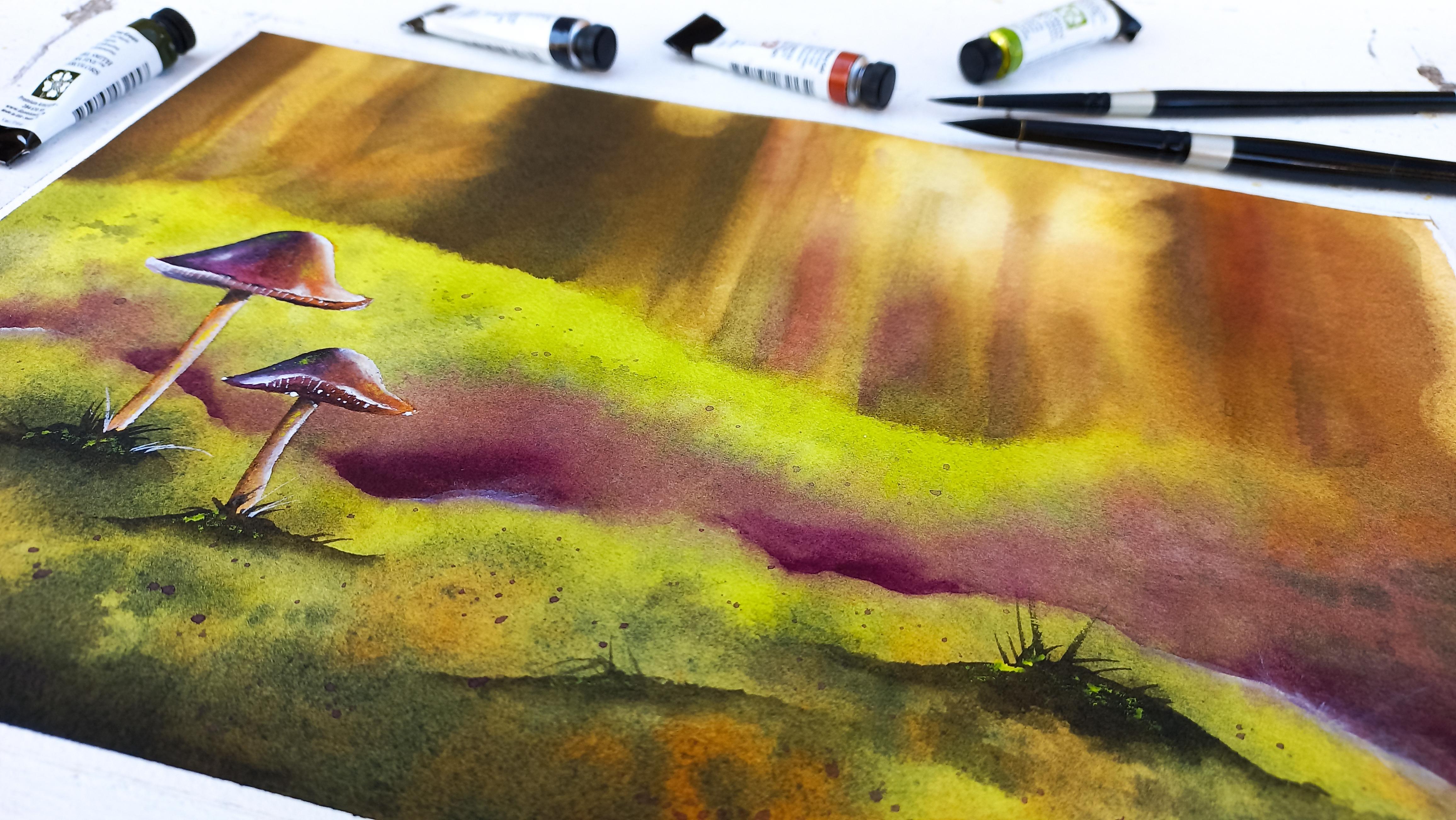
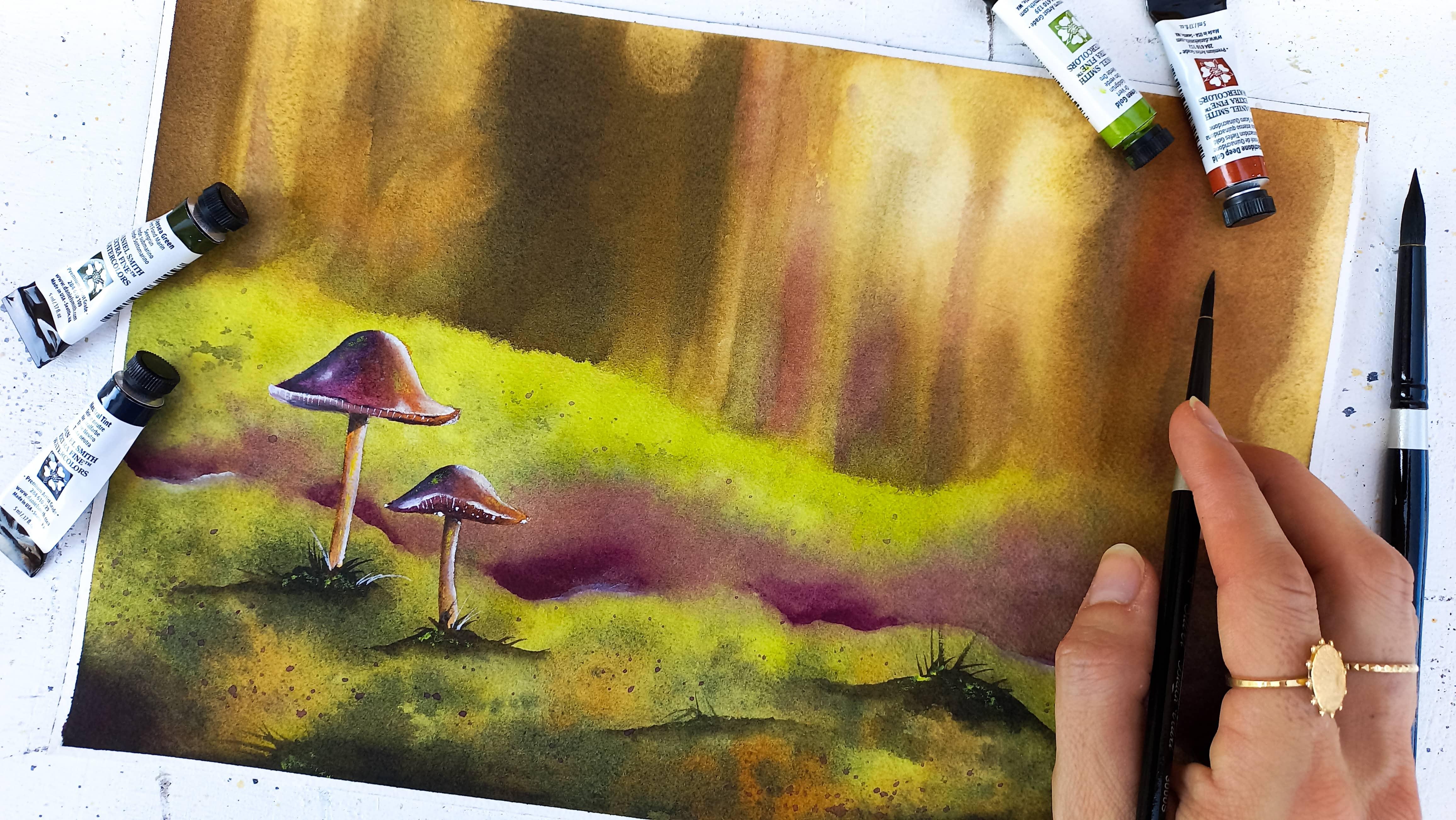
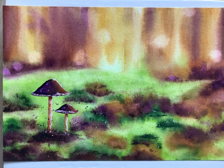
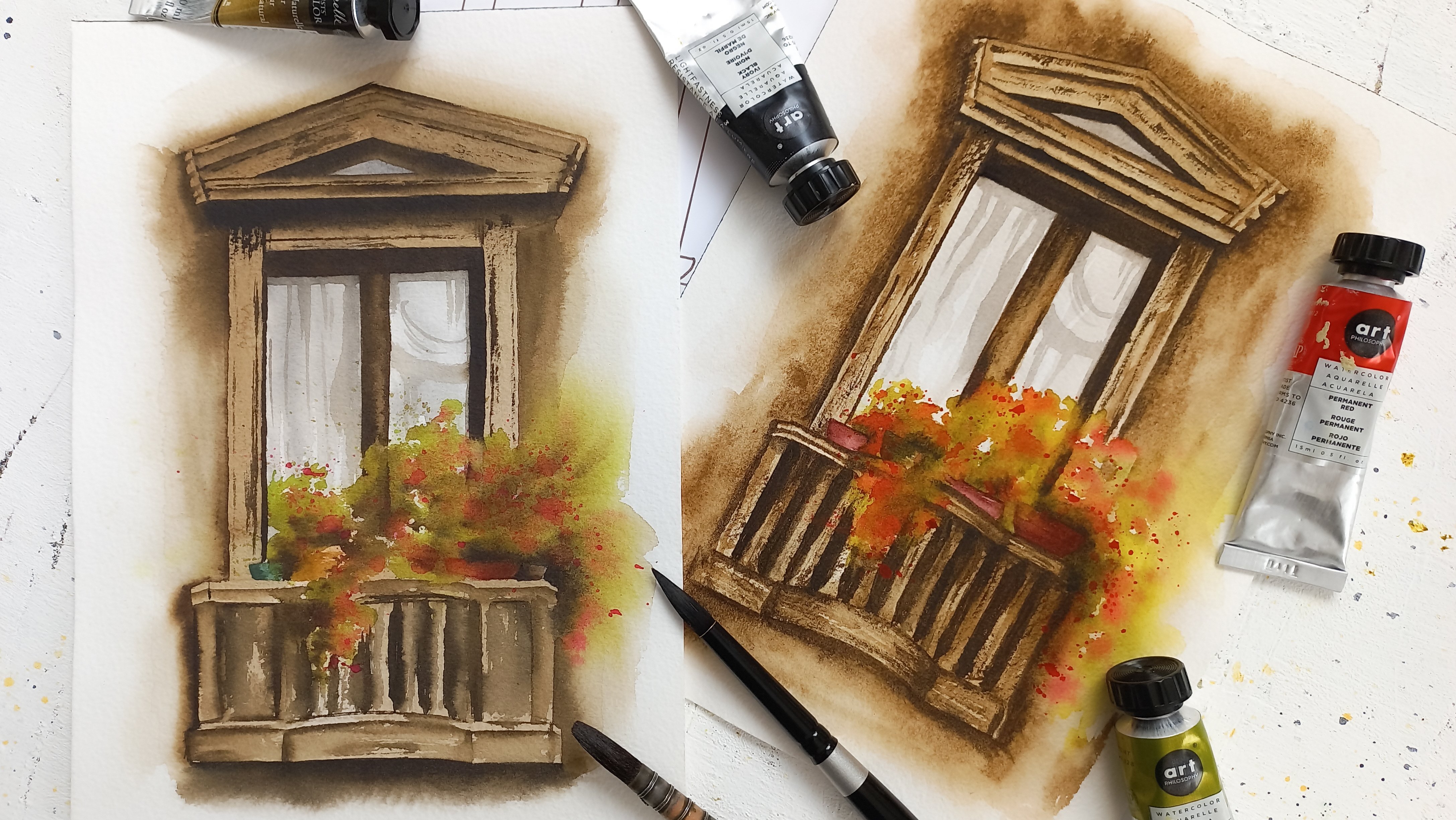
2. Your Class Project: Your project will be to paint this watercolor landscape using the techniques shown
in this class. Our focus will be to create the pleura effect
of the tree trunks, and to incorporate a subject
in focus with a mushrooms. You can also use this
painting and techniques to create your own
unique piece of art. I will show you how to prepare your sketch for a
blurry background. We will learn to mix colors
that work well to paint a magical autumn
forest landscape and we will start
layering watercolors. Each time, we'll
add small tweaks, shadows, and details to
bring our painting to life. I created a list of the supplies and color mixing
guide specifically for this class and
you can download them and the project in
the resources section, along with the reference
photo and a photo of my art. When you're ready to
share your project, you can upload it like so. Without further a do, let's get started with a review of the
supplies we'll use. So see you in the
next lesson. [MUSIC]
3. Watercolor Supplies: [MUSIC] In this lesson,
we're going to go through the supplies I recommend
for the class project. For the exercise, you will need a piece of
watercolor paper. A small size will do. It can be any type
you like as we will just be testing techniques
to create a blur effect. For the project itself, I wanted to do something
larger than usual. So I went with an 8
by 12 inches sheet. But if you want your
project to be slightly larger or smaller
than this, go for it. This is 100% cotton cold pressed paper with a weight of 300
grams per square meter, and the brand is Arches. I think a paper of this quantity will be best for
today's project. In the supplies list I
attached to the class, you will find other
suggestions if you need them. If all you have is
wood pulp paper, also known as cellulose paper, you can still complete
this project beautifully. I just find that 100%
cotton cold pressed papers deal with color
and water so much better, and that's why I
prefer to use that. To paint our background, I recommend one large
flat paintbrush and a round one like these two. [MUSIC] These three
paint brushes are noticeably smaller
because we will use them for the details
and the mushrooms. I have around one and
two random pointed ones for more precision. You can make do with less
paint brushes if you'd like. Maybe one large round
one for the background and two smaller ones for the details would
already be great. That's how I started. Nowadays, I like to have
a variety when I can. The more you practice, the more preferences
you're going to have, so you'll know what
works best for you. I like masking tape because I can paint without worrying about holding the
sheet into place, and it also creates nice and crisp edges all
around the painting. This is construction tape, it's affordable and it's easy
to find online or locally. If you don't have this kind, you can use scrapbooking
Washi tape, also. It works well too. We will need the most
basic pencil, ruler, and eraser that you have to
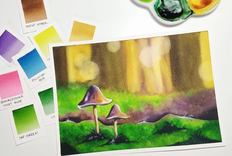
draw a very quick sketch. This is the color scheme
we'll be working with. I'm going to give you
lots of alternatives. My choice today is with Daniel Smith undersea
green, green gold, quinacridone deep
gold, neutral tint, and Winter Newton
quinacridone violet. But you can use any other brands and shade for these colors. You want to earn the process not the results you're getting. I will also use lemon
yellow in a tube. This is completely optional. Lastly, white gouache is very useful to paint dreamy
highlights that do look magical. So I highly recommend that. Any brand will work with
gouache, don't worry about it. This is one of the metal tins I pour
my tube's paint into. I like that it has
very large wells, so I can mix great
quantities of paint. I find it's nice to have
a lot of room to do it. If you'd rather paint
a background without having to control the mushrooms, you can use masking fluid
or drawing gum like I do. It's not a must, but
it's convenient. I also have that color
shaper to apply the fluid. You can use an old
paintbrush instead. Actually, I like the color
shaper because it's silicon, and it will not get ruined
by the masking fluid. I find it's hard to keep
a paintbrush clean and usable for the long term when it's used with
masking fluid. Have a few paper towels ready, I use that to soak up extra water and paint
from my paintbrushes. If you have a piece of
fabric, it's just fine. Two jars of water
will be useful. We'll use one to wet our paintbrushes and
one to rinse them. I use a scrapbooking heat gun. It will come in handy to
dry the background fast, otherwise, you can wait it out. If you have a hairdryer, you can use that instead. These supplies are very useful for all watercolor projects. I find that even as an
experienced artist, I can paint anything I
like with this list. I'll meet you next to learn more about blur effect
techniques. [MUSIC]
4. Exercise : Practice the Blur Effect: [MUSIC] We're going to practice
the blur effect and we need the extra sheet of paper
I had you pick for this. Let's mix a little bit of whatever color you
have near you. It doesn't matter if the mix is watery or creamier in texture. However, make sure
it's not too thick, it will be easier to practice. Get a round paintbrush
ready to wet the paper and another one to apply the paint
for our first technique. Let's wet one small area of
the paper with clear water. Now, pick up some paint
with the other paintbrush and apply it on the
area that is now wet. You can see the paint
spread out instantly. This is known as
painting wet in wet. It means the paper is
wet with water and the paint brush is also
wet with water and paint. The advantage here
for a blur effect is we will not get
any harsh line, anything we paint
will remain blurry. That's why this
is in my opinion, the best technique to paint
skies and backgrounds. In contrast, another famous
watercolor technique is called wet on dry, because only the paint brush
is wet paper remains dry. That creates harsh
edges and it is not the most helpful one
to use for a blur effect. You can experiment with
painting wet and wet and get a different
level of blur each time. This is what I've noticed from painting a lot using
that technique. When you wet the paper and
add wet paint immediately, the effect is at its peak, it's all very blurry and
the paint is under control. But if you wait a bit for the water on paper to evaporate, and you add the
pigment to mix so it becomes creamy or thicker, the paint will spread
out a lot less. This is exactly what
I'm doing here. I'm adding more
pigment to the mix so the paint brush isn't as wet. My paper also
started drying a bit even though it's not
that noticeable yet, and you can see the blur
effect is less pronounced. We're now able to
draw a shape that will dry in the way you
want it to look like, except the edges will
stay a bit blurry, thanks to the wet paper. To practice this, wet the paper, apply wet paint, and every minute or every
30 seconds depending on how your paper is and what conditions
you're painting in, add paint to the mix and apply
it to see the difference. Besides, remember that
paint will only spread and get blurry when there is water on paper, as
you can see here. There is another technique
you can use when you want more control or you need to blur just a small
area of the painting. [inaudible] this, once the
base layer and blur effects have been created and I
need to refine the details. I'm using two paint
brushes again, one to paint on dry
paper this time, and the one to fade harsh
edges and make them blurry. That paintbrush
needs to be pretty clean and it cannot
be too full of water, so I recommend to dab it on paper towel like this
so it's just damp. Just paint with the
first paint brush and soften the edges with
the damp paintbrush. Mine is actually too dry now. When you practice like this, you will be able to
adjust the amount of water with ease like I
just did be sure of it. It's a matter of habit
and getting to know how it should feel and
look to soften an edge. This one is really pretty now. I'll do it again
here. Remember not to wait for too long when
you want to blur an edge, because on dry paper, watercolor dries very quickly. [MUSIC] Look at what happens when we add
too much water. The paint on paper is not as
wet as the paint brushes. That why all the
water we added with a paintbrush now pushes
the paint on paper. This exercise is
really excellent to level up your watercolor and
feel comfortable painting. Once you master this, painting will become
a lot easier. Remember there is more
than one way to achieve a blur effect with watercolor on wet paper and on dry paper. On wet paper, play with the
amount of paint and how wet the paper is to create different intensities
in the blur effect. Use the technique for
large blurry areas. On dry paper, quickly blur the edges with
a clean and damp paintbrush. Use that technique
for details and refining your blur
effects some more. Please don't worry about
practicing this taking ages, just repeat a simple
exercise like this a few times and you will
quickly see progress. We'll also practice it
a lot with the project itself so you see how it's
like in a full painting. See you in the next lesson for a very simple sketch. [MUSIC]
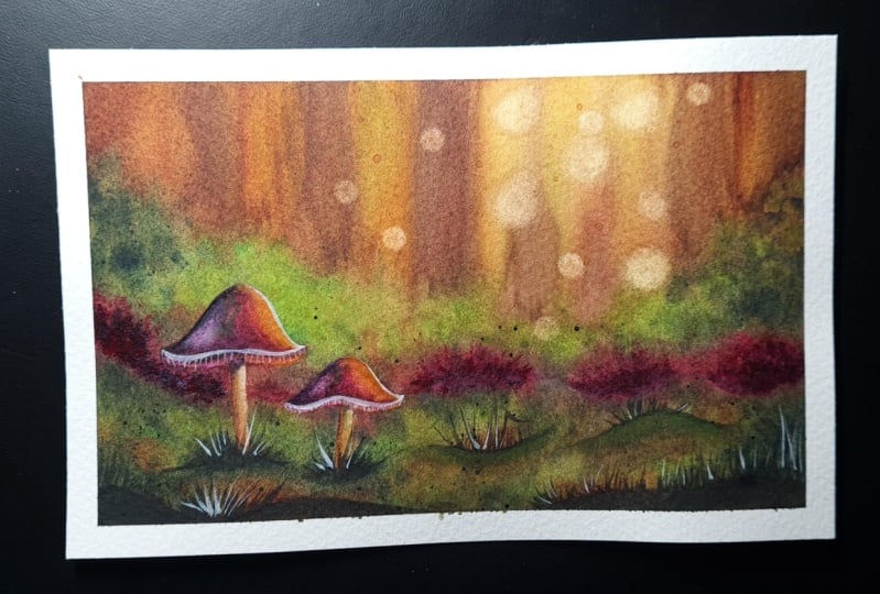
5. Quick Forest & Mushrooms Sketch: [MUSIC] Let's draw
a quick sketch. To start I always
use my masking tape, so make sure you do this on the surface you plan to work on. If you plan to use a
heat gun or a hairdryer, make sure the area won't
get damaged by the heat. [MUSIC] We will start with
a ground line that is in the foreground and that we can see in the reference photo. Mentally divide your sheet
into three horizontal parts. We end up with the bottom, middle, and top part. That line would start in the
bottom part of the sheet. I tried to be spontaneous
as I draw this, the line really doesn't
need to be perfect. Actually, it's even
better if it's a bit bumpy since it's supposed
to be the foreground. There's another ground
line in the reference and I'll place it on the
upper part of the sheet. Drawing the ground
lines in this way helps me balance
the composition. Let's use the ruler to place the main tree trunks so we remember where
they are later on. It's okay to press a little
bit with a pencil so they remain visible after
our first layer as long as it doesn't
create a harsh dent in the paper because you want to be able to erase
if you need to. What I'm thinking about
is that we will need some room in the top part
to paint our blurry trees, and the middle part
is also important because that is where we
will place the mushrooms. By dividing the sheet
into three parts, we'll have both balance in
the painting and room for our main elements
especially because here the ground is bumpy
as I mentioned previously. It will be easy to make
our trees shine more towards the right side
where we see more of the background and
the mushroom so stand out better on the left side
where the ground is taller. We're going to draw
the mushrooms on the left part of the sheet
in the middle ground. [MUSIC] Notice how my lines here, it doesn't look perfect either. It's the same in the
reference photo. This contributes to
the final painting looking more realistic. If we were to draw
perfect mushroom shapes, it might look cartoony. [MUSIC] I love to use masking fluid when
there are elements in focus in the painting
that I want to preserve. This would also help paint the background without worrying about the mushrooms at all. [MUSIC] I went a little bit over the edge earlier
with a masking fluid, so I'm just pushing
it back inside the mushrooms sketch
with my finger now. I find that works well when
I make little mistakes, but first you have to
wait for it to dry. Remember to decide what the main elements in your
painting are going to be. Here are the blurry trees
and sharp mushrooms, and make sure to help them
stand out in the composition. We are ready to mix colors
in the next lesson, and later we'll be
able to paint. [MUSIC]
6. Creative Color Mixes: [MUSIC] Let's mix
the colors we'll be using in the next lessons. You will need one of your paint brushes
and your water jars. I recommend you to watch
this lesson all the way through before
attempting the mixes, as you will be better able
to choose whether to go for the colors you already own
or to mix your own colors. You will need a bright green, like the Daniel Smith
green gold I picked as this is one of the main
colors in today's project. There are several ways you can recreate this color and each one of them is going to be recapped at the end
of this lesson. For example, here, you can leverage color mixing. Look at what these
two different greens look like when I
add lemon yellow. There is a slight
difference between the two. You can try orange
as well and see. Once you've chosen
a combination, you want to stick to
those colors and see if you're able to reuse
them elsewhere in order to minimize the
total number of colors in your palette and make sure
the painting looks cohesive. That's because it's best
to avoid overwhelming ourselves juggling too
many colors and instead, to leverage color mixing
as much as possible. We'll need a lot of
the bright green for our background so I
recommend you mix a lot of it to avoid having to mix more in the
middle of a layer. I'm trying to get my mix to
be creamy and I mean by that, not too thick not too watery. Now I'm adding a
little bit of water because it was getting
too thick and that's it. I think it's looking good. [MUSIC] Now, let's prepare the
dark green mix. I'm using Daniel
Smith undersea green. Again, you can use color mixing. I'll suggest to add blue as we can use that
blue again to mix violet or you can use brown or even black,
like I'm doing here. Each time you're going to
get a different color. That's why I insist on reusing the same colors
in different mixes, so we narrow the color palette. Remember that I will recap all options later in the lesson. Again, I try and add enough pigment so the mix
is concentrated in paint, but also enough water so that makes flows and
paper when we add it. Imagine if it's too thick, the paint will look
vibrant when it dries, but it won't mix very well
with the rest of the colors. Transitions will
look a bit harsh and if on the contrary,
it's too watery, you will have to apply many layers before
getting your painting to look colorful because watercolor looks so much lighter
when it dries. Let's mix a bright brown
or gold color now. Same creamy consistency. I'll use Daniel Smith
quinacridone, deep gold. Quinacridone, gold is
a common color I find, but you can also get
it with color mixing. For instance, use brown
and yellow or orange. Mine looks better using
burnt umber and yellow, orange than if I use lemon
yellow instead of orange. You can experiment and decide depending on what you will be
using to mix other colors. Let's make this
creamy once more. To mix a dark brown, I follow the logic that
I explained earlier. I look at what I have
in my palette of five. I see that instead of
picking any brown color, I can simply use
neutral tint to turn my quinacridone deep
gold into a brown color. This is why I love to have at least one dark
color in my palette. I could have removed
undersea green completely and use
neutral tint to make my green gold dark too if I wanted to simplify my
own palette even more. That's just an example. I wanted to do things
differently in this class by picking fancier color
than usual but overall, I find the classic colors are best, especially for beginners. I love mixing colors together
from a limited palette. It's better than picking
one separate color each time as this way, you are sure to achieve a better color harmony in a painting without
overthinking it. You can use the same combination
as mine if you have it or if you used blue or brown
earlier to mix a dark green, it would work well in darkening
your deep gold color. I'm using a color called
quinacridone violet but really you can have any other
type of violet or purple. A fun way to create purple
is to mix pink and blue. Here I'm using opera pink and indigo and there opera
pink and Persian blue. Remember, you'll get
different outcomes depending on the
color you're using. The reason I picked violet is because the painting will
have shades of green in it mostly and the best color to pop in contrast
to green would be its complimentary color and when you look at a color wheel and find the color that sits on the opposite side of
the wheel from green, you will see pink,
purple, and violet. That's why the
mushrooms would look great too if you just
want to use pink. They'll stand out more and the painting will be
less muted than mine is. Now let's review the
different options you can choose from for colors. You can download
all of them from the resources section
afterwards too. Option 1, you can use the exact same colors as
mine if you have them. However, it will be easy to
mix them from common colors. Please don't let my colors
stop you from painting. I used to think as
a student that it will be better if
only I could use the same color as my teacher
was using but in fact, the exact color you use is not going to affect your
painting much at all. The techniques, the
process you use, color proportions, as well as color value is what matters. Option 2, for beginners, or to make it very
easy on yourself, go with colors you already have, and that look like
the ones I used, even if they remotely do. You can use Option 3 to leverage color mixing
as its maximum, using mainly blue as a way to create certain colors
like green and purple, but also to make other
colors darker like brown. This is great for a
simple palette and a cohesive color scheme. However, there is
little choice in the outcome of each color once
you have picked one blue. Option 4, use a color palette made of five colors and
that in my opinion, will get you the best results in terms of recreating
my own mixes. What I like about this option
is I included orange in it, and I would recommend
a very bright orange, like one that's closer
to yellow than red. I do enjoy my art philosophy. Yellow, orange color
for that reason. Otherwise, a warm yellow would work very well here
too and what's great about this is that you get more control over
the general tone in your painting and
you'll get it to look warmer thanks to this color. Remember, these are just
suggestions and examples and all choices come from my own point of view
and preferences. Feel free to tweak
this as you like. We're done. I hope you enjoyed
learning about colors, some more here, and creating
creamy mixes of paint. I'll see you in the
next lesson where we'll start painting
a base layer. [MUSIC]
7. Base Layer : Blocking in Vibrant Colors: [MUSIC] In this lesson,
we're going to apply a base layer and
focus on blocking in the main colors and make
them vibrant enough so that we have something solid
to work from later on. Find a large flat or
round paintbrush that will make it easy to
cover the paper in water. It might help to watch this
lesson and wants to be for a painting just so you
know what to expect, since we'll be working
quickly on wet paper. Let's wet the paper
as well as we can. To do that, I found that going back and forth with
the paintbrush really helps and changing the
direction you do it in also helps in
covering every inch. [MUSIC] Wetting water color paper for a base layer is not just
about covering every inch. It's also about
letting the water sink inside so it takes
a lot longer to dry and that's why it
takes me a while to wet it because if I was
to do this quickly, only the surface will be wet and it will all dry very fast. How long it takes for
your paper to be wet inside and out also depends
on what type it is. Mine is 100 percent cotton, but if yours is wood pulp, also known as cellulose paper, wetting it would be a
lot quicker because that type of paper doesn't
absorb water very well. [MUSIC] We will start with a round paintbrush and our brightest
color, green, gold. Let's apply that where
the ground is [MUSIC] You see the paint
spreads out quite far and get all what the background
of our landscape is, where the blurry trees will be. That's okay because this color is very light, first of all, but also because if we see a little bit of
green back there, it won't hurt at all and
this is just a base layer. Anything we do here can be fixed or improved later so please relax into blocking in the main colors
roughly, and that's it. No need to worry
about anything here. Now let's fill up all of the background with
quinidine gold. Make sure your paint
brush is clean. That's most of the green has
been washed away in the jar. I find this important
when the paper is wet to apply paint
everywhere quickly, just so the level of
humidity is maintained. It's almost like we're
doing a reset on the paper being just wet
and ready for the paint. It buys us time to
keep applying color. I keep some areas
white because we'll create a slight book
effect there later. Remember, it's okay
that all of this is covered in paint because this
is a light color after all, and it will dry even lighter. That's what we're seeing now. With a dark green shade,
you have tap the brush on paper to make the
class more interesting. Keeping it as it was, we'll make this painting look
very cartoony in the end, we need to add other
colors to it and since the paper is still
wet, why stop now? [MUSIC] Notice I add more towards the bottom, the middle ground being more distance to the person
standing in the forest, we want to keep it
lighter [MUSIC] We're applying the
same logic and background with more
color this time. Our darker tone of brown. This time we're outlining
the trees a bit better. I'm leaving those patches of light in-between as they were. [MUSIC] You can already tell this landscape is coming to life in just a few minutes. [MUSIC] If your paper is
still wet, we keep going. Otherwise, remember
you can stop at anytime and start
from here at later. After letting the paper
dry and wetting it again. I aim at keeping the
sheet wet still, so I keep switching between painting the top and
bottom as you can see. I find the gold green, it looks pretty bland. Since I have time, I'm going to add
more and now you can see it's brighter
and more intense. Take advantage of
this to also start refining the painting a bit
now the main colors are on. To define where that patch of grass should be for instance. Don't be afraid to make
some more if you need, it. It's best if you don't make
a new mix too watery as our painting is starting
to dry a bit and we wouldn't want to add
too much water now. This is exactly what I'm
doing with dark green. I add pigment to the
mix, still creamy, but maybe a tad less than it was when we
first prepared it. Let's overlap that onto
the previous layers of paint to achieve something
that looks natural. Remember the bottom of the
painting will be darker than that patch of grass
towards the middle ground. [MUSIC] Let's add intensity in the trees with
quinacridone gold. [MUSIC] We can also overlap that color in the grass. It will help tie in all areas
of the painting together. You can even see that golden color in the
reference photo in the grass. Let's not add too much though, as we want to keep the
ground looking mostly green. [MUSIC] While we're using that color, why not outline some of the
blurriest tree is a bit more. I don't want the brush to be too wet and the paint too dark. I wash some of it and I soak the extra water out
with a paper towel. Remember how I showed you
in the exercise that when the paper is less wet and the paintbrush
also isn't as wet, the shape you're painting
actually stays almost intact. The paint won't spread
out like it's out of control and this is
what's happening here. Let's use our purple or violet now and add some
to the base layer. While the mushrooms are the
ones I picked that color for. Again, here, I'm tying in
different parts of the painting together in a subtle way because it doesn't have
to be very obvious. [MUSIC] Let's add some trees. And now dark brown to redefine those blurry
trees a bit more. I switch again to violet. You can play it by ear here and the sidewalk colors to add and where according to
your own painting. [MUSIC] It's time to try this. [MUSIC] Remember to wet the paper thoroughly, so it takes longer
to dry afterwards. Also start with a light
colors and take advantage of that to maintain the level
of humidity in the paper. Add darker colors
little by little. As long as the sheet
stays wet enough, keep adding color while increasing the amount of
pigment in the mixes. This will help with
more vibrant colors when the piece dries. Overlap colors on
top of each other a bit and add
touches of violet in the class and the
woods too to create a better color harmony
with the mushrooms later. That's it. You can see now the base layer is much
lighter, but that's okay. As in the next lesson, we will paint a second layer before we add any detail.
See you there. [MUSIC]
8. Second Layer : Adding details: [MUSIC] In this lesson, we're going to add details to our background so it's
close to finished. Let me make some
more of each color. As I'm seeing, I ran out
of almost all of them. This is always a good time to also clean your paint brushes, change the water
or paper towels. Make sure each color mixes
a bit creamier than before. There should be more
pigment now, less water. Colors shell very well in
the second layer, once dry. [MUSIC] To work on the background some more, I find it's best to
wet it all again rather than to try and just
add two sections of it. It really helps colors blend in better and it avoids
any drying marks. On this second layer I wet
it good, but not for long. We're doing it in a
superficial way this time as just a surface
needs to be wet. That's because we
might lift some of the color if
we insist for too long and also because we already filled the tooth of the
paper with the first layer, and we want to add more
vibrancy to the colors, which means we don't need as much water on paper
and in the paint. With the same round paintbrush
as before I start adding each color once more with
the same logic as before, covering all areas in the paper quickly to maintain a
good level of humidity. First two greens. Since we already have a base, it's interesting to look at adding touches of color here and there by tapping
the paint brush on paper and overlapping
on top of other colors. Doing this will create more color shades in
the final painting, since watercolors are
transparent and it will contribute to
depth and realism. When you think about it, there are a whole lot of colors
in absolutely everything, whether it is human's
skin or a grass. Painting is something with
just one or two colors will make the art
look more cartoony. Remember we want more of the dark green towards
the foreground. [MUSIC] Before the sheet dries, let's add a color and details to our blurry
tree trunks with grenadine and gold and then we will apply
a dark brown color. Notice how I use
vertical strokes because these are trees and I'm
trying to render that shape. At this point, since the
paper isn't as wet as before, and since the paint also is
less wet you should see that your strokes still blend into the background enough
that it's blurry. But this time it's easier to distinguish the trunk shapes. Strokes on spread out into
the rest of the painting. [MUSIC] Let's switch to violet now and apply some in the trees to have it there and
not just in the mushrooms. We'll add more too
in the ground there to mark the separation
between the foreground, the middle ground
and [inaudible] a hollow area between the two. Or maybe it's dirt instead
of grass. Who knows? [MUSIC] At this point, I'm refining each area,
increasing contrast. That's why I'm overlapping more cryogenian gold down here. [MUSIC] Let's define some of the trees even more
with a very dark brown. Simply add more neutral tint
to your dark brown mix. Makes sure that mix is
getting even creamier, almost on the thicker side now. Notice how much better to find those trends are and
yet we aren't seeing any harsh lines since the
background is still wet enough that the paint blends in
smoothly into the rest. [MUSIC] I'm taking advantage this
is still wet to create pretty blooms for added
texture in the ground. I just went around paintbrush and mix splatters to do that. [MUSIC] Let's do the same with dark
green now for texture still, it allows us to make
those light green parts more interesting without
making them look too dark. Splatters are also a great way to overlap a color
on top of another, like tapping the brush on paper. Except the splatters
themselves are smaller and they look
more spontaneous. [MUSIC] Let's increase the shadows
now with dark green. Remember the paper is getting
less and less wet so don't hesitate and make
your mixes a bit more concentrated
in paint as you go. You can see here, not
only does the paint spread less but it also
shows a lot better. [MUSIC] Whenever you feel you added
paint where you don't want it or if it spreads
out a bit too much, use a clean and damp
paintbrush to clean that up. Tap the paintbrush on
your paper towel so it's not dripping wet otherwise
you will get a bloom. I find that background lacks contrast towards the
back in the trees. [MUSIC] Now I'm mixing my
dark green shade with quinacridone gold and neutral tint to create another type of a
dark brown color. Since I'm using colors from my limited palette, it's okay. It won't throw the whole
color scheme off balance. Mixing is always a great way to leverage colors in
the limited palette. [MUSIC] You can use water [inaudible] thinner paint brushes for slender tree trunks if you like. [MUSIC] Let's clean up the edge a bit with our clean and
damp paintbrush. The paper is getting dry now and some slight hard lines
are starting to show. Now on to creating more highlights in this
blurry background. The paper being
damped at this point still we can use the
lifting technique. This is when you use
a clean paintbrush that is almost dry, not have been damp but just thirsty as we call
it in watercolor. Again, you can remove
excess water from your paintbrush with a paper
towel to make it thirsty. Just dab it on it. Then you need to press
the paintbrush firmly on the area of your choice
to remove the paint. This helps us get some of
the color in the paperback, although not quite
but it's still enough to create a highlight
that looks natural. It can also be helpful to make some of the tree trunk edges to appear more neat and straight
while keeping them soft. [MUSIC] Another technique for
such a highlight is to use a piece of
clean paper towel. We are lifting the
paint with it now and because mine has
been shaped into a bowl, it helps me create an
impression of a book effect. [MUSIC] We're ready to let this dry. It will take a while
as the sheet is quite large and we applied
lots of water on it, the insides should
still be a bit damp. Remember to increase the
amount of pigment in the paint as you go when
working on wet paper. In a second layer, wet the sheet fast and
start reapplying color. Overlap different
colors together and you splatters
to add texture. Use vertical strokes
to shape the trees, adding more and more
pigment as you go. Lift paint with a thirsty
paintbrush or with a piece of paper towel to
create some subtle highlights. You did a wonderful job
making it till here. As I know, this was
a little bit of work but I bet you've got a much better sense
of how to create a blurry effect in a
watercolor painting. Let's meet next and
paint the mushrooms. [MUSIC]
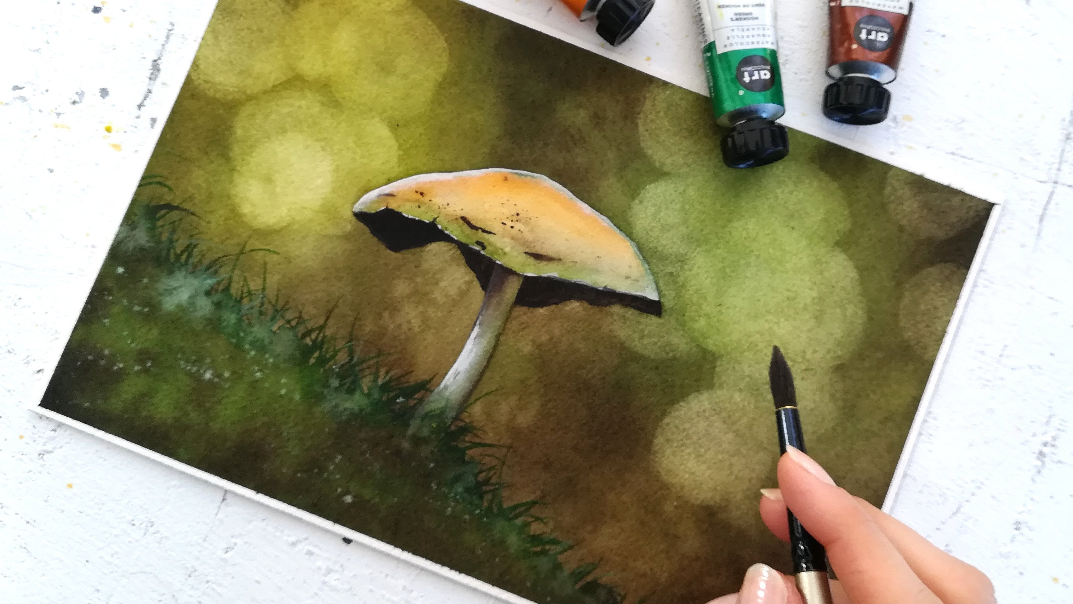
9. Painting the Mushrooms: [MUSIC] We are ready to
paint the mushrooms. The first thing we
want to do now, the background is finished
and completely dry, is to remove the
masking fluid or drawing gum with a
piece of paper towel. Mine comes off
easily on ash-paper, but I noticed on other papers, it might be more difficult.
It really depends. If your paper wants to
tear when doing this, try and limit the damage as best as you can and know you can still paint on a damaged surface as long as it's not too bad. I press quite hard and I
go in circular motions. We will need one or
two paint brushes. I like to use these
with a fine tip anytime I paint something small
that requires precision. Let's pick up violets first. [MUSIC] I apply a pigmented
version of it first, then I wet the paint brush a bit to dilute some of that paint directly on paper and
create some gradient. [MUSIC] Now, let's add quinacridone
gold on the right side. [MUSIC] Now we overlap it a bit onto the
quinacridone violet. Normally, I avoid mixing any yellowish shade with something purple
or violet because these are opposite colors
in the color wheel and they will turn into mud or brownish
color, in other words. But still, it's
important to make a connection between
both colors through the act of overlapping them
both. That bit is enough. [MUSIC] You can use the
lifting technique here too, and pick up some
color off the sheet. [MUSIC] Now, let's paint the stem
with quinacridone gold. With a clean and
damp paintbrush, you can create
that gradient from a pigmented version of that color towards
a much lighter one. We're repeating the
exact same steps for the second mushroom. [MUSIC] Before we add the shadows on a second layer, let's try this quickly. [MUSIC] Add a bit of neutral tint to violet
to make it darker. Now we don't want to
add too much of that, just enough so the mushrooms become more three-dimensional. [MUSIC] Soften any hard lines with a clean and
damp paintbrush. [MUSIC] Let's add a few details. [MUSIC] Now, we repeat with
quinacridone gold. We add neutral tint to it to create a dark
brown version of it, and it will serve
as the shadows. [MUSIC] The area that is right underneath the
cap is this darkest one. You can see that in the
reference photo too. [MUSIC] I find a new more vibrancy and shadow in the cap. [MUSIC] Now let's repeat on the second mushroom. [MUSIC] Remember to remove masking fluid once the
paper has completely dried with circular
motions and a paper towel. Overlap colors a bit
in the mushrooms. Add a dark color like neutral
tint for the shadows. Use dark mixes, not just for shadows
but also texture. These two are looking good, but you can tell there's
going to be a few adjustments to make they blend into the
ground better as right now, they're just sitting
on top of it. I'll meet you next to paint more detail and shadow
on the ground. [MUSIC]
10. More Shadows and Definition: [MUSIC] In this lesson, we're going to add shadows
in the grass to make it look like the mushrooms
as part of the landscape. But also because we need more dark areas in
the foreground. Right now, the foreground
and middle ground are looking too similar and the
painting is a bit flat. We're going to use a very
dark green color and the paintbrush with a fine
tip so we can paint detail. Have a clean and damp
paintbrush ready for later too. Don't forget neutral
tint can be added to dark green and make
it even darker. Let's hide the mushroom stamps into the grass by
coloring them up a bit. The way to do this is
to make sure the paint is much darker than
the stem itself, almost opaque so we can
hide that stem tip. [MUSIC] Let's do the same with a second mushroom. You can draw grass if you like to suggest even better than grass is what that whole patch
of green land is made of. Then before that dries with
a clean and damp paintbrush, we're going to soften
that hard edge there and now the added grass melts
into the previous layers. You can see this is also a
blur effect we're doing here. Two layers become one. When that dries, it
will look so natural. To make the painting
look realistic. It will be great having a darker foreground, none
necessarily everywhere. A few spots will be enough. Let's add dark green again, right at the bottom
of the sheet. Before that dries soften
the edges once more, just like we did with the
grass and the mushrooms. [MUSIC] Add a few more blades of
grass if you like that. You can tell now we can
clearly differentiate the foreground from
the middle ground with that addition, it makes more sense
in our brains. The landscape feels
more harmonious and in tune with what
we might expect. Because the foreground,
being closer to us viewers, we would distinguish grass a lot better there than in
the middle ground. [MUSIC] I want to make the violet area
between a foreground, a middle ground, even more
visible, even better. If it looks like there's a hollow area in
between the two, the blur effect comes
in so handy once more. That's why I love it so much, and I use it to make my
paintings realistic. With our dark version of the violet or purple or
pink color you picked, let's just find the
separation between the foreground and middle ground more and blur some parts. I think it will look better if we don't do this all the way, but just in some areas to suggest rather than get
into a lot of detail. We could also imagine
that in some places, grass from the
foreground sticks out enough that we can't see
the hollow part everywhere. That's why I talk
about suggesting. It's up to you and
your imagination. I have learned parts
on both sides, as you can see so we
don't end up with a consistent harsh line
on one side or the other. It looks more natural this
way I find the more subtle. [MUSIC] I want some of the trees back there
to look blurry still, but to stick out a
little more than others. With a chronogenic gold, let's strengthen the
trunk line for this one. Now we want to blur it a bit. Remember from the techniques exercise that when we
work on dry paper, we need to add
water in some way, and we do that with a clean
and just damp paintbrush. Just like we did for the
line between foreground, middle ground, and a minute ago. You don't have to
blur all of the edge. In fact, everybody
depends on you. If you want to
make the tree look close and more
focus blur it less. If it's supposed to be
out-of-focus leave it as it was or barely
add any detail to it. Defining the trees like this also helps me either vibrancy, color to that blurry background. Quintillion gold is a
great color for this. We can even add trunks
that were in there before. Choose your color and how
intense you want it to be, and then choose how
much you want to blur. [MUSIC] Notice, I don't paint the whole trunk from top to
bottom, just a part of it. Because some places
in the background, the ones where we added a book effect,
they're very bright. Light is coming from there. I'm imagining we can't distinguish all of one trunk,
but just a part of it. I also like I can
add more violet to the background to balance it with the rest
of the painting. It helps at the stage that we already finished adding violet to the mushrooms
and hollow areas between a foreground,
and a middle ground. We can better see now how much of that same
color to add in the background to establish equal harmony of color
in the painting. [MUSIC] To take this idea of creating harmony to
a color a step further. Let's platter at some of
the violet color onto the green grassy areas to make them more
interesting and textured. [MUSIC] The middle ground
being more distant, I suggest we add water
to the brush here so this part has come
out violet still, but just a little bit lighter. I'm really happy with how well this finishes the painting, and I hope you're
enjoying this too. Remember to make the foreground
and the landscape look darker and more detailed than the middle ground or background. Use the blur effect on dry
with your clean and damp brush to make it look
like the added elements, like mushrooms or tree trunks
are part of the painting. Play with paint and water
to create more or less of a blur like we did with the tree trunks
and the background. Create color harmony all over
the painting whenever you can by adding the
different colors in your palette in
different ways. Strokes, a blur
effect, bladders. That's it for shadows
and textures. I will see you next for the
final highlights. [MUSIC]
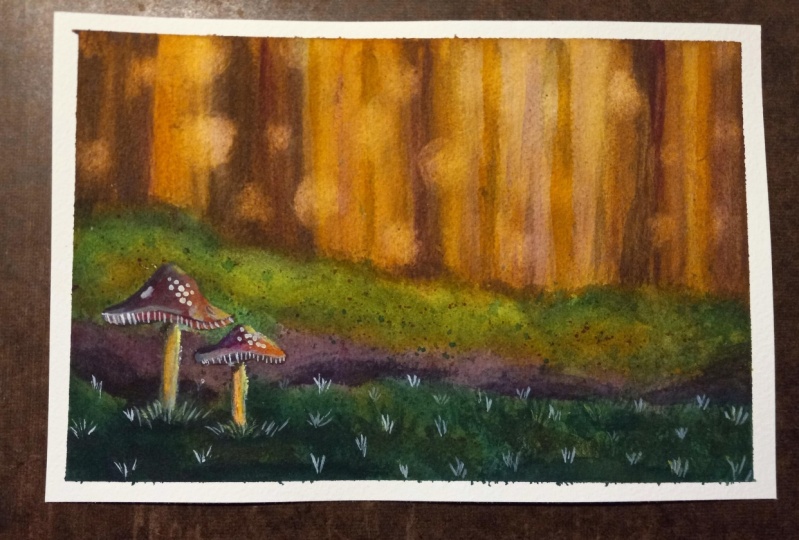
11. Final Details and Highlights: [MUSIC] We're ready to add the final details
and highlights. To do so, I enjoy
white gouache the most because of the magical
glow it gives my paintings. Let's squeeze some
out of the tube. It will be easier to use when we add a little bit
of water to it. When it's too thick, it becomes hard to apply, so I keep that for strong
and small highlights. [MUSIC] Even with gouache, I use my favorite blur effect
technique on dry paper. White gouache can either look opaque when it's
pure, or almost pure. It can also look beautifully translucent and magical
when it's mixed to water. Softening edges with a
clean and damp paintbrush gives us that exact effect. Here it's helping and defining the bottom of the mushroom cap. We get the impression of a natural circling all of the cap. [MUSIC] We can also
highlight the right side, since we added shadows
to the left side, to help with the 3D
realistic effect. [MUSIC] The stem could
also use a little light. Adding highlights really
helps us subject pop. Try and think to
highlight at least what's in focus in a
painting like this one. I'm adding a bit more. You will notice as
white gouache dries that it becomes so much lighter. At the beginning, you
will probably learn to mix less water
to your gouache, so it shows more when it dries. It's totally normal
and an easy fix. [MUSIC] On the second mushroom, I'm adding very sharp highlights with gouache that's pure. As I mentioned earlier, it's easy to add pure gouache when it's
done on a small area. Just that the paintbrush area to deposit some paint
and that's it. [MUSIC] Notice how we're able to shape the cap with
white gouache. [MUSIC] Now let's add
those cute little details that make our mushrooms
looks so real. [MUSIC] More magic, you can add white gouache to
some of the grassy areas, and use the blur technique
on dry paper again. Like we did with our
dark blades of grass, we could very well
add light ones too. I'm not sure I like in my
paintings too much as I want just a tad of magic
with a lot of realism, so I might remove that later. Did you know that white gouache can be removed very easily? Anything you do with
it can be undone. If it's a thick white
dots when it's dry, it just remove it
with a fingernail. Otherwise, for thinner layers, a damp piece of cloth or a
paper towel will do the job, or a damp paintbrush. As long as there is no lengthy back-and-forth and a whole
lot of pressure added, the paint wouldn't come with it. I think if you subtle white splatters and
the mushroom caps will look fantastic here and
add light and texture. This is an optional
step to take, and sometimes I like
it in the painting. I want to add something interesting to my
violet mushroom caps, and I see a bright
color like lemon yellow might pop on top of
the dark violet areas. We will take it right
out of the tube so it's pure and thick
and apply it there. Just a tad as an
accent. I love it. Adds a little something extra. If you only have
colors and pans, the most effective way to get a similar effect is to go dig some of the pigment out of there and make sure it's not
too full of water, but instead quite thick. [MUSIC] The dark green
areas you can see it helps create a nice
textural effect, that I think looks more
natural than gouache would. [MUSIC] Remember
white gouache dries very light when
diluted with water. You can use it as opaque or
translucent as you wish. The blur effect helps us subtle white gouache
highlights and a magical glow. It is easy to undo any
white gouache work, with a damp paintbrush or cloth. Experiment with other colors, preferably in a tube, to add a texture and
lights to a painting. Congratulations for
completing this painting. I loved creating blurry
areas, especially the trees. I'd love to hear all about your experience
in the project section, so please go ahead and
share your painting there. Let's meet one more time for final thoughts on
this class. [MUSIC]
12. Before You Go: [MUSIC] Thank you so much for taking this class with me today. I'm pretty confident
that by now you have a much better grasp of how to create and use the blur effect. I would love to see
what you've created. So please share your project
in the Project section. You may also leave
a review to let potential students
know what to expect. If you'd like to stay updated
about my future classes, I invite you to follow
me here on Skillshare. I'm also active on
YouTube and Instagram, so if you plan to
share your work there, you can use the hashtag
createwithfrancoise. I hope you had a great
time during the class. I'm looking forward to
see you in the next one. Bye for now. [MUSIC]
 Francoise Blayac, Professional Artist