Transcripts
1. Welcome to Class!: Keeping Wa Curt Mountains
simple while still creating depth and realism
isn't always easy at first. And this class is going
to help you strike the right balance with a
clear and simple approach. Hi, I'm Hansis. I'm a Waaka artist and
teacher based in France, and I specialize in loose yet realistic
watercolor painting. I share my teaching
online on YouTube, Patrit and in in depth courses. Instead of copying a photo, you'll learn how to simplify a reference and create your
own version with confidence. In this class, we'll paint one simple mountain
landscape made of four layers to understand depth and atmosphere
using soft shapes, gentle transitions,
and very few colors. Bull cover water control, paint consistency, edges, and layering through
short and easy lessons. After that, I'll guide
you step by step through the full painting with optional lessons to help you fix a painting that feels flat, dull, or too dark. This class is ideal for
beginners or anyone who wants a calm and structured
way to approach watercolor landscapes without
overcomplicating things. If you're ready to
paint Watercolor mountains in a simple, relaxed and realistic
way, let's get started.
2. About The Class project: Your class project,
you'll be painting a simple and expressive
Watercolor Mountain landscape with only two colors. This project is designed to
help you focus on depth, atmosphere, and layering without
getting lost in details. We'll start with short exercises to understand how water
and paint behave, and then we'll apply
everything directly into the final landscape painting using very simple techniques. In the resources section, you can download the supply list of photo of my art and the
photo reference I used. Once your painting is finished, take a photo of it and upload
it to the project section. If you'd like, you
can also ask me for specific feedback in
the discussion stab. In the next lesson,
we'll start with a quick tour of the
supplies we'll use.
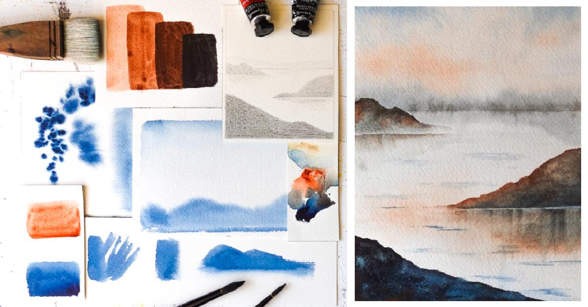
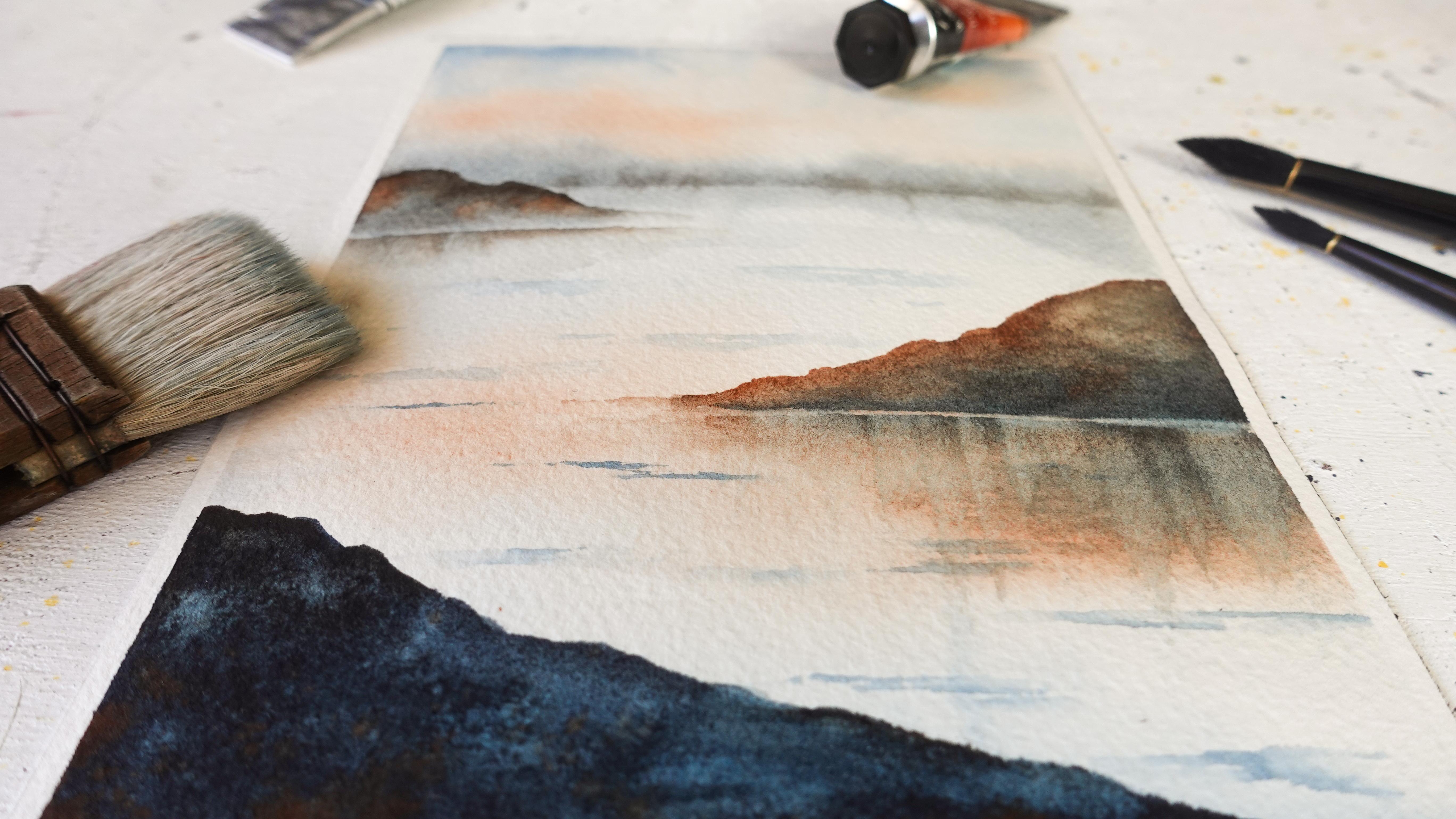
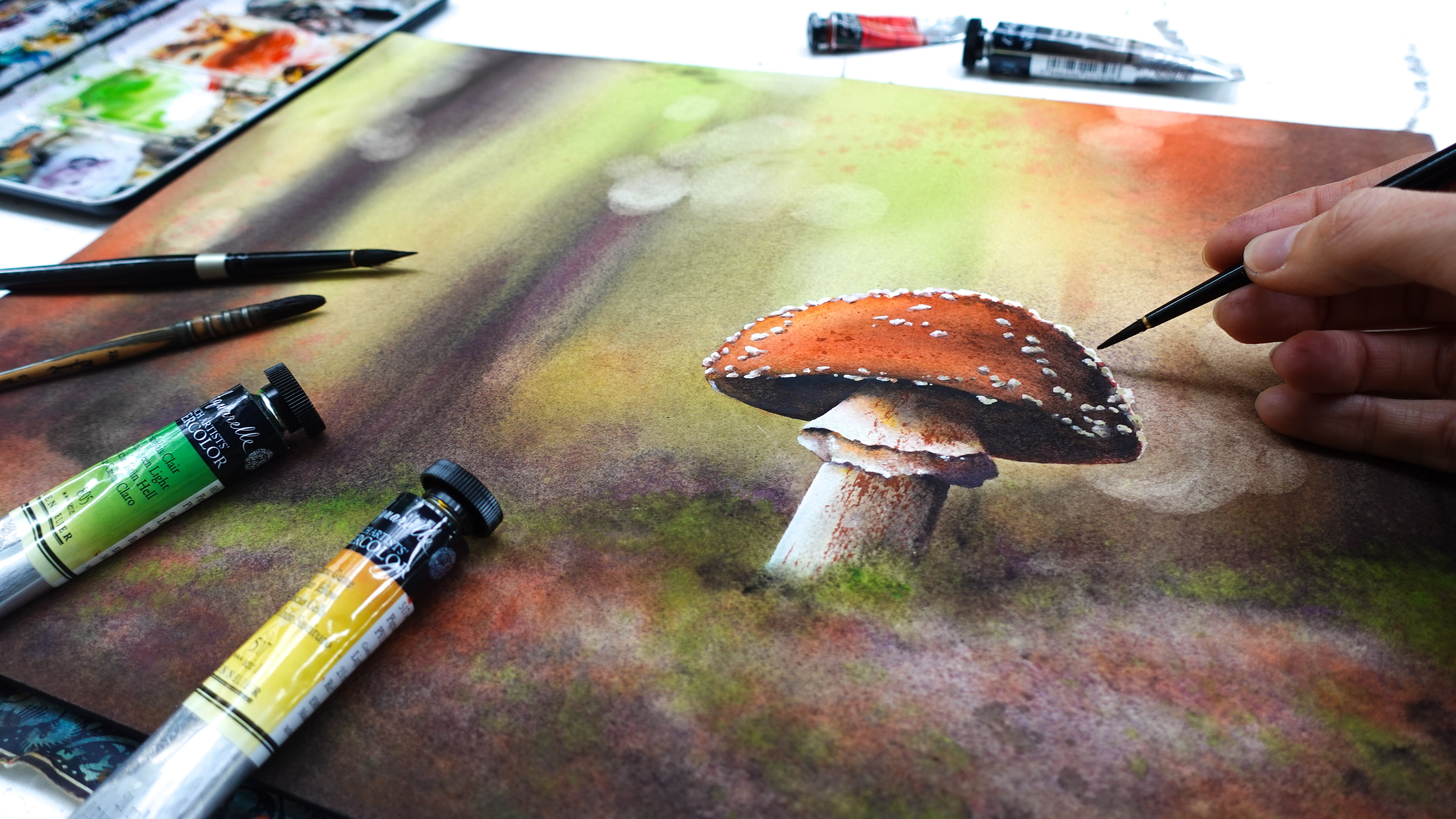
3. Supplies: Take a look at the
supplies we're going to use for this class and
we'll start with the paper. I like to use 100%
cotton water cot paper, hold press, 300
grams/square meter. I find that it tends to dry less fast than other
watercolor papers. But whatever you have is
fine for the class really. We're going to paint
on a very small size, which is five by seven. Even when we work on wet, we're not going to work
for a very long time. You don't need top watercolor
paper if you don't have it. You will need a few
scrap pieces of paper along this one here
for the main project. Just a few as well practice
different things together. For colors, I like to go minimalistic with as
few colors as possible. Here I've picked indigo
and burned sienna. Indigo is a dark blue.
I'll just show you. If you don't have
that, you will get a similar results by mixing
any blue with black or brown. For Ben sienna, you can
either use a brown color or you can mix
maybe orange red or yellow with a brown color of yours to make it a
little bit brighter. If you really want to get a similar look as mine, otherwise, just pick any blue
and brown color you have and you'll be all
set to paint the project. Convenient to use mixing
trays to prepare your colors. I like to use that kind. When it comes to paint brushes, you'll see me use a variety. But I did start with these two when I was a beginner
and I kept them for a year. I just painted with these
two and it was enough. Don't feel obligated to get the exact same paint
brushes as mine. If you are interested though, I will add a list of the
supplies that I'm using, a very detailed list to the resources
section of the class. You can download it
and go check it out. You'll also find my
color references. You'll just need a small
brush and a bigger one. Any brush that would
fit your paper size. By that, I mean nothing
too small or too big, that it will make it
hard for you to paint. Then you'll see me use
some masking tape to tape my sheet all around so
it doesn't move as I paint. I really like it,
it's convenient. We also need a
pencil and a ruler. There's really no
sketch in this class. It's just one horizon
line. That is it. Then we'll need a few
paper towels and we need two water jars to paint. And lastly, I'll be
using a heat gun. That's because I
like my paintings to dry faster than let
them dry on their own, but you do not have to use this, and if you're in
a hurry like me, you could still
use a hair dryer. If you have any questions, feel free and let me know in the comment
section of the cost. Otherwise, I will see
you in the next lesson.
4. Make any Reference Your Own: This lesson, I
would like to share the reference photo that
I've used as inspiration for my landscape and also
encourage you to play with different
compositions because we don't have to paint a
photo exactly as it is. We can simplify it.
That's the power that we have as artists. That's what I did, for example, for this class here, just a simple thumbnail. This looks like the reference. There are just less mountains. It's a lot more simple. And you could come up with 1,000 different ones of
these if you wanted, maybe add more or
less mountains, different shapes,
different placements. There are so many things to do, and then you can also
change the colors. So it's really endless. I hope this inspires you
to try it for yourself. Just pick a piece of paper, a pencil, and play
around with that. I also want you to notice that as we get to the bottom
of the sheet here, my mountains get darker and I've done it on purpose
here to really show you the depth that
we're going to recreate with our watercolors. Don't worry, you'll
notice this is doable when you take
it step by step, which is what we're going to do. I will meet you in the next
lesson to get started.
6. Keep Edges Light and Loose: In this lesson,
I'd like to share a technique that changes
everything in watercolor, makes it so much easier. You'll see it's not
very complicated. We're just going to start with two paint brushes
of your choice. It doesn't matter
what they look like, and we just need one color. What you want to do is pick up some color with one of
your paint brushes. Doesn't really matter if
it's thick or very diluted. And you're going to use your other paintbrush to soften
the lines we're going to make with this one here because notice what happens if I just paint and I
do nothing else. I'm getting those
harsh lines, you see? Especially when I paint on dry. To avoid this, to create a very soft
look in the landscape, we might want to soften those edges and that's where that other
paintbrush comes in. So you want it to be
clean, so wet, clean. Then we're going to soak up the excess water like
this with a paper towels, we just press it once or twice. That's it. So it's
not dripping wet. Here I'm going to paint in
the same way I did before. Except that this time quickly, I bring my other
paintbrush here, I start painting
on nothing here. I just paint on the paper, and then as I get closer, I touch the edge and it transforms into
something that looks a lot softer than it did before. Here notice I have an
excess of water on my brush because we have a
little bit of a bloom forming. So if this happens, you just make sure to
remove a little more water, can even add a bit more
paint here to fix it. For example, if I'm going
to paint a mountain, I will make sure to have
that paintbrush ready here to soften a harsh edge
because we need to be quick. I'll paint my mountain like so. Then I'll come underneath. I'll start adding water
underneath on the paper. Now I'll go touch the
edge here so the paint can go ahead and
soften into the paper. Now we don't have a
harsh edge anymore. It doesn't look like that
mountain has been pasted on. It really looks like
it's part of the paper, as you can see, and we do get a little bit
of a mist effect. That's really nice. That's
it for this technique here. We're going to use
it quite a bit. You'll see it's very convenient. I hope you've enjoyed it and I will see you in
the next lesson.
7. Simple Layering Exercise for Depth: In this lesson, I'm going to
show you how to layer for beautiful mountains that look soft with the right
pain consistency. Don't worry, we're going
to take it step by step. You'll see that it's
actually pretty easy when you practice
it with simple shapes. I'll start with Fn Siena, you can pick whatever
color you like. We're just going to pick
up a little bit of color, add water to it,
it's quite light. This is important for layering. You want your base layer, your initial layer to be
pretty light, like this. And what you want to do
is pick up your paint here and use the side of your
brush to cover more ground. So rather than trying to
draw a rectangle like this, what you want to do is shape
it with a very light color. I'm still being quite fast
here so the paint doesn't dry. You can see I don't have
very clear outlines here. That's what you want
it to look like. Same for a mountain, no outline, using the
side of your brush. It's very important that we dry each layer before
we apply a new one. Otherwise, the paint would
bleed into this layer here. What we're going to do now is thicken up our
paints a little bit. That's one way to make the paint look a
little bit darker. What I like to do is add
an other color to it, for example, a little
bit of indigo, and that really helps
to get it noticeably darker without having to make the paint very thick and
opaque like gouache. We can still keep
that watercolor look, but get a darker
version of this. Now I'm going to layer on top. Again, I'm thinking in
shapes, not outline. You can see here thanks to
the paint being darker, we cannot even see the line
from the previous rectangle. It's disappearing underneath
this coat of paint, which is exactly what you want. That's why the paint
needs to be darker. Here we've layered
a second time. We're going to try this. And now that this is dry,
I'm going to keep going. I'm going to pick up
more paint still, make it a little thicker, still add a little
bit of indigo, maybe a bit more this time, and now it's turning
into a very dark brown. It's pretty thick too. I'm going to apply that starting to be very thick, so it's harder to paint. That's why at keep that consistency here for
the end of a painting. In the one we're going to do is going to be for the
front mountain. This is already very
thick, as you can see. Now you can really see
the difference and how well these are layering
on top of each other. Let's try this.
Then we're going to take it a bit further
with the fourth one. Hey. And this time to make this even darker, I'm going to add more indigo. Again, thick coat paint here. Let's add more indigo. See that's why I
like to work with several colors,
including a dark one. Becomes very easy to layer. Look at how dark this is now. Looks beautiful. With only two colors,
this is all you can do. We really don't need to have a very complex
palette to paint. Here we go. Four
beautiful layers. No visible lines underneath. As you can see, they
layer perfectly. That's exactly what
you want to do to create depth in the landscape like the one
we're going to tackle later. I hope you've enjoyed this.
If you want to share this in the projects and resources
section, go ahead. If you have any questions,
feel free to ask as well. See you in the next lesson.
8. Quick Warm-up!: Going to do a quick
warm up painting here with just one
color to begin. This is going to be just a sky and a simple mountain
that we add. We're not even going
to tape the sheet, use a scrap piece of paper, and we're just going
to go with indigo, but if you want, you can
pick any other color. You want to make sure that
your paint looks like milk, even a bit more watery, it flows on paper,
just like that. See it still has pigments, so it's still going to show, but it's going to
be able to move. It's important because we're
going to wet our paper. I'm going to do
this very quickly. I'm doing a little bit
of back and forth. This is just an exercise. Don't worry if it
doesn't look exactly like mine, it's not the point. We're just going to
paint a quick sky, It's starting to be
a little darker, so I'm just going
to rinse my brush completely and pull that paint down to create some
kind of a background. Since I'm not
adding any paint to my brush and there
is water on paper, notice how the paint dilutes itself and gets lighter and
lighter, which is great. Imagine this is a sky
and when we have this, we wait a little bit
that the paper starts to dry and we're going to start painting a mountain
on wet paper. The wet paper is drying. All we're going to
get is fuzzy edges, but the paint should not spread out like it usually
does on wet paper. I'm going to add
my mountain now, the paper is starting
to dry a bit. I waited for about 30 seconds
on such a small size, it's drying pretty fast. I'm going to thicken my
paints a little bit. Now I'm going to press
my brush to paper here. I'm using the side of the brush. Notice how the paint
spreads a bit. If it spreads out too far, it means that the paper
is still too wet, so you might want
to wait a little bit or just thicken your paints. Now we're going to
shape a mountain. You see, I press my
paintbrush quite a bit here. I'm just shaping a mountain. I notice how I get
these fuzzy edges, but still the paint stays
where I put it, which is nice. Just finishing the edges of my painting, so it looks nice. You see this is how to paint a background that looks
very soft and fuzzy. That is great for those
mountains that are far away. In the next part, we'll paint an entire piece with three
different layers of mountains, actually even four
different layers. You can see how they
complete each other and how to play with paint and
water to achieve that effect. I'll see you in the next lesson.
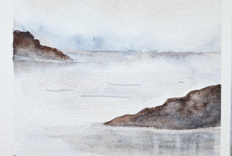
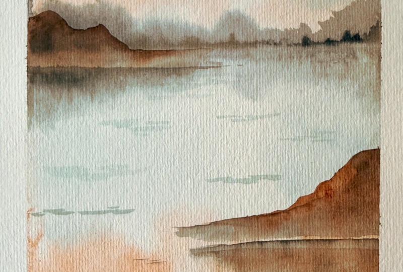
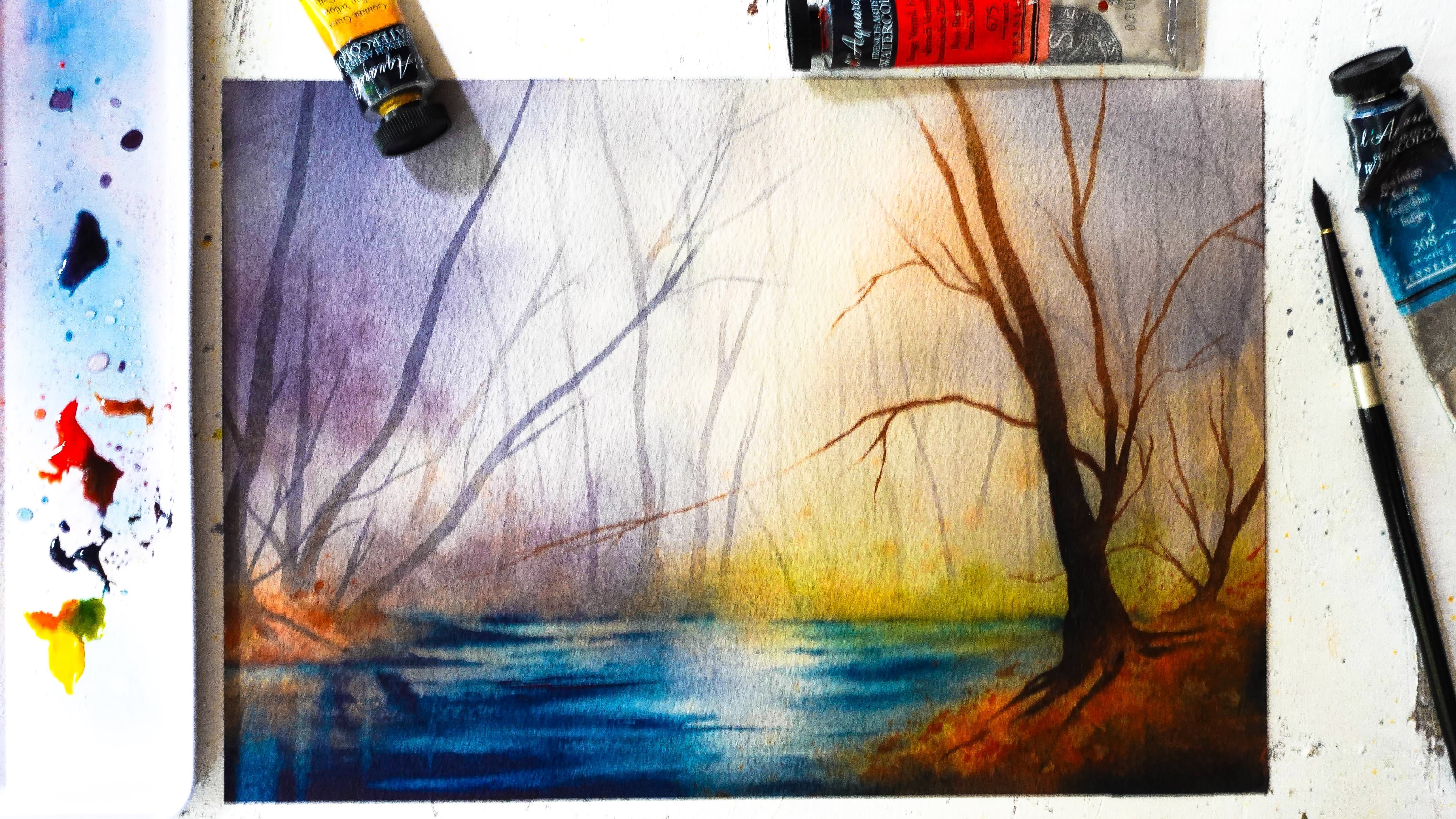
9. Base layer (Background): We're ready to start painting our mountains and
we're going to start with a background wash. Don't
worry this is going to be the easiest layer just because we're going
to go very light. There's no need to fear mistakes here and we're going to
take it step by step. This is meant to be just a base. If it's not perfect, it's fine. If it doesn't look like the final painting
you have in mind, don't worry, it's
absolutely normal. I'm just going to
tape this around so that the sheet doesn't keep
moving around as I paint. Now make sure you have
your paintbrushes ready. I like to have a variety nearby and also make sure
your colors are ready. We're just going to draw
a very quick sketch. Nothing too complicated. We just need to trace a line. That's it. I'm going to pick the upper third
of the sheet here. I want more room for the
mountains than the sky. Mentally divide the
sheet into three parts. They don't have to be equal. You can be a little bit above or below, it doesn't
really matter. There we go. I don't know
if you can see this line, so I'll just insist,
M here it is. And for the paints,
just a reminder, we're looking at
something that moves, which means you want
to pull a little bit of paint after wetting
your brush like this. See here it's not
moving that much, so you can add a little bit of water until you get
something that flows, and that will help because the colors will be
able to move and to mix on paper and we'll
do the same with indigo. Remember to rinse your
brush in between. The two colors together, they make gray.
Sometimes that's great. Sometimes we just want to keep both colors
fresh. It depends. This is great for a base
layer. We can get started. I'm going to wet my sheet and I like to do a little bit
of back and forth to make sure the water gets
in every nook and cranny and I also want it to seep inside
the fibers of the paper. That way my paper won't dry too fast. That's
a little trick. Seems simple, but it's a
big mistake that I see to just wet the surface
of the paper very quickly and that's it because
that will dry very fast. If you take a little more
time like I'm doing here, then your paper will
be wet for longer. We want to avoid puddles on
the surface. That is great. Now I'm going to start painting. You can go ahead and pick the brush that makes you
feel most comfortable. Think about the
size of the paper. For example, a base would be very hard to paint with a
very small brush like this. I'm going to go for something
a little bit bigger. This is actually a little
too big here for my taste. I'm just going to go
ahead and pick this one. Is the one I like to
paint with on such sizes, but it varies for everyone. I'm going to go
ahead and pick up that burnt sienna first
and add some in the sky. And I haven't made
enough. Here we go. I'm starting to place my color. Doesn't really matter
where you do it. I like to use a
reference as a guide, but that's just a sky. It doesn't have to
look one specific way. See, I combine straight strokes
and also tapping motions. It's up to you to see
what you prefer to do. Now I'm going to add a little bit here for
the reflections. There's a body of water there. I also try and keep
some areas fully white. As you can see, I concentrate this color in those
areas of the painting. If the paint starts moving around in odd ways
and bothers you, it doesn't really
matter at this stage. But a little trick here is just to wet your paint
brush, clean it. Make sure it's
just a little wet, not completely dripping wet. Then you just go
ahead and soak up that excess like I'm doing here. I will help you
control the paint, even maybe soften some areas if you find they
were too strong. See my brush is not too wet. Otherwise, you won't be
able to soak up that paint. You don't have to
do this, but that can be helpful at times. Now let's add indigo. I would like a little
bit more of it on top here to make my skype
bit more moody. Again, I'm combining
different types of strokes. I'm going quite fast. I'm not really overthinking
anything here. Straight strokes here again. I'm going to start
adding a little bit of color down here where we're
going to add the mountains. Don't be afraid to overlap
colors that looks very good in any watercolor
painting. Looks more natural. Here again, I'm going to clean up a little bit of that paint. I just make sure
my brush is clean, not too wet, and I
clean up my edges. That looks very nice. I might darken the
top here a bit more. Now let's take care
of the bottom. We want a little bit
of that blue too. That base is important
because on wet paper, you'll be able to start adding the main colors
from your painting, and you can do it in a very gentle way since
the paper is wet. You get to build
yourself a base, something to go from
later. That's important. We just want to make sure
to keep some white areas, not try and paint everything. At the bottom, I'm
not afraid to add color because I know there'll
be a dark mountain here. So I'm just adding a little bit. Again, I clean my brush
and I'm just going to go ahead and soften
some of the colors here. I'm hesitating whether or not
I want to leave this here. It actually looks beautiful.
I might leave it. It's just a water do
its thing as you can see it almost looks
like it's a stormy day. Maybe I'll leave it.
It looks very cool. What I would like to do now
is add that mountain in the back and the trick here
is that the paper being wet, the edges will be very fuzzy. That will look nice because
it will really convey the idea that this
mountain is far away. I'm going to pick
up a little bit of that bunsiena mixed to indigo. We want to create
a grayish color. I want it a little bit more
indigo than the burnt sienna. We want it to be a tad
thicker than before, not thick and stiff. You can see it's moving, but a little bit thicker. So it sticks on paper and keep in mind also the paper
is drying right now. We want to match that with the paints and make sure they're not as wet
as they were before. Now I'm going to add
this color and I'm going to press my
brush to the paper, press a little bit to make sure the paint sticks
exactly where I at it. If you see the paints
spreading too far, it means your paper
is still too wet. If it's not spreading, it's just making
some harsh lines, maybe the paper is
drying already. So if this happens, you could dry your
sheet completely. And then wet it again and add your mountains then so that you can add
them on wet paper. See here, it's
spreading a little bit, but it's not bad, and that
creates that fuzzy effect. It's perfect for mountains
that are in the distance. See, I'm really taking
my time with this, trying to not make
every mountain the same snow the same heights. It wouldn't look very
natural if it was. That's where the
horizon line we drew before really helps because
we know where to place this. Now I'm going to add
a little reflection. I'm just doing the
same pretty much, but on the other side, the paint doesn't have to be as dark. You see, if it's diluting because there's still water
on the paper, that's fine. Mine is a little bit lighter
and that's just fine. What I do like to do is make sure the horizon line
gets a bit darker though. I'm going to mix a bit
more of these two colors. I don't want it to
be too thick so. Also make sure my brush is
not overloaded with paint. Then I'm going to add a
bit here at the bottom. That really helps define that
horizon line really good. I'm just going to add
a bit more paint. That gorgeous colour. See here, I've added a little bit more of the burn sienna,
but that's fine. It actually looks nice. And you can see it because the paint is a bit thicker
here just a little bit. Very nice. See, at this point, you can just let the
paint do its thing, let it dry completely, or if you're in a hurry like me, you can just use a
heat gum. That's fine. It's not going to
ruin the effect. That's what I'm going to do. This is completely dry, so we'll meet next and we'll start painting
our middle layers.
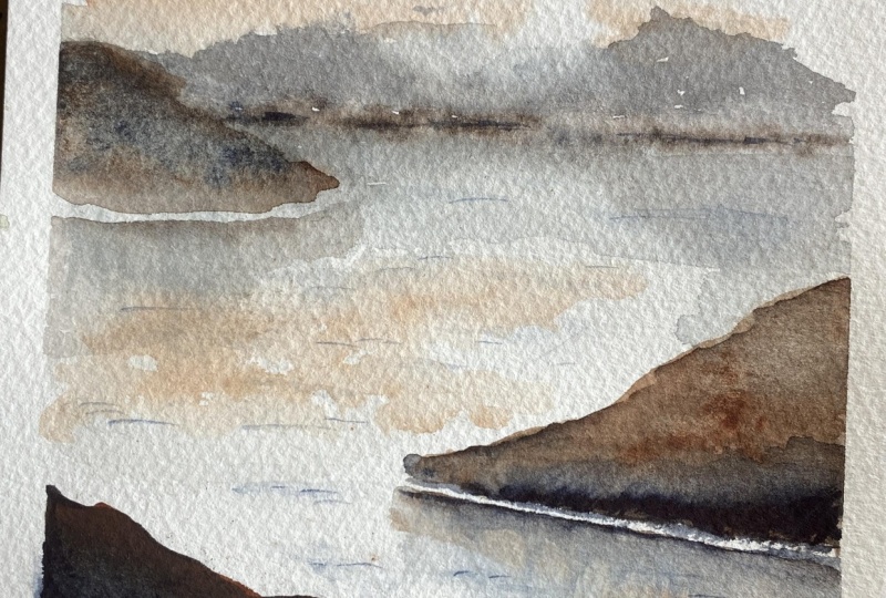
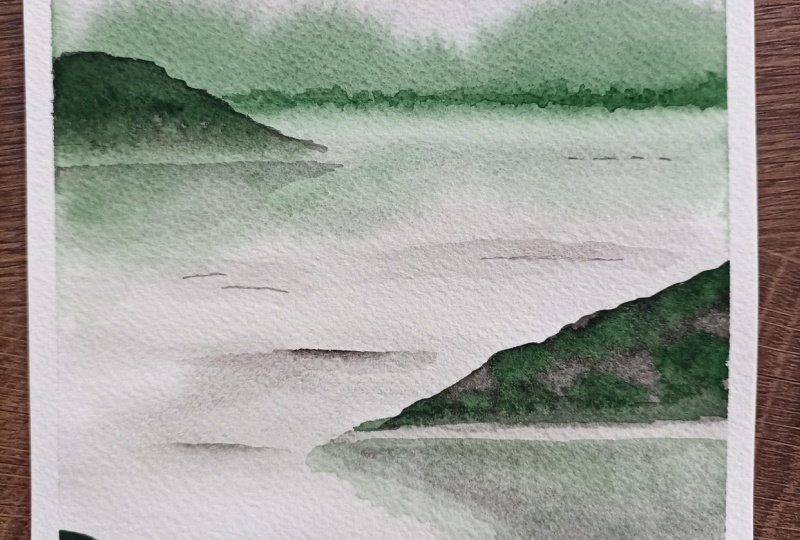
10. Middle Ground: Middle layers are going to
look a little bit different. We're going to define them
a bit more and do this, we just paint on dry paper. This way, they will
show more naturally. My technique to paint soft mountains is to
use two paintbrushes. With one of them, we're going to add color and with
the other one, we're going to soften the paint. Let's get started. And we do want to make sure those mountains stand out a little more than
these back here, which means the paint needs
to be a little bit thicker. It can also be a
bit more colorful, which is why I'm adding
more of the burnt sienna. I'm going to make it
creamy like milk here. You can see it's moving, but it's not as
watery as before. I'm going to add a
bit of the indigo. You could make those paints
more of a brown color or more of a blue color
depending on what you want. I'm going to make a dark
brown and I'll need to add more bunsena here
so I have it ready. If I need more There we go. Now we want to have paint on this brush and rinse this one completely making sure it's clean and wet and then just get rid of a little bit of
water so it's just damp now. Now we're going to start
adding our mountains. One here will look
nice and again, you can choose whatever
composition you would like. See, I'm just racing
the top here. I'm not really overthinking it. I just know I want my mountain to end
somewhere around there. And I think it's a little
bit too dark, actually. I've just rinse my
brush to get rid of the paint and I'm lifting
that paint tap at it, see how you can easily correct
whatever you're doing. I'm stopping here and with
that other paintbrush, I'm going to wet the paper right underneath where I've
stopped and then go touch the watercolor and it melts now into the paper and you get
that very soft look. I think that looks very nice. If you want to give it
a little bit of color, what we can do now that the
mountain has been added, we can go ahead and pick up some fresh bun sienna
and go drop it inside. To make it a bit more
colorful like this. I'm not going to
overdo it because I still want that mountain
to be quite light. Now I'm going to repeat this
with the next mountain. Again, I mix Bncena and indigo and I'm going
to go ahead and add it somewhere over here see it's a little bit lighter
than the other one. We'll add a little bit
more color afterwards. There's no rush. Right now, I just want to
shape the mountain. And don't forget to wet the bottom of it with a
clean and damp brush. I've just added water to the bottom and I'm just
touching the base. Then if you want, if you feel
like you have time still, you can rework the shape of this mountain because it's
still wet at this point. You can add a little
bit more color to it. Like I'm doing here. What you can do for
the reflections is do the same thing
just the other way. For example, I still have
that same paint here on my brush and I still have a clean and damp brush
here, on the other hand. I'm just going to add a
little bit of paint and leave a gap here
between both mountains, between the real one
and the reflection. I just add a little bit of
color with my other brush, I'm going to go ahead and
soften this color here. I just soften it so that we're guessing that
this is a reflection. It works because we
have that gap between both mountains and a
lighter color down here. You can even wetch your
paper a little bit, why not add a bit more paint? There you go with a reflection. We can do the same over here, so we need more indigo, and a little bit more water. Remember, I went a
bit too dark earlier. I'm going to add a
little bit here. With a clean and damp
brush, I'm softening this. It's actually enough. We don't need a whole
lot of attail here. I just want to add a
bit of paint there. That is it for the
middle layers. Let's try this. And we're now ready to move on
to the foreground, so I will see you
next to do that.
11. Foreground: Foreground is something
we want to keep simple. We want to place a darker shape for it to stand
out a little more. There's no working
with two paintbrushes to soften anything because
there's no reflection here. It's just a mountain
right in front. We're going to work
with thicker paint. I'm going to use
more indigo here. I do like to add a little
bit of burnt sienna. To keep that color
harmony going, just less than before. It's more of a dark blue. We're going to add it
somewhere over here. So this is pretty quick. What I like to do
with something like this is to darken
it to a whole lot. I'm thickening my
paint even more. It's barely moving here. I'm adding a thick coat here
towards the bottom, mostly. We can add a little bit of
bunsena thick way up here. Again, for the color
harmony, that's great. A is drying quite fast. One way to make
this a little more fun is to splatter a little
bit of water into it. You just need to wet
brush, a clean brush, and splatter with clear water. You can even add same splatters, but this time with that
burnt sienna color. That really adds a lot of
color all of a sudden to that mountain because the paint
is pretty thick actually. I find it nicer to splatter, it looks so much more natural than when it's done by hand. I still like to add a little bit with
my bars directly if I want the biggest pot of paint here it looks pretty
nice and fun. Let's try this. We don't here, but
we need to add a tiny bit of detail to
make this look even better. I'll see you in
the next part and we'll place soft transitions.
12. A Few Details: In this part here, I'd like to add a
little bit of detail. On the water, it will
look very nice to add a few ripples so we can clearly tell that
this is a body of water. We're going to do this
with a small brush, it's going to be easier
if you have one. It's going to be more convenient and I'm going to use a
little bit of indigo. We want to keep it very light. Like this is actually fine. Again, we want to
grab another brush. This time it will
be a bigger one. Make sure it's clean
and make it just damp. We'll soften those ripples
into the rest of the paper. For example, you could add a
little bit of ripple here. If you want, you can
soften it on either side. And you can do that in
several areas here. Ideally, the ones in front will show a little bit better
than at the back. Here I'm adding two in the same spot because
it's going to look very boring if we add one, one, one, we want to
make it look natural. For example, now I add
a little bit here, but sees just a touch. When I do that, I go and
soften it right away. I don't wait for it to dry. I also like to add some here on the edges and I soften that. It looks very nice. I really try to never do all
my ripples in the same way. Again, it's a different shape. Then you can look and
see where you want. Maybe add something
because it's missing. It's a little bit boring. With the water, you can soften
them as much as you like. Nice. I'm content with this. Now I'm going to go ahead and
add some towards the back, but we want to add a little
more water to our paints. They're not as dark. They are not going to show
as much towards the back. I might add it a little
bit towards the back, and this sim is going
to be very light. That should be enough. You can already tell how much this changes the
entire landscape. There's something even
better we can do here because if you want to improve your landscape a
little bit more, if you notice that
some things are either too flat or they're too dark, we have a lot of different
ways to fix that. I'm going to show you
in the next lesson.
13. Fix a Flat or Dull Painting: In this lesson, I'd like
to show you how to fix a painting if you
feel like it's a bit flat or it's lacking color. For example, in my painting, I noticed that this mountain here is very light
compared to that one. It doesn't really stand out
as the middle ground here. I want to darken it a little
bit, but not too much. I'm just going to
work again with my two paintbrushes and I'm just going to layer
some paint on top. I'm going to add a little
bit more indigo this time. I'm just going to pick
up what I already have. It's a mix of indigo
and burnt sienna. I'm going to get that
other brush ready, so I need to be
clean and just damp. Make sure you do
this on dry paper. You want those mountains
to be dry to do it. For example, what I could do is add a little bit of paint. I'm going to do it
at the base mainly. I'm just adding paint over here. Then with my other brush, I'm just going to soften that
into the existing layer. Now you see all of a sudden, we have something darker. It's very easy to
do with layering. I don't like to have a
straight line in there, so I'm just going to
soften it a little bit. There we go. We could
see add more paint. It's up to you to
decide where you think your painting needs it because none of our painting
is going to look the same. Everybody's going to get
a different results. So that already
looks a bit better. I could even darken
it a bit more. Layering will really help you
fix pretty much anything. As long as the base
is not too dark, you can do anything you like. That's starting to
look a lot better. Now we want the reflection
to match this a bit. I'm going to do the same and
strengthen that reflection. Again, with my clean
and damp brush, I wet first the paper
around the paint, and then I let the paint
melt into the wet paper. It's almost like working on wet, but on sections, it's
more controlled. Look at that. It's a lot
better now, a lot deeper. I'm really happy with
this. That looks good. We could decide to do the same with the back
mountain, but so far, I feel like the balance is much better with a lighter
mountain here, one that's average in color
and one that's very dark. I really gives that
sensation of death. That's it for fixing painting that's too flat
or not colorful enough. We're going to dry this
Then in the next part, I'm going to take care of any area that might
look too dark. Maybe you had a heavy hand, then you want to fix
it. See you next.
14. Fix a Dark or Tight Painting: Pretty pleased with
this painting, but sometimes we might want to soften paint that is too
dark, maybe too overpowering. A simple way to do this is with the lifting technique
and we're going to do it on dry paper. You need a clean paper towel. You need a clean paintbrush. You want your paintbrush to
be wet, not soaking wet, wet or at least damp
so that we can go ahead and wet the area
that we want to lighten. For example, here,
let's say I want to get the headlight back between the mountain and its reflection, I'm just going to wet this area here and you can see already I managed to lift the
paint pretty easy. Then I would use my paper
towel and just remove it. That's one way to do
it. That would be fun. We could also make our
reflections a bit more fun, let's do it here. Maybe adding a bit
of water here. You see in a vertical
motion and then lift. We're not going to see it very much here because
it's very light. But you're going to notice
the difference right here. If I do this, here
I'm adding water. And I lift. You'll see now we do have a nice effect showing. You can really do a lot with
that lifting technique. I feel like I need
to do it there. See, we don't have to, but it is just something that you can use. That's for me very helpful
in a lot of paintings. Whether we do this or not
for these specific mountains here is just another way
to add the reflection. We could have left
it the way it was. But it will be useful
in cases here. I'm done with this one. Now, let's see if I decided
this is too dark and I want a little bit more
light into it because I find it looks too
much like a silhouette. I will just wet a
little bit of that to remove some of the
paint and same, I will be able to
remove some of it. Just be careful
when you do this, not to add that
paint on the paper. That's why I made sure to use my paper towel in this way so that if I'm going to
add paint somewhere, it's on the mountain
and not on the water. See, I can line up any area that I want and it's going to
work, it's going to lift. We don't need to do
this everywhere. I could even have
left it how it was. But see the possibilities are really endless with
what you want to do. You can add cool details
to your art this way. Maybe I'll add a little bit of a highlight here. I look nice. And that already looks good. Can you even add
a one over here? Makes those mountains look
more three dimensional. I always make sure to switch to a clean area on my paper
towel when I do that. And that is it for
this landscape. Feel free to share your art in the project and resources
section of the class. Look at how beautiful
this looks, especially once we take the tape off and how this mountain
in the front stands out. You can see how those
reflections add to the painting in terms
of realism and detail. That's very easy to do. It's really a trick you
can use in any painting. Look at that beautiful depth. I hope you've enjoyed
this and I will see you next for some
final thoughts.
15. Before You Go: I hope this class helped you
understand how to approach Galcar Mountain landscapes in a simple and relaxed way without losing realism
or atmosphere. Remember the
techniques you learn here are not just for
this one painting. You can use them as
a foundation for many future landscape projects with different references,
colors, and mods. Feel free to share
your finished artwork in the projects
section of the class. I'd love to see how you make
this landscape your own. Leaving a review would
also be very helpful and appreciated for me
as a way to improve, but also for future students to decide if the class is
the right fit for them. If you'd like to be notified every time I publish
a new class, you can follow me
here on Skillshare. And if you want to stay
up to date with all my watercolor and watercolor
pencil works, tips and lessons, you'll find me on YouTube,
Facebook, Instagram, patron, my website, under the name Painting
and Chocolate. Thank you so much for taking
this class with me today, and I'll see you
in the next one.
 Francoise Blayac, Professional Artist