Transcripts
1. Welcome to Class!: You enjoy painting misty forests and you'd like to explore new ways to create dreamy and atmospheric effects.
This class is for you. Hi, I'm Francoise. I'm a watercolor and
watercolor pencil artist sharing my techniques
on YouTube, patron, and instructed courses. My style mixes
loose strokes with details to create
paintings that feel alive. In my previous misty
forest landscapes Beginner's Guide class, I covered the basics of painting misty forests from a
distance, and in this one, we'll step inside the
forest with a soft haze in the background and more
defined trunks up close. We'll take a look
at the supplies, then we'll use a
very simple palette that's colorful
and balanced with misty tones to help you capture the vibe of magical autumn
and winter forests. I'll guide you through
a quick exercise, and we'll move step by
step through mist effects, layering trees, and building depth from background
to foreground, finishing with final details. This class is ideal
for late beginners and intermediates who want to level up their forest paintings, and the techniques
you'll learn can be used in any forest scene. So grab exercise and
join me in class.
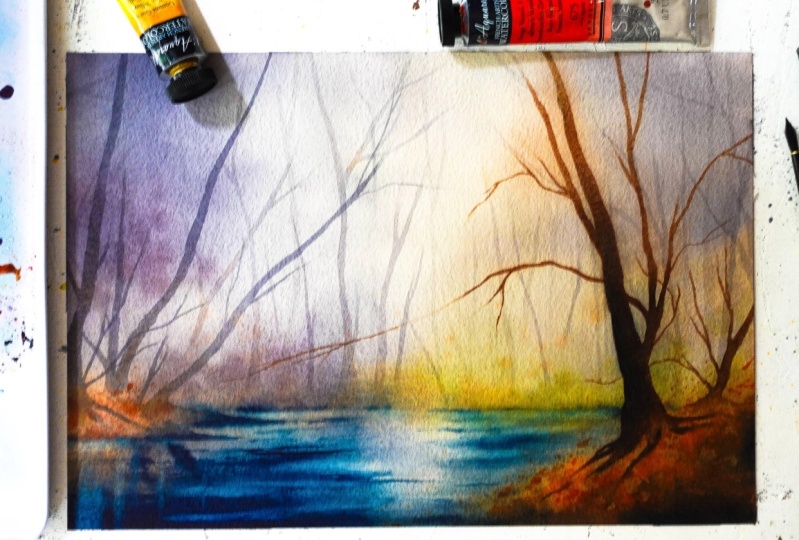
2. Class Project Overview: You assignment is to
paint a realistic, misty forest landscape using the step by step techniques I
teach throughout the class. This project is designed to help you practice
creating depth, atmosphere, and
realistic mist effects in a layered forest scene. By following along, you'll gain confidence in
painting a background, middle ground, and
foreground while maintaining a dreamy
autumn color palette. From the class
resources section, you can download the
reference photo, a photo of my art, and the list of the supplies. This sketch being minimalistic, we'll take care of it
together during the class. Once you've completed
your project, don't forget to share it
in the project gallery. You can also reach out anytime
for feedback or questions. Let's meet next for a quick look at the
supplies we'll use.
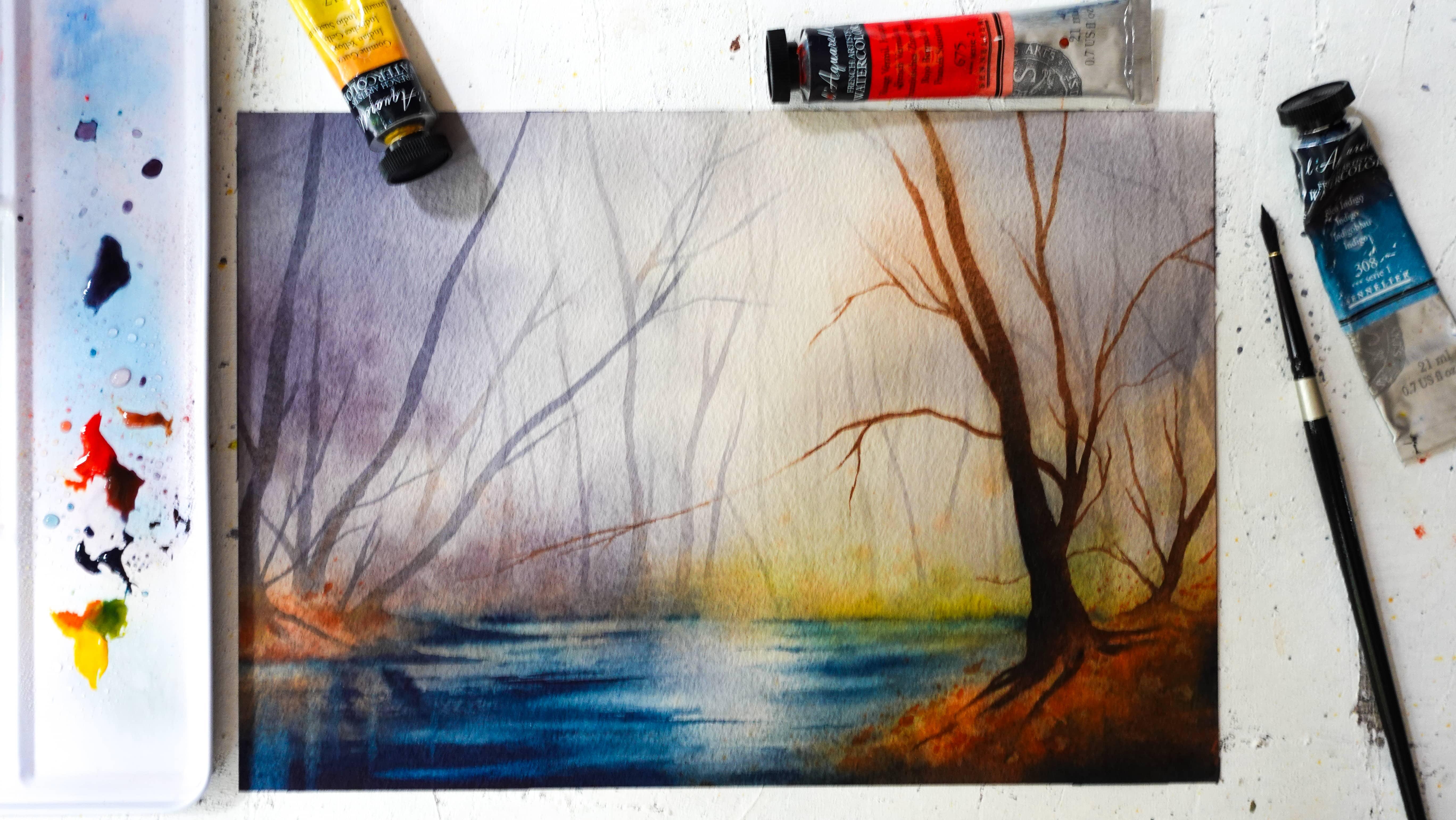
3. Supplies: In this lesson,
we're going to go over what supplies
I use to paint forest and what I
think is going to help you succeed and it
starts with paper. So I really like to use 100% cotton papers because
they hold water much, much better, and it's so much more convenient
for painting landscapes. You'll notice we'll
use the wetting wipe technique quite a bit, and this is going to help you. Also, a good weight of 300 grams/square meter,
something thick. Like this is going
to help you a lot. Regular cold press or
rough is going to be fine. At stay away from hot
press papers which are a lot smoother and
also dry very fast. Now you'll need a seven by
10 " sheet for this project, as well as two practice sheets. That's why this one is actually a good one to practice since
I've stained it before. So two of those and one
large one for the project. Now, if your paper is not glued, on a block like mine, mine is glued on all four sides. I don't have to stretch it. I would recommend to
use matching tape. That's going to
be very useful as the sheet won't move
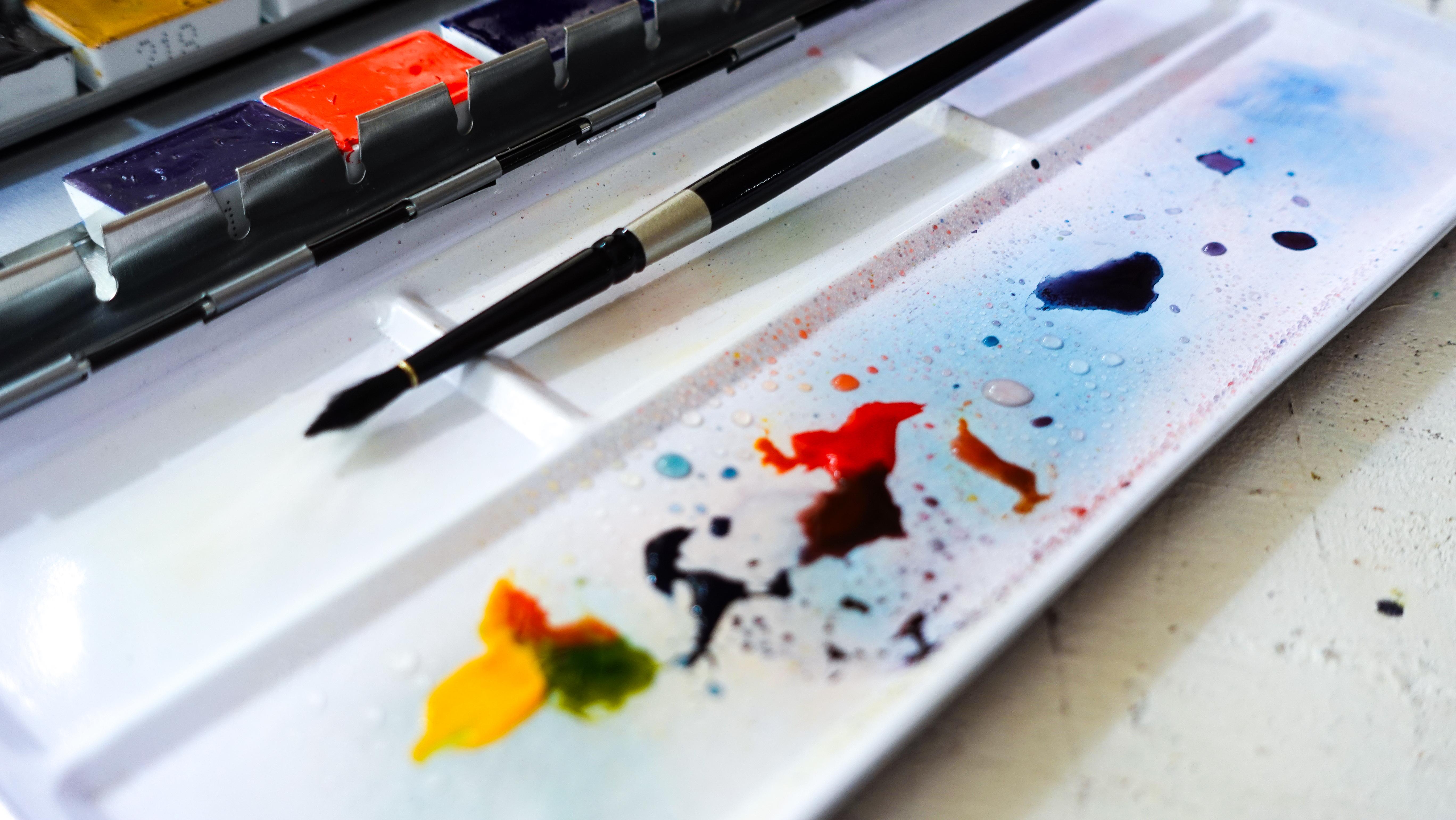
around as you paint. Now, when it comes to paints, you can either use half
pans or pans like these, or you can use tubes. It doesn't really
make a difference. I like to use tubes,
and you'll see me still use this just
because of the palettes. I find it convenient
to mix my paints. So whatever you have is fine. In terms of colors, it's
going to be very simple, just a bright red,
a warm yellow. And if you have an
indigo or if you don't, you can still use a regular blue with maybe a dark brown or even black mixed to it to turn it into a dark blue that
looks like indigo. So just these three colors
close to the primaries, and you'll notice in the
next lesson how this is going to help us mix
a ton of colors. For this class in particular, I recommend a variety
of paintbrushes, and you'll see me use a flat
paintbrush very useful to wet the paper and also
create the mist effect also, I'll be using detailing
paintbrushes like these. A fine tip is going to be
useful to paint beautiful, graceful branches and trunks. I like to have two of them. You'll see it's convenient. You could make do with just one, though, if that's what you have. And then at least
one round paintbrush also will be useful
to create platters, or just add quick
touches of paint. So in short, you'll need at
least one fat paintbrush, one detailing paintbrush,
and one round paintbrush. And if you can have
one or two more, it will be more convenient
for you to paint and quickly switch between
paintbrushes and colors. We'll need a ruler and a
pencil to just draw a line, so that's really going to be
a quick part of the class. And then the usual jars, two of them, one to wet and one to rinse
the paintbrushes. We'll also use
some paper towels. You can use a rag instead, but for a final technique, I'll demonstrate in
the very last lesson. You'll need at least
one sheet like that. And then finally, it's optional, but if you have one, it's great, a heat gun or a hair dryer to avoid having to wait
between each layer, since that's how we'll
complete our painting. So remember to check
out the list of the supplies in the
resorta section, and next, we'll take a look at our
colors and how to mix them, to paint a forest and a
beautiful mist effect.
4. Sketch & Color Planning: In this lesson, we'll explore a little bit about the colors we're going to use and
also draw a quick sketch. And you'll see it's
going to be very brief when it comes
to the sketch because we're painting a
forest and most of it is just going to
be done on the spot. So all we're going to
need is just decide where the bottom of
the trees are going to be I'm going to
rely on the rule of thirds and divide the sheet
into three equal parts, and I do it with my fingers. It's easier and quicker. And what would make
sense since we want to paint a lot of trees here is to give them more room
and locate the bottom towards the bottom of the sheet rather than
the top of the sheet. It makes sense. So that'll
be somewhere around here. And now, of course, you can
lower the line a little bit. It doesn't have to
be exactly a third. What you want to avoid is placing it right in
the middle like this. And that's also why I've
cropped my reference beforehand for it to
match this a little bit. So I'm going to decide that the water starts
beneath this line here. And everything else, the trees will be located in this area. Then we'll have a little bit of the ground in this area here. We're not going to
draw anything else, so that's it for the sketch. Now, let's look at the colors. As usual, a very
limited palette is what's best to paint
because with color mixing, you can mix a lot of colors, and that's where we're
going to look at right now. So you can see I have yellow. And, of course, you can use half pans or pants like these. I do like to use tubes, but it's about the same
paint from the tubes, is just a little bit easier to mix because
it's already wet. So it's yellow, red, always great colors for
any autumn landscape. And then indigo,
which is also nice to convey a mysterious
mood to any landscape. And in the case of fog, you'll see it's going
to be very helpful. So we'll just need
a little piece of paper and a paintbrush. And with yellow and then red. We will create
beautiful oranges, and by varying the
proportion of yellow or red, we can change the color. So that's going to be
great for foliage, mainly, and also all the leaves you can see on the ground on
the reference photo. Then if we want to add
a little bit of green, we use yellow and a
little bit of indigo. And again, by just increasing the amount of one
or the other color, you can change the outcome here. There are really a
lot of things we can do already with these colors. Now, the color indigos can be very useful to paint our trees, and you can use it in
combination to red and yellow. To create browns,
as you can see. And again, just change the
proportion of the colors, and you'll get a different
brown every time. So that's going to be a great
way to paint the chunks. And finally, to create a
beautiful mist effect, we'll need to render
the color gray. And again, we can do this
by mixing indigo to red. And you'll need
more indigo here, even a little bit more. So we get to something
that looks more like a gray than a blue
or a red or purple. And there are hints of
purplish tones here, as you can see,
this is still good enough to create a
beautiful miss effect. That is it for the
sketch and colors, and I will see you in
the next lesson for a quick exercise to
create our missed effect. See you there. Oh
5. Misty Effect Exercise: Basics and Beyond: In this lesson, we're going to explore the miss
effect in detail. And I want to show you first how to create a
basic miss effect. And the first way to go
about it is with water. That's what you'll see. Most people teach a lot of the times to create
mist in watercolor. And you'll see it a
lot with pine trees. So let's do a quick demo. So let's just mix a
little bit of green. Then I'm just going to work
with two paintbrushes, one to paint, and one to
create the mist effect. So you need to wet
that one here. Make sure it's not too wet. And you can either
pre wet the paper wherever you want the
mist or do it afterwards. We'll do it later. Now, we're just going to
quickly paint a tree. So I'm really doing this
quickly to show you So a way to create the mist effect
would be to wet the area beneath the tree and
blur the bottom of it. And then here you
have a mist effect. You can keep painting, maybe
paint some trees down here, and here you get it with water. That's one way to
do it, and we'll be using water a lot
throughout the class. It will help us with
the mist effect. And now, what we're
going to do in the class is paint trees that already have that misty color, which be that
grayish color here. This is very important.
You'll notice it on reference photos. If you add colors
that are too bright, not going to look like mist. So we want them to be a
bit grayish like this. We can use water as we
did before to soften some parts and also
emphasize that mist effect. Then if you want and we'll do
that too during the class, you can add some of
that tree trunk color, but just a bit of it. That will help painting look a bit more fun with more color, but still keep that effect here. As you can see, the color of the trunks is very important. We're going to draw And next step is going to be
to wet the sheet again. So you're painting,
and we'll do that. To work in layers, in fact. So you just wet
everything again. And notice already how just re wetting it might take
some of the paint off, which is actually great for
that mist effect to work. So if this happens, don't worry. I would not encourage a
lot of back and forth. We don't want to
lose the shape of the tree completely
or remove everything, but a little bit of lifting is absolutely fine
and looks great. And once you have this, you wet, I'm just going to wet
a little bit more. You want to make sure you
keep white, first of all, because usually mist is
almost white and add just a little bit
of that color here. You can see it in
fog, it's whitish, but still heavy enough that we should add color in a
watercolor to render that. So that's how you
create the mist effect, and then through layers, you'll notice we'll be able to increase it and make
it look realistic. So that's it for this
little exercise. We're going to work on this
in depth, do not worry. We're going to take
it step by step and very gently from the
beginning to the end. So I hope you've
enjoyed learning about this little trick here, and I will meet you in the next lesson to start
painting the background.
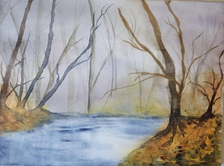
6. Painting the Background: And we're ready to
start painting, and we're going to tackle
the background right now, focus on those
trees over here and also blocking some of the
colors here in the water. So let's just start by
preparing our colors. So I've decided to add
indigo here in this area of my palette because
I don't want it to contaminate my yellows and reds. So it'll be easier
to separate them. And since I'm going to
need a lot of that color, I'd rather have a
bigger area to mix, and I'll just add
yellow over here. And the red over
there. There we go. The first thing
we're going to do is to actually wet the sheet
and we'll work on wet. So when it comes to consistency, as always, you want to go for a creamy consistency
like that of milk. So that means you want
to add enough water to your paint that
it flows on paper, but at the same time, you
want it to be colorful enough and not too dilute
it with the water. So this would be
pretty good here. And we're going to do
that with all the colors. And what I tend to do, if I need more water in the
color, I'll just add it. But I like to start
with a creamy mix. And then it's easier to
just thin with water or just add more paint to
make it thicker, I find. I'm going to use my clear
water here and wet everything. So I don't really care to separate the
top and the bottom. I'm just going to wet all of the sheets and work on
everything at once. But this line here will help me. It's going to act
as a guide to know exactly where those
bottom trees are here. We're going to need
a flat paintbrush here. It'll be easier. If all you have is a round paintbrush like
this one, it's fine, too. But I do find this is great
and also for the miss effect, sometimes it's more convenient
to use a flat brush, and it helps apply more
pressure onto the paper. There's more room to do this because of the
shape of the brush. And you can see it here. I'm covering more room than I would with
round paintbrush. So I'm just wetting
everything really well. I'm using a type of paper
that takes water well. So it's important to make sure the water has time to
seep inside the fibers of the paper because that will help you paint
for a lot longer than if you just wet it very superficially and
start painting. So that's why I do so
much back and forth. I also try and not forget any corner or any
part on the sheet. And when I feel
that the paper is starting to get a
little bit more dry, then I can add more water. You want to be careful and not have any puddles
sitting on top, though. And the pressure also that I add on my brush helps me get rid of those puddles. I
think this is good. So now I'm going to grab
a round paintbrush. It's going to be easier to use my favorite
technique to block in the colors in the background, which is to tap the
brush on paper. It's great to create gradients, and I find it easier to do
with a round paintbrush. So let's see now we
want a little bit of green I'm trying not to contaminate the yellow here. So I'm going to start with this little and just add
some of it here. So right now it
looks very bright, even though this is going to be a foggy landscape, don't worry. You know that the
paint's going to dry a lot lighter anyways. And I think it'll be
great if we do have a little bit of
color showing rather than end up with a painting
that's a lot of indigo. If we can get hints of
green, it'll be nice. So here I've insisted
a little bit more, and you can see I'm
tapping the brush here. I'm also going to
add some down here. Now we can rinse the paintbrush. And why not add a little
bit of our oranges? So mixing yellow and red. And add that over here. I think this is
really going to add to the painting all
these nice colors. And we're gonna end up
with that autumn feel. Even gonna add some over here. And I'm still tapping
the brush in places. This is starting to look great. Let's rinse the
paint brush again. And now go for indigo.
Not a lot of it. So I'm just pulling a bit of it. And it's actually a little bit watery compared to
that milk texture. For now, it's good. And now let's add some of it
here to suggest water. We want to leave some whites. It will look striking in
this type of painting. I'm just going to add blues in the corners and maybe
a few strokes here. That looks great already. Now, let's mix a
little bit of red to the indigo and create that grayish tone
that you can see here. It's very light, and there's a lot of water
still into this. And now I'm going to start
adding some over there. And same, I would like
to leave more light, and you can see it
on the reference, actually, there's more
light in this area. So we're just going to
focus on the sides. Also overlap colors. We want to make sure we
leave some lights over here, too, so we can
create a gradient. I'm going to mix
it a little more. Just a little bit
of red is enough. This is actually
a bit pronounced. So I'm just rinsing my brush. And here I want to
add some as well. Can see on the reference, it's pretty foggy in this area. Going to dry this. We
have a good base now. You want to make sure this is
100% dry when you're done. It took me a good
minute to dry this. I see that I have a little
stain here probably because there was more water in
this area, and that's okay. This is just a base layer. So we're going to
be able to conceal any little mistake or any little flaw that you
might see in your painting. Don't worry about this.
And we'll actually meet next to now paint the trees in the
background. See you there. O
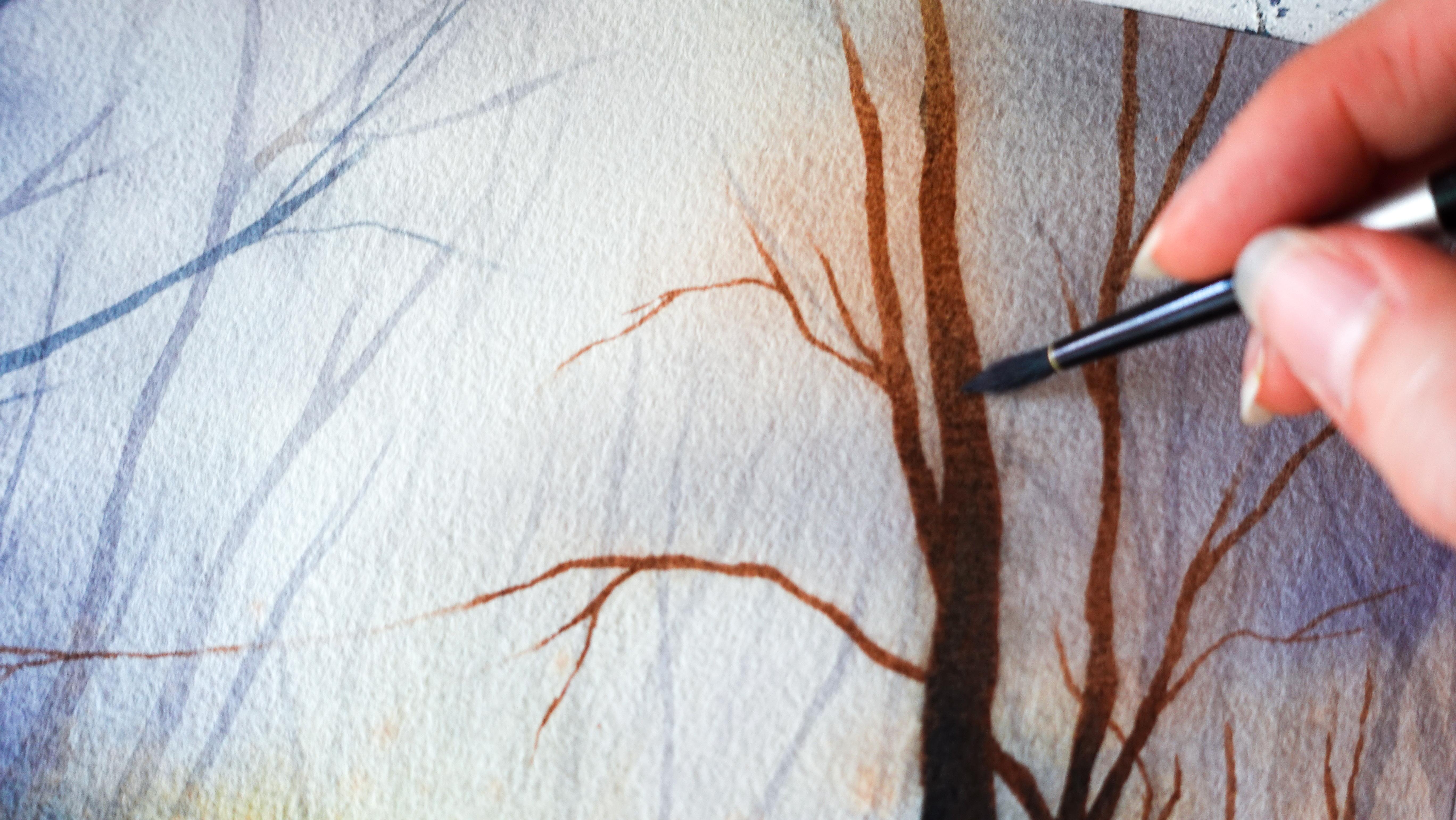
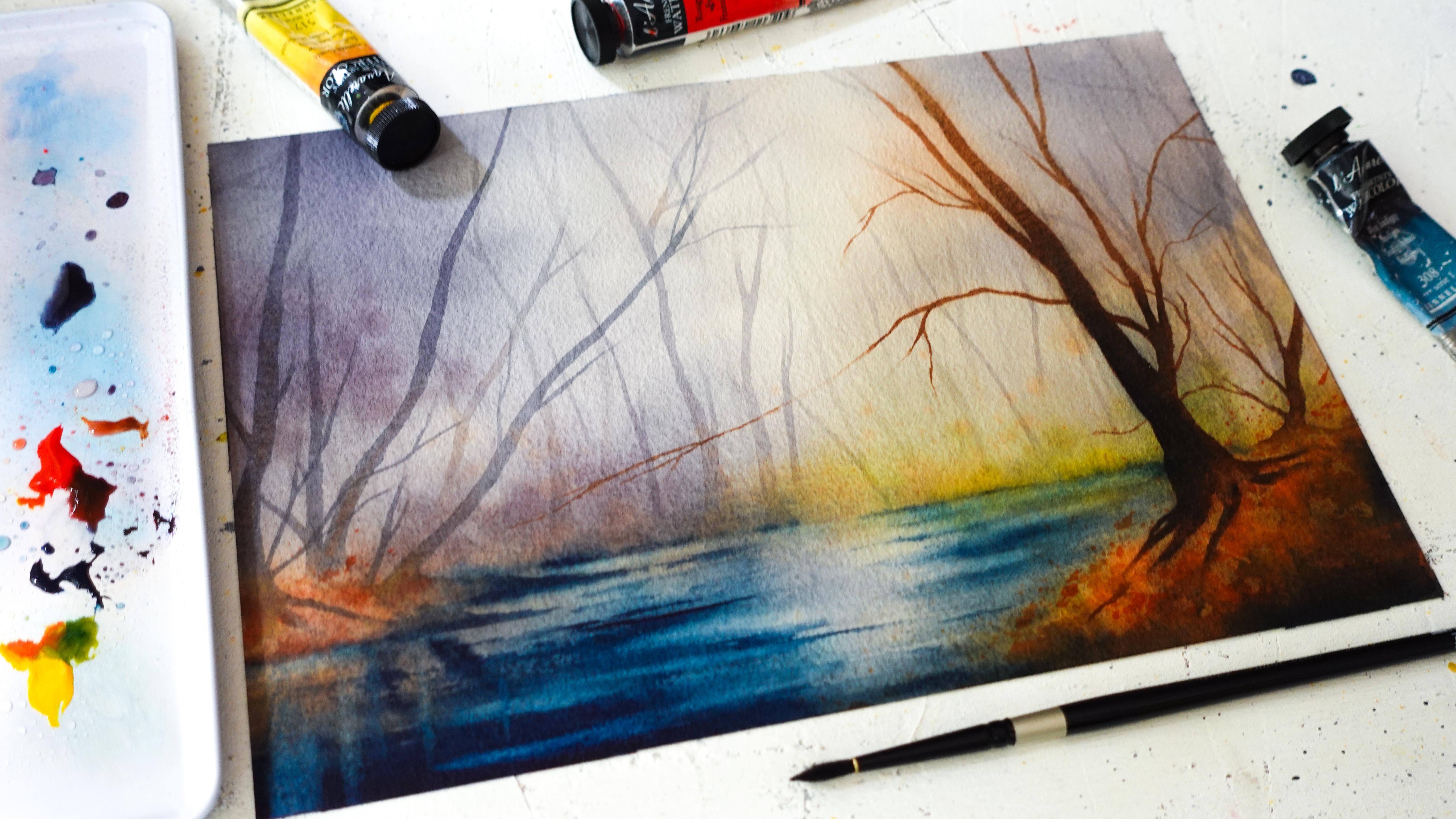
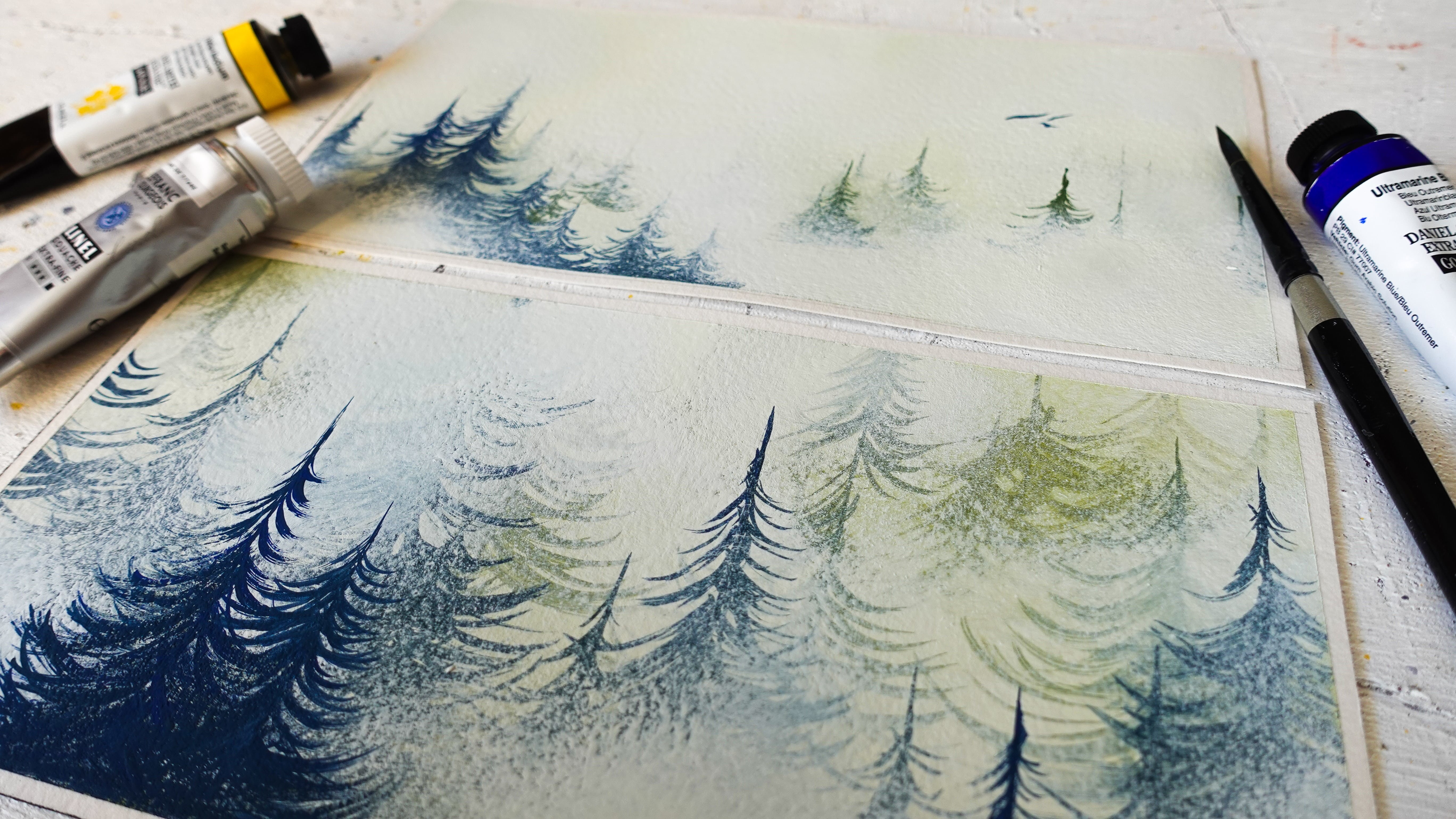
7. Background Tree Layer: In this part, we're
going to focus on all the trees that are
located in the back here. The ones that are culvtd
in a lot of mist. But before taking care of the mist itself, let's
just paint them. And to actually get
the effect we want, we're going to need
to mix two colors. So the first one will
be a brown color. So I'm using yellow and red. And then a little bit of indigo. We want that brown to
be a little bit dull, and that means adding more indigo to make
it dark like this. So that's the first color. And then the second
one will be again, creating that gray color. And I'm making a lot of it here. We want quite a bit
of water into it. So right now you can see
this is very creamy, but here, because we're painting the background,
we need more water. And I'm actually going to add a bit more indigo
and more water. Again, we want something
that looks diluted and weak. I think this is
starting to look good. And two paintbrushes here
are going to be handy, one to paint and one
to soften the edges. You'll see it'll look nicer to soften them in a lot of places. So to apply that technique here, you want to make sure to use
a paintbrush that is clean, wet, and then just damp. And that's why I use a paper
towel to remove the excess. I'm going to start painting
with this paintbrush here. Okay. I've just mixed a bit more of my brown here and adding a
lot of water to it. And we're ready to start. I'm going to remove
the excess here. I want those trunks
to be very defined, so I need a little
bit less water so that my strokes
are more precise. And then you can use at this
point the reference as, but you don't need to
do the same at all. And now look at what I'm doing
with my other paintbrush, the one that's just
clean and damp. I just come and soften
the edge. Same here. So that the trunks
look like they're disappearing into the landscape
that's very important. We want to start
adding branches, too. You can see I don't wait. I soften the lines right away. Before it dries, I'm
going to add a little bit of brown in places. The idea is that we don't end up with a bunch of
very dark trees. That's why I'm adding a
little bit of color into it. Now, let's keep doing this. I already looks very nice. I'm going to make the
trunk a bit whiter. It's important to rinse
your paintbrush often. If the paint seems a
bit too dark in areas, you can just run your
clean paintbrush on top. Go to soften that a bit. I'm trying to vary the way that I shape my trees,
as you can see. I think a bit of
brownie tos the bottom. Let's keep going. Uh We want to make a bunch of trees and not worry about what
comes on top later. I can already notice some trees are a little bit darker than others,
and that's fine. We need to create death anyway. So these, for example, are
going to look like they are in the background more and these
in the foreground more. And that's fine. Here, I might add a bit more
water to paint. Those here, make
sure they are very light because there
is more whites. And we don't have to paint
everything we can suggest. I also gonna add some over here. I was keeping my
brush clean and damp. I pressed a little harder
here to create a wider trunk. That in one year two. I like movements. That's why I create branches
that are not strats, and it looks more natural, too. I try to use the tip of my paintbrush for
those final branches. Add a little bit of brown. I'd like to add some more. We want to have branches ticking out from the sides.
Always looks great. I'm going to add a
bit more paint here. Let's see, it looks good, and it makes sense because there's more painting
here than there is there. So when I have the trees, go in front of those
here, makes sense. Now, let's add some thinner
trees and little branches. I'm going to use my
smaller paintbrush, just going to switch
paintbrushes and use this one to softenage So I'm really improvising here, not looking at the reference
that much at this point. I like to paint partial
trees, too. Looks great. Make sure not to
space things out in the same way all the
time to vary that. I'm adding less and
less brown as I go because this is getting
lighter now on purpose. Those are really little trees
and branches in the back. So I'm just using a very
light version of my y. This made these trees here even lighter
with more water. She done. I was just fine. You can see I'm doing
this very quickly too. This is starting to look great. Adding little twits
here in the back, just like on the reference. And now I might add more
trees in front of that. So I'm adding less
water this time. We can add a little
bit of brown in those And again, varying
movements, very important. There we go. So now
let's just try this. And I will meet you next. We'll create the miss
effect on this background.
8. Adding Mist: To create the mist effect
on this background, we're going to need
preferably a flat paintbrush. If you don't have
one that's fine, you can make do with a round
paintbrush like this one. And it will be useful to
also have a paper towel. So what I'm going to do
is just wet everything. Quickly, all we want is
apply a coat of water here. When this is done, we're going to add a little
bit of that foggy color, miss color, which
is going to be, again, red with indigo and we don't want it
to be too dark yet. This is pretty good. You can see it's pretty diluted. And now that things are wet, I'm going to add a coat of this in places, not everywhere. To see, I'm just
hoping the blur here, the impression of a blur by
adding this color on top. And I need to mix more This is also going
to be great to darken the sides
of our painting, which is going to contribute
to that atmosphere. See how the flat
paintbrush helps here. I'm going to add some
towards the base, too. I'm trying to add
a little bit of movement here with my brush. I'm trying to also leave
this part a bit lighter. This looks great. So
before I do anything else, I'm going to take advantage
of the fact that this is wet to improve the bottom here with more indigo and also starting to
redefine here the ground. And I'm adding horizontal lines here to show that
we're painting water. We don't need a lot, but certain
strokes can really help. Can also help the trees
disappear into a darker color. I'm not trying to
cover everything up. I'm leaving some of
the light greens here. So this looks colorful also. Still working on
this. And actually, before this part dries, I'm just going to grab
a round paintbrush and add a bit of color here. That's a mix of yellow and red. Let's keep working on the water. So we want to leave this area
here to look a bit lighter. I like to use a clean
and damp brush again to maybe soften some areas where
I've insisted a bit much, improve the overall
looks of that water. As you can see, it's starting
to look pretty nice. I can start defining
the ground line here by just adding
thicker amounts of indigo. In places. I'm not trying to outline everything
super clearly. It's easy to correct mistakes
or just take some kind of. Before this dries completely, I'm adding a bit more of
that fog color to also kind of alter the blues
in the stream. I just want to make
them bit darker. And now I'm going to
splatter a little bit. So I'm gonna use a smaller
round paintbrush to do this. So it's important to really have various
paintbrushes, if you can, just so you're able to switch
quickly without having to rinse a paintbrush really
well and waste some time. I'm seeing something here. That I want to remove. And I'm just gonna
splatter a little bit of the fall colors here. But more towards the bottom, I don't really want
to go overboard. Just where, you know,
the landscape is closer to us and where the mist wouldn't
be as pronounced. Here, also, I want to improve the ground and how it looks a
bit more bushy and natural. It looks better than just outlining it with a
paintbrush like this. You can see the
difference already. Looks so much more natural. When it's drying like this, is the perfect time
to also redefine the bottom of the trees, for example, here the
paint will stick, and it will still
melt into the rest. I will still look very nice. So here, for example, I can decide that I
want this part here to end in this area, and we have a little bit
of color down there, which is great since
there are reflections. I'm even going to splatter a little bit of the indigo for
the gradient that we need. So it's not just dark down here, and then all of a
sudden, it's colorful. Same here, actually. And
I'm gonna keep going. So I'm using stick paints now. And this is pretty good already at this
stage of the painting. I like to improve things
a bit, pull paint. Whether I clean or brush, maybe add some
strokes in the water. And it's starting to
dry now, actually. Which means it's going
to be time to stop. I'm just going to
add a little bit of my reds here for
the refraction. And we're going to dry this. This might be a good time to change the water in your jar, clean up your paintbrushes, and maybe remix
some of the colors. I'll meet you next to tackle
the middle ground now. And
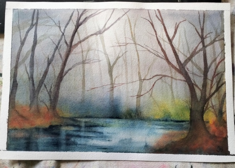
9. Middle Ground: It is time to paint
the middle ground now, especially the trees
are located over here. We might have one
or two back there. It depends. It's up to you. And notice that I've refilled
all the colors here, change the water in the jar. Everything is ready for
us to keep painting. So again, I'm going to
use two paintbrushes, same technique as before. What's going to change here
is that we're going to start adding more browns
into the trunks. We still want to keep
them quite grayish, but a little bit
more color showing is going to be nice, too, and really going to
help those trees here to look even more misty. So let's get started here. So you want one paintbrush
to paint, one to soften. Remember to soak up the excess here and I'm going to
mix a little bit of brown with red and yellow. And I don't want it
to be this bright, so I'm just going
to add a little bit of indigo once more. Something like this
would be good. And then we're going to
keep using this color, too. I'm going to mix more of it. And this time we want
a bit more pink. So more of that creamy texture showing rather than
a very watery one. I think this is great. So let's start now. I want to thick a tree here. Although, yeah, thinking maybe it would
have been smarter to start with the trees that are located towards the back of
a little Mr that's okay. I'm going to take care
and soften the bottom. Very important, especially here. It will look so much nicer
if this looks like it is part of the leaf area. Can even add a few roots. I'm finding my trunk a bit
saturated with color here, so I'm just going
to remove some. Especially, yeah, towards the
top is even better to do. It reinforces that
sense of mist and then to add a
little branch here. I wonder if I want to add
anything there, maybe. Once more, I'm not really
looking at the reference, just using it as reference. Really, it's what it is, and not something I
want to copy 100%. Before this dries, let's drop a little bit of brown into this. And again, I'm removing
some of the paint, not everything to just make the top of the
tree a bit lighter. Now I want to add some
trees next to it, maybe add a bit more water. I'm even gonna add
more water to this. So this one's gonna be
somewhere around here. Before it dries, I
soften at the bottom. And my other bits of
brown here again. Adding a bit of brand. And again, let's
add one over here. I find that it looks very
nice on the reference. That's why I want to keep this. But see you can
really choose and see what you want your final
painting to look like and what you want to keep from
the reference or maybe skip I find this adds a lot of charm to the photo and that's
kind of what drew me to it, the movement in the trees. So I want to keep this
one pretty light. It's a bit farther away
than the other ones. I'm even going to add more
water here to finish branches. Trying to add some fine
branches to look so nice. I'm just gonna add
a tad of brown. It looks great. There is a tree here. I
don't even know if I'm going to paint it because
takeaway from this. I find this looks so great. I do want to add a little twigs or smaller branches, though. Maybe also improve
the shore here. Define it a bit more.
That's what I mean. I actually going to add
a bit of paint there. And now again, soften this. Look at how nice this
is starting to look. And at this point, you can start looking at your painting, maybe taking a step back
and trying to decide, Okay, what can I add and we to make my painting look a
little more interesting? I'd like to add a darker
branch in this area. And, this looks really good. So now I'm just going to
maybe add a few details. And that's going to be
more of a leaf effect. So maybe a bit more color. So this is still wet here. It's very easy to do. Otherwise, you can use cleaning them paintbrush to wet the area. And just add a bit more color. I'm going to add more ns here. So I'm tapping the paintbrush
once more, really helps. I don't want to
cover everything up. Just create darker orange
areas here so that we have a little bit of
contrast on that piece of land. And I think that looks quite good. You might also
want at this point to splatter a little bit just to create an impression
of maybe little leaves here. Like we did before this time, the difference is
that it's on dry. It's gonna show a lot more
and look a lot more vibrant. I don't want to overdo
it. Just a little bit of colour is good. And now we're gonna dry
this And in the next part, we're going to add more mist to this beautiful landscape,
so see you there.
10. More Mist: And we're going to enhance
the mist effect once more. You can see I'm doing
it layer after layer. And every time enveloping the new trees into the
mist, that's important. And if you think about
it, mist itself is like a layer of condensation. So we need to reproduce that
with real layers of paint. Because these trees now they look almost too
perfect in crisps. So if we want them to show us in the mist more than
the ones in the front here, we really need to add
some paint over it. I don't want it to
be too dark yet. Maybe this is good,
and, you know, if it looks too dark anyways, it's very easy to add a
little bit of water to it. So let's not worry. And that's why I was telling
you in the beginning that it's okay to start
from creamy mixes, and then you can
adjust way easier. If you need more
water, just add some. If you need more
paint, just add some. We, again, are going to wet everything with our
flat paintbrush. And I have way too
much water here, so I'm making sure to remove it. And notice that all
the back and forth, it kind of blurs everything
a bit, which is good. It really contributes
to that mist effect. Now, let's add our mist. Again, you want to add it over. And you want to make sure
some of the areas here stay white or whiter. I can insist here on smart. Wherever you insist is just
the effect of a heavier fog. I'm tapping the paintbrush
with the edge here to create a better
gradient between the light areas and
the foggy ones. I might add a little
bit of indigo down there to make this look
even more mysterious. That looks great. See, this is a year to do with a round
paintbrush, anyways. Okay, and now we have this. I'm taking advantage
as usual that this part is wet to work again on the water to
deepen the effect. We also need to work
on this part here, so I'm going to start mixing
again red and yellow. Starting to make
it a bit brighter so that it looks like it's
in the foreground even more because of
all that vibrancy that we don't have elsewhere. And as always, I like
to add more depth. And this is easy
to do with indigo. So I'm tapping my brush stone. There we go. Here, also, let's take advantage
of the fact this is wet to again reinforce
the reflections. And now with my
smaller paintbrush because I have more control, I'm just going to again
emphasize movement on the water. With thicker paints, I'm
going to create ripples. And if you want to soften them, you can rinse your
paintbrush and just pull that thick paint. And that looks great. Now, I think this looks good. I'm trying to decide whether or not I want
to add something else, maybe a little bit
of green, actually. So that'll be I don't know
a bit of yellow and indigo. Gonna add some over here. Actually it doesn't
show that much. For colo rite, it's always good. And it's going to be
great to add this because when we add the
darker tree over this, it's going to cover
up that part, but it will look very
natural and like the grass is behind the tree and that we didn't try
to add it afterwards. It will be very easy to cover. So this is the time
where we want to do it. So just like that, we have
a little bit of green now. I wonder if I want to add more yellow for an extra
touch of color, which again, will be good with such a dark
color as indigo. We want to try and create
some kind of balance with other colors so that
we do get ironcy. I want to splatter a
little bit of indigo over here to create shadows in
places while it's still wet. Okay. And then it might be a
good idea to wait a bit and then flatter water here too so that we get some light back. Let's see if right now I
can do that. Seems good. So this contributes to adding texture to I was
going to say grass, but it's mostly leaves, while also having some highlights
contrast with the dark, the indigo that I just added. And this looks good. So let's just try this. This looks great. So we'll be ready to work on the very last
layer in our forest. It's going to be the foreground, and I'll meet you in the
next lesson for that. And in the meantime, if you
want to share your progress, feel free to do so in the project and resources
section of the class.
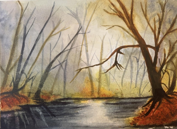
11. Foreground: We're ready to add the finishing touches
to this painting, and now we're going to want to add more browns into our trees. So I'm going to remix some of those colors yellow and red. And a tiny bit of indigo
to keep the mood. And this time, I'm not going
to bother mixing any graze. We'll do that later if we want
to add more foggy effects. We're just going to work with brown and then
indigo, pretty much. And then maybe we work some
of the details. We'll see. So I still want to make
this look pretty thick. I'm adding more paint. I want my tree in the foreground to look like it's
in the foreground, and for this, it
needs to be opaque. That is why I'm
thickening my paints. And I'm going to need
actually bit more yellow. We still need a
little bit of water, so it's easy to paint. And this is very creamy, on the thicker side of creamy.
So this should be good. Again, you'll need another
paintbrush to soften edges, and we're going to proceed in
the same way we did before. This time, though it's
going to be here. And now I have the rule
of thirds in mind, and I know that I need to place my main subject
on a focal point. And if you divide
your sheet into three parts vertically
and horizontally, the focal points are
where those lines meet. So somewhere around
here on this side, that's where my main tree is
going to be located then. It'll be better than
locating it here, more pleasing to the eye. So I might even start
with the top, actually. And press more and more. As I go down, we also want
this tree to be bigger. It would make sense
since it's closer. Before it dries, you want
to soften those edges here. I like to include roots. I think it looks very
neat. Very beautiful. And let's add some branches. I wonder if I want to add a branch like the one we're
seeing here, why not? I'm trying to add more
detail into this tree just because it is the
start of the painting. More detail also
means more branches. And before it dries, I'll just add a
little bit of vindigo we can still if
it's already dry, just soften the whole thing with a clean and damp
paintbrush. That's fine. I'm working on
contrasts here mainly. This, I think will
be good enough. Trying to add grace
into this tree. I might add a little
bit over here, even though that's not what
we see on the reference. So it looks a bit
more interesting. Oh so whatever I think will benefit
my painting, I add. So this is really
a personal choice. That looks great. Really good. I might add a little
bit of digo back there. Just at the base. And now, work on
the leaves a little more by adding touches of
paint like we did before. So the best paint brush
again for this when we're tapping is I find a round one. And the goal here will
be to add some colour That's where I also like to splatter for more naturalness. I got to remember some of
those fetters that got a bit further away than
what I was expecting. For and stay really close to the paper to
control where they go. Maybe add a few over here. We could suggest that there's a little bit of the
ground down here. That looks great. I want to spatter some indigo
now for shadow. And now I'm just readjusting with a clean and do paintbrush wherever I feel like I
want to improve something. I also feel I'd like to make those roots a
little darker down here. It will look more logical when you look at
the dark darks there. And that looks great. So let's now dry this. And I'll meet you
in the next part for the very final touches on this painting with
one more layer of miss and a few
details. See you there.
12. Final Details: In this last part,
we're going to enhance the mist effect
and add a few details. So make sure you have
clear water here to re wet the entire sheet. And actually, before that, it'd be wise to remix
some of that miss color. So let's wet everything
one more time. I'm making sure to get
rid of any puddles. I'm not afraid to
go over my trees again because I know it will help. Just
look at this here. We're lifting paint,
and that looks great. We don't want to
do it everywhere, but a little bit is good to
create that very hazy effect. So I'm insisting a bit here. And I'm not going
to touch this part, though, because I want this
one to stay pretty sharp. So now let's go ahead
and add dark paint once more. You're two. Again. I might add some at
the bottom, too. Just for now, I want to get some of the white
back over here. So it's very easy to soak up the paint if you've
added too much in places. Here, I want to make
the area darker. Just increase the mist here. I'm just cleaning up the edges a little bit so it stays sta. I want it to melt
into the parts. Otherwise, it's going
to look like a bush, like we've added a bush. I'm tapping my brush
while pulling the paint. I feel like there's
not enough mist here, so I'm going to
add it over here. And this looks a lot better. Now, it's time to work on
the details down here. With indigo, I'm picking
up thick amounts of paint. And I'm going to
redefine the short here. It's still a little
bit wet, though. To spread out too much, you can wait a little. Now, whatever we
want to emphasize, we can do it now. So, as always, I like to really add a lot of
depth over here. Also emphasize where the land
ends here with thick paint. Then maybe add some
ripples in places. And I'm going to
soften all of this. It's a little bit too
pronounced to my taste. So with a clean and damp brush, I'm just softening that. And I feel like
something's missing here. It does look a little
bit better now. I think that looks great. Now this has dried a bit more. I can add more indigo. We can even add the
reflections. Slight ones. And now we want to dry this. Oh. And all we need to do now when
it's completely dry is to add a
few last details. So first, some very slight ripples that are going to be a bit more
pronounced than the rest. You want to make sure to
soften them on either side. Now, let's now let's make sure that the does
not too saturated, especially for this side. And again, I'm going to soften this into the existing water. I was like this part here. And Maybe create a few ripples here as well. Oh. This is just adding depth, which in turn is gonna make those trees in the back
look even more striking. That is why I'm taking so much care darkening
the bottom of the water. Notice, I always
leave some we part here and there. It's important. That's pretty good.
Let's try it. And now we'll grab a
piece of paper towel. And clean a brush that we're going to use to
actually lift paint. So we don't want it to be dry because the
paper is not wet. There's nothing to soak up. We want it to be a bit damp, damp enough to reactivate
some of the paint. For example, over here, I'm going to insist a bit
underneath the tree line. And then I'm lifting and it's
going to look beautiful. It's gonna help us
redefine that line. I'm going to do the
same wherever I might want to get a highlight. This is very subtle. That's why I like this
technique here also. And we can even
create a neat effect by creating vertical lines. So we don't want them
to be all the same. We'll show better wherever the paint is already very dark. There we go. First, let's take a look at this
painting of clothes. So look at the trees in the
background and how they melt into that miss effect.
Thanks to the layers. It looks beautiful,
and then you can see colors are more
vibrant in the front, which is key to
create that effect. Also, look at the top
of the trees always lighter than the bottom
is where the mist rests. I will meet you next for
some final thoughts. O.
13. Conclusion: I hope that learning about the
mist effect in this way is going to be useful
and that you'll be able to paint
more on your own, especially since this is
going to be a great technique to reuse in any autumn
or winter landscape. Remember, you can share
your work anytime from the project and resource
section of the class. You can also leave
a review to help potential students decide if the class is the
right fit for them. And for more of my watercolor
and watercolor pencil art, don't forget to follow
me here on Skillshare, so you can get class
updates and emails. I share my art and
plenty of tips, tricks and techniques
on Instagram, YouTube, but also on my website under the name
painting and Chocolates. Thank you so much for
taking this class with me today and see
you in the next one. And h
 Francoise Blayac, Professional Artist