Transcripts
1. Introduction: Like to experiment
with your art, learn new art techniques, and try always new art supplies. It's maybe you'd also
like to know a way to paint illustration
in an easy way. Just one art technique. If yes, then jump
into my new class. Hi, my name is Anya. I'm an illustrator. I personally really
love to experiment, to try new art techniques in
my art and illustrations, I always try new ways. I never limit myself to just
one medium or one technique, but I really loved to play, join various art techniques. One of my favorite topics often are imaginary fairies scenes, where I really
connect with myself. That's why I'm really happy
to welcome you in this class. Because in this class, we will join two things. We will learn new art technique, and we will use it in order to create an imaginary,
fairly forest. There are three things that you will take from this class. The first one is that you will learn watercolor negative
painting technique. So you will learn a
new artistic skill. The second one is
that you will apply it to create imaginary
fairy forests, like for this class's project. But most of all, you can apply this technique
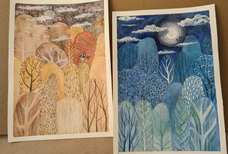
for other projects, for your future projects, for any other topics. E.g. I. Apply watercolor
negative painting to create those two flowers. This class is for illustrators. You don't have to be
professional watercolors, but I recommended for those who already painted
with watercolors. And now how to use it. In this class is project. We will paint imaginary, fairly forest with watercolor
negative painting. We will use watercolors
and some other mediums. So if you're inspired, I invite you to watch next two lessons where I will
explain in details, which is this class's project and what art supplies
we will use. I hope to see you there. Bye.
2. Class Project: Welcome in the second
lesson where I will explain you what is
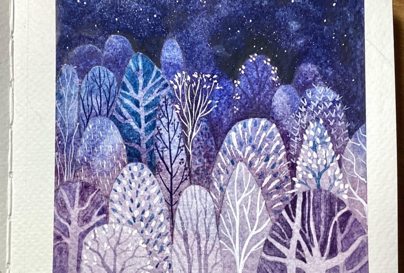
this class's project? As a final project, we will paint imaginary
fairy forest scene with negative
watercolor painting. Why did I choose this topic
for the class project? I really love to
paint both trees and forests and also
imaginary fairy scenes. And also because there is another class on my
profile where I teach how to paint a
similar scene with trees and watercolors
and imaginary scene. And I thought it would be
fun to paint similar topic, but with other art technique
and with another approach. Here's what we're exactly
doing this class. First of all, I will show you all the art supplies
needed for the project. Then I will share with
you two color theories. One which will be very
useful for this class. Another which you can
use are not hint. I will explain you specifically. Why is that? I will also share
you tips to create a color palette with a really
vibrant and clear colors. Bend. We will jump into exercise, a simple exercise that will show you what is negative painting. Then I will give you some tips on how to sketch for
negative painting. Then we will paint from the first until the
very last layer. And at the end, we will jump into painting all the details
of our illustration. I will share with you
a lot of tips and recommendations and I hope they will be very helpful for you. E.g. I. Will show you how to create really beautiful
textures with watercolors. And within your project, I will share some tips about
colors and color palette. And at the end, I will leave you with
a bonus lesson with a kind of alternative
negative painting. When you will finish
your project, I invite you to post it in the projects gallery than I can give you
feedback and also, you can share your
art with others. It's really very
inspiring to see what other artists create. And maybe it would be great
to exchange our feedbacks, our impressions with each other. So grab your watercolors,
your brushes. And if you're not sure
which art supplies use, than jumping to the next lesson, where I will show
you all the things that will be needed for this
product. See you there.
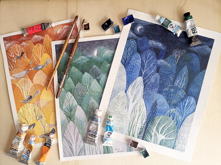
3. Art Supplies: Welcome In this lesson
where I will show you all the art supplies
that I will use. My tip for you is to use the things that you
already have at home. Maybe you have different
brands of watercolors. Maybe you have
different brushes. Maybe for the details, you would like to use
other things, e.g. that I don't use the creative. If you have any questions, then come back to me and discussion panel and
we can write about it. See with what ideas you came up. Alright, so I'll show you what I will use
for this project. First of all, you'll need paper. I will use this unimodular
watercolor paper. You can obviously use other
brands that you have at home. Always probably already
know it's recommended to use 300 gram paper or higher. If it's possible, it can
be a little bit slower, but not too low for watercolors. And also it should be
a stress-free have a, should be a cotton paper, 100 cotton paper or less. But it should have some cotton. And I will use cold pressed in, but it's the same. You can use hot
press paper as well. Then we will use
obviously watercolors. I have different brands here. It doesn't matter the brand, the water colors that you have. I will use this
limited color palette. Those are eight colors
with green, blue, blue, a little bit of violet, but I will explain you the color palette in
the other lesson. As the brushes, I will basically use three or
four sizes of brushes. The largest one you can use
another round brush doesn't have to be flat to paint
water for the first layer. Then for the bigger areas, I will use round brush, bigger size, this one is 12th. And for the area around
the object and detail, I will use another
small round brush. This one is number six. And as for the details, I will use, I will paint
basically white colored details. So I will use the
white and white ink. I use it in other
classes on Skillshare. So we can jump in and
see the specifics where I explained the different
types of white mediums. So I will use this Dr Ph, Ph Martin's ink and the dip pen. You can use also acrylic
pen like this one. Other time that you have a
moon jelly roll as well. White pen or white
colored pencil like this one or other brands. And you can use
also other colors. Other types of depends, This one is 0 point, it's free. It's can be larger or smaller. And this one is Faber Castile, but obviously there are
other brands out there. So yeah, but those are basically the ones that I will use. Some extra stuff that I
will use, the spray water. You can if you have a little
battle other type of spray, you will see when I apply
it to create textures. And also for the bonus lesson, I will use masking fluid. There are different types. I will use this one in bottle. And it's not
necessarily you can do the project without
masking fluid as well. Other supplies that might be handy but are not necessarily, is the pencil and eraser. If you would like to make an
initial sketch masking tape, I will use it, but
it's not necessary. It's up to you. And also hairdryer to dry
our layers in a faster way, but it's up to you can leave the layers to dry
in the natural way. Let's jump into the next lesson.
4. Color Theory: Let's talk colors. Color theory can
be really tricky and defining your color
palettes can be challenging. In this class, I want to explain all the color theory because
the topic is too huge. But I will give you a few
tips and I will explain you to color theories that will
be important for this, the project for this technique, but also can be helpful for
you in your future work. Especially if you're struggling
with combining colors. And maybe you're a beginner or don't know how colors behave. So I invite you to watch
this class and you will see both to terrorists. And let's jump into the lesson. I will use those color wheels and probably you're
familiar with them. I have two of them. This one is the classical one, but it's really small. So for this class, I will use this one. So it will be, this one
is watercolor wheel, but it's basically the same. You can also use the normal one. Yeah, this one has the watercolor colors with paper textures and
transparencies. So it's also better for
the purpose of this class. I want to explain you all the color theory,
the color wheel. But what is interesting for us, our color theories, I will
explain to you two of them. There are many more color
schemes and color theories. I wanted to show you two ways. One is to show you
to not use it, and the second one is
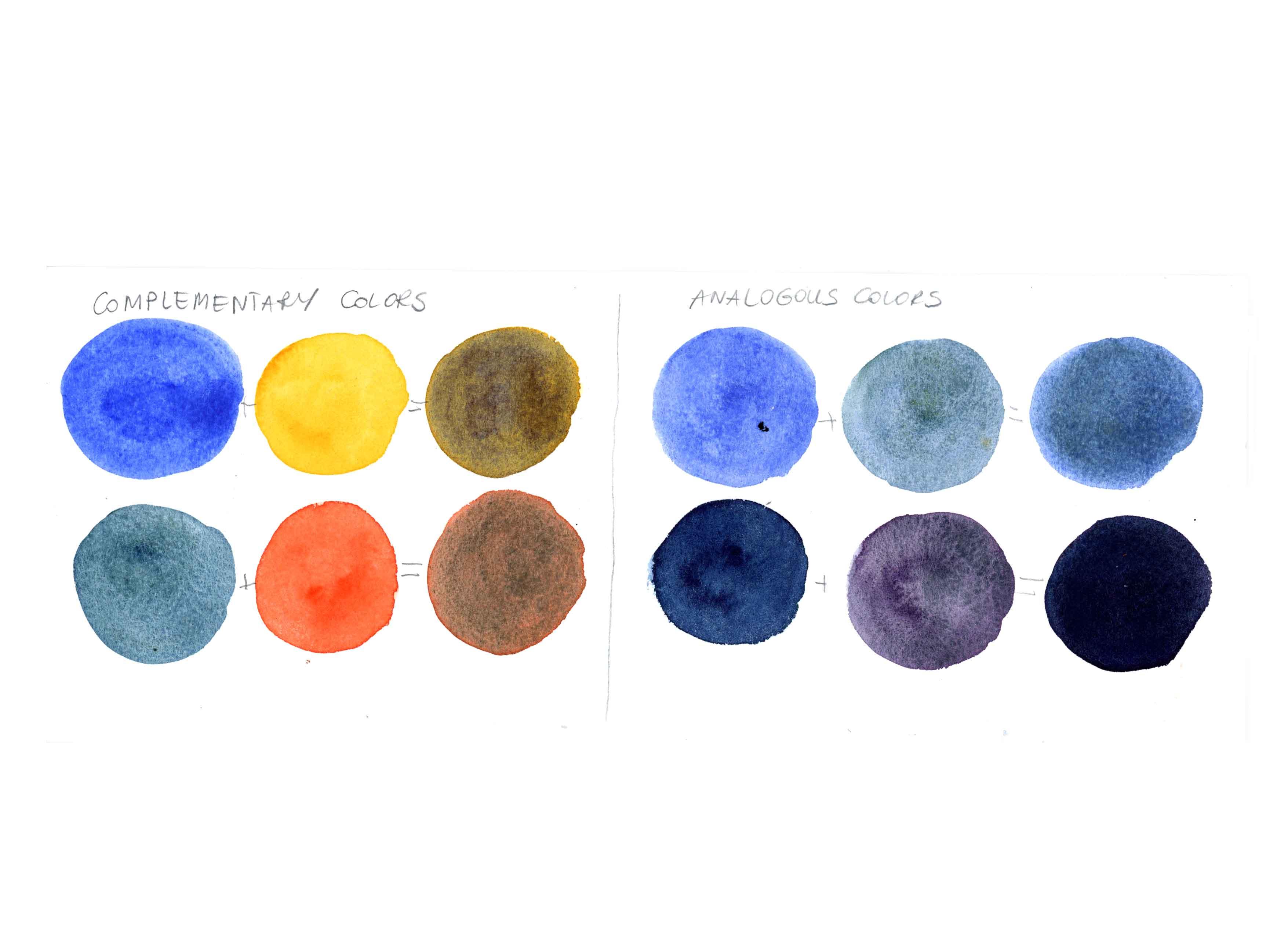
the one that I will use. And I will explain you. Why is that? So the first color scheme, because color theory is the theory of
complimentary colors, which is written here
with this arrow. The arrow shows you two colors
which are complimentary. So in this case, orange is complimentary to blue. If you will move the arrow, it will show that thread
is complimentary to green. And basically they together
create very lovely contrast. E.g. if you put green with red, it is really vibrant
and contrast tree. But the problem is with when you mix two
complimentary colors, I will show you later what
happens when you will mix those two colors and
the second color scheme, the second color
theory that I wanted. Explain you, and this is the one that I will use for
this class's project, is the theory of
analogous colors. Analogous colors are the ones that are next to each
other on the color wheel. And it could be two colors, 34 maximum to five colors that are near to
each other, e.g. here, the range is from
yellow until blue, and it contains five colors, but you can as well use only
three or two, e.g. or four. As you wish, you can use different analogous colors
from green to violet, e.g. or from violet to orange. Those are warm
colors from violet to yellow and so on, so on. Another thing that
you probably know is the color temperature, e.g. here the temperature
of the color is warm, those are warm colors. And cool colors are usually
those ones from green, yellow, green, and blue. Blue, violet. Maybe it's more warm, but sometimes ClO is cool. But let's say greens
and blues to simplify and warm colors are
yellows, oranges, and reds. So for our class project, I will use analogous
color scheme. And I will also explain
you why is that? Because with this color scheme, I can be sure that I will achieve a vibrant
and similar tones. While if I would mix e.g. orange with green's, probably I would get some
muddy and not always. Nice surprises. To explain you better, why it's better not to mix
those two colors together. I will swatch it for you. And as the first example, I will swatch blue
and orange color. They are two
complimentary colors, as you can see on
the color wheel. I will swatch blue
and orange color, and then I will
mix them together. I will mix the colors
directly on the paper. So first, I painted the orange color and
while it's still wet, I will apply the blue color. So blue and orange gives
us kind of muddy green. And yeah, it's not very
vibrant as you can see. And that's why I
wanted to show you the mixtures that are created
with a complimentary color. The second example will be the
blue green and orange red. As you can see in both cases, mixing complimentary colors gave those Maddie not very saturated, not very vibrant colors. Well, it all depends on the results that
she wants to have. A few up into the colors like
this, the saturated colors. And absolutely, you
should probably try using the
complimentary colors. I might example a want to show you how to create
vibrant colors. Obviously it's up to you which effect you would
like to achieve. So now I will jump into analogous colors to show you
how to mix them together. In order to create vibrant
and saturated mixtures. This example, I
used the blue and the green blue colors I will
use for our final project. And mixed together, they create, let's say the darker blue, a green color, darker, bluish turquoise stone,
which I really, really love. In the second example, I will mix indigo and violet, dark, let's say gray color. Also those two colors I will
use in the class project, in the final project. And those are dark colors and
I will use them to create the last layers to paint night sky and the darkest
trees in the background. So let's see how they
will mix together. One is blue, indigo dark blue, and the other one
is the blue violet, Let's say gray violet also. So here's how they mix together. Obviously, it, they will
create a dark color, but still quite vibrant and not the saturated or muddy color that I would like to
avoid for my project. I've ended my swatching. So here is the result. And let's do some recap. By the end of this lesson. I explained to you, I showed you two color theories. One is a complimentary color. So use it if you would like to have some muddy and
the saturated colors, but don't use it. If you want to have
vibrant colors. And analogous colors,
use them if you want to achieve the
vibrant watercolors. And maybe if you're
struggling with color theory, using analogous colors
could be useful for you, especially if you're a beginner. Then we were talking about
the temperature of colors. And again, to avoid mixing complimentary colors and
not to have a muddy colors, use, I would suggest you to
use only warm or cool colors. Just at the end. Remember those color
theories and the fact that I suggest you to use one
and not to use another one, not nothing that you
have to stick to. You can use other colors if
you're familiar with them. Or you can experiment and
do just what you feel best. So I hope this lesson
was helpful for you. Remember if you have
any questions or doubts you can write in
the discussion panel, I will come back to you and
see you in the next class, where we will choose
our color palette.
5. Color Palette: In this lesson, I will show you which color scheme I will use. As I already told you, I will use the
analogous color scheme. It means that I will use the color range 2-5 colors that are nearby on
the color wheel. But be careful because
if you will use five colors that are
next to each other, you can use also warm colors that are new to the cool colors. It can create a little bit of confusion when you
will mix them. This is what I explained to end the color theory about
the complimentary colors. So if you are not sure
which colors use, I will suggest to, to use or cool colors
or just a warm colors. Another tip would be to limit your colors from
analogous scheme. E.g. I. Will use just
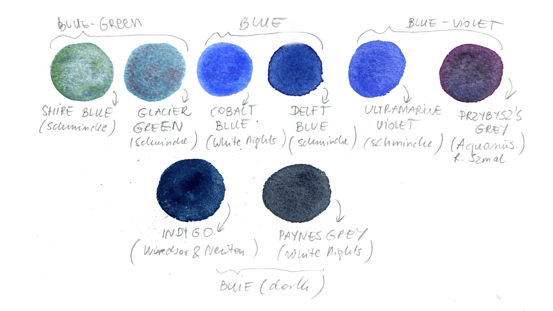
three blue greens, blues and blue violet colors. And I will swatch it for you. Here are my watercolors
and you will see, I will have two or three colors
per each color families. So those are blue greens. Then I will have blue
and also blue violets. And the last two are dark blue. Let me swatch for you all the color colors that I have chosen for
my color palette. As I said, I will start
from blue greens, then I will swatch blues,
then blue violets. And the last two will be the dark blues that I will
use for the last layers. To paint a dark background
and the night sky. I will write the names of
each color underneath, and I will leave you
the chart with names, with colors and their names
in the class's project. So you will see all the
colors that I used. You can obviously use
your own color scheme, your own color palette. If you decide e.g. to use warm colors, go for it. Or if you want to
follow my color scheme, you can also use
another colors, e.g. I. Use a Shi'a blue, which is super
granulating color. If you don't have it, then you obviously don't
have to use the same colors. You can choose your own colors
from blue, greens, e.g. also, the second color will be super granulating
color. But e.g. you could use some turquoise
color or other blue Greece. So I will speed up a
little bit the swatching, and I will see you afterwards. So here I leave you the photo of the color palette
that I will use. Here are the names of the
specific brands that I used. And also let's
recap two tips that could be helpful if you're
struggling with colors. One is to limit yourself
to use only cool colors, are only warm colors. And the second tip would be
to limit your color palette. So I hope it was
helpful for you. And let's jump into
the next lesson where I will explain you what is the negative
color painting?
6. What Is Negative Painting: Okay, so what is the
negative painting? Here? I prepared a simple example
of positive painting. You mean that you paint inside the shape and negative painting. And it means that you
will paint outside the shape and leave the shape
white, blank without color. But what happens if you want to add layers and
create depth, e.g. so here's the simple
exercise that I will show you in order to understand
negative painting better. Okay, so let's paint
a simple flower. E.g. I. Will draw simple shapes. First, petals. Let's say that I want the
circle to be the brightest. So let's write down one. It will be the brightest color. Then those petals, I want
to be a little bit darker. Then I want to draw
petals that will be darker than number two. So it will be number
three. Let's start. It is simpler than
it seems high. We'll use again
the violet color. Instead of leaving white. I will paint all
the color, really, really bright and soft color. And I can show you, I will
prepare my color here. And I want it to be bright. So I want to use a lot of color. Just to really clear. We can do rectangle to limit
our paint into rectangle. Right? So the first layer, first wash is ready. Okay, So the first
layer is already dry. It's very important
that the layers should be dry before you will
paint the second layer. So it's very important. It means that we will have
to paint a round number one to create the second
layer, the second color, I will use the same color, the same amount of color. And let's paint
around the circle. Okay. Let's try it with a hairdryer. Okay, so here is
the first color. Now I want to paint a
round number two petals. You have to be quite
quick with this. If you don't want borders
of your color to dry. My tip that I always repeat in my watercolor classes is
to keep your paint wet. Means to paint the borders
of your puddle wet. You can see I have
this trap of color. Then I tried to paint quickly. This way you will evolve a
void to create the borders. Okay, So here are the
petals with number two, a little bit darker. So let's jump into
the last layer. Okay, we will paint the
last layer, number three. It means we will paint
the darkest petals. So I paint around number three, but also number two, because I want number
two to be brighter. So I will just paint
around every petal. Remember, be quick. Try to be quick. It's also a good
exercise for precision. To try to paint
in the quick way. With the precision. I'm not very precise. I prefer to be more expressive. And I'm not so much
and to precision. But still it's a
good exercise to do. Especially if you
work with watercolors when you often have to be quick to have to paint
before your color will dry. So as you can see,
I'm not obsessed. Row size me. Never mind. For me. The important thing
is to understand the concept of
negative painting. Okay? So here it is. Maybe the difference between
number two and number three. It's not so clear. But yeah, never mind. My exercise is finished. As you can see, maybe the difference
between number two and number three is not so big, but still it's brighter. The brightest is number one. Then we have number
two and number three. Okay, here it is. I invite you to
do this exercise. It will help you to understand better than
negative painting. And just remember about few tips that will
make it easier. Paint on the dry layers only. Use lot of paint and
keep it wet to avoid the borders of a dried colors and try to be possibly quick. I hope it was helpful for you. And let's jump into
the next lesson where we will sketch
our illustration.
7. Sketching: Hello, hello. I'm very excited
to welcome you to this.
8. The First Layer: Hello, Welcome to
our next lesson, where we will start our adventure and we
will start painting. I'm really excited about it. So here you can see that I
prepared my watercolors and the first thing that
I really advise you to do is to wet your colors. This is the step that I
skipped for a long time, but when I started to really wet to them before
and wait a little bit, I saw the difference. The colors behave
in a different way. They apply more easy and they really activated
the watercolor nature. So yeah, that's what I
would advise you to do. You can use a spray bottle or just apply water
with your brush. Or the first layer, we will use the wet
on wet technique. So I will wet the paper. I will apply the clean water
with this large flat brush. You can use other big
brush that you have. Apply a thin layer of clean water on the
surface of your paper. And I do this because I think using the
wet on wet technique will be easier for the first
layer because it will be easier to cover the whole
surface with a color. With wet on dry technique, it would be more difficult. As you can see, it's not too wet. You can also check on
my class about basic of watercolors where I explain
better this technique. The second reason use this
technique is to create a lovely textures because we
will apply different colors. Different, not only one color, but I will apply three colors randomly in order to create
a really lovely textures. Especially because I will use the super granulating
watercolors. And within this technique,
wet on wet technique, it really gives great results. Once your paper is wet, I will prefer the colors
for my first layer. I will use shy or Blue Glazier
green, and cobalt blue. The colors that I swapped in the previous lesson,
the blue-green, brighter colors,
Let's say I will apply them on the wet
paper randomly, e.g. here I swatch the first color. I create the planes of color, and I will apply them randomly. It means that I will
paint with one color and then I will apply
another color nearby. The different colors
lands together and create really beautiful
textures and effects. And wanted to give you some
extra tip to create textures. If you will use granulating
colors it already, we'll make beautiful,
beautiful textures. Extra tip is to e.g. take a paper towel
or cotton cloth and tap it into your
still wet color. The color shouldn't be too wet and you should tap
in a delicate way. Otherwise, you
will create holds. If you're as big fan
of textures as I am, then you should
definitely give it a try. At the end of this lesson, let's recap of the steps. So first wet your paper
with clean water, then apply your colors for the first layer in the random way with
wet-on-wet technique. And my tips for you is to wet your watercolors previously and to create some lovely textures. Use a paper towel. I really hope you
enjoyed this lesson. Let's jump into the next step, which is painting
the second layer.
9. The Second Layer: Welcome In our lesson where we will paint the second layer. And we will do this with a wet on dry
technique this time. That's because if
we wet the surface, then the paint from
the first layer would reactivate and we
couldn't paint over it. So that's why the, the first layer
must be really dry. And we will paint on it. And without wetting
the surface before. I will use a very diluted color. I choose to use blue colors, darker than the previous layer. It's up to you if you will
use flu or other colors. And also sometimes I
will use just one color. And other times I will do us for the first layer when I will
paint with more colors. So my tip for you would be to use a small brush for details. As you can see for
the small space. For thin lines, I will use a smaller brush and then I will switch to a larger
brush to finish, to paint the rest
of the surface. I have another tip for you
to create lovely textures. I will use the sprite
water in the bottle with price so you can use it while
the paint is still wet. Not too wet, but
not too dry yet. And then, especially if you will use
the granulating colors, the pigments will separate and create really,
really nice effect. You can try this method
with normal colors as well. Probably it will create
dots, dotted texture. Just give it a try. I'm always a fan of experimenting
and trying new methods. This one I usually
use when I want to achieve textures and when
I work with watercolors. Okay, That's it. So this is how we painted
the second layer. You would use the
wet on dry technique and you can paint with
one or more colors. And my tips for you is wait until your first layer is
fully dry and paint over trilayer to use a small brush
to paint the area around the trees and then switch to a bigger brush to paint
the rest of the layer. And then to create really
love the textures. Used the water in the
bottle with atomizer. I hope you really enjoy
the process so far. So let's jump to the next
lesson where we will finish the remaining
layers. See you there.
10. The Remaining Layers: Hello, Hello. Welcome to
our lesson where we will finish to paint all
the layers here, I'm, will start to paint
the third layer, but I decided to include all the layers
in the same lesson. That's because I will use the same procedure to
paint each of layers. So let's have a look
on the steps that we will follow to
paint every layer. So number one, remember that the previous
layers should be tried. That's because if
they will remain wet. And what happens is That's when you will
paint the next layer. You can pick the paint that's underneath it
if it's still wet. And then you will create
the White House number to paint new layers with
wet on dry technique. I think it's already clear. And you can use
one or more colors for each layer that depends
on you, on your vision. If you want, you can use
just one color and if you like to add some sparkled
and use a more colors, use a small brush for the
area around the trees and the bigger brush
to paint the rest of the layer, that's really handy. Give it a try. Then if you wish, you can create
textures in-between. With spray water or paper towel, I will show you, it's again further on. And the last step that I
will show you as well as to retrace the lines with pencils with pencil,
sorry if needed. That's because as I already told you in
the previous lessons, it can happen and
probably it will happen. That's your pencil will
disappear because it will be covered with layers of paint. So here we go. I'm painting. The third, I think, is still layer. As you can see with
the small pencil, I traced the area around
the trees and then I will integrate the remaining
painting with a larger brush. Yeah, you should be quite quick. If you want your paint to dry, use a lot of paint and to try to keep it as wet as possible. Yeah, that's the tip
that I already gave. You can see that in this moment, I decided to cover
one of the trees. That's perfectly normal. In the meantime, you
can change your mind. You can add some shapes
or covers some of trees. The process of painting can
be quite unpredictable. You can follow the traces
of pencil that you already have or you can
change your mind in-between. So in this case, you could
just improvise and let yourself lead by the process
and playing without blaming. The other thing that I wanted
to share with you is that I use darker color as I
go for a new layers. So for the next layer, I will use a darker blue. I think it's not necessary, but I find it as a helpful tip. And creating the desk
and you're painting. Here, I'm starting to
paint the first layer. And my other tip
for you would be to prepare amount of paint ahead. So you won't run out of paint because as you can already see, you need a lot of color
to cover all the spread. So here we go again
with fixtures. As much texture as possible. I really love them. So if you love them too, then you can apply it
whenever you wish. This time, I will use
a paper towel again. And tapping. When while the
paint is still wet. Here's the good
moments to retrace the strokes because the next
layer would cover them. If you feel that she wants
to proceed with the sketch, then remember to retrace the pencil stroke while
it's still not too late. Or you could just proceed
improvising and painting. As you go without
tracing, it's up to you. Yeah, another
textures coming up. This time, I will pray
a little bit of water. The tip here is that
the paints shouldn't be too wet and it shouldn't
be dry and ready. So you have to find the right
wetness of the surface. It's a very delicate
sometimes it can be seen better and sometimes not. But hopefully you can
see the little dots. And exactly now when it's a try, It's can be seen better. I really love this
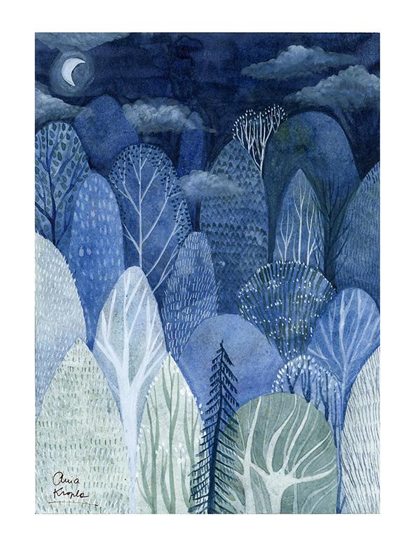
kind of effect. So here's the sixth layer. We are already there. I just wanted to let
you know that as I go, I use always the darker colors. So in this case, I will mix together
my darker blue, e.g. Delft blue, sugars
gray and indigo, also the Payne's gray. As I go. The last layer, my case, this is number seven, but she can do less. You can do more. There's no rule. So
for the last layer, I will use freely
the darkest colors. I will just make indigo Payne's gray to achieve dark night sky. Let's recap briefly the
steps that we took. Use wet on dry technique and you can paint with
one or more colors. And my advice is for you is to wait until all the
previous layers are dry. Use a small and large brush and exchange them while
you paint different areas. And to create textures, use both paper, towel
and water and spray. And also remember to retrace the lines with
pencils before they disappear and use darker colors as you go in order to create
depth in your painting. I really hope you enjoyed
all the process of layering. So let's jump into
another lesson. My favorite part which
is painting the details.
11. The Details: There are many ways to
paint your details. This is the moment
when you can create really nice stuff for me
personally, it's very relaxing. So let's dive into my
favorite part of painting. Here are the steps that we will follow in order to
complete our painting. First of the ways to create details will be again
negative painting. And this time we
will use it inside the tree to paint
the tree crown. Then we will paint watercolor details in many
ways with many tools. We will paint the trunk and
branches and leaves as well, and we will play with different kinds of
shapes and strokes. Then we will use also the
white ink to paint triangles, branches, and leaves as well. And we will also paint
new elements, new trees. It's not necessary, but if you feel like to
add some extra elements, then I will show
you how I do it. And at the end, we
will paint also the moon and the clouds
on our night sky. Okay, Let's start our painting. Let's start with negative
painting inside our plants. Here is the example
of what I mean in my old illustration. Few of the trees I painted with negative
painting technique. And I find it a really nice. So you can first draw the
strokes with pencil or just go with the flow and
painted without tracing. In my case, I already drawn the pencil strokes so you can follow me if
it's easier for you. And I will paint
the first layer. So it means that I will paint
outside the pencil strokes. This is my free
interpretation of tree crown. Feel free to draw
your own Crown, your own shape of
trunks, of branches. You can also use a photo as a reference or draw
from your imagination. When the first layer
is ready and dry, you can add new
layers if you wish, you can leave it like this, but I will paint a new layer,
creating some dimensions. And this time I
won't use pencil. I will just paying directly
on the first layer. Now I will simply paint
trunks and branches and other details like
leaves with watercolor. So prepare your paint
the color that you wish. In this case, I will
use the same color, green, blue color that I
used for the previous tree. And I will trace my
trunks and then branches. And my tip for you is to push your brush very lightly
at the beginning, and then push harder in order to create really nice
strokes from thin to Boulder once you fall out. My previous lessons, you already know that I'm a big
fan of white ink, especially the one
that I showed you in art supplies, a lesson. I loved to use it client
to apply tiny details. I will use different tools
to paint with white ink. I will use e.g. small brush, but I will also
use a dip pen to create really thin and delicate lines
are really tiny details. I'm using a small brush and I tried to be really,
really delicate. And I push a little bit harder to create a
thicker strokes. Often I will use white
ink to friend leaves. I will alternate,
sometimes I will use white inks and
sometimes watercolor. It's up to you. Have fun and try to be as creative
as possible. And play with the
shapes and strokes. I will use some
different tools that I didn't show you in the
art supplies lesson. But that's because they
are not necessary. You can use the
brushes that you have. But in case you have some
other types of brushes, you can play around, try different
strokes in order to create a different ferry leaves. And in this case, I will paint tree needles, play around and just
have fun experiment. I will continue with
different tools and mediums, but it basically will be
watercolors and white ink. I will just try to vectorize the shapes of trees and
branches and leaves. So see you soon. I will paint some extra trees outside the trees that
are already there. It's not necessary if you feel like adding
some extra elements, some extra plants, maybe it
doesn't have to be treat. It can be a plant,
a flower, maybe. Leave. Then go for it. The final touch, I will paint
moon and clouds or both. I will use the same
white ink paint. I will also add light around
it with a diluted ink. And inside I will paint
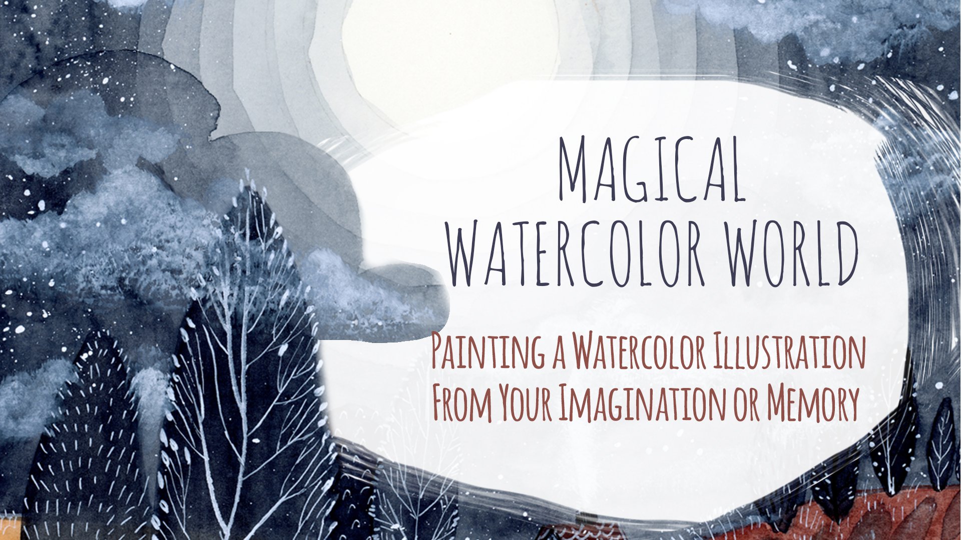
moon with non diluted ink. As for the clouds, I want to explain here how I paint them because I already did this in my class entitled
magical watercolor world. So feel free to watch
the lesson that explains specifically how to
paint clouds with white ink. And for now, I will just leave
you with a speedup video. Alright, I think I done here. I will call it finished. It, it was quite
long process here, It's all sped up. But in the real time, it can take awhile. Especially if you're like
me and you like to add a lot of details and don't
know really when to stop. Here. I'm tearing away
the masking tape. It wasn't a successful
In this case. I think I used the wrong type. As you can see, it ruins
a little bit my paper. So be careful. My tip would be to test
it before you will paint. So you will be sure
it wants ruin it. But at the end, the
damage wasn't big at all. And at the end, I am very, very happy of the final
result of the night. Quiet. I don't know, calming, but also mysterious
atmosphere that came through the colors
and all the lesson. Let's try to sum up a little bit all the steps
from this lesson. So first of all, you can use multiple ways
to paint your details. You can be very
creative and play with different tools and
colors and strokes. You can use also
negative painting inside the trees to create
a tree crowns. You can also paint new
elements in your illustration. And also you can paint
the moon and the clouds. Or it could be also Sun
because I didn't say it. But of course you can
paint also a day seen. So it can be a son. Also, the other tip that
I wanted to leave you with is to use different kinds of tools that
you already have at home. If you don't have white ink, you can use other white mediums. Or you can also try to
use colored pencils, which are really great for
this kind of illustrations. I didn't feel free to do that. If you have other tools
at home, just use them. Feel free to experiment. There's the last lesson, the bonus lesson, where I
will leave you the last tip. So see you there.
12. The Bonus Layer: Hello, hello. Welcome to the
final bonus lesson, which I call it negative
painting with masking fluid. So here are two tools
that I will use this silicon brush
and masking fluid. I will use the one
in the bottle. This one is from royal talents, but there are many
brands, phenotypes. You can also use the one
in marker in the pan. So you won't have
to use the brush. The silicon brush, I advise
to use silicon brush. If you have one at home. If you don't, you can
use a normal brush, but I recommend you
to use old brush because afterwards it afterwards the masking fluid will go away. So use just the old brush. Okay. So why is it
negative painting? I will show you afterwards why I thought it could be a
kind of negative painting. And here is how I
apply masking fluid. Again, I'm using silicon brush. If you have a marker or let's say Penn
with masking fluid, you can apply it directly
from the masking fluids. Ben. If you're not
familiar with this medium, it has like yogurt,
liquid consistency. And when it's dry, it will become like a gum, rubber gum, jelly consistence, but you will see it later. I will show you once dry. Okay? And what is very important that your
paint must be really, really dry before you
apply masking fluid on it. I will show you why
because my paint wasn't dry enough and some
accident happened. But it's all for good
because this way you will see what can happen when
your paint is still humid. I'm not totally dry. Now. I'm applying
masking fluid to draw branches and the trunk. And once when it's done, I'll show you how the masking fluid
behaves when it's dry. So here's the masking fluid. When it's dry, it's a
little bit darker than translucent and it has
a rubbery texture. There can be different
colors of masking fluid, but you can understand
easily when it's dry, when you touch it
with the liquid, NMR is like a rubber. So once when it's dry, you can paint over it. And it works like in this way that the paint underneath
will remain as it is. Because then later on you will take off the
masking fluids. Basically, it is to
mask some areas. So that's why I've
called it negative painting because at
the end it's the same. But you use masking fluid instead of painting
outside the shapes. For in this case,
outside the branches. We will paint over it and mask branches with
masking fluids. A very important thing
that you have to keep in mind and that I really advise you is to remember
to have your layers really, really dry before you
will apply masking fluid. That's really very important. And I will show you why, because I didn't wait enough
and then something happened. I will show you what. To avoid it. I really recommend to be sure. Maybe you could wait
one night or one day before you will apply
masking fluids. Okay. So here I take off. Masking fluid. You can do it directly
with your finger, or you can use eraser. Sometimes it is
also good thing to use cellophane,
some plastic wrap. So here's the tree where
I didn't wait enough. There's what happens. Some of the paper, as you can see, this white dots came off
together with masking fluids. So in this case, it's ended quite well. I didn't ruin my tree,
the illustration. But even the effect
is not as I wanted. Also, maybe because I could
use a little bit darker. The paint should be
a little bit darker. Here you can see I turn it
off a little bit of paper. That's what happens when the paint below is
not dry enough. Yeah, I really recommend
or can you see it? I will correct it
the width wise. So to unify all the end
to cover this error. But it wasn't meant
to be avoided. Remember, before you
apply masking fluid, your parents must be
really, really dry. So as I said, I will use white
paint and just simply paint over the mask branches. I felt a little bit sorry for this mistake, but at the end, it's good to show it to you so you know that in the
future you can avoid it. And you see what
can happen and also how to mask some of your errors. In this case, I'm painting
over the whole mask area. I will show you
another illustration. Illustration with masking
fluids and all when swell. And the effect is really nice. So here it is. The bright branches or
mask to our masking fluid. Yeah. Also you can see here also it's masking fluids so
many ways you can apply it. Try it, and let me know if you have any doubts
regarding this medium. Let's see together the
steps from this lesson. If you use fluid masking
fluid from the bottle, I do then remember to use Alt, or inexpensive brush that
humans need anymore. Or the best thing is to
use the silicon brush, which I recommend and then
apply the masking fluid, wait until it's
dry and then paint over it with watercolor. And when the watercolor is dry, then you can remove
the masking fluid. Remember the lesson
that I learned? Just be really sure
that your paints, your illustration is really dry. And that's because we paint
really a lot of layers. Even if you think that
your illustration is dry, the paper underneath
can remain still wet. So it would be best to
leave it a couple of hours or even for
a night to dry. I invite you to watch
the last lesson, where we will summarize all
the lessons of the project. And we will leave
the last class that all the things that
we did in this class. So see you there.
13. Final Thoughts: If you're watching
this lesson than you probably finished your project. If yes, then I really, really wanted to thank you
for joining me in this class. So I really wanted
to congratulate you that you finished
your project. I hope you had fun, and that too learned a lot. Let's summarize all the steps
that we took in this class. First, we saw the art supplies that was necessarily
for this class. Then I show two color theories. And understanding those
two color theories, I showed you why it
would be helpful, especially when it's
up to color mixing. Then we apply it. One of the color theories to combine the color
palette for the project. Next, we jumped into exercise
of negative painting. Then we sketched our forests. We painted it from the
beginning until the end, applying also details with
many tools and techniques. Also, in the bonus lesson, we saw how to do the negative painting
with masking fluid. I hope that in this class
you learned new skills, new art technique, and that you can apply it also in
the future projects. Because as I already told you, this technique can be
applied in multiple things, multiple situations and objects. And most of all, as always, I hope you had fun and
enjoy the process. Remember to post your projects
in the project gallery. In this way, you will share
your art with others. You can also comment and share your impressions or
on other projects. I think it's really helpful
for all of us and very inspiring for us to share
our work with others. If you liked this class and if you would
like to learn more, then please follow my profile
on Skillshare because I will come up with new
content, with new lessons. If you're into watercolors, you can check other
of my classes, e.g. the watercolor basics
technique where I explain how to use watercolors. Or another class where
I use watercolors to create another imaginary scene. And also you can follow me on Instagram and on YouTube to see all my art where I share my illustrations and
also some process. Thank you once again to joining my class and see you next time. Bye.
 Ania Kropla Malinowska, Award-winning illustrator