Transcripts
1. Introduction: Hi. Hello. My name is Anya and welcome to my
new sculpture class. I'm a graphic designer
and also illustrator. For the last few years, I'm working on becoming a
professional illustrator. In my work as an illustrator, having a graphic design
skills was very helpful, because I could use graphic design programs and I could project all by my own, and also prepare
my files to print. I will be very happy to
share all my knowledge and experience I have
achieved with you. In this class, we will
create a family tree and I will guide you through all
the process from sketching, painting, then editing
it in Adobe Photoshop, and preparing your art to print. This way, you will not only create a beautiful
handmade gift, but also we will learn several digital tools to
edit and print your art. This class is for everybody. Just beware that
I won't get into the details about watercolor
techniques that I will use. You can jump into my two classes about
watercolor techniques. Also, I wanted to tell you that you can use
your own technique. If you use some
other art supplies, other art mediums,
then go for it. I will use Adobe
Photoshop software, so be sure to have it
installed on your computer. If you're a beginner and if
you don't know this software, then don't worry, I will
use just the basic tools. I'd really love to have
you in this class, and I really can't wait to share all my knowledge and
skills with you. Jump into this class
and in the next lesson, we will see what's this class's
project. See you there.
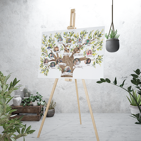
2. Class Project: [MUSIC] This class' project
is to create a family tree. There are two reasons why
I prepared this class. First of all, I really love to create by my own creative gifts. A second reason
is that my friend asked me to prepare a
family tree for her family, and I thought it is a really
great idea for a gift. The process will be divided
into two major steps. The first one is a traditional one and the
second one is the digital. [MUSIC] The first step
is to paint our tree. We will start with
making a plan, a basic layout, and then
a sketch of our tree. Then I will show you two ways of transferring the sketch into
the final illustration, and then we will paint the tree. I will use watercolors. But as I mentioned, feel free to use your favorite techniques and art supplies that
you usually use. The second step, once we've
finished to paint our tree, we will scan it and then transfer it into
Adobe Photoshop, where we will do
some basic editing, adjusting, then we will
insert our photos and names. Finally, I will show you how to prepare your file to print. If this class seems for you a little bit complex,
then don't worry, I will divide all the
process into tiny steps, and I'm sure you'll be able
to follow all the lessons. If you have any
problems and questions, come back to me in this
classes discussion, I will be happy to answer all
your doubts and questions. Also, I will provide helpful
materials and resources, and I will attach
all the files in the classes resources and project section so you can go there and check what
I've prepared for you. You can also jump into
this classes description and see the single steps
that I described there. If you're ready, let's go
into the third lesson, which is Art Supplies.
3. Art Supplies: Let's see the art supplies that we will use in this lesson. As I've already told you, I will use watercolors and
I also told you that you're free to use whatever art supplies and techniques
that you prefer. If you're new to this channel, then just be aware that I've already prepared
two classes about watercolor techniques
when I specifically explain how to use watercolors. For the first part where we will create a sketch and layout, I will use just the
pencils, eraser, and a normal copy
of printing paper. It will be just enough. I will also use colored
paper and scissors to cut out the shapes
for my layout, but you can use
another type of paper. It's really the same if it
will be a normal paper. For the final illustration, I will use watercolor paper. In this case, this is Arches watercolor paper
with cold pressed texture. You can use another
type of paper. It doesn't have to
be so expensive one. For example, if you have at home mixed media paper or
other watercolor paper, then you can use it. The important thing
is that it should be at least 300 grams or maybe
even 250, but not lower. To transfer our sketch, I will use the light box. I ordered this online. It's not expensive. You can find it on the Internet. But if you don't have
one, don't worry, I will show you alternative way to transfer your sketch to
the final illustration. To paint, I will
use watercolors. This is one of my
watercolor sets. As for the brushes I will use round synthetic brushes
for watercolors. If you don't have one, then you can buy maybe
three or four sizes, small, medium, and large one. Also the scissors,
I already said, and this white ink
that I often use. I will use it for the details. Also, I will use
the masking tape, the adhesive of tape, to fix my illustration while I will copy to the final sketch. As I already said, you can use your favorite
art supplies or you can add some mixed media
to your watercolors. For example, colored pencils, brush, or acrylic, or inks. It's certainly up to you. Let's recap the list
of art supplies. Here's the list
of what I've used for the sketching and
the painting part. Remember that if you
have any doubts or questions about the art
supplies or the technique, you can also ask me questions
in this class' discussion. I will be very happy
to answer to you. In the next lesson, we will plan our tree, so see you there.
4. Planning Your Tree: Before jumping into
painting your tree, you will have to
plan a few things. For example, how many generations you will
have to include? How many people? My tip for you is to
not make it too big. For example, I've included three generations,
including grandparents. It's up to you, but my suggestion is
to keep it simple. I will provide you a link
to my Pinterest Moodboard, where I've paint examples
of family tree artwork. I will share with
you my process, my ideas or how I figured
out how to layout the tree. Of course, if you have
other ideas, I'm curious. Share with us your process. I will show you how I did it. First, I've counted the number of people
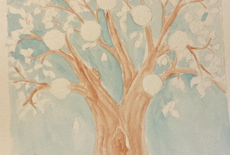
that will be in my tree. It could be couples, it could be single people. Then I've cut out their shapes. I decided that my
photos will be circles. Here, I am preparing
the number of circles that will be
needed for all my tree. Once I had all my circles, then I drew the trunk, and I've put the first
circle, the first couple. Afterwards, all
the other circles. I also signed the circles. I find that it can be
helpful during the process. Once I've put all the circles, once I've planned
all the layout, then I drew the branches
between the circles. Afterwards, I put aside all the circles and connected the gaps
between the branches. In this way, the scheme
of my layout is ready. Here's the brief sum
up of this lesson of how I designed the
layout of the tree. Once you've planned and
prepared all the information, we can jump into sketching
our family tree.
5. Making a Final Sketch: [MUSIC] In this lesson, I will show you two
ways how to transfer your layout draft
into a final sketch. I've decided to divide the
sketching part into two steps. I found it more
simple for me to make the initial layout and then to transfer it into the
final illustration. But obviously, you can skip
the first step and plan your tree layout directly on
your executive art piece. I will show you two ways of
transferring the sketch. If you have a lightbox at home, you can use it. I think it's a very useful tool, especially if you
work with sketches before you go into the
final illustration. For me, it depends. Sometimes I prefer to
make initial sketch, especially if I work with
children books illustrations, and then I transfer the initial draft into
my final art's piece. Give it a try to a light box. You can find it, not very expensive online. [MUSIC] If you don't have a light box, then don't worry, you can use just your
window during the daylight. Fix your illustration, your draft underneath the
paper that you will use. Then probably you can see
underneath your draft. Maybe it's less
comfortable than lightbox, but still works really well. You've made it. We've created the basic of our family tree. Finally, we can dive into the next lesson and
start to paint. See you there. [MUSIC]
6. Painting The Trunk And Branches With Watercolors: [MUSIC] In this lesson, I will define my color
palette and then I will jump into painting the
wooden part of trees, which are trunk and branches. I will use watercolor, wet on dry techniques. I will also show you some tips that I use to
create a tree bark texture. Before you start painting, it's a good thing to create your color mode,
your color palette. I think it's a good
habit whether you're painting something as
a gift or commission, or even if you paint
something for yourself to think ahead of your colors. It doesn't have to be
super defined or specific, sometimes you want to
just create some mood. You play with tones, warm tones, or should it be cool tones, or maybe you want to create contrast of cool and
warm tones together. Then it's good thing to play and experiment before
you jump into paint. I decided to use very
classical color palette for trees with greens and
arithmetic brown, warm tones for the wooden part. Here I grabbed my
green watercolors and also I played to
create brown tones. Once I prepared my colors, I started to paint. For the trunk and branches, I use wet and dry technique, it means that I don't wet
the paper before painting. Then paint with quite
a lot of watercolor, creating a paddle that
I will push around. In this particular technique
where if you use watercolor, my tip for you is to never
let your paint to dry. Once you would turn to the
paint where I left it, it won't create the borders, but it will blend smoothly because the
color will be still wet. I'm working quite fast because I don't want to
let my color to dry. You can see that I use the same brush to create
also the tiny branches. That's because if you have
a good quality brush, you can use it to create
different strokes. When you use it in a light way, it's within and when you push your brush and paint then
it creates larger strokes. As you can see, I've painted in the zone that
I left for some time, but it was still wet, so it blended nicely. Another tip that I have for
you is to play with colors. I don't use only one brown, but I mix it while I'm painting. Sometimes I will
use a darker brown, then I will add
some lighter brown. You can start with one color
and then add some tone, some different colors
into it to create different tonalities
of the same color, in this case, it's brown. Here I'm starting to
create the wooden texture. To do that, I put a
little darker brown into my still wet brand underneath. That's because I want to create a little
bit of gradient, a little bit of lovely,
crispy texture. Once again, the color must
be still wet if you're using watercolor and if you want to follow this
particular technique. Once I'm happy with the result, I grab a tissue or
paper towel and dab into the paint
while it's still wet. This way you create
lovely textures. Let's recap briefly
this apart of painting. First I defined
my color palette, then I painted the trunk
and branches using the wet on dry watercolor technique
and I mixed more colors, then I created the wooden
texture by dabbing the paper tissue
into the wet color. When you finish, let's
your illustration dry. In the next lesson, we will paint leaves.
7. Painting The Leaves With Watercolors: [MUSIC] Probably you've already chosen the type of the tree
that you want to paint. When it's about painting leaves, you can both use realistic
shapes of leaves, a search for some
photos reference, or maybe you can just bring some leaves from outside
and try to paint them. Or you can use your imagination and paint whatever strange
shapes you like to. Maybe add some flowers
or some fruits. It's totally up to you. You can be as
creative as you wish. Maybe you could do
some investigation and search for some elements
that represent the family, maybe some fruit, maybe a color, maybe it will be a tree itself. What type of the tree? Maybe the family has
some tree in the garden or somehow they like some
kind of trees or plants. I think you know what I mean. So try to think about it. Be as creative as you wish. The shape of my leaves will be quite traditional and I will also use different
greens to paint them. I will play with different
shades of green, and also I will dilute
the color in the way that sometimes it will
be more dense and sometimes it will be
more translucent. In this way, I will play with different tonalities
and shades of green. I will also use the
transparencies. It means that I will
paint diluted color above the more dense
and more opaque color. It creates a really nice effect of a crispy and
transparent color. I will also paint floral
details for this, I will use the tiny brush with a really sharp tip because I like to paint really thin
and tiny lines, and that. So this will be my
imagination playing around. I won't paint flowers or fruits. [MUSIC] In my work, I often use white ink to
create final details.So also, this time I will use
it for the leaves. You can use other white colors, for example, acrylic
or maybe white pencil, but you can also use
other colors and other mediums to create
your final details. As a very final touch, I decided that I would paint
additional wood texture, so I used for that very
diluted brown color. It would be darker color than
the one that is underneath. Then just paint above and
create additional wood texture. You can skip this
if you don't want to or create your
own wood effect. Here's the final result. At this point, I decided
that I won't add anything else and that my tree
is ready to be scanned. Let's do a small recap of all the step that we
took during this lesson. Yay. Your tree should
be ready at this point. In the next lesson, I
will show you how to scan your illustration
into Photoshop. See you there. [MUSIC]
8. Scanning and Importing into Adobe Photoshop: [MUSIC] Let's talk
about scanning. In this lesson, I will show
you the scanner that I use. I have my own scanner at home. I will show you that
and I'll also show you the file settings that you should use to achieve a high-quality scan
of your artwork. I will show you how to import your scan files into Adobe way. If you have multiple scan files, then I'll show you how to
merge them into unique file. At the beginning,
just a short notice, I will show you how
to scan at home. But if you don't have a scanner or it's not a good quality one, then obviously you
can scan elsewhere. For example, in a professional printing
point or maybe a photographer, it's a good solution. Always ask for a good
photography scanner though. You can both ask staff of
your printing point to set the file and scan for you or you can
provide the settings, for example, the one that I
will show you in this lesson. That's because my
experience is that not always staff is aware
of the proper settings. First, I will show you
the scanner that I use. This is Epson
Perfection V600 Photo. This is the photo scan and
it is really high-quality. I can really
recommend it to you. There are other
models, 500, 550. They are also very good. I have 600 and it's
really, really good. It's A4 format. As you can see, it has glass a scan. So this is how it's big. This is the power button. Yeah, it's really good. I
can highly recommend it. I will show you how I
scan the illustration since it's bigger
than the scanner so I will divide
it into two parts. You can push this
button or later I will show you how to
do it from the software. My tip, remember to align
your illustration with the signs that are
in the scanner. So I can push the button. Once the scan is ready, I will turn upside
down my illustration. I will rotate it in order
to scan the second half. Let's see where's
the scan software. I have this icon
over here on my bar, and to activate
it, just click it. My scanner now will make
some noises because it's connecting to my computer. Just remember that your
scan have to be on. If it's switched off, then it won't connect
to your computer. Here it is. This is the panel
of the of Epson software. If you have another scanner, then it might be
slightly different. The important thing is that
all the settings you have. Here and here you can
have your preview. Right now my settings are in Italian but I will
try to translate. The most important
thing every scanner has those settings is to set
the bits of your image and resolution and also the type of the format of the file that you want
to save your image. Also probably this mode, modo foto, it means it will be in color not
in black and white. Bit, you should select
24 or 48. It depends. If you have better scanner, you can have 48 and
maybe higher as well. I will select 48 because
it gives bigger range of colors but 24 is good as well. So 48 bits, then the resolution, if your artwork
will be printed in the same size as it was made, for example, if you draw on A4 format and your
points will be A4, then 300 DPI is enough. If, for example, you want to print your tree on
a bigger format, then you should probably
choose something between 400 or even better at 600 DPI and then it's a double number so
you can print it on the double size of the
format that you use or even bigger
because it's really high and good resolution. Also, I suggest you
to use a TIFF format. That's because it's
better than JPEG, and TIFF is also for print and it's really
high resolution. It's better than JPEG. Before scanning, you should probably see the
preview which is here, anteprima in Italiano, in Italian language, sorry, just to see if your illustration is straight and all right. So I will push this button. It doesn't make a
scan at this point, it just makes you the preview. Okay, so I'm quite happy. As you can see, it's straight. Here, maybe it's cut a little bit but I think that's my
illustration was like that. So I will just leave
it like this and with 600 DPI and TIFF format, I will push the scan button. It takes a little while
because the bigger the format and the
higher quality you ask, so more data the
scan must elaborate. All right, great. So here it is. It is the
first scan of my tree. As you can see, I've
already made them. So this is the first
part, first half, then I rotated the image and scanned the second half
and this is the second image. So I will merge those
two in the next step. Right. Let's import
our illustrations, our scans into Photoshop. We will have to merge two scans, and I will show you the really easy and quick way where Photoshop will do
all the work for us. So to do that, go to Photoshop file, then automate and photomerge. Next, search for your files, select all the scans
that you have. In my case, it's two. You might have three. It's depends. Anyway, select all of them
and click ''Open'', then click ''OK'' and just wait a little bit and let
Photoshop do the work for you. Okay. Voila. Here it is. In my case, I will have
to rotate my image. So I will go to image, image rotation, and then
search for the layer panels. It should be on the right
bar of your Photoshop. Open it, and as you can see, there are two separate
layers with our scans. Keep them selected. I'll select both of
them and click merge, right-click ''Merge Layers'', and voila, our illustration
is ready to be edited. Let's do a small recap of all the steps that we
took during this lesson. [MUSIC] In this lesson, I showed you how you can
scan your artwork and what file settings you should use once you have your files ready. In the next lesson, I'll show you how
to open them and edit them in Adobe
Photoshop. See you there.
9. Editing Your Illustration in Adobe Photoshop: [MUSIC] In this lesson, we will start to use
Adobe Photoshop software, so be sure to have it installed in your
computer at this point. We will make some basic
editing on our artwork. Let's create new document that
will be our work document. To do that, go to File, New. I will choose a print format A3. That's the format
that I want to print on and it will be horizontal. I choose horizontal over here. Three hundred DPI pixels per inch of resolution is enough. Right now, I will leave RGB color and then I
will click "Create." Let's take our illustration
into our new document. To do that you can
simply just drag it, so click it, don't release it and just drag, drag and release it
in your new document. As you can see, the
illustration is much more bigger than
the document and that's because it was
scanned in 600 DPI because in case I
would like to print it on the bigger format,
it's always possible. But I will print it on A3. I will simply resize
it to my file size. If you scanned it in 300 DPI, it should be the same
as your final format. If you scanned A4 in 300, then you can print
it easily on A4 and if you scanned
A4 with 600 DPI, then you can print it on A3
or even larger documents. It's up to you. Now I would
like to work on whites. As you can see, it's a little bit
yellowish and it's not so bright and also I would like to on the
vibrancy of the colors and increase the contrast
between white and colors. I will leave the white
background because I will print on the white sheet. Later on I will print on the white paper and
I also worked on white paper so I don't really need to delete
the white background. I will just delete
the imperfections, stains and happy accidents
like this one later on. Let's start from increasing
our whites and contrast. To do that, go to Image. You have to click on the "Layer" and have it
active otherwise it won't be possible to select
this layer adjustments. Go to Image,
Adjustments, Levels. To increase whites, go to this section. This section is
responsible for whites, this one is responsible for a dark and black colors and this one is responsible
for the mid tones. I will just increase whites
by dragging this white arrow. Let me zoom a little bit, a little bit farther
but not too much. Also, I will increase mid tones, just to work on the
contrast a little bit. As you can see now the
whites are much more brighter and my colors
have much more contrast. You can switch off the
preview to see how it was before and
how it is right now. Just be careful not to burn the whites and the bright
colors like this one. If I go much more further, it would burnt my bright color so I don't want to do that. Just decide what's
best and then click. Let me just check
this once again, I think it's perfect,
click "Okay." The last thing is to
work on vibrancy. Go to Image, Adjustments once again
and choose Vibrance, just a tiny little
bit because if you exaggerate then maybe
it's not so good. Also saturation,
if you exaggerate, as you can see now
browns are much more red saturated so I will just leave it maybe five
vibrance just a little bit. As you can see the
greens are more vibrant. I would advise to keep
those numbers low, not too high. Click "Okay." Here it is. This is
my basic routine. Once I scanned my illustrations, first I work on contrast and then I adjust a little
bit the saturations of color. Let's start to clean
our illustration. Even if you increased
your whites, there will be still
some imperfections. For example, I tend to
make a lot of stains and dots and that's
okay because later on I will clean them
with Photoshop. To clean those, grab your Erase Tool which
is on the left bar with the tools of Photoshop and
here's the Eraser Tool. You can click it
and you can also decide the shape of your brush. Right now, I will use
this normal round brush but you can also choose
one soft edge brush. Maybe this one will be even better especially if you
work only with mouse. If you work with graphic tablet, then it's more comfortable and easy to use the erasers
and the brushes. Let me try this shape because right now I'm working
with my mouse. What I usually do before I do
any changes with my layer, any modifies, I do the copy of my layer
and I will work on the copy and leave the
original just in case. You can just simply
copy the layer and work on and
leave the original. I will click with my
eraser wherever I need it. To make step backwards, use Command and Control Z, you can decrease or increase your brush in
here and here we go. [MUSIC] I won't be too accurate. As you can see, I forgot
to delete the pencil with eraser and that's
not so good but hey, there are many things that you
can adjust with Photoshop. Good thing to do is to clean your desktop before this work because when your desktop is not clean and you can see
some stains sometimes, it's on your desktop, not on your
illustrations actually. That's a good habit to
clean your desktop. I will speed up a
little bit the process. Let me just check out with
you some other stains. You can also try the Hard brush. It's also okay. See what brush shape
is good for you. [MUSIC] Here is the small recap
of all the steps that we took in this lesson from
creating new document, through editing the
colors and vibrancy and contrast and lastly through
the cleaning of our image. If you're new to Photoshop, then you made your first
steps into the software. I hope it was easy for you and if you're not
new to this software, I hope you've learned
something new. In the next lesson, we will see how to import
the photos to our file. See you there. [MUSIC]
10. Importing and Working with Photos: In this lesson, I'll
show you how to transfer all the photos
into your project. First, I'll show
you the settings, how you should set your
photographs to print, and later I will show
you the tools that I use to create
circle-shaped photos, and then we will paste them and create layout
on our branches. All right, so let's put the
photos into our illustration. As you remember, during
the sketching phase, I've already planned and
decided where to put my photos so right Right it will be quite
easy task to do. I will create the
circles in this file, and try to reproduce
my photo scheme. So to select your shape tool, go to left bar of the Photoshop. Here you have several
shapes to choose, depends on which one you want to use for
your own project. I will go for the circles. To create a circle, you can just simply drag, but then you will create
not a perfect circle. You can decide the shape, so it will be more
like elliptic shape. So I wanted to create a circle. I want to create a perfect
circle so to do that, I will click ''Shift'' while
dragging the circle so press the ''Shift''
on your keyboard and then drag the circle. I think this size is okay. To decide which color
you want to use it. It's not important
because it will be just a mask for our photos. No colors will be seen
so you can decide it or here on the upper bar
or in the properties panel, so I will deselect the stroke. And as for the color, I will choose some
bolder color just to see well my shape. So to copy the circle, you will have to press
''Alt'' key on your keyboard, and while you see
those two arrows, just click and drag. Once again, click and drag, click and drag, and click and drag. So I will finish the process. For the parents,
for the couples. I will make them
a little bigger. Once I copied it, you can see there's the
selection free transform tool. Once you see the arrows, click ''Shift'' on your
keyboard and drag. So a little bit
bigger, not too big. And once again, copy, copy, copy and last but not least most important
couple of grandparents. Here it is. So while you are deciding the
layout of your photos, be mindful that you should
leave some space for the names so I will
just put them. Having this in my mind, then at the end when
we will put the names, we can also move our photos
around freely so yeah, just more or less. Once you're happy
with your layout. As you can see, there
are many layers. I will group them to not have such cows in my layer panel. Select all the
layers to do that, click all the layers you want to with ''Shift'' pressed
on your keyboard, and then click this little
icon and here it is. We've created our group. I will rename it, double-click on the Group 1, and I will write photos. So let's drag our
photos into our file. To do that, you
will have to find your folder with
photos. Open it. And once you have it, track your photo into Photoshop. But wait before you do that, be sure that all of your
photos are scanned or shoot at with 300 DPI resolution,
print resolution. Unless if you want
to just have it for your Internet and
you want to print it, it doesn't matter. But if you want to print it, just check your photos. To do that, open
them with Photoshop. Go to image. Image size. This one is okay. This one is 300. Let's see the other photos. This one, for example, is 72. It means it is too
low for printing. Re-size it. Deselect this resample here. You don't want to
have it selected and write 300 then click ''Okay.'' That's it. Save it. And do that with
all your photos. Just one thing I wanted to
tell you is that I won't use my personal photos only the for purpose of this
lesson of this class, I will use the photos
I found on Internet. Those are photos from Unsplash
site found on Internet. There's a great site,
website, Unsplash, where you can find free copyright resources,
free copyright photos. There are free to use for commercial and
non-commercial use. You will have to just credit the artists, the photographers. I will leave all the credits
in this class' description. Once your photos are ready, go to insert them to your file. To do that, just
track them like this. This photo is really
big, so it's cool. I will re-size it a little bit. This is the photo of
our grandparents, so they will be here. You will create a clipping
mask with the circle, and to do that, you will have to put the
photo above the circle layer. Just see where is your
circle on the layer panel, then take the photo and drag
it above your circle shape. Then put it above
the circle more or less where it should be located. To create a clipping mask, press Alt on your keyboard and have your photo layer
selected, press Alt. When this little arrow appears, I hope you can see it, click with your mouse
the left pattern, and here it is, the
clipping mask was created. The really good thing about
clipping mask is that you can drag your photo
inside this shape. You can re-size it or
edit it just as you want. I will leave it like this. To have a little bit of
order in your panel, I suggest you to create a group for every
photo so you won't be lost and searching
where is your photo, where is your shape. I will select those two
and click My Group icon, and just name them,
grandparents. I will repeat this
process once again. Choose a photo, another couple, re-size it, then find your layer
with the shape, drag the photo above this
layer, and click Alt. Click the left button
on your mouse. Re-size the photo
just as you wish , and group it. Some problem. I selected the wrong layers. Couple1, and repeat the process. I will speed it up a little bit. Our photo layout is ready. As you can see, I put all my photos. They are here in this folder. What I could do if you like your photos the way they
are, it's perfectly fine. I like those colorful photos. But for example, if you'd
like to uniform the photos, make them look more similar. You can apply a filter
to all of them, black and white, or some other color filter. I'll just show you the
quick way to do that. Go to Layer, New
Adjustment Layer. Let's say, for example, that you would like to have
black and white photo. Choose black and white. Click Okay. Right now it's applied
it to all my documents. I will create a clipping
mask to only photos. To do that, keep your Adjustments
layer selected, click Alt, and left mouse click. Maybe it's a little bit sad. I would like to maybe more sepia or some other
warmer filter. I can play around and
see what happens. Just play around with
adjustments layers. I will add, let's
say, photo filter. I will put it above the
black and white filter. As you can see, there are different filters you can apply, let's say, sepia. You can also make just sepia
without black and white, but it's up to you. I just wanted to let you know
there are few options to uniform all your photos if you'd like to have them similar. Then there is a
quick and easy way. Here's the brief summary of all the steps that we
took in this lesson. In this lesson, you saw how to import the photographs
into the project. I showed you the tools and the settings that I use to work with photographs and to use
in this specific project. I hope it was useful for you. In the next lesson,
we will see how to create names for
our family tree. See you there.
11. Writing the Names: [MUSIC] This lesson is the final step in the
creation of our project, which is writing names
for your family members. I will show you how to use
text tool in Photoshop. I will also provide you the
shape that I have designed, shape of the ribbon that you can use also for your
project if you like to. Feel free to use it, I will leave it in this
class's resources. Let's jump into our lesson. Once your photo grid is ready, we will type our names. To do that, go to type tool on the left
of your toolbars, select the type tool
and just click and then drag and the text
box will appear. Also, in the upper bar you will see the panel with font options, from here you can
choose some font. Remember to use a
font that you like, there are a lot of free
fonts to download, free to use, the fonts available
on the Internet. You can choose calligraphic font or just whatever you like. Here you can choose the size of your font and also the color. I picked the color from my tree. Here you can see
there's a panel so you can choose whatever
color you like. But I wanted to use one of the colors that
I used to paint the tree, so it will be a
brown, darker brown. I think this one is perfect, so click Okay and
type your names. I will write a Polish names, and i is for and, so Ania and Maciej
for example here. You can also block your layer
just to keep it untouched. As you can see in some places it won't be visible even
if it would be white so I decided to create shapes
to highlight the names. You can do it just by using a simple shape tool
that I explained you to create the circles. Or I prepared for you customized shapes and
discuss its resources, so you can download them and
use them for this project. I will show you those
shapes. Here they are. This is ribbon shape, and simple rectangle shapes. If you like them, feel free to use them
for your project. I will choose this ribbon shape. You can resize them and put
them under your text layer. Here it is, I will proceed. Here's the brief summary of all the steps that we
took in this lesson. You made it. You've made it. You made it. We
finished our tree. In the next lesson, I will show you how
to set your file and export it to print.
See you there.
12. Preparing Your Tree to Print!: [MUSIC] In this lesson, I will show you the settings that you should use
for your color or for your resolution to create
high quality file to print. Let's go. The last part
of our project will be saving our tree
as a print file. There are few simple
steps to do that. First of all, you have to
decide the format of your file. My advice for you is to hear
with your print service, prints point
wherever your print, ask for all the
required settings. They will tell you what file
you will have to provide. Usually it will be a JPEG
file or maybe a TIFF. I will show you how to export
into those two formats. To save our illustration
as a JPEG file, go to "File", "Export," "Export As" then you can select
different formats. Ours is JPEG, and we should choose the best quality
as it is the print file. I will choose great
then we will see the final size of our
file and click "Export", select your destination folder, I've already created
the folder for print files and click "Save." Once you've exported your JPEG, you will also have to
change the color mode. Most parts of printing
points will ask you to print in CMYK profile, which is normal printing
profile color mode. To do that, go to "Image", "Mode" and select
this color amount, and then to save it, go to "File", "Save" or the shortcut
is "Command", "Control", "S" once again you should choose the biggest quality option
and then click "Okay." The reason why I
didn't transform my file at the beginning in the CMYK profile is because
it increases the size of the photoshop format and usually I just do
it as the last step. Here is my JPEG format. To save it as a TIFF format, probably you will
be asked to save as a TIFF format
when you print in a larger scale or if you do a really high
quality art print. To do that, go to your
original file, photoshop file, and then go to "File", "Save As" and select
the TIFF format. Once again, I will choose my destination
folder, click "Save." I will leave all the default
settings and here it is. The last two things
that we should do is to merge all the layers. To do that, just select
older layers and click "Right Mouse" and select
"Merge Layers", click "Save." Again, if your print service needs another color profile, the print color profile
then go to 'Image", "Mode" and select "CMYK mode." and once again save
it and here it is. As you can see, the TIFF
format is a really big one. This one has 70 megabytes. It's really high,
but that's because this format doesn't
lose information and keeps most of the color and quality data in your file. Once you've prepared your file, you're probably asking
yourself where to print. You have two options. If you have a good
printer at home, you can use it. I do it. I have a really
good quality printer. But I won't to include
the process of printing, it should be subject of a
different class or you can just use your trusty printer
from your hometown. You can search online for
some good printers and also you can choose the material
on which you will print. It could be just a
good quality paper, or it could be a Canvas. For example, my
friends printed it as a Canvas as it was painting. It's up to you to be creative. If you print online, just beware of the settings
required from the company. Usually they provide you the settings that
you should use. If you have any questions, remember to come back to me
in the classes discussion. If you have also experienced
where to print online, if you can provide some names just to help other
students from the class, we can help each other,
inspire one another. I encourage you to share
your knowledge with us. We finish the digital
part of this point. You should finish all
the project and have your file ready to be printed. Here's the brief summary of all the steps that we
took in this lesson. I'm happy to follow to me
until this final step. Let's go into final
lesson where we will share some
final thoughts about all the project and try to recap all the process
and experience. See you there. [MUSIC]
13. Final Thoughts: [MUSIC] If you're
watching this lesson, probably you finished
your project. Wow, Congratulations. I'm aware that this class was complex and a
little bit long, but I hope I've divided
it into easy steps and that you followed it
without any problems. To recap all the steps, we covered all the process
beginning from art supplies, then making draft layout, we transferred the draft as a final sketch, we've painted, and then we jumped into the
Photoshop where I showed you all the tools to edit and
prepare your file to print. I also showed you
how to use tools to insert the photographs
and names into your project. There are two things I hope you took away
from this class. One is the idea. I think creating a family
tree is really great idea of making a really valuable gift for your friends or your family. The second one, I hope
that you've learned new skills in the process of
digitalizing your artwork. I know it's a very complex stuff and I just wanted to show you some basics
and in the future, let me know if you'd
like to learn some more about tools regarding
digitalizing your art, working with Photoshop
to edit your artwork. I hope you've learned a lot and that it will
be useful for you, and that you will use all
the tools that I showed. I'm really curious about the family trees
that you created. Please share it. I'd really love to see all the
trees that you've created. Share it in this class' project. You can share it in both ways. You can make a
photo of the file, print it out, please. On your wall, it would
be really great to see it or you can just
upload the file, the photo that you
exported without printing. Both ways are really fine. It is a great way to
inspire one another. Share it with me and
with other students. It would be really great to
see what you've created. I really hope you found this class really
useful and helpful. I ask you to leave a
review of this class. It will help my channel to grow. Also follow my channel and my
profile here on Skillshare. It will also help me to grow and also you will be updated
with a new upcoming content. Thank you once again for
taking part in this class, for participating,
for following me, for all your projects
that you will upload, and see you in my other
Skillshare classes. Bye.
 Ania Kropla Malinowska, Award-winning illustrator