Transcripts
1. Introduction: Hi, welcome to my new
Skillshare class where I will explain a lifting
watercolor technique. My name is Maria. I'm an illustrator. I graduated from Academy
of Fine Arts in Italy, where I started how
to illustrate books. For me, it's fundamental
to experiment, to try new art techniques. I think you can
discover new styles, original voice that
you have inside. And you can play with arts techniques and
learn new skills. So that's why I prepared also this class where I explain
new art technique. It will be lifting
watercolor technique. And I think it can be
really interesting for you because then you can apply it
in your own illustrations. I'm quite sure you will love it if you love
working with colors, with watercolors,
liquid watercolors can provide really brilliant
and saturated colors. And this technique is easily to use in your own
illustrations and style. This class is for everybody. I think you can manage with the project even if
you're a beginner. But if you are new to
liquid watercolors, then I invite you to see my other class where I explained the basic
of this medium. This class will be
divided into two parts. The first part, I
will explain you. Tools are tools
that technique and different factors that
influence this technique. And in the last part, we will paint the final
project which will be an old, where I will use
lifting technique to paint this illustration. If you don't want
to paint a null, you can paint another
illustration just by using the technique that I will explain you in this class. So I'm very excited
about this class. I really hope you will
enjoy it as I did. I think you will, because
this is really fun and cool and not so a
difficult technique. So in the next class, I will explain it better. What will be the
class's project? See you there.
2. Class Project: So for the final project, I will paint and all. I will use the lifting
technique to paint this. All. You can do the same
illustration and all, or you can do another illustration and other
subject of your choosing. For me important
is that you will understand how you can
apply the lifting technique in order to create your
own illustration in your own style and your own
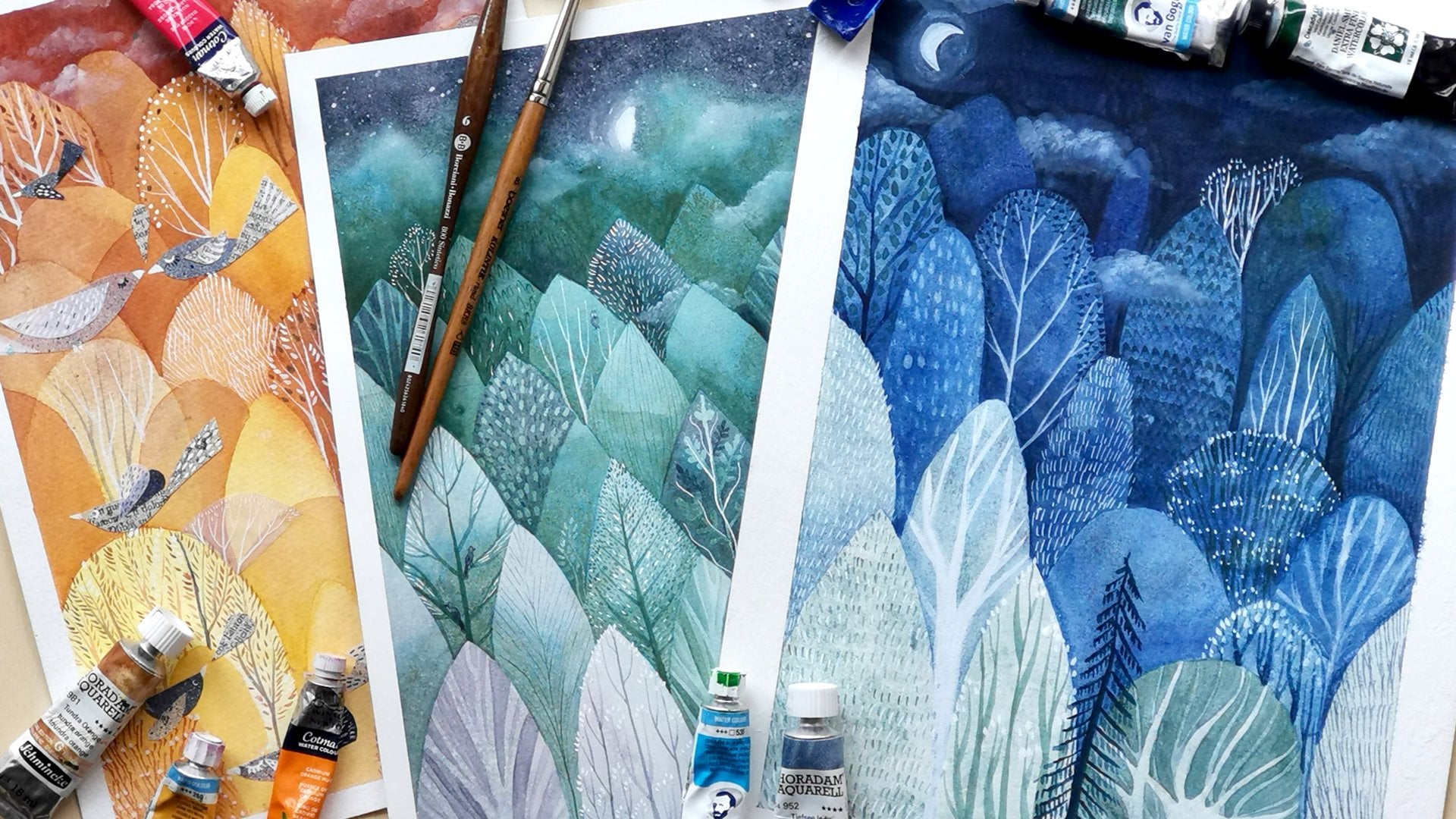
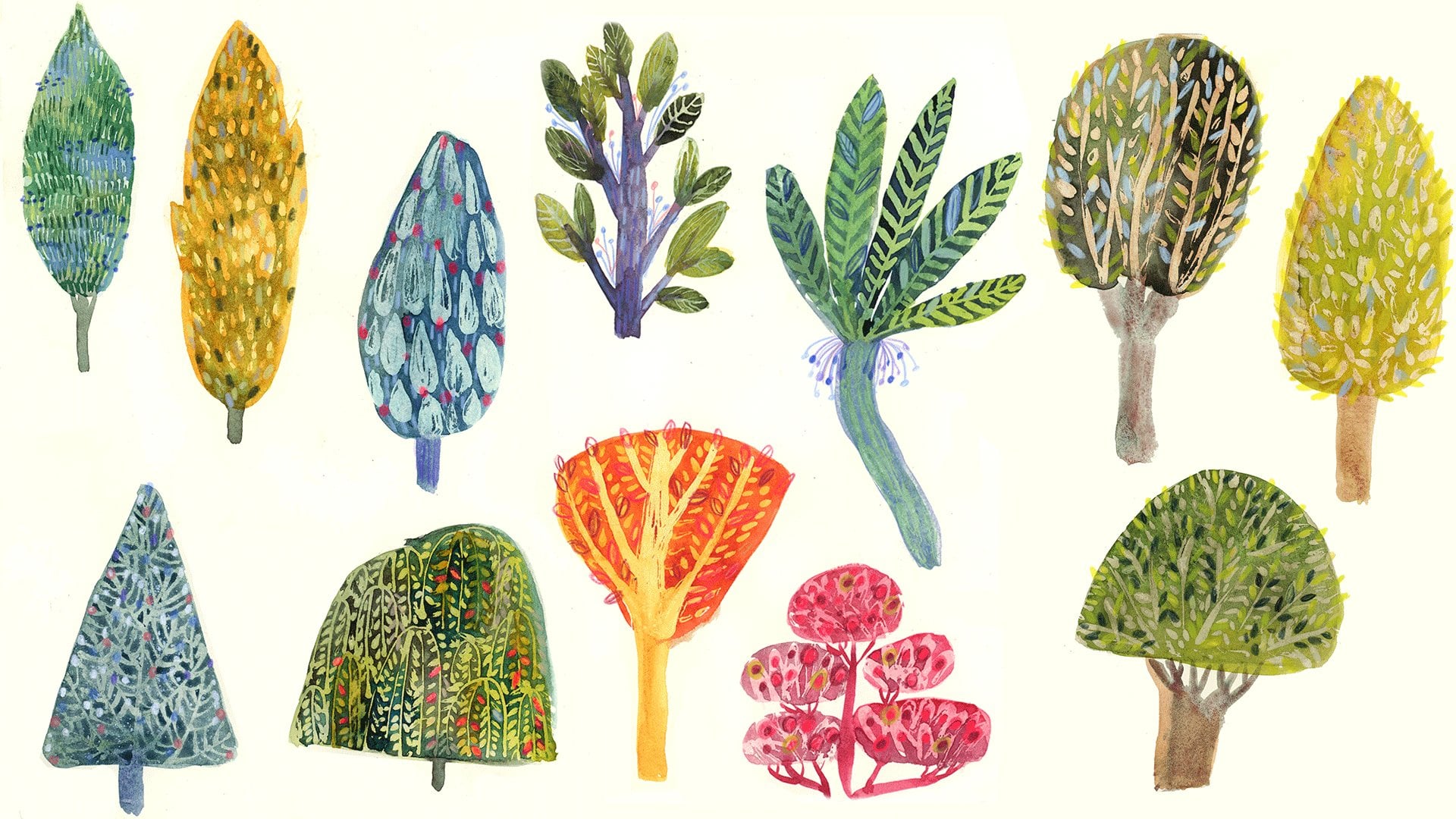
subject that you prefer. E.g. I. Will show you a different illustration that I made with this technique, e.g. this trees, all e.g. this water scene. You can choose whatever you wish or you can just
paint this old. So I created this class
exactly for this reason. So you will understand this
technique and apply it to your own illustrations and
future in your own artwork, not only in the final
class's project. And I think this
technique is really cool. It's really beautiful. And I'm really excited
to share with you my experience and my knowledge while I was discovering
this technique. Before we will jump
into the final project, I will guide you step-by-step
through all the process. First, I will show you the arch tools that we
will need for this class. Then I will show you what
is the lifting techniques, what are the differences
between when you use traditional and
liquid watercolors? Then I will show you
two main factors that can influence
the outcome of this technique that I discovered during my own experiments. And those will be
paper and time. So I will show you
different kinds of papers that I had at home and how they work
with this technique. And I will also show you time can affect the
outcome of this technique. Finally, when you will be more familiar
with this technique, when you will know the tools, we will jump into
the final project. I will paint all, as I said, feel free to paint
whatever you wish. You can paint the same old, can just paint
another illustration. Another subject you wish. At the end, please upload your projects in
the project gallery. You can share also not
only the final project, but also a single exercises
your doubts, your questions. You can add them
to your project or ask questions in the
discussion panel. I encourage you to do so and share all your
process with us. Also, I will leave
you resources. So be sure to check out the files and resources that I will leave
you in this class. I hope you will join me. And if yes, then grab your sketchbook, your
watercolor paper. And in the next lesson, I will show you better what are the tools you will need for
this class. So see you there.
3. Art Supplies: Let's see what our supplies
we'll need for this lesson. If you're new to
liquid watercolors. Then I invite you to see my other class where I explained the basic
of watercolors, different types and brands, and the differences
between them and the traditional
regular watercolors. So I will use mainly alkaline
liquid watercolors also, but there are also other brands. So again, you can
check my other lesson if you want to use another
brands that you have at home, obviously it go for it. Then I will use paper. I will use different
kinds of papers. E.g. I. Will use this sketch book, mixed media paper, and
I will also test it. It's kind of watercolor papers for this lifting technique. And one of them I will use
for the final project. So feel free to use whatever watercolor papers
you'll have a tongue. You will need also a
paper towel or a cloth. And you can use cloth, but maybe it would be better to have paper towel because
you will use it a lot and cloth would get wet
and dirty really quickly. Also, watercolor brushes,
I use synthetic brushes. They will work better
as they are harder. Better for the
lifting technique. To paint background,
I will use a flat and a bigger brush, but they are not necessary. If you have several sizes
like small, medium, and big round brushes, they will be perfectly fine. And I will use two
jars of water. That's because there will always be needed to
have clean water. Besides. I forgot to tell you that I will use for
the final project. Also the color pencils. You can use colored
pencils, pastels, or another medium that you usually use for my
mixed medium, e.g. to add details on, on watercolor, I will use
those drawing pencils. The reason is that they
are very oily, very pasty. I don't know how to
say they cover really well the color that
is underneath. I think they have oil. As any ingredients. They are not oil pastels, but they're very Walk see
I can say now boxing over. They are really, they're
covering really well and they have really
nice colors as well. I love this pastel, the saturated, very
delicate color. And they're also really warm
colors and it will contrast pretty good with my dark blue and quite
cold illustration. But feel free to use whatever color pencils
you have at home. You can test other pencils
or pastels if you have if you don't have colored
pencils that I would suggest to buy for this project. Few colors of oily,
oil-based colored pencils. You can ask arch your
art supply store, which are, have a
better coverage, which are more oily. E.g. Darwin's current
as luminance. Okay, so we can jump into
the next lesson where I will explain you what
is the lifting technique?
4. What Is The Lifting Technique : Welcome to the lesson where we will see what is the
lifting technique. I will use both traditional
regular watercolors and liquid watercolors. I will show you the
differences in this technique. And what effects can you achieve when you use those to
kind of watercolors? This is the exercise that we
will do during this lesson, I will show you with one
traditional watercolor and one liquid watercolor, the lifting technique, the differences between
those two medium. And also what will happen if
you will use more colors, what effect you can achieve? So let's jump into the lesson. Let me show you what is
the lifting technique. First, I will show
you the example of traditional watercolor
technique is the same, but the outcome
will be different than with liquid watercolor. I will use ultra marine color. The brand is shrinking, but obviously the brand and
the color aren't important. Just use the one that you
have if you want to do this exercise and Swatch
or regular watercolor. As for the liquid watercolor, I also will use ultramarine color just
to see the difference. If you have the
same color, use it. If not, you can use other
color than the one that you used for the
regular swatching, the regular
watercolors watching. If you're not familiar
with liquid watercolors, they are provided with
the pipette usually. So you can apply the color
directly on the paper. Wait until your
swatches are dry or you can try them with
hairdryer as I did. Then prepare your water paper
towel and also a brush. I will use synthetic
round brush, but you can use whatever
watercolor brush you have. Maybe synthetic are better
because they are harder, natural brush our software. So maybe it will be more
difficult to lift up the color and then take water and paint with
water over your paint. As for the quantity, It shouldn't be too little. You have to have a puddle. A little puddle of water
drops are a few drops of water that you can push
around as you can see. And then you will start to see
that the color is lifting. Then grab your paper towel
and dab into the water gently to lift up the
paint that to activate it. As you can see, there
is also the texture of the paper visible,
but it's okay. Obviously it depends
on the cloth or paper that you
will you will use. You can also rewet
it if you want to improve lifted color. Or you can also try
different brush strokes, you can just leave the color, the water drops, sorry. Then see the effect of
different textures, different strokes that you apply it with water
and your brush. You can use the
lifting technique with watercolors and also gouache. And that's because the colors can be reactivated with water. Whilst with acrylic, e.g. you cannot reactivate the color because it has plastic inside. Now I will test the
liquid watercolor swatch. And you can already see the difference
between the two swatches. The traditional and liquid
watercolors are different. The traditional watercolor
has white, lifted. The lifted part is white and the liquid watercolor, it's colored. And that's because liquid
watercolors stain paper. And when you will
lift the color, you want to be able to
lift it completely. The paper underneath
will be colored. That's because liquid
watercolors have die inside and they behave like inks and they stay in the paper. And that is why this medium
is great for this technique. Because you can achieve really interesting effects
with when you will lifted. Now, let's prepare the swatch
of two or three colors. I will use blue and two
different kinds of greens. And important is that. You shouldn't mix them together because then you
will have just one color. But I would like
you to try to make a swatch of a gradient of those three colors and
not mix them altogether. Okay, So this swatch is dry. You can see the
colors are separate. There is blue and
two kinds of grains. There are also some white dots, but remained, but
it's not important. And I will paint
again a triangle, but maybe I will rotate it. And I will try to cover with water those three colors to see the difference of the shades of the color once it
will be lifted. And quite generous with water. As you can see, there's quite a lot of it. That's because I want the color
to be really reactivated. Then grab your cloth or paper towel and gently
remove the water. And as you can see, underneath, the beautiful
gradient is created. You can see the difference
between the background colors, between the blues
and the greens. I think this effect
is really cool. You can achieve for the
bright and vibrant gradients. I will see also the
darker greens at the other gradients
that are on my swatch. And wallah. Also here you can see the difference between
the lifted colors. I wanted to show you another examples of the swatches that I did in my sketchbook. E.g. here I swatch to red colors and paint it those kind
of plans of grass. And I really love the
effect that it created. As you can see, it's
really diverse, vibrant. And what I would like you to leave you with is
a suggestion that you can also do the swatching of all the lines that
you have at home and do the lifting technique to see the colors that
they will create. Now, I hope this exercise
is more clear to you and that you enjoyed
it and always clear. Let's recap the main things that we talked about in this lesson. If you want, you can upload
the outcome of this exercise. Feel free to do it if you
want to share this process. I hope it was all clear for you. If not, then be sure to come back to me in the
discussion panel. And in the next lesson, we will see how paper can affect the outcome
of this technique. See you there.
5. Testing Papers Part 1 : And paper influence the outcome
of watercolor technique. If you're not new
to watercolors, I'm sure you know
the answer is yes. The difference can be
fundamental with watercolors. Right now, I won't be
explaining different kinds of watercolor papers
and the specifics. But I will show you how paper can influence also the lifting technique
with watercolors. I will test the papers
that I have at home. You don't have to
use the same brands of papers that I do. Just grab the papers
that you have at home. And I will just share with
you my experience and I will test on the papers
that I have at home. This lesson will be
divided into two parts. In the first part, we
will do swatching and we will swatch colors
on different papers. And in the second part, we will do the
lifting technique. Well, during my process, I discovered that paper can influence the lifting technique. So I always do the swatching of my papers before I
will do a project. Here you can see the samples of the lifting technique on
different papers of the water, but also I use the
bleach, bleach here. And it will be a topic of my other class here
on Skillshare. Right now we will focus on
the water lifting technique. I prepared for you different
swatches of paper and I will redo this swatch together with you to
see how it works. I will also scan the
outcome of my papers swatches for you and leave it
in the cluster's resources. So my first observation
I would like to share with you is that I discovered that not always the best quality watercolor
papers are the best, or this technique, often the worst quality papers work even better with
lifting technique. I think it depends
on how much Two. Paper absorbs the
water because when it repulsive than it's
even better, e.g. for the swatching that we
did in the previous lesson, I used the sketchbook paper. It's not a good quality
paper and as you can see, it worked really well
for this technique. So let's start swatching. I will show you my papers
that I have at home and I will show you which worked
for me and which didn't. But first, let me give
you some color tips. E.g. I. Would suggest you to use the same colors for
the same swatches. You will easily see
the difference, e.g. you can see that I use the same blue and black color
for different swatches. And you can see immediately
the difference. E.g. here, there
are the same colors on different papers and you
can see the difference. My other suggestion would
be to use darker tones. That's because it
create better contrast. You will easily see the lifting technique whilst
with brighter colors. There's not always
such a great contrast. But obviously, you can test
whatever colors you wish. The first paper is
honeymoon Britannia. It's hot pressed
watercolor paper. And I will apply two colors on it
directly with a pipette. It will be a dark blue
and dark turquoise green. Try to keep separated. The colors, divide them, and try to blend
them into one color. I will leave the swatch
to dry in a natural way. So in the meantime, I can prepare other
papers, swatches. Right now. I will jump
into Canson Mullin. Do why? I'm not sure how
to pronounce it. Sorry, It's the hot
pressed paper as well. And again, I will
use the same colors. This is one of my favorite
watercolor papers, but I saw that with
this technique. It doesn't work very well. I mean, it works, but the
color is not so bright. So I think it also
depends on how this color absorbs water and it
absorbs it really well. That is really very
good quality paper, but we will see it later. I'm not talking to you about a scientific theory
because I'm really not certain. Those are my suggestions,
mine guessing. Right now. I am testing Fabriano
artistic cold cold pressed. Sorry. So my suggestion for you
is just to do the testing. E.g. now we will test not
the very obvious choice. This is a sketching paper, honeymoon, nostalgia
sketching paper. I chose it because
it's quite thick. And I thought to test it because it's really
smooth when you touch it. And I thought it could
repulse watercolor. And maybe lifting technique could appear really well and it, so let's check it. And also if you have a sketching paper that
you think could work, good, then give
it a try as well. Now, I will jump into the
papers that didn't work. Well. For me. I'm not sure what paper this is. I'm I have this swatch at
home and I wanted to test it, but I don't know
what brand is it. But as you can see, immediately, the
swatching went wrong. The colors stained the paper. And while I'm painting, I already can feel
that something wrong. The watercolor is not
absorbing in the correct way. So I don't know
what the brand is, but I will show it to you just to let you
know that there are some papers don't
work well at all. And the second example
is Fabriano artistic or hot pressed before
it was cold pressed. And also this paper
doesn't work at all. You can see the
same problem here. It's stained the paper. I'm not sure why this happens. Maybe it's because the
color the paper is old or I'm not sure. Probably it's the
composition of the paper. So yeah, I will show you those examples as the
one that doesn't work. Wait until your
swatches are dry. That's because you could do
it also on the wet color, but the edges would spread
and would be blurry while they are sharp
when the color is dry. So that's why I will use the dry swatches so it
gets your paper dry. You can wait until it's
dry naturally on you, or you can use a hairdryer. And when you're ready, then jump into the second part of this lesson where we will test lifting on the swatches that we prepared. See you there.
6. Testing Papers Part 2: Welcome In the second part
of the testing Paper lesson, where we will test lifting on the different
swatches that we prepared and see how the lifting technique
appears on different papers. I will start with
Fabriano artistic or this one is cold pressed and I will prepare the water and ask for the lifting
technique lesson. I will try to be quite
generous with water. I will paint as well,
tree with branches. But you can paint a triangle or a rectangle
or whatever you wish. And as you can see, I have this drop of water
and I'm trying to push it to in order to
reactivate the color. So you can see here
that there is a puddle, a drop of water. Here we are lifting the
color as you can see, the contrast is really
great, really nice. I wasn't so happy of the
result with a black color. But maybe that's because
black color is a little bit more difficult
and more dark. Blue with green was a
really good choice. And you can see better
with bright effect. Test Canson hot pressed. And again, I'm really happy with the result of the lifting
color, lifted color. So it's not that the
good-quality papers won't work or the bad quality paper
will work or vice versa. It's all about testing and
saying what the result, what result will satisfy you. And here is the honeymoon
and Britannia hot pressed. Right now I'm showing you the granulation that two colors. It's quite unusual because liquid watercolors usually in blend and homogeneous
and plain way. But here's some granulation happened and I really like it. So at this point you probably understood that lifting
technique can be unpredictable. And I won't give you any
strict or fixed rules. The only way is do the testing. So again, colors are
really beautiful. I think I also prefer
nanomolar from Canson. Let's jump into the last
paper that I prepared for you as the example
that works good. This one is the sketching
nostalgia Hannah MLA paper. I decided to show it to
you to encourage you to test the papers that
you don't think at. The first glance
could work good. Instead, they could e.g. look here, it
worked really well. Also the blending effect. I find it very nice. And here's Fabriano,
artistically hot press that didn't work well
when I watched it. When I'm applying the water, I can feel maybe you can
see that the water is immediately absorbed and
now lifting is occurring. There's something
wrong with this paper. I don't know if its
composition may be glue. It is 100% cotton paper. But since it behaves like this, it must be something wrong. And you can also see the color. The edges are blurred
and it's not. Okay as well. Let's jump into
the second paper, the one that the name
I didn't recall. As you can see, the swatching went wrong
and also the color is not. Okay. Let's try to
see what happened. If I will paint it with water. Now the same problem here. Water immediately is absorbed and it wants to lift
the color at all. So I want to use those
two papers for sure. And again, my advice
for you is to test your papers
and if you will see that the lifting technique
is not going well, so maybe the problem
will be your paper. Let's recap the steps that
we took in this lesson. And here are the slides
with paper testing, where I show you the samples of the papers that I
used in this lesson. So I know this lesson
was quite long. It's could appear a
little bit boring. But for me it was fundamental
to share with you my experience, my experiments. And also, I'm aware it could be a little bit
confusing because sometimes the effect was
obvious and sometimes not. But what I basically
want to to live with, it's not rules, scientific
roles, specific rules. Because I don't really
know them to be honest. But I would like you
to leave you with this knowledge that paper can influence the outcome
of lifting technique. And second of all, I would like you to
experiment and explore your own papers and see
which one works best. Of course, if you want to
share this exercise with us, then feel free to do
it in your project. Or you can turn back to me to ask in the
discussion panel, it would be great to
share our knowledge, our experience, and process
regarding the paper as well. And in the next lesson, we will see the second
factor that can influence the outcome of the
technique entities time. So see you there.
7. Time Testing : In this lesson, I will
show you how time can affect the lifting technique
with liquid watercolors. There will be two time factors. The first one will mean that you will think
how long you would like to leave your watercolor
on your paper before you will use
the lifting technique. And the second factor
will be how long you will leave water on your watercolor
before you will lift it. So let's check it out. Let's start with
watercolor timing. It means that we will do different timing before we
will do the lifting technique, I prefer to test
with two swatches. On the left one, you can see the swatch where I painted with watercolor and then left it for about an hour before I did
the lifting technique. And on the right, I painted and then dried it with hairdryer or you can
also leave it to dry. And then immediately
once it's dry, you will use the
lifting technique. So you can see immediately the difference
between two lifting. Here the colors
are really bright. And when the watercolor left
more time on the paper, you can see the effect is really darker and not so bright. Also on this slide, you can see the difference
between two swatches. So my guess is that when you
will leave watercolor for more time than the color that
will interact with paper. It will stay in it more and it will be more
difficult to lift it up. While if you will use
a less amount of time, then it will be easier
to lift it up because the color won't stay
in that paper so much. But since it's the
alchemy and we saw that different papers
reacts differently. I wanted to say if this rule will be the
same for this swatch, I painted those branches after 10 min and the swatch
is two days old. And now I will paint
the same branches. Next to the old. Wants to see if there
will be difference between those two timing
in the lifting technique. And as you can see, there is no difference or
there is a difference, but it seems that the second swatch worked
better than the first one. So even if it was made after the color was on
the paper two days. So as I said, it's a kind of alchemy. And you just have to test it
and see what will work best. Let's jump into the second step, which is the water timing. Whilst in the first step, we were thinking how the
lifting technique can be influenced by the time that the watercolor is
left on the paper. And the second step we will think how it can be
influenced by the time that the water is left on the color before
it will be lifted. So right now I'm
doing the swatch when I will leave the
water for a longer while, I'll I will insist a little bit re-wet with
the brush more times. And yeah. So this one is a little
bit longer before I will lifted as as as you can
see, it's quite successful. You can see the lifted
color is really bright and there is a
beautiful contrast. So on the contrary, let's try to do the lifting in a really quick way
without insisting. And let's try to lift it almost immediately after we
will apply the water. And you can see the obvious
difference on the right. The lifting technique they
lifted color is more dark. We weren't able to live the
color in the right way, whilst on the left, the contrast is really
lovely and bright. So the conclusion
is be aware of that also the timing will affect
the lifting technique. And let's recap the steps
that we took in this lesson. And I will leave you a few
slides where you will see the difference of
different time swatching. Okay, So we finished
the thoracic part. I know it was quite long. I hope it was clear for you. And if there's one
thing that I would like you to take from
these lessons is that you will be aware
that there can be different factors that
influence the outcome. And this could be paper and time that you apply to
the lifting technique. I also know it can be confusing because sometimes you can see the influence of those
factors and sometimes not. But as I already
told you, I don't, I don't want to leave you
with some specific roles, scientific rules, because
for me it's kind of alchemy. So I encourage you to test, to do many testing and try. And I hope that you will
satisfied with your exercises. If not, then just explore
really, really a lot. I did it for me. It was really a lot of exercises before I
achieved a cool effects. And again, if you want, you can upload this exercise to the two-year project and
share with us your thoughts. And in the next lesson, finally, we will start our final
project. So see you there.
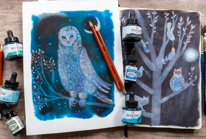
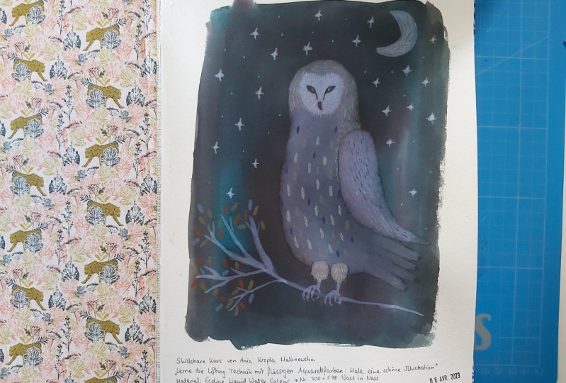
8. Painting An Owl Part 1: Welcome to the final
project lessons. I'm really excited
about it now that you're more familiar
with this technique and with the tools and different factors that
influence the technique. I think it will be
really exciting to apply them in order to do
your final project. As I told you before, we will paint this 0
for the final project. But feel free to do whatever
threshold you wish. Later on I will show
you different kinds of illustrations that I made
with this technique. So maybe it will inspire
you to do some other topic. And in the first part, we will paint and all
with lifting technique. And in the second
part of this lesson, we will draw details
with colored pencils. So let's get started. Let me show you some examples in my sketchbooks of
the illustrations that I did with the
lifting technique, e.g. this trace, this one. First I lifted tree and the shapes of the
birds and the cat. And afterwards I drew with the dry pastels over the
birds and also over a cat. The same here it's
the same kind of illustration and technique
I just used other colors. And here's an example of
just the tree that I did. And later on, I applied birds in Photoshop
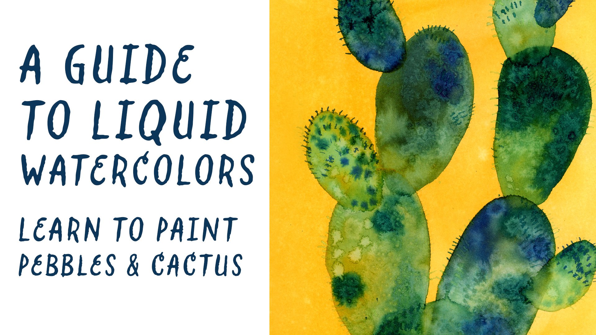
to create this illustration. E.g. I. Also use the lifting technique
for this aquarium seen. First I painted different
water plants and the brighter grass
leaves that you can see are made with
lifting technique. And also later on, I applied finishes with photoshop, collage,
digital collage. Also those cacti were made with lifting
technique as well. And we will paint a null. That's because I painted also this before in my sketchbook. And I wanted to do again
this illustration together with you and show
you the process. A brief reminder for the art supplies you will
need for this lesson, or your sketchbook or your
regular watercolor paper. And also colored
pencils for the, for the details if you
want to draw them. Obviously your
liquid watercolors. And I will use this time of watercolor paper and not
the sketchbook paper. That's because I wanted to be a more defined
illustration that I can give to somebody later on. But you can use your
sketch book if you wish. Let's start with
painting the background. I will use two dark colors for the background does
because I will use, I will paint a night scene and I also think the
contrast is better, but you can use whatever colors you wish for your background. And I will use black color
and the Prussian blue color, and I will blend them in
the wet on wet technique. This time, I will use
this large flat brush and first I will cover
the paper with water. The reason that I use
the wet-on-wet technique is that I want to
have blurred edges. I want them to spread
without very sharp lines. You can use wet on wet
technique as well, or you can just do wet on
dry technique as we did in the previous lessons if you're not familiar
with this technique. So I will drop colors here and data randomly on my
waters to still, until it's still wet. And I will alternate blue
with black here under. And as you can see, they spread really well. But still I have to paint
with my brush and try to distribute the color
all over the water. As you can see, I left
the border of the color without painting with a
brush over it because I wanted to leave this effect
that of color that spreads. But there are still some gaps, so I will just fill it again by using the pipette
without using a brush, I will try to fill the
color when it's needed. Okay, The background is dry. I use the hairdryer and now
we can start to paint the OH, to make it more easily, you can sketch the shape of the illustration that
you want to draw before. I will use the pencil
and as a reference, I will use the illustration
that I painted before. Yeah, let's get started. Try to be delicate and later on you can
erase the pencils. The color won't be canceled. And as you can see, the stroke is visible on
the liquid watercolors. We will start with lifting
up the basic shape. I will use a medium
synthetic brush. And first we will do the
lifting technique on the general shape of the all. And then I will show you how
to do overlapping shapes. So we will lift the shapes on
the previously lifted part. Once I will finish the painting
with water, I will live. The water. Ensure that the water
was long enough under color before
you will lift it. If you think that your
color is too dark, then what you can
do is to re-wet the surface and do the
lifting a second time. To speed up the process, I will use a hairdryer. I want my old to be really wet. And now let's start to
paint overlapping parts. I will try to lift
another piece of color over the lifted over the color that
I already lifted. So I will try to reactivate it. So I'm insisting
quite a bit with water and brush strokes
because I really want the color to
reactivate farther. And because I wish I wanted
to have a brighter color. Now, I will jump into the
legs, into the class. And also here I want to do
a little overlapping parts. One part will be
over the over the 0. The same for the wing. Part of the wing will be
outside and apart will be over, overlapping the old. And as you can see, I leave the water for a longer time before I will start to lift it, I want to lift it immediately. So let's check the result. And it worked. As you can see, we were able
to lift another color more. I will insist before
lifting this part. Also here, you can always re-wet before you will
lift it if you want the lifting parts to
be really bright. And let's try it. And as you can see, there is a really
significant difference. I will also try to
paint a feather here and that will overlap, e.g. the wing and the tail. I don t really
planned the elements that I will paint for
examples, the feathers. I decide during the
process where to add them, what elements to add. I'm just I'm just, I just like to decide
those kinds of thing. During the process. Let's jump into the clubs. But before I will paint class, I decided to paint
the branch first. So the clause will
be overlapping the branch and not
the other way around. Let's lift it up delicately. Also the feathers that
were left behind. And two things happened here. First you can see there
was a little bit of water that fell down and lift
it a little bit of color. And the second is
that the further and the branch edges aren't sharp. There are blurred,
blurry and spread. That's because obviously,
there must have been what? Color? And it wasn't dry enough. So sometimes it's enough
to use a hairdryer. Let's see if it will improve. It did about not the branch
and not the other feather. I will see what I can
do to cover it up. Probably. I will paint another further to cover this effect. But it's not so important. Now that the branch is dry, I will draw the
class with water. And also I will wait a
little bit before I will lift it and I will finish
to paint my branch. As you can see, to drop, fell down and lifted the color and it gave me
the idea to make stars. So sometimes the process is
giving you the solutions. Also this round shape that
was created accidentally by the drop-off color gave me an idea to draw the
moon around this shape. I didn't plan it. It's just a process
that leads me. Let's paint the
moon and the stars. And four stars. I will leave a few drops here and just a simple
drops of water. Okay, Now we finished the lifting technique
and let's jump into the second part where we will use colored pencils
to draw the details.
9. Painting An Owl Part 2: Welcome. In the second part, final part of our project. At the beginning, I wanted to warn you that unfortunately, my battery went down
and I wasn't able to finish illustration
to record it. So you will see that I
already painted the stars and also the feathers on
the front of the old. But I use the same technique as I used for other feathers. The stars were simply the
tropes that I left on the color and the same for the feathers just to
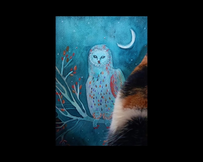
drops that I lifted. Okay, So now that you're ready, let's see how we can use colored pencils on
our illustration. Let's get started. Maybe at this point, you're wondering if you want to add details with
colored pencils. Of course, you don't have to. Maybe you like the outcome of your illustration
without further details and you want to
leave it as it is. Obviously, it's up to you. Maybe you would like
to add just e.g. eyes are big if you painted on all as well. It's up to you. So I will use the
drawing colors. As I explained to you before. There are covering
really well and also because they
have warmer palette, so it will create a
lovely contrast between my cold dark colors and
the detail warm colors. So let's start by drawing
the eyes and the big, I will draw them, I will catch them with pencil so I could always erase
it if I don't like it. For the eyes, I will
use black color. And for the pig, it will
be chocolate brown color. So you could leave
it like this or at some other direct dark
details if you want. But I will proceed. I will. Now I will add light white
feathers on the head of the 0. I will use a Chinese white, and then I will alternate it
with this warm, wet color. So first, I started
with Chinese white, and the second row will
be the warmer white. I will mix those two
together basically. And here it is. Maybe a little bit more
contrast to the eyes. I will add feathers also
in the front of the, oh, also, I will play for an
hour with brighter colors. I play with the strokes. And in the front, I will repeat this
drop shapes and use a darker yellow
color, ocher color. Also, I will add darker details. Few tips about choosing
your color palette. You could use a contrast, as I already said. So if you use cool
colors than you could use warm colors for the
details and vice versa. If you have warm colors
for the background, you could use cooler tones. You could always use
darker tones, e.g. or brighter tones to use the contrast between
dark and bright colors. So I would avoid to use two similar colors for
your details, e.g. green for green,
blue for blues, etc. Or if you want to use blue, the similar towns, then use
them brighter or darker. Also, you can use just
one or two colors. You don't have to use more. If you like more
homogeneous tones, then just pick fewer colors. You can use also the eraser
on your colored pencils. So it's quite forgiving. If you're not doing
too bold strokes, e.g. here, I will use the lighter strokes to
create the volumes. I'm just playing around. Sometimes I will use
strong strokes like e.g. for the leaves, times softer. I will apply really softly
the colored pencils to create different tones and to create the light,
this light effect. Alright, we've finished, we've
finished our illustration. I'm really curious
what you create it. I'm really curious if you painted an all or
some other subjects. I hope you will share it with
us in the class project, in the projects gallery. And I invite you to see the last lesson where
I will leave you some last inflammations about
the project and the class. So see you there.
10. Final Thoughts: So thank you so much for
taking this class with me. I hope you really
enjoyed it as I did. I hope that it will be very helpful for you that
you learned new skills. I also hope that you
discovered new medium, which are liquid watercolors. I'm a great fan of them. I let you enjoy the
colorful process. So let's recap briefly the steps that we
took in this class. So first I show
you the art tools. I showed you. What is the lifting
technique that I showed you different papers. How paper can affect the
outcome of lifting techniques. Finally, we saw also how you
can play with Simon order to have some slight differences
in this technique. And at the end, we created our beautiful
Final Project illustration. So my final reminders
for you would be to upload your project in the projects
gallery if you wish, you can share with us also the process of the
previous lessons. Also, I would like to ask you to leave a review
of this class. It would be really
very helpful for me. You can vote on different
factors of this class, and it will be really,
really helpful for me. So thank you in advance
for your review. Also, you can follow
me on social media. I'm mostly on Instagram and I share some art videos
on YouTube as well. Thank you. Once again, I hope you enjoyed it. I enjoy the process, enjoy exploring new
arts techniques. And I hope to see you
around on my channel. I invite you to see my other classes and explore
also all the classes that skillshare offers to
you. So see you there. Bye.
 Ania Kropla Malinowska, Award-winning illustrator