Transcripts
1. Hello & Welcome Back: Painting is the silence of thought and the music of sight. It's just another way
of keeping a diary. Need to paint is a few
tools, a little instruction, and a vision in your mind. Painting is self-discovery. Hello everyone. I'm mashed it. A perio, an artist, an art educator, and a
creative business and Premier. You can find me on
Instagram under the handle, creating from the
heart where I share my journey with
journaling supplies, handmade phone cases,
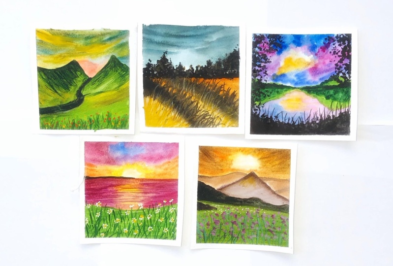
vintage frames, and my other artworks as well. Hi, welcome you all to my new Skillshare class on painting meadows
with watercolors. In this class, we'll be exploring five
different videos and creating each one over the
course of five coming days. Do not be overwhelmed. If you are a beginner
with watercolors, we will be diving first
into the materials that you would be needing
throughout the class. And then we'd be going
into the details of each class project for
the coming five days. I'll be sharing
everything in detail for each class project
from each stroke, how we laid out the colors
that we'll be using, the color mixing that
you can create if you do not have the
same color tones. And then walking onto creating on the five
beautiful meadows, I'll be sharing the
reference image as well and how I selected
my references. And then you can see
the difference in the reference and what
creation we turn it into. If you are someone who's looking to level up your
watercolor games, then join me into this
class and paint along these five beautiful meadows from the reference to
the final painting, creating our own sunshine, along with a little
hint of the flask. So without further ado, I'll see you guys in to the
next lesson of this class.
2. Materials Required: Before moving further into the
class project for day one, Let's have a look
at the materials that you would be needing. I'm going to be using this handmade sketchbook
from my store, which is made of Archie's
300 GSM, 100% cotton paper. This is the same sketch
book that I had used in further 12 days
monochrome class series. This is completely
hand bound using the Archie 300 GSM hundred
percent cotton paper. This is a little rough
grain textured paper, but it's actually a
cold pressed paper. You can have a close look at the texture of
the paper despite being a cold press paper and the thickness that is 300 GSM. You can go ahead with
any paper which is at least 300 GSM, 100% cotton. In case if you're
going with a paper which is not 100% cotton, you will have to make sure
that your paper stays wet for enough time for
you to create it. I can use both the sides of the paper while working
with such a thick paper. This is about the paper
that you will be needing in the next material that you would be needing
watercolor paints, I'm going to be using in this Magellan mission
watercolor set, which I already have
squeezed out on the palette and I will be
using the shades from these. Do not worry if you do
not have all the sheets, I will be sharing the
details of each shape. Apart from that, you would be needing in white gouache as well for adding in some details and creating in some opaque colors. Next to you would be
needing the masking tape to tape down your paper for
each of the class project. Apart from that, you would
be needing some basic stationary like a pencil eraser, tissue papers or some
cloth towels so as to dab your paints and brushes for getting in some
texture effects as well. Lastly, you would be
needing in some brushes. Now you may not need
so many of them. I will be sharing which
crashes I will be using, which is majorly going to be
one flat brush, round brush, and one detailer brush, which are all natural
hair brushes that I will be using it you can even
use in synthetic brushes. And lastly, you would be needing two jars of clean water
for each class project because we are going to
be working in with a lot of details creating in
each class project. So these are all the
supplies that you would be needing
for the five days. So grab all of them
and I will see you guys into the next lesson, which is going to be the
class project for the one. So grab your materials
and dive into the next lesson
of this class and begin painting your
watercolor medulla.
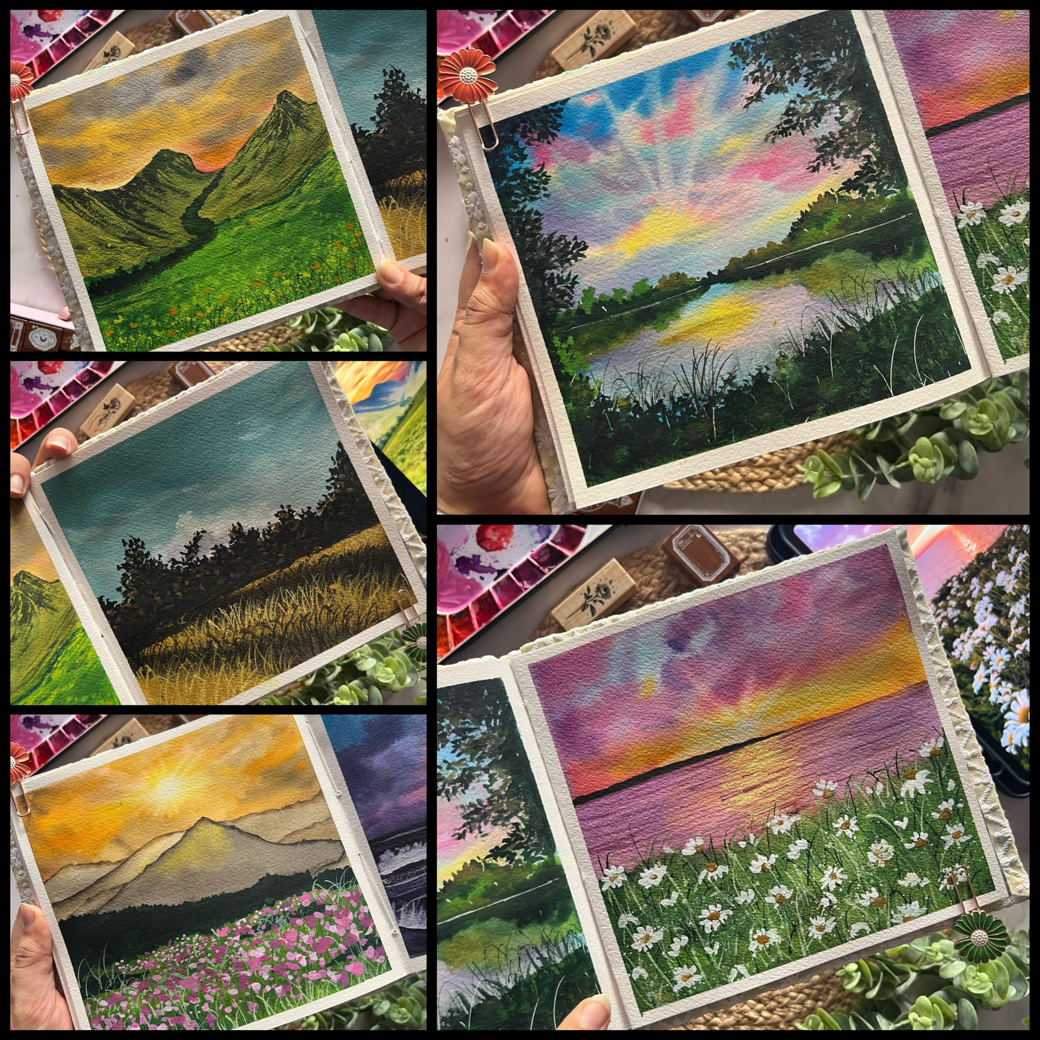
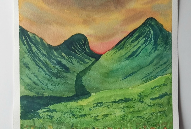
3. Day 1 - Mountain Meadow - Part 1 - Sky: Let's begin in with our
class project for d, one of these five D, watercolor may lose challenge. I'm going to begin in
with a pencil sketch. I have broken down each class project into
different sections, so that is easier for
you to follow along. As we discussed this
class projects are going to be analytical,
detailed manner, which will take a
little extra time for you to get in
all the details and level up your watercolor game so as to not make
it overwhelming, I have split each class project
into different sections so that you can easily go along and create in
the class project. Now I first added in the mountain range and now in-between the
mountains as well. I'm just adding in a
small area which we are going to be giving in lush
green details out there. Mountains are also
going to be off the green details with
different color tones of the green color creating in the details with the
dry brush technique. So this little part in-between is going
to be darker green. And then on the mountains
we'll be adding in the dry brush details
with the darker tones, feeding in different
textures on the mountain as the top area over the mountain is going
to be the sky space and the bottom is going to be the middle that
we'll be adding in. Now, this darker part
that I've created, we are going to be adding
in most of the dry brush, giving it a little darker area. Now the colors that we need
for this class project, I will keep sharing one-on-one. So basically for this tie, you would be needing more
of the yellow, orange, and brown tones, The
mountain ranges and the bottom space you would be eating the green and
the brown tools. And then finally, for
the floral effect we are going to use in the yellow
and the orange tones. Now first I'm beginning with
a layer of water out here, and I'm just going ahead
into the sky space. But the layer of photo, make sure you do not add the water and the
rest of the space is you just need to add the
water in the sky area first. Do not even run into
the mountain range. So go ahead very slowly. In case if you're using a paper
which is not 100% cotton, then make sure that
you leave it to you, But wait for it to dry approximately 50 to
60 per cent and then re wet your paper
again in that way your paper will stay wet
for a little extra time, letting your work wet on wet, giving him the
details in each of those pieces of our
painting step-by-step. So you can see despite I'm
using 100% cotton paper, I'm running my brush
multiple times so that my paper stays wet for enough time for me to get it getting all the
details Dan and right. So the first color
that I'm going ahead with is the
yellow orange color. Now in case if you do not
have the yellow orange color, you can just mixing a little bit of your yellow
and the orange tint. I will try using as
much as possible the basic color palette so that even you can follow
along very easily. Going ahead with this yellow, orange color layer very closely towards the
mountain range, marking out the shape of
the mountain carefully so that we do not run into
the mountain area. Now next I'm going to pick up a little of a light reddish tone, or you can even pick
up a raw umber color. I'm mixing a little of the rumba with a little bit of
the light jet tone, you can even mix in a little
tin two of the bonds here, not very little, not much. So using the raw umber color, I'm beginning to add in the details at the
top of the sky. Now you can see in
the raw umber color, the water content is quite low. I just dip my brush in water and just
activated the paint. And after that, I
haven't added any water. So using this raw umber color, I'm just beginning to add in strokes over the yellow,
orange color as well, creating in the cloud effect. Now next I've lifted a little
bit of the sepia color and I'm beginning to add in little highlights
with the sepia color. Now again with the
sepia color as well, you can see the water control. I haven't picked up much of
the water because of fish. The paint is spreading in
very easily and I'm just able to add them as
the highlighted space. They are not spreading
and blending with the yellow or covering
the yellow space. They are staying
at the space where I'm just adding them
with the brush. You can see the shape is
also reading just that. They have a beautiful soft edge, well blended look with
the base layers as well. Now next I'm just going to
squeeze out a little bit of the Payne's gray color
and begin adding in some highlights with
the Payne's gray color. You need to make sure that
your paper is still stays wet. My paper is still wet. I'm still working wet on wet. I'm just going to
squeeze out a bit of the White Nights or Payne's gray color because the Magellan mission set does not have a Payne's gray color. And I absolutely loved the Payne's gray consistency
of the White Nights set. So I'm just going to begin using the Payne's gray color and begin adding in the highlights. If you want, you can first have a look at the entire part, one that is going to be just
the sky part and getting all the colors ready and then go ahead
painting in your sky. Now using the Payne's gray, I'm going to begin adding
in little highlights. It's going to be quite less. With every color highlight
that you're adding in. You can see we are
making sure that the colors are still visible. So you need to be sure that you add the palace in
such a way that the previous year's
colors that you've added still remain visible. Otherwise, it would
make no sense adding in the base colors first. So you need the whole
layers on layers. Now using the
Payne's gray itself, I'm just adding in little
darker depth as well. Now next time
lifting a little bit of the vermilion color. If you do not have
a vermilion color, you can go ahead with the orange tone or any
other reddish orange tone. To that, I've added
very little tinge of the bond sienna color to give
it a brownish orange tint. And now using this, I'm just going to begin at adding it closer to
the mountain range, but this is a little
darker as of now. So I'm just going
to lift up a little of this enlightened up
little off the top. This is the last layer of
color that we're adding in your and I'm just going to
lighten this up and blend it. Well. I'm just going to
add in little highlights with the orange-ish brown
color at random places. And then wait for the
sky to dry out and move ahead for the ones the
sky dries out completely. So with orange color, you can see I'm adding in
very little highlights and MoMA's Gianni closer to
the mountain ranges. Only. I'm not taking it much
towards the top of the sky. I'm just keeping it closer
towards the borderline of the mountain ranges to show in a little of the sunset effect. You can see I've lighten the
color effect as well so as to give it a little lighter
and wherever needed, I'm giving it a little bit of the overlap with the brown
tones again as well. I'm just adding in
a little bit of the brown tones closer to the Payne's gray details because I feel it's looking a
lot of Payne's Grey, so just a little highlight of the darker sepia brown color out your very little, not much. And now we're almost
done in with the sky. So as I told you, each level, we are going
to create a lot of depths, lot of details working step-by-step so as to get
into details right now I'm just going to lift up a
little color closer to the Payne's gray and creating
little lighter effects as well, showing in the perfect
sunset effect. So that is it. We are
ready with us sky. We need to wait for it to dry. And in the next lesson, we'll move on to the next part, that's the mountain ranges, to see you in the next lesson.
4. Day 1 - Mountain Meadow - Part 2 - Base Layer: So my sky is completely
dry it and now I'm going to begin in
with the mountain ranges. So as I told you for
the mountain ranges, we are going to be going ahead
with the shades of green. I'm going to be using in different shades of
greens, sap green, yellowish green, olive green, Hooker's green and
vending machine. Now, you do not have
so many of the drains. You can just use a
light green color, dark green color
and green color. Now in case if you do not
have a light cream color, you can mix in a little tinge
of yellow to your salary. If you do not have a
darker green color, you can just mixing
a little bit of your brown to your
regular green. And if you do not have
a vendor green color, you can simply mixing a
little bit of the Payne's gray or black to your
green, but very little. First-time beginning in
with a little bit off the olive green color onto
the right side mountain. I'm mixing in a little
of the olive green and the greenish yellow
tone from this set. I'm first just going ahead with the mountain range
on the right side. And you can see I've
added the layer of water as well only
on the right side, because by the time I
reach the left side, the water may dry out. I'll go in step-by-step because in the center,
as you can see, we're already be giving in the lush green detail
because of Fitch, the rough edges will
get covered up, if any. Now I'm going to go ahead with the same green tones onto the
left side Mountain as well. Now I'm just going to go ahead with the layer of color
directly you are, but I'm going with a
little extra water. You can see I added a little
color and using the water, I'm spreading the
color directly. So this is how I'm going to
be creating in the detail out here onto the left side and
blend it till the right side. Now you can see at the
top of the mountain, I'm going in very carefully to define the shape
of the mountain. Well, so go ahead very slowly and carefully
and define the shape, the outline of the
mountain where now you can see I'm using a brush
which has a pointed tip, which is making my job easier in spreading all of the
details out there. In case if your brush does
not have a pointed tip and it becomes difficult for
you to define the edges, shift to a detailer brush. First define the edges and then quickly run in with
a bigger brush, filling in the rest
of the spaces. Now I'm just running
ahead with the layer of color defining in the bottom
line of the mountain range. As of now, I've used in
only two shades of green, one greenish yellow color, and the second one, a
little olive green color. Now I'm going to begin adding
in little details with the Van **** brown
color is going to be quite hitting, not match. So I'm just squeezing
out a little bit of the green color
from this palette and blending it with a
little bit of water so as to get it in a little
perfect consistency. And I'm just beginning to add
in little darker strokes. I'm still working wet on wet. My mountain ranges
are still wet in case if your mountain ranges have
already begun to dry in, then make sure you wait for
it to dry out completely. Go ahead with the
re-weighting technique, and then go ahead
with the next layer. Otherwise, it will be
very difficult for you to get in that soft
blends between the details. You can see I'm blending
the darker tints as well into the base layer
using a damp brush. So I just have those
darker highlights, but not those strokes marks
standing out distinctively. Now in the scene
view, you can see I'm running towards the
left side as well. But if you notice the difference
towards the left side, my strokes are moving
diagonals towards the bottom right side and towards the right
side my strokes, we're moving diagonally
towards the bottom left side. That is to show the
flow of movements of the details on
the mountain ranges. Again, you can see your as well. I'm going ahead with the
wet-on-wet technique. The darker green strokes are blending in well
into the base layer. On the left side, I'm just running with little
more details of the darker tones to give it a little more depth
in the same way, even on the right side, I'll run in with a little more
of the darker green tones. You can see I'm still
working wet on wet. That is my basically a
mountain is still wet because of which these
talks are blending in well. But since I'm not adding in much of the water into these
darker green tones. The colors are retaining the space in which
I'm adding them. Now, I'm going to go ahead
with a yellow green color, which is having more of yellow, less of the green tone. And I'm going to add in a base layer in the
completely bottom space. So I'm just going to
go ahead and add in the base layer of the
middle space as well. For this as well, I'm going
to use in different tones of green first beginning in with
the greenish yellow color. Yours better, I'm directly
going ahead with the color. Now you may feel that
the mountain is still wet environment going ahead
with the color directly here. Because if the mountain and the middle spaces blend as
well a little into each other, It's perfectly okay because we need to show them
connected to each other. And as it is on the
left-hand side, we are going to show in
that lush green valley in between the mountain ranges moving to the left side so that space will automatically
be covered up. Now in case if you want, you can go ahead with a
layer of water first in the middle space and then
run in with the colors. But the reason I'm running directly with the
palace is because. Oh, I'm not going
to add in much of the details wet on wet
in the middle space. So basic details
that I have to add, it will be sufficient
enough with this wet layer that
I'm going ahead with. But one thing that I'm making sure is that the paints are a little extra wet so that it remains wet for
a little time. By the time I have to
add in a few details onto the bottom space as
well while it is still wet. So this is just
the first layer of color that have spread
across completely. Now wanted this, I'm going to go ahead with the darker tones, which are going to be
sap green, olive green, and a little bit off the
vendor gene as well. So I'm just making sure that my paper stays wet
for enough time. Then we'll wait for the mountain and the bottom spaces to dry out completely and then move on with the details
on both of it. Now when picking up a little of the sap green color for us, and I'll begin adding in some random darker
strokes as well. So you can see how randomly I'm beginning to add in
these darker strokes, just moving my brush
across very freely. Adding the darker
deaths vary randomly, but making sure that the
lighter green strokes are also still visible so that they do
not get completely hidden. Otherwise, it would
make no sense to add in those lighter
beans first. So I'm just going ahead with some darker tones
of the green color. And you can see not
much of the green from the mountain and the
bottom middle space have blended are flowing into each other because I did not
add a layer of water in the bottom space and I directly add it in the
layer of color very carefully and Biden
the mountain range was a little bit dry
because of fish. The colors are not flowing
much into each other and both are having in this
specific distinctive marks. Now using the
vendor cream color, I'm just beginning to give
in more depth on the edges. You will notice the
center of the middle is a little more
towards a greener side. And on the edges I'm beginning to add in the darker depths. Now I'm going to
lift up a little of the light yellow color and I'm going to
sprinkle a little of this light yellow color
at the bottom space of the middle while
this is still wet. So make sure that you go
ahead with little splatters. Now in case if you
are going to be using in the next
side of the paper, covered it up first. Secondly, make sure
these platters do not go in the mountains
and the sky space. They feel not confident
about that as well. You can cover them up first and then go ahead
with these plateaus. So as I told you, we are
going to be adding in the flower details with the
yellow and the orange tones. That is the reason I'm
adding in Digital of the splatter details
with a yellow color while this is still wet so
as to give it a little of the background blurry effect
of the plaza as well. So since I'm going to be using
in the right side as well, I've covered it up
with a tissue so that the splatters
do not go there. My splatters are not moving into the sky and the mountain ranges, so I have not covered them up. Now I'm adding in
these plateaus bile, my bottom middle
space is still wet. So make sure you add in these plateaus while it
is still wet only then it will have that soft edge blended look with
the background, which we want to give in. Now again, I'm just
running it with little of the darker
greens while this is still wet to give it a little
more darker desks in-between this
platters as well. I'm running in because
I'm still going to go ahead with more
of these platters. This is building in the
details step-by-step. Now using the
darker green color, I'm justifying the
line that is marking the distinction
between the mountain and the middle space. You can see my paper is
still wet and I'm able to add in all of these
wet-on-wet GTA is in case if you're using a
paper which is 100% cotton but not stay wet
for enough time. Then you can go ahead
and first adding a layer of water and then
go ahead with the green. So in that way your
paper will still stay wet for a
little extra time. Now the next details
that I'm going to go ahead with is I'm going to use the pointed edge of
a brush and I'm going to pull out some grass strokes
while the green is still wet. So just using a pointed edge or appointed tool or
appointed knife that you can use in appointed any pointed object
that you can use it. And just go ahead and keep
adding in some grass strokes, pulling out random
grass strokes. So this will given texture in your middle space
while this is still wet. When this will dry out, you'll be able to see the
green effect that is created. So I'm going to pull out
these strokes at the bottom of the meadow space completely
from left to right. Now I'm going till
the center space of the meadow with the
length of the grass turf. At this point, it
may not be visible to you what the cross
strokes are looking like. But once they try out, you can be able to see some inbuilt texture effect because of these strokes
that we are pulling out. Make sure you need to do this while the
paper is still wet. If you will try creating in this texture when
your paper dries out, you will not get
the same effect. Now you can see all of our green strokes or
yellow strokes that we had added are completely
hidden because of the greens and the pulling
of the grass strokes. So now I'm going to go
ahead with a little more of the splatters
with a yellow color. Again, I'm going ahead
with a bowl yellow color, so it will be visible
on the greens to create in the background
Florida effect. Now again with the yellow tones, I'm just pulling
out a little more off the grass strokes again. And then we'll be almost done
with this second section of this first-class
project will have to wait for all of these
to dry out completely. In the next lesson, we'll be adding the details on the mountain range and adding in the details
in the middle. And creating in the
distinction point in the in-between the mountain range creating in that
lush green space, adding in the floral details
as well in the meadow space. Now after creating a little
more off the grass strokes, I'm giving you a little more
of the bowl yellow effect. And this is going to
be the last step here. Now we'll wait for this
to dry out completely. I'm not going to be
using in a hairdryer. I let this dry out
nationally so that those Castro's effect at
the bottom space we can be visible a bit. So I'll wait for
these to dry out completely and then
we'll move on to the mountain range details and the meadow details
in the next lesson.
5. Day 1 - Mountain Meadow - Part 3 - Final Details: So now my mountain changes
completely dried and I'm going to go ahead with the details on the
mountain change. So I'm going to first go ahead with the dry brush techniques. Let's begin with the
dry brush details. So I'm going to pick up a little of the vendor green color. Now since I know I have to go ahead with the dry patch detail, I will make sure I do not have excess water or they say
excess of pigment on my brush. I'm mixing in a little bit
of the sepia color with my green tones to get in a
little more darker colors. So along with the vendor Trina, I've added a little bit
more of the sepia green. After picking up the
paint on my brush, I've tapped it on the
paper or cloth towel. As you can see, that the excess paint and water
is absorbed by the cloth. And I have very limited
paint and water on my brush. I'm first beginning and
to define the edges dark off the mountain change
using in this darker tint. And then I will slowly begin
adding in the dry brush. Now I'm going to go ahead very slowly and carefully to add in the dry brush technique because I do not want to overdo it. I want to make sure that the base layer is still
visible distinctively, having all those elements of the darker tones that we've
added in being visible. Now towards the right
side of the mountain, you can see the dry brush is moving towards the left side. When we will be adding
in the dry brush on the left side will make it move towards the bottom right side. So that is how we
are going to go ahead with the dry
brush technique. Now on the tip, I'm that's the tip of the
right-side mountain. I'm moving a little towards
the right side as well, only on the edge as you
can see in-between, I'm even going to keep adding in little darker patches of the
color that we're using in. And major me, it's going to be the dry brush technique for
the right-side mountain. I'm going to add in the
dry brush technique majorly at the top space
where we've already added it. Now, majorly at
the bottom space, I'm going to give in very limited of the dry brush detail. Again, you can see
I'm going ahead diagonally with the
dry brush detail. Make sure you do not
have excess paint, otherwise you will not get
the dry brush effect, right? So at the bottom you
can see I'm going ahead with very minimal
dry brush for now. After this, we'll
still be adding in little dry brush
with a little of the Payne's gray
and darker tints. So I'm not filling in much
of the spaces for now. I'm going ahead with
limited details. Now, in the center you remember the little space that we had created in for the
lush green detail. I'm just going
ahead and adding in those details using the
vendor green color. Now along with the vendor green, I'm adding in a little bit of the lighter green
tones as well, blending both of these
together well and creating in that lush green movement
In-between the mountain ranges. And I'm going to take it completely towards
the middle space, moving towards the left side, trying to show are lush green area in-between
the mountain ranges out here. So on the edges while
it is still wet, you can see I'm
adding in the dark of Lean details in the center. I've kept it towards a
little lighter skin tone. Now I'm just going
to take it till the left edge and
I'm going to keep adding in the details in the same manner towards
the left side as well. So before that, I'll
just go ahead with the details on the
left side Mountain as well first and
then I'll connect the rest of the details
of the Center's space. Now on the left side as well, you can see I'm first going ahead with the dry
brush technique using in defining the edge
of the mountain belt. Now as I told you
towards the left side, we are going to be having in more of the dry brush technique. And you remember the pencil or backing or the patch that I had created on this
mountain space. So that entire top space, we are going to be
adding in more of the dry brush detail
and the bottom space, I'm going to be
keeping it light. I'm mixing in a little bit of the sepia color to my green to get in the
darker green tones. You can see on the left
side we have more of the patches and less of the
dry brush details coming in. I'm just going to
keep defining in. I'm going to keep
the bottom side of the left Mountain more towards the MDR
side, as I told you, I'm just running across the shape which may
not be visible to you because it's the green
tones that we've already added in the base
layer of the mountain. But if you don't remember that a line that we had
marked on this mountain, I'm just trying to maintain that line shape so as to give
in these dry brush tedious. Now, towards the bottom or side here you can see I'm
giving you in again, very minimal patch details to actin as some rocks onto
this mountain range. We're almost done with
the mountain details. Just two little more
dry brush and patches urine there to give it
a little more detail. You can see how
detail we are going ahead with the class
projects step-by-step. So much of the
details into the sky, creating in the
clouds, the patterns, the movement of the colors, same way even in the base
layer of the mountain and the middle we've added in so
much of the details step. And now going ahead with the
wet-on-dry details as well, creating in the textures, depth into the painting
using indifferent tones. And that is the reason I told you this class
projects are going to be a little longer as compared to the other classes that you
may have joined until now. Now I'm just going to join in this space out here
towards the left side. So I'm just going
to pay beginning with lighter green tone first. And you can see I'm
just going ahead with simple dabbing technique to
create in the grass effect. And I'm going to connect it till the center space completely using a mix of delight again and the darker
green I've connected it till the center space
you can see now the lush green pathway that's coming in between the mountains crossing in towards
the middle space. That is what exactly what I
wanted to create an York. Now the details that
were left to add in is giving him little more texture
to the mountain ranges. And then the Florida effect
at the bottom space, you can see the grass effect, which is visible at the
bottom inscribed into the meadow space because of the wet-on-wet
details that we had added using in the back
of the brush stroke. Now using the
darker green color, I'm just giving it a little
darker at the bottom side, defining the edges
a little more. Well, now using this darker green, I'm just going to give him little more darker highlights in the middle space as well. My motto is also
completely dried, so I'm going ahead
with these details. You can see the splatter
of the yellow color effect that is created at
the bottom space where we'll be adding
in the Florida. So these florals will give him the filler effect for the final florals that
we'll be adding in. Now using this darker bean and the mix of the
brown and greens, I'm just going ahead
with little of the texture details in
the meadow space as well, giving in random dry
brush details as well. Remember for going ahead
with the dry brush details, it's very important to have in very minimal water as well
as paint on your brush. Otherwise, it will
begin to give you patches of color instead
of the dry brush detail. So depending whether you need the patches or the
dry brush effect, you need to accordingly have the consistency of the paint
and water on your brush so that you can have
that free movement of the brush to get in
those dry brush details. Now using the
darker green color, I'm going to add in little of the grass strokes as well
in the bottom space. So the background grass strokes that we had added wet on wet, we'll just actin again as the fellow spaces using the darker green and my liner brush, I'm just going to
begin adding in smaller strokes at
the bottom media. Again, make sure you
use a pointed tip brush or a detailer brush here so that you can
add these details. Finally, I'm just going to keep moving in these
grass strokes vary randomly and just going to fill in at the
entire bottom space, make sure you do not cover up the entire yellows platters
that you've added in. We need to let them
be visible so that we have in the effect of this
background flowers as well. Once we add in the
little detail, look up the flask using in the yellow and the orange tones. So you can see I'm pulling out these grass strokes
and very small length and I'm
going to pull them across completely
from left to right. I'm not having any
specific movement. I'm just having and
moving them freely, either left or right. There's no specific
pattern here. Make sure if you're
anywhere you have an excess paint dropped
and you can quickly dab it up with the
help of a tissue to lighten it up and
given the effect. So I'm done adding in the
grass strokes as well. Now let's move on to the
next layer of details. I'm going to pick
up the yellow color and begin adding in
the Florida effects. So I'm using a bold yellow color and I'm going to use it in a very thick consistency
so that I have that opaque look
on my green space. Now in case if your
paper or paint is such, which does not give
you an opaque look, you can go ahead and
mix in a little bit of the whitewash to
the yellow color so that you get an opaque look. But you can see since I'm using it in such a
thick consistency, it's visible very clearly
even on the green tones. I'm just beginning to add in very random rough dabbing shapes using in this yellow color. I'm not giving a
very precise shape to the flask for
this class project. I'm just going ahead with
very simple layering of the yellow tones to actin as
the Florida mentioned here, the bottom graph space. Only. Now I'm just going to cover up the
mountain and going to go ahead with
some splatters wet on dry as well to
give him little of the filler yellow
effect florals as well. You can see I've covered
up the right side of the painting as well as the
mountain because I do not want these yellow
flowers to even go much in top area of
the marrow space. So I've covered up even the
top space of the meadow. I just want the splatters
to be at the bottom side to actin as those filler tiny mini flowers
at the bottom area. Now the little
splatters that I have of the yellow color
at the top space. I'm quickly blending
it into the greens using a damp brush
so you can see. Those yellow tones
are blending in well quickly with a cream color
and no longer visible. If you have little splatters, you can quickly use a damp
brush and use this technique. Now I'm picking up a little of the orangeish yellow color, which has more of
orange, less of yellow. And I'm just beginning to add in little florals with
this color as well. So for this class project, I've kept the floral part very minimal so that you can just beginning and get
into the form of the detail painting
style as well. I've kept in very
simple florals, not going ahead with
much of the details. Very simple, basic meadow look that
I'm trying to create it, which is not visible
in detail to you. Now, one last detail before
removing the masking tape, I'm just going to go ahead
and add in little of the greenish yellow color detail highlights onto
the middle space. So I'm going to use the
yellow green color in a bowl consistency
so that they are visible on these darker
green tones as well. Now in case, again, if your color is not that
opaque, you can go ahead, add in a little bit
of the white gloss to this yellowish green color so that it gives
you a bowl loops. I'm just going to add in very little highlight
at random spaces. So you can even mix in
a little bit of the yellow to green to get
in an opaque look. So you can see I'm
just giving you a little dry brush detail and little patches towards
the right side of the meadow space cure. So you can see as
soon as you added in little of the dry brush
with the yellow color, it gives a different
impact on the middle. I'm trying to show in that
little of these flowers are trying to bloom in towards
the top species as well. But since they are
far from our view, they're not visible clearly. Hence, I've added them in
the dry brush pattern, just giving you a little of the yellow dry brush effect onto the mountain
ranges as well. Very little. You can see hardly one or two strokes on
each of the mountain ranges. On the left mountain range, I just gave in a little
more dry brush detail. Now let's remove
the masking tape and see your final painting. You can see it took us almost around 40 to 45 min to create this entire
painting because it was so detail revoked with each
detail step on step creating in the detail look for the painting and
the middle space. I hope you guys enjoyed painting this T1 class project with me. In the similar manner we
are going to be creating in far more detail watercolor
meadows so as to level up your watercolor
gave and to go into details, painting format as well. Yours, the final Anna closer look of the painting
for day one, you can see the textures, the details onto the
mountain ranges, the middle spaces, the wet-on-wet details
that we've created. Thank you so much
for joining me into this class and painting
along with me. I will see you guys
soon into the day two of this five-day series.
6. Day 2 - Cornfield - Part 1 - Sky & Base Layer of Meadow: Hello everyone. Welcome
back to day two of the five-day what
color challenge? Today we are going
to be painting a very simple model as
compared to the previous one. But this time we're
going to go ahead with a little more detail in the sky creating in the highlighted box. So I'm first going to head
with the pencil sketch. I have marked the horizon line. And on top of the horizon
line we are going to be having in a lot
of the bush space. And in the field
we are going to be adding in the details which are going to move in diagonally from left towards the bottom right. And in the field we are
majorly going to be having in a cornfield details wherein we'll just be
having in the grasses of the concrete and not
much of the details. So this is it for our
basic pencil sketch. Now I'm first going
to go ahead with a layer of photo
onto the entire sky. Then move on to
painting the sky first. We'll paint the sky, wait for it to dry and then move on to the base layer
for the field as well. So for this guy, I'm running
in with a layer of water. Make sure you have an even layer of water we are going
to be having in a pretty simple sky with
just a one base color. But we'll be creating
a religion of the cloud effect and creating little texture
in the sky as well. I'm going to head with
an even layer of water. You can see I'm running
my brush multiple times so that my paper stays
wet for enough time. Despite amusing
100% cotton paper, I'm making sure to run multiple times so
that it will stay wet for enough time for me to add in all of the Cloud details. I've added a layer of water
till the horizon line. Now when mixing in a
little tint of the black, a little tinge of the vendor
green color and blue color. The green and the
black is very minimal. It's more of civilian
blue that I'm adding in. I'm ready with the turquoise
blue kind of a tone. And I'm beginning to
add in a layer of this color onto the entire sky. You can see I'm going ahead with a medium tone layer
of the color. I'm mixing in a
little bit of the Vendee green randomly in-between the blues wherever
I feel the need to add in little more hints
of the green color. So this is kind of a
grayish blue shade that I'm trying to get in with a little hint
of the turquoise by keeping the blue a little
on the extra side. Now I'm just going to add in a little bit of the
vending machine and the civilian blue
color and blend them onto the paper directly. And, you know, getting
a little darker tones towards the top side, towards the bottom center side, you can see I've left a space
white because they are, I'm going to create in
a glowing cloud effect, which I'm going to
give in photo texture by dabbing in the
paints out from there. So first I've kept that
space blanket self much towards the lighter side
in the center you can see. And I've taken the paint's still the horizon
line because on top the bush area is going to be off the black tones so it
will all get covered up. So you can get a neat
line out to you. Now I'm going to use in a tissue and creating the
texture into the sky, creating in the cloud effect. So just using one
edge of the tissue, I'm beginning to create an, a big cloud space in the center area going ahead
with a very rough cloud shape on the edges as well. I'm just lifting in a
little color very randomly urine there so as to create
in a little more depth, make sure you do not add in. A lot of whitespace is at
the top area of the sky. I'm majorly going to keep in very small cloud effect
towards the right side. And just this one big
cloud in the center. As you can see closer
to the horizon line. Now quickly using a damp brush, I'm blending in this edges of this cloud and creating
in the software. Blended in with the sky, giving it a little very light
blue in defect as well. So you can see the soft edge
that is coming in because of the damp brush since you had lifted in the colors with
the help of a tissue, the edges were very sharp, which I did not want to make it look soft and blend
it in with this guy. I'm just going ahead
with the damp brush and adding in a little detail. Now using in a little bit
of the Payne's gray color, I'm just going to add in
little effect into the Cloud, very little hint of
the Payne's gray, not the darker tone. So make sure you go ahead
with a very light tone, keeping neutral after
spaces white as well to create in
that glowing effect. Now I'm dabbing a little bit of the Payne's gray
color as well, creating in little
effect out here as well. All of this you can see I'm
still doing wet on wet. That is, my paper is
still wet while I'm working in creating in
all of these details. So that is why I recommend you to work on a
paper which will stay wet for enough time for you to add in all
of these details. Otherwise you will not get this effect what we're
trying to achieve in your. So I'm just adding
in some darker hints of the Payne's gray
color as well. Now I'm just going to go ahead and lift a little of the colors out here from the top right side using in the brush as well. Because you can see
the tissue lifting is almost blended into the sky
because of the wet paper. So I'm just going ahead with a little more lifting
technique very randomly. Even from the center and the left spaces you can
see I'm going to head lifting in a little
bit of the strokes to create a metal
effect in the sky. All of this is only possible when your
paper is still wet. My paper is still
wet and you can see almost eight to 10 min that I could work wet on
wet on this paper. I'm using 100% cotton paper, which helps it stay wet
for a little longer time. You can see how
carefully I'm lifting up the strokes one-by-one, creating in that
effect into the sky. Make sure you do not
lift up a lot of strokes from one
particular space a lot. Otherwise you will not get in that effect into the
sky that you needed. It's a very simple sky
with very minimal colors, but yet a beautiful effect because if the lifting
technique that we are doing in your to create
the depth into the sky. Now using it a little bit
of the tones I'm just beginning to add in
little darker effect on the edges randomly. Now I'm going to paint in the base layer for
the field as well. And then they'll move on to the details in the next lesson. So far the base
here of the field, I'm directly going ahead with
the wet-on-dry technique. I'm going to begin in with the yellow ocher color
in a bold consistency, I'm moving diagonally
from left to right. Now, do not worry for little
of the color will bleed into your horizon line just a
little towards the top space. Because as you remember, we are going to be adding in the bush details on top
of the horizon line. That is the reason
I'm not waiting for the sky to dry
out completely. But if you want between
the sky and the field, you can leave a very
fine line blank in these details so that all of these can dry
together and then you can begin adding in the
details, wet on dry. Once these dry out, now you can see the different
sections that we had created diagonally with
the pencil sketch. So I'm going to alter between
the yellow ocher color and the sepia color for the base
layer of the field detail. So now I'm going to add in wanting diagonal effect
of the sepia color. And I'll add in little hints
of the Payne's gray and the black color as well to give it a little darker effects. Now for the third section again, I'm going ahead with
the yellow ocher color closer to the sepia color, giving him the
darker depth again. Now again, for the
second last piece, I'm shifting into the
sepia color mixed in with a little bit
of the black tones. Now the second meal was a little towards the lighter side. So I'm just going ahead with one more layer out here to
make it go a little darker. You can see how We are running
in feeding in the depth. We are working wet on wet, each of the layer is having a soft edge blended
look with each other. Now the last fear at the bottom, I'm covering it up completely
with the yellow ocher tone. In-between the
tones. If you feel that the blending is
not going smoothly, you can run in with
a lighter tone on the blending point and
create in this mood, going blend between the tones. We are ready with the
sky completely and we are ready with the
base layer for the field. Now we'll have to wait for all of this to dry out completely. And then in the next lesson we will move on to the
further details. For the fee we are going
to be adding in a lot of grass strokes to create
the confint effect. And then we'll be adding a
lot of Bush effect on top of the horizon line and then given little highlights to
the bush area as well. So let's wait for this
to dry out completely, and I'll see you in
the next lesson now.
7. Day 2 - Cornfield - Part 2 - Meadow Details: So now everything is
completely dried, my sky and the
bottom middle space. So let's move on with
the next layer of details onto this
class project for D2. Now using the
Payne's gray Canada, I will begin adding in
the bush details on top of the horizon line
and beginning in with the center space so as to
be careful to not cover up the entire cloud that I've created just above
the horizon line. After this layer of the bush
with the black color will be adding on highlights on top of this using in the brown tones. Do not worry, we would use
in a little bit of the white quash if needed to create
the highlighted tones. So as you can see, I'm
falsely just using the tip of my brush and creating in the bush effect
at the top space, because the rest of
the bottom space is going to be filled in completely with the black or the Payne's gray color
till the horizon line. So I'm first just defining in the shape of the top spaces, giving him the dabbing technique creating in the
random Bush effect. Now you can see I'm filling
in the entire bottom space completely with the darker tone off the black or the
Payne's gray color, whichever you wish
to use in same way, even on the left side,
I'll be adding in the bush detail at the
top space as well. I'm first defining the
entire horizon line. Now quickly using the
dabbing technique, I will begin defining the top space of the
left area as well. You can see I've covered
the Cloud minimum. I've made sure it
still be visible. Go ahead slowly adding in these
details of the bush meat. Sure they look a
little realistic. You can see how I'm going ahead slowly defining the
shapes somewhere. Toddlers are much shorter. If you're not confident about adding indirectly with
the bigger brush, you can push shift into a
smaller sized round brush, adding the tabbing
details and then fill in because space is better
because I is brush. But since my brush
has a pointed tip, you can see how easily I can add in these bigger
details using in this bigger brush
itself because of the pointed tip of the brush. Now let's open places
wherever I feel the need to define a little bit
more of the top spaces, I've shifted into a
smaller size brush, which is a size four brush. And I'm adding in these details using in this
smaller size brush, make sure you do not
overdo these details. You can see how
slowly I'm going in step-by-step defining
in the details. Hey everyone, I just want to add it a little taller in space. I'm just adding in
the bush detail at the top space of fit. I'm going to fill in the
rest of the space till the bottom area with
the black color again. Now I've taught in places, I'm just going to pull out a few branches of
the leaves and try to show in some of the branches popping out from
this bush space. So you will see very
thin strokes and very thin branch details that
I'm trying to pull it out. So you can see these
little details adding so much more
depth to the painting. It may look a pretty
simple painting by the end of it all. But the details, the step-by-step adding in
of this proportions of each of the details makes it
time-consuming and helps you understand the detailing
process a little better. Never overdue all
of these together. Otherwise, it will be
very difficult for you to go back if you want to
reduce any part of it. But in case if you add in
little in the first step, there is always a
possibility to add in more whenever you
wish to. Going ahead. I'm almost done with
the first layer. You can see I almost increase the height
throughout Kevin, little more details using
in the smallest size brush. Now we need to wait
for this to dry before adding in the next layer of
details on this bush area. But till then, I will
just go ahead and add in the other details
at the bottom space. Now next I'm going
to begin adding the details on the middle space. So for that, I'm going to
pick up the yellow ocher. Along with that, I'm going to
mix it with a little bit of the white gouache so that we can have an opaque consistency. If you will try to go ahead with the yellow ocher color directly, then it may be very difficult to have an opaque layer over the black and the opaque
color details that we have already added in, in the base layer of
the meadow space. So now using the liner brush I'm beginning to add in
the crust works. So first I'm going
to go head over the yellow ocher layer
and begin adding in the grass to make
sure to beginning with the topmost layer
closer to the horizon line. The grass strokes also will
be moving in diagonally on the sepia color layers that we've added in
the field space, we'll be adding in
the grass strokes with the darker color there. Now make sure your grass strokes are moving in very randomly. You can see, I'm making sure that they are moving
in all direction, as well as just because of the use of a bit of
the white gouache, you can see how beautiful
opaque color consistency you can get them in
all your layers. So make sure that you
add in the details, as well as using a little bit of the white quest to get into this too opaque. Look for the grass strokes that you will be adding in your. Now for the layer
of grass strokes on the sepia color I'm going to use in a bold black color so that it stands out
on the sepia color. I'm using the same liner brush. You can see how find
the strokes are coming in and I'm moving
in very naturally. You are as well. I'm going
to move in diagonally. Now a little of these
black strokes may be overlapping onto
the yellow strokes that we've already added in. So in the same way, we are going to go
ahead with all the rest of the three bottom
areas as well, moving in between the yellow
ocher and black tones, adding in the detail. After that, in the next lesson, we'll go ahead and
add in little of the highlights onto
the top bushy area that we've created it before completing this class
project for D2. Now for the third layer, I have again shifted into the yellow ocher and
the white quash mix. Now you can see the third layer. I'm making sure it goes overlapping onto the
black space as well. Because I want to minimize the black space a
bit and neater, showing some darker depth underneath the yellow
spaces as well. So you can see how beautifully even the yellow color is standing out right
on the black spots, creating a more detailed look. So make sure that you add in these details are
very carefully. Make sure that you
beginning with the topmost layer because we want our overlapping
to be there. So now you can see this yellow ocher third layer overlapping onto the second black
layer that you've added in giving in
the realistic view. Also, another thing that you
could do is you could use in two to three color variations of this yellow ocher
and white mix. You could even mixing brown
and the right question. Use another variation to add in some highlights or add in little more details
to this conflict. It's absolutely your choice, but I'm going ahead to
keep it simple with just one color mix of the
white and the yellow gouache. You can see the white quash
and the yellow ocher color. So you can see how beautifully it's overlapping
onto each other. I've made sure to give
it a good enough pair. Now again, I'll shift
into the black color and begin adding in the fourth
layer with the black color. So I'm almost through the
fourth layer as well. I'll just go ahead with a
little more filling detail. And now you can see
the fourth layer is overlapping onto the
third layer as well. After this, we'll
just be left with one more layer up of finishing
the field space as well. So now for the last video, I'm again going ahead
with the yellow ocher and white wash mix and I'll make sure it overlaps a
toddler as well. I'm still going to
go ahead and add in a little more highlights in
the previous layer as well, with a little lighter
tone to create little more depth
into the painting. So now using the
lighter tone that is, I've just added in little
more off the whitewash. I'm going ahead
with another layer. Also at times, if you
have excess water, the Leo me dry out a little
dull because this page, it may be a little dull. So in that case as well, you can run in with
a second layer to make it look a
little more bold and vibrant enough onto
the dark backgrounds that we've already added in. In the same way, I'm
just going ahead with little more highlighted space and the bottom layer as well. You can see I've added little
more of the white quash, making the color go a little more towards
the lighter side. As I told you, you can create in two to three of the
color variations with the same color by just adjusting the color mixing propulsion to get in different
tonal variations and adding the details and the highlights using in
different color tones. Now I'll wait for
all of this to dry out completely and
I'll see you guys in the next lesson where we add in the final highlights into
this painting for the two.
8. Day 2 - Cornfield - Part 3 - Final Details: So now everything is completely dried and I'm going to go ahead and begin adding
in the highlights onto the top bush space. There I'm going to be
using in the brown and the yellow ocher tones to add in some highlighted
leaf effect and then blend it a little into the black space so as to
show it a little settled look into my yellow ocher, the white quash mix I've just
added in a little bit of the sepia color so as to get
an opaque sepia color look. And now using a smaller
sized round brush, I'm just going to begin
dabbing in very small dots so as to show us the bush
effect onto the black spaces. You can see the same
dabbing technique that I was using with black. I'm using it with this
mix of the yellow ocher, white quash and the brown tone to create in the
highlighted space. Now I've just lighten up a little bit of the
color tone by adding in little more of
the white and the yellow or yellow ocher color. And you can see how
beautifully it's standing out on the
black color as well because of topic consistency of the white course that
we've added to this mix. Now this is just one layer. We're still going to add in little more details and then blend these a little bit into the background black
space because I don't want them to be standing
out so distinctively. Now for the next layer, I'm going to mix
in a little bit of the light red color along with the yellow ocher and the white course to get it
in an opaque consistency. And using this color mix, I'm going to begin
adding in next layer of this bush detail just below the lighter tone that
we've already added in. You can see I'm adding
these details in such a way that the black layer
is not completely hidden. In-between these strokes,
you can still see the black color visible and the black layer that
we've added in. We'll be dabbing
this layer well into the bag black layer
as well later on, so it will still be visible. So now as I'm moving
towards the bottom side, you can see I'm
giving it a little more of the bigger
details as well, dabbing in my brush a
little more takeoff so as to get in those
details out there. Now next time picking
up a little bit of the yellow ocher under
white quash mix. And I'm going to add
in little highlight. And then we'll move
on to the last step that stabbing all of this
into the background. And then we'll be ready with this class project
for D2 as well. So I'm almost done adding
in the highlights as well. Now we'll move on to the
last step quickly before removing the masking tape
for this class project. So I'm just using
in a little bit of the black color and I'm just
defining it a little more of the bottom space is
trying to show the top bushy area blended well
into the field space, just creating a little
more natural lookout. Now using the black color, I'm even giving you
a little rough edge towards the bottom space
of this black space, you can see trying to make
it look more natural. And as I told you,
I'm just going to dab it on top of the
details that we've added in so that it
has a little blended and settled in look
onto this bush space. So I'm just using the black
color and with a light hand, I'm just dabbing in the
black color on top of these highlights that
we've added it to make it look a little bit settled
and lighter tone and given a little perfect transition from that bush space
to the field area. So that is it. Now let's
remove the masking tape. So we just use the black color and a round brush and
dab in a little bit of the black color randomly in-between the yellow
ocher and brown tones. And you can see how beautiful
effect it has created, giving in a very muted or tone along with all of the details. So you also final class
project for day two of this five-day watercolor
meadow challenge. I hope you guys enjoyed painting this beautiful class project
with me or for the two. I will see you guys soon
into the D3 class project. Thank you so much to each one of you for joining me
into this class. I hope you guys are enjoying painting this beautiful
detail meadows. And over the coming
three days as value will enjoy painting these. So these are the first
two days class project. I'll see you guys tomorrow
in the D3 class project.
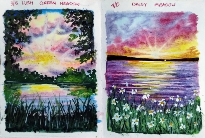
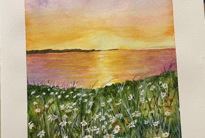
9. Day 3 - Lush Green Meadow - Part 1 - Sky & Sea: Hello everyone,
Welcome back to D3 of the five-day watercolor
middle class. Today we are going
to be painting a beautiful sunset by the lake side with the
details of the middle. So let's go ahead with the pencil sketch
first and then move on to the details of
the middle signpost marking the horizon line, which is a little
below the center space and below the sea area. We're going to have in
that little middle space, wherein we are going to
be going in with more of the lush green details instead
of the floral details. So I'm just marking out the trough spaces on top of
the horizon line as well. We are going to be
having in little of the lush green spaces. And on the left and the right
side of this guy as well, we are going to be having in lush green leaf
details this time. Secondly, we are going
to be creating in a little bit of sunshine
this time in the sky by using the lifting
technique to create in the shining sun effect that we're going to get
into this painting. So first we'll begin
with the sky now. So I'm going ahead with
a layer of photo onto the entire sky space first and then we'll move on to
the rest of the details. Make sure you have an even
layer of water spread throughout so that your paper
does not dry out quickly. We are going to be
working wet on wet onto the sky with a
little more Laos this time as we are going
to be creating in that lifting technique effects you're trying to show
in the sundries. You may have already seen the final class project in
the beginning of this class. So you know the sunlight effect that I'm talking about using in the lifting technique in
this guy plus this guy. This time we are going to
be leaving in little of the white gaps nationally while painting in
the sky colors. Now you can see despite I'm
using 100% cotton paper, I'm running my brush
multiple times so as to make sure that
my paper stays wet for enough time so that I
can walk in with all of the wet-on-wet details are creating in the
depth into the sky, as well as making sure to go ahead with the perfect
lifting technique. In case if you're using a paper
which is not 100% cotton, I would recommend you to
first wet your paper, wait for it to dry for
around 50 per cent and then run in with another
layer of water that will help you in keeping your
paper wet for a little longer time for you to work with all
of the details wet on wet. So first I'm going to begin
in with a yellow sheets. I'm using in the shade of
the light yellow color. You can use in any
lighter tone of the yellow which is
available in your palette. This is permanent yellow
light that I'm using it and beginning to add
in very random patches, I'm making sure I do not have excess water while adding in
these panes because I want to make sure that I have very minimal water so that the colors do not
spread on their own. They retain the space in
which I'm adding them and so that I can have in the perfect
color blending later on. Now the next color that I'm
lifting up is a little bit of the brighter color
now in case if you do not have the right operator
color, you need not dividing. You can go ahead and use in any lighter tone
of the pink color. I'm just kidding
to begin adding in little highlights closer
to the yellow color. Now, make sure again for
the pink color as well, you do not have excess
water or pigment so that it does not cover up the yellow space is completely, if you will be having
an excess water, what will happen is the
pink color will begin to cover up entire of the
yellow color as well, giving you a mix of the
yellow and the pink, instead of having
in both the colors looking at
distinctively out here. So very randomly you
can see I've added in the layer of the
pink tones as well. I'm making sure I do
not have excess water. I'm running in with
a smaller size brush so that I can keep
the details minimum. Now I'm going to use in the
civilian blue color again, by losing in this area
in blue color as well, I'm going to be
sure that I do not have excess water and
pigment on my brush. So every time that I'm
lifting up the pigment, I'm dabbing it onto my paper cloth towels so that the excess paint is
absorbed by the cloth. And I have very limited
water and paint. Now in between all
of the white gaps that we've added in males, the fill in with the yellow
or blue color. I will not be. All of the gaps completely. I will leave in little of the white highlighted
spaces as well. So filling accordingly,
making sure that literal of the whitespaces
are left in between. Now at this point,
you may see that it's looking at very weird blending
in-between the colors. Using a damp brush. I'm just dropping in
little water closer to the blue edges so that it blends a little automatically
with the pink tones. And when the pink and the
blue will blend together, it will form in a little
bit of a violet tone, which is perfectly
okay for a sky. So you need not
worry about that, but make sure do not blend the
blue and the yellow color. Otherwise, it will
give you green tones, which we do not want. So now you can see I'm having
those white highlights, but I'm using the soft edge or to create in-between
these colors. So very carefully I've
added in the blue tones. Now I'm going to head
with overlapping of the blue tones or whether pink color very carefully
the toluene, so that I do not have much
of the violet tones as well. Now at certain places I'm
going ahead and adding in darker tones as well
majorly at the top space. Now at this point, I believe in go ahead with a little
bit more detail of the pink tones
as well to give him little darker dips
again, your Asbell. And blend all of these together for blending
anywhere if you need, you can simply using a damp brush and run it
towards the edges of the meeting point of the
colors so as to have the smooth blend happening
between the colors. Now using 1to1 darker
off the same pink color. I'm adding it closer
to the blue edges so you can see how beautifully
the colors are blending. And also you can see
the color mixing and having soft edges between each other on the blending points. Now you can see it's a
little darker consistency. So at certain points
it may form in a little lighter tone of
the violet color as well. And that's perfectly okay. So now I'm just going
ahead and adding in the highlights with the
pink color over the yellow as well as the
blue tones creating in the plans happening
in between the yellow and the blue as well. Now, I've taught in places, I'm intentionally adding
in a little bit more of the pink over the blue to
get in those violet tones. You can see a beautiful
violet being fun because if the mixing point of the pink and the blue
stuff is happening in, in creating in a natural
violet color out there. Now I'm just adding in a
little more highlights you are or what the blue color creating
in little cloud effect. Now after this will directly be doing in the
lifting technique, wireless sky is still wet. So I'm just cleaning my brush
now using a damp brush, I will begin the
lifting technique. But first I'm just adding in a little more of the
yellow yard from there, I'm going to begin in with
the lifting technique to create the perfect
sunshine effect. Now using a damp brush, Let's begin doing in
the lifting technique. From this center point yellow
color that I've added in, I'm going to begin
lifting up the stroke, moving towards the top
of the sky aspect, every stroke make sure to clean your brush so
that the pain that is lifted up is dacron to the tissue and you do
not have any paint. Again, dip your brush
into water and go ahead with the next
lifting off the ray. So you can see how I'm
lifting in the race, makes sure you're using
a smaller size brush, just using the tip
of the brush to pay. Go ahead with this
lifting technique so as to create this
effect of the sundries. Now let's open spaces. You may have to go ahead
with two layers of the lifting technique to
get that bright effects. So you can see I've
run on the race twice so that the color
lifting is perfect. Towards the left hand is right. The rays are only Dylan,
small limited space, but towards the center
of taking a pill, the top edge of the paper
giving him that lifting effect. Now next I'm going to go ahead and paint in this area as well. Between the sea and the sky, I'm going to leave in a
very neutral white gap because there as it is, will be going ahead with the Bush details which
will get covered up. Also we'll be adding in
a little reflection of the horizon line Bosch
into the sea area as well. So while adding
in the details in the C will be adding in
those reflections as well. So we need to make sure that as the area also remains
wet for enough time. So I'm running in
with a layer of water first only in the z-space. I've not gone completely
till the horizon line. I've left a very fine
thin white light gaps, so that does tie colors, do not move into the area, ruining up the sky. Now as he's going to be a
reflection of this guys, I'm going to exactly
placed in the yellow tones wherever we have it in
the sky very randomly. And then I'm going
to go ahead with the pink and the
blue tones as well, giving you the details
you are as well. Now next time beginning in with a little bit of the pink tones. And now lastly, moving on
towards the blue tones and beginning to add
in the blue tones in the rest of the spaces. In the C, I'm going
to keep it medially, the blue, the little
yellow highlights. There's a little bit of the
violet tones because of the mixing of the blue
and the pink tones. Now closer to the horizon line, you can see I'm going ahead
very carefully leaving in that little white
cat in the sea, as I told you, wet on wet, we're still going to add in the reflection of
the greens as well. So make sure your C remains wet until you can add
in the reflection. In case if your c happens to
begins to dry out quickly, then you will have to wait
for it to dry out completely. And then once it's
completely dry, then adding or
reweighting technique of the sea area and then add
in the green details. For the re-weighting technique. You can visit my
specific class on the re-weighting
technique where enough discuss the reweighting
technique in detail. So with the pinks
are blended with the blues getting in those
violet color in between. Now I've made sure
that the yellow is still visible in
between and a little highlighted space to show
the effect of the sunset happening in the sea area
as well as the reflection. Now, I'm just going to go ahead blend in a little
of the blue tones, but using the flat brush
quickly and lift up a little of the color wherever
I'm feeling that the blue is going
in a little excess, my paper is still wet, I still have to add
in the reflection, so I'm still going ahead with
the details until I feel that I can go ahead and
my paper will stay wet. I've just lifted a little
of the pink tones to give it a little more violet
effect in the area. Now using the sap green color, I'm going to begin adding
in the reflection. So I'm going to add
in the reflection for the bushy details that we are going to be adding
on the horizon line. So the deflection will be
in an inverted manner. Now, make sure in the
green tones you do not lift up excess
water or paint. Otherwise these will
begin to spread it. So you can see I'm going
ahead with such a layer of the pain that it does not
spread out completely. It's written in the space
in which I'm adding them, along with the sap green I'm using in a little bit
of the darker green, That's the vendor green color. I spend to give it a little
darker that you can add in a little bit of your brown to your sap green color to get
a little darker effect. Now in the center I'm leaving a little gap, as you can see, because they're at the top space also believing in the
little gaps accordingly, even in the CAD, I've left
in the little gap if needed, we'll add in a reflection
there as well later on. Now on the rightmost side, I've gone in with a little more color variation and used in a little bit of the
lighter green tone as well as you can see. And I'm just going to
fill in the rest of the spaces blend in with
the sap green color. So you can see how using a damp brush and blending
the darker greens, the lighter greens
as well together so they have the
perfect transition, smooth flow between
them as well. Now next, I'm just going
to lift up a little bit of the yellow ocher
color and begin adding in little depth with
the yellow ocher color in-between the greens
while this is still wet, to give it a little more detail, because at those top
spaces we'll be adding in little reflection with the green or yellow ocher color as well. Now on the right side, my reflection you can see
is a little larger than length because at the
top right side as well, I'm going to add in
the bush detail with a little longer height than
as compared to the left side. Now, using a little
darker green, I'm just going to
define in a little more off the edge out you are at the horizon line on
the right side as well before we move ahead to the further details
in this painting. So all of these, I'm still
going ahead, wet on wet. And you can see how beautifully the colors are blending
into each other, creating in the depth
into the painting. Make sure that you do this only when your
paper is still wet. Otherwise you're going
to get a very sharp look for reflection and it may standout distinctively
making the entire painting look a little epsilon. Now lastly, I'm just going
to give him the base layer for the bottom meadow
greenery space as well. So I'm just going ahead
with the layer of greens. I'm just randomly
using in random greens from my palette and adding
in the details here. Creating in the layer. Now, do not worry if you see
area is still a little wet. My area is almost
50 per cent dry. So I'm going to hit with
this NEO because if, even if the greens
and the blues at this point mix a
little bit together, it's perfectly okay because
we are going to be adding in the grass strokes on top
of these green tones as well. So just as in the
previous class project, we used in the yellow
ocher mixed in with white to give him the
details. You are as well. We'll be using
invite quash a bit, mixing it with the
greens this time to give him little highlighted
opaque leaf details. You can see randomly
I've gone ahead with different mixes of the greens and given in the details here. So I'm randomly running in with different genes yet creating
in different texture, running my brush in
circular motions, creating indifferent texture on the entire green large space. So now that is, it will wait for all of this to dry completely. And then in the next
lesson we'll begin adding in more depth
to this painting.
10. Day 3 - Lush Green Meadow - Part 2 - Final Details: Now everything is
completely dry it and I'm going to go
ahead with the details. So I'm going to be using in
this spoilt round brush, which I call it my magical one. Because the tips of this brush, or a little hard because of the credit colors that
they've been used for. Now I'm going to pick
up the black color. I've just dip the
tip of my brush a bit so that I can
wet the black color. But you need not to
read your entire brush. Now I'm mixing in the black
along with the greens and browns on my palette randomly
creating a greenish, blackish kind of a tone. Using this, I'm going
to hold my brush perpendicular and
begin dabbing in, creating in the texture. Now my brush has
a little excess. What does I'm just dabbing in the excess water very
gently onto the tissue. Now as I'm beginning to dab and I'm going to make sure and creating the shape of the outline that I
need accordingly. So you can see as I'm moving ahead with the
dabbing technique, I'm even giving you the shape to these green foliage
that I needed somebody. I'm taking them taller towards
the outer side somewhere. I'm keeping keeping them
more towards the edge only. So you can see this method helps you fill in the
space completely. After this, we'll be
giving you a little bit of the detail dabbing
technique as well, giving in some detail
leaf on the outside. Same VM just going to go ahead quickly fill in the horizon
line as well first. And then in the
horizon line as well, I'll be giving him more of
the darker details later on. Cmv, even on the right side, I'm going to go ahead with the
dabbing technique creating that effect of the bush area
on the right side as well. Now to get this dabbing
technique right, the important thing is that on your brush you shouldn't
have excess water. If by any chance you will have excess water on your brush, it will not give you
this dabbing look. It will give you
patches of the color. Instead of giving
in this dry brush, leave a detailed, giving you
the complete village look. You can see how
quickly this space is filling up plus giving
in a very natural law. This helps you in filling up. This base is faster reducing the time as well as
it gives in a lot natural look as compared to go ahead head with just a basic
leaf kind of a detail. But as I told you, the
important thing here is that you shouldn't
have excess pigment or water on your brush. It needs to be a little kind
of a dry brush technique, but not too dry as well. Otherwise you will not
get the file age effect. So even on the right
side you can see I'm defining the shape as I'm
moving ahead forward, giving in the detail. I'm making sure I
give him the shape accordingly as per the need yard so as to define the shape. And right now it says later on using in the
detailed leaf as well, we'll be defining a
little bit of the shape, but as much as possible to find the length and the shape
of the bushy area. Now it says, now using
the same technique I'm going to give in a little detail towards this bottom side, green lush space as well. So just at the top species
using in the darker color, I'm giving in these darker
details as well as I'm just going to pull
out a little of the grass effect using
in this color as well. As I told you in
the last lesson in cells that we'll be having
in the details coming in, you're at the meeting
point of the blue and the green covering up
the blending points. And now you can see there
is no spillage between the colors because Messi was
already beginning to dry in. Now using this brush itself, I'm pulling out very
random grass strokes in between to give him little of those grass details as well. But since my bristles
are separated, I'm getting in this grass
effect in case if you want, you can use a fan
brush to give him these grass details
as well quickly. So onto the entire bottom space, you can see I've given in
this dabbing technique creating so much more texture
into this bottom space, making it look so
much more realistic. This has been a mix of
the greens, browns, and blacks that I've
been using in randomly. Now across the line you
can see I'm pulling out these grass strokes very
randomly creating in the debt, giving him the details out here, make sure you can use a fan brush or a liner
brush if you're not comfortable getting in
these grass strokes using in this pilot
round brush itself. Now using my round brush, I'm beginning to add
in detail leaves. So I'm just using the tip of
my round brush and I'm just dabbing in your to create
in the detail leaf effect. Inbetween this spoilage
that we've added in. I'm using in the mix of the black and the greens
you are as well. And once this dries out, you will see the natural
effect more because we already have the base layer filling in space and now the
detail look over it. Wherever I feel the need. I'm giving it a little more
filling details as well with the darker tones
using this detailer brush. So now you can see everything is coming so much more
into the detail life. Now I'm going to
use in a little bit of the yellow ocher
color as well, your TA given lifted
highlighted leaf effect, very little, not much of it. Now again, I'll pick
up the green tones and I will give it overlapping
the yellow as well so as to make it blend
well into each other and not stand out distinctively from the greens are the blacks. So you can see a very
simple technique that I've used to create the
entire foil is first we gave him the details of Philip spoilage look using
in this point the brush. Now we are giving in
the detailed look on top of it using
the round brush so as to give it a detailed look majorly on the inside edges. Same way I'm going to go
on the left side as well. And given the detail look, now, make sure that you do
not lay your hands at the bottom space where
it's already wet, otherwise, the colors may
get lifted from there on your hand and wherever you place your hand on the painting, it will get laid there. So you need to be very careful. You can tell your
paper accordingly. So it's always better to
have your paper taped down on a movable surface
so that it becomes easier to rotate your paper accordingly to your hand
movement and add in the details. I'm almost done with
this detailed leaf on the left side as well. Now the other details that we
are left into this painting will be the details on the horizon line
for the bush area. And a little bit of
the green lush details at the bottom space
of the middle. And then we'll be ready with this class project for day two, day three of this five-day
of watercolor middle class. Now on the horizon line
for the bush detail, I'm first going ahead with
the green color at the top. You can see I'm giving
in the dabbing technique creating very random shape. And at the bottom space
till the horizon line, I'm filling it completely
with the green tones. On top of this lighter greens, I'll even be running in with
a darker greens towards the horizon line as I did in
the reflection area as well. So the reflection is exactly the opposite
of the top space. So at the top you will
have the reflection at the bottom area closer
to the horizon line. So in that reflection
closer to the horizon line, you will have the darker tones. Now going ahead on the
right side as well, in the same manner,
filling in the spaces. At the top. You can
see I've tried to vary the height of the
bushy area as well. And at the top I've just giving
them the dabbing details. Now on the right side, I'm using in a little bit of the yellow ocher color as well. You remember we use the same yellow coat color
in the reflection as well. And that time I told you in the top space on the right side, we'll be using in the
yellow ocher color, so adding it in the
reflection at that time. Now using the darker color, I've marked the
distinction point between the horizon line under
reflection beautifully. You can see each of the
details visible separately. Now I'm going to go ahead with the darker details
on top of this bush, giving you more depth
at the top spaces. So you can see I've given in the top details while my lighter green
color was still wet. So all of this, we are
still working wet on wet. Make sure that your paper green details are wet enough so that you can give
him these details. Now I'm just defining and blending in the horizon
line perfectly. Do not worry, we'll still be giving you a metal
highlights using the white pen later on once everything
dries out to give him little highlighted details. Now in the bottom
lash green space, I'm going to begin adding in
little detail defects I'm going to be using
in the brown tones as well as the green tones. First going ahead with
the mix of sepia, along with a little bit
of the yellow ocher and the white course that we had
used in the previous lesson. So I already have
that on my palette. To that I just added a little more sepia color
to get it in a darker tone. And using the liner brush, I'm just pulling out some detail grass strokes
from this screen. It is paste that we've added
at the bottom area here. So throughout I'm going to
pull out these random strokes. You can see how roughly I'm
losing my brush moving it so casually so as to give him that natural looking
grass details at the bottom space here. Now using a little bit
of the lighter green, I'm going to give in
little more detail towards the left side, giving it more of the
foil each connection between the top and
the bottom space. So I'm just going to
beginning with the dabbing off this light
green color here. Now onto this slide,
I'll go ahead with a darker green so as to give it a more natural and blended look. Otherwise, it will look
out very separately, standing out in the painting, not blending in well with
the rest of the details. So on the edge giving in the darker color look
and I'll blend it well so as to have in the
natural lookout here as well. Now using the
yellow ocher color, I will just give him little more highlights towards
the top space here. Now these little details
that we're adding in using the yellow ocher
color creating and little highlighted
space are very natural. As you know, after
letting things to dry out wherever you feel the need to add in little highlighted space. So you go ahead with
the layer again there. As I always tell you, it's easier to add on
the details later on rather than to minus the details when it
comes to watercolors. Because once you add anything, It's no going back. It's either completely gone or you'll track it
out completely. So it's always
better to add them step-by-step and
using a damp brush, you can blend them easily
with the base layer. Getting the perfect transition as well happening in lightly. Now I'm just defining
the top bushy area a little more using in the
darker tones I'm giving the top spaces as well a
little more defined shape with the bush shape that
I needed to add in your. Now before moving on to the final highlights that we need to wait for all
of these to dry. And then lastly,
using the white pen, we'll be adding in
little highlights. So we'll wait for all of these to dry out completely before moving on to the final details and removing the masking tape. So just wait for a few
seconds for these to dry out. So now everything is completely dry and I'm going to use in my white gel pen to add in little highlights on
the horizon line, very little broken
white line detail to mark in the distinction between the top space and the reflection of this green large space
that you've added. So you can see this
white line begins to actin as the point wherein it shows the meeting of the top area Bush detail along
with the reflection point. Now, same thing, I'm
just going to add in very little highlights into
the grass details as well, very little, not much of it. So I just pulled
out a little bit of these white strokes as well. Now I'm going to remove
the masking tape and see your final painting
with those clean edges. Make sure you remove
the masking tape once you register
completely dried or is it may tear of your
painting because of the wet paint that's
there on the edges. Always remove your masking tape against the paper so that it does not lift up the paper and tear of your painting again. You also final painting for day three of this five-day
vertical and middle class. I hope you guys enjoyed painting this beautiful green lush
painting with me today. I will see you guys
soon into the day for class project where we create another beautiful pink sunset. Thank you so much for
joining me into this class.
11. Day 4 - Daisy Meadow - Part 1 - Sky: Hello everyone,
Welcome back to day four of the word
element of class today. Then on the second
last class project of this five-day series. Today we are going
to be painting another beautiful pink sunset
along with the middle, along with some disease
as well this time. So let's go ahead with the
pencil sketch first before moving on to the further
details of the class project. So this time, this time-space
is going to be quite small. As you can see, the
horizon line is quite towards the top
center, top space. What I'm marking out the same space and the center
is going to be the CEO. This time also, it's going to be a seascape along
with the meadow. At this time, we'll be adding in the floral details as well. Plus this time this guy
is going to be more towards the pink tones
as well as we'll be adding in all the
shining effect in this guy this time as well with
the lifting technique just as we followed for
class project three. So let's go ahead with the
details in the sky for so we'll go ahead with a layer of water bill going step-by-step. There's no much pencil sketch. All of the details will
directly be with the paints. And Carlos, did they agreed
to give him the details out. So I'm first going ahead with a good layer of water only into the sky space so as to begin adding the
colors in the sky. Make sure you haven't
even near to four to two out so that your paper stays wet for enough time for you to walk with the details wet on wet for bringing this tie and the details in
the sky together. You can see despite
using 100% cotton paper, I run my brush multiple times so that I know my paper stays wet enough time until I can
get in all the details done. Now I'm going to shift
into my round brush. I'm shifting to buy right? Round brush size it on the
silver black velvet brush CDs. And first picking up the
lemon yellow kind of tone. And I'm going to
begin in closer to the horizon line with
evading the yellow color. Because we will be
giving in that rising, sorry, the sun rays effect for this class project as well. So just giving a very
little yellow hint first. Now next, going ahead
with a little bit of the yellow orange tone and at the beginning of the
indigent highlights. So this is more of
a yellow, orange. So it's kind of a mid yellow
tone that I'm using in urine this point to begin adding in little highlights
with this color. Well, I've just added in a little bit of the
yellow, orange tint. Now I'm picking up bring
it to the end of this. I didn't move cargo
and I'll just add it at the top
space a little. We'll still be going in
with the pink highlights. This is the base
feels color that I'm adding in your so as to have a little color mixes
when we add in the pink, closer to the blue
and the yellow, you can see I've left in
the white gaps in between so that the colors do not
meet on for many green tones. Now I'm going to head with the Rosemarie dark color in the center space
where I've left in the white gaps so that we
have a perfect transition between the yellows,
the blues as well. Now, all yellow and the
pink when mixed together, it will give you a reddish, orange and pink and the
blue mixing together, they'll give you a violet
ish kind of a tone. That's perfectly okay. That is the reason we use
this palette and between blending of these two colors so that the transition
looks smooth. Now I'm going to begin creating in the Cloud space using in this color itself at places
wherever I feel the need, I'll go ahead with a damp brush so as to make the
blending goes smooth. So you can see how quickly I ran the damp brush at
the meeting point of the colors so as to have that smooth transition
between the colors happening. Now that I'm adding
in the highlights using in this pink tone, you need to be sure that you
do not have excess water. If you will have excess water, all of the yellows and
the blues will get covered up with the
pink completely rather than having enough
transition effect and the effect of each color
that you've added in so far. So you need to make sure you have a very less
water on your brush, as well as limiting
pigment so that they stay on this piece where
you try to add them. Now using a little bit
of the violet color and beginning to add in the
details at the top space. Now I'm still
walking wet on wet. We still have to fit in that
glowing sun effect as well. So remember, people still has
to be bad for enough time. So you can see how moving in randomly I'm creating
in the highlights using in this violet color in a very medium tone consistency. Make sure to not take the violet color
closer to the yellow. Otherwise you may
get in muddy tones. You need to go there very carefully with the help
of little pink tones together for getting in the transition and the
blends right as well. Now next time using
in the orange, yellow color, which is more
of orange, less of yellow. And I'm going to begin adding
in little highlights in the yellow spaces of this guy giving him little
effect there as well. So there you go. It
was a simple patch of the yellow color as of
now to do that as well, I'm giving you a little
more cloud effect. So just adding in
little more details with the tones of the
violet color you can see I'm using it in
such light consistency to get in stride. If anybody you feel that the color is dropping
in editor access, you can quickly lift it up
with the help of a damp brush. Now after this, we are
going to directly go ahead and begin in the
lifting technique, just as we did in the
last class project. This time is going
to be much closer to the horizon line that will be going ahead with the
lifting technique. Now I'm running but
one more layer of the pink tone so as to get it in a little ball pink effect, you can still see
the blue color tone that's being visible
learning that is, had edited in the bass. Now, I'm just going to hit with the damp brush
blending in the tones, right, so that we'd not have simple patches of
color anywhere. Now next, using a smaller
sized round brush, I'm going to go ahead and begin lifting in those days effect. This time it's going to be in the center closer to
the horizon line. And false marking out a
small subspace as well. So very small, so good. And from this I'm going to begin pulling out the race. This time. The reason will not be
The Complete top edge. I will take it a little smaller as compared to the previous one. As we discussed in the
previous lesson as well. At times it may take two to three of the
lifting strokes to get into details, right? So make sure that your
paper supports also much of the lifting technique or else it may become quite difficult. Now what do these
have shifted to afford us smaller, fine brush. This is a size zero round brush. And I'm now going ahead
with the lifting technique. You can see the rays are
quite small at this time. I'm going to vary the
height of the vase as well. And it's going to be more in number rather than the
width of the risk. So slowly you can see the sun rays coming
to live because, uh, you know, I, as I told you, it may take time at
certain times to go ahead with the lifting technique so as to lift the colors, right? Also, some colors may not be supportive for the
lifting technique because they may be
staining pigment. But these colors
that we've used are normally the non-sustaining
pigments out here. You can see how simply we are able to lift it up
into 23 strokes. And my paper is also
not wearing off. The key here again, is that makes sure that after
every stroke that you live, that you clean your brush. Now we'll wait for
this guy to die out completely and then move on to the sea area and the middle spaces in
the next lesson. So I'll see you guys in
the next lesson now.
12. Day 4 - Daisy Meadow - Part 2 - Sea: So now my sky is completely
dry it and you can see the beautiful sunrise
effect that is formed here. And this time, as I told you, it's not till the top edge, just until the
center of this guy. Now I'm going to go ahead
with a layer of water into the entire area for us and
begin painting in the sea. The seas also going to be the reflection of the
sky colors majorly. And then we'll be
adding in some wet on dry wave effect later on
once I see is kind of trite, make sure you have an even layer of water spread throughout so that you can get all the details right closer to
the horizon line. Be a little careful so that
the colors of this guy do not begin to bleed and the water
does not seep into the sky, ruining up your sky loop. Now I'm going to hit first with the yellow orange tone in the center to create
that sunlight effect, it's going to be very little. And on the left and
the right side, we have majorly going to be
having in the pink tones. I won't be adding
in the blues here because it's very limited
in the sky as well. So I do not want to
increase the task of adding and blending
in one more color. So I'm going ahead
with the pinks closer to the yellow and
then on the edges, I'll go ahead with the
violet tone or light Leo. So now on the edges I'm going
ahead with the violet tone. You can see this is
just the base layer. The colors you can see a naught well blended yet
into each other. I'll be going ahead blending
each of these well and creating in the base
layer just in the center, we have to maintain little of the yellow effect
for getting in that glowing sunset
reflection effect in this area as well. And on the horizon line running very
carefully so that you do not move into the
sky space at all. So now you can see I'm
blending in the pinks and the yellow is using in a little bit of the
yellow color again. Now, step-by-step, you can see a little of the blending
coming to life. Now again, I'm going ahead with the violet color from the edges and I'm just taking it very close to the yellow,
orange tone, but I'm not taking it overlapping
too much because they may form in muddy tones there
and we do not want that. Now very carefully just
using the tape I'm trying to get in lifted off the violet
tone over the yellow, orange color, but in such
a way that it does not form any muddy tones
with a very light hand. I'm just giving you a little of the violet color overlay so as to give a more realistic
look to this area as well. You can see via building
it layer on layer, not going ahead with
the details altogether, one editor wants together. Last, we are building in the
color tones as well, Leon. Leon not adding the
darker tones directly, only then you will be able to achieve in the depth
into your painting. Now very carefully
from the center you can see how easily
I'm trying to blend in using the flat
brush maintaining in that yellowish orange tone in the center for the
sunlight effect. So we are done with a
base layer of the C. Now I'm going ahead with a layer
of water for the grass pay. So we'll just paint the base
layer for the grass as well. Yeah. I'm just adding
in a layer of water, but closer to the sea area, I'm leaving in a
baby's fine line for now while adding the colors. I'll cover that up. Now again, the reason of not
waiting for this to dry is because I want a
little soft edge between the C and
the middle space. So that is the
reason I'm directly going ahead with the
base layer of metal as it is will be having in the Grass talks later on
and the flower details, which will show everything
perfectly blended. So for the base layer, I'm going ahead with the
yellowish green tone, which is a mix of the
yellow and the green tones. This is just the base layer that I'm adding in now on this, I will begin adding in
the darker tones as well. So you can see I'm just
defining the edges where I'm using in the sap green color for adding in the second layer. Now I'm making sure to
add it in such a way that you have little lighter
tones as well visible. After this, I'll go ahead
with a little bit of the vendor green color to give him little more darker depth. Just closer to the C9. Be a little careful that you do not use extra wet paint there. Otherwise, you will have
a lot of green color moving into the area
which we do not want. And also if you
want, you can keep your paper tilted so
that the colors from the green will not move towards the sea area because of
the tilting the paper. Now just beginning to add in the darker depths at
the top speed line, you can see I'm just giving you a very rough shape so that we do not have that straight
line giving in that, you know, a natural
look out there. Now next, I'm adding
in a little bit of the olive green
color as well. So as I told you, you
can simply go ahead with any multiple colors of the greens that you
have in your palette. You just need to
create a very greenery in field or with different
tones of greens possible. You can use in the
yellow, brown, blue tones to alter your
palate of greens if you do not have much of the
different green shades already in your palette. Now I'm just going to go
ahead with a little bit of the water splashing technique at the bottom space to
create a little texture. It will take a
little time to keep, keep creating in this
texture because, you know, since that paper is still wet, so this may dispose completely. So we'll go here on
LEO to get ingest very little texture
effect, not much of it. Now if you're not
confident about adding in this plateau
easily make sure you cover up your Z space
annual painting on the left side in case if you're painting on both
sides of the paper. And then go ahead with the
scratching techniques so that the splatters do not
go on to the sea area. Otherwise you will get those
patches in the sea as bell. Now I'm done with this
flattering technique as well. And now I'll wait for all
of it to dry completely and then we'll
move ahead further to add in the waves first. Sees almost dried. It's just like ten
to 20 per cent wet, which is exactly the time that
I wish to add in the vase so that my waves also
have a little soft edge. So I'm mixing in a little bit of my pink along with
a little tinge of the violet color
you can directly using a reddish violet
tone if you want, and using my liner brush. And I'm just going
to begin adding in the waves, but in the center, I will keep it blank for now because there'll
be adding in little off the
yellow leaves effect on the left and the right side. I'll begin adding in the waves with this violet color tone. My greenery space is still wet. I'm going to go ahead
very carefully to not lay my hands on
the green spaces. Otherwise, it may lift up
the colors from there. You can see I'm using
the violet tone in a very light consistency here to adding
these waves effect, make sure you do not use it
in too dark consistency. Otherwise, it will not look in that in sync with the z-space. So in a very light
medium consistency and the fine strokes closer
to the horizon line, I'm adding these waves
in very small length and just crisscross random
lines closer to each other. As we move further
towards the middle space, we'll begin increasing
the length of these ways because those are much more closer to our view. So as I told you in the
center, I'm leaving the space. Because they're forced,
I'll be adding in the wave effect with the
yellow, orange tones. And then I'll just add in little of the
blending tones with the violet color once we are done adding in the
yellow, orange tone. So going step-by-step
so that we have that sunlight reflection
effect in the area as well. Now somewhere, I'm just going ahead with little darker hint of the violet color tones so as to give him some more
depth to the waves. So just some few darker veins randomly urine there and some of the waves you can see our little thicker as compared
to the other way, so as to add in little
more depth to the waves. Now using the yellow,
orange color, I'm beginning to add in the
waves in the center space. In case if you feel that this
color is not standing out, you can simply use in a little
bit of the white gouache, mix it with your
yellow, orange color. So I'm going to do
the same thing. I'm just going to
mix in a little of the white course so that
I get an opaque look to this yellowish
orange tone mix and I get those wave
effect quite good. Now made sure to this mix
of divide question yellow, you do not add in a lot
of water otherwise, again, it will begin to
actin as watercolors. You can see as
soon as I've added just a yellow color
to divide quash, it is turned out opaque and you can see the waves
coming to live. This is just a simple
dry brush technique. Waves that I'm giving
in your so as to get in that glowing sun effect
reflection in this area as well. If you want, you can mix in a little bit of the
orange ten CRS well, and given little of the orange
wave highlights as well. After this, as I told you, I'm going to give him little of the violet overlapping
waves effect here as well so as to make everything look well-defended
with each other. So with the violet color you can see in between
the yellow tones, I'm trying to add in
these waves so as to show everything looked
blended with each other. Make sure that your yellow
waves are completely dried and do not run too harshly
over the yellow leaves. Otherwise it pink
if you muddy tones in-betweens wherever I
can find the gap I'm adding in these violet
color wheel so as to show everything looking well
blended with each other. Now, after the waves
have dried out, I feel that they are looking
a bit lighter in tone. So I'm just going ahead
with a little darker tint out pure and giving in some
darker depth randomly, not going to turn
it to dark as well, just some highlighted
Dhaka waves effect so that everything looks a
little more in detail. So you can see how
simply you can dab in the darker tones as well in case if you feel it's
turned out to dark, however used to tissue and
quickly dab that wave which was looking to bold as
compared to the entire CSPs. So we're almost done with
the sea area as well. Now the details only left
in the middle space and a very fine mountain range on the horizon line using in the black tin or
the violet color, whichever you wish to use it. So using the black color, I'm just going to quickly add in that very tiny mountain range on the top of the horizon line. I'm just going to take
it till the center of the horizon line and it's
going to be a very tiny one. Make sure you have an
uneven shape to this at the top space and
towards the horizon line, you just fill it with the
black color completely. So there you can see, I've just got it
till the center line and I'm leaving it there, just turning it into a very
fine pointed edge out there. Now we'll wait for all of
this to dry completely. And in the next lesson we'll add the final details to the middle. And we'll be ready
with our class project for day four as well. So I'll see you guys
in the next lesson where we add in
the final details.
13. Day 4 - Daisy Meadow - Part 3 - Final Details: So now let's go ahead with
the details on the middle. So I'm going to squeeze out a little bit of the white course so that we can mix
it with the greens for adding in the grass strokes. In the second class
project as we had mixed in the white along
with the yellow ocher color. This time we'll be mixing
invite along with the greens that you can get in a little opaque looking
green if you want, you can directly using
a green gouache. But in case if you do not have quash paints and just
have a white color, you can simply mixing
your white quash along with a little tint
off the white watercolor. And we also did the
green watercolor. And we'll begin adding in the Grass talks with
this opaque color. Now I'm randomly
mixing into 23 greens, which is already on my palette, and a little bit
of white gouache. You can go ahead with any mix of the green just that
you need to make sure that it be visible on to the base layer colors that
you've already added in. Now, once I added
in a few strokes, I could feel that they
are not visible that great because of this
almost same looking colors. I'm just adding in little
more off the white gouache to get it in a little more
opaque consistency. Now you will see I'm
going to move ahead very randomly with
these grass strokes. I'm going to take them quite
taller one as compared to the shorter ones that we were painting in the second
class projects. So we do not have Laos or
different sections here. We're just going to randomly be going ahead with
these grass strokes. So very randomly you can see I'm moving ahead using
the liner brush, adding in very random strokes, moving in all direction, giving in the depth
to the painting. So it may be a
little tedious task to keep pulling out these tools, but it's at the same time quite relaxing to just randomly
adding these strokes without any sped set
specific pattern or without any specific
way of adding these. So you can see I'm just
randomly adding them, overlapping each other as well. Later on we'll add in some
darker green strokes as well, which will be
visible very simply. Now towards the top as well, you can see I'm
adding in some of the green stuff overlapping the sea area as
well so as to make everything look well
blended with each other. Now using the
vendor green color, I'm just painting to add in some darker green
Stokes randomly. Now make sure in case if you are lighter green tone is
not completely dried. It may be a little
difficult for you to add in these talks as the colors may begin to blend and
move into each other. So go ahead accordingly. If you'll notice I'm
going ahead with very different lens
of the grass strokes. I'm not having the same length
for each of the strokes. I'm very, very small,
some base shadow. I'm even adding some of
the grass strokes coming out from the bigger
grass strokes connected to each other, giving him the natural
look as much as possible. Now I'll just add
in a little more of these are darker strokes first quickly and
then we'll move ahead to the next step
for this painting. Now you can see we just added in the grass talk using in
the two color as of now. But because of the
background Leo, already the space looks
completely filled up and so much nitrogen background
green tones that we had added now access to fill those spaces and these
grass strokes that we added on top of it makes it
look much more in detail. Now I'm going to add a little
more lighter green strokes if needed variable. So I've added in a
little more white. As you can see, this is little more towards the brighter side. So these are just adding in as the highlighted
strokes are in-between the grass details that
we've already added it. So now I'm done adding
in the grass strokes. Now I'll move on to
adding in the DZ. So I'm going to squeeze
out a little bit of the white coats separately to begin adding in the daisies, make sure that your
grass strokes are almost dried before you begin
adding in the daisies. Using the white quotient
of all consistency, I'm going to begin adding
in very simple florals. And then for the buds, I'll be using in the yellow
ocher color later on. So for now let's begin
adding in the disease. We are not going to fill in the entire glass piece
with the disease, will add them in a
very scattered manner. So you can see I'm
going to head with very random shapes of
the daisies somewhere. I'm just taking it half towards the top sites and
we have towards the bottom side somewhere
the top strokes are quite smaller somewhere the
bottom strokes are smaller. And decide strokes up bigger. So just trying to vary the look of the flowers from
different perspectives. One of my previous classes are discussed in detail
about these daisies. How you can add them in
different angles, proportions. If you want, you can go ahead
and visit in that class, wherein I have discussed
in detail about adding an painting
to Daisy fields. Now you can see some of
the daisies I'm even adding an overlapping
area as well, trying to show in those days is blooming or towards
the sea as well. So I'm just going to add in a little more then we'll add in a little splatter as well to
actin as the filling space. So do not go ahead and
fill in the daisies at one specific spot altogether. Go ahead, scattering them all throughout the middle space. And then wherever
you feel the need, you can go ahead and add them. So you could see I began in
from the left or right side. I added a few on the
right than on the left. Now again, I'm adding in the
center so as to, you know, understand where you need to add in more instead
of filling in the entire space just with
the player of a white color. Now using the yellow ocher
color I'm beginning to add in the bud in the
center of the disease, make sure you use a
yellow coat color in a quite bold consistency. If you want, you can use
in a darker brown tint as well and mix it with a little
bit of the white quash. Now I'm going ahead very
carefully adding in the buds to each of the
daisies that we've added it. Now some of the
disease which are blooming towards
the bottom side, but will be on the top and the petals which are
towards the top side, the bud will be at
the bottom side. I'll say if you notice all of my disease or in
different sizes, I've tried to bury them
as well somewhere. I've added them
quite small and tiny one somewhere I've added
the bigger ones and some there half daisies
as well to maintain the natural log of the
entire middle space. So I'm almost done adding in the buds to each of the flowers. Make sure you go ahead very
carefully with this step so that you have the notch
look to the flowers as bad. Now using the white gouache, I'm just going ahead with
a little splatter off the white color medially at the bottom space to showing us some tiny daisies which are quite far from our
view and which will act as the filling space. Do not add a lot of these
platters, adding very minimal. Now randomly somewhere
I'm just converting these dots into bigger
petals trying to show in just a few petals of
these daisies coming in to which we won't be adding
in any of the bad effect. Now, I've taught in
places I feel that the white mini dots
are the little extras. I'm quickly going ahead
with the tissue and lifting up those dots
before they dry out. So just dabbing them into the green space a
bit if you want, you can even use Dan Brown
brush and blend them into the green tones and just add in a little green overlay on top of it and it
will get covered up. So that is why I told you
while adding in adding very minimal because I had
added in a little extra which I'm
dabbing them out now. So we're almost done
with our class project. I just added in a little
more detail to the daisies. Now I'm just going to add in little more strokes
connected to these daisies. So some grass talks
with the darker and the lighter green tones so as to get it in harmony with
the disease as well. And to some of the disease, you can even add them as
the stem for the disease. So now let's remove
the masking tape and see your final painting. We are ready with our class
project for day four as Ben, Just one more tea and we'll be ready with this five-day
challenge to level up your watercolor skills with
the middle class lessons. You also final class
project for D4. I hope you guys enjoyed
painting this with me today. I will see you guys tomorrow into the day five class project. Thank you so much
for joining me into this class and painting
along with me.
14. Day 5 - Sunset Meadow - Part 1 - Sky: Hello everyone. Welcome
back to day five. This is the last class project in this five-day challenge. So let's begin in with the
pencil sketch for d Phi first. Four, D five we are
going to be having in a lot of mountain ranges
and we are going to show in kind of a sunset effect from
behind the mountain range. I'm just adding in some
random mountain ranges. You can go ahead
with your own layout for the mountain ranges. And below the mountain ranges
we are going to be having in that little middle
space at the bottom area. So you can see I've added a few bigger mountains and then some of the
smaller mountains. So I have six to seven different mountain ranges
that I've given in. So this entire
bottom space will be the middle till that
mountain range line. And the top area is
going to be this guy. So let's begin with
the sky first. I'm going to go ahead with a
layer of water into the sky. This time we are going to
be painting a brownish, yellowish kind of a
sky with a little of the glowing sunset effect again. And then we'll be
showing that effect of that sunset falling on the
mountain ranges as well. While adding in the layer
of water into the sky, make sure you go across the mountain shaped
very carefully because the mountain ranges at the top side are going to
be off the lighter tones. As we move towards
the bottom side, the color of the mountain ranges will also begin to darken up. Because closer to the sky, we are going to show that these mountain ranges are having the effect of the sunlight falling on top of them
because the fish, they are visible
in lighter tones. So I'm first beginning in with the yellow light color
in the center space, beginning to add in
the yellow color. Then we'll shift onto the brown tones giving
into depth into the sky. Next time picking up the light
red color from this set, you can see it's kind of
a reddish brown tones. So in case if you do not
have the exact same tone, you can simply mixing
your red color with a little tinge of
the Guanzi and Apollo. And you'll get it similar-looking,
reddish brown tone. You can either use vermilion
color or you can even use in a little bit of
the Bayh-Dole dread, permanent red, whichever is
available in your palette. Now, with a little of the
yellowish orange tone, I'm adding it completely
in the whitespace till the closer line
off the mountain range. Now big thing in with the brown, I will begin adding
in little details. I'm going ahead with the
burnt sienna color a bit and I'll begin and
adding in very slowly. Now make sure when you
beginning with the brown, you do not have access water. Otherwise, they will begin
to split up completely and we'll cover up the
entire yellow spaces. We do not want that. We want the yellow space
is also to be visible. So make sure that now
when you begin adding in the Cloud detail and
the depth into the sky, you have to perfect Water
Control on your brush. No excess water, no
excess pigment so that the colors stay where
you are adding them. So now you can see I'm just alternating between
the yellow oranges and the brown tones and
beginning to add in these cloud shapes
in different angles. So I'm, when I'm
running my brush in circular motion somewhere, I'm just running
in simple strokes. Now I've picked up a little
bit of the sepia color, and I'm beginning to
add in the details close to the orange tones
that we have added in. You can see I'm
running my brush so casually and down motions. I have mixed in a little tent of the yellow ocher as well, which was already on my
palette into the sepia color. That is the reason it's in a little lighter
tone consistency and not the ball
sepia color look. So we're still
working wet on wet into our sky and we'll
still be working a little more wet on wet
before going ahead and creating in that
glowing sunset effect. Now using the light red color, I will just add in a little
more highlights as well into the sky because I feel a lot of sepia and yellow
has taken over. I want a little
reddish tone as well. That is the reason I'm using
this light red tone and not directly a red tone
because I don't want that bold red
color as well. Now using the
smallest size brush, I'm going ahead with
the lifting technique. It may again take
you a little while, but I'm sure after the
first two plus three, j of d3 and d4, I've got a little hang
of it in lifting up the details out here and
creating in that glowing effect. Now using the size zero brush
I'm lifting in the race. Now this time the
rays are going to be completely in a circular motion, but towards the bottom side
I'm going to lift it up in smaller lens and towards the top it's going to
be a little longer, almost in the edge
off the masking tape. Alter this time you can see in-between I'm lifting
smallest strokes as well, and between two longer strokes, I'm lifting up some
smaller strokes as well to give a little
more depth out. You're now in the
center we're creating in this glowing space
and the sunlight effect. So in the mountain ranges, when we'll be painting the
mountain ranges will make sure that towards the
center side of each of the mountains that falling under this piece will keep the
tones are little towards the yellowish site to
show the effect of the sunlight falling on the
mountain ranges as well. So as I always tell you, it takes a little time to
lift up these V is n gets, get the effect right. But after the multiple
lifting strokes that you go ahead with it. Absolutely. The
details that come in here now makes sure that after every stroke
that you lift up, you clean your brush
so that you do not have the pins lifted
back on your brush. And when you go to pick
up the next truck, it may again get laid down. Now wherever I feel the strokes have gone a little longer. I will quickly go ahead
with a little bit of the color and blend them
before they dry out. Make sure that your
edges haven't dried in. If you are going ahead with this layer of the Browns
who are blending in. Otherwise you may get in
patches of the color instead of the blending loop on the
edges of the strokes, you can see a little bit wherever I'm feeling
it too long, I'm just blending them
into the sky well, because my paper is still wet. So we're done with
this guy now we cannot paint the mountain
ranges because this is wet and the colors will
begin to seep into each other and we want the distinctive
look in each of them. So we'll go ahead and just
paint the base layer of the middle for now so that
even that can dry out. And later on, we
can begin painting one-by-one mountain ranges
in the next lesson, and then paint the final
details. So I'll go ahead. The Meadows piece, I'm
going to beginning with the same yellowish
green layer for us and then begin adding in
the darker green tones. So then the last mountain range, so only the bottom 30% of the
space is the meadow space. Make sure you do not
go ahead and fill in the last mountain range with
the lighter green tall. Now, I'm going ahead
with a very rough shape, not maintaining a straight
line for the middle space. So for the middle this
time you could see I did not go ahead with
a layer of water. I directly went in with this
yellowish green color layer. And I went ahead
with this color in a little liquidy consistency so that automatically it will stay wet for a little
time until I can add in the darker tones on this and get the depth into this painting. Now seeing because we have been going ahead in the
previous class project, you can see with
different tones of greens how I'm moving ahead
very randomly. You can notice my brush
strokes just moving carefree in any circular
motions. Anyhow. Just so as to create
different color depths into the meadow space
for the base layer. So that when you
add little details, staffs on top of this,
once they're dry up, this background layer acts
as the filling space, which makes the middle look
more detail, more realistic. So the third layer of colors you can see I've
used in a little bit of the olive green tones now in case if you do not
have all three, you can simply mixing a little bit of your
CPR to your sap green and you'll get an almost olive
green color looking tone, which you can use in
for the darker tones. And now lastly, I'm
going to use in the vendor cream color
and I'm going to begin adding in some
more darker depths using in the vendor green color. You can see how
randomly I have been moving on the middle
space because of which I can see variations of greens in my meadow space giving
it a more natural look. So make sure you
move your brush so randomly that you can get
in all of these details. And so much more of these right? Now, just as we went ahead in
our class project one same way I'm going ahead
with little of the lifting technique here to create in some grass stroke. And I'm just using the
tip of my brush to create some texture pattern
for the class talks, while this layer is still
wet, Ready simple detail, you can see I'm just
lifting up little bit of the color tones directly
from the edge of the brush. Now I'm just going ahead very randomly here you can
see because we are going to be adding in a lot
of the florals this time, it's going to be pretty simple. Florida, not a defined one
by tau, since, you know, in-between the floral sees, grass strokes will be visible, sizable dividend, natural law. That is the reason I'm
going go ahead with this textured grass this time instead of adding in those grass strokes
with opaque color, once everything dries out. I'm pulling in a lot of these in the entire space you can
see when stay dry out, it will give him
the texture effect. Now my sky is
completely dry and I'm going to go ahead with
the first mountain range. And after that, I'll wait
for all of it to dry. I'm going ahead with
the burnt umber color in a very light consistency. It's more of water and just
a little tinge of the color. Make sure that the sky is
hundred percent dry before you go ahead with this
step of beginning to paint in the mountain ranges. Otherwise it will
be very difficult to maintain the
distinctive points. Now you can see I'm going
ahead with a very light tone of burnt umber mixed in with
a little tint of black. And it's a very light tone
that I'm adding in your. Now just using a little
darker tint at the tip, I'm defining the
top edge and I'm going to blend it
with a lighter tone. So basically we
are going to have each mountain
enough radiation be the top of the mountain
range is going to be towards the darker side. And moving towards
the bottom side, you'll keep lightening
up the tones. Now you can see this
mountain range that we painted as not falling
directly under the sun space. That is the reason I have not added much of the
yellow effect here, but still have kept it
towards the lightest site. So basically even
going to be painting the center mountain ranges, your will keep in mind of
adding in the yellow tones much more as compared to the rest
of the mountain ranges. Now in the same color pattern, I will paint in the
right-side mountain range as well because it is not connected to the
left-side mountain range and we can paint this
as well together. They stop the mountain ranges. We'll have to wait for He's
forced to to dry out and then go ahead step-by-step with each year of the mountains. So I've painted this right
most mountain ranges well in the same way with the same
tones of the bond amber and the black tint at the
top I'm giving in the darker tint and
blending it till the bottom space
using a damp brush, make sure you have the
perfect transition and not to patches of the
color darker and lighter. So you can see how
using a damp brush, I'm blending the darker
tones as well towards the lower side and
getting it the old right? Now we'll wait for all of
this to dry completely. And then in the next lesson we'll move on to
the next layer of mountain ranges and then do the final details
of the middle. So I will see you guys
in the next lesson now.
15. Day 5 - Sunset Meadow - Part 2 - Mountains: So now let's go ahead
with the further details. My entire painting
is completely dry. You can see the beautiful
effect of the glass. Glass talks that we didn't with the help of the
tip of the brush. Now I'm going to go ahead with
the second mountain range. So I'm lifting up
a little bit of the sepia mixed in with
the burnt umber color. And I'm going to begin with
the center mountain change. Now in the center,
remember we have to even given a little bit
of the sunlight effects, make sure that you are
forced to mountain ranges that you've
painted a completely dry. Otherwise these will not
have a distinctive low, and the colors will begin
to seep into each other. Now that this mountain
range I'll be creating in that light effect in the
center space as well. I'll be adding in
a little bit of the yellow color then later on. So first I'm just lifting in
a little bit of this color. This was the second
mountain range. I know the pencil sketch maybe too light for you to understand. But after this we'll be having in the rest of the mountain been bigger mountain range in
the center you can see into more smaller
ones on each edge. Now I'm just adding in
a little tent off the yellow out here after
lifting up the color. And you can see the
effect that it's showing, the sunset effect falling on
the mountain range as well. And I'm blending the
yellow effect well with the rest of the colors
of the mountain range. Now I've even, even paint out this mountain range on
the rightmost side, which is again a very small one. You are again, will not be having any of the
sunlight effect falling in because this is
quite far from the sun area. So we are done with two
more mountain ranges. You can see how
slowly we are going in step-by-step to
add in the details, do not rush with the
mountain ranges. You can use a hairdryer to speed up the process
if you want, but do not rush an ad while the mountain
ranges are still wet, not go on to the
second mountain range, otherwise you will not get the distinctive looks out there. Now I'll wait for
these to dry out completely and then move
on to the next mountain. Now my two mountain
ranges that I added are completely dried
and I'm going to move on to the third Mountain, which is going to be the biggest mountain in the
center that you can see. I'm going to use
in the same color, but this time in a little
extra darker consistency as compared to the first
two that I've added in. First, I'll go ahead
with this very small, tiny mountain range on
the left side as well. And then I'll go ahead with
the main mountain range. Again to this mountain
range on left as well, you can see I lifted up the
color from the center space, just keeping it a
little darker edge and then a transition effect. Now in the same way
I'm painting in this last mini
mountain range out you're on the rightmost side and then we'll just be
left with the tool. Bigger mountain ranges,
which we'll add in once, you know, these to
dry out completely. Now we'd have to
wait for these to dry and then we'll move ahead to the bigger mountain
change in case if you are mountain range or has
already dried out, you can go ahead with the bigger mountain range now it says. So now my third layer of the mountain ranges on
the left and right. I've also tried out
and I'm going to go ahead with the center
big mountain range. And for this, I'm using quite a darker consistency
of the sepia color. It's going to be darker than
compared to rest of the six mountain ranges that
you've added so far. And fast beginning to define the edge and the shape
of the mountain range. And later on I'll be adding in the yellow highlight on
this mountain ranges well, in the centers piece to show the sunlight effect
falling onto this as well. I'm filling this
completely as you can see, the last mountain range is going to be off the green tones, which will be showing in as
the tree effect out there. So do not add the brown tones
there now because they are, we are going to be
going ahead with the tones of green later on. So you all, you can see
I'm lifting up a little of the brown tones and
adding in the yellow tones and blending all of them
well together to show the sunlight effect falling
on this mountain ranges. So you can see how
beautifully the mountain is showing the sunset effect falling on the
mountain range here. Now make sure you have
the Blending right. Otherwise it will
look as Apache space, which will not give them
the natural effect. So to make it half
the natural look, it's very important
that you blend the yellows and the browns
well to each other. So I'm just going ahead with
another layer of blending. And now you can see everything
is looking in smooth. Only the edges have
a little darker. And this mountain range is
much darker as compared to the rest mountain
ranges that you have added towards the top site. So basically we have
gone ahead with a gradient mountain range
towards the topmost site. We've kept them light
because they are closest to the sky and more lighter because of more sunlight falling
on top of them. And as we move towards
the middle space, we've kept darkening the
effect of the mountain ranges. Now the last mountain range, or the range you can call it, will be of much
darker green tone, which will make it look
much more darker and try to show it in harmony with
the color range falling in. So just to add a
little more layer of the browns and the yellow
Teutonic, a little more dark. And now we'll wait for
all of these to dry. And in the next lesson we'll
add in the final details to this painting with the
last mountain range and the rest of the details.
16. Day 5 - Sunset Meadow - Part 3 - Final Detaisl: So now everything is completely
dried and we're going to go ahead with the last leg of
details for this painting. So let's go ahead and paint that whitespace first wearing. I'm going to add in
a tree-like effect using in the dark green tone. I'm using the Van ****
green color for that. It's the darkest green
tone of my palette. Now in case if you do not
have such a dark green color, you can always mix in a little
bit of a darker blue or brown to yard or regular greens to get in
this darker green effect. Now you can see
towards the top side, I'm giving it a little
spiky look to try to show it as a bunch of trees
clustered together out to you. That is the reason I'm giving in that top edge a
little pointed low. And then I'll fill in
the entire bottom space with this green color
till the horizon line. So now I've almost filled up this entire bottom space with this darker green tone
now will be left to add in some details
in the field space, as well as the floral effect in the meadow area for
this class project. Make sure you go ahead
with a very bold layer of the green color here you can
see how bold the screen is. Not. Go ahead with the
black color directly. I would recommend go
ahead with a mix of a darker green
because, you know, it will give you a
much better look and in-sync with the mountain
ranges and the field space. Now the bottom of this
mountain range you can see I'm trying to give
it a very uneven shape. I do not want to keep it as a single straight line
because I wanted to show it well-connected
to the field as well. So that is the
reason I'm giving it a very absolute shape at the bottom and run
the bottom as well. I'm just going to pull out very random shapes
are there to try to show in all of these connected well into
the field out here. Now with this
darker green itself just giving it a
little darker effects randomly urine
they're creating in some bush details in-between
the grass field as well. And then we'll go ahead with
the last leg of details. That's the Florida and
for the middle field. So very simple, darker green patches in the field you
can see we've created so as to make sure that
everything is in a sink instead of just having
simple parts here and there. Now I'm just mixing
in a little bit of the pink tone
with the white quash already on my palette
so that I can get an opaque look
for the florals. Now, for the florals, I'm
going to go ahead with very simple dabbing technique to create in that distinctive
floral trying to join a lot of bunch
and cluster together. So no distinctive
look for the florals. But I'm going to go ahead with two to three color variations of the pink tones for
the floral area. So I'm going to keep
altering the color mix, some more of pink, somewhere more of
white so as to get different color tones
for the Florida area. So far. So I'm going ahead
with this darker tint. You can see I'm just randomly beginning to dab in
this color urine there. Now I'll just squeeze
out a little bit more of the white gouache
and keep it so that I can keep altering
the color by just adjusting the white
gouache in this color mix. Now randomly in
between you can see I'm going ahead with
the darker tones. I'm just dabbing in
the tip of my brush somewhere you can see the
dabbing is quite thick and big. So I'm going to just
some smaller dabs to create in some miniature
flowers in between. So then dire bottom space, I'm going to be filling
in in the same. Then that's going
to go ahead with different tones of
the pink color. The reason of adding
invite cautious to give it an opaque and right
look to the florals. You can see how beautifully it standing out even on
the darker green tones. Next we'll be adding in little
bit of the green details in between these florals as
well once they dry out a bit. Now somewhere in-between
you can see I'm adding in some bigger
florals as well. I'm going to take
these Florence till the green mountain range
that we've added in. That's the trick range kind of detail that we have added in. Now closer to the
mountain range, I've shifted to my
size zero round brush. I'm just using the
tip of the brush. I'm adding in these
quite tiny dots out. You're trying to show him that these florals are quite far
from our view because a fish, they are visible quiet
in a smaller size. And the Florence, which add the bottom-most area of the page are much
closer to our view, Hence a little bigger in size. So I'm just going to add these quite far as you can see, same, I'm going to go
ahead with different color tones there to give him those mini flower details closer to the horizon
line kind of detail. Now in-between these
bigger flowers as well, I'm just going ahead with some smaller flowers to
give him little more debt. You can see how
beautifully we can create so much detail with just the help of
different color tones, giving it so much more
depth to the middle space. If you want, you
can even go ahead with some detailed
floral look here. You can go ahead with
a sunflower field, arose field, poppy field. But I wanted to keep it simple so that even if
you are a beginner, you can follow in easily. And even if you had an
intermediate level artists, you can easily go ahead and add in detail flowers on your own. Now a further created an
almost baby pink tone. You can see so much of light and very little bit of
the pink color. And I'm just beginning
to add in some highlighting flower with
this lighter tone as well. So I've got like three
to four color variations by just adjusting the pink and the white color proportions
in the column mixes to get in these tones you are
for the Florida range. We are almost through
the class project for day five as well. I'm just going to hit very carefully and slowly building in the entire middle space because I do not want to overdo it. You can see since the
beginning I've been going ahead with very little
details of each color, not running quickly
with too many colors altogether so that I do
not overdo any space, and I do not overdo any
specific color a lot. Now, I'm shifting into
my liner brush and using in the green mixed
with white gouache, which I already
have on my palette from the previous class project. And I'll begin adding in some
grass strokes in-between these florals to give it a much better blended look altogether. So very carefully in
between the florals, you can see I'm pulling
out these drugs. The details majorly
at the bottom space, I'm giving in more of
these crosstalk details, trying to show in these acting as the stem to the florals
that you've added in. So in between the
spaces of the florals, wherever you can find
in much larger spaces, you can add in small lines
of these color tones. So they will act in asda or stem to the flowers that
you've added in those spaces. So you can see how
carefully I'm adding in these if you want for
the greens as well, you can go ahead with
different tones of the green color so that you can have it a
more natural look. You can see how
loosely I'm moving my brush without any
specific notion, just moving randomly in different directions to
give him the details. So make sure that you go
ahead quite loosely and casualty so that you'll
get it in a natural look. We are almost through
the day five as well. And I hope you guys have enjoyed painting
these meadows series, enjoyed it in
different, you know, all the five are quite different class project ranging from different techniques
or different details for adding in the meadows. This was a little detail class so that you could
get a handful of detailed paintings and walking layer on layer step-by-step, as well as with the
wet-on-dry details. Also, this class was more
focused on building up your techniques rather than
simple, easy class projects. So I'm almost through
the class project and we'll soon be removing the masking tape for our last and final painting
of this five-day challenge. Now, using in a little
bit of the pinks, I will just give him some highlighting effect
so as to make it again look blended well with the gastroc that you added in. Now, you can see so much of the grass strokes that I added
in-between the Florence, it took a little
time, a few minutes. But now you can see
the realistic effect to the meadow that's coming in. Places. You can
see I'm adding in some bigger flowers
so as to show in the close-up view of
these flowers which are much closer to us.
And that is it. We are ready with our class
project for day five. Let's removing the masking tape and see the final painting. I hope you guys
have been enjoying painting these
five-day series and I would love to see each of your class project into
the project section. And in case if you've liked this class for
whatsoever reason, do not forget to
drop me a review. It may help me reach maximum students who
may also be looking to level up your watercolor skills and paint detailed paintings. Make sure to remove the masking
tape once your edges are completely dry it and always to move it against the paper. You also final painting of
the five-day challenge day five class project with a
pretty pink meadow detail. You also closer view for you
On the day five painting. In the next lesson, we will have an overview of all the five class
projects that we did in this five-day challenge. I hope to see you guys soon into my next Skillshare class. See you in the next lesson
where we see Oliver, five paintings at
a glance together. Thank you so much once again for joining me into this class and painting along with me through the five-day challenge.
17. Thank you : Thank you so much to
each one of you for joining me in to this
five-day challenge. We began with the
first day painting in this beautiful
mountain range with the sunset and a simple
greenery, lush meadow. For the next class project, we went ahead with
a cornfield kind of a detail wherein
they went ahead with little different color
tones as compared to the color tones of the reference picture and
created in this beautiful fee. For the 3D painted this beautiful glowing sunset and the green dashed details. For day four, we painted this
beautiful pink daisy field. And four, day five, we find that the painted a
beautiful glowing sunset mountain range effect fit
something floral details. I hope you guys enjoyed
painting each of these beautiful painting with
me through the five days. I will see you guys soon
into my next class. Thank you so much
for joining me. Make sure to drop
me a review if you like this class for
whatsoever reason.
 Umashree Taparia, Artist, Art Instructor, Entrepreneur