Transcripts
1. Hello & Welcome Back: Happy World Watercolor Month. Watercolor is a medium that has captivated people around
the globe for centuries. Working with watercolors can be pleasant as well as
intimidating at the same. Hello everyone. Welcome back to a new
Skillshare class. With me. I'm in my student body are
attached to the accountant, an artist and an art
educator based in India. You can find me on Instagram and other social media
under the handle, creating from the heart, where I share all of my
walks with watercolor, gouache, acrylics and some
beautiful vintage frames. After been walking with multiple
mediums since two years, watercolors is my
most favorite medium. And to celebrate this
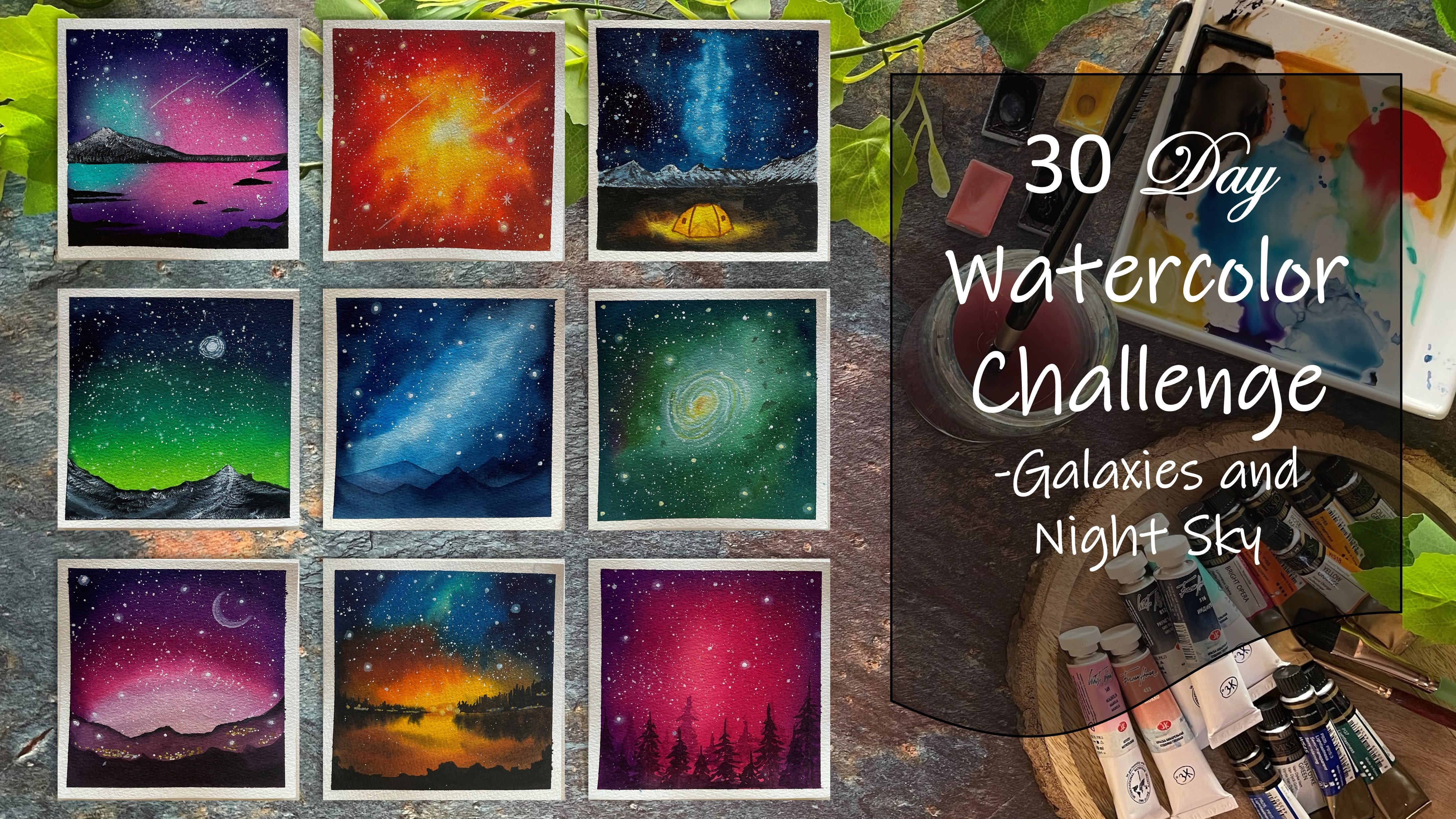
world watercolor month, we are going to be exploring monochrome painting
with watercolors, exploring the power of one
single color at a time. This class will also be focusing on the sketchbook
spreads in yeast. So basically, since we are
working on a sketch book, we are going to be creating
in the left side of the sketchbook with
the thumbnails from our final painting. Whatever elements you will be having in your main painting, we will be breaking
them down and creating a sketchbook spread
onto the left side. Before diving into the class, discussing with you
all the materials that you would be needing for this class so that
you can have them ready before beginning
this challenge. Before we begin with the
color one of this series, I'm going to be
discussing you about the tonal values
using one color. We will have an
exercise creating them. I haven't even be discussing
with you some properties of watercolors which
will be helpful for you in the class project. We will also be discussing
a few of the techniques creating textures and blends
with the help of spray, tissue, lifting
techniques, et cetera. If you are someone who's intimidated to try your
hand at watercolors, then what better time than the world watercolor month to explore the beauty
of watercolor. So without further ado, come join me into this class and let's together celebrate
the world watercolor month, one single color at a time.
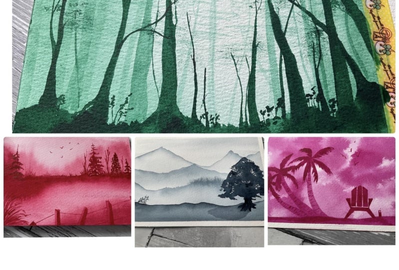
2. What is Monochrome Painting?: In simple language, a
monochrome painting is working with different tonal
values of the same color. Blue and green are
different colors, but light blue and dark blue are not two
different colors. The same base color with
just different tonal values. Using in white and black, you can create different
tones of the same color and create an entire painting
just using one single color. In case of watercolors, the lighter tonal
values can be achieved by adjusting the
quantity of water mixed in with the
pigment instead of using in the white paints out
you're in this class we are going to be
exploring how to create different tonal values for watercolors without
using the white color. All of these are
monochrome paintings created with one single
color at a time, giving in all the details
with different tonal values.
3. Materials you will need: So before moving
further into the class, let's have a look
at the materials. The first one being the paper. I'm going to be using this
watercolor sketch book, which is hand stitched
by my own store. So you can see the cover of the sketchbook is
an indian fabric. The Lochner v fabric that
we call in your sketchbook, is made out of our cheese, 300 GSM, 100% cotton paper. Since this class is
going to be about a sketchbook spread
cities as spin. Onto the left side I'm going
to have in the spread. And on the right side I'm going to have the final painting. So this is how we will be
using in the sketchbook. This is a 20 pages sketchbook
which is stitched in such a way that it's perfect for flatly photography painting, creating in the
sketchbook spread. So I'm going to be using
in this sketch book. If you do not have the
same paper, no problem. You can go ahead and use
in any watercolor paper, which is at least 300 GSM, a 100% cotton for
the best results. Also, I would recommend going ahead with a sketch
book for this class. As you will also be able
to understand how to create such beautiful
sketchbook spread using in both side of the paper creating
indifferent spread with all the monochrome
paintings that we will be creating
through this class. But again, if you do not have, you can go ahead with
a piece of paper, fold it into two sides and
create both the sides. So that is about the paper
that we will be using it, make sure it's 100% cotton
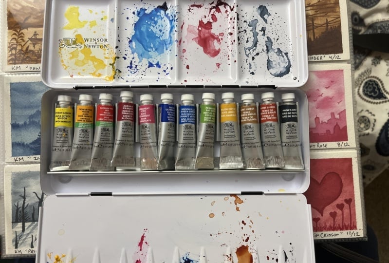
paper for best results. Next to you would be
needing watercolor paints. I'm going to be using in these watercolor paints from
the brand Magellan mission of you off the shades
will be from White Nights and PWC. Through each classroom. I will be guiding you through the color that I'm using for that class project
and the brand that I'm using in Major League, I'm going to be using
in this palette, which has all my Magellan
mission shades already inside. So if you do not have such
a palette, do not worry. You can use the
colors directly from the tubes or whichever
brand colors that you have. We are going to be working
with monochromatic, and we will be using one color
in different tonal values. So if you want, you can even use the colors from the
tube directly and use a pallet to dilute the colors and keep creating in
different tonal values. Next, you would be
needing a jar of clean water for each
of the class project. One jar of water would be enough since we're
working with monochrome, so the water would not be
getting in dirty that much. Next, you'll need a set
of watercolor brushes. Do not worry, you do
not need all of these. You can go ahead with just a few brushes through
each class project, I will be telling you what size, what kind of brush
we are using and alternatives that you
can keep using it. This time they are
going to be creating in certain textures and details with the help of a spray bottle. So make sure you have a spray
bottle handy to create. Look into our paintings. Also, we are going
to be creating in some textures
with the help of tissue paper this time going ahead with the palate
lifting as well. So make sure you have
tissue paper handy. I'm not talking about
paper towel or or sorry, not clot I request you to have some tissue paper
because that will help in creating in some details in
the painting plus lifting off the colors to create certain clouds in
view of the painting. Next, you would be needing
a pencil and an eraser for some pencil sketching
few of the class projects. So you can go ahead
and keep one of them handy so that you can go ahead with the pencil
sketch quickly. Next, you would be needing in masking tape to tape
down your paper before each class projects so that you can have those
pretty clean edges. I'm going to be taping
down only the right side. On the left side, we are going to be having in a very rough sketch book spread details that we are
going to be creating in. Apart from that, you would
be needing in a white quash. We will not be using in white quash for each of our painting. It's just in one or two of the class projects that we
will be using in white gouache to create details in
our painting and to give him some details
in our galaxy painting. So that is it for the pains
that you would be needing in. So these are all the
materials that you will be meeting
through this class. Make sure to have all of them ready before each class project. I will see you guys now into the next lesson with all
your supplies ready.
4. Understanding Watercolor Pigments: Before you begin working
with your colors, It's important to
understand its property. What does the tube
indicates or what does the color tried to
communicate through its details? You can see I have two tubes of the same color but
from different brands. If you see the pigment
number of the tube from PWC, it has a single pigment, whereas this magenta mission
give off the same color, has two pigments
for the same color. So both of them have Pb 29. But this tool from
my jello also has another pigment which
is PB 15 by three. So basically, this denotes that this colony is formed by
mixing into pigments. That is the PWC blue color is formed by mixing
in one pigment. Also it denotes the light
fastness on the tube. That is, how will the colors react if exposed to sunlight? And how fast even better off. Every tube has the light
fastness detail as well, depending on the number
of stars indicating the light fastness
rating from one-to-five. Some cubes also denote
whether the colors are transparent or
semi-transparent, semi-opaque. And whether this one on
stealing some cubes like these, only half the light fastness and the pigment
number information. They do not denote whether
the colors are semi staining or opaque
or transparent. Now, this brand new
generation yard, you can see on every view it has mentioned whether
the feathers are semi-transparent,
semi-opaque, or transparent. Now if you see this color, this is a semi-opaque color, which is the
quinacridone rose color. This color is more vibrant as compared to a
semi-transparent color. That is, when you read down
this color on a white paper, you will barely be able to see the underlying white paper, which is not the
case when it comes to a semi-transparent color. Whereas if you see
this color red brown, it is a transparent color. That is the vibrancy of this
color is going to be light. The underneath PayPal will be visible on the table
when you use this color, even in a little
thicker consistency. Now I'm going to swatch out the ultramarine deep color
from both the brands. And we're going to see and understand what granulating
watercolors are. Basically granulation is when after swatching out the color, when the color
dries unevenly and the pigment is visible
after it dries. Many watercolor just
use this property of watercolor as a medium to create texture
in your painting. Most of the landscape
part this laughter use granulating
watercolors to create beautiful textures to
their landscape paintings. So ultramarine deep
is one of those. Hello us, which is a
granulating color. We will first be
swatching out this color. Then we'll wait for
this to dry out and then understand
what triangulation looks like and how the pigment is seen after the
color dries out. So this color is a
mix of two pigments, that is PV 29 and
PB 15 is to see. This color will show later
granulation because of the properties of
pigment VB 29 in it. So let me give you a closer view of the swatch while
it is wet and you can still see little after
granulation evening layer. So you also flows and look
for you to understand. If you observe it closely, you can see the pigment getting
separated from the water creating of granulation and
the texture to your painting. At this, use this in
landscape to see details for the affinity spaces
or some foil HDP is. Now in the same way,
I'm going to swatch out the ultramarine deep
color from the brand PWC. So why is watching the
colors halfway through I add the pigment and
to the rest half, I just use water and try
to dilute the color to the bottom space
so that we can see the granulation in the
lightest consistency as well. Not all colors are
granulating colors. Also the same color in every brand may not be
a granulating color. It all depends from
brand to brand. The pigment consisted in it
while formulating the colors. So ultimately lead
color here, if you see. In both the set, it gives
almost a similar outcome despite the pigment number being different in both of them. But the base pigment, that's pp 29 is in
both of them closely see the swatch of the
pigment from the outset. Even this shows granulation. We'll get the perfect
granulation effect. Once it dries out completely, you will be able to see the pigment creating
that texture as well. Notice those two pigment dry in. Let us watch this
semi-opaque color from the brand Magellan
mission and see how the semi-opaque color reacts on the white paper to begin swatching out
this color as well. So I'm beginning with the
dark consistency at the top and I'm just going to swatch
it then the halfway through. Now as you'll see, when we squash the ultramarine
blue color, you can still see the
underlying white paper a little better when you begin to swatch this semi-opaque color
in the same way, even in the lightest
consistency after it dries, you will see that the white
paper is barely visible. Had this bean and
opaque color than even the slight white paper underneath would not be visible. But since it's a
semi-opaque color, you will be able to see a
little of the white Dutch. So now you are, if you see
both these color swatches, That's the swatch
of the ultramarine blue and the swatch of
the quinacridone rose. In this, you can see more of the white paper underneath
as compared to what you can see in the swatch
of the pinna can end rose color because this is a semi-transparent pigment and this is a semi-opaque pigment. So before you begin working
with any set of watercolor, makes sure to do the basic study of each of
the pigment in your set. Understanding the
transparency, light fastness, the pigment consistency,
the granulation. These will help you in deciding
which colors you need to use to create your
final painting that you're wishing to work on. Because these properties will affect the outcome that
you are working on. Now if you see these swatches, they have dried completely and the granulation is visible. So beautifully. You can see little
greens visible. That is, the pigment is
separated in a beautiful way, creating texture, giving
him the granulation effect. Some artists do not
like such triangulation in their painting
by others loved this granulation
because it creates texture and details.
India painting. You'll see the dried
out painting out CIO, which is a semi-opaque color. And this is a
semi-transparent color. You're underneath a little
white isn't visible. You're in case of
the quinacridone rose color, it's barely visible. Now next, let's understand the staining property
of the pigments. Some colors are staining
colors by other colors, maybe non staining colors. Stealing colors means as soon as you add
them on the paper and you try to lift up the color using a
tissue or a brush. Now colors, we'll leave
a little scene on the paper no matter how
quickly you pick it up. So you already, you can see I squashed out the quinacridone rose color and I
lifted it up quickly, but still you can
see it has left the stain despite trying
to pick it up quickly. Now again, I'm going ahead with the same color swatch and we'll
try the listing technique with the help of a brush and see if that is a staining
pigment even then. So now I'm going to
use a damp brush and quickly let's stop a
stroke from this color. Make sure to clean
your brush after one stroke so that the pigment
is tapped by the tissue. You can see as soon as
I lift up the color, even with the help of a brush, has left two little stain. That is the reason on the tube. It's written it's a
semi staining pigment. That is, the steam
is not too tough, but it leaves a little stain and does not leave the paper. Why did it really quickly, even after lifting up the
color within a few seconds. Now, let's see
another pigment and understand this
property a little more. So now I'm going to
swatch out to sit in, in blue color and
we're going to see how staining is a
setting in blue color. Now again, some of the colors may be more staining and some of the palace may be
very less staining depending on property. So you can see the
serene blue color is less staining as compared to
the quinacridone rose color. It is a little staining but not as staining as
the rose color. So again, you know, the steaming property also
varies from color to color. Some colors may
be more steaming, some maybe less staining, and some may be no
abstaining at all. So like this yellow color now, this is the lemon yellow color. Now, I'm trying to lift up this color with the
help of the brush. And you will see this color
is barely staining as compared to the blue and the rose color that
we have switched out. With three to four
times of lifting up, you will see almost white
people visible underneath. So this kind of pigment is
the least staining pigment. So if anytime you're walking in a painting but you have
to lift up the fallows. You need to know the
staining property of the pigment before
working with it. Otherwise, it will be
very difficult to lift up the colors without
leaving a stain behind. So these are some of
the basic properties of the colors when it
comes to granulation, lifting technique,
the opaqueness, transparency of the colors. Having an understanding of
colors that you're using helps you better in selecting the colors for each
of your paintings. And also understanding how
the colors react on paper. Before it mean every
class project, make sure that you have a little detail about your
color that you're using, the shape that you're using, the pigment consistencies that didn't help you in handling the color better and also focusing the
outcome accordingly.
5. Creating Tonal Valuessss: So now let's understand
the tone radiations for one single color to work
with monochrome paintings. I'm first going to pick up a
little water on my palette. Now whichever pigment
you wish to pick up, just begin adding in
the pigment little by little into this water and
keep flushing out the color. So for instance, I'm going ahead with the
hookers green color. So you can see this
so much of water and I've just added in a very
little touch of the pigments. I'm going to swatch out this first color.
Now I'm do this. I'm just going to
keep adding little by little the value of
focus green color, toning the color into one
darker shade at a time. I'm not going to add
in any more water. I'm not going to be dipping my brush into water any further, except for the water
which is in my palette. You can see with the
every moment that you added little more of
the color to this mix, the color tool is dawning
darker one sheet at a time. In this way, you can create
multiple sheets with just one color and walk into a painting Walking with different tones and
values of the color. So you can see that with F, the moment every
brush stroke that I'm adding in one more or
tinge of the color. The color tone is going
darker and darker. In this way, you
can easily create seven to eight tonal values
of one single color. This way you can walk into monochrome paintings with
different tonal values, creating in the details
with different tones. Now you can see the dark is consistency is
such a dark color. Now in the same way, I will quickly both with
one new color that is CO shade of blue
and show you how you can create the
tonal variations. You can go and try this tonal mediation
exercise with any color of your choice
from the palette. It can be a shade
of yellow paint, blues, greens, Brown's black. Any color of your choice, you need not follow
the same color sheet that I'm going ahead with. The next color that I'm
going to go ahead with for this exercise is going to
be the civilian blue color. I'm going to go ahead
with the same format. First, I began with
a lot of water, and now I'm slowly
beginning to add in the setting in blue color
little by little and do this, I'm going to create in
the entire radiation and the shade card using
in this one color. I won't be dipping
my brush into water further until I have the
end of this exercise. I recommend all of you to try this exercise
before beginning any class project
that will help you in understanding whether your color is granulating, staining. Whether or you can
create multiple sheets, whether your shade will give you a lighter tone or it
will only stay darker. And all of this helps you in understanding rich color
consistency you wish to use for the final
class project and which TPAs should be off,
which color consistency. So I recommend to keep
trying this exercise. It is a good exercise to
understand the color, the different tonal
variations that can be created with just
one single color. Now you can try this
with any color and see how you can form in seven
to eight different colors. Now before each class project or during each of
the class project, as we are going to be swatching the color tones
that we keep using in, in some of the class projects. You may see that
the color tone that we're using in our local same. So saying you are, you
can see I have flashed on all the class project
colors for the one. So you can see the first and the fourth color
look almost similar. But believe me, when you begin painting in the
water consistency in both the Carlos is different because hello as
and when needed. So again, the third and
the last color shade here, if you see they are almost the darkest shade and look, see. But that's completely okay. We're feeding it a
sketchbook spread as well. So I'm going to keep swatching every time I mixed
up color because even a little water
content can make the color shade look
completely different.
6. Watercolor Techniques: So before beginning
with the challenge, let me show you some techniques that we are going
to be using in. One is going to be creating in details with
the spray bottle. And other one is the use of tissue and then the lifting
technique, aspirin. So I'm going to begin in
with a layer of water first. I'm going ahead with
this blue colored water. It says, because I'm
going to show you the technique with the
blue color itself out. I'm sure you would
be acquainted with the basic watercolor
techniques of wet on wet, wet on dry, the dry
brush techniques. But if not, you can visit my 50 day watercolor
masterclass. There. I have discussed all the watercolor basic
techniques in detail. So you can visit that
section and understand the basics if you are a
complete newbie to watercolors, I have added a layer of water, and now I'm just dropping in some pigment of the
Prussian blue color. Now you can see despite
being a red background, the color does not flow much. So in such cases, when you want the
color to flow in, you can use the spray bottle. Now depending on the direction that you want the
color to flow in, you need to spray accordingly
in that direction. Now I want the colors to
flow towards the top sites. I've tilted the paper accordingly and I have sprayed
out in that direction. Now here I want the paint to flow a little towards
the bottom side. So I did get the
paper and sprayed little water moving
towards the bottom side. Now again to get little blends, you can keep tilting
the paper. Now. You can see this pigment
is a little dark. I want to lighten it
and make it flow. I splayed out in that direction, made the pigment flow. And you can see automatically
the pigment has diluted. And this flowing quickly with
all the rest of the space. And creating in the blends. We're going to use
the spray bottle for creating the
effects in our sky, moving the colors out there. The next technique
is going to be the lifting technique with
the help of a tissue. Now you'll see I press
the tissue so hard that it created edge through
the lifting technique. And you can see all of the
sharp edges that are formed. So you need to be very gentle by lifting it up
with the tissue. So you can see I'm
dabbing in very slowly and not adding
in too much pressure. You are competitively. You can see the sharp edges
are quite less in such case. So you can quickly use
a damp brush and blend the rest of the edges if you
want to feed the soft edge. So you can see the difference
in both the lifting technique when you lift up
with the help of a tissue, we are going to be
using in the tissue in creating in some cloud effect in few of our
paintings for the sky. Also while painting in the
misty mountain ranges, I'm going to use
in the tissue to create the message across
the mountain ranges. In one of the class
projects I'll TO, you can see I have created these misty mountains
and you can see there are no sharp edges
anywhere and the mist is formed. So in that case, I'm going to
use in the tissue to create this mixed background by dabbing it with the
help of tissue, again, adding it, softening it with the help of the brush. Now the next lifting
technique is going to be with the
help of the brush. So you can even lift up the colors with the
help of a damp brush. But after every stroke you
need to clean your brush. Otherwise, the pigments
that are listed in the first row get laid
down on the second store. Now in this method also, it completely depends
on the pressure that you are applying
on the brush that will determine as to how the
colors will be lifted. So if you add a lot of pressure, you will get in sharp edges. If you add little pressure, then you will get
in the soft edges. You can blend in using a damp brush and
create the soft edges. Now for the lifting
technique, also, there is little
understanding that you need to get it so fast. I'm going ahead with
just one single color. So you can see this color is of the same consistency
throughout. In such a case, when you go ahead with the lifting
technique where the lifting it from the inside to the out or out to the inside, it will give you almost
the same result. But important thing
is after every store, you have to keep
cleaning your brush. So here you can
see I'm lifting up the color from the inside to the out and now from
the outside to the inside. So in both cases you will see that the result is almost same. I will keep repeating this, but it's very
important that aspect, every listing you clean your
brush to get the result. But in cases where
you're walking with the same color but in two
different consistency. This lifting technique makes
it a little different. So let's understand
what I mean by this. I'm going to go ahead
with a layer of lighter tone of the
raw umber color first. And then on that I will add
in little darker detail. And then tried to show you
the lifting technique, what difference it creates
on listing of the strokes from the darker to
the lighter color or lighter to the darker color. Let's go ahead with an example slowly and understand this. Do not worry, it's quite a simple technique
but important to understand because this will make
a difference of how your colors or react to
do the lifting technique. So fast, I'm going ahead with a light layer of the
raw umber color. Now under this at the
bottom space out your, I'm adding in a darker layer
of the color as you can see. Now, when you go ahead with
the lifting technique, either from the
darker to the lighter and lighter to the darker
color it will make. Since then you go from the lighter color to
the darker color, you will get the perfect lifting the species
McDonald's light. But when you go from the darker color to
the lighter color, legend of the darker
color will get laid onto the lighter
color, as you can see, because you are dragging the darker color towards
the lighter side, creating in that stroke. But when you drag from the lighter color to
the darker color, you are lifting up
the light color. I'm moving up to the dark color, lifting up the darker
color as well. So in such cases, when you want to walk
creating and clouds as we are going to be creating in our first class project today, you will see you need to decide whether you need to move
from the lighter color to the darker color
for lifting or from the lighter color to the darker color for
the lifting technique. So you can see I've created some lifting from the
darker to the lighter tone, creating in those
clouds strokes and some of the strokes from the
knitr to the darker color, again creating in
some lighter stroke. So this is how the
lifting technique is affected when you're working with dual tone of the same
color in a single color, it will not make much
of a difference. So practice a little of the lifting technique before you beginning with
the class project. That will give you
an upper hand in the lifting technique
for the coming classes.
7. Class Project 1 - Raw Umber: So let's begin with
the class project one. So the D is going to be
the raw umber color. Before beginning
with the painting, Let's begin with a
light pencil sketch. So today we are going to
be painting a seascape, a very simple one, with adding in deviance but different color tones of
the yellow raw umber color. First beginning with
the horizon line. A little about the center line is going to be the horizon line. So if you can see the water area is more as
compared to the sky space. Now in the boat closer
to the horizon, I'm sorry, in the sea, closer to the horizon line, we have a long boat up there. Under this we are going to
show entry human figures. Now again, the human figures are not going to be the detail one. So very rough pencil sketch
that I'm going ahead with. So onto the board, I've
shown in three humans to which we are going to
add the reflection into the CAD as well. One of the humanist
standing and holding a stick until the humans are
sitting inside the board. At the bottom space, we're just going to add in
a legend of the brass with details out there on
the right side majorly. So that is it for
the pencil sketch. Make sure to go ahead with a very light pencil sketch
because we are going to be working with one color and we're going to have
in lighter tones as well. So first let's
begin with the sky. I'm going to go ahead
with the clean layer of water onto the sky space first. So as we discussed
earlier in this class, we are going to try to
create a sketchbook spread. So basically on
the right side of the sketchbook we're going
to have in a painting, the left side of each of the painting we are going to
have in the color swatches that we keep using in swatching each time we create a
different color consistency. Also, we will be adding
in the elements from the painting separately
onto the left side as well. So every element you can, for every painting, you can create three to four elements. And I'll swatch them out
separately onto the left side, creating in the entire
sketchbook spread. So fast I'm picking up the
raw amber color first. It's going to be a very
light consistency. It's almost going to be more
of water, less of pigment. I'm just going to swatch in
the color out here quickly. So this is the color
consistency that I'm going to use in the
first layer for the sky. Now in these, if you do not
have the raw umber color, you can mix some yellow
ocher burnt umber. First create the
thickest consistency of the raw umber color. Then from that mix, keep adding in these water to create in the lighter tones. Or if you want, you
can go ahead with a completely different tone of brown for this entire
class project. But the raw umber color created a beautiful field to
this entire painting. And I absolutely
loved the outcome. So I've gone in with a layer
of the raw umber color. You can see nightly or
for the Skype first. Now I'm adding in
little more of pigment and it's going to
be a medium tone. It's less of like almost 5050 per cent
of pigment and water. Now, every time that you are create another
color consistency, make sure to swatch it. You may feel that it's
equal to either though, the swatch or the
consistency that you've created you may have already
used in the painting. Believe me, every
time that you're mixing the color consistency
can be different. The color swatch
can be different. So now using this same color
in another tonal value, I'm going to begin adding in
the details into the sky. This is wet on wet
the first layer, I just let it settle in a bit. Not completely dry, just
around ten to 20% dry. So that will help me in
adding in this layer. Now. Now when you are adding this layer with
the darker color, one thing you have to be careful is to not have excess water. Whether you want to
use the pigment in light consistency or dark, the water proportion
makes a difference when you're adding in
the details, wet on wet. Otherwise the colors will
begin to spread and create one color flat loop and you will lose the
lighter consistencies. Now closer to the horizon line, I'm going to add this color itself in a little darker
consistency like this. So this is the darkest consistency
that is without adding any water directly picking
up the pigment from the pan, you can see how
dark this color is. So as I told you, every time that you begin
using in the color, in any color consistency, make sure to swatch it out. So now using this
data consistency, I'm just going to begin
adding in little details step-by-step creating in
the effect into the clouds. So close it to the
cloud. You can see. I'm running my brush
very carefully, not having any excess water creating in some
shapes into the sky. Also am still going to blend
in the top area of the sky, giving in stalks into these clouds spaces and creating in the
entire Cloud Loop. I'm just going to run
this darker tone a little at the bottom
space as well. And now using a damp brush, I'm just going to blend
it in the bottom spaced. Now using this darker tone only I'm going to
run a line onto the horizon line
because the CDF is going to be off a lighter tone closer to the horizon line. So to define the horizon line, when you need to add in
this darker color tone into this guy's face while
painting wet on wet. Now this giving it a
little darker strokes that you're creating
in the blends as well. We're still working wet on wet. We still have to do a
little more work wet on wet into the sky. So make sure that your
paper is still wet. If your paper seems
to begin to dry, then you'll have to
run a little more quickly because we have to
create the strokes now. So now I'm going
to go ahead with the color lifting
that we discussed. So I'm just going
to begin lifting up the colors and
create strokes like this to blend in the lighter tone with the
darker tone out here. Stroke, you can see I'm pulling
from the lighter towards the darker side and some from the darker to
the lighter side. So when I pull the strokes from the darker color to
the lighter side, you can see the
darker color moves, strokes into the lighter side. And when I move the light and strokes
into the darker side, the color from the darker side seems to be like lifted color. Now just going to add in some
darker strokes are tiara, the top spaces as well. So you can see how
quickly you can create in the strokes and given
the effect into the sky. Now using the color again
in the dark consistency, I'm just going to add in little darker cloud effect
out here into the sky. So when I pulled
out those strokes, you can see it blended
with the rest of the light area of the sky
and created a most loop. Otherwise the light, any
of these guys seem to be a separate path completely
which I did not want. Now we'll have to
wait for this to dry completely and then we'll
paint the sea area. We also have to create the
sketchbook spread on the left. Completely dried and you can see how beautiful the
sky is looking. Absolutely loved those tropes, that palate lifting that we did. I'm pulling up the strokes from the darker to lighter color. Now, beginning in
with a layer of water onto the bottom space. Now you can see I'm using the water from the
spoiled child itself. But since we're working
in a monochrome painting, this won't make much
of a difference. Otherwise, make sure
to use in clean water only if you are not going
to use in the same color. So I'm going to very carefully closer to the
horizon line because I do not want to run into
the sky and ruin up the sky. Now for the C, C area, also, the first layer is going to
be very light color tone. So for the first layer out here, I'm going to go
ahead with again, a lighter consistency
of the raw umber color, which is going to be much more affordable and very
less of the pigment. But remember again to swatch
out this color as well because we are creating in the sketchbook spread
kind of a series as well. Given D, D is one to the
left side of the sketchbook. Color swatching, creating
in the elements that you're going to use in the
painting, or creating small, small thumbnails of those
elements out there on the left side will give him the filling details
onto the left paper. Now I'm just going
ahead with the layer of this slide color onto
the entire area. Do not worry the boat
area is going to be off a very darker color so it will get covered up when
you begin adding it, the details with
the darker color. Now if you'll see the
first color swatch and afford color swatch, they are both to offer very diluted consistency is still the color looks
a little different. So as I told you, you may
feel that the color is exactly same as the first
color that you used it. But still because of the
water content, the dilution, the color tone, BPD, even by one per cent and
create a different look. That is the reason
every time that you mixing a color to
add in any detail, keep swatching it that will help you if you need to
create the same color so you can swatch it closer
to this color again and see if you've reached to
the same color or no. Plus a. As you can see, it's helping us create the
entire sketch book side of the left area and giving you the details to a
sketchbook spread. Now closer to the board space, I'm going to keep
the color light, so I'm just lifting up this darker tone from
closer to the board space. Now at the bottom,
euro is where you can see I'm getting a
little darker details. Now. Albia going to give him more of the details
wet on dry this time. So before mycelium dries in, I'm just going to go ahead with a pointed tip brush closer
to the horizon line, defining the horizon line. Well at the bottom side as well. If you want, you can use masking tape at the horizon line so as to not make the colors move into each other from the
sky and the sea. Now, let's wait for this to
dry completely. So forth. The drying process,
I use a hairdryer onto the spaces that I
want to try quickly. Now you can see I
use a hairdryer from a little distance, not
completely closer. Keep moving your hairdryer
in all directions so that you do not dry up
one space at a time. Otherwise, you may begin
to have in patchy look. So it's very important
to keep moving your hairdryer in
all directions so as to equal up the drying
speed onto all of the spaces. Now, let's begin adding
in the further details. For that, I am going to use the same Romberg color since we are working on
monochrome painting. I'm going to go ahead
with this color again. As I told you, it's
very important to keep swatching in each. You are using the Palo in a different diluted consistency. Now in case C, if you will, using the color which
was already pre-mixed and you already have
it on your palette, like go when you use it for
any of the other details. And again, if you are adding
in water just to rewet it, even then you will notice the color changes because again, you're adding in
water to revisit the paint has dried
onto your palette. So again, that creates a
different color consistency. Now using the wet on dry method, area has dried
completely and I'm going ahead with a
wet layer of paint. I'm going to begin
adding in the detail. We discussed the
dabbing technique with the tissue as well. So I'm just going to
quickly keep dabbing wherever I want to create
a little lighter effect. Now I'm just going ahead
with a pointed tip brush on the edges you can see I have pointed tips and in the center, I fill in the spaces randomly. You will see in gaps in-between under which the base layer
color will be visible. So this week, we are
going to create in the viva effect this
time wet on dry. So I'm forced filling in
the bottom space because at the bottom space we are going to have in major of this detail. And closer towards
the board space, we are going to have in
very small wave details. So you can see I'm adding
the details one by one, also going very slowly. Make sure to go ahead with a pointed tip brush
so that you can keep adding in the tiny details
as well for the beef spaces. So basically at the bottom I'm going to create
a bunch of weeds closer to each other because of which it is forming
a color patch. But at the top side
I'm going to give him the waves separated
from each other. Because if V-Q have these thin strokes that
I'm adding right now. So you can see how beautiful this wet-on-dry
details are looking. Now closer to the board area. I'm going to add in
very tiny mini v's. And about the board line, I'm not going to be
adding in any detail. All of the details
is going to be majorly just below the board, a line that is below the board line till the
bottom of the painting. Now closer to the board
you can see I'm adding in little extra details to showing us the
deflection of the board. We are even going to be adding
in the reflection through the swan pretty humans that
we've added it so fast. Let me add in little movies
or at the bottom space now. So you can see I'm adding in very scattered small waves d, d allowed TO Support line. I'm not going to be
adding in any of the VPD is it's all going to be
just below the line. Now I will just add in
little more details quickly out here
with the same color. And then I will move ahead
to adding in the further. We are still left
to be creating in the entire sketchbook
spread on the left side. And then the other details
out into the bottom-left, bottom-right side
of the painting. And the body deals as well. Go ahead with painting
in the board. So for the word,
I'm going to use in the color in the thickest
fantasy and CO2, which is without
adding any water. It's basically you're
adding water to just paint, but you will not add water
to dilute the pigment. So just letting the paint
and directly using it. So going very carefully with the smallest size brush so that you do not run out
of proportion. So I'm first giving in a
dark calendar at the top, then using a damp brush, I'm going to dilute the color a little till the bottom space. So you can see at the
bottom of the board, I just diluted the same
color using a damp brush. Now at the bottom
I'm spreading it a little to create a
reflection to the board. You can see now just
going to give him little edge to the shape of
the boat at the bottom side. So in the board, in the
center you will see a little lighter tone
because of the diluted tone. And then just adding
in the reflection. Now in the dark is consistency. Just adding in these
human figures as well. Going very carefully
because if you were out of proportion for these
tiny human figures, you may ruin it and
then it will be very difficult to
correct these out here. You can see we've used
such simple human figures, adding in the details out
here and still they looked so detail and created such a beautiful effect
into this painting. Now as discussed, just adding in little reflection with
this darker color for these humans out here. So since whenever you feel
the humanists taller, the reflection is going to be taller where the
human is shorter, that reflection is
going to be shadow. Now, does the waves try in, I'm going to add in the details on the left side
of the sketchbook. And then we will add in the final details onto the right side of
the final painting. So for this sketch book, the first element
that I'm going to be creating is going
to be these leaves out you're not going to go ahead with the
underlayer of the water. I'm just going to go
ahead with the vase. So in case if you do
not understand how you how I added in that
wave detail wet on dry. You can once again
see it here while I'm creating in the sketchbook
spread on the left. So you can see here also, I use the dabbing
technique with the help of tissue and created a little
lighter effects as well. Alternatively, if you do
not want to go ahead with the swatch out your thumbnail
of the waves are TO, you can create a
small company of the sky and the clouds
out here as well. It may not be exactly the same as the sky we have created. It can be completely different. The entire motive
here is to create a spread into our sketchbook
using in just one color, breaking down the elements from our final painting
to our left side, the page showing in the entire process
journey of the painting. So we have the color swatches now we have the
elements breakdown. So you can see I just took
the v's as element trip down. Now next I'm going to take in the grass details that we
are going to be adding it. So for that again, I'm
picking up the color in the thickest consistency
without adding any water. I will just run one line here again because it's unfinished. So just gave him
the bottom edge. You can see in the
center of the board, I still have a lighter color. Now on the left side here again, I'm just going to add in the grass details and
this can help you in understanding what kind
of details we are going to be adding in, in
our main painting. So beginning in within branches and then
just popping out, we'd kind of leaves out here. You can see very simple leaves. You begin with a pointed edge, press the belly of your brush
and lift up your brush. The leaves can be overlapping
each other as well, moving in different directions. So you can see some of
the leaves can be taller, some of them shorter, some of them
overlapping each other. There are a lot of gap
in-between these leaves. You can see going
ahead very roughly. We are going to add a bunch of, so they're going to
be multiple branches from which leaves
are popping up, overlapping each other as well. So you're like, I'm just going
to add in another branch, since this is just
a thumbnail page, all you can see it's competing
in the sketchbook spread. I'm going ahead with
limited details on this side not adding in all of the details as I'm going to add into the final painting. Now data element that
I'm going to add in here is the boat and the humans. Now in this I can even give you again one more time
the understanding of the deflection that we
added to the humans. I added in a boat Zillow hit. Now to this I'm going to quickly add in the
humans as well. Again, follow sketchbook
spreads side if you want, you can go ahead with a
pencil sketch and then go ahead with a painting. Or since it's a very rough thumbnail that
you tried to create, you can go ahead with the
pencil sketch directly, with the paints directly, sorry. Now, for understanding
the reflection, you can see the
height of a human that you add that the top CMV, you determine the
same height and the reflection space and
mark out that point. So false closer to the board since it's the leg of the human, I have added in
broken deflection, then giving him the
body reflection and then a very small head. Now to this one, the reflection
size you can see smaller, so I just mark out that size. Now since you do not
have legs in this one, you directly begin with the
bigger lines for the body and directly go ahead with a smaller fees
reflection as well. So this is how you can
add in the reflection. Now you can see this time for
the sketchbook spread part I added in the board smaller
in size and only to humans. So as I told you, you need not have exactly same filling space. Now, this is still
not dry completely. I'm just going to speed up the drying process using
in my hairdryer again. Now again, you can see I run my hairdryer in all directions so as to make the drying process equally on all of the species. Avoiding creation of
patches while drying. So now the waves and the board
has dried completely with the help of the hairdryer
that we sped up the process. Now, I'm going to add in these grasp branches and
the leaves are dead. So again, I'm just going to go ahead with the
last swatch if the color out T0 to fill in this last block
for this painting, it's just one tone lighter
than the dark is stone. You can see, you can even use the darkest tone
if you want to, or you can use in just
one tone lighter. Or even if you're going
ahead with the darkest tone, if you want, you can
create a swatch like this. So in this painting,
if you will see, we have moved from the light to the
darker color first for the sky and then for
the sea again from the lighter to the dark
is stored in that way, even if color swatch
seems to be enough fat in and fills up the left
side of the sketchbook. Pretty leaf. Now I'm just going to go ahead with
one branch taller, moving a little into
the skies piece. I'm just going to pop out a little rusty things from this. Now very randomly, I'm just pulling out these
leaves out here. You can see how beautifully
these leaves are turning out. I begin with a
pointed tip and then press the belly of the
brush and lift it up. I'm using a smaller
size brush because I do not want these leaves
extra big in size. Because again, we
are going ahead with very small size of a
paper, not too huge. So all of your elements have to be aligned with the size of the paper and the kind of painting that we are
going ahead with. Now, as I told you, I'm going to be
adding in some of the branches overlapping
each other as well. So now you will see that these leaves move
onto each other. The branches intertwined in each other creating in the
beautiful effect. Now some of the branches I'm adding in along with
the leaves as well. And you can see just quickly
adding in smaller details. Now out your, I'm just going
to add in some more details. I'm not going to move in
completely to the left side. I'm going to leave middle
of the left space empty. Now at the bottom most phase-out you're
in-between these branches. I'm just going to add in little details to show a
little more filled up space. So now you can see
I'm just adding in simple grass strokes as well to add in some filler spaces, just some random
strokes in between. You can see how beautiful
effect these creates when overlapping onto the phosphate
here. So that is it. We are ready with the
class project one for this monochrome class for the World Watercolor
Month challenge. So let's remove the
masking tape carefully. Make sure that the edges
are completely dry, otherwise the colors
may get lifted onto it. Edges that you tried getting in with the help of
the masking tape. So here's the final painting
for a class project, one of this challenge. I hope you guys enjoyed painting this beautiful painting with
just the raw umber color. It's mostly or less use
color in a palette. But I love how the effect of this color is created
in this painting, using in that same color in
different consistencies. I hope you guys enjoyed
painting this with me. I will see you guys soon into the next class project
for this challenge. Thank you so much
for joining me into this class and painting
along with me.
8. Class Project 2 - Hooker's Green: Hello everyone, welcome back to class project two of this
monochrome painting class. Today we are going to be painting with the
hookers green color. So there is no pencil sketch. We are going to be creating a misty forest without
hookers green color. So let's post beginning with attainder of water
onto the entire paper. Make sure you add an even do it afforded
throughout so that your paper is not dry
unevenly by adding the color. We are going to be
going ahead with the lifting technique as well in the first layer to create some light falling
into the forest. But first running with a
layer of water completely. Now I'm forced picking up
the hookers green color in a very light
liquidy consistency. It's much more of water and
they release of pigment. For the first layer
in the forest, I'm going to be running with this light color but
in circular manner. So in the center we are going to keep the space completely light because we want show
the light effect of the forest in
the center area. You can see I'm just running
my brush in circular motion, leaving the center space a
little on the lighter side, as in how you begin adding in the layer with
the same color, you will see that the depth
of the color begins to darken as you keep adding
in their own layer. So in this way, you have to
keep an adding in the color, get the blend right in such a way that on the
edges you will get a little darker tint while in the center you will still
maintain the light effect. You can see using a damp brush, how I'm lighting
up the color and getting the plans still
the center space. So now you can see in
the center we have a very light layer
of the color tint, but it is still blended with
the rest of the details. Now, when you see you are using the same color
but running over the first layer automatically where you apply the
color second time, that looks a little dark enough because of the second
layer of the same color. Now again, running
with the same color, you can see him running
in circular motion to create that effect
in the forest space. Now, to go ahead, I'm
going to use this, but one tone darker so as to get the darker effect
onto the edges. Also, you can see I'm
side-by-side creating in the journal effect
or the sketchbook spread effect as well
onto the left side. If you want, you
can go ahead with the tonal value
swatches at the end of the class project or
alongside while painting, you can keep watching the
colors side-by-side so that you can see the tonal variations
which you are using it. Now again, using the damp
brush from the darker tint, I'm moving till
the lighter tint, but it's all in circular motion. My paper's still wet and we still have to go with
the lifting technique in the center space to create that flow from the
top of the light. Lift up the fallows creating
in that light effect. You can see how quickly and
running my brush so as to get the blend strike at
any place where you feel that the blend is
looking a little unsmooth, you can go ahead,
use a damp brush and then from that space
to the lightest space. Now like you're I just
cleaned my brush, use a damp brush and
blending it till the center space
because I do not want the darker tones to
go in the center area. Running multiple
layers, you can create the transition from the center
lights paste in the edge, moving to the darker tones. You can see how we've created the night effect for the
forest in a circular motion. My brush in the circular angle and darkening the
tones at the edges. But after adding in one single layer of color
on the entire paper. Now, using the
smallest size brush, I'm going to begin lifting up the colors are in the
center top space. I'm going to create
the light effect falling into the forest. From your I'm going to show the sundries or the light
trees falling in our chart. So I'm going to begin lifting up the colors out from here. Now again, as I discussed with you in
the technique section, you should know whether
your colors are going to be the staining color or
whether when you lift it up, it will all leave you with
almost no stain details out. You're on the paper leaving the left and right
edges at the top space. I'm going to mention
it in lifting up the colors out in
the center area, you can see slowly or the risk of falling in
as if the sun rays are dropping in your so fast. I'm lifting up the colors moving from the
inside to the out. Then I believe in me
adding in some of the strokes moving from the
outside till the insight. Both the way light fall out, you're now immediately you will see I'm running from the
top till the center space of the paper and only in the top center space and not towards the left
and the right edge. This is just creating enlightened light effect
falling into the painting. After every stroke of
listing the color, you can see I'm cleaning my
brush because I do not want any of the color
that I've listed on my brush to go again
onto the paper. So it's very important that
you keep cleaning your brush. Now wherever you feel that you've lifted up
the color excess, you can quickly ramp but Diana, **** brush and blend it again because you are still
working wet on wet. You can see by multiple
lifting at the same place how the rays are looking as if the sunlight is falling
exactly out from there. So that is what I want
you to create for this, you will have to keep running
with multiple strokes. You may not get this
sunlight effect in just one time of lifting
from that space. Because, you know,
we just wants to, because the paper is still wet, the colors again begin to bleed in there and
cover the space. So you need to go
multiple times, run your brush by
lifting the color. Now let's wait for this
to dry completely. So now the first layer has dried completely and you can see the light effect
falling from the top coming out in the form
of these as well. Now I'm going to begin adding in the misty effect to the
forest one layer at a time. So for the first layer, we are going to go
ahead with, again, almost a light tone of
the green color and creating the first layer of trees and little bit of foliage. So we are going to be adding in the foliage in three
color details. One is going to be a little
lighter tonal value. Second is going to be
a medium consistency. And the two earlier
is going to be the ductus consistency of
the hookers green color. And with that, it says while
adding in the tree trunk, we are going, you
can be adding in little correlates using
indifferent brush store. Those also I will
keep discussing with you as and when
we keep adding them. So first, leaving much of
the center space plan, I'm going to begin
adding in the Gita. They are going to be crooked
and very natural looking. Of course, at the bottom space, I'm just going to play it
in little foil age and cover it completely
till the bottom space. So you can see in how light consistency I'm using the green color
for the first layer. It's almost welcome to the first layer of the
palate that we had added in. But since we're
adding this color on an already added color layer, that is the reason
it's standing out a little darker than
the first clear. Now under this, I'm going to keep adding in the tree trunks. So you can see for the
first layer I'm going ahead with very
thin tree trunks. I beginning with the Pinto, but then as I move towards
the bottom pilots paste, I'm pressing the belly of my
brush creating in the day. Also you can see the trees that are closer to
the growing space. I'm dabbing in the trees
out there with the help of a tissue to create
the light effect passing through the
trees and spell. So all the trees that
we will be adding in this center space here where we have the glowing light pole. I'm going to keep
dabbing in the tissue to create the light effect
passing through the trees. As some of the trees, you can still keep
them dark out. You're in this space has been also in the center space
meeting you all the t's. I'm going to keep them
a little smaller in height and not take them too
much till the top space. Because I want to show the light effect also
being visible out here. So going very slowly
adding in these trees, this is just the first layer that we are going ahead with. We'll be adding in
another two layers of trees with
different tones and values of this color to create the depth
into this mistake. Now, moving towards the edge that is the left
and the right edge, you will see that
the thickness of the trunk of the tree is increased from the
beginning itself. So majorly in the center space, we are going to keep the
smaller looking cheese. And as you move
towards the edges, we are going to increase the
breadth of the tree as well. Also, if you notice, I'm adding the trees
in different angles. Not all of them are moving
in the same direction. Some of them towards the right, some of them towards the left. Some of them are
half tilted towards the right and then
moving downstream. So you have to use in a mix of all different angles so as
to make them look realistic. Now, you can add in the village in this layer in
three different ways. So the first one being
a spoiled round brush, just dip the brush
in color directly. Do not add any water
to your brush. Let's lift up the
color and this light consistency and
begin dabbing it, holding it perfect
perpendicular, creating in little
cartilage effect. So since the force is in a
very neither consistency, you can see that
the foliage is also offer very light
color consistency. Now I'm just eating in little
of the lighter color again, because I hardly have any
color left on my palette. And we're just going to
add in very dark boil it. You do not have to worry
how the college is looking. It can be rough and
messy as you want. But just one thing to
remember, do not overdo. Otherwise you will get rid of the entire background
that we have created. Now the next week or adding in the four liters using
this greener brush. So you can use this
greener brush, which has no braces
already split in between and just dabbing in all these details,
creating little Cornish. You can even run a
little left to right creating in that rough
point age effect, or even given little pint effect directly with the
help of this brush. But if you do not
have this brush, you can even use a flat brush and adding little
details like this. So I will show you next with the help of a flat
brush as well. If you have any of
these three brushes, That's one of
coiled round brush, either a greener
brush like this, or you can even go ahead. It's a greener brush. Also you can call it, or if you have a
flat brush and E3, or a combination of two of the brushes to create
in the details. So now I'm going to show
you with the help of either you can use
in a angular brush or you can use in a flat brush, whichever is available with you. I'll let Ivan using
a flat brush. It's a half inch flat brush. Now I'm going to
hold this as well perpendicular and begin
adding the foliage effect. So you can see just
running left to right, giving him little
detail onto the trees. Now this is just the first
layer, as I told you. Also, if you notice, I'm
not running with the foil, it's still the bottom of the grass area that
we've created. And in the center I'm adding
in very little village, which all I'm going to quickly dab in and create
the light effect for the light effect falling onto these trees and foliage as Ben. So I'm going to use in my spoiled round brush and
creating little correlation. Now, wherever I
feel the need to, using a mix of the
round brush as well. I'm just going to read and onto this trunk because I
think it's a little bit of lightened up because of the pilot effect that
I was just adding it. Now using a round brush, just quickly adding
in little foil. If you see this at this stage, it looks completely messy
and it also feels like so much unfinished because of the delayed effect
that we're adding in. But believe me, when you
add in the next two layers, all of this will automatically
begin to look very pretty. Plus remember, in the light
effect in the center space, do not add much of the foil age. So going very slowly
when you're adding in the fall it so that
you do not overdo it. You can still see the
tree trunks as well. Now, I'm going to quickly using a hairdryer and make this
entire firstly, I'll go try. And after that beginning
with the second layer, you need to be exactly sure that the first layer is
completely dry. Otherwise, you may mess up
with a second layer because the colors will flow into each other and you will lose
the lighter effect. When you're using a hairdryer, whenever you want to try all of the layers in the same manner, hold your hair brush as well, a little perpendicular
and run it with equal air onto all
of the species. Do not keep your hair dryer at one place for a little
longer time because that space may dry up
quickly creating in the rough patches and the rest of this species
may still be wet. And then when you begin
trying those pieces, they will begin moving you rough edges which
we do not want. So it's very important to run your hair dryer on all these
pieces and meet the entire paper dry equally unless
and until you are trying to create some effect with the help of the hairdryer. So the first thing that
is completely dry, now I'm thinking of
the hookers green color in a little medium tone. You can see how beautiful the foliage is looking
in the first layer. No matter at this moment, the entire painting put together looks a little unfinished piece. But if you only
notice the violation, the cheese, it
looks so beautiful. Now the second color
consistency you can see it's one-to-one
darker than the second, of course, Leo consistency. So we're going to begin
with the cheese in the same manner just
as the first clear. Now, energy is going to be
overlapping the first layer trees AT anyhow that
you wish to add them, they can be overlapping in any
manner as per your choice. Now causing the same way, I'm going to add in little, while HDD lot you're at the bottom space that's
creating in little grass area. But that's going to be smaller than the first layer
as you can see. So you can see that the
first layer, light of oil, it will be visible just behind this darker polish that
we're adding in now. Fill the entire space
with this darker green out here at the
bottom paper as well. Now on top of this I'm
going to begin adding in the tree trunks and
then the violet just as we added
in the first page. So I think when I keep
adding in the T Jones, you will be able to see how naturally I'm
going ahead and adding in the tree John's freely
overlapping the first layer, but moving in
different directions as well then the first page. Now in this index space, since we have the light
effect coming in, you can see that we do not
want to add in much of the darker G yours because we have the night effect
falling in Europe. We are going to go
ahead again with the smaller trees only to
create in the depth as well. But I'll make sure you do not take them taller
till the top space. It's very important to maintain
the light fall coming in. And I said noticed my tree
trunks and the second layer, they are completely different
than the first layer. I'm even adding in
some tree trunks moving in from the main
trunk here as well, creating in more depth into the trees as you keep
adding on layers. Now when we will be adding
in the third layer, we will add in more trans, moving out from the
major trunk of the tree, creating smaller
trunks and branches, moving out as well. With the second layer
of the cheese itself. How beautiful our misty forest is already beginning to look in. And I'm just beginning to add in some smaller branches
in this layer as well. Because from this layer we are going to reduce the detail. So how much of a foil which
we added in the first layer? Now in this layer
we're going to add any less spoilage because we are adding in branches
to give him dead. In the third layer, you will
see that the foliage is almost equal to ten per cent of what we added
in the first place. So you can see in between how roughly I'm
adding in some of the branches popping out from the bottom of glass
details as well. And I'm loving this
class project, how it is turning out slowly, taking the entire sheet. Now that nice detail that I'm adding here in the center space, I'm going to quickly
dab them with the tissue to create
the light effect. So as I told you, even
if you add in any D, D latch here where we have
the whitespace falling in. Make sure to dab it
quickly lighten it up to create the light effect falling onto the branches
and trees as well. So keep a tissue handy. That is why in the
material section I told you it's very important to
have a tissue this time, not even a paper
towel or solid clot. Because with the plot tab and you will not
be able to achieve this dabbing technique
quickly as much as you will be able to achieve
with the help of a tissue. Now using the round brush, I'm going to begin
adding in the file HT2A onto the second
layer of the tree. So using the same
color consistency of the second year
trunks that we used in, I'm going to add in
little foil HTT. It's going to be 50 to 60% of what we added
in the first place. So you can see how
quickly I'm just adding in little coalition
majorly at the top space, not much at the bottom
space of the trees. Also, you can use either of the two brushes that we
discussed during the first year. And go ahead with
whatever the most. Again, if you are adding
much of the foliage in the center space where
you have the light space, makes sure that the little unevenly so that you have
some lighter effects as well, showing in the light
effect falling there. Now I will quickly
add in middle of the foil h d t.
Now cheer as well. And you can see as I begin
in the center space, I quickly dab it up to the tissue to create the
lighter effect as well. Now actually, if didn't
do the flag dash, I'm going to add in little
detail with the flat brush. Now, if you're walking
on the edges and if you want to be a little lighter
effect here as well, you can dab it up with
the help of a tissue. In the center species it's more because to pee it in
the foil age effect. Now, I'm creating a
little less detail with the flat brush here and
dabbing it wherever I feel, it goes a little excess. So that is it for
the second layer of the trees and the foliage. Now again, I will run it
out with a hairdryer to dry it up quickly and to
speed up the drying process. Now, the reason
why I'm including this year is to help
you understand how you should be using in a
hairdryer so as to make your drawing process
even throughout and not to have in
any sharp edges. Also, this will help you in
understanding how you can quickly speed up the
process of drying as well, your watercolor paintings and listen until when you've created some textures which
if you jive with the hairdryer or may not
turn out as they should. Now I've been
swatches the dark is consistency of the
hookers green color. And with this color consistency, we're going to add in the
third layer of the trees. Now if you notice,
I have not created much of the sketchbooks
played out here. I will create it out quickly after adding in all
the details here. And then we will create
the entire detail for the sketchbook
spread on the left side. Now for the cloud layer, I'm going to create
the grass detail, which is going to be smaller than the first two
layers out yours. So you can see now, even at the bottom we have
three layers of glass visible. One with the lightest tone, then with a darker tone, and now the darkest tone as the bottom-most layer. Now from this I'm going to add
in all the trees moving till the top space. Now again, these
trees are going to be overlapping the
first two layers, and some of them can be
completely overlapping as well. Just going cd with
your instinct, create the entire
space out your. Now you can see from the center
how I took a t completely moving Tinder right side but did not take it
till the top space. So that is how you
have to create in the nitrogen look
into the painting. Now, when you are adding
in layers on layers, you even get a
chance to cover up a few of your mistakes
if you have made in the costlier or if
you do not like something in the first layer
with the foil or the trans, you have a chance to cover them up with the next layer, right? So keep adding in the cheese
with the darker tone. And now as I told you
with this knee or we're going to add in very
little spoilage detail. Rather, this immediately going to add in more of
the chunks out. So even in the center space, how fine a deterrence
that I'm adding it, but in smaller heights
as you can see. Also, if you'll notice from
the bottom spaces this time I've moved the trees quite a lot in
different directions. Moving through the
center space has been. Now I'm just going
to begin adding in the branches onto these bigger trends that
we've added in. As I told you, we are
going to be having invading limited for leach
into this third layer. So we're going to cover it with much smaller branches coming
out from these bigger drunk. So keep adding in
a lot of branches, but remember to not
overdo that as well. So you can see how smaller
branches I'm adding in quickly to this layer
that is the last year, even in the center space here, we can just pull out some smaller tuns out from
these branches as bad. So in the current layer you
can have a little more of the branches because
we're not going to be adding in much
of the foliage. Major Libya just going to add in the foliage towards the
left and the right edge. So you can see I'm pulling
out the smaller branches as well from the
bottommost, class-based. Now in this centered up space, again, when I add
in the branches, I quickly dab it with the
help of a tissue so as to get into lighter effect and show the light falling onto
these branches aspirin. Now using the round brush, I'm going to begin adding
the foliage effect. So I'm going to use it though as point round
brush method and use the brush perpendicular to begin adding the foliage
effect out to you. So you can go ahead and
either using a round brush or the flat brush or greener or the comb
brush that we discussed. Now majorly only on the
left and the right edge. I'm going to add in
the foliage effect. And a little towards
the bottom side from where the tree trunks
are actually coming up. So that is it. You
already becoming class project In the last
video till it dries out, I'm going to quickly create
in the sketchbook spread out. You are on the left side. The sketchbook spread this time, I'm going to cut it out into
three different elements. The first one being creating in the background space
and the light area. So I'm just going to
quickly run out your and create the details for
the sketchbook spread. Now, when I began
feeling in the readings, sketchbooks fit, they are going
to be very rough details. I'll try to keep
them a little and abstract way whenever needed. So I'm going to create them very roughly so as to give it all that junk spread kind of loop that we want
to create our tour. So you need not worry
about the perfection for the details out
you're on the left side. Just go ahead and roughly
creating and break the elements of
your final painting into different parts and
add them out to you. So you can see I've added in the backside layer only in
a circular shape as well. I did not have to convert it into a square shape this time. Now just going to give it a little lifting
technique as well, creating in the light effect. Now for the second element, I'm just going to go ahead with some tree trunks out here. So you're not going
to go ahead with the tree trunks and
different color consistency. I'm just going to go ahead with one nail consistency
of the tree trunks. Also add the top space, although oval shape
that we have fun. I messed it up and eaten
by lifting up the colors. So that is the reason at the
top space, I just gave it, trying to show in a
light space falling and peeping into this oval
shape that we have created. And the last detail, I'm going to break
down the foliage as well and creating
the foliage effect. So this is how you can quickly create your journal spread with different elements of
the final painting that you have created. Now let's remove the
masking tape and see your final painting
with those clean edges. How beautiful this misty
forest is looking. And as you run into
the center lights, you can see the forest being filled up with
the light effect. I will just run up
with some touch ups, strokes wherever I
feel that the color has lightened up
on a little extra. So just before it
dries completely, you can give them
these strokes so those three jumps will
not completely dried. That is the reason I ran
into layer of color again. So that is it we are ready
with your class project for to using it screen color. I hope you guys enjoyed painting this beautiful misty
forest with me today. I will see you
guys tomorrow into the next class project and make a brand new color to explore the power of that single color.
9. Class Project 3 - Permanent Red: Hello everyone, welcome
back to class project. The color for the D is
the permanent red color. You can use permanent Scarlett or initiate a fit that's
available in your palette. Or if you want, you can go ahead with a
different color to them, but make sure to go ahead
in the moon cone format, forming different
tonal variations for that one fan or
whichever you send it. Not only pencil sketch
here is the horizon line. I'm going to begin
with a thin layer of water onto the entire paper. We are going to create a
misty looking seascape. So we are going to
have in a lot of pine trees need to be
on the horizon night. And for now we're
going to create in the reflections the rest of the sea and the sky is going to be a very light
tone in the beginning. Then after everything dries, we will add in little details
into the sea as well. Make sure you add in a new era for the
two out so that you haven't even knew at a photo and you are able to
walk wet on wet. We're going to add
in a lot of detail, even I didn't get
to show using in the spray bottle creating
in the details and texture for the bathroom fine
T that we are going to add in right now in a
very soft looking menu. So I'm going to beginning
with the red color, but first in a very
night consistency almost equal to a water and
very listing of the pigment. Now, again, creating
the sketchbook spread is absolutely your choice, how you wish to create it. You can either create
while painting or created later on at the end. I didn't please, if
you are not going ahead with the sketchbook
spread series, then you can directly go
ahead with the painting. We're off the light tone of
the red color onto the paper. Now, I'm going to begin
creating in the details for the pine trees
that we are going to be adding on the horizon line. So for that, I'm going to shift into a smaller size
brush later on. Now from your Honor, I'm
just lifting up little of the excess paint or
water or from the top of the sky because I do not want the pine trees that
we will be adding a dog horizon line to flow at the topmost piece and
even at the bottom space. That is the reason
lifting up little of the water content majorly from
the top and bottom space. Now we're going to add in
the background Booking, buying j's onto
the horizon line. I'm the deflection for
that into the sea area. All of this is going
to be wet on wet. Now I've shifted to
a size eight brush. And using this brush I'm
going to begin adding in the detail with a medium
tone of red, as you can see. Now when you begin
adding in these details, wet on wet, there are two things that you have to
be careful about. One, you may not have
excess water on your brush. Otherwise it will begin
spreading and it will not lead in the shape in
which you try to add it. Secondly, make sure
that your paper is wet otherwise you will not
get into soft details. And it will be very difficult to create the look that
we're trying to go home, going very slowly, do not rush. I recommend using a 100%
cotton paper for these petal width details because it will help in writing your paper, Steve it for a
little longer time, as compared to verify
percent cotton paper. With this painting that
we're creating today, working a little bit wet
on wet for creating in the misty look with the red
color is very important. So now I'm using a flat brush, I'm just trying to
smooth enough though. D. D is on the horizon line. Not worry if the colors have moved on to the,
into the z-space. We are going to add
the same details now at the bottom side. But I'm just working near on
Lear creating in the deck. The same V upside
down going to add in the reflection to the top PBS that you added into the area. Now this is just
the beginning of the details that we're
trying to create it. We're still going to go ahead given texture to
this background, and then move ahead and adding pine trees
wet on dry, neater. Now in between, if you feel
that you are see color has, is beginning to dry into light. You can quickly
run in a layer of the light red color
again, this type, so as to keep them wet
so that you do not run out of age and getting
those sharp edges. Now using a spray
bottle, you can see, I just read a little from
a little distance and you can see how beautifully the textures are
beginning to pop it. Now, if your people
will be too wet, then all of this
water will begin module to each other
and given a flat look. So unique to understand
at what timing to spray sprayed on it. This will help me in keeping
the paper wet again. Now I didn't just go ahead with another layer of the
red color and again, adding some details into
this wet-on-wet only. So now you can see this time, I think that's quite
less of water. And now I'm beginning
to add in some rough, fine T-shapes out here
into the background. Again, you can see
all of this is soft because in
working wet on wet. So the first layer
of spray paint, a spray water that
I added was to make the background Steve it
for a little longer time. Now I'm just keeping
on adding in some of the pine trees on the
top, the horizon line. We're not going to add
in these pine trees at the bottom site that's
into the sea space. In the sea, we're
just going to have in this rough reflection what
we've added in the blurry. Now, these are just the base
layer that we're adding in. Now all of this will again
turn a little soft and then we will be adding in pine trees once everything will dry out. Now into the sea,
I'm just going to add in little quicker one, so I slide in little reflection. So wherever you've added in
the top of the horizon line, simply bottom, you can see
I'm running it so quickly. It's just basically creating
the patch of the color and not much detail like we
have it at the top space. Now on for this layer as well, I'm just going to
go ahead and spray some water using in
the spray bottle. Makes sure to spray the water
from a little distance, not completely closer to the book or the paper
that you are using it. Now you can see when
you add in the booms, it begins to create the
blooming tech shop. But again, this is if the
paper will be too wet, it will begin to spread
and not give you the blooming or
the texture effect that you want to create. So to get into the
texture effect, your paper has to be a little dry only then you
get in that effect. But in this one we're not working much on
the texture side. Rather, it is to
create little flow of the pains and to keep
the paper a little wet. Now I've just defined the horizon line
with a darker till. Now using the same brush, I'm just going to
soften it up again. I left this. We're
still working wet on wet creating in the
details out here. Now, make sure that your sky and the sea has not
driving otherwise. Otherwise it will be
very difficult to, you know, getting
the blends right. And you may begin
having sharp edges for the pine trees that
you are adding right now. Now I'm just beginning to add in little reflections as
well into the OSCE area, giving in little details. But if you want, you can directly add all
of these later on. So I've just added a little
softening up quickly In one darker tint again to
the rest of the z-space because the area is the
need of die in very light, almost equal to a white color, which is not exactly what
I want. Even in the sky. I'm going to add in
a little layer of the color and give it
a one-point darker. So very carefully
using the flat brush, you can see I'm just adding in a very light layer of
the red color again, closer to the pine trees,
going very carefully. All of those are still wet. You will not be having
in the sharp edges even if you adding this layer
of color right now. Now this space is
around 50 per cent dry. It's not completely dry, but it's not wet as well. So now I'm going to give him
little of this three again, so as to give him the texture. Now at this point,
when you spray, it will begin giving in the
blooming texture perfectly. When you spray, when
the paper is too wet, you would not get in
the blooming effect much it better or the spray. But when your paper is
around 50 per cent dry, it begins to given
a lot of detail and texture because of the spray
bottle that you use it. Now at this point,
I've given him a little spray now I will
wait for this to dry out completely and then begin ahead adding in
the further details. If you want, you can
give in a liter of the texture effect
using a brush as well. I'm using a brush
just picking up some water and dabbing
it onto the paper. You can see the water is feeding in the bloom
effect in-between the red color and creating the texture which we want
in-between the pine tree. So this is how you
are In the tech shop. Now I'm going to again quickly dry this up a little
with the help of the hair dryer because there seems to be
some excess water. Just try it out around 50
per cent again and again, adding this texture that
I want to create it. Now you can see I'm keeping
my book a little thin, thick so as to make the
palace Flow accordingly. And moving my hair drier and drier in the
direction accordingly where I want the colors to keep flowing because of
the excess water. Now at this stage, again, all of it is around 50% dry. I'm going for again,
stop the hairdryer now. I'm giving it enough
the blooming texture with the help of
the brush directly. I won't be going with
the spray bottle because that is not giving you a
good effect for this one. I'm directly going ahead with a brush and dabbing
if some excess water. Also, I'm picking up some
water onto the brush. I'm just flashing out. You're creating the effect
for the background details. Now I will wait for this to dry completely without
the use of hairdryer, make sure to not
use a hairdryer, otherwise the blooming
effect will be lost. So now you can see
everything has dried completely and how beautiful the blooming effect has come up. Now, I'm going to
begin adding in some pine trees at the
top of the horizon line. So the main details
of creating in this blooming effect
is if you will splatter the water via
your paper and pains or two where you will not
get the blooming effect. You need the doodle scratching
technique when your paper is around 50 to 60% dry, only, then you will be achieve this texture effect that you want with the slashing
of the water. If you will, plateau when
your paper is wet enough, then it will just
create a lighter tone. And because the paper
begins to dry in, the water will just
spread across and dry flat without
giving in the texture. Now using the darkest
consistency of the permanent red color and
using a smallest size brush, I'm just going to
add in some detail finally on top of
the horizon line. So go ahead and keep adding in these scientists slowly to
not crash with the details. I'm not going to cover the entire horizon line
with the pine trees. I'm just going to add in about two to three of the
bigger pine trees and then just some small
details in between to create the perfect
looking horizon line. After that into this area, we are going to add
in some details and some details to give him the
look to this area as well. Now, our TR on the
rightmost side, I'm just going to add in a
very small one out here, which is approximately
just half visible. Half of it is not
visible to our view. One more big O one out
here on the left side. And in the same way, I'm just going to begin
adding in the foreign aid. Now you can go ahead with the pine tree that you
are comfortable with. But with practice, you
will be able to add in, find Gs in different shapes and different methods
as this final tour, I'm going ahead with a
little more scars loop. So the one that I
added on the right, you can see it has
a lot of spoilage. Whereas the one that now in
adding on the left side has a little less four liters
compared to the right one. Now on to the horizon line, I'm just beginning to add in
a little of this tone and the grass effect by
adding the red color. Now I'm not going to connect the entire horizon line at
the moment in the center, I'm going to keep it quite
thin During the show in, or I can leave that space and try to slow the movement
into the sea easily. Now adding another
small pine tree in the center space closer
towards the left side, you can see going
in very slowly with the detail and with
very basic shape. We're not even adding in
much detail findGene here. It's just a pretty simple
one that we are going ahead with so that it's easy for
anyone to follow along. Now out you're adding
one more big O one out. You're now this is the
biggest as compared to all of the findings that we've
added and the foil lesion. This one also is a
medium for an age not too much as compared to the rightmost one that we added it. Now as I've moved much
closer to the horizon line, you will see that
I'm just filling in the foliage with
the red color. And at the top I,
given the detail. Also, remember find
Gs should mean the shape of a triangle
after you begin again. So you begin with a pointed edge and then
as you move downwards, you keep increasing the bit to get it into the
triangular shape. Now in-between these pine trees, you can see how
quickly I have just given him little of the
filling effect with just some grass effect using the same red color in
the thick consistency. So just filling in this space, creating in the deck. So as I told you, we're
just going to add into the three of these pine trees
and then rest of the spaces. We're just going to give
him a little fine HDD. Now using a damp brush, I'm going to first begin
creating in a soft edge to this horizon line so as
to show the reflection of these moving into the
area again softly. Now just keep using
in a damp brush and softening out the edge at the bottom and blend it
well into the sea area. You can see when you keep
blending it with them. **** brush, you do not
have sharp lines and you get the soft edge and
deflection moving into the CE. So the horizon line
color knew that I added was still
wet and I just use the damp brush and blend it into the Cabo creating
in the soft edge. And you can see
now the deflection is stoned or tone
darker as well, giving him the
perfect reflection to the pine trees that
we added right now. Now I'm just going to run a
little more of the red color. I'm going to darken a little more of the
reflection into this. See. Now on the edges, that's the lesson that I did. You can see the
reflection is a little taller as compared
to the center space, but I'm keeping the
reflection little small as the details
in the center, as small as compared
to those on the edges. So quickly using a flat brush you can see how I
have blended in the reflection Ben into the sea area without
having any sharp edges. Now if you want, you can add in a little bit of
this plateaus out, you're into the
reflection as well. To give him more texture
effect to your painting. It's absolutely your choice. How you want to use this reflection tool to create the depth
into your painting. Now I'm going to
quickly be wet the entire see space
so you can see I'm just adding a layer of water and blending it with the reflection
that we have added in. I'm going to add in little wet on wet we have the days into the sea and I could see little sharp edges
which I did not want. That is the reason I
thought of going ahead with a quick V waiting for
the C. Now we do this, I'm going to add in little
of the VAP days wet on wet, but make sure you do
not use in the pigment into dark consistency
just with the medium. Keep adding in the dual of
the reflection like this. So in this medium tone
you can see I'm just beginning to add in little
reflection detail, wet on wet. That is the reason
I quickly read it, the entire CSPs by adding
in the reflection. So it could cover
two points to me. One, I did not have
any sharp edge adding in the reflection because
id wet the entire surface. Plus I'm able to add in the
wet-on-wet wave the days to just using in the pointed
brush, adding some blinds. But when you are
adding these lines, you have to be careful
about two things. One, you shouldn't have
excess water on your brush. Otherwise, you, the big deflection that you're trying to add in all the waves
that you're trying to add, it will spread out
and you will not be able to read in the
shape of the waves. And you shouldn't even
have much dark pigment. Otherwise, you will get in a lot darker color
which we do not want. Ok, closer to the horizon line, you can see I've added
in the waves with darker color so that
they're visible. And at the bottom side, I've kept them very
light in both the cases makes sure that you are not
using in a lot of water. Otherwise, the shapes
that you can see, our reading will not be
read in your painting. Rather, you will get
one flat color loop. Now quickly using a hairdryer, I'm drying up this entire space, running it in all
direction so that all of the details join equally without leaving in
any sharp edges. Now again, using the red color
in the thick consistency, I'm going to begin adding in of your boards into the sky first, and then we will
move to the CEO, adding in some
details into the sea. So just adding a
flock of birds out, you're closer together in
different flight movements, as you can see,
very simple ones, not the retail ones you can see. So you can quickly
add a few of them moving in different angles and different slight motions. Now using. Consistency of the red color. I'm just beginning to add in
some details into the sea. So you can see how I'm going
to add all of these details. Make sure you do
not overdo this, otherwise you will lose the look of the C that we are
trying to create it. So going slowly, add the details step-by-step
so that you do not rush because once you add in the details with
the darker color, it's very difficult
going back to the lighter tones and getting into details, correct again, now before adding
few of the rocks, I'm just going to add in
little splat does too. So in some very intimate need, rocks floating into
the water as well. So just add in little splatter. Now when you add
in these plateaus, make sure you do not let the splatters go into
this Brightspace. If you are not confident
about adding them directly, you can cover the horizon line completely and then begin
adding in these plateaus. So now I'm going to
add in a little more rob details after I'm done
adding in the splatters. So you can see how
random here I'm creating images of the
rock deviance out. You're giving it the
debt to the sea area. I'm showing in some sort of
spaces as well in between. So I guess now this
painting looks perfect. I don't want to
add anything more and make it look
overfilled or something. This look satin, beautiful. So now I'm going to quickly go ahead and fill in
the sketchbook side. Out. You're on the left
side with the elements from the details that we have
created in the final painting. I'm first going to go ahead and create a very small
background space. Then the second element
that to add in is the brine cheese and then some rocks and
some splatters as well. To fill in my sketchbook
side, on the left side. As we discussed, you
can go ahead and add these sketchbooks spreads
series as per your choice. You can go ahead and add in
the DPS whatever you wish to, how you wish to break
your painting and create smaller thumbnails to
fill in the sketchbook CVs. Now in case if you are not going ahead with this
sketch book series, then it's absolutely
your choice. But this was just a
different exercise then just painting
on a regular paper. So the first element
here that I'm creating is the
background effect. Now just going to add
in little splatter of water as well using
in the breast in a p. Now the next element that I'm creating is some grass
strokes that we've used for adding closer to the pine trees in between to
create the filler effect. I also added in some birds
on top of the filler effect. Now at the bottom
just going to create the pine trees and then
some rock details. And then we'll be ready
with this class project for d t. Can you believe you can create such beautiful paintings
with just one color using the color in different
tonal values giving us such pretty
landscape, use. These kinds of
exercises using N1 fallow fields in understanding
the Palo much better. And also helps you in creating
debt using in one color. Plus. It also trains your mind how you
can add in details, but just limited our resources and also create the depth
into your paintings. Now the last element you are I've just added in some rocks, I'm going to add in some color
splatters you are as well. And that is it. I'm
ready adding in all the details to the
sketchbook spread as well. Now I'm going to quickly
use a hairdryer and dry off all the details before I begin
removing the masking tape. Make sure always before you begin removing the masking tape, you have your age
is completely dry. Otherwise, if you will have
excess water on your edges, then the paints and
begin to flow towards the whitespace
that you're trying to create with the help
of the masking tape. So when you walk before
painting in the masking tape, It's very important
to make sure that the edges of your painting
are completely dry. Only then peel off
the masking tape. And now everything
is dry completely and I'm just beginning
to removing the masking. You can see here, removing
the masking tape against the paper and the clean edges have come out for beautiful, giving it so much more pity
look to the entire painting. You as a class project
for d3 of this 20 challenged celebrating
the world watercolor month. I hope you guys enjoyed painting this beautiful misty seascape with me just using one color. I would like to see all of your class projects into
the project section. So keep them coming
and thank you so much for joining
me in this class.
10. Class Project 4 - Van Dyke Brown: Hello everyone, Welcome back to D4 of this monochrome
painting challenge. Today we are going to use one of the most unused color
from my palate, which is the Van
**** brown color. We are going to be creating in the entire painting
using just one color. So let's directly beginning
with a thin layer of water because we are going to go ahead directly with the details. There is no pencil
sketch for this one. Directly go into beginning
with the colors and create a very pretty
simple sky for today. I'm giving you a good layer
of photos so that my paper stays wet for enough time till
the time I paint the sky. For this guy, I'm going to create the color
effects using in the different tonal values of the color and rest
of the details, we will be adding it with a good dark consistency
of the color. So first beginning in with the lightest consistency you can see it's majorly water and very less touch of the
pigment that I'm using in your using this
light consistency of the Van **** brown color. I'm just going to
begin adding in a layer onto the entire space, creating the base
layer for the sky. Now in case if you do not have
the Van **** brown color, you can go ahead and use any dark brown color that's
available in your palate. And since we are working
with only one color, you have to create in the tonal variations
with that color itself. So you can see I'm just giving a very light wash of
the entire color first. Then I will begin adding in the darker tints out
you're creating in the details into the sky and
the rest of the details. Now I'm picking up the color
in 1to1, darker consistency. So to that same mix, I've just added in a little
more of the pigment. And now using this
dark consistency, I will begin
building in the sky, adding in the layers, creating in the Cloud effects. So now with a darker color, I've added in little
of the spaces now quickly using
in a spray bottle, I will make these
colors float easily. So using a spray bottle, I'm just going to spray a little water from
a little distance so that you will see
how the colors begin to flow and having
the soft blend. Now you can see just by
adding in one little spray, the colors begin to bleed, move downwards and blend
easily on their own, creating in very smooth flow
and blend between the sky. Now just joining in with
the same color layer. Now, we are going to later on be adding in some mountains
are there for detail. So do not worry much about the bottom space, how
it's going to be, because it's going
to be covered with the dark most consistency
of this color. We just have to build in the sky in a good
color band, Justin z, such that you have different color tones
visible in the sky, making it look like a
thunderstorm, kind of a sky. Now I'm picking up more pigment and I didn't get
to the same mix. You can see I'm hardly adding in any water to this mix now. Now using this one
tone dark consistency and beginning to add in for
the Data Cloud details. In the center you can
see I'm maintaining that little light glowing space to create the candle
look out there. Now I was just laying down these darker tone
colors as well. Then again, using
the spray bottle, I will make the colors float
and flow into each other. That helps in making the colors bleed and have the
soft edges as well. So when I use the spray bottle, you can see I keep the
book a little inclined. This makes the colors flow
towards the bottom side, blending easily with
the bottom colors and also have such smooth, soft transition
between the colors. Now whenever you
use this method, makes sure to keep a
tissue handy so that you can lift up the
excess water that flows down on the edges
of the paper so that it does not see
back-end spoil the painting. Now, wherever I feel I need a little more of the darker tint. I'm just adding in little
of the colors out there. So you can see I'm keeping a
tissue handy and lifting up all the excess water that
streaming down at the bottom. As soon as I turned
my paper in-between, make sure to do this so
that excess water is lifted and it does not seep into your painting from the
edges and spoil it out. Also, you can see the flow
of the colors as soon as you tilt the paper flows
towards the bottom space. Now in case if in
your painting you want the colors to flow
in any other direction, you can accordingly
tilt your paper in that direction so as to make the flow of the
color goin easily. Now again, going ahead
with a darker consistency, I'm just going to begin adding
in little more depth now. Now in this layer, I will
not go ahead with much of the water spray because we have enough of the
blends happening in. Now I'm just going
to begin adding in the dark or depth and
create the Cloud space. Now in between in
the center you can see we still have the
lighter patch visible. Make sure when you begin
adding in the darker tints, you still have the
lightest pieces visible to create the effect into your sky. We're also going to
use in the tissue and create little effect
into the clouds as well. Now going bunch
shade more darker, I'm going to add in
little more depth. And then we will be
ready with the sky. Then we'll wait for the sky
to try and move ahead codon. And I've very simple
silhouette details this tight. So you can notice every time I begin with a darker
tone is majorly from the edges
that I just adding this color and in
the center space, I lead the spaces be light. So now when I'm adding in the dark is consistency
also you can see in the center I'm creating that light
effect, be there. And creating that panda
loop B, they're out there. So at the bottom
space, as I told you, we will be adding in
details later on. So just quickly
cleaning it up and blending it when
using a damp brush. Now I'm just going to give him some final touches and
then use a tissue, create some cloud effect. Again adding in
this darker layer, but this time you can see from the edges it's even less
than the previous layer. So since the previous layer was already of a darker
tone, then on top of it, again, you add in a
darker tone layer, the color tones more vibrant. And you can see
I'm just adding it majorly more towards the edges. I'm just trying to blend it with the rest of the details
in the center area. Now using the tissue and
lifting technique I'm going to create in some Cloud spaces as well in-between
these darker deaths. Now, we have already discussed the pressure that you
should be applying onto the tissue while
lifting the colors. If you want any
sharp edges you need to that the tissue
quite harshly. And then these, if you
need lighter species, you can adapt the tissue lightly like this and lift up the, it doesn't create the
lighter spaces into the sky. You can see how
slowly I'm going in, lifting up the colors
from the edges creating in some clouds spaces. You can do so with the
help of brush as well. But it becomes quite easy in handy with the help of a tissue. So when you use a tissue, it becomes a little more easy because you can
shape the tissue in whichever shape
you want and just use a pointed edge
and keep lifting. Alter since the tissue
is made out of paper, it absorbs the water and lifts up the Palo
much more easily, making the paper dry out
a little more quicker. In case when you use a brush
to lift up the colors, it does not dry up
that space a lot. And because of that,
the colors may bleed in there again
in that space. So quickly you can see how I created little lighter
Cloud effects onto the darker tones
where we have added in giving in the cloud
effect out there. So now I will let this
dry out naturally. I won't be using a
hairdryer to speed up this process because I do not
want the colors to flow in. So let's wait for this
to dry naturally. So my sky has dried
completely and you can see how beautiful the colors
of the sky are visible. Also, you can see how the lighter effect in the
center of this guy is visible. And the Cloud details that
you lifted at places are lighter and some may you can see beautiful sharp Cloud
effects as well. Now let's begin adding
in further detail. Now using the dark
most consistency of the Van **** brown color, you can see it's such a dark, vibrant color with
very limited water just to make the pain come
in the right consistency. I'll begin adding in the
details at the bottom out here and just begin
adding in simple strokes, creating in some bush
kinds of details out here. So I'm forced filling up this entire lab space
with a darker tone. And then on top of this
using a smallest size brush, I haven't given the detail, the kind of Bush detail
that I'm talking about. So now you can
either go ahead and dive out to be the tip
of your round brush and given these grass
and Bush detail like this as I'm giving right now. Or you can go ahead
with another method which we will be discussing
just after this. The detail is just adding in
simple strokes at the top, creating in some grass details
in the silhouette form. So one was where we were dabbing the tip of the brush to
create boost detail. And the second one
is this grass to BD. Whichever you are
comfortable with, you can go ahead and add the silhouette detail onto the entire bottom
space like this. So the bottom-most piece you can see it's filled in
with the darker tone. And just at the top we are giving in the silhouette detail. You can see I'm reading the
height of these throughout, not keeping them in
one single height. So make sure to vary
the strokes and create a difference as how you
keep on adding them. So now in-between, I
will just give him some more bigger
strokes randomly at places wherever
I feel I need to. So I'm using the brush, which has a pointed tip enzyme evil to achieve those
points at the edge. So in case if your brush does not have a pointed tip shift to a smaller size brush so that you get in
these fine details. Now using this liner brush, I'm going to begin adding in
some violence into the sky. So make sure that you
do not lay your hands onto the bottom space
because it is still wet. You can see how find
the lines are out here. I'm using the size
0 liner brush. This is from Princeton. You can go ahead and use any
detailer brush which has appointed with which you can
achieve these fine lines. Now in-between these
grass strokes, I'm going to add in
some details as well. So for that as well, you can see I'm using
the liner brush and giving me good fine pores. You can adjust the thickness accordingly with the
either 12 strokes depending on the
size of the paper and the details that
you are adding onto. Now the two to three
goals that we added, I'm giving it some violent connections through
them as well. So you can see it's the
Canvas sky looked at. We wanted to create in a field kind of a detail
that's coming in your. So just adding in little
more of these lines. You can see as soon as you feel that your brush does
not have a lot of pigment, make sure that you stop in there and began again lifting up the color so that you do not get the dry brush
strokes in between. This is the day four
of the 20 challenge. We are still left
to go ahead with eight more monochrome paintings. And I hope you are able to understand how you
can use the power of one single color and create
such beautiful landscapes. Now you're on the left side. I'm just adding in
one more poll didn't, because I found this
space a little empty. So I'm just filling in the sky with a little more of the lines. I also added one more poll on the rightmost side to give
it more detailed look. Online. If you want, you can even add in
boards into your sky. You can show a lot of boats sitting onto the
wire lines as well. I'm just going to quickly add in a few of the boards as well. You can add a whole lot of
boards and create the sky. You can even less than the
amount of violence that we have added and added more of the boards
if you wish to. So you can see, I'm adding in very simple boats trying to show them sitting on
to these guidelines. And I don't think I
would wish to add in any of those in-flight
movements mentioned here, I want to show these boats onto these wires that
we have added it. So I'm almost done adding
the boards as well. You can see I've hardly
added any bird flying, only in the center
one that I've added. All of them have
been adding them onto the wires. As of now. You can see the
bottom space is still wet and when I lay
my hand there, the color from there
got lifted up. So you have to go in very
carefully when you lay your hands because the
bottom space is still wet. You can either dry the
bottom space force with the help of a hair dryer
and then move ahead and add in those details
for the boards and the lines so that you do not
mess with the bottom space. So now on the left side
I'm going to quickly go ahead and create the
sketchbook spread as well. For the spread, I'm first going ahead with a little
bit of this tidy the color shade swatches we already have on the left
side here you can see, I'm just going to create some elements of the final
painting out to you. So basically the left side acts as the thumbnail
to your painting. And you just break down the
elements out here and create a small details and create the sketchbook
spread that we need. So the first element, I've created a rough sky with the same color that we have been using for the
final class project. Now using in the tissue, I will just give him little
cloud details here as well. Now next I'm just going to go ahead and add the religion of the bush details with the dark color to add in
as the second element. Now lastly, I'm just
going to create a middle of the detail
of the wire lines and the poles that we have added in that little space which is
left at the bottom area. So you can see how
you can build in your sketchbook cities
as well and create your sketch book details with thumbnails of the
painting on the left. You can even go ahead
and write some details about the painting or about the scene that you're
painting with the color. And adding more details
to your sketch book tour. Now before removing
the masking tape, I will quickly dry
all of these using a hairdryer so that
the masking tape does not leaving
those unclean edges because of the colors
flow from the edges. So now everything has dried up equally and I'm
just going to begin removing the masking
tape and see the final painting with
those clean edges. Our final painting for D4, you can see how pretty the
standard sky is looking. I hope you guys enjoyed
painting this pretty easy, but yet another beautiful
sky with me today. I will see you guys tomorrow
into the D5 of this class. Thank you so much to each
one of you for joining me into this class and
painting along with me.
11. Class Project 5 - Indigo: Hello everyone. Welcome back to day five
of the 12 days from class. Today we are going to
use in the indigo color. So this indigo color from
the branch in an odd, sort of more closer to
a Payne's gray color, then a bluish indigo color. But today we will use this indigo color because
we're going to create a misty mountain lookout TO we're going today
at the beginning, Rapporteur on client
diamine class project site. So beginning with
a layer of water, we're going to begin
working wet on wet. We're going to create the
entire misty mountain v, u. We have seen the image in the beginning of
the class project. Do not get intimidated by
seeing it and we bought it. How you will see the misty look. I will be guiding you
through each of the step. You just need a few
of the things handy. One, the indigo color to a
jar of water, a few brushes. And the most important thing, but it's too painful because
we're going to create that misty look without having those harsh edges with the
help of visual display. Then having hemophilia
for that item, the brush multiple times. So that might be most easily
for enough time by the time, I mean that older. Now using a round brush, I'm going to begin with a
light indigo color first. It's going to be a lot of water, very less of pigment. We are false. We'll be painting on the only took this guy space. I'm going to keep swatching
the panels as well onto the left side to fill
in the schedule space. And when I keep adding in. So firstly, I'm going to add in a very light layer of this
color onto the entire paper. So you can see it's
a very light tone. The entire bottom space of the white sheet is clearly
visible underneath. So just joined with this light
tone to outdo the buttons, please make sure to not adding the darker tones match
at the bottom side. At the bottom you
will just having this light layer after that, all of the details will
be first only in the sky. Now slowly, I'm beginning
to build in the sky. Now these darker tones I'm only taking in below this guy's face. This time of year is going to be hardly just the 30%
off the top space. Just 70 per cent piece is going to be covered with the
misty mountain ranges. I'm just running with them. I don't know if I'm now
giving in some depth. They didn't run into
the problem space. Now in case if we were
using in the darker tone, we wouldn't have run
down the bottom space because at the bottom we need that either tone for the mist. Now I'm shifting to a
smaller sized round brush and I'm going to begin in with the second consistency of it is going to be one-to-one
darker than the base year, what we have used it
now fostering this thickening us to get out
your very little of it. So as to whether the
mean, the midst, we have DBAs out there. Now in the top spies
based on blending it all well so that they
all look into this. I gave you in the cloud effect at the bottom mountain range, those plateaus be there. Now I'm going ahead with
the second consistency. It's just one digit
or knock on then the false color consistency
that we have been using. Now slowly just begin reading
in the Cloud details. You can see I'm going
in very gradually. I'm not increasing the
palatal altogether at once. I'm going in very lightly so
that I have a perfect blend. The bottom species as well. When I'm reaching the bottom, you can see I'm
hardly picking up any pigment so as to
have the blends, right? I'm going ahead with a damp brush to keep the
blends happening in school. Now it makes, I'm
going ahead with one mode, one
darker consistency. You can see how gradually the colonists beginning to go in intense so that you have in the forefront
look into your sky. Now with this darker tone is going to be much
less of this piece, just this buys B's better. I'm going to be in, in the
misty effect has been. So by now adding in
the need is you can see I have the perfect control. That is the veins on
getting the sheep in which I'm adding them as it moves
towards the bottom side, you can see I'm just
using a damp brush and blending it to the bottom
space so that right, not have sharp edges in between. I'm just going to run the
heck with more some of the darker strokes and
giving some details. So you can see only
the top 30 per cent of the space I've met this guy
b and this of the space. I've just blend it
with clean water and just let the
light cone be there. Now quickly using the edge and I'm going to
try out this piece. So using a hair dryer, you can see how I'm running
it equally in all directions, not only at the top
space in the sky, you can see the darker
tones visibility showing in the cloud
effect under Mr. Lu. And the rest of the
space is almost equal to a white paper but still
implanted into the sky. So just below the sky, we are going to begin adding in the misty ranges once
it's completely dry. Before you beginning, just have a little check so you
can see it's still wet. I have those fingerprints now, which I'm going to
quickly go ahead and bend in Ben again with
the help of hair dryer. So be very careful
before you lay your hand just laid on the edges so that you're not
Window painting like this with
your finger marks. Now I'm just going to
repeat, this is dry. So running the hairdryer in all directions as you can see, if you're using a hairdryer, It's important to keep running it in all directions equally. Otherwise, you will
begin to get in touch. Having an equal, even the fear
of trying out of the base. Now, my sky is completely
dry and I'm going to begin adding in the
mountain ranges one-by-one. So I'm again going
to begin in with a very medium consistency
of this indigo color. I'm going to keep
swatching out each of the color consistency that I
use for the mountain ranges. And I moved the beginning with the light
consistency first. Then as we move towards
the bottom space, I will just darken the edges, top edges of the mountain, giving in the top details
with the darker tones. Now beginning with this
light consistency, only the center space I'm going to fit in a small
mountain range. You can see I'm not taking the mountain on the left
and the right edge. Then I'm going to blend
it into the background with the help of a tissue
and a nice uniform. So fast I'm going to explain a little what route you're so as to make the colors flow
towards the bottom, say, you can either use a
spray bottle or you can simply use in your brush and
begin dragging it downwards. I'm going to use in a brush and keep dragging the
color downwards. I'm going to keep a tissue ready because we will be
needing to dab it. So now you can see I've taken this water layer on the
left and the right edge. Now in order to avoid
those sharp edges, I'm going to quickly
dive in those ages, the help of a tissue so that
you will see that this piece dries out quickly and you do not have that sharp
border line as well. Make sure to make
it tried to make it have on the bottom space. Now the storage is your you
can see I'm going to dab it with the tissue so that I do not have this line in between. Otherwise you will
have this sharp line, so forth giving you the
layer of damp brush. Now I'm just going to
blend it into the sky using in the tissue,
dabbing it quickly. So you can see we get rid of those sharp water edges if you dab it when it is still wet. Now while this is still
wet at the top of it, I'm just beginning to drop
in some darker paint. So just using the tip, dropping in the darker
tones and you can see it flows into
the bottom space, blending into the bottom
layer of the mountain. Top, you have the darker
tone of the mountain. And as it moves down, it gives you the misty look
by having the lighter tones. Now on the edges you
can again create some shapes if you need
with the help of tissue. So we've blended it with
the layer of water till the bottom space
so that you have that misty look going equally. Now again from the edge you can keep lifting up the pallet. You feel wherever you are
adding the layer of color, if you've seen that you
have some shopping, you can keep lifting it up. Now again, using a hairdryer, I'm going to quickly dry in the first year of the
mountain v. So I'm going to run it equally
from left to right so that everything
dries out equally. Now let's begin adding in the
second layer of mountains. So the first layer
is completely dry. You can see how beautiful
the Mr. Luca stone down. Now for the second
ranges mountain, I'm going to go one
bond market and of course the amount in the first year of mountain
you can still see when I've added the
darker at the top space, still blended it well, so you have very light,
darker highlights. But when we go down to the
second mountain range, the darker highlights
will keep on increasing as we move on moving
towards the bottom side. Now this time I added the
second mountain range from the left or little
descender space, and again, using the damp brush, just blending it to the bottom so that when you move to
the next month and read, you do not have a
sharp line in between. So with every mountain
range makes sure you take the layer of blending the bottom space with the
help of a damp brush. Now again, using the
docker team just beginning to drop it
from the top space. Now in this mountain range, you can see on the
right most edge of the mountain you
have a sharp edge. And we will get rid of using in the tissue by force
using a damp brush, blending it into the bedroom, and quickly dabbing
it with the tissue so that you do not
have a shelf life. So now you're already you
can see I'm extending it and quickly dabbing
it with the tissue so you can see you
get a soft blend into the background and you do not even have a sharp line there. So that is how we are
going to be creating into the CEJ more of
the mountain ranges. But if we can make this dry again with the help
of the hair dryer, running the hairdryer,
or where did this mountain data equally? So my second mountain range is also dried and you can see it's just a tone darker
than the first one. Now I'm going to go ahead with the third consistency for
the third mountain D, which is going to be on the right side moving
through the center space. So now you are, you can see I'm beginning with the
thought mountain range. You can see all the mountain
ranges out of differentiate, not similar to each other and of different length as well. So this right most mountain range that I'm adding right now, you can see it's quite
a small one layer of dark color now
using in water, just sending it towards
the bottom side and adding in little darker
tint again at the top. Say, now again, remember using a damp brush and blend it
in the bottom space so that when you begin painting the next month and
you do not track sharp line on top of it
in-between the mountain ranges. Now, in this endless PCR, if you see you have in those sharp edges because
of the blade name, then again, use brush, try to blend it into
the background and giving in the BST looks so
this is how using in a tissue, you can get rid of those sharp water lines
by blending class. You can still get in those misty than just running
a layer of water. You're going to blend
it quickly around. So I still get that misty
look for the mountain ranges. So at the bottom, as I'm moving
towards the bottom side, you can see I'm running the
layer of water much lower because I need to cover the entire next
range of mountain. Otherwise, in the next change
of mountain in between, you will have the sharper lines. Now you're in this
mountain range. I'm giving you a
little texture with some water splatters
using a brush. I'm just adding
in some status of the water to create
some texture. Now again, I'm just
going to quickly use a hairdryer and dry
this a little force. And then again, I didn't get this plateaus and dry it again. I'm just going to make this
piece dry around 50 per cent. So once it's dry or 50
per cent of the limit, I'm just going to
go ahead and add in little most plateaus
because that will help me in getting
more texture the deal. So now just using very
little water on my brush, I'm going to get it out. You're again, I still get
little texture the day. So now these rooms will create a much better teacher than the fourth layer
because in the force near the mountain day it
was due because of budget was very difficult to
achieve in the loop. Now I'm going to let
this texture dry, nice. And even though the use
of her hairdresser, otherwise you will
lose the texture loop. Select this mountain range, die out that city. So now this has dried
out and you can see how beautifully
it has moved up, creating the texture on
the glow effect actually. Now it's beginning with
an exchange of money. So now the next change of mountain I'm going to run again, you're in the
center of these two mountain ranges that
we added at the top. Now this landing
page is going to be one more tone darker
than the first two ones. So first I'm just going
in with a medium tone. Then I will blend
it well and added. So now this time began
the mountain range from the left side but moved into complete it
in the right site. And using the water, I'm just going to blend it to the bottom-most piece now
because we're just going to have in one more
dark is strange at the bottom media once
all of these trays in, so far as going ahead
with the darker at the top space giving
him the shape as well to the mountain ridge. Now just blending it when you can see making the colors flow, as soon as you use a damp brush automatically the
fellows begin to flow. Now using a damp brush, I'm running, it fills
the bottom space. Now you're on the left. You can see when I add
the 0 for better blended, you can see the sharp
line of the water. So to get rid of that sharp line quickly use a tissue and debate. So this will help you
in getting those clear, misty look and the flow between the mountain
ranges as well. So I just keep
running my brush up multiple times so
that the colors bleed easily and you get perfect transition from the
darker to the lighter tones. And wherever you
feel, you need to dab a little with
the help of this, will get rid of those edges. You can quickly dab it off. Now again, I'm going
to use a hairdryer and make this mountain
range dry out quickly. So you can see this
mountain range is one more turn darker than the previous two
mountain ranges. Also, you can see,
as I told you, this indigo color dries out
like a Payne's gray color, but when you are using it, it gives you a bluish
tint when it is wet. But when it dries, it dries
into a Payne's gray color. Now make sure you run
the hedge or equally. And now I want the colors to flow a little towards
the bottom side. You can see I'm giving you the pressure from the hairdryer from the top space
and so that the data that is flowing towards
the bottom side giving you more transition from the
darker to the lighter tones. Now for the last
change of mountain, I'm going to head for
the darker consistency. And this time I'm going to cover almost the bottom space
with this darker tone. After this, we're
just going to be adding in little of the
fine Jeannie days at the bottom of the mountains
to give you the details. So just half, half of this
piece moving from the left, I've given in the dark post
mountain range out to you. I'm just going ahead with
father little dark tint that the dolphin going
to blend it fills the bottom of this
mountain range. Now you are as well, too little misty look
towards the edge. I'm just quickly
lifting it up with the help of tissue creating
in that Miss Blue, trying to show that this
mountain range is also having a little misty and
towards the bottom side. Now to get this
mountain range as well, a little misty look, I'm dabbing it with
the help of tissue. Then again, just
using a damp brush, I will try to blend and move this top most dark color
towards the bottom side. Now again using a hair
dryer and I'm going to make this piece
dry out quickly. Then after this, we're
just left to add in the pine GDPs and painting in the scheduled spread
onto the left side. Now again, this time
you can see I'm pulling the header pressure from the
top towards the bottom side, make it good news flow, giving an abbreviation of
the deal, the bottom space. So now everything is
dry completely and I'm going to begin adding
in the pine trees. So for that I'm going to
use the indigo color in the dark most consistency
and begin adding in the pine trees medially
towards the bottom right side. So this is the darkest
consistency now in which I'm going to
add in the pine trees. So now I'm just going to begin adding and find Jason
different heights. So I'm not going to go ahead and match the look of
the buying team. But still this time
we are going to fit in a little detail one. So that is you're going
to give him the file is looking in such a way
that it looks, you know, detailed one victim
before at least but still a detailed look at
the pine tree always, always at the end has to
have a triangular loop. At the top you beginning with a very thin part and I so move
towards the bottom space, you'll begin increasing
the length of the foil is between
nasty near the end, give it a triangular shape. So you can see from
both the sides and just simply pulling out the foil is creating in that triangular shape
giving into detail. Now adding in another one. Isn't it taller than the
first one that we had it? Let's see me. When I'm
just adding in the late, which is going to keep it really hasn't moved
towards a more concise. So as I told you this time, the binding is not
going to be one because that's going to be eligible for this
part of the painting. So make sure before slowly and adding these details
of the brine cheese. Bottom left side
of the sketchbook? Yeah, Glenn divorce and the findGene mountain
ranges and described as being small thumbnail for
the final class project. Now you can see at
the bottom space, I'm just filling in the space is trying to show that
these pine trees are stand not either from a mountain range or a
small family space. Now, as I'm moving
towards the left side, you can see I'm trying to vary the height of the
pine trees to vote. Now I'm just going to add
in one more use detail, find D almost in the
center space out. And after that I'm just, I did a little smaller ones and magneto fill up the space. So you can see I'm going
very slowly because the point is the
day I'm not sure because I want before
I used to come up naturally and you
read this this time. This will also be
on the boundaries because of them is they
look at the backdrop. So make sure to going
very slowly and give it a nice look to your pine
trees is a very easy task. You can send just running from the right to be at
that point somebody, at least for the fine Jesus, quite easy, but you just need
to go in and it is for me. Now in-between your I'm
just going to give him some smaller pine trees again
so as to fill in the space. And that will be it for the pine trees and do
a final class project. After this, we will
immediately be left to create in the
sketchbook spread and we will be ready
with our class to check for the right as well. So now let's quickly,
in this case books. Then the pine trees
will dry out and then even removing
the masking tape. I hope you guys
enjoyed this sketch. Looks great to me. And I
would love to see you. Nice because that will
tell us where to building a sketchbook city as the
means for the final painting. The first one at the top, I'm just going to
be in the small cloudy not using
the indigo color. Now, as I told you from day one of this class, the schedule, the schedule is not a
d11, it can be avoided. And if not exactly the
same as your final thing, then you cannot even some
other elements as well. Or you can go ahead
with a very rough moves north of elements from
the final painting. So you just add in
some small companies to fill in this space
with the same partner. So that it looks like a
complete sketchbook spread. Now for the second element, I'm going ahead with a
mountain range that I'm just going to go ahead
without that kind of stuff and going to
dilute it as I move towards the bottom side with
the help of a **** brush, using a damp brush, I'm just going to blend
it in the Bowman's space, giving it that
misty look as well. Now this guy yard was still wet, so I'm just going to give him some darker details because PVC, the sky was too wet. So as soon as I was
adding in the dark days, it was spreading along and
getting that flat loop. That is the reason I
waited for it to dry around 50 per cent
in then I added in the other details and now quickly adding in little
more of the Cloud DB. So you can see how if
you have excess water, the colors begin to spread
and give you one flat color. Look. Now the last element urine quickly adding in
a fine G as well. And then we'll be ready with this class project for the five. So this is almost a detail finds the look that
I'm adding in. But as I move
towards the bottom, I'm just giving them
that space company. So that is it. We're ready with our class
project for the five. Let's remove the
masking tape and see your final painting
with those clean edges. So I hope with every class project you
are getting to learn the new DJs plaza understanding
the power of one color, how using the different
tonal values, you can create such beautiful
watercolor paintings. Also, you can add in a few
boards into this in-between the midst of the mountain ranges and show flock of
birds floating around. You can even use in the
golden color to add in some boards or cure
that will give another golden blink
through your painting. Define your class
project for d Phi. I hope you guys enjoyed
painting with me today. Must be eternal fuel for
joining me for this class. I would love to see all of your class projects coming into the gallery section
of this class. Thank you so much once again.
12. Class Project 6 - Quin Rose: Hello everyone,
Welcome back to D6 of the 12th day monochrome
painting class. Today we are going
to be exploring yet another unused
color from my palate, which is the
permanent rose color. It's almost like equal
to any other pink shade. You can consider it to be Carmine Scarlett,
almost the same, but yet a little different
since it's the most unused. I thought of using that color so that the little collect
these gets used. I'm going ahead with a
layer of water first, we are going to paint
in a very simple thing, detail or feel this time
with a pretty sky off the same color
since we are going ahead with a
monochrome paintings. So this time as well, we're going to go ahead
with a pretty simple sky with different tonal values
of the Queen Rose color, creating in depth of the clouds, using in the darker tones
for the sketchbook spread. Again, we're just
going to go ahead with the color swatches and breakdown of
the final painting creating in this
for the painting. I'm going to pause,
go ahead with a very light consistency. So I'm going to dilute the
color with a lot of water. So this time leaving
a little white caps, I'm going to begin adding
in the Cloud detail so that we have little lighter
tones as well into the sky. So you will see automatically the colors spreading and
creating in the deck. So the first layer of the
color you can see I'm taking it completely
till the bottom space because the bottom field
area also we are going to have in the background
of the same color. So just a lighter tone, lighter wash that
I'm giving in your. Now next using in 1to1
darker consistency, I'm beginning to add in
the folder Cloud dy dx. Now when I'm using
in the darker tone, you can see I'm not
having much of the water. That is the reason the pains are not spending beyond the limit. Also, I'm just
beginning to add in the darker details
from the edges maintaining the
center space white, which we have tried to leave it right from the
first layer itself. Now I'm just beginning
to add in the darker that at the bottom space
as well for the field. But not much of the darker
tones because we're going to add in the field with
the darkest consistency. Once everything dries out. Now in the center you can see everything has got covered
up with one flat color loop. So I'm quickly
lifting up little of the color using in the
lifting technique. And I'm just going to
sprain little water. You're in the center space so as to make the colors
flow downwards. So I just kept my paper
tilted and you can see the flow of the colors
happening moving downwards, which will lighten up the
sheets out there as well. Now I will leave the
sky to settle in, but till the time the
background is still wet, I'm going to go ahead with one further darker consistency. I'm going to add in some background grass
DTLs, wet on wet. So that you have that little blurry details in
the background. So using a smaller
sized round brush, I'm just going to
begin adding in some leaves and
some branches out. You're now when you begin
adding in the details, wet on wet, the entire technique Yoda again is the water control. So you can see I have two
water control on my brush. That is the reason when
I'm adding these details, they are not spreading despite the background being wet
and be working wet on wet. So it's very important that when you begin adding
in these details, you have to forfeit water
control so that these retain the shape and do not
move out of proportion. Same to the entire bottom space. I'm going to keep
adding in these strokes so as to give them the
background blurry detail. When we will add
in the details in the foreground later on
when everything dries it. So at the bottom as well, I'm just giving you
little bush detail, spreading the darker
consistency of the same wind rose color
that we are using in your now for the of it One
more darker tone. I'm adding in some of the
leaf details here again, you can see I'm maintaining the height and also
at the top space now, you can see how beautiful
the pink sky is looking with those white gaps in between creating in
the cloud effect. Now these TDs we're still
adding mean veteran back. You can see that they're not spreading beyond the limit
because if the water control, we are still going to
add in the details in the foreground once
everything dries out. But I just wanted to add in little soft details
in the background. That is the reason I've gone
ahead with this layer for now while the background
was still wet. Now quickly using it dried, I'm going to speed up
the drying process and write this out quickly. So you can see I'm running the hairdryer in all
directions so that everything dries up equally
without any rough patches. So make sure you run
your hairdryer out in all directions so that
it dries out evenly. Now you can see as the bottom layer is
beginning to dry in, everything is turning
out blurry and so soft. That is the details what I needed in the
background before we begin adding in the foreground details for the leaves
and the branches. Now, everything has dried
up completely and using in the dark most consistency of the color that we
are painting way. I'm going to go ahead and add in the details in
the foreground. For that, I'm going to add
in the same leaves and the branches that we kept adding in the
background, wet on wet. Now I'm going to add
this wet on dry. So make sure your
painting is completely dry otherwise the colors
will begin to spread out. So using this dark
most consistency now, I'm just going to begin adding the details
in the foreground. I'm using in a pointed tip brush because of which I can add in all the details together without shifting between
multiple brushes. I'm going to begin in
with the pointed tip. Press the belly of the
brush and lift up as soon as I'm satisfied with the
length and shape of the leaf. So that is how you can keep
adding in the leaves as well. You can see, I can go ahead with thinner
leaves as well as some thicker list with the
same brush. Because of Appointed tip of the brush. Now some of the leaves are going to be crisscrossing each other. In the background, we had
mentioned he added all of the beat is moving in a
little street manner. But now in the foreground
I'm going to begin adding these moving into left and
right directions as well. You can see how
quickly and swiftly I can add in these views without
applying much pressure. And also they are so easy to add them in the
one stroke method. You begin with the pointed stem, press the belly of the brush
and lift it up once you're satisfied with the
length of the details. So just keep adding in these leaves moving
in all direction. Make sure you do not
overdo any kind of detail. So in-between you can see
I keep running between different kinds of details with different angles
of the leaves. And now I'm adding
in little off, just simple Bush details
as well in between. Now in-between I'm going
to add a little of these details as well. So you can see just
adding a little of the weak field kind of details
that you have in your. Now you can see when you are done adding in these details, the background details create an effect into your painting, giving in that little
blurry background look of the details that you're
painting in the foreground, making it look like
I've clicked picture. Now I'm just going to
add these little more of this De Beers before
moving to this case. Pray. And I'm loving how this beautiful field is toning
now just with one color. So with every class project, I hope you are
able to understand more about the
power of one color. How you can create in
different tonal values given the details, highlight shadow
all of the details just with one color and given
depth to your paintings. So going very slowly for
adding in these details, you can see I have been
shifting in-between all kinds of details so that I do not
overdo anyone kind of TV. Because after adding the details in the dark is consistency. There is no going back and
correcting any of these. Now using this color in a
little lighter consistency, I'm just going to add in little details in
the background. So just using one tone lighter, you can see adding in some of the details to give it a
little more color variation. So be very careful when you're adding these details so that you're not overdo and mess
up the darker details. Now I'm just going to add in more details into
the sky as well. Now if you'll see is
that the BOD colors turnout to darker, you can quickly dab it with a tissue and creating the data. Look for the boats,
trying to show that these bonds are
quite at a distance. Make sure that you use in a smallest size brush by adding
these details of the box. Otherwise, you know these
details but not too big and you may not be able
to correct anything later on. So quickly I didn't let
him off the boat details. Now I'm going to quickly just adding a few more of
these in-between. And then I'm going to shift into the sketchbook spreads side and picked me adding the
entire sketchbook spread. So now the first element for the sketchbook spread
is going to be the sky. So I'm just going ahead
with a layer of water. Now, this layer of water has
already a little pink tone, but I'm not worried
because as it is, it just a rough sketch
book spread that we're creating with the
thumbnail of the painting, making them the elements
creating it in a very abstract, rough way and not
in a detailed look. So roughly have created
in this guy out. I'm just going to add
a little darker deck. The next elements are
going to be the bottom leaves that we've had
to do that I'm going to add Vn of the
details with them. I'm the third element. I will split up the buds as
well and add them as well. So in the background,
I've added imaging of these soft details as well. But now you can see
they've spread it a lot because there was a
lot of water into the sky. So I'm quickly dabbing
it with the tissue so that the excess water
gets lifted up and you retain a little
of the sheets instead of having those completely, you know, spread out color
patch kind of a loop. Now at the bottom you are, I'm giving in the leaf details are the kinds of needs
that we've used it. Just giving in those details out here to fill in the
sketchbook site. So these are all the
different elements that we have used
in this painting. And we have combined all of them to create the final
look for the painting. Now, just simply to create
a sketchbook spreads side, we are breaking the elements, creating the thumbnail
for the painting and painting in the
sketchbook spread as well. Then diet bottom side I
added in more of these are leaves and now I'm
just adding in middle of the butt
hovering over this. Alright, and then we
will be ready with this class project
for the six as well. So now let's remove
the masking tape, make sure your edges
are completely dried. If not, make sure to use a hairdryer to dry it
out so that you do not mess up the edges
and the colors do not flow and ruin
your clean edges. So I hope you enjoyed painting this pretty simple
field with me today, which we would have never otherwise painted
with a pink color. But you can see how beautiful this field looks even
with the pink color, the sky, the birds, everything put all together. I hope you guys are enjoying this 20 painting challenge of painting in the
monochrome painting. I will see you guys soon
into the next class project. Make sure to keep your
class projects coming in. Also, if you liked this class, make sure to drop in a review so that it can reach more students. Thank you so much
for joining me into this class and painting
along with me.
13. Class Project 7 - Violet: Hello everyone.
Welcome back to day seven of the 20 monochrome
painting class. Today we are going
to be painting a pretty galaxy using
just one single color. So for the galaxy
we are going to play alone with a
violet color tone. So again, we do not
have any pencil sketch. We are directly going to
go ahead with a layer of photo onto the entire space. We are going to be adding
in the layer of photo and the details we will
be adding all wet on wet, creating enough
beautiful galaxy. This time using a
little bit of the white quash as well to given
this task detail in, because otherwise
it will be very difficult to create
this style into the galaxy by leaving
in those spaces white or using the
masking fluid, maybe a very difficult task. In such cases you can
use in a light wash. I'm going ahead with and even
layer of water on my brush multiple times so that my paper stays wet
for enough time. Now I'm going to quickly
squeeze out a little bit of the bright violet color
onto my palette as well, because the violet
color seems to almost be over here as well. So this is by the shared
bright clear violet from the Magellan mission set. It is usually by different
names and different palette. It can be in the name of violet, permanent violet,
right? Clear violet. So by whichever named sheet, it is in your palette. It's a population violet
tone that we are using it for creating
beautiful galaxy today. So far, the first
layer going ahead with a very watery tone, as you can see now
in the center, I'm going to keep a little space white as we begin painting from the first layer itself to create the glowing
space in the galaxy. So you will notice in
this endometrial layer, I'm just going to give
him blending effect but not adding much
of the color details. Now I'm going to go
ahead with one tone darker color and
begin adding in debt. Now as you begin
adding in the depth, make sure in the center you still maintaining
the light space. And I have lifted up my book from one site
because I want to begin adding in depth and keep
rotating the book as well. So I will quickly, you know, first or tie up that people on the left side with
the help of a bookmark, flips so that the paper
does not flip out here. Now you can see I'm
beginning to add in the colors in such a
vena liquid consistency. And why did adding it says, I'm rotating my books so
that the palace flowing naturally and create the
growing space in the center, yet have a soft, smooth blend. Now using in this play button, I'm making the colors again
flowing the center space. Now whenever you are using in this technique of
the spray bottle, you either keep a
tissue handy but have perfect control because
the pains you can see on the edges there
how much water and paint that gets collected
which may flow andrew, when your entire sketch book, as well as other spaces as well. So it's very important to either have control
when you're using this technique or keep a tissue handy so that you
can keep cleaning or lifting up the excess water from the edges so that it will not
ruin your painting as well, plus the edges as well. Now you can see how beautifully the entire detail is being
created on the edge as well. Plus you have the soft smooth blending in
the center space, maintaining that glowing area. Now, going ahead with
one tone further.com, you can see as I begin
adding in the darker tones, It's majorly from the edge
that I add in the color and let it flow in the center
and having a soft blend. Now, with every edition
you can see I'm limiting the space in which I'm adding in the darker tones. Also at the bottom you can see major of this
piece is maintained. Why? Because they're
going to have in a mountain range
coming in later on. So for now, I'm not going to
add in much detail there. Now, again, after the addition, Let's sprain little water so as to make the
colors flow easily. Deeper tissue handy
if you feel it will go out of control
quickly for you. I'm going to keep tilting it didn't direction you can see how the colors float flow into
each other, creating the debt. Now you can see I've been using a tissue lifting up all of the excess paint from
the edges still I have so much of water
playing throughout. So be very careful
when removing in. Now you're in the
center as well. You can see it's difficult to remove
the water from there, but I'm going to quickly using a brush and lift up
all the excess water from data has been
collected does not ruin up the
entire sketchbook. So it's playing with
the watercolors is fun, but at, it can even be messy. But such a mess is absolutely what the results that you will be getting
at the end of it. For now, you can
see in the center, the glowing space is
still maintained. So whenever you take
your book in directions, you have to be very carefully and your eyes should be able to know when the colors
are flowing in the center and it will
cover up the center space. So at that moment you need
to tilt it out again so that they're the flow stops and the glowing space
here is maintained. Now with one more layer
darker consistency, you can see almost equal
to the black color. It looks like in the
dark is consistency. I'm going to begin
adding in some depth further from the edges and make it blend in the
center space using the spray bottle and
the same technique. You will notice
with every layer, the space in which I add
the darker depth reduces. Now again, you're going to go ahead with the spray bottle, make the colors bleed and flow
naturally into each other. So keeping the spray bottle at a little distance towards
the edge of the color. Now, you can see I
missed out this part and you're the color bleed
it onto the table as well. So as I told you, it's
very important to keep an eye whenever you are using this technique to
make the colors, because there becomes
excess water on the paper and then
you keep tilting in the fallows flow
in all directions and that may seep out through
your painting as well. So you can see multiple
times we have been repeating the same process to get this flowing space
into the galaxy. It's very important
to repeat this step again and again so as to get the depth into
your painting. If you would have tried
to get in this step, in one layer itself, I'm showing you wouldn't
get this effect. So to get the effect, the flow, the bleeding
of the color, the softness, and
differentiates of the colors. It's important to go in and build a galaxy layer on layer. Now again, I'm just
going to go ahead with little more darker color
tint and add it on the edge. So just little darker
tones on the edges. And now I'm just going
to let this flow up naturally after this into the galaxy to create
lethal effect. I'm going to use in the
splattering technique and given the texture
into the galaxy. At the bottom again, we have maintained in a quiet glowing kind of space because we're
going to add in a mountain range from
behind which we are again going to show in the glowing effect that
is the reason. The bottom, I haven't
added much of the color. Now very swiftly wherever I
feel that the paint is not flowing smoothly and just adding in a little
of this praise. But again, you can see
it was moving into the center space and
I quickly tilted downwards so that it does not cover up the growing
space at the bottom area. I'm done adding in a lot
of layers into the galaxy, has built in the galaxy
with multiple layers. Now I'm going to go
ahead and splatter little water into the galaxy
to create little texture. So I have some
water on my brush. And now just beginning to debate a little
from the distance you can see how
beautifully the splatters is creating in the blue. Now in case if your paper is
extrovert at this moment, then all of this will again
create a bigger patch all together and creating a lighter color effect without giving him
the texture effect. So you need to keep a hold of this while this
is drying out. So basically when
this is drying out, you, by the time it
is 50 per cent dry, you would get an
estimate whether you need to add in the
splatters at that step again. Because when this dries out, you can see automatically
right now as well, the splatters are beginning
to merge with each other, creating a simple space out there because the
paper is too wet. Right now I'm even
going to go ahead with little of the vapour splatters. And maybe while this dries
out around 50 per cent, I'm going to add in
some more splatters, because by that time
then add the splatter, it will not module
together and we'll give it a good blooming effect
into the painting, giving in that picture as well. Now again, using the darker, I'm just going to drop
it a little on the edges this time you can
see at the edges you hardly have any darker tint left because of the color
lifting through the tissue. So just on the edge, adding in little darker
tints very randomly. So I've added in
the data tend in such a way that the growing
space is still maintain, the status is still maintained. So at this point you can see almost all of the blooms I've got covered up because of the
pains that we added again, plus because of wetness of the paper that the balloons
reacted and work together. So now when this is 50% right, I'm going to add in the
blooming effect and then you will get the texture
depth into your painting. So then this will
dry out 50 per cent. I will add a splatter
and let it dry completely and then see you once everything is
completely dry. Plateaus when it was 50
per cent dried and you can see how beautiful
the effect has come up. I did not use a hairdryer at this time to speed
up the process because I wanted all of the
layers to dry out naturally, only then the blooming
effect will come in. So make sure when your color layer dries
out around 50 per cent. Adding this plateaus
and let it dry naturally without the
user for hairdryer, otherwise you will
not get this effect. Now again, I'm going to go ahead with a range
of mountain with a medium tone of the violet
color at the bottom space. So now you can see it's
looking as if the light is coming from between the mountains
moving into the galaxy, creating in the
beautiful effect. Now with this medium tone, I'm going to take
it completely till the bottom space so that I
do not have any sharper, rough edges when I add in
the second mountain range. So in-between this,
I'm going to use in the hairdryer to dry out
this mountain range. Because in the mountain range
there's no texture details which will dry unevenly
if we use a hairdryer. First at the top
of the mountain, didn't I'm just giving it a
little bit of the shape and a little darker tint as compared to the rest
of the mountain. So again, it's
kind of a gradient mountain range that
we are painting in your so does this dry is what I will do is
rather than using a hairdryer, quickly go ahead and add in the details which we
have to end the galaxy. So you know, we won't have to even run through a hairdryer. We can get done with
the other details. I'm going to create
in some glowing stars into the galaxy this time
for that I'm going to use in the white quash and first Peter Del background
using the white gouache. So first I'm going to use the bike cost just
adding small dots. Then using a damp brush, I'm going to blend them into the background and
create the dull spaces. Now using a damp brush, I'm just going to blend these
dots into the background creating them or dull
white patch out here. So you can see small
dull white circles. Now, when these will dry
up in the center of these, we're going to add white. Gouache again can
look that will create the glowing stars
effect into the galaxy. So each of the bigger dots
that I added and quickly blending all of them creating
in the glowing species. Now some of them are, if you blend a lot, they will dry out much done. So you can go ahead with one
more layer on top of DOS. Now in the center, the
glowing space there, if you use white quash, it will not give him
that glowing effect. So I'm using a very light
tint of the violet color. I'm going to create
a glowing space. And on top of that we will
add in a glowing study. So you can see in the center and the violet color itself to
create the glowing effect for the styles that we
will be adding with the white quash later on
once everything dries out. Now till the time the
LDL patches settling, I'm going to use an
appointed brush. I'm going to add in some
shining stars as well. Basically some diamond, the stars that we're
going to add it. So use a pointed tip
brush or a detailer brush so that you get in these
fine details for the stars. So apart from the glowing
stars that we will be adding, we're adding in
these shining stars. So very randomly, some of
them I've added separately, and some of them I'm going to add it on the patches
that we've created. Along with that, adding in some fine line to actin
as the shooting stars. So major new on the violet
color so that it's visible. You can see very fine line. I picked as the shooting
star into the galaxy. I'm absolutely loving
the texture that is created in the galaxy because
of the waters plateaus. Remember, I added those plateaus when my Leo was around
50 per cent dry. This helped me in achieving in the effect of the splatter
that you tried to get him. Otherwise you will not
get that texture effect. Again, all your splatters,
we'll just mix two, undo each other, and create a lighter effect instead of giving in this texture detail. Now my force mountain
range has tried in, and I'm going to use in 1to1 darker color of
the violet color. I'm going to add it
at the bottom space, a second mountain range. So this time the
sketchbook spread site has been spoiled too little because of the water
overflowing onto the left side and I missed it. And, you know, we just
within a second or so the color seeped
out there completely. But it's okay. I hope the entire painting at
least turns out body. So now the entire bottom
layer I've added in the medium dark tone
of the mountain range. Now, again, while
this dries out, Let's begin adding
in the glowing stars for which we've already
created in the space. So make sure those
background patches are completely dry that you've
created in the first place. So now just in the
center of these you can see I'm adding
in these small dots to actin as the glowing stars creating in effect
into the galaxy. So do almost each of
the styles that you've added didn't add this
glowing star detail, you can automatically see a
galaxy is beginning to happen so much more depth just by
adding in this task quickly. Now randomly, I'm just adding in some smallest stars
you're in there. You can even use the
splattering technique, but I don't want to
add in a lot of stars. That is the reason
I'm adding them one-by-one rather than using in this splattering technique
because I want to have a little balance detail and let the violet
color be there, visible standing out because of the monochrome effect that
we want into the painting. Now there is one last
eaten left to add in, but till the time the
mountain range tries and I'm going to quickly go ahead and create the
sketchbook spread. So for the first layer, I'm going ahead with a
simple galaxy background, our tour as the first
element for the thumbnail. I'm going ahead with the
color directly wet on dry. I'm not going ahead with the
wet on wet technique here. I'm going to leave in a
whitespace in victory. And then using
simple damp brush, I'm going to blend it in
the center space as well. Now for that I didn't didn't little darker that
thought you're onto the edges creating in the
background for the galaxy. Now to this as well, to
give in a little texture, I'm just going to go ahead and splatter literature
of the water, your Asbell to give
him the death. Now makes sure that
if you are unable to have in controls
pleasure of water, you cover the right side
of your painting so that your main painting does
not get spoiled with it. The next time named
element that I'm creating is going to
be a mountain range. In the final painting, I'm still left to
add in a little of the bush effect below the last mountain range
that we added in. But I'm waiting for the
mountain range to die. So till then I thought
of quickly creating in the sketchbook spreads
side so that we do not have to waste time in between and we can go ahead rather
than using a hairdryer. So again, you're, I'm adding in little splatters because
you can see the slackers again had almost
blended into each other because of the
weakness of the paper. So once it's around again, 50 per cent data added
little splatter so that now when they try to
give you the texture effect. Now lastly, using in the dark most consistency
of the purple color, I'm just beginning to add in the bushes as the
thumbnail here. And then we will add
the same bush effect into our final painting as well. So now I'm done creating in the entire sketchbook
spreads side as well. So now to speed up the process, I'm going to use
the hairdryer so as to make the mountain
range dry out quickly and so that we can add in the final detail while
drying out the galaxy, I did not make the
use of a hairdryer. I'm repeating it again because I wanted the texture to be there. So if you will, use the splattering technique and again use a hairdryer
to dry out the process. The splattering technique will not give you the texture effect. It will give you a
plain flat, look. Like you're in this small space. You can see as soon as I started using a hairdryer
to dry up this, you can see the splatters
have not given the texture as it gave to me on the right
side in the final painting. So to have that effect uses splattering technique
once you're painting is around 50 per
cent and then let it dry naturally without
the help of a hairdryer. Now using the dark most
consistency of the violet color, I'm just going to begin adding
in dog bottom Bush detail. So for that I'm going to use in the violet color in the
darkest consistency. Before that, I'm going
to quickly add in one more mountain range
for the thumbnail as well. So the even that
will dry out till the time I add in the
bush effect out there. So now we've shifted
to a smaller size brush and I'm just adding simple Bush detail with
the darkest tone at the bottom most space
of the painting creating in the depth as well
with one more darker tone. So make sure to keep reading the height of this bush details that you add in throughout do not keep them off
one single height. Otherwise it will not
give you that effect. So it's very important to keep feeding the heights throughout. If you do not want to add
in this kind of brush, you can go ahead
with the tabbing of the brush technique that
is using a rounded brush, just dabbing it at
the bottom space to create little bush detail. You can go ahead and add in some small pine trees as well or any other
kind of fatigue. Or you can simply go ahead with one more mountain
range if you wish to. Now lastly, do the
thumbnail pad. I'm just going to add
in some smallest stars onto the galaxy patch
that we've created. And then we are ready with this class project for
these seven as well. So let's remove the
masking tape and see our final painting with
those clean edges. I hope the edges are not
doing much because of the flowing water
technique that we kept using to create
this class project. So you also final painting for D7 of these 12 day challenge. I hope you guys enjoyed painting this galaxy by just
using one color. I will see you guys soon
into the next class project. Thank you so much for
joining me into this class.
14. Class Project 8 - Prussian Blue: Hello everyone. Welcome back to D eight of the 12 day monochrome
painting class. Today we are going
to be exploring a simple cityscape with
the Prussian blue color. I'm going to squeeze out some
color on my palette because this color is out in
my palette right now. I'm just going to squeeze out fresh one from the
tube directly. Now there is no pencil sketch
for this exercise as well. I'm going to directly
go ahead and add in a layer of water onto
the entire Sophie's. And then we'll directly
beginning creating in the sky first and then going with the Leo's of the cityscape. It's going to be a
pretty simple but yet beautiful looking
class project as well. So I've added a
thin layer of water evenly throughout
so that there is equal liter of water everywhere and you haven't
even spread of water. And you know, so that
your paper does not dry out quickly if you run
your brush multiple times, especially when you're using a twenty-five percent
cotton paper. This helps a lot and keeping your paper wet for a
little extra time. Then what it would
stay otherwise. Now, going ahead with the
Prussian blue color, first, I'm going to begin in with a little lighter consistency to begin building in the
layers in the sky. This time I'm going to again
be living in white gaps in the sky that given the
natural cloud looks as well. So very casually you can see
I'm building in the sky, leaving gaps in between
to act as the Cloud. Now as I reach
towards the bottom, I'm going to end up this guy
space with a complete line. Because at the bottom we are going to have in the cityscape. So as it is, I won't
be adding in much of the Cloud details
at the bottom area. Now this time I will
swatch to all of the left-side sketchbook spread together by the end of it. For now, I'm just going
to go ahead and building the layers and first prepare
the entire painting. Now going ahead with
one tone darker. Now as we move further in the last three class
projects as well, I'm going to focus more on the painting and less on
the sketchbook spread. Because by now I'm sure you
would know how you can create different sketchbooks
spreads with different kinds of painting need not be specifically
just a monochrome painting. Even in regular paintings, you can create a sketchbook
spread with the thumbnails of the final painting
or the swatches of the colors that you use
and that may even help you in future reference value one to create the
similar painting, you would know the elements
that you're using, the color sheets
that you are using. And in that way you
can try to create an almost similar
looking painting. Now going ahead with photo darker tones billing
in the layer in sky. But you can see I'm
still maintaining in the whitespaces
for the clouds. So be very careful with
every layer you can see. I have the water
control on my brush. That is the reason these
paints are not spreading much. You can see they are
retaining the shape in which I'm adding
them at the place. That helps in maintaining
the effect as well. Now, to give all of
these little blend, I'm just going to tilt it and spray little water
using the spray bottle. Now the reason of
tilting it upside down is because I want
the flow of the colors to go towards the
top side to blend in and create the cloudy
effect at the top. I do not want the
colors to bleed much into the city side area. I like. Now you can see on
the edge extra water that gets collected because
of the spray bottle Tiki. So you either lifted up with
the tissue quickly or you use it and blend it
well into the rest of the painting so
that by the end, but everything begins to dry. This should not ruin up the
edges of your painting. Now just beginning to add in some more further
darker details. So you can see how step-by-step moving one tone darker we are creating in the entire
effect of this guy out here. Now at the bottom, I'm going ahead with a bigger
cloud effect. You can see how I'm running
my brush in circular motions, giving in that Boston
cloud kind of a loop. Now, all of this, I'm
still doing wet on wet. That is, my paper is still
wet because of which I am able to have in the
soft Cloud details. So it's very important
that you have in the paper wet only then
you will be able to achieve in the soft edges to all of the details that
you tried to add it. You can see I'm lifting
up the color again in circular motions to create that cloudy effect
until the bottom, I'm just going to be this
so that we do not have any sharp edges when we
paint the cityscape area. Now I'm just creating
some layer of depth. So at places you can
see I'm lifting up the water wherever
there is excess water. So to create the cloud effect along with the
lifting technique, I'm just running my brush in circular motion that gives him little of the
cloud effect as well, and easily helps me lift up the excess water and pigment from the places that as well. You can see the blue sky we have the darker
depths plus, plus. We also have the
whitespace is creating in the sky effect beautifully along with the blue tone
that we have added in. So just some last lifting
technique again to create some lighter and
darker depths as well. So you can see it
places I'm just moving the fellows on the whitespaces to get in the blends
and fluoride. Now that is it for this guy. Now, I'm going to quickly using a hairdryer and make
everything dry out quickly. After that, we're going to
begin adding in the cityscape. So the cityscape,
we are going to add it into color tones. One is going to
be a medium tone, and then one is going
to be of a darker tone. So you can see I'm
running my hairdryer in all the directions equally so that the entire
painting dries out equally and does not
have sharp edges. If you will focus
specifically on one species, then that species will dry out quickly leaving him ages of the other species
that drive after the specific space
has dried out. So that is it. My entire
first layer is completely dry and now I'm going to
go ahead with one photo, darker tone of the blue, what we have used
for this guy to begin painting in the cityscape. So now before I directly begin adding in the details
with the color, I'm just going to go ahead with a very light pencil sketch for the first layer
of cityscape. Now I'm going to go ahead with very random shapes
of houses out here. We're having in
different kinds of groups and different structure. And make sure you go in with a very light pencil
sketch to not use darker color of the
pencil sketch because one, you will be unable
to use an eraser because you already have a
base layer of paint out there. To these marks will
be visible underneath the tones that you add in because we are going to
use in the medium tones. And then you will not be
able to get rid of them and they may create spots
into your painting. So very important to go in very light handed leave and
it comes to painting with these or pencil when you are in the center stage
of your painting. Now this cityscape
pencil sketch may not be clearly visible to you
because as I told you, I'm going ahead with a
very light pencil sketch, but still a little of it is
still visible because it's the lighter color tones of
the sky in the base layer. Now in case if it is not
visible to you much clearly, you can wait till I add in the outline for
this entire thing before filling it with color. Then you can go ahead and
have an outline for yourself. Or you can simply go ahead with any kind of structure
for houses and buildings across
the entire space and create your own looking
different cityscape. It's not compulsory to following the exact same layout of the cityscape that I
have gone ahead with. I'm going to quickly add in
a good outline to all of it. And at the same time I
will keep blending it with little color so that this
outline does not dry out. Because after that, when I
will try adding in the color, it will give me a
different path altogether, which I do not want. So I'm keeping a check that
these nails should not dry by the time I add in the
outline to the rest of them. So you can see I'm using a medium tone of the blue
color and I've gone in with a very basic outline
now I'm going to fill it with the same color
till the bottom space. Make sure you fill it till
the bottom space for now. Because the second
layer of cityscape, which we're going to add is
going to be of a darker tone. But in case if you will
leave this layer of maybe, then, you know, underneath the second layer you may
begin having in sharp edges. So now this entire layer you
can see I'm going ahead with a medium tone to
make sure I do not go in with a very dark
tone for this layer, because we are going
to go ahead with one more layer of
cityscapes still. Now using the same color, I'm going to split it
till the bottom space. Make sure to not leave it midway through our knowing that
your second cityscape is going to start somewhere about it because
then you will have sharp edges in half of the
space in the second layer, which will make your painting
look a little out of order. So make sure that you
add in this year of lighter blue tone till
the bottom space. And in case if you are going to have in a third Leo
than at least cover the entire seconds piece of
this with the mesial color. So now till the first layer
of the cityscape dries, I'm going to quickly go ahead and add in the Swatches out to you're using in the
different consistencies of the same blue color. So just adding in four
to five color swatches of color so as to fill in
the sketchbook spreads site. As we move ahead for the
last coming three days, I'm not going to focus more
on the sketchbook spread. Rather, the focus
will only be on painting and creating a quick, beautiful landscape painting
using in single color. So in the last two projects, I won't even be creating in the sketchbook
spread so that it's easier for those who do not want to go ahead
with sketchbook spirit can create paintings
on both sides and have a color swatch of the color directly in
different tonal values. Now I'm going to go ahead
and fill in the rest of this sketch book series
you are as well quickly. So the first element that
I've created here is a quick and pretty simple sky with the white cloud
effect as well, while you're adding in the
details in the sky itself. Now the next element, creating in a small
city scape lookout, you're at the bottom space. Now I forgot to add in
little details out you're in the main painting for the
first layer of cityscape. So my painting is still wet. I'm just going to quickly go ahead and add
it and just some details to these cityscape building that we
have added here. So randomly to one of
the flag buildings, I'm just adding in
little tedious detail with the same color tone that I used in the obese Leo for the first cityscape
that we have added it. So make sure to use it
in the same color tone. And given these details, if you can add these details
while it is still wet, it will give a little
better effect. But in case if your
layer has dried out, you can quickly try and
blend it using a damp brush. Now, you are, you can
see the color tone was too dark out yours. I'm going to quickly dab
it with the tissue because I do not want this
darker tint out here. So I'm just going
to quickly blend it again using the damp brush. So very randomly you can see I'm just creating little
details now again, you can see this piece is
still wet because the fish, the color is bleeding
in the bottom space. But I'm just going
to add a little of a dish detail out here. So this is something
which has not turned out exactly how I wanted
this digital lookout. But it's okay. I'll let it be there as just a structure
in the cityscape. But I'm just going
to go ahead and correct this detail so that it looks a part of the cityscape. Now I'm going to quickly
go ahead and use a hairdryer and dry
out the rest of this piece in the first layer so that now we can quickly
add in the next video, because there's
nothing more to add in which we can add until
this layer dries out. We have to add in little
boats as well into the sky, but that will be the last step after we're done
with everything. Now. Before using
the darker tint, I'm going to go ahead with a very rough pencil
sketch so that I know and what shape and
detail I wish to go ahead with. Now again, make sure that this pencil sketch you go ahead in a very light consistency. In case if you feel
that your consistency maybe are too dark or something, then go ahead with a
lighter pencil tone. This will just help you in understanding what shape
you need to add it. Again, you cannot use an eraser. You'll also going very slowly. And the pencil sketch may not
be visible to you right now on my paper because of the light strokes that
I'm using in here. This method, you can
again wait until I fill in with the
colors orange. You can go ahead with your own layout for the cityscape
as for the first clear. So I'm going ahead
with almost the dark is consistency of the
pollution blue color here. And creating in the final
layer of the cityscape. After this, we'll just be
adding in some details just as the force TO like creating in some terrorists look some lines, awesome chimney details to the houses that
we have added in. And then just add in
the boards into our sky and we will be ready with our class project for the eight. Make sure you use an even layer of the color so
you have enough of the color ready and
prepared so that you would not have different
tonal values out here. Now on top of the roofs
of these as well, I'm just going to go ahead
with little details so as to give it a little detail
view to the cityscape. So you can see how
simple details create so much more depth
into your painting, especially using in
one single color. You can see we're able to add in so much depth into
the entire painting. With just one color but
different tonal values. Now the last thing to lifting
is some birds into the sky. So I'm going to quickly
go ahead and add in a good flock of birds
are there together. So for the birds you can see
I'm going go ahead again because lighter
consistency, not too dark. I also am going ahead with very random shapes of the boats. And wherever I feel that the color is going
to turn darker, I'm quickly dabbing
it with the help of a tissue so as to get
it into a lighter tone. Now you can go ahead
with the boats in different flight motions
create a flock of birds moving either from left to top right or bottom to top left, depending on whatever way
you wish to go ahead with. Now you can see every time
I'm dabbing it to get it into lighter tones
wherever I feel that the tones are going at tone.com. So you can use this
dabbing technique as well, but make sure you're using
the clean side of the tissue. Otherwise, the colors
from the tissue me get laid down on the paper
while dabbing in. So I'm just going to go ahead
and add a lot of boats out here at the bottom side
of the left space, moving from left
to the top, right. So I'm almost done adding in a lot of boards here as well, just the last few. And then I'm just going to
add in a few birds into the sky off the sketchbook
spreads side as well. And then we'll be ready with this beautiful class project. This is one of my most
favorite class project. I don't know how do
I select one from all of these class
projects because I am absolutely loving how with
just one color we are able to create so much depth
and detail into a painting, just using in and seeing the power of one
single color here. So I'm just adding in
some random boards urine data as well. A few closer to the cityscape. It has bent so as to make everything look
balanced together. Now instead of adding
it into the sky, I'm filling up this
little space out. You're just underneath
the swatches with the bird silhouette. So now let's remove
the masking tape and see your final painting. Now, make sure you
remove the masking tape against the paper
going very slowly. And also make sure that your bottom most layer is completely dry it
off the cityscape. Otherwise, the colors
will begin to move on to the clean spaces and they may get lifted onto
your hand as well. So either you can use a
hairdryer to speed up the drying process
or wait for it to dry and then remove
the masking tape. So the final painting
for the eighth, we adjust for these away from closing this 12 day challenge. And I'm loving how
we're able to explore one color each day and create
such beautiful pieces. I hope you guys have enjoyed
painting this with me. I will see you guys soon
into the next lesson.
15. Class Project 9 - Payne's Grey: Hello everyone. Welcome back to day nine of the 12 day monochrome
painting class. I hope you guys are enjoying
the world watercolor month along with painting some
beautiful monochrome paintings. So today we are going to use
the Payne's gray color and create a beautiful winter
landscape using this one color. The sky, the
landscape, the snow, the trees, everything
just using one color. That's the Payne's gray cargo. The phosphate being in with
a little pencil sketch. So I'm just going to
take the horizon line. That's going to be a
major pencil sketch. Major part is going
to be the sky space. Also, you can see around 60 per cent of
the paper is my sky. Area below 40% is going to be the snow
space from where we are going to give in
simple wooden door standing out without
any foreign niche. So beginning in with
a thin layer of water onto the entire pie first, make sure you add an
even near reported throughout so that your paper
stays wet for enough time. In case if you're using
a 25% cotton paper, then running multiple
times weight via paper to settle in a little and then
rerun earlier of water. In that way it will help people to Steve it for
little longer time. Writing work, wet on
wet adding in the Laos, getting into depth into the sky. So despite using a
100% cotton paper, you can see I've run my brush multiple times because
they had been had been keeping my paper wet until I added all the layers
into the sky. So fast going to begin in with a very light tone of
the Payne's gray color, with more of water, very less of pigment. I'm going to begin leaving
in white gaps in between procreating in effect into the style while
adding in the layers. Now it's very important to
keep building your sky in Laos rags and going ahead with
her directly darker tone. Because building
is kindly OS will help you get in
depth into your sky. And also building or more of beautiful sky with
different lungs coming out with the
help of fun coloring. I'm going to hit one
more tone darker. You can see the
difference post it was almost equal to a water
new that we added in, but just a little
dusty elastic loop. And now I'm going ahead
with one tone darker. I'm going to begin adding
in details in the sky. Now, as you keep adding in the deck to the color that as n, how your tone value of the
color goes on, darkening. The space on which you enter is going to reduce the false. You can see we added in
almost the entire sky. But now we are going a tone
dark all we are going to reduce the space in which we add it to begin
getting in the tip. Only then all the new year of
your colors will be visible separately and stand out and
create depth in your sky. Now you are, I feel that the
darker tone has gone into darks and quickly dabbing
it gently with a tissue. I'm going to quickly run
in a layer of water. This was that
everything stays wet. So quickly you can
see how easily you can lift up the color
and revert that space and blend it in the
rest of the background so that you do not have
rough patches as well. Now you can see I have so
much white gap in between in which I'm going
to begin adding in blending the colors
from the base layer. Now this color has
gone into darks. I'm going to keep lifting
the color from this edge and keep diluting it into
the rest of this piece. One important technique
when it comes to adding the Leo's wet on wet is having
in the water pen tool. If you will have excess of water while adding in
these things out, then the color will
begin to spread and cover the entire
space and give you a rather medium tone instead of maintaining the light
and the darker tones. So it's very important to have what we've
been told by adding the Leo's wet on wet in any
kind of watercolor painting. Now very randomly you
can see I'm giving in this trots moving diagonally
from left to right, creating the effect into the
sky. You made a mistake. Ok. Now saga, going with Dawn darker, I'm going to begin adding
in more depth to this guy. In this scene, we, as we went with the second
layer of the color, I'm going to go ahead with
the third year of color, but now this is
going to be further less as compared to
the first two layers. You can see the darker tones I'm adding very
less as compared to the second darker
tone that I had added in the center
at the top space, I'm maintaining that white
looks so as to create that are glowing
effect into this phi. And given that winter, Lucas, now read whatever place you feel that the calories exists, you can quickly lifted up with your brush and dab it
onto a tissue before moving up to lift up another
stroke so that the colors do not get laid back because of them being into the brush. Now why is the sky is still wet? I'm just going to go ahead
with a little darker color and I've lifted off the
soft brush effect on the horizon line. So you can see again, I have to want to
control that He's, the beans are not spreading
beyond the control. Limit. The *** thing in the shape that I'm
adding on there. But because it's
the red background, they just have a soft edge
and create a beautiful blend, giving him the soft look through the bushes that we're
trying to pee it out here. I'm almost done adding
in the details. Again, it's very important that you have the water control. Otherwise, these
Bush's will begin to spread and begin covering
up the entire sky. We do in your sky look instead of giving
you the soft edge. So water control is
very important and an important thing
to keep in mind whenever you're working
with wet on wet details. You can see I have
the soft debt, but the beans haven't spread beyond the shape
that I've added it. Now I'm going to go
ahead with a layer of water into the bottom space. I'm going to blend it with the Bush's space because napalm wet on dry even
further define the DBAs. Now, we can quickly
run out of water and the base layer for
the eyes to the base here of the eyes is going to be
off of very light tone and value of this fellow
given the snow effect. So just joining with
a very light layer of the color you can see now. Horizon line, it
was thin vector. You can see the fallow softly leading into
this null space. We even need to define that area when we begin adding in
Livy deals wet on dry. For now, you've learned to love the meeting happened
into this small space. It will give a beautiful effect
or do not have to worry. But for the rest of
this course space, you can see I'm going ahead with a very light layer of
the Payne's gray color. Now, we have to wait for the entire first
layer to dry in. Under speed up the
drying process, I'm going to go ahead and use a hair dryer and ran
it all directions. So you can see I'm
running the hairdryer in all directions
so that everything dries out equally and there are no patch is formed
by using the hedge. If you will keep the pressure of the hairdryer at
one specific space, then that's piece will dry out quickly leaving the
alveolus pieces still wet, which will create a rough
patches in between. I'm rough edges in between the painting while
it begins to dry. So now everything is
dried completely and I'm going to begin adding in
the wet-on-dry details. Now, we're going
to go ahead with the same Payne's gray
color because as we are going ahead with the
monochrome painting. But now I'm going to
force begin adding in dry brush D1 for the snow. Dab your brush onto a tissue so that the excess
pigment and water gets laid onto the tissue before you begin laying
it on the paper. And now since maybe poison
within drafting paper, it helps in adding the drivers stroke because
of the greens in the paper, it's very important
that you do not have excess water or pigment. Otherwise, you will begin
to get in patches of the Palo instead of fitting
in these dry brush strokes. So from the book
ends left and right, I have followed in some strokes moving through the center space. And from the bottom,
I have pulled the strokes diagonally
moving to the center space, giving him middle
of the snow deposit the DNS your as well. At this point, also, this painting looks so
beautiful and gives him that Summary window
feeds out here. Now I'm just going to begin
adding in little patches. So basically the dry
brush that I have, I'm just going to use in a
damp brush and blend into the paper and create some patches to give it a
little more snow details. So variable you'll see
is that the patches are dawning of data
quickly use a tissue and dab it off so that all
of the excess pigment gets lifted and you're getting lighter patches to
reflect as the small, it's very important to not
go ahead with darker colors. Will you get in this tool path, make sure you have
the color control. Because after this we are
going to be adding in the tree trunks and we are going to add in
deflection to that. So that is going to be
often don't darker. You will have the ice patches also have the darker
tone than all of it will just blend in together and not give
you the distinctive. So to have all the
beat is standing out, it's important to have
in the control in the color or tonal values
for adding in the detail. Since we're working
with single color, I'm going to go ahead with
the darkest consistency, which is almost equal to a
flat colors you can see. And I'm going to begin
adding in the tree. John's very loosely. So I'm going to begin adding, then they will be
moving up to the sky. They're going to come out
from this null space. Now for the t jumps, you can see I'm going ahead
with Betty random shape. I'm going to add
in the reflection, do all of these they
did onto force. I'm going to go
ahead and add in a few of the trunks quickly. Now in-between I'm positive finding the horizon
line so that we remember that we have to add
in the details here as well. Now, make sure your
tree trunks are moving in different angles and
have differentiating. He not look exactly
the same each other. Otherwise it will not give
you the nutshell bite. Now some of the GI John's, you can see I'm just pulling
them from the horizon line, the line that we
had it out there. We're going to add
the reflection for these as well into
the school space needed on when we
begin adding in the reflection the rest
of the GI John says, now the two terms that I'm taking from the
bottom-most piece of this more you can see
I'm taking them on knees closer to
the horizon line. And also some of the GI John's. You can see we're not going to be adding any point
leads to these DJI drones. We're just going to add in a few smaller branches of bonds coming out
from these drugs. So there is not much detail
to add onto these chunks. Now next one to
the horizon line, I'm just going to add
in some form BD is I'm just kidding to pull
out some small ponds out your in-class sheets closer to the three turns
that we have added it. So I'm not going to be adding in these poems on the
entire horizon line. I'm just going to add
them little water in there to give a little detail. Horizon line as well and not make it look
empty out there. Now I'm done adding in the DTAs. Now it's time to begin adding
in the reflection first, it's important to understand the light source for
understanding that affects you. So if the light source is c from the left to
right or center, for now, we have
two light sources. You're in the center. So that is flexion
as well. False tree. So the genes that are
on the right side, the reflection will go a little
tilted towards the right. And the trees that
are on the left, the reflection men fall
towards the left side because the light is falling
from the central space. So in guessing if the light was falling completely
from the left side, that all of the reflection
would be towards the right side of the g times. And in case the light
was falling from the right side and all the
deflection of the Tetons, that is, the shadow would be falling towards the left side. So now for the tree
trunk on the left side, the light is coming from the
right, that is the center. So the reflection will fall towards the bottom
left side again, just using in the
Payne's gray color in the night consistency. Beginning to add in
draft lines to act as the shadow to these tree
trunks that we have added in. You can see the tonal value of the shadow that we're using. It's a very light. Payne's gray color
diluted with water. And I'm blending it till
the bottom space of the tree trunk so that it looks exactly coming out
from that space. Same VM just going to
go ahead and add in the reflection to each of the three chunks
that we have added. So now on to the right
side you can see the reflection is calling from the left of these fiefdoms. That is the reason
the reflection will be moving towards
the bottom right side. You can understand
the perspective of the shadow and deflections
by keeping any object and giving it a little
light source to understand how the light and gimmicks and effect
onto the shadow and how in what angle
does the shadow fall? So you can keep an object, throw light from the left side and see where the
reflection falls. Keep the light source in the Santos event the
reflection falls. And Keith. Let's towards its
right side and see how the reflection falls
towards the left side. So the same technique and
the same methods we've used. That is the reason the
trunks on the left, half, the shadow falling towards
the bottom left side. And the terms on the right
have the shadow falling towards the bottom right side, because the shadow is coming from the left and
right of these trunks. Now, Very good. I'm
feeling that I need to add in a few
more of the Tetons. I'm just going ahead
and adding into war of these under
these as well. I'm going to add
in the reflection. Also, you can see I'm adding in some thinner branches to these bigger trends
that we have added it. So you can just go ahead and
use a point if they bought a detailer brush and add in some of these
branches as well. So now adding friction to these as Ben that we added right now. And again, remember
wherever you feel that the reflection is
donning a little darker with me, dab
it with the tissue. I still give it that
will fit shadow effect out to slowly variable. I feel that I need a little
more of the smaller ones. I'm just going to go
ahead and add them. So a little onto
the horizon line and small reflections
to these as well. So now since this is a
smaller branch that we added, you know, sleep is also going
to be on a smaller one. Now into the sky, I'm
going to go ahead and quickly adding
some boards as well. This time I'm just going ahead
with little detail boards. And you can see they're
quite bold enough aspirin in case if you feel that the colors
in sweet toolbar, you can use a visual and dab
it off a little lighter. If it says that. This time
you can see how about identifying board with a
little detail angled view. I'm just going to add in two to three of
these deviant ones. And then I'm just
going to go ahead with little of the
free ones out there. Now a little closer. Left side box as well. I'm just going to go ahead and added up the birds
flying Doris van. That is it for the buds as bad. Now last week before moving
to the journal spread site, I'm just going to add a
little more darker patches in the snow showing as the
snow collected out to you. Then I'm just going to go ahead and add in
few more branches. At the bottom was based
off the snow area. So you can see I add the patches here and I quickly dab
it off with the tissue so as to pay the light
bill effected not heat these colors in
much of the darker tone. So you can see from
the bottom space how added few of these branches. I plan to add the reflection to these because variable
the reflection for these may be falling is out of app preview area
for the moment. So just some branches moving
from the bottom space. Now I'm going to
quickly go ahead and feed in the
sketchbook spreads site. So I'm just going to break the elements from my
final painting and feed small companies out
onto the sketch books. For the last two class projects that we are going
to go ahead with. That is on day 1112. I'm not going to be
creating in the sketchbook spread site because in the
first ten class project, I'm sure you would
have been able to understand how to
read in this case, if you are using a sketchbook, understand of baking
the elements, creating thumbnails to
create this series. So the first element
that I've created out to ask from me is this guy. So pretty simple by using
this file to your own. I've not gone ahead with
much of the loading, have discarded heads and PPE to do the
simple-looking sky. And at the bottom, just
adding in little off the bush tea with
the darker tint. So just adding a
little darker data as well to p if
needed, cloud effect. The next two elements
that I'm going to pick up for this gift
book straight side is going to be some branches and then some boards as
well because those are all the elements
that we have added it. You can even add middle of the grass detail that we
add on the horizon line, the candy deal basically. I just added few of the branches and add it
smaller branches to them. Now you can see these branches, you all look completely
different from what we added on the sketch,
main painting. And you can use of
branches as well, moving in different directions and as well as in
different sheets and giving them listen for VDD so as to get more of
the national look, looking into these scared
branches that we've added in little reflection
to them as well. Now lastly, I'm just going to
quickly go ahead and add in some grass strokes out your and then some words
hovering on top of it. And then we'll be ready
with the painting for the nine of these
12 day challenge. Now on top of these just
quickly adenine a few of the so that is ignored. Let's remove the
masking tape and see our final painting with those clean edges.
Make chocolate. Remove the masking tape on
snow painting is completely dry so that you do not
pay off the edges. The beans from the
edges do not see onto this white edges
that you've tried to preserve with the help
of the masking tape. So you also find them
painting for the nine of these two
and the challenge, we are just three days
away from closing this 20 challenge for the
world watercolor month. I absolutely enjoyed painting
the shadows and now how to glowing effect falls
on the snow and creates a beautiful effect
into this winter landscape. Thank you so much to each
one of you for joining me and painting along with me. I will see you guys soon
into the next lesson. Make sure to keep
your class projects coming into the project section. And you feel like this
class for whatever reason, make sure to drop a review so that it can reach
maximum students. I will see you guys soon
into the next lesson. Thank you once again
for joining me.
16. Class Project 10 - Ivory Black: Hello everyone. Welcome back to day ten of the 12 day watercolor challenge. Today we are going
to be using in the black color to create
a monochrome painting. I know you may be
thinking that how using a black color you can
create an entire painting. But believe me, we
are going to create a beautiful night
winter sky loop, just using in the
ivory black color. So beginning with
the pencil sketch, I have first mapped
out the horizon line, which is approximately a
lot below the center line. And now using a
small circle thing, I'm just going to mark
out the moon space. So you can go ahead and mark out a small soccer at whichever
space you want into the sky. So I'm keeping it
towards the right side. Make sure to go ahead with
light pencil sketch because these charcoal marks
will be visible as we're going to use
in the lighter tones. So I'm going to go ahead
with a layer of water, but I'm going to leave
the moon space empty and just run the water
into the sky space. I'm just going ahead
with a layer of water onto the entire sky. Make your make sure that your entire sky area is wet enough so that
you can walk layers on layers and do not add
the water layer into the moon space because we are going to add the
details in the moon. Once the sky is completely dry, we are going to have
a bright full moon kind of sky that we're
going to create. So make sure to go ahead and mark out the edges
of the moon very carefully using the
brush while adding in the layer of water and
the layer of paints as well. So around the wound space
you can see I'm running very carefully so as to
secure the edges of the moon. But if you want, you can lay down
a masking tape in the so-called shape
and move ahead easily. You can even use masking fluid and secure this piece
of the moon well, and then done the colors easily. But I'm going to go
ahead without using the masking tape or
the masking fluid. So first I'm going to go ahead and use a
very light layer of the black color and just giving a layer into
the entire sky. So this is the shade
ivory black that I'm using in their various
shades in black as well. Ivory black, neutral
black, lamp black. So all of them, if you try to
flush them closer together, you will see a slight difference between the pins of the colors you're using in the ivory black from the Magellan mission set. So I'm just going ahead
very carefully around the moon space so that I do not run the color into
the moon for now. And I'm going ahead
with a very light. First for the base
layer of this guy. Now this time the sky you
can see I'm running a little in circular motion
closer to the moon space. And then as I reach closer
to the horizon line, I'm making sure I have a
well-defined horizon line. And after dark I'm giving
him to do circular loop. I'm going to go and
then keep adding in little darker tones as well into the sky moving from the edge to the center of the
moon, the moon space. I'm going to keep it like
the EV around the moon. I'm going to keep it very light. Glowing effect of
the moon as well. I'm slowly beginning
from the edges. I'm going to begin giving in the darker debts with
1200 darker value. So with every layer that you keep adding in or into the sky, make sure you blend all
of them well and have a perfect transition from the wound edges so
closer to the moon, the lighter space to show the
light effect of the moon. And moving towards the
edge of the paper, increasing the tonal value given in the darker value
so as to show the light getting towards
the edge of this guy. So closer to the
moon you can see, I'm trying to maintain this time moving in circular shapes so as to get the depth into the sky and even towards the top edge, I'm moving my brush in a little Coby angle on even at each closer
to the horizon line, I run my brush in street manner so as to keep
the horizon line in fact. So you can see I'm
adding the darker that's majorly on the edges and blending it till
the center space, giving him the
perfect transition from the lighter color in the center towards
the darker tones onto the edge of the sky. So slowly keep moving and
adding in these details and keep blending with each layer so as to get the
perfect transition, you may have to run
your brush multiple times to and fro so as
to get good blends. Easy going. So you can see, again, I get it into the circular angle and now moving to the center, I'm just going to
blend it with the sky so as to get the perfect
movement from the moon space. So a little has moved out yours. I'm just going to blend
and give this line is soft edge and I will
define all of this well, when I begin painting
the bottom snow space, if you have the
perfect horizon line, you can just let it be there. So that is it for our sky. A pretty simple sky
with using inches to tonal values.
Ivory black color. Now using a hairdryer and I'm
going to quickly speed up the drying process and dry
the sky area completely. You can see I've preserved the
moon glow around the plus. I've maintained the
whitespace for the mood, for adding the details
once everything dries out. Now using a hairdryer, you can see I'm running in
all directions so as to having the perfect giant
consistency throughout. So now my sky has dried and you can see whenever
watercolor dries, it dries the tone lighter. Now, using this
medium consistency of the ivory black color, I'm going to go ahead and begin painting in the
snow space as well. But in this new space, I'm majorly going to
go ahead with more of the dry brush
pattern after adding in a very light
layer of this color. So it's going to
be a very light, almost equal to a white tone. So it's going to
be more of water. And just to touch
off the pigment. You can see just that
little pigment is what I've used in spreading it across
the entire ice paste. Now at this step, I'm
going to go ahead and define the horizon
line perfectly. I'm going to blend the
color that is bleeding at the horizon line well
into the bottom space. Now, as I told you, this is just the first layer
for the snow area. This is just the base New York. On this, we are going to go ahead with a lot of dry brush. But before that you
can see I'm running my brush multiple times
at the horizon line, finding a perfect straight line plus blending the colors
that have pleaded, well, so as to give it the perfect finishing
on the horizon line. So this is a very
light consistency that I've used in almost
equal to water. Just a little touch of
the pigment to give in the sky effect falling
on the snow area. Now with the same palette
of the snow that we added, I'm just going to go ahead and add in a roughly or on the moon. So you can see again
on the moon as valid systole or
almost equal to water. I'm going to leave
little off the edges. White only so that I do
not run into the sky. And I'm just going to add this detail onto top
half of the moon. You can see in between I
have little white gaps. Now this was again just the
first layer for the moon. I'm going to go ahead
and keep adding in more layers and
creating debt. So I'm just blending
this entire first layer into the entire
space of the moon. Going very carefully
towards the edges slowly so that you do not
run into the skies piece. At this stage, you can
even define the so-called perfectly by giving
a sharp edges with the help of this base layer that you are adding right now. So you can see
using a damp brush how I am deactivating
the color that has entered the wound
space by not adding this guy and blending it
with the rest of the skies. Peace giving you the
perfect round edge to the moon that we
are wanting to add it. So you need to go
in a little slowly and they find the perfect
age to your mood. So very carefully using the tint of the
ivory black color, I have almost define the
entire edge of the moon. Now, outside the wound space, you can see how beautiful the glowing light
effect is giving because of the
light colored tone that we have used in there. Now slowly I'm going
to keep adding in layers with the ivory black
color and using a tissue, I'm going to keep dabbing it to give it little texture effect. And bit step-by-step, as you
keep adding the ozone layer, some parts will
become toning darker, which will give the depth
into the moon space. So then this first
layer dries in, this new area also dries in. I'm just going to go
ahead and create a little of the sketchbook
spreads site. So for this case, we've spread this time first I'm going with a circular sky this time leaving the moon space
in between black. So I've left the whitespace to look in as the moon
and just creating a small circle out
there closer to the rest of the Moon
space looking as the sky. You have added that
good depth and closer to the moon and
maintain the light effect. Now I'm moved too quickly
again using a hairdryer and speed up the drying process
for this bottom space here. And then go ahead adding in the further details
onto the horizon line. Also, my moon is
still wet so I cannot add in the next layer until
it dries out completely. Now using the dry
brush technique, I'm going to begin adding
in the snow effect. So you can see I quickly
pick up some pigment, dab it onto a tissue so that the excess water and pigment
is absorbed by the tissue. And then just begin running
my brush onto the snow space, giving in the dry brush detail. You can see as soon as
you begin adding in that little dry brush gives him so much depth
to your painting. Make sure to have
a tissue handy. Otherwise, if you will have excess pigment or
water into your brush, then it will give
you patches of color instead of giving in this
dry brush technique. Also, since my paper is a
little just green paper, it adds to helping in
the dry brush technique, easily giving in the
texture of the paper to help the brush to move in smoothly and create
the dry brush effect. Now on the horizon line, I'm just going to go
ahead and give him little bush tea then
lake of fire of you. So you can see I'm adding it in very small d. D is our choice. We're going to add in one
huge find G on the left side. And it's going to be
the single pine tree that we will be adding it. So on the rest of
the horizon line, I'm just going ahead with very
little and simple Bush t. Now let's begin adding in that huge pine tree
on the left side, beginning with a thin branch
and moving downwards, I'm increasing the breath. You can see I'm going to take this small space and
using the damp brush, I'm going to swipe perfectly coming out from
this small space. So just using a damp brush, you can see I just diluted
the bottom layer of the ivory black color
and blend it into the snow space trying to show
the shadow effect as well. And quickly using enough tissue, I normally do so as to show it blended well into
the small space. Now I'm going to
go ahead and begin adding in the foil HDD into this using a pointed tip brush. And this week need to add in very thin branches coming
out from this huge stem. You can see towards the top, the branches are
very small and just pointed edges and slowly
moving downwards. I'm going to begin increasing
the lens trying to get the entire tree into
a triangular shape. Also, you will notice
that the branches are moving in randomly
in directions. Not all of them focus moving
towards the same side. You can see some of the branches have some smaller branches
coming out from it. And we're going to add a
little detail at the end. But first I'm just
going ahead and adding in all the
branches out GO together. So going very carefully
and adding in these branches do not
rush and add a lot of them because we are
going to still have in the file and we do not want
much detail into the tree. It's going to be a
pretty simple one. But some of the branches are
going to be visible as it is because we will be adding in fighting only to some
of the branches. It's very important to
add these branches out your analytics panel
because they are going to stand out in the
painting because of no foliage onto all of them. Santana in the branches
to all of them. Now just using the
tip of my brush, I'm beginning to
add in the foliage to some of the branches. I'm just dabbing the tip
of my brush to create little texture on the
foliage effect out there. So I have added a lot
of foil is towards the left side and now on
the right side I'm going to keep it very limited Polish because major of it I've
added on the left side now I wanted to give the
right side little less populated and more of the
branches being visible. Now wherever you feel, you can just give a
little finishing touches. You can see at the end the entirety is taking
a triangular shape. And now I'm just
going ahead with some finishing touches before I move ahead to the next detail. Now let's begin adding in
the detail on the moon. So on the moon as well, I'm going to go ahead with
little dry brush stroke, but with a very lighter tone and majorly towards the
top half of the moon. On the bottom half, I'm going to give him very
little details later on. Now with every layer of patches and dry brush
that I keep adding, I'm going to keep dabbing
it with a tissue so as to keep giving it lighter
loads and the depth detail. Now in the second layer you can see the tone is a little darker, but the details that I'm
adding is a little less. And to this also I'm giving you the dabbing detail
so as to give, create a little lighter effect for the next layer
to be visible again. So basically the top
half of the moon, me, I'm going to keep it a little on the darker side and
the bottom half, I'm going to keep it a
little on the brighter side. Shining bright enough. Now I'm going to hit
diving in a tissue gently because that is
helping me given the depth. If you feel any other
method works for you, where you can go
ahead with that. But you can see as I keep
dabbing it with every layer, the darker, you know, after the next day or the details are getting
darker one step, even after dabbing in
because we are building in the layers creating in the
depth into the entire moon. Now with a little darker tint you can see I've just given it a little dry brush and
little patches as well. So you can see how slowly
from a 0 level color, we've built-in little, little, little darker depth
and given him the entire depth
to the painting. Now, I'm going to
quickly go ahead and add in little final details. And then we will move on to
the sketchbook spreads site. So just giving you little
random point H detail into the smallest piece of very little you can see just random months with a
darker to give him the death. Now on to the edge, you're giving indigenous
wireless detail. And in the same way
I'm going to give him little foiling detail towards the right end of the
horizon line as well. Now giving some
last final details out you're at the bottom,
some grass strokes. And then we'll be ready
with this class project. You could see using
the black color. You've created an entire
night winter sky. I'm with such a beautiful view. Like the sky, the blow that
it has around the moon space, and that lonely tree creating the entire effect on detail and the focus
into the painting. So now I'm going
to quickly add in the rest of the
sketchbook spread. Now for the last
two class project, as I told you, I won't be creating in the
sketchbook spread. And I will make it with class projects for
you to follow it. If you want, you can create your own sketchbook spread by
breaking down the elements of your final painting
and creating in smaller thumbnails
of your painting onto this sketchbook
spreads site. So just a quick pine
tree I added your, you can see this pine tree and the final pine tree that we
added looked so different, yet both of them look so
beautiful and natural. So make sure to go
ahead with whatever your instinct is and the type
of tree that you like it. Now I'm just going to add in some grass strokes here to
fill in this spreads side. And lastly before removing
the masking tape, the last element,
just some dry brush stroke to give him the
snow detail. Here. We are just two days away
from closing this challenge and creating two more beautiful
monochrome paintings. I hope you guys
have been enjoying painting the first ten days. And we laughed and asked
to ten days as well. Plus, I hope you enjoyed
the world watercolor month painting in these
monochrome paintings, seeing the power
of a single color, how beautiful you can create, and how much a single color have many colors in it and create
such beautiful paintings. So let's remove
the masking tape, make sure your edges
are completely dried and always remove your masking
tape against the paper? Or is it material
of your painting and ruin up your
clean edges as well? In the sky you can see towards the left topside you have
that little darker debt, which is giving another level of detail look into the sky. So yours, the final
painting for the ten. I hope you guys enjoyed painting this beautiful
monochrome painting using in the black
color with me today. I will see you guys soon
into the next class project. Thank you so much for each one
of you for joining me into this class and celebrating the world watercolor
month with me.
17. Class Project 11 - Ultramarine Deep: Hello everyone.
Welcome back to day 11 of the 12 day
monochrome painting class. Today we are going to use the ultramarine deep color and create a beautiful seascape. So let's begin with a
little pencil sketch before we go ahead
with that painting. So for this last
two class project, I'm not going to be creating in the sketchbook spreads site. Rather, I'm going
to directly be just going ahead with the painting
for these last two days. Horizon line, a little about the center line and below the
horizon line in this area, we are going to have
enough fat fee on which we are going to
have in a lighthouse. I'm just going ahead
with the pathway. So the pathway in
the center is little smaller and as you move
towards the right side, you can see it is turning wider. Now on top of this
using our scale, I'm going to mark out
the lighthouse detail. So I've just added a lighthouse
on top of this out here. Now, the rest of the details majorly we are directly going
to add in with the paint. For now I'm just
going ahead with very simple details and
important markings. Now on top of the pathway
and the lighthouse there, we're going to have an
offense space as well, which I've just given him
a simple line for now. We will directly adding those details with
a pointed tip brush and the darker consistency
of the blue color directly. So let's begin in with the
clean layer of water for the entire sky and then
move ahead further. I completely forgot that
I was yet to adding the layer of water and I went ahead with the
layer of color. Now, adding in
water to this layer first before moving ahead
further with the color. So I just added a little
tinge of the color. So it's easy to overdo
with a layer of water. I'm going to go
ahead with the layer of water onto the entire sky. You can run into the space
of the lighthouse as well, because we are just
going ahead with a very light in for the sky. And the lighthouse is
also going to be of the same ultramarine
blue color which we are going to use for
the entire painting. Now I'm going ahead with a light layer of the
ultramarine blue color. Now on the edges you can see that it's accessible
to paint and water. So I'm just lifting up the water as it how
I'm going ahead. Also closer to the lighthouse that is in the light of space, try to maintain adding
in very lighter tone. So in case if you feel that the color layer is going
into darker out there, you can lift up the
colors as well. Now this guy is going to be off for transitional tone to add the top we're going to have in the darker tint of
ultramarine blue color. But as we move towards
the bottom side, we are going to
lighten up the shape. So you can see I've
added one more layer of the dark ultramarine blue
color at the top space. But as I've moved
towards the bottom side, I'm just getting the
transitional color by blending the color with
the help of a damp brush. So you have all dedicated was
of the same color that is, at the top you have the darker
tint and moving downwards, you've created the
lighter in color. So I'm just again going to
run with one more layer of this color so as to get
the perfect transition. So that is it for the sky space. Now I'm going to wait for
it to dry out completely. So to speed up the
drying process, I'm going to run a hairdryer
to dry the entire sky. So you can see I'm running
the hairdryer equally in all directions so
that everything dries out evenly and equally. Otherwise, you may have
in patches in between if the drawing is
not even throughout. So my style is completely
dried and now I'm running with a layer of
water into the entire CSPs. And after that,
we'll begin adding the details into
the sea as well. So closer to the
horizon line running very carefully so that
you do not mess up with the sky as we do not have much details to add again
onto the horizon line. Now, when I'm just running along with the layer of the
ultramarine blue completely. So I'm just going ahead
with a very light layer of the ultramarine blue
color in the entire CSPs. Now on the horizon line, I'm running the head with a darker layer of the
ultramarine blue color so as to give the
horizon line of perfect distinction
from the sky. Now you can see I'm
running my brush multiple times to one foot so as
to get the perfect blend. And with this, I'm lifting up all the excess water which
is there onto the paper. Now at the bottom I'm going
to give him the darker depth. So in the sky he had given the darker depth at
the top space and in the CV of giving
the darker depth at the bottom and just
defining the horizon line. After this wet on wet, we are even going to go ahead and adding the c wave effect. And now you can see adding
in the darker effect. I'm not adding it into
the lighthouse space. To the top and the bottom. We've given the
darker depth and in the center we've maintained
the light space. Now, white mycelium
is still wet. I'm going to go ahead
with my round brush, which has a pointed tip
and I'm going to begin adding in some
details, wet on wet. So I'm going to
make sure that wine adding in the
details, wet on wet. I'd not have excess water
or pigment on my brush. Otherwise, it will begin
to spread completely and will again give me one
single flat color loop. So you can see now
he carefully using in the little darker
tint of the same color, I'm beginning to add
in the waves effect, leaving gaps in between. And as you can see, as soon as I had excess water, the paint is spread it
off completely OTO. But in the initial waves that I've added,
it did not spread. Rather it just had a
soft edge because of the water control that I had
while adding in the waves. Now in the same way, I'm just going to add in some leaves at the top space as well and
create the perfect software. Look wet on wet while
this area is still wet. Now in this npn, you can see how C is already off to
a very light color. So the v is also am going
to keep them off the light. And at the top and
bottom you can see the waves are
also of the Docker. So in the center you can even notice that
the waves are quite thin as compared
to the waves the boat we have added
at the bottom side. That is because the
waves in the center and the top space are
far from our view. That is the reason
I've kept them smaller so as to show the
perspective view as well. Now quickly using a hairdryer, I'm going to dry up the
entire bottom CSPs and then we'll go ahead with
the details for the lighthouse and the
pathway into the sea. So now main diocese completely
dried and I'm going to go ahead with the
further details of the pathway and the lighthouse. So first beginning to add in the detail for the past week, I'm going to go ahead and mark
the outline very carefully using the pointed
tip of the brush so that I do not flow
out of proportion. Because once we go
out with proportion, it will be very difficult to correct these details
because we are going ahead with such a dark
consistency of the color. Now, the entire path we, I'm filling in with
the dark consistency of the ultramarine blue color. So I'm done adding
in the detail onto the path p. Now I'm
just going to tilt my books so that it's
easier for me to adjust the angle
for the lighthouse. And I'm going to go
ahead and add in the details into the lighthouse. So very carefully
first I'm going to create the fence detail
on top of the pathway. So for that again, I'm just using the pointed
tip of my brush and adding these details in case if you
find it difficult, you can go ahead and
use in a detailer brush for adding these fine lines
creating in the details. Now to create the fence loop, I'm going to further add into more of the lines
out your and create the deck and giving those small lines in between to make
it look like a fence. So now I'm just giving
these fine lines in between these horizontal
lines that I've added to create the fence lookout. Then we will move on to adding the DVDs into the lighthouse. Now on to the fence out
your onto the path. I'm just giving you a
little more details to give it a little detail view. So just some polls are very
randomly standing out there. Now for the lighthouse, I'm going ahead with a medium tone of the
ultramarine blue color. So you can see it's
not as dark as the color that we have
used in the past week, but it's not as light as the seed color we have
in the center space. The reason of going ahead
with a medium tone your is because we still have to
add highlights to the path. We also either Lighthouse, which we can add in
only with the darker. That is the reason you
have to go ahead with a medium tone so
that the darker tone will be able to add
in the highlights on the lighthouse and create
the depth into the painting. Now again, I'm going to quickly
using the hairdryer and viable space so that we can add in the further details
on the lighthouse. Because now we are only left to add in the highlights onto the lighthouse and a little
detail on the horizon line. And then we'll be ready
with this painting for d 11 of these 20
watercolor challenge. So neither lighthouses
completely dried and I have picked up the ultramarine deep
color on my point if they brush in a
dark consistency. And I'm this going
to begin adding in the details onto
the lighthouse, creating in the depth
on the lighthouse. Now at the top space here
as well on the lighthouse, I'm just beginning to add
in some details using in the pointed brush and the
darker consistency three, giving him the details of very slowly using
the pointed edge. So very simple details
that I'm going ahead with. You can go ahead with
any other kind of TPS or any other silhouette of the lighthouse
if you wish to. So using the same
dark consistency, I'm even adding the windows
onto the lighthouse. You can see very tiny v views, but they are giving so much
more depth to your painting. We are also lead to add in
the reflection to this path. We end the lighthouse into
the CAD to be or even going to add that once we
finish adding the details now. So now very carefully, in the darker tint of the
ultramarine blue color, I'm just adding in
little reflections. I'm just adding some
thicker lines below this detail of the
pathway and lighter, just adding in
some thicker lines to act as the reflection. Now to act as the deflection of the pathway and the lighthouse. I'm just going to go ahead with the smaller lines out your two actin as the
reflection of the light. So you can see there you
have the light off just in the underneath space
of the C. You have to go ahead with smaller lines
because you can see that the lighthouses tenor and the
pathway was broad enough. That is the reason we added
that reflection abroad space. So just using the darker tint, we've added the reflection
as well for the lighthouse. And you can see how beautiful the reflection is acting out. And as soon as you've
added in the reflection, it has given one more layer
of depth to your painting. Now very randomly, I'm just
adding in some wet-on-dry be VPNs out here to give it more depth to the
painting as well. So very little of it. And closer to the horizon line, I'm going to keep these waves
very thin and very small, and also not going with
the darkest consistency. You've added a medium
brown consistency so that everything looks
well blended together. Now at the bottom space, when I'm adding in
these wet-on-dry, you can see I'm
adding them a little because these waves
are closer to our view and that is the reason
they have to be a little thicker as they are much
more closer visible to us. Now using a tissue, I'm just going to lighten
the reflection of the lighthouse because I'm finding the deflection too dark. So quickly, just lift it
up middle of the color. And I'm just going to run with a medium tone of the reflection again for the lighthouse because I was just a little
unsatisfying. So now you can see I have the deflection of the
lighthouse and two tones. One was the beast here, lighter color that I just note that and
got the lighter tone. And now just added in-between little highlights with
the darker tone as well. Now, one last thing to
left arm is going to be a small mountain range on the horizon line using
a smaller size brush. Again, I'm just going
to go ahead and adding a very small
mountain range, moving out from the left side
closer to the horizon line and close it in the lighthouse and closer to the light
and you will see, are you not taking the
mountain range quite lower? And then on the
rightmost side as well, I'm just going to go ahead with a very small range of the
mountain goat as well. So this mountain
ranges when you can see a very dark color
consistency that I've tried to use it so that
it stands out and it also defines the horizon
line quite well. So you also closer view, you can see how the
reflection of the pathway and the lighthouses adding so much more depth
to the painting. Now, before removing
the masking tape, I'm just going to
go ahead and add in more details onto this path. I'm just going to add a
little bit more of the poles. And those are loops that are
connected to each other. So just some more details, give it more depth as
opposed seashore out here. So that is it. We are ready with a class project for
day 11 as well. So let's remove the
masking tape and see your final painting
with those clean edges. We're just one day away
from closing this challenge of the monochrome painting class for the world watercolor month. I hope you guys have
enjoyed painting these beautiful monochrome
with me for the coming for the past 11 days. I'm one more for the coming day. Thank you so much to
each one of you for joining me into this class
and painting along with me. I will see you guys soon
into the next class project. I hope you guys have created
the first 11 paintings. And if so, I would love to see
all of your paintings into the project lesson of this class so that I
can share them as well. Also, I feel like this
class for whatever reason, make sure to drop a review so that it can help me
reach more students.
18. Class Project 12 - Indigo & Thank You: Hello everyone. Welcome back to day 12 of the
monochrome painting class. We are on the last day. And today we are
going to be using in the indigo color
from the white knight. So I'm going to go
ahead and squeeze out a little of the indigo
color out on my palette. We're not going to be having
in any pencil sketch via directly going to go ahead
with the paint colors. I have some color already on my palette now I'm going to go ahead and add in a layer of
water onto the entire paper. I already have my
paper taped down and make sure that
your edges are paved and there is no
loophole in-between the masking tape for the
water to seep through. Go ahead with an even
layer of water throughout so that your paper stays
wet evenly throughout. You are able to add in all
the details wet on wet. Despite using a
100% cotton paper, you can see it on my
brush multiple times to one floor so that
my paper stays wet evenly throughout and
it does not dry out in between violent working with
the wet on wet details. I'm going to go ahead
with a pretty simple sky and then going to add in
a lot of rage at the top. So I'm going to show you some simple tricks that you can use. A quick foil it. And then
just given little details, look to it with the
detailer brush. So I'm almost done adding in
the equaled layer of water. I've made sure
that I do not have any excess water on the edges. Otherwise, it will sit
back into your painting. Now I'm going to go ahead
using the flat brush. I'm going to go with a very nice consistency
of the indigo color. So you can see it's a very lightly you that
I'm beginning with. So as the first layer evenly, I've given him the
indigo color throughout. Now beginning from the top, I'm going to go ahead and begin darkening the tone
and run my brush horizontally from top
to bottom so as to get a variegated wash that is on the top we will have the darker
tone of the indigo color. And as we move downward, the color will get diluted and have a lighter tone consistency. So in short, you will be having a darker consistency of
the same color at the top. But as you move towards
the bottom side, the color will go
on telling lighter. Now from the edges
keep lifting up the water or excess
paint that comes onto the masking tape so that it does not see back
into your painting. Now I'm going ahead with
the darker tone you can see I've listed more
color and now again, from the top, I began with the darker they are and
moving downwards. I'm just trying to live down
the color by just running my brush without lifting
any further color. So you can see slowly
layer on layer, I'm building the Docker
death at the top. And as I'm moving
downwards, slowly though, color is being diluted
and turning into a lighter tone at the bottom
space on this lighter tone, given some cloud effect. And I put off, we will have
to file a defect later on. That is the reason at
the top we already have a darker sky look at the
bottom as we move downwards, I polluted the color tone. Now picking up the
indigo color in a medium tone consistency, I'm going to begin
dropping in some clouds on the lightest pieces of
cure at the bottom space. Now when you are adding
the details wet on wet, you know the two
important key points, one being the water
control on your brush. Otherwise, the colors
to begin to spread out completely and do that. Your pigment should also
not be much on the brush. Otherwise it will spread and
cover up the entire space. So fun. Now if you see my Cloud effects are
not spreading much. They are retaining the shape
in which I'm adding them. Because I do not have
excess water on my brush. You can see the
cloud effect is not spreading beyond the
limit which I'm adding them at any place where you feel that it's not even
spreading religion. You can go ahead, use a damp brush and spread
the color simply. So very gently. I'm just adding in little of the cloud effect only
then the lighter tones. Because the top space will immediately get covered up with the Cloud if with the foil age effect that
we will be adding it. So at the bottom, we have
kept in the light color for the background space so that these cloud effect be visible. So at the bottom space, make sure to create
a good cloud effect using in a medium tone
consistency first. And then you can use in a
little darker tone and just adding a few highlighted
clouds with the darker tone. I'm just going to go ahead
and add a few more of the cloud effect out here before we let this to dry
out completely. Now at the top space as well, I'm just giving little
cloud effect so that in-between the little
cloud effect is visible. So we are almost done adding
in all of the cloud effect. Now wherever I feel, I need to give a little
blending or make the edges more than just
running with a damp brush. Now let's wait for
this to dry out completely and then
move ahead Further. Adding in the further details. Sky is completely dry
it and you can see how beautiful the
clouds are looking. All of them have such
a beautiful soft edge. Now I'm going to
go ahead and begin adding the foliage
details for that time. Foster new thing or data
consistency of the indigo color. So I've just added
very little water so that the consistency
stays Docker itself. Now using this
pointed round brush, I'm going to hold
it perpendicular and lift up little color onto the brush and begin
adding in the foil age effect. So holding the brush
perpendicular, I'm just going to begin dabbing it and it will create
the file age effect. So you can see how the foliage
effect is being created. Once we add in the
village effect with this big technique, go ahead with the
smallest size brush and adding little
details for lesions. Now when you're going
ahead with this technique, you have to be sure that you've not dip your brush in water. Otherwise it will not give
you this dry brush pattern because of the bristles
that are separated. As soon as you will add
this brush into water, the bristles will again
be connected to each other and then they will not give you this quick
foil age effect. So it's very
important that you do not deploy brushing water. Also, you need to be sure that your pigment also does
not have a lot of water. Otherwise, it will again make the bristles of the brush coming together and then you will not get in this dry brush effect. The head first creating
in the foliage. So from the left
and the right edge till the half of the sky, I'm going to have in a lot
of spoilage in the center. I'm just going to give it
different shapes as well. And then I will go ahead
with little detail for an edge loop after adding in this wireless with this brush. So you can see I'm
trying to move the foreign legion
different directions. I'm trying to keep him
little spaces as well. So it's very important
that you do not add the foliage in a
single straight line. Try to vary the
direction and angle of the foil is because that will make a difference
to the painting. Now in the same way, go ahead with the foil h out
here on the right, a left side as well. And keep adding in the
foyer leach out here. And as I will move
towards the center space, I will keep little off
the center space empty. So that does tie in
between is visible. And then in-between the varnish, we are going to go ahead and add a bright shining moon as well. So now even from the right side you can see how I'm
pulling up the, the angles of the foliage
as well as creating some creepy kind of creeping kind of
violate effect as well. Then we will add in the details. Look to these, you will
see how the shape takes, how all of it takes shapes and create such a beautiful
blend into the painting. For now, make sure
that you do not add the foliage in a single
straight line, try to mediate. Now at the bottom
most right-side here, I'm just going to add in
little foliage as well. So just quickly running
with last time. Round off the foliage
effect and then I will shift into adding in
some detail. For now. I'm just going to
squeeze outer leaflet of the Payne's gray colors so that I can go ahead and
add in the detail for now, I'm going to use my size one liner brush so you can
see how thin this brush is. Plus I'm going to use
the indigo color in a good right consistency so that I get good
enough details out. You're now using
this liner brush. I'm just going to begin adding
in some veins in between the foil is before we begin adding in the detail
for each loop. So very naturally and very roughly just
begin adding in veins. You need to back a little of the directions of the formulation
that you have added in. So very often mileage is going towards the center outside side. You need to add the veins accordingly so that
all of these points, which looks coming
out from these ways. So that is a little
perspective thing that you need to keep in mind
while adding in the veins. Similarly, even
on the left side, I'm just going ahead and adding
in little veins out here. So very randomly you can
see in between the foliage, I'm trying to show
all of the wings moving towards the
center part of the sky. Now I'm going to add
in some of the veins coming out from the
foil is peace as well. That is the excess been peeking out from the
foil age effect. So very randomly,
you just need to go ahead and keep adding in
some smaller veins as well, coming out from the bigger wins. And make sure to give them moving into the direction
of the foliage. So you can see how
I'm pulling up the excess beans picking up
from the foil lid space, giving in much more detail view. And now the foil is begins
to look so much more meaningful after
the veins that you have added with such
a dark consistency. Now on top of this, we're going to go
ahead and add in more detail so as to make all
of these look more detail. Now I've shifted to a round
brush and using the tip, I'm just going to begin
dabbing in some of these outside onto the foil age as well as onto the veins. So you can see I'm just using the same darker consistency and just dabbing out nice sheets so TO onto the outside
of the wind as well as a little onto the foliage
effect that we have added. So automatically, as soon as you begin
adding in the data, while each loop you can see everything begins to get
so much more detail. Now just keep adding
in little detail leaves like these onto the
veins and onto the foil. So it may take a little
time to add in these nice, but you can see as soon as
you're given little DBAs, it looks more natural. Painting gets another
level of depth. Now in the scene via am going
ahead with the deviant, look onto the right
side as well. So I'm creating a bunch of five leaves closely
knit together. So they look kind of an autumn
leaves together as well. But they're just normal leaves that I'm
trying to depict out. I'm going to quickly
go ahead and add a few more of the detail leaves before moving to the next detail than having the detail leaf. Now next I'm going to
move ahead and add in a glowing moon effect in-between the spoilage
into this dark sky. So using in the whitewash, I'm going to create a
small glowing space. So I'm going to pick
up the white gouache. I'm going to dab it and
create a glowing space. So I've added in
a small moon out, you're in-between the
foliage in the center space. Now I'm just going to go
ahead and use a damp brush and blend this into
the background and create a glowing space. And then on top of
this I will add a moon only in the center
of the growing space. So very carefully you have
to be at this glowing space. Make sure you do not touch the darker stroke off
the indigo color. Otherwise, it may land up onto the whitespace of
the glowing moon. Now, whitespace is drying. I'm going to quickly
go ahead and add in little more detail
news wherever I feel there is a little
need to add them. So on the left side, on the right side still, I feel a little knee to keep adding in little
more of the details. So does the time the
whitespace dries in, go ahead and utilize the time and add in
some detail leaves. So whenever you feel the need, you can pull out some veins as well and add in more details. In the center closer to
the moon you can see I pulled out a longer visa
details looking leaves. Now rewrite, growing
space for the moon is completely dried
and I'm going to go ahead and using
the white wash and add a small wound center out to that music via lady with our final class project
for the deep 12 of the 20 monochrome
painting class to celebrate the world
watercolor month. So let's remove the masking tape and see your final
painting because teenagers make sure to remove the masking tape once you
register are completely dry. So here's our final
painting for the d 12 of the 20 monochrome
painting class. I hope you guys enjoyed painting this beautiful
monochrome painting with me using the indigo color. Thank you so much to each one
of you for joining me into this class and celebrating the World Watercolor
Month with me. Along with me.
 Umashree Taparia, Artist, Art Instructor, Entrepreneur