Transcripts
1. Hello and Welcome Back: Clouds and the sky is imagination. The sky changes its color and has a story with every change. Sometimes it looks doc, and sometimes it produces a multi-colored gene, Gu. Whenever I feel stuck, I look at the sky. The changing clouds reminds me that everything changes. The sky is indeed a thing of attraction to man. Doesn't look like that. The clouds are making a painting out of the sky. Hello and welcome back everyone. I'm a machine, an artist, and an art educator. You can find me on Instagram, Pinterest and you will do under the handles creating from the hot. Welcome to another Skillshare class with me. Putting that Bakery, if we can make our own paintings out of these cautious Kaizen class, that is, all this class is about, we will be painting beautiful cotton candy clouds and pasted skies. Being a big note if you are worried as to what materials you would be needing, do not body. I will be discussing each of the materials that I would be using into this class. You can go ahead with the best alternatives available at your end. And we would even be discussing to create our own pace style sheets. We would even learn the riveting technique. In this class, we will learn to use this hake brush to make our reweighting task much easier, faster, and simpler. This is one of my favorite brushes that I have come across recently. And this brush has completely changed my beam. For the re-weighting technique, we would learn the use of this brush and D1, but each of the class projects as bad. As we move ahead, we would begin the class project. And we would also learn to add debts after the re-weighting technique. And we would be big thing for beautiful, gorgeous guys today with the riveting technique and adding the soft blue. With each class, you would be creating your own piece to color palette needed for that class with all the best options available in your palate. So even if you have just a basic palette, you can join us easily and create these beautiful, gorgeous paintings with us in this class coming for this. I'm sure if you join this class for the coming for, you would be in love painting this beautiful soft coaches guys with basal colors and these cotton candy clouds. And I'm sure by the end of the class, you would love to paint your own skies and clouds using the techniques learned in this class. So without further ado, let's begin this class and discuss all the materials and basic tips and begin the class project one for today, I would see you want to join me into this class and this beautiful cautious guys between.
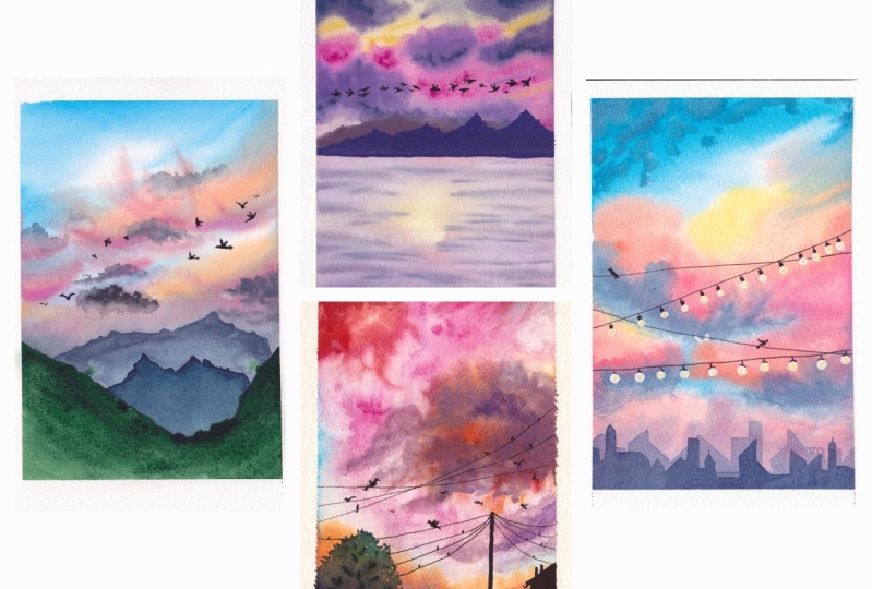
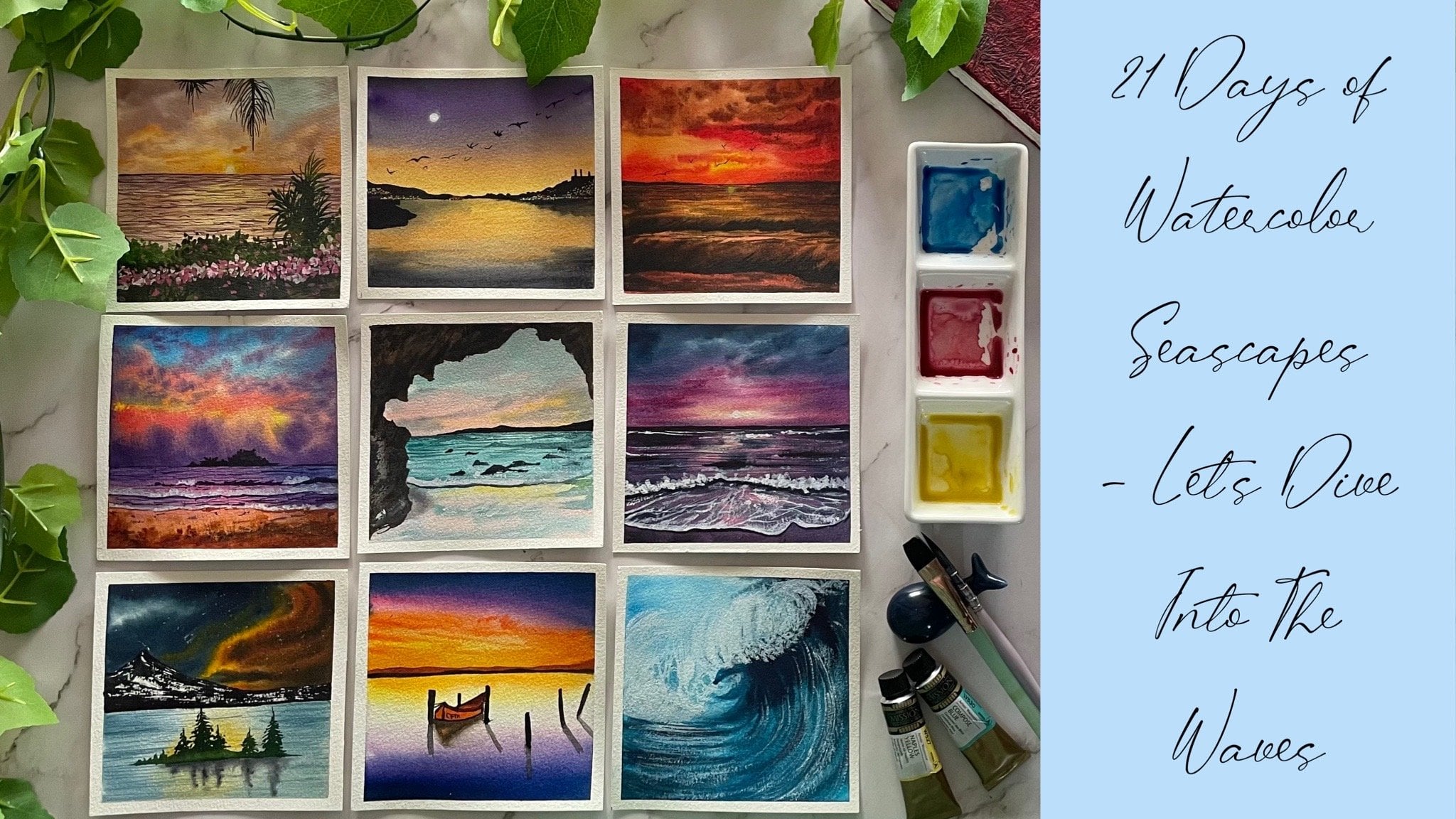
2. What you would Be Learning ?: Let's have an overview of the class projects that we will be painting in this class, we will be painting for pretty beautiful piece to skies with different landscape views. We will be painting for class projects for this class, two of the paintings are going to be in the color combination of blue and the cotton candy clouds. And two off the class projects are going to be in the combination of pink and some basal clouds. So we would be going ahead with very different approaches for each of the class project and tried to create different beautiful cotton candy Cloud and the pistons Kylo. We will be creating the pastry colors for each of the class project before beginning the class and learn different techniques, how you can approach creating these beautiful skies.
3. Materials Required: Let's have a look at the materials that I would be using through this class. I will be using this bond Academy 11 watercolor paper pad that is ten by two inch into seven inch. This is 300 GSM, 100 percent cotton cold press people. I will be using this people in its complete size for each of the class project, you can go ahead with an E5 already full size depending on the people available at your end. I will be using this masking for taping down the people on all the four edges. When it comes to watercolors, I will be using my White Nights watercolor set. We will creating our own piston sheets. I have some ready paste in sheets as well. But so as to make it easier for all of us, I will be creating a style sheets for each of the exercises and we will create a piece, two sheets together before each exercise. So you do not have to worry. I will be using this mixing palette for creating the piece two sheets for each class exercise. Next, you would be needing two jars of clean water for each of the class to reject so as to apply some cleanly also for, um, for some live editing techniques as well. Next, you would be needed by quash, I would be using the right nights whitewash. You can go ahead with any white quash that is available at your end. Apart from that, I would need a tissue for dabbing off my brushes and removing the excess water. The last thing is the brushes. The brush that I would be using the most is this three inch Hake brush. I will be using this brush for the vetting. This brush will be very helpful for rebutting the surface after painting the host us, because we are going to be doing a lot of live editing technique this time and create a lot of debt. You can use any because I is flat brush that is available at your end. I would always recommend you people because I is flat brush for the vetting techniques. Next, I would be using a round brush. You can get any of the round brush size. So I have these two brushes insights to. Next, I would be using a round brush size and I will be using a smaller size flag brush anti-matter round brushes. So this has a round brush size 4 and size 0 for adding in the detail. All my round brushes from silver black velvet have a pointed tip so it will be easier for me to add details with that as well. And a smaller sized flat brush for some smaller purposes. So that is it for the materials. Grab them and see you in the next lesson.
4. Taping Down the Paper: So let me quickly guide you about how I would be taping down my people for each of the class project, I would be taping down my people onto this paper block only and lead to run. After the painting is done, I would use all CARTO and the wolf, the people from this bag. And also it will be easier for me to keep this paper in an angle for the class project needed. So first, I would just take down the masking t and apply it onto one of the edges. Next, I would apply the masking tape to the exact opposite edge of the first edge that we applied it. And then I will quickly add in the masking tape to the rest of the two edges. Now while applying the masking tape, you need to be careful about two things. Make sure that on all the edges you have equal spaces. And I would recommend you to tape down your people onto a movable surface. So since I'm taping down my people on do this block itself, the block is movable because we are going to be creating a lot of soft backgrounds and we would want our people to be moved multiple times. So I would recommend you to take down your people on a moveable It's office so that it's easier for you to create the softness into this guy is that we will be creating two paintings. Now I'm done adding the masking tape on all the four edges. Now using a scale, I will quickly run it on to all the four edges so that there is no air bubbles left inside the masking tape. And most piece for the water to seep in unspoiled, clean edges. So for each of the class project, I will have my B what the DOM in the same V. I hope you guys understood the taping down. I will see you guys into the next lesson.
5. Let's Learn to Create Pastel Shades: Some of you may already be having some pieces of colors, but many of you may just be having the basic columns. So even loaned to create the base steel sheets. Instead of directly having the base to the colors available at our end, I will try to show you how to recreate the pace to Carlos from a basic color palette. So fast, I'm picking up this base color of royal blue, which I have readily available at my end. We will first see what this color looks like directly in the basal form that we have picked up. Then we will try to create a similar color from our basic color palette that we haven't. So I have first washed out the royal blue color. Now. So if you study this color, this color has a little bit of a violet touch to it. So this scholar is going to be formed by mixing in white, violet, and blue colors together to get this royal group Eastern sheet. So even begin by picking up a sheet of blue. I didn't pick up the shade of bright blue. You can pick up the shade of city and in blue or a cobalt blue and tried to see, next, I would be adding it to the blue color. And I will just pick up a little bit of the violet color from the palette and mixing your. So I am first going ahead by adding it isn't right? And see how much more rich color needs to be added. That is either you need to add more of violet. All right, so now let's watch this color that we mixed in and see. So you can see we have achieved the exact same s0 that we got directly by using the tube and the sheet that we formed by mixing in the kalos, just a little more of pauper would have gone a little more well, but even right now, it's almost 95 percent the same sheet. Let's try mixing in another color tone and see how you can create peace through sheets. So you are, I have to pace your sheet of mint color. First. I will quickly swatch this color and see what this color looks like. And then we will try to create a column makes off the same color using a basic color palette. So right now you can see this color looks like more on the side of a little bluish green. It has a little C attached to it. So first, I'm just picking up the green and the white color, mixing both of them. Let's watch and see whether it's almost similar on your, you can see the tones are not similar. That is a little blue touch as I told you previously, to the PCL mint color that we used in. So I just picked up a little bit of the bright blue color and I will just add little more of the white. And now you can see this color is almost similar to the mint color that we directly gotten from the tube. Let's watch this corner next to the mint color and see. You can see there is no difference between the two colors that we used. That is the palette that was directly from the tube and the palate that we formed by mixing in the sheets. So all I want to tell you is every sheet can be created from our basic palette itself. Do not worry about how you will plead the color. With trial and error, you can always keep creating the colors as you saw, we created the green color first by just mixing in green and white, but we did not achieve the same thought. And then just by mixing in a tinge of blue, we could get the ball effect on CMV. You can see how peaceful, beautiful sunset tones of yellow orange can be created. For one of the class projects we are going to be using one of the column mixes of brown and the violet color to create kind of all violet ish brown tone. So this is the tone that we will be using. It is, it has a little sort of a muddy green because of the brown and the violet mix. We will be using this color to create this VOC looking cloud into this beam. So this is one of the pandemic says that I wanted to discuss with you in case if you do not have the violet color, mixing brown, red and the blue color to get a similar looking tone. So this was about the column mixing and forming the colors.
6. Creating the Base Layer and Hake Brush Usage: As I told you in the beginning, this class is going to be focused more on creating depth using the re-weighting technique and adding Leo's with the re-weighting technique into each of the class project, we are going to be using the re-weighting technique. And for that, I am going to be using this brush to make my past easier. This brush is offered three inch land. So you can see in one's true, half of my sheet will be completely covered at once. So I will quickly dip this in water and it holds a lot amount of photo. So you can see with one stroke, I have almost covered half of the sheet and there is so much water still to paint the rest of the sheet as well. So that is why I would recommend you to use a bigger size flat brush which can hold a lot of amount of water so as to make your task easier while riveting and making the task much faster. Now, I can just add the force, deal with whatever color is available in my palette and let it dry for you to show how I'm going to use this brush body vetting technique. So I am adding the fourth layer with some basic colors and in-between you can see I have left the whitespace because then we will be adding debt with the riveting technique. So let's wait for this to dry. I will see you in the next lesson with the re-weighting technique.
7. Rewetting Using the Hake Brush: So now if you see the four CO, is completely dried and I even begin preventing this Leo using the big brush. So you can see this is a bigger size brush. I haven't Quickly dip it in water and I will quickly run it. Or what did the CEO. So you can see very gently, I run this brush. I am not adding a lot of spatial, so my colors are not getting lifted up again. And you can see there is so much water that this brush can hold in. The entire surface is wet in just half stroke and I still have so much water to wet the entire surface. So in almost just loose strokes, Read my entire bingo sheet that I will be using for painting. Now once we leave it, this idea will add the depth to this. So when I run my brush 2 times into halves, so that is one stroke will fill in the half side and one stroke fills in the second side. And that makes the re-weighting technique faster for me and easier. So I would recommend you use any because I is flat brush as big as possible to make the alleviating faster. Now I'm just picking up the color that is on my palette and I'm just adding it and showing it to you how we are going to be adding Carlos for adding debt to you can see when we add the palace after the re-weighting technique, the kalos blend much with the Vizio kalos and do not disturb the harmony. So you can see despite adding the orange neon to the violet color, we are not getting any muddy goals because we are adding the orange towards after the riveting technique. Seeing the, the yellow and the blue is not creating a green thought because of the reweighting technique used. And with the reverting technique, you can see, you can add in so much TPs. For each of the class project we are going to be using the reweighting technique for adding in the details into the sky. So for each class project, we are going to be using the re-weighting technique. And in each class project after riveting, see different kinds of approaches that we will do for each of the painting. So without any further ado, let's begin our first class project for today. I will see you in the next lesson.
8. Project 1 - Part 1 - Preparing the Palette: So let's begin by forming the beast and sheets that you would be needing for the fourth class project. I have kept the class project image your in focus so that you can see the color sheets that we have used in. If you do this, the sheets that I have used, shades of yellow, shades of pink, violet, and a little bit of the Payne's gray color in a piece. So far the pink cannot impose picking up the Quinacridone Rose she, for the yellow, I will be using the Naples yellow color for violet, either directly be using violet that is into my palette. And a little bit of a Payne's gray mixed into violet to get that little dial violet. And a little of the Payne's gray color alone itself. So these are the four colors that I have used for this class project. And I have created all the dominant values of this color by adjusting in the white into it. So I have force picked up all the four colors. That is the quinacridone rose, Naples, yellow, violet mixed in with a little touch of Payne's gray and the beans green color. Now do all these cool colors, either be adding it right color. So this time I'm using the white watercolor only because we just need to create in the piston colors. So I didn't quickly just adding a little of the white color. And we are going to be using the pains in a liquidy consistency for the first wash. These are the colors that we are going to be using in for the force of the sky for the rest of the areas where we need the darker tones for the second Neo Viva, just me adding little more color touches to this piece to mix, to get a dapper, don't then the base layer tone that we are going to be using it. So do all the four colors that I got onto my palate. I have quickly added some white. Now to these, I would just add little drops of water and mix them and see whether they are the right color sheets that I'm looking for or do we need to add little more of the color sheets or label more off-white to adjust the color according to the need of our being. So I'm done mixing all the four sheets. I feel that is a little need to add more of bite into the violet color mix. So I'm just picking up mortified and adding in your I still need to create one more lighter tone of paint because I need two layers of paint with different Boolean. Even to the Payne's gray color. I just added a little pinch more of white and you can see I've got a T cell kind of agreed to it. And for the violet, just add a little more of Bij to get more, obviously don't towards the violet side. Now to the quinacridone rose color, I will just start a little more of white and little more of the Queen Rose color and form a darker blue because we will be forming of all the pieces tone of pink separately. So first I'm just creating the Docker dawn. We're adding in the decks nature on. So you can see my colors are in a very liquidy consistency. Our intake and they are in a good fluid consistency. Now, I will just add little more of the Queen Rose color. Do not worry, I will be watching all the colors and showing it to you what the balance sheets look like. So you can create the exact looking same sheets. These are the colors that we will be using for the forced be CEO. Now, I will quickly prepare the pieces shade of pink that I was talking about so far that I'm going to pick up a lot of pain and the piece, so I've been back, we have formed either just pick a little tinge of that and add to this. So it's going to be almost like a white tone with just a pink Dutch. So you can see that such a peace tipping color that I have formed. So these are the five V's colors that we will be using for creating the first player. And then for adding in the second layer and depth into the sky, we would just talk in this colors. Now, I didn't quickly swatch out these colors and show you how these pieces sheets are looking at. So I would recommend you also to go in with a little swatch card around you so that it will help you understand the different color tones that you are using it. So this is the pace helping the baby pink color that I was talking about. This is a medium pizza topping tone. Now next, swatch the yellow and the rest of the colors as Ben. Now in case if you do not have to wind rose color, you can use crimson color instead of Naples, yellow. You can use any yellow that is in your palette. For violet, you can mix in the red and the blue or red and pink. And for Payne's gray, you can either use an indigo color mixed in with a little danger of black or you could use a little bit of black, blue, and white. So these are all the palace for the post-meal.
9. Project 1 - Part 1 - Layer 1 for the Sky: So let's begin with the pencil sketch for you just going to be having a very light horizon line or below the center line and onward this we're just going to be having two mountain ranges. So I'm just marking out the front mountain range because the back mountain range is going to be a messy one, wet on wet. So that is it for the pencil sketch. Now, I will begin reading the sky species. So for vetting the sky space, I'm going to be using in my three inch Hake brush and I will quickly dip it in water and wet the entire sky species. We won't be adding the water to the CSPs at the moment. We would read that EDR after we're done painting and Dias, ISPs. So you can see just by using a bigger size brush so easily, we could be in the entire surface quickly. Now, Ivan false beginning with the pins three and the right column mix at the top. And then I can use in the Naples yellow color mixing that a little bit of white and did just below the Payne's gray mix. So I'm just picking up the yellow color. I feel the yellow color is too light, so I'm just going to add in a little more often, Naples yellow to make it little more bright. I'm just going to add it below the oil paints gray color that we added in. Don't worry, you can leave a little space between the polos. The colors will blend and flow into each other naturally. Now next time using in the mix of the light pink that we have created by adding in a lot of 5x2 the windows color, you can use the crimson color if you do not have the windrows color. Now I'm just adding it at the bottom space, just underneath the yellow and again, a little of the yellow underneath the pings piece. This is just a falsely or we will still be adding one more layer, wet on wet right now. And then the third LEO we would be adding, after all, you know, waiting for this to dry completely and then revisiting the entire surface. So you can see for the first New York, I'm just using in the pink and the yellow at the bottom speeds. So this is for the post Neo. Now for the second layer, I'm using indices Payne's gray mix. I just added a little more touch of Payne's gray to get it in a little darker tone than the previous. And I'm just adding it to using the round motions of my brush and creating the cloud cheap at the top speeds. You can see that I have been using the beans in a very liquidy consistency and I'm adding them very carefully. Now. I picked that the darker mix of the pink and just adding it into sandals piece, creating a big cloud in the centers piece. All of this is wet on wet, that is, the first layer is still wet and I'm adding all of these wet on wet. So you need to control little of your waters when you're adding in these layover, the pink and the darker tones of Payne's gray. Because if Devin have a lot of what DO the beans spread a lot and you will lose the bees Neo look that you added in. So make sure that the yellow is still visible and would not cover all of the yellows pieces. Now next time making, picking up the mics off the violet, Payne's gray and the white color that we created. And I'm adding it at the bottom space. This is just going to be legit because we will be adding much more details into the next Neal. Okay. I'm just adding little more of the violet cloud at the top using the same ground motions of my brush. So this is it. Now we will wait for this to dry completely and then move to the second layer and the entire space and add most of the clouds. Students.
10. Project 1 - Part 2 - Adding Depth and Clouds to the Sky: So now my first CEO is completely dry and we will begin adding the second Neo. But before rewriting this piece, I would love to prepare the colors for the second layer so that we can act upon those quickly. So to the mics off my dock be still pink. I'm just adding in a little pinch of the Payne's gray color and creating or dial kind of a pink balloon next to the pins, gray and white mix color that I have. I'm just going to add in a little more of a pilot and create a darker violet tone. So it's basically the same violet mix that we had. But since I had an autopilot data, did the colors have been, let's please watch these colors and see how they look. So you can see these look kind of cool vintage tunes that we are trying to create. And they are different from the previous tunes that we have been using it. So these are the two kalos and the rest of the colors will be the same that we will be using it. Now quickly using in my hake brush, I will just rewrite the entire sky ISPs. So now you can see Justin, those groups I'm even to rewet my entire sky ISPs quickly make to our whenever you have eventing, do not apply a lot of pressure. Quickly, run your brush with a very agenda in hand. And if you feel any verb that is excess water, pick it up with another dry brush so that, that is no excess water. If you will add a lot of pressure by rewriting, then the beans will begin to reactivate and they will spread a lot. Now I'm just preparing this pink column mix a little more darker. And now I'm just going to dab off the excess paint and I will begin adding in smaller clouds. So I'm just going to use the little tip of my brush. I'm going black, middle cloud shapes. And whenever I'm picking up the color this time you can see I'm dabbing off the excess water so that all I have on my brush is the pigment and so that I can add these soft looking clouds. Now very gently, I'm just going to add a few clouds with this column first. So you can see it's such a soft vintage kind of a tone. I'm just using the tip of my brush. My beans are not spreading much because I am not picking up any excess water. I'm trying to limit the water that I'm adding with this layer and I'm laying the polos very gently without adding any pressure. If you will add a lot of pressure, then the Bayesian kalos will begin to get activate and will react with the Apollo's that you are trying to add in now. So you can see I'm going to add these clouds into the entire sky. And then even I have little radiation with different colors as well. Now next I will pick up the pink follow mix statistic windrows and the white column mix that I have your, so there is more of windrows and lifts off, right? And even by adding this cloud, I will make sure that there is no excess water that goes inside by adding in the clouds. So I'm going to add a little of the clouds overlaying the false clouds that we added in as well. Now again, you're also, if you notice, I'm just using the tip of my brush, adding in paint and you're not just trying to add some cloud effects from the edges and pulling out strokes from the edge to get little more stroke details into this. All of this is very soft and you can see my hand is moving so gently I'm not adding any pressure. And I'm just moving my hand very softly so as to achieve those soft law. And the key here is to not add a lot of water again because you already have of it. So phase and if you will add a lot of water, the paints will know a lot and will not give you the cloud look that you need to achieve in. Now I have just picked up a little more of the Naples yellow color. And very gently just using the tip, I'm adding little yellow highlights in between. Again, you're the key has to be that you need to add the color very gently so that it does not react with the rest of the pink color and form an orangeish don't we need some yellow highlights in the sky space as well. Okay. So just on the dynein you can see I'm just blending it wet so that I have that yellow look into the sky space. So you need to achieve, and that is the reason we had added the yellow layer forced by painting the first layer. So you need to strike a balance. And now if you'll notice my sky, I have all the Apollo's visibility light tones, the darker tones that we added now. So just using the Payne's gray and the pink color mix, I'm just adding little more cloud highlights onto the Cloud SAC we painted earlier. Just a little darker highlights. So basically this time it's a little more of the Payne's gray color than the pink tone. And you can see I'm just adding little highlights, not much that you feel compare. In the fourth year, we had added a lot of clouds with this color, but right now we're just adding little highlights and little strokes, the half C strokes to add more details. And all of it again is ready gently wet on wet. My paper is still wet and, you know, so I'm getting that soft look completely. So now just knit and highlights with the pink ballerinas. And then we'll be done with the sky space. So now I'm done adding the sky. Now we will just add the first mountain range while sky is still wet to ask to get the soft blurry effect on a misty effect to that as well. So for that I'm going to be using the violet Payne's gray and the white column mix. I will just place this masking tape underneath my people so that i, it gets a little tilted on motion. And when we add this colors, the colors will not flow towards the top side. They will flow towards the bottom side. So you can see it's a very muted kind of a violet tone that I'm using it. Make sure if your sky area is still wet, then bait floater little time to dry almost like 50 to 60 percent, and then begin adding in this Leo. So the first layer of mountain is a very muted and glory, misty kind of a mountain range that I'm trying to add it. We will be adding the second layer once all of it is dry completely. Okay. So just adding the fourth street, I'm just mixing in the same fellows that we have been using. It now doesn't mix of violet paint, Payne's gray and white and just add in good read on. That is the top area of the sky is still wet so you can see it has a soft edge, but keeping it inactivated motions so that the paints don't float towards the top space, the flow downwards and we have a perfect look to the sky has been. So with every stroke I'm just making the color tones a little darker. And you can see I just use the tip of my brush and add it onto the edges. And I'm using the color as well in a very diluted consistency. So that does it. Now let's wait for this guy to dry completely and then even move ahead and painlessly space. And the rest of the details.
11. Project 1 - Part 3 - Painting the Soft Sea: Now my entire sky species has completely dried and I will begin painting the CTO. So for the C Eda, I'm just going to wet the entire space using my biggest size brush. Be careful that near to the mountain, you do not add a lot of water, otherwise, the colors may begin to bleed. Again. I have kept my people in an inclined direction only so that it's easier for me to be in the CSPs. Now for painting the SPC space I'm going to be using in my flat brush. I first picked up a little bit of the Naples yellow and just adding it into the center space, creating some light effect to deflect the clouds light effect into the sea. Now next I'm picking up the mix of pink and white color. And I'm going to begin adding this on to the edges. And very gently I will run it, or what do they look hello. But in such a way that the yellow color is still visible. The area that we are painting is going to be a very soft see with very less details, but we will try to achieve all of the details into this. Next picking up the tone of violet mix that we have. And I'm just beginning to add it from the edges. You can see I'm just picking up very little kalos and pulling it out from the edges. So in this N dot, the yellow light effect is still maintained. Now using the Payne's gray column mix, I will just again pull it out from the edges. So the key that I'm using is I'm only pulling out these darker tones from the edges so that in the ascender space I have that yellow light and you can see how beautifully and easily I have maintains a yellow light. That is the reason we use the flat brush so that it's easier to get this smooth blend of two colors. And also I used the colors in a very light and medium consistency. And you could see very little color that I was picking up for adding in the base Leo. Now I'm just mixing in the Payne's gray color with the pink color. And I've shifted to my smaller sized round brush. And in-between, I'm just going to begin adding some ripple effects wet on wet. So the CATI is still wet. And on Buddhist vector space we're just going to add little ripple effects and have a soft effect to the repairs as well. So first I'm adding in the rebels with this mix off the beans green and the pink color. And you can see it's a very light triple effect when it blends into the vet back now. Then we will still be adding little more darker ripple effect and all of it is just going to be wet on wet. We won't be adding any much details into the CSPs because our focus was the sky area. The C is just an element to give it to this beautiful sky that we have been today. Again, if you notice, I did not add any rebuilt onto the yellow space. I gently added it around it. Now just adding little bit and you can see all of it is blending and having such a soft look. And I am not picking up any excess water, hence, my friends are still visible despite having the soft look. Now for the next color repeats, I'm just going to mix in the pink and the violet color. I'm going to add the ribose with a more pink tone. So you can see this color is a little more darker than the previous neoliberal state. We added a. And all of this again is based on where your people dries in between by adding in these layers off, I would recommend you, just as you reverted the skies be redirected CSPs again before adding in the rebels with a darker tone. Now I just picked up a little more of the Queen nose and the Payne's gray color. I'm just adding in little darker ripple effects. This time. I haven't added any white. And also I picked up the color and medium consistency and added a little tinge of water only. Hence, I'm getting these darker tones to the ripples here. Now just a little repairs with the violet column mix as well. And you can see I'm adding them wet on wet yet and they are having the soft edge on its own because of the vet tag. So it's very important to add these ripples all vet on wet so that you can again get a control onto the wet background. Now just using a flat brush, I will quickly blend a little of this so that they have a soft look. Now if you notice the repossessed and visible distinctively yet having the soft edges. Now let's wait for the CSP is to dry and then we will add the final details into the painting. So the key to painting the sea space was to use the brush strokes in a very light banner. If you'll notice, my brush strokes were very gentle and I was pulling the kalos very lightly. I used very light tones of the colors we were adding. All the ripple effects wet on wet refers began with the yellow color wash, then added the pink and the violet and the Payne's gray washes. We use the same colors as we used in the sky. And phospholipids, we just use darker dawns of the pink, violet and Payne's gray mix. We added the rebels also with three color effects. That's the forced with the lighter tones of the Payne's gray and the pink color mix. We have been using the Windows color in case if you do not have the quin rose color, you can use the crimson color. So that is how we got this soft looking see space. Now let's wait for this to dry and then add the details.
12. Project 1 - Part 4 - Final Details: So now my entire painting is completely dry it, and you can see we've got such a beautiful effect. Now. I'm going to just make sin the Payne's gray and the wild scholar. And I won't be adding in any right. I'm going to be using this muted tone of the violet color in a medium consistency. And we'll add the second mountain range ahead of the first mountain range that we already added. But the second mountain range is just going to be smaller than the first one. Let me just watch out the color that I'm using. So this is the new territory that I'm going to be using. I would always recommend you, whenever you mix any new color, I would recommend you to swatch them out before using it so that you know that you are using the right color sheet. And so that in case if you have to mix the color again, you know the right colored bone that you need to get because of the swatch card that will be available at your end. Now I'm just going to quickly add in the second mountain range your and define the horizon line again. So you can see, I'm just trying to get a very rough edge to this mountain range that I'm adding it so very gently, I'm just adding a very dark in. And you could see, I just need the height and the shape of the mountain throughout so as to give it the natural law. Now I will quickly fill the space with this color and then we are done adding the mountain range as well. So I'm done adding the second mountain range. Now I'm just picking up the black color in Arctic consistency. I'm good. Just going to add a lot of birds indoors, cheap. 9, just about the mountain range in the US. Isps. I'm going to be using my smallest size brush. So I'm using this size two round brush which has a pointed tip. I'm using this brush. I will quickly add in the entire range of boats into the skies piece. You can see the mountains. I've got some beautiful look. The bag down mountain giving the misty and the front mountain giving it a detail look. Now make sure that you will not lay your hand over to the mountain species. So if you want, you can be it via mountains to dry completely and then begin adding the boards. We're just going to be adding very simple boards embedded under shear, moving towards the right side. And I'm just going to add an entire flock of these bots, almost industry line. And just a little about the mountain as you can see. And the rest of this guy is just going to be playing like that with those lovely clouds that we have gotten. So you can see him but she just, hey ones, nothing in the data was just trying to show them in the flight motion. If you want, you can please the boats anywhere else into the sky space as well. But for this class project, I wanted to place them in an almost cheap line just above the mountains piece. In the rest of the full class projects, we will still be adding in the boats in the different directions and indifferent placements. So each of the class exercise is going to give you a good exercise of painting these bodies in motion. And it may help you to even, or you know, launder these boards very simply. So if you'll notice I'm just adding the simple shapes, just adding some moving towards that, some moving towards the right. So just giving them different altogether. And just the last board your, and then we are done adding in the board and all the bands in this beam. Why doesn't this guy looks so beautiful and gorgeous with those soft clouds and the basin and look. So now let's remove the masking tape and see the final painting with those mean edges. I will be removing the masking tape and then I will have to use oh people and take out the sheet from my block. So in case of U1 using direct me a sheet, you need not have to do that step. But since I'm using it on a block of people, I even have to remove the sheet from the block and separate this being day. Suppose let's remove the masking tape, make sure that is no water or beans which is wet onto your masking tape. Otherwise, hello, back into your paintings. So be careful and always remove it at an angle. So your final painting for D1. I hope you guys enjoyed painting this beautiful sunset view with me to D and loan to create this beautiful clouds and abbreviating technique. Thank you so much for joining me. I will see you guys into the next class project to model.
13. Project 2 - Part 1 -Preparing the Palette and Layer 1: So you always what we had painted on day one of this for this class project of painting the pasta's guys. Yesterday, we did this by first adding in the sky, then give editing and adding in the Cloud depths and then painting the CSPs. Today we are going to be and painting in another beautiful cotton candy sky blue. But today we are going to be approaching that a very different technique for us to even paint in the sky with a very light tone of blue and then add the cotton candy sky Lu. Yesterday, we added in the entire sky at once giving up ECO. But today we will be leaving white gaps and we will be painting the sky and creating the cotton candy look. So now let's begin with a second class project. We even begin by first forming the pace and sheets needed for this class project time span. For this class project, you will be needing the shade of orange, windrows, bright blue, and a little bit of yellow. These are the colors that we will be using for this class project. I'm going to pick lip repair these scholars one by one. So I already have to orange and Queen Rose out on my palette. I'm just picking up the bright blue color. You can use a crimson color instead of a win-lose color. And in case of a bright blue, you can use acetylene blue-collar if you do not have exact change sheets. Now to the orange, I'm just going to mix in a little touch of the yellow and now to the yellow orange mix and the Queen Rose mix, I'm going to add in the white. I'm not going to add in the white much to the blue color. Because this time what we're going to be doing is we're first going to be painting the blue sky, leaving some white gaps. And then we will revert the entire surface and add in the clouds with the yellow, orange sheets. So today blue color, I'm not adding much a fight and you can see I've just got the perfect sky blue kind of a tone that we needed. And to the rest of the two colors, I will just create the pacer door and keep them ready for the next layer. So I'm just adding in a little bit more of the yellow and orange. And I will just add a little more of fight and keep a lot of color ready for adding in the clouds. So now I have automatic Ono's Jenny, and I'm going to quickly begin with the pencil sketch like Banza sketched up either be having for this class project is the mountain genes that may even be having at the bottom specced. So you are at the bottom space. I'm going to make me mock out of your mom didn't gene just so I marked out this bottom mountain range. And now on top of this, I'm going to add another two mountain ranges. So almost 40 percent of the bottom paper is going to be covered with a mountain range. And at the bottom most space below the biggest mountain, we are going to be having a little field space. Now I will begin applying a clean coat of water only into my sky area. Make sure that you do not run into the mountain space without body. Little water goes in there. The mountain range is going to beat the off the darker bones of the pins gray color. So quickly just apply a clean vote of water into the sky space. So you can see there is a little water that has drawn into my top mountain range, and that's perfectly okay. We are going to begin with the blue column mix that we have prepared. Make sure to leave white gaps by painting with the blue color, you can see how I'm going to add the blue color now. So at the top, I add a little of the blue color. Now I'm just going to begin adding strokes of the blue color, leaving white spaces in between. And you can see I'm using the blue color in a very medium consistency. It's not do that. In between at the top space you can see such a big white space that I left. We are going to leave it the surface and then add the cotton candy cloud moving look this time. So just at the bottom space, you'll see we have the light blue at the top space. I added in a little of a darker blue. Now I'm just going to lighten the blue photo by just quickly picking it up at my flat brush. So basically I want a little login to my Skype, but not too much because we need to leave space for adding in the clouds. So now let's wait for this entire surface to dry quickly. And then we will begin adding the clouds with a different color tones that we have prepared in
14. Project 2 - Part 2 - Adding the Cotton Candy Clouds: So now you can see my entire blue sky is completely dry. It and it has caused such a soft blend because of the water layer and very light tones of blue that we use. Now I will quickly swatch the colors that we will use for admin, the clouds. So this is the mics off the orange and the yellow color. I added more of fight to get the basal tone. So this is the quin rose color and now I'm just going to mix in the crimson color and adding white to the crimson color and show you the palette that you would get by mixing in the crimson and the right color. So you can see these two things are almost the same. So don't worry if you do not have the exact same sheets, you can always go with the best alternative color available in your palette. The next color that I'm picking up is the Payne's gray color. And I'm just going to add a little bit of blue to the Payne's gray. And I'm going to get a grayish blue tone like this. With this color as well, we will be adding the drill depth into the sky species. So these are the four colors that we will be using to add the clouds now. So now that my colors are ready, either begin to rebuild the entire surface. So I'm going my hake brush to the event the entire surface. And I'm going to revisit it with a very gentle hand. You can see in almost three strokes my entire sky is red and the bottom layer is still intact just as we've been today. Now the key while adding in this layer is going to be, you have to add the clouds with the smallest size brush. You need to be sure that your brush does not have a lot of water when you pick up the kalos. Otherwise, the polos will spread a lot and you will not get the blue. So I'm using my smallest size brush and floss picked up the mix of the orange, yellow, and white color and adding it streaked like this. Moving from the right side, you can see my beans are not spreading much despite of the wet surface and wet pin. This is because one, I'm using the smallest size brush, and second, I'm using the paints without much of water. Hence they are not spreading much and having the soft edge and even giving us the perfect shape look that we're trying to get it. Now at the bottom space, I added a little blend of the pink and the orange color from the places where we had picked up the blue color. Now just going to add little streets of the pink, orange colors. I'm going to add little debt with the darker dawns later on onto these pieces. So again, you can notice I'm just adding these stones very likely. Now on to the orange color. You can see very gently I'm just adding some half C strokes with the pink color and trying to create a blend between the two colors. Also, if you see, despite being the orange color when mixing with no, It's not forming the muddy tones because of the Vizio not getting activated and losing the riveting technique. And also because we have a little of the white into the orange. Now wherever we left the white gaps, you can see I'm just using the half C strokes and adding in these clouds there. I'm using my brush very gently. I'm not adding any pressure while adding in these clouds. Whenever I feel there is excess of water on my brush, I'm quickly dabbing it on a tissue. So having a tissue handy is a key your, otherwise it will be very difficult to achieve these soft look and even the cloudy look. So all of my edges are very soft if you can see, but still I have the distinctive look of the orange and pink color Cloud SAP am adding it. Now from the top, just adding little very random pink strokes you can see and adding little more detail to the clouds. So you can see the clouds have done so beautiful. Now just about the mountain range, I'm using the mix of the Payne's gray and the blue color and adding a little, good luck trying to give him the mountain reflection that we are going to be painting ahead. So just giving a little foggy background to the mountain. So using a mix of the Payne's gray and a bright blue color in a very liquidy consistency you can see. And I'm just priding the paint with the water quickly and having it a soft edge blended with the sky well. So you can see we've got the perfect fog effect just about the mountain gene. So make sure to get this fog effect because we will be painting the mountains with the Payne's gray color. Now using the same tone, I'm just going to add very little low lying cloud shapes. And this time also you can see I'm dabbing the excess water every time I pick up the pace. I do not want the paint to spread too much outside the shape that I want to achieve in. Now you can see, again, my paints are having the soft edge and they are maintaining their shape. Also, they're not spreading a lot because of the water control. So you can see very random small clouds that I'm adding in there having the soft edge not spreading. So remember the key here is to apply all of this wet on wet, my sky is still wet. But when I'm picking up the beans, I'm making sure there is no excess water. So because of the liquid paints, I'm getting into soft edge, but the beans are not spreading and giving me the perfect Cloud sheet as I'm trying to add them. So that does it for the clouds. Now let's wait for this guy to dry completely. Then given paint, the bottom mountain ranges.
15. Project 2 - Part 3 - Adding the Mountains and Birds: So now my sky spaces completely dried and we will begin painting the mountain ranges one by one. So for the first mountain range, I'm going to make sin the Payne's gray and the blue color. So this time it's going to be more of or less of Payne's gray. As we move downwards, we will begin darkening the mountain range. Now, I have enforced, given a very sharp edge to the mountain range that I want to achieve in, you can see I'm picking up more of new and very less of the Payne's gray color. I will define the shape of the mountain range and then paint a complete mountain range with this color. Now at the top of this mountain range, again, I'm going to add the color and at the bottom, I'm just going to use a damp brush and quickly spread the color and get a little lighter effect. So you can see now just using a damp brush, I'm trying to blend the color and get it at the bottom space in a lighter tone. So basically, I'm just trying to get the abbreviation to this mountain. Dark colors at the top and the lighter color at the bottom. So this will again give it a MSDN, a foggy kind of an effect. Now quickly make the blend smoothly. I'm again going to add the color at the top space and let the colors flowing at the bottom space. So the top of the mountain will be darker and the bottom of the mountain will be light up giving in the fog effect. Now does this mountain range tries, we cannot be in the rest of the mountain ranges are the ways all of the colors will begin to spread into each other. And we will not be able to achieve all the distinctive mountain looks for each of the mountain. So we're going to have to wait for the false mountain range to dry in there. Then we will add the boards into the sky species. My sky area is completely dried and you can see we've got such a beautiful cotton candy clouds sky, isn't it? And the clouds that we added using the Payne's gray and the blue column is, have got such a beautiful center low. Now using the Payne's gray and the black color, you can add boards into the sky. So I'm going to be using the black color this time and using my size two round brush, which has a pointed tip, I'm just going to begin adding for your boards into the sky space. So this time I'm not going to be adding all of the gods in a simple straight line. I'm going to be adding the boards vary randomly, but they will be a lot diagnosed. So basically the top-left and off the sky and the bottom right of the sky that is near to the mountain, then we will not be having a lot of boards. We will be having a lot of boards in the center space moving diagonally. You can see I'm adding the boat sheets vary randomly and I'm adding them in different flight motions and trying to really the shape of the boards with every board that I'm adding in. Some, I mean, I'll fuel bauds of whatever shapes you prefer. So you can see inbetween be even on a dumb big O boards as well. Now as I'm moving towards the top space, I'm adding a few of the big boss. A little more detail. I'm mad and I'm adding them very peacefully, so dark I do not run out of the shape so that I don't oxygen when download. So you got to be airflow if you're adding in, but don't De Dan look off the boards. Also, make sure that we are using the smallest size. But if the odd brash does not have a blinded, use a detail brush for adding in these boards so that they do not look out of proportion. And you can add them in smaller shapes and sizes. So you can see, I've added the boards in the diagonal line this time and not in a straight line. And then between I added very light boards as well, just too far view of the bots. Now my first mountain range has dried completely. And for the second mountain range, I'm just going to add a little more of the Payne's gray to the blue column mix that we have. Now this little space that you can see, make sure to not add the color there because that is a little unique space that we will be depicting later on. So make sure you do not add any color there in that little space while adding the pencil sketch, I missed to tell you that little space was not a pencil sketch error, but it was actually a small lake space that we have left to in-between the mountains. So it's going to be very small space which we will paint with blue colony drawn. Now this second mountain range I've added completely with the Payne's gray color and you can see the palette distinction from the first layer now. So now when we being the third layer, we are going to be adding more of the Payne's gray and vivid, even be using a little tinge of the green color this time for painting the third layer and farther toward LEO, we are going to be using one technique of adding textures and creating some grass effect without using colors. So in the next lesson, I will first discuss with you that they eat that we will be using for creating the brass effect this time. They'll then, I've just picked up the colors. So I have picked up that dark green color and the Payne's gray color for the third Leo. So let's meet for the first two layers to dry in quickly. And then we will paint the third layer and the final details into the painting.
16. Project 2 - Part 4 - Final Details: So let me quickly discuss with you Will that technique that I'm going to be using for adding in the grass effect. So I'm just picking up some Payne's gray color and I will add a patch of the beans Greek along here. Now why is this patches still going to be bad? We will be adding textures using a pointed tip and creating some grass effect. Okay, So this area is wet. You can see now I'm going to pick up a smaller size brush. And from the back of the brush, I'm just going to pull out some grass tool. So the brush has to be unlimited pointed one. So you can see just pulling out simple grass strokes from the back onto the wet layer paint that we add it. And you are getting this class effect. So this looks kind of a self cross effect and it is a little unsettled with the grass. So this is what we are going to be using at the bottom of this painting for adding in the grass effect like this, using the tip of your brush. I hope you could understand the technique. So make sure to use a brush which has a little pointed edge at the backspace and vary. Your surface is still wet. We're going to create the class effect quickly. So now my painting is completely dry it and we will begin adding in the final mountain range some false picking up the dark green color. And it's going to add little of the dark green color onto the edges and then pick up the paint strainer, take consistency and blend both of it. I'm just going to make sure that I just have little green effect visible. And the rest of this piece is just going to be filled in with Payne's gray color. Make sure to leave that little lake space again in between the mountains that we have added, and we will add that later on. Now, quick clipping this mountain range with this for all green and Payne's gray column mix, make sure this range has to be read to add in the grass effect which we just saw. And we're going to be using that back off a brush for adding in the grass effect so quickly I didn't this end biospace off the green and the Payne's gray color and even begin adding if the grass effect with the brush. So you can see, I'm just trying to get them clean data onto the top side of this mountain VH time to show a little field ADR. So you'll get to see because of the pain Kahlo getting in such a beautiful look, Annelida greenfield space. Make sure your space has to be better at the bottom to add in the grass effect. So my idea is still wet and now I will quickly shift to my smallest size brush and use the back of the brush for adding in the grass strokes quickly. So just as I showed you this technique in the beginning of this lesson, we are going to be using the back of the brush for adding in the grass strokes. So I'm going to be using this smallest size brush, and I'm just going to use the back of this brush and pull out the grass tools. You can use any brush tip that has a smaller size tip at the back. So you can see that texture this is creating and as it will begin to dry, it will give more texture effect. So this is one of the texture techniques used in watercolors for adding in some textures. You can use this technique for adding in the grass into your middle paintings. And you can see it gives it a little settled grass Doc, and you need not use any other colors. And the green color is giving such a pretty luck to all of it. Now let's make the district drag to add the final details. So now my painting is completely dry. I'm first going to pick up the blue color and add this little lake effect here. I'm simply using the Selenium blue-collar and showing this little lake area you are. And you can see, despite being so small, it's adding a little elements to the paint day. Now I'm just going to pick up some white gouache and they are going to add little flowers into the bottom space that the grass is that we added in. So before beginning to add the flowers, what I will do is using the white color. I will just add little dry brush to this last mountain range that we added. And I'm just going to add very little of the dry brush technique. You'll make sure that you do not add any water to the white quash. Just pick up a little of it and just run your brush very gently to add in this dry brush. Since my people has a little grainy effect, you can see it's making my bass much easier to add this dry brush stroke. And also I'm picking up the paint in a very thick consistency. You can either you want by guage or vita credit for adding in this white watercolors may not do all great justice and give you this opaque effect. Also, the key here is that you need to pick up the paint without adding any water. And you need to be very gentle on hand. And even if you will pick up a lot of the paint, then you will begin to get a lot of the pages. So you need to pick up the paint also very little by little so that you do not get Apache low. So you can see very gently, it didn't dry brush onto the entire space. Now to this white color, I will be adding in a little tinge of the yellow color to add the white flowers. So just a little stage. We are going to be mixing white gouache and any yellow color that you want. You can mix into this and add little flowers at the bottom space, just about the grasses that we added in. So I'm going to be adding very simple flower looks just some simple dots vary randomly to create some vital flower. Look. Now at the bottom space, I'm quickly just going to dab in some of this yellow color you can see and trying to create more of the distant flower look. Now make sure that this dabbing does not move into the mountain ranges at the top space. So either cover it or add them in a very controlled way. And now I'm just going to add those smaller flowers very randomly in between these. And you can see it's getting such a beautiful look with just simple flowers. And the Southern Cross looked at we added it. Now one last thing, I'm just going to use my white gel pen, some white cross strokes and between your, so you can add these drugs stroke with a fine liner brush using your via gosh, if you do not have your white gel pen, I will quickly add a few of them using a white gel pen. This way, just add a little highlight to your painting. I hope you guys enjoyed today's technique of creating these soft sky and the cotton candy sky cloud low. So now let's remove the masking tape and see our final painting with those clean edges. Make sure that your edges are completely dry before you begin to remove the masking tape. And always remove the masking tape at random from your paper. And if there is any water onto your masking tape, It will not flow back into your painting. So you always, I find that painting of today's class project. I hope you could get these soft sky look and loans to control the water while adding in the clouds and forming these basic shapes and adding these little grass strokes with the watercolor texture. I will see you guys into the next class project to model.
17. Project 3 - Part 1 - Preparing the Palette and Layer 1: Hello everyone and welcome back. So this is what we have been did on D2L. If you remember, the force created the beautiful soft too blue sky and then revetted this office and added to Scott and candy clouds look. Today we are going to be painting something similar in the color tone palette, but we didn't have a very different approach today. Today, even forced be adding in the cotton candy clouds and then either being the blue sky and add the cityscape silhouette. So let's begin painting today's class project. So let's begin to force prepare the color palette for today's class project. The cameras are going to be quite similar to the previous class project. Just that in the previous class we had mid stay in blue and the orange together. This time, we will be creating the associates for both the cashflow separately. So I'm going to be using yellow, orange, the quin rose color, and the same bright blue color. And these are the four colors that we're going to be adding into this space. As I told you this time, the approach is going to be a little different because I wanted to show you both the techniques are forming those Bureau for cotton candy cloud look. So today, even philosophy painting in the cotton candy clouds and then adding in the rest of the sky on the syllabus. But first just preparing wilder beast two sheets. So I already have all the four colors out on my palette and not just quickly adding in right to all of them. So I won't be adding the white and the blue right now. So I'm going to mix it later on. Now, let's watch the kalos NC done before applying them on to the people. So first I will just add little more of the yellow because the yellow on the people when being very transparent, which I do not want. Simon quickly just create one, don't DACA. And now you can see it's not transparent yellow part, it's a beautiful piece. And yellow dot v have quoted saying, I haven't quickness, watch the rest two colors that we are going to be using, creating the cotton candy clouds. So with these three colors, we will first begin creating the cotton candy clouds. So let's begin applying a clean coat of water onto the entire surface and then add the clouds into the surface. Make sure that you add an even coat of water and that there is no excess water anywhere or any port hold of photo. Otherwise, the cotton candy clouds may spend a lot on David not treating the I looked at we will be trying to add. So you can see when I'm running my brush multiple times and picking up the excess water and dabbing it onto the tissue. Now using my round brush size, I will begin adding the clouds. So first beginning in with the yellow color, we are going to be having one big cloud towards the right side and then some smaller clouds in the rest of the space. Now next with orange color just applying and below the yellow column, you can see the colors are blending well with each other because of the white that we have it. And I'm just moving my brush in small round motion. I'm in-between even adding small patches, as you can see, a small batch of orange on the site. Now I have just added a little more orange to this mix to give it a little darker depth places I just dropped a darker color to given Dakota seeing David, the yellow color also at places in between, just going to add little more of the yellow color to give more darker deck. Now next, shifting into the pink color. I'm going to add it below the orange color. And you can see I'm just to vary randomly forming a very big cloud at the top, Brightspace. I do not have any particular shape. Anything in my bodega approaches different and we are creating addition looking cloud than the previous class project. But the point here is to understand the different approach that you can use for creating these beautiful clouds. Now I'm done with that one vCloud at the top space now just going to add smaller zoom clouds at the bottom space using the same colors you can see the orange, yellow, and the pink. I'm just randomly adding very small cloud shapes, just moving my brush in the circular motions. So you're at the bottom. I have added line of clouds just to show these clouds exactly behind the cityscape that we will be adding at the bottom space. Hence, I have added these glow line clouds at the bottom space. Now, just a few more, little smaller clouds you are in there. And then we are done adding the cotton candy clouds. So this is it for the Cloud loop. Now we need to wait for this to dry completely. Then we will paint the rest of the sky with the blue color.
18. Project 3 - Part 2 - Adding the Sky: So now my force TO is completely dried. I will begin preparing the sheets that we will be using for this video. I'm going to be using two to three colors. First, I'm mixing in a little bit of the bright blue with the Payne's gray. I'm going to add in a very little danger of white to this as spin. Next, I'm going to be using in the bright blue mixed with right, In case if you do not have the bright blue color, you can just go ahead and use the sediment blue color. I haven't even be adding more depth to the cotton candy clouds that we have added in. You can see at present the clouds look so beautiful and light. But to add a little more depth, I'm going to be using the same colors that we use for the base theos, orange, yellow, and the queen rose color. In case if you do not have the quin rose color, you can use the crimson color. Now why that is the depth to VR even going to be creating little more sheets directly by the painting. So basically, when near to the pink color, we will add little of the blue touch. It will create a little purple tones. Okay, So to get a perfect blending in-between the Cloud jazz band, that is the reason we will be adding an overly, hence in the force Nia. I had been that the clouds very lightly. Now I have the colors ready, so I will quickly begin and revamp my entire surface. You can see just in three strokes might be blissfully wet and very gently. I have Diodes office. You've got to be very gentle on hands while adding this riveting technique. Otherwise, the busier polos we begin to activate and may spread completely and you may lose this looked at you have achieved with the force Cleo. So I just picked up the excess water. Now quickly I can swatch the colors that I'm going to be using. So this was the mix of Payne's gray, blue, and white. And this is a mix of bright blue and the white color and rest of the colors are the same as we used for the clouds. Now I'm going to use my flat brush and then do the whitespaces. I'm just going to first add of any quickly or of this blue color. When you run the AutoDock clouds, be a little careful. Leo hand very gently. Okay. So I'm just going to quickly you can see I'm just adding it very randomly at the moment because I just want to add this color first. And then when I begin to add the second layer to the clouds, I will begin defining all of these. So you can see at present, the blending is in looking that great between the clouds and the sky. But don't worry, even achieve a proper blending into all of it when we begin to add the clouds. This was just the second layer for adding in the whitespaces with the blue color. Now at the top spaces you can see I'm just trying to blend in the blue with the clouds looks. Now just going to pick up a little more blue and dark in the top space. So I'm done adding the blue color. Now, let's shift to the round brush again and begin adding the clouds near to the blue spaces to create the perfect blending between the sky and the clouds. So you can see, I'm just using the PCR mix of yellow and orange. It near to the blue. Be a little careful. Do not use a lot of yellow, otherwise it may give you a green tones. So when you blend the yellow and the blue, you've got to be a little careful to avoid the green tones. Now at the bottom of this huge cloud, I'm adding in the Payne's gray column mix to create a little more of a blended between the sky and the Cloud space and add little more touch and a huge difference to the Cloud space that we are adding in. So you can see very randomly at places I'm just moving my brush in small round motions to add clouds with this darker tone of blue that we have added in. Now this will create a perfect blending into the sky space and the cotton candy clouds that you are adding in. Remember, even the last class project, we have added the clouds with a similar tool, but very little clouds that we added in. So you can see almost underneath each of the sky I'm adding in the clouds with this color so as to create a perfect transition from the cotton candy to the sky and get a perfect transition between the sky and the cotton candy cloud low. Now if you notice the key here is that your brush and not have a lot of photo. So my brushes not having any excess water, hence my beings are not spreading much and they are retaining the Cloud sheep. Otherwise the paint will spread so much that you will lose the false Clio cloud shape as well. So you really need to control the water by adding in the SEO. Again, just picked up a little of the orange and trying to get blends at places. Now just adding little of the blue clouds your, and you can see I'm adding these clouds very randomly with my round brush. I'm not adding any specific code motion or it's just moving them in simple round motions. And some of them I'm just adding in the half C strokes. Now just adding little more detail with the darker tones into the sky space. Now you're at the bottom, then I'm and the pink color, you can see that it will begin to blend with the blue. It will create a little puppet tool. And that will add another beauty to this guy. Okay, so do not worry if you get little purple tones, it will be ready and perfect. Now just adding some of the Cloud motions by just adding some loose strokes very randomly moving out from the edges. So you would need to understand the different approaches that we have been using. Now when I'm always this blue color, I'm moving my hand very gently so as to avoid any green or muddy tones. And in the previous exercise, we had forced added in a soft blue sky and then added it no cotton candy looked by leaving in the right guy. I found methodology easier than this one. But this method is also different and, uh, you know, beautiful in its own way to create different looking clouds. Now just adding darker decked with the blue color in the center species. I am making sure that I did in that top huge cloud and the bottom or underlying Street Lending Club because I won both clouds to be visible from behind the cityscape and rest of the spaces. I'm making the clouds or Latin, he didn't in-between the sky. So you can see I did not lose the entire sky look or that is a Cloud loop, but they are not even visible completely because I wanted to make them Layton hidden in-between the sky. So whenever adenine strokes from the edges, although you can see there is not much excess water. Hence my paints are not spreading or flowing on their own. They are retaining the shape in which I'm adding them now and do this huge cloud just adding little of the pink at the bottom and blending with the blue. And now you can see the purple sheets being created, okay, now I will quickly use a damp brush and lift up Lipton colors just from below this huge cloud so that the poeple, things can spread in a double-space and blend well with the blue color. So just lifting a little telehealth and make the task easier. So we're done painting the sky. Now let's wait for this to dry completely and then we will add the rest of the elements for the spring day.
19. Project 3 - Part 3 - Adding the Cityscape: So my entire sky is completely dry it, and you can see we've got such a beautiful cotton candy sky look. And the violet color that was formed by mixing in the pink and the blue is giving such a beautiful subtle blended look with the sky. And in-between the smaller clouds that are visible and the bottom line cloud that we have in looking so pretty altogether. Now I'm mixing in the bright blue and the Payne's gray color and taking it up for us in a very liquidy consistency. And I'm going to add the first year of the cityscape. So the fourth layer is going to be off a very diluted tone that is more of water, less of pigment. If you want, you can directly use the indigo color in a very liquidy consistency and add the phosphate layer. Now this neon, if you will notice it's kind of a transparent layer of the cityscape. After this layer dries, even still be adding in another layer of the cityscape in front of this layer. So just quickly going to add very random cityscape view. And then we will wait for this to dry and add the second layer. So you can notice I'm adding the cityscape vary randomly and off different shapes and heights so as to maintain, oh, you know, a natural look to the entire cityscape view. So if you want, you can completely go ahead with very different cityscape than mine. It's perfectly okay and it's your choice. And then when you add the second layer, you can accordingly go ahead with the second layer as well. So I will quickly add the rest of the city scape and then we will add the rest of the details under this layer dry ice. In case if you wanted to, you again, go ahead with any, thus the low head. If you do not want to go ahead with this new city scape, no, but I thought going ahead been different elements, but each off the beam is preferring a cityscape from this law. Underlying CloudStack we added in. That is the bottom layer of the clouds that we added is looking so predict from behind the cityscape view. Hence, I had added that entire line of clouds or just at the bottom layer. And I did not hide those clouds with the blue color band vivo painting the second layer because I wanted those clouds to be visible from behind the cityscape that we are adding in now. And you can see how beautiful it is looking from behind the cityscape. So I'm done adding in the photosphere of the cityscape. Now I will wait for this layer to dry. Let's begin adding the rest of the elements. So the rest of the elements are going to be of your BI aligns into the sky space. So I'm just going to be using my technical pen. I'm going to use a 0.3 sides technical pen. I'm just going to add simple bios and we are going to add string lights attached to these. So I'm just going to add two big lines of the string lights. So at first I did in the lines and now to this, I will quickly add the connection for the light. We would add the lights with divide quash. You can either use a white Baco by decree, lake white gel pen, whichever you are comfortable with. And I believe in giving a little yellow touch to the lights that we will be adding it. So I'm just but he's my shapes up the connection for the justice model string haven't got from that to buy a small box for the lights to be hanging around. Quick. Off the top space, on the bottom space as bed. Now in the same V, I'm just going to add the same connections in the bottom line as well. So end up bottom lines, I'm going to head with a little different connection. So asked to add lift and the friends and do these streamlines that are hanging around. And then all my bottom knee or cityscape is also dry. I've been at then begin adding the second layer off of the cityscape. And then we will add the rest of the details at the top space. Now just going to add a few off the wire is just crossing these virus very randomly. So these lines will not be having any string lights attached to it. Just going to be nominee via lines moving into this space. So I'm adding them very randomly. You can see now onto these we are going to be adding of your body like these settings. So just a few of them that I'm showing you right now. We will paint the rest of them lead to run after we are done adding the second layer of cityscape. So now I'm going to begin adding in the second layer. For the second layer, I already have the Dakpo don't often column mix of Payne's gray and blue. Ready, if you want, you can directly use the indigo color. Now make sure that your behind cityscape part is the fourth layer of cityscape bees visit, but when you begin to add the second layer, so it will not Live Ansible of course, but you need to make sure that the elements are visible in urine there. Okay, so I'm going to begin adding in the second layer also vary randomly. There is no reference that I'm using in for adding in this cityscapes and low hit, it's very random. I'm just making sure that the background cityscape, which we added with the lighter tone means visible at pollicis. If you wanted to, instead of going ahead with doesn't escape. So you could even go ahead but different mountain ranges, just as the previous exercise mode after class projects went off the same color tones painting similar kind of cotton candy clouds with same dawns. I wanted it to go ahead with the defense and low weight so as to get done. Him being date. So in case if you want, even with the previous guy, you can go ahead with all cityscapes, a low weight or any other silo he'd found that plateau. So you're not getting a little variations to this. Elohim is completely your choice. Our focus is to create these beautiful cotton candy clouds and then adding little elements to just lighten up doc loud. And in case if you're adding mountains to this one, you just need to be a little careful that the cotton candy clouds that you added up the bottom, they be visible from behind the mountains as well. So if you want, you could shift those clouds are little side also that you can have a little bigger mountain range at the bottom space. Almost done adding the second layer of other cities and no head to on.So and you'll see I have made sure that my backside silhouette instead of as a bit. Now, I'm still left to add an attendee date, so I can quickly add in the rest first and then adding it to the minute details to them. Now I'm just shifting to my smaller sized round brush which has a pointed tip. I'm using the same color. I will quickly add little details to these. So somewhere I've been just dive into defense. Nope. And somewhere at the top, I will just give them some pointed edges to the building. So your first I'm adding in a little fence looks so quickly, add in a straight line and then smaller lines in between to create a fence law. So on the left your as well, I'm adding it on a small fence, know. And now I can just quickly add in little pointed edges to the rest of the buildings. And then we are done with the cityscapes, aloha. Now after this in the next lesson, even quickly add the string lights and the bads into the sky space. And then we will be done with this class project for today.
20. Project 3 - Part 4 - Final Details: So now let's begin adding in the books. So for adding the boats, I'm going to be using my black color. My entire painting is completely dried except the bottom solo heat, which is a little bit. So I can be a little careful by adding in the boats so that I do not leave my hand over to that cityscape space. Now major me, I'm going to be adding the book sitting on to these violence that we have added in. And a few of them into the skies piece flying as well. And you can see, I'm adding a few of these books trying to show them that, you know, they would just landing on to these violence in offline motion. So you've been different radiations to the boards asked me your choice and not be exactly the same as mine again, you ought to also, you can have your one feed him to create them and then Vedanta me. So I can quickly add a few of them. Now your space as bad. So if you want your content, then add this just to be sure that you do not need Johan's at the bottom space cityscape if a distilled bed. So I'm almost done, I being the boards on the line. So I hope that every class project you are able to understand how you can add the boards in different motions. So in the first class project, if you remember, we added the boats in a straight line, flying altogether. In the second class project, we added the boards diagonally flying all together. Now into this class project, we've added the boat sitting on to a string that is the violin. And a few of the boards in the flight motion moving towards these white lines to position onto them. And we also added a few of the board's already sitting onto the wires and trying to depict as if they're all to be there. So with every class project, there are two things that I've tried to vD, that is 10k off painting the soft piston clouds. And how you can use different approach for different methods. And secondly, how you can add the boards into the sky speaks differently. So in the last class project, if you remember, even behind the mountain read, we created a little misty effect into the sky when the sky was bad, just so as to give it a little complementing look with the mountains C, v in this class projects, since I already knew we are going to be adding in the cityscapes yellow here. I added that bottom range Cloud. And now you can see that bottom range cloud is creating such a beautiful sunset effect, giving such a beautiful view to the cityscape. So that is how you can really, you know, the elements that you are adding in the sky method that you want to go into. It is with a little practice that you will be able to achieve these much more easily. But trust me, it's not at all difficult. And you know, with perfect practice, you can really master into painting these beautiful skies and clouds. Now I'm just going to quickly add a few more boards and then shift adding into those string lights into the middle connections that we have added in. So I'm done, I think a lot of the box now I'm just going to quickly pick up some fresh body wash and I'm just going to use my smallest size brush itself. And this chain lights, make sure that you use the white color. Thick consistency. White watercolors may not do great Justice. Button keys if you do not have gouache and acrylic and go ahead with using whitewater color. Then make sure that you do not add any water to your paint and use the paint in the thickest consistency. Now, under these connections that I have added, I'm just adding small circles to depict as the string lights that are hanging out from this entire suggest using the smallest size brush. I will quickly add all of these lights into both of the lines that we added in the top line and the bottom line as well. Hi. So I'm almost done adding in the lights to both of the string ADS, just a few of them left. Now next what I'm going to be doing is I'll just add a pinch off the yellow color to this white quash and make it a very pasted looking bright yellow color. I'm just going to add little touch of the yellow color to these lights so as to give them little yellow light effect to these. In case if you want, you can deduct me, use some yellow color as well. Not want to mix it with white wash. I am using the yellow color directly in a good tip consistency. And you can see I'm just adding very small patches in the center. I'm trying to blend it with the white. Only lasting that we will be left to do is just to add in very small black lines at the bottom of these lights to show the outline of the lights as well. So that does it via done painting all of the lights now I can quickly pick up my black pen. You can use black color and your fine liner brush for adding in this. If you do not want to add them with the black pen, I'm just I'm the bottom of the light. You can see just dialing very small black marks. So Aster sure, you know the edge of the light onto our little more detail to these lights. So I'm done adding these black lines also, you can see a very small line that I have added into each of them. Now let's remove the masking tape. Make sure that your masking tape does not have water collected on the edges. Otherwise, if Missy back into your sky, I hope you guys are enjoying this class and learning to pin these beautiful skies, but the cotton candy clouds and loaning each different technique and trying to see what suits you the best. So your is our final painting for D3 today. I hope you could get the difference of painting this painting in two different ways. You can pick the same painting using the previous class project method, that is the D02 Class Project of painting the blue sky first and then adding in the clouds, leaving the entire species white. Our first painting in these clouds and then are willing the clouds and the sky and creating this beautiful blend between the sky and the clouds. I will see you guys into the last class project tomorrow. Thank you so much for joining me.
21. Project 4 - Part 1 - Preparing the Palette and Base Layer: Hello everyone, welcome back to class project for this is what we had been dead on d3. And if you remember, we had phosphine did the clouds and then target the rest of the sky using the re-weighting technique. Today we are going to be painting on other pink beautiful sky with some stormy clouds with a little different approach than this one. So let's begin today's class project by false preparing in the colors for today's class. So the colors that we are going to be using for today's class project is going to be a shade of violet, orange, yellow, windrows or crimson color and shade of blue. So we're going to prepare all of these colors in the piece. Still don't. I'm using the shade of violet, Naples, yellow, orange, green roofs. And write new from this knave up, Alec said, that's the right maze plan pans colors that I'm using it. You can go ahead with the best alternative colors. You can go ahead with vol median. Instead of audit, you can just pick up your violet color on mixing blue and pink to get it. You can use crimson instead of the wind rose color, and you can just use cadmium yellow instead of the Naples yellow. Now to all of these colors, I'm adding in the white color to make them pasted. And this is just the colors for the first layer. For the second, Naomi will prepare the color after painting the first layer. So today we are going to be painting of a stormy sky. So you're going to have a piece of the sky and a very dark cloud into the sky. So that, that cloud is going to be of the same colors that we're using right now, but just in the darker tones instead of having them in the B-cell thoughts. So phosphate bearing in the colors. And now let's watch all of these colors so that we know what color sheets are we using it. As I told you in the first class project, I would recommend you again that before beginning every class project, when you form your own Kahlo's, make sure to swatch them out. So in case if vital being done, you'll fall short of any colors. You would have to color their friends on your swatch card and you can try to get the new arrest Carlo possible again. So we are ready with these cotton candy sheets. Now let's begin being dead. So I will first begin with a clean coat of water onto the entire people. We do not have any pencil sketch for this one as well. So we're just going to be adding all of the people with Tibet layer of water. So since I'm using this bigger size brush, you can see my work is done quickly. Make sure that you have an even coat of water throughout so that your people remains back throughout. Now we'll begin with the shade of blue first, and we'll just begin applying. The color was very gently and very legit. Now in case anywhere that you feel that the colors are too light on people, you can simply just add in the base color that we have used it. Now next, I just added a little of the violet, don't know. Next moving to the pink tone, I'm just going to randomly apply a stroke of pink and just added diagonally into the rest of the sky, leaving the white gaps onto the left and the right side. So on the left side we are going to be adding the blue color. And onto the right side we are going to be adding in the yellow and the orange clouds. And in the rest of the species we will get the pink tone. Even be adding folder darker tones of pink after we are done with this layer. So you can see very randomly just started again, oh sorry, the blue in-between. Now again, just to think about the blue, so automatically you will get though by electron, you can see now the rest of the space, which is on the right side, we are going to be adding the yellow and the orange clouds. So you can notice we are randomly adding just by moving our brush in circular motions. Now at the bottom, I'm going to fund it completely with the orange clouds. And if you feel, as I told you previously, anyone has light, you can simply pick up a little of the pigment again and just give it a little more docker attach. Now when you mix the orange and the blue, be a little careful that you should not form any muddy bone. Now I'm just going to pick up the pink color. I'm going to turn to the board and you can see I'm just dropping the beans for them to flow in. We want more of the pink sky. Hence I'm just adding this pink color in our liquidity and the flow inconsistency, as you can see. Now, I am going to darken this pink color by adding more of windows to this mix that we have. Your same way, we divided color also just adding little of Tom liquidity beans for them to flow into the blue species. And you can see when the beans flow free need to create such a soft look. Now just going to pick up the windows color and add in that docker consistency. So this time you can see that bite and more of windrows. And I'm just going to drop some darker tones using the tip of my brush. So the beads are in a medium, liquidy consistency so you can see it's automatically spreading a bit. And it's not even spreading a lot, covering too much of this piece. So very well. Who added the pink now just to add little darker tones around it, like little softer lighter tones also be visible. So you can see near to the blue and purple dots. When I'm adding the dark pink, I'm adding very gently and very lightly, hence, the polos or not getting on most too much. And the blue car laws violate. The yellow colors are still visible from between the pings as bad. Now I'm going to pick up a lot of piping and we are going to begin creating some blooms that is some cloudy effect with the white beans in a very liquidy consistency. So in my sky, if you can see at present, I have the darker and the lighter tones visible completely. So now I'm just picking up the white color in such a liquidy consistency. Amazingly, on the top space I'm going to be adding clouds. So basically I'm just dropping in this white color and not liquidy consistency, creating some blooms which will automatically begin to act as the clouds, as you can see, when the white paint is spreading, it's creating that bloom analyte effect there, causing the Cloud effected equity. So as I told you for each of the class project, we used very different techniques for creating the cotton candy look and creating and clouds in-between. So that is the four different approaches that we used in your and I worked with every approach you got more hang of painting these pasted skies and creating clouds. You can go ahead with the approach that best suits your practice are you know, best suits your outcome. Now you can see I am just dropping in the white beans still. And I have dropped them in such a way that all the lighter tones are still visible, and these just created a beautiful cloud effect. Now let's wait for this to dry completely and then even re-read and act as Tamika would look.
22. Project 4 - Part 2 - Adding the Stormy Clouds: So now my photosphere of sky is completely dried and you can see the blooms the right being feeded and give that cloudy effected to the spaces sky. Now for the next layer, I'm going to prepare the sheets that we are going to be using in and then even begin GVHD. So fast I have picked up some white wash. Next, I'm going to pick up the other colors that we will be using to create this dummy cloud effect. So far, the stormy clouds I'm going to be using in the sheet of ruby color here. And I'm going to be mixing in a little bit of brown to this color to get a reddish brown tone. In case if you have an addition brown bone readily, you can directly use that addition trombone from your palette. Next, I'm going to be mixing in the violet and the brown color to get a white electron thought. And it's going to be 02 bones that I will be preparing. Invite off the dawns. It's going to be more of violet. And in one of the tone is going to be more often all brown color. So you can see both Apollo's create different impact. You may feel that there is no need of adding in the ground bonds and so you can directly use in the gallows without adding yet. But these budgets create a little stormy look. Hands I'm adding in the brown colors and creating these different sheets of three tonal colors. That is one with the dawn of red and gone or reddish brown. Second, awhile it is strong color. It's going to be kind of a pinkish Franco. And the third one or more of a brown and less of violet color. I'm even going to prepare a little off the orange color with dark brown. And these are the four colors that we will be using for adding in the stormy clouds. Now. Now I will quickly swatch out these four colors for you to know what difference does it creates then just using the basic color. So you can see the little underlying content that the gallows, because of mixing and ground with the basic colors that we have enough valid. So that is the reason I would recommend you also to add in and mixing these colors. Now you can see this beautiful vintage, kind of a pink tone that we have quartile and the vintage bound on that we caught it. Now we're going to be using these four colors. So I will quickly prepare more of these colors and keep ready because we will be needing a lot of them for adding in the stormy clouds. Now let's begin to revert the entire surface. So I'm just going to rewrite using my hake brush quickly and this will make my walk faster because in just three strokes my entire sky is going to be read. Make sure to be applied this riveting technique with a very gentle hands so that your Vizio Carlos do not get reactivated. Otherwise, it would be very difficult to achieve the look that we already have right now. And then adding in more details now. Now we will first begin with the orange color. And now you've got to be careful about one thing that when you're dropping in, you need to make sure that you do not use excess of water. And you need to be very gentle on your hands because if you will add too much pressure, the PCAOB get activated. And secondly, if you are going to be adding in a lot of what are the pins will flow a lot and you will not be able to achieve the Cloud Share. So you can see, I'm mocking the edge of the cloud very randomly giving very random shapes and edges. And you can see how beautifully it has been created. And now at the bottom space I'm going to be adding in the orange clouds again. Now you can see I'm adding the orange clouds in such a way that the force neon, orange color light tone is still visible. After this, we are going to be adding in the clouds with the darker tones mixed up we have. So just going to begin in adding the red column mix with the ground. I'm going to add it on the orange color in such a way that the Orange New York is also still visible at places. You need to walk a little quickly onto this NEO. Hence, we prepared all the palace, all initially only because we are going to be adding in the clouds and adding more debt to the sky with the basal tones as well. Make sure that you have your white quash also ready. Now wherever I feel that the color is dropped in by quickly, I have tried to quickly pick it up with the help of a tissue. Now the third color, picking up the violet and the ground mix, I'm going to add it. Now the violet and the brown mix is going to be another SSPs as compared to the orange and the red clouds that we added it. So basically, you want all the Nios to be visible and at the top, just we want the darker tones visible. Now, if you want to keep them in your border bit so that the colors flow nationally and have a soft edge amongst each other. So now I've just dropped some draw violet color and it's a little dark tones. I'm just going to pick up a little of it. And because of Underlying odds are, it's going to already have a little muddied or which is exactly what I needed it. So you can see just a little, the red and the orange tones are still visible. So make sure you got to go in such a way that all the colonial wars are visible, otherwise you will not be able to achieve the stormy law. Now using the rectum mix, I'm adding it at the top space vary randomly and around it, I'm going to quickly add in a little of the white quash and try to achieve that by Bloom effect using whitewash. So I'm just picking up the white quash in a liquidy consistency and using the deck, just going to drop it around the edge of the ground Galileo type I have added in. In the same way. I'm going to add in little off the pink cloud at the top-right species as well. And even at home, this big cloud that we have added in, I'm going to add in a little of the white quash to get some wide blooms around this cloud trying to show the light effect from behind the stormy clouds. Now with the red color, I'm going to add the Docker depth into this bottom cloud here. Don't worry if you do not want to add a lot of details at the bottom space, because the bottom space is going to be covered up with the bean details that we are going to be adding it. But in-between the vein details also a little of the clouds are going to be visible. Now you can see when I'm adding these Docker Cloud bones at the bottom, I'm making shorter, lighter tone Dustin visible. Now using the red color mix, I'm going to add in the Cloud you're at the top space as Ben. Now, quickly using whitewash, I'm going to try and blend this red color at the bottom space a little so that there is no sharp edges. And now I'm just going to pull out a little of the Cloud stocks from your. So just using the tip of my brush, I pointed out the polos Knitter and give them the stroke more motions. Now just going to pick up this color. I'm going to add very night clouds at pleases randomly, quickly adding in the color and dabbing it using the tissue you can see so that it gets a little certain look and a very transparent looking cloud and then very light tones. Same thing with the purple color also. So make sure you have a tissue handy to adding these cells. Kind of clouds in the sky species. Now next I have picked up the Naples yellow without adding in any white. And I'm just going to add little yellow effects into these spaces. And you got to be careful again, such that if you know any of the darker tones I lifted, make sure to clean your brush again before picking up the flesh yellow. So you can see every time that I'm adding in the yellow tones, I'm cleaning my brush so that if any darker tones I picked up, my brush does not add those darker tones. Anybody is now just going to pick up a little of the violet brown mix. I'm going to add the darker effect you are in the bottom sky. Now my paper is still backends. I'm able to add all of these Nios bet on red. In fact, any Nevin your paper has dried again. Wait for it to dry completely. Again. Go ahead with the VA rating technique and then add all of it. Now just picking up the white color and adding little off the white effects vary randomly vary, but I feel the paper is beginning to dry in or needs a little of a retouch. So just adding little more of the pink clouds with the help of white gouache very randomly just using the tip of my brush. Now you're at the top space of this guy folder, adding in another darker layer of a dog islet and the brown color mix you can see just trying to add depth step-by-step. If you will, add all of the colors at one place altogether, then it will all spread and just create one follow and will not give you all the different color looks into the stormy clouds that you're trying to achieve. I add one Kahlo, move to the other part of the sky, then come back to that path and added. Now just picking up a little of the blue color. So nobody agenda you can see at the whitespace at the bottom space, I just added a little of the blue clouds very gently with agenda and high such that the orange and the blue and not even form the muddy points. Okay, so that is it. We are ready because chi, and now we're just going to wait for all of this to dry completely and then even move ahead and paint the small details at the bottom. Pleased to call complete disclosure. Far as chi for this class project. Now let's be for the sky to dry completely. And then we will add the further details into the painting. So let's wait for this to dry.
23. Project 4 - Part 3 - Final Details and Thank you : So you are, you can see my sky is completely dried now and I have achieved all the followers into my sky. The lighter orange tones, the DACA towards the rectum ones that we added in the blues, the yellows, all of the Poland's are completely dead and do a sky. Now I'm just picking up on the left the black color, and we'll begin adding in the details at the bottom. So I'm just going to be adding in a very random cityscape with some bush effect. Okay, So it's going to be very simple and a quick one because the main thing was this stormy clouds that we wanted to add it so fast, I'm just getting all the colors out on my palette. So I have some green and some black color ready onto my palette. Now first with the green color, I'm just going to be adding a bush effect your onto the bottom drag left side. And as I told you mind adding in the bottom Clouds that you know, at the bottom species, most of this piece is going to be covered up green and the CDC low head details. But still from behind all these details that CloudStack will be visible. I'm going to add a lot of beauty to your painting. Now you can see I'm just adding detail look onto the edges of this bush. And as I'm moving towards this end, ban the bottom space, I'm just filling it with the green color in-between. I'm even going to add an ID to love the Docker dorms with the black color directly. And I'm just going to get distance the bottom space. Then after this dries even just added that to the branches in between to this bush that we are adding it. Now at the bottom most base you can see I'm detecting using the black color instead of the bean colors to ask to shadow effect, you know, this bush ADR as well. Now onto the right side, just going to add little of the cityscape di, actually not a cityscape day. They're just going to add one of the Thetas, do a buildings. And we're just going to add details to this base. And we won't be adding a lot of the cityscape details just as we added in the previous class project, it's going to be pretty simple one good. So now I'm going to fill this little block here completely with the black color quickly. Now on top of this, I'm going to add some hands-on violin. The days are going to be adding bonds fall short because that's one of the things that we have been adding in all of the pain days. So if you're not confident about adding these details directly with the black color and the brush. You can begin to add these details and add a pencil sketch for the door, and then begin adding in with the colors here. Now, I'm just going to add a little of a roof detail onto this terrace. So just trying to show up, that is how's maybe so just the identity does not match on. I'm just going to quickly this phase also compete with the black color. This is one of my favorites guys from all of the full class project stack beeping did because of the soft stormy note that this cloud has cotton and also a sky that we created and the effect that we added using in the white wash and white watercolors. So I hope with every technique or you got to learn something different. And you can now paint and create beautiful skies and beautiful clouds using whichever technique suits as per your requirement. Now just adding smaller details, you are at the bottom area. Now I've been just shift my fine line up, bang on quickly, add some via nines, moving into the sky space. So I'm going to be using my point z. It'll bind to one for adding in Latino via lines and then IV shift to what they got banned for adding in some pico via lines as well. Now, this is a 0.3 pen that I'm using it. And very randomly you can see I'm adding in these via lights. We are still left to add the details into the bush space using the black color. And we are left to add the boards into the sky space. Now at the top sky as well, you can see I'm just adding these lines vary randomly and all of it adds so much beauty to the sky that we have painted in your. Now just going to use the black color and add little bush effect here as bad. Now from in-between the bushes you are, I'm going to add on, on top boy, standing out on all of the white lines are connected to this. So I'm just trying to show up. I'm dumb. Half of the boy is hidden behind the bush. Hence, I just ended up was during the bush line. The Watson left side here as well. Now my green spaces completely dry and I'm just quickly going to add a few branches and do this bush area. So this man just add little details and you can see I'm not adding compete connection to the branches, just adding it vary randomly. And as I told you from between and behind this little space that we have added in, a little of the cloud is still going to be visible. And you can see it adds so much more beauty to the painting despite being visible only a bit. So that is the reason always add in all of the details of an envelope wasn't. But despite your moles, I'm often being hidden by the media savvy you will add ahead father. Now this time I'm quickly going to have in the body using my fine line up. So I'm just going to add bonds indifferent angles just as we have been adding in the previous class projects. Now by adding in these pools, if you had noticed a little of the blank drops had fallen onto my paper. So that is a reason I'm just going to quickly be using in uncovering those black spots using the bonds that I'm going to be placing that. So that is one of the things that you can do in GIS. You know, any offer your color has been dropped. Accidentally adopt please. You can try to cover it up with some elements which you are going to be adding in the painting. So you can see, I'm just to quickly adding enough fuel, bought some more. Some of them are just in the flying motion, and some of them just sitting on to these violins that we have added it. Now do these bottom violence. I'm just adding small connections, very randomized model lines you can see to depict as the connections between these violent. Okay. And this time the boards also, I added quite simple ones and nothing much in detail and very little. And now just going to add a few boards onto these all Lu Leng violence as well. Very few and not much. And then we are done with this painting for today. So your is our painting for, for this basin sky series. Let's remove the masking tape and see our final painting with those clean edges. I hope you guys totally enjoyed this class and he enjoyed creating our own pistol palette. I hope this will be useful for you in your photo painting and it will help heal pink skies and clouds more easily from your own. And painting with the clean edges. This is my most favorite one from all the food that we painted just because of the stormy clouds that is found using the different Doctor Owens mixing in with Brown. I hope all of you enjoyed this class today. And thank you so much to each run a feel for joining me for this class. I would love to see all of your class projects into the project section. And if you liked this class, do drop enough feedback. I would love to read all of your feedbacks. Thank you so much to each one of you for joining me in this class. I would see someone in domain next class. Happy painting.
24. Bonus Lesson - Part 1- Preparing the Palette: So this is what we have been did on D4 and he did this Tommy Cloud Today. I am your with a bonus lesson into this class to paint yet another beautiful and yet simple face to the sky. So let's begin by preparing the base two sheets. So I'm first going to just pick up the white color into each of these. We are going to be making the pieces shades of yellow, orange, blue, and violet. So we are going to be making the piece total of five Congress. We're just going to create a very simple piece, band count. And then using some white gouache and write what the economy will just be creating fuel cloud effect using the riveting technique and then just be adding in the palm keys. Now I have picked up the white color into five levels of this palette. Now I'm quickly going to add in the base colors to this to create the pistol tone. So first I've used in the bright blue color. Next after that being used in the violet color. In case if you do not have to violet color, you can mix in your blue and pink to get a violet tone. Next, I have picked up the windows color and added it Anki to be certain of pink, you can even use Kim's in Carlo if you do not have to pin those color next with the shade of orange in case if you do not have audit, you can use in vermilion and a little touch of yellow. And last year I have picked up the Naples yellow color. So these are the five sheets I'm going to be using in. I'm going to just add a little more of fight to these colors and create more pieces door. And make sure that you make these colors in a little extra quantity because we are going to be adding a lot of these. You've been seeing, my beans are in a kind of a flowy consistency the audience to take on, you know, with less of water. This time I'm going to be in the sky in our little liquid watercolors type. So we are going to be adding in these liquid beans and then just keep rotating API point to directions to get the blends in between them. Hence, I'm comparing more of these colors and keeping them ready already so that we do not fall short of any of these might be thinking. Now let's quickly swatch out these colors that are already here. And let's see how these sheets look like. I would recommend new to all of these, make a swatch card. But anyway, you are mixing in your sheet so that you know what the color will look like when you put it onto paper. And always try to use the same people for swatch got, but you're going to use for the original painting because different BIM papers may give you the result of the colors because of the paper composition. So your swatch. Now in the next lesson, let's begin painting the sky.
25. Bonus Lesson - Part 2 - First layer: So I can begin with a thin coat of water onto then die of people. That is no pencil sketch for this class project has been, we are going to be adding in the palm trees. Did I play with the beads? We won't be having any pencil sketch for them. Make sure that you add an even newer 42 up so that the people does not try it with me. And I'll run your brush multiple times if you're using are people which is not a 100 percent carpet. And even if you're using a people, a 100 percent cotton run your brush multiple times, that helps to make the people stay wet for a longer time. So now you can see I have got a good layer of water and it's such a shiny Leo, make sure that this time we'll have a little shiny new ITIL 4 just so dark easily. Now, I'm going to just pick up the shadows quickly and going to drop them by the random beats. And you can see the beans are in such a liquidity and fluid consistency. This is the consistency you need for the beans to let them flow on their own and manage night's journey. Now leaving a little white gaps, I'm going to add the rest of the colors. So between each layer of color, I'm going to be needing write gaps for the beans to flow in match 2D, and blend naturally into each other. So you can see very randomly adding in these scholars and they are in such a flowing consistency and they're all flowing into each other places because of the water I'm beneath. Now at the bottom just going to add the orange and the yellow color as bed. So now I'm just going to keep rotating my board and you can see the beans flowing quickly. So you need to keep on updating them quickly in all directions. If you will, just repeat them in one direction, all of the colors will flow towards one side. Now you need to keep a tissue handy for this class project so as to wipe off all the excess water that comes out to the edges. Otherwise it will not let you have that the Palo blood. So I'm just pick out the excess water like this sample might be shorter so that it does not flow a lot onto my people. Now you can see how beautifully the cameras are flown into each other and create data beautiful soft blend on the board. So this is just a false new law that we have added it. And you can also notice how quickly I'm I rotating my board in all directions so that I do not have all the pins flowing in one direction only. So now you are, you can see we've got such a pretty light tone pieces sky. This is just a force Theo. Now to the colors that we have on our palate, we are going to mix into these scholars again and create a darker tones and begin adding in the darker dawns, where we added in the lighter tones of the same color. Again, looking if gaps between the docket books because again, we are going to be using the flowing liquid water pillow method to make all of these blend into each other. And this time they are even going to be using a lot of white water color and drop in between to create whitespaces and Cloud effects. This piece is Pi. Now you can see how dark tones of colors via using it do not worry, you will still be having in the lighter tones in between when you begin to add in the white color, hence mi added in obesity or false so that we have the collarbones everywhere. And automatically you will have some right baboons and Madrid. Now, I'm just going to use some white watercolor innovating liquidy consistency. I'm just begin to drop this in-between each of the family was so that gets in-between blue and violet, violet and pink, pink and orange, orange and yellow. Just using the white watercolor in a liquid consistency dropping in. So as you create blooms using what are your, we are going to create moons using in the whitewater color. And you can see it's automatically spreading, creating both beautiful clouds in between the pieces, guys. Okay, so I'm just going to quickly drop them into the rest of the speech as well. Now again, let's begin to move or copy by non-production, keep your tissue handy because what DO because of liquidity piece is going to proceed onto the edges of the masking P. And it's very important to adapt those off. Otherwise, they may begin to run into your painting. And OU Norman give you a very flat color look instead of the proper blends and the Cloud defects. So again, you can see we've got all the blends this time, but this time they have little white gaps showing it because of the white beans that we added in to create the cloud effect. So we're just going to add a little more colors. You're indefinite will be field. So I think the audience fellow was not visible in my building. So I'm adding in a little bit of orange in. Your color is visible to not add it. Now, I'm just going to run my brush. Innovating down and random motion and just create some more effect at the top space. So beginning from now, pink color you can see I run build a blue color, just running my brush and Dong motion and creating that beautiful cloud all effects again. Now makes sure that you use a brush which does not have a pointed tip for adding in the ground effect. And also make sure that you do not add any water fell by moving your brush in the wrong motions. Now if you can notice I have those white gaps in-between be creating the Cloud species. Now again, going to pick up more of white and begin adding in more Cloud details. Now this time, the white that I'm dropping in, if you can see, I'm not adding in more liquidy consistency. I'm adding it in a medium consistency so the beans are flowing, but they are not smiling in excess and creating the Cloud. She might be placed in bed since the force DIP can move this. So this time we had a shiny new era of Florida and also they had the beans as when employee consistency. Hence, we are able to maintain the people bad for such a long time. Now you can see how easy me, I'm just dropping in the white beam, I'm getting the cloud effect loops. So as I follow the colors is not the white collar is not in an external liquidy consistency. It's an immediate fantasy and hence not flowing so much but creating the moon and the cloud effect. Now again, just going to rotate it a bit in order to get sheets, to get metal blends in between the clouds as well and give them a little extra soft edge. Make sure. And remember again, you need to keep rotating in all directions. So this is another way of beating these pretty looking size, but some cloud effects and do it. Now again, just going to drop some medium right beads. So you don't want in each of the class projects before load very different methods of creating the clouds. And even in this bonus lesson, you can see if you're following a very different approach and playing along with liquid water colors. And trust me, with this technique, it's very fun to play with because your outcome can be very different from everyone, is because of the fluid consistency off the beans and the movement that you give it all depends on how you will be moving in your people. So each one's reserve is going to be different as compared to this one. So the main focus your ears just to create the piece of sky and v It blooms in between to debit some clouds. Now let's wait for this to dry compete. Then either begin ahead photo.
26. Bonus Lesson - Part 3 - Adding the Clouds: So now my philosophy out of the sky is completely dry it. And now we are going to give this guy a little more effect using white gouache and the beans. So with right what Apollo's we created. The balloons are now with white gouache. We're going to give in depth to our Cloud and the sky. So I mean, if we could remove some whitewash and then begin preventing the entire people. So I'm going to rewrite the entire surface using in my hake brush. This brush DOE helps me in reinventing myself as, as quickly as it was a lot of amount of water and also being larger than size. You can see in just three strokes I can quickly completely wetting the entire make Paypal. Now I'm going to use my round brush and using the right question, a medium consistency. I will just begin dropping in some fields in cloud shapes, very random cloud shapes. And then I'm going to be using in the base colors to create some effect into the sky. So you can see I'm very randomly adding in the clouds you are, and just moving my brush and down motions at places. I'm not adding in too much pressure to my brush hands. I'm able to achieve this very easily. Now. I'm just going to pick up my flat brush and begin adding in some effects using the flat brush. So using a damn flat brush, you can see, I've just got the clouds. I'm just trying to blend it with the base. Just easily. All you know, getting the perfect Cloud Shell. Now using the flat brush itself, I'm just going to pull out some strokes to add in more cloud effect. So you can see using my round brush, I'm just using the tip of the brush. I am pulling out the byte strokes from the edges to add more details of clouds onto the edges. Now after this, we are going to be using in the Bassanio kalos that we used it and add little colors in-between these clouds that we added in to make the clouds more prominent and add more depth to all of them. So now I'm going to pick up the base, the Apollo's again, I'm going to pick them up in a medium consistency, not going to add much of water. I'm not even going to add much of fight. And you can see I'm randomly picking up the fellows and just adding them around the clouds to add more depth and shadow effect to the Cloud and make the Cloud space more prominent. Now make sure that you do not add a lot of pressure by adding in this just added with a very light time using your round brush and add them in video of random shapes. The Hofstede's dogs pulling out from the edges of some of them adjust. You'd already randomly moving into circular motion, adding the cloud effect. And you can see how all just easily adding in these colors again, adds so much more depth to all of this. So that is it. We are done with our sky. And now you can see the cloud effects that you have achieved. You have some white clouds and then you have some very small white clouds in between the colors and some Cloud effects with the Apollo's itself. Okay. So this is it for the base layer will be for this to dry completely and then even be adding in the bounties on to this. So at places where we'll feel that the blending is not going smooth, you can quickly run in your damn flat brush and create a little soft doublet so better when I'm feeling I'm just running this damn brush. Now let's wait for this to dry completely.
27. Bonus Lesson - Part 4 - Final Details: So now my BCE is completely dried and we're going to begin adding in the palm trees. So I'm going to be adding the palm leaves and the gene, but three color tones. One is going to be this dark green condo. Second, it's going to be the bone sienna color. And next it's going to be either black or the Payne's gray color. So we're going to be adding the palm trees better than only with these three colors. So on the right side, I'm going to be adding in the boundaries posts with the bone sienna color. Then I'm doing that. I'm going to add an automata your width of beans, grapevine, not once this NEO dry season. So I'm just trying to depict that the sunlight, does it reflecting on the right side, hangs on the right side. I'm having the brown color leaves for us. So just going to add a few of them. You are quickly forced. So you can go ahead and add any other shape of leaves that you wish to. You may not need the needs exactly as mine. Just make sure that you have them small and medium looking so you can see some better. I've just started the half leave all looking motion and sound better, ragged the entire leaf visible. Now at the top, I'm just going to add a few of them popping out with the Payne's gray color. Now do the brown leaves dry? Let's add an entire palm tree on the left side, a little diagonal, as you can see. And then the other ones, the brown leaves will be dry. We will add in the second video with the black or the Payne's gray color onto those leaves. Now to this palm tree, I'm going to add in all of the leaves with the black color itself. So you can see very random. Now I'm going to be adding in a lot of leaves coming out from this tree. You can go ahead and add as you wish. So I've shifted to a smaller size liner brush. I'm using this brush, I'm adding in these final details. And you can see with this brush, I'm getting much final need the datas than the previous brush that I was using it. Now even on the left side, just going to add a few of the leaves popping out from the left side from a tree which is not visible completely to us. The reason I'm fossa having these is because I want the main focus tree leaves to be overlapping these leaves on the left side. Hence I stopped adding the leaves onto that G-force and adding in these side leaves first. Now on the left side I'm just going to add a few leaves with the green follow popping up and they can be overlapping, the black ones as Ben, I'm using the shade of dark green from this palette. You can go ahead and use any shade of dark green that is of independent your palette, or you can just add them up then Java EE, dark brown or black into your regular green and get a darker looking v. So you can see just by simply adding a few of these dark green color leaves, it's adding so much more detail and all of you to these palm leaves that we are adding it. So before I add in, the leaves on the left side of the Either VT formulas on margin needs to dry. I didn't. Then I can just begin adding in the knees out that Bob spaces. I'm going to need Ding between the content of green and black for the top species. So first I'm going to add in some quickly but the beam and then adding overlapping with the docket but ones. Now a few leaves popping awesome. That top-left side you out as well. So your dog, so I'm going to pause to add a lot of them but the green color, and then there's stuff then overlapping with the beans k odd the black color. So with this pretty pasta's guy, you can be free to go ahead and add a neon listen low heat that you want to, if you wanted to add a lot of pine trees in accompanied look, just, you know, in the middle of this guy. You can even do that. You can go ahead and I've any odd of cheesy low hate, or you could just add a lot of pine trees at the bottom range in different heights. You'll go to even go ahead and add different mountain ranges as well. But for that you just need to keep on little off the bottom species MD and you'll need to pull up your sky Alla del 2 diabetes you need though ODU was the basis of each of the color that all of the cameras are miscible in the sky. Now on the right side you're adding it with the black color. My brown leaves are completely dry. Now the leftmost side needs I've also try and do this tree. I'm going to begin adding the leaves on the left side. And now you can see, oh Ben, I'm adding in these leaves overlapping the forest Leo, it adds so much more detail into the painting. Hence, I had stopped in between and added those needs for us so that they're dry and then they can add these overlapping leaves. So if you'll notice, I have been adding these leaves in quite different shapes and different angles. And this is adding a lot of DD. Make typo, keep it as natural as possible. And then as notched India's ban in different shapes, different angles. Now at the end we even even add a few often leaves overlapping one, but this bomb t on, so I'm going to add more depth, just going to add a few more leaves overlapping onto the left side as well. Now, we're going to add in the news with the black color, your top space, overlapping green ones. So it's going to be in such a way that the green leaves I was a bit from in-between these black leaves that we're adding on the top layer. I'm using this on find my Nebraska. It's so much more easier to add these nice because it gives up pointed edges to the knees and helps them to add more detail and look. Now let's begin adding in the palm leaves overlapping. You're on the top-left side as well. So make sure to add them in such a way that the BCL green leaves are visible from in-between. As you can see on the top-right side, the green leaves us to visibility on the need the black ones. So that adds more deep into your painting. So that is the reason we added the V Neves false so that this still be visible after you add in these darker leaves. So just adding the last few leaves, you are at the top species and then even be I'm just darkening the main stem of the T and then I'll feel boards into the rest of this guy space quickly. Yeah, I wouldn't go into a box with a black color. I'm just a few all that much this time. So now let's quickly add a few of the boards. Make sure that you either use a smaller size brush on, maybe all you can go ahead and add the boards with appended at me if you do not want to add them with the beans. So the Botswana Turnitin.gov. So I picked, just stab them with a tissue to make them go lighter in F1. Now I'm just going to add notes and highlight the data and add the rest of the bullets. So you can see I'm adding the bads, ready done the meat, indifferent pride motions, mostly all of them moving towards the right side this time. I'm just and Odessa and does pays off this guy that I'm adding them. So back up from this bond is being done. Let's remove the masking tape and CFRA not being being windows clean edges. I hope you enjoyed painting this bonus lesson on non-dot the sky, written on the technique. I would love to see you recreate this one has been an upload into the project section and grab some bonus points for the giveaway as Ben. So you aren't as defined in painting from the bonus lesson. Thank you so much to each run a fuel for joining me for this class, I would love to see all of your class projects in the project section and see you guys soon in delay next class. Thank you once again.
 Umashree Taparia, Artist, Art Instructor, Entrepreneur