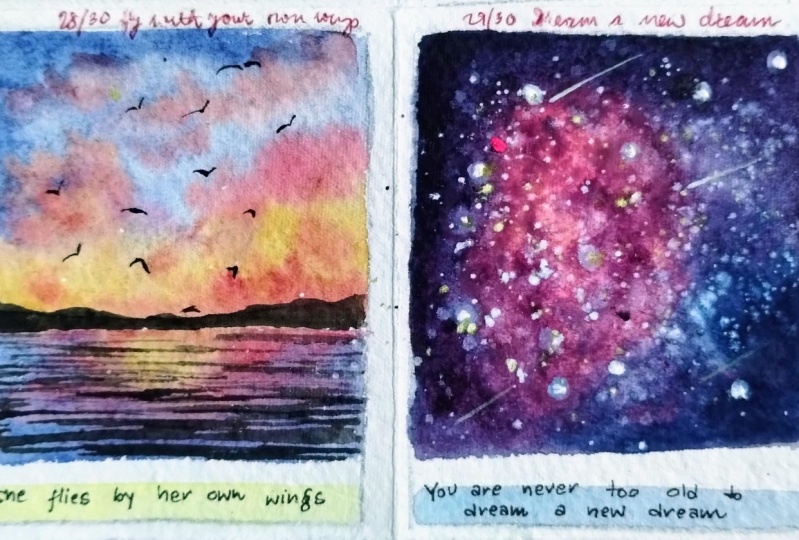
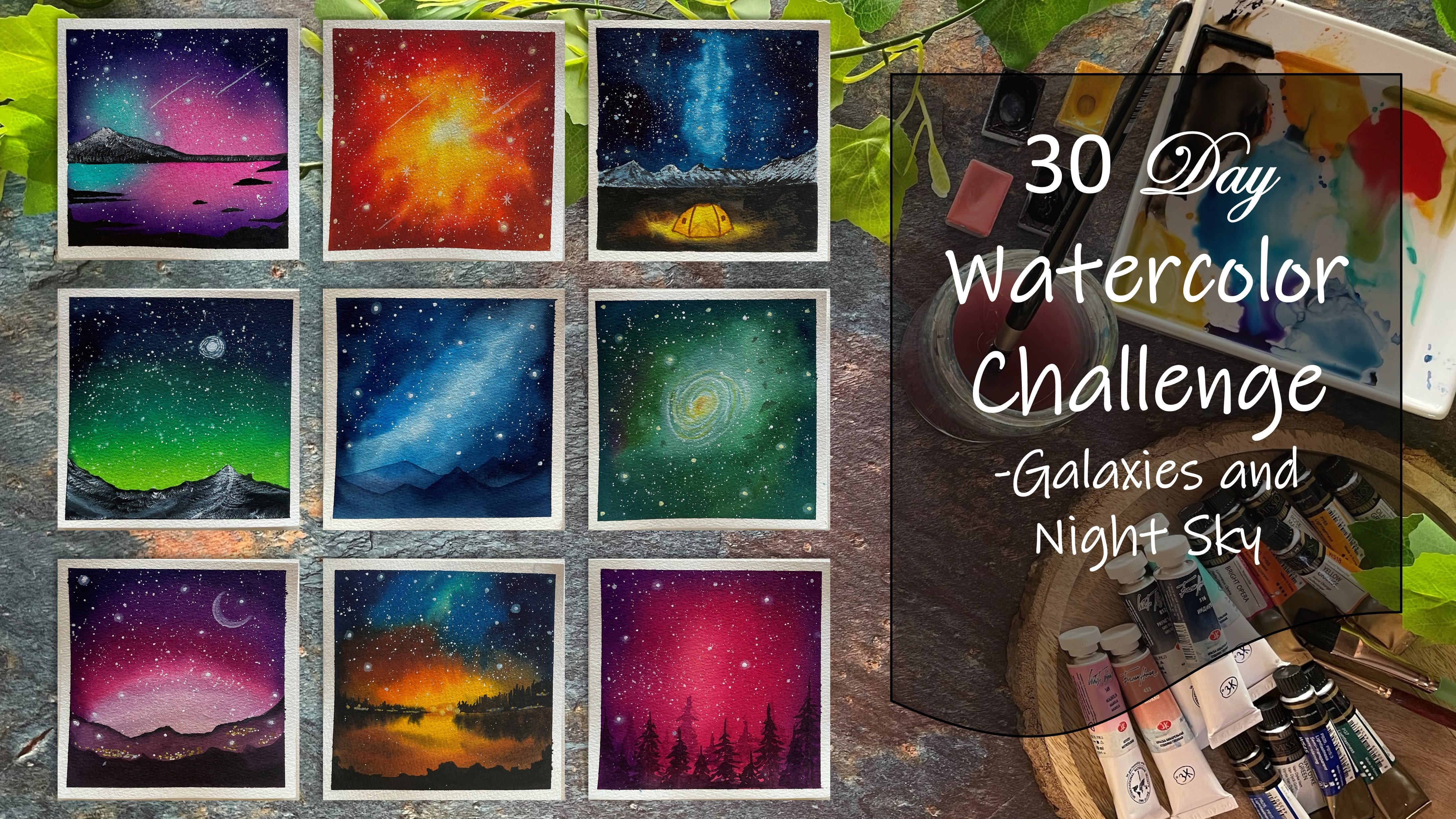
Transcripts
1. Welcome to the Class: In our fast-paced lives, it's easy to get caught up in the hustle and bustle
of everyday life. Leaving little time for ourselves is a form of creative expression that
can help us slow down. It's a way to nourish our souls and reconnect
with ourselves. Through art. We can tap
into our inner creativity, release, tension, and find
a sense of calm and peace. Hello everyone. Welcome back
to a new Skillshare class. I'm idea of what you can
find me on Instagram. Handle creating from the hot. But I share on my
works too late into watercolor wash journaling as unafraid journaling
supplies on my store. This class isn't just about
learning how to paint. It's about taking time for yourself,
prioritizing self-care. I'm finding joy in the
simple things in life. By the end of the 30 days, you'll not only have
a collection of mini watercolor paintings
to be proud of, but you will also have developed a new habit of self-reflection
and positivity. Over the next 30 days, we will embark on a creative and relaxing
journey together. Don't be overwhelmed if you
are an absolute path now, I will be guiding you through all the materials and the basic techniques
through each day. We'll explore various
watercolor techniques, such as layering, blending, and wet on wet to create beautiful and
unique pieces of fat. You would just be
needing ten to 15 min of your busy day to create
these beautiful outcomes. Each day, even choose a positive code to
include in our painting, reminding us of the importance of self-love and positivity. So grab your paint, brushes, your watercolors, and a
blank sheet of paper. And let's begin this journey of self-discovery and
creativity together.
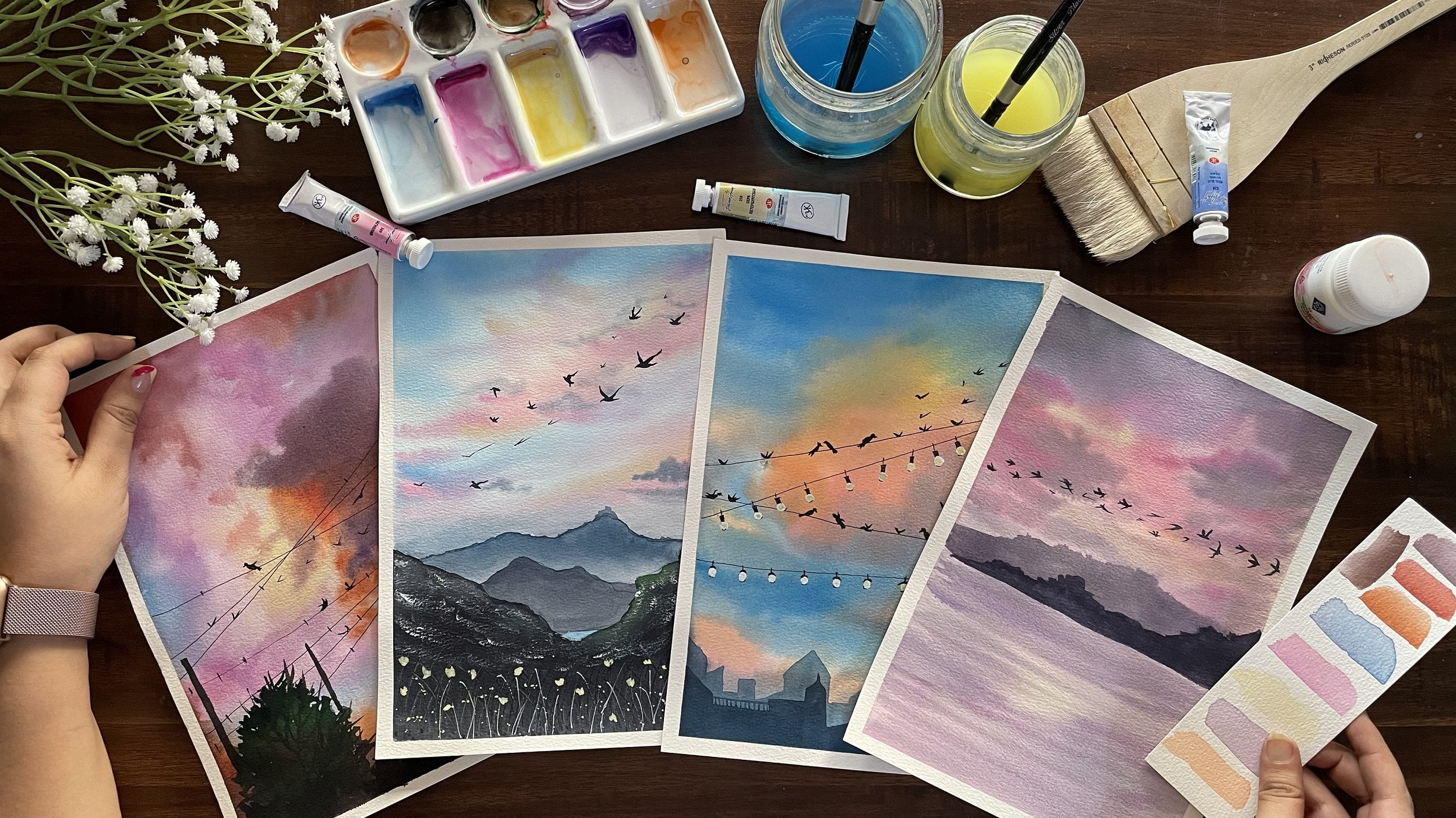
2. Materials you'll Need: Before diving into the
day one class project, Let's have a look at
the materials first. So firstly, you would be
needing in watercolor paper, I will be using this
eight centimeter by nine centimeter mini
size watercolor papers. This is from the brand book. It's 100 per cent part
in 300 GSM paper. We are going to be
creating each day the painting onto
these mini sizes. You can see at the bottom of it, I've left enough space to add in the self-care
code for each day, for the coming 30 days. Now, if you have a close
look at the paper, you can see a little of
the rough grain texture. This is the cold press paper
which has a little rough, clean texture that
I will be using. This paper is 300 GSM,
hundred percent cotton. So you can see the paper does not buckle up after painting. It stays intact and it's
perfect for working wet on wet, adding in layers as well. So I would recommend
using in a paper which is at least 300 GSM
hundred percent cotton. Next is going to be the watercolors that
you would be needing. I'm going to be using in this PwC watercolor
set of 32 shades. I'm going to be squeezing out paints directly onto my palette each day according to the colors that we
would keep needing it. If any color stays
on the palette, you can simply re-wet it and use it in the coming
days as well. So I'm going to use
this ceramic palette for mixing my paints. Using the paints
directly from the tubes. Next year would be needing
some paint brushes. I'm going to use in these
four to five paint brushes from different brands and
different angles and sizes. So it's going to be one
flat brush for the washes, some round brushes and
some detail and liner brushes for adding the details
for each of the paintings. Next, you would be
needing two jars of clean water or a single jar
of water for each painting, as we're painting very many, Once you will not be needing
much of water as well, but makes sure to use clean
water for each class project. Next, I'm going to be using in this very small cutting mat with for taping down
my paper every day for the class project using in this masking tape so that
it's easy for me to rotate my board whenever I need some blending or some movement or flow between the colors, make sure you tape down your
paper on a movable surface. Next, you would be needing
in some stationery supplies, which is going to be some
technical waterproof pens in black color and a pencil and an eraser for some pencil sketches in
some of the class project. Apart from this, I'm
going to be using in the spray bottle to leave it the paints on my
palette whenever I wish to use them for our
next class project. If they've tried out. Next, you would be
needing in a rough tissue or a rough clots so as to
wipe off your pains and clean your brushes during
your painting process so that you can have clean
brushes for each stroke. Now for this class, I'm going to be using in this code sheet
from my own store, which have different positive
codes or mindset codes are just some regular
codes to bring in positivity or boost
your self-confidence. So we're going to be using these different codes of
different colors each day on different class
project and paste them just underneath the painting
as I showed you earlier. So like this, we are
going to keep pasting them every day so as to have a positive reflection
and have your 15 min of relaxation with a
positive note on it. This is how we'll be
using these codes sheets. You can simply print them
on a normal paper through your normal printer and cut them for each day and
keep pasting it. I'll be using this blocker
to pluck out these quotes easily and paste them
for each class project. So very simply I'm just going
to peel small edge and then pull it out with the help of a blocker easily and using it, I will paste it on
the painting as well. You would also be needing
in white gouache, which I forgot to
mention earlier. These are all the
supplies that you will be needing for the coming 30 days. So grab your paint
brushes and your papers, and I will see you guys
into the next lesson with the davon class project
of this 30-day challenge.
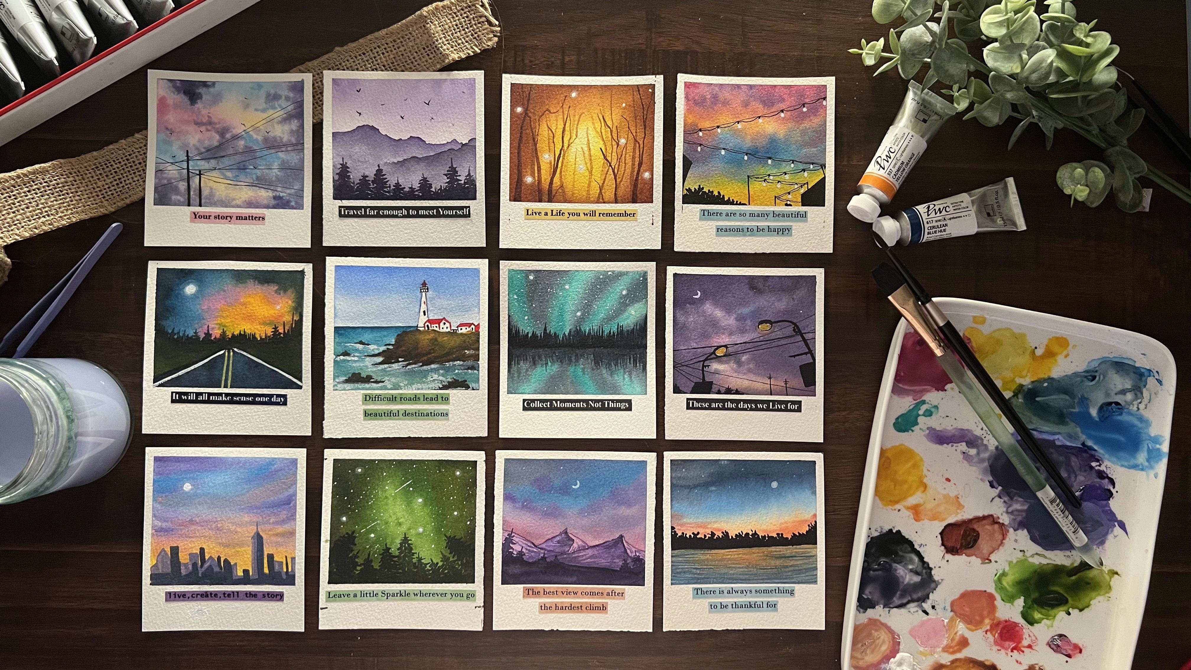
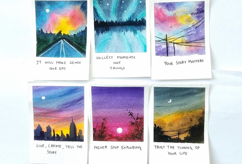
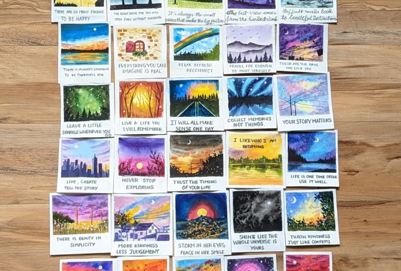
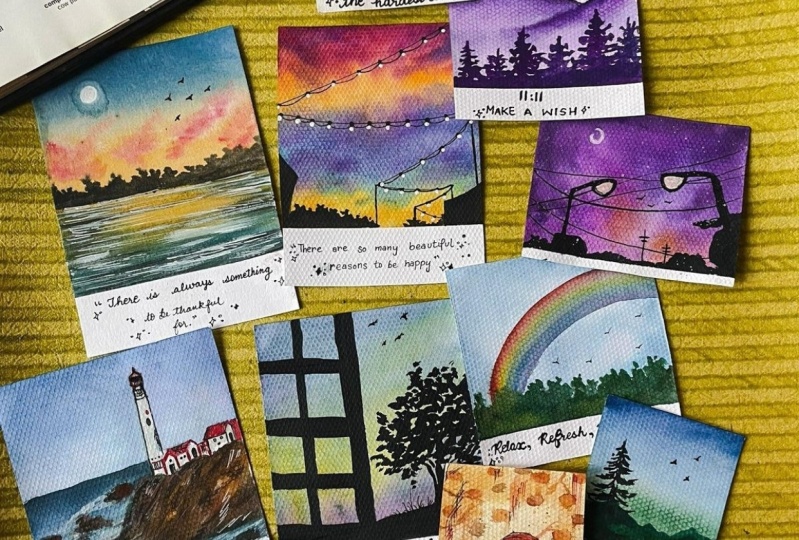
3. Day 1 - Be Happy: Welcome to day one of this 30-day mini
self-care challenge. Let's begin with
our class project. I have my paper taped down
onto this small cutting board. And you can see I've
kept a lot of space at the bottom area because we are going to be adding in
the quotes out there. Now let's begin squeezing
out the colors one-by-one. The first color for
today's painting is the Crimson lake color. Now, you can go ahead with the best alternative or
similar looking sheets. So you can either go ahead
with any tone of pink, scarlet color, rose, Madonna, or any other thing which is
available in your palette, then you need a medium
tone of the yellow color. I'm using permanent
yellow light, which is a medium yellow tone. Been eating a tone of the
blue color for which I'm going to be using in
this peacock blue color. Now in case if you do not
have a peacock blue color, you can simply use in acetylene blue color or a cobalt blue color
whichever you wish to. So you just need a basic
sky blue medium tone of blue color that you would be needing for creating in
today's class project. We are going to paint
in a very simple sky. We even need a little tint
of the populace belt. So in case if you want, you can mix in your blue and the pink to get a purple tone, or you can directly use
in a violet color as I've just squeezed out a little
tint of the while it out, you're going to squeeze out a little tint of the yellowish
orange color so as to give a little blending
between the yellow and the pink tones and given a little orange
highlight there as well. Now there is no pencil sketch
for today's class project. It's going to be a
pretty simple one. And then we'll directly
add in the details to this with the Payne's
gray color later on. So first I'm going
to begin in with my half inch flat brush to given a flat wash off the water layer before we
begin adding in the pains. So I'm just going ahead
with an equal layer of water to out onto
this entire space. Make sure that your
masking tape is taped down perfectly and you have
done your fingers tightly onto the edges of
the masking tape so that the paint and the water does
not slip onto the edges. Otherwise, you will ruin
up those clean edges. After removing the masking tape. I'm going to run my
brush multiple times so that the paper stays
wet for enough time and it does not dry
out quickly because we are going to be painting
the entire sky wet on wet, and make sure that all of the colors are blended
into each other. If you're using a paper
which is not 100% cotton, your paper may try out much quickly than 100% cotton paper. I would recommend you to
first wet your paper, wait for it to dry
around 50 per cent, then go ahead with a layer of water and then begin painting. In this video, people
will stay wet for a little longer time until you walk with the wet
on wet technique. Now beginning tones, I'm beginning to use a smaller
sized round brush. This is a size four round brush from silver black velvet series. And I'm just beginning to
add in first the warm tones, that's the pink, orange and
the yellow colors smoothly. Now, leaving a little space between the blue and
the orange tone, I'm beginning to add
in the blue color. You can see I'm
making sure to not blend the orange and the
blue completely into each other because orange and blue do not go well with
each other and they may form in muddy tones when blended to each other
without the help of a color which blends well and does not form in
the third column, seemingly with the
yellow and the blue. Be a little careful
as it may give you green tones onto
the yellow color. Just adding in a little bit
of the orange highlights. And now let's go ahead
and begin adding in little more
details into the sky. First layer, we just gave him the color blocking to
all of the colors. And now we'll begin adding in the Cloud details and building
in the sky step-by-step. I'm just beginning to add
in little darker tints. You can see I'm making sure the darker tint is not
spread completely all over. It is spread only are in such a way that even the
lighter tones are visible. Now, I'm going to
begin blending in with the pink color in between the
orange and the blue tone. And you can see
you automatically have a little violet color formed because of the blending of the pink and the blue tones. Now using the violet color
which is squeezed out, I'm going to add in
a little tender fit closer to the pink tones
and blend it well. For now you can see the color has not spread in
well completely. So I'm just using
a damp brush and blending it well
with the pink tones, giving in little highlights. Again, be careful closer
to the orange color because violet and orange me
again give you muddy tones. So you need to make sure that you let the violet stain only closet in the pink
and not let it come towards the orange color. Now on the orange
added a little bit of the pink highlights
and now adding in little bit of the YA
lit highlights again. And even on the blue,
just adding in little of the violet highlights
from the edges. Also be careful about one
thing when you're working wet on wet and adding in
these little details, make sure you do not have access water while
adding in the details. Otherwise, the
colors will begin to spread completely and they may form one single color instead of having the
perfect blended look. So you can see my colors, I have not spread much. They are eaten in the
space in which added. Now let's wait for this
to dry completely. So this has dried completely. You can see how
pretty the sky is. You can see all of the
colors visible easily. Now using in these
waterproof pens, I have a 0.5 and 0.1 name. I'm going to begin adding
the details with this, so forth with the
zero-point one name. I'm just going to
forming some lines into the sky onto which we are going to be adding in Lord
of the light effects. So you can see, I wanted
these fine lines. That is the reason
I've used the 0.1. Now I need some bigger lines as we are moving towards
the bottom side. And for that, I'm
using in the 0.5 nib, you can see the difference in both the size pen and nib underlying
effect that comes in. Now I'm just going to keep them connecting with some
violence because we're just going to be adding in
the street light effect of that center has a low
heat for this painting. So I've just made a
little connection between all of the poles and the wires that
we've added in so as to show a
street light effect. Now we're going to go ahead and squeeze out a little bit of the Payne's gray
color because at the bottom I'm going to
fill in some spaces, but the Payne's
gray color as well. Make sure you use the Payne's gray color in
a bowl consistency so that you have a good ball effect of the Payne's gray follow coming. Otherwise it written transparent if you would be using
in a lot of water. So on the rightmost
side you can see I've just given him a small
building effect. And on the leftmost side, I'm just going to
give him little of the bush effect using
the Payne's gray color. I'm just using the tip
of my brush and dab in, in your to create this effect, you can see how beautiful and simple it is to create
these silicate details. On the leftmost
side here as well, you can see I'm just pulling out a very small roof which is
not visible completely. So only on the edge you can
see how I'm trying to ship it out and fill it completely with a thick consistency of
the Payne's gray color. Now let's begin adding
in the details to these lines to add in
the light details. So I'm just drawing
one more curvy line at the bottom of
these fine lines. And in-between the point wherein both the white lines are
meeting to each other. I'm giving him the loops to
add in the light effect. So I'm just dropping
in a small ball, the black dot, dot out there so as to show in the light
hanging out from there. So undo all of the violence
that you've drawn, you just need to
go ahead and given the small details
and adding that oh, you know, hanging
point for the light, you can see I'm just
adding it completely till the bottom most line
that is created. Now for adding in the lights, Let's squeeze out a little
bit of the white gouache. It's very important to use in a white gouache
or white acrylic. Because white
watercolors will turn dull once it dries out
onto these bright colors. But since gouache is
an opaque medium, even after you add it on
this dark background, it will stay bold
and be visible very easily and boldly giving in
the perfect light effect. Now using a smaller
sized round brush, I'm going to begin adding
in the white details. I've picked up the
white gouache in a bold consistency and just add those spots where we've added the connector for
the light effect. I'm just adding small dots off the white color actin as
the lights just below that. So keep adding this
light effect to all of the connective
points that you've added between the lines. So we are done adding in
the light effect as well. Now, one last thing,
I'm just going to go ahead with a little bit of
the Payne's gray color. And I'm just going to
rectify elliptical of the bush how it is looking
on the leftmost side. And then we'll be ready
with this class project for day one of this 30 day of class. After removing the masking tape, we are still going to
be adding in the code for today into this painting. As I told you, if you do
not have these Cochiti, you can simply printing or your positive codes are codes
that make you feel happy, energetic, or make you
feel calm and relaxed. You can pick up such codes. Just print them on a
simple piece of paper in any colored background
that you want or on a black background itself. I'm just cut them
and paste it here and do the same exercise
for the 30 days. You can hang them onto a wall
altogether and see all of those positive
quotes reflecting in the positivity in
yourself as well. So make sure to remove
the masking tape against the paper carefully. Now let's add in
the code for today. So I'm going to be using in a blue color sheet for
adding in the code. And the code that I'm
going to use for today is, there are so many
beautiful reasons to be happy, isn't it? So I'm just going to
cut this code into two parts because
the paper is small, the code is a little pigs. I'm going to paste
it in two lines. But honestly, if
you go to see and find there are so many
reasons to be happy, it's onto us what to choose, whether to choose the ones, the reasons for which
we can be happy, or to choose the reasons which make us sad and
crave about that. So it's always in our hand to choose happiness or cribbing. So let's choose
happiness for today and finding all the beautiful
reasons to be happy. So these codes are
in sticker format. You just need to peel
and stick them directly. No need of glue or
anything out there. So here's a final
painting for day one of this 30 days self-care
painting challenge. I hope you guys enjoyed painting this beautiful mini
painting with me today. On day one. I will see you guys soon into the
day to class project. Thank you so much
for joining me.
4. Day 2 - The Right Door: Hello everyone. Welcome back to day two of these 30 days of
self-reflection and self-care. Today we are going
to paint another beautiful, easy,
simple seascape. And to that we are going
to give it a window view. So basically it's going to be as if you're viewing
it from a window. So I'm just beginning in with
a very basic pencil sketch. So even if you're not add this pencil sketch
at this moment, it will be completely alright, because after you
add in the colors, you can just have this
light pencil sketch for marking the window grids. Now, make sure you use these
grids in a very, very, very light consistency
of the pencil marks because the sky and the C are going to be a very light tones. So these pencil marks will
be visible underneath. And then if you do not
add the black color properly into these
exact grid lines, then those marks may be
visible out separately. On the right side,
we're just going to add in a very simple tree out there. And this is it that is going
to be for the pencil sketch. The top is going to be the sky, the bottom is going
to be the sea. And then the window grid area, as in we are going to
show you are viewing this seascape from
a window, so forth. Let's begin in with the sky. I'm just going to go
ahead with a layer of photo only onto the sky area. For the colors.
I'm already having the colors squeezed
out on my palette from the previous class project
we are going to use in the same peacock blue and the yellow color that we used
in the last class project. So as I told you, since I have it squeezed
out onto a palette, I can just add in
a drop of water and reactivate the
colors if they try out. I'm just going to beginning with a wet brush and beginning
with the blue color first. Now this peacock blue color is almost like a
civilian blue color. So in case if you do not have
a peacock blue name tone, you can simply go
ahead with acetylene, do our sky blue
color very roughly. You can see I've added
in the blue tones, I've left a little white
strokes in between, going in very lightly. Also remember we are working on very small pieces of paper. So you need to be
sure that you do not go ahead with a
bigger size brush. Or if you go ahead with
the bigger size brush, you need to manage to using just the tip of the brush
to get into details. Try it. Now I mixed a
little of the yellow, orange and the yellow
color and I'm beginning to add in this talk is closer
to the horizon line. Now makes sure you
do not mix it with the blue tones
because it may give you green tones or muddy tones. So very carefully
you have to vary given very gentle strokes with very light hand on the blue
tones to give him little of the yellow effect
in the whitespaces, I'm very likely going to add
in these yellow strokes. Now, make sure if you want, you can leave a little white
gaps between the blue and the orange tones so that they blend into each
other very easily. Now with the blue tones, I'm just beginning to add in
little of the highlights. Now, one more thing that
you can notice here is that if you have excess water while
adding in the details, it will spread and cover
up your entire space. So you got to go in
very carefully and slowly so that you do
not have a lot of water. Because again, you're working
with very small spaces. More of water will
mess it all up. Now I'm just blending in
which love the blues, giving it a little darker
depth of the blues. You can see I'm making sure
I do not have excess water. So the lighter blue tones
are also visible. Still. Rest assured you
can just go ahead freely because it's
more about just relaxing your 15 min
of the day after hectic work day or beginning your mornings with this
self-care routine. So go ahead freely. But with all the self-care, there should be some
learning as well. So try implementing
these little techniques that you need to
understand between the properties of colors as well as some of
the blending points. Now you can see at places because if the yellow tint
mixing in with the blue, it's giving you a little
lighter skin tone. Quickly lifted up the
colors from there because I do not want any
green tones in my sky. Now that is for a sky will wait for this to dry
completely then paint the c. C is going to be the
exact same colors of the sky. So we'll first read for this guy to dry out completely and then move on to the c and then
do the final grid details. So my sky is completely
dry it and I'm going to go ahead with a layer of water
only into the z-space. Now, now we're going to add in the same colors as
the sky in the sea. Then we'll just go ahead with
the Payne's gray color for adding in the rest of the silhouette detail
for this painting. Why you're adding in
the water in the sea. Be very careful that you do not adding any water to
this time-space. Otherwise, the colors will get reactivated and again mess up your horizon line and you may get in very uneven
tones out there. Now in the sea at the bottom, I've given it a
little darker depth using innovative than
just the paints. Along with the blue color. And closer to the horizon line, I'm going to go
ahead with a yellow, orange color again
and just adding into those whitespaces again, while blending in the
blues and the yellows, be careful that you're not getting a lot of
the green tones. So you can see how lightly
I have just added in a little layer of the
yellow tone as well, are closer to the horizon
line without having any issue or creating
in any green tones. Now I'm going to go ahead with my liner brush and using
the Payne's gray color, I will begin adding in little soft c strokes
while this is still wet. So I'm going to give
in a very fine line first at the horizon line. So you will have a
perfect distinction between the sky and
the sea as well. I'm doing all of this
while my c is still wet. Now you can see
as soon as I just added in the Payne's
gray color on my brush, add a little extra
water so you can see more of the Payne's gray
spreading on the leftmost side. You've got to be careful
about these little things. As I told you, more of water, small-sized painting,
it will ruin up, it will spread, it will miss. You got to have little water control as well as pain control on your brushes. You can see I'm using majorly all the smallest
size brushes itself, and mainly using in the tips of the brushes to get into
these details, right? I'm just spreading this out
and lifting up that excess gray which had spread
on the leftmost side. So you can see using
my size three brush, I could easily just get rid of those excess water or that
was spreading across. Now mixing in a little
bit of the blue and the Payne's gray carrying
in an indigo shade. I'm just beginning to add in
little cv is my c is still wet so you can see
the soft edges when you are adding
in the sea waves. Again, be careful you do
not have excess water. Otherwise those strokes will
spread and blend it with the base layer
color and you will not have a different color loop. So it's very important
to make sure to have water controlled by
adding the details. Now let's wait for
this to dry and then move to the last section. So now everything is
dried completely. You can see those
soft waves visible in the seat looking so
pretty and beautiful. Now beginning with a ball layer of the Payne's gray color, I will begin adding in
the silhouette detail. So fast giving in the bottom window pane detail using the Payne's gray color. And I'm going to fill
it completely with the Payne's gray color
till the bottommost space. Now, very softly and
gently begin adding in these details of the window
pane on the left side. Now, when you begin adding this, be very careful that you
have two straight lines. In case if you're not confident, what you can do is you can
first use a black pen, Martha outlines of the window
panes and then fill in the spaces with a ball
Payne's gray or black tone. So that way you will have a very neat layout
for the windowpane. Also, if you want, you can go ahead with
the different silicate for the window as well. As I told you, it's more about just giving
in those 15 min of the day for yourself to do
some relaxing activity. So you can go ahead with
the different silicate. You can find a lot of samples for the silicate on Pinterest, along with different sky
color combinations as well. So it's more about
the technique, the theme for the day
to be followed along. You can have your
own color choices, your own solo, hate Putin. So I'm almost done adding in the windowpane details as well. Just one more stroke
at the topmost area. After that on the right side, we'll just be adding in a
small tree silicate as well. And then they'll be ready with this class project
for day two as well. So let's begin adding in the tree silhouette on
the rightmost side. Now, make sure you're using a smaller size brush
and the paint color in a very bold consistency so that you get
these details dry. I'm sure if you paint along
with me for the coming days, giving you in just 15
min of your day for your own self giving him
some relaxing activity. At the end of 30 days, you would be used to giving
in time for yourself, as well as you would
have built in a skill, painting with watercolors,
creating a nice one. Beautiful polarize pieces. Now these polarized pieces
can be used in multiple ways. You can create a big collage, fame, fire living area, or you can create in much
smaller sizes and use it as 0. Or insert in your
phone back covers. You can use it to just pluck
it up on your laptops, your PCs, your fridge, you can just add in a fridge magnet at the
behind and paste it. So there are multiple uses, how you can use this
little creations as well. I'll try sharing all of those beautiful uses after
the end of this class, at the end of 30 days. Now I've shifted to a spoiled
round brush and using the Payne's gray in a very
thick consistency and using the brush in a
little dry pattern I'm just going to add in little foil is I've added in those branches using
in the brush first. And now I'm just adding in
the Irish tabbing in the tip of the brush holding
this rash perpendicular. And you can see simply
you can create in the foliage details so
quickly and easily. While adding these details, make sure you do not have
excess water on your brush. Otherwise, the pains may begin to spread and give
you a patch of the Payne's gray color instead of giving you this
spoilage look. So that is eight.
We are ready with this class project for D2. A pretty simple one. I wanted to keep it minimal. I want and keep all
of the paintings in under 15 min only so that everyone can
manage our time from their busy schedule and
get out time for yourself. Using the round brush. I've just given some
finishing touches to the tree added in little foil age connected it till
the window space, giving him the view from the
outside window pane as well. Now let's remove
the masking tape. Don't forget, we are left with the last thing for
today as bell, that is adding in the
code for the day. So first let's remove
the masking tape and then move on to
the code of the day. So since we've painted kind
of a window and a door scene, I have selected the
code also accordingly. Let me paste it down and
then read it out for you. So quickly paste this down,
you're very carefully. Now I've cut the code into two parts because
it's a big code. So the code reads
as the right door, you will open even
without knocking. And isn't it true
the right moments, the right things, the right situations happen
when you least expect it. It's always said,
Believe on God's timing rather than trying to put
in your timing in between. And if you believe
on God's timing, you will notice that
the right moments happening at the right time
when you least expect it. You also painting for D2. Thank you so much for joining
me in to this class today.
5. Day 3 - Small Pieces: Hello everyone. Welcome back to D3. After 30 days of self
relaxation and self-care. Today we are going to paint yet another beautiful
green landscape with a pretty blue sky. So let's move ahead with a
very basic pencil sketch. I'm just going to mark out the bottom field space and a small mountain
range on top of it. And the rest of the space at the top is going to
be the sky area. It's a very simple pencil sketch just so that we know
which colors go in there. So I'm ready with
the pencil sketch. Now for the sky, I'm going to be using in the same
peacock blue color, which I already
have on my palette. I'm directly first
going to go ahead with a layer of photo
onto the entire sky. And then we'll squeeze out the green tones while
the sky dries out. So go ahead with
an even layer of water throughout the entire sky. Make sure you do not
leave the edges or do not have extra
water on the edges. Otherwise, it will
seep back into your painting and may ruin
up the edges as well. So it's very important to
have an even layer of photo. Make sure if you
are painting small, you using a smaller size brush for adding in this
layer of water. Pick up the excess
water from the edges, dab it off on a tissue
like just how I did it. Now, I'm going to shift into my smallest sized round brush and beginning with the blue
color into the sky first. So for this guy,
I'm going to have a pretty simple gradient
sky towards the top. I'm going to have in a little
of the darker blue tone. And moving towards
the bottom side, I'm just going to
begin lightening up this blue tone and tonic lighter till
the mountain ranges. So you can see I'm adding
in the blue color only at the top space and
then using a damp brush, I'm just lightening the
tone till the bottom space. Now you can see the
gradient in the blue color that we're using from
the top till the bottom. Now on the top,
I'm still going to add in a little more
of the darker tones. So for that, I'm just
going to pick up a little tinge of the
Payne's gray as well, along with the blue. And you can see I'm adding it to a literal
near the top space, cleaning my brush and then
using a damp brush to blend it till the bottom space and get a little lighter
tonal consistency. We are ready with a
pretty simple spine now to the sky dries, we'll paint in this bottom
field space as well. Because in-between your
half the mountain range, so the sky and the mountain
range is distinguished well, so far that I'm
going to squeeze out fresh sap green color
onto my palette. And I already have a little bit of a yellow tint on my palette, so I will use it that
yellow color to give it a little lighter effect in the field space along
with the sap green color. So this is how you can use
the colors which are already on your palette as well if you
do not want to waste them, instead of squeezing out or different tones again
and again for the field, since it's a very small space, as you can see, I'm directly going ahead with the wet-on-dry technique that is amusing in the wet paint directly
onto a dry layer. Now along with the sap green, you can see I've picked
up a little of the yellow to get enlightened,
lighter green tones. So when you make
sense, light green or yellow along with
the dark green, you get in a light
green tone like this. In case if you want, you
can directly squeeze out a yellowish green
or light green color. But since I already have
yellow on my palette, I thought of using it so that it will give him a little bit more brighter look towards
the green tones and as well as make the blending look more beautiful as compared to directly
using a light green tone. I'm just a bit unsatisfied
with the blending here. So I'm quickly
running a **** brush so as to get a perfect blending, you do not do this
step if your sky has already begun to dry in
my sky was still wet. That is the reason I've went
ahead with one more layer because I wanted to lighten
up the colors at the bottom. Now let's wait for this to dry completely and
then move further. So now my sky and the bottom field spaces
completely dried. You can see how beautiful
the colors are looking, the gradient, as well as the bottom field with
the light yellow Tails. Now I'm mixing sap
green along with the Payne's gray color to
getting a darker green. Now again, it's a personal
choice if you want, you can directly using the dark green color
in your palette, can be a Wendy green
hookers green, or any other darker green
tool that's available. But I prefer mixing the colors that are already
on my palette and forming in different shades then what's readily
available in the tubes. So I'm just using in this darker consistency to
paint in the mountain range. Now in this mountain
range as well, I'm going to go ahead with little lighter tones in the
center space of the mountain. I'm using a little bit of the yellow tone to get a
little lighter thin effects. At the top I've used in the darker tone of Payne's gray and the
green mix in center, I'm adding a little of this
yellow filling to give him little lighter tones of the green to be forming on the
mountain space out here. And then add the
bottom-most piece again, I'm going to use in the
darker consistency, blend all of this together for the mountain range as well, have gone ahead with a
wet on dry or layer. So the mountain range was dry. I went ahead with a wet colors directly and then
blending these because it's very less details
that I have to add in an easy to
get in the details. After this will again
wait for this to dry and then add in the final
detail on this painting. I'm defining this
line quite well, distinguishing this bushy
mountain from the field space. And now I'm just going
to go ahead with little darker tones and blend the mountain
range well enough. So I'm done with a
mountain range now I'm going to just revert
this white gouache, which is already on
my palette here. But in case if you feel that by rewriting your cautious
turning into light, make sure to space out the fresh squash so that
you get an opaque look. Using this, we're just going to add in very little floral detail and the bottom field space on
the bottom rightmost side. Majorly, I'm using the
smallest size brush, which has a very fine tip. And I'm just going
to begin dabbing in very small flower details out here to give him little floral effect in
the bottom green space. So you can see I'm adding in
very simple floral detail. I've just been dabbing in
this white color randomly to create in a meadow kind of
a detail. On the left side. I'm going to go ahead
with very little of these details because
on the left side, I'm going to be adding
in one big pine tree. So I'm just keeping
very minimal details with this white quash
on the leftmost side. Majorly added all of
it on the right side. This painting, you
can see how small, small details put together creates such a
beautiful outcome. Pretty simple small sky with a very simple field detail and a little flower details
which are very minimal. Now adding in a
simple pine tree, my mountain ranges
also completely dried and I can go ahead with
the pine tree detail. I'm going to use the
Payne's gray color in a bowl consistency for
adding in the pine tree, make sure you use it in a
bowl consistency so that your pine tree stays opaque
as well as bold enough. I'm going to begin in with a pointed tip of a
brush and first add in the main stem
for the pine tree. Now, using a damp brush, I'm just blending
the bottom space of the pine tree into
the field space, trying to show it perfectly
that this tree is rooted into this
Greenfield area. So just easily using the tip of a damp brush and blending that Payne's gray color
into the green space, giving it a little blended
look and a very light effects so as to show the
perfect rooted effect for this pine tree. Now, I just squeezed
out a little more of the fresh
Payne's gray because my all your Payne's gray felt
a little more diluted and I wanted a very bold
consistency for my pine tree. Now I've shifted into
my liner brush so that I can get in the final
details for the foliage, for the pine tree
going very slowly. Remember the pine
tree has to add the end taker shape
of our tree out here. A rectangular shape. At the top you beginning with very small length of the file is moving towards
the bottom side. You gradually keep increasing
the length of the foliage, which will automatically by the end of the tree make it
into a triangular shape. So at the top, it will be very narrow, phylogenetic,
moving downwards, the foliage will
keep increasing and the narrowing part will
form it like a triangle. So I'm going ahead very
slowly maintaining the shape, giving him the violation very different format as
well as you can see, I'm using a liner
brush so that I can get in these fine
details for the foil it. If you will try to achieve
everything bigger altogether, it will be very difficult, as well as
disappointing when you will be unable to achieve it. Always try putting into
smaller pieces together, getting in smaller
things together and making it out
of big picture. You are, you can
see we went in very step-by-step creating
in very small details. And when all put together form such a beautiful landscape and the scenic view to the eyes. Now on the rightmost side
here I'm just adding in very simple file is detail
with the Payne's gray color. You can see how
easy it is when you have a paper tape down
on a movable surface, you can simply
rotate your board, adjusting your hand movements, making it very easy to
add in the details. So I always recommend taping down your paper on a
movable surface because it's quite handy and makes adding the details
much more easier. So we are almost done with
this painting for D3 as well. We are three days
through this challenge, already, removing
the masking tape and then add in the
code for the day. Make sure you remove
the masking tape only once your edges
are completely dry. Also, while removing the
masking tape, Be very careful. Always pull the
masking tape against the paper so that you do
not tear off the edges. So you can see I'm pulling
it out very carefully. Also if your edges will be dry and if you lay your
finger on top of it, and if your finger gets
laid onto the whitespaces, you will get driven
up the edges as well. So now let's add in
the code for the day. So what we've been
talking around is going to be the
code for the day. So again, today's quote
is also a little Baker. Once I'm just going
to cut it into two pieces and paste
it into lines. So the court reads, as it's always the
small pieces that makes the big picture in life as well. If you try to put in all the
smaller pieces together, you'll be able to see live quite pig and a bigger
picture in your life. Your final painting
for day three of this 30-day of self-care
and self relaxation. I hope you guys enjoyed painting this beautiful piece
with me today. Remember it's always
the small pieces that makes the big picture. And I will see you guys
in the day for tomorrow.
6. Day 4 - Hardest Climb: Hello everyone. Welcome back to day four
of this 30-day challenge. Today we are going
to be painting this beautiful dreamy landscape. And we'll begin in squeezing
out the colors first and then move on to a
very basic pencil sketch. The first color
that I'm squeezing out is a cobalt blue color. You can use either cobalt
blue or ultramarine blue, whichever is available
in your palette. Next, you would be needing
a little end of the pink, which I already
have on my palette. And I lifted off the violet, which also I already have on my palette from the
previous class project. So the colors are
already on my palette. Now let's go ahead with a very basic pencil sketch is going to be marking out
the mountain ranges. So I first marked down or diagonal line at the bottom
space as you can see. And now on top of that
I'm going to give in a mountain range on the right and then on the left as well. On the mountain range, we are going to be hiring
any ideas to depict in that shadow spaces as Bell giving in the darker depths there will be having around
three mountain ranges, as you can see, one on left
101 in the center space. Now, I'm just marking out the distinction on
the mountains to give him the darker
spaces when we'll be adding in the colors
there, I'll help you out. Finally, Let's
begin with the sky. I'm going to go ahead
with a layer of photo only on to the sky space. Make sure you do not add the mountain range
or water space right now because we need
to let it be blank because the mountain range is going to be off
the lighter tones. So if we add in the
sky colors there, it will be very difficult
to cover it up. So closer to the mountain space, you can see I'm going in very carefully defining the edge of the mountain according to the pencil sketch that
we have added in. I'm not adding in a
layer of Florida. I've made sure I haven't
even near afforded throughout and no excess
water collected on the edges. Otherwise it will see
back into your painting. And creating those are rough patches on the
edges of the painting. Now, beginning with the
cobalt blue color first, I'm just going to go
ahead at the top space, add in a little blue thin. And then we'll be
playing along with the violet and the pink tones. Now to give it a little darker
that I've just picked up a little bit of the
Payne's gray color to make it look like
a little indigo. Hello. So half of this guy, we've gone ahead with this tone. And now I'm just
going to pick up a list of the peacock
blue as well, which is already on my palette. You can use a civilian blue
color instead of this. Next time going ahead with the pink tone
closer to the blue. Now when the pink and
the blue mixed together, you can see it's already
beginning to form in the violet tones directly because it's the properties
of the pink and the blue mixing in together closer
to the mountain range. You can again see I'm going
ahead very carefully so that I do not run into the
mountain range at the moment. Now, this is a very basically out of the sky that we've added. Now on top of this, I'm going to begin adding
in some cloud deck. So I'm going to use
in the violet color, the pink and the
blues to forming different tonal
values in the sky, giving you more
depth to the sky, most of the blue space will
lighten it up and give it a little more of the
pink and the violet tones. So I'm going ahead with
the Payne's gray color first at the top to give it a little more darker debt to the blue only at the top space. Now playing along with the pink, I will create a little
violet tones and then use a little bit of
the violet color as well, if needed to give him little more darker effect
of the violet tones. Now make sure that you go ahead with paints are in the second
layer with less of water. Because now if
you're going to have excess water while adding
in these Cloud details, the colors will
spread completely and they will cover up
the entire space. And you will not have that
color look being visible. So you can see
when I'm adding in the violet color to
define the cloud shape, I do not have excess water, so they are retaining the shape
in which I'm adding them. Make sure you do not have
access water while adding in the wet-on-wet
details to get into details and depth into the sky. I've just moved my brush
in circular motions, added in little
cloud effect into the blue skies as
giving him the depth. And now wherever I feel I
need a little blending. I'm just going ahead with
a damp brush to blend. Now we'll wait for this guy
to dry and then move further. My sky is completely
dry it and we're going to go ahead with
the details now. So I'm going to go ahead with
the mountain ranges first. So I'm going to mix in the
pink and the violet color and get a pinkish violet
tone. Or you can directly. A red violet tone if it's
available in your palette. I do have a red violet
tone available, but since I always tell you, I try mixing the colors
on my palette already. So I'm mixing the
paint and the violet, and I'm going ahead with
a very light consistency. So it's more affordable or less of pigment
that I'm using in your for the first layer
off the mountain ranges. Now, all the right side
of the mountain ranges, I'm going ahead with this
lighter color consistency force because I'm going to show
more of the shadows, other darker spaces on the
left of each mountain ranges. Now this right, leftmost
mountain range, I've added completely
this lighter tone layer because you aren't going
to add in very little of the shadows and
that to moving from right to left for this
specific mountain. Now we need to add
in the details in the mountains step-by-step so we cannot add the darker details while the lighter
detail is still wet. So we'll have to wait for
this to dry completely only then you can add
in the detail there. Otherwise, all of the colors will blend into each
other and you will not get in that distinctive look that we're trying to achieve. And for these mountain ranges, onto this leftmost
mountain range, I'm just adding in little
more darker there. Make sure that you're also
you have a little extra water because we are going
ahead with the wet-on-dry technique
or paper is dry. And we're adding
in the wet colors so that you have
the perfect loop. Now my first year of the mountains is
completely dried and I'm going to go ahead
with the second layer covering in the right spaces. So now I'm going to have a little more of the violet color mixing in a little tent of the blue as well and
then the pink tone. So you have a bluish violet tone which will set in well
with the pink tone. Now I'm going to fill
in the whitespaces with a light consistency of this color makes
that we've created. So in-between you
can see I added in a little bit of the ping
giving him the depth and showing it perfectly in sync with the rest of
the mountain ranges. But now you can see I'm going so slowly defining in the shape of the mountain here as well. So make sure that you
go ahead very slowly. So that will define the
mountain range well, the shape that outline, otherwise it will go
all out of proportion. And then if you try to shape, it, will not give
you a natural look. Now again, you are blending in the violet and the
pink tones together, getting enough blend
between both the colors. But you can see how dark it
is from the previous color that we used in towards the right side of
this mountain ranges. You can see that was
just very pink color in a light consistency. And now this area, since we are showing
the shadows and darker that you can see how
all these colors are. Now while this is drying, I'm going to go ahead with
little dry brush technique onto the lighter mountain
ranges that we've added in. So I'm just using the tip
of the brush and giving him little strokes onto
the lighter spaces, creating in some darker
depth there as well, giving in the shadow details
and some dry brush effect. The given texture
to the mountain. Make sure that those
mountain ranges are completely dry before
you add in this layer. Otherwise, these layers
will spread along with the base layer color and will ruin your entire mountain space. Onto the leftmost
mountain you are, as you can see, I'm giving
in simple dry brush detail. It's basically I've
lifted a little of the violet color and tap the excess water and
pigment onto the tissue. And now just using the tip, I'm giving you a little
dry brush texture onto these lighter
mountain ranges. Believe in me giving you a
little dry brush texture onto the darker mountain
ranges that we've added. Once it is completely dry. Let's wait for the last
layer to dry completely. Then we'll move ahead
further into this painting. So data lakes layer is
also completely dry. Then you can see the effect of the dry brush that we gave on the lighter tones and the darker color
which is already dry. Now, I'm going to mix
in a little tent of the violet along with
the Payne's gray. And I'm just going to
begin adding in the dark or dry brush technique
onto the darker mountain. So you can see how we
are going step-by-step. The first mountain
range we painted with a very lighter
pink tone on that. We gave in the dry
brush technique with the darker color that we use for the second
mountain range. But now we need a little
more darker colors, so we add it in a little
more pinch of the Payne's gray to get
one more darker tone. Then the second layer of the mountains that we've added in. This is how you
create your color or tonal values and for creating in the depth and the darker
effects into the painting, you move from the lighter to
darker color step-by-step. So I'm just going
to head adding in little more dry
brush technique onto the lighter spaces as well
using in this darker tone. And then will almost be ready
with this mountain ranges. Then we'll just be left to
add in the bottom-most piece and the code for the day
for this painting of A4. Now the bottoms piece, I'm going to fill it with a ball consistency of
the violet colors. I've picked up the violet color. I'm going ahead
on dry technique. You're as bad because
as you can see, it's a very small space depending on the
size of my painting. So I can fill it up
completely quickly. And to that, I'm going
to add in a little bit of the Payne's gray
color as bell closer to the mountain range line and
blend both of these colors by giving him the darker
space at the bottom area. You can see how I've blended
both of these colors. Well, I've made shorter
violet color is still visible and not hidden completely because of the
Payne's gray color. So you need to add it
in such a way that both the colors of visible and the blending
is also visible. Now I'm going to add in
very minute pine trees on this line in-between
the mountain range and this bottom dark space
that we've added to actin as a field or, or forest space. Now I'm going to begin in which very small pine trees out
here with a darker tone, which is again mics off the Payne's gray and
the violet color. And I'm just going
to begin adding in very small pine trees. Make sure you do not cover
all of the mountain ranges, so they have to be quiet
minute so that Eve, It's a background mountain
range is still visible. So you can see I've added
a few of these pine trees. It's not necessary to add
it onto the entire space. Make sure these
pine trees are very blended into the bottom spaces, but they do not have any
sharp edges in-between. If you want, you can just add in simple spikes to add
in as the phylacteries or the pine tree kind of effect so that you have a little more
filled up look out there. Now next, using in
the white quash, I'm going to go ahead and add in a very small moon out here. Make sure you're using
either the white quash gold consistency or you
can use in a white marker or a white gel pen if
you're not confident about adding this small
detail using a smaller brush, I'm using a size three brush, but since this has
a pointed tip, it's very easy and
convenient for me to add in this very small moon out here
in the center of the sky. I'm just going to add in very few limited
scattered star effect, very limited, not much of it, but the moon is going to be
the highlight out there. We are ready with the painting. Let's remove the masking tape. Make sure you remove the
masking tape against the paper. Also make sure that your edges
are completely dried in. Otherwise, the colors
will get lifted and you may lead onto the
white edges otherwise, and ruin up the
whitespace as well. So be very careful that you
do not lay your hand onto the wet painting while trying to pull off the masking
tape as well. So we've removed the masking
tape, your final painting. But before that, let's add
in the code for the day before giving it a final look. So today I'm going to select APA code from this
brown color sheet because it will go
well in contrast with the colors
that we've used in. Not worry, if you do
not have color sheets, you can simply print
the quotes as per your color choice and take a printout from
a color printer, cut and paste it with
the help of a glue. But since mine is
already sticker sheets, so I just need to pick them up, pull them apart from the sheets, and just paste it directly without any glue or
without any stickiness. This placard just helps
and makes it convenient for me to face these
little details easily. So the court I have chosen
for today is the best view, comes after the hardest client. Now keeping this mountain
range view in mind, I thought this is the
perfect code to go with it, but if you apply it into
your normal life as well, It's absolutely the best feeling when you achieve
something or when you succeed into something
after a lot of hard work and effort
that you've put into it. So remember, with hard
work and struggle, There's always the
best happiness, best feeling that you achieve
after all the struggle. So you as the final
painting for day four. I hope you guys enjoyed
this with me today. I will see you all soon tomorrow
into the next painting.
7. Day 5 - Beautiful Destinations: Hello everyone. Welcome
back to day five. After 30 days of self
relaxation and self-care. Today we are going to paint this beautiful seaside
lighthouse painting. I know it's a very
mini painting with a lot of details,
but believe me, you can paint it very simply and easily along with me
falling in step-by-step. So beginning with
the pencil sketch, I'm just beginning to mark out the lighthouse space and the rough area on
the right side. I've already marked
my horizon line almost a little about
the center line. So the bottom is
going to be the see, the top is going to be the sky. And on the right side
we're going to have in the rock and the
lighthouse on top of this. So this painting will take in
a little more than 15 min, but I've tried to shed unit up on a Sunday so that
you can squeeze out that extra 5 min to paint this little detailed
or painting for today. Now on top of this rock, I'm just going to add into simple cottages and
the lighthouse detail. We're not going to be
adding in a lot of details into these many
cottages and the lighthouse. We're going to give him
very simple details later on using the red color. For now, just given the very simple pencil
markings for this, you can follow in your
own reference for the cottages as well
as the lighthouse. So you can see, I
have my paper taped down on a movable surface and it becomes so easy
even by adding in the pencil sketch to
just rotate the board, I'm getting the details, diagnose the angles and the hand movement
adjusted in so easily. So I've added in the Lighthouse, you can see the lighthouse
is a little below the fall behind the
first cartridge. So I've tried to show
him that that cottage is exactly in front
of the lighthouse, covering up a little
bottom-right space of the lighthouse. We're ready with
the pencil sketch, just a very simple, basic pencil sketch for
the rocks in the sea, the rocks, the lighthouse
and the cottages. And now we're going
to go ahead with the details in the sky first. Make sure you have the
pencil sketch very light because we are going to again be using in very light colors. So you do not have a
very dark pencil sketch. Try to lighten it as
much as possible. While painting the sky and the C will not be adding in
the details are in the cottage and the
lightest will not even be adding in the layer
of water there has been. So let's begin with a
little photon to the sky. Make sure you do not add the water layer onto the
cottage or the lighthouse. We're going to keep them white. We're just going to
add in details there later on once
everything dries up. So going very
carefully closer to the lighthouse and
the cartridges, I'm going ahead with an even
layer of water throughout. You can see I'm running
in very carefully closer to the cottage and
the lighthouse space. I'm making sure I do not even have excess water
on the edges and spell otherwise it will be
very difficult to avoid. Those are rough edges that may happen because if the
water seeping back, now the colors I already
have on my palette, so I haven't squeezed
out any fresh color. So for this guy, I'm using
in this cobalt blue color, going to give him very
light consistency. And moving closer to
the horizon line, I'm going to lighten up
the tone as you can see, again, marking the edges of the lighthouse very carefully. So I'm going ahead with
this pretty simple sky as you can see closer to
the cottages as well, just filling in the inside gaps, making sure to not
get the colors inside onto the cottage
or the lighthouse. Now I'm just adding a little
tent off the surreal into all the peacock blue color onto the top of the
cobalt blue color. I'm going to blend
it well and get very lighter tone closer
to the horizon line again. Now only at the top
spaces I'm adding in little more darker
depth as you can see, I'm making sure I have a gradient sky moving
closer to the horizon line, I'm lightening up the color, which is the help
of a damp brush. Now on the margins
of the lighthouse, I'm just going to give in a little blue tint
and blend it well, because the lighthouse, we're not going to be
adding in any color. We're just going to be
adding in highlights using in the red and the
Payne's gray color later on. So at this moment itself, bile, my sky is still wet. I'm just going to pick it up. Little color and given the
borders very carefully, first, I'm just
blending in the sky. Well, I added little more of the cobalt blue color again
and blend it, all of it. Well, you can see I have running in so much
multiple layers, even on the smallest space
so as to get the plane that transition going in smoothly from the top till the bottom. So at the top you
can see I'm running more of the colors
moving downwards. I'm just blending and
lightening up the color, fill the horizon line. Now in the cottage and other spaces we're not going
to be adding in the pain. So let's give him the
outline as I told you, using in the blue while
our sky is still wet. So I'm just going to pick up a little tinge of the
cobalt blue color. I'm just using the tape, I'm going to define the
outlines of the lighthouse. Make sure you do not use a too
bold color and you need to blend this well a little into
the sky using a damp brush. So very closely I'm
running the **** brush, blending it well into the sky. You can see the lighthouse
has called the margins, as well as the
blends happening in smoothly between
the sky as well. Now, wait for this to dry
out completely before moving ahead further and
adding in the further details. So now my sky is
completely dry it and I'm going to go ahead and
begin painting in the sea. For that I'm going to be using
in this turquoise color, which is in tan format. This is from the
brand right night. I'm first going to go
ahead with a layer of water into the area as well. If a little of the water
goes inside the rock space, it's completely okay
because the rock is going to be off
a very darker tone. But make sure you do not add the water into the cottage or the Lighthouse Beans because there we still have
to keep it white. Now I'm going to begin in with this turquoise blue
color in the z-space. And then I'm going to blend in a little bit of the
greens as well. Now in case if you do not have this turquoise blue color,
It's absolutely okay. You can go ahead and
just mixing a little, tend to offer your
viridian green or emerald green along with your blue color to get a bluish green tone. So beginning in with this color, adding it into the z-space, into the entire see, I've just given an a base layer of the turquoise blue color. Now I'm just lifting a little of the sap green color which
is all filled my palette, I'm beginning to add in little cleaner depths
at the bottom space. So you can see it's
giving in a very natural see color look to this. Now, I'm going to
begin adding in little darker highlights with
the turquoise blue color. You can see I'm just using
the tip of the brush, using a darker pigment and adding in the
dark or highlights. Now below the rock space
area that you've mapped out, we need to add in the
shadows space while this is still where we will be
painting the lock later on, but the shadow to
the rock in the sea, we need to add while
the layer is still wet. So using in a little
of the Payne's gray and the black color,
turquoise, blue color. I'm just adding in Dhaka depths below the rock space
as you can see. Because after we
add in the rock, this area will actin as the shadow space of the rock
falling into the z-space. Make sure you do not have excess water while
adding in this shadow. Otherwise, the Payne's
gray color will spread completely uncovered up
the entire bottom CSPs, instead of just having that little shadows
pays for the rock. So with the turquoise
blue color, you can see I just added
in little darker depth on the horizon line defining
the horizon line well. And also a little of the dark
Aviva effect urine there, but made sure that little of the lightest parts
is still visible. Now just adding in last blend between the entire see space. Now we need to wait for this to dry completely so that we can add the final rock and the lighthouse and
the cottage details. So now my c is completely
dried and I'm going to begin adding in the details into the cottage and the lighthouse. I'm going to squeeze out a little bit of the
yellow ocher color. First, I'm going to begin
with The Rock space. When you pin the
rock, you have to be careful that you do not add in the details in the cottage
and the lighthouse piece. Next, I've picked up a little
of the raw amber color. You can pick up yellow ocher and any shade of brown
that you have in. I'm going to begin in
with the yellow color. I'm going to go ahead with the wet-on-dry technique
here because it's quite a small drop and there's not much details to add in. I'm just going to make sure to define in the top space so that I do not move into the pottage
and the lighthouse area. So as a first layer, I just added in the entire space with the yellow ocher color. Now on to this, I'm going
to add in highlights with the raw umber and
the green tones as well. Defining in the
workspace a little much better. On the edges. I will begin adding
in this darker brown and begin blending it
with the yellow ocher color. I'm adding this while my
yellow color is still wet, I'm going to blend all of
these well and smoothly. In case if you feel that the blending is not
happening in smoothly, you can use a little pinch
of water so as to make the colors flow and blend
to each other easily. So in-between you can
see I'm just adding in a little off the sap
green color as well to give him little green depth
onto the mountain chains trying to show in some bushes growing in onto
the rocks as well. Now next I'm going to pick up a little of Payne's
gray color and just add in little more
darker highlights majorly at the bottom spaces. After the mountain will
be completely dried, we may even add in a little
bit of the dry brush detail if needed to give him little texture to
this big rock space. Amazingly, at the
bottom you can see I'm adding in this much
more darker death, trying to showing that
more darker tonal value. And now as you are
adding in the rock, you can see the role of the
reflection that is playing in there that we added in the area while
painting in the sea, giving in that
darker depth detail. So very carefully I've
painted the rock. I'm just using a damp brush to blend in the
colors in between so as to get that
smooth transition as well between the colors. I've gone ahead very slowly defining in the details
of the rock as well. Now, in the water,
we had some of the other oxides well for which we had added in
the pencil sketch, which may no longer be
visible to you because of the layer of see that
we've already added in. So I'm just going ahead roughly adding in
some random rocks into the sea space using in
the brown tones to this, if you want, you can use
in a mix of the brown, the yellow ocher, and the
Payne's gray color as well. It's absolutely
your choice how you wish to go ahead with
these details here. Now for the lighthouse
and the cottage, I'm going to be using in
the payroll red colors. I'm going to squeeze
out a little bit of the payroll red color. I did not have any
red on my palette. That is the reason I'm
squeezing out fresh destined. You can use scarlet,
red, crimson, whichever color of bold red
that you have in your palate. It may not be with the
same name as mine, but you can go ahead with any color of red of your choice. I'm going to begin adding in the details and to the cottage. So basically, I'm
just going to define the roof of the cottage
with this red color. In case if you
want, you can first have a look as to how
I'm going ahead with the minimal details and then go ahead and
fill in these pieces. The cartilage area, you remember we had kept it completely white. So you are just going
to define the edges of the cottage using in
this bold red color. And then you can just give a little minimal window details using in the red brown or the Payne's gray color
as per your choice? So I'm using the Payne's gray
color and I'm just saying define the doors and the windows for this cottage space here. You can see very
minimal detail keeping the entire cottage as red, as white and the roof
as the read-only. Now even in the lighthouse, I've given him the details with the red and the black color. These are very minimal
elements that we've added in. So very minimal details needed
to make them highlight. So we kept them white
as the base and just added highlights with the
red and the black tones. Now I'm just going
to go ahead using my permanent marker and
just going to define in little more details of the lighthouse because
they are quiet minute. And I do not want to
ruin it with the colors. I'm using a 0.1 pen nib so that I can get in these fine details in front of the lighthouse, just adding in a small fence and in-between both the
cottages as well, just adding a small
fence detail. Now next I'm going
to squeeze out a little bit of the
white gouache and just going to add in little
wave details into the CSPs. So basically I'm going
to show a little of the waves form effect closer to the rock species
and in the CSP is a bit trying to show the
crashing wave effect. So let's begin with
white gouache, not adding a lot of water. I'm using my size four round brush and I'm just
going to begin adding it. Very simple DTs using in the white quash a little in
the dry brush technique. So the points at
which this rock is, you're not touching the
C line at that space. I'm adding in little of the
dry brush with the whitewash, trying to show in the waves
crashing towards the rock and creating this form
effect of the white color Towards the other rocks as
well onto the edges you can see I'm adding in little of that crashing wave effect, just little detail
with the white quash. We're almost through this
painting for d5 as well. I hope you have been enjoying
this mini-series so far, as well as finding
these 15 to 20 min of painting exercise
daily or relaxation. And yourself time-varying,
you learn a new habit as well as only be focused
on yourself, your creation. And B3 towards just enjoying
the entire painting time. I'm almost done with
the whitewash TTL. Make sure that you do not have excess water while
adding in these details. Otherwise, you may
get in patches of the color instead of getting
in this dry brush technique. And now I'm just going to begin peeling off the masking tape. Make sure you pin it against the paper so that you do
not tear off the edges, as well as make sure
your painting is dry otherwise your human Leia
Han onto the wet part, I'm relayed onto the
white edges as well. Now, lastly, let's add
in the code for the day. So today for this painting, I'm going to be adding in a
quote from this green sheet. I loved the color contrast that will go along with the sea, the sky, and the tonal
variations of blues and greens. Again, I'm going to cut this
code into two parts because it's a bigger one and it
may not fit up in one line. So the quote for the day reads, as difficult roads lead
to beautiful destination. And it's the same V with
your success story as well. All the difficult, hard
blogs, the struggles, everything will lead you to your beautiful glory
and victories. Remember, straight roads
always have an end. You need to take a course, CMB, difficult roads but
Beautiful Destinations. I hope you guys enjoyed
painting with me today. I will see you guys soon into
the next lesson tomorrow.
8. Day 6 - Be Grateful: Hello everyone. Welcome back to day six of the 30 days self-care challenge. Today we are going
to be painting a pretty simple
seascape painting with colors that actually may not
go well with each other, but we learn to blend them easily without having
any muddy tones. So now I'm going ahead
with a pencil sketch. So it's going to be very
minimal pencil sketch. I've just marked
the horizon line, which is a lot below
the center line. And that's the only
pencil sketch you need. And we are directly going to
beginning with the colors. I'm going to begin in
with the layer of water onto the entire sky space first. Now under the sky we are
going to be using in blue and the orange tones which we
already have on our palette. Make sure you go in with
an even layer of water throughout so that you do not
have excess water anywhere. Also, make sure on the edges you do not
have excess water. I'm running my brush multiple times so that my
paper stays wet. And then I add in
all the details, despite being a small space
and using 100% cotton paper at times because of the weather conditions your
paper may try out quickly. Now I'm using a mix of cobalt
blue and the peacock blue, which is already on my palette. I'm mixing both of
these colors and beginning to add it
at the top space. So I've got a pretty sky
blue kind of a tone. And on top of that later on, I'll give it a little
darker details as well. Now we're going to be blending
in the blue along with the orange color on
the horizon line to show it kind of a
pretty sunset view. I've added a little off the
Payne's gray I stole onto the blue tones so as to get a little darker on the top space. Now I'm going to use the
yellowish orange color, or you can use an orange
color if you want. But remember orange and
blue and blend it together, it forms and muddy tones. I'm just mixing in a little
tint of red to get in an orange tone from this
yellowish orange color. Now, as I told you, you can directly use orange
tone if you want, but like me, if you need, you can mix the colors
on your palette. You can see I've got a
bold orange color by mixing the yellow orange
and a little tint of red, orange and yellow mixed together may give you a muddy tones. So in-between the
blue and the orange, you can see I've left a small white gap and
now using a damp brush, I'm just going to blend both of these colors smoothly into each other that you do not have any or muddy tone
forms in between. If you will try blending in
any complimentary colors, they may form muddy tones are forming very unpleasant
color mixes. So it's very important to let these colors blend
and nationally. So I've just added
a little water or little liquidity flowy color, and I've just tilted my board in all directions that the
colors blend into each other smoothly and have
that smooth blend between the color and the
transition happening as well. You can see that little space
in between the blue and the orange creating in the
perfect blend happening in. Now next, I'm just going
to begin and add in little more detail with a little touch of Payne's
gray and blue color, giving in little effects
into the Cloud as well. But makes sure
while adding this, you do not have excess water. So on the top I just need a
little more darker tints. I'm adding in pain scale
from the top and I'm keeping my boat tilted
towards the bottom side so that I have a radiation
from the Payne's gray towards a little lighter tone
blue for the lighter moving to the orange giving
into perfect sunset. Why? Now using in
little danger of this payroll red color
which I have on my palette. I'm just going to add in little cloud detail
onto the orange pieces, giving in some strokes to add in little more drama to the sky. Now while I'm adding
this red color, you can see I do not
have excess water. The red color is reading this piece is in which
I'm adding them. It's exactly staying at the space onto which
I've added them. So make sure while
adding in these details, you do not have excess water. Otherwise, if I would
have had excess water, the red color would
have spread it and covered up the
entire orange space. So now we have the sky is ready, a pretty simple one. And now we are going to
wait for this to dry out completely before moving
ahead further onto the CSPs. So make sure that your
sky dries out completely. Then we'll paint the sea and then the final detail
on the horizon line. So at this top left space
you can see the color was turning a little light maybe because of
some paper defects. I'm just trying to cover
it up as much as possible. Now we'll wait for
the C too dry. Or if you want, you can
go ahead with the sea by leaving a very fine white line in-between the sea and the sky. So I'm going to leave the white cap and
beginning if you want, you can wait for it
to dry completely, then move on to the c. The
reason why I'm leaving that white space is a very
fine one MMR to MM line is because I'm going
to be adding in details on the horizon
line which will get covered up in that whitespace
by adding the details. So this E is going to be an
exact reflection of the sky. So I'm just going to go with the inverted color theory now. Onto the closer to
the horizon line, it's going to be
the orange color. And at the bottom
space I'm going to add in the mix off the blue and the Payne's gray color
again and create a reflection of this tie
into the sea space has been. I've gone ahead very carefully. By the time I was
painting the sea, my sky has also dried
out completely, so I covered up that
white cap as well. You can see my colors have
not moved into the sky space. They're retaining the space
in which I've added them. So make sure you do not
connect the sea and the sky. If the sky is still wet, otherwise the colors
will flow into each other and ruin
up your entire sky. Now I'm just adding
in little wet on wet details in the
center majorly, I've maintained the
orange and the red tones, reflection of the sky
into the sea and on the edges as given more of the Payne's gray and the blue tones. I'm just going to add in little darker depth
at the bottom space. And then they will wait
for this to dry out completely now and then
move ahead further. Add in the details seven, let this dry out diagonally so that the colors do
not move into the sky. In the center here you can see a little of
the palace seeping into the skies have just lifted up quickly with the damp brush. Now I'll wait for it to dry. Now I'm just going
to squeeze out a little bit of the
Prussian blue color. My c is completely dried
out and I'm going to begin adding in little wavy effect with the Prussian blue
color in the sea, and then move on to the
details on the horizon line. Now if you want, you
can go ahead and use in any darker tone of the blue which is available
in your palette. It may not be exactly
Prussian blue color or the same tone. I'm using my liner
brush so that I can get in fine lines to
actin as the vase. Now for the leaves, I'm
not going to be using in too much bowl of the
Prussian blue color. I'm going to dilute
it a lot and use it. In the center where you
have two orange space. There will be adding
the wave effect with the orange color later on. So make sure you let that space be a little empty for now. Then just add in little of the wave effect with
the blue color. But first we'll add in
with orange color there. Now make sure you add
in very fine lines. I'm just going to go
ahead very randomly adding very fine strokes
to actin as the waste. Now you can see how randomly
I'm adding these veins. There's no specific
pattern to follow along. It's going to be a
pretty simple one. As I'm moving towards
the bottom side, you can see the length of
the waves is increasing. And as I was closer
towards the horizon line, the veins land was
quite smallest. So as to show the
perspective view, that is, you are much more closer towards the bottom side rather
than the horizon line. Because if you know
the waves could to urge the horizon line look
in shorter to your eyes. Now in-between,
I'm just adding in little darker strokes with
the blue color as well. Not much, but a little
darker than the base layer, very limited. You can see. Now moving on to
the orange color, I will begin adding
in the details in the center space which we
have left empty for now. After adding in those details
with this orange color, you can add in
little blue stroke so as to show perfect
blend happening in, I'm mixing in a little tint
of red as well so as to get that highlighted view of the waves in the
center space as well. Make sure you do not use too
much of a bold red color. Otherwise it will stand
out quite differently. That one stroke, as you can see, I'm going to lighten
that as well, but be a little careful
that you do not have these thick
strokes coming in. Now to blend it with the
orange and the red strokes, I'm going ahead with the blue
strokes again, you can see, and now all of it is looking well blended
into each other. Now I'm taking the blue strokes closer to the orange
strokes as well, so as to show the perfect blend happening between
the visa as well. So now I'm feeling that
the strokes are too dark. I'm quickly lightening it
up using my **** brush. You can see very simply adjust lighting up
some of the strokes, very likely, not much. Now I'm just going
to go ahead with the final detail on
the horizon line, which is going to
be a little off the bush detail using
the black color. Now makes sure you can use the black color or Payne's gray, whichever is available
in your palette. But it's going to be
very minimal details. And then if we need, we may add in a small moon into the sky. But it would depend. Let's first add in
the bush detail also makes sure you do
not add the ghost so much taller that you
cover up the orange and the red cloud details
completely off the sky. So you need to
maintain the length accordingly so that the orange and the red strokes are visible at least closer to
the horizon line. First mark the entire top space. I've just used the
dabbing motion. I've just been
dabbing the tip of the brush to create
in this bush effect. And now I'm going to fill in the entire bottom
space with this color. So I'm just filling in this entire space with
the black color, as you can see giving in that bush detail on
the horizon line, my orange and red
clouds is still visible. When I told you that. You can leave that
thin white line in between if you want to paint the sea while the
sky is still wet, that would have got covered up. Now, when you would be
adding in the bush detail, taking in the black
layer on top of that white line and
are covering it up. So now we have
defined the edges as well where now I'm just going to go ahead with white
quash and adding a very small moon into the sky. And that will be
the last detail. Then we'll peel off
the masking tape and add in the code for the day. Make sure for adding in the moon you use
the right question, a thick consistency
so that you get an opaque effect of the same. So I've just added in a small
moon and now I'm just going to add in very small tiny
stars out there randomly. If you want, you can
skip this part as well and just add the
moon and let it be. So that is it. We are ready with the class project now
I'm just going to lighten up a little of
this task because I don't want ball look of those. So let's remove
the masking tape. Make sure to remove the
masking tape against the paper so that you do
not tear off the edges. Also, make sure that your
edges are completely dried before you begin
removing the masking tape. So we're ready with
our painting for D6 are pretty beautiful, soothing evening seascape
with those soft wave lines. Now let's add in the code before having a look at
the painting closely. Using in the code from
the blue sheet today. And it will go well in with the color tones that we've
used in for the sky. Now if you want,
you can just simply use in white or black
sheet printed from your computer or a
color printed sheet of the codes that
you wish to add in. The code for the day
leads as there is always something to
be thankful for. And that's absolutely so much
true in our everyday life. If you see at minute details, you can be grateful and
thankful for so many things, maybe just being
thankful are grateful that you woke up today to do
this activity for yourself. If you were able to spend
in time for yourself. Your final painting for D6. I hope you guys enjoyed
painting this with me today. I'll see you tomorrow into
the D7 class project.
9. Day 7 - Imagine : Hello everyone. Welcome back to day seven of these 30 days of self
relaxation and self-care. Today we are going
to be painting a beautiful window illustration with watercolors using in very simple floral
and leaf details. So I'm just going ahead with the pencil sketch
first for the window. The florals and the leaf detail that will be adding
on the window is going to be pretty
simple one and we do not need any
pencil sketch for it. We are directly going to go ahead with the colors out there. So I'm just beginning in with
very simple window outline. Now if you want,
you can follow in any other silicate
of your choice, you can find endless
references on Pinterest. I'm going ahead with a
very basic gentle one and just going ahead with
an open window loop. So basically the window is
open and I'm going to give him the proper great details in the window and at
the bottom of it, I'm going to give him the
leaf and the floral detail. Now you can see it's so
easy to just tilt the board and adjust as per the hand movements to add in
the pencil sketch as well. So I always recommend
taping down your paper on a movable surface to make
all if the process is easy. So at the bottom we
are going to be having in the greenery and
the floral space. And on the rest of the space, we are going to be painting of very vintage kind
of a while loop. So let's go ahead with
the layer of water first. Now, while painting
the background, I'm going to go ahead
with a layer of water on the entire paper. I'm not going to
leave in any spaces, but I'll try adding in, not try not adding the
colors on the windows space. So for now, for the water layer, I'm going ahead with
the entire space. Now I'm using a very light consistency of the yellow tones. You can see just going
ahead on the edges, I'm not adding any closer
towards the window space. You can see, despite having in water there have not
added the color there. So automatically it will
remain towards a lighter side. Now using in a little tent off the raw umber color that I
already have on my palette. I'm just painting
to add and drop dark details on the edges to give that while
the vintage look, we'll be adding in
broken brick details once this dries out completely. So we are going to be adding
in very basic details, very simple one to create a very simple window
illustration. Now, I'm just adding in the yellow ocher color onto
the window space as well. So I'm just going ahead
with very simple details. Wet on wet right now my rest of the details are still wet, so I'm just adding this
window pane detail as well. Because later on when we'll
be defining the edges will automatically be having
in the details coming in. So for now you can try and add in most of the
details wet on wet. Now using the
yellow ocher color, I'm just adding in little
yellow ocher paint onto the wall space as well. All of this is still wet. That is the reason
I'm able to add it. Now. Wait for all of these
to dry before moving on to the next layer of the
bricks into this painting. Now for the break, I'm
going to be using in this brush from
silver black velvet. This is a very small brush, which you know, it's a
flat brush basically, but it's called
as a chisel brush and the length of the bristles. So if you see
they're very small. So using this mini flat brush, I'm just going to
begin adding in the brick details I'm
using in the brown color. I'm going to use it
in different tones. And very randomly, I'm going to just add in these small
brick kind of details. You can see I'm taking it all in different sizes and making
it look like that perfect. How the bricks are putting our two bricks and then
in the second line, one brick in-between
the two and in-between, I'm leaving for the gaps as well because I'm trying to
show it as a broken wall. So net certain
places or, you know, the wall paint is out because of fish, the
bricks are visible. So we try to not add a
lot of these as well. Keep it minimal so that you have that wallpaper
look as well. Now, using the liner brush, I'm just going to
add a little texture as well onto the wall. So very fine lines
to actin as short as some of the cracks
onto the walls as well to give it a
more natural look, make sure you use a very medium brown colored
naught, two volt enough. And also these lines
have to be very fine. You can see very
randomly I'm adding them to actin as the tracks
onto these walls. Now this is drying. I'm going
to squeeze out the color. So I'm going to
squeeze out the rows better color for adding
in the floral DD. So you can use any tone
of pink if you want. If you already
have the pink from previous class projects
on your palette, you can use that as well. Now using the rose
madder color itself, I'm going to add in little of the details into the
window panes as well. Now make sure that
your base here is completely dried before
you go ahead with this. Otherwise, you will not
get in that detail. The colors will begin
having a soft edge and blending and may give
you a rough edges as well. Now I taught in places, I'm lightening up the rows
my dark color as well, just using a damp
brush and using the same color to
spread it across to have a little gradient
look as well. Now this window
or cover as well, I'm just going to go ahead and add in the details with this same
Rosemead dark color. And I'm going to make sure
to lighten up this as well using in water as well as I'm adding in
little brown touch to this window door so as to give him little
effect to this as well. Now, since we are
painting in a very many of space, as you can see, I'm not going to go
ahead with much of the shadow reflection
details on the window space. But if you are someone who would love to add in more details, you can go ahead with any
reference on Pinterest, I mark the shadows
and reflections as well on the window panes
using in darker tint, giving in more detail, but so as to keep these exercises simple
and within a timeframe, I'm not going ahead with that
detail of the reflection, plus it's a very small space, so I do not want
to cluster it up and make it difficult
for anyone. Beginning in with
your watercolors. Using the brown color, define the window panes as well. Now we'll move on to
the floral details once this dries out. So for the fluorine
and the greens, I'm first going to add
the green details. I'm going to use in
the sap green color and begin creating in a rough patch off the green
color here on the edges. I'm going to give him
the detail leaf look, dabbing in the tip of the
brush and in the center, I'm going to just keep on filling it with the green color. Now to darken up the green, you can use a little bit of
the brown color in-between, or Payne's gray color. Or you can use in Dhaka beans if already available
in your palette. But since I have other Payne's gray and the
browns on my palette, I'm going to use them to create the darker tones in
this green space. So you can see the
entire space around. I've added in the detail
leaf effect and in the center just filled it
up with the green color. So that was how the easy
way to add in the details. Now onto this, we'll add in the Florence once this
green layer dries out. Now at certain places, I'm just taking in
the leaf detail a little more towards
the bottom side, growing in very randomly
at random spaces, not in a specific pattern. Now using the
Payne's gray color, I will add in the darker that
while this is still wet. So I'm just going to add
a little darker effect using the Payne's gray color. You can see as soon as you
add in the darker effect, it begins to get in a
little more detail. Look as been as it has that little reflection or
the shadow effect as well. Now when this dries out, I'm going to go ahead with
the rest of the details. I'm going to mix in
brown along with a little bit of the
Rosemarie dark color. If you want, you can directly
use a reddish brown tone. But as I always tell you, I'm going to try and mix the colors so that
everyone can follow. So let everything
just pink or rows, Madonna or crimson, along with a little tinge of brown
and Payne's gray. And I'm going to mark in the edges of the
window panes as well. Now made sure for
these you're using in the pointed
edge of our brush. So I'm using a brush
which has a pointed tip. And you can see
I'm able to get in these fine details easily. Now on to the window opening, you can see I'm just adding
in little picture using the same color giving you that
wouldn't affect out there. So to show a little reflection, you can see I'm adding
in little darker tints onto this window panes
as well, very randomly, not much, just adding in the yellow ocher color
highlights so as to actin as the reflection of the space is falling
on the window space. Now the pains of the window, I'm just giving a
little darker that using a darker brown
tone as you can see, it's giving you in
a little more depth to the entire window. Now for the floral details, I'm mixing in the rose
madder color along with the white core so as
to get an opaque look. And using this, I'm
going to add in just simple dabbing technique
to actin as the Florida. I'm not going to go with
detail florals here. You can go ahead and
add in detail roses or any other floral off your wish if you want to go
ahead with a detail. But since I want to
keep it simple and easy for everyone
to follow along, I'm going to go ahead with pretty simple dabbing
technique Florida. Now make sure that
your green space is completely dried before you begin to add in these floaters. So my green area has
dried and I'm just beginning to add in
simple tabbing details. But I'm going to use in two to three or
tonal variations of this pink tone so as to add in depth to the
floral space as well. So a lighter tone pink or medium tone pink and
a darker tone pink. But all of them, I'll be
mixing in with white quash so that I get an opaque look on to that darker
green tone as well. So the next layer you can
see I've added in with a darker pink color
and giving in detail. Now you can see how the
entire green spaces looking at leaves
between the florals giving in the perfect
floral effect onto that window pane. Now using the brown color, I'm going to add in little dry
brush texture as well onto the wall space to give him
that broken vintage effect. Now when you're adding in
this dry brush detail, make sure you're
using a damp brush to not pick up excess
water or paint, you can see very light effect
that I'm giving in randomly on the edges and giving
it a very light color, medium tone, not filling
the entire wall with this. So be very careful to
not overdo these details because you already have a lot of details
pulled up on the wall. So we have a div with the
class project as well. Let's remove the
masking tape and see the final painting and then
add in the code for today. So for today I'm going
to go ahead with a pink color sheet
coat because it will go well in with a
window pane detail of the pink tones giving
in a perfect thing. Again, as I always say, you can go ahead with any color choice of yours
for the code things. The core for the day reads
as everything you can imagine is rare and
that's absolutely true. You can manifest
everything that you wish to and manifestations to work, but all you need is your
dedication as well as working hard to make
everything really yours. The final painting
for these seven, I hope you guys enjoyed
painting with me today and hope all of
your dreams do come true. I will see you guys soon into
the day age class project.
10. Day 8 - Rainbow: Hello everyone. Welcome back to day eight of the 30-day self-care challenge. Today we are going to be
painting a beautiful, simple, easy rainbow into a
beautiful cloudy sky. So let's pick it indirectly with the details
that I'm going to directly go ahead
with a layer of photo onto the entire paper. We do not have any pencil sketch for the rainbow or leaving in any whitespace for
the rainbow will be adding the rainbow
directly onto the sky. Once our background sky
and clouds try out, first, go ahead with an even layer of water throughout
spreading the water plus evenly so that
you do not have excess water on the
edges anywhere. So for this guy, I'm going to be using in the
Prussian blue color. And then it will mix of
the peacock blue color which I already
have on my palette. Now, this time for the sky, I'm going to go
ahead very loosely. I'm going to use in
the blue color and a little liquidy consistency. I'm going to use in water
to spread these colors so as to get that even
white spaces in between, uneven white spaces
in between to get that effect of the
cloudy sky out. So you can see I'm dropping
in the blue color, leaving in a lot
of fight Captain, using a little liquid
consistency of the blue color, a little more of
the water to give him this effect into the sky. So this is just the base layer. Now I'm going to head
with little darker tints. You can see very randomly
I'm dropping in the dark, pertains in a little
liquid consistency so they are spreading and forming in those clouds shapes wherever you feel that the
color is not spreading it. You can use the damp brush
again to spread it out. So now you can see slowly, there are so many colors
getting into the sky with just one color by adjusting in the tonal values with
the help of photo. Now Father going
with one more layer, darker consistency of
the same blue color. You can see you can use one single color in
so many tonal values, given so much more depth
into one simple painting, the sky at the bottom, we're going to add
an ambush detail using in the green
tones later on, once everything dries out. First we'll add in the rainbow to this one says hydra is up. So we read for this guy to
dry up very simple sky, just two to 3 min to create it. So let's wait for
this to dry and then having the further details. So now my sky is completely
dry it on my palette, you can see all the rainbow
colors already there. All the colors, that's
violet, indigo, blue, green, yellow, orange shade, all of the colors that
are already there. For the inequality
mixing Payne's gray along with the blue color
to get an indigo paint. Now I'm going to use this
half-inch flat brush so as to give him this too. Depending on the
size of the people who need to take the brush size and we are going to be going
in a semi-circular stroke. So make sure you
choose the size of the flat brush depending
on the size of your paper. Since I'm going ahead with
the smallest size paper, I've chosen a
half-inch flat brush so that it compliments. Now I've just dip my brush into water using another brush, a smaller sized round brush. I'm going to begin adding in the colors onto the flat brush. I'm mixing in with the red
color on the top side. So I've just added on very small stroke of the
red color onto the brush. Make sure you do not
have excess water also, but you do not have
very less water also. Because otherwise it may not
leave well onto the paper. So your brush has to have
the perfect consistency of water to get that one single
stroke closer to the head, I'm adding in the orange color. I will go ahead with all the
rainbow colors like this. Even beside the
sizing on the brush, depending on the size of the brush that you're
using and split it into equal seven colors so that you can
understand better to have these green tones. And you can see all
of the colors visible on my brush when
I'm adding them. So I am making sure that I have enough water while
adding in the paint as well. As well as I had dipped
my brush into water, just one so that
even the brush has enough water for the
colors to come in easily. If you're not confident about
adding this at one stroke, I would recommend
you to try this out on rough sheets
multiple times. And then go ahead on your
final painting because I times getting in this
drove the water content. The wetness of the brush, the wetness of the pains
may become tricky to try this method onto rough
pages multiple times. And once you get in
the right stroke, you will be able to understand the perfect consistency
that you need on your brush to get
in there tried stroke. But in any case, if you are unable to
get in the right stroke and you've already tried
it on your final painting. You can even connect
it out there, but it's width practice
that you'll be able to understand how you
can correct it out. Now I'm going to add in
this stroke into the sky. So I'm going ahead with the brush moving in
and one angle you can see all the colors perfectly coming in
your photography. I love the colors in between. That's the orange
and orange color in between the red
and the yellow has mixed up because the colors are of the
same color family. Now I'm just going to give it one more stroke moving in so that the excess
paint is lifted up. And I'm just going
to define this edge. You can see the rainbow
has come in if you want, you can soften up
the edges as well. So using the round brush, I'm just going to soften up and lifting of the edges out yours, I'm using a damp brush and on the edge I'm just
blending it with a little bit of the
business ties so that the rainbow has
a very soft edge. But again, if you're not confident about
softening up the edges, you can leave the
rainbow as it is, even with those sharp strokes, it's turning out quite
pretty and beautiful. So you can see how
easily you can even give him little
corrections if you need, like I'm giving it a
little red stroke at the top space to get in
the rainbow consistency, I will add in a little tense of the audience because between
the yellow and the red, the orange caught
almost hidden up. And if you want, you can
even add in a little of the green patches that is
also completely hidden. But you need to do all of this while your invoice still wet only then it will have a well-tended loop
or is it mellowed, scattered and we
have in sharp edges. So you can see I'm running with almost all of the
colors to get in that little more highlighted
look after it, dries out. So with this one Mohenjo
that I've added, you can see the colors have done so much bold and ones
this will dry out. It will have a very bold
effect and it will be visible. Remember watercolors
dry or bone lighter. So I times it may so happen that because
it's the lighter tones, it may dry out much lighter. Now I'm going to go ahead with the Bush details at
the bottom space. So for that I'm going to use in Payne's gray and the
sap green color. I'm beginning with
the pain state was the left side and right
moving towards the right, ivan, keep adding in
little by little. At the top I'm just using
the tip of the brush, adding in random
dabbing technique to actin as the bush effect. And you can also see I'm
reading the height throughout, not keeping it off
the same length. So make sure you give it that differentiation so
that it looks natural. So on the rightmost side you
can see I've gone ahead with the green tones to adding the details and now
have the bottom. I'm going to fill
it completely with the pin and the
Payne's gray mix. So I'm going to make
sure that both of the colors are blended
into each other and do not look distinctive or standout separately
from each other. Now at the top, finding
those little details again, you can see I'm just
using the tip of the brush defining
these little details. Now I'm just defining the
edges a little more yellow. You can see I'm
just trying to give it a little softer stroke. Now make sure you go ahead with this software stroke technique only if you are confident
about not running up your sky. Because at times you
may get patches into the color of Cloud space if you are unable to blend it
well into the base layer. Now I'm just giving you
a little more detail with the Payne's gray
and green column mix. A little darker color towards
the right side because I'm finding it quite this balance between the colors on
the left and right. So that is it. We are ready
with our class project. You can see how beautiful
this has turned out. Now, I'm just going to add in
a few more details as Ben. Or you can go ahead with any kind of silhouette
for the bird. And then we'll
remove in the mask. Dave, I'm going ahead with very simple silhouette and
I'm not going to add in much of them as red because I want to let the rainbow as
well be the focus, as well as the background
sky which I'm in love with. I'm adding very
small black strokes to actin as the
board's very randomly. Make sure you go ahead
with very smaller ones, depending on the size of the paper that
you're using so that everything looks well and sink in balance with each other. Finally, let's remove
the masking tape and see your final painting. You can see such an
easy beautiful painting in just like ten to 11 min, creating in this
beautiful rainbow with simple techniques
to follow along. Make sure averages
are completely dry before you begin to
moving into masking. So you ask the final painting, but let's quickly add
in the code to this before having a closer
look at the painting. Today, I'm using the
yellow sheet to add in the code and the code that I'm going to choose as it relaxed, refreshed, and G connect. Remember, in life, it's quite important to step back at times, come down, slow down your peers, relaxed, refreshed,
and then leave again. And believe me, when you take that small break for yourself, you come back with double the
energy and more the power. So you also painting for d. I hope you guys enjoyed painting this beautiful rainbow
with me today. I will see you guys soon into the D9 class project time this
whole much for joining me.
11. Day 9 - Live Your Day: Hello everyone, Welcome
back to day nine. After 30 days
self-care challenge. Today we are going to paint this beautiful evening
skies treat look. Let's begin with the
details directly. We are not going to be
having any pencil sketch. We are directly going to
go ahead with the layer of photo onto the entire paper. Make sure you have an even
layer of water throughout so that there is no excess
water on the edges. Otherwise, the bottom
is C back into the painting and may also
begin running up the edges. Make sure you run your brush multiple times so
that your paper stays wet for enough time for
you to add in the details. I'm beginning with
the violet color. I already have a little
of the violet on my palette from the
previous exercises. You can see I'm leaving in little gaps in-between randomly. Now next I'm going to go ahead with this
yellow, orange color. Now, yellow, orange and violet
are complementary colors. So you can see I've left that fine white line
in between both. Now just using a damp brush, I'm going to blend both of
these so that you would not have muddy tones in between. So you can see how
carefully I've blended these and not
have any muddy tones, as well as have that soft
blend between the sky. Now, next I'm going to
pick up a little of this pink tone which I
already have on my palette. And I'm going to begin adding in little strokes of the pink
into the violet color, as well as a little
on the yellow, orange tones to get
in the blending and the transition as well
happening in smoothly. At the top, I'm
going to give it a little darker that
by mixing Payne's gray along with a violet
color at the top of the sky and just adding
in little darker depths. Now with this darker color, you can see I'm adding in the cloud effect even
at the bottom space, but I'm making sure that the pink clouds are
visible in between. Those little yellow highlight in this in-between
is still visible, as well as till the bottom
you can see I've got that perfect evening
sky loop with that little sunset effect of the yellow and the pink
tones being visible. Now further at the top, adding in little
more darker tends to add a little more
darker cloud effect at, only at the top space majorly. You can see with every
layer of the color that we are going
one tone darker. We are making sure that the
space in which we are adding, it is turning limited. So first the violet color
was in the major space. Then we added the
highlights with the pink and the yellow orange, which was in a confined space. Then the event with one
layer darker cloud effect, but made sure the lighter tones, the pink highlights, the
yellow highlights are visible. And now this darkest tone
of the Payne's gray and the violet color mix to add
in the funnel cloud effects. Now I'm just going
to go ahead with little blue highlights as well. If you want, you can skip this blue highlights as
well and just let it be completely where you left it with the purple and
the pink highlights. But I just added a
very little touch at the top space,
not much of it. Now when you're
walking layer on layer like this to get into
the details, right, you need to be very
sure that you do not have excess water
with every layer. Because if you will have access, what are all the colors
will spread out. Now using a little bit
of the Payne's gray, I'm adding the next year of Taco clouds medially at the top and the edges only you can see getting in
that cloud effect, but you can see my brain
does not have excess water. That is the reason
the blue highlight, the pink, yellow,
orange highlights. All of them are still visible. Now just at the top, I feel it's a little darker completely on the right
side and the left side. So I'm just lifting in a
little of the color to get a little lighter tints of the
violet also being visible. So while the paint is still wet, you can see I'm just going ahead with this simple
lifting technique. After every stroke
I'm lifting up, I'm cleaning my brush
so that my brush can again lift up the
paint in the next space. And now we let the sky
to dry out completely and then move ahead further
with further details. So now my sky is completely dry. You can see the
bottom sunset effect visible because if
they're yellow, orange, and pink tones
that are still visible. Now using the Payne's gray
color and the liner brush, I'm just going to add in the street light effect
into this painting. So the major element
in this painting, or the silicate you
can call is going to be the street light
and the light effect. So I'm first going ahead with the pole details using
the Payne's gray. I'm using my fine liner brush. You can see how easy it is to
get into the details here. The poll I'm going
to be adding endured on the left side
you can see both of them are lifted diagonal and tilted and coming in
closer to each other. Now other spaces
I'm going to add in a few of these white
lines as parallel, so just adding them quickly. And then we'll move on to the light details
for this painting. For these lines, make
sure you're using the Payne's gray color in a medium-term
consistency at places you can see the bottom
strokes are quite lighter and not that bold as compared to the pole effect
that I've added in, also makes sure that these
lines looking quite natural and twisted and
entangled with each other to give him
the natural effect. Now, I'm going to go ahead
with further details. I'm just adding in
very simple details into the hole wherever
I feel necessary. We still have to add
in the light effect. Now I 50 to my size three round brush and using
the Payne's gray color, I'm just going to add
in this box detail to this poll out here and fill it completely with the
Payne's gray color. So basically this will just
enhance the silhouette that we are using and giving
you a little more detail. Because you can see it's
a pretty simple painting, just a pretty simple sky and simple celebrate off
the street lamps. Same way on the
left side as well. I'm just adding in this
little detail here. So in between the poles
randomly you can see I've added a little of the bush
or the pine tree effect. You can go ahead with any
detail that you wish to there. Now I'm going to squeeze
out a little bit of the fresh white gouache for
adding the light detail. So I'm going to add
in the first place using in a white and
a yellow mix a bit. And then I'll see whether
I need to turn it white more or keep it a little
yellowish tint effect. So I'm going to pick up
the yellow orange color a bit and mix it along
with the white course. You can use yellow, orange, or you can even use yellow only. And I'm mixing it
with white gouache so that I have that bold effect. I've just added a little
pinch as well off the red color to give it
that orangeish light effect. Now using this, I'm going to
add in the light first two, we'll add in the outside of this light with the black
color once this dries out. But first, let's get the
light color finalized. Now I feel that this
color is going to be a little too dark compared
to the painting space. I'm just blending it into
the background to give it that background light
effect as well. So just blurring it
a bit onto the edges so as to show the effect of the light and the shadow
of the light as well. So I've lighten it
up one shade and again I'm blending
in the background. So as we do it for the moon, creating in that glowing
space around the moon, around the light, I want to
create the glowing space. Now my growing species
completely dried. I waited for it to
dry completely. Now I'm going to go ahead
with the final light detail. You can see that first
layer has dried out. That is exactly what we wanted. Now again, with
fresh white quash, I'm mixing in a
little bit of the red and the orange tends to
get a bright yellowish, orange, reddish orange
kind of a thing. But this time it's more
a fight and less of the ten so as to get
this bold color effect, which will dry also
bold and bright. So I'm placing this into the light space
that we have added, but I'm not covering up the entire glowing effect
that we have created. Now using the white, I'm just going to give
him little effect on the edges and tone it
a little more bright. And then go ahead with the
further details into this. Now using a little
tinge of the red, I'm just going to see go
adding a little bit in the center of the light and see if it is giving
it a nice effect. If not, I will add in a layer
of white again if needed, but I'll wait for it to dry and see if it is looking
very enough. Until then, I will add the other details
into the sky as well. I'm just lighting up
the data as well. You can see I don't
want much effect, just a very small
highlighting the center is, but all I need on the edges, I wonder why defect
or need to stay in. So far adding the details
for the moon I'm going to use in my white
gel pen and quickly adding a very small
half-moon kind of a detail or a quarter
moon you can see. Now lastly, using the
Payne's gray color, I'm just going to
give him the edges of this light effect as well, defining in the
box for the light. And then we'll be ready with
this class project for D9. We'll just be left to add in the code and see
the final result. Now, as soon as you've
added those black details, you can see the
details look so much more in depth just by
getting in that outline. I'm just giving you a
little more connection and some spring details connected
to the wire lines randomly. So in between you
can see I just added those two very tiny lines as well so as to give it
a little more depth. And now lastly, I'm
just going to pick up white gouache and add
in that bold effect of the light out here
because that red color is seeming a little
uneven out there. So only in the
center you can see the outside of the box
outline is still there, so make sure you add it
only in the center space. If you do not want
to keep it as white, you can just add in
yellow on top of the white color so it will
have that bold effect. So I'm just adding
a little yellow. And now this looks perfectly as an evening look under yellow light coming in
from the street lamps. That's the perfect
color that I need. Nor red nor Orange
or yellowish one that I was planning
in the beginning. Now let's remove
the masking tape. Make sure your edges
are completely dried before you begin removing
the masking tape. Now let's add in the
code for the day. So for today I'm going to use in the code cheat from my
travel journaling kit, which had a quote sheet
and black color like this. So I'm just going to peel up this code quickly and I'm
going to add it directly. Reads as these are
the days we live for an exactly in
every day life. If you go ahead and see, there would be something
that you would have once jumped four of
achieving or having. And today you will be
having that with you. I'm grateful to each one of you for joining me
into this class. I will see you guys soon into
the data and class project.
12. Day 10 - Inner Child: Hello everyone.
Welcome back to day ten of the 30 days
self-care challenge. For today, we are going to paint a pretty simple misty
mountain range of painting. It's going to be a
pretty simple one and very easy to
achieve in details. We're not going to have in
any pencil sketch directly, we are going to give
him the details with different tonal
values of the color. It's more of a
monochrome painting that we are doing today
because usually we are going to be using in the
violet color and adjusting in the tonal values using the Payne's gray color
wherever needed, or water. If we want to just
lighten up the tones. It's more of a
monochrome painting that we'll be doing today. I've added a layer of even
water onto the entire paper. And now using in
the violet color, I'm just going to give
it a very light layer onto the entire space. But while I'm moving
towards the bottom side, I'm going to just
lighten it up using in water and spreading it
till the bottom space. So amazingly add
the bottom space. I want to keep the
color tone very light so you can see
I'm just using water, dropping it at the
top so that the color flows automatically
towards the bottom side, having in that very
light radiation. I want very little tent at the bottom space
or almost noting because there we are
going to be adding in the misty mountain ranges
with the same color tone. I've just rotated my board
in all direction and you can see the smooth flow
of the paint and color. Now if there is any excess
water on the edges, you can lift them up so that it does not see back
into the painting. Make sure you have this light gradient color looks
so that you can have that misty mountain range look coming in when
you add the mountains. Now let's wait for this
to dry completely. My sky is completely
dry it and you can see the perfect gradient coming in very light tint of
the violet color. Now I'm going to pick up a little tinge of
the Payne's gray, mix it along with
the violet color and begin adding in the
first gradient mountain. It's going to be a pretty
small and simple one. I'm not going to use this color
in much taco consistency. So make sure you do not have it in order to bold consistency, I'm just going to
add a fine line and blend this color till the
bottom again using water. So I'm going ahead with a very rough shape
for the mountain, giving in that uneven edges
and uneven height as well. And now using in water, I'm just going to begin
spreading this till the bottom space and
lightening it up completely. So this is the bottom you can
see I've used in water and diluted this color so that I do not have any uneven edges. Now at the top again, I'm just going to begin
adding in Victor depth and define the color flow
much better and smoother. You can see how
beautifully the violet and the Payne's gray
color is flowing in the first mountain range, the member at the
bottom to again keep it light only and do
not cover it darker. Because they are
going to have in the second mountain range once
this dries out completely. Now one thing that
I'm going to do is I'm going to lift up a little
of the Payne's gray color and adding little bursts
into the sky because the sky is completely
dry it and we can add in the boats
at this point, I'm not going to
add much of ten. And remember, according
to the size of the paper, go in with very fine ones. I'm going to go in with random
silhouette for the board. Nothing detail, just
simple viz dogs. You know, some random
strokes to actin as the birds flying
into the sky. You can see some of the boards. I've added them so fine trying to show them
as if they are too far and just visible
in a kind of a package. So very small ones is basically
showing the perspective. Now I'll wait for this mountain
range to dry completely before we move on
to the next layer of the mountain range. So now my first mountain
ranges completely dried and I'm going to go ahead with
the next layer of details. So for that, I'm going
to again shift into the Payne's gray and
the violet color mix. This time it's going
to be just one tone darker than the first
layer mountain chains. You can see the flow of the first mountain
range from the darker at the top lighting till the bottom edge.
Now, same thing. I'm going to go ahead with this second layer
of mountain range. But for this second
layer of mountain range, I'm not going to take it
completely to the edges. Half mountain range only. You will get to know much
about it as we add in the colors you are and dilute
and have that soft edges. Now you can see this
is one bone darker, but on the left side, I have not added in
the mountain range. I'm just going to use
in water and dilute the color and
getting the details there and soften up the edges. Now you're on the left side. I'm just blending it
with a damp brush into the base layer and you can see
that line has disappeared. Now you have the
mountain range only in the right side of
the second layer. The left side
mountain range line is also completely
disappeared by using the blending technique of a damp brush and blending
it into the base layer. Now I'm just going to go ahead with a little darker
tint again and define the details you're again and have the flow of the colors. Now after this mountain range, we'd have to wait for this
as well to dry and then add in the final layer of pine
trees at the bottom space. And be ready with this class
project for data in as well. Make sure you go ahead with the perfect radiation
so that you have the perfect color
flow happening in, as well as the color transition from the lighter
to darker tones. Now, let's wait for
this to dry completely. Made sure you do not
add the mountain ranges or the pine trees
while any layer is wet, otherwise, it may
mess up the painting. So now my second
mountain range is also completely dried
in and you can see how beautiful and misty
look at is having in with those lighter tones
in between and the radiation of the color
that we've used in. Now I'm going ahead with a ball consistency of the
Payne's gray and violet mix. And I'm going to begin adding in very fine pine trees
at the bottom space. I'm using my size
three round brush, which has a pointed tip, and I can add in fine
details of the pine trees. Now, depending on the size of the paper that you are using, you will accordingly go
ahead with the size of the pine trees so that everything looks in
sync with each other. I'm going ahead with
some pine trees taller on the left
side because on the left side you
can see we do not have the second mountain
range coming in. So this base can be utilized for adding in the
taller pine trees. Moving towards the right, I will keep the pine trees
smaller so that I have in the look of that
second mountain range and the misty look
visible still. So you can see I'm altering between the heights
of the pine trees. I'm not keeping them off
the same height anywhere. I'm trying to keep them
all of different heights. Now further your I'm
just going to add in some smaller pine trees quickly onto this
entire bottom space. You can see very
simple details of the pine tree is
nothing much in detail. The only thing that you
need to keep in mind is using the ball
consistency of the Payne's gray and the
violet mix because you want these pine trees to
stand out bold enough. Make sure you go ahead
and slowly adding in these pine trees and do not add them in a rush or quickly. Otherwise it may ruin the
delicacy of this painting. You can see how delicate those
mountains are looking goes very tiny boats
that we've added in giving you that Misty soft
look to the painting. It's very important to keep all of this in sync
with each other. You need to add the
pine trees also are little delicate me
and not just the added randomly or in bigger sizes
because everything needs to look delegate into this painting to blend it all together. So in between you
can see I took up one big pendulum,
the right as well, but I made sure
it does not cover or go through the
second mountain range. It's below the second mountain
range so that the effect of the second mountain range
is also visible perfectly. So we're almost done
with this painting. We've added in the
pine trees as well. Make sure you have a
bold detail to this. Now, I'm going to go
ahead and peel off the masking tape and
then add in the code. Now my pine tree is still wet. I'm going to go ahead
very carefully removing the masking tape in case if
your paper is also still wet, make sure you do not lay your
hands on the pine trees. Otherwise, the colors
may get lifted and laid onto those edges
which are white. Or you may wait for the pine
trees to try out completely and only then go ahead and
peel off the masking tape. And always peel that masking tape against the paper so that these wet painting
details on the edges do not get ripped off and do
not spoil your painting. So for the quote
of the day, again, I'm using from this
travel journaling kit. So the code for the day deeds as travel far enough
to meet yourself. I would recommend you all for this 15 to 20 min that you are painting along with
me in this class, make sure you only and
only focused on yourself. Look for yourself happiness. And try finding in
the inner child inside you to meet
your real self. Thank you so much for joining me into this data and project. I'll see you soon
in the next one.
13. Day 11 - Sparkle: Hello everyone. Welcome back
to day 11 of the 30-day cell can challenge today
we are going to be painting a beautiful
green galaxy. It's going to be a
pretty simple one. We will go ahead step-by-step. There is no pencil sketch, but we'll squeeze
out fresh paint. So I'm going to squeeze out a little bit of
olive green color, sap green color, as well as a little of the
Payne's gray color. I'm also squeezing
out a little bit of the greenish yellow color now in case if you do
not have this term, you can simply just
mixing a little bit of your sap green and yellow
to get in this green, I've gotten three
tones of green color. I'm going to use
in a little bit of the yellow as well
as the Payne's gray, I'm forgetting in further
lighter and darker tones. I'm going ahead with a
clean layer of photo onto the entire surface and will directly begin painting
in the galaxy. We'll add in the syllabus, but once the galaxy is completely dried
directly with the pain. So there is no pencil sketch
for the silhouette as well. Just make sure you have an
even layer of wet water. Make sure you haven't
little extra wet layer this time because we are
going to play along with the flowing consistency of the
paint to get into flow and the smoothness
in-between the galaxy as well as the flow of
colors going in smoothly. I haven't taken in from
the lightest color in the center moving towards the
darkest color on the edges. So I'm just going
to begin dropping in these colors randomly, and I will keep
adding them layer on layer again for
blending as well. Next I'm moving on to
the sap green color to add it closer to this
light green tone. The third column shifting into the olive green color
towards the edges. And then I'm using a little
bit of the Payne's gray. Now this is just
the first layer. You can see the
blending is not there. The colors are not flowing
well into each other. The smoothness between the flow of the colors is not there. So we're going to go ahead
with multiple layers to get in the blend flow
between the colors, the soft edges, smooth flow happening between each
tonal value of the colors. So again, beginning in
with the lighter color, I will begin dropping it towards the edges of the sap green
and the light green color. And with this one drop, you can see how beautifully little blends have begun to
happen with the second layer. Now with every little
paint that I keep adding, I will keep rotating my board alone so that the colors flow in all direction and have smooth edges on all
the directions. Next, begging in
with a little bit of the Payne's gray on
the edges as well. Now after the Payne's gray again moving to this
olive green color, adding it closer to
the Payne's gray. And you can see now
the blending happening between the Payne's gray
and the olive green color. So basically after adding in a layer of color
on the edges, I'm going ahead with the color which was just
previously closer to the darker tones
so that you again have a little extra
fluid consistency. And the paints
flow and seep into each other and create
a smooth blend. You can see from the first
layer where we began blending till now the blending has turned out so
much more smoother. The colors are flowing
well into each other. I'm creating in that lighter
space in the center, moving towards the darker,
towards the edges. Now I'll keep rotating my board in all
directions so that I have the perfect flow happening in-between the
colors everywhere. Now I'm going to pick up a
little of the white caution, a little liquidy consistency and using the tip of the brush, I'm just going to drop in
Latin lighter tones in the center spaced closer
to the lighter skin tone, so as to create a glowing
space into the galaxy. You can see I'm just
dropping in drops using the tip of the brush for the
white tones at the moment. Now I will blend
these as bell into the greens because we do not
want these bite patches. So again, using the
lighter green color, I will add it closer to
this white color and then I will tell to my board
in all directions so you can see how
important it is in certain projects to have
your paper taped down only and only on a movable
surface only then you can get in these smooth flowing
blends between the colors. Getting in that natural look to the galaxies are
your night skies. Make sure you do not
keep your boat tilted in one single direction
for an extra long time. Otherwise, all the colors
may just keep flowing in one direction and you may
have a very single color, New York, or a flat
colored layer later on. Now you can see how
the white color has created in that
glowing space, in the center space. We've gone in with so many
layers of pains to get in this smooth flowy
blend between the colors. So make sure in one layer
you may not get it. All right. You need
to go ahead into layers to see the
flow happening. You can see how the colors
are flowing naturally, giving in that natural look. Now I've randomly just plot a little bit of the
sap green color into the whitespace so as to have that little green effect
in between the white. Now we'll wait for
all of this to dry completely and then move
on to the silicate. I will just go ahead
and add in little more of the olefin
before I let this to dry because the olive
green seems to be hidden because of the sap
green and Payne's Grey. So just a little
towards the edges. And then we'll wait for
this to dry completely now, then move ahead with
the further details onto this painting. So now my galaxy is
completely dried and you can see how
smooth the galaxies looking as soon as
you will add in those splatter of stars
using in this white gouache, you will see another glow
of light happening in need even be creating in the
glowing star effect as well into the galaxy. And then the adding in the
pine trees, hello, hey, I've squeezed out some
fresh white costs so as to get in that bold effect
of the white stars. Now I'm just going to splatter, these are as bad. But first I'm just
going to create in some glowing spaces
for the glowing stars. So I'm just adding in
simple white dots. And then using a damp brush, I will blend these a
little into the background and create a dull
white small circle. Then once this dries out, I will add in a white
board dot in-between the circle or the
LDL patch that we create to actin as
the glowing star. As well as I've just added in the splatter of stars as well. Now those bigger dots
that I've added, I'm going to use a damp
brush and blend them into the background and
create a little dull. Because space or sulcus to actin as the growing
space for the stars. You can see these
upright because compared to the normal stars
that you've splatter, do not add the
glowing star effect right now while these
patches are still wet, wait for it to dry completely. Do then we'll go
ahead and add in the pine trees at the bottom
to actin as the syllabus. For that, I'm using my
smallest sized round brush, which has a pointed tip, and using the
Payne's gray color. I'm just going to begin adding in simple pine tree details. I'm going to add them a little
tilted towards the center. So from the left,
towards the right, and from the right
tilted towards the left. Now if you want
to experiment and go ahead with little
more details, you can go ahead with
two to three layer of pine trees and
different tonal values. I do not want to add
in two to three layers because it will create a
lend the class project. And I want to try and keep
all the class projects in a specific time limit so
that you can squeeze out daily time to paint in
these mini class projects. So that is the reason
I'm going ahead with one single Payne's gray
color pine tree effect. But if you want, if
you have extra time, you can first go ahead with a very dark tone of
a green pine tree. Leo, vague fight to try then go ahead with one
more darker tone of the pine trees are using in a little darker green color. Then move on to a further darker green and
then Payne's gray. So depending on the type of silicate that you wish to add, you can even change
the silhouette. You can go ahead with
mountain ranges, snow-capped mountains,
or you could just go ahead by OC side galaxy view. It's absolutely your choice. I'm giving you various
alternatives that you can try and experiment. If you have a lot of time for experimentation and adding
in a lot of details. So now from the right
side you can see I'm adding the pine tree is
tilted towards the left. That is basically
towards the center site. You can see I'm going ahead with different heights of the
pine trees so as to keep it look natural as well as not make
it look monotone nice with just one
single height. So I'm going ahead
with different height of pine trees out here. I'm going to fill in the
entire center space as well quickly adding in the pine
trees of different heights. So last one in the center, I'm adding it a
little bigger one. After this, we'll just
be left to add in the details into
this task and then add in the code for the
day and we'll be ready with your class project
for day 11 as bad. Now, make sure you add these pine trees in a
very bold consistency. So at certain places
at the bottom space, I feel that the Payne's Gray
was a little extra diluted. So I just went
ahead and added in a little more bold detail
there so that once it dries, it has that bold look. Now I've picked up white quash. I'm just using the tip. I'm going to add in
very small dots into the center of those
patches that we created. Make sure you only add it in the center and not
cover the entire batch. Otherwise you will lose
the glowing star loop. Then I'll give you a
closer look of this. You will be able to
see it in case if you want to know more about the
glowing star in detail, you can go ahead and visit
my class on galaxy painting. We painted 30 different galaxies and created today
different paintings. And most of them we've added in these
glowing star detail, which you can learn much more in detail and learn different
30 galaxies as well. Now using the vibe question, I'm just adding in some more random because stars randomly urine there into the galaxy so that it looks
all well-balanced. If you want, you can add in two to three shooting stars
are shining stars as well. That's absolutely your choice with whatever details you wish to go ahead with coming
to this task perspective. So let's remove
the masking tape. Removing masking tape very carefully if your
edges are still wet. Also since we are playing along with the
fluid consistency, you can see I'll let you off
the colors coming in towards the edges because of the extra watery
consistency that was there. So I quickly clean the
underneath green paints that was on my mat so that it does not come back onto the painting or get
laid onto my hand. Now let's quickly add in a code to this
painting for today. So far today I'm going
to use in a quote from the green sheet
of my collection. And the code reads as leave a little sparkle
wherever you go. I absolutely loved this code going in with the galaxy
that we've painted. No matter where you are, what you are trying to leave a positive note, a happy note. Maybe meeting, of course, in going to a certain place, make sure you leave your little sparkle that
people remember you for the little positivity or the sparkle that
you left onto them. So you ask the final
painting for day 11. I hope you guys enjoyed painting this beautiful little
galaxy with me today. I will see you guys soon
into the D2L class project. Thank you so much
for joining me.
14. Day 12 - Glow in the Forest: Hello everyone.
Welcome back to day 12 of the 30 day
self-care challenge. Today we are going
to be painting this beautiful misty forest. It's almost on the same lines of the previous class project. That is the reason
I've kept this just after that so that
you've already got a hang of playing along with the flowing consistency
of the colors going from lighter to the top ketones getting into plants
making it easier. So I'm beginning with a
layer of water first. This time instead of the greens, we are going to be playing
with the yellow browns. Orange tones will be creating a beautiful same galaxy
kind of a background, which is basically going
to be a gloomy forest. And then we'll be adding in
those silicate off the trees, which are again going to
be a pretty simple one. When going step-by-step. Make sure this time also you have a little wet background, a little extra weight, I mean, to say it and what
we regularly keep because we will be playing with the flowing consistency
of the color. So this time in the center and beginning in with a
little bit of the white. And now I'll move on to the
yellow tones onto the edges, and I'll begin adding in the
yellow closer to the white. Do not worry at
this point again, you may not see the blends
happening in Wikis, but obviously we're just laying down the colors just as the
previous class project, it's on the same lines. You need to add on layers, on layers as the
colors to get in the blends happening
between the colors. Next time picked
up a little bit of the yellow ocher color and I'm adding it closer to
the yellow tone. Now I'm squeezing out a little
bit of the brown red color now in case if you do not have a brown red color to not worry, you can simply pick up a
little of the red mixing along with burnt sienna to
get a reddish brown tone. And we'll begin adding it closer to the
yellow ocher color. So you can see the red tone along with a brown tone coming in and giving him that perfect glow effect
from dark to light. Now next I have again shifted into the yellow ocher color, adding it closer to
the reddish brown tone that we've added in. And now you can see little, little blends happening in. I'm using a damp brush along
with adding the color as well to get in the blends
happening in smoothly. Now in the same day,
I've been keeping on moving with colors
in the center. Again, I'm adding in a
layer of the white color. Again, I'll move on to
the lighter yellow color, brown tones, yellow ocher tones. Now I'm the edges, I'm going ahead with a
little darker tint as well. We're still just kind of in the beginning of
adding these details. There is a lot more to add
in and getting the flow ando or smoothness and the soft blend between
the entire background. So now again, just as the
previous class project, I'm going to begin
tilting in my board in all directions so that you can get in that
smooth flowing blend. With tilting, you will
have to keep adding in the layer of colors as well
to create in the details. In the previous
class project we had created in the
glowing star effect. In this class project we'll be creating in the
same glow effect, but those were acting
as the fireflies. Now with every layer you
can see how the blending and the color transition
is happening in smoothly. Now I'm going to little
bit coupon tilting in all directions so
that the colors can flow in smoothly
into each other. And if needed, we'll go ahead with little more
layer of the colors. I'm using a little extra water so that the colors
flow in naturally and I do not have to add in a lot of blending
through the brushes. So on the edges as well as when I'm dropping in
fresh paints now, I'm making sure to add
it in a little flowy consistencies so that it
can flow in smoothly. Also adding in little
water droplets, you can see that the colors flow from the edges
towards the center. You can see how quickly I'm rotating in all
directions so that I do not stay specifically
at one single point. Otherwise, all the colors will flow out to one
direction and you may not get in that
transitional effect between the layers. Again, wherever you feel that the colors are not
flowing easily, you can either drop a drop of water out there so that
the colors flow there. Or you can simply just
go ahead and pick up a little liquidy consistency of the color and drop in there. Now, I'm just going
ahead and adding in little more tones to get in that consistency
because I feel that is more of the light
yellow that is visible. And I want to make
sure that we have a lifted off the darker pins
on the edges as well. Now I finally got from the light to the
darker tend towards the edges as Ben now I'll wait for this to dry completely. Make sure you have
that glowing space in the center and then we'll
move ahead further. So now you can see my background
has completely dried. It has turned out so pretty
especially that center glowing effect that
I still have it. Now, I'm going to
begin adding in the branches or the tree
details major leave, you're just going to show in the branches know
foil age effect. So I'm first beginning
in with a yellow color. So what I'm going to
basically do in the center, I'm going to have in the
lighter branches because I wanted to show the light effect
falling onto these trees, making the branches
look lighter. And as we move
towards the edges, I'll keep darkening
these branches so as to show the
effect of the light, of the darker light falling
on the tree, on the edges. So this is how you're
going to add in the details to play
along with the light and shadow details of the center glowing space falling onto these
branches as well. Now I'm going ahead with different movements of these
branches as you can see. Also, you can see that I have, I'm adding the branches
in the center, a little smaller and
then little taller. Moving towards
that, I'm edges as well as in the edge as
well, certain branches. I will still keep it
a little smaller, not all bigger ones. So first I added a few branches with the light yellow tint, then a little with a
yellow ocher color. Now I've mixed in a region of the Brown with the yellow ocher. And then lastly, I will shift in with little brown details. After this will be left to add in the fireflies glowing
details as well. Be ready with this
class project as bell. Again, this is also a pretty, pretty, pretty simple one. As you can see, the main
trick here is getting the background right and then everything will fall in place. Otherwise, you will lose onto that glowing space
in the background. Then it will be
very difficult to justify the whole look
of this painting. Now I'm going ahead
with these strokes. You can see I'm building
them so slowly. I am going ahead with some darker strokes in
the center as well. Not much, but very little. So as to show that the
lighter strokes are in the background and then moving closer to the darker
strokes are visible. Now towards the edge you can
see I'm going ahead with such a bold consistency
of the brown red color. Make sure you go ahead with these bold color
consistency on the edge. You can also see my branches
moving in so much randomly. I'm moving in soft, really crooked low strokes and those are natural
looking strokes or I'm trying to add in. So make sure you go ahead
with the natural look. And these are twisted and intertwined look of these branches that
you are adding it. Now to some of the branches, I'm just going to add in
some smaller branches. Now it's not compulsory
to add this if you want, you can skip this
part and just simply adding those branches
and leave it there. But I prefer adding in
little smaller ones, as well as adding in little darker branches in the center. But in the center, these
darker branches make sure you keep them smaller in height
and not two bigger ones. I've built in the
misty forest globe now I'm going to squeeze out a little bit of the
fresh white quash and begin adding in the details. Just as in the
last class project we created in that
glowing space. Same way we are going to
create a glowing space first. And then we'll move ahead
and add in the white dots to the center of tours to actin as the fireflies in the
previous class project, those acted as the
glowing star details. And for this class
project they'll actin as the fireflies because we are
painting a forest painting. So since this time we
only need the Fireflies. That is the reason I have not added in this platter
of the white gouache. I've just added in
a few white dots and now I'm blending it
into the background, creating in that are dull white patch to actin
as the growing space. And then we'll go
ahead and add in the white dots to this once
it dries out completely. Now make sure you do not add the white dots until these
are completely dried out to make sure that the distal
patches are completely dry before moving ahead
and adding in the detail. So now my white patches
are completely dried. So I'll quickly go
ahead and add in the white dots to
these. To that. I'm just going to mix in
a little tinge of yellow so that it gives in a more
natural look to the fireflies. Because the fireflies look a little shining light because of the light effect
that they show in. So to show that I'm adding in a little tinge
of yellow to this. And now in the center I'm
just adding in those dots. We're almost ready with
this class project as well. So let's remove the masking tape and see the final painting. This time also be a little
careful by removing the masking tape
because we played with the flowing
consistency of the colors. So there may be colors in-between the
masking tape as well. And while peeling off, if we do not take care of that, then the colors on
the masking tape, we get laid onto
those clean edges that you've tried
to maintain it. So this time I'm going to go ahead with a quote
from the yellow sheet because it will go well with the color code that we've used
for the painting as well. So in the painting we've used
that yellow in the center. And this will go
well showing in with the indexing, with the painting. So the code for the T reads as live a life that
you will remember. Remember, life is short and
make sure that you live a life that you will remember
that you lifted every bit. I will see you soon into
the d 13 class project.
15. Day 13 - It will all make sense: Hello everyone. Welcome back to day 13. After 30 days, health care and
self-reflection challenge. Today we are going to paint
a beautiful simple galaxy. Let's begin with a very
basic pencil sketch. We're just going to
mark out the pathway. On top of the pathway we are going to be
having in little of the green details and a little of the pine
tree structures. And the top area is going
to be our galaxy sky. We're not going in with
an exact galaxy look, but it's more kind
of evening sky, night sky kind of look back, we are going to be creating in so very basic pencil sketch. I tried to keep the pencil
sketch as much minimum as possible so that we do not have any charcoal
marks anywhere. So we've mocked up three spaces. The sky, the sensory is going
to be the greenery space, and the bottom is
going to be the path. Now I'm going to
squeeze out a little of a yellow light color on
my palette separately. Or you can use an even or
medium tone yellow color, whichever is available
in your packet, that you would be needing a little bit of the pink
and the blue tones. Before the blue, I'm
going to squeeze out a little bit of Prussian
blue this time. I'm spacing out a little
bit of difference portion, keeping it in case if
we needed for blending. So we have to colors
ready on our palette. I already have the pink tone on my palette from the
previous class projects. Now I'm going to go ahead with a little photo onto
the entire sky first. I'm only going to run into
this guy at the moment. We'll paint a step-by-step
each section separately. Make sure you go ahead with an even new report it to work so that you do
not have access. But on the edges, also make sure there is
no excess water any bad. Otherwise it's
tweak the ID badge and an uneven space
into the painting, especially on the edges. Make sure that your masking
tape is sealed properly. There is no gap for the
water to seep through. I'm beginning with
a little bit of the white mixing in with this yellowish orange
tone that I have. And I'm going to begin in from
the horizon line out here. And just closer to the horizon
line on the right side, I'm going to begin adding in little of this tint out to you. I'm adding agenda is clear of the yellow color you can see, and I won't have
picked up the color in a very bold consistency
so that you have that ball opaque look once
this dries out as well. Now I'm going to begin in with the next color into the galaxy. So I'm going to begin
in with the blue color, and I'm going to add it
towards the left side. If you notice the strokes, I have been pulling them out
diagonally closer towards the yellow tone and now losing a little bit
of the Payne's gray. I'm darkening up the edges
in case if you want, you can go ahead and using indigo color directly out there. Now using the white quash, I'm going to blend
in the yellow and the blue tone so they do
not have any green tones. You want. You can go ahead and using some other tools
as well in between, you can use an even
a pink color in between so as to get
the blend straight. So you can see I'm rotating
my board in all directions, so that's the colors flow
into each other easily. Now I'm going to
pick up a little bit of the pink mixed in with little bit of
whitewash so that I have a piece to pink color
in between for blending this blue and the yellow color without having any
green pillows phone, you will get a
little purple tint in between because if the blue and the pink
color meeting it, you can see I'm using a
damp brush plus using in little excess water in-between
to blend these colors. Because I guess there was not enough water for the
colors to flowing easily. So now I'm dropping in little, little water using a damp brush and drying for getting
the blend straight. Now this yellow
space looks more of a very simple one
layer yellow tone. So I'm just creating
little depths of the yellow Asbell by
using a little off. Sheet and a little bit of the pink color to get in that variations in
the yellow color, I want just simple patches of the yellow and
the blue tones. Now, I'm beginning to add in the blue pallor to
create in that evening, night sky kind of a book. You can see I'm rotating
my board continuously in all directions so that the
paint is flowing easily. That's very important
when you want a very soft looking
evening sky, night sky, or maybe even a disguise to have those colors living in softly
smoothing to each other. It's very important
to play along with the flowing consistency
of the paint and let them flow and blend into each
other at a certain point, who even me to stop it
because if you keep it tilted in it definitely one direction for a longer time, then all the pains were only and only flow in one
sinful direction, which reform your one
single flat layer of water color mixes
instead of having it that distinctive
color tonal variation. Now I'm picking up
a little bit of pink color and I'm
going to add it in between the yellow and blue in a very form consistency. You can see how
I'm just going to go ahead and blend these again. You can see I'm just
dropping in little paints water so as to make Hello, I'm just using ****
brush dropping in drops of water on
the pains and you can see how quickly the paints are becoming slowly and liquidy, as well as simply moving in directions and having
this movement, we are almost through the sky, just a little more blending. You can see we've worked
on so many layers together and then gotten
this blend right. So now our sky is almost ready. I'll just add in little
more pink closer to the horizon line
in-between the yellow, so that I have a little
thing of orangeish as well. And a little after yellow gets subsided with dark pink tone. So I'm almost through the sky. You can see it takes a little while to
get in smooth blends between the color and have that evening glowy look into the sky. So now I'm going
to go ahead using the Payne's gray color
and I'm going to add it into the pathway space. The pathway is not
connected to the galaxy. We have that little
teeny space in between. So for now I can go
ahead and paint that. And we will use in a mix of the pollution blue and
the Payne's gray color. And paint the entire pathway. Now on to the pathway as well, make sure you have
the pollutants major deal with Linda
center on the edges. Make sure they're having more
of the Payne's gray Carlo. So you can see I've
entered with a wet on dry because it's a very
small space to paint it. I first started on mix of the
blue and the Payne's gray. And then on the edges I dropped
more of the Payne's gray. Given that darker,
that the reason for adding that little bit of
blue in the center is to show the effect of the night sky
falling onto the pathway has been given in the blue
light effect on the pathway. Now let's wait for this
to dry completely. Now my galaxy as well as the
part B is completely trade. Not exactly a galaxy,
but the night sky. Now I'm going to go ahead and
painted into that white gap in-between there I'm going to use in a mix of olive green, sap green, and
Payne's gray color. So the entire whitespace, I will fill it completely
with the green tones. And then at the
top, I will just be giving him little of
this spiky edge loop, kind of the pine tree details. First, let's go ahead
and fill this up. You are all so I'm going ahead. We debate on dry
technique because it's quite a small space and not much detail to
add in wet on wet. Now at the top you can see I've mixed in a little bit
of the Payne's gray, giving it a darker
green tone and now adding it into the
rest of the space, I will make sure that
I blended well with the light green color so that it does not look
who's separately. Now on top of it you
can see I'm beginning of giving that spiky
edge loop using a mix of the Payne's gray and the darker green tone
in-between few of them. I'm even adding them as
simplifying JD major of them just taking in simple spikes in different height levels
and in-between somewhere, just adding in little pine tree. Infrastructure. Now you're adding in
these details at the top, make sure you do not cover up the entire spine depending on a very small size of a paper. So you'll need to decide all
the details accordingly. Also make sure that you keep reading the height of this tree. The reason of using these
simple spiky strokes are TR, is to give him that
fulfilling effect as well. From far these Lucas
trees of cluster together forming in
that patch to low. So that is the reason I'm going ahead with this simple spikes and in-between the study in
little detail pine trees. Because if you have
a closer look, those detailed pine trees as
bad given a different deck. But you can see I've vary the height of all of
these throughout, so make sure to give
it an actual love. You read it
throughout in height. Now I'm just blending these and through the bottom
space as well. And you can see how
beautiful the green has gone down with the
help of the Payne's gray. Hello. Now the pathway is
looking so beautiful and gluey, kind of night sky light
falling onto the pathway, giving you that
blue light effect. Onto that we're going to add in literature
of the details. And then let's list the
details into the sky and will be ready with this class
project for its happiness. Now I've mixed invite course along with this yellow
color on my palette. And using the space
to the yellow tone, I'm going to go ahead and add in the views out into the
center of the factory. So we're going to head
with very basic DT is now using the right version, using the liner brush. I'm going to give
him those lines on the pathway on both
the edges as spent, so as to show the structure. Nine days. If you do not have
a white brush, you can use a white marker or a white gel pen to add in this white detail
on the pathway. But make sure that
you use in a cold or, you know, opaque color. White watercolor is built
on data once they dry out. So it's important to either use gouache watercolors gel pen, which was standout, opaque and bold even once they dry out. I've gone ahead
with two layers of these white lines
so that they have that gold effect once they
dry and stand out that white. And right. Now I squash, I'm just adding in a very small moon
onto the left side of your thigh, onto
the blue colored false, giving this moon a little space you can see I've blended it
into the background. You did a white done. Now using involved consistency
of the white color, I will add a wound into
the center of this. This helps in having that
growing space for the moon, giving a glowing light
effect of the moon as well. Now in the center of time, I've added in that little
moon space as well, and we are ready with
our class project. If you want, you can even start to add in
some stars before adding in the detail the pathway for covering up the pathway. So let's remove
the masking tape. Make sure you remove
the masking tape once your edges are
completely dry. And always remove the
masking tape against the paper so that you do
not tear off the edges. Now, let's quickly add
in a port to this before we end this class
project per day Turkey, the courts are there as it
will all make sense one day. And that's absolutely dried at certain days we feeling solo or be feeling so
much time that we feel that everything
we're doing is nothing. But, remember, all the hard
work will make sense one day, one day do not give up until the final
painting for the 13. I hope you guys enjoyed
painting this for three today. I will see you guys soon into
the day 14 class project.
16. Day 14 - Northern Lights: Hello everyone, Welcome
back to day 14. After 30 days
self-care challenge. Today we are going
to be painting a beautiful northern sky
are pretty simple one, if you are a big no, it's an
easiest one to make alone. For that I'm going
to be using in this cobalt green hue
from Magellan mission. Now in case if you do not
have this, do not worry. You can simply just mixing a little bit of your
VD didn't green, along with a little
hint of blue and white. Make sure to use an
electric white gouache so that the blending
makes easier. The pencil sketches very basic. I've just marked
one horizon line. Now we're first going to
begin in with the sky. I'm going to hide with
a little photo into the sky area first and
then the paint in the CAD. And then going with the
silhouette on the horizon line. It's going to be a pretty
simple class project, just 14 or 15 min. And we'd be ready with
a pretty beautiful small size postcard painting off another night scene. Now for the northern lights, make sure that you
have enough water sprayed onto the paper. Because if you will
not have enough water, then maybe very difficult
for the paints to flowing smoothly
into each other and have that smooth
blend into the sky. Now I'm going to
head with a layer of all the new first
time going through using the quotient rule
and the Payne's gray to run first type is map out this pieces with
this green color. So in case if you do not
have that same green, you can simply as I told you, mixing viridian green,
blue and a little bit into fight color so as to get
this basal greenish tone. Or you can even just
pick up your turquoise blue color mixing a little
bit in the fight question, get a similar tone. Now I've mixed a little
bit of the Payne's gray along with the
Prussian blue color. You can directly use in an indigo color as
well if you want, or you can mix in
colors like these on your palate if you already have the colors on your palette. Now I'm going to use
it while it has very, very little, not much of it. Now at this point, if we see
as high, It's very dull. And when it will dry, it will be much more
dull than this. So I'm going to go ahead
with one more layer of the same colors that I have a bold effect once
my colors dry out, they remember watercolors dry, one tone lighter than what
they look when they are way. So whenever you're playing
along and you know, you're wanting a little darker consistency
when it dries out, make sure that you add in one more layer darker
than what you need it. If you're not sure how
your colors dry because some colors may dry
off the same tone, some may dry a little darker. Submit dry a little lighter. I would recommend you to
watch your color onto a rough shape so that you
know how your colors react, whether they tried that light or of the same
tone, consistency. So I've gone ahead
with one more layer. Now I'm going to head
with a layer of water into the CAD I spill in between the sky
and the sea we are going to be having in the
black colors and Oh hey, So all of the colored movement into each other will
get covered up. But make sure you do not
have much color closer to because it
Bedouin up your sky. If you want, you can
need for the sky for dry out and then begin
painting in the sea. The sea is going to be a
simple reflection of the sky. So you can see I'm just adding the same skylights or movement, but Justin hadn't
bought it back. And in the same way, I'm going to add in
the Payne's gray mixed in with low in the
rest of the species. You can see both of
them are looking exactly perfect
reflection of each other. We'll just go ahead and add a little more darker
consistencies until this is still wet. Now why am I see Eastern red? I'm going to go ahead and add in the reflection for
the pine trees that will be adding on top of the horizon line. So
you need to add this. Reflection while
you're still bear, because you need to have
that very soft look. Now make sure you add the
reflection very minimal because we are going to add in the pine trees or the spiky JD, there's only a
very small height. So make sure you maintain that almost equal amount of smaller height and the
bottom deflection as well. I'm just using the paint straight through adding
visit affliction VD. I've been at the sky and
the sea, water together. But in case of you're not confident about painting
the sea and not winning up the sky along with
your painting wet on wet. So make sure that
you read for you aside to dry then paint the C, but C is still wet. Make sure you add in this deflection for the pine
trees that we've added it. Now I've got my border little tilted because I do not want the reflection too much into the sky at this moment itself. Though, we'll be adding in
the pine tree detail there, which will cover up all of the
colors that flowing there. But I don't want it
to flow much because at times if we lose control
or if you forget it, flow into much higher
because my sky is still wet. Now in the reflection
at certain places I'm just lifting up a little
of the Payne's gray color, creating enlightened,
lighter effects as well. So we're ready.
These are basically now we'll wait for
all of this to dry completely then adding
the details are in the sky or later on once
this dries out completely. So now my base is
completely dried. This is the one that I feel I
should have gone ahead with one more layer because I find
this little notch do that, but a little darker than
what it could have been. Now I'm picking up
whitewash and I'm going to splatter in some
stars into the sky. And if you want, you
can add the middle of the stuff that goes
into the sea as bad. Make sure for these styles, your forehead with a
full consistency of the whitewash so
that you have to perfect effect of this task. Otherwise, if you
will use a diluted by forces Tasman Drive done, and even not given that
effect what they should. Now using the
Payne's gray color, I'm going to go ahead and add in the details of the cheese
on the horizon line. I'm just going ahead with
the Payne's gray color. I'm just giving in symbols. He looked to actin
as the cluster of trees together on
the horizon line. But the only catch again, you'll notice also I'm going
to make sure that I vary the heights throughout so that they have an actual
look to them. So you can see throughout
the horizon line, I've tried to vary the
height of these trees. Also make sure that you
add these g's depending on the size of reflections
that you've already added. Otherwise, it may
create a kiosk. Now I'm going ahead
with a little detail on the reflection space has
been very attentive, not much of it, but I'm just
going to go ahead with it. Oh, **** brush. And you don't make
this all stock Ocala, Florida little integrate
afflictions piece as bad and given little ball
reflection as better. But I will not cover the entire blurry deflection
that we've added in. So I'm almost done adding
in the reflection as well. You can see how beautiful the
reflection is missing now because of the
variation side we have. Now I'm picking up some
white wash and I'm going to add in some stars
into the night sky. I first created in the
growing space for the stars. And now into this,
I'm going to go ahead and add in the white
gouache to given that detail of the groin
star effect out there. Just in the center of this
bases that we've added in. I'm just going to
go ahead and add in very simple dots only in the center spaces to actin
as the glowing stars. So that is if we are ready
with our class project, Let's remove the
masking tape and then I'll quote for
the day as well, make sure you remove the
masking tape on the right. It is a completely
dried and always remove the masking tape against your paper so that you do
not tear off the edges. We are on day 14, RGT, and we are hardly 16 days away from closing this 30-day
cells gets challenged. Month. I hope you guys are
enjoying painting with me. And in case if you're enjoying, make sure to drop
a review negative, positive or constructive
feedback that you have for me. It would help me reach
maximum students. If you're painting along, make sure to keep uploading
your class projects so that we all can share
it with each other. So today reads as collect
moments, not things. It's very important
in today's life, we are more materialistic than collecting in the moments
that we live for. And another lights is
one such moment that I really want to collect
it once in my lifetime. I hope you guys enjoyed painting this beautiful mountains
sky with me today. I will see you guys soon into
the day 15 class project. Till then keep
painting and thank you so much for joining
me for this class.
17. Day 15 - Your Story Matters: Hello everyone.
Welcome back to day 15 of the 30 days
healthcare challenge. Today we are going to paint
this beautiful piece of sky. Let's go ahead directly
with the colors. I'm going to squeeze
out a little bit of the white gouache to get
into paste in Canvas. Now, many of you may already be having in pastry colors JD. So in that case, you can use your PESTEL Canvas
for a few exercises. I'm going to show
the color mixes that you can make
for pastry colors. And then for few exercises, I'm going to directly using the pieces colored
tubes that are already having a little
bit of a blue color. You would need in blue,
pink, yellow, orange. All of those will be
turning into pasting. I've picked up a little
bit of the blue, now taking out a little bit of the violet color as well again, I already have a pink and
yellow on my palette, but in cases you need fresh, you can squeeze out a little
bit of those colors as well. Fresh again, I'm just going to squeeze out a little bit
of a pink tone this time. I'm going to go ahead with a different thing than what's
already on my palette. So I'm just squeeze out a little bit of the
Rosemarie dark color. Now for the yellow,
I'm going to go with Naples yellow
from Magellan mission. This is kind of a
pistol yellow already. And I love this color. You can mix these colors. You can mix a new permanent yellow light with
a little bit of whitewash and you'll get this pasty yellow
color kind of a loop. But since I have it, I wish to use this because this gives it a very
creamy consistency. Now I'm going to go
ahead with a layer of water onto the
entire sheet first. Now make sure you go ahead
with an even layer of water to move out so that there is no excess water on the edges. Make sure that the
layer of water is evenly spread throughout
the paper so that you can walk wet on wet
because the entire focus of this painting is going to be the sky that we are
going to be creating. So first I'm adding in a little
bit of the white gouache along with the middle color
that I have on my palette, and mixing in a little bit of
the crimson color as well. So basically you just need
a pasted pink color first. Now since my paper is wet, you can see very light handedly, I'm just dropping in
this very pivotal baby pink kind of color, living in gaps in between for the violet blues as well as
for the yellows to come in. Now I'm going to head with a little bit of the
yellows as pain. Now there is one thing when you walk in with these
pasting colors, which have a little
white contained in the blending between the
colors become easier as you, because it's the
white and yellow and the white that we'll
be adding in blue. When you blend both of these
colors closer to each other, you may not see that much
of the dream content being formed because
the white contend makes it paisley colors and makes the blending much more
smoother and easier to know that mixed in a
little bit of the blue along with white gouache. And I'm just going to add it
very randomly into the sky. We are going to have in a little bit of the white
caps as well visible. Now I'm using more water
because of the white colors. The colors are becoming
a little thick, so does spread these naturally. I'm dropping in excess water this time so that
the colors flow into each other naturally and have that smooth blend amongst them. Also at this point, if you see a color tones, they are very light
and then they begin to dry the mean Drive
folder or a tornado, because as we know, watercolors try
one tone lighter. The SDL going to build
in the depth into this, the main focus of this painting is going
to be the entire sky. I'm going to keep in a
very simple silicate for this so that you can focus your time and spend your time onto
building up the sky. So now I've just
added a little bit of the pink tones closer
to the blue to make it look more natural from the yellow towards
the blue as well. Now in to the violet, I'm adding in a little
bit of whitewash. And with this violet
color mix of Fight Club, I'm going to begin adding in little details with the
violet color as well. Now for the first layer
of this violet color, you can see I'm going ahead with very light consistency of the violet and the
white gouache mix. After this, I'm going to go
ahead with one tone dark or to building the Docker depth
of clouds into the sky. One important thing
while working wet on wet with so many
colors building in Laos and the depth you need to have water control otherwise is, say suppose if you had excess water while adding
in this violet color, when you drop this excess water, the color onto the paper, the entire color will begin
to spread and cover up the rest of the colors as well and give you one
flat color loop. At this point you can see the violet color has retained
the species in which I've added them and just has a soft blend because of the
wet paper and the red pill. So it's very important to have that water control by
adding in details. Now, I'm going ahead with
a little bit of Payne's gray mixing it to my
violet along with a little bit of the
white gouache to forming one bond darker consistency of this color to add
it into the sky. Now in this also makes sure
you do not have excess water. It's very important to
have that water control. Otherwise, it will cover up all the lighter tone of the violet that you've
already added in. Now slowly you can
see I'm building up that detail into the sky
with this darker tone. We've gone ahead so slowly
building in the sky made sure that each of the
colors still say visible. You can see the clouds strokes, I'm going ahead very loose, very random strokes
keeping at natural, giving him those curves. Make sure that you let it look natural as much as possible. And yet still
working wet on wet, my paper has 100%
cotton since I've run my brush multiple times while adding that
layer of water on, my paper is still remaining wet, as well as when I was adding
in the base layer colors, you could see I was adding drops of water to
make the colors flow. So because of that, my paper
is still wet very much naturally for me to add all of these details basically
into this painting. Now I'm beginning to add in little bit of the darker
blue tints as well. I'm just going to add a little more blue along
with white gouache and get one tone darker
blue then verbiage used in for the base layer, and I will add a little
darker the episode. Sure. If at any point you feel that your paper is
beginning to dry out already, I would recommend you
to let your paper dry completely and then use the
re-weighting technique. Now in case if you
want to learn in detail about the
re-weighting technique, you can visit my class on the re-weighting technique
and, uh, you know, both through the class and learn the reweighting technique
to apply it into a painting when you need to
work a lot of wet on wet. Now I'm going ahead with one
more darker consistency of the pink color and beginning to add in little darker
pink depth CRS. Now I've made sure every where the colors
are blending in, wherever I find the
blade was not happening, I just use the damp
brush and blended them. Now why wait for
the sky to dry out completely and then we'll
move ahead further, adding a simple silhouette
and the code for the day and be ready with our class
project for the 15 as well. So now my sky is completely dry. Then you can see how
beautiful the colors have turned out the
sky is looking pretty. Now I'm going to use in my
0.5 times 0.1 size pen. I'm going to add
in the silicate. I'm going to add in a
very simple power law in pool and some
violence into the sky. I want to keep in the
silhouette detail of this very simple and just
let the sky standout. So that is the reason
I'm going ahead with such a simple silhouette to
just complement the sky. But the focus being
the sky here as well. The 0.5 fen I added
in those lines. And now with the 0.1 pen, I'm adding these
fine byline details so that they give
minimum in fact, through the sky, you can see
these lines are looking so fine as it perfectly
far away into the sky. So make sure if
you're going ahead with all the color
and the brush, you're using a very
fine pointed brush and the black color in a
light consistency to add these tours or
as if you want, you can use a very pointed pen like this and adding
the details easily. Now in-between these,
I'm just adding in a few board a
silhouette as well, using the pen directly, very fine ones and
very small ones. Each of them. So make
sure to keep all of these details minimum
because as I told you, the focus has to be the sky. So I've just added
in 1 mol call-out. Sure, and we are ready with
our class project for d 15. We're already halfway
through this challenge. Just 15 more beautiful
paintings to go to complete this 30 days of
self-care, self reflection. Make sure that you peel
off the masking tape against your paper so that you do not turn
off your painting. Now let's add in the port
for the day before we have a closer look on the
painting for today. So I'm going to use in
a pink color code sheet this time so that you know, you get that perfect blend in with the pistol tones
that you have in the sky. So the quote for the
day that I've chosen is, your story matters. And that's absolutely true. No matter where you
are, what you're doing. But remember, your story matters and it matters to you the most. Your story will surely
leave an impact. Hello, wherever you are. So make sure to leave
a story which is worth listening to
for anyone ever. Remember, just as these
beautiful clouds matter here, you can see every cloud has its own place on VOT
adding to the painting. Same day your story also matters into this
little world as well. I hope you guys enjoyed painting this beautiful
one with me today. For day 15. I will see you guys soon into the D
16 class project.
18. Day 16 - Tell your Story: Hello everyone. Welcome back to Day 16 of this 30-day
self-care challenge. Today we are going
to go ahead with a pretty pistol
cityscape painting. Since we already went ahead with the pastel colors in the
previous class project, I thought Let's explore
one loop is still painting because many of you may already have those
colors on your palette, and I do not want
them to go wasted. So let's go ahead with a layer of color today, a
water directly. We are directly going to
go ahead with the colors. You know, I try keeping the pencil sketch pad minimal
because I do not want those charcoal marks as well
as I like keeping it as much natural as possible
directly with the paints. I'm done adding in the layer of water and I'm going
to go ahead with the pastel tones just as
the previous class project, I have to Naples yellow, which is all to paste in yellow
with white content in it. And I have in the pink, violet and the blue
tones on my palette. In case if you do not have any, you can simply mixing
your white color with your base colors to get the pastel tones are in case if you have
that ready colors, you can directly using
the ready colors. Now I'm going to head
with these colors. And this time we are
going to go ahead with a very simple sky
because we are going to add in a cityscape
silhouette photo. In the previous class project, our main focus was on to the sky building in those clouds
working layer on layer. And this time we are going
ahead with a simple sky, but the cityscapes a
little bit more in focus. So that is how you can
differentiate paintings as well, using the same colors
but different layouts. Now in between the
blue and the pink, I'm going to go ahead with a little bit of
violet color as well. And they feel adding
little bit of the strokes with the violet color giving
him little cloud effects. And those are, uh, you know, that
effect into the sky. Now using in a little bit of
this yellow, orange color, I'm going to go ahead with little highlights onto
the yellow color as well. You can see it's
just one bond darker than the basically a
yellow that I've used in. This has helped me,
helping me giving in this cloud effect
into the yellow space. Now I'll just go ahead with such simple strokes of
different colors as well. That is a little
darker pink to add in little cloud strokes of
the pink color as well. And then we're almost ready
with this class project, sorry, will almost be
ready with the sky. And then we'll move on to the seller who wants
the sky dry zone. So now using in the pink color, you can see I'm just using a very smallest size brush
and just using the tip, I'm adding very simple
little curvy strokes, a little diagonally little
or onto the yellow spaces, I add them very small ones. Now with one tone darker
consistency of the violet color. I'm adding in these violet
strokes out you're into the sky building in the
Cloud detail for this time. Last time we had gone ahead with more of those
Cloud details. And this time we are going
ahead more of these. Let's talk to actin as the
Cloud details into the sky. So add didn't you tell Docker
tins of the blue as well? I'm just adding little
more pink highlight towards the yellow
color. This time. We're not going to go ahead with a simple black one we are going to use in
the violet color. And we live in try showing
in little of the light and shadow effect onto
this silicates as well. So first let's go ahead
and complete in the sky. We are almost through
it just a little more, and we are happy with it. Now we need to wait for this to dry completely before moving ahead onto the
silicate body weight for all of these to dry. And actually, and
then we'll move on adding the first layer
of the silicate. So now my sky is completely dry. I'm going ahead and mixing invite along with
the purple color. So as to beginning with the
first pair of the silhouette, I'm even adding
in a little tinge of the Payne's gray
color, very little. For the next layer,
we'll go ahead with 1to1 darker to give him the
light and shadow effects. I'm going ahead with this
first tone and value of this mix of the
violet white gouache and the Payne's gray color. And I begin adding in a very
simple city silhouette. You can go ahead with different types of
buildings structures, different type of
roof structures. It's absolutely your choice
how you wish to go ahead. You need not copying
the same solo here. You can go ahead and forming
your own celebrate as well. So I'm going to go ahead
with different rooftops, as well as different heights of the buildings outflow to
form in the cityscape. So go ahead very naturally
and keep filling in the entire spaces with this photosphere of
the color in-between, I'm going to add in
some tall towers as well out here like this. I'm just going to give him little more detail
to these towers. So this is just the first layer of heat that we are
going ahead to add in. We'll be going ahead
with one more layer on top of this to
build in the details. Now you can see I'm
going ahead with so many different
shapes of the solute to add in your when we go ahead with the darker
color consistency, I may further add in some more solute with the
darker colors as well. But for now, for the
basically all let's build in the entire space
till the left end. Also, I keep emphasizing this in every class project that
how convenient it is to tape down your paper on a movable surface
and to just move your paper according to your hand movements and
getting the details right. So we are ready with
the first layer. Let's wait for this to dry now. So my first fear of the
silhouette is dried. Now I'm going to go ahead with one darker consistency
of the same color mix. To that same mix,
I'm going to add in a little bit more of the
violet and Payne's gray and getting 1to1 darker color to add an OH to the cityscapes, a low heat and building
the depth out. You're now I'm just giving you a little
shadow effects towards the right side of the
buildings, major leaves. I'm trying to show
that the sunlight is falling from the left
side because the fish, the shadow reflection
is falling towards the right side in
certain buildings. I'm just going to
put it a little towards the left side as well, but very little, not much along with that in the frontend, I'm building in one more
CDC low hit a little one, not much bigger one, but at random places adding in some extra buildings
with this darker tint. So now this second
Leo can seem to be as the shadow part to some of the previous layer
that you've added. And in some cases it may
seem an additional building or a solo heat added to
your in France space. So you can see as
soon as you have gone ahead with this
one darker layer, it has toned everything
so much more in depth, as well as giving in that realistic look to
the entire cityscape, trying to show that the front
layer is darker because of the shadows off the backside Neo falling in because of
the sunlight effect. Now in-between the Zillow hate towards the back side you
can see I'm adding in some additional structure
so as to give it a little more depth and
a little more detail, trying to show in some darker
That's onto the background. Now I'm going to mix
in a little tent of the pink along
with the white quash. I'm going to add in a
few pink highlights onto these buildings
at certain places. So as to show the
effect of the sky color falling on these paintings
are buildings as well, giving in that light effect of the pink sky falling onto
these are buildings. So I've just added in that little details
to some of them. Now I'm going to go ahead using the white gouache and add in
a moon into the sky as well. Now, using a damp brush, I'm just going to
blend the moon a little into the background
first and then add in a little ball color
in the center so that the Moon can have in
a glowing effect as well. So that does it.
We are ready with our class project
for day 16 as well. Let's remove the masking tape
and see the final painting. Make sure you remove
the masking tape only once your edges
are completely dried and remove it against the paper so that you do
not tear off the edges. So you can see I laid my hand
onto that whitespace and that got lead into
the whitespace ruining up that white edge. So that is why I tell
you you need to be very careful when
your edges are wet. Now what I'm going to do is I'm going to use in a
little tinge of the fresh white
gouache and place it there so that I can cover
up that patch or little. So let's try using indigenous fresh white
quash and cover it up. Before that, I'll just quickly
add in the code first I'm going to use in a violet color
sheet this time because, you know, it will
go in perfect with the heat that you've added it. And it's just going
to be a small Coats. I'm going to quickly
add it here. So you remember in the
last class project, the code that we had
used, your story matters. This one goes again in sync with that and it reads as live, create and tell the story. So remember I told
you yesterday in this little world,
your story matters. So make sure to live, Create, and tell your story because
your story matters. So here's the final
painting for this. I hope you guys enjoyed painting this beautiful
one with me today. I left the basis chi and the silhouette in
this one as well. I will see you guys soon into
the day 17 class project.
19. Day 17 - Explore: Hello everyone, Welcome
back to day 17. After 30 days
self-care challenge. Today we are going to be
painting this beautiful, easy sunset view is going to be a pretty simple one
in under 15 min. Let's go ahead with
the paints directly. We're not going to have
in any pencil sketch. But this time we will be working wet on wet for
creating a legend, blurry details into
the background for the main focus silhouette. So first I'm going
to squeeze out a little bit of the
permanent violet color. And next year would have
been eating a shade of pink. These are the two colors that we'll be using in for this guy. I'm just teasing out
some bold colors so as to add them directly. For the pink color.
I'm going to go ahead with the crimson lake
color and I'm going to just pays out a little bit of the crimson lake color
as well on my palette, you can go ahead with anything that is available
in your palette. It can be crimson or it
can even be scarlet color, Rosemarie, dark color,
quinacridone, rose, rose color. And use the things that's
available in your palette. I have pulled the primary colors for this guy squeezed out. Let's go ahead with a layer
of water onto the entire sky. First. I'm adding in a little flatter
onto the entire sky. Make sure you haven't
even Nero for the cloud, especially on the edges, make sure you do not
have excess water. Is water lifting otherwise by painting that excess water may create rough patches and given very rough edges because it
takes us water coming in, seeping back into the painting. Now I'm forced beginning in with the violet color on the top, moving towards the bottom side. And then I'm going to begin
in with the pink tone. So now in the rest
of the half space, I'm going to go
ahead with the pink. Now, in this first query, if you see the colors seem to
be a little dull as of now, we need to add in more
layers to get in that, right look to the colors. I think I had with one
more layer of the violet. And you can see how
Voltaire stone now, now I'm going to go
ahead and run in and blend both the colors
well into each other and give him one more layer
of the violet because I feel a while it will drive
one more tone lighter. And I want to have opposite
easing, bold, look. Next at the bottom. I'm going to go ahead and add in little of the lead down bones
while the sky is still wet. So my pink and the purple tones have blended well
into each other. You can see the
smooth transition happening in-between the colors. Now I'm mixing a little of the red brown color which
is already on my palette, along with a little tent
of the Payne's gray color. And I'm going to begin adding it at the bottom space here. Now, we are adding
this wet on wet, so you need to make
sure that you do not have excess water
in this brown tone. Otherwise, the paint
will spread up and cover up the entire
pink color completely, which we do not want. So we need to make sure that
we do not have excess water by adding in these Payne's
gray and the brown tones. Now I'm just picking up a little more of the Payne's gray, adding in more of
the Payne's gray. You can see I'm going in
very loosely create again, a very blurry effect for the bush details that
we'll be adding in Santos. This is just the base
layer onto this. I'm going to add in
little detailed ones also wet on wet right now. But cos I'm just
giving it a perfect here of the brown and
the Payne's gray mix. Also, if you notice, all of these are
having in a soft edge, my paper's still wet and I'm
still working wet on wet. Adding in these details, make sure that your paper is
wet only then you will have that soft blurry effect
for the bottom Bush space. Because that's going to be a little highlight as
well into the painting. Now I'm shifting
into my liner brush, or you can just fill to a
smaller size brush for adding little details leaf effect as well while this is still wet. So now using the liner brush and using the Payne's
gray color and be nimble adding these
little leaves details while the background
is still wet. Can you all see you need to be sure that you do not
have excess water. If you will have
any excess water, it will cover up the space
rather than giving you that blurry effect of the bushes that you're
trying to add in. After we are done
adding in this, we'll wait for this to
dry out completely. Then I didn't
little bush details with the Payne's gray color
once everything is tidy, and we'll add in a small son and will be ready with
the class project. It's a pretty simple blurry
effect class project that has kept in for today. So now you can see how slowly I'm adding in these
blurry details. I'm not going to add
much of them very little and little in the
center and on the edges. Now we wait for all of
these to dry out naturally, I won't be using a hairdryer
to speed up the process. I will let it dry naturally. Hey, everything is
completely dried and I'm going to go ahead using the Payne's gray color and just begin adding in the details
of the bush out here. I'm using my liner brush so that I can get in
the fine details. When you begin adding
in the details for the bush in the focus space, make sure you use the
Payne's gray color in a gold consistency so that you have
that opaque ball look come in off the silicate. Do not add in a lot of photo. Because if you will
add in a lot of photo after these dry out, they even have a dialogue
and will not give you that bold effect of decelerate
that you want to add in. I'm going ahead with simple
branches of the bushes. You can go ahead and add in
different leaf silhouettes. You can even go ahead
with the dead leaves. Or you can even create it simple Bush detail or simple
fine She's are palm trees. Whatever you wish
to go ahead with. I'm going to go ahead with kind of those green leaves
the data in the field. I'm just going to go
ahead with those details. So I have one bigger branch. And from that I'm pulling out the smaller branches and pulling out the foliage
details from them. So from one big branch you
can see I've pulled out so many smaller branches and add it in the
foil age detail. In the same way, I'm going
to add in a few more of these branches and then I'll go ahead and add
in one small sun, setting sun, you in the
center at the bottom space. And then they'd be ready
with this class project. So on the right side I've added two of these bigger
branches now. One I'll add on the left
side and in the center, I will keep it very
empty and light so as to have that ball effect
of the sunset as well. So now you can see
how the background details that you had
added wet on wet or acting in as the
glory details for these details that you've
added now using in this bowl, consistency of the
Payne's gray color. Now so adding in the sun, I'm going to squeeze out a
little bit of the white bar so that I can have
an opaque look for the settings and view. I'm going to be mixing
it with a little tinge of yellow to have that little
yellowish sunset effect. And then we'll be ready
with this class project. So let's quickly add in the sun and peel off the masking tape. Mixed in my gosh, along with the
yellow color which was already on my palette, you can mix it in with
any yellow color. You just lead a world
peace dull yellow color. And now I'm going to add in a very small sun out you're in the center space and creating
that effect out here. So I'm almost done
adding in the sun. I'm not adding in
any blurry effect or glowing effect this time just as simple sun
creating in that sunset view. So that is it we are ready
with the class project. Let's remove the masking tape. I kept a few of the
class projects, very simple like
these in-between so that you don't even have to
walk in with any details. It's just plain simple, ten to 12 min class project
which you can create it in just on any day when you
have hardly any time. Now let's quickly go ahead and add in the code for the day. So I'm going to be using in a pink color code
sheet this time because it really
going well with the color tones that
we've used in the sky. And I'm going to quickly
build out from here. And the court is going to
be never stop exploring. For everything in life. Never stop exploring
are coming to myself. As an artist, I started
with what colors. I thought it's everything
that I need to do. But then when I explored
other mediums available, say gouache,
acrylics journaling. So much more in art itself. I realized there is
so much to learn, to explore, so much
to experience. So keep exploring in
every aspect of life. Because remember again,
your story matters. So tell your story, your story, create your story. I don't see you guys soon into
the day 18 class project. Thank you so much for
joining me in today's class. I hope you guys enjoyed
painting this with me.
20. Day 18 - Trust the timing: Hello everyone. Welcome back to day 18. After 30 days
healthcare challenge. Today we are going
to be painting a beautiful night Skype, kind of a view,
evening, night sky. So let's go ahead
with the details that has no pencil sketch
for today as well. We're going to add in all of the details with the
paints directly. For this guy, I'm
going to squeeze out a little bit of the permanent
yellow, orange color. Or you can even use in
the vermilion color. I'll go ahead with the
vomiting you because it's a little colder than
the yellow orange tone. You can go ahead with orange color, yellowish
orange color. Or if you do not
have either of them, you can mix in your red and yellow and get an orange tone. And the next color
that you would be needing is the
Payne's gray color. I already have the Payne's
gray on my palette, so I'm not going to space
out more until needed. There is no pencil sketch. Let's directly go ahead
with a layer of photo. Again, as I always say, make sure you have that
even hear of water. We are going to be working wet on wet to build in the sky. And then the details of the silicate will
add in wet on dry. But for this guy to add in the Cloud details to
get in the plain sight, it's very important that you add in a perfect layer of photo. Makes sure that the
water layer is even throughout and you do not have any excess water on the edges. Or it will see back
into the painting. I'm done adding in the layer of photo and now I'm going to go ahead with the orange color
force at the bottom space. We are going to build it
a very bold evening sky, just mixing in a little off the yellowish orange
color as well, which was already on my palette. Now in the rest top area, I'm going to go ahead with
the Payne's gray color. Before that, I'm just adding in little yellow tint if you
have it on your palette, even if you do not
use the yellow tint, It's perfectly okay because once you add in the
Payne's gray color, it will all blended. Now I'm going ahead
with the Payne's gray colored the top space. I'm beginning with
a bold color at the top and moving
towards the orange, I'm just lighting up
the Payne's gray, getting it till the orange. I'm going to run in with
the same method a few more times so as to get that bold effect of the
Payne's gray color. This is just the base
layer of the sky that we're building in getting
in the plains of two color. One is the orange and the
other is a Payne's gray color. I'm just running top to
bottom, bottom to top. Blending in both the
colors will make sure if you are running
from top to bottom, then you clean the brush off the Payne's gray
color that was dated. Now, while this is still wet, I'm going to go ahead with a smaller size brush and add in a cloud detail with the Payne's gray color
closer to the orange space. I'm going to mix in brown
along with the Payne's gray, so I'm using that
light red color. You can go ahead
with red brown tone, burnt sienna color, or any reddish brown tone that
is available in your palette. Mix it with a little of Payne's gray and begin adding
in the clouds. Now you can see
excess water makes the color spread across
and cover up the space. So you can see I'm just adding in all of the excess water onto the tissue so that all it takes is water is absorbed
by the tissue. And you can add in simple
details of the clouds out here. This is just the first
layer of clouds. Now using the Payne's gray, I'm adding in
little darker depth into these clouds as well. I mentioned it going to be
keeping in these cloud effect closer out here at the
bottom space of the sky. And then we'll be adding
in a very simple cityscape kind of a silhouette using the Payne's
gray color later on. By not adding in these clouds, make sure you do not use too much of a bold Payne's
gray color also, because we need to
keep it lit in light because the silhouette
that will be going ahead with is going
to be off the ball Payne's gray color in
the rest of the edges. I'm just adding in very simple Cloud silicates like these. Now at the top I'm
going ahead with little mobile consistency of the Payne's gray
color so as to get the darker effect
at the top space, I'm just going to add in little clouds at the
planning point of the yellow orange tones as yellow and the Payne's
gray tones as well. Now at the top, make sure
you have that bold effect of the Payne's gray color
because once these dry out, they will further
be turning lighter. So make sure that if you're not confident about your colors, you first swatch it on a paper, see how it dries. And then decide how many layers, what darkness you need
while it is still wet. So be ready with a bold
and beautiful sky. Now we'll wait for this to dry completely and then
add an SLO hate. Once this is completely dry, This guy's completely
dried and you can see how beautiful this cloud is looking
out on the orange space. Now, we're going
to go ahead with the Payne's gray
color and building the silicate into the sky. So we'll go ahead with the ball consistency of
the Payne's gray color. Make sure you do not
add excess water. Use the Payne's gray color in
a bold consistency so that you have that perfect effect
once it dries out as well. Now I'm using a smaller
size brush and add the top. I'm beginning in
giving in middle of the detail, bush detail. I'm just dabbing with
the tip of my brush creating in that bush
facilitate out here. And I'm going to take it taller as I move towards
the right side. You can see I'm going ahead
with very simple details. I'm just giving you little
detailed leaf details as well. I'm using a size
two brush so that I can get in these fine details. Make sure you're not
trashed with these details. And also make sure you do
not cover up the entire sky. Because otherwise, cloud detail that you've added
in, we'll get hidden up. So make sure you do not
cover that Cloud completely with these ball
details in-between, I'm just going to add in sample of the cityscape
details as well. And the rest of this
space is I'm just going to fill it completely with
the Payne's gray color. So basically I'm just marking the outline first wherein we are going to
have that detail. And then the bottom spaces, all of them are to
be filled in with the ball consistency of
the Payne's gray color. Now our tour, I'm just going
ahead with a little detail. You can see I'm creating a fence with a
little curvy edge. And I'm going to
fill this as well with the Payne's gray
color completely. Then on top of this, we'll add in a little poll
as well as some byline details once we fill in all
of the bush details as well. Now I'm just going ahead and adding in simple
silicate out you are. And I'm going to
fill in all of these perfectly with the
Payne's gray color. So you can see I'm using in
such a bold consistency of the Payne's gray colors so
that once it dries out also, it has this bold effect. Also you can see
how I've covered up the cloud space and made sure that the cloud is still visible. You will even have
two orange highlights visible at the bottom space. On the left side here as well. I'm going to quickly fill in this space with
the Bush details. So in-between you can
see I'm adding in little of the detailed
ones as well. And now I'm going to
fill in the rest of the bottom space completely
with the Payne's gray color. After this, once
this will dry out, we'll add in little of
the light effect in between the silhouette
trying to show in some light effects visible in
the cityscape will even be adding in simple pole details as well as byline details here. Now just adding in
simple roof details your so as to make it
a little more detail, very simple details,
but still you can see so much more depth it
gets to your painting. Now using this technical pen, I'm just going ahead and
adding in these details. I'm using a 0.1 pen because I want to keep
these details very light. I do not want to give them
too much bold effect. So you can see how light the lines I'm keeping
them as well as they are very thin because of the
0.1 pen that I'm using in. And I'm just going to add in a simple pole detail here as well in-between the violence. So you can see some
simple connections that I've given in
between the lines as well as giving them
those simple connection to each of the violence
with each other. Now, I'm going to squeeze out a little bit of
the white gouache, mix it with the vermilion color
that we've been using in, I'm going to create in a pasty, basically an opaque orange color to give in that light effect. If I use him directly
the bold orange color, it will not give in that
bold effect because of the Payne's gray background
that we already have in. That is the reason mixing it with a little bit
of white gouache will help us in giving
in that effect. But before that, I'll
just quickly adding the moon with the white color before mixing in
the orange tone. So I've given you a
pretty simple moon you can see now I'm going to mix the white along with a little hint of orange color. And I'm going to begin adding in the light effect into the bush. And those are bottoms cityscape silicate
that we've added in. But makes sure that
you add in this color only once your Payne's gray
color is completely dry. Otherwise you will not
get in that effect. So you can see very
simple details to actin as the light
that I've added him. Now, all of this is seeming as a cityscape wherein some of
the light is peeping out. So now let's remove the masking tape and
see the final painting. Make sure that your edges
are completely dried before you begin removing
the masking tape, the edges may begin
to peel off along with the Payne's ruining
up your edges as well. Finding up for day 18, let's quickly add in the code
to this painting for today. So far adding in the
code I'm going to be using in the
brown color sheet. It will go in perfectly with
the sink of the painting. And the code that I'm going
to be choosing for today is going to be just the
timing of your life. Always remember, God's plan is much better than your
plan for yourself. Everything will fall in
place at the right time, at the right moment, at the right place. So here's the final look at
the day 18 class project. I hope you guys enjoyed painting
this one with me today. I will see you guys soon
into the D9 class project. Thank you so much
for joining me.
21. Day 19 - Love Yourself: Hello everyone. Welcome back to D9. After 30 days, self-care and self-reflection
watercolor challenge. Today we are going
to be painting a beautiful sunset by the sea. So let's begin with a
very basic pencil sketch. I'm just going to mark out the horizon line
that we can have, the sea and the sky distinction. We are going to be
going along with very pretty sunset colors
for this class project, which is going to be the
tones of yellows and pinks. And then we'll be adding in little greenery
effect just about the horizon line
for which we'll be adding in the reflection
while the paint the sea. So when we think
the sea wet on wet, we'll add the reflection, but the top bushy
area in the sky will add once the
sky is dry it out. So let's first go ahead with the sky and add in the
colors into the sky. I'm going to go ahead
with an even layer of water to move out. And I'm just going to make
sure that I only stay into the sky area and adding
this layer of photo. So despite using
100% cotton paper, I run my brush
multiple times so that my paper stays wet
for enough time. Now for the yellow, I'm
spacing out a little bit of Naples yellow color because Naples yellow has a little
bit of the white content. If you see the pigment
numbers closely, it has a white and
yellow pigment makes, which makes it a little opaque, as well as the basal
tone of yellow. Now in case if you
do not have it, you can simply mixing a little
bit of white to yellow, yellow, yellow, yellow tone. So beginning with this pasty
yellow color into the sky first and then
we'll go ahead with the other color
tones into the sky. Make sure you use the color in a bold consistency because
we want a very bold sky. We do not want very dull colors. Once they try out, I've added in the entire sky with a yellow color layer first. Now I already have the vermilion color from the
previous class projects. I'm just mixing in a
little vermilion to the yellow to get a
yellowish orange tint. And I'm going to begin adding
in little detail with this. Now when you begin working with the vermilion on
the yellow color, make sure that you do
not have excess water. Even then you begin adding
in this pistol pink, which is a mixture
of the crimson as well as a little bit
of the white quash. Make sure you do not have
excess water on your brush. Otherwise, the
paint will begin to spread and cover up
the entire space. So you need to make sure
neither do you have excess water nor excess pigment. I'm just beginning
adult. Let's look. The violet and the
pink color mixes well to create some
little cloud effect. You can see I mentioned
it walking in with just the tip of the brush
to create this effect. I'm still working wet on wet, my sky is still wet
onto the wet layer. I'm going ahead with
all of these tedious. Now I'm mixing in a little
bit of the white along with the violet color to get a
pistol violet tone so that I can add it onto this
color without farming in any muddy tones because of the white content when you
mix it with a violet color, when you add it onto the
yellow or the orange tones, it does not forming
any muddy color. You can see it's giving a
beautiful lavender lilac kind of tone instead of giving
in any muddy tones. So very softly, I'm
just adding in little more of the orange
clouds out here. Very basic style with
obesity or yellow color. And on top of that building
in the sky details. So we're ready. A
sky almost either. Just go ahead with little
more pink highlights before we let this to dry out. The C is going to
be a reflection of the sky colors only majorly. And then we'll add
in the bush details, but in the C will add the bush deflection while
that will be still wet. So first we'll wait for the
C2 sky to dry completely and then move on to painting
the C and the reflection. And then move on to the
bush on the horizon line. So let's wait for this to dry. Now my seat sky is
completely dry. I'm going to go ahead
with a layer of water into the sea as well. And then beginning the wet
on wet technique here. This time the reason of going ahead with a layer of
water into the seas because I have to add
in the reflection for the bushes as well
why MSE is still wet? I want to stay wet for a little time so that I can
add in all the details. That is the reason
I'm going ahead with one year of water previous
than the yellow color so that my paper stays
wet for enough time for me to walk all the
details wet on wet. After the yellow color, I'm just adding in little
pink highlights on the edges. I'm going to keep
the sea very basic, very limited color tones. And then now we're
going to shift onto the greens to add
in the reflection. You begin working with greens, make sure you do not
have any excess water. Because when you're adding
in this reflection, if it will have in excess water, it will cover the entire
CSPs which we do not want. We just want to add in
little deflection to the bush that we'll be
adding at the top space. I'm going ahead just
dropping in the greens, creating in that
soft brush effect. You can see I'm going ahead with random heights
throughout waiting it so that it has a natural look to the
reflection as well. Now put up liens and mixing in a little bit of the brown
and the Payne's gray, not randomly and just
adding in little darker. Because at the top space as well we are going
to be using in the browns and the
Payne's gray color to add in little details. So I'm just going ahead with
very simple strokes here. I'm still working wet on wet. You can see my green
and the browns are retaining the space in
which I'm adding them. They're not moving anywhere except for the place
that I've added them and they're retaining gas phase and the
detail as well. Now, with my liner brush, I'm just beginning to add
in very fine strokes of the green color in the sea to add-on to the reflection
that we are painting. Now make sure these
lines are very fine, very limited, very small
ones and very thin ones. Do not add them to match
orbit to darker tones. You just need to give
him that cuts to the reflection to show the
moving effect of the water. Now I'm going to go ahead and
paint the top bush detail. My sky is completely dry. We first had to
paint the reflection because I the area was bad. So we had to paint
that wet on wet. But this TTL at the top, you need to paint once your
sky is completely dry. Now when you begin adding
in this push detail, make sure you do not cover up all the clouds that
you've created. Otherwise, you will have one
flat color look in the sky. So at the top you can
see I'm going ahead with very random structure for
the Cloud details as well. And just beginning to add in very simple details to create in the look for the bush here. Now I'm going to
mix in a little bit of the Payne's gray
and the brown, your Asbell, closer
to the horizon nine. And given that depth. Now at this point, if you see the reflection and the bush does not have any distinction, they both are looking
just joined to each other and does not giving
in that realistic effect. But we'll wait for this
to dry completely. And then given that
distinction point in-between both of these and
create the highlights space. But we need to wait
for this to dry first. So now that everything
is completely dried in and we're going
to begin creating in that distinction
point in-between the bush and the
reflection of the bush. So I'm going to be using
in this angular brush. You can even use a
smaller size flat brush. Or you can even use your
fine round brush but an angular brush heads and getting the angle
better for this, I've just dip the
tip in water and now I'm just lifting
up the colors out from your horizon line point to distinction or to mark the distinction of the
bush and the reflection. So you can see that space, but I'm running this damp brush, it's turning out light
is green in color, marking the distinction between the top bush and the
bottom reflection space. So this is how we are
going to create in that distinction point. Now. Starting in little more
reflection details as well using the liner brush once
this was completely dried. So just very simple details you are as well to
add in more depth. So I'm just going ahead
with little more details. I'm just using the
angular brush, just using in the mix of the
greens and browns marking in this highlighting points at certain places in the
reflection as well. Using in the damp brush, I've just lifted up
smallest torques out there to create
in that debt. Now if you want,
you can even show a little movement into
these bushes as well. I'm just adding in little
branch effects out here. For this, you can
even simply use in your white gel pen or white quash to give
him the details? I will just using my white
gouache or white gel pen. Sorry, I'm just going to
add in little details here, very little, very minimal in this ear as well,
just adding in little white highlights to shoulder moving effect of water. Now you can see these
talks that you've added with the
greens and byte is acting as the moving effect for the waters and
creating in that deck. Now I'm just going
to go ahead with a little off the darker green, that is the Payne's gray
and green color mix. I'm just adding in
little darker strokes at random places
wherever I felt that. So we are almost through
the class project. Just a little more
highlight and we'll be ready to remove
the masking tape. So using the brown color, I'm just adding a very
fine line closer to the horizon line that we've created to show him
little mud effect. Very fine, but make
sure you do not cover that lighter space
that you've created. So again, I'm just running
my angular brush to create that highlighted
space again a bit because it was covered a
little bit the brands. So now let's remove
the masking tape and see the final painting. You can see in
just under 15 min, we could create in such
a beautiful landscape with such beautiful
colors into the sky, as well as learning a new techniques to create
in those highlights. So smaller steps, but still learning something
new every day. Now I'm quickly going to add
in the code for the day. And for that I'm going to be using in the yellow
color sheet this time going in perfectly with the colors of the sky
and the painting. And the code that I'm
choosing for today is I like who I am becoming. So always be the best
versions of yourself and always love yourself
for whatever you are, however you are, because
nobody else will love yourself as
much as you can. So make sure to laugh
like who you are, what you are, and whatever
you plan on becoming. So here's the final
painting for the 19. I hope you guys enjoyed
painting this with me today. I will see you guys soon into the data entry class project. Thank you so much for
joining me into this class.
22. Day 20 - Life is one time offer: Hello everyone.
Welcome back to day 20 of the 30 days
self-care challenge. Today we are going to be painting another
beautiful northern light. It's going to be a
pretty simple one with very soft blends. So let's go ahead with a
very basic pencil sketch. I'm just going to mark out the horizon line so as to distinguish the sky and the sea, as well as the sky and the C are going to be reflections
of each other. So fast we're beginning
with this guy. Now this time I'm
not going ahead with those Covey's talks for
the northern lights. Rather, I'm just
going to lay out the colors randomly and
try to blend them out. So first I'm going ahead
with an even layer of water throughout so that
we haven't even read. Please make sure you run
your brush multiple times. Now first I'm squeezing out a little bit of this cobalt you, which I already
have on my palette, then you would need a shade
of pink, violet and blue. And a little of Payne's
gray to darken up the blues and violets
at certain places. So I already have all the
colors on my palette. Now let's begin
adding in the beans. Paine's also, I'm
going to add them in a little liquidy consistency
this time because I want the paint to flow
into each other and create that softer
blend into each other. Now makes sure that, you know, the blends of the pains may not go right, Justin, one goal, you will have to run with
multiple layers so as to get the smooth soft
blend into the pink. I'm just adding in a little
bit of the white gouache, Asbell analytical liquidy
consistency so as to get there then between the green and the pink is going smoothly. Onto the right side here, I've mixed in the
violet along with white gouache and given in
here in the rest of the space. And now I'm just going to
go ahead and begin adding the blue color at the top
space on the left corner. Now along with the
blue, I'm even going to add in a little bit of
the violet as well, mixed in with a little stint
of white so that it blends smoothly with the green color
that we already have it. Now, as soon as we
are done adding in one layer of each
of the colors will begin rotating the
board in directions and begin adding in the
second year of colors so that the colors now
begin to flow into each other and creating
the smooth soft blend. If you have seen the final class project in the beginning, you can see these are
very light tones. We want a night sky, kind of another light. So we are going to go
ahead with lots of colors onto this and blend them. You can see I've been using the colors in a
liquidy consistency, making them flow and float
into each other smoothly. Now on the edges that
tripeptide also you can see I've added in little
of the Payne's gray mixed in with blue. Now going ahead with violet again and rotating the board in directions so you can
see how the color is floating closer to the
cobalt green hue color. And I'm rotating it
in all directions, but very quickly I'm changing the directions as
well so that there is no one color collected at a specific point
for a longer time. Now I'll just squeeze out a
little more off the colors, whichever are empty
on my palette. And beginning with
further layers on this so as to get in
more depth into this. Now, with the
smallest size brush, you can see I'm beginning to add in smaller strokes towards the right side to create more depth into
the northern sky. We're just basically working
with the same four colors in different consistencies
again and again to build into depth
into this painting. Now using the Payne's gray, pulling out a little bit of the strokes from the
left edge as well. Now I'm just going to
splatter in a little bit of the water droplet so as
to create a little texture. So very little, not much
of it as you can see. And again, I'll
rotate the board in all directions again
so that it blends in all of them as well easily and does not
create a bigger patch of that lighter spaces because
of the water droplets. Now slowly you can see on the edges I'm
beginning to add in more of the Payne's
gray on the left and more of the
violet on the right. And again, I'm just going ahead with blending these colors because I want to build in a little darker
depth into the sky. I do not want it light
or a soft color. So that is the reason I'm going ahead with multiple layers building in the depth and
the intensity of the pains. But one thing that
you can notice is after every color space
that I'm adding and I'm rotating my board
so that the colors swiftly move into each
other and have the blends. Now we'll wait for this
guy to dry completely. Now my sky is completely dried and you can
see the bold effect. You have the pink color
visible, the violet tones, the blue on the edges, and the green in
the center space. Now we're going to go
ahead with the c. So for the CF first picked
up a little bit of the white and the violet color
mix because in the sea I want more of the violet and the pink effects and very
little of the green effects. I'm not using the blues
at all for the Z space. So I've just added a little blue because I felt blue would go in much better rather
than just the violet tones. So I've just picked up blue, but I have converted it into an indigo color majorly using
the Payne's gray color. Now if you want,
you can directly using the indigo color as well. And in between, I'm
just giving you a little bit of the green
things by adding in little stalks off
the cobalt green you in-between the violet
and the blue tones. So I'm just going to
pick up a little more of the alkene you and add it. You're in the center
space to give him little more effect in the sky. Also on the right side you
have motive to cobalt skin. So even in the CF, given more of the cobalt green
on the right side, and now I'll just give it a
little more darker depths and blended with the
Payne's gray color. Now next I'm going
to go ahead with a little bit of the
fresh white gouache. And I'm going to begin adding
in the stars into the sky. So I'm just cleaning up the violet color
from the whitespace. And now I'm just going to add in little more fresh
white gouache. I'm shifting to a
smaller size brush. I'm just going to add in the stars only into
the sky space. So in case if you're
not confident about adding them without
ruining up the C, you can cover up the
C with a rough paper, but wait for that to
dry and then cover it up or else the pains
me get lifted off. I'm even going to go ahead with a little bit of the
glowing star effects. I'm just going to
create a little depth. I'll first begin adding in
with the moon so that we have the space for the
moon already determined. Now I'm going to begin adding
the splatter of the stars. Make sure that you use
the right question. A thick consistency for this, as well as make sure that
you're not adding a lot of it. Also makes sure that your
CSPs is covered or you have that controlled
splatters of the white paint. Now next I'm going
to squeeze out the Payne's gray color
and keep it here so that we can add in the
mountain range detail on top of the horizon line. Once the sea is completely dry, then he's completely dried. And I'm going to
beginning with the Payne's gray color using in this smallest size brush
and begin adding in a very simple range
on the horizon line. As I keep repeating in
every class project, you can see how easy it is to just tilt your board
and begin adding in these details by just adding in building your board and getting your hand
angles adjusted. So I'm just going ahead with very basic layout
for the pine trees, not going in with
the detailed ones because it's a very small space. And I just want that effect of the trees on the horizon line. In a similar way, I'm adding it onto the left side as well. On the left side you can see I've taken them a little taller, but I've made sure
I do not cover the entire pink lookout
to make sure that pink sneak peek is
still there into the sky to give him that effect
of another light strokes. Now in the center, I'm just going to make both
of these meat, but with a very small
range of mountain effect. Also make sure that you've used the Payne's gray color in
a very bold consistency, only then you would get in that bold effect once
it dries out as well. Because remember, watercolors
always dry or tone lighter. Now using a damp brush, I'm just creating
little reflection of this into the area as well. So I added one more layer of the Payne's gray color
while that was bad, just using a damp brush, you can see I'm giving in
that little effect into the sea area at the bottom by just creating that
blurry effect. But make sure that you blend it well as well into the sea area. Otherwise, it may
give you patches into the sea this week taking
a little practice, but it gives a beautiful
blurry reflection effect of the trees into the ASI space. I'm just running in with a little damp brush and a
little of Payne's gray color. And you can see I'm
adding in the reflection, but I haven't made sure
that this deflection is very blended into the sea. So you can see how
using the damp brush, I've blended it all well. Now, I'm just going
to even add in a small short kind audit or
a space at the bottom space. And then we are ready with this class project
for day 20 as well. We are just ten days
away from closing this beautiful
self-care challenge. So let's remove the masking tape and see the final
painting and then adding the code for the day
before we close for Day 20. So now let's quickly
add in the code. So today I'm going to use in this dark navy blue
kind of a code sheet. So I'm just going to be
love this quote quickly and I think it's a good
fit in, in one line. So I'm just going
to add it to your. Now the code reads as life is a onetime offer, use it well. Remember you only have one life, so make the most of it, live it well and always
remember your story matters. Here's a closer look at
the painting for day 20. I hope you guys enjoyed
painting with me today. I will see you guys soon into the next class
projects till then. Thank you so much
for joining me into this class and painting
along with me. I would love to see
your class projects into the project section.
23. Day 21 - Beauty in Simplicity: Hello everyone. Welcome back to day 21. After 30 day challenge. Today we are going
to be painting this beautiful
field illustration. So let's go ahead with a
very basic pencil sketch. I'm just going to mark
out the horizon line. The rest of the details will directly be adding
in with the pains, as always, uh, with the
other class projects. On the left side of
the horizon line, we are going to have in a
little greenery Bush space. Then we're going to have in three or these powerline
poles into the painting, which will directly
be adding in with the pains for the sky. We are going to be going in with an evening thing, sunset, sky. The field is going to
be off the green tones and then this time
the power lines and the silicate will be adding in with different
tones of greens and browns instead of directly
using the black color. So fast I'm going
ahead with a layer of water only on to the sky. And then we'll go ahead
painting in the sky first. I'm beginning to
add in the colors. Now. I'm forced
beginning in with a little bit of violet mixed in, along with a little
tint of white. And next color that I've picked up is the
Crimson lake color, which was already on my palette. And now I'm just going
to blend both of these colors bleed
into each other. We are going to be having
in a pretty simple sky this time that's going to be a
blend of both of these colors. Even in the bush space for now I'm adding in these colors, but in a light
consistency later on, we'll be using in
darker tones of green. So all of this will get
hidden up completely. Now I'm just blending in both of these colors well
into each other. So you have that purplish
pink sky coming in. Your, if you want, you can go ahead and add in little details to
the Clouds as well. So I'm just going to pick up a little bit of this
crimson lake color and adding little cloud depth or closer to the horizon line. But I'm just going
to go ahead with a very medium tone consistency of this color and create it. So as you can see, I'm just
running my brush and drown circular motions to create
that cloud depth into the sky. Nothing in detail
or complicated, just simple darker strokes to give in that
depth into the sky. Now using a very light
tint of the Payne's gray, I'm just giving some
darker cloud effect. You can see I'm using
the Payne's gray in such a liquidy consistency, making sure that it's very
light and not too dark. If you're not confident about handling in the consistency
of the Payne's gray directly. You can mix in a
little tent of the Payne's gray along with
the violet and then begin adding it so that
you have that control over the color tone of the darker depths that you are beginning to add into the sky. From both the edges you
can see I'm creating in very base or clouds or
with this darker mix. But also you can see all of these colors are still visible, the pink, violet and
then the darker strokes. Now let's wait for this to dry completely and then move
on to the field space. My sky is completely dry. You can see it's
a very basic sky that we've gone ahead width. Now we're going to go ahead painting the base
layer of the field. For that, I'm beginning in
with the yellow ocher color, which is already on my
palette in the field space. I'm going ahead with the
wet-on-dry technique because we don't have much
details to add wet on wet. We're just going to
create an a base layer of the field using
in the yellow, green, and the brown tones. So I'm just going to
mixing these colors alternatively and
creating the depth. Now I'm beginning
with the greens on the edges and even on the horizon line a bit and just blending it well with
the yellow ocher tones. Now I'm going to begin adding in little darker That's
using in the browns. So I'm just going to mix in
the brown which is already on my palette and
use it out here. Make sure you can go ahead
with any tones that if you already have some tones on your palate or if you want
to freshly squeezed out, then you can either
go ahead with a burnt umber,
burnt sienna color. Now, I'll make sure that once I began adding in
this darker Deb, I still have the yellow ocher and the green tones visible. Otherwise it will cover up all of the green and the
yellow ocher tones. Summation here, I'm just
adding these on the edges. Now I'm blending all of these. Well, you can see every
time for blending, I have to go ahead with
two to three layers of the same colors
so that the blending between the colors
happen smoothly and the colors flow into
each other naturally. Now using a little bit of the
Payne's gray at the bottom, I'm adding in little
darker effect areas as well to actin as the shadows. After this in the field, once it dries out completely, we are hardly going to
be adding in details, just little floral
details if needed. And then we're going to
have in the bush area. Now I find that is a
lot of green space, so I'm just lifting up little of the color creating in
the lighter tones. Or you can simply use in little lighter green
tones and adding there. Now let's wait for
the field also to dry completely and then we'll
move ahead further. So now everything is
completely dried and I'm going to go ahead
with further details. So I'm going to just squeeze out a little bit of
olive green color first because I'm going to begin adding in
the bush details. So using the olive green color, I'm beginning to add
in the bush details at the top space here you
can see going ahead with very rough random strokes
and with different heights throughout creating in
the space out here, it's going to be only
till the left edge, not taking it even
till the center, because we are going
to be adding in the details of the
violin poles in-between. So at the top of the bush, I'm just dabbing my brush
at the top to create in that rough space for that space and give
it a natural look. Now I'm squeezing
out a little bit of the yellow ocher color fresh
and I'm going to add in a little tint of the white
goes to this and begin adding in little grass
strokes into the field space. So I'm just going to squeeze out a little bit of the fresh
white gouache as well. Now the reason of adding
in just a little bit into fight goes to the
yellow ocher is so that you can get in
that opaque strokes for the class talks that
we are going to add in. They're going to
be very limited, very simple ones this time. Using the liner brush. You can see I'm just adding in these simple strokes out here to actin as the grass strokes. I'm just going to keep adding in a lot of these at
the bottom space. Now you can see I'm adding
them kind of bunches together out to your painting in the
depth into the bottom space. Then if you want,
we'll just add in very simple floral details here and then move on to the last and the main focus element
of this painting. That's going to be
the powerline pools. I've gone ahead and added
in these grass strokes, you can see they're
standing out so brightly on to the Greenfield because of the white
colors that we mixed in with the
yellow ocher color. Now, on the left side you can see I've taken them
taller as well. Now let's go ahead with
the further details. I'm just going to pick up a
little bit of the pink color mixed in with a little bit of the white gouache and add
in the floral details here. So I'm going ahead with florals
of different pink tones. I'm just using the
tip of the brush and dabbing it simply too
often as simple floral. I'm not going to
add much of these, just adding in very
simple little ones closer to these grass
strokes that are added in. So I've just used into tonal
variation of the pink color, mixing it with white gouache
in different quantities and ratio so as to get in
these floral effect. Now using a little bit
of Naples yellow color, I'm just adding in little
more yellow florals as well. Now Naples yellow already has a little of
the white content, which makes it an opaque color. That is the reason I'm directly using in the Naples yellow here. But in case a few who do
not have Naples yellow, you can simply mixing
white gouache to your permanent yellow
light and go ahead and add in little
of the florals with this opaque yellow tint as well. Or you can even directly
go ahead and using the white quash
and adding little off the white florals directly. I'll just go ahead and add in little white florals
if needed later on. Now for the power
lines pools this time, I'm not going to use
in the black color. I'm going to use in
this reddish brown tint that I have created. Now, I'll just see if this
color is standing out well, or I need to darken it
up a little bit more. So this then seems to be a
little on the lighter side. So I'm just going
to further add in little more depth into this by creating in the
highlights space. So this time you can
see the power lines also I'm trying to
create in sync with the sky and try to give it like an animated movie
kind of a scene. Now I'm going ahead with Taylor, little darker tint of the brown, adding it on the one edge so as to give it that
impact and debt. So now you can see
this is acting as the shadows piece
of the power poles that you're adding in. On the left side of these, I'm giving you in a very
light thin so as to show in that light effect falling
onto these power poles, because of which you have the shadow effect
on the backside. Now using the darker brown tint, I'm going to give him
little details out here. I'm just first going ahead with the lighter team to mark out the spaces and then again adding the highlights
using in the darker tint. So very simple PowerPoints but with different color
combination this time, as well as acting, acting in playing along with
the shadows and reflection, giving it a little more debt. Now for the y lines I'm going
to use in my 0.0, 0.1 pen. And go ahead and adding
these violence using in a pointed tip pen so as to
having those very fine, fine lines coming in, you can see I'm just going ahead with simple
connection between all the three power
poles that you've added in using in the violence. Plus you can see these violence are not exactly off
the black color in a very light
consistency because of the very fine pointed
tip pen that I'm using, it's only 0.1 MM. Now before we remove
the masking tape, I'm quickly going
to go ahead and add in little more details out you're in the field space and then removing the masking tape. So we're ready with our
class project for day 21. Let's removing the
masking tape and see the final painting with
those clean edges. Make sure you remove the
masking tape against the people so that you do
not tear off the edges. Also make sure that your
edges are completely dry before you begin
removing the masking tape. Now let's quickly add in
the code for the day. And I'm going to use in the violet color sheet
because it will go in perfectly with the sink of the color tones of the painting. So I'm just going
to paste it out in one line and read out
the code for you. So the quote for the day reads, as there is beauty in simplicity and it's
an absolute fact. We tried to find
comfort and happiness in complex or costly or stuffs. But if you have a
closer look at life, you will be much
more happier with simplicity and with simple
little things in life. So we've playing
along with the light and shadow reflections
in this one. I hope you guys enjoyed
painting this with me. I will see you guys soon into
the day 22 class project.
24. Day 22 - Be Kind: Hello everyone. Welcome
back to day 22. After 30 days
healthcare challenge. Today we are going
to be painting another beautiful faces, sunset with a
beautiful city scape rather than a novel cityscape. So let's go ahead with
the pencil sketch. How far the cityscape I'm
just going to mark out the roofs of the
cityscape roughly. And then we'll go ahead with the rest of the details
with the paint. Now you can go ahead with a different layout
for the cityscape. As I always tell you, you can go ahead with your own celebrate your own references. It's more about
learning the technique, the method rather than
copying in the same stuffs. The tree of the houses, our
chore for which majorly, I've given more a
focus onto the roof. And now we're just going to
beginning with the sky first and then onto these
silhouettes spaces will be adding the
details this time. So we won't be having in simple black silhouettes
for this rather we will be going ahead with a lot of details on
this, this time. So this class project
maybe a little bit longer than 15 to 20 min, but you don't pay so much more to learn into
this one as well. Now, all of the pencil sketch, I'm just going to
lighten all of this up because I do not want
charcoal marks to be visible because
we are going to go ahead with very
light details here. Also make sure you do not have any excess lines in
the pencil sketch. We're first going to
beginning with this guy. And this guy. This
time I'm going to use in the pastry colors
which I already have. So first one is the
royal blue color. Now if you have a look, It's just a mix of
pigment blue and white. It's PV 29 with the
pigment PW six, which is PW six satisfied. You can simply mixing of
blue oh, a white tint. So you can use in our cobalt
blue mixing and editing to fight this is PV 28
and your wrist pigment. So when you mix it with white, you will get a royal
blue kind of a tone. Next I have two pink tones. One is pink peony, and the other one is magnolia. I'm going to squeeze out colors directly now again,
for the pink tone, you can simply mixing
your rows middle with white and get up
Pistol pinkish tone. Now since I have a few
colors readily available, I'm adding them into my palette and using
these pastel tones. But in the previous
class project on days stdin 16, if you remember, I had created all of
the pastry tones with the help of fight and the
primary basic colors. So there's always a possibility to create your own colors. And if you already
have paisley colors, you can simply even use them. So I'm going to go
ahead with the yellow, pink, orange, blue, violet. All of these pasting tones
for the sky this time. Now I already have Naples
yellow on my palette, so I've not pleased that out. I squeezed out the royal blue
and the pink tones, orange. I will mix it with a little bit of Naples,
yellow and created. Or you can mix in
white version theater pistol orange and see him
before the while it has been. Now I'm going to
head with a layer of water only into the sky. Closer to the cityscapes area. You can see I'm
going to hit very carefully marking
out the outline out. Now, beginning in with
the royal blue color, I'm just going to begin adding the colors roughly and
blend them into each other. Also, since these colors
all will be having in white component in it because
of the pace of consistency, you will notice
these colors will be more opaque than
your basic colors. Now after week, the
royal blue color, I've moved ahead
with the pink tones, adding in the pink tones
in between the blues, as well as blending it with a little bit of the blue tones. You can see a little
of the bluish pink or violet color being formed because of the blending
of these colors. Next time moving on to the
yellow color and I'm going to begin adding in yellow
in-between the pinks and blues. Now this time has
picked up the pink and a little darker consistency
and adding it closer at the bottom species into the white gaps and blending
each of the colors well into. Now on lineages onto the pink, you can see I'm adding
in little blue tones, blending them so as to create more depth into the color tones, as well as creating more of the color variation that spaces rather than having single color
spots at specific places. Now, I'm just going ahead
blending these colors, getting in little of
the cloud effect, overlaying the other
colors onto each other. So laying the pink
over the yellow, the blue over the pink and blending all of them
creating in that deck. Now I'm going to head
with little more of the blue tones you are
getting in the darker death, you can see that every near the colors are
turning more darker, more brighter, giving
in more depth. Now lastly, I'll just add
in little moping debt. Before we let the sky
to dry out completely, we need to wait
for the sky to dry completely and then move
on to the cityscape area. So we XOR the sky
to dry completely and then now we'll
paint in the cityscape. Once the sky is completely dry, the cityscape be going ahead with a base layer and
then the details. So let's wait for
this to dry. Now. My sky is completely dry
it and we're going to quickly go ahead with a
layer onto the cityscape. So for that, I'm going to mix in the royal blue and the paste helping and use it in a
very watery consistency. So I'll just drop
the color here. Now I'll just use
water and blend it. You can see it's such a light, just kind of a wash layer
that we are giving you. So this is a mix of the pink and the blue tone of both
the face-to colors, but in a very light consistency. After this base layer
color will try. We will give in depth using in a pistol grip or pistol black
tone that you can call it. We'll give him the
details into this, as well as we use one
themed darker tone, violet color to give him the shadow effect
into the cityscape and create a cityscape.
Look this time. Now, why is this
cityscape is still wet? I'm going to go ahead and add in little more darker depth. Right now it says, I'm using it one tone
darker consistency and open spaces I'm going to add in these aka
depth so as to show in the shadow effect
falling in your, not all of those pieces. I haven't gotten them darker, so you need to make
sure where you need to show the light effect. So I'm trying to
show that the light is falling from the left so majorly on to the right sides of those pieces
that are visible. I'm going to add
in little more of these darker deaths to create
in that shadow effect. Now why is this is drying? I'm going to go ahead
with my round brush. I'm using this brush. I'm just going to begin
losing in the Payne's gray mixed in with a very light
tint of green if needed, and begin adding in
little bush effect on top of the cityscape, it's going to be
very little menu. Go ahead with this technique. You need to make sure
that you do not have a lot of water or
pain plus your brush, you didn't as much water. You can even use a hard brush or a fan brush for adding
in these details. But the round brush, which has while prisons
because if acrylics, this gives him the best
effect ICU because I use this postnatally
and leveraged up. Now into this as well, I'm beginning to add in little detail or
paint strokes here. You can see I'm just giving you little detail look to the
leaves out here as well. So just losing in a smaller
sized round brush and dabbing in the green
strokes to add in here. So very carefully closer
to the roof space on the left side you can
see I'm defining the Rufus. Do not bloody the roof is
going to be awful paste in gray tone and not the Payne's gray color
directly this time. So these bushy area will
stand out differently from the roof as bad in the center. Then I'm just giving
him the title of the detail effect of
these bushes out. You're not going to take the bush all
throughout the left. So I'm just adding
little, little details in between and a little
detail is needed. On the rightmost side. I've just defined a little
more of the detail out there. Now my VCR for this cityscape
is completely dried, so I'm going to go ahead, begin adding in the
further details. So I'm going to mix
in a little bit of the royal blue along with the Payne's gray to
have a grayish PESTEL tool. You can call it a bluish, please pay or bluish gray tone that we're having
in your kind of steel gray color
that gets formed by mixing in the royal blue
along with Payne's gray, you can simply mixing white
black and a little tint of Prussian blue or any darker tone blue to get in this effect. Now using this grayish
or the steel gray color, I'm going to begin
adding in the roofs and the windows to
each of the houses. So you can see because
of this deal gray color, how the bush and the roof are standing or separately
from each other. And an odd-looking much because
as I told you this time, you're not using the
Payne's gray for the roof. We are going ahead
with much detail. Look for the
illustration this time. Now the houses that are
in the front edge here, even to them, I'm
going to go ahead and add in the roof
with this color. So you can see how much
more of the deaf coming into this painting just by adding in these different
colored details. Now to this rightmost pace, I'm going to use the
Payne's gray color and fill this entire space trying
to show in one bigger of a roof or any other kind of a detail out during the fence piece off those back houses
that we've added in. Now using my liner brush, I'm just beginning to add in very fine lines onto the house to give
him little texture. I'm using the same
steel gray color, but in a very light consistency, I've added more
affordable and picking up very less of this color and giving you these light strokes. I will quickly go ahead
and add in these strokes to each of the houses that
I've added in some way, you can take them horizontals and verticals and diagonals. That's absolutely your choice. So I'm done adding
in these strokes into each of the
houses now shift into my smallest size brush and using the
Payne's gray color, I will begin adding in the
window details. If you want. You can add in the
window details using the same steel gray color, or you can using the
Payne's gray color, That's absolutely your choice. I'm going to head
with a little bit of the Payne's gray
and then I may add it to the highlights using in this team gray color as well. The lines that we added using in the lighter tone of the
steel gray color is getting into much more depth to the entire illustration of the cityscape that we
are going ahead with. That is the reason I told you this class project is going
to be a little detail one, because this guy was
also a little detail once eating in the
pastel tones discussing the fellows as well
as the old DVD and our cityscape or the
silhouette illustration. The sky you can see is looking
so beautiful because of the smooth soft blend between the colors are different
colors peeking out, the yellow ping lose orange. All of them peeking out
so well into the sky, giving in so much, much wider look under depth into the sky. So I'm just giving it a
little more shadow effect with the Payne's gray color as well onto the roof spaces on the edges defining
it much more better. Now using the steel gray color, I'm just going to add in
little highlights into these windows that I've
added in one of the edges. I'm going to create a little
lighter effects for that. You need to make sure that your Payne's gray
color window panes or forced completely dried in? My opinions, are
completely dried in. So I'm going ahead with this
teal gray color adding in the shadow and light effect onto the window panes as well. So I imagine you're adding in this lighter tone towards the left side
because I'm showing the light is falling
from the left side onto the left side
of the window panes. The light is falling in making
it look lighter in color. Now using my technical pen, I'm just beginning to
add in these lines into the sky has been giving
him some of them. You can see I'm adding them overlapping onto
the house as well, giving in the depth out. You're now using the
zero-point one nip pen. I'm just adding in very
fine lines into the sky above the house moving in from in-between the bush as well. If you do not have
a fine tip pen, you can simply go ahead using
the Payne's gray color and a very fine pointed
tip brush and adding these details very
limited as you can see, not added matches it. Two of them added
crossing across the house rules and then in
the top space of this guy. Now using in the white gel pen, I'm going to quickly add in a small moon as
well into the sky. So that is eight.
We are ready with the class project
for D22 as well. Let's remove the masking tape
and see the final painting. Make sure you remove the masking tape once
your edges are completely dry and especially that you do not lay your hands
onto the wet spaces. Now I'm adding in the code from the pink sheet
because it will go in perfectly with the sink
of the sky colors as well. And since it's a smaller code, it will fit in
perfectly in one line. So the quote for
the day leads as more kindness and less judgment. Remember, kindness never hurts. And it's always better to not judge anyone because you
do not know their story, you do not know what you
feel in their shoes. So always be kind. Being kind will always help others to be better
with themselves. And it will always help you in feeling better off
doing good to others. I hope you guys enjoyed painting this class projected
me today for d 22. The final look of the painting. You can see how we've
paid along with the light and the shadow
effects in this finance. But thank you so
much for joining me into this class and
painting along with me. I will see you guys
soon into the next one.
25. Day 23 - Storm in her Eyes: Hello everyone.
Welcome back to day 23 off the 30-day
self-care challenge. Today we are going
to be painting this beautiful seascape. So let's go ahead with a
very basic pencil sketch. It's going to be a
pretty simple one. We're just going to show
in the reflection of the sunlight falling on to the waves part of the Sea area. Also at this time,
the sea you can see I haven't taken it
into a straight line. I've tried to show
the wavy movement. Now I'm just marking
out the sun space exactly closer to
the sea waves line. You can go ahead
and use any tool that you want to mark
out the sun space. So we have the sun, the sea, and the sky. The sky is going to be dark
night sky kind of loop. But to show the sunset effect, we are going to use
in little pink tones. Now while painting the sky, I'm not going to
add in the layer of water into the sun space. So closer to the sun space, I'm going to go ahead carefully and mark out the water lines. So very carefully
closer to the sun area. I'm marking out the water
lines as you can see, making sure to give in an even layer of water
throughout the rest of the spaces so that the colors blend and flow
into each other smoothly. Make sure on the edges you
do not have excess water. Or it may begin to sit back into your painting and
do an upper edges. Now shifting into
my round brush, I'm going to begin
in with the tones. So first I'm using the payroll red color closer
to the sun space to show the warmth of the
sun and showing in the perfect
evening sky effect. So very carefully just adding in this payroll red color
with chairs are little mix of the white tone
because of fishes is a little lighter but very little of the white that
is there inside it. Now next I'm going to use in the Prussian blue color and then the Payne's gray color to add it closer to the head
and blend this pair. You can see I'm going ahead in a so-called motion this time. The blending is going
to be circular, so make sure you go
ahead accordingly. At this point, if you
see the planning of the red and the blue
is not that great. So we need to go ahead
and blend these two. So again, I'm going to add
in a layer of the red color after adding in the Payne's
gray only on the edges first. Now I'm going to head
with the red tones again, and I'm going to make sure to make the blending goes mood. At this point you can see the
blending isn't that great? So using a damp brush, I'm going to go ahead
with the blue tones again first and then
using a damp brush, I will blend the meeting point
of the red and the blue. Now I'm using a
little bit of the pink mixed in with
white in-between the blue and the red tones so as to make the blending
going smoother. Now you can see as soon as I'm beginning to add in
this white color layer, the blending is turning
out so much more smoother and having the
perfect transition. But you need to make sure
while adding in this color, if any of the blue color
comes onto your brush, clean it, and then move
again with the same layer. So again now I've picked up red mixed in along with
the white goulash, giving in this lighter tint, making the blending go
much more smoother. Now just using the damp brush, I'm running it the
blending point so that everything
fits well into each other and has the
perfect transition from the red to the blue tones. Later on when this
dries completely, we'll be adding in the
sun with the mix of the white gouache and the yellow color to give
the perfect sound effect. So I'm almost done
with the blending. You can see I've gone ahead
with multiple layers. I'll just lift up a little
more red and add it here. That is red mixed in with white. Since the first player I've
been using a red mixed with white so as to have that
little soft touch to it. Now we need to wait
for this to dry completely as sky is ready, let's wait for this to dry. So my sky is completely dry. Now let's go ahead
into the sea area. Into the sea, I'm
directly going to go ahead with the blue
tone and not going ahead with a layer of
water because there's not much detail to
add wet on wet. So I'm just going to be playing
along with the blue and the Payne's gray color
into the sea, wet on wet. Now with the Payne's
gray, you can see I'm beginning to add in
these darker depth, adding in the darker patches, but making sure
the blue is still visible at certain places. So you need to add it in
such a way that you have different tonal variations of
blue as well into the sea. Now I'm just using a little
bit of the brown and adding in a little brown into the
z-space very randomly. Not much of this
will be visible. I will blend it well
again with the blue, but the result of adding
in this lifting or bonds in a kind of
a color is last two given little effect of
the red space falling into the sea giving him those brown tones
in the reflection. So very little you
can see is now visible because I've
blended most of it using the Payne's gray color
and just let a little of it being the center space
closer to the circle area. Now using the
smallest size brush, I'm just lifting
up some strokes to actin as the lightest
P wave effect. So you can see I'm just
using a damp brush, lifting up the color
that cleaning my brush, and then going ahead
lifting in the next row, I'm still doing all
of these wet on wet. My layer of color is red. That is the reason I'm able
to pick up these talks. You can see the whitespace
is being formed as soon as you begin
lifting up the colors. So that is eight. Now we will wait for this as well to dry completely and then go ahead and add in the
further details. So let's wait for this to dry. Now my sky nc is ready. Now we are going to
paint in the sun first and then simply using in the
red and the yellow tones. We're just going to give him
little sparkle effect in to the area to show the
reflection of the sun. So the sun I'm going
to be using in the mix of white quash
along with a yellow color. First beginning in with
the orange color to add in little reflection
so that they can dry. Then we can paint
in the sun space. So in the reflection, we're
going to use in three tones, yellow, orange, and red, now vary randomly
and marking out these pieces to actin as that's shining reflection on to the water because of
the sunlight effect. So not much of it
with every color going quiet little by
little, step-by-step. So with bold red color as well, I'm just adding in
little of these strokes as you can see majorly, you will see all of these
only in the center that I'm adding because the
sun is in the center. So I want to show the
reflection of the sun as well, falling only in
the center space. Now I already have Naples
yellow on my palette, which already has the
white competent in it, making it an opaque color. But in case if your
yellow is not opaque, you can simply just adding a little bit of
the white gouache to make an opaque yellow. So now in-between, I'm
beginning to add in little of the ripple effect shining
with a yellow tones as well. Now I'm using a little bit of the base to orange,
a reddish tone. So I've mixed in a little bit
of red, orange, and white, and I'm beginning to add in little reflection
with that as well. So basically in the
reflection part, if you see I'm going ahead with different bones of
yellow, orange, and red. Because the sun is
going to be off the yellow color around the sun. You can already see the
pinkish red tone that we have. So I'm just going to show the reflection of
these two colors. Now if you want, you can just
simply splatter in a bit of the palace as well to show the natural
ripple effect as Ben makes sure while splattering
you cover up the sky or is that splatters me go into
the sky area as well. Now, I feel that, oh, you know, these reflection part
is a little extra. So I'm just going to blend a little of the
reflection quickly. So I'm just adding in little of the Payne's gray
strokes in between so as to cover little
of the reflection and turn this yellow, orange, red reflection
space little minima because I feel this is looking too
much for the reflection part. So simply just using
the Payne's gray color, blending it well again, now I've squeezed out a little
bit of fresh white quash. I'm going to mix in a
very literal thing, but the yellow mortified, I'm just going to begin
adding in the subspace now into the entire sun area. You can see I've just
added in this paste in yellow color to show
as the sun effect, makes sure that you add
this very carefully. Now with this bowl
yellow color as well, I'm just adding in little
more details, very little. And now I'll just go
ahead blend these are little into the background before we removing
the masking t. So just using a damp brush, I'm lightening up certain spaces because the reflection
is a little extra. So that is how you
can correct it with the help of a damp brush. Now, let's remove
the masking tape and then add in the
code for the day. Make sure that your edges
were completely dry. Otherwise you may lay your
hand over there and went up the edges by peeling
off the masking tape. So today I'm using a quote from this dark navy blue coat cheek. And I'm just going
to paste it in one line because I know
it will fit in your, the quote reads as storm in
her eyes piece in her smile. And I hope every one has that willingness
and their eyes to achieve what they G.
And with the US mind, they are so mattered,
so much art piece that anyone looking at their smile can feel
the peace within 2 h the final painting
for D2 and D3. Thank you so much for
joining me into this class. I will see you soon
in the next one.
26. Day 24 - Universe is Yours: Hello everyone.
Welcome back to day 24 of the 30-day self-reflection
self care challenge. Today we are going to paint
this misty night sky. It's going to be a
pretty simple one, just under 15 min. So let's beginning
with the color. The color only that you would be needing is going to be Payne's gray and a little bit of white gouache to add
in that glowing moon. We are going to be creating in the entire sky with only
the Payne's gray color. So let's go ahead and
add in a layer of photo onto the entire paper. Make sure that you add in an
evenly refer to throughout. Run your brush multiple
times so that you can have that clean water layer
which will not dry out quickly so that you can add in all the details wet
on wet as well. Also make sure on the edges
you do not have excess water. Now for the Payne's gray color, I'm first going to go
ahead with a light tone. And then we'll begin
adding in darker tones, creating in the depth
as well into the sky. Now in case if you do not
have the Payne's gray color, you can take in a
neutral black color. You will have to just
dilute it a little extra to use it in a little
lighter consistency. And then building the layers. So you can see for
the first layer, I've given in a very
light base layer. Now I'm slowly going
to begin adding the darker debt increasing in the tonal values step-by-step. But when I begin adding
the darker tints, I will make sure that I do not cover up the entire
lighter tints. We need to have a lot of
color variation in the sky. That is the reason
I'm going ahead with different tonal values of the same color
building in the sky. Also make sure that you
go ahead very slowly. The next layer that
you keep adding one, make sure you do not
have excess water. Otherwise, the darker
tone will spread out completely and cover
up the lighter tones. This is just a very basically
are still, which we are at. I'm still going to go ahead
with multiple layers, but makes sure you do not use the darkest consistency of either the black or the
Payne's gray color. Because using the same
color we are going to be adding in the leaf
silhouette as well to this. Now, before we move ahead, what I'm going to do is
I'm just going to drop in a little water on the right side to create a glowing
space for the moon. So using the tip of my brush, I'm just dropping in very
light layer of water. You can see how beautifully it's creating in that
patch out there. And that will act in
as the growing space for the moon once
everything dries out. If you're not confident about going ahead with this method, then you can again
go ahead using the white brush created I'll background and then
adding the moon. But I'm just showing you a
different technique this time. How you can use a
patch of water to create a net lighter space
for the glowing area. I'm just adding in a
little more again, your eye because you could
see that fellows was seeping in there again
because of water content. So I'm just creating in
that growing patch again, using the same **** brush
and maintaining it in a so-called sheep will add the moon only in the
center of the space, or later on once
everything dries out. For the growing space, I
want that smooth blend. That is the reason
I've just deleted my border bit so that the colors flow naturally
into each other. Now using the Payne's gray, just quickly add a little
more of the cloud effect. You can see the different
layers of clouds forming in the different tonal values
of the Payne's gray color. Now after this, I'll wait for all of this to dry
out completely. And once it has
completely dried, I'll add in a silo hate using
the Payne's gray color. That is going to be a
simple leaf silhouette. And then I'm going to go
ahead and add in the moon into the center of
the flowing space that we have created. Now we will wait for this to dry completely and then
add in the details of the moon as well as the foliage on the left
and the bottom side. So let's wait for this to dry. Now my sky is completely
dry it and you can see the glowing moon space
which is still preserved. Now using in this
point round brush, I'm going to begin adding in the base year for the foliage. For that I'm going to be using
in the Payne's gray color in a very thick consistency so that you get in
that bold effect. Holding it
perpendicular, I'm just beginning to add in the
base layer for foil. Once this dries out, I'm going to go
ahead add in detail leaves using in my smallest
sized round brush. So for the first layer, just let's begin adding
in these foil age. Make sure you do not have any excess water or excess
pigment on your brush. So you can see I'm removing all the excess water from
my brush onto the tissue. So all the excess water is getting absorbed by the tissue. And now with very
limited pigment, I'm beginning to add in stem. You can see because of the
excess water and pigment, I'm just getting in
patches of the Payne's gray instead of the
foil age effect. Now here you can see how quickly I'm adding in the base
year of the file. It just dabbing it around and creating in that
village effect. Now whatever shape
you want to give into your village at
this stage itself, you need to begin defining the shape as well
off the foliage. Now this is just the base
layer of the foil age. Now using the round brush, I'm going to begin adding
in the detail foliage. I'm using my size three
round brush with which I can get in the smaller kind
of foils detail as well. I'm just going to begin
dabbing in from the tip of my brush and creating the
shape of the foliage. And then at the bottom you can again give it a little
more darker depth. Now when I'm beginning to add in these details for English, I'm making sure to use the Payne's gray color in
a very thick consistency. Wherever at the bottom
you can see because of excess water in the last
earlier of foliage, there is little light effect. I'm just going ahead
with one more layer using in this round
brush and giving it that dark effects so
that it stands out onto the entire background sky
that we have painted. Now in the same way,
I'm going to go ahead even on the left side
of this and quickly add in the foil HDD after this will only be left to
add in the moon detail. We'll be ready with
our class project. But when I begin adding
in the detail out here, you can see I'm going ahead in such a way that at the top you have the detail for each loop. And at the bottom I'm just
giving in the filling detail using the Payne's gray
column on the left side. When I'll begin adding it, I'll make sure I give
him little more details to the foil age and
created more detail. Look for the leaves that
we'll be adding in. You can go ahead with any kind of shape for the
foil is in-between. You can see the
randomly I'm adding in just some grass
strokes as well. I'm even going to
pull out some of the leaf branches
as well to give in a little detail look
on the left side as we begin adding in
the detail for college. So I've created a detailed
file, as you can see now, on the leftmost edge, I will just fill it
with a thick layer of the Payne's gray color. You can see with just giving
in this little detail look how much more debt
comes into the painting, as well as it gives the entire sky a beautiful
detailed look. Now at the bottom here, I'm just giving you a
little more detail look and pulling out little more
violet and random strokes. You can see just pulling out simple strokes to give him little grass structure out here. So we are done with
the leisure as well. Now we'll go ahead and
add in the moon out here. For that, I'm going to
pick up a little of the white wash and mix it along with a little
tinge of yellow. In case if you want,
you can directly add in with the
white color itself. I'm just going to add in a little bit of
the yellow color. It's going to be mortified. Less of yellow, just
a small tend to create it like a creamish
tone for adding in the moon. So I guess this yellow moon is not standing out that wealth IV, I'll just go ahead and
add in white layer onto this so that it has that
much better glowing loop. So quickly pick up my white gouache and add
it on top of the yellow, creating that glowing effect. You can see the whitespace
that we created. Viola background was wet, is giving in such a
perfect glowing effect to the moon out here. So now let's remove
the masking tape and see the final painting. You can see a little extra
water which has seep through, through the masking tape. That is why on the edges you got to be very careful
that you do not have excess paint or
water because it may create such effects
onto the edges. Now I will quickly add
in the code for the day. I'm using a pink sheet because our entire
painting is black. And pink will go in quite
well with this entire team. So the code that I've
used for the day is shine like the whole
universe is yours. And that's absolutely
what we all should believe in yours. The final painting for the 24, I hope you guys enjoyed
painting this shining moon. And remember, shine like the
whole university is yours. I will see you guys soon into
the day 25 class project.
27. Day 25 - Kindness: Hello everyone,
Welcome back to day 25 of the self-care challenge. Today, we are going to paint
this beautiful clouds sky. So let's go ahead with a
very basic pencil sketch. I'm just going to mark
out the Cloud space so that we can fill in the
rest of the sky area. I'm taking the Cloud
space on the right side. You can go ahead with
any other placement, size, or shape of the cloud. It can be as natural
as possible. So I'm just going to mark
out a rough Cloud space to which I'm going to give him the cotton candy cloud effect. And the rest of the top area
is going to be the sky. I have given in a very
light pencil sketch because I do not want
it to be visible. For the cotton candy or
cloud I'm going to be using in the face still colors. So I'm going to squeeze
out a little bit of the royal blue
color for the sky first and for the
Cloud I'm going to be using in more of
the shades of yellow, orange, red, and
then a little hint of this royal blue color again. Just squeezed out
a little bit of the ultramarine
blue color as well, so as to use it in the sky along with the royal blue color, I'm False going to go
ahead with a layer of water onto the entire sheet. I'll go ahead with a little further into the
Cloud space as well. But I will make sure my
lighting in the paints, I do not add in the
paints out there. If you want, you can avoid adding in the
mirror further into the Cloud space and
just add it into this guy's face first and then move on to the Cloud space. But since the cloud shape is such random and
it's so many calls, it will be very
difficult to maintain in the water they aspect there. So that is the reason
I'm going ahead with the little photo onto
the entire sheet. Now let's beginning with
the royal blue color. Make sure you go
ahead very slowly building in the
details for this one. So the default blue
color you can see I've given in this
piece of the cloud, I'm making the sky, I'm making sure to not let the color go into
the Cloud space. So adding it only closer till the pencil lines so that it does not see as
much into the Cloud. The Cloud area also is going
to be off Paste Cell colors. So it will be very opaque layer of colors which will cover
up any of the blue details, if any, go inside
the Cloud space. At the bottom left side, you can see I've
taken the sky into the Cloud area to show it well blended
cotton candy Cloud. Now using the
ultramarine deep color, I'm just adding in
little more details into the royal blue color sky
that we are painting. Now one more layer darker
tints that I'm adding into the royal blue color giving
in Dhaka dips into the sky, creating in the depth
into the sky before we move on to the
cotton candy clouds. Now at this point, if
you see the entire shape of the cloud is not visible. As well as a little of
the blue colors have come in by landing
in the details, the Cloud, we'll
try to cover up all of these and creating
the cloud look. Now using the logit
of the violet, I'm just going to give him little highlight into the
sky with the violet color as now, I've just picked
up a little bit as the white gloss on
the tip of my brush. And I'm just going to add
in little lighter effects into the sky randomly putting in some glowing
spaces so as to have the effect of the cotton
candy cloud coming in. Using the white and just
using the tip you can see how I'm creating a little of the glowing spaces
at the top space. I'm still doing all of
this wet on wet, that is, my sky is still wet onto which I'm adding
in these details. Now, we're almost
ready through the sky. I will just go ahead with
a little more blending and colored spaces of the blue
tones to blend the white well. And now we'll wait
for this to dry and then adding the
cotton candy Cloud. So my sky is completely
dry it and I'm going to begin squeezing out the colors for the cotton candy Cloud. First one, I'm going to squeeze out a little after
Naples yellow, which is already a pasty
yellow and opaque color because of the white content
already in the color. Next, I'm going to squeeze
out pink tones, red tones. And for the orange, I'll mix it with a little of the Naples yellow to
get in one tone.com. Now slide the cotton
candy Cloud and false beginning in with
the white gouache. Because you can see
we have a little of the blue tones
that have come in. Into our Cloud space. So to cover them up a bit, I'm going ahead with
the white gouache. They are to define
the Cloud area again. And you can see I'm
going ahead with a very random shape
as we had with the pencil sketch to define that cotton candy Cloud space. This will help him covering
up the blue layers underneath and let
the other colors, that's the yellow, orange, and pink stand up vibrantly
into these edges as well. We did. He feels yellow color. I'm going to begin adding in
closer to the whitespace. Blend it with a
little of the widest. Go ahead very slowly. Make sure you do
not run much into this guy's face because then
the color in the sky will begin to get reactivated
because these are watercolors and they get
reactivated with water. So go ahead very carefully because if they get reactivated, it will give you green tones mixing in with the yellow was. So undo the edges I've added in yellow at certain
places you can see little lighter yellow
tones because if the white color that we
used on the edges. Now next I'm going ahead with a little bit of the orange
closer to the yellow. This is just the base layer Coloring that I'm
trying to add in. And then we'll try
to blend these together and creating
the depth as well. Now again, after the orange
going in with a little bit of the yellow and then I will move on to a little
after red tails. You can see how slowly
the Cloud is coming to effect the shape of the
cloud is also natural. The blue color tones that had entered the
Cloud space are no longer visible and
covered up with the help of the white
gouache easily. Now mixed in a little bit of the white along with
the violet color. And I'm adding in
a little while in detail at the bottom space. This bottom space will
have in a little of the green leaves are Bush
detail that we'll be adding it. So I'm just going ahead and adding in this violet clear out. You're covering up
the entire space so that now we can go ahead with the next layer of
details onto the Cloud area. Now slowly using in the
violet mixed in with bite, you can see I'm adding
in layers on the yellow and the orange
tones as well, creating in the depth into
the cotton candy Cloud. Now, when you use in the violet color over the
yellow and the orange, you have to go in a little carefully because it may
form in muddy tones, but it does not form
much because you already have white
mixed in with violet, yellow, orange, all of them. So it will not give
you those muddy tones, but you got to go instill carefully with a very light hand so that it does not create
party tones even by mistake. Now I'm going to further lighten up a little of the violet along with the white quash and add
in further details as well. All of this, I'm still
going wet on wet. So while the Cloud is still wet, I'm just beginning to
build in this layer. Now I'm just giving
you a random half C strokes to give him little
linings into the clouds. Now using in a little
bit of the yellow, I'm going to give him
little yellow detail at the bottom as well so that if a little of this cloud is visible in-between
the bush space, you have little color effects at the bottom of
the cloud as well. To just add a little yellow on top of the violet
space and blended it. Well. You can see
it did not give in muddy tones because of the white contained in all after or colors that we're using for
the cotton candy Cloud. Now into the Cloud space, wherever I feel that there is a little excess of the violet. I'm just going ahead with a yellow blending in hiding in little of
the violet spaces. If you feel now that the
yellow is a little more, you can add in a
little orange as well. And given little
highlighted spaces. I turn the yellow
little more light and extended a little of
the Cloud space more time mixing a little
more white gouache to the Naples yellow color to add in little more
spaces, the Cloud. Now I'm going to go ahead blend these edges
into the sky space. I'm using a damp brush
blending in the edges so as to show that this cloud is
perfectly into the sky. That is the reason added
this lighter layer. Now you can see the soft
edges that are happening. The sky and the clouds are looking very blended
into each other because of these soft
details that you use right now with
the yellow column. That is the reason I mixed
in a little white added in the yellow line on
the edge of the cloud. Then using a damp brush, I just blend it into
the sky to have that soft edge between the
sky and the Cloud as well. Now, just adding little more
orange highlights as well. And on the edge again, on the right side as well, you can see using a damp brush, I'm just blending all of these. So to build in depth into the cotton candy clouds you can see you will have to
work with layers. Now, let's wait for
this to dry completely. So now my cloud is
completely dried and I'm going to go ahead with
the green bush TDS. You can see the cloud is having such a soft edge very
blended into the Skype. Now using in the
olive green color, I'm going to begin adding in the reasonable Bush
TTL this time. Now you're all set. If you want, you can go ahead with multiple
colors of the greens. I'm going to go ahead with two to three different
color variations of the greens to give
it an actual effect. So first on the edge, I'm beginning with little
darker green tone, just defining in
the detail bush. Then I will go ahead with this lighter green onto
the right-most edge. I'm going to have the bush on the right and the bottom side. And I'm going to keep
all thing the color with the help of Payne's gray
and the white wash. Now with the Payne's gray color and creating in lifted off the darker depths at the
bottom space at the top, I gave him little of the
darker green detail. On the rightmost side, I will go ahead with a little
lighter green by mixing in whitewash along with
the olive green color. So this is how you
can go ahead with random color variations of the green and building
this bush space. But make sure you do not
cover up the entire sky on the right with the
lighter green as well. I'm beginning with little detail leaves onto the darker spots, but making sure to not cover up the entire darker
spaces because they will act as the shadow to these lighter green details
that you're adding in now. Now at this point you can see this is feeling like a patch of green on top and
looking very untidy. Now on top of this, I'm just going to go ahead with this lighter green
given these GDM, nice. Now, this will help you in
filling up the space faster. So with that in Bio
green layer on the edge, the entire space got covered up. And now you can give
him the detail look off the leaf using in this lighter and the
darker green holes, just dabbing the
tip of the brush giving in. Struck to us. Seem VM going ahead with
darker greens here as well. On top of the lighter green, the creating
international look for the leaves out to
a similar vein. We are going to go ahead at
the bottom space of the Cloud as I'm giving this greenery
area for this class project. So now I'm beginning
with this in details at the bottom space as well and creating in the same greenery. First going ahead with
this lighter green patch at the entire bottom space. And then I've been
given the darker, lighter strokes to show in the perfectly natural
looking bush area. Now if you notice closely, I have tried to maintain
the difference. That is, I've tried to maintain the leaves
in different angles, different heights,
different lens so as to make them not sure. I haven't kept them off the
same height throughout. Neither have I kept
the bush area in a state single line
looks I've tried to vary the height and
look throughout now with the light of being giving in details at the bottom. And then I will move on
to the ductus three, which is going to be mixed up the Payne's gray and green color and adding the final details
in the bottom layer as well. So with the darker
green just adding in the details now at the
bottom you can see I've just mixed
in the green with the Payne's gray color to
give him this details here. Now you can see as
soon as you've added this green it is
phase the effect that the cotton candy
cloud is having in the background with that
beautiful glowing blue sky. So I will just quickly go
ahead with a little detail. I'm just going to pick up
little white gouache and just add in smart
stars into the sky. Now that's absolutely
your choice. If you want to add in
little star into your sky, I did post go ahead
and just add in a small moon onto
the blue space. Using the white gel pen. I'm just adding in
little shining stars, very tiny ones if you want, you can directly add this
bit pipe wash as well. I wanted to give
this painting the beautiful Do possible
with these by D, D is to just going in
with very little d does not match along with the
cotton candy cloud look. So let's remove
the masking tape. Make sure that you remove the masking tape very carefully. The gene details are still bad. If you lay your finger
on top of those colors, it may only onto the painting. So be very careful by removing the masking tape so that you
do not clean up the edges. Now after this will quickly
add in the code for the day and will be ready with your class
project for day 25. Yeah, just five days away from closing this 30-day challenge. So I will quickly
add in the code for today and we'll have a
closer look at the painting. I'm going to use in a
violet color sheet today because it will go in
well with the details. So we use religion of the violet in the
cotton candy Cloud. And you can see the
color code and violate details into the
cotton candy clouds are going perfectly
well with each other. I'll quickly cut the
code in two parts because I think it wants
it up in one part. So as quickly or cut them into two parts and add
it to the port for the day reads as through
kindness around like confetti. It's very important to be kind, to be gentle no matter how
harsh the person situation is. If you'd be kind, everything else
will come back to you and be kind to you as bad. So here's the final
painting for D 25. Thank you so much for
joining me into this class.
28. Day 26 - Everything is Possible: Hello everyone, Welcome
back to day 26. After 30 days
self-care challenge. Today we are going
to be painting this beautiful
sunset by the field. So let's go ahead with a
very basic pencil sketch. I'm just going to be mapping
out the field space, a small mountain on
top of the field. And the remaining is going
to be this guy space. So beginning with the mountain, I'm keeping me just
pays for the sky. As you can see, the fill and the mountain space is quite
a small one. Plus the fuel. You can see I've taken a
diagonal moving from bottom left towards a little
top tilted right side. Now, we're first going to
go ahead with this guy. So I will go ahead with
a very multi-colored sunset sky giving in tones
of yellow, pinks, and blues. I'm going to go ahead with
a layer of photo onto my entire sky space for now, I'm going to go ahead with the colors which are
already on my palette. I have Naples, yellow, I have pink tones, orange tones. I have to close by or less everything available
on my palette. I have been using the same
palette since day one. It's quite easy to just
add in few drops of water and reactivate the colors on
your palette and use them. Now, I've just added
in a layer of photo, makes sure that you have a good even their photos so that your paper stays
wet for enough time. Now shifting into my
smallest size brush, I'm beginning with the
Naples yellow color first. Beginning from the left. I'm going to begin in with
yellow, orange, pinks, reds, and then move on to the blue and violet towards the right side. I'm going to use in these colors in quite a bold consistency. As you can see, that I have a very bold effect of
the colors closer. And once they dry out, they standout bold enough. I do not want the colors
to dry transparent. I'm going to make sure to use in bold consistencies
closer to the orange. I've added a light layer
of the payroll red color, which is also already
on my palette. And now I'm moving on to
a little bit of the pink. For the pink, I have a little
bit of white mixed to it. And after the pink, I will move on to
the blue color. This is just the first layer. I'm just adding in the
layer of colors here. We're still going to go
ahead with Furthermore, layers blend all of these well into each other and
have perfect blend and transition and
smooth movement between the flow
of colors as well. For the blue, I'm using
the ultramarine blue D, which is already on my palette. Now I'll beginning
with the orange again because you can see there is hardly any orange visible between the red and the yellow. So now I'm leaving a little of the orange over the
yellow so that there is a little
furthermore transition from the yellow
towards the ping. Now closer to the orange again, I'm going ahead with
a little hint of pink and making the colors flow. So now with every layer
that I keep adding, I will keep tilting
my board slowly in directions so that the colors flow seamlessly into each other. You can see how smoothly
the colors are flowing, but make sure to not keep your paper tilted in one
specific direction for a very long time
because it may cover up all the other colors
in the bottom of it. And me give you one
flat color looks, it's very important to have quit movements so as to
have that flow and, or transition between
the colors happening. Now further violet, I'm going in with a little bit of
violet mixed in with a little tint off white and in-between the
pink and the blue, I'm going to go ahead with
little violet tones as well. And even on the pink color, I'm just going to
give him little violet highlights as well. Little, not much of them. So you can see how bold colors
are already looking in. We're still going
to go ahead with further more colors to turn these small bowl
because they want a pretty dark evening
looking Sakai. Now slowly you can
see I'm getting in the pings over the
yellow as well, as well as taking a
little of the yellow towards the pink so as to show much more smoother
transition happening between the colors of the sky. You can see I'm rotating
it in all directions so that from every angle the colors flow smoothly
into each other. Now once we are
ready with the sky, we'll wait for it to dry. So make sure that you have good enough bold
colors and why you're working with every
layer of the sky. Make sure with every layer
you have the water control. Otherwise, the base layer
colors will all begin to spread completely and give you one flat color loop as
they may flow a lot. It's very important
with every layer for depth that you keep adding
new half the water control. So let's wait for
this to dry now. My sky is completely dry
it and for the mountain, I'm going to go ahead with very light consistency
of the sky colors in the same kind of
placement and giving a very light highlighted Look to the Mountain Range first, I'm first going ahead with
the yellow on the left, then moving to the
orange, pinks and blues. And then we'll define the top of the mountain range,
giving in the edge. So right now you
can see I'm using very light consistencies for the base layer of
the mountain range. I basically want to
reflect the light of this guy falling on the
mountain range as well, giving in the same Look
to the Mountain area. Now to define the
top of the mountain, I'm going to mix in a
little tint of Payne's gray and the blue and
gave it onto the edges. So now you can see the mountain ranges looking distinctive from the sky and it is having that edge separating
it from the sky. And now I blend all of
these well as well. On the left side we
want that little of the highlighted look of the
yellow and the orange colors. So make sure you're
not hide them while giving in the glazing
of the blue colors. On the left side,
I'm going ahead with a little darker pink color to define the edge of the mountain. But I'm making sure
that, you know, you have that little yellow
effects still there. So make sure you do
not cover up the entire yellow with
the ugly border of the pink tones will still go ahead and define
the left side match. Well. So as soon as you begin to drop the
darker tones at the edges, you can see how beautifully
it separates from the sky and gives a distinctive
look to the mountain. Now I will go ahead
with a little tint of blue onto the right-most
side and given little darker effect to
show the darker side of the sky falling on the
mountain range as well. But you can see how
beautifully all these colors are blending into each other
having that smooth blend. Now let's wait for
this to dry as well. Now, even my mountain ranges completely dried and
we're going to go ahead with the field space for the field I'm
going to be using in the olive green
color for the field. And first beginning in with the yellow ocher color closer
to the mountain range. And now using in the green, I will fill in the
rest of the space. Now since we're painting in sort smallest pieces
you can see for these smaller details
where you do not have to work a lot wet on wet, you can simply directly
go ahead with the colors, just as in the mountain range, also be directly went ahead with the colors same day even
in the field space. I'm going ahead directly
with the color tones. I'm going ahead with a yellow. Now. I'll go, sorry, I'm going ahead with
the green tones. I'll further darken this up
using in Payne's gray brown, whatever color it
is available on my palette to mix in and
create the darker tones. To create darker greens. You can either add in
a little tint of blue, brown or black to
your sap green, orange, yellow, green color. And given getting
different tonal variations of the greens as well. Now I'm just adding in a little brown at the bottom and again, using in the greens, I
will blend the browns. When you blend in green and brown and Payne's gray together, you get a green color, which gives a very natural
effect to the field space. So at the top you
can see I've given in a darker depth of the Sapien again now I'm just adding little yellow ocher
again in the center. Now, reasonable fusing
in yellow is to show a little effect of the sky yellow falling onto the
field space as well, giving you that very little
highlighted space, not much. Most of it gets covered up
again with the green tools. So via through the
field space as well. Now let's wait for this
to dry then we'll go ahead with another
smaller mountain range. So now my sky, my mountain, my field, everything is completely dried and now I'm going to
mix in a little of the Payne's gray along with
the ultramarine blue color. And I'm going to add a
very fine second layer of mountain range in front of the first mountain range
that we've added in. It's going to be a
pretty small one and a pretty or
thin one as well. Because we want the
background mountain range also to be visible as well. So this time towards the left, I've kept the mountain range a little broader and moving
towards the right, I've got taking the mountain
range quite thin and, you know, taking it
towards the smallest side. We are ready with the second
mountain range as well. And now using the white quash, I'm going to go ahead
and quickly add in a small moon into the sky. So I'll just shift into
my smallest size brush, which has a pointed
tip so that I can get the details right in
case if you want, you can even use
a white gel pen, white acrylic, white
watercolors if you wish to use, you need to make sure that
the watercolor does not contain a lot of water and we'll stay opaque after drying. So it's always
recommended to use gouache or acrylic
so that it stays opaque and stands out even on the darker tones that you
have in the base layer. So I'm using a very
fine tip brush and I'm just creating a moon, but I haven't filled it
completely with the white color, the other in the
center of the moon. I've given a little blurry
effect trying to show him or very little texture onto the Moon using in
the white directly. Now let's remove
the masking tape and quickly add in
the code for the day. Before we have a closer look
at our painting for the 26. So far the poor today
I'm going to go ahead with the violet
color sheet again. It will go well with the
colors of the sky as well. So it's a big ones. I'm going to quickly cut it into two parts. The code for the
day reads as when nothing is sure
everything is possible. Isn't it true when
you are unsure about whether something is
really possible or not? And rather than having that negative thought as to whether you will be
able to achieve it or not. Always have a
positive thought that when it is not sure you
can still achieve it, go ahead with that positive
thought that everything is possible, nothing
is impossible. You, it's always important to give that tried to
give that chance. So when nothing is sure
everything is possible, move ahead with that
positive attitude. So you always have
final painting for D26. I love how this guy
turned out in this one. Thank you so much for
joining me in to this class. I'm painting along with me. I will see you very soon into
the day 27 class project.
29. Day 27 - Sunshine & Good Vibes: Hello everyone, Welcome
back to day 27. After 30 days, self-care and
self-reflection challenge. Today we are going to paint a beautiful orange sunset with very simple kind
of coconut trees. So let's go ahead with
a layer of water. There is no pencil sketch. We're definitely
going to go ahead with the paints and
we'll be adding in the palm tree silhouettes directly with the Payne's
gray or black color, whichever you wish to use. So make sure you have an
even layer of 42 out. And as you would have seen, we are going to go in with very warm tones to give
him the sunset effect. Some force beginning
in with the vermilion orange color here beginning
in very randomly. I'm going to be using
in the shades of orange, brown, and yellow. It's going to be very less of brown that I'm going
to be adding in. It's going to be more
of orange and yellow. And if you want, you can
give him little tensors. Now I'm going to head with the Naples yellow along
with the orange color. You can see I'm going
very randomly placing in the colors to give in
the warm sunset effect. I'm done with the first
layer of yellow and orange. You can see very
randomly around. Now on to the yellows. I'm going to add elitist
in the fire engine onto the orange added
little tender skin wound. Now, moving on to
the problem cargo. So I already have
this brown color from the previous class project. In case if you want, you can go ahead using burnt sienna or a red brown tone
and begin adding in little cloud details
with this color. Make sure you go
in very lightly. Also make sure that
you'd not have excess water or
pigment on your brush. Otherwise, the brown color will begin to spread completely. Uncover all the yellow and the orange tones that
you've added in. So it's very important
to make sure that you do not
have excess water so that you can still have to orange and the yellow
tones visible. So whenever you feel that the color is
spreading or covering up, you can go ahead
with the layer of previous color or quickly lift up the color
tones from there. Like in the center, I lifted a little bit of the
brown because I thought it was covering up the entire orange and
the yellow tones. Now I'm going to keep shuffling in-between these three colors, creating textures into the sky. I'm going to just go ahead, go ahead with the
orange yellows. And I'm just going to
pick up a little hint of pink as well to give it a
little more warm effect. Now, make sure that you are have a very opaque layer
of colors you are. That is the reason
I'm working with so many nails so that
you have that warm look. I do not want a transparent
look to these colors. So walking layers, you can see
as soon as you added that, let's love to pink tone, it's giving you
such a warm look. And remember what color is
dry or tone lighter gives you all of this time accordingly
such that after it dries, you have stint that dark
warm effect of the calculus. Now listing the Naples yellow, I'm just going to go ahead and keep adding in
little more often, Naples yellow set randomly and just giving little
more lighter tones. There is too much the
dark tones overpowering. Now going to head with
little more off the browns. You can see the building
in this ties so slowly because that's going
to be the main focus in the painting as well. So using the brown now I'm just using the tip of my
brush and creating in this cloud effect to
go ahead very slowly building so that you have
that boy looking sky. We're truly sky now. I'll wait for this
to dry completely and then we'll go ahead
with the silhouette. So let's wait for
this to dry first. My sky is completely dry now I'm going to quickly
squeeze out a little bit of the Payne's gray
color so that I can have a ball look to the
Payne's gray color as well. And I'll begin adding in the palm trees as the silicate
for this sunset painting. After adding in the palm trees, we'll go ahead and
add in a small son Asbell if needed. Then lastly. Go ahead, add in the
code for D and will be through the painting
for day 27 as well. It's very simple painting
in just under 15 min. Now using the Payne's
gray color and phosphocreatine in
little bush effect at the bottom space, make sure you do not
have excess water. You can see since I feel that is excess water not giving
me the dry brush effect, I'm dabbing all the excess
water onto the tissue. And then going ahead with a
very simple dry brush layer, our chart at the bottom space to create a little bush effect. So I'm using my
spoiled round brush holding it perpendicular. Given that both stroke, you can even use any brush which has the prisons
are spread across. You can even use a hub brush or you can even go ahead using a flat brush without
dipping it into water and trying to use it
in a dry brush practice. Now shifting into my
smallest size brush, I will begin adding the
details for the pine tree. So she shifted into
my fine tip pointed brush and I will begin adding in the palm leaves and
palm trees to lead. When you have your paper taped
down on a movable surface, you can see how
easy it is to just rotate your paper and
adjust according to your hand movements
so that you can get those strokes very
smoothly and easily. Now I'm beginning to
add in details into the entire bottom
space somewhere. I'm just going to
pull out little of the palm leaves somewhere. I'm just pulling
simple brush strokes out from the bush area
that we've added in. And in the center
we are going to be adding in detail
palm trees as well. So adding in the main
stem to the palm tree, and then from these, I'll be pulling out
the smaller branches. Remember, we're painting on a very small size
piece of paper. So maintain your silicate
also according to the size so that everything
looks in sync with you. So I'm just adding in
the palm leaves you can see using in a
smaller size brush, the details are coming in so fine making the painting
look so delta G, because we are painting
small to the details, also need to look delicate and small so that everything
looks pretty good. So in between your, again, I'm adding in a few of
these palm leaves only. I'm not going to
show that all of the cheese or out you're
together somewhere. I'm just going to show
some of the palm leaves, a structure coming up from
the bottom space as well. And make sure you're
on the edges. I've tried to show him that
the palm trees are not enough view just a little of the branches which are visible onto the left side yard. I'm just giving you in
a little detail look to the bush space that we've added in just using the
tip of the brush, giving in little detail leaves. At the bottom you can
see I've given in another layer of of the Payne's gray colors
so that once it dries, it has that bold effect. Now using the
Payne's gray color, I'm going to quickly
add in some bodies as well into the Skype,
very simple silicates. So quickly just adding in
some birds you can see, I'm just going ahead with
very simple details. Are not detail exactly, but oh, you know, better looking ones that
didn't the simple ones place trying to give each of them
a different slide motion. So I added four to five
weeks, very tiny ones. Now to the ripples, yellow, I've added a little
bit of white gouache, and I'm going to add in a smile, Sun in-between these
bush out here. That is the reason I had kept a little of this base out there. And I'm just trying to show in the perfect setting sun out, you're giving him the
perfect sunset, warm vibe. I have gone ahead with a
very simple silhouette. I've added a little
bit more white because seeming a
little extra yellow. Now, I'm going to go ahead
and remove the masking tape and then just go ahead with
the quote for the day. I will just quickly
blend this quite a bit before we removing
the masking tape. So let's quickly removing the masking tape and
see the final painting, a pretty simple one, but a beautiful,
gorgeous, warm sunset. Look. Be careful of Texas water around
the edges so that you do not lead over
the white edges. Now, let's quickly
add in the code. I'm going to use
this yellow coat. She'd going in perfectly
with the sunset. And the quote reads, as
sunshine and good vibes, remember, you create
your own sunshine. And remember you are the one who can fill the world
with sunshine. You also find in
painting for D 27, I hope you guys enjoyed painting this
beautiful bond sunset. I will see you guys soon into the last three paintings
of this 30-day challenge.
30. Day 28 - Fly with your own Wings: Hello everyone. Welcome back to day 28 of the 30 days
self-care challenge. Today we're on the third last
painting of this challenge, and we are going to be
painting a beautiful seascape. I'm just going ahead with
a very basic pencil sketch that's distinguishing the
sea and the sky area. Now we're first going to
beginning with the sky. So I'm going ahead
with a layer of photo onto the entire sky space. We are going to have
a pretty sunset sky with the warm tones of yellow, orange and giving in the
blue sky effect as well. The area is going to be a
reflection of the sky colors. And then we are
going to be adding in very simple silhouette into the sea area and giving
into details into this. It's going to be a pretty
simple class project and just less than 15 min, having a beautiful
painting with us. So first beginning
in with the blue. So I have to ultramarine blue, a little of the
Prussian blue as well. So I've just mixed in the
blues on my palette and giving in the detail at
the top of the sky first. So using the blue I
disliked in it a bit, and now using in
the yellow color, I'm just beginning to add
in little strokes closer to the horizon line of the
yellow and the orange tones. Now go very carefully
because the yellow and the orange color
when mixed with blue, may given muddy tones
or green tones. So why the blending both of
these use a damp brush so that you can see a transition
from the light blue, from the dark blue at the top towards the light
blue in the center, and yellow on the
horizon line moving towards a lighter yellow
closer to the blue color. Now shifting into a
smaller size brush, I will begin adding in
little details as well. So I'm mixing in a
little off the white, along with the
yellow orange tone, which is on my palette. I haven't begun adding
in little cloud detail on top of the horizon line
while the sky is still wet. So we are working wet on wet giving into details
into the sky. Similarly, I've mixed
in a little bit of pink along with the white quash and beginning to add
in little details. So when you're working
with wet-on-wet details, make sure you do not have
excess water on your brush. Otherwise, the
paintbrush completely and cover up the
previous pieces as well. It's very important to have in the water control so
that these pins stay at this pace that you're
adding them at the same time because of
the wet layer underneath, they just have this soft edge. Now I'm just going to go ahead, build in a very bold Cloud
closer to the horizon line, using in the bold color
of orange mixed in with a little bit of white and begin creating in
the cloud shape. You can see I'm
going very slowly, but my paper is still
wet because I'm using 100% cotton paper. So make sure that you
go ahead very slowly and carefully building in
the layers step-by-step. Now, I'm mixing a
little of the violet along with the White Claws. And I will begin adding in little violet detail
as well into the sky, mentioned into the Cloud space. So in the sky measure of the top space is going to
be the blue color space. And closer to the horizon line, this tie that we're building in, the Cloud that we are building in is going to have in all of these multicolor tones
that we're using to create in the
depth of the cloud. Now using a little
of the bold pink, I'm going closer to
the horizon line, giving in more details. I will quickly go ahead, add in little more depth into the Cloud before we
wait for this to dry. So you can see every step
I'm blending all the colors well so that they have well
blended look with each other. Also in every step
you can see I'm making sure I do not
have excess water. Otherwise the paint will
spread out completely. Now I'm just building in
a very rough cloud shape. You can see I'm just giving in very simple half C
strokes to define the Cloud in a little
more detailed manner. So you can see we've
gone ahead with so many layers building in the detail into the
Cloud step-by-step. Now we'll wait for this
to dry completely. So my sky is completely
dry it and now I'm going to go ahead
into the sea area. I'm going to go ahead with a
layer of photo into the sea. We are going to go ahead
with the same tones, but it's going to be
majorly blue with a little highlights of the
orange and the pink tones. So first I will go ahead
with the pink color and add it into the center space for adding in the highlight area. We are going to go
ahead with a yellow, orange color as well, closer to the pink tone. Now on top of this, we are going to go ahead
with the blue color and given a kind of
a glazing technique, so fast on the edges, I'm adding in the blue color. And then over the yellow, orange, and pink tone, I'm going to give it
a very light layer of the blue in such a way that
the underneath yellow, orange also still
remains visible. Now very carefully
you can see I'm getting the blue color
over the yellow, orange color and the pink tones
using in the wave method, just adding in light
ways so you can see the underneath pink and the yellow orange colors
are still visible, despite having in the blue color being overlaid on top of it. I've just mixed in
a little of the Payne's gray as well
along with the blue. I'm just giving you a little of the wet-on-wet wave details. Now you can see we've built
in a very bold dark cloud. That is the reason I've gone ahead with ball detail of blue. Now we'll wait for
the C2 dry as well. So now our sky and the c both are dried
completely and I'm going to begin adding in first a little of the driver effect. So I'm mixing in a
little of Payne's gray along with the
blue on my palette. And I will begin adding in very simple strokes
to actin as the vase. So closer to the horizon line, I'm going to keep the length
of these waves quite smaller as compared to moving
towards the bottom side. So after when we are
done adding the ways, we'll just add in
a small shorts, a low heat at the bottom. And we'll just give it a
little more silicate details to give in depth
to this painting. Now for the waves you can
see I'm going ahead with very rough lose wave effect. And I'm even going ahead with little dry
brush techniques in between to give it
a little more depth to the waves as well. I'm using a very
smallest size brush. It's a ten by zero brush, so it has a very fine
pointed tip because of fit. You can see, it can
hold very little color, but it's giving him
very fine details, giving in the depth
to the painting. Now you can see as I've moved
towards the bottom side, I've increased the
length of the waves, as well as the leaves are overlapping and
crisscrossing each other. Given that natural look. Now using the same color that
I'm using for the waves, I'm just giving a
definite line to the short horizon line as well. So it's a mix of the blue
and the Payne's gray color. Now in-between randomly giving him little more darker depth to the waves trying to show in some crashing wave effect
with this color itself. Now I've shifted to my
biggest size brush. I'm using the
Payne's gray color. I will begin with a short
space at the bottom. You can see I'm going with
a very rough outline. I'm going in with a
very random detail out your two beginning. And then we'll go ahead with little splatters of the
Payne's gray color. On the right side here
you can see I've taken a very fine line closer till
the center space as well. And now using the
Payne's gray color, I will splatter in a
little of this giving into detail are trying to show in little drop details
closer to the shore line. Using the Payne's gray color. You can see I'm just adding in little splatters now in case
if you're not confident, make sure to cover
up your sky space so that these platters do
not go into the sky. I'm having the control
over the splatters. That is the reason I've
not covered my Skype. But make sure if
you're not confident, you cover your sky so that these platters do
not go into the sky. Now I'm going to add in a very small human figure
silicate on the shore space. It's going to be a
pretty simple one. No details, no
features or anything, just a pretty simple
silicate out here. So just a small human figure
in very simple block format. So I've just added a small body, two legs, and a small face. And now I'm going to add in
a few buds into the sky, very many ones using in the
smallest size brush itself, the pins gray color. Now some of the boats I'm adding on the lower
side as well, trying to show them flying
over the area as well. And I'll give you a closer
look of the silicate as well. Just give me a moment until we add in all of these bonds first. Now lastly, I'm
just going to add a very small, tiny mountain range. On the left side,
I'm mixing in the Payne's gray along with
the brown out your, I'm going to add
a very tiny one. And then we'll be ready with this class project for day 28. And we'll remove the
masking tape and have a closer look at
the painting as well. So I've taken the mountain range completely to the right side, and I've just gone ahead with a little taller mountains
towards the right and very fine one towards
the left side. So let's remove the
masking tape and see your final painting and
adding the code for the day, make sure that your edges
are completely dried, especially the
bottom shelf space, and do not lay your hand over
the colors if they are wet, otherwise it may ruin
up your edges as well. Now let's add in the code. I'm using a white sheet
because it will go in well with the dark colors that
we've used into a painting. The quote reads, as she
flies by her own wings, remember to be your own
reason of happiness rather than your happiness being dependent on anyone else. So here's the final
painting for d 28 of these 30 day challenge. I hope you guys enjoyed painting this beautiful sunset silicate
by the sea with me today. You can have a closer look at the silicate
that we've added, a very tiny one. Thank you so much for
joining me into this class.
31. Day 29 - Dream a New Dream: Hello everyone. Welcome back to the 29. We're on the second
last painting of this 30-day challenge. And today we are
going to be painting a beautiful simple galaxy
in just in almost 15 min. I'm going to be using in the
pink and the violet tones, some squeezing out a little
bit of the brighter color. Now in case if you do not
have a brighter para color, you can go ahead
with any neon pink, or lighter pink tone. The next color
that I'm squeezing out is the quinacridone red. You can go ahead with the
Quinacridone Rose as well. Or you can even go ahead
with any different tones of pink that's available in your palate and a
little tint of violet. You can either use
red violet or violet. I'm going to use in
both the red violet, violet and all the
different things that are available
in my palette. So I'm squeezing
out a little bit of the permanent violet as well. Now I'll first beginning
with a clean layer of water. Now this time we are going
to be working a lot wet on wet to get in that
depth into the galaxy. So make sure that
your paper will stay wet for enough time. So Daniel brush multiple
times so that your paper will stay back and you can get
in all the details, right, wet on wet while adding
in the layers are so that you can get that soft
edges and soft blending as some then adding in
a layer of photo. Now I'm going to begin in
with the brighter para color. As I told you, if you do
not have a brighter para, you can go ahead using any lighter tone of pink
or a bright pink color, or a baby pink color, shell color, whichever color that's available
in your palette. The shell pink color
I meant you are, I've just added a little
bit of this bright pink. Now, I'm going to go ahead with the little quinacridone
rose kind of a color closer to this. And I am just beginning in with the first layer adding in
the colors randomly false. And you can see I'm going ahead with a little diagonal motion so as to create that spiral look
into the galaxy as well. Now I'm going to add
in little bit of violet color as
well on the edges. So this is just the first
layer, as I told you, we're still going to be
creating in a lot of details to create a
little spiral effect. Not exactly a spiral effect. I just want the violet tones as well in-between the pings. So I've just added in little of the violet in a quick
spiral pattern. And we're still going to be
adding in a lot of details. This is just a base
layer that we're beginning in weight
on the edges. I'm adding in a little bit of the Payne's gray
color to give him the darker depth onto the edges. At this point of time, I know this looks
like a clear mess, but we are going to blend in. All of these get in the
smooth blends happening in. I'm going to pick up a little
of the white quash as well. I'm just going to begin adding
in little white gouache. So that had a little blues. I'm taking it out
from the other side, wherein I have pure white color. And now I'm going to
add in little off the white as well in a
spiral motion randomly. So basically in the center, I want a perfect
blend between pink while it's lighter tone of
the things I do not want, or just to lighter
pink in the center, then moving to darker
towards the edges. Rather, I want a hint of each color as well
in the center space. So I'm just randomly adding
in all of the color tones. They're in little
spiral motions. Then I will use in the liquid consistency and make them slow and float
into each other. So right now, I'm just
randomly adding in the colors and now
using in a little of the excess liquidity
paint or you can call in extra
watery consistency, I will begin adding
and making them float. Now using in the
light pink as well, you can see I'm adding a
spiral till the end and just moving in downtown
circular motions over the darker colors as well. So that you have the lighter
as well on the edges as well as the darker tones
in the center as well. I hope you're getting
the point that I want a blend of each
color everywhere. That is the reason
at this point, I'm just randomly adding
in the colors everywhere, but I'm moving in circular motions so that you have that little color breaks in between each of the
colors that we're using in now using the
Payne's gray as well. I'm just going to add in little darker strokes in the center. So I'm using the paints and a
little liquidy consistency. That is the reason
you will see they're spreading and blending
into each other. Having in the soft edge, I'm still going to
sprinkle in a little of the water and then
make these move into each other and make them blend with each
other very smoothly. Now I've taught in
places where I'm feeling towards the edges. You know, there is more
of the darker tones. I'm just adding in a
lighter layer as Ben. Now again using in a
little white giving him little highlights
onto the edges again. Now, all of these
you can see how smoothly It's blending
because there is a lot of water and wet
paint onto my paper, which is helping in the
colors blend and flow into each other smoothly
and having that soft, smooth blend happening in. Now using the right again, I've just added a small spiral and now using a damp brush, I'm just lightning this up so that it has a well blended look. Now I'm going to
splatter in a little off the white color
and then I'm going to blend a little of t's into the background and create
lighter spots randomly. So you can see right
now the paints are in such liquidy consistency. As soon as they've dropped by, they begin to spread. And you can see the dispersion happening because of
the liquid consistency. If at any place you feel the
dispersion is not happening, you can simply just
use a damp brush, blend them into a little
of the background, creating in the
lighter tones as well. Now I'm going to just pick
up little water on my brush. I'm going to splatter a
little of the water as well, and so that the colors be more flowy and you have those little
glowing spaces happening. So as soon as you add in
these water droplets, you can see at certain places the blooming effect happening
in because of the water. So that is a texture
that will come in. So in the base layers, the colors that you've used and which are hidden with
the top layer colors, you will see the transition
and the bloom happening. Now we will wait for
this to dry completely. So my galaxy is completely dry. You can see the
effect of the blooms, that spiral motion that
you kept adding the paints into giving that little
spiral effect as well. The white patches that have come in because it's
the white paints, the water droplets giving in so much depth and
glow into the galaxy. Now when we add in the
stars into the galaxy, it we'll get in more glow. So let's begin adding
in the star as well. I've picked up some
fresh white gouache and I'm first going to
go ahead splatter these. I'm making sure there
is no excess water, so I'm dabbing my brush onto
the tissue first so that excess water is
absorbed by the tissue. Now I'm first going ahead
with little splatters. Now when you're going ahead with these platters, be
a little careful. It will mess up
your space around. Now I'm going to go ahead and add in some of the
glowing spaces. So I'm just going
to go and brighten up and make a blend little off some white dots into the background and creating
some dull white spaces. I'm sure by now, if you have been following
me through my classes, you would be knowing this
technique of creating in the glowing background space for adding in that
glowing star effect, I'm going to shift
into a smallest size brush so that I can get in little finer details
for adding in these tasks. This time into the galaxy. I'm not going to be
adding in any silicate. I'm just going to keep this
glowing star galaxy we have. That is the reason
spending a little time on this small piece while
creating in the background. And we went into so
many spiral motions of the different
colors back-to-back. And then giving it that
little texture effect with the white splatters and the splatter of water because I was not going
to add in any silicates. So I wanted the galaxy and these tasks to be
the main focus. So now I'm just creating
in random spaces these whitespaces to actin for the glowing
start background. Now make sure that you do not
add a lot of these as well. I'm just going ahead with a scattered look
for all of this. So that there's not
excess of these is better and not too
less of this as well. Remember, you can always go
ahead and add in more after adding in the star detail if you feel that you need a
little more of it. But once you add them, then there will
be no going back. So you begin by adding
in little of these and then go ahead and see
if you need more of these. Now once the background
glowing spaces are dried, I'm just adding in the smallest
stars into the center of these whitespaces or dull
spaces that we've created. And you can see how soon these stars are looking
as the shining stars. Because if the dull background
that you've added in, I'm shifting into my ten by zeros size brush and
I'm just going to begin adding in little tiny or
shining stars as well. So that is the
reason I'm using in this very fine tip brush. This is a zero by ten
size brush and it's a very fine detail brush from the brand Princeton
Heritage Series. I'm just adding in little of these shooting stars as well as little shining star details. Now I'm just adding in little of these are shining stars as well. And then will almost be ready with this class
project for d 29. Just one more painting for
this 30-day challenge. So now I'm done adding
in the details. Now let's remove the
masking tape and see the final painting beyond
little careful this time because since we
are playing along with the liquid consistency and
a lot of layer of pains, you may have a lot of pain
collected on the edges. So going very carefully
and make sure that you do not touch the
edges wet paints. Now let's add in the code. So I'm just going to use in
this violet color sheet, It's a tone between
violet and pink. So it's going to go perfectly with the color tone
of our galaxy. It's a big coat. I'm just going to cut
it into two parts. And I'll quickly paste them into two lines into the center space. So the code reads,
as you are never too old to dream a new dream. And it's absolutely right, and I guess we all
should be falling this, you are never too old
to dream a new dream, dream and make it possible. So yours, the
painting for day 29. Thank you so much for
joining me into this class. I will see you guys into the
last class project tomorrow.
32. Day 30 - Your Heart will Show you the Way: Hello everyone. Welcome back to the last day of the 30 days self-care challenge. Today we are going
to be painting this gorgeous sunset
by a desert look. So let's go ahead with
the pencil sketch first. It's going to be
a very basic one. Basically, I'm just going
to mark out the sand dunes. Are those Rocky Mountain
kind of details or you can go ahead paint in a
desert kind of look as well. I've just given a basic outline
to the Rocky Mountains. Now we're going to go ahead with a layer of water into this guy. First, we are going
to go ahead with bold pink evening sky with some warm tones
of purple as well. So make sure to go
ahead with a layer of water evenly onto
the entire sky. If a little off the water goes inside the top of
the mountain space, it will be okay because we are going to be painting
the mountains with dark tones of brown and the sky colors are going
to be lighter than that. They will get covered up easily. But as far as possible, a wide adding in those colors
into the mountain change. Now I'm quickly going to
squeeze out a little bit off the payroll red
color because I want fresh red effect into the sky. Next I'm squeezing out a little bit of the
crimson lake color. Now let's begin
adding in the colors. So I'm first going ahead with a bold red closer to
the mountain range. I'm going to go carefully closer to the mountain range and define the edges as much as
possible with every step. Now next I'm going ahead with the crimson color
at the top space. And then I will
blend both of these and then begin
giving in details. At this point, if you see
it's looking at flat sky with just two colors which are almost similar
to each other. One on a pink side, one on the red side. I've gotten the pink
tone at the top, the red at the bottom. Now I'm going to go ahead with the violet color
and begin adding in the strokes and defining
the darker details into the sky as well as given
the depth into the sky. So for that I'm directly
using the violet color this time I'm not adding
in any white to it. Now makes sure you do not have excess paint as well
onto your brush because, oh, you just want
limited strokes. If you will have to bold
consistency of the color, it will give you a black law, which we do not
want to just need the violet color as a highlight into the red and the pink sky. After this, I'm going
to pick up a little of the pistol yellow color
by mixing in a little white to the yellow and add little highlights to create little lighter and
glowing spaces. So I'm going to pick
up this yellow, orange color which I have here. And I'm going to begin
adding it into the sky. I'm just going to mix in a little Tinto
fight cost to it so that it has a pistol bold loop. And once you add it
onto this wet layer, it will still stand out
on the darker tones. So I've added these
yellow highlights while my sky is still wet now
using a damp brush, I'm just blending it well with the red tones so that
it has a soft edge. Does not look standing
out separately from the red or as
a patch of a color. I'm just mixing in a
little more lighter tone of the yellow and adding
it at the top of it. And again, I'll
blend these as well. You can see how swiftly using in that color we created little
glowing spots into the sky. Now we'll wait for
this guy too dry then move on to the Rocky
Mountains space. Now my sky is completely dry. You can see that effect
of blowing space at the top center space
because of the white and the yellow
color that we used in. Now, I'm beginning in with
the burnt umber color, which is already on my palette. And I will begin adding it
into the entire bottom space, which is byte. At the moment. I do this, I'll keep
adding in the darker. Violet is still wet
and then later on you can just give him
little dry brush stroke. And lastly then I will just add in little
greenery strokes at the bottom once the mountain
range also dries completely. Now I'm mixing in a
little of the Payne's gray so as to give him
the darker death and getting in the darker brown at the bottom space and blending both the light and
the darker browns together specifically, you can see at the top I've gone ahead and define the shape. I will further define a
little more shape and give it a listen better shape
than what it is right now. So at the top here
you can see I'm using the darker tone and just defining this rocky
mountain space, giving in those spiky
kind of look and giving more definition
to the mountain shape. Now I've picked up
Payne's gray color and I'm just adding
little darker strokes, but I'm making
sure I do not have excess water or pigment. I'm just going ahead with little strokes are
given the darker debt while this is still
wet so that it has a little soft look as well. In the same way, even
on the right side, I'm just defining in the
mountain space, well, giving in that little
detail look onto the edges, as well as making sure
that the lighter and the darker tones are well
blended into each other. So we've given little of
Payne's gray strokes at the bottom as well to give him the Docker depth at
the bottom space. So we're ready with the
mountain range as well. I will give you a quick
close view of the mountain, details of the Payne's
gray color giving in that depth and that little
texture to the mountain range. Now we'll wait for
this to dry completely and then add in the
final layer of details. So now the base layer of the mountain ranges
completely dried. And now I'm going to begin a head moving with
the yellow ocher mixed with a little bit of the white color to give him
some grass strobe details. So the reason that I'm not
going ahead with the greens is because so as to show
everything well in colors, sing and I want
that summer look, giving in that dry grass
kind of a detail out here. So that is the reason
I'm going ahead with the yellow ocher color mixed in with a little bit of fight so that it stays opaque onto the darker brown layer that
we've already added in. In the entire bottom space. I'm just giving in
simple grass strokes. I'm using my size
zero by ten brush, which is very fine tip. So I'm getting in
these fine strokes you can see it cannot even hold a lot of pain because it's quite a smallest
size, Brazil. So I'm going to quickly
add in a little more of it only this that I'm going to
add in at the bottom space. Now after this, I'm going to
quickly be adding in a moon. So for that, I'm first
going to create an, a glowing space using
in the white gouache. And then moving further, I will add in the moon to this and then we will
move on to the code. So first let's quickly create in that glowing space out here. So I've added a
small white patch now using the damp brush, I'm blending it
into the background and creating in the
lightest space. Now to the center of the moon using in the bold white quash, I'm just adding a
small moon effect. So you can see the outset
space is now acting as the growing space for
the moon. So that is it. We are ready with
our class project. A pretty simple one. It had the two colors, 11 to 12 min to create this
beautiful simple painting. Let's remove the masking tape. See the final painting, adding the code for the last D, which is the most
favorite code after the entire 30-day series
that we've painted. So since the 30 days
we've been using all the positive codes,
learning something new. Just thinking positively, taking everything around us
in a positive way, being more kind,
learning to be more, trusting ourselves
a little more. So today's code finally reads
as listen to your heart. And it will show you the way. So no matter what, how you feel, your heart will always
show you the right way. At times it's always
a struggle and a juggle between the
mind and the heart. But your heart will show
you the right way always. I've quickly pasted the code into lines because
it's a bigger one. But I'm absolutely in love
with the code that has come in for the last day saying
listen to your heart. It will show you the way this series might
have ended here. But remember, every day in life you have something
new to learn, something new to dream, something new to achieve. So always listen to your heart and it will show
you the right way. I hope you guys enjoyed painting this last painting
with me today. In the next lesson, we will have a quick
run through of all the 30 paintings of
the self-care challenge. And thank you so much for
joining me for this class. I'll see you guys into the
next lesson with a run-through of all authority paintings
together through the 30 days.
33. Glance through the 30 paintings: Thank you so much once again for joining me in to this
30-day challenge. Here's a quick view of all the 30 paintings we
did so far in this study, days of self-care and
self-reflection challenge. Every day we painted a mini painting in just
under 15 to 18 min, created in a beautiful
watercolor painting, learning some new
watercolor techniques, as well as at the end, getting in a beautiful
painting through every day. We added in a positive code to deflect onto
ourselves to bring in that positivity and giving those 15 to 20 min
just for ourselves. Creating in something
to cultivating a hobby, as well as learning new
things at the same time. I hope each one of you enjoyed
this 30-day challenge with me and enjoyed painting all
of these mini 30 paintings. If you've loved this class, make sure to drop a review and upload your class
projects with us. Thank you so much once again for joining me into this class.
 Umashree Taparia, Artist, Art Instructor, Entrepreneur