Transcripts
1. Hello and Welcome Back: Every time I look at the CVs, I feel like wiping off all the worries and
negativity around. I believe in seizures
bringing in good luck. When the toes are
dipped in the sand, I feel I sold grounded. I love being by the same
more than the mountains, but I always feared
painting the waves, fueling it to be a complex
stars for me to accomplish. But as I always
say, with practice, anything can be learned
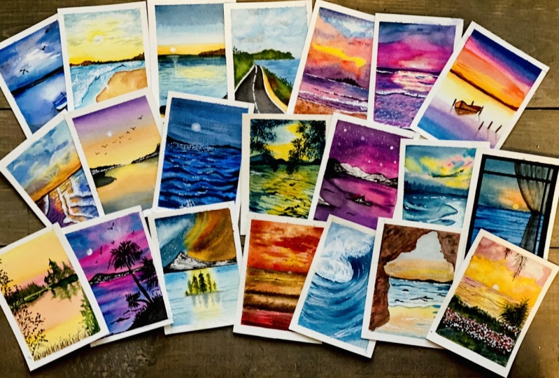
here and I am with a 21 day watercolor challenge for you to dive into the waves. Hello friends, welcome back to another Skillshare class
with me and my sheet, the barrio, an artist and
an art educator from India. I am a watercolor
and gouache artist. And you can find all my walks
onto my Instagram handle, creating from the heart. In this 21 day
watercolor challenge, we are going to be exploring
in painting and see escapes with watercolor
and diving into the vase. I will first be
guiding you through all the basics of
watercolor and also be giving you a little depth
about the techniques used in watercolor for adding
in the background washes, as well as discussing a lot in detail about adding in
weaves into your seascape, creating indifferent
depth into your seascape. I will be guiding you through the materials as well
for the 21 days. And then we will be diving
into this 21 day class. If you always feared painting these leaves in this
class is perfectly for you to begin with and get rid of your fields of
painting the leaves. I would love to see you
join me into this class. So without any further ado, let's begin in discussing in the materials and
the basic techniques for us and then dive into the day one class
projects for today. I hope to see you
all join me into this 21-day challenge
and explore. Bc escapes with me. Let's begin diving
into the next lesson.
2. Materials Required: Let's have a look at the
materials first one being the paper I'm going to be
using in these people. These are approximately 12
centimeter by 12 centimeter. I have gotten bigger
sheets into smaller size. You can go ahead with your own preferred
size of the paper. I'm going to be using
these for each of the class projects
throughout for taping down these paper I'm going to
be using in this board onto which I'm going
to be taping down the paper using a masking tape. You can tape down your paper
onto any movable surface. I would recommend to go onto a movable surface so that it's easier for adding
in the details. Next is the watercolors I'm going to be using in
this Magellan mission. Watercolor said, this
is actually board from tubes into this palette
out your do not worry. I'm going to be helping you
out with each of the shades that we will be using in
each of the class projects. You can go ahead with the very basic sheets
available with you. Next other brushes you will be needing in some flat brushes, some round brushes and
some detail of brushes. Also, I'm going to be using in this pointed round
brush for adding in details with white gouache into our CVs and creating
in the form effect. You can go ahead with
whatever brushes you have some flat
round and detail brushes for each of
the class project you will be needing into
jars of clean water. Make sure for each class
you have clean water. Next, you would be needing
a masking tape to tape down your paper for each
of the class project. Apart from these, I'm going
to be using white gouache. So I'm going to be using
in the whitewash on a separate palette for
each of the class project, you can either use
white gouache or white, because white watercolor
will not give you the opaque look for the details that we
are going to add in. Next, you will be needing in a few of the stationary
or scale pencil, a black pen and write pen. Do not worry if you do
not have a white gel pen, white gouache or white
acrylic will do the walkway. Next, you are going to
need an tissue paper. Make sure you have some
tissue paper or rough clot handy because we will be
dabbing in lot of the paints, forgetting in the
details as Ben. So these are all the
materials that you will be needing throughout the class. So make sure you have
all of these ready. And let's begin discussing
in the techniques for today and then shifting to a
first-class project for D1.
3. Technique 1 - Basic of Watercolor & Clouds: Let's begin with some basic watercolor techniques
before moving into the depth of adding in the weeks and learning
details about the CBS, I will begin with the
techniques one by one. The first technique is going to be the wet on wet technique. The wet on wet technique. We have a clean layer
of water which is wet. And onto this wet LEO, we are going to be
adding in paint, which is again going to be with this is called the
wet-on-wet technique, wherein the layer in
the underneath or space is already wet and
onto that wet Leo, you are adding in the wet
Leon with the colors again. Now, in my technique can
even be covered on color. So when we are going
to be adding in the waves in the photo classes, you will see that while
your first color, the Oresteia, where
we're adding in the waves didn't wet on wet. We're adding in the details, wet on wet over toby Nero photo. I've just used in one
simple color of law, added it throughout the show in the wet on wet
technique out here. This is the first technique
which is very important. That's the wet-on-wet technique. Now the next technique is going to be wet on dry technique, wherein the base layer is dry, there is no water or
wet layer of color. We undo this direct drying. The OPIA going to be
beginning in with wet paint, hence it is in wet, on dry. Suggest using in wet paint, I'm going to add it completely. Now this technique is
used when there is a very small space to be painted in and not much detail
to be added in. And you want your space
to dry in quickly. If on larger surfaces you will try to use this
wet-on-dry technique, you may get in or sharp edges in-between
because the paper will dry mouth to know as compared with the
wet-on-dry technique. This is only by now adding in details or walking
on small spaces. You can already see the
color difference is coming in out your because
of the wet-on-dry technique, because the paper was not wet, even it places it began
to die in that I'm just running a **** brush
over it to make it even there
throughout like this. So that is why we will majorly
be using wet on wet for because offices and only for the dealing we will be using
in the wet-on-dry technique. Now next one you're going to
learn in different kinds of wash. Let's begin in with
a clean code of water. As I told you, we are going
to be going ahead major, live with the wet
on wet technique. So let's begin in
with the wet on wet technique and beginning
with the first type of wash out your the first wash is a gradient wash bedding. We adjust going to be using in one color and we are going to be having a no
gradient to this. So at the top you can
see we have the darker, deep, and at the bottom
that intestine lighter. I have picked up the
same color again and just running from
top to bottom again. Now I just add the candidate at the top and using a damp brush, I just, you know, get radiation to
the bottom space creating an a gradient wash. Now this gradient wash can
either be top to bottom or bottom to top depending
on how you need it. To see if you need
it bottom to top, you can begin adding in the tint from the bottom
and moves backwards. Now let's move into
the next wash. Again, I'm going on with the
wet on wet technique. So first adding in a
layer of water onto your first time in beginning in with
the blue colored the top space until the half, that is still the center
line of this box. I'm going to add in
this blue color. And from the bottom, I'm going to shift into
the next color now. And I'm going to use in a
darker tint of blue color, all masala and indigo
color of this set, which is more or
towards the black side. Alright, so this is called a variegated wash bedding
you using two colors, blending them to each other. Now, these variegated wash can be of different
colors as well, need not be just
of the same color. Family. Modesto, according to the colors that you pick up, the variegated wash.
We'll video later, depending on the color harmony of the colors that you're using. So you can see there
are two colors, both of them blending
well into each other. So this is the variegated wash. The first one was the graded
wash and the second one is the variegated wash. Now let's shift it to
the next one out. You're, so again, I'm
going to begin in with a clean buret of water first and then begin adding
in the colors. I'm using in the indigo
palette from this set. This car wash is nothing
but a flat wash. It's just one color in a simple theme color
tone throughout. In the radiated wash, you will see that at
the top or the bottom, you will have
darker tones moving from the darker to
the lighter color, but you're in flat
wash. You will have one single color tone seen
throughout, everywhere. So you can see I'm
trying to add in an equal colored bone onto the entire space throughout having the perfect theme
color spread throughout. This is known as a flat wash. These were the three
different kinds of brushes. First, we learned about the wet on dry and wet
on wet technique. Now these were the three
different washers, that is the graded wash, variegated wash,
and the flat wash. Now let's move on to the
next technique for that. Well, I'm going to go ahead with the clean layer of water again. Your Ivan show you a variegated wash with two
different colored tones, you know, of blending of which
may form in a third color. So how we can do that as well. So I'm going to do in a variegated wash with the
blue and the yellow color. Now we know when the
blue and the yellow mixed together they
will form a green tone. So to avoid that in-between, we believe in little
white tab and let go the colors blend easily
into each other. So you can see I have added in both the colors in-between. I left a little white gap. Now using a damp brush, I will just blend from the bottom of the blue
pill, the yellow color. And you will see there is no green color form and there is a perfect flow happening
in-between the colors. This is how you can
achieve variegated wash, the two colors which may
form in a third color. By living in a white gap, you can get perfect
transition between the colors and go ahead
with the variegated wash. So these were the
different kind of wash. Now moving on to
the next technique. Again, you're going to begin in with the clean
layer of photo. Now I would recommend
you to try out these basic technique first, if you are a complete beginner. These basic techniques
will help you a lot in getting the class
projects much easily. And this will also help you understand where you go wrong. So I recommend you to try
out these techniques and get a hang of these before moving on to the final class projects. Now, we're going to learn
about adding in the clouds. So again, this is wet
on wet technique. I have a wet neuro photo. Now under this, I'm going
to be adding in wet paint, but I'm going to add in paint, leaving in some white
gap financial clouds to act in suggest adding very simply small
patches of the glue Carlo going to form in little
cloud shapes in-between. And then undo this. I will show you how we are
going to be adding in the wet-on-wet technique or
using in another color. On top of this. Now you will see how
easily I've left in the spaces in between
to act as the Cloud. Now undo this, I'm going to
pick up the indigo color. I'm going to shift into
a smaller size brush. Now this piece is still wet, wet on wet again, I'm going to add in
the next layer up. Now this darker tone, I'm going to add
in very little as compared to the blue
color that I did it. Because I wanted the blue
color as well to be visible. You can see how easy and you can form in the clouds as well onto these using the wet on wet technique creating
imperfect depth. Now you can see three
colors coming into our sky. The white gaps that you lifted. Now when you are these
clouds wet on wet, you need to make sure that
into this indigo color, you do not add much of photo. You need to control the water. Otherwise, you will just get one flat layer of the
color and all the colors will blend and bleed into
each other and you will not have any color
distinctions in between. Now wherever I feel the pallidus
spreading little extra, I'm just lifting it
up with a damp brush and then we have got the
perfect kind of clouds. Now let's begin with the next, a technique out
you're getting going ahead with the clean
layer of water first. Again, you are as well. We are going to learn
adding in the Cloud. So this time I'm not going
to live in any white gaps. I'm going to use in the
blue and the pink color this time I'm using in the
city in, in blue color. Next, I'm going to be
picking up the pen up, sorry, the windows color. So using the Windows color, I'm going to add it completely. Now when the blue and
the pink mixed together, they will formulated
purple line. As you can see, if you do not want
that purple color, you can live in
mitten whitespace. And when just as we blended
the yellow and the blue, these are different
ways that you need to understand about
blending in watercolors. Whether you want the
third color to be formed or you do not want the
third color to be formed. Now I have picked up a little of the violet color and I've shifted to a
smallest size brush. Now you will see just
using the tip of my brush, I'm adding in this
color wet on wet for a million little cloud
chiefs into the sky. Now in DSM-5, we'll add in lot of water to
this violet color. Violet color will spread a lot
and give me a flat loop of the violet color instead of retaining these cloud sheets
that I'm trying to add in. So it's very important
when you're working wet on wet with the
color neuron color, you need to make sure that you
control the water content. Our biggest to maintain
and read in the sheep. Now automatically these
cloud shapes will have a soft blending because
walking wet on wet, but also they will maintain the shape because
I've tried to control the water content and the
liquidity of these watercolors. A24, I have added in the
clouds using two colors. That's the red violet
and the violet color. And you can see these
cloud shapes are reading because I have
not added much water. Also, the clouds are in the
form and all PCR colors are visible if your is the dried loop of
the complete thing. So let's remove
the masking tape. These were the basic techniques. In the next technique
we are going to learn in different kinds of
adding in the CVs. Wet on wet, wet on dry, and different ways of adding
reflections, shadows, B-trees are all of the videos in the next
technique session. So far now, these
were the basic ones. Again, I would
recommend if you are a complete beginner
practice, all of these, they will help you
a lot in overcoming your viewers with
watercolors and help you get better with your
basic techniques. In the last one out you are, you can see how beautiful the clouds are
looking wet on wet, maintaining a lot of bones as varied but
maintaining the shape as your first technique session. In this first technique
session we have lawn wet on wet wet on dry graded wash, variegated wash, flat wash, variegated wash with two
colors which may form. Third color abiding
in the third color, or adding in clouds, leaving the whitespace,
adding clouds wet-on-wet with two colors
forming the coat color. So I will see you guys into the next lesson discussing
more about this.
4. Technique 2 - Different Ways of Adding Waves: Now we are going to be
discussing in little more detail about adding in weaves in different manner into
your cityscape painting. All of these will be
helpful for you in the coming days to add in v's in different
pathogens into your CVs. So far, the first one, I'm beginning in with the
clean layer of water as we are going to be working on
with the wet-on-wet technique. We are going to be
adding beams wet on wet. I'm adding in a base Leo color of the civilian blue color, and this color is
going to be red. I'm going to add in the v's with a darker blue color onto this
wet layer, the blue color. This is going to be adding
in the waves wet on wet. For now adding the waves I'm shifting into a
smaller size brush, which is a size
four round brush, which has a pointed tip. Now using in the
darker blue color, I'm going to begin adding
the wheels wet on, wet out. So now when you are
going to add in waves, you have to be careful
about few things. One, the water control into this darker blue
tone that we're using in. Secondly, you need to
make sure that you're basically of blue
is not extravert, otherwise your paint
will spread a lot. Suggest as we learned the water control for
adding in the clouds in the same way we need to control a while adding in the
waves your as bell. You need to add wet-on-wet, but you need to make sure that the pigment does not
have extra water. And depending on the color
tones that you need, you will be adding in. Now, we can use in wet on wet some thicker strokes like
what I'm adding now. You can also lose intend single line strokes
we're adding in details. Now you will notice that as we move closer to
the horizon line, leaves will be smaller one. But as we move
towards the bottom, spaced of veins will
be thicker one. Now I'm trying to
drink my horizon line to be the top line. So now I'm adding in
various smaller and ANOVAs, as you can see, because
of these that are closer to the horizon line
are far from our view. And the ones that are at the bottom of the horizon line are much closer to our view. Hence we add them a
little more teacup. So just adding little
more darker death. This is how you
can add in waves, but on where in this way
you will be achieving in soft edges to your
visa because you are playing along with the
wet on wet technique. And you will also maintain
the little darker loop because of the water control that you do while
adding in the VCE. Now let us begin again
with a clean photo photo to move on to the next
detailing about the VFS. Onto this one, I'm going to give an allele or of the windows and we will be for this to dry completely then add
the details on this. For now I'm just giving a simple flat wash wet
on wet with this color. And then we will learn too, I didn't wet on dry. Now, I will move on to
the next one wherein we are going to be adding in the v's are all wet on dry
again, duress bell. But let me show you another
way of adding the width. So I'm going to
directly begin in with the color
non-liberal fortunate, anything onto a blank space. Let's learn to add in the
different weaves out to your. So for adding in the
leaves giving in depth, if we're using in this
modest sized round brush, this is a size two round brush. Now you will see I'm
just adding these closer to each other but connecting
them at some point. Now the ones that
will be at the top that is closer to
the horizon line, they will be quite
smaller than length. As you can see,
the ones that were at the bottom space for
quite bigger than length. Again, the matter
is the line that is closer to the horizon line
is far from our view. Hence, these leaves are
quite smaller than length, yet connected to each other. Then as the viewer
becomes closer to us, we add the veins in
much bigger Lynn. In-between. We're
even going to be adding in a few of these tick OVS to give it depth to them and giving it different
motions as well. You can see very randomly
I'm just adding in some floating lines
connecting them to each other at the
point V1, V2 dot, dot and other two, the next one creating in the depth
in-between again, you can see how the
anemone I added in the tea coffee in-between, you can even add a
little dry brush or just like at the end. Now from top to the bottom, I will connect all of these. So now you will see from the top as I'm moving
towards the bottom, I'm increasing in the length of these views automatically, but I'm making short that
one wave is connected to the next one and the next
one to the next one. This is how you can add
in a lot of waves when the main focus of
the entire painting is going to be the waves. Again, it is very
important that you keep connecting them breach or those who asked to give them
a sense of depth. We're even going to
be adding in waves which will not be
connected to each other, just simple straight lines. But that is again,
a very simple kind of depth that we
will be adding in. This is a little detail depth
of adding in the waste. Using in some texture
lines in between and understanding the thinner lines knit closer to the horizon line. And as you move closer
to the seashore, WBS will be bigger in length. Now let's move on to the next
two weeks for that also, I'm beginning in with
a thin layer of water. And this time we are
going to learn adding in some crashing and some
roaring wavy effect into RC scheme. So the first one that
we learned was simple, basic wet on wet leaves giving a little
detail to the waves. The second one we will
still be adding in. The third one we learned
adding the veins wet on dry when you'll see
area is completely dry. Then how you can add in these dry leaves or giving
him closer to each other. Now in this fourth one
we're going to add in some crashing leaves
are the roaring B's. First I have given in the near of the permanent red color, make sure you do not have
excess water otherwise, the color that we
will be adding on top of this will spread a lot. A little after
crashing baby effect, I have picked up the
burnt sienna color. Again, I've shifted to my
smallest sized round brush. I'm making short that is not much excess water while I'm adding in this
burnt sienna color, but I'm also making sure
it is wet enough for it to blend easily with
the BCR red color. So you can see I just added
one single line and I tried pulling the waves towards the top side to give it
the little crashing view. Cnbc, I want to add in
one more layer to this. I have picked up a little
darker brown bone this time and I'm adding it just at top of the
burnt sienna color, but in such a way that little burnt sienna color
highlights are still visible underneath
this darker tone. Now just so as to make the
blending little more better, I am again giving
it a little touch of the red color at
the bottom space. So all of these we are
doing wet on wet too now you can see just by
adding in the red color, the blending looks most Moodle. Now in the same BC, if you want to add
another layer at the top, you can again adding more detail once
this dries a little. So I'm going to be adding in one more layer of
this crashing beef. You're at the top area. So I'm going to follow
the same method. Just add a 9 first, then keep pulling out these leaves automatically
trying to act in as the crushing leaf or
the rolling wave effect. Now to this as well, I will give in further
depth with a darker tone. You can see how you
can begin adding in depth using in the color
tones of the same color, giving him more depth
to your leaves as well. We are going to be
painting one of the paintings where
we will be adding in these crashing or roaring baby
factor into our painting, creating your perfect sunset
painting kind of a view. Now my second block
is still wet, so till that dries completely, I will begin in with the
fifth block out here. So again, I'm going on with
the wet on wet technique. So first adding in our
clean layer of water, then we will begin adding
in the colors your, this time into this block, I'm going to show you how to add our details into an
overview of beach. Overview beach or overview
ocean or a seascape, anything but it's a board I view that we are
going to learn in your first beginning in with a flat layer of the turquoise
blue color completely. I've done one flat wash off
the turquoise blue color. Now while this is still wet, I will begin adding
in darker depth with the turquoise blue
palo suggest as we learned adding in
the crowd saying Baby, I'm going to add in the board, I knew beach or the CBP is. You're also you need
to make sure that you control the water content while adding in
the dark or death. Otherwise, because
of extra water, the darker blue
color will spread a lot and give you one
flat color of view. Now, you can see that dark
nofollow was externa too. I just lifted it up again using In brush and spread it across. If you will not
add enough water, the colors will not spread
and give that soft edge. So it's what you need
to control the water, but you need to
make sure that is enough water than the
paint spread easily. Now to this, you can
further add more depth with further darker tones of the indigo pallor or picking in for the
darker blue color. Then hadn't more depth to this. Now this fund that has
dried your onto this, I will begin adding in the
detail with the white gouache. You can see how you can add in beams with the white
gouache as well. Adding in the detail
to the sea area, it would seem be
just as we learned, adding in the waves with the violet color in
the same manner, I'm adding in the
blowout you're with the white color following
the same process, just that you're I mean, I didn't little
more depth using in the dry brush technique
has been, you know, you've been use this when
you want to show a lot of crashing wave or high died
kind of a loop there. And you can use invite
guage for adding in glory detail or the moon
glow details as well. Alright, let's move on to
the next one out here now. So again, I'm beginning in
vitro clean layer of photo. Now I will show you how onto an overview beach you can add in the crashing wave loop
using the right court. Suggest in the fourth block
as belonged adding in the crashing beef
into the scene, you can add it into an
overview beach as Ben, I've added in the
bond sienna color to actin as the signed
area of the beach. And I took it off, I'm
adding a little of the blue color to act
as the beach area. Now easily both of
these are wet on wet blended well
into each other OTO. Once this dries, we will
add in the crashing wave at the short time to show in the perfect beach
space coming into lay. Let this GI Bill then
let's move on to the next block and creating the base layer for
the next block. Again as when I'm moving on with the clean layer of water forced into this block as well. I'm going to show you to
add details or wet on dry. So I've just added in a wet on wet layer and added an a flat
wash off the violet color. And I will wait for this also to dry incompletely and then beginner adding in the
details to this as bell of a. Now we've been weighed for
all of these to dry in there. Then in the next
lesson we will begin discussing for the
details about this. So let's read through
all of this to dry and I will see you guys
into the next lesson where we discuss a little
more about waves and then move on to our day one
class project for today. Let's wait for these
to dry and I will see you guys into the next
technique section.
5. Technique 3 - Detailing into Waves & Shadow: Let's begin photo. I will first begin creating
in this last patch out here. I'm false beginning in with a clean near a photo
to your data has been my water has a little
pigment of the violet color, but it's almost negligible. So that will work for now. Endoderm if we're
going to be learning how to add in varied, boring, kind of crashing, kind of VIP detail
of the ocean low. So fast I'm beginning in with a base layer of the pink follow. Now this time we are going to add in the leaves wet on wet. So in this, you'll need to make sure these veins will be moving towards the top V. So that
is the half sea's torques. But you got to move them
in such a way quickly and got to give them a
little round turn around. So you will see these
are quiet because compared to what we were
painting at the top space. And boobies I'm giving in an inverted see kind of
a structure sheep. Alright, so this is just an inverted see that we're adding, Given those roaring
baby faked out here. Onto this, we will later
on be adding in depth using invite gouache at
the top space in-between, you can lift up the colors like this using a damp brush to give a little lighter shadows in-between these
overloading beams. You can either leave
some space light before adding in the darker tones or after adding in
the darker tones. You can go ahead with
the lifting technique. Now. You can see I'm adding
in the darker tints. Again, this isn't the inverted T stroke
that I'm adding in. So basically, you just have to keep adding in
the inverted c. And this will create the
routing baby facto tool. Now again from
in-between this you can see I'm lifting up
little after colors. Very simple technique,
but it will give you such beautiful view out here in the coming days and
manage the class project. We are going to be painting in a detailed painting with these roaring beams
are showing in the perfect crashing wave
coming into view with those white tribute at the top that we will be adding in
with the white gouache. So for now you can see how Leo, Leo by either lifting
the color or adding in, in Dhaka strokes controlling
the water depth I have been able to achieve in so much depth into
this simple wave out. You're now further glad
little more depth. I'm just adding very
few darker strokes with the violet color. Again, you can see
how this gives in the depth to the
shadow look as well. Now in the sixth block, your that is the overview beach. I will begin adding the
details with the whitewashed, giving it the perfect
shoreline detail. Beginning with the whitewash, I'm first going to
be adding in a line across the blending point
of the sea and the short, I'm just at where the blue and the burnt sienna color
is blending into each other. At that point, I first added in align with
the white gouache. Now you're simply using the drivers technique
to add in the detail. This is another
overview beach detail that you can learn to paint. This is also known as the dry brush technique detail that you can learn in your, in this method, you
need to make sure you do not have excess
water on your brush. You just need to have
in little pigment, make sure if there is
excess water or pigment. You're dab it onto a
tissue to get these Dr. Rush may be tails. So what majorly
across the shoreline where you have the waves
crashing the shore, you'll get is perfect
or, you know, details using the white gouache, white watercolor will not
give you that effect. Now to add a little
shadow to these, I'm going to be using in the
same burnt sienna color. And underneath the white line, I'm just going to add in a very fine line with
this one sienna color. And then just using a damp brush I read blended
into the background. This will automatically act as the shadow to this crashing
wave on the shoreline. This started in a very fine line of the bond sienna color. Now using a damp brush, I will quickly blend this very carefully into the bottom space. You can see now
just by blending in the shadow looks
much better on tour. In the same way, you can use
white gouache for adding in VBD into animal
seascape as bill, this was in an overview
of view that we added in. Now in the normal,
we're going to add these crashing kind
of leaves with the white quash first and then add in the shadow details
using in the business. So the basically around TO
is the violet color you are, it was a brown color. In this one I'm going to add in the shadow with
the violet color, faster adding in the veins. That is a little
crashing wave detail with the white gouache out your So again, you know,
you can use each of the technique either for adding highlights with the white color. You can add in with
the same Leonato or, you know, kind of
team going around. So as at the top one, we added in the crashing
wave with the brown color. I'm adding in this crashing
wave with the right color. And then we will be
adding in shadow to this. Now using in the
violet color force, giving in a very thin line just as I added for
the brown color. Then quickly using a damp brush, I will just blend this
into the bottom space. Now, by blending it
into the bottom space, you have to be careful
not to add much water. You just have to use a slightly damp brush
and blended into the background to give it a
soft edge so you don't want, if you will add a lot of water, then you may get an
patches of the palette because the base
is already dried. Now onto this one, I'm going to show
you how you can add in for the one more layer of the shadow in-between the
violet and the white color, I'm going to add
a very fine line of the paints gray color. So automatically this
will further given one more layer of
depth to your shadow, you can see how
just by adding in very lightly out of the
Payne's gray color, there is so much
more depth coming to this shadow that
we are adding in. Right now, we're just
adding one element out. You're asked to
learn the element. But when you add all of these together into a full
composition or a painting, all of this will automatically begin to look much
more beautiful. Next, let's learn to add
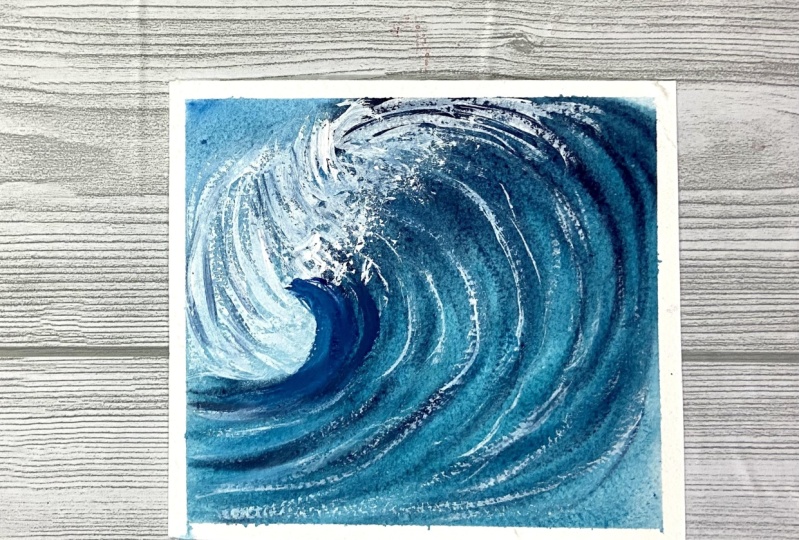
in little off the foam or the crashing wave effect
using a spoiled brush. So I'm using this round brush
which is coiled at the top, so the brushes are actually
separated from each other. So using this brush out
your eye can give in the form effect
to the water that happens because of the
crashing of the V's. So at the top, just dabbing
the tip of the brush, picking up white gouache
in a tea consistency, you can see how you can use
a simply spoiled brush, but adding in details
and texture to water. Now see, I can even add a little texture into this
moving structure that is the half see inverted
structures that we added in to create for
the MOE form effect, as you can see. Now to this top one out here, I'm going to add a
little of the DP, that is the shadow detail to
this fourth picture as well. So quickly for him to pick up little of the
Payne's gray color. Just going to add in
a very small line. I'm going to blend that as Bill. So you can see after
everything dries how you can still manage to
add in little shadow, some dry details onto this. So I'm going to add in
little dried EDNS vents. So adding in little dry brush using the paints gray color over to the brown of crashing the videos
that we have added in. So you can see how
slowly everything in the composition can
get in more detail. Either wet on wet on wet on dry, depending on the type of composition or reference
that you are working on. Now again, note also
using a damp brush, I'm just giving it a soft blend into the background
very carefully. When you use a softer damp brush for giving in a soft blend, be careful about not having
too much water on your brush. Otherwise, it will
be very difficult for you to, you know, get rid of the sharp edge that
you may get didn't because of the water layer again onto
the dry pattern out here. These were little details study about the different waves
that you can add in, how you can add in
furthermore, glowing details. There is lot more into this
when we begin painting. You know, it's the same thing, but using it in a
little different week and make a huge difference. It's the basic technique that's important to be understood. And then the different
applications or Fed can make different composition,
take different tones. Now, let's begin in today's class project with a very simple seascape painting. So see you into the
day one class project.
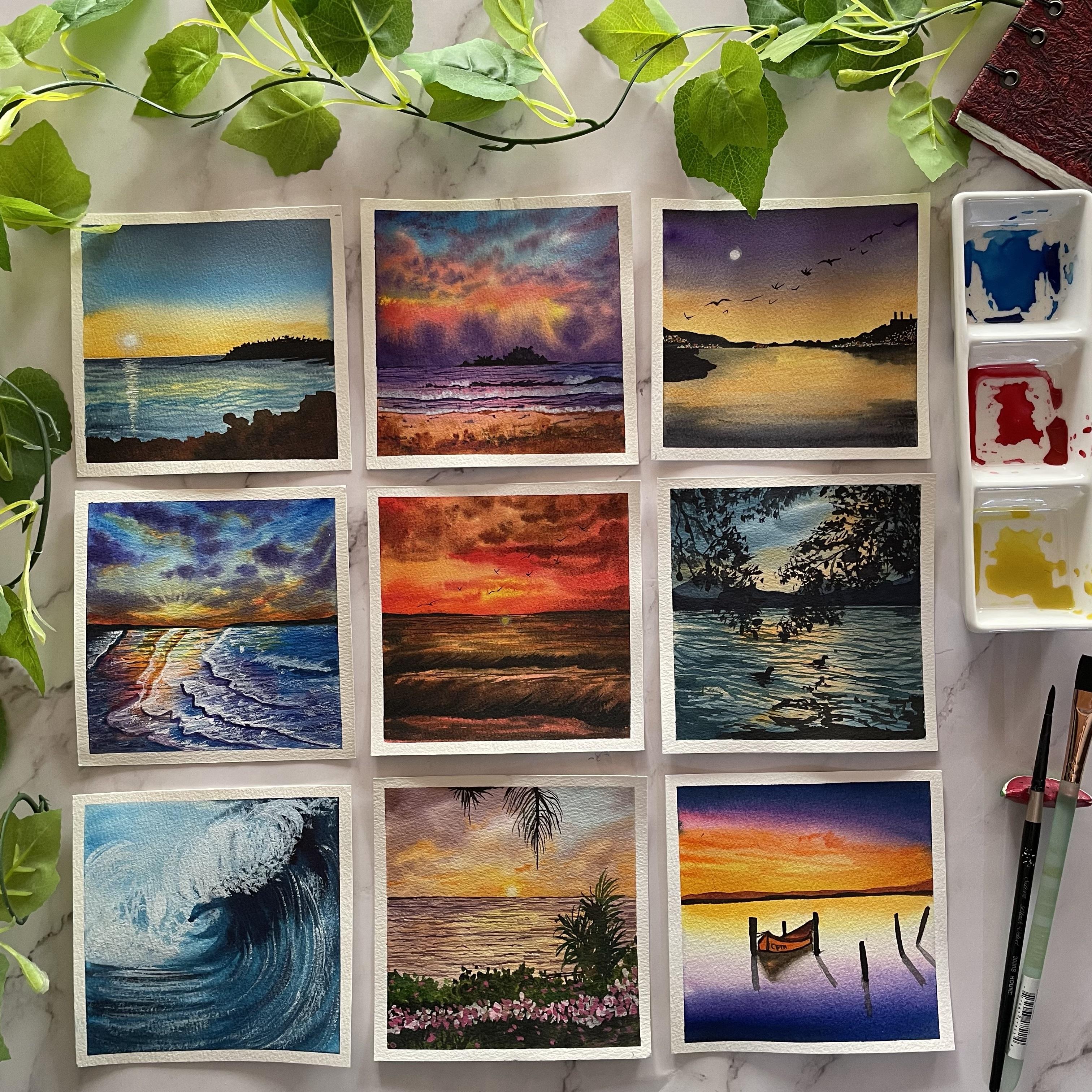
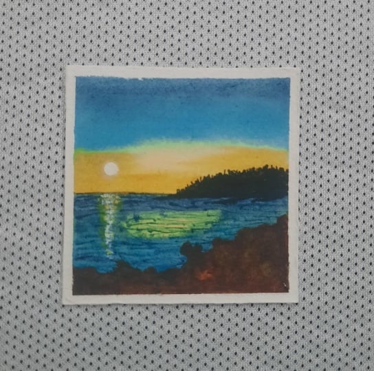
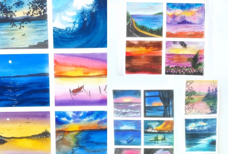
6. Day 1 - Sunset Seascape: Welcome to D, one of these
20 day watercolor challenge. I have listed them
all the color sheets that I will be using
in this class project. If you do not have the
exact same sheets, you can use the best
alternative sheets available in your family. I have my paper they've done, and I will begin in with a
very basic pencil sketch. So let's begin in with a
vengeance stitch false, then maybe move ahead
and begin the painting. So first I will begin by
marking out the horizon line. I'm marking to arise in line almost in this ended
of this piece. I am using approximately in 12 by 12 centimeters
either Foursquare sheep. Now onto the right side, I'm deciding in a very small
mountain range or a bushy. Now at the bottom, I'm just starting in this small
short space out here. So you can see I'm adding in the shoreline very time to me and giving it a very tough
I'm towards the right side. I have taken it a little longer as compare to the left side. This is our basic pencil sketch. Now we even begin painting
the BB one-by-one. First I'm going to take another masking faith and I'm the lead at
memorizing night. In this way, you can get a very clean horizon line
after painting in the sky. So I'm just going to pick
this masking tape and tape it down underneath
the horizon line, right? I'm painting the sky. Whenever you are using a masking tape in the
center like this, makes sure that the masking
tape is perfectly taped down. Otherwise, the water
and the veins may flow from the masking
tape and you may not get the name edges for which you are adding
in these masking tape. Now, I'm begging you,
and with a thin layer of water on into the
sky space both. And we're going to
be painting over these impulse cry
for the one to do. Later on in the pharmacy days, we are going to be painting
in much more detail skies and OCBs as support today, let's keep it light
and beginning with a very simple, yet
beautiful seascape, I'm done adding in a clean, beautiful DO I have made sure I haven't evenly
beautiful throughout. The first palette
that I'm picking up is this Naples yellow. You can go ahead with
any light yellow if you do not have the
Naples yellow color. And next I'm going to be using in a little bit
of the yellow audience needed on suppose
beginning in with the Naples yellow
onto my horizon line. I'm going ahead with that. I've been fantasy
Lindsay of the paint and even on the bushy
area you can see for now I'm adding in the
beat because the bushes going to be off the beams
getting out of the black color. So we can directly add that once the sky and the DBS
will be completely dry. Next I am beginning in with the civilian blue color
at the top space. In-between the blue
and the yellow. You can see I've lived
in a little space. This is exactly the
method that I had discussed with you in the
technique section off leaving this
whitespace in-between and letting the colors
blend together and actually using a damp brush that you do not have the green
padlock coming in in between. Now, the remaining top space, I'm going to pick up the indigo color and
I'm going to add in the indigo color at the top area and we ended with the new. In this time you have
to follow radiations. That's the indigo sit in in blue and the Naples
yellow color. I'm going for, I didn't
literally it in with the orange following
highlight into the sky. Coming ahead. I'm going to keep
the masking tape underneath my board
so that might be boys incline and the colors move downward and the yellow does not move into the blue color. Instead, the new flows naturally
into the yellow color. Now for the blending, I'm picking up a little bit
more of the yellow color. My paper is still wet, so make sure that your people means all wet enough
because we are still working wet
on wet and we are yet to add in little
cloud details. While this is still rare, I'm picking up the
yellow orange color. And with this yellow
orange color, I'm going to begin adding in little cloud detail
onto the yellow part. I'm going to use a smaller
sized round brush. As you can see, it's a size two round brush which
has appointed day. Now, while adding in
this cloud detail, you want to be sure
that you do not add an excess water to this
yellow, orange color. So you can see I've added very limited water to my
yellow, orange color. Only then the colors
will not spread a lot. And we'll try to read in the cloud shape or the strokes
that you tried to add in. Now you can see just using
the tip of my brush, I'm adding very simple strokes with this yellow, orange color, trying to create a little
cloudy effect onto the yellow. If you can see, I've left a little growing space into the sky and
that's purpose needle, short little cloud effect and the color blend things
happening easily. That is it for our
sky area for now, we will wait for this to dry
completely then more ahead and paint the CEO and the
medians further ahead. Let's wait for this to dry completely and then
begin painting further. Now my sky is a nucleotide and
you can see the colors are so beautifully blended into eta dot and there is
no green color font. Now very carefully, I will remove this masking tape and you can see such a plane horizon
line we have achieved. Now I'm going to please this masking just about
the horizon line. Do not body, the color
will not be loved, but you need to be sure whether
your paper open support this technique and whether your paints will
remain the same. Because my paints and people
support this technique. Hence, I didn't leave
them this masking tape onto the earlier paint as well. Now when beginning in with the clean layer of
water only into the CEO In into the shoulder area if it goes
because they're shorter, again, that's going to
be off a darker color. Now when I add the masking
tape at the top area, this makes my process easier because you can
see I can move in very freely even near to
the horizon line without worrying about
running into the sky area. This helps me and adding in the colors much
more freely rather than being worried about how ADH will not go into the CEO. But again, with this technique, you have to be
sure that you take down the masking
tape very tightly. Otherwise, if the color's
will seed from beyond this, then you will have to try to
correct the DDL somehow are, your painting will be spoiled. The beginning with the same
Naples yellow color post in the center area for the C. Now
at the top and the bottom, I'm going to pick up the
indigo color and when to begin adding in the details
with the indigo color. First closer to
the horizon line, I'm going to begin adding in the colored it in with
the indigo color. So basically my Sea area
is going to have in three colored tones with indigo
near to the horizon line, then the Naples yellow and add the board dip the
city and in new color In the city didn't
move holidays better. Now, very carefully, I'm just
going to add a little of the city and in blue color
onto the yellow space as men, only in the center, I want to maintain that
yellow light very carefully. This is called as
glazing venue title Meta other Carlo over
onto one BC of allo, but still trying to
maintain that color look. In the center you can see I've maintained the yellow
Pali look despite blending it with Lou and still a wide indicating the green tones. Now I'm shifting to my
smallest sized round brush, which is again the
size two round brush which I use for
adding in the clouds. Now while this is still wet, I'm going to add in little
of the DBAs, wet on wet. So all of this we had discussed into the technique
section as well. Now make sure you do not
have excess water or excess B. I've got my brush onto a tissue before beginning into adding these
leaves so that I'm sure that there is
no excess water or pigment on my brush. And if there is any excess, it will get absorbed
by the tissue. Now you can see since I have the perfect What do control via am adding in these waves went on with the visa getting
into soft edge. But still they are evil to maintain the shape that
I'm trying to add them in. This is just the force the
beams we will be adding in vivo wet on TI as well
after everything dries. Now for adding the leaves
on the indigo palette, I added the VMs with
the indigo color. Now I've shifted to the city in, in blue color and I
followed the same process of removing the excess
water from my brush. I'm going to add in little
beams with the city in Luke, hello onto the city
didn't loose piece. You can see very bad numbers. I'm adding in a few
lines connecting to each other,
overlapping each other, and having a little hump in the center on
the yellow space, you can see I've left
this space blank and not added the VMs out there because they're
either be adding in the waves with the
yellow color highlight. I'm adding in the leaves
with the indigo color as well on the sit-in in blue
color at the bottom space. Now for adding in
the wave highlight in the center AT onto
the yellow Carlo, I have picked up the city
in blue color but in a quite diluted consistency so that I get very light
effect of waves out here. And I have the yellow color
highlights still visible. So you can see the leaves on
the yellow color are often quite lighter consistency
than what I have added at the top and
the bottom of the sea. Ilya, I'm adding
all of these wet on wet so you can see all my
beads are having a soft edge, yet they are visible
clearly because of the water control
by adding in these Bs. Now, I'm quickly adding in
little more darker leaves using the indigo color
at the bottom space. You can see even on the lighter highlights
somewhere, I again, we added some indigo
Carlo or leaves on top of them to act as
the darker highlights. This was the falsely the leaves. Now I didn't begin adding
in the wave second meal. So now my leaves have like
almost 50% dry it in. Now this time I'm
adding in the waves. You will see that
they are a little more on the wet on
dry technique rather than the wet on wet technique because these waves will have in Britain sharper edges as compared to the
force-field of this. So I am adding these
while this is 50% dry, just little highlights at the top space using
in the darker color. Now see if you want, you can simply even blend it a little with a damp brush
if you do not want, there are feedback
loops at the moment. I want to give it a
little darker highlights. Hence, I'm blending it into the fact that we're
using I'm Josh. Very carefully, Let's
remove the masking tape. You can see the line
that we have maintained. And on the right
edge you can see a little bubble because of
which the color pastor there, but that's okay
because there it's as it is going to be the bush. Now shifting into
the whiteboard. I'm going to show in a
sunset view out yours, I'm going to hide the sun width, the whiteboard. This time. I'm going to add the sun just little above
the horizon line. And then once my CAT will
be completely dried, I will be adding in
deflection do that as well. Using in the White was
giving in the highlight of the sunset on the wins out
you are on the left side, you will see I'm just adding in a very small circle to
act as the sun for now. To give you the little
glowing effect, I am just blending it with a little bit of
the yellow hello. I'm going to make this as the phosphine also
using a damp brush. I'm just going to
blend this circle that I have added in
into the background so that I get little shine around
the Sun that we will be adding in after this layer
dries in this scene, we, as you know, or if you would have been
attending my galaxy class, this is a theme be how we used to add in the
glowing stars. In the same way to
add a little glow around the sun out
your post freedmen, the growing space on top of which I will be adding
in the sun once this dries completely messy, EDI is completely
dried and I will begin painting in the
bottom short space. And you can see how beautiful
the leaves are looking is despite adding them
wet on wet and a few leaves that we added
once it was a little dry. Let's begin painting
in the show, in your photo shoot in here, I'm going to be using in
different tones of brown color. The false color that
I'm going to pick up is the burnt sienna color. I'm going ahead with the
wet-on-dry technique. You're as it is, a very
small space and there is not much Didi into
adding very quickly. I'm going to first begin in Italy out of burnt sienna color. Now, my pencil sketch of the shoreline may not be
clearly visible to you, but it is visible to me. So first I'm giving out a
rough marking to the outline. And you can see in this outline as well, I'm getting, you know, a very rough sheep and giving it a very rough edge so as to make it look as
natural as possible. I'm filling in this
space completely and you can see because of the
little blue color that had come into the space
on the left side. Hence, I always recommend either take the
entire new color till the bottom space or do not add it even a little
into the shore space. But no problem as we are going to be adding in the
darker highlights, this will get easily covered up. So I'm shifting into the Payne's gray color and I'm just going to be dropping in little highlights on the edges
and at the bottom space. Suggest using in the
department brush, I'm dropping the Payne's
gray color wet on wet. So the brown color
Leo is still wet. And you can see how
beautifully the paints Michelob needs and blends
into this burnt sienna Carlo. Make sure you are this
burnt sienna fallow in such a way that the natural brown colors
still visible in-between. Otherwise it will
not make any sense for adding in that
view of brown color. So at the moment
you can see I have little brown highlight speaking through the burnt sienna color. If you want, you can even use the sepia color instead of
the Payne's gray color. Or you can mixing your paints gray and brown color
and get a sepia color. And using I prefer to
directly using the paints gray color as I already had the entire brown
there underneath. So automatically getting
in the CPR Carlo. Now the bush space that
I had marked out here, I'm beginning to paint in that. You are also, you will
see four-star to talk. I'm giving it a very tough as they just dabbing in
the tip of my brush, creating in the bush
effect out here. Then the complete
bottom bushy it Yeah, I will just fill it with the Payne's gray
color completely. So you can see the bushy
area is going to be half about the horizon line and
half below the horizon line. Now quickly giving
it the bottom line. And then I will fill it completely with the
Payne's gray color. Make sure when you are adding
the paint out, you're, the color is quite opaque
enough and it is not transparent because we want a good dark layer of
the paint palette out. You're just adding in mitten
highlights at the bottom, trying to give it a rough edge at the bottom space as well, and showing a little
extended bushy area to make it look
natural out here, suggests you can see
how simple strokes connecting them altogether, giving you a little
more detailed look. Now lastly, let's begin
adding in the sun. So my posts beautiful white
quash is completely dried in. I have picked up the same
bike course is timing a very thick
consistency and just adding it into the center
space of this glowing area, you can see the blue area acted as the double-space
around this. And now this is standing
out quite a bit. Now we're going to add
a reflection to this exactly underneath into the CEO. So for that I'm picking
up the whitewashing a thick consistency
and I'm going to go ahead with the
dry brush stroke out. You're just using
the tip of my brush, going to add in very
fine digress talks out the white color to act as the shine of the sun falling
onto the water space. Make sure fine. Adding in this dry brush, you do not have excess paint
or water on your brush. Otherwise you will not be able to achieve in the
dry brush stroke, you will just get
in flat patches of the white color instead
of the drivers drool. Whenever you are adding in
the dry brush technique, it's very important that your brush only has
the two pigment, no excess water going
very slowly, right? Adding in this, make sure you
pick up the right question. I pick consistency so that you get the perfect
drivers stroke out here. Now to give it a
little more highlight, I'm mixing in a little bit of yellow with a white gouache. And I'm going to give him
little highlight with this yellow allergists
around the white color. Small lines that is just extending the white
lines and adding the little onto the white lines as well to give it a
little more depth. That is it, we are ready with our first-class project
for this 21-day challenge. Let's remove the masking tape
and see our final painting. You can see how such easy composition can still make it look so beautiful. So make sure your paper
has dried or be careful by removing the masking tape if if any of you
are is still wet, I'm going to quickly begin
removing the masking tape. Make sure you pull the
masking tape against the paper so that you do
not tear off the edges. A final painting for one, let me give you a closer view of the weeds and how beautiful
this is looking in. I hope you guys enjoyed the day, one of this 21-day challenge. I'm sure if you join me
through the entire 21 days, you are going to fall
in love with paintings, he sleeps and that's going to be our next favorite subject
to paint anytime. Thank you so much for
joining me into this class.
7. Day 2 - Simple Beach: Welcome back to the 21-day
watercolor challenge. This is the class
project for D2, and I have listed down
all the colors that I will be using for
this class project. You can go ahead with the best alternative colors to these sheets in your palette. I have my paper taped down and
I'm going to begin in with a very basic pencil
sketch to mark the horizon line and the
C and the short Elian. The horizon line again
is going to be almost in the center of the paper
that I'm using it. Now, if you are using in
a different size paper, your space would
alter accordingly. I am going to mark the
center line on little about, as you can see, the horizon line is actually a little
about the center light. And then marking a short while
you're on the right side. So the left side is going to be the CEO and the right side
will be the shoulder area. Now on top of the horizon line, I'm going to be having an
a mountain dreams are just added a rough sketch for
the mountain range as well. This is a very basic pencil
sketch that we need. Now, we are going to begin
painting the sky first. For this guy, I'm going to be using in a combination
of the yellow and the blue in color and in
the center approximately, or a very small ground space. I'm going to leave
it blank while painting so as to give a
glowing sunset effect. And I wonder sundry effect
to be quite bright the same. I'm going to leave
that much space right? While painting, while
applying the water, I will apply it onto
the entire space. Now false, I'm adding the
tape onto the horizon line. Though you can skip this
fast as this time on the horizon line
we are going to be having in a mountain
range later on, the horizon line would
automatically get corrected even if the
color CPR in there. But I just wanted to be free
while painting the sky. So at least I'm adding in the tape right now
onto the horizon line. Now just beginning in
better clean layer of water onto the entire sky. You will see that even onto the center growing
space that I had, I'm adding in the
layer of water onto that circle as well
because I want little yellow soft
edge out there while we paint the yellow
color around that target. So you just have to keep
in mind that inside the yellows often you do
not have to add any color. All the colors we'll
be outside that range. False beginning in
with this yellow, orange color onto
the horizon line. Now in case if you do not
have the yellow orange color, you can simply mixing a little bit of your
orange to your yellow. Next, I have picked up a little bit of the
Naples yellow color. I'm using a 1 fourth
inch flat brush out here so as to get this torques very minimum around
the sun space. And also because I'm painting
on a smallest size paper, so I want much paint control. Now across the rounds
piece that I had marked, I have added in the
yellow color leaving in the center space
right now across it, I'm just going to be adding in the same Naples yellow and the yellow orange
color alternatively, just adding in little yellow, orange highlight across
the yellow as well. And at the top space now I'm going to shift into the
city, Lynn in blue color. So make sure you clean your brush because
audience and the blue mixed together may give you Maddie tones if your
brush is not clean. So shifting into
this blue color, I'm going to begin adding
in the civilian blue color, also in a very liquidy
consistency as you can see at the
top of the sky area. Now just to be a
little careful about blending this color
into the orange color, because then you make it in muddy tones so you have
to blend them very carefully using a damp brush
are going very slowly. You can see I've used the city didn't blue
color and quiet a liquid consistency
so as to get a very light tone and
in-between that also, I have left him little gaps. Now on top, I just added little strokes with a
little darker tint, Dr. CD when Luca, No. Now I'm going to be adding
in little cloud effect as well first using the
tip of my brush, I'm just going to give
them little strokes coming out from this
yellows is make sure after every
store you either clean your brush if
any colour is lifted. Otherwise you may begin to get a little muddy
shades in between. You can see I'm getting
the two Newtons because I did not
clean my brush and blending them easily again so that the blue tones
are not visible. So now you can see
the transition from the yellow to the blue
looks much beautiful. And there is little Sunday, Sunday strokes coming
out in between. Now next one, adding in little
cloud effect into the sky. I'm going to be creating in a little muddy sort of a color. I'm going to pick up little
off the Naples yellow, going to add in very middle
of the city, Lynn blue. I'm going to add in little
indigo color to this. I'll let now mixing in
these three colors, you can see I've got a little
dusky kind of fur color. Now using this and just using
the tip of my round brush, I'm going to begin adding in very small cloud patches or overlapping the
sun space as well. So you can see I'm adding
all of these wet on wet. My sky is still wet hands, I'm getting into soft
look to my clouds. Also you can see the
water control that I've tried to achieve while
adding in these clouds, I have made sure that there is no excess water and
pigment on my brush. Otherwise, I may
get in much darker. At the top space of this guy. I'm adding very random clouds just using the tip of my brush. Now I'm just using a damp
brush here so as to get little blends it to get little more lighter
strokes and you know, awesome soft edge so that even a little of the yellow color
seeps into the whitespace. Now, again, just lifting
up little color and blending all of this when
using the damp brush, you can connect
any harsh edges in between if you have because
of the paper drying it. So that is it for my sky. A very simple cloudy
sunset sky with that bright light of the
sun in the center space. Now we will wait for
this to dry completely and then begin painting in the sea area and
the area together. Let's wait for this to dry. The sky area has
completely dried and I'm going to first
removing the masking tape. And I'm going to place
the masking tape just about the horizon line again so that I can use any
paint or the CDR for now. By the way, whenever you place
this masking tape again, you have to be very careful because if there is
any loophole left in the paint will
flow into the sky because we are going to
be moving in very freely. And then in this case we
already had the mountain range. Two things can be corrected. But in case if
there is nothing to add onto the horizon
line, then chime in. Whenever you do this, you
have to be very careful. Now I'm beginning in with
a clean layer of water onto the entire C
and the short area. I'm going to paint
the base layer of the CMB, the shore together. And then we will begin adding in details onto this one by one. For the force field, I'm beginning with the
turquoise blue color. So I'm using in the peacock
blue shade from this palette, you can simply use in civilian blue eyes or any
other tone of blue that you want foster only into the CATI you can see I'm
adding in this color. Now on to the shore space, I'm going to add in the
yellow ocher color. Now all of this Gallo will
blend into each other because of the soft edge loop
and the paper is still wet, I want a soft edge
blending between the short space
and the CSP area. Because then we are
going to be adding in details with white gouache
onto the shore line. Hence, I added both of
these in the base year together so that there is a soft blending
between both of them. Now I'm going to add in
little of the wave effect, wet on wet as well. I'm shifting to my round brush and I'm going to
begin adding in DPS. But before that I'm just adding some darker highlights of
this peacock blue color. You can simply use civilian
blue or turquoise blue also, if you do not have
the exact same sheet. Now you will see closer
to the horizon line, my peacock blue shaded darker. And as I'm moving towards
the bottom of the paper, I'm lightening the
shared by just using a damp brush and getting a
radiation to the scholar. We had known this as well in the technique section to get ingredient to one single color, either from top to
bottom or bottom to top. Now why messy ADI still wet? I'm going to begin adding in little VIV effect wet on wet. I'm using the same
peacock blue color and using a smallest
sized round brush. I'm just going to
add very small, simple lines into
the entire CAR. Only. I won't be adding
in these waves into the shore space because
on the shore we will be giving in the
details with the whitewash. Now Menu begin to
add these waves. There are two important things. One, you control the water. That is, if you
have excess water, the waves will spread
completely and will not give you a
definite wave low. Secondly, you even need to control the color
tone of the pigment. And thirdly, or
people should not dry if you want these softwares. I'm going in very slowly using in a smaller
sized round brush. I'm making sure the pigment
is darker than the peace Leo, only then it will be
visible on this near out. You're quickly going to be
adding in very simple lines, nothing much detail or fancy. Simple lines closer to each
other somewhere overlapping. Some valid will. Let trying
to create an WE blue. And then if need, we may add in
little waves wet on dry as well after
everything drives it. So at the top, when I
was adding in the views first idealized at the
top space was quite wet. Hence I was not adding in there, I'd be dead for it
to settle in a bit. And now I'm adding the
leaves at the top space. Until then, I began
adding in the wheels at the bottom area because
that was almost 50%, right? So again, this is
important that you need to understand that if your
business is also extravert, you wait for it to dry, see around 30% or 40% depending on your paper and how
fast it would dry, and how much time it
would take you to add in the width and then
begin adding in. Now near to the shoreline have not added in
the waves wet on wet because I'm going to add them there with
the white gouache. Now into the shore area, I'm adding a little
darker spots with the burnt sienna color very randomly while
this is all still wet, just using the smallest
size down brush, giving in some darker depth, using in the bone sienna color. Now let's remove
the masking tape. And you can see even I
have messed up despite or, you know, taping
down the people. Well, I guess the blue of the gum I started
on the wrong side. That is the side which already had a little
water content. Because of that, the water
has moved into the sky area. Now, as I told you, we were going to be having in
a mountain range out debt, so this can be easily corrected. But in these, if I did not have any mountain range
to be added there, it would be very difficult
to correct this. So first let's wait
for all of this to dry then begin adding
in the mountain range. First, I'm going to begin
adding in the mountain range. Now everything is
completely dry. I'm going to be using in the raw amber color this time
and using my round brush, I will begin adding in the mountain range
on the horizon line. By not adding in
a pencil sketch, if you would have noticed, my mountain range was actually just supposed to be
on the right side. But now since I have had
this little mess about, you're going to add the
mountain range even onto the left side so as to
cover up this mess that I have created and also even have to alter
a little height of this mountain danger
accordingly so as to hide this part that
has been created. As I told you, you know, correcting your
mistakes as possible, but try avoiding as much as possible to get
these colors bills. So this has happened to me
or into this class project. But still, since we had
the mountain range, it was quite easier to
correct this this time. Now, to give it a
little more detail, what I will do is
I'm going to pick up little of the dark
green color and just going to add
it at the top of this raw umber color
that I'm using in, so as to give it a little
more depth out here. Because since I have little
of new underlying color, I do not want it to be
visible in the center space. If you see completely there is little blue color being
visible at places. So I'm just going to in
very random green depths as well into this area
that I'm adding in. Your it was supposed to be
only a simple mountain range, but since there is this mess up, I am adding in little
bushy area as well. Now let's shift to adding in the details with the white
gouache to the waves. So I'm going to pick
up the white version, I think consistency and
forced across the shoreline. I'm going to be giving in literal as the
crashing the loop. While you're doing this, make sure you using white
gouache or white watercolor is not going to
give you any effect onto these dark colors. And it will just give you a pale color look off
the base layer color. So it's very important
that you use either whitewater
writing clearly and more preferably
white gouache since you're walking in with watercolors and gouache is
also a water-soluble media. Now very randomly, you
can see I'm giving in little or no curves
to this, right? With that I'm adding it. So as to short the perfect
crashing effect out, you're going to add one more shoreline
towards the horizon line, sorry, towards the shore line. I'm adding the second line exactly at the meeting point of the yellow ocher and
the blue color there. And then I'm making them
meet onto the right side. Now under this and went to. A pullout, simple dry brush
towards the left side, that is towards the sea area to give it that
crashing wave effect. When it reaches the shore area exactly how the leaves look. Simply just adding in
dry brush technique. Now whenever you add in
the dry brush technique, there are two important
things to take care of. One, you should not
have excess water. Secondly is the
white gouache has to be not thick consistency. Thirdly, make sure even
your brush does not have excess water or
pigment or you may get in, simply write patches
and you need to go in quite slowly while adding in
this dry brush technique. Depending on the
size of the paper or the area that you have
to add this dry brush, you'll need to adjust the
brush size also accordingly. Now next time shifting into
this coiled round brush and I'm going to begin adding in the details with this brush. Now when I will add the
details with this brush, it's very important that onto these brushes when you do
not have excess water, also make sure when you pick up the pigment from this brush, the pigments should be quite thick enough only
then you will get an opaque look to this crashing
be on the inside line. Now I'm just dabbing in little white gouache
using in this brush. So you can see I'm holding
the brush perpendicular so as to get the perfect
effect out there. You are. I wanted to give you
an extra form effect of the crashing wave
happening on the inside. I'll let a very randomly
you can see I'm adding little on the
CV of area as well. Now in case if you do not have such as pointed
round brush, you can simply use in your
regular round brush and try going ahead with the dry brush technique
you are as well. You can see we've got
such an opaque look to the details that we added
on the inside light. Now shifting domain,
smallest sized round brush, I'm just going to add a little
more of the rebuilding. It deals with the white gouache. And then we will
move ahead and add a little more further
details into this painting. Now when he handed me, I'm just going to add a few
of the white lines into the Wave area as well to
show little form effect, you are in debt into the cavea. Now on this side that is
the outside shoreline, I feel that the white quash
is still a little light, so I'm just adding
little more dry brush. He didn't give it a
little more effect. After this, we are
going to be adding in the shadow detail
that we learned in the technique section to make these waves look
much more natural. The inside we've, I'm using in the same peacock blue color which I had used
for the Sea area. And I'm going to the shadow with that color on the
outside that is at the shoreline settings
that I have added in there I will be
using in the bond sienna fallow for
adding in the shadow. So depending on the BCR fallow, your shadow color will
matter accordingly. Since my basically was
the peacock blue color, I have used the shadow color of the same peacock blue color
but in a darker consistency. And now just using a damp
brush and blending into the background so as to give
it the perfect shadow look. Now to this shadow, I'm even going to add in little detail with the
indigo color as well. Very randomly, very
little darker debt. So make sure you use the
smallest size brush so that you have the control onto these
details that you add in. Otherwise, since we are
painting on smallest pieces, if you go out of track, then it will be very difficult
to control these details. Now on to this baby effect
near to the shoreline I'm using in the burnt sienna color to add in the shadow effect. Just as I added the shadow with the turquoise blue collar or the peacock blue color
on the inside lane. Same way you're going to add first very thin
line of the bonds sienna color just
under the white line. And then using a damp brush, I will blend this
into the shore area. Then adding in the
shadow as well. Now just picking up a little of the sap green color
and I'm going to add a little detail out. You're in the center area, which I told you previously, that all you can see the
blue colors still visible. Now the mountain range has
dried completely hands. I'm adding in a little
bush detail in front of this mountain range so as to cover that blue
details completely. Last year, I just wanted
to give little after shining effect of the sun
onto the sea area as well. So just going to pick up a
little of the white gouache and just underneath
the sun in the area. I'm going to add a little
reflection using the whitewash, just very simple lines to
act as the growing space. You can see I've taken
the reflection on me a little delta short
area, not much. I'll let now I'm
just going to pick up a little of the yellow color, mixing it with white gouache, I'm going to add a little effect with this color as well so as to give him the sunset effect
onto the sea area as well. I'm almost done
adding in little of the yellow highlights you
can see on the shores piece, I have not taken much of this
highlight. So that is it. We are done with our class
project for D2 as well. Let's remove the masking tape now and see our final painting. Make sure that your edges are completely dry it and remove the masking tape against the paper so that you do
not tear off the edges. Is our D2 painting for
this 21 day challenge. Again, I went ahead with a
very simple one to D as well, just including the shadow
effect out slowly and gradually we are going
to be painting in more complex escapes as
well in the coming days. So I hope you enjoy this
dado painting and I will see you guys tomorrow
into the D3 class project. Thank you so much for
joining me into this class.
8. Day 3 - By the Road: If you want to be, I have listed down
upon the contours that we will be using
these class project. Again, you're going to be
painting in Albany sympathies. But on the root side, Let's begin painting it to
these people deep known uneven beginning with
the very basic fences get you guys going
to begin talking about the whole rising 900 all going to be hard
on the left, sorry. Make sure you add
the Venter's did in a very light tone because if you've been
having dark marks, then it will be visible
after you apply the water. A fulminant looking at, as you would have seen
in the beginning, the sky is going to be
applying. This time. You can see I'm
adding the fences, getting a busy night tone. Now, on the left side, I'm willing to be having
enough in the past week across which I'm willing to be
adding some broccoli, marking up the
bushy area for us. And I will give you further
details to the fat. It's going to be a little
more of the bootstrap. Return. Very rough
marking right now, make sure you're given
a very tough and nights get anywhere however, you can send covered it up with the doctor would now it's March and arthropods moving to the
right site, not in-between. Let's see, on the
bottom is going to be the dean team behavior that
you're going to add in. Just adding indigenous
sketch out your offer us the past month. Rather than giving
this means dark, is it for the basic
sentence sketch? It begins with this guy false. Then move on to painting
the details one by one. At the bottom, you're going to have a
clean horizon line. I'm going to be using in another masking fluid and
beating yourself on the horizon line so
that I do not have to body at least when
painting in the sky. And I can get that cleans teeth knife with the
heads off the masking. When you are at such
a mask and make sure that we're being careful
about, you know, running your hands
very firmly onto the masking feet so that
there is more for the, if no other paints who blow it because then it
won't be Adam asking please be a little more
of, you know, moving in. Being careful to move in 3D, make sure that the
IV is Steve Dunn for nicknamed with a painful
for them to this guy here. This guy is going to
be producing food, one, I'm going to leave it. Zaps and adversity
deal with Dr. drops. The first beginning in with
the city nimble follow. Now I'm using the same brush it says because it's very simple, as high as I can. Foster care. I didn't descending who partner in a very light constancy, as you can see,
it's more of water, lots of pigment just
adding in the same throughout the flat wash that we had learned in
the technique section. The BCE Neil pilot of this guy. Now, this while
this is still wet, I'm going to be hard in
the middle cloud TPUs. And for that I'm going to be
using indigo color maybe. Suppose that's pick up
the right floss brush and a medium consistency
not too thick and you know what z as bed. So picking up water, I'm going to begin in
dropping in this wide feet, wet on wet for me, listen right into
the sky even more. Does that automatically
you will be getting a little cloud chiefs farming
it because of the white. Now see if you do not
want to use whiteboards. And what you could do this, wiping clean this time you couldn't even
little white gaps will act as the Cloud. Discuss that method as
in the techniques that she then I thought about the clouds in the
technique section. With me in little cloud BBS, you can see I'm
moving device wasn't a very liquidy consistency of torque so that it spreads
and bends with the blue. All of these ongoing
wet on wet that this might be new group and
the sky is still wet. I'm adding in this
automatically. I have to salt stretch
through my notes. For this. I'm just going to add
embedding the leading us back with the doctor told me that
upmc, all the integrals. I think in the clouds now before adding the darker tones
and with the pickup, the setting, unless
asked me launch, adding in the shadow of who we are when I didn't
additionality these clouds husband just added
in a little touch of visiting a new panel and
I'm using a damp brush, I'm going to put people into blended into the spice piece. All of these again are going by. My sky, is still representing the software design has
been happening very easily. I'm going to add a
shadow effect to the other Cloud Center and I
didn't blended into the sky. In C are taught another
piece that I'm adding in. Some darker clouds into
the sky. Darker depth. I'm going to pick up
the indigo panel. I'm just going to be dropping
in vending machine into these whitespaces clouds and blended with the white panel. Make sure you add this color in a very nighttime to Cynthia, as you can see, also very quickly I'm blending it
with the Cloud species. Now if you've been
near the horizon line, I have a very light sky because of the big
cloud that I didn't, and that's the perfect
sunset kind of review on a sunny day
knew that I needed it. You can see using the Payne's
gray color and just adding some darker highlights to the
white notes. And I didn't. But I'm adding even
such a way that the whitespace still visible. Just adding a little more of the white dots or two
or at the bottom. Because I want a very sunny fine go for blue to this
time, this time. Let me get. You can see
such beauty clouds. I didn't do the very
nightfall of the white color. Now the height and
weight for this to dry and then remove the
masking tape from the horizon and begin painting into further details
into this painting. Remove the masking tape now, but my sky is still
a little wet. So what I will do is I
will begin painting in the pathway post because that is not connected to
this guy in any way. Because as it is, Ivan have to paint one element at a time. And when painting in the party, using the paints, I will just figure picking up
the beans we covered today. And I will go it with
the wet-on-dry technique because it's a simple path
with only one cover layer, no RDBMS to be added wet on
wet or any other mediation. So quickly using the
Payne's gray Carlo, I even paint the entire path. I'm using a one full
inch flat brush tool because I want to pull very
carefully around the edges. Because on the right
side of this box here I'm going to be adding
the yellow ocher color. Make sure you do
not fall outside the shape that we had
added for the part three, it's very important to maintain
the shape out because on the either side of the park with the college rooms are
going to be quite light. And since we are walking
with watercolors, the lighter color tools will not be visible on the desktop. We're going to quickly fill in this entire heart of
the Payne's gray color. Now, now I will describe the dipole. Then even thinking about
it even before that he pays into this being one by one. So let's meet for this to dry completely and then begin ahead. Not my thoughts
being described is completely dried and
I'm going to place the masking tape on top
of my horizon line so that I can paint the CEO
has been very freely. Now in the last class
project you're more, I had a blender on the horizon line that might be able to stay with me this time because if
I make a plan though, I didn't have to do something
to correct it as better. Be cautious this time, I have taped down the
paper you are live in. Now by feeding in the
CER, I'm going to add in. This time also going to go ahead with the wet on wet technique for
hiding in the weeds. I will be adding mean very little just flowing effect with the right brush bounds. Everything is driving.
The father views. It will be going wet on wet
only for this one as well. I'm going to pick up
the same peak of Luke, which I have used in the
previous class as well. If you do not have
to pick a new color, you can use turquoise new
or Saarinen new as well. Now at the bottom of the CTE, he didn't know padres going to blend both of these
well with each other. The BCR for the seat. Now for Hobbes, hobbes, I'm going to pick up the
same peacock blue color, darker consistency. Then the bigger and bigger. Bet on B3, honest, humble, pick up a darker color and
just add in very simple lines goes with which are
just using inductive walk me down just so
you can see your, I'm adding in lines this time even closer to
the horizon line. Alright, and I'm trying to
connect them to each other. It didn't point
between the wheels. Make sure that you do not have
access, whatever pleases. Otherwise, you will
not get in the look of the weeds or fit very important to control
the water and make sure you add in fine lines
and not the covariance. Now for these, I'm going to add a little more depth to the
rigs while this is still wet. I'm going to pick up little bit of the Payne's gray color. I'm going to mix it
with the new color, or you can even do a
few using the index it as valid as the indigo color, you can mix in a little bit
of your black or paint. We've got our little gaffer
things like an indigo follow. Now I've took the two are for
the smallest size brush and just using the tip of my brush and drop in
these dark obese. So you can see how easily we are getting in more
depth into RC Steve, starting in some leaves as well. Now if you've been
no this despite me dipping down the white when I can see a
little pigment which has moved into the sky
on the right side. You can see that little blue
below the masking paper out your blender on the
right side this time, despite being much careful. So I will covenant up again with a very small bushy
area there as well. Now first, I even paid for
the entire area to dry, just remove the masking tape to attach also drives
him by the seeds. You can see on the left, everything is perfect and
I've gotten a very clean, whereas in light
or new underwrite, the blender has happened
despite being quite careful. I didn't cover it
up again is very, very small, bushy
area there again. Now I believe that
all of this type, and then we even begin adding in the further details into
this painting together. Let's be for this to dry now. My C has dried completely and you can see it
looks so pretty. Despite adding them wet on wet, they have a soft look, but still they are
visible, distinctive B, so that is very important
and you will achieve that only if you have to forfeit water and the pigment control. How fast I'm picking up the yellow green color
and became beginning to add this onto the left side of the bushy know near to
the past we out here. On this, I'm going
to be adding in the darker color as
well of the beam alone. Now towards the edge
of this bushy area, you've been giving me
a very rocky deal, kind of giving you a very
rough sheet at the end. Make sure onto the
edge you'll give him a very rough Shift to make
it look like a natural bush. With the same post you're
on the right side as well. I will give him one
day off with that. Then these two are still wet. I will add in the darker
tones onto this wet on wet to in-between
you make it visible. And then you will ask me to leave the darker tones visible. Before shifting into
the darker tone. I will add middle
of the night or being blown out your as well, not even near to the sea area you will
see I'm going to give it a very dark sheet with a bush space in between the
bush linear and the pathway. You can see the thin
line that I'm being very careful about where I will
be adding in the yellow. In color, literal. Meet, showing me that
clean line of the bush under that didn't get a perfect crisp line
out there as well. Next I'm going to do shifting a little bit to the
bone sienna color. I'm going to mix it out. You're in-between who
asked to pick, you know, begin adding in depth
wet on wet itself. Then we will shift into
the other tones of green, as you will see, I'm adding in-between
that of the buoyancy and on this side, green
color as well. Now next, shifting
into the yellow ocher, going to begin adding in
the yellow ocher color next to the burnt
sienna color it out. You're trying to really this
field as much as possible. All of this I'm doing y in
the green color is still wet, blending into each other. Well, again, shifting
to the green planet, beginning to add in
little more detail. Lastly again, shifting into the bone sienna color and adding it into the
rest of this piece. So this is how you can be in my entire piece together out you're with
different color tools. You can see a peak in the bushy, a little carving
the CEO's office, it onto that when we will add in the dark of
being color now, they will get covered
up completely. Now my bushy areas
were completely wet still because I'm using
a 100% cotton paper. But in these, if
you're pushing idea or your people is something
that tries in quickly, then you can paint
one bushy area at the time and then shift
into the next one. Uptight Bush's also stillbirths on top of the light green color. I'm just beginning in the
dark of bean colors now are seeing the shifting out your near to the
bottom see space. Now as I move, you will notice at
the top space I'm defining the Gucci nerve with the darker color match petal. And automatically you will see that crisp line between the
C and this was disappearing. Reduce visible in
the false nail. On the left. As you can see, I have added in much of the details with
the darker green. And even at the bottom of this, again, just speaking
to add in the dark. But I've made sure
that the yellow ocher on the bone sienna
also be visible. So you have two aren't
the dance of being in such a way that the
light is off the b3, you're still be visible. Now I didn't pick up a little more of the dark in color and added to the top area out you're onto the
right side as well. So you can see here
to talk please. I define March with
the darker tones, giving you the very
dolphin natural edge as much as possible. We are almost through
the painting, just little details to
be added or, you know, with the right washed into the sea area as well
as on the part of, you know, once we move ahead. So now I have picked up a little bit of the brown
color and this point will follow very random branches from this book using in
the brown color, giving me some very
simple branch details in-between two again, this is all for wet on
wet might be placed in red on who that I'm just adding
in little brown details. Even if your paper has dried, you can add these
details and just given little branch into the spaces. Now even at the bottom bushy, I'm going to add in little
details with the bond Tiana, just adding in very
simple branches in random directions to
give them little deck. Again, this is
also a bet on red, but if your people have started, you can add these
as very wet on dry. You can notice at the
bottom space I'm giving him very enough feedings with
the burnt sienna very naturally so as to give little branch details
popping out as well from this
green beans pieces. Maybe you can add
in if you want, you can add a few with
the pains me, Canada's that is it now I didn't be on all of these to dry and then add the final details with the white brush and
yellow ocher color. And we will be done
with this class project has been completely dried. And first I will begin with
the yellow ocher color. I'm going to use the yellow. In quite a thick
consistency so as to get a very opaque
loop of this color, I'm going to add it into this
whitespace just in-between the bush anion and the pod mates drawing
maintain that clean, crisp line that we
have achieved, right? Adding in the other.
And this entire piece with yellow ocher
color completely. You can see I'm being very careful across the
line out yours. So then I do not run either in the bush space or
onto the Northwest. And I've got a very
opaque color look for the yellow full-color
because I've picked up the color in quite a
thick consistency. And also I've gone ahead with
the technique wet on dry her husband because it's just a simple one
single fellow New York, very smallest piece completely. I'm done adding in this color. Now, next I'm going to push
us into the whitewash. I'm going to add in
the further details and the final videos
into this painting. Suppose using in
the right quash, we have to add in foodie, this one is on the path. And second, it's going to be
little details into the CEO. I'm going to pick
up the right brush in epic fantasy and z. So that are having a big
loop of the whitewashed EPS. Wherever I added. Fast on the path,
we am deciding in very simple obedience on the path we're using
in the whitewash. You can see the DV is
quite fine enough. Also the whitewash is in a
thick opaque consistency. Hence I'm able to achieve
in the opaque and made sure in the Gobi shape of the pathway that
you have added it. Now using in the white quash, I'm going to follow the lines onto board decides of
the pathway as bent, that's the left and
the right side of line completely
moving in together. On the right side,
learners vary. I'm connecting it a little to the yellow color line in
between an in-between. I'm leaving in this
piece as very already. It's just very simple line, but it defines so much more
detail into your painting. You have to add this
video carefully so that you would not
run out of proportion. Make sure you're using the smallest size brush to
achieve these fine details. And so that didn't get the
perfect gloves as well. Now lastly, using a
little bit of whitewash, going to quickly add in very fine leaves as
well into the CD. And then BBB done in with
this class project, as you can see, intervenes with a little dry
brush technique, but still intact so much
life to your CDD or company. That is it. We already
read countless project. Let's remove the
masking TDE and see your final painting
with those pin edges is a final painting for D3
off this 21 day challenge. I hope you guys enjoyed painting and already is in food seascape. It didn't mean that
glowing effect with the whitewash and learning to add in details wet on wet into the bush easier as well. Also, this class project was more focused on the wet, on wet. So I can see your thighs into the next class project tomorrow. Thank you so much for
joining me into this class.
9. Day 4 - Pink and Violet Sea: Hello everyone, Welcome
back to day four. I have listed down
all the colors that I will be using for
this class project. If you do not have the
exact same sheets, you can go ahead with the best alternative color
according to the color sheet. Let's begin painting now. I have my paper
deep down and I'm just going to begin by
marking the horizon line. I will give you a very
light pencil sketch and then deep down
the masking tape. This time the sky area is going
to be on to a bigger one. And I'm going to paint the
CEO a little smaller one. This time in the CEO. I'm even going to learn adding
in the waves wet on dry, giving you more depth. And this time we are leaving, going to be using
invite gouache for giving in the effect
or the short line. So first let's begin
by taping down the paper onto the
horizon line as well. After the last two blunders, I'm going to make sure that
this time I have everything, a dumbbell enough
so that I do not have to suffer anything
on my horizon line. Again, I'm going to make an inverted lean layer of
water into the sky area. This time the sky also, I'm going to be painting it
in a very different way. It wouldn't be a
simple, basic sky. As we are moving their head
further into this class, we are going to
increase and, you know, make our learnings more patho
from simple to the 14th, which are actually easy to
paint a followed step-by-step. So make sure you
have an even layer of water to that there are no particles of water
on your paper does not begin to die from any space. I'm gonna adding in a
clean layer of water. And now I'm going to begin adding in the colors one-by-one. First, I'm going to be picking up the permanent yellow color. It's a yellow color, not too dark, not too light. I'm using a smallest size
brush and I'm just going to begin adding in the yellow
color in the centers piece. At the border near
to the horizon line, I'm going to be having
in the violet color. So I do not want to add the base Nao yellow
faded out there. Otherwise, the yellow and violet mixed together will give
me muddy tones there. Hence, I'm beginning to add in the yellow color in the
center of the sky area. You can see I'm adding
it very randomly. Next, I have picked up a little bit of the
permanent red color to which I'm just going to add in a little bit of the yellow color that's already on my palette. And I'm going to pick up
this orangeish color. It's a pasting audience kind of volcano that
is being formed. And I'm going to
begin adding that near to the yellow
color highlights. Make sure whenever you begin
to add in colors in patches, you have to be careful about the water content on your brush. If you went to pick up the
colors with extra water, all the colors will bleed
a lot into each other and you will not be able to maintain the distinctive
color looks. Next to this same mix I'm
adding in a little bit of the window scholar to get a little pink dash
to add to my sky. And I'm going to begin
adding in this color near to the yellow and the
red tones that are added. Now, you will see this tone
is a little on the pink side, and now I'm adding
it to kneel to the horizon line as well because while it color and
the pink color will not give me
any muddy towards you can see how at the top
space I have maintained the yellow color
or light despite adding in the red
and the pink tones. Now at the topmost piece, I'm going to add a little of
the city in, in blue color. So this is just a base layer of the sky that I have added in. My paper's still wet and I'm
going to be adding in a lot of cloud effect wet on
wet onto this wire. If you know this is still wet, we have to add in
the Cloud details. In case if your paper has dried, then you will have to
wait for it to dry completely and then go ahead with the
re-weighting technique. But since my baby
boys wet enough, I'm going to quickly
begin adding in the Cloud details. For that. I'm for speaking up the bright violet color from this palette to
that I have added in a little touch of the white watercolor this
time and not whitewash. And I'm going to begin
adding in a little bit of the color tones very carefully using in the smallest
size brush to this, I will fall doping adding
in little darker tint of the violet color with or without the white
as when later on. Do the complete horizon line. You can see I have added
in the violet color, but I have made
sure that the pink and the red tones near to the yellow are visible at pleases. You have to control the
water control again, or you know, while adding in these cloud effects
with the violet color. Now at the top spaces you are when I'm beginning to
add in the clouds, you will see that I'm adding in the clouds in very
small patches, just blows it to each other, forming in very
small random shapes. Now I'm going to
pick up the violet following a little
darker consistency. I'm going to begin adding
in the darker depths. Now, all you have to be very
careful while adding in the darker Deb says When do not pick up with excess water, otherwise they will
spread a lot and will not read in the cloud shape that
we are trying to add in. So at the top area you can see I'm adding them very randomly. Also, you can see the
little white cloud effect that I have tried to maintain. And at the top near to
the blue color as well, on the blue all-time
going to add a little of the effect with the
violet color plots. Now, now you're at the horizon line. Everything is still wet and I'm just adding in little
darker depths. So you can see I'm adding the darker depths very randomly, making sure a little
lighter colors are also visible underneath. This is how a step-by-step, you can go ahead and add in
so many details. Wet on wet. Now you're on the yellow
color where I feel little of the violet color is coming in because of maybe
it says in water, I just lifted it up so that I have the yellow color
sky look as well. Now I'm just picking
up a little bit of the permanent
jet color again. And I'm going to begin adding in little darker deaths out
near to the violet color. So again, you would have seen I dropped my brush
onto the tissue for two reasons so
that I do not have excess pigment or excess water. Otherwise, it will
be very difficult to control the flow or the
movement of the colors. Now using in the quinoa
Scholar just pigment to add in very simple details
onto the blue color. So automatically
when the Queen Rose and the blue color
react to each other, they are given the purple shade, as you can see in you can see if you
lay the Windows Hello with a little gentle hand, you can see the queen
rose color also into light and not a clear
wireless color. So that is it for my sky ADR. You can see how
pretty the clouds are looking and we've
got the perfect COC, cloudy look at the
top of the clouds. I have made short
at the clouds are very small patches
closer to each other. And on the horizon
line I have added in the bigger cloud
with the violet color. And at the horizon line I'm just going to add a
little more depth, the violet color,
darker tint actually. And I just need down or masking tape below my board
so that this color does not flow much
on the top side and remains at the bottom
near to the horizon line. Again, my paper is still wet
while I'm doing all of this. So you can see for how long
my paper has remained with now are at the top
also just adding in some darker greens
very randomly. You can see I'm just using
the tip of my brush, wet it under me for adding
in the darker tones as well. So that is in and then
adding in the dark codons. Now let's wait for this to
dry completely and then we will begin painting
the CEO of this pin-pin, once everything is dried in my sky is completely dried and you can see how beautiful the
cloud looks at calm, and especially the whitespace started speaking out
at the top right side. Now let us remove the
masking tape and I've got a clear line out to
her for the first time. Now while taping down
the paper again, this time I'm going to be quite careful because I do
not want any blunders. Do I'm going to be adding
in little bushy area, but that's going to be only in the center of the horizon line. But I do not want to make
mistake and then are they? So I'm going to be
very careful and you will see I'm running
my hand multiple times so that the tape is
Steve down quite well enough and there is no all mistake or loophole left in this time. Now for the CDR, I'm going to begin in
with the clean layer of photo in the C part also we are going to be
having in two parts, we are going to have a very small short space at the bottom. And we are going to
be having in the ca, not just below the horizon line. I'm going to paint both the
business for these together, just as we did in
class project 23. That is the shore and the
beach area or the CDE area, together with having in a soft blending
between the fellows. And then we will be adding in the details and trying to show. The separation between them. For now, make sure you have a clean layer of
water throughout. And then we will
begin painting in. My CTI is also going to be a reflection of the
sky area itself. So I'm going to use
almost the same colors. So first I'm mixing
in a little bit of the Queen Rose
and the red color. And I'm beginning in with
my flat brush itself, approximately 1.5 centimeter
from below my paper. I'm going to let it be
as the short space. As you can see, I've lifted
space white or light to have just given him a very light
wash of this Windows color. Now next photo showed aid. Yeah, I'm going to
add in the brown. California has picked up
the raw amber color and just adding in a very night on the order of the raw
umber color as well. So again, that is also a
very light color tone, and I've blended both
of these two now you can know or
developing color. It is a senior and then
it is assure area. On top of it. I've just added in a little bit of the brown
sienna color as Beth. Now, even in the CAR, I'm going to be adding
in the highlights with the blue and
the violet color. For that, I'm going
to shift into my smallest size flat brush. This is a one-quarter
inch flat brush because my paper is quite small and I have to add in very
little details. Now while this is wet, just using a smallest
size flat brush, I'm adding in little
purple strokes and you will see very carefully, I'm making sure that the ping Palo would still be visible. Same way, I'm going to add a little highlight with
the blue color as well. Now again, the
important thing is water control by adding
in these color Leo's. The colors do not spread
or bleed a lot and cover the entire space with
this colors that you added. You have to maintain all the three color looked at is pink, violet, and the blue color. So you have to add
these in such a way. When I didn't remove
the masking tape, you will feel as if the C is a complete reflection of
the sky colors itself. Hence, using in these colors
for the BCR of the sky. Now, just going to add a
little more darker tint of the willl attach majorly
near to the horizon line. Because on the horizon
line, you know, we have added in more of the violet clouds to give
those antigens reflection. I'm adding more of the violet
color and the horizon line. This is for the base layer. Now I'm just going to
wait for a few seconds for this to settle
in and then bind. This is 50% dry. I'm going to add a little
depth to the shore area. Now this is 50% die
and I'm going to pick up little of the bond
sienna color and just going to be dropping in
very random patches of the darker tint of the
burnt sienna color into the shore species. You will see just using
the tip of my brush, I'm dropping in little off the effects with this bond
sienna color out. Now I picked up the
bond sienna and much multicore
consistency and you can see giving embedding
more darker patches just using the tip of my brush. All of this while my
short area is 50% way. So you can see it's
not spreading match, but it has a soft edge. Now that does it for all the BCR of the sea and the short space. I will carefully remove
the masking tape on the horizon line and then wait for all of this to
dry completely. And this time I'm sure
I have achieved in the perfect horizon line
just a little bit out here, which I can quickly run my hand auto small tissue
and covered it up. Let's wait for all of this
to dry completely. Now. Now I see ETAs onto
completely dried and I will remove this masking tape
from underneath my port. And I'm going to begin adding in the details into the leaves. First, I'm going to use
the smallest size brush. This is a size two round brush
which has a pointed tip. I'm picking up the
Y lip color in non-lethal liquidy
consistency, not too light. Not too dark as Ben. And I'm going to
begin adding in this. Alright, so first I'm adding
in some darker depth. So for that I'm using in the violet color in a
very dark consistency. It will almost look like a black color to
you in the screen, but it's the why lip color. First adding in some
very dark or depth and then I will add
in the light of ifs. So I wanted to create
little detail and you will see I'm adding in
this also vary randomly, nothing specific and sheep just very thin compared to the
size of your paper that it will really vary randomly. You can see I'm just adding
in the darker depths false. Then I will begin adding
in the fine beers. Now. This is wet on dry this
time, that is my seat. Adr is dried completely. And under that I'm beginning
to add in the detail and the depth using the
wet on dry out too. Now I'm going to shift into
the right brush first. I'm going to add in little
detail with the white quash, then shift into
adding the leaves photo to this white gouache. I'm going to add
in a little bit of the citrulline blue color and a little touch of
the violet color. Very little done already. It won't be a clear
white color D1 that I will be adding them. It will have a little effect of the sunlight or the sunset
actually are lacto, it will have a little effect of the sunset colors into
the waves as well. Do not use pure
white pigment out. You're makes sure to add a little tint of
the wildlife and the blue color to give it an
effect of the sunset out. You're now in the center In-between these violet
lines that I added him, I'm adding in these
little details with a white quash
has failed first. Now on top of this, I'm just going to begin
pulling our little baby deals. So it's not completely
dry brush this time, but it's not too much
of the pigment as well, just randomly giving in
some dabbing details to act in as the verb near
to the shoreline areas. Now almost similar
kind of a detail. I'm going to add an exactly
on the shoreline that is at the point where the
pink and the brown is blending at the bottom space. I'm going to begin in with the white line forced
out there as well. And then given literally deal with the whitewashed
data as well. You can see just by adding
in that little tent of the blue and the violet
color to the white gouache. This fields as if all you know, you have the perfect
sunset effect onto these waves as well. If you would have added in
the pure white pigment, it would look a
little more standing out on different from
your entire composition. Hence, at times to make the things blend well
into the composition, you can mix it a little
tint of the BCL color. So after showing the deflection of the sky colors as well, now on top of these darker tones of the violet color alter, I'm adding in little or no form the deal with the white gouache. Now after this, I'm
going to begin adding in the wave details that is
still left to be added. Now the waves that I'm
going to be adding in is going to be with
the violet color, but it's going to be lighter than what I have been
adding previously. So I'm using in
this liner brush, this is a very fine
tip liner brush. And I'm going to use
this violet color in a very light consistency,
not too dark. It's just going to be enough data to be
visible from the base. Yellow, violet color or light. I'm going to begin adding in very smaller wheels closer
to the horizon line. So the moment you may not be able to see
these fine leaves, I will give you a closer view. As I add a little of it. Let me give you a
closer view now you can see how fine and small these leaves that I'm adding it all vector closer
to the horizon line. You have to add in these fine weaves all closer to each other. You could see they were
in some way or the other connected to each
other very randomly. I'm making sure these lines
are not exactly street, they have little
cove and movement in itself as well
to depict of ears. Now as I move downwards, I'm going to increase the length of these waves as
you can see it, but still they are all
closer to each other. And also you can see the waves. Hello is just a tint darker than the BCL violet color
that I have used in. So you have to make sure that the violet color is not
too dark as you know, you use in the false darker
dead start, you added it. Otherwise the darker depths will not stand out separately. Now in-between these Altair, I'm just going to
add in little of these waves vary randomly. I will make sure
I do not overlap the white quash at places
wherever I didn't. But in-between the darker depth of the violet and the white, I'm just going to
add a little bit of detail using my
brush perpendicular. Now with this same thing, I'm going to add the shadow
to these white waves, suggest to underneath
the white line adding in the shadow, you can see just as you
begin to add in little, little detail step-by-step,
all of it begins to look much more natural
together are then. So for the shadow I have used in the lighter tint only
or not the darker. Make sure for the
shadow area you use in the lighter tint only. Now lastly, with the
same violet color, I'm just going to be adding in very random patches onto
the shore area as well. You will see it's very little
and very randomly that I'm adding into given
little more depth to the CAD or this style. Now I'm going to
add in the shadow to the bottom line of
the white gouache, which is connecting
the sea and the space. There. I'm going to
add in the shadow using in the burnt sienna color. So just underneath
the white line, going to add in a very fine line off the bonds sienna color. Now using the same
burnt sienna color, I'm just going to
add very random Dr. Rush onto the shore AVR
suggesting it didn't. I'm going to make sure I pick up the burnt
sienna color and a little thicker consistency
without excess water and just going to move my brush
vary randomly and given little dry brush technique
very randomly at places. Now let me give
you a closer view of this dry brush
that I've added him. It's very little, but it adds so much more depth into
the beach area again. Alright, so you can see
just very little details with the dry brush
that I've added in. And you can even see the effect of the
whitewash mixed in with the blue and the
violet color gives him the perfect reflection
of the sky. Now I'm going to pick up
the violet color again. And I'm just going to add in little more depth to this
shadow that I've added in because I feel it's a
little light suggest going to add a little more detail
to the shadow to her. Now using in a
little darker tint, I'm just going to add in a few darker leaves at
the top space out here. When he landed me just
going to be adding in very little of
doors, not much. So make sure you do not rush. And I had a lot of them. I'm again using the same smallest size brush
on the A24 so that I get the fine details as I have been
getting in till now. Lastly, using in the
paints gray color, I'm just going to be adding in a very small Bush detail
into the center space out your data is
going to be only in the center area and
quite a small one. And I'm just going to be dabbing in the tip
of my brush at the top space to define the
top edge of this bushy area. I'm going to read it
the height as well of this bushy area so
that it looks natural. Of the horizon line
you would have seen, I have added in a
little darker line off the violet color so as to distinguish the
sky and the Celia. Now I've added in the edge to the bushy area and now I'm going to just build this area completely with the
Payne's gray color. Now randomly just
adding in little Dr. Rashad patches with the
Payne's gray color as well onto the shore space so as to give it a little
more depth and showing little stone details onto the science piece out here. I'm just using the tip. You can see I'm dabbing in
this Payne's gray color. Now using the damp brush, I just blend it into
the background so that it does not stand
out much prominent, but it has that little
stone touch to it. So just some final details
onto the science piece. I'm just going to
add a little more of the burnt sienna color
TO which I have just, you know, where
that space again. So adding in little darker
depths alert and then we will be done in with
this class project as men do not worry, if you have rough edges
in the sand area, it will make it
look more natural. Just try to get an, a perfect look to design space. I have given it much
more darker depth at the bottom species so as to give it a more beautiful of the sunset
kind of a lookout. You are there too. This is our default
class project. Let's remove the
masking tape and see our final painting before. And I'm just going to add
a very fine line out. You're on the horizon
line because you notice sky and the CATI
still not standing up distinctively suggest using an a very darker tint
of the violet color on both the left and the
right edge and just added a very fine line
on the horizon line. That is it. Now let's
remove the masking tape and see our final painting with
those beautiful clean edges. Make sure your edges are
completely dried and if there is any water or color
onto your masking tape, then they move it very carefully so that it does
not sit back into your painting or under your fingers and drawing
out your clean edges. Here is a final painting for D4. We've gone into much
more depth this time by adding in the clouds
in a very different way, giving in so much depth
to the sky and also adding so much reflection
into the area of the sky. Thank you so much for
joining me into this class. I will see you guys tomorrow
into the D5 class project.
10. Day 5 - Warm Seascape: Hello everyone, Welcome
back to the five. Today we are going
to be painting in this warm sunset
and the seascape. Nacada is that you need for today's class project
is listed out here. You can go ahead and with
the best sheets available in your palate may not be the
exact same sheets as mine. So let's begin painting
in today's project, I have my paper tape and
I will directly beginning by taping down the masking
p for the horizon line, I won't be adding in
any pencil sketch. I would rather directly
just tape down the thief directly as its only the sky
and the CED at this time, no other details
as you would have seen in the reference
at the beginning. We're going to quickly
pay down this first, making sure that this tape
is taped on perfectly. So that is Norway
for any mistakes. I've been forced begin
with a clean code of photo only into the sky space. And after this, we will be
painting the CAD or ones. This guy will be
completely traded. So make sure you
I didn't cleanly on a photo onto the entire sky, make sure that there's
no excess water or portholes of
water on the edges. I'm running my brush
multiple types so that my paper stays wet for enough time for me to add the details wet on
wet into the sky. First I'm in with the permanent yellow
light color or undirected just a medium tone off
the yellow that I'm using in and beginning at the horizon line with
this yellow color, I'm going to add it till the
little top area as well. Just going to leave
little spaces in between. Now next time picking
up the vermilion color, you can pick up any orange, red, scarlet color, whichever is
available in your palette. You can see that this
portion of this color, because of the
paper being so read enough time adding it
onto the left hand, the right side that I've
left in the white space. But you need to add
it in such a way that you make sure
you do not cover the yellow color in
the center near to the horizon line
completely alter. You have to make sure the water control while
adding in these colors. Otherwise they will
spread a lot and covered the entire
lighter. Don't start. We have to maintain
in the sky even at the top species you
can see I've given in the strokes quite carefully. Now next time picking up
the burnt sienna color. Again, even my lighting in
the burnt sienna color, I'm going to make sure that
I control the water content, if you will, external onto
the colors will spread and you will not be able to maintain each of the color loop. We are adding all of these
wet on wet so that all of this has the soft edge and
blended look together. But we have to even
control the color lay out under the sky spaces. Now just as the previous class
project at the top space, I'm adding in the clouds
with this brown color just using In the tip of
my brush as you can see, I like to just try to add
in clouds very loosely out. So you have to just
go in very loosely. All of this is wet on wet. If your paper dries
anywhere in between, make sure you wait for
it to dry completely and then go ahead with
the liberating technique. Next time picking up
the permanent red color mixing in a legit dint of the
vermillion do it as well. So it's going to be darker than the war million color shade that I have used in previously. And I'm going to begin adding in little darker details with this permanent red
color Major near at the top space to given that
perfect warmed effect. Now in this also you can
see I'm trying to maintain the water control and the
water content in this. It's very important. And that's the reason I'm
repeating again and again, that you have to control
the water while adding in these darker strokes on
the center yellow Cloud, although you can see
I'm adding in lifting stroke of this red color to
give them the cloud effect. But I'm making sure that
the red color is not spreading on the yellow until
and unless I wanted to. So that is why we want to
control is very important while adding in these
darker details at the top, you can see we still have some little lighter
clouds visible. Now do my burnt sienna color. I am picking up if the analytical or
darker consistency that is with much less of water. So, you know, more of pigment, less of water to give in
some darker streets as well. Now if you want, you can
add didn't need to be tough CPR quality or
brown color if you are unable to achieve the darker brown details with the burnt sienna color itself. I'll read to you
can see again at the top space just moving my brush very freely to add
in these Cloud details, I'm making sure that
lives in yellow is still visible at
the top as well. Again, all of this
is wet on wet still. Now you can see how I have added in the brown
color on the red color, the brown color is visible, the red is also visible. The colors have a soft edge. They are blended
into each other, but they're not
spreading much beyond the control or limit
that I wanted to. So that is why I
want to control is very important by
adding in such detail, try adding in a big bandwidth
extra water by adding in these news and you would see everything
will go into mess. Maybe try it out on a
rough space actually. Now I've just added
a little bit of the sepia color to my
burnt sienna color. You can directly pickup
Burnt umber color, raspberry few want to give in some darker streets
at the top space, you can see I'm just ready randomly using the
tip of my brush, I'm adding in very
random strokes to create little
depth into the sky. Just going to pick up little
more of the red color. And given some little details, that is it for us guy, you can see the darker depth and the yellow color that I've
maintained out you're in the center space that's
very important to be maintained to show the
perfect one sunset effect. Now we'll wait for this to dry completely and then remove
the masking tape and begin painting the c. Let's
wait for this to dry completely then move ahead
and begin painting photo. Now my sky is
completely dried and I will remove this
masking tape out. You're in the center line
and I'm going to very carefully place it at
the top of the sky. Now I'm going to be
very careful because on the horizon line There's no other details
for me to add in. So I'm going to add
this same people again, but I will be very
careful and make sure there is no
pothole or any loop or left for the paint to flow in at the top ADR
ruining of my sky. Even if you are using in this technique makes
sure if you're deep, has lost is new, the new use a fresh day. But I made sure my
papers, the glue, and I am using it in the
reverse manner right now. And I'm making sure I
taped down the tape. Well, hands you can
see I'm running my finger multiple times
so that it's steeped, unglued Well to the
sheep on right also, you need to make sure
that your papers supports this technique easily. Now I'm going to begin in with
the clean layer of water. This guy, sorry, the
sea area you are. Now the CDI is also going
to be a warm violet, is going to be a
reflection of the sky, even more intense actually, to show the perfect night
view coming into light. First, I'm beginning in with the permanent jet color tool
at the bottom space or lead. You can see I'm using the colors in quite a milestone right now because we are
going to be adding in the depth while
adding in the views. So till the halfway I
added in the red color. Now I'm going to pick up little of the yellow
color to give him little yellow street
in the top center space. I'll let this animation, they get covered up because
we are going to be adding in much darker depth in the
areas compared to the sky. Modesto have little
light effect in between, I'm adding in this
yellow color O2. Now, while discussing with
you in the technique section, if you remember, the fourth kind of beef
that we had launched, we are going to be using
in this time or to give in depth with the darker towards false picking up
the burnt sienna color, I've shifted to my
smallest size flags star, so that it's easier. Now what I will do is I will remove out this
masking tape so that I know I'm not going out of
proportion and even on right. And I have not gone out of
the line and it's perfect. You can see the horizon line
is a clean line out there. But I have to add a little
darker depth and I want to be careful so that the color does
not go into the sky area. Now from the edges, you can see I'm pulling out the burnt sienna
color on the board, the site still the
little centers piece. And again, this is
wet on wet that I'm trying to add in the detail. These are bigger size
wave details, wet on wet. This is the first kind of
wave that I showed you. Wet on wet. Just adding in bigger strokes rather than
the smallest strokes out. To undo this, I'm going to further begin. In a darker brown color. So you can either mix
in a little bit of your CPR color to your
phone, CNR Carlo, or you can pick up
the bond amber color, or you can even
add a little touch of the Payne's gray to
your light brown color. Now you will see I'm using
a smaller size flat brush, and just using the
tip of my brush, I'm putting up
these random waves, make sure that you do
not have excess water. All of this is only an only
about controlling the water. We're adding all of
these wet-on-wet. Say if by adding in
these leaves all too, if your paper has begun
to dry in-between, then wait for it
to dry completely and go ahead with the
re-weighting technique. Now as we learned the
fourth technique by learning the technique
section, beef fat. Alright, so that way
I'm adding in some of the crashing wave with
this darker color this time. So I did one big Aviv
at the top space and at the bottom I'm giving in another photo
crashing wave effect. So you can see died Monday, I'm just pulling out
the color strokes very roughly giving you a very
rough edge at the top end. I'm just using the tip
of my brush for adding in these details are
after this will dry. I will further add in little
more detail to this as well. Now, Father, again,
I'm just going to begin adding into much
more darker leaves. Now I'm using in
the sepia color, did I live without adding
in any burnt sienna? So you can see the
different color transitions that I'm using in. Also, you will see
that I'm trying to maintain each of the colors
still being visible. So the yellow, red light
browns are still visible underneath these darker strokes that I'm trying to add in. You have to add the leaves in such a way that the
bottom layer strokes on to be visible after you begin adding in these
darker strokes. If you do not want to use the
smallest size flat brush, you can add all of these using in the smallest
size down brush. But I wanted to show you how
even using a flat brush, you can add in all the details
that you can add in using a round brush with
the sepia color. I'm adding a second layer to this crashing wave
out your, again, all of this is also a wet on wet suggest using in the
tip of my brush and pulling a little darker strokes or lethal the halfway
of the bottom layer. So you can see the bottom layer light color wave
is still visible. Top of this, I'm adding in
this darker brown tones, pulling out these
crashing waves out too. Now at the bottom, yours
is better just adding in little more depth out
with this color out. You can see very randomly
just moving my brush, Chris God's giving him
more of the detail out. You're now taking up the sepia color in
the tick consistency. You can see I'm just adding
in little shadow to those. A darker leaves
that are added in. Little darker effect on the
top left and right side. That is it for the first
year of the waves. Now, I will wait for all
of this to dry completely. Then we will add in little off the drive EFD dance onto this. I'm then we will be done with this class project for today. Let's wait for this
to dry completely. My waves are completely
dried and you can see how beautifully they have tried on each of the color
is still visible. Now as I told you, I'm going to add a little
of the dark or waves on those crashing
waves wet on dry. I will begin adding
in those fees. So I'm picking up the
sepia color out your again directly without adding
any lighter brown to it. And I will begin adding
in some smaller waves. First-out, you're at the
top anion wet on dry. I'm going to add in
very small areas closer to each other, near to the horizon light on it. Not much of it, very
little because in the BCOP already have the VIV effect
of the wet-on-wet technique. I'm not muddied much about
the wet-on-dry details. I'm going to go in
very quickly as well. On the left hand,
the right edge, I'm adding in the weeds with this darker brown
color in the center. I'm not adding in
the veins right now onto the yellow color
bar because there I will add the
views with a little diluted torn off
the brown color. Now under this crashing VIV, I have just picked up the CPR color in a
thick consistency. And you can see I'm
giving in the details. In wet on dry out your suggest onto that same soft
wave that we have. I'm pulling out simple
waves in order to diamond manner to give him
more depth to these waves out. You're in the same way. I'm going to pull
out these views for the bottom Leo caching. But to that I will pull out
a little smaller and not cover that entire big crashing
wave effect out there. In this scene via just
going to begin adding in the darker depth with a very thick layer
of the sepia color. So you can see the CPR
pilot is quite dark enough this time before the
first two Leos as well. Hence, it is visible onto
these darker leaves as well. Now you can see your, I'm pulling out these
wet on dry leaves only till the center
of the brush that I have added in so that the BCR soft VIV effect
is also visible. So first adding in
a small line and then just pulling out
simple lines diagonally. Do not worry if you get middle dry brush
technique as well. In between adding
in these waves, it will only look more
predicate altogether. I'm done or I didn't
end up on the edges. Now as I told you, I'm going to use
in light that is a diluted tone off the brown color for
adding in the VMs out, you're on the yellow light. I've picked up the
burnt sienna color in a very diluted tone. And I'm just going to add in
very simple lines out here. So automatically you will see the sunset effect on
the leaves as well. On the edges you have the darker debt
because of the dark, obese and new to
the yellow color, you have the lighter
wave effects because of the sunlight
falling in there. Even at the bottom space light. But I'm just going to add in
the lighter tones out to us. Next, I'm going to shift
into the white gouache. And using the white gouache, I'm going to add in, spawned little reflection
of the sun into the CEO. So basically in the sky space, the yellow color that you
see is the sunset view. And do that I just want to add a very small deflection
in the sky area. I'm going to pick up the
white gouache forced in a little medium
consistency that is not to take and not too watery and exactly in the center
near to the horizon line. I'm just going to add in a
very small circle out there. Now I'm forced blending
in the edge of this circle into the bottom
space because I want a very soft reflection and
also so that it looks blended into this bottom space
of the C. Alright. Now till that is drying, I'm just going to pick
up a smallest size pen and it's going to add in
a few boats into the sky. I want a very fine
boards this time. Hence, I'm using an append. If you want, you can even use your black color or Payne's gray color and the
brush and adding these boats. But I'm adding them using a
point to or pen out your. So this is a waterproof pen. Make sure if you're
using an append new, using a waterproof pen
for adding in these. Let me give you a closer view of the boards that I've added it on right here you can see I've added the
buds very fine, tiny and closer to each other, almost all diagonally on right? Now it to begin adding
into further detail, I'm going to pick up little
off the yellow color. That white patch reflection for the sun has
dried completely. And to the center of data, I'm just going to add a
little of the yellow color to act as the sun deflection
that I needed there. Now just exactly at the top of this above the horizon line, I'm going to add a
very small circle with a yellow color to actin as the photo settings are
now dare to which the reflection we have
added in the sea area. I'll let you, you can
see the effect of flexion and the sun
coming into life. Alright, let me give you
a closer view again. You can see, make sure you
use the yellow color in a very thick consistency
only then you will get the opaque look onto
that red color as bell. Lastly, I'm just
going to be adding in a very fine mountain
range on my horizon line. So for that, you
can either use in the CPR or the Payne's
gray color as you wish. I'll let I'm going to be using
in my smallest size brush, I'm using the size two round brush which
has a pointed tip. And onto the horizon
line I'm going to add very fine tiny
mountain range. It's going to be
from the left till the center and from the
right till the center. So as I move towards
the center line, I'm going to make the
mountain range height moving for the smaller, from the left to the center,
it's going to diminish. And then from the
right to the center, it's going to be a
diminishing one. You'll see I have not even taken it till the
complete center line. That is it done adding in
the mountain range as well, not just going to
add a very fine line in the sand over
I have not added the mountain date so as to have the perfect distinction
between the sky and the CEO. Now let me give you once
again a closer view of the mountain range and then we will remove the masking tape. So you can see the fine
line in the center and the mountain range showing
in the perfect distant view. Let's remove the masking tape. Be careful when removing
the masking dare. You can see such a
beautiful seascape created in just like 25 minutes, going in slowly, step-by-step, in all the details one by one. So make sure you'll be patient. It may take time
for you to get in the waves and the
detailing pat dry matter, It's always worth loaning. Your final class
project for day five. I hope you guys enjoyed painting in this warm sunset today. I will see you guys tomorrow
into the D6 class project. Thank you so much for
joining me into this class. I would love to see
you all paint with me. See you guys tomorrow into
the D6 class project.
11. Day 6 - Meadow Seascape: Hello everyone. Welcome back to D6. Today we are going
to be painting in this meadow seascape. I have listed down
on the colors. Do not worry, you can use
the alternative colors in the best shape change that is available in your palette. So let's begin painting
in today's project. I have my paper taped down
and I will begin marking by the sky area or the area and
the middle area separately. Suggests in data very light
pencil sketch because this time I'm going to be using in the colors and a
little pastel tone. I do not want my pencil
marks to be visible. Now at the bottom, you can see a marking
out a very rough space for the field and grass area. And just about that is
going to be the CEO, right? So that is it for
the pencil sketch, I will begin by taping down the masking tape on
my horizon line so that I can paint my sky freely without worrying about
moving into the sea area. Make sure if you're
following this technique that you tape down
your paper really well so that you do not
go up or do not have any portholes in-between that the water or the paints
flows into in shadow. The shades of yellow and
orange that I will be using is the Naples yellow
and the nipples orange. The Naples yellow is from the brand Magellan
mission underneath both audiences from the brand White Nights
do not everybody, you can go ahead with any shape that is
available in your palette. You can simply use the simple yellow or the
simple orange color. Now I will begin
with a clean photo, photo on domain sky area. Make sure you have an even
layer of water throughout. Also, make sure that
you do not have any portholes of water left anywhere for the paint
to flow anywhere. I've added in a thin layer
of water and I run my brush multiple times so that my paper stays wet for enough time. I'm going to begin in with the
Naples yellow color force, which is already on my palette. I'm going to begin adding in these colors in a very
light consistency. That is, it's going to be
like me are equal amount of water and paint and I'm going to add them
very free handed, close to each other. So you can see such a light tone of yellow that I've added in. Now next to the yellow, I'm going to add in little
of the nipples orange color. Now if you do not have
the neighbors orange, you can simply mix in a little tint of your
yellow and orange and get a yellowish orange tone
and use that here as well. Alright, so you can see I've added it in such a way that the yellow-colored is still
visible in the center space. So it's very important both of these color pigments are
very close to each other. Alright, two, you have to make sure little color
distinction between both of them has to be visible. Now at the top, I'm going to add in a little of the
civilian blue color. Again, the blue color
results are going to be in a very liquidy
analyte consistency, as you can see, be careful of not mixing it with
the orange color. Otherwise, Maddie, it may
get formed out there. So it's very
important to control the blending of those
two colors there. Now next I'm going to
mix in a little bit of the Naples orange
and violet color together to get a little muddy, kind of a violet color. And using this color,
I will place it. You're on the top-left side. Again. This also
you can see it's in a little liquidy consistency
and not to take data, it's very important
that you make sure you add in these colors liquidy consistency so as to get these light tones just adding in little darker
depths very randomly. Now on to this
muddy violet tone, I'm just going to mix in a little of the orange
and the violet color in a little thick consistency
if it's little less water so as to add
a little darker depth. Because at the moment it
seems that once this dries, it will almost be a very light tone as watercolors
dry or tone lighter, hence to get in a
little darker tint, I'm just adding
in very little of the darker or tone
with less of water. And very handed me even
on the blue color, you can see I've added
in little highlights. Using the same muddy
tuna I'm adding in mittens loud effect even on
the yellow, orange colors, but I'm making sure that the yellow and the orange colors are also visible in-between wine
adding in these clouds, it's very important to control
the water on your brush. Otherwise, the paint will move a lot and you will be unable to achieve the consistency or
the movement of the pins. Now, I have picked
up a little of the yellow color and I'm just adding in a little
sun shape out. You're with a very thick layer of the permanent yellow deep. It just has to be
one-to-one darker than the base neon yellow
that you have used it. Now using in a smallest
sized round brush, I'm just adding little
orange highlight near to the sun space
that I've added in. I don't want a clear
shape to the Sun, but I just want a little
extra vibrant space out here to act as the sun. Hence, I added in that
dark yellow patch and little of the orange
colors across it. Just added one more layer
of the yellow color because the previous layer
was not that visible. Now across this again, I'm just going to add a little
the audit and highlight moving or or what do these yellow space and
around it as well. Again, all of this is still wet on wet and hence you can see how beautifully the colors
are blending into each other and having
in the soft edge. So I've tried to get in that little glowing space around the sun area near
to the horizon line. Now using the Naples orange in a little darker consistency, I'm just going to add a
little highlight below this violet multi-cloud
that we have added in. Again, you're also
going on wet on wet. But again, the important
thing is water control. If you will have to paint in extra thick consistency
or L sorry, extra tick or extra
liquidy consistency, you will not be able
to achieve this loop. Otherwise, the colors
may either spread a lot or maybe not
blending easily. That is it for the sky. Now let's wait for
the sky too dry. Then we will begin adding
in the further details. My sky has completely dried and I'm going to remove
the masking tape. And you can see with the
help of the masking tape, you'll get such a
clear horizon line. Alright, now, little of the sky that is the center
yellow patch is still wet, so I won't be adding in
the masking tape now, otherwise the color will
get lifted out there. This time I'm going to go into
the eclipse without adding in the masking tape
painting in the C idiom. I'm going to pick
up some freshwater. I'm going to add in a layer
of water onto my entire CSPs. Now if you run a little
into the grass area, if you want to move in 3D, it will be perfectly
okay because the grass colors are going
to be off the darker tone. But as far as possible try to not run into the grass paste. I'm done adding in a clean
layer of water throughout the sky area and the area are going to be
of the same color tones. The color tones that we used in the sky at the same tone set, I'm going to be using
an in the sea area. First beginning in with the nipples yellow color
only in the center space. Because on the edges
I'm going to get in the blue and the
wildlife tones, right? To be very careful near
to the horizon line. Shifting into the nipples, orange color going to apply just near to
the yellow color. Vote on the left
and the right side. Apply it in such a
way that they can look at it is still visible and make sure that you do not have excess water otherwise the
paint will spread a lot. Be very careful near to the horizon line that you do
not go out of proportion. Next, I'm forming in the same muddy color
of the violet and the orange color
and going to begin adding it onto the
remaining edges. Now added that such a way
that the orange color is still visible in the center
and the yellow as well. Very carefully, even at the bottom near to
the field space, I'm adding in this layer of the Maddie tone of the
violet and the orange color. You can see I'm using
the colors you're expelling a very
light consistency, alright, so that I
get a very light onto my sky as well as the sea area. You can see this guy
has dried in such well. Now using in this muddy tones, giving in very random
believes wet on wet auteur. But again, I'm controlling
the water so that the yellow and orange color
do not get hidden completely. We are going to be
adding in waves wet on, dry also later on. But for now just
adding in the waves wet on wet very little.
And that is it. We will be for this
to dry completely. Then we will begin adding in the further detail
into this painting. Let's wait for this
to dry completely. Now. Ilya is completely
dried and we will begin painting in the first layer
for the middle space. And then by that will be drying. We will begin adding in
the details of the CVs. First I'm picking up the green color and I'm going to begin adding in the
green color out. I'm going ahead with the wet on dry technique here because I just have to add in the business greens and
wait for them to dry in. First defining in the shape of the middle area at the
top near to the sea line. And you can see I'm giving
it in a very rough shape. Alright. Now for the first layer are true or I'm going to fill in this complete space with
the base layer green color. I am mixing in a little bit of the sap green and the
olive green color out. You can go ahead with a simple tone of the
sap green if you do not have an olive green
color in your palette or less, going to fill this completely. So this is just a
false Leo volume. This is going to be still wet. I'm going to add in
little darker depths to the grass area also. Now see if your people is the one which drives incompletely, then I would recommend you to go ahead with the wet
on wet technique, even for the fetus piece
that you can add in the darker tones while your
field area will remain where? Now I'm going to pick up the darker green tone of the same tones and going
to begin adding in some darker dead
father, darker depths. I'm picking up more of
pigment and less water. Hans automatically getting in the darker depth into
this field area. Now let's begin adding in the CBMs while the
field area dries in. So I'm mixing in
the same market, all of the orange and
the wireless color. And I'm going to begin
adding in very simple CVs. So I'm going to
pick up this color in a little watery consistency. It won't be too dark enough. It's going to be
a medium tone and using in a smaller
sized round brush, I'm just waiting
to begin adding in simple leaves are wet near to the horizon line I'm
going to be adding in. These waves are
smaller in length. And as I move more
towards the field, I'm going to increase the
length of these bees. Make sure you use a very
muted analyte tone. Do not add much water
or much pigment. And you can see every time
before I begin to add in the leaves with the fresh
feed pink color on my brush. I that my brush onto a
total order people tissue that the extra pigment or water is soaked
in by the tissue. And it's easier for me to
add in these fine beers. So I'm going to quickly
continue adding in these leaves out your, I'm shifting into a liner brush so that my brush can hold in much more pigment and I can add in much bigger
waves together. Now, if you are not sure
if the pigment will stay enough for you to
add in all the ways, either makes a lot of pigment or try to get the best tone again, if you run out of the color
by adding in these waves. Now you can see as I'm moving more towards
the field area, I'm adding in much larger
leaves as compared to the ones that I was adding
near to the horizon line. Also making sure to connect
these waves episode in point randomly urine
they're asked to meet. All of these waves look
connected to each other. Well, also, if you see as I'm
moving downwards, I have increased
the tonal value of this column mix that I'm
using in that is at the top, I used it in a very
light consistency. But as I'm moving downwards, I'm increasing in
the tonal value and taking it a little
darker than the top Leo. But the lines are
because as compared to the top space and much
more closer to each other. I'm almost done adding
in the first layer of the waves near to the
grass field area. I have added them
very carefully. Now next I'm going to pick up a little more of the
violet to this mix. This time it's
going to be more of a violet and very less
of the orange touch. And I'm going to add in some
darker leaves into this. And this time I'm going
to pick up this color. In a little darker consistency, I'm going to add in some darker leaves vary
randomly in-between. You can see I'm
adding these waves in a little curvy motion and closer to each other at places giving into our movement
into the wheels. Now ready randomly, I'm
just going to add in some darker leaves
into the sea area. This giving in simple
wave lines as well. I'll let make sure you do
not add a lot of them, but make sure you
have them enough so as to balance the
color throughout. Just to give in
some darker depths. You can see I've added a few of the tick obese as
compared to the basically of leaves to give in some darker depth or
movement into the CAD. So let me give you
a closer view. This is our CBP spot
for this painting. Now let's begin
painting ahead further. Shifting into the
Payne's gray color. I'm going to be adding in two of the very simple palm leaf dropping out from
the top space here. So I'm using in the same size two round brush which
has a pointed tip. And very simply you can
see I'm just dropping in these simple leaf structures
popping out from this. I'm adding these
as well very fine, and a few of them
overlapping onto each other. I'm going to add in two of these leaves coming out
from this piece at the top. Then I'm going to add a few of these leaves popping up
from the grass area, but that I can add in once my
Sea area is completely dry. For now you can see I'm
adding in these Neves when he randomly just simple it and it'll deltaic
closer to each other. Same wages going to add in one more of this
onto the left side. Now in the same way, I'm
going to begin adding in another palm leaf on the left side of this leaf
that I have added in, make sure you use the
smallest size brush. And of course, depending
on the size of your paper, you can add in a few
more leaves if needed. You can see the
second one is quite smaller than the first
one that I have added in. So as to balancing, you know, and let the sky also be visible as I'm going
to be having in more details coming into the
sky from the field area out. Now let's begin adding in the details into the field area. So first time picking it up a little bit of the
sap green color, I'm going to pick
the sap green in a little darker consistency and just add the top of this field space
that I painted in. I'm going to begin adding
in more of the grass depth. I'm just beginning to dab
the tip of my brush and begin adding in this bush
beating at the top space. Now you can see as I dab my brush and begin
adding in these details, the field ADR begins to
look much more natural than the forest clear what
we have added into a file. So CMV, I'm going to
add in a little more off the bush detail at the
bottom spaces as well. And then in-between
these bush we are going to be adding in
very simple flowers with or based on mics off
the pink or the red tones. Now at the bottom space, I'm going to be picking up
little off the sepia color or you can use in the Payne's gray color
or the black color. I'm using in the Payne's
gray palette out, you're just adding in
little darker leaves at the bottom space to act
as the shadow areas for the flower and the
leaves that we will be adding out in the centers
piece of this field area. Hence to add a little darker. I'm using in the Payne's
gray carried out to her. If you want, you can even using a very dark lean tone or a black color instead of
the paints gray color. Now in-between these very randomly going to add
in little off this, add pink color details as
well while this is still wet. Now the rest of the area
out here on the left side, I'm just filling in it
with a darker green tone. Alright, so almost a false Leo
will no longer be visible, only a little less visible
at the top spaces. But I found a False
New York extra light. Hence, I had to add in
this layer to given the perfect sunset depth
out your again added in a little patch of the
Payne's gray color and then at the
bottom again a little off the yellow color to get in the perfect balance
and the shadow ranges. Do not worry the
flowers we are going to be adding in mixing
with the white gouache. They even have an opaque look, even on these darker tones
that we have been using it. Now, on the right side, I'm going to add in little
off the bush titin popping out from these fields
spaces very randomly. I'm going to pull out
certain grass strokes and certain family structures
out from the right side. First I'm picking
up a little bit of the burnt sienna color
to add in these details. On the right side,
I'm just adding in a very small fence detail
in-between these bushes with the burnt sienna color near to the beach or the shore space you can see in very
little detail, but still it makes an adds to
the beauty of the painting. Now from the right
side, as I told you, using a darker tone of
the sap green color, just pulling out the
same family leave and grass strokes almost till
the horizon line somewhere. I'm going to keep them
shorter and some of them are going to pick them taller
till the horizon line, trying to strike a
balance you are as well between the
details that we added. Now picking up a little bit
of the Vendee green color, it is just a darker skin
tone that I'm using it. If you do not have the
same vendor clean color, you can simply pick up any
darker green tone that is in your palate and added certain strokes with
the darker green color. Now, all of this I'm adding in while all of it is still wet. At places they may blend
and margin to each other, but that's perfectly okay. Now from behind of
the leaves it in, you can see I'm
randomly pulling out very simple grass strokes
closer to each other. Now in-between, I'm just
going to pull out little of the grass strokes
going on a little beyond the horizon
line, very little. Make sure you do not drunk
too much out of proportion. And you can see again, I'm indignant very randomly, there is no proper
shape or method to be followed out your offer adding
in these grass strokes. After this, we will only
be left for adding that it deals with the flowers
or majorly in-between, you're just adding in little darker brown strokes as well to add to act as little branches
and between very randomly. Now I'm just adding
in little more darker that pure because
as it is drying, I'm finding it a
little more light. And after this, I will wait for all of these to dry
completely now, then begin adding in
the further details. Now, everything is completely dried in and I'm going
to pick up little of the wind rose color and
I'm going to mix it with the right words
together, pasted pink color. If you do not have
the windows Scholar, you can either use
permanent red color or the scarlet color as well. And getting a little or
light pink color kind of a tool in the center of this
grass pays very randomly. I'm just going to be dabbing in simple petal shapes to
act as the flowers. I'm not going to be adding in much detail look to the flower. I'm leaving little gaps
because in-between I'm going to add in one more
turn darker flowers. So you can see at present
I'm just adding these closer to each other just as I had
in the bush in the same, I'm adding in these flowers
are too close to each other. The entire center
line I have added in this detail with the
light pink color for us. After this, I will add in LET with one tone darker
to this tone, but I've used it and you
can see I've tried to add them very randomly in
random shapes out there. Not an exact straight line, but very randomly
spread them across. Now to the same mix I'm
adding in a little tent more of the Queen Rose
color to get 12b1 DACA. And now with this one
tone darker color, I'm going to add in further details out you're
into the flower range. Just going to go ahead
with the same technique. But this time in such a way that in-between the lighter
layer is also visible. And then you have this
darker tones in-between. The same way I'm going to add it quickly in the rest
of the space as bed. Now with this
darker tone itself, just going to add in a
few petal details at the bottom spaces trying to show some scattered flowers as well. Same day just adding in
a few at the top space, you can see they are quite
few as compared to the, you know, density of the flowers that are added
in the center range. So make sure just a
little to add in as the filling spaces are random flower speaking
out randomly. Now at the bottom media just
going to pull out middle of the grass strokes using
in the mix of the Payne's gray and
burnt sienna color. You can even use in the
sepia color very randomly. I'm just adding in
little grass tool to add in more detail. Now, one last thing, I'm going to pick up
the violet color in a little darker consistency and just going to add in a very fine mountain range
on the horizon line, because I like to
distinguish my sky and the sea ADR
with a darker tone. So for that I'm just
adding in this fine line to act as the far-off
mountain range. You can see as I'm moving
towards the right, I have decided a very fine line. I'll let to, instead of considering it as
a mountain range, you can simply just
considered it to be one darker line on the horizon line that
would make it look much better. That is it. Lastly, using in
the white gouache, going to add in the settings and detail out here in the
center space where we had added in the
yellow patch to act as the growing
space for the sun. All right, so it's touching the horizon line as you can see. I'm just going to blend it
into the background so as to give it the soft perfect
look for the sunset view. Let me give you a closer
view of the sunset now, you can see how blended and
how beautiful it is looking. Good effects on set byte. So let's remove
the masking tape, make sure your edges
are completely dried and there is no red paint
on your masking tape. Be very careful when removing the masking tape and pull
it against the paper. Your final painting for D6, you can see the details with such a closer view and they
look so beautiful together. I hope you guys enjoyed painting
in this painting today. I will see you guys tomorrow
into the B7 class project. Thank you so much for
joining me into this class.
12. Day 7 - Reflections: Hello everyone. Welcome back to D7 of this
21 day watercolor challenge. Today we are going to be
using invade limited colors. And I have listed down
the colors out to. You can go ahead with the best alternative
colors of lipid in your palette for
these scholarships that I will be using today. Let's begin painting
today's class project. I have my paper taped down and I will directly beginning
by taping down the masking tape
in the center to distinguish the sky
and the sea area. I'm not going to be
adding in any pencil sketch your and
directly going ahead, a tipping down the teeth out here to act as my horizon line. Almost in the center area, or maybe just a little
about the center line. I'm going to be adding
in this tape out, you're on top of this. I'm going to be having in the sky and the mountain ranges. Make sure you tape down
the team perfectly so that there is no leakage
of water on either sides. So first we will begin
painting the sky, and then once this dries, we will begin painting
the sea area as well. Let's begin painting
in the sky first. For the sky, I'm going to go ahead with the wet
on wet technique. So for that I'm just adding
in a layer of clean water. Make sure you use in clean
water for the false. Otherwise because, you know, if you use colored water, you may get muddy tones of
the colors that you lay over. It also makes sure you run
your brush multiple times so that your paper stays wet for enough time for you
to add details. Wet on wet, despite using
it 100% cotton paper. You can see I'm running
my brush multiple times so that my paper with
Steve it for enough time. I'm done adding the
layer of water. Now, I'm first going to begin in with the nipples
orange color. You can go ahead with
the yellow, orange tone. It's perfectly the same sheet
as the nipples, orange, beginning with this color
closer to the horizon line from the left and the right edges
at the top of the sky, I'm going to be having in the blue tones and
Newton the horizon line, I'm going to add in
the yellow tones. Now at the top out here on
the right side as well, just adding in little thoughts, I'm going ahead with a very medium consistency
of these peas. It, because I wonder very light sky and not too
dark enough are there. So that matches it for the
details out you're now next I'm going to shift in
to the blue pallor and begin adding in the
blue color tones first. So for that I am picking up the Prussian blue
color this time. To the Prussian blue color. I'm going to add in
a little tint of the nipples orange color
again to get a little muddy, muted kind of a tone, make sure you add in
very little tint of the orange color,
not much light. If you do not have the
Prussian blue color you can even use in the
civilian blue color. Now. And you can see more
of Prussian blue and very less of the orange
tint that I'm adding in. So I'm going to
use in this muted, muddy kind of atone for adding in the details
into the sky. Now all of this is
again wet on wet, so my people is still wet while I'm going to add
in this blue color. Now I'm adding in this
blue color strokes in such a way that idea is
still the orange color. But I'm making sure
on the paper I do not have much more muddy
tones coming into life. Now, ready gently from
the edges as well. I'm adding in little
of the blue cloud details onto the orange color. I'm moving in my brush quite carefully while adding
in these strokes out, you're onto this guy
off the orange color. Now again, you can see when the orange and this
muted tone mixes, you'll still get a
little of the monotone, but that blends
better because of the mudstone that we
are already using in. You can see how I have achieved in the blue
color perfectly. Now to this mix,
I just picked up a little bit of the
indigo color and just adding in little
indigo highlights onto these blue clouds
that I've added in. Now in-between all this, you can see the orange
color looks a little dark, so I'm just going to quickly
begin little orange color. I'm going to add it out to be very careful when you add
this orange color again, because you already have the
blue tones later on too. You have to add in
very carefully and blend it well using
an undamped gosh. That is it for us
sky you can see the perfect orange and
the blue clouds already. Now, after this dries and
we will paint in the sea. The C is going to be
an exact reflection of the sky colors and
with a lot of veins. And then we are going to
add in much more detail with the leaves and branches this time and a lot of mileage, even at the top space and even a little at
the bottom media. So we will wait for this
to dry completely now and then begin painting
in the sea area. Now my sky has dried
completely and I'm going to carefully remove this masking
tape from the horizon line. And you can see even
without any pencil sketch, just with the help
of the masking tape, I could achieve a clean,
clear horizon line. Now in the same VM, just going to tape down
the same teeth out here at the top space so as to get the perfect horizon line
after painting the sea area, as well as you know, I have faced to blend those in previous two class projects. I'm being very careful and
taping down this steep much well enough and tight enough so that it does not, you know, below from anywhere in
between by painting in, hence running my
finger multiple times so that it stays
intact out there. Now for the CAR going to begin in with a clean quart
of water first. This time, the sea
area is also going to be a reflection of
the sky followers. And this time we
are going to add in much more detail look to
the waves wet on dry. First, let's begin in with
the basically offer the C. Now for the
base near as well. I'm using the same colors that we used in for the SPI area, that's an orange and the mixers, the blue tones, make sure
you have an even layer of water throughout so
that your paper does not dry anywhere in-between. Now for painting the
CAD I'm going to be using in my van food
inch flat brush. So picking up the nipples
orange color first, I'm going to begin
adding it near to the horizon line and when to leave little gaps in
between and further, I didn't Lytton
little of this tool in adding the orange color. Now in the same way as we
have been painting the sky, I'm going to begin
adding in the blue color from the edges over
to the orange color. But I'm going to add it in
such a way that it looked like I need to lock the
wave reflection that you're trying to add in, or let's say just from the
edges pulling out these tones. Now this time, once
everything will drive, we are going to paint the
widths diagonally, hands up, if you can notice I'm adding in these beams also
little diagonally moving from left to right or tilted towards
the right side, as you can see, not picking up a little
of the indigo color. I'm going to begin adding in little indigo highlights
onto these blue highlights. It's very important to
control the water while adding in these blue layers
it over to the orange color. Now you can see my paint is not spreading March the orange
color stays intact because the blue color is
water control and that is due excess water
which flows easily. And in the center you can see I've maintained the
perfect reflection for the orange color just as
I have it in the sky area. Alright, so very carefully just added in little
of these truths. Now going to pick up
little orange color and create the depth of the orange color
also darker just as I created for the sky area. That is a photo or basically
over the sea area as well. I will remove the masking tape. I feel that this time again, there has been a
little blender and little pain seems to
be flowing upside. But as I was already going to have a mountain range
there, it's okay. But you can see
how you have to be careful despite being
so much careful, I have this little line
coming out to you. So I've been covered
it up when I add the mountain range
on the horizon line. But for now, let's
wait for this to dry completely and
then we will begin adding in the further
reading into the CSPs. So let's wait for
this to dry now. Now everything has completely
dried in and you can see the sky and the C look perfect
reflection of each other. Now as I told you, we are going to be adding in the waves wet on dry this time. So my CEJ is completely dried. And on that I'm going
to begin adding in the bed with the leaves. I'm going to add in with a little darker tone
off the blue color. So I'm going to mix in
the same push in blue, indigo and the
nipples orange color together to get a muted
tone of a darker version, blue or red hands. I'm going to add in the
tool of the indigo as well. Now this time I'm going to
add in the leaves little diagonally and closer and
connected to each other. It's mix the color first and then I will show you
how we are going to be adding in the width
we are going to use in a very smallest
size brush this time. So I'm going to be
using in my size two round brush which
has a pointed tip. And using this brush I will
begin adding in the V's. So I'm going to pick
up the paints in a little medium consistency
not to take a not too watery. Alright, And as I told you. It begin from the left and
as I move towards the right, I will make it go diagnosis. Let's begin adding
in the vase from the left side and see how we are going to
add them directly. So first I'm adding it little in the center
space out your, I'm going to show it to you. Then we will begin adding in quickly in the
rest of the space. Once near to the horizon line, I'm going to add
in smaller ones. And this time I'm going
to take in more of the covariates instead of
the straight flat lines. So as you can see, I'm adding in more of the waves
in a little cubby manner. Alright, so now
simply just going to keep connecting in
these waves together. At the top space are TO
near to the horizon line. You won't find much of the
difference of the diagonal weaves that I'm telling you and trying to prove it to you. But as we move further
below the horizon line, you will get to know when I add these VMs much closer and
connected to each other. So at the top first
I'm adding in these waves very closer to
each other and smaller ones. And now when I will
move further down, I'm going to increase the
length of the beam as well as add these leaves
a little thicker so you can see how
take the weight is. Now I'm going to keep
connecting a few waves closer to each other so
as to give in depth. Now make sure you first using a medium tone of this column means so that you
have a darker tone. I will able to add in little
darker highlights as well. Now when I'm adding
in these waves, the bigger ones out here, you can see the diagonal effect of the waves coming into view. Alright, now I'm trying to
have a perfect combination of some thicker and something
obvious as you can see, all of them closer
to each other much enough such that you
can easily add them. All right, so this is
how we are going to keep adding in the waves
into this entire see. Now you can see the
diagonal movement makes a difference into
this entire painting. And you can see the
movement or the perspective of the waves on which
you are viewing it. As you can see in-between, I add in a few of the
ticket in some ANOVAs. Now here you can see as
I'm moving downwards, I'm adding in more of the wheels much connected to each other and just giving in symbols exact lines to act as
the waves out your. And because this area is much
more closer to our view, hence I'm trying to make it
look much more clearer to us. And the ones that is closer to the horizon line is
far from our view. Hence they were quite tiny ones. You already, you can
see the palette is also a van tone darker than the ones that have been adding near to the horizon line. Now you're again,
I'm just going to simply be adding in a
few of the leaves are thinner ones only because
in the center you can see I've gotten enough
of the takeover. Now at the bottom, I'm going to be
adding in waves with a black color as well later on. Hands, I'm not wedded much about the takeover lives
there right now because I will add in the
Tico leaves with the black color because
they will act as the deflection to the top area of our lives that we
will be adding now. Now next I'm going
to pick up the same blue one-to-one DACA. I'm going to add in
little highlights at the top space as well, so as to get everything
in sync with each other, are there to just
one-to-one darker. I'm going to add in
little highlights onto the lighter ones wherever I didn't leave with
the lighter color. That was for the highlights
near to the horizon line. Now I'm going to pick up more of the indigo
colors who has to get much more darker tin
and add the bottom space. I'm going to begin
adding in more depth to this wheel so as to show much
more closer to our view. And I'm going to create in very simple patches with this darker tone off
the indigo color. You can see just like that, I'm adding in much
bigger patches of this indigo color at the
bottom space major Lee. And it looks so much
more realistic now, I'm going to add a little more darker highlights as I move up. What's with this indigo color? I'll let just little,
little step-by-step, everything you know,
coming together, we'll begin to look
much more prep you. Next. I'm picking up little of the black color
and going to lie. I didn't get in depth with the black color at
the bottom space, You are now connected
to the indigo color. I'm going to add in little
of the black color. Just bigger batches
closer to each other to act in
as the reflection to the greenery branches
and the bush that we will be adding at
the top space later on. So very randomly you
will see I'm adding in these black waves for
the reflection of the top space that we
will be adding in. In the center tied to add in little of the
black reflection. And now onto the right
side as you can see, a little wavy effect and
little patchy effect, same. We're just going to add in
very little out here as well and get done with
this reflection part. If you want, you can
add this reflection after painting in the
greenery area as well. But we are not painting the
exact reflection of the bush, so it will not make
much of a difference. Hence, I thought of
adding them while we are adding in the waves itself and just adding in a few
more dark Aviv's with the indigo color
at the top space. That is it for the
leaves spot for now. Next, picking up the
indigo color again, I'm going to add in
the mountain range on the horizon line. And then I will wait for all of this to dry before
beginning to add in the bush the deals because
the mountain range has to almost be dry before
we add in the bush. So far as just adding in a very simple horizon line
using the indigo color, I wanted to go along with
the self tones only, hence choosing the
indigo color out. You're only for adding
in this mountain range. So now a very
roughly I'm defining the mountain range with a medium tone of
the indigo color. And I'm going to fill in this entire mountain range
with this indigo color. Now, you can see I'm using in mid tone of the indigo color, not too dark and not
too diluted as well. So completely going to fill
in this mountain range now. Now in this first
mountain ranges drying, I will begin adding
in the bush details. So I will create the
branches for the bushes. For that I'm going
to be using in the Payne's gray color and
using the paints gray color, I'm going to have in a lot
of branches coming out from the top right side and a little from the
left side as well. For now, I will not
add these branches overlapping the mountain range because the mountain
is still bed. So till then, I will just add in the other branches except
for the mountain range. So quickly going to keep adding in the
branches popping out from these bigger branches
and adding in photos, smaller branches coming out
from these bigger branches. Now in this scene we're
going to add in a few of the brand just swapping out
from the left side as well. But on the left side it's
going to be a little less. So from the right
you can see I've got the branches almost
till the center area. But from the left I'm not going to get it till the center area. I'm going to let the left
the center sky be visible. So that is how you
have to judge tell which angle you have
to take in autumn, which area or ratio accordingly. From the right you have to
take it till the center space, but from the left you
have to take it only till the little center and
let us enter be visible. So I'm just adding in
few more branches. You are in there wherever
I feel like adding in the smaller ones coming out
from these bigger branches. Now next, using the black color itself or the
Payne's gray color, I'm just going to add into small ducts, yellow
hate Saltillo. It's very simple. Just added in a small or sleeping oval or an
egg shape to that, adding in a very
small neck detail and phase detail for the dark. You can see very small basic
detail and do that as well. I will add in a very small
reflection in the z-space, same, we're just going to
add in one more Dachau tour. Again, very simple shape. First or an egg shape
in a sleeping manner. And then a little neck and
then a little circle to act as the head and add
a small beak to it. And then we will be
adding in the reflection very fine lines just below this piece to actin
as the deflection. And you can see how perfectly
it looks and you know, the reflection
looks so beautiful. Now let's wait for the mountain
range to dry completely and then add the final
details into this painting. Now, my mountain ranges
completely dried and I'm picking up the indigo palette again with a little tint of the
Payne's gray this time. And I'm going to add in
a second mountain range, hence taking in 1to1 darker
than the falsely or mountain. It can range of mountain
is going to be a little smaller and it's going to be in front of the
widths are big, honored and veins that we
have added in using in 1to1, darker color of
the indigo color, just add in a small
mountain Vint in front of the bigger mountain range that
you have already added in. And do this also, I am
going to fill it completely with this tone of the
Payne's gray and indigo mix. Now with this darker color of the indigo and the
Payne's gray mix, I'm going to add in
little or simple winds near to the horizon line to act as very little reflection of this mountain range
that we added in. You can see very little detail, but it makes so much
of the difference. Now using in this
pointed round brush, which I discussed with you while discussing in the materials, I'm going to add in
the foliage detail into these branches. I've picked Dr.
Payne's gray color in a thick consistency so
that I get an opaque look. Just holding my brush perpendicular without adding
in much water to the paint. And my brush is also damp, dry, so I have not added
much water as well. Just adding in simple
correlates to these branches. From the right side, I've taken the foliage falling
till the CAD, as you can see,
trying to show that the branches are falling
into the sea space. Alright. Now in the same beaches went to adding the foliage, even on the left side, your Asbell. You can see how If everything looks so beautiful and using it as
point round brush, it's so much easier to add
in the 5-HT deal quickly. After this, I will just add
in very few leaves popping out from this spoilage to given little detail
view as well. So you can see how
simply you can add in the foliage quickly and
get such realistic views. Now I have picked up my smallest sized
round brush and very randomly I'm just
going to pop out a few of the Cleo
looking leaves vary randomly from in-between
these filings that we have added in. Now after adding in this file, you can see the black
color that we have added at the bottom of
the sea area looks like the perfect
reflection of these leaves into the hands off
the black color. Lastly, I'm just mixing in a little bit of the orange
with the white color. I'm just going to be adding in a few highlighted
leaves onto the blue leaves out here
at the bottom space. Very little of these
highlight waves on top of the blue ones are
just a few of them. That isn't reality. The top class project
for these seven as well. Let's remove the masking
tape now and see your final painting
with those clean edges. Make sure your edge leaves are completely dried
before you begin to remove this and all the paints on your masking tape
is dried as well. Your is a final painting
for these seven. I hope you guys enjoyed painting this and loaned adding
in the views in little different angle and in a little different manner
closer to each other. I will see you
guys tomorrow into the day eight class project.
13. Day 8 - Ocean Waves: Hello everyone, Welcome
back to day eight of these 21 day
watercolor challenge. The colors that you need for today's class project
is listed out here. We are going to be painting in these drawing bids today and giving in the form effectors
when using the whitewash. Let's begin painting
today's class project. I have my paper taped down and we are directly
going to be beginning and beautifully in order for
the onto the entire paper. We're not going to have
in any pencil sketch. And the distinction for the
sky as well as the CAPM, it will directly be doing in by lighting in the paints directly. We even begin painting
both of these together and create the distinction later
on with the right course. For now, make sure you have an even layer of
water throughout onto your entire she makes sure you do not have
any portholes for. Also run your brush
multiple times so that your paper stays
wet for enough time. Despite using in a 100%
cotton paper out here. I'm running my brush multiple
times so that my paper with Steve it for enough time
because this time wet on wet, we are going to be
adding in a lot of details into the rolling bass. In the technique section,
if you remember, I had discussed with you one
of Exploring Dave example, a very simple and tiny example out there using
in the pink color. We are going to follow in
almost the same procedure out here for this one. For speaking at the
civilian blue color, I'm just creating in a very light sky onto
the left top side. The entire top right
side is majorly going to be off the rolling
wave effect, alright? And the bottom
space is completely going to be the
ocean part as well. You can see the sky color
I'm using in the city, Lynn blue color in a very
light consistency and giving him little
cloud effect as well by adding in
some darker depth. So you can see on the right
side I'm creating an, a very light sky space because
whatever will be visiting, I do not want any
whitespace to be there. So as a safety near, I'm adding in little
of that color and keeping it on our next, I'm going to begin in with
the turquoise blue color. So the peacock blue color
from this palette is almost equal to the
turquoise blue color. I'm picking up that color
and first adding in a very Paisley around
TO for the entire area. So this is just like the
base layer out here. Now why is the system
that we have to begin adding in the
drawing VFD deals. I'm going to pick up the
same turquoise blue color, but this time I'm going to increase the intensity
of the pain. That is, I'm going
to pick up the paint in a little darker consistency. And beginning the left, I'm just adding in
false simple lines. And as I move towards the right, I'm going to give
it the movement of the rolling wave effect on, you can see as I'm moving
towards the right, I'm making my brush go round. Alright, to given
the VBE facto tube, you can see completely
from left to right or how I am taking in the wave
movement on the left side, I'm taking it a
little street and as I move towards the top space, I'm giving you a top curve, moving it towards
the top right side from the right to the left. Now again, picked up the same
color, but in furthermore, intensity and wine, all
of this is still wet. I'm going to further
begin adding in very simple coffee
beans are till. This is basically
the half C stroke, but in the inverted V out here, you can see how level
by 11 you have to keep increasing the
intensity of the paint. Now you're out, you're going to be giving in the whitewash
detailing later on. For that I'm adding in
the shadow out here. I have picked up the color and a little darker consistency
as you can see, if you're adding all of
these details wet on wet, you have to be careful
about two things. One is a water
control and secondly, Europe of ADR has to Steve it. You can see how level by level, I'm adding in the dark of evs in such a way that we
have the lighter waves visible automatically
creating in the depth and the
movement of the water. You can, if you want, you can go from the
right-to-left as well, showing eroding waves coming
in from the left side. But I prefer going
in from the left to the right to show in these
crashing leaves out here. Now again, go ahead
and go into pick up or the indigo color so as to give them much
more darker depth. I'm just mixing in
a little indigo to the turquoise blue so as to
get a little blended view. Now again, you are to the
shadow of the white gouache. I'm adding in little
darker pins of the indigo color so as to show, you know, when you
will be adding in the whitewash
details out deaths. So you need to have the
perfect darker shadow to that white gouache order of waters platters that we're
trying to show in hands-on. We're adding in
the indigo color. Now using the same indigo color. If thing into a
smaller size brush, I'm going to add in
some darker leaves at the bottom space as well. Again, your two important things you need to
control the water. And all of this is
still wet on wet. You can see with
the indigo color I'm adding in much thinner. We're using in the smallest
size brush and just meet any playing along
with the tip of the brush. Now from the top
side you're going to give a little
more of the VFD, the indigo color
blending it altogether, dying for showing
more of the details. The shadow effect
basically just giving literal shifts at
the top space where we are going to be
adding in the whitewash. Now you're in the center space from where the turning point is beginning in there also to
give him little shadow effect, I'm going to add in little
or indigo color later on. Mac now in-between
varied randomly, just going to be lifting
up little leaves to give him little
lighter effect as well. Just using a damp brush, you can see I'm lifting up
little baby facts out your, to give it a little more
detail and depth to the wave. When he randomly leaving
gaps in-between, pick up little colors, were asked to give him
little lighter depth. Now if you see any picture
of these rotting leaves, you would understand better
about the reflections are the shadows of how
you are adding them. Pick up any reference
of rolling wave and you can understand why we are adding in shadows at places where we are going to be
having in the turning points. Now picking up the indigo color, just adding in
little more depth. Again, the important thing
is the water control while adding in these waves only then these darker leaves
will be visible. Otherwise, you may just
get one flat color mix. Now out you're in
the center space just adding in
little water effect, letting it to dry. Then I'm going to be adding in the whitewash detail out there. So for that, just to sort
of show some borders, Florida's out your have added in that little
deeper as well. Lastly, I'm going to pick
up the indigo color again. I'm going to add a little
more darker depth. You can see how I'm building
in the depth Leo by Leo. Because if you will begin adding the darker depth
directly in the base Leo, you will not get the blends in between the movement
of the waves clearly. So it's very important
to keep adding in these waves layer on layer that you're
building that depth, you have the perfect blending
in-between the ways and the movement looks all together and not
broken in-between. Adding in this darker
depth using in the indigo color
at the top space. Now lastly, just adding in a few of the darker leaves out, you're at the bottom
area as well. And then after this, we will wait for this
entire falsely or too dry. And then we will
majorly be left to add indeed deals
with the whitewash. Alexa. Now, we will wait
for this to dry completely. But before that one last thing, I'm just going to add a little more depth
out your, alright, so that I get the perfect on a distinction
from the sky tone. Alright, so let's wait for
this to dry now completely. Now the first layer has
dried completely and you can see the blending in-between
the veins is so perfect. Everything has a soft edge, but still everything it has a distinct look to each other. Now make sure you pick up a clean brush for picking
up the white gouache. You can see It's got a
little blue tent because my brush had little indigo
color left somewhere. Now first I'm picking
up the white gouache, and I'm going to begin
adding in the details in the center space
out here and are basically now we're just
going to be adding in a lot of form effect because of
these roaring or the crashing. What I'm going to be majorly doing our tour is
going to be just tapping in the tip of my brush for adding in these details, make sure everything
is completely dried. And now in this case, I'm going to make sure
little blue color bees visible in-between. So let us little blue. It'll be visible. I'm
going to cover rest of the spaces with
white gouache. So what I'm doing
is I'm marking out the space in which I will let
the blue color be visible. Alright, and then just
solve the spaces. I will just dab into whitewater given the
forum detail because of the crashing or the high-intensity
of the moving bees. You can see for the whitewash as well at the turning point, I'm giving you the detail in
If Coby manner to given that toning or the movement
of the waves as well. Now, you're at the top. I'm just going to
keep pulling out this white color to actin as
the crashing David effect. Although you can see
I'm blending it till the liberal top area
of the sky in-between, I'm letting in that little
blue colors be visible. What I have a mock doped or to act and as the
water is plateaus. Now, I'm just going to first mark out the outline from there. I'm going to be adding
in the Bitcoin cash. So very randomly you
can see I'm adding in a very rough and
very uneven outline so as to make it
look all natural. There I will be adding
major details using in a spoiled brush as well later on giving in
the form detail. For now, I'm just pulling out very simple ways from
the top of this as well. Suggest using in
the white gouache in a thick consistency, pulling out the wave effect
in little COVID directions, as you can see. At the top right corner. You can see giving in this white detail to
actin as the fall. Again, I would tell you pick up any reference from either
Pinterest Unsplash, or whichever spaces you wish. And if you see any
hoarding, it leaves effect. You can understand how you
are adding in the shadows, how you are adding in this
white detail to actin as the form details because of
these are splashing waves. Now at the bottom,
just adding in very little random
Dr. Raj details out so as to show
them connected to the wheels and not as a
separate white patch. Now, very randomly in
the waves as well, I'm going to add in little dry brush leaves
with this whitewash. But again with this
white color as well, you have to keep the
movement of the waves seem as you have been keeping up with the turquoise
blue color. So you can see with the
white quash as well, I'm keeping the
movement of the waves nettle COVID itself
on the right side. Italy warhead with very dry
brush technique for adding in the right ways that will make your painting look more
natural and more real. Now out your, this
is going to give a little Dr. Raj
detail you can see. Make sure whenever you go ahead with the dry
brush technique, there is no excess
water on your brush, not even excess pigment. And make sure you pick
up the whitewashing a very thick consistency so that you'll get an opaque
look to these waves. It's very important. Otherwise you may just get in right color patterns instead
of this Dr. Raj detail. Now next I'm going to pick
up the white gouache. I'm going to add a
little moving details from the left side
C area as well. Because the far now if you see onto the entire right side, you have the form
details coming in. On the left side still
something feels missing. There also, I'm just picking
up the whitewashing, a medium thick consistency. I'm going to pull out waves
into the right side movement. Basically just
trying to show him little details of the waves which is not exactly visibility
into our site right now. By giving in the
form details into our painting. As I told you. The year is going to
be visible very less. Hence we painted it wet on wet along with the base layer of the sea area because major of it was going to be
covered up with this form. The reason that we're adding in, you don't majorly, you're, you're playing along with
the white gouache for adding in the entire depth
into these paintings. It's very important using
in the dry brush you connect the white form area with the blue color waves where
it is beginning in so as to get the perfect blending
in-between the colors as well. Now, I have picked up the indigo color and
I'm just going to mix in a little tint of the indigo color with
the white gouache. And using this color, I'm going to be adding in
very little detail with this, you know, muted tone gray color. So you can either pick
up paints gray or indigo color and over to
this whitewash. Just I didn't literally effect
with this darker color. So automatically you
will see much more depth coming into light because of this little fellow variation. You can see majorly at the top
spaces of these leaves I'm adding in this light ducting
that we have created in. It's not exactly white gouache, but it acts almost like a
white gouache muted tool. Now, I'm just picking up the same whitewash in a
very thick consistency. So you can see just adding in little more opaque details
onto the whitespaces because the false Leo seems to have
dried in a little dull and it looks a little blended with the
basically a blue colors. Hence, to give a
little more depth, I'm going ahead with this
second layer as well. In the second layer, I'm making sure to keep it at places and at
least he's letting the false we'll be
visible so that I have a perfect blend
and transition again. Now to these dry brush
behaves as well, just adding in
little more depth. Now at any place, if you feel that the white
gouache is a little more, what you can do is you
can simply pick up a damp brush and blending into the background and
get a lighter tone. So I'm going to do that out. You're now just
using a damp brush. You can see I'm
blending in little of the whitewash into
the bottom space of the waves out here so that it will look more settled
into the widths. Now lastly, I have shifted
into my spoiled round brush. And just using the
tip of this brush, I'm holding the brush
perpendicular and I've picked up white gouache in a
very thick consistency. I'm just going to begin
dropping in much more detail. So just dabbing in the tip of my brush onto this
white gouache, especially in New York to the connecting
point off the white and the indigo colors
out your drawing space. And trying to give him
much more formal effect. So you can see when you add indeed the losing
in this coil brush, it looks more realistic
than the simple means that you have been adding in with the right course so far. Now just moving in a little of this brush onto
these waves as well. At the point I'm making sure my brush also moves
in the coffee manner. So when you are adding
this white gouache detail onto your VMs as well, you will see that
the form effect is coming from the bottom, moving towards the top. All of this makes your
painting look more aligned on together
and the movement of the wheels becomes
more defined because of the details that you
keep adding everywhere. Now lastly, just picking up a little off the
turquoise blue color. And I'm just going to add in very little detail at
the turning point out, you're in the center area
because I feel that is extra white and I just need to give it a little
in shadow. Do this. Now you're using a damp brush. I'm just blending in
this new color with the white color Leo
that I have added in. So make sure to not
leave it like this otherwise it will look
as a very rough patch added out your you can see using an a **** brush and blending
it with the white quash PC0. So now you will see the
profit movement happening in. It's very easy to blend
using a damp brush with any color and create 4 fifth movements
wherever you wish to. That is it. Now let's remove the masking tape and
see our final painting. Make sure your edges are
completely dried in. And also make sure that
no whitewash details are dry before you lay your
hand at any of the places. By removing the edges, be very careful so that
there is no abet allow onto your masking tape
which may go back onto your edges of the painting. It's the final painting for the eight of these 21 day challenge. Looking at the painting, it may look a difficult
task, but believe me, if you do it step-by-step, it's very easy to paint alone, and the result is beautiful. It may take you a few
tries to get into perfect movement and adding
in the perfect details, but at the end
everything is bought it. Thank you so much
for joining me. I will see you guys tomorrow into the day nine class project.
14. Day 9 - Monochrome Sea: Hello everyone. Welcome back to D9 of this
21 day watercolor challenge. Today we are going
to be painting in this monochrome
sort of a seascape. The colors for which I
have listed out here. You can go ahead with the best alternative colors that are available
in your palette. Let's begin painting. I have my paper taped
down and I will direct the beginning by laying down a tip to act as my horizon line. If you want not going ahead with the taping method for
the horizon line, then you can go ahead with
a pencil sketch tomorrow. Don't know horizon line. Make sure it is taped on both at least so that
there is no porthole left anywhere for
the water to seep through into the CSPs. Right? To run your fingers multiple
times so that there is perfect dipping at
the center space. I'm going to begin in
the Technion layer of water into the sky space first. Make sure you run your brush multiple times so
that your paper stays wet for enough time till the time you are
painting in your sky. I'm going to begin
this time with the ultramarine blue color. You can go ahead with any other blue tone
that is available in your palate if you do not have the ultramarine blue color. Going ahead with the
ultramarine blue color, I will first beginning with a very medium layer
of this color tool. And then I will add in little
darker depths using in the darker consistency
of this color mixed with a little
bit of indigo. I'm been having in
a basically all now I will first
pick up a tissue and just dab the excess paint onto the edges of
this masking tape. You're so that these
do not see back at any moment into the painting
and drawing out the edges. All right, Now I'm
going to begin in with the same color again and given
little more darker death, this time I'm going to pick up a little darker tint
of the same color, but with less of
water so as to get in some darker highlights
at the top space. Now next I am shifting
into the indigo color and just from the top beginning to add in little indigo highlights, blending it till the
middle area of the sky. Now using the tip
of my flat brush, just going to add in
little indigo color to atomize the Cloud spaces
into the skies piece. Now as I'm moving
closer to the horizon, a line I'm adding in little
detail with the darker tone of the indigo color to
act in as the plough such shifted into the smallest size flat brushes you can see and very simply just getting in
very simple blends out here. All right, That is it now I'm just going to pick
up little more of the indigo color and given little darker highlights at the top area of the sky again. So again, I'm using a very
smallest size flat brush, and you have to be very careful
about the water control while adding in these
strokes to act as the cloud. If you will have access, what do the paint will
spread a lot and you will get a flat log
of one single color. So that is it. Now my
sky is completely ready. You can see I've gotten some
darker strokes as well. Now, I will wait for this
to dry completely and then we will begin adding in
the details into the area. So let's wait for this
to dry completely. My sky is completely
dried and I'm going to remove the
masking tape now. I'm going to place
it the horizon line. Alright, and then we will
begin painting in the CEQA. Remove the masking tape very carefully so that
you do not tear off the edges or the paper
and removing it in a rush. Now let's see, area is going
to be an exact reflection of this guy follows that we
have used it. This time. I'm not keeping down the tip
and directly go ahead with the clean layer of water
into the entire space. So make sure since you
do not have the tape, you maintain the cleanliness of your horizon line and
maintain that clean look at the horizon lines
having the perfect or distinction between the
sky and the sea area. So I'm going to leave
a very small white gap between the C and the horizon. The sky so as to directly
add in the paints there and get the perfect blend and the perfect distinction. Now this time when
painting in the CBF. So we are going to be
going in with a lot of lifting technique
of the pain, lifting up the colors to
pay it in lighter depths. And we are going to be adding a lot of the COVID
leaves this time. It's going to have
in a little hump in-between the veins of
NB begin to add them. And also we'll be
working more of wet-on-wet weaves in
this one as well. False beginning in with the same ultramarine blue
color onto the entire space. I'm going to go ahead with
the very medium tool. Now at the bottom you
can see I feel that isn't excess water on my paper. So if it will create a problem, I may use a tissue and
DevOps that excess water. But if everything works fine, then I will try to
lift up little water, add it onto a tissue or people. Now, very carefully
at the horizon line, you can see I'm trying to
get in the perfect line with this ultramarine
blue color that I do not run the colors into
the sky space at all. See, I'm just adding in
another layer of little of the cobalt blue color mixed in with a little of
ultramarine blue. If you wish, you can directly go ahead with the
ultramarine blue color, darker tone instead of picking
of the cobalt blue color. But since I have to add in much more darker depth
into the z-space, I'm going ahead with one
load of the cobalt blue. You can see in-between the ultramarine blue
is still visible. Now again, running much
closer to the horizon line trying to fill in that
white gap that I've listed, you have to go in
very carefully so that you do not run
into this Christ peace. Now with the help of a tissue, I will quickly lift up this
excess water on the edges so that it does not move back into my painting at any moment. Alright, now next I'm
going to begin adding in much more darker depth with
the ultramarine blue color. We are going to be working
wet on wet, as I told you. So make sure your paper is still wet because now we
are going to begin adding in the wet
on wet BFS so far that I'm shifting into my
smallest size John brush, this is a size four brush. And now I am going to pick up the same ultramarine
blue color. I'm going to begin adding
in vgs little by little. Now again, there is
two important thing. One is the water control. Second is the wetness
of the paper. You have to make sure your
paper is wet enough such that the paints do not spread mask but still have the soft edge. And secondly, the paints that you pick up
onto your brush, you have to make
sure that it does not have excess
pigment or water, that it spreads a lot. Now ready randomly
for the first layer, I'm just adding in very
simple big Aviv's with this darker tone of the
ultramarine new color. Further moving ahead,
I'm going to shift into darker tones to given
the depth to the width. So we are working very
much indeed in this time, I'm going in step-by-step
by adding in this detail. So make sure your people is such that it remains wet
for enough time. And if you feel at any
moment your paper is going to dry in
10-bit for it to dry completely and then maybe already wet the surface and
try adding in the details. But I will in
recommend make sure your paper stays
wet naturally or because the writing will not
give you the same effect as you would get in adding in these details
in the false Leo, I shifted into the indigo
color and I'm going to begin adding in the Humvee kind of leaves that we
are going to add it. Alright, so again, your blue important thing
that you have, the water control and
your paper is still wet. Beginning from the bottom space, I'm just beginning to adding some Coby VMs with that
little bulge in-between, alright, and trying
to it connect them to each other at points, I'm going in with
very random leaves. You can see how at
places in between I'm connecting these waves to
each other very naturally. Better at the bottom, I'm just going to
give them more of the darker there so as
to give him more of the night sky reflection as you can see at
the top of the sky. And you have a very
dark the end of the indigo color at the bottom, I'm adding in more
of the darker. Now after this, we're still
going to go ahead with the lifting technique to
lift up little colors and given little lighter
debt so as to show the moonlight effect as
well onto these views. But first, keep adding
in these big RVs and try connecting leaves
in-between to each other. So they did under
me, you will see I'm trying to build
in connection in-between random waves with the bottom layer and
the top layers as well. Now as I'm moving closer
to the horizon line, you will see my
leaves are becoming smaller as compared to the
ones at the lower SPS. As I'm moving towards
the top space, I'm going to make these
waves go for the smaller. I'm going to add in very
simple lines as well. Instead of adding in
this little bulge at kind of the beast. Now from the edges or
I'm just adding in the darker depths as you can see on the left and the right edges, polymer clay to data.gov. And even closer to
the horizon line, I'm just going to give them
a darker depth so that I have a distinction
point at my horizon line. Once everything dries it. Now shifting into our
smallest sized round brush, I'm going to begin adding in little darker leaves
in-between randomly variable. I feel the need to in-between these bigger waves out you are at the bottom space where he randomly just adding
in a very few of these In obvious so as to get a little balance
into my Sea area. So it's going to be very
little if you want, you can even skip this part, but you're not just adding in little depth can create
a little difference. Now closer to the horizon line, I'm going to add in
for ANOVAs as well because if you see closer
to the horizon line, the waves are not much visible. Hence, I'm going ahead with another Leo TO much darker in
tone and much thinner ones. It's picking up a little of the Payne's gray color
and at the bottom space, I'm just went through
I didn't little after we've highlights with
these paints gray color, I'm going to be using in
a smallest size brush. I'm going to add a little
highlight on these Indigo. So they are going to be quite thinner and smaller as compared to the Indigo beings as these are just some darker highlights. Now my paper at this moment
is quite wet and active. You know, if at this moment I will go ahead with
the lifting technique, the paints will
again be spreading because the paper is wet enough. So I will wait for a
few seconds for this to dry in until this dries in. What I will do is I will add in the moon into the sky area. For adding in the moon, I'm going to pick up the white
gouache and I'm going to add the moon at the
top-left space, so forth. I'm going to add in
the growing space for the moon losing
in the whitewash. Now, I will tell you one thing. If your paper is one
which is drying quickly audio leaves or if you feel that your leaves is almost
going to be dry, so fast, go ahead with the lifting technique and then
begin adding in the mood. So you can just skip this part of adding
the moon for now, go into the lifting part ahead, and then come back
to adding the moon. So make sure it all depends on your paper and your
paper level of drying, how quickly it will dry. Faster I've added
in this white patch and now just using a damp brush, I will blend it
into the sky space. If you have been following
mean to my galaxy class, you would know about the concept of pleading
in this glow for your moon or sun sets or
for your stars as bed. Just be eating in this
background growing space using in the white gouache, I'm trying to blend it with the background and
give it a soft edge. So this will be the dial
whitespace which will act as the glue once you add
the moon on top of this, the edges again, I'm making the blend profit
so that there is no sharp edges visible
for this glowing space. Now to the center of this, just adding in a moon, the moon is going to be smaller
than the growing space. Only then the growing
space will be working. Make sure you maintain
the growing space. Nope, I knew I had a
very smaller moon in the center space. Now my beings. Are almost 60%, right? So at this moment I'm beginning with the
lifting technique. So I'm going to use my size
four round brush and I have picked up the brush with a little damp
consistency of water. I might rush into
water and dab it onto a tissue and
have a damp brush. And in-between the dark OB is just going to pick up little v's is the ship itself and trying to give
them the lighter effect. So you can see just
in the same way how you added the
waves with the fallow. In the same way
using a damp brush, you have to move your brush
in the same direction and give the waveshape
lifting in the colors. Now you can see the lighter
colors are acting as the glowing effect of the
moon falling onto the VMs. The meat you have to pick in
middle of this wave effect. After picking up every week, make sure you dab and
clean your brush. Otherwise, the pigments may be onto your brush and we just get laid down onto the next Leo that you
tried to pick up. Now I'm just going to pick
up little indigo color. I'm going to give
him little finishes wherever I feel there
is little need. Wherever I feel I have
lifted up extra time, just went to a given
very little connection then between the
waves and tense, all of this is still wet automatically even
having a soft edge. So now basically what
I've done is I've just given a little
breaks in between to the colors that I've lifted
in trying to connect the waves to each other
using in the indigo color. That is the number
of leaves as well. Now let's wait for this
to dry completely. And then we will add
in the glowing effect of the moon into the sea area. Now my C has completely
dried and you can see the effect of the
colors that we lifted, creating the perfect
glowing effect of the moon. My moon as well is
completely dry. Now I'm just going to add in very simple shining effect
of the moon onto the V's. So for that I'm going to be
using in the white gouache. I'm just going to wet
my white gouache. I will make sure that
I do not all you know, adding much water because I want the little tick up uncertainty
of the paint itself. Now, make sure you are using invite garage only
then you would get in the shining look of the effect that we're
trying to add it now. First closer to the horizon line just underneath the moon space, I'm going to add in
very simple line. Then just going to add in very simple dots closer
to each other to act in that little shining reflection
of the moon onto the v's to very simple dots closer to each other to act
as the shining part. Now closer to the horizon line, you will see I've added in
a lot of these white dots, but as I'm going to move
towards the bottom of the sea, I'm going to reduce
the length of these white dots as well as the amount of these white dots so as to show in the
diminishing Reflection Effect, going to add most
of these only onto them inside because the
moon is on the left side. So I want to add the reflection as well onto the left side. Now ready randomly, you will
see as I'm moving downwards, I'm adding much more of the scattered effect of
these are reflections. As I told you, as we're going to move towards the
bottom of the CMB, going to reduce
these reflections. I'm going to add them in
a very scattered manner. Alright, now to
this I'm going to further add in
little more depth. Now, very important thing that you make sure you keep adding these reflection and little
by little, step-by-step. If you will add a lot
of these closer to each other all together
at one single time. It will be very difficult to
control them and to get into perfect minimum reflection
effect of the Moonlight. So that is the reason
you will notice I'm going in very little
step-by-step. I added little at the top
space false then added little scatter deflection
at the bottom area. Now again, wherever I feel, I'm just adding in little
more of the reflection again. Now you can see I'm adding in little bigger reflections
closer to each other. That is a little hiccup out
off the white color it. So you can see how
the, the moonlight, shining reflection
we are trying to add in and how that is impacting
the leaves as well. Alright, so that is it for our class project
for D9 as well. Let's remove the
masking tape and see our final painting with
those clean edges. One last thing before
removing the masking tape, I'm going to pick me add
in a small mountain range with the indigo palette
itself on the right side, suggest going to pick up the indigo palette in
a dark consistency. I'm going to add
in a very small, tiny mountain range on the horizon line
on the right side. Now just going to add in a
very small one out you are on the left side as well only till the white light in the center. I'm just going to let the
moon light effect we there. And only on the left
edge you can see a very small and
thin mountain range. Make sure that if you're
mountain ranges still wet, then remove the masking
tape very carefully. Remove the masking
tape or against your paper so that you do
not tear off the edges. Is our final painting
for the night. You can see how it either
reflection and the shining effect of the moon
looks into the views. And also the lifting technique creates another glow
into the sea area. Thank you so much for
joining me into this class. I will see you
guys tomorrow into the datetime class project.
15. Day 10 - Boat: Hello everyone, Welcome back to the 21-day watercolor challenge. We are indeed tend
today and today we will be painting the simple
seascape with the board. I have listed down
all the colors that you need for
this class project. Let's begin painting in
today's class project. I have my paper taped down, and this time we will
have to go ahead with a very literal
basic pencil sketch for marking out
the horizon line, the board space, and some bird logs that we will be
adding into a CEO. Most of the center
of the sea area. I'm going to add in
a very small wood. So I'm going to add an, a
very simple, basic board, not much of the detail one, but I'm just going to
give it a side view. So you are viewing it from a little side angle and that
is how I'm adding it out. We're going to add in the
reflection for the boat as been the reflection we will
directly be adding in while we add in the colors. But I will just give you a
very rough pencil sketch to the reflection as well. So the reflection is
just going to be exactly below the board that
we have added in. You're ready randomly. I'm just adding in a
few of the wooden logs, which I'm trying to show
them into the Z space. This time in the cdr, we won't be adding in
much of the details because we are adding in the board and these
long details. This time we will be going ahead with adding in
the reflection to the boat as well as all of these wooden logs that
we are adding in. Now one thing, make sure you
add these wooden lungs with a very light pencil sketch
because or does he, ADA is going to be here
for very light color. And also make sure that
these wooden logs are already small ones and tin ones. I'm adding in very
rough line to actin as the reflection how the
deflection will be moving in. So do a few of the logs that reflection will be little
diagnostic depending on the sun or direction that
we are trying to join and do a few of the logs I've added in a very straight reflection
at the bottom space. So that is it for
the pencil sketch. Now, we are going to be
adding in a very small, tiny mountain dangerous well on the horizon line, let's run it. It's marking that out as well. We are going to be
playing along with the colors are for
yellow, orange, violet, and siem will be the reflection for
the CSPs as well. So first let's begin
with a clean coat of water onto my
entire skies piece. Make sure you run your brush multiple times so
that your paper stays wet for enough time
until you're painting a sky. We are going to
paint a very simple, subtle sky with just very
little cloud details near to the mountain range. We're just going to have in
single flatly or color look. I'm adding the water onto the mountain range
as well for now because the mountain
range is going to be off a darker tone later on. For now, it will make my job easier while adding
in the colors. First picking up the
shade of yellow, orange. So it is more of
yellow, less of orange. You can go ahead with a medium tone of
yellow if you wish to. Now beginning with this
color on the horizon line. Now after this color, I'm going to shift into a
lighter tone of yellow. So I'm going to pick up the
permanent yellow light color and I will add
this little color, just about this
yellow, orange color. You can see the
shade distinction. It's a light yellow and the previous one had a
little orange tint to it. Now after this,
I'm going to pick up the orange color directly. I'm going to begin adding in little orange highlights about this yellow color
that we added in. So it's going to be more of
a sense that kind of guy. Make sure you pick up the
colors little by little and go ahead with the
smallest size brush so that you have control. But if you're using
a bigger size paper, then your brush size
can vary accordingly. Also your, you can
see I'm picking up the pigments directly with very less dilution
and the water. Next fitting up the
queen rose color, adding a desirable the
orange color little. The reason of using in the
pigments directly is to get the vibrant touch
into the painting and not have much of
the diluted tones. Lastly, picking up the violet
color and beginning to widen the violet color just
about the Windows color. And you can see every
color I have tried to blend it with the previous
color node to get a soft, smooth transition in between. From the yellow till the purple color that
we have added in, you can see the
transitions happening in now this violet
color I'm adding in diagonally and you
can see I've covered the right speed of the wind
rose color and a little tint of the orange color because
I did not want a simple, plain or straight client
kind looking sky. Now just below the violet color, I'm adding in a little bit
more of the Queen Rose because I feel the palace
at a little lights. And I want them to add even
more vibrant and dark. I'm simply just adding
in the same colors again so as to get a
more vibrant look, you can see, even despite
adding in the colors again, you can still see that I have a clear distinction between
each of the colors. Now at the top space, I'm going to add in
much darker pins. So I'm picking up the
brush and blue color and just adding in
little darker tint of blue onto the violet color to get a little highlighted
tone out death. You can see I've added in
the Prussian blue color in such a way that the
violet color is still visible underneath the
Prussian blue color. So you have to add
it very carefully, little by little so
as to make sure that the colors do not
get hit completely. Now one of these I'm going to add in little cloud details, but I'll just wait for a few seconds for these
colors to settle in. And once it is
like code 30% dry, I can begin adding
in the sheets. I'm picking up the orange
color and I'm going to add in very little smaller
strokes onto the yellow, orange color near to
the horizon line. Now I've shifted to afford
the smaller-sized on brush. As you can see, it is a size two round brush which
has a pointed tip. I'm just using the
tip of the brush. I'm adding in very simple
strokes majorly towards the bottom part of the sky to act as the Cloud
strokes for the sky. Now on the right side, I'm going to give
it a major depth with this orange color Cloud. And we're going to add in
much darker patches with the audience color
trying to create and more of the
darker side effects. On the right side, you can see how
slowly we've built up a sky with perfect transition
between the colors. And then adding in
the cloud effect. I'm working wet on wet, still trying to maintain
each of the color looks. That is it for the sky area. Now let's wait for this to dry completely and then we will paint the CEO and the
reflections into this painting. My sky is completely dried and you can see we've
got such a perfect, beautiful, vibrant looking sky. Also, if you see the
clouds have a soft edge, but they have tried to
maintain their loop. That is how you need to
add in the clouds are having in the water control
by learning in the Cloud. Now going ahead with a
thin layer of water onto the entire area In
the board space. You can add what onto the
wooden logs as those logs are going to be off a very
dark brown or black color. But into the board space and the reflection
of the board makes sure you do not add the water as well as
the paints there. Because there we
will be painting after the CEA is completely dry. So around the board if you want, while adding in the water Leo, you can use the
smallest size brush if you are not confident about adding in the water-level
using an a flat brush. I'm done adding in a layer of clean water into my entire CSPs. So this CATI is going to be an exact reflection of the sky. So I'm going to begin
with the same colors. First, beginning in
with the yellow, orange color near to
the horizon line. In the same way, I'm going to begin adding in the same colors one-by-one into the sea area and get the reflection to
the Skype perfectly. Next, adding in this
light yellow color, That's the permanent
yellow light color. Now you can see near
to the border area, I'm going in very
carefully so that I do not enter the board space. Going very carefully.
Now in the sea, I want a little lighter spaces as well around the boat area. So I'm just using a damp brush and pulling
out the yellow color, literal till the bottom space. Now I'm going to begin in
the window Scholar just below the point of
reflection of light. And again, using a damp
brush, I will pull this up. What still the yellow
color and try to get a blend and a very
light tone in-between. You can see I have not
added any paints rather. It's used in a **** brush
and diluted these tones. That is the yellow
and the TK window Scala and blended
them to each other. Now at the bottom-most piece
adding in the violet color, and then I will add in little of the Prussian blue
highlight as well. Lastly, at the bottom, shifting into the
Persian blue color, I'm just going to
add a little of the Prussian blue
highlight moving from the bottom till the violet color or tone
that we have added in. You can see I ran the color till the top neo color and try to get the blends much
more smoother. Now, I'm just going to lighten up the tones
still the top space. And if you feel the need, you can again add in little of the lighter tones
at the top space. Again, if you feel that you're not the blend things are
not happening smooth, all the colors aren't
looking vibrant. But make sure that in the
z-space in the center, you try to maintain a
very little light space. As you can see, I
have maintained near to the borderline
completely. Now at the bottom space, you're just adding in
a little bit more of the indigo color to give him little darker, denser as well. Just very little
highlight as you can see. That is it for our CEO? As well as I told you, we won't be adding in much of the leaves detail this
time it's going to be a very simple scene with the reflection of
the sky colors. We'll wait for this
to dry completely and then begin adding in
the further details. Normally, edema is also
completely dried in and you can see how beautifully the colors have blended into each other. And the reflection of the sky is perfectly scene into the CEO. Now I'll begin painting
in the board area. So for that, I'm going to go ahead with the
wet-on-dry technique. First, I'm picking up the yellow coat color
and I'm going to begin adding in the yellow ocher color into the actual board area. Going to add in this
complete earlier off yellow ocher color
onto the entire board. And once this will dry in, I will given the margins with the burnt sienna
color in-between, I'm just adding in
little orange tint to give it a little Calibri. If you want, you can add
indirectly or you know, little bit of the burnt sienna Carlo blended with the
yellow ocher color, or you can even add in
the audience highlights. The reason of adding in the
orange highlights again, is to get a little of the sunset effect onto
the board area as well. Now using the burnt
sienna color, I'm going to paint
this top space. Now. You have to paint it very carefully so that
the colors do not bleed into the
bottom board space because the bottom border
area is still wet. But if a little off the
color bleeds as well, it's okay because
after this guy is, we are going to give in
finite lines, alright, to or getting the perfect
outlines to this board space. But as much as possible, try avoiding the colors
to bleed into each other. Now you're, as you can see, the colors are bleeding
into each other. And to stop that bleeding, what I'm going to
do is I'm going to pick winners
smallest size brush. And just using the
tip of my brush, I'm going to lift
up the color out your add the margin
line quickly. I'm going to dab it. That will prevent the
colors from leading March into each other
and will make them stay. Hence, I told you you can either wait for it to dry
completely and then add the bronchi enter or
leave a small white line in-between where you will be adding in the margins as a desk. Now let's begin adding in
the mountain range out here. So the mountain range, I'm adding it with the
burnt sienna color with a very diluted tone or not to or dark and not
too light as well. The reason of adding it with Bhante Anna euro as
well is to get in a little reflection of the sunset onto the
mountain ranges. I'm done adding in the
mountain ranges bell. Now we need to wait
for the boat to dry completely before adding in
the reflection to the board. So till then I will add in the wooden logs that
we have created. So far, the wooden laws
I'm directly going to be using in the
paints gray color, you can use in a CPR color, black color, or any other
darker tone that you wish. I'm going ahead with. Is gray color and I'm going
to paint the top spaces. That's the actual
wooden log for now. I will add the reflection
to these later on with a very diluted zone
off the same color. While adding in that reflection, we're going to use in a
diluted tone consistency where there will be ninety-five
percent water and only 5% of the pigment. Now those two logs
near to the CEO, I will pin them later on once
the board dries completely. So for now, I'm picking up a very diluted consistency
of the paint gray color, like as I told you, ninety-five percent water
and five per cent pigment. And adding in the reflection, as I had told you some
of the reflection, I'm going to add them
straight and some moving in a little
diagnostic towards the left, towards the right side actually, because I want to show the sun rays coming in
from the left side, hence the deflection falling
towards the right side. Now if you want, what
you can do is you can even quickly dab the reflection with the other tissue to get in a very light tone and get it go more on the lighter side acting in us the
deflection again. Now I am just giving them a
little more defined shape so as to hide any pencil sketch
that is still visible to me. Alright, now, do
this reflection. You can see the color is bleeding a lot from
the top space. So again, just
using a damp brush, lifting up the color to make the reflection go very light. I'm just adding in
the reflection to this one as well and
keeping in because I will add the wooden block to that once the boat is striding. But the deflection can be added as it is no way
connected to the board. Now my board is also
completely dried, so I will begin adding in the
further details one-by-one, going very carefully
so that you do not tell you run
out of sheep's out. Because now, since we are
adding in the details, there will be no scope
of production of these dark colors since we are walking in with watercolors. Now I will begin
painting the reflection as well to the board
and further reflection. I'm going to begin in with the burnt sienna color mixed in with a little yellow ocher. Just going to paint
it completely and do the entire
reflection space. My reflection, I wanted a little blended into
the bottom CEO. I'm going to blend it using
an a **** brush turning around the edges so that
it has a soft edge. But before that I'm
going to pick up a little bit of the paint
gray color to give them little darker effect
to the shadow or the reflection of this
board that we are adding. It picked up the paints
gray color and a little medium consistency and just
adding it onto the edges, as you can see. Running from the edges
you can see I've drawn the paints gray color
till the center space, leaving in a VD small
or burnt sienna color visible in the reflection area. Now using a damp brush across the edge of
this reflection, I'm going to smoothen
the edges and look at blending and make it look
blended into the Z space. So you can see just
using a damp brush when you begin to blend
it into the background, it begins to look as if the reflection is a
part of the z-space. But you need to make
sure the blending that you use do
using a damp brush. It does not have a
nice sharp edge left, so you need to use a damp brush little water and get
the blending tiller, lighter tone so that you have the soft edge
to the reflection. Now the last thing
left to add is the details under margins
of the board space. So let's begin adding in the details to the
boat area as well. Before adding in the
detail to the board, I will quickly add in
another mountain range out you're on the right side using in the Payne's gray color, this mountain range is going to be a little smaller one as compared to the one that we
added in the background. That's the brown
mountain range of any small mountain
range majorly on the right side that
I will be adding it. I will add a very
fine mountain range out you are on the
left side as well, but just a very small
one as you can see, because they wanted to show it what connected to each other and given little more defining
ship on the horizon line, hence adding it on the
left side as well. Now lastly, let's
begin adding in the margins or the
outlines to the boat area. For that I'm going to be using
in the Payne's gray color. First I'm adding in
little highlights with the burnt sienna color onto the outlines of the board area. Exactly how I had done it
with the pencil sketch, the same outline
I'm following and adding it with the
bond sienna color, as you can see at the bottom, I'm using the Payne's gray color to give them the
darker highlights. That is the connecting
point between the deflection and
the actual board. Now, even closer to the
A-band CNR, the top speed, I'm adding in very fine line
with the Payne's gray color. You can see the outline has
little bond sienna team, as well as the paint scraped in. Just using in a technical pen. I'm just going to add
in little connection in-between the wooden
log trying to show that the boat is tied to
this wooden law using in a rope, very
small connections. You can add these using the Payne's gray color and
find the brushes as well. That isn't reality with our class project
for details as well. Let's remove the
masking tape and see your final painting
with those clean edges. I will just add little initials
to these votes as well. So I'm adding in the initial
of my Instagram handle that the CFD HDAC
from the heart, you can name your vote
as per your wish. Alright, so just giving you a little more detail
to this board. Now let's remove the
masking tape and see your final painting
with those clean edges. Your is our final painting for details of this
21-day challenge. A pretty simple C with
very little details, but you can see it a little
reflection and the board details also makes it
look so much 50 off. I hope you guys enjoyed
painting this with me too. I will see you
guys tomorrow into the d 11 class project
of this 21 days series. Thank you so much to each one of you for joining me
into this class. I will see you guys tomorrow
into the class again. Thank you once again
for joining me.
16. Day 11 - City Lights: Hello everyone, Welcome back to the 21-day one
colored challenge. We are on d 11, and today we will be painting in this beautiful city
night seascape. I've listed down
all the colors that you need for today's
class project. You can go ahead and did the best alternative sheets
available in your palate. So let's begin painting. I have my people deep
down and we will begin with a very
basic pencil sketch, 70s begin by marking
out the horizon line. So for that I'm
going to directly be using in the masking tape because there is not much DDL to be added
on the horizon line. It just a mountain ranges. If we have to add in, I will add them later on
directly with the black color. For now, directly beginning
in little layer of masking TDE to define
the horizon line. If you are not going ahead with the masking tape technique, then you can go ahead
with the pencil sketch and later on the pencil
sketch for the horizon line. So a little below
the centers piece, I'm going to mark
the horizon line. So you know that
doping is going to be a little more as compared
to the bottom space. Because on top of the horizon is going to be having in the
mountain range as well. Make sure you've saved on
your paper quite well. I'm the masking tape for the horizon line is
also taped properly. Now, I will begin
with a polynomial of order onto the entire sky area. This time we're going to be painting in a video 50s symbols, sky with those unsaid colors
of yellow, orange, violet. Then we will be painting
already symbiosis. This time we will be adding in deflection to the
mountains based on deck as well as wet on
dry they did on so forth. Let's paint in the sky. Make sure you have an
evenly out of order 12. And you can see I'm running
my brush multiple times, so that might be bursitis. Wait for enough time for me to add in all the
colors into my sky. This time for the yellow color, I'm going to be using
the Naples yellow color. Now if you do not have
the Naples yellow color, you can simply using a little
piece still yellow color. Next I am going to be using
in the NAEP is orange color. Again, if you do not have
the nipples are in shallow, you can template using a
little piece to orange. So do your bees,
yellow and orange. You can just mix in a
little bit of light to get a little piece
of tinge to them. All we'll be using
in the other colors, That's the indigo
and violet color. First, I believe beginning
with the yellow and the orange tones near
to the horizon line, I'm going to be using in a smallest sized
round brush so that I can add the devious smoothly onto this smallest size people. First beginning in
with the Naples, yellow closer to
the horizon right? Now next close to the yellow, I'm adding in the
Naples orange color. So half of this guy, I spilled in with the yellow
and the orange tones. And half of this guy
is going to be off the darker blue and
the violet tones. Now, make sure you add
in these colors in a goodbye print
consistency because as you know what colors
will dry in a bowl. Now next time picking up the
paints gray color and just beginning to add in
little darker effect near to the audience. So you can see I'm
using the paints being a very light consistency,
not too dark. And now I'm just picking up little orange and adding
it again closer to the Payne's gray color to get a perfect transition between the orange and the Payne's gray. Hello. Next, picking up the bright teal violet color, I will begin adding the scholar at top of the
Payne's gray color. False. I'm going in
with a very light tone of this color and then
I will begin adding in darker depth as well using the same color tone
with less of water. You would notice as
padding in every color, I usually shift into
the previous color to get perfect transition
and blends in the colors. Again, just added mission of the Payne's gray color to get
in the perfect transition. Now again, her top off the
violet color adding in the Payne's gray color at
the top area of this guy. Now this is just the
false basically, as I told you, and we are going to be adding in furthermore, or depth into the sky using in the same color groups but in a little more
vibrant consistency. Now at the same places I'm going to begin in
with the same color. So shifting into the
violet color just at the place where we
added it in the phosphine. Blending. The beans they do the top. Now you can see how
wiping the followers are shifting into the
Payne's gray and just below the
violet color again. You can see how
gradually you can build your sky nearby Leo and
getting full pick transitions. Now this time has got
the violet coloured till the little below the
center line of the Skype. Now I will just add in little orange and
yellow color lines again and blending well to get the perfect vibrant
look to our sky. Now lastly with the
Naples yellow again on another layer to
get the vibrant blue. And you see how you're
going nearby Leo. And you'll get the perfect
transition between the colors and the smooth
blend between the colors. Just when you blend the
violet and the orange color, be careful so that you do
not get the muddy tones. Hands in between, I've
used in a little bit of the Payne's gray color to get the transition and
the tone smooth off. So that is it for this guy. As I told you, we
are going to be painting in a very simple Skype, or right now we
will wait for this to dry completely and then begin painting in the CAD
and the further reflections. Let's wait for this to dry now. Now, my CDN has completely dried and I will begin removing the masking tape in
my horizon line. We will begin painting in photo, beginning with a thin layer
of water into the entire CEO. Now the CIDR is also going to be a reflection of the sky
colors only this time. Beginning in with the
clean layer of water, make sure you have
an even beautiful to run your brush multiple
times this heads and making your paper stay
wet for enough time for you to walk onto Leo's and get the blend and the transitions
perfect between the tones. Now near to the horizon line, you can see I'm adding
in the water near very carefully so that I do not
run into the sky area. Now I have at the beginning with the same sheets of this guy. So false beginning in with the Naples yellow on
the horizon night. So just below the horizon line, I'm beginning with the
Naples yellow color. Naples yellow. I'm
going to be adding in the nipples audience and get the blend between the
yellow and the orange. Perfectly. The same colors
that we used for this guy add the colors that we are using
in your next at the bottom, I'm going to be using
in the beans green and the violet color just
as we did for this guy. So you can see the scene is exactly a reflection of the sky. And as I call you at this time, we won't be adding in
March of the wheels GD, but rather we would be
adding in the reflection for the mountain range that we will be adding at the horizon line. But first let's finish, complete the painting
in the area. Then adding in the Payne's gray and I've blended
a little of the Payne's gray with
the orange color at the top as you can see. I'm just going to add in little more darker depth
with the Payne's gray color. Now once again, I will
just begin in with the same colors again so as to get the vibrant
look at this point, if you'll see the colors look a little dark and once they dry, damaged dry for
the tone lighter, hence document in the
vibrancy to match the sky. I'm just going ahead with one more layer of
the same colors. This will also help in getting the blends much more
easier between the colors. Now in this EGD, as you can see, I have not added in the
violet color, alright, because I do not want much
of the violence reflection falling into the sea as the Seagate here is
quite a smaller one. Now, either in the
reflection to the mountain. So as you know, we will be adding in
the mountain range about the horizon line. I'm going to add in a
very rough reflection to that at the
bottom into the CED. And while this is still wet, I'm using in the sepia color in our little medium
consistency and just adding in very
simple reflection. Now when you begin Brad
and this deflection, you need to make sure that you control the water content
while adding in this. Also, you need to make
sure that you add this while your people
is a little dry. So whenever you feel that
the paint is spreading much, you can simply just go ahead
with the lifting technique and lift up the paint as well
and get the blends easily. Suggest a very
small or reflection to the mountain that
we will be adding it. So you need to add
this wet on wet to Yossi area should
not be too wet, otherwise the paint
will spread a lot, but it shouldn't
be even two or dry otherwise you will not
get the soft reflection. Now to this, I'm
just going to begin adding in the darker the window
or mixed software paints gray color to the brown color. Just a little
darker reflections. Is at the edge. You can see I'm giving you the
little spiky loop. Now. All you need to
add the reflection in the way as you are going to add the above mountain ridge. So I know my mountain dangers
are going to be taller on the edges and as it will move towards the center space, I'm going to shorten the
length of the mountains. Hence I'm adding the
deflection accordingly. Now when you are at this, if you feel that
at any point you need little blending
in-between the reflection, you can just pick up
the base layer color and added closer to those, those and then the blending
becomes much more smooth. I'm just going to pick up a little tint of the
nipples orange again, I'm going to add in
little just below the mountain ranges because the audience follow already
seems one don't light up and I want little
darker effect as well. So what I will do is instead of directly adding in the color, I will just start
in middle VB fit. Now all of this is
also against in wet on wet to my entire
Celia is sin. While I'm adding in
these VIP days as valid. In this way, you can add
little details as well to your area by
adding in middle of event with BFS plus get the blending and the transition
between the reflection and the C also when we are going to add in
reflection wet on, dry also later on. But for now this is just
a bloody reflection that we are trying to add it. At the bottom, I'm picking up little off the Payne's
gray color and just giving him
little vague notions with the Payne's gray
cholera as well. That is, if not, let's wait for the CEO to dry completely, then we will begin
adding in the mountains and the further
details this painting. Now I see IDA has also dried
completely and I'm going to begin adding in
the mountain range on the horizon light. So far I didn't use
the mountain range. I'm going to be using in
the Payne's gray color. Now I'm going to use the
Payne's gray gala in a very dark consistency by
adding in the deflection, you can see I've used it in a little diluted
consistency that is more of water,
less of pigment. Now why not in the mountain
range at the top space, I'm going to be using it more
of pigment and less water. Now as I begin adding
in the mountain range, as I told you in the center, the height of the mountain
range is going to be smaller just as the reflects. And as I move towards the
left and the right edge, I will be increasing in the
height of the mountain range. I'm using in the
smallest size two brush, which has a pointed tip, which will help me adding in more details at the top space. Now make sure you do not
add a flat mountain range. Try to Wadi its height and
also try to giving it, give it a little different
and rough edges at the top space that will
make it look more natural. Now onto these mountain ranges, once everything diets,
we are going to be adding in the
city light effect. So we need to wait for the
mountain range also try incompletely after we painted completely with the
Payne's gray color. So first let's paint it
completely with the Payne's gray. Hello. I'm just defining
the horizon line a little bit much
better. Let me check. It'll get us cheat lie. In the same way I'm
going to be adding in a mountain named on
the left side as well, taking it till the
little centers piece. This mountain range as well, I'm going to fill it completely with the paints gray color. You can see it at both the ends. I have tried to vary the
shape of the mountain and given it a very rough
shape at the top speed, the horizon main, given it
a perfect straight line. So Tribal radio, all of these
to get in the nutshell, look through these mountains and the city's gates that
we will be adding it. Now on the left side, I'm going to extend
this mountain area and take it in a little
sand kind of an area. You can see auto Lidl or short space near to
the mountain space. I'm going to fill it completely with the Payne's gray color. The right side as well. I'm going to take in
a little more depth. On the right side
I'm fostering to begin adding in
little reflection. I've just added a line of
the Payne's gray color. Now using a damp brush, I'm just going to
begin spreading in the Payne's gray salary
fill the reflection height. But we have added in this is the wet-on-dry reflection
that I was talking about. So you can see how by
adding in one more line of reflection gives in so much
depth to the painting. So on. As I called UP, added in
a little short space and on the right side we are
adding in further reflection, very simply just
blending it with the background using
in a damp brush. This is how you can
learn getting into soft edges after
everything dries, it dries in as well. Now since we are going to be painting in cityscape out your, that is the reason I'm adding in small details out your two
actin as the cityscape building towers as the
deflection is looking in. So pretty and profit. Now, we will begin adding
in further detail. So for that, I'm going to first begin picking
up the right. I'm going to be adding in a
moon out your time first, adding in a white patch. And then I make
drawings piece to this. I'm just using a
damp brush again, I'm blending it with
the background, giving it soft edges and
creating in the glowing effect. Again, if you have followed me into my thought it
is Galaxy class, you will surely know
about this creating in the growing space for
the stars and the moon. I like to be a following in the same technique you're
creating in the globe. We'll wait for this
to dry completely. Till then, I'm just
going to begin adding in little boats into
my sky. This time. We're adding in the buds
I'm going to be using in the Payne's gray color and
the smallest size brush. Now make sure you do not rest your hand onto the
wet mountain ranges. So be very careful or tilting your paper if that is
convenient for you. Also, if you want, you can these boards using a
smart technical pen mixture, but you use a waterproof one. I'm going to add in a flock of birds altogether
majorly diagnosed. But in different angles. You can see how
I'm trying to vary the shape of the boards
that I'm trying to add it and I'm adding them or guidance and make sure you
use the smallest size brush. Otherwise you will not get these minute details
into the woods. It's very important to maintain the size of the
elements that you add depending on the size
of your paper and the area in which
you have to add it. I'm just going to add in a few more of the
smaller voids you are in there and just a
few more at the top space. And then we will
move ahead photo. We are majorly left. I'm adding in the moon once the growing space joins
the city night effect, once the mountain ranges dry in IVB for all of these
to dry because my mountain ranges still
wet and once that dries, I will begin adding in
the city light effects. Also, the moon area
is also still wet, so I will be and the
mountain named work to dry and then add the final
details into this painting. Now my mountain danger has dried completely and you can see the right side
reflection looks more beautiful because now the
top area mountain range, it looks blended into the CEO without having in that
line of distinction. I'm going to begin a picking up the whitewash and begin adding
in the city light details. So I'm going to lose
the whitewashing a very thick consistency and using the tip
of my round brush, I'm just going to begin
adding in Swan light into the mountain range to
actin as the city light. First, I'm just adding in. This morning and I'll create little glowing space by
blending this as well. Now just using a damp
brush, I'm blending this, this one has been acting the background growing
space when you add the light details are
both on the left hand, the right side horizon
line I added in a little white and created
in the growing space. Now, by that settles in a bit. I will quickly add in the moon as well with the right version. Now by adding in
the wound mixture, you pick up the right question, a very thick consistency. Only then you would get
in the growing space, the moon only in the center
of the growing space, and do not cover the
entire growing space. Now I'm going to mix in a little bit of the
yellow width of whitewash and begin adding
in the city light effect. Make sure you mix it
with a little thing of whitewash so that you get the opaque knocked to the light. If you will try using
the colors directly, you will have to use it in a very vibrant
consistency and validity, which we see it difficult. So I would recommend
you to add in written whiteboards that will create the opaque
look to the paint. Now I'm just dabbing
very small dots closer to each other to
act in as the city light. At the top space out your, I'm adding in the Tanakh the
scattered light as well. So majorly on the horizon
line Bevin created in the growing space I added in the light it closer
to each other. And at the top spaces I added them in a little
scattered manner. Now in the same way,
I'm going to be adding in little off the lights
with the orange color. I'm mixing a little
of the orange to my yellow and white meats and using in this
audience color, I'm just going to
begin adding in the CMB or small dots closer to the yellow color and
randomly you're in there to actin has knitted
oriented delight effect. When you add both of
these colors together, you'll get the perfect
city light effect with a mix of the warm and the little warm and little
of cold light effect. Now in the same way
I'm going to add in a few on the
left side as well, and little in the
center as well. Now to give him little
more warm effect, I'm going to pick up the
orange color directly in a very thick consistency
without adding in any right, I'm just going to
begin dabbing in little orange lights
in between as well. So this will give a
very warm light effect of the city light. You can see how step-by-step you can build in the
entire cityscape. Now on the right
side you can see the mountain range that
knocked the most completely with the C is now a distinguished with the
help of the city lights at the horizon light
and the reflection looks so pretty off
the mountain veins, especially the wet-on-dry
deflection that we added in. We are ready with our class
project for the 11 as well. Let's remove the
masking tape and see our final painting with
those clean edges. Make sure your edges are the masking tape does not have
any wet paint left on it. Otherwise, it messy back onto your edges and mid-winter
in your clean edge. This is our final painting for day 11 off this 21
days seascape challenge. I hope you guys are enjoying
painting in differences Kip. And for the coming ten
days we are going to be painting in photo, more
beautiful cityscapes. Thank you so much for
joining me into this class. I will see you
guys tomorrow into the day 12 class project.
17. Day 12 - Seascape : Hello everyone,
Welcome back to deep 12 of the 21 days he escaped. Challenge. The colors
that you need for today's class project
are listed down your, you can go ahead with the
best alternative colors available in your palette for these shades that I
will be using it. So let's begin painting
today's class project. I have my paper taped down. It will begin in by just taping
down the masking tape at my horizon line to distinguish
my sky and the CSPs. This time as you would have
seen in the beginning, we are going to be painting in a very beautiful
evening sunset sky. And B will be giving him
the reflection of that into the sea area has been also this time the sea area
is going to be a little different than the
basic SI space that we have been following. It's going to be from
a different angle. And also the sky this
time is going to be a lot cloudy one giving it the perfect sunset
and the evening view. So I will beginning with
the three input of water onto the entire sky area forced. Make sure you run your
brush multiple times so that your paper stays
wet for enough time. I'm done adding in the
clean layer of water. And now I'm going to begin in
with the colors one-by-one. First, I'm going to begin
in with the yellow, orange color near to
the horizon line. You can see I'm using in
a smallest size brush so that I can keep adding these
colors and smaller Lewis. Make sure depending on
the size of your paper, you would select the
brush size accordingly. Next, I'm picking up the
yellow color I'm using in the permanent yellow
light out your and beginning in just about
a yellow orange color. Next, I'm going to pick up the civilian blue color and begin adding it
from the top sky. Now make sure that when the yellow and the blue
will mix together, they will form a green
color which we do not want. So I'm going to be leaving a
little in-between and just using a damp brush for blending in the
yellow and the blue. So you can see I'm
just using water trying to dilute the
color from the top to the bottom and blended it
well with the yellow color without even having any green
colors coming in between. Now while the sky is still wet, I'm going to begin adding in wet-on-wet Leo's of the clouds. I'm beginning with the
ultramarine blue color and I'm using the color in a little
diluted consistency. But you can see I'm
dabbing my brush onto a rough travel
before adding it out. You're on the paper. Excess water from my brush is
absorbed by the toggle and there is no excess water that
gets laid onto the paper. You have to go in
very carefully. If you will have excess water, the color will begin to
spread and you will just get one flat color loop
which we do not want. In order to maintain and
achieve the plow chip, it's important that
you begin adding in the colors by
controlling the water. And you only have pigment
left onto your brush. Now, just using the
tip of my brush, you can see I'm just adding in simple cloud shapes
very randomly into the sky area so as to get the perfect clouds sky
that we are looking for. Now, do my ultramarine blue, I'm mixing in a little
bit of violet color and I'm going to begin adding in little bit discoloured as well. So again, you need to make sure that the pigment
is not too dark. You need to take it in
a diluted consistency. But again, you need to make sure that there is water
control as well, otherwise, the color
will spread a lot. So every time that I
pick up fresh color, I dab it onto a rafter when if I feel that there is
excess paint or water, very important technique
when you're trying to work wet on wet for
adding in the detail. Next using in the
Permanent red color, I'm just adding in
little highlights at the bottom layer near
to the horizon line. Again, you can see I'm just
using the tip of my brush. It's very important to
have the brush control. And also you can see I'm holding the brush quite closer
to the prison space. So automatically I'm able to get more control over the
movement of my brush. Now using the same Permanent
red color you can see I've added in very little highlights
at the top area as well. Now shifting into
the yellow color, I'm just mixing it
with a little tint of the yellow orange
color and getting an a medium shade of
the yellow color. I will begin adding
in little highlights of the clouds into the
top area of the sky. So for this, you just
need to make sure that you have very little
pigment on your brush. I'm just using the
tip of your brush. You have to drop this pigment. Now because of the
blue color underline, you can see there is a
little lighter green tint that is getting formed. But that is exactly
how you know, because we blended it
with the orange color. It's not coming out much. Now just adding little more
of the violet highlights, giving in some darker
clouds spaces over to the light clouds
that we have created in going in very slowly. All of this is still wet on wet. We added in the force-field of clouds with a very light color. Now onto those light
clouds adding in the darker color clouds very
randomly, little by little. Now this time it's
more of violet and very little of the
ultramarine blue. You can see how you go in step-by-step and
building the Leo's of the clouds automatically
you begin to get so much more depth
into your Skype. You can see multiple sheets of clouds coming into existence, giving a perfect evening view. Make sure you do not add one dark color all
together at one go, going Leo by Leo from the lighter colors to
the darker colors. Now you can see I've given
little violet tones at the bottom median near to
the horizon line as well. Now I've picked up the
city didn't blue color in a little darker consistency
and just adding little darker highlights of the civilian blue
color in-between the gaps of the clouds
majorly at the top space. Now I've mixed in
a little bit of my paints gray and
the violet color. And I'm going to add in the
totally out of docker cloud. Again, this color alter. I'm going to pick it up in a little darker consistency
but still diluted. This highlight. I'm going to add it much less than the previous
color highlight, all too that I've added in. You will see I'm adding it
very little as compared to the first two layers of the
highlights that I added in. Now this is because I
need to make sure that the base to Leo clouds are
also visible at places. Hence, we began from
adding in lighter clouds, moving into a darker shade and then the doctor sheet
for adding in depth. Now, picking in
the yellow color, I'm going to be giving
in a perfect sunset view out here onto the left side
near to the horizon line. So I'm going to add
the yellow color in a very thick and opaque
consistency out here. And I'm going to be lifting up some colors using in our
smallest size brush. First I'm adding in middle
yellow color highlight with a very thick consistency of the paint so that
it stays there. Now, I will pick up little of the white gouache for adding
in little more highlight, mixing it with a
little tint of yellow. Now using this mix of the
yellow and the white, I'm going to be adding in
little highlights into the Cloud space just underneath
the darker violet clouds that we've added
in very little of these highlight into the cloud said I wanted to add it suggests on the edges of the
clouds you can see. Now next, even into
the sun space, I'm going to add a little
more extra highlight using in this mix
of the white and the yellow gouache intellect to us to get more brighter space out your because I
really wanted to show a beautiful sunset view. Now we are going
to be pulling out little San Luis by
lifting in the colors. I'm going to use in
this smallest size two round brush which
has a pointed tip. And I'm just going to
pull out the release of this color in-between
if you want, you can just dip your brush
invite wash so that you get those bright rays coming out if the color lifting
doesn't go well, you can see I'm
going to be pulling out raise in different heights, some dollars I'm shorter. Typo maintain depending on the size of your
paper and depending on the sun area that you
have shorten very carefully, just keep pulling
out these risks. There are two ways. One
what you can do is just lift up the colors from those pieces while
this is still wet, using in a smallest size brush. And if you go ahead with
the lifting technique, make sure after every
brushstroke you clean your brush and then
pick up fresh color. I'm going ahead with adding in the race using in this mixer. Equation, the yellow color. And despite that you can see are starting in every stroke, I'm cleaning my
brush so that I do not get any other color
tint into my wrist. You can see have a
closer view and see how the sundries are
looking right now. Now to this white and
yellow mix I've just added in a little tinge of
the yellow orange color and just adding little highlight in-between the violet and
the yellow highlight, just little orange
highlights as well to depict the perfect sun effect onto
the clouds area as well. Just using a damp brush, I'm painting a blend
between the Cloud and these highlights that we
have added in so that these highlights to not
have any sharp edge. So all of these I
have done wet on wet, my sky is still wet. Now let's wait for it to dry completely and then
begin painting the CEO. Now my sky has dried
completely and I'm going to be removing
the masking tape. You can see we've got such a, such a perfect horizon
lines with the help of the masking t. Now with
the pencil sketch, I'm going, it'll give
you a little guidelines of the waves that we are
going to be adding in. This time, the CIDR is going to be actually the short
area is on the left edge, which is not visible to us. And the Ceti is on
Assembly tried site. So these guidelines
that I'm marking with the pencil are going to be
the VBE for maybe even start. We are going to be adding in
using in the white gouache. And we are going to be using in the same style colors for
adding in those areas as well. But on the left
side, as I told you, since we have the short piece, I'm going to give him much
darker depth on the left side. And on the right side
is going to be more of the sea colors using
in the sky colors. Let's begin in first with
a clean Porter photo. Be very careful while
adding in the water near to the horizon line
so that you do not run into the skies piece. I'm going to begin in with
the civilian blue color force from the right side and
closer to the horizon line. I'm going to be very careful. Next I will pick up the mix of the ultramarine blue color with a little bit
of violet color. I'm going to add it near to the civilian blue collar out
here. This onset effect. I'm just going to give it
just where we've given in the sun effect without
trees out there. So just in that
space I'm going to be using in the
yellow, orange color, rest of the sea colors
I'm going to be using in more of these blue
and violet tones. Now shifting to the
yellow color closer to the horizon line just below the sun where we have added in. Make sure you do not blend it completely with the
blue color directly. Otherwise, you may get in
green tones in-between, closer to the yellow card, it adding in little orange
highlights as well. Now, on the leftmost side, I'm going to add in logit of the wind rose color
out you are as well. Under this, I'm going
to be giving in the violet and blue highlights. As I told you on the left edge, I'm going to be giving it more darker death
to still undo this, I'm going to add in
much more darker death. Just going to have the
sun reflection out there. Now on the right side
has been very random. We just begin dropping
in little more of the darker tint with the mix of the ultramarine
and the violet color. Now on the left side as well, I'm dropping in the darker
tint with a darker color tint of the ultramarine and
the violet color meets. You can see slowly
we are building up the same sky colors
out your butt, just going to give
in darker death. Then we are going to give
him the white wave effect. This is it for the
base layer of the CTL. Now I will wait for this
entire basically out of the sea area to
dry incompletely. And then we are going
to be adding in more of the details wet on
dry for the leaves. So let's wait for this
to dry completely. Now my area has dried
completely and I will begin adding in the week
details wet on dry this time, I'm going to begin in with the
civilian blue color first. I'm going to pick up the
Catalina medium consistency with not much water and not
to take off the pigment has been it's going to
be one shade darker than the BCR of civilian blue
color that I've added in. Now just using the tip of
my smallest size brush, I'm adding in very
simple leaves out you're on the right side with the
city Lynn blue color first, you can see very
randomly I'm making the waves March and
meet each other. Now as I move further down, I'm mixing in the ultramarine
blue and violet color. And I'm going to
be using a mix of this color for
adding in the West as I move downwards towards the ultramarine blue patch
that we have added in, you will see the color
of the wind is going in Dhaka as we are moving
at the bottom space. So these are very random
leaves that I'm adding in. Most of these will
get covered up with the four meetings that
we will be adding it. But in-between little spaces
disease you'll be visible. So it's very important to add in these waves before moving ahead. Now leaving the reflection of the sun near to
the horizon line, I'm adding in the waves
even at the bottom part, at the top space there either. I didn't meet with
the yellow and the orange color later on. Also, you can see as
I'm moving downwards, I'm increasing the length
of the leaves as well. In-between you can
add in a few of the takeaways as well
to give in depth. And you can see very randomly, I'm just moving my
brush crisscross, trying to make the waves
meet each other at one of the other point and
adding in beams very simply. Now next I have shifted
into the orange color. I'm just going to be adding in little orange leaves in-between. Now, make sure that you pick up the orange color in a
very thick consistency. Only then it will be visible on the blue parts that
you are adding in. Next time shifting
into the yellow color. And I will begin
adding in little in yellow leaves out to your
near to the blue side to give them little
depth and effect of the sunlight out your as
well onto the waves area. Make sure you pick
up the yellow. Got it all to
imitate consistency. Only then it will be
visible out your, or you can make
similar to think of the white gouache to get into
view of the yellow color. Now on the edge out
here on the left side, I'm beginning to add and lots of leaves with the civilian
blue color photos. Now under the yellow column, make sure you are the bins
in such a way that the yellow and the orange color
is still visible in between. I'm just mixing in
a little bit of the yellow and the white gouache
because you already, you can see the yellow color after drying is no
longer visible. To give him little more depth, I'm mixing it with white
gouache so that it will stay open even
after drying in. Now I'm going to pick up some fresh whitewash without
mixing in any of the colors. And I'm going to begin adding
in the form E wave effect. Now you remember that
a pencil lines that I had marked to
amortize that I lay. It may not be visible
to you now into my painting and maybe not matching to your
painting as well. But I'm just going to
very roughly begin adding in these guiding
lines again and you can follow along or wait and see the complete guidelines
and then move ahead. You can see I'm just
beginning to add in these white lines to actin
as the guiding lines. Make sure you use
the white gouache and a very thick consistency. Only then you will be able to achieve in these opaque loop. Otherwise, the color wheel
drive data and you will not get the bright look of the foaming effect that
we are trying to given. So first for your convenience, I'm just adding in the
lines and then from these I will pull out
the dry brush effect. Now as I told you this time, the short area is on the
left side and we are standing on the left and from the left side we are
having in this view. Hence adding in all of these VMs moving towards the
right side and You know, from the
center and not adding it as we have
been adding it so far. Now from these lines
that I've added in, I'm just going to pull out simple dry brush effect moving
towards the right side. You can see in
between I'm adding in the dry brush onto the
bigger VFC sees as well. And now you can see
in-between these whitespaces, how the underlying
weaves is giving into effect to this area. Also make sure and
be careful about one thing when you're adding
in the dry brush strokes, It's very important to control
the water into your brush. So whenever you are going ahead with the dry
brush technique, make sure you do not
have excess water or pigment on your brush or else you will just get
patches of the color instead of getting
into dry brush effect, the two important things, the water content in your
brush and the pigment. So always if you feel that there is excess
water or pigment, dagger brush onto a rough
toggle order tissue. This will help in controlling
the water on your brush and also help in getting into
perfect dry brushstroke. I'm almost done adding in the dry brush to almost
towards the right side. Now just a little more
towards the leftmost side. And then we will begin
adding in little more detail and will almost be done with
this painting for today. On the left side, you're, the reason why I'm adding in this dry brush ready randomly is because the short line is
still not visible to our site. And all wherever the short
side will be on the left side. We know from there also
the formula effect would be seen hence on
the edge I'm adding in little of the form
effect to given the perfect details
into the shore area. Now to these leaves, I'm going to begin adding
in the shadow details. Now, depending on the
basically a color, I will begin picking up
the color for the shadow. First one for the leftmost side, I'm going to pick up the windows color and we're going to add a very thin line just underneath
the white gouache line. I'm going to mix a little
bit of violet as well because underlying there is little violet content as well. So make sure you go
ahead with very less of the water while adding
in these reflection. And make sure you add in a very thin line now
onto the white quash. I'm just pulling little of this color using
in the **** brush. This will give them little
effect of the sky onto this form as well and not show
it a complete whitespace. Now, moving ahead, I'm adding in more of the violet color and beginning to add
in the reflection moving towards the right side. Now to basically always
violet color hands I added the reflection
with the violet color. Now you're on the
rightmost side. I'm adding in the shadow
with a darker tint of the civilian blue color because the underlying color is
the civilian blue color. Same way on the right most
leftmost side out your near to the horizon line just started in a very small detail out there. Now just picking up little
of the orange color and I'm just going to begin
adding in little shadow out. You're at the top space
near to the sunset area. Lastly, I've just picked up the ultramarine blue color and the violet color mix in
a very dark consistency. And I'm just going
to begin adding in a very small mountain range
on my horizon line vector. This will mark up your
distinction between my sky and the CEO as bell. Lastly, just giving you a little more detail with
the violet color onto this dry brush
stroke so as to get the perfect balance of
the white color as well. That is it. We are ready with our class project
for D2L as well. Let's remove the masking tape
and see our final painting. Your final painting for the 12, another pretty sunsets escape. I hope you guys enjoyed
painting with me today. I will see you
guys tomorrow into the decoding class project. Thank you so much
for joining me.
18. Day 13 - Sunset to Night Sky: Hello everyone, Welcome back to the 21 day watercolor challenge. We are indeed coding today. And today we are going to
be painting this night sky. Kind of review the colors
I've listed out to your. Let's begin painting in
today's class project. I have my paper taped
down onto all the edges. I won't be having in
any pencil sketch. I'm directly going to
begin by taping down this masking tape in the center to act as
the horizon line. Because other pencil
sketch that we need, the waves we will
directly be adding in with the paints when
we begin painting in. I've just saved down this almost in the center
of the paper. So I will be having
in an equal sky and the sea area we are going to be having in a very
little short space as well at the
bottom of the page. Now if you are going to add with this masking tape technique, then make sure that
you've paid down the tip quite well
in the center space. Otherwise the colors will flow from one space to the other. Now I'm beginning in
with a clean mode of water into the sky area. Only we are going to be painting and almost equal to
a night sky view. It's a perfect night sky
coming into the view. This time we'll be
painting it with the shades of pink,
blue, and violet. I'm done adding in a
clean layer of photo. Now I'm going to
begin picking up the paint onto my
palette one-by-one. First, I will begin with a very little thing
of the yellow color. So I will pick up the
lemon yellow color. You can go ahead with
any light shade of yellow that is available
in your palate. It need not be the exact
same sheets as mine. I'm going to begin
with the yellow color, almost just a little
above the horizon line. So it's a full fit
night sky view that I'm creating by two with the little sunset view,
the horizon line. So you can see in between
I've been living in little white gaps this time in the sky to make sure to
add in little clouds, I'm going to be needing in little whitespaces
as well in between. Now next I have picked up
the permanent rose color. Now if you do not
have this color, you can simply pick up
a carmine or Scarlett or any other pink color that is available in your palette. Now ready carefully in-between. You can see I've added in the pink strokes from the edges. In the center, there is very
little yellow highlight that is still visible. So make sure you let that little yellow
highlight be visible. Now this time in this
guy I have added in little diagonal strokes with the permanent rose color
living in little white gaps. Next shifting into the
Prussian blue color. Now I'm going to begin in with this Prussian blue color at
the top space of the sky, almost neon pink color. And by adding in
this color also, you can see I'm going
to be living in very random white gaps in
between to actin as the Cloud. Now you can see when the pink and the
blue mixed together, they have automatically
given us a violet tone, but I'm just going to
pick up a little violet, mix it to this balanced pink on my palette and just going to begin adding in little violet
strokes into the sky area. Now, make sure when you begin to add in these violet strokes, you do not have excess water. Also you can see I'm adding in these violet strokes a
little diagnosed from both the edges to give them little cloud movement
or effect into the sky. So accordingly, how you
wish to show the effect of the moving clouds or the sky, it's very important to move your brush accordingly
in that direction. Now picking up the
permanent rose color in a little dark consistency, I'm just going to begin adding
in little darker strokes. Now again, man, I
will be adding in this darker pink
tone on the blue. It will give me a purple tone. That is exactly what
I need in-between, add the top space. So you can either directly using the violet tone or just
using the pink color, mix it with a little blue
and get a violet tone. Now I'm beginning to add in little darker strokes
of the violet color. So you can see I'm going in
very slowly layer by layer. Now when you begin to add
in these clouds, again, I would recommend be careful about the water
content in your brush. Next I'm picking up
the indigo color. And using the indigo color, I will begin adding
in the dark or highlight at the
top space to show the perfect night sky setting in near to the horizon line, you will see the
sunset view and from the top sky it will be a night sky coming
into the picture. So that is how you can create the perfect night skies as well. Randomly you can see I'm
adding in the indigo color, making sure that
there's no excess water whenever you are walking Laos on watercolors to
add in details, it's very important to have
the perfect water control. If you will have excess water, then the paint will
spread a lot and you will just get one
flat color loop, which we do not want. It's very important that
whenever you begin adding in these Cloud details or sky color details to
control the water, only then you will get the perfect layer of
these colors and maintain the shift that you're
trying to retain despite having in the
perfect soft blended Lu, I'm still adding all
of these wet on wet. Now I've just picked up a little of the
indigo color again. I'm just going to add little
more darker diagonal strokes at the top area. So you can see in-between I
leave little gaps for the lighter and the Visio
fellows to be still visible. Now just adding little
more darker effects with the darker tone of the
permanent rose color without adding much of water, you can see just
little highlights near to the indigo color
that I've added it so as to have perfect blend and the darker tone
transitions between the livers and at the bottom of the sky that is near
to the horizon line, adding in little darker strokes, despite adding in so many
layers of the clouds, you can see my
paper's still wet. I'm getting in the soft look. I have Perfect Water Control on my brushes and the yellow color, a horizon line is still 3D. So let's wait for the
stripes guy to dry completely and then we
will begin painting ahead. Now my sky is completely
dried and I'm going to remove the masking tape
from the sky area. You can see using
a masking tape, we get such a clean, crisp line for our horizon line. Now I'm going to
go ahead without adding in a masking
tape for the C space. So I'm going to beginning
with a clean coat of water into the entire area. Make sure you have an
even layer of water, not excessive water anywhere. Otherwise, it may sit back
into your painting and give you some white spots and
blooms because of the water. Also near to the horizon line. Be careful when you
add the water because if the water moves
into the sky area, the colors will get reactivated. And again, you will
get in patches because we are walking
in with watercolors. So what you can do
is usually I leave a very thin line between
the sky and or CDR. And there I directly
go ahead with the paint so that
it's quite easier for me to blend in
the colors and to maintain no horizon
line as well. I've run my brush multiple
times so that my paper stays wet for enough time
for me to work wet on bed. Now the CATI is going to be an exact reflection
of the sky. We are going to be having in the same color tools that
we used in father sky area. First beginning in
with the yellow color just in the center
of the sea area, near to the horizon
line in our sky. Also you can see we have very little sun glow space near to the horizon
line in the CEO just going to add a little in
the center space very randomly just adding in the yellow strokes leaving
and gaps in between. Next I'm going to be moving
in the permanent rose color. So in case if you have used the window scholar or
the Carmine color, you can use the same
color you're instead of the rose color
that I'm using it. Now again, you can see the pigment is a
little darker ones. I'm just going to lighten it
by adding in little water. And we're going to begin
adding this from the edges. Now when you add this column near to the horizon In running very carefully so that you do
not run into the sky area. That is why it's very
important to use an appointed tip brush so that while adding
in these details, it's very easy to get in the
precision lines variable you needed Albrecht and very
easy to run in as well. Into the entire space. I've given in a layer of the
wind rose color somewhere. A codon somewhere lighter tones, but in the center you can still see I've tried to
maintain in the lines of the yellow color to give him the reflection of
the sunset area. Now again, very slowly, I will just run on the horizon
line and define it well, the shore area this
time I'm going to give them the deflection
of this guy only and given the darker colors and not going with the tones of brown hens for the short video also have added in
the pink color. For now, we will define
the short video details of once we add in the whitewash we've laid
it on automatically. You will have a
distinctive short area. Now picking in the violet color beginning in from the edges, giving in the darker
deck just as we began giving in the sky area. It's the same be how we're
going to add it in the area. When he handed me I'm adding in some strokes in
between leaving gaps. Again, you are also, it's
very important to have the water control because if
you will have access Porto, the color will spread
throughout and you will not be able to read
in the BCR colors. It's very important
when you want to maintain the BCR colors that you do not add excess water into these waves while
adding in the colors. Now from the edges, just again adding in little of the darker tones with
the violet color. You can see I'm having in the Perfect Water Control
hints, the pink color, the violet color,
the yellow color, all colors of visible despite
adding in Leo's wet on wet. Now next I'm going
to pick up little of the indigo palette
and begin adding in little depth with
the indigo color into the sea area as well. So first closer to
the horizon line, I'm going to add in a fine
line of the indigo color. And then on the
edges in the center, I will maintain that
middle growing space of the yellow color. Now from the edges I'm beginning to adding
the darker tint of the indigo color from both the left and
the right edge. Now majorly, you will see at the bottom most space
I have added in more often indigo color
because I wanted to give them the darker depth to the
shore space, as I told you. So the topmost sky, as you can see, is
of a dark color. Hands at the bottom to
the shore area also, I'm giving you the same
color darker effect to show the reflection of the night sky onto the shore space as well. I'm going to pick up
now little more of the indigo color in much
darker than the false Leo. First or the horizon line I'm
adding in this darker color so that automatically you will have a distinction
between your sky. And I'm now just going to begin adding in little
more darker debts from the edges to give it
the perfect night view coming and reflecting onto
the sea area as bell. Now this time I'm adding in
babe effect with this color. So again, you are, you can see there is perfect water control, hence, the paints are
not spreading much. I'm able to have a soft edge because I'm
working wet on wet. The weave look is also coming. So these are the wet on wet. You can see
in-between I'm giving in some takeaways and then some waves in-between
photo takeovers. I'm just pressing in the
belly of the same brush. So you can see I have painted the entire sky and the
CAL with just one brush. How are you know, it will
help you in learning as well. Pick up one size brush and try adding in all the
deals with one brush. Now at the bottommost space, I won't be adding in
these wave details much. I'll just define one line. And that will be the distinction between the short
and the Sea area. Now with the Payne's gray color, I'm just adding in
little darker depth at the bottom of these waves and in-between randomly adding in some darker leaves with the
Payne's gray color as well. Now with the Payne's gray color, also make sure that you
do not have excess water. Just adding very little of these dark OB is
not much of them. Now next, just using
the tip of my brush, I'm adding in very fine beams with the paints gray color at the top space major knee
and at the bottom giving in darker debt with the Payne's
gray Carlo completely. This is a force field of the CED on what we have
worked wet on wet. Let me give you a closer view. You can see we've
gotten the waves that the COVID and we've tried to maintain all of the
color sheets visible. So you have the yellow
paint, violet, blue, each follow visible, distinctive list yet blended
with each other. Now let's wait for this to dry completely and then
paint a head photo. Now to false figure
of the sea has dried completely and we will begin
adding in further details. So at this moment you can see
everything has a soft edge, but each of the leaves
are also visible because of the water control
that we hadn't. Now first I will begin adding the details with the
whitewash and then we will be adding in very little
or wet-on-dry details with the other colors as well. So first beginning in
with the whitewash, make sure you pick up
the white gouache, not the consistency so that
you get in the opaque look. Now you're at the bottom first I'm defining
in the short space. So as I told you, the
short area is going to be very little unjust
the bottom space, which I've given him
the darker tone. Rest area is going to be ilya. So this line I'm going to be giving in a lot of
the form kind of a detail which you have near to the shore space because of the waves coming
to the shoreline. So again, you are
also, you will see I'm going ahead with
a very rough edge and not all very street
or a simple line. Make sure to have
in draft ships that will add into the beauty
of your painting. Now from the top space, I'm going to begin adding in little white waves this type. So you have to control the
amount of leaves also that you added to not go overboard or access because we do
not want a lot of them. Now next near to
these thicker waves that I've added in
at the bottom space, I'm going to add a little
white details to act. And as the form near
to these big obvious, you will notice that as
I'm moving downwards, I'm adding in vain little vein and median here at the bottom of these Tico Andraka
leaves that we added in with the indigo
and the Payne's gray color. If I told you we need to
control this white effect. Now, you're in the center again, I'm going to be adding in a white line to actin
has another line, but you are going to go ahead with more of the
dabbing technique. So you can see there
also I had added in a very big line
off the pulpal color, just about that I'm giving in
this form effect on letter. You can see there I have added
complete line from left to right with that dark tone of the indigo and the
paints gray color. Just on top of that, you have to keep dabbing in your brush to give him
visual form effect. You can even use a
spoil tone brush for giving in the form
effect or false. I'm just dabbing in the tip
of my smallest size brush completely from left to right. I'm giving in this
form the deal. And you can see in the center, I have given it a little cubby effect
depending on my pulpal line. And I just followed the
purple line and on top of it, I have given in
this form detail. Now from the bottom space here, I am just going to
randomly adding in zigzag lines to each other
with the white gouache. Now make sure that
these white lines are very thin, alright, and made sure to vary
the shape so you will see just like
branches as we added. I'm going to keep adding
these very randomly. From the left, I'm going to show them tilted
towards the right and from the right
I'm going to show them tilted towards the left. It's a little diagram
that you have to add it and also make sure
that these are very thin. They have to be opaque
enough, alright, because in-between
we're going to add in little dry brush as
bell, the bottom media. This is going to be exactly
the shoreline of leaves that we have in
the crashing wave looked near to the shoreline. In-between you will have
some opaque white lines. And in-between these
lines we are going to add in the dry brush details. Now in-between these lines, I'm just adding in
little dry brush detail. When you add in the dry
brush, two important things. You should not have access
water, not excess pigment. So make sure if you
have any of these, you dab your brush onto a
tissue and then add it. Now after adding the dry brush, if you feel that the white
lines are still not visible, OB, then just add these lines again over on
the dry brush as well. I think the white lines
are not visible enough, so I'm just adding in another
layer of the white lines. As you can see, the
dry brush will be one Leo lighter as compared
to these white lines. Now I will just go ahead with a little more of the
dry brush detail out. You're in the bottom space only. Again. When adding in these
dry brush going very slowly. Do not rush, add in little by little because now as it is, you are working wet on dry so you do not have to worry about anything drying in quickly
for you to add the details. You can go ahead
and very slowly, if you will overdo it, it will be very difficult
to correct all of it again, because you are walking
in with watercolors. You can see I'm going to insource slowly and
again and again. I'm adding in these white
lines after they dry or later because I feel that
the white lines were not visible opaque enough. Hence, I'm adding
in the second layer again so as to get the
perfect opaque know. Now in-between just
going to add in a few of the white
waves out your ads the top space as well to give him little foam
effect out here. Now onto this form, the deal that we had
added in, again, I'm going ahead with a second
layer over this as well, because after giant, they look one shade lighter
and a little dull. So very randomly in-between. I'm giving him little, much more opaque look with
the white color. In this way, I will have to color variations to this
for media you are as well, adding in and making
it look more natural. Now I'm shifting into the
indigo color and I will begin in little darker effects
and the shadow effect. First at the bottom most
line you're using in the indigo color just
underneath this white line, I'm going to add in the shadow
near to the short line, the short area, as you can see, he's off the sky
color reflections, hence going ahead
with the indigo color to add in the short area shadow. So make sure you add a very thin white line just
underneath the asserting, the indigo line just
underneath the white line. Now again, you have to
go in very carefully. Do not add a very thick line, otherwise it will not
look as a shadow. And at cases in-between give it a little thicker shadow so
that it will look natural. Now, even to this
form effect out you're at the bottom
of the white color. I'm adding a little
darker effect with the indigo color giving
him as the shadow space. This also makes sure you
add in very thin detail. You can see I'm not going
with a very straight line. I'm trying to make
it little COVID and little or unfinished kind of for loop to make
it look natural. Now lastly, just
going to be adding in little waves out you're randomly just going to go ahead adding in the width using the
indigo color itself. Very randomly, just
some wet on dry leaves. Now under the horizon
line as well, I didn't give a complete line with the indigo color so as to have a perfect distinction
between the sky and the CEO. Now in-between it randomly
just going to add in very thin leaves using in this indigo color
at the top space. Make sure you do
not overdo this and also make sure these waves
are very thin enough. Do not add them tick. It has to be quite
thin and in-between a little dry brush leaves
also you can add it, but you have to be
very carefully. Now again, I'm going to shift
into the white gouache. I'm going to pick up
the bike question. A good thick
consistency and just going to add in
little detail out. You're just adding in a little thick line
of this white color. Make sure you do not cover the indigo color shadow
that you have added in. Wherever I felt that the line was to ten and it is covered. I'm just adding in a
little thicker line is compared to the previous one. And from this until I'm
just pulling up little off the dry brush
effect to give them more of the natural law. After this, we'll just
be left to add in the growing moon space
near to the horizon line. That also I'm going to be adding in with the
white gouache. I'm going to be
quickly picking up my round brush of which, which has a pointed tip. I'm just going to be adding
in a very small moon in the center area near
to the yellow color, just above the horizon line. So you can see a very tiny moon suggests the perfect
moonrise effect. And just in the center
I'm going to give him little more white effect to show the growing moon effect as well. Just very little. Do not overdo it
because you already have whitewash weaves
in your C area. Now let's remove
the masking tape. You can see such pretty colors and the seascape
looks so natural. I wish we could actually
visit such a view this time. Let's remove the
masking tape carefully. Now, your final painting for decoding of this
21-day challenge. I hope you guys enjoyed painting this beautiful seascape
with me today. This is by far my favorite of the 13th escapes that
we have painted in. So simple yet so beautiful. Thank you so much for
joining me into this class. I will see you
guys tomorrow into the day 14 class project. We adjust it does away from
closing this challenge. And thank you so
much for each one of you for joining
me into the class.
19. Day 14 - Window View Sunset: Hello everyone, Welcome back to the 21-day watercolor challenge, VR on day 14 today, and we will be painting this window views
he escaped today. The colors that you need
are listed out here. And we will begin with
the class project. I have my paper taped down
and I will just begin in with a very basic pencil sketch
to mark out the sky area, the area under Window
space, very roughly. I'm going to be adding in a
very light pencil sketch. Let's begin adding in
the pencil sketch first. I will add the rest of the painting sketch later
on after painting the sky, the CEO, because they
will get covered up with the color right now
and will not be visible. So for now, just mark the horizon line and
beginning in with a clean coat of water
into the entire sky area. We will first be painting in, or beautiful night sky and then shifting into painting
in the window later on, after painting the area, make sure you have
a clean layer of even water spread out into
the entire sky space. This guy is going to be
off for D2, simple colors, that's orange and blue mixed first-time picking up the
orange color from this palette, you can go ahead with the
shade of war million. If you do not have the
orange color or you can even go ahead with any other similar tone
of the orange color. I'm going to begin in with the orange color in the
center of the horizon line. Now moving till the
center of the sky, you can see I've given
in a larger space for the orange area and closer
to the horizon line, a very smallest piece. Next time we're
going to be picking up the Persian blue color. You can go ahead with any other darker blue that's
available in your palette. With occlusion new color, I'm going to begin adding in the color into the rest
of the whitespaces. Now when I begin to add in
the Persian blue color, I will make sure I just added
closer to the orange color, but not run it in such a way
that it creates muddy tones. So you have to be very
gentle on hands when you add the color on the
orange color later on. For now you can see I'm just
adding it till the edge of the orange color and
very gently just pulling a little of it
into the orange color. First, closer to
the horizon line, I filled in the white gaps
with this blue color. Now at the top space
which is empty, I'm going to lay
down an entire layer of the occlusion blue color. Near to the orange color, you can see I've gone
in very gently so that I do not have much
of the muddy low. Now, very carefully
from the edges, I'm just pulling little of the blue in color tones
still the center of the orange color to get in the perfect night view
coming into life, I lead to very
carefully you have to be very gentle
on your hands and also you have to make sure that your brush does
not have excess water, otherwise the paint
will spread a lot. So now you can see just
moving my brush to and fro of giving in
very simple strokes. Now I'm going to begin in with a little of the
orange color again. I'm just going to
add it to your again so that it blends with
the blue color wheel. Now into the sky area we are going to be
giving in little of the Cloud D1 using in the
darker tones of the blue color. Very carefully, I've picked up the pollution look a
little again and just beginning to given very
simple strokes into the Cloud to actin as
the cloud in the sky. So you can see I'm being very
careful about two things. One, I shouldn't have
excess pigment, and two, I shouldn't have
excess water has been now to my orange color, which is on my palette. I've just mixed in
a little bit of the white gouache and I'm
just going to begin adding in little highlight with
this whitewash on the orange color here so that I do not have much of
the muddy tones. And then getting just little of the light highlights
into the sky. Just using a damp brush, you can see I'm just
blending it well. And everywhere where the blue
and the orange is blending, you can see how
slowly and blebbing this color getting in the perfect blends
in-between the colors. Now we'll begin adding
in photo darker strokes. I have little indigo color on my palette and I'm just
going to begin at again, the Docker Cloud strokes. At the top. I've just laid down a layer of the indigo color very randomly in-between you can see little cloud
strokes as well. So major Cloud
Stokes was near to the horizon line with
the orange color. Now let's wait for this to dry completely and then
paint the sea area. My sky area has dried completely and we will
begin painting in the area in with the clean layer of water
into the entire area. The area is also
going to be pretty simple this time
because the mean view that we are going to get into this painting is going to be the window view with the glazing technique
that we will be using into paint Dakotas. For now, let's begin
in with a clean layer of photo near to
the horizon line. Be careful that you
do not run into the sky space while adding
in this layer of photo. For the CNA, I'm going to be in the Prussian
blue color itself. I'm just directly going to
begin with a clean layer of the Prussian blue color
in a medium consistency, not to think and not to watch, suggest using an a
bigger size brush. I'm adding in the
Prussian blue color onto this wet on wet. We will be giving
you a little of the baby effect with
the darker tints. This time, as I told you, we won't be focusing much
on to adding in detail. Because this
Seaview, I wanted to give it with the
Window View effect. Hence, our main focus
and main picture of limb will be the
window and the codons. So keeping rest of
it pretty simple. Now to add in little
details, wet on wet, I'm going to be picking
up the indigo color, so I'm just removing, lifted
up the indigo color out. You are on my palette. And using this indigo color, I'm just going to
begin adding in little baby fix wet on wet. First on the horizon line, I'm going to give in an entire
line of the indigo color. So it will mark a
clear distinction between my sky and the sea area. Make sure you do not add
a very thick line on the horizon line going that
the very medium light. Now I've shifted into
my smallest size brush. This is a size four brush
which has a pointed tip. Now ready, randomly
leaving spaces, I'm going to add in
very simple VB effect, what we've learned in
the technique section, all of this is wet
on wet in-between. You can see I'm just
adding in very simple thin leaves just using
the tip of the brush. So you have to go in with the mix of what the
kind of leaves. Now right now, adding in
these waves also you have to make sure you do not have
excess water on your brush. Otherwise, this indigo
color will spread a lot and you will lose the look of the
Prussian blue color, and you will just have one
indigo color, flat Lou, It's very important when
you walk wet on wet for adding the details to have in
the Perfect Water Control. Only then you are
details will be having in the soft
edge yet visible. I've added in the
wheels wet on wet. Now I'm just going to pick up little more of the
indigo palette and just given a little more
darker depth of the VFS. Now shifting into the
paints gray color, I'm just going to
pick up a little of the Payne's gray color
and just going to add a little darker effect with the Payne's
gray color randomly. Again, this is also a wet on
wet to my CEO, is still wet. Hence, I don't know if you run your brush multiple
times your paper with Steve it for enough time until you are adding in all
of these details. Now till messy area is drying, I'll just add one more
detail into the sky. So I have mixed in
a little bit of my white gouache, yellow color, and a little tint of
the orange color, I will add into this and using in this space will mix up
the yellow, orange color. I'm just going to be adding in a little sun space near
to the horizon line. It's going to show in the
perfect setting sun look, this is just a false LEO. We will add in the detail
once this dries in, creating in a little glowing
kind of space so that the blue color near to the horizon line
is covered up your very simply just
using a damp brush. You can see I've blended
it into the sky space and I do not have any
sharp edges as well. This is how you can create a little lighter space for adding in the details later on, let me give you a closer view
as well of the blending and you can see how easily
even wet on dry, you can blend all
of it easily using a damp brush without
any sharp edges. And also the waves you can see. They are visibility yet soft. So now let's wait for
all of these to dry and then add in the folder
details into this painting. Now everything has
dried completely. I'm going to begin marking
in the outlines for the window using in a
scale and a pencil, I'm going to be masking and
very thin edges which I will be painting in
with a darker tone of the paint gray color. You can either use
black color if you do not have the
Payne's gray color, very fine lines, you can see even lesser than one
centimeter actually. Alright, so onto both sides, the left and the right side, and then at the top and
the bottom side as well. At the top space here, I'm going to give him a
little small drawn as well, just to adding it on
other small or less than a one centimeter space
out your online. This also we will
be painting in with the black color step-by-step. As we begin painting, you would get to know better. Even on the right side, I'm going to be adding
in a rod later on, you know, connecting it
to the top rod as well. So first let's begin
painting these many margins. So I'm going to be using in the Payne's gray color in
it's very thick consistency. So it will automatically look in like a black color out to her and very quickly going to begin painting in all
of these margins. Now when you begin
painting in these margins, be very careful that you do
not run out of proportion. So make sure you are using in a smallest size brush on which you have the
perfect control. Last, make sure that the
brush has appointed Pepsi. You can given the
margins first and then paint the rest of
the inside details. I'm done painting one side. You can see I've gone
in source slowly and mid short that I do not
run out of proportion. Also make sure that
you haven't even mute off the color and do not
add much of Florida. Otherwise the colors
will not be OB, we need and very opaque
black color lookout. Now team there. I'm just
going to paint the rest of the three sides quickly
and very carefully. I'm, you know, I'm rotating
my board so that I do not lay my hands on
to the whitespaces. So that's another benefit
you have when you tape down your people
onto movable surface. You can easily just tilt
your paper and getting the perfect angle for your
hands to move in. Fellini. I'm done painting in
the third side as well. And now just the top
side that is left, I'm going to tilt my paper for the just going to paint
the top one as well. So the top border is a little thinner as
compared to the rest of the three sides because
at the top we are giving in another
grill view as bell. That is the reason I've
kept the top-line a little thinner as compared
to the rest of the tree. Next, I'm going to that center
or that I have added in. If you cannot see the center odd or how it will
be painted to. Now when I painted, you can completely get a view of it using the same paints, gray color I'm going to
paint in this space as well. I will just verify
me using the tip of my brush mark out
the street line. And now one thing if, say you are not confident
about adding in a straight line using in
your brush today clear. You can even use an a market
on a scale and first mark the thick black outline
and then fill it completely with the
darker paints of paints, gray color, black color. So that will help
you in achieving in the fine line
effects as well. Now next on the right side, as well as I told you, I will be adding in another
rod out euro as well. So I'm going to detect the begin adding this with the paint. If you, and you can go ahead with a pencil sketch
for this as well. So it's going to be
just the same Lord, as we added at the top space. Alright, I'm done, I think in the last
black detail as well. Now I'm going to pick up a
little of the yellow color, mix it with a little bit
off the white gouache. And using this very
pastel yellow color, I'm going to add in little
lock the sun's piece again. I'm going to give it
a very soft loop. And then once this dries, we will add in the
final settings and detail in the next layer. For now, just mixing in a lot of white to a very
little tint of the yellow color I'm going to create in the father
gluing space. I've just added in the
half sun loop because I wanted to show it as the
perfect sunset view. Now using in a smallest
size damp brush, I'm going to quickly soften up the edges using in
the **** brush so very carefully so
that you do not have any sharp edges as
well in-between. That is it. Now let's wait
for this to dry completely. And then we are just
left to add end-all of cotton details and we will be ready with this class project. Now, everything is
completely dried in and I'm going to begin adding
in the code in detail. Now for adding in, in detail, we are going to be using
in the glazing technique. We are going to be using in the Payne's gray color
for adding in the fleece. So we are going to add
the glycines are to enter the base near
details of visible. So we are going to use
the Payne's gray color. I know very watery consistency. So you can see about
it in a lot of water to the Payne's
gray on my palette. Now using this lighter
consistency of Payne's gray, I'm going to begin adding
in the cotton view. First, I will just add a very light pencil sketch
for the curtain outline. The curtain at the top
is going to be broad. And when you reach near
to the horizon line, that's going to go Tina. And as you go towards
the bottom space, it's again going to go a little thicker as compared
to what it is near to the horizon line showing in the perfect folded curtain
view and in-between, we will be adding in
little darker lines to show in the false. Now using an a bigger
size flat brush, this is a half inch flat brush I have picked up the paint is Greek island of
watery consistency and with a very light hand, I'm going to quickly paint the paints gray
color completely. In this case, there are
chances that the base layer, Payne's gray color line
may get reactivated. So when you reach
those red lines, make sure you'll be very gentle on hand so
that the paints do not get reactivated much
and do not spread a lot. Now as I move downwards, I'm going to paint the rest of the garden space as well using the same
paints, gray color. But you can see I'm
moving in so light on my hand that even the
underneath leaves are still visible despite giving it the curtain view
at the top area. Now I've shifted into my smallest size
round brush and using the Payne's gray color in a little dark consistency
then the basically a color. I'm going to begin adding in
little of the full details. And you know, HDD
is to this coating. So first on the edge, I've given it to align with
the Payne's gray color. I'm now going to give him little full details
in the center, I felt a little off my color of the road
was light enough, so I'm just giving in another
layer of the beans grid. Now using just the tip of the
smallest sized round brush, I'm going to begin
correcting in very rare, I feel that the rod
details are spreading a lot and just giving it
the perfect line out. This way you can lift up
the colors wherever you feel it is spreading
across your control. Now using the pain scale alone, a little darker consistency
while this is still wet, I'm just going to
add in a few lines you're showing us the
fall and the darker. So you can see
many randomly I've just pulled out little
strokes onto this. It's one codon darker
than the BCR color that you've used in giving him
little detail to the curtains. Now at the bottom
you are as well. I feel the color was too light. I'm just giving you
an another layer so as to make it a
little bit darker. But again, this is also the
same pleasing technique, giving it in a little
darker tone or right. And at the top you
can see the fault. I have blended
them Well as well. They are still visible but still blended with the
entire contents piece. At the bottom space we are, I've just given a little more
darker data and given him much darker effect then what I have given it
at the top space. Now at the top while
this is still wet, just last few lines as well. So now you can see we worked on the coating also
in three layers. First with a very light tint,
giving into potentiate, then adding in little full
details and blending it well, and then adding in
little more details for the fall spaces
of the curtain. Now one last thing, just going to add in the yellow
color into the center of the whitespace that we created
involved the sun area. So automatically you will have that glowing sunset effect. That is if now let's
remove the masking tape and CF final painting,
as I told you, it was a pretty simple painting compared to the others
escapes that we have painted in the main detailing part
and the main loaning thing Your was the glazing technique for painting indoor proteins. So there is something new
in every class project, but you know, the perspective
will be different. You can see how
beautifully the obesity AS a spike allows us still visible despite the codon being added. So this is a final
class project for d 14. We are just seven days of e from closing in this 21 day
challenge as well. Thank you so much to
each one of you for joining me into this
challenge and painting alone. I hope you guys are
enjoying painting in different cityscapes
with me every day. I will see you
guys tomorrow into the day 15 class project.
20. Day 15 - Misty Clouds: Hello everyone, Welcome back
to the 21-day challenge. Be out on D15 to D. And
the colors that you need for painting in dismiss the seascape to d
are listed out here. We are going to go
ahead painting in this guy first and then moving on to the C and the other
details, Let's begin painting. I have my paper taped down
and we're going to go ahead by taping down the masking tape for
the horizon line. And then we will
add in the rest of the detail with the
pencil sketch later on. So first using masking tape
to mark down my horizon line. This time my sky area
is going to be a little smaller as
compared to the sea area. You can see the CIDR is a little more than
compared to the sky. Now in the sea area, I'm just going to mark out a very simple board that
we will be adding into this mestiza escape suggest giving in the rough outline
to the board out here. It's more towards the right
side of the Sea area. You can see for the board
also I have given in a very rough outline
and just adding in a very small reflection
as well so that we know as to what colors we have to add in the placement
for the replay. For the reflections are the
shadows you can call it. Alright, so this is it
for the pencil sketch off the board is going to be
a very simple solo hit. Now let's begin
painting in the sky. So I'm going to begin
in with a clean code of water into the entire sky area. Now this time the sky, we are going to live in very misty kind of
clouds in-between by leaving and white
gaps instead of using in any white
gouache or white paint. In painting the sky
step-by-step first to make sure you have an evenly
or off water throughout. You can see I've run my
brush multiple times, so that might be post is bad for enough time for me to
paint the clouds slowly, step-by-step, adding in the
layers Building in the sky. Let's begin with the
violet color first, I'm going to pick up
the violet color on my palette and diluted with
a little bit of water. We're not going
to directly using the colors in the
darkest consistency. We are going to build layers
on layers so that we get in the perfect details into
our sky and the sea area. Next I'm going to be using in the ultramarine deep color
along with the violet color. I'm getting all the
colors ready on my palette so that we
can paint quickly. As you know, we begin painting
in the colors one-by-one. Let's begin with the
ultramarine color force near to the horizon line. Now in the center of the sky, we are going to be keeping
in a very whitespace. So make sure when
you begin adding in the colors in the
center of the sky, make sure you do not add much of the calories in the center. Now you will see
I'm just pulling out the colors from the edges, taking it to the
little center part and letting the
center area be white. You can see the color nail, which I've added
right now is so light the shades are in such
a light consistency. Now onto this we are going to begin building up
layers so as to get depth into our sky area
from the edges very gently, just using the tip
of your brush, keep pulling the paint in the
center in different lines. Now next I will pick up the violet color
and begin adding in little violet details over onto this ultramarine blue
color that we've added in. Now as I move with
the violet color, I'm going to fill
in little gaps off the center space with some little strokes
of the violet color. But again in the center, I will try to maintain a
very large space right? Now I'm mixing in
both the colors and adding in little highlights. Now when I began adding
in the violet color, you can see I did not have
much water on my brush hands. The paints are not
spreading much. They are needed in the shape
in which I'm adding them. In the center you can see I've got the Cloud fields as well, but still I've tried to maintain in the white pattern
that we need. And for the misty look. Next time picking up the
paints gray color and I will mixing the paints
gray and the violet color. And then I will begin adding in little darker strokes as well. Just adding in little with the Payne's gray color directly first and then I'll
mix in both the colors. Now I'll just mix in a
little Payne's gray with the violet color out your and I didn't little
darker strokes. Now when you begin adding
in the darker strokes, you have to make sure that
the darker strokes are little less as compared
to the first two layers. Only then the forced to Laos
will be visible urine debt. So that is how you have to go in step-by-step to
build in your sky, giving it the
perfect misty look. Now with this color, you will see in-between the
white gaps I'm adding in very fine lines to give them little cloud lines
in between as well. Again, you know, with
everything adding in, I'm trying to maintain
in that center glow space of the white
color as you can see. Now, I will just pick up little
ultramarine color again, and this time little darker to add the ultramarine
color as bell. Now skies piece, you can see all the three
colors are visible. That's the ultramarine blue
color, the violet color, and the Payne's gray
color in the white spot. I have picked up the
paints gray color in a very diluted
consistency and I'm just adding in a very finely
are in the white spots. So basically it
is like 98% water on my brush and just do percent pigment to get
in that light view. Now let's remove
the masking tape as we're done
painting in the sky. You can see such a
pretty simple sky in just under three to four minutes
going in layer on layer. And my paper is still
wet for if you wish to add for the more
details on right. Now in-between the
sky and the CAPM, we are going to be having
an a mountain, James. So what I will do is I will
mark another line out here, just the horizon line. On top of this will be
the mountain range. And we can paint
the C Ada and we won't have to wait for
this guy to dry in. Then from below the line, Let's begin adding
in a clean layer of water for painting
in the sea area. Make sure you do not
add the water in that between ten line that we have created using in
the pencil sketch. Otherwise, the sky and the sea will begin to bleed
into each other. When he carefully
just begin adding in a clean layer of
water into the CEO? I wouldn't be adding
in the layer of water into the board and
the reflection space. We will be painting
that later on. So make sure you
do not add water into these two spaces right now. Iran that at the Waterloo
are very carefully, alright? And also makes
sure that you have an evenly enough water just
as you heard in the sky so that your paper
with Steve at for enough time for you to
add in the details. The CATI is going to
be an exact reflection of the sky colors again
this time as well. So the same three colors
that we used on our palate, we will be using for
painting in the sea area. So it's going to be a mistake. I end up with C
deflection as well. Now I shifted into my smallest size brush
again because I'm walking on the smallest size paper and I wanted to get the
details correct. Now first going ahead with the ultramarine blue palette just closer to the horizon line. Because you can see near the horizon line
in the sky area, we have the ultramarine blue
color coming into the loop. Now in this area also, we are going to
maintain a little of the whitespace closer
to the horizon line. You can see I've
left that white gap without adding in the
ultramarine blue color because I wanted to
show the reflection of the Cloud as well into
the sea area this time. This time basically the CEO is also going to be an
exact reflection of this guy having
an whitespaces to depict those misty
clouds of the sky. Next beginning in with
the violet color, beginning to add in the violet color details from the edges. Now add the violet color detailed in such a
way that you do not cover up all the
ultramarine blue details that you have added in. Also make sure that
you do not have excess water when
you begin adding in the violet color advice
the color will spread a lot and cover up the
ultramarine color as well. Now across the board
area onto the edges, I'm just going to add
in the darker tint of the wildlife color and later
on the Payne's gray color. Given more of the
shadow reflections to the board while we're painting
in the sea wet on wet. Next, beginning in with
the Payne's gray color at the bottom space in a sky, if you see the darker tones are at the top space of this guy. So hence at this area also
adding in the darker tint at the bottom space majorly
and around the boat area, I'm going to add in
the darker tint of the Payne's gray color to
give in the shadow effect. Writing this is still
wet so that it will have a soft edge to the shadow. Next I'm mixing in a
little bit of violet and the Payne's gray
color just as we mixed in for the sky color. But beginning with
this color to add in little b's at the top space. I've just made sure
that I do not have extra pigment also otherwise
it will spread a lot. Suggest using the tip off. I'm going to begin adding in
very little light pigments into the CAD using
in this darker tint. Now, all of this is
still wet on wet, you can see my paper
is wet and y now adding in the waves I'm having the perfect What do control. Hence, the leaves are
having in the soft edge, but they're not
spreading much and covering up the
rest of the spaces. Also in the center area of the
senior to go rise in line. You can see I've
tried to maintain in that white loop just as we
have in the Cloud space and crossing that I'm adding
in little VIV look as well to maintain the perfect
kind of a cloud reflection. I feel that the waves are a little more so I'm
just going to quickly lifted up while this is still
were using in a **** brush, I'm just lifting up
the colors from your enlightening them
so that I have more of the whitespace to show the perfect reflection of the bigger cloud of
the sky area as well. Now I'll just give
it a little after finishing digestible
dark colors. Feel needed a little more
space into the sea area. That is it. I'm done painting
in the sea area as bell, and now we will have to
wait for this to dry and then paint in the boat
and the mountain details. Let's wait for this
to dry completely and then add the final details
into this painting. Now this has dried
completely and I'm going to begin painting into
further details. First using an a mix of the Payne's gray and
the violet color. I'm going to paint in
that little field area between the sky and
the CSPs. All right. I'm just going to pick up this darker color
and add it there. In the beginning,
I told you that it's going to be
a mountain range, but I was mistaken. It's going to be a very
small dark field area giving him the doctor
flexion of the sky as well. I'm going to fill this space, but in-between I'm going to just lighten a little of the color by adding in little lighter tint or diluting it with a
little tent of water. Just in this end dive, it diluted the color a little, giving it a little lighter tone. Now you can see
the fields piece. I've given it a
very rough edge at the bottom space and at
the top space as well. Time to look at natural
and you're not giving it a very tough shape
instead of a VDS treat line effects that
we need to give in. Next using in that
ultramarine color, I'm going to begin
painting in the board. At the bottom of the
board is going to be the ultramarine
color at the top, we are going to give it an, a very light wash and then add the seed details once
this dries a little. And then the
reflection we will be adding in once this dries again. At the top area you are, I'm just going to give
you a very diluted earlier of the
ultramarine blue color. And then once this will dry, we will add in the
darker details. All of this dries. I'm
going to quickly pick up the darker tint off the wireless and the
paints gray color mix. I'm going to add in a few buds into the sky area this time. So be careful that you do not rest your hand onto
the board area because that is where and even the field area
that is still wet. So if you want, you can build out your paper so that you can easily have the perfect angle
for adding in the boat. You can add in the boards and random shape of your choice. And as per your convenience, I will be adding in another one. You're at the top space. I'm just going to be
adding in two of these. It's not going ahead
with Mash details into the sky because I wanted to
let the misty look be there. Now I'm a little bit
unsatisfied with this fill space at the
bottom media yours. I'm just giving it a little
finished look out here so that it looks a
little more or you know, in proportion with the details that we are trying to add it. Now my board has dried
in and I'm going to first begin adding in the
reflection to the board. So further reflection, I have picked up the paints gray color, and beginning in from
the bottom media of the deflection space, I'm going to add in
the Payne's gray color and just going to
blend it into the sea, the area using in the
damp brush on the edges, you have to go in
very carefully and in-between are added
in a little bit of the ultramarine
blue color as well, so as to give him the
color of the board as well to the reflection space. Now just using a damp brush, you can see I'm softening
the edges of the reflection so that it looks blended
into the sea ADR. Already. You have
to do this very carefully so that you do
not get any sharp edges and do the blending
strokes and also the reflection should
not look very sharp. Edge it as bed. Now at the top space, you're just giving him
little details with the darker tint off the
ultramarine blue color, make sure that
everything is dried completely before you begin
to add these details. Otherwise, they will
begin to spread it. Now just giving it a
little more details vary randomly into
the board space. Now to the board,
I'm just going to, I didn't want small drawn on a string connected to
the front of the board. All of these I'm adding in using in the ultramarine
blue color itself. Make sure you're using in the smallest size
brush so that you get the perfect proportion of these details that we
are trying to add in my reflection, your head, a little space left. I'm just trying to
correct that using in the ultramarine blue color and getting in the
blend perfect. Because I guess while living in the soft edge or the color
guard lifted up excess. Hence, it had a little
patchy look out there. So quickly you can see
how you can protect the reflections as well or any other details for that matter. So that is reality with our
class project for the 15, Let's remove the masking tape
and see our final painting. Make sure you remove
the masking tape against the paper
so that you have in the perfect edges and
your edges does not get lifted by turning it
off with a masking tape is a final painting
for the 15 we adjust six days away from
this 21 day challenge. I hope every day you
are getting to learn in new and different techniques for adding in different details
into your painting. Like for this one we created in the DC area and the misty
cloud space as well. I'll just connect this bottom reflection it because
it seems to have in a little rough shifts
like to see using an a **** brush you can easily correct in the detailed as bell. So that is it We already
with the painting. Thank you so much for
joining me into this class. I will see you
guys tomorrow into the day 16 class project. Thank you once again
for joining me.
21. Day 16 - Fierce Sky: Hello everyone,
Welcome back to the 16 of this 21-day challenge. I have listed down
all the colors that you need for
today's class project. We are going to be painting in this POC sky if it's
already coming see today. So let's begin painting
in today's class project. I have been people down
and we're going to begin in with the pencil
sketch before moving ahead. This time, if we're
going to have a mountain range on our
horizon line and in the sea area we are going
to be having in a few of the pine trees and
a little jazz area in the middle of the sea. This time though,
the horizon line, I'm taking it a little below the center space because we are going to be having
in a mountain range, at top of this mountain range, Alto is going to be a
little bigger on the left. And as we move
towards the right, it's going to turn shorter. This time the sky area is
going to be in a very fields. He kind of a look. And we're going to paint it in the style of the
northern lights starts having in the COVID
beams with the darker and the POC colors. Now let's begin
painting the sky. So I'm going to begin
with the clean photo, photo Olin to the sky. I will not be adding
the water Leo on the mountain loons because
on the mountain range we are majorly going to be giving in the details with the dry
brush technique to make sure you maintain the outline of the mountain range while you're adding in this layer of photo, I'm going to begin with the
clean layer of 14 to the sky. I'm going to run my
brush multiple times so that might people will
stay wet for enough time. I'm done adding in the
clean layer of photo. Now I'm going to
quickly be picking up the colors onto my
palette altogether. And then I'll begin
painting in so that I have all the colors
really supposed is the permanent
yellow deep color that I'm using it so it's a little darker tone than
the medium yellow color. Next, I will be using in
the burnt sienna colors. I'm just going to quickly
pick up a little of the bond sienna as
well on my palette. Next, I'm going to remove in a little bit of violet color. And after that I'm
going to mix in a little bit off the
pollution blue with the blue color and get that
color as well on my palette. These are the colors
that we are going to be using for
painting in our sky. I have the colors ready. I'm going to begin in with
the yellow color first. Make sure you have
enough of the colors on your palette so that you do
not fall short of the color. Now I'm not going to
add much of the water, I'm just going to pick up a damp brush and beginning
with the yellow color, I'm going to begin adding in little COVID leaves,
as I told you. From the right side,
you can see our beginning with a Colby angle. And I filled in the space with the yellow color as the
base layer onto this, we will be giving in the
darker colors as well. Then we begin adding
the details with the darker color we
will have to get in the movement of the clouds
or the PLC sky that I want to give it next beginning and with the bonds
here and our palette. Now I'm going to begin adding
it in the little shapes. You have to move and
carefully also for this, you have to make sure that your brush does not
have excess water. Otherwise the paint will
spread a lot and you will not be able to read in the
shapes that we want to. Now onto the brown color, I'm going to pick up a
little of the violet color. I'm going to give him
little darker death automatically when the brown and the while it
will mix together, you are going to get an, a much darker look to the brown color. So if you want, you can use in the purple color or directly using a darker brown tone for adding in the
dark or highlight. Now you can see I'm
building in the leaders in such a way that I have all
the colors visible yet. Now on the right side, I'm going to apply this mix of the two blue colors that
we have created in. Now near to the yellow color, be a little careful
because we do not want any green
tones to be formed. So I'm going in very
carefully out there. If you see on the left side, I have intentionally left in a little cece White for giving it that little
fuzzy cloud or that stomach Cloud
detail as well there I have left at intention
and not lifted by mistake. Now, if you'll see
the colors now they are quite light
and when they dry, they will turn for the light
to give them darker depth. I'm going to begin in with
the darker colors now. I've just mixed in
a little bit of the sepia color to my
burnt sienna color. Now make sure when you begin adding in these darker details, you shouldn't have excess
water on your brush. I've kept a rough
toggle onto my hand so that every time I pick up paint and feel that
there is excess water, I can quickly dab it off so that no excess paint goes
onto the paper. Now I'm I'm, I'm beginning
to add in the depth. You can see I'm moving
my brush strokes inside Jacobi manner so as to give
those details into the sky, you need to get the angle right. Now him to pick up the indigo color and I'm going to begin
adding in the depth with the indigo
palette out you're into the blue
pallor skies piece. I'm going to add it in such
a way that I have learned to love the lighter color
sky also visibility. Now with a clean
brush and just went to pick up a little of
the yellow color and given a clean stroke near
to the mixing point of the indigo and the yellow color that I have a clean
transition there as well. So you need to make sure you
move your brush quickly, even in between
the indigo color, I've just given him a little of the yellow highlight
that have moved my brush quite quickly and have not added much
of the pressure. Hence, the color
stays there and no green colors for, for this, you have to make
sure you pick up the color in a good
thick consistency only then it will be visible in-between the indigo
color as well. Now lastly, with the indigo
color just adding in some highlights near to
the right side also. Alright, so now you can see
the details coming into the sky space creating
in that PLC look. That is it for the sky area. Now I'm going to
begin painting in the beginning with a clean layer of water into the entire area. We will paint the mountain
range once this guy dry. So till then we
can paint the sea, IDEO and then B for both the sky and the sea to dry together. Just went to begin
with a clean layer of water into the entire area. Make sure you have an
even layer of water. And you're also maintain the horizon line because
we cannot run into the mountains piece
because that we will be painting with the
drivers technique as I told you in the beginning. Now the C is going to be of quite a light color,
as I told you, I'm beginning in with the
city when blue color, I'm just going to pick up a
very nice end of the color. And beginning from
the left side, you can see how light
the colors are. It's more of water
and very less of the pigment we need in
very light details. In the next, in the center, I'm going to pick
up the same yellow that we use in this guy's piece. I'm going to add it in the
center space of the CEO. Now on the right side again, I'm just going to
quickly be adding in the blue color and getting
in a perfect blend between the yellow and the blue without having in much of the greens coming into existence
in the center of the In later on we're
going to add in that little grass
detail as well. Now just beginning in with the little darker tint
of the blue color on my palette and
beginning to add a little darker highlights
from the edges. But if you compare
the sky color tones and the seed color tones, it's quite light as
compared to the sky area. So make sure you go in
with very light tones for the area and not
make them much dark, but make sure you have in
the perfect blend as well. Now I'm just going to
give a little more of the darker yellow
highlights as well. Now using the paints gray color, I'm just going to add in a little reflection
to the grass area or the pine trees that we will
be adding in the center of the C. So C is still wet, just underneath that
space where we have those end up pencil
sketch in the sea area. Underneath that I'm
going to add in little reflection with
the Payne's gray color. Alright, so this is wet
on wet my CATI still wet. I'm adding in these reflection. So we are going to be
painting in a lot of pine trees onto
that tender space. So very roughly I'm giving
him the reflection. So when I paint the pine trees, I will make sure that I balance
the height of the binary is according to the height of the reflection that
I'm adding right now. By adding in the reflection, makes sure that you go ahead
with a very light tint of the colors you're seeing
here is still wet. So you may ask to make sure that you do not have
excess water as well. Otherwise, the paint will
spread a lot and you will not be able to maintain
the reflection space. So this was the first
cleared of the reflection. Now onto this I'm
going to begin adding in another layer of
reflection as well. So while this is still wet, I will just pick up
a little darker, the end of the paints gray
color then the phospho color. I'm just going to add
a little more depth. Again, this is
also wet on wet to the things will automatically
have a little soft edge. And this darker
reflection is going to be a little more detailed, but a little lesser than the previously reflection
that we have added it. That is it for the
first layer of the sea and the
reflection as well. Now let's be for the sky and
the sea to dry completely. And then we will begin adding in the further details into
this painting one-by-one. Now everything is
completely dried in and we're going to begin
adding in the detail. So the details that
were left to add in a little detail of
weaves into the CAD that it is under the
mountain range and then the pine trees onto the
center of the CEO. So first beginning in with
the Payne's gray color, I'm going to begin in with the dry brush detailing
on the mountain. So again, I have the
rough napkin in my hand and I'm going to dive off the
excess water than pigment. And when to begin with a very light handed
dry brush technique. In-between, I'm going
to be giving in little darker depths
as well so as to define some darker areas of the mountain range
and in-between, I'm just going to go in with lighter or dry brush detailing. The important thing
while going ahead with the dry brush
technique is that you shouldn't have either
excess pigment or excess water onto your brush. Otherwise, you will just
get flat patches of the color instead of getting
in these dry brush detail. You can see I have
tried to add in little darker patches of
the follower as well as dry brush details to ask to get into depth into this
snowy mountain, look, make sure
you try to balance between the dry brush
and the patches as well. I'm almost done with the
detailing for the mountain, but you can see such a
quite easy they didn't, but such a detailed look
to the mountain yet. I'm just going to add a little
more darker patches out. You're on the right site. You will need to strike a
balance between the patches and the dry brush depending on the composition that
you're working on. Next, I'm going to
begin adding in the wave details
into the sea area. So I'm going to go ahead with very simple wet-on-dry
details for the Sea area. I'm going to be using in this pointed tip
brush and going to pick up the blue color in
our very light consistency, but just a little
tone darker than the base Laozi color
that we have added in. And just going to
begin adding in verifying waves using
in this point that the brush just going to use the tip of the brush and
adding simple waves. Now, this time you will see to the waves
I'm not adding in much of the detail just near
to the horizon line. I've maintained in
little smaller width. And as I'm moving downwards, I've just increase the length
of the base and just adding them prescribe the exact
closer to each other, near to the yellow color, I have not added
much of the waves in the center space because in
to add the waves therefore the with the lighter
tone and very little because most of it will get covered up with the pine trees, but we need to add
because they do love them will still be visible. Now as I'm moving downwards, you can see I'm adding
in much larger waves as compared to the top area
leaves that I've added in. And the variable,
you'll feel that the color is a little darker. You can quickly dab it with a tissue and tone
it lighter as well. Now just adding
little highlighted with the top spaces randomly. That is somebody
Kobe's to give him little more depth
to the sea area. Now for adding the leaves
in the center yellow space, I have picked up the yellow
color and just going to begin adding in very random waves
with the yellow color first. So again, the
yellow color is the same that I used
for the base layer, but just one tone darker so that its little visible
on top of this. And then we will add a
little blue waves if needed, in-between the yellow VCE. Now once you've leaves
dry completely, the last thing to add in
are the pine trees into the center space for which we have added in the deflection. So for that, I'm going to
pick up the sap green color. You can go ahead with any tone
of green that's available in your palette and using
the sap green color, I'm just going to begin
adding in the pine trees. So first I'm going to add in a little bushy area on
top of this deflection. And then on top of that I'm going to paint in
the pine trees. Now using a point of the brush, I'm just going to begin
adding these details quickly. As I told you first, I'm going to add another
little bush space with the green
color at the top of the deflection
that we have added in to the bush AT altough. You can see I've given it
a very tough detailing out the top area as well and
giving it a very rough shape, not going in with anything specific details or
just a straight line. Now on top of this using in the same sap green color and little darker greens in between. I'm just going to
begin adding in the pine trees on top of this. Again, you can go ahead with the color tones of your choice
and need not be the same. Suggest using in middle of the darker green droplets
into the bush Alia as well. And just using the
tip of the brush dropping in a little
paint out there as well. Now the center pine tree is
going to be the bigger one, which almost touches the
mountain space as well. So just going to begin adding
in little foliage detail. I'm not going to go ahead with much of the detail formulation. This is going to give in
simple foliage details. Now, when you paint the
rest of the binaries, you have to make sure I'm
taken to concentration that reflection that you have added in for the pine trees. So according to the
heights of the reflection, you will have to keep adding in the height of the pine
trees about them. You can see I'm trying to vary the height according
to the reflection and the detailing that
I'm going in for the pine tree is not
that much detail. Just very simple pine tree for Lisa Madigan quickly
using in this mop brush. Now rest of the two
or pine trees out, you're on the right side. So just four to five
of these pine tree in-between our left and little
gap to show that there is a reflection of the bushy area
as very what we have added in this pine tree. You can see that
reflection that we have added in its
quite big enough. So I'm just making this, he finds a little
huge anticoag as compared to the rest of
the pine trees as better. Now one last detail, I'm just going to
splatter some stars using in the white
gouache in the sky areas. I'm going to cover the mountain
range and the Sea area. I'm going to add the stars
only in the top area. But when I add the stars, I wanted to little
look to the stars. So what I'm going to do is
I'm going to quickly splatter the stars and David with
our tissue autograph clots. So automatically I even have done look to the stars as well. So quickly using in
this rough tissue, I'm just dabbing in the white
stars that we splattered. So automatically I even have a little look and you can
see I'm spreading some of them diagonally
so as to give them little detailed
look alike to that. Is it reality with our
class project for this 16, let's remove the
masking tape and see our final painting with
those clean edges. Make sure you remove the
masking tape frontier edges are completely dried in and
against your paper direction. Here is the final
painting for the 16 of these 21 day challenge. You can see such a
beautiful outcome behalf, such as sympathy,
yet too much detail. So that is it for
today's class project. We are just five days away
from closing this challenge. Thank you so much to
each one of you for joining me into this
class and painting alone. I will see you guys tomorrow
into the next class project.
22. Day 17 - Northern Sky: Hello everyone. Welcome back to the 17 of the 21, the
watercolor challenge. Today we are going to be painting this northern
sky kind of a, C E. Look, the patterns that
you need are listed here. And we're going
to begin painting in today's class project. I have my paper taped
down and we're going to begin in with a
little pencil sketch for the mountain range. And then it will detailing
into the area as Ben, I'm just going to begin by marking out the
horizon line first, almost in the center space or just a little below
the center line. I'm going to mark
the horizon line because we are
going to be having in a mountain range as well. So that is the reason I've taken the sky area a little bigger
as compared to the CEO. Now this is going to give in
a very rough mountain ranges in the CAD Yeah, I'm just
giving you little drove PTAs. The reason of marking disease. We have to leave
these pieces by, as we will be adding
in details with the dry brush
technique it as bed. So that is it for
the pencil sketch. And now I'm going to
begin painting in. First. I'm going to begin
in with the clean layer of photo only into
the skies piece. So we're going to begin painting each of the elements one by 1. First, let's begin with the sky. Make sure you add in an evenly beautiful water
onto your entire sky. And make sure to run your
brush multiple times that will help in keeping the
paper wet for enough time. And you blend the colors
and adding all the layers to get into vibrant look
to Yana, the night sky. Then adding in a clean
water to my entire sky. And now I'm going
to begin adding in the followers into
the sky one-by-one. First, I'm going to begin in
with the bright opera color. So I'm going to pick up
a little after brighter, better color on my palate. Now many of you may not have the bright or better
color in your, you know, basic palette. You can go ahead with any
vibrant pink or you can just create a little pastel
pink up by mixing in Jak, wind, rose or modality, red colobus, little
bit of white. Next time picking up the red violet color and
the violet color as well. So I'm keeping all the
colors for the Skype ID on my palette so that I can
begin painting them quickly. The last color is going to
be the paints gray color. So removing that
as well a little onto my palette and
keeping it lady. Now if you do not have
the red violet color, you can just mix
it a little bit of your violet and anything she'd to get a little pinkish
violet kind of photo. Now first beginning in with the bright opera color
from the right side. Next I'm going to pick up the red violet color
and add it onto the left side to the private operator color
that we have added in. So just going to pick up the ballerina
medium consistency. After this, we will be adding
in for the LEO to get in the vibrancy and the depth
to the sky that we wanted. Now at the top space, I'm going to fill
it completely with the violet color and onto the red violet color
also very gently, I'm going to pull out little of the violet color
strokes from the edges. Now when you begin adding in
one color over to the other, make sure you have the perfect Water Control
on your brush. Otherwise the paint
will spread a lot. Next, picking up the
paints gray color, I'm just going to add in little
out the darker side or at the top side to given the darker depth to
your skies piece. Now to give a little more
darker effect into the sky, I'm just adding
in little more of the Payne's gray color
beginning from the top, directly picking it
up from the band without adding in
much of the water. Now you will see
I'm getting into create more of the
darker depth and do my sky into my sky area. I have to keep an already
knowing space for the bright opera
color and rest of the colors are going to be
little on the darker side, creating in the darker blue
for the sky space. Now. I'm just beginning to add
in the same colors again. So I added in a little
look the red violet in the center space
because the left side, red violet, as you can see, who's completely covered with the violet and the
paints gray color. Now again, going ahead with
the second layer of Friday, it as well, so as to give them the depth to
the opera colorized. Remember, watercolor
dries a tone Dido, hence TO vibrancy
of the paint will be a little duller
one stay dry in. So make sure to get
the Dakpo vibrancy. You add in another layer
and building layer by layer rather than adding in
the darker colors altogether. Now I'm slowly moving my board in all the
directions so as to get the perfect blend in-between the colors that
we have added it, make sure you go in slowly and do not tilt them a lot together. Otherwise, they will
just move a lot and if excess water it will
create one flat color. Now let's paint the CEO. It's going to be a
reflection of the sky only. We will paint the mountains
needed on the mountains this time also will be more
of the dry brush detailing. First, I'm going
to begin in with a clean layer of water
into the sea area. I'm going to leave
those little of, you know, rock spaces
that we have added in. I'm not going to add in the Waterloo there
because they're also, it's going to be the dry
brush detailed look. Now in the CAD alter, I'm going to begin in
with the same colors that we used for this guy area. Just an exact reflection. So on the right side
first beginning in width the bright opera color
near to the horizon line. Next I'm shifting into the red violet color
and I'm going to begin adding that color just closer to the bright
opera sheets. Now make sure you
maintain the outline of this rock spaces
that we have added, wherein we did not add
in the layer of water. So make sure you give them the perfect edges
so that the reading their shift when we add the details with the dry
brush technique later on. The left. If I'm adding in
the violet color again on the left side also
that little drug space you can see I've left it blank. So now if you see the
vibrancy of the colors in the cdr is so light
and when they dry, they will still dry
or tone lighter. So I'm going to begin
adding in the deck. So first beginning in with
the paints gray color, giving you a clean line at the horizon line so as to
get the perfect distinction. In this India, if you see
there is the darker depth on the left side and the
topmost site in the CO2 am adding in the depth on the left side and the
bottom most site so as to get the perfect
reflection of the sky into the area. Now I'm just adding
in another layer of the same color so as to get
the more vibrant loss to the colors once they
dry in suggest added in the red violet color and
next picking up the brighter, better color and we're
going to add it. You also asked to get them more vibrant look once this dries it. Now with the Payne's
gray palette as well, just adding in
little more darker. Randomly add the left side and the legend at
the bottom side. Now one last thing before
we read for this to dry and I'm going to pick
up a smallest size brush. And just underneath
the center roc space, I'm going to add in
little darker tint with the Payne's gray color to act
as the shadow once we paint this dark space to just using the Payne's gray color in
a little data consistency, adding in a little shadow just underneath that drug space
that we have left there. I'll wet make sure this
is wet on wet so you get the soft reflection for
the New York area as well. Now on the right side as well, just going to add a
little more depth with the darker tone. Just really, not much. Just lastly, I'm going
to add a little more of the red violet color
tint very randomly. So I'm picking up and just dropping the color
to create more of the color blues because there is very less
of the red-violet, violet color because
majorly it's got covered up with the
Payne's gray color. I'm just going to pick
up little of both of these colors and you can
see I'm just dropping it, creating and blues are automatically even between
the Payne's gray color. You can see a little
lighter color effect coming in because of
the violet color. Now after this, let's wait
for all of these to dry and then add the final
details into this painting. That is the mountain range and the details in the sea area. Now my sky and sea
areas have dried completely and you can
see such a vibrant look. We have cotton also
in the CAD I2C, the leaves that I added on the right side with the
Payne's gray color. I added them so light that after drying they given the
perfect blending effects. So make sure you go ahead with very lighter tones
on the right side. Now using in the
bright opera color in a very watery consistency, I'm just going to add in a very lightly onto this
mountain range. So it's mode of water, very less of pigment. The reason of adding
this new node is because I wanted
to show a little of the shadow of the
northern sky colors onto the mountain range as well. You can see I just added
pigment and now I'm just using a damp brush and spreading it across onto the entire
mountain range. In the same way onto these
small drugs into the CEO, I'm going to give in
a very light layer of this brighter barrack info. Now, these false fear of
the brighter, better dry, I'm going to quickly add in the stars into the sky because we've painted a northern
sky without the styles, the sky will look a
little empty for adding in the styles I'm going to
be using in the whitewash. I'm picking up the white
gouache and I take consistency so that I get the
opaque look to the stars. And I'm just going to
begin to planting in the stars into the sky area. I'm using in a smallest size
brush so that I do not get a lot of them not we're getting the biggest
plateaus at all. Now at the top I feel that is a little extra star
gathered our tours. I'm going to quickly
just blended into the background and
make them disappear. We will be adding the
glowing stars later on, but for now, my first layer of the mountain has
dried completely. That's still a bit of pink
layer that I added in. Now I'm going to pick up
the paints gray color, and I'm going to begin adding in the dry brush onto this too, just as we added
the dry brush in the last class project
the same base we are going to be adding
in the dry brush onto this mountain
range as well. So picking up the paints
green or Tico consistency, make sure you do not
have excess paint. Keep it as Tocqueville
audit tissue handy so that you can dab your brush every
time you pick up the paint from the left, I'm going to begin moving
towards the right side. In between your all-time going
to be giving in little of the darker patches with the Payne's gray
color and in-between. A little off the dry brush
stroke majorly on the edge. I'm going to give him the
black color budget so as to define the outline off the
mountain range as well. You can see slowly and beginning to add in the dry brush detail, make sure you do not have
excess water or paint, otherwise you will get only patches instead of
the dry brush detailing. It's very important to control the water content on your brush only then you will be able
to achieve in the dry brush. If you're not confident
about adding in the dry brush still
you can false test your brush onto a rough
paper before adding it onto the main
artwork directly. Now as I'm moving towards
the right side mountain, I'm going to make
these dry brush moves towards the left side. And if you remember,
in the mountain range in between are given in little of the pencil sketch to distinguish the mountains
from each other. So near to those lines, I'm going to give in for
the darker depth so as to show the mountain distinction
between each of them. Now under horizon line, I'm adding in a good thick line off the Payne's
gray color first. On the right side you are to distinguish both the
mountains you can see in-between I've given in such a darker patch and
this right side mountain, I'm going to add in bone off the patches instead
of the dry brush. So on the left if you see
the mountain to have more of the smaller details and
on the right it has list. And this makes this
mountain range looked a little balance. Now I'm just going
to give him little detailing onto the
left side as well. Now in the same way,
I'm just going to begin adding in little
dry brush and patches onto these two rocks that we
have added in the sea area. You can see at the
top I've given in a darker detail with a darker patch of the
Payne's gray Carla. And in the center
of the rock space, I've just added it in. It'll dry brush detail, same v onto the
left side mountain. You're going to give
them little detail. After this, we will be
left to add in little of the shining star
effect into the sky. And then we will be almost done with this
painting for today. In the dialogue to
finishing detail with the Payne's gray
color to this row. So you can see this time again, we have painted in a
very simple seascape, not much of the waves
detail, but again, more of the reflection detail of the same sky colors
into the sea area. So that is how with
every seascape, you will get to learn something new if you have been
following us from day one. Now using in the white gouache, I'm going to first
begin creating in the growing space for
the glowing stars. First adding in the patches. And I'm going to quickly pick up another own brush
and keep it damp and jelly and just going to keep blending this patches
into the background, creating and deploying
space for the stars. Very randomly. You can see I've made these scattered
from each other. And now to all of them, I'm just giving them
little blurry effect, trying to blend it
into the background, giving it the dull view
so that it looks center. Then you will add the
styles on top of this. This will act as the growing
space from behind the stars. Do the glowing spaces is drying. I'm just going to pick up
some paints, gray color. I'm going to add in
a little short space at the bottom of the sea area, suggest using the paints gray color in a very
thick consistency. I'm going to add in a
very rough shore space at the bottom area here. You can see I've given
an n very uneven shaped to the short rate you're trying to make it look natural. And now going to fill
this entire space with the Payne's gray color. You can see I'm using the
Payne's gray color consistency so as to get an opaque
look to this space. Now I do the sea area. I'm going to further
be adding in a few of the rock beat is using in the
paints gray color to these, we won't be adding in
the small details, so just simple drops. Now two main drugs, we added it with us
no detail and rest of these rocks can just be simple with the
Payne's gray color. These rocks, you can see I've just added in the
two reflection with the lighter tone of the
Payne's gray color giving him very thin zigzag lines
underneath them. Now lastly, just
going to pick up the white gouache and I
think consistency and adding the glowing stars in the center of these patches
that we have created. And I'm going to add in for
those smaller patches, you, it has to be smaller than
the patch that you have in only then you will get in the glowing star
effect out here. That is it reality with
our class project for D7, let's remove the
masking tape and see our final painting with
those clean edges. Make sure you remove the
masking tape against your paper and once your
edges are completely dry, the bottom short space. Be very careful if
the black color or the Payne's gray
yellow is still wet, otherwise, it may get lifted and be applied on
the edges as well. So make sure to have
those clean edges. Your final painting for the
17 of this 21 day challenge, the address four days
away from this challenge. Thank you so much to each one of you for joining me
into this class. I will see you guys tomorrow
into the class project.
23. Day 18 - By the Rock: Hello everyone,
Welcome back to DVD. In off the 21-day challenge, the colors that you
need for painting today's class project
are listed here. We are going to be painting in this view by the rock
side or, you know, and to kind of review, let's begin painting
into this class project. I have my paper taped down and we're going
to begin in with a slight pencil sketch to dependence is going to be
marking the horizon line, that drug space
entry that we are going to give in details, we will be adding in
directly with pins just as we have been
adding in so far. So let's begin by adding
in the horizon line. And that big rock and the rock has beginning from the left side and it will
be towards the top side. I wouldn't showing in the
right side of the rock out. So at the top part, if you see I've made the rock go quite till the top edge of the paper to the rock also you can see the rough details that I've given them an, a very uneven edge. That is it for the
pencil sketch. Now we're going to begin
in with clean layer of photo into the sky area for us. Now, the rocks piece, as you would have seen
in the beginning, is going to be over
quite dark color. But still I'm going to try and avoiding adding in much
of the colors out there. But while adding
a layer of water, I'm just going to
go ahead and let that water layer
go there easily. That I do not have to worry much about the
edge for this guy. First time beginning in
with the Windows color, I'm going to pick
up the color in a very light consistency. And I'm going to begin
adding in these colors. The sky and the
sea boat are going to be of very light
pastel tones. Next I'm picking up the
yellow, orange color out. You're mixing it with a little tint of
that Windows color, which is onto my palette. Now beginning with this audio
engine yet red color mix, I'm first going to begin in with them very lightly or of the color closer
to the horizon line. You can see so much of water
and very less of pigment. We want him very light colors. Next, I'm going to remove
all of Compose blue colors. I'm just going to
remove very little of this color on my palette
because this color also be needed in a
very light consistency only in the top area of the sky. You can see I've hardly
picked up any pigment. It's more of water on my brush that is doing the walkout to us. We wanted very light colors to the sky and in-between you will see leaving a little white gaps as well to actin as the clouds. Now to this, I'm going to begin adding in little cloud detail. And for that I'm
going to be using in the Payne's gray color to the remaining compose
blue on my palette, I just added a little bit
of the Payne's gray color. Now the landscape clouds also have to be off a very
light consistency. So make sure you do
not have much of the pigment and just
have very light color. So I dropped in a
little darker tones. I'm just spreading it with
the help of a damp brush. Make sure you be careful about this thing before
you move ahead. First, I will add in
the yellow clouds. So I've picked up the
yellow deep color and I'm beginning to add it
closer to the horizon line. Now you can see the
orange Galileo was so light that the yellow
color is easily visible. But make sure you add these yellow color
clouds in such a way that you still have to basically arrange visible in-between. Now I'm again shifting into
the paints gray color and I'm going to begin adding
in this at the top. Now when you're
adding in clouds, despite you want to use the color in a very
light consistency, you have to make sure
that you do not have excess pigment or
water on your brush. Otherwise, the colors
will spread a lot despite picking up the color and a very light consistency. You will see that
I adapt my brush onto the roof is that I do not have excess water and only very necessary pigment
is onto my brush tip. Just using the tip of the brush. I'm just adding in the
Cloud details with the mix of the Payne's gray and
decompose blue color. Nice. You do not have
to compose blue color. You can just use in a
lighter tone of the turquoise new or the
cobalt green color. So at the top of the sky you can see just using the
Payne's gray color, I'm giving you the
data cloud effect near to the edge line of ROC area that we are going to be having
it in the center. I've tried to maintain
little of the blue color. Look. You have to try
and strike a balance between all the colors such that all the colors are visible, despite all of them having in their distinct look as well. Now using one tone darker, that is the Windows scholar, I'm beginning to add in little clouds with this
darker tone as well. Now again, you are, it, you will notice the
important thing is the water control
on your brush. Otherwise you will just
get one flat color look instead of getting in the
Cloud detailed step-by-step. So we're done
painting in the sky, a pretty simple sky. Now let's wait for
this to dry and then we will paint the CAD Yeah, and then move to
the rock species. Let's wait for this
to dry completely. Now my sky area has
dried completely and we are going to
move into the area. I'm just going to remove little of the composed
blue color again. You can see just a
small dot is all unique to if you have the color in the
palette, It's great. Otherwise, if you're
removing it from the tubes just for one painting, then make sure you remove
and very little paint. Now I'm going to begin
in with a clean layer of water into the
entire area forest. Near the horizon
line became first that you do not run
into the sky area, otherwise you will
mess up the sky. So I've just added in a clean
layer of even water onto the entire CSPs analytics of it has gone into
the rock space. But as we painted the sky, we are going to paint
the C also feeling because the rock is going
to be off the darker color. First beginning in
with the composed blue near to the horizon line. I just removed a little more of the color so that I do not fall short of the color
white painting and otherwise may see area
will begin to dry in, just beginning in with
decompose blue color. Now as I'm moving towards
the bottom space, I'm going to add in
little highlights with the remaining orange
color onto my palette. So you can use the
same palette that you use for the sky area vector. This is bottom space is going
to be the shortest piece. So we're going to go in with the weeds majorly wet on
dry this time as well. I'm just going to add a little of the yellow highlights as well into the sea area just as
we had in the skies piece. Now in the short space, I'm going to begin adding
in little detail with decompose blue color over
onto the orange color. Make sure you use the
paint only from the tip of your brush and going
with a very gentle hand. Otherwise, the blue and the orange mixing together
will give you muddy tones, which we do not want. Martins behalf, a
little of the red tones underneath that will help us in a sliding window or you know, muddy tones being fun. Now shifting into the
paints gray color, even into the sea area, I'm going to be giving
any little highlights with the paints gray color, Major knee towards
the edge of the rock. I'm adding in a
little shadow with the darker tone so
that the all you know, when you paint the ROC area, you have a shadow of it
falling into the sea. Now while my area is still wet, I have mixed in a little
of the Payne's gray and decompose blue color and
gotten a darker tint. And I'm going to define the horizon line
with this darker. Then I'm going to
give them little of the wet-on-wet
leaves as well. Alright. And rest of the weeks we're giving it wet on dry once everything dries
completely suggest very little detail
with this darker, did two given the total
depth into the sea area. You will see I've given in very loose leaves with the
darker tint and I've made sure that I do not have excess water or near the end
of leaves will be visible, otherwise they will spread
and give you one flat color. Lou, I keep repeating this in each and every class project
the importance about controlling the water
while adding in the details into any kind of watercolor painting so that you understand the
importance of this. Now, at the water
molds have just added in little of
the leaves to show in the crashing VIP near to
the shore area. That is it. Now let's wait for all
of these to dry and then add in the further details
into this painting. Now I will wait for
this to dry completely. Now I see ADR has
dried completely and I'm going to begin adding
in the further details. We have to add in
the drug details and little detail into the CSPs. First, I'm going to
begin in batting in the forcefully of
other rock as well. I'm going to begin in with the burnt umber
color and going to paint the entire rocks piece
with this bond amber color. So for the ROC area, I'm going ahead with the wet
on dry technique because I just want to add in the code
of the brown color first. And then once this dries, I will give him little detail with the dry brush technique. So beginning in with
the burnt umber color, I have marked out
the edge as bed to the pencil sketch
edge that you'll see. It makes sure that you are, you know, go across that edge. Otherwise, the pencil
marks will be visible. Hence with watercolors,
it's always important to go ahead with
light pencil sketch so that, you know, you can
hide them easily under the transparent
colors as well. I'm just marking out the
rough shape and going to fill it completely
still into this. We are going to give
them darker depths while this is still wet, your paper is less
than a 100% or if it dries quickly
despite being a 100%, then you can go ahead
with the overtly out of water as well and then
add in these details. But giving in the water
they are defining in the shape of the rock can
be a little tedious one, so be a little careful. Now. I am adding in the Payne's
gray Canada as well along with your so that by the time I
reached this space again, it shouldn't die in. Just adding in the dark adapt with the
Payne's gray column majorly towards the bottom edge where we've given
him that rough ship. Now at the bottom space
you are on the left side. I'm going to fill up major
leave it Payne's gray on given very little tent off the
brown color in between. Now, on the left side your
I'm just going to lift up a little of the color and given little of the light
effect out here. Because there I will give
you a little detail with the dry brush technique giving
in some light effect. So for now I'm just lifting up little color very randomly. So this is for the first
layer of the rock speed. I'm just going to add a little
more darker detail with the Payne's gray color
while this is still where majorly onto the edges. And then we will wait
for this to dry. Until then we will add in
the details into the CIDR. Now until this dries, I'm going to begin adding
in the detail into the CEO. For this. I'm going to mix in again the composed blue
and the paints gray color. And I've shifted into
a pointed tip brush and I'm going to begin
adding in the wet on dry. I'm going to add in very
fine line width this time. Make sure you use a
pointed tip brush or a detailer brush. My brush, despite being
a size eight brush, has such a pointed
tip that when I hold it perpendicular and
begin heading in the V's, I can get in the fine
details perfect. In-between. It will be adding in the dual of the leaves as well to
given the crashing effect. Now you can see in between him, I didn't mean to love to take copies and now
in-between these gaps, I'm going to keep
filling in the ANOVA. I'm adding in shorter beams closer to the horizon line and adding them closer
to each other to give in depth to the waves area. Majorly from the
edges I'm pulling up, the bigger we've effected
the centers piece. As we move away from
the horizon line have added in March
off the big details. Now for moving further below, I'm going to begin
adding in much more, bigger of ease and I'm going
to define a shoreline. There we added in the little
crashing wave effect. Now to define the shoreline, I'm shifting into the white
gouache and I'm going to add a little of the
crashing wave detail. As I told you, the
orange colored area is going to be the short space. So just about that I've
added in a light blue, given some crashing
BP deals out there. Now in the same way, I'm just going to add given little of the crashing phone details
in the short space as well. So just going to pick
up little whitewashing, a thick consistency and adding very random dry brush
into the shortest piece. Now next, using in
the white gouache, I'm just going to add in
little more detail into the CEO giving it
more formed detail. You know, the line that we
added in from there also, I'm going to pull
out little after dry brush dd to give him the form crashing
effect as well. Now to this white gouache
line that we added in, I'm going to add in
the shadow detail with the mix of the paint gray
and decompose blue color. Using injustice small,
fine tip brush, I'm going to add in
a very fine line to act as the shadow to this
crashing wave effect. I'm done adding
that shadow line. Now picking up the
paints gray color, I'm just going to further add in little darker leaves as well. I'm Rob details
into the sea area. Make sure you do not add the rocks in the
same shape and size. Tried to scatter them and give
them different shapes and sizes so that it makes
them look nitrogen. Just going to add in
a few more of them. And after this we will just
do a left to be adding in little details into
the big rock space. And then we will be done with
this painting for D a dean. Now using in the white gouache, I'm just adding
little form detail closer to these rocks as
well to show a little of the caching waveform effect closer to these rock
spaces as well. Using the Payne's gray color, I'm just adding in the
shadow one more layer out TR so that I get in
a little darker shadow, but this shadow is going
to be for the ethanol. Then the foreshadow that we added in so that
both the colors, the shadow are visible. Now let us begin adding in the dry brush detail
onto the rocks piece. Using the Payne's gray color, I'm going to begin adding
in the dry brush detail, so make sure you use the Payne's gray in a thick consistency. I'm going to shift into
my size four brush, which will be much easier for me to add in the
dry brush the day. After picking up the
pigment makes sure you false dab it onto a
tissue ordered October. The excess paint and the
pigment board get absorbed by the paper napkin
or the paper towel. And you will get in the
perfect dry brush stroke. So we are going to be filling
in major of these rocks piece with the dry
brush in-between, you can give him little of
the dark patches as bed. If you have excess
water onto your brush, you will just begin having
in the patches of the color instead of getting
into dry brush and boo meet the
rocks, look not sure. It's very important to get
in these dry brush TDR. So make sure you do not have excess water or excess
pigment on your brush. Both of them would give
you patches and would not give you the natural
look to the rocks piece. Now using the paints gray color, I'm just going to add in a
very fine mountain range onto the horizon line majorly
onto the right side first, the top of this mountain range, you can see I'm giving
it a very uneven shapes so that it looks natural to try to 3D its
height throughout so that it will give it
the more natural look. Now lastly, I'm just
going to pull out little of the dry brush
with the white quash out your near to this
crashing short wavelength that you'll get in
the perfect form DD. That is it. Now let's remove
the masking tape and see our final painting
for DAD today again, another of you off the seascape, it minimum wave details, but having in so much other
elements and so you know, giving it such a
definitive view class using the colors in a very light consistency
yet getting in the beautiful sunset
kind of review is our final painting for the
18 of the 21 day challenge. I hope you guys
enjoyed painting this. I will see you guys tomorrow
and do the D9 class project. Thank you so much for
joining me into this class.
24. Day 19 - Sunset: Hello everyone.
Welcome back to the 19 of the 21 day
watercolor challenge. Today we are going
to be painting in this beautiful sunset and the reflections to the colors that you need are
listed out here. You can go ahead with the
first arch Native scholars. If you do not have the
exact same sheets. I have my paper taped
down and we are directly going to begin
in with a pencil sketch. So I will begin knocking
out the horizon right. Now almost in the center area, I have marked the horizon line. The horizon line, I'm
leaving in little space. On the left side, we are
going to be having in a very small area visible in-between
the greenfield space. So that logins piece on the left side will be
the see colors again. And this entire because
space is going to be the greenery space onto which we will be having
in the pine jeez. Even on the left side, we will be having a
little of the TV it is. That is about the basic pencil sketch that
we are going to be having eaten and we
are going to have the reflection of
these cheese out. You're into the idea that
even be painting wet on wet, make sure to not give in
the darker pencil sketch otherwise it will be very
difficult to remove them. Now from the left side and
a little on the right side, we are going to have a
little of the leaves and the branches
coming in aspirin. That is about the
basic pencil sketch and the layout for the painting. Let's begin removing in
the colors one-by-one. First, we'll paint the sky
and then we want to see a PDF I'm going to be using in the Nathan's
orange color this time. If you do not have
to Naples audience, you can go ahead and use
a yellow, orange color. That will be perfect meal. Next time. When do you
use in the Naples yellow. Hello. If you do not
have Naples yellow, you can simply using any
lighter shade of yellow fallow. Next I am using in
the shell pink color. So if you do not have
the shell pink color, you can simply use your windows, adding a little bit of white
and get a pastel pink color. These are the three colors
that I will be using it. So let's begin in with a green border for not
only into the sky, I'm not going to go below
the horizon line for now. We're just going to paint
in the sky area first. I'm gonna have in the
thin layer of water. Now I've been false beginning with the Naples yellow color at the top space
underneath that I'm going to add in the
nipples audience color. You can see I'm
using the colors in a medium consistency directly using a flat brush so
that I get fulfilled. Glenn's between them. Next, shifting into the shelf
things at the bottom space. Now I'm going to pick up a
little of the windows color. I'm going to give him
little darker highlights moving from the bottom space. So automatically, you
will see now that, you know the shell pink
color is almost like the pistol paint off
the windows color. Hence, if you do not have
to share think Carlo, you can simply use in
little white and Windows. Now I'm just giving
you a little more of the highlights
of the followers. That is it for this guy. Now we'll paint the sea area
as we have gap in-between, so we need not read. We can delete the begin
painting the CSPs. So I'm going to begin
with a thin layer of water into the area as well. The CDR is going to be exact reflection of the
sky colors as well. We're going to begin in with the windows at the
top side of the sea. And as we move down
what we will shift to the orange and
the yellow cargos. I began with the
shell pink color, then shifted to the audience
and now to the yellow. And lastly, I will
just start a little of the crinoids
highlight are near to the horizon line onto
the shell pink color. Now my sky is almost 50%
dry it and I'm going to begin adding in Digital of the green details while
the sky is still wet. Your paper dries quickly
then forced adding this detail and then
shift into the Z space. So I'm going to pick up
the sap green color, no medium consistency. And I've shifted to a smaller sized round brush and I'm just I'm going to begin
adding in little of the financial detail
into the sky space. This is wet on wet. You can see my sky
is wet and then getting into soft edge
to the green color. So I'm just going
to add in this 3D then I will be the
heights throughout, keeping them tall
and short somewhere. You can see how JMP I'm
going in your so that I do not blow out of proportion
out of the horizon line. Also make sure that your
site is 50% weight. Otherwise the paint
will spread a lot. And also on the green color, make sure you do not have
excess water otherwise, it will also spread a lot. Almost in the center space I've added in this
bush, they didn't. Now I'm going to add the reflection to
these in the CTE area. Now my area is also 50%
better than 50% dry. So I will get in the 4-factor
flexion for these as well. So I will add the reflection a little smaller as compared to the box area because in-between we have
the little bit of the grass detail again. Now I'm just picking up a
little darker green tone. And on the right side I'm going
to add in the reflection. On the right side, I'm
adding in the deflection for the pine trees that we will
be adding on later on. So for now I'm just adding in a very dark reflection
to the pine trees. You will see the
reflection is very random. And again, my CTI is wet hands, I'm getting into
soft reflection. Look, we are going to be
giving you a little carton between these reflection as well so as to make him look perfect. Now make sure you
add the reflection only in the heights
that you will be adding at the top space. You'll give me the heights
of the pine tree at the top space according
to your wish. I'm adding the
reflection accordingly. How I'm going to be
adding in the trees at the top area
into the sky space. I'm just going to pick up a little bit of the
Payne's gray color. I'm just going to add
a little darker depth to this reflection. You can see my area is
also still wet hands, the reflection is coming in. Also, I learned in the
reflection I'm making sure that I have the perfect
Water Control on my brush. Otherwise the paint
will spread or not and you will not be
able to control it. Now why is this cdi still wet? I'm just going to pick up
niche enough the colors using a damp brush to us to give in more depth to the reflection. So you can see just by lifting up the
parlor or giving you those carton with we mixed the
deflection look more real. You can either do this using
in the lifting technique or using the wife wash for
adding in these details. Now next in the center space
near to the Greenfield area, you're going to
be having a logit of the CSPs in-between
time this window, adding the colors
there and keep it. Then we need to wait for
all of these to dry before beginning to adding
the final windy deals into this painting. Now let's wait for all of this to dry and then beginning to adding in the wet-on-dry
details of this painting. Now everything is
dried and you can see the reflections a
beautiful and perfect. Now we're going to
begin adding in the green details into
this painting supposed to, and beginning in with
the sap green color and the white space that
you can see in now, I'm going to fill it with the
sap green color in-between. I'm even using in a little
of the olive green color, but that's just optional. If you do not have it, you can simply just go ahead
with the sap green color. Now you're going ahead with the wet-on-dry
technique because it's a small space where I just need to add in the green color. On right side of this piece, we are going to be adding in the pine trees coming out from this green field
area. In-between. I'm just adding in a little bit of the light green
color as well. On the right side, I'm using the
yellow-green color. You can go ahead and use any light that is
available in your palette. Now, I have to walk a little
distinction in-between that bush space and that little area that we have
in between the field area, just giving it the green
highlights, your Asbell. Now this is the
green space dries. Let's begin adding
in the details at the bottom of the painting. I'm going to pick up a little of Payne's gray color and I'm
using a pointed tip brush. And using this pointed tip, I'm just going to
begin adding in some branches at
the bottom space. They're going to be
very small branches. Make sure you use either
or detailer brush or appointed the brush to
get in these fine branches. So I'm using a size eight brush, but still this has
appointed depends. You can see the outcome. They are such fine branches and just adding them
closer to each other, close to each other,
giving in the DDS. I'm done adding in
the branches at the bottom space now
I'm going to shift into another brush and blend
to begin adding in the fine Gs at the right
side Greenville area. So for that I'm just picking up a normal dark green color. You can go ahead with
any darker green top. Or if you do not have the
darker being brought, you can just use the sap
green color mixed in with a little bit of the black
or the Payne's gray color. Now when you begin adding
in the fine Gs or basic, GO TO make sure you remember the height of the reflections
that you have added it. And accordingly, I
have the height at the trees, the top space. You can see I'm not adding
in March, they look G. I'm just going ahead with
very basic looking tree. You can go ahead with any
other all kinds of detail that you wish to see if you just want to add in
simple long bushes, all taught that will also
work perfectly fine. As I'm painting in the
trees at the bottom, I'm giving it the darker
tones as well so as to solve the trees perfectly merged
into the greens piece ADR. Now I have taken care of the
reflection heights as well, and we read the height of
the trees accordingly. Again, you will notice that I'm going ahead with
very basic gene, not even the detail
for an edge loop. So do not worry about adding in much of the detail
look to the gene. You can go ahead with any other signs of
a basic G as bell. Next on the left side, we're going to add
in a lot of branches and very less of the
foreign nation ECG. So for that I'm just picking
up some Payne's gray color and mixing it to the balance
green on my palette. And I'm just going
to begin adding in the file HDD and out
you're on the left side. So again, I'm using an appointed
tip brush and I'm just going to begin adding in
very simple branches. And from those bigger branches, I'm going to remove in some
taller branches, the police. These branches can surely vary
for each one of you also, you'd need not have the same placement of
the branches as mine. Most of the entire left side you can see I've
added in branches and various fine branches as well coming out from
the bigger branches. Now make sure you do not move it a lot in the centers piece. To add the bottom media, I pick in the branches
a little longer, but at the top space, I've kept it, uh, you know, limited space because we have already small
size painting. Now just using the
tip of this brush, I'm going to dab in very
random leaf structures in-between these branches
to given the foliage. You can see how just
randomly just dabbing in the tip of the brush giving
you that very random GDP. I'll give them so
much depth and yet the detail view for this window, I didn't have a
few more of these. Make sure you have them
on it. It's got there. Do not add in a lot of
polish this time door. Now in the same way, I'm going to pick up
a little more of the olive green color
and mix it with the remaining greens
on my palette. I'm going to begin adding
in little foil leach out. You're at the bottom-right
side as well. You are not going to
add in the branches. I'm just going to
add in the foil it. So I'm going to
add in the foliage much closer to each other so as to give him the more detailed
view out your window, adding a little of the
Payne's gray color as well between two given some
doubtful debts as well. Now in the same, we're
just going to pop out of the branches on
the right side as well. But they are going to be
quite less as compared to the details on the left
side and on the right side. I'm not going to be
adding in much detail as we're just going to leave
these branches as a disk. Now next, using the
tip of my brush, I'm just going to
add in little of the branch detail into
the bottom field space. Very random. I'm
just going to add in very natural or branches
or you can call them just little article
grass details are there for grass details out
you're in the center area. Now last thing using
in the whitewash, I'm going to add in that setting some details from
behind the trees and the bushes so far that I'm going to be using
in the whitewash. Just from behind
these bushes are given in that divide
more detail first, I'm going to blend
this a little. And then to this I'm going to add in little off the windows colored effect to
given the effect of this guy space
onto the sun area. Now using in the white gouache, I'm just going to
add in little of the white highlights as well. As I told you in the beginning when we were adding
in the reflection, you can use invited
quash as well, be given those. It is. I'm going to add in a
little tedious with whitewash to make sure you
use the right question. I think consistency using an appointed the brush to
given these white details. Now using in a little
bit of the Payne's gray, I'm just going to add
invaded little details into the CSP is to give a little
stone details or you know, the original details and
reflection into the sea area as you can see when it comes to
these DTUs and going in so slowly so that I must run out of proportion
because it will be very difficult to undo any of these. So make sure you go ahead
very carefully with these. I just add a little of
the green details or the darker diabetes onto the
old vintage space as well. Now using the Windows color, I'm just going to add in little highlight to
this anemia as well. And then we will be ready
with this class project. So I just added a little
stroke of the quinones and blended it with the white
using in another brush. You can see the other
green details as well onto the Greenfield
area wet on dry, giving into much detail view. Let's remove the masking. T and C are fine and
painting for D9 as your final painting for D9
of these 21 day challenge. Today we added in the reflection in a very different manner. I will see you guys into the day 20 class
project tomorrow. Thank you so much
for joining me.
25. Day 20 - Ocean Waves: Hello everyone. Welcome back to the 21-day
watercolor challenge. We are indeed 20 and
second-last painting of this challenge. The colors that you need. I have listed down out here. You can go ahead with the best alternative
colors if you do not have the
exact same sheet, Let's pick in painting in. I have my paper taped down and
we are going to begin with a very light pencil
sketch that's marking out the horizon line. The horizon line
is going to be a little about the center
space this time. Just to let you know
about the center space, you can see the Ceti
is a bigger one on the sky area is
a very small space. Now in the sea this time we
are going to be having in the movement of the weeks
with the rough pencil sketch. I'm just marking
out the movement or the spaces where we have
to add in the darker debt. Then we will be adding in the form d1 with
the white gouache suggests giving you the
rough pencil sketch to showing the
movement of the V's. So the weights are
going to be moving from the left towards the
right and on the, onto the center space. It's going to have in a
little crashing effect. Let's begin painting in the sky. So for the sky this
time I'm going to be using in the
compost blue color, which I already have a
little on my palette. Now if you do not have
to compose blue color, you can simply using the
turquoise blue color, mix it with a little bit of the Payne's gray
or indigo color. Next I'm going to be using
in the indigo color. And apart from this,
the yellow and the orange sheets from the
previous exercise. First I'm going to begin in with the clean layer of water
into the sky space. Make sure you have an
even layer of water throughout so that
your paper will stay wet for enough time and adding in the
layer of water. And now first I'm going to begin in with the lighter tones. So the lighter tones
are going to be the Naples yellow and
the orange color. I already have them
on my palette. I'm going to begin in with the
Naples yellow color first, make sure you do not have much after water into these pigments. Go in with a very light to
Audi dealing with this color. I'm full speed, meaning
that they get no Carlo. You can see just starting in very random patches to give them that little detail of the clouds in-between
that gloomy sky. Next, I'm going to pick up a little after shell pink color. If you do not have
the shell pink, you can completely skip this step or create
a pistol pink, or use of flesh
tint color as well. Now I'm going to begin adding in the details with
decompose blue color. So using in the
component blue color, I'm going to add it into the
rest of the whitespaces. Now near to the yellow color, just be a little careful and even near to the
shell pink color, lay the colors a
little farther and let the water do its magic
and blending easily. In-between all those little
white gaps that we have. I'm just starting in little
cloud details as well. Now I'm just going to add little more depth
using this color. Right now, when I'm adding
it near to the yellow color, I'm adding it in a little more liquidy
consistency and with a very gentle hand so that the colors bleeding
easily with each adult. And I do not have much of the
green shades being formed very gently in ban adding
emitted off the clouds, making sure that I do
not have excess water. Now next I'm going
to begin adding in the Cloud details using
the indigo color. I'm going to begin adding
in the dark clouds detail from the top space using
the indigo follow. Again. This is still wet on wet, my sky area is still wet hands. I'm able to add in all of these details using the wet
on wet technique out here. Now I'm going to add this
indigo color in such a way that compose blue pattern
is still visible at places. And the yellow and blue
shell pink colored beads that we added are also visible. Now carefully, even near
to the horizon line, I've added in the dark of
gloves with the indigo color. Now I'm going to pick up
the composed blue color in a little darker antique of antisense if without
much of photo, I'm going to begin adding
in the darker cloud depth. So you can see in
the base the ove had used this color in such
a light consistency. And now just by picking up the color in a
thick consistency, you can see the color pigment, how dark it is
then the base Neo, suggest beginning to add in random clothes in-between
in the central space. Make sure little of the yellow and the shell pink color clouds are still visible. Just adding in some darker
depths with the indigo color as well to build in the
depth into the cloud area. Now at the top space you
are just going to add a little more darker clouds and then we will be
done with the sky. So after the sky, we will wait for this
to dry completely now. Then we will begin adding in
the details into the CEO. The CEO is going to be off the composed blue and
indigo color majorly, or you can use in the
turquoise blue color. Let's wait for this
guy to dry forest. My sky is completely dried and we will begin
painting the sea area. Now, I will begin in with a layer of water into
the entire area. In this area, we are
going to go in two steps. First, we will be
painting in the base Leo adding in the darker
depths, wet on wet. And then once this dries, we will be adding in the
detail with the white gouache giving in the form details
because of the crashing beers. Now the waves dependent sketch that we have added
in will be acting in as the darker shadow or
the movement of the dark Aviv's giving you the
A-form effect out there. The first beginning
with the clean layer of water into the entire area. Now I'm going to
pick up a little of the cobalt gene Canada as well, so as to give it a
little lighter depth on the right side. Let's begin painting in with the cobalt green color first, I'm going to begin in with
the lighter tone of this. And then we will begin
adding in the darker deaths. Now when you begin adding
in this color type, omit the movement
of the color into the shape of the ifs that
we are trying to add in. Also, when you add this off, you off the pencil sketch
may get hidden urine, they're all wine adding
in the darker depth, you can go ahead with
the national movement after we've already, you want to add in
the darker depths, the entire sea area. You can see I've given in the layer the cobalt green color living that tend to leave
space a little white. Now shifting into the
compose blue color, I will begin adding in
the depth of the V's. Again, when I begin to
add in this color also, I'm going to keep
the movement in the movement of the
leaves that I wanted. It's very important
to move your colors also accordingly so
that when they dry, they have those
shape retained in. So now I've filled in
the darker depth with this darker layer off to compose blue color
on the left side, the pencil sketch that
we had marked in, and fewer Adobe's that we had added in with
the pencil sketch. I'm just going to be adding
in little of the dark of a movement out there with
this composed blue color. The entire see, you can see. And I have been giving
in the wave movement using in this darker color. So the cobalt green was the
lighter color tone layer. And onto that we are giving you the darker depths using
in this compost blue. Now if you do not
have to compose blue and if you have
the cobalt green color, you can just mix
in a little indigo to get in the darker deck. Now I'm going to use
in the indigo color up your LEA and begin adding
in much more darker death. For now you will not be able
to even see the movement of the waves that we need in the final painting,
those depths. Now we're going to begin adding
in with the indigo color. So be very careful. One makes sure you do
not have excess water in your brush or
nor in the pigment. And second, make sure
that you are using in a smallest size brush
and your layer, that is the C area is still wet, otherwise you will be
getting the sharp edges instead of getting
into perfect blending. Now I'm going to begin adding in the indigo color majorly
from the left side, making it move towards
the little centers piece. In the center, the
bigger crashing baby fact that we are
going to show it there. I'm going to mark out with
this indigo color outline. Now according to him, giving him the shadow effect out here
for the waves that we will be having at the top space out your two that I'm adding
in the little shadow. First or knee while
this is still rare. So the wave is going to be
from the left to the right and on the right just underneath the V3 will be having
a little darker, giving in the shadow to this bigger wave effect
that we will be having in. So you can see how Leo, by Leo, we're building in the
depths into the sea area. That is how you have to go given the movement
of the leaves and also given though or movement while adding in
the paint itself, only then when they dry, they will read in the shape and give you the
movement effect. Now, what's the shadow
space bottom area I'm showing in some movement
going towards the downside as before letting the C2 dry. And I'm just going to give
them in more detail using the indigo color at the horizon line,
defining it perfectly. And then I'm just
going to pick up a little of the compose blue color and this going to blend it at places wherever I
feel the need to. Now, depending on your layout of the colors at the moment, you can go ahead whether
you want to add in photo more color effect or do you want to leave
it at that space? So wherever I feel that is a little extra indigo and I
wanted to lighter depths. I'm just adding in
little layer of this composed blue color so as to get a little
lighter spaces. Now again, as I told you, this is perfectly and completely onto your
choice because how your colors are pleased may be completely different
from what mine are. The bottom yours. I'm just
lifting up little color towards the downside to show
some movement of the vase, suggest using a damp brush. I'm going to keep lifting up, lifted off the
colors now to give a little light movement
as well into the sea. You can notice after every
stroke that I lift up, I'm dabbing my brush clean
and lifting it up again with a damp clean brush so that I get the perfect
lifting technique. Otherwise, the colors will not make much difference
because you would already have little pigment from the previous
lifting on your brush. Now let's wait for the
C2 dry completely. And then just next to
add in details with white gouache giving in the form details
into the painting. Now, the EDI is
completely dry, I didn't. And you can see the movement of the left side waves because of the way in how we added them. So it's very important, as I told you a
while adding them, you need to define the movement while adding in those layers. Now using in the white gouache, I'm going to begin adding in the details into the sea area. Make sure to use
the white gouache in a good thick consistency. Only then you will
be able to achieve in the opaque look
to the form effect. First I'm just defining the outline where a
wonderful effect. So make sure you use undefined
these outline very roughly and with a very small tip so that you do not
cover major spaces. Now at this piece, I'm going to give a little of the form detail using the dry brush technique, giving you ingest some
form detail out there. Before that, I'm going to
just add a little more of the form and web detail very randomly into the
rest of the z-space. You can see I'm adding them vary randomly and very little. Make sure you do not
overdo this white part. Ready randomly, you will see
I'm using little strokes and little dry brush as
well to give informed the deals into this
entire ocean space. To keep building in the
detail step-by-step. Whenever you are giving
in the dry brush, make sure you do not
have excess water or pigment onto your brush. Otherwise, you will just
begin to get into patches of that color instead of getting
into a little detail loop. So it's very important
by not adding in the dry brush to get the
perfect control in your brush. Now to add in the form detail, I'm shifting into this
coiled round brush which has very rough edges at the top suggest I am going to detect
a debit into whitewash. I'm not dipping it
into water at all and picking up the whitewash
in a thick consistency. I'm just going to begin dabbing this tip of the brush out. You're given the forum detail. Now I will make sure I define
the shape out your again and do not run out of
the detailing us peace. Now, when you are adding in this detail with
the white gouache, you can match better understand the movement of the beam and the form details
that we are wanting to add in with this brush. Also, you can see I'm
adding in little of the dry brush detail from
the end of these waves. So this is just a
spoiled round brush, which are the
bristles of which are completely spoiled
in which I use for adding in these details because it makes the
tasks much easier and quicker and it also gives them march off the
natural effect needed. Now randomly, I'm just
adding in little more of the whitewash detail with this brush into the
rest of the sea area, giving in some more form
details randomly urine there. But those details you can see I'm giving it
very roughly with a very gentle hands so that I get in very light
details to that. Not much of the opaque look. Now to give in some
finishing touches I'm going to use in this course, compose blue color again. And I'm just going to add in, out your near to the bigger
form effect, the day, giving in the shadow detail
on the inside part as well, suggest using the
compose blue color. I'm giving it the darker shadow. So you can see it's
one layer darker then the BCR color
what I have in there. Now again, just some
final touches with the white gouache
and then we will be done with this class project. If you weren't also using a round brush which
has a spoiled Brazil, make sure that you're
not dip it in water. Otherwise it will become soft
again and it will not give walk as B1 double spoiler
brush to work as. Now let's remove the
masking tape and see our final painting with
those clean edges. Make sure you remove
the masking tape once everything is
completely dried and remove it against the angle of the paper that you do
not tear off the edges. Your final painting for day
20 of these 21 day challenge. I hope you guys enjoyed painting this beautiful
ocean behave today. And your is a closer
view to the details of the waves that we have
added in yet very simple, yet so much detail and
such a pretty view. Thank you so much to each one of you for joining me
into this class. We are just one
more class project of E from this 21 day challenge. I will see you
guys tomorrow into the day 21 class project. Thank you so much
once again to each one of you for joining
me into this class.
26. Day 21 and Thank You- Pink Sky : Hello everyone, Welcome
back to day 21. We are on the last day of this challenge and we are
going to be painting in this very simple night sky
with the city lights again. So the colors are
listed out here. And let's begin painting in the last class project
of this challenge. I have my paper
taped down and we're going to begin in with
the pencil sketch. So I'm going to begin my
finger horizon light, almost in the center space. I've marked the horizon
line. At the bottom. We are going to be having a little field space from where we will be having
in the families. And on top of the horizon line, you're going to have a
small mountain range. Makes sure your pencil sketches are very light so that you do not have them visibility if your followers
are light enough. I'm going to begin in with
the clean water further into the entire sky space for us
needing in the mountains. Or if you want, you can even paint the mountains along with it because the
mountains or as it is going to be off the
black color later on. I'm done adding in
the clean layer. I'm going to begin adding
in the colors now. So first I'm going
to begin in with the bright of error color
closer to the mountain. I'm leaving the
mountain range blank. If little color goes in
there, it's perfectly okay, but as much as possible, I will try a wide adding
in the colors out there. So beginning in with
the brighter parabola, disclose it to the
mountain range and almost hiring half
of this guy with it. Next, I'm going to pick up the violet color
and when to begin adding in the violet color
in the rest half in-between, you will see very lighter
difference in between when the transition
between both the calories. Now we're going to begin adding in the Cloud details into this. I'm going to begin in with the composed blue color that's
already onto my palette. If you do not have to
compose blue color, you can just use the indigo color and
little medium consistency. Or you can use in
any other blue shade that you want for adding
in these Cloud details. Or you can mix in a little bit of your cobalt green color with a little bit of indigo to get the needle composed
blue-collar kind of a look. I've just added in
one layer of clouds. Now I'm picking up the
permanent rose color and I'm going to begin adding in the darker depth closer to the bright opera color near
to the mountain range. Now you can see I'm
adding in the colors in such a way that each of the
colors still be visibility. Now beginning to add in further darker depth using
in the violet color as well. I am using in a size
0 mop brush out here. And you can see the amount
of pigment these brushes holding and creating in
the perfect depth as well, plus having in the
perfect point to defer adding in the
minute details. So try using and brushes with which you can add in
much of the details altogether without having the shifting in-between
brushes again and again. Now last it using in
the indigo color, I'm just going to add a little darker highlights
at the top space. It's going to be
quite as compared to the detailing
that we've already added in because I just want little darker effect and having the perfect
pink night sky. Or this time, you
can see majorly, I'm just using the tip of my brush for adding in
these darker clouds. That is it for this guy. Now before I think this to dry, I'm going to pick up
little of the color and create little rays effect
on the right side. So I'm using the same brush. I have cleaned it
well enough now just using the tip of the brush, I'm lifting up little of
the race who asked for sure little glowing light effect which will be coming in from behind the palm trees that
we will be adding in. This shifting into
another brush. I'm going to quickly
hip lifting this. Now after heavy lifting makes sure that you clean your
brush so that again, when you lift up the color, you are able to lift up and not the color that
is on your brush. Let's get a, gets made again. You can see on the right side we created in that glowing effect, which will be coming
out peeking from behind the palm trees that
we will be adding it. Now beginning with
disease piece, I'm going to leave that
center mountain space blank. And I'm going to
just begin adding in the colors into the sea area. This area is going to be
quite simple this time, but just the same colors of this guy and very
little wave details. Make sure that you do not. Indeed the mountain
ranges better. Then you wait for the sky to dry completely and
then paint the area. Otherwise, the colors
of the sky and this evil begin to
bleed into each other. But since I have
left gap in between, I can begin painting
in the seed right now itself without reading
for this guy to die in the CAD or forced, I've given it an air of the brighter, better
color completely. You can see at this given in a very medium tone of the writer better color
into the entire CSPs. Now onto this, I'm going
to begin adding in the darker highlights
using in the violet color. So the violet color, I will begin adding in from
the bottom space and then just add more of it from the edges till
then it'll center. In the center, I will let the
bright opera look be there. Now I have bought them
right-side you busy. I'm not adding in March of the beans because that is as it is going to get covered up
with the black color later on. So I'm just leaving
those spaces, whichever can be left easily. Now picking up the remaining of the composed blue color on my palette and adding that in effect with decomposed
blue color. So I made sure
that I do not have excess pigment or water. So I'm dabbing paint onto a rough cloth and
then adding it into the CSPs so that the
colors do not spread much. You can see how simply we
are beginning to add in the depth grieving in little of the wave and the movement. Same vivid they indigo
palette as well. I'm just adding in little
darker depths into the z-space, giving in some wave effect that these are the wet-on-wet
we've details, they're adding it.
Then wet on dry. We will just be adding embedding UDL wave detail
when you are adding these details also there is very important thing that you have the proper water control. Otherwise you will just get flat color looks and not getting these details
we've looked at, we are getting in with
the different colors. Now just adding in
some darker highlights with the violet color as well. Again, you're also, you can see I have two Perfect
Water Control, hence the paints are
not spreading much. Yep, Having in the soft
look, the wave effect. And I'm just using
the point that the brush giving it
the perfect detail. So it's very important to have the brush control,
water control, and the pigment control when
you're adding in details, wet on wet into any
kind of a painting, otherwise you will not get in the detail note
that you need it. Now from the edges,
I'm just adding in little more darker detail with the indigo color and that is it. We are almost done with the base year for
the CAGR as bed. Now we will be for
all of these to dry completely and then we will
begin adding in the details. That is the mountain range, the city lights,
and the palm trees. Let's wait for all of
this to dry completely. Now, my sky and C have
died incompletely. So let's begin adding in the further details
into this painting. I'm going to shift into
the Payne's gray color and begin adding in the details
and the palm trees. Make sure to use the
Payne's gray color in a good thick consistency so
that you get an opaque looks. I'm going to first define this little short
space out your, you can see I'm giving
in a very rough edge and just going to fund it completely with the Payne's gray color. If you do not have to
paint it any color, you can simply when
using the black color. Next, using the same
paint is gonna be, I'm going to add in
the mountain range. So I'm giving you the outline
to the mountain range. If you have any pencil sketch visible and make sure
you follow that, or you can go ahead with a very small mountain range depending on the
size of your paper. I'm going to fill in this
entire mountain range as well with this
Payne's gray color, make sure you define the perfect line in
the z-space as well, and not run out of
proportion because it will be very difficult to
correct any mistakes out here. I'm done adding in the
Payne's gray color to the entire mountain
range as well. And you can see
we are getting in the forfeit evening law. We are going to be adding
in the city light effect on the mountain range needed on
once everything dries in. Now next, let's begin
adding in the palm GD days. I'm going to begin in with
the same paints, gray color. I'm going to begin adding
in very simple palm trees. I'm not going to go ahead
with much of the detail one. So I'm going to begin them and add them on the right side. And the bungees are going to be a little tilting
towards the left side. You can see I'm giving him the family videos very
simply and randomly. I'm not going in
much of the detail. View me try you do not cover those lines that we have
added in the sky space. Make sure you still have them visible while you're
adding in the palm GO TO, YOU have to add the
palm tree leaves. You're in such a way
that from behind it looks like these shining
rays are coming out. Now from the right side here. I'm just going to fill up Net
ID of the family's going to short some of the
trees which are not in our view presently, only the leaves from
which are hanging out. You're into APIC just best to
just adding a few of these. And then I'm going to add one
of the palm trees almost in the center space
towards the left of this big palm tree
that we have added it. I have added in four to
five of these families. And you can see it's
beginning to look in so much more
detailed already. Now in the CAD, I'm
going too fast. I didn't a few wrong PBS. We get to add in the details
in the CSPs as bell. Now at the bottom space you are, I'm just going to pull up these grass effects first
and then run this Your, I'm going to pull out one
more palm tree quickly. So you can see
I've been using in just one same brush throughout
the entire painting. And I've been able
to add in all of the details just
using this one brush, because this brush has
a pointed tip pens, I'm able to add in all
of the details as well, using in this brush and creating an all the Cloud
treaty deals as well. So I gave it another layer
of the paints gray color to that bottom floor space because the false PR seemed a
little night to me. To give a little more depth CMV. I'm adding in a second layer to the mountain space as bad to
give it a little more depth. Now the last palm tree I'm
adding A2A as I told you, closer to the bigger T, but a very smaller one
that I'm adding it quickly adding in small
file HDD into this as well, not going in much of
the detail, €1 as well. It's really simple one. Now next I have to add in
little details as well. And then we will move to the city light and
the sky details. So far, the leaf details, I'm going to shift into a
pointed tip round brush. And I'm just going to mix
in this bright or para and the violet color that's
our left onto my palette, I'm going to use in
this color and add a little off the violet
color morphs needed. And just went to beginning with very simple leaves out to you. You can see I'm just adding very simple lines to act in as the views out your and this also I'm not adding
much of them. Just randomly scattered detail that I wanted to
give him this time. We are almost through the project now Next time
we're going to pick up the white gouache
and begin adding in the moon detail
into the sky space. Make sure you use
the bike washing or thick consistency do
not add much of water, just a little water to
reactivate it if it's going to be adding in a moon on the top left side
of the skies piece. First I have created in a
growing space for the moon. So I didn't earlier of the white gouache and blended
it into the background. Now I've been read for
this to dry completely and after that I will add
in the moon to this. Now using the
Payne's gray alarm, just going to add in a few of the boards into the sky quickly. You can go ahead with any random chip off the
board staff you wish to make sure you're using in a smallest size brush for
adding in this detail. Or you can even add these details with a
permanent black marker. Now next I'm going to create in the growing phase on
the mountain range by adding in the city light. So my mountain dangerous completely dried and I'm
going to add a little of the whitewash
patches and creating the growing space
by blending it into the background as we
did for the moon area. So you can say I'm randomly
adding in some lines with the whitewash to create in
the detail look out to her. And now just using a damp brush, I'm going to slightly
blend them and creating little groin spaces. Now let's wait for all of
these to dry completely and then we will add in the father details into this painting. So let's wait for this
to dry completely. Now everything is
completely dried and we're left to add in the moon
and the city light effect. The father said the light, I'm going to pick up a
little of the yellow color, mix it with the whitewash, create a very peaceful
yellow color. No reason if adding it with white washes so that I get an opaque look to
the yellow color. Now, just using the
tip of the brush, I'm going to add in very fine
dots closer to each other, creating in the
city light effect onto the mountain range where we have added in these are white patches to create
the glowing area. I'm going to even adding, be adding admit enough
the city lights apart from these
growing spaces as well. You can see almost the
entire mountain range I have funded with the city light effect giving in very minute dots of this
spacetime yellow color. And since we mixed it
with white gouache, we have that too opaque
look to the yellow color. If you've been using yellow
watercolor directly, you will not get that opaque
white color patch for the moon completely blended with the background and there
was no groin space lifting. I'm adding in another
layer so that I have and if there's growing space
as well for the moon, so fast-growing to blend
this very quickly. Now using in the whitewash, I'm going to be adding in all half-moon out you're
into the skies piece. And that is, we
will be done with this class project for
this 21 day challenge, the last class project. We NAD without
painting for day 21, let's remove the masking tape and see your final painting. I hope you guys
enjoyed painting in this class project
today and Android, the 21-day watercolor
challenge with me. If you have been practicing
good for the 21 days, make sure to upload it on
your class projects and drop a review if you like
the class for any reason. You're is the final
painting for day 21. Thank you so much to
each one of you for joining me into this
21 day challenge. I would love to see
you guys join me into my next
Skillshare class soon. Thank you so much once
again for joining me into this class and
painting along with me.
 Umashree Taparia, Artist, Art Instructor, Entrepreneur