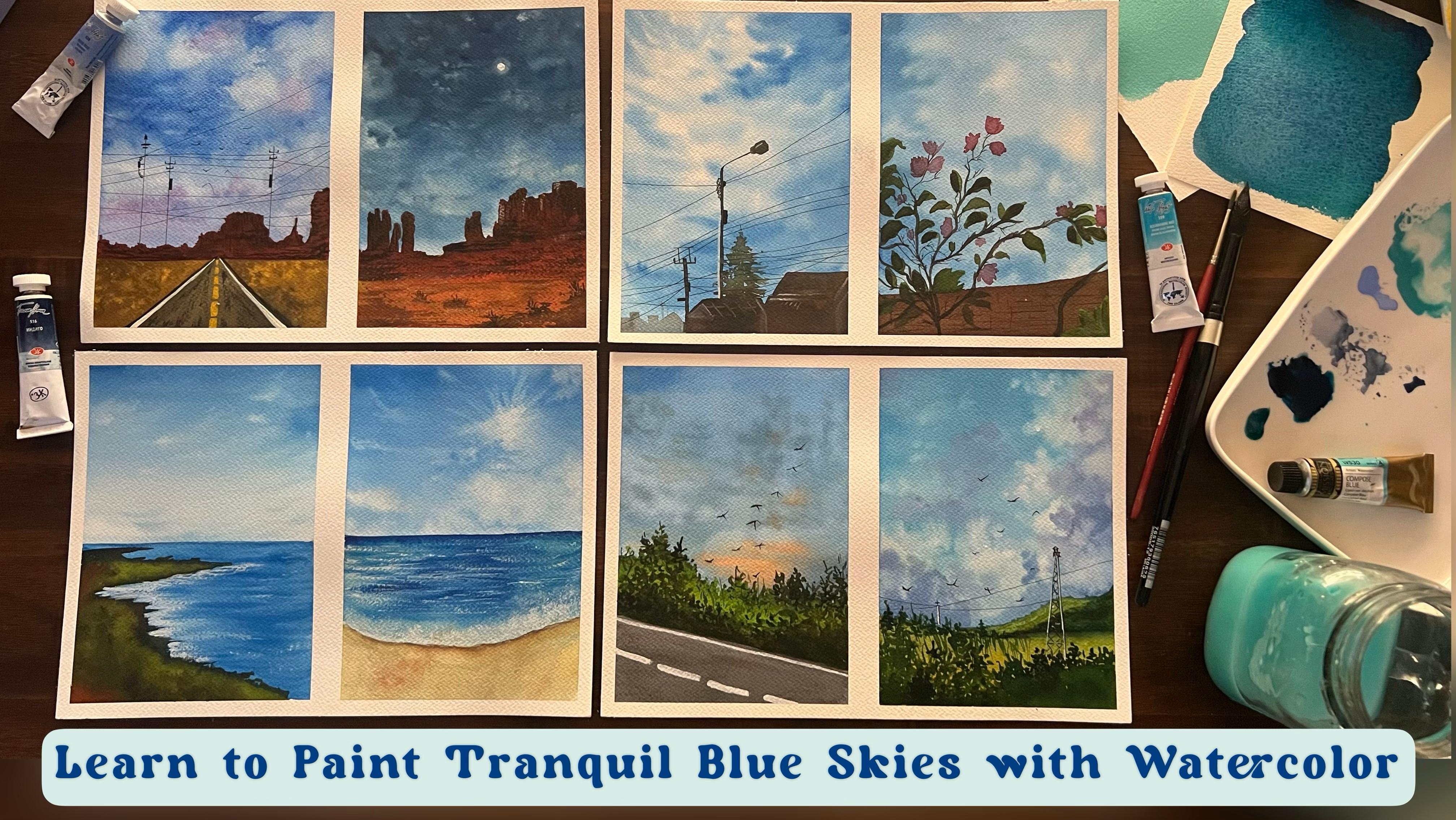
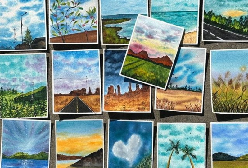
Transcripts
1. Welcome to the Class: There's a certain kind of
certainty that comes with gazing into the boundless
expanse of the blue skies. The blue skies stretch out like a canvas painted by the
hand of nature itself. Its cerulean hues seem to hold a promise of peace and calmness. That's hard to find elsewhere. When you stand beneath
the vast expanse, you can't help but feel a connection to
something greater. Nature's masterpiece,
the tranquil blue skies. A reminder that beauty
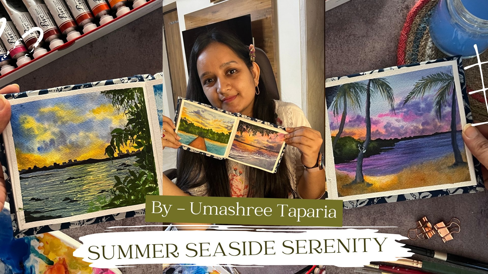
exists in simplicity. Hello everyone. I'm
umashree Taparia, a chartered accountant
and an artist. You can find me on Instagram under the handle
creatingfromtheheart, where you can find all my
works with watercolor, gouache, acrylics, as
well as journaling. Welcome to my new Skillshare
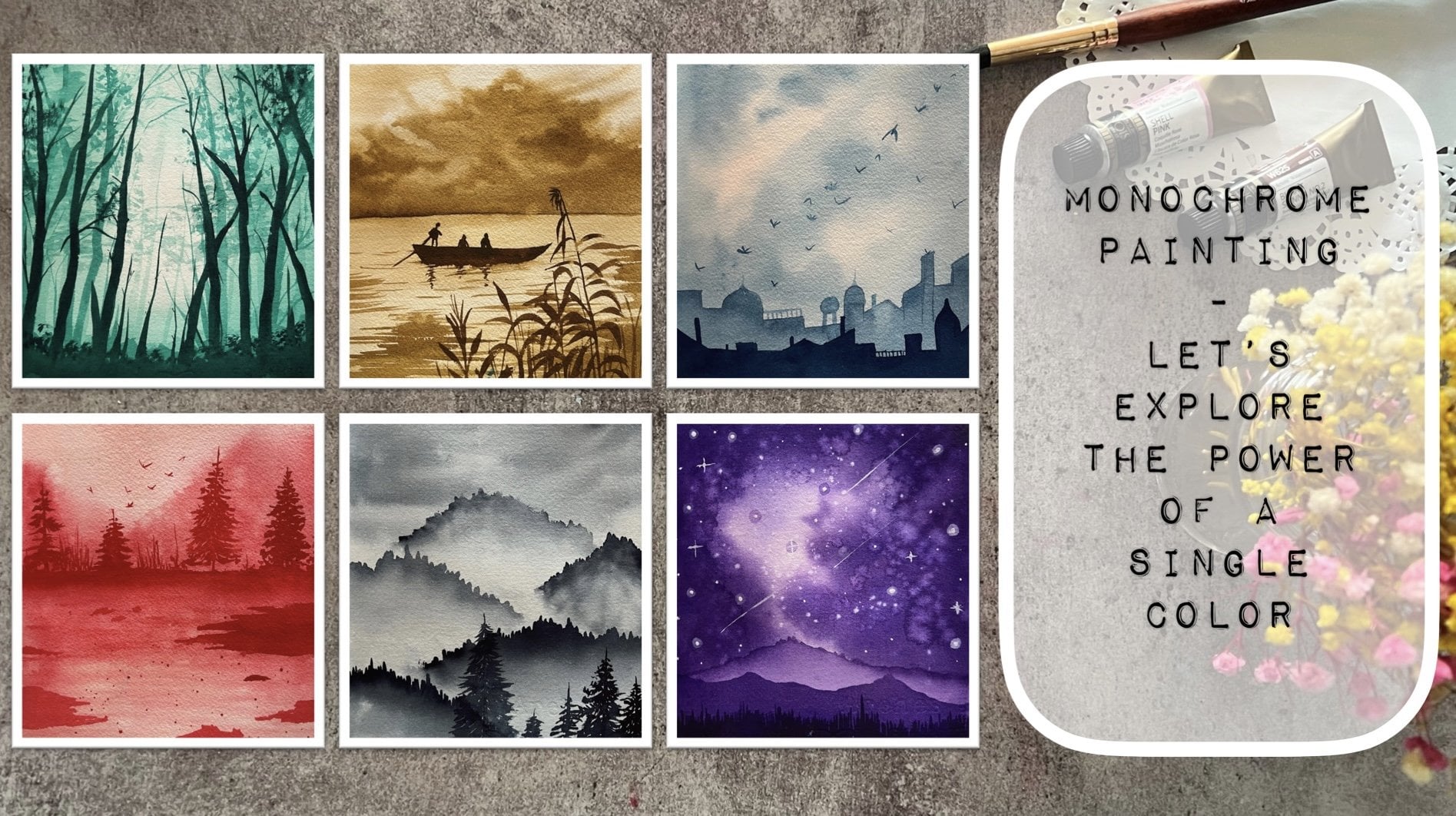
class on painting beautiful and bold blue
skies with watercolor's. Welcome to this 21
day journey into the realm of watercolor
landscape painting. Focusing on the mesmerizing
beauty of blue-themed skies. In this immersive class, you'll learn to master the integrate Art of
capturing various moods, textures, and shades of the sky, from tranquil cerulean mornings to vibrant cobalt sunsets. Throughout the 21 days, you'll watch your
canvases transform as you infuse them with the
magic of boundless skies. Whether you're a novice
or seasoned painter, this class promises to elevate your watercolor expertise and unleash your artistic potential. We will begin this class by first diving into
the shades of blue, the granulation of
the blue colors, the staining properties
of the Blues. And then moving ahead further, we'll dive into some
basic techniques that you will require to understand before you dive
into the class projects. I will also be giving you a detailed insight into the Art materials
that you would be Needing for this class and my recommendations to use for
some specific Art Supplies. I would love to see
you join me into this 21 Day transformative
journey of painting, bold and beautiful blue skies. And together, let us
gaze upwards and find solace in the ever-present,
ever-calm blue skies. And let its tranquility infuse our souls with
a sense of peace. So without further ado, I will see you guys
into the next lesson of this Class of Painting in bold
and beautiful blue skies.
2. Art Supplies You'll Need: Let's quickly have a look
at the List of materials or Art Supplies That you will
be Needing for this class. So the first and foremost
is a set of watercolors. Now, Watercolors can be in
the form of tubes which I have squeezed out
onto my palette. Or you can even use
in pan watercolors. Or you can squeeze
out the colors onto a palette and use as per need. Now I have this ready
palette of 36 shades, wherein I have all the 36 color from my Magellan mission
set squeezed out. The other way is this pan set, which is from the
brand White Nights. Not necessarily
for you to having both the sets or have
any of these sets. You can have your own set of watercolors which you can use. You can simply just rewrite this pan set using
a spray bottle. Again, activating
your pigments from the dry pan that they are in. You would also be Needing in White Gouache for adding
in a lot of details. It's very important to have
a Gouache said because bite Watercolors do not
give him that effect. What are White
Gouache will give in? So it's important to have a
set of fight Gouache as well. The next important essential is going to be a watercolor paper. I'm going to use this
Canson Heritage 300 GSM, hundred percent Cotton Paper. It is a cold press paper but has a little rough
texture to it, giving in a beautiful effect
to the watercolor paintings. This is a big Size papers. I'm going to tape it down
into two parts for each of the class project and use for two different
class projects. Then once the class
projects are ready, I will peel them off
and have a layout like this for two class
projects on one page. So you can use a smallest size Paper or whichever size
paper you wish to. You can see the
texture of the Paper. I recommend using a minimum of 300 GSM hundred
percent Cotton Paper. For this class, we are
going to go ahead with a lot of lifting
technique and creating in those glowing spaces for which your paper
needs to be offer good-quality to support all of these techniques to achieve
the desired results. The next important tool is
going to be the Brushes you would be Needing in some Round
Brushes, some Flat Brush, Flat Brush, forgiving in
the first water wash, and then the Round
and the Detailer Brushes for going ahead
with the Painting. Also, an important
essential is going to be a Spray Bottle
because we're even going to be using this inner
class projects to create some effects into the
clouds as well as to, given the re-wetting
effect you would need in tissues because a lot of lifting technique
as you know, or you can use a
clot towel as well. You would need in a jar of clean water for each
of your class projects for you're not applying a layer of clean water,
wetting your pains. And lastly, you would need
some basic stationary. It's going to be
some Waterproof Pen of different fine liners. I have 00.5 and I
also have a 0.30, 0.1 name or Pencil
and an eraser. So these are all
the supplies that you need to grab quickly. And as you guys into
the T one class project
3. Exploring the Blues: Before we move ahead
into the class, It's very important
to understand all the blue sheets that are available with different brands. And there would be more
possibilities of blue, indifferent brands
that you may be using. I am going to swatch out all the Blues that I
own from the band, White Nights and
Magellan mission. I have to Color Swatch and all the colors of blue
in the center lean. So first I will
begins watching out all the Blues from
the White Nights set. So let's begin swatching
them one-by-one. The first color to beginning is going to be the
turquoise color. Now with every swatching, we're even going to go and
understand each Colors, listing or the
steaming or property. Because in this class we are going to be using in a lot of lifting method to create an the highlights
into the clouds. As quickly apply the
layer of the Color. Now using a clean brush with
just little bit of water, I'm going to begin listing in
one stroke off the help you understand whether
you're Palo is a staining color or whether
it's a non staining one. So if you are able to
lift up the color and able to see the white
paper underneath, then it's a non staining one. Some colors maybe
highly staining, some maybe semi staining
or some maybe nights stealing off suddenly
completely be with zero space. So it's very important to
understand whether you're blue, that we're using is a staining pigments,
non-sustaining pigments. I'm going to go ahead
with this study for each of the Colors
for the White Nights, as well as the
Magellan mission set. I have eight tones of blue in the white knight
set and eat tones of blue in the
Magellan mission set. Also the colors in both the
set may have seen names, but if you will notice
afterwards the comparison, you will get to know that the shades look a
little different, the staining properties
maybe a little different. So I recommend you to go ahead
and do a swatch study and a staining study for all of your Blues before you begin
each of the class project. Because it's very important
while creating in the clouds for the method that will be
following this time, we're going to be
working with a lot of the lifting technique as well as creating in Bloom's
with the help of water. So it's very important
that you know the staining property of
the pigment that you use. Before you pick up any blue
for your class project, I would recommend
to experiment with dilution and layering to
create light and dark sheets. You can even do a
dark and light study of each of the
pigments to understand how light fastness
or how dark or a darker shade that you can achieve using in that pigment. Also remember that mixing complimentary colors
are adding a touch of warm colors can help you achieve
more sheets of the blue. Every shade of blue
that you would see or that you own is created through different process
to different gem stones or different chemical
products or different, or reducing agents or different kind of
semi-precious stones. So every color will have its different property
as well as will have different reaction to
the different techniques that you apply for the
watercolor techniques. Like this royal blue color here, you can see it is a very tasty hope because it has a lot of white
pigment in it. Because of which
you can see it's a little staining pigment. Now, the last one
that I have here with the White Nights is a
granulating pigment. This is the name
aquamarine missed. It has a pigment of blue
and a little bit of green. So it's PB 29 MPEG-7. Now, this is a very
granulating pigment. So after it dries out, it gives very
pretty granulation. So you can experiment with
granulating colors as well to understand how they react and give effect into your Skies. I'm going ahead with this lifting study for the
granulating color as well. This granulating color, I have a pigment big swatch card
shady for you to see. You can see the
granulation coming tonight once it dries
out completely. So you can use in such Colors, especially for creating
in your Seascape, giving in so much texture
to your C and so much debt. These are the eighth
White Nights color that I currently own
in the shade of. It was very important to
do this study because going ahead into the future
days in the class projects, we are going to be going
ahead with a lot of this lifting technique to create an the cloud effect with
the help of these loose, you can see the lighter Cloud
effects that we've created So it is very important that you know whether your pigment will be leaving in stains after you do the
lifting technique, or whether it will give you this glowing white
effect into your skies. So if you will not know the staining property
of your pigments, it will be very difficult
for you to create in the cloud effect
using the technique that we are going to be
learning in this class. Now, let's quickly swatch
out the next set of colors from the brand middle machine
and see the difference. Now for this set as well, I own eight different
shades of the blue color. One of which is a cobalt
green color actually, but it can be used in as a blue tone as well
for your Seascape. And a little effect
into the skies is I'm going to do the same swatch
study and then lift up one strap so as to understand the staining property of the eight tones of the blue
that I have in this set. Now, if you will notice the
cobalt blue from this set, as well as from the
White Nights set, you will see a lot of difference
in the shades as well. Once I'm done swatching out the colors from
this brand as well, I'll show you a comparison
of both the brand as well as the column
names which are similar, but the color tones look completely different
on the dry paper. I'm quickly going to go ahead
and swatch out the rest of the Colors and do this lifting technique
for each of them. Now the major reason
for the difference of the shades that happen across the same name of
colors but across different brands is because of the pigment that
every band uses. Every brand uses a different
pigments to create an OCI. If you want, you can
go ahead and read the pigment details on the tube or the
pans of each brand, or it is easily available
on their websites as well. For example, major
omission may be using of pigment PB 21 for
some shades of blue, whereas White
Nights may be using baby 27 for the
same name pigment. So it's the difference of
the pigment that creates the difference in the
tonal value of the colors. The process of creating these pigments involved
carefully Mixing, heating and chemical reactions to get the desired blue color. The resulting pigments
are then finally grounded and mixed with a binder to
create watercolor paints. Different pigments offer reading levels of transparency,
night fastness, and Mixing properties,
allowing parties to achieve a finite range
of shades and effect. At this point, the method
that I'm using to swatch this Colors and do the lifting technique is
the wet on dry method. On a dry people I'm
applying in the pet pig. It's very important to
understand that Techniques like wet on wet and wet
on dry application, can you different effects? The next blue in
the middle machine is this compose Lubitsch, like a turquoise blue
from other brands. I have this color
on my palette and I will quickly
switched out for you. It is not necessarily
for you to own all of these different
shapes for this class, I am just giving you a detailed
study on the swatch of the blue tones that I own
from these professional said, it's absolutely your
choice of colors that you can pick an swatch them out. We can even discuss the color mixing to get these
different shades of blue from the Basic
shades of blue with the help of some
complimentary colors. Shades of blue play
a crucial role in watercolor landscapes
as they help convey depth,
atmosphere, and emotion. That is the reason mustering the use of beta
sheets of blue in Watercolor will
allow you to create scenes that are not only
visually appealing, but also emotionally resonant. We have put the
swatch card steady. Now if you see the ultramarine
deep color also has a little granulation in
the Magellan mission. That is the ultramarine
blue color in the White Nights looks
completely different, too dark, and does not
have any granulation. Also, if you compare the cobalt blue hue
in Magellan mission, as well as the cobalt
blue in White Nights. They look completely
different because of the pigment that
it may be has been formed with ultramarine deep off the material mission looks more like the cobalt blue of the White Nights rather
than the ultramarine blue. Also the bright blue
name here looks more like the cerulean blue
in the Magellan mission. So these are
different properties and how different colors loop the composed blue and
green miss look quite similar. Just the difference that
accommodate missed is a granulating tone in
the brand White Nights. You will see in each of the
class projects will be going ahead with a lot of Technique to create in that clouds peace, to give him that
natural effect of this skies undo subtle
manipulation of blue to capture the
essence of nature and the ever changing qualities
of light and atmosphere. So this was a little study of the blue tones that I have
from different brands. Now in the next lesson, we will discuss some very
basic watercolor techniques and then move on to
our class projects
4. Basics of Watercolor: Before you dive into the
class project for day one, let's discuss some very
basic watercolor techniques. If you are an absolute beginner Joining us for the first time, this will help you
understand and begin your watercolor journey into the future days of
the class project. First and foremost, I'm painting in with the
wet-on-wet technique. I've applied a layer of wet, that is a wet layer of water. Now onto the wet layer, I'm going ahead with wet paint. This is the wet-on-wet technique for building
in your base. The other Technique to this
is the wet-on-dry technique, wherein you have a dry base
on which you apply canvas, we may easily use the wet-on-wet technique
while beginning to painting the background or biggest pieces into
your landscape. Now onto the wet
on wet technique. This time into the class, we are going to be
going ahead with a lot of creating in the whitespaces or the staining
lifting technique. So I'm just dropping
in a drop of photo, you can see it begins to disperse and creating
that whitespace. Now, this whitespace
will only be created depending onto the staining
property of the pigment. That is the reason in
the previous lesson we did that staining study
of all the blue pig pens. You can see this setting in blue color is very
lightly staining. It's giving in that
white paper I'm beneath, look as soon as you drop
in this water droplet. Now, after dropping
in the water droplet, you can just move your brush. Keep on listing the colors to create different cloud shapes. It's very important to do this lifting technique while
your paint is still bad. Once it dries out, it will begin
staining and it will not lift up the colors easily. Also, after it is dried out, you may get in very
rough patches, which we will also be
discussing a little later. Now you can even use
a smaller brush to create smaller highlights
into the Cloud. This is the major
techniques that we are going to be
using to each of the class project for which
it's very important that you do the staining study of
all your pigments of blue. Otherwise, it will be
very difficult for you to understand whether you're Colors been supporting
this lifting technique to create in the Cloud
spaces into your sky. Or you may have to switch into some alternative
techniques. Or leaving those whitespaces which becomes a
little difficult. We are going to just go ahead, drop in water after
every stroke. It's very important that you
keep cleaning your brush because when you create
in strokes like these, to create in that
glowing sun space, if you do not clean your
brush after every store, you will see that the Color
begins to leave that. So now say, I'm not going
to clean my brush after listing in a store and going to directly go
ahead with the next. You will see as soon
as I lay the next to, the Color, begin to
get applied again. So you do not have
a clean brush to basically you're not
lifting up the color. You are just applying
the lifted panel. So after every stroke you need to dab your
brush onto a tissue or clots so that the paint that will stop is
absorbed by the tissue. And again, you have
clean brush to begin lifting up the
next set of Canada. In this way, through each of the class project
we are going to be creating in a lot of Cloud details using
indifferent boost. If you have seen this washing
off my Blues, you know, my, Most of the Blues are
very lightly staining. And plus when you
lift it up quickly, violet is still wet. It's very easy to achieve in those green spaces
into the clouds. Now once your color
is completely dried, and if you go ahead creating in that cloud space or dropping
in the water droplet, you will see you get a very rough patch instead
of the growing space. Your, you can see I'm trying to grow up in that
water droplet. It's not disclosing on its own because the background
is completely dried. Plus the lifting
becomes very difficult. The color does not get lifted. It becomes very difficult as it has stained the
paper completely. You can see how hard I'm
trying to lift up the color, but it's not
happening in easily. Also wants this will dry out. It will leave a very
rough outline patch into the entire Sky, which will not look pleasant
into a sky as a cloud, It's very important to have
in soft edges to your Cloud blended completely with the
blue tones into the sky, giving in that tough
transition between the sky clouds and the
Blues and the whites. You can see how difficult
it was to lift the color and the rough edges that it
has less than the paper. So it's very important
you need to go ahead wet on wet technique. I'm quickly why your
paper is still wet. It's very important to go ahead with the
lifting technique. The Paper also plays a
very important ruling. This because if your paper
will be very, you know, offer lower quality than it made their of
your paper when you go ahead with the
lifting technique or with a lot of water droplets. So it's very important that
you understand that as well. My this piece at the bottom
is completely dried. So on the dry space when
you apply and Paint, this is the wet
on dry technique. Now, when you apply this paint, you can even pull out
some glass through which we are going to use in
a few of the class projects. Basically, I just wanted to show you the wet
on dry technique or solid to dry on wet technique so that paper
was completely dried, the paintball completely
dried on that. I've just added a layer of
paint which is the wet, dry on wet technique. Now from this wet paint, I'm just pulling out these talks into the sky to
actin as the grass. So you can see how you can use simple techniques to create an much more details quickly, just giving you a
rough look so that it gives a natural effect
at the bottom, peace. So these were some very basic
techniques of watercolor. That's the wet on wet, wet on dry and most important
creating the Cloud species
5. Day 1 - Cerulean Blues: Let's beginning with how
class project for day one, we are going to paint a pretty
Simple Sky to begin with. And we are going to go ahead
with very simple silhouette. I'm going to begin painting onto the left side here first. And then for the
class project for D2, I will paint on the right side. I have my paper
taped down using in a Florida Masking or washi tape. You can use any Masking tape
or a washi tape as you wish. Just like the print of
the washi tape and felt like using it to give the
acute effect while painting. Now, I'm just going ahead with a little photo onto the
entire paper first, there is no Pencil sketch. We are directly going to go with our beautiful blue sky and then move on to the
silicate for the painting. Adding in an even
layer of water first, before we move on,
we are going to go ahead with the wet
on wet technique. That is, we have added a
layer of wet water onto this wet layer will
be going ahead with a wet layer of the pains. You can see, despite
using 100% Cotton Paper, I'm running my brush
so many times so as to make sure that I have
the water spread evenly. I do not have access
water collected on the edges and my paper
stays wet for enough time. Now makes sure that you lift up the excess water from the edges, as well as make sure that your paper stays wet
for enough time. Now I'm going to squeeze
out a little bit of this royal blue color
on my palette to mix it with a little of
the civilian blue to get a little sky blue color, you can directly use this
cerulean blue color as well. Or adding a very little
white tends to your cerulean blue to get a little
lighter sky blue color. Now I'm using my round
brush Size eight, and I'm just going
to begin adding in very simple strokes
here into the sky. For this first-class project, I'm going to leave in
a lot of white caps naturally to create
in the cloud effect. You can see in-between, I'm just using the tip of the brush to give in
very thin strokes. So the major color of the
sky is going to be towards the right side and on the left side it's going
to be major clouds. I've added very little tinge
of the royal blue to my cerulean blue to get
this bright blue color. Now beginning on the left side, I'm just going to go in
with very small strokes. Make sure you do not have excess water or paint
on your brush because your paper is still
wet so it will all begin to spread
out completely. You can see I'm
naturally leaving in white gaps, purposely, a lot of it on the left side
because I want to create a very left cloudy
sky kind of a moment. And on the right
you can see we have the major Blues on
the right edge. I'm ready with the
phosphate of the sky now I'm going to pick
up the cerulean blue, and I'm just going to add in some darker strokes
as well into the sky. Now, make sure when you go
ahead with this next layer, you do not add an excess water
because it will begin to spread and cover up the
entire lighter spaces. I just want a little
darker highlights and I do not want to cover up the
entire lighter spaces. I want different
tonal variations of the blue into my sky. From the left you will see
I'm pulling up the strokes majorly diagonal and not
just simple straight. You need to make and
move your strokes in different directions
to give him that effect. Because remember the
direction of the strokes also make a difference
after it dries out. Now just using a damp
brush at certain places, I'm blending, creating
in some effect, giving in some strokes. But majorly on the
left top space, you can still see a
lot of fights pieces. Now, I'm just
splattering a little of the water using in
the brush to create some white blood into the sky to give in that cloud
effect natural ones. So you can see just very
simple splatter and the effect that it's giving
into the sky at the bottom. I do not want this effect, so I'm just going to recolor it with some darker
strokes because at the bottom we are
going to have in the silhouette at the top space, I have created in little
effect with that. Now, you can see, now when I'm adding this
blue stroke also am making sure I do not cover
up the entire species. Now I'm just going
to go ahead with little strokes in the
center space because you can see the color has washed off a lot in
the center area, so just giving in
lithium darker effect. But I do not want
it to bold or too dark also so quickly
using a damp brush, blending it well into the base layer to give it
a perfect blended effect. So all of these you can see I
have been doing wet on wet. My paper is still wet and I'm still able to create
so much depth into the sky by just using different tonal variations
of the blue color. That's what I told you when
we was watching the Blues, it's important to
do a tonal study to understand how light and dark
your blue sheets can be. Now we'll wait for the sky
to dry out completely. So now my blue sky is
completely dried and I'm going to go ahead with
the silicate on this one. I'm going to keep the
silicate pretty simple because we are just beginning
in with the day one. I do not want to overwhelm you with a lot of
details altogether. Let's begin with very
simple details and simple layouts to begin with. Using in a reddish brown color. I'm just adding in a
small house silicate. You're on to the right side. I've added a little
of the brown layouts. Now along with
this, I'm going to begin mixing in
the Payne's gray. I want very little brown
highlight on the right side. And medially it's going
to be the Payne's gray, but makes sure that you let
that brown highlight be blended well with the
brown and be that visible. Now I'll just pick
up a little brown again and blend all
of these wells. So just picking up
a little brown on my brush and adding
it over the Payne's gray so that the
transition between the brown and the Payne's
gray look smooth. We're not going to add
much of the details into the silhouettes will just add in little highlighting
lines later on, once this layer dries out. Now using in the province, I'm going to go
ahead add in little more silicate, the same method. I'm going to add in
little brown and then Mixing with a
little of Payne's gray. Just a simple cityscape kind of a silicate that
I'm adding here. On top of each, I'll
just add in little, maybe like a pine tree and a little of the head
street light effect that will go ahead with this one as well. You can see I added in the brown
and now on the edges, I'm beginning to add
in the Payne's gray, making sure that we just
have little brown effect in the center well blended with the Payne's gray
color on the edges. Now for the rest of the
silicate on the left side here, I'm just going to go ahead with a very light tonal value of the Payne's gray
color and add in very simple small building
silicates suggest creating in blocks of different
heights and shapes with a very light grayish tone. You can see it's such a
diluted and a light color. It's not an opaque,
bold, dark color. So make sure you go ahead
with such a light tone. I'm just mixing in a little tint of Brown's as well in between. So basically, these
buildings which are lighter in tones look as if
they are far off. And the two main celebrates
of the houses that we've added on the right
and the center space are closer to our view, hence the difference in
the shades and effect. Now next I'm going to add in a bold street light
of very big one. So I've shifted into a
smaller sized round brush which has a pointed tip. I've tilted my
papers so that it's easier for me because my
browns are still wet. Make sure you either
wait for that to dry completely or adjust your
hand movement accordingly. So as I told you, I'm adding in a bowl
street light here. So the line also
you can see is a little thick and bold enough. Now I'm going to add
in a smaller light or a smaller pool kind of an effect here that I'm going to add in, in a little thin line as compared to the first
line that I've added Next, using in the green color, I will add in one
pint sheet before we move on to the other details
onto the street light, I want to wait for
the black layer to dry out and then
add in the poll, delight or the street
light details. I've picked up the shade
of an olive green color, and I'm going to add in one Fine tree on
top of the center. How's that we've added? Now you need not necessarily use the same olive green color. You can go ahead
using any green. I'm mixing in a little bit of a lighter green as well
to my olive green color. And I'm going to add in a
very simple pine tree here. Just make sure that at the end, when you are done adding
in the pine tree, your pine tree has
a triangular shape. So I'm beginning in with a very thin lens at the
top and moving downwards. I'm going to keep
broadening up the land. I'm just going to be
adding in one pine tree, not much of it for this one. You can see I'm taking
a little of the foil, each of the pine tree
overlapping onto the pole that we've added
for the street light to make it look well binded
with each other and well in sync with each other into
our silicate and the sky. At the bottom you
can see I'm using much darker green tone so as to make it look perfectly in sync going with the top
of the houses bell. Now I'm just going to give it a little more pointed edge at the top using in
little darker tones. So you can see in the center, I've gone ahead with
different tonal variations of the greens and at the top and bottom with much darker tones
of the green color. Now shifting to a
smaller size brush and begin adding in the details
of the street light. I've shifted to a size zero pointed brush because
I want very fine line. If you want, you
can even use a pen for marking all
these thin lines. I'm just going to add a
simple street light here. I've given an outline
for the street light on top of page I'm filling in
the black color completely. And at the bottom of which you can see for the light-speed, I've let it be white there. That is the best color
of the is visible. Once it will dry out, you can give no effect if
you want or if you want. You can even fill it up
completely with the black color. So I'm filling it up completely with the black color
for this time. We'll see it by the end. If I want to add in the
white effect there. Now onto this small poll, I'm just adding in
symbols poll details, not a street light effect. Now using my size two
by zero Detailer Brush, I'm just adding in
some fine lines on this ball to
given the details. If you ever happen
to visit a street, you can see these polls with little details and
highlights out there. Now using a lighter gray tone, I'm adding one pole in between these buildings that we've
added on the left as well. I'm adding this in a
lighter tone so as to show that these are
also far from our view, that is the reason
visible so likely. Now next, using in a fine liner, I'm going to add in some
lines into the sky passing through the I'm using a 0.1 nib, which is giving me
such fine lines. You can even use the black or a Payne's gray color with a liner brush and
add these lines. But using a
Waterproof lineup Pen gives in much more
detail and fine lines. You can use 0.05 nib or 0.1 nib to get such
fine lines easily. And plus they are Waterproof
so they will not spread. Or even if you have to add
any details on top of it. So just adding in
a lot of these at the bottom space and a few
at the top that I've added, adding some moving between the pine trees and
the houses as well. Now after this,
the things that we are left to add into
this painting is going to be some highlights on the pole and the houses
on the right side. With the black pen
itself onto the poll. I'm adding in some
small blocks and some small box and
by-line details. You can see some very
scribbled lines and small boxes to give him the
details to the street light. As soon as you add in these
small details you can see your painting becomes to look more natural, more realistic, because these are the
small little details that make it look like a real-life scenery plus the sky you can see
it's such a subtle, Real looking sky with the soft blend between the
clouds and the sky blue color. Just adding in the
last violating, you're moving towards the top. Now I'll wait for the entire
Black details to dry out first and then we'll move on
to the last leg of details. Now I'm going to use in Bitcoin and adding
the highlights. I've squeezed out and it's
just the white course separately on a palette because we will
be Needing it for each of the class projects. Now everything is
completely dried. I'm just going to
give little highlight details onto the house
using in the white color. Some of the details. I'm going to blend
them again into the houses, turning
them lighter. I'm just adding draft lines to mark the distinction
into the houses, that is the roof, the mean speeds the front area to creating highlighted effects. Suggest using a damp brush. You can see I've
blended it well into the base layer and you can see a dull white layer that is Form creating in the
highlighted effect. Now this line also you are, I'm just adding some small
lines and I'll blend the top line into the
are basically are again, toning it a little
lighter and fainted. Suggest using a damp brush. I'm running onto the white color and onto the edges of the white. So you will see it
begins to blend into the base Leo CMV going to do it for this
line your as well. So you can see how little
highlights also act. And given a realistic look
to these little details, again, I'm adding
a few lines and I will go ahead and
blend these as well. Turning them lighter as just the highlighted spot
and not to boulder effect. So you can see these looks like light brown tones that we've added, just smaller highlights. And they look so
well blended and giving in that
highlighted effect. Now onto the roof
of the smaller one, I'm just going to go ahead, add in some highlighted lines. Again quickly using
a damp brush, just blending a few of
these lines back into the base layer so that we'd not have too much of the
bold effect visible. We want everything
well blended into the peace and have very
minimal highlights here. Now using the ball
line of the white, I'm going to add
a highlight on to the pole of the street
light that we've added. Towards the left, I'm
adding a white line in such a way that the black
line is still visible. I'm just going to
add this half off the street light or three-fourths of the street
light that we've added, not taking it till
the Complete top. The reason of adding
it on the black on the left side is to show the effect of the sky
that is on the left, you have the white bright clouds falling onto the pole as well, giving it that White effect. That White effect on
the poll you can see is giving such a natural look
to the entire painting, putting it altogether,
trying to show the light of the clouds falling onto
the pool giving in that shining effect
on the poll space. Just adding in the last
highlight a little onto the street light
here at the top as well, just a small white line that
is Z to be already with our class project
for day one are pretty Simple Sky with
simple silhouette. I'm not going to remove in the Masking tape
now because I'll be painting the D2 class project and then peel it off together. I'll see you guys soon into
the D2 class project. Now
6. Day 2 - Simple Sky: Hello everyone. Welcome back to D2 off painting as skies blue. I'm going to paint on
the second side of this huge paper that we
painted on yesterday. After which I will peel
off the masking tape. I already have the
Masking tape on, onto the second side as well. So I'm just beginning
in with a layer of water onto this entire space. Make sure you add in an even
layer of water throughout. Also in case if you are also using one sheet for
to Class Projects, be a little careful
that you do not make the excess water move into the or side of the first painting or drop-off
any water onto that side. You can either cut the paper and then reuse the second side, or you need to be a little
careful because otherwise the first painting may get reactivated and it may
give you a rough patches. So I've added an even
layer of water throughout. I'm just going to run my brush multiple times so that my paper stays wet for enough time until I create the
details into the Cloud. There is no Pencil sketch. We are going to go ahead
with simple leaf and floral and a roof
detail this time. For this class, I'm directly using in this
cerulean blue color. I'm not mixing it with
the royal blue color, just diluted consistency. You can see it's quiet
liquidy that I'm adding it. We are going to
rotate our board to get in the movement
and flow of the Color. So as of now I'm just
adding in color, leaving in white
patches in between. And you can see I'm using a
very diluted consistency, more of water, less of pigment. I'll quickly add a little of the pains towards the
bottom side as well. You can see I've
intentionally kept a lot of whitespaces at the top
right and top side. And now I'm just going to tilt my board in all directions
to make the colors flow and move into
each other and have that soft flowing
effect into the sky. This is just the first layer that we are working with will be creating in a lot more
depth into us Sky later on. Now while you're rotating
your board like this, if you have the other
painting on the other end, it's very important to be
careful that the paints do not move or flow
into that painting. Now I'm picking up the
same cerulean blue color with a little darker
consistency and I've tapped off the
excess water onto the towel so that I
have very less paint. Now towards the
right, I'm going to keep it on the lighter tone, that glowing space
that we've created. You can see towards the left, I'm going to keep in
the darker clouds. So I'm going to
medially be adding in these darker effects
towards the left side, keeping a little brighter
effect on the right space. Now after this again, I'm going to begin rotating my board in different
directions so as to make the colors flow
and have that soft blending. I want the clouds also to have
a very soft blended look. Now, after this darker
color also blends in, well, I'm going to go ahead drop in some water droplets to create
some blooms into the sky. You can see still on the right, I've tried to maintain
that glowing effect. Now, just dropping in
little water droplet. Even by doing this, be careful if you have your
second painting on the side. Again. Now I'm going to go with 1 mol
of Taco details, but I'll make sure that the right side glowing
effect is still maintain. You can see, even by
tilting the board, I tilted it in such a way
that I make sure that not of the pains to not move
into that right side, I've shifted to my
smallest size brush. I'm going to pick up
the cerulean blue color to which I'm just going to add in a
very little tinge of the Payne's gray color. Now using this darker blue
and the smallest size brush, I'm just going to add in
little darker cloud effect. Now you can see I do not have access watercolor
pigment on my brush. That is the reason the
pains or not spreading. They are staying in the
position that I'm adding gain, but we're still
working wet on wet. You can see my paper is still wet and all the paints that I'm adding is having a soft
edge. Towards the right. I will still maintain in that white glowing cloud effect that we've tried to create. It's very important to make sure that you do not
have excess water. Otherwise, these darker
paints will keep spreading and will not stay in the place
that you add them. And you will not achieve
the depth effect of the clouds with different
shades of the Blues. Yours, how you need to be careful while adding
in these details. Now we are ready with the sky almost you can see we've got
so many different shades of blue with the
glowing effect of the species in the
right side as well. Now using a smaller size brush, I'm even going to begin creating in some
smaller cloud effects. So I'm using a very
small size brush and just dipping it in water. I'm adding smaller droplets and giving it the desired Cloud or the growing space
that I've gone to my quickly lifting
up the colors. I'm just doing all of these
while my paper is still wet. You need to be a little quick with this because
you need to be working with a lot of
wet-on-wet technique in this class to get in those glowing species and different kind of cloud effects. You can see how I'm adding in one water droplet at a time, creating in the cloud shape. And all of these while
my paper is still wet, that is the reason
I recommend you to use 100% Cotton Paper, which is 300 GSM so
that it can handle all these layover off the
wet on wet techniques. Otherwise your paper
will begin to crumble up and it may tear off as well. In the same way I'm
going to go ahead and just keep on creating
in smaller clouds. You can see this
time I'm going with very small spaces so that you can get in
the shapes, right? Just dropping in water,
cleaning my brush, and then giving in the
desired shape that I wish to. I will still be going ahead with one more darker
layer of the clouds as well so as to create in
more depth into the sky. So I'm going to pick up
the civilian blue in a darker consistency and begin adding in some
darker cloud defect. You can see it's almost beans, almost 7 min that
I've been working wet on wet maybe,
but it's still wet. That is the reason I'm
still able to achieve the light and dark
cloud effects, I'm given the depth to the sky. Also, in case if your paper
is beginning to try out, you can go ahead with the
re-weighting technique as well. But it is a little difficult, especially if you are
an absolute beginner. If I think Technique maybe
a little tricky to follow. So try using a good-quality
Paper which can save it for enough time for
you to get in these details. You can see after the
darker layer also, I'm creating in some
smaller clouds, which is giving in so
much depth to the sky. Now I'm almost
done with the sky, just some last lighter
Cloud details. And then I'll wait for all
of this to dry completely. And then we'll move on adding in the detail for the
silver heat this time, which is going to be roof and
some leaf and some flowers. You can see now the
details of the clouds, the darker, lighter clouds, the growing species
into the sky, the right side glowing
effect of the Cloud. And still you can see
I'm creating such small, small clouds using
a damp brush and some watery effect while
my paper is still wet. Now, let's wait for
all of these to dry completely and then move on
to the silicate details. Now my sky is completely dried and you can see
the different tones
7. Day 3 - Calming Seascape: Hello everyone, Welcome
back to day three of the 21 Days Challenge of
painting a skies blue. Today we are going to paint
a beautiful Seascape with a pretty sunny blue sky thickening in with a very
light pencil sketch, just marking out
the horizon line and a little of the CSPs. The left is going to be a little greenery patch that
we are going to create. And towards the right side it's going to be the entire CSPs. The top is going to be this guy. So almost equal that I have divided the horizon line into
the sky and the Sea area. So this patch here on the left will be
the greenery space, the sea, and the top
side will be the sky. We will first beginning
with the sky. So for the sky we're
going to go in with the blue sky because that is bought the class is all about, I'm going to begin with a clean layer of
water onto the sky. I'm making sure that my
Masking tape is perfectly seal so that the water does not move between
the Masking tape. Also make sure that your pencil sketch
markings are very light. Otherwise, they
may stay in there permanently because
as soon as you apply a layer of water
onto the pencil lines, they become permanent because of the charcoal in the pencil lead. So that is why make sure that your pencil sketches are very light because watercolors
are usually transparent, so these dark lines
may be visible. Then I'm going ahead with an even layer of water
onto the entire sky, running my brush multiple
times so that my skies stays wet for enough time for
me to add in the details. So far the sky, I'm
going to go ahead with this cerulean blue
color this time as bad, but I'm going to go
ahead with a very light consistency Mixing
in a little bit of the royal blue as well. Already have loyal
blue on my palette. Now, if you do not have
the royal blue color, you can just add
in a little tint of white and it's
perfectly okay. I'm going to head
with a very light wash off the blue color
at the top space. As we move closer to
the horizon line, I'm going to lighten the
color. As you can see. It's a variegated wash
that we are going to have beginning in with the
darker color at the top, moving downwards, lightening up the color tone of the
color that we're using. So we are going to,
beginning with the top, that is going to be off
the darker color of the sky and moving
towards the horizon line, keep lightening up the Color. So every time that I
pick up the Color, you can see I'm
beginning up from the top and moving
towards the bottom. I'm just dying to
dilute the color from the top towards the bottom
with the help of water. I'm not lifting up any fresh color at the
bottom space because I want a beautiful variegated
wash off one color. So you can see we
have a beautiful wash off the blue with the
darker tones at the top and towards the bottom space we have the lighter tonal variation of the same saline blue color. Into this, we are going to create an little
cloud highlights, not much of it, but little highlights
that will be working on. I've gotten a perfect layer and perfect transition of the
blue from the Docker to the lighter colors you can
see now I've shifted to my smallest size brush
and dipping it in water, I'm going to begin creating
in the Cloud spaces. So close it to the horizon line. You can see as I'm
dropping the water, the color is turning
further lighter. Always remember,
these stones will still be trying for
afforded tone lighter ones. They are completely dried out while you are adding in
these colors at them in such a constancy or know how your colors dry beforehand. Otherwise, it may so happen that you're sky maybe to light. Now you can see just using
the simple technique that we discussed that is
using a damp brush. We are creating in
whitespaces in-between the wet sky to create
in the cloud effect, my skies wet and I'm working
wet on wet to create in these glowing spaces into the
sky to actin as the clouds. Make sure you need to do
this while of paper is wet, otherwise the colors will
compete least in the paper, and you will be unable
to lift up the colors. Now, I've picked up
a little of the blue to give him little
blue highlight of the clouds as well at the bottom space closer
to the horizon line. Because you can see closer
to the horizon line, It's a very light color
sky that we've kept in using the blue I'm
just creating in some highlighted
cloud effect as well. You can see how the
darker colors are also visible on the light tone, so beautifully giving
in that cloud debt. Make sure when you're
adding in this layer of the blue on top of
the lighter tones, you do not have excess
water or pigment. Otherwise it will
spread completely and you will not have
the cloud effect. Rather, you will get
a complete blue patch Now similarly, I'm just
going ahead lifting up a little more colors at
the top spaces creating in more depth and the lightest
space effect you can see I'm moving my brush so much randomly
and in different angles, strokes, not moving in justin
Simple straight strokes. So that is it for a sky, will wait for it to dry completely and then
move on to the see. My skies completely dried. You can see the effect
of the whitespaces and the blue highlights
at the horizon line, giving in such a subtle
cloud effect into the sky. Very simple, very light, with very easy techniques
that we created that effect. Now let's go ahead
with a layer of water into the entire CSPs. I'm just going to add in a
liter of water in the CAD, all the greenery space will
be adding at the last. Now, closer to the horizon line, be a little careful
that the water does not seep into the sky or else the sky will get reactivated and the colors will
flow into each other. Now, very painting the see, I'm going to use the same
cerulean blue color. But in case if a little of the colors move into
the green spaces, it's completely okay,
we'll cover them up with the darker green tones
for the sea as well. I'm going to go ahead with
a darker tone closer to the horizon line and
moving downwards. I mean, heightened
up the tones a bit. You can see very carefully I'm defining the horizon
line because I want a pretty simple horizon line
as we are not going to be adding on any details on
top of the horizon line. So you have to go and carefully to define
the horizon line. I'm going to keep the entire see space of this darker blue only. I'm not going ahead with
a variegated wash here. I want to let the CB or bold
one year on into the sea. We are going to go ahead
with a little wet on wet wave details and
then we'll add in highlights with the white
color later on once it dries out completely
while it is still wet, Let's go ahead, add in a
little depth into the sea. So I'm just lifting up little
Colors at certain places to create some lighter
effect into the sea as well. So I lift it up
little Colors and created some lighter
highlights into the sea. You can see I've got a
pretty see color now. Let's go ahead add in
little wave details with a little darker tint
of the same blue color. I'm shifting into
my smaller brush so that I can get in
smaller details. Now when you begin adding
in these wave details, make sure that you do
not have access water into your brush or
excess of pigment. Otherwise they will
spread completely and you will not get that
soft wave look. So vitamin C is still wet. I'm going ahead adding in
some wet on wet lines, making sure I'd not have
access paint or pigment on my brush because the fish I'm getting the soft strokes. So you will notice
that these tropes are having a soft blended
look into the base, but they are also visible distinctively
because of two things. My paper is still wet because of which I'm getting
the soft law. Secondly, I'm not adding an excess water or
pigment because of which they are retaining the shape
in which I'm adding, having a soft blend because
of the wet layer underneath. And I had turned the base
a little light because I wanted to add in waves
with a little darker tints so that they be visible onto this lighter or space of
the see that we created. Now further adding
in some takeaways, you can see I'm not adding
them in simple straight line. I've just added some
crisscross lines and some curvy lines to give him
the depth into the area. We're ready with the
first layer of the see now rest of the details
will be wet on dry. Let's wait for the C to
dry and then move further. My CE is completely dried and
I'm going to go ahead and begin painting in this last
green space that we have. And then we'll move on to the final layer of the details
with the White Gouache. I'm going ahead with
a layer of water, but going ahead very carefully
closer to the water line, you can see I've left a
little white cap there, which I will directly be
filling in with the color. Now for this piece,
I'm going to use and mix of greens and browns to creating a kind of a field space or grasp is closer
to the sea area. So I'm beginning with
the lighter green. You can go ahead using multiple variations of greens you to create in
that natural effect. And then just add in little
brown highlights to given that little muddy tone as
well in-between the grass Just be careful about two things that is
closer to the C line. Adding very carefully because if the colors will move
into the z-space, then the area may get
activated and Watercolors may merge and move into each
other across the edges. Go ahead very carefully so
as to have that perfect. It. Make sure that your C was completely dried before you
begin on with this step. Otherwise also the colors
may seep into each other and will ruin your entire half
space of the painting. I've added a good patch
off the light green color now on top of it and beginning
in with the darker green. So for the dark green,
I'm using a mix of the sap green and the
olive green color. You can go ahead with
any darker green, lighter green that's
available in your palette. There is no specific greens
that you need to have. All you need to use in your, you are absolutely free to you in your choice of the
greens and browns. To go ahead with
these details here. I've just given in
a very rough shape. You can see at the top trying to give in
that bush kind of a detail and giving in the perfect blending effect
with the sea as well. So using the darker green, I've defined the edge
in a very just manner, not keeping it a straight line. Now I'm using a little bit
of the light red color. You can use a burnt
sienna color or any reddish brown color to
add in these highlights. Or you can mix in a
little bit of your red and round to get a
reddish brown color. So in-between the greens
you can see I'm randomly dropping in little browns
and especially on the edges, and especially on the edge
closer to the sea as well. You will see I will drop
in the browns to create in the depth into this paddy
space that we are creating. Now for blending the
greens and browns, if you need a little bit
of the greens again, you can simply pick up the
greens and adding again. So you will see that
the blending happens more smoothly and swiftly. The colors freely
move into each other, giving in that soft blend. Now I'm picking up a little
of the Payne's gray color, mixing it to the greens, you're on my palette
or directly, you can use a little darker tint of the Payne's gray
or black color. I'm going to add in little
highlights at the top space, especially on the edges
to define the edge. Now, now I'm not going
to keep the edges very simple and just
that a straight line. So that is the reason
using in this darker tint, you can see I'm
giving a very rough and natural shape to the edge. Define this paddy space and perfectly blending in
with the sea area. We are still going to
be going ahead with a white quash detail on these edges to show some
crashing wave effect. But first, we need to add this while our green
space is still wet. You can see since the
green space is still wet, the Payne's gray is
perfectly blending in quickly with the greens giving
in that soft blended loop. That is the reason
I mixed in the Payne's gray with
a little tint off the green colors so that it has a perfect blending
effect as well. And it looks off the
same family tone. You can see, I'm
trying to blend in on to the left side
with the greens how? And also the rough strokes that I'm taking out with
the Payne's gray color to create that perfect effect
of a patch onto the z-space. Now quickly, I've just adding in little more highlights
with the greens and browns and then we'll wait
for this to dry wherever you feel that the
blending is not smooth, you can quickly use
a damp brush and just blending the
colors together as bad and getting a
soft transition happening between
all the colors. Or you can reuse
the base colors, that is the green tones, places to create in the debt. Now randomly I'm dropping in some lighter tones as well
at places to create an, a little more of the depth. Quickly, I'll go ahead with little darker green
spots as well. All of these I'm still doing
while my paper is wet. So make sure that
your paper is bad. Otherwise you may just get in random patches instead of
this blended soft loop. Now, let's wait for this to dry. And then one with
the last details, that's going to be
the white highlights, the crashing wave effect Some White waves effect. So let's wait for this to dry. So everything is
completely dried. And now beginning in
with the White Gouache, I'm going to begin giving in
some crashing wave effect at the meeting point of
these greens and the Blues. Using in the White Gouache. I'm going to give him some
dry brush wave effect. This dry brush wave effect, you have to give
him very carefully, you shouldn't have
excess pigment or excess water onto your brush. You just need to pick
up the White Gouache in a thick consistency
onto a damp brush. I'm given these
light wave effects, you can see how
they're acting in as the crashing water effect
towards this field that you've added or the a patch that you've
added in-between the see. I'm just beginning in
with these bytecodes, strokes from the green point
meeting into the blue space. And that taking these strokes
towards the right side into the sea to show in as the
crashing wave effect, using the same technique we are going to adenylate
and highlights into the blue sea as well
to show in some of the water ripple or crashing
effect of the water. So you can see some
that I'm taking these strokes are little taller towards the right
side and somewhere I've kept it very
small and subtle. Also make sure that you do not have excess water
or excess pigment. Also White Watercolors
will not give you the same effect as
White Gouache will, because White
Watercolor will turn up opaque and lighter one stride barrels White
Gouache will remain opaque and I'll give you that opaque effect of the
white even after it dries out. So at certain places I'm just running the White Gouache
wherever I feel that they're drying lighter so that I have that
bold White effect. You can see I'm using a very small size brush so
that I get the details right. I'm just dragging my brush, getting in the dry brush effect. I'm not adding any water
to the white quash, not onto my brush. I'm simply just picking
up the White question, a thick consistency to
add in these details and get these dry brush
kind of wave effect. Now last week, weekly adding in some highlights into the z-space using in the White Gouache. And we'll be ready with our
class project for day three. So into the sea as well, you can see I'm adding
very light effect and some of them I'm even blending
into the sea giving in there, creating in those
lighter ripple effect. So very little, not much of it. I want that crashing wave effect to be the
highlight in-between the see and that padding
area that we've created. So that is it. We are ready with our class project
for D3 as well. So you also quick
and closer look at our painting of the sky
and the see for day three. I hope you guys enjoyed
painting this with me today. We'll paint the D4 and then peel off the masking
tape tomorrow. See you tomorrow into the
day for class project
8. Day 4 - On the Beach: Hello everyone. Welcome
back to day four of the 21 tape blue sky
Painting Challenge. Today we are going to be
Painting another Seascape. It's going to be more of
a Beach. For painting. I'm going to begin
marketing the horizon line on the same length
as the previous one. This time, instead
of greenery space, we are going to have in a Beach
space at the bottom area, just going to roughly mark out the bottom space
as the Beach area. So that is if for
the pencil sketch, we are going to beginning
with the sky first. Now, again, for the sky, you can experiment with
different clues if you wish to. I'm going to first go ahead with a layer of water
into the entire sky. I will be using this cerulean blue color
for this guy has been. Make sure you have an even
layer of water throughout so that your paper does
not dry or quickly. Also that no edges are
left without water. Also makes sure that you run your brush multiple times
so that your paper will stay ahead far enough
time for you to work wet on wet and given the
details into the sky, I'm beginning with this
cerulean blue color with a little mix
of the royal blue. Now again, if you do not
have the royal blue, you can simply mixing a
little tent off-white. I am beginning in with
a very rough layout, leaving in some
random white caps. And I've just created a small circle
because that's peace. We are going to create
a glowing effect. So we are going to
go ahead with a lot of lifting technique there. So that's just a
small are roughly out for you to know where we're going to go ahead with
lifting technique. So at that spot you
can keep your colors a little towards the lighter
side or leaving white patch. I've gone ahead
with an even layer of the Color throughout because the glowing
space you can see I've left in that white cat. Well, I'm just giving you in a very light layer
of the blue tone because we will go ahead
with the lifting technique so that we have little
lighter blue effects. Before that, I'm
just going ahead with her little darker tint off the blue onto the entire space so that after the color dries, it stays bold enough. We'll go ahead creating a
glowing sun space this time. That is, we're not going
to add in the sun, but we are going to show
as if the sunlight is peaking between the clouds
creating in that White effect. To my smaller sized round brush. And using the damp
brush I'm beginning to create in the spots you can
see my colors non-sustaining. Hence I'm able to lift it up quickly while my
paper is still wet. I'm creating in
draft cloud shapes at the bottom space you can see how easily I'm able to lift up the color with
the help of photo. But after every stock you can
see I have a rough towel in my hand so that I can quickly dab off the
planes that I've lifted. Otherwise it will
get lead back to the next piece where I
tried to lift up the Color. I'm going to create a
low lying cloud effect majorly at the bottom space. At certain times that
glowing space may require two to three times of lifting up because, you know, since your paper is wet, the paints from the
sides may flow back into that glowing space and
cover that space again. So in those cases, you can quickly lift
up the colors again. But the important thing is you need to do this entire
lifting technique, why your paper is wet. Otherwise the colors will dry
out and then you won't be able to lift up to get in
these light soft effect. Now at the top here
I'm beginning to create in that
glowing sun space, I first created a
so-called from this, I'm going to keep pulling
out a lot of leaves now. For that I've shifted to afford the smallest size brush
which has a pointed tip. And I will keep lifting
one stroke at a time, cleaning my brush, and then
going ahead for the next TO Make sure after every stroke you keep cleaning your brush. Now, these strokes
you may require two to three or run it
rounds off the same or Technique because you can see where I began lifting
up the stalks there. Again, the blue color from the sides of the
strokes is speaking in. So you need to go ahead
with two to three layers of this lifting technique to
get in that desired effect. Now in the second layer, some of the strokes
I'm pulling out much bigger and much long
as you can see. You can see how it's
creating like an effect of the sun rays peeking out from between the
clouds in the sky. So I'm just going to
go ahead and lift up a little more strokes before we let the sky to dry completely. Also, you can see
since my paper is taped down on a movable surface, it becomes so easy to just
tell the Paper according to the hand movement or according
to the hand convenience. So I always recommend taping down your paper on a movable so phase so that you can rotate any time anyhow as you wish to. Now at random species you can see I'm going ahead
with little more off the Color lifting to create a little more Cloud effects
at the top space as well. My paper is still wet, so you can see when you use 100% Cotton Paper offer
good-quality of paper, stays wet for enough time. If you've read your paper well enough before you begin
adding on the Queen's. Also, you need to be a
little quick as well, so that you know,
you do not have any sharp edges anywhere. Now at certain places, I've just added little
lighter blue tint as well, Mixing it well along
with the white. Now you can see the
rays that I pulled out are completely hidden again. So now I'll go ahead
quickly with another layer. I'm doing this while
my paper is still wet. Again, I'm repeating this point. It's very important for
your paper to be wet to achieve the effect of the lifting technique
that we are trying to. Now, I will quickly pick up a little of the blue
because you're, you can see it's a little messy. So since my paper is wet, I can just correct this space with the help of the
blue quickly so that, that messy or lifting race
can be hidden quickly. So you can see how easily you
can correct your mistakes while the things are still wet
and still in your control. So that is it. I will
wait for my sky to try and then move on
to the Beach area. My sky is completely dry now and I'm going
to begin painting Beach area for the Beach also am going to go ahead with
the blue tone first. And then for the sand area, I'm going to use a
very light brownish, creamish kind of a tone
from White Nights. I will share the details
of the pains as well. Once we begin adding
in first-time, going ahead with
a layer of water onto the entire bottom space, that is the C and the
Beach area, both. Now for the water
area of the Beach, I'm going to use in the
composed blue color from the brand
Mitchell emission. You can use in
turquoise blue or you can Mixing a little
tent of your emeralds or viridian green
along with the city didn't blue to get a
turquoise are composed blue. So this is basically
a mix of pigment blue and pigment green together, giving in this beautiful
turquoise blue kind of a tone to which I've just added a
little drop blue color to make it a little more pasted. Closer to the horizon line, I'm going to run
in very carefully so that I do not
run into the sky. In the center. I'm going to keep in little lighter species. So first I'm beginning to add in the color from the edges. So on the edges, I've added
the composed blue and the royal blue color in the center space that we've
kept white and light there, I'm going to add in the city
didn't blue color to give a little reflection of the
sky falling onto the Beach. That is the reason adding
in a little hint of the cerulean blue color Given
that effect of the sky. So just in the center space you can see I've added
in the blue tone, blending it well with
the composed Blue Palo with very loose strokes, making sure that
both the colors are blended yet visible
distinctively. Now, I'm going to
begin adding in some wet on wet strokes as well. So for this, I'm
going to make sure I do not have excess water. I'm adding in some darker use in between and blending
these well, again. Now picking up a little of the composed blue and
the royal blue again, because the edges are
looking a little lighter as compared to the cerulean
blue color from the edge. Pulling out the mix of
these colors, again, you can see how smoothly they are blending into each other, as well as still standing out distinctively for both the
colors that we've used. Now for the bottoms
and space I'm using in this dun color from
the set White Knight. This is a pistol
color from their set. I have it in the tube form. You can see it's a very
tasteful yellow ocher color. To create this color, you can
simply mixing yellow ocher, a little tinge of
yellow and white to get a beautiful
light sand color. I'm adding it exactly
below the blue tones, blending it well with the blue, but making sure that both the colors do not
seep into each other. We want that soft edge
because we are trying to show in the overlapping of the
Beach and the see spaceport. Now my see still wet. I'm going to go ahead
add in some wet on wet strokes just as in
the last class project, we went ahead with
little strokes. You can see it's soft strokes
in the third class project. We're going to go ahead with some soft looking
strokes here as well. So I'm shifting from
my smallest size brush picking up the
salient blue color, beginning to add enforced at the horizon line to make
the horizon line prominent. Now into this space where
we've added the composed blue. You can see I'm pulling out very fine strokes of this
cerulean blue color so as to show both those
color spaces of the Beach blended
well into each other. We're not going to go
ahead with much of the wet on wet wet on dry strokes. That is the reason
I'm going ahead with those lighter wet strokes
only in the subspace, adding in a little splatter of the brown color to blend into giving little effect of
into the sand as well. Make sure you cover up your
Sky and the water space. If you're not confident
about these plateaus, or you can drop them using
the tip of your brush. I've just added in some
brown patches here to create a footprint detail
if it works out well. So while this is still wet, I've just given in these few footprint effects
onto the beach. Let's wait for it to
dry and then we'll add on the details on
top of it as well. Till then I'm going
to go ahead with some darker blue strokes
into the system. You can see I'm
walking very much or patiently into
the sea details. I'm adding in a few details waiting for it to
settle in till then working on other details of the painting and then
coming back to the sea. But still I'm doing all of it
while my seat is still wet. That is the reason
I'm still having in the soft blends and
strokes between the C. So that is it for the base layer of the sea and the Beach. We'll wait for these
to dry completely and then we'll move on to the
next layer of details. The most important
thing while working wet on wet is the water
control onto your brush? And the water control
on the paper, your paper shouldn't
be too wet nor dry. Your brush shouldn't
have access pigment or very less pigment. So it's about the water control and the brush controls that you need to learn to master the
technique of wet on wet. I'm just defining
the horizon line straight and prominent with
the cerulean blue color. Now that is, it will
wait for this to dry and then adding
the final layer of details before we peel off the masking tape for
this class project. Now we have water and the
Beach and the sun space. Everything is completely dried, so I'm going to go ahead with
the White Gouache and begin adding in some wave details
using in the white color. I'm using the right cost
separately on my palette. I'm just going to pick
up a little water and re-wet this and
activate it again. If you want, you can even
use and fresh squash. Now, just like in the
last class project, we went ahead with a
little dry brush strokes. Similarly, we are
going to go ahead with some dry brush strokes
this time as well. So let's begin adding in. This time it's going to
be at the meeting point of the sand and the
water to create in that crashing wave effect or the foaming effect when the water and the
sun merge together. Last time we had it onto the green space showing in
the crashing wave effect. So very rough lines
that I've added in now, I'm going to go ahead using this spoilt Round brush and
using the White Gouache. I'm just trying to create
in some foaming effect. So I'm just using the
tip of the brush. The bristles of features
spoiled because of fish. I'm getting this dry
brush kind of an effect. I've not dip my
brush into water, hence it is very dry and I'm
picking up very thick paint, so I'm getting in
these dry brush kind of further ripple effect. I'm to the entire
space quickly using in that brush I created in
little ripple effect. Now using in again the
smallest size brush, I'll go ahead with a bowl layer of the white
at the bottom space. Because you can see, because of the dry brush
dabbing that we did, the bold line is hidden. So I'm going to go
ahead with this, a very rough line. You can see it's very
coffee and I'm trying to move it in a very rough
and random manner. Now into the sea as well, giving in little details
with the White Gouache. I'm not going to
give much of it. I'll just give it a little
and blend a few of these into the base layer quickly
using a damp brush as well. Again, you are also,
you can see I'm going ahead with very dry brush. My brush does not have access
water nor excess pigment. It has very little pigment just on the tip and that also in a very thick consistency
because of page I'm getting in these dry
brush strokes easily. That's going ahead with little more of the dry brush effect, trying to show in
some more crashing or foaming effect
into the water. So I'm going ahead
very carefully. I'm making sure I do not
overdo these white details. You can see I'm
moving in very slowly to create in this byte
effect into the sea. Make sure you do
not overdo this. Otherwise, it may
look very uneven. I'm trying to create in a lot of pre-fill effect into the
water because the fish, I'm going ahead with a
lot of fight details to show the thrashing effect or the foaming effect of the water? Now I've picked up
a little bit of the yellow ocher color
and I will add in a shadow line to
the crashing wave you're using in the
yellow ocher color. I'm giving in a
very fine line just exactly below the white
line that we added. And quickly using a damp brush, I will blend it into
the base layer after the orange tone that we
added in the science piece. So now just dipping
the brush in water, I'm going to begin blending this at the edge
in the base layer. I'm just adding in a little
tinge of brown as well, and then I'm beginning
to blend in. So just at random places I
added little brown effect. You can use the light red
color or you can even use in the bunt sienna color to add in this little brown effect along with the
yellow ocher tone. Now just using a damp brush, you can see I'm blending
it into the base you're giving in that soft edge. We are done adding in the
shadow effect as well. Now let's go ahead adding little more brown
detail onto the shadow. So just using a
darker brown now, I'm giving a very fine line
underneath the white that is between this blended
look that we've created and the white
tone that we added. So you can see the blend
is at the bottom of this darker brown that we've
added. At certain places. I'm again blending it the
into the base as well, the darker brown you can see as soon as you add in
this shadow effect, it looks so realistic
as if after crashing wave is happening in real
in front of your eyes. Now the last thing is these
footprints that we've added, I'm not satisfied with these. I'm going to quickly
hide them out. So I'm going to pick up a slot, the burnt sienna
color added on top of it and quickly
using a damp brush, creating some shadow effect onto the sand space with the dune
and the urban sienna color quickly added in the dark brown. And you can see I'm
blending it into the base layer of
the sea to create a little darker patch on the Science-based to get
rid of the footprint, the effect that we
were trying to create. And because most of
it got hidden and it was not turning out
as I wanted it. So now let's removing
the masking tape and see your final painting. Make sure you remove
the masking tape once your edges are
completely dry. And also always pull the
masking tape against your papers so that
you do not lift up the color or tear off the edges. You can see both the paintings
look so beautiful together side-by-side with the blue skies and different kind of sees. You also look at the
painting from D3 and D4 together without
the masking tape, I hope you guys enjoy
painting these blue skies, creating in that glowing space, but just one color
and using in water. I will see you guys soon into
the day five class project. Thank you so much for
joining me into this class. I'm painting along with me
9. Day 5 - Onto the Roads: Hello everyone. Welcome
back to day five of the 21 day challenge of
painting the sky blue. Today we are going
to go ahead with a pretty roadside
view with a blue sky. So I'm first marking
out the roadway. I'm going head tonally
from top left to the bottom right On
top of the pathway, we are going to have in a
little of a greenery space, so I'm giving a rough outline
for the greenery space. So basically we
have three parts, the sky, the greenery
space, and the pathway. We'll first begin with the sky, so let's go ahead
with a clean layer of water onto the entire sky. If a little of the colors move into the green
spaces, it's okay. We'll be able to cover them up with the darker green tones. But as far as possible, try avoiding to add
in the colors there. Now, this time into the sky, we are even going to use in a little orange
highlight to create a little sunset effect
along with the blue tones. So, so far for all the
four class projects, we have only been working
with a single blue tone. But now onwards, we'll
try incorporating some more complimentary and some harmonious
colors along with it, such as pinks, oranges, yellows, and the violet tones to create beautiful evening
blue sky effects. I'm done adding in a layer of water. I'm mixing in a little bit
of the Selin blue along with a little tint of the royal blue color you
can mix in or white. And I'm pinning in with the
blue color first at the top. As I move towards
the bottom side, I will keep little space at the bottom for
the orange space in between. I'm using a little bit of the
white quash as well. Because remember orange
and blue mixed together, we'll give you muddy tone. I'm going to mix
in a little tint of orange along with the white quash so that it does
not create in muddy tones. And it will give you a pretty
blend between the blue and the orange without having
informed any muddy tones. That is the reason,
in the blue as well, I used in a little tint
of the royal blue, which gives a pastel hint
or a white tint effect. I've picked up the orange mixed in with a little
bit of the white quash. I'm going to create a
light highlight here. I'm just laying down the color. The top and bottom you can see is white between the orange. Now very carefully across
this orange space, I'm going to go ahead and
add in the blue tones. I'm beginning with the top
again so that I get the blends from the top till the bottom perfectly, closer to the orange. I will leave a very fine
line between the blue and the orange so that
the colors bleed and blend into each
other naturally. If you want to blend these two, you can even use in a little bit of white and blend
them naturally. I'm going to just
tilt my board in little different directions so that the colors flow
into each other. That is, the blue and the orange blending easily with each other. With a little light hand, you can see I'm even giving some overlaying strokes
over the orange. I'm quickly lifting
up my hand as soon as I add in that
little pigment effect. Now, I'm just going
to go ahead with some darker highlights
as well into the sky. We are going to create a lot
of cloud effects as well into the sky before we
let the sky to dry out. So I'm just going ahead with a little more bowl
consistency of the blue. Because I know when
it will dry out, it will turn a
tone lighter and I want a bold sky to given
that evening effect. Now I've shifted to a smaller
size brush and to my blue, I'm just adding in a
little tint of the indigo. Or you can use in the paints gray color to create a
little darker blue color, but not too dark. And using a smaller size brush, I'm just pining to drop in
some colors like these. Usually how we have
been creating in that glowing space effect
with the help of water. This time we're creating some darker spots into the
sky with the help of paint. The technique is same, you
need to drop the color, blend it into the shape and
the space that you want in. Basically, since we are going ahead with an evening sky look, I wanted it to make
sure that we have these darker tones instead of
those white cloud details. That is the reason we
are going ahead with a darker blue tone to create in the cloud
effects this time very carefully,
closer to the orange. Also, you can see I'm
going ahead carefully. I'm just mixing in
a little tint of paints gray to my
erred in blue color. Now I have created one
further tone, darker. You can see from the
previous tone that we used and going ahead with
the next layer of clouds. Basically into the clouds, you can see different tonal
variations of the blue. We began with a pistol layer, went ahead with Pete darker. And now a further to when I'm going ahead with this
wet on wet technique, I'm making sure my
brush does not have excess water or excess pigment. Otherwise, they will spread out completely and
will not eat in the space in which I add
them now to my orange Again, I'm adding in a little
more white to create little orange
highlights in between the blue sky as well at the top, but that's going
to be very little, so I'm using my smaller
size brush and just going to drop in very
tiny highlights. Just add it in a
little of Fate now, I'm just going to go
ahead with a little more of the white
along with the orange. Because you can see it's
not that clearly visible. It looks a little D.
Now I'm going to create a little high light onto
this orange space as well, closer to the greenery space. But here, when you add in, make sure that the blue
color does not get lifted on your brush or else clean your brush
after every stroke. Otherwise, you will not
get the clean effect of the orange color onto these orange highlights. As I told you they were darker, I'm just going ahead with
this lighter tint of the orange again so as to
create that highlighted space. Now I'll just quickly create in a little more
highlight before we let the sky to dry
out completely. And then move on to the pathway
and the greenery spaces. So you can see how with
the help of white quash, you can even add two
complimentary colors into the sky and get
the highlighted effect. You can see with such a bold mix of the orange and
the white quash, I could create in such
highlighted space onto the blue color as well. And get them visible
into the sky perfectly. Now I'll just use a little of the blue and give
some highlighting covering strokes over
the orange so that both the colors look
well blended and, you know, perfectly
merged into each other. Just two to three strokes
over the orange color. With the blue, with a soft hand, we're done with a sky. Now we'll paint the first
layer of the pathway as well. We can't paint the green spaces now because the
sky is still wet. But the pathway and the
sky are not connected. I'm going to go ahead with
the paints gray color. You can go ahead with a black
color or a grayish tone. I'm going to mix
in a little bit of the violet and blue to this
to create a grayish tone. I'm mixing the violet and the crucian blue color to my
black to get a gray tint. So this great tint I'm adding
in into the entire pathway. I'm further going to create in darker depths into this as well. I added one more
layer and blended all of it well together so
that after it dries out. Also I have the perfect dark
effect for the pathway. In case, if this dries lighter, I may go ahead with
one more layer. Let's wait for this to dry, and then we'll move on to the further details
into this painting. Now everything is completely tried and I'm going
to begin with the first layer of
this green space which is completely white. So I'm going ahead with the
wet on dry technique here, because wetting this area
may be a little difficult. But I'm going to go ahead
with little extra wet panes. First, I'm beginning in with
this yellowish green color. You can see it's a
bright green color at the top. I'm adding
in layer of this green. You can see the underneath
blue sky still stands visible, so we'll be using some
darker tints there to hide. And you get the shape of the green tones or the bush
space perfectly right, with different
tones of the greens for the first layer I've
given in this lighter tone. Now on top of this,
while this is still wet, we are going to go ahead with
different tones of green. I'm defining the straight line
for the roadway that we've added so that we have that perfect straight line
for the pathway. Now I'm picking up a little of the darker tint you can see and beginning to
add in at the top. Now this time when
I'm adding in, you can see I'm creating
in rough patches at the top to act in as the
leaves at the top space. So I'm just tapping in
the tip of my brush, blending it with the base
Leo, lighter green color. So we are still going to
go ahead with a lot of greens into this space
and create in this space. So this is just the
second green detail that we are adding in here. Now I'm picking up a further darker green color
and beginning to add in a little more darker
effect into the bottom space, closer to the pathway. You can see I'm just trying
to blend in with the greens. My green space is still bed. That is the reason you can
see the soft blend happening. I'm trying to maintain the
light green color as well at spaces and get in the
darker green tones as well. At the bottom, I'm going
to go ahead and give a bold line of the
darker green color. Now to my sap green. I've mixed in a little
bit of the paints gray color to get one more layer
of the darker green tint. And I'll begin creating in some details at the
bottom space as well. Remember, my green
space is still, but still I have not picked up excess water or
excess pigment. That is the reason I'm able
to have this soft look to my bush and still the
colors are not spreading. And retaining the space
in which I'm adding them closer to the
line of the pathway. Be a little careful so that you do not ruin
the straight look. Otherwise, it will
be very difficult to get in or you may
have to go ahead with one more layer onto the pathway to get that
line straight again. This is how you can
create so much depth into these little little spaces and get your entire
painting to life. We're still going to add in
little more darker tints and effects here and there
before we let this dry out. Now, for a few
minutes, I'll wait for these greens to settle
before I add the next layer. Until then, I'm going to add in little dry brush effect with the pains gray color
onto the pathway. I'm going to pick up
the pains gray color. I have a damp brush. I'm going to still dab my
brush, picking up the pigment. And technically as the
movement of the pathway, I'm going to add in little
of this dry brush effect. Some of the dry brush effect, I will blend in into the base layer using
a dam brush as well. But first, let's add in the first layer of the
dry brush technique. Now the important thing with
dry brush technique is that your brush shouldn't have
excess pigment or excess water, otherwise you will
not get this effect. I'm going to go
ahead and blend in these darker spots
that I'm adding. That is the reason I'm adding some darker spots so
that I can blend in and get in some shadow and light effect onto
the pathway as well. Now, quickly using
in this flat brush, I just tipped it into water, dabbed off the excess water, and I'm going to run it
softly onto this pathway. And you can see how the
darker tones are blending, creating in that darker death. And the dry brush also,
at certain places, creating in that darker
and light shadow and light effect closer to
the greenery space. Be a little careful because the greens are still wet and the colors flow into each other. Be a little careful there. Now you can see the light and shadow effect into the
gray space as well. Now let's wait for all
of this to dry and then we'll move on to the
next layer of details. Now my green space is also completely dried and
the pathway also. I'm going to go ahead first with the details onto
the greenery space. I'm picking up, again,
a taco green tint. I'm mixing in various greens. You are free to experiment with whatever green colors are
available in your palette. But just a little tip, if you want to create
in some darker greens, you can add in pain scrape
brown or blue to your greens. And if you want to create
in lighter greens, you can use yellow
and white tones to create the lighter effect. Now using this darker tint, I'm going ahead with the
wet on dry technique. That is, my green space is completely dried on
top of which I'm going ahead with wet color to create in little of
the bush effect. So now you can see I'm creating in just
dabbing in the tip of the brush and creating in different bushes
and leaf branches. You can see I'm using a mix of different
techniques somewhere, I'm just having the tip of my
brush Somewhere in between, I'm giving in little detail
one stroke leaf as well. In this way, I'm going
to go ahead with this layer and
create in the death. Now closer to the orange space, be a little careful
that you do not cover that entire orange line that you've created
with this bush effect. So you can see how quickly
I'm going ahead with these green bush detail at the
bottom space here as well. I'm just going to go ahead
fill in this entire space. And then lastly, we'll
be left to add in the details onto the pathway
with the white tones. So this bottom space here, you can see I'm simply
just filling it up completely with the darker
tone just at the top. I've created that bushy effect. Now to make the
transition between the lighter green and this
darker green patch perfect, I'm going to go ahead with some lighter green color so as to have in a little blend with this darker green strokes
that we've added. Now this is also wet
dry. My paper is dry. On top of which, I'm going ahead with these Bet colors to create. In the depth you can see just simple dabbing that I've done to create
in the details, and now it looks more blended
with the paste layer. I'll still go ahead with
a little more green. I shifted to a
smaller size brush so that I can get in
some fine details. This is a size two brush, but it has a pointed tape
on top of the dark green. Now, I'm sorry, on top
of the light green, I'm going ahead with some
dark green pine tree in effect so as to have that
perfect transition happening between the
light and the darker tones randomly. In between pulling out some simple bushes or
branches as you can see, so as to make everything
look blended and seamless. Now you can see
into a bush space, we have so many
variations of green, yet everything is so blended
and well coordinated with each other and looking in perfect sync as a
perfect bush area. So to get in these details, you need to work wet on wet. You can see I'm still
going ahead with little darker greens on top of the lighter greens so
as to blend them all. And at the bottom, we have
that darker green depth space perfectly showing in
the light and the shadows even on
the darker green. I'm just going to dab in
little lighter green so that the blend and the
transitions look smooth. Now using in the white quash, I'm going to add in the detail on the pathway if you want. You can use in a white gel
pen or a white marker. I'm going to use in white
quash with my fine tip brush. Make sure you use
the white portion of bold consistency with less of
water and thick of pigment. So that you get that bold
effect even after it dries out into the center way.
You can see I'm creating in the pathway lines. I'm going to add in
these white lines leaving gaps in between. Go ahead with the
next white line so you can see how in
between I've left in those little gaps and
added in these details. We're still going to go
ahead with a white line in between the pathway
and the bush area For that I'm going to use in my white shell pen so that I
get a very fine line there. Using this wide el pen, you can see I'm able to get in this fine line here just
below the bush line to create in the depth into the bush space and between
the pathway as well. I'm just going ahead
with one more layer of this white Chellpen line so
that it stands out bold. You can see how easy
it is for me to just rotate my board and
quickly adjust. As for my hand movements, that is why it's always
preferable to tape down your paper on
a movable surface. Now, ing in my 2.0 liner, you can see the fine tape and the black color or the
paints gray color. I'm just going to add in some bird silhouettes
into the sky. So it's going to
be very tiny ones. Now again, for
these silhouettes, you can go ahead with
different kind of silhouettes or bird movements, or their flight movements
as you wish to. You can see I'm going ahead with different movements or different flying
angles of the birds. Very simple strokes,
but just make sure that you use a
very fine tip brush. Or if you want you can even
use a pointed tip black pen. But make sure it's a
waterproof pen so that if you ever have to overdo some
details of watercolor, it does not spread out. I will just quickly add in
one or two more of these. You can see I've
taken them below till the bush space as well. Here's a final
painting for day five of this 21 day sky
painting class. I hope you guys enjoyed painting This Beautiful View with
me today I will see you guys into the day
six class project and then we'll peel off
these masking tape.
10. Day 6 - Pastel Sky: Hello everyone. Welcome
back to day six. Today we are going to paint
the other half of this page. For today's painting as well, we are going to go ahead
with a green field look so as to complement
the left side of the painting along
with the right side. I'm just going to begin with
a very light pencil sketch. Since I'm painting two
paintings on one sheet, I'll remove the masking tape
for both these paintings. Once I'm done painting the
other side here as well, on top of the green field space, I've just added a small mountain
range towards the right. You can see I've
marked out two ******. The top is going to be the sky. We are going to go
with beautiful pastel, blue violet sky. And then we'll add in some pole and line details
as well later on. I'm not going to put in the pencil marks for
that too much in detail because I really do not want any charcoal
marks to be visible. So I'm just lightening up
these lines so that I'm not fixed in to add in
details at this spot itself. I can add it according to
the need of the painting, beginning in with a layer of
water into the entire sky. First, I will just
add the layer of water marking very well, the field and the
mountain ******. Make sure you add in an even
layer of water in case if you are also painting on a
single page for two paintings, make sure that your
water does not seep into your left
side painting or else your left side
painting will get reactivated because
these are water colors. I'm going ahead with an
even layer of water. As you can see, I'm running
my brush multiple times. I've very carefully marked
out that mountain and the field space so that I do not run my sky colors in there. Even if a little
color seeps in there, we'll be easily able to
heighten as far as possible. Try avoid adding in
the colors there. I'm just running my brush multiple times so
that my paper stays wet for enough time until I work on all the
details into the sky. This time in the sky, we are
going to use in a lot of pastel tones of blue
and the violet color. First I'm beginning in
with the picco blue color. The pico blue color from
this set is more towards, like a turquoise
blue color to which I'm just adding in little
tint of the white. You can mix in a little
is cereal in blue to get a similar peco blue color along with a little
tint of white. Because as I told you,
we are going to create pastel gradients of blue
and violet into a sky. Now I'm just picking in with the first layer that's
going to be a layer of this pico blue color to
which I'm just going to add in roughly whites in between to create
that pastel effect. So I've got a very light
gradient sky situation. I'm just going ahead with single base layer color for now. On top of this, we
are going to build in the entire pastel
depth of the sky. Believe me, this is
just the beginning of the sky and you have no idea how and where this
is going to go with all the pastel details that we are going to add
forward into this. Before that I'm
just darkening up a little tint of the
pickup. Blue color here. Just took up the
color and running it again but making
sure it's not too bold because I want a
pretty pastel effect once I add in more of the white and
the violet effects to these. Now for the first
layer of clouds, I'll begin with a water
technique that we have been following since
the previous class project. Just using water on
the tip of my brush, beginning to create in
some cloud effects. And I'm going to go
in very carefully. You can see my color
is not staining because of which I'm able to
lift up the pigment quickly. Make sure you lift up
the excess water that, that gets collected
on the edges. Otherwise, it will set back into the painting and you will
lose that white effect. I'm beginning to create a
big white space towards the right side where
I'm going to add in more of the violet
cloud effects. Moving ahead further, even closer to the field space, I'm creating a big
white patch in a straight way and giving in that rough cloud shape
because they also, we are going to have in a lot of the violet effects coming in. Now at times the lifting may not happen in
just one stroke. You may have to run
two to three strokes to get in that glowing space. Be a little quick because if your paper is something
that dries out quickly, then it would be difficult for you to achieve those ******. You can see I'm running
onto a second layer of the pick up of the color so as to
get in that glowing effect. Because while it was still wet, the blue color again begins to spread into the white
space at times. You may need two to three times
of this lifting technique to get in the depth of
that glowing space. I've shifted to a smaller
size brush so that I can lift up more in shape
outline that I need in make sure your paper
is wet enough. Because we still have to go ahead with a lot of details into the sky in case if your paper
is beginning to dry Again, I would recommend you
to use a spray bottle, spray in some water and try
to keep it a little wet. We are going to discuss
this technique as well in one of the coming projects. But for this project, my paper is wet enough
and I've made sure that I use 100% cotton
paper so that I can work so much wet on wet to create in the depths
into my sky and the natural effect and that beautiful cloudy
effects into my sky. With the same technique, creating in some small cloud
effects here and there. Before we move on to the
violet details into the sky. Now I'll move on to
the violet color. I'm going to pick up
the violet color on my palette and I'm going to mix it with a little
tint of the blue, that's the Picco blue
mixed in with white. So then I get a bluish
violet tone first. And I'll just begin adding in little highlights into the space where we've created
in the white ******. Just dropping a little
tint of the color and creating in that cloud effect
into the white ******. I'm still doing all of this
while my sky space is still, you can see it's a beautiful violet blue color which is going well in sync with a blue color that we've
used in, in between. I'll even keep on
using white to create a little more highlighted
space at certain ****** where I feel that the water is not giving in
that lowing effect. I'll just drop in or
tip off the white quash so that I'll get a
more bold white space. Now when you begin adding in this violet color highlights, make sure that you do not have excess water or excess pigment because we want to make sure that it does not
spread out a lot. If you will have excess water, it will spread completely
and you will not retain in the cloud or the shape
that you're trying to add in. In case if you have
excess of pigment, you'll get in two darker tones, which won't set in well with the colors that we're
trying to get in. You need to have pigment
and water control. Now, at the bottom here again, you can see I'm
just picking up a little white to dilute
the violet tones as well and get in different tonal variations
for the violet color as well, with the help of
the white color. Now in the sky, you can see so far we have little blue ******, we have little white ******, we have violet ******, and a little of the blue
violet tones as well. So so many different colors
into one simple sky, creating in so much depth
and the pastel effect, evening sky effect to the sky. Now using in the white, I'm dropping in just at the edges to create
in that cloud shape. You can see my paper is wet, so the white is also
having a soft edge. It's spreading just
as like the water, but it's more bold because it is an opaque consistency color
that I've used in here. Now in the same way, I'm
just going to create a little of the violet effects
into the rest of the sky. Before we move on to
the other details, you can see I'm using the color in such a light consistency. I'm making sure
from time to time I do not have excess
pigment on my brush. I'm altering between a little of a darker tint of a violet and
a lighter violet blue mix. So that I have different
tonal variations and that natural effect of b***ding of the
colors into the sky. Now again, picking
up a little of the white quash and I'll
just begin adding in little at the bottom
****** here to create a little more highlight in between the violet
tones as well. And given the depth
you can see, again, you get one more
tonal variation of the color just by adding in these little highlighted spots. At the top here. I'm not
satisfied with the cloud shapes. I'm just adding in little
more white patches. My paper is still wet, hence I'm able to do
all of this yet and create in all of
the glowing ****** and depth into my sky. Now, at ******, if
you feel that you need a little more
tints of the da, bluish violet or a violet tint, you can go ahead with a
little more highlights. But again, the
most important key here is your paper
needs to be wet. You need to have water control. You need to have
pigment control. Only then will you be
able to work wet on, wet with water colors. And achieve in the
effect and depth into your sky in such a way
that all the colors, layers, and details are visible. That is it now I'll
wait for my sky to dry and then we'll move on to
the next layer of details. My sky is completely
dried and I'm going to go ahead with the first layer of
details onto my mountains. It's basically going
to be a green, bushy mountain effect that
I'm going to go ahead with. I've mixed in various greens, yellowish green, olive green, and a little of the sap green. And I'm beginning
with the first layer. I've shifted to a
smaller size brush so that I can define the
details well enough. Now on the right you can see I had marked out two
mountain ranges. First for the base
layer of the color, I'm just going to go ahead
add in the colors there. Once this dry out, using the wet on dry technique, I will distinguish both
the mountains into different color tones and
different highlighted effects. Now for the first layer, you can just add in
the same layer color for the base layer detail. I'm just going to lift up
little color and create little lighter
effect because I'm going to add in details
with a darker tint. Make sure for the base
layer of this mount, you do not go ahead
with a lot of darker tint just on the edges. You can give in a little
darker tint so that if a little of the blue
color has seeped in here, it will get covered up easily. But make sure to b***d it well, again into the base layer. Now, while this is wet, using in a little darker tint, I'm going to mark
out the space for that second mountain
range that we added, but I'm making sure I do not have an extra liquidity color. We are still going to define in the details once this dry out. For now, I'm just giving in a very light layer
of a darker tint. I'm making sure this
retains the shapes. I'm just lifting up
the excess water or pigment line across from here so that it does not see or flow completely into
the top mountain range. But even if it b***ds in, we're going to define
in the details once these dry out completely. Now we'll have to wait for
these mountain ranges to dry out completely and then
move on to the field space. I'll wait for these to dry now, and then we'll move on to the next layer of details
into this painting. Now my sky and my mountains
all are completely dried. We'll go ahead with
the first layer of paints into the field space. You can see both the mountain ranges has a soft
edge in between, but both the colors
are eating in the space that I added them
because of the water control. But we'll still define
those mountain ranges. Well, I'm beginning with a
light green layer first, into the bottom
space of the field. This is just the base layer
that we are creating. I'm going with the wet on dry technique because
on top of this, I'm going to add in a lot of details later on. Wet on dry, closer to the mountain range. I'm going ahead very carefully
so that I do not run into the mountain range and define the details well enough here. Now I'm picking up a little
of the yellow occa color, and while my paster
green is still wet, I'm going to drop in little yellow acco highlights as well to create a little
more natural effect into the field here. So you can see a smoothly b***ded in the
yellow occa color, along with greens having in that little yellow occa
highlights in the center space. Let's go ahead with the
next layer of details onto this mountain range
using the wet on dry technique and
a little darker tin. I'm just adding in little
dry brush technique onto this smaller mountain range that we have in the forefront space. You can see as soon as
I added that outline, it's standing out distinctively from the back layer mountain. And that soft edge is
easily covered up, giving in that perfect effect. Now with the dry
brush technique also, you need to make
sure your brush does not have excess
pigment or water. Only then you'll
be able to achieve that dry brush effect and get in the details into
that green space. Similarly, I'm going to add in little dry brush effect onto this back mountain
range as well. But I'll make sure that I do
not cover it up completely. Because I want the lighter green highlights also to
be visible so that both the mountain
ranges are visible distinctively and do not look
as just one mountain range. Now, let's wait for all
of this to dry again. Now, my field, my mountain, everything is completely dried. Let's begin with the last layer of detail onto the field space. We are going to go ahead
with a lot of leaf, grass, bush details with
taco green tones onto this bottom field
space that we have created. Now again, for these details
that I'm adding at the top, I'm adding in very small
tiny pine trees on the borderline so that I have that soft transition from
the sky to the field space. You can go ahead with just grass strokes
there as well if you do not want to go ahead with these tiny pine trees effect. Also, again, here
you are free to use in any tone of
greens that you wish to. Now along with that, I'm just
going to begin adding in very rough strokes
into this field space. I'm going to add all of these in such a way that
in between I have a little of a green patch visible of the base layer
color that we've added. And the rest of the
space we covered up with pine trees, grass
strokes, leaves. So very randomly, I'm
going to go ahead, you are free to go ahead
with your own layout. You can just use in a
lot of green leaves, you can just use
in grass strokes, you can just use in
an entire patch of pine trees to give a little
depth into your field. It's absolutely your choice
or you can go ahead with a mix like I am going ahead with also with the green tones. You will notice different
tonal variations into the greens as well. Now some of the grass
strokes as well. I'm going to pull them a
little taller into the sky. To given that natural
effect and ***gth effect. Now these pieces, I'm going to go ahead with more
layer as well, but I'm just going ahead
with the first layer. And then I'll begin
building in the deck. Now, in the center here,
almost the center, I'm adding in a small
pine tree as well. As I told you, I'm going
ahead with a mix of grass leaves and pine tree
details to create in the dead. I'm using a very dark tone for
the pine tree you can see, so it's standing out
more distinctively. I just added one more pine tree towards the left of
that pine tree that I added so that I have a
little more filling space. You can see with the
help of pine trees, I'm able to fill up the
****** So well quickly, in between detail
of the pine trees, I'm having that background
light green effects coming in. I'm adding one more pine tree so that now from behind the
pine trees I just have a little grass strokes
visible in between the pine trees creating in
more of a natural effect. Now towards the right. I'm
just going to go ahead, keep on dabbing my brush and
create a little bush effect. I'm going to make sure
towards the right, I let a little of the
lighter green space be visible as it is. So I'm not going to cover up the entire light green space. So you can see I'm adding in pine tree kind of
structures here as well. I added in some grass
talks and then covered it up with the help of pine
trees In the background, you have a little grass
talks visible on the left. And then at the bottom you have an entire patch of pine trees. Now the bottom space of this, I'm just going to go ahead
fill in with colors, but just leaving in
little highlighted spots of the background color. On the right, you
can see between the mountain range
and the pine tree, I have that green
field space visible, distinctively having
in that dimension of field to this painting at the bottom here on
the left side as well, I'm just going ahead with
a little more daco tins of the greens to create
in more depth because I find these
a little lighter. So just adding in more
variations of the greens here. Now, randomly at
the top as well, I will quickly go ahead with some darker
green highlights. As I told you, the entire
play of this field is playing along with different
tones of light greens, yellow greens, darker greens, so as to create in the depth and natural effects
of the field, you just need to keep on
playing with the greens and different kind of elements
of the field as you wish to. Now to this mountain range, I added a line of green. And using a dam brush, I'm going to create a
soft edge so as to show a b***ded look of the mountain range
into the field space. We could have done that by
painting the field alarm. But now after adding in
all of these details, I feel like b***ding
in the mountain with the base here of the field. Just giving a soft b***d in a dam brush and one
stroke of the color. It's showing in like a little shadow effect of the mountain range falling
onto the field space, giving in that little effect. Now using these fine liners, I'm going to add in the details. I'm going to use my 0.05 n, which is a very
fine, those small poles that I told you will be adding into the field
space background. So you can see with the fine, fine the lines are. You can even use a brush
and pigment if you want. You can use in pens like
these so that you get in the details more
precise and more crisp. But in case if you're
using in color, make sure you use a
very fine liner brush and not too bold
color consistency. In case if you're wishing to
use in these micron pens, make sure you use in waterproof pens now using a 0.3 nip pen, I'm going to add in one electric pole in
between the field space. Before you begin to do this, make sure that your
green ****** are dried. Otherwise the colors
will get lifted onto your scale and it may lay to
the sky and other ******. It's very important
that you make sure that your paints
are completely dry. I added one tigon stroke
with a thinner pen, now using 0.5 nape. I'm adding in the second
stroke towards the right side. I'm just building in a small electric pole
towards the right. I've added two lines, one thin and one thick. Now I'm going to go ahead with the pen and just add
on quick details. And then later on using
the white shell pen, I will just create
little highlights on top of this electricity
pole as well. Now in the center
of these lines, I'm going ahead with diagonal
lines again and again. I'm going to go ahead
with diagonal lines in the opposite direction and create such diamond
shapes in between. In between these diamond shapes, I'm going to add in
little highlights with the white shell pen that
we were talking about. Now, certain details at the top. I'm just giving in and
high light to defect, making sure we have that perfect highlight element
happening onto this. Now using the white shell pen, I'm going to go ahead adding some highlights onto these
black lines in the center, onto some of the black lines. I'm going to create the
highlighted effects like these, that it gives a
more natural effect trying to show in the effect of the sky that is closer to the falling onto
these poles as well. Closer to this mountain range, you can see our sky is
a lot white and light, trying to show in that
color falling out here, peering in that shadow
and light effect. Just some simple effects
with the white hell pen. And you can see
how realistic look it gives into the entire detail. Now using the black pen, I will again give in a bold
line closer to the white one, because my white line was overlaying the black ones a bit. So I just wanted to give
in a little depth to that. No, one last thing, I'm just going to go ahead with
the pain screen color. Add in a few birds
into the sky and then we'll peel off the masking
tape to see a final painting. Just some tiny birds here and there in
different flight angles. Just as we added in the
previous class project. But this time I'm going to add them much more tiny
as you can see. Again, the angles
and the movements are the same as
the previous one. Just the placement
and the way of adding them may differ a bit. Just a few more. And then we are ready with this class project
for day six as well. Let's quickly add in a few more and peel off
the masking tape. Now we are ready
with the painting. Let's begin peeling
off the masking tape. Make sure you begin peeling off the masking tape once your
details are completely died. Before that, I'll just quickly add in a little
more highlight of the black color
at certain ****** so that along with the white, the blacks are also
visible perfectly. Now, always peel off your
masking tape against the paper so that it does not tear off your paper nor
lift up the pines. Make sure if your paints
are dry or wet anywhere, you do not lay your hands
over the wet pines, otherwise it may get
laid onto your hands. Here's the final look at our
paintings from D five and D six to beautiful pastel
skies with greenery effect. I hope you guys enjoy
painting these with me. I will see you guys soon
into the Day seven project.
11. Day 7 - Desert View - 1: Hello everyone. Welcome
back to day seven of the 21 day painting a
sky blue chal***ge. Today we are going
to go ahead with a little deserted
view with a blue sky. I'm going to go ahead
with the pencil sketch. At the bottom area, I'm going to mark
out the roadway that we're going to show along with a little deserted mountain. Look very much at the bottom. You can see I've marked out a line on top of which
I'm going ahead with a random Rocky Mountain look to act in like
a desert space. Now at this bottom space here, I'm going to have
a pathway which is leading towards the
desert, kind of a view. It's going to be tanal both on the left
and the right side. In the center you can see
it's meeting and going in very thin and going
into the infinite view. This top is going to be a sky. And then the bottom details, we'll first begin with the sky. We'll go ahead with a layer
of water onto our entire sky. Make sure that you add
in an even layer of water so that you can go
ahead and paint wet on wet. This time we are going
to be playing along with the cobalt blue color and creating in a lot of
lifting technique, clearing in the depth, and then adding in some
purple high lights. Make sure you add
in an even layer of water closer to the mountain
space or the desert space. You can see I'm going
ahead very carefully, making sure that I do not add the water into the desert area. But even if, again, a little of the pigment
goes in there, we can easily cover
it up because that space is going to
be of dark brown tones. A sky is going to be
of pretty blue tones. But as far as possible, a white adding in the
colors so that it's easy to then add in the details
in the other ****** as well. You can say, despite I'm
using 100% cotton paper, I run my brush
multiple times so that my paper stays wet
for enough time. And I have an even layer of
water throughout, everywhere. I'm beginning in with
the cobalt blue color. Now I'm going to mix
in a little tint of the ultramarine blue
color to this if needed. Otherwise, I'll
just go ahead with the simple layout of
the cobalt blue color. Or if you want, you can mix in a little tint of the
Celine blue color as well. Now, first I'm going ahead with a very light layer
of the entire color. After which, I'll go ahead with the lifting technique
to create in the depths as I move towards
the bottom space. I've further lightened
the tone a bit. Now you can see my
paints are going a little into the mountain
range towards the right side. And that's okay,
because I want so that the blue color has an
even layer throughout. Now using a little of
the erlian blue color, I'm going ahead with a
darker layer at the top and b***ding it again
till the bottom ******. This is the second layer
which I'm going ahead with. Now to this, I'm going
to pick up a little of the violet color and create a little violet
gradiation into our sky. Simply picking up
the violet color directly from my palette. Mixing it with a
very light tint of the blue from the bottom space. I'm giving a gradiation of the
violet color into the sky. This will create a violet
blue color because in the base layer we already
have a blue tone. And then on top of which we've b***ded it along with a
little tint of violet. You can see I've not taken
it too much towards the top. Just a little space now
I'm going to shift into my smaller size brush and begin creating in the cloud depths
by dropping in water, lifting up the colors. So I'm just pinning in
to drop in the water. You can see slowly as the water is
beginning to spread out. It's beginning to
create in that ******. Along with that, I'm going to
just keep swiping my brush. Lift up the colors you need to do all of this while
your paper is still wet. And also make sure that you
have tested your pigments, whether they are staining
or non staining. Because if your pigments
will be too highly staining, then it will be very
difficult for you to lift up the colors and
create these glowing spots. In that case, you will
have to originally only leave these spots empty so as
to create the G radiations. Now I'm going ahead with
a lifting technique. I'm creating a big
cloud at the top space, dropping in water,
lifting up the color. Making sure I clean
my brush after every lifting so that I do
not lay over the color again. And I'm still doing all of this while my paper
is still wet. Because this technique will
only be able to achieve once your paper is wet
and the pigments haven't stained your
paper completely at certain ******. You
can see you may have to run two to three times
to lift up the colors. Because at once it may not lift up the color and it may still
be leaving in some stains. You need to run two
to three rounds with your brush and water to get
in those glowing ******. Now, this time into the sky, I'm creating a lot of
bigger cloud effect and we'll let very little
blue effect be there. So at the bottom here as well, you can see I've created
a big cloud effect. Making sure I have
different variations, but still making sure
in between I have a little color tones
as well visible now next, trying to lift
in some smaller clouds in the center ****** and creating
some smaller highlights. Now at the bottom space here, where I've gone ahead with
a lot of lifting there, I'm going to add in little
violet highlights using in my smaller size brush and
using in the color in, you know, medium consistency, not too dark and not too light, and making sure I do not
even have excess water. I'm just going to create in strokes and b***d it
into this white ******, creating in some
highlight of the color of the violets as well in
between these cloud space. So towards the left I
added in the violet color, and towards the right I
added in the blue color. You can go with a mix of both colors on both
sides as well. That's absolutely our choice. And these both colors go well
in harmony with each other, so they won't create
in any effect. That would be
difficult for you to maintain or create
in any third color, or muddy tones, which may
react with each other. It's very safe to play
along with these colors and let these colors b***d
naturally into each other. Now at the top as well, I'm just going ahead with a little lifting technique
more because I want some more brighter ******
at certain ******. I'm just lifting in a little more and then we'll wait
for the sky to dry out. You can see we've created very big spots of
clouds this time, but all of them have
a soft b***d with the remaining blues
on the edges of the highlighting space
that you've created. Because of the wet
on wet technique that we have been working, it, my paper is still wet and hence I'm able to do
all of this still. But in case if your paper
is something that has begun to try and you are
satisfied with your sky, you need to leave
it there and there. Because otherwise you may
begin to get patches of the color instead
of the soft b***d between the clouds and the sky. So it's very important
to understand how the wet paper plays
an important role in the lifting technique as
well as in achieving in those soft b***ds between the
clouds and the sky tones. Now at the top space as well, I'm just adding in little
violet highlights randomly. And I'm going to add in
little smaller highlights again using in the
smaller size brush. So I'm still doing all
of this wet on wet. I'm repeating this multiple
times because it's very important to add all of these details while your
paper is still wet. In case if you want to add in violet highlights and if your paper has dried
out completely, you can wait for it
to dry out completely and then go ahead with
the retting technique, and then you can add in
these violet highlights. After the vetting technique, it's difficult to
lift up the colors, but it's easy to add the colors. Try lifting up the colors
first before it dries out. Because for adding
different layer of colors, you can still go
ahead with the re, wetting technique and add in
the depth that you wish to. That is it. We are
ready with the sky now. I'm going to go ahead with the details on the bottom
space of the pathway, and then we'll paint
the mountain range once the sky is dried. Beginning for the pathway, I'm first going to begin
with the right ****** which is again going to be a
very deserted, muddy space. For that I'm going to use
in the yellow occur color. I'm beginning in with the base of the yellow occur to which I will begin adding in little highlights with the
browns as well. I'm going to mark
the pathway lines so that in the pathway space, we are going to be
going ahead with the black color or paints
gray color later on. Now here I'm going
ahead with the wet on dry technique because
it's a very small space you can see and not much detail or much time to work
more wet on wet, we can quickly add in these
****** and then go ahead add in the wet on wet details and wait for these
to dry completely. So I'm done adding the
yellow ocher color as a base on both the edges. Now I'm going to begin
with the brown color using a smaller size brush and
begin adding in some detail. Now you can either use
a light tone or you can use in a raw umber color mixed in with a little
tint of the Bonn Sienna. I'm mixing in my raw umber with a little tint of the Bonn sienna to begin adding
in these details. Now I will add these
in such a way that the yellow occur color
is still visible. And I'm adding these
all wet on wet. That is my yellow occur
****** wet on top of which. I'm going ahead with these
wet highlights to create internal variations into
the sand space as well. Now in the same way, quickly, I'm going to go ahead onto
the left side as well. And then we'll add in a little
more yellow highlights. That's the yellow
ocher highlights in between these brown ******. Again, now I'm just lifting up a little of
the yellow occur color in a little liquidity
consistency at certain spots. I'm just dropping them in
between the brown tones. So that this also spreads just as we were doing the
water technique, Same way this yellow
color will spread and create little highlights in
between the browns again. Now let's wait for this much
to dry out and then we can move ahead with the next leg of details into this painting. So I'll quickly wait for
these to dry completely, and then we'll move on to the deserted space
and the pathway that we have in now, my sky and the bottom
space is completely dried, so I'm going to begin
adding the details at the bottom here in
the pathway first. So I'm going to go
ahead with the paints. Gray color, you can
use in black color, but not in a too
bold consistency. I'm going to lighten
this upper bit so that we have that little grayish
effect for the pathway. Now on the sides,
I'm marking out that straight line effect so as to get that beautiful look. Now in between this
black color as well, I'm going to add in a little of the yellow ocher color to create a little highlight
trying to show in a little sand as
well onto the pathway. I'm just quickly picking up the yellow ocher color and
adding it onto the edges. And now I'll clean my brush and b***d it into the
paints gray color. You can see how you have caught that little yellowish
golden effect trying to show that sand which comes through the wind
onto the pathway. I'm just going to add a little more yellow occur. And then again, lift up a little more of the
pain screen and b***d it again because I felt that the yellow occur
turned too dark. So just now going to pick up
a little of the pain screen again and b***d it again with the yellow
occur color here. Now, quickly using a damp brush, I'll try to b***d these in
and get that goldens effect. Now in the center, you can see we have that golden effect. Now I'll wait for all
of this to dry again, and then we'll move on to that top deserted space
that we're going to add in. Let's wait for this to dry now. Everything is completely dried and I'm going to begin adding in the first layer
for the mountains at the top or the
deserted mountain. Look for that, I'm picking
up the light red color. You can either use a Bca color
or mix in a little of your red along with the brown tones to get this reddish brown tone. Now I'm first marking
the outline that I want. It is completely
hidden because of the sky line that's come
into that mountain space. It's a deserted mountain look that I'm trying to
create in here. Then I'm going to
begin adding in some dry brush technique
on top of this as well. Once this dries out now closer to the horizon line, I'm going to go in
carefully so that I do not ruin up the look at the
bottom that we've created for the first layer, I fill this entire space with
this reddish brown tone. Now again, I'm going
to lift up this color a bit and add it at
the bottom space so that the sky line
that is visible underneath this brown gets
covered up completely. That is the reason,
as far as possible, tria void adding in the
colors because you will get that distinctive
line color shade because of one layer underneath. Now on the left,
I'm just giving in a little more heighted space to this deserted mountain look. Now to begin adding in the details on top
of this mountain, we need to wait for this to dry and then add in the
dry brush details. Let's wait again. Now my
mountain range is almost ri, but before that,
let's begin adding in the rest of the details
at the bottom space. Using the fine tip brush
and the black color. I'm defining the
edge line your will, so as to get it distinctive from the sand space line
and the pathway line. Now using a damp brush. I'm b***ding this into the
edge so that it does not have that sharp look at
****** wherever I feel like, so that it looks well
b***ded in the bottom space. Now next let's squeeze
out a bit of a fresh white quash so as to add
details on the pathway. I'm going to be adding
in those lines to show the pathway runway
details. Let's begin. Make sure you use the white
quash in a thick consistency. Do not add much of potter. I'm mixing in a light
tint of the yellow color to this and making it
a pastel yellow color. Because if I will directly use
in the yellow water color, it will not stand
out bright onto the darker tones of the paints gray that we already have added. So in order to make
this yellow opaque, I have mixed it with a
little tint of the white re, so that now after it dries
also it will be visible perfectly on the darker pathway that we have already created. Beginning with this yellow
color in the center, I'm beginning to add
in very small lines, leaving small gaps in between. So you can see as I move
towards the bottom space, I have increased the ***gth
of these yellow lines. Trying to show in that
these bigger lines are closer to our view. And as the view
is going far off, the lines are looking
shorter to our view. Now next I'm using in a little more of a
white consistency. You can see it's more of
white and very little tint of the yellow that
I've added in here. And with this I'm
going to give in lines on both of
the edges as well. Now in case if you
want for this, you can even use in a white pen if you're not too confident about adding in the detail
with a white color. So I'm first using
a white shell pen to mark out the outline. And then if needed, I'll go
ahead with the white quash. Now on top of this
white line that we created with the help
of the white shell pen, I'm going to run in with
the white quash so that it becomes easier for me to
get in that straight line. That is the reason that white line with the white
hell pen help. Now as I'm moving towards
the center space, I'll make this
line go very slim. You can see just as we
added the center detail, that is the yellow lines were shorter towards
the center space. Same way even the
white line will turn thinner as we move
towards the center space. That's because of the perspective
that the center space is far from your view and the bottom space is
closer to your view. And that is the reason
the things closer to you are visible
more distinctively. Now let's begin
adding the details onto this mountain
range that we've added. So for that I'm going to pick up a darker brown tint you can use in ndeg brown burned timber. Or mix in your browns with a
little tint of paints gray. Now using a smaller size brush, this is my size four round brush from silver black velvet. I've not dipped this
brush into water. I've directly lifted up
the dark brown paint. I'm going to dab it
up onto this style so that the excess paint
and pigment is out. And now I'll begin giving
in the dry brush technique. You need to go in very slowly
to give in these details, only then you will
get the texture onto these rocky deserted
mountain look. It's very important
to go in slowly and not rush with
these details out here onto the entire mount. I'm going ahead with
the first layer of details with this
darker brown tint. Then later on if you want, you can even give in further darker tint with
the help of paints, gray color that is creating in some darker strokes or dry brush technique with the help of the
paints, gray color. Now here in that center,
bigger mountain, I'm going ahead with some
vertical strokes as well. At the bottom, I gave
in the diagonal effect. Now with a closer view, you can see how this dry brush
technique is adding onto the details of this
deserted mountain look that we are
trying to create. In same way, I'm going to go ahead with some horizontal diagonal details onto this bigger mountain
range here as well. You can see that dry
brush technique is very important to add in
textures to your mountains. And you need to make sure
that you do not have excess water onto your
brush nor access pigment. After every time you
pick up the pigment, make sure to it onto
the tissue or the cloth that you're using
so that even if excess pigment is
lifted on your brush, it gets absorbed by the
tile or the tissue and you have very less pigment which gives you the dry
brush technique. I'm just adding in some
darker strokes with the paint screen color as well at certain
****** if you want. You can even use a damp
brush and b***d in some darker spots into
your mountain ranges. Now using the paints gray color, I will quickly add in little
dry brush technique onto the roadway as well.
Not much of it. You can see I'm
going with a very light hand so that I do not have access and make sure you do not have excess
water and pigment. Otherwise you will begin
getting in patches of the color instead of the dry brush look
that you try to achieve in Now. Lastly, using a fine
line, a pen, and a scale, I'm going to add
in little details of some poles into the painting. It's so easy to just tilt
your paper according to your hand movement and
you get in these details. I'm using a 0.01 nib and
getting in these fine lines, I'm going to add two
to three of these and then some lines
into the sky. I added two on the
left, one on the right, and now I'm going to add in
some violines connecting in these lines that we added
in using the scale. So I'm just randomly going in Chris Cross and just
giving in a lot of line details from behind of this mountain range
that we've created. Now to these polls
that we added, I'm just going to quickly add in some details and highlights
into the polls and then we'll be ready with
this project for days seven of our 21 day
sky painting class. You can see how quickly
using in the pen you can add in such fine
details which gives in so much more depth and
realistic look to your skies or the other silo hit Details that you try adding in
into the painting. Since you're using a
very fine tip pen, you can see how
the details stand out so clearly and a crisp. Also, make sure you use a waterproof pen in case if you have to
do in any correction, and if the pen was
not waterproof, the black ink will
begin to spread, ruining your entire ******. I'm using a waterproof pen, even if water drops
on top of this, it won't fade out,
it won't spread out now. Lastly, adding in a few birds using in
the pen only directly. And we are ready with our
class project for day seven. We'll quickly have a closer
look to this as well. I'm not going to be removing in the masking tape
now because we'll remove the masking
tape after we are ready with the
painting of day eight. Here's our final
painting for day seven. I hope you guys enjoyed
painting this deserted look. I will see you guys soon into the day eight
class project. Thank you so much
for joining me into this class and painting
along with me.
12. Day 8 - Desert View - 2: Hello everyone. Welcome back to day eight of
Painting a Sky Blue. Today we are going to paint
another desert sky look. So I'm going to go ahead
with a pencil sketch. First, I'm going to mark out
a desert kind a rocky space. Again, this time in the previous class project
we had a pathway in between. But this time we're going
to just in kind of sand and rock details at the bottom
and the sky at the top. This time we're going to
have a rather dark sky look. I'm just going ahead marking out a rough rocky mountain range to act in like a deserted a look on the left. I've kept it a little low lying and
moving towards the right. I've taken it a little
towards the top space. Now just defining some
more rough edges randomly. We are going to
give in the details at the bottom later on. First, we'll begin with the sky. Now, depending on the size of your paper or the
layout of your paper, you can vary your
mountain range or the shape of the mountain
as per your need. It need not exactly
be like mine. I'm going to go
ahead with a layer of water into the entire sky. Now, if a little of the water runs into the mountain
range, it's okay. We are going to be
going ahead with the Taka brown tones
later on there. But as much as possible, try avoid adding in
the blue tones there. I'm going to go ahead
with a layer of water. I'm just going to give it a straight line until the mountain range line
so that it's easier for me because there are
very small curves for the mountain range
lines that we've created in for the sky. I'm going to begin in with the
Prussian blue color. I'm going to pick up
the Prussian blue color and begin adding in
a layer to this. We'll later on be
creating a lot of depth using in the white guash. First, picking in
with a bold layer of the Brucian blue
color at the top until half of the sky. You can see I've
added a bowl layer of the Crucian blue color. Now to this, I'm just going to add in a little
light consistency. You can use a cobalt blue color, or you can use a
Celine blue color, just adding in little light
tint at the bottom space. Now this is just the base layer that we've built in for the sky. We are going to go ahead with a lot more details onto the sky to build in
the depth in the sky. We have a little gradient look as you can see towards the top, we have a bold blue. And moving downwards to the mountain range
or the desert area. We've lightened it up now using a little tint
of the indigo color. I'm further beginning to
darken up at the top. You can see I'm
moving my brush very randomly and letting the
random shapes be in there. I'm not worried about getting
in a lot of details because we're going to create a very beautiful evening kind of sky. Look more moving towards a
night view kind of a look. So we are going to have
in that beautiful sky. Now this time I'm going to
use in this white quash, in a liquidity consistency and begin dropping in in
between the blues to create in those
glowing ****** and to create in the
depth you can see. I'm just using the
tip of the brush, the white into the blue. You can see when the white
and the blue mix together, they are forming a lighter
blue shade automatically. At certain ******, I'm the color and creating
a rough shape as well. Before moving on
to the next layer of detail at other ******, keep on adding the
color and blending it and creating in the shape
that you want to get in. I'm using a dam brush and the white color to create
in these cloudy ******. In the same way.
Quickly, I'm going to go ahead creating a lot
of details like this. So I'm just dropping in the white paints first and
now I'm going to use in a dam rash and create it and give it an outline
shape as I wish to. While doing this, you can
use a little water or a further diluted white paint to get in these details. Right. Major. You will
see on the edges, I run my dam rash so as to have that soft blended look off the white along with the blues. You can see how swiftly they create in those
beautiful cloud effects. But you need to make sure that the edges are well
blended into the sky. Only then it will give in
that perfect blended effect. Now I'm going ahead
with the next layer of white dots onto the
top of the sky. And then I will blend these. I'm doing all of
this while my sky is still wet and
onto the wet sky, I'm adding in these
white details, blending in step by step. So you need to work wet on wet. So make sure that your
paper stays wet for enough time for you to get
in all of these details, blends and the highlights right now. In the same way, even
at the bottom space here, I'm going ahead with a
big bad white space cloud in between the blues to
create in that cloudy effect. Now again, at certain ******, if you feel you need
a little bit of the blues to blend in the
white and get in the details, you can even lift up
the blues and blend in. It depends on you whether you want to blend in just
with the help of white or at any spot you
feel that the white is overpowering and you need
a little blue blend in. You can quickly use in
a little blue and blend in again because we
are working wet on it. So at this point in time, whatever colors you want to
add in all lift up again. You can easily do
it while it is wet, so that you do not
have sharp edges or a uneven look at the end. Now at the top here, again, I'm going ahead with little
more details into the clouds. Just as the water technique, you will see that these
white ****** also at times get covered up with the
neighboring blue colors. Again, you may have
to go ahead with a layering of the
white again as well. Now I'm lifting up a
little of the blue so as to blend in at certain
****** at the bottom, space between the whites and creating little
blue highlights. Because at the bottom you
will notice that there is a lot of white space
that we've created. So to given that blue effect, I'm just using the
Erlin blue color and blending in in between whites so that we have both blues and the
whites visible re. I'm just going to be repeating in the same process that is altering between the blues and the whites to get in the clouds. The moment you feel you are
satisfied with your sky, you can stop it there
and wait for it to dry. But I still want to create a lot of more drama into my sky. So I'm going ahead with
some more darker tones in the center of the sky. And then again, I will
shift on to a little bit of white to create in little
more highlighted ****** at the bottom here as well. I'm still adding in
a little more of the details here
with the blue tone. Then you will still
notice that I still have the white spots
visible completely. Now, again, using in
white at the top, in between the darker
spots that we added. As I told you, it's a lot of layering to build in
the depth into the sky. I'm still doing all of this wet, wet now to make sure I
do not have sharp edges. I'm using a little
tint of the blue along with the help
of a damp brush. You will see that the blues and the whites both blend together easily and given that
perfect blended effect. So I'm almost through the sky, I'm just going to go ahead with these last layer of white
details At the top, in the center, you can
still see there's not much of the white
highlights that's visible. So now I'm going to
quickly go ahead adding some bold white
highlights at the top. Moving towards a little
at the bottom as well. In the bottom center, you
will see there's a lot of blue which has covered
up the white ******. Just go ahead with a little
more layer there as well. And we'll be ready with the sky. Then we'll wait
for the sky to dry and then move on to
the desert space. This sky was pretty different, but it's fun to play along with just the
blues and the whites. Every sky every other student
may have created would look different because of your laying off the
white at the spots, as well as your style of blending in with the whites
and the blues as well. That is it. I'm done
adding in the whites, the blues, into the sky. Now we'll wait for
the sky to dry completely and then move
on to the bottom space. My sky is completely dried
and now I'm going to go head paint in this
bottom desert space. For that, I'm going to head with the bold red brown color. I'm going to pick up
this red brown color and begin marking the top space. Now a lot of fate is covered up with the
blues of the sky, but I can see the pencil marks
for my painting at least. So I'm sure you would be able to see it out on your papers. You can roughly go ahead, mark out a Rocky Mountain, kind of a range for the deserted look that
we're going to create. So I'm first going ahead
with an outline and then I'm going to fill in
all of the details in here. Now in case if you do not
have a red brown color, you can simply mix
in a little tint of red to your bon sienna color. To get this bold,
reddish brown color, it gives a purify rocky effect. And the color gives you a lot of abilities to work
with darker colors on top of it to give
in the details of the dry brush and the
texture details to the rock. Now the entire bottom space, I'm not going to be filling
in with this color. I'm going to use in a little
more different tints, the half bottom space
that I've left empty. I'm going to go ahead with
the yellow ocher color there. So make sure you do not fill the entire space with
this red brown color. Only I've given one more bowl layer of the red brown color so that
all the blues are hidden. Now at the bottom,
I'm going ahead with the yellow occur color
and I will blend it perfectly with the red brown
color so that they have a perfect blending and
transition happening in now, we're going to do a
little over layering of the red browns over the
yellow occur and given little depths of the darker
colors on the yellow occur as well on the edges you can see I've got that
highlight to blend in. The red brown along
with the yellow occur, creating in that perfect, sandy and a desert effect at
the top, closer to the sky. You need to make sure you may
have to run two layers on the mountain if the blue
color tones are visible. Or you'll have to
very carefully and smartly hide any blue tints with the help of the
textures that we'll be adding on top of the
mountain range later on. For now, I'm just adding
in one more layer. You can see wherever I felt
that the blue is visible. So I just added a little
tint of the browns. Now on the yellow occur
as well as I told you, I'm going to create
little highlights of the red brown color. So very swiftly on the edges, you will notice I'm
creating the highlights, but making sure that the
blend from the mountain till the bottom is perfectly
smooth. In between, at times it may take two
to three strokes to and fro to get in the blends and the transition
happening smooth. Now my mountain range
is still wet onto that. I'm going to go ahead with
a little tint of brown at the top to create a
little only at the top, I'm dropping in little browns so as to show the
blends happening in. We are going to go ahead with a little dry brush and
wet on dry details. Once all of these
dry out as well, but wet on wet also, let's create in
little depths into these Rocky mountains or rocks that we've created
into this deserted look just on the top edges
you can see and a little at the center
of the rocks, I've added in the darker tints, but in such a way that the lighter tints are still visible. So you need to make
sure you do not hide up the lighter tints completely
now using the same brown, adding a little effects
at the bottom as well, but I'll make sure that
little yellow occa and little red brown color tints are still visible here as well. You need to add every detail in such a way that
every layer of the color that you've
been trying to add is visible in some
way or the other. Now when I'm adding
this wet on wet, you can see I'm having in
the water control and the paint control so that I do
not drop in the excess paint. I've just given in simple lines
so that they are visible, yet having in a soft blend. Now let's wait for
this base layer to dry completely and then we'll go ahead with
the dry brush details onto this as well. Now the base layer of
the Rocky Mountains are completely dried in. And now we are going to go ahead with the next layer of details. For that, I'm shifting into
this size four round brush. This is from the
brand silver black velvet and it helps in giving in smooth dry brush textures
very easily and swiftly. Now I'm going to pick up
the paints gray color, but I'll make sure
I do not pick it up with excess water
or excess pigment. I have just picked up a damp
brush with a little pigment. And just as the last
class project we gave in little diagonal and
horizontal dry brush strokes. We are going to go ahead
into this one as well. So this one I'm going majorly with some more diagonal
strokes first, so I'm giving in some
simple random lines and little dry brush effects. I'm sure wherever I feel that the brush is
having excess water, I'm dabbing it onto the cloth so that the excess water and
pigment is absorbed in there. Now, again, you can see since my paper is taped on
a movable surface, it's so easy for
me to just tilt it and adjust it as per
my hand movement. I'm very carefully picking
up very thick pigment with very limited water and making sure that my
brush is not wet. That is the reason
I'm able to achieve these dry brush strokes so
easily in just one goal. Now onto the left side, I'm going to go ahead
with a little of the horizontal strokes as well. So you can see I've been
altering between horizontal and the vertical strokes
now at the bottom as well. I'm going to go ahead add in
little bra strokes to look, make it look as the sand space. Now I'm not going
to add a lot of dry towards more of
the bottom side there. We'll be adding in with
a little lighter tint because pains gray will be too. At that bottom space, I've given first clear with a little darker
tint of brown. And now giving in a
little more highlights. With the pains gray color, you will automatically see
two to three variations of colors onto your mountain ranges as well. At the background, this darker highlight
of the dry brush. I'm just going to give
it till this line, that's the mountain line that we are drawing out indirectly. At the bottom, I'm going
to use in lighter brown, yellow ocher tones to
give in little dry brush. Make sure you do not give the dry brush strokes at the bottom completely
with this darker tint. We need to create little
lighter highlights to make it look like
this sand space. I'm going to shift into
the lighter tints now. First, I'm using in
this little bit of the yellow ocher color to give in this dry brush
technique here. Now make sure you do
not go ahead again with a lot bold color and dab off the excess
paint and pigment. Otherwise, you will
just get in a patch of color instead of getting
in this dry brush. Highlighted look also in case if you feel that your yellow
occur is not visible, you can simply add in a
little tint of white to it. So it will be visible,
perfectly white wash, because it will make
the color opaque. You can see after every time
that I pick up the paint, I'm dabbing it onto
the cloth towel, that excess pigment, and the
excess water is absorbed in. Now next I'm going to cover
up the sky and I'm going to add in brown platters
at the bottom space. Now make sure that you
cover up your sky. Otherwise, these
platters may go into the top space and may
ruin up your sky. Also, if you're painting
two paintings on one pages, be careful that these
platters do not go onto the left side of
your painting as well. Now I'm going to go ahead
with little rocky effects, with a little bit of a brownish
tint at the bottom space, creating in some
rough rocky ******. So you can see I'm just using some random
shades of brown. And altering gate with
the help of the paints, gray color to create in little darker muddy ****** and
some rocky ****** as well. And just adding in these
tints to create in the depth. Now using a medium tone brown, I'm adding a little dry
brass stroke in the center. Over the yellow occur color, you can see it's not as dark as we used at the top of
the mountain ranges. It's a little lighter
tint as compared to that that the sand
look stays in there. Now using the pain screen color, I will quickly just add in
some random grass in effect. Or you can say some
dry bush effect very. You can add, you can use in
a dark brown tint or paints gray mix in a little
paint spray with your brown so that the colors go
well in with each other. I'm giving in very
random highlights. You can see not much
details but very simple. And wherever I feel
the need to blend it at the bottom quickly,
using in a damp brush. Blending this well in now using in a little
tint of the white quash. I'm going to add in a
little dry brush on the mountain range as
well, but very little. Now make sure you use
the white quash in a bold consistency and dab
off the excess pigment. Otherwise, you may get in a bold white patch of the color. But I just want to create in some highlighting strokes here, just going to add in little highlights at the
bottom as well, trying to show in little of the sky effect falling in here. Now wherever I feel that the
white has gone too bold, I'm quickly using a damn rush, blending in so as to
create it lighter and go well in harmony with the pros
that we've been using in. Now. You are free to use in whichever brown
shades you wish to. You need not stick
to the exact same with brown shades
that I have used. In the white, you can
see I've blended it all well and just created
some lighter highlight, kind of a spot. Now I'm just quickly going
to go ahead with a little white and add in a
moon into the sky. And we'll be ready
with our class project for day eight as well. I'm first creating in a
glowing space for the moon. By now, if you've been
following me into my classes, you would know how much I love creating in the glowing
****** for the moon. I added a small white dot, blending it into the background, giving it a soft blend
on the edge with the background that it looks
like a dull white patch. Now to the center of
this dull white patch, once it is dry, I'm going to
add in a bold white circle. Only in the center space. You will notice automatically
the edges begin to look in as the glowing
space of the moon. The center is the bold, white moon. That is it. Now let's remove in
the masking tape and see a final painting. Make sure you remove
the masking tape once your edges are
completely dried. And always remove the
masking tape against your paper so that you do
not tear off the edges. As well as you do not lift up the paints and tear off your
paintings from the edges. So here's the final look
of the two desert painting from day seven and day
eight of our sky paintings. I hope you guys enjoy
painting both of these beautiful blue skies
with the desert views. I will see you guys soon into
the day nine class project. Thank you so much
for joining me.
13. Day 9 - Thunder Sky: Hello everyone. Welcome
back to day nine of the 21 days challenge
of painting a skies blue. Today we are going to go with
a pretty simple painting. I've just marked
the horizon line. The bottom will
be a simple field and the top will be a sky. We are going to paint a
little thunder effect of sky this time. I'm going ahead with a layer
of water into the sky. First, make sure you run your brush
multiple times so that your paper remains
wet for enough time. And make sure all your edges
are perfectly wet and you have an even layer of water throughout and no
extra water collected, especially on the edges. So make sure to run your brush multiple times and in case if you're using a paper
which is not 100% cotton, you can wait for the
first layer of water to dry a bit and
then go ahead with a second layer of
water that will help keeping your paper wet
for a little extra time. Now I'm going ahead with
the Erlin blue color. Now I'm going ahead with a
bold consistency of the color, but I'm going to
keep on leaving gaps in between a lot
of white ******. This time in the
previous class projects, we've majorly been going ahead with the
lifting technique. This time I'm going
ahead keeping in a lot of white ******
naturally on the paper, and we'll create
little thunder like effect into the white
****** that we add in. You can see I'm going
ahead very randomly, I have kept a very big space
onto the top right side. I'm then keeping for
the smaller ****** in between and bigger ******
on the left side as well. Now this is just the first layer of the color layout
that I'm adding in. At the bottom, you
can see I've left two white big patches in between the blues
in between this, I'm going to go ahead create in the soft blend with
the white patches in the white ******. I'm going to go ahead
with little violet tints as well as very little
tints of the blue tones. But first, I'm darkening
up this color. You can see I'm going
ahead with the same color, but in such a way that we have little lighter tones and little darker tones
both visible. Now, I'm just tilting my paper a bit so
that onto the edges, the blue colors seep into the white ****** and have
a little spreading effect, giving in that soft, light
blue tint spreading around. Now, while my paper
is still wet, I'm going to go ahead
with a lot more details onto the edges of the
blue, closer to the white. You can see I'm running
a dam brush so that a very light blue tint begins to spread into
the lighter ******. Now picking up a little tint
of the paints gray color, I will begin adding in
little highlights here. Now when you're adding in this pains gray color highlight, you need to make
sure that you do not go ahead with a very dark tint. You can see I add
a very light tint and then using a damp brush, I'm quickly blending it now
at the left space here, I feel that the blue tints are a little extra at certain ******. I'm going ahead with a
little lifting technique as well to create furthermore
highlights into the sky. You can see randomly, I'm going ahead lifting in the darker tones
at certain ******. At the bottom here, you can see the blue color has covered
up the white space. That is the reason
I'm going ahead with a little lifting
technique here as well. Now I'm just mixing
in a little of the pain along with the blues and trying
to blend them in. I'm just going to keep on adding the panes and rotating them so that I can easily blend them and have the color moving
between each other. Now, using a spray bottle, I've just diluted the
color again and you can see the entire paper has got
the cereal in blue spread. The reason is I guess this
paper was beginning to dry in quickly and I was
not ready with my Sky. That is the reason I
used a spray bottle, sprayed it all over so that
my paper can stay wet. And now from the edges, I'm just collecting in all
the excess color that is getting collected because of the extra water
that I've added in. And now I'll go ahead again
with the lifting technique. At times, it does not
go as per your plan. I had planned on keeping in the white ****** and
adding in the details. But because my paper acted faulty and began to dry
too quickly than expected, that is the reason I had
to use a spray bottle. And now you can see major ****** covered up with the blue tones. So I'm going to go with
the same technique that we followed so far in the
previous class projects. And creating in the
glowing cloud ****** and lift up the color. I already know my color
is a non staining one. So since my paper is wet, I can easily lift up the paints
and create in the depths. Even now, there's always an alternate way to get
out of a mess that happens unknowingly or if
an unexpected fault happens with the
paper, the pins. So it's quite easy to go ahead and go ahead with an
alternative technique. So now you can see it's
looking much better because all the white ****** are having a
beautiful soft edge. Plus the lifting is
happening in easily. And I'm having in various
color variations into my sky, giving in that thunder
kind of a look that I wanted to
create into my sky. Now following the same step I'm quickly creating in the
depth into the sky. I'm almost through the
sky and you can see a little granulation as well happening in between
the sky this time. It's because I guess
on my palette, I had a little
granulating color mix because of which I've
caught the granulation. Now let's wait for the sky to dry and then move on
to the field space. Now my sky is completely
dried and I'm going to go ahead with the next layer of
details for the field space. I'm first picking up
the yellow ocher color. Beginning with that color,
I will begin adding in a base layer to which we'll add in little greens and
browns as needed. I'm going ahead with the
wet on dry detailer. I'm directly adding
in a wet layer of the paints onto
the dry space, into the entire field space. I've first given in a layer
of the yellow occur color. Now, while this
yellow color layer is still going to be wet, I'm going to go ahead with little darker brown
tints onto this. So I'm going to make
sure that, you know, the highlights of
the blue that is visible get covered
up completely. I've just laid a masking
tape below so that I get a little tilt to
my paper so that these colors do not
flow into the sky. Make sure that your sky is completely dried before
you move on with this. Now, in case if your
paper is something that happens to dry out quickly, then you can first cohad with
a layer of water as well. And then move on to
the darker tints. So that you get enough
time to work wet on wet. But I'm directly going ahead with a wet layer of
the yellow Acco. And now I'm picking up
the ndegrown color and I'll begin adding
in strokes with the ndegrown color onto this. Now when I'm going to add
in this wet on wet details, I'll make sure I do not have excess water or pigment
onto my brush so that it stays into the place
that I add in and not cover up the yellow
acco color by spreading in. Now after adding in the brown wherever I feel
the need to again, pick up a little yellow
occa for blending, I'm picking up a
little yellow occur as well and blending in easily. Now similarly I'm just going to go ahead creating
little darker depths of this brown color into the yellow occur field
space on the horizon line. We are going to be
going ahead with very tiny mini pine trees once this also dries completely
the field space. Now you can see
very randomly I've created in the darker
patches into the field, I have mixed in a
little yellow occur along with the Wende
brown at certain ******. Now you can use any
darker brown tint and just try to blend these
in easily with each other. Now again, let's
wait for the base layer of the field
to dry completely, and then we'll move on to the details on the horizon line. Let's wait for this to dry now. My base layer of
the field is also completely dried and
now I'm going to begin adding in
the pine trees on the horizon line for which I'm picking up the
pain spray color. I've shifted into a
smaller size brush. This is a size two
round brush from the brand Princeton
velvet series. Along with the pain scra, I'm mixing in a little
tint of green, creating in a very
dark green tint. You can simply pick up a very dark green and
green or any talk of green that's
available with you. Or you can simply mix in your sap green with a
little tint of paint. Stray to get in a darker tint. Now I'm going to add very tiny pine trees
on the horizon line. Now, with every pine
tree that I keep adding, I'm going to keep fading the
heights of these pine tree. I'm not going to keep them off the same height throughout. You'll see smaller,
bigger again, in between, you'll see
smaller ones and bigger ones. So, I'll just go ahead with
a very variated height throughout the horizon
line so that we have in the natural
look to the pine trees. Along with altering the
heights if you want, you can even alter the
shades of green asper need. You can somewhere use
in some lighter tones, somewhere some darker tones so as to create the
depth in between. Here, I'm even creating just a little bush
space in between the pine trees so as to give in a little more variations
on the horizon line. At the top you will
see I've given in the tabbing effect and
closer to the horizon line, I've given in a straight line. Same way I'm going to go ahead throughout
the horizon line. Now I'm picking up a
little lighter green. As I told you, you can keep on wearing the
greens as well, along with the heights
of the pine trees. Now I'm picking up a little lighter green tint and
I'm going to begin adding in the rest
of the pine trees as well on the horizon line. Now again also you will see I'm trying to vary the heights
and not keeping them same. So make sure that you vary them. Otherwise it will look
like a monotonous thing. Try varying in the heights
and the shapes in between. I'm just adding in some spiky
strokes so as to act in as some pine trees which are very far hence just a spiky
visible thing in the center. You'll see we have a
little bush space, a little spiky area, same way on the left edge. I'm just adding in the spikes
at the top and going to fill in completely
with the pine screak, green tint at the bottom
till the horizon line. Now in between here again going ahead
with a big pine tree. As you can see, this is the biggest of all
the pine trees, so we've added so far
so you can see how the varying heights
of the pine trees creates in the depth into
the painting as well. Now, on this side,
in between here, I feel that I needed a little
more height in between. Just added a little more height
closer to the bush space. Now I'm just going to add in some dry grass detail at the bottom field
space for which I've just squeezed out a
little bit of the fresh white quash onto my palette
to this white quash. Now I'm going to mix in a
little tint of the yellow so that we get an
opaque color which be visible on the yellow occur and the brown tints
that we have at the bottom space mixing
in a little yellow occur, a little yellow and white quash so that you get that bold color. It's easy to get an opaque color with the help of white quash, which is visible even
on the darker tones. Now using in the fine tape, I'm just going to add in
some fine dry grass strokes. So these are kind of those
grass which are dried out, hence in this color. Just going to add in
a little of it at the bottom space here
in the field area. In the same way, I'm
just adding a few of these onto the
right side as well. You can see I'm going ahead with random angles and movements
of these grass strokes. I'm not keeping
them the straight or the same movement
for all of them. I'm trying to vary them so that they have a natural effect. Now to some of these strokes, I'm giving in this
kind of a leaf effect, coming out from
this dried grass. So just a simple dabbing
in the tip of my brush, pulling it and pressing the belly and lifting
it up and giving in this leaf kind of
effect in between this dry bush detail that
we're trying to add in. Now in the same way,
I'm going to pick up a little darker tint and add in some darker brown
strokes in between these so as to give in
a little more debt. Just very little, not much. Make sure that the lighter
strokes are still visible. We are almost through
this class project, just these last details. And we, with this class project, I'm going to add a few birds
into the sky after this. And then we'll be ready with the class project to
the leaves as well. You can see I'm just adding
in a little darker highlight, but in such a way that the
lighter is still visible. And I've not added
it to all of them, now I'm adding in a little
splatter at the bottom space. I've covered up the top
area, that is the sky, so that these platters
do not go into the sky. These will act in as
small rock ******. Make sure that you cover up the sky and then add
in these platters. Now I'm just going to blend in a little of these
platters using in a dam brush so that we have
that little dry brush effect. Now lastly, using in
the pain screen color, I'm going to quickly add in
four to five bold birds. This time in the
previous class projects, we've been adding
very tiny bird. Look. This time you'll see I'm
adding in very bold, very thick bird effect, trying to show in very
close to our view. The board shape and the movements are the same
as the previous ones, just that these are
bold and thick, trying to show in very close
to our view. So that is it. We are ready with our class
project for day nine. Here's a closer look
at the class project. I hope you guys enjoyed
painting this with me. I will see you guys tomorrow into the day ten class project.
14. Day 10 - Field: Hello everyone. Welcome
back to day ten of the 21 day challenge of
painting a skies blue Today. If we are going to paint another simple field with a blue sky, I'm directly going ahead
with a layer of water first. It's going to be a
pretty simple one. And it would just take about 20 minutes to
complete this painting, so I'm going ahead with an even layer of water throughout. Now. I'm going to begin with
the cereal in blue color, to which I'm just
adding in a little tint of the royal blue which
is on my palette. And I'm picking in with a layer of this color and I'm going to dilute and lighten up the shade as I move towards
the bottom side. Towards the bottom, I'm going to add in a little
blurry field effect. Wet on wet while the sky is wet. Now next I've picked up a
little of the purple color, mixing in with the blue to get a bluish violet sky tone on
top of this violet as well. I'm going to add in little
blue tints so that we have that little blue
effect blended in with the violets at the top. Again, I'm going ahead with little darker tints
because remember, water colors will dry. A tone lighter,
whatever tone you need. Make sure that you
go ahead with a tone darker than that on the
paper while it is wet, even to the violet color have given in a little darker layer. Now at the I'm going to go ahead with the
yellow ocher color. While the sky is still wet, I'm going to give in this soft
blend look on top of this. Once this will dry out, we are going to go ahead add in little bold grass
detail for now, wet on wet, giving in a
little blurry effect. So you can see I'm randomly pulling out random
strokes at the bottom, moving into the sky to get
in that soft, blended look. Now remember, when
you're doing this step, you need to make
sure that you do not add in a lot of water. Otherwise, the yellow occur and the greens will
begin to spread and move into the sky violet
and the blue tones, which will make it very
difficult for you to control. And then you may lose
the shape of these. You can see these grass
strokes that I've added, they're retaining their shape despite having a
soft edged look. So make sure that you add these with perfect
water control. And a little bit of
the paint control, I blended a little tint of
green as well at the bottom. Now I'm going to pick up
a little more bold green and add little green
strokes as well into this. While this is still wet, but making sure that I do
not have excess water. Otherwise the greens will spread completely and cover
up the blues and the violets in the
sky and will not have the defined shape
that we've added them. Now let's wait for
the sky to dry completely on the field as well. Then we'll go ahead
with the detail of grass on top of
this blurry field. Now my first layer is
completely dried and I'm going to shift to a
smaller size liner brush. I'm going to use this
size two liner brush. You can see the pointed
tip once tipped in water. And I'm going to begin with
the green and brown tones. Now I'm first picking
up the yellow ocher. I will mix it with
little of the browns on my palette and
begin adding in the bold grass strokes on top of these blurry
strokes that we've created. So I'm going with very
thin strokes randomly. First, I'm adding in
some low lying strokes. I'm going to keep altering
between greens and browns. You can keep altering between
the choice of your colors. You can use lighter
tone, darker tones, different tones of green
browns as per your choice. You need not stick to the exact same color theory
that I'm following here. You just need to follow a
grass field color theory so it can have multiple choices
of colors as per your wish. So you can see I'm
altering between yellow, ocher greens and I'm going to use in a little tins
of browns as well. I'm even going to
be going ahead with some bigger strokes of
grass as well, after this. Now on top of this, I'm going to go ahead with some
darker greens. Now in case if you are not
confident about adding them directly while your first layer of the grass strokes
is still wet, you can wait for
this first layer of grass strokes to dry
and then go ahead with darker tones so
that they do not mix into each other and
stand out separately, the ****** which have dried out. I'm going to go ahead with the darker green strokes there. Now, after the
dark green stroke, I'm going to move on
to a dark brown color, trying to make it
look a natural field. So I'm going ahead with
all different kind of field colors possible, the same strokes. Now I'm going ahead with the brown color so as to add in little
dry grass effect as well in between. Now from in between
these grasses, I'm going to pull out some
bigger grass strokes. And to those I'm going to add in little foliage
effect as well, the wheat field effect,
if you've seen in. I'm going ahead with
the yellow occa color. I've added a big stem to the
top of which I'm going to add in little foliage which
will act in a wheat field. Look, I'm going to go ahead
and add in a few of these. Now the stem is going
to be thin at the top. Just going to add in the
foliage and create in the depth for these as well. You
can keep alternating between different tones of yellow occur, browns and greens. Now you can see since the
bottom grass layer is wet, I have easily tilted up my paper so that I can get my
hand movements running and up easy So that I can
add in the details in a simple manner without laying my hands over the
darker green strokes for this foliage as well. You can see I'm softly altering between different
tones of browns, with little variations
with each stow plus some of the grass weeds moving in some other direction. Some of them in the left, in the right, some of them
just towards one's side. I'm just altering and adding in some natural
kind of details here. Now you can see in
between these as well, I've kept enough space so that we have the
background sky, purple highlights
as well visible. Now, this is just
the first layer again that I'm adding in. I will wait for this to then. On top of these
wheat fields only, I'm going to use darker
tints and add in little highlights once
it's dried completely. Right now I'm just
adding a little wet on wet highlights
as you can see. But once it dries,
I'm going to go ahead with a bold
Daca layer as well, to give in further highlights. So I'll wait for this to dry after adding in
this first layer. Now, now the first layer
is completely dried, and on top of this,
I'm going to go ahead with the darker color
and begin creating in the highlights on top of the same field grass
strokes that I've added. I'm going to run on
top of that with the color in such
a way that we have lighter color visible
and little darker color visible as well
creating in the highlights. Now these highlights, I'm
going to go more precise, more thinner strokes,
more bold colors. You can see these
strokes will be more precise and much thinner and will look more detail than the first layer of strokes
that we've added in. I'm going to run with this tint
almost on all of it. You can see in the
bottom stroke, I run only halfway at the top. In the foliage space, I run with very fine
strokes in the background. You can see the
lighter color as well, but on top you get
some detailed view of some detailed fine strokes
that we are adding in. In this way, you can build in layer on layer and
create the depth into your painting and
the silo head details. Now make sure that you add these details only when
it is completely dried. Because if your first
layer will be wet, then these colors will
begin to blend in with the first layer and you will
not get this bold effect. And the bold strokes that
you're trying to add in, it's very important that your first layer of the
grass strokes has to be completely dried
before you move on with this second
layer of the strokes. Now next at the bottom, I'm going to go ahead with some darker strokes
of grasses as well. So for that I'm going to
use in the nd, green color. You can mix in your sap
green along with browns or black color to get in a little darker green
tint to my wende green. I've added a little tint
of the brown as well. And using just the
tip of a fine brush, I'm going to add in
some darker strokes. At the bottom, my bottom
layer is completely dried. So now I'm going to add this strokes so that
it does not blend in and cover up the earlier
strokes that we've added in. Make sure you use a
pointed tip brush for adding in these details. You can see now
in the background of these darker strokes, I have the lighter
strokes as well visible, giving in so much color
variation to the field and creating in the natural effect
into the field as well. I'm almost done adding
in the details. Now we have such a dark bold
field effect at the bottom. But in the background we have those beautiful greens visible, covered up with these
darker green strokes. And now you can see
some of the strokes have even taken overlapping
the wheat fields, creating it a natural effect. Now I'm mixing in
white quash along with the yellow to create a little
sunset effect into the sky. Using white quash,
it will give us an opaque of the color
in the center. Here, I'm going to create a glowing space first
with the yellow color, and then create a setting
sun kind of effect. So I've added a
small yellow circle now using a dam brush, I'm going to blend this into the background and create
a dull yellow patch. Now make sure that you soften up the edges so that you do not
have the sharp edged look. So using a damp brush, I'm blending it into, into the sky and you
can see how it is slowly getting in
that soft edged look. Now I'll wait for
this first layer of the background for the
sunset effect to dry. And then on top
of this, we'll go ahead with a beautiful
sunset effect. Now the first layer has tried, Now I'm going to pick up
bold white color and add in a small.in the center of
this that is a small circle, just in the center
of this yellow patch that we've created to create the kind of
a sunset effect that we're trying to basically, you have that glowing effect of the sun showing in the
yellow colors popping out. So now let's remove in
the masking tape and see both our final painting
for day nine and day 82. Very simple field painting
in just under 20 minutes. Here's our final painting
for day nine and day ten. I hope you guys enjoyed
painting this with me. If you'd like this class, make sure to drop me
a review so that it can help me reach
maximum students. And I would love to see
your class projects into the project
section of the class. I will see you guys soon into
the day 11 class project.
15. Day 11 - Seascape - 1: Hello everyone,
and welcome back. Today, 11 of the
21 days challenge. Today we are going to paint a beautiful seascape in
an ultramarine color. I'm marking off the
horizon line at the top. It's going to be the sky on
top of the horizon line. We are going to have a
small mountain range, so I'm just making
roughly an area for the mountains as well. I've added in three
mountains on, a very small one in the background and a
bigger in the front. The top is going to be the sky. So let's begin painting
in the sky first. So I'm going to go
ahead with a layer of water into the entire sky. If a little of the paints run into the mountain
range, it's okay. We'll hide them up
with the darker tones that we'll be painting
the mountain ranges. But as far as possible, a white adding in
the colors there. So you can see while adding
in the layer of water. I'm going ahead very
carefully and marked out the line for the mountain
ranges very swiftly. This time I'm going
to go ahead with little diagonal strokes and
in the center of the sky, I'm going to create
in a glowing space. I'm going to use in
the ultramarine blue mixed in with a very little
tint of the erlian blue, more of ultramarine, and very little tint of the erlian blue. Now as I told you,
I'm going to add diagonally both from
the left and right. I'm going to pull out
strokes in the center space. In the center, I'm going to
keep it light glowing space, a light glowing up in between. Very carefully, I'm pulling out these strokes into
the center area, closer to the mountain range. I'm further being
careful so that I do not run into the mountain
range as much as possible, closer to the mountain range. I've covered up the space
just in the center, you can see I have that
glowing space kept. Now I'm going to go ahead with another layer of the panes. It's a Celine Blue, mixed in with a little
bit of the ultramarine. And I'm going ahead on the
same way that I went ahead, the first layer in the center. You can see right now we
have a very unfinished look. We'll give it a perfect look. Once we've done adding in
the tones of the blue, now I'm going with further, one more darker tone layer. So you can see I'm building
up the sky in multiple layers so that we have that radiation coming in at certain spots. We have those lighter
tints as well. Make sure you do not go
ahead with one layer of the bold color altogether with
every layer of the stroke. You can see that in
the center as well. Most of the ****** is
getting covered up. We'll be creating in that glowing space in
the center as well. Now from the center,
you can see I've quickly lifted up the
color in the strokes, moving towards the outer side. Now after every stroke, make sure you clean your brush and then go with
the next stroke. Otherwise, you can see the
colors come back again onto the stroke layer
just in the center, creating in that
little glowing effect. So again, pulled out
strokes from the outside to the inside to cover up and
give it a finished patch look. So now you can see an
illuminating light, kind of an effect, coming
in from the center space. Now further going ahead
with more darker tints, you will see that the space
is getting covered up. We'll again, go ahead with a little lifting
technique there. Now to top of this, I'm going to add in little violet as well, just a little
violet highlight to given that little
color variation, we'll still be creating in more of the glowing effect
in the center. Once we are done adding
in the color tints here, that is it. We are
ready with the sky. You can see in the
center, I have those glowing strokes
trying to show in that light illuminating from the center. In the race format. Now we are going
to go ahead with the same colors into
the sky as well. I'm going to go with
the same ultramarine mixed in with a little
tint of the serialan blue, the little highlights of the
violet color into the sea. For the sea, I'm going
ahead directly wet on dry, because at this
moment I'm just going to add in the base
layer on top of which we'll create
a little details with the white as later on to, given the glowing
effect of the light of the sky falling
into the sea as well. Just going ahead
with a bold layer, now you can see my sky and the sea is not connected
because of the mountain range. That is the reason I can paint my sea while my
sky is still wet. I'm going with the same color
tones, flat layer here. Now in the sea as well.
Using in the violet color, adding in little high lights to create in the depth you can see, I'm adding it in such
a way that it gives in a little wave effect as well. Now I've shifted into
a smaller size brush and using in the
Celine blue color, in a little bold consistency, I'm going to add in little
darker wet on wet waves. For this, you need
to make sure you do not have excess water or excess pigment on
your brush as well as your paper does not
have excess water. That is the reason I went
ahead with the ton dry layer first layer so
that it is not too wet. While I add in this
ton wet waves effect, this will have a little
soft blended look into the base layer. While adding in these
details, wet on wet, you need to have the water
control on your brush. Otherwise, if you will
have excess water because of the wet layer, the colors will begin to
spread out completely. Now at the horizon line, I'm giving a perfect definition to the horizon line as well. In the sky, you
can still see that glowing rays coming in
from the center space. So make sure that in
case while drying, if you notice that those
rays are getting covered up, you quickly go ahead with a
lifting technique if needed, which we've been following since the past few class projects. Now I'm just going to add in
a few more wet on wet waves. And then we'll wait for the
sky and see both to dry, and then we'll move
on to the mountain ranges once these
dry out completely. So now my sky and sea both are completely
right into my sky. You can see the glowing space
and into my sea you can see those wet on wet waves
that we've added in. Now let's go ahead into
the mountain range. So I'm going to go ahead
with the green color. I'm going to create kind of, you know, the bushy
mountain kind of a detail. That is the reason running
in with the greens, I first picked up the
olive green color. Now the greens are
absolutely your choice. You can go ahead with your
choice of greens on the edges. I'm going to give
in darker hints of the greens with the help
of little paints gray so that if any of
the sky blue color from the sky has seeped
into the mountain range, we can cover it up easily now
using the darker green mix, which is the mix of brown, green and a little
tint of paints gray. I'm adding little darker
tints in the center. As you can see now on the edge. Again, I'm running so that the darker tints of the sky get hidden completely ground mountain ranges, we'll paint once
this one dries out. So we need to work layer on layer so that we have
those distinctive look. Now, just creating in a blend of the greens here, trying to, given that effect of a little
darker shade in front of this bigger mountain
range and in the background a
lighter mountain range. Now this edge mountain also I'm painting with a very
dark green color, just the center mountain range. We'll paint once both
of these dry till then, we'll given the details
of highlights into the sky with some
glowing stars as well as a little highlight of
the shining effect of the glowing effect of the sky
falling into the sea area. For that, now I'm shifting
into my white quash. I'm going to give in very fine dotted lines
in the center of the sea to create those gluing beams
falling onto the water. Because of that gluing
gray in the sky that we have very tiny dry brush effect that I'm trying to give in. I've not added much water to my white quash so that I
get in bold effect. Plus I'm using a
smaller size brush and in a bold consistency, the white quash, so that I
get an opaque look white. Water color will not give you that opaque look as in
white quash or white. You can see very carefully. I'm just adding this
glowing space in the center because we have
those glowing rays in the center of the sky. You need to go very
carefully and given these little dry brush
kind of effect so that you do not get in
patches of white color, you need a little
dry brush effect. You can even add little small
glowing dots trying to show in water droplets glowing
because of the top sky. On the edges here you
can see I'm adding these three tiny
droplets to act in as the glowing droplets of
Potter onto the sea space. Now into the remaining C space, I'm going to add in little
white waves effect. And I'm going to
blend these into the base layer trying to create a little glowing
effect as well. So I'm not queuing
to keep them bold. I'm going to blend them using in a damp brush quickly that we just have a little
glowing effect and not much bold wave effect quickly. In the same way
you can see on both sides. I'm adding in these
and trying to create in that effect of the little glowing effect of the light in the sky falling
onto the waves as well. Now into this background
mountain range, I'm going ahead with the
yellowish green color. It's a very light green but
it's a little opaque as well. Both the mountain ranges
in the front are dry. That is the reason I'm going ahead with this next layer here. Now. I'll wait for these all to dry and then onto
the mountain range, I'll give in little
dry brush effect and we'll be ready with
our class project. Now my mountain ranges
are completely dried. I'm going to go ahead with a little darker green
tint and go ahead and add in little
dry brush effect onto the mountain ranges, trying to create in the depth
on the mountains as well. First, I'm just going
ahead giving in a little outline to the
front, bigger mountain range. And from this itself, I'm going to pull out
the dry bra straw. I'm just going to blend this
a little on the edge first and try to create a little
patchy effect as well. So quickly I've
separated it from the background
mountain range and blended it well into
the base layer. Now into the remaining
space I'm going to give in very small strokes, just using in the
tip of the brush, giving in that dry bra
straw in the center. I blended it the
darker line so as to separate the background
mountain range from the front mountain range. And quickly blended the
Taco color so that we do not have a patch
kind of a color. Now in the remaining space, you can see I'm
just using the tip of my brush and giving in small, small strokes to create the foliage effect onto
this mountain range. You can see very simple detail, but it creates so
much more depth onto this mountain range
that we've added in, just very simple dry brush
strokes and patches of the green trying to create in so much depth onto
the mountain range. Same way, I'm going
to add in little of the depth onto the remaining
two mountain ranges. And then we'll be ready with this class project
for day 11 as well. On this background one as well, you can see I've
added the foliage in such a way that the
lighter green is visible. Now the background mountain, I've kept it light so as to
show that little effect of the sky glow falling onto
the mountain as well. Now lastly using in
the white quash, I'm going to splatter
little stars into the sky. Make sure you cover
up your sea and the mountain range completely before you splatter
onto the sky. I'm just going to keep
my cloth quickly. I'm going to splatter in little stars using
in the white quash. Now I'm just going
to pick up a little of the blue tint again and I'm just going to blend in a little of these white
patches of the sea. Wherever I feel that
the white is looking a little extra or
too bold or a patch, just going to quickly add in a little blue
highlight on top of it so as to cover it up and
given that a blended effect. Lastly adding in another
layer of the stars as well, because after drying, the
stars were hardly visible. Just adding in a little more. Now adding a few bold stars using in the tip of the
brush so that we have little bigger stars
as well in between the tiny platters that
we have in quickly, closer to the mountain range. And at the top as well,
you can see I'm just using the tip and added in
some bold white stars. Here's a final
painting for day 11. I hope you guys enjoyed painting this glowing blue sky today, along with the seascape. I will see you guys soon into the day 12 class project with another seascape painting
with a blue sky.
16. Day 12 - Seascape - 2 : Hello everyone.
Welcome back to day 12 of the 21 day
painting, a sky blue. Today we are going
to be painting yet another simple
seascape with a blue sky. I'm just going ahead with a
very basic pencil sketch. We are going to have a
beautiful greenery zone out there, which
I've marked out. On top of which we'll be having a mountain on the left
side on the bottom, we'll see if we just
want to go with the sea or given some
greenery details. First, we'll begin with the sky. For the sky I'm going to use in Naples yellow and the
royal blue color. Now in case if you do not have an naples yellow
color, it's easy. You can just mix in your light yellow along with a
little tint of white. It's kind of a pastel yellow. That's the Naple yellow color. For the royal blue, I'm going
to mix in a little bit of Erlin blue to get a pretty pastel sky blue kind of a tone. You can simply add
in a little tint of white to your Celine
blue color as well, to get a equivalent tone. Now I'm going ahead with a
layer of water into the sky. First, we'll begin with the sky. The sea is going
to be a reflection of the sky colors itself. I'm going ahead with an
even layer of water now, make sure that you have
an even layer throughout, especially on the edges. You do not have water collected
because this water may see back into your
painting and may ruin up your edges
and give a very, you know, pache finish. Now I'm beginning
in by mixing in the royal blue color along with a little tint of
the ceilian blue. You can see it's giving a pretty pastel sky blue kind of a tone. I'm going to begin with
this color at the top. The yellow color will be
towards the bottom side. I'm just starting in a layer of color and moving downwards. You can see I've diluted the color to a
little lighter tone. I've left the
bottom space empty, wherein we'll now go ahead
with the Naples yellow color. I already told you the mix
for the Naples yellow. If you want, you can just
add in white to your yellow. Now, before moving
to the yellow, I added a little of the
white quash below the blue, because yellow and
blue mix together may give you green tones. But with the help of a
little tint of white, you can simply prevent that and get a smooth transition
into your sky, from the blue to
the yellow color, without forming in
any green tones. Now again at the bottom, I'm just adding in little blue highlight closer to
the mountain ranges. I'm going ahead very carefully
and soft handedly over the yellow color so that we do not have any
green tones form. Now I'm going to
mix in the yellow, along with a little
tint of orange to begin creating in some
highlights into the sky. So you can see, very simply, I've just created in those
highlights into the sky, making sure that I still
have the yellow as well visible and not
covered it up completely. Now further going ahead with little daco values
of the orange color, I'm using the same brush. But you can see I'm able to
get in the finest strokes because of the pointed tip
of the brush that I'm using in this brush has a pointed tip with which I can get in
fine details as well as bold details by just
adjusting the angle of the brush so that
is it for the sky. Now I'm going to go
ahead and add in a layer of water into the entire
sea space as well. Now I'm adding a little water
into the mountain space that we've left empty
while painting the sea. Even if a little
color goes in there, it's okay because there
we are going to be using in bold
paints. Gray color. It's okay if little
color goes in there and makes your
blending process easy. In the sea as well
as I told you, it's going to be a
reflection of the sky color. I began with the blue
a little closer to the horizon line because
closer to the mountain, you can see we have little
blue Tens in the center. Went ahead with the yellow,
and at the bottom space, going ahead with the blue color. Now here, also with
the wave details, I'll play with both
colors on each other trying to get
in that wave effect. So I'm going to pick up
the orange color and begin creating in the waves using in the tip of the brush. So I'm following
the same process that we followed into the sky. Just creating in blends, this time in the sea area, it's just a wave
effect that we're trying to build in in the sky. It was beautiful cloud strokes that we were trying to build in. Now at the bottom, I'm giving
in little darker tones. Now, while the sea
area is still there, I'm going to go
ahead and paint in the right side space that
we've kept in because I want a little blended
look into the sky to create a little reflection
to that space as well. I'm going to go ahead with
the paints gray color here. You can go ahead with either
the paints gray color or you can go ahead with black color,
whichever is available. Now when you begin
adding in this, make sure you do not have excess water below the
line that we added. I'm going ahead with this
color below that line to create a reflection of the
top space into the sea. Very carefully you can see
I'm creating the reflection. I'm making sure I do
not have excess water. Otherwise, the pain scray
color will spread completely into the sea space and you
will not have that look. Rather it will cover up
your sea space and give you darker spots into the
sea very carefully. At the bottom line,
you can see I've given in this
reflection effect of the pain scray color because for the reflection I wanted
it to have a soft edge. Now I'm just going
to go ahead with one more layer so that we
have little darker tints. Again, I'm making sure
that in this layer also, I do not have excess water
on the right most side. You can see I've
increased the length of the reflection that we are adding in with the
paints gray color. And now quickly
using a dam brush, I'm just trying to
blend in well with the base layer color
so that we have a beautiful soft
reflection effect. Now let's wait for this to dry and then move ahead further. Now everything is dried
and now we are going to go ahead with the mountain
range on the left side. First you can see the reflection has
tried one tone lighter. That is the reason I had gone ahead with a little darker tint. Remember watercolors
dry or tone. So make sure you go
ahead with the tint accordingly so that after drying you get the effect
that you're looking in. For now, I'm first going ahead
with this mountain range. On the left side here, I'm using in a brown tint. You can go ahead with
burnt umber or CPA color, or you can just mix in a
little tint of paints gray to your brown color to get in a little darker
brown effect on this. I'll still be adding
in little darker spots now until the first
mountain range tries at the bottom here. I'm going to add in
a few pine trees, so I'm going to use in
the pines, gray color. I've shifted to a
smaller size so that I can get in a detailed
look to the pine trees. And I'm going to go ahead with varied heights of
the pine trees at the bottom space here and quickly add in a
bunch of these here. Now you can see I'm
making sure that not all the pine trees
are of the same height. I'm going ahead with different
heights and I'm going to add them at the bottom
space here quickly. You can go ahead add them in different layer
color tunes as well. You can create two layers
of the pine trees, one with a lighter color first and then going ahead
with a darker tint. Now in the center here, again, you can see I'm going
ahead with a bigger one. In the center, we
went with smaller, smaller, and now again,
shifted to a bigger height. That is how I'm trying to vary the heights
throughout so that we have a natural effect and
natural look to all of the pine trees that
we're trying to add in. Now in the center, more space
you can see I've taken up a very big one here to give in that detailed look
in the center area. So I'm almost done adding
in the pine trees. Just a few more towards
the right side, and we'll be done adding
in the pine trees as well. Then we'll just
be left to add in the details into the white
space on the right side. In the center area, you can notice towards the
end of the pine trees, I'm just filling in with
the black color to create kind of a patch from which the pine trees are standing out. Now let's go ahead into the last detail here
on the right side, in the center space for that, I'm going to use in
the pinscrey color and add in a bold mountain
kind of an effect. So you can see how bold the
pain scray color that I'm using in now we've already
created in the reflection. I'm just going to create
in a bold line above the reflection so that the
reflection still stays there. And now this rest
of the top space also I'm going to fill
in with this taker tint. Now in the center
of this as well, I'll create a little
highlight effect towards the bottom. You
can see I've taken up a little smaller strokes as well to give it
a finished effect. Now in the center, I'm just
trying to lift up a little of the colors and create
a little highlight in the center area, trying to show in a
little space in between. So this lifting
technique you need to do while your
paint is still wet. Otherwise, the colors
will stain the paper and then you will not be
able to lift up the paint. So you need to go ahead with this lifting while your
paint is still wet. I'm doing this while my
paints gray color is wet. I'm using a damp brush after every stroke you can see I'm
cleaning my brush so that, you know, with
every fresh stroke I can lift up the colors again. Now at the bottom,
you're just giving in a little detailed blend
effect till the bottom space. And we are almost
through the painting. We'll quickly remove in the masking tape from
both our paintings, and we'll be ready with the
paintings for day 11.12 Two simple escapes with blue
sky in different formats. So that is it, we are done. Now let's remove in
the masking tape. Make sure you remove
the masking tape once your edges of both the
paintings are completely tried, or else it may lift up the
paper and tear off your edges. As well as lifting
up your paints, always remove the
masking tape against the paper so that you do
not tear off the edges. It's an important
technique to remember. Do not ruin up those white
edges that you maintain. Here's a final spread
for day 11 and day 12. I hope you guys enjoy
painting this with me. I will see you guys soon into
the day 13 class project. Thank you so much
for joining me.
17. Day 13 - Heart in the Sky: Hello, Ivan. Welcome
back to day 13 of the 21 day challenge
of Painting a Sky Blues. Today we're going to paint a blue sky with a
heart shaped cloud. I'm just parking out a heart
shape in the center of the page so that we have
that space for the cloud. Now rest of the
details are going to be the blue sky
just at the bottom. I'll keep a little
lighter clouds as well. Now in the remaining area, we'll begin painting
the blue sky. I'll just lighten up the
pencil sketch a bit so that these marks do not be visible once we
are done painting. Now, the heart is
clearly visible to me. It may be very lightened
up for you now. First, I'm going ahead with a clean layer of water
onto the entire surface. I'm not going to leave the
heart space also blank, but while adding in the colors, I'll make sure that I do
not add the colors there. After adding in the
layer of water, I'll try lifting up little of the water from there with
the help of a tissue or a damp cloth so that most of the heart shape becomes
dried completely. I first added in a layer
of water from the edges. You can see I'm lifting up all of the excess water so that the excess water does
not set pack while you're painting and then
ruin up your edges. You can see I'm running
my brush 2.4 multiple times because I want my paper to stay wet for enough time for me. Now using in the white color, I'll first begin dropping in the white into the
center space of the heart so that we have the heart covered up with
the white color completely, just marking out
the heart shape. Now beginning in
with a little tint of the cobalt blue mixed in with a little bit of the royal and the serreline blue that's
already on my palette. Again, getting in a pastel, I'll begin adding in the rest of the details into the blue sky. Now while adding in
this detail also, I will make sure I leave little white caps
randomly here and there, so that we can have a lot of color variations
into a sky as well. Now, going closer
to the heart space, be a little careful
that you do not add in a lot of water or paint
closer to the heart directly. Otherwise, you will
lose the heart shape. While you're adding
in these pins, you even need to keep on
maintaining the heart shape. Now closer to the heart shape, you can see I'm going ahead
in the shape of the heart, trying to maintain in the shape. So I've given a rough outline to the heart and
rest of the spaces. I've just covered
up blue simply. We're still going to
cope with a lot of blue layer details as well on top of it to create
in the details. Now, going ahead with one
darker layer of the blue here. Now again, I'm trying to
maintain in that heart shape, but you can see
on the left side, a little of the blue is
seeping into the heart. I'll quickly lift up
the colors from there so that we do not ruin up
the heart shaped cloud. Now in the heart
shaped cloud as well, I want a soft blended
look with the blues. That is the reason I have not left the heart space
without water. Because I do not want a
bold edged heart shape, A soft blended
heart shaped cloud. Well infused and
blended with the sky. Now I'm quickly lifting up
the colors on the inside. You can see just making my brush damp and from everywhere I will just quickly lift
up the color from the edges and create in
a heart shape again. Now after I've
lifted up the color, you can see the heart shape
is beginning to have in a bold edge because
of the dry details. I'm quickly going to use this spray bottle
and going to spray little water in a
tilted direction that, closer to the heart. The paints again have a soft
edge and the heart also has a little moisture water
content to it so that the blue space and the white space of the heart
blends well into each other. In the heart space,
we'll be adding in little gray cloud
details as well. Now, very gently,
just on the edges, you can see I'm
softly blending in those blue shades but trying to maintain
in the heart shape. Now I'm going to
pick up a little of a paints gray color mixed in
with a little bit of blue. I'm going to pick up in a very diluted consistency that is mesurely water and very pigment'm going to add
in little in the center of the heart to create that
detail into the heart shape. Now again, wherever
you feel if the paint, the water is flowing too much, you can quickly go ahead with the lifting technique and
maintain the heart shape. In this class project, it can
be a little tricky for you to maintain the heart shape as well as getting in
the soft edges. But with practice, it
will be quite easy. Now, again, since I went
ahead with a lot of lifting, I'm just going ahead with
very little spray effect. You can see this time
I've not gone ahead with because previously when I went ahead with
a lot of fight, then the water was too much
and the heart shape was lost. Now again, just adding in little details into the
heart shape of the cloud. Now using in a little
bit of the white quash, I'm adding little white
effect onto the blues, closer to the heart, trying
to show the effect of the cloud color onto the rest
of the sky space as well. Now using the white quash, I'm randomly adding in little cloud details here and there. Especially at the bottom space here where we've left
in that white space, blending in the white along
with a little tint of blue to get in different
tonal variations as well. Now again, just creating in a little hard detail at the top, giving in that
perfect edged effect with the help of that
little great tint. You can see it is a lot of wet on wet technique
that you need to play. And you may not get
the heart shape and the details right
in one try itself, you may have to re, wet your
paper or keep your paper wet for a little extra time to get in the details straight. Now randomly I'm beginning to drop in little white
tints here and there. And you can see
they're blending and spreading into the wet
paper and creating in those different
cloud effects as well as little tonal
variations into the sky. Naturally you can see even I have been
running to and fro around the heart shape
after a few seconds, every time when I see accordingly how the
paints are spreading, because once you add in, it begins to spread
and reacts in a different way Every
time after a few seconds, you get to know whether
you need to add in for the layer or
it's settling in. Perfect. Now, quickly into
the rest of the sky, I'm going to add in little
tints I'm going to use in the royal blue color as well as a little bit of the
paints gray color. Or you can use a
darker blue color to create little highlights
into the sky as well. I'm just going to
mix in a little of the paints gray with my blue. So I've added white spaces into the sky as you can already see. Now, to give in a little
more color complement, I'm going to use a
Daker tint that is going to be with the help
of the pain scray color, almost like an Indico color. You can see I've just mixed in pain scray along
with my Celine Blue. You can even directly
use in a Indico color, in a little lighter consistency, to begin adding in
these daker depths into the cloud space. I'm still working wet on wet. You can see all my edges and the colors are having a
soft blend with each other. My paper is, I'm able
to walk wet on wet. It is also because we use the spray bottle technique twice to keep our
paper moist and wet, that has also helped
in keeping the paper. We now again, you can see as we were painting
the rest of the parts, a little of the bottom of the heart shape
was getting lost. I quickly went ahead with
dam brush there and got in the details there as well as to get in the heart
shape intact again. Now again, I've just
added in little of the high light effect with the paints gray color
into the heart shape. Now lastly, closer to the heart, I'm just adding in little
darker tints of the blue. And now I'll just
tilt my paper a little so that the heart
shaped is maintained. And now I'll let the
paper dry completely before we go ahead with the rest of details
into this painting, let's wait for this
to dry completely. I'll let it dry
at a little angle so that the paints do
not flow into the heart. Now as you can
see, while drying, the heart shaped is almost lost, so we are going to go ahead
with the rewetting technique. I'm using a damp brush. I'm just going to go ahead
with quick strokes of water. After every layer of water, make sure you clean your brush because you may have lifted up some pigment and then
pick up fresh water again. Go ahead with the next stop. While rewetting, you need to go very light handedly
onto your paper. Otherwise, you may activate the base layer and
the paints may begin to blend and
flow into each other. Right now, you just have
caught a soft layer of the water again onto the paints without
activating the colors. Much to lose their
space and the look. Now I'm going to go ahead with white gash and going to create in that hot effect
again, now wet. So remember to not too
much liquidity paint, otherwise it will spread out completely just
using in the white. I'm going to create in a
heart shape in the center. Again, I'm going to give in
little details as I told you it various layers. Or it may also take a
rewetting technique. Like we did it
like while trying. I thought I may not need
a re wetting effect, but after it dried I needed a re wetting layer so as to
get in the heart shape. Correct. Again, I'm
just going ahead with the layer again so
as to get in the detail. Right. So I've got a hard shape as you can see, but I do not want it as a
separately looking effect. So I'm going to add in little randomly onto the edges
so that it blends in with the blue on the
edge and looks as a perfectly inscribed
cloud into the sky space. Now at the top here as well, I'm just adding in one
bold white cloud effect. A little giving in little
lighter tints randomly. Now after a minute or so
while my white is still wet, I'm just going to add in those highlight effects
into the heart. Now the edges of the heart will let them be
white in the center. I'm trying to add
in the details of different color
combinations of blue and paint Screy in
different tonal variations. Now again, in the center of the dark spaces creating
little highlights. As I told you, it's a
work of layers on layers to get in those different
tonal altogether. Now randomly in the
remaining spaces, creating in some lighter
spaces into the clouds as you can see with the help
of the white quash itself now at the top, adding
in darker spots as well, blending in with the lighter
spaces that we've created. All of this I'm still doing while my paper is still there, I'm just adding in little
darker highlights on the edges and blending it with
the help of a damp brush. My paper is bad, so you can
see all the soft blends happening with the help
of the retting technique. You can create in
details again and get in those details
and color shades. Right now, let's wait for all
of this to dry completely. Now everything is completely
tried and this time we have the perfect hardship cloud with the soft edges
and all the detail. Look. Now I'm going to go
ahead with a mix of greens and add in little foliage
detail at the bottom space. You can go ahead with
greens of your choice. There's no specific greens. You can go ahead
with a multi mix of different greens so as to create in the depth into
the foliage space. At the top you can see I'm
just having the tip of my brush giving in random
details At the bottom, I'm going to fill
in the spaces with different tonal
variations of the greens. So you can see I've got in
lighter dacotones of greens. I'll even be adding in
further more dacotones of the greens into this. Now shifting to a
smaller size brush, I'll shift into a darker green
tint and begin adding in some darker green
highlights onto these lighter green tones
that we've added so far. I'm just using the tip
of the brush to create in the detailed kind of
foliage. Look at the top. And as we move towards
the bottom space, we'll go ahead with bigger
patches of the same tones. You can see first,
I'm going ahead only at the top space where
the paints have tried, so that we get in the
detailed look at the bottom. The green path
space is still wet. So if we add in the
darker green color, we'll not get in
the foliage effect. We'll wait for this to
dry and then on top of it we'll add in little
darker green foliage. Now the bottom green is also completely tried and onto
that now I'm going to go ahead with the
darker green details and create in little foliage
details there as well, using the same technique
that we used at the top, but just a little darker tin than the previous layer as well, so as to get in those
different tonal variations of greens into our foliage. Now as I move towards
more of the bottom side, I'm going to increase the
patch size of this color, but I'll make sure
that we still have the lighter greens
visible in between. So that we have the
total variations of the greens as we needed, because of which we went
ahead with the layering. So we are almost
through this class, just a little more
details and then we'll be ready with this class
project for day 13. Now I'm using in a scale
and a pointed tip pen. I'm using a 0.1 pen to add in some while
lines into the sky, in between the
foliage, into the sky, make sure that your greens are completely dried or if
your green is still wet, then you do not lay your
scale onto the greens, or else it may lift up the green and lay it
onto your blue sky. Ruining up the spaces, you can see just some
random lines into the sky overpassing
the cloud as well. Now using the same pen, I've quickly added in
a few birds as well, just at the bottom space. Now using a little
thicker nib pen, I'm going ahead with
two bowl lines. And rest of those was 0.1. This was 0.5 nip that I used. We are ready with a class
project for day 13. I hope you guys enjoy painting this beautiful heart shaped
cloud with me today. I will see you guys tomorrow
into the day 14 C project.
18. Day 14 - Palm Trees: Hello everyone. Welcome back to day 14 of the 21 day challenge. Today we are going
to go ahead with a simple blue sky
for the silo height. We'll be adding in some
coconut or palm trees. So I've squeezed out the
composed blue color. You can go ahead in any tones of blue here or you
can simply mix in a little of your turquoise
blue or your cobalt blue along with a little of the erlian blue to get
a composed blue color. I'm going ahead with a layer of water onto the entire paper. We are going to paint the
entire space as the sky first. And after that dries out, we'll be adding in the
silo het on top of it. So I'm done adding in
the layer of water. Now I'm mixing in the royal blue along with a little bit of
the composed blue color. And I'm going to begin adding
in drops of these paints, creating in different color
variations into the sky. I'm just going ahead with a
layer of water again before I begin adding in
the paint so that my paper does not
dry in between. Because we'll be working with a lot of wet on wet technique. So leaving in random white gaps. I'm just pinning to
drop in this color mix. Now as I told you, you can mix in a little bit of
your turquoise blue, with a little of a
pastel blue color to get a similar tone. Or you can even mix
in your cobalt green along with a little tint of the blue to get a similar tone. Now to make these paints spread, I'm going to use in
this play bottle, I'm going to spray
it over the paints. Be careful that the painting on left side does not
get reactivated, so cover it up completely. Now, I'm just going to keep on tilting my board so as
to make the colors flow and get a smooth sky with different tonal
variations of the color. Now from the edges you
can see the excess water. I'm just going to dab it off
with the help of a cloth or a tissue you can use in and pick up all the excess
water from the edges. This is just the first layer
of the sky on top of it. We are going to be going ahead with a lot of tonal variations now going ahead with
a little darker tint of the composed blue
color on top of it. And now also I'm just picking in and
dropping in the color. You can see I'm just randomly dropping in colors
here and there, Not worried about anything, not even in the
shape, just that I'm playing wet on wet
with the paints. Again, we lose a little of the spray bottle technique and create a flow into this color. I've just tilted
my board a bit and adding in two to three spray of the water and make
sure again that the left side painting
does not get re wet again. Now again, just
tilting my board in all directions so as to
make the colors flow. Wherever I feel that the
colors are not flowing easily, I'm using my brush
or bit so as to make the colors flow with the help of the water that
we've sprayed so far. Now on top of this,
I'm going to use in water droplets to create
little cloud effects. So I'm just going to drop water at random spots so as to create that glowing effect of the cloud just using
in clean water, dropping in between
the panes and creating in those
cloud effects as well. This technique we have been following since day
one of this class. And you can see how
easily you can create in the lighter cloud
effects in between your blue tones by just
lifting up the color. With the help of the
water from the edges, I have again lifted up all
of the excess water because otherwise it may set back into the painting and
create a lot of mess. So I'm just going ahead with the same technique of using
clean water to create lighter spaces into
the cloud and to create in the effect after
every lifting technique, I'm cleaning my brush so
that all the pigment that is lifted up is cleaned and then I go ahead with clean layer. Lastly, at the bottom as well, I'm going to create in
little lighter cloud effects and we'll be ready with
the base of a sky. On top of this.
Once it dries out, we'll be adding in a silhouette of the palm trees quickly. So I'm just going to add in a
little more lighter details at the bottom side before
we move on and let it dry. I'm almost done creating
in the cloud effects. You can see we are
still working wet on wet and my paper is
still wet to lift up the colors and create in the depth I've majorly created
in the lighter spaces. Now I'm quickly going
to go ahead with little darker clouds
again so as to blend the lighter
effects with the ones. Again, all of this I'm still
doing wet on wear that we have the soft blend between the and the
lighter clouds. Now when you go ahead
with these darker tones, make sure you do not
have excess water. But also make sure that you
do not have a very dry paint, otherwise you may get in
patches of the color. You need to make sure
that your paper is still wet so that you can
get in these details. And the soft blend you can see we first created a bigger darker patch
on the entire sheet. We lifted up the colors. Now again, going ahead
with darker tones, creating in the blends between the darker and the
lighter tints. Now let's wait for
all of this to try, and then we'll move
ahead further. My sky is completely dried. You can see the play
of colors of blues into the sky with those
white cloud effects. I'm absolutely loving
the sky just like this and feel like leaving
the painting here itself. But let's just quickly go ahead with two silhouette
of the palm trees. I'm just going to go first
using the yellow ocher color, adding the mean
stem for the tree, adding another one on the
left side here you can see I'm beginning with
a thinner length, and as I'm moving
towards the bottom side, I'm broadening up the
thickness of this stem. Now, while this yellow
ocher color is still wet, I'm going to go ahead with
little darker brown tins and blend it along with
the yellow ocher tones. So I'm picking up the burn
timber and the darker brown a color and I'm just going ahead on the edges and
adding it on the edge line, blending the browns along
with the yellow ocher tins. Same way. I'm going to go
ahead onto this stem as well, with the darker
tines creating in the blends between the darker
and the lighter tones. Now for the foliage
of the palm trees, I'm going to go ahead with this line and I'm going
to begin picking up various tones of greens
and begin adding in very simple foliage
on top of fate. Now you can go ahead with any tones of greens
of your choice. You can go ahead with
various multiple tones so as to create in the depth. I'm going ahead with
simple strokes. I'm using a liner brush so that I can get in these fine details. You can even use a little
tint of the yellow occur, lighter greens or brown
tones in between. For a little foliage
like for this one, I'm using a little
of the yellow occur tint to create little variation in the foliage so as to give a little dried foliage
effect as well in between. Now you can see since my paper is taped down on a
movable surface, it's so easy for
me to just rotate my paper block easily as
per my hand convenience, so that I can get the
hand angle right. It's easy to just tilt my
paper and swiftly add in the details without
worrying much about my hand movements
or being uncomfortable. That is why I always recommend to try to
tape down your paper on a movable surface so
that it's easy to adjust as per your
hand convenience. Now I'm going ahead
with major strokes of the yellow occur color for
the first layer on top of it. Once this dries out,
I'll go ahead with green tones so that we have
a blend of both colors, the lighter and
the darker tints. Now in between the
yellow ocher tints, you can see I'm going ahead
with the green color foliage. I'm going to go ahead with
the overlapping as well. That is a little of
the green foliage will be overlapping onto the yellow occur
foliage so as to create the blend and the effect
into the palm trees. You can go ahead
with any choice of green brown of your
choice for the foliage. As I told you, it's
absolutely your choice. I'm using in green yellow
occur lighter greens, a little darker greens as well. Whatever is available on my palette and just mixing
in different greens together to get
in more variation into the foliage to
make it look natural. Now you can see the
different tones into the foliage effect and randomly are just added in some more strokes. Same way. I'm going to quickly
go ahead with the foliage onto the
next palm tree as well. Again, you can see since my paper is taped down
on a movable surface, how easily I could just tilt my board and get in the
details for this one. I'm going to go
ahead with little smaller foliage in length. I'm not going to
increase the length m, because it may cover up the
entire space at the top then. So for this one, I've first
gone ahead with a layer of the same green tone for the entire foliage
of the first layer. And for the previous one, you could see we went ahead with a lot of yellow
ocher tints as well. Again, it's absolutely your
choice how you want to vary the tonal variations and get in the details or the depth
to make it look natural. Now a little of the
foliage you can see. I'm pulling over the stem
as well so as to make it look perfectly blended
into the stem space. Now, everything is
completely dried and I'm going to go ahead
with the next layer onto the stem and going to add in little
texture there as well. I'm simply using in the darker
brown tint and adding in little dry brush effect
towards the other side where we had kept the stem color lighter with the
yellow occer tint. This is creating in the texture
and the natural effect. I'm just giving in random
line details to make it look like the natural texture
on the stem of the trees. Same way quickly here. Also, I'm giving in a
little dry brush effect first and now I'm
just going to add in little darker patches to give in that wooden
effect on the trees. I'm just using in the tip of the brush and all of
this is wet on dry. So that is it. We are ready with our class project for day 13.14 Let's quickly remove in the masking tape and see a final painting with
those clean edges. I hope you guys enjoyed painting these two beautiful
and different blue sky landscapes with me. We use pretty different
methods to keep our sky ing in the spray bottle in
both of these class projects. I'll see you kay soon into
the day 15 class project. Thank you so much
for joining me into this class and painting
along with me.
19. Day 15 - Misty Mountains: Hello everyone.
Welcome back to day 15 of the 21 day challenge
of painting a sky blue. Today we are going to
paint a beautiful, misty mountain range with just a blue color and trying to create a monochrome painting. So I'm going ahead
with a layer of water onto the entire paper. There is no pencil sketch. We are going to add in all of the mountain details
directly with the paints. Go slowly with this
class project. I would recommend, or
rather I would say, I would recommend
you to first watch one part and then
go ahead paint it. Wait for it to dry. Watch
the second part until your first part
is drying so that you know how you need
to go ahead with. Because if you will go
ahead while watching in, you may create in
a little errors. I'm going ahead with a mix
of the erreine blue with a little of the royal blue
color just at the top space. And now using in water
and a flat brush, I'm just going to dilute
this color and blend it towards the bottom space
in a very light tone. Almost like a white color with just a little hint
of the blue tones. So basically, we are
first painting the sky, which is just going
to be the top space. The entire bottom space
is going to be a range of misty mountains with
some pine trees at the bottomost layer. I'm just going to go ahead with little darker tins
again at the top space, creating in little depths
into the cloud as well, giving in those little
strokes of the sky. Now, again, moving
towards the bottom side, I'm just going to
blend this color and create in the
lighter effect, moving downwards,
diluting the color of completely with
the help of water. Again, at the top,
I'm just going to go ahead with little
darker tints, add in little darker
highlights after every layer. We need to wait for things to
dry in this class project. Again, I recommend, while your first layer will be trying. Watch in the second
part so that you can understand how you have to go
ahead with the next layer. And it will be easier
for you to then create in the misty effect
that we'll be working on. Now majorly at the top space, I'm creating little effects into the clouds using in just
the tip of my brush. This brush has a pointed tip which makes it very easy to get in all the details together
even with a size a brush. Because of the pointed
tip that it has. We are ready with the sky part. Let's wait for this
to dry and then we'll move on to the first
layer of the mountains. My sky is completely dried
and now I'm going to go ahead paint in the first
layer of the misty mountain. I'm going to use the same color, that's the Erlin blue, but in a very
diluted consistency. Now I'm marking out the
first mountain range. I'm just going ahead adding
in a line at the top. It's just majorly towards the right side.
Towards the left. We are going to create
in the misty effect. Now using in water, I'm going to dilute this
again till the bottom space. After every layer of mountain, it's important to
blend in and create a transition of the lighter
tint towards the bottom. Otherwise, you may get
in patches in between. And when you go ahead with the next layer of the mountain, it may be difficult to hide those patches and get
in that smooth flow. Now, even on the left ear, you can see that we are having in a very rough
patch so quickly. Using, in a dam brush, I'm going to just use water
and blend it in a little towards the top space of the sky where we have
the white effect. After all of these tries, it will look well
blended into each other without any harsh
patch of the color. You can already see with
the help of a damp brush, we've been able to blend
the left blank space into the sky easily by just
with the help of water. Going ahead with damp
blending technique here. Now you can see
that mountain range having that misty effect. We'll wait for this to dry, then move to the next layer. The first layer of mountain
is dried after drying. You can see on the left, it is perfectly
blended with the sky. We do not have any water
marks or sharp edges. Same way, we are going
to go ahead with the next layer a little
below the first layer. Again, we'll go
ahead with a layer of water till the bottom space, blending in, creating
in the lighter effect. If you will not do that, it will be very difficult to hide any sharp edges that will stay in between after adding
in the layer of color, I'm just going ahead with water. Now, with every layer of the mountain that
we go ahead with, I will increase the color
depthness of the mountain. The first mountain
layer was very light. The second layer, you will
see we've gone ahead with a little darker blue as
compared to the first layer. I would recommend you to do a color study of the blue
that you're using in different tonal
variations so that you understand how they
react after drying, so that you use the
perfect consistency while adding in here. So just at the top edges
you can see a top ten. A little bit of the
blues again and again, I'm just going to go
ahead with water and get a diluted tone
towards the end. Now again, we'll wait for the second layer as well to dry. You can see just at the top
line of the mountain range, we have the darker tint. And towards moving
at the bottom space, we are trying to create a
diluted look because we need a very diluted effect
and the mystic effect. Now on the left side, I'm just taking
the mountain range towards the top space
a bit because I feel it was looking a little empty quickly while
it was still wet. I just corrected out
that point where I felt it was looking
a little uneven. Now, again, I'll just lift up the excess water so that
this dries out quickly. But you can see the
color is darker than the first layer of the
mountain that we've added. Now we've got an even diluted
and a color tone phase. Now let's wait for
this to dry as well. My second layer of the
mountain is dried. You can see it's acker
than the first layer. Now again, we are going to go in the same method for
the third layer, just that the third
layer tone will be further darker than
the first two layers. With every layer
of the mountain, you need to keep increasing in the tonal value of the color so as to get in that misty effect as well as that
monochrome effect. Now the same process that
we are going to follow, Just a little darker
tint creating in the mountain line first and
now going to dilute it. Now the same method
that we used for the first mountain range
I'm using here, that is, but on the right side this
time I'm going to keep it as the misty effect first
diluting the color. And then, sorry, on the right, I will just use water
and dilute it till the top space so that we do
not have any sharp edge. Now here using water, you can see I've blended it
into the second layer of the mountain range
so that I do not have any sharp edge there now. Just adding in little darker
tints so that after drying, it dries darker than the second layer of
the mountain range. But again, here you can see
if I leave it here like this, it will look very uneven, diluting it getting in that total variation of the
blue till the bottom space. After this, we'll let
this layer also dry out completely and then move
on to the next layer. Now towards the right side, I have to go in carefully
again because I have to show it perfectly blended with
the second mountain range, creating in that foggy effect. I do not want any sharp
edges there very carefully. I've lifted the color from the right side wherever
I felt excess. Now I'm just blending in
again till the right space. Now let's wait for this
mountain range to dry as well. So my third layer is also dry. Now we are going to go ahead
with the fourth layer. For the fourth layer, the
color will be further darker. So you can add in a little
of the pain scrayor, indico color to your blue
tones to get in darker tins. Or you can use in
pain skray along with blue or any darker tones of
blue if you wish to directly. Now for the fourth
mountain range, I'm going ahead with the mountain range towards
the right side on the left. I'm keeping a little
smaller gap this time. You can see it's darker than the third mountain
range as well. A little more bold
actually you can see I'm going to dilute
it till the bottom space. And on the left side,
we'll blend it again, just as we did for the
third and the first time. So very carefully.
First I've got in a layer completely
till the bottom side. We are going to go ahead with further darker tones as we
move towards the bottom space. And just on the line
of the mountain, I've given in the
darker tines again. Now on the left
side going to blend it just with the help
of water so that it creates that misty effect
and has a blended look with the top layer mountain and not having any sharp
lines in between. With every layer
you can see we've got into darker
tints one by one. Now let's wait for
this to dry again. Now, the fourth
layer is also dried. I'm going to go ahead with the last layer of the mountain. So I'm going to mix
in a little more of the indigo to the blue and
create in a darker tint. Because this is going to be
the last mountain range. But do not take it completely into a paints gray color because we are going to be
adding in a lot of pine trees at the bottom space. If you'll go ahead with
a very darker tint now, then the pine trees
will not be visible. So you can see the blue color that I'm going ahead with it, but not completely or
paints gray again. This time I covered
up the left side and took this mountain
range towards, moving towards the
third mountain range. And same way, just
going to dilute it till the bottom space at the
top on the mountain line. I'm going to create
an uneven edge and given little detail and
drop in little darker tints now, just creating in an even
blend and an even layer of the color and trying to create a little lighter effect
in the center spaces. That is it. We are ready
with the last layer as well. Now let's wait for this
last layer to dry, and then quickly add
in the pine trees, and we'll be ready
with our misty mountain ranges for day 15. Let's wait for this to dry now. Now, the last layer of
mountains is also dry. Now let's begin with a very
dark, bold blue color. You can add in a lot of
indigo or paints gray. And now I'm going
to go ahead with the last layer of
the mountain range. First I thought to directly
take in the pine trees. But I thought, let's give in
one more bold layer first. So I'm going ahead with
a bold indigo color. And towards the bottom space, I'm adding in much
taco tint of the blue. Now again, for this last layer, make sure you do not add in a lot of paints gray directly. Keep it a little towards
the lighter side. Now to this mountain
range itself, what I'll do is on the top, I'll add in the pine
tree effect so we won't have to go ahead
with one more layer. So this will basically
be our last layer. So while this mountain
range is wet, I'm shifting into my
smaller size brush. And now on top of this, I'll quickly create little
pine trees effect. So basically at the
bottom, you will have, as in the pine trees
are coming out from this mountain range and
have a blended look. And at the top,
you'll clearly have in this pine tree effect. For the pine trees, I'm using the same dark blue color that we've used for the
last mountain range. Now as I go along
the entire, um, length from left to right,
I'm going to keep on wearing in the heights of
the pine trees somewhere. I'll even take it taller. Moving towards the
top mountain ranges here you can see the
center pine tree is moving towards
the fourth layer of the mountain ranges that
we've added in between, you can take in a few
taller pine trees as well so as to give
it a natural effect. Make sure you're
doing this while the last layer of the
mountain is still wet. Only then you'll get
in that blended effect look off the pine trees
along with the mountains, just a few more towards
the right side. And then we'll be ready with our class project
for day 15 as well. Since towards the
right side already, the mountain range is
towards the taller edge. I'm just keeping in the pine
trees smaller in height and not taking them too much
taller on the right side, I majorly added
the taller ones on the left side because the mountain range was
low lying at that space. Now lastly, using in
the technical pens, I'm going to go
ahead and quickly add in a few birds into the sky. You can use in pain
screen color as well, but since I want
very minute details, I'm going to go ahead with the pen so that I can
get in the details. Right before that,
I'm just adding in a little layer of the
same color here again, so that it has a perfect blended look with
the pine trees. Now I'm using a 0.1 nib pen and getting in these fine
bird details into the sky, you can see such
simple silo het of the birds creating in so much
more depth into the sky. To some of the birds I've
given in little bold effect by just darkening them up and some of them have kept
them very light. I've gone ahead with different flying angles of the birds. You can see very randomly, just created a flock of them
together. And that is it. We are ready with her
class project for day 15, a pretty misty mountain range
with just the blue color. I hope you guys enjoyed creating this misty mountain
range with me today. I'll see you guys
into the day 16 and then peel off the
masking tape together.
20. Day 16 - Country Side Field: Hello everyone. Welcome back to day 16 of the 21 day challenge. Today we are going
to be painting a beautiful and simple,
subtle countryside field. I've marked the
horizon line a little below the center
line on top of page. We are going to have in
two mountain ranges. The top is going to be the sky, the center is going
to be the mountains. The bottom of space
is going to be that little simple
countryside field. Let's begin with the sky. I'm done with a pencil
sketch and we're going to go ahead
with a layer of water into the sky first
in the field space, we'll add in grass and flowers directly without
any pencil sketch, because it's
difficult to maintain those pencil sketches
for smaller details. Let's go ahead with a layer
of water onto the entire sky. First, I'm not going to go into the mountain
ranges for now. Our sky is going to be a combination of blue
and purple tones. This time, our field
is going to be a combination of
greens and browns. Then we'll see the
mountain ranges, which colors to go ahead with. I've done adding in the
layer of water into the sky. Now I'm going ahead with
the ultramarine blue color. This time I'm being in with simple strokes of the
ultramarine blue color. I'm not going ahead with a
lot of a darker consistency, just going ahead
with a medium tone. Along with that,
going ahead with a little celan blue tone. And now I'm going to
blend this paint and lift it up and turn it
lighter, blend it well. Along with the ultramarine blue. Now the ultramarine
blue, as you can see, already has a little
violet touch to eight because of which you already
get in that violet hand. In case, if you do not
have the ultramarine blue, you can simply use in a
purple or violet color, mixed in with a little
bit of your blue and the Celine blue color to get
in the details into the sky. Now, simply using in the tip of the brush and the
Celine blue color, I'm going ahead adding in
some strokes into the sky. Now, when I'm adding this,
I'm making sure I do not have either excess water or excess
pigment onto my brush. I'm going ahead with very
minimal light strokes now into the sky.
I'm going to go ahead with some
violet color strokes. You can either use the ultramarine
blue colors I'm using, or you can go ahead
with the violet or purple color and add in little strokes into your
sky to give in little dramatic and variations
into your sky. Now closer to the
mountain range, I'm going to keep the
sky a very light tone. I'm just going to
quickly lift up little colors closer to the
mountain range And blend the top strokes perfectly
so that we have a smooth transition and have the lighter effects
towards the bottom side. For this, you can use help of a damp brush
after every stroke, you can see I'm dabbing my
brush onto the cloth so that the paints that are lifted
are absorbed by the cloth. Now we'll go ahead and paint
in the layer of the field. Since we have the mountain range in between the sky
and the field, we can simply paint
the field quickly. I'm going ahead with
the sap green color. You can go ahead with any tones of greens
that you wish to, not necessary to follow
in the same greens. Now since for the first layer, I'm just going ahead with
the wet on dry technique because there's not much
details to add in wet on wet. But in case if
you're not confident about directly going wet on dry, you can go ahead with a layer
of water into the field as well and then go
ahead with the colors. Now next I'm picking up a little bit of the
yellowish green color, which is a very
pretty light green and adding it at
the bottom space. You can see into my field space. I've got in so
many variations of the greens with darker
towards the top, lighter towards the bottom, and medium tones towards
the center space. Now towards the top space, I'm going to go head with
little more darker tints, mixing in the greens
with a little tint of browns at the top here. I'm just giving in
the darker strokes, I'm doing olive while
my field is still wet. So that we have smooth
and soft transitions happening between
the colored tones. Now I'm just adding in
very simple strokes here. You can see with the
daco green tint as well, to give it a little more
depth into the field space. As I told you, the field is
going to be pretty simple. We'll just be adding in very simple florals in the center bottom
space at the end. And the rest of the
field is going to be a simple green field that
we are going to have. Let's wait for all
of this to now. Everything is complete right in. And we are going to
go ahead and paint in the first layer of the
mountain ranges now. And then move on to
the details into the field space
for the mountain. I'm going to use in a bold
consistency of the blue color. You can see it's a beautiful
indico kind of color. So I've mixed in a
little of the paint scray along with the
blues on my palette. To this, we're still going to
add in little darker tints. The mountain on the
left is of this color. You can see I'm marking
the outline for the mountain on the right
side and leaving it blank. We need to wait for the first mountain range
to dry and then we can add in the details in the second mountain
range later on. Now onto this, I'm going ahead with little tints
of the pinscrey, along with a little tints
of greens to create in little more darker depths into the mountain range at the back. Now using in the
dabbing technique, I'm going to lift up little
pains in the center space and create little more highlighted spaces
on the mountain. You can see very randomly, I'm lifting up the colors. You can see so many different
tins showing up onto the mountain range
altogether because of the different tins
of green paints, gray and blue that
we use so far onto our mountain range Now until the first layer of the
mountain range dries out, I'm going to use in the color. I'm going to add in
simple strokes at the bottom space here
for the grass strokes. And then on top of
it, we'll go ahead with very simple floral
details as well. You can see very randomly, I'm going ahead with very
simple foliage detail and adding in the details here. Now a few of the grass strokes. I'm taking them a
little more taller. Now, for these grass
strokes as well, you can go ahead with various
tones of greens and browns. You can play with the colors of your choice and create
in the depths here. I'm going ahead with a bold consistency of the
green for now. And we'll see if I need to add in any other color
variations as well. I've gone ahead with a
lot of these strokes. As you can see, I'm
almost done adding in the layer of grass strokes now till the crass
strokes dries out. After that, we'll add in a
little floral detail as well. For the floral detail I'm
going to use in white quash, I'm going to squeeze
out a little tint of the fresh white
quash as well. To this, we are going to be mixing in some yellow, orange, and pink tones to create different tonal variations
for the flowers. First to my vermilion color, I'm mixing in the white quash. Now the reason of adding
in white quash along with the paints is one to get
pastel colors for the florals. Secondly, these
colors will stand out opaquely even on the darker green background
that we've added. I'm adding in very simple
floral layout. As you can see. I'm just going to go ahead and quickly add in few flowers, not with the same color, because we're going
to go ahead and add in a few with the yellow
color tints as well. Again, for the florala as well, you are free to use the
colors of your choice. You just need to
make sure that they are opaque enough
so that they are visible even after
they dry out on the dark green background
that we've added so far. Now I'm mixing in a little of
the yellow here separately, along with a white quash to get an opaque
pastel yellow tint. And I'm going to go ahead with a few of the yellow
florals here and there, randomly, some small
wild flower details. As you can see, you can even
use white pinks, violets, blues, any tone of flowers of your choice into
the field space To add more variations along
with the frass strokes, you can even go ahead with
some leaf strokes as well. Now onto the orange, I'm just adding in little
darker orange highlights to add in little highlight
to the florals as well. Now to create a little highlight
in between the florals, I'm going to use in
the royal blue color. This royal blue color is
already pastel as you can see, so it will stand out
opaque because it already has white paint in it. So I'm directly using it without mixing it
with white quash. You can simply mix
in your Altmarine along with a little tint of
erlian to your white quash. And get a similar
looking tone for adding in this royal
blue floral details. Main flowers are the orange
flowers that we've added. And rest of them are very
simple bile flow in detail. Now for the next mountain range, I'm first going ahead with a
layer of yellow occur color. The first mountain range
is completely dried out. After which, I'm going ahead with the second mountain range. Make sure that your
first layer is dried. Otherwise the colors will
begin to sep into each other and you may lose the
look of two different ranges. Now in the green color, I'm going to begin adding in little highlights over the
yellow Occa Mountain range. I'll make sure that the yellow occa color
is also visible. But I'll create in
those green paddy kind of patches onto
the mountain range Now using the greens, adding in little taker
tins at the bottom of the mountain range to create little shadow of the
mountain falling in here. Simply using in the
darker tints I'm creating in little patches
of the darker green color. If you need, you
can use a damp rash on the edges and blend in a pit. Now using in little
tints of brown, I'm going to give in little
brown patches as well. Onto the second mountain range
that we've painted in here now onto the first
mountain range as well. Going to go ahead with little d brash strokes with the paints, gray color, very simple. And then we'll add in
little patches as well to create a little more depth onto this mountain
range as well. You can use in a
darker brown tint or a paint scray color as you wish to to add in
these dry brush and those little patch details. Now using in the darker brown, you can see I'm adding in little strokes and darker
patches to create the depth onto this mountain
range as well and creating the textures
for the mountain range. Now lastly, using
a very light tint of the orange that
is more of white, less of orange, I'm going to create little highlights onto these florals again and
give a little more depth. That is it. We are ready with our class project
for day 16 as well. It's time to remove
in the masking tape and see our final painting. Let's peel off the masking tape. Make sure you begin peeling
off the masking tape. Once your edges are
completely dry. Also, always peel off the
masking tape against your paper so that you will not lift up the colors nor tear
off your edges. And we have our clean
edges painting for day 15 and day 16 with
those clear blue skies, here's a closer and final
look at are spread from day 15.16 I hope you guys enjoy painting these two
beautiful paintings with me. I will see you guys soon into
the day 17 class project. Thank you so much for
joining me into this class. If you like this class,
for whatsoever reason, help me drop a review so that it can help me reach
maximum students.
21. Day 17 - Evening Sky: Hello everyone. Welcome
back to day 17 of the 21 day challenge to
painting A Sky's Blue. Today we are going to go ahead
with a bold, dark evening, blue sky with very simple
pine tree silo het. It's going to be a pretty
simple small class, yet a beautiful outcome
of the painting. I'm going ahead with a layer of poo onto the entire paper. We're going to be painting in the entire sky with
a great blue color. It's going to be a dark blue. Then at the bottom,
we are going to go ahead with a lot of
pine trees in details. Now when we're painting the sky, we're going with a gradient sky. That is the top is
going to be quite dark and as we move
towards the bottom side, we are going to lighten up the little blue tones to create highlighted glowing
effect coming in from behind the pine trees. I'm then adding in
a layer of water. I've made sure I do not have any excess water on the edges. Now I'm lifting up the
crucian blue color and mixing it on my palette. I can add in a little bit
of indigo if you want, or you can add in a little
tint of your paints, gray, if you feel that your crucian blue color
may be too light. Now, as I move towards
the bottom side, I told you I'm going to be going ahead with a gradient sky. First you can see I'm going ahead with a very medium tone. Then I'll go ahead with
darker tones at the top. And just using in water, I'm going to keep on blending the colors towards
the bottom side, creating in the
lighter gradients. So I just added a little
more color and now again, I'm just going to dilute it
towards the bottom side. So you can see as I'm moving
towards the bottom space, I'm keeping the
color quite light. I'm mixing in a little
tint of indigo along with the crucian blue color so as
to get a little darker tint. And I'm still going
to add in further, more darker tints
towards the top side. This is just in the center
space that I'm creating in some wet on wet effects
as well. Going along now towards the bottom
side on the lighter spots, I'm just going to create in some darker highlighted effect using in the tip of the brush. Now I'm just going
ahead making sure that my paper is still
wet because you need to still be
working a little wet on wet to get in
the details into the sky till the bottom I've taken up the gradient
effect as you can see. Now we're going to
add in little details given little radiations and
variations into the sky, you can see as well. I've kept little lighter strokes so as to create the depth of color and the strokes into the sky to give in
those cloud effects. Now using in the darker tint, just using the tip of the brush, I'm beginning to add
in these darker, high light effects into the sky. Moving towards the bottom side, you will see I'm still keeping
the color gradient light. I'm making sure that towards the Ed end of the paper we have a little glowing
space so as to have that glowing effect from behind the pine trees in between. A, you will see I lift up the colors to create
some highlighting strokes. And at spaces I'm adding
in the darker tins. Just using, in the tip
of this same brush, I'm using the size eight brush. And you can see with
this one brush itself, I'm able to add in
smaller strokes as well. Because of the pointed tip
that this brush has to offer, I've shifted to a
very small size brush towards the bottom space, because at the bottom where
we have the light effect, I'm just going to go ahead with some darker strokes and blend
it well to the top space. I've just added it now
using in a damp brush. I'm going to blend this
with the top layer so that it does not
look out of proportion. Make sure you're still doing
all of this wet on wet. That is, your paper is still wet on which you're adding
in these strokes. Now I'm using only
the indigo color. I'm going to add in.
Furthermore, darker tins, You can see we'll be
adding these strokes in so many layers so as to create the depth and detail
into the sky. As I told you,
this class project is going to be a
pretty small one. But you can see
these little details will make in the
class project look so pretty detailed and
purifulow using this acer tin, adding in some highlights towards the bottom
space as well. And it's going to be a
pretty dark evening, blue lit sky from which
we're going to add in just the pine tree
silhouettes at the bottom from behind
the pine trees as well. We'll have that little light glowing effect
coming in because of the lighter tones
that we've kept towards the bottom
side of the sky. Now, at this point here where the lighter tones are
beginning to come in. I'm just going ahead with
little light blue effect again, because once it's
beginning to dry, I can see that the colors
are turning to light. Remember what colors
dry or tone lighter. Make sure that you put in your layer of
colors accordingly, so that after drying they have an effect. I didn't want that. After drying, that space
has a complete white look. That is the reason
I'm going ahead with a little washed
off the blues. And then again, adding in the highlights here
so that we have that little blue glowing effect and some strokes coming in. That is it for a sky now. I'll wait for the sky
to dry completely and then we'll move ahead with
the pine tree silhouettes. One, this is dried completely, my sky is completely dried. And now I'm going
to go ahead with the siluet pine trees
at the bottom space. Now I'm going to use in the pine spray color for
adding in the pine trees. You can go ahead with a darker tone of indigo color
as well if you want to, or you can mix in
both the colors and create a little
dark bluish tone. Now first at the bottom, I'm just giving in the
filling space completely, which is going to be filled up. Then this I'm going to
add in the pine trees. Now you can see I've added a
little hint of the indigo. I've added a little hint of indigo along with the
pine screen color, so that we have that monotone
effect coming in again with the tones that we
are going ahead with now shifting into
a smaller size brush. I'm going to begin adding in the pine trees on
top of this patch. Now I'm going to go ahead
with the pine trees of different sizes
throughout so that we have a variation
to the pine trees. Now in between, you
will see I'm just going ahead filling in the
spaces with simple stroke, simple technique to fill
in the spaces faster. In between, I'll keep adding in detailed pine tree as well. In this way you'll
have a balance of both as well as it will make
your work a little faster. And given little
variation as well, I added a small patch
of just some strokes to act in as a very
distant pine tree effect. And then again, going ahead
with some detailed pine tree, you can see throughout I'm
wearing the height of all of these pine trees and
the strokes that we have, that natural looking
effect go slowly with the foliage of the pine trees so as to make them
look detailed. Now in the center, I'm going
to go ahead with a little more of the stroky effect
that we had gone ahead with. Now also you can vary the height accordingly
and take them a little as to cover up that
white patch that we have. You need to accordingly
take the height of your pine trees so as
to make sure you do not have any white
patches in between. You need to reach till that
light blue sky effect. Again, going ahead with
a pine tree as well. Now make sure that you do not take them completely
till the top as well. You can take one
or two pine trees, a very tall one as well, if you wish to, but not
all of them too tall. We are almost halfway
through adding in the pine trees just
a little more to go towards the left
side and we'll be ready with the silo het of
the pine trees as well. Then into the sky
we'll just add in a little star animon
effect if needed. First, let's go ahead
quickly add in all of the pine trees and
then move ahead further. You can see because of
that little indigo tint that we added to the
pines, gray color, the effect that it's giving
in to the pine trees with that little blue tint
that's coming in after dying, it will have that
very dark blue effect because of the indigo that we mix along with the
pins gray color. Now here again, I'm going ahead with little
strokes in between. And then towards
the leftmost side, I'm going to go ahead with just some more
detailed pine tree. You can see it
settles in so well in between the pine trees and makes it look as
pine trees only. But such simple process to add in and fill in the
spaces quickly. So, I've almost reached the
end of the pine tree details. Just one last one here to add
in towards the left side, and then we'll move on to the
other details into the sky. So now using in the white quash, I'm going to begin adding in
the details into the sky. I'm quickly re wetting this white quash which is
already on my palette. You can use fresh
squash or you can just use a spray bottle and re
wet the same quash paint, make sure it's not too liquidy. Otherwise it will not
give you an opaque look. So you need to rewet
it in such a way that it does not
lose its opacity. First, I'm going to splatter
in some stars into the sky. For this, if you want, you
can cover up your pine trees so that these platters do
not go into the pine trees, or you can simply
give a retouch to your pine trees if you have a little of the platters
going in there. I've just given in
a little retouch again to the pine trees as well. Now, I'm going to go ahead add in some glowing star
details as well. So, I'm going to add in
some bigger white patches and turn them into
some glowing stars. First adding in
the white patches. Not too big. Not too small. I've white dots. Now using in a damp brush, I'm going to go ahead blend these and create a
dull white layer. And then in the center of these, I'm going to add in
bold white color. Again, you can see once these dry out, they will look as dull
white patch which will act in as the glowing
spaces of the stars. In the center of these, we are going to add in
bold white color, which will act in as the
star glowing from within. Now in the center of these, you can see I'm adding in
bold white patch just in the center space of this
glowing space that we created. Not adding it completely and covering up the glowing spaces, you can see from the
border of this white dots, the glowing space, the dull color patch that we created in. So here's a final
painting for day 17. A pretty simple silo hat, You can see the blue
effects in the pine trees. I hope you guys enjoyed painting this beautiful blue
evening sky with that glowing effect into the
sky at the bottom space. I will see you guys soon into
the day 18 class project. Thank you so much
for joining me.
22. Day 18 - Night Sky: Hello everyone.
Welcome back to day 18 of the 21 day challenge. Today, we are going
to be painting yet another beautiful
evening, blue sky. I'm going ahead with
the pencil sketch. So I've marked out
two mountains at the bottomost pace and
towards the bottom side, I'm just going to have
a very small sea area or water body, the
two mountains. And on top of it we are going
to be having in the sky. We'll begin with the sky first, so let's go ahead with
a clean layer of water. It's going to be a
dark evening blue kind of a sky turning
into a night sky. I'm adding the layer of water
only into the sky first. And then we'll move on
to the other elements. We're just going to be
painting the sky first. You can see I'm running my
brush on the edges multiple times so that there is no
excess water on the edges, as well as making
sure we do not have a uneven layer of water. Now, picking with the
crucian blue color, I'm beginning to add into the sky roughly the
blue tones in between. I'm trying to create
a little galaxy glow in a situation because
of which you can see, I've marked out that
space in the center where I'm not going to
add in the blue tones. Also, you will notice
this time I'm playing along with a very liquid
consistency of the paints, because I want the paints to flow well into
each other easily. Now on the edges as well, I'm going to go on adding darker depths using in
darker values step by step. Marking out the mountain
ranges carefully so that we do not go
into the mountain range. Now in the center where
we've left that space there, I'm going to use in this
white quash and add in there so that we have that glowing effect coming in there. Just dropping in
the white paint, you can see a little tint
of blue that gets added because of the little blue
on my brush automatically. Now this you can see is
a very unfinished stage. We'll begin with darker depths
of the blue on the edges. I'm using a little mix
of the indigo along with the Prucian blue to get
in these darker colors. I'm going to be adding
in these darker tones on the edges in the center. We are going to
keep it light from the edge dark towards
moving center space. We are going to
go dark to light. You can see I've added a lot of different tonal
variations of the blue. Now I'm splattering
in little water. So that we can just go ahead and play along with the
flowing consistency. You can see how the pains are
flowing, but in the center, I have to make sure that I maintaining that
glowing space. As soon as the colors begin to move a lot into
the center space, I'm tilting my boat quickly so that the colors do
not flow in there. Make sure you use in
different tonal variations of the blue, just like I did, so that you get in
those colors light to dark and creating in that
galaxy kind of an effect. Just adding in a little
more white highlights. Because after tilting,
you can see a little of the blue
overpowering the whites. Now again, after
adding in the whites, I'm adding in little blues in between the
whites and going to go ahead and blend it again with the help of
little splatters, make sure you do not
add a lot of splatters. Because if there will be excess water at
any specific spot, it may later on develop a patch so you need
to make sure that you rotate your boat accordingly and get all
the water evenly spread. We are ready with our sky. A pretty beautiful
galaxy with blue tones. Now for painting the mountains, we'll have to wait
for the sky to dry. Until then, we'll
just quickly go ahead and add in a
very simple sea. The sea is going
to be a reflection of the sky colors itself. Just going to go ahead with simple blue tones given
that little sea effect. Then we'll wait for all of
this to dry and then move ahead to the mountains once everything is tried completely. Now, before letting this to dry, I still feel to add in little
more white into my sky. Because I feel after drying, the blues may still
overpower just going ahead with more whites and
little splatters of white, as well as to create
that glowing spaces. You will see automatically, these spaces will glow and create those beautiful
glowing spots into the sky, giving in that glowing effect
into the galaxy again. After adding in the pans, make sure to rotate
in so that you have that soft blend
happening in easily. Now let's wait for the sky and
the sea to dry completely, and then we'll move
on to the mountains. Now my sky is completely
dried and I'm first going to go ahead splatter it
in some stars into the sky. Before we move on
to the mountains, I'm using the white as in a very thick consistency and
using a smaller size brush. I'm going to go ahead
with splatters here. Make sure if you are painting
two paintings in one page, then you have a control over the second space and where
the platters are going. Now into the mountain.
I'm first going to add in some highlighted
spaces for the mountain. We are directly going ahead with the wet on dry technique. I'm going to add in some light
space of yellow and orange to create in some glowing light effect
into the mountains. Adding in these
colors already and now I will use in
a little tint and little tint of paint
screen mixed in with indicoes to get in
little blue highlights. You can see used
tones of orange and yellow to create in that
light space roughly now, while adding in the blue
and the brown tones, we'll add it accordingly
in such a way that we still have these
glowing spaces there. For the first mountain range, you can see in between
the glowing space, I've given that blue
brown line cut and now I'm going ahead adding in the brown color with a
little mix of paint, scray, and a little
mix of blue as you can see so as to keep everything
in harmony with each other. For the background
mountain range, I'm going ahead with a
very deep blue color. You can see indigo mixed
in with paint screen, not adding in any
brown tints there. Now, I've just marked a
small line in between both the glowing spaces to have those two glowing spaces coming in on different
mountain ranges. We'll add the depth to these
once they dry out as well. For now, we're just
creating in the space, having in that glowing element in the second mountain range, you can see that space is
getting covered up completely. So I'm going to quickly
go ahead and use the damp brush and try to maintain that
glowing effect space. And add in little tints again, with the yellow color there. But make sure you use a clean brush to add
in the paints there. Otherwise, you may get
in very muddy tones. So you need to go ahead very carefully to add in the
colors again there, because you already have
in blue added there. And blue mixed in with yellow
may give you green tones. Otherwise, you have
to go a little carefully with very
clean brush strokes. Now I've added further
darker tones of the blue onto Got the
mountain changes. Because once these dry out, they may turn a tone as
watercolors dry a lighter. Now again, into
the bottom space, I'm going to add in a little
more yellow highlight. Because again, with the blues, it has got covered up. So you need to go again, very carefully in such a way
that both the colors do not blend and have that
highlighted glowing effect. Now let's wait for
this first layer of the mountain ranges to dry out and then we'll
work on details on top of it. Now using in some
fresh white quash, I'm going to go ahead and add the trail stars into
the galaxy sky as well. I'm using the white quash in
a bold, white consistency. And using a smaller size brush, I'm just adding in some
bigger star spaces first and then we'll create in those glowing spaces out of these white dots that we've added using in the damp brush. Just going to soften
up these edges and create in that soft
looking white patch. Now to the center of
these white patches, we are going to add in bold white color again to create in that glowing star effect
into our galaxy blue sky. Now my mountain ranges
are completely dried. And I'm going to go ahead add in little dry brush technique on top of these mountain
ranges as well. Till then our white
patches into the sky will also dry out and then we'll add in the glowing star effect. So here you can see I'm just using a little of the
white quash and adding in these Ty brush strokes to create a little snow cape look
on top of this mountains. You can go ahead and first test your paint consistency
on a rough sheet of paper so that you get the
perfect dry brush effect. Make sure you do not
have excess water. Neither excess paint. Otherwise you'll
get in patches of the white color instead of getting in these
try brush effect. Now using the white paint in
a little bold consistency, you can see I'm creating in some bold white
patches to give in a very snow collected kind
of effect on certain spots. Now using in this
soil round brush, which has the bristles
separated from each other, I'm going to use in the
paints gray color and create a little foliage in front of the mountain spaces on
the right side here. I'm just dabbing in
the tip of the brush and you can see getting
in that foliage effect. I'm the bold consistency
of the paints gray color, so it's standing out separately from the
color of the mountain. That is the reason
on the right side, I hadn't added any of the
snow effect with the white. Now, while this stage, as you make sure that you do not have
excess water on your, neither do you use the paint in a very liquid consistency. You need to use it in
a bold consistency. Now going ahead with a
little detailed effect on the bottom space to create in that finished line effect
separating it from the sea. On the top, you can see
I'm just tapping in the tip of my brush and
giving in that bold effect. Same way, going to give in a little effect towards
the left side as well, but it's going to be smaller as compared to the right side. Details that we've
added in, again, giving in a bold distinction
to the sea line and filling in the rest of the space with the bold paints gray color. Now on the top here
as well, on the left, I'm just going to
dab in a little and create a little bush
effect at the top as well, giving in that dabbing
effect and giving in that natural
bush effect easily. You can see how
simply we can get in the natural looking
effect for the bushes or trees just using
in a spoiled. Now, quickly going to add in a litle more
detail into the sea. First, I'm going to add
in little reflection of these bushes that we've added using in the
pinscray color, just giving in rough
lines on the right side, I'm going to fill in with
the Painscray color, roughly on the edges. And in the center we're
going to let the C be visible in the blue tones
that we've added in now using a light consistency
of the blue color. Adding in little
water strokes in the center space so as to show some water movements
happening in Now. Lastly, adding
in the detail of stars into the glowing
spaces that we've created. And we are ready with
our class project for day 18 as well. Let's remove in the masking
tape after this and get in that beautiful view of both the paintings
together to this one. You can see I'm just adding in some shooting star
effect as well. Giving in very fine white lines. Using in the white quash, just a few of them, not much. You can even give
in some glowing or a shining star
effect like these, giving it in the
star shaped effect. So let's remove in
the masking tape. Make sure your edges
are completely dried before you begin removing
in the masking tape. Or else you may
tear off your edges and the paints may
get lifted off. So here's the final look of our painting from
day 17 and day 18. I hope you guys enjoy
painting these two beautiful, dark evening, blue
skies with me. I will see you guys soon
into the day 19 project.
23. Day 19 - Green Lush - 1: Hello everyone. Welcome back to day 19 of the 21 day challenge. Today we are going to
go ahead and paint a beautiful sunny sky view with very simple foliage effect. It's going to take
hardly 15 to 18 minutes to create this beautiful
landscape out there together. I'm going ahead with
a layer of photo onto the entire paper I have already taped
on my paper and onto one side which we
are painting for today. I'm going with an even
layer of photo throughout. Make sure to run your
brush on the edges perfectly so that
you do not have excess water
collected out there. And if you will
have excess water, it will see back and may
ruin up your edges as well. Now moving ahead with the color, I'm going to mix in a little of the royal blue along with
the Erlin blue color. And using this pretty
sky blue color, I'm just going to begin
dropping it lightly. So with the help of water, you can see the colors
are beginning to spread. For now, I'm just dropping the colors and later on using
a little more water effect. I'm going to make these
colors flow and spread naturally while adding
in these blue spots. You can see I'm deliberately leaving in white caps
in between to create the cloud effect and the natural variations
of colors into the sky. Now in between, I'm
going ahead with more of the Erlin blue
color. You can see. Again, I'm using so
much of water onto my brush to make these colors flow and
spread into each other. But still making
sure that I have initial white gaps in between so as to make those
cloud effects come to life. Now, if you feel that your paper is beginning to dry anywhere, make sure you
somehow try to keep your paper wet by
adding in layers of water or using in a spray bottle that will help you in
working out this sky. You can see I'm just leaving
and dropping in blue panes, leaving in white
random shapes of the white caps to create
the cloud effect. Also, I'm wearing the tonal
variations of the blue color. With the help of Cerelian blue
and the royal blue color, I'm even using a little tint of the turquoise blue color
at the bottom space here, which was already on my palette. You can skip it if you do not have a turquoise blue color. So I'm just done adding in a base layer of the blue tones. Now I'm just going
to tilt my paper in all directions so that you
can see the colors are flowing naturally wherever
I feel that It's not a moving flow or having
in that smooth flow, I'll just drop in a little
more water and make the colors bleed and
blend into each other, but making sure that I still
have the white caps intact. Now while my paper is still wet, I'm going to go ahead with
another layer of blues. You can see I'm
using the blues in a little watery consistency, just dropping it with the
help of the tip of my brush. You're also playing along with different variations
of the blue color. You can see a little
of turquoise, Celine Blue, putting it out
on the edges very softly. And blending it right there so that we do not have
any sharp color tones. My paper is still wet enough, but that is the
reason I'm able to get in all of the soft blend between the colors and having this subtle
look into the sky. In this way, working
layer one layer, we can add in depth into a sky. Moving ahead slowly, I'm further
going to go ahead add in little more depth into the sky Using different tonal
variations of the blues. You can go ahead use in as many colors of
blues as you wish to. You need not specifically stick to the same color
palette that I have followed. You can go ahead with
the ultramarine blue, erlian blue, cobalt blue. The blues of your choice to create in the depth
into your sky, that all of them blend
naturally into each other. Now again, I'm going to go ahead with one more layer
of the blues. You can see the
paper is still wet. It's been almost around
five to 7 minutes and my paper has
still remained wet. And I'm able to still
work wet on wet. That is the reason it's very
important to work in with a good quality paper that will help it stay wet
for a longer time. For you to work wet on wet, to get the details right. In case if your paper
is beginning to dry, try using in this spray
water technique so as to get in the effect of the paper
and making it stay wet. You can see how slowly I've
add in the darker depth. So many variations of the blues, but still making sure we have a lot of those white
cloud effect in the center spaces and on
the left side majorly. Now, once we'll wait for this to dry completely
after that, we'll add in the
foliage effect to this. So now my sky is
completely dried and using the soil round brush, I'm going to begin first creating in the first
layer for the foliage. With this dry, spoiled brush, I've just picked up
a dark green color. It is a mix of saprene and
the olive green color. Just using the brush
perpendicular, I'm dabbing in the tip
of the brush to create a lot of foliage on
the top left corner. I'm not going to take it
a lot towards the center, just a little on the edges. Onto this, we'll still
be adding a little of the detailed leave
effect later on. You can see with this technique, it's so easy to create
the foliage quickly. The important tip to remember here is that
your brush has to be dry. Your paint doesn't
have to be too wet. Try using a brush of
which the bristles are a little hard and spoiled so that you get this dry brush effect. Now, next one, I'm just going to go ahead add in
little darker layers. As you can see, we've got two to three variations of
the greens for the foliage. I'm going to be adding in this foliage towards
the bottom side as well towards the bottom right side. I'm beginning to
add in and create the foliage effect
the same technique, holding the brush perpendicular. I haven't dipped my
brush into water, so my brush is technically dried with just a
little wet paint. And that also, I've
made sure not to pick up a lot of
paint altogether, otherwise you will just
get simple patches of color instead of getting in this dry brush effect
for the leaves. Now at certain spaces at the top you can see
I've tried to give a flow to the foliage that we're trying to add in somewhere. I've taken out those
bigger leaf effect, trying to show leaves falling
in from certain spaces. On this, we are going to go
ahead with detailed leaves. Now I'm using in a smaller size round brush
and using same green tones. I'm just going to begin in
the tip of this brush and creating some
detailed leaf effect randomly on this foliage. You can see I'm just
having in the tip, creating in the foliage
to give in more depth. Now while you're doing this, make sure you do not pick up excess of water onto the paints. Try to use the paint in a
little pole consistency so that you have that bold effect of the leaves even
after they dry out. Go ahead very slowly. Now, when you're trying
to add in these leaves, try giving shape to the
entire foliage effect. Whatever shape I want or whatever flow of the leaves
and foliage I am looking for. I'm trying to move and add
the leaves in that direction. While adding in these as well, you can go ahead and play with different
tonal variations of the green color so as to create the natural
effect into the foliage. You can see I'm randomly mixing in greens
from my palette. That is the reason
I'm not specifying the colors of greens
that I'm using in here, because I want you
to go ahead with your own color palette and in different variations as
per your mood and choice. Now, randomly at
spaces you will see I'm taking out bigger
branches of the leaves, trying to create a flow
and giving in a direction. And I mentioned to
this foliage that we've added with the
help of the dry, the technique that
we used earlier helps us to fill in
the space completely. And then with just
little detail effect, we can get in beautiful
effect of the foliage which looks in more
natural and realistic. Now here also, you
can see I'm going ahead adding in the
leaves very randomly, moving in all
different directions and creating in the
depth for the foliage. Now in the same way
we are going to go ahead adding a
little detail leaf on top of this dry foliage onto the right
side here as well. After this we'll just be
using in a black pen, adding in some Vio lines into the sky and a few
birds if needed. You can see as soon as you begin adding in this detailed
foliage effect, everything begins to look a little more detailed
and realistic. As well as giving
in another time mention to your sky and
the foliage as well. I'm almost done adding
in the foliage effect. You can see I've gone ahead with different variations
of the green color. You will see some lighter tones, medium tones, and some
darker tones of the greens, as well as you will see
the leaves moving in all different direction,
left, right, bottom. That will make it look
natural and realistic. Now in the center here, I'm pulling out a bigger branch falling towards the bottom side, trying to create in more
depth and variation randomly. I'm just pulling out just some raw branches
without leaves. So you can see I'm just pulling out small strokes and adding in the branch effect in between this leaves so as to create
more of a natural effect. You can use in brown tones as well for this if you wish to, or you can use in the green
color itself as I'm using. In same way, I'm going to add
in little more foliage and branch effect towards
the top side as well so as to make
it look natural. I'm just going ahead with some darker effects onto
the lighter leaves so as to create more tonal variations of the greens and giving in
more of the natural effect. Now you need to make sure
that you go ahead with the second layer of colors only when your
first layer is dry. Otherwise, all the
colors will just randomly begin to
mix into each other. And you may not get in that detailed effect
towards the edges. You can see I'm just
having in the tip again to create some
loose petal effect. Now quickly using in the pen, I'm going to add in
a few random birds, very simple shapes and style. I'm using a zero point nib pen so that I can get in
these fine details. You can even use a finer tip, 0.2 or 0.1 to get in
more fine details. Now randomly some re
lines as I told you, you can use in pain screy or black color as well for this, but using a pen
makes it more clear and gives in that very
fine detail effect yours. A final painting for day 19, we'll paint for day 20, and then remove the masking
tape With a closer look, you can see all the
foliage effect of the green tones, the
different variations. Simple sky for today and I
will see you in day 20 soon.
24. Day 20 - Green Lush - 2: Hello everyone.
Welcome back to day 20 of the 21 day challenge. Today we are going
to be painting another beautiful sky with a
lot of green foliage effect. But the variation this
time is going to be that we're going to add in a
little color to our sky. Along with the blue tones. Along with the blues,
we're going to add in little hints of yellow, pink, and violet to create a beautiful evening sky effect. First, moving ahead with a layer of water onto the entire space. If you're working with two
paintings on one sheet, make sure you do, let the water flow into
the previous painting. Also on the edges, make sure you do not
have excess water. Otherwise, it will see back into your painting and may ruin
up your edges as well. I'm making sure that I have an even layer
of water throughout. So I've run my brush
multiple times now. First, picking in
with a little bit of the Naples yellow color. If you do not have
a Naples yellow, you can simply use in a
little pastel yellow color by mixing in a little bit of white along with your
light yellow color. Very randomly you can see I've added in little yellow spots. Mark them out into my sky. While adding in the
blues, be a little careful that you do not add
them near to the yellow, or you may get in green tones. Now, mixing in a
little bit of pink and orange to get a little
orangish pink tone. And I'm going to add it
closer to the yellow. I'm even going to
add in a little hint of white so that it
remains past still. And when we add in the
blues here as well, we will not get in any
muddy tones despite of the orange and the
blue mixing in together. So just going to use this also in a very light consistency. These colors have to be very
light and soft, and subtle. Do not use the colors, that's the yellow, pink and
violet in bold consistencies. We need just very light
effect of these into the sky across the yellow
where we've added in, I've added in little hints
of pink mixed in with orange and white and randomly
adding it at other spots. Now next we're going to move on to the royal blue color and begin adding it
into the sky with a little mix of the
celan blue color. Now this color also I'm just first adding it onto
the white spots. I'm going to leave in little
white caps in between so as to have more dimensions
and colors to a sky very carefully, almost into the entire space have
added in the blue effect. You can see the colors have blended in so well
into each other. The pink and the blue mixing in together will give you
a little violet ins. We made sure that the yellow
is past, so automatically, do not give you any
green tones despite blending in a little wit
with the blue naturally. Let the yellows and the
blues blend in naturally. And do not try to blend them with a brush or layer on layer. Now again, going in
with little pink tones, because you can
see we've used it in such lighter consistencies, we're still going to go ahead with a little more of the blue, darker tones as well, because
once all of this dries out, you know, it will
turn out lighter. I've just dropped in little
pink mixed in with white, in a little liquidy consistency so that I can have the flow of the colors and create
the magic with just the flowing
consistency of hot coolors. This is the best part of
hot colors that you can just tilt it and let
it flow naturally. Create those natural blends. Those natural, you know, harmony between the
colors and, you know, giving in those
smooth, soft blends. Now I'm picking up
a little bit of purple mixing in with blue
to get a bluish purple tone. I'm going to use this
also in a very light, liquidy consistency
with very pigment and little more of water. I'm going to begin
dropping in this, along the blue
spaces and create in tonal variations of the blue with the help of this
blue violet color. Very carefully, I'm
again beginning to add in these little
strokes as you can see, with the blue violet color. Again, you can see I'm
using the color in a very medium tone consistency, more of fat or less of paqment. But making sure that it's not so much excess water that
it spreads out completely. I want to make sure that the remains in the strokes
that I'm trying to add in so that they retain the shape and given the
depth to the cloud. Now quickly we'll add a little towards the
bottom side as well. And then we'll wait
for the sky to dry completely and then
move on to the foliage. Once it's dry completely, let's wait for the sky to dry. You can see the
different variations that we have into
our sky already. Now, once this will
dry out completely, we'll add in the foliage. I'm just adding in
a little more tints here and there because
once this dries out, it will turn a little lighter. So at certain spaces, just making it dark, that is it. I'm ready with the simple sky. Let's wait for this to dry first and then move
ahead further. So now my sky is completely
dried and you can see how light the colors
into the sky have turned, giving in that beautiful effect. Now, the same technique that we use for the 19th class project, the dry brush technique for adding in the base
layer of foliage. Going ahead with
that same technique and adding in the
foliage quickly. This time I'm going to add in the foliage
towards the bottom, left and right side and create an entire space of the foliage. And then we'll be adding in a street light effect in
between to this first, quickly going ahead, adding
in the drybrush effect. The same tips to
remember here as well. Firstly, use a brush of
which the bristles are hard so that you can get in
the drybrush effect easily. Secondly, do not dip
your brush into water. Just pick up little
thick paint onto the tip of your brush and
hold it perpendicular. And keep dabbing it so as to
get in this foliage effect. As you're adding in the foliage, try giving in shape to the
foliage taller somewhere, taking it in different
shapes of semicircles, or moving in topwards, creating in a branch
to the foliage. Try using in different
tonal variations of the greens while adding
in the foliage as well, so that you can get
in the variations and the natural effect as well. Now in the same way, I'm going ahead onto the
right side as well. I'm going to quickly add, you can see how I'm moving ahead in different shapes
towards the center space. Some we're taking it
more towards the center. We're just keeping it towards
the edge of the paper. This is again just
the first layer of the foliage
that we're adding, like the previous class project. And then using again, a
smaller size down brush, we'll add in little detailed
foliage here as well. And then add in a silhouette
to this painting as well. Now quickly using in the brush, I'm going to dab in the
tip of my brush and create a little detailed leaf effect while adding in these
detailed leaves as well. I'm going to go ahead with different tonal variations of the greens I'm using
in mix of green, dark green, olive
green, light green. So that I keep on getting in different variations
to my greens. I'm mixing these colors
randomly so as to get in that random effect to
the foliage here and there. Now as I'm beginning to
add in the detail leaves, you can see I'm trying to define the shape towards the
center spaces with the help of the leaves giving in that effect to the foliage. This is by far one of my most
favorite spread that we've created into this With
very simple skies, but so much depth with
the help of the foliage. And such quick and easy painting with just under 20 minutes to create in such
realistic effect with simple blue skies. In between here you can see I'm just stabbing in the tip of my brush as well to create
little depth to the foliage. Again, towards the right here you can see
how I'm pulling it towards the outside and
creating in the shape and the branch effect with the help of
the leaves using in the smaller sized round
brush so that we get in that natural effect in the
center of this foliage, we'll be adding a
street light effect using in the black color. You can use in black
color paints, gray color. Or you can even use in a
black pen so that you can get in more sharp
and fine details. I'm almost done adding in
the foliage here as well, Quickly filling up the spaces at the bottom to create
in more depth. Now let's shift and
begin adding in the details of the leaves, a little more, a little
towards the right side here, before we move on to adding
in the rest of the details. Here I'm taking one branch
moving towards the sky. At the top you can see
how beautiful everything is turning out with
such simple details, such simple techniques, but yet such a beautiful
creation and outcome At the end, Even if you are a big ner, you can follow simple techniques and trips to create in details. Now at random spaces, I'm pulling out some branches, adding in some detailed leaves. You can even pull out
just simple strokes to add as dry branch
effect as well. Now using in a black pen, I'm going to quickly
add in the detail for the street light that we
are going to be adding in. Adding in a straight line first. Now I'm just going to add
in a simple light effect. I've marked a line
with the help of a black pen so that I can
get in a straight line. Now I'm going to make this
bold with the help of the brush I'm using in
the paints gray color, in a bold consistency. And adding it on top of
that line that I added. This will help me in getting in the straight line
effect out of this. Pulling out the hand
for the street light, I'm going to simply add in
the street light effect here. Now the light space as well. I'm just adding in simply
with the black color, trying to show just
the outside part, since the street light
is not lit up for now because it's a
day light effect that we're trying to paint in. Now. In between these
as well, if you want, you can simply go ahead with a little more of the
lines as well. First, I'm using in a dark
green color and blending in the bottom of the street light
pole with the foliage that we've added at the bottom so
that it looks well merged and coming out from this foliage space that we've created. Now my street pole is completely dried and using in
the white quash, I'm just going to add in a
small high light to this pole, make sure that your
black color of the pole has to be
completely dried. Before you begin adding in this, I'm just going to use
the tip of my brush. I'm going to add in a fine
line towards the backside to create a depth and shadow falling onto
this street light. Just adding a
little light effect towards the light space as well. Just a small curve to add in the depth and showing in
that light space that is there using in the pen. Again, adding in simple birds, just as we added in for the day, 19 very simple tiny silohtes
which are hardly visible, and very fine details
to make it look more delicate and
realistic and trying to show them with
a far off view. You can use a smaller size brush and the black color as
well to add in these. But I wanted to add
in fine details using in the pen directly.
So that is it. We are ready with our painting. Let's remove in the
masking tape and see our final spread for day 19.20 I hope you guys enjoyed painting both these
beautiful paintings with me. I'm in love with how
the spread looks. The greenery effect
has my heart. I hope you guys learned a simple technique to create
in the foliage quickly. Here's a quick close
up look of the spread. Thank you so much
for joining me into this class and painting
along with me. I will see you guys soon into the last class project
of this class. I hope to see your
class projects into the project section and do drop a review if you
like this class.
25. Day 21 - Pastel Sky: Hello everyone. Welcome back to the last day of this
21 day challenge. Today, we are going to be
painting our last blue sky, which is going to be a sea sky. I'm going ahead with a
rough pencil sketch. The bottom area is
going to be the sea. On top of each,
we're going to have a small mountain
or a field space, and the topmost area is
going to be the sky area. Along with the mountains, we'll be adding a
little greenery. I'm not going in with
detailed pencil sketch, we'll directly go
in with the paints. So I'll first begin in
with a layer of photo onto the entire sky and then we'll move on to the
rest of the details. So beginning in with even layer of photo throughout on the sky, while adding it closer
to the mountain range, I will try defining the shape of the mountain range with
the help of the brush. Going ahead slowly, make sure you have
an even layer of water throughout and
no excess water on the edges so that your paper stays wet for enough time
for you to work wet on, wet to build in the sky. As well as if there will be
excess water on the edges, it will seep back
into your painting and may ruin up
your edges as well. So make sure you have an
even layer throughout. Now, we're going to begin
with the colors into the sky, so I'm going to mix
in the royal blue along with a little bit
of the Cerelian blue. We're going to go ahead at
the top with the blue first. And then closer to
the mountain range, we'll go ahead with a little
hints of yellow if needed. So I'm beginning in with
very light tones first, as you can see, just trying to go ahead with a very light wash. You can see
moving towards the center, I've further gradiated the color and got it to a
light consistency. Now using a little bit
of the Naples yellow, I'm going to begin from
towards the bottom side of the mountain range and blending well till
the light blue tones. Now remember, blue
and yellow mixing together may give you greens. So it's very important
to blend them, leaving in some white
cap so that they naturally have in
that soft color. I'm even going ahead
with a little of the pink closer to
the mountain range. So it's a pretty beautiful
sunset color sky with different tones of
pinks, blues, and yellows. We just gave a basic wash for now and now I'm going to
begin with taker tint. So I'm mixing in
a little tint of indigo along with
my cereal in blue. And I'm going to begin adding it towards the blue
building in the sky. But when you begin
adding in these, make sure you do not
have excess water or pigment on your brush. Otherwise, it will begin
to spread completely and cover up the spaces
very carefully. You can see I'm
going ahead slowly, step by step to
build in the sky. Now, layering this very
light handedly over the pinks and the yellow so that we do not
have any greens. The blue and the
pink mix together. I give you a little
violet tones, which will be perfectly okay, as it will be a color which will go in
harmony with your sky. Rest of the spaces go
a little carefully. You can see how slowly
I'm building in different cloud shapes
with this stone. Again, this is not much of a
darker tint as you can see. We'll still be working with much darker tints as
we move ahead further, very carefully, you can see across the mountain
range as well. I'm defining in
details with the blue. I'm further going to go
with one more darker tint. So just going to add in a
little more of the indigo to the silent blue color and begin adding in
some darker hints. You can see I'm still
working wet on wet. My paper is still wet on
which I'm going ahead with these wet pints to
get in the details right. So make sure your paper is
still wet so that you can get in the soft blend between
the colors happening in. And you will not get in sharp edges in case if your
paper dries in between. You can use in spray bottle
to keep your paper wet as well as you can
wait for it to dry completely and then
go ahead with the re, vetting technique if your
paper is drying a lot quickly. That is why I recommend using a paper or test your
papers before using them so that you know whether
they're going to stay wet for enough time for
you to work wet on wet. Now at the top as well, just going ahead with some
blue cloud highlights. Now at certain spaces
where I feel that the blending is not
moving smoothly, I'll just go ahead and use
a tambrush and blend them. Now at certain spots, I'm adding in little
pink highlights to create some violet tints
as well into the sky. So you can see the blue and the pink mixing in
together automatically, creating in those beautiful
violet highlights. That is it for a sky. Now, we'll paint
the bottom space first and then go ahead
with the mountain range. So the bottom area is
going to be a field space. I'm going ahead with a layer of water first into the field area. And then on top of
this wet layer, we're going to go ahead and
add in the colors quickly. Now for the field space, I'm going to go ahead
with the colors of green. Randomly, I always
say you can go ahead and play with your
greens of your choice. And you try having in
variations of greens into your field space so that it
has a natural effect to it. So first I'm beginning in with this light yellow
green color towards the horizon line and filling in the entire space with
this light green color. Now on top of this, I'm
going to go ahead with little darker hens to create little depth into
the field space. I'm in a little of the
sap green as well as a little dark green
color that I will be using to create
little highlights. But I'll make sure
we have little light to green highlights as well. Staying in so that we have those variations of greens
into our field space. Now shifting into
a smaller size, I'll pick up a little of
the olive green color. You can use olive green, creen, or Hookers green. And just add in little
darker highlights on the edges in the center. I'm going to use in a little of the yellow ococlor as well to create a little
highlighted space. I'm just going to drop it at the bottom center of the field. You can see we've swiftly created in some
highlighted spaces. Now using in the browns, I'm going to give in little
depth at the bottom space. I'm still doing all
of this, wet on wet. So you can see the soft
blends happening in between the color towards
the bottom space, just dropping in little
browns and creating in little taco patch
into the field, trying to show some
muddy areas in between the greens that
we're trying to add in. Now before we let the field
to try just some last detail, I'm going to use
darker green tint. And just going to add
in little lines into the field space you can use in any green of
your choice to do this. Now I'm going to add in
three to four lines and see some moving left and some
moving right diagonally. And then we'll see whether
we need to keep all of them or we need to
remove a few of them, just diagonal creating
sections into the field. Basically, I'm doing this while my base layer of the field
is around 50% wet so that I get that soft edge to this diagonal sections that we're trying to create in
now towards the right. I'm going to go ahead and
try doing in the same, very swiftly, doing the same towards the right
as you can see. But I feel towards the right. It's looking a little weird. So what I'm going to do is
I'm going to quickly pick up a bigger size brush and using
it in a damp consistency. I will blend this screen
into the field again, since my base is wet, I can simply blend this again and not having these lines here. So you can see how
swiftly I blended it back into the
base of the field. And we just have those two
lines on the left side. And again, I'm just dropping a little lighter greens
here towards the right. Because you can see because
of the darker green, the entire space looks
of a similar tone. Now let's wait for all of
this to try completely. So now everything is
completely tried and we're going to begin painting
in the mountain range. So I'm going to use in
the light red color, you can use burn sienna or
mix in a little tint of red to your brown to
get this very vibrant. Reddish brown tint and begin adding it as a base layer to
the entire mountain range. Now you can see as I'm
beginning to add in, I'm trying to define the
top of the mountain range, giving in that rough edge and that beautiful shape
to the mountain. Now the bottom space, we are going to add in
darker green bush effect. So I'm letting that be for now. I'm just going to pick up little darker tints of
the brown and add it on the mountain range
that we've added while the lighter layer of the
mountain is still wet. So you can see how gently the color is
spreading on its own. By just adding it towards
the tip of the mountain, it's blending it into
the lighter shade, creating in that
perfect radiation for the mountains as well. So I've just started in a
little more of the Kats now, defining the top of
the mountain quickly. And then we'll go ahead with the further details Now until the first layer of
the mountain dries out, we'll quickly go ahead add in some grass details
into the field space. I'm going to use in random greens which are on my palette. And I'm going to add in
very simple grass strokes, masurely towards the right side. You can see very randomly, I'm going ahead with
very rough strokes or moving towards all directions and just swiftly adding them. I'm going to use
in little brotas as well to add in a few so as to create that detailed look of some dry grasses as well. In between the green grasses
that we're trying to add in, you can see from
the grasses itself, I'm trying to pull out
smaller grasses coming in. I just defined the
diagonal line well, again, because it had
blended into the base layer. Now I'm just going to go ahead with some splatters
of the creen. When you begin splattering, make sure you cover up your sky or have a controlled splatter. Otherwise, it will
go onto your sky. Just going with some
very random splatters. Now randomly using,
in darker browns, I'm just adding in
some rock spaces, some muddy patches like this randomly into the
field to create in little depth at the bottom. Adding in little bold
brown patch to create some muddy mountains are
formed into the field spaces, or you can consider them
as rock spaces as well. Now let's wait for this
to dry completely. So now our first mountain
range is completely dried. And I'm going to
quickly go ahead add in the second Bush
detail in front of the mountain range using in
a very dark green color. I'm going to begin adding in the Bush space, the
top of the bush. I'm just going to begin dabbing in the tip of my brush and create random shapes and then bottom tilt
the horizon line. I'm just going to
fill it with this dark green color quickly. Now you can see since I have my paper taped down
on a movable surface, it's so easy to just tilt my board and quickly
add in the greens. So I'm first defining the straight horizon line
quickly and there on top of it, I'm going to go
ahead and just dab in and define it
in a random shape in between. You can see I'm just pulling out simple
strokes like this and just taking it like a
spiky pine tree in effect, but not to the detailed one, just a far off view in between. Again, dabbing in the tip
to create some details. Using both of these
detailed variations to create in the depth I've almost reached the
end of this painting, you can see just such a simple field effect,
the beautiful, colorful, subtle pastel
looking sky. That is it. Let's remove in the masking tape now and see our final painting. Since we have this last
painting on one sheet, I'm going to remove in the
masking tape now itself. I hope you guys enjoy painting these beautiful 21 blue them sky with me with
different variation elements such as fields, water, simple silo heads. I hope this pastel
sky at the end was beautiful creation to
end this 21 day challenge. I hope if you've
paint along with me, you will upload all your
class projects into the project section as well
as if you love this class, do not forget to
drop me a review. I would love to improve as well as read all of your reviews. Thank you so much once
again for joining me into this class
Painting along with me. I hope to see you guys soon into my next skillshare class.
 Umashree Taparia, Artist, Art Instructor, Entrepreneur