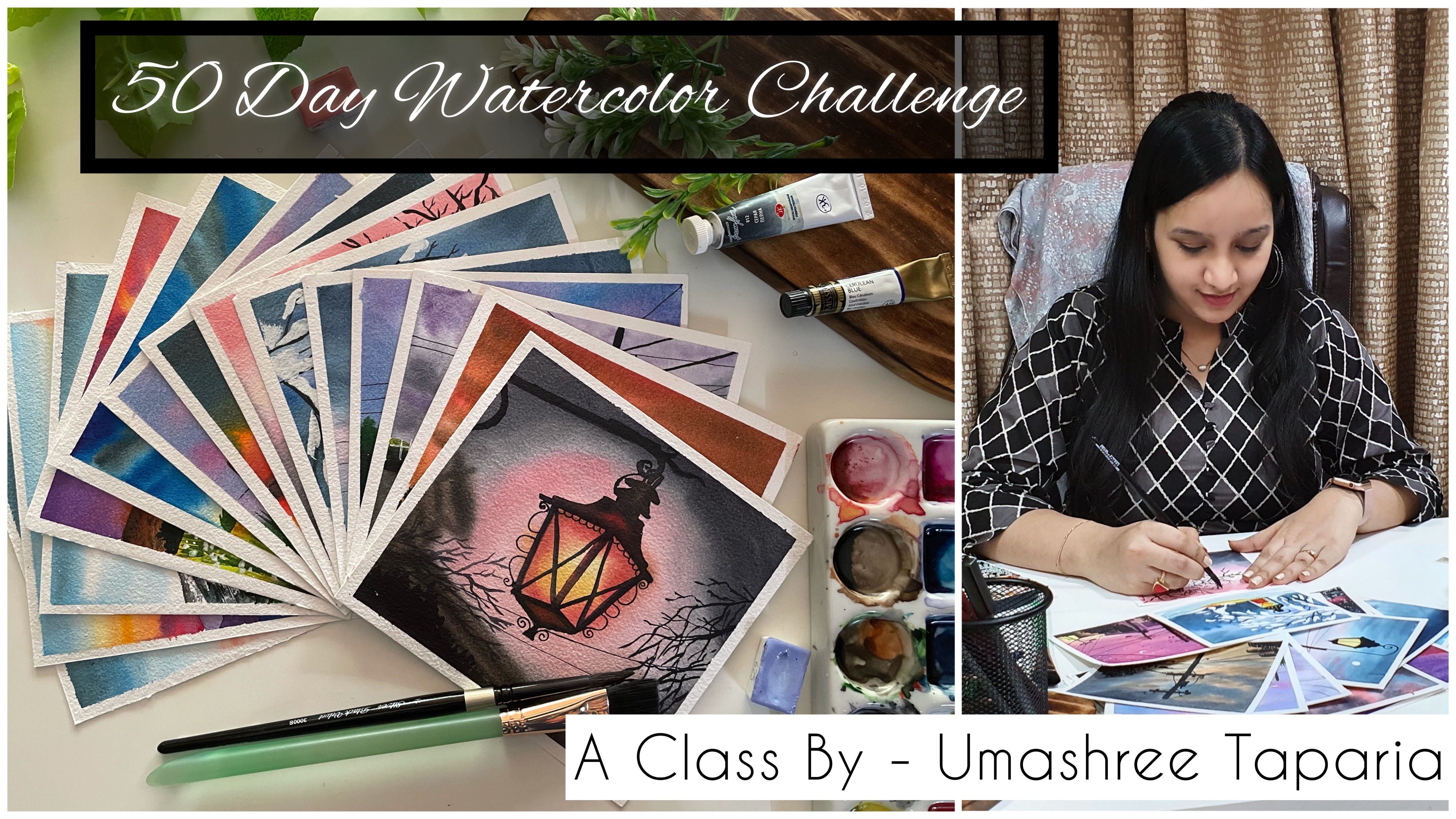
Transcripts
1. Welcome to the Class: As the warm some
of these approach, many of us begin to
daydream about the beach. There's something
magical about the sun. The sun and the sound of
the waves crashing against the shore that draws us in and helped us not
forget about our ys. The beach has a way of transforming our mood
and lifting us periods. The feeling of the
warm sun on our skin, the refreshing
coolness of the water, and the gentle breeze
blowing through our hair all contribute to an experience
that is both relaxing, an invigorating summer and
the beach go hand in hand. And there's no denying the special energy that
comes with this combination. It's a time for
letting go of stress and embracing the simple
pleasures of life. Hi everyone and welcome
to my Skillshare class. I'm a chartered accountant or creative artists
and creative business. And if you do not
know much about me, you can follow me on Instagram under the hand and creating from the heart when I share most
of my books with watercolors, gouache, acrylics, as
well as my John link. You can also consider the thing
I stole page, very clear, handmade watercolor sketch book, as well as journaling kids and
other journaling supplies. So make sure to visit
our Instagram handles to know more about me and
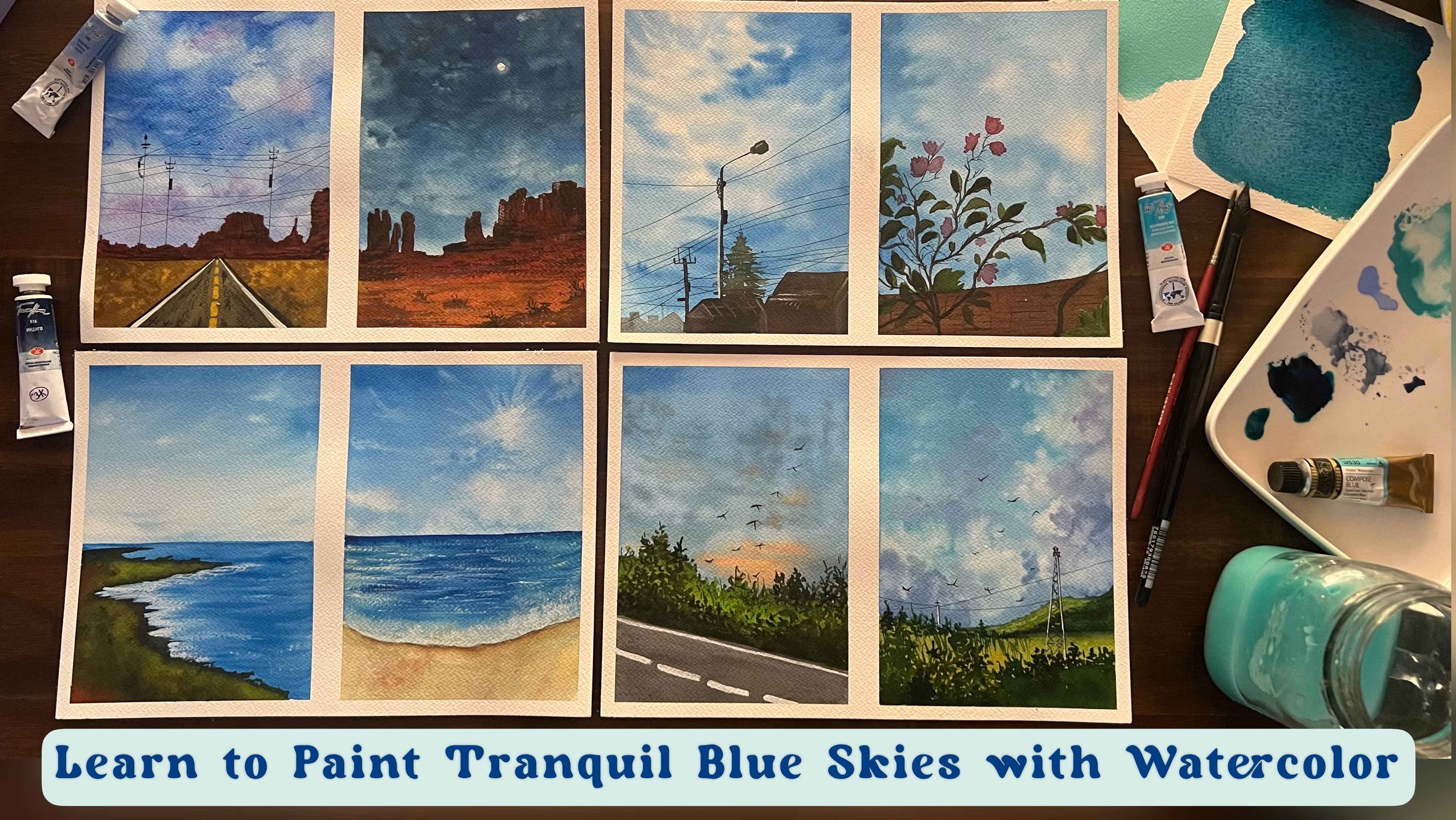
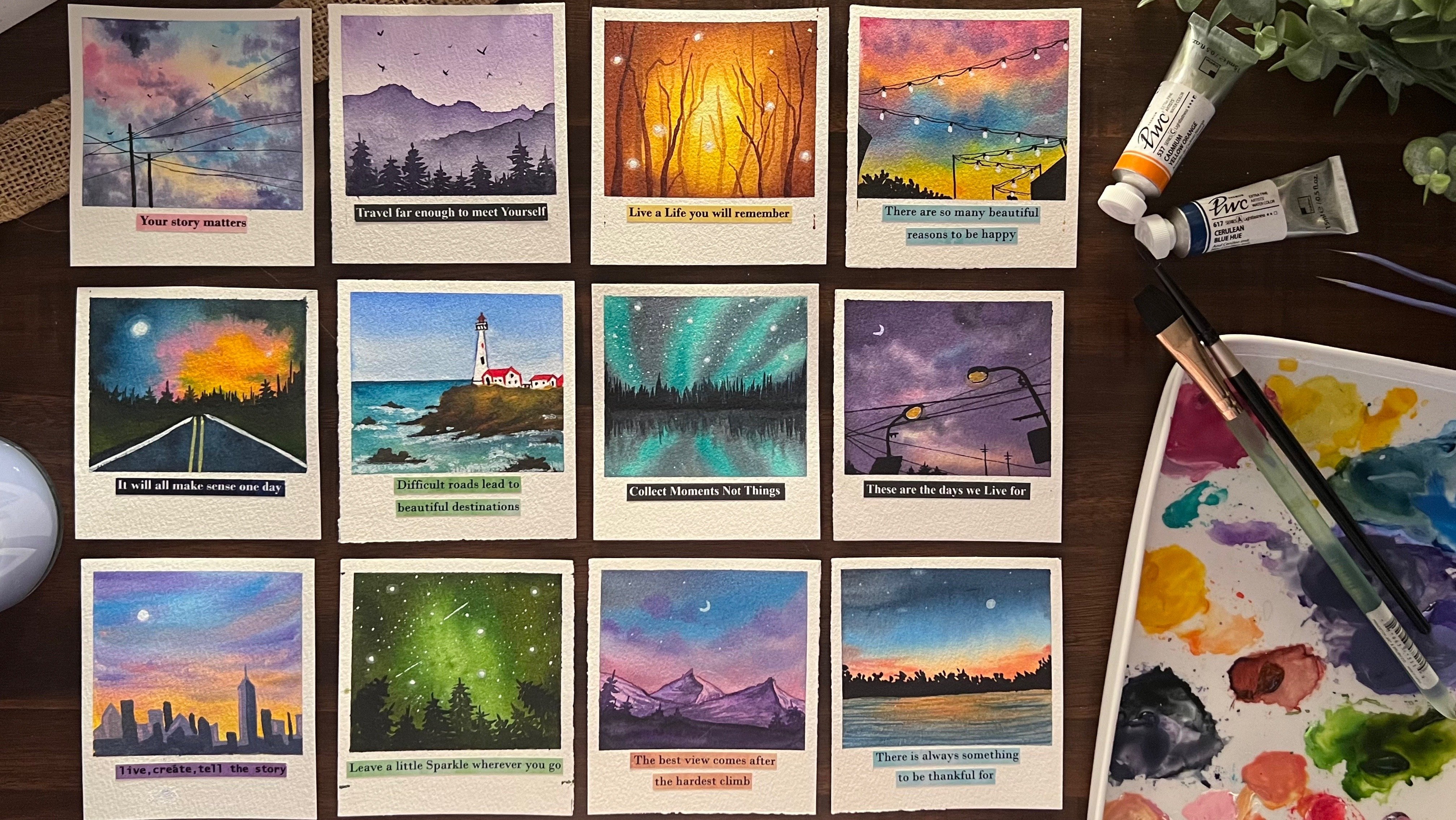
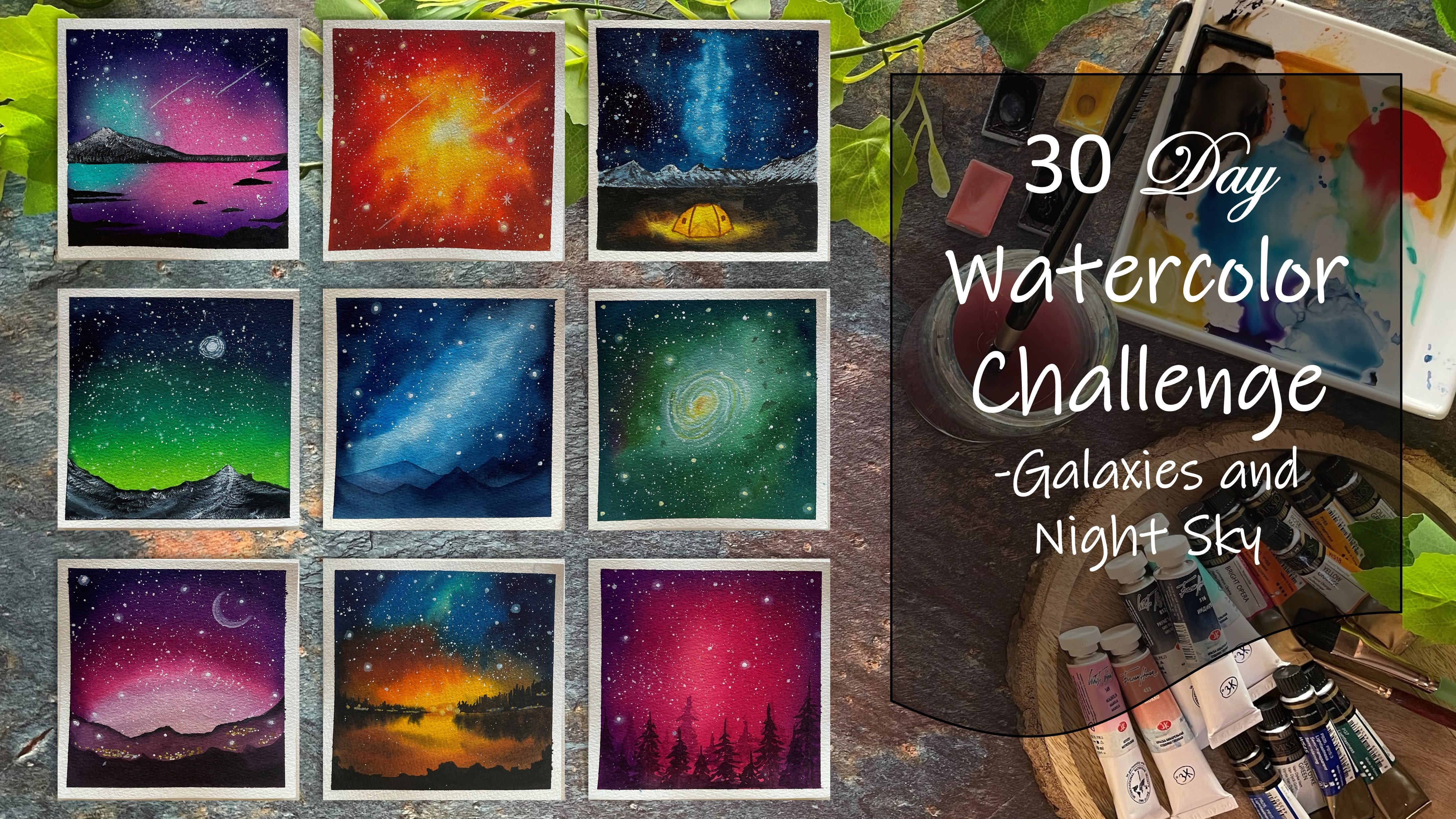
the work started to. I are excited to welcome you all to my new Skillshare class. That is all about painting some of beaches with what Canvas. Over the coming few weeks, we are going to be painting themed beach paintings
with different angles, different perspectives,
different color combinations. With watercolors, we can create stunning paintings that capture the ceiling beauty of peaches, from the soft sand to
the rolling waves, and everything in between. The versatility of watercolors allows us to experiment
with different textures, techniques, and colors
to create unique, mesmerizing pieces of font. Do not be overwhelmed if you add an absolute beginner
with watercolors, because I will be guiding you
through all the materials that you would need to begin your journey with watercolors. We will be covering various techniques from
washes and pleases, too wet on wet and dry brush. So you can discover what
works best for you. Seasoned artist, or picking
your journey with art. This class is designed in such
a way that it will inspire you as well as help you to
develop your skills in Pig. We will also be exploring
different compositions and perspectives to
create paintings that are both visually
striking and meaningful. Through these beach
themed paintings, I want you to tap into
your creativity and express yourself
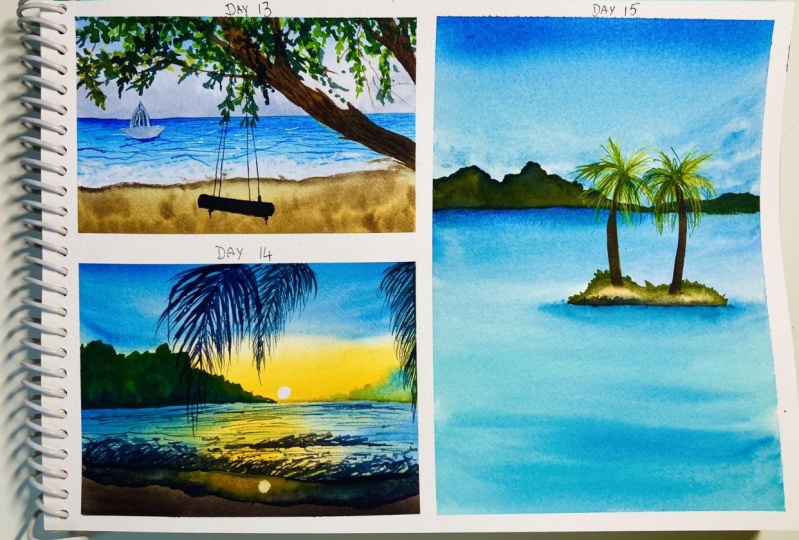
freely through art, just as the ocean waves. By the end of this class, you will have created 15 stunning beach themed paintings that you
can be proud of. You will have honed your
skills with watercolors, learned new
techniques, and gained a deeper appreciation for
the beauty of the beach. So without further ado, let's dive into the world of
beach team paintings with watercolor was cleared
some Stein pieces of fire this summer season. So I'm looking
forward to see you inside the class as well as see all of your unique creations on the some kinda
beach paintings, sharing the joy of
painting together. I'll see you guys into the
next lesson where we discuss all the materials and then dive into each class project
one day at a time.
2. Materials you'll need: So let's begin with
the materials first before we move on for the
class project for D1. So first and foremost, you would require a
set of watercolors. I'm going to be
using in this set of 32 shades from the
branch Shannon, Are there PwC range, which is an artist create
professional watercolors range. On the tube of watercolors, you will find all the details
regarding the pigment, the vibrancy, the transparency, as well as the staining or the light fastness of the pains. So you can go ahead
with either tan, what colors, or tube watercolors with whatever is available. Apart from this set, I'm even going to be using
a few of the other sheets, such as this Naples yellow
from Magellan mission, Payne's gray from White Nights. I'm going to be using a separate turquoise blue from the White Nights
pan set as well. You would also be needing in white gouache to add
in a lot of details plus creating in
some opaque colors as well with the help
of fight question. Mixing it with your
basic watercolors, you can go ahead with a mix of different kinds of colors
or different brands. As per your availability, you need not have the
exact same sheets or the exact same
color palette as mine. In every class project, I will keep discussing
the best alternatives I'm going to be using in this ceramic palette
for mixing my paints. For every class project, I already have a few
colors from beginning, so I will reuse them by
just rewriting the paints. Next, I'm going to be using in this handmade sketchbook
by our store, which is made of Archie is
300 GSM cold pressed paper. I'm going to be using in this five inch by
five inch paper. You can see the
thickness of the paper. It's 100% cotton paper. I recommend you using a
minimum 100% cotton paper for watercolor works so that you can go ahead with a lot of
wet-on-wet details, as well as your
paper stays wet for enough time and your paper will not come pull up after painting. Next, you would be needing
two jars of clean water, one for cleaning
your brushes always and one for using freshwater. The wet layers before you
beginning with your wet on wet techniques come into the
brushes that you would need. I'm going to be majorly
using these four brushes, which is a half
inch flat brush or smaller sized round
brush, liner brush, which is size two, round brush size eight from
the silver black velvet rest. All of them are from
the brand Princeton. You can see this liner brush has such long bristles and it's very fine tip perfect for adding in the wave effect
into your paintings. I'm going to be using
majorly these four brushes, but you can go ahead and use any set of brushes
that is available. But it needs to be a mix
of round and flat brushes. I would be needing
these paperclips since I'm using a sketchbook, so just pinned down my paper
so that it does not move. Next, you would be needing a masking tape to tape
down your paper for each class projects
so that you can have those clean edges as well. Apart from this, you wouldn't be needing some basic
stationary such as pencil ruler and an eraser for doing some pencil sketch for all the 15 paintings
that we'll be doing over the
period of 30 days, you would be needing
either a rough cloth or some paper tissues for dabbing index as water
cleaning your brushes and all of that while
painting each class project. So these are all the materials. Apart from this, you can just keep a spray bottle with you. In case if you're using a pan set or half paints
on your palette, you can simply use a spray
bottle like this and spray a little water and re-wet your
pains and use them easily. So it becomes quite
handy as well as easy while you're not
reusing your colors. These are all the materials
that you would need for the coming period of
30 days where we'll be creating 15 different
beach themed paintings. So grab all your
materials and I will see you guys into the
next lesson where we begin with the techniques first and then move
on to the day one.
3. Watercolor Techniques - Part 1: So before we dive into the
class project for day one, Let's have a look at some very basic watercolor techniques which will help you in beginning your journey
with watercolor, or help you better in understanding
how watercolors work, or the different techniques
that you can use. The first one that
we're beginning in with a wet on wet technique. We already are adding in a layer of water which is going
to be a wet layer. And this wet layer we are
going to add in wet colors. So this is called wet
on wet technique, wherein your base
layer or the paper is already wet with
either color or water. And on top of that, you go ahead with a wet
layer of the color. I'm going ahead with a simple serial in blue color layer here. I'm just giving it
a simple flat wash. So basically, a flat wash is when you use one single color in one single tonal variation and add it all way throughout. You can see the same blue color
I've added it throughout. So this is basically a flat wash and we've used
the wet-on-wet technique, which is the paper was
wet on top of that, you've gone ahead
with wet layer. The second technique here is
the wet on dry technique. That is your paper
is going to be dry. On top of that you
are directly going to go ahead with a
layer of wet colors. This technique is only useful when you have
to add in details or adding the silicate or just go ahead with a
small piece of paper. So right now you can
see the block is very small and I'm using
a bigger size brush. So it will be very easy for me to cover up the entire space in like two to three color
or pickups that I do. But in case if you're
working on a bigger space of paper and if you go ahead with
the wet-on-dry technique, by the time you reach
the end of the paper, it may so happen that
the top space has dried and you may get
patches of color. Since this is a small space, it will not affect much. And you can simply add in the layer while
everything is still wet. But this does not
work well when you are walking on because
pieces of paper. So use this technique only when the cover area that you have
to cover is very small. Or you are working
with the detailed part where you have to add
in detail wet on dry. You can see this layer
still looks a little less moist as compared
to the first wet on wet, because there you have to wet layers and here you have
only one wet layer. So again, this is also a
very simple flat wash to be. I've done one single color, but just the technique
is different. That is the
wet-on-dry technique. Now, we are going to go
ahead with the next one, which is going to be a variegated wash. For that I'm going to use
in the wet-on-dry technique only majorly for all our background washes
the sky, the beach. We are going to go ahead with
the wet-on-dry technique. Wet on wet technique, and listen and we
just have to add in a small layer which tries
out quickly as well. Also difference between the
wet on wet and wet on dry. Wet on wet layer will stay
wet for a little longer time, helping you to add in more details if you wish
to on the wet layer. Whereas the wet on dry technique or the layer will
begin to dry quickly. So if you go ahead adding in
more wet details on that, then it may be very
difficult as the patches may begin to dry out at places
and give you a flat layer. Now in this variegated wash, I've gone ahead with a
layer of blue at the top. And now I'm going to use
in the pink color at the bottom and blend these two colors together
in the center point. Now, blue and the pink mixed together gives a tone
of purple or violet, which is a pleasant tone when blending in these two colors. But say in case if
you go ahead with a blending of colors
of yellow and blue, then you do yellow
and blue mixed together will give you a
green tone. Which one? Look pleasant, either
in a sky or sunset sky, or even in the B2B space. So in that case,
the variegated wash will work a little different. In the case where colors
go well with each other and form a third
complementary color, which things in well
with the colors, you can go ahead with
the method that we went with the blue and pink
blending both together. But now, if the colors are complimentary
colors and they do not get in well
with each other or forming a third color which
would look unpleasant. Go ahead with this technique. So I'm going ahead with
a blue color at the top. And I'm going to go ahead with a yellow color at the bottom. But in the center I'm going
to leave a small gap fight. And I'll just tilt
my board and make the colors flow naturally
into each other. In this way, you'll
get the lighter tones of the blue and the
yellow in the center, but you will not
get a green tone. You can use a damp brush like
this and run in the center so that the colors of blue and yellow move into each other. And now just tilt your board in both directions slightly
a bit, not even much. Otherwise, it may again begin
forming in the green tones. So in case when you're using colors like purple and orange, which both together forming muddy color when mixed together, you can use this method
of variegated wash, where you use a damp brush
in-between for blending, or you can use in
the white color in between for blending. Now, next I'm going ahead
again with a layer of water. First, we're going to go
ahead with the wet-on-wet technique to create
a gradient wash. The first two washes that
we saw that is the wet on wet and the wet on dry with
one single color throughout, that is called a flat
wash. Now we are going to go ahead with
a gradient wash. Now, gradient wash you can
use two to three colors, but I'll show you with
one single color. So I'm using in this
crimson lake color here, I'm beginning with
a darker tone at the top and moving
towards the bottom side, I will keep lightening
the color tone. So up till a certain level, I will add in this color. Now using a damp brush, I'm just going to begin moving this color from the
top to the bottom, donning it lighter as we keep moving further towards
the bottom side. So in this way you can
see we are creating a gradient of one color, beginning with a darker
tone at the top, moving towards the lighter
colors at the bottom. Now you can do this in a
reverse method as well. That is, you can begin it
with the darker color at the bottom and then
using a damp brush, keep moving it towards the top side with a
lighter tonal value. So this is called
a gradient wash, where the color has different
tonal values in one layout. So here you can see the gradient between the different
oral values of the ping, the darker paint,
the lighter pink, and then the lightest. And at the top you can see a flat wash off the
same color throughout. You'll be able to
see the gradient much more clear
when it dries out. Now in this last block here, we're going to go ahead
with the glazing technique. I'll just give you
a little glimpse of the glazing technique. We're not going to be using
much of this in this class. We'll just be using a very
little highlight of it while adding in the sand effect or closer to the beach spaces. So again, I'm going ahead
with a wet on wet layer. So I'm going ahead with
a layer of water first. Now I'm going to go ahead
with a blue color and a brown color at
the bottom to kind of try to show a beach effect. And I'll show you how we are
going to show a little of the water effect overlapping the signed area of the beach. So if you've ever
visited a beach, you would see how the
waves come towards the sand area and form a
layer of water on the Sun. But you can still underneath CVA suddenly or even
under the water. So that is the glazing effect. So I'm just adding in a layer of brown and the blue force. Now on the browns, I want a little
effect of the blue. Try and show that little effect of water onto the sand as well. So when this is wet, I'm going to go ahead
with the blue color that I want to give the
glazing effect with. But make sure you do
not have excess water. With a very light
hand over the blue, you will add a very light
layer of blue on the brown. So you can see now the underneath Brown is
visible on top of that, you've got a little blue color. I will try extending this space a little
more and show you. But let's first
have a closer view. So you can see the
underneath Brown is visible. And then we added a layer
of blue on top of that. So this is the glazing technique where the base layer color is also visible and you give the other color
effect on top of it. I will just add in a little more brown at the top here
and show you again, I have the brown color here. Now on top of this brown, I want the effect
of the blue color to show that effect of the water coming onto the
beach using the blue color, not having excess water
with a very light hand. I'm just running
on top of brown, so it has to be a
very light layer of the blue such a way that the brown underneath
is still visible. In cases if you feel that the blending at the bottom
is not happening smoothly, then at the bottom you can
just take a damp brush and run from the glazing
effect in the bottom. It does not have different patch or does not dry out separately. So these are some of the basic
washes glazing technique, the different kinds of washes, the wet on wet layer that we've discussed in this
technique section. I'll write down all of these techniques that
we've discussed. And in the next lesson, we'll discuss a few more
techniques which are going to be the details for adding
in the clouds waves, as well as the
reweighting technique. So I will quickly remove the
masking tape and note down all the names for
you so that you can refer it anytime for guidance. So the first one was the
wet on wet technique, the next one is the
wet on dry technique. Both of these are flat wash that is one single
color layer throughout, without any gradient or without any other color or
dual tone washes. This one is the variegated wash. This is the first method that we discussed where we are blending in both the colors
together forming in a third pleasant
color in between. This is the second
variegated wash, where the leaving a
little white cat. You can see even after
blending and drying, we do not have the
green tones formed. The color transition as
smooth between the blue and the greens without it blue and the yellow
without any greens. The next one was
a gradient wash. Now, after drying you can see the gradient effect as well. The last one was the
glazing technique. You can see the glazing effect
as well after drying the blue and the brands both
are visible distinctively. The third color is not formed. That is the mixing
of blue and brown. Rather, we have both the colors visible because of
the glazing effect. So now these are
the basics and in the next lesson
we'll dive a little more deeper into
the techniques and then move to the
dv1 class project.
4. Watercolor Techniques - Part 2: So now let's move on
to the next set of techniques before we dive
into the class projects. So now I'm going to show you two different ways how you
can add in whitespaces. One is going to be the
lifting technique and the other is leaving and
white gaps naturally. So for the first one, that's the lifting technique, I'm going ahead with a
wet layer of water first. Now, whenever you want to go ahead with the
lifting technique, you will have to
test two properties. One is better, the color
is a staining color. Because if the color
is a staining color, then no matter how
hard you try to lift, it will leave a
stain underneath and it will be very difficult
for you to lift up. You need to be very careful
while going ahead with the lifting technique
because it May 1 gives you a rough patches
and it may also be difficult to lift up the color in the desired shape or style that you want to go ahead with. I'm going to head
with a layer of the cobalt blue color first, I'm just going to add in a little bit of
the peacock blue, which is on my palette
to turn it even darker. Now, the peacock blue color
is a little staining color. So when I try to lift up, you will see an
underneath blue layer still being visible. Now for the lifting technique, you just need to go
ahead with a damp brush, lift up the color from the
spaces that you wish to. Now, it may take you two
to three times to lift up the color and getting
the lighter spaces. Because as you lift up the
color from the nearby spaces, again peaks back into the space from where
you've lifted up. In one stroke, you may not get that effect of the lifting. So you can see how I'm going
ahead trying to create in random cloud shapes to go ahead with the
lifting technique. So that is the
lifting technique. You can see still a little
of the color is visible. That's a lighter tone of
the blue color and as well as by the time it
dries these spaces, but again, reducing size because the nearby colors
that come in again. Now, next is, I'm
going to leave in the whitespaces naturally
while adding in the color. So this is most
useful when you are trying to paint in skies with different
color combinations, are trying to painting some simple fluffy
cloud effects as well. I've just added in a
layer of water now and I'm going to beginning
with the blue tones. Now when you beginning
with this kind of technique where you want to
live in the whitespaces, you need to make sure that your brush does not
have excess water. Because if the paints will
also have excess water, they will spread on their own. It's very important to have a little water control
while adding these will be discussing the
water control in the next technique
itself directly. So now, for now I'm just randomly adding
in these patches. You can see how I've made sure I've left in enough
whitespaces now I'm just going to tilt a little in all
directions so that you have that soft movement and blend between the whitespaces
and the pains. Try it will all look a
part of it together. Whenever you are
tilting your board, make sure you do not
keep it tilted in one direction for an
extra long time because that may make the colors flow in one specific direction
for a longer time, making it difficult
to have that effect, what you're trying to achieve. And so now you can
see the difference in both the spaces,
the lifting technique, and one that you
leave the white gaps naturally so that you
have that effect. That now when you went ahead
with the lifting technique, you can see the underlying
blue color is still visible. Where else in this case it's
pure white that is visible. It depends on what kind of
outcome you're looking for that you can decide
the technique that you want to go ahead with. Now next, I'm going
to go ahead with the technique of water
control. With watercolors. It's the most important
thing to have the water control while adding
in details, wet on wet. So I'm first going
to go ahead with a simple blue color layer. So you can pick up
any color if you are practicing these
techniques along to get a hang of the details or the watercolor
techniques to follow it. So I'm just going
with a very flat wash off the color first onto this wet background that we've added
up, the blue color. I'll show you the water
control importance. So we're going to use a violet color on top
of these to understand the importance of water
control and how you need to control it so that you
can get the details, right. So I'm going to
quickly squeeze out a little bit of the violet
color on my palette. And now I'm going
to go ahead first. A very liquid consistency
of the violet color. So my paper is already
wet where I'm supposed to add it plus this paint that
I want to give details, I'm taking it up in a very liquidy consistency
and beginning to drop it. You will see at the
beginning it tries to maintain the space in
which you are adding, but with time it's beginning to spread and cover up
the entire space. The blue color
that was naturally there underneath is
no longer visible. It's a mix of blue
and violet now. Now next I'm going
to show you when you pick up the color
with limited water, your brush does not have
either excess pigment or excess water. You will see the difference. Also, make sure that you dab your brush a little
onto the paper tissue, that the excess water, if any, underneath in the prisons will
get absorbed by the paper. Now, let's begin adding in the violet details here
and see the effect. So you will see the violet color is retaining the space in which
I'm adding them. It's retaining the shape
in which I'm adding them. It's blending onto the edges, giving it a soft effect with
the blue color underneath, but it's not spreading
like the top layer. So in this top variant here
you can see the spread out completely and it's just
become a patch of color. Whereas in the second case where we tapped off all the
excess water in the tissue, it's retaining the shape even after few seconds and
even after it dries, it will retain the shape in
which you've added them. So it's very important
to understand this water control because
when you add in details, wet on wet, like in the coming
class projects as well. In all of the paintings, we'll be adding in
clouds like these. If you will not have
the water control, the colors will
spread completely and either give you muddy tones or a patch of color like this, instead of giving in
this cloud effect that you want to achieve. So in each of the class
projects you will see it's very important to have that water control may be adding it into the
sky or the beach area. Water control is very important. Otherwise, with watercolors, it may become very difficult. In these two class project, we will even be exploring
the lifting technique and the whitespace techniques
that we've discussed. So this was about the
water control are very important part and I
recommend each one of you to have a hang of
it so that it becomes easier for you to paint
and work with watercolors. Now the next technique here is going to be the
rewetting that pink. I'm going to quickly give you a little insight about the
re-weighting technique. Now, basically, if you are
using a paper which is, which tends to dry quickly, or if you're living in such
temperatures where the paper dries quickly because of
the atmosphere temperature. Then in such cases
you can go ahead with the re-weighting technique to add in the wet-on-wet details, like in the last technique that was the water control technique. You can see we added in
the details wet on wet onto the blue color
with a violet color. But say in case your paper has begun to dry already
or because of any other reasons that paper
is drying out quickly and you have to still add
in details wet on wet. In that case is if
you keep adding in the detail on the paper
is beginning to dry, then you will notice you
begin to get patches of color and very uneven edges. So in that case you can use
the re-weighting technique. So I've just added
one simple layer of the blue color for now. I'll wait for this to dry. Until then we'll discuss
very basics about the waves that is wet on wet
waves and wet-on-dry ways. So I'll quickly go ahead, add in a layer of water. You're again and beginning
discussing the ways. And once the rewetting
space dries, I'll show you how
to go ahead with the re-weighting
technique and add the details again
as a wet-on-wet. So I'm just going ahead with a very simple flat wash off the violet color
into this space. I'm going to go ahead and
add in the waves wet on wet. So while this area is
going to be still wet, I'm going to begin adding in
the waves in top of this. So why don't you begin adding
in the waves wet-on-wet. Very important thing to again understand is the water
control as we discussed. Because if you will not
have the water control, the waves will begin
to spread and give you again one single
flat color loop. So the technique that we
discussed forward to control is very important when you add
in any detail wet on wet. Now I'm using a liner
brush size two and I'm just beginning to add in the veins with the water
control technique. You can use this
technique while adding in wet on wet waves or wet
on wet cloud effect or any other element where
you want the colors to have a distinctive look yet a softer blend
with each other. I'm going with simple
strokes to add in as v. So this is called
wet on wet waves, but you want a soft effect
to your viz and do not want to have those sharp looks
to your waves out there. Now I'm fancy drink the center point as
the horizon point, that is the center line from where this color is beginning. So they have left a
little of the space. But as I'm moving
towards the bottom side, you can see the length
of my waves have increased because these
waves are closer to me. And as I'm making it
move more closer to me, you can see I'm beginning to add in some thicker waves as well, trying to show because
of the perspective, since it's much closer to me, it's visible to be
in much bigger, you know, lines or strokes. Now, this point that I've considered as the
horizon point there, I'm going to add in the
waves in quite small manner, in a very tiny ways
so that these lines, because they are far from us, the horizon line is far from us. So these V's are
hardly visible to us. So in very small length, you add them closer.
You can see the waves. I'm just going crisscross to each other and simple line
strokes to add the details. That was the wet on wet detail. Now in the same
way we're going to discuss in the wet-on-dry
details as well. Now these wet on wet details, wet-on-dry details can be
done with multiple colors, which we will be
doing when we go ahead with each class
project one day. But for now I'm just discussing the very basics with
you so that you have a little
knowledge about what's coming up for you in the
coming class project. And you have a little
hang of it if you are a complete beginner
with watercolors. Now again, I'm just
going ahead with a flat layer of the paints. I'm going to mix in the violet
and the blue this time. So I'm just going ahead with a layer of both the
colors quickly. I'm just going to blend them. Now I'm going to wait for
this to dry because now we're going to add in the VIV
effect, wet on dry. So once your background
layer is dried, you go ahead with the layer of wet paint again to add
in the VIV effect. Now let's go ahead with the
re-weighting technique. So this is a very small space, so small brush works, but if you're working with a
larger piece for deviating, you need to use a brush which is bigger in size so
that you can give the reweighting water strokes in very less number of strokes. So in this case, if you
see in two strokes, this would have got covered
up with this brush. But this brush holds
a lot of water, so I do not want to add a
very too much watery layer. So I'm going ahead with the
smallest size brush here. Now, I'm going ahead with the re-weighting technique horizontally or
vertically you are. But you can go
ahead horizontally depending on the kind of area that you want to revert
or the kind of effect that you want after
every stroke, make sure to clean your brush
and pick up fresh water. I'm using plain clear water and just running
with brushstrokes. It's very important that after every stroke you
clean your brush. Otherwise, the colors
that get lifted from the first layer will get
lifted onto the next clear. Now going ahead with
the wet paints and adding in the cloud
effect, again, your water control is very
important if you want, do not want the color to
have a simple flat loop. So you can see it's again
having the soft edge. The entire background
was wet again and it's looking very
blended and soft, edged with the blue color tones. So this is the
riveting technique Thai using in the biggest
size brush possible, depending on the size of the paper that you
want to revert. Because less of the strokes for evading easier it is to rewet, make sure you do not
have an excess water. The water should be minimal
enough that it's really wet, but not even dry. You can go horizontally
or vertically depending on the kind of detail
that you want to add in. Now we'll wait for
this last block to dry and then add in the
wet-on-dry waves as well. And we'll be ready to
dive into the davon. Now this is also
completely dried and we'll begin adding
in the wave effect. Now. First, we had
added wet on wet. Now we are going wet on dry. So the waves are
going to be the same, but the effect that comes
is going to be different. Again, in the center, I'm considering it to
be the horizon point. So there I'm going to add
the waves in very small, tiny lines and strokes. Now as I will keep moving
towards the bottom side, I will keep increasing
the length of the stroke. You will see just not simple lines you can
use in half C strokes. You can move different angles, some thickness as well in
between to add a little depth, you can see I begin
with a pointed tip, press the belly of the brush, give it a little hump, be
kind of a moving wave effect, and then lift it up again. So these are different
strokes that you can use in. Now, I'm using the same method as we had gone ahead
with the wet-on-wet. But you can see
the difference in the log in button that you have. The soft wave look better
on the wet, on dry. You can see the waves are having a very distinctive bold effect. I will just quickly add in
the waves. You also fast. I'm adding in some
takeovers and in-between, I'm adding some very thin
leaves to fill in the spaces. So there are
different ways again, you can go ahead with this. You can go ahead
with some roaring waves, crashing wave effect. As we move further, we will learn how to
add each of them into your paintings
depending on the kind of paintings that
we are going ahead. Great. So as I'm moving towards the bottom side, you can see I've kept increasing
the length of the waves because these waves are falling
much more closer to us. So that is it. We are ready with the technique section
for this class. These are the basic techniques, some kinds of washes,
basics of watercolors, then the re-weighting technique, lifting tech t. All
of these are quite important to begin your
journey with watercolor. So now in the next lesson, we'll beginning with day on day class project every
alternate day. And we'll discuss
the color palette for that specific class, as in how we proceed further so that you can have a
color understanding of the class project as
well as I will keep discussing the specific
techniques that we're using for that specific
class project so that it gives you a much
better understanding about each class project. Every day. I have noted down all of the
techniques that we've covered in this
second section as well for you to refer any time. So these are all the techniques
we discussed so far. I hope this has helped you
in understanding the basics of watercolor and beginning
your journey with watercolor. I will see you guys into
the next lesson where we begin painting our
class project for day one.
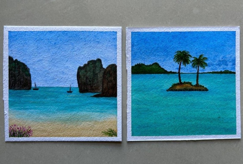
5. Day 1 - Greece - Color Palette: Before we dive into the
class project directly, let's first discuss
the color palette that we're falling
for this class, as well as the different
colors that you can use if you did not have the
same color options available. For this guy, I'm going to be using in the saddle
in blue color. Now in case if you do not
have a civilian blue color, you can go ahead with
the sky blue color or a very light layer of the
Prussian blue color as well. For the beach area
or the water area I'm going to be using in
the peacock blue color. You can even use the turquoise
blue color if you have. But I wish to go ahead with a peacock blue color this time. It's a very beautiful, bold blue and looks perfect
for the beaches as well. Then coming to the
wall space out here, we are going to be using
in the Payne's gray color. So I'm going to dilute the Payne's gray color
is going to be like just two per cent color
and 98 per cent water mix. That is how I'm going to use it. You can see the white color
and the Payne's gray color, just one color difference. So that is the reason
I'm going to add in that Payne's gray
color next to you would be needing in these
shades of green color. I'm going to be using in three different green tones for adding in the leaf detail. First is the cadmium
light green, then is the sap green color
and the olive green color. Now if you have a
look at the leaves, there are so many
different tonal values. If the greens that I've used in, you can even use in yellow, I'm going to use a
little bit of a yellow instead of the cadmium
light green color. Because I already have
yellow on my palette. I'm going to use that and mix it with sap green to
get a lighter green. But you can even use
a lighter green if that's readily available
in your palette, then you would be needing in
white quash for adding in the details of giving in
lethal effect onto the water. Trying to show the effect of the sky color falling
onto the water space, giving in The Shining
ripple effect. So this is your, you can see very little and very
minimal effect. And then lastly, we'll just be adding in a small
candle holder or a lamp effect onto the beach space here to give
in a little aesthetics. So these are all the colors
that you would need for this class and the
basic techniques. So just giving a
quick overview again, we're going to be using in the cereal in blue
color for the sky, the peacock blue
for the water area, the Payne's gray for the
wall and the pot holder, and then the greens
for the leaves. And lastly the white quash for adding the details on the beach. The sky is going to be a
very simple flat wash. The area of the Payne's gray
color is going to be, again, a simple flat wash and further
waves we are going to use it wet on dry technique for
adding in simple leaves. This time, I'll
see you guys into the next lesson where we create this class project
in detail together.
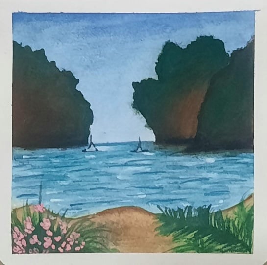
6. Day 1 - Greece: Let's begin in with the
class project for day one. I've kept the class
project for d1, a pretty simple one and
a quick one because we already had a lot of
techniques to discuss on the one. I wanted to make sure to keep
the class project easy and light so that you can follow up with the
schedule as well. So 41, we are going to be
painting a beautiful or C painting from a view from
Greece you can consider, we're going to go ahead with
a very simple wall by the, a site through which
this beach is. So I'm going to use this masking tape and
I'm going to mark out the wall space first and then move on to
the other details. Now using a ruler, I'll mark the rest
of the center line. Now I'm going to go ahead with the same shape on the
inside as well to give a little brief detail
so that it becomes easier to add in little depth
to this painting as well. I'm just going ahead with very simple outlines,
as you can see. Now, on the right side
here we're going to have the entire beach area
that we'll be painting. I'm just going to give in a little broader effect
towards the right here. And now on the left, I'm going to add a
very simple flap or detail across the wall. And on top of that
we're just going to be adding in very
simple leaf detail. You can see it is so much
easier to just tilt or rotate your board when it's taped down on a movable surface. In my case, since I'm
using a sketchbook, you can see it's so easy to
just rotate a sketchbook. I always recommend to
tape down your paper on a movable surface so
that it's easier for you to just adjust the movement or angle of
the paper according to your hand is on the right side. I've divided the sky, the beach, and the bottom,
again, walk area. So for this guy, I have added in a very simple base layer of
the civilian blue color. The recording of this
part got corrupted. So I'm just sharing with you or direct small detail
and further detail. I've used a very light layer
of the Payne's gray color, which is a very or
diluted color with water. It's majorly water just to tend of the Payne's gray color. So these are the basic wash
that I've done for now. Now after this, we'll move on to the details of this painting. So we'll first begin
adding in the details for the C. For the C, As I told you, I'm going to be using in
the peacock blue color for beginning to add in
the base layer of the sea. So once you are done adding in the sky and the wall detail, wait for it to dry. In-between the sky and the wall. You can see I've left
that white gap empty. We'll add in a Payne's gray
detail later on there so that we can create in that depth and the view
out there as well. Now I will squeeze out some
fresh become blue color. You can either use a
turquoise blue color as well. This pickup blue color is kind
of a turquoise blue color. For this class project, I preferred using
this color instead of directly using in the
turquoise blue color. So using this, I'm
going to give him a very simple flat layer of the paint into the
beach space here. First, I'm going ahead
with a layer of photo. Now you need to go
ahead carefully so that the water does not seep
into the sky area. So go ahead carefully
here and just adding a light layer
of the water you are. So now I'm going ahead with
the layer of blue color your, as we discussed, I'm
just going to go ahead with a very simple
flat layer of the color. I'm using very basic
and simple techniques for the first class projects so that you get a hang of the basic techniques first and
then moving ahead further, you can go into the details of the other techniques as well. I'm just going ahead with another layer to make
it a little taco and board because I'm
just going to go with one simple layer of
this color here. Now across the
walkway here I'm just defining the blue
line perfectly again, covering up the
messy area of the Payne's gray and giving it a
very simple straight line. So we are done with
the beach as well. We'll wait for this
to dry as well. Until then we'll add in the
layer into the pot as well. But make sure that your
Payne's gray color layer is completely dry before you
go on to the pot layer, using the Payne's gray color, I will begin adding
in the depth and the 3D effects to the pot. Now. I'm going to use the Payne's
gray color as we discussed. Now make sure you use the
smallest size brush so that you can add in the
details effectively. Now using the
Payne's gray color, I will give a very fine outline only at the top and the
left side of the pot first. And then using a damp
brush and water, I'll again go ahead
and blend it. Now just using the damp brush you can see I'm lightening up the Payne's gray
color and filling it in the entire pot space. So majorly on the
left of the pot, we're going to have
a darker highlights of the Payne's gray color trying to show the light
effect there as well. And in the rest of the space, just giving a very
light layer, again. Now makes sure that this
slide layer is darker than the base layer that you've added for the wall effect. So that this time though, now I'm just lifting the excess darker tones from the
left edge as well. So you can see very simple
technique that we've used and just a simple
color and using in water we've given in such a three-dimensional effect to this flat part as well. So on the right of the pot, I'm keeping it light so as to show the light effect falling. And on the left, I'm
keeping it or towards the darker tone to show the shadow effect
falling in there. Now next I'll begin
squeezing out the green colors so as to
begin adding in the leaves. Now for the leaves,
I have not gone ahead with any pencil
sketch because you can go ahead and add them in a very simple way
as you wish to, for squeezing out a little
bit of the sap green color. And you can use a lighter green that's
a cadmium green color. Or you can simply use in the yellow color to
lighten the tones. Next to you can either
use an olive green color or mixing a little bit of
the Payne's gray to your green or a little tent of
brown to your green to get an olive green color or
a darker green color tone. But since I have that, I'm just going to squeeze out a little bit of the
olive tree indirectly. And using instead of
the cadmium green, I'm going to go ahead with
a little bit of yellow, which is already on my
palette and reuse it. Now, I'm going ahead with
very random shapes of the leaves together to add
an end to the flowerpot. I'm using a round brush
and I'm just going in with a pointed tip first and then adding in a simple
shape to the leaf. Now with this, you
can go ahead with two to three colors
in one leaf as well. Now, make sure you add
the first layer of leaves in such a way that they are not connected to each other, otherwise they'll all
flow into each other. So for this second leaf, I added an outline and now using in the yellow color I'm
going to drop it in between and blend it
on the edges with the green tones so as to have a little lighter
leaf as well. Whenever you are going ahead
with these dual tone leaves, make sure that you're
not have excess water. Otherwise, both the
colors will mix and give you one
flat color look. Now in the similar way, I'm just going ahead
quickly adding in a few more leaves out here. I'm going to connect all of these later on with the help of the brown are the
Payne's gray color towards the pot as well. For now I'm just going ahead with the leaf
structures first you can see I'm randomly altering between different
tones of greens. Some leaves I'm painting
in with a single color, some leaves, I'm going ahead with two to three color tones. That's the sap green, olive green, and the
yellow color variations. You can go ahead with simple one stroke leaf
of two tone colors, or you can add in two to three different
tones leaves separately. Also, you can see
I'm going ahead with very random
shapes of the leaves, no set pattern or those set
style to add in these leaves. You can go ahead freely
and add them if you want. You can even go ahead with simple bunch of smaller
leaves as well. Or you can even add in
some floral details here. Absolutely your choice. You can have the freedom
of experimenting. You're as per your vision. Now I've just mixed
in a little bit of the Payne's gray color
along with the green. And I'm just going to add
in the branch detail now, it's more of Payne's gray
and very less of green. And I'm just going to add a small branch to
all of these leaves, connecting them towards
the center of the park. So very simple. One
stroke leaves that we've added now with the
darker color as well, I'm just adding in
some darker leaves medially towards
the left side to show some darker effects of the shadows are
falling out there. Now, my beach space
is completely dry. That's the water
area of the beach. So I'm going to shift in to
my smallest size liner brush. I'm using the same blue color. That's a mix of the peacock
blue and the Syrian blue. I will begin adding again
the wet-on-dry v is in the technique section
we had discussed the wet on dry method
of adding in the way. So I'm just going
to begin adding in the waves using that method now. So closer to the horizon line, I'm going to begin in with
very fine smaller waves. And as we move towards
the bottom side, I will keep increasing
the length of the ways also to keep the waves in this class project
very simple and easy. I'm going with
very simple waves. That's just a smaller lines
closer to each other. And just simple straight lines
are a little cough to it. I'm not going ahead with
any dry brush strokes, take on strobes or water
movement into the V's. So keeping it simple
so that you get a hang of adding in
these details slowly. Now as I'm moving
towards the bottom side, you can see I'm increasing
the length of these waves and increasing them because these waves are
closer to our view, hence visible in a little
more detailed manner. As well as you can see, I'm going very crisp, cross into the waves. No set pattern to
follow your as well. You can just keep adding them between each other as well as overlapping
towards each other. So as I've reached the end, you can see I've increased
the length of the waves a very big size because these waves are much
more closer to our view. Now after this will dry out, I'll go ahead and add in little details with the
white color as well. I'm just lifting a little off the color which
was dropped excess at the bottom space and blended it quickly
into the base layer. So these are small tricks and tips that you can do lifting the colors quickly or dabbing it with the
help of a tissue. If access pins fall,
falls out anywhere. Now, we're supposed to add in the detail out you're closer to the beach
and the wall space, the small grid that
we had created. So I'm using the
white gouache for that and I'm just
giving in a layer of the white gouache
out there to show overall effect to
the white quash. I'm just adding a small tent of the Payne's gray
color to have that grayish thin and I'm going to add it across the
entire so-called area that we've created between
the beach and the wall. Now makes sure for adding this. You go ahead very slowly, you can see and also make sure that your beach is
completely dry otherwise, the blue colors may begin to
see pin towards the side. So as soon as you add this
bit a little different color, you can see it's getting a 3D effect to the beach
view as well as the wall. So I've just added a small
team of the yellow color as well to give him a little different effect
from the base layer, Payne's gray that we gave in to the wall on the left as well. So very simple detail, but you can see as soon as
you add in the detail there, you'll get a different
view to the wall as well as that beach view
coming from in-between the wall or a window
kind of a view that is getting formed
for the beach space. Now, I'm just going to
go ahead and darken up this bottom space as well
because it's looking too light. So I'll just use the Payne's
gray color and I'm just going to blend it into
the entire space here. I'm going to further
lighten it up a bit by just lifting up a little
of the darker tones. Now, I'll wait for this to dry and then add the final details. So now this last layer of
Payne's gray is completely dry. So using it as 0.3 size pen, I'm just adding a very small silicate kind
of a detail here. That is a small
lamp which is just put as an aesthetic
towards the beach side. So a very simple one. Now since I wanted to add it
in such a miniature size, I'm using an append so that the details do not go
out of proportion. But in case if you want, you can go ahead
and add this with the help of the
Payne's gray color and a very fine tip brush. So it's just basically
a candle holder or a lamp that you can consider
that I've added in here. Now the last detail that I'm going to add in is going to be, I'm going to use in
the white quash and just add in little
highlights are and given little shining
effect onto the views because of the bright clear
sky that we've added. So trying to show that effect of the sky falling onto
the waves as well. So just adding very simple
white highlights using in the white gouache and medially
in the center space and keeping it very light and limited at certain spaces. I'm just adding very simple
dots as well to denote some light effect or the shining effect falling
onto the water waves. So that is eight. We are ready with our class project for d1, a pretty simple one. And very basic techniques
to begin with. Now we're just going to
peel off the masking tape. Make sure while peeling
off the masking tape, you peel it against
the paper that is pull it towards you and not
towards the painting. Also make sure that you know, your edges are
completely dried before you begin peeling off
the masking tape. Otherwise, it will be
very difficult for you. As the paints from
the edges we begin to seek to your white
edges that you've tried to preserve using
the masking tape. So here's a final
painting for day one of this 15 days beach
painting challenge. I hope you guys enjoyed painting this beautiful
simple Greece, kind of a beach few
painting with me today. I will see you guys soon
into the D2 class project. Thank you so much
for joining me.
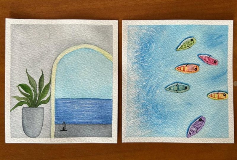
7. Day 2 - Evening Pastel beach - Color Palette: Hello everyone. Welcome back to day two of this 15 painting beach
Challenge class. Today we are going
to be painting this beautiful paste till
evening beach scene, wherein we are going
to paint the beach also as a reflection
of the sky colors. So for this guy, we're
going to go ahead with pastel tones of blue,
pink, and yellow. For the blue I'm going to use
in the civilian blue color, to which I will add
in a little tinge of white to get this pistol
blue kind of a tone. Now in case if you have
ready based on colors, you can even use them. In case if you do not have pasting colors, you can simply, he was in byte and create
your pastel tones for the yellow I'm going
to be using in this Naples yellow
from Magellan mission, which is already a
pasty yellow color. So I do not need to
add in the white. Now for the pink tone, I'm going to be going ahead
with the crimson lake, but you can either
use quinacridone, rose crimson makes
college draws matter, whichever pink is
available in your palette, you just need a
beautiful soothing pink and add in a little white to give it a little
pasty effect for adding in the details
into the sky. And then we are
going to be using in a little bit of the violet
color highlight as well to just add little
evening sunset kind of a look and toning the
sky a little darker. Just very little of
the violet color that we are going to
use as a highlight. You can either mixing your blue and pink
together violet color, you can directly use a permanent
violet or purple tone. So these are the colors that
we'll be using infrared sky. The CATI is going to be an exact reflection
of the sky colors. So on the sky we are going to be using in the wet-on-wet
technique for adding in these cloud DDS for which you
will be very important to learn the water control
technique that you have the perfect control while
adding in these details. We already discussed the
water control technique. So it's very important
to understand that. And then as we discussed, the sea area will be an executive flexion
of the sky color. And then we will be using these driveway of technique
that is wet on dry. And then the dry brush technique for adding in this blaze of the white color to show the form effect for
the beach sand area, we are going to use tones
of brown and yellow ocher. Here we are going to
use a little tone of greens and then the white
quash for the glazing effect. So these are all the colors that you would be needing
for this class. Now, make sure you have
a white gouache because only with white quash can
you get this opaque layer of the form effect that
will try to create using the dry brush
technique. As we paint. In the next lesson, you will know what the
dry brush technique is. We are going to use it in a glazing method will already
have an underlayer brown. And on top of that, we
are going to add in the white gouache to create
that glazing effect. So these other little details
for this class project, also we are going to try to show the reflection of the
sky into the sea. And accordingly the tribe waves will also vary that we will also be creating that sunlight
effect onto the subspace, giving a little
yellow highlight into a beach area and then a
shadow to the beach as well. So these are the details and
the colors for this class. Now in the next lesson, we'll begin creating this
painting together step-by-step with every little detail to create this beautiful
beach painting.
8. Day 2 - Evening Pastel beach: So let's begin with our
class project for D2. Since I'm using an
Arches paper sketchbook, this paper is usable
on both sides without any paper folding or
any paper crumbles. So I'm going to use both
sides of the paper. So I've just marked
the horizon line. The top is going to be this guy. The bottom is going
to be the C and the beach space that we
are going to be happening. This time I'm going to be
having a beach towards the left side and not
just the bottom space. We're going to go ahead with
a pretty pinky evening sky. Looked at we're
going to go ahead. So for this guy first, as we discussed in
the previous lesson, the colors that we're going
to use are going to be shades of pink, blue, yellow. And same. It's going to be
in the case of the sea, as we are going to
show the reflection of the sky onto the beach area. And then we're going to go ahead with the beach space
with the tones of brown. So I'm just going to
space out a little bit. Often Naples, yellow
color for the sky. It's kind of a
pasty yellow color. So in case if you do not
have a Naples yellow, simply adding a
little bit of white to your yellow to get
a Naples yellow color. Now, I need one tone
of pink for which I'm going to go ahead with the
crimson lake color this time. You can go ahead because
Scarlett or Crimson, Quinacridone, Rose, rose matter, whichever pink tone
that you wish to. We've discussed all the
color alternatives already. I already have a little of the city didn't
do on my palette, and now I also have a little of the white color
already on my palette. You can get all these
colors ready before you begin to add in the
details into the sky. So I'm forced beginning
in with a layer of water only into the sky. Make sure that you go ahead with an even layer of
water throughout. Water is evenly
spread and you do not have access water
collected on the edges. So you can see I'm
running my brush multiple times so that
I have an even layer of water throughout on my paper
stays wet for enough time so that I can add in Leo's wet
on wet to build in the sky. Now as we discussed in
the technique section, I'm going to be going
ahead with wet on wet layer for building in the
Cloud details into the sky. So I'm going to make sure to have the perfect
Water Control while adding in the
wet layer colors to given depths to the Cloud. First time beginning ahead with the Naples yellow color just
closer to the horizon line. Now to the side, or
even blue color. I've added a little the
white color to make it a little piece of sky
blue, kind of a tone. Now very carefully I'm adding
in the sky blue color, but I'm not having it close to the yellow color because
yellow and blue mixed together may give
you a green tones in-between I'm going to be
using in the pink tones. So for the pink, I'm mixing in a little bit of the white
to the Crimson lake colors. But in case if you already have readily available
tasteful watercolors, you can even use them. Or you can simply mixing your white watercolor
or white quash. I'm mixing in a
white bar since I do not prefer using a
white watercolor. Now I'm just having
of Texas pain because I want very
light consistency. So make sure you do
not have too dark of a pink color because
we are working on now ready carefully. I'm laying a little off the
pink over the yellow color and you can see little
orange tones getting formed. So that is the reason I've
not used in any orange color. Rather use the pink mixing on
a little bit of yellow too, given that warm orange color
instead of that right? Audience for loop. So you can see how simply
you can mix the colors are all have off of beautiful or transition
between the color tones. Now, I'm going ahead with the violet color mixing
in a little tinge of the Payne's gray color to give it that drastic
violet effect. And I'm going to begin
adding in the clouds. Now make sure when you
begin adding these, you do not have excess water. The water control technique
that we discussed in the technique section
is very important here. Plus my paper is still wet, but in case if your paper
has already begun to try, we also discuss the
rewetting techniques. I would recommend
you to go ahead with the re-weighting
technique in that case. So I've just given
a very light layer of the violet color. Now since we use the pink
color closer to the yellow, you can see even when you
laid the violet color, you do not get in muddy tones. There was already a little
bit of the pink which was helping to avoid
the muddy tones. So I'm just going to head
with a little of the pink again at the bottom side so
that even at the bottom, you do not have any muddy
tones being formed. So I've absolutely loved the clouds onto
the left as well. Now I'm just going
to go ahead with little yellow highlight
at the top space, just using the tip of the brush, adding the colors with a very light time so that you'd not get muddy tones or green color because of the violet
and the blue tones. Now I'm just going to
go ahead with a little more of the pink
highlights as well. My paper is still wet. I'm still working wet on wet, adding in the details with the red bellows on the red
layer that we already have. So you can see when I'm adding
in the deviance of clouds, I'm making sure my brush
does not have excess water. That is the reason
the clouds are retaining the shape in
which I'm adding them, but they are having the
software because it's the wet on wet technique
that we're using it. I'm just going to go adding little blue highlights
over the yellow color. Now in this case, since I've added a little
extra white color, it will not give you
green tones, rather, it will stay as a
light blue color tone over the yellow color. So in cases you can use white
color to avoid getting in the complimentary
color which may give you Maddie tone variations. So very carefully,
I'm still walking. It's almost being
five to 7 min that have been working wet
on wet onto the sky. So you can see when you have 100% cotton paper and you add
a perfect layer of water, you can go for a longer time, wet on wet again, smoothly. So make sure that
you try using in 100% cotton papers so
that it stays wet. But in any case,
if it has dried, you can go ahead with the
re-weighting technique two to three times to
keep your paper wet. Now, we will wait
for this to dry and then move on to the CAGR. Now my pretty based on sky
is completely dried and I'm going to go ahead beginning
with the beach space. I'm going to go ahead with
a layer of water onto the entire San as well as the water is
based off the beach. We are going to add in both of the base layers for the c and the sand together because we want a soft
connection between them. And later on we'll
be adding in the two of those crashing Dave
effect with the white quash. So in this class, a new thing that you would be
learning is about adding in those
crashing wave effect using the dry brush technique. I'm just very carefully
going ahead with a layer of water
again, only in the C, Make sure you do not run into the sky space and especially closer to the horizon line or in very carefully with
the water for that, excess water does not
move into the sky. Now ask me discuss the speech or the z-space is going to be an exact reflection
of the sky color. So I'm going to go ahead with
the same colors as the sky. So closer to the horizon line, I'm going to go
ahead more with the pink and yellow so as to show the reflection of the pinks
and yellows closer to the horizon line falling
into the water space. And then at the
bottom I'm going to go ahead with the
blue and the purpose. Now you can see very carefully, I'm going ahead in
such a way that all if it has a soft edge
to each other, as well as a blended look
and each color is visible. Now I'm going to head
with the blue tone, and I'm just going to mixing and added closer
to the pink color, the blue tones so that you have a little violet color being formed because of the
pink and blue mixing. And you do not have
any green tones form. Now again, wet on wet, I'm just going ahead with
little more off the blue tones and moving a little
over the yellow as well. We're going to add in wet on dry leaves this time as well. Once the base layer
of the seat right. Now, we are going to
quickly go ahead painting the space for that I'm using
in this raw umber color, which I already
have on my palette, mixing it with a little bit
of the yellow ocher color. And I'm just going
to begin adding it into the rest of the space, which we are going to be
showing us the same space on the left side moving
diagonally towards the right. Now you can see at this point I'm adding it perfectly close to the blue color so that
all of it has a soft edge. And later on, when we go
ahead with the white tedious, you'll see the
distinction point and the sand details coming
as well separately. Now onto this, I'm
just going to pick up a little of the
light red color. I'm just going to add
in little effect with the brown browsers
because it seems too much of the yellow ocher
instead of the raw umber. So just a light wash off
the brown as well on top. Now again, then you are
adding this brown color. Be careful you do not
have access water, otherwise it will seep over
the blue color completely. Now this is for the base
layer of the beach area. We'd have to wait for this to dry before beginning to add in. The wet-on-dry details
for the beach. So we'll wait for this
to dry completely. Now, if you can just
completely dried and we're going to begin
adding the details. Wet on dry paper is
completely dried onto this. We're going to go ahead
with bet pains to begin adding in the water
area of the beach. I'm going to go ahead with
the wet-on-dry views. I'm going to be using the
same colors that we used for the base layer and begin
adding in the driveway effect. So I'm first going ahead
with the pink tone. Now closer to the horizon line, I'm going to keep it more often, pink and yellow tones. And a little look,
no highlights with. When you begin adding
in these fields, make sure you're using a
very thin liner brush. You do not have excess water, otherwise, it will give
you patches of the color. Closer to the horizon line. Go ahead with very small, tiny beads and small lines. And as you move closer
towards your viewpoint, keep on increasing the length. That is because of
the perspective. Wherever you are standing, waves closer to you will be
visible much more clearly, much more longer inland. And since the horizon line we're considering is far
away from you, that is the reason
the waves out there are going to be quite
smaller in the Lyn. Now using the yellow color, I'm just adding in
little highlights. Now since this yellow is kind
of an opaque color already, I'm going ahead and adding
in these opaque lines here. So just adding in
some yellow color highlights onto the
blue space before I move on to the pink and the blue tone effect
at the bottom side. So now I'm going to
quickly keep on adding. These are wave effect. You can see I'm going
to head very slowly not rushing with it because
I do not want to overdo it. I'm going ahead with some
crisscross lines closer to each other building in
the layers one-by-one. Now next time shifting
into the blue color, I am just picking
up more of the blue with very less of
white this time. And I'm going to begin adding in the movies as we are moving
towards the bottom side. Now you can see at the top, I kept in more of the pink
and the yellow highlights. And moving downwards, I'm shifting into the
blue color slowly. But I'm even going
to add in little of the blue highlights onto
the pink tones as well. So I've just shifted
up to another brush because that liner brush
did not seem to work fine, was holding a lot of water or maybe the bristle
brush has got damage to have moved on to another smaller size brush to quickly adding
these wave effect. So you can see move towards the bottom side at
certain places. I've even added in
some kickoff is to show that these waves
are closer to your view. That is the reason visible or little more thick and closed. So even for this class project, I've kept WWF details. Simple because the technique that we're going to explore in this one is going to be adding
in the driveway effect. So you can see just at
the bottom I've given a little detail with
the blue color, giving in some little
Kogi wave effect as well, trying to show that flowing
water effecting there. Now I'm picking up
the white quash. Now, white quash you
need to pick up in a very thick consistency
so that you can add in the bold effect of the crashing V across
the entire sand lime. We're first going to go
ahead with the white color, given a line and then given little dry brush towards the
inside of the water space, for us to add the meeting
point of the browns and blues just gave a little
fine line like this. So I've made sure that a
little of the signed area is towards the water side and not completely towards
the white line. The white line you
can see I have this little brown patch
visible trying to show that how the
sand or water comes over the sand when
the water I'm that crashing gave effect
coming towards the sand is that is the reason
I've kept a little of the brown towards the
right side while adding in these white crashing
wave effect to show the effect of the flowing
water on the sand as well. Now, I'm going to pick
up the right portion, going to just add in
little dry brush. For this, you need
to make sure that your white quash does
not have excess water. You pick up a whitewashing of both thick consistency and your brush should also
not have access for. Now I'm just going to pull out some very light lines using
in this dry wash color. And I'm just using it in a very dry consistency and pull strokes towards
the water side. You can see with
just a little bit now that we've added so far, you can feel that
crashing wave effect when the water moves over
onto the subspace, giving you those, for me, kind of line effect. And you can see that underneath sand or under the water as well, under the form
that gets created. That is what we've
tried to convey here. So you can see the
underneath, round, under the white
tones that you've added using the dry brush. Now you can see my brown
does still visible because I have gone ahead
with the dry brush technique. If you're bright
color will be too watery or if you will add
in thick layer of fight, the brown will get covered up completely and you will not be able to see the underlying
details of the sun. It's kind of a glazing
technique again, when you are adding one
color over the other color, but you're making sure that the underneath color
is still visible. Now I'm just going
ahead with some bold lines of fight
moving towards the water speed is trying
to show a little of form, in fact, coming from
towards the water side. Now next I'm going to add in a little bit of the
shadow to this format. So towards the sine side, I'm going to use this
light red color, and I'm going to add
a very fine line just underneath the
white color line. And I'm going to
use a damp brush and blend it into
the science piece. So this will kind of
show the effect of water falling of creating a
shadow on the sand as well. I suggest using a very fine
line off the brown color. Now quickly using a damp brush, I'm going to blend
this brown color line into the VCR such that it is very blended and it looks as a perfect
shadow effect. So you can see how
I've blended it. So you have that
lighter brown moving towards the sand area as well. And at the bottom, if
anybody you feel you are having a patch of
a color or something, you can go ahead with a very
damp brush and then it will the bottom space so that
you have do not get patches till the bottom
because of this or, you know, color
shading that you've tried to give it in
for the brown tones. Now using the brown color, I'm just going to give him
very little dry brush. Only at the bottom
left side trying to show him some artifact
here as well. Now next last thing
left to add on is a little greenery effect on the horizon line
towards the left side. So for that I'm going
to use in the tones of green which are
already on my palette. And given a very
small bushy back, you can go ahead
with any green or just a brown tone as you wish to for adding in that effect. Now just add this
time-space post. I'm going to add a little
bit of a yellow color so as to show that sunlight
effect falling on the side. So you can see in the sky
exactly at that pace, we have that yellow pad. So to show that effect, I've added a little off
the yellow and blended into the background using
a damp brush on the edges. So you can see a little
lighter it bedtime, the shoulder sunlight effect
falling on the sand as well. So a very light effect, but all layer of
detail to add it, you can see it creates a little depth as
well as flow into your painting when you walk
on these little videos time to show the reflection of
this falling on the sand. So simply just dropped
a little of the yellow, blended it on the edges
using a damp brush. You do not get patches
when you tried to go ahead with soft blending
using it brush. Now I'm using the greens which
are on my palette already. It's a mix of the sap green
and olive green color. I'm just going to add in
little bush effect here. So just a little afraid only medially towards the left side, I'm going to fill it till
the horizon line quickly. Now I'm just going to give it a little bit of a darker depth as well at the bottom
side to this bush space, I'm just going to
go ahead and mix it a little bit of the
Payne's gray or brown, but my greens and given a little more gradient to
these bush details as well. So you can see the
darker color effect, just very little detail that
are added, not much of it. So that is it. We are ready with the odd class project for dq2. It's time to remove
the masking tape and see our painting. So again, the class project
was a little simpler one, but we went ahead with two. Nudity is one,
working wet on wet, adding in the Cloud DPS. And second going ahead with the dry brush VPNs for creating
in that crashing waves. So slowly that you
keep on adding one new technique
with each painting, you will get a hang
of it as well as you will be able to understand
the techniques, why we're using
what we're using. Now I'm just blending a
little of this brown again into the background because
I'm not liking that much. So just using a damp brush, I've quickly blended it and I'm making sure I do not
have any sharp edge, so just running
with a damp brush across the entire space. So this is again how
using a damp brush you can quickly create
these soft edges. Again. I'll just add in a
little of the yellow again to show that effect of the
sunlight falling on the side. It already has a soft edge
because the paper is bad. So now I'm satisfied with the yellow color
effect has been using a damp brush and
bending the edges soft V does not give
you any sharp edges, as well as the blue blends
the color with the base layer because it turns the we basically are also
a little bit again. It's an already carefully remove the masking tape
against your paper. And we're ready with our
class project for D2 off this 15 of the beach 15
painting beach challenge. Yours. A closer look at
our painting for today. I hope you guys have
enjoyed painting this beautiful paste in a bit. You can see the
glazing effect of the white underneath which the brown and the blues are visible. Crime disorder,
unneeded sand as well. So I hope you guys
enjoyed painting this. I will see you guys soon
into the D3 class project.
9. Day 3 - Shine through the Leaves - Color Palette: Hello everyone. Welcome
back to day three of the 15 days beach
painting class. Today we are going
to be painting this beautiful glowing
sun effect from between the palm leaves and a
swing onto the beach space. So we are going to beginning
with the sky, father sky. You can see we are
going to use in a very light tone of the
civilian blue color. Here you can see the
difference between the sky and the base tone paper. So it's going to be
almost a water layer just with a tint of the
civilian blue color. Then we are going to go
ahead onto the beach space, which is going to be the
turquoise blue color layer. So I'm going to be using in this turquoise blue from
the White Nights pan set to add in the
base layer as well as the details into
the water space. Now, into the water, I'm even going to be using in little green tones to create highlights for the
deflection of these palm leaves falling
into the CSPs. So far, the families
we are going to be using in the tones of
greens and yellow, olive green, sap
green, viridian green. You can mixing browns and blacks to create darker
and lighter tones. For the buck I'm going to be using in the raw amber color. Along with that highlights with the brown color and a little
of Payne's gray color. So you can either use a raw
umber color if you have, or you can go ahead using
yellow ocher mixed in with a little bit of brown for the base layer of the
bark of the tree. And then we are
going to go ahead with little of the
red brown tone. Or you can use in bone sienna, burnt umber color, a darker
brown color basically, for adding in the highlights
onto the back of the G. You would be needing a white
gouache as well to create that effect
of the glowing sand between the palm leaves and adding little effect
of that as well, falling onto the
ripples of the water. So you would need a
white gouache for that, then the Payne's gray color for adding in the spring details. We are going to be
forced beginning in with the water layer, which is going to be
the C and the beach. We paint together wet on wet. After which we are
going to go ahead and add in wet-on-dry waves as well. So in the techniques
that we discussed first, we're going to go wet on wet for the beach space and
the skies fees. Then we'll move to the wet-on-dry for
adding in the details of the ways we will be adding some waves wet on
wet and wet on dry. We've details as well. Then we're going to use in the water control
technique while adding in these green
highlights when we paint the CAD so that you
can see the green is staying in the spaces that we're adding them and not covering
the blue tones. And for these families, we are going to be
using the wet-on-dry technique to add in the
details of the palm leaves. These other techniques
and the colors and the flow of
this class project. In the next lesson, let's paint this beautiful beach painting together for D3.
10. Day 3 - Shine through the Leaves: Now let's begin with our
class project for D3. We are going to go ahead with
a very basic pencil sketch. I will just mark a very fitted
line for the horizon line. As I told you, the color
for the sky is going to be almost a very light
tone of the blue color. So make sure you do not
have sharp pencil lines. Now, I'm going to be adding
in a palm tree at the top, and I'm going to show
it in Ogilvy one. So I'm just adding the
bark of the tree first and then we're going to
add in the leaves falling towards the water side. That will directly
be adding in with the pains when we begin
adding in the details. And in the center, we're going to add in a swing or reaching till
the beach space. And we are going to show in some shining light
coming in from between the leaves will begin in with
the sky and water first, then move on to the wet-on-dry
details once these tryout. So first let's begin with a layer of water onto
the entire paper. I'm going to be painting the sky and the base layer
for the C together. Because as I told
you for the sky, we are going to be having in a very light layer
of the blue color. So accordingly, we can
paint both of these together because we are going to be going ahead with
the wet-on-dry ways. When we add in the
wet-on-dry viewers will make the distinction point
between the sky and the sea. Now make sure you have an even layer of water
throughout so that you can add in the details and
no space dries out unevenly. Also make sure on the edges
you do not have excess water. Otherwise, when you leave
your paper for drawing, the excess water will
seep back and may ruin up the edges
and fade them out. Despite I'm using
100% cotton paper, I run my brush multiple times
so that my paper stays wet for the perfect time for me to add in all the
details, wet on wet. Now for the sky, as I told you, I will be going ahead with a very light layer of the blue, that will be the
civilian blue color. For now, I'm beginning
in with the sea area. I'm going to head with
the turquoise blue color and I'm just going to
add in a base Leo. And while this is
going to be wet, I'm just going to add in
little of the green spots at the bottom space to add in as the reflection to the palm leaves that we'll be
adding at the top. So just little green
effects to show little reflection color
falling into the sea space. Now into the sky,
I'm going ahead with a very light layer of
the civilian blue color. You can see it's such
a light tone layer that I'm adding in. Most of the sky will
get covered up with the families and the
back of the palm tree. So that is the reason
I'm not going ahead with much details in
the sky for this time. Now. I'm going to go ahead
with a little more off the turquoise blue
color and add in a little detail and
depth veteran way. So I'm going to begin in
with one layer darker tone. I'm using in the water
control med car. I'm just going to begin
adding in little wave effect, wet on wet as well. Later on we'll be adding in detail waves wet on dry as Ben. For now, just adding in little depth while
it is still wet. Now again, going with one
more layer, darker tone. It's just the base layer
that we are building. So be very calm and
let it go loosely. Just keep on adding one darker tone and adding
little wave effect. But make sure you have
the water control. Otherwise, these waves will spread completely
and again give you one tone of the turquoise color instead of giving in
different tonal variations. Now on the green spots as well, I've just added in a little
bit more of the planes. Again. I'm going to pick up a little bit of the viridian
green color as well. Now in case if you do not
have the viridian green, you can go ahead with emerald
green or you can just go ahead mixing a little of your turquoise with
your Sap green. And just to add in,
I just want to show these as the reflection to the palm leaves that
we'll be adding. So giving you a
little green effects only at the bottom space. At the top space also just adding in very light
green highlights as waves in between to show a little reflection
of the moving water. Now we'll wait for this to dry completely and then
move on to the details. You can see the sky
color is so light. So let's wait for
this to dry now. Now my base layer off
disease completely try it. You can see the sea color
has not moved much into the sky space because while adding it closer
to the horizon line, I made sure to not go
ahead with a lot of photo. Now I'm just mixing in a little bit of the
civilian blue and the turquoise blue
color to begin to add in little off the
wet on dry waves detail. So first I'm going ahead with very simple wave details and then we'll go ahead with a
little detail one as well. Now I'm going to
pick up a little of the green tone which is
already on my palette. It's a mix of olive green, sap green and a little
tent of the brown. And I'm going to begin adding in little wet-on-dry details. I'm just squeezing
out a little off the viridian green
color as well to mix in with the
olive green color. I'm just going to give him
little wet-on-dry details at the bottom to showing us that reflection for the palm leaves. I will later on blend this using a little damp brush
into the blue tones. For now just beginning to add in very simple lose reflections of the greens at
the bottom space. So I'm majorly keeping
the reflection for the palm leaves only
at the bottom space. So you will notice more of the Greens only at
the bottom layer. Not taking it much closer
to the horizon line. Do not worry in-between this, we are again going
to be adding in little blues and not going
to keep it completely green. Now using the
turquoise blue color, I'm beginning to add in simple
wave effect, wet on dry. I'm going to define the
horizon line also well, so I'm not keeping it a very straight horizon line this time. You can see little corny effects of the waves that I've added in. Now, I'm just beginning to
add in very simple strokes to actin as the waves and
the movement for the VFS. After this, I'm going
to even be going ahead with more fine
waves into this. For now. You will see
I'm going ahead with very big patches of the
color to add in the details. Wet-on-dry. Now you are, I'm just blending the blues
and the greens to get in a perfect blend and transition happening between
the colors as well. So as I told you in the
bottom on the green, I'm adding little of the blue
highlights again as well, because we want a
perfect plan and transition happening between
both the highlights. Now, we'll wait for this
layer of the waves to dry. You can see it's a very
messy and oh, you know, a little bigger
brush stroke detail that we've added for
the weeks after this, we'll be adding in the
detail waves as well. For now, let's begin adding in the base layer for
the buck of the tree. So I'm mixing in the
yellow or raw umber into brown and the
Payne's gray color. And I'm going to go ahead with the base layer for
the back of the tree onto this as where we
are going to be going ahead with a lot of
details moving further. I'm just adding a little
more of the Payne's gray to get it more towards
a rusty brown tone. So I'm roughly just creating
a bark of the tree, trying to show the tree trunk moving towards the top sign. Onto this, we are going to
add in the leaves falling towards the bottom water
side of the beach. Now using a little
after white gouache, I'm just adding little
of the white highlights out here at the
bottom space as well. To create little
highlighted space. This is just again,
one more addition. We are still going to
go ahead with a lot of details into the water space. To make it look like a
natural rippled water effect. Now, till the base
layer of the waves, that is the second year of the waves dry and
the bulb trays, we're going to begin adding in the first player for the
palm leaves as well. For the palm leaves
also will have to walk onto layers to
build in the depth, as well as the darker and the lighter and the shadow
effects as well. Now since I'm working
on a sketchbook, It's so easy for me to
just tilted the sketchbook according to my hand movement
and hand convenience, because for adding in the
palm leaves at the top here, I may have to lay my hand onto the water space
which is still wet. You can see how simply I
could just rotate my book and adjust according to
my hand convenience and begin adding in the details. I'm beginning to add
in the palm leaves. First, I'm going
to add in a set of palm leaves scattered and
septic from each other. Once this first layer dries out, I'll go ahead with a
different tone of green and yellow and begin adding in the second layer of
the palm leaves. Now when you begin adding
in the palm leaves, you can go ahead with any green tones of your
choice plus a little tinge of yellow to add in
little effect of the sky falling
onto the families, as well as showing in little variations in the
palm leaves as well. I'm going to use in a mix of
the sap green, olive green, brown, and yellow tones to create in the different
tonal values. You can use in a light
green if you want, or you can mix in
yellow along with your green to get in a
lighter green tone. I'll say if you do not have a sap green or an
olive green color, you can simply mixing your lighter green
with Payne's gray or brown and get imperial
tonal and variations of the green tone. To begin adding in simple
palm leaves like this. Now, again, for adding
in these leaves, you can go ahead with any color
combination for any leaf, there is no specific pattern or no specific color tone
that you need to follow. You just need to keep adding
in in different variations. So two leaves close
to each other. Try keeping them off
different tones. So now the next one that I'm adding closer to the first
leaf that I've added. I'm going ahead with one tone darker color than
the previous one, so that these standout
distinctively. Now in-between I've left
a little space and I'm going to add in another
layer of the leaf here. Once the first layer will dry in-between these two leaves, I'll go ahead with a different
color of the leaf to add in little layer and depth
into the palm tree as well. Now the next one
you're in the center, I'm beginning in with
the Naples yellow color. You can use in any
lighter yellow color or creating a lighter
paste in yellow, using in a little off
the white color into it. I'm just going to quickly add in a layer of the leaf
with the yellow color. And onto this I will quickly add in little of the
green depth as well. But in such a way
that the yellow color is still visible into this. Now in-between these last
leaf and this yellow leaf, you can see a lot of gap there we are going to
have in the swing. So accordingly,
where you want to place this thing in
the center space, make sure you keep a
little space there. We'll first add the
swing and then add in little palm leaves covering the string off the
swing as well. Now on to the yellow, you can see I'm going ahead with the green color in
such a way that in-between you have
little yellow highlights visible in the palm leaf. But you do not need to wait
for this in for it to dry. You can add in the green
layer on the yellow itself. Now also, all the
palm leaves you can see are moving towards
the water side. They are all tilted
towards the bottom edge. So make sure you try to have little variations in
the leaves as well. Suddenly you can see
I've taken it a lot, tilted and bend somewhere. I've taken it a little
street somewhere moving towards the left,
towards the right. So try adjusting the angles of these palm leaves as well
to give it a natural look. Now as we move towards
the left side, I'm going to keep more of the darker tones
towards the left. So you can see now
I'm going ahead with a much darker green tone, which is a mix of
brown and the green and a little tint of the
Payne's gray as well. As I told you earlier, this is just the first set of leaves that I'm adding funds, this first layer will dry. We'll go ahead with more leaves. We are still left to add in one more layer of
the waves as well. One molar of the leaves and the detail onto the back
of the tree as well. So the left side you can
see it's almost filled up with much darker tones giving
in that natural effect. Now, we'll go ahead with
a little of Payne's gray. I'm mixing in with the green. And towards the
top side out here, I'm going to give
in a darker death, trying to show a
very dark space out there as if you know of because if the light reflections
turning darker. So I'm just beginning
to add in some darker, darker leaves effect falling
out from that space as well, giving a little more layer
to the leaves as well. Now at this point I'm just blending all the
details here so that it all looks well and it does
not have any sharp edges. So now you can see that
tree effect that is coming because of adding in that darker depth
at the top space. Now I'll just begin adding
in some overlapping leaves. My first layer of
leaves are dry, so just going ahead with overlapping leaves of
different tonal values. So you can see that
basically are leaf was of a complete olive green color. But now this color
is a little darker, so this will just add in the depth to the
palm leaves as well. In-between you're just using
a little lighter tone as bad to show a little
lighter effects of the palm leaves as well. Now onto this lighter one, I will quickly go ahead with a little of the greens again, just giving you some
little highlights over the yellow tone. So you can see I've
added the highlight in such a way that even
the lighter green, lighter yellow is still visible. Now at this point, I'm
just going to add in one palm leaves for now. And later on we'll go ahead with the swing details and adjust
the details accordingly. Now I've picked up a little
of the yellow this time, I'm going to reverse method. I added the green first. And on top of that I'm adding in a little yellow highlights. We are left to add in
the spring on the bar, we are even going to be
adding in a shining effect, trying to show in the sunlight peeking through these families, creating in that glowing
effect when you click on a photo and a light falls
at a specific point and the reflection or the white blurry space or that
growing space that it creates. We are going to try and create that effect with the
help of five gouache. So that photogenic effect
of light falling because of the sunlight coming
from in-between the palm leaves that
we've added it. Now using in the mix of
brown and the Payne's gray, I'm just beginning to add in little highlights onto
the back of the tree. So some simple lines
to give in texture. To the back of the tree. Make sure that your
first layer of the back was completely
dried before you begin adding
in these details to the back of the tree. So the tops piece of
the buck I filled in completely with the green
and the black tones, time destroying the darker space where again, that's i as well. That is a cluster of leaves, palm leaves, which are not
visible in our picture focus. And because of this, the shadow part of which is visible creating in
that darker effect. We're almost done
with the top spaces. We'll have to wait
for the leaves to dry before we add in
the swing effect. Until then let's begin adding in the details
in the waves. Again. I'm going to begin with
the layer of green force. So we're going to add in one more layer of
the green details as well on these parts to
show us the reflection. So now you can see these rough
green patches looking as the reflection of the palm leaves that we've
added at the top, which is falling into
the water space. Because of which these
green highlights in the water area. Now, let's use in the turquoise blue color and begin adding in little details. I believe in squeeze out
the white quash and keep ready for adding in the whiter
highlights trying to show. So we are going to be
creating in that, you know, the glowing effect I
told you of the sunlight falling or coming in
between the palm trees. I'm going to show that
little shining effect falling into the water
ripples as well. So in the center
space here I'm just adding in very simple
white dots and white. Little shining effect is showing the effect of the sunlight
falling out your, you can even just go ahead, cover up the rest
of these pieces and adding very little
splatters here. So this white effect,
I'm going to keep it majorly only in
the center space. Not going to keep ticket much towards the left
or the right side. Because I'm going to show
that effect of thumb are glowing sun effect between the palm leaves only in
the center of the bar. At the bottom you are, I'm just touching very little
effect as well. To give him little
unnatural view. Make sure that if you do not have that control
over the splatters, you cover the rest of
the top spaces so that does plateaus to not move
towards the top side. Now using the
Payne's gray color, I will quickly add
in the spring here. Now when you add in this week, make sure you use a very fine tip brush so that
you get the details right. So I'm going ahead
with the strings of the swing first onto this will add in little white
highlights later on. So we are almost done
adding in the spring, I'm just adding little tie on, not effect as well
at the bottom space, trying to show that string
tied down at the bottom space. Alright, now let's add in that glowing effect of the
white gouache as well. I'm first adding in little
Payne's gray highlight very little if you want, you can skip this part. I may later on, just go ahead and
lighten this up as well. So just added little
dry brush effect with the Payne's gray color. Now I'm picking up
the white gouache. Make sure you pick up
the white caution. A very bold consistency
to create this part here. So I'm forced adding
a dot towards the left end of
the swing string. And now using a fine tip brush, I'm just going to pull out small reads out from this whitespace. So basically trying to show
that sunlight peeking through in-between the
leaves creating in that glowing photogenic
sport out there. So using the fine tip brush, I'm just pulling out these
trucks from the center space. You can see the
photogenic effect that happens when
light falls onto the cameras piece because of the glowing light or
the sunset effect. So you're, we're
considering it as the sun glowing from in-between
these leaves creating in this
glowing light effect in the center of
the palm leaves. Before you begin to create this, make sure that your leaves
are completely dried, your buck is completely dried
so that this white spot has this glowing effect strong
and visible out there. That is it. We are ready with
our class project for D3. I just diluted the highlights
of the Payne's gray color a bit using a damp brush because I felt the Payne's gray
highlight was too dark. So I just lightened it up
a bit and used in a little of the brown bones there again
on the back of the tree. So here's our final
painting for D3, are beautiful glowing sun effect from between the palm leaves. Along with us. I hope
you guys enjoyed painting this beautiful beach
view with me today for D3. I will see you guys soon into
the day for class project. Thank you so much
for joining me into this class and painting
along with me.
11. Day 4 - Overview Beach - Color Palette: Hello everyone. Welcome back to day four of these 15 beach painting class. Today we are going
to be painting this overview view
of a beach parent. We're going to add in
a lot of boats joining simple rolling effect as well as the crashing wave effect
towards the rock side. We're going to go ahead
creating these details when first beginning with
the pencil sketch for the board's mark
those pieces out. If you want, you can use masking fluid to secure
these boats pieces, but I'm going to keep
those spaces white. Then we're going
to go ahead with the wet-on-wet
technique and paint this beach area, water area. For the water area
I'm going to be using in this turquoise blue
from White Nights, as well as a little of the aquamarine missed
from the White Nights, which is a granulating color. I will show you that color in the next lesson when
we begin creating. But if you do not
have that color, you can simply use in the
aqua turquoise, blue color. I'm going to use the base layer, a very lighter one, and then darker tones of the turquoise blue to
add in the details, wet on wet creating in the vase. Then for the boards, we are going to
add in the shadow using the same
darker blue color to show the shadow of the board falling into the
water space as well. Then we'll paint the
boats wet on dry, and then add in the
details on the board. Once the base layer of the
board drive on the left side, we are going to show in
this crashing wave effect using in the white gouache. So we're going to show and
assume that on the left you have a lot of rocks through
which the waves are crashing, giving in this form effect. And as the form is moving
towards the board, it's turning lighter
because it's a little far from the rocks. So very little form effect that diminishing form effect
that you'll see. That is what we are
going to try and create. Very first, beginning with the boards and base layer
color combinations, then add in the details. And then lastly, using the technical pen
or the black color, you can add in destroying
us rods or the tire effect. Just a little detail
to show on the board. If you have a closer look, you can see the wet
on wet details are done using the water
control technique, which is very important
to get the effect and depth like this so that
the colors are visible. Yet stay in the space
that you are adding them. In case if you're wondering what water control then
let me show you. So basically in the
technique section, we had discussed the water
control, if you remember. So in case if you'll go
ahead with lot of our wet, darker tone, it will
spread completely. But if you will have
to water control, it will give you
this effect wherein it has a soft blend
with the base layer, but still visible distinctively. So we do not want the
first wrong method, rather the right method of the water control to give him the depth into the water space. We are not going to go ahead
with any wet-on-dry details. Rather, this time
we will be going with the wet-on-wet
babe details. Adding in little
wet on wet waves effect in half C strokes manner. Moving from left to
right or right to left. So very simple wave
details as well. So these are the two
important techniques. That's the wet-on-wet
waves using the water control technique to add in the depth
into the base layer C. So now in the next
lesson we will go ahead and begin creating in this beautiful class
project for day four.
12. Day 4 - Overview Beach: So now let's beginning with
our class project for the A4. I'm first going to go ahead with the pencil sketch for the boats that we
will be adding in. Now as we discussed, we are adding these boats
in the overview view. So I'm just going to mark out
the outline of the board. And for the overview view, we're going to add in
a little shadow of the good falling into the water
when we paint the water. So for the shadows, we are not going to be
adding in any pencil sketch. We are directly
going to be adding in that depth of the shadows using in the darker
tone of the blue that we use in for
painting as CAD. Now, I'm going to
go ahead and add in around five to
six of these boats. Hello head. If you are
using a smaller size paper, the number of votes can
be adjusted accordingly. Or in case if you're using
a bigger size paper, you can accordingly adjust the number of votes that
you wish to add in. I will go ahead with
approximately five to six. I'm using a
five-by-five inch paper so they will fit in perfectly. Plus I'm going ahead with
very many sizes of the boat. You can see I've tried
to keep the angle and movement off the boats
in different direction, make sure that you keep them
moving in different angles. Otherwise it may look
a monotone is one. I'm done adding in the layer
of the board pencil sketch. Now we're going to go ahead
with a layer of water. Now I'm going to go ahead with the water into the
entire see space, leaving the boats space empty. So in case if you want
to use masking fluid or masking tape to
safeguard these boards, spaces from water and paint. You can go ahead adding
the layer of masking fluid or cut masking tape
in this shape and paste it. But for me, I am directly
going to leave these spaces empty while adding in this layer of water and preserve them, and later on then adding in
the details in the boat, I will correct if any water or paint seeps inside
the boat for now. But as much as possible, I will avoid adding in
any paints into these. So you can see around these, I'm adding in the
layer of water very carefully running my
brush onto the edges well enough that I did not add any layer of water
inside the boat. But you need to make sure
that by the time you are outlining these boards
for the layer of water, the left side or the other parts of your water layer
should not dry. So you can see I'm
running my brush in multiple areas back and
forth so that every area of the paper stays
wet by the time I'm adding in this detail onto
the edges of the board. So I'm adding in an even
layer of water throughout. Now I'm going to begin
adding in the paint. So I'm going to be using this turquoise blue from
my White Nights pan set. You can go ahead with a
C blue color or any blue that you wish to go ahead for
adding the layer of water. I'm even going to be using
this aquamarine missed tone, which is a granulating shade from the White Nights new range. So this is the first time I'm going to be trying
out this paint, but I know it's a
bluish tone which will blend in well with
the turquoise blue color. I'm just going to be adding
a little hint of this color. So in case if you have granulating colors and if
you want to experiment with little granulation
in the water and given little textures
to the water with the overview view,
you can go ahead. Now first I'm going ahead with a very light layer of the
turquoise blue color. I'm going to spread out this color itself onto
the entire space. And given a very light layer, because we have to add in a lot of depth using the darker tones. So make sure that your first
layer is a very light one. Across the board space. Again, you will see I'm moving
around very carefully so that I do not see the colors
inside the board space. You can see I've not lifted any further colors since the
first lift that I had done. I'm just reading that same color throughout lifting it
from the left side, adding it towards the right side because I want a
very lightly off, because I want to
add in textures. With a darker tone, the shadows to the board as
well as on the left side. I'm majorly going
to be having in the white quash
effect showing in the crashing wave
and the form effect. Now lifting a little off
the aquamarine color, I'm just going to
begin dropping in little color in random shapes
to show in water movements. So I'm just using the tip
of my brush and moving in very random half C
stroke shape to just add in little effect on
movement into the water. On the right side as well. I'm just adding
little darker spots. So all of this is keeping in mind the water
control technique. You can see the paint
that I'm adding now is staying at the place
that I'm adding them. It's not moving around, but it's just giving in the soft edge because we
are working wet on wet. So make sure that you have the water control so that you have the effect of the color. Now, name aquamarine missed. I have shifted to a
smaller size brush, and I'll begin adding in the shadows to
each of the board. So I'm going to show the shadows falling towards the left side. If you want, you can show all the shadows falling
towards the right, but you need to keep one
direction because it is, you are taking that
photo from one angle. So either all the
shadows would move on the left or all
towards the right. So I'm keeping all towards the top side and not
towards the bottom side. Now in case if you are using
only turquoise blue color, you can even add the
darker shadows with one darker tone of the
turquoise blue color. As well as you can add the
shadows to these boards using the darker tone of the
turquoise blue color directly. You may not have this color. You can see it's almost like a turquoise blue color or maybe just a little bit
of the granulation. So to eat off the board while
the paper is still wet, I'm adding in this
shadow effect. Again, you will
see the shadow is also having a soft edge, but it's retaining the space
in which I'm adding them because I have the water control while adding in this paint. Now, using the
smallest size brush and using the darker
tone of either the aquamarine missed or either
the turquoise blue color, whichever you wish
to go ahead with. I will go ahead and add a little more darker wave effect into the water while
this is still wet. Now in any case,
if your paper has by chance began to dry already, you can go ahead with the
re-weighting technique that we discussed so that you get in those effect
off the wet on wet details. So in the same way
you can see I'm just moving half C strokes and giving little coffee beans majorly
towards the left side because I'm trying to show the boats are moving
towards the left. So that is the reason
these curvy wavy effect on the left side
that I'm adding it. I'm not adding them straight
from top to bottom because the movement of
the water that I'm showing is from the
right to the left. So you need to have that angle in mind
because if you will add the curved strokes
in a horizontal manner, then it will look weird and not go ahead perfectly
with the perspective. Now just adding little
more darker depths as you can see simply, I'm just going with
the water control and very loose strokes. I'm still working wet on wet. My paper is 100% cotton paper. You can see it's almost bet
for around eight to 9 min. Now that I've added
the layer of water. Plus you can see
it's able to take in all the layers of the paint's
still not buckling up. So when you want to work
so much wet on wet with so many wet layers of the pains or add in a lot of
wet on wet details, make sure to use
100% cotton paper. And even if you're
100% cotton paper is the one that may
dry out quickly. Remember to run your brush
multiple times and all that. You know, it stays wet for
a little longer time than what it would suggest towards the closer
to the board says, Well, I'm just adding
little of the wave effect. You can see the lighter color visible than a little
darker tone off the blues, and then the darkest tone of
the blue that is visible. Now I'm just going to pick
up one more darker tone, add in little more detail, and then we'll be
waiting for this to dry. So I'm just picking
up a darker tone and adding one more layer to the shadows because I feel the shadows are looking
a little lighter. So I'm just going to quickly
add one more darker tone. These shadows also have
been adding wet on wet, but make sure that they have to soft and blended look with the water and do not have that sharp line
look as the shadow. So you can see I'm using
a damp brush Blend, get well into the water space. So as we discussed, I'm considering the photo
view from the bottom side, so I'm keeping the shadows
towards the top side. But in case if you
are considering the photo view from the top, you can add the shadows
to the bottom side. So it does depend on
your perspective. Now we'll wait for this
to dry completely. Now my base layer has completely dried and I've just
removed my palette, which already has a little
bit off the PWC pains. So I'm going to
pick up the paints from this palette because I need very little sheets for adding the details in the board. So now if all the boats, or you can go ahead with any random color it,
any random place. I'm going to go with a
colorful board seeing here. In the first one, I'm going
ahead with a green boards. I'm going to use lighter
in the center and darker towards the end and have a blend between
both of them. So I'm using the
Cadmium Green Light along with a little off the
sap green color on the edge. So you will T2 transitional
colors in the boat as well. For the rest of the boats, I'm going to go with yellow, orange, pinks, purples, blue. So you are free to alter these colors or change the
placement of the boards, angle of the goods, number of the boards, as well as the palette
combination for the boats. So for the next one,
I'm going ahead with the purple and pink
combinations on the edges. I went ahead with purple. Now, authority in the center, I went ahead with purple and on the edges I'm adding
a little of the pink. But this second word seems
a little too dark for me, so I'll quickly lift up
a little of the color. Because onto this,
once they dry out, we still have to add in a lot of overview
detail onto this board. That is the seating effect, the rowing rod that
we will be adding, the tire that we'll be adding. So I want all of those
to be visible so quickly lifted up later and
turn this light off. Now in the same way,
I'm quickly going to use a yellow color and now add a yellow and orange mix
out here for the third one. In the center, I used
the yellow and now on the edges I'm using
the orange color. And then I'll move
on to the next one. Now. Now since I was walking with a yellow, I will quickly add in
the yellow to this smaller one on the
rightmost side as well. This one I'm going to keep single turn off the yellow only. Now I'm going ahead with one more purple and
the pink combination. You are free to alter
the combinations, as I told you, you are free to use your own color
palette for the board. You are free to explore with different angles and movements
of the boat as well. Also, if you want, you can go ahead with
much detail boats. Hello, hey, you can go ahead with different
silicates off the board. It's absolutely your choice
and your preference. This class project is
more about the technique. I'm understanding
the perspectives, the color combinations
are free to be explored. So for the last one, I've gone ahead with the
purple and blue combination. I will quickly lighten
this up a bit as well because we still have
to add in the details. Now you can see how the
shadow is creating a debt. Now, I may go ahead
folder and darken the shadows a bit
because for now I feel the shadows are
looking a little lighter, but I won't do that
at this moment. We'll add in the details
as well and then decide. Now I'm squeezing
out a little bit of fresh whitewash to begin adding the details on the left side for the dry brush
crashing wave effect. So basically, I am assuming on the left side we have
a lot of rock details through which the
waves are crashing and creating this form effect
on this entire left side. So I'm going to pick
up the white gouache. I have not picked
up much of water. I'm just going to begin adding dry patches of the white color. And I'm beginning to add in very simple dry brush effect and some very loose white lines. Now when you begin with
this dry brush technique, two most important
things is that you shouldn't have any water
in your white wash, your brush who didn't
have access or photo, you need these dry
brush pattern to actin as the natural
form effect. So you will see
on the left edge, I have a little
of a white patch. And moving towards the inside, that is towards the right, you will see the
dry brush pattern. You can see I'm moving
my brush very loosely. We are going to begin adding
in very fine white lines, crisscross calls to each other to create in that movement
of the water effect. For that, I'm shifting to my liner brush and picking
up the white quash, I'll begin adding in some very simple crisscross
lines throughout here, which has to be very fine. You will see they are moving
in very random directions. Kind of if you have ever noticed a picture of veins
moving inside your body, how criss cross and very
random shapes they move into. That is the kind of detail that you need to
add in here to give him that natural effect of the moving water ways
and that foaming effect. So additives,
crashing wave details may take up a little time, but you need to be patient
so that you get in the detailed view that
you are trying to add in. So you can see, I'm not
rushing out with it. I'm going very slowly
because as it is, my boats are going to take
in their time to dry. So might as well
utilize that time. Be patient and freely let the water flow with
these white details. So there is no set
pattern again yours, so you're more free to just go ahead with any
random placements. But I'm not taking it too much
towards the right as well. Now, I'm just adding in little half C strokes as
we added the green ones. Short little foaming effect. Although crushing effect moves
little far from the rocks, you have very little
white foam effect left on the far view. So that is the kind of
detail that I'm trying to add that is
closer to the rocks, the crashing Dave and the form
is very dark and deep that we've added the white line and moving further from the rocks, the white effect on
a little lighter. So whenever I feel I need
a little more detail. You can see I'm just going
ahead with those details and just adding in little more of these bean and the
dry brush detail. I'm almost done adding. I'm just going to add in little after COVID strokes
and dotted effects. Far from the ROC area that
is far from the left edge, more towards the center side, you can see random dots
and lines that I'm trying to add into short
little form effect as well. So as I told you,
this may take up a little patience and, you know, you need to go ahead and
slowly because if you overdo our detail and if you
try to redo this area, it will be very difficult because you're using
white gouache, which is very opaque. So even if you go ahead with the re-weighting technique
and add in a blue color, it will create very
different tonal variations. So you need to go slowly. There is always an option
of adding in more later on, but once you, it will be very difficult to delete anything. So go very slowly. So closer to the board, you can see I'm just
adding very small lines trying to show very little foam effect closer
to the boards. Measure of my form
effectors towards the half left side and then a little
towards the center site, very little effect
trying to show the moving effect of the
form into the water. Now my boats are
completely dried, so let's begin adding in
the details into the board. So onto the Green Man, I'm going to use
the darker tone of the green on the inside. I'm just going to
create some lines to show in as the seating
area of the board. Then they're just going
to add in one drawer or one stick to show that for the following purpose of
the board and vampire at the byte to show that
50 tire that is added. So again, with the silicate
or the details on the board, you can use any other
reference that you wish to. I'm going ahead with
very simple details here so that it's very easy
for everyone to follow along. Plus it gives it a
very natural look. So I added one inside line, then created two
blocks on the inside, added some horizontal lines on the bottom side of the board that is
towards the right side. So I guess now you can have a closer view at
the details that we are adding into the boat and understand much more better. Plus, in this closer angle view, you can see the shadow
effect much more close. Plus the water water
waves effect that we added wet on wet with the water control while
adding in the first layer. You can see all of the
effects much closely and how every detail
matters class all of the white dotted line details that we have added
towards the center side to show very little form effect moving with the water
towards the both side. So now on this silhouette, I'm going ahead with a
little different pattern. You are free to
explore as I told you, I'm just trying to keep it in a little difference so that all of them stand
out separately. So now on this third one, you can see I've gone ahead with a very bold a center line, and I'm going ahead with different kinds of line
patterns onto this one. So again, as I told you, you are free to explore the details of the
board that you wish to. Or you can keep it much more
simpler if you wish to. I'm going ahead with
very simple ones. After all of these dry, we'll add in the rest of the
details to this as well. And will almost be done with
the class project once we are done adding in the details for all of the boats as well. So now on to this
yellow, orange one, I'm going ahead with a little
darker tone of orange. So using the vermilion color, I'm adding in the details
so that all of these looks perfectly self for
color boats as well. If you're using the black color, it will look like a very
simple illustration, which I don't want to. That is the reason I'm using the same color family
that we've used it, the base color for the boards. So now on to this yellow one, that's the second last one. I'm adding in the details
using the darker yellow. So in the bass I'd use the cadmium yellow
light and for the top, I'm using a little of a yellow, orange mixed kind of a color. And going ahead and adding
in the same kind of details, you can see how I've
tried to be read very little details
in each one trying to make them look different yet altogether
well synchronized. So now what I want
to, the detail of the last board will
quickly add these, then add in the rowing stick on the tire effect and
we'll be ready with our class project off day for, as I told you in the beginning, these class projects are
a little detail and take a little longer time because
I wanted to take help you guys take one step ahead in painting your beach painting stand out from the
fear of adding in the waves or the details
into a painting. So that is the reason I've kept this class project
a little detail, but very easy to follow
along step-by-step. Every detail discussed. Now I'm going to use a
little off the white quash and adding little highlights
at places on the board. It's completely optional again, but I just want to create little glowing effect of the
sun falling on the board. So just a very little
highlights strokes that I'm going to add in. So you can see with these
little highlights that you get one more color tone variation to the boats from the top view, adding in one more
dimension as well. Now I'm going to use a
black pen for adding in the tire details as well as the stick detail
because honestly, I do not want to mess around with the smallest size brush and a mess in any details
because we are through the painting
very smoothly. And I do not want to
make any mistakes because these details
have to be very fine. As you can see, our boards are hardly of two centimeter sizes. So on the back of each board, I'm adding one tire. That's a small blue ring, kind of a detail one or
two rowing stick effect. So it's absolutely your
choice on some you can add in one on some you can
add into ruins sticks. So I'm almost done adding
in these details just onto two more and we'll be ready
with this class project. So let's quickly add them and then remove the masking tape. So that is it. I'm done
adding in all the details. Now, after adding in
all of the details, you can see the
shadow is visible perfectly off the board
falling into the sea. So I'm not going
to go ahead with another layer of
the shadow again. So let's remove the masking tape and see your final painting. Make sure you remove the
masking tape against the papers so that you do not lift up the paint or tear off the paper. Going very carefully
removing the masking tape. Yours, our final painting for day four of these 15
beach painting class. I hope you guys are
enjoying painting these detailed beach paintings with me every alternate day. If you guys enjoyed learning
these new techniques, make sure to try
out these projects and upload them in
the project section. Thank you so much for
joining me in to the class.
13. Day 5 - Mountain Beach - Color Palette: Hello everyone. Welcome
back to the class. We are on day five today
and today we are going to be painting these pH
between the mountains. So let's go ahead
discussing the colors before we dive into the
class project for today. So as you can see for the sky, we have a gradient sky
with a tone of blue. So we're going to go ahead with the tone of Prussian blue color. But you are free to use in any other blue that you wish to. You can either co-head with a cobalt blue, acetylene blue, ultramarine blue, or the
pollution group color, or even an indigo
color if you wish to. It's absolutely your choice how you wish to go
ahead with the color. I'm going to go ahead
with a little of the Prussian blue majorly mixed in with a little tend to off
the setting in blue color to create the lighter
effect at the bottom space. So at the top it's going to
be the darker tone of the Prussian blue moving
towards the bottom side. I'm going to create
in the gradient look. So make sure that you create
this gradient looking sky. We have discussed
a gradient wash already in the
technique section. So in case if you
are new here and if you do not know about
the gradient wash, you can simply visit in the technique section
to understand about the gradient wash. For the C I'm going to be using
in the turquoise blue color, which is going to be y
White Nights pan set. And I'm going to mix in a
little hint of green to that. For the sign space, I'm going to go
ahead with the tones of yellow, ocher and brown. And for this green spaces, you can go ahead
with olive green, sap green for adding in
those grass details. And then for the floral details, you can simply go ahead with
a little mix of the pink. So you can go ahead
with any pink. It can be quinacridone,
rose, crimson, Scarlett. I'm just mixing a little
of a white quash to it. I'm going to be using in the Crimson lake color and a little of a brighter para color, mixing it with white
gouache to create an opaque effect while adding it on the
darker tones of green. But you are free
to go ahead with any tone of pink for
adding in these florals. Now the next detail is
the mountain ranges. So if you have a close look
at the mountain range, you will see some tones
of greens and browns. So we are going to be
using in the olive green sap green,
right red color, burnt umber color, and the
Payne's gray color for creating in the entire detail
of the mountain ranges. Now in case if you do not have
a specific green or brown, you are free to
use any greens and browns that's available
in your palate. So in the base layer, we are first going
to go ahead with the browns and greens to
create the base layer. Then add in the dry brush using the darker tone of brown
and the Payne's gray color. So in the same way
we are going to be creating in three of
these mountain ranges, using in the browns and greens. Again, you are free to use in any color tones of the
browns and greens. And then we'll be adding
into simple boats, hello hits, and then some
dry brush waves as well. As well as we're going
to add in the V is wet-on-wet as well as wet on
dry in this class project. So both the method of adding the waves that we are
going to go ahead with. In this class project. Your major learning is
going to be to create this gradient sky that
we're going to learn. So we have already discussed the gradient sky in
the technique section. So the gradient wash
technique we'll be using for
creating in the sky. Then for the mountain
ranges we are going to use in the variegated
wash that we discussed. So you are going to use in
the greens and browns to create a variegated wash
layer on the mountain ranges. The C is going to
be a flat wash with the color of turquoise
blue mixture with a little off the screen. And then for the waves will
be using both wet-on-wet and wet-on-dry details to create in the depth into the sea space, as well as a little
white highlights to create some form
effect for the sign. As I discussed, yellow ocher and brown tones that
we'll be using. I'm adding in this shadow
line as well that you can see to show the shadow of the water falling onto the sand space. So these are about
the details and the major detail learning is going to be the dry
brush technique. So you can go ahead and learn the dry brush
technique for this class. When we paint in
the class project, I will be discussing
all the tips and tricks about the dry brush
as we paint alone. That is about the color palette
for this class project, you can go ahead with alternate
color choices as well. Remember to make use of learning the dry brush technique
in this class project. So grab your colors
and I will see you guys into the
next lesson where we create this beautiful
painting together for day five of these 15 days
beach painting class to see you guys into the
next lesson of this class.
14. Day 5 - Mountain Beach: Let's begin with talk class
project for the five, we're going to begin with a
very basic pencil sketch. I will mark the horizon
line, the area, the San Diego area, and the mountain ranges that
we are going to be adding. The horizon line
is a little below the center space
because we are going to be having in
mountains on the top. On the left I'm going to keep it one mountain and
on the right I'm going to keep it like two to three mountains
are clustered together. Now the mountain range line, I'm taking it a little below the center line
trying to show that the mountains are the rock is coming out from
the water space. Now on the right, as I told you, I'm going to add the
mountain into three parts. So just creating in
different lines. So I've added in three
mountains or stock-out to paint them one by one so that they all stand
out distinctively. Now at the bottom, marking out a very small time space
and the water space. Now first let's begin with a clean layer of water
onto the entire sky. So if a little off
the water goes inside the mountain range or the pins go inside
the mountain range, it's perfectly okay
because we are going to be adding in the
mountain ranges, but very dark tones
of browns and greens, the blues will get hidden. So I'm just going ahead
with a layer of photo onto the entire sky for now. As much as possible, I will try a winding to add in the colors out there
into the mountain range. Now, as we discussed in the
tech color technique section, you can go ahead and
using any tone of blue. I'm going to be
using in a little off the Prussian blue
color at the top, if needed, at the bottom, I will go ahead with a
little lighter tone of the cobalt blue or maybe
you're civilian blue color. I'm going to add it a
gradient sky at the top, the darker tone moving
towards the bottom side, I'm going to turn
the tone lighter. Now, in this case, it may be really
difficult for you to get the gradation exactly
on the borders. That is the reason I told you. If a little off the
pains go inside the mountain range will
say it's perfectly okay. They will get covered
up when you add in the layer on the
mountain ranges. Or if you want, you can cover
the mountain ranges with a masking tape on the
outline or masking fluid. You can see for the
gradient has kept the darker tones at the top and moving towards the bottom space. I've just gone ahead and use the damp brush and
spread the color till the bottom area to
get a radiation to the blue color
that I have used in. Now again, at the top, I'll just run with
a little more off the pollution blue
color so that we have a very dark
tone at the top. Because remember, watercolors
dry or tone lighter. So I'm just using
a damp brush and blending it towards
the bottom side. Also. If you want, you can keep your paper a little tilted towards the
bottom side so that automatically the
pencil flow from top to bottom creating an unnatural
radiation as well. Now I'm just going to go ahead and quickly blend all of these. I just added a little of
this ideal in blue color. Now at the bottom I'm
going to blend in, pick up a little color
wherever I feel that the radiation is going
a little darker. So it may be difficult for you to avoid the mountain ranges. So again, I would
recommend either you go ahead and cover
it up with the help of a masking tape or
masking fluid or let a little of the
blue moving there and then cover it
up with the brown. When you paint a mountain range. I've kept the board tilted and I'm done adding
in the sky now, we'll wait for this to dry completely and
then move further. So now my sky is completely dry. It will move on to
the water space. Now, for the water space, I'm going to be using in
the turquoise blue color. That's the White Nights pan set color that I will be using. You can go ahead and using the aquamarine color that we discussed in the
last class project, or any other tone
of blue that you want to go ahead
for with the water? I'm going ahead with a layer
of water into the water and the sand space because
we are going to be painting both of these
together for us, then giving in the highlights using the color
details later on. So I've just mixed in
a little bit of the viridian green along with the
turquoise blue this time. And I'm just giving you a
little more green or depth to create it like a more
turquoise green color. And painting it for the
base layer of the sea. Using the darker tone, I will begin adding in
little darker depths while this is still wet, just creating in some
darker highlights. You can see I've just
added this blue tone, only Tilda or sand line
and not taking it in the sand space will add
this and space later on. But first let's add in the
darker details into the seat. At the horizon line
of the sea line, I'm dropping in the
darker color to get the perfect distinction
between the sky and the CSPs. And I'm just going to add in little darker depths
into the sea you can see just some random
larger strokes to create in the darker depth. Now, make sure at this point
you have the water control. Otherwise the colors
will spread completely. Also below the mountain ranges. I'm going to add in a
darker line so as to show a little shadow off the mountain falling in the sea because
of fish. This is.com. So in this case, if you want, you can use a very
dark tone consistency of the turquoise blue
color like this. Or adding a little of
Payne's gray tend to act as the shadow to the
mountain range at the top. Now, I'm going to pick
up the wrong book. Hello and quickly add
it at the bottom. You are in a very light
consistency, not too dark. If you want, you can even
using the yellow ocher, sorry, I'm using the yellow
ocher color if you want, you can use the
raw umber color as well for the sand space
or any tone of brown, a lighter, medium
yellowish brown tones so as to act as
a perfect sand color. Now on top of this,
I'm just adding in a little highlight with
the darker brown mixed in with little tint
of white to create a little more sand kind of look. Now at the bottom-right
space here, I feel that the tones
are a little dark, so I'm just lifting
up the colors very gently so that
they're not today. But remember to not even
turn them to light because you remember the watercolors
dry, one tone lighter. So always be careful about
the tonal consistency after. Know how will they
look after drying out? Now while the sand
space is still wet, I'm just going to go ahead with a little of the olive and sap green mix and add a little
greener highlights here. We'll be adding in
little grass detail once this dries out, but just adding in little
lose details here, while this is still wet to create a little shadow
effects as well, you can even use a little of Payne's gray color to add
in a little shadow effect. So very simple droppings. But remember again
the water control. Otherwise a green color
will spread completely, cover the entire space, which we do not want it. So I'm just going to add in a little detail with this
app, Payne's gray color. So just to actin as
a little shadow, I'm just adding little
Payne's gray droplet as well. So this will act as the
shadow for the grass and the Florence that we'll
be adding in later on. Also underneath the
mountain range. I'm just giving you a
very light highlight with the Payne's gray color
for the shadow effect, my CATI is still wet. I'm able to add this, but in case if your
paper has already dried or Z space this
area has dried out, then be very careful
about adding this or revert this piece
and then add this. So I'm just blending
it a little on the bottom spaces into
the sea space again. And even you can just add it and blend it using a damp
brush into the z-space. Because later on, when you will be adding the
wet on dry leaves, you can cover up these
little ball lines if they get formed. So I'm just running
with a layer of the turquoise blue color
again because it seems that literal of the space
set dried and I was getting in patches of the
color which I did not want. So you can see how
simply I could just run in with the same
turquoise blue color again and blending the Payne's gray
well with the turquoise blue. Now again, I'm just going to add in little darker
highlights of the turquoise blue
because since I blended all of those again
back with each other. So just some fine lines. Make sure to have
the water control while adding in these details, only then they will stand out. Otherwise, they will all blend and create one flat color loop. So we are again Teddy
with the base layer for the c and the sand space. Now we'll have to
wait for this to dry before adding the details into this or before even
painting the mountain changes. I'm quickly just going to add in little more of the
Payne's gray detail here because this
seems to have spread it completely and
turned to light. So I'm just adding in little
grass kind of a detail to actin as the shadow of other graphs that will
be adding later on. Now let's wait for
all of these to dry. Now everything is
completely dry. It, and I'm going to begin
in with the mountain ranges. So far, the mountain ranges, as we discussed in the
color technique section, I'm going to go ahead with the tones of greens and browns. You are free to use
any darker tones of greens and browns that you wish to go ahead for
the mountain range, squeezing out a little bit of the olive green color I'm going to use in lesson of
the brown tones, little of the sap
green color as well. And I will just mix and
match and blend these colors together and creating the
details for the mountain range. So beginning in
with a thick layer of the olive green color here, you can even use a sap green mixed in with
a little bit of the Payne's gray color to get a darker green tone if you do not have an
olive green color. Now on the right side, we have three mountain ranges, so we'll be painting
one mountain range at a time so that each of the mountain ranges also standout distinctively
from each other. So at the top, I've
added in the green tone. Now at the bottom
I'm going to pick up this light red color and
blend it with the green. Then we will add in
little darker brown. Now, if you do not have the light red color,
it's absolutely okay. You can simply go ahead with a bouncy and non-color
or row bond, amber color, any tone of brown. That's absolutely okay. It's not necessary to have the
same color for these tt's. It's more about understanding the technique and the ideology behind Booking step-by-step
one part at a time. Now on the edges,
I've just picked up a little of Payne's
gray color and adding in little
darker depths while these basically are off
the mountain is still wet. So you can see
just on the edges, I'm just using the tip of the brush and dropping
in the darker tones, CMV, even at the top space, I will just add in little. Now you can see the
blue color has got completely hidden under
the greens and browns. Now I'm going to paint in the mountain range
on the left first, because we cannot paint a mountain range that is just
closer to the right one. So we'll have to wait for
this first one to dry. Now, I just added a little
green highlight as well. In the right-side
mountain range, you can see a
lighter green color. That's the cadmium green color. Now in the same way
on the left side, using in the olive green, I will just begin adding
in the top detail. Then using the brown blend
is now in days if you want, you can use the
brown at the top, green in the center, again down at the bottom. That's absolutely a choice. It's not necessary to follow the same color layout
for the mountain ranges because it's as much
natural as you can add in. So there is no set pattern
that the mountain has to be green on the top only and
darker at the bottom. Now at the top of
this mountain range, I'm just going to go ahead and define the shape a little
bit, the darker tones. So I have a little of Payne's
gray mixed in with brown, so just adding in the
darker depths at the top. And also you can see how
I'm trying to create a very random shape for the
mountain range at the top, giving in that uneven shape
to make it look natural. So it's very important
to go ahead loosely out here to create that shape so that it gives him
a natural effect. Now using a little of
the cadmium green color, I'm just adding in little
highlights in the center. And I will blend it well
with the brown tones. Because after this we are
even going to be adding in the dry brush details, which will be off
the darker tones. So again, all of these
lighter tones will add into the highlights when you go ahead with the dry brush strokes. Now while these two mountain
ranges settle in a bit, I'm going to go ahead and begin adding in the wave
details, the wet-on-dry. For that, I've just
picked up a little of the turquoise blue
color on my palette. I'm using a liner
brush and I will just begin adding in very
simple wave effect out here and give it a
little wet on dry way of details that we had discussed in the
technique section. So just simple ways crisscross closer to
the horizon line, very smaller lines,
smaller cars. And as you move towards the bottom side
that's closer to you, you begin adding in bigger ways, a little more curves, a little more thickness to
show the perspective view. So you can see I'm not adding a lot of the waves
as well in-between, I'm using little lighter
tones and some there, I'm just using little
darker highlights because I want to keep
the water tone or lithium soothing and the
waves are little less prominent this time
because we have the mountain ranges bell
to create focus on. We'll be adding two simple boats elevates as well in the center, very simple one door. So I do not want to just
overpower the leaves. So very simple wave
highlights that you can see, but it's important
to add in to give that element to the
water area as well. Now next, using in
the white gouache, I will give him little
highlights into the water space to show a little forming
effects in the water. So this time not a clear to forming effect
kind of a thing, but just little waves in between to show that
form effect of the way. So basically I'm
trying to add in a little dry brush pattern with the white gouache instead of
adding in bold white v's. So very simple
ones you will see. So you can see in-between the
turquoise blue highlights how I've added in
these white highlights in the dry brush pattern. I've not picked up much
water into my white gouache. I've just begin adding
it with a thick layer of the white on top of
the blues very loosely. Now I'm using a size ten by zero brush because of which I am getting in these
fine details, you can hardly see the
bristles of the brush here. So make sure you add
these details with a very fine tip brush so that
you can get in the details. The highlights also
makes sure that, you know, the white gouache
does not have excess water, otherwise it will not
stand out opaque. Now at the meeting point of the water and the
sign you can see I've added a little highlight with the white gouache
there as well. Very little, not much of it. Now let's add in a little
shadow line out here to show the distinction between
the C and the sand space. So I'm just using a little
mix of burnt sienna with a little of the
yellow ocher color to create this shadow line. So I've just added the shadow
line now on top of this, I will go ahead with a
little white quash detail. But first I will
blend this using a damp brush into the
base layer of the sun. So I'm just using a
damp brush learning below the line so
you can see it's turning lighter and softening up the edges at the bottom
space and blending in. So just using a damp brush
you can see I've blended it so smoothly into the
bottom science piece, which gives it an
actual effect of the shadow to the waves that
will be adding at the top. Now I'm just going ahead and adding in this third
mountain range here. And then once both the third and the first mountain
range on the right dries, we'll add in the center
mountain range later on. Or you can go ahead and add in the center mountain
range as well. Now, then when you go ahead
with the dry brush technique, you can create a distinction. So I'll go ahead
with that method. So I'm just going ahead painting both the mountain ranges
for now together. But for the first one I've left a little fine lines so that
it has that distinction. Then when we go ahead with
the dry brush detail, I will create the distinction between the mountain ranges. Now just using the
darker tone of the green color mixed in with Payne's gray adding
in the highlights. So for this mountain range, you can see we went
ahead with the reverse. We went ahead with
Brown's first and then adding in the highlights
with the green tones. So now using the
green you can see I'm adding the highlights
over the brown. So as I told you, there is no
set pattern to be followed. You can go ahead with
any color at any place to create in the details
for the mountain ranges. Now at the bottom, let's add in little lose grass details. And then on top of that we'll add in little floral details. So both on the left
and the right edge, I'm just going ahead
with simple graphs. You can add in
simple leaf details as well if you want,
along with it. Same way on the right as well. I'm just going ahead
with simple details, not much in detail. Just simple things to create little greenery effect
onto the sand space. You can see the beach
line that we added. The brown color line
between the C and the science piece is creating
such a realistic effect, trying to show the shadow effect of the water on
the science piece. Now I'm going to pick up a
lifted off the brown tone and adding little highlight
with the brown color as well. So just very simple highlight
using in the brown color. Now, using in the
brown tones and beginning to add in
the dry brush effect. I've just picked
up the brown color with very limited water and I'm just trying to drag my brush given the
dry brush technique. After this, we live
in the adding in little dry brush using
the Payne's gray color. So this is just the first
layer of the dry brush. You just need to drag
your brush and getting that very rough effect for this, you have to make sure
your brush does not have excess water
or excess paint. After you pick up the paint, make sure to dab it
forced onto a tissue so that the excess water and paint is absorbed by the tissue. You can see I'm holding a tissue in one
hand so that I can quickly just get rid of the
excess paint and the pigment. So now if you have a close view, you can see how I'm
just picking up very little pigment on my
brush with no water and just trying to drag my brush
out here to create these dry brush pattern onto the mountain range giving you those rough patches of color. Now seeing the aspect of the Payne's gray color to begin creating in the patches here. This will give him the natural
detail to the mountains. So in-between you
will see I create some very fine lines and then giving less of the
dry brush TTL. So with a closer view, you can understand how the
dry brush pattern looks like CMV onto this
left mountain ranges. Well, I will quickly go ahead, add in the dry brush details. So you can see how the
dry brush details create the natural effect onto the
mountain ranges or the rocks. So at the top I first giving a little line details and
now just dragging my brush, giving in that dry brush detail, I'm repeating, it's very important to have
the water control. That is, your brush
shouldn't have excess water nor excess pigment. Only then it will give you these dry patches to act in
giving in the natural effect. So keep a tissue or a rough plot handy so
that you can always keep dabbing in the excess water and pigment at certain spaces. You can see I added
clear dark patches of the paint to give him
some texture as well. Now I'm just going to go
ahead and quickly defining these two mountain ranges onto
the right-most side here. So I've just gone ahead and I'm going to pair these
mountain ranges. One only I may not create
a distinction point, but I've separated it from that first mountain range
on the right completely. Now using the
Payne's gray color, just adding in a little of
the texture on this as well. So I just went ahead with a little more texture
onto this one as well because I found it a little less so just add a little
more texture. Now using the
Payne's gray color, I'm just going to simply
add in a small boats hello, hit into the center space
of the mountain ranges. I will add in two of them, one towards the left,
one towards the right. You can see a very
small silicate that I've added trying to show
it's very far from us. That is the horizon line
is also very far from us. And just adding in very light
Payne's gray highlights into the z-space to create
some darker effects. Very little, not much. And you can see the color
is also not too bold. Now the last thing that
we are left to add in a little detail
with the flag. For that I'm going
to pick up a lot the pink tone mix it along
with the white gouache. So before adding in
the floral details, I've just gone ahead with one more layer of little
darker green strokes. Now I'm lifting up a little of the pink color which is
already on my palette and I'm going to mix it along with
the white gouache and adding very simple dots to
actin as the Florida. So I'm just going to add in the florals or into color tones. One's going to be
this light pink. And then to these,
I'm just going to add in little darker tone to create one more
darker variation for the floral effect. Now, just adding in a little
more darker pink color, you can see again the
white quash is there so that this color stands out
opaque onto the green tones. Mary's simple technique that I'm using to add in
a bunch of florals, just dabbing the tip
of my brush to create that loose floral effect
out your wildflower detail. And that is eight,
we are ready with the class project for d5
are pretty beautiful, mountain range view
of the beaches. So now let's remove
the masking tape. Make sure that your edges are completely dry before
you begin to move masking tape and always remove the masking tape
against the paper. I hope you guys
enjoyed painting this beautiful mountain view beach
painting with me today. And understood the technique of adding in the dry brush and how the dry brush
patterns can create so much texture and
depth into the painting. You also closer view at
the completed painting, you can see the small
silicates of the boards, the floral details, the details
on the mountain ranges. I hope to see you guys into
the next class project, as well as all of
your paintings to allow into the project
section of the class. Thank you so much for
joining me into this class.
15. Day 6 - Sunset Beach - Color Palette: Hello everyone. Welcome back to D6 of these 15 day beach
painting challenge. Today we are going
to go ahead and paint this beautiful
sunset beach. So let's go ahead
with the colors that you need first
and then move on to the techniques that
you would need to understand to create in
today's class project. For this tie, as you can see, we have the tones of
blue and the yellow. So you can either co-head with Prussian blue color or a serine in blue
color as you wish to. I will go ahead with a little
bit of the serine in blue, a little indigo
and violet tones. Now in case if you do not
have the indigo color, you can simply using
the Prussian blue mixed in with a little bit
of the Payne's gray as well. So these are the colors in
the sky and for the yellow, orange tones I'm going to be using in the Naples
yellow color, as well as a little bit of
the yellow orange tone. So you can go ahead with any yellow orange that is
available in your palette. Or you can mix in a
little off the vermilion and the yellow tones to
create a yellow orange color. Now the C is going to be
a reflection of the sky. So the same colors as the
sky, blue, violet, yellow, and a little of the
turquoise blue color that I'm going to use at
the bottommost space. So you can either
mixing your blue and yellow to get a
greenish tone directly, use a little tent off
the turquoise blue at the bottom in the CEO
there in the sun. I'm going to use in
the raw amber color. Now again, you can
use in a yellow ocher mixed in with a little
tinge of brown as well. If you do not have
a raw umber color. And then for the shadow
line, as you can see, I'm going to use in a little tent of the
bond sienna color. Now for the green spaces, I'm going to be going ahead with the sap green and the
olive green color. Let me give you a closer view of the green tones so
you can see it's a little hint of green and then texture with the
Payne's gray color. So I am going to go ahead with the sap green color and then adding the highlights using the Payne's gray color
or the indigo color. Now again, if you do not
have an indigo color, you can simply use in
a Payne's gray color. You can either use sap green, olive green as per
your availability, both the colors will go
in when you just need a medium tone of the green first and then texture
with the Payne's gray. Same way even in
the bottom spaces, we are going to go ahead
with the same details. So these are about
the colors that you need for today's
class project. Now in the next, let's discuss the techniques that we're going
to go ahead with. So far the sky. We are going to go ahead with the wet-on-wet technique with a variegated wash off the
blue and the yellow first. Then we'll go ahead with the
water control technique, adding in the Cloud
details into the sky. So all these Cloud
details using the violet, indigo and the yellow
orange tones for the CV are going to go ahead
with the wet-on-dry details. No wet on wet weight
waves details this time. These other little details than the dry brush
technique using in the white quash
that will be going ahead with the greens as well. We'll be going ahead with
the wet-on-dry technique creating in the deck. So these are about the
techniques, the wet on wet, wet on dry water control and how we are going
to proceed in. So these are all about the colors and techniques
for this class. Then we're going to add
in little splatters with the Payne's gray color to create depth and natural detail closer to these green
details that we've added in. Even at the bottom
here you can see little patches of the
greens that will be adding. So grab on your colors, get them ready
onto your palette. And I will see you guys into the next lesson where we created this beautiful class
project together for D6 of these 15 beach
painting challenge.
16. Day 6 - Sunset Beach: Let's begin in with our
class project for D6. I have my paper taped down all the D. We are
going to begin with a very basic pencil sketch
marking the horizon line, distinguishing the sky, the C, and then adding in the
details one by one. Now in the C, I'm going to be having these two spaces
which I'm going to show in as the grass
or muddy area. And at the bottom
we are going to be having in design space. And then design space as well. We're going to have in
these bottommost spaces as the greenery spaces. So I've marked out this
space is the top is the sky. This is the area. These two are small
greenery patches. This is the sign space and
at the bottom again on the edges we have
the greenery spaces. So this is about
the pencil sketch. We'll first beginning
with the sky. We already discussed
the colors for the sky. The colors for this guy
are going to be yellow and blue and a little tent
of the violet color. I am adding in a little tent, often Naples yellow
on my palette. Now, this is kind of a
pastry yellow color. You can simply using a yellow tone mixed in with a little tint
of white as well. Next time squeezing
out a little bit of the permanent
yellow orange tone. Now in case if you
do not have this, you can simply
mixing a little of yellow along with
our little tint of the orange color and getting the similar kind of a
tone for the browns. I'm going to go in with a little bit of the,
set it in blue. You or you can even go ahead with the
pollution blue color, as we discussed, to
not go ahead with either ultramarine
or a cobalt blue. Preferably try for acetylene
blue or Prussian blue color. And lastly, I'm squeezing out a little bit of the
permanent violet color as well because we are
going to be adding in little blue
violet highlights, wherein we'll mixing
the violet along with a little tint of blue
to create the details. So these are all the colors
that you would need. We've squeezed out
the colors already on a pallet because when to
begin painting the sky, it will be very difficult to wait to squeeze out the colors. So make sure you have everything
ready on your palette freehand so that you can go ahead and add in the
details altogether. Now, I'm just squeezing out a little bit of the
indigo color as well now in case
if you do not have the indigo color,
that's absolutely okay. You can simply using
Payne's gray mixed in with a little bit of blue and
use that color directly. So now I'm going
to go ahead with a layer of water
onto the entire sky. Now I'm going ahead with an even layer of
water throughout. Make sure that you have
an even layer of water so that while you're working wet on wet to add in the details, your paper does not dry unevenly giving you
a rough patches. So I'm running my
brush multiple times despite using in
100% cotton paper so that my paper stays wet for enough time until I can
add in all the details. I'm first beginning with the Naples yellow color
closer to the horizon line. And then onto this
I will be adding in a little highlight of the
yellow orange tones as bad, but false beginning in
with a pistol yellow. Then at the top we're going
to have in the blue tones on which we will be having in the highlights with the
blue violet colors. Now at the top, I'm beginning
with the surreal in blue color as you can see and
creating in the highlight. Now make sure you do not
blend the yellow and green, yellow and the blue tones. Otherwise you will
have in green tones. So you need to leave
that little white gap in between for blending
it naturally. Now I'm picking up the
yellow orange tone and I will begin adding in highlights
on the yellow color. Now makes sure that this point you have the water control, the water control technique
that we discussed only then you will be able to have in the effect
of these tones. Otherwise, they will
cover up the entire space and will not stand
out distinctively. So very carefully
as you can see, I've just been using the tip of the brush and blend it
all of these together. Now to my said elan blue color and beginning to add
in a little bit of the indigo color and
a little hint of the violet color to create
a bluish violet tone. So you can simply mixing a
little of a Prussian blue along with the violet color to get this bluish violet tone. Again, using in the
water control technique, I'm just beginning to add
in the strokes at the top, the afternoon some Cloud
details into the sky. So at this point as well, It's very important to
have the water control only then will you be able to
get in these Cloud details. Otherwise, the paints will
just spread out randomly and cover up the entire species and give you one
flat color look. Now I'm just going to keep
on varying this color mix. So I'm just going to increase
a little contents of the violet color so as to get in some different shades of
blue violet tones here. You can see I'm adding it very carefully closer to the blue, yellow tones so that we do not
have any muddy tones form. Now, even on the
yellow orange tones very carefully
with a light hand, begin adding in little of
the blue highlights of the Cloud details to show the perfect sunset
effect kind of a detail, as well as the perfect blend between the clouds and the sky. But you need to go in with a
very light hand if you want, you can add in a little bit of the white color that
will make it not form a green tone in case if it's difficult for you to
add in naturally. Now using a damp brush, I'm just blending the bottom of these Cloud details
that we just added in. Now next half just
mixed in a little bit of the violet and
the indigo color. And I'm just adding in some darker highlights
into the clouds. So you can see how step-by-step we are creating in
the darker details. On the top-left side, I'm letting the lighter
tone of the sky be there because I just want some
darker clouds only in the central and the right spaces so as to show that perfect
sunset kind of an effect. And in the rest of the
top space on the bottom, I'm letting the yellow
and the blue be there. Now wherever you
feel that, you know, you need a little of
a color highlight, you can go ahead with the color. I didn't little
highlights as well. So using the yellow tone, I'm just pulling in some
highlights into the blue, trying to show in some sundries kind of an effect very lightly. But after every stroke I'm making sure to clean my brush so that the blue color that gets added onto the brush does not get paid back onto the yellow, orange tones creating in a very muddy kind
of a texture there. Now this last yellow highlights that I added in the center,
local little muddy. So I'm quickly just
going to go ahead with a darker tone of the blue
tone and cover it up there so you can see
how simply you can use a darker tone color and
cover up these pieces if you feel any of the
spaces blending is not looking smooth and
you know, appealing. So closer to the horizon line, I'm again quickly just
starting in the rest of the highlights of the
yellow, orange tones. And we are ready with this guy, but almost just a
little more highlight. And then we'll have to
wait for this guy to dry before we paint in the area. Because after we paint in
the C will be painting the green patches that we are going to show in the z-space. Now let's wait for all of
this to dry completely and then we'll move ahead further with the next layer of details. So now my sky is completely dry. It after drying the sky looks a little unsatisfactory to me, but I'll just move ahead with the process and paint
the sea area as well. And after wards at the end, we'll judge whether
this painting went ahead as per
expectations or noon. So I'm mixing in the violet
and the indigo color. I'm going to begin adding in
closer to the horizon line. So as we discussed in
the technique section, the color theme for
the C will be forced, will be having in this
blue and violet tone closer to the horizon
line in the center will be having a little
of the yellow highlight to show the yellow color of
the sky falling into the sea. And add the bottom-most piece, we'll have a little lighter, greenish blue, kind
of a color tone. So accordingly, I'm just
going ahead with that phones. So I added a little of the color closer to
the horizon line. Now since you are,
you can see I'm going ahead with the wet
on dry detail. That is my base layer
paper was completely wet and I'm going ahead with
dry details on top of it. Now that I've added
in a little of the Naples yellow color
in the center space. Now at this point, I'm not worried much about
the green tones being fun because when I add in
the wet-on-dry details, I can cover them up and, you know, creating the perfect
blend as well happening. Now using a little off the aquamarine missed
or the turquoise blue, I'm adding it at the
bottom-most piece. Or you can mix in your blue along with a little
tint of that green. They're having a greenish
blue color. And add in your. Now I'll quickly go ahead with one molar of the colors and blend them well because
watercolors dry or tone lighter. So I do not want these also to dry lighter just
as the sky tones. So I'm going in very carefully first only with the
sea colors here. Now while this is still wet, I'm going to go ahead with
the mat area as well. So for that I'm using
the raw umber color. I'm directly using it from the tube itself because I
need a very little tense. I do not want to squeeze
out extra paint and wasted. So just a little tent
and spread it across. Now, if a little of
the thins coincide, the green space for now it's completely okay because
as you would have seen, the green spaces are
going to be of much, much darker tones, um, so, you know, they will get
covered up completely when we go ahead with the green
and the Payne's gray tones. Now let's wait for
this layer to dry, then move on to the
last layer of details. So now my base layer of the sea and the sand is
completely dried. So let's begin adding
in the detail. So with the waves and
the greenery patches that we are going to show in the sea and the science piece. So I'm going to squeeze out a little bit of the
sap green color. I already have a little off the olive green
on my palette. So just squeezing out a little
of the sap green color. Now using a bowl consistency
of the sap green color, I'm beginning to create in a greenery patch
in-between the sea bed. So you can see, I'm just going ahead with very rough edges at the top and even
at the bottom, I'm going ahead with a
very rough patch detail. And then later on
we'll go ahead add in the details with
the highlights of the Payne's gray color as well. So now if you have a closer
view and if you see, you can see how I'm
trying to give him those bottom line strokes
to make it look natural. So try adding in these little, little national
details which makes the painting look more
natural and realistic. Now, in the same
way, I'm going to go ahead with the
green details onto the right-most side and then at the bottom spaces in the
signed area as well. So go ahead very carefully. This is just the first
layer onto this. We are going to be adding
in darker details. Now for adding in darker
details, you know, it's not compulsory to using the Payne's gray
color only you can go ahead mixing a
little of the indigo with the green to get
a darker green tone. You can even mix
in a little bit of the brown color to get a
muddy kind of a green tone. And go ahead with these
different tones of greens. I'm going ahead
with a little tent of the Payne's gray color just adding in little highlight
wet on dry, wet on wet. So the green color is
still wet onto that. I'm just adding in little off the green highlights as well. So on the right
side here as well, you can see how I'm
trying to create in the natural loop by giving
in these very rough edges. So make sure you go ahead with these little details to make your painting look natural
as well as realistic. We are still left to go ahead
with the waves details, the details into the sun. So we'll walk one-by-one
onto them for now. I wanted to let the waves, sorry, the first layer of
these green spots trial. That is the reason I'm
adding in this first player and then we'll begin
walking onto the waves. So even at the bottom spaces, you can see I'm just
going ahead filling in the green spaces of the areas that we had
marked with the pencil. The pencil sketch may
not be visible to you, but we remember the
spaces in which we are supposed to add them
onto this as well. I'm just going to add in little darker highlights
with either a darker green, Payne's gray, indigo
or brown tones. However you wish to
make it look natural. Now you can see I'm adding
in the dark or highlights in such a way that the green
tones are still visible. So you need to do three
different green color variations to make it look natural. So add it in such a way
that it does not cover up the entire space that
you've already added in. Now in the same space I'm just using in the darker
green tone and adding in some rough patches to show in some smaller green RDDs
onto the grass as well. So you can see very rough, natural just using
the tip of the brush, dropping in these smaller
droplet details to actin as the grass spread across into
the sand space randomly. So these are little,
little details that make it look more natural
and realistic. So on the right side I've
added very limited one, not much of it because I want to let the sand space
also be there. Now I've shifted to my
liner brush and I will begin adding in the
details into the veins. So let's begin adding in the details one by
one into the waves. So closer to the horizon line, I'm going ahead
with the same mix. That's the violet
and the indigo color and beginning to add
in very fine lines. So closer to the horizon line, I'm going to show
these waves are very small because they
are very far from us. So you can see the tiny
lines that I'm adding. It's off the self
color that is of the base layer color
only that we had added. One by one. We'll
keep on changing the color as we move
towards the bottom side. But you can see for now, this is one tone darker
than the base layer. Only then will it be
visible perfectly. Make sure to have your
color combinations accordingly so that they
are at least visible. Once you add them on
the lighter tones, I'm giving the bold line
on the horizon line so that the horizon line
is visible distinctively. So very carefully you can
see I'm adding such small, small strokes closer to the horizon line so as to
show the perspective view. So make sure that
you go ahead very carefully and do not rush
in with the details. Now you can see as I'm moving
towards the bottom side, I'm increasing the length
of the ways in-between. I'm even adding in
some ticket waves are anti more coffee
tones to the V is trying to show these waves
much closer to our views. That is the reason visible
and much clear angle and the detail of the waves. So I've added a bunch of
the thick waves first. Now in-between
these, I'm going to go ahead and add in
the lighter ways. Now when you are adding in the waves with this
darker tone on the yellow tone
makes sure you do not cover up the
entire yellow color. Let the base layer yellow
color be visible in between. So go ahead accordingly in
such a way that in-between the yellow strokes acting as the yellow color into the area. Now as I will move further
towards the bottom side, that is towards the aquamarine missed or the
turquoise blue color. I will increase the
length of the waves, the depth of the waves, the thickness of the waves. Again here as well. You can see your I've added into thicker waves and a plus
the length of these waves are so much or longer and thicker as compared to the
top ones that we added. Now in-between
these, I'm going to go ahead with the same or Tino VMs but in longer in
length and fill up this PC. So some of these takeaways are just two actin as the
depth to the ways. So you don't need as
much of it but little of it so as to show
the depth of the wave. Now at the bottom here, I've added a little of the aquamarine color
into the veins, or you can use in the
turquoise blue color or just lighten up this
mix of the violet and the indigo mix to create
in some lighter weight so that the accommodation and the yellow tones are
visible perfectly. Now I'm just going ahead
with little veins wherever I feel after drying the waves are looking
a little lighter. So just going ahead with a little more layer
on top of it. Now I'm going to squeeze
out a little bit of fresh white gouache to
add in the details. So make sure that you
have fresh white gouache and not access watery
white gouache or reactivated because it turns
are less opaque than once, then these dry out,
then it will not have the same
opaque consistency. At this meeting point of
the sea and the sand, that is a little where both the colors are
blending into each other. I'm adding in this shoreline kind of a detail
wherein I'm trying to show in the foaming effect
of the water at the beach. So just going ahead with this white line first
and then on top of it, we'll just give them
little dry brush detail. Now on top towards
the water side, I'm just going to add in very simple or dots this time to actin as
the foaming effect. Every time you can see
we are trying to use in different methods to
show in the form of fat. So this time I'm just holding my round brush perpendicular
and dropping in this D. D is very casually you're so across the entire
pipeline that we have added. I'm going ahead
with this kind of TTL to create in the deck. So if you want, you can even go ahead with the
dry brush method, just adding in little dry brush. But I wanted to give in a
little different effect than the dry brush detail. That is the reason
went ahead with very simple dropping method this time just using the tip of the brush and
creating simple dots. Now using the white gouache, I'm just going to add in little highlights into
the waves as well. Now towards the bottom side, I'm just adding in a little
of the white quash and I will use a damp brush and blend
it into the base here. And then we'll be
adding in little detail or with the darker brown
tone to actin as the shadow. So that is the reason I've added a little white color there to show little forming effect as well into the shadows space. I'm just adding in
little highlights into the waves again, I've shifted to a
very thin brush. I'm using my liner brush
size two so that I can get in these 5D the fine details
into the veins creating it. Now with the same liner brush, I've picked up a little bit
of the burnt sienna color. You can use burnt
sienna, brown, red, light red color, or
a brownish tone, whichever is available
in your palette. Now on design space, I'm forced giving you a little
texture with this color to show in little different
tones of the sand as well. And then I will create in that shadow line on the water space that
we have discussed. You can see it's very simple dry brush technique that I've used again to add
in these details. If you want, you can just add in a little bit urine there. It's not necessary to add
it across throughout. Now using the
Payne's gray color, I'm just beginning to add
in little texture onto these green patches that we
created inside the seabed. So I'm just using in the
smallest size brown brush. This is a size two or
size three round brush. And I'm just giving
little dry brush detail with the Payne's gray and creating in little
patches as well with the Payne's gray color
to give him the debt. So that is the
reason I had painted these green spaces first so
that by the time we add in the ways these details
dry out so that you can give him these dry
brush details as well. So at the bottom
side you can see how I've added in these
darker details of the Payne's gray
color creating in that distinction
from the z-space, giving it a very
distinctive colored cone. Same way even on the right side, I'm just adding in little
of the Payne's gray detail, little texture with the
Payne's gray color. So these are little details that create the depth
inside the painting, giving it to the detail
under realistic view. Now, once I have done
adding in these details, I'm even adding in little of the highlighted details with the Payne's gray color
at the bottom side. And now I I'm loving the sky
as well along with the CDDs. So that is the reason at that point I told
you to not give up. Now using the little
Payne's gray color, I've covered the
remaining spaces and just adding in little splatters. So you can see a
little of this platter did go into the sky. I will clean that up as well. So just a little
towards these are two green patches in
the sea adding in little dots to
actin as very small random or what we
call the rock effect. You can see so many tiny kind of Iraq detail that I
wanted to show you. So I've quickly add a
little white patches there and I will dab
it with the tissue so that the Payne's gray
color from there it gets lifted up so that there
is no patch left out. So you can see how you can
clean up these small spaces. Very simple tips and tricks, but you can get in good effect if you create such
small mistakes. Now I'm just using
the tip and adding in some smaller black
dots randomly urine there to actin as
smaller rocks or grasp pieces into the
sea area as well. Now the last detail before removing the masking tape that's adding a little shadow line
underneath this white line. I'm just adding in
a small bond CNR, the light red color line, and I'm going to blend it using a damp brush into
the bottom space. At this point, if you
let the line be bold, you can see how it looks weird. So I'm just going to pick up a damp brush now and using it, I'm just going to blend it
into the bottom spaces. And that white quash
you can see is lightening up the bottom
space as you're blending in. So that is the reason
I'd added into that little white color
space and Captain, because it would help
in blending this. So at certain spots I'm just adding in little
blue highlights as well into the shadow to show a little water effect
of the shadow. Now at the bottom,
if you feel it's not blending in well with
the US Science-based, just use a damp brush closer to the sun space and blend it well. So you can see the blending
has happened smooth. I do not have any rough
patches anywhere, and even the brown spots
are visible perfectly. Now I will just given the bold white line
again to show it bold enough because
it got covered up with the blending process. So now let's carefully removing the masking tape and
see our final painting. Make sure you remove the masking
tape once your edges are completely dried and always remove the masking tape
against your paper. And go ahead very slowly because the green
spots may still be wet if you haven't waited enough for it to dry completely. I'm going to hit very carefully
peeling off these spaces. So here's the final
painting of D6 from these 15 beach
painting challenge. You can see now the sky and the sea all are looking
so well in sync with each other than what it was looking previously when
you just painted the sky? Do I feel this guy could have
been a little more better, but I'm satisfied with
everything altogether put now. Never give up at any stage. And I will see you guys in
to the next lesson now.
17. Day 7 - Pink Sunset Beach - Color Palette : Hello everyone,
Welcome back to T7. And today we are
going to be painting this beautiful sunset beach. So let's have a
look at the colors that you need for
this class project. So first for the
sky, as you can see, we are having in tones of blue, line it, pink and
the yellow tones. So for this guy, we're going to beginning
with the tones of blue. For blue I'm going to
use in the pollution, do our cobalt blue
color for the pink, I'm going to use him though, are brighter color mixed
in with the yellow, orange, I'm going
to mix in range. And then the poeple, you wouldn't be needing
in bright color to mix and create lighter
and darker consistency is for hiding the details. Then the C is going
to be a reflection of the sky color sets the
mood and the violet. For the green spaces
we're going to use in different tones
of green sap green, a little yellow highlight, and the Payne's gray color. We'll have a closer look
at what the space we have the Payne's gray highlight in the sense of what
these green spaces. So this same green bones lived
on BPOs into the families. So next for the signs
of space between eating in the drop box in. If you'll see as much space,
your on-site effects. We're going to add in
these thoughts on the back of a clean and to show
the night effect of your window with the
yellow and white space. So this is about
the followers and border-box of the pixels. Along with white. I'm going to highlight the effect of
this by calling Jesus. Then this is about the
carlos that you need. And very simply, I know
the last part is simple. Now, one of the techniques of this class we are going to be using clean ago obeyed on wet technique for
painting the sky. Then using the water
control techniques, we'll be adding in the
Cloud details, bet on red. It's called the Cabo. We're going to go wet on wet and then go ahead
with the wet on wet PBLs as bad in two layers will be adding
in the views as well, but all wet on wet. For this piece, we're
going to paint wet on dry very small spaces to add on. The same space we'll
be painting along with the CAD only
you can see us off. And then we'll be adding in these die once the sky
is completely dry. So this is about
the techniques that you would need for
this class project, the colors that you would need. In the next lesson, Let's begin creating in this beautiful class
project together. This brain region is one of my favorites
from the 15 meter, meaning CDs that we're
doing for this class. I will see you guys in the next.
18. Day 7 - Pink Sunset Beach: So let's begin with our
class project for D7. We'll first beginning
with the pencil sketch. So I'll begin mocking
the horizon line. First. On the horizon line,
on the left side, we are going to have a
little greenery space. So I'm going to mark
out that space as well, which will move a little into the sealant to just taking it a little
below the horizon line. And now at the bottom
I'm just going to mark out to nine
for the wonder. And the science base. To the top area is
going to be the sky onto which we're going to be having in a lot of palm trees. So I'm just marking
out the palm trees. One which I'm going to
have on the right side, two to three of them
on the left side in the same type and let it
be this time to see me. Go ahead. And on the left
full stop on that. I'm adding just one small part of that is just mark out the pencil sketch
for that has been betting. I just think that nothing is now being mixed in with
this guy for us then. So for this guy, we
have all heard me. So I'm going to go
ahead for the day. I'm gobbling up. Even though, you know, box of nifty thing is we
are going to go ahead. And I didn't or masking tape. Or you can go ahead and
just lift up the water, get from what I've heard me. Try my best. Just to avoid in
those white spaces. Now forced them to
the right of Beta. So far the pink tone, if you have a brighter
colors and veiling good, or you can simply mixing
crimson with a little off white and yellow,
neon pink color. So I have mixed in a little
of fight to this as well. And I'm just going
to begin adding it first closer to
the horizon line. Now, I'm going ahead with
a yellow orange color. I'm just off the oranges and mixing or very
little orange ball. So in case if you want, you indirectly use an
orange mixed in with white. Just adding a little yellow. Now closer to the big, just adding in one
interview stops we are going to have in the open and the wind and dust and added
up the pink and orange, bright white closer to
the horizon at night. Now, It's basically on. I'm just asking if not, let's go ahead and added
a little bit highlights that leak in between before
we begin moving on though. So I'm just adding in a sleeping in these
highlighted pieces, specifically much more closer to a yellow color
so that we do not have any money when we
add in the white ones. Now Father, I'm going
to hit the city. I love it. I, on my palette. You can use in our
mixes the city. Now I'm just mixing in a
little bit of the prominent by the phone and going
and filling it up. Now this is just a false
view of this pilot. We are working on BMI going
ahead with a lot of females and we still have to
add in a lot of clouds. Just forehead very loosely and make sure that
your paper has Stephen for enough
time so that you can add in all the
media's wet on wet. Now just picked up a little
of the violet color, adding in little
violet highlights over the blue and
the pink cones. Mark. Make sure you add it in
such a way that you do not cover up the
tones completely. Class closer to the orange and yellow to be a little careful with the violet color so that you're not forming any muddy. Now Father, cloudy
day and I'm mixing in the violet along
with the pink, along with the white
wash and Bell, but in a face to violet. Now, with this, I'll
begin adding in the Cloud DB is coming about me. Make sure I have to work that otherwise have
been to just begin. And now you can see
fingers be having extended quite hard
for the audience. If not giving you money. Now just using in the
paper was monocytes, but I try to add the clouds. And just beginning to be going into the cloud says the phosphate of
spouse that fabric short, Who has the public
was also make sure that you do not do this. He makes that fun. I don't talk about this. I'll just begin building, but in such a way that I
covered the entire Cloud. Now if I add more darker tones, might be, but that is the reason I'm even add all of
these wet-on-wet. But in case if your
paper has already begun to try drawing a week for it to dry completely and go ahead with the
reweighting technique. Now I'm done adding in little highlights in
Victorian better but I feel the little stones to mark on the rightmost side
closer to the horizon line, you can see the
yellow highlights speaking from
in-between the violet, now in-between the
violet clouds as well. I'm just going ahead
with these clouds giving a novel color variation
to the Cloud details as I'm just using a round blender
brush and I'm just going to softly
blend all of these onto the pages and
they're not ready to not have me just go ahead and use it as a strong
freshwater mop brush. And just I'm Glenn, the edges of the sky of it. Now let's wait for
this type of dried. My sky is completely dry. Then I will go
ahead and painted. So far. I'm going
to go ahead with the neuron and the
dance pieces fit. I may open your eyes in the time that they can either be on
the bottom of this gene, the effect that we'd
be adding effects. So for that you
need that you have the nicer moon's light. The sign on the back of the t-shirt on the
left in any of these based on their behalf, the thing in the sky on the
left side and on the right, I'm going to have it mean to
be the blue and the white. And then we go ahead
with the video now and do the CBD. I'm not eating in the
morning stones at all, but in case we need, we'll just add in a little
highlight later on. For now, I'm just going to
go ahead with the blue, violet and the pink dots. Now all these three colors go well with each
other because Ben, pink and the blue meat and
you'll get in a tone of purple and white
blood cells then stay purple out
there so you will not have in any
muddy tones as well. So you'll just be having
indifferent also find it. Why did man pink
and red, violet. I have added in the
basically all now on this we need to begin adding
in the wet on wet. Sky is still wet. You need to add in little bit because this time
we're not going to be going ahead with
the wet-on-dry. I've just picked up
the wrong number. And I'm just adding in the
face of science, pizzas, nightly or 1 oz is glowing effect of the
light and not added there. I'm just adding units. So I still have that night. Now on the edges, I'm just going ahead with images
beats me highlight, mixing in different
routes that split. Spacing the central night. Create a more diverse piece
by using invite for fun. Now have to skip that. Once the night that I did. In case if your partner
has gone in there, you can lift up the
shadows as well. Now I'm just adding
even more ghetto and white beans
mixed with darker. I'm just added in there. So you can mix in whitewash along with a little
bit of yellow and add your own. And then they just
with themselves. After moving. Now using the wet on wet ways, using the water
control technique, begin adding in the wave. So I'm beginning
with a violet color. Make sure you have
the water control. Otherwise the waves will spread completely and just give
you one flat color, blue. Also, make sure that
your paper is still only then you will have these
bird on that pFET looks, I'm going ahead with the
pink tone highlight. Onto the left side. I just added a little
bit violet color. You can directly using a red color to begin adding
in the details here. In-between, I'm even going ahead with that. Little highlights. You can see even on things Given the white
and color highlights. But for now I'm just
going to live in Britain. Morphines be highlighting
this time please, and let me go ahead
and say, well, maybe that is the
reason I'm even given all of these people, they're not going to be
adding in any whitewashed or if things are moving. Thank you for being pulled me into the veins. I'm going ahead with one for me so as to give it
a little more depth. So after every meal you can
see I paid for a few minutes, go ahead with other details in other species and then come
back and add in another layer of details so that I do not overdo the details
plus the force of details or settle
in a bit so that I know what kind of a layer
I need to add in again. Now on this side, I'm
just going to add a little more off the
pink highlights. Now we'll wait for this
to dry completely and then move ahead with the
next layer of details. Now let's begin painting in
fees on the horizon line. Now when I begin painting
in this green space, I would not add it
into the box p. So this section by section, because this green
card opens and release it in the box,
which I do not want. The G box as we discussed
in the private section. That means kidney. So then the greens will
be visible in the violet. So it's better to go
ahead with painting in these green
spaces five-by-five. To have begun in with
the biggest part in the center space and just started the
smallest piece on it. Now onto this green as banner beforehand
with different goals. So I'm just going to
hide this means today. So you can either mix it in a couple of main audio
isn't anything you want. I'm just going to use
in a mix of thinking. Now, as I'm going
towards the bottom side, you can see I'm even
defining the shape had to call time In visit
of his doctorate. But making sure they're not having excess off
the stack is one. Otherwise the light would
get covered up at the top. Austenite. Now in this event briefing in this
part onto the right. And I'm going to
take even a little towards the right side of war with the Payne's gray indigo
color or the brown bone. I'm just going to extend it. You're a little towards
the right side as well. But you can see as I'm
moving towards the right, I'm diminishing the
height completely and daunting and very small in size. Now I can just go ahead with this in more detail
in the same speed. When they get a little further, I'm just dropping in
between the highlights. Those pieces, as I'm doing
all of these y's directly, you can see how they get
their fellow just blend in with the Benin highlight. It doesn't just using the Docker going up, just going ahead and adding in the beginning and then add some species given
many dopamine. Now in this center speeds as
needed in the darker spots. Now let's begin adding
in the box one-by-one. So as we discussed for the box, I've clicked the mixin bite, bite it off the
beans green, violet. And I'm going to keep
using this morning different color constancies the first time beginning in
with the lighter color, and then I didn't
use a darker tone to add in little darker. So for obesity, I just
started with a lighter tone. Now you can see I'm
trying to think the shape of the
buck very natural, very Coby, as well
as very rough edge. I'm not keeping it
into a straight line. So using a damp brush, I'm just painting it into the
bottom space of the Sunday they're trying to
show this vessel didn't do the sign space. So just using a damp brush to blend the bottom
of this tree. Now I'm going to pick up the darker tone and begin
adding the darker highlight. The highlight on one
side, the left side. And I haven't I haven't seen
them both in the board. Speeds. Again, I don't want them making it look perfectly. Now this end of green
space looks at it and then I'm just going
to go ahead with a damp brush again so
that does not have any sharp edges because
of uneven drying. Isps. And you can see now
they get to try it out. The most fun, I've just got
the board and the lighter. These giant, I don't
know this one. I didn't get anything.
Onto the base of the DCP out again gets us. How good the same mix of the
violet and the white color, I'm going to hit boxes. And on the left side of the foot that I'm
one of the data. Now one believes box I think in orange and
the pink highlight, light falling on the bottom
of the tree as well. So I added a little yellow, orange color now,
adding a little thin. Now on the edge I will give a very fine line with
a darker tone again so that this is not look
uneven or an unfinished edge. Now I'm giving in this
darker don't detail, you get C and it's
blended in bed. So we just have that very little sneaky make me highlight. There. I'm going to go ahead with this last box are the three that we have
in the left side. So in that also foster, go ahead with the
same color mix of the violet Payne's gray
and the white color. Then I will hide in a little pink highlight
as well on the left side so as to show this guy fellows colleague
in Europe as well. Now on this one as a block
inside I'm going to show, and I thought I wanted to show
that effect of the light, of the thoughts
calling a ligand onto the evening in the
middle, Watson, right? Now I'm just going to add
in a small thing highlight on the left side and
then adding water. So now I'm adding in
the data highlights. You can see on the
right-hand side, not much of an actor. Because I want that light. Using a damp brush. I'm just going into the base of the box and the light effects of see
that we have with right. Now I'm just adding
in Winton warping. What's this one I
just wanted to say. And I have to get this
Ts when science-based, they're using a damp brush. I can click the plane that as I'm almost done
blending besides well into the bottom
space very quickly. Now, we'll go ahead and
move on to the palm leaves. So the for the families are going to go ahead
with simple tones of green and yellow as Ben, and just some darker
tints as well. And after that, we'll add in the torch effect
because we need them. Wait for this backup, the key to drive on meeting
before we add in the effect, I'm done adding in this perfectly good effective
means you have taken out the Mouton towards less than right side and
blended it well in subordinate space,
showing it perfect. Now let's add in the
properties for that. I know my line of that phrase, scooping up enough paint for me. I didn't Oh God. The Father me if I wanted. Thickening is just
simply out and let's see how I'm making. One of the big money is needed. Symphony Hall. Now asked to both of these dry, I'll go ahead with a little
more color variation, least. Until then I'm going
to go ahead and add in the leaves onto the
trees on the left side. So in the scene, I'm just
going to add in little leaf. I don't want flower. You'll get z because I knew
it would have been nice. I get the top of this thigh
a little wet violet tone. That is not just the
females there because I knew I didn't deviate defect. Their poverty me. I've added one of these
D that's better for now. And I'm adding water. All crisscrossing
each other as bent. Then I've shifted like
that one at the light. On the lift force, as I knew, we're not going to be adding in the leaves now has
shifted into the right. And I'm just going
to add in all of the copies they did with this
yellow, orange light color. So onto the right side, I'm just going to add
a little highlight on to the greens with this
yellow, orange color. I will not add in any further leaf detail because I feel this
leaf is enough. I do not want to make it
louder with a lot of people, but if you want to add
in little more details, it's absolutely your choice. Now, I'm going to
go ahead and add in the short term for that and
using the technical pen, I'm just going to mark out as my rectangle and this
muscle but underneath that. And then we will add in the media as with the
whitewash to die. So I've just marked
it up with a pen. Now I'm just going to fill it completely with the
Payne's gray color. That does give any
missing bizarre scheme. Now at the Martin and adding in a small white kind of getting
that light effects morning, noon, and night species
that are designed together. Just like riding a bike. Picking up the white
dwarf, god, ****. I click, replace
it with the base, that we do not have any
sharp edges of the pattern. Now I'm just going
to highlight one. Before that he was either
mix up the white and the white point with a
little bit of dusty. So as I know Luby not
be using in any way. I'm just using in a very
lighter consistency. You're forgiven the
distinguishing point. Last week before we
remove the masking tape, I'm just going to add
in small highlight onto this torch so as to give
it a little dimension and blend it better to just
little lifelines to join a little effect on leading
onto the torch space as well. Hello, so that it
does not stand down labeled white line up there and just giving it a new edge. Now, I'm just lifted
with the last thing that I'm using the light of the violet and a white
color mixing Payne's gray and giving you little effect on this
last bar on the left. I needed in that finite
using the right Ben, now, I've just thought that that was the
fact that I'm closer. Look, let's remove the
masking for D7 as bed. Make sure once you register from the title that you
do not lift up the ones. I find that meaning
for these seven. Close the loop, you can see how pretty this thing is fine. By far my favorite. So far. Thank you so much for
joining me into the class.
19. Day 8 - Walkway - Color Palette: Hello everyone. Welcome back to day eight of the 15 days beach
painting class. Today we are going to be painting this
beautiful greenery, sunny day beach painting. And if you have a look at
the colors in the sky, It's going to be a beautiful
sunset color tone sky using in the tones
of blue, yellow, and then a little bit
of violet to add in, a little cloud highlights, along with a little bit
of the orange tones. Then moving on to
the greenery spaces, you can see a lot of green tones depicting the summer vibes. And then we have in the
beach space as well. So in the sky you can see we're going to add in
the Cloud details, wet on wet, using in the
orange and violet colors. So first, begin with the sky. I'm going to use in the
civilian blue color, Naples yellow color, the yellow, orange tone, and
the violet color. For the greenery space
I'm going to use in cadmium light
green, sap green, olive green, and a
little of Payne's gray to create little
darker green tones. So that is how you
can go ahead with multiple green variations to depict the greenery spaces out. Your father beat space. I'm going to use
in the turquoise, blue or the green mist and the
raw sienna color to depict the sand area closer to the beach on both the
left and the right side, you can see the same color tone. Then for the center
pathway I'm going to be using in the brown tones, as well as a little of the
darker Payne's gray color. To give him the death of the darker tones of the
brown on the pathways piece. So if you have a closer
look at the pathway, you can see the horizontal and the vertical lines
that we've given on the edge and the
horizontal lines in the entire center space to give him the texture
to the path. And the Payne's
gray color linking both the greenery and
the path-based piece. These are the color
tones that you would need for this
class project, also in the greens, if you have a closer look, you can see the different
tonal variations of the greens that are visible. So this is about
the color palette. Now, for the technique, the sky is going to be wet
on wet with water control, adding in the clouds. This greenery space will
also be wet on wet. The CAD also we'll be
painting part by part, wet on wet and the
sand and the sea will be painted together
having that soft edge, the pathway is
going to be wet on dry or very small space
and then wet on dry. We'll be adding in the details. And the final highlights, all of wet on dry details
that we'll be adding in. This is the class
project that we are painting today for d e, I hope you guys have understood the color palettes of the
class and the techniques that we're using throughout
the class for painting in different parts of
this class project. So I will see you guys into the next lesson where
we begin creating this beautiful painting
together today for the ETE of this 15 days
beach painting class.
20. Day 8 - Walkway: So let's begin with top
class project for D. It will begin with a very
basic pencil sketch. So let's begin with
the horizon line. And as we discussed this time, since we are going
to be having in a very big green bush space at the top of the horizon line. So I've taken the horizon line a lot below the center line. Now, below the horizon
line in the center, I'm marking out the walkway that is going to be the
wooden pathway kind of details that we are
going to give him on either sides of this we are going to be having
in the beaches. And this time as we discussed, the sand space is
going to be towards the horizon line and not
towards the bottom side. And on top of this, let's quickly add in another
of the bush detail outline. So we'll pause, be
beginning in with the sky. That is, we are going
to be working wet on wet into the sky first, then moving onto the grass and the See details
step-by-step. And the sand and the sea
will be painting together, wet on wet as we
move ahead further, I will keep discussing
in all the steps again, and we've already discussed a brief outline of the
project in the previous. So let's begin with a layer of photo onto the
entire sky for now. So before you begin adding
the layer of water, I recommend you having in all the layers of colors
that you need for the class project
to be ready out on your palette for that
when you begin painting, it's easy to paint along and your paper
who didn't dry out. Otherwise, it may so happen
that while mixing in the veins are getting
them out of, people, begin to try it out, squeeze out a little bit
of the fresh whitewash, and also keep an eye on the rest of the
colors on my palette. Now, let's beginning with adding the layer of
water into the sky. So I'm going ahead with a
layer of water into the sky. And if a little of the water
moves inside the bush space, it's perfectly okay
because the bushy area, as you know, is
going to be off the green and the darker tones. I definitely love the yellow or the blues go inside
the bush area. We can cover them up easily with the help of the
darker green tones. So I'm not going in that strictly across the
line of the booth space. I'm going in very roughly, beginning in with the
Naples yellow color. I will begin in closer to the bush area at the
bottom space of the sky. We are going to
have in the yellow tones at the top space. We are going to have in the
blue tones on top of that, we are going to be adding in the detail with a violet color. Now for the blue and
mixing in a little bit, often cities in blue
with a little touch of the indigo color to get a
Prussian blue kind of a sheet. And now I'm just going to
lift up a little tint of the violet color
and mix it to my blue and mix them together. Now as soon as I reach
closer to the yellow color, you can see I've left the blue separate and
the yellow separate, so that will not have
any green tones. I listed the slope,
the indigo color given little more darker
highlights at the top speed. Now, beginning in, I'm going to mix in the white along
with the yellow, each color that is on my
palette and paste and yellowish orange tone and begin adding in little cloud
details. Wet on wet. So we are going to
work wet on wet, adding in the Cloud
details into as phi with this basal yellow, orange tone, I'm pasting, or purple grayish tone. Now the only important thing
here is you need to have the perfect Water Control while adding in these
details into the sky. If you will have an
excess wet paint or excess water into your brush, the paint will begin to spread and cover up the entire space. At this moment, if
you noticed my sky, the yellow color
layer is visible. And the shapes in which I've added the yellow, orange tone, they are visible
distinctively because of the water control that I had
while adding in the beans. Now I'm mixing in a little bit of violet along with
a little bit of the indigo and the
white gouache to get grayish purple color. But adding in little
white costs so that when I add it
on the yellow color, I do not getting
any muddy tones. Using this, I'm going
to begin adding the darker clouds
details into the sky. Remember, I'm still
working wet on wet, so my clouds will have
in a soft blended edge. And just at the bottom. I'm at the edges. It will have in that shape
that we are trying to add in. So you can see how
slowly and beginning to add in very small
Cloud details. All of this is still
wet on wet my paper is still enough for me to
add in these details. So it's very important to
make sure that your paper stays wet for enough
time to work wet on wet. But in any case, if
it begins to dry, we have already discussed the re-weighting
technique that you can use to re-wet your paper and adding these wet on
wet Cloud details. I'm just using the
tip of my brush to add in these
smaller cloud details. And you can see because of the mix of the white color into the violet color and the indigo color when added
over the yellow color. Also, it is not giving
us any muddy tones because of the pace to
constancy that it begins in. Now I'm just going to pick up a little more of the yellow, orange tone and adding little more highlights over
the blue tone as well. Very little, not much of it. So to make the clouds look perfectly blended with
different color tones, you can see I've added it, but along with the violet color, as well as added little of this cloud color detail onto the blue cloud space as well. So we are almost
through the sky. Now, does this guy dries out, go ahead and paint in the beach spaces because the genie spaces are
connected to this guy, so we have to wait for
it to dry completely. So until then let's begin painting in the beach
space one-by-one. So far the beach part. Now I'm going to first beginning with the
bottom right side. You can begin in with
the left side as well. That's perfectly okay. Now I'm just going ahead
with a layer of photo. I'm not going to add
in the neuro photo into the center pathway
that we've added it. So that is the reason we
are going to paint them. This is part by part. Now, I'm going to beginning with the turquoise blue color
at the bottom space. You can even use in the granulation colors
if you want to. I haven't makes us the
turquoise blue and the aquamarine myths from the granulation
series of quite nice. I'm just adding in little bit
here at the bottom speed. And now for the mathspace, I'm going to go ahead
with the raw umber color. You can go ahead mixing
a little tinge of brown, yellow ocher to get in, or brownish yellow tone
for the science piece. I'm just going to use
a little directly from the tube and going to
add it at the top space, blend it too well at the meeting point
with the IOC colored. Now in the same way, Let's quickly painting
the left side as well off the beat space
with the same color tones. When to add in a little off the wet-on-dry
details if you want. Or you can directly
go ahead with the wet-on-dry details that
will be adding later on. So beginning in with the same aquamarine blue color and then a little off the amber color at the top space
for the sand area. Now, what my beach
spaces are still wet. I'm going to go ahead
with a little wet on wet with a little darker tone
of the aquamarine color. In case if your paper is the one which we begin
to try in quickly, you can pose forehead
and painting the entire left side or the right side with all the wet-on-wet details and then move on
to the next side. But since I know my paper is 100% cotton paper and it
does not dry out quickly. I painted both the sides, waited for it to settle in a bit so that when I
add in these details, it does not spread in much. So I'm just going
ahead with very simple wet on wet
vapor details for now. Not giving in much
of the detail look, just dropping in
some darker tone. Once this dries up, I'll be going ahead
with a lot of wet on dry with details as well. Always remember
watercolors dry or tone lighter than what they
look when they are wet. So when you are rolling
any color onto your paper, make sure that how you want
it to look once it dries out. So accordingly, you need to
adjust the tonal values. Now we'll wait for this to dry and then move on
to the next layer of tedious. Now Ms. Guy, and the beats
completely dried. So I'm going to go ahead
and beginning with the center pathway first
that is between the beaches. So for that, I'm going ahead
with the sienna color. You can use in the
burnt sienna color or the light red color or
a reddish brown tone, whichever is available
in your palette. For the base here of this, I'm just going ahead with a very lighter tone as
you can see onto this, we're going to add in the darker details onto the edges while
this is still wet. And then once this dries out, we'll give him little details, all the horizontal lines as we had seen in the
technique section. I'm defining the edges well, you can see using in the
pointed tip of the brush. Make sure now you define
these shapes because this is beginning in with the final
details of this painting. Now I've just mixed in a little bit of the Payne's
gray with my brown. And just using the
tip of the brush, I will begin adding in this darker tint only
on to the edges. It's still want you can directly using a darker
brown tone as well. But since I already have a little of the pins,
turn my palette, I prefer mixing it
along with the crown for getting the darker
tones for the edges. You can see the water control. There is not much water in
this darker brown tone. So the paint is not
spreading much. I'm just adding it onto
the edges and giving it a soft blend into the lighter
brown in the center space. Now let's begin painting in
the bush space for that, I'm going to squeeze out a little bit off the
light green color, That's the Cadmium Green Knight. You can simply mixing a
little bit of the yellow along with your sap green to
get this light skin tone. You can directly using the yellow color in-between
the greens AND blend, it will all turn out
or well together. I'm squeezing out a little
bit of the sap green colors, but I do not need to wait for the center pathway to dry completely for painting
in the bush space. Just make sure that you see
on the sky is completely dry. I squeezed out a little bit
of the olive green color as well so as to have different tonal values of the green color. Now I'm going to hit with
a layer of water here, but I'm making sure
onto the edges I ran very carefully
the bottom and the top as well because
I do not want to ruin the sky or the sea area
that we padded it. Remember a little of this
guy Carlos have come inside this green space
and that's perfectly okay. It will all get covered
up when we begin adding the darker
tones of green out their first time beginning in with this green tone
and just giving in a very lightly or also the
lighter green color in the center species. Now on the edges I will begin
adding the darker greens. Now there is no set pattern or way to begin
adding in the greens. You can beginning with any lighter and
darker green tones that's available in your
palette by what I want names. It's not necessary to have in the same sap green or
the olive green color. As I've been telling you, you can mix in your darker
green tones with the help of indigo grounds and Payne's gray in your basic green color. For creating in the
lighter greens, you can mix yellow and white to get the according or desired
color that you needed. Now at the top space
closer to the skyline, you can see I'm going in
with a very rough shape, giving in a very
dark edge and as well as giving it off
different heights, as well as making sure all of the yellow colors
that might have seep inside this bush area by painting the sky have got
covered up completely. Now I'm defining this
bottom space as well. You think point of the
bush and the path. We are going to give it a
little darker depth so as to show both of these well
blended into each other. Now at the bottom
wall, so you can see I'm giving you
a very rough shape, showing it perfectly
routed onto the sand area, not giving it a very
simple straight line, making it look unnatural. Now I have begun picking up the olive green color and I'm
just beginning to adding in the center spaces will
still be going in with the darker tones of green with the help of the browns, ando or Payne's gray color
creating in Dhaka bones. For now you can see all the
different greens visible. We have the lightest screen
that we added for us, also visible in the
centers pieces, the sap green color and the
olive green color tones. I'm just giving a
little more uneven edge at the bottom space again. Now after meeting point of
the bush and the pathway, as I told you, I want to give
him a little darker depths. I'm going to pick up a little of the Payne's gray color and add secure and blended with
the brown and the green. So now you can see there is a sharp line
between the brown and the green tones are
using a damp brush. I will quickly soften up this
Payne's gray color and pull it a little towards the
brown and the green board. So you can see it shows
him perfectly that this pathway is moving
in the bush area. That is the reason turning
our backs that we're now using the darker green, I'm just beginning to
add in the darker depths into the green spaces
while this is still wet. So I'm still working wet on wet, my pathway is almost
about to dry. That is a reason why to use a damp brush to blend the
Payne's gray in the pathway. But my push area is still wet, so I'm just beginning to add in the darker dips onto
the bush has been. Now I'm just running a layer of damp brush again
here so as to blend this Payne's gray veil into the brown tones and not
having any deaf shape. Now you can see the bush and the pathway being well
connected to each other. Now, we can begin adding in
the wet-on-dry with details, areas as the CAD as
a completely dried. So I'm going to be using in the same color with a
little mix of the Payne's gray so as to get one bond backer who begin adding in the wet on
dry leaves effect. So very simple waves that
I'm going to add in your, I'm just going to go
beginning with the, along the lines to actin as the vase and some
curves in between. I will add it both the sides on the left and
the right as well. So you can see we
are going ahead with very simple DTLs, nothing
much complicated. This time they are going ahead
with the veteran diabetes. On top of this, we already added a little of the
wet-on-wet waves. By the BCAC EDR Was, was. Now in the same way. The details onto the left side as well. After this, we'll even
be adding in little of the waves effect using
in the white quash, giving him very little details onto the waves
with white as Ben. I'm almost done
adding in the views with the blue color will have to wait for this to
dry before I add in the next layer
of leaves to this. So my right side
views or dry detail beginning with the white
on the right side, and until then the left
will also dry out. So as I told you very
simple white highlights that we're going to add in, not the crashing wave is just some simple highlights with the white color over
the blue tones. Now remember to keep
in mind when you begin adding in these details
with the white color. Your white color shouldn't
have excess water so that it will stay out opaque and
give that highlighted loop. Also make sure to not adding two waves of the
white this time, just very fine and tin ones. So now I have quickly
added it onto the left side as well
as you can see and just giving them the
perfect look out on both the sides of
the beat spaces. Now, we're left to add
in little details on the center pathway and then a little highlight
into the grass area. So you need to make sure that
your pathway is completely dried before you begin adding the texture
onto the pathway. So for that I'm going to use in the same ground color in a little 1to1 darker
than the base layer. And just begin adding in very simple horizontal lines
and onboard the edges, I'm just going to give him very fine vertical
lines as well, going diagonally left and right. So you can see from the edge, I've left in a little space
and given in the second line. So basically vertically
moving diagonally, I have given in two lines, one on the edge
defining the edge of the pathway and one towards the inner side
giving him the DTA. Now in the center space, I'm going to go ahead with the horizontal lines completely. So for this, I'm
using my liner brush. You can see I'm getting
in such TIN lines. Now I'm going to keep adding in these horizontal lines
closer to each other. You can see it's just one
bone darker than the VCO. Do not go ahead with
much darker tone. Otherwise, it will look very different and would
not look as a picture, rather it would just look like earlier added on top of it. Also make sure that you add
very fine lines so that the texture remains
very natural looking. So I'm almost done adding in
just some last few lines. Also one more thing, do not add this directly with
just a Payne's gray color. Make sure you're using in
the brown color so that it looks well and also looks as in the
texture inscribed into the wooden or pathway
that is put in there. Now using the damp brush, I'm just blending the edges a little and giving it a
little darker there, pumped to the edge and giving it that little darker highlight on the edge so as to make
it look more natural. Using the damp brush, I'm just giving you the finished edge and lifting up all of Texas p and given it a little darker blended
look onto the edge. Now just using in a little
of the white gouache, I'm just going to add a little highlight spots
into the greenery space. You have very little,
not much of it. If you want, you can
skip this part has been not a compulsion to
add these highlights. So as I told you, very little of the highlights,
not much of it. So make sure you do
not add a lot of it, just some limited highlights
strokes to act in there. Now, let's remove
the masking tape and see your final painting. We are ready with our class
project for D eat as well. Make sure you remove the masking tape once
your edges are completely dried so that you
do not list that the color or tear of your edges. So here's the final painting for D eat of this 15 days
beach challenge. I hope you guys are enjoying
painting these bids me. We're just left with seven more beach paintings like these. To close the sum of each
painting challenge, I hope to see your
class projects uploaded into the project
section of this class.
21. Day 9 - Pink Sunset 2 - Color Palette: Hello everyone.
Welcome back to day nine of these 15 days
beach painting class. Today we are going
to be painting this beautiful
scenic sunset view of the beach with those
tiny boats again. So let's go ahead
and have a look at the colors and
the techniques that we will be exploring through this class project in the sky, as you can see, we have
the tones of yellow, orange, violet, and
the pink tones. We are going to beginning
with a yellow tone. I'm going to be using in
the Naples yellow color, the yellow orange color, the pink I'm going
to be using in brighter para and
the Carmine mix. And then the violet color too, which we'll be mixing
in a little bit of the Payne's gray and the
white color as well. So these are the
colors for this guy. And this guy colors
are going to be reflected into the sea as well. So the same colors
that you used in for the sky will be used in
for the sea as well. You can see where we have the glowing space of
the sun in the sky. Same VAB are going to add in the growing
space of the yellow, orange space into
the sea as well. So same way this guy Carlos
reflected into this, see, this time the
sign space has value. Can see we're not going
to be adding in it with the brown tones will be adding
the science piece as well, along with the
colors of the sky. Also the sun space that you can see we are going
to be creating in this glowing effect
going ahead with the lifting technique
of the color while the sky is still wet, creating in this sundry
effect as well into the sky. Also then these shadows on the same space
as we discussed, the sky, you can see the
color that is there. We are using the same color
to reflect the sand as well. Show that reflection
of the sky falling on the sand space
as well this time. Then the shoreline using
in the white gouache. So these are all the colors that you would be needing
for this class project. And lastly, at the top space, we are going to be adding in
the entire Bush detail of the Payne's gray and green
tones on the mountain ranges. But we are going to
be going ahead with a violet Payne's
gray mix as well. And these little details into
the C later on at the top, if you have a closer look, you can see the
Payne's gray color and the green tones that we'll be using to add in these details. Now phosphorus sky,
we're going to go ahead with the
wet on wet technique for the C also will
be painting wet on wet along with the
science piece together. Then we'll be going ahead with the wet-on-dry
details for the waves will be going ahead
with wet-on-wet waves as well as
wet on dry waves. I'm showing you in
little patch details to show in the cloud effect. And we'll be adding
in these leaf details wet on dry as well into the sky. So this is about the colors and the techniques
for this class. Now in the next lesson, Let's begin creating in this
beautiful class project together for D9 of this 15
days beach painting class.
22. Day 9 - Pink Sunset 2: Hello everyone,
Welcome back to D9. So let's begin with
the class project. I'm going to begin in
with the pencil sketch, so I'm just going to mark
out the horizon line first. So on top of the horizon
line I'm going to be having a very small mountain range just marking out the
sun spaces bear, which is going to be on the
bottom right side this time. The top space where we'll be
having in the green leaves. I'm not mocking out that space will directly beginning
with the sky. And for this guy, I already
have the colors here, which is going to be the tones
of pink, violet, yellow. I'll just squeeze
out a little bit of the bright opera again, because it seems to have been mixed in completely
with the purple. Just a little bit of
it separately again, you would also be needing a little bit of the
white along with it. And I will even squeeze
out a little tent of the crimson color to mix it along with the
parietal pleura color. Now apart from this,
the violet and Naples yellow color are
already on my palette here. I have the violet here and
the Naples yellow here. So let's begin in, and I will just **** out a
little bit of the yellow, orange or the vermilion
color as well and keeps all species
are the watermelon you, so that I can get a
little orange tint as well into the sky. So I will just keep it ready
in case if I wish to add in. Now really beginning
with the sky first, also spacing out some
fresh white gouache. Before we begin in with
the layer of photo, make sure that you
have your paints ready before you wet your paper. Because once you wet
your paper and then you spend time on
squeezing out the pins, your paper begins to dry out. So it's very important
that you have all the things ready before you begin and adding in the
layer of photos so that you can walk enough
time wet on wet, adding in all the details. I've added in a clean layer
of water onto the entire sky. I'm just running
my brush multiple times so that my
paper stays wet for enough time so that
I can add in all of the wet on wet
details into the sky. Now, in the top-left
corner of the sky, we are going to be having a lot of leaves coming in later on. If you do not add a
lot of Cloud details in that space for
now it will workout. But in the rest of the space, make sure you add in the
Cloud details as well enough. Now I'm beginning with a little of the Carmine color
at the top space, beginning in with very
lighter tones because we are going to build in the sky
in different tonal values, adding in a lot
of Cloud details. So beginning with the
lightest color tones for the base layers, adding in a little of the yellow closer to the horizon line. So as for now in the sky, we've added the carmine and
the yellow color tones. Now I'll pick up a little off the orange color and begin adding in highlights in between. Now when you are beginning into adding these highlight details, make sure you do not have either excess paint or
excess water in your brush. Otherwise, the paint will
begin to spread completely and will not retain the
shape in which you add them. I'm mixing in a
little bit of the white along with
the orange tone and beginning into adding
some lighter highlights as well into the sky. Now I've shifted into
my smallest size brush so that I have
minimum color on my brush, as well as I can move ahead with smaller details into
the yellow color. I'm still adding the
highlights with the orange mixed in with a little
bit of the white goulash. I'm almost done adding
in the orange details. Now I will next move on to the next layer of details
for which I'm going to use in this violet mixed
in along with a little of the white quash
and the Payne's gray color. And I'm going to begin adding in the Cloud highlight
with this color. For this color as well. Important is that you
maintain the consistency of the color and do not have an extra liquid constancy
or excess paint adding in. Otherwise it will not read in the spaces in which
you add them. Now while you're
adding this color onto the orange and the yellow
highlights as well, you can see you would not get in a muddy tone because
in a yellow, orange tone, you
have already used in white color and even
in the violet tone, you've mixed in a little
bit of the white, which prevents the muddy
tones from being formed. So whenever you wish to
mix in two of the colors, which may give you muddy tones. You can use white to
make the blending goes mood without having any
muddy tones being formed. Now I've just mixed in a little off the Carmine color as well, and I'm beginning to add
in little darker spots of the Carmine in
whichever spaces we had added the
Carmine previously. Now just using a damp brush, I'm going to begin blending
in little of the edges of the clouds wherever
I feel the need to. Now with the violet color and beginning to add in the
next layer of Taco depth. So you can see in the
first layer I had gone ahead with a
lighter consistency. And in the second
layer I'm going ahead with the darker
consistency of the color. So as I told you in the base, you're beginning with a very
lighter tone consistency. And then moving
with every layer, you begin darkening up the tone so as to create in
the Cloud details. Now, on the left side here, I'm creating in a little
glowing space for the sun. So I'm just lifting up a
little off the color in a circular motion and turning this pace a little
towards the lighter side, I will add in a little
often Naples yellow here. So Naples yellow already
has white in it. So in case if you want and if you're not using
a Naples yellow, you can mix in a little white to your permanent
yellow light so that it's easier for you to get in the consistency here
and the glow as Ben. Now using a smaller
size flat brush or a smaller sized round brush. And you can just begin pulling out little of the rays from this color spot that you added in to create a little
glowing effect. Some kind of a loop. Makes sure after every stroke you clean your brush so that the colors that get lifted or clean before you begin
pulling out the next row. So you can see I'm going
ahead cleaning and after every stroke so that I have
that clean brush stroke. The yellow-colored droplet
of the color that I added. I'm just pulling out rays from that color using the
smallest size brush. You can even use a
round brush if you do not have a smaller
sized flat brush. So once this dries out, it will give a glowing
effect of the sun and also showing some of the
sundries effect out there. Now, even with the orange color, I'm just pulling out
little rays effect. I just added a little orange
highlight to the yellow. And again, going ahead
with the same procedure of pulling out little
of these Sundays to show that glowing effect. At this point when it is wet. It may not clearly showing that effect that we're
trying to achieve in, but once it dries up, you will see the lighter
effect of the rays. Make sure you are doing this only while the sky is still wet. In case if your
sky has dried out, then the effect would
not turn out well and you may get in
very rough patches. So you have to be very sure that your paper is still
wet or else you can go ahead with a riveting
technique and then go ahead with a yellow spot and
the listing of the pins. Let me give you a closer
view while this is still wet to show you how
they affect us looking, you can see the glowing sundries effect
that is coming out. It will be more visible once
it dries out completely. So now we'll wait for the
sky to dry completely. Before we move ahead to
the next layer of details, I will just add in a little more of the violet
highlight closer to this glowing effect
that we've added in to show in a little
more cloud effect. And after that, we'll wait
for the entire sky to try. Then move on to the, the see, as we discussed in the
color palette section is going to be a reflection
of the sky colors only. So let's wait for
this to dry now. So now my sky is completely
dried and we're going to go ahead and beginning with
the layer of the C first. So I'm going to go
ahead with a layer of water into the entire
C so that we can add in the base layer and let
the policy as well to dry. Now go ahead carefully
at the horizon line. And as it is, we are
going to be having a very small mountain range
as well at the horizon line. But be careful. And now we have the entire area wet for a
C as well to be painted. Now we're going to go ahead with the same colors
just as this guy. So wherever in the sky we
have the yellow highlights. We are going to go
ahead with a yellow, orange pinks accordingly. And at the bottom right side, we are going to go ahead
with a deep purple mixed with the white and the
Payne's gray color. Because you can see in the
sky on the right bottom side, you have that dark cloud
that we've added in. So to show that reflection of tag falling onto
the sand as well, I'm going to go ahead with
a deep purple out there. So first I've gone ahead
with the yellow and orange closer to
the horizon line, then a little of the pink
tones at the bottom side, and now just giving you
little pink highlight over the yellow
orange tones as well. Next at the bottom sands piece, I'm going to go ahead
with the violet colors. So I'm first going ahead with a lighter layer and
then I'll begin adding the darker the color of the sky cloud that you added
on the right bottom side, closer to the horizon line. Same Halloween, a
little more darker consistency that I'm using
here at the bottom side. And I'll blend it with
the lighter tone. So basically at the
bottommost tried we need a darker tone and a little
towards the seaside. You can keep it towards a
little lighter side to show a perfect transition from the sea color to this
darker sand color, which is the color of the sky falling on the sand as well. Now I'm taking a
little of the violet says well into the
z-space because you can see in the sky we have a lot
of violet clouds as well to show the deflection of
those in the sea as well. I'm taking in these
as the highlights. So basically this is kind
of little wet-on-wet waves that we're adding in with
the color highlights, we'll be adding in
the actual waves once this dries out completely. That is the wet on
dry waves method. So at the bottom space here, I'm just adding in
a little bit off the more darker
highlights as well again. And we're almost ready with the base LEO of the sea as well. Now the wet-on-dry details, the details for design speeds, the crushing of the
crashing wave effect, all of that we'll be adding in once this dries out completely. Before we let this to dry, I'm just going to go
ahead with a little more off the wet on
wet wave detail. So I'm just going to mix
in a little of the violet, white and a little tint of
the Carmine Lake as well. I'm going to go ahead
with this color to add in little highlights
of the waves. So using a smaller size brush, you can see I'm just
going ahead and adding in little details. Not much you can see I'm
going in very carefully with very limited details and only with one tone consistency
that I'm going ahead with somewhere I'm even
adding in little off the curvy strokes has been. So now closer to
the horizon line, I'm going to go ahead with little more lighter consistency
and very limited ones. We're still going to be working wet on dry with the waves. I'm not going ahead much
with the wet on wet. I'm just going ahead
with some soft waves so that we have little soft
details as well before we begin adding in the
wet-on-dry VS. Now again, let's wait for this
to dry completely and then we'll move on to the
next layer of details. So now my sky and the c both
are completely dried in. And now we'll beginning with the next layer of the details. So I will begin in mixing
in the same carmine, violet and a little bit of the white color and
begin adding in the wet on dry wave details. I'm using my size
two liner brush, which has a very pointed
tip and a long bristles. So I can get into
the fine details. I'm beginning with the
tones of pink and violet, and I'm just beginning to add in very simple strokes to actin
as the sea waves here. We'll be defining
in the shoreline as well at the bottom side, which we had math
through the pencil, which will be defining later on. For now, I'm just
going ahead with little off the
wet-on-dry details. So I'm trying to create
a little reflection of the Cloud into the
sky for so you can see I'm giving in a patch of this violet color which we
have in the sky as well, giving you a little effect, as well as depth into the sea as well with the reflections
off the clouds. So same way, even on the
left you can see I've added a little reflection of the
Cloud with the violet color. So this time it's
not a simple wave. You can see it's a little
patch of the color, but in a kind of a
reflection of the cloud. So I'm adding in little
darker depths as well to show the darker effect of
the clouds as well falling onto the sea
as a reflection. Now from the edges of
this badge you can see I'm pulling out these
fine lines to actin as blending in perfectly with
the waves and showing it as a perfect reflection
into the sea area. Now in the rest of
the space that is at the top space closer
to the horizon line. I'm just going to go ahead with simple pink and the
violet tones to add in the wet-on-dry details over the yellow and
the orange tones. But I will add them in
such a way that I do not cover up all of the
yellow, orange pieces. We need to let them
be visible as well. Now using the yellow tones, I'm just giving you
little highlights over the violet color
as well to cut in the reflection that
we've added and try to give him the moving water effect into the reflection as well. Now we'll begin
adding in a bunch of leaves at the top space here. So forth that I've squeezed out the fresh Payne's gray color. Now I'll simply tilt my book because my waves are still wet. I'll make sure I do not
lay my hands on top of it. Now using the
spoilt round brush, I will begin adding in the first layer of the
leaves our chores, I'm holding my brush
perpendicular and I've just picked up the
Payne's gray color in a thick consistency. I did not dip my
brush into water, otherwise the bristles
would have soft enough. I've just gone ahead
with a damp brush, lifted the Payne's
gray color and holding my brush perpendicular, I'm beginning to dab it. Now. I'm just mixing the paint in the right consistency with another brush so
that this brush does not hold any excess
paint or water. This is just the first
layer on top of this bill, given a little
detailed leaf detail using the Payne's
gray color with the smallest size brush
and also little highlight detail with the green color on top of the black color later on. Now when you're
adding these details, make sure you do not
overdo a lot of this. Otherwise, you know,
you'll cover up the entire sky and on top of it, we still have to go ahead
with little detail leaves as well as a little bit off the green leaf details
as we discussed. So make sure to go
ahead and limit also, you can see I'm trying to
define the shape here itself. So somewhere I'm taking these
leaves a little taller, some are just shot up
towards the top edge, only. Using in a smaller size brush. I'm beginning to add in
detail leaves on top of it. I'm first going ahead with the Payne's gray color
only. Do not worry. We'll make sure that the green
is visible on top of the Payne's gray as well with a little help of
the white gouache. So for now, just go ahead
with the Payne's gray color, adding in a little of these
detailed leaves as well. So if you have this close look, you can see I'm just adding in very simple patch
details and just dabbing the tip of my brush to give him these leaf details. I'm just pulling out smaller
branches randomly and very fine lines to actin
as the leaf details here. Now quickly onto the rest
of the spaces as well. I'll just go ahead with these little detailed
leaves and then we'll move on to the next layer of TdS by the time this
layer dries out. So now in-between,
I have mixed in a little of the sap green along with the
Payne's gray color. So you can see the
green highlights that are coming in now. Make sure I'm in
the center space. You mixing a little of the
white with a little tint of the Payne's gray and the green color,
very little white. And I'm just dabbing a little of the green onto the
edges as well so as to show a perfect
blended look off the greens and
the Payne's gray. So very simple leaf
details that you can see. I'm just tapping in the tip of the brush at certain places. I'm even pulling out
the branches and creating a branch off a
leaf, kind of a loop. Very simple. But it's very
important to make sure that you use the smallest
size brush so that you can get
these details right. So that the coin perfectly with the sink of the size
of the paper as well. So I'm almost done adding in this layer off the
leaves as well. Now I will just pull out some random leaves at
certain places and some smaller branches and some just random
twigs hanging out, out of these leaves as well. Now on to the
Payne's gray color, I'm just adding in a little of the green highlights
at random places you can see the Payne's
gray leaves are also still visible, not
completely hidden. We have both of the color
combinations visible. So it's very important that you make sure that the green and Payne's gray boat is visible to give him the natural effect. Now I've shifted into my
liner brush to pull out those smaller twigs and branches out from
between these leaves. I'm just pulling out
very simple lines. You can see two given
that detail effect, simple strokes but not in a simple straight
line as you can see, I'm trying to make sure
that these strokes are also posted on intertwined
with each other. So even on the edge here, I'm just pulling out a little
of these as you can see. So we're almost
through the painting. We just have to add in that mountain range
on the horizon line and a little detail into the
area and the science piece. And it will be through this
project for D9 as well. So just adding in a little
more detail somewhere, pulling out those
strokes and adding in just one or two
leaves hanging from a branch giving in a
little detail view. Now if I move ahead with the violet color and add
in the mountain range, so I'm going to
mix in the violet along with the white and a
little bit of the Payne's gray and add in the first layer of the mountain range
here at the horizon line, make sure you add in a
very small, tiny mountain. Also, depending on the
size of your paper, it may vary a bit. So I filled in the
entire mountain range this little color droplet
that had dropped in, I have just blended it well into the background and just giving
them that simple effect. Now onto the mountain range while it is still
wet in the center, I'm just adding little yellow
highlight to make sure the effect of the sunlight falling onto the
mountain range as well. So I will blend well with the
help of the orange color, giving in that little
highlighted blue. And just at the bottom, I will give in that little
violet color effect. Well, so that's chosen perfectly
as the mountain range. So now you can see that little
tiny peaking highlight on the mountain change trying
to show in the effect of the sunlight falling onto
the mountain as well. Now that's defining
the shore line. So for that I'm mixing
in a lot of white with a little tint of the violet
and the Carmine color. And this time I'm
going to use in this white tone for adding
in the highlight here. I'm not using a
simple white color to define in that form wave
effect on the shoreline. Rather, I've added in a
little bit off the violet Payne's gray and a very
little of the Carmine color. So as to show that off
the sky colors falling onto the foam effect
of the waves as well. So you can see how pretty
this is looking at all in sync with the color tones
of the sky falling in your, I'm just pulling out very simple strokes with
this dull white. Make sure you do not add
in a lot of violet or any other color tone because otherwise you will lose
the white completely. So you need to make sure
that it has a bald effect. Look. So I'm just pulling in simple
crisscross lines and just, you know, juggling up everything together to create in
the form effect this time not going ahead with that or dry brush
kind of a pattern, rather simple scribbling
pattern to create this effect, make sure you do not cover up
the entire area with this. You just need to go ahead
onto a very small space, which is going to be the distinguishing point for
the c and the same space. Now using in a little
more bold white, I'm just going ahead with an
adenine at the bottom space, or bold white line. To the same mix. I added a
little more of the white. So now you can see the
highlighted space of the white as well as the shore
colors that we've added in. Now at the bottom-left cure, I'm just adding in another
form line which I'm just going to take in till the
center of the first line and blend both of these
to form lines and all given the little
detail to this as well. Now to these shorelines
that we've added, I need to add in a little shadow effect to
show the shadow of these falling onto the water
or the same space as well. So I've shifted into
my liner brush. I've picked up a little off the violet mixed in with
Payne's gray and white and just adding in a fine line underneath the white line
to actin as the shadow. I'm sure if you have been following me from
day one by now, you would be knowing
the trick of adding in these fine lines to actin
as the shadow giving in a layer of depth to your seascape
paintings showing in the foaming effect of
the waves as well. So at certain spots
you can see I've just increased and thicken up these lines so as to
show the shadow or altering as well and giving
in that depth as well. Now on the same space, I'm just adding in little
white patches which I will blend using a damp brush. Suppose I'm just adding into creating those little
lighter spots. And then quickly
using a damp brush, I will blend it into
the bottom basically. So just simple highlights that I'm adding now
using a damp brush, I'm just blending these, creating those lighter
spots so you can see how quickly this get
blended and ogives in those highlights pieces
onto the sand space as well. Now, using the Payne's gray
color and the liner brush, I'm just adding in
some quick details into the area as well, trying to show a little
of the twigs growing it out for in-between
the sea as bell. So on the left and the
right, very little, very fine strokes and not
to offer darker tone. It's a very medium tone, Payne's gray consistency
that I'm using. And I'm going to add in like two to three off the
boat effects as well. Very tiny one, nothing detail, just simple silhouette
of the board. You can either using
the violet color or the Payne's gray color
or a mix of both colors. So I have used in the Payne's
gray color and added in the simple effect you can see I will give you a
closer look as well. Once we remove the
masking tape, for now, I will quickly add in
another one here as well, a very simple board celebrate
that you can go ahead with. One more in-between
both of these, I've added approximately
five to six of these. You can go ahead depending
on the size of your paper. Now I'll quickly
blend these rest of the white patches that I had
added in using a damp brush. So you can see the
white is also visible but blended in well
with the base layer. Now, let's remove the
masking tape and then have a closer view of
our painting for D9. Make sure that your edges
are completely dry, especially the top space are details that we added
enough the leaves, otherwise the colors may
split onto the edges. I'm going to ruin up
your edges as well. So here's a closer view
at a painting for D9. You can look at those
little delicate details of the leaves that we've added
in those delicate boards. I hope you guys enjoyed
painting with me today. I will see you very soon into
the day ten class project. Thank you so much for
joining me and do not forget to upload your
class projects as well.
23. Day 10 - Evening Beach - Color Palette: Hello everyone. Welcome back to day ten of the 15 days beach
painting class. Today we are going
to be painting this beautiful blue yellow sky, along with the seascape
and the greenery details. So let's begin in
with the sky first. As you can see, we are going
to be using in the shades of blue and yellow
majorly into the sky. So for this guy, I'm
going to be using in cobalt blue, permanent
yellow light, a little bit of the violet
mixed in with the blue, and a little bit of the
orange mixed in with yellow to give him little
highlighted details. So that's about the
colors for the sky. The C is going to be a
reflection of the sky colors. So the same colors that
we use in the sky are going to be used in
the CAGR as well. For the greenery details that
we have on the right side, I'm going to be
using in the light green and the sap green color. You can see and
have a closer look at the waves and the sea colors, which are exactly same as the
sky colors in the center, giving in the highlight of the sky falling into
the sea as well. For this green detail, I'm going to use
in the sap green, light green and a little of the Payne's gray to turn it into a little darker green
on the horizon line. I'm going to be using in the Payne's gray color just as the rocks, the
Payne's gray color. And on the horizon line as well. I'm going to use in the Payne's gray color and in the back, I'm going to use a little
of a purple mixed in with Payne's gray for the
background layer at the horizon line. So for this guy, we're
going to go wet on, wet with the water control to create in the details
into the sky. For the C will be giving in
the base layer of wet on wet and then wet-on-dry
wave details. The greenery and
the rock details are all going to be
wet on dry ones, are sea waves dry
out completely. We'll be adding
in these details, the horizon line detail as well. We'll be adding in once
the sky is completely dry. And this all greenery details, the branches as well, will be all wet on dry once our sky and the sea
is completely dry. So this is how we are
going to approach the class project wet
on dry, wet on wet. And then going ahead with
the details and a little of the splatters as
well as you can see into the sea space
for the rock areas. So grab on your colors,
get them ready. And in the next lesson, we'll begin creating in this class project
together for ten. So I will see you guys
into the next lesson now.
24. Day 10 - Evening Beach: Now let's begin with our
class project for d ten. We will begin with
the pencil sketch, which is going to
be pretty simple, just marking out
the horizon line. Because the rest of the
details we're usually going to be adding in with
the paints directly. So at the bottom you
are as well as given in the space wherein
we'll be adding in the greenery details and
the C and the top is going to be the sky on top
of the horizon line. If you need, you can add in
a small mountain ranges. Well, and then we'll
be having in all of the details of the
green leaves coming in. I'm not giving him
the pencil sketch for all of those will
directly move on to painting the sky for
which I am using the permanent yellow light and the cobalt blue color this time, I'm just going to
squeeze out both of the paint onto my
palette quickly. Now I have two paints
ready for the sky. So I'll beginning with a
clean layer of water onto the entire sky first because we need to
paint step-by-step. So this guy, as we discussed, we'll be painting wet on wet. So we'll begin in adding
the details are living in whitespaces for creating in the cloud effect using in the
yellow and the blue tone. Now remember the yellow
and the blue mix together may give you
a greenish tones. So when you are adding both the colors closer to each other, you're keeping a
little white gap and let the colors
naturally flow into each other so that you do not have the green tones and the colors will blend smoothly
into each other. I'm just running
my brush multiple times onto the edges as well so that there is no excess water remaining onto the
edges anywhere. And we have an even layer
of water throughout. So beginning in with
a yellow color, this time I'm going to add
it in sports like motion. So at the top I'm going to add in the yellow
in such a way that we live in
little white gaps closer to the horizon line, I'm adding in completely
yellow color detail. So now in the rest of this
guy you can see I'm just creating little clouds using
in the yellow color detail. And after this, all of the
white gaps that remain, we will add in the cobalt
blue color and make both of these colors blend
into each other smoothly without farming
in any green tones. So when you add in this
yellow color as well, you need to have in
the water control. Even by lighting in the blue, you need to have in the
water control or leave, then the colors will stay in the place and have a soft blend. Otherwise they may give
you a green tones. So now into the remaining gaps, I'm going ahead with the cobalt
blue color and filling in the entire space has been
the green to blue tone. So you can see how
carefully I'm adding in the blue color in such
a way that closer to the yellow there is no
green forms because of the blue and green
mixing together. Now using in the blue color, I will just go ahead
with a darker layer. I just went ahead
with a lighter layer filled in the entire species. Again, CMV, the water
control technique, I'm beginning to add
in the darker depth into the Cloud space, even onto the bottom
yellow that's closer to the horizon line
will be adding in little blue highlights
very carefully, but in such a way
that we do not have any green tones formed it. I'm even going to use
in a little tint of the orange mixing it with a yellow color to get a
yellowish orange tone. You can directly even use
a yellow orange color. But since I have both yellow
and orange on my palette, I'm going to pick up and
makes both the colors and when to add in
little highlight over the yellow space. Now next I'm mixing in a
little bit of the violet along with the cobalt blue color and a little tender fight. And I'm going to begin
adding in little more darker Cloud details
your as well. So that is the reason it's very important to have
all the colors ready on your palette so that you can easily go ahead
working wet on wet. I'm still working wet on wet. And with these clouds
you need to have in the water controlled
by working wet on wet. Now wherever I feel that the colors are not
blending or moving, I'm just using a damp
brush and running across the meeting point
of the colors so that they blend into
each other smoothly. I'm almost done adding in the purple highlights
as well into the entire sky just a little more over the yellow
space at the bottom. So there I've added
a little more of the white so that we do
not have muddy tones. So a lot of purple mixed in with a lot of white getting in this basal kind of a tone which I'm adding over the yellow
and the orange tones. So you will not get in any
muddy tones, otherwise, purple and orange
mixed together may give you a very
rough muddy tones, which may make the sky
look very unpleasant. Now I'm just adding
in little more of the yellow highlights
planning in the yellows and blues together, as well as adding in little more off the blue
highlights as well, living in some darker decks. And then we'll be
ready with this guy. Now next we'll move
on to the sea. And for the C, It's going
to be the same colors. That is going to be
the reflection of the sky color only into the sea. So I'm done adding
in the sky details. Now let's move on to
the c. So I'm going to go ahead with a layer
of water into the sea. On the horizon line,
we are going to be having a small mountain
range, as I told you. So I'm going to leave a very
fine line between the sea and sky space so that we
can cover that up later on. And we do not have to wait right now for the sky to dry them. But in case if you're
not confident, you can wait first guy to try and then move on to the CSPs. So far the sea I'm
moving in with the yellow color in the center
and on the edges I will give him the violet and the blue colour highlights
and blend into each other. Then we will be giving the
wet-on-dry waves detail once everything dries so fast, picking up the cobalt blue
color and beginning to add it into the rest of the sea
spaces at the bottom, the space that I've mapped out, you can see I have not added
much of the color there. There I will be adding in
the green tones, wet on wet. You're only when we are
painting in the CSPs. Now very gently, I'm
going to take in a little of the blue highlights moving
over the yellow color. But you can see a little
greenish blue being formed, which is acting as
the turquoise color. So perfectly blending in well. Now picking up a
little of the violet mixed in with the
white and adding in little highlights
over the blue tones moving inside towards
the yellow color. From both the left
and the right edge, you can see the fine white line between the sky and see
that I've left in so that the colors from the
sea to not move into the sky because the
sky is still wet. And if we went up the sky, then now I'm just going
to pick up a little more of the blue mixed in with a little of the city
didn't do as well. I'm just going to add in
little wet on wet waves, you're not much of it, just little highlights mentioning
over the yellow color. And now at the bottom space
which I have left in empty, I'm going to go ahead and add in the green tone there as well. I've just picked up a
lighter green color. I'm just adding in one
basically I will be giving in the detailed leaf effect once
this dries out completely. For now, this is
just a little color blocking along with the sea. So make sure your green
does not have excess water. Now I'm just lifting up a
little of the excess paint. So that's the blue and the
yellow tones just moving in one single stroke
and dabbing it onto the tissue because they
feel the colors are looking to dark,
which I do not want. So just lifting up
the excess color from the edges
using a damp brush. After every lifting you can
see I'm cleaning my brush so that the colors
that are lifted on the brush to not get laid back. Again. I have very little
yellow highlight left. You can see at the bottom
we have the green tones. Now I will just given
little more highlight into the sea wet on wet mixing in the white and the purple together. And then we'll wait for
this to dry completely. So I'm just giving
in simple cards by lifting in the color
you're a little and now we'll wait for this
to dry completely and then move on with the
next layer of details. So now my sky and see you
have dried out completely and we're beginning with the next
layer of details onto this. So let's first begin adding
in the detail of the waves. So I will first
begin in mixing in those same violet and
blue tones together. So before moving on to the vase, I'll give him the first layer of the cityscape that will be
adding on the horizon line. So I'm just going
in with a mix of the violet byte and a little tinge of the
Payne's gray color. And I'm creating a very small, tiny cityscape with
very different shapes. You can see, you can
go ahead and add in your own shapes
for the cityscape. So I have mapped the entire
outline now I'm going to fill it completely with this color till
the horizon line. And given a defined
straight horizon line, once this layer dries, I will give him one
more darker layer with a darker tint of the Payne's
gray color on top of it. So going very carefully, filling in the entire space, make sure that the shapes
are a little visible. And make sure you're given
and define the horizon line. Well. Now let's begin adding in the wet on dry leaves
for that I have mixed in the city and blue
with a little tint of the violet and
the white color. And closer to the horizon line, I'm beginning to add in very
fine lines as you can see. And as we will move
towards the bottom side, I will keep increasing the
length of these waves. So now you can see as I'm
moving towards the bottom side, I'm increasing the length
of the waves as well. And you can see
how crisscross I'm going to add in
these wave details. So closer to the horizon line, make sure to keep the waves
and the length smaller. And as you move towards
the bottom side, keep increasing the length of the ways each layer by layer. You can see how I'm
adding them, crisscross, overlaying on to each
other to make it look natural as
much as possible. So I will not be
adding in the waves at the bottom right green
side that we've added, because there we're going to be having a bunch of
leaves coming in. So I'm just going to add
it at the bottom left side now and quickly
finish this up. So now as we moved almost
towards the bottom side, you can see how long
waves that I'm adding as compared to what I was adding when we were closer
to the horizon line. So closer to the horizon
line I was adding in very tiny v is closer
to each other. I'm almost done adding in the ways or till
the bottom side, the bottom right side, you can see I've left it empty, the green space that we've added because they are
going to be having in the green leaves on the
entire right side as well. We'll be adding in that leaf
patch into our painting. Now let's move on to the next
detail That's going to be adding in the green leaves
onto the bottom right side. So I will begin in with
the sap green color. You can use in any green which is available
in your palette. Now in this part as well, you are free to use in
different tones of greens and different shapes of leaves however you wish to fill it up. There is no set pattern or no set method of filling up this space. So
you will notice. I'm going ahead with
very random leaf shapes, very random patches of
different green color tones. And then on the entire
right side will be adding in a patch
of the leaves as well. So what I'm doing is
for the base layer, I'm adding in the lighter
green tone entirely and then I will move on to the darker green on
top of these two, given the layering detail. Now by the time this first
layer of the leaf dries out, I'll begin adding
the second layer at the horizon line
for the cityscape. So for that I'm using in
the Payne's gray color in a bowl consistency without adding any white
or purple to it. Just a bolt Payne's gray
color line that I'm going to add in and
define the horizon line. And given us I can small
mountain range layer in front of the cityscape
that we've added in. So going very carefully, you can see in-between, I've taken up this mountain
range a little taller, covering up the
background space. I will justify in all of this. Well, again, and on the right side I'm
just adding in little cityscape detail as well. So now on top of it you can
see in the center I've taken the mountain range and on both
the left and right edges, I've taken a little
cityscape details. Now let's go ahead with
the next layer of details. So I'm going to pick
up this yellow, that's the Naples yellow color, which I already
have on my palette. Or you can mix in a little
bit of the white to your yellow color to get
a little pasty white, a pasty yellow tone, and begin adding in
little yellow highlights to the waves as well. So I have just some fresh
white got squeezed out, which I've mixed in
with the yellow so that I can get a bold yellow color. And I'm just adding in little yellow
highlight effect into the V so as to show the
effect of this guy, Carlos, falling onto the
moving water, you are as well. So majorly you can see
I'm adding it only in the center space and giving in the detail in the center area. Now to the same mix
I've just added in a little orange tint as well, and giving in some highlighted
VMs with this yellow, orange color mixed in
with a little of the why. And now in the rest
of the blue spaces, I'm just going to add in very little
highlights, not much. You can see hardly just a few ways to show
in the effect of the sky colors blending in
well into the area as well. So you can see how
far I'm adding in these yellow highlights not
much closer to each other. Also, you can see how
find these details are. I'm using a size
two liner brush, which is giving me
these fine strokes, letting the blue color be
visible and the yellow also standout highlighted
on top of the blue waves. So in the same them quickly doing it up on the
right side as well. And now we are only
left to add in the entire green patch on
the right side of the paper. So I will quickly move on
to the green tones and begin adding in that
patch on the right side. But before that, I'm going to
quickly use my damp brush. I'm just going to lighten
up lifting of the yellow and blend it well
into the base layer. Blue color, just running a very little brush
stroke on top of it. You can see the waves
are still visible, not gone completely,
but they have a little blended look
with the blue tones. Now I'm moving on to
the sap green color and I will begin adding in the leaf detail first on top of this lighter green color
details that I added. So my lighter green
patches completely dried. So now on top of this, I'll begin adding in the details here with the
darker green color. Now in case if you do
not have a dark green, you can simply go ahead
and mix in a little bit of your brown TO
green color or indigo or Payne's gray green tones and begin adding in these
simple leaf details. Now let's quickly add in that thin patch on
the right side. So I'm beginning into
it, very simple leaf. You can see I'm just
dabbing in the tip of my brush and pressing
the belly of the brush, adding in these leaf details. And I will quickly fill in with this sap green color mixed in with a little
lighter green first. And then I will move on to a darker green color layer
on top of this as well. So I've just popped
out one branch of the leaf and giving in some detail leave
out you're trying to show it bent towards
the water side. Now I'm just taking it up till the top-right side before we
move on to the darker shade. Now in case if you want, you can add in a little shadow of the leaf as well
into the CSPs, but I'm not going to go into that part of the DD
name for this painting. At the top, you can
see I've given him a little off the branch
details as well. Now I'm shifting
onto a darker tone. So I've picked up a sap
green with a little tint of the Payne's gray mix to it so that I have a
little darker green. And now I'm just going
to begin adding in the darker green leaf
details on top of the entire lighter
green patch that we've created so fast into the branch, I'm just adding in little of the darker green leaves as well. And then onto the
entire right side I'll give him little
darker leaf details. So very simple
leaves you can see just adding in
simple leaf shapes. You're on top of the light of in detail that we've added in, giving you a second color
touch here as well. I'll just quickly add
in a little more off the leaf detail at the
top space here as well. And we'll be almost ready
with this class project. Just a little more highlights before we removing
the masking tape. You can see at the top I'm giving him little
branches hanging out as bad so as to make it look natural and blended well. I'm done adding in the
darker green details on top of the lighter green, you can see the lighter
green is also still visible in between the
darker green tones. Now I'm going to shift
into my liner brush to add in little off the tweaks hanging
in between these leaves. So I'm going to mix in a little more of the Payne's gray to the green and just add in some
fine details as well. So imagine you have
the top space. You can see the fine lines
that I'm pulling out trying to show that twigs hanging
in between the leaves, making it look more often
natural beauty here. Even at the bottom, I'm
just giving you a little of the grass popping out from
in-between the leaves, very little, not much of
it at the bottom space. Now lastly, I'm just
adding in little of the rock details using
the Payne's gray color. And then we'll just add in
little splatters as Ben. When you add in the splatters, make sure you cover up
your sky completely so that the splatters of
the black color to not go into the sky or else it may ruin up your sky
with black patches. So first just adding in some floating rocks
onto the water space, very random shapes and patches of the Payne's gray color
that I'm adding in Europe. So at the bottom here, I've added a bigger patch. As you can see,
I'm just trying to show in a little more
bigger patch off a rock, kind of a detail. So I've quickly added in just a few more at
the top as well. Now just going to splatter a little of the Payne's
gray as well. Make sure you splatter only into the sea space and cover up the sky space completely
or else you may get in black patch dots
into your sky as well. So we're ready with our
class project for d. Let's quickly removing
the masking tape and then have a closer view. Make sure you are removing the masking tape against
your paper so that you do not tear off the painting along with the paper as well. So you also final
painting for day ten. I hope you guys enjoyed painting this beautiful beach
with me today. I would love to see your
class projects into the project section as well
as if you liked this class, make sure to drop a
review so that it can help me reach
maximum students. Thank you so much
for joining me.
25. Day 11 - Bird Eye View - Color Palette: Hello everyone.
Welcome back to day 11 of the 15 days
speech painting class. Today we are going
to be painting this beautiful overview, but I view beach along with a lot of shadow
details this time. So let's have a
look at the colors. First pharmacy area
I'm going to be using in the turquoise blue, along with a little
bit of the city in this time-space I'm
going to be using in the unbound mixed in
a little bit lost the brown tones to give him
little darker if the bonds, the Anaconda, the
bottom means male, is going to be mixed with
the lidocaine sap green, and then the Florida atheists, but it'll be off the
white bits limit. While the dry brush we'll be
using a wash for the shadow. Round off the main ones that's going to have the same kind of
pattern that I have. The shadow this time we
have mics off the white. It has long been the one we
did at least be out of luck. One thing that locks on these pieces and everything
dries, I'll try. And mainly you can
even use masking tape, but you might be adding all of these
dry brush deviance. And all of the even the
flawed and videos we've had in the last, maybe. You can have a closer look. I'm assuming that I just wanted to come
to the bottom left. That is the reason all of the deflation falling
towards the right side. Sitting spaces that we haven't
had the perspective view. If you want to assume the sunlight falling
from the right side, you can have all the shadows
towards the left side. So that's about the fellows and the technique for this class. I will see you guys into
the next lesson that we begin creating
this beautiful. But I view beach together.
26. Day 11 - Bird Eye View : I'm going to sketch
the next four weeks. So I've got the top is
going to be the one piece and it's going to be the science on which we
are going to be having. It makes that space painting. We can see the top. Instead, what site? But you need to map this out. Why do you not want to be just the pieces? I like chocolate? Without drilling technique,
make sure you haven't even been walked with on the drop. I'm just using up why? What's going on here? I was wondering what that means. But I'd walk on the fourth and most species
that is byte right now, then you're going to have
a lot of money propped up. So basically a bunch of kids also not nodes we
heard with being born. I'm just giving
you little darker. One. I'm just given this
type of thing. What? The one on the back of your mind. So you can see my
people wasn't enough for me to walk benefit. Otherwise, it may
really not that hard. I just told me. The best. Shadow, along with these things about
a lighter rocks really define the event
on dry once this piece. So just use a very nice added as the base can be used
to find them one by one and show what
distinction between each of them needs. I'm going to go ahead with
this happening and just adding one to the side to speak that came to be and
quickly fill in this space. I was saying it needs to be sent. Hi. Unit because the next one I'm going to write any of these settings
based on the beat. Just as we've been
run in the forest. You can even even good morning. Sunday night. Right now I think you saw during the night. I think. I'm just adding limited shadow
with this shadow violet, which is a mix of both define
it and the Payne's gray. So basically we have even
adding the shadow to the V in any species that I'm going to head with gametes
of the violet color and the mainstay instead of just two beans green color for the shadow to make
it look natural. Now let me look at me like maybe last year Section. Now using the wash, I'm given the warming effect of the leaves as best I could
meeting point of the sand. I'm getting into effect. Last mocking out of any line. And now I just What's the word for site in
the dry brush effect in these dry brush technique, you need to make sure that the maintenance costs
that you will not have access being worked on your brush. In these pictures. In this scene, It's pretty big. Topic right? Now, using the brown color. And I'm using a damp brush using a **** thing. Right? Now. He's lost describing invading. Can you hear me now? So now we V8 father, shadow of the tree as my
diagonal, pull me aside. And now this darker green, I'm adding in such a way that is happening on this
side so that the shadow begins to look at tonight. By design. I thought was a Sunday, fingers on the floor. My shadows on the shackles of these the right side. I have not had even
come back here. Wait. One, you add one by one. That's right. Variations of the faith not
wanting that pink color. So you can do union. That means white and the pink one. It's an odd prime. I just got a lot of mathematics. I don't like me.
27. Day 12 - Boat Ride - Color Palette: Hello everyone.
Welcome back to day 12 of the 15 days beach
painting class. Today we are going
to be painting this beautiful scape for the 12 of these
15 day challenge. So let's quickly have a look at the colors for the sky
I'm going to be using in the Prussian blue mixed
in with a little bit of the cobalt blue and then
the Payne's gray color. Then for the CVA
going to be using in the turquoise
blue color only with different color
tone variations of the turquoise blue color
for the mountain range. I'm going to be going
ahead with the blue tones, whichever will be
available on our palette, you can use Prussian blue mixed in with a little bit
of the turquoise, cobalt blue, or any other blue that's available for the board. We are going to be going ahead with the tones of
orange and brown. The bottom rock spaces,
it's going to be brown. And then the dry
brush technique with the black color for the
boat in the center, it will be orange and
then on the edges, but we'll be adding
in the brown tone. And using the darker brown tone, then we'll be adding in
the highlighted space. For this guy. You can see the
growing space that we will be creating we
are going to use in the lifting technique
and creating that space. We're also going to be adding in the reflection of the
boat into the sea, using in these darker tones just underneath the boat to create the reflection onto the water. Time for the waves,
we are going to go ahead with the
wet-on-dry ways. As you can see, it's
completely wet on dry. And all of these color tones for the veins will be
adding layer on layer. And then creating in
that glowing effect of the top glowing sky falling
into the sea as well. And a little onto the
rock as well on the left. And then lastly, a
little dry brush onto the rock space at the bottom spaces using
the Payne's gray color. So we'll first be beginning
in with the sky using in the blue Payne's gray color and the lifting technique can
go ahead with the sea. Then we'll be painting
in the rocks and the boat wet on dry once
everything dries out so fast, we'll be covering the wet
on wet part and then for detailing will be majorly using
the wet-on-dry technique, even further
reflections as well. So let's quickly go ahead into the next lesson and
begin creating in this beautiful class
project together for 12 of this challenge
28. Day 12 - Boat Ride: So let's begin with our
class project for D2L. We will begin with the
pencil sketch first. So I'm going to go ahead
mark out the horizon line. And this time we are going
to be painting a boat scape, as we discussed in
the previous lesson. So I'm just quickly
going to go ahead and mark out the
outline for the boat. Now let's quickly add in
the boat silicate that we are going to be painting
onto the moving water. I'm just going ahead with a very simple silicate
off the boat. You can go ahead with your
own reference as well. If you wish to change in
the silicate for the boat. I'm going ahead with
a very basic boats. Hello, hate. I am
adding the boat as if you are viewing it from
the left side perspective. But in case if you want to go ahead with the right
side perspective, you can completely tilt
the board accordingly. Since I'm painting from
the left side perspective, I'm adding the details, the sitting area of
view accordingly from the left side view
underneath the ball, we're going to be adding in the reflection for
the boat as well. At the bottom. I'm
just going to add in little green spaces as well
into the water area only. So I'm just marking
out those spaces and rope or something
connected to the boat, to the shore line or, you know, stationed at the shore
or kind of a view that I'm going to add in
with a rope detail. On the left side you are, I'm going to have
into mountain ranges. So first we'll begin
in with the sky, then move to the C For
this guy makes sure to not add in the water
layer into the board space. I'm going to go ahead with a pretty simple blue sky using in the
Prussian blue color. So I'm just squeezing out a little bit of the color first. Now adding a layer of
water onto the entire sky, only make sure that
you do not add the water into the
bottom boats piece. You can see on the
board I'm going ahead with a very sharp outline even on the mountain range in case I felt little
color seeps in also, you should be able
to cover it up with the darker details on
the board later on. So we're going to paint the sky wet on wet for that I'm going to use in the Prussian blue color and this ideal in blue color. So this shaded in
blue and a little of the cobalt blue is
already on my palette. I have not squeezed out any
fresh color of the same. I'm going ahead
with very light or consistency of the paints first, I'm going to be leaving in little white gaps
in-between where I will be creating little cloud effects using in the Payne's gray color. You can see I've
left in spaces at random places living in those white gaps to give
him little cloudy detail. I've gone ahead with
very light layer or color in the first layer. Now when we begin adding
in the cloud effect will keep darkening the tones
and creating the effect. Now I've lifted a little of the Payne's gray color
and I will just add in little Payne's gray effect into the whitespaces that we've
lifted and blend it well, a little with the blue
color on certain places. Now, I'm going to create a
glowing space into the sky. So I'm just swapping one drop of water using the
tip of the brush. And now I'm just going
to lift in the race to create the training
effect of the sunlight. After every stroke
you can see I'm cleaning my brush
onto the tissue or the paper towels so that
the paint that gets lifted up is dropped on
onto the tissue. And then when you go
ahead with the lifting, you have a clean
brush again to lift. If you do not clean your
brush after every stroke, the color will get applied to the next stroke and
you will not get these clean shining effect for the glowing effect of the sun that we are
trying to add in here. I just went ahead with one more layer of the
glowing spaces and you can see the white rays
that are coming in trying to show the
sunlight peeking through. Now, I'm just adding
in little more darker cloud effect using in the darker color mix
of the blue tones. And making sure that I let
that glowing space be there. And I do not add in any detail on top of
that on the left side. Now just going ahead
with a little more of the Payne's gray highlighters
well into the sky space So I just went ahead with one more layer of
the color lifting out here so that we have that growing space once
it dries out completely. Now we'll wait for
that to dry completely and then move ahead
on to the next layer. Until then we can paint in
the layer in the sea as the C is not connected to the sky much except for the little
right side there. I will leave or Go ahead very
carefully with a fine line. Now when you are painting
this year as well, make sure you do not add
the layer of water into the board space or the mountain
ranges on the left side. Those we will be painting wet on dry once the base layer is dry out into the sea, I'm going ahead with the layer off the turquoise color now make sure you go ahead with a very light consistency layer, because this time they are
going to be adding in a lot of wet-on-dry effect reflection
to the board as well. I'm showing in the moving effect using in the darker tones. So I'm going ahead with
a very light layer in the base color for the z-space closer to the horizon line
on the right side. Be a little careful
because the sky is still wet and we do not want the sky colors to move into the sea or the sea colors
move into the sky. Now wherever I feel the color
is a little darker still, I'm quickly lifting up the excess paint
and dabbing it off. Well, now quickly I will just give it a little
darker wave effect using the same turquoise
color in one tone, darker consistency, just adding in little
highlighted spaces, not going to add in much
of the depth, wet on wet. We're going to create
major of the depth into the sea wet
on dry this time. So that is it. Now
let's wait for this guy and the base layer of this
E to dry out completely. Then we will move ahead with the details of further
into this painting. So now the sea and the
sky are completely dried. And I'll move ahead
with the next layer of details into this painting. I'm going to go ahead painting the first layer of the
mountain for that, I'm using in the
cobalt blue mixed in with a little tint
of the Prussian blue. I'm going to use it in a
very light consistency. It's going to be mentioned in
water and very little thin. This is just the
first layer that I'm adding in on top of it. We'll go ahead with
one more layer once this dries out completely. So make sure that
you go ahead with a very light consistency
because the next layer that will be in front of this bigger mountain range will be offered darker consistency. I'm just going to define the shape at the
top here as well. I'm just adding in a little more off the pollution blue at the top and blending it
towards the bottom space. I'm going to quickly lift up
a little of the color and still turn this a little
towards the lighter side. Now next, let's go ahead with
the details into the sea. So for that, I'm going
to pick up a little of the turquoise blue color and
take it out on my palette. And I'm going to beginning
with one tone darker than the base layer and begin adding
in some wet on dry bees. Make sure you do not use the
darkest consistency now, because we're
further going to be adding in one more darker
layer of the waves. Once this lighter
layer dries out. So very randomly,
I'm going to go ahead with bigger waves
effect this time. So you can see this
time the waves are much in patches trying to show in the realistic
photo effect of the waves, as well as trying to show in the water movement and creating
in that shadows as well. So majorly at the bottom side
you can see I've given in this taco consistency closer
to the board at the bottom, I've kept it a little
empty because they are, we're still going
to use in one tone darker consistency to create the shadow for the
board that is tearing So this time we are
going ahead with very differently out for the
waves as you can see, wet on dry, but very
bigger waves as well, not do simple lines
that we add in. Now, I'll just quickly add in little darker spots in certain
waves of these as well. Very little, not much of it. Now we'll begin adding in the dark of wave
consistency for that, make sure that your lighter
waves are almost dried. Otherwise they will
all blend into each other and just
mix and blend away. Now the bottom right and
the left space that is still white there I'm going
to use in the brown color. I have the light thread
along with a little dent of the yellow ocher that's
already on my palette. Mixing these two colors, I will begin adding them
here into this space. So basically kind
of a rock space into the sea that I'm
trying to add in here. I'm going to add a little of the Payne's gray as well
to the brown and taking different tonal values of the brown color and add it, you're in the base layer. The top you can
see I'm trying to define it in a very rough shape. So same way, even
on the right side, I'm filling up this space
and you can see I'm defining a very rough shape here to
show it as the stone effect. Now next, let's
go ahead painting the first layer for
the boat as well. So I'm going to use an
orange and brown tones. So I already have a little of the orange color on my
palette, bright orange. So I'm going to pick that up, added in the center. Make sure that your waves and the mountain range
connected are completely dry before you begin adding in this detail into
the board space. So I'm going ahead with the
orange color in the center. Now on the edges I'm going to use in the burnt sienna color, you can either using burnt
sienna or the light red color, whichever is available
in your palette, or a reddish brown
tone if you want to. So now on the edges I'm adding this reddish brown color and blending it well with
the orange color. Then once this dries out, we'll be adding in the outline and the details onto
the boat as well. So make sure you add them in such a way that the
orange color is still visible in
the center space and the brown on the edges. And both of them blending
into each other, having a beautiful transition
between the layers. Now, living in a very fine
white line in-between your, I'm going to paint the
right side as well off the boat with this brown
and orange mix in between. You can see I've left in that very fine white line to show in the dimensions
for the board. Now at the top here as well, I'm going ahead with
the brown color tone giving in the outline. We'll paint the rest
of the details. Once this dries out. Unable to live in
the white gaps, you can later on using white
gouache or white gel pen to define the details and
the shape of the boat, keeping in these
highlighted part. Now, my second mountain range, we'll begin adding in, but make sure that your
boat is completely dry. I begin adding in the
second mountain range with one tone darker
consistency of the blue color. But my boat area was still wet. So you can see a little of the brown tone seeping
into the mountain range. I quickly had to lift it up with a damp brush and stop the
color bleeding in there I've quickly shifted
to a dry brush and lifted up the color
and the water from this meeting point
so that the brown of the boat does not move
into the mountain range. So that is why you'd
be a little careful, wait for the boat to dry
completely and then add in the mountain range so that the colors do not
bleed into each other. Now using the
Payne's gray color, I will quickly begin adding in the details onto the board. Makes sure that your board is completely dried
before you begin adding in the details as the colors may seep
into each other again. Now you're at the horizon line. I'm just adding a very small, tiny fence effect as well. So just simple two, horizontal Payne's gray line and then some vertical lines to
actin as a fence walkway. Now I'm going to mix
in a little bit of the Payne's gray along with the
turquoise blue color and begin adding in the wave effect under the boat to show in
the reflection of the Board. Now this color you can see
is quite DACA as compared to the two base layer colors of the turquoise blue that
we have been adding in. Now again, I'm going
to go ahead with a very crisp cross
line and giving in a very uneven shape for the reflection off the board falling onto the moving water. So you can see in-between, I've even cut the reflections
and let the space be there. Now I'm just going
to quickly add in some more darker effects into the rest of the z-space as well. So as soon as you added
in that darker reflection underneath the boat on
the left side you can see the board begins to look more realistic because if
the reflection that's added into the
water space to show in the shadow
effect falling into the board or into the water of the board
that we've added in. Now, going in with
the darker tones on the rest of the pieces, adding in some darker
waves as well. I'm done adding in
the dark of effect as Ben now these are brown
patches at the bottom are dry. So I'm going ahead with the
Payne's gray color to add in little darker depth and some
textures you're in as well. So majorly at the
top and the bottom, I'm giving it a
little darker effect. And in the center space, I filled it with
the dry brush layer to show it as the stone effect. In the same way, I'm
going to go ahead with the stone on the left
side as well and adding little patches with the Payne's gray and then fill in the rest of the space with the
dry brush technique. So now let's squeeze
out a little bit of the fresh white gouache
to begin adding in little reflection DPS of that growing
space in the sky, into the water space as well. Now make sure you use this white gouache in
a bowl consistency, we are going to create
the reflection of that growing space in the
sky on the left side, into the sea on the left side. So I'm going to
add in very small, tiny wave effect using
the dry brush method. It's going to be these dry
brush strokes to show in that reflection and shine
falling onto the water as well. So major knee, I'm
going to be adding this only in the left
side because we have that glowing shiny space of the sunlight effect only on
the left side into the sky. So quickly going ahead and
adding in these details, make sure that you use the white version of
bold consistency so that you have that bold effect onto the water as well
as on the edges. You can see I'm just adding in some drops using the tip of the brush and just dabbing
the tip of the brush to create that effect of
the water ripples. Now, I'm even creating in some glowing species
like the star kind of an effect into the water to show that reflection that falls
into the water space. So for that, I'm using my
very smallest size brush. I'm just creating a
small star shape using the white gouache to show in that if shining
effect on the water. I'm almost done adding in
the detail on the left side. So I've used in three
different kinds of details, some white lines. I'm just a small dots of the
white-collar and some of these shining stars to show in the effect of the shine
falling onto the water. Now on the left side drove just adding a little deflection falling in your as well creating
in that glowing sports. Just very little. And I will blend this a
little into the rock space. Now, I'm going to head
with one more bond, darker consistency on to that second mountain
range that we added because I find the second mountain range
still a little lighter. I'm just going ahead with one more layer of a darker
blue so that we have that effect and the
distinguishing point between the sky and
the sea as well. So you can see as soon
as you've added that gold color onto the
second mountain range, the sky, the C, everything
gets in more detail. Now I'm quickly going
to begin adding in the details onto
the boat as well. My boat is completely dried
in the center wide gap. I'm just adding in the
Payne's gray color, That's the seating
space inside the board. And as I told you,
since I'm painting it from the left
side perspective, my details are
added accordingly. In case if you are painting it from the right
side perspective, the shape and the layout of the board will
change accordingly. I went to this meeting space
as Ben just creating in some handles and some
details of the rod as well. Now, using in the brown color, I will add in some
lines onto the board. So I've shifted into my
liner brush size two so that I can get in
these fine details, making sure that
the brown color is darker enough then the
basically a brown that you've used in so
that this stands out onto the board
once it dries out. As always, remember watercolors
dry or tone lighter. So whatever tone you
wish to use your, once it dries out,
it will be lighter, so it has to be quite darker
than the base layer brown that you've used so that it
stands out even after drying. I've just doubled up this
line at the top and bottom, leaving a very fine
gap in between. You can see these tiny details making it look more
elegant and realistic. Even on the little right side, I've given in a similar
kind of detail. And now we are almost through this class project for day 12. We are just three days away
from closing this 15 days, some of each painting class. Let's quickly add in
the final details to this one and removing
the masking tape. Then I'm just adding a little bit of the
white splatter here at the bottom space makes
sure that you cover up your sky and the mountain
ranges and the boat as well, so that the colors are the white drops do
not move in there. So let's remove the masking tape and see your final painting. I hope you guys enjoyed painting this beautiful boards
cape with me today. I absolutely loved the
details onto the boat. Very simple yet very
pretty and elegant. Especially the
realistic looked at the reflection of
the board create as soon as you add it
with the darker color onto the bottom
space of the water. I'm just quickly adding in one more tone darker layer or deflection at
the bottom here. This is the fourth
color consistency, but I'm making sure that the third layer also
is still visible. So just some more
darker highlights to create the reflection
more realistic. So you always the final
painting for day 12. I hope you guys enjoyed
painting this with me today. I will see you guys soon into
the day 13 class project. Thank you so much
for joining me in this class and painting
along with me.
29. Day 13 - Let it Swing - Color Palette: Hello everyone. Welcome back to day 13 of the 15 days beach
painting class. Today we are going
to be painting another beautiful
spring painting, a pretty simple one. This time we are going
to go ahead with the lifting technique in the sky to create in that
cloud effect a bit. So we are going to be beginning
in with the sky first, wherein we will be using in very lighter tone of the
blue towards the top side. And then we'll be creating in little cloud effect by going ahead with the
lifting technique with the help of the brush
and then adding in little highlights with
the Payne's gray color. It's going to be a
pretty night sky and not much of a darker tone. Only towards the top side
we are going to have a little darker tones
of the blue color. Later on we'll move
on to the sea space, which is going to be
again a blue tone. You can go ahead with whichever
blue tone you wish to. And for the sand space, we are going to use in the
raw umber mixed in with a little darker
browns are creating in the shadow effect of the leaves that we have added
on the top for the spring and the highlights onto the board we're going to use
in the Payne's gray color. Wheel phosphate beginning
in with the sky, then move on to the C
and the beach space. Then later on using the wet-on-dry technique
will be adding the details of the dry
brush waves onto the CAD. And then we'll be moving on to this patch of the tree
that we're going to add in the tree I'm going to use in the brown tones
and father leaves, I'm going to use in
different green tones. And we're going to
walk on two layers. You can see the lighter green and the darker green strokes. Then we'll be adding
in the spring. And lastly will be
untangling a little off the branches off
into the spring as well. The shadow into
the same space for the leaves we'll be adding while the sand space is
going to be still wet. So this is how we're
going to proceed in with this class project and the
colors that you'll need. Grab on your colors and
get your materials ready. I'll see you guys into the
next lesson where we begin creating in this class
project for day 13 together
30. Day 13 - Let it Swing: Hello everyone.
Welcome back to day 13 of the 15 days
beach painting class. Let's begin in with a little
pencil sketch for this one, it's going to be a pretty
swing side view of the beach, giving him the perfect
vacation vibes. I'm first beginning in
with the horizon line. It's a little about
the center line, as you can see. Now from the right side, I'm going to be
having in a tree to the branch of which we'll be adding in the swing attached. So I'm just giving you
a very rough outline for the bark of the tree. You can go ahead with any
other layout if you wish to. I'm going ahead with
a very simple one. I'm not going to be adding in much of the pencil sketch for the tree and the
branches because I'll go ahead directly
with the paints. I'm just adding in the major
branches that needs to be daring onto this will be adding in little
foil age as well. So I'll be just be adding in one more branch at the end
out here on the right side. So I'm just adding in
these little details and keeping in the spring as well, I'll add in direct
link once we are done adding in the tree
in the center space, at the bottom, I've even
mocked out the beach space or very little one and
medially the science piece. Now let's begin in
with the sky first. So as we discussed,
this guy's going to be a pretty simple blue one. So far. This guy I'm using in the blues that's on my palette. A little of the
cobalt blue mixed in with a little off the
Prussian blue color. I'm not leaving in the space for the tree empty right now
because it's going to be off the darker brown
color which will get easily covered up with the
blue tones underneath. I'm just going in with a very simple layer of the blue sky. I've added in a very light
layer now from the top, I'll begin adding in
little darker tones to create a gradient
into the sky. So the top of the sky will
be on the darker side, moving towards the horizon line, the color will keep
on turning lighter. Now into this I'm
going to create in little off the cloud effect. For creating in
the cloud effect, I'm going to keep on
lifting the colors now. So I've cleaned my brush
and using a damp brush, I'm beginning to lifting the
color. After every lift. I'm dabbing my brush onto a
tissue so that the paints that I've lifted get
absorbed by the tissue. I'm just beginning to create in little cloud shapes
into the sky. Make sure you do this while
the sky is still wet. Also makes sure that you do not lift the colors too harsh. Otherwise you may get in very rough edges to these
white patches that you create. You do not want in
those harsh edges, you want a soft blended
look into the sky. Now, using a little off
the Payne's gray color, I will just begin adding in little highlight into
these whitespaces, which we've lifted to create
a little cloud effect. I'm still doing all of this
while my paper is still wet. So you can see all of it
has a soft blended look. While I'm adding in the details with the Payne's gray color, you can see I have to work to control that is the
reason I'm able to add in these details in such a way that they
still remain visible. I've mentioned the added in
the Payne's gray cloud effect closer to the horizon
line as you can see here, also just lifting in
little color tones to create an effect in
between as well. So we are ready with the sky, a pretty simple one
as you can see. Now we'll wait for
this guy to dry first and then move on to
the other details. So now that my sky is
completely dry it and let's move on to the base layer
off the beach and the Sun. Time false beginning in
with a layer of water into the sand and the beach
space, both together. We are going to paint the
base layer of both together. And then once this dries out, we'll be adding in the details
on top of this as well. So make sure you go ahead with an even layer of water
throughout so that you get in the details straight
into the CME going to be using in the
simple turquoise blue color. You can even use the
acromion missed or any granulating colors if you
wish to further some space I'm going to be using
in the brown tones majorly the raw umber
color and getting a little shadow effect
for the tree and the village detail that we'll
be adding into the tree. So beginning with the
blue tone into the sea, or little of the
turquoise blue mixed in with a little bit
of the civilian blue, which is already on my palette. You can use in any blue tone for the beat space
that you wish to Now closer to the horizon line, I'm defining the horizon line. Well, make sure
that you are given a little darker tint towards the horizon lines so
that once it dries out, you have a clear distinction between the sky
and the sea boat. Also, you can see all my
sky is perfectly right. That is the reason the
color from the sea is not moving into the sky space. You are free to
use any blue tone that you wish to further CSPs. You need not use a turquoise
or acetylene specifically. You can go ahead with any tone
of blue that you wish to. So I've given it a
little darker highlight towards the horizon line. And now just using a damp brush, I'm going to blend all of these well into the bottom space. And then we'll begin adding
in the same space as well. So I'm again going ahead with a little darker tint
on the horizon line, defining it in one more time better so that
once it dries out, it still stands out. Because remember watercolors
dry or tone lighter. So if in any case, you know, you'd leave
the layer light, once it dries out, it will
turn out more lighter, not giving in a
distinguishing point between the sky and the sea. I am just giving in one
more tone darker effect and blending it well into
the bottom space using the damp brush. So now you can see the horizon line has a
distinctive dark line. And once it dries
out the sky and the sea boat will stand
out distinguished. Now, I'm just squeezing
out a little bit of the raw umber color
for adding it into the sand species suggest
going ahead with a layer of the raw umber
color into the bottom space, you're blending it lightly into the blue space
so as to show the perfect blending between
the Sun and the water space. Now onto the browns
on my palette, I'm going to mix in a little bit of the Payne's gray color. And while my beach
area is still wet, I'm just going to add in
little darker effects onto the subspace so as to showing
us the shadow effect. Because as we discussed in the technique section on the trees we're going
to have in the foliage. So I want to show the
effect of those leaves falling onto the subspace
creating in the shadow. So very little darker
effect that I'm going to create while the sand
area is still wet. Make sure you do this while
your signs pieces wet, only then you will get that
shadow effect blended well. I'm not going to be adding in this shadow effect
to the entire space. You can see in-between I'm leaving the lighter
space still visible, measured in the
center and a little of the edges that I'm
going to create in the effect for the
shadow of the leaves that will be adding at
the top of the sky. So we're adding this
while the sea area, beach area is still wet
because once it dries out, it will have in that
perfect effect. Now in the center you can see the color has spread
a little extra, so I'm just lifting up little
of the darker spots to let the little lighter
colors in-between be there. So by adding in these
darker shadow effect, It's very important to have the water control
only then you'll be able to get in all the color looks as
well as the shadow effect. I'm just adding in
little more darker dots once I've added the second
tone of the beach spaces. Now we'll wait for
all of this to dry again and then move on
to the further details. This painting. Now everything is completely dry it
and we are going to beginning with the tree
on the right side. Now, I'm beginning with the tone of the
burnt sienna color, which is already on my palette. You can use a light red color or a brownish red color or any brown color that
you wish to add in. I'm first beginning in with the thicker branches and moving the head will
keep on adding in the fine branches
and then move on to the green leaf details
once the branches dry out. So I'm beginning with
the brown layer. I'm not going ahead with
the darkest tone of brown for now because
we are going to be adding in little texture onto this branches off
the tree as well. So make sure you do not go ahead with the darkest
tone altogether, because we'll be
adding in little dry brush details as well. Now at the bottom
or into the CSP is where the brown color was
looking to light there. I've just added a little darker, thin and onto the edges as well. I'm just adding in little
darker tint while this is still wet so that it
has a little blended look. We'll be adding in
little wooden texture to these branches. So make sure you do not add in a very dark tone altogether. Otherwise, you will have
no scope of adding in the darker highlights or the texture effect
with the darker tones. So I'm just adding in the other thicker branches as well first, before we move on to
the thinner branches, you can see very randomly
at certain spaces, I've added in those
darker spots to create a little highlighted
effect onto the branches, giving it a natural law. But I've made sure I've not covered up the
entire branch with the darkest tone onto the
darker spaces as well. Using the Payne's gray color, I will still be able to add
in the highlight effects that I want to undo these
branches of the tree. So I'm just going to
quickly go ahead, add in the thicker ones. We'll be adding
in the texture or the dry brush effect once
this teacup branches dry out. So this is just the beginning that we are doing
a head right now. I'm done with the basic
branches for now, now till the time
this dries out, Let's begin with a little wet on dry is behaves detail
into the CSPs. So I'm going to begin in
with the same grounds. I've shifted into my liner
brush and I'm just going to begin adding in very
fine wave effects. So closer to the horizon line, I'm going to go ahead with very fine and smaller length waves. And as we move towards
the bottom side, that's towards the sun side, I'm going to keep on increasing
the length of the waves gradually so as to show the perspective view your as well. So very simple waves
you can see I'm using the same blue tone that we used for the base
layer of the sea, but Justin, 1to1,
darker consistency. I'm even adding in little
dry brush effected waves in-between so as to give a little texture into
the weeds as well. You can also see
randomly in-between, I've gone ahead with some
thicker waves as well to give him a little depth
to the waves as well. I'm keeping into
waves detail quite a simple one because
I want to make the swing of this painting are major attraction
point as well as we'll be adding in a
very tiny white board towards the left side later on. So I do not want to emphasize a lot onto the wave
spot this time. So just going ahead
with the simple wet on dry waves detail and
very simple ways. A little curvy ones, little straight
lines crisscross to create in the depth of the vase. So I have almost reached the bottom space
of the water area, that's the beach part
of the painting. And now we're closer to the
sun space where we'll be adding in little off the
blending details later on. So now using the white quash, I'm going to begin
adding in that. You're not crashing point of the waves onto the
science piece. So I'm going ahead with
the white quash color. Now make sure you use
the right question. A little thicker consistency so that you get in
that bold effect. But I'm not going
to go ahead with a very thick layer this time. I'm going to keep
it a little subtle and a little towards
the lighter tone. Now, on the inside
I'm going ahead with very simple waves
this time I'm not giving you more of the dry brush technique this
time just going ahead with simple little technique
and blending it well with the blue tones at the top space to create in the
crashing effect, I'm even going to add in
little highlights with the white gouache into the top waves that we have
added with the blue color Now underneath the white color, I'm just going ahead
with the shadow line using in the brown
color so as to show the shadow of the crashing be falling
on the sand as well. So I'm going with a
little blue line first and then I'll move on to a
little of the brown tint. So showing you in a
little warp effect onto the crashing and then the
sand shadow effect as well. So now I've shifted into the
brown color and I'll give a little brown highlighters
Bell and using a damp brush, I will quickly blend it
into the same space. So I've shifted to my normal
round brush so that I can blend in easily and using
it in a damped constancy. I'm just blending the
bottom shadow area into the same space you can see
giving in a soft edge creating that shadow effect
of the crashing v. Now let's begin adding in the green foliage
effect into the tree. So for that, I'm
going to squeeze out different tones of green. I'm going to use an
olive green sap green. I'm a little bit of the brown
and the pins gray color to create different
cream consistency. You can go ahead using
whichever green you wish to. So I'm going ahead with very
simple leaf details here. I'm going to add in little branches with the
green color as well. And I'm adding in very
simple tiny leaves your and creating a bunch
of them altogether. I'm just using the
tip of the brush, dabbing it to create
in the leaf shape and add in the
details of the leaf. Now, I'm just going to pick up a little of the lighter
green color as well and adding little
lighter green leaves as well in between, you can either add in
yellow to your sap green or directly using
a greenish yellow color. If you have one. I'm going
ahead with a little of the sap green mixed in with the yellow color to create
in this lighter green, since I already have
yellow on my palette. On the other side,
that's the left edge. You can see I'm
going to head with a little bit of the
lighter greens first. And then on top of this, I'll add in little of the
darker green leaf detail. We're going to show in three to four color variations
of the green color leaves, so as to show a
perfect natural effect to the leaves and spell
that we add in your first, I'm adding
in all the leaves with this lighter
green color that I've shifted two and then I will move on to the different
tones of green. I'm making sure that the
branches are still visible as we still have to add in
little texture on top of. We'll even be adding in
little tiny branches later on once we are done adding in the lease so as to show that, you know, a bunch of branches
happening in-between the leaves as well to
give it a nudge to look. Now, you already, you can
see I'm trying to create in a little bunch of the
leaves hanging around. So I've just added in 33 leaves in pairs out there and then I'll be adding in
the branch effect later on with the
autonomic brush. So just showing in some
hanging leaves detail as well. In the center, I've left a
little space empty for now because we'll be adding in
little darker leaf there. And a plus there will be having
in the swing hanging in. So I'm keeping in the
species out there ready. I'm showing you a
little of the leaves moving towards the
bottom side as well, creating in a little
more natural effect towards the right side. Now at the right end
your I'm just showing in a little bush area
on top of the CSPs, closer to the horizon line, giving you little
greenery space out here. Now using a darker brown color, I'm beginning to create a little texture
effect onto the tree I'm just beginning in
with very simple details, just going in with
very simple lines to create a little
texture in between. I'm just going to give him little more spiral
effect as well so as to show in little effect
of the wooden texture. So very simply using
in the Dakotas, you can see I have made
sure to keep the base layer of such a color
that when I'm using the darker Payne's Grey
author brown color, these texture
details are visible. You can go ahead first with our darker brown
layer of texture, and then go ahead with one
molar of the texture using in the Payne's gray
color if you want to give it a little more detail. Now using the
darker brown color, I'm even adding in little
very fine branches under hanging for these leaves
as well that we had added. Make sure that you use
a very fine tip brush. You can see how fine
my strokes are because I'm using a pointed
tip liner brush, which is giving me
these fine strokes to create in the details. So everywhere around I'm adding in these details
of the branches. We're still left to go ahead with one more darker layer of the leaves so as to make
it look all-natural. I have first gone ahead
with a little bit of the branch details so that when we add in the next
layer of the leaves, these branches will
get covered up a little showing in the perfect, you know, getting through between these leaf kind of look. Now I'm shifting into the
darker green color to begin adding the darker
leaves on top of these. Now I'm going to add these in such a way that the
lighter leaves us still visible from behind of this light darker green
tones that we're adding in. So you can see as
soon as we begin adding the details with
the darker green color, the painting is getting
to look more beautiful. As well as the effect of the leaves is turning
out more natural because of the different
tonal variations of the green color
that's visible. Crick giving it a natural look of the leaves that
we are adding in. I've added the darker green
details in such a way that the lighter greens are still visible and not
covered up completely. So behind these
darker green strokes, you can see the lighter
green color details. If you want, you can go
ahead with one more layer of leaves with one more
darker tone or color. Or you could go ahead with one
more lighter tone color in the base first to create in
another tonal variation. So this will show that
there are leaves of all different phases of
the leaves that, you know, very beautiful green
tone or dry tone, a little medium-term giving in the different stages of
the leaf effect as well. Now I'm just going to add a little more leaves towards
the bigger branches. One branch I'm going to add in moving towards the sea side, going into the sea almost. Now on the left side here, I'm adding in a very small board using in the white color. I'm going to later on
given little highlights or with the pen so that I
can get in fine detail. So using the white gel pen, I will quickly add in
little detail you want. You can use in a
fine liner brush and the white color itself to
add in these little details. But I find it easier to add in these details using
the white gel pen Now using the
Payne's gray color, I'm just giving you
little highlights towards the edges
of the boat and towards the bottom space to create little shadow
off the board as well. Now, using the black pen, I'm going to add in
the swing details. So as I told you,
I'm going to show it almost in the center space. If you want, you can go
ahead and using again the black color or the Payne's gray color with
the help of a fine tip brush. But I'm using a 0.3 nib
pen so that I can get in very fine details for these are details you can see as we're
moving towards the top side, the distance between these
ropes has short enough. Now at the bottom, I'll give
him the bench detail for the spring as well and fill it with the
Payne's gray color. So after marking the outline, I've shifted into my brush. I added in the
Payne's gray color to the entire branch and now just adding in some tie
around details of the row. Now I'm just adding
in some branches and tangled towards the roof
of the spring as well. So using the Payne's gray color, I've just added in some
entangled kind of detail of these branches to which I'm going to add in little
off the leaf details. So basically trying to
show some branches of the leaves entangled towards the swing that we've added in. So we're ready with
our painting for d 13. Let's remove the masking tape
and see the final painting. If you have a closer look at
the branches and the leaves, you'll see the natural
effect that's coming in because of the
texture details that we've added
onto the branches of the tree as well as
the bark of the tree. The different green
tonal variations that we used into the leaves. You can see the shadow effect of the leaves that
we added while the sand was still wet and that tiny board detail as well. I hope you guys enjoyed
painting this with me today. I will see you guys soon
into the next class project
31. Day 14 - Evening Vacation Vibes - Color Palette: Hello everyone, Welcome back
to day 14 of this 15 days, some of each painting class
today we are going to be painting this beautiful
sunset beach vibe. So let's go ahead and
have a look at the colors that you would be
needing. For this guy. The colors that you would
be needing is going to be the tone of blue and a
yellow, orange color. I'm going to be using in the Prussian blue color and
the yellow orange tone. You can go ahead with any
yellowish orange color or a yellow deep color. Any tone of blue. Sky colors are going to be a reflection
into the sea as well. So the same sky tones
will be using in, for this bush space. We'll be using in
different tones of greens by creating
in Dhaka highlights. For this bottom space, we'll be using in the
Payne's gray color to give him the sound effect because we are showing in the evening effects of
other sand as well. We'll be using in
the darker tone. Now of course, we
will be painting in with the sky wet on wet. Then we'll be using in the
water control technique, adding in these little
cloud effect into the sky using indifferent
tones of the blue color. Then we'll move on
to the beach space. The base layer again is
going to be wet on wet. And then once it dries out, we'll go ahead with a
wet on dry wave effect, giving him the
details into the V's. This small space here
will be going wet on dry. It's a very small space and then using the
white gouache will add in the sun or the moon and the
reflection of the same. We'll be adding in these
palm leaves as well are using in the gold Payne's
gray color into the sky. We won't be having enough
pencil sketch for the sky. The palm leaves
will just be having a simple horizon line and
the bush areas sketch. If you have a closer look, you can see the colors of the sky reflecting into the sea. And this time the
crashing wave effect. We are going to give it with a bold Payne's gray and
blue tone instead of the white tone because
I'm trying to show in that perfect evening
vacation loop. So that's about
this class project. Now in the next lesson, Let's begin creating in this beautiful class
project together. For day 14 of these 15 days, some of painting class
32. Day 14 - Evening Vacation Vibes : So now let's begin with our
class project for day 14. I'm quickly going to
squeeze out these colors. That's a Prussian blue and
cadmium yellow, orange. We've already discussed
all the color tones in the previous lesson. I will quickly squeeze
them out into my palette. And then we'll beginning
with the pencil sketch we had on the second last class
project of these 15 days, some are painting beach class. So let's quickly
squeeze out the colors. You can go ahead
with any yellow, orange tone or any blue tone that you have in your palate, it need not necessarily be the same exact shade
as I am using it. Now I will quickly mark out the little pencil
sketch that we need. That's going to be
the horizon line falls and marking
out the beach space, that's the sand and
the water space. At the left end here
of the horizon line, I've just marked
out a little bit of a greenery space as well. We'll first be beginning
in with the sky. So Father Sky, It's going to be a pretty simple sky with the blue and the
yellow orange color. So I'll quickly beginning with a layer of photon to the sky. I will try leaving that
bush space empty for now because they're going to go ahead with the
tones of green. And I do not want the orange
tones to get in there. I'm almost done adding in
an even layer of photo. Now I'm beginning with
a yellow orange color first closer to
the horizon line. Now remember the yellow, orange and the blue color mixed together may give you
green tones or bid. So in the planning
phase in-between, I'm going to leave
a little white gap and let both of these
blend in naturally. We've discussed this as well
in the technique section. I'm just lightening up a
little of the color as well. And now at the top, I will beginning with the
Prussian blue color. And in the center, I will
just use a damp brush for letting both of these blending
smoothly into each other. So I'm just rotating my
book in all directions so that these colors blend
a little into each other. Now I will go ahead with one
more layer of the colors because this color tone
is very light for now. Once all of these dries
out, it will dry, even afford the tone lighter, which I do not want. That is a reason
running ahead with one more bold layer of the same color consistencies and creating in the
depth into the sky. Now for a little cloud detail, I'm going to mix
in the blue along with a little bit
of the white quash. And using this pistol blue, I will add in
little cloud effect over the yellow orange color. The reason of not
directly using in the blue color is so that I
do not have any green tones. Adding in a little white
makes it easier to blend even complimentary colors
without forming in any thought. So just a very small light
cloud effect at the bottom. And now just going to add in very little darker
highlights with the darker blue tone
on top of this. Now you can see because of the
underlying white and blue, this blue is also not
creating any green bonds or with the underlying
yellow orange tones as well. So just a little
darker highlights and I will just quickly blend it well and define the horizon
line also perfectly. Now into the sky,
I've just run ahead again with one more
layer of the blue tone. And I'm just going
to blend this in the center space
using a damp brush, the yellow and the blue tones. And then we'll wait for this
guy to dry out completely and then move ahead with
the next layer of details. Now, while my sky is still wet, I'm quickly going to add in which love the
cloud effect using a smallest size brush into the blue layer of
the sky as well. For that I'm going to use in a medium tone of
the blue and just going to add in
very little cloud highlights from the
edges like this. Make sure you have the water
control your otherwise the color will spread completely and cover up the entire space. I'm just going to add in very
little cloud effects onto both the sides and very
tiny ones as you can see. And then we'll wait
for this to dry completely and then move on
to the next layer of details. After this guy dries
out completely, you can see the
water control that I have vile adding
in these clouds. So they are retaining the
shape in which I'm adding them while having a soft edge blended look with
the base layer. Make sure you do this while you're basically out of
the sky is still wet, otherwise you will just
get in sharp line of the colors instead of the soft
blended look into the sky. So that is it for the clouds. Now I'll wait for this
to dry completely and then move on to the
next layer of details. So now my sky is
completely dry it and I'm going to move ahead
to the beach space. So I'm going to go ahead
with a layer of water onto the rest of the
bottom space for now. And we'll begin
with the C first. So into the C, I'm going to have in the same colors as the sky, but very little of the yellow, orange and a little
more off the blue tone. So the yellow, orange color, I'm going to take it only in the little centers piece
of the water space. So just little highlight
that I'm adding in first, most of this will again
get covered up and I begin blending in
with the blue tones. Now, if I let go of the green
tone gets informed Also it is completely okay because
the green tone will be right, that bluish green tone
which will be formed, which looks perfect
for the water spaces. So I'm not worried much
about the blending out here or the green bonds
being formed here. So very carefully onto the edges you can see I'm adding
in the blue tone, but I'm making sure
that my yellow, orange color is still visible a little in
the center space. After the first lighter layer, I'm going to begin in
with the darker tones of the blue on the edges
defining the horizon line. Well, give me the little
wet on wet wave d. D is a measure of the waves we'll be adding in wet on dry. So I'm just using the tip of my flat brush to given
these little highlights, I'm defining the
horizon line well, because on the
horizon line only at the left end we will be having a little of
the bush details, rest of the space we will not be having in any other details. So we need to make sure that
the horizon line is defined. Well. Now for the
remaining subspace, I'm going ahead with a
little darker consistency of the brown color. I've mixed in a little of Payne's gray along
with the burnt sienna, which was already on my palette. You can directly using a
darker tone of brown as well. But I just picked out, going ahead with the
colors on my palette, mixing them and using
in so that I do not have to waste
in those colors. You can even directly
go ahead and using the Van **** brown
or a darker brown tone, whichever is available
in your palette. Now, on the edges you
can see at the bottom have again given in
little darker highlights. Now I'm just going to
blend in a little of this time-space along with the water space giving
in that soft edge. Later on, we'll
just be giving in the little foamy effect
out there for now. Just going ahead with
very simple blending and overlaying of the water and
the sand onto each other. We are ready with
the base layer for the c and the sand as well. Now we'll wait for this
to dry completely and then we'll move ahead with
the next layer of details. So now my water area is
also completely dry. Now before moving on
to the wave details, I will quickly lift up
the green color and given the first layer
for the bush as well. So I'm just going to define
a very random rough edge. I'm not going to go ahead
in a specific shape. Just going ahead
with bold colors you are defining in a bush space, giving in a very natural look to the details that we are adding on top of the
horizon line here. I'm filling up the entire space out here with the green tones. You can see I've gone ahead with a little more darker green as I'm moving bottom
towards the horizon line. And now when I'm moving much more closer to the horizon line, I'm going ahead with
very bold consistency. And for that I'm mixing
in a little bit of the brown and the Payne's
gray to the green color Now with the darker tone, I'm just going to
take a very thin line till the centers P is giving
it a perfect lookout. You're at the top space of this bush whenever you feel the sky colors have
already come in because of which the green color is not visible perfectly. You can use a little darker
green there to hide in the blue and the orange tones
that have peeked inside. Now I will quickly
begin adding in the palm leaf effect
that we're going to add in the top of the sky. So I'm just beginning in using my liner brush and the
Payne's gray color. First time beginning in with one half palm leaf on
the rightmost edge. So I'm just showing in the
half side of the palm leaves. So just some leaves, foliage that is peeking out
into our painting here. I'm just adding, these are leaf very randomly
as you can see, overlapping onto
each other as well. Just trying to
give him some ball leaves in-between as well. I'm even going to
be adding in two of the more leaves peeking out from the center space here. So make sure you do not
lay your hands onto the leaves that you've already added on
the rightmost side. So go ahead very carefully
or wait for it to dry. Now in this center
space, you're, I'm adding in the
entire palm leaf. Again, you will see
the foil each of which I'm adding it in
a very random manner, crisscross to each other. As I'm moving towards
the bottom side, I'm making the final
age more bent towards the bottom side that's
dripping downwards. So I'm quickly going to add in the foliage now on to
the next side as well, you can see overlapping
each other, creating in some darker and
thicker village as well. As well as giving in
some bold lines in between to create that
little bold effect. I'm just adding two to
three bold lines now you can see it's creating a
different impact and giving in that bold effect in
between because of these two to three or
thicker leaf strokes that we are adding in. Now I'll wait for these
two leaves to dry first. Until then, I will go ahead with the first layer of the V's. So far the waves, I'm going to go ahead with the blue tone. I'm going to go ahead with
very simple wave detail. So a closer to the horizon line, very smaller lines
close to each other. And as we move towards
the bottom side, I will just increase in
the length of the ways these waves also are
close to each other. I'm just overlapping and
intertwined with each other. Now in the center, I'm keeping in little space closer to the
yellow orange space because there I will be adding in little lost the waves
effect that the yellow, orange color as well. So fast I'm going ahead. So the edges only in
the waves also you can see I'm randomly adding in little thicker waves
in between two, given that bold effect and very simple
crisscross and zigzag lines to each other to
show in the wave effect. So as I'm moving towards
the bottom space, you can see I'm making
the waves a little more bold and longer as
compared to the previous one. Even adding in a little
tint of the Payne's gray to give him little gold
effect of the waves as well. Majorly, I'm adding all of them using in the Prussian
blue color directly. Just a little
highlighted darker tones with the Payne's gray mixed
in with the blue tone. Now in the center with
a yellow, orange color, I'm going with very
lighter tone of the blue and leaving in little
spaces in-between as well. So as to add in the yellow, orange wave effects
they're in as well. Now using in a bowl layer
of the Payne's gray color, I'm going to define
in this line, That's the meeting point
of the water in the sand. And later on I will be giving
in little depth out there. Now from this line itself, I'm just pulling out
very simple strokes like this are moving
towards the water side. You can see I'm just randomly going ahead
with little dry brush, little in the wind
waves with each other. Just very crisscross
kind of look. So this time instead
of going ahead with the white look of
the crashing waves, I'm just going ahead with
a very simple look off this black bold effect
of the crashing wave. Because I do not want to give in that white wave loop because of the evening sky that I'm
trying to create a new array. Now some of the ways you
can see how I've tried to blend them well
into the sea space by taking them a
little longer so that all of these look perfectly and the crashing effect looks in well blended into
the waves as well. Now at the bottom I'm going
ahead with one more line. Now this line I'm using in the Prussian blue
color as you can see. And into this, I'm going to add in little detail with
the white quash now, but it's going to be a
little dull white quash, not too much of a bold effect. First, I'm just going ahead with very simple pulling lines with the same Prussian blue color. Just as we went ahead in the previous layer of
the Payne's gray color. So very simple strokes that I'm pulling out towards
the water side. Now in the center you're
just adding a little yellow, orange highlight as well. So as to have that sunlight sunset effect falling in here. We'll still be adding
in the sun into the sky later on using
in a bold orange effect. So for now, I'm already adding in the reflection where
we'll be adding in the sun just in
that bottom space closer to the waves area as Ben. Now using the yellow
orange color only and just adding in
some wave highlight, make sure you use a yellow, orange color in one tone, darker consistency
than the base layer. Only then it will be visible. You can add in little
wide core so that it gives in a
little ball effect. Now using the yellow,
orange color, I'm going to give him a
little highlight effect onto the crashing waves as well. So make sure that the Payne's gray line of the
crashing wave is completely dried only after that you begin adding
in these highlight. So using indoor yellow, orange color with a
little tent of the white. I'm just going
ahead onto this in the center space where in the
sunlight effect is falling. You can see as soon as you've added the highlighted effect, it's looking so much
well blended into the CSPs with the
crashing effect. Now into the rest
of the water space, I'm going to quickly add in
a little more highlights. We are just left to walk in
with little more details into the CSPs and then add in the sun and one more
palm leaf if needed. After that, we
will be ready with our class project
for d 14 as well. Now using a little darker color, I'm going to quickly add in little darker highlights
into the waves as well. Because you can see as soon as the waves layer has dried out, the earlier looks a little dull. That is, the color has dried one tone or much, much lighter. So I'm quickly going
to go ahead with little more darker
consistency of the waves that we have that bold effect into the rest of the waves space as well. Now this type of consistency
I'm adding in such a way that little of the lighter tones in between are also visible. So we'll automatically
having like two to three different
color variations and do Aviv's as well. Because of the different
tones of the waves using in the bold color have defined the horizon
line as well, very clearly giving in a very distinctive line
with a darker tone. Leo. Now quickly adding in little more of the yellow, orange highlights as well
onto the edges majorly, you can see I have used in the literate
end of the white quash, which is giving you
that bold effect even on the darker
tones of the blue. Now I'm just adding in little of the Payne's gray detail at the bottoms piece and
I will blend it well. So first I'm adding it in a
little dry brush pattern, then needle of the patches, I will blend it into the bottom
space using a damp brush. And some of these pieces, I will let that dry
brush look be there. Using a damp brush. I'm quickly blending
in all in and giving him that darker effect at the bottom species making sure that the lighter
effect is still visible closer to the sea waves space. Now I'm going ahead with
the last palm leaf. And I'm going to add this a little more
towards the z-space. So it's a little longer than the previous two leaves
that I've added. Plus this will
have a little more off the boulder leaves as well. Now you can see this is overlapping the second
leaf that we added, that is the reason I waited for the second leaf to dry out completely and then move on to this third
layer of the leaf. After adding in this
third layer of the leaf, will quickly add that sun
highlight and we'll be ready to peel off the masking tape
and see our final painting. Now the bottom waves and
the science piece is wet, so be very careful. You do not lay your hands
over the bird species. You may either wait for
it to dry completely and then add in this
palm leaf or rotate your paper or board in an angle such that it's comfortable
for your hand as well. So as I told you,
I'm going to take this leaf a little longer, moving till the z-space. I'm just going to
take a little of the leaf effect moving
towards the sea side, touching the seawater almost. So under the ball
leaves as well, you can see I'm going ahead with an overlapping of ten leaves
as well so as to show it up perfectly loaded palm leaf with a lot of foliage details. Now I'm going to quickly take
the center of the leaf and I got to tell the board what does P is
touching the water? Look, I'm just going to add in little small effect
closer to that. Now lastly, let's quickly add in the glowing sun effect here. So I'm going ahead with a bold white quash layer to
actin as the sun's peace. Or you can call it as the rising moon or the setting sun,
whichever you wish to. And I'm just adding a
similar highlight of that into the bottom
water space as well. So a perfect reflection
of the sun or the moon that you want to consider
in the water area as well. So we're ready with
our class project. Make sure that your edges are completely dry before you begin removing the masking tape so that you do not
tear off the edges. Go ahead very
carefully and always remove the masking tape
against your paper. So here's our final painting for day 14 of these 15 days
beach painting class, inspired by the Summer Team. I hope you guys are
enjoying painting each of these beautiful
beat scapes with me. How pretty the moon or the
sun reflection looks here, giving in that perfect
vacation vibes. Thank you so much for
joining me into this class, and I will see you guys
soon into the final and the last class
project of this class. I hope you enjoy painting all
of these with me as well.
33. Day 15 - Summer Evening Beach - Color Palette: Hello everyone. Welcome back to the day 15. This is our last painting for this 15 days beach
painting series. And today we are
going to be painting a very simple serine evening, some kind of a beach look, giving him the perfect
vacation wipes. So it's going to
be a pretty simple tropical beach
painting that will be going ahead with phosphate beginning with the sky veteran, we'll be using different
tones of blue, a little of the cobalt blue, cobalt green shaded in blue, and then adding in
little cloud effect as you can see closer
to the horizon line. Then for the CM
going to be using in the turquoise blue and
the cobalt green color. I'm going to use this
cobalt green hue by the brand Magellan mission. You can go ahead with any tone of a pistol green if you do not have a cobalt blue
color because this is just p G7 and PWC. That's a mix of a pigment,
green, pigment white. So you can create a similar
looking basal green by mixing emerald or viridian
green with the white gouache. Then you can use
in a little bit of the turquoise blue to
the darker highlights, we'll be adding in the
darker highlights to create the shadow for
the bush space on the horizon line
will be using in the darker depths to create the shadow for this
rock space as well. For the rock we are going to be using in the raw amber color. Then for this file HER you can see the different
tones of greens that we'll be using to create in the details onto the palm trees. So that's going to be a
pretty simple painting for Dave Weil, beginning with the
sky where we'll be going wet on wet using
the tones of blue. Then we'll be painting
the base layer of the C for which again, we'll be using the
wet on wet technique. And this time we'll be adding in very subtle wave effect using
the wet on wet technique, as well as the shadows for
the bush and the rock space. Then we'll be painting this
bushy area, wet on dry. And then the palm
trees wet on dry. This time we're not
going to be adding in any veteran that
waves are wet on dry waves effect the sea and the sky is going
to be pretty simple. One very subtle clouds,
very subtle details, and then wet-on-dry
details to create the elegance and the
look into this painting. In the next lesson,
Let's begin creating in this final last
class project for this 15 days beach
painting class. So without further ado, I will see you guys into the
next lesson where we begin squeezing auto colors for our final painting
of this series.
34. Day 15 - Summer Evening Beach: So let's begin in with
our final class project of this 15 days beach
painting class. So we'll just quickly beginning
with the pencil sketch. This time I'm keeping the horizon line a little
about the center line. So this guy is going to be a very small space and we
are going to be having in a little bigger CSPs
this time into the sea. I'm just adding in a small
rock kind of space in between, which is on the sea bed. And onto that we are
going to be adding in small palm trees later on. So I'm just giving you
a very rough layout for the details out here. And we're just going to
have in a small mountain or a bush kind of space on the horizon line
at the left side, and a little on the
right side as well, but very thin one on the right. This guy is going to be a
pretty simple one as well. And even the C will be
a pretty simple one. First beginning with the sky. So let's quickly
squeeze out the colors. This time as we discussed, I'm using the cobalt
turquoise color. So you can use cobalt
blue or you can use in any other blue which
is available in your palate. It need not necessarily
be the same blue as mine. I'm squeezing out a little bit of the cobalt blue as well. Going in with a very bluey
combination for this one, I'm going to paint in a very
pretty simple seascape. And the last one,
ultramarine blue as well. A bit, since all the blue on my palette you can
see is already over. So just squeezing out
fresh blues to beginning. So let's begin in
with the sky first, and I'm going to go ahead with a layer of water
onto the entire sky. I'm not adding any water into the bush space
on the left side, you can see I'm
trying to keep it as much white as possible if a little color still peaks in on the edges, It's completely okay. And I'm just going
to go ahead and add in an even layer of water. You can see I'm running
my brush multiple times so that there is no excess
water on the edges. Otherwise, the excess
water will see back into the painting and may
create in or uneven edges. So we begin with the cobalt blue mixed in with a little dip of the ultramarine blue at the
top and a little below. I'm going to use the cobalt blue as the cobalt turquoise
blue as well. I forgot to squeeze out a little bit of the
cellular and blue colors. I've just squeezed
out a bit of that as well to give it a
little darker deaths. And now using a blend
of these blues, I'm going to create a very
blue sky in the center. We are going to have in
that cobalt green color. At the top, I have
more of the civilian blue and moving towards
the horizon line, I've lightened up
the color a bit. I'm just lifting up
excess color from the top because I do not
want a very dark sky. I want a very sunny
day kind of look. So just going ahead
with the colors. Now I'll just quickly
add in a little more of the lighter
tones into the sky. Now I'm just blending in all the colors where
you can see how you are having in different
tones of blue mixed together, not standing out separately. At the top. We're
going to have in little darker depths,
but not much. I've used in a little
bit of the white quash your Asbell to create
a little opaque layer, as well as giving a
little lighter twist to the colors in the sky. So that is about the sky. Now I'm just going
to pick up little of the blue tone mixed in
with the white quash. And I'm going to add in little
cloud effects into this. Much closer to the horizon line. So closer to the horizon
line, as you can see, I have a very light tone or color of the blue
in the base layer. So now this blue color highlight for the clouds will be perfectly visible out your because of the lighter blue
layer that we've added. That is the reason I told you
closer to the horizon line, keep the blue color
very light so that you can create in literal
of the cloud effect. Now when you're creating
in this cloud effect, make sure to have in
the water control, as well as the color consistency look to not go in with
a very bold color. And also make sure that your
base paper is still wet. Otherwise you will just
get in sharp patches of color instead of a
perfect blended look. So I'm just majorly creating in the Cloud effects towards
the horizon line. And majorly on the right side, I'm not going to cover the entire sky with
the clouds effect. When to keep it pretty
simple and light The sky. Now I'll beginning with the C. Now on the horizon line, as you know, we are going to
have in that mountain range. So I will keep a
very fine line gap in-between so that
the colors from this guy do not move
into the sea and the colors from the sea
do not move into the sky. But in case if you're
not confident about it, wait for your sky
to dry completely and then move on to the z-space. I'm going ahead with a layer of water into the entire see, I'm leaving that center
OCT space empty. So you can see I'm not adding
in any colors out there. And closer to the
horizon line you can see a fine white line gap that I've left between the sky
and the horizon line. Make sure you do not
cover the rock space this time because it's going to
be off a very light tone, beginning in with
the cobalt green hue at the bottom space into the C, I'm going to use in the
same blue of the sky, but more of the
cobalt green hue. And I'm lifting up a little
of the turquoise blue color. And I'm just going
to blend both of these blues and
creating the CSPs. So the C also this
time is going to be a pretty simple one
just to blend of the turquoise and the
cobalt green you, and while it is going
to be still wet, we will just add in little
wet on wet waves effect. This time we won't
be going ahead with the wet-on-dry waves. For the last class project. I've kept it a
pretty simple one, but a very soothing one. It's going to be a
perfect summer vacation by BH loop that will
try to create it. Now using a little darker tint, I'm just defining the
horizon line more prominently so that
once it dries up, we have the perfect distinction between the sky and the sea. You can see I'm
just using the tip of my flat brush to give him the little wet on wet beef details and the darker
details into the sea. I'm not going ahead with any prominent wave look or any
wet on dry waves later on, it's all going to be the little wet on wet
waves effect that we are using in the darker
tint and the tip of the brush. Now, I'm just picking up a little off the
turquoise blue color and I'm just going to give him little shadow effect
to this rock space. So why is the sea area is still wet underneath
the rock space? I'm just creating
a little shadow to it because once this dries out, if we add in the shadow, it will have in a
little rough edge. So adding in the shadow
while RC area is still wet. Now I will quickly
add in little off the back of waves effect
while this is still wet, make sure you're adding
all of these wet on wet in case if you feel that your paper is
beginning to dry in, you can either choose
to add in little of the wet-on-dry waves or you can leave at your
space and then adding the details again so that you have that wet on
wet soft wave effect. So let's add in the darker
depths into the sea. I'm using the same
cobalt between you and the turquoise blue color to
create little darker effects. You can see my paper
has stayed wet for such a long time because I'm
using 100% cotton paper. Plus I run my brush multiple times while adding the layer of water so that I can add
in and work wet on wet. So just adding the
darker depth using the same cobalt green color
at the bottom as well. You can see I'm not covering up the entire space with
the darker depth, just adding it onto the
edges and blending it well, giving in the soft edge look. With the little
off the turquoise color raspberry adding in some waves effect blending
it well with the base layer. Again, as I told you, we are not having any
prominent wave loop, just very soft wet
on wet waves effect. And the rest of it is
going to be pretty simple. C this time, the main detail
will be the highlight of the rock and the palm trees that will be adding
into the sea. Just adding in little darker
edge to the shadow as well. Because you can see as
it's beginning to try out, it's looking a little lighter, so just little darker effects before all of these
dries out completely. So now we'll wait
for the sea and the sky to dry out
completely and then add in the final layer of details for this last painting of the
beach painting class. So make sure everything
is completely dried before beginning
in with the details. So now my sky and the
c both are completely dried and we're going to begin adding in the final
layer of details. You can see the dark details in this C are standing
out so beautifully. Now for the greenery space here, I'm going ahead with the
mix of the olive green, sap green and light
green tones to create in a greenery Bush space On the horizon line, you can go ahead with any
greens that's available in your palette and go ahead
adding in the detail. You can see since we've added in that dark layer on
the horizon line, we already have a little
shadow effect for this green space has
been at the top, I'm just dropping in
some darker green that is green mixed in
with Payne's gray and brown to create in
this darker effect at the top so that the
blue color of the sky, whichever's come
into this bush space gets covered up easily. So at the top and the bottom
edge of this bush space, you can see I've added in
the Payne's gray loop now in the center I'm again dropping in little of the
lighter green tones. And now you can see how the
shadow effect is looking so beautiful with the details
into the bush space. Because of the top bush space, we have that shadow
effect also coming in perfectly same V. I will quickly add it onto the
right side as well, and then move on to the
rock space into the sea. Then adding in the detail
onto the right side as well. Now let's move on to
the rock into the sea. So I'm going to use in a very light layer of the
raw umber color first year. And then on top of
type we'll add in little effects with the brown
and the Payne's gray color. So for the first few, use
a very diluted layer of the rumba color like almost
equal to a water Leo, but just with a little tint
of the raw amber color. So this is the first
layer that I've added now, very Nand assembly. I'm just adding in
little greenery details at the bottom yours, I'm using green mixed in
with Payne's gray color to show some Mauss collected
onto this rock space here. So make sure in this part
you have the water control. Otherwise, this Payne's
gray green color will spread completely and cover up the
entire lighter space that we've added on the rock. You can see I have the water
control because of phage, the lighter tone is still visible and I only
have the daka, daka most effect only on the edges and not covering
up the entire rocks piece. Now on top of this rock, I'm just adding
little green detail moving into the z-space as well to show some greenery collected onto
this rock as well. Make sure again, this also
you have the water control, otherwise the rock lighter space will get covered up completely. And I'm just trying to give
him little of a grass kind of an effect randomly at the top
space onto the sea as well. Now let's wait for this rock and the bush to dry completely. And then we'll add
the final layer of the palm trees into
this painting. So now everything
is completely dry. I'm just giving it a little
darker effect at the base. Again, this is wet on dry, so the rock is completely
dried onto that. I'm just giving it a
little dry mass effect. And then we'll add
in the palm trees. As I told you, it's going to be a pretty simple painting
for the last one, but it's going to be
a pretty evening, sunny day view on
a vacation vibe. Now, we'll quickly
begin adding in the palm trees onto
this rock space. So you can add in two
to three palm trees depending on the size of paper that you're
working in bed. I'm using in the bunt sienna
mixed with a little bit of the raw umber color and add it in the branch
for the tree, sorry, the stem for the tree. And now onto this, I'm just going to add in little darker effect using
in the darker brown or you can use in the
Payne's gray color to give it a little darker
highlights on the edge, make sure you have
lived in night. This piece is visible
and little darker spaces for the stem part. Now for the foliage
of the palm tree, I'm going to use in
the green tones. So I'm just going to go
ahead with the olive clean all the sap green color and just begin adding in the file
is for the palm trees, you can go ahead simply using any darker green that's
available in your palette. Just make sure you use it in a golf ball consistency
so that it's visible perfectly with the
base here of the sea and the sky and stands
out into the palm tree. In between, I'm going to use an even some lighter
tones of the green to give him little
highlighted effects. So far the lightest
strokes that I'm adding, I'm using a little bit of
the yellow mixed in with the green since I already have
the yellow on my palette, you can even use the
greenish-yellow color or a Cadmium Green Light
color if you want to, make sure you use it in
a bowl consistency only then you can see it's visible
even on the darker tones. So I've mixed in a little tent of the white gouache to it so that it stands out opaque
onto the darker tones. But in case if you already
have an opaque color, you can directly
use that as well. So in a similar way, I will quickly add in the foil
age to both of the trees. So quickly adding in the foliage towards the right side as well. And you can see
I'm just adding in very simple foliage
effect now overlaying the lighter ones as well with
a little of the Dakotas. Now lastly, let's quickly
add in the foliage to this tree on the
left side as well. In the similar way,
I'm going to go ahead with same
mix up the colors. I've added in the lighter layers here and now on top of it, I'm going to go ahead
with the darker deaths. You can see how
the lighter color stays in the
background creating in that Sonny effect falling
onto the palm trees as well. Creating in that lighter
effect onto the foliage. On top of the lighter ones going ahead with
the Docker file is, but in such a way that the lighter foliage is still
visible in the back layer. Now using the Payne's gray
color and further adding in little more of the darker
dips onto both of the trees. So once your first
layer dries out, go ahead with one more layer
with little darker things to create one more
darker violet effect into your palm trees. I just started little more lighter highlights on
the darker ones to create a balance between the light and the
darker highlights. I will just add in little
lighter highlights with the mix of the yellow
and green out here. And using a damp brush, I will blend it into the
base layer and create that soft edge because my
Bush was already dried, so I'm just running it with a layer of water again so that this color blends in and has the soft edge only
in the center. I wanted to create an add in
little lighter highlights, which I forgot to add in in
the previous layer itself. So just to add a little
dry brush effect with the brown color tone your
onto the rocks piece. And we have the lighter and the darker both spaces visible. So we're almost ready
with the class project. Just some last
part of highlights before we peel off
the masking tape. Let's be honest,
the masking tape and see your final painting for the 15 of these 15 days
beach painting class. This was our last
painting of disease. And I absolutely love painting each of
the beach paintings for this 15 days series of the summer beach
painting class. I hope you guys enjoyed
painting these with me. In the next lesson, we will have a flip through
of all our 15 paintings. So make sure to have a
look and make sure to upload your class projects
into the project section. If you've painted along with me and do not forget to
drop me a review if you liked this class
for whatever reason so that it can help me
reach a wider audience. Thank you once again,
and I will see you into the next lesson
with a flip through of all the 15 paintings
35. Thank you for Joining: So here's a quick
flip through of the 15 paintings that we
did into this 15 days. Some of each painting class, I hope you guys
enjoyed painting each of these beautiful
beach paintings with me throughout the period
of 30 days where we painted each beach
painting one day later. I hope you enjoy painting
these with me and enjoy your summer wipes
through these beach paintings. If you could not make it
to a beach this summer. If you've painted along
with me into this class, either one painting
are all 15 paintings. Make sure to upload them into
the class project section. All of us can have a look and
appreciate each other for the efforts that we take in to create these beautiful views. If you've liked this class
for whatever reason, if it makes sure to drop me a review so that it can help me reach a wider audience and health by class do
a little better. I hope you guys have
enjoyed painting this, and I loved painting each of these paintings with
you for this class. Thank you so much once again for joining
me into this class, painting along with
me for 15 days. And thank you if
you've already dropped a review and uploaded
your class project, I will see you guys soon into my next class till
then, Happy painting
 Umashree Taparia, Artist, Art Instructor, Entrepreneur