Transcripts
1. Welcome to this Class: Watercolor landscapes don't
need to be overly complex. Once you know a couple of techniques and easy
and relaxing style and prepare with
warm-up exercises. You should be able to
paint scenery like this. Hello fellow creatives. My name is Bianca lose track and aspiring watercolor artists from beta1, guess Philippines. I love painting florals
and landscapes senior use with watercolors. But there are days when all I have are a few
minutes for my craft. I still wanted to
create the painting, but I'm not so sure if I can
finish it in one sitting, let alone begin the work. That's why I'm so grateful
to have discovered the Chinese Thai
landscape paintings which aren't only
easy on the eyes. They are also very simple
and relaxing the grade. On days when life
is very demanding, I was still able to complete an artwork and it
felt so rewarding. In this class, I am happy to
paint with you and discuss necessary techniques to create a minimalist atmospheric
landscape compositions in Chinese style. With this projects,
you'll have lots of opportunities to
practice your brush stroke. Learn to let the medium
do its work and let go and effectively use
water as a painting medium. You'll also get over
the fear of perfection and great simple
compositions from scratch. This is designed as a beginner
friendly short-course with hobbyists and experienced
watercolor artists are welcome to join defined. By the end of this class, you will be the
proud grade or of atmospheric Chinese style
landscape paintings that you can give to families or friends are hanging
on your wall. When you're ready.
I'll see you in the next video and
let's get started.
2. How this Class Works: Our goal for this
class is to create the simple and
minimalists Chinese style watercolor
landscape illustration by highlighting or
watercolor technique called wet on wet or dispersion. To get started, please
prepare these materials. Watercolor paper. Student grade we'll do. The one I'm using is actually
a very affordable one. The brand isn't
that famous either. Watercolor paint. You
will need four colors, light and dark blue
for the mountains, a pink or red for a
design, and some acids. And a dark one for the details. Watercolor brushes
to round brushes, we'll do one big size, either 12.1, small
size two or four. For the details. You can also use a pen or marker
as an alternative. Water jars, one for rinsing your brush and another one
where you can get clean water, paper, towel or a rag to remove excess water
from your brush, and a masking tape if
you want a clean border. I have provided a class guide PDF that you'll find
in the Resources tab, which contains reference
photos that you can use. A summary of what we'll
learn in this class, a list of materials
and recommended colors and painting examples that you can use as an inspiration shot. Please go ahead and download
that if you haven't already. I want you to have the best
experience for this class. So let us maximize Skillshare's
different features. To the best of my abilities. I want to give you the premium
support that you need. So if you have questions or suggestions related
to this class, feel free to open a discussion
via the discussion step. I'm happy to answer
them as soon as I can. Review with also help
other students to decide if this class is
right for them or not. They ensured that I am
creating high-quality classes. And of course, they say
that learning is doing. So once you finish your artwork, I'll be waiting for them
in the projects tab. And I'll be leaving a
feedback soon as I can. Let's appreciate what our
fellow art lovers graded do. This glass is divided
in five main sections. Planning the painting, warm up exercises for
watercolor techniques, and three projects with
various compositions that you can use as an inspiration
for your own artwork. I will end this with a handful
of tips and how to avoid mistakes and painting with this style of
landscape art work. Now that the Avanade, the
underflow of this class, let's plan our composition
and the next video
3. Planning Your Painting: It all starts with choosing
the right reference image and creating a small study on how you're being
thing will look. I suggest looking at the overall shape or the
silhouette of an object. Focus on getting that right. When looking for a
reference photo. For example, if you're
searching for mountain images, these would work very well. The shapes are well-defined. They are simple and
pretty straightforward. There are no
complicated elements that will only confuse you. On the other hand, these are the ones that
you need to avoid. This one is incomplete and you cannot see
the mountain shape. This one's too busy
with too many elements. This is too complicated. While this is a two
symmetric or perfect shape. If needed, we can also look for references for the
shape of a house, a boat, or a person. For our Chinese style
landscape painting, the composition will be simple and has four major components. The mountains in the background, the sign, a small detail
like a tree house. Both are first on a flock of birds flying in
the direction of design. There are also lots of whitespaces in this
painting style, which gives the
AI space to rest. Now, let's use this
reference photo and draw sample sketches that we can
use as an inspiration later. I will only refer to this to
draw the mountain shapes. I will place the sun over here. And usually they are
going to lay across. That is where I'll
place my focal point, let's say a bolt. And then use a flock of birds to lead the eye of
the viewer to our subject. I will darken this, give it more emphasis. And we're done. Once you've gathered the
reference images you need and have an overall idea of how your minimalist
painting will look like. Let's practice the different
watercolor techniques will mean for our projects. In the next video.
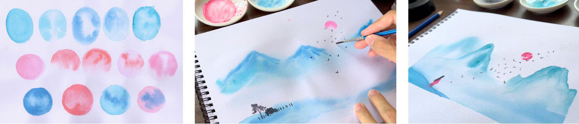
4. Warm Up Exercises: Now that we have selected
a reference photo, let's prepare our materials and lose some warm-up exercises. There are two main ways of preparing your
watercolor paints. This is for absolute
beginners, by the way. So feel free to skip. If you're already unexperienced
watercolor artists. You can use paint directly from the tube and squeeze
it on your palette. This way, you'll have
fresh beans and can get the thickest
mixture possible. In my experience, it took awhile to estimate
how much paint I needed to squeeze out for
a specific art project. I also use these
individuals ceramic bowls, one for each color, but you can use whatever
pallet you already have, or you can squeeze your paint on the palette and
let it dry overnight. This also works for
water color paints. You will then need to reactivate the paint by writing
them with clean water. The beauty of this option
is that you can arrange your palate with your
most used pigments. Once reactivated, keep dipping your brush
to and from the paint, do the palette and get as much pigment as
you think you need. A spray bottle is
also a handy tool in reactivating dried up
watercolor paints. And with this, you won't
need to constantly rinse your brush just to
reactivate different colors. As a practice, I sprained my veins a few minutes
before starting my artwork to give the water some time to reactivate
the drive of pigments. There are, however, some pigments that take
longer to reactivate. For example, this
deep ultramarine blue gets so hard when it's dry that it takes so much time just to load my brush with
enough paint that I need. So for this type of pigments, it's better if you
get them straight from the tube to your palate. Hematite genuine
is another example of pigments that are
hard during grants. For our exercises and projects. Please prepare for colors. Blue shades of blue, a pink, or a red, and a dark color. And we're all set time to practice the
watercolor techniques that we'll need
for our projects. This is just an exercise, so feel free to use a scrap watercolor paper or even the backside of
your watercolor pad. Let's try ovals first. For comparison. I will paint a plain
wash with deal. This is a direct application of watercolor paint or
what they call wet. On dry, or simply
direct painting. Your brushes wet and
the paper is dry. On the second, overall, the process is simple. We'll paint the shape
with clean water first. You can build your
paper to check how shiny it is and
therefore how wet it is. Load your brush
with the color of your choice and drop
it on the web shape. Let the colors bleed and
observe how they spread. This technique is called wet on wet or others referred
to it as dispersion. The brushes wet, the
paper is wet as well. Try it again with
a different color and observe carefully. With the third one I painted, the color spread
faster and farther. This is thoroughly and blue. I recommend trying this method with the colors that
you're planning to use and take note how
each pigment reacts. If painting the shape with clean water is challenging
for your eyes. You can also begin with a lightly colored
water mixture as your base shape and then
drop the thicker colors. Like what I'm doing here. This way, it is easier to see
what shape you've already painted compared to using just
clean water. At the start. Let's try it again, but we deal blue. This time, instead
of just leaving the oval alone after
dropping some colors, I will use fresh, thicker paint. You'll notice that
the less water and more paint that you drop, the less movement of
the discretion to. This is useful when
you want to add darker shades of color while
the paper is still wet. Do this warm-up exercise as
many times as you need it. And in the next video, let's practice how
to paint the sign
5. Painting the Sun: We learned how to prepare paint and use the technique called wet on wet or discretion may
painting in perfect ovals. We can then move on to Siri
calls as a practice for painting this sign to
avoid frustration. Don't get too concerned in
painting a perfect circle. Imperfections are
welcome. Again. Just like what we
did with the ovals. I started with direct
painting of the shape with a pink plus a bit of
red for comparison. Moving on to the next one, I'll use clean
water as a base and then drop the warm colors. I live. This is an incomplete circle and
only paint the upper part, living the pigments to interact
and bleed with the water. This style creates a mysterious
vibe and I like how it looks compared to the flat
wash on the left side. The first one that we did. I will do the same
for the next circle. But after dropping the colors, I'm going to rinse my brush and remove the excess
water by tapping it on the tissue paper
or a rag and then soften the edges of
the red pigments. It looks different
than the previous one. And I think each
has its own charm. Again, this is an
incomplete Seroquel, and I think I will use this farther project leader as it looks visually appealing. Retouch if needed. But don't get too hung up
on perfecting this area. Go. Okay. For the next shape, I'll start with a
light pink mixture, then grab red paint and
drop it on random parts. This looks like a moon
rather than a sign. But we're free to interpret
our painting, our old way. So nothing is wrong
if you bake your son, looking like a moon with
different textures. And for the last circle, I'll use pink instead of red. Now, once you get
the hang of this, you can then test other
looks like starting with a dark strong blue
color and then rinsing the brush and lifting
up some color for texture. Or do the same, but with red or pink. You can also try
using two colors like this one with two
different shades of blue. The last one with the
pink base and blue layer. Now, you have different options on how you can beat the
sign for our class project. Keep this practice
sheet near you. And let's continue with our warm-up exercises
in the next video.
6. Painting the Mountains: We worked on a flat
surface earlier. But for this exercise, let's paint at an angle
and use masking tape or any other object you
have to tilt your paper. This way, we can easily predict where the
pigments will go. And that is downwards. Of course, the higher
the NGO you work on, the faster the paint will
flow from top to bottom. So grab any item you can use and choose an angle that you are comfortable
working with. And then we'll continue
with our exercises. Also a books that is a great alternative when
working at an angle. This is also a good practice if you want to avoid back and neck pain when painting for
a long period of time. Okay. We're dotted ovals and circles. Now let's move onto
rectangles and triangles. As a preparation for
painting the mountains. I'll begin by painting a
rectangle with clean water. The node may rush
for the color of choice and paint the top part, only, letting the
pigments dispersed. Compared to the
previous exercise, the pigments will most likely spread downwards
and not outwards. Okay, let's try it again. But on a triangle and
with a different color. You can retouch the top part. We adding more pigment
and making it darker. This way, we get a
misdemeanor looking mountain. Now we can proceed
to a mountain shape. We're working at an angle and
only painting the top part and loving the rest of the
pigments disperse downwards. We will be able to achieve
an atmospheric look, which will give our pain
things and interesting look. Keep retouching the
top part is needed. Or if you want to adjust
how the shape looks. You can also soften the bottom most part of the
mountain and say, that's a field of grass
or a body of water. Now, let's try another
style where both the top and the bottom parts of the mountains have soft edges. In the previous exercise, we define the top parts
of the mountains only. But let's see how it looks. When both the top and bottom
parts have soft edges. Do this a huge area
with clean water. Load your brush
with paint and draw the shape of the
mountain in the middle. You can also assist the flow of the pigments by tilting
your paper slightly. Since we've painted on
an already wet area, this creates an impression that this mountain is far from us, far in the background. This style is best used
if you want a great depth in your painting by using it
on the farthest mountain. Again and try another color
until you're satisfied. Notice how this cerulean
blue pigment spreads fast. So I will need to tilt
it at an angle and encourage the pigments to
flow downwards instead. That's the importance
of warm-up exercises. You get to know your
materials more. Now you have two options and how you want your
mountains to look. Let's practice painting details. In the next video.
7. Painting the Details: Let's talk about
painting details, which are usually the
last ones to be added. For this exercise, you can
use a round brush with a pointed tip and practice
painting thin lines with your darkest color. Using light pressure. Start by drawing
short parallel lines. Then move on to elements like birds with
different pulses. This is a bit tricky
for beginners, but this is an opportunity
to get to know your brush on what it
can and cannot do. Another option is to
use a smaller brush. The only disadvantage
with this one is that you have to repeatedly reload your brush more compared to using a brush
with a bigger belly. Again, practice
painting thin lines and small details like a boat, house or a tree. Depending on the overall
composition of your painting. Whether you are in
drawing a meadow or a body of water
under the mountains. Take this time to
figure out how, debate the small details
that would fit your design. You can even paint a
small person facing the mountains and looking at
the direction of the sun, which I'll do later in
the last class project. Or even banker pet, a silhouette of a dog, a cat, a horse. This is your paintings. So I want you to
own this and add elements that you think would
best fit your painting. These simple elements,
when added to an art, Greg completes the composition and makes it more interesting. If you want to paint trees, simply dab the tip of
your brush repeatedly, or this is what they
call scumbling. But after practicing and you think you won't
be able to pull this off using a brush and fear that the details might
mess up your paintings. Then you can pick up a pen or
marker and do the exercise. Please use whichever material
is comfortable for him. We're done with the
warm up exercises. If you've followed
in practice along, the next videos will
be more familiar and you will be confident to
work on the class projects
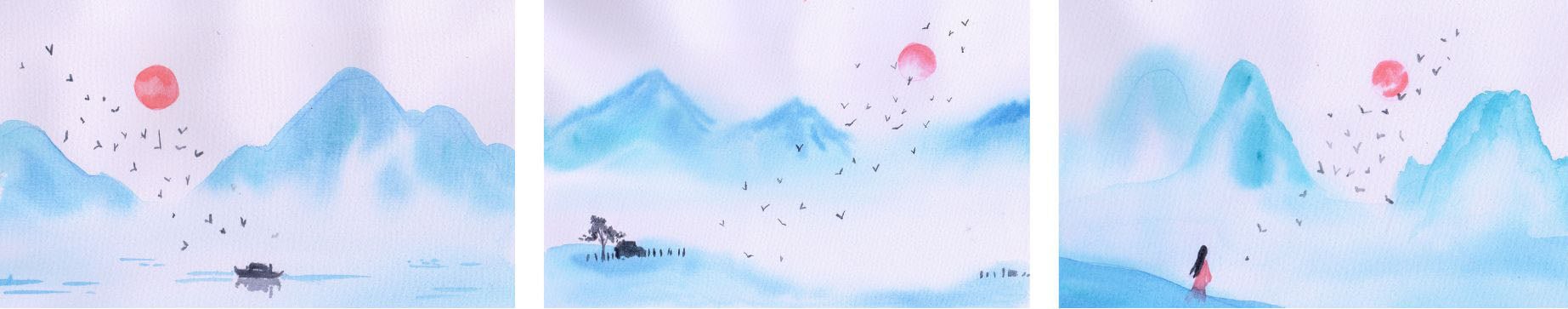
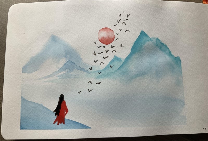
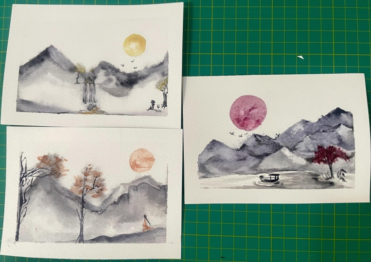
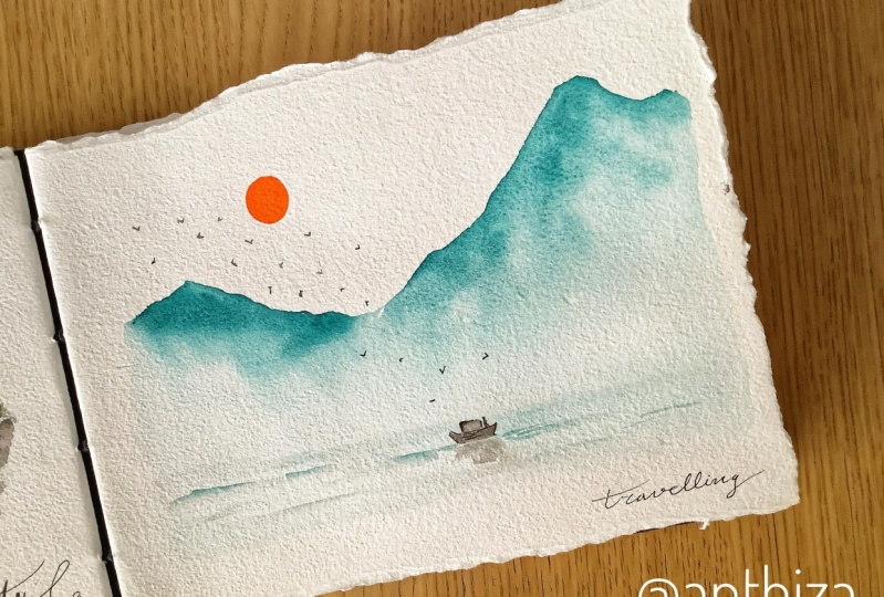
8. Project 1 | Traveling: Okay, it's time to
work on the projects. This is one of your options on how you want your flow meat, chinese, Thai landscape
to look like. For this project,
I have prepared for colors with two
shades of blue, a pink, and the darkest
one for the details. Or you can just use a pen. I use masking tape
or a neat mortar. And I will like me sketch
where the mountains, the sign and the boat would be. I know it is barely visible since I want to
hide the pencil marks. But it also helps in positioning the different elements of
the landscape painting. You may do the same oranges
directly and spontaneously. Tilt your paper at an angle that you're comfortable
working with. Of course, the higher it goes, the faster the water and
pigments will flow down. Then, Let's begin with the biggest shape
first, the mountains. I will load my brush
with a light blue color. Paint the top of the
mountains so you can see it. Easier. Rinse my brush and extended downwards
and sideways. Make sure to cover the bottom
part where the C will be. For the waves to
have soft edges. I also painted the small hill on the left with clean water only. Now, as practiced. For an atmospheric look, I will only paint
the upper parts dark and let gravity
do its work. This process is so
relaxing for me and I hope you're feeling the same. You'll notice that I
start to change how the mountains look compared to the reference photos
I showed earlier. And to me that is a good thing. We have an artistic
freedom to change how we want to represent a scenery, an object, or even the person. I'm working on the
hill at the left. And I made sure to vary my
colors from one shade of blue, another because it would
look too flat or boring. If I only stick to one color, the same blue color, I will likely paint the
sea and some waves. But making sure to leave
lots of whitespaces for that characteristic is distinct to a Chinese
style painting. While the mountains are drying, let's paint the sign. You can now remove
the masking tape and let's work on a flat surface. Since we will no longer need to let the pigments flow downwards. For the next steps. Now, for our design, I decided to color in the circle completely and use the lifting
method to add texture. If you'll remember, we have
to do is rinse your brush, remove the excess water, may padding it dry on a paper towel or a rag
and lift some pigments. You can also choose other styles that you want for design. Please refer back to the class
guide for your reference. Since this is a
smaller shape and compare it to our
practice pieces earlier, it will be safe the switch
to a smaller brush. Keep retouching as you see fit. Now, the mountains
are still wet. So I'll paint some
birds for now. Again, for a smaller details, it's your choice whether
you want to challenge yourself and use brush with
a light pressure only, or switch to a pen or a marker and go for
a mixed media loop. As discussed earlier, the birds will be
painted diagonally, pointing from design
to the focal point, which is about the
bottom-right part. This style of composition
suggests movement. So no matter how simple this is, we are following some
basic principles. This piece will still
look interesting. Leave this to dry before
painting the rest of the birds and the boat. Okay? Once the paper is dry to the touch and
not cool anymore, we can continue painting
some more birds and our focal point or main
subject, which is the boat. Notice also that I am
varying the birds post size and their distance from one another to make it
visually appealing. And as they point
towards the boat, we are also naturally leaving the eye of the viewer
to our focal point. And that should be around here. Take your time to paint the final details and
enjoy the process. As cliche as that might sound, it is really more
relaxing if you just focus on the task at hand, rather than worrying if your artwork would be
a masterpiece or not. So take your time and
focus on the details. Add some waves and
this artwork is done. I hope you're
starting to see how this painting style is really easy on the eyes and has
a simple composition, but still is an
interesting piece of work. You may use my painting as
a reference or make use of the reference photos
to draw your own and just add a sign and house. Both are tree is
the focal point. And don't forget the words. Here. I've made the mistake of rushing to remove
the masking tape. But this still
looks good since I am just using a wood pulp
student grade paper. Learn from my mistake, and I'll see you
in the next video for another painting style
9. Project 2 | Staying: This style is free form, so I will not use masking
tape for the borders. Okay, let's start by
planning our painting. I'll place the sun
at the upper right. And diagonally across that, I will draw some guidelines for a tree and a house
on the lower left. Keeping my sketch light so it won't show in the
final painting. Again, this is a
personal preference. I will paint distant
mountains in the background. And to do that, That's what a huge part of the background
with clean water. This mountain range
will look different from the first
project that we did. Make sure to avoid the
sun so that we can paint it while letting
the mountains dry later. You see, that's the beauty
and importance of planning. You can save time and
resources when you plan ahead. Then my brush with blue, green and I will paint
the mountain shapes. The shape has undefined
and has soft edges. It creates the illusion that the mountains are far
in the background. Not forget to introduce
other shades of blue. Complexity in your
painting. If needed. Filter paper or work at an angle to help the
flow of the pigments. This isn't looking monotonous
and a bit boring for me since I've covered the bottom parts of the
mountains completely. So I will lift up some colors in random
areas as I see fit. Retouch the top part if needed, using the same technique. Wait for this to dry a bit. Next, we can work on the
bottom part by adding a touch of color for the land where
the tree and the house ten. Notice that I'm keeping that as a separate shape from
the mountains and making sure that the
bottom part doesn't touch the wet area
under the mountain. That is to preserve the
whites of the paper. Like what we did
with the mountains. Drop other shades of
blue on the land. If you wanted to
continue working while one part of the
painting is drying, look for an area that's dry. And think of what
you can put there. In my case, the
upper right part, this guys is, I avoided
touching that earlier. So now I can paint this on
in a style that I want. And I think an
incomplete pink sun will complement the mountains. After that, I'm checking if the mountain shapes are
starting to dry slightly. If yes, I can add
thicker paint to make the mountain peak
darker and more defined. Remember to add it
at the top part, only the kipp, the
atmospheric effect. One satisfied with how
the mountains look. Leave this to dry so we
can work on the details. Always check if your
paper has dried completely before
painting another layer. Or you'll end up with soft
edges for the details. And we don't want that. The darkest color
on your palette. Paint the details that you like. It can be a person
housing the tree, avenge, a silhouette of your bed or anything that would make sense
in your composition. I have already decided
earlier that a house and the tree would be the
best fit for this project. So I am drawing them
directly on the paper. For the trees, use scumbling technique
where you are in dabbing the tip of the brush repeatedly to make an impression
of the foliage. I will then draw the house next. Notice that I'm leaving tiny gaps at the
bottom of the house. That's because I want to
make an impression of bushes and grasses
growing decide the house. Based on my experience, if I draw the bottom part of
the house flat and straight, it would look too boring. You can do the same. Relax and do this part slowly. Like the first project, I will draw the birds diagonally as if
they are flying away from the house towards
the sign, or vice versa. This leads our eyes to look
from one place to another in our painting and makes it visually appealing
and interesting. Make sure to vary the
bows and the size of the birds do where they are facing
and if their wings are spread widely or are folded. Once the tiny details are added. This painting is complete. The composition is simple, but I hope that you're
also finding joy in creating a relaxing
artwork like this. How do you feel about your
painting projects so far? Let me know if there
are any parts and clear to you via the
discussion stamp. I'll see you in the next video for our final painting style.
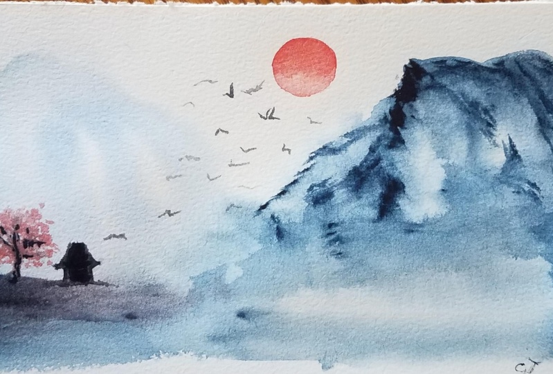
10. Project 3 | Waiting: For the final project, I want a clean border, but since I know from experience that
masking tape is not so compatible with my student
grade watercolor paper. I will pick up some
lint from Mike loads. I'm only doing it on this
rod so that you can see it. But they actually picked
up some lint from my blouse before taping
it down on the paper. This way, it will reduce
the stickiness of the tape and hopefully it will be easier to
peel off later. I will place the sun
at the upper right. Once again, two mountain
ranges on each side, and the person standing
diagonally across the sign. For the final style, we'll be combining project one and project two, mountains. One has soft edges, while the other will have
defined mountain peaks. Let's begin by painting
the background area off the mountains on the left
side with clean water. Make sure to avoid
wetting the sun. I will also place a
masking tape to tell this a little bit
and start painting the mountain shape with
deal or turquoise. I'll keep the middle part white to give it an
atmospheric look. Then with a very
light mixture of zero Alien Blue or other shades
of blue that you prefer. Let's paint the first layer of the foreground and make
that mass of land darker, where the person is supposedly standing at Duchess of the same color on the
mountain range for a variety. Now, for the mountains
on the right side, start by painting the shape with clean water like
project number one, and extend that downwards. Then load your
brush with blue and paint the outer
parts of the shape. At this point, you
can already see the difference between
the two mountain ranges. The left ones appear farther because of the soft edges
and lighter colors. While the right ones
appear closer to us, we define mountain peaks and
brighter, darker colors. Three dots in the background
and foreground as needed, and darken the landmass where
the person is standing. It's time to paint the sign. For this project. I'll go for an
incomplete red sun, where there are white areas
or white gaps in the middle, instead of just painting the upper half like what we
did with project number two. I hope you're not getting too concerned with how
perfect that circle is. Embrace any imperfection that you might accidentally create. And consider that as a part
of the learning process. Keep retouching as needed to give it the texture
that you want. This partner is already tried. So now I can work on this figure by painting
her dress with the same color as the sun while living the hair shape untouched. I think this land mass
is also too light, so I'll paint another
layer of cerulean blue and let the dress
blend with that color. Make sure to leave the dress to dry first before
painting the hair. Now as I look at it and
observe my painting, there is a defined
mountain range at the right and a dark
landmass on the lower left. And it feels too
heavy on the right. So I decided to add another defined mountain at the left side to balance
the composition. This also works as a
frame for our son and provides an area where the
birds can be placed later. Before doing this, make sure that the first
layer has dried completely or everything will
just blend with each other. And you'll end up with a
huge blob of soft edges, mountains, which
are brilliant blue. I'll paint some horizontal lines that could work as
a body of water. Make sure also to give the area below the
mountain light and white. When painting the additional
mounted on the left, they also made sure to avoid wetting the head of this figure. So that is the mountain dries. I can paint the hair. Like our landscape. This is also an
oversimplified figure, a here and a dress. And we can already tell
that it's a person. That's the beauty of a
minimalist painting. You don't have to stress
too much about details and still feel satisfied and
rewarded with your artwork. One final step, and we're done. I hope you're painting
along and finding joy in creating
this type of art. As usual, let's paint a flock of birds flying from
the person to the sign. I find this part of the
painting the most relaxing, since it is the last
step and we're only minutes away from completing
another work of art. To me, it is a form
of forced meditation, is we're only focusing on each brush stroke instead
of the demands of life. Okay. Time to see if the lint
picking technique correct. I should mention that it's also a good practice
to make sure that the paper has dried completely before removing
the masking tape. Another mistake I did with project number one is not
letting it dry completely. And 100% cotton papers shouldn't
have this kind of issue. I guess it. See you in the
next video for some more tips.
11. Final Tips and Summary: Congrats on completing
this class. We created three projects
that tell a story. One where the character
is traveling. The second, another
character stays at home. And the third one, where the character is waiting
for the return of someone. Aside from the stories
we were able to portray in this
landscape paintings, we learned about different
watercolor techniques that are useful in achieving
a Chinese style look. Danger that you'll
be able to produce paintings with
atmospheric effect. Please keep these
things in mind. Use a brush appropriate for the size of the area
that you are covering. If you make a mistake, Braddock dry with the paper
towel immediately to lift the colors and scrub it clean
with a wet brush if needed. Better see what you're
painting with clean water. They'll care paper at an angle. Or just use a very light mixture by adding more water
to your paint. Maximize gravity and let the
colors blend with the water. The pigments do their magic. Make sure to leave some white
spaces in your painting for a distinct Chinese
style look or use the lifting method in case
you already did some parts. And finally, avoid
flat washes and make sure to add touches
of a secondary color. I'll be waiting for your
projects in the project gallery. And you're honest
glass review to help other students decide if this
class is for them or not. If there's one lesson I want
you to take from this class, that is to take things slow. Let the water and paint flow
and relax while painting. Focus on the task
at hand and allow your artwork to take you
to different places. You can also try the same techniques with other paintings, subjects such as flowers, animals, or an abstract piece. Literally any topic would do. That's it for this course. I hope to see your
output in this class and many others offered
here on Skillshare. And together, let's
make this a little bit more colorful with our artworks.
 Bianca Luztre, Watercolor, Productivity, Color Mixing