Transcripts
1. Welcome to this Class: What's stopping you from
trying out watercolors? Is it the fear of
making mistakes, the difficulty of
controlling the medium, or the overwhelming
options of materials, which leaves you clueless, which wants to purchase. If you've always wanted
to try watercolors, but don't know where to start. Then this class is for you. This is designed
for beginners to jump-start their
watercolor journey. No prior knowledge and painting
and drawing is required. Hello, lovely fell us. I am Bianca, a mom, cat, lover, bookworm, and
uninspiring watercolor artists from Bhutan
because Philippines. I started my watercolor
journey in 2018. And since then, I've learned
a lot from experience, exhibits, books, tutorials,
workshops, and classes. And I am happy to share with you these learnings
to help you start your own journey to when
trying out a new medium. It is always a
good idea to paint abstract or organic
shapes like trees. They are easy to draw and
paint and are very forgiving. That's what we'll do with
this class while exploring three basic watercolor
techniques. I will also recommend a starter kit, including
watercolor, paint, paper, and brushes
that will serve as your guide in choosing
your own materials. By the end of this class, you'll be equipped with
basic watercolor knowledge, which you can use in
your own art projects. If you're ready,
download the PDF, grab your materials,
and let's get started.
2. Watercolor Paint: Watercolor paints. The first thing that
we have to learn is how to activate the pigments. Watercolors come into forums
in tubes and in pants. You can either use paint
straight from the tube as fresh as it is or
do what I did here. I squeezed out some paint on some pants and let
them dry overnight. That way, it's easier to control how much pigment in
my brush is speaking. Then I purchased a thin case where I can put in
the range my colors. Depending on the brand
and pigment properties, the paint could completely dry and crack or stay
moist like this. To activate watercolor paint. Rinse your brush first. Remove excess water on a rag or a paper towel and
loaded with paint. You can use a ceramic, plastic, or acrylic palette to see
how transparent your paint is or recycle some
household materials that could do the job. When working with fresh
paint from the tube. Be mindful of how much paint you are charging
your brush with. Keep adding water if you want
a more transparent color. Let's try this color out. This is manganese blue by
Holbein and love how it looks. Now, let's charge our brush with more water to make that same
color more transparent. Basically, by controlling
the water to pigment ratio, you can achieve different
shades of the same color. Let me demonstrate that again. This time. I'll
load my brush with pure pigment and use that
to paint a small square. You'll see how thick
and opaque that shade this compared to the
ones at the top. To do the complete opposite
and get the lightest chain. I will rinse my brush, block the excess
water on my rag, and use whatever my brush
absorbed to paint a swatch. For comparison. Let me use this puddle here
and paint another square. That's how flexible
watercolor is and how important the role of
water is in this medium. Now, in mixing colors, you have two options. By a convenient mix, like this green here,
Hooker's green. And use that In your projects. Or combine two colors, like yellow and blue to produce
a secondary color, green. One thing that you should note, though, based on my experience, greens and violet are two of the most
difficult colors to mix. Especially if you want to
achieve a bright shade. You may have to test out
all possible combinations. The reduced the color you want. See the difference. The one at the left is
a mixture of manganese, blue and gamboge Nova. And the one at the right is a convenient mix
of Hooker's green. Now let's talk
about student grade and artist grade paint. Here's a quick demo to show
you the difference between the student grade and artist
grade watercolor pigments. I have here hookers, green by three different brands. Prevail, Holbein
and Daniel Smith. Or isn't affordable student
grade watercolor paint, which I used to when
I was a beginner. Well, both Holbein and Daniel
Smith or artist grade. Daniel Smith being the most
expensive of the three. You can already see
the color difference despite having the
same pigment name. Overall. The main difference is how long the
painting will last. Student grinned ones
usually include the extenders instead
of using pure pigments. So if you will be joining local or international
exhibits and competitions requiring
archival paint, then you should use, are these green ones? More about convenient mixes. Let's try violet. This is permanent
violet by Holbein. Take note how vibrant
this color is. As a kid, I've always
known that combining blue and red will
make violet, right? So that's what I did as
a watercolor beginner. Why they want to mix my
own violet, Albert beer, different blues and reds to see what kind of violet
I will produce. I'll use ultramarine blue, Manganese Blue, and cobalt blue. These are all from Holbein. For my reds, which are
also from the same brand. I'll have quinacridone, red, scarlet, lake, and
vermilion hue. Mixed and swatch. Then mix and swatch. Here's the first violet from
cobalt blue and queen read, not as vibrant as the
convenient mix, isn't it? What about Scarlett? What about ultramarine
blue and scarlet lake? I decided to add more
blue to make it cooler, but it still looks dull and nothing compared to
the permanent violet. One more for manganese
blue and vermilion hue. Still not the color I want. I struggled so much to produce vibrant violet because
this is what I did before, only to find that I am
mixing the wrong colors. Let's try mixing violet again, but this time I will use
pink instead of Fred. Here's my Quinacridone Rose, mixed with ultramarine blue. Upon mixing on my palette. You can already see the difference with
the other mixture. You could already see the difference with
the other mixtures. Still not as vibrant
as permanent violet. But it's so much better
than these three. But it's so much better
than these three. Another pink and blue
combination, quin rose again. But this time with royal blue. It's on the color shade, but definitely more vibrant than the neutral mixes we produced
with reds and blues. Here's another convenient
violet mix I love. It's called lavender. It's opaque and light and perfect for florals
and landscapes. A closer look at our swatch.
3. Watercolor Paper: One of the most
common questions I received when teaching
watercolors to beginners is, can I use a copy paper, board paper instead
of watercolor paper? The answer is yes, you can, but most likely you
wouldn't want to. You will see the difference in the performance of the
papers in this quick demo. I have here an Osler paper, similar to a copy
paper aboard paper, and a student grade
watercolor paper. Showing you a small swatch I painted on an artist
grade watercolor paper. Observe carefully how
different it will look. On the other papers
that we will test. I'll directly paint a simple
pine tree shape with lots of paint and drop some more
with the wet on wet method. We'll dig deeper on
this method data. I want you to observe how each paper reacts with
the water and pigment. As I paint the pine trees. Watercolor paper is specifically designed for water-based media, such as gouache, ink, acrylic, and of
course, water color. It reacts differently with water compared to copy paper
and board beeper. Here, you can see that the water is not
being absorbed well by the copy paper
and the board paper. While the watercolor
paper, though, a student grade one, shows you the full
potential of the medium. Going over the trees again
and dropping more paint that will represent the
shadows on the trees. But also to add another layer of paint
while the paper is wet. Let's take a closer
look at each paper. The authors of the
paper barcode. And the backside is no longer usable for another
watercolor illustration, or even a swatch. On our board paper. It looks like it's spilling
off when painted over. It also buckled
and more layers of paint will surely peel
off more paper fibers. Compared to the student
grade watercolor paper. Though it's not made
from 100% cotton. The water was absorbed well
and there's no peeling. And since we only
painted with one layer, there's no buckling and I
can still use the other side of the paper to paint
another illustration. When it comes to
the vapors texture, you have three options. Hot pressed, cold
pressed, and rough. But I rarely use rough. So let me just show
you the difference between hot and cold pressed. I'll paint some pine trees
in wet on wet style. Put simply, hot press, watercolor papers are smooth and good for a detailed work. And cold press papers
have a good amount of texture ideal for beginners. But choosing your paper texture
is a personal preference. Looking closely. This smooth texture
is what makes hot pressed perfect for highly detailed Berg
and cold pressed. If you want some texture. I use hot pressed for my floral
paintings and portraits. But most of the time I prefer cold pressed for still life, landscape, semi abstract, and
sometimes floral paintings. Loaded my brush with water and painted the base
for the pine tree, then charge it with indigo and let the pigment bleed
through the wet area. You'll learn more about
this technique later. I didn't land. There's not much difference between
the two papers. But once it dries, you'll see the texture
on both papers. Here's a closer look at the two, which do you think will
use most of the time. If you have the
budget to upgrade or splurge in your materials, I would strongly recommend upgrading your
watercolor paper first. Here, I have a student grade
watercolor paper by Canson. It's 200 GSM and cold breast. While this one is a
multimedia paper good for acrylic, gouache
and watercolor. Consonant, vowel, 300
GSM, cold pressed. And this one is
me Then Bao home, 300 GSM called breast
on our disagreed one. This is just a quick demo to compare the three types
of paper laid down here. And I am painting the pine
tree demonstrated earlier. Depending on your
painting style, could maximize the
paper of your choice. For example, a
student grade paper isn't compatible
with wet on wet, especially if you're
working with lots of water. But you can still use it
to test your colors are being simple illustrations and practice your brush strokes. Mixed media one breaks
well with direct painting, but the number of layers
you can use is limited. And the artist grade one
opens lots of possibilities. This is my personal big, since I loved working with
a wet on wet technique. Showing you how
they look up close. With enough experience. You Wilson have your
own paper reference. But as I mentioned earlier, if there's a material
that you want to upgrade, choose paper first. It makes a lot of
difference when you work with the proper
watercolor paper.
4. Watercolor Brush: From size, the shape
and materials used. Watercolor brushes come
in different form. But which one do you
actually need as a beginner? Would you believe that I
survived my first year of watercolor journey using
this paintbrush only. It's generic, cheap
and synthetic brush. I was able to paint these simple floral and
still-life illustration. When choosing your brushes, you have to consider the
shape, size, materials used. But so as not to overload you
with too much information. Let me just show you
the usual types. Here are examples
of round brushes. I usually get a big
and a small one. We also have a flat brush, which is ideal for big washes. A mop brush for
the same purpose. Water brushes are popular with calligraphy enthusiasts and are ideal for your travel kit since you can load it
with water inside. And I also got a generic
Chinese calligraphy brush. Here's an exercise that
I recommend you do every time you get your
hands on a new brush. I call it the Brush Dance. Our goal is to create different
strokes using one brush only to know what this
brush can and cannot do, how wide or narrow the
strokes it can create, and how much paint and
water it can load. So vary the pressure you
apply on your brush. Like what I'm doing here. And tried to create
single stroke shapes. Or you can even make it dance
literally on the paper by dragging it along and changing the angle and pressure
every so often. For additional challenge, try painting a circle with one
continuous stroke like this. Retouch if needed,
and repeat as many times as you want to
get to know your brush. Create tiny marks when
only the tip of the brush. And try the dry
brush technique do. You can block the excess
water on your rag. If you're using a
cold pressed paper, you'll get a somewhat
similar effect to this one. Quick, short motion. Try scumbling on your paper. This is a good technique
in adding texture. So let your brush dance.
5. Watercolor Starter Kit: As you try out a new medium, choosing your
materials can be quite overwhelming since there
are lots of options, different brands available, and difference in price range. Let me share with you my
recommended watercolor paint, brushes, and paper. As you start your own journey, Let's start with paints. You have lots of options. But for those in the budget, want to avoid this
struggle of mixing colors. Then purchase a whole set like this one from Winsor
and Newton Cotman. Or if you want to
mix your own colors, then get at least
three pigments like this starter set by
Winsor and Newton Cotman, which includes permanent rows, lemon yellow hue
and intense blue. For those who want to
splurge in their paints. Go for the big brands
like Daniel Smith, Sri Lanka, and M Graham. Or go for cheaper
artist green ones like home buying and shin hand. They're permanent Siri things are lower than those
of the big brands, but there's so much better
than the student grade ones. Personally, I started
with the Bayeux, a student grade paint that is so much cheaper than Codman, but enough for me to create simple and cute
watercolor illustrations. With watercolor papers, you can choose between student
grade paper like this, one by sharp donkey fines, or a multimedia paper
like consonant, vowel, which is good for gouache, acrylic and water color. Or if you want to experience the full
glory of watercolor, then find the brand
accessible to you that is made of 100 per cent
garden like arch. It should clearly state
on the packaging that it is made from 100% cotton. You can also opt for a
sketch book like this, one, which is small and perfect for traveling and painting
on the cation. Other quality brands
I've tested or Fabriano, Strathmore, honeymoon, and me. Bow home. Here's a
painting I did on a chip student grade paper
and an artist grade paper. I have collected a lot of brushes in the span
of four years. And these are just
some because I want to try out which will
work best for me. But as I mentioned earlier, one round brush, size six or
eight is good for a start. If you want to expand your collection after
trying out watercolors, then I suggest getting yourself
a one inch flat brush, a quality round tip brush, and a smaller one, which is size two. Here's a simple
watercolor illustration I did using my old brush. Here's a recent one where I
used more than one brush. If you're not yet committed the watercolors and just
wanted to test it out. Here's the budget friendly starter kit that could work for you as student grade
watercolor paper. Three watercolor paints,
which are also student grade, and a single round brush
size six or eight. Byte. If you do have the budget
and one to splurge a bit, then I recommend getting
artist grade watercolor paper, which again should specifically state that it's made
from 100% cotton. Artist grade paints. It could be a set or a few
colors of your choice. Along with three brushes, a flat brush to round brushes, a size eight and size two, or simply a big and a small one. In the next video, we'll start with our projects.
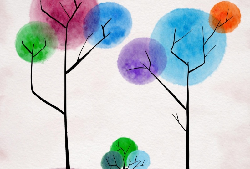
6. Project 1 - Wet on Dry: Let's start our project using the most common watercolor
technique, wet on dry. This is a pretty straightforward
technique and it only means that the
brush is wet and loaded with water and or paint while the paper is dry and you
directly paint on it. I have prepared here a pool
of my Payne's gray pigment. And I will paint simple trees
using a single color only. With my round brush. I'll scribble the
foliage of the trees, but an app and down motion. If you watched the
materials demo earlier, you'll remember that we can
create different shades of a single color by adding
more water on the mix. And that's what we'll do. Load your brush with the thin down version of
the pigment of your choice. This is my first tree. Then they'll go for a
stronger mixture of Payne's gray and connect the second
foliage with my first. Since we're on this scribbling and creating watercolor
illustrations, don't worry too much about making a perfect
looking foliage, but focus on varying the
shades of a single color. We're controlling the water to pigment ratio will leave this to dry before painting
in the trunks and branches. So it might not look
like trees right now, but it will all
make sense later. I also painted the ground
where the trees stand. Set this aside and then we'll create another one using
the same technique, but with more colors. My color choice
this time includes a pink, violet, indigo. And with the same approach, I will paint the tree foliage, rinse my brush before loading
it with the next color, and using the leftover
pigment paint, the ground. Tried to vary the color by blending it on the paper itself. Leave this to dry before completing the
training illustration. Now, we have two options in painting or drawing
the trunks and branches. We can use a brush or a gel pen. With the first option, you can challenge
yourself and use a small round tip brush or
any brush available to you. And using light pressure, paint, thin lines to connect the
foliage to the ground. If you have a scrap
paper beside you, I recommend practicing
your strokes first. As it's very easy
to accidentally paint thick lines
instead of narrow ones. And they mentioned, challenge yourself because as a beginner, I know how hard it is to use just enough pressure as you
tried to paint thin lines. Have fine and this part, you can draw straight
or cricket branches. We ve, or edgy ones. Play with your brush and finish this illustration
to your liking. Now for a more
manageable option, which is also one of my
favorite techniques when I was just starting
my journey with watercolors is to use a gel
pen for the thin lines. This style is also
called ink and wash. With your ballpoint pen, marker or a gel pen. Draw the trunks, and
that's about it. This technique is very easy
to use and quite addicting. Here's our first project
in two versions, a monochromatic
Tree illustration using a single pigment and a multi-colored
tree artwork where we used the ink and wash style. Upon looking at it from afar, I realized that the multicolor
version has thin chunks. So as we summarize our key
points for this lesson, I'll go over the trunks and branches again where
the thicker gel pen. In this lesson, we'll learn
about wet on dry technique. How to change the opacity of the pigment by
adjusting the amount of water and incorporating
ink in our illustration, or what we call the
ink and wash style. In the next video, we'll start the new project and discuss another basic
watercolor techniques. See you there.
7. Project 2 - Wet on Wet: Time to paint simplified
pine trees using another watercolor technique
called wet on wet. Wet on wet is a
technique where you wet the paper first
before adding wet paint. So unlike wet on dry, brush and paper
are wet this time. Using a clean brush
loaded with water only. I will paint pine tree
shapes on my paper. To prepare it. I will link three shapes to create another mean, the forest. A good way to check if your
paper is wet enough for this technique is to tilt your paper and see
if it's shiny. I recorded this
class at nighttime. And with the help
of ring lights, it's easier to see
that the paper is wet. But during daytime,
you may need to tell Care paper to see the shape that you're painting with water. One satisfied with
the pine tree shape. Let's charge our brush with a single color and drop
it on the wet paper. Leave some areas blank and let the paint move
on the paper freely. That's one of the beauties
of this technique. Depending also on the
paper you're using, your color choice and
the size of your brush, you will see a different
effect on your project. And that's totally fine. You can also charge
your brush with water only and drop it on the dark
parts of your painting. This is a good way to
observe how the water and pigment react with each
other on the wet paper. Or load your brush with a thicker paint consistency and drop it on the pine trees. Leave this to dry,
and let's work on another one using two colors. Just like the first project. We'll add the branches. Once it has dried. I will use pink and dark
blue this time. Using water. Let's paint the pine
tree shapes first to prepare the paper for the
wet on wet technique. From time to time, you'll see me
dabbing my brush on my rag to remove excess water. Now is a good time to
practice doing that too. In case you get your
paper too wet or accidentally dropped butter on areas you want to keep dry. Use a paper towel to
absorb that excess water. It takes time to
automatically know how much water your
brush is loaded with. So don't worry if you don't
get this right the first try. Now, I'll switch to a smaller
brush so I can control the amount of paint I will
drop on the shape better. I'll start with my
lighter color bank and drop that wherever I like. Then switch to another
brush for the darker color. You can continue using a smaller brush when
adding the second color. If you're more
comfortable with that, remember to leave
some areas white and observe carefully how the
colors bleed on the paper. This will give you more understanding how
the technique works. I'm going darker by
carefully dabbing on areas. I want to deepen the tone. We will leave this
to dry and use a gel pen to add the
trees and branches. Or you can use a
brush if you want. Later, we'll try a multi-color
pine tree illustration. I hope you're having fun
with our projects so far. And they're helping you get familiar with this
beautiful medium. The second one is dried already, so I'll go ahead and add
the trunk and branches. Simple lines will do. Also. This is your painting. So if you find my color choices too dark or not to your liking, please use colors that
appeal to you the most. After all, color is a
very personal thing. So go ahead and own this painting by selecting
your own palette. I'm excited to see what
you'll come up with. So I hope you'll upload your lovely illustrations
in the projects tab later. Now, I'll work on the monochromatic pine
trees and use a brush. This time. I will warn you
once again that if you're not used to painting
lines using a brush, it is so easy to
paint thick ones. Instead. You can either practice first on the scrap paper or
use a small brush, like what I'm doing here. Or use a bigger brush
with a nice pointed tip. But be sure to apply
light pressure only. Just use a gel pen or marker to complete the
watercolor illustration. For the first two versions, we used water to paint
the base shape of the pine trees before
jumping arc colors. But this time, we'll use a very thin wash of
color and water. I'll use pink. I'll Does it out on my scrap
paper first to see how transparent the puddle of
paint is that it will do. Then I'll drop my blues and violets on the pale pink wash. I'm showing you
my color choices. By this time, you could probably guess my favorite
color combinations, pinks, blues, and violets. I'm more of a cool
palette person. That started with
a third version. Roughly paint a pine
tree shape using the thin pink paint and
link the three foliage. You can always go over the
shapes to rewet them so long as you haven't dropped
the other colors yet. When I first learned
this technique, I didn't know that you can
keep on rewetting the shapes. So I was always in
a rush painting the base shape before
dropping the other colors. And you could guess
what the output was. O. And another thing,
I love watching other artist's process videos in time-lapse or what
they call speed paint. And so consciously thought that I need to work
that fast, too. Funny but precious memories
in my watercolor journey. Right now that I'm satisfied
with the wetness of the paper and the overall
shape of my linked pine trees. I'll drop the other
colors as they see fit. Just have fun and do not
overthink this part. For this version, I decided
to drop the cool colors at the middle part only and let them spread
over the pine tree. Remember to rinse your brush and tap it on your
rag or paper towel to get rid of the excess water before changing colors
to keep them vibrant. Let's leave this to dry, and that's finished
up with a gel pen. While I'm doing that, let me summarize what we
learned in this lesson. We talked about
wet-on-wet and got to apply that with our second
project in three versions. Monochromatic or
using a single color, only, using two colors. And in this final variation, using a very pale wash of
colored water as the base of the pine tree before dropping the other colors and letting
them bleed with each other. In the next video,
let's discuss glazing.
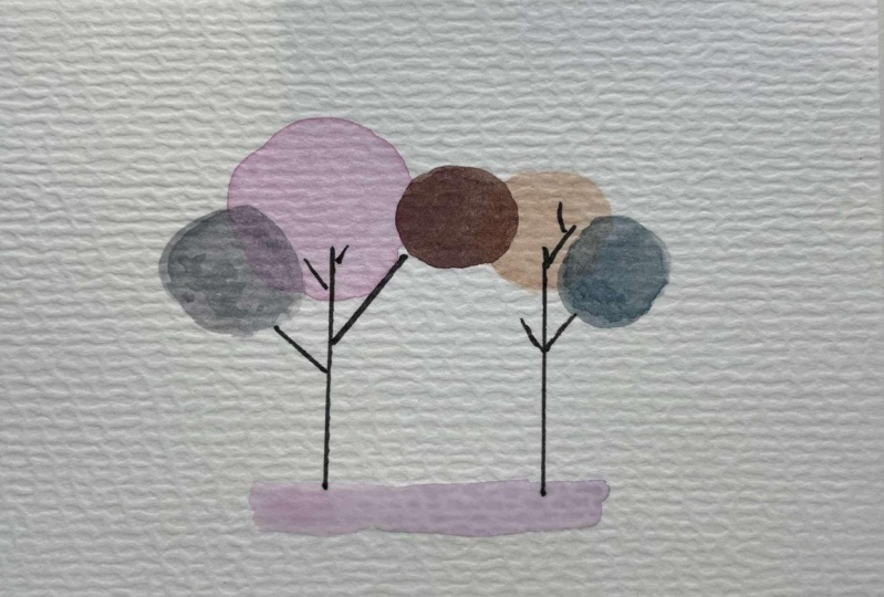
8. Project 3 - Glazing: Let's talk about
glazing or layering. We painted the last two
projects using one layer only. This time. Let's learn how to layer
or glaze with watercolors. I have painted a
circle and let it completely dry to
properly demonstrate glazing paint and
overlapping circle using wet on dry technique
or direct painting. Since watercolors
are transparent and the wash I'll use has
enough amount of water. Part of the circle underneath
should still be visible. Now let me show you what happens when the layer
underneath is not left to dry completely before adding another
layer of paint. This usually happens to me before when I am so impatient
with the drying process. When you paint another layer
on a still wet surface, instead of seeing
two separate shapes, they just merged into one blob. If your goal is to
show separate shapes, then be patient and let the first layer dry
before painting the next. Let's do that one more
time using another color. I'll use a faint pink wash. Where the circles overlap. You'll see what color they create together with
this technique. Doing the same on
the other circle, which hasn't dried completely. The paint bleeds to the red shape and the colors
blend with each other. This can be a useful
technique in other projects, but not for glazing or layering. Now that you know how to
layer with watercolors, Let's start on our third
and final project, where I will use violet
thinks in dark blue. You'll also need a
smaller brush later. Let's start with the
lighter colors first. By still paying for my
first tree foliage. Don't worry if it's not
the perfect circle, because this is not a realistic painting, a
watercolor illustration. I'll rinse my brush and load it with another
pastel color, a light peach for
another foliage. Try to vary the size and
placement of the circle foliage. To give your
illustration a variety. Let's leave this
to dry completely. Before adding the darker colors. You can use a blow dryer or hit guide to speed up
the drying process. Tilt and check if the shapes
have dried completely. With a smaller brush. Let's paint more foliage shapes. You can stick with
your bigger brush. If you think you can make smaller shapes by
applying light pressure. The darker the color and the thicker the consistency
of your mix is, the less of the first
layer will show those smaller shapes and they're starting to
look like trees. I think I'll add one more at
the center and mix colors. I already used for a fifth one. I like how the color
looks, and this time, I'll try to overlap the two
bigger shapes at the back. What's left are the trunk
branches and some details. But before doing that, leave this to dry completely. Be patient and
we'll finish it up. I decided to use the ink and wash style for our
final project. So I'll have to go
with my gel pen and add branches to connect the
foliage as they see fit. Of course, you're welcome to use a smaller brush to add teeny
tiny details. If you want. A simple but colorful and satisfying painting,
what do you think? A smaller brush loaded with the same color
of the foliage. Quick dabbing motion,
also called scumbling. Add some texture. It adds complexity on our painting and makes it
look more interesting. But this part is
completely optional. Okay? While I'm doing that, here's what we learned
in this project. We learned about glazing or
simply layering of paint. That we should wait for
the layers underneath to dry completely before
painting another one on top, or the white shapes will
just merge together. We also tried out another
technique in adding texture, which is called scumbling. Adding some colors
on the ground. And I'll see you
on the next video for some tips on what
to do from here.
9. Before You Go: We've finished. I'm so glad to be part of your creative journey and I
do hope to see your projects. So please upload them in
the projects gallery. And if you have time or view
is greatly appreciated, helped me improve my classes. We were able to create three simple artworks using different watercolor techniques. Wet on dry, wet on
wet, and glazing. Which one's your favorite. I also shared with you my
thoughts and suggestions on which materials to grab to help you get started with
your watercolor journey. With every half right now, please maximize them and
do your research first before buying all the materials
that got your attention. Like what happened to me before. Now that you've equipped with
basic watercolor knowledge, you can try using
the techniques in different subjects
like food and flowers. You can also check
out my other classes. And together, let's
make this world a little bit more colorful
with our art breaks.
 Bianca Luztre, Watercolor, Productivity, Color Mixing