Transcripts
1. Introduction landscapes: Landscape painting
can feel overwhelming when you just start
painting with watercolor. There are so many
details, textures, colors and shapes that it's easy to feel lost and not to
know where to begin. That's why understanding
a few simple composition and sketching principles can
make such a big difference. In this class, I
will show you how to simplify landscapes
into clear shapes, organize the composition,
create depth and perspective, and understand what actually makes a landscape feel
balanced and natural. Instead of trying to copy every detail from
a reference photo, you will learn how to see
landscapes like an artist and build paintings with more
confidence and intention. My name is Alexandrina, and I'm a watercolor artist. I paint different subjects, including landscapes, and landscape is one of my
favorite topic to paint. We will work on two
class projects together, a beautiful sunset landscape, and a simple green scenery, where you will be able to apply all these principles step
by step in practice. Grab your brushes and I'll
see you in the class.
2. Vanishing Point: A strong landscape composition usually has two
important elements, a focal point and
a vanishing point. The focal point is the main area you want the viewer
to notice first. For example, a house, a tree, about a silhouette of a couple
or something like that. It gives the painting
a clear center of attention and helps guide the
viewer through the scene. The vanishing point helps
create perspective and depth. It's the place where
perspective lines appear to meet in the distance. You can imagine these
lines almost like sun rays spreading outward
from the vanishing point. Roads, rivers, fences,
rows of trees or shadows often follow these
invisible directional lines. As objects move farther away, toward the vanishing point, they appear smaller
and closer together, which creates the illusion of distance on a flat
piece of paper. Artists often place
the focal point near the vanishing point because our eyes naturally follow these perspective lines
into the landscape. This helps create
movement, balance, and a stronger sense of
space inside the painting. In the next lessons, we will try to make the
vanishing point with help of the road and the
hills in a simple landscape.
3. 3 Rules Of Sketching Landscapes: Creating a landscape composition becomes much simpler when you stop focusing on details and start thinking
in simple roles. In this lesson, we will explore
three simple principles that make landscapes feel
more natural and balanced. Simplifying shapes, placing the horizon line intentionally and
the rule of thirds. These simple techniques will help you organize composition, create depth, and
make your landscape look more realistic
and visually pleasing. Before we even start
sketching details, one of the most
important decisions in a landscape painting is the placement of
the horizon line. This simple choice can
completely change the feel and balance and focus
of your composition. The horizon line is the
level of the viewer's eye, the place where the sky and land or sky and water appear to meet. One of the most common
beginner mistakes is placing it exactly in
the center of the paper. When the horizon line
sits right in the middle, the composition often feels static and divided
into two equal parts. The viewer's eye
doesn't know what is more important the
sky or the land. Instead, try asking yourself, what is the main story
of this painting? The sky is dramatic and full of beautiful clouds
or sunset colors, place the horizon line lower. This gives more
space to the sky and makes it the main
focus of the painting. If the foreground contains interesting textures,
flowers, reflections, rocks or leading lines, place the horizon higher to give more attention
to the land. In this case, we
will need to add more textures details and
contrast on the foreground. And for example, in my
class with five landscapes, we are focusing on creating
interesting textures. Now let's discuss the case when the horizon line right in
the middle of the image. In this case, we need to move the horizon line above or
below the middle of the paper. So rather than splitting
the painting in half, we create visual hierarchy. One area becomes dominant
while the other supports it. So in this painting, I decided to give some more
space to the background, the mountains, and the sky. By the way, the tutorial with this painting you can
find on my patron. One of the easiest ways
to create illusion of depth is by dividing the landscape into
three simple layers, the foreground, the middle
ground, and the background. Thinking in layers helps
organize the painting and makes the scene feel much more
believable and atmospheric. Let's start with the foreground. The foreground is the area
closest to the viewer. This part usually contains
the most texture, contrast, and detail because
objects closer to us appear sharper
and more visible. In watercolor landscapes,
the foreground is often where we place rocks, grass, flowers, tree branches, reflections, or
stronger shadows. Colors in the foreground
also tend to feel warmer, darker, and more saturated. Because this area
is closest to us, it naturally attracts
more attention. Next comes the middle ground. This is the area between the foreground and
the far distance. It often contains
the main subject or focal point of the painting, maybe a cabin about a group of trees or a path leading
through the landscape. The middle ground helps connect
the composition together. Usually details here are softer and slightly simpler
than in the foreground, but still clear enough to guide the viewer
through the scene. And finally, we have
the background. The background is the farthest
part of the landscape, distant mountains, trees,
hills, or the sky. Because of atmospheric
perspective, distant objects appear lighter, cooler, softer,
and less detailed. This happens in real life
because the atmosphere between us and distant objects
softens colors and contrast. That's why background
elements in watercolor are often
painted with softer edges, diluted paint and cooler tones. When beginners
sketch landscapes, they often try to draw every single detail they see every leaf,
branch, and texture. But landscapes become much easier when we learn
how to simplify. Instead of focusing on
details right away, try seeing the scene
as large basic shapes. A mountain can
become a triangle, a tree can become a simple oval, groups of bushes
or clouds can be simplified into larger
connected shapes. This helps us focus on the overall structure and composition before
getting lost in details. Simplifying shapes is important because strong paintings are built on strong large
forms, not tiny details. Let's discuss, for
example, this landscape. We see a lot of different
buildings on the left, and the main thing in this case, just to draw a simple line
that will repeat the shape, like an outline of this big shape of
buildings in general. And only after that, we will go into the details, building some roofs and
windows, et cetera. Now when we are sketching, we need to repeat the shapes of the background of the middle
ground and the foreground. Or, for example, this image, we don't need to sketch every
leaf or shape of the tree. We just need to sketch
the main line where the tree is and main shapes for the cars
like big rectangles, sketch people with simple
shapes, too, like oval, and then we need just to create the perspective
creating the lines with a vanishing point, go to the horizon. Another important thing
we need to learn and remember when sketching
landscapes is color value, but we will discuss this topic more detailed in
the next lesson.
4. Color Value Study: Before thinking about color, it's important to
understand values, the lights, mid tones, and darks inside a landscape. A value study helps us
simplify the scene and clearly see contrast depth and the
focal point before painting. Here is a little tip. You can make the photo black and white to see the color values. If you are painting from nature, you can narrow your
eyes and to see which areas are very light and
which areas appear darker. In this landscape, for example, I see that light terrace, this building and the
field on the left side, the mountain in
the background is Midtown and these
buildings as well. But we compare mountain
and the sky and the field, and we can see that
mountain is darken. These trees are the darkest
areas as well as this wall. Soon as I move to
painting landscape, it was clear for me that
the mountain will be darker than the building
and then the field. These two parts of the field
will be separated by shadow, but the left side of the
field will be very light. This hack is very helpful, especially when we see very
similar colors on the image, and it's hard to understand which is dark and
which is lighte. Now we will try to make
a color value study for this landscape to see which areas are dark and
which areas are light. I made the photo
black and white, and first thing I
want to check is how much the foreground takes
up on the whole image, and it's two of thirds. I sketched this landscape in
a very small format because it's enough to understand the color values
of the painting. I simplified the shapes and
drawing just directions of the hills and the trees as
round shapes or triangles. And the road that is closer
to the right corner also as a simple line now we
will use just one color. In my case, I have a lot of
gala blue on the palette. The main thing is that the color should be
pretty dark itself. Normally, we can use just black color for
the color value study. And now we are using three different intensities
of the color and water mix. First one is tea, then coffee and butter. The more pigment you
have in your color mix, the dark color should be. So basically, in the first mix, we have a lot of water. In the second, it's like 50, 50%, and in the third one, we just have almost pure
color from the tube, and we add just a
little bit of water. So the color is very
opaque and dark. This simple skill will make
your painting much better. I'm using round brush, and now I will clean my brush, and we'll start by covering the whole painting with
the very light mix. And I can leave unpainted
areas where the lightest. Areas will be where
the highlight. I can see this line on the
hill will be the lightest, so I can even keep
it unpainted to create the difference between the sky and the lightest area. You can also cover the
whole painting with just one color and then lift
the color from the surface, creating the highlight in the areas you want to
keep the lightest. Now, I can apply some color for the background on the
right side to now I can apply some dark
color to create the background on the right
side and on the left side, the color is traveling
to the area of the sky, but I like this effect. It looks very nice, like a blurry, foggy background. I apply even more dark color. Just make sure that you
are not going too dark in these areas because the darkest
areas will be the trees. And now I start building up
the values on the foreground, keeping in mind that the grass on the sides of the road will be darker than the road itself. So when we are
applying color values, we are comparing different areas laying next to each other. Which one is dark, which one is lighter. I will let this layer
get dry and will move to the darkest areas
painting the trees. I load my brush with
the darkest color, and now I can add
some dark areas. It will be the trees
in the background and maybe some little
details in the foreground to increase the contrast
because foreground is normally more detailed and sharper because
of the contrasts. At this point, the only
thing left is to add some more interesting color
values to the foreground, creating the difference
between the light road and the dark grass on the sides. Now, our color
value study is done and we can move to painting
the landscape itself, and it will be easier, even though the whole landscape
consists of green shades, it will be easier to
understand which areas should be dark and
which should be lighte.
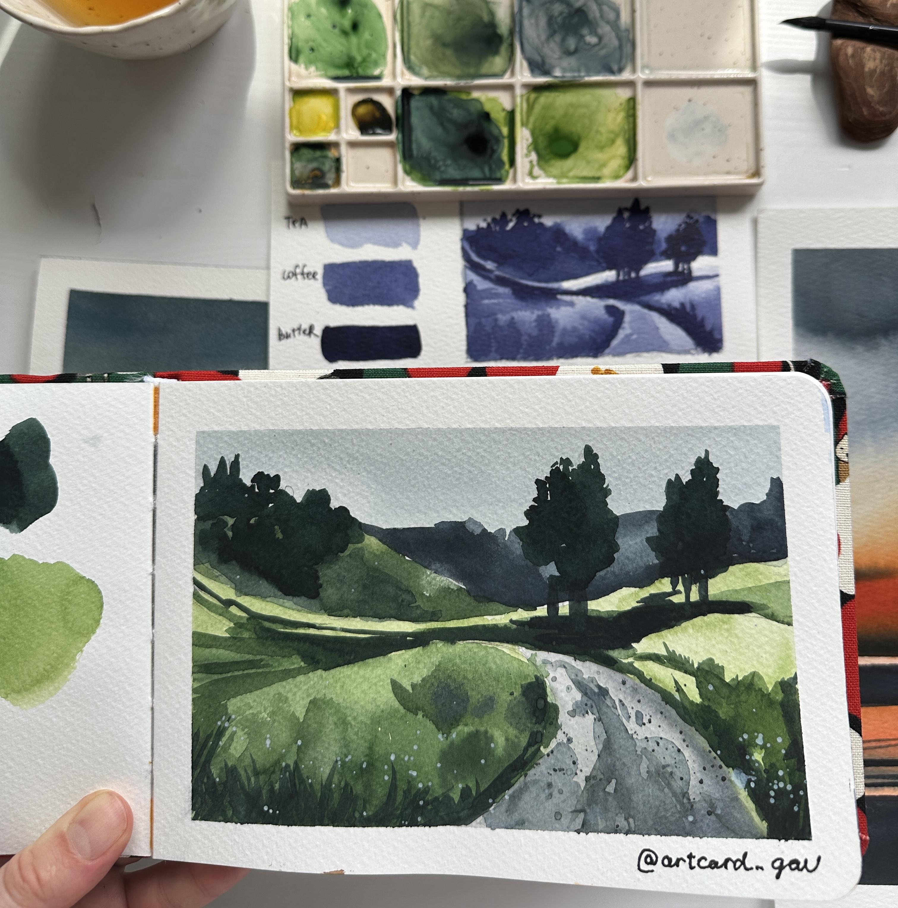
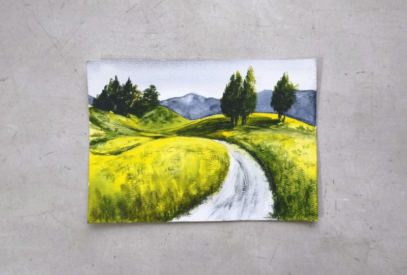
5. Green Landscape: Now let's paint this green
landscape with color. I'm using watercolor sketchbook with 100% cellulose paper, and I will fix the paper with masking tape first
because it's not a glued pad. I will need just three
colors, paints gray, green, and aoline
and one round brush. Number eight, by Fumi, you can get 10% off for your order on fumoi using code in the
description of the class. Placing colors on the palette. I always use ceramic
palettes because it's much more convenient
to mix colors in them, but you can use
any other palette. And now let me show you the
color mixes I will use. It's green and paints gray
for the dark areas in the background and
darkest areas like trees and mix of aoline and green
for the lightest areas. As always in watercolor, we start with very light
areas and light colors. So I'm placing this mix of lein and green to the area
where the top of the hill is and basically the whole area of the foreground avoiding
painting the road. Now, I will use the color mix of paints gray and water
to paint the sky. When I'm getting closer
to the area of the hill, I leave a very thin line
between the sky and the hill, so the colors wouldn't blend. For the color of the road, I will make spins gray
with a little bit of yellow oca that is
left on my palette. You can just use Allin. But if you have yellow oca, it's much better
because it will just make this grayish color
a little bit warmer, and I cover this
area of the road. So basically now in terms of color value road and the
hills around are same, but we will make the grass around the road dark
on the next level. Now, I'm mixing dark green color using green and a little
bit of yellow Oca or line and just placing this color to
the sides of the road. Oh So places I can lift the color with a clean and dry brush to
create the highlight. And also, I can add
slightly dark color to the area of the foreground
that is closer to us. Now, our main task is to continue building
up the color around the road and in
the middle ground. And the best thing
to do it is to constantly compare different
areas to each other. If the road is lighter
than the field, if the trees are
dark, et cetera. And here is the main
thing to keep in mind to not get too
dark in the colors because we need
these darkest colors for the darkest areas like
trees in the background. When I'm creating dark areas, I keep in mind that
it's mid tones, so it shouldn't be
too dark because the darkest areas will be
the trees in the background. And also, keep in mind that the lightest areas are on
the right side of the hill, so I will not cover it
with dark green shade. Now, it will be
your task to paint the background trees and the background hills
and a little hint. I will give you that
for this color, I will use color mix of
green and paints gray. This is how it turned
out for my landscape, and I like that the
trees are dark and they are the darkest area in the landscape
without any doubts. And also, as you can see, I added some splashes and some watercolor spots
on the road to make it less flat and to add
a little bit details. Now the only thing left is
to add trunks to the trees, and it's almost done. And let's repeat what we
discussed in previous lessons. That middle ground with these hills and the
highlights on them, they wear worm color
yellow and green. And the background
hills and trees, they wear the cold colors, green and paints gray. And now we can also
make the foreground daca because we can add
later some white flowers, white splashes on
the foreground, creating some
textures and details. Now, our landscape
is almost done. Just one thing I
want to do is to add some little
splashes on the road. So I have to cover
the areas around with just paper towels and using the same colors I
used for painting the road, I'm creating these
little splashes. To make them more realistic, I can just use a
wet brush and apply some water and to combine these splashes in one
spot in some areas. Now I can do the same
with the foreground using zinc white colour.
And that's it. Now we can remove the
masking tape if you are using one just like me and
the landscape is done. You can use other
references I attached to this class in class
resources to practice more in building
color values and understanding the structure
of the landscape. We will paint another landscape focusing on the sky
in the next lesson.
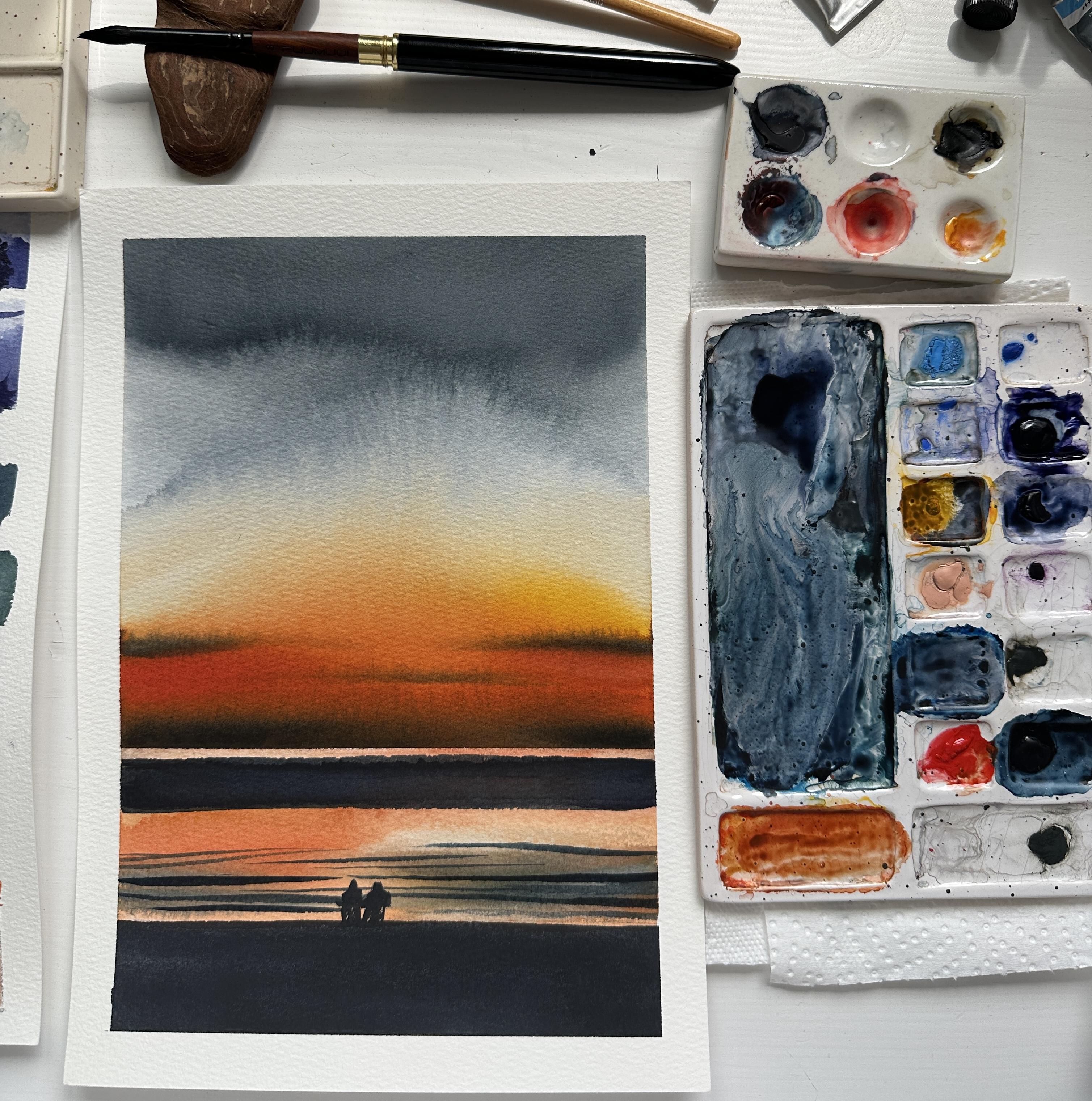
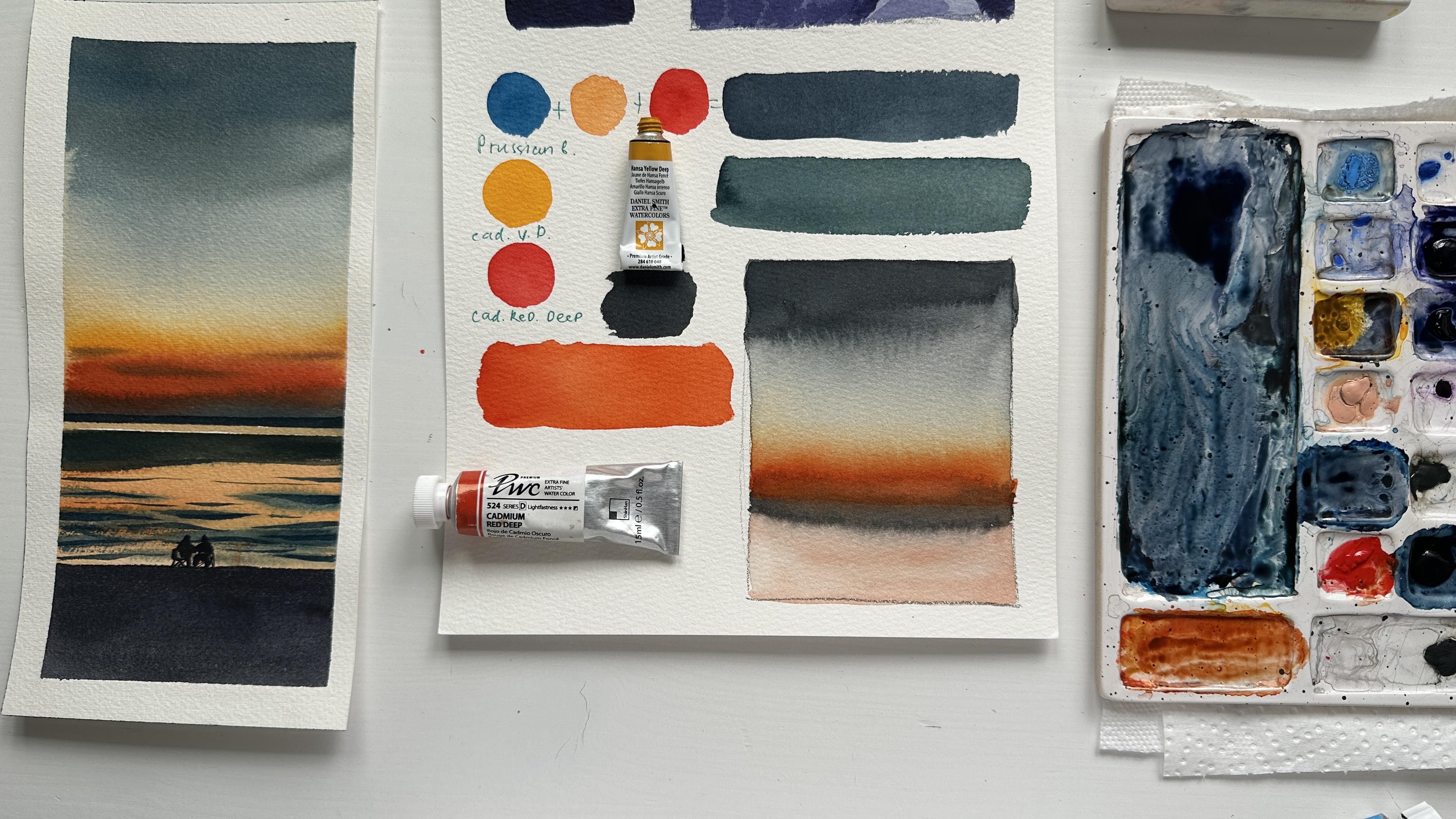
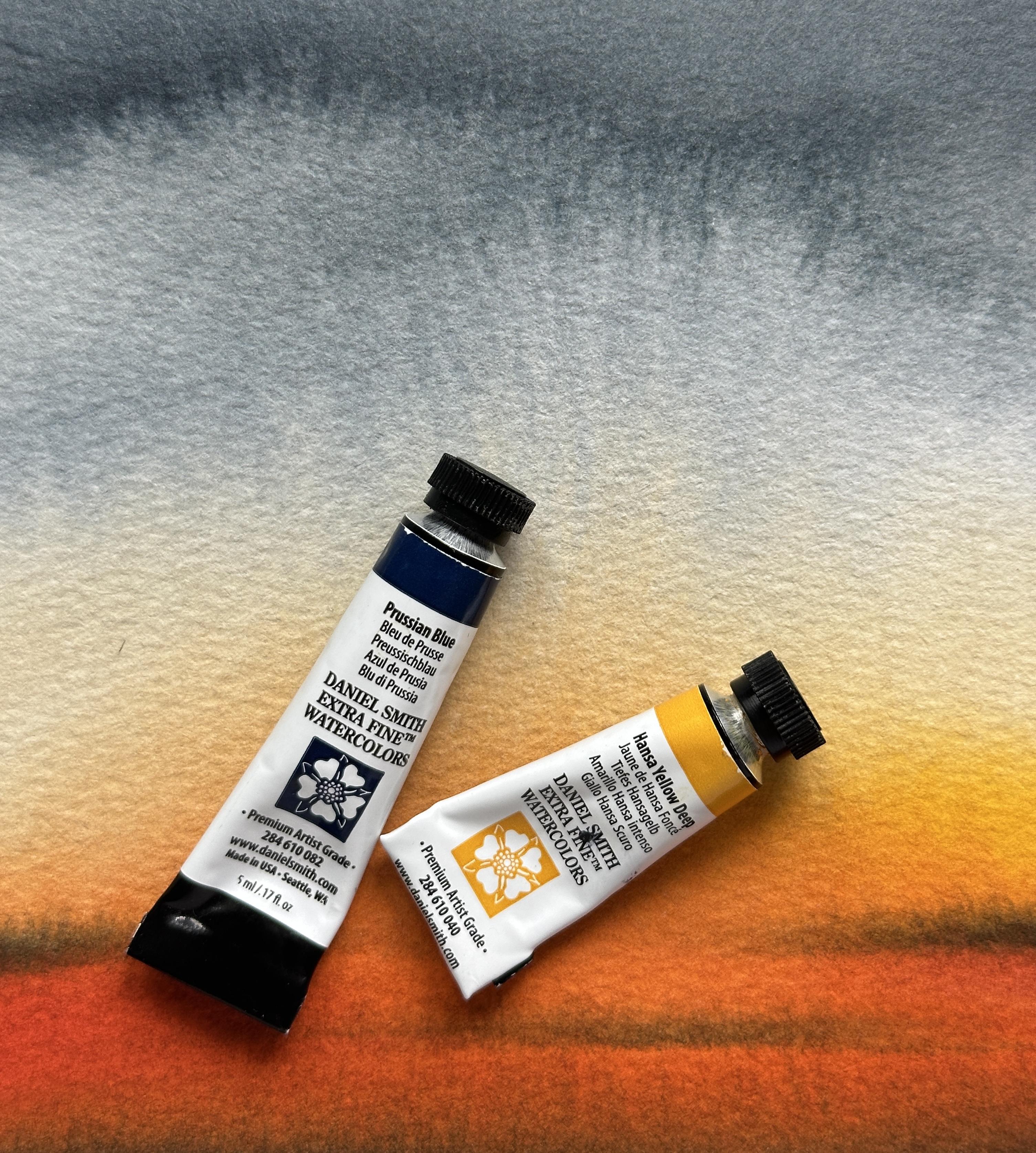
6. Sunset Color Mixes and Watercolors: For painting this
gorgeous sunset, we will use four watercolors
Cadmium red deep, cadmium yellow deep, Prussian
blue and paints gray. For painting this landscape, I will use 100% atu paper by Baohong, quilt press texture. For painting big areas
of the landscapes, I recommend you to use atm
paper and round brush number eight by fuming Now, let me show you the color
swatches and color mixes. I'm using two separate colors yellow and red instead
of ready made orange because it's easier to control the intensity of the color
and the shade I want to use. Besides, for the color of
the sky in the upper pot, I will use color mix of
Prussian blue, yellow and red. If you are new to
watercolor and color mixes, I recommend you to
join my other class on color mixing and basics
of watercolor painting. It will help you to
understand how to get this interesting shade and
not just color from the tube. Now, let's move to
the painting part.
7. Painting Sunset: I already did a
very simple sketch, place in two lines,
the horizon line, which is below the middle of the paper and the
line of the seaside. Now I'm sketching simple
figures of the people, and I can move to
the painting part. But to make it easier
painting the sky, I will separate the
area of the sky and the sea with
the masking tape. Now, I'm preparing the
color mix for the sky. And as I told you, I'm
mixing Prussian blue, cadmium red dip, and
cadmium yellow dip. I use about 80% of blue, 15% of red, and just a little
bit of yellow, about 5%. I'm mixing until I get this
very nice grayish blue shade. And I apply this dark color
at the very top of the paper. And now I will use more water
to create the gradient. So in this painting, we will practice in a very simple thing that will be useful for
painting landscapes, creating the gradient
between different colors. I'm using brush number two by ArtSecret with French holder. The advantage of this brush is that it can hold a lot of water, and you can use it
for big washes. I'm using clean water, but since some color
left on the brush, we see some color. And now I can create the orange area closer
to the horizon line. I will need a very
bright orange color. And at the top of
this orange area, I want to add more yellow
color. But be careful. I see that the yellow
color is already not so pure because I mixed it with blue and some of the
leftover is mixed. So it is better to use different palettes for the
colors and keep it very clean. While I'm painting, I'm holding the drawing board and tilting
it a little bit to let the colors nicely blend and also make sure that the whole
area that you are painting, the area of the sky is still wet because otherwise you will not have these very
nice smooth transitions of the colors. I mix even more orange color for this area closer
to the horizon line. You see that there is a rough edge because it's
stated to get in dry, so I reapplied the color to
make it even more bright. Also, keep in mind
that the color will became more pale when
the paper will get dry. So don't worry if your
colors looks too bright, they will fade
away a little bit. Now I load my brush with this
blue shade that we used for painting the sky and making sure that the color
is pretty opaque, and I apply this color
to the horizon line, creating the gradient from the dark blue shade
to the orange. I just let the colors
blend on the surface. And using the same color, I can carefully create these horizontal lines,
imitating the clouds. In this landscape,
clouds are not very complicated and mostly we focus on this
beautiful gradient. So it's just enough if you
make a few brush strokes. I can also add a little
bit more red color and apply it to this orange
area while it's still wet. We'll let this layer to get
fully dry meanwhile I can change the water
for the clean one and even take another glass. Now I will remove this
masking tape and will place a new one above the horizon
line on the area of the sky. Now I'm making the
same orange shade but a little bit more
water in the color mix, and I will paint the
area of the sea. The color will be similar to the sunset color but
slightly lighter, especially closer to
the horizon line. I don't care if
the bottom line of this seaside is straight because we will
fix it later with the line of the dark
color above it. And for now, it doesn't matter. Now, I can mix Prussian blue, red and yellow creating this dark intense
grayish blue color for painting the waves. And now I just need to make
slightly more watery mix, more transparent for
creating the waves. I'm making just a few
horizontal brush strokes. Be careful because the color will travel on the wet surface, and sometimes it's hard to control how far it will travel. So it's better to
wait a little bit until the paper will
get slightly dryer and also leave some of the orange color
closer to the area between the seaside between this dark area at the
bottom, and these waves. Most of the sea
area still orange, and I will leave it like this, and I even want to add some more orange color around these dark
areas of the waves. Now I will let this
layer to get dry.
8. Sunset Part 2: Now when this layer got dry, I remove this skin tape, and I will place
another one just a few millimeters lower than
the horizon line, leaving this very
light orange color as a divider between
the sky and the sea. Now, I will load my brush with the same color mix of blue, red and yellow and will place
it below the skin tape. The color mix shouldn't
be too opaque because we don't need
this effect of dry brush, so it should be enough water on the brush to make this
very smooth line. Now, I renew the
same color mix on my palette and use a
very opaque color, not too much water
in the color mix, I will make very thin
lines as a waves. Oh I'm still using my brush number eight, and since it's a round
brush with a pointy, it's easy for me to make
even these thin lines. But if you feel more confident
with a smaller brush, you can just switch
to the smaller brush. And when I'm making
these brush strokes, I'm trying to create these
lines in some places, thinner, in some
places, thicker. And also, I'm not avoiding painting on the
silhouettes of the people. Because anyway, we will paint
it with a very dark color, and you can just not
think about it right now. And I think that's enough. If you will take a
look at the reference, you will see that in the
middle of this sea area, there is just orange color
without any waves or anything. So we keep it that way. I want to darken this area on the edge
between the sea and the sky, so I just apply
another layer on top. Now when I'm done
with the sea area, I will wait until it will get fully dry and remove
the masking tape. And now I will
load my brush with paints gray color and
will start painting the seaside area or beach area with just very
intense black shade. You can also place the masking tape above
this seaside line, but I will just try to
make it with the brush. I cover it with just one layer, and to make this very
smooth and straight line, you just want to make sure that there is enough water
in your color mix. And now with this black color, I'm making the silhouettes
of the people. I'm starting with a little
round shape as a head, then I'm painting
the shoulders and legs and some silhouettes
of the chair. And again, I'm
using brush number eight and this point
end of the brush. But if you feel more confident, you can use just smaller brush. This couple will be our
focal point of the painting. It means that it will be the first thing that people see when they look
at the painting. But it's very important
to not make it too big or too complicated. It just little dots and shapes that we are
trying to create. Also, I don't like
how wavy this line of the dark area in the
upper part of the sea is. So I will just try
to fix it with a brush and the dark color, trying to make it more smooth. Now our painting is done, and I can remove
the masking tape. I think it looks gorgeous, especially this beautiful
watercolor wash in the area of the sky. I hope that you enjoyed
this class and I will be waiting for your paintings in
the class project section. Please don't forget to attach the photos of your
final paintings. Also, I have a few other
classes on landscapes, and if you are interested in practicing more,
please join them. Please don't forget to leave a review about the class as well to help other students understand if this class
is a good fit for them. I wish you patience and good luck in your
watercolor journey, and I'll see you in
my other classes.
 Aleksandryna Gromyko, Watercolor tutorials for everyone