Transcripts
1. Introduction: Hi, my name is Alexandrina. I'm a watercolor artist. I love creating easy to follow painting classes to
share my knowledge. In this class, we will
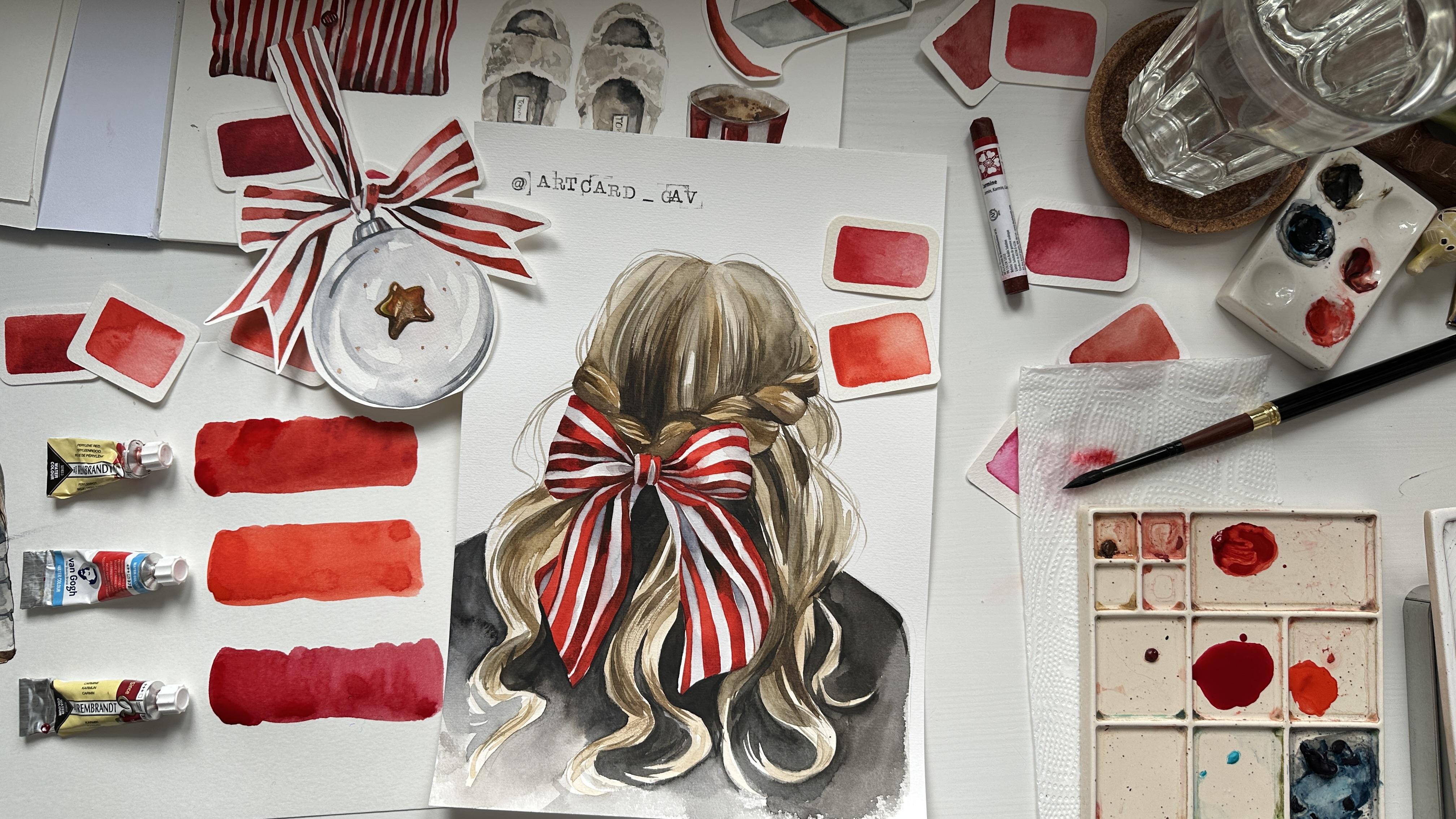
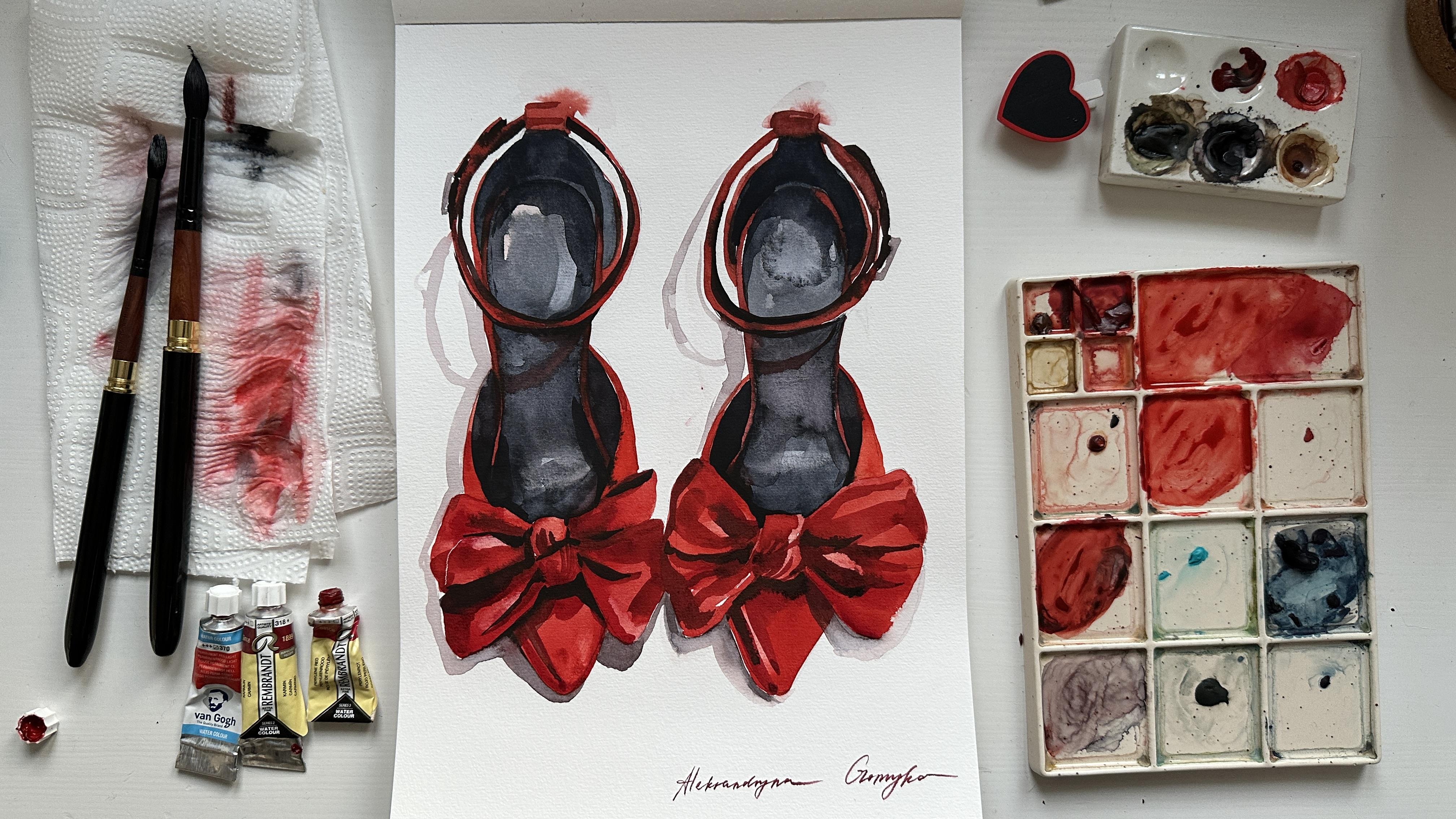
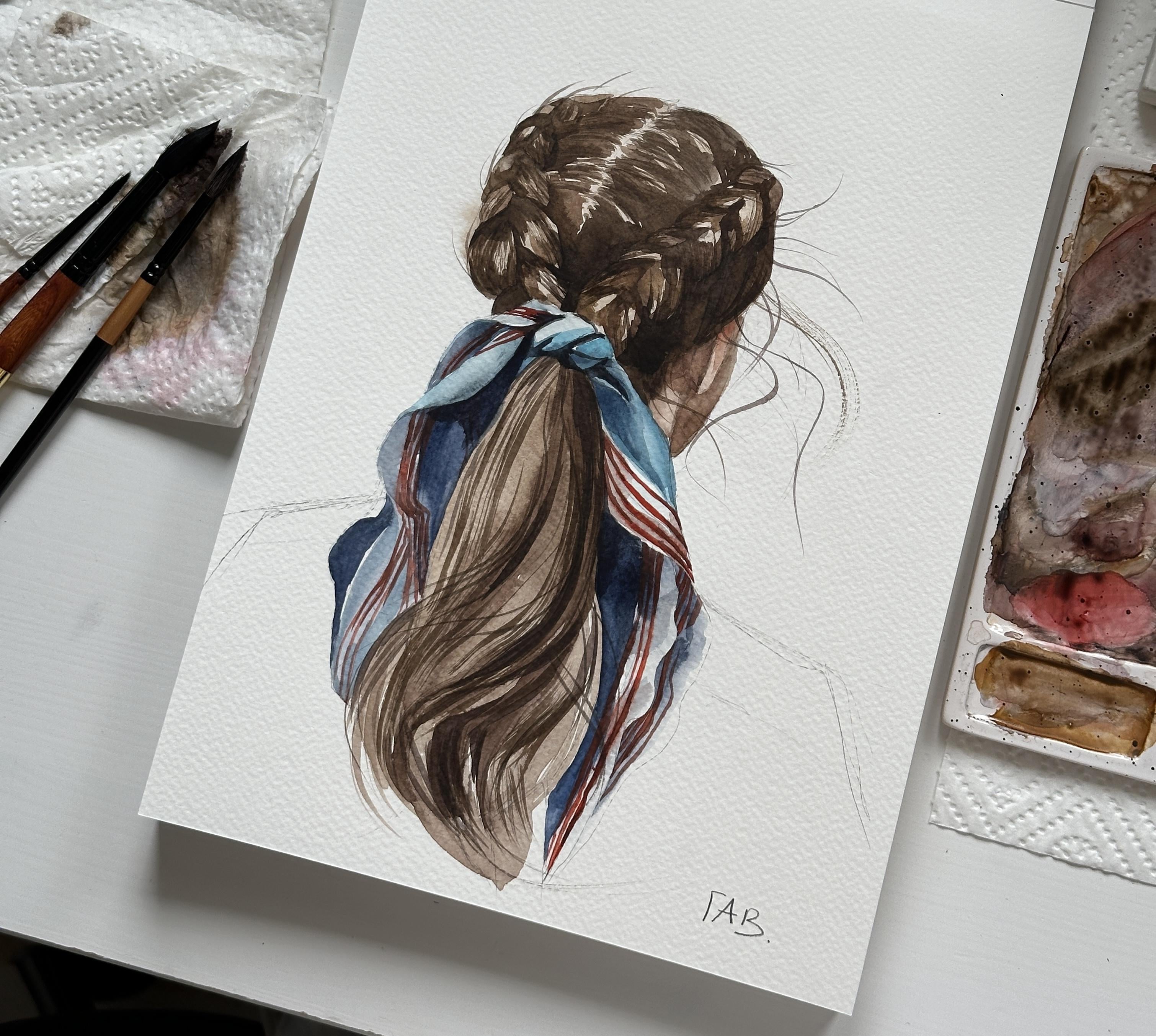
create two class projects. One is a striped, a red ribbon, and the hairstyle. Another one is red shoes. If you want to dive into fashion illustration and
improve your painting skills, this class is for you. You will learn how to use the wet-on-wet technique
for soft edges, built dimension with
different shades of red, paint hair texture, and at
depth through layering. I'll provide traceable sketches, material recommendations, and share my
favorite red colors. This class is perfect for intermediate artists who want to improve their
painting skills and create fashion
illustration step by step. Grab your brushes, and
I'll see you in the class.
2. Materials: Welcome to the class.
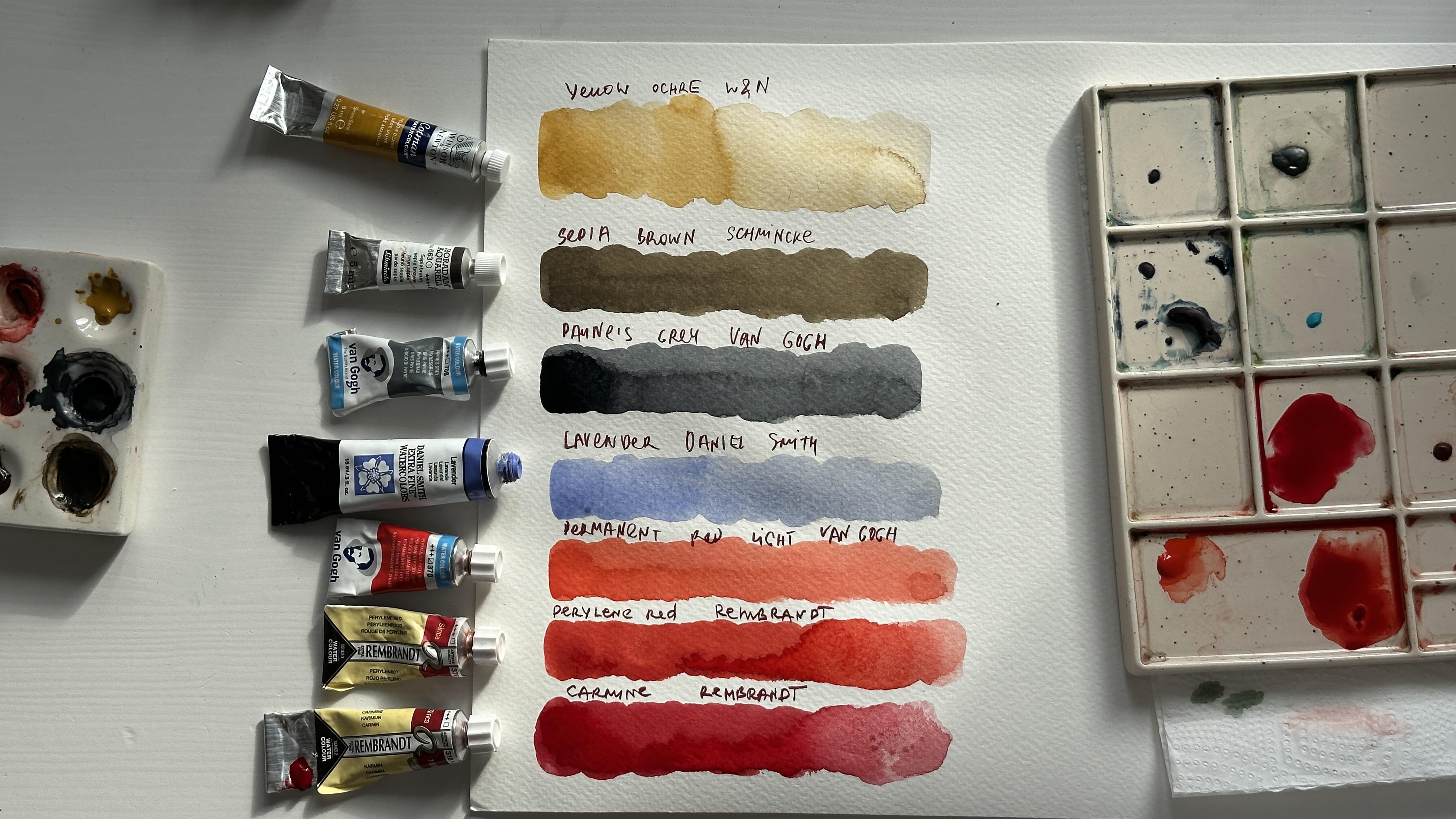
Let's start with art materials you will need
for these two class projects. I will use Aquapad, 100% cellulose watercolor paper, 300 JM by Clairefontaine,
cold pressed texture. I use it for simple
illustrations. If you want to use quaton
paper, it's even better. But even with the cellulose
paper, it will be okay. Both of the projects
will include red colors. You can find list watches of the colors in the
end of the video. And here's the list we will
use for this tutorial. Pearl and red by Rembrandt, Yellow Ochre by Windsor
Newton, Sepia Brown, by Sminke, Lavender,
by Daniel Smith, paints gray, B and G. Also, I will use Permanent
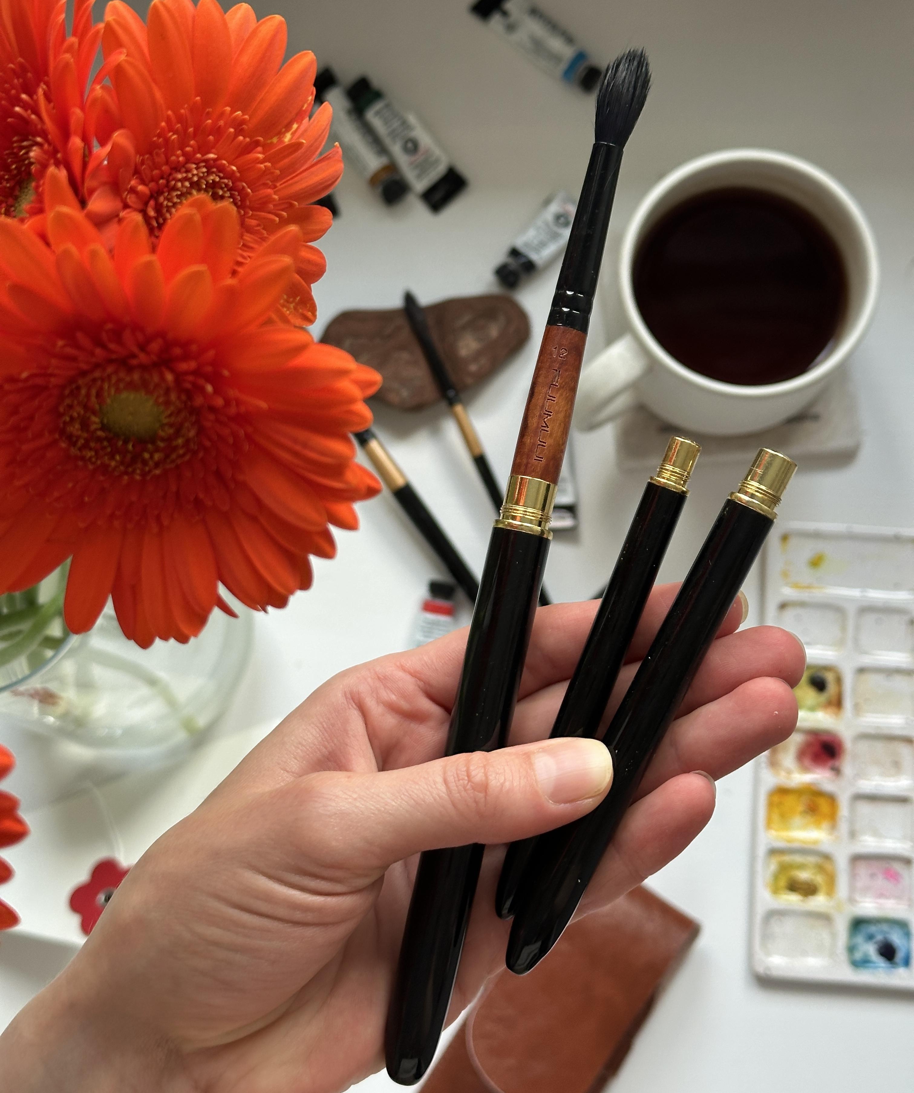
Red Light, B and G, and a few brushes by Fumui and also Silver
Brush number two. Round brush number
eight or number six will be a perfect choice
for this painting because it has a pointy end and you can paint big areas and
little details. I will use same brushes for this class project and also
brush number 12 by Fumi. You can order these brushes with 10% discount with my code. I will use four colors, three shades of red, Permanent red light,
Carmine, and Perlin red. Perlin red is the
perfect red shade. It's very warm and
quite intense. Also, I will need some color for the black that I have
on my ceramic palette. I normally use Payne's
Grey because it creates also very
nice color mixes. Let me show you the colors watches of what
colors I will use. The first one is
yellow Ocha and it's very basic color in
any color palette, and every artist definitely should have it in their palette. Next one is Sepia
Brown by Sminke. It's also pretty basic color. The third one is Payne's Grey, which is my favorite color, and I use it in every painting for darkening the
colors for the shadows. It creates very
nice color mixes, and we will use it a
lot in both paintings. Then I have Lavender
by Daniel Smith. I will use this color
for painting hair and in color mixes to me down the
yellow shade of Yellow Ochre. Then we move to the red shades I will use in both class projects. First one is very
light and bright, permanent red light by Vangh. I will use it for
the light areas. Then we have one of my
favorite red colors, perminent red by Rembrandt. And the last one is
Carmine by Rembrandt. It's more called red shade, and it can be helpful
in some color mixes. Now when you learned everything about art materials
we're going to use, we can move forward
and start painting.
3. Sketch Hairstyle: Let's start with a
very simple sketch. You can find copy of
my sketch attached and just trace it to your
watercolor paper. But if you want to learn how
to sketch from the scratch, you can just follow
my lead here. I'm using mechanic
pencil 0.3 millimeters, but you can use any
pencil that you like. I have a paper with A four size. The main thing to
remember while sketching is to press the
pencil very gently. Do not leave a very hard
marks on the paper. When I'm placing the
object on the paper, I'm making sure that I have some space left
on the right side, on the left side and on the top, from the object to the
corners of the paper. I'm sketching the braid, making each segment with a particular direction
of the hair. For this painting, I used
a few references that I combined into one image because I wanted to
create a striped, red bow and this hairstyle, I just found separately
the hairstyle and the bow. Then I move to
drawing the bow and I will start with the
middle area of the bow. Since there are
stripes on the bow, it's very important
for us to analyse the direction of each stripe and to repeat it in the sketch. GG. In this case, some pattern like stripes or any
other one helps us to show that the fabric has
its own shape and direction. So we are trying to
recreate this shape, not only by light and shadow, but also by the shape
of the stripes. Now I move to sketching
the rest of the hair, and I'm trying to
also make directions for some separate hair at
the bottom of our image. I will also sketch the
direction of the hair on the top of the hat to make
the painting process easier. I remove unnecessary
pencil lines with eraser. Now, my sketch is done, and I can move to
preparing the color mixes.
4. First Layer Hair: Let's start with
the first layer. First, I will use Nina
p eraser and remove the pencil lines as I usually
do with all of my sketches. It will help me to keep the
final painting more clean. I start by placing on the
palette a little bit of happier brown and mixing
it with yellow Oca. I will also add to this mix
a little bit of lavender to make it more cold because we are going to
paint the blonde hair, and we don't want to
make it too yellowish, so I will mew down this
color with lavender. Using this color and
quite a lot of water, I will cover the
area above the bow, the top of the head, and the braids with
this very light, almost transparent color mix. In some places, I can add a little bit more Yellow
Ochre, and in general, I remember that
the braids will be lighter and the
middle of the head, where the bow is and
the hair below the bow, it will be dark
area in the shadow. Create the highlight
on the braids. I can clean my brush tape on the paper towel and just lift some color from
the wet surface. Now I can move to painting
some of the hair lower, and I still use very
light color mix. The first layer normally
should be very light. I can come back to the braids
and lift some color of it. Again, Now I can add a little bit more happier
brown to the palette, creating more dark
mix for the hair. Now, when the paper
got a little bit more dry and it doesn't
contain a lot of water, the color will not
travel too much, and I can add some dark
areas to highlight the contrast between
light areas on the braids and dark
areas in the shadows. Now, I'm mixing slightly
dark brown shade by using lavender
and shapier brown. Also, I can add a little
bit of yellow Oca, but I'm trying to use
more opaque color, adding less water and
also more shapier brown. Place the main colored area in the middle right in
between the braids, and I'm trying to create these light and
thin brushstrokes coming from this big spot. I use brush number six, but it has pointy end, so it's not a problem to
create more thin lines. I can also twist my
brush on the palette for creating the
textured brushstrokes. Not covering the whole area
with these brushstrokes, leaving some areas
unpainted with just first layer because normally in the
middle of the head, we see the shiny area
because hair normally shiny, so we will leave this area unpainted as a
highlight on the hair. Now I'm switching to the brush
number two by Silver Brush to create slightly
darker brushstrokes and more thin lines. Also, with this brush, I can create a
separate hair that are going from the shape
that we already painted. Now, I will mix
some darker color, adding paints gray to the color mix of
Sepia and Lavender. I mostly add this
darker color to this middle area inside the
head between the braids. And also now, I will carefully apply this darker color
in between the braids, the segments of the
braids because it's basically switch
between the light area of the hair and the darker one. It's especially
important to create dark areas around the bow because these dark areas will create the backdrop
for the light bow, and it will create the contrast between light bow and dark areas on the hair. Placing the slightly
bigger spot on the edge, trying to keep the middle
area on the segment of the braid light and create this very light hair texture with the very tip of the brush. Now I add a little
bit of yellow Oca and create slightly
different shade. Now, again, a little
bit more paints. Grey to the car mix
and apply again. While the surface still wet, we can work adding more and
more color to this wet spot. Okay. Now I come back to the
brush number six and mix in the first color mix with
yellow Oca and Lavender. I will use a bit more water
because I want to cover a big area of the hair on the left side and between
the ribbons from the bow. I've also painted some
separate curls on the back, and in some places
I add more color, creating slightly darker
areas on the curls. Now I want to darken this color mix by adding
more shape brown, and I will add this
color mix under the bow. And again, I switch to
brush number two to create some separate hair that are
placed quite chaotically, but repeating the shape of the curls and the
hair in general. You can join my portrait
class to learn about hair texture techniques I usually use when
painting the hair. Now we are almost
done with the hair, and we are moving to
painting the bow.
5. Painting The Bow Part 1: Now I am moving to painting
the bow and the ribbon. First, I will use paints
gray with a lot of water to create very neutral
and light gray shade. With this color, I will paint the white
stripes on the bow. We're not leaving white
color in watercolor, and we still need to
add some shadows. On the white stripes, the shadows will be close to
the middle and on the edge. And in the middle of the stripe, I will leave light area
for the highlight. I'm using brush number two, and I have paper towel next
to my painting so I can reduce excess of water on the brush if I feel like I
want to have more control. I'm doing the same
with the other side, repeating the shape of each stripe that I can
see on the reference because the bow is very flexible and it has
different shape. Each stripe has different shape, so I have to repeat it. Now, I move to the ribbon, and I repeat the same steps. Also, I just keep in mind that one white stripe goes
after one red one, and I'm just painting
one after another, leaving the area for the
red stripes for later. Mm. Now I can place the
red color on the palette. I'm using Perlin
red by Rembrandt. It's one of my
favorite red colors. It's absolutely perfect. And also I have
permanent red by Vang. I will follow the same sequence that first I cover
with light red color, and then I will darken
both edges closer to the middle of the bow
and closer to the edge. For the dark red color, I will mix pearlin
red and paints gray. Basically, I don't even
use permanent red light by Van Gogh because
I'm satisfied with the difference between
just pure purlin red and dark shade of the color
mix of red and black. Now I will do the same with
another part of the bow. Stripes on the middle area
will be just parli and red and maybe a little bit
darker color at the bottom, but mostly it should
be very light and lighter than the stripes
on both sides of the bow.
6. Painting The Bow Part 2: Now I move to the ribbons. And on these red stripes, I will use permanent
red light van gold. It's more bright
and warm red color. And on the light areas, these ribbons will be
lighter than the bow itself. Mostly because they appear to be more exposed to the light. At the edges of
these red stripes, I can add some parylent red
to make it slightly dark. And at the top part, I will add this dark color mix of perilin red and pins gray. Any pattern on the fabric just like these stripes
help us to show the direction of
the object and to show better shadows
and light areas. However, I mixed up a little bit the sequence of the red
stripes and white ones. It's not a big deal, but I still have to figure
out how to painted now. And also here at the
top of this ribbon, I will need to add a little bit more dark color to the white stripes because
they are in the shadow. So I would say that for painting such objects
with stripes, and as might appear, this is one of the favorite
subjects of my students, and it looks very
impressive and realistic. So I think that the main part
is to build a sketch and analyze all the stripes and
structure of the fabric, the direction of the
stripes to repeat them exactly how you
see on the reference.
7. Painting Ribbon and Hair: Now, I will move to
paint in the hair again, and I will mix some
more dark color. I mix in yellow, ocha, shapi brown, mix of pearl
and red and paints gray. Now I have pretty
nice brown color. I don't use just pure sepia
brown because it would be very flat color and it's more interesting shade if I mix the colors I already used. For the dark brown color, I use pins gray and shapia
brown, pearl and red. Now I will apply a pretty opaque color
right below the bow, creating the dark
contrast between the hair and the light
ribbon and the bow. M Now I will switch from the brush number
eight to brush number two to create more thin
lines for separate hair. It's very nice to
make this line more flexible and in some
areas to make it thin and then to make a
thick brushstrokes by pressing the
brush to the paper. Also, I want to highlight
this difference between the braid and
the hair underneath. That will eventually appear
more dark as in the shadow. Now, again, I mix an even dark color mix with paints gray, shapia brown and peril and red. And with this dark
brownish color, I will enhance more the
contrasts and dark areas. I can switch between
slightly lighter brown shade that we mixed before and
the dark brown color to make also the diversity because different areas of the hair exposed to the light in
different proportions, and it changes the
color that we see. And normally, I just
have to keep in mind that I need to make
the paint endeavors, so I'm trying to use
different shades. Yeah. Yeah. Yeah. Now, I can also come back to this
area on the ribbon that is quite blurry because
the red color that I dragged
with the gray one, and I just reapplied
this gray color, creating slightly darker shadow. I already like how it looks. It looks very bright, and the bow and the ribbon, it looks very realistic,
in my opinion. Yeah.
8. Painting The Jacket: Now, I will apply this
darkest almost black color to the darkest area to create
the contrast between hair, the ribbons and the background. And background, it's
a coat or jacket or a dark part of the
color that we can see. But it helps us to create this nice dark area to
make the ribbons pop. And now I carefully continue
working with this dark area, I can add even more paints gray to the color mix to
create a dark color. And now I'm creating the dark backdrop for the
hair and the ribbons. And also, I can create more sharp lines for
the edges of the object, like using the negative space. Money. Money. Money. Money. As I move closer to the
bottom of the paper, I make this dark black
color more blurry, and I first apply the water or some very
light gray shade, and then I apply some
dark and dark colour. At this stage, I have to work
very fast because I want to create a unite background
without any separations, but also I need to make this dark background darker
than the hair, for sure. And I can add to the wet
surface more dark color, especially in the areas
where I needed the most. Like next to the light areas
of the hair and the ribbon. Now I mixing again Pains gray
and sepia brown and I will darken the shadows to create
even darker contrast. You see how the painting
became more bright right away. That's why we need
these contrasts. In some areas, I
can use more sepia brown in the color mix and in some areas
more paints gray. Once you're done
with your painting, don't forget to submit it as a class project and a touch
photo of your final painting. Also, don't forget to leave
review about the class. If you like painting
this class project, you can also join my other
class on painting portraits. It will be also very insightful and
interesting experience. And I'm done with the dark
background for the hair. Thank you for joining the class. I will see you in the next
lesson for the final word.
9. Shoes First Layer: Please prepare your
sketch based on the reference photo attached or the traceable copy of my sketch. Use Interpol razor to
remove the pencil lines and prepare the colors
you are going to use. First, I cover the
area of the shoes and around the shoes
with a clean water. I cover the area around the
shoes because it will help me to create a very nice,
blurry watercolor effect. And with the second layer, I will define the
edges of the object. But for the first layer, it's a very nice technique
to have blurry edges. Now I switch to the smaller
brush number eight, and I will prepare the color on the palette
by adding some water. Normally, in watercolor,
we start with light areas. And I load my brush with
a permanent red light, which is very bright
and warm red colour. Before you start painting, make sure that you don't
have water puddles on the paper and the paper
got a little bit dry. The paper almost got dry. It happens with a
cellulose paper, so I don't even see that
color travels around, and I can just easily paint
the shape of the shoes. I use two red colors. It's permanent red
light and pearl red. Pearline red is slightly darker, so I use it in some areas
where the shadow will be. When you are working with
wet on wet technique, make sure that the
color is pretty opaque, so don't use a lot of
water in the color mix. Right now, I'm
carefully applying the color where the
light areas will be, and the middle of the bow will
be the lightest red shade. So I can carefully add
pearl and red on the sides. And also in watercolor, especially here we are painting basically with just
one color red. We can control the
intensity of the color by adding more pigment
and less water. So the more color I will have on the brush
or on the paper, the more intense color
will appear on the paper. So for the light areas, I'm trying to add more water. I'm trying to paint
each area separately, even though I'm using
basically the same color, but I'm painting the sides of the bow and the middle
area little by little. So I would see the slightly difference
in the color shade. Because normally when I leave
the brush in someplace, the color will stop there and the area will
appear a bit darker. Once I covered the whole
area with a red color, I can use a bit of carmine, which is more dark and
intense and add it in some places like under the
middle part of the bow, maybe in the corners of the bow. And also at this stage, I can clean my brush, tap it on the paper towel, and lift the color from some areas where I want
to leave a highlight, for example, on the shoe. I want to lift some color from
the middle of the bow and also from some of the areas
on the sides of the bow. Once I'm done with the
highlights, more or less, I can mix some dark red
shade or almost black color. I will use carmine
and peril and red, and I will add a little
bit of paints gray to this red shade to create
a very dark color. I will use this color for painting the dark
areas on the bow. These dark areas will go from the center of the
bow to the sides, and the paper is not
that wet already, so the color doesn't
travel a lot. It just blends a little bit
with the existing color. But I will have to add a
little bit of red shade anyway to create more
smooth transition of these dark areas. Now I can use pearl and red
or even mix carmine with a permanent red light and
just use this dense color, paque color and move the brush from the
sides to the center. Again, highlighting
the light color of the middle part and more
intense color of the sides. Also, we will have a shadow under the middle
part on the shoe and the middle part also have its own dark areas
and light areas. So now I'm just looking
at the reference, and I'm trying to add some more interesting colors and color values to this
one colored area. Now, I want to move to even
dark shadows, and first, I will place the red
color underneath the bow and the middle
side of the bow, and I will paint this
area on the shoe. Avoiding this highlight I created with a clean
and dry brush. Now, I will use a pure paints
gray color and will add this color right in the wet spots I created
on the previous step, highlighting the difference
between the shone with a shadow and slightly
lighter ribbon or bow. But on the bow, I also see
these very dark black shadows, so I will apply this black color to the
bow itself as well, letting the color blend a
little bit with the red shade. And I will do the same
with another shoe. I'm using a very opaque red
color carmine and parlin red, and I place this dark
area underneath the bow, and then I will just
add a paints gray color to the area that I created, making it even darker. You see how nice and
realistic object looks right. Now when we added contrasts, that's why I always explain in my videos that it's
very important to create contrasts between
dark and light areas and always analyze
image before painting. Where will be light area, where will be middle value, and where will be shadow. Painting bows takes
some practice. So if you are not fully satisfied with the
result at this stage, don't be harsh on yourself. It just takes some time and analyze all the areas,
all the shadows, and all the shapes and lines
of the bow that you can see and try to repeat it. Oh
10. Shoes Painting Soles: Now I will move to
painting the insoles. They are contoured, and
they have this red contour, so I will start covering
the whole insole area, avoiding covering
the very thin line on the edge because I will paint it later
with a red shade. I also switch to the
brush number 12, so it would be
more convenient to cover a big area with
water very fast. I also avoid covering
the ankle straps with water because I will
also paint them later. Once I'm done, I will load my brush with a
paints gray color, and I will start applying
this color to the wet area. In these little spots, you can see how wet your
paper is because of the watercolor spot and
how far it travels around. So now, my main task is to cover the whole area
with a light color, adding some more pigment in
the areas of the shadows. The areas of the shadows, for example, are below the bow. And at the top of the
insults in the upper pot. In the areas where I need more precise movement
of the brush, I hold my brush
almost vertically, and I work with the
very tip of the brush. You can see that for now, I leave the area right below
the bow unpainted because I will apply a very dark
color right at this area, and I have to be very precise. For now, I can just press my
brush and move color around, leaving the brush in the area where I want
the color the most dark. And also, I come
back for the area of the counter hel because I want to add more
dark color there. Now I start painting the
area around the bow, which is the darkest one, and I have to be very
precise and careful. I can also add dark areas around the ankle strap and a little bit on the
edges of the insole. Just try to keep some area
in the middle quite light. While the area is still wet, I can clean my brush pet on
the paper towel and lift some color from the surface,
creating the highlight. I want to create
the highlight in the upper pot and also here. Now I'm using my
brush number eight. Basically, I'm analyzing
the reference, and I can see where
the highlights are, and I'm lifting the
color from that areas. Now, I can load my brush
with paints gray again and apply this color more opaque to the areas
I want to darken, for example, under
the ankle straps in the heel counters and also here below the bow and also maybe on the
edges of the insols. I can also add some drops of
clear water to create nice, watercolor texture and effect. And I like to do it to just
leave it as it is to get dry, and it will be, as a final result, very nice. Now I can move to painting this contour on the in
sauce with a red colour. I'm just mixing
permanent red light and some leftovers
of the carmine. But basically, it's very
bright and warm red. I didn't wait until
the black color will get fully dry
because I'm okay with the red color blend in with black color
in some areas. And as you can see, the area wasn't too wet, so the color basically stays where I place it
and it's no problem. And now I want to darken the area below
the bow even more, and I add some paints gray
color in the little corners to highlight the edge
between the bow and the insole and the
contour of the insole. Let's do the same with the upper pot and also
apply this red color. You can add some of the darker
red shade, for example, mix of peril and red and paints gray to some of the area of this wet spot to create some shadow areas even in
these little contour lines. But basically now
my black color that is on the ins is mixing
with the red shade, and it creates a
nice transitions between bright red color
and dark areas on itself. I don't need to
even add anything. Now I want to create even
darker color on the contour of the insole and under the ankle strap to create
even more bright contrast. You see that I leave the area of the highlight unpainted because
I want to keep it light. And to be honest, I really like how it's going, how the painting
looks like already. So we need to add
some little details. And in general, the most
difficult part is wet on wet, which we used for painting
the bows, the first step. At this point, I can just add a wet spot of the
color and just leave it as it is without blurring
the edge because it will show the sharp shadow area, and it also looks very nice. And
11. Red Shoes Final Steps: Now I will move to
painting the ankle straps. I clean my brush
and load it with a pearl and red and
permanent red light, some very bright, nice, opaque red color, and I carefully start
painting this line. It's not very thin, but it has some of the movement that you have
to analyze on the reference. In some areas, it
will be more thin. In some areas, it
will be more wide. I don't paint the middle part right now because I
will do it later. And also, I see that ankle straps have the
other side which is black, so we will have to
paint it as well. And it will help us to show the dimension of the ankle
strap that it's not flat. The black color blends
with the red color in some areas because
the air is still wet, but I'm okay with it
because it looks more artistic and I don't want to
separate these two parts. I want just to create some darkness and darker
areas on the ankle strap. What I also want to add is a shadow from the ankle
strap on the insole. It goes a little further than the ankle strap itself and
the same with the other shoe. Now, I clean my brush, and using clean water, I will cover some area around the middle element
on the ankle strap. I don't know how
it's cold, actually, but I'm sure that you understand
what I'm going to paint. If not, just look at the video. So I'm loading my brush
with a permanent red light, and I carefully
apply some color. I actually want intentionally to create this blurry
effect on this area, so I let the color travel a little bit further,
but not too much. So now on the right side, I will lift some color, and I will come back
to this area later. Now I want to move to these
side parts of the shoes, and they have a very
bright red contour, and the area inside
will be very dark. So I will use a
pure black color. But for now, I will just use permanent red light and
will paint these areas. I will wait a little bit to get the color
more dry because I don't want to blend this dark black color
and this red area. Mm. Now, I can come back to these areas on the
ankle straps because the paper got already more dry and I have more control
over this area, and I can apply just one more layer to
create more intense color. But I don't apply it on the
whole area just on the edges, leaving the light area in the middle where
the highlight is. Now, I will clean
my brush loaded with a pure paints gray color, which is quite opaque. So I use color from the tube, or you can use a
color from the pen, but make sure that you have a lot of watercolor
on your brush. And I apply this
color carefully in these little areas on
both sides of the insole. Now, I also want to add
some shadows around the middle element of the
ankle strap to create the contrast and
just some dark areas to outline the elements like
ankle straps and so on. Just be careful because
you don't want to add these dark elements
everywhere, in some places. Now, I cleaned my
brush and I apply some clean water around the
shoe to create the shadow. The shadow will be a mix of paint gray with a little
bit of peril and red. It's mostly gray shade, but with a little hint of red. I apply this color
under the shoe. And the edge can travel a
little bit on the wet surface. It's totally fine. I don't want to create a
very rough and dark shadow. I will do the same
with another shoe creating first
very light shadow, and then applying some dark
color right under the shoe. And also, I can apply it under the bow on
the shoe itself. I can see on the reference
some light shadows from the ankle straps and
the side of the shoe. So I'm using my brush and a very light mix that
left on my brush. And I'm creating these
very light brush strokes to create this shadow. And that's basically it. I can add some little details to the ankle straps and darken some areas in the middle of the ankle strap, but that's it. I like the final result. I hope you do, too, and thank you for
painting with me. I hope to see your painting
in the class project section, and also please share your feedback about the
class in the review. Join next lessons to be in
the second class project.
12. Final Word: Congrats on finishing the class. I'm so happy you made
it all the way through, and I hope you enjoyed the
process as much as I did. Don't forget to upload your
paintings as a class project. I would love to see your work
and to give you a feedback. I hope this class inspired you to continue painting
fashion illustration. And remember, if you are not fully satisfied with the result, it's okay because watercolor
takes patience and practice. So you just have to keep going. If you'd like to continue
learning with me, feel free to check out my other classes
here on Skillshare, especially my portrait
painting class. In the class, I
explain basics of painting portraits from sketch
to the watercolor part, and also I show main brushstrokes for
different hair textures. Please don't forget
to share your review. It will help me to improve
my future classes and for other students to understand the relevance of this
class to their needs. Thank you for painting with me, and I hope to see you in my
other classes very soon.
 Aleksandryna Gromyko, Watercolor tutorials for everyone