Transcripts
1. Class Overview : Hello everyone.
Welcome to my class. If you know me for long, you would know that I always
paint on a small paper. I usually paint on A5
size or even smaller, ending on a smaller
paper as fun. And I still love doing it. But I was still used to paint on small paper that I use
to fuel on painting. Logic. I had so many questions
in my mind, like, what if I ruined the paper work, if I waste the papal? What will I do want
such a large people? How will I paint? What if my painting, my colors dry out? How will I rectify that? So much more? These thoughts, never let
me paint on a larger paper. But one day I decided
if I won't dry, I would not know. I got my people into A4 size
and I started painting. I did few paintings on them. Few I did ruin it. But if you don't, don't really amazing, that instantly boosted
my confidence. Does painting on the
logic people gave me a sense of accomplishment
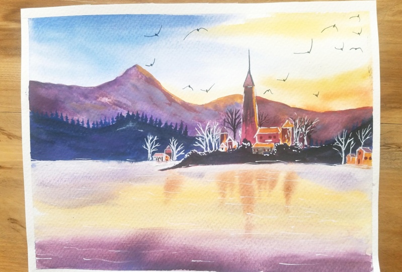
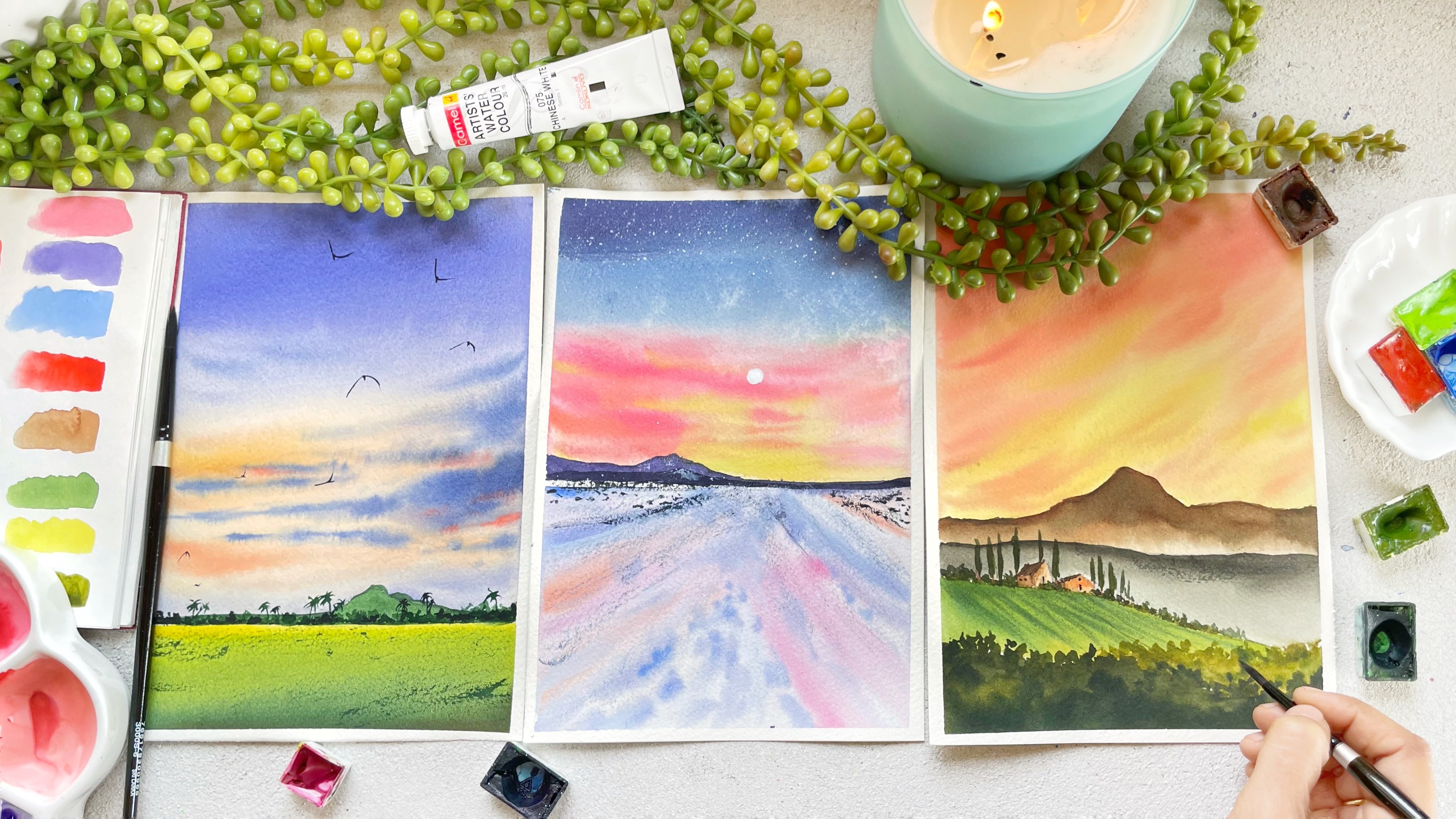
which I never got. These are the few which
I tried on A4 size. If you are someone
like me who really want to try and want
someone to push you, then this class is for you. Don't worry, if you are
a complete beginner. I will walk you through
each and every step. We will start with the
practice exercises and then we will move on to
the final class project. Walk you through all the
materials that you will need. It values the brushes, the paper, everything off. Studied about the materials. We would move on to the technique spot
where I will eat you. All the techniques in the deal. I will share you so
many tips and tricks on the way while we're working
on our class projects. Once we are done with
the techniques part, we will start with
the practice exercise on a small paper so that you are thorough
with the materials, the paper, the techniques part. I will walk you through each and every color which you will need for each class project
just before the floss. Once we have done that
to practice exercise, We will move on to painting
on an A4 sheet paper. We will apply everything
that we have loaned throughout the class on
our main class project. And this is the final
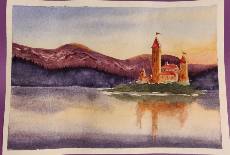
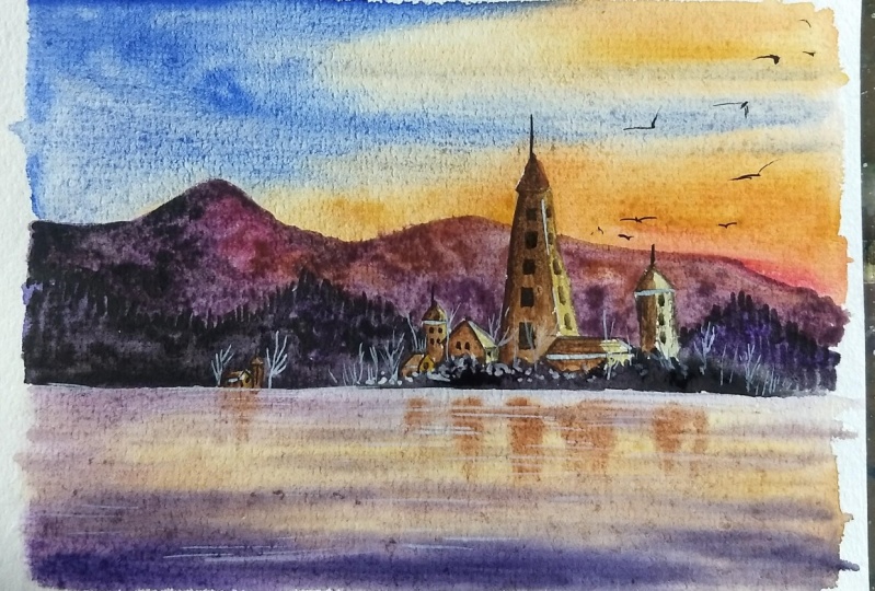
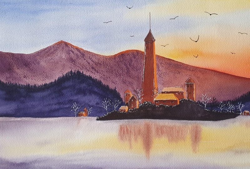
painting which we will be learning today. Come join me. I'm sure gonna
offer time artists, art educator, YouTube,
Skillshare teacher from India. You can find me on Instagram and in the hind and
advocate artistry. And you can find me on YouTube
under ain't which real. So come join me
in today's class. We will deal with the
fewer of painting bingo. I'm hoping to see you
in the next class.
2. Materials You Will Need: Hello everyone. I'm
so happy that you've decided to join me today in this class. Let's get started. Let me first walk you through
all the materials that you will need for today's class. First, let's talk about paper. I'll be using a 100% coordinate, 300 GSM cold pressed watercolor
paper from Bruce, true. You will need to A5 size watercolor paper
for our practice exercise. And for our final class project, you will need one A4
size watercolor paper. Next, you will need
a boat to stick down your paper with masking
tape on all sides. So your, I'll use multiple
for smaller paintings and I use called larger
board for larger painting. You can use any of
the two halves, make sure that you are
able to move the board in all direction and it is not completely stuck
to your table. Next, you will need masking tape to tape down your paper
on all four sides. Then you will need brushes. You will need one large brush to wet the paper with clean water. In case you don't have this, you can use a brush or any
larger flat brush you have, so that it would be much more easier for you to wet
the whole paper quick. Other than that, you will need
round brushes, size 2468. I'd be using silver
black velvet brush, but you can use any wrong
brushes you have that. You can even use a flat brush. That is also fine. Alright? Next you will need a pencil and eraser to sketch
down your painting. Black waterproof pen
to draw the birds and tiny little white Jelly Roll pen in case you don't have this, you can use white watercolor, all white gouache bit, thinner liner brush
that is also fine. Next step, you will need a pallet to mix down
all your calories. Then you will need
two jars of water, one for a fresh supply and one to clean down your brushes. Next, you will need a
laugh cloth or tissue. You will also need a skin
to draw down your lines. Then you will need rough
papers to swatch down all your colors before you
apply it on your paper. Lastly, of course, you
will need watercolors. I'll walk you through
each and every color that you will need
just before the class. And don't worry, I'll also
share the alternatives to you. You don't have to have the
exact colors that I'm using. I may using the colors from either plants
or from the dude's. Don't worry, I won't
use all these colors. Just a few from here. Go grab all your
materials and let's get started with the practice
exercise in the next class.
3. Basic Watercolor Techniques : All right, so before we start our practice exercise and
finding class project, Let's study all the
techniques that we will need for projects. All right, remember
one thing I'll be using exactly the
same people and the same materials
as I'll be using for my practice exercise and
for my class project. Alright, let's
first learn how to paint the mountains
with the fog effect. So I'll just use the colors
which I have right now on my palette because I'm just showing
you the techniques. First I'll take though, hoping scholar
mid-value purple color, it is not way too dark and it is not way too light for us. Draw the mountain. You're, I'm using
wrong brush size eight to paint the mountain. What I'll do first is I will first apply the
color on the top and then I'll clean off
my brush and use the damp brush to pull
you off the color down. That this I'll show you again, cleaning off my brush, removing the excess
on the tissue and just using the **** brush to pull the color down as I want the top portion of
the mountain to be done. That's the reason we are not applying any color
at the bottom. If you feel like the top
portion is way too light, what you can do with why
the area is still wet. I will take the same color. Then I will reapply it on top
and repeat the same step by just applying it on the top and then using the damp brush
to pull the color down. Also, whenever you are
pulling the color down, make sure that you take
the brush completely at the end and don't leave
it in middle advice, it would create Apache effect. Basically, we will have
to create a gradient look on the mountain that is darker on the top and as we come down, it should get
lighter and lighter. While that is drying, let's study how we can
mix our two colors. That is blue and yellow on this guy without
making it look green. What I'll do first is I will
first wet with clean water. Once I've applied
the clean water, I start with the yellow
color on the board TO as I reach the center of the people,
I will leave it there. And then I clean my brush and start applying the
blue color on the top. Same way as I reach
near the yellow color. I will leave it there and then clean off my brush completely. I'm not mixing both the colors. I'm leaving the tiny little
white gap in between. Now I will take the **** brush and I'll just use the damp brush very lightly on both the edges of blue and yellow are
two blended together. And you see how
beautiful it is looking. It is looking as if we have
blended both the colors, but we have not. Because if we did, it would have turned green. That's how you mix two colors. This guy, right? Now, let's layer the mountain and see how we can
create the fork. This layer has
completely dry now, I will take the same color, but I'll darker
value of the scene. And then I will draw the
mountain on top of it. Same way we will do with that. This darker on the top and
lighter at the bottom. What I did this, I applied
the color on the top and then I took the damp brush and
just pull the color down. Lighter color which
we had left earlier, creates the fog effect. That is why you have
to leave bottom of the mountain little lighter. Now, let's study how to create those tiny little trees
on top of the mountain. Alright, so again, take the smaller round
brush size to o for whichever you are
comfortable doing it. And all you have to do is
just create this small, small lines on top
of the mountain. This will make it look like there are lots of trees
on the mountains. But as we are quite far
away from our viewpoint, we are not able to
see completely. Just draws more and more lines. Sometimes you can even
draw the foliage. But those trees
would be very small in size as the Al-Farabi
from our viewpoint. So like I said in the start, I would like you to use the
exactly same materials and the brush and the
paint as you'll be using for your final
class project. Because this practice exercise will help you to
understand your materials. Alright, so now let's study
how to paint the pine trees. If you would have
attended my last class, you are definitely pro at
painting the pine trees. But if not, let me show you. So if you see pine trees
are in a triangular form that is narrower at the top
and broader at the bottom. So that is exactly
what you have to do. You have to first
draw a straight line. And once you have drawn
the straight line, you just have to do swiping motion from the
top to the bottom. But on the top you will paint smaller strokes and as
you come downwards, you will just have to increase
the size of the strokes. Alright? So I've
painted two trees. Your, if you change
the way you paint, the pine trees would look different as right now we
did in downward strokes. Now we will do upward strokes. You can paint any whichever you are comfortable doing it
and whichever you'd like. Or you can even mix different types of
trees in one painting. Next, let's study how
to paint the buds. So I was taking the
white pen and I start drawing the front b's. That is, I will make
some small mix, some large megan
different directions. All you have to do is just take a paper and draw
different weeks. I know you all know
how to paint the way. Once you have done that, you just have to draw
the dot at the center. That is V is the
wings of the birds, and the dot in the
center is the body. It's that simple to
paint the board. We enter dot and a dot, just keep that in mind. Lastly, we will study a very important
technique that is how to blend the harsh edges
by doing wet on dry. We'll be using this
technique or Lord, make sure that you
are with this. So what I'll do first is I'll first apply the
color on the paper. We're doing wet on dry right? Now you see that this
is quite a harsh line, which we don't want. So I'll clean off my
brush completely, then DHAP of the excess water on the tissue and then just use the damp brush along the edges. That is I'm just softly swiping
my brush left-hand dried. And you'll see it
looks so much softer. This technique we will be using a lot to paint our mountains on. Let me show you once again, I'll take the purple color
and paint the mountain. Once I've drawn the mountain, I clean off my brush completely. Then use the brush along
the edges to blend it. Right now it's looking
way too harsh, but once I blend
it all together, it would look much
more software. These are all the
techniques which are very important for our
class projects. So practice it on a rough
sheet or a rough people. And then once you are with it, Let's move on to painting our two practice exercise and then the final
class project. I will see you guys in the
next class where we will start painting our first
practice exercise.
4. Pastel sky swatches: So let's start with our very
first practice exercise. And this is what we
will be painting. Enough practice exercise. Let me walk you through
all the fellows. I be using White Nights
watercolors for this exercise. The first one is geranium red. This is quite bright red color, which we will be mainly
using it for the sky. Then you believe that oxide, this is a very bright open. In case you don't have this, you can mix your red and blue or blue to get a bubble Fido. Last thing you will need indigo, that is a dark blue color. In case you don't have this, you can use portion blue
eyes or finds green. And lastly, you will
need white gouache. Paint the moon, and the
stars will be using combination of all three colors
to paint this landscape. Alright, so grab the colors and let's get started
in the next class.
5. Paint Foggy Mountains : All right, so let's
get started with our first practice. Makes sense. So grab one of your E5 size
watercolor paper and start applying masking tape
on all sides of the paper. I'll be using a 100% content, 300 GSM cold pressed
watercolor paper. I usually don't stress upon
the materials that you use, especially in the
colors and the brushes, but I highly recommend
you do use right paper, especially when we
will be painting on a larger paper size. That way, if you use proper paper that
is a 100% quartile, 300 GSM and breast. It will make working with
watercolors or yard easier, especially during the season. That is it so hard
right now that even I was doing
reject today's bag and I applied water on
both sides of the paper still my paper was drawing
within five to six minutes. Yeah. Make sure that
we're using a paper which stays wet for a longer
period of time. And that is only the
100% coordinated people which will stay wet
for a longer duration. Once we have applied masking
tape on all four sides, let's get into the
sketching part. For the practice exercise, I have kept sketching
quite simple because we are just focusing on the techniques which we have done in the
technique section. We are focusing more on getting used to the
materials which we are using and getting under the more confident with
watercolor as a medium. Alright, let's start
the sketching part. So we will just draw
three mountains, one after the other. I have attached the final
project like I always do on the right-hand side
of the screen so that you will always
have a reference. Plus you will also know how your painting would
look by the end. Alright, once that is done, Let's move to the painting, but I always start from
top to the bottom. That way even if I have to
work on the bottom part, my hands don't
keep on that area. Alright. So let's
start with the sky first part before
we wet sky area, Let's first prepare those
colors for this guy. We mainly using geranium, red, and mix of blue color
to paint this guy. First, I will take
my integral color on my palette that I will
mix my dioxide purpose, you'll make it a
little brighter. I took 1515 of both the colors. Once I've done that, I will mix that
color on my palate. Then I will just wanted
to add color for you that you will get the idea of how the calories
looking on the paper. I'm pretty happy with
how it turned out. Next, let's prepare
our red follow. So far that unfolds, clean off my brush completely and then take
geranium red on my palette. As you will see that
it is way too bright. So to make it a bit, and I will add a little bit of white
directly on the paper. Why we are painting this guy. So I will show you
how to do that. But before that, let's first start applying clean
water. On the paper. I take my flat brush and
apply an even layer of clean water just on
my sky area to make sure that you are
applying even near your brush on your brush in
left and right directions. And do it multiple
times so that you, if I haven't left any
area of the paper, right, you will see that
I will take my time. But the sky area with water. So do it slowly. Make sure that you
have covered each and every thought and try to reapply water like duty tribes after taking a break or five
to ten seconds between, so that the paper will
absorb more water. Thus slowing though try. All right, So once we have
applied even layer of 40 multiple times per absorb the waterfall more
five to ten seconds. While that is happening, I will screen out the
white paint on my palette. And now let's get
to the painting by, so I will start from the bottom and move my
way towards the top. I first start applying
geranium red. Right on the bottom. I'm using silver black
velvet, round brush size. And I'm just applying
the right color. By doing this swiping
motion on my brush. Just apply it on the board
non-banks, I've applied it, I'll clean off my
brush and then just use the damp brush
to blend the edges. The paper. Then I will take the mixed
of that oxide, propyl and indigo
which we created. And I'll start applying color
from the top to the bottom. Same way I'll apply it using the swiping motion on my brush. That is just moving my
branch from left to right. You'll see I leave the
white gap in between. Then I clean off my brush again, Apple, excess water
from my brush. And then I just use
the dampers to blend the edges of the
focus Carlo paper. As your color is red
and the paper is wet, it would be much more
easier for you to blend the two colors
with the paper. Now I'm pretty much happy of
how my colors are looking. So what I'll do is I'll
switch to my smaller brush. And I will just reapply the red color on
the board room to increase the saturation
of that color because you know that
watercolor one strike, it will get a shade lighter. Avoid saturation or not. I just added a bit of
red at the bottom. And once that is done into my same larger
brush, size eight, and I will take the white
color directly on my bright and start applying
it on the white gap, which we had left between
those two colors. And I'll start blending
it with same way, I will add little
bit of white in my purple and I will
apply that this guy area. So remember one
thing I'm doing this while my paper and
the colors which I've applied earlier
as dealt with in case you feel like your paper
has already dried out, then I would suggest
you to avoid this step. Otherwise though, Carlos
would look a bit patchy, but you don't want, we want this guy to
look smooth gradient. Once that is done, we will let this guy
ADR completely dry. So what I do with my hairdryer and dry off those
sky area completely. Before we move on to
painting the mountain, I use the hairdryer to
dry off each layer. You can just keep your
painting right below the fund that the drying
time would be much less. You can just let it air dry. I'm a little bit
impatient with this. I just use the hairdryer to speed up the process
of painting. Once it is completely dry, let's paint the first mountain. To paint the mountain, we will go from light to dark. That is the mountain which
is closer to this guy. The one which is far away from our viewpoint would be lighter. And as we come near
the horizon point, we will make it little
darker and darker. So basically we will be using mixed of indigo and
purplish color. But though, for the
first mountain, we will add another
bit of more hopeful. And as we come, Neal, We will start adding indigo
to make it darker and darker. So once I've mixed my
puppet and indigo color, I will apply it just on
the top of the mountain. Then I'll clean off
my brush and just use the damp brush
to blend the edges. Once I've blended the edges, I will reapply the same
color just on the top. What do we are
basically doing is, as we want the top portion of
the mountain to be darker, eyes being moved downwards. We wanted, I really liked it to create the effect of four. You can use this
technique by applying the color just on dorm
and then blending it. Damp brush, then just
reapplying it on the top. Again using the damp brush
to blend the colors. That way you will
get the gradient. Wash on the mountain. This time we did it wet on dry. That is the mountain area
was dry and the color was but but you can also use wet-on-wet technique
to paint the same. Once I've painted the mountain, I will take my hairdryer
to dry off the mountain. Then we will move on to
painting the second moment. The second moment,
I may just add a little bit of indigo
to the same mix. I'll start applying it in the same way as we
applied earlier. That is enforced. Apply it on the top and
use the damp brush to blend it with the paper and then I'll reapply it just on the top. We're just repeating the stem. Ending the mountains.
Do it slowly. Don't Hadi this step. Remember one thing we are
doing this practice exercise, just as a warm-up to get used to all the materials that we are using and just prepare mine. You paint on larger paper. I would highly suggest
you to not skip this practice
projects and do it on a smaller paper that
you will get used to the techniques as well
as the materials. And once you are used to the techniques and
the materials, you will be much
more confident that we're painting on a larger
paper won't be as difficult. We are just taking
small baby steps. Achieve something even
more bigger, right? I'm pretty much satisfied, but how my second mountain is? Again, my hair dryer
and dry at all. Now, let's move on to
the last mountain. As this is noticed, a viewpoint we will
make it uncle. We will use 80% of indigo
and just 10% of dioxide. And we will start painting the whole mountain
with just one color. That is, we will apply the same color onto
the whole mountain, giving it a flight March. I speak, don't want to create a fork effect for
the last mountain. We will just apply one color
to the whole mountain area. I would suggest you to use
our larger round brush. That way, it would
be much more quicker in case we're using smaller brush or you
don't have a large brush, you can just wet the
rest of the paper with clean water and then apply
the same color of it. That way you will
get much longer time to apply the paint as
the paper would be read. Do whichever technique
works for you. I have shown you the forest
mountain when needed, wet on dry and right now we are domain wet
on wet technique. So both the techniques
work beautifully. It's just depends
on how you want to work and on what you are
comfortable doing it. On. I'm just applying the
color on the paper. Once I've applied the Gallo, I will again use my
hairdryer to dry it out. And then in the
next class we will continue painting the trees and giving their final
touches to our painting. I'll see you guys
in the next class.
6. Painting Pine Trees: So now my whole painting
is completely dry. Now, let's paint the pine trees. I will switch to my smaller
round brush science pool. And we will start
painting the pine trees as we want the trees
to look darker. So we'll be directly using indigo color
to paint the trees. Like I showed you in the
techniques to paint the trees, all you have to do is first
draw a straight line by holding your brush at almost
90 degree angle so that we, you are just using the
tip of your brush. Once you have done that, you just have to flip your
brush in both the directions, starting from smallest
strokes on top. And as you go downwards, you have to increase
the size of this drug. As you know, my entries are in a triangular
form that is 0 here on the north and wider
and thicker at the bottom. So that is exactly what
we will be painting. One more thing is whenever you are drawing those rate line using 85 to 90 degree
angle on the brush. Don't load your brush
with Lord of paint. Just remove the excess on
those sides of the ballot. If you will, have lot
of paint on your brush, it will be very difficult to draw or thinner looking line, it will end up
looking thicker and a lot of color would
flow up on the paper. Remember to remove the excess
paint on your palette. We have already started
painting the pine trees. What I'll do is I will keep on changing the size of the drinks. That is, I will
paint them larger. Sometimes I will
paint them to go. Sometimes I will paint them. Then I will also
change the directions. That is, I think some grease in slightly slanted direction
or sometimes straight. Alright. I will also change
the size of the tree. That is, I will paint some baker or taller and then
I'll paint some smaller. So keep on changing it. And you have to paint the whole of the bottom ADL
with the pine trees. If you have attended
my earlier classes, especially the
winters gave you who would be pro at making
the pine trees? I am definitely shorter
about that. Yeah. Believe me, painting pine
trees is salty or predict, do it slowly, don't hardy. This group says, these are the details which
we are painting. If you will paint the
details properly though, painting would look much
more pleasing and beautiful. Alright. Let's just continue painting the pine trees
in the foreground. A blight of pine trees. Start painting. In the foreground
using the same color that I will take
even more thick, the consistency of indigo, as you will see that
the pine trees, which we painted earlier
got a little lighter. So that way if I paint more
trees in front of that, it will definitely show
up. I'm doing that. Remember not to cover the
whole area with the same. I'm just adding few urine there. Once that is done, let's start with painting
the moon in the sky. Do that, I will take my white
color or white on my brush. I will start painting the moon. But before doing
that, if you saw, what I did is I totally cleaned my brush with indigo color. Because if I use the same brush to pick
up the white color, it would show get. All right, so before we
start painting the moon modeled with alphas, stars. So I just took the smaller
round brush size do I loaded my brush with white
gouache and I'm just using my hand to tap of
the brush that we, those plateaus of
white would fall on the paper making
it look like stars. I'm using a smaller brush
and take a consistency of paint because I want my
stars to look smaller. But if you want to largest, That's all you have to do
is use a larger brush. Alright? I'm pretty satisfied with how my stars are looking. So I will start
painting the moon. If you are not confident painting the wound
directly on the people, then you can draw
a circuit using a coin or tap of the board, and then you can paint it. Do whatever is
comfortable for you. I always directly do
it with the brush. I just took the white gouache
and I painted. Using that. Once that is done, I will open and blue
mix and I will start applying it on the
moon area because I don't want them to
look completely flat. I want to add a little
bit of extra to it. That's the reason I'm adding
the color on top of it. And then I will just clean
off my brush and use the damp brush to blend
the white color together. Now, as you see that it
is looking way too light. So I will take the white
color directly from the tube. I would start adding that. You give a little bit of
highlight to the moon. If you see I'm using very thick consistency
of white color. That way it would not lose its saturation and it would
look as it is looking right. Now. Once I've added
the white color, I will again use the damp brush to blend the white
with the moon. Do it slowly as we are
doing a very small area. Maybe use a smaller
brush to do it that way you will have a much more
control on your brush. Once that is done, we will let the whole
painting completely dry. I will again use my
hairdryer to dry it off. Once it is dry, what I usually do is before removing the masking
tape is I will just step a little bit behind
and I will observe my painting for like
two to three minutes. And usually at that time I
would know what I should add, all what I should do. I do this step every time
before IP law of the deep. Right now you'll see
that I felt like I have to add more pine trees, especially in the lighter
portion of the paper. So before removing the tape, I'm just adding few
more pine trees. You will think like
how is that possible? I believe me do this step. Just observe your painting
and your instinct width. If any of you, what
do you do next? When status then we
wouldn't let oil painting completely dry before
we be off my skin deep. Now, you see that the painting
is looking so much better. Believe me, go with
your instinct. Again. Now my painting
has completely dry, so I will just be loved my
masking tape at an angle which is away from the paper that
we don't end up adding it. This is how final
painting is looking. I'm super happy with
how it turned out. Alright, now, let's
challenge ourselves more. Let's move on to painting, our second practice exercise. In the next class. I will see you guys.
7. Evening Sunset Sky Swatches : Now let's start with
our second painting. This is what we
will be painting, like lifetime be
deduced just three colors this time we will
be using more than that. Okay. Let me swatch down
all the colors for you. The first one is
captured mortem. This is brownish red color from White Nights and it is
pigment number be R1 01. In case you don't have this, you can mix your brown
but alertness bit of red to make it a little darker. I will add a little bit
of pines gray to it. And you will see that when I'll swatch it
just side-by-side, you will see that it
looks almost similar. Maybe if I add a little
bit of red to it, it would look exactly the same. Alright, so in case you
don't have this color, you know how to mix it. It is brown. It has a bit of red and a
tiny bit of pine screen. Next you will need binds gray. You will use this
scanner to darken the value as well as for the last mountain you will
see that we have painted that mountain using
just binds green. Next, you will need
Naples yellow. This is calloc, which you will get by
mixing a bit of cadmium, yellow, yellow ocher, and white. Do it in case you don't have bet you know how
to mix it right? Next you will need
woman and yellow, orange, this is from
Art Philosophy. Go. If you don't have this, you can add a bit of cadmium yellow or any yellow which you have the orange and you will get the
lighter version of it. Next you will need indigo. Lastly, you will need
a bright blue color. So I'll be using civilian
blue from Van Gogh. You'll see that
we are just using this color on the top of
the sky, and that's it. So in case you don't have this, you can use any bright blue
you have in your palate. It could be blue. Blue. Any Bu grab your colors
and let's get started.
8. Painting Evening Sunset Sky : All right, Now in this painting we will
challenge ourselves even more. That is, we will paint the
sky with two colors as usual. At this time, we will be
using two contrasting colors, that is the blue and the yellow. And we will also add more
layers to the mountains. Last time we had
just use the mix of indigo and Dioxide pulpal
to paint the mountains. This time we will use
different colors. So let's do it. So this is our second
practice exercise. Once we are done doing it, we will be much more confident. Then once we do this, we will move on to painting our final class project
on A4 size paper. Or like always, let's first apply the masking tape on
all four sides of the paper and make sure that
you have pressed down your masking tape
totality so that there is no gap between the paper
and the masking tape. All right, let's get started. Like I said last time we just painted three
layers of mountains. This time we will paint more. Let's first draw all the
layers of the mountains. I've attached the final painting on the right-hand
side so that you can have a reference while
you're sketching out. Yeah, let's do it. You just have to
draw crooked lines. Don't draw the mountains in appointee triangular form like we used to do in the school. Just make crooked lines
because that mountain looks quite unnatural
and we don't want that. Alright, so we will draw all the layers of
the mountains first. And then once we
are done doing it, we will start painting. Alright, so before
we start painting, I'm just making sure that I've applied the masking properly. I'm just pressing it
down one more time. And then I will just squeezed out the paints which
I want in my palette. So Naples yellow, I already
have in my main valid, so I will use that
directly from there. I will need the permanent
yellow, orange color. So I will just squeeze out
that a little on my palette. Always prepared your color beforehand before
you start painting, before you wet your paper so that you don't end
up wasting the time. Like this is uploaded. Whenever you are working
with watercolors, prepare all your colors
before hand lies also keep everything just by your side
so that you don't end up, you know, looking for things
while you are painting. Because if you do that, then the paper will dry off and everything would be ruined. So what I do is I keep
everything just by my side. You will see that
I'm right-handed, so I'll keep my water on the right and my palette
on the right-hand side. And then keep all the
brushes that I will need under tissue on
the left and also have one more tissue that
is just in my hand so that in case I needed orginally, I'll just use that. If you are right-handed, keep all your values
and water on the right. And if you are left-handed, then keep it on the left. So that way it is much more
easier for you to work. I hope this will help you out. Now let's prepare our colors. First, I prepared
my Naples yellow. The second color which I'm
preparing right now is I'm mixing my Naples yellow
and a tiny bit of orange. And then I also prepared my blue color that
the civilian blue. Next ones I've prepared
all my colors. I'm just wetting the sky area with clean water using
my round brush size. Then I realized that it's taking a lot of time to wet the paper, so I just switch to my
larger flood brush. And I decided to wet
the whole paper with the clean bottom as we will be painting the sky in the lighter. Hello. I thought we'd just
paint the whole thing at once. And even if the colors flow
down the mountain area, that's fine because
we will anyways, paint the mountain
using darker color. That way you'll be
able to paint much more fleeting. Let's do this. So once we have
applied clean water, Let's start with
the lighter color, that is the Naples yellow, and start applying it on the paper using
the swiping motion leading few gaps in between. Then I will use
the mix of Naples, yellow and orange
and then apply that. The mountain area. Once I've applied that, I just added a tiny bit of
more orange to the same mix. I started applying the same on the people as I want it to look like there is a light heading from the right-hand side and
the sun is setting there. We want that portion of
the painting to be light. Once that is done, I applied settling
blue just on the top. And I have used beanie light
value of the blue color. That's the reason it didn't
turn out green less. I also left, I need a bit of gap between the blue
and the yellow. You will see that I've
taught you how to mix the two complimentary colors
in the technique section. So you just have to
follow those steps. I think the blue and the
yellow coloring this guy. Once that is done, I'm pretty much happy
how it turned out. Now. I will just use my
hairdryer to dry it out quickly so that we can move
on to painting the mountain. Like right now, you will
see that it is looking bright by the ones you
dry it out completely. You will see the
difference between what it is looking right
now and once it is dry. That's why it says that
watercolors dry or shade lighter. So you will always
have to layer it. Ip it saturated. Once the whole
painting has dried, we will move on to
painting the mountain. As usual. We will start from the top and we will
move our way downwards. So this time we will
use kaput Morgan. If you don't have this shade, you know how to mix it. That is, you can
mix your brown with your red and tiny bit
of Payne's gray color. In fact, even I won't use
the same color as it is. I will add tiny bit of indigo to the same mixed to
make it a little darker. And you can use
Payne's gray as well, but I just had that
in my palette, so I just used indigo to
make it a little darker. Now, let's paint it. As I want my right-hand side of the mountain to look lighter because I want to show that there is sunlight
hitting on the mountain. What I'll do is I'll mix my
Naples yellow with orange. The color which
we mixed earlier, that is the gap
pre-mortem an indigo. We will use those two colors
to paint the mountain. Left-hand side would be darker. In that portion, I will use the darker brown mix and
on the right-hand side, I will use the Naples
yellow and orange mix. Like we applied the
color earlier that is darker on the top and
lighter on the bottom. The same thing we will
be applying video, but right now we will be
using wet on wet technique. What I'm doing is I just took the round brush and I'm just wetting the whole people,
not the whole people. Just the first mountain
area with clean water. And then I will start applying the two colors which we
have prepared earlier. Once I will apply the border
with the darker color, I will take another brush and
I will apply though Naples, yellow and orange
mixed at the bottom. So keep two or three
brush in hand. So that way, it would be much more easier
as you don't have to clean the brushes
every time you use it. That way you don't end
up wasting the big men. Also, you will be much more faster or keep two
brushes in your hand, one for darker color and one for lighter and wine for just applying clean
water on the paper. Or once you have applied
both the colors, now, you just have to take the damp brush and blend
everything together. Once you have blended
both the colors together, see if you have two
or if you need to apply more colors
in the same area, in case you feel like you're satisfied with how it
is looking right now, then you don't have to add. But if you feel like
you want to add, then you can always layer it up. Alright, so right now
I'm quite satisfied. So what I did is I just took the hair dryer and I'm
just drying that layer. But the hairdryer,
once that is dry, then we will move on to the
other layer of the mountain. I've kept the whole video in real time so that you
can paint along with me. But I would highly, highly, highly suggest you to first
watch the video completely, because you will see that I have nor deleted the
mistakes, which I've done. The only reason being that I've shown you how
you can collect it. If you'd watch the whole video, you would know that what
mistakes I have done. And you can avoid it.
And you can do it. In a much better way. So that's the only
reason I have not edited the mistakes and I've kept the video
in the real-time. Alright. First, watch the
whole video completely. Then maybe you can just watch the picture
and do it yourself. Or you can just keep the video playing in the background and then you can paint
along with me. Alright, is what I usually do whenever I'm
watching any video. This works for me, but I, this is just a suggestion you can do whatever works for you. Alright. Now let's paint
another layer of the mountain. This time I just took more than, I just use tiny bit of indigo. I painted the mountain
in the same way, which for the first
practice exercise that is darker on the top
and lighter at the bottom. As we want to make it
look like there is some kind of fog in between
those layers of the mountain. That's the reason we appending the top portion and the lower
portion of the light down. All right. Once that is
done, you know that thing. You just have to
let the layer dry completely before you
paint the antidote. Now what you can do with, as I'm showing you, each mountain layer by layer. But what you can do is if the first layer of
mountain is drying, maybe you can move on to the third or the fourth mountain. If you don't have
it hairdryer or you don't want to use the hairdryer. Alright. But I don't think so. This would be a problem
because anyway, Sue Horton right now, just switch on your fan for five minutes and it
would be dried off. By the time you will make
your next color layer, which you have painted
would be completely dry. So let's paint our
third mountain. I took the same color
and this time I added more indigo to it
to make it little darker. I'm painting the mountain using the small round
brush size form. Once I've painted that
and while that is drying, let's add one more layer of mountain between the
forest and the second, because I feel like
there's a node of gap between those two mountains and that space is
looking quite empty. I took the very
light value of it will break or put more of them. And I'm just using my smaller brush size four to paint one
layer of mountain. Do it slowly. See
that you don't end up touching the mountain
because if you do that, we'll get a little bit darker. So do it slowly, it's easy. It's not that difficult. You just have to
do it. Same way. I just added a bit
of darker mix to the same color,
same lighter value. I created one more mountain. This is the beauty
of watercolors. As this is a transparent medium, you can always Leo color
is one upon the another and still you can see the
underneath layer through that. That's why this is also one of the things which I
love about watercolors. Now let's paint the
final mountain. So we will be using binds
green to paint that because this is the foreground, we want that mountain
to be the darkest. So I already have mine
screen in my main palette. So I'm just taking that color directly from that
into my palette. First, I will apply that
color on the mountain. So what I do is I always create the Bordeaux
and then I will paint desktop the portion. I think I'm using quite
a small brush to paint. I would suggest you to switch
to or larger round brush so that you can
gain much quicker. Once you have applied the pines gray color
to the whole mountain, Let's create the tiny
little Pine Street on the top of the mountain. As it is quite far away, you cannot see it completely, but you know that there are lots of trees on that mountain. So to create that what
you have to do with, like I showed you in
the practice section, you just have to draw
tiny, tiny little lines. I maybe for some trees
you can draw the foliage, but the rest you just
have to draw lines. Make sure that you are
making some lines taller and some lines shorter.
And that's it. It will make it look like the mountain is filled
with lot of trees. This will take time as you
are using the smaller brush. I'm using like size
two round brush. But if you're a size two is thicker and it
doesn't have a good tip. Maybe switch to a round
brush size one or 0. As you want to make it look like the trees are quite far
away from our viewpoint. You will have to
make them smaller. Switch to your smaller brush and cover the whole
of the mountain area. But the 2is do it slowly, just don't hurry this step. Like I said earlier, the a's are the things which makes the painting
look worst or better. We always have to
try to make it look better. Do it slowly. Don't hurry this step. Because if you do it, you will end up regretting
it that we don't want. Do it slowly. Once that was done, we were almost done
with our painting, but then I just observed it for awhile and I realized that the mountains
which we painted earlier, once they were dried, they look quite lighter, which I didn't like. What I did is to make it darker, I use the same colors which
we had applied earlier. I reapplied those same
color over the mountains. Now as we have already done
those details and everything, you will have to do
it much, much lower. But if you are watching the
video for the first time, you won't have to go
through it all over again. You just have to paint
it little darker. Why you are doing it
for the forest time. Alright, so that's the reason I told you to watch the
whole video and then do it along with me
so that you don't end up doing the same mistakes
which I did earlier. Also, even if you do it, you know how to
rectify your mistakes. That way you will learn
how to do that as well. So you will always learn. All you have to do is keep on practicing and key
points painting. Alright? I'm just applying one more layers
to the mountains, which I feel like the needed. And once that is done, we will paint naughts
of birds. And this guy. I will also paint few more
trees in the foreground. As we painted the
mountain behind that, it got a little lighter. So I'm just reapplying
that paint and painting the trees
on the mountain. Now, I'm super happy with
how it has turned out. So now let's paint the
flying birds in the sky. What I'll do is I'll take the black pen and I'll
start painting the boards. You can use a black
pen or you can also use liner brush or a smaller
brush to paint the boats, whichever way you weren't
comfortable doing it. Right now, I'm just
using the pen. And all you have to
do with just draw a shape in different directions
and in different shapes. And at the same day you have
to draw a tiny little dot. So on this guy I will
make larger boats, making it look like
they are near to us. And for the behind mountains
in between the layers, I will make small, small, tiny, tiny little boats, making it looked like
the sinus setting and the birds are going towards
their homes in the trees, do in the mountains, or add as many as you want, but just don't overdo it. Otherwise it would
look way too crowded. Let me just show you
igloos how it is looking. Looking beautiful. But
the only thing which I didn't like is
the top mountain. Just apply the paint the
same way we did earlier. Master the technique
of damp brush that is softening the edges
using the damp brush. And it will be your best friend when you are
painting with watercolors, believe me, practice it on the paper and master
this technique. I'm telling you guys, this will help you a lot. Happy. I will just remove my masking tape at an
angle which is away from the paper so I
don't end up ending it. Alright, so this is
second practice exercise. Now let's move on to painting in the next class and let's start
our final class project. I hope you all are confident and excited to paint
on a larger paper. All right, let's get started. Even if you are in a
doubt, don't worry. Just come along, follow all the steps which
I am telling you. And believe me, you
will be able to do it. All right. I'll see you
guys in the next class.
9. Final Class Project Swatches : Alright, let's get started. This is what we will be painting as our final class project. Let's get started. Let me just first tell you all the
colors that you will need. The first one is
laryngeal for this guy. The one I'm using
is from rainbow. But in case you don't have this, you can mix your ultramarine, but a tiny bit of red and white. If you have attended
my earlier class, you would know how to mix the
lavender color because I've shown you the exact
formula for that. You can definitely watch
that part of the class. Next one you will need Naples yellow for this guy
as well as for the water. Then you will need the permanent yellow
orange for this guy. Then to make your
sky a little Danko, you will need read your, I'm using geranium red. This is the exact
shade which we used for our first practice exercise. Next, you will need dioxide. This one is from White Nights. In case you don't have this, you can mix red and blue
to get the purple shade. Next you will need
indigo, green. If you don't have Payne's gray, you can mix a tiny
bit of blue to your black to make the gallium. Next, you will need
ultramarine blue. Same for the sky to just
darken the top portion, then you will need
red brown color. This is quite a bright color, and it is from Magellan mission. In case you don't have this, you can use the
caplet mortem shade which I showed you earlier, or you can mix a bit of red to your brown
to make it brighter, then you will need yellow ocher. I'm sure you will have
this color in your palate. And that's all. Now, let's get started.
10. Painting Soft Sunset Sky: So we already know
which colors we will be using for our
finance large project. We have already studied about the techniques and we
are titled with them. So let's get started to
our final class project. I am super happy that
you decided to join us. Paint along with me. And you took that step of
painting bigger, bolder. So I'm super proud of you. All right, let's get started. So what I'll do is, as usual, I will first apply masking tape on all four sides of the people. As you know, we will be
using a larger paper, A4 size for this painting. Might not be way
too large for many, but we are painting from A5 size to emphasize that
it's a one-step ahead. Yeah, let's nail this. And maybe next time
we will paint, even though Joe, so let's
first apply masking tape. Don't worry about anything, just follow along with me. I will walk you through each
and every step in detail. All you have to do
is just observe me how my painting and
follow my instruction. That's on. Let's get started. I have already
applied masking it, so we will start with
the sketching part. What I'll do is I will
leave 1 third area for the water and the total area would be the land and the sky. I will just draw a straight
line using my scale. You don't have to be
very accurate with it. Just eyeball it. If it's one centimeter up
and down, that is fine. All right, so once
you have drawn the horizon line that's
dividing the paper into two, that is, 2 third
would be for the sky and 1 third would
be for the water. Once we have drawn the line, we will draw the line
AVL on top of it. There'll be two lines. Avl one is hired when there's exactly
on the horizon line. Right now, we are drawing the one which
is in the foreground. Once you have drawn
that line that is just below the horizon line, then we will start drawing tall buildings
and houses on that. You can use those gain to draw
the lines of those houses. You can just 100. I'm using a scale, goes it's quite a
plus buildings. You cannot make
glucose lines for 19. Have to make it straight. Just draw one thought around that I've been
drawing small, small houses. What I've done is I've kept those sketching
part quite simple. You already know how
to paint the house. Won't be difficult. One more thing is change
the size of the house that this just makes
you a few shorter. That way it will help you to create the depth
in your painting. That is, the houses which are bigger would be
mere two y's and the houses which you
will draw a smaller would be alerted far away
from your viewpoint. That is how you create the
depth in your painting by just changing the size
and the color value. But right now we
are not coloring. So just keep in mind that you have to change the
size of the houses. Alright, so that's
what we will be doing. Bench that is done. I will draw one mountain
just behind that. And on top of that I will
draw one more mountain. So I've attached TO final
painting on the left-hand side. You'll know exactly
what we are doing. So once this is done, I will just absorb
how it is looking, how my composition is looking. Then I will just add few
more details if I freely, like right now, I will
add few more houses because I felt like that Emmy Awards looking
a bit incomplete. So that's the reason
I added more houses. But if you feel like you're painting isn't already looking complete and you don't
want to move houses, then you can take that
call for yourself. These glasses are just for you to understand
the techniques. A position and how you can create the depth and
contrast in your painting. Once you are tired with then
you can paint any subjects. Okay? So you are always 32. Decision for yourself
and for your painting. And I would highly
suggest you to do that. That way you will train
your mind has been. So once that is done, I'm just drawing some dry
twists around the houses. So you can draw it. If not, you can
directly get the pen. That's what I'd be doing. I'm just drawing one node
so that you can know, I advise you can directly
do it with the pen. That is fine. Once this is done, I will draw a few more
houses on the horizon. I made sure those
houses are smaller than the one which you have already
drawn in the foreground. Because the art
under this far away. That's all with the
sketching part. Now let's start with
the final inking. Let's first prepare all
our colors for this guy. So you'll be using lab window. We will be using Naples yellow, permanent orange and
geranium red for this guy. We want to make it
look like the sun is lifting from the
right-hand side, that portion of
the paper would be light compared to
the left-hand side. Right here. I'm just using my flat
brush to wet the sky area using thinking photo makes sure that you apply even
layer of Bordeaux. And there are no patterns forming in case we have
applied load of water, just tilt your board in one
direction and the water will come down and then you can just wanted to with your
rough cloth or tissue. Once I've applied the water, we will start painting the sky as I already have all the
colors ready. Meet me. That's the reason
I didn't premixed. But in case you have
to mix your lab window and you have to mix your
permanent orange with yellow. Then I would suggest you to premix all your
colors and then wet the paper and then start
painting like we did in our practice exercise. Once you have prepared
all your colors, the paper is wet. We will start painting
lavender color on the left-hand
side of the people. And on the right we will start applying the
orange color forest. If you notice, you will
see that I'm not applying very dark value of all
the colors in the sky. That's because I just want
to see how it will look. So I will start with
the lighter value. Once I'm satisfied with
how it turned out, I will leave the same
colors all over it. If you will apply the colors
in the light to value, you will be able to lift the color up in case
you make a mistake. That's the reason I
always start with the lighter color as well
as the value to pain, especially the bigger portion of the painting that
there's this guy. For. Anything. Once that is done, I just applied tiny bit of geranium wrenches at the bottom
to make it little darker. And then I'm just adding me put yellow on the
top of the sky, and then just blend all the colors using their
**** brush techniques. Once this is done, I'm pretty happy with how
all my colors are looking. So I will just apply one more layer of all the
categories to my sky. So I'm taking ultramarine
blue directly from the pan. And I will just
apply that color on top to make it darker. I'm doing it because
my paper is still wet. The colors will blend
beautifully into each other. In case you feel like your
paper has already dried, hold, let it completely dry and wet the paper and then Leo the
dark color on top of it. But if it has dried, please please don't
apply in color on it because it will make
it look back here. Alright, so for this guy, I love how it is
looking right now. What I'll do is I will
let it dry completely. Then we will move on to painting the other parts
of this plant scape. I'm just taking my hair dryer as usual and just
drying the sky area. Once it is dry, we will
move on to the next part and I will continue
that in the next class. So I'll see you there.
11. Painting The Houses : So once the sky area
has completely dry, let's start painting them often. Let me swatch all
the colors that we will use to paint a mountain. The first one is
dioxide purpose. Next, we will use
red brown color. We will mix the two colors, that is the oxide purple and red brown to
create this mixed. And we will use
this color to paint the mountain for
the right-hand side as sunlight is heading. And to create the effect of light hitting
on the mountain, we will keep it lighter. That is, we will just use
red brown color over there. Alright, so first, let's mix
the two colors together. That is the purple and brown. In case you don't
have this color, you know what to do. First, you have to
create your color. That is by mixing red and blue, or pink and blue. Once we have created that, you just have to add
the brown mixed stupid. As the mountain
area is quite huge, we will be using wet
on wet technique. You're I'm just wetting the
whole mountain area with the clean water using my
round brush, size eight, Your it will be a
little difficult to use the larger
brush which I was using earlier to wet
the paper because we don't want to wet
the house area. So that's the reason I'm using a smaller round
brush that I'll be able to apply water in the tiny little areas
around the houses. Alright, so avoid using
way too large brush, otherwise, you will end up applying water on
the houses as well. All right, so once I've
applied the water, I will start applying the
color on the mountain. I don't want my mountain
to look completely black. I will keep on adding
some colors on top of it. So right now I'm just adding a little bit of orange
color on the top, not covering the
whole AVL with that just the top portion
of the mountain. This will also create the effect of light hitting on top of it. Then I will take the
red brown color. I will leave tiny little gap and start applying that
color on the mountain. Once status, then
I will just start applying the purple
and the brown mix which we created and cover the rest of the
mountain with that. Keep on changing the brush
according to your need. Like you can paint a mountain
top with the larger brush, but when you are moving
downwards near the houses, you can switch through
those smaller brush. Pick that goal for yourself. And I'm sure that you
will be able to do that because once you start painting regularly and you know, you really know what to do next, even if you don't purposely
do with your hands will reach to a smaller brush and
you will always do it. I hope you understood.
All right. So right now I'm just covering
the mountain area with the once that is done, I will move on to the right-hand
side of the mountain. And as I want that
version to be lighter, I am a it directly taking
the red brown color from my palate and applying
it on top of the mountain. You will have to be very
careful around the houses. Make sure that we're using
smaller brush or a brush which has a generally good the width normally
don't hurry the stamp. Advice you will ruin everything. Leaf first I'm just applying red brown color on
top, just below that. Make it little taco. I will add a little bit of open ground together and apply
that color at the bottom. Then using the same
leftover color on my brush, just giving few more extra
hours on the mountain. By drawing few more lines. I spent as few more
dry brush strokes create the effect of
rocks on the mountain. So once that is done, I will repeat the
same steps again, but we use it our
oxide poeple and apply that on the left-hand
side of the mountain. And you would see that
the mountains are already looking better
than it used to. It has got the folios and
the depth which we created by just adding a few more dry brush
strokes and the lines. Once that is done, let it dry. And then we will move on to painting the first
layers of houses. So what I do is again, I'll just take my
hairdryer to dry off a mountain AVL completely. Then we will move on
to painting houses. Even if you have
used the hairdryer, just keep a habit of
checking the paper, losing the fingers that
it has completely dry. Make sure you do that before
you start ending again. I already did that and the
paper has completely dry. So let's start painting
houses and buildings. Like usually we will keep the right-hand side
of all the buildings and the houses light because that's where
the sun is hitting. Same width, the
left end portion, it would be darker
because that's where the sun is not reaching. Basic theory. I'm just using the
orange color on the right-hand side of all
the towers and houses. Again, switch to
your smaller brush because we are painting
in a very small area. That way you will have lot
more control over your brush. I'm just painting the fourth Leo because we will have
to paint over it, but we won't be able
to do with by now because that layer has dried. I'm just painting
the first layer after lighter color
on all the houses. Then I will take the red brown
cardio and I will dilute it under the top of the
tower within darker color. Again, as I want that
line to be very pointy, either just use the tip of the
brush you painted that is, holding my brush at
almost 90 degree angle. Then I will just paint the same color over the top
of the roof of some houses. For some houses, I will paint it little item by just adding
a tiny bit of yellow to it. If you will change the
color and the color value, then each ours would be
identified from the file. Otherwise, if you will
paint it in one color, it would look like there is a huge rectangle
in the background. And you won't be able to
identify the different houses. That's the reason we're
changing a little bit of value. Do each house. Usually what happens
is the light falls differently in different
areas of the house. That's why we have
to paint them in different values of the same
Carlo or the same family. That is, if you are using brown, then you can use lighter
brown or yellow ocher. Born Gamboa burnt
sienna, set PR. That way. Once we
have done that, I will then paint it
though front-end of the tower by using the
red brown color directly. And I will paint the
first layer of that. Once I've painted that, I will use the same
color to paint the front of the
other houses as well. If you have drawn
this sketch properly, then it would be very
easy for you to color. But if not, just keep in mind that though friend end of
the houses would be darker, whereas the part of the house
which is hit by the sun, that would be lighter. If this formula in your mind, and then you just have
to follow those steps. Alright? As my first
layer has almost dry, what I'm doing is I'm taking a darker value and then I'm just adding a bit of
shadow near the roofs, as well as a bit of texture
to some of the houses. Let's complete how we spot. And then we will let
it completely dry. In the next class, we will paint mountain, which is behind the
houses as well as though lined area
below the houses. Alright, so complete this part and I will see you
in the next class.
12. Painting Background Mountains: As always, before
you start painting, just run your finger
or work to make sure that everything around
that is completely dry. Once you have done that, Let's paint the mountain behind the houses on
the horizon line. As this mountain is infrared, we will have to paint
it a little darker. So what I'll do is I will mix my dioxide pupal with indigo, mix it in equal proportion, and then I will watch
it for you guys. I wasn't quite satisfied
with how it goes. Looking. Later, I didn't mix a bit of purple to make
it a little bit brighter. I'm pretty happy with
how it is looking. The whole mountain
using the same color. I will just dilute it alerts and make it
a little running by just adding a bit
of mortar because right now it was way too thick. And then I will take my
smaller round brush and I will start painting the
mountain using that value. Although we are painting
on your larger people, we are still painting
part by part. That is, first we painted the sky and then painted
the mountain houses. And then again, we're
painting the mountain. That is, we are not painting
the whole thing at once. We attacked link one subject by, it won't be as difficult, but you still have to work
a little faster device. The colors won't blend in and it would look at
cheap at the end. You got to work fast. Although we are just painting
one subject by antidote. But that subject is quite
large on the paper. That's the reason
we will have to work to avoid making
it look patchy. Be a little slower and
careful new houses. You'll see I created the
effect of bush right now. So that whenever I paint
lined area in the front, I don't have to overwork it. So I just created the effect
of push using the brush. This part is quite simple
to paint as we are just giving the flat
wash to the mountain. All you have to take areas just be Sloan your housing area so that you don't end up adding the darker open
mics to the house. Once that is done, Let's add few trees
on top of the house. If you remember, we
did this exercise in our practice exercise, as well as I have taught you
in the technique section. All you have to do
with draw tiny, tiny little lines
on the mountain to make it look like there
are a lot of trees on it. Again, use a brush which has a good tip or switch to a smaller round
brush. To do that. I will do with on the
right-hand side adds red and I will cover the whole
mountain with two streets. Let me tell you
what mistake I did your and you can
avoid doing that. What I did here is once I
added the trees on the top, you see that the new colors
there on the mountain, that is the one which
we added right now, and it is looking quite patchy. I'll have to reapply the
color at the bottom ads. But what you can do
is you can paint the trees and the underneath
Leo at the same time. So start with the trees
on the top and then fill the lower portion of the
mountain with the same condo. That way, you will
avoid making it look like it is
looking right now. While I was completing
the behind Morgan, I realized I've
kept one unindent. I took the mix of
brown and pines, gray, and I painted the front of that house using
the same column. Once that is done, Let's paint though lined area
below the houses. We wanted to make it look like
there are a lot of bushes and behind those bushes
there are houses. What I do is I take though red brown color and I will mix my indigo
and purple color, which I already
hard on my palette. I will start painting
that color on top of it. As I want to make it look
like there are bushes, I will have to paint the end. You just have to do the tapping
motion with your brush. That way just complete the whole area using
the same color. Don't you think that
painting as coming to life? Like once we paint different
subjects of the painting, it looks more and
more beautiful. Just wait for the
water to complete. The painting would look
fabulous at the end. I'm already so excited. I hope you all are. Let's not wait. What I'll do is once
I've completed, I will again take my
hair dryer and dry the layers of the
mountains and the bushes. Once that is done,
Let's move on to painting the water reflection. Let's just finish the
painting in the next class by adding all those
tiny, tiny gains, right? I'll see you guys in the
last and final class.
13. Painting Lake & its Reflection: All right, So now
let's complete it. As the lake part is quite huge and we have to add
the reflection as well. So we will be using
wet on wet method. That way we will get
longer time to paint. I will just wet the whole area using my larger flood brush. I will apply the clean
water evenly on the paper. Now, one more thing I
really wanted to tell, if you feel like you
have already screwed up, the painting isn't looking as
you wanted it to look like. I would suggest you
don't lose hope. Complete this one. Then, see what mistakes
you have done, and then repeat the whole
thing so that you don't end up doing the same
mistake all over again. Let's get to painting the lake. As you know that water doesn't
have its own category. It is the reflection of the sky and the
land on the water. That's the reason we
will paint the colors of the sky and the
mountain on the water. So I started with the very
light value of yellow, orange. And then at the bottom, I painted the mix of
purple and indigo. As you see, I've used way the light value for
my fourth layer. Now, I'm confident with the
colors which I've applied and reapplying the same color all over again to make
it little darker. So always start with the lighter values so that you don't end up ruining it and you still have the
time in hand that you can rectify your mistakes if
you have painted it lighter. Also, use are larger, either flat brush or
round brush to paint the lake area that
you will be able to cover the larger portion
much quicker to keep one tissue in your
hand or just by your side so that you
feel like you have. Then any mistake, you can just take your
tissue and damp off there so that all the colors would be absorbed by the tissue. Never forget to remove the excess color or the water which comes
near the masking tape. Advise the colors move low back, creating or larger
blooms on the paper. Now I'm just taking
the trash and blending everything together
so that it looks smooth. Once that is done, I will switch to my
smaller round brush. And let's add the reflection
of the houses on the bottom. Remember, you will have to paint the reflection while the
Lake area is still wet. I just took the
red brown color in the lighter value and I'm
adding the reflection. The reflections are almost seem. So you will have to
eyeball the size of the houses on the top and
paint it in a similar way. Once that is done, I will also add the shadow of the bushes and the mountain using
dark mix of indigo. And I will paint it
right below that. You will see why I'm doing that. I have left or tiny
little white gap between the water
and the reflection. So you will have to
leave that white gap. That line divides the water and the land area in case you were not able to
relieve that gap? As we are working wet on wet, I'm sure that the colors
would have known. You can always use the
lifting technique. You will lift off the
color over there. Now let's paint the bottom of
the lake and it is darker. I'm making a mix of red, brown and open Carlo. And I will paint the
bottom using that color. And then I will lift some
color noodle horizon line. Every time you lift, remember to either
clean your brush. Onward the shoe so that
the colors which is there on the brush don't
end up on the paper. Again. What you can do is you
can just take the tissue, make it a little smaller, and then just use tap
off on the paper. The paper is read, the tissue will lift off
the color over there. Then just use the
damp brush to blend the edges with the paper. Again, both techniques
works wonderfully. Do what works for you. I have shown you both. Now. I want to make the bottom of the lake
even more darker. What I did is I took my dioxide, purple, indigo, and
drag brown color. And I'm painting the bottom. Of the lake using
the same Godel, if you notice, I'm doing all
this while might be still. Remember, your paper
has dried out, you know what to do. You will have to wait
for your paper to come. Then just rewrite the
paper using a black brush. Do it carefully. Then you can do this
following steps. Now why the Lake area is drying? Let's add the DDMS on the
buildings and the houses. I switch to my smallest
brush size two. And I'm using the darker color which we had
prepared for a leak. And I'm adding the dose, the windows and
the reflection of the roof on the house
using the same color. I will either use the
brush technique to lender colors or I will just use fingers sometimes to
blend it all together. You have to be very careful with as your link
area is still wet. And don't touch your hand
over there, I'd rise. Your hand will
lift off the paint or what you can do
is you can just take the hairdryer or just let the lake area completely dry. And then you want to painting
the houses meetings. Once that is done
in a white pen, if you don't have a pen, you can use a smaller round
brush and ink the white in. And let's paint the highlights near the houses and the bushes. Just have to create the lines. Don't overdo it. Don't draw highlights
everywhere. Do it in some AVS and leave
other area untouched. Once you add the highlight, you will notice that
the houses would look like the r in front
of the mountain. And that's the Xin via adding tiny didn't highlight urine. Notice what I'm doing is after applying every bite
line or white board, I will just behind, observe it for two to five
seconds how it is looking, and then I will add it. Do that. Don't know what the
word like I said before. Alright, so once that is done, Let's paint dry Greece
using the white pen. It's quite easy. You just
have to draw the trunk of the tree and then you just
have to draw the branches. If you don't have this band, I would highly suggest
you do buy one. It is not that expensive. I think it was good for
less than a dollar. Get the one for, believe
me, it would make. Drawing this tiny little
details are not easy. Once that is done, let's do the same thing. But this time the average, the width with the black bench. I will draw a few more trees
using the black bread. You can add as many as you want. I would stop you as I'm pretty satisfying of how it
is looking right now. My leg area is completely dry. Let's add highlight. The same white men and I
will draw lines on the leak. Then I will add few more
lines using the black pen. Lastly, let's add flying
birds in the sky. So again, I be using
black pen to do that. But you can even use a brush. As usual, like we
started before. We add the center draw or tiny
little dot. And that's it. I am hoping you all
are little more confident at painting
on a larger, painful, believe me, painted
and you will not look back as you get lot
more space to work. Less. By the end, you will feel a lot more achieved once you paint
on a larger paper. You will be able to do it. Believe me, you will be able
to do it and I'm telling you, don't
underestimate yourself. All you have to do
is trust yourself. Take that leap of faith
and do it. Alright. I'm just adding final few
more dry brush strokes. Now let's remove our
masking tape and see the final result of our aiming. I want you all to be
super proud of yourself of how whenever you have done it because I
am brought off, you, believe me,
I also have done few mistakes here which I felt like I could
have done better. But right now, I am
proud of myself. So you should be proud of yourself of what
you have achieved. All right, this is how a
final painting, books. And it is beautiful, right? Alright, so I'll see
you in a goodbye value.
14. Thank You: Hi, I'm so glad that
you lead stereo. Firstly, thank you so
much from the bottom of my heart to take the
time and watch my class. I hope that I haven't please
do to paint on the paper. Now, it's your turn to paint. I'm posted in the project
section of this class. I am really excited to
see what you create on. So don't forget to leave
a review as that will help me reach more number
of students engaged. You have any doubts regarding
the class or the paintings. You can always
reach out to me in the discussion section
of this class. Alright, I'll see you guys
soon in the next class. Bye.
 Shreya Gada, Artist