Transcripts
1. What We Will Be Learning: Have you ever experimented
with granulating watercolors? These are special
watercolors that create or extra or grainy
effect as they dry. Adding a unique
dimension to your work. If you have found this a bit challenging to
work with them, don't validate this
class is tailored to assist you in mastering them. The main focus of the class
is to teach you how to paint a specific scene that
is the gloomy rainy day sky. Using watercolors. To begin, we will start by familiarizing ourselves with
the materials you will need. This includes not only the granulating
watercolors themselves, but also the brushes, the papers and other tools
that work best with them. Understanding your material is the foundation of success
with watercolor painting. Once you are comfortable
with the materials, we will move on to the heart of the class
that is the ground leading
2. Materials Required : So before we start
with anything, Let's talk about the
materials that you will be needing for today's class. First, let's talk about the most important thing
that is the paper. I'll be using 100% garden 300 GSM cold pressed
watercolor paper. You'll see this little
bit of texture. This is because it
is cold pressed. And this is almost about
six inch by four inch. And as we will be using, are painting on a
postcard-sized. Grateful, I feel like the size. Perfect. Next, let's
talk about the brushes. So I'll use this 1.5 inch flat brush mostly
to wet my paper. Then you will need
a round brush. Size for, I'm guessing
this is Size four. There's nothing written on it, but it looks like a
size four round brush. And this will be
using for major part. Next, you will need all
smaller round brush. I'm using size three, but you can use size to as well. This is a Chinese brush which
has a weightless baristas. And I'll be using this brush
mainly for all the details. Again, if you don't have
this Chinese brush, you can use any smaller detailing
brush size one or zero. Next, you will need two jars of water when to clean
down your brush. And one for fresh supply
of water because you don't want to mix dirty
water in your pattern mixes. Okay. Yeah. So next two
conveyed or pencil and eraser to sketch
down you Painting, masking tape to masked on
your paper on all four sides. And you will also need a
board on which you can stick. Your people should be moving. And because we will be tilting our board
for major projects. So make sure that
your board is moving. Then you will need, of
course, watercolors. So these are few, will not be using
all of these colors. But there we'll talk about
the colors and everything in the coming classes as we
move with the class project. Alright, we'll also need a
white quash for some details. And for one of the
class project. Again, if you don't have wide
gouge and it's okay if you use white watercolor
or even Chinese Bite, but you won't be able
to use white acrylic. So next you will need
some kind of Card. Can also use the back of your
brush efforts this point D, but to paint the picture
on the mountain, you will need some guard. Maybe you can use your IDs or
credit card or debit card, which is of no use. Okay. Yeah, that's all. I guess. Can go grab your materials and cut down
your paper into the Size, which I've told you, that is six inch by four range. And that's all.
Let's get started.
3. Techniques: Now let's study all the
different watercolor techniques which we will be using in
our folder class project, will be you Learning softening
of the edges Will Be Learning dry brush
technique only learn how to Paint,
but don't Wet. We'll learn how to create different values of the same
alert and so much more. So let's start by learning
how to soften the edges. Now this technique is
so, so, so important, you can use this technique
to soften any edges, and I'll be using this one multiple times
throughout our class project. So make sure that you practice this one as much as possible. So what we mean by
softening of the edges, let me just paint one tiny
little mountain and you'll see all of the edges are
super sharp and harsh. But what if I want a little
bit of blended look? So all you need to do is clean
out your brush completely, remove the excess
water on the shoe, and then just use the damp
brush along the edges of the mountain or any
subject you are painting. And you would see that it
will get a little softer and blended as the background color is white right now
that is paper. You will see that it will be a little muddy and a little dirty. But if you are painting on, Let's suppose are already
created background, then it wouldn't be ordered. I'll show you once
this layer dries, we'll paint one more
mountain on top of it and we'll see how you can create
this softening of edges. But this, but this
is how you do it. Whenever you apply paint on it, you need to clean your
brush completely and just use the damp brush
around the edges. And you can only do it
while the calories. So make sure you do
it At that time. Now next, let's learn how
to do dry brush strokes. Be any consistency of
paint you are using. Load your brush with dark paint, remove the excess on the shoe. Don't forget this step. Once we have done that, then just rub your brush
on the paper and you will see that it will
create a beautiful texture. And this is what it is
called as drivers technique. That is, you are applying
dry paint on dry paper. Alright? And this
technique will be using a lot of time to create the texture on the
trees and so much more. Next, let's study hello value. Socolow value is
basically how saturated or unsaturated or how dark
or light the color is. In watercolor, you don't add me white to your paint
to make it lighter, all you need to do is add water to it so your eyes washed away dark value of portion
blue on the very end. Then I'm just dragging the
color by adding water to it. So this is a
different color value which you get can get
with just one column. And this is simply done
by adding lots and lots of water each
time you go further. So whenever I see that I'm using a lighter
value of any color, that means I've just added a
little bit of water to it. When I say I'm using
the darker value, that means I'm using a very thick consistency which
has less of water to it. Alright, Next let's learn how to paint wet on wet, so forth. Let's apply even
layer of clean water. When I say even Leo, that means it has to be
even layer of water. There shouldn't be
any puddles forming. There should be
just this tiny or the hint of shine which
you see you on the paper. And that's it. There shouldn't be a lot of water on the paper. Once you apply even
layer of mortar, I will take any color for now. So you're, I'm taking
the blue color once I load my brush, but I will remove the excess on the show before applying
that paint on the paper. Once you do that,
you will see that your brush has less
of painting it, hence, it will release less
paint on the wet surface. Now, let's see if you
don't do this step that is you don't tap off the
excess paint on the shoe. What will happen? Mildly,
brushes loaded with paint. And you will see that it
will create this blooms, which will be very
hard for you to control it on the people. Hence, the best way
to get control using wet-on-wet technique is to
remove the excess paint on the edge of your palette, as well as on dog tissue paper. You can also use a
synthetic brush, which anyways, moles
less of paint. But whichever brush you use, whichever paint do I using, how much ever consistency
your paint is. That is if it's light
or if it's not, forget to remove the excess on door tissue before you
apply it on the people. Alright, now let's see how you can do the softening of edges when you have
underneath layer painted Your I am being adding
one more layer of mountain with the
blue-green color. Once I've painted, then I will
clean my brush completely, remove the excess
paint on the tissue, and then just use the damp brush to blend the edges very softly. Every time you lift off
your brush from the paper, either T in it or just dab it on the tissue before you apply
that brush on the paper. Otherwise you will end up
getting those same color on it. Very simple. Just use the damp
brush to blend the edges. And this is how you get the
softening of edges for right. Now. Next, let's learn how to Paint the car or how to get
the texture on the bag. So again, I will use the same color and I will apply even hear of that
color on the paper. Now this is very important
whenever you want to create the texture using the card or the end of brush or
even your needs. It is very important
that the colors should be settled on the paper
and it shouldn't be Wet. That is it shouldn't be too wet. I hit shouldn't be dried. If it's dry, you won't
be able to create this texture and if it is Wet, then you won't get the effect. Alright, so you're, I'm applying an even layer of
paint on the paper. Now I will let it
set for at least 20 s. And then I will take my
car and then scratch it. And you will see that it
will create this texture. And wherever I'll
apply this card, it will lift off the
paint in that area. I do this grassy
effect on the top. I will also show you how you can create the
texture which will be choosing to paint the mountain in one of our class project. It is all about scratching
and different direction. That's all meeting that you
have to keep in mind is the color shouldn't
be too dry or too, but I'll show you what happens
if the color is too wet. Let me swatch one more
layer of even color. And this time I will add
lots of water to it. And you will see why
not just tilt my paper, the water will move around. And Wednesday I've applied
evenly are of very moist. They worked three layer. I will take up my
car and I will try creating those same
texture using the card. And you will see I won't
be able to create that. That is because my
paper is super wet. So what I'll do is
I will just let it sit there for two to 3 min
because it is too wet. And then we will
come back to it. Once. It is a little
bit settle down. By that is happening. Let's study how you can
paint the pine trees. So to paint the pine trees, load your brush with
any color for now. Julio brush at almost
90 degree angle first and then just draw
the free straight line. Once we have drawn
the straight line with a 90-degree angle, tilt your brush at most
30 to 40 degree angle, and then just use the
belly of your brush and create this tiny little lines starting from small
lines at the top. As you move downwards, cricket or larger life.
It's very simple. Again, whenever you are
drawing the straight line, Julio brush at 90 degree angle. Then move your brush at
almost 30 to 40 degree angle. By using the belly
of your brush, try creating tiny little lines
from the top, the bottom. It's a beautiful way of
creating pine trees and I truly loved the end result
using this technique. Next, let's learn how to Paint
flying birds in the sky. Your, I'll be using round brush. Size three as this brush dipped in water
gives, are beautiful. But in case you're
Size three brush is to take or it doesn't
have a good depth. And I would suggest you to use size one or maybe Size sudo. So again, dude, your
brush with paint, remove the excess on the edge of your palate and then start drawing in
different direction. All you need to do is
draw some smaller, some hollow long ago anyway, but different ways in
different direction. And once you have done that, just draw a tiny
little.in the center. And that's how simple it is to paint flying birds in the sky. Again, if you're not
comfortable using the price, you can always do the
same thing with the pen. Again, the technique
remains same. That is Gerardo first V-shape and then tiny little
dot at the center. But I would highly suggest you to try it out
with your brush. That way you will get
lot more control in the brush which is
required when you weren't doing small,
small details. Okay. So do practice it out on a rough sheet or any kind of people and then do it
in your final book. It's all about the practice. If you are practicing and
doing it multiple times, you will get better
and better at it. Now, let's do the
same Card Technique. My paint has almost
settled and it is not dry, but it is still wet. And I will need to use the
same dressmaking technique. And you will see I'm able
to create texture with the card because my paint is not too bad and
it is not dry. So it is very important
for this technique to work is that people shouldn't be super wet and it
shouldn't be super dry. So just try it out on people and practice all
the techniques which we have studied right
now on the paper which you will be using for
your finance class project. So that you will also get the hang of the people
which you are using. Alright, so that's it with all the techniques.
In the next class.
4. Granulating Watercolors: As we will be painting with
granulating watercolors for almost all of our
class project lead study. What own granulating colors. Your life taken glug
from Daniel Smith, which contains the
pigment number BBQ 11. And I will dig under the
brand that is oxide black, which also contains
the same pigment, that is BBQ 11. And let's watch
them side-by-side and see the difference
between the two sheets.
5. How To Mix Greens: Before we dive into
our class projects, let's take some time
to explore how you can mix various shades of greens by mixing different
colors to keep things simple and
avoid confusion, I was focused on just one green that is the
sap green color. We will use sap green color
as a base color throughout. I highly recommend you
to do the same as it will help you understand the
process more effectively. Your swatch, the
sap green color, and one Manx, I'll
just add lemon yellow. You will see when you add Lavender little
your sapling color, you will get very
bright green color. And your is what I switched for you now
to make it lighter, all I will do is add more
water and dilute it a little. Alright, for the second swatch, what I'll do is instead of adding the cooler color
that we added last time, that is the lemon yellow be, we'll add the warm yellow
that is cadmium yellow to it. Any warm color you can use, you can use Indian yellow, cadmium yellow,
Hansa, Yellow Deep, any color you have
in your palate. When you will mix a warm
yellow to your claim, you will see that you will
get looking clean color. Again, I would do the same
thing to make it lighter. I will dilute it by just
adding water to water. This, this is how you can get the barriers value of the same color by
simply adding water. Now, let's just watch different
greens by mixing blues. To wait for the post swatch, I've mixing a little bit of ultramarine blue to
my sap green color. And you will see, you will get very forest dark green
color and do the same Mix. I will add a little bit
of burnt sienna to be saturated and you will
instantly see that you've got away
looking green color. You can use any
complementary color to D saturate your green color. You can all, you can
use red, orange. But I wanted to make it a
ways subtle transition. So you're, I just added a
little bit of burnt sienna. Next time adding to Nochlin
cool to my green and you will get a very olive green
color and do the same Mix. I add a little bit
of ultramarine blue and you get a little
bit of darker version. Now, let's add portion blue
to the sap green color. You will get very turquoise, bright green color.
The same Mix. I will add a little
bit of warm yellow and you will get somewhat
buccal green color. Next, I'm taking sap
green color again, and this time I will add indigo to get the
darkest green column. It's obey simple rule to
make your greens like Dude, you need to add jealous. Again, if you want to
make your green brighter, you need to add a cool yellow. And if you want to make
it dull but bright green, then you need to
add warm yellows. Same way if you want to
make your green darker, you need to add blue to it. You can add indigo, ultramarine blue portion blue. And you will see by
adding different blues, you will get different
shades of green. If you want to D saturate
your green color, you can add its complimentary
color that is red, orange, yellow ocher,
or burnt sienna. Alright, so it's all about experimenting with the
planes which you have. The green, which I
have world swatch, completely different than yours. So it is okay. All
you need to do is take one green
color fit you have in your palette and mix all the reds all day
and Louis Blues, which you have with
the same green color. And you will get a huge
chart of the greens which you can create using the
color which you will. I highly recommend you to do this exercise before you move
and do your class project
6. Importance of Thumbnail Sketch : Alright, so let's talk about the super coiling
technique which I have been using in my art journey. It's all about doing. Please sketch before tackling
until your final piece. Trust me, it's a game changer. So picture this. You grab a scrap piece
of paper or sketchbook, or just loosely sketch
out your main ideas. Looking at your reference
or to your imagination. However you prefer to work, however, you plan to
pin that painting. Let's start with the first one starts with the horizon line and then throw in your subject which you are planning to sketch out. Like it could, it
could be a mountain or a cozy cottage or house or rule or anything
you want to sketch. No need it to be super detailed. This is just a rough draft. This sketch session is like a sneak peek to
your painting to be. It lets you see how everything's
going to fit together, sort out your proportions, and decide on what
and what goes on. You can even make a little adjustments and
experiment with the new element. Like, like, you know, there's many houses in the
reference picture which I was referring to, but I want then some elements
on the horizon line. So here I am adding skewed tiny little
houses and the back. Once I've sketched
out everything, I will also plot
the color scheme. That is how I want my sky to be, how I want my mountain. For this one, I want it away. Loose kind of Skype, but I wanted my few of the edges of the
mountain to be soft and to make it look
like it is misty day. That's what I've been doing. I just planned the whole
sketch and leader I plan to painting as
well as the colors. And this gives me a rough idea of how my final
sketch would look like. This v, I will repeat
all the steps of please catching for the
other class project. So for this one, I wanted to focus mainly on the sky part. So I left a huge
ADL for this guy. And for the below part, I would add a lot of
detail because I really want the sky to be the
highlight of this painting. So that's how I
sketch to this one. For the third one, I wanted to add a
new technique and I wanted to teach you
how you can create the texture on the
mountain area. So I just created one huge mountain so that all
the focus on goes on that. And then I wanted to create a beautiful house by the league. And then I also added few pine trees because
I didn't want to, wanting to look
completely empty. I have sketched this one before, but I didn't like
few of the elements. So your I am changing what
I didn't like in this one. Peak. Now I will plan
the color scheme. That is, I wanted a
gradient wash for the sky that is dark to light and fuel
textures on the mountain. And just all would be always simple wet on wet
technique which we'll be using to
paint other elements. For the last one. I wanted to paint
a lavender field, but in a way loose style. Your I wanted more of the
focus on lavender field, but I also wanted to clear
a little bit of contrast. So I think there are few
houses on the horizon line. And to add a pop of color, I will paint the roof in
a way poppy red color, which I just mentioned
it over there. So that it's easier for
me when I start painting. And that's all. I've been using this technique since
quite some time. And this has helped me so much
to plan better and to make less and less mistake in the final project or
the final painting. Once you, we'll get the
habit of doing this, you will see the difference and you keep on doing it with
the order each book. So let me just revise
you how helpful that is. It helps me plan
better projects, my proportion mistakes, if any. It also gives me an idea of
how my final sketch would look at is any need
for me to change. I can change it and
my rough sketch, I don't have to do that
in the final work, which is sometimes impossible, especially when you're
working with watercolors. Also helped me choose the
color schemes before painting. When sometimes I'm not sure about the colors
which I'll be using. I what I do is I just use the colors
which I have planned in this rough sketch so that
I get the final idea of how my work would look
on the final painting. It just takes like
five to 6 min extra, but it saves so much time
when you do the final work. So I would highly recommend
you to give this a try. Maybe you don't need to
do it right now because everything is being planned and you just have to
follow my steps. But when you are painting
on your own or when you are painting a new
subject or anything, I would highly recommend you to paint or draw a rough sketch before you move on
to your final work. I'll just show you how I do this rough sketch
using the colors. You don't have to be specific about the shape or the structure of subject
which you are painting. It's all about
getting the colors in the subject and knowing how all of this
will look together. I painted this, I left, those are all completely white. And I really liked that. And that's what I will
do in my final work, as there are lot of colors and all of greens
in this painting, that I decided to keep the
rule completely white, which added so much
interest in the painting. So yeah, that's all. This is how I do and this
is how I plan all of my painting before doing
the final project. And I would highly, highly recommend you to giving
this technique or short. And believe me, it is super-helpful and
super time-saving. Alright, so yeah, I'll
just complete this one. I will paint the roof. I also paint some
bonds, and that's it. I won't paint three paintings. This is just me giving an
idea of how it can be done. So I hope I convinced
you and if you are up for this precession
or be sketching session, give this a shot. Believe me, it's a fantastic
way to get the solid plan, build up your confidence, and make your painting process
a lot more fun, easier. And purple. Alright, that's it for now. And let's move on to painting five of our class
project one by one. In the coming class. I'm really looking
forward to see you all in class project
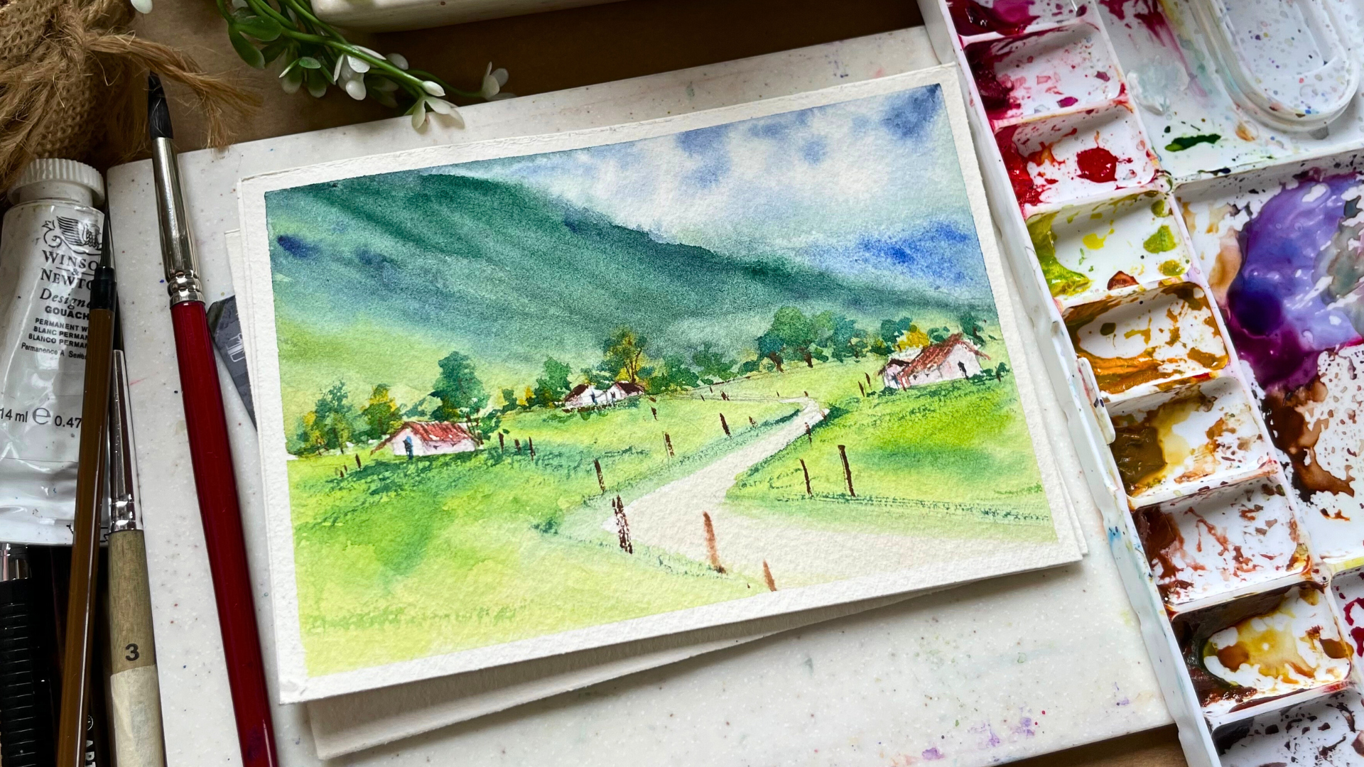
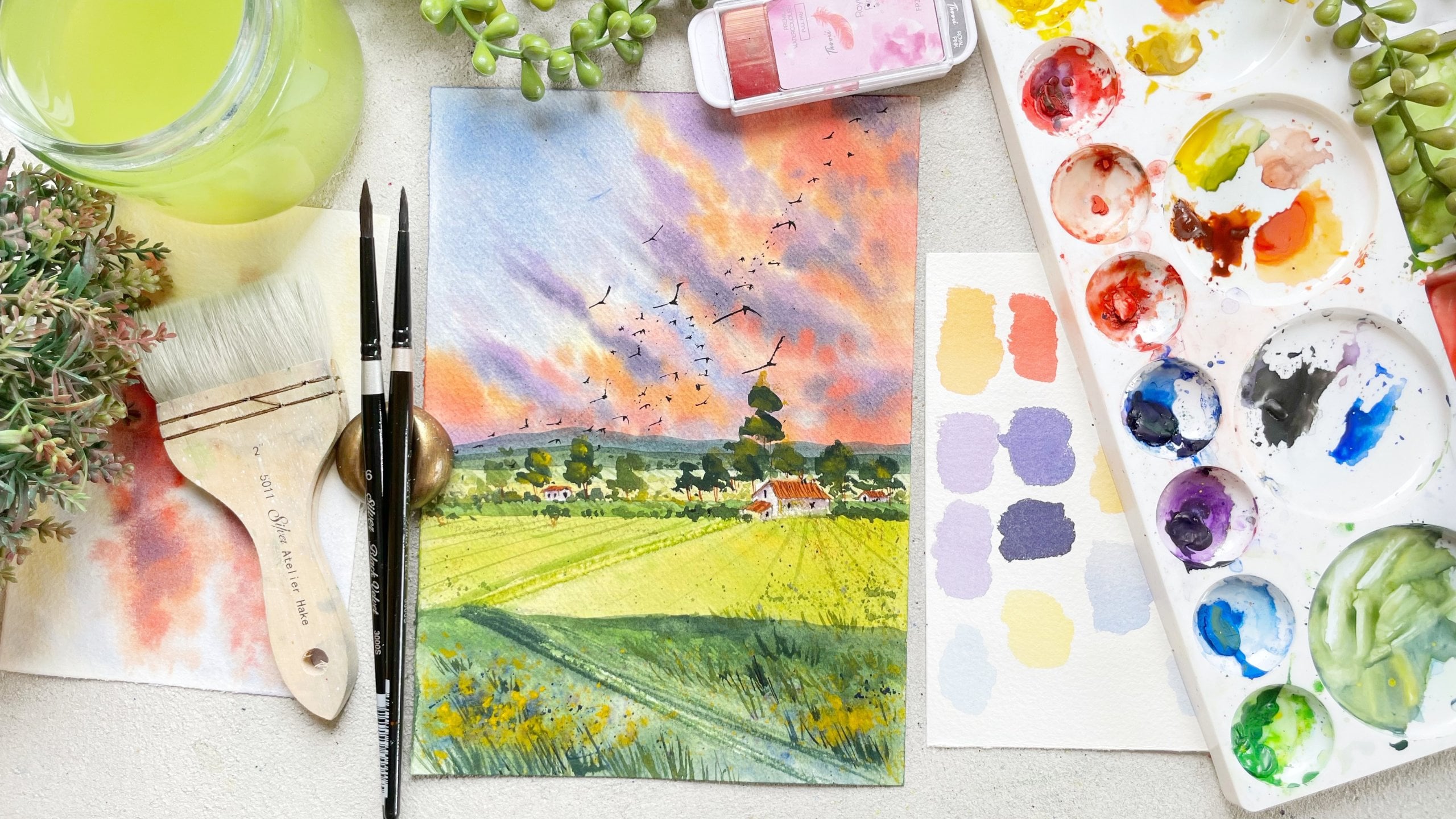
7. Green Grassland : Hello creatives. I'm so happy to see you all in the class. We have already learned about the color theory and wealth
into various techniques. Now it's time to dive into the heart or five
class projects. Before we start, let's
prepare our people. Grab your masking tape
and let's ensure we get those clean edges. Carefully apply the tape on
all four sides of the people. Ensure there's no gap between
the paper and the tape. Press it down Powderly for
the professional finish. Alright, Once that is done, now let's move on to
the sketching phase. We'll start by drawing the horizon line right below
the middle of the people. Remember I've done
this rough sketch and we'll keep that sketch
in mind while doing it. Now. We have already
done the horizon line. Above this line we'll sketch
the mesostic huge mountains. And below the horizon
line will create the rule leading from the
horizon line to the program. It's essential to Neil
the perspective view, the rule should
be sketched as an inverted as tenure
the horizon line. And gradually as we
reach the fulcrum, I've attached the
final painting on the right-hand side
for your reference. Glimpse into what our sketch
bill transform and do. Don't be shy to use your
eraser during this process. Perfection isn't the
goal on the force dry, and mistakes are
always very found. Once I sketch it spot on, we are halfway to dedicate
ample time to get it right. And remember, you are setting the foundation for
something really beautiful. Alright, now, let's paint the tiny houses along the
both sides of the road. A crucial point here
is the perspective. Those in the front should be
larger and those in the bag sketch them smaller, right? Also remember to sketch lightly, focus on precision to avoid dark line monks consider
using pencil with the edge or even six edge for lighten lines if
you are very heavy, ended on the Benton. Okay. We are not done with
the details. You get. Let's sprinkle a few bonds around the house
and on the road. Remember the perspective rule. Closer, objects are larger, dose farther away are smaller. Keep this in mind for
all your objects, and that's it for
the sketching part. We'll add some bushes
on the horizon line. During the painting process. Now it's time to
get your colors, brushes, and water ready. First, we'll tackle
the sky and mountain. Using the wet-on-wet technique. Apply a layer of clean water. Large flat brush at your own time by
applying the clean water because this is the base
and you need to be perfect. So remember to apply even layer of clean
Bordeaux on the paper. Then take your brush size
four and load your brush with indigo color and gently
apply that paint on the sky, leaving few gaps in between for the illusion
of white clouds. Soften the edges with a clean, damp brush if required. Moving on, we will paint the
background of the mountain, keeping them light to create
the illusion of distance. Mixing indigo blue
and dark green, I'm diluting it with
water and applying the flat wash of color
for the behind mountain. Next, we'll work on the main mountain and we'll add the depth by using
various shades of green. I want the top of the
mountain to be dark, and as we move downwards, I want it to be lighter. So you're, I'm mixing my dark green color by mixing
a little bit of indigo, dark green and desaturating
it by adding burnt umber. And you're my dark green color. I'll apply that color on
the top of the mountain. As we move downwards, I will take the sap green color. And lastly at the very bottom, I will add a little
bit more yellow to my sap green and
apply that color. Remember to use different shades of green by mixing
blues and yellow to your green to create the
depth in your mountains. Again, don't forget,
my paper is still, but in case your paper has already dried after painting the sky and the
background mountain, remember to apply
one more layer of even water before you
start painting though? Main mountain, as we want those soft blends between those different shades of green, It's important to use wet
on wet technique, right? Once that is done, once I've painted the first
layer of mountain, I will add small, tiny dots on the
horizon line to make it look like bushes with
my smallest drone brush. Next, let's move on to
painting the foreground part. Again, we'll be using the
same but On Wet Technique. Apply clean water, avoiding
the houses and the road. Now, this time we'll paint the foreground part of very
light, bright green color. So I'll be mixing a little
bit of lemon yellow to my sap green color to get that fresh green
color on my palette. This green looks
just like how we see those fresh new brushes
which are being formed after the rains or
during the rainy season. So to create that
freshness of those bushes, you need to paint them later. Next, we will apply a patch of sap green fellow below the
houses around the role. And some light touches of bushes using the yellow
ocher on the horizon line. Is the painting dries. You might notice the color
would get a little lighter. So consider adding another
layer for the richer effect. So your, I am adding one more
layer of dark green color just on the top of the
mountain to get that soft, foggy look which we get
during the rainy season. We'll try creating that by blending few of the
edges on the mountain. You already know
how to do with that is clean your brush completely, remove the excess
water on the tissue and use that damp brush
to soften that edges. Remember to clean your
brush every time so that you don't apply the
green color on this guy. And by blending those few
edges of the mountains, you will get the softest
and the most misty look, which we are looking
for. Alright. Once that is done, I
will apply a little bit of ultramarine blue and
the background mountain. And again, use the damp
brush to blend those colors. Now, let your whole
painting completely dry. Once dry, it's time to add details using the
wet-on-dry technique. First, let's paint the roof of the houses with a light
wash of Poland sienna. I'm switching to my
smaller round brush for more precision. Maybe you can switch to your
round brush size one or two. Now, add a bit of red to your burnt sienna and adding one more
layer onto the roof, leaving gaps to
rebuild the light. Color bleed. For
this Shiloh using a very light purple
color tone as the base of the houses and blending it with the damp brush. I want my base of the
house to be very light, so it is almost
like white color. This is like 90% water and
just ten per cent of pigment. So that's how light
I want my houses. This is just me adding
a little bit color to my house instead of
keeping it completely white. Now everything is dry. It's time to add bushes
around the horizon line. Start with the sap green color
and then our dark green. You remember to just do the dabbing motion with the
brush to create two small, small bushes on
the horizon line. And also keep on
changing the shades of green to add that
depth in your bushes. Losing the scene green. I will add fuel, dry brush strokes around the houses and the road
edges to add the texture. A little bit of depth and
color in the foreground part. Repeat this dry brush strokes
around the bushes which are there on the horizon line
to add that roughness. And instantly they would look so much more jules
and beautifully. Member. Attention to detail
brings your painting to life. Do it can be quite hideous. It gets low. Do the step slowly and embrace the meditative
nature of the process. If you feel tired,
orange, uninspired, take a break and return
with the fresh perspective. Now, once this and we will start adding the
last few details. So I will take my bond on board. I will add few lines using
that color on the roof. I will use the same
color to paint their doors and
windows of the houses, to paint the trunk of
the cheese pitch on, on the horizon line. And lastly, we will use
the same color to paint. Dose wouldn't bonds. Again, when you are
painting though within find deep the
perspective in mind. That is the pond or near the horizon line
would be smaller. And once which are near to the foreground part
would be larger in size. I'm truly delighted
with the result. It appears as if
the rain has just paused leaving the sky. There's a subdural mystique and damp ambiance in the atmosphere. To fill the same. Well, let me know. Remember, you won't get anything
in the forest. Cool. All you need to do
is practice and practice. So I'm really looking forward
to your class project. If you do paint, then do post it in the
project section of the class via yet to do
four more paintings. But we'll move on to painting the sky more darker and
darker as be equal. I hope you all are excited. And they, you go the
painting that reflect the cumulative of our efforts. Once the painting
is completely dry, gently remove the masking tape and let's reveal
the masterpiece. I hope you enjoyed this
Painting Experience. Did learn a lot of
techniques and subject. We learned how to paint wet on wet to get those softer blend. We also learn how to blend those edges using the
damp brush technique. Lastly, we did learn how to add those scripts details using
the wet-on-dry technique. Any painting you do, it's always a mix of tools, techniques, and you'll get this beautiful
artwork at the end. Now, let's move on to
our next class project. Stay inspired and I'll see
you all in the next class.
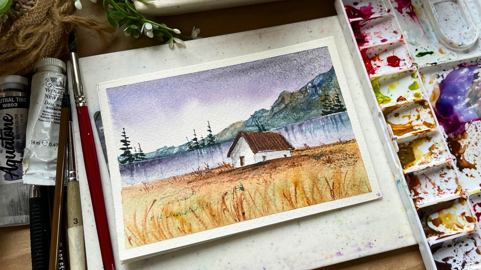
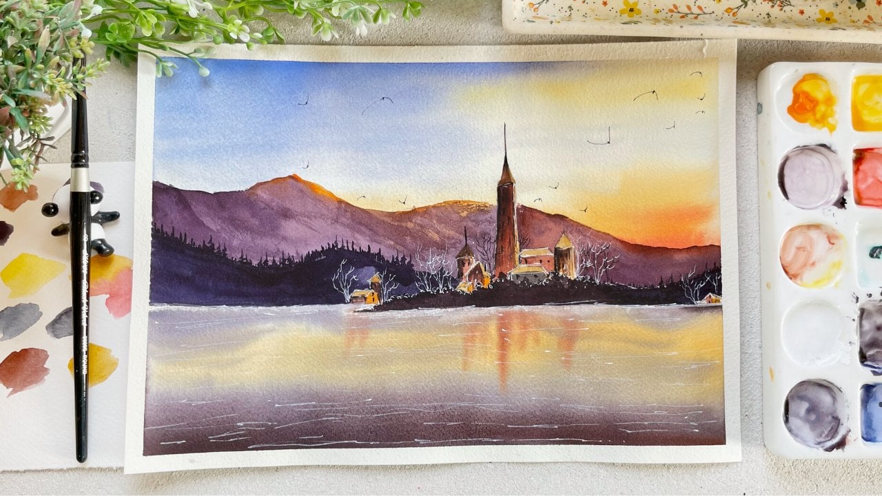
8. Cottage By the lake : Hello and welcome to our
second class project. I'm thrilled to
see you all your, and let's start on
creative journey. As always, let's
start by applying masking tape on
all four sides of the ensured that
you really press it down to achieve
those clean edges. While we're setting up, let me share the
exciting techniques we'll be exploring
in this class, this class project, we'll dive
into those moody dark Sky. We will learn the Art of painting the sky with
granulating colors, hiding texture to mountains using the, a unique technique, mastering the
reflection on what DO, and even painting the
charming prime trees. I hope that you are curious and I've you with lots of excitement
for this class project. Now, let's get into
painting and sketching. Once the masking
tape is in place, let's start with
the sketching part. Begin by drawing
the horizon line. Position slightly above
the center of the paper, then above the line sketch
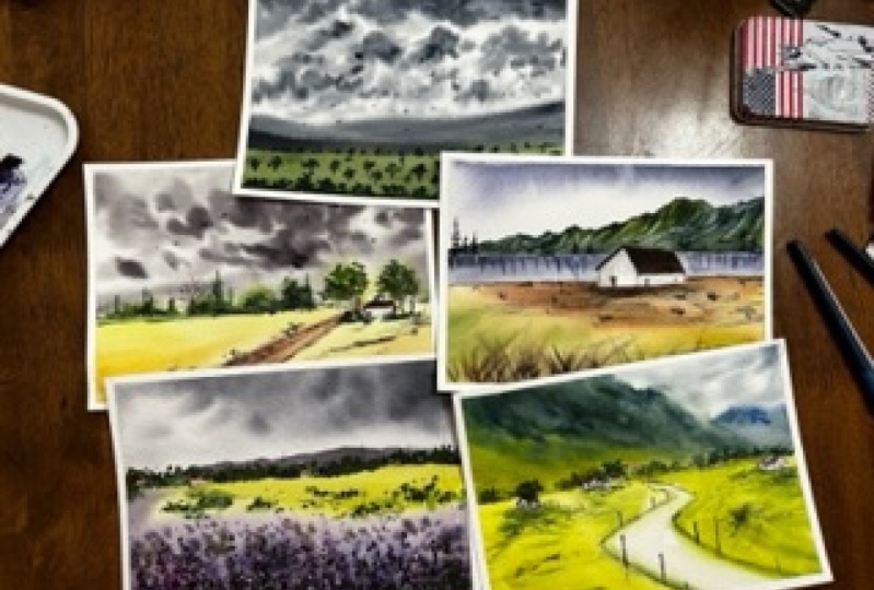
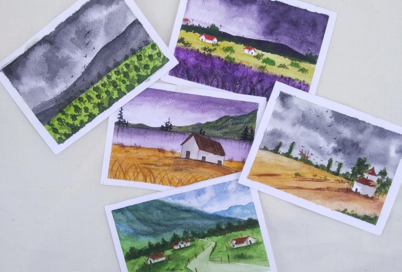
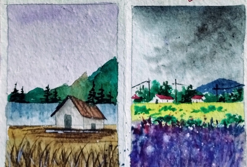
single impose mountain. As always, I've attached the final painting on the
left for your friends, giving you a clear
visual of our sketch. Destination. Notice how I sometime will
my pencil far from the tip. This technique, combined
with the light sketching, helps achieve the
row and natural. It's true, crucial when
working with watercolors, we want to avoid the pencil marks showing
through the painting. Next, draw another line. Leave about an inch of space
from the horizon line. This will represent
our foreground as we as sketching the
house on top of this line, I will hold the pencil
closure to ensure precision. In our focal point, the cottage. Those sample requires
careful sketching. Start to slant lines
for the roof, paddler, lines at the bottom and top
followed by connecting lines. Define the house structure, including the doors and windows. Let us sketch complete. It's time to paint this
gap to do landscape. As usual, we'll
begin with the sky, gradually working
our way downwards. I'll also tilt my board slightly by placing
something underneath, allowing us to work more
fluidly for the sky. I'll be using. Miss this genuine of granulating
color from Daniel Smith. If you don't have the
specific shade, nobody's, you can mix ultramarine
blue with a touch of warm red to achieve that
beautiful purple. Big sure you use cobalt
blue or ultramarine blue, which has granulating effects, which will work wonders. Remember to leave
some white gaps near the bottom to resemble the gradient look of this guy that is darker on the top and lighter
at the bottom. Also add a touch of lunar black just at the
top of this guy. Then soften those edges
with a clean, damp brush. I Sky dries. We will move on to
painting the water. Water doesn't have its
own color. It's measured. The sky, the object above
it, like the mountain. So we'll be using the
same sheet as be used for sky and we'll be
using for the mountain to paint the water began but
the purple color followed by the lunar black on the top and the touch of dark green for
the mountain reflection. Years where it gets interesting, grab an old credit card
or any Card and start scratching the surface while
the paper is slightly them. This technique adds
fantastic texture. Remember if your paper is to wait a few moments
before scratching, I will add that texture on
all of the horizon line. This will create a
beautiful texture. Then I will just use the damp
brush and soften the edges. And I will repeat
the same step again, but the Card to create
some more texture. You can stop at
anytime you want. I just wanted to add few
more of those strokes and your I am softening the
edges with the damp brush. I would use a
hairdryer to ensure the Painting is totally dried. Now, we'll be painting the mountains using
the various shades of brown and green. Begin with a diluted version
of hello at the top, transitioning to dark
green at the bottom. Finally, I will add more strokes of dark indigo to
intensify their darkness. Adding those strokes just at the top as well as a
little bit at the bottom. Be attentive when you're
painting near the horizon line. Just make sure that
you try to get that line as straight as possible because you
don't want to mess up. But the horizon line, whenever you will
notice in the nature, you will see that those
lines are quite straight. Once all the colors
are on the mountain, we will scratch the surface
while it is still wet. Use your again your
old bank guard or even your out-dated
school or college IDs. And start creating those seem extra as be created on
the lake. This time. This gives you the effect
of a rocky, rough texture. Adding the strokes is so much. So just enjoy this process. You don't have to be
perfect while doing this. All you need to do with Scratch the card in different direction. Make sure that your
paper is damp. It is not way too wet
and it is not dry. The rise, you won't get the
effect you are looking for. Once you have added ON to have scratched the mountain area and us satisfied
with the texture. Let's soften few of the hard
lines using the soft brush. While I was doing it, I just occurred that
the yellow ocher, which I had applied earlier
has completely faded. I did want to add a little
bit of light color. So you're, I'm taking
a yellow ocher, just applying Field
thoughts and then blending it with the brush. And I'm pretty happy of health my mountain
as don't doubt. It just looks so much
more natural and rough. But while doing that, I just noticed that the lake
is looking way too light. So you're, I'm adding a mix of this genuine and
a little bit of lunar black just on the horizon line and blending
it with the damp brush. Next one, though mountain. The lake is dried. Let's tackle the roof
and the foreground part. The roof. I'll be using
burnt umber and I'll apply the flat wash of
that kind of keep in mind that the sky is
dark and the colors of the object below will
be darker to all-terrain, the minimal light will be using subdued color for the foreground to capture this atmosphere. Once the roof is complete, I will apply a very
diluted black mixture, jazz 95 per cent
of water and just five per cent of pigment
just below the roof, creating the shadow and then blend it with
the damp brush. I'll miss pitching to the smaller detailing brush
and add the darker strokes. Let's Appiah, or similar dark
brown shade to the roof. If you don't have sepia, you can create a similar shade by mixing a little bit of pints, gray or black to your
point, sienna or bond. I'm using the same color. I will pay the doors and
windows of the house Now let's paint the
foreground part. I want this part. What I want to
paint this part in a very loose and natural way. So we'll be using the
wet-on-wet technique. First, let's apply
an even layer of clean portal with a
large round brush, making sure that the
bottom of the paper is entirely cover with
even layer of photo. From there, I will start
with yellow ocher and then add some strokes of burnt sienna at the bottom of the
house for the shadow, a little bit of burnt
umber in the same idea. Lastly, I will add a little
light wash of sap green. Remember to move
from light to dark. Always when you're working with watercolors because it is very hard to apply light color on
the top of the dark color. So always go from light to dark. Alright? So once that is done, I will be switching to a smaller round brush
and we will add tiny grasses to the foreground while the paper is still wet. Begin with the lightest
color that is yellow, ocher, and gradually
move towards the browns. For this tiny strokes, hold your brush at an 80 to 90 degree angle
using the pointed tip, I'm moving your hand from the
risks to achieve that goal. Use the distance of paint strokes so that they maintain their shape
on the wet surface. You can add as much as
you feel necessary. I will add few more
strokes but stop the full covering
the entire area. I will darken the shadow
below the house and then I will use the hairdryer
to dry off the painting. Again. If you don't
have the hairdryer, you can just let
it air dry or keep it under the font
for a quick dry. I am a little bit impatient
when it comes to waiting. So I just want to be quick
and I want to complete this, although it is
completely opposite. Especially while working
with watercolors, you need a lot of patient
and lot of precision. Because once the
mistake is done, it has not been rectified or it is very hard
to rectify those mistakes. But for me, waiting
for the painting to dry is quite impossible. So I just use the hairdryer
too fast in the process. Now, we will add some strokes. Once more. This time, we'll be using wet
on dry technique to achieve clean sharp strokes. Notice that's the
magic of painting, lies in the combination of wet-on-wet and
wet-on-dry techniques. We'll use wet-on-wet for
the subject that shouldn't draw too much focus
and serve as a base. The final details are added using the wet
on dry technique. Always, which brings the
whole painting to get them. So here I am adding the same strokes using
the same colors. That is the pounds and a
little bit of yellow ocher. But this time I'm using wet
on dry technique to do so. I'm satisfied with
the strokes I've added and I don't
want to overdo it. So now let's paint
the pine trees. But before that, we need
to mix our green color. I'm aiming for Wake
Forest green color. I'm mixing a lot of shades
to achieve that color. I'll just tell you
what all I have mixed. So I'm mixing my
indigo at touch of burnt umber a little bit both down and a little bit
of sap green color. Feel free to adjust the proportion of things
colors to match mine. If not, you can always
mix a little bit of indigo to your green and
every bit of burnt umber. And you will get almost
similar looking shade. When our shade is ready, I'll start painting the trees began with the straight line. Nine. Then use the
belly of the brush to paint the thin and thick strokes on both the sides of the line. Simulating the shape
of the tree where either direction and the size of the tree to create
the natural effect. So add as many as you want. I will add few more
and we'll be done. Binds the trees are complete. I will use the same color to add some dry brush strokes
in the foreground part. At these dry brush stroke, load your brush in. Don't forget to remove the excess on the edge
of the palate as well as on the tissue
and then just rub your brush or move your
brush on the paper. As my paper is cold press and it has a
little bit of texture. This dry brush technique gets
a little bit more easier. But to practice it on
the rough sheet of paper before moving on to
define and Painting. Lastly, I be using a little
bit of white quash and I'll be adding a
little highlights on the water as
well as the house. If you are not pretty confident to get this thinner
strokes with the brush, you can always use a
white pen to do the same. But make sure you are using a very thick consistency
of white paint. To do it. You can use your white wash or even Chinese wide to do that. Now, this is a final
look of a Painting. We must lead the entire painting dry before removing
the masking team. I'm incredibly pleased with the color combination
and overall look. Despite the dark Sky, the light foreground adds a beautiful brightness
in the Painting. Don't you think? They do notice the beautiful
granulating effect of the lunar black and
purple on the sky. It is just magically. Now it's your turn to paint. And I'm really
looking forward to your painting in the project
section of the class. Now, let's move on to
the next Painting.
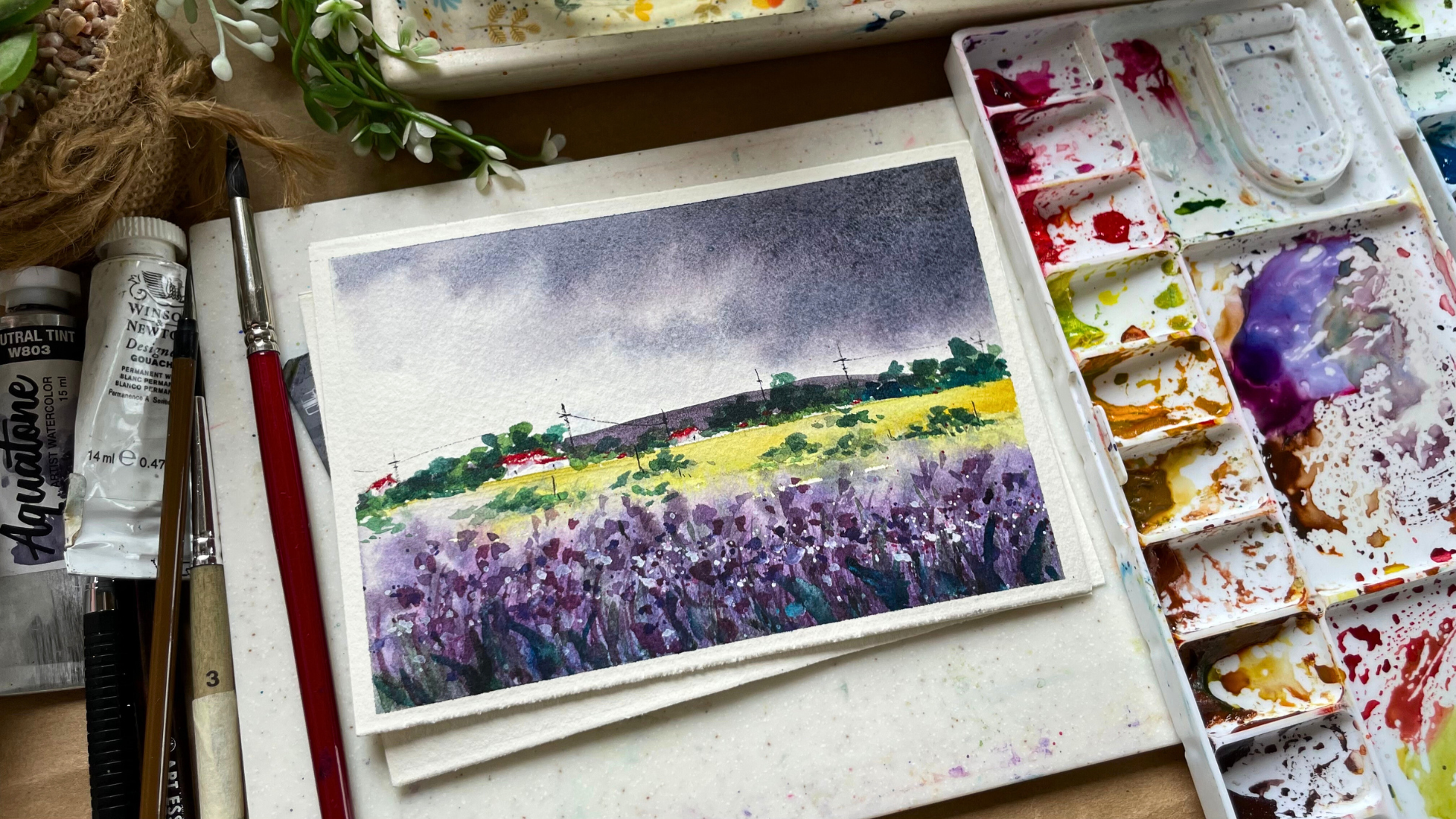
9. Gloomy day Lavender Field : Hello, and welcome to
our third class project. I'm thrilled to have you join me on this artistic adventure. Let's start by
applying masking tape on all four sides of the paper, ensuring clean edges
for your masterpiece. Why we are setting up, let me give you a brief
overview of what We Will Be Learning and painting in
this class and this project, we will once again explore the theme of dark and dark Sky. Adding a unique twist with a
loose style Lavender Field. We will learn how to create depth using
Layering Technique. Charming tiny houses and
graft background mountains. I hope you're excited SIM, to dive into the
techniques and subject. Go ahead, gather your
materials and Let's embark on this painting
journey together. Remember, I always suggest watching you the
whole process video, forced to familiarize
yourself with the step. It's beneficial to re-watch paint along with me
for the best results. This approach
minimizes mistakes and ensures that the technique
remain fresh in your mind. Now with the tape is pleased that's begin to sketching what? As always, I will start drawing the horizon nine position
at slightly blue, the midpoint of the people. I love ample space for the sky and mountain
above the line. I will sketch the background
mountain and also add tiny houses and wishes
along the horizon. For your reference,
I've attached to find that painting on the
left so that you can visualize the sketching
process as we are using an A6 size people for this
bond postcard-sized landscape. It makes for a quick
and manageable project. This Size and shows
that everyone can spare at these ten to 15 min
or the to paint along. While there's no rule
that you must complete the painting on the
same day as the video. Keep in mind that
working as soon as after watching keeps the content
fresh in your mind, leading to the breast
result and fewer errors. So let's stay motivated
and paint together. Trust me, you will have a blast experimenting with
this wonderful medium. With a sketch complete. I will dealt my boat slightly by placing something beneath it. And we'll begin by painting the sky using
wet-on-wet technique. When working with
granulating colors, this technique is essential to achieve the best
Granulation effect. The extra water flow allows the pigment to create
beautiful texture. Began with applying
an even layer of clean water on the sky. And I will use the same emesis, genuine color which we
used in the large class. And I'll mix a little bit of
purple for the first layer for focusing on dark and
heavy clouds on the right. And as we move towards the left, the clouds will become
lighter, soften edges. I'll pull the color slightly, but the dam plush
people will naturally, I love some of the
calories to flow down, giving us a beautiful finished. I will reapply the
same color on the top. And lastly, I will apply lunar black just at
the top of this guy. By this guy is drawing. I will paint the foreground to create a bit of
contrast and brightness. I will use lemon yellow and a tiny little flower field
just below the horizon. After applying the yellow color, I will blend the edges
with the damp brush. Now, let's paint the loose
abstract Lavender Field. Using the wet-on-wet
technique as the base stand by applying
even layer of clean water. For our custom purple shade, I will mix poeple are
touch of pink or a bit of Prussian blue to D saturate
it slightly apply. The first layer would
keep the bottom darker and as you move towards the horizon line,
make it lighter. Next, eight portion
blue directly on your brush and paint some
strokes on the wet paper. Switch to your smaller
round brush maybe Size to, to do this, remember, to work quickly to prevent the people from trying
as the base layer, we will be doing
everything but On Wet. The key is to add
different shades of pink and a little bit
of blue to create it. I will also add a
little bit of warm yellow on the top of the
yellow flower field. As this right now is
looking quite flat. And I will also create
a few loose plot, those with the clean water
in the foreground part. To achieve the lactose, load your brush with water, dab it with your hand or underbrush and watch
the drops fall? Creating beautiful blooms. I will repeat the process, but this time I will
use purple color for this plateau
and not just water. Remember to cover the top
of your painting with the clean tissue or paper to prevent it drops
from falling there. I skipped this step because
my sky was still wet. Next, let's apply some green
strokes at the bottom, followed by the mixture of
purple and burnt umber. To add a little bit more depth. We're working all of this
while the paper is still wet. If you feel like your paper
has already try it out. You can always use
a little bit of spray bottle and spray it on
the bottom of your paper. All you can wait for
it to completely dry, then rewrite your
paper and work on it. But I would suggest you to
use at least 100% cotton, 300 GSM cold press
watercolor paper to make your life a little bit easier while working
with watercolors. Specially when you're
walking and so many layers, it is very important
that your paper stays wet for a longer duration. So make sure that you use
the right kind of people. Now that the whole of
the painting is dry, we will repeat the same steps of applying the strokes
with different colors. But this time I will use
wet on dry technique. So switch to your smaller
detailing brush as you want those strokes to be the
thinnest and load your brush, wet bulb, and start
creating those strokes. You know the drill, you
have to hold your brush at almost 80 to 90 degree angle. And just use the tip of your
brush and start painting those grasses like flowers
just in the foreground file. Once that is done, we'll
use the same color and start creating the petals to start with the lighter value. And as you move ahead, make your color a
little bit darker, or increase the value. You can change your color by adding a little bit of
blue or burnt umber to your pulpal and keep changing your puppet to add a lot of
interest in your painting. I know the steering techniques take a lot of time to paint, but this is the only
way in which you can create a lot of depth
interests and your painting. Okay, why painting? Don't be afraid to
increase the size of the brush a bit if you feel
that it would look better. Experimentation is
perfectly fine, and it's what makes your
painting unique to you. Okay, now, I will make the
purple and a little bit of lunar black to add that
granulating effect. And I'll paint the
background monitoring. Remember to leave
a little bit of gap at the bottom photo, bushes. And I will use the
same color to paint some darker flower battles
in the foreground part. Next, let's paint some
pinkish purple flowers. So I will take my thing. Hello, you can use quinacridone
rose up paying upright. Choose to make your
pinkish purple color. And I will add a little
bit of purple to it and start painting the flowers. Petals and the foreground part. Speeding up this
process because I'm repeating the same thing
over and over again. So maybe you can just pause
the video somewhere and just start and complete your work
and then restart and do it. Alright, once that is done, I would take green
color and I'll start adding some
leaves at the bottom. Now it's time to paint the bushes which are
in the foreground, as well as on the horizon line. So I'll start with the
light green Carlo. That does. I'll use the
sap green color and I will add a little bit
of water to dilute it. And I will paint the first layer of the bushes with that color. Once I've painted
the first layer, I will go darker green color by adding a little bit
of blue to my green. And I will start
adding a little bit of depth in the bushes. Remember, whenever you are
doing the Layering technique, it's very important
that you don't cover the underneath layer completely when you're putting
up the second layer. Otherwise, there is no point
in doing Layering technique when you cannot see all the Differently
use of your paint. So whenever you are doing
the Layering technique, just make sure that you don't
cover the underneath layer. If you feel like
you would do it, then just switch to
a smaller brush and be careful while painting
the strokes. Alright? Also when you are
painting the bushes or any subject in your main thing, if you feel like you
need to increase the size of the bushes more
than you I've sketched. It is totally fine. You can take that call for yourself and you
can always do that. It doesn't have any rules that
it should be of this size. Only. Experiment before it for yourself and
see how it looks. Alright. Now lastly, I'm adding few of those darker leaves
strokes at the bottom. Next, let's add the red
poppy color for our roofs. I really wanted something
bright enough painting. So your, I am using the
warm bread to Paint, though roof of our homes. Next, I will also
add some wet on dry splatters using
different shades of purple as well as white gouache to create a
little bit of highlight. There technique remains
the same of splattering, loading your brush
with paint and dabbing it with your hand or
another brush to do so. But this time we are
doing Wet on Dry. So it won't read the bloom, but it will stay. As it drops. This will add the final layer
of our flower patterns. And it would look
just beautiful, especially when you
add the white lactose. Remember to use
white gouache or use a thick consistency of white paint to make
it more opaque. Once that's complete, I will
mix my dark green by adding a little bit of indigo and I'll add the last layer to my wishes. I know we have worked
with multiple layers in this painting and it might
seem complicated initially. However, if you follow the
step-by-step approach, it gives quite simple and it will give you
a fantastic result. Please do give it a try, and you will see the
magic on your paper. Lastly, I will add a
tiny dose and windows to the houses using the black color and a small detailing brush. If you're not confident using the brush for such
small details, feel free to use a black pen. It works just as well. But the same brush
and the same color. I will also paint
some electric poles. I complete this Painting. All the steps complete. It's time to remove
the masking tape. Andrew, Will the final result of our hard work doesn't
look perfect. It'll Granulation in the
sky and the Leo's of purple flower have created
a wonderful effect. I am genuinely with the outcome. I hope you enjoyed painting and learning alongside with me. This concludes our
class project, and I'm really excited to see
you all in the next class where we will be painting
over very dark dramatic sky. I hope you all are excited and I'll see you guys
in the next class.
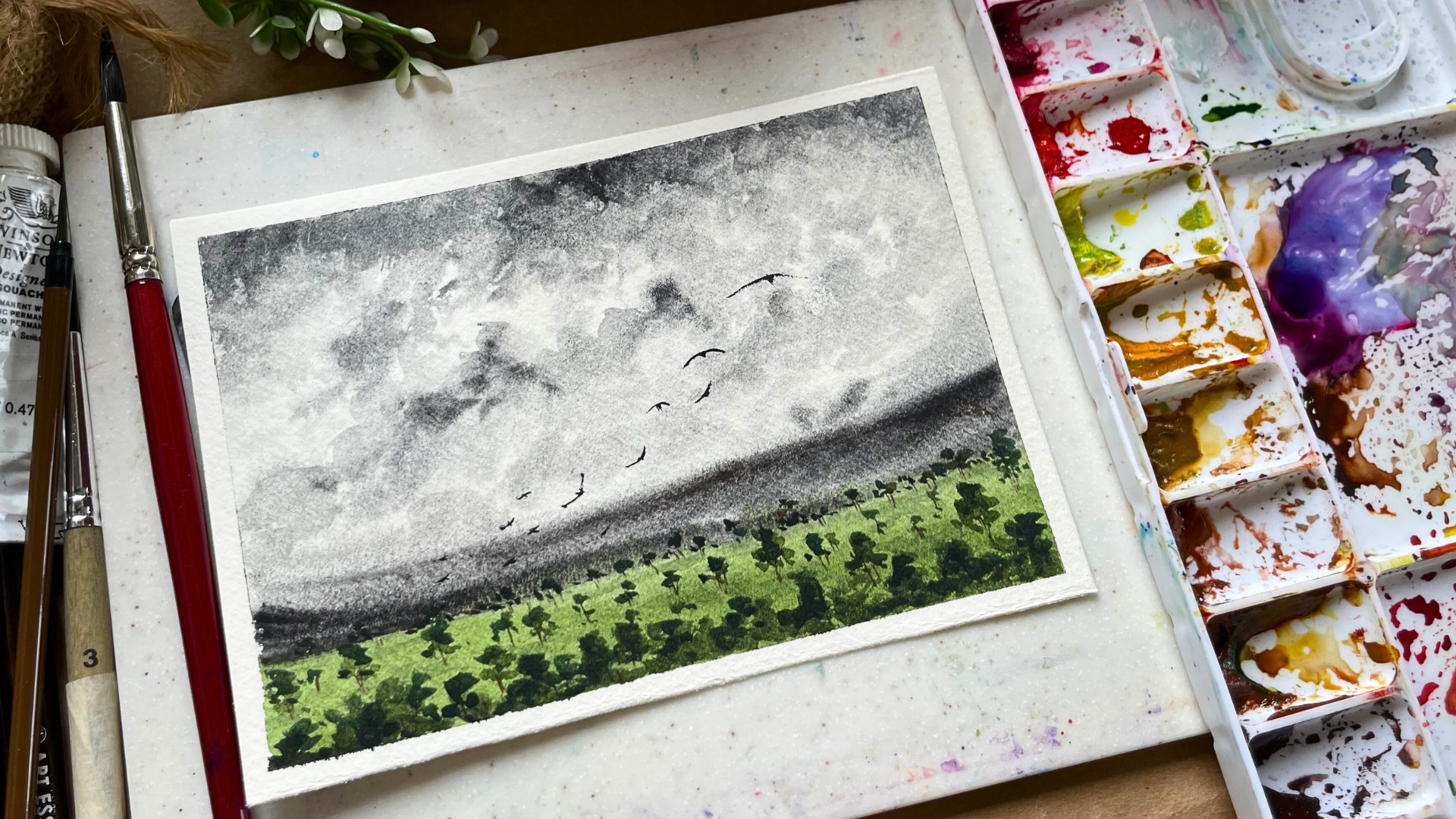
11. Dark Sky Landscape Painting: Hello My create companions. Welcome to our last and
final class project. I'm so glad you have stocked
with me till the end. And I'll make sure that we will make this project
are remarkably one. Okay, so let's start by placing the masking tape on all
four sides of your paper. Make sure it's
securely attached, me leaving no gaps
between the people and the tape to give you a
clean edge at the end. Once that said, we will move
on to the sketching part. As always will always start by drawing the horizon
line at the bottom. That is the base of
any sketch YouTube. So once you have drawn the horizon line sketch
tiny mountain on top of it. Once, that's done below
the horizon time, we will create a
small college age, but an old style
triangular roof. And then we will draw tiny little bushes and
trees around the house. As always, I have attached
the final painting on the left-hand side for you to compare of what we are
sketching and haul. The final painting
would look in the end. We have painted the
cottage, the mountain, the few bushes and trees around the house
and on the horizon line, we will also draw a small road which is leading towards
the horizon line. Remember to draw your sketch
as light as possible so that you don't end up
getting pencil marks once the painting
is completely done. While the sketching is done, let's dive into the painting
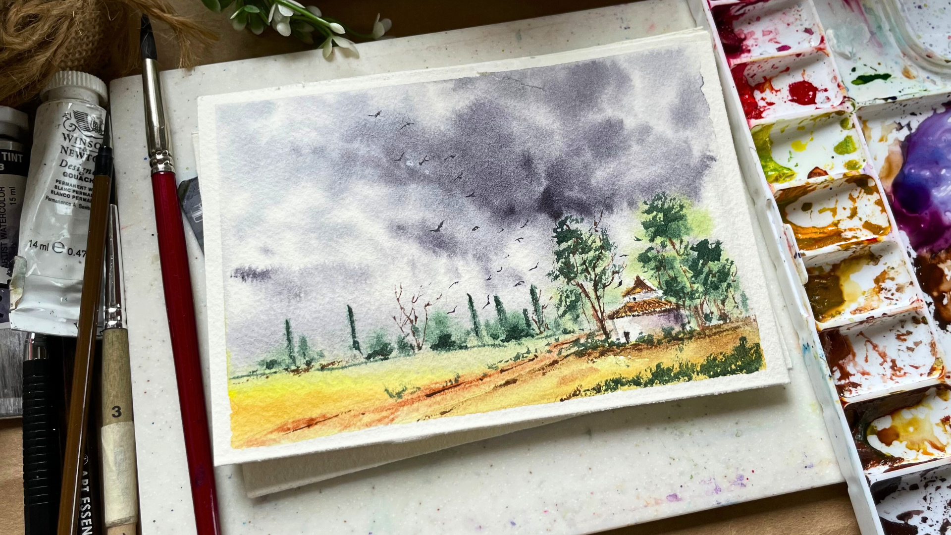
part for this class project, we will paint same dark sky, rainy day, gloomy Skype. But this time we will
pay the whole thing with the non granulating color
because I wanted to give you an option and for you all to see how working with granulating and non-blank leading
color would just affect a little bit
on the texture path. Otherwise, it would
look the same. So I really want you all to
give all the class projects or try even if you don't
have the granulating color. Okay? So once that's done, now for the sky, we will be using the
neutral color from Ecuador. And it's a lovely blend of three different pigments
that SPV 1915 and p, because seven is not entirely blue or black, it is in-between. And that's what is so
special about this color. Again, if you don't
have this color, you can use binds
great directly, or you can add a little
bit of ultramarine blue to your pines
gray and then paint the same dark sky
like we are doing. Remember the goal is to learn the technique and
improve in each step. Don't aim for perfection
in, for growth. So I'll just watch the
color for you and you will see that it is not
entirely black. It is very muted
and purplish black. Now on to painting process, apply an even layer of clean
water on the sky area, the board or little to let the water and color
flow downwards be quotients for
the excess water. You can remove it with a tissue
or the brush if required. Okay, So once this guy is
not applying the color, walk from top with
a medium value of neutral and leaving
few gaps in between. Then switch to your
smaller brush and add the dark value to the bottom of two clouds for the
depth and the shadow. You don't need to apply
lots of Leo's for this guy, you just have to
apply one layer of mid value of pines
gray or neutral tint, any color you are using. And for the last layer, just applied the dark value at the bottom of few of the clouds. Alongside, we will paint
the distinct mountain using the same color but
in the lighter value. Now to create a huge contrast between the sky and the ground, we will paint the foreground using a bright color
like Quinacridone, jello, and lemon yellow. If you don't have
conducted and you can use any warm yellow
that is cadmium yellow. You can add a touch of
points sienna and a touch of orange to your cadmium
yellow and paint it further. But before we do that, and while the sky
is still a bit, but let's first paint
the first layer of the skies and the bushes
which are near the house. So your, I am taking the sap green color and I will paint the first layer using that Green color, then
I will add a touch of blue to make it
slightly darker. And I will use the
leftover cream color, which was already
there on my Padlet, and switch to a smaller
brush and start adding the tiny bushes and trees which are there
on the horizon line. And I'll use that
same color to paint the foreground trees which
are around smallest garbage. By then, though, sky part
would have already tried, but if not, and let it dry. And let's paint the foreground. So I am taking my lemon yellow forest and
applying it on the top. And then I'm taking
quinacridone yellow and applying that color
just at the bottom. And then I will blend
those two colors together. I will upload. I'll apply the same color on the road area. Then I will switch to my
smaller detailing brush. I would take the bonds Vietnam, and I will start adding the lines on the
role while the paper is still wet so that
it gets a little bit blended and you get
this softer edges. While all of that is drying, let's paint the cottage, apply the yellow ocher
as the base color for the roof and add
some lines of points, sienna on top of it. Next to paint the
bottom of the house. I really wanted to keep
it completely fight, but keeping it wide is never the ideal option you need to create a little bit of depth. You know, a shape, and to do that, you need
to add shadow to it. The white doesn't
have any color, but it does have the color
of the surroundings. So you need to add that. So now you mix your own
grade. I will use it
12. Thank you: Heartfelt. Thank you for taking all the time and
dedicating it to my class. Now, it's your turn to green. I'm post all the class projects in the project section
of this class. I'll be eagerly
waiting to see that. If you happen to post it on
Instagram, then do tag me. My handle is, at the
rate, artists shreya. If you are stuck
somewhere or you need any clarification
regarding anything, then don't hesitate
to reach out to me in their discussion section of
this class and I'll get back to you as soon let
me your views on invaluable think guide
me my future classes, as well as the encourage me to get better and get more
classes for you once. So please do post a review in the review
section of this class. Alright, that's it for now. I see you all really soon
in the next class. Bye
 Shreya Gada, Artist