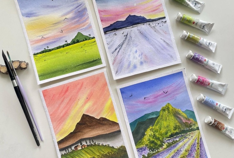
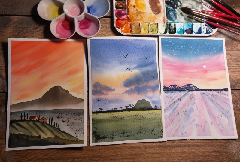
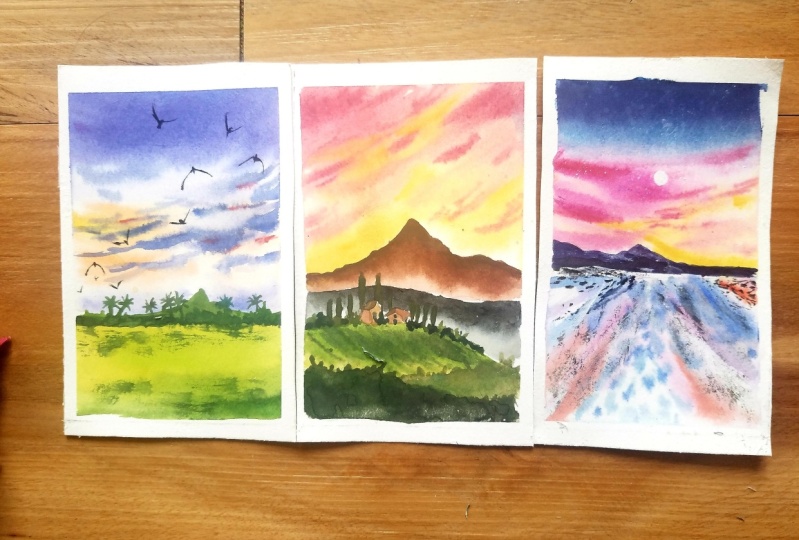
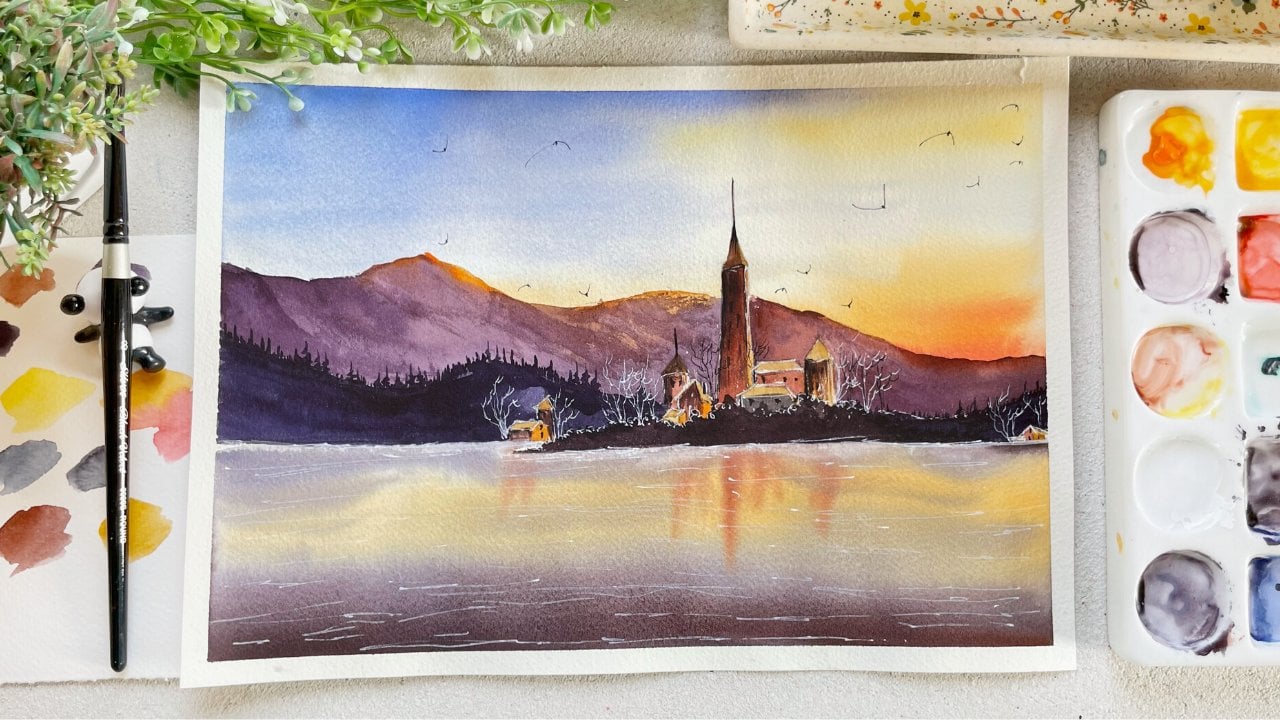
Transcripts
1. Welcome to the Class : Hello everyone. I
am sure you are full-time artist and
educator detail from India. In today's class,
we will be learning how to work with
base ten colors. As usual. Our class, we'll start with the materials we will
need for today's class. I will walk you through each
and everything in detail. What you will need. And I will
also explain why you need those materials to paint when you're working
with watercolors. Next, I will show you how to
mix your own pastry colors. You don't need the
premixed pasta's. We will mix our own colors from those irregular
colors which we have. I can also give you the
alternative Carlos, which you can use if you don't
have these exact shades. We will be doing are very fun
exercise of color mixing. Then we will study
in details about the techniques which we will be using in our class project, especially the wet
on wet technique. And I will show you what
is the exact amount of water you should need when
you are working wet on wet. We will study how to paint
clouds to sing this technique. Then I will teach
you how you can mix your colors
directly on the paper. We will also study how to soften the edges are dry
brush technique, the boards, as well as how to create contrast
in your painting. Once you have studied
the techniques we've been started with
our class project and we will apply all the techniques
which we have learned in this class is jam-packed with so many techniques
and information. So in case who are
struggling with watercolors, you should definitely
take this glass. By the end, I've also included the bonus glass where I
am teaching you under the complicated subject on how your Carlo is to create the
depth in your own painting. I'm hoping you all
are excited to learn and explore
what colors with me. Come join this class. And I promised I will make working with watercolors
are little easy for you. You can find me on
Instagram under the handle. At the rate artistry, I gotta, I do have a YouTube
channel where I upload regularly reduced on
painting with watercolors. Other than that, I also have
two classes on Skillshare, on painting different types of landscape using watercolors. All right, I'll see
you in the next class.
2. Materials You Will Need : Firstly, thank you so much
for joining this glass. Am so happy that
you decided to join me in today's class. Right? Now, let's get started. Let's talk about the materials
which you will need. What do these guys understand? One thing you don't need
exactly what I'm losing. You can use whatever you
have available with you. Alright, let's get started. So you will need masking tape down your paper
on all four sides. Then you will need
watercolor paper. I'm using 300 GSM cold pressed watercolor
paper from Bruce joe. You'll see that it has
a slight texture to it. Then you will need
the boat to tape down your paper on all four sides
with the masking tape. Next, you will need the brushes. I'll be using round brushes
from silver black velvet. I'll be using size 268 and bind strip brush
which has long hair case. You don't have this brush, that is totally fine. Next you will need flood brush. Your I'll be using two inch
flat brush to wet the paper. If you don't have this, you can use a mop brush
which holds lots of water. Or you can use any larger, large brush which
you have with you. We are using larger
brush so that it is easier and faster
to wet the paper. Next, you will need
two jars of water, one to clean down your brush. And either for fresh supply. Then you will need
watercolors and walk you through each and every
color in the next class. Thanks to you, we'll need to
mix down all your colors. You will need a rough plot. An eraser. Lastly, very important. You will need white color. So you can either use
white watercolor, that is the Chinese. You can use whitewash,
which I went. You have the tool. It's fine. As we will be mixing
our own sheet. For this class, you will need
the white color to do that. Now, let's get the color
mixing in the next class.
3. Colors Mixing : If you'll see, I have so many
patients sheets on ready. But I thought why not make our own pasted the
sheets in this class because I understand
not everyone would have these
specific colors. If you look at the tube of the, based on the sheet,
this is min green, you will see that it
is usually though, pigment mixed with the white, it seem but the girl color, so it is a mix of red
pigment and a white pigment. Together. Let's make our old
pasta's sheets using the regular colors which
we have mixed with white. You can use either Chinese
white or white gouache, whichever white
you have with you. Alright, let's get started. First. Let me squeeze out my white
watercolor on my palette. Make sure that this
color doesn't get dirty. So keep those separate pan or a separate space
for your white color. Next to rewrite my color, I will just add a drop of water that the help
of my brush on all my bands and leave it for a minute or so so that the
colors will reactivate. And I don't have to rub my
brush a lot in the past. This is a really good technique. What I usually do is
whenever I start sketching, I'll just spray the
water on the pads. So by the time I'm done
with this sketching, colors are already reactivated. Alright, let me switch all the greens which
we will be using. First is only green color. So majorly, all the calories
are from White Nights. I may be one or two is
from different brands. Next is sap green, then the next is made green. You can create this column
by mixing your color, that is the lemon yellow and
a little bit of green to it. Then I'm swatching
my yellow hansa yellow medium from Daniel Smith. Watercolors. You can use cadmium yellow
instead of this or any yellow. The task of warm
undertone to it. Now, let's mix our
own green sheets from no colors which we
have already chosen. We will know that what
our palate can create. What I'll do is I'll take
the yellow shade and I'll add tiny bit
of sap green to it. You will see you will get a lighter value of green
color, same weight. If I'll add more green to wet, it will get darker. If I add more yellow to word, it will get lighter. You can also mix
your yellow and blue in different proportions to
get differentiate of green. Like I'm adding a bit
of ultramarine blue to my yellow to get
the green sheet. Same way you can add indigo
to your mix as well. This is the shade for
Jack God by mixing my ultramarine blue
hansa yellow medium. So here I'm just experimenting. What I do is I will add a bit of burnt umber and
ultramarine blue and a bit of May green to the
same Manx and see if it's green and create the stand. Your column might vary because the pigments which
I'm using my default, as well as the
proportion in which I am adding different colors
would also change. So don't worry, if you get slightly different mix
to make it even darker. What I did, I added
in bigger do it. Now, I will add more indigo to the same mixed to
make it even darker. In short, green is
a secondary color, but you can mix with
your blue and yellow. So these are the
differentiates which we created with the colors
which we already have. All right, next you will
need burned on both. Then I do marine blue to create the lavender shade or
based on lavender color, which we will need for
our class project. Then you will need indigo. In case you don't have indigo, you can use any darker blue, that is the portion blue. Then you will need a pen shade. Your I'm using permanent
rose room instead I unmuted. You can use any pink
color you have. Then you will need Rage. Shake Your I'm
using uranium red, which is a very bright
warm red color, which is more towards
the orange side. That means we will be
able to create beach. Achieve easily with this garden, you will name dioxide
global or while it. So these are the ten
colors which we will be using for our class
project. Let me repeat. Olive green, sap green, main green, Hansa,
Yellow, Medium, burnt umber, and
ultramarine blue, indigo, permanent rose, geranium,
red, and Dioxide bulbar. Now, let's study how to mix
our own based on sheets. Let's post mix the
lavender color. First, I'll take ultramarine
blue on my palette. In case you don't have
ultramarine blue, you can even use cobalt blue
to make the window shade. The kind of would be
slightly different, but that doesn't matter. As long as you get
something similar to it, then I will add a slight white, do my ultramarine
blue and you'll see that it gets
under the lighter. Still doesn't look
like a lavender shade. To make it look under
the more properly, I will add a bit of
pink color to my mix. You see instantly it
looks much better. But I'm still not
satisfied with this mix. I wanted to look
much more palpate, so I'm again adding the
pink mix to the same color. And now it's looking like. Then to make it even darker, I will add the wallet
dioxide bulb with the same mix and see that it
will get under the darker. One more reason I like
to mix my own paste in Sheets is because the
premixed be based on sheets, have the white opaque
color to it that they use maybe gouache or white
opaque color to it, which makes the colored V2 chunky and it loses
its transparency. Brightness, if you see to the
colors which we are mixing, knew the are quite bright
and transparent ads, but which in the end we'll make a painting look much
more beautiful. Alright, let's mix
a peach color. So what I've done is I've taken geranium red
in my palette. Then to make it a little
bit only orange side, I'm adding a bit
of yellow to it. Once I've added the yellow, I will add a bit of
white to the same mix. Mixing is theory predict, right? I think you would agree to it. So keep on trying, you keep on trying different ratios if you are
not getting it one goal, maybe you will need to add more of yellow or maybe you
need to add mode of white, or maybe a little bit of red. The same way, like
we mixed up bulb. We added a bit of pink, then in the end we added a
bit of violet to it as well. So keep on experimenting
with your wrist. Just make sure that
whenever you are adding color to your
already pre-mixed color, just added little by little so that you don't end
up screwing the whole thing. You're watching
the golden color, that is the premixed paste
in colors side-by-side. To make the same shade. What do you have to do with? I'll just add more white to our Godel or the
beach color which we created and USC
that you will get some word similar color, fill. You don't need the
pasta's shades, right? They can do it with the normal
watercolors which we own. Now. Lastly, let's prepare
our pasted paint Carlo. I think you would already
know how to do it. I'm sure we are just mixing a bit of white
to above an inch rules. You get the rosy pink color. Then just to experiment
a little bit more, I'll add a little bit off geranium red to the
same pink color. And you'll see we get
the bright pink column. Alright? So keep on experimenting, keep on mixing, differentiates
and you will enjoy it. Maybe you will end up getting a different and completely beautiful color
from your ballot. All right, Now we
already know our colors. Now let's move on to the techniques aren't
in the next session. Then we will start with
painting our class projects. Alright? I hope you are all excited and I will see you in the next class.
4. Techniques: In the last class, we
studied how to mix our own Eastern chains from the basic colors which
usually had been a pilot. These are the colors
which we marched and studied in the last class
in case you missed it. Definitely watch that you will know how to mix the sheets. In this class, we
will be learning the basic techniques
which we will need to do our class project. Post. Let's start with
wet on wet blending. So we will be using
wet on wet technique to paint those sky
and clouds on it. Wet on wet technique basically, as it is applying paint
on the wet paper. Our paper is bad
art galleries wet. That's the reason it
is called wet on wet. Now I've applied
water on my paper, going to see that this book, slight shine to my paper. There is no part of forming. Now, let me add a
lot of water to my paper and you'd see that on the edge there is excess water. Now, whenever you are
working with watercolor, especially with wet
on wet technique, there shouldn't be any parties
forming on the platform. In case that happens, just tilt your paper in one direction and
grab your tissue. Just move that along the edges. Your tissue with soak
up the excess water. So this is the exact amount of water which should be
there on the people. That is, you should see a
slight sheen on the paper. And that's it. Once you have applied in even coat of
water on your paper, Let's start applying the paint. I'll start with the purpose
sheet from the top. Once I've applied that sheet, I reapply it to increase the
saturation of that color. Then from the bottom I'll start
applying the beach shade. Just moving my brush left to
right as my paper is wet, the colors are blending
in beautifully. I don't have to put a lot of efforts in blending the colors. Now, next, reapplied
each sheet one more time because once the watercolor
dries, it gets alerted. So make sure that you leave
at once or maybe twice, depending on those saturation
which you are aiming for. Alright, now let's add the clouds while the
paper is still wet. So I just switched to
my smaller brush size. Do I load my brush with the paint sheet and remove all the excess on the
edge of the palate. And then I'll just do the
tapping motion on my paper. You'll see that the
clouds are looking so much software because the edges are blending
in with the paper. Because my paper is red, right? To create a bit of shadow, I will add a little bit of pink at the bottom of my clouds. That way it would look
much more interesting. Sometimes what would
happen is the edges won't get blend automatically. You would have to help it blend. So you do that. Clean your brush with water, remove the excess on
your tissue and just use the damp brush along the edges of the clouds very
slowly and lightly. And you will see that the colors will
blend in beautifully if your paper is damp or wet. I'll show you one more time. I publish the applied, the poeple makes it above
so that you can see. And now I'm just
using my **** brush to blend the edges of the appropriate with this guy
to clean off your brush. And every time you clean it, just dab off the
excess on the issue. Otherwise, what will
happen is the water on the brush would flow on the
paper and if that happens, it would ruin the
whole painting. All right, be sure that you tap off your excess
on the lecture. Show you how to blend
the edges wet on dry. That is, my paper is
dry. My paint is. But what I do is I'll just first applied block of color
side-by-side. One. I will leave it as it
is. The other one. What I'll do is I'll
again take my **** brush. While my color is still wet, I will take the **** move along the edges and pull
the color a little down. Once I've done that, I will
again leave my brush and I will apply the damp brush
where I ended last. And you will see that
it looks so soft, blended with the background. You can see the
different side-by-side. Now, next, let's learn how to blend the colors
directly on the base. Sounds tricky to
figure it right? But it's not. Let me just explain you. What I do is I will first apply the yellow color on my paper. Once I've applied
manga, look alone, Why am I in yellow is
still wet. I will take. The green color on my brush, and I will reapply
it on the mountain. See that the color is red. And because of that yellow
and green mixing in together, you just have to be that color which you have
applied is still wet. You are not comfortable
doing this. What do you can do is
you can mix your colors on your palette and then
apply it on the paper. But believe me,
it's quite simple. You must give this a try. Next, next study how to do dry on dry technique or
dry brush technique. If you have attended
my last two class, you know this technique
very well because we have used this technique to give
textures so many times. Let me repeat. Just load
your brush with paint, remove the excess on the tissue, and then just move your brush left to right on the dry paper. It doesn't matter how light
or dark your color is. The only thing is your paper and your brush should
be almost dry. Like I'm using the lighter
value of green color. Yet I'm able to do the
dry brush technique. Just be sure to tap the
excess on the digital. Next, Let's paint
the flying goods for screen grabber brush, which has a really
good. At the end. I'm using size two round brush. You can use size one, size 0, whichever smallest brush
you have with you. But first, let me show
you how to do it. You know how to create a week. So all you have to do is create a V in
different directions. While doing it makes them wider, shorter, larger,
hand, even narrower. Once you have done that, we will do the same
thing with the brush. So let me show you how to do it. First, I redraw the V-shape. Once I've created the V, I will just draw a small
dot at the center. Repeat the same with different kinds of feet
or differentiate Sophie. Now, let's paint or bush
using wet-on-wet technique. So what I'll do is first I apply the paint
on the dry paper. That is, I'm applying
my green color force. Now my area where I've
applied omega1 color is red. If I apply another
layer on that same ACH, then it would be
considered as wet on wet. Now I just took a darker color of green and I'm just
doing the tapping motion, making sure that the
underneath layer which I've applied isn't
completely covered. I'm leaving few gaps in-between. Then I will take the
darkest color of my green and I will
reapply it the bush. Now you will see that while
my paper is still wet, the Cairo's are not
blending in together. They are just
spreading a little, which is exactly what we want. But sometimes what
happens is when you apply the different layers, while the underneath
layer is still wet, the colors blend in way too fast and the covered
a lot of area. So let me tell you what happens. So what I do is I first apply the room even layer of water. That is the first step. Second step is I take
my color and load my brush with paint and I won't remove the excess on the planet. Now you see that my brush
is loaded with paint. Whenever I will try to
apply it on the paper, lot of color would
fluid on the wet paper, and because of that, color would spread a lot. Now what I'll do is I take
a teacup consistency of paint and I will cabinet on
the scene by its surface, and you'll see that the
color is not blending in. So what you have to
do with if you are using the light
value of your color. Doing wet-on-wet technique
to remove the excess on the tissue or on the palate, etc, before applying
it on the paper. The second method is used
the thick paint to apply it so that the color
wouldn't spread a lot. But you will always have to use different values on
people while inking. So just make sure that
I remove the excess on the palette before
applying it on the paper. I hope you got all the
biggest techniques. Some of the techniques we will learn while we are
doing the painting. And these are the important
ones which I don't do. You're, now let's move on to
painting the class projects.
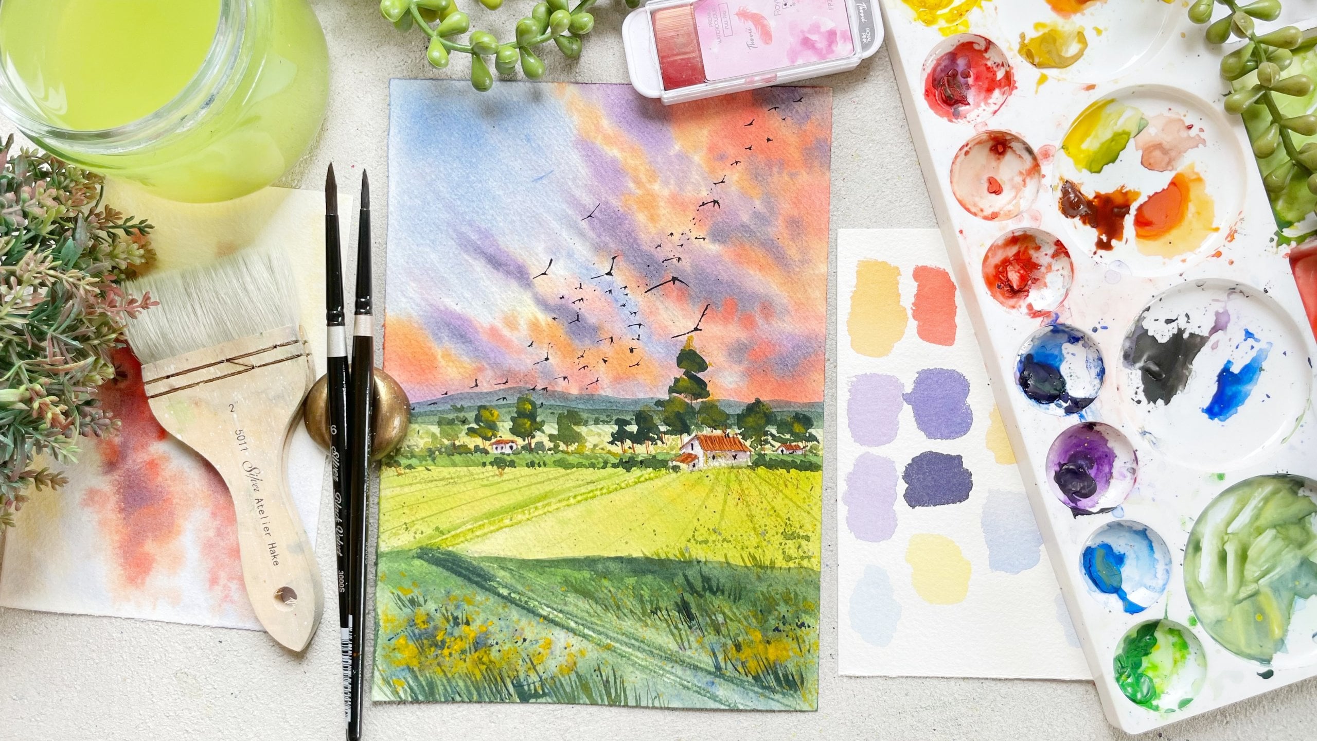
5. Soft Lavender Sunset Sky (part 1): This time we will be
painting a very simple, yet beautiful looking landscape. We'll focus of this painting
would be on the sky. Let's get started. Let's apply masking on all
four sides of the big boy, like we always do. Like I always say me, or that you have applied
the masking properly, you have pressed it down
apparently so that there is no gap between the paper
and the masking deep. You always run my finger
one or two times, once I've applied that, I don't regret at the end
when it's time to pay love. That color on the edge
and it looks stupid or D, believe me, I've learned
from my mistakes. That's the reason I'm telling
you to not do this step because you put so much
time and effort in your painting and when
it's time to revert. You see that just because you didn't apply the
masking tape properly, the gallery just blue everywhere and you
didn't get the field. So why have that regret when you can do the
first step, right? So make sure you are
asking to you properly. All right, Now
let's get started. Let's move on to
the sketching part is quoting is quite simple. Like you see, I have attached to painting on
the right-hand side. So what we will do is we would first draw the horizon line. As you can see that I've left the whole portion of
the paper for this guy. I've just left a
little for the land. That's because we want
to focus on this guy. Just draw the horizon line just below like two to
three inch of the paper. And once you have drawn that, draw a mountain
on the top of it, and just few palm trees rest all we will do it with colors. All right, Now take
your larger brush, but before we start, let's first prepare
all our colors that we will need for those guy. First, let's prepare
our lavender color. As I showed you in column mixing glass people do
with exactly the same way. What I'm doing is I'm first
taking my ultramarine blue. Then you'll make it darker. I will add wireless or
dioxide purple to it. And lastly, I will
add white to that. In case you are not satisfied
with your Karla mixed, you can always buried or proportion of the
fellows which we used. I'm pretty satisfied with
how my Congress new king. Now next let's
prepare the beach. So first I will take
my geranium red. This red is so much
towards the orange site. That's the reason
I don't have to, you know, add a lot
of yellow to it. But in case your red is move on. Aculos. Just add more load
to make it little orange. Once I've taken my
Judah and num read, I took a little bit of yellow and then lastly I added
a bit of, why do it. Now I will watch
the colors for you. This is exactly what we want. Alright? In case your
colors differ under del, that is totally fine. Don't worry about
that a lot, right? Once you have
prepared your colors for this guy, Let's
start painting. Now you will be
wondering why did we prepare our colors before hand? And why didn't we do
it while painting? There are two main reasons. First is we are not using the color
directly from the pan. We are mixing two to
three colors to make the color which is not possible to mix
while you are painting. Second reason is we are
doing wet-on-wet technique. And even though we're
doing wet on wet, that means the papers days
a little longer than usual. But you still have
to work quickly because we will be painting
in two to three layers. So if you have prepared
your colors beforehand, that way you will be
able to work faster. All right, so whenever you
are working with watercolors, I would highly suggest you to mix all your
colors before hand so that it is much more
easier and convenient, right? Let's get started. So what
I did right now is I took my larger flat brush and I just applied clean water
onto the sky, leaving the mountain
area untouched. Make sure that you are
applying even layer of water and there are
no puddles forming. This guy. Once you have
applied water to your paper, start applying the beach
hello from the bottom. Then I will apply
lavender color, just balloon that you want. I'm using a smaller
size brush that is full so that I don't end up covering
the whole area with it. And you will have
lot more control if you are using
a smaller brush. Now I'm taking a
bit of geranium red to make my peach color
a little darker. And then I'm reapplying
it in the same way, like leaving some
gaps in-between. While doing that, I'll
also add tiny bit of yellow as my paper
and color are wet, the colors wouldn't blend
in with each other. I'm just softly
running my brush that all the edges get blended with the paper and it looks
much more softer. Once I'm satisfied
with the blend, I will switch to my larger brush because the upper part of
those guy is complete. It's covered with lab
window and I want to cover the whole area quicker. I just switch to my larger
brush and I'm just taking the lavender color and
applying it from the top. Once I've applied
the first layer, I'll reapply it from the top. You'll see that I'm not blending and orange together
because if I do that, it will create a muddy mix. Once I reached the orange color, what I'll do is I'll
just clean them off my brush and use the
damp brush along the edges to make it
look blended like we studied in the practice session. If you have attended
my class before, you will know how to mix two contrasting colors
because we have done or low heard of him
using that technique. Now I'm pretty satisfied
with how my sky is looking. So let's add the clouds. So I just added a
bit of indigo to the same open mixed to
make it little darker. And I also switched to my
smaller round brush size two. And I've started applying the clouds from the
right to the left QC that I want heavier clouds on the right and as we
moved towards the left, they will get
thinner and smaller. Then once you have applied the
first layer of the clouds, we will create a bit of shadow. Now I'm just adding
more indigo to the same mix to make it darker. And then I will apply that color just the bottom of the clouds. This guy is already
looking so nice. I love colors which we have chosen for
this class project. Just singing happiness to me. I don't know if that's
even a sentence, but you had that's what came to my mind when I saw this guy. I felt super happy. Once I have applied
the purple color. You see that in some areas, no color has not completely
blended with this guy. So I will just use
the damp brush very lightly along the edge to blend the color
with discarding. Once that is done, I wanted to make it look like sunshine coming from the Cloud. So what I did is I took geranium red and I mixed it
with the peach color. And I applied very
lightly below the clouds. And then I'll just use the
damp brush to blend it in. Don't apply the lot. Otherwise, the purple
and the peach color would blend and
make it look muddy. Do it very slowly and very lightly and don't try to
blend that color a lot. Just do it in a way that it
looks a little seamless. Then I will add undertaking
darker color to the clouds because right now though clouds are looking
Week two slides, you see that I've
been painting for more than seven to eight minutes and my paper is
still wet or damp. So that's the reason
I always tell my students do use
the right April, use at least a hundred
percent three hundred GSM paper whenever you are
working with watercolors. Because if you use right paper, few of the techniques would
be super easy to work with, especially when you are
painting the clouds. And we were painting in Laos, just adding final few touches. And let's move on to painting the mountains
and the grounds. In the next class.
6. Soft Lavender Sunset Sky (part 2): So this is how's your
Cloud should looks heavier on the right and as
you move towards the left, it should get
thinner and smaller. Now while that is drying, let's move on to
painting the line. We are done with the hard part of this painting, this painting, the sky and clouds, painting the land and the
mountain is quite simple. So let me walk you through that. So we will paint the land using the same wet
on wet technique. So once I've applied clean
water on the land area, I will start applying the
yellow color from the top. I will leave the bottom portion as it is because
we will anyways, apply a darker green
color over there. Once I've applied the yellow, I will take the green color and I will start applying
it from the top, but I will leave a tiny
little yellow on the top. Once I've applied the
main green color, I will start adding
other greens. First, I will add those
sap green from the bottom. Again, I will leave
you, you know, lighter colors are lighter
value of yellow and green, which we have applied. Then I will again add the
darker green color that is a mixture of sap green
and a bit of indigo. Lastly, I will again take the darker value of green and
applied just on the bottom, tiny bit of brown. So this is how we blend
colors directly on the paper. And it's quite simple
while loop galleries wet. It looks tricky, but it's not. So once you have
colored and lower portion like the
completely drive, once that is dry, we will move on to
painting the mountains. I will again use those seem like the value of sap
green to paint among the weight slowly
has the mountain is quite small suits which do
we are smaller brush size to a smaller size
brush which we're using these low while you are working at the bottom or while you're working
your horizon line, that you don't end up
applying it on the ground. Alright? Do it slowly and within this smaller brush and you
will be able to do it. It's quite simple. You
just have to apply though flat wash of those sap green
color on your mountain. Then once that is done, leave it to dry. Then we will do the
final details things on the top of the mountain. That is, we will add few bushes
and also few palm trees. Once it is dry, I will take the darker value of sap green. I will again use the
same round brush size two and I will start applying the bushes near
the horizon line. They're tapping motion with
my brush. Repeat the same. Knew where the horizon line, just to make sure that you
paint some bushes smaller and some larger so that it
looks more natural. The tiny date instinct or
longest time to paint, but finds you do this tiny, tiny veins doping thing looks so beautiful
and at the end, and it just moves the
whole painting to get the width know Lynch
doing hygienists business. The cause. This
chart takes time, but the end result is beautiful. All right, Now let's add the tiny little palm trees
around the horizon line. I'm again using
those honest brush. First, I'm just drawing
the straight line. And when the line ends, few lines making it look like the leaves of
the palm trees as these tweets are very far
away from our viewpoint, we don't have to add
a lot of details. Just make it look like palm trees very far away
on the horizon line. So to do that, you just have to draw lines on the
head of the trunk. Once that is done,
I'm just taking darker value of lean that
there's good mix of indigo, sap, green and empties too. I think we would all washes as the ground is looking flat. So what I'll do is
I will just add few more dry brush strokes
using the same Danko green. That is first I
load my brush with paint and app off the
excess on the issue. And I just dropped my brush on the beat annuity that it will create this beautiful
execute on the people. Lastly, let's add few
boots in this guy, I will switch to the same brush and I will
take my indigo Carlo. You can even use
black or you can also use your black pen if
you're not comfortable, you know, painting
directly with the brush. Like I showed you in
the exercise section, you just have to draw
the V-shape force. At the center of the week, you will have to
draw a small dot. That is the body of the board. Very simple, just a v-shape of different sizes and shapes
and in different directions. And a tiny little
dot at the center. That's it. I hope you enjoyed
inking this landscape with me and you'll learn few of the techniques in watercolor is. Alright, so once you are
done painting the board, let your painting completely
dry before you begin off your masking tape at an angle which is
away from the paper. Do it slowly so that you don't
end up tearing the paper. Ailing off the masking tape is my favorite part
because you get to see the final painting like
how it looks at the end. Let's see if we get
pure edge on all sides. And we have applied the masking
tape properly. I think. Yeah, we got we got it. This is how our final
painting looks. Now let's get to the
next class project. I will see you all
in the next class.
7. Sky During The Sunset (part 1): Hello everyone, Welcome to
our second class project. In this class, we
will learn how to paint over any sort
of looking Skype. And we will also learn about the proportions of the
mountains and house, how to place them in. All right, let's
get started first. Let's, as usual, apply masking
tape on all four sides. Make sure that you
press it down badly, that there is no gap between the vapor and the masking tape. Whenever you are
applying masking tape, make sure that you are leaving exact same size on all sides. So that when you peel it off, you'll get equal looking
borders on all four sides. And so that it looks good. It gives that doesn't happen. And if you leave or
larger gap on one side, you can always cut it down with this nasal will make
it look equally. So to be precise, what I do is I will just place the masking tape for
us and just roughly compare if it's properly pleased when times
aren't just right, I will press it down
with my fingers. That way you will get an idea if you have pleased
the mosque indeed for actually the ones who have applied the masking
tape on all four sides. Let's start sketching part. As usual fullest, we always draw the horizon line which
divides to be put into the upper quotient
is usually the skies and the Morgan's law of
motion is land and water. Once I've drawn the horizon line and redraw or mountain
on top of it. And just below that I
will draw small amount in your am attaching though final painting on
the right-hand side. So that while
sketching you'll get an idea of what we are doing. And you can compare the board. What do we sketch and
what we ended up. Big thing. Alright. Once I've
drawn the bushes, I will draw a store, tiny houses on the mountain. Surrounding that we
will draw a few trees. I'm just roughly drawing
it so that I just know that this is where
I have grouping them. In case you don't want to, you can directly do it
with the standard is to, to find lastly, averages to add fuse
landlines on the mountains. That's it. No, Let's start with mixing on gallows where
this guy follows. Let's was prepared. Our peach color. Here will be mixed groupings Carlo attack, this one would be darker and
learning would be literate. And I do, let's do that. I'm taking geranium
red on my palette. I will modulate them
red and mix it. No other way. To create those. I will add a
little bit of yellow to it. Just reduce the saturation of the geranium grid an altered to make it a bit
more orangey and DG. Next we can also be
creating by bringing low Carlo sheet and I
will mix a tiny bit of like get me swatch the color as it is so that when I add the white color
you below the difference. If you notice what
were your washing mine but I strengths before taking the white follow so that I end up throwing the white pink. I'm just adding a tiny bit
of white intake each other. Then I will mix the
wrist with a yellow. Let me just watch
it all for you. Always when you are painting, I would suggest do keep our
rough papers by your site so you can always watch your Carlo before
applying it on the paper. That way you will
get the idea of how the color looks
on the people. Prepare, undertake. But more than that, while you're working
on your painting, you don't have to mix the gondolas, which
human-based Ivan, also dry the paper, but you don't want your
colors are being prepared. Let's start with indigo sky. We will be using
wet-on-wet technique. Let's first applying this
guy using any larger brush. Be sure that you
apply even coat of water and there is
no bundled forming. Make sure that you have
applied the evening. Good, Just move your
pressure in all directions. You can always, you don't lift your paper ads either shine. You'll make sure that you have applied even the era of water. And also turn to your paper
in case we have uploaded on. What are words like? Now? You can grab the tissue, remove excess water
from the paper. One status then let's
start by applying. This. One will give you,
is whenever you are painting anything
with watercolor, start with the lighter Carlo. Your lightest yellow color. Start with the lighter color so that even if you screw it up, if we supply the
darker color over it. Like right now, my brush
ones have been Dorothy and it had a bit of blue to it. Don't worry as my paper is, but we can lift the counter. I'm just applying
water and just taking tissue and dabbing
it on to people. That way it will lift off paint. All right. Once that is done,
I will start by applying the yellow
Carlo onto my sky. Once I've placed
my yellow contact, I'm also making sure that it is completely blended
with the paper. Sometimes I will apply the
yellow color on my sky and sometimes I will just use the damp brush to
blend with the sky. Once I've applied the corner, I will take the beach wonder and I'll start applying that. I'm using a larger
brush science aid, which is made up
of natural hair. It is commenting on North of
area quite quickly because natural hair brush tends to hold in order of
water and paint. So if you're wrong, Raj doesn't hold
this merge of pain. Maybe you can use
the mop brush or any larger size brush
to paint this guy. Once you have applied the
lighter color of the beach, now start applying the cannula, which we have already prepared. Once you are satisfied with
Bill colors where you have least clean off your brush and start applying
secondly or urine. Then once it dries in prison, he loses its saturation. Also one more thing to
keep in mind whenever you are loading your
brush with yellow color, make sure that your
brush is really clean. Advice even tiny
bit of orange or any allo would completely
change the yellow column. All right, so be sure
to clean your brush thoroughly or what or you can do is you can keep two brushes. One for the yellow
and other colors. Right now what I've done is I'm switching to those smaller brush because I want to add a bit
of clouds. You are in debt. What I did is I took my
size two round brush and I'm using the darker peach
color paint on this guy. I'm super happy with how
my sky has stolen note. In case you feel like your
colors are not blending in, you can always use the
damp brush technique. Or what you can do
is you can take the fluffy round brush or any brush which
is fluffy and dry. And you can just slowly move that British
along the edges. And you will see that the
color would blending together. Whichever technique you
are comfortable doing it, you can do it, but first try it on
the draft paper so that you don't window painting. Alright, so why
this guy is drying? Let's paint the mountain
on which there are houses. First time applying even coat of olive green color all
over the land area. You'll want we will
be doing is we will directly mix the
colors on the paper. As an area is more, we will be able to, you know, create different
layers directly on the paper. Now I'm switching to my
smaller brush, size six. And I take this AB, bring color on my palette and I will start applying
it on the paper. Like I always say,
whenever you are layering, be sure that you don't cover the underneath layer completely. This time we are applying sap green color in
a way that we are leaving some gaps you
are in the colors. Now, I will take the
same sap green color, but this time I will
add tiny bit of indigo to it to make
it little darker. I would start applying
that in the same way which we applied
that is that this land lines towards the bushes and as the underneath
layer is red. And plus we are using thick paint off the
darker green color. It won't blending a lot, but it will give
you a softer edge, which is exactly what we want. Now I'm just using the damp
brush to soften the lines. That's it. Now let it completely dry. Then we will move on to painting the mountains and
the other parts. In the next class. I'll see you there.
8. Sky During The Sunset (part 2): So now my sky and the
land is completely dry. Just a touch and made sure that it has
completely dried out. Now, let's paint the mountain. Forced to paint the mountain, we will be using burnt umber. Take some burnt
umber on my palette. I had to make it little
tiny bit of indigo to it. Let me first mixed my colors. Once I'm satisfied
with heirloom mix, started applying it
on the mountain. Use a smaller brush or a medium-sized brush
to paint the mountain. First I'm applying the gala
which we mixed the mountain. What I'm doing your wrists and imposed applying
it on the edges. And then I will though
gaap inventory. Once I've applied the borders, I will enter portion
of the mountain. First. I've been off the brush and I will just pull the color down because I want the lower portion of the mountain to
be a little lighter. What I'm doing you're
have cleaning my brush and I'm just softening the
edges of the mountain. That way it would look
lighter as well as it will look like it has
blended with the landscape. In-between. I will also darken some
portion of the mountain with the darker brown mix of
burnt umber and indigo. That's when the mountain, so let it completely dry. We won't be able to paint the line area below the mountain
because the McDonald's, but let's just paint the bushes. If you will see the drawing, you will see that there are
two layers of purchase. So what we will do is we would
think though fourth layer with a lighter green and the
one which is near towards, we will make it little darker. So what I've done this, I've mixed a bit
of olive green to those same burnt umber, and I'm applying
the fourth layer of the bush with the same color. You will see that on the edges I'm just doing the
tapping motion. Make some tiny, tiny
little strokes that way it would look like their
plants over there. Alright. Once I've applied the olive green color, I will start applying a tiny
bit of sap green urine. They're using the same
API emotion on my brush. Let's paint the
rest of the bush. We go and I'm taking sap green. And I will add a bit
of burnt umber, do it. I will also add tiny bit of
indigo to the same mix to make it little it
and have it start applying the color or the bush. I have kept this
video in real time so that even if you are
painting along with me, you can follow along. And in case you are finding it, you can always
speed up the video. There's an option on the screen. So you can do that
as I highly suggest, all my students watch the
video forced completely. Maybe you can watch
it at the wax or 1.5 XP that you know
what we are doing. And you can watch it
again, normal speed. And at that time you can
paint along with me. This is what I have been doing. It works for me. So maybe you can try as well. Once I've applied
the green Carlo, I will take the indigo condo to make my green A1 moon Danko, and I haven't started applying
that. You're in there. The GIF a bit of
depth to my bush because right now it's
looking weight and flat. Once you have done that, you will see that there are
three portfolios of the bush. One which is lighter, and the McDonald's
and the darkest value of green that we create, the depth and different
leaders in your painting, which at the end makes it look so beautiful
and realistic. Now let's paint the line
area below the mountain. I will take my bond amber
color on my palette. So I was quite easy to
clean off my palette. But those colors are mostly the ones which we
have used for our landscape. Plus they are not the
contrasting Carlo. So even if we mix a tiny bit
of that, it wouldn't matter. That's why I haven't
cleaned off the palette. What I did right now is I built a bone comfort and mixed
it the indigo too wet to make it little darker and forced applied on the top like
we did for the mountain. I will just pull that
color down using the damp brush and make
the edges look software as well as make the lower
portion that in light though this belong to make it look like there's
some kind of missed. And for the mount
is underlined area, which is what we wanted. So quite easy technique
to create a fog and mist. So definitely give
that the goal. Here, I'm just lifting
off some of the paint with the drive or
the damp brush, especially the ones
around the house. Once that is done, let your painting
is completely dry. Then we've been into houses and the final few more
details around the house. I'm using a hairdryer to
speed up the process. You can do that as well. In case you don't
have a hair dryer, you can keep your painting below the fan that it will
dry off quicker. You can always let
it dry on its own. Now let's paint the house. I'm switching to my
smallest brush size and I will apply burnt
umber to my house. So we're gonna be using
the same technique as be applied to the
mountains above. So I will first apply
the taco value on the edge or draw around
those roof of the house. And then I would just clean
off my brush and pull that color down making the lower portion,
they didn't live. To remember one thing go front of the house would be little lighter compared to
the back of the house. So even if you're
using the same color, you can just add a tiny
bit off, you know, indigo to make it
little darker and paint the back portion of
the house using that color. While the front of
the houses drying, let's paint the trees
around the houses. I'm thinking though,
olive green color, using the same small
brush to paint the trees. It's quite simple.
You just have to draw thicker lines
around the house. Once you have done that
darker color of the green, that is the sap green or
a mix of SAP and indigo. You can just apply
the same color on the trees while the
underneath layer or the olive color is still wet. And that will give a bit
of dimension to the house. Then I have an altered drawing, the trunk of the tree using the peach color which we
have prepared earlier. You can also use burnt
umber to do that. I did it with each Carlo adjust because we won't be able to see a lot of the trunk of the tree because any base we will be
painting bushes below that. Now, I'm painting the roof of the house using the
darker brown color. Once that is done, let it dry because while
that is growing, we won't be able to other
parts of the house. Let's paint the bushes
around the houses. So first I'm taking the
lighter value of three, that is the olive green color. And I'm using this small brush
and I'm painting the bush. Now understand one thing. These houses and bushes are quite far away
from our viewpoint. The size would
automatically degrees. Whenever you are
painting their landscape to give the depth
and the dimension. Though, objects which are far away from our
viewpoint are smaller, There's the objects which
are new to us are larger. Keep that in mind. Whenever you are painting. That's the reason we painted
those bushes quite small. Whereas the bushes which are in front of us are quite large. So by changing those
size of the objects, you can give dimension to
your bending that the only way in which you can create those layers and depth in
your banking. Alright? So once that is done, I took the darker
green color and just do some lines on underlined
area below the houses. It used by HUD stool, blended a little bit. Now I'm aching darker value
of green that is mixing a bit of my sap green bushes. We are almost done
with this painting. Now, let's add the doors and the windows of
the house directly, taking indigo color on my brush. And I'm just doing small
thoughts on the house. These are the steps which
are quite self-explanatory. I think by just observing me paint and looking
at what I'm doing, you can definitely
forgot it out. Yeah. Status then I will just
add few more drivers, trucks on the land behind. I think that's amazing. I love the followers
which we have it used. They are not so saturated, whereas they are not so tight. I love this color palette. I hope you enjoyed it. I really cannot wait
for you to paint this. Definitely try it out. If you do, then please
do upload it on your project gallery so that I can watch and
review your painting. I loved doing that. I'm just pulling off my pain. So do that once
you're painting has completely dried and remove it at an angle which is away from the paper so that you
don't end up getting it. This is how our final
painting looks. Beautiful. Right? Now let's move on to our third class
project where we will be painting of winter landscape. I'll see you in the next class.
9. Sunset During Winters (part 1): Belt him to work
toward last project. And so happy that you made it. You're, and you're still
enjoying the class. I'm super grateful for you all. Let's not waste time
and let's get started. First. As usual, we will apply the masking tape
on all four sides. While we are applying
masking tape. Let me show you few things. Firstly, I would
highly recommend you to paint once you weren't
done watching the class. And if you paint to share it on the project gallery
of this Skillshare, you can upload your painting
only using the next term. That is, you cannot
use your phone to upload and you won't be able to see that
option on your food. Alright, secondly, I always
insist my students to paint because I agree that
you will do loan lot of links by just
observing and watching. But if you won't apply the techniques which
you have loan, you will keep on forgetting it. Also. If you want practice, there is no point in investing
your time in won't drink. Because if you
will not practice, you would never improve. And you've been never get
the result that you want. Why highly recommend you to
practice whatever you want. Low link, because practicing is the only way in which you
can improve your board. Alright, let's get started. Once you have applied the
masking tape on all four sides, let's start the drawing. So as usual, we will
draw the horizon line. As you can see, that
forest I drew the line exactly on the half of the
paper which wasn't looking. I just drew the line
just below that. I don't like my
painting when my sky and land is of equal proportion. Always keep either this guy
or aligned alert and larger. That is, don't divide
your paper into two equal parts. Or right. Once you have drawn
the horizon line, we will draw the
tiny little mountain on top of it as we want to really focus on the sky and painting those
soft looking snow, the rest of the elements of the painting would be smaller. Alright? Once we have
drawn the mountain, I will draw one more tiny
mountain just below that. And then I will
draw those lines, lines on the paper. And that's it with
the sketching part. Now, let's move on to
painting as usual. First, we will prepare
all our colors. Before doing that, I'm just erasing of all the pencil marks. Because as we will be
painting those nodes, which will paint my door, I don't want the pencil
marks to show up. That's the reason I
just made it lighter. Now, let's pause. Think that does your Bowman and draws from
Winsor and Newton. I will add tiny bit of geranium
red to make it brighter. Then I will take the same
ALU or in another well, because in that I will add a bit of white to make
it they didn't like you. You can use any white watercolor
which you have the dual. That is the Chinese white
or zinc white or any white. You can also use whitewash. Once I squeeze out my
white mortgagor know, I think the guy in the
middle of that and I will mix that, wipe my thing. It got way too light, so I'm adding a bit more pink to those same mixed
mincut lithium. All right, Like I always say, prepare your color a little
bit more than you require. Same way, let's prepare the
blue color for our sky. I will take my ultramarine
blue and then I will add tiny bit of indigo to
it to make it let him down. Next steps prepared though, based on yellow
color for the sky. So I'm taking a bit of yellow and I'll mix a bit
of white to it, make it let him live. These are the three colors which we will be using for our sky. That is two things. One is Danko and night though, blue and the yellow column. All right, Now let's get
started first, I went. Those sky area. But what'll be shown to apply even layer of
water on this guy? Refusing, I'm not using my larger brush to
those kind of AVL. Instead I'm just using my
round brush size eight. So you don't need all
those supplies to paint. You can always spoke with whatever you have
available with you. So please never get a motivated that you don't have
the exact same supply. That's the reason you then get the exact same breed solid. That's never the case. Like for example, if you are not using artist grade colors, maybe York alone might need to do three
layering instead of one. If you are not using
the dry paper, that is, if you're not using
a 100% cotton, 300 GSM paper, your
paper more dry quicker. If that is happening. Maybe you can work
in small portions. That way you will be able to cover the small
portion quicker. So always understand your supply and see how it is working
in your environment. If you are titled with that, you will be able to paint
with any supply anywhere. Okay? So never get
de-motivated with supplies. You have an always keep on practicing with whatever
you have. Less. If you really liked this medium, you can slowly
keep on investing. And once you have applied the water on the
sky, Let's painting it. So we will start with the lighter color,
that is the yellow. Once we have applied
the yellow color, we will start
applying the color. On this guy. You'll see that I've applied tiny
bit of pH as well, which was there on my palette from the last class project. You can apply that
follow as well. Then every use the damp brush to blend all the three
colors together. Once I'm satisfied with the opposition of
my color and blend, I will start applying the second layer of the
same color on top of it. It will get a bit darker and be sure that whenever you
apply another layer that it is blended in case
that is not happening, use the damp brush. It will blend the
color then and don't leave it to do it
at the last moment. Do those steps like
apply the color blended, then reapply it or layer
rate and then blend it. All right, Once that is done, we will start applying the
blue color from the top, the color which we
have already prepared. As we reach the midpoint or
as we reach the pink hello, I will just clean off my
brush and use the damp brush to blend the edges because I want that portion to
be a little lighter. I'm just reapplying
the blue color because once that
color would dry, it would get a little lighter. That's the reason
we are applying two to three layers
of the same cardio. We're pretty much
done with this guy. I will just reapply the colors you are rendered to
make it a little darker and give a bit of dimension to this guy right now it's looking way too flat. I'm just adding a
few clouds with the lacO Carlo using
the smaller brush. Then, as usual, we are
blending the fallow as B. So we go right, accidentally
mixed my loop with the blue. And if you know that when you mix your yellow
with the blue, it turns out to be green. Doesn't look good on this guy. I just took the damp
brush and lift and just lift in that color and then reapply the blue
color over there. Don't worry if you
do the same mistake, you'll know how to solve that. Alright. So by this
guy is drying, let's paint this new area. Switch to the larger brush
and wet the whole area with clean water forced as we want to do snow to
look quite soft, we will be using wet
on wet technique. Once we have applied
even layer of photo, we will start
painting this node. This node doesn't
have its own color. It is usually the reflection
of those sky on it. We will be using all the colors being used to paint those guy. But this time you can
use very light value. Add a lot of water to it. Now what I did is I just
mixed my ultramarine blue and pink to make it a bit
more bubbly and lab window. And I'm just applying
that color first. And then I'm taking the
painkiller and applying it. Second. Leave some gaps
in between you're in there because we want the whiteness of those nodes
would be shown as well. Next, I'm taking ultramarine blue directly from the pan that I'm using very light value and I guess I'm adding water to it. And I'm painting
using that column. Once you have applied, all the followers are mixed
of ultramarine and pinch. And I will start applying the in 1990 million dots on the paper
while the paper is still, which you will see that it
will get a little blended. These are the shadows on those move which we
are trying to paint. Then I will go darker value of ultramarine and
I will apply it on the same dots which we applied earlier to make
it a little rectangle. Not the wing it on
the whole area. Just your day. Once you're satisfied
with how it is looking, then just leave it
to dry completely. That does leave your sky
and this node to dry. And we will move on to
painting the mountains and giving final few more attaches to the snow in the next class.
10. Sunset During Winters (part 2): So my lower portion of the
sky near the mountain is dry. We can paint the
mountains. Let's do that. I'm taking a bit of
indigo, ultramarine blue, I'm tiny bit of pink
to make a dark purple, and I'm giving a flat wash of
that color on my mountain. Once I applied on the paper
iPhone that way too light. So now I'm adding a bit of indigo to make it
little downhill. And then I will apply that
color on the mountain. That's the reason I always say that launched the color before. But sometimes what happens is when you are watching on paper, it looks right, but when you
apply it on your painting, you might feel like
you want to change a little bit because
that's when you know that if the
color is looking right with all the
background or the sky, whatever you have painted
on it. That's okay. You can always change it. Like right now, I feel like those upper part of those
guy is way too light. So I'm just taking the same
poeple makes which we had, prepare for our mountain
and applying it on this guy as my top portion
of this guy was still wet, the color is blending
in beautiful. And I also wanted to create
a bit of extra on this guy. So what I did is I took my
shoe and I'm just dabbing it on the stamp area of my paper. That way it is lifting
few of the colors on it, making some part of
the sky a bit white. Now I will take my
hairdryer and dry everything before we start to give the final
details to our painting. Once the painting
is completely dry, let's start adding the details. So we will be adding a lot of drivers technique
to those new area. So I switched onto my
smaller brush size two. And I will take the indigo color and
tap off the excess on my issue and I'll start giving their drivers
technique on this note. Whenever you are doing
dry brush technique, IEP do things in mind. That is posters, your paper
should be completely dry. Second is whenever you are
loading your brush with paint, make sure that you
tap off the excess on the tissue so that you don't end up applying or
not on the paper. I've been painting with
watercolors from quite some time. And I know how much paint
is there on my brush. That's why sometimes I
don't end up tapping on the tissue because
I get that judgment, but I always recommend you to do it so that you don't end up screwing it
on your painting. Now I'm making are
darker mix of brown that design mixing a bit of indigo to my board and fumble. And I would start applying that Carlo on the people using
the same drivers technique. You can also use your
hands to blend a little like the way
I'm doing you're now we will be just adding few dry brush
strokes on this node to make it look like there is some part of land
which is showing. We will also add tiny
dots on this node, making it look like there
are huge rocks on land. Do not overdo it did not cover the whole area with the darker blue or the
darker brown color. The y's, the effect of
this node will be gone. So do it slowly fourthly and do it in a way that it doesn't
cover the whole area. Next, I'm mixing a bit of
darker color to my Puppet. And I will add one more
mountain with that color. Then again, adding few
more dry brush strokes. What happens is whenever you keep adding one on the
element in your painting, you will slowly get the judgment of what you should add more
and what you should list. Like if you see yours, I added a few more dry
brush strokes before then, I added the Morgan. Now I'm adding a few
more dry brush strokes. Again. Whenever you feel like
you don't know what to do, just add another element. Look at your painting
from far away. And just add it for a
few minutes and you will instantly know what
you should do next. All right, I hope this helps. These are the few things
which I usually do. Now. I'm just adding moon on the sky using the
white color directly. And then I will also
add few more stars on the blue part by
using those black drink. That is loading my
brush with white color. That fingered with my hunch. I knew I'd see that though
few drops when fall on the paper making
it look like stars. Now, I will use the
leftover white paint on my brush on the mountains to do the same
drivers technique. I will add few more
drivers groups using those same white-collar. Once I'm done doing that, what I noticed is
those stars which I added on this guy are
looking way too light. I will add few more
splatters on the sky. We are done with this painting. I hope you enjoyed
painting along with me. And you learned a
little bit about what the colors are, right? You know what to
do next once you are painting has
completely dried off, ripping off your masking tape
at an angle which is away from the people so that you
don't end up getting it. So what I'll do is
before peeling it off, I will use the
hairdryer to make sure that my painting
is completely dry. And then I repeat off. Let's see how our painting
looks at the end. Be sure that you
paint this and make sure that you upload it
on the project gallery. Alright, so that I
can see your work. This is how painting
as looking at the end, I really loved how
salt than beautiful. It turned out. I really wanted to add something more
tricky and difficult. So I ended up adding a
bonus class for you all. I will see you there.
11. Bonus Class- Painting Lavender Field : So let's start with boldness. Glad, this time we will
be painting on living more complex subject that says we will be painting
lavender field, mountains in the background
and pasted looking soft sky. Let's get started. First, let's apply masking tape on all four sides of the people. Then they will start
with the sketching bond. Once you have applied the
masking tape on all four sides, let's move on to
the sketching part. So what I do is I will
leave less than half of my people for the rest of the area would be
for the mountain. And this guy, once I've
drawn the horizon line, I will draw one large
mountain on top of that. And then I would draw two
more mountains behind it. Next, let's draw
the lavender field. This time our vanishing
point would be on the right-hand
corner, that is yours. And they'll feed it would end. What I'll do is I will draw the lines connecting
our vanishing point. So I would start
from the left and I'll slowly move
towards the right. So whenever you are painting any subject that has all
these two vanishing points, sometimes it's one, sometimes
there is two or even more. This time when we are
painting lavender field, there is one vanishing
point that is on the right. All the lines should end
as though vanishing point. So that way you can create this perspective that
is larger at the end, that is larger than
where the viewpoint is. And as you move away
from the viewpoint, it will get narrower
and smaller. All right, I will alter, draw one for three on the
top of the lavender field. Some more bushes over the
horizon night. That's it. Now let's move on to preparing our colors for those sky forest. And then let's start painting. We will be using the pink and
the blue color for the sky. You're, I'm just rewriting
my color before we start. So that gets under dense
soft dough and then it is easier for me to load
my brush with paint. I bet all the colors which
are the need for Jasper. You all I'm wetting my bank,
ultramarine blue, violet. I think that's the color which
we will need for this guy. Let's get started. So I was squeezed some of the
white color on my palette. And let's prepare our
kind of for this guy, we will need of
light in unassuming. I'm taking the bank
I know and I will add a bit of fluid
to make it liquid. Easterly and light seem way I would take my ultramarine blue on my palette first
and later I will add the white and blue. He said lighter blue
color on my paper. So I will immediately grabbed the tissue and I
will TAP port off. Don't worry if the color doesn't come off
completely because we will be anyways paint
lavender field in that area. No accidents keep on happening. This is the third time which happens quite used
to how to handle it, because usually it keeps
on happening with me. Alright, so let's
get to mixing art. You are adding a bit of white to my blue color will make
it live in the same way. I will add a bit of
white to the thing. Let me swatch for you that
you know how it should look. I'm watching the colors
between nightstand. I'm just watching the original
color just below that. You will note that
the how light will be added to B, right? And you will know the difference
between the two colors. Slightly different, that's fine. Alright, so once that is done, Let's move on to
painting the sky. We will be using the same wet on wet technique to
obtain this guy. Let's first apply clean water on the sky using a larger brush. You can use larger flat
brush or larger round brush. Apply evenly Your of
Porto on this guy. Once we have applied water to this guy, Let's start painting. I will take the lighter
value of the blue color. That is, I will add more water to it to make
it a little lighter. And I will apply it at the
bottom of this guy first. Then blend it very well with the background
over the paper. Then I will switch on
to the smaller brush. I will start adding
the pink urine. They're leaving few
gaps in between. And you see I'm adding it in motion that we looked like this. A few fluffy clouds in the sky. Once I've applied one layer
of lighter pink color loud, I will apply backup
in pilot just below the clouds to create a bit
of shadow off the cloud, just using the same
smaller brush and applying the color directly from the plan at the
bottom of the clouds. Make sure that at this
getting blended with no background in case
that is not happening. I'll show you the trick
of how to do that. But first let's apply the color. Once that is done, I will take ultramarine blue
directly from the pan, and I will start applying
it from the top. Then I will apply one more layer of those
seem ultramarine blue. This guy, because right now
it's looking way too light. But before doing that, let's blend everything together. So what I do is I take my strip of brush at
this completely dry. I will just drop the brush
along the edges of the cloud. You will see that it will automatically blend in together. You can use any brush
you have with you just make sure that it
is a bit fluffy and dry. Slowly do it, don't
put a lot of pressure. You'll see where I've
loaded my brush. It is right at the end and I'm just flicking my
brush on the paper. You'll see the blend which we caught using this technique. The color guard on
the way to light. So I'm reapplying all the
followers on this guy. Using the same brush. I will apply a second layer
of blue on top of this guy using the dam to blend
everything together. Right? So once that is done, we let it completely dry. That is drying.
They wouldn't move on to painting the window frame. In the next class.
12. Bonus Class- Painting Lavender Field : Alright, so why
last guy is drying? Let's move on to
painting the 11th mean. We will be painting
the first layer of the lab window from using
red one red technique. So what I'll do is
I'll apply water only on lavender field area using the largest
brush size eight. Once you have applied the water, let's prepare our colors. I'm taking a little bit of
violet and mixing it are already mixed blue
color to make it a little more
hopefully. And 112. Once you have done that, I will start applying that
hello on the lavender field. But let me first
swatch it for you. You're watching both the
colors side-by-side. That is the blue color which we had earlier prepared,
and the pupil, which is what we prepared right now so that you'll know the
difference between the two. Now, I'm switching to my
smaller brush size 6. First I will apply me
green color on the lines. What I did is I completely forgot to erase all
the pencil marks. I drew it later is algo, so that you all can see, but it tends to drag and
now I cannot erase it off. In case you have drawn
the lines way too dark, I would suggest you to erase all the pencil marks
before you start painting. Alright, so I apply a very light value
of main green color on the and as well as
on the bushes new tree. And then I will start applying the lavender color on the paper. Always apply the light
value forest and with each layover Van Gogh
now go and create the depth. Next ones have applied
the purple color. I will start applying the pink color which we
had prepared for this guy. Only on the left
edge of the field. Try not to patch indoor tree. More often than not apply. In case you apply it, then you're in
there, that's fine. But avoid doing that. As green has
completely vanished. So I'm thinking right, olive green color
and reapplying it on the EDI is very applied
me green color. Once I've applied the
olive green color, I am applying sap green on
the top of the olive green. Then I'm taking the violet
color directly from the pan and I am applying the paper in a vein at the green is
blending in together and the left-hand portion of the lavender field
is under the doctor. I know there are too many steps, but this is how you create
the depth in your painting. Let's lab window means
this many layers. But I love painting, learning your heels, you
can check out my profile. I have painted Zoom
any lab window, Venus. Once you paint it, you obsessed. And believe me. Let's add the fun bit to. What we will do is we
will add splatters to force our sky. Andrea, then load your
brush with just water. That water on the paper as
your beneath yours is, right? When the water will
drop on the paper, it will create blooms, which is exactly what we want. Next we will load our
brush with paint and we will do the same
splattering technique again. I'm just taking their blending
the largest black girls. But don't overdo it. Those bladders be as it is
and let it dry completely. Alright, so that is drying. Let's check if those guy has completely dried
and it has bright. Let's move on to
painting the mountains. First, let's paint mountains
which are behind so forth. I'm taking the ultramarine blue directly paint
that mountain with the blue color ones I have applied the blue color
on the mountain. I will note my brush
with the sapling. And while the counter
is still wet, I will reapply it
directly on the mountain. And you see that the underneath
layer was great though Carlos Lewin automatically
blending, you get though. This is how we blend the
colors directly on the paper. You could have mixed
your ultramarine blue and sap green on your
ballot and then applied it. But the small portion
on the paper, you can easily do it directly. Now while that is drying, let's paint the tree. I will first apply the
endochondral on the tree first, and then we then started adding
different green steward. First, I will start
adding olive green color. I want the topmost
portion of the tree to be very light because that's
where those signers Hibbing, I believe, dry to keep it
as yellow as possible. So a white painting, green color on the left
top portion of the dream. All right, so once I've
applied the olive green color, I will start applying sap green. Use thicker paint so that
they don't spread a lot. Because the background is wet, you don't want the
color to blend a lot. The wise it will
completely covered with one color or
use thicker paint. And you know that
the thicker paint won't be learned a lot. Then I'm adding a bit of violet to my green to
make it even darker. And I will just add the
darker green on the bottom of it because that's where there's a lot of shadow of
the tree on it. Just use darker green
color on the bottom. Now, I will load my brush
with yellow color and I went tap it to make some ocean
and they didn't like, right now Let's leave
the dream yours. And we always give more
details at the end. So while that is drying, let's paint the bush
around the DRI. So I will take the
sap green color and start adding the bushes around the tree using those
smaller branch. Let's paint the mountain
darker green color by mixing my green with a bit of indigo mountain using
this darkening. Now, let everything
dry because we won't be able to paint
the mountain behind the tree because three is
wet and you won't be able to add details to allow in the field because
that is to wedge. Let everything
completely dry and we will start adding the
readings in the next class.
13. Bonus Class- Painting Lavender Field : All right, so now
everything has dried up. So first, let's paint the
bigger mountain on the back. We will be mixing all the colors directly on the
mountain, so forth. Let's apply yellow color to it. Lower wild you are
around the DRI, don't end up applying
colors on that. What I'll do is I will
keep on adding few colors. I've added the bank alone. Then I will start adding
the green Galileo run it. And I wouldn't add different
values of greens and yellows and pinks to create a bit of rocky effect
on the mountain. You will be wondering
why did I add thing. I wanted to make it
look like there are few flowers and rocks
on the mountain. That's the reason I
added a bit of pink. Now, right? You're at the
bottom of the mountain. I'm avoiding painting though
bushes because anyways, we will be painting with
a darker green color. Whenever you're working
with watercolors, always make sure that you
go from light to dark. I can not stress on how important it is to work your
way from light to dark. Because watercolor is
a transparent medium, less, it is really
difficult to do. Or you can say it's impulsively
do Lear lighter color on the dark color unless that
colored are big in nature. That's the reason you should
hook from light to dark. Because even if you
screw up alerted, you can always lay your
darker color on it. Anyway, you want the
subject to be lighter. It's very important
that you leave that space light because you won't be able to paint
the lighter color on it. I like Mountain has don't know, so I will leave it to dry. And then while that is drying, let's add few more
details on our lavender. I'm taking dope opal Carlo
and I'm just tapping it on the paper and I'm using my hands to blend
it with the paper. I'll also add few more
dry brush strokes, losing those same value. Once that is done, we will paint bushes using
the dark green garden. So to make the dark
green color and you already know what
you have to do that this makes a bit
of indigo to your green or you can
also mix the color, make it knit and alcohol. Have an ought to do. But I'm loving how by
adding the details, it's come all together. Won't you agree with me? Now the few CBO tree
has almost lost as lightness that the third
yellow color to what I do is I will take very
thick yellow paint and I will start adding it
on top of the tree. You will make it they didn't. I go and do differentiate
the three from the mountain. Next, I will paint the trunk
of the tree using notebooks. On book I learned
directly from the pan. Now I would also add tiny little tree on the
horizon line, go bush. And so I was forced to being
spilled trunk of the tree. And then by status dry, I will paint though claim
a 100 on top of it. I think fewer drive
the shocks when the mountain. To wait. A few more drivers of 4-bit on using the board
for eyes were less green. Now let's add the highlights to our painting using
the white watercolor. I will forward
load my brush with white color and I will start adding the highlight to the survivors had
applying the white color. And then I will directly use
my hand to blend the colors. And you will see that automatically the
tree is looking up the same way I will add to highlight
on branding on trees. Having add few more
drivers strokes with the same white color and all these use my hands
to blend and let it, because you see that
it gets blended. White wealth. Never
underestimate your dues. As though tree is completely
blending with the mountain. So what I did is I took
the darker value of green color and apply where
the treaty is ending. That way the lighter
portion would be drifted from the bedroom. Now, let's add plateaus of the white color
on the layer window. Loading my brush with paint and I'm just tapping
it with my hands. You see that the white droplets
will fall on the paper. White dots create the highlight which is happening
because person is boiling and that's it. We are done. This is how our
final painting is looking. Now let your painting
completely dry. Before you beat of your day, I didn't angle which is
away from the vapor. Let's see how our
painting is looking at. This painting was
a bit complicated, but in terms of the
layerings which we did. But you will be easily able
to paint it because you have already learned the
basic techniques in the last three projects,
class projects. So now it's your turn
to paint all the class protects and I'm really excited
to see what you create. So make sure that
you upload it in the project section of the class so that
I don't miss out. And I will see you in
the goodbye with you.
14. Thank you: Thank you for joining
me in today's class. I hope you enjoyed learning. I'm painting along with me. If you did, please
do drop a review so that my glass would reach
more number of people. Now it's your turn
to paint and enjoy. If you do, please upload it in the project
section of the class. Also in case you are uploading it on Instagram then do tag me. My handle is at rate artistry Agoda and I
would love to share your work. Alright, I will see you guys really soon in the
next class. Bye.
 Shreya Gada, Artist