Transcripts
1. Introduction: Let's jump right in basic
watercolor techniques while working with watercolors. The one which I remember
is the wet on wet wash. I will ever struggling
painting wet on wet. And you ended up getting
Niger rooms on the faith. But anyway, just not
able to control water than paint on the paper
because something went wrong. Or have you ever struggled with getting the right kind of
value while e-learning? And you ended up
getting the flat wash, the doubting dimension
on your painting. If yes, then this
class is for you. Bid of basic word Gaia painting, ordinary lives were the kind
of thinking you need to know all the basic
techniques before you want to painting with
watercolors in this class. Moving on, all of those techniques
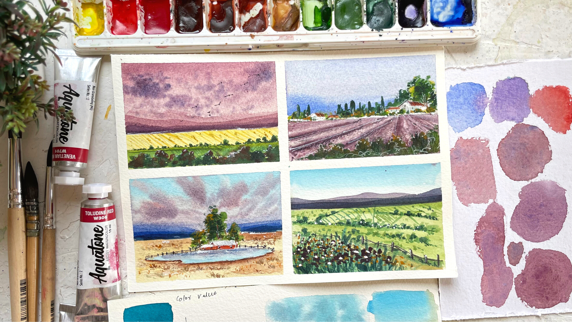
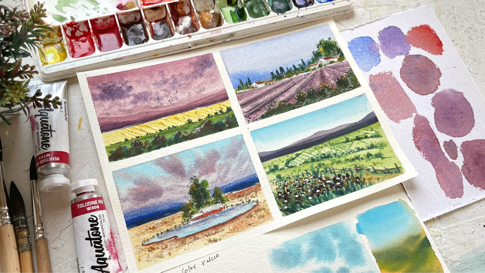
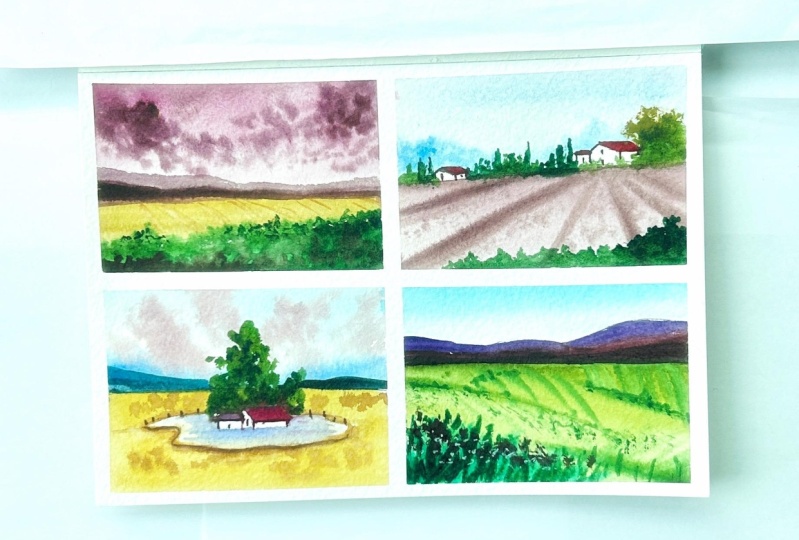
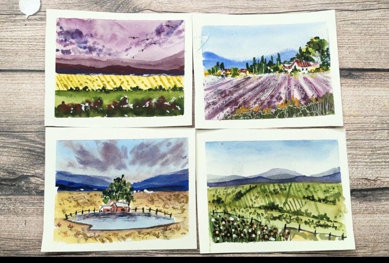
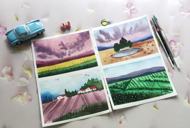
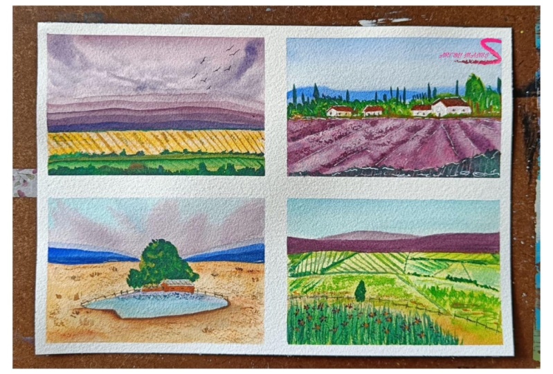
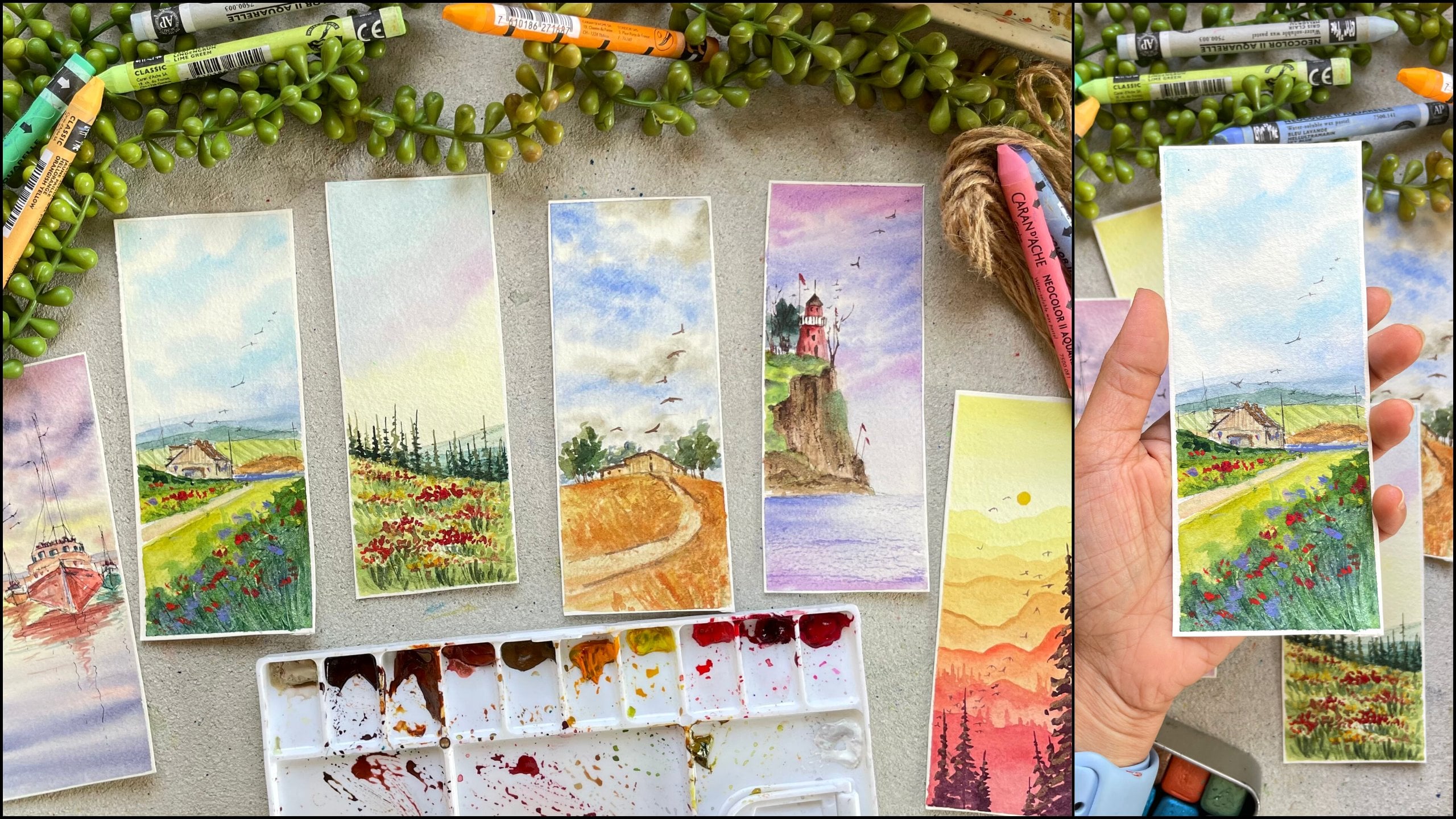
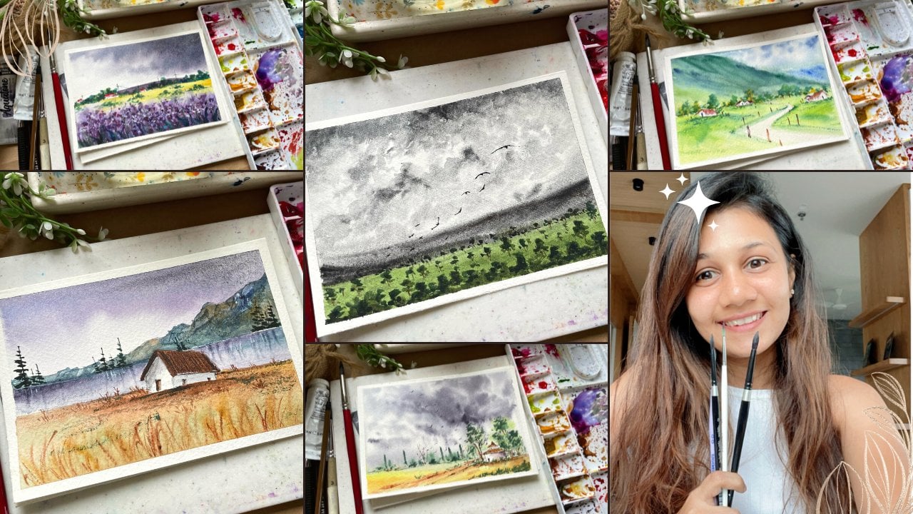
Powderly, step-by-step. By the end of the class, we will be painting for many landscape in
the collage form. In all of those for me, landscape really put into practice all of the
techniques which we have node don't want to muddy if you
auto-complete thickness. I will walk you through each and every step
throughout the class. Like always, we're
going to talk about the materials that we
believe in this class. We'll talk about the
basic tab is wanting it into practice in that
class project and then moving more on to non-ionic
and mixed One Carlos with the basic primaries that you will have
in your palate. Then we will move on to
sketching and painting. Each of our four ninths
give one by one. By the end of the class, we will have one
beautiful painting, but you can frame it and
put it on your board. I hope you're excited
for this class. By the end of the class, you'll be so confident with the basic techniques
that you will be able to pay any type of
subject with everyone. I am a full-time
artist and educator. I'm a YouTuber from India. You can check out all
of my progresses, all of my favorite games, all of my announcements, and all of my daily practices on Instagram under the landed
elite artistry over them. You can also check out my
produced which I've put every week on YouTube
to follow me there. Alright, that's it for now. I'm really looking forward
to see you all in the class.
2. Materials required : Hello, hello. Firstly, thank you for
joining the class and thank you for taking the
time to join my class. I promised it would be worth it. Alright, so before we start, let's talk about the
materials in this video. Like you can see,
we'll be creating for many landscape in an A5
size watercolor paper. And each of these painting would take you less
than 20 min to paint. We'll talk about techniques and everything in each
individual class project. So don't worry about that. First in this class, Let's talk about the
materials that we will need. First, let's talk about the Wei. Wei important thing
when you work with watercolor is the
people you are. I'll be using 100% cotton, 300 GSM cold pressed
watercolor paper. Now let me.
3. Basic Watercolor Techniques you should know : So before we move on to painting each of
our class project, Let's first learn a few of the techniques which
we'll be using a lot throughout our
individual class progenitor, which are very basic and
important to master. Then you work with watercolors. Alright, so let's
first study though color value to color value is basically how light
or dark the color is. The light value is a pale
and obey transparent color. And a dark value is
something which is very rich, deep, and opaque. And we get the value
in watercolors by just adding more
and less of water. You don't add any white color
to make your color lighter. You just have to add water to your color to make it lighter
and to make it darker, you just have to add
less and less of water. Alright, so let's just
do an experiment. So here I'm taking one color, this is turquoise
blue color and I will take away St. of this color. So I am taking that
color on my palette. You can see it has less of water because it is more of
a buttery consistency. That's how you know, it
has less of Bordeaux. And your, I will do a swatch
of that column first. Then I will keep on adding
or dropped or drop to drop. So portal with each
swatch and you will get lighter and lighter
shade of the same color. Like your let's add a
little bit of water. So I just took a
water on my brush. I mixed it on the same color. And I will swatch
just below that. With each swatch, we will add a drop of water to the same mix. You will see how the color
will get lighter and lighter. I'll be using this term
a lot in wiping thing. So I'll just say like I'm
using the lighter value of two green or I'm using a
lighter value of porpoise. And then next time
or maybe I would say I'm using a darker value. So basically that is the water and paint proportions that you have to understand. It's very simple. To make your color lighter. You have to add water and
to make your color darker. Or you want to increase the
intensity of the color, you just have to subtract the water or you have
to add less of water. That's all. It's very simple. You can see with each layer I'm, as I'm adding more and
more water to the paint, it's getting lighter
and lighter. And that's how you can
get a different range of the same color simply
by adding water. Isn't it? So good? I mean, I love this about watercolors. You just have to play
with your water to create different values
and different colors. Alright, so I'm just
writing it down. That is, if you want to make your candlelight to add water, if you want to make
your color darker, add lots of water. And I would suggest you to do this exercise with at
least two to three colors. And you will see how many different range of
colors you can get. So you'll see I've used
the same technique and this first project where we will create a different range of mountains using the
different values of the same thing I have used in
either two class projects. As you can see the way you, as well as I would highly
recommend you to try at least three to four colors
and see how many values you can get and
that you will also understand how much
water you need to add. Yeah, so do experiment before we start with
our class project. Now next let's learn how to
control water and paint, especially when you are
working with watercolors. I understand a lot of
beginners struggle with none. One is, you are not using
the right kind of people. If you're using the
right kind of people, it would be a lot more easier, like I said before. Second is maybe you are applying a lot of
water to your people. You see I've applied
a way even layer of water on my paper. Next is, let's study how you can control the paint on the paper. Now, you see I loaded my
brush with a lot of paint and the brush has lot of
water and paint on it. You can see that. Now what I'll do is I will apply that color on the paper
and you will see it will create a bloom and you would definitely won't be
able to control that. So whatever the consistency of the paint, it doesn't matter. You just load your
brush with paint, remove all the excess on
the edge of the palate. Then again remove the excess on the tissue and then
apply it on the paper. And you will see that the colors won't spread
a lot on to your people. And it would be much more
easier for you to control. Now what I'll do is, I'll repeat the
same thing for you. That is, load your
brush with paint, then remove the excess on
the edge of the eyelid as well as on the tissue and
then apply it on people. You can use a synthetic brush for doing this wet
on wet technique. It would be best
because anyways, that brush doesn't
load a lot of paint on it rather than using
a natural hair brush. So it's very simple. First three things which
you have to keep in mind is forced apply even coat
of water on the paper. Second is whenever you load
your brush with paint, remove the excess on the edge of the palate as well as on the tissue and then
apply it on the paper. Is using the right
kind of people because that would
help you a lot. Not anything. Alright. So easy. Tried to experimented and tried
to do it on a rough paper before you move on to
the final painting. Alright, now, the next
thing which we'll be learning is using the
minimum brush strokes to create your work. Remember when your job bill
brush a lot on the paper, when you try mixing a color, the colors get muddy, patchy and it just loses its
intensity and the freshness. So yeah, let's see
how you can do it. So you will be using
wet on wet technique. You'll see I read it though people with even layer
of water and then I applied yellow color on it by
just three to four strokes. Next I will take the sap
green color on my brush. Again, I will do the
same thing that is, I will apply that
color and few strokes and I will leave
it at their eyes, my color and painters, and the paper is wet. It will blend with each other, creating a beautiful effect. And I want her up my brush
to blend it with each other. Same thing I will repeat. I will take even more
darker green color and apply it on top and inhibit NADH dropping my brush As well as touching
a lot of my brush, but the brush on
the people next, taking the blue color
and I just feel the same upper part with
two to three strokes. That's all. Now, let's see what
happens when you rub your brush a lot on the April. So I will show you
that as well so that you can see the difference between the two paintings. Alright, so let's
repeat the same step. Let's first with the people
with even layer of water. Once you have applied the
water onto the paper, I will take the same colors so that you can see
the difference. So here I'm taking yellow, orange color and
I've applied it on the bottom part and you see I'm rubbing my brush
making new color even. And then I will take the
sap green color and again, I will blend the
colors together. Next I will take the
darker green color. And again, I will mix it. You see the whole of the
yellow color which you had applied earlier has almost gone. The sap green color which
you applied earlier is also gone because you mix a darker green
color on top of it. And the painting, or that
portion looks a lot darker. And the best part about watercolor is the lightness
and the light fastness, which you can get by just
using less and less of brush strokes and just leaving the color and paint to
do their own magic. That's all right, so you can totally see the
difference between the two. And this is the fun thing
which will be applying on lot while doing all of
our class projects. That is using the
minimum brushstrokes. I know it would be very tempting to mix your colors and do it. But believe me, we all
gonna add to that and we're going to use less and less of brush strokes while doing it. Alright. Next, let's learn the
dry brush technique. This technique we'll
be using to create a little bit of texture
onto our painting. I'll take the right
color on my brush. And then I will remove
all the x's on my tissue. And I will just drag my
brush onto the paper. And you will see
that it will create this texture on the
paper too. Now. This lecture is much more
easier when you are using cold press paper because already your paper have a
little bit of texture. And remember to use vein dry paint that is doing a lot of water
to your paint. Load your brush with color, remove all the excess owned or tissue and then simply just add, though, simply just rub
your brush on the paper. So your brush on the
paper boat has to be dry while doing this
technique. That's all. It's a very easy technique. Just try it on a
rough paper and I think it would be able
to achieve it very easy. Now, next, let's learn
how to blend the edges. When you are working with
wet on dry technique. So first I will draw or
tiny little mountain. And what I'll do is you'll see that the edge is
looking very sharp and it doesn't look pleasing
more almost all of the time. So let's blend this. So I'm cleaning off
my brush with water and dabbing off the excess
water on the tissue. And you see my brush
is a little bit damp and I'm dropping my brush, **** brush on the edges of
that mountain. And that's all. You're going to repeat this step by cleaning off your brush, removing the excess water from the brush onto the tissue
paper and redoing it. But make sure that you are doing it way softly and very gently. So let me repeat the step
one more time so that, you know, I first applied
color onto the paper. Now I've cleaned my brush, remove the excess water
from my brush onto the tissue and
gently rubbing it on the edges of the
mountain and you see it is way easily
getting blended. Make sure that you do it faster. The color has to be wet if it dries off than it would be
impossible for you to do that. So all you have to do is
while the paper is still wet, just use the damp
brush along the edges and you would be able to
achieve the softer edge. Alright, so knees are
important techniques which you will need to study before you move on to
the class project. They started to
techniques which we will directly do it and learn while
we do our class projects. But make sure you
experiment and you practice these techniques Powderly to get the best of
the best results. When you are working with
oil for class projects. If you have any doubts regarding anything
or any technique, feel free to drop a question on the discussion
section of the class. I would be happy to help you. So basically we learned
five techniques. First one was the color value. Second one was how to control your paint and water
onto the paper. And we will be using
this technique to paint the sky for two
of our class project. The first one and the third one, like you see the weaker. So make sure to practice this because this isn't
easy as it sounds. It would be a little bit
tricky when you do it, right? And yeah, so that's all
with all the techniques. I will see you guys in
the next class where we will study how to create
our own pink purple color.
4. How to mix your own pink purple color : Alright, so before we move on to those sketching
and painting part, let's study how you can
mix your own color. So there is one color that
is the cosmic pink color, which I'll be using in all
of our four mini landscape. I want it to select one color, which I'll be using
in all four of our paintings to make
it look like a collage. When you use one
color or you create a little bit of
similarity between the, each painting, it to look a lot more complete
and beautiful. That's the reason I wanted a color harmony happening
in all of our collage. And this is the
color which I'll be using throughout the painting. I understand not everyone would have this color on the palette. So let's study how you can mix this color with
the basic colors. This color I've already squeezed out alerted
on my palette. Let me just move my
water a little bit and put the palate ends so
that you know what I'm doing. Now I'm just taking
one random brush and I will swatch this
Carlo forced for you on. When you swatch, you
will see that it is a very pink purple color. It isn't hard thing. It is not even proper. It is in-between that, but it is a little bit duller. And you know a basic
rule when you want to create a dipole fill color, you will have to use
two warm colors. That is warm red and
warm blue, right? So for this part, swatch, what I'll
do is I will take a warm red which is
there on my palette. This is permanent, drew it. But if you don't have this, you can use vermilion, red bar low read any
bright warm color, and did the same mix. I will add ultramarine
violet color, which I already
have in my palette. I always watch it down for you. When I switched, I think
it is more on the side. So I will dig a little bit
of more permanent red to the same mix and adjust
that color a little bit. And I was watching
it side-by-side. And you will see
that you will get most similar looking
color. Don't you think? You would obviously have to
adjust the pallor auditable? You will have to swatch
the color and see what that color leans
more towards. Like, why? Like we forced March, it was more to the purple side. But once we added a
little bit of red to it, we got the similar looking. But now, let's suppose you don't have ultramarine
violet in your palette. So what to do? So let's mix
it with ultramarine. Boil it. I'm taking this same
Permanent red color and instead of ultramarine violet, we'll just use
ultramarine blue color to it and use your I'm just
adjusting the color again, the blue cord a little bit more. So I'm adding a little bit
of red and blue to it. And now I will swatch
that color for you. You will see it looking
so **** similar. Right? So this is how you can mix
your own cosmic pink color. And as you are adding a little
bit of ultramarine to it, it will granulate and it, and it will give you
a beautiful effect. Anyways, they'll cosmic thing, original color is also
granulating Godot. And you can create your
own granulating color by mixing a little bit of ultramarine
to your permanent red. You can use permanent red mixed with your
ultramarine violet. Just do things which you
have to keep in mind is you have to take
to warms color, that is the warm blue and a warm red to create
these kind of. Now, I just wanted
to individual and color that is the right
color which I use. This is the permanent red. Like I said, you can use vermilion or low
red, scarlet lake. Any warm red color if you don't have this red in your path. I'll just show you the close up next time is
watching ultramarine violet. This is also a
warm purple color. And lastly, I will swatch ultramarine blue in case you
don't have ultramarine blue, you can use cobalt blue to mix your own
cosmic bank column. Alright. So this was all about mixing your
own cosmic pink color. In the next video, we will start sketching
our four landscapes. And then we will
move on to painting. Each one individually in
the coming class, right? Yeah, that's about it for this video and I'll see
you in the next class.
5. Sketching of all 4 landscapes: Alright, so let's get started. So before we move on to
sketching each of our landscape, we were forced to apply the masking tape on all
four sides of the paper. And we will divide the paper
into four equal parts. As you know, we are ending on
an A5 size people so forth. We will apply masking
tape on all the edges. Then we will use those
smaller masking tape to divide it into
four equal parts. Each part we will paint the
front and landscape. Alright? So this is what I've
done in the past. I really like the idea
of creating the collage and then just framing
this into your theme. But if you want to create
a small four paintings, then you can always cut
the paper into four parts. And then you can paint, or you can paint all
four into one page, like you can see it. So it's all up to you. And if you are not able
to decide what to do, what you can do is just
painted on a one page and then you always have
an option of cutting it into four parts
with Jocelyn Zoe's, but you won't have an
option to join it. So yeah. Alright, so that is
what we will be doing. Now, let's start by applying masking tape on all four sides. Remember to use
the right kind of people so that whenever you
pull off your masking tape, it doesn't tear off? I have I've been asked so many times like why doesn't
your paper tear off? Why you remove
your masking tape? And this doesn't happen with me. That there are many
reasons for that, but one of the most
frequent reason is that they don't use
the right kind of people. Like if you use the
printable paper or any local watercolor paper or the drawing book people which are available in the market, there are high
chances that when you remove the masking tape, it will tear off. Raising. The second is the masking
tape which you are using has a very
high amount of blue. So what you can do
is you can apply the masking tape on a piece
of cloth or a table once, remove it, reapply it
on the table and then remove it and then apply
it onto the paper. That way, you will
loosen up the glue. And when you are removing
the masking pain, it would be a lot more easier. The third thing which
you can do is you can use a hairdryer to remove the masking tape so that the glue melts a little and
it would be a lot easier. Alright, so these are the tips, but the masking game. Now what I've done
is I've applied the masking tape
on all four sides. And if you see I've used almost more or less
the same thickness of the Let him asking gave which
will be applying in the middle of the people. I've used the same amount of thickness around the edges of the people that they're equal amount of white
gaps or their own yard. I'm just eyeballing
it, the measurement. But if you want, you can
always use your scans to measure and then apply the
masking tape and the murder. One thing you have
to keep in mind is you have to
totally press down your masking so that there's no gap between the people
and the masking Lin. Alright, so that's
what I've done. Now, let's move on to
the sketching part. So the sketching of all for
landscape is based and force. What I'll do is for
this landscape, I will divide the paper into two part by creating
the horizon line, and I will start
painting the small, small mountains on the top. Lastly, I will draw
one more line, just below the
horizon line and fuel grasses in the foreground. That's all I think
we will be doing, everything else but our colors. And remember to draw
everything like that. Tell Mark doesn't show
up when you paint. I'm drawing it a little bit darker so that you all can see. But I would suggest you
to use a weigh like pond or very light pencil
to do your sketching. Alright, so that's all with the sketching part
for the first one. Now, let's move on
to the second one. You can always pause your video. Once I'm done sketching and you can sketch out one-by-one. But while I'm sketching,
please don't sketch. Otherwise you will end up
making the mistake, right? So yeah, I like always we will first draw
the horizon line. And then we will start painting
the top and the bottom. So I'm redrawing
the horizon line because I felt that
it wasn't the street. Like I wanted it to be. The best thing is you can
always erase and redraw a word. Like me as an artist
who left and working, sends a lot of yours, even I'm income mistake and erasing and redoing
it as not ashamed. So never be guilty of doing
anything multiple times. The more you do, the
more you will learn. And that's what is the
most important thing. When you are drawing it lighter, you can always erase it off. And doing that though, people would also
not be damaged. So once I've drawn
the horizon line, I choose three tiny
little houses. And then I am drawing a little bushes below the houses and few
trees on the top. Now in this one we
will be drawing one point perspective to
draw our lavender field. So I will create one point on just below the largest
how's that we painted? And joining that point, we will draw all the
lines in the foreground, but like you see you. So if you will connect
all those lines, it will meet at that point. And that is the whole point
of one-point perspective. That's how you paint the
lavender field, right? It's way simple. You can use your skills
to draw the lines, but as we're painting on a base, more people doing it freehand, it won't be an issue. Okay. That's all but the sketching. Now, let's move on
to the third one. In this one we will draw a tiny little house
just above the league. In the background, we will draw multiple
layers of mountain. So like always, let's divide
people into du by dy, by drawing the horizon line. Once you have drawn
the horizon line, we will start sketching
the mountains. You can roughly do it even
if you don't want to do it, that's also totally fine. You can always do it
with your paint if you are more confident doing that, but I will draw it
so that you get an idea of what it
would look like. Alright? So then we will draw a round and a kind of an oval shape
that would be a lake. And then we will draw a tiny little house
on top of falling. In this landscape. We will learn how to paint those reflection of
the sky onto the leg. Along with that, we
will learn how to create Leo's of mountains
in the background. All right, so get excited. I've drawn two tiny houses. And on the top of
that I will draw a huge tree behind that. And surrounding the houses
would be the fences. I think I'm almost done. I'm just darkening it a little so that you'll know
what I've done. Now. Let's move on to
the last landscape. So in this landscape
we will focus more on the line area and
let's go in the sky. So we will divide the paper
in a way where we are leaving only one-third part for this guy and two-thirds
for the land. Once we have divided the line or the paper into two parts, Let's move on to
adding the details. So first I will draw one tiny little mountain
on the horizon line. Then I will draw a slant
line in the foreground part. This would be the road leading. Woods though, left-hand side, and land which is on the
right-hand side of the road, would be covered with this
tiny, tiny agriculture fields. So I will divide those lines
into unequal parts by just drawing the lines around the lines I redraw or
tiny little bushes. That's all. The sketching is very simple. Like I said, you can always
pause the video and do it. In the lastly, in
the foreground part, I will add tall, tall version so that we will get the perspective from where we
are watching on landscape. Right? So that's all with
the all four landscapes. Now, one-by-one, we will start painting in coming
videos, right? Yeah, grab all your colors, two jars of water and brushes. And let's move on to the
painting part in the next video. I'll see you there.
6. Moody Sky Painting: Alright, so let's start
with our wafers landscape. We have already sketched out the landscape now it's
time to paint them. So as always, we will start from top and then we will
move our way downwards. So before we start, we will be doing wet
on wet technique. So let's first apply even layer of clean water onto the sky, even if the color flows a little bit down
towards the mountain, that is fine because we'll be painting the mountains
with the same Carlo. Alright, so once we
have added the idea, let the whole world is talking. And while that is happening, let's prepare our colors. You are, I'll be using my chromic thing color
to paint the sky. If you don't know how to paint
or how to make this color, you can always watch the earlier video where
I've taught you how you can mix your own cosmic
pink color. Alright? I'm diluting the color a lot. And I'm using a
very light value to paint the sky and I'm applying an even
worse off that color. You'll see I'm just rubbing
my brush left and right, and I'm slowly moving
my brush downwards. Once I've applied
the lighter value, I darken it by adding
a little more pigment and using the same color on the top to make
the top darker. And as you move downwards
it will get lighter. And that is the gradient
effect that we created. Now, I'm mixing a little
bit of ultramarine blue to my same cosmic pink color
to make it a little darker, switching onto my smaller brush. And I'm loading my brush
with that dark purple color, like I said before, tap off the excess
color on the tissue and then start
painting the clouds. You see the clouds would
be larger on those sites. And as they come towards
the horizon line, it will get smaller and smaller. And that is what we
will be painting. Right? So hold your brush
way far away from the tip so that you would get as
loose strokes as you can. And that would look much
more natural, right? So I'm just painting the clouds as we are
painting wet-on-wet. That is, the sky is
completely well. Remember, like we thought or like we studied in
our techniques section, that is remove the excess paint on the tissue and
then started applying it on paper so that you have
full control on the paint. Next, I added a little
bit of more ultramarine blue to the same mix
to make it even taco. And I, applying
that paint just at the bottom of all the clouds to create a little bit of shadow. Now I'm taking the
cosmic pink color and I just darkened
stopped because I felt like the color
just lost its vibrancy. Right? Yeah. Now I'm taking the same ultramarine blue
and cosmic pink color to create the darker
purple color. And applying those
same color just below the clouds to make a
little bit mood darker. Now once it has completely dry, Let's move on to
painting the mountains, which are on the horizon line. So first we will start
with the way light value of again,
cosmic thing, color. To paint our first mountain. I'm diluting the color by
adding a little bit of water. And I will paint the first
mountain. With that. I will apply evenly or all
throughout the mountain area. And then I would clean off my brush completely
dab off the excess. And I will blend few edges of the mountains to make it
look like those edges are blended with the sky and
to create the effect of soft, foggy sky. Once we have the first
layer of mountain, we will dry that off
with the hairdryer. And I will paint the second layer of mountain
using the same cosmic thing. But this time I will add
less of water to it, and I will paint the second
layer of the mountain. Now if you are not sure
how low color swatch, you can always watch that color on the roof sheet of paper. That way you will get an idea if the color is darker
from the foods clear. I have been paintings
into long time. So looking at the
consistency of the paint, I can easily figure
out the value. But I'm sure that you won't be able to do it
if Cuba working with watercolor is pretty
recently than I would highly suggest you to swatch
with each layer so that you don't end
up making the mistake. The bike, there will be no
difference between the Leo's of mountain and
you would be able to see just one plane mountain. Okay, now let's move on
to the third mountains. This time, I added a
little bit more of ultramarine blue to the
same cosmic pink color. And we will be painting another layer of mountain
using that same color. Now it's time to dry off all the lilies and being
the last layer of mountain. And to make the color darker, I will again add a
little bit of mood, ultramarine blue to my
same cosmic thank Carlos. And teal color is ready. Let's paint the way last
layer of the mountain. Remember to paint each mountain a little bit lower to the
earlier mountain so that you can see all the four
different views of mountain once they
are all dried off. Alright. So yeah, fun. Stone Mountain is dry. Let's move on to
the bottom part. So I'm taking though Indian yellow or the dark
cadmium yellow color, which will be there
in your palette. There's a warm yellow color. I will think that
color dilute it by adding a little bit of water. And I will paint
and evenly or off that color onto the
foreground part. Once I've applied
the evenly or I will take the same
color and I will add a little bit of
that color urine there to create a little bit of
dimension to our painting. Otherwise, the whole
area would look flat. I'm taking the same color and I'm applying it on top as well as you can use yellow ocher as well if you
don't have this column, but I'm sure you will have a warm yellow color
in your palette. Now when that layer is drying, let's prepare our green. So I'm taking the sap green
color and to the same mix, I will add the yellow
which we used earlier. You will see that the color
would look very bright. I want to tell the color
under the bed so we will use the contrasting color
that is too red or orange. I will take a little bit of the permanent red
colored chest alerted. And I will blend it with the
green, which when mixed. But you'll see that these
saturated the color a lot. So I will again add
a little bit of sap green to the same mix. And I will also add
a little bit of yellow to make it a little lighter because right now
it's looking way too dark. I'm pretty happy with how How beautiful than olive green
color has done note, we will start painting
using the same color. So then almost a yellow
would have dried out. If not, then please use the hairdryer or
wait for that layer to dry before you move on
to painting the green. So I just applied those
straight line on the top. Then I cleaned off
my brush completely. And I'm just using
the little bit of water and the damp brush to pull that color down because I want the top to be
a little darker. And as you move downward to
get it lighter, lighter. Alright. Once you have
applied the green color, let it completely dry. While that is drying, we will move on to adding more details
on the yellow part. So I will switch to the smaller
brush that is size zero, size one, whichever you have. And I will take the yellow
ocher color on my brush, and I will start drawing
those lines which we have painted earlier
using that color. So I added a little bit
of yellow as well to my yellow ocher diluted a
little bit by adding more dark. And I'm painting those
lines using that color. But my smallest brush tasty. As we want those
lines to be tunnel, you will be using those
smallest size you have. Then I will switch to
my size two brush. And we will start painting
the tiny, tiny little bushes. But before we do that, we will change our green
and make it little darker by adding a little
bit of portion fluid. So you're going
to add potion to, you can add indigo, you can add a little
bit of ultramarine. All. You can also add a
little bit of sap green to the same mix to make
the color more darker. I will draw a tiny little
line on the line, the area. Then I will use the
damp brush to blend all the harsh edges
to our background. Then we will start
painting though tiny little bushes
with the same color. Painting Bush's is very simple. All you have to do is
tap, tap, tap motion. Switch to your smaller brush if you want being
smaller bushes. And if you want to be
in larger brushes, switch to your bigger brush to get those smaller
and larger strokes. I'm using those smaller
brush size tool to paint those tiny little bushes with the same color that
we mixed earlier. So this is just the first layer of push that via painting. Once we have painted
the first video, we will let it dry and
then we will paint on top of it with a little
bit of darker color to create a little bit of
depth in our bushes, right? So to make the color darker, I just use a little bit
of more blue to it. And then I will paint another layer on those same
bushes with the same brush. Again. Remember when you are doing the layering
technique not to cover the underneath layer completely advice There's
no point in there then. As you cannot see
the different Leo's. Now we will be repeating
those same steps, but this time we will draw bigger brushes in
the foreground part. And I'll be using
the same brush, but this time I will create
more larger strokes and I'm using the same green color
to create those wishes. Once we have applied the
first layer of pushes, it will add a little
bit more bushing due to the same green mix and add that darker green color
on top of those pushes. These are all the small, small techniques of layering
which will add a lot of depth and beauty
do your landscape. So don't skip on these steps. Now what we do is we will take the permanent red color
directly on our brush and start adding that color just at the top of our bushes. And if you feel like the
color is not blending, then you can use your
fingers to blend. Like I'm doing right here. Next we'll paint this one, small bushes on the yellow part, but as though that area is get Luby won't
use the green color, we will use the yellow. I believe I used that color
by adding a little bit of water and paint to
tiny little bushes. Bushes are way far away
from all viewpoints. So all you have to
do is create small, small dots that would
make it look like there are some kinds of trees
or bushes on that. Yeah. That's all. No, I actually wanted
to add one more layer of mountain in the background. So you would already know where you have to
do if you wanted to add one more mountain that is create one more darker shade of purple. So you're like We take a mold of ultramarine blue and
less of cosmic pain. And I will paint one more layer of mountains using
my smaller brush because now we have to
eat away small mountain. So make sure that you choose
smaller brush to do that. Now we will draw a few lines
in the foreground part, like we did earlier. Lastly, let's add few
birds in the sky. So I'm taking a waterproof
smaller nib pen and we will paint a
few birds in the sky. So painting boards
is very simple. You just have to draw a V shape and draw a tiny
little.in the middle. Now change the size of the V-shape and little
bit of shape of the beak. And that way you will get
different shapes of the book. And that's all with
this landscape. We learned a lot of techniques. I hope you enjoy it and now it's time for you to paint this one. And I'll see you guys
in the next video where we will start
painting the second lines. Q.
7. Lavender Field Painting : So let's start with
a second landscape. In the last video, we studied how to paint the sky using wet
on wet technique. How to paint the
clouds using wet on wet technique
for the mountains, we did wet on dry. So in this video or
in this landscape, we will study how to paint the sky using the wet
on wet technique, as well as how to paint the background mountains using the same but on wet technique. So in short, we will be painting the sky and the
mountain together. Now, let's see how
we can achieve that and how we can differentiate
the sky from the mountain. Alright, so I'm hoping
you're excited. So let's get started
as all things, we will start from the
top and we will move it, move away downwards. So we'll be using ultramarine
blue to paint the sky. But if you don't have ultramarine
blue in your palette, you can use cobalt blue
or even a Chrome blue, any bright blue color, but I'm sure you will have
ultramarine in your palette. You can even use civilian blue in case you don't
have ultramarine. Alright? So changing the
colors a little bit, urine there wouldn't matter. Because we are painting a landscape we own or
thinking something realistic. That is totally fine. Okay, so now lets the area like the sky and the mountain
leaving the houses on Dutch and apply even layer
of water on that part. Then I will take a value
of ultramarine blue. On my brush. I will add a little bit
of water because I don't want the sky to be weighed dog. I want it to be the lighter. And as we paint the
mountains on the top, we will paint them
a little darker. So I will apply even wash of ultramarine blue onto the sky. Don't worry, encase
the color goes into the houses but be careful
that it doesn't increase. It does just dig or clean
tissue paper and dab it off. And you will see while
the colour is wet, it will be easier for you
to lift off that paint. Now, I will take the
same ultramarine blue. But this time I will take it in a darker value that
is less of water. And I will paint the mountain. Again. Remember to control though, water and paint
onto the wet paper. What do you have to do
is take your brush, load your brush with paint, dab off the excess on the issue. I remove the excess
on the palette and then apply it on the
paper that we use C, I can literally see the
shape of the mountain forming and those colors are
not blending with the sky. Alright, so that is why
you have to dab off the excess paint from the
brush and then do it. And remember your paper
has to be evenly wet and there shouldn't be
puddles forming onto the, alright, so I'm repeating
the same steps. But this time I will take
even dark ultramarine blue and I will paint that
on the top of that mountain. You see the color looks
bright right now, but once it dries, it would get a lot lighter. That's the reason I'm painting one more mountain with the
same ultramarine blue, but using a darker value. And that's all. Be careful around the houses in case you end up getting
the color on the house, just take the team
tissue and Albert off. Alright. So that's how you paint mountains or any
subject wet on, wet. So why is the sky is drying? Let's move on to painting
though lavender. So we will be again using the same wet on wet technique to paint the lavender really because we want obeyed loose floral field,
corner landscape. So again, I just took the
clean water and applied even layer of clean water
on the flower field area. Now, I'm taking those same
cosmic pink color on my brush. You remember I told
you that I'll be using this color
at least once in all of my landscape to
play it a little bit of color harmony in hello
for, for landscape. And obviously it is
a pink purple color. So that is the best way to
use this color is to use it. Right? So I took away light value of cosmic pink color and I applied an even layer of that
color on my paper. Now I will take the same
color and I will start drawing the lines which we have already drawn
with the pencil. So I will take a darker
value of the scene Carlo, switch to those smaller brush, and I will start applying
that pink on those lines. I will also add a little bit of ultramarine to make
it a little darker. And I will take away thick consistency of paint and you will see
that the classes. Consistency of Maine would spread a little
less on the people. But remember to always
dab off the excess from the brush onto the tissue
paper or onto your palette. But if you are pretty confident that it wouldn't
spread or if you're confident that you would
be able to control in case if the colors
flows everywhere, then you can do that. Then you can avoid dabbing
off the excess paint, but don't be a little
overconfident. Either use a synthetic brush or use a smaller brush
that would anyways, we'll look less paint
onto the brush. And that way you'll be able to control the paint and
water onto the paper. Because I'm telling you to
not to be over-confident is because you cannot really
do anything in watercolors. Once it is done, it is done. It is very difficult to
rectify all of those mistakes and why you're putting a
lot of efforts in painting. Why just to spoil
doing something which you already know would
end up making a lot of mess. So go with the techniques
which are being told. All of those are
being experimented. And I've learned all
of those techniques doing a lot of
mistakes in the past. And these techniques are all
being tested and try it. So believe me, follow what
I'm saying and you will get the best of the
best results hundred. Okay? Now it's time to add plateaus, but before we add
these plateaus, it's time to cover the other
parts of our painting. Otherwise, you will end up getting florals,
plateaus everywhere. And this time we are doing
is plateaus wet on wet. That is the base
of our painting. Brett. And I am taking the mix of
cosmic pink and purple color, which was on my palette. And I'm taking a
smaller brush size to loading my brush with paint, dabbing off with
the unimodal hand. But you can use either
a brush or a pencil, anything to dab the brush. And you will see that though, drops of colors boiled all
onto the paper and it will start to blue monitors because the underneath
color is still wet. And that is the exact
effect which we want. You will get the softer edges of older droplets on
the edges and it would spread onto though people. So I'm doing the same thing
with different colors. Either I'll add a little
bit of more pulpal or mode of ultramarine
blue to make it darker. Or I'll add a little bit of more water to dilute the color. And we will add a lot of splatters using all
these different shades of purple to create a little bit of more contrast and depth in our lavender field. Alright, now while that
pushing is drying, let's move on to painting the foreground part or
the horizon line part. Now, first we will start painting the bushes
around the houses. So we will start with
the lighter colors. So you are, I'm digging
Hansa yellow or cadmium yellow,
funny warm yellow. And I will start painting the bushes with
the smaller brush. You already know how
to paint the bush. You just have to do that app, that blood motion with
your brush and that soil. So I started with
a lighter color, that is the yellow
because I wanted to lay those same with the
darker color on top. But first I will apply the
color that is the yellow, and then I will start applying the green color on top of it. You are, I'm digging those sap green color directly
from my pen and I will use the same color on our
trees as well as the bushes. As the underneath color already has a little
bit of yellow. Sap Green would automatically be diluted when we
paint on top of it. So there's no need to add
anything to us that green. Right? Next, I'm digging
permanent orange and I'm mixing a little bit of
buoyancy and undo it. And we will start painting the roof of our house
using that color. I'm mixing a little bit of
permanent orange because I want those moves to be a
little bit more brighter. But if you want, you can directly use the Tiana or you can use the
permanent orange directly. All right, So that's okay. You can paint the roof of the house with any
of those colors. Next time thinking though, sap green color and I'll
add a little bit of blue to red to make
it a little darker. And then I will start painting one more layer on the bush with the
darker green. Hello. I'd also add a few more
bushes behind the house. That way it can be
differentiated from the mountain and the roof of the house
would be more to your right. Now I will add a little bit
of more blue into my scene, sap green color to
make it even darker. We will start painting the
trees using dark green value. To make your landscape
more interesting. What you can do
this, you can change the size of the trees
which you are painting. Like. You can make some trees some more thicker and
some more thinner. Why? Some shorter? That way it will create a lot of dimension in your painting, making it look much more
natural, uninteresting. Alright? So we are done
with the horizon line. All you have to do with paint or add a little bit of
more details to the house. So I took the
permanent orange color and I started painting
fuel lines on those rules because the color which we applied earlier was looking
way too light. Now I'm making no purple color, which is already
there on my ballot. In case you don't
have to fill color, you can mix your red and blue in equal proportions to
get the opaque shade. And I'm diluting it way
by adding Laura photos. So it hardly has 10% of
paint and 90% is all water. I just painted a
way that you did color of purple on my house. Next, let's paint a
few dry brush strokes are not allowing 2 ft. So I'm taking the cosmic
being color on my palette, dabbing off the
excess on the tissue. My foreground part, that is the lavender field
part, has already dried. So once I load my
brush with bean, remove the excess on
the tissue and I'm just rubbing the brush
on the dry paper. And you will see
that it will create a beautiful texture
on the people. Now it's time to paint
a huge Bruce bushes and no full-grown
bond that will go, go from the right and as
you go towards the left, it will go thinner and
thinner and smaller. So I'm taking the sap green and I'm painting the bushes first
layer using that color. You can totally skip this step
if you don't want to paint the bush in the foreground
and if you want to hold off the ground to be
filled with love Windows mean, that is also fine
that it was already looking down beautifully,
but engaging. Want to add one more element, then you can do that. But it is completely optional and I would
leave that up to you. Trade. Once the sap green
layer was done, I reapplied the darker
green color on top of it. Now what I'll do is I'll take a brush back and you
see it's way pointer. And I will start painting few strokes on cheese which we have been
paid on the back. And you will see
in the area where we applied that stroke, the color would lift off, creating the highlights
on the people. This will only happen when
your paper is semi red. If it has completely dried, then you won't be able
to get this effect. You can use your Credit card. You can use a scale
or a palette knife, anything, or even all Carter
to do this technique. Wondering, now I'm taking
the orange yellow color. I will apply it,
it on the top of the bush and I will
blend it with my finger. You remember we did
the red color of permanent red color
in our last video. The same thing they will
be doing this time, but this time we'll be
using yellow, orange color. To do that. You don't
have this color. You can add a little bit
of permanent rate to your warm yellow and you
will get the similar shade. Next, I'm taking the
pines gray color. You can use black or
any downhill Carlo on my smaller brush and
I will start adding the dose and the Windows
using this column. You can also use
ultramarine blue or blue or even cobalt blue to add a little doors and windows. It will look beautiful as well. So we are almost done with our lavender field, many
landscape painting. It's time to add
some final things. So let's add the trunk
of the tree using the blend sienna color. Yeah, you just have to draw the lines to create
the trunk of the tree. It's looking so beautiful. The only thing is missing is
a little bit of highlight, which we can later add with
our Jelly Roll white pen, or even ordered a bit of
white gouache device. The landscape is looking
so beautiful and we learn so many techniques throughout
this mini landscape. We learn how to paint those background glory mountains using the wet on wet technique. We learned how to
create a loose kind of light lavender field
in the foreground. We also learned how
beautiful effect we get when we paint those plateaus using
the wet on wet technique. Next, we also learn how to paint those bushes using the
different layering technique. Now what I'm doing right
here is the yellow which we painted has almost
gone invisible. So I'm taking the
yellow orange color which is there on my palette, and I added a little bit of
that on top of the green. Remember when you are adding a lighter value on
top of the darker, you will have to use a very thick consistency
of paint that is almost 90 to 95% of pigment and just five
per cent of vaudeville. And that way you will be
able to paint on top of it. Alright. Now I'm just redoing those same dry brush strokes
using the dark black color, but I've added a little
bit of purple to it to make it a
dark purple color. Right now I'm taking my hairdryer and
drying off completely. Next, I will take the
white Jelly Roll pen and I will start adding few highlight where the bushes is meeting though
lavender field. That way we'll be able
to differentiate. Otherwise, the whole
area is looking very dark and I will add few more lines and
highlights urine there. That's all we are
done with this one. I hope you enjoyed and I
hope you'll learn the Lord. Remember you won't
be able to know how much you learn until
you put it into practice. You will have to paint
all of these landscape to understand how
much you have grown. So please, please, please do
all of the class projects. Whenever you get the time
you see this painting, hardly the extra
minutes to paint. So yeah, do it and do share it in the project
section of the class. I would be happy to help you in case if you have any
inquiries or anything. Yeah, that's all with this one. Let it completely
dry and then we will move on to the third one. I'll see you in the next class.
8. Cottage by the Lake Painting : Let's start with our
third lines game. I'm so happy that
you all reach tenure and you are still learning
and excited to learn. In this video, we'll learn how to paint or different kinds of clouds in the sky using the
same wet on wet technique. And we will also learn
how you can create the reflection of
the sky on the link. All right, let's not waste any time and
let's get started. So I started by applying even
layer of water on the sky, but once we have applied
the even layer of auto, I'll take them suddenly and
blue color on my brush. Again, if you don't have several into color in your palette, you can use Chrome blue color. It is a way light,
bright blue color, which I'm sure you will have in your palette in case
you don't have this, you can use ultramarine or even cobalt blue
to paint the sky. So we'll paint the sky with
even layer of blue column. Next, I don't want this
guy to be off to seem. So. What I'll do is I'm lifting off some of the colors
with my damp brush. Once I've lifted off the color, I'm using the
cosmic pink colored just at the bottom of my sky. So I took those same color, diluted a little by
adding a lot of Bordeaux, and I applied it
just at the bottom, and I blended all of
those too close together. Next I'm taking the
same cosmic pink color, but this time I'm
taking a darker value. I'm adding a little
bit of permanent red, same cosmic pink color. And then we will start
painting clouds on this guy. Won't obey, lose kind of clouds. I will hold my brush a little
far away from the tip and start painting the
lines on our sky. I replay this Purdue from the top angle as well so that
you know what I've done. Another note I wanted to
share with you something. So when you observe how I'm doing or how
I'm holding my brush, how I'm moving my brush. As my paint consistency, you would be learning so much, especially in this art. Believe me, or all of things are being logged by just
and just observing. I'm telling you this because I have watched so many tutorials, which are not even in English, which are in some way
different language. I don't understand
what they're speaking. But by just observing or like, how are they doing?
What are they doing? I was able to easily paint those subject which
they were painting. By observing and by watching. You can learn so much, right? So, yeah, let's get
back to the painting. I added a little
bit of ultramarine to those same Manx and urine are adding few darker shadows onto our clouds like we did earlier. I didn't repeat those steps, But remember whenever you're
working with multiple, who's the excess paint on the tissue and then
start painting the clouds. Alright, I'm pretty happy
with how my sky is looking. Now, let's paint the
background mountains using those same wet
on wet technique. So I took the ultramarine
color on my brush and I will start painting
on the horizon line. I'm pretty happy with how my top portion is looking now I will let
it completely dry. Then we will move on to pain. Adding those different use of mountain while that is drying, let's paint a reflection
of the sky on the lake. Will again be using
wet-on-wet technique. I will wet the area with
even layer of water and I will apply a flat wash off suddenly
and blue on the lake. So we'll be using the
exact same colors that we used on this guy to
paint the lake area. Because it is the reflection. We don't have to change
a lot of colors. So I added the cell
in blue color. Now I am adding
the reflection of the clouds using the purple, pink color that we used. You would all have to
be very specific as we are painting on a
very small surface. You don't have to paint the whole structure
of the clouds. Just add a little bit alone
or just below the house area. That will also create a little
bit of shadow as well as though it will give
you the effect of the clouds. Right now. Use the hairdryer to dry off, dry off the whole
landscape completely. Then let's move on to painting though Laozi of those mountains. Again, I'm taking the
ultramarine blue color and I'm painting the mountain
using that failure. I believe the middle portion
empty because we'll be. Painting huge tree behind
that so you don't have to paint the blue because we will be using the greens which won't go on top of the blue. So that's where you will have
to not paint on that data. So while the mountain
area is drying, let's move on to
the foreground part and I will start
applying away light wash of a mix of yellow ocher
and I'll start painting. So you'll see the area of the mountain was still wet
and I started painting. So be careful when you are
walking around that area, see that the brush
doesn't touches the blue? No, if you want, you can just dry
off that layer and then start painting
to avoid doing that. So that Toby woke
with watercolor is when one part of the
painting is drawing me. Move on to add the
part so that we don't waste time and we
keep on painting. Once they even layer of yellow ocher has been
applied onto the paper, IBD Kobe diluted, burnt sienna. And I will start, start adding a little
bit of that color around our 92 by the
color is still wet. Then we will use
the hairdryer to dry off our painting completely. Check before jewelry paint
on top of it to make sure that the painting has
been completely dried. Alright, now I'm taking
the same ultramarine blue on my brush and we will start painting
another layer of mountain using the thicker consistency
of ultramarine blue. Now we're going to add one
more layer of mountain, and this time to make the
color even more darker, I will take
ultramarine blue and I will add a little bit of blue to my same money view and Buwei feigned 1 mol monk and choosing the
mix of that Kylo. The smaller brush while you are painting the smallest
object on your painting, that decision for yourself. Don't wait for me to switch your switch to
your smaller brush or switch to a larger brush. Whenever you are working with
now a small area or detail. Work like when you're working on details of your painting, switch to your smaller brush. And when you are painting
on a larger subject, that is the sky or
the foreground, or just a flat wash, then use your large brush. So don't wait for me
to tell you that. Just take that decision
for yourself. Right now. The bonds here now
color and I applied it on the area where the land
is touching the lake. And you will see that the line is on the top and do lake is
just below the land area. Using the same color. Near the horizon line adds, Oh, I completely forgot
when we painted the shadow and below the
League ADL IQs to go. **** brush blending
techniques are applied to burnt sienna color. Then I'm completely
washed my brush, remove the excess powder and I just use the damp brush along the edges just to make
those edges look softer. Now, let's move on to painting the trees which is
behind the mountain. So you are, I'm mixing my
sap green with a little bit of warm yellow to make my
color lighter, lighter. And we will start painting the trees behind the houses
using those same Gallo. Like always. We will start
with the light TO value of green or a lighter
color of green color. And David, I'd only use
darker green on top of it. Once we have completed
painting trees, we will start with painting
the body of the house. So your, I'll take the
permanent orange color. I will paint the bottom of your house using
that bright orange. If you feel like your oranges way too
bright and you can add a little bit of burnt sienna
to dilute or two D saturate. My audience is not so bright. So I give it that. Now I'm taking a darker
green color simply by adding a little bit of
pushing, you would do it. I will add few more strokes of darker green color onto
our background trees. And I'm taking a thick
consistency and also adding few more dry brush strokes
to create a bit of texture. Now it's time to add
details in the ground, but I'm thinking of light value of burnt sienna and I
will start adding small, small brush sizes
using my blush. So to get the strokes, hold your brush at almost 80 to 90 degree angle that we were just using the tip of your brush to create those strokes and you will get another
looping strokes. Same page. I am. Just don't I didn't do seem kind of strokes
using different color. That is, I diluted my yellow, orange color and add a bit of burnt sienna
to dilute down. And adding few of those strokes
using those same blush. I'll be repeating
those same steps of adding those tiny
little crosses, but different shades of brown. So sometimes I'll use plenty. I know. Sometimes I will
use a lighter value. That is by either adding
a yellow ocher or a little bit of permanent
orange or yellow orange. So just play with your
colors which you have. Just make sure that you are using your color a
little because we don't want those dark
colors on our program part. Next, I'm just using my burnt sienna to draw
the trunk of the tree. Next time taking the
darker brown color which I already
have on my palette. But in case you don't
have dark brown color, you can always makes for a
little bit of paints gray or black to your
buoyancy and not to make your brown
or legend darker. So I'm just reapplying that paint where we
have already applied. So just below the lake. And once I've
applied that color, I will just to use the leftover color to
create a dry brush strokes. Now, I'm taking the black color or you can say pines
gray calendar on my smallest brush and start adding door doors and the
windows of our house. I'm with the same color. I will start adding
those fences, which we have already
sketched out earlier. And if not, if you cannot see those lines of your
Penzias, it's simple. You just have to draw
a tiny little lines. Make sure that you are using your smaller brush to do that. So I'm just drawing field
lines and then I'm just connecting all of them
at the same brush. I'm pretty happy with
how this has turned out. You know, with aging. And by adding each element, you can just see how if you're painting is coming altogether. By just adding those
tiny little fences, it just looked so
beautiful, right? So yeah, let's add
some few more details onto a painting
before we completed. So I took the dark blue color. I added few dry brush
strokes on the lake area, specially just below the house. So that way it will
create a little bit of shadow of tools house and
the trees onto the lake. I'm using that same color
to paint one more layer of tiny little mountain on the left-hand side
of our painting. Now to create a little bit
more highlights on the tree, I'm thinking though
yellow color on my brush. And I'm adding that color
just on the top of our trees. Don't blend colored other day
because if fuel blend it, it will lose its saturation and you won't be able to
see those highlights. So just apply it on the
top and leave it there. Now I will add few
more classes and few more textures of small, small hind and the
foreground part, using those same
yellow ocher color. By just changing the values of the values you can
create the whole painting. You would have learned
about monochrome painting. That is, a painting done
using just one color. And the whole painting
is done by just changing the values of Gallo. Yeah, that's what we have
done in the foreground, but you'll see it all of those grasses and extras
which we have added. That is simply by changing
a little bit of color and changing a little
bit of value of the same kind of hard, right? So don't worry if you don't have these many shades of brown, you can always change
a little bit of value of your brown
and paint them. Lastly, let's add
a few highlights with Jelly Roll white pen. And I am just adding
a few white strokes on the lake area as well as
a little bit on our truth. Again, if you don't
have the white gel pen, then you can always use white watercolor or
right course to do that. But make sure that you
don't add a lot of water to your wide thing and use the thicker consistency
of being to do that. Okay. Yeah, We are almost
done with the painting. I'm just going to eating
few more highlights near the horizon line
using those same pen. I'll also draw a few
highlights around the doors and the
windows of our house. And instantly you will
see that it will lift off the windows and you'll
be able to see that. That's all with this one. Let's just revise
what we learned. We learned how to paint a different looking
clouds and sky will learn how to leverage
those mountains. We also learned how to create the reflection of
this guy on the lake. And lastly, we learn how we can, simply by changing the
values of those browns, we can create a
beautiful texture in the foreground, right? I hope you enjoy it and I'll
see you in the next class.
9. Green Grassland Field Painting : Alright, so let's move on
to weight loss landscape. Then. Remove the
masking being fancy or of how our collage
has still not. Get excited. In this plan, we will
be focusing more on the foreground part
and less on the sky. The sky and the
mountain part would be very easy for you
because we have done this for almost three times
in our class project. So yeah, let's do
it all over again. But this time we will create
a gradient wash of the blue. What I did is I took
those saturated blue and I've applied to strokes of that
color on the top. And then I just clean my brush, dab off the excess lung
tissue and I'm just using the damp brush and
I'm blending the color. But the paper, and
you will see that the top is darker and
as you move downwards, it gets lighter and lighter. Now while this guy
area is drying, let's move on to painting the fulcrum part and
not waste any time. Figure. Again, we'll
be using wet on wet technique because that is
a huge portion angle first, apply the first layer
using the wet on wet wash. Your I'm taking no
yellow color and I'm heading away to pay
rate tiny bit of sap green because I wanted it to be it looks like a wave,
bright green color. Add more of yellow, endless of sap green. And we will start applying that color onto our
foreground part. We will cover the
whole of that line, alien leaving the road
using those same color. Once you have
applied though even wash or that light
green color with it, start adding a little bit
of Taco green urine there. So I'm using my same brush and I'm leaking dose sap green color directly from my band and I'm starting to
apply that color. I will also create
some background for our bushes using the
same dark green color. And I'll also add yellow
ocher to the land. Then we will switch
to the smaller brush, and I'm using the
darker green color. This color I've already have
in my palette because we have used it in our
earlier class project. But in case you don't
have it simply don't mix of blue or indigo with the sap green you
would already know. And I'm starting to
add some grasses in the full round while
the color is still wet. So we'll be adding this
layer of wet on wet. And I'm using my smaller
brush to do that. Then I will take those
off my brush and we will start adding few
strokes on wishes area. And you will see
that it will create a dent and a beautiful
texture on the paper. Remember this technique was only apply if the underneath
layer is semi wet. So I'm repeating the
same step of adding few more classes using more
of the dark green color. Holding my brush at most 80 to 90 degree angles
so that I'm just using the pointy tip of my brush to paint thinner looking
masses in the foreground. Next, I will be taking
the cosmic pink color. And this is actually a
mix of cosmic pink and a little bit of
ultramarine blue. And once I've mixed
those two colors, we will start painting
mountains and no backbone by the time those
Kai would already be dry. But in case you're
sky's not try it. Check it before you paint
the mountain not to talk. Now I will add few chances
in the foreground, and you will see that the
strokes get more and more declined because the paper is
you trying with each level. Alright, so it will
spread less than, less. Once that is done, I am mixing my light
green column by digging a little bit of sap green and a little
bit of gallows. And we will start adding those
lines which we had drawn earlier that is dividing all of our agricultural land
in the foreground. But once you have
drawn two lines, all you have to do
is paint those tiny, tiny little bushes around those lines as well
as in the foreground. And in some area, I will also add
few smaller lines, making it look like there are rice beans or rice grains are
being grown in that area. So yeah. Imagination is, unless
you can imagine as much as you want and you
can pin as much as you want. But those dining teens would add a lot of details and a lot of drama and a lot of
interests to your painting. And that landscape
would stand out from other ordinary
landscape, right? So you already know how we
paint the Busch Gardens. Adding the forest Leo
bit lighter green color and then on the top, but we'll start adding the
darker green color one-by-one. So I know these tiny little
steps takes a lot of time and a lot of patients because we have to do
with slowly and steadily. But if you enjoyed the
process of painting than these steps are so therapeutic because you don't
have to think a lot of, you don't have to pay a lot
of attention while doing it. You just have to
enjoy the strokes and enjoy the
process of painting. And believe me, you
would enjoy it. Do it at your own speed and just enjoy the
process because that is the most important thing
while you paint on right? Now I'm digging the
same cosmic pink color and I'm adding a little
bit of black to my pink. And I will start
adding the fences. Pitch is there on the
right-hand side of our road. So you already know
how to draw the fence. You just have to draw
a line and then I will connect those
lines. But the same. But if you don't want to, you can avoid this step. Because any ways though
fences on alone, it's looking complete
and beautiful. But it's all up to you. And if you're not comfortable hiding those lines
with your brush, then you can always switch to the pen and do the same step. Okay, Now, let's move on
to painting the bushes. Again. I will keep on changing though. Shades of green. That is, sometimes I
will paint it with lighter green and sometimes
I will paint it with darker. Sometimes I will just
dilute the color by adding a lot of water
to make it lighter. And sometimes I
will add little bit of yellow to make it lighter. Same way when we
are working with, when we want to work
with dark green. I will add little bit of more sap green to
make it darker. And just reducing
the ratio of yellow, I will add a little bit of blue to my green to
make it little darker. So you already know
how you have to change the ratio of the water, the yellow and the
blue color to make all of your greens
lighter and darker. It's very simple. And one more day in
which we have to keep in mind whenever you are
adding bushes or anything, the wishes which are
near the horizon line or which are far away from our viewpoint
would be smaller. Whereas the bushes which
are near the fence on your viewpoint would be
a little bit larger. So before we end the
session and I forget, I really wanted to
tell you that if you are still watching the class and if you are enjoying
it or if you have any kind of review
about this glass, then do consider posting it in the review
section of this class. That would help me
understand if you have enjoyed watching
the class or it will help me improve in making other
classes in the future. So make sure that
you do it without fail before you leave though. Alright, and I'm really
thankful for that if you do it. Okay. Yeah, we got still
painting small, small pushes in the background. The fun part is still remaining. That is going to be painting a pure full set of flowers
in the foreground part. But let's first finish the tiny little details
in the background. And once we're done doing it, maybe we'll start painting the
flowers in the foreground. Now let's add one more
layer of mountain. You are. I'll be adding little
bit of more blue to my already mixed fopen
to make it even darker. And we will add one more
layer of mountain because that single use morphine isn't looking pleasing, so we draw it. I'm adding one more layer of
mountain using their darker. Open dialogue came
by and then move in and start painting the
flowers in the foreground. But alright, so once that is done, Let's move on to painting the
flowers in the foreground. So take the cosmic Benkler and add a little bit of minds grade to make it
little donkey Blanche, switch to your smaller
brush size two or size one, and start adding those tiny little dots
in the foreground. So create a dog like three
dots or five dots in the foreground part to make it look like there's
a flower change though. Size and directions
of those dots to make it look like
the flower is moving. Or us saying some other sides
of the flower. That's all. It's very simple. Sometimes draw three
petals, sometimes draw for, sometimes just make
bigger strokes of those flower to
make it look like the flower is bigger.
And that's it. Now you can draw as many as you want and you can
stop it right here. But I really want it to
fill the whole of the area with lava and making it look
like a beautiful flower. Middle of all the wild flowers. I'll be adding few more. And as you go towards the root or towards
the horizon line, you see that I will end those
smaller flowers over there. And as we come near
to the foreground, I will paint the larger flowers. That way it will
make it look like those powers are newer and
some are way far away. Once you are done painting the flowers with the same
brush take a mid value of dark green color
and start painting though defined strokes that will look like stems
of those flowers. And once you have
painted this time, you don't need to paint a
stem for all the flowers. Just paint for few of them with the same
pain dancing brush. I will start painting fuel use
in the foreground as well. Next, let's paint the
center of the flower. I want it to make a contrasting color and the contrast in
color to the purple. I do the dark pink or yellow. So I'll be using a weighted consistency
of yellow ocher color. And I will start painting
the center of those flowers. They're using that color. So take away thick consistency. Don't add a lot of
water to your paint. That way it will act more faith. And yeah, if you don't
have this color, you can use cadmium
yellow as well. Hello would get
lighter once it dries because as it is the
nature of what colors. So don't worry about that. We will layer it with a little
bit of white in the end. So all you have to do right now is paying the
center using cadmium, yellow or yellow ocher
or any kind of Gallo. Just don't use lemon
yellow because it won't look very appealing. Use a warm yellow color. Okay, So it could
be cadmium yellow, yellow ocher or
Hansa Yellow Deep. Any of that? All right. Next, I'm taking though Cosmic bank and
ultramarine blue mix. I will draw one more layer of mountain on the horizon line. Now you see the yellow ocher, which we applied it
in the same way, too light and it is
hardly being seen. So what I'll do is I reapplied. But this time I will use yellow, orange color which is
there on my palette. This color is a
little bit opaque and that being you'll
be able to see the dog. So I'm taking away thick
consistency of paint again, and I will start
painting the center of the flower using that column. Again, we would be
sharing it with a little bit of white later on, but you create a little bit of highlight in the same dorm. And that's all we are almost
done with this painting. I will paint those eye level using the yellow, orange color. And then we will move on
to painting our tiny, tiny details on the
bushes background part. And we will be done with
all of our four paintings. I hope you enjoyed along with
me and you learned a lot. I have tried to explain each
and everything in details. We have used all the
basic techniques that we use on a daily basis while
working with watercolors. That is the wet
on wet technique, layering technique, don't
dry brush technique. So I've tried to explain all those basic
techniques in detail. And I've also those techniques into all of our paintings
so that you get part of it. Did you all to get a little bit of practice
of all those techniques. So, yeah, I really hope that you enjoy it and you'll learn
a lot about watercolors. And I really hope that I made
working with watercolor is a little bit easier and
simpler for you because I understand what working with
watercolors is no joke. Sometimes it could be
really frustrating. Not because there's
medium as bad it is because this medium is
unforgiving sometimes. And that is the fun
part about this medium. I love this medium. It gives you so many surprises
when you work with it. I hope you enjoyed
and I hope I made you fall in love with
watercolors little bit. So don't stop working
with watercolors. I know it's a little bit tricky, but once you get the hang of it, believe me, you will not enjoy any other medium
than watercolors. Entree say, Yeah, I'm almost
done with this painting. I will see you guys in
the next class where we will put all the highlights
and all of our paintings.
10. Adding highlights: Alright, so let's start adding those things before we
removed the masking. So you can do at
least skip this step. But I feel like my adding
these tiny little highlight. The painting looks even
more refined and fresh. So what we'll do is, I will take the white wash. This is from Winsor and Newton. In case you don't
have a white gouache, you can use white watercolor, you can use Chinese white. Just in case you
don't have anything. I would allow you to use
white acrylic paint as well, but only use it if you
have no other option. Alright, so yeah, I will take my smallest brush
that is the size. And I will dig a little bit of white colored directly
from the tube. I won't add any water to it. And I will start adding
a few highlights. Urine that on my painting. Like you see, I added a little bit on the
top of the roof. I added a bit on
the horizon line. I added on the
date and that toy. Now we will move on to the
next painting where I will add the white highlighted on
the center of the flower. Like I said in class before, we will add a little bit of white to the center of
the flower and you'll see instantly it lifts
the painting up, right? You can also use white gel pen, but you won't get the exact
same brightening effect. So that's the reason I'm
using the white indirectly. So I will add a little bit
around the bushes as well. Alright, now let's move on to thinking some highlights
on our lavender field. So again, I will start by
painting a little bit of highlight under the
roof area of our house. This technique of adding little
bit of white highlight or white paint on top of our painting when it
is completely done, is very useful when you forget to leave those white
gaps in your painting. And when you are
working on small, small area of people leaving
those tiny little white. April is very difficult. This wife Carlo
comes to our rescue and it gives you all more
or less the same effect. So yeah, I think this tiny bite eyelid lifts
off your painting completely. We have done the
lavender field one. Now let's add a little
highlight on the first one. I will add a little
bit on a bush area, which is in the foreground. And sometimes if
you feel like the white is looking way too bright, you can always use
your finger and tap it on top of it and it will
instantly that lid. And that way it would
look much more natural. Lastly, I will add
one or two lines on your phone, lavender. That's it. I'm done with all of our food, beautiful
landscape painting. All of our painting would
have been all moisturized. So it's time to do the fun
part that is removing the masking D. Yeah, let's do that. So it's very safe to
remove the masking tape. Anyways, we go painting
the highlights so that all of those highlights are not on the edges of
the masking game. You can totally remove the tape. So what do you have to
keep in mind is when you are removing the
masking tape is to pull, lift off at an angle so that you don't end up
getting the people, especially the middle ones. You won't be able
to pull it off at any angle because they
are right in the middle. What you can do is pull
it off very slowly so that you don't end
up paying the paper. And for all the other for masking tapes which
are on the edges, pull it off away from the
paper and do it slowly. I'm repeating this
multiple times because I don't want you all
to air the people. Why you are pulling
off the masking tape? Because I know you have
put a lot of efforts in painting all of
your food landscapes. So yeah, please do it carefully
and slowly so that you get a beautiful we're looking edge without
tearing the paper. Alright? So yeah, this
is how it is looking. And again, I'll see you in the
last and the finance laws.
11. Thank you: Thank you for taking
all the time. I'm watching my class. I'm so glad that you
enjoyed watching. I'm going from me. And I hope that I made with watercolors a little
bit easier for you. If you watch the class
and the earth and do consider posting on view in the review section
of this class. If you guys have any doubt regarding the materials,
the technique, or the painting, then do posted in the discussion
section of this class. And I would be happy
to help you out. Now, I'm really looking forward
to see all of your fuel. Prefer that if you paint them to post it in
the project section of this class so that everyone can see an invalid
age from your work. If you happen to post it
on Instagram and tag me, my handle is Adelaide
artistry over that and I would be happy to live or die. That's it for now. I hope you enjoyed and I will
see you in the next video. Bye.
 Shreya Gada, Artist