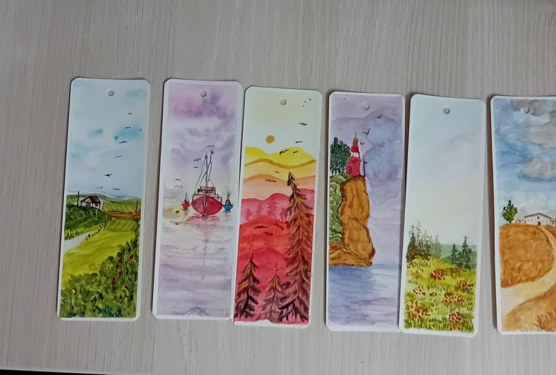
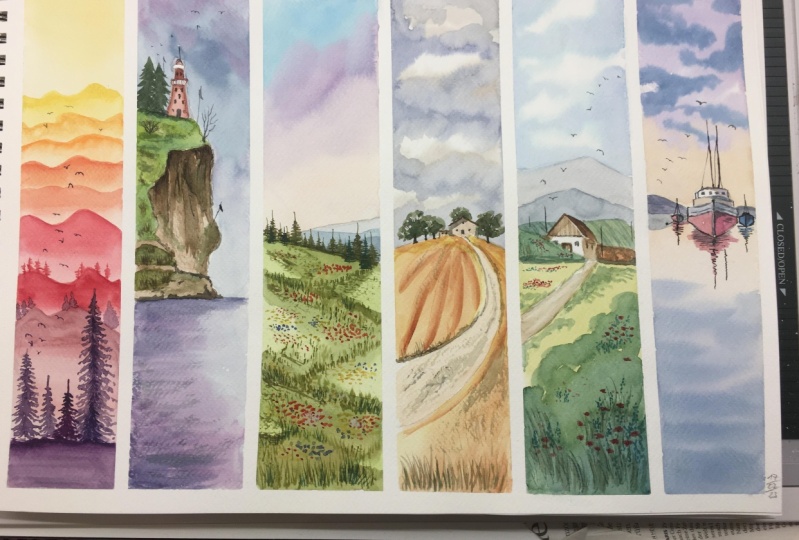
Transcripts
1. Class Introduction: Thinking landscape
is always fun, especially when you
are working with vibrant colleague who's and
so many different elements. In this class, we will
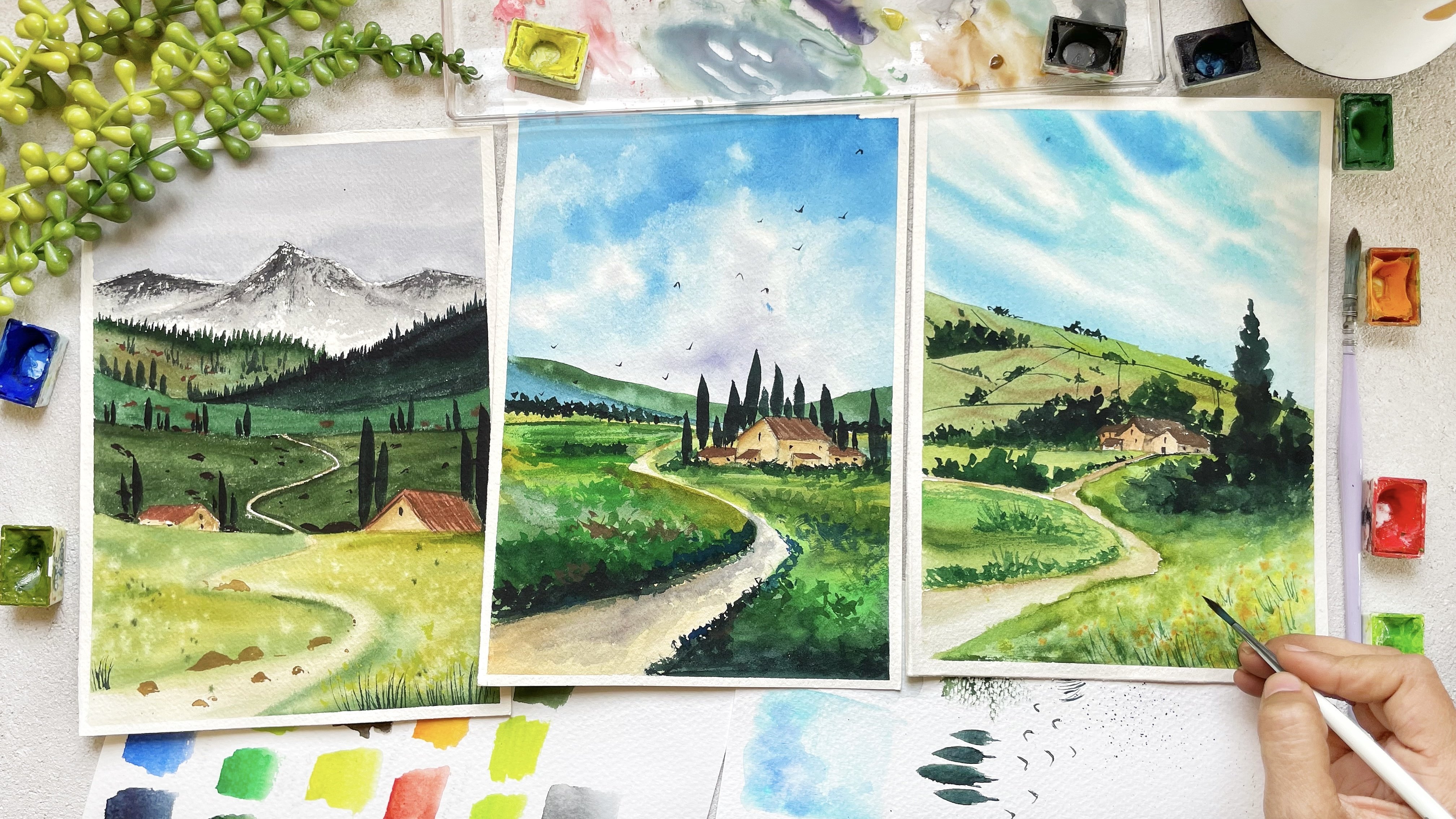
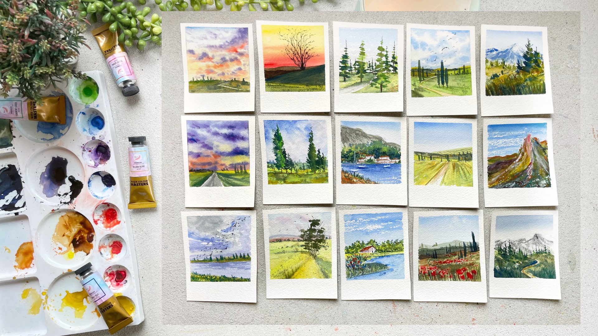
be learning how to paint beautiful bookmarks
from the scratch. You will have too much fun
creating this bookmarks, which you can keep it with
our gift to your loved ones. On their specialty. We will be exploring some new watercolor
techniques which have been using since
quite some time. So they are all
tried and tested. Don't worry if you're
a complete beginner. I've explained each and
every step in detail. Plus this class would
be great for you to learn some basic
fundamentals of watercolor too. Along with that,
we will also learn a little bit about
drawing and perspective. As always, we will
first talk about the materials that we will
be using in this class. Don't worry if you don't have these exact ones.
I'll be sharing. You don't need those
for the papers, for the brushes, as well
as for the panelists. Once we are tired of it, the materials that
we'll start with, cutting the people into the
preferred size that we want. I'll show you step-by-step
how you can cut or A3 size or A4 size people into our preferred
bookmark size. Once we have all our
materials and paper ready, we will start painting
each and every bookmark. I'll show you and explain you each and
every step in detail. Once we have painted
all the bookmarks, start making them look
more and more beautiful. These large bill steps, we'll take a bookmark
to the next level, which will make them
look even more colleges. So do not miss out on
the last few lessons. By the end of the class, you will have
beautiful bookmarks, which will be your
class project. Hello everyone. I'm Surya of full-time workers. Either educate your
skin shaggy. Thank you. Google Chrome and you can check out all of my
work on Instagram, handles great artistry and I post about anything and
everything on Instagram. So do follow me there. On another note, I also
have a YouTube channel where I post painting
video once a week in which you can
follow along with me and my YouTube page
name is paint, which share so do subscribe
to my channel one, right? So that's it for now. Let's move on to the class. So I'm really hoping to
see wall and the class. Let's get started.
2. Materials required: Hello everyone. I'm so glad that you
decided to join the class. Alright, so let's not
waste anytime and let me just walk you through what
all materials you will need. What do these
glass, as you know, we will be painting
six bookmarks. You can directly by
this bookmarks I spoke, which is in the
form of a bookmark. This is from minora
and it is 100% cotton, 300 GSM cold pressed
watercolor paper. But don't worry in case
you don't have these. Even I have not used that. I knew not everyone would
have bookmarks, eyes book. So what I've done is you or I'm using my regular people
from proves true, which is a 100% cartoon, 300 GSM and cold pressed. This is my A4 size people. And I'll show you
how you can cut it into the preferred
size which we want. Alright, we have already
talked about the April. Now, the next thing we
need is the board that is on which you can stick down your painful but
the masking deep, so you will need a
masking tape as well. Take a board which is movable and which is not just
stuck to the table. Next, let's talk
about the brushes. I'll be using vision like those. Synthetic hair brush
size 14461 is 0, which is the liner brush. These are all cruelty
free watercolor brushes. You can use any round brush size 246 and maybe eat
or whichever you. Next up you will need
a pencil and Rachel, then you will need a
black pen, which is what? You'll be using 0.05 nib pen to do a little bit
of detail on our painting. You can use any black pen. Next, you will need
two jars of water, one for the clean supply and are there to clean
down your brushes. Then you will need watercolors. This is my palate where I have bold colors
from different brands. So I will walk you
through each and every color just
before the class. Don't worry about that. You don't need exactly
the same color. So I will also tell you the alginate those
right in the class. Next, you'll see that I've
added a little bit of shine and little bit of interest
in our bookmarks. For that, you will need
watercolor paints. Again, in case you
don't have this, you can totally skip this step. This is just me wanting
to add a little bit of joy and sparkle and
interests to monks, do need. Next you will need a scale to measure the size
of the bookmark. Scissors to cut down your people into the preferred
size or a plateau. And lastly, we'll
need or hairdryer to dry off each layer before
you paint the next one. Alright, so these are
the basic supplies, but you will need to go grab
them and let's get started. I'll see you in the next
class where we'll be cutting the people into
the size of the bookmarks.
3. Cutting the paper: Alright, so now let's come to people into the
preferred size we want. So what I've done is I
had a four size sheet. I did cut it into two, which is now A5 size. Now the E5 science people who
will cut into 2.5 inches. So I took my scale and I
will measure 2.5 inch on the people and you should get
three parts of 2.51 people. So I will measure
it with my scale. Draw the little dot. It would be 2.55 inches and 7.5. I'm the same way. Draw three
more dots just above that. On once I've drawn the dots, I will connect those
dots that each of those so that you will get
a completely straight line. Draw the lines as
light as possible. If not, draw the lines on the opposite side
where you are not supposed to pain so
that you cannot see them while you are painting. Alright, once you
have done this, repeat the same step on
them or the heat of people. So now we have all the
lines reading on the paper. All you have to do
with cut it down. So what I'll do is
I'll take the help of my scale and I will
fold the paper so that whenever I got it as a
little bit easier for me to cut and I'll be using
our data to do that. But if you are not comfortable using your CARTO,
then please, please, please use or
scissor to do that. This is what I've been
using since many years and I like using the
way and I am very, very, very careful
while I'm doing that. But again, I will repeat
it like if you're not comfortable using the
character or if you are small, then please do take help of your model or your elder
sister or anyone at home. Please don't do it yourself. Alright, All the
best way is to just use those to do it, right? So just taking the help of
the scissor and pressing down the paper thoroughly so that
whenever I got it down, but it is very easy. So pressing it down multiple times and then just running
my character through it. So repeat this step
with the sheets. And by the end you will get six rectangular size people on which we will be
painting our bookmarks. And your Hugo v have six
equal-size of people, which is in a form
of bookmark sites. So don't worry in case you
don't have the exact size of a book which is already
available in the market. You don't need that. You can always cut down your paper into the
preferred size. Just make sure that you are using good-quality. Take people. Otherwise, if you'll
paint on a thinner paper, it will buckle up and the bookmarks will
not look that pretty. We'll use a thick book. You'll see that the
size of our bookmark, it slightly smaller,
but it's fine. It won't affect the painting and the use of the bookmark, right? So you see, other thing is, you'll see that
there's a tiny piece of paper which was left. Don't throw it away. We
will be using those people to swatch down all
our colors, right? So we will start
from the next video.
4. Sunset landscape: Alright, so we have
all our colors and brush and water ready. We also have our April ready. So let's get started. Take one of the sheet
of the bookmark and start applying masking tape on all four sides of the paper. While you're doing that. Let me talk to you
what we will be doing for this painting. So we will be learning very important concept in watercolor, that is the color value. I'm using that concept. We will be painting layers
and layers of mountains. By the end, we will be painting beautiful pine trees, right? So we have already applied the
masking tape on all sides. I'm just running my finger
multiple times to make sure that the gap between the
people and the masking tape. Right now I will be taking
engineered do and I will add lots and lots of water
to it to make it lighter. As you know, in watercolors, to make any color of
light do all you have to do is a lot of water to it. So that's exactly
what I'm doing. I'm adding more value to just reduce the
concentration of that color. I've added the color swatch, you're down on the
people and that is the exact kind
of itch I want. Then I'm just using that
kinda on the paper. So this would be the
color of our Skype. If you are not very
clear about the value, what I would suggest
you to do is take any color
from your palette. Take it in a very
concentrated form. That is, take a color and
a very thick consistency, less of water and more of paint. Swatch it on your people, then keep on adding or dropping, drops off photo and
keep on watching it. And you will see that your
color will get lighter and lighter as you keep
on adding the water. This is the basic concept
which we'll be using to paint our bookmarks. So what I've done is
I've painted this guy. I just took the hairdryer
and dried the forest Leo. Now we will start painting
the first layer of mountain. Again, I'm taking those
same Indian yellow color, adding a little bit of water
to read another swatch it right beside where I watched
the color of the sky. And you will see
that it has to be unlearned bit darker towards it. I found it a way too dark, so I added a little bit of more water to make
it a little lighter. And now I'm quite
satisfied with color mix. And I will paint the
first layer of mountain using the same kind of
apply that color first. And then I would just take the clean water on my brush and just
pull that color down. Again, using the
hairdryer to dry it off. Now for the second layer of
mountain, but I'll do it. I will add a little bit of
red to the same yellow. Create a light orange color. Again, swatching each and
every color before I put it on my paper so that I know how exactly it would
look on the paper. Once I'm satisfied
with the color mix, I will paint the layer
of mountain again using the same color which
we have mixed on the top, cleaning my brush and using the damp brush to
pull that color down. Then using my hairdryer to dry. Be sure that you are trying
each layer before you move on to the other layer. Now, I've added a little bit
more red to the same mix. That is Indian yellow
and mode of red. And I painted the third
layer of my mountain. So it's very simple. You just have to go a little
bit darker with each Leo. But do keep in mind that your colors should
be transparent, otherwise you won't
get that shine. And the beauty of watercolor is, so keep your colors better, watery while you paint. Alright, so now let's move on to painting
the fourth layer. So you are, I'm mixing my same color that is
yellow and red together, but this time I will
add more of red to make it a little
bit more orangey. And again, avid swatch
it down on my paper. If I feel like it is way too orange compared to
the previous layer, I will add a little
bit of more yellow to make it lighter orange. If I feel like if
it is more yellow, and I'll add a little bit
of red to it to make it. A bit of a brighter orange. So that's the reason
we are keeping those swatch card just
beside us so that it is easier for you to decide what you should
add in your 100. It would be very easy. It looks difficult,
but once you have swatch off your previous color beside you and it feels swatch, it says besides that, it would be very easy for you to know what you should do next. Alright. That's how
you will have to move. So now I'm adding more
of red to my same mix. But it is looking
way to oranges. So I started adding a little
bit of Alizarin crimson to the yellow and red mixed to make it a
little bit more reddish. And I will start adding one
more layer of mountain. Don't forget to
drive each layer, but your hairdryer or
just leave it to dry. Otherwise, you will end up mixing the colors and you won't get different layers of mountains which you are
able to see right now. Well, right now, I'm taking the right color
directly and I will add one more layer of mountain. You see that this grid is
more on the orange side. So in case you don't
have this kind of red, and I will suggest you
to add a little bit of more color to your red to
make it a little bit oranges. And then painted. I completely forgot to talk about the size of the
brush which I'm using. I'm using size brush to paint
all my layers of mountains. But you can use
signs for or even size eight if you are
comfortable using it. Right? So next up, what I'll do is I will add a little bit
of alizarin crimson, red, and paint another layer of mountain using that color. Keeping in mind that the previous layer
is completely dry. We are almost done. I think
I have added 1234567, almost seven layers
of mountains. I will probably add one more and then we'll start
adding the details. But before we add the
last layer of mountain, what I did is I took my liner brush or you
can use size 0 brush. And I've started adding a
little bit tough, tiny, tiny little pine trees on the last or the second last
layer of the mountain. While though color is still wet. So it's quite simple. Just draw the straight
line and the zigzag line around that and you will
get the shape of two pi. Don't add too many pine trees. I've just added
fuel on both sides. I will keep the
middle portion empty. Then I will dry it off
with the hairdryer. And now let's move
on to painting the very last year
of the mountain. So this has to be the darkest
because it is in the front. So I will do my
Alizarin crimson. It is also quite
bright red candle. I'm thinking that it
is more on your side. So I just took that color
directly from the pan. I'm painting the last year of
mountain using that color. You can use any red, orange, yellow, just don't
use lemon yellow, use oil. The warm colors, that
is cadmium yellow, cadmium orange, and red. I am hoping you will have all these colors
in your palette. Carlos are definitely important, but more important is the right value which
we're using on people. If you are not confident, I would highly suggest
you to try though, value exercise on a
different sheet of paper. Like I said before, use the hyperconscious
treated color on the top. And as you move downward, keep one adding a little
bit of water that we, you will know that
how you can create different values
of the same color once you are part of it, that it would be very
easier for you to ain't that same color on
the table and know which. Exact values you should
think for this painting. Now, let's add the
final details. I've taken Alizarin crimson, and I will add a little bit
of blue to vet to your. I am adding indigo. You can directly
add your pulpal as well to make it more properly. But as I want this to be
more on the right side, I'll be adding more
of alizarin crimson, purple, and blue color. As you see, I've added
a lot of you are, I'm adding more of
Alizarin crimson to it to make it more
reddish purple. Then I would use to color
to paint the pine trees. So it's very simple to
paint the pine trees. All you have to do is
draw a straight line. And once we have drawn the line, start adding tiny, tiny little lines and dots on both
sides of the line. Start from this point or not. And as you move downwards, keep on increasing the size
of the dots and the lines. I've already taught
you in detail how to paint the pine trees
in the previous class. So if you want,
you can check that out before you start
painting over you. Alright, again, use
our brush which has a beautiful depth so that it is easier for you to draw
those straight line, as well as the pine tree with
one single brush, right? Nasty. I'm adding
one more larger tree on the right-hand side. Limestone, larger trees. Then I will add two more
tiny little pine trees just beside that. And then we will add a lot
self flying in the sky. You would already
know how to paint the boards if you have
attended my previous class. If not, let me just tell you, all you have to do is switch
to your smallest brush. So I'm switching
to my liner brush. What I do is I will
first draw the V-shape. Once I've drawn the V-shape, I will draw a tiny little
dot at the center. I will keep on changing
the direction of V that we will eventually look like boats and flying
in different direction. Once you keep on
changing the size of the boards so that
it will make it look like fuel boards are
very far away and few are new to our viewpoint. Right? Now, just, let's
recap what we have study. We studied how to create values of those
same color orange. We also studied how we can paint so many layers of mountains
using just three colors. That is Indian yellow, Barlow read, and
alizarin crimson. We then studied how to
paint the pine trees. And lastly we are painting and studying how to paint
the flying birds in the sky. I'm hoping that you'll enjoy
learning this concept. Now, one thing is don't
let dry it off with the hairdryer to make sure that everything has completely dry. And let's be auto masking tape and see the final
look of a painting. But before that, let me just show you a
little bit of close up of how it is looking
at looking coaches. All right, so I'm really excited to be loved
the masking tape. So let's do it off the
D-pad and angle which is away from the paper and
do it gently and slowly. Its head, you don't end
up tearing the paper. You're I'm just removing
note the one-by-one. So yo you go. This is the final look
of forced bookmark. I hope you enjoyed. And let's move on
to the second one.
5. Lighthouse: Alright, now let's move on to painting our second bookmark. Take the sheet of paper
and start applying masking tape on all four
sides of the people. Makes sure that you are pressing the paper and the
masking tape in a way that there's no gap between the people and the masking tape. Even if you have done it just before you start
drawing or painting, make sure that you run
your finger or wrong. To be toddler, that there's no gap between the people
and the masking tape. Otherwise, you will
end up not getting no clear looking edges.
You will regret. I don't want you to
regret because we would have put a lot of
efforts and painting them. So just do it one more time
so that you don't regret. And I will just flip those
watching sheet and I will just stick it on the board so that
it doesn't fly off. Why we are using the hairdryer
on it will be quite handy. Alright, so for this bookmark, main thing what we will be
doing is we will be painting or tiny little lighthouse
on the top of the mountain. Let's start with the
sketching part first, we will draw the horizon line. I will draw the horizon line, leaving more than half of
the people for the sky and the mountain and rest would
be the area at the bottom. Once I've drawn
the horizon line, I will draw a mountain
on top of it. Once I've drawn the mountain, I'm just drawing the line area dividing the rock
underlined area that that is the line
which will be painting would be in the green and rest
all would be in the brown, which will be due
Rocky Mountain. Alright, so once
we have done that, I'm starting to draw the
lighthouse on top of it. It's very simple to draw the lighthouse in case you are not able to
see what I'm doing. What I would suggest
you to do is once I've completed the sketching
part, it's very simple. Just pause the video
and he goes screenshot, or just pause it and do it. Once you are done drawing it, then you can start
playing the video. Write it as a beautiful
and simple sketch. Not very hard. And that's all with
the sketching part. I will just draw a few
lines, noodle lighthouse, because that's where we will be drawing the trees and rest all we will be doing with
our things underbrush. Alright, so that's all. Now, let's move on to
the painting part. So Yoda color scheme
would be very different. So we will be using purple, pink color for the sky. So I'm taking the
lavender color. I already have this
color premixed in my palette in case you
don't have lavender color. It's very simple to make. Take your ultramarine blue and add a little bit
of pink color to it and then add lots of white to it to make it
look like lavender. I have shown you how to mix the Sackler window shade
in my previous class. So if you want, you can definitely check it out. Otherwise, I already
told you it's simple. Just add a little bit of pink to your ultramarine little
bit of writing fellow, and a little bit of white. You will get those similar
shade like lavender. So we will be painting a sky
using wet on wet technique. So what I did is
I took a larger, thicker brush and I applied a clean neural water
onto the sky area. Once I've applied to water, your rhyme taking my
pink color and the Popper which was
already there on my palette from the
previous class project. And I'm adding a little
bit of pink color to it. I'm swatching the lavender
color just beside that. I feel like it needs
more of pink color as it would look more
prettier beside the lavender. So that's the best part. Few swatch your color before
you apply on the paper, you would exactly know how
it will look on the paper. Yeah, this technique
helps a lot. Alright, so I'm pretty
happy with my colors. So what I'll do is
I will first apply the pink purple in color which we had prepared
earlier on the top. And then I will start adding the lavender color
on the bottom. You will see I will
leave gaps you're in there in-between to make
it look like clouds. As your paper is better to, you would see that
it would be very easy for the colors to blend. Shadow. I also tilted my boat by applying the masking
tape just below the board so that
the colors up to the sky would float down instead of just staying it on to people. Right. So that's the reason I
told you to take the board, which is movable so that you can tilt the board
in a way you want. Now, I'm adding a little
bit of ultramarine blue to my lavender color to make
it a little bit darker. And I'm starting to apply the same colored urine
there wherever I have applied to lavender
color or LEO to give a little bit of
depth to the sky. So once that is done, I'm pretty happy with how
my sky has turned out. The colors are looking beautiful now as we'll be using the same
color for the water. So I thought why not just
being that you're embracing the bottom part of to want
to be the clean water first. And then I'm starting to
apply the lavender color. And once I've applied the
lavender color rather than applied to
pink purple color, which we have already prepared
on a pallet for this guy. And lastly, I've been applied
to a darker purple and lavender and ultimately
mixed to create a little bit of shadow of
stone Mountain on the bottom. I'll be keeping the
right-hand side of the water a little bit lighter compared
to the left-hand side. Now, while that is drying, let's paint the rocky
part of the mountain. So I'm taking the
darker brown color and I'm adding a little
bit of quinacridone, gold. But you don't need to do that. You can directly take buoyancy
and out from your palette. I don't have that
right view right now. So it just makes a
little bit of yellow or gold to my darker brown mix
to make it a little lighter. And I'm applying that
California rocky part of our mountain
in case you feel like your sky has not completely
dried and make sure that you use your hairdryer or
otherwise to brown color. We'll move on to the
sky looking way to D. So be sure that those Kai area is dry so
that it doesn't spread out. So once I've applied to
first layer of brown color, I took the consistency
of the dark brown color and I am starting to create
a little bit of shadow, just nodal line area and on
the top of the mountain. And then I switched my rigger
brush or a liner brush. Again taking the same color, but this time taking it
very thick and applying it just on top to
create more shadow. You'll see you have
to walk in Laos when you are working with
watercolors or with any medium, two is to create a bit
of depth and dimension. You will always have
to walk in Leo's. We started with a lighter
brown color would then be applied a little bit of
darker color just on the top. And lastly, we added more dark brown color to
create more depth and shadow. Once that is done and
while that is drying, begin artwork right now on it. So I started painting
the bottom part. So again, taking
those similar values, that is the shades of brown and applying the
lighter value first. And just while the paper or the while the underneath
layer is still wet, I am starting to apply a little bit of darker
color on top of it. I don't know what the width. Don't try to blend your colors
are lot, leave it there. If the underneath layer is bad, it would automatically blend. If not, it won't look toward it, But if you will try to mix your colors V2 match
with your brush, then it would end up
looking way too muddy. The weight very lightly and slowly so that it
looks much more fresh. Alright, now let's paint the
top of the mountain that is to clean line area
on the warranted. So what I did is I took my Indian yellow and
mixed a little bit of sap green to my Indian
yellow to make it a bright green color. And I'm applying
the first tier of the mountain using the
light green color. Once I've applied that, again, I will start adding
a little bit of that by adding darker
green color on top of it. So simple. If you have added a yellow
to your green color, then for the next
layer, don't add it. Just use the green
color directly from your pan so that
it is dark room. Next, I'm just adding that
green color on the mountain. I'll just read it to make it look like there's a little bit of green on rocky area as well. So you see that the
mountain has already dried. So what I did is to
add one more layer. I took very light
value of brown. That is, I added a little
bit of more portal, and I added one more
layer to create more interest in our painting. Now, it's time to add more
trees around the Lighthouse. I want that tree is too dark, so I added a little bit
of indigo to my green. And I'm just painting using that color
along the lighthouse. Use a smaller brush because. You might feel like
you're working on larger paper, but no, you are working on a
very tiny people that is just 2.5 and width. So always use a
smaller size paper or I mean smallest
size brush to do. Right? So once we have
painted the tree, let it dry. Once it is dry, we will
draw the trunk of the tree. But while that is drying, let's move on to
painting though. Lighthouse. I wanted to
lighthouse to look bright. So I took the red color
to paint the light downs. And I always, whenever it
comes to the Lighthouse, I always think about
red and orange color. I'm into brighter color. I don't know why, but whenever I see the lighthouse or whenever I think
about it than I was, I always like those
other two colors but should be there
on the lighthouse. So that's the reason I just knew that I wanted to paint them in a
bright red color. Alright, so I've been in the fourth layer
of the lighthouse. And while that is drying, I do the trunk of the tree
using my liner brush. And then I'm just adding a little bit more shadow over on top of the mountain
area using the same brush. Once I'm done doing that, I also added a little
bit of dry brush strokes to create a rough
texture on the mountain. Now, just take the hairdryer
and dry off completely. Once it is dry, we will move on to adding all the final details on
a work that is false. Let's start with the lighthouse. So I will add more the color on the lighthouse
using the same color. You see that once the
watercolor dries, it gets o way to Dido. Sometimes. I wanted
the light post to look much more brighter, so I'm adding one more
layer of the right color. And then we draw the top of the lighthouse
using the brown color. Then what I'll do is I will add few more dry brush strokes at the bottom of tools
is quite simple. I'm taking those same
colors which we have used all year for the water. That is the lavender
random pink mix. And I will load my
brush with color and tap off the
excess on my tissue. Once that is done, I will just rub my brush on
the paper and you will see that it will create a beautiful
texture on the water. It will make it look like the water is shining a little bit. Yeah. Just don't forget
to tap the excess of your color on the brush, on the tissue so that you
don't end up carrying a lot of color on 90 or the sea area. Alright, so once that is done
and while that is drying, my lighthouse has
completely dry. I just checked it
with my finger. And now I'm adding a
little bit of doors and windows on the
lighthouse using, again, the smallest brush
that is the liner brush. Again, if you're not comfortable doing
it with your brush, you can take the black pen
and do it with your pen. But I would suggest
you to do it. Practicing, doing
everything with your brush that way you will get a lot more control on your hand, as well as on your brush. Once that is done,
I'm just adding few more details with
my same liner brush. I added a huge stem, all huge wooden log, and on top of it I painted
tiny little flags. Then I'm painting the center off to the top of the lighthouse. Lastly, I will paint a few more branches of the trees on the left-hand
side as well as I will draw one more dry tree on the right-hand side
of the light host, choosing the same liner brush. Adding fuel, more dry brush
strokes you are in there. And I will also add
two more flags. I don't know, honestly, fuel flying birds in the sky. And then we will be
done with painting. So once that is done and you are completely ensured that the painting
is completely dry, then you can pay it off your masking tape at an angle which is
away from the people. That again, you don't
end up failing it. Always do it gently and slowly. So I will not remove
those watching card, which we have applied on the
left-hand side because I haven't used when North
offered for this project. So I will keep it as it is and I will remove the tape of this. And this is how our second
bookmark is looking. I hope you enjoy it.
6. Flower meadow: Alright, so we have already completed two
beautiful bookmarks. Now, let's start
with our third one. I'm hoping that you all
are enjoying painting these simple kind of bookmarks
which are quick to do. Plus we are learning some beautiful new
techniques as well. Alright? So this one
is quite simple. What we're gonna do is we
will draw a light area on which will be
Eating of my door. And the sky would be very simple and soft sky using
three different values. Alright, so I just draw the lines for the
mountains. That's all. Now, let's move on to
the painting part. So you're, I'm taking certain blend glue
directly from our brush. We will be using wet-on-dry
technique to paint this guy. So first time applying
served in blue on the top. Then I will apply a little
bit of lemon yellow. And you will see
when I'm applying lemon yellow, I believe, with tiny little gap in between
the yellow and the blue because I don't want those
two colors to merge together. Become green. And this
guy is who you are. I'm just leaving the tiny gap and where I've left the camp. I am using the leftover color which was there on my palette, which was painful, which we had used in our previous
class project. Lastly, I would just take
the lemon yellow color and pull that color
towards the mountain. You see, I've used two
very light value of all the three colors because I want this guy to be the
focus of a painting. I want this guy to look
very soft and very subtle. So that's the reason
I have used very watery so that the sky
looks light and soft. So I took the control directly
from the pan on my brush. But if you are not confident
using the colors directly, I would suggest you do
mix your color and water on a separate Padlet or
on a separate section, and then start applying
it on this guy. That way you will get the right consistency and
right value of the color. Now, why is the sky
area is drying? Let's paint the bottom part. So you're again, I've mixed my Indian yellow with
my sap green conduct to make or green gold color
and applied the first layer. You'll see that I've applied
fuel dry brush strokes at the bottom and there
are white gaps in between. Let it be because they will
act as a white flower by the end that I did
it go because me, once I've applied the fourth
layer of light green color, I reapplied a little bit of darker green color urine to
create a little bit tough. In my big thing, again, I switched to my smaller brush
and a size six while I was painting those guy I was painting with a larger
brush size, spooky. But when I started
painting the ground, I switched to the smaller
brush that aside sinks. So you can use any brush which
you are confident using. That is all up to you and
you can always switch your brushes while you work
on different subjects. Alright? So while I was
talking about that, I applied a very, very, very light value of green blue color for the
background, mountains. Now while that is drying, let's paint some grasses
in the foreground. So I switched to
my smaller brush. And I'm starting to paint the
grasses in the foreground, but using a mate
value of green color. And I will keep on changing
the green light light paint. So sometimes I will
use dark green color. Sometimes I will just
add a little bit of water to the same
green color and paint. And sometime I will just
use light green value. So just keep on changing
the value as well as the color of the
green while you are painting these small,
small gracilis. Also keep in mind that
the grasses which are towards the horizon line
would be smaller in size, whereas the crosses
which are in the front, would it be a little
bit brighter, darker? Also pick up because they
are new to our viewpoint. That's those simple
thing which you have to keep in mind while you
are painting that. I've painted so
many bookmarks in the past and I've already
sold so many in the past. I love painting them. I've painted and almost
all the subjects which I do like the
northern Light, the night sky, the sky, beaches, flower
meadow, mountains. Soft sky, cotton candy sky. I mean, you name it
and I've painted them. It's small. It looks so adorable
and I've gifted them so many times do
all of my friends, and they still adore them. So I just makes me so, so, so happy when the just appreciate a little
piece of art to it. I've put a lot of efforts on. So if you have your siblings or friends
who are popular war, you can definitely give them. And I'm sure that they loved
that so much. All right. So while I was
talking about that, we painted the bushes, though grasses in the foreground in differential of green. I also applied one
more layer of mountain in the background using a little bit of
darker green color. Now while that is drying, I again moved on to painting the crosses which are
in the foreground. So this would go slow because you are applying
lots and lots of layers. So it will take a little bit of time to do it,
but do it slowly. And you will see that
gradually it will create a lot of interests
in your painting. I know these paintings as more like the
bookmarks as mold, but it does take a
lot of effort and same amount of patients
to paint them. Plus, as you are painting small, you have to be very careful
with those object you paint. Yeah. Do it slowly. Now what I'm doing is I took the bright red color
on my palette. And I'm directly taking a very thick consistency
of the paint and starting to apply
the red flowers. In the foreground. I'm just doing the
tapping motion, making some thoughts,
pleasure and some smaller. And this will look
like there are red flowers in the
foreground part. Same way I will
use to deep yellow and paint some yellow
flowers in the foreground. Again, you can use any color of your choice to paint
flowers you want. You can use the puppet, can use orange, pink, anything, but just
make sure that you use some bright color. That we, it would look
much more beautiful. So while the first era of
the right flowers is drying, let's paint one more layer
of the background mountains. So I will again mix my green, dark green color,
but I will make it a little bit more
brighter and darker. So again, mixing my blue and a little bit of indigo
and adding a bit of water to dilute it and painting
layer of the mountain. This is the same
technique which we used for our very first
class project. That is using different
values of green to paint the only
use of mountain. That is exactly what
you have to do. Alright? So while
that is drying, again, like I said, I will be painting one
more layer of flower, but this time I will use
yellow to paint them. So this colorism mix of cadmium yellow and a
little bit of orange. So you can either mix
that color or you can use any color of your
choice to paint the flower. Only thing which we
have to keep in mind is use thick consistency of paint. Advise the color won't
show up once it is dried. As watercolor is a
transparent medium, you won't be able to see, don't like to value, or the lighter color
on top of the tongue. That's the reason
why you have to use thick consistency of paint. Again, if you want to
use the yellow color and you want a yellow color is not showing up on the paper. You can always add a little bit of white gouache to your yellow that will make it a little bit more opaque and then
use that color. All right, now I just dried it off everything with
the hair dryer. And lastly, I am using my bright red color to paint some more bright
flowers on top of it. Because as you'll see, when the color dries, it gets a little bit duller. So I applied one
more layer of the, right on top of the flowers, which we have already painted. Now, it's time to add some
trees in the background. So we will be painting
the trees in two layers. First, we will paint
a lighter layer, and then on top of
it we will paint one more layer of
dark blue trees. So let's first mix our colors. So I've mixed my sap green with a little
bit of burnt umber. And once I'm satisfied
with my color mix, I'm starting to paint the first layer of pine
trees in the background. It simple, like I said before. First draw a straight
line and then. Draw this exact lines on this side starting from
the smaller dots on the top. And as you move downwards, just increase the
size of the lines. Also keep in mind to keep
all the trees different. That is, make some
Twinkies short those smaller to note the color, change the directions
of the trees. That way it would look
much more natural. So repeating the
same steps using the smaller brush
size to do that. So while that is drying, I will add some
more darker stems of the flowers in the foreground with the dark green colors. While I'm mixing a little bit of indigo to the same green. And I'm adding a
few more classes and the stems of
those flowers urine that you will see
that I will keep on coming to paint
those same subject, which we have already painted. The flowers or the grasses and the stems in the foreground. Because once you
will add more and more subject to your painting or more and more layers
to your painting, you will know what is missing and what you
should add more rows. That's the reason you
will be always keep on coming to the same subject and adding more and
more. That's okay. But you will gradually
understand if you will paint and practice more
and more and more. Alright, so now that
everything has completely dry, it's time to add the
last layer of trees. I mixed my indigo to the same mix to make
it a little darker. I'm painting one more
layer of pine trees, but not covering the whole of the background
trees completely. So just keep that in mind. Migdal trees which are
in the foreground, a little smaller so that you can see the background
trees as well. I think that's it. I'm pretty happy with
how that's looking. Now. I'm just taking my
rigger brush and adding finer few more branches off some grasses in the foreground. And then once
everything has dried, even though masking
the chain DB. So let's build off
the masking tape gently and have a look at our bookmark and see how it
has its fuel food, right? This guy is looking so
soft and beautiful. Alright, that's all
for this class. I will see you in
the next class.
7. Dessert land: So let's start with
our food bookmark, the call sheet of paper, and start applying
the masking tape on all four sides of the paper. I'm really excited
what that's one. The cost of color
palette is different. We will be painting or different types of
Skyfall, though. Book luck. Alright, so let's get started. The squirts is quite simple. We will draw a tiny
little mountain below the half of the paper and then on
top of the mountain, but we'll draw a
tiny little house and surrounding that house, but we'll paint some trees. Once you have painted the house, window trees we withdraw. Or road which is leading
in the foreground. So it would be like
narrower new house. And as you move towards
the foreground, it will get a
little bit broader. It's as simple, C-shaped. All you have to keep
in mind is narrow on the top and as
you move downwards, just make it broader. Now I'm just painting
some clouds in the sky. You don't need to do that. This is just for my reference so that I know when
we are painting. Alright? So draw them very, very, very light that
only you can see it. So that when you
paint on top of it, though, pencil mark
doesn't show up. Now, before we start painting, let's first prepare our
Carlos for the sky. So I'm preparing those
shadow of the Cloud, that is Dockery follow. What I did is I mixed
my raw umber and ultramarine blue to create
very dull gray color. That would be those shadow
color which we will be using to paint the clouds. And for this guy, I'm mixing my ultramarine
blue with a little bit of white wash and you will
see bright blue candle. We could have used
ultramarine blue directly for those Skype much, but adding a little
bit of white will help the color to spread
less on the books. That's the reason we are adding white horse to do
ultramarine blue color, as we will be working
completely right on bread. Sometimes it gets very
difficult to control the paint and water
on the paper, especially when you are
working in very small space. So adding a little
bit of white color to the blue will help the
color to spread less hands. You will be able to
control a lot more. Alright, so I tilted my bowl by applying the
masking team below. And then I started applying clean water just
on the sky area. Once I have applied
evenly or of water, I will switch to my
smaller brush and we will start painting the shadow
of the clouds voiced. So I would take the mix of burnt umber and
ultramarine blue, which we created earlier. And I will start painting
the shadow color on the sky. So whenever you are
painting wet on, wet, when you want your color
to spread less and less. There are two main types. That is fortunately use of synthetic brush which
holds less often. Second, when you
hold your brush, remove all the excess on
the sides of your palette. And if you're not
confident doing that, you feel like your paint, your brush still has a lot
of paint on it than just tap off the excess on the tissue and then start
applying it on paper. First is use a synthetic brush. Second is remove all
the excess paint on the brush and then start
applying it on the paper. That way, the color will
spread way too less on people. So what I did is I
liked the first layer of gray color which we
have mixed earlier. And then I applied a
little bit of darker color of the scene to on
the shadow part. Once I've done that, we will start painting the sky. So I switch to my
larger brush, size 14, and the color which we mix the audio that is
ultramarine blue and white. I will start applying
that follow. Keep in mind that wherever
you have been been, no shadow of the clouds
you will have to keep those surrounding
AT or white. Okay? Again, use a synthetic
brush and use tech consistency of pain so that the color will
spread less and less. Now once I've applied
the base layer, I will take ultramarine blue and add a little bit of wine. And they could take
consistency and I will start applying a darker color. Around the sky area
one more time. The same they with the door
shadow that is applied the title color and applied a
little bit of darker color. Once I've applied all
the colors on the paper, I will completely clean off my brush and remove the
excess on the tissue and just use the damp brush
to blend the urine there. Remember not to put a lot
of pressure on the brush. Also, don't drop your
brush a lot on the paper, otherwise, it will
ruin completely. So just very slowly
and very lightly. Just dab, dab, dab. And you will see it as the
paper and the color is red. It could be very easier for
you to blend the colors. Now before we move on
to the bottom part, Let's first try this
guy area completely. And for the bottom
part, like I said, we will have a very
different color pallet. We always think though
for brown or green, but this time let's
change up a little bit. We will be painting the foreground part
with the dry grasses. So we will be using shades
of yellows to do that. That is we'll be using
yellow ocher going CNR for amble sepia too. These are the colors which
you can use to paint. Dry bushes and the
crosses and the fulcrum. So you're, I'm starting with
the yellow ocher on the top. And I will also add a
little bit of lemon yellow. The one thing which
you have to keep in mind while you
are painting though foreground plot is the road
area which we have drawn earlier should be lighter compared to the
surrounding area. Alright? So just keep that in mind
while you are painting. So every majorly be using
yellow ocher and a little bit of brown and lemon yellow to
paint the foreground punch. Your, I'm just applying the first layer of
yellow ocher color. Once I've applied that, I will start adding details on top of it
with thicker paint. So you will see in a few places I will lift off to paint with the brush and few places I will add a little
bit of more color. So I'm ready random with the brushstrokes and do
color which I'm applying, just keeping those
things in mind. Doctors don't color
palette like I have to use these specific Pylos. And secondly, I have to
be as loose as possible. That is, I don't have to
think a lot and trying to get my brush strokes
as natural as possible. So there is no need to keep your data while you are
painting no ground part. I always forget to remove that. While I'm painting. You can remove the masking
tape if you're not comfortable painting in
this position, right? So you're just adding more and more condo to
do foreground part. I'm adding a little
bit of darker color alone so that it will lift off
the ground area or legend. In case you feel
like you have mass double-ended and the color
is flowing and no load area. Just you then just use a
damp brush to feel pain. That's all. Now you're I'm
adding tiny little glasses. I will also add some splatters. So just trying to add more
texture in the foreground. I'm Josh repeating those
step and I'm slowly adding details who I
really hadn't noticed. We don't deal with that. You can just paint
along with me. So I'm pretty happy with how my foreground part is looking. So while that is drying, we will paint the house. So first I will
paint the roof of the house with the
darker brown color. Then I'm going to dry it
off with the hairdryer. Once that is dry, we will
paint the bottom of the house, but using light value of brown, that is the role on more. Now while that is drying, I will start adding more
and more details in the foreground using
the dark brown color. So I'll keep on saying
dark brown and light brown is basically rounds. That is either I will add
a little bit of yellow to my brown or you're not going to go into my
brown to make it lighter. Or I will use a little bit, binds grave or indigo to
my dark brown to make it little darker. Sample drink. So just swatch your colors on this warm shade which is
there on your side so that you know exactly what
colors you are applying. But basically I've
just used burnt sienna and yellow ocher to paint
know foreground part. Right? So while that is drying, we will paint trees
around the houses. So I took a mid value
of green color, that is sap green
and a little bit of indigo and draw on board
and mixing it together. And I'm painting two trees around the house using those
smaller brush size two. Then we draw a trunk of the tree using those
same dark brown color which we have applied
for the roof. As well as within also
paint the doors and the windows of the house
using the same color. Just make sure that doll house is completely dry before you paint the doors
and the windows. Otherwise, the color
will spread a lot. I felt like the area around
the houses Duquesne quiet, empty even after
adding those two 0s. So I decided to add few more brushes and tall
trees along the house. But I wanted it to
look like they are behind the house
in the background. So I will take those
same color, green, but I will add little bit of
water to dilute it a little. And I will start painting
though bushes and no background using
the lighter color. Now switching to my liner
brush and I will keep on finding then it is
the Bellevue and your thoughts and some glasses. And I need to do the Danes, you're in there and then let go painting completely dry
before we peel off the tape. So before I just
peel off the tape, let me show you the clues
about how the painting has joined down with
this loping, beautiful. I mean, I just love the
color combination of blue sky with the dry
grasses in the foreground. It is just singing to me. I'm pretty happy with the colors and the subject
which we have used. So let's peel off the tape. Let's see the final painting. I mean, after feeling
of the painting looks quite different
and complete. I'm excited to see how it
has turned out. You go. I hope you enjoyed your
color palette and subtract, and I'll see you
in the next class.
8. Country side : All right, Now let's start with our fifth bookmark that you realize we are almost towards
the end of the class. I am guessing that
you are guild, that means you all are enjoying
the class so far, 100. So as usual, take the papal, apply masking tape
on all four sides. Once you have applied
the masking tape, Let's start with
the sketching part. So this time we will be painting our
countryside landscape with tiny little house and
you can see a cottage. We'll, let's sketch that out so far is trying
the horizon line. On top of the horizon line, I will draw tiny little
area on top of it. We will draw tiny
little cottage. Like I said before. If you are not comfortable
sketching along with me, then what you can do with
one tap done sketching, just pause the video
and take that as a reference and
sketch on your paper. Or you can just
take the screenshot and then you can refer it whichever way you
are doing it, right? So once we have drawn the house, I will draw three layers of
mountains just behind that. Any tiny little
rude which is going towards the house or towards the mountain area
which is in the background. All right, So that's it
when the sketching part. Now let's move on to painting. As usual, we will
start from the top. So here I am applying
clean water on the sky area with my
larger brush, size 14. Once I've applied
some clean water, we will paint this guy
using just one color. We'll be using cerulean
blue to paint in sky to get the effect
of clouds on this guy, what I'll do, I have a load
my brush with blue color. When I'm painting on the paper, I will leave some
gaps in between. Those gaps would act as clouds
and by the end so forth, just apply the color. Once I've applied to Lynn blue, I just apply tiny bit of
ultramarine blue at the bottom. And now I'm thinking
my damp brush to blend the harsh edges. While you are blending
it with the damp brush, make sure that you are doing it very slowly and very likely. If you will hurry this step, then the whitespaces,
which we have left, would be completely gone and the whole sky would be
covered with the blue color, which you don't do it carefully. If you're not comfortable
using such a large brush, then just switch to a smaller brush when you're
blending the got this one. Right. So why in the
sky area is drying? Let's paint though very
far mountain using those same ultramarine blue
and a tiny bit door. Open. Thanks them together and paint the background mode and
using that one color. But remember to make that
blue color very light. That is, it should be just
tiny bit taco two doors. Then your hairdryer and
dry off everything. Before you start painting. Don't bank round bump and
as you will come forward, UV will increase the
intensity of the colors as well as we will make them
a little bit more brighter. So what I did is first, I did the first era of
mountain using alerts, bit of darker green value, more on the blue side. That is, I will add a
little bit of indigo to my green color and a lot
of water to dilute it. And then everything. No bank room, next door. Layer of mountain, which is
just behind the holiday, will make it brighter. So you'll write mixed
my Indian yellow and sap green to
make a bright green. Follow that with the layer which is I heard of that we will paint it with or yellow
or yellow ocher color. So you can see all the
different layers of mountains. The only thing which you
have to keep in mind is the mountains
which are far away, would be in dark blue color. And as you move ahead or as you move
towards the viewpoint, you will have to make
them lighter and brighter because that's
where those sung hertz. You can see all the colors. Right? Now, when we have
painted the leaves of mountain, I take the hairdryer
and dry it completely. Once that was completely dried, let's paint the foreground
part again, starting it. Very light green color. So I again took my Indian yellow and mixed a little bit
of sap green with it. And your, I am using that color to paint
the foreground part. Again, if you don't
have Indian yellow, you can use cadmium
yellow, lemon yellow, or any brighter, deeper yellow
color to mix cold greens. If you don't have bright
yellow or white print, Yellow Tail is totally fine. Use any kind of
venue have if you already have a premix green to make it a little
bit more brighter, just a tiny bit of lemon yellow, you will get a beautiful
bright green country. So once you have painted foreground part
with the light green color, it's time to add a
little bit of depth by adding more darker
tones on top of it. So I started from the top. That is, I took the
sap green color and I applied that valid
just below the house. Next, I'm taking the same
color and I will create large bush in the very end of the paper that
isn't the foreground. So I'm just using the tap, tap, tap motion with
my brush to paint. So you will see that it will create a little bit
of texture as well. So first I took the green value, then I took ultramarine
blue directly on my brush, and I use that color to
paint on top of the green. On lastly, I'm digging
a little bit of indigo and doing the same
thing all over again. So once that is done, I will let it dry a little bit. And while that is drying, let's paint the parts
of our painting. We'll let start with
painting though road, I will use a very light
value of yellow ocher. And I've told using that. Then I will take common
value Queen's Gallery, and I'll use my liner
brush and I will paint a few lines in the
background mountains. And while I was doing that, I realized that the
background mountains once tried it got way too light. So I took the green color and reapplied that color on
top of the mountain. So we just apply one
more layer of it. If you feel like the mountain in the background
are looking way too light. If not, then you don't
need to do this step. Alright, so my status then, let's paint the house as usual, starting it with
painting the room first. So here I'm taking the brown
color and painting the roof. So while that is drying, let's create a little bit
of extra on the front bush. So I'm taking the
darker blue color and I'm adding urine there, though, mainly on the top with the same brush as the paper has not completely
dry in the area. I'm using the same technique
called tab, tab, tab. And you will see that
the color will blend. But all those greens. Then the roof of the
house had almost drying. Let's paint the lower
part of the house using very light yellow. So I just painted the
forced labor of that. Now it's time to add a lot
of texture in the bush area. So what I did is I
just took my niece. The area on the bush is still not completely dry and it's
not completely red as well. It is the right
time to add texture using your nails or
any sharper object. I'm just scratching the
people. It's very simple. You just have to take
your needle and just move your finger up in a way
that it looks like a stem. You can use your nails if
you only needs are not long. Can, you can use a
palette knife or a scale, or even owe credit card. Alright, I have shown you this
technique before as well, and you'll see that it
gives a beautiful show. And it creates a little
bit of highlight I spent. And I love using this technique. You would use this
technique to paint, to paint the stems so much more. Now, let's just being door
stems of the flowers, which we will create a
leader on the right. Once that is done, now it's
time to add a little bit of more shadows on the house as we have already
applied the forest layer. So what I do is I will take a little bit of
darker brown color and I will start adding a
bit of shadow on her house. At the same time even
start adding a little bit off grasses and bushes. Though, How's same way? I will add more stems using those darker green
in the bush area as well, and then we will let
it completely dry. So while that is drying, let's create a few
around the house. Again, use already very
small brush to do that. If you're not comfortable
making those straight lines, straight, thin lines
with your brush, then switch to your
pen and do that. Because as we are working
on a small paper, I understand that it would be a little bit difficult to do that. So just switch to the pen, which will give you a
lot more controlling. Your, I'm just thinking along straight lines and then I
will connect all those lines. But awhile. And then it would
look like it is the electric poles which
are around the house. And then again, using
the same brush to add more processors, new area. Now it's time to add
tiny little flowers. New purchase. It will add a lot of
life to Spain thing. So I took my bright red
color on my palette. I took a very thick, dense consistency of paint. And you're, I'm drawing
tiny little dots in the bush area as penance a
little bit around the house. So it's okay. The color will dry off. A little. Light pad
finds it is drive, we will apply one
more layer of it. But once you have
applied the force layer, I will repeat the same step using the lavender
color as well. I will also apply
a little bit of lavender color around the doors and the windows of the house. When style is
applied, I will start painting flowers using
the scene alone. Then your, I'm taking a
little bit of flight Bosch, which I already
have on my palette. And I tried adding a few
stems using that phantom, but it didn't work on urine. Again, using my name's those gradual little
green white highlights. Once I'm satisfied, I will use the same white garage
riches there on my brush. And I'm going to start adding a little bit of
highlight around though. What do would just draw a tiny, tiny dots or lines. Now, let's add few more bullets. And this guy you would
have already nailed, I'm sure how to paint
their boards. Didn't know. I'd pulled me to explain
using my liner brush. I'm making the black color
which is there on my palette. I'm painting fuel
flying in the sky. I just feel like adding boats. And then empty sky just brings the whole
painting together. Just makes me feel like it
would be a happy environment. When the sky is
clear, it is sunny. Flowers are blooming
and birds are flying in the sky and happy. And my moment is what
we are creating on the paper by adding
tiny, tiny details. Like I said before, the force due to floral, which we have applied
in the foreground, if it would have tried, it would get other than lighter. So you're I'm applying the
same color on top of it. I do see it. Instantly
got brighter. We're done with Spain thing. Let me show you the close up. Then we will remove
the masking tape. I've been angle, which is
a view from the paper. So let's do a little bit of recap of what we have studied. So be studied how to paint those guys with white cloud using our different techniques. We also started doing
how do we use your nails and create texture of the
stem in the foreground? And lastly, we
studied how to paint the flowers in the bushes. Alright, I'll see you
in the next class.
9. Ship by the Port: So let's start with our
sixth and final bookmark. So take the large
needle of the people, apply masking tape
on all four sides. Once that is done, Let's sketch it out. This time. For the last
one we will be painting. First, draw the horizon line. The horizon line. Let's draw the tree ship, which is standing on the poll. So draw three lines to have drawn the
three parallel lines. The middle one
would be larger and the rest two would be smaller. Then just connect the whole
lines with each other. So this is the basic
shape of the ship. Funds you have drawn
the baker one. Let's draw the deck and upper portion of
the ship on top of it. This one would be the larger one would be on the same tool. Once you have done that, we will be drawing two smaller
ship chest beside that. Those cheap drawing
would be simple, three parallel lines and then connecting it
with each other. As this is the view
from the very front. So we are drawing the
front of the ship. I just feel like the
odd numbers letters to three or five looks better
when something is thick. So that's the reason we
are drawing three ships. The one in the middle would be larger and the rest
would be smaller. Then just below the ship, we will be drawing
its reflection. And then I just do a tiny they didn't mountain
on the horizon. So that way you
can differentiate the sky and the water area when you draw tiny,
thin mountain, right? So I'm bringing satisfied
with how it has gone down. Let's start the painting. But as usual, we will
start with the sky. If you know, I've painted so many ships on boards and its reflection
in the past few days. And I really wanted to include this subject for the bookmark. So that's the reason I just created a mini version
of what I have been practicing and learning since
past few weeks on grade. For this guy, what I did, I took baby pinkish
purple color. And for the bottom, I didn't
put both Indian yellow. I just applied the
fourth layer of color, gradient wash, Pound. Once that is done, I switched
to my smaller brush. Now I'm taking the
same purple color that I've added a
little bit of blue, darker value, but
I'm starting to paint no clouds on top
of it using red on red. Again, remember to apply the masking pain below
the board and keep your mode in Islam
is addition to that though, fellow
flows downwards. I'm pretty satisfied with
how F9 Charles and looking. So this is the first
layer of the mountain. Now I will add a little
bit of indigo to the same mix to make it
under the ankle and have it start adding color
on the bottom part of to create a bit of shadow. Again, think that the
consistency and you're moving, you're working red tone
that remove the excess on top of the tissue before you apply it on the board that
veto color will spread less than right now. Lastly, I'm just taking the red color which is
there on my palette. And I'm applying slightly
just below some clouds to create a little bit of light effect which is coming
from behind the clouds. Go away the very light
value and do it. Right? So once that is done. That's it. Now let the sky area completely dry
and while that is drying, let's paint to water. As you know, the portrait is a reflection of those
guys who will be using those same Carlos which we have painted point this guy and that is the
engineering handle. On the bottom, we will
be using the papilla. So I just applied clean
water on though what? I'm starting with the mid
value of yellow on top. And as we move downwards, I will be using, though purple color
at the bottom. You'll see the way I'm
applying the color. I will leave some white gaps
in between that will act as the water is moving and it
will make it look like. But anyway, you love paintings. Start with the very light value, and once you are satisfied with the colors you have
applied on the paper, you can always leverage with darker value of
the scene followed. That's how I work
because if you will, apply a very dark
color in the forest, cool and it's very difficult
to lift off the paint. So if you say OK, I applied very light
value of yellow and blue, I applied very light value of blue color, thing
popping color. On one side. Satisfied
with Howard was looking, I reapplied darker color into some area at
the bottom, right. Definitely go with this approach so that you will have
less and less mistakes. Right? So I was talking about
that I do the mountain on the horizon line but same
column but unlike the value. And then I dried it off
completely with a hairdryer. Next, let's paint those ship. Yeah. You can paint though. Ship in any color you want. Your I'll be painting it
with the red and blue. So the better one.
I'll, we'll be painting with the
bright red color. And the left-hand one, I'll be painting in or
darker yellow color and the right one I'll be
painting tried Chrome blue. But you can choose
any color which you want to paint those ship. That is up to you. Right? So once you have
applied to the body, Let's paint the deck of a ship. You are, I'll be using
very transparent Carlos to paint towards tech and all
the rest of those chip area. Because mostly all the details
we will be doing later on. But Ben, use a very light value to paint a deck as well as
the windows on top of it. Then using those same color
but in a darker value, I will add a little bit
of texture on this ship. Once that is done, let's pin don't reflection of all the three ships
on the water. I will use the same color
as I've used for the ship. That is for the red chip, I will use the red color
as the reflection. The reflection is, sadly, those seem as though ship, but it would be in the
opposite direction. If you want not comfortable
directly doing it, you can always catch
it with the pencil and then painted on top of it. That simple, you don't
have to be very specific, but make sure that you make it more and
more similar goals, but that it would look like
code reflection, right? So for the right
shape I painted to read reflection and for the
blue when I picked it up. And I'm pretty happy with how
the reflection is located. So I will let it dry. And I painted one more layer of mountain in the background. Now, adding a little bit
of depth to the back of the ship using a mix
of blue, purple color. Now it's time to add all the details and
everything will come together once you
complete this plot. So take any pen, think a black pen
which is point fruit, and start adding the
outlines to the ship. Don't make it
completely perfect. It doesn't have to be perfect. Just add a little bit
of crooked lines. You're in there around the
outlines of the shape. When sound is done, we
haven't drawn them. Wrinkles on the top of the
ship using those same thing. As it has to be straight lines, using pen for these
details would be way more easier than
using the brush directly. That's the reason you're, I'm using the pen to do that. I would also add those shadows
off towards Greg goes on the ropes on the ward using
those same on the bottom. Once that is done, I will take the smaller
brush and I really are learning but more
shadows on this ship. Tiny, tiny skin on top of it. Again, use a very light
value of two colors. You don't want to power it. Adding few more details. Husband, as I will.
Tiny little mountain on the horizon line. Your eyes the painting dry, the reflection looked
a little bit lighter. So I'm adding one more
layer of the same colors which we have used
earlier on top of it, we are using very light values of Euler Carlos,
this could happen. But in watercolor you can
always move in layer and it is always easier to put darker color on top
of two lighter color. So it is always the best
to start with the light. And then you can work
your way towards it. It looks perfect. Although those reflection
was looking like. But we rectify those mistake
by adding one more layer. And in fact, the two layers which we are
able to see right now, it's looking much more
beautifully, right? Alright, so we'll lastly, I'm adding few votes on this
guy using my liner brush. And this is how our final painting is
low and it has no node. Beautiful. Let's just
remove the masking in it. In the next class, we will be starting how you
can make your lungs different from the others and how you
can add a little bit of magic to your work, which we have already done. I'm super excited to see how it will look by the end when we add
a little bit of glitter. Let's start nice anytime. And I'll see you
in the next class.
10. Cutting the edges: Alright, now let's do the
final work on being, being. You can see that
the board is around the monks are not at all, even. Some size it is thick
and some side it is ten. Let's just make them even. And the white portion around, though colored area
isn't looking good. We will cut it down with
the help of this result. And we will do it with all the bookmarks
on all four sides. You can skip this step, but this is just me wanting to make it
look much more better. But it's fairly simple. It just takes hardly
five minutes to do it. So yeah, cutting it down
from all the sides and keeping a very tiny little
line of white by the end. And I will repeat the same step for all the other bookmarks. Yo you go, it's done. Let me show you the
close up of how it is looking much better, right? So yeah, just cut down those borders around
the bookmark so in case you haven't
applied evenly or of masking tape on all
sides, that is fine. You know how to cut the paper, I may make them look
even on all sides. Alright, that's it
for this class. I'll see you in the next one.
11. Adding shine: So we already have
cut down the edges. Now, let's add a little bit of shimmer to all
of our bookmarks. So your eye have, you shimmery watercolors which I have collected over the times. And we will be
using a little bit of it in each of our bookmarks. Now, again, if you
don't have this pin, you can totally, totally, totally skip this
step because any, these are bookmarks are looking
amazing the way they are. It's just that recently I've started adding little
bit of urine there. And when you are reading the book and when you
pick up the bookmark and the bookmark
or just shake it, you can see that little bit of shine on the paper which
looks so beautiful. That's the only reason why I am loving to add a little
bit of shimmer on a mug. And I really wanted to show
you how you can do that. So if you, again, don't have this
pains, It's okay. You can skip this step. It is not necessary. Right? So you're, what I'll do is I will take those
similar colors which we have used for a
painting, like the sky. I already used the yellow color, so I'll be painting the
sand bedding yellow color. Now you see your mountain which is already
in orange colors. So I will take the orange
and I will just add little bit of that on
the top of the mountain. Remember, you don't
have to overdo it. You just have to add a little bit so that whenever
you shake your bookmarks, you can see a little
bit of shine onto it. So again, if you don't
have this pinned, skip it. What you can do is you can take the center of the
bookmark and punch a hole on those same doh
di or thread on top of it. Or you can use that are different shapes of scissors which are available
in the market. You can use those scissors to cut the edges around
the bookmarks that pay instead of looking straight, it would look like cause exact cause,
something like that. So there are multiple
ways in which you can add a little bit of
thought patch to the bookmark. So you're, I'm adding the dark brown color
on top of the tree, just on the top of the foliage. And that's it. But this one. Then we will move on to
the second bookmark. For this one, I
will not do a lot. I will add a little
bit shine on the roof. I will add golden bushes, a little bit of grasses
and the foreground part. You will not be able
to see if you will see the bookmark
completely straight. It's only when the
light bulb you will be able to see those shine on. It makes it interesting. When you see them straight, you just cannot see
what's happening, but when you tell
the bookmark or when there's light
farming on it, it shines, which
makes me so happy. Then I'm just lost looking at
that book or that painting. I hope you are getting
what I'm saying. Last be what I'll
do is I will add few more boards using
lower shimmery beans, that is the dark brown cat. Now, let's move on
to the PowerPoint. For this one, I will add the red color just
on no flowers. So I've been at Drake. The red flowers and a little bit of gold and gender bender on the yellow flowers. For this movie, I will add little bit of shimmer
on the front end of the board as well
as a little bit on the reflection as well. Like I said, don't overdo
it, don't add a lot. The ways though
charm will be gone. A lot of shimmer will
ruin everything, so just add little
better urine there. Use similar colors if you have, so that you won't be able to see on only when
the light will hit. You will be able to
see the shift in the balance or the rice strain. You will not be able
to see anything. I'm so sorry for the
change in light so much. I don't know, like if I'm
using the shimmery beans, That's the reason why the
camera is changing alive a lot. Because when I painted earlier, this has never happened. I tried to figure it out
but I wasn't able to do it. I'm so sorry for that. But you get my point, right. You just have to add a
little bit of shine and some shimmer and some
parts of your painting. All right, For this bookmark, I will add a little
bit of shine on DOE jockey part of the mountain. And I spent as I really
enjoyed some flags with the right colloids using
those shimmer paint. Does it impact of green around
the top of the mountain? Right, let's move on
to our final bookmark. The same way, I will
use different shades of those shimmered beans to
add a little bit of touch. That is, I will add a
little bit on the roof. They didn't get done. The
background of mountain. I'm going to add some stems and non grasses in the front-end of the bush mit dem queen color. Lastly, using the right color
on the top of the flower. This is how it is
looking by the end, let me just fill
color so that you can see where I have added
the shimmer paint. Right? We had done we have added a little bit of shimmer
to all of my bookmarks. I will just delete
each one so that you can see a little bit
of close up of all. I really hope you enjoyed
painting along with me on it. Time for you to create all
these bookmarks for yourself. So I'm really looking forward to see all of
your class project. In the project section
of this class. I'll see you in the next class where we will recap everything. Right. See you there.
12. Thank You : Thank you for
watching the class. Now, it's your turn. Pink and post all
the class project in the project section
of this class. If you happen to post it
on Instagram than two, tightening my page name is add
the rate artistry Alberta. I would love to share your
work with my art community. Also, if you enjoyed this class, than to consider
posting our review, that will help me reach
more number of students. Alright, that's it. For now. I'll see you guys soon
in the next video. Bye.
 Shreya Gada, Artist