Transcripts
1. Class Intro: Bubbles are fun and whimsical
part of not only childhood, but fun memories from bubble baths to blowing
bubbles in the summertime. And bubbles are
kind of whimsical. In today's class,
watercolor heart bubbles. We're going to take advantage
of a whimsical nature, as well as the
playfulness of bubbles. We're going to use our
imagination and create them into heart shapes instead of just
a standard round shapes. This way, we get a
little bit of shape and something of interest aside
from just a round bubble. This class is great for beginner watercolor artists
because we're going to work on the three keys to
make a bubble come to life. Transparency,
lightness, and arenas. Instead of coloring in a
bubble or a shape completely, we're going to let the
watercolor do the work. We're going to blend the edges, make lots of bright color, and make really soft
tissues as well. We're also going to take
advantage of the arenas of bubbles and let the white
paper shine through. There's a downloadable
class supply list, but all of the supplies
necessary or things that you have already. There's watercolor
pigments, just a pencil. I like to make my own templates, so I just use some card stock. I actually use an index card
and it helps me to make these perfectly symmetrical
hearts will show you how I do that in
the next few chapters. So let's get started.
2. Class Supplies: So here are the
class supplies that we'll be using today for our watercolor heart-shaped
bubbles to make the heart shapes because I
like them to be symmetrical. I create my own and
I use a template that I make using just a
little piece of card stock. And here I use index cards just because they're
convenient and inexpensive. So to do that only the pencil, the index cards, and
a pair of scissors. Then I use my watercolor paper. I've cut to size at four-and-a-half by 5 " just because that
size is convenient, but you can use any
size paper you want. I'm going to have
a larger piece, six by eight, then I can use
to make additional bubbles. I have a 6.1 for my
watercolor brushes, but use whatever brushes
you're fond of in the Navy, my assortment of watercolors reference the specific ones
I use when we use them. And I'll also include
a class download that includes all these materials
in a list formation. In the next chapter, we'll
start by making our templates.
3. Making the Templates: So to start with, I wanna
make my templates and I'm just using four
by six index cards. You can use card stock, you can even use paper. The stronger the paper, the easier it will be to
work with the template. You could also freehand sketch
your hearts if you'd like. But in order to make
them symmetrical, I find that this
method works best. I'll take one piece
of card stock and I want to make the
heart symmetrical. As I stated, I just
fold the piece in half. Now I can fold it in half
lengthwise or width wise. But whatever size I sketch out will be half the full size. And when I open it, that will be the full width of the heart. So this is kind of a fun
project because I can really tailor it to
whatever size that I want. And I can modify it because it's inexpensive,
isn't easy to do. I can make lots of them. But one thing I do
like to do because I use the negative space, the part that isn't the heart. I find it easier, but you're more than welcome
to use the heart itself is I want to make sure I have a little gap both on
the top and the bottom. So then I just carefully cut in a smooth way by moving the
paper, not the scissors. And not only do I have a
heart that I can use in my work or saved for
mixed media projects. But then I have my
template so I can sketch out that to use
as my heart bubble. I'll do the same thing over
here as well on both pieces. So for this one, I'll
make a skinnier heart. And the bubbles are
gonna be a little more rounded than a standard heart. So I'll just round
off that edge. I like to make my loop. I can take a few sketches. Don't have to make it
perfect the first time. Once I have it, then
I'll just cut it out. And I can even modify it. My sketch is just a guide to
help me create that shape. So here I have another heart. You can see it's a different
shape and a different size. And then I have the
template, then I'm going to use lastly, I'll make a smaller one. So I'll just fold this
piece just on the edge, not perfectly in half
and create a shorter, stout or little heart. Again. Then I can just cut
it out as I want. So that will be
the finished size. And here is my template. Now I can trim it down to be a little more
convenient to work with. And I'll do this on all of them. So now in the next chapter
we're going to start our first sketch and
then our first painting.
4. Making Bubble Sketch #1: So to make my first sketch, I have one of my four-and-a-half
by five inch pieces of watercolor paper. And again, you can use
any size paper you want. And then I have my three
templates that I made. I'm going to use this heart. So I'll set aside my other templates
and then we'll just place my heart on my paper. I don't find it necessary
to tape it in place, but if you'd like to use little
tape to hold it in place, just some washi
tape would be good. And then I just lightly
sketch around the shape. So when I remove it, I
have my symmetrical heart. Again. I want to
keep it nice and light because when
I paint over this, the pencil marks will remain. I feel like this heart
bubble isn't quite right. I'll modify it. And for the point as well, I just want to round that tip a little bit just
so that it's more bubble-like. Can
do the same thing. Up top. I'll take my eraser and gently
erase those points. And any pencil marks that
I don't want to remain. There's any that are too thick. Now's the chance
to clean those up. In the next chapter,
we'll start painting.
5. Painting Bubble #1 - Blue Layer: Now before we begin
our first layer, I want to just point
out that off camera. I have a jug of water, which is a fairly large jug. And then I have a smaller jug. I keep the smaller
jug specifically for using clean water on
my piece to blend. And we'll be doing a lot of
blending today in order to make this heart really
come to life as a bubble, more so than a heart. Well, we have to do
is make it look very transparent and very airy. So the key is going to be to add just enough color to
indicate what it is, but no more than that. So to start with, I
like to dip my brush in Clearwater and just sharpen
that point a little bit. Then I just gently stroke around the interior of the
heart in one layer, one brush layer just around
the inside of that heart. This is kind of softening the
paper up for the next step. Don't want to use so
much water that it runs just enough so that it really starts to soften
the paper a bit. So now I'm going to
choose my color. I'm going to start on my
first heart with making it predominantly one color, but we're gonna use other
colors to enhance that. So you just choose a color that you like from your palette. I'm going to choose
a cobalt blue here. I'm gonna take a little
bit of this pretty blue and set it down. Making a little well
inside my palette. Now from here, because this
is our dominant color, we want this bubble
to be reflective. So we're going to
choose colors on either side of the color wheel, the color that we selected. So for blue, that would
be green on one side, in purple on the other. But we're not going
to make that leap from green to blue
or green to purple. We're going to throw
in some variations. So it'll be a purple
blue and green blue. So I'll make another two wells just with a little
bit of those blues. I'll rinse my brush. I'll take a little
of this deep green to mix it in with
one of the puddles. And so therefore I have my other color on
the color wheel. And I can mix the paints until I get the color that I like. That's a variation. And then I'm gonna
come over here with just a little purple and mix that in with my blue. Again, I play with it until I get the variation that I want. Just want a slight variation enough to look different
than my main color. Come back, take a little
more of my main color, and I want to mix it with a
little Prussian blue just to get it a little unusual, a little less than
direct from my palette. So now I'm going
to take my brush and with a very sharp point, I'm going to go around
just little areas. And again, I want a
very sharp point. I can even switch to
my smaller brush, but I'm going to barely touch that heart right on
the pencil line. So I have one area. They're going to come
to the bottom of my piece and go right
over that curve. Really build that shape up. And then I'll go
one side over here. I've chosen three areas. You can choose more or
less, it's up to you. I'm going to rinse my
brush so that it's clear. And I'm just going to
blend out the color. Blending it out because I
don't want any harsh lines. And I want there to
be a nice variation. So I'll pull that color away from the actual
line that we made. So it's just a soft blend. Turn my piece around, wet my brush again. And I'm trying to do this before the color dries on my paper. But you can see the
difference between my initial color or I placed it down and where
I've blended it out. And then I'm trying
to bring it to the center of my bubble, but keeping it as close
to clear as I can. For the last one, I wet my brush again so it's perfectly clear. Gently scrub case it
dried in any spots, and then just pull it out. And as you can see,
the deepest color is around the perimeter
of this heart. And the deepest color is around the areas specifically where I made that first introduction
of the paint to the paper. So once I have that complete, I'll rinse my brush
one more time and press any color
from the center, pressing it out to the edges. It's a very soft
color, very light. But there are areas that
are really very bright. I like the way that looks. I'm going to let
that dry somewhat probably for 30 to 45 s, just enough to really
sink into the paper, but not completely dry. Then we're going to come
back and add our next layer.
6. Adding Green & Purple: So we have that first
layer of that blue. The page is still somewhat damp. It's not really wet,
just a little bit of dampness, which
is what we want. And now I'm gonna take my
thin number one brush. I like to wet it. And then I'm gonna pick up
this green blue that we made. I'm just going to
dab it in areas beneath and to the side of the first initial
blue that we put down. Going to keep my number
one brush still damp, just rested on my palette. And then I'm going to
take my number six brush, wet it with water,
make a sharp point, and gently blend out that color. Again, the key is to keep the pigment on the
edge of the heart. And to make sure there
are no harsh edges, I'm going to set my brush aside, reload my number one brush, and add a little bit of
green to that next area. Take my number six brush, make sure it's nice and
clean with just freshwater. And blend out just a little bit. And then I think I'll do
this in one more spot. Just like this. Rinse that brush. Take my larger brush
and blend it out. That's looking very nice. Now to make it look
like a bubble, to have a little reflection, I want to take my
number one brush again, pick up that green and just
make a little line that resembles the curve of
that heart on one side. And then I'll do it
over here as well. And if you notice I'm doing
it on areas that aren't heavy on that green. I rinse my large
brush and again, just blend out the color so that it's just barely
staining the paper. And I'm really happy
with the way that looks. Now I'm gonna take my number
one brush, rinse it off, and pick up just a
little bit of purple, that purple blue color we mixed. And I just wanna
put that down in just a little area much
smaller than the green. I'm going to set that down. Pick up my larger brush, take most of the
water off of it, and just help that to blend out. And you can see it's just a
hint of that purple color. I'm going to come over
here to the same thing, just a little hint of purple in the areas
that the paper was wet. It whipped it out, which
is a beautiful effect. And now I'm just going
to go in there and blend it out with
a clean wet brush. And I'll do one more
area on this side, just a little bit of purple. Just to pull that in. Now I want to take that
purple and again add just a little
section of pigment. I'm following the curve
that's behind it, which happens to be
the heart this time. And I'm blending it
out ever so gently. If I blended it out too much, I can introduce a
little more pigment. And again, I just play with
it, gently blending it. I'm looking for just
a hint of color. I want it to look
airy and light. And so I'm quite
pleased with that. Now it's time to let
it completely dry. I'll let it dry for a good maybe five to 10
min, maybe longer. I want the paper completely
dry so that nothing smudges. And then we'll come
back and enhance any parts that have
faded when it dries.
7. Painting Final Details: So now my painting
is completely dry and the heart bubble
is dry as well. There's no smudging involved. I want to start by
examining the heart and seeing where I want to
make a little more contrast. I like to have a little contrast on the edge and then just a little bit of reflection on
the inside of the heart. So that's exactly what
I'm going to enhance. Going to dip my brush in
Clearwater and sharpen it. Then I'm gonna pick
up a little of this cobalt and
Prussian blue mixture, can even add a
little more Prussian blue just to make the
color a little richer. Now I would want a
very sharp point and I barely want
to touch the paper. Certain areas, I'm just going to really enhance that edge, making that line
really nice and sharp. Again, I want to
keep that bubble, that outline exactly as it was. Just making it a little sharper. Just going to go a little bit past where we put down
the initial blue. Just to extend that. Again, maintaining that shape and keeping that
heart really intact. I'll even just go around in certain areas that don't
have a nice clean edge. Taking my dominant color, that blue and just
inserting it there. So I liked the way that's
sharpening that edge. I'm going to do the same
thing by cleaning my brush, by picking up a little
of that deep green, just making it a little
sharper and brighter in color. And a little of
that cobalt blue. Again, I can just
play with it until I get a nice sharp color. And again, I just
want to outline it barely touching that edge. Extending a little beyond
where we put down that initial green can even
overlap some areas. Then lastly, I want to do the same thing with that purple. I rinse my brush, pick up a little more of that purple and just really make
that nice sharp outline. Any of the areas that
don't have that outline, just going to take my
time and create it. Now if any of those areas
look too much like a line, too much like a really
specific painted on. I'll dip my brush in water
until it's clear and just blend the edges on
the inside of that bubble. It softens them and as it dries, it will soften them even more. So again, I'll just go around just trying to build it up
and play with it a bit. Now the last thing
I wanna do is keep this nice and light. I'm really pleased with
the way this looks. I just want a little
more reflection on the inside of this heart. So to do that, I'm going to
switch to my larger brush, my number six brush, wet a little area on the palette and then enhance those
colors that we put down. I'll start with the
green and I'm going to wet it just slightly with a little bit more water and
just place that green down. I'll rinse the brush, Pat most of the water out of it, and just tap it around. I want that green there. But I don't want it
to really be harsh. I like having about 85% of
my heart without any color. The key is to make sure
that that bubble has a lot of white behind it
and just a nice blend. Rinse my brush. I'm gonna do the same
thing with the purple. Pick up a little bit
of purple on my brush, make sure it's watered down. And then follow the
shape of that heart. I'll come back in,
remove most of the water from my brush and
just blend out the edges. So I get a little bit
of stain of color. But nothing to distract from
the actual bubble itself. Can rinse my brush one more time and just blend those edges out. So this is the part that takes a long time because you
really want to play with it so that
you have a lot of clear and very subtle colors. This is the part that
takes the most time. You want the outline, but not a straight
line anywhere. So that's the first
bubble and I'm quite pleased with
how that looks. Next chapter, we'll
start our second bubble.
8. Making Bubble Sketch #2: So to create our sketch for
our second heart bubble, I'm using these smaller heart. Just going to place
the template down on my watercolor paper and sketch out just to round it the same way I did
with the first one. I can remove it, see if there's
any areas that I want to modify and make
that modification, want to really round
the edges here. Then I'll just take
my eraser and erase. I want the pencil
marks remaining being the ones that
I don't mind seeing. You say accidentally
show through. So that's my sketch. In the next chapter, we'll
start painting our colors.
9. Painting Bubble #2 : So now, even though this
is a smaller bubble, I want to paint
additional colors just besides the
one dominant color. Really make it very whimsical. Could do the same thing where
I take my larger brush, my number six brush, because I'm comfortable
using the six brush. You can use whatever
brush you want. If you want to use a
smaller brush, that's fine. And I'm going to just soften
the paper on the outline, or I should say the
in-line of the heart. So I want to create that wet layer just on
the inside of that heart. And I'm just going around
the perimeter on the inside. So the inner perimeter. Now from here I'm just going to play with different colors. I'm going to start with
this crimson lake. It's a beautiful deep pink, almost a berry color. So I like to put that
onto my palette and dab it and see if I want to
add additional colors to it. I'm going to take
a little perylene red just to mix in with it. And now I'm going to outline on that pencil mark
with a very light hand. Just some of the area of this heart because we wet
the paper, it may run. So I have two nice marks here. I'm going to come in
with my larger brush, Clearwater, remove some of the water and blend
out those marks. Again, I want the center of
that bubble to be clear. And just a gradual fade from where we put
down that pigment. Rinse my brush again
because I want to keep it nice and clean and blend out that second area where we
put down the Crimson Lake. Now if it's dried and this seems to have dried
a little bit, I'm going to really scrub
it with my brush gently. I don't want to tear the paper, but I do want to create
a little bit of an edge. Lastly, I want to make
one more section of this beautiful crimson
lake will do it just on the left side of the bottom. I have my little line. I come in there with a
little clear liquid on my brush and blend
out that edge, kind of pulling it on
the shape of that curve. Now I want to come in
here and I want to take a little bit
of this deep green, like the way that looks. And I'm going to take a
little of this lemon yellow. It's a cool yellow. And just mix that in with
the green just a bit. Then I just want to put a
few little dabs of green, maybe five or four or five
little dabs of green down. Because I use just
small amounts. I'm going to take that
number one brush, wet it with clear water
and blend out those edges. I'm happy with the
way that looks. There's any areas
that are a little harsh to take a little more
time and blending them out. Lastly, I want to come in here with a little of this cobalt blue and just set it down on areas that I haven't
added the pigment yet. Again, rinse my brush
and blend it out. That makes it very
beautifully colored bubble, particularly for
the first layer. You can take whatever's
on the brush and transfer it over here. Just to really
outline those shapes. Now with a wet, clear brush, I'm just going to
blend those edges. I'm not trying to draw color
to the inside of the heart. I'm just trying to
make those edges nice and light and softly blended. Can do that here a little
bit more. That looks great. I'm going to let
this completely dry. And then we're gonna come back and introduce another color, as well as brighten up
the existing colors.
10. Adding More Color: So now our first layer has dried and you can see
the nice edge that we have and the colors fade
in as we get to the center. I want to introduce another
color to our bubble here just to make this
truly whimsical kind of a rainbow bubble. And then I want
to work on adding a little more definition. So I'm gonna take a
little lemon yellow on my wet brush and just
put it on my palette, adding just a little
water to lighten it with a sharp point. I'm just going to dab a
little bit of lemon yellow. Just in a few areas
here, not too many. But you can see how that yellow, that introduction of yellow
really makes the color pop. And it brings a
little more life to this bubble. Looks great. I'm going to stick with my
number one brush for now. Clear it off and I'm
going to pick up a little more of
that lemon yellow. Now I want to
imagine a channel of a concentric heart that I'm going to leave
completely clear. I want there to be that transparent layer,
that concentric heart. So I'm just going to get a good section and add just a little bit
of this yellow here. And if I was to follow
that line around, I would have another
heart within the heart. Rinse my brush,
we'll clear water. And now I'm just
trying to blend out that edge while maintaining that little transparent heart. The color is going to fade. So I'll go back in
there and dip in a little more of that yellow. Again, work on
blending that out. And then I want to take
a little of that cobalt blue and pull that over here. Blend that out. And I'll take a little of
that crimson lake over here. I'll make two little
spots instead of one. And as you can see,
when I blend it out, if you were to draw a
line all the way around this center area that
we've been coloring. You'd see another heart emerge. Take a little of
that, a little bit of that crimson lake
that's on that brush. And just pull it up here just
to help the IC that heart. So I'm going to let
this dry and then we'll come back and just enhance
some of those colors.
11. Painting Final Details: So the heart is dried. You could stop here if you want. I'm gonna take my
number one brush. Just a little bit of
that crimson lake. And a very light hand. I need to make it to
a very sharp point and just really sharpen that edge by barely touching
my brush to the paper. I'll go around with a nice sharp edge and just continue to outline using the colors that we
already introduced. So now I'll switch to the green, adding a little more
deep green in it. Just to pull those
colors around. It's very faint and subtle line. But it's enough to trick the eye into the nice perimeter
of that bubble, makes it a little sharp edge. But it's still maintains
that bubble like appearance. Do the same thing
with cobalt blue. Again, making sure that
I have enough liquid on the pigment to make it so that I barely touch the paper and
really sharpen that point. And then lastly, I'll just go in with a little
bit of that lemon yellow on any area that
I didn't outline yet. That will just enhance the color and really make it
all popped together. There I have my rainbow bubble. The next chapter we'll
finish up by doing multiple bubbles
on a single page.
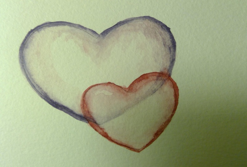
12. Making the Bubble Sketch #3: For our last design, I want to overlap the bubbles. I want the bubble in the
front to be transparent enough to see a little hint
of the bubble in the back. So I'm gonna take my largest
heart here for my template. And I'm going to set it down on my paper and just
make a light sketch. I'm not trying to
scar the paper. Just trying to make a sketch
so that I can see my heart. Then I can place my
second heart over it. However I want to do that. So now again, I'll take my eraser and my pencil
and soften any points. And I'll change
any of the shapes that are here if I want to. I can even come in and
put in a third heart. But I'm pretty happy
with just the two. The idea is that the
first heart that we painted was basically a
single color dominant. The second heart
repainted was very whimsical with multiple colors. And now we're going to work on transparency for the hearts. The next chapter we'll
start our painting.
13. Painting Bubble #3: So to start our painting, we're going to start
with this longer Heart, going to take my brush. And again, do the
same technique we did before where we went
with Clearwater, just around the
inside of the heart. So once I have that done, now I don't want it
to be so wet that the water runs around the paper. So if there is too much water, they're all either mop it up with a paper towel or just
give it a moment to dry. I'm not going to work on the heart in the
foreground just yet, just working on the
background heart. So I want to keep in mind that anywhere where it overlaps, I wanna give the
impression that it's very faint with the heart
in front of it. So I need to choose my
colors wisely accordingly. I don't want to choose a
color that's going to turn to mud when it contradicts
each other. So I'm going to start
in the background by using blues and purples. So I'll take a little purple on my number one brush
and set it down. Make a second little puddle. That'll take a little blue, cobalt blue and mix it
in with one of them. Again, I'm going to stick
with my number one brush. I'm gonna pick up that cobalt
blue and purple mixture. And I just want to paint
around the side here, creating that line
and that perimeter. Rinse my brush, switch to my number six brush and
just blend everything out. I want the majority of my
color to be on the edge. And I can even push
that pigment around, pulling it away from the
center of the heart. It's okay if I pull it all
the way up top and around. Rinse my brush with that
brush nice and clean. And just blend the edge out. Then I'm going to switch
to my brush again, pick up that same color and do just a small area opposite
the first one that we did. Creating that nice heart-shaped rinsing my brush,
cleaning it up. In this blending that edge. I'm going to paint all the
way around the heart with a nice fainted color with
whatever's left on my brush. Then I'm going to
clean my brush, remove most of the water, and just push any
pigment from the center, pushing it to the edges. If this is too thick, I can break that up as well. Sharpen my brush and
just blend it out. Again, creating nice soft edges. Then I'll let that
layer completely dry.
14. Painting the Second Heart: So for the next layer, since I want the bubbles
to somewhat coordinate, I'm going to start on
this second layer, as well as playing
with the first. So we'd take some clear water on my brush and just
go around the edge. I'm also going to go around the edge on the area
that we overlapped. But I'm not going to
work that area too much. I want to put the Clearwater down and brush around the edge. I'm going to rinse
my number one brush, re-wet this purple
pigment and just create some areas of purple
on this second heart. So once I create that outline, I can set my brush down, take my larger brush, and just blend out that edge. The same procedure
we've been doing all along with these bubbles. No harsh edges and lots of clear space and
very subtle pigment towards the center
of the bubble. So now that I have my two
edges done with that purple, I want to come in
here on the area we overlapped and create
an edge as well. Coming with my larger
brush, Clearwater, and just go around the edge,
softening that pigment. Going to pull that color down, connecting it and
moving it along. Come back in with my
number one brush and add a few areas of this purple
color to this bubble. Start with two. Rinse my
brush and do that blending. Same thing over here. Really helping that
pigment to move around. The key is getting
that soft blend. There's any areas that
really aren't blending. I can go in and take a
little bit of blue on my number one brush and just
pull those colors together. Just trying to create
that soft blend. I'll take my large brush
and blend the edge. And I'll let this
layer completely dry.
15. Building Up Color: Our layers are dry, so
now let's introduce some interests to
our bubbles here. There are good start to
take my number one brush, wet it with clear water. And just on the
edge here where we haven't introduced color on
this bubble in the forefront. And over here as well, the same reasoning we haven't introduced color to the edges. I'm just going to wet it
with some clear water to soften the paper and let it get ready to introduce an absorb a
little bit of color. So now I'm going to
take a fun color, gonna go with a little
crimson lake on my palette. A little bit of water. Just to dilute it a bit. Again, sharpen that point, and then come around and
introduce a little pop of color. Don't want to go overboard
not looking to fill in the entire area with that
pigment. Just a little bit. Then again, I'll rinse my brush and push that pigment
back to the Perimeter. Do the same thing in all the areas we
introduced that color. Now on the area that has the color underneath
it from that heart, I don't want to
scrub it too much. So I'm going to switch
to my larger brush and just blend out that edge. Now I'm going to take that same brush and take a little of that cobalt blue
purple mixture and just do a little bit of introduction of color
here and there. Just really little spots. I'll blend out the color and just make a little
bit of interest. Again, the key is
to make that blend, particularly for this layer, that nice soft blend. Now for the bubble on the back, I'm going to rinse my brush. Just add a little
bit of water on areas that don't
have the pigment, but I'm avoiding this
heart right now. This is a lot of
purple and blue, so I'm just going to introduce some water to soften it up. And then I'm gonna take a
little bit of lemon yellow, put it on my palette, and just deposit it. I like the way that looks. Just a little pop of color. I'll rinse my brush and just
barely blend out the edge. Then I'm going to
take whatever wetness I have on my brush, pick up just a hint of that lemon yellow and put it down here on the base of that, on the base of that heart. And I'm going to
really fade it out. So it looks like it's
underneath this heart. I just want to gently
blend out any of the edges here and let this
layer completely dry.
16. Painting the Background Heart: Now these layers have dried. We can start adding definition. But again, start by working on the heart and the background. Take my number six brush
with clear water and gently just outline
the heart again. Again with that larger brush. I'm gonna go in there
with that cobalt blue, a little water down. And with a sharp point, I'm going to just very
gently go around the edge where I already
introduced that blue. Then I'll rinse the brush. And I want to work quickly
here while everything's wet. I'm going to come in
here with the purple. Again, taking more pigment
on the brush is needed. Continue to outline those areas. Then lastly, go in there
with that lemon yellow. Again, just enough
pigment to make it pop. Now I want to rinse my brush, get it really nice and clear, and just blend that out. I'm gonna be very
cautious going over the area that covers that
heart in the background. Just introducing enough
water to make a nice blend. When I have that done, I'll come back in with that purple. And again, I'm going to envision that concentric heart
on the center here. Rinse my brush and
blend that out. It's nice and subtle. And I'm forming those lines. Come in here with the blue. Finish that off, then
rinse my brush, dry it, and just pat it down, get a little bit of color, but not too much. Now with a very sharp
point on a clean brush, I'm going to pick up
that yellow and just dab in a little bit of
pigment here and there. Just threw out that wet area. Take a look at this. There's any areas
that are uneven or have harsh lines are gently blend them
with a clean brush. I can come back in, add
a little more pigment, maybe even a little more purple. Again, rinse that brush, remove some of that water, and blend those edges. Just introducing a little bit of color to this bubble here. I want to make sure that those
edges are nicely blended. Then there's a little bit of
clear area on that bubble. I can even come in with a, with a dry paper towel and just pick up a little
bit of the pigment. And I'm going to let that
layer completely dry.
17. Painting the Foreground Heart: So now to work on the bubble
in the foreground here, I want to be very cautious
of the area where it overlaps with the
background heart right now, going to take a
wet brush and just introduce some more
of that crimson lake. And just very
carefully go around the edge anywhere
that I already did. This will brighten that color
up just a little bit more. Dip my brush in water. It will be a little bit
of pink left on it. And I'm just going to
gently blend it out. Again. We're preventing any straight
lines, any harsh edges. Then I'm going to switch
to my number six brush. Make sure I have Clearwater. Just blend that out. I'm going to come back in with my larger brush
and crimson lake. And again, I'm going
to envision that concentric heart and just
emphasize it a little. I'm purposely
avoiding going over that heart where it
overlaps right now. I'm going to go around it with a wet brush,
soften that edge. Going to pick up a
little that cobalt blue because it's going to reflect from that
other bubble behind it. Blend that out. And that will blend
nicely and create more of a purple look as well. Blend out those edges. And then with my smaller brush, I want to make sure
it's nice and clean. I'm gonna pick up
just a little bit of yellow and introduce it. And that's gonna
be the reflection from that heart in
the background. I want to let this completely dry and then we'll
come back in and work on that area to make this heart look like
it's in the background.
18. Painting Final Details: Now to finish up this
painting and make this heart look like
it's in the foreground. What we need to do is
make this a little crisper and brighter than this. So I'm gonna take my
number one brush, pick up a little
more crimson lake, and just mix it on my palette. Now, I'm going to
start by going over the line where the
two hearts intersect. And I'm really enhancing all
the edges of this heart. Going very gently
though, almost subtly. Rinsing my brush
with clear water and just blending it out. I like that effect that it
gives where it's kind of a dull blend on the
inside, a smooth blend. I'm going to pick up
a little more purple, not too much though. And come around on
that heart as well. Grab my number six brush
and blend this out. And I want a little
more color and a little more blend on this
heart in the foreground. So I'll go around making a
little bit more of a border. Take that purple and
do the same thing, continue to outline it
all the way around. Then I'll take that
number six brush and just blend that out. Getting a nice soft line. Take a little bit of pigment on my brush and really make it come to life
over here and over here. Anywhere we introduced
that purple blend the brush using Clearwater. Blend out that edge. I'll come back in
with a crimson lake. And this is the
process that you do because depending on
how much pigment you added and the amount of
pigment underneath the heart. This is what you have
to do to really make it pop and come to life. Your dominant colors,
you're vibrant colors. You're vibrant and crisp shapes should be the one that
you're seeing right now. And then heart in the
background will be just a little less vibrant. So I have my heart come back in with clear water
to blend that out. As long as that's
a nice soft blend, were in good standing. I also want to take a
little of that cobalt blue, mixing it in with that purple. And just introducing
that in a few spots, particularly where
the two colors meet. Again, go back to my blending
brush and blend that. It's starting to really come
to life the way I like it. I still want to envision
that concentric circle. And now I'm going
to take a little of that Crimson Lake and I'm gonna go opposite the side
where I put that color. I put that crimson lake down
and then opposite here. Rinse the brush and
start blending it in. I can pull it up a little. It doesn't have to be
perfect or excluded from the heart. Mental. Take a little purple, introduce that, and then just some clear
water to blend that out. I want those edges soft. Going right over that
area for the background. Just with some clear water, I go over that area and
that concentric area. I'm just going to take my
paper towel and gently press. And that's going to pick up
just a little bit of pigment, just enough to give it
that transparent look. And so therefore we have our hearts layered on
top of each other. The next chapter, we'll do a class wrap-up
and I'll show you some variations using
this process with just different colors
and shaped hearts.
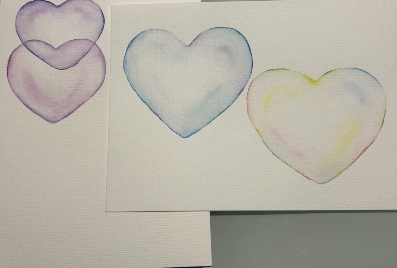
19. Class Wrap Up: So here are the three
hearts from class today. We have the heart with
a dominant color. So this is my blue heart, even though it has elements
of purple and green, it's primarily a
blue heart bubble. Then I have my
rainbow heart bubble. And this was really fun and
a little bit whimsical. It's still clear
and transparent. There's lots of layers and
lots of reflection of colors. And this is typically what I think of when I
think of a bubble. And this is my
layered heart bubble. By layering them, you'll
see a little bit of the heart and the background peeking through just the edge. So every so often, not even solidly the edge. It's kind of a fun
take on the project. I wanted to show you
some variations. You can take your images, your watercolor images, and
scan them into your computer. And then you have just
the image to work with. Now from there you can
get a lot of variations. Let me give you an example. For our blue heart bubble. You can see how
you can layer them upon each other after
you have that image. And you can get like
a greeting card or a different effect
that you can use. And then by showing the
bubbles trailing off, you get really more
of a bubble feel. You take your initial image and transform it into
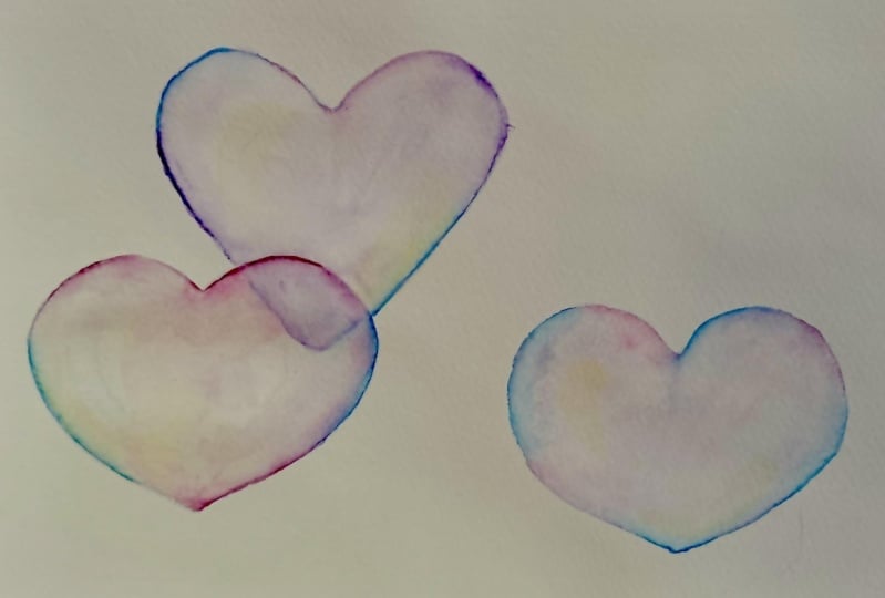
something else. Now with the other two
images, I did the same thing. I scan them into my
computer and then I just combine them here. And I have a little card full of my little heart bubbles using the same techniques and
just different colors, you can get different effects. So in class, we made
our blue heart. But over here, I did the same technique,
which is variations. Here I did mostly a yellow
heart and here I did purple. And as you can
see, the amount of the colors of the blue
and the green in here. We're a little different. And so therefore I get a
little different effect, but they're all
recognizable as bubbles. Now in class I showed
you a rainbow heart. Here's another rainbow heart
of different size and shape, a little bit larger. In fact. Then I just created that
with bubbles trailing off. So you can really take this
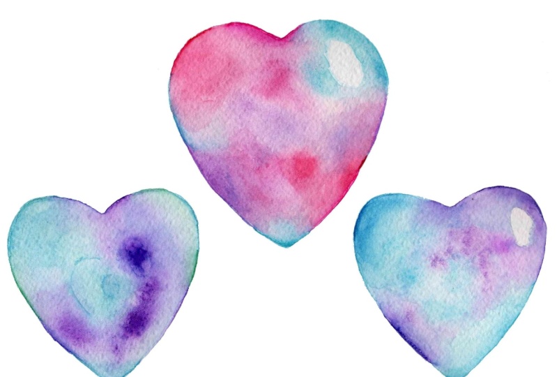
and go quite far with it. And lastly, instead of making
a solid dominant color, I just played around, this is a cross between the rainbow as well
as the solid color. I use the same techniques that I used when I made
the first bubble, the solid color bubble, but I just change the colors. So instead of using lots
of yellow in this case, I mean each quadrant
really a different color. And I combine them all here
in this finished piece. So that's how I created my three different types of
bubbles that you can then take and make multiple copies of making your own
template to make any size, shape that you'd like. I hope you'll create
your own bubble and post your work in
the project section. Please be sure to
follow me here on Skillshare to get notified of future classes and please
consider leaving a review. Thanks for joining me today.
 Daniela Mellen, Artist & Author