Transcripts
1. Class Intro: Vegetables are a standard subject of
still-life paintings, where they're
interesting foliage, brilliant colors,
and unique textures. In today's class,
watercolor Italian veggies. We'll focus on these
humble culinary staples for our inspiration. Goal is to capture the shape and colors of these subjects. Hello, I'm Daniela Mellen, an author and artist. Today's class is for beginners, watercolor artists
with an emphasis on building layers with
simple brushstrokes, will paint five images with two chapters dedicated
to each image. The first chapter carves out the unique shape of each image, and the second
chapter adds details. We'll start with a
simple pencil sketch. Then you can trace
from the template and modify as you like. Then we'll paint an eggplant, a pair of bell peppers, a Portobello mushroom, and cap, an artichoke, and a
vine, a plum tomatoes. The images are
abstract but contain enough characteristics of the
veggie to be recognizable. Gather your materials
and let's get started.
2. Class Supplies: These are the class supplies for our watercolor Italian veggies. Now what I use is a six by five paper for each one
of these illustrations. But you can modify this and use any size paper you'd like. I have the template
here which you can download and print out. If you print out
at the exact size, it'll fit that six by
five paper nicely. Or you can enlarge
it as you see fit. I have a pencil and an
eraser to make my sketch. And then I'm just using
three paint brushes, a 621. I have an assortment
of watercolors, and I'll include the
specific colors that I use on the class
supply download. The next chapter
we'll go over using the template and different
ways to modify it.
3. Using the Template: Now to use the template,
you'll need a light source. I'm using a light pad, but you can use the
light from a window. These sketches for your tracing onto your template are
very simple line art. What do you do is
you find the image that you want to trace. And I'm going to demonstrate using this pepper image here. And then you just set it down on your light
source and you might want to just tape
it here to keep it in place if you're using a window. And then you put your
watercolor paper right on top of where you
want to put it now I'm gonna shut out my studio lights and turn on the light source. And you'll see that it
shows up through the paper. Now you can flip your
template around. It doesn't really show so
much different the pepper, but you'll get a different
image so you can get the mirror image
using this template. I'm going to sketch my pepper, but I want to put
two peppers there. I want one just behind it. So I'll put my template
down, make my sketch. I want to go very lightly and I don't want to scratch the paper. I'm going to erase the pencil
marks or paint over them. And so I don't want
them really showing. But there are very helpful guide while I'm doing my painting. I create my first image. And then I can alter
the template by putting it behind this image and
changing the size up. I want it to look like
there are two peppers here. I'll just sketch that out. And then I have my image and it's
ready to paint. In the next chapter, we'll start painting by painting
our eggplant.
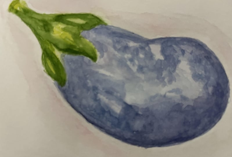
4. Painting the Eggplant: Because we're making
simple images, there are two things I
really want to focus on. I want to focus on
the shape of each of the individual vegetables and
the brightness of a color. You can also make very subtle
color if you prefer subtle, but I think bright is very
energetic and exciting. So the first thing I want
to do is I want to make a very painterly simple image. Just with some
water on my brush. I'm gonna go around
the perimeter on the interior of my sketch, not going into the center. And I'll do the
same thing up top here with this green stem. Now, my first layer is
going to be very simple. I'll start by putting
water on my palette, mixing some purple and then mixing a little
Prussian blue with that. Just until I have a soft color. Then I'm going to
be very careful and I'm just going to
create that outline. You don't have to go
the entire outline. I like that look, but if you want to skip
some areas, that's fine. Going to just outline it. This color is very soft and it's actually
quite beautiful on its own. I go around the perimeter of the flesh of the eggplant here. The same thing up top
here with this greenery. When I have that perimeter, I'll dip my brush in water
again just to lighten it. Now I'm just going
to blend it out. Not worried about coloring
in all the eggplant. In fact, I like it a
little bit of the white. I'll pick up a little more
of the deep color though, and deposited just on the
base to give a little bit of a shadow and a
little bit up top here. That's just for variation. Now I want to color in my stem. I can see that I spilled a
little pigment over there. So I'm just going to take
a paper towel and just dry off that area where
I made that spill. I'll absorb some of the pigment and just make it a little
easier to control. Now I'm gonna take some of
this light green, this green, yellow, yellow, green,
right on my brush. And I'm gonna do the same thing. I'm going to create that shape. Again, not filling
all the area in. I have my background layer
for the stem as well. I'll go back in, take a little more intensity
of the pigment and just deposited along sides
of this stem here. I'll come up here right to the edge and really
get that shape nicely. When I'm happy, I'll stop there. This is a great base layer. We'll let this dry and
then we'll come back and add our interest in our
color in our second layer.
5. Adding Details: Now that I have my first layer
dry, and as you can see, the eggplant shape is
really starting to develop. Now we get to really play with the color for the eggplant. I like to take two colors. I'll take another shade of purple and then
a shade of blue. So I'll take some of
this cobalt blue, put it on my palette, and mix just a little of
the existing color with it. I want it to be really
blue, more than purple. I'll start with
this light color. I'm going to take
an area here and I want the deeper color to be along the bottom area of this eggplant with
large brushstrokes. I'm just going to
add some texture. Just like this. Gonna really focus my
color on the bottom half. Then I'm going to dip
my brush in water, pickup some purple and really
mix it in up top here. I want a really intense color. I'll mix a little
Prussian blue with that until I get the different
color than what I have. Now play around with the
proportions of purple and blue. Now I'm just going to add
some more of that color. Interesting shade overlapping
the colors I already have. Also come up from
the other side. Going around, not
getting the entire area. I really just want little
areas of interest. Dip my brush in water and
blend out some of those areas. Can come up here a
little deeper pigment. Then I'm gonna come back
in with that cobalt blue again and add some
more to some areas. I want a very rustic
looking shape, very abstract, but easily recognizable
for what we're doing. And I can play around with that, adding pigments as I go. I really liked the shape
of the egg plants, so I wanted to maintain
that nice rounded edge. But then just depositing
pigment here and there. Just for a little texture and a little interest
in that color. I can come back in, wet my brush, pick up a little
color and just soften it. So it's not so harsh. I'm quite pleased with that. I'm going to switch to
my number two brush. I have a little more
control and we're gonna do the same thing for the
top of the eggplant. I'm going to go in there
with that original color, we use that yellow, green. I'm just going to go around the perimeter in
long brushstrokes. Not going over the entire image. I'm leaving some of the area we've already painted exposed. And now I'm going
to take some deep green and mix it
in with my color. This will really give
it a pop of vibrancy. With a sharp point, I'm going to go over the
area that we just wet. So there'll be a little blending of the colors we created. Again, I'm maintaining
that shape. Again, going back and forth with a really chunky
rustic texture. I want to combine the areas. Then for the last layer, taking a little of
this lemon yellow, it's a cooler yellow. I just want to dab it in areas. It'll be a little wet. It'll help the
previous color blend and it gives a nice effect. There I have my eggplant, I can go back in and decrease the intensity of the
color if I want. But I'd like to give
it just a little bit of shadow or background, more like an aura. I'll choose a color that's
flattering to the eggplant, pickled, choose a soft pink. Come in here with
some brilliant pink, right on my palette. A little bit of
perylene red just to deepen that up ever so slightly. I have my color. Rinse my brush. Large strokes just go around the eggplant with clear water. Setting the stage here so
that when I deposit my color, it will blend nicely
away from this image. Just want to soft little effect so the eggplant doesn't
look like it's floating. You can use any color
you'd like for this, I'm going to switch to
my number two brush. Pick up that soft pink. Just run it along the
edge where we just wet. Leaving a little gap
of space between the subject and this little
aura that we're creating. Go around all the way around
the eggplant and the stem. And this accentuates the shape. Kind of grounds it
just a little bit. Now I can choose
how thick I want the spread of this aura. I'll go in there
with a wet brush and just make sure the
edges blend out. I get a nice gradient where
the most intense color, which is still quite light, will be up against our subject
and it just fades away. Then we have our
first rustic image that's easily recognizable
as an eggplant.
6. Painting the Peppers: For our peppers here, we have the beauty of
being able to color them in multiple colors. Peppers can be red or
green or yellow, orange. And these variations
within those as well. Just start by taking my clear water and just outlining the face
of these peppers, leaving the center bear little more difficult because there's less surface area on
that image in the back. Now I want to make
my first pepper red and my back pepper yellow. I'm going to take
some perylene, read, write on my palette and mix
it with some vermilion hue. And I'm just going to
outline that front pepper. Going right around
the perimeter. Same formation that we did. The eggplant where
we're just creating that first layer of color,
that background layer. Because this is red. I want the pepper to be red. I have a lot of play here. I don't want the color to
be too vibrant or to read, but I do want to start
staining that paper. I'm going to switch to
my number one brush. Picking up that pigment and
doing the same thing on that background piece
to that pepper here. I'm just gonna go
around the perimeter, leaving a space between the front and the
back of the pepper. The sections of the
pepper, I should say. Just introducing
my pigment here. And I'll do it
over here as well. And I'm not coloring in
that area completely. Want that to look
like little highlight and a little painterly. Then I'll rinse my brush
with water just so it's damp and just blend
out those edges. I'll come in, take a little more perylene red on my palette, and just go around the outline here on one side of this pepper. Really carving out that shape. Start introducing a little
bit of a bold color. Dip my brush in
water and just blend out that vivid color. I want the ends where it blends out to kind of go smoothly. Little brushstroke is nice, but not too much. Then I'll pick up that color. Just deposit it on
those back sections. Again, the area closest to the existing segments that
just gives a little variation, could come around here
with just a little bit on my brush and outline the shape. On the right-hand
side, this pepper. And then going there
with a wet brush and blend it so it's
not a perfect line. I'm going to switch
back to my larger brush and I'm going to take
some of this deep yellow. It's yellow with a little
bit of warmth to it. I'm going to outline that
pepper the same way, leaving a nice gap of space between the red pepper
and this yellow pepper. Right now I'm just
creating that shape. When I have that perimeter done, I'll dip my brush in water and just blend out
some of the areas, leaving a little bit of the
white of the paper showing. Rinse my brush and then switch
to my number one brush, pick up that pigment and
work on those segments behind the front of that pepper. Again, I leave white of
the paper showing just really creating that
shape right now. When I had that done, I'll let this layer
completely dry.
7. Adding Details: Now that I have a beautiful
base on these peppers, I just want to really
accentuate them. I'm going to start by
working on the stem. I'll take some of this yellow
green right on my palette, mix it with a little deep green. Just to add a little more color. I'm just going to carve
out the shape of the stem, leaving a slight gap
between the pepper and the stem won't fill
in the entire area. I liked that white of
the paper showing. I'll do the same
thing on this pepper. I like that white of the
paper showing I think it looks very abstract painterly. Just going to come in
there with a teeny bit of this deep green. Really get that color very bright and just deposit
some deep green along the wet areas of this green is a nice
little variation. I'm going to switch
to my large six brush and I'll go back in. I'll take some of this
perylene red on my palette. A little bit of deep brain
and with that, to tone it. Now I'm just going to add some
brushstrokes on one side. Take a little more on this side, the opposite side
from where I went. I'm not trying to cover
up the entire pepper. I liked the variations in the
color that we have going. Then I'll take a little more
perylene ran on my palette. Just deposit that in
areas and as you can see, I'm getting a nice
variation of color here. I want to make sure I maintain
that shape to that pepper. While still adding
color and brushstrokes. Just deposit a little
bit of color just in dabs on the back sections here, because I liked the variation. Then I'll rinse my
brush with water. Now here's the part where
it gets a little risky. I could take my number two brush and I'm gonna take
a little of this deep green on my brush. And I want to just deposited in some areas where if already added the red on my
paper so that it's wet. And I'm getting just
a little variation, a little hint of depth of color. Going to come back
in with that red and just introduce that red to the outside of the areas
where I just added the green. That gives a nice
little variation. And it makes it blend. Going to pick up a little
bit of this lemon yellow up. Just deposit that in a
few areas for highlights. Not too much, but just a
little bit inside my pepper. Really happy with
the way that looks. I want to come over here
to my yellow pepper. Take a little more deep
yellow on my palette. Just swipe up a little bit
of that red onto my brush. Now I'm just going
to add some areas on the front face of this
pepper, not too many. With this deeper color, this little orangey yellow. When I have my three areas are so I'll come back in
with some deep yellow on my brush with a little
bit of water and go over the edges of those areas that I just introduced,
that orange color. This gives me the
variation that I like. Introduces a little vibrancy. It also coordinates it
with that red pepper. I'm quite happy with
the way that looks. Again, I want to
make a little ora, slight aura around my peppers. So I'm just going to take
some clear water on my brush, stroke around the peppers. Then I'll choose a color. I think I'll go
with a light blue. I'll take some of
the cobalt blue on my palette. A little
bit of water. I'm not looking for
a very bright color. And I'm just going
to pull it around the edge of these peppers here, leaving a little gap. Paper between the pepper and this little aura
that we're creating. Go all the way around. Very simply. I'm going to take a wet brush and just blend out
any of the straight edges. Again, I don't want it to
distract from our painting. It's going to dry very soft. And that's the look that I want. There. We have some rustic bell peppers to use for our illustrations.
8. Painting the Portobello Mushroom: Now to paint the
Portobello mushroom, we have the mushroom here, the underside with the
gills and the cap here. This is a very basic painting because the colors are so soft. I'm going to go
around on the cap here and just wet the cap, both of the background image, the main image here. I want a very light color. I'm gonna take a little
step just on my palette. And a little Van **** brown, if you don't have to
just use a light brown. And I'm just going to introduce
a little bit of color, creating the shape
for the mushroom cap. Then up top here
I'm just going to very gently paint
in that pigment. Really wash out that color. Really just creating
a discoloration on this whole mushroom. Makes a little more
sepia in with that. Now I want to just wet
this area of this stem, leaving this little stripe here. Just getting that
stem nicely colored. I'll switch to my
number one brush. Really just move
that pigment around, creating the shape of that stem. Pulling that pigment
right to the bottom. But maintaining that shape. It's okay if they're a
little bit of white area. Going to switch back
to my larger brush. Wet it and I want
to come in here and we're gonna work on
the gills really quickly. Take a little more
sepia on my palette. Color in this area with more
pigment up top right at the border where the mushroom
cap and the gills meet. That the bottom is a
little bit lighter. I also want this color to
be a little darker than the mushroom cap and darker than that stem and come back in, add a little sepia. Now just deposit pigment up
by the top of those gills. I'm going to remove as much pigment and
water for my brushes. I can just come back and outline closest to the gills and the
exterior of this mushroom. Then I'm going to take my
brush and with a pointy brush, I'm gonna just create a line. It's going to echo the
shape of that mushroom, but it's only going to cover
the top portion of it. Just like that. Going to come back
to my mushroom cap. Just add little segments
of color here and there. Just dabbing it lightly with whatever remains on my brush. Just looking for a few
little discolorations. I have that done.
I'm going to stop there and let this
layer completely dry.
9. 9 Adding Details: To finish the mushroom,
I'm going to start my detail work. My
number one brush. I'm gonna take some sepia. I want the consistency
to be what I can control and make a
nice sharp point, but not too dark. I'm going to start with
just barely touching my brush to my paper
and just making a little thin outline for the shape of the
mushroom cap here, as well as the whole
mushroom, the underside. I'll just go around creating
that shape, that outline. This is important because it
gives us nice boundaries. Go right over your pencil mark. Again, take it slow to
get that nice thin line. And it will dry even lighter. Then I want to outline
the mushroom cap here, the interior where
the gills meet. That creates a very
interesting ruffled edge. Then I'll outline the
stem very carefully. Now I want to start
adding my details, but to use my same brush, just dip it in water. As you can see, I've
got a little bit of pigment on my brush. Take a little more
pigment and mix it in. And then we want to
create a shadow up top here from right here. Tracing that line, meeting that line that
I made for the gills. Right to the edge here. From about one o'clock
to seven o'clock. I'll dip my brush
in water again. Just blend out that edge. Good. Take that same pigment, flipped my piece around and do the same thing
on the bottom here. Just on the bottom edge, dip my brush in water
and blend that out. So I have a nice shadow forming. I'll come back and pick
up a little pigment. And it once again on my little brush and
I'm just going to make little specks of brushstrokes on the top of this mushroom. I want to stay with these specs somewhere on this
discoloration that we made. Not making a perfect
line of them, but just a little different
specs here and there, little bumps of them
all the way around. Then I'll come back and
take a little more sepia. Just introduce a few darker
ones, little larger. Just to get some
texture going here. Now I want to do the same
thing on my mushroom cap, just making little bit of
brushstrokes here and there. And it varies depending on how much pigment I
have on my brush. Dip my brush in water
on some, blend it out. This will make it dry, lighter. I'm just going for a
little discoloration. A little look like that. Take a little more light
pigment on my brush. Make a nice sharp point. And now I want to make lines
very barely coming up from the center of the stem
up towards the top. And then I'll go at
opposite as well. I'll just keep
dividing this in half. My little distance
between marks here, really pulling them out. Again, I'll pick up
that light color, can even add a little
more water with it. And I'm going to create
that sharp point and make those lines from the top
of the gills as well. This is a very light line. It's not very dark. Just pulling them down. Dividing this space between
lines in half each time I go. Because this is a
nice light color, the shadow will be
nice and light, but it still gives the
impression of these gills. I'll take that light
color and now I'm just going to add a
little more water to it. And now I just want to make
some discolorations on this pristine white
area of the mushroom. You can take your time and
do as many as you'd like. The pigment will dry lighter. And that's the look
that we want to go for. I want to take a
little bit of this darker color, mix it in. I get somewhat darker color. Now I want to just go
with the top here. Make a line of a shadow. Not the length, the entire
length of the mushroom cap. Just a little area for interest. And I'll go right over the area we already
added some texture. I can come back in and
white in this line. Dip my brush in water, and just blend it somewhat. I like to come over here and just create a little bit of
shadow on the base as well. Then I'm gonna come back
in with my deep color. I want to be able to
control it on my brush. And I'm gonna start
adding texture, little dots, very faint. Little dots to the stem is gonna look like little earth or soil. And right up top as well. Not filling in the whole area, but just peppering
it in certain spots. I'll come and add a few more
of these little spots to my top of my mushroom, as well as the cap here
just in a few spots, gives a nice little texture. Then I'm going to
take that sharp point and a darker color. And I went to add just
a few more stripes just away from the
ones we already added. Just so we get more of
a look of the gills. Really letting that
brush flail out. Key is just start
right at the stem. Then I want to come up here
to the gills and pull down. The lines are not going
to touch each other, but they give the
impression that they're one long Gil going from the top of the
mushroom to the stem. You can decide how
many you want. The more you add, the
darker it will look. We want really the
impression of the mushroom, not an exact realistic copy. Quite pleased with
how that looks. And now I want to just add
a little bit of a border. Again, I'm going to use that
or a technique where I go around my subject
with clear water. I'm going to choose
just a light green. Ticks into this deep green. Put it on my palette. Just go around the mushroom. Come back in, introduce
a little more pigment. Just helps ground that image. It will dry very light, but it just gives a little
something to look at here, a little contrast to the paper. Go around the image with just some clear water
to blend out any edges. There I have are mushrooms.
10. Painting the Artichoke: Now to paint our artichoke, we want just a
little rustic image. Going to put some
water on my palette. I'm going to take
some deep green and then this yellow green. And I mix it in until I
get just a soft color. I'll add one more
brushstroke of water. Now I'm gonna take
my large brush. I'm not worrying
about perfection, but I just want to wet
each one of these petals, not trying to fill them in. What I am trying to do though, is create that shape. I'll spend a little
more time making sure I get the shape of each petal, not worrying about completely filling in that
image with pigment. Leaving a little gap
between each petal. And if I go very
close to one edge, I'll just try and leave it that little space on the other. When I have some of them done. But not all, I'll clear
my brush and just blend a little water in just so those edges aren't so harsh. I will just continue coloring the petals just to
form the shapes. Again, it's nice to
have a little contrast of a little white showing. I'll just go over
each of the petals. I'm happy with the shape. I'll move on to the next petal. It doesn't have to be perfect, but I am just trying to
capture the individual petals. Then I'll go to the stem, bring that pigment right
out to that pencil mark. Don't fulfill that in. I'm going to just switch to
my number two brush while my artichoke is
somewhat damp or wet, take a little purple
on my palette. I'm a little Prussian blue. Would that just to change
the color somewhat? And then at the base of
each of these petals, just going to deposit a
little of this purple color. Can go over the areas
that are already wet. I can decide if I want to go up the entire length of the
petal half or just very it. The key to remember is you're
just trying to maintain that shape because you're
adding this darker pigment, it will really draw the eye. So this was a good way
to carve out the shape. Even further. Come back in and makes
a little more color, Prussian blue and the purple. And continue just on the bottom portion of
each of these petals. I like to do this while
it's a little bit damp. Get adds a little interest,
a little blending. But it's not so wet that
the colors completely melt. And that'll just take a teeny, teeny little bit on one
side of my stem here, just to unite the image. On this one, it really blended, which was kind of a nice effect, but I do want a little
bit of a purple look. So we'll just go
in there and drop pigment on a few more of these. Rinse my brush while it's wet
with a little bit of green. I'll just come in and
blend some of these areas. Not going for perfection. I just want a little bit of a blend just so we can
see difference in color. But also an area
where they're just so softly blended that
it's hard to see. I'll do this with
all the petals. Also enhances any of the green that we put down
on our first layer, but built up the second layer. Take a little more
green on my stem here. Going over that purple. And I'm very pleased with that. I'll let that dry
and then we'll come back and just add
some final details.
11. Adding Details: Now my artichoke has
dried and I erase the pencil marks and I have
a beautiful texture here. I wanted to take my
number one brush and add just a
little definition. I'll take some of
this deep green right on my palette here just to get a nice rich color with
a very sharp point, I'm just going to outline
each petal and the stem. And I'll speed this along. There had my artichoke, I wanted to add a little
bit of Wednesday to it, so I'm going to take some of his brilliant pink little bit of water and just
add a little bit of brilliant pink to some of the areas on each of the stems. Usually between the area of the purple layer and the green. Just like the way that looks, the ads just a soft
element and really emphasizes that interests of these shapes and these globes. I'll add a little to
the stem as well. I wanted to add my aura here. Take my brush here
with clear water, go around the
perimeter just to wet the paper, and then
choose a color. I'm gonna choose just a little
bit of this lemon yellow. Put it down on my palette, but a little bit of water. And I'll just echo the
shape of this artichoke. Go around, continue
all the way around. Really emphasizing that shape. It's just a beautiful shape. Rinse my brush with
water and just blend out those edges just
so they're a little soft. You can enhance the artichoke further with light paintbrush, a thin line and those colors. But I like the softness and the abstract version
of this artichoke.
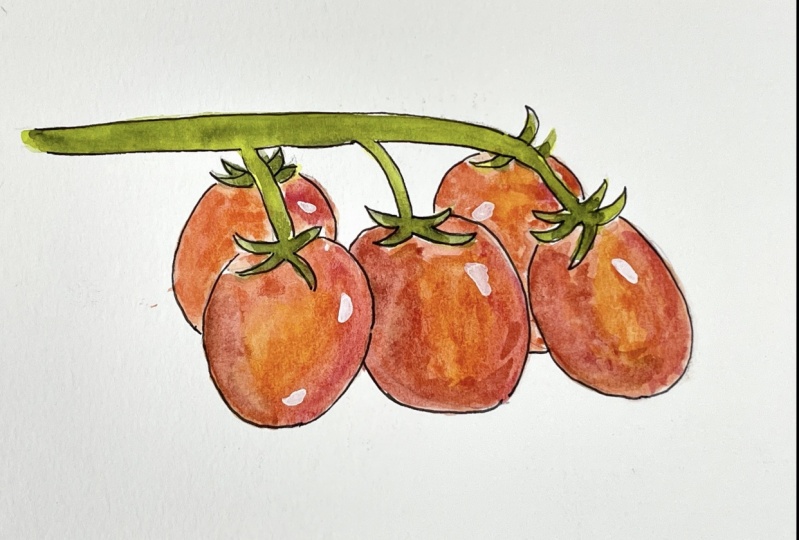
12. Painting Tomatoes: For our last painting,
we're going to paint these italian tomatoes, which are really egg-shaped,
the plum tomatoes. I'm going to start
by just wetting my brush with clear water and just introducing
a little water to each of these egg shapes. Not worrying about covering
the whole tomato or any particular area on the tomato just
within each border. Then I'm going to take
a little water on my palette and add some
of this vermilion hue. A little prayer line, red, I want to get just a
nice color to stain. I'm going to start with the
full tomato in front of me. And I'm going to create
just that shape. Really working on the
outline and whatever, whatever water is on the
paper will blend that. Really once I have
that outline shape, I'm just going to move
on to the next one and do the same thing. Leaving a little barrier
between objects. Leave a little barrier between the little greenery
that will paint later. But right now I just
want to introduce that first layer with a
stained pigment here. Again, a little area of
white is nice on the paper. If you prefer an
area that's fully covered with staying or pigment. And go ahead and
cover it all the way. I'm going to do these
ones in the back as well. Leaving a little gap between the object in the front and
this tomato in the back. Wet my brush, take a little more vermilion hue and mix it with whatever
is on my palette. And then deposit this
vermilion hue on the left side of each of these tomatoes that
we've already added. Just dabbing it in. Maybe a third of the tomato. Really getting that
interesting color blend with whatever is wet
and left on our paper. I'm going to rinse my brush, take a little perylene red, mix it in with the
existing color that we have and do the perylene
read on the opposite side. So on the right-hand side
of each of these images, I'm going to try
and go to the edge, but I'm not making it perfect. So if I have a little
bit of that area that we stained with that first
layer showing through. That's just fine. Again, I went a little
white of the paper to show if you want to have that rounded edge
all the way through, use that as well. Lastly, I'm going
to rinse my brush, make sure it's clear and take a little of this deep yellow. Take a little bit of the
pigment that we mixed, that orange and red. And now I'm just going
to mix a little of this color and dab it on in-between those two colors
on each of the tomatoes. It'll blend, it gives
another variation of color. We're starting to see
some interests develop, going to let this layer dry, and then we'll come
back and add the stems and our detail work.
13. Adding Details: Now to finish up the tomatoes, I'm gonna take my
number one brush, go in there with a little
bit of whatever's on my palette for the red fur. If you cleaned your
palette or a dried, just re-wet it or add some perylene red
little vermilion hue. I'm just going to very
lightly outline all of these tomatoes going right
over that pencil mark. I'll go over all of them. Speed this along. I'm going to switch to my
larger brush at a couple of brush fulls of water to
the red on my palette. And I just want to go over about half of each
of these tomatoes. Just on the one side here. It's adding a little
bit of a glaze, but just a portion
of each of them. Not trying to stir up what's there for the
pigment or blended. I just want to add
an overlay of color. Wet each of these tomatoes. Now I'm going to go in
there with a little deep green on my brush, mixing with a little red. So I still get a dark
color and just deposit a little splash of
this on each of those tomatoes on those
areas that we just wet. And that'll give a little
interest and a little depth. Switch to my number two
brush, make a new puddle. Take some deep green
and some lemon yellow. I have a nice green color. I just want to go
along the bottom of the stem here with this color. From the start to the
base of that tomato. I'll just connect
all the tomatoes to it and add that pigment
again to the top. Really filling in that stem. Rinse my brush. Take a little of this deep green and just in certain
areas on the wet stem, add that deep green. Rinse my brush again, pick up that color
that we originally put down and just encourage it
to run with that deep green. It forms a nice little blend
and a little variation. Going to switch to
my number one brush. Pick up that deep green, mix it with whatever
green remains. And then I'm going to make
these little parts of the tomato that stick
out from the plant. Just going to bring them. Each of the sections
here where this deep green pulling them out. I'm gonna take a little
of this yellow green, mix it in with just a
little of the deep green. Go over these again, give a little variation, fill them out and make
them a little thicker. Skip a few. I don't
think they needed or if they're too clustered already. But I like the way this adds
a little bit of shadow. Now lastly, I'm going to
take my brush just with some clear wet water
and go around the edge. Again to create that little ora. Take a little of this
surreal Ian blue can use your cobalt blue
or any blue you'd like. Or you can even change
the color altogether. I'm just going to deposit
that color all the way around those tomatoes. It gets a little tricky because we have that
little area to work on. But we're gonna stick
with that light-blue. Go around just the widest
of the perimeter first, helping that color
to blend out gently. Just so there are
no harsh lines. Then I add a little more
color and go back in here and outline that area. I'm going to outline both areas. Re-wet my brush, and then
just blend that together. There we have our tomatoes. In the next chapter,
we'll review our work that we've already
done and we'll look at a couple of variations using the same images and
the same template.
14. Class Wrap Up: Here are the paintings we've
worked on in class today. Each one has its iconic shape, and we really played with that. And then we added some colors. Now on a number
of them, we added some unexpected
colors that added a little bit of wind DSI on the artichoke and the
peppers and tomatoes. And I liked the way
that looked at added a very interesting
approach, very colorful. Wanted to show you
some variations that you can make using the same templates aside from flipping the
templates as well. Here I took each one of
the images and created them just so that I had a
catalog of images to use. Instead of doing the
aura around them, I just did a little bit of a shadow and I liked
the way that came out. The effects were
very intriguing. I played with the intensity
of the color on these. They're very vibrant compared to the ones we did in class, but I really enjoy
that aspect of it. Another version that I did is
called unloading groceries, where you just put
your produce on the counter and this is what
you bought for the day. I loved the colors played
with the variation of the shapes and really
enjoyed the process. I hope you'll try your
hand at painting some of these watercolor
Italian veggies. If you do snap a photo of your work and post it
in the project section, be sure to join me
here every Friday for a new class on Skillshare. And thanks for joining me today.
 Daniela Mellen, Artist & Author