Transcripts
1. Introduction: Hi, and welcome to This house. My name is Nadia, and I'm a professional artist living
and working in Berlin. I love painting with watercolor, but I have to admit it did
take me quite a while to pick it up because it is
quite a difficult technique, and I also like to
draw and paint hands, but I feel like that is also
quite a difficult element. So I've put together this class for you to take you through all the steps to make an expressive
watercolor painting of hands with a
botanical element. First, let's start by looking at the materials that
we're going to need. Then I will take you through
the process of looking for your reference image and showing you how I edit it
for my painting, using my phone software. Once you've chosen
your reference image, I will walk you
through how to get your image onto your paper
using a light source. And I will take you through the colors we will use
and how to mix them. For the project,
we will be making one watercolor painting of a hand and a botanical element. Once we have a
sketch on the paper, we will see how to start
painting by applying the first layers and building up our painting slowly
layer by layer. I've included a lesson to talk
about the basic notions of watercolor as well as how to get your sketch on paper in
a really simple way. So I think that this
class can really be for all levels of skills from
beginner to professional. If you've always wanted to paint hands and you
love watercolor, I hope you join
me in this class, and I will see you
in the next listen.
2. Project, Materials & Finding Your Image: In this lesson,
let's have a look at the project for this class, at the materials that we need, and at how to find our image, and then edit it
for our painting. For the project,
we will be making one watercolor painting of a hand and a botanical element. So I've created a
materials list, which I will also be uploading
to the resources section, and let's just go through
that for a moment. So firstly, we're going
to need water colors. I like to use these tubes, but you can also use pans or liquid water colors,
whatever's best for you. What is important
is that we need a palette because we will
be mixing our colors. We will also be needing brushes, and I'm going to be using three. I recommend you
have three to five brushes of different sizes. I'll be using a
one, ten, and a 16. Next, we'll need some
watercolor paper, and the important thing is
that it's minimum 300 GSM. I like to use fine grain,
but it's up to you. Really important two
containers for water. One is to clean
your brushes with, and the other one is to make up fresh colors for which we
will want really fresh water. We don't want to be
making dirty colors, and we will also be
needing masking tape to tape down our paper so
that it doesn't buckle. And for this, I will also
have a wooden board, but you could also tape your
paper down to the table. We will also be needing
graphite pencils as we will be doing some
details with pencils, and you'll want to probably
have an eraser handy as well. If you're going to be
using a light source for transferring your
image onto your paper, you also need a light
table or a window. You could also
transfer your image via grid method or free hand. I like to use a hair
dryer to dry off my paintings in between layers so that it goes
a little bit faster. So if you want to
speed up the process, I suggest you also have
a hair dryer on hand. So let's have a look
at where we can find some reference images
for our hands. This, for example, is pixels. I really like the site
because they have a lot of variety of
nice photographs. There are also some other sites like Nsplash where you can find some really
high quality images that you can use
for your artwork. So when you're
ready to download, I would recommend
always downloading in the original size
because that way you get the most resolution. And then just go
ahead and save it in a folder that you
have maybe created, especially for your project. And then you can
always easily find the reference images that
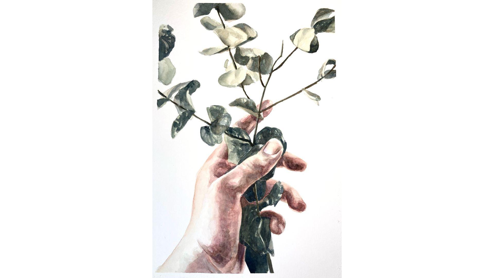
you've chosen for your project. Okay, so I found this
image here, I splash. I like the variety and
tones on the hand. We've got some
nice light shades. We've got some reds.
We've got some greens. We've got some nice shadows. And I also like the variety
of greens in the plant, so I'm just going
to go ahead and download that in
the original size. Next, let's take a
look at how to edit our image so that it's perfect
for our purposes to paint. And I'm just using my
program on my iPhone, just the normal photo
editing software. And I'm just playing around
with the brilliance here. So I'm trying to get
a nice contrast. Also upping the highlights
maybe a little bit, maybe taking down the
shadows a little bit, or rather making them
more intense so that I've got a really
nice, clear contrast. Also playing around with taking up the contrast,
taking it back down. Just play around with it.
All we want to really see is a really clear, nice, dramatic, contrasting
image so that it's easier for us to find the
highlights and the shadows. And then I'm also
going to adjust the format so that it is
30 by 40 or three to four. So that's perfect because it's exactly the size of paper
I'm going to be using. And then I'm just
going to save that. Once you're done editing your chosen image, ready to paint, let's revisit some basic watercolor techniques
in the next lesson.
3. Transferring Your Image: Okay, so as you already know, I've chosen this image and I've gone ahead
and printed it out, and now I'm going
to show you how to transfer this image onto your
paper using a light table. And for that, we're
going to need a dark environment so that we can actually see
the image really well. I'm just going to go
ahead and make it dark in here and then I'll see you
back in just a second. All right, here we have the
light table and the image, and I'm just going to
go ahead and turn that on and you can see I can raise the intensity and
I want to have it as high as I can so that I
can see as much as possible. I'm going to want
to fix the image on two sides so that while
I'm drawing it doesn't shift that I'm going
to ta masking tape. Just fix it. To the table and then making sure I have the
right side of my paper. I just place that on
top and you can see how wonderfully you can see
the image shining through. I also fix that on two sides. Then I will get my HB pencil,
which I've sharpened. I'm just going to lightly trace
the image onto the paper. I'm wanting to capture
the outlines, obviously. But also, I'm going to mark
in a moment for myself some darker areas
where the shadows are and then maybe some highlights that
I want to reserve. If you're holding the
paper to the light table, then make sure your
hands are clean. You want to keep tabs on which parts you've drawn and
which parts you have not. Worst case scenario, you can just turn on
the light and then you'll be able to
see your drawing better than the
image underneath. You can always
correct the drawing afterwards when you can see your reference image properly if you've made a mistake
or missed a part. You can say I don't
really have a set system for doing this. I'm just following the image. It doesn't really matter as
long as you have an overview. I like to be pretty precise
about the drawing part because it just helps you later really discern where
you're going to paint. The better your sketches, the easier it'll be for you
to know where the colors go. Some parts you won't be
able to see so well, like here in the shadows, I can't really make out much. I'm also just going to finish this part here, the thumb nail. I also want to be
quite precise about that because the
thing about hands is that you don't really have any clear planes and the
transitions are really smooth. What we're really just working
with is the transition of color from shadow
to light. Really? It's harder to see
because it's very light. You don't want to be
pressing too hard, so that you're making
indentations in the paper, but hard enough so that you
can see what you've drawn. You can always erase
your pencil marks afterwards if you don't
want to see them anymore, but just make sure
you don't make marks on the paper because then the paint is just going
to go right in there. Also marking in here where there's the shadows
on the leaves. Okay. I'm just going to turn on the light to see
how far along I am. Just got an extra image
printed out here, which I'm checking it against. Yeah, I'm missing a little
bit of drawing over here, a bit of drawing over
here. That's it. Looks good. Well,
let's remove that from the light table and
then tape it onto the board. This is what my finished
pencil drawing looks like, and I'm going to go ahead and
tape it to the board now. We do that because if we don't, then because of all the
water we'll be using, the paper is going to buckle and we just really
don't want that. Make sure I've drawn
ice and taped down. Then I'm going to erase my
drawing just a little bit. Just with my putty eraser, I'm just going to go over and take out some
of the intensity. When you're done erasing
your drawing a little bit, I will see you in
the next lesson.
4. Colours: Okay, so these are the
colors that we are going to be mixing today.
This is skin tone one. We've got skin tone
two, purple shadow, coffee brown, the green
ochre, and the blue black. And for that, we will need
yellow ochre, burnt sienna, crimson, ultramarine blue, Prussian blue, and ivory black. We want to be taking
a medium size or larger brush so that we can transport a
little more water and pigment to the compartments. I'm going to start by mixing up a little bit
more skin tone one. Already have some here. I'm
just going to add to it. I can always cat that
on a test strip. But I already know I need to add a little more crimson and a tiny bit with the
ultramarine blue. You just clean your brush, take some water,
take some pigment. Don't put in too much blue, otherwise it'll get too brown. Skin tone one in this
exercise is only going to serve us for making the first layer and that is just to indicate to ourselves
to give us a base, see where we're going
to paint later. I'm going to move on
to skin tone two, pretty much the same mixture, the colors are in different quantities
and different relation. Caso sometimes it takes a little minute if your
pigments already dried. What's the great thing
about watercolor though. You can always just revive it
by adding some clean water. Every time you take
a new pigment, you want to make sure
that your brush is clean. My add a little bit more
of the yellow ochre. I think I want a little bit
more red, so more crimson. That would be a skin tone to. Then I'm going to make
some coffee brout. I'll start with the sienna. We always want to
be starting with the lighter colors and then adding the dark
colors afterwards. That's sienna. So I'm just rehydrating this pigment from
underneath as well. I'm going to put some
ivory black in there. Remember this is one
of our shadow colors, a tone that we'll be using for making the
shadows on our work. Still light, so I'm going to add a little
bit more ivory black. I think it's a
little bit too dark, we'll just go ahead and add a little more sienna in there. Yeah, they're quite like that. All right. Now I'm going to move on to making my purple shadow. For that, I'll take
plenty of the crimson, add some water,
some clean water. We don't want to go
over the top and dilute the pigment too
much because then we just have a very light
wash. We can always dilute it later when we bring it over to this
part of the palate. Then we're going to add
some ultramarine blue. It's very purple. If you know a little
something about color theory, you know that we
use the opposites on the color wheel
to tone down colors. In this case, this is purple, the opposite would be
a yellow or an orange. I'm going to take
a little bit of the bird sienna,
put that in there. Still a little bit more. So it's a little bit more organic, a little bit more earthy. Actually, I think I want
a little bit more red, so I'm going to put in a little
bit more of the crimson. I like that. Next up
is the blue black. I think we'll be mainly using that on our botanical element. Starting with the Prussian blue. The Prussian blue is
a little bit more towards green on the scale. You can see it's
a different tint to the ultramarine blue. No, it's way too blue still, so keep adding some ivory black. The Prussian Blue is
also really dominant. Well, maybe a little
bit more blue. We can always make
it more fluid, as I said on these when we bring it over to the other
part. That's good. Then I'm also going to
make the green ochre. That's going to serve
us for the hand and the botanical element
and we can mix that later with
the blue black for the plant as well to get a little bit
of variety in there. I'm going to take the
prussian blue again. Add that in there, it's
a little too dark. We cannot use that
for a skin color. Put in some greenish
tones in the skin tone, back to the ochre. I'm going to need
to add quite a lot of yellow ocha still in here. Looks like quite
an intense wash. Let's just get rid of the
excess water and pigment there, dab it on the towel, and I like that. I do like that. I've mixed my colors
for the session. I suggest you go ahead
and do the same and then I will see you back
here and then Listen.
5. Basic Watercolour Techniques: Before we begin,
let's just revisit a couple of basics of
watercolor techniques. I'm going to use some crimson
just as my first color and I'm just going to use
the wet on dry technique, which basically
means I am painting with wet paint until a dry
surface, which is my paper. Let's let it dry.
In the meantime, let's have a look at the
wet on wet technique. I'm just wetting my paper
and then I'm getting my pigment I am just working that into the
wet area of the paper. Now, the wet on dry
technique is much easier to control than
the wet on wet technique. Let's have a look at
fading out a brush stroke. I'm going to work with
some ultramarine blue now. I'm just making a brush stroke. I'm going to clean my brush, dry my brush on the
paper a little bit, and then I'm just going to pack up a little bit of pigment here. Now my brush is
not entirely dry. Still a little wet so
that the watercolor will expand into this
brush stroke here. You can just remove the pigment, moving your brush
carefully over the paper. Don't go too hard on it because otherwise you perhaps
also damage the paper. Now, should we have a look at injecting some pigment
into a wet area. I'm wetting the paper, going to dry my brush
and I'm going to get some more crimson and I'm just going to inject
that into these areas. You can see it's not wet there. Maybe I'll just get a
little bit more pigment so it's a little
bit more evident. You can see and imagine that you can get some really
cool effects with this. Because once you inject the pigment, it
does its own thing. Now what happens if you make a mistake? Let's
have a look at that. Again with the crimson, I'm just going to apply
some to my paper. And I've realized
I've made a mistake. What do I do? I just get my
tissue paper and I just pick that up and then I can go ahead and just wet it again a little bit
with some clean water. Then I just with a clean
bit of tissue paper, I can just go over it again. And pick up as much as possible. Now, as you can see, it hasn't picked up all of the pigment. You could insist
if you wanted to, but usually it's so faint, especially if you're
going to be painting over it, that it
doesn't really matter. So you can see that these are
all translucent because we don't want to start going
opaque with our paint. The reason for that
is it gets harder and harder to layer the brush
strokes on top of each other, the more opaque the paint is. The beauty of watercolor really
is that it's so nice and translucent and it lets through
the light of the paper. Now I want to to try layering
with you guys as well. Let's just make a brushstroke
here with the crimson. We'll just wait for that to dry. In the meantime, we can try to mix two colors together
directly and see what happens. We've got the crimson
and I'm going to get the ultramarine blue and see what happens when I
mix them directly. We'll have to wait
for that to dry as well to see exactly
what happens. And while we're waiting
for that to dry, maybe we can just have a look at smoothing out edges
because sometimes we want to have crisp
brush strokes like this and other times we might just want to have them
a little bit smoother. Let's just have a look at that. I inject a little pigment there, but I want it to be a little
bit smoother on one side. I've just gone ahead
and clean my brush. I'm just drying that
off a little bit, and I'm just going to
smooth this edge out. You can see that the watercolor is expanding a little bit
into the still wet area. It's more damp, but
it is very smooth. You can always do this to get
a variety in your painting. I am going to actually try layering some yellow ochre
on top of the first. The very first
brushstroke that we made a top here can say it's
definitely dry now. You always want to
be making sure that the last layer that
you've used is dry if you're going to be
adding another color and if you don't want the colors to be mixing with each
other like these two, Now, you can move the brush
a little bit over this area, but if you move it too much, you'll actually end up
packing up the pigment from underneath because the watercolor
is still water soluble. You don't want to be
doing that necessarily. Now we've gone over some of the basics again of watercolor. I suggest we start painting
in the next lesson.
6. Painting the First Layer: All right. Let's just have a
look at my workspace setup. I have my drawing in the middle. I've got my brushes
and my tissue paper to wipe off any excess water
or pigment from my brushes, but also if I make a mistake to correct that
quickly from my paper. I've got my test strip
where I'll be testing all my colors, and again, before I put them on the paper, and then I have my palette
with all my mixed colors here and two jars of water. One will be for cleaning
the brushes and one will be for clean water. When I put more water into
my already mixed colors, that they don't get dirty. I think we are ready to start. In the first layer,
we're going to be painting with the skin tone one. Let's just have a look. I have my reference image and I'm going to reserve some areas where I'm not
going to paint, probably this part here, that's where the
lightest part is, maybe also a little
bit of this area here. I do need to paint
the edge of this, this is otherwise won't be able to see where
the hand ends. Obviously, if we're looking
at light and shadow, the lightest area is here
on this side and also this, and then the darkest areas
on the inside of the hand, where the plant also covers it and here the
shadows underneath. Obviously also the plant. In the first layer, it
doesn't matter if you make a mistake and we're not going to be doing any
smoothing out or anything because we're going
to be working with a really light watch, that really doesn't need to be modified in this first layer. We're just going to start by getting ourselves a little base. Let's start and I'm going to use my n six brush and I'm working
with my skin tone one, just bringing it over here. Trying it out on my test paper
to make it really light. I'm always referencing my
reference image as well. I'm going to start
at the top here. If there's any highlights
you want to reserve. Now, because the branches
also really dark, it doesn't matter if
you go over them. You can see I've played myself a little highlight up there that I want to reserve. I don't really want to
go over the leaves. I'm just picking up that
pigment with my paintbrush. I'm just going to
take it part by part. You can see the first
philande stops here. I'm going to do that and
then I'm going to move on to the next part and wait
for that to dry first. We're really just going from the most general to
the most specific. That means we're not
going to be looking at details right now, just covering everything that is going to be not the
white of the paper. I think they could actually be a little bit lighter still that wash. Now if this happens that you have
an excess of water, no matter, get your brush, take off the excess water
on your tissue paper, and then you can
just pick it up. What we're also trying
to do is just get these nice smooth movements
with your paint brush. We don't want to
be going staccato. We want to be making really
nice smooth strokes, trying to keep inside the lines. I'm just working on these parts as one because it's really quite hard to just differentiate
between phalanges here. What I'm going to do is just
reserve this nail here. Now I'll take a little
more of my skin tone one, dilute that with a little
bit of clean water, bring it back to my test sheet, and then I am going
to continue here. You can see that just by
having waited for that to dry already you can see
there's a little difference. It's what we want. We don't
want it to all bend into one. In this first step, it's not
as important as it is later. I'm just going to make it
slightly lighter around here. Then I said I don't want to paint necessarily
on all of the hand. I'm going to reserve some areas of this fingernail
so I'm going to see where the shadows and just already apply a
little bit of color there. If you have excess
pigment or what, you can just pick that
up with your brush by drying off your brush on your tissue paper and
then just picking it up. Seem to put too
much pigment there, so you can always just go and
smooth it out a little bit, even though on this first layer, we really just don't need
to worry about that. We're getting into this
shady area back here. Let's just let that
dry first before we continue there,
right next to it, and we can just hang this part here and maybe just
smooth this out. Maybe you want to make
some circular movements. You can also emulate the shape of the hands
and it'll be like this. Well, that's dry before
I continue with this. I'm just going to go
and start on the plant. After that, I'm going
to take my green ochre, bring that over here onto my mixing palate and I'm
going to do the same thing. Just go over the plant with a light wash. Could
be lighter even. I'm just going to cover
most of it really because I'm going
to be adding depth and volume to it with some more intense washers and also a little bit of
the blue black later. But what I don't want to do is just treat everything
as one leaf. I just made a mistake
here, this is two leaves. I'm going to try and work
as I am on the hand by leaving adjacent areas to dry first and then
come back to them. By leaving adjacent areas to dry first and then
working on them separately, we're just going to get a
little bit more definition, and it's not just going to
look like one big mass, but rather different
separate elements, which is what I want. So yeah, I'm just working on the separate elements and trying to work one
leaf at a time and leaving the
adjacent leaves for now until the leaves that I'm working on right now are
dry to get that definition. And then I'm also going
to try to work on the darker areas of
the leaves first and then move on to cover
the lighter parts later. So the hand should
be dry by now. I'm not too worried about
that spreading in there. Just make sure you don't go over the edges onto the hand.
We don't want that. I'm still just using
that one color, the green ochre, and this is
just a really general wash. It's our first wash, so you don't have to
really go over the top. We're not trying to put in
any details or anything. But there is quite
a bit of plant to cover, that might take a while, but I'm just working
steadily here with the one tone
and just reserving the highlights where
I need to and just covering the general
base as I go. Leaves like this,
I'm trying to do this part later so that you can really see that there's
a spatial difference. Okay, so remember if you have
excess pigment or water, you can just pick that up
with your paint brush. If you have a
highlight, like, for example, this little line here, I'm just going to reserve that
might be quite nice later. Carry on now that the
skin here will be dry, I'm just going to take
my skin tone one again. And just go over this part here. Then I am going to start
again at the top of the leaves and work on the ones that were adjacent to other leaves that I've
already worked on. I really feel like
you can tell that it just makes a difference
straightaway. I like to wait for this one to grow before
I work on that one. So yes, I'm just going to go over the rest of
the leaves now with the same tom evenly to
finish this first layer, and then we will have covered the areas that don't
want to be left white. And so that will give
us a better indication of where to go from there. But as I say, it doesn't have to be detailed, as you can see, I'm just filling in the leaves really evenly with
my green ocho. Then the last parts up here. It's a little too much. Should make it a habit to always test your colors out on
your test strip first. That way, you'll have
a lot less mistakes. Now I'm going to work just on the stalks, on the branch here. Try not to lean your finger
on your painting if you can. That would be our first layer. Now we've got to
either wait for that to dry or we can blow dry it, and then we will continue.
7. Starting on the Second Layer : All right. In this lesson, we're going to look at
working with skin tone two. But we're going to
start really defining some volume by applying the paint and then
smoothing it out in the direction of the hand. We can use circular brush
strokes for this or we can use the strokes that go in
the direction of the fingers. Make sure you do this while
the paints still wet. So we're trying to put down a base and start to
focus on a little bit more of the shadows
on the fingers and the hands so that we can see
a little bit of contrast, little bit of depth, and a
little bit of volume build up. We're going to paint
the same way as we did in the last lesson, we're going to start one part and then leave the
adjacent part. Open, move on to the next part, and then the next
part, and so on, and then return to the parts that we worked on first
when they're dry. Okay. Another thing
to note is that we're not going to
draw the lines of the knuckles on the inside of the hand just because it's
not going to look organic, but I'll show you what we'll
do when we get to that. Getting askin tone to, adding a little water because
it's really quite a lot. Pigment. I'm going to start
on this finger up here. You've got too much water
or pigment on your brush, you can just dab it off
on your tissue paper. All right, so just finding
that shadow in there. All right, so now
I'm smoothing that out and moving on
to the next finger. You can see it's darker on the inside and less
dark at the top, so just smoothing
that out as well. Actually just going to remove
a little pigment from here. So while it is true that painting and drawing
hands is quite difficult because the planes
just all kind of blend into each other and
there's no clear lines really, O task is to look for
the highlights and the shadows as we would in any other painting and just
focus on that for now. So remember, you want
to be working quite fast so that it doesn't dry. So what I'm doing now
is just looking for the shadows and reserving the highlights and just applying my color to the areas
that are in shadow. In that way, I'm just
building up my layers. Remember that you can
always correct mistakes by picking up the pigment
with your clean wet brush. Okay, so continuing with
the finger down here. Then just smoothing it out. The pinky. It's really quite hard to see where the phalanges start
and end down here. I'm just going to paint
all of this for now. Smoothing out the pigment. If you feel like
you've got a little bit too much, don't
worry about it. You can just get a
piece of tissue paper and add that on there and
then continue smoothing. As I said, it's quite important to smooth
these brush strokes out. The transition of the
plans on the hand are very smooth and you can only see them because of the light and shadow
and the contrast. So there's no cut lines
is what I want to say. We've got to try to make these
transitions very smooth. I'm going to go on the
inside of the hand. Always cleaning and drying off your brush when you're
about to smooth. I'm not going to smooth out on this side because
that is actually quite a clean cut from this
part here to this part here. We don't need to
smooth that out. Now I think I can probably
start on this part here. This is the darkest part and I'm going to smooth it
out to both sides. Try not to go over
the leaves too much. You just smoothing that
out if you want by a circular motion or also in
the direction of the finger. Then I'm going to
move on to the thumb. I'm not painting really
intense shadows just yet, but that's what I'm
looking for so that I can start to indicate
to myself where the shadows are and then I'm
just going to smooth them back out so that it's very
subtle at the moment. You can see I've marked myself this beautiful shadow here. And I'm going to start up
again here just to leave that metal part until the other part that I've
just worked on is dry. Nice, smooth brush strokes. And again, trying to smooth that out while the paint
is still wet, so we have to work
a little bit fast. And also, on the other side, I don't really know
what happened here. Just going to correct
that. I think I probably dropped some water on
it unintentionally. Don't worry about it. We'll just mop up a little bit of the pigment and we'll go back to it in a minute. Take away a little bit
of that still it over. And going to start
again on the thumb now. Just trying to find
the form here now. Okay, so you can see
I'm trying to emulate that shape that is
in the shadow there. Okay. Smooth it out. And then I'm also
going to go over this part here. Same thing. Smooth out. Now
that is still wet. In the meantime, I'll be
going over my plant again. I'm going to focus more
on the darker leaves. And I'm going to start
from the top here. Got a little too much
pigment on my brush there. You can also smooth these brush
strokes out a little bit. So yeah, as you can see, I'm not really focusing on
any details here. I'm just covering the
darker areas of the leaves. Remember Testra. What I'm trying
to do is start to build up some of this
contrast so that it really starts to come out of the paper and you can really start
to see some depth by just using the green ochre to put a uniform layer on
top of the leaves. But again, I'm trying to work on areas that are not
adjacent to each other, so I'm working on this
part of the leaf. I will not be working on this
part directly afterwards. I'm going to smooth
it out a little bit. I feel like on the leaves, it doesn't matter if the brush
strokes aren't as smooth. It might be nice
contrast as well. If they're a little bit
crisper than the hand. It's a nice contrast anyway
because of the reddish tones of the hand and then we've got greenish tones of the plant. Not working on that it's too close to the
other part of plant. I can always go ahead and inject a little pigment as well. That might be quite nice here and there, see what happens. I just focusing on not
covering the entire plant now, just some areas that I feel
like a little bit darker, a little bit more contrast. Then smoothing out some parts. Adding a little detail,
but not too much because what we like
to do is go from the general to the
particular from the very general picture to the details and
we're not there yet. So you can see this part of the plants a little bit lighter. There's a couple of
highlights on there. What I'm going to
do is just fill up this part and then the hand, just smooth it out a little bit. Here this is similar to what we're going to do in
the hand as well. Just outlining these
highlights and then I'm going to smooth
it out a little bit. That way we'll get the
feeling of this texture. Wrinkles candles, I guess. Remember, you always want
to have your tissue paper directly by your drawing
so that you can dad any excess pigment or water
off your paper brush and also if you make a mistake or
a drop of water falls on your paper and
makes a weird mark, but you can just lift
it up straight away. And then I'm smoothing
this part up too. Remembering that
we're not working on adjacent leaves at one time, waiting for them to dry first. I'm here being very careful that I don't go over the thumb. I'm going to go over
this, but only because the outline has a
highlight on it, so I'm not going to be touching my leaf that I've
just worked on. I really like to start
seeing this contrast. Feel like it's starting
to come along? I feel like even though we're
going over the darker areas just with one color in a really
kind of uniform fashion, you can already see this
contrast kind of building up and the drawing or the painting really starting to
come out of the paper. Just go over some of these areas that I
haven't gone over yet. Now, if you got over
an area like I just have that you've already gone over a leaf that's
adjacent to another one, you will see that it
just gets a little bit darker, so it
doesn't really matter, especially if it is a little bit darker and
you reference so much. Try not to get your hand on any damp or wet areas
that you've got going on. I am working on
adjacent leaves here, but only because I've already
gone over this one before. Hopefully that will just
look a little darker now. I'm just working my way across the entire painting until I have covered all the
areas, and again, trying not to work on
adjacent leaves or adjacent areas so that it
doesn't look like one big mass, but rather many
different elements. Go over the stalk here
as well a little bit. I'm being quite liberal
here with my brush strokes. I think that'll probably
be interesting in the end in the plant. I'm starting to add a
little bit of texture here, adding a little bit
of shadow where there may be a
crease in the leaf. Okay. Now I am going to touch up the part of this finger here that had the
water drap on it. So that and then smooth that out. I'm going to remove a little
bit of pigment from here. It's a little bit excessive. So that I think I need
a really dry brush, so just drying that
off a little bit. Then I'm going to take
the green again and go over these parts of
the stem of the plant. Careful not to touch this
part that I've just gone over because otherwise the green is just going to
spread into the hand. I have to wait for it to dry. Try not to rest your finger on any wet areas on your painting. It's really easy to then drag the paint to another
part of the painting. I just gets a little messy. Okay. I also have to go
over this left here, which I didn't go over before. I'm going to just dry that off, and I think I'll give it
another little coat of the skin too because I feel like it's still a
little bit too general. Actually, just realized that I haven't done this part here yet. I'm just going to go
ahead and do that. Dry off the paint brush and
then just smoothing it out. Okay. Now I am going to go
in here just one more time. I've actually managed to miss out one part completely, and
I'm just going to do that. Let's this part here. I'm just going to smooth
that out as well. I'm not going to smooth
it out over the thumb. That's fine. If there's
crisp line there just here. It did go over the
line tiny bit. I'm just gonna remove that and dry it off with
a little tissue paper. So it doesn't expand
into the thumb. Okay, so I'm going
to dry that off now. And I will see you
in the next lesson where we will continue to heighten the contrast and work with some
purple shadow.
8. Adding Shadow: In this lesson, let's
start adding some shadows. Let's just see where the
shadows are. In the. We've got this part
here over here, under here, obviously it's
a lot in shadow and here. And the inside of the hand and then this pinky finger
as well, and also here. There's also other
mid tone shadows that we also want to be
using the purple shadow on. We're just going to go again, general to specific and we're
just going to start marking the mid tones with the
purple shadow with a slightly lighter wash
and then afterwards, we'll go over it again with
a little bit more of a wash. I'm going to use my
number six brush again for this taking
some purple shadow. Gonna bring it over to
the compartment here. Add a little water. Try
it on my test strop. A little more water, then
I'm just gonna start. Same as I did before.
It's not enough pigment. That is not enough. And I'm just getting
into this shadow here in the finger
under the leaves. Same as before, we're
smoothing it out. As you probably know from
your own experience, it isn't really that easy to
draw and paint hands because of the difference in the planes and the lack of the clear lines. This is where we really
need to start focusing on finding the shadows,
the mid tones, and the highlights so that we
can really start generating those planes and give it volume
and make it look organic. If you feel like you've got a little bit too much
pigment in some areas, we'd actually like to reserve a little bit of
highlight, remember, you can always just
get your tissue paper and just dab it in there. Lift up some of that pigment and if you want to go back
and smooth it out afterwards, And we're still not working on areas adjacent to the
ones we've just worked on so that it really
starts to become different elements and
not just one big mass. Smoothing only the bottom line, and here, I'm going to smooth
it into the fingernail. So I'm also trying to look for the shapes of the
shadows on the fingers. So I'm going to
start on this mid tone shadow here on the thumb. And again, I am going to smooth that shadow out because there aren't any
hard lines there, and so I don't want my shadow
to have any hard lines. Okay. That's looking good. Go to continue here. I feel like it's
hard not to work on this part together because
it is so connected. Now, you can see I'm applying
quite a lot of pigment, but then I'm going to smooth
it out so that it really is just a mid tone shadow because as you can see
in the reference image, it isn't as dark as I've
made it here to begin with. You can see that's
taking shape already. It's pretty nice. Okay, so
I'm working wet on wet here. Just injecting a little pigment because that seems to be a
little bit darker there. Okay, so how do we
get these wrinkles? I'm going to instead of
outlining them one by one, I'm going to make
these squiggly lines. I'm going to start
off by doing that, and then I'm going
to smooth them out. So I've got some shadows and
I've got some light areas, but they're not
like, really drawn. They're not really
defined. So they're just kind of insinuating
these wrinkles. Don't use too much water here. I think I'm just
going to change to my number ten brush
for this part. Testing my purple
shadow on the test rah. And then I'm going
to do the same with the wrinkles down here, just going to create
some squiggly lines, and then I am going to change
to my number six brush, and I'm going to
smooth those out just to insinuate
those wrinkles. I'm also going to smooth
out this part here. I don't want that to have
too hard of an edge. I don't want to make
this one too prominent, but there is a
definite line there, I put it there and I'm
taking it away a little bit. This part is a lot darker, so I'm just going to inject
some pigment in here. This part is also a lot darker, but it's already dryer. I'll just add that
smooth it out, and here Just remove a
little pigment from there. Then I'm going to move on
to this part down here, just going down into
the palm of the hand. I'm going to finish this part of the handm switching back
to my number ten brush. If you feel like you've added too much pigment at some point, you can just go ahead and remove a little pigment with
a wet and clean brush. I'm also going to
smooth that out. Now, you can see why it's
so complicated paint hands because it really is
just this balance between light and shadow, and there's hardly
any drawing on there. Now I'm going to do move on
to this finger here again. You can see it's just like
painting any other painting. I'm adding the pigment, then I'm smoothing it out or removing it, building up the layers
little by little. I'm just going over the shadows again on the index finger, just working my way
across the painting. Now I'm going to go on
to the middle finger. And again, you can see I'm
trying to find the shape of those shadows that are going on there on the middle finger. If you're having trouble seeing the difference between
light and shadow, you can always squint
your eyes, and that way, it's easier to see because it just simplifies
the contrast for us. Don't forget to smooth out. Going on to the
inside of the hand. And then the next finger. Also smoothing that out. This very dark shadow on you. Once again, you can observe in the reference image that there
is a shape to the shadow. So that's what I'm trying
to find right now. Once again, smoothing out. Try not to have too much
water on your brush. Moving on to the next figure. And again, you can
observe that there is a shadow with the shape that
I'm trying to emulate here. Again, smoothing that out. So smoothing out these shadows will just make it
look a little more organic and the planes kind of start to blend
into one another. So we want these
smooth transitions, so we really need to remember to smooth out our brush strokes. Going on the inside
of the hand here. And you can observe that
the inside of the hand and the thumb are actually
quite different planes, so it's right to have a bit
of a crisper edge there. And still continuing
with the shadow. And I'm just going to
get them here now. So when you're painting hands, it does become important
just to be observant of the planes of the hands and which ones have a very
smooth transition. Like, for example, where
there's curvature on the hand, here, for example, and
on the other hand, where you've got more defined transitions that
aren't that smooth, and then to make a
decision about which brush strokes to smooth out and which ones to leave
a little more crisp. And I'm going to make
a few changes here. For example, here, this nail. I'm not very happy with that, so I'm just going to keep
working on that for a minute. Going to take away a
little pigment here too. Then I am going to go over the plant with
some coffee brown now. Namely the stalks first, then we'll see
about the contrast. We're really also looking for whether there's a
light to the stalk. But as we already discovered, most of it is
actually in shadow. But for a example here, we have a bit of light on the stalk on the left hand side. I'm going to get some
blue black and just really go over some of the
darkest areas of the leaves. Going to smooth these areas out. Leave some a little bit crisper. So if you want to make
it a little more varied, you can also not cover
the entire shaded area. You can see I've
left a couple of kind of highlights or, you know, uncovered areas so
that there will be variations to the green and the shadow and the contrast within the shadow of the leaves. And when you're working
close to the hand, just remember to be
careful not to go over any of the skin tone areas
with your green or your blue. So my aim isn't to make a hyper realistic painting that looks exactly like the
photograph or anything. I'm trying to make an
expressive painting. So right now I'm
just trying to get a little bit more drama in these leaves by
heightening the contrast, adding a bit of shadow,
leaving some highlights. And yeah, just also
with the blue black getting a little bit of
tonal variety in there. So you can see, I'm just making some expressive
brush strokes here, and we'll see how that
turns out once it's dried. So just be free also with your brush strokes and let
watercolor surprise us. And we can also get some
really nice variety in here if we're a little
bit loose with our brush, and then we choose some areas that we're just
going to smooth out, and others, we're just going
to leave a bit crisper. What you can also do, of course, while the paint is still wet on your leaves is just go ahead and inject a little
pigment here and there, and that will also
make for a bit of variety and an interesting
contrast in brush strokes. Again, remember to be a little bit careful when
you're working around the hand area so that
you don't get any of the blue or green onto
the skin tone areas. And if you do accidentally
go over a part, just quickly lift it up with your tissue paper and you can smooth it out
with your wet brush. So I feel like this is
really the darkest part underneath in this part of
the inside of the hand. So don't be shy with
your color here and just make sure you get
a really nice contrast. So also remember
that we're trying to avoid working on
two leaves that are directly next to
each other so that each element is defined and
it doesn't blend into one. And I'm going to go over all of these leaves down
the bottom here, but still remembering to
reserve the highlights. I'm going to dry that off
and then let's go over some shadows once more with
a little purple shadow, then we'll probably
use a little bit of the coffee brown and then we'll see what else
needs to be done.
9. Intensifying Contrast: Now I'm going to use a little
bit of the green ochre. I'm just going to apply it to some areas of the
hand where I feel like there's still a
little bit of shadow needed and it's just a little bit too red
for me at the moment. I'm going to start
with the thumb. I'm using my number ten brush. Applying a thin layer of greens just going to neutralize
that red tone. Again, I don't want to
make really crisp lines. Especially down
here, you can see that there's a little
bit of a greenish tinge. And I don't want
to go overboard, so I don't want this to
be completely green. I just want to take a
little bit of that red, like, really, really
red tone off the hand. So I'm just making sure my
wash is nice and light. I'm also going to get into
the inside of the hand. Doesn't matter if I go over the leaves because
they're green anywhere, and they're in shadow back here. Going to also take a little
bit on the side of the thumb. So as you can see,
I'm also not covering the entire area that I've already painted,
just some areas. Not quite happy with
this part here yet. Especially because
there's a wrinkle and I don't want to
accentuate it too much, so I'm just insinuating
that it's there. Really faint lines. Probably need to go
over that in a moment. It's a little bit too green, go over that with
some more skin toes. Moving on to this part. So, as I said, I don't want to cover all
of the skin tone, some areas, but definitely
in here and also up here. I'm really just looking for some shaded areas mainly just applying a little
bit of that green. Also a little bit here. Not really happy
with how they dried. Applying the paint. And smoothing it out. I'm
really happy with this either, so I'm just going to smooth
it out a little bit more. You can always work on the watercolor paint
even if it's dry. Just be careful
not to do too much because you don't want
to lift up your paper. I'm going to get a
little bit more of the green ochre and
also get pinky here. I really use some
and smooth it out. Have your son here? Yes, I'm just reiterating the shape of this shadow
with my green ochre, but again, just making
sure it's very light. Them here. Okay. I'm going
to try that off again. I'm making sure that
that's completely dry. I'm going to get my eraser. I'm just going to
erase a couple of these lines and really
do make sure that it's completely dry
because otherwise you're going to rule on your paper. I just erasing this line here. It's really annoying. I'm going to erase a couple of these. So just really carefully, I'm erasing these
because I feel like they're really just disturbing the subtlety of the painting, and I'm using a putty rubber, so that's quite good
for erasing pencil and also charcoal because it doesn't really leave
those smudgy lines. I feel like that's
already better, and now I'm just going
to go over some of the darkest shadows here in the hand with
the coffee brown, making sure it's not too dark. For example, this line here and also a membrane
to smooth it out. Then I'll leave that
for when that's dry. Accentuate this line of the
thumbnail here as well. With the coffee brown right now, I'm just focusing on some
of the darker areas. These really dark areas, we're not going to
get them as dark as they are unless we
use blue black. I'm really not a fan of using blue black on the
skin because it just makes it look
a little inorganic. I'm just focusing on some
of these darker areas. I'm trying to put in these creases a little bit without making
them too dramatic. Again, plot them out. And moving on up to
the pinky again, to this shadow up here, which is quite prominent. I'm also trying not
to go over the top, though, because then it starts to look a little bit unnatural. So it's about
finding that balance between dramatic
and also natural. Okay, so I know this looks
like a very deep shadow, but I hope that, you know, after I smooth it out and
then once it's dried, that it makes sense, really starting to get into
the details here now. Go to the finger here as well. Remember that the
contrast that we can achieve with
watercolor is not the same as we will achieve oils or gouache or any
more solid paints. But it's fine because it's actually what we love
about watercolors, this whole translucent thing. We just trying to get as
much drama in here as possible without taking
it over the top. Taste a little bit
more skin tone, too. Just get there a
little bit, it mixes. Now, if you feel like it's looking a little bit too brown, you can always go and
give the whole thing a little wash with the
skin tone to again, and I'm going to go into the pinky finger again and emulate the shape of the shadow. Okay, so we're almost
through with the copy. So sometimes because of
the perspective and also, you know, what we
talked about before, the difficulty of
painting hands because of the planes of the hand
and the smooth transitions, don't focus so much
on the drawing of the hand to
orientate yourself. Rather look at the shadows
and the highlights. If you're finding it hard to
see the shape of a shadow, just squint your eyes that really helps just simplify that. Then also going to get into just a couple of these
darker areas here. I can see one just down here. This one, this area here. I'm just insinuating
this wrinkle one here. You don't want to leave it very crisp because then it just doesn't look organic and we'd
like it to look organic, really lightly here as well, a couple of creases. And I'm going to just
insinuate this crease in here just really,
really, really lightly. So really just insinuating it so that it looks
really natural. And if I don't like it, I can always just take it away again. And then I'm going to work on
this part over here again. Yeah. And I'm here. Now I feel like I need to add a little more shadow on here as well and insinuate that crease. Now it's gone again.
So use too much water. Okay, so I'm going to
dry that off again, and then in the next lesson, let's have a look at putting
on some finishing details.
10. Finishing Touches & Final Thoughts: Interesting. In this lesson, let's just put on some
finishing touches to our work, and I would like a
little bit more blue in the hand because
it's just a little bit too red for
me at this point. So I'm just going to take some ultramarine blue
straight out of the tube, so unmixed with anything. And I'm going to make a really
light wash, like, very, very light wash. And I'm
just going to go over some of the areas and shadow with this light wash so that it just kind of tones
down the redness, maybe even make it look
a little bit purple, but not like the purple shadow, more of a blue tinge to it. And I'm just going to work
my way across the hand, adding the blue two
areas here and there. I don't want to be covering
everything necessarily, but yeah, I just really want
to tone down that red tone. I can also make some shadows a little more intense like
this one down here, for example, and adding
some blue to the wrinkles. That's one thing and I'm going to have to
dry that off again. Now I'm just going to
go back to my skin tone one and see that there's a light wash there and I'm just going to
go over this area here. It's a little bit too intense. And I'm going to smooth
that in as well. So with a clean and damp brush, I am just going
over this part here to make a nice smooth transition
on the back of the hand. Maybe use the slightly
larger brush for that. Number ten, for example, then again, skin tone one. I'm just going to go
some of these areas too. Giving it a little bit
more life, I feel. And I'm not going to
go over everything. I'm just going to
touch on some areas, and I'm alternating
between colors to give it a little bit more
variety and volume. So this is not all white. Don't forget to smooth
out your brush strokes. I don't want any sharp edges on the soft surfaces of the hand where there
aren't any sharp edges. And I'm just going to
work my way around the hand covering
the areas where I feel like it needs a
little bit more color to have a little
bit more vibrancy. And I'm just still doing
that with my skin tone one. I really like how
bright these highlights are under the fingertips
here in the reference photo, and I feel like in my painting, currently, they're just
a little bit colorless. I'm just going to go over those as well with my skin tone one. And remember, if
you make a mistake or you go over the lines, you can pick it up with
some tissue paper. And I'm just going to take my skin tone to that I've still got here on my palette I'm just going to cut
over this part again. Well, I feel like it needs
a little more intensity. Again, I'm still building up those shadows and
heightening the contrast, and then I'm going to
smooth it out a little bit, trying to avoid sharp
edges or crisp edges. I want it to be very smooth. Insinuating some little
bones here as well. You can always smooth it out. I put a little color
in this line here. You can see there's a little bit of a
highlight next to it, which accentuates that too. Maybe you can use slightly
smaller brush for that. I'm not liking how
that has dried. You can always just go and correct stuff as you notice it. I can in pigment. Over some of these brush
strokes that are already there, I'm just insinuating
now these lines. But you don't want
to go over the top. I'm just putting on some finishing touches
here and there. Just going to go over the
thumb a little bit more. I think I've left it a
little bit too light. It's a little bit
more in shadow, so I really want to just
up that contrast a bit. Okay, I think I'm actually quite happy with the hand
at this point, and I'm just going to go
and grab a little bit of my coffee brown and
start adding that to the leaves to give it a
little bit more contrast. And I think also
because the leaves are green and there's a bit of
a red tone to the brown, that will also give it
a nice kind of variety. And also make it more vibrant because you
probably know that if you put two colors next to each other that are opposite
on the color wheel, they actually make each
other more vibrant. I really like to add
different colors to an element that you may
think is just one color. So, for example, the leaves, you might think it's mainly
just, you know, green. But if you just add a little
touch of something else, it just really
makes it pop and it just really makes it a
little bit more dramatic. So one of your challenges
is to start looking at your reference image
and really start to see the different colors
in the different elements. And if you can't see them,
you can start to imagine them and just start working
them into your painting. Hook, that's a
little bit too much, so I'm just going to remove that and move it
around a little bit. And then I'm going to
smooth that out, as well. I don't want the brown to
start overtaking the leaves, the overall color of the leaves. So if I feel like that's starting to happen, I
really need to stop. And I can also just go ahead and remove some of the pigment. Maybe here I could add a little bit more of the
blue black, as well. And I'm just switching
between colors, going back to my coffee brown. I think right here, I need to add a little bit
more of the green. And back to coffee brown. I'm just being pretty liberal with my brush
strokes in here. All I want to get
is a visual effect. I don't need to be
very detailed with the actual leaves
or what they look like or anything like that. Maybe last but not least. I'm going to take some purple
shadow and a little bit of blue. Not that much. Oh. And just put in some
really fine details. Just the finishing touches here. Sometimes just a
very small spot of color will help make
everything else stand out. So you don't want to
be going over the top. You really just want to
be focusing on small, small details and just
accentuating them. Going over the shape
of these shadows on the inside of the hand
again in the fingers. Just heightening those
shadows that contrast. I was looking for the
darkest areas, as well. And I'm just going to remove
a little bit of pigment from here where I feel like I've used a little bit too much. And on this highlight here, I'm going to apply a little
bit of the skin tone one. When you're removing
pigment with your brush, just remember to be careful so that you don't end up
lifting up the paper. I think I'm pretty much done. If you do want to add in these wrinkles and accentuate them, make sure you do
it really subtly. Smoothing out after
you've edited them. And so there's part
here that needs to go. Just looking for those
final small details like on the thumbnail. Maybe there's a little real
contrast that you want to heighten with a line
or put in a wrinkle. I'm going to dry that off
and then maybe I will give just a little bit of
yellow ochre to some areas. Okay. I'm going to get
my number ten brush. I'm just going to grab
some yellow ochre just straight from the
tube, pretty much. Just make a light wash. You always get a new test
strip if you need one. Then I'm just going to go
over some of the areas here. Some yellow ochre. And I want to use the
yellow ochre just to balance out the red tones
and the brown tones again, give it a little bit more life, add a little bit of variety, really lightly, though, and I don't want to be covering
the whole thing, so just some touches. Maybe I'll just
go over the plant as well with a little bit of a yellow ochre wash. You don't necessarily
have to stick to the colors that you can observe
in your reference image. So I feel like the yellow ochre is not really visible
on the plant, but I can definitely
see some yellow ochre on the hand and the arm, and I think it really works. Okay. One thing that I just noticed that I don't like
at all, is this here? I'm not loving how this
fingernail has turned out, so I'm just going to remove some pigment and try and make it a little bit more smooth. Maybe leave this up to the
imagination a little bit more. And to remove the
pigment, again, I'm just going to dab
some clean tissue paper onto the area I want to remove and continuing to remove some pigment to try and get the shape of the
fingernail right. And then I'm going to
take some skin tone to and just add a little bit
more pigment in there again, trying to get the shape
of the shadows right. I feel like the shape of this shadow here isn't
quite right, either, so I'm just going to have
another look at that and try and get the shape
of this shadow right. And also the shadow up here. I feel like I need
to do a little bit of work on that as well. Going back to the pinky finger. Another thing I'm not too
happy with is these creases. I'm just going to go over
them with my skin tone, one again, and then I'm just going to blend
them in a little bit. Again, I am going to
switch colors and I'm going to go in here with the purple
shadow a little bit. I feel like I could
keep going for hours, but I'm actually
quite happy with it. I feel like I'm going
to leave it there and let's take it off the
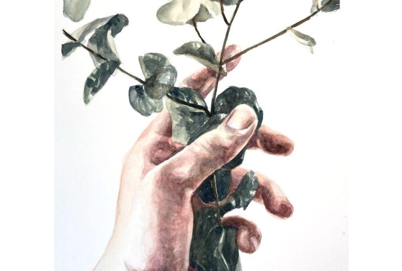
board once it's dry. Now that it's dry, we are ready to remove the
paper from the board. When we remove the masking
tape from the paper, we just roll it out
like this so as to not damage the
paper too much. And that is the finished work. Thank you again for
joining me today. I can't wait to see all
your awesome projects, so please remember
to upload them to the project section
of this class. Also, make sure to stop by my profile to see what
else I'm teaching. And you can do that just
by clicking on my name. If you love watercolor
and you've always wanted to paint a
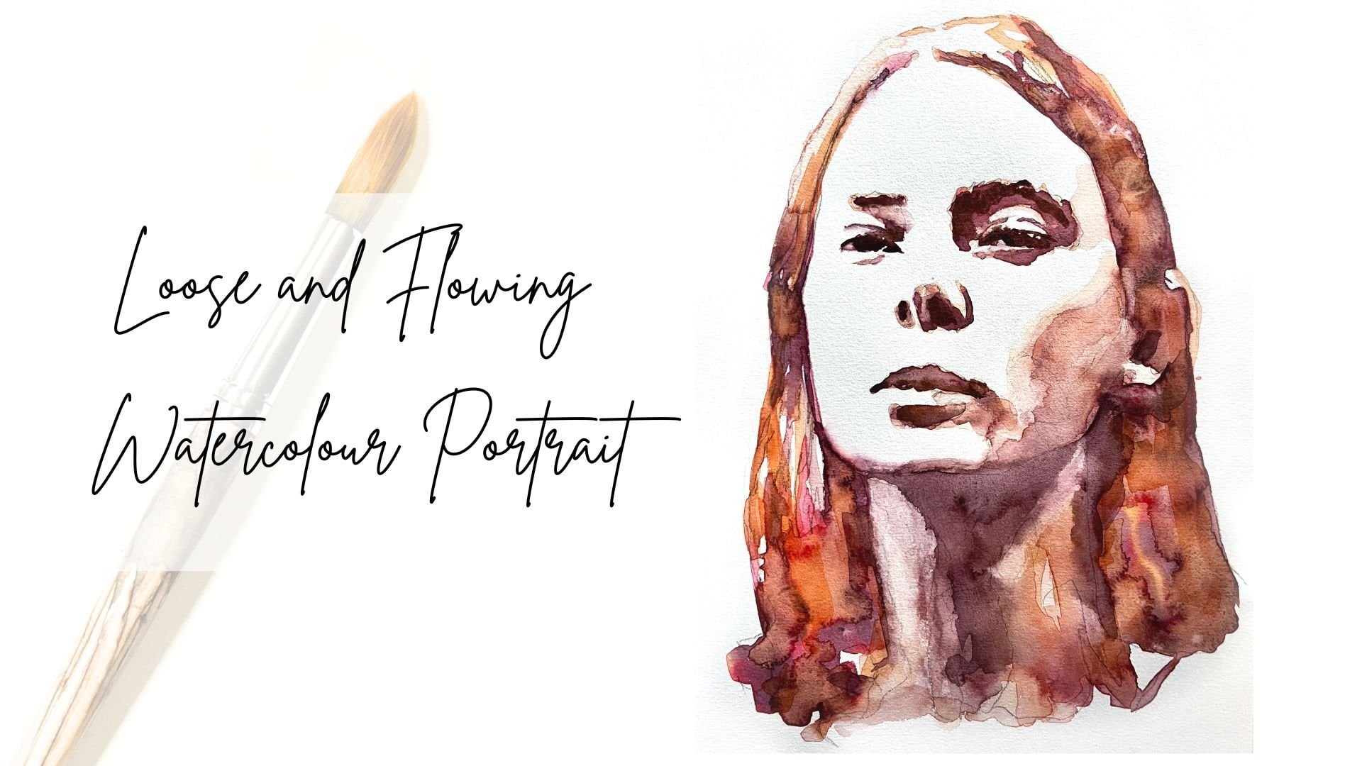
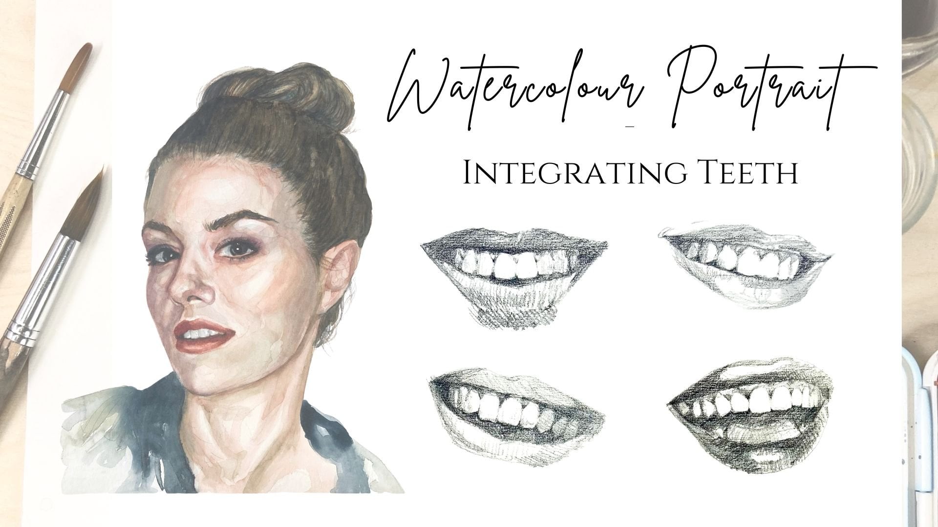
portrait with watercolor, check out my class watercolor
portrait from a photo, where we start from
the very beginning and go through all the basics, and by the end of the class, you will have all
the tools to paint a wonderful expressive
portrait with watercolor. Alternatively, you
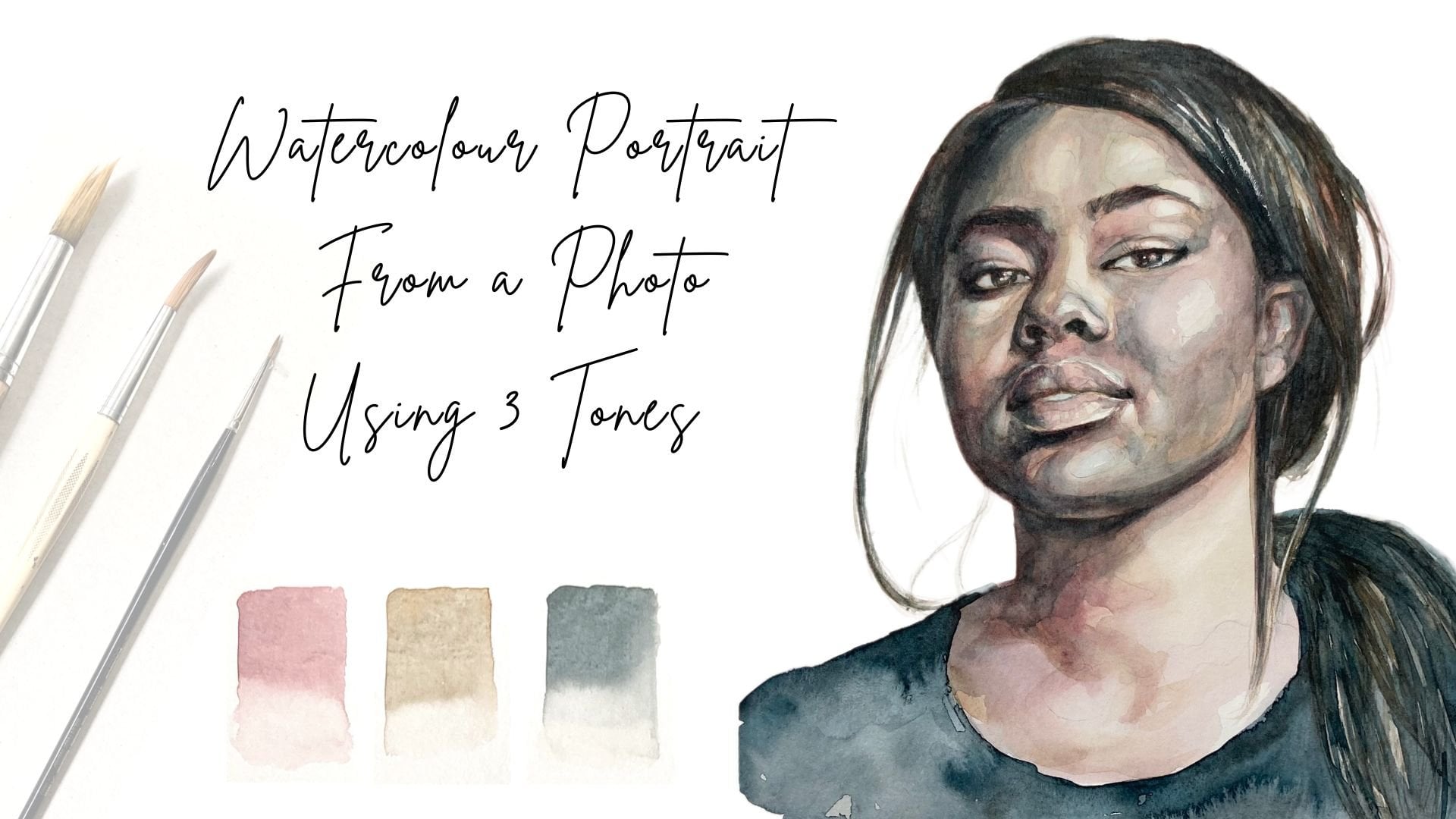
might want to check out my class watercolor
portrait from a photo using three
tones in which we paint a portrait
using only three tones. If you have any questions, please don't hesitate to post them in the discussion
section of this class. I hope you've enjoyed this
class, and if you have, then I would love it
if you could leave me a review in the review section. I read every single review, and they always motivate me
to keep making these classes, things that I have learned
on my creative journey, and it also assists
other students in deciding which classes
might be right for them. You can find me on Instagram under Nadia Underscore
Underscore Valska. If these walls underscore
Kid Talk or night project, where I share some
different angles of my creative work
with the world. Of course, you can
also follow me here on Skill Share just by
clicking on this button. That way, you're always
in the loop about new classes and other things
that I've got going on here. Thanks again for
joining me today. It has been a
pleasure having you, and I can't wait to see all
your wonderful projects. I hope to see you again soon
in one of my other classes.
 Nadia Valeska, Berlin based professional artist