Transcripts
1. Introduction: Hi, and welcome to this class. My name is Nadia, and I'm
a professional artist. I'm currently living
and working in Berlin. In this class, I'm going
to show you how to create a soft expressive portrait using flowing watercolor
techniques without getting caught up in perfection
or tiny details. Watercolor can sometimes feel intimidating because it
has a mind of its own, but that's exactly what
makes it so beautiful. Class is really
about learning to loosen up, trust the process, and let the paint create those organic flowing effects that make watercolor so unique. Together, we'll go through the entire process step by step. I'll show you how
to choose and edit a reference image that works well for loose
portrait painting, how to transfer your sketch
onto watercolor paper, using a simple light
source method, and which materials and
colors I recommend using. Then we'll start
painting layer by layer, building up soft washes, depth contrasts, and
expressive details while still keeping the
portrait fresh and loose. This class is suitable
for beginners, as well as anyone wanting
to develop a looser, more expressive approach
to portrait painting. And by the end of the class, you'll not only have your own flowing watercolor portrait, but also a better
understanding of how to work with watercolor in a
more free and intuitive way. So grab your brushes,
and let's get started.
2. Project, Materials, Finding & Editing image: In this lesson,
let's have a look at the materials and
colors that we're going to need and then also look at the project
for this class. So I've created a
materials list, which I will also be uploading
to the resources section, and let's just go through
that for a moment. So firstly, we're going
to need watercolors. We need a palette because we
will be mixing our colors. We will also be needing brushes, and I'm going to be using three. I recommend you
have three to five brushes of different sizes. Next, we'll need some
watercolor paper, and the important thing is
that it's minimum 300 GSM. I like to use fine grain,
but it's up to you. And we will also be
ding masking tape to tape down our paper so
that it doesn't buckle. And for this, I will also
have a wooden board, but you could also tape your
paper down to the table. Really important, two
containers for water. One is to clean
your brushes with, and the other one is to make up fresh colors for which we
will want really fresh water. We will also be ing
graphite pencils, as we will be doing some
details with pencils, and you'll want to probably
have an eraser handy as well. If you're going to be
using a light source for transferring your
image onto your paper, you also need a light
table or a window. You could also
transfer your image via grid method or free hand. The colors I'll have on
hand are yellow ochre, cadmium yellow, burnt sienna, cadmium red, crimson red, ultramarine blue, Prussian blue, burnt umber, and ivory black. I may not use all of them, but I always like
to have a couple of different colors on hand anyway. If you can't get these
exact colors, don't worry. Just try to have at least
one or two yellows, one or two reds, one or two blues, and preferably also a black on
hand, and you'll be fine. Now for the project,
I'd love you to create one loose watercolor painting using the techniques we're going to be looking
at in this class. The goal isn't to create
something perfect. It's more about
experimenting with flow, layering and letting the
paint move naturally. You can follow along with
the same reference image that I use or you
can choose your own. And when you're done, upload your painting to the
project section. You can also share
work in progress. I would love to
see that, as well. So to begin, it's important that we choose the right
image for this project. We want a portrait that has
high contrast and that we can simplify to basically three
tonal areas of midtones, dark tones and light tones. I always like to go
to unsplash when I'm looking for inspiration
for my portraits. So I'm going to look for
photographic portrait, and let's have a
look at what kind of photos would be suitable
for this project. So I've already gone ahead
and selected some images. What we want to imagine is
that we're going to simplify them to those three tones
that I talked about before, the light tones, the mid
tones, and the dark tones. And as you can see, they
all have an even contrast. So we also don't
want any elements in the picture that are going to complicate things for us like hair on the face or
hands in the face, glasses, anything like that. Going to be editing our image
to black and white anyway. So if you find an image that's already in
black and white, there's absolutely no problem. Once you've chosen your image, let's have a look
at how we're going to edit it to edit the image, I'm going to use Snapseed. That's a free software that you can download
in the app store. If you have Photoshop
or anything else, any other photo
editing software, you're free to use that as well. Okay, so let's go ahead and
open our image in Snapseed. The first thing I'm going
to do is edit the curves, and you can find that function down the bottom
under the tools tab. So I'm going to up the contrast. So I'm upping the
light and making the shadows more intense by toggling these
things on the curve. And then I'm going
to turn it into the silloit with the filter. For that, you need to go
down the bottom to Los, and it's right at the back
there at the last one. And you just click
on that and it turns your photograph
into the silhouete, makes it a really nice
high contrast image. And now we're all set
to export the image so that you can just
click on Export, save a copy, and then
you've got the image ready to print and transfer
onto your watercolor paper. Now, of course, if you want to, you can have a go at
playing around with these filters and the
curves and everything, and I will see you in the next lesson to start
transferring our image.
3. Transferring Your Image: Okay, so I'm going to
start transferring my image onto my
watercolor paper, and for that, I'm going
to use my light table. And you can see the best in
a very dark environment. So I've just turned on, gone into the darkest
spot of my studio. I'm just going to tape down the edges so that it doesn't
move while I am sketching. This usually works best when you're in a
dark environment, you can see the light more, and making sure your watercolor paper is the right way around. I've got a little bit of a rough edge on the top
and the bottom is smooth. I'm just going to place that on there and also just
take down the edges. And then I'm going
to start outlining just general areas
like, for example, this here, just lightly as well. See, I'm just tracing those
outlines a little bit, making some fields of color. Reserving a little bit
of a highlight there. We don't want it to be white
at the end of the day, but we might want it to
be a little bit lighter. Down the bottom eye. Top of the eyelert here is also part that needs to be
lighter but maybe not white. Moving on to the other eye, I'm going to do the same thing. Outline the eyebrow
a little bit. This part above the eye. Find it so much easier when it's already simplified for me. I do the hairline. So I'm looking for
the mid tones, the darkest tones, and
the lightest tones. Mainly. I'm just trying to
sketch this all out for me because then it just becomes much simpler
to paint later. Again, this part's quite dark,
so I'm focusing on this. And then the mid tones
and lightest tones. Now, what we've done
with the photo and editing it beforehand is
really simplified it. So this is really
helpful right now. I'm really trying to
keep it loose, as well. Remember, this is all about letting the paint flow for itself and not
getting too detailed. I'm just going to also sketch in this nice cheekbone
shadow for myself. It's a midtone, I would say. Continuing with the hairline, go to try and keep some
highlights in the hair as well. And here where the
hair meets the neck. This is obviously also going to be darker these parts here. Okay, I'm going to do the
hair on the other side. You don't have to
go too detailed. We just want to sketch it in roughly so that we can make
a nice loose painting. Now, because we're not going to be painting the background, it might be a good
idea to not have this part just the white of the paper at the top of the head and down the bottom here. We'll see when we get
to the painting part, we might do a little bit of a light wash over
that so you can actually see the
difference between the background and the hair. Okay, loosely
outlining the nose, first this side, and then
moving on to the other side. There are a few very dark tones here and also some mid tones, and I'm just roughly
outlining it. If you want, you can also
do the bottom of the hair here. And this part. And yeah, if you want to check, you can just turn off
your light source. And that's pretty much
the result that we want. When you're done, join
me in the next lesson, and we'll start painting.
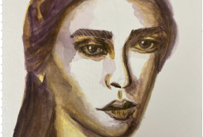
4. First Stages of Painting: I'm going to start
by just observing my reference image and I'm going to have my
reference image very close. I'm always looking
at this and what I'm doing on my watercolor. I suggest you also have
your reference image close. Let's begin by mixing. The colors that I have
told you I would be using, I've got lined up here. We've got the cadmium yellow. We've got the cadmium
red, burnt sienna, crimson, yellow ochre, ivory
black, and burnt umber. I'm just going to
mix a orange out of the yellow and
the cadmium red. We're just going to
start with wet on dry, which means just painting
wet paint onto dry paper. All right. You can test the colors. If you have a test strip, I've
got my whole space set up, I've got a test strip type thing underneath you and
that looks good. We're going to start
with the hair. We just want it to be flowing. Going to use quite
a lot of water with this because we're going to
work wet on wet afterwards. Remember, you're also looking
at your reference image. I'm just going to leave the white parts up here
white for now. I'll probably go over
them in a little bit. Here we've got the
ear sticking out. Just a loose, very
watery brushstroke here. Don't be shy with the water. If you run out of color, you can always just mix
a little bit more. Then I'm just going on
this side onto here, contour of the face. Remember, we're doing
loose brush strokes. You don't have to adhere
exactly to your drawing. Going to put a little more water on here. Loose brushstrokes. Great. Okay. And while it's still wet, I'm going to mix a little bit of my crimson with my cadmium, so we've got a really
nice rich red. I'm just going to inject it into some areas here and
let that expand. I'm trying to mimic
the hair a little bit, and I don't want
to cover it all, but I do want to make sure that there's a really
nice red tone in the hair on the other side, you can see I'm just
lightly going over this. I don't want to go
over this too hard, then I'll be at risk of
breaking the paper as well. What we really want is just a
really nice organic flow of paint that expands into the
other paint layer underneath. But we want it to
be quite vibrant. It's going to expand
on its own, I think. Okay, so while it's still wet, we're going to get a
little bit of red, a little bit of black, make this into like a purplish
type of color. Then we're going to just how we really want it to
be intense, don't we? So a little bit more, a
little bit more colour here. And I'm just going
to inject that with my paint brush into the still
wet areas here and here. We can intensify this later. But now we just
really want to get a nice feel of this hair. Don't want to cover everything. Remember we're trying
to stay loose. Okay. Maybe I want to go a
little bit more intense, so I'm just going to get
more pignant on my brush. A little bit more black.
A little bit more. And again, I'm just dabbing the paint into these wet
areas with my paintbrush. We like this contrast of
the very light yellow, orangy tones, some of that red, and then this rich
dark purplish color. Now, while that's dry,
I'm going to clean my brush and I'm going to clean this a little bit because I'm going
to go back to my orange. Of course, I've
cleaned my brush, and then I get a little
bit of clean water, dip it in the yellow,
a little bit of the cadmium, bit more yellow. We want this wash to be a little more yellow, a little
bit more light. That looks good. Now I'm going to go into these
areas in the face, tracing these outlines
that I've laid for myself, trying to reserve the
highlights if there are any. If you've got excess paint or water on your
brush, don't worry, you can always just wipe
it off with your tissue, which I've got handy always in my hand or next to my workspace. Now let's have a
look at the nose. Is the darkest part
of this part is also not completely white. I'm just going to
cover all the areas here that we've
marked for ourselves. I think it'd be
quite nice if we can reserve these highlights
here of the eyelid. I just continue to go over these areas that I've
marked for myself. Also the eyelashes, and I'm just trying to start building up the contrast really here. Then I'm going to go
over to the lip part. If you make a mistake,
don't worry about it. You can just lift it
up your tissue paper. I feel like it's a
little bit too intense, you can always add a
little more water. Here, you've got to be
really careful not to touch the red orange dark
part because otherwise, this is going to start flowing into that area. We
don't really want that. All of this can be a
little bit in the shadow. Remember, careful here. Don't want to touch that. If you feel a little bit
too nervous about that, you can also just wait until it's dry and then
continue with this. In this instance,
it's actually not too bad because you can see the neck here blends in
with the hair anyway. That's actually
quite nice. I think that make a nice effect. I want to do the same
on the other side. It's almost dry over here so
it won't blend in too much. Shall we go back to the hair and just add a little bit
more very vibrant orange? I'm going to make a very
vibrant and strong orange, test it on my test strip and I'm just going to go in here, give the hair a little
bit more structure. We want to avoid this happening, so I'm just going to lift this up so that it's purely on the neck,
that it's blending in. Don't worry if you've
got this going on. It can make for a really
interesting end result. It always looks different
anyway once it's dry. Remember that you
can always lift up anything with
your tissue paper. If you're impatient,
you can always dry it with a hair dryer. Just continuing to apply
this fibrant orange here. This is quite wet over the side. We'll see what it looks
like once it's dried. Just dabbing my
paint brush on here. Going over the parts that are, you know, the lightest
in the hair as well. Just really loosely.
Oop. I'm going to lift up this part here. I actually quite like it.
Sometimes errors, as I say, can be really good for
the end result because it's unexpected.
It's uncontrolled. It's actually what
we're trying to do here a little bit of
uncontrolled painting. Okay, great. That's
looking really good. When you are at this stage, come and meet me in the next
lesson to continue painting.
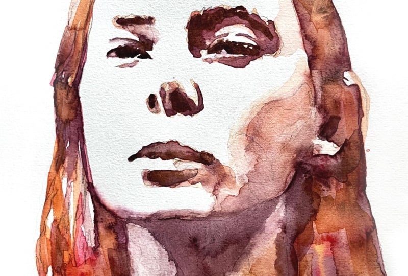
5. Adding Contrast to the Face: Let's try first with an orange that's a little
bit mixed with the red. I'm just going to give it a
little bit of a coat and then we're going to try
and work a little bit of wet and wet on the face. Make sure if you're
resting your hand on your paper that you're not
resting on the wet parts, you don't want to go
smudging your work. Careful here with
all the details. Just continue filling
in these areas that I've marked for myself and
just building up the contrast. Feel like it's already
starting to look quite cool. Going into the
darker parts here. I'm gonna dab some
very dark pigment in some of these areas soon. So I'll just continue working on this layer by working my way across the face right now the lips and then let's
see about the chin. On this part down here. If you like the paint
brushes too thin, then you can always, of course, change back to a larger one. Just getting the big
shadows in right now. Now I'm going to go in
with this darker color and just dab it in the darker areas. You can see it's
going to spread. We're just dabbing
at the moment. We can refine structures
and things in a little bit. I just want to make sure it's still wet while
we're doing this. We can work with a dry
paint brush in a minute to refine the finer
areas like the left eye. I want to do a little
bit more detail on that. Okay, so I'm just
going to come over to the left eye and just
refine a little bit, pick up a little bit of
water and paint from here, and also smooth out a little
bit towards the bottom. I'm going to lift up a
little bit of paint here. If you need to, you can
always get your tissue paper, maybe draw out a fine point
and just go in there to lift up any unwanted pigment
there, and then here. If you need to
smooth anything out, feel free, but it is
supposed to be loose. I'm trying to keep it
very loose as well. But you can always go and
lift up a little bit of pigment from different
areas if you want to. I'll start flowing back
into each other anyway, but then you're just making a little bit different texture, a little bit of a
different tone. Remember, you can always pick
up any wet pigment by using a clean and dry brush
and you just move that over the wet paint
and that will pick it up. See, I'm just refining it a little bit so that
it's not too harsh. Well, that looks pretty
good already, actually. Now that this part
is sort of dry, I'm going to go back to
my larger paint brush. I'm gonna take this
wash, as well, a little bit more
intense than that. A little bit less
intense than that. I'm gonna go over
these areas here. Using this purple wash, which I've made using the
crimson and the black. It's quite nice. Now I'm going to drop some of
this into here as well, into the neck area. Here. I just pick up a tiny bit of pigment here around the jaw with an
almost dry clean paintbrush, so that you can still
see the difference between jaw and neck. I do the same over here. And I'm just going
to smooth that out, and then I'm just going
to continue adding more depth and contrast by applying more of
the purple colour. Remember, we're trying to
create a loose painting. This has got nothing to do
with it has to look like this person or it has to
be exact, none of that. We're trying to be really loose. I'm going to try and draw
this neck down a little bit. Obviously, I'm going to
have to do a little bit of work on this part
here in a minute. Going to smooth it out a
little bit this way as well. Oh. And now with a little
bit of the burnt umber, I'm just going to
come in here and sort of define these
parts a little bit more. Darker parts here.
This is still wet, so I'm trying to
work wet on wet. Eyebrows. I'm not
diluting this pigment. Me over here as well.
Almost for park. A. I'm gonna come into the nostril, as well. This one over here. And then I'm going to go into
the mouth just to find these tiger areas here. Maybe also in the
part underneath. It's not wet anymore. You can always just
grab your brush, go in there again, and
then dab it in there. Don't worry if you
make a mistake. Always lift it back up with
a dry clean paintbrush. And remember, loose
loose, loose. So basically, I'm just trying to add more and more contrast using this burnt umber
until I'm satisfied. I actually just going
to put a little bit more of this lovely
orange around here. Around there. Maybe that was a little much. Just
kind of lift it up. And I'm just going to
go back in here again quickly with the
undiluted burnt umber. Okay, I feel like I need to
just wait for this to be dry. And then I can go in again with the neck and the jaw line. In the meantime, I might
just do a couple of more touches on the hair
with a really bright orange. Just really make a
lovely contrast. Going to use a little bit of orange at the top here as well. And remember, we're still trying to make a loose
watercolor painting. Please. Just gonna go
in here with orange. Maybe just make it a little bit smoother here towards the face. And I'm just going to cover the entire neck area here in the shadow also just
with this lovely orange. And you know what? I
think I'm gonna lift up a tiny bit of this here, here. And also just around
the cheek here. Maybe a little bit in here. And a little bit in here. Little I'm here. A
little bit there. A little bit on the side here. And the side here. Okay, now I'm just
gonna wait for it to dry and then
we'll continue. It
6. Continuing Painting: Okay, that's a little bit
wet, but it doesn't matter. I'm just going to get some
of my crimson black mix and go into this neck line
just to define that, and that's dry
enough to work with. Just defining this
line here as well, and I'm just going
to come down here. This is all quite dark. I'm going to mix a little bit more of my crimson and black, and then just dab the
pigment in there, maybe a little bit more
crimson than black. I'm going to let that dry. And in the meantime,
I am just going to go over this part
again with some orange. That's the mix of the
crimson and yellow. And so I'm going to
crumb across here with a much lighter wash. Just
going to go over here. Now, remember, you have to be careful not to mix those again. Otherwise, we've got the
same issue as before, and we don't want this
area to turn into one big area of paint and
smooth it out a little bit, lift up some pigment from
here and here, and from here. When it's completely
dry, I'm going to erase some of these
pencil lines as well. And while this is drying, I'm going to come in to this part of the neck
with the orange. I want to erase some of this, so I'm wetting the paper. Then I'm going to get a
fresh piece of tissue. I'm just going to come
in here and really define this line of the
neck a little bit more. You can always lift up
pigment, even if it's dried. You just have to be careful not to also lift up the paper. So you don't go rubbing the
tissue on the painting. You just dently dab it on there. And now I want to
correct this area. Okay, that's looking a
little better, I think. I want to correct a little
bit of the jaw line here, just make it smoother. See what I'm doing
there, just running my paintbrush over it
so that it's smoother. I didn't mark this for myself, but that would be quite a good area to just have in there. Now I want to lighten this
area in here a little bit. Same thing, clean wet brush. And I'm picking up
some pigment there. I'm also going to go with a little bit of
tissue paper as well. You don't want it to
get too controlled. I tend to be a little
bit perfectionist, and then I start getting
really into the details, and then in the end, it just
doesn't look loose anymore. And for this class, we're
really trying to get the watercolor just to do
its own thing, as well. So I'm just going to define
this nostra tiny bit. And now I'm going to
go into the neckline a little bit more with
a little bit darker, more intense mix of
this crimson and black. I don't want to overdo
it, but it is quite dark, so you can see that I'm
just dabbing it on there. Actually, I'm going to go in
here also with a little bit of the wash with the crimson and black,
the purplish color. Just a really light
wash, though. I'm really trying
to describe the structure of the
cheek bone here with my light wash and also
around the jaw line. Just kind of softening
those edges a little bit. Also lifting up a bit of pigment so that it
doesn't just become one big area with
a clean dry brush. I think I'm almost done. I don't want it to
get too controlled. One thing I want to do is I want to make sure that
I do get this part of the neck nice and light because you can see that
there's a light part here. I think that's going
to make a difference. So I'm just lifting
up a little bit of pigment here with my brush. And I'm also going to lift
up a little bit here. Maybe we can extend the path of the neck and
shoulder over here. But yeah, I actually
think that's already looking really good. And for the last touch, I am going to lift up a tiny
bit of pigment in here. I feel like it's a little
bit too dark. That's better. And a little bit from
here. Okay, that's great. Now I'm going to
wait for it to dry. Join me in the next lesson
to see how we remove the finished painting from the board without
damaging the paper.
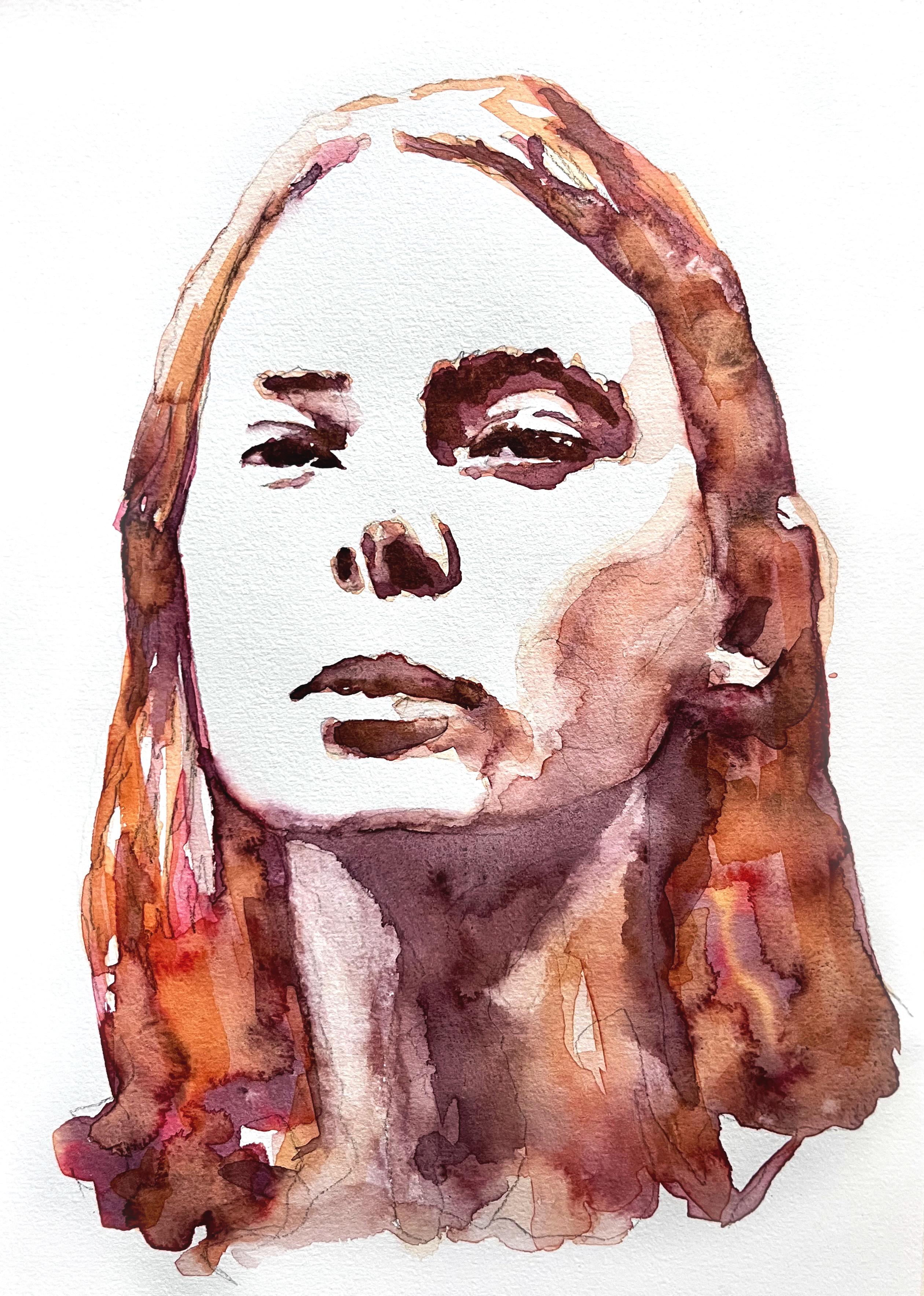
7. Finishing Touches: Okay, now that it's dry, I'm just going to remove these pencil lines here because they bother
me a little bit, really carefully,
but you really have to make sure it's actually dry. So I've got a patty rubber. I'm just carefully going over
these and removing them. If the papers still wet, you're going to
ruin your painting. So really just be careful. In the hair they don't
bother me so much, neither in the neck
but in the face that just yeah, bother me a lot. You see that the paper is
starting to go a bit weird. Stop. That's the finished piece. Now I'm going to carefully
remove the tape. So for that, I'm
just going to peel it so it comes out to the side. You want to do this
right away because otherwise it starts to
stick to your paper. And then it'll lift up some of the paper when you remove it. The longer you leave
on the masking tape, the more likely it is you'll
damage your painting. Just always taking the
tape away from the paper, sort of rolling
it out like this. And here's the
finished painting. As you can see, it's not about perfect lines or exact details. It's more about the
overall feeling and flow. If there's one
thing to take away from this class that is to let go of control and allow the water and paint
to do the work. Thank you so much for
joining me today. I can't wait to see all
your awesome projects, so please go ahead
and upload them to the project section
of this class. Also, make sure to stop by my profile to see what
else I'm teaching. And you can do that just
by clicking on my name. If you've enjoyed painting
this portrait with me, out my class, watercolor
portrait from a photo, where we start from
the very beginning and go through all the basics, and by the end of the class, you will have all
the tools to paint a wonderful expressive
portrait with watercolor. Alternatively, you
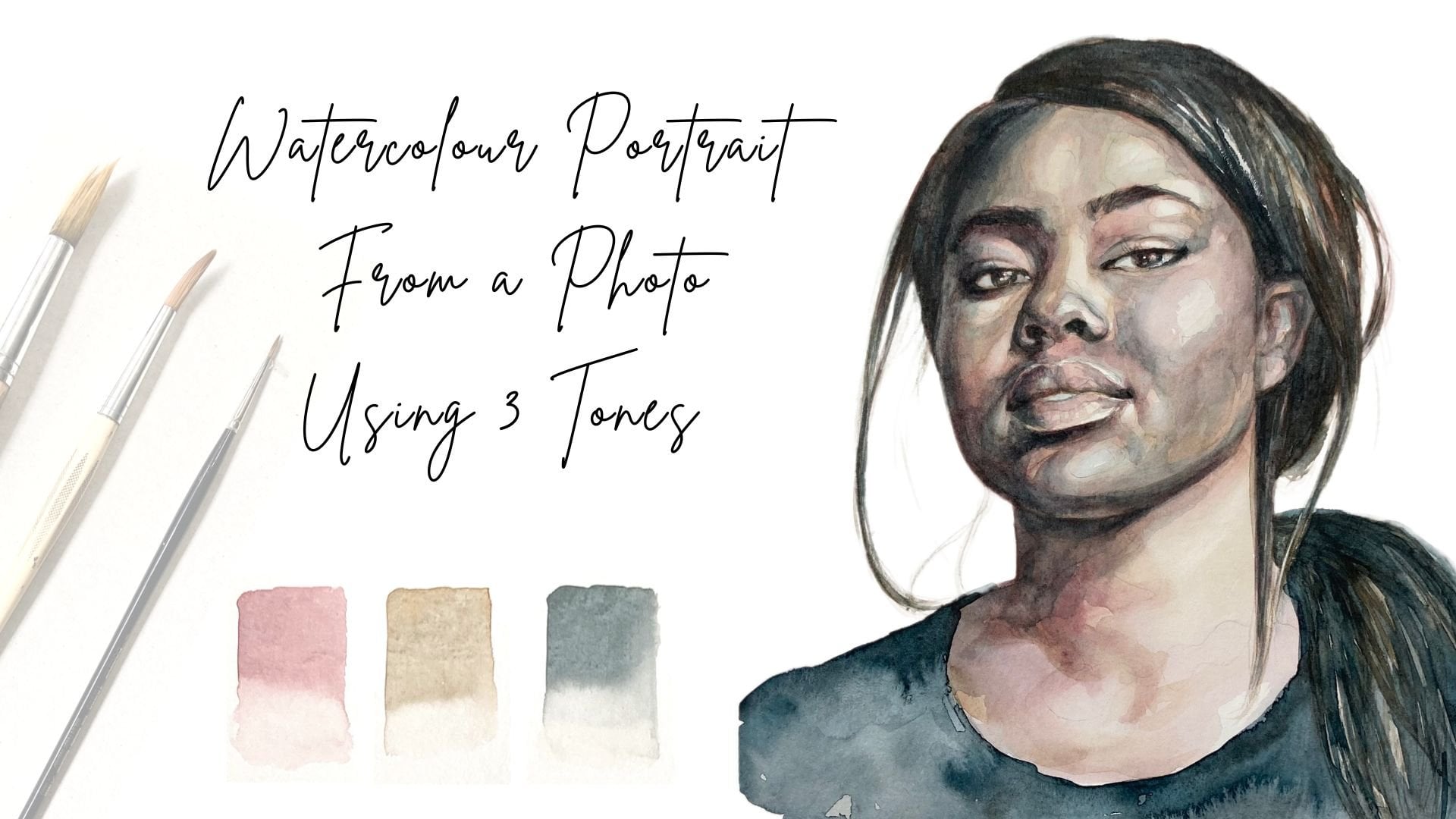
might want to check out my class watercolor
portrait from a photo, using three tones in which we paint a portrait using
only three tones. If you have any questions, please don't hesitate to post them in the discussion
section of this class. I hope you've enjoyed this
class, and if you have, then I would love it
if you could leave me a review in the review section. I read every single review, and they always motivate me
to keep making these classes to share the things that I have learned on my creative journey, and it also assists
other students in deciding which classes
might be right for them. You can find me on Instagram under Nadia Underscore
Underscore Valeska. Of course, you can
also follow me here on Skillshare just by
clicking on this button. That way, you're always
in the loop about new classes and other things
that I've got going on here. I hope to see you again soon
in one of my other classes.
 Nadia Valeska, Berlin based professional artist