Transcripts
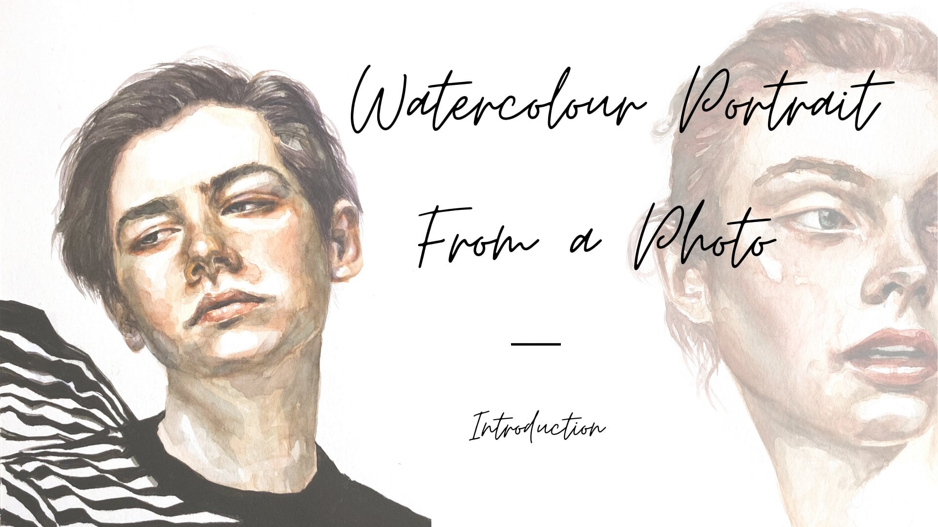
1. Introduction: Hi, welcome to my studio. My name is Nadia and I'm a professional analysts
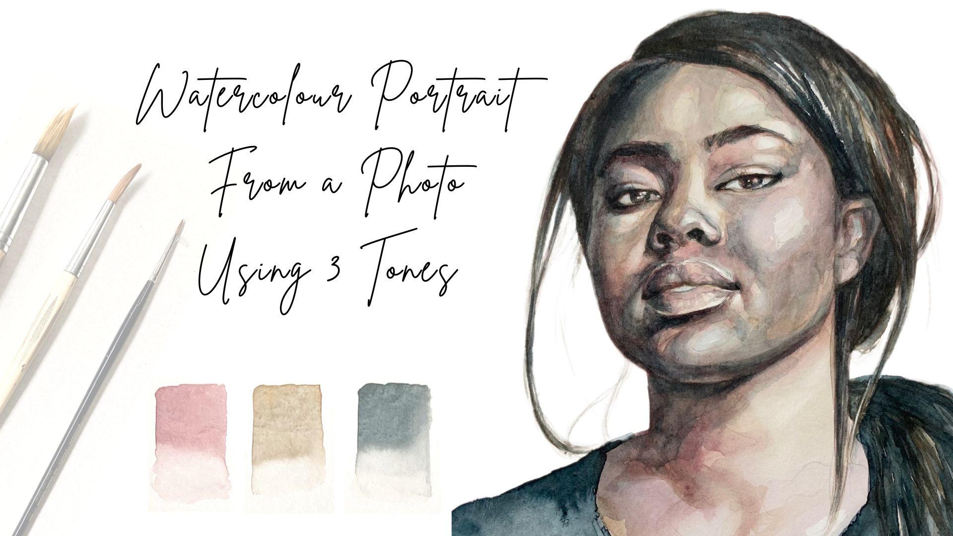
living and working in Berlin. In this class, we're going to create an expressive portrait in watercolor based on a photograph
using only three tones. Using a very limited palette simplifies the painting process, which is great for those
just starting out. But for experienced painters at coarser leaves the
possibility of getting super creative with
it and seeing how much you can do with
just three tons. The more elements there
are to keep in mind, the more challenging
the painting process. So working with more
cows means it's more complex to figure out how
and where to use them. This is why I've simplified
the step and this class by using only three tones, which we will mix
before painting. My main area of work
is in portraiture. And even though I had
painted for years, it was always usually an oil. And I loved the
technique of watercolor, but it took me some time to
really get a grip on it. I think it really clicked for
me when I stopped worrying about how it was going to turn
out and enjoy the process. I will take you
through the materials, will need show you how I set up my workspace and how to
choose and edit your image. Then I'll talk to you about the colors we will use
and how to mix them. We'll also look at one
very simple way to transfer you image onto
paper using a light source. But if you prefer,
you can also use the grid method or
sketch freehand. If you want to learn more
about the grid method, you can check out the
lesson on transferring the image of my class
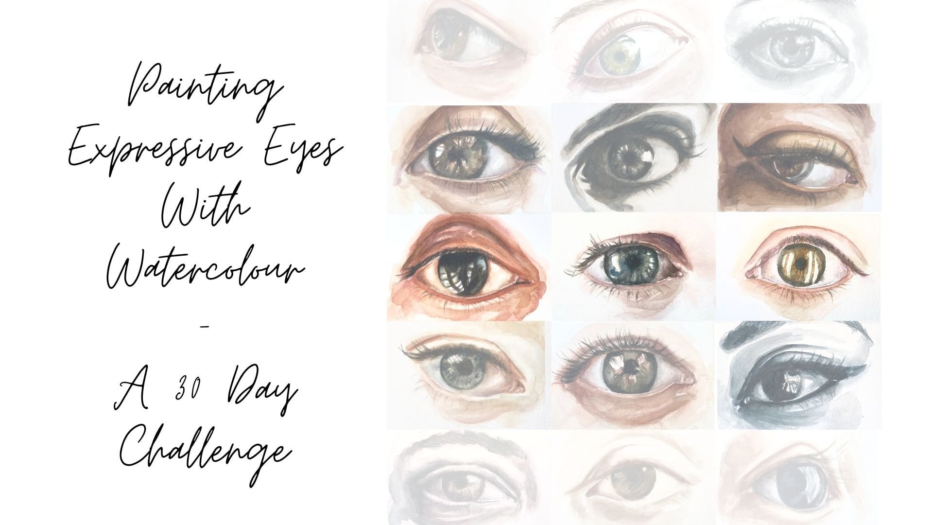
watercolor portrait from a photo for my class painting expressive eyes with watercolor
of 30 day challenge. Once we have our
sketch on the paper, we will see how to start painting by applying
the first layers, also looking at the various
elements of the face and building up a painting
slowly, layer by layer. Among other things, you
will need paper, paint, brushes, watercolors, graphite
pencils, and the pellet. I've included a
lesson to talk about the basic notions of watercolor, as well as how to
get your sketch on paper in a really simple way. So I think that this
class can really be for all levels of skills from
beginner to professional. You don't have to have any experience with
portraiture or watercolor. If you're just starting out, working with a very
limited palette is perfect because it means less focus
on which color goes where. More focused on how to
actually paint the portrait. By the end of this class, you will have at least one watercolor portrait
and three tones. And maybe have
surprised yourself at your results and
how fun it can be. I really hope you join
me for this class. And I would love to see your projects
comments and reviews.
2. The Project & Materials: Hi and welcome. In this lesson, I'm
going to be telling you about what we're going to
be doing in this class. And also about the materials
that we're gonna be using will be making a watercolor portray using a
photograph as a reference, and using only three tons. And we will mix these
before we begin painting. We'll also be using
graphite pencil as a tool to help us get expression and contrast and they're painting, but not too much. The aim of this class
really is more to create an expressive portray rather
than a hyper-realistic one. I find expression
to be much more important than getting a
likeness of the photo, the stage, and not
worrying about this would definitely make for a
more relaxed experience. It's also important to have
fun and enjoy the process. I'll be showing you
how to build up the facial structures, volume, and contrast by
working in layers, making sure we're always working
with translucent washes. Painting with watercolor
for me has a lot to do with using brushstrokes
and colors intuitively. But I do realize
that this may be hard to do when you're
just starting out. So that's why I suggest
as a good way to practice to work on two or
more paintings at one time. Said that you don't
feel the pressure of having to get a good result. Maybe have one that you
treat with more precision while the other one you work on more freely and playfully. You can even use the
drying times for this, so it doesn't
necessarily have to take double the
time to paint two. Okay, So let's have a look at the materials we're
going to need. First of all, when
need watercolors, I'll be using tubes, but you can use whichever
form you prefer. The talus, we'll need our
burnt sienna, crimson, red, ultramarine blue, Prussian
blue, and ivory black. Then we'll also need
watercolor paper, at least 300 GSM, so that it doesn't buckle. And I like to use fine-grain and will need
watercolor brushes. I usually like to have
three on hand once more, one midsize and one large one. We'll also need a pallet
to mix that callosum. As I said, we'll be using graphite pencil
for some details. So make sure you have one. Hb is the one I'll be using. And also make sure you have an eraser will need
masking tape to tape the paper to the table or the board against
that doesn't walk, will also need two
containers with water. One is for cleaning the brushes
and ones for adding water to our colors so that the colors don't end
up getting dirty. And then we'll also
need kitchen roll or tissue paper to absorb extra pigment or water from my brushes or from our
paper if we make a mistake. Alright, so once you have
your materials together, come join me in the
next lesson where we will have a look at
how to find your image
3. Finding & Editing Your Reference Image: Hello and welcome.
In this lesson, let's have a look at how to find an image for our portrait. There are a couple of free to use image sites
that I like to use, my favorites or an
splash and pixels. But you can also take
a look at free book or any other sites
that you may discover. Of course, you can also source your image from
your own archives. And I'll be
commenting on what to look out for when choosing
your image and just a moment. So first let's have
a look at pixels. You can see I've typed in portrait photography
and the search box, and it gives me some nice
high-quality images here. It's a pretty easy interface, so maybe you'll find a picture
here that inspires you. I like to make a folder
on my desktop and collect images that inspire me before I make a
definitive choice. And flesh is much the same. You can access the site via browser or also by
downloading the app. I really liked the
site and I found many inspiring images to use as a reference here
when searching, I recommend using portray photography or photographic
portrait because I've found that this renders more professional looking images with nice and light conditions. Then if you just type
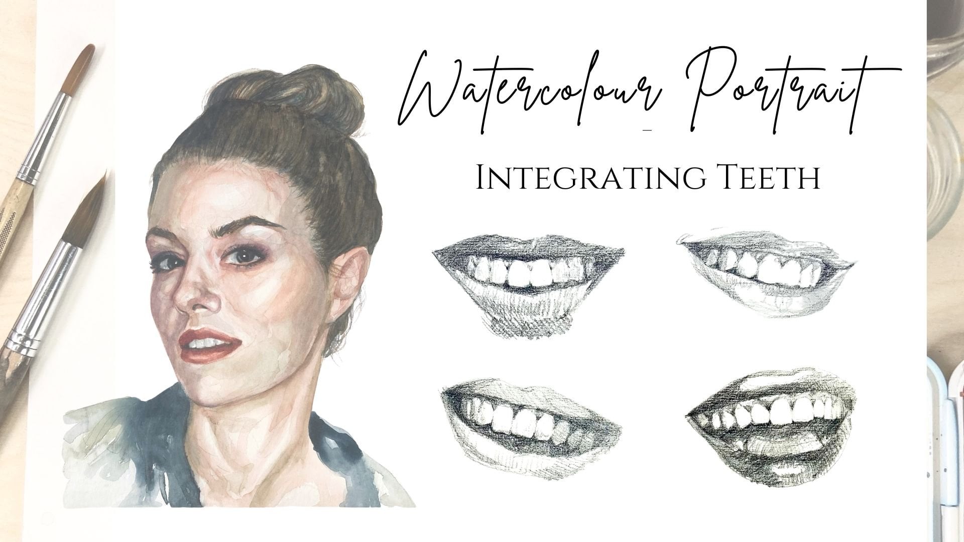
in portray or nice, things I recommend avoiding
for this class would be photos in which hair or other
objects cover the face. Glasses, sunglasses, strong shadows are
unnatural lighting, closed eyes and hands, open mouths and open mouth smiles where you
can see the teeth. And here are the
things we do want. Clear front-facing or mainly front-facing images with a
good light and shadow balance, panel variety and a
quiet background. If you do want to
paint a portrait that tends towards
being an profile, I recommend you choose
when we're both sides of the face and still visible. If you choose an image of a torso which needs
to be cropped, remember to maintain the
ratio of your paintings. So say you want to
paint 30 by 40 cm, the image ratio for cropping
should be three to four. Also makes sure that image has a high enough resolution
so that you can still clearly see the
features in terms of the phase once it's cropped. Okay, so say you've
decided on an image, you click on it and you can see here the Download Free button. And it gives you the option of which size you can
download them. I recommend always going for the original size because it tends to have the
highest resolution, then you can save
it to your desktop or designated folder. And I recommend giving
it a name that you'll remember so you can find that
easily when you need it. So this is the reference
image that I've chosen. And as you can see, it's a torso that will
need to be cropped. Also, as I'm going to work
with only three tones, I'm going to work from a black and white
reference because that way I am looking more for the toner varieties and
colors and net will simplify the process for
me to work with my tones. For the editing, I'm
just going to be using the editing functions
of my iPhone today. So no need to use any other software than
the one on your phone. First I go to saturation
and adjusted to -100 so that the image becomes
a black and white image. Then I use the crop tool
to adjust the size. Then I'm just going to adjust, brighten the shadow contrast and highlights to make the image a little more high in contrast. And I recommend that
you adjust it so that the contrast is
high enough to make it very clear where
the highlights and shadows or without
going over the top. I'm pretty sure most phones have photo editing
options these days. So even if you don't
have an iPhone, this shouldn't be a problem. And this is my final edited
image to give you an idea. If you want, you can also have a color image on
hand while painting. It might inspire you,
but if you feel like it confuses you and makes
things more complicated, just work with the
edited monochrome photo. You have several
options of getting your sketch onto your paper. One being the grid method, sketching freehand or
using a light source. And we will be covering how to use a light source
and the next lesson. Just a couple of
comments for the sketch, you'll see that I've
done my drawing in pencil and it's
really important to mark and obviously the features like the eyes, the
nose and the mouth, and the hair, but also
mark for ourselves the areas where you
want to reserve some lights, for example, here on the cheek or
here on the nose, and also indicate where the
dark areas are going to go. So that would be over here. I've pressed down
quite hard with my pencil so that you
can see it properly. But I suggest that
when you do this, you just try and keep
it quite light so you don't have to erase the
pencil marks afterwards. Once you're ready, let's
move on to the next lesson to look at the workspace
setup and the colors
4. Sketch & Basic Notions of Watercolour: Alright, so I'm going to show you one way of getting
your sketch onto paper, which is using a light source. So that would be anything
like a light table or you can even try it on your window or on a glass table with
light underneath. Basically you're going
to see the image shining through from
underneath your paper. So I'll show you how that works. Okay, so here we have
our light source and I'm just going to
switch that on now. Alright, because you can see can make it more or less luminous. I'm going to try and
get the maximum light going so that I can see
my image quite well. Then the first thing
you need to do is place your reference image
on the light source. And I'm just going
to fix it down with some masking tape just at two ends so that it doesn't
move while I'm sketching. And I'm going to place
my paper over the top. And as you can see, you can see the image underneath
really well. So depending on how
thick your papers, this is going to
vary, but usually it really does work quite well. I'm also going to fix
my paper on top of the reference image
again with masking tape. And then I'm just going
to start sketching. So I'm trying to indicate to myself what I'm going
to paint later. The more information I
give myself in the sketch, the easier it's going to be
for me when I start to paint. I'm trying to get
in the features like the eyes, the
nose, and the mouth. And I'm also trying to get in the highlights and the
darker areas, shadows. I'm outlining these areas
for myself. As you can see. Obviously there are a
few different ways in which you can get your
image onto your paper, such as the grid
method that I referred to in the intro or
sketching freehand. But I find that using a
light source is by far the simplest way to get
your image onto your paper. And then it ends up looking a
little something like this. Now, let's just have a look at some very basic
notions of watercolor. And for that, we're just gonna
do a couple of exercises. And the first one we will do is just painting wet and dry. So that means wet
paint on dry paper. So basically we're
always working with translucent layers because if
we make the layer of pack, It's really hard to
work on it afterwards. And you can see this would
be too much pigment. You can see that the water doesn't really shine
through anymore. And so none of the
other colors will shine through in the
end, we don't want that. We want all the colors to start shining through as
we build our layers. Now let's try
painting wet on wet. So I'm just going to
wet my paper with some clean water and then
I will get my pigment. I'm using yellow ocher here. And I will just start painting. And you can already see
how the paint behaves a lot differently to
painting on dry paper. So you always have more control painting wet
on dry and wet on wet. But I find that wet
on wet gives you a little bit more
creative freedom because you relinquish control
to some degree. So I, I quite enjoy painting
wet on wet sometimes. Now let's try, let's
see what happens when we just inject
a little pigment. And for that, I'm just going to use a little bit of crimson. And I'm just wetting my paper and I'm just going to inject a little bit in here
and you can see how the paint just kinda
starts to expand. That can be really effective when you use it
in your painting. I'm gonna put down a
layer of yellow ocher. I want to see what
an overlay looks like and you can see that's
a little too much pigment. I'm just going to add a little more water and
spread the pigment around. And I'm just going to let that
dry and then I'm going to try and overlay the meantime, let's go back to the Kremlin. And I'm just going to try
smoothing out some edges. So I'm going to apply my paint. And then you clean your brush, dry it on some tissue paper. And then with the
kind of moist brush, you can just go over those edges and just
smooth them out. Don't dry your brush too much. So you can see how
you can just have really crisp edges like these ones or you can
have really smooth edges. Now let's try removing
some pigment. So again, I'm going to use
my crimson and I'm just going to make a little bit
of a circle like this. And then cleaning
and drying my brush, I can just lift up pigment. As you can see in-between
lifting up pigment, I'm just cleaning and
drying my brush again. Another way to lift up pigment. So for example, if you make
a mistake or you want to lift up all the pigment is
with your tissue paper. Again, I'm applying some paint here and then I'm just going to lift it up with my tissue paper. You can see it hasn't
lifted at completely. But if you would apply
a little more water, then it doesn't always remove the pigment
in its entirety. But there's quite
effective if you make a mistake and you
notice right away, often you can control the damage before it
gets too out of hand. Now one thing about
your brushes, never put them face
down into your water. I've ruined a couple of
brushes that way because then the bristles will just separate and then you can't really
use your brush anymore. Let's try a graded wash. For that. I'm going to use
my crimson again. And graded wash means
just basically that there's more pigment in
one area than another. So I've added some pigment here. I'm can inject a little more. And then with a clean, not completely dry
brush but dryer brush, I'm just going to start
fading it out towards the bottom and just add a little water
to the bottom here. And then we'll see
how that expands and gradually fades out. Can remove a little water here so that it doesn't
expand too much. Now that the yellow ocher
as dry at the top here, I'm going to try and overlay. I'm going to just put a
circle next to it and be careful not to move your brush too much
over this part here, because otherwise,
you'll just lift up the pigment of the
yellow ocher underneath. So that's another really
important thing to remember when you're layering different
colors on top of each other, the first layer should always
be dry before you start on the second one
because otherwise it's just going to mix. Another important thing
is when you're painting, you want to be making these kinds of
movements if possible. So long controlled,
calm movements. You want to avoid making kind of staccato brushstrokes,
wispy brushstrokes. Sometimes it's appropriate. But the reason you
want to focus more on the long controlled
brushstrokes is that they give you more
control over your paint. So when possible, just remember that long controlled
brushstrokes will make it easier for you. Okay, so I recommend you
have a play around with those heavily practice at all
the different techniques. Get acquainted with
your brush and paint. And when you're done, Let's move on to
the next lesson and see how we set up our workspace
5. Workspace Set Up & Colours: Now that we have the
drawing on the paper, Let's take it down to the board or the surface
that we're working on. What the taking down of
the drawing is going to do is when we are
working with watercolor, the paper as likely to buckle
as it's not taped down. So that's what we're
trying to prevent. Just make sure that's
all nice and tight. Okay. So before we begin, I just wanted to quickly look again at how we set
up the workspace. So you can see I've got
my work type down here. I've got my palate to the riot. I've already put in my colors. In the second. I've got my test
strip. This is always good to just test out colors on. I have my clean water. I've got two jars
and one I will be cleaning my brushes and the other one that I'll be
using to wet the color. Then I've got my
brushes over here. I have one very
large 11 lead 1.151. And then obviously I
have my reference image, but she wouldn't be saying, but it's always
to the left here. So let's go into the colors. The colors I will
be mixing today. People shadow, coffee,
brown, and blue. Luck. Okay, so let's start by
just mixing those colors. So I'm going to make
my coffee brand. That's looking pretty good. We can always just test it on the test strip.
That's looking good. I'm just going to
change brushes. I'm mixing my crimson. And then I'm going to put
the ultramarine blue. That's very powerful. And if you want, you can add in a little
bit of the bent Sienna. Let's see. I think it's a little
bit too blue for me. I'm just going to add
a little bit more. The chromosomes. Make sure your brush
is clean before you dive into a different color. Okay, let's just test
it on the test strip. Quite like the color, but I feel like it's not intense enough. So I'm just going to add
more pigment to this because I can always
delete it later. But it's just annoying
when it's just very, very light wash and
let's try that again. Yeah, it's a little
more intense. Okay. So now for the last color
that the blue black. So I'm starting with a blue. It's getting a little
bit of that pigment in this compartment. It a little bit of water in the brush and add a little
bit of ivory black. There's gonna be a
little bit more. That's looking pretty good. Okay, so I'm happy
with those kalos. So when you're ready, come and join me in
the next lesson where we will stop putting
on the first layer
6. Working on the First Layer: Hello and welcome. In this lesson we
are going to be starting to work on
the first layers. And I am going to start
with my medium brush, that's in my case number ten. I am going to start by outlining and identifying areas
such as the eyes, the nose, the lips. And then we'll go on to
identify an outlining the contours of the face and the hair and later
on the quotes. And I'm going to start
with the coffee brown, and I'm just going to start with a light wash. We always want to be starting from a light wash and working our way up to making more intense
washes because afterwards it becomes more
and more difficult to build on the washers. If we go to concentrated
at the very beginning, you can see outlining this
ion and make sure you reserve the areas that you want to highlight is the inside
of the eye, for example. Just really also look at
your reference image. Keep looking back and forth. Yeah, The first part is really just a general
getting to know where everything is that
you're going to go over and mistake and I'm good to go on
the crease here, but I identify that a lot of the pupil making sure I leave a little bit of white of the paper
with the highlights. The nose contour of the non, see that there's a shadow
here on the side here. Quite a lot of shadow over here. Eyebrow that need to be exact, exact, hundred percent precise. But we want to start seeing what we're going to go
into afterwards. Then I'm going to
move on to the left. If you can. You want to be making decided strokes from
start to finish. And if you do happen to go over a line that you don't
want to go over, you can clean your brush. Just go over that again. And if it's intense,
you can also use tissue paper just
to lift that up. So we'll just continue. Always a bit darker on
the inside of the loop. The line and the
bottom lip as well. See the shadow is there. While that's drying,
I'm just going to go into this crease up here and then start
to go shadow here. So we're just trying to
define general areas. As I said at the moment, can already see here it's dried. So as I'm going over, it leaves the new Mac. That's what's going
to happen really. We want to be kind
of smoothing out some brushstrokes and leaving out the brushstrokes
as they are. Because that variety is
just really going to give a bit of richness to
the end painting. I'm just going to give
a light wash here. You can see there's a light
pad to the left of the nose. Then also just here. So I want to leave that as the white of
the paper for now. It's not going to stay as
the white of the paper, but it's going to help me define where I need to
intensify afterwards. And then just going to inject a little bit
of color in here. A lot darker and smooth
it out a little bit. Fairly wet brush so
it starts to expand. Not going to go either
this part down here. And now with a
slightly lighter wash and tested on your
test strip again, he's going to define a
little bit over here. I, here we've got
a bit of a shadow. Just going to make sure I leave these lightweight
areas you can see up here just under the eyebrows, a little lighter, and also
just above the eyelid. Then we've got the temples, which are a little bit concave. So there's always a bit
of shadow on there. And lively cheapens. Going to injected
them with a color. And then also make a wash, a little bit lighter part here because you can see this a little bit in shadow. The ridge of the nose is
also a little bit of shadow, even that's much lighter than
this very intense shadow, but it's still not as light as for example,
this path here. Just keep building up layer and just let your
eye kind of guide you. You will have probably defined
quite wealthy yourself. Some areas of shadow and
light just build on that. More used to find the
easier it'll be for you. Sometimes it's a little
bit overwhelming to identify where the shadows
and the light side. And if that is the case, you can always just go
ahead and squint your eyes and then it becomes
apparent a lot easier. Just make sure not too
much of a contrast there. And I'm gonna go
back to the lips now and just define
them here a little bit. Just lift up a little
bit of pigment here. If you want to do
that and you can just dry off your brush and then go over the
wet area of paint. Moving on. Now, still with
the coffee brand new, I am going to start to find
in the neck a little bit. Just gone to the
shadow under here. I want to be working
quite quickly because the watercolor dries
really quickly. And I'm just gonna
get some clean water and just go over this. So it kind of expands
into the lighter area. I'm working wet on wet, but mainly wet on dry. I just want to kind of
insinuate these areas here, not defined them too much. Given a little bit of shadow. And let that dry
while it's drying, I am going to be
really careful so that I don't touch
any of the wet areas. And I am just going to start putting a little bit
of a shadow on the hair. Once you've got the darkest
area which will be the hair, everything kind of comes into
focus a little bit more. You can see it's pretty
much myself with a light areas are
in the hand here. Go into the details
Towards the end. So if you can and
if you remember, try to use CAM, long brush strokes
whenever possible. Even though sometimes you may feel like it's more appropriate to use wispy brush strokes
like for example, in the hair. I know that I'm not constantly using the cam long
brush strokes. But the more calm and long
your brush stroke is, the easier it is to
control the watercolor. Because I'm going
to use example. Let's be brushstrokes because
of big here is wispy. I think the neck
areas still dry. I'm going to get onto
the close later. First, I'm going to just focus
on the face and the hair. But we haven't done the ears, so let's just do the ear. Usually when you're
working on a portray, the paint will dry
quite quickly, shouldn't have an issue. But if you do notice
that your paint is still wet because I can go and
dry it with a hairdryer. Depending on how fast
you work, really. Okay. I think I'm just going
to give that a quick dry with a hairdryer
and then I will continue in the next lesson with the second layer in coffee brown
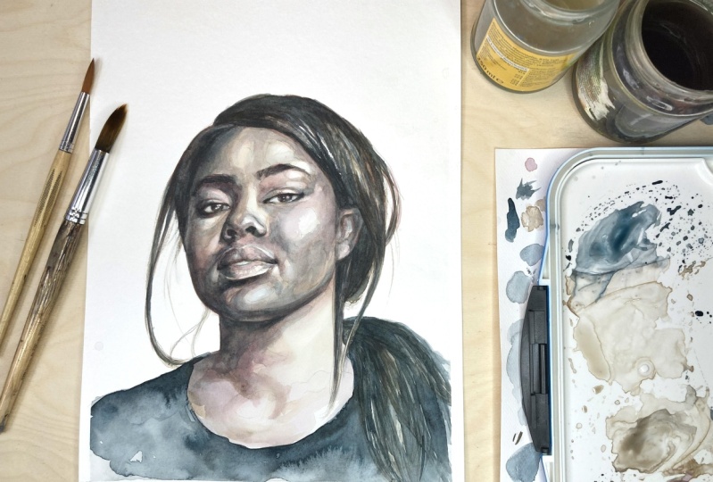
7. Continuing With the Second Layer: Hey, and welcome back. In this lesson, we are
going to be seeing in detail how to build up the first layers with
the coffee brown. So several light washes
and we'll also get into the details with pencil and
then with more coffee brown. So now that we're sure it's dry, if you're not sure,
you can just kind of carefully touch it or was
the back of your head. We are going to move on
and go over some details. Still going to work
with the coffee brown, also with my number ten brush. And I'm just going to go
into the eyes are going to start to much pigment. You can just get rid of your tissue paper and then
come over to this side here. And then literally the
highlights you want to reserve. Remember that even if you
see really dramatic shadows, but just trying to work
them up little by little so that there's really
the feeling of volume. Highlight. Crazy up here a little bit more. This one over here. Then I'm going to move on to
the nose and the nostrils. And I'm going to get into
this part of the mouth here. I'm trying to remember my calm, smooth brush strokes here. And then I'm just going to
smooth that out a little bit. And I'm just going to move
on to the bottom lip here. There's a part of the lip
that's a little bit lighter. And then I'm going to return
to the shadow under the lip. I'm not forgetting about
my reference photo. I keep referring to it
as a means to see where the lights and
shadows are and then using that information
to create my painting. But it's not important
for me to make this hyper-realistic or even that there's a lightness
to the photo. The photograph
really just serves as a reference so
that we can create this painting more than it
to look like a photograph, I'd rather have it looking like a really
expressive painting. And I'm just going to
go over the eye again here and then the other eyebrow. And I'm just trying to really heighten the contrast here all over and also starting to get
into some of those details. So I'm really focusing on those. I'm just going to dry
that off again because next I am going to do a little bit of
work with my pencil. Said before we continue,
we want to make sure it's completely dry because otherwise we're totally going to ruin the entire painting. I've just dried it off
with my hairdryer. So what I'm going to
start doing is just going over some of
these details here. A little bit of shading. I don't want to make it too
much about pencil drawing, so I'm just going to lightly
couple of eyelashes here. Then the iris and
the pupil area. To intensify that
shadow under the idea. Just shading a tiny
bit. That's all. See, there's a highlight here that I'm trying to preserve. And I'm going to move
on to the spine now. Let's try it a little bit. A couple of details,
eyebrows. Not too much. I can do that with a
brush later as well. Then just move on
to the nostrils. And then the lips. Find them a little bit more. Then come over to this corner
here, it's quite dark. I actually think I'm going
to leave it there with the pencil and I'm going
to continue painting. And I'm just going to
get my small brush, the number one brush, to just go over
these details again. Remember we want a lot of drama, a lot of expression in here. So just really
heightening the contrast. Just going to put a couple
of details and the eyebrows Okay, This always trying to go from the general
to the particular. Right now, we are getting
into the details, but we have got the
general just down already. Putting a nice details
up here as well. The nostrils with
a little bit of paint lips. And then I'm just
going to go over some of the areas of the face ago to heighten the contrast. For example, this contour here. Then the middle here,
recursion here. So there's more
light on this part. It's very faint, so just
really affect it too much. Little pigment. It expands a little bit. Now still got a lot of white of the paper leftover
that I'm going to leave it for a while yet, and I'm gonna eliminate that later because it just helps me see a little
bit more contrast. Then there's contrast here. Again, we're just looking right now for the general areas, mainly for the shadows. Just going to do the
smoothing out around here. And also here. You can see it's just kind of it's not a very
defined the area. Just it kind of just transitions from light to shadow
and vice versa. Trying to mimic the lines of directions of the
face with my brush. So it is all about
heightening that contrast, building up those layers. And as you can see,
I'm just really slowly building it up with my coffee brown in this second
stage of the first stage. So we'll just keep
going like that. You can always remove pigment
if you've used too much, that's absolutely not a problem. You just wait your brush, dry it off a little bit on your tissue paper and then just move it over
your brush stroke. I've made a little
mistake up here, so I'm just going to
remove a little pigment from this part
above the eyebrow. So you can see what I'm doing. I'm just getting my light
wash of coffee brown, just heightening
their contrast and all the parts of the face, the nose, the lips, above the mouth and the cheek. So before I move on
to the next color, I really wanted to have
this one layer down. I'm just gonna go over
the neck now as well and just heighten the
contrast there as well. Remember the flowing movements and just the detail
and the year. I'm also going to put
a little defining line under here, under the jaw. Okay. So I'm going
to dry that off now with my hairdryer
and then I hope to see you in the next lesson to start working with
the purple shadow
8. Starting With Purple Shadow: Okay, so now that
that's all dry, again, you can check
with your hand. I am going to start using my pixel shader to keep
heightening the contrast. And same thing again, just going over some
of the darker areas. And I I am brown eye. So it's always good to remember that when we're
working in pairs, for example, eyes, eyebrows, that we always do those
at the same time. Now the white of the eye
is never completely white. I just don't want
to go over the top yet with adding too much color. We just continue the nostrils. Again. I'm just looking for
the darkest areas first and then going
on to the other areas. So going to take this
shadow over here. If you want, you can
always smooth at your brushstrokes a little
bit with a wet brush. Just like this. Don't use too much water though. I feel like the combination of smooth that brush strokes and lift brushstrokes really works
in a watercolor painting. Straight onto the contour
of the face here. You can build it
up really slowly. You're a little
bit afraid to use too much color all at
once, that's fine. Don't worry about it. You
can just do a few layers. You can work a little
wet on wet if you like. Can see we're just building
up as contrast here. Some color in there
so that it expands. Just dabbing some color and
the iris and the eyebrow. And then moving on
to the lips again. And then let's go
into the shadow under the lip again and unite that with the shadow of the
contour of the face here. And let's continue that shadow. And also the shadow of
the jaw line there. And then going onto
the bottom lip, which is not as much in shadow as the top
lobe as you can see. And you can always reference
my reference image, of course, and the resources. Also just remembering
that I'm trying to limit the forms of the face
as much as I can here. Now with a lighter wash, also use yellow
strip as a pellet. Just kinda go on some of these areas that are in
shadow but not as much. Smoothing out. I'm also trying to define this hairline up here
without defining it too much so that it
doesn't look like a helmet, solid but smoothly. Areas, eyes actually in shadow. Eyes usually are because
it's concave area. It's going to lift up a
little bit of pigment here. Don't need it to be the
white of the paper, but I do want it to him
bit of a highlight. If you like, you can
really start to see the face shapes of
the face I'm merging. And I just continued to
build up this layer here. I'm trying to define
the cheekbones, the chin area under the mouth, and just really adding
more and more depths. So every time I add shadow, the highlights start
to stand out more. So remembering this might
be really helpful for you. For a highlight.
To be a highlight, it needs to stand
next to shadow. And I'm just going to smooth
out this part here too. And I feel like I've ever
done this part a little bit. So smoothing that
out to in a minute, I'm gonna give the hair a bit of a purple
shadow wash too. But first, I'm going to focus again on these
shadows and the neck. You can see we're
just really slowly, slowly, slowly building
up those layers. Some artists prefer to
work with less layers, but I feel like the more
layers, the more volume, you know, you really have
a depth to the painting. So I really like working slowly
to get the hand wash now. Maybe quite intensely, you ideally the contour
of the face as dry. Otherwise it's going to
start expanding until you just really touching
that a little bit. Quiet. Clearly the hairs, the darkest thing of this painting,
the hair in the clouds Feel like if that is lighter
than the face at the moment, it's just going to distract
from the contrast, really. Trying to get a bit of overview. My lights and shadows, making
couple of wispy marks. And then going back to the
long from start to finish, brushstrokes, wispy. See I'm just continuing really to heighten the
contrast in these areas here. And hopefully by
the time I'm done, the rest of the face will
be dry and I can give it another wash Quickly going
to do the ear as well. Okay. So now that I'm
sure that the face is dry where I wanted to paint mixed just again, the features. I am going to go over some
of the shadows again, like this one here. I'm trying to be very precise. Here in the eye and
the eye eyebrow. I'm going to start going over some lighter areas now that
aren't actually the light. So that the lightest
areas that I actually that really
start to pop. Like I said, for a painting
to have dramatic contrast, the lightest light and the darkest dark have to
be very differentiated. And I need to limit the areas of lightest light and
data stack to a few. So in this case,
the lightest light would be the white of the paper. So that would be
highlights that I leave that I've marked myself. And then the darkest dark I think would be the
clothes and the hair. And then obviously I'm also
working on the mid tones. There's quite a variety of
mid tones here, of shadows. What can also be really
effective as just put little accents of
the darkest dark in some places, for example, in the corners of the
mouth or in the pupil, which is very dark as well, really get into this shadow
under the lip here again. So even without
looking at a face, you can probably
guess a little bit with the highlights and
shadows are going to be things that come
out of the fairs like the nose and the chin and usually a bit lighter while things that kinda
go into the face, like underneath the lip that's usually a little bit
darker and cheddar. You can always maneuver
the paint around the paper if you feel like a brush
strokes not quite right, or you just have
too much pigment. It's going to smooth that out and into the inside
of the face here. Now I've covered a lot puck, but it wasn't supposed
to be that much. So I'm just removing some pigment again
with my tissue paper. And then continuing. I just keep going over those
darkness barriers, really. Just some great things,
some pigment into there. So I'm really trying to
work all over my painting. I'm focusing on the details
and kind of jumping from one to another
and remembering if I'm working in a pair,
to work in the pair. But yeah, just really heartening the contrast and
relation to each other. Okay, and I'm just going to add a little bit more
shadow on here. Keep looking for the
darkest areas and heightening the contrast
and just keep wiping away until you are happy
with using purple shadow. It's really a question
of when you're satisfied with this layer
using purple shadow, you can always come
back to the color. So if you feel like you're
ready, that's totally fine. You don't have to go on forever. I'm a bit of a perfectionist, so I like to work really
slowly and really intricately, but that's not for everyone. Also sometimes less is more so it's kind of a feeling thing. So you can see I'm
just kind of working the elements while I'm
heightening the contrast. So usually I start with the eyes and I got
into the eyebrows, the nose, the lips, then undo the
contour of the face. At some point I
retouch here the ear. So I'm just working my way
around the face really. The final details will
come at the very end. We don't need to go
and define the teeth. Just going to go
back to the neck. I'm just going to dry
that off and then I am going to start on the hair
9. Starting on the Hair: Okay, so now that we've dried it off, just make sure it's dry. I am going to start defining
a little bit of the hair. You will see that towards the
roots and towards the end, it's always going to be
a little bit darker. This is in front, this part here, and then
this part here is behind. So that's also gonna be Dhaka. And here we've got this
posits come over the shoulder and the wispy parts of the front also
going to be lighter. So I'm just going to define
a little bit of here. And I'm just going to do that
by pressing harder towards the root and then just making these strokes in the
direction of the hair. We're going to go over it anyway with the color with watercolor. But this is just gonna
be a nice background. The hair comes out in this way. I'm just going to divide
it into some sections. The section I have over here. Then this other section that comes over, this
incorporates itself. And then there's this
section here, here. One more section, this
part of the head and then this strand of hair that
just comes out of nowhere. So I am just working with strikes and I'm just trying to get the
very dark areas and fist. So the roots here and
make very few months on the wrist here where it
gets tucked behind the ear. I'm going to stop
the ear and work outwards with divided into sections so that it doesn't
look like a helmet. And this thread here, she comes across
in the kit there. Then I imagine what their hair, what direction the
hair is going is coming from underneath here and it's kind of curling around. So then this hair, obviously it's going
straight down. And then this hair that
is coming from behind, the other hair is just divide that up into
sections as well. I feel like there's
two sections that come across and one that goes behind. So that's one section and I'm just going to
divide them again. Okay, and then I'm just
going to start making masks. Obviously at the top, you can hardly see a dark. We have this one strand
of hair coming down here. Let's actually lighter. We want to reserve. That. Said, trying to get some shadows in there really doesn't need
to be life-like. I'm just trying to get
an impression of here. Like some flowy here. Okay? So now I'm going to grab my number ten brush
and I'm going to go back to the coffee brown. Again. We can check
that from a tester. It's looking good. I'm just going to occur the sum of these
sections of hair, just trying to really get
it to go a little bit darker so the
contrast is better. And then I'm going to start
working section by section. So one section. Again, I'm doing that so that it does not look like a helmet. And the end one section. Then I'm going to work
on a section that's not directly adjacent
to the first section. Otherwise they'll just blend into each other and it wouldn't make a difference that we
worked on them separately. Okay. Come down here. I'm down here. So I'm still trying
to keep it varied. See, I'm not using the
same intensity here. I'm trying to lift
up a little bit here so that it's a little
bit more interesting. Then I'm gonna come over
to this section here. And same thing. I'm going to apply the pigment
and then I'm going to lift up a little bit to have
a little bit of variety. And now that I think the top
sections are probably dry, I'm going to come
to this section right here that was
adjacent to one that I already worked on
Pinterest little bit. And then I'm gonna come down, work on this section here. And I'm going to
cover all of it. Now. Clean my brush. Just recap some
highlights on them. Now while I'm working
with the coffee brown, I'm just going to go
over with a light wash, just going to go over some of
the areas on the face that I'm supposed to be completely
white of the paper. So for example here, just going to give
a general wash, actually, just a
really light one. Just to unify a little bit. Move your brush too
much while it's wet, because otherwise
you're going to start just manipulating and looping around brushstrokes on the needs that you
might not want to lose. It's going to look
a little bit of this nightclub dance
really annoyed me. So as you can see, you can also lift up pigment once
it's already dry. I'm just saying there's a
slightly lighter there. My goal here. So I'm just going to
give that a quick dry and then I'm going to move onto the next lesson and start working with
the blue black
10. Adding More Contrast With Blueblack: Right, so I am going to start working with the blue black now. The first thing I'm
going to do is just give the hair a
little coat of this. Because that is going to be the darkest part of
the whole painting. And I feel like it's irritating my capacity to see where
the light and shadows are that I still
need to heighten when the thing that
is going to be the most and shed a light lighter
than it's supposed to be. Okay. I'm just going to lift up a
little bit of pigment here. Then I'm going to
continue this path here. As you remember, we want to work on parts of the
hair that are not adjacent to each other so that it doesn't
look like a helmet. So this is all very
much in shadow. Anyway. Excuse you imagination. They don't need to
tell it like it is exactly in the order. Okay. Moving on back up
to the top of the head. Smooth it out. Trying to preserve
some highlights here so that the hand
really comes to life. Not too many though. We can add some more details
on the head, the very end. This part here. Starting over here with a very wet brush
because it's lighter. And then just finishing up here. Okay, and now we are going to add some details with
the blue black as well, the details of the face. Actually, first,
let's try this off. Now that it's dry. Let's go over some details. Starting with the eyes, make sure it's not too intense. Let's really get into some
details here as well. I was like not
making the iris and the pupil exactly uniform. So I tried to have some turnover varieties
and they're always, It's trying to smooth
that out a little bit. It's really getting
into these details now. You don't want to
make a uniform line across the bottom there
because then it just looks not real when not
going photo realistic, but we also don't
want to make a comic. Okay, and I'm looking
for darker areas, trying to preserve
the highlights, untitled varieties in there. The excess pigment,
you can just get rid of that tissue paper. I'm just working
with my fine brush so that I can really
get into these details. So usually I use blue
black very sparingly in the shadows of the face
and on the features of the face when I'm working
with more than three times. Because it does sometimes have the potential
to be a little bit overpowering or
make the painting a little bit too dramatic. I'm a little bit
comic like I think in this case because
we're only working with three times, it's
really going to work. Because moving on
to the eyebrows, still just working on
the general eyebrows. I can give some proper
detail in a moment. Once I'm happy with
the overall tone. And now with a
slightly lighter wash, I'm just going to go
into this shader here. Still working with my
small brush to define the shadow over here a
little bit more rigid, the nose and the nostrils. Just really looking for these dark areas so I
can define them better. Make it look more
dramatic, more expensive. Still trying to kind of mimic
the lines of the face here. My paintbrush And the smoother the brushstrokes when I
find that too intense, a little bit of pigment and the areas where I
want it more intense. So I'm trying to focus
on one area at a time. But if I feel like I see
something that's bothering me, I try and do that straight away because otherwise later I may forget getting into the shadow
under the bottom lip here. Now, it's really quite
dramatic as this shadow here. So I don't want to
make it to light. See if the size of the
paint brush that you're using is working for you. I feel like I'm
going to interchange to the larger
paintbrush in a moment. I'm just trying to still
get into these details and I find that this
brush is better for that. But once I've finished
with the details, are there back to my
number ten brush and just work on some general
areas with a light wash. But you don't have to get too detailed in the
air, for example. It's just not that important. So I'm switching brushes now. I'm just going to
take a light wash. Just got some of these areas to light and back down to
the contours of the face. And I'm really thinking about those long brush strokes here. They really make it a lot
easier to control the paint. Especially in these areas
here it's important to mimic the movement
of the last phase with the paintbrush going straight down under
the neck line here. Just so I'm just doing what
I did in the layers before. Now with the blue black, just adding where I think there needs to
be more contrast. Feel like it's really
coming together. Again, a lighter wash, the right side of the face. Going to have to go over
the left side again. I feel like the contrast
isn't quite right yet. So I'm being careful to heighten the contrast
slowly build up the layers slowly, evenly. So once I have an overall coverage of this first light
wash of blue black, I'll be going back over to
the other side to heighten a little bit more over there and then coming back over this side. So I really just
step-by-step getting to a place where it's really
nice and contrasted. The top, this one to
heighten the contrast, not change the entire painting. Really got to pay attention
to where these shadows are and where they're
most prominent. I guess that's part
of the challenge to not go over the top, but still have this really nice dramatic
contrasting image that you end up with. Amaze, you can see I'm still
over the side of the face applying pigment and then taking it away if I
think it's too much. And basically just
working my way through all the features
of the face until this layer is finished. We don't want to get rid of all of these light areas here. I also would like
to raise salvage this area here and
this area here. So I'm just kind of
rubbing the pigment off. Well, the claim
paintbrush and then dabbing my tissue
paper on the top. Also, like these kind of highlights here are really important for the
shape of the face. Look correct. Riverside. Bit of a perfectionist. If you're happy with
how it's going, you don't need to do this. I'm quite happy with how
it's going to continue. I'm just going to give
the eyeballs very, very light wash
because as I say, white of the eye is
never completely white. Again, I'm going to give
to take a bit of a wash. This document over here a
little bit like very dark. I'm going to give the hair another wash and I'm just going to go over all of it
this time to unify it. Starting at the top. Well, I do want to unify it. I don't want it to
look completely flat, so I do want to preserve
some of the highlights. So if I've used
too much pigment, I can just lift some app with my paintbrush or with
some tissue paper. Um, that's just what
I'm gonna do here. I'm just going to lift up
a little bit of pigment. Areas that I want, a
little bit lighter, highlights that I've saved. It's going to find this a
little bit more of a couple of strokes and they're wispy
movements because again, we're working with the hair. The other side. This detail here again. Alright, We're making
great progress. I'm going to dry that off now. And then in the next lesson, I am going to continue adding some more contrast and also
starting on the close. I'll see you there.
11. Heightening the Contrast & Starting on the Clothes: Okay, so in this lesson, let's just have a look
at what needs to be heightened in contrast and then let's start
working on the clouds. What I'm saying is, I feel like I need a
little more shadow over this part here. So I'm going to grab
the blue black again. And I'm just going to put another wash over
this area here. So I'm going to do the same for the shadow under the nose. **** on here, a little bit. On the lip. And the shadow here feel like
it's really mixed. Come down here as well. I'm just looking for the
last kind of shadows that I need to cover generally. And then I'm going
to cover the close. Not quite happy with
this part here. Maybe I'll just go back to the peripheral
shader for a minute. Just click on this variant here. Just going to smooth that out. And then come in here a
little bit of the back. I feel like that's a little
bit too harsh. Maybe. See if we can turn
it down so it looks more slender rather than
puffy here on the cheek area. Kevin got a laugh. I feel like shadows up here is still too large because if you look at the picture, it's actually not that
much of a difference. You can see where
the hair begins, but it's not that clear. It's going to take
my little one here. I feel like here
you can see with the face becomes happy with it. Just kind of let that dry
and while that dries, I will go back and just some details
with some blue black. Again, I hear a couple of lectures at the top. So I'm just going back over some details which I feel like the little motor findings
example, these diagrams. I'm just going to put a
few wispy here and here. Just going to smooth
it out a lot, but I really want you to start. And then some of the the I
opened up a little bit more down there and I'm not
going to damage the top. Usually there's a
little bit of shadow over the eye ball
because of the eyelid. Just defining this here to
put in there those creases, minimum, some eyebrows
and here as well. The width of it
doesn't really matter. It's nice if it
expands a little bit, a little bit to file vibrant. I'm just going to take some away by going over this
with a clean brush. Pulling them the shadow again, I feel like it's been
lost a little bit. Then maybe another little
detail on the lip here. It's really putting
them last finishing touches on the face. A little bit darker
to do that enough You can keep going
and keep going, but soon I'm going to
move on to the clothes. Just insinuating that
these teeth there, I'm not gonna go into
detail or anything. Tooth or another matter and
move on to some other point. Now I just want to
focus on the lips. Really don't really
like what I did there, But wait for it to dry now. And I can I wasn't going to
take away all of the pigment. I don't want it. Remember if you move
your brush too much, you take away the thing
when you just need to wait till it's dry if you want
to make some major changes. One line here, another. Beautiful cheekbones. I'm going to do the
clothes now and then I'm also going to
use blue black. And I'm going to do the wet on wet so I get my large brush, makes sure that the board
is still tied down. So I get my large
brush and I'm just going to wet this paper. Okay, Then I will go over the wet paper
with the blue black. Just creep into the
neck here a little bit. Like working wet on wet. Sometimes it lets you
be a little more free because you have very little
control over the paint. I'm just going for the
whole area of care as well. Just noticing that I need
to work a little bit more on the neck
area. That's okay. I'm just injecting
some pigment here. Some areas of the clouds. While I've got my large brush, I might as well just go over
the hair one more time. Some areas. The neck, I'm just
going to also work a little bit wet on wet
with coffee brown. And I'm going to be
careful that the neck area is not touching the
clubs area because otherwise I'm just going
to get a big mixture of color and I'd
really like to just keep it a little bit separated. This happens to you. Easy way to do it is you just get your tissue
paper and just dab it on the area that you want
to remove the pigment from. And I get a little
bit of shadow work. I don't really want to give too much detail
because next, quite difficult. I find. Don't really have any
lines to work with. It's all just the shading. Okay. So I before I continue, I'm just going to dry that
off with my hairdryer quickly and then I will see you in the next lesson to put
on the finishing touches
12. Finishing Touches: Okay, I actually
quite like this. What I'd like to do is
make the clothes DACA, and also put a little
bit of detail into the hair and pulling these
little wispy parts of here. And then I think I'm done. It's quite intense. It's
kinda how I want it. So what I'm gonna do
is I'm just going to go under the clouds. Tends wash. I'm just going to use water to kind of make it
expand a little bit, make it a little more organic. While that's drying. Time to get a little more black. Step here. Then I'm going to move
on to these darker areas and just really make sure
I have that contrast. Remember that it's watercolors, so you're not gonna get the same results
from watercolor as you will with gouache
or acrylic paints, oil paints, that's always
going to be a little bit translucent and that's
exactly what we want. We don't want to
have Pat colors, but I still want to have
this kind of drama. I'm really looking for
those high, high contrast. No, wanna to touch
this up as well. Maybe put a little bit more
purple shadow on there too. A little more contrast in here. And now I'm just going
to work on details. I'm working with my
number one brush again. I'm really just trying to focus on the details of the hair. Small details. Yeah. Just my wispy movements
imitating the hair. Can be as detailed or not
detailed as you like. We're first gonna do the wispy hairs. I need to treat them with
a coffee brown status, just traumatic where
it doesn't need to be. Alright, and what I wanted, wow, it's whisker over here. Slightly larger brush. Don't really want
too much detail in this kind of fade
into the background. I'm just being
very liberal here. Some of these details as well. Try and keep it varied. Not making the
same brushstrokes. I remember again, doesn't
really look organic. Kind of loosens the
whole thing up. We have a couple of striving
to my floating around, just make sure
next to something. Just putting the finishing
touches on while both Dr. while it's still wet. I'm just going over this path here as well, some coffee brown stray press frogs here. Okay, Last but not least, I am actually going to do
what I don't usually do. But I have not managed very well to preserve
highlights on the eye. So I've thought of white. I'm just going to
do the following. I'm just getting some of
this on my very fine brush. I'm not even going to dilute it. And I'm just going to dab that. I can paint over it if
you don't get it right. Just putting a little bit
of white highlights are supposed to be in
Mountain them very well. Just from the hair. Just going to take away
a little bit here. And little bit of black. Also. I forgot to do this with a
little bit of purple shadow. Can very light wash. I'm just going to
fill in some of these lines and the lips. Careful not to get
your hands on. The wet paint. Can also see this
pattern slightly darker. You want to put a little
more detail on the lips. Go ahead. Just putting a little bit
more here at the top. Otherwise it's just
going to look silly. Chest insinuated
that their lines. Alright, I'm actually
really happy with it. So I'm going to leave
it here and let it dry. And now that we've finished, why don't you join me
in the next lesson for some final thoughts while
the paintings drying?
13. Final Thoughts: Okay, so now remember when
you finished and it's dry, remember to peel off
the masking tape. In this way. You're rolling it outwards so that you don't damage
your paper too much. And that's it. Congratulations, you have just completed and watercolor
portray him three times. Now I want to
encourage you to share your finished project and the project gallery because it's always so great to see your
projects and that gives us a chance to exchange
ideas and feedback. You can upload a cover image, but also don't forget, upload an image
into your project. If you've made more
than one painting, feel free to share them all. You can do so by simply updating your project and adding more images and
texts as you need. I'll be happy to
give you feedback. And you can always write
me with questions. If you've enjoyed the class and painting with watercolor
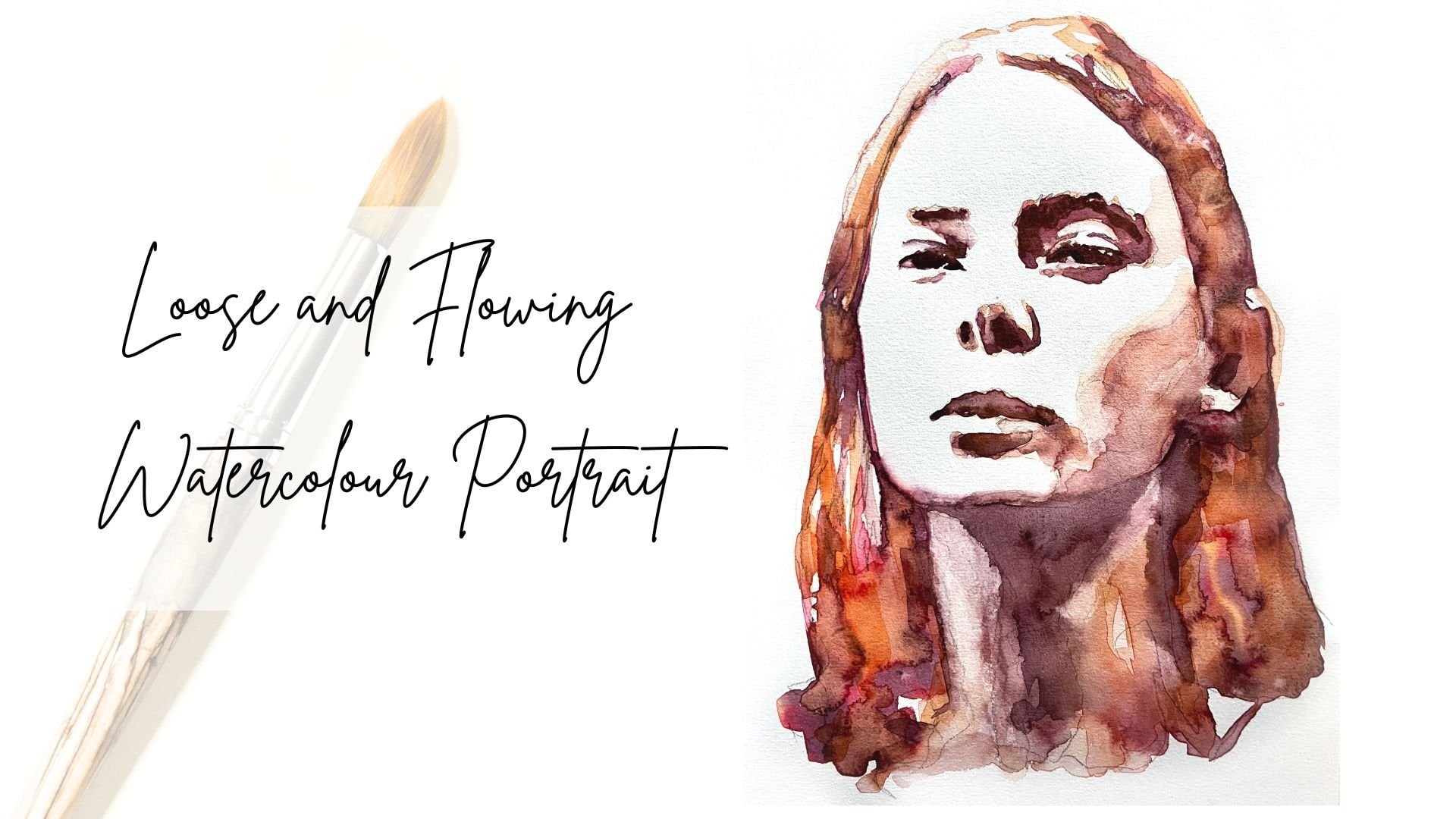
and make sure to check out my other classes and watercolor portrait
from a photo, we paint a portrait using
more colors and tones. It's also a really fun
class and there are some lessons to cover
the basics as well. I also show you which
colors to use and we mix them together ourselves
before we start painting. If you like, a challenge, can join me in my class painting expressive eyes with watercolor. A 30-day challenge. If you're like me and what
you love as portrays, maybe you also want to check
out my liner class in which I take you through how to make an easy portray with lineup cut, a printing technique which has a ton of creative possibilities. And of course, if you want to frame or your great creations, you can also visit my easy DIY framing class where
I show you how to make a passport to so you can easily and beautifully frame
your own works on paper. Feel free to ask questions
and the discussion section. And if you enjoyed
my class today, please leave me a review. And the reviews section, I read every review I receive. And they always motivate
me to keep creating and sharing my knowledge
and love for creativity with you all. And that also help other
students get motivated. If you want to keep in touch, make sure to follow
me on Instagram and Nadia underscore
underscore of Alaska. It's these walls underscore. Underscore could talk. If you decide to upload
your projects to Instagram, make sure to tag me so that
I can also share them. You can also follow me on Skillshare and that
way you always know when I launch a new class or make
a new announcement, make sure to upload your
projects to the project section. And I can't wait to see them. Thank you again so much
for joining me today. It's been a real
pleasure having you and I hope to see you
again really soon.
 Nadia Valeska, Berlin based professional artist