Transcripts
1. About The Class: If you've been painting and experimenting with
watercolors for a while now, you would notice that
some color pigments behave very differently
from the rest. Some colors producers
smooth, even wash, but others seem to
have a mind of their own creating amazing
textured patterns. For an absolute beginner with no prior experience
with watercolors, this particular
granulating property might be often confusing
and intimidating. You might begin to wonder, is my paints spoiled, or is there a manufacturing
defect by the brand? Hanging there? There is
nothing wrong with your paint. This particular aspect
of your paint pigments can be attributed to it
as granulation property. Hello, my dear creatives. My name is Neil m and
m and watercolor is an art educator based
out of Bangalore, India. I love to experiment
with different mediums, but watercolor has been one of my favorite
mediums to explore. It's been four years that I'm
painting with watercolors. And I'm constantly
striving to improve my skills by practicing
and experimenting. Then one such practice sessions, I discovered the expressive
beauty of granulation, paint, rinse and incredible texture that it produces in a painting. Personally, I was blown away by this expressiveness that
decline lytic pigments produce. And this very subtle
textures that it produces in a
painting is very unique. Do watercolors. Today, I'm very excited to turn all those learning
experiences into a class and share it with you,
my dear students. Regardless of whether
or not you have granulating watercolor pigments
with you, Do not worry. Everyone can join in this class. As later in the class, I will help you to
identify watercolors which exhibit granulation
property from your own watercolor collection. This class is all about
granulating watercolors. I will be sharing with you my key understandings
about what is granulation. I certain pigments
exhibit this property. What are the factors that affect randomization methods
to amplify granulation? How you can create your
own granulating mixes. And finally, I will be
showing you a few examples where it is granulating paints
can be used in the end. Together we will be able
to create a minimalistic yet and urine landscape with all the techniques that we have learned during the
course of this class. I cannot do all my excitement
to show you guys how this unique granulating property
of watercolors can make all the difference in
your watercolor painting without any further ado. Let's get started.
2. All About Supplies: Let's quickly discuss
about the materials that will be needed
for our class. The paper that I'm
going to use for all our class projects is from
Saunders Waterford paper, 100% cotton cold press, and 300 GSM is the
thickness of the paper. And these all details
will always be mentioned on any good-quality
watercolor paper, especially if it is 100%
cotton watercolor paper, it will be mentioned on
the label of the paper. Always remember to choose
your watercolor paper, which is of archival
grid and is acid free because that will prolong the lungs ability
of your painting. The painting starts
turning yellow, which you would certainly not want for your
watercolor paintings. There are various brands
available in the market. So choose your paper
wisely and make sure that you are using 100%
cotton watercolor paper. And watercolor papers
come in the form of this glute bads like
the one I have here, which is glued on
all four sides. Okay? So this is a type of papers. So if you are not using this glute pads but
separately blue sheets, then you'll have to
stick the paper onto this acrylic sheet board that is a non-absorbing surface
so that the water is not absorbed into the surface that you are using
to stick your paper. Okay, so that's where an
acrylic sheet will be needed. And for that you will be sticking the paper
onto those words. If you're not using
the blue sheets, then you could very
well go ahead with your glute pad and directly apply masking tape
onto the side rooms. Now masking tape is needed
only when you want clean, clear, crisp borders
to your painting. If you do not want to
have those kind of clean, crisp edges, you could
skip masking tape. Now masking tapes come
in different sizes. You could go for a
half an inch or 1 ". The next supply that we
are going to talk about, our brushes here, I'll be using only few
of these brushes. This have been my
absolute favorite. The first one is a
Chinese quill mop brush. Now, this is from
Silver Atelier range. Now this is a
synthetic mop brush, but it's really soft. This has been my
absolute favorite brush. Whenever I want to quote my paper with a
flat wash of water, I use this brush apart
from the synthetic mob, I have another quill mop brush. This is again from
Silver Atelier series, but the only differences, it is made up of natural hair fiber,
especially goat hair. So it is very soft and works magic when used for
wet-on-wet technique. Now if you are my regular
Skillshare students, you would know how
much I love using this silver black velvet
size number eight brush. And the other brushes
that I'm going to use is this synthetic soft brush
from silver silk series. Now this is size number
four and the other one is this beautiful rigger brush
from Scheme money art. This has been one of
my favorite rigger brushes so far that I have used. And I'm just in love with the bristles and the springiness
that this brush has. So these are the, quite a few brushes
that we'll be needing. So instead of this rigger brush, you could choose to use any size number one
or two round brush, which has long pointed tip. Next, we will be needing
a pencil and an eraser. Here I'm using a
mechanical pencil, but feel free to use
any two HB pencils. Coming next is our
watercolor paints. Now the watercolor
paints I'll be using for this class will be mixed
from various brands, particularly from White Nights, Shannon arts, PwC, and
Daniel Smith watercolors. Now I'll be showing you why I have mixed and matched
with different brands later in the class where
I'll be discussing more in details about
the color pigments, exclusive color pigments
that I'll be using. So you could grab your
own watercolor paints, which is readily
available with you. But one recommendation, go
ahead and use our choose any artist grade watercolor
paints because it brings a lot of difference
into your final outcome. And important thing
to note here is that all artists grade
watercolor paints will have on its label mentioned the important
characteristics of the particular paint
pigment that has been used to manufactured
the color e.g. in this white knight tube off. Aquamarine missed. It has been clearly
labeled whether the color is granulating or
non granulating, light fastness and whether
it is semi-transparent, are transparent to not worry in a separate section in
the upcoming lessons, I will be discussing
more in detail about the paint pigments
that we will be selecting to create our
own granulating mixes. Now to apply the paint, we need a surface rate, so that's where our
palate comes in. The palette that
I'm using here is a 42 palette from
Shannon are gay, but here, it's not necessarily that you need to use
this particular brand. I love to use this
palette because it has quite a good species surface
area to mix my paints as well as designated wells to
store my individual colors. Instead of that, you could use ceramic palettes like this. We have covered most
of our supplies that we are going to
need for our class. I almost forgot about the
most important thing. Yes, You wouldn't be
needing two jars of water. One is the source of your clear water and the
other to rinse your brushes. The water that you see in this jars is the
normal tap water. But apart from this water, I will be also going ahead and using little bit of
distilled water to show you the difference
how granulating paint behaves when subjected to
different water conditions. That is the hardness
or the softness of the water for that purpose. In that lesson, I will be
using this distilled water. This is the last ounce of distilled water that
I have left with me. Now here, if you do not
have distilled water, you might need to get a little
bit of distilled water. So you could find distilled
water on Amazon Are you could check out in your
nearby hardware store to avail distilled water. Boiling water will not help
because it will still contain the trace elements
and will not remove the calcium and
magnesium salts in it. So that's why it won't work. Now, looking at the
next material that we would need is salt
to create a texture. Or before I forget, you can also have this
separate sheets of paper by your side before taking
up the class projects here, you could practice
your brush strokes or the elemental composition, or go ahead and swatch your colors before testing
them out on the final project. So you're just like how I have switched
out all my colors. So keep them handy. Instead of this small
pieces of paper, you could offer a sketchbook
where you could document all your day to day
watercolor practices. So you could use a
sketchbook as well. So that is all
about the supplies that we are going to need
for our class project. I'll see you in the next lesson.
3. What is Granulation?: What is granulation? Granulation is a property
of watercolors where some pigments pull together in small groups when
applied wet on wet. This produces a so-called
mottled or cuddled effect. The granulated pigments will
always show up as small, unevenly dispersed dots are spots in the paint layer
once it starts drying. Now you must be wondering why this pigment
particles granulate. The reason lies in their
origin and the size of the pigment particles
when they are manufactured. In the past, artists used organic substances to provide
pigments for the paint. This natural pigments are
the origin of some of the paint names
that we know today such as alizarin,
CPR, gamboge, etc. However, today majority of the pigments that are used
in paint are man-made, which are known as
synthetic organic pigments. Now many of these
synthetic organic pigments from clumps during
manufacturing. These clumps can
be broken down by milling before the pigments
are made into paints. But not all pigments are
equally as easy to grind, and as a result, the shape and size
of pigment vary slightly from one
page to another. That being said,
granulation not only does depend on the
type of pigment, but also on the grid and the
paint brand that you use, because different manufacturers have different paint formulas, that is the amount
of pigment that they use in manufacturing
particular pain. So the student grade
watercolors will granulate less because the paint formula tends to contain
lesser pigments. Now let's understand how
would you identify if the brand has manufactured
granulating paints. So it will be mentioned on
the level of the brands e.g. in White Nights, it
will be mentioned as G for granulating paints. Whereas in certain other
brands such as Daniel Smith, even though the pigment
is granulating, it wouldn't be
mentioned on the label. But you could always go ahead
and check the website of the brand to search for their granulating
watercolors Ange, and you would find
the list along with all the other properties
listed on their website. As you can see, they have a huge range of granulating
paints to choose from. So go check out their
website and get a grip on all the colors and the pigments
that they have used. Just like Daniel Smith, different other paint
brands have come up with their own set of super
granulating watercolors. Among them, White Nights and shaming gay are quite
trending nowadays. Now you must be wondering, what would you do
if some brands do not label there watercolors
to be granulating. So in that case, swatching is your
best option when you layer wet watercolor wash with your granulating
pigment on the paper. At first, it will seem like they're behaving like
regular watercolors. But you will quickly see the pigments bunching
together and settling or sinking into the crevices
or the grooves of the paper as the water starts evaporating and the
paper starts drying up, you will see some pretty
interesting effects or the flocculated
effect on your paper. I hope this granulation property
is more clearer to you. Now let's take a look at some of the examples or group of
pigments that granulate. Some naturally
occurring groups that granulate our
ultramarine cobalt, including several in blues, earth tone such as raw sienna, burnt umber, burnt
sienna, etc, and blacks. It is important to note
that not all blacks will be granulating
only ivory black, which is made up
of p Begin nine, Mars Black or Lunar Black
made up of PPE became 11, are generally
granulating in nature. It is furthermore
interesting to note that naturally
occurring red pigments and yellow pigments are read
only the parameter X series of Daniel Smith has
granulating yellow and red.
4. Factor 1: Type of paper: In this lesson, we will
try to understand how our granulating pigment behave on different people services. I will be testing
out or swatching out my granulating paints on three
different people surfaces. I'll be using hot press paper, which is from Lana, 100% cotton rough paper,
which is marches. And I will be using
Saunders or arches, 100% cotton green fine
watercolor paper. Now when you compare your
fine-grained watercolor cold pressed 100% cotton paper
with that of learner, 100% hot pressed
watercolor paper, you would find that the hot pressed watercolor paper has actually no
texture on the paper. It just looks like a
plane surface paper, just like your printer
paper. Just that. The GSM of this take
that is 300 GSM. As you can see, there is
absolutely no texture on it. So we will use
this little cards, swatch cards for testing out our granulating
watercolors and see how they behave on
this kind of papers. Now, I'll be starting
out to swatch my granulating pigment
from White Nights. This is cobalt chromium, and the granulating pigment
responsible for it is Pb 28, which is a pigment of your cobalt blue
coupled with the G77. Now as I start laying down of wet watercolor wash with
this granulating pigment, the color pigments suspended in the water of the fluid paint. We will have to wait
for the water to evaporate and the pigment
to settle onto the paper. Granulating pigments
are generally heavier than your non
granulating pigments. So when this start drying out, they will sink into the paper under the
influence of gravity, thus giving rise though mottled
texture of granulation. Or I will try doing
the same with another granulating pigment
from White Nights itself. This is a chromatin miss pigment responsible for
granulation is Pb 29, which is present in ultramarine blue or the
French ultramarine rate. So let's again quickly wet
down our paper and we will be applying the paint
as the wet tip of my brush touches the
wet paper surface, you can see the dispersion of
the paint pigments, right? So this is very much even
on a cold press paper. Lilly, I'll repeat the
same for another color. Now here, this is not
written as granulating, but there is the presence of
highly granulating pigment, which is P became 11. And look at how beautiful this
granulation has resulted. The colors have all
dried out on this or choose 100% cold
press paper and wow, look at the resulting
granulation or the mottled effect
that it has produced. Wow, it's amazing rate. Okay, So I'll be testing
out or experimenting with my other granulating
pigment that I have with me. So you could also try, do the same and test out
all your watercolors and see if there is any resulting granulation
that you are able to obtain. So this is the result
that I obtain by swatching out all the
granulating shades that I had with me. Now keeping the shades
as my reference, I'll be swatching out this to my other papers that
I have with me. So I'll be testing it out on Lana hot pressed
100% cotton paper, arches rough grain,
100% cotton paper. And I will be also
testing out on 25% cotton paper from Fabriano, which is also all 300 GSM. Besides your texture
of the paper and other important factor
on wet granulation depends is the amount
of water present in your paint mix as
well as on the people. So the more the amount of water there is in your paint
as well as in the paper, the better the
granulation will result. Now, LP's watching
the same color onto this Fabriano 25% cotton paper. Do you see what is
happening on that paper? There is so much of
uneven dispersion of the paint pigments and also that the paper is made
up of cellulose. The paint pigments are not able to sink into the
fiber of the paper. It's just sitting on the
surface of the people. Similarly, I'll swatch out
the rest of the other shades onto this paper and we will
draw a comparison at the end. Okay, so now let's compare on this 100% cotton
hot press paper. I see the granulation
is more distinctive. This is because the
pigments tend to move freely around the paper until
all the water evaporates. So here you can see almost
all the shades have shown very beautiful
granulating property on this hot press paper. This is because the pigments
moved around freely without any texture
present on the paper. But if you look at it closely, you will see that there is an uneven dispersion
of the paint pigments. Unlike your cold
press watercolor, where it has its own
characteristic beauty that it rendered to the
granulating pigment is because the pigments were
able to settling into the grooves and crevices
of the textured paper. When you compare the same
with your rough green papers, you'll see better and
even similar results. But some of the pigments did not show the granulating
effect that distinctly on the rough paper because
maybe the amount of water that I had in
the paper was to less. And that's why there
was the interference. See here in the green shadows, there wasn't enough water for the paint pigments
to move around. Hence, I have not got that distinctive granulating
pigmentation on the people. When you compare it against this 25% cotton paper or
100% cellulose paper. The granulating pigment rather behaved very poorly on
this tape of paper. And you can see the
uneven dispersion of the paint pigments, which actually made the
granulating pigment go in vain.
5. Factor 2 Quality of Water: In this lesson,
we're going to look at how the quality that is, the amount of salt or the
hardness present in water affects the granulation in your watercolor paint pigments. So for that, I have here
four jars of water. Do not worry, I'll be explaining what each
of these jetties. So this one is with soft water, that is our drinking water. Okay. Which is filtered and has only some traces
of minerals in it. This is my regular tap water. This I have kept separately
to rinse my brushes, post loading my color. Now this is another
jar with tap water. So this I will be using to
demonstrate if at all there is any change in the
granulating behavior of the watercolor pigment. Now, our last jar will
consist of distilled water. Now, you must be knowing
what is distilled water. If you're not aware, let me give you a brief about
what distilled water is. Distilled water is the
purest form of water. It is basically the ionized form of water where all the
mineral components, including the pollutants, are completely removed
from the water. Only hydrogen and
oxygen is left, which is the constituent
of our water, right? The chemical bonds of water. So that is the chemical logic
behind the distilled water. And today we are going
to use distilled water as a control agent
to check whether the granulating paint behave any differently from our tap
water or soft water. Now let's look at
the color pigment that we will be using here. I have taken Earth pigment, that is my burnt umber. So this granulating behavior of your own pigments
will differ again, brand to brand because most of the paint manufacturers
nowadays go opting for the synthetic versions of this naturally occurring
burnt sienna or raw umber. So check your brand
stdout if it has granulating property and
then maybe you could pick yard earth pigments
to do this test. Now select another
of your color, which is non granulating, so that would be mostly
your reds and yellows. There are very red reds which
show granulating property. Okay, so pick your granulating, non granulating and
highly granulating color, and let's do this test. Okay, it's time for us to test it out on the
paper surface. I have segregated my
tending to seven inch sized paper into this
three-by-three grid. That is three for water testing parameters and three for our paints, pigments. The first column is going
to be of distilled water. Next will be soft water, and last will be tap water. I'll be starting first
with my art pigment. But before that,
I'm going to use my eyedropper and
squeeze out some of that distilled water onto this separate palette and
rinse the bristles of my brush very parallely So that there are no mineral or salt deposit stuck onto the
Brazils of my brush. I'm doing this step to ensure there is no interference into the results that we will be looking at using our
distilled water. Once done, debit, clean
onto your tissue paper. Now let's get started. Now, I'll be laying flat wash off water onto
this first grid, which is with distilled water. I'm using distilled water to the paper with a
uniform coat of water, the effect of
granulation is much more pronounced
when you use it on a dam surface or when your paper surface is
charged with more of water, enabling the paint to
move freely and settling into the crevices of
your cold press paper. Charging my first layer with another coat of this
watery paint mix, we will let it dry and later on we will come back and
interpret the result. Now, before I start
using the soft water, I will make sure
to rinse my brush thoroughly in first tap water, then again in distilled water, just to make sure that
there is no remnant of the previous mixture that
we had in the brush. Now you could use
this soft water to coat your paper
nice and uniformly layering our flat wash and
also to be wet your paint mix. As soon as I start
letting the paint, I can see a little of
that granulation effect. We will have to
wait and watch till the paint dries
completely time to again, repeat the same
steps of rinsing. Time to let our paper
with tap water. So this is the third
grid where we will be drawing in a comparison
with distilled water, soft water, and tap water. Similarly, I use tap water
to pre-vet my paint mix. Now charging the paper
with this watery paint mix and we will wait for the
paint to dry up completely. But I can already see that
there is some kind of granulation effect
that is happening in the third grid where
we have tap water. Unlike the first two grids, especially in the
distilled water. So we will wait for it to dry completely and then
we can come to a conclusion whether
the hardness of water plays any impact on this brand of burnt umber or the Earth pigment
that I have. Okay. Now it's the rinsing time. You're in the mid section. I will be filling the grids with my non granulating
paint pigment. I have chosen to go
ahead with rose madder, consisting of pigment PR 83. Now, PR 83 is known to be
a fugitive paint pigment. But if you have any other
paint pigment with you, which has a single
pigment in it, beat and reds, oranges, yellows. You could go ahead and use
them to fill your grades. Here the main aim is to draw a comparison and
to show whether at all the hardness of water has any impact in the granulating behavior
of your watercolor. I'll be repeating
the same steps, switching between the waters and using this red pigment
to fill our grids. Did you notice for
this red pigment, I cannot really find
any difference. It is giving me the feel of that nice perfect smooth
wash, the gradient wash. So that means that pigment
is not granulating. Now, let's use our highly
granulating pigment, which is RP became 11. 11 is the most highly
granulating black pigment that Daniel Smith has, even it goes by the name of March black and
the brand chiming k. So go ahead and
find your own PBM 11. This will give us very sharp and distinct
understanding whether or not hardness of water
plays an important role in increasing or enhancing the
granulation effect of wow, whoa, look at that. As soon as my watery paint tip of the brush touch the paper, it started flowing
across the paper and see the separation
of the pigments, which is almost instant rate. Now let's do the same with
the soft water as well. Here, did you notice
one difference? The granulation is not
that very evident on using soft water because
the control that I had exercised over using
water into the paint. Similarly, I'll show you
while using the tap water. Here also the paint
pigment is not too watery. I have gone ahead with
more intense tone of paint pigment and started
letting the paper surface. Now we will infer
the difference. The last grid where
we had lead it with tap water and the
paint particles is starting to settle down into the grooves and crevices
of the watercolor paper. We will let it settle down completely and wait
for it to dry. Okay, so now people has
completely dried out. Now it's time to
draw conclusion. Let's look at the
very first grid where we have used PBR seven, which is our burnt umber. Now, when you look closely, the app water did show some granulating effect
into that p.sit, we're seven as compared
to the distilled water and the soft water where we
have used our drinking water. Now when you compare it
against rose madder, you would find that
burnt umber is a granulating medium because
rose madder has given us this clean find
smooth wash. Can you see where distilled water
and with drinking water? And when you draw it in
comparison of lunar black, lunar black is out of the world. It is so, so granulating, even with distilled water, the granulation is so
very evident rate. This means that there is an impact with the
hardness of water. But when it comes to the granulating nature
of your pigment, if your pigment is
not granulating, whether you are using tap
water or distilled water, you will not be able to
achieve granulation. If not, you need that extra means to create
granulation by adding some salt into your
water that you're using or using water splatters to create those backgrounds and some kind of flocculated effect
onto your paper patterns. So only then a non
granulating pigment can give you some
textures, right? So, but that is
totally different, that will not come under the granulating property
of your watercolor. So in order for your watercolor
to exhibit granulation, it needs to have a little
bit of chunkier particles or the sedimentary particles
present in it and not grounded into a very
fine smooth particle.
6. Factors Enhancing Granulation: Do have an enhanced
granulating effect for ER, granulating pigments. You could lay your papers with
excessive amount of water. I would not say
excessive amount, but more amount of water onto your paper as well as
into your paint mix so that the paint is able to move around onto your
paper more freely, allowing the
sedimentary particles sinking into the
fibers of the paper and creating those
beautiful girdles are the modelled lake
effect of granulation. Then you add more
water into yard mix. It allows the paint to disperse
freely as much as it can. Another enhancing factor is by addition of salt here I'm adding some salt into my tap water and allowing the salt to
dissolve into the water. I will be using this very
same water onto my paper as well as into my paint mix
and creating the swatch. In this case LV here
using my synthetic brush. Synthetic bristles will not be affected by using
salt into the water, but your natural hair
brushes might be ruined. So in order to avoid that, I'm using here my
synthetic bristle brush to spread the water
uniformly on the paper. Now, I'll be using the paint and layering it onto this
wet surface of the paper. Using my eye dropper, I'll squeeze out some more
of that salt dissolved in that water mix and look
at that paint dispersing. Now I will go ahead and use
the results of my brush to spread the paint uniformly
across the paper, allowing the paint particles to disperse into the
paper as it likes. I will add in few more drops
of that saltwater and let the paint particles move freely along the surface of this paper, the wet surface of this paper. And using my brush, I will just allow the
paint pigments to disperse into the crevices of the paper nice and smoothly. We will let this area get dried and at the end
compare the recent. I can already see beautiful separation of
that sedimentary particles. And yes, all did
induce enhance defect. Now, another way to enhance your granulation is by addition of these
granulating mediums, Winsor and Newton granulation
medium is known to induce granulation even in
your non granulating colors, such as your alizarin,
your reds, yellows. So I haven't had a chance to get this medium because it's
not available in India. But if you do have a chance of a willing either of this
medium or sprays, even the spray from shaming
gay is equally good and it does the same job as that of the
Winsor and Newton. Please do try it out
and let me know.
7. Formulating Own Granulating Color Mixes: Here in this lesson, we are going to try and create their own granulating
color mixes using some of our few
granulating colors when mixed with our non
granulating colors. Let's quickly take a
look how we can do that. Here at the top, I have taken all
my single pigment, non granulating colors which
are transparent in nature. And here at the
left-hand corner, I have talked out all
my granulating colors. These are two single
pigment colors. I have used some of my granulating blues
that I have with me. So the ones that I'm
using here is from the branch in Han arts,
PwC, watercolor range. The two blues that
I'm using here is French Ultramarine
and cobalt blue. The other one here you
can see is mineral valid? Now one thing if you are
noticing all these colors that I have chosen are having
one single pigment. And you must be wondering
why I have chosen single pigment colors
for the granulating, as well as for the
regular pigment colors. This is because single
color pigments are known to have their own
individual characteristics. And hence, as a result, most of these pigments used
for formulating color mixes to showcase the individual
characteristics of both the colors. E.g. here, when I mix bb 28, which is a granulating color, cobalt blue with my yellow, which is a transparent
yellow, say PY one. The pigment which is used, which is a staining yellow, I would be getting a color which may show the
granulating property of my PB 28 and have a standing effect of yellow
as I'm layering my PB 28th, wet on wet, you can see how
beautifully the granulation is coming out onto
the surface of the paper and see how
transparent that is, right? So let's look at this example. I will be mixing my
BB 20th pigment, which is my cobalt blue pigment, which has granulation
characteristics, along with my pigment BR2 54. Now this is a semi-transparent
pigment. I would say. It was not the
transparent pigment, as I can see over here. When I mix it in. One is to one ratio with
my granulating blue. You can see the
granulating violet pigment that we have got out here. But when I go ahead and mix some more of that
red into the same mix, and I have started
mixing it on my paper. You can see that red because it is
semi-transparent and nature, it has maxed some of that granulation effect that was pronounced in the
earlier mix, right? This is the reason
why properties of your watercolor will
play a very important role. When you select the colors to
form your own color mixes. Be IID granulating color mix or your secondary or
tertiary color mix. That doesn't matter. So the first column
x that we have got is a granulating color mix. We are successful in creating our very first
granulating color mix. So this is the reason
why I would say there is no
granulating color mix which is opaque in neater. If you have some ready-made, readily available
granulating watercolor tubes, along with you. Go and check out the properties mentioned on the label of
those watercolor pigments. And you would see that most of the granulating
pigment will either be transparent in nature or it will be semi-transparent
in nature. There is no granulating pigment
that I have known so far, which is completely opaque
to prevent your colors bleeding into one another
from the respective grids. I suggest you go ahead and
create this grid lines using your masking tape before
you start the exercise. I shouldn't have done
it earlier prior to the start of the
exercise, but anyhow, you must do it before you start on filling the grid from Huron. It's all about mixing
my cobalt blue, the granulating pigment with
my regular watercolors. And we will wait for it to dry out to see and compare the
results that we have got. We have our very first set
of granulating color mix. Now as you can see in almost all the colors that
we have formulated there, we can see the
granulation effect or the flocculation effect, e.g. this purple that you can see, even though it looks
a little saturated, still the granulation of
blue can be clearly noted. Can you see right, Similarly for that yellow, the blue is so distinctly
separated out from that yellow, but only in that blue
where we have used the peacock blue of 15
is 23 pigment there. We cannot see the
result of granulation. Now let's try to create
a second set of colors. Here. The pigment that
I'll be using is Pb 29. This is a granulating pigment. And now I'll be mixing with, again with the same
order as the first one. First I'll be starting
with BR2 four. And similarly,
I'll be then going ahead with the other
pigments and one-by-one, I'll be filling up this grid
to understand more about this granulating behavior of your paint pigments
under different brands. You could also do
a similar kind of exercise where if
you have paint, supposedly French ultramarine
from different brands, then you could compare the French ultramarine from
those different brands, mix it with one particular
color of a particular brand, and then formulate
your own color mix and see which brand is giving
you the highest granulation. So in that way, you will have a better comparison
and a better idea. Formulate your own
granulating mix. So here I have completely filled up the grid and formulated my own granulating
color mixes when mixing my granulating pigment with the regular non
granulating ones. And look at the beautiful granulating
mixes that I have guards, especially the ones that I have formulated
with P week 11. Almost all the mixes show
the granulation property. The black pigment has
beautifully separated out in all those staining pigments which were non granulating. And look at the separation, it's very evident on
the pallet itself. So go ahead and do
this fun exercise. I'll be looking forward
to see what kind of granulating mixes that you have got with the chosen
color combinations. Please do upload them
under the project section, it will be fun to have a look at each other's
granulating mixes. Meet you at the next lesson.
8. Practical Application of Granulating Colors: Now that you have gathered
a lot of information about what is granulating pigments and what are the
factors affecting it. Now let's look into the
practical implementation of it. Granulating watercolors can
also be used in portraits, where you could use
them to highlight the features such as
the hair or the skin. They can also be used to
add texture to bushes, trees and grasses can be used to create quite a character in
your landscapes be eaten. Those mountain
textures, forest sky, or even in galaxies creating
craters in the moon, are still objects such as vintage doors to
depict the rough ER, the concrete brick
like appearance in your buildings or water. Or if you're into abstract, so you could create
stunning illusion and textures using these colors. So I hope you have got
quite a lot of ideas on how to use your
granulating paints. So now let's get started
with the main project.
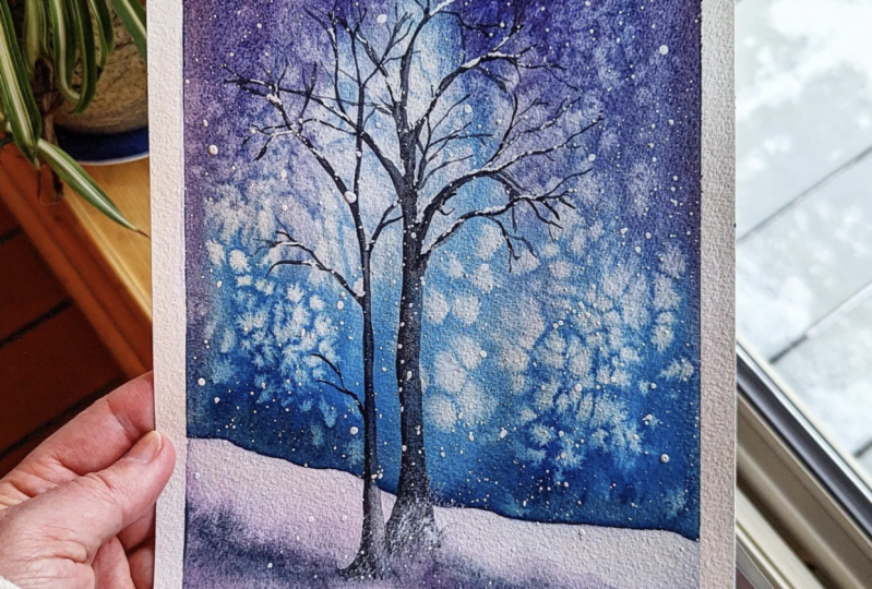
9. Color Palette Main Project: For this guy, we're going to
use the following shades. This is the final
outcome of a painting. I will be quickly swatching
out all the colors that we're going to need for
completing our project. To create that glowing
effect in the sky, we are going to use this
aqua marine missed, which is a combination of
a pigments PB 29 MPEG-7. This is a granulating
color by White Nights. I'll quickly swatch out
the color shade that it is to not worry if you do not have this
granulating color. I'll quickly show
you how you can mix your own aquamarine miss. In the earlier color
mixes that we have done, we mixed our db 28, which is a cobalt blue
pigment with that of p27, which is a viridian hue rate. The only important
clause to make your own granulating
Aqua Marine missed is to have granulating French
ultramarine pigment. That is your PV
29 pigment or ER, granulating cobalt blue pigment, that is your PB 28th. So if you have either of
these granulating pigment, you will be sorted. But it is necessary that your ultramarine
cobalt blue should be showing the
granulating property. Here, I'll be mixing
both of my pigments. Pigments that I'm
using here is from the branch and an arts
PwC watercolor range. One thing which I
absolutely love about the PWC colors is
the vibrancy as well as the fact that most of the colors are made from
single pigment colors. And that is why I was able to conquer this granulating mix. Like I mentioned earlier, another alternative is to mix your PV 28 sheet
instead of your p.sit B29 cheered and you would get almost similar looking but
with little bit of difference, but very close to what we
have as our aquamarine miss. The next shade that
I'm going to use is my lunar blue
from Daniel Smith. This again is a granulating
color and as you can see, it has the presence of the
pigment p 11 and PB 15, that is blue and black. Now in order to make this
similar granulating mix, you need to have pubic 11
SCR granulating pigment. Or else you could
substitute p week 11, if you have hematite
black from Daniel Smith, that would be excellent. Or else you could try and
mix your ivory black, which consists of pigment. He began nine and try to replicate the same by
mixing it with your blue, which is non granulating. So you could offer
for any of the blue, or you could make CR, granulating blue such as yours
suddenly and blue PB 35, That is the pigment or your
peacock blue or green blue, which is p before it comes in, the ratio of PB 15 is 23. So you could also
try and use that. I have used Prussian
blue as my blue pigment, but most of the
times Prussian blue in some other brands,
maybe granulating. So you need to check
that if you mix two granulating colors
to give rise to another granulating mix that
is also perfectly fine. So whatever blue you have, if you mix with
granulating black, you will get some
gorgeous granulation of the black pigment
into your blue. So that would give rise to a beautiful granulating
black blue. Now and other granulating
color that we will be using to create textures on the
snow mineral violet. Now apart from this
mineral valid, we will be also using
our ultramarine shade, that is our PV 29, to create textures on our snow. Coming back to a mineral Violet. Mineral Violet can be created by using your granulating blue, that is your warm
shade of blue with the cooler shade of red here, I'll be using my rose madder
or quinacridone red here. This is having a
pigment of PV nine. Feel free to choose
your cooler red, which has the pinkish
or purple undertone, and use it to create your own bright
and beautiful mix of granulating violet or purple. In the earlier
lessons of the class, where we had created her own
granulating color mixes. We did obtain some beautiful
granulating violet. So you could go ahead
and refer back to that section and mix your own granulating
valid accordingly. So that is all about
the colors that we will be needing for
creating our final project. I will see you then in the next lesson where we will be looking at
the techniques.
10. Techniques of Main Project: Now that we know about the colors that
we're going to use, Let's quickly get started
with the techniques that we are going to
use for main project. Segregated my paper
into three grids. For the first grid, I'm going to show you how we are going to create
the background. We are going to go ahead and use the wet-on-wet
technique for creating our beautiful dreamy and
bloody snowy background. For creating this background, I will be going ahead and using this software mop brush
from Silver Atelier. So do not worry if
you do not have the small brush every level with you, that's totally fine. You could go ahead and use any
ground natural hair brush. Size number ten or 12, preferably 12 because it will
have a larger belly to hold more water to allow you to spread the paint
beautifully on the surface, just like how the
mop brush does. So that's fine.
If you have that, use that or else if you have any mop brush
available with you, you could also go
ahead and use that. Now, if you are able to observe, I'm using my
granulating aquamarine missed for the background. And you can notice
how I'm tilting my block pad to ensure that the colors are blending
well with each other. And there is that upward
and downward motion of colors that are blending and
merging with one another. So this will only
happen when you have quoted the paper
sufficiently with water, allowing the paints
to move freely into that watery space. How starting from the bottom of the paper with gentle strokes, I'm trying to push the
granulating colors upwards and trying to do the similar step
from the top of the paper, trying to push down the
colors towards the bottom. So this is how I'm going to go ahead and blend the colors, but making sure that each
time I'm doing that step, I am not removing the whitespaces that I have in between the top and
the bottom part, where the colors are merging
and blending together. Okay, So that is very essential. You need to have
those white spaces in order to create
that glowing effect. Now, I'm going ahead and mixing
some of my darker paint. So if you do not
have lunar blue, you could go ahead and
use your black with your blue and try to
create a similar shade, that of lunar blue. Or you could directly use your lunar black
into the turquoise, aquamarine or the turquoise mix and create this darker edges. Be mindful of the
strokes whenever you are trying to bring down
the colors from the top, make sure that you
are using very soft, gentle strokes so that you are likely blending the colors. Now, do not try to overwork, leave it at that. Now it's time to go ahead
and splatter some of the salt to create that
beautiful granulation. You will see a separate kind of magic happening
when you splatter salt into a background
of granulating paints, the salt will disperse
the sedimentary particles more into the other corners of the paper and it
will give a very, very beautiful and
dreamy effect. Here, I have used my common table salt
for the same purpose. But if you want, you could go ahead
and use rock salt as an alternative to
your common salt. But I think common salt will be readily available at all
of your homes, right? So go ahead and use that. And I'm now splattering
few drops of water and you can already see the magic happening
there, right? So I will let this background
get dried completely. And then with the help of my palette knife or
the tissue paper, I'll be scrubbing
off the salt from the paint or the background
that is very essential, or else the salt will ruin the colors and
painting eventually. The next element of a
painting is the snow mound. But the snow mound will
be below this background. So with a very basic
pencil sketch, I'm going ahead and creating this snowy mountains
over there. Here too. We're going to use
wet on wet technique, LNG or to coat the mounds
with nice coat of water. And then I will be using my ultramarine blue to
create the shadows. Now here, always
remember that the snow generally reflects the color
of its surroundings, right? So if we are using that aquamarine missed for our
sky or the background. We are going to
replicate the same color for our shadows in
the snow as well. Starting from the base
of the snow mound, I have started layering
it with the darker shade of ultramarine mixed with
little bit of my mineral valid. As you can see. Try to observe the water control that I'm having in my brush. I'm going ahead with a very damp brush and
lifting little color onto the tip of my brush and letting it on the base of
that snow mound. This is because I want it to be very light and not
too rich in color. At this point, I'll be
lifting off some of that colors to
ensure that I have sufficient whitespaces
in-between those shadows in order to know more in detail about the basic
watercolor techniques, you could go back and refer to any of my watercolor classes. You would have a glimpse
of all the major, the basic techniques that I mostly use for my
watercolor paintings. Now I'm just going
ahead and creating this background using
wet-on-dry technique. This is just for reference. Now, if you get backgrounds like this from the
background wash, what you can do is use
just the soft tip of your brush or your round
brush and blend it back. Now, I'm going to repeat the same exact step
for the snow mound, just below the top one. And this no mount will be a little darker
towards the base of it because this is
at the bottom and hence there will be
more shadows for that. I will be using in some of
that very little tinge of my blue violet mix along
with little bit of black. We are using
granulating watercolors for creating this Gnomon
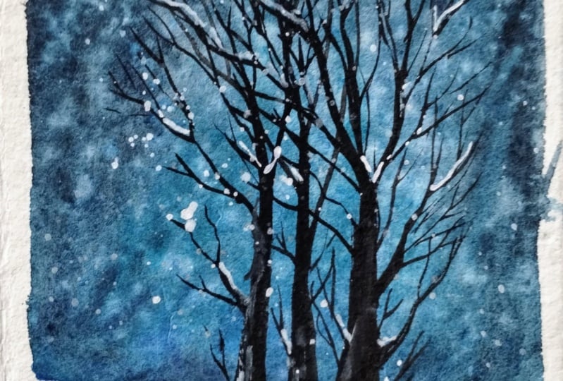
to add textures to it. Now, going to the next
element which is a tree, I'm going to use the same BBQ 11 as our black pigment
to create the tree. Now, I want to create out your minimalistic tree without
any leaves. I don't know. I'm literally drawn towards this kind of dream
without leaves. It adds so much of
character to yards, no scapes, especially when it is winter and everything
goes lifeless. This trees are clearly a sense of depth and character
to your painting. Using my liner rigger brush, I'm going ahead and
creating this tree. Now make sure whenever you
are creating this tree, one and go with the
intense tonal value and using just tho ****
tip of your brush, spread out the color evenly and make it from darker to
lighter tonal value. This will create
so much of depth into the tree and also
create beautiful texture. So one part is darker where there is no light
falling on it and the other part is lighter than the light is
falling and reflecting. Now, can you see using
just the tip of my, this very beautiful
good old liner brush, I'm going ahead and
creating this curved, thin lines to create the
branches of the tree. This is very essential
that you need to create this thin lines to make your tree stand out
in the landscape. I'm going to create another
tree with same technique. Now, the only difference
that I will make industry is by the
shape of the tree. I'm going to make it
a little curved with some natural clubs out.
You're in the trees. Some trees are bent towards
the direction of light rate. So I'm trying to replicate that. Instead here there
will be no leaves. It's just going to be the stems and the
branches of the tree. I liked the trees to be bear with this long, sleek
pointy branches. But if you want to create
bushy effect in your tree, you could use the least tonal
value of your black pigment and go ahead and use
your mop brush to dab it on to those
branches of the tree. But do not overdo this because you want your background
texture to stand out. That is why I chose to leave this tree, something like this. Okay? Now, if you are someone who is not really very confident
about creating this long, sleek, pointy branches
of your tree. What you can do is you can grab another sheet of
paper or a flip over the page in your
sketchbook and go ahead and practice some of
these brush strokes. The steadiness of
your brushstrokes will come only with practice. Now, if you are a beginner
and you're looking to have some
brushstroke exercises. You could refer to my class
seven days of vitamin C, and know more about the control and the
brushstrokes that you need to have while using
your different brushes. The pressure that you exert
on the tip and the body of your brush very much defines the shape that
you want to create. And this is exactly the same
what I'm trying to do using my this rigger brush and for
keeping my hands steady. Can you see I'm using my
little finger as the support. While creating this thinner
branches of the tree, I'm using varying pressure
points when I want the branches to be
very thin and sharp, I'm using very little pressure and releasing the pressure towards the end of
those branches. So I have those
flicking brushstroke. Funds, additional
recommendation, go ahead and practice some horizontal and
vertical thin lines using the brush that you
have selected or opted to go ahead and create
this tree in that way, your hand will develop some memory muscle and
you will remember where exactly to release
the pressure from the tip of your brush to
create this mood thin lines. And to create this
depth in the tree, you could use the full body of the brush and see how the
strokes are coming out. I'm going with some
horizontal lines and using the full
body of the brush, applying pressure, I
created those fat lines. And to create thin lines, I'm just using the tip
of my rigger brush. Wow, look at that texture. The paper is
completely dry and I will lift off those
masking tapes. Now, look at from up-close, you have guards such
beautiful texture into your background this
year is going to give a lot of character
to our painting. The exact same
thing we are going to repeat for our
final painting. So let's get started. I'll see you in the next
lesson where we are going to start with a background
of our main project.
11. Background Main Project : Let's get started with our background for
the mean project. Before that, I'll just
brief you about the paper. Once again, the sizes
of paper that I'm using here is 18 to 26 centimeter, which is ten into seven
inch size of the paper. Now, this paper is 100% cotton, cold press, green find 300 GSM is the thickness
of this paper. This is from Saunders Waterford. To keep my people
inclined am going to use that small masking tape underneath my paper and position
it something like this. I have taped down my paper on all four sides using the
masking tape that I have. Now, it is up to you
whether you want to have clean edges
to your painting. If you do not want those
clean, clear edges, you could choose to omit this option and go with
a full-sized painting. Now, I'm going to go with the basic preliminary
pencil sketch to demarcate the area where my snow mounts will begin
and the background will end. Okay, So for that, I chose to go with 34 sides of the paper for the background and the remaining one-fourth
for my snow mom's. I'm not going to add the pencil sketch of the
tree in my background, but if you want to add the pencil sketch off your tree before
you begin painting, you could feel free to do so. Using my soft
synthetic mop brush, I'm going to start letting my paper with an even
flat wash of water. I'll be using clean
water in doing so. I always choose to use
my mop brush to lay flat washes in areas
are in paintings where I have this
need to go and reach out for these curves
because the pointy tip of your mop brush will
allow you to have clean edges to your borders and have a clean
wash with water, which might be a little difficult when using
the flat brush because flat brushes have
broader brush heads, right? Make sure to water down your paper thoroughly
because you need to keep your paper wet for a longer time when working
with the background. Also, as seen in the
earlier lessons, the granulation will be
more enhanced when you have more amount of water onto your
paint and your people mix. Now, I have squeezed out all my required colors
into my palette. I have my acclimated missed, my lunar black and
mineral Violet, ultramarine blue all
in this palette wells. Now I'm using my spray bottle
to reactivate the paint. Make sure to squeeze
good amount of water into your paint mix so that you have that watery paint me. When you hold your paper
block against the light, you can see if there
are any pools, are puddles of water forming, are standing in your paper, if you feel that there is some
pool or puddles of water, you could use your mop brush
to spread it out evenly. Let's begin. Now.
I'm going to use my ultramarine miss the granulating turquoise
teal shade that I have guard and tilt
my paper or inclined my paper in this way so that when I start
layering the paint, the paint starts
flowing upwards. Can you see the beautiful blooms that I'm getting over here? This is the effect
that I want to have. The more watery your
paint mix will be, it will be easier
for the paint to travel or to migrate
and settle into the crevices of your paper
drops and the values of your paper giving rise to
beautiful granulating effect. Now with very soft, gentle, upward strokes
using my mop brush, I'm trying to spread
out the paint. I can see that the
colors are slowly fading out because there is lot
of water in the paper. So I will charge the base
of the background with another wash of that aquamarine messed with the same
upward strokes. Just dropping the
colors over there and views very light gentle
strokes using the tip of your brush so that you
do not lift off any of that settling particles
from your paper. Now I'm loading my
brush with lunar blue, making sure that I have quite a good amount of
watery lunar blue paint mix. Mixing a little bit of
my lunar black that is pubic 11 into the
same paint mix. And for some reason, the lunar blue has
frozen on my palette. Not frozen exactly because the temperatures are
quite low outside. That's why I think the gum
is not able to separate. So what I've done is I have mixed my Prussian blue
with a little bit of that pubic 11 pigment and created my own lunar
blue paint mix, the very same that we have seen, how we can make it in the
color palette section. So using that, I'm
going ahead with this downward motion
of my mop brush, making sure to pull
down the colors. There were some extra
splatters on the paper, so I will just use my
tissue paper to clean it. Gender, notice that
uneven paint flow near to the base
of the background. I will be fixing it. I have rinse my brush
thoroughly in that water. Now, I've unload
the tip of my brush again with some
clean water maker, watery paint mix of aquamarine, miss the paper and start
back applying the paint mix towards the base of that background using very
soft, gentle strokes. I'm creating this
upward strokes, moving the paint upwards in the same direction like we had applied the
paint previously. This will ensure that your
paint has no uneven runs. Now I can notice the same in that top section of
my sky background. I will show you an easy
trick how you can fix this. Go ahead, load your brush
with that darker paint mix and create this same
downward strokes starting from the
top of the paper, bring it down,
pulling the colors, but makes sure that you are not overdoing this step and
completely covering up the whitespaces or the lighter parts that
we had left earlier. I'm pretty happy of how this background has
turned out now to prevent any unnecessary backgrounds of the watery paint mix coming out from the sides of the paper. I'm going to use my
tissue towel and soak up all that
extra paint mix. So now when the
background is still wet, we will go with some of the magical techniques that
is splattering with water. This will enhance the granulating
effect of the colors, as well as give a very dreamy, blurred book. Snowy effect. It's time to use a magical
ingredient that is solid. Go and dropping salt into
that wet background, spread it across
from top to bottom, but do not overload your
paper with the salt. Keeps some empty spaces as well. That's all I'll stop with
splattering the salt. We will wait for the
background to dry. But before that itself, we can already see the
beautiful granulating effect.
12. Snowy Foreground: Let's get started
with our snow moans. Our background is
still drying up. That is the reason I have
not gone ahead and started wetting that area just
beneath that sky background. I have started
from the bottom of the paper where we have
another snow mound. Now, I'll be going and mixing my colors ultramarine
blue with little bit of mineral violet and a little bit of that lunar blue
mix that we have got to create shadows starting from the base
of that snow mound. This particular technique is known as wet on wet technique, which literally means applying wet paint over wet
paper surface. If you want to know more about this basic
watercolor techniques, you could go back and
refer to my class, watercolor cityscapes,
where I have discussed all the basic watercolor
techniques in great detail. Timing yourself and
watercolor painting is very, very crucial and essential. Why I say this, because as you have noticed, I have not gone ahead and touch the upper snow
mound that we have. I started working from the
base of that snow mound and we will gently start
creating the shadows over here. And later when our background, the sky background
has dried completely. I will go and try to
smooth out those shadows. The reason is pretty simple. If we go ahead and start wetting the areas which is in very close contact to
that sky background, you will risk or chance of
letting the colors flow into that background or the sky colors coming
into the red background. So you will end up creating
a messy situation. So in order to avoid that, we are sticking to this bottom section
first and later on, when the background
has dried completely, we will go with a
very damp brush and try to smoothen out those
shadows of this new amount. One thing that you should have noticed is that when
creating the shadows, I went along the direction
of the pencil outline. That is, how does know
mound is inclined. I have followed those
directions and just went and filled in the
colors by layering. To make this look
more realistic, I have confined the
shadows only to the bottom layers
and routine though, white part of the snow
at the top layers. As this area starting to dry up, I noticed that shadows
are looking little dull. So what I will do is I will go ahead and use my
ultramarine blue mixed with little bit of that
aquamarine missed or that teal blue color that
we use for our background. And go ahead using a damp brush and start layering
again from the bottom. I'm going and repeating the same exact steps which
we had followed earlier. At this point, when my
paper is still wet, I will go ahead and
use a little bit of my lunar Bluemix and using
just the tip of my mop brush, I'm going and
creating and raised portion from where our
trees are going to start. So that is going to be
the base offer trees. Now, if you feel that
it's too much of saturation of your paint mix, you could use your
synthetic brush or yard natural hair brush, whatever you feel comfortable with and lift out certain
pigments from there. Now at this point, we will let it dry. Once the area is completely dry, we will start
creating our trees. Here. I will just check if my sky background has
dried completely. Yes, it has got right now
it's time to remove off all those salts that we had applied for removing
those salts, I'll be using this dry tissue
paper and I'll gently scrub the surface and get off all that dried salt
off from the people. In the next lesson, I will be starting out
creating the trees. So for that, I will be using my rigger brush from
skimmed money art brushes. This is a synthetic hair brush. Now, if you do not
have rigger brush, you could also use your round brushes of
size number 32 or one. Any of it has a long
and pointed tip. So the pointed tip of your
brush will help you to achieve those very slender and
thin brush strokes.
13. Adding Trees & Branches: Time to start with our tree. So I'm going to use
my rigger brush, use a synthetic brush, and as I have already mentioned, try using a long pointy
tip of the brush. I have first started
from the left, where I'm using the
darkest tone of my lunar black in
case if you are not having your granulating
black pigment, do not worry. You can go ahead and use
your normal black such as Payne's gray or in case
if you have ivory black, which consist of pigment, Begin nine, that will also show a little
granulating effect. So you could choose to use that. As I'm reaching up to
the top of the tree, I'm going to use just
the tip of my brush and varying the pressure
point on the tip of my brush, I'm going to create
this thinner branches, the very same exercise which we have done in
the technique section. Now, I will be preparing
my black pigment, which has leaves tonal value. I have created the right
side of the tree using the same least tonal value
of my black pigment. And as you can see, I am just trying to
spread out that color using just a one-fourth part
of the tip of my brush. We have practiced this technique in the technique section. So make sure you do not skip that technique section
and practice on your own. Before you kick start
your main painting. I will keep on adding
these branches. So keep noticing and observing my brush movements and the way I'm releasing the pressure, creating this thinner
lines for the branches. I haven't now start
with the other tree. So keep observing here
how I go about it. Now, I will be
loading my brush with this diluted paint mix
of my lunar black. This has the least tonal
value of that black. And now using one-fourth
of the tip of my brush, I'm going to smear
down that paint to create this right
side of the tree. Now I'm sure I'll be dragging the tip of my brush
and with steady hands, I'm going to create the shape
till the top of the tree. Can you now see how by just varying the tonal
value of our paint, we have created such
beautiful textures and depth on the
bark of the tree. Even if I load my
brush with new paint, I will make sure that my
left side of the tree is darker by pushing away the
paint from right to left. In that way, you will
be able to create a lighter shade at
your right side. Now I will be going
ahead picking up some of that darker
tone of my lunar black and start with applying towards the
left of the tree. I will continue the same
process creating another tree. Here, I will be
fast-forwarding the process a bit because this is going to be the same repetitive process. But if you feel that you are happy with the trees that you have been good so far and
want to stop over here. You are welcome to do so. I would like to
add one more tree because they feel my right
side there's little empty. I will just quickly go ahead and add in another tree over here. And then we will see the
next step of the process. Okay? Now, to give a
realistic appearance at the base of this tree, I'm going to use my damp brush. The brush that I'm using
here is from Silver series. It's a very soft brush. So I'm just using that
damp brush and applying little of that lighter
tonal value of lunar black. This will give a very realistic
feel to our landscape. And also it would not
seem that trees are just standing upright
suddenly on the snow. So I'm trying to blend
the colors over there, creating a darker line. To the base of the tree are
paper has already dried out. So to blend the colors
back into that area, I will be just dipping the tip of my mop
brush very lightly into water and I'll try to
blend it back. That is all. We will let this
dry up completely, especially the snowy
ground because we had used a little bit of water to dampen the area so that area
must be still wet. Now, here on this branches, I will be going and
creating snow that is no has accumulated
on the branch tips. So for that, we will be
using white gouache, but that is for the next lesson. So I'll see you over there.
14. Splattering Snow & Final Details: Time to add in the
snow for that, I will be using white gouache. Now instead of white gouache, you could also choose to use your white watercolor paints, but in that case, always go ahead and use
your titanium white because titanium white is more
opaque than the other white, which is Chinese to white, which tends to be a little
transparent in nature. I mixed my gouache into
a medium consistency. Now I will be splattering the white quash that is
loaded my paintbrush. Just by tapping with my fingers, I'm able to splatter. You can use a brush, also, ruler anything that is little heavier to tap it on your brush. You could feel free to use
that and do this technique, splattering some more around
the left and the right. Okay? Do not overdo. You need that beautiful
granulating and the separation of the colors in the background
to show through. So do not overdo this step, used sparingly little amount of whitewash to
indicate the snow. And that's all. Now I'll be loading my brush tip with this medium consistency
of white gouache. And I will start creating
this deposition of snow on this branches because the branches out
here are very thin. So I'm going with this
thinner deposition of snow. But if you want to add some more dramatic effect
of deposition on the snow, you could go ahead and use larger blobs of paint
dropping in that area, but I do not want that. So I'm just going with this kind of smaller dots and
lines over here. Now I will not cover the branches of the tree
with any more snow. I will just leave it
as such to be there. Now it's time to create some snowy textures
on the base of that trees and little bit on the bark or the
stems of the tree. Here, I'll be going with the dry brush technique to create some textures
on the tree. So dry brush
technique is nothing but using your wet paint. So here I'll be using little thick paint and
using your damp dry brush, you just go and create
some textures like this. But using this rigger brush, I'm not able to create
the perfect textures. So I will be
switching to my size number for silver round brush. This is a synthetic brush. Here I will have a better grip and textures will be better
since it's a synthetic brush. And you can find out the
Brazils of that brush, dry it and create
amazing textures. Switching back to
my Azure go brush, and this time it's
absolutely dry. So I'll just use that tip of the brush to
create some textures, snowing deposition, and textures on that
tree bark over there. And just like that, yard, dry brush
strokes are ready. Covered up near the
base of the tree with my lunar black little bit because it was looking
too much. That's it. Finally we have
completed our painting. Our paper has dried
up completely. Time to take off those masking tapes from
all the four corners. B, little gentlemen, patient, whenever you are trying to
take off your masking tape, because often when your
paper is not dry completely, you run a chance of risking your heart
beautifully painted piece, joining it by just
staring from the site. So be a little patient
and good Gently. Finally, it's the end
of a painting and we have our final art
piece ready to be hung.
15. Final Thoughts: Congratulations, you have made it to
the end of this class. I hope you will continue
your journey of experimenting with
granulating watercolors that you learned today. Once you complete the class, please do upload
your projects under the projects and resources
section of the class. Last but not least, please do post a review
under the review section. This would help
my class to reach a wider audience and also keep me energized and motivated to bring more such
contained to you. I hope you have. I really loved this class. If you're uploading
your projects on social media
such as Instagram, please do tag me under
the handle name at the rate that C underscore
code. Thank you once again. Joining this class,
I will see you soon with another
exciting class. Until then, bye-bye.
 Nilam Roy, Art Instructor