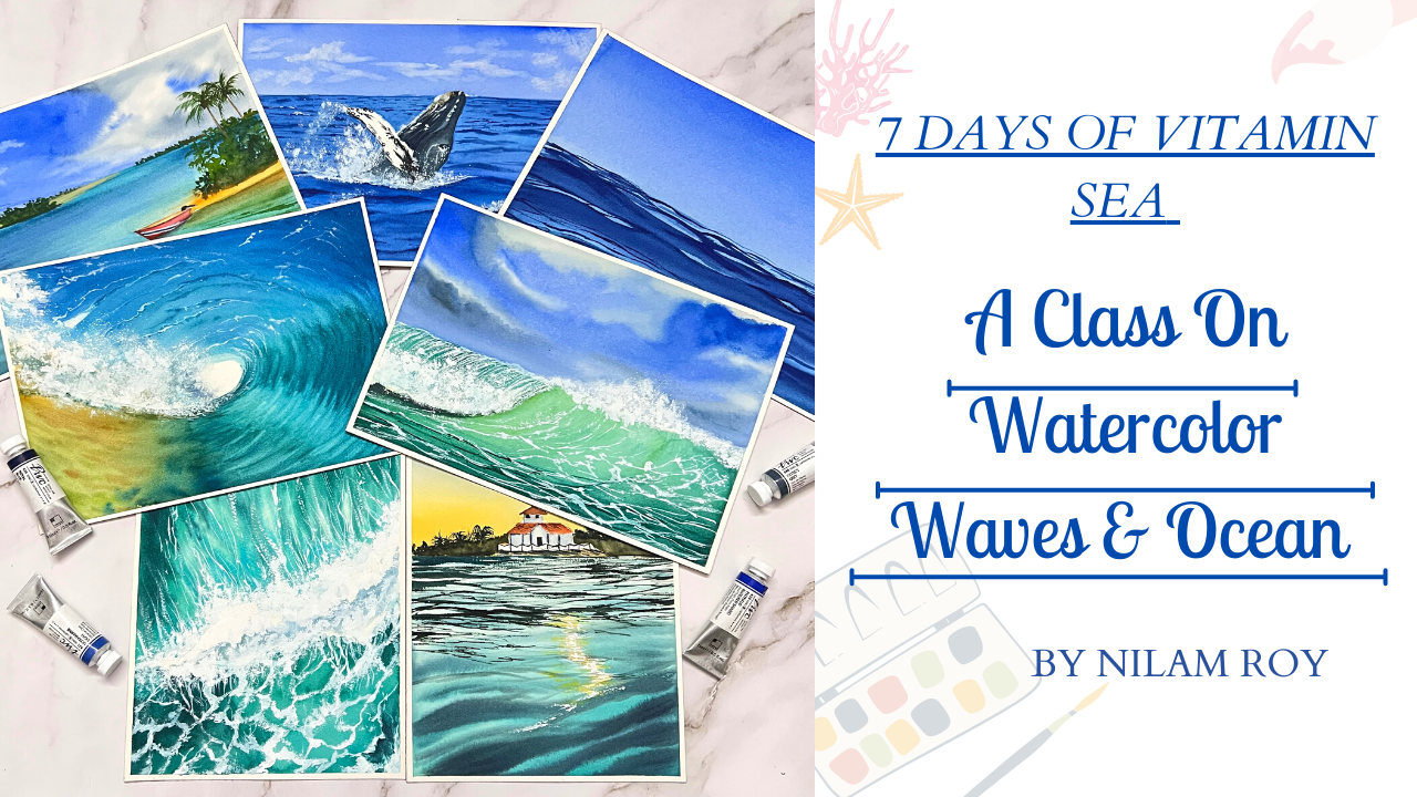
Transcripts
1. About the Class : Most of us would agree that just by being near
to the sea order around this brushing
waves gives us an immense sense of
peace, isn't it? Hey guys, I welcome you all
to another Skillshare class, which is curated from my own travel experience to this beautiful
beaches and oceans. In case if you are
joining me for the first time and don't
know much about me. I'm a watercolor artist and the dog mom based out of India. And you could find all
my watercolor artworks displayed on my
Instagram page at the rate of Neil's
artsy underscore cove. I have been painting
with watercolors for almost 2.5 years. And painting oceans and seas is little challenging when it comes to painting
with watercolors. But when combined with the
right approach and techniques, this subject can easily be
painted with watercolors. In this class, we
will be learning seven different types of
cityscapes in seventies. And each day we will be exploring a different
approach to being this beautiful seven see landscapes all inspired from
my travel vacation. Before we jump start
our class project, I have included a section
wherein I discussed about the overall color theme of the class and the
importance of swatches. One very important foundational
skill in watercolors is understanding your brush
and the strokes it can make. This class I have demonstrated very important
brushstroke exercises that you can do with the
help of your round brush. The practice control, which
will enable you to create those waves and ripples in our oceans and see
painting just perfectly. After this section, we
directly start out with the technique section each day as we progress into our class, wherein I'll be talking in detail about the techniques
that we are going to use along with the color palette for each and every
class project. As we move further ahead
into our class projects, the complexity of this projects will keep increasing day by day. There are in each
day we will study a reference learned
to break it down into simplified forms
and incorporate the basic watercolor techniques
in creating the same. This class is designed to
suit artists at all levels. But if you're someone who
has just started out with watercolors and are not much aware of the basic
watercolor techniques. I would request you
to go take a look at my Skillshare
class, watercolors, unsafe cityscapes where all the basic watercolor
techniques that are required for a beginner
to get started with the class projects is
described in great detail. I'm pretty confident that by the end of the seventies
you will be able to paint any seascape from any reference with the techniques
demonstrated in this class. So come join me and let's start our journey of painting this beautiful
cityscapes together.
2. List of Supplies: Before we start with
that class projects, I want to quickly walk you
through with all the list of materials or
supplies that we are going to need for
creating our projects. The very first supply
that we are going to be taking a look at is
our watercolor paper. Now, I will be using your Saunders Waterford
classic watercolor paper, which is a 100% cotton mold made acid free and of
archive will create now this is a cold press
watercolor paper which is 300 GSM and thickness. Now the size of the paper
is approximately r. I'll just measure and
measure it up for you guys. So this will be around 26
centimeter into 18 centimeter. Now this is the perfect
size of what is written there as 17 to ten inch, roughly an A4 size,
you could say, but feel free to use whatever size of paper that
you are comfortable with. It's absolutely not necessary
that you need to go with Saunders Waterford
paper only use any paper which is at least
a 100% cotton cold press. Now, let me give you an up-close view of the
texture of this paper. Now this is the texture
of this Saunders paper. Now, here is the texture that just for
comparative analysis, I'm just showing you here, this is how the arches texture
looks like of the paper. I love using both of these papers and they
are really good when it comes to having the paper wet for a
longer period of time. So this is how the
paintings up, Your Honor, cold press watercolor paper in case if you are joining for the first time and you are an absolute beginner
in watercolors. This is very
important, you know, to use watercolor paper, which is a 100%
cotton cold pressed and is of at least 300
GSM and thickness. Now let's take a look
at the brushes that we are going to need for
creating our projects. I have couple of round
brushes with me. So these are from silver
black velvet CDs, which is size number 1282. Now apart from this, I'll be also using
this hake brush. This is also from
Silver Atelier series. Now, this is made up
of Gore-Tex and is really very soft
and flexible brush. Apart from this hake brush, my silver black velvet
round brushes are actually a blend of synthetic
and natural hair brushes. So you get the most out of this brushes when it
comes to watercolor painting. Now, your order, some
other synthetic brushes. These are liner brushes from an Indian local brand
known as stationary. And they love using them because they are really good when
it comes to detailing. Now, there are other
liner brushes with me. These are synthetic brushes
from Princeton as well. You just need to choose any liner brushes from
any brand that you have. Let me now show you
a demonstration of why we should at
least have a blend of synthetic and
natural airbrush and synthetic brush when it comes
to watercolor paintings, we will be doing our test, which will show
water-holding capacity in both of these brushes. Now, I have taken same
size of the brush. The only difference
is that the one is a natural hair brush or a
blended natural air brush, and the other is a
synthetic brush. Now I'm going and
dipping the brush and water and I'm just placing
it on my desk tissue towel. I'll grab my
synthetic hair brush and I'll do the same with it. Now. I'm just pressing the tip onto the tissue paper to
show you though, water holding capacity
of this brushes. I'll wait for a few
more seconds and then we will see what
the results are. As you can see, this synthetic brush from
Princeton has very limited or less water holding capacity as compared to the silver
black velvet brush. And hence, this is
the reason why we use a synthetic brush for our, The dealings in watercolors, whereas this natural or the
blended hair brushes we use for the mean background
washes for watercolors. The next very important
material is our paints. I'll be using BWC colors
from Shanahan Art. Now, this is my color chart or the swatch chart for this class, which consists of mainly
blues and greens. I have listed down the names of the colors along with
their pigment information. Do not worry, I'll be
showing you in details in the next section about this color chart where we will be including
some more colors. Now, in case if you are not owning this brand
of color, do not worry. You can choose yard
colors based on the pigment information that
I have provided in there. Also have your white gouache or white watercolor
paint very close by to you before we begin starting class
projects because this will be very
necessary in case if you do not have masking fluid. To do the whiter areas of the wider portions of
the sea waves are default. In case if you are feeling
that this blues and greens, you do not have
the exact shades. But if you have with you this art philosophy
go Currents palette, you can see most of the
colors that has watched out closely resembling
to each other. So you can go ahead and
use your art philosophy, go Currents palette, and include some of the earth tones with it, such as raw sienna, burnt sienna, raw umber, CPR, any, you know, all those warm tones along
with their Currents palette. So that would very much
about your color palette. Next, you can use
this palette knife. Now this is totally optional. I'll be showing you in
the later sections how we can put to use this
palette knife. Now that was all
about the colors. Now let's take a look at the other materials
that would be required. Next, coming to up alerts. Now your I'll be showing you
different kinds of colors. This one is a plastic palette which has alert airtight lid. Now you could either
use this kind of parlors which has
well-defined wells, are ceramic palettes as well, the wild ones, or
even a ceramic plate. The choices up to you, what you have
available with you. Next will be our tissue
papers grabbed couple of tissue papers are
towels handy with you. And then we will be using in some of our
projects masking fluid. I will be also showing you other alternatives of
this masking fluid. You can go ahead and use
your white gouache or white watercolor paint as an alternative to
your masking fluid. That's all about it. And yes, how can I miss this? The very important thing, you also need masking tape in
case if you weren't white, crisp edges to your paintings. If you are using
handmade papers, this masking tape might be
little harsh on your papers. So I would advise you
to use washi tapes which are gentler on
the handmade people's. Last but not the least, you would be needing two
jars of clean water, one for washing
your paint brushes and the other to lay a
flat wash on your paper. That's all about the supplies that we are going to require
for our class projects. So grab them and join
me in the next lesson.
3. Color Theme of Class: I have the color chart
where it has watched out all my blues greens along
with my od, warm tone colors. I will be adding
this color chart in the projects and
resources section. So you could go take a
look in there because this chart has all
the color names along with their
pigment information. The main objective of swatching before attempting a project or row reference
that you want to paint is to understand
your colors, whether they are transparent
or opaque, granulating, staining or non standing colors, all this unit play
an important role in the final outcome
of the painting. Hens, do this step, grab all your blues
greens and your OD, warm tone colors
that you have and swatch them out
because watching will help you to understand your
tonal values of your colors. Also, if the color
is transparent, granulating are staining as we further take on each
project each day, I will be also discussing the color palette of
that particular project.
4. Brush Control Exercise: Outcome of a good painting, maybe a result of us and our artistic values or
the course that we have. But even our brushstrokes can make a lot of
difference to a painting, can make it look
even interesting. In this glass lesson, we are going to learn about three most basic
watercolor brushstroke exercises that will help you to master your game of brushstrokes
in your paintings. For this exercise, all you need is your round brushes
of varying sizes. You can also repeat the
same exercise using flat brushes or any
other shape of brushes. But I would recommend
you first to practice with round
brushes of varying sizes, ranging from size one or 0 to as big brushes
as you can have. And you would need
watercolor paper. Now the watercolor paper can be of lesser GSM also just to practice or you can take out a normal printing sheet
as well to practice it. Now, here I'm using a paper which is one AD
GSM and thickness. And it is smooth paper. This is not cold press paper, but rather I would say
it is hot press paper. Let's begin our exercise. I am going to first go ahead with my brush size number two, if you want, you can
repeat the same process using your size 0 or
size one brush as well. Now, I'm going to make straight lines using just
the tip of my brush. Now when doing so, it makes sure that
you take the help of your little finger
and use it as a support. Just lightly press down
on the tip of the brush and move it along as you are
creating this straight line, the amount of pressure that you apply to your brush
while pressing against the paper will influence the type and the size of
your watercolor strokes. If you press down hard, it will leave big
and wider strokes. Now if you gently and lightly press the
tip of your brush, that will live thinner strokes, figuring out how to use the right amount of
pressure is crucial. A single brush can give you many different varieties
of brushstrokes and you can also learn
how to play with it. Next comes the placement
of your hand on the brush. Holding the brush close
to the variable gives you more control when creating fine and detailed strokes
like we just did. Now when you move your hand further away from the
bristles or the fair use, you can create more
loose strokes. Now I'm repeating the
same exercise using my size number for silver
black velvet brush. And you can see I am applying
though brushstrokes on the paper by varying
the pressure on the brush when practicing
these straight lines, the thing that you
must known always maintain good control of
your brushstrokes and try to keep your
line tetanus and distance from each other
as consistent as you can. I'm going to repeat the
same exercise using my size number eight
silver black velvet brush. Now, always remember the amount
of water that you have in your paint mix also depends how your brushstrokes
will appear on the paper. So use the right
consistency of paint, do not use do diluted
or too watery paint. So in this regard, it is always a good habit and a practice that when
creating paint mixtures, always have a separate piece of scrap paper or any used
paper by your side to just test out the paint
mixture before you go on and start painting
on your final painting. The next exercises, take
ten, pick and thin. This exercise is
great for practicing control with the
pressure and release. The goal of this particular
exercise is to evil. To control the
change of pressure. Start off with a light touch, drag a thin line and gradually pushed down
or press down to the widest you can go and then
pull it back up gently. Now next, what I'm
going to do is I'm going to press
down my brush fully into the paper and then
release the pressure by gently lifting the brush up lightly there I
get a thin stroke. Repeat the same process. And you can create as many
chains like this as possible. Now, doing this exercise, keep in mind whether the shapes, our ADA consistent size. And whether you are following
a consistent rhythm, you need to practice
it in order to get the perfect rhythm into it. So keep practicing
with various kinds or sizes of brushes and
you will be perfectly confident in creating this
brushstrokes perfectly the same kind of application we will be doing
when painting the waves. When you press it down
lightly and create a bulge, you are creating pressure on the bulged areas so you
get a thicker line. Same thing I'll be trying to do for this wave like structure. I'm going and creating
a c out here. This is an inverted c. Now the same C you can see
towards the belly of the sea, my brushstrokes are widen. This is because I
have pressed down my brush over that area, thereby creating
a thicker stroke. Now I'm going to repeat the same thick and thin exercise using size number four brush. The ultimate fundamental, basics is the same pin and then take, and then again, this is what
we are trying to create out your and trying to find a rhythm and comfort in
the brushes that we have. Once I have got comfortable with the size number four
brush now I will try creating the same and
replicate wave-like patterns. What I'm trying to
do is I'm trying to create interlocking waves by just reading the pressure where I am pressing it lightly, I'm getting thinner
lines where I need to apply and get a thicker line. I'm going ahead and
creating more pressure. So in this way you
get into locked ribs. I'm going to repeat
the very same exercise using again my size
number eight brush. Now, doing this step or
exercise is very helpful for beginners because when starting out with
watercolor painting, we may not have all kinds
of various kind of brushes. So to make the most out of
the brushes that we have, you can find your own
comfort with the brushes that you already have
existing with you. And try to create this balance
of thin and thick lines, thereby perfecting your
hand muscle memory to create this strokes whenever it is needed
in a painting. Next, I'm going to show you a little exercise where it
is known as dab and pull. You learn to control
a slight turn with the brush as you press
are lifted from the a paper. You can see I'm using the
full tip of my brush, starting from the tip. I'm putting pressing
down the brush and then releasing it lightly so you get a thinner mark over there. Now you're, I'm trying to show you in the
form of floaters. The main idea is to
see whether you have grip over this and
control to get uniform petals of the flower. Now using the very same method, we will find this application
when painting the wave, see the broader strokes
that I have got because I'm using my size number
12 brush now. I'll vary the
pressure that I can make on the brush and create
thinner and thicker strokes, creating this beautiful
wavelike form. Also remember the placement of your brush in your hand
plays a very vital role. When you hold the brush
closer towards the variable, you are in a more
controlled position, thereby creating this
controlled strokes. And when you hold it away from the ferrule more towards
the edge of the handle, you have more loose drugs. Now repeat the same exercise with the vertical lines as well. This is the most
difficult tasks and most difficult exercise
because it takes some time and practice to
perfect the street lanes. You create consistent
straight lines of same shape. It requires really good
effort and practice. But this is of vital importance because
when painting a seascape, especially with sale boards, if you create some
verbally patterns of sales or masked in a board, it will be true and
raid the entire look of the painting may get just boiled with those wobbly
lines that you create. It is very important
that you try to create this steps with the help of your rigger brushes
or any liner brushes. And see whether you are
comfortable doing the same. Find your own comfort. Whether it is the rigger
brush that you are more confident in painting
this vertical lines, or it is the detailing round
brush of size number one or 0 that you'll feel more confident is a demo of
what I was talking about, the wobbly lines that
ruin your painting. So in order to avoid this kind, you need to have perfect control on the brush that
you are using to get this perfect straight
lines whenever you are painting supporting
elements for any painting. Now repeat the same exercise with different sizes of brushes. I'm going to use the same size number four pillars that we
have used to create the brushstrokes for the
earlier thick and thin lines and the horizontal
straight lines. I hope this was helpful. The main point is to be creative with the way
you use your brush. So make the most out of it. That is all for the brushes
that we are going to use. Next, we are going to kick-start our main techniques
section for our project.
5. Effect Of Water Temperature On Watercolor Paintings: We are going to conduct
a little experiment. I have grabbed my cold
water bottle and I'm going to pull out some of that cold water
into my this jar. And we will be seeing how
our watercolor paints. Watercolor, paper
draft too cold water. When I say cold water, I mean ice cold water guys, not your regular tap water. Especially if you are in regions like India where
someone has already set in water temperature of your tab is going to
go above the normal. Do not use that kind of water. Use refrigerated water. Any water which you have kept in your refrigerator just for the time being used that and
lay a flat wash of water. Using this ice cold water, I have free wetted my paper. Now I'm going to go ahead
and squeeze out the colors from my tubes and we're going
to start working on it. Now to reactivate my paint, I have used the
same ice cold water and you can feel the
difference literally, you know, the colors are not flowing on the
paper as it always does when you go to your paper with a flat
wash within water. And the colors are not able to move that or flow
freely on the people. I think I'm pretty much done with this flat wash
that I wanted. So this is a gradient look
that I wanted to achieve. Towards me. I have created that dark
patch as you can see. And as we went upwards
towards the horizon, I have started to fade it out. Now. I'm letting this repulse other waves and you can see how weirdly the paint
is reacting rate. The paint is not at all flowing, are spreading on the
paper as it should. Trying to create and code it is just like a blot which
is trying to sit on the paper because I have
used the ice cold water to reactivate my paint that I squeezed out fresh
from the tube. You can see, I think I am getting to know
why this is happening. I don't want to come to
a conclusion right away. I want you guys to
see for yourself, what is the difference
that I am noticing here? Okay? If you have already
caught it In good, but if you haven't, if big node has joined and you are not able to really
make the difference, Don't worry, I'll be
comparing this process with that of doing the same
with normal water, that is a normal, regular
temperature of water. I would suggest you
guys to also to work this exercise so that you know and feel the
difference literally, you know, this is
very important. Once you try out and
know the difference, only then you can
really understand and come up with your own exercises
or ideas on your own, you know, so try this exercise out and you are
going to enjoy it. I'm just going in and making the crest of the waves a little
darker than the troughs. So when I mean Chris, I mean the top part of the V form when it
is bending down, that is known as the trough. Now there is a little
physics behind it. The crest of the
waves appear darker, whereas the trough
of your lighter, this is because
the refraction of light that is happening from
the peaks and the valleys. So when the light is falling near or when it strikes near
the crest of the waves, it is more focused together
and hence it creates a bright spot and the light that strikes near the value or the trough of the
waves are dispersed. When the light gets dispersed, it creates an illusion
that it is lighter. It goes and creates
this brighter spot. That's why I'm using
the lifting technique to lift off paint from
that so that it seems. That area is the lightest. Now, the same exercise we are going to repeat
using normal water. As the very first step. I'm going ahead and coating my paper with clean
coat of water. This is known as the
flat wash method. The water that I'm using here
is room temperature water, that is the normal water that
I have got from the tap. Now if you are located in different regions where the temperature
conditions may vary, your temperature of normal water might be different than mine. So that's why in choosing to say that I have gone ahead
and use normal tap water, I'm diluting the paint with
the same normal tap water. And the instant yard brush loaded with the paint will
touch your paper surface, you will instantly
feel the difference. The paint is nice and smoothly
flowing across the paper. You are not facing a friction or a hindrance that the paint is not flowing on
this wet surface. The paint is nice and beautifully laddering
across the paper. I'm going to apply the same
principle of the prospective. The side which is
closer towards me. I'm going ahead and
making it more darker and fading it out
to the top surface, which is closer to my horizon line because that
is at a distance from us. So the wave, which is
the part of the scene which is closer towards am
going and darkening it out. Okay. So this is I
have followed like you can see if you are
coming from top to bottom, that is the light
to dark approach or if you are taking it
from bottom to top, then it will be Dr.
light approach. Now I'll be creating the
waves or the Christian, the troughs are the
ripples you could say. And now you can see how
beautifully the color is quite nicely spreading
out on this wet background. Now, the more control that I
exert on this brushstrokes, the more sharp my waves look. Okay, so this is why
the brush control in exercise that I had
included previous to this lesson is very
important for you to know what is the amount of control that you need to
have on your brush. Also, the amount of
water control that you need to have your my
paint is not too watery as you can see if
you layer though waves your width too
watery paint it will start blending across the wet surface very badly and you will not able to and you will not be
able to control it. I'll be going ahead and making this more readable
shapes and forms. The crest of the refills will be darker, like
discussed earlier. So I'll be going ahead and applying much more darker shade on this crest of the
waves very shortly. Now at the very same time, I will be going ahead and creating the lighter
portions of the troughs. So for that I'm resorting
to lifting techniques. Lifting technique is nothing but gently removing the
paint from your paper. So that is what is
known as lifting. Your the lifting technique
can only take place when your background
is wet enough for the paint to come off
the paper easily. As I'll be closing in
towards the horizon. The top part, my waves
will appear much thinner and longer because
it is at a distance from us. So those waves will
be much thinner. Now that we're done with
our experimental study, let me explain you
the difference. When you try to paint
with ice cold water, what happens is your paper
is already layered with a temperature of ice cold water which is below the
normal temperature. It may be 531 or two degrees Celsius if you are
using ice cold water. Now, what happens
is your paint has a certain amount of gum
arabic mixed into it. When you use cold water to
reactivate it or try to lead this paint mix
onto the paper surface, which is lead with cold water. The gum arabic somehow is still intact into
the paint and is not letting the paint
flows smoothly on the paper when it is
coated with cold water. That's the reason that you
can see how the paints we're reacting on the surface which was led with cold water. To think of it, you can create this exercise using
three types of water. That is your ice cold water, normal water and hot water
do not use to bubbling hot water because that 12 totally ruin your
watercolor paper, as well as the
brushes that you are using for the painting.
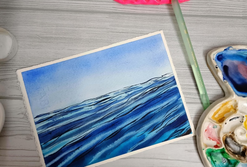
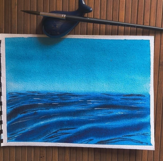
6. Techniques & Color Palette of Day 1: Welcome to day one
technique section. Let's first take a look at
the colors that we're going to need for creating our
first-class project. For this class project, we are going to mainly
stick with our blues. We are going to stick with one
shade of blue for the sky, which you're, I'm using
ultramarine blue. Now for the body of the sea, we are going to use a
peacock blue color. Now, the main trick is you have to go and
use a gradient wash. I'll be describing
you how to do in the following just few steps. The next color that
we would be using is indigo to create
the darker ripples. These are the
pigment numbers for the three colors that
we have used here. So go ahead and pick your colors based on this
pigment information. Kick-starting with our
techniques section. First, we are going
to paint the sky for which I am going with
wet-on-wet technique. For this guy, we will be going
with gradient wash. Now, what do you mean
by gradient wash? Gradient washes a flat
wash technique where you lay one single color with different tonal
intensities that is from lighter to darker
or darker to lighter, thereby bringing out
the transparency of that color as we move
down across the paper. So this method is the mostly widely used
method for painting skies. As you can see, I am going with
horizontal strokes of my brush from darker to lighter. And as I'm moving down
across the paper, I am not reloading my brush, but I'm making sure that
my tonal intensities is reducing as moving close
towards the horizon line. The horizon, the area above
the horizon line should be the lightest part when
it comes to painting skies. Now I'll be squeezing
are some more of that peacock blue color
to paint my ocean, the body of the
ocean or the sea. I am going ahead with
the reverse side now, I have started from
the edge of the paper, darker tone and as I'm closing in towards
the horizon line, I'm fading it out. For the sea. The closer you are to the paper, it will be more
darker and as you are moving further
away from you, it will be lighter. It is because of the prospective because my board though sky and sea area is dry, you could see that my C Area color was
moving towards the sky. That's why I went ahead and cleaned it off
using a wet brush. I'm really not happy with
the color of the sea, so I think I will go ahead and let it one more time
with the color. I'll start from the bottom. I'll go with the intense
value of my color. That is the peacock
blue colored with the same horizontal brushstrokes
to and fro brushstrokes. I'll move up the horizon line, making sure that
my bottom area is the darkest and as I'm closing in towards
the horizon line, it is the lightest. In-between these
steps, we will let the C to get
dried-up little bit, but makes sure that it is
not dried-up entirely. Prepared. A paint mix not too
diluted for the reposts or the paint will start spreading uncontrollably
when you start, you know, creating
this repopulate forms onto your wet
background of the Sea. Hence, it is very
important that you exercise water control
in your paint mix. You would have observed
that I have created some broader brushstrokes just at the bottom of the paper. Now as I'm closing in
towards the horizon line, my strokes are going
thinner in tiller as I'm painting this sea waves
or ripples in the sea. I hope you have taken the brush control exercise
wherein I have shown you how just by varying the pressure that you
exert on your brush, dip and the whole brush, you can create
different kinds of brushstrokes with the
help of my flat brush. Now, I'll be going ahead and
lifting of the colors in between the broader ripples
that I had just painted. This technique is almost
the same technique. If we had done for effect of water temperature on
watercolor paintings. I'm going ahead and repeating
the same steps over again. Now you're, I'm trying to
create the shadows and the light reflection that
is coming on the wave. So the lighter area
is the troughs and the darker areas will be
our crest of the waves. Now, observe my
brushstrokes that I'm creating to give damage
into this waves. They are not flat, I'm trying to create
it bulging or a swell in the waves and hence my strokes
are little curved. As my paper is still wet, the colors are able to
flow and move around. The colors are filled
in-between the troughs. I'll go ahead and clean
that area up again with the help of this damp
flat brush that I have. Now if your paper has
started to dry out, do not try to do this step because this will
instead give you a very nasty hard edges if you're trying to remove
the paint in right now. Now with the help
of my liner brush, I'm going to go ahead
and darken the crest of the waves along the direction that we had created the wave. So this will give depth to the waves and it
will make it look that there is a
swell Linda waves and they are moving along
the direction of the wind. You're satisfied
with your waves, you let it dry and now
it's time to paint our smaller distance between
this larger ripples. The ripples that you will be creating in-between
the larger wave should be thinner than the rebuilds that
you have painted. So make sure you use your
liner or your detailer brush, whichever you are
comfortable with, and create this strokes
very nice and smoothly. Do not try to create
straight lines. Go ahead and create some bulgy coves and
outlines to this waves. Entering the smaller waves or ripples over again with
the help of my liner brush so that you guys
have a fair idea of what kind of strokes
you need to make. These strokes can
be totally random, just that you need to remember that they should not
be flat, horizontal. There should be some curves
and bulges in the waves because that's how
the sea waves dance upon the sea, right? So that is what you need to
take care of. Do not worry. This is just a practice
exercise to get you warmed up with all the
techniques that we are going to go ahead and use to create a main project
along with the colors. Now, I hope once you have got accustomed and
familiarized with all the techniques and
the colors that we will be using for
this class project. It will be easier for
you and you will be much more confident when
you are kick-starting the, the class project one. Now recapping though,
techniques over again. For this guy, we went ahead
with wet-on-wet technique. We follow the gradient wash
using our ultramarine blue. You can use your
French ultramarine, cobalt blue or civilian blue. Anything which is closer
to that of P B29, which is the pigment
number for the color. Now for the body of the CBI went with wet-on-dry technique. Now your mixture that you are transitioning from the
bottom of the paper to the horizon lane going
ahead from darker to lighter. Now the very same thing can be done on wet-on-wet technique. But you had seen what
generally happens when you create board sky and your C
with wet-on-wet technique, the colors start moving
upwards and the horizon line, you might get some blooms
are thread-like structures. The color starts moving
into your red sky area. In order to avoid that, we have gone ahead and used wet-on-dry technique
for our final project. Okay, now for the
darker ripples, we have used our indigo. Now if you do not have indigo, you can go ahead and mix
a little bit of a yard. Payne's gray or neutral
tint or ivory black, anything into your shade of blue and turn it
into a darker mix. Use that to create your
darker shades of the Rubles. Now, in order to create that lighter looking part of the C in-between
this broader waves, we have used the
lifting technique. Now lifting technique
is nothing but removing the paint from
the red background. You cannot do this step if your paper has
already dried up. To exercise controlled
brushstrokes. I have already included a lesson previous to this class projects
so that you'll get a better understanding
of your brush that you are using and the
amount of control and pressure that you must exert on your brushes to create proper
defined controlled strokes. I hope you are pretty much
clear and confident about the techniques that
we are going to use for creating
a class project. So without any further delay, let's quickly get
into our project one.
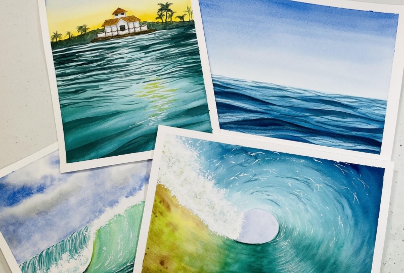
7. Day 1: Ebb & Flow: Welcome to day one, and this is the reference
that we're going to follow for our project. Now you can see, right, the C has this calm looking
appearance with this reposts. The exact same thing which we have learned in the
technique section. So let's get started
with our first project. I have taped down my paper
on all four sides using masking tape and with the
help of my hake brush, which is isnumber, I am
laying flat wash with water. Now do this step. Take your time and lay
uniform flat wash of water on your paper so that your paper doesn't run out to
be dry very soon. I will be using my
same hake brush and try to create my paint mix. Make sure you are not adding any extra water because your hake brush already
consists of water. Now observe my brush movement. I'm going to press
down my brush, lift it up and go back. Repeat. In process two, went through from
left to right side of my paper delay rich
the horizon line. I'm going to repeat the
exact same process, just that I will be
going from top to bottom and again from bottom to
top in a continuous manner. Just above the horizon line. I want my sky to look
little faded out. So for that, what I
have done is I washed my hake brush and dabbed
it on tissue double, making sure to absorb all the excess amount of water that the hake
brush can hold. And I went back again
creating those to and fro strokes from left to right in creating this smooth, seamless gradient sky, which is transitioning from
dark to lighter shade. Make sure when you are going
with multiple layering, your paper should still be wet. You can see I have tilted
my board downwards so that my colors are able
to flow according to the brushstrokes
against the gravity. Similarly, when you are
coming from top to down, you can tilt your board
slightly towards you so that the colors flow downwards according to the
gravitational pull. It will lead the
sky to get right. In the meantime, we will
start working on our part. For that, I have chosen my color peacock blue now
instead of peacock blue, you can go ahead and use your
Prussian blue. I am going. And using wet-on-dry technique as moving closer to
the horizon layer, I am diluting the colors, meaning I am decreasing the tonal strength
from the darker to the lighter shade
possible because near the horizon it is at
a distance from us, and hence the lighter shade. I'm going to go ahead
and lair the sea with another layer of my paint
mixture of peacock blue. And I will transition
it again from darker to lighter as I'm
approaching towards the horizon. As I'm approaching
towards the horizon, I realized that my paper is
still wet and hence I have the chance to lift out anti-market the horizon
lead more prominently. When you feel that your Skype part has
dried out completely. Do not try to go ahead and do this lifting technique which I just shorter marketed rather, let it be as such and try
to work on your theme, making the part of the C
closer to you more darker. I have switch to my brush size number eight from silver
black velvet brush. And I'm creating diagonal wave-like
farms for the repulse. We are working on the waves
which are closer to us. Hence, as you can see, my brushstrokes over
your are much broader. Now as we move closer
towards the horizon line, you will be noticing that
I will be going ahead with a much smaller strokes which will be interlocking
with each other. The pressure that you apply
on your brushes a lot will depend on whether you are getting this broader
strokes and thinner lines. And all of this has been explained in the brush
control exercise. So I hope you guys have taken
it and you are carefully following what kind of
brushstrokes I'm using your I am now starting out with
ripples, whichever ready ten, exercise water control in your paint mix do not make
your paint too watery or else you might have uncontrollable
bleeds when doing this. Ripples. You do not want that. Hence, it is very important for you to exercise water control the amount of water
that you are mixing in your paint and
reactivating them. We are trying to paint
all the ripples in the same direction as
we had started with. That is, we are making the
ripples go diagonally where the vanishing point or the converging line is out
of our paper boundary. There are many ways this kind of water movement can be painted. In this instance, I am
taking the help of lifting technique to create
the lighter areas, whereas darkening
the other areas to create the sense of depth. There is another
way by which you can try and approach
this painting. That way is little tasks. There you have to first
draw a sketch wherein you clearly outline your shadows and the lighter areas of the
waves that you are creating. And then go ahead and mask them out with the help
of masking fluid. Once the masking
fluid has dried, you could go ahead and create this gradient wash like
we did for this painting. Once the gradient layer
has dried out completely, you could take off or peel off the masking fluid from
those areas and start with the detailing of the
ripples of waves in you will meet those
ripples more darker. And the gradient
was that you just laid for the C would be
your lighter background. I am feeling my paper
has started to dry out. So what I have done is I took another damp brush and I went
over the wave making sure that the area was wet before
I went ahead and loaded the paint again on the top
crest part of the wave, making them appear darker, as well as blending them
smoothly into the background. Now I will be going
ahead and doing the same for the rest
of the waves images, even in the distant background. Bird cured brace in mind about the tonal value or the
string that you are using, only the crust part of the wave, you will be using
a darker shade or darker strength of your
Prussian blue or indigo, whichever shade you have
chosen to paint your REPL. For the distant waves
which have to be thinner, you could switch
towards detailing, brush, liner, rigger brush, anything which you
are comfortable with. I'm comfortable with my silver black velvet
size number eight brush because it has a
sharp pointy tip. This ripples can also be done using help of this flat brush. So if you are comfortable painting this repulse
with flat brush, you can go ahead
and use flat brush. Wait for the repulse to
get dried completely. Then start out with the detailing work with
the help of rigor brush, RER, many liner brush. This small ripples I'm
painting in-between the larger waves and
the lighter areas. So the larger waves
are basically the crest and the lighter
areas are drafts. So I'm going ahead and
painting this smaller waves creating small ripple
shaped structures in-between this lighter parts, I'll do the same for the
rest of the portion. And algaes darker and are outlined the waves
like this week. My paper is drying out. I observe that the
waves which were closer to us is
becoming lighter. So I go ahead and with the help of my mini
detailer brush, I create this darker shadows
on top of this crest with bulging motion of my brush to indicate the bulge or
the spell of the waves. I will go in and create some more thinner
lines out there. Just below the horizon line. I'll be repeating
the same step to indicate the bulge are
the swell of the waves, even which are closer to the horizon line to indicate
the sense of depth. Because the farther it is, generally more darker,
it is. The waves. It will be darker since there is a shadow being cast
in the lightest, not from that direction. The light is towards us from where we are
viewing the scene. That is all we are done
with the class project one, and now it's time to peel off our masking tape
from all four sides. Do it at an angle
and do it firmly and smoothly pressing
down your paper or you just might rip
off your paper. That is all for our
day one project. I'll meet you again
tomorrow with our D2.
8. Techniques & Color Palette of Day 2: Welcome to day two. Let's take a quick look at the colors that we
will be requiring. The first color that I'm swatching out is
my cobalt green, which you can make by mixing your turquoise blue along
with your viridian. Next year, shadow green. Now you can mix your
shadow green by mixing viridian any
darker shade of green, and you can use indigo or paints gray to
make it more darker. Wash my brush quick and nicely and I'll be picking
up the next color, which is my Naples yellow. Now, you can make your Naples
yellow by mixing some of that yellow card with your white watercolor
paint or gouache. Next would be the ultramarine. Now you can use instead
of ultramarine, any darker shade of blue, such as sertraline
blue or cobalt blue. Also. Next is ultramarine. Now instead of ultramarine, you could use your cobalt
blue or you're civilian blue. Anything which is
available with you. Next will be my
earthy tone color, which is the burnt sienna. Now instead of burnt sienna, you're going to go ahead and use your onboard or
your burnt umber. Next is yellows. Now here I have used
the yellow deep. Now if you do not
have yellow deep, you can mix a little
bit of orange into your yellow to get this
yellowish orange shade, followed by white gouache. Now, if you do not
have white gouache, you may also use your
white watercolor paint. Go for the titanium white
paint because it is little opaque than the Chinese
white of the watercolor. Then the last is burnt umber. Is the pigment information
of all the colors. You can go ahead and check out this pigment information
which will be labeled in your watercolor tubes
and pick your colors accordingly because
the color names may vary brand to brand. This is what our day
to project looks like. I will be beginning outer
preliminary sketch first, I'm creating our
horizon street lane, then a small hillock which is just one centimeter
above the horizon line. And I am beginning to create a basic structure of a house. I think we all know how
to create a house rate. Just follow along
my pencil sketch and you can also pause the
screen and make yours. Now I'll be adding small
fence to this house, which will look like the property or the
boundary of that house. Now I have decided to create
a small plateau like thing, like an island thing which on which the houses
actually standings. So that comes to little friend and hillock that we
had created earlier, goes to the background. Now here I'm creating
some trees as well. I'm done with the pencil sketch. Now let's begin with
the painting process. The first and the foremost is, I'll be going ahead
and painting the sky. Here. I'll be showing you
wet-on-wet technique, which will be a variegated
wash using two colors. That is Naples yellow
towards the horizon. And as we move up, it will be blue, the
ultramarine blue. Now this can also be done
using wet-on-dry technique. I'll be showing you that
in the project section. If you are an absolute beginner, you may not understand what exactly do I mean by wet on wet? Wet on wet means applying wet
paint over a wet surface. So you can see I had quoted my paper with an
initial wash of water. Now I have reactivated my paints diluted with
little bit of water, and I'm going to start
applying the color, that is our Naples yellow mixed with a little bit of
yellow deep color. And I will start to lay down the colors just
above the horizon line. I will go now rinse
my brush in water because my brush at too
much of yellow pigment. Now slowly using my damp brush, I'm going to spread
out the colors upward direction and
I'll stop there. But you can see my Naples yellow because
it doesn't Naples, it is quite opaque so it
is turning little dull. I will be adding in
tinge of orange. That is my yellow
deep over there, which has just like
an orangeish yellow. And I will begin
to blend it again with the colors that
are just spread out. Once I'm satisfied with this, I will be going from
the top using my blue. I will be repeating the same process as I
had done for the yellow. Now you can see I'm
beautifully trying to blend both these layers
coming from top to bottom. And I am not going and blending again from bottom yellow
to blue. I'll just It lightly with the
tip of my damp brush, I'll try to spread out the colors so that
the transition of these two colors where it is meeting looks even
and beautiful. Now, I will be switching to wet-on-dry technique
for the hillock area. Why wet on dry? Because I do not want the colors to
flow into the sky. Hence, I want to have control
how the paint will spread. That's why I went ahead
and used wet on dry. Now I'm going to let my burnt
sienna just with some dabs of this color using some darker tones and the
lighter tones as well. I'll just simply tried to mix the color so
that it is mixing. I wanted to look little lose and uneven because it
is quite a distance. I'm happy with how this looks, because we will be creating
some trees over there. We will be starting out
with the house later on because my paper
is still wet, so we will wait until the sky and the hillock dries
in the background. In the meantime, we
will be starting with wet-on-wet again
for the C. Here, we will be going
with gradient wash, that is towards the bottom, it will be darker. And as we are moving closer
to the house on the hill, it will be lighter. Now I will wash my brush and soak it on our tissue
travel with the damp brush. I'll try to lift certain
areas along the right side. Okay. I was off my
brush strokes because here is the area where we are going to paint the sun's reflections on the weaves that we're
going to paint. Next. I will be painting
the repulse following the same brush control
exercise that I had shown in the brush control
exercise also in project one was all about painting
this repulsive and see, if you are someone who has
started out from project two, I would recommend that
you go take a look at our day one project as well as the techniques that I
had shown for day one. Because this waves and
repulse will seem to be much easier because we practice
this thoroughly in day one. It's now time to paint the
repulse from the horizon line. Now this will be darker boots, which is also like a
shadow which has been casted by the background
growth of the vegetation. I want this repulse
to be very thin. Hence, I have switched
my brush from size number eight to
this mini liner brush. Now if you're comfortable making this ten reports using your
rigor or a liner brush. Feel free to go ahead
and use the same. One thing you must
remember when creating this darker shadow
rebuilds is that try to create a mixture of thin and thick strokes and
connected from left to right. Now, do not try to
completely make it dark leaves certain areas
where the C is also seen. One thing that you must remember is do not try to cover up the area where we had left to white using
the lifting technique. Remember, that is the
area where we will be painting those sun's
reflection on the wave. Since it is a golden R, I am that I am
trying to reflect. Hence I'm using the shades
of Naples yellow and orange. Naples yellow because I do not want the mixture to
turn really muddy when it gets mixed with my cobalt green hens
that Naples yellow. Now, I will be taking my palette knife and
I'll be just loading it with some of
that white gouache and creating this
random zigzag patterns. Now see how I'm
creating the patterns. I just created some
broader strokes with the tip of
my palette knife. Now if you do not have
this palette knife, you can go ahead and get your
butter knife to do the job. Even yard exacto knife Carter also you can use and try
to do the same technique. I'm going to go and
layer some of my Naples yellow on the outer
fringes of the white gouache, just to make it look visually
more appealing to her eyes. Now, you can also
go ahead and mixed little tinge of yellow
deep or your orange, whatever you have in
your color palette. But make sure that you do
not turn it to Orangi. That wouldn't look
great on this. I am going to let
it dry for now. We will be starting
working on our house, which is on the cliff. So for that I'll be needing
some of my burnt sienna. Now, make sure when you
are doing the staff do not load your paint mix and
make it too watery. Try to have water control in the paint mix that you are
having also in your brush. The reason why I am
telling you to have some controlling
the amount of water in your brush as well
as your paint mix is if your paint is too
dilute or to water, what will happen is
your paint brush, we'll start spreading it out. And you may just not
be confident enough to retain it inside the
boundaries of that roof. It might slowly starts
creeping out to the sides. If that happens, and if your background has not
still dried completely, your sky will be ruined. Now you do not want to
ruin a perfect sky rate. That is why you need to do
this step very cautiously and exercise water control
in your paint mix. If you'll feel your brushes
having too much of water, dab it on the tissue
paper or tissue towel, whatever you have by your side just to soak
up the extra water. Now using my same brush, I will be going ahead and
creating shadows to the house. For the shadows, I'm using my
pigmented ultramarine blue. At those sites where, you know, I have those pillar
like structures, those straight lines there. I will go ahead, layer the pigmented
value and I will slowly thin it down
to the other radius. Now once it dries only the
shadow part will be very nicely having that dark tone and the rest will
look faded out. So your house, even though
you have not lifted, right, we'll still have some
tinge of color as well as it will look very
appealing to your eye. Next, I will be going ahead
and creating the cliff. So for the cliff, I will just use some slanted
random strokes using my burnt sienna because this base is larger,
not large enough. This is quite a
smaller area to cover. I'll use some varying
tonal values. First, I'll go with a lighter
shade of burnt sienna and then I'll go add in some darker slanted
strokes and that's it. I will grab my brush and load some darker
pigmented value of indigo or your
shadow green and try to create this fence, okay. Just try to cover up the pencil marks that you had made for the
fence and that's it. Now it's time to
create our background. Palm trees. I'll be using
the same brush if you're confident enough to go ahead and create this
tree-like shapes, then use the same brush
that you are using now. But remember that
your stroke should be thinner when you
are painting this because it is quite
a distance from us. Always remember the
prospective angle that you are working on. That's all for our
second project. So this is how we are going
to go ahead with our project. Starting with the sky, then following the ocean and then creating
our background. And it is divided into
step-by-step process. Now this is the reference
that I had clicked during my vacation and I have
used the same to create it. Observe the repulse, the reflection of the
sun that is there. So this is exactly the same way that I have tried to create it. Okay, so just follow along the directions that
I have used and do not forget to go check out
the class project one because that is the lesson where we have taken our time and learn through how to paint
these reports in great detail. So without any further delay, let's get into our
final project.
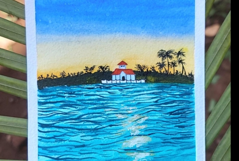
9. Day 2 : Beach House & Golden Hour Part 1: Let's begin our D2 with this
preliminary pencil sketch. I'm drawing a horizon lane just about 1 fourth
of the paper. Now above the horizon line, I will be sketching out house. It's a basic simple house
where I am going to make this matchbox kind of thing and then place
a triangle on it. This, I'm talking in
very layman language. If you're just a beginner, I hope this would help you understand what exactly
I'm trying to say here. Observed the size of the
house that I'm making, since it is at a
distance from us. The size of this house
will be very tiny, not too tiny, and not too big. It should be the size of the paper that
you have selected. If you have selected a bigger chunk of paper
like an A3 or A2 size, you need to accordingly portion it out so that
everything is balanced. You could say that this
hillock and the house is just a midground of
our entire landscape. Now I'll be starting out with flat wash. On the rest
of the three-fourths of the paper where we are
going to paint the C in order to keep your paper wet
for a longer period of time, always ensure that
you lay flat and even wash off water in the areas where you are going to
go with wet-on-wet, I have loaded my brush
with cobalt green, the brush size that I'm using a size number eight from
silver black velvet. And I have started layering the paint on the paper from
the right-hand corner. Because at the corner or at
the bottom side of the paper, I wanted to be dark
and as we move up, it will be lighter. So I'm going now towards
the horizon line with long horizontal strokes
towards the bottom I use long slanted strokes, as we have discussed
this earlier, a watercolor paintings can look interesting by its brushstrokes. As you can see, I'm going ahead and layering
my strokes on the paper very random and Enter
interlocking wave-like pattern because this is how we are going to create
the definition of the waves which are moving in
the direction of the wind. Now with some darker tones, I am going and sharpening out this wavelike forms that I
want to create on the paper. Make sure that your paint is
not to dilute and watery. You need to have the right consistency of the paint mix that
you are using. This is very important
because we want the waves to look smoothened
out into the background, but yet create a
sharp, distinct. That is why your paint and your paper needs to have
the right balance of water. Now I'll be going
ahead and create more darker waves with pigmented values of
my shadow green. Now observe how I am going
ahead and creating the waves. I will change the
tonal values as they move up the
horizon lane because the waves will go
lighter since that's the area which is receiving
the most light cure. Observe my brushstrokes, I'm
going and trying to create very loose and fluid strokes by holding the brush at
almost towards the edge. But yet exercising control by the strokes that I'm laying
towards the horizon. Now, we will work on the
waves which are closer to us. Your, I'm trying to create more bulging and swell of the waves. So that way I'm going with very bulge to kind of
shapes of the whales. Once I'm satisfied with
how the waves are looking, I will go ahead and try to clean up the areas
or the bleeds, the hair-like structures
that you can see. This is because my paper is wet. It's time to market
the ADS where the sun's reflection
will be on the water. So I grab my Naples yellow
on the tip of my brush and I gently go and create this shorter horizontal strokes with just a dabbing
movement of my brush. Now you can see my
strokes or export to the direction of the waves
am not going and creating. A straight, straight
or vertical strokes. I'm slanting it along the direction of the previous
waves that we have painted. Now in order to give that
sparkling shine to this waves, I will be using my white
watercolor paints, though. I'm very Shewhart that
I will need to go back and create it with white gouache later on
once a paper has straight. But just for the time being, I want to go and create that by letting it will become more prominent and we'll
beautified the painting. Now it's time to create the darker repulse
towards the horizon where the darker repulse denote the shadows that are
getting reflected on this. Waves. Start this ideas
only when you feel that your paper towards the
horizon has dried up a bit. It should not be completely dry, just the optimum amount of gray. You can call it semi dry. Or if you feel your paper is wet enough for
the colors to blend, then use a very concentrated
or pigmented values of your pigment. Now observe my brush
strokes that I am doing. I am using my silver
black velvet size number eight brush
for doing this step. But if you feel that
your brush does not have a sharp
pointy tip switch to a brush where you
have control and has a sharp point to dip to give
you a thick and thin lanes. So our brush control exercise of ten pick and pin
will come into play. I will be now repeat in the same steps on my
right-hand side also. And I'll make sure that I interconnect some of these
waves from left to right. I will be creating very
thin lines which will connect from the left to
right side of the painting. Now, your use pointed brush because you need to
have very thin sharp lines, but not too thin. You see how likely am stroking
the brush at this point, if your paper is dry enough, you can go ahead and create some dry brush patterns to
create this kind of effect. Now I will start creating, cannot rebel towards the area
where the sun's reflection. Once I'm done creating
this thinner ripples, I will go ahead
and try to create more darker rubles towards
the bottom area of my paper. Now this area, I still see that my paper has dried completely, so I have still chance
to work with it. But if you feel that your paper has dried out in this portion, please do not do anything to it. Skip this step and just
move on with the next step, which will be painting our sky. Now it's time to get
started with the sky. We are going to go wet on wet. Now you can see I just dip
the tip of my hake brush because I do not want this area to have
too much of water. I am going to apply it
slowly and steadily, ensuring that each
and every corner of this region of the sky
gets properly coated with water so that my colors are uniformly blending with
each other because we are going to do a
variegated wash. Now go around the areas
of the house. If you are a person who
loves using masking fluid, you can very well go ahead
and use masking fluid to mask out the ADR such as the house
and the background hillock. I have created my paint
mix now I'm going to let the colors using
my size number 12, brush from silver black velvet. And I'm going to blend
the colors smoothly up to a certain area only because
we are going to again, go to that top portion of the sky with blue,
the ultramarine blue. Observe my color
gradation out your, I am going ahead with
pigmented values of my Naples yellow and my orange
towards the horizon. Now as I'm moving
upwards towards the sky, I am not reloading my brush. I am just trying to spread
out the colors now it's time to repair paint mix
off my ultramarine blue. Do not use too much of water, just the right amount
of water and try to go with long
horizontal strokes. Now, I'm feeling that
my brush is too dry, so I will go and
reload my brush, dampen it again, and reload
the color, layering it back. As I move closer towards the area where my blues
intersect with yellow, I'm trying to create
a nice even blend. And here you can see that
both of these colors are not reacting to give
me a greenish, muddy mix. But instead it is
giving a muted, neutral tint kind of color, which is looking so
beautiful right now. I will go and try to blend
the colors even more using very long horizontal
strokes of my brush. And I'm doing it really
fast so that there is a chance of my colors to blend together before it
is completely dry. Now, I will be going ahead and creating some more of
the Naples yellow, creating this long
broken strokes where I had initially used white gouache just
to make the Golden are of the sun reflection
more prominent on the water.
10. Day 2: Beach House & Golden Hour Part 2: Now it's time to work
on our midground cliff. For mid brown cliff, I'm going with my lightest
tonal value of Naples, yellow. You're going on wet on
dry because I do not want any unnecessary problem of my paint bleeding into the
sky and ruining my sky. To exercise control, I'm going to go ahead with
wet-on-dry technique. Now, I will be mixing some of my burnt sienna with this
Naples yellow alert. And as you can see, I'm trying to just spread it out layering on top of that
Naples yellow cord. Your, I'm doing this
to create an effect. And when I layer
it once again with a darker shade and lift some
of the colors from there. This under coat color
would be visible, giving our extra loop. When you are on your way
painting this cliff, please do exercise some
control in your paint mix. Yes, I'm saying this
again and again because I don't want you guys to ruin
your perfect sky blending. That's why I'm again and
again cautiously telling you to in exercise water control in your paint mix as
well as in your brush. Now, I'm going ahead and
just using the damp, my brush and lifting
those areas out. And you can see I got
that beautiful texture. Do it. Now it's
time to go and do some dry brush strokes with my palette naive on the waves. Because this part
of the C has r, the paper rather I would say
it has completely dried. So now I would be able to get this dry brush
strokes more easily, just using the tip of my palette knife and I'm
dragging the colors. I will be using my silver black velvet size
number eight brush only to create some thin stems
using thin strokes. From the tip of my brush. Use up pointy brush in order
to create this denotes, now I'll be going ahead
and create some of that background palm trees. Now this do not
have to be perfect. You just can create some
random shapes or you can choose to create some
background vegetation by just dabbing the brush. I'm going to repeat the same
on the right-hand side. Also just start your the
trees will be little taller. I'm using this liner brush to carry out thin strokes
for the palm leaves. Now, just make one or $2
palm trees are those you can create some
shorter palm tree is to create the sense of depth. Dissuade with those
background farms. Now it's time to paint our cliff on which the
houses standing upon. Now for this, I'm not going
to cover the entire cliff using this burnt sienna
or burnt umber mixed. I'm just going to
randomly go and create some extra effect using some darker tones as well
and leave it as such. Finally, it's time
to paint our house. I'm starting out with the roof. For the roof, I'm using
burnt sienna mix. Again. Exercise water
control in your paint mix. You do not want to ruin your sky because all this hard work
that we have done so far, we'll go into waste. Just use the sharp pointed
tip of your brush and try to just drag the colors down to the shape of the roof. And that's it. You will be
done blending the roof. Once you have created the roof, we will go and create some darker blue tones to create the pillars of the house. The pillars are
beams of the house. And then with my damp brush, I'll just feed it to the other white areas is to
create the sense of shadow. Do give the houses film. To create some
texture on the roof. You can go ahead and use dry brush stroke using
some darker tones of your burnt umber and make the
roof look more realistic. Using thinner strokes with
my size, number two brush, I'm going ahead and painting the fence on top of
the pencil sketch. That's it. We are done with
the painting after this. Now, draw us small door onto the front
entrance of the house. I missed it out. I will be doing it after
rapey loud my masking gapes, but you can do it ahead also. Be lawful masking
paper at an angle always to ensure that you do not rip off your
paper and always wait for your paper
to dry completely. Before you do this step, this is very important, otherwise your painted
areas will read about with the arm
peeling off tape. Also to make your
painting lifelike, always let it dry naturally when you're
masking tapes are still on. That way, you will ensure that your painting is
flat and that's it. We're done with d2.
11. Techniques & Color Palette of Day 3 : Welcome to day three. Now before we get started
with the techniques, let's quickly take a look at the colors that we
will be needing. First color that I'm always
watching out is my viridian. Now instead of viridian, you can go ahead and use your
hookers green or any other darker green shade
that you have guard or else you can go ahead and use
your cobalt green as well. In case if you do not
have cobalt green, nothing to worry about. You can easily mix
by just adding a little bit of
your turquoise blue along with the Virgin, the exact color, how we
can make it I have shown in our day to go ahead and
check out the process. In day two. I'll be swatching
out my ultramarine blue, which is the color of our sky. In case if you do not
have ultramarine blue, you can always go ahead and use your cobalt
or civilian blue. Swatching out my sap green. This sap green color we
will be using to denote the lighter areas in the waves to retain the freshness
of the ocean. Next will be our indigo. Now Indigo I'll be using to make our darker tones of green where I need to
paint the shadows underneath the crashing waves. Okay, so instead
of Payne's gray, I'm going for indigo because it has a slight bluish
undertone to it. Last I'll be swatching
out my burnt umber. Now this burnt umber
album mixing with ultramarine blue to create the darker areas of the clouds. And that's it for the colors. Now here I want
you to understand and study this reference
picture as a whole. As you can see, the three-fourths of the
paper or the picture is of the sky and the
remaining is our waves. And water. Waves which have cold and art crashing towards
the water body, is having gradation of color
that is light to dark. And with the sun's reflection, the curved or the bulging area
is lighter as you can see. As you go down below this areas, it is darker because the
sun is casting a shadow. Also hear the perspective
comes into play. We are looking at from
the direction which is from feeding into the horizon. So it is pretty
straightforward prospective that is a linear perspective
that we are talking about. You're only point that
we have to remember is to make the darker and the lighter
areas in a way so that it looks visually
appealing and realistic. Now coming to the foamy part, you can see the foamy part is
not in theme sheep, right? There is some grooves,
curves and bulges. So according to that, make the shape of
this spray because it is very random and irregular. It is never in one shape. You can also mask out this areas for preserving
your whitespace. Or you can just do
negative painting. Let's just start with
the sketching part. So your three-fourths of the people I have
left for the sky. Now, I'm trying to create the
shape of the crashing wave. Okay, once we, I
create the shape, the other part is automatic with there will be no
pencil sketch required. It will just be your
brushstroke that will play an important part. Starting with my sky, I'm going with my
favorite method to work the sky that is wet-on-wet, flying wet paint on my wet paper is what is
known as wet-on-wet. And I love to use this technique
for the clouds because my clouds or the sky looks
very soft and fluffy. Your observed my brushstrokes
that I'll be going ahead and layering my
ultramarine blue colors. So I'm the marketing the ADS
of the blue parts of the sky and leaving out the
rest you'll paint though weiter clouds
laden with my show. The clouds which are
laden with moisture are generally at the
bottom of the cloud. For that, I'm going to
prepare a paint mix. Is mixing a little bit of
my ultramarine blue with my burnt sienna that
became too dark. You need not worry about it. If it is too dark, you can wash your brush and
try to blend out the colors, lifting some of the
areas over there. Now, when you go over
here again and again, there is a possibility that
you will tend to overwork it. And if you feel that
your paper is drying, do not do this step because
this may turn ugly like this. My paper has started
to dry and it's not really advisable to go and
start reworking on this. I'm trying to fix it, but yes, I have ruined my sky. I hope you have learned
your lesson and do not try to do the mistake that I have done by
overworking the sky, leave it at the
very first instance when you feel that your
sky is looking pretty, do not try to overwork
it because that is going to ultimately
ruin your Skype. Now there are two ways on how you're going to
approach painting, the C and the crashing waves. You can also go and do
it in wet-on-dry method. But beginners may feel a little frustrated if they are not
able to spread out the colors. That's why I thought I'll show
you guys how you can work the same width wet
on wet technique because once you start
layering though, wet paint on the wet surface, your paint will start to
spread smoothly on the paper. This step, it is important
for you to remember that your brushstrokes will indicate the water movement
in this painting. And that's why you have
to have control over your water in your paint mix
as well as on the paper. It should not be
too watery, runny. Your pin should be just with the appropriate
amount of water. It should not be too runny
or dilute d orbitals. You will have to
go multiple times trying to create these layers
of light and dark shades. Now using pigmented
tone of your viridian, you can mix a little bit of indigo to make it more darker. I'm going to go and create some ripples just below
the crashing waves to denote the water
movement that is happening due to the
swelling of the waves. So the water will try to go
into various directions. Hence, it is very important that your brushstrokes are Esport
how the waves are moving. To give it a visually
appealing look. Just below the forming or the crashing waves will
be our shadow areas. So I'm going to go and let it with a dark pigmented
value of indigo, but make sure that you
are blending it out evenly to the body
color of the waves. Now towards the top part of
the wave where it has risen, that area will be
our lighter areas. So using the same apostrophe or the inverted C leg brushstroke or a semiotic kind of shape. Go ahead and try to
lift out the colors before your layer starts to dry. Now I'm trying to paint the
waves which are crashing. So using my cobalt green mixed with a little
bit of viridian shade, I'm trying to create this
kind of shapes on this. Now the shapes of varying
lens, as you can see, some are shorter, some are
darker, some are longer. So this would give a definition
to this crashing waves. When we start with our
creating the white foamy part. Now it's time to do our white for me part that is
the ocean Spray. Use this upright
dabbing motion of your brush to create
the white form. Now ensure that you watch that you are taking
is not too watery. It should have picked
consistency to create this varying
movements of the brush, I changed my brush and
to size number six, brush from Princeton Neptune. And I feel that I have a better grip while
doing this step. So I go load my brush tip with
this white gouache again, the random strokes
or random movement, I'm creating this
white for me part. Use an inexpensive round brush while creating this form part because you would not want to ruin your silver black
velvet bristles rate. Now it's time to work wet on
dry using my sap green now see I have used pigmented values towards the
base and as I'm going up, I'm trying to lighten it out. This will give a different
kind of freshness to the sea. I love using this
color to indicate that tropical or see greenish vibe. You know, I really
love using this color. It gives a beautiful
effect to your scenes. Using my damp brush. Now, I'm going to
go and lift out certain areas from the top part of the wave using very soft, gentle pressure, you do not want to take off
the entire color. Finally, it's time to go create
more of that ocean form. I get really excited when doing this step because this
is the last step. And this step makes a lot of
difference in your painting. I'm using my palette
knife to just dab my white gouache
and using my fingertip, I'm just trying to blend it out. So this kind of gives a different kind of
depth in those forms. And your painting
looks very lively. Now instead of this, you can do this step
along with that. You can use a little bit of
diluted gouache and go and start splattering some of that form to indicate
the ocean spray. Now with the same palette knife, I am going to go create
this dry brush stroke or patterns of the wave
movement indicating that you're the Lizzie
kind of network of four Ms forming when the waves are
moving and crashing. So this can be done using
with your brush also, but palette name gives a different texture
and look to it. So it is totally
up to your choice. If you do not have
a palette knife, you can go ahead and do
the step using your brush. Also, I'll be showing you
that in the main project. I'll show you how you can
do that using your brush. So have control and amount of water that you have in
your gouache and try to, you know, create this
long freehand strokes. Varying shapes and sizes
of the strokes to indicate that interlocking wave pattern forming a lease kind of network. That's it. This is how you
can create your project. So let's quickly deep dive
into our main project.
12. Day 3 : Crashing waves Part 1: I hope you guys are ready
with the three suppliers. So let's just start
with our date. As discussed in our
technique section, I'm using 3 fourth
of the paper as the sky and the remaining
1 fourth will be R, wave or the sea. But the help of my pencil, I'm just going to go over
that straight line and create an irregularly shaped plane because veins never come
in a straight line. Now sketching out the white
for me part of the sea. I'm doing this step
because we are not your masking fluid. I really don't like using
masking fluid because I get easily affected
with migrants due to the strong order
of the masking fluid. But if you want to use
masking fluid, you know, this becomes lot more easier because you just need to mask those areas out where you want the whitespaces to be
retained and paint over it. Once the painting dries, you can peel off the
masking masking tape, starting with
layering of flat wash of water on the sky area. Now make sure that you do this step vary
generously because you do not want your paper to get dried in-between painting
your sky, right? So go as many times over this
area and ensure that you are evenly spreading
out the water on all corners of the paper, especially in the sky region. Ensure that there is
no pools of water standing are getting
accumulated at any corners, spread out the water evenly. I'm going to start letting the sky with my
ultramarine blue. Now, I have started from
my right side corner and I'm going to go and
do some random strokes. We are painting a
sky where they are. I'm loose, fluffy
clouds go random. If you have any reference for
those selected for the sky, use them to create
a sky of your own. So this is how you can include elements apart from
the reference picture and create a painting using your own style and that way the painting will be yours own. With the help of my damp brush, I'm just trying to clean up the bleed that is happening
because of my wet paper. Now as I move
towards the horizon, I will make sure that
the intensity of my blue reduces because
at the horizon level, C form will also play
an effect that Misty, for that misty effect to happen, I have went ahead and use the lighters intensity
of the blue. I would advise you not to
overwork your sky too much. I think I'll be
ruining my sky very soon because I'm
trying to overwork. Going on with multiple layers. Might be bird, I feel has
started to dry up a bit. Do not do this step. If you feel your paper
has started to dry, please leave your sky assets. You would not want TR
sky to look disastrous. Now, I will still try
to go ahead and create this bottom of the clouds
using darker shade. And you can see
that the colors are not exactly spreading
properly on the paper. It is because those
areas have dried above bit sooner than
the other areas. You can see rate how I have ruined my sky
in order to fix it. So do not try to do this step. If you feel that your
paper has started to dry, leave your sky as such, this itself will give a very beautiful effect once your paper is dry
it out completely. Now these are small little
lessons that you will encounter when you
do such mistakes. Now you should learn from these mistakes and
learn to avoid them. Preparing a mix of
my cobalt green to start working on my C. Especially the right
portion of the sea where we're going to go wet on
wet towards the left. Do not try to wet the area because that is
the area where we will go and meet the upper portion of the waves crashing
into the sea. Width wet-on-dry technique. I'm loading my brush
with the cobalt green mixed which we had
prepared earlier. Now, I'm going with my lightest intensity
of cobalt green. Observe my brushstrokes
very carefully because this is what will give the
water its movement. Your painting will look more lively with your brushstrokes. So observe these brushstrokes
carefully and do the same. I would advise you
to first watch this entire process and then go back and start
painting your own. I will now be gradually
adding some darker tones. I'll be starting first
with viridian hue at the rightmost corner with
long horizontal strokes. I'm stroking it like
an inverted see. Just at the bottom, go with horizontal strokes. But when you are
reaching for the wave, make it like a C. That is it and tours the underneath
of that crashing wave. I will go with the
darkest tone of indigo. I'll be making sure
that I load my brush of that darkest tone
and I'll try to blend the colors together. Now you're at the bottom media. This is where the darkest
tones of the C will be. So you can go ahead and
create darker stones, but do not apply to dark tones. Now, I'm going ahead
and using my sap green to coat the upper portion, the portion which has swelled
and is about to crash. There. I have used a
little bit of my sap green to create that
freshness of water. With the help of
lifting technique, I'm lifting out certain areas towards the upper portion
of that crest of the wave. Not lifting out
entirely because I want that color to also retain
once it gets dried. This will automatically
look much lighter. Towards the rightmost side, I'll go and create some
more darker shades here I'm using shorter and longer
horizontal strokes. As you can see. This would be the
still water body before the wave crashes on this. It will be darker
because of the wave. It is opposite to light and
hence it is casting shadows. So this is the reason
why this area is usually darker than
the rest of the week. I will now be using
my damp brush now, this should not be too wet. Okay, So rabbit or no paper, you should have all clean it
off instead of a Hake brush, you can also go ahead
and use your flat brush. But I would recommend
you not do use your flat brush because this may not be having some software. Use a brush which
is naturally made. This is made up of
gold hair and hence, you can see how beautifully
blends the colors. Just, just the job that it
does being a Hake brush. Using my same hake brush. Now I'll be going and
doing the reverse also. There in the technique section I had shown you how you can do the same with your
round brush as well. So if you do not have
this hake brush, you can use any software
like Princeton Neptune, flat wash brushes
also to do this step because that brush too has natural hair fiber in
them and hence you can get easily this kind
of dry brush strokes. Use weddings strokes of the
brush because you would not want all the waves
to look same rate. So use wedding strokes on longer than some
shorter and then retain the whitespaces because it
isn't there that we will be going ahead and creating the ocean Spray using
our white gouache.
13. Day 3: Crashing Waves Part 2: Continuing with part two. Now you're just with the
help of my hake brush. I'm trying to soften out
those hard edges that had been formed with the brush strokes that I
had placed earlier. Now I'll go and create some more strokes using
some lighter values. And with the hake brush, I will try to blend it in. Adding some more darker tones
towards the right side. And I'll be again
trying to blend in with very soft, gentle strokes. Make sure that you are using some loose strokes
to blend the colors. You would not want the
colors to lift out. Okay, so if you put
too much of pressure, you're at this point because the paper is in semi dry state. So you would never be
chances to lift out again with the help
of Hake brush, I'm going and softening
out the hard edges. Once you're satisfied
with the color gradation, now it's time to create some darker repulse at
the bottom of the sea. With the help of my liner brush, I'm going to go ahead
and create the rebels. Now. I'll be going
ahead with total randomly stroke some curves and some bulges denoting
some smaller ripples are wave forms here beneath
this crashing wave. I'm going to create this
smaller waves right from right to left off the sea. And I will follow the direction how I had initially
painted in the waves, denoting that all the repulsive and moving along
the same direction. Now, I'm going to
go ahead and do a second learning
process on the underside of this peaking wave using a med tonal value
of my sap green. Now, you're always do
remember to use a meat tonal or the lightest tonal
value of your sap green, you do not want this area
to get any further darker. Towards the inside corner of
the right side of the leaf. I'm going to go ahead and
start layering it with again, darker shades of
my shadow green. Now, as you can see, once the paper is drying, the shields are getting
lighter and lighter. That's why I was going with
so many layering processes. Now with the help of my darkest
value of my shadow green, I'm going to go ahead and create this ripples
again because the other time it got covered when I was going
with layering technique. Now if you're an
absolute beginner and are not aware of this technical watercolor
techniques like learning process and the others like
wet on wet, wet on dry. I would suggest
you to go revisit my Skillshare class,
watercolors answers, he escapes as well as my class on watercolor
iceberg landscapes. There I have explained
in great detail about this layering process and how it is done in watercolor paintings. With the help of my
same liner brush. I'm going to go ahead
and create this white for me part over the darker
ripples using white gouache, you're always remember to use a thick consistency
of gouache because we need to work this on a little dry brush
technique, also urine there. If your wash is a
thick consistency, it will be easier to work with dry brush technique as in when
required in certain areas. Now if you have observed crashing waves or
when the waves are swelling and the other wave
is crashing upon this small, small ripples that are forming along with the white
form of those see which kind of creates a list or a lazy
Ocean Network rate, sorry, lacy network of waves. So that is what I'm trying
to create out here. Now this step could be done
with masking fluid also, if you would have. You know, masks that this areas before we started painting
the body of the ocean. So after painting the
body of the ocean, you just had to, you know, meet, let it dry and loved this masking fluid does
giving you this shapes. Now, the important
thing to remember when you are using masking
fluid is dead yard. This ribbon like shapes needs to be as thin as you are doing it like if you're masking fluid doesn't have a
sprinter attached to it, it becomes little difficult
even with the liner brush. So it is with extreme caution
that you need to do it. As I have told earlier, I am not the person
who likes working with masking fluid because of the
strong order reader has. So that's why I
didn't do avoided, but yes, that definitely
makes your work a lot easier. You need not spend
time again doing so much of detailing
with your white gouache. Now, I'm going to go ahead and use the same brush for making this cove kind of white
lines on the breaking wave. This is because when
the wave is already in a position to
break on the shore, it is usually becoming
very for me at the top, just a dark background
color becomes visible. So that is what I'm trying
to create our tier. Use a combination of longer
and shorter curved strokes, just like how we had painted on the top or the
phase of this wave. That is how you need to go and create some more dry
brush patterns on this. And next we would be
starting working on creating the ocean Spray or
the white foam part under, underneath this breaking wave. Now it's time to create
the ocean form finally, so I'll hold my brush upright almost at 90 degrees and
I'll just dab the brush. Now, use your thick
consistency of gouache. Do not add any water to it. Use just your ****
brush to lift our Lord, don't whitewash onto your
tip of the brush and start doing this dabbing motion of your brush to create
the same effect. Now, if you have noticed when wave is breaking
on the shore, you would have noticed that the underneath
portion of that white for me part carries a
lot of the breeze through it. So we are trying to
create the same. I'll be creating
this muddy mix off. My shadow green mixed
with a little bit of burnt umber tinge and I'll be darkening these
areas. Do not ready. This will be, we will be
covering it again with this dabbing stroke of
white gouache as well. Just to give this effect of that wave getting
something underneath, we have gone ahead and
use this darker tones. I'm pretty happy
with how my white for me part of the
breaking wave looks like. So I'll stop with that. Now. I will go ahead
and create the same dabbing the dry brush
strokes on the peaking. We've just at the
top portion of it. As my paper has started
to dry already, I noticed that some of
the darker rebuilds that we had created have faded out. So just going ahead with
the liner brush and trying to create this
darker ripples once more. Now post this. I want to make the Ocean
Spray look more lively, so I'll go ahead and splatter
some of the white gouache on top of those
areas, and that's it. Finally, I'm done
with the D3 project and really loving how
the waves are looking. Just that if only the sky
would have been perfect, it would have been just
a perfect painting, but nevertheless, it's absolutely okay
to enjoy the process. And during that,
we often do make mistakes from which
we learn a lesson in order to have an experience so that we avoided
the next time. Always do. Remember that accidents are not
the end offered. It is always a lesson
in the learning. I'll meet you again
and they fall.
14. Day 4: Wave Tunnel Color Palette & Techniques part 1: Welcome to day four. Let's quickly take a look
at the color swatches. Here are all the colors
that we're going to need to create a project. You can pause the screen out your antique anode of all the colors with their
pigment information. Now comes the part where we will take a
look at the reference. So the main thing is about creating the water movement
you're in this project. It is all about
your brushstrokes, the magic that your
brushstrokes can do in creating this realism
and the painting. I have just created a basic pencil outline wherein I have created the shape of the channel along
with the areas where I'll be going ahead and
masking with masking fluid. Basically the shape of the ocean Spray or the wave when it is
calling and crashing. It's the underneath view that I am going to cover
it with masking fluid. Whenever you are
using masking fluid, always remember that user brush, which is inexpensive, that is
your normal, regular brush. Because masking
fluid is generally hard on your brush bristles and always make sure that you use a synthetic brush
for doing the same. Use dabbing motion
from the tip of your brush with
the masking fluid and create this areas where the ocean Spray
has been masked out. Now in the meantime, I want to show you something that is the water
movement that we're seeing and the
brushstrokes denoting the light that is getting
reflected from the tunnel. That will have to go ahead and use synthetic brushes
for doing so, we need a stiff
brush in order to lift out the colors
and that angle line, I'll be your using
my dagger brush. Now if you want, you can go ahead and use a
synthetic flat brush as well. Because you need
some stiffness in your brush versus to really
lift out the colors. Now make sure that you use
just the tip of your bristle. And every time that you
lift out the colors, go ahead and dab your brush
clean on your tissue double. Now, I had washed my brush again using this
liquid soap solution. I always have it handy with me whenever I'm using
this masking fluid. Now, I will be going ahead
and masking out some of the wave-like forms over there that you can see
on the final painting. So I'll be going ahead
and masking this out. The final project, I
will not be going ahead and doing with the
help of masking fluid, but I'll show you how
you can do that project without the help of your masking fluid using
just your regular gouache. So this is another way that you can attempt
this painting. So I'm showing you
here with masking fluid host using your
brushes and masking fluid, always remember to give them a nice quick bubble
button soap solution. This will help your
brushes to be saved.
15. Day 4: Techniques Part 2: Let's get on with our project. The very first thing
that I'm going to do is lay a flat wash of water on this area that is the
bulge toward the curved area. Now, remember that you need to do this step only when
you're masking fluid has dried out completely because
you do not want to ruin your brushes on
this masking fluid. If the masking fluid
has not dry properly, it may stick to your brush
bristles and measuring it. I start with my medium tonal
intensity of peacock blue. And towards the
rightmost corner, I will be going
ahead and adding in some more darker intensities
of peacock blue. And as I come to the
innermost side of the wave, I will be going ahead with
the lightest tonal value. I'm loading my brush
once again with a diluted form of turquoise. Now remember, we
will be creating a turquoise green
shade by mixing our turquoise blue along
with viridian hue. This is how you can create
your own cobalt to green now, based on the amount of
turquoise blue that you add, your cobalt green will see sway from side to really
didn't use it. That is the greenish site. So use any amount of viridian or turquoise
blue as for your liking, how you want your color
of the wave to look like. Now I'll be using some of that leaf green now
instead of leaf green, use any other yellowish green
that is available with you. I love using this
colored to meet this wave look very
fresh and lively. Use wet-on-wet method in cure
because I wanted all these letting that I am going to do to blend uniformly and smoothly. Now, I will be going
ahead and creating some more darker shades to just denote the shallow part of the whales that it
current carries the dirt from the seabed rate. So I'm just going to
drop in some of that brown into this area where we just loaded with
yellowish green that would give little
texture random body to your C. Now you can add in some different tonal
values of greens as well, but do not go over
board with it. You know, just little tiny splatters or drops
here and there and some strokes along the direction of the wave that
should do it fine. This will indicate that
the water is moving, circulating along the direction of the wave that
is getting cold. Now with small arc like shapes, I'll just go and try to create this using just the
tip of my brush. I'm going to let those colors, that is the darker
tones indicating the shadows or the water
movement in the viva. Okay. I am going ahead with
broader and longer stroke. So when I am towards the corner, most inside corner was
part of the wave and as I'm approaching though
inner circle of that, you're not handled that wave I'm going with shorter copes. With the help of my angle
brush or the dagger brush, I'm going to lift out
certain colors right from the center of where we had
laid the darker tones. This is to indicate that the light is passing
from that tunnel, which this crashing
wave has created. Okay? So that is why we
need to go ahead and lift out certain colors
using lifting technique. Once that is done, use just the tip of your
round brush and slowly layer darker tones suffer shadow green towards the
periphery of those area. That is how we will be doing it. I'm going ahead and trying to blend the other colors using my cobalt greens and lose at
just the top beaking we've. Once I'm done with this step, I will go ahead and drop in some darker tones
of indigo as well, just in-between that ocean
spray that we had marks. This is to denote some depth, The Ocean Spray, okay, now post this will have to wait for a paper to dry and then lift out those masking fluid and start working
with whitewash. Now, I'm going to create a more volume in that way by going ahead and adding some
more earthy tones. After this, I'll be adding
in some darker tones in those white areas that we had not marked using
masking fluid as well. Now, I'll be going ahead
with some yellow ocher as well and do this dabbing
brushstrokes here, denoting that there are some wide sea foam that has crashed upon this
water body as well. Now I'll be using
my white gouache. This is from Rous drew. You can go ahead and use any
whiteboards that you have. I would prefer to use
titanium white when it comes for whitewash because
it is much more opaque. Now it's time to remove our masking fluid
from those areas. My idea the painted
idea has dried completely so it is easier for me to lift out
the masking tape. Sorry, masking fluid not be just using my upright
dabbing strokes of the brush, just like how we had created
Ocean Spray in D3 project. Remember that this is the
same way that I'm going to go and create this ocean
form or the ocean Spray. Keep doing this step
until you are satisfied. I removed the masking
fluid from those thinner, wave-like forms that I had created in-between also, right. I'll just go over with my thinnest liner
brush that I have got. This is size number 0, liner brush from PBCH. Now, this is a very
ordinary Indian brand. I'm just going ahead and creating some small
learned ripples or wavelength forms in-between
those larger waves. Okay, so that is all about it. At this point, I'll be
going ahead and adding in some more greenish
tone over this, the burnt sienna
and dabs of brush. Okay, so this is to
create that illusion that the wave has carried in lot
of debris from the ocean bed, especially the sand. Okay. The waves when it
lashes upon the short it also does
carries sand, right? That is what I'm trying
to represent here and use this dabbing
motion of your brush. Try to use dry brush technique first and then try
to smoothen out certain areas a bit using
your damp brush. That's it. We're almost done painting
this leaf tunnel. I'm jotting down all
the techniques that we have used to create
this wave tunnel. I hope you have enjoyed
the process and you have a fair understanding how we are going
to approach this. This is fairly simple. All we have to do is let the brush do the
talking on the paper. And we will be very much
done with the painting.
16. Day 4: Wave Tunnel Part 1: Welcome to day four. And like always, I have deep down my paper on all four sides. This is the reference
that we are going to be painting today in my own style. I'm just going
ahead and creating the kernel shape with the
help of my pin pencil. Now, I'll be going ahead and
marking out the areas where though crashing
waves are falling and forming this for me part. Now, after this
step, if you want, you can use your masking fluid like I have shown you in
the technique section. And you can cover all
the serious with masking fluid in order to retain
this whitespaces. This is where we
will be going ahead and doing our ocean
spray later on, once we are done with painting. I'll show you what
I'm talking about. This ocean for media is the
area where you would be using your masking fluid
to mask out though areas as shown in the
technique section. With the help of my hake brush, I'm going to go and quote my area of the wave with
a flat wash of water. Now, make sure you
do this step nicely because nice and
tightly because you want to IP your paper wet for a longer period
of time in order for the colors that you will be using to blend
harmoniously together. Now this method can also be done using wet-on-dry technique. But it would require much longer time for creating
the effects that they want, especially the water movement. So I decided to go up with a combination of Bhutan
read as well as wet-on-dry. Let's start first. I'm starting with
my peacock blue. Now, remember that the column mix that you are using
with your blues, especially the peacock blue
or any other blue that you are selecting do not go
with a very diluted mix. I want to use a variation of medium and your lightest
journal values. Towards the topmost
right corner, you will be having some
drooling pigment, the tones, that is the area where we
want the doctors layer. But as you come towards
inside that we've done, the colors will appear to be lighter and lighter
because the artist apart, which is getting most light. Okay? So that is how we
are going to proceed on with dark reference as a guide and we'll
be painting this now. Now look at the brush
strokes that I'm making. I am going as fodder direction, that is my initial
outline on the wave. I am not a unit layering your flat and even
horizontal wash, I am making sure that
my brushstrokes are in the direction that the
wave is calling and bending. So I'm starting with
my cobalt green mix. Now, I have shown in previous projects also
how you can create your own cobalt green by
mixing turquoise and viridian. I'm going to go in-between those lighter letting that we
had done the you know, there is some kind of
whitespaces that we had left. So I'll go and create this kind of brushstrokes just with
the tip of my brush, do not apply too much of
pressure because you may be lifting out the colors at this point because your
paper is still wet. So apply your brush
strokes ready, Italy and slightly towards the left side you can see
I have not wet my paper. That is the area which is dry. We will come to this part later, but I want to finish first this right tank coal of the wave and then move
on to the left side. Now, did you observe
one thing as I'm going ahead with my brushstrokes with different
coloring densities. You can see evade. I'm trying to focus on the
water movement in the wave. So this is becoming
more and more pronounced as we are proceeding
on without painting. That way in this exercise, your, the way you create your brushstrokes that
will matter the most. So I would recommend that you take a look at
the entire project, watch my brushstrokes carefully, and then go ahead and
start with your project. Now towards the arc
of that tunnel, I'm going to go ahead
and create some. Docker water movement reports. Okay. Now, why darker? Always remember that
you are lighter. Values tend to be visually more lighter when you have your
darker areas around it. So that is what I'm
trying to create our tiered just observe
my brushstrokes. I'm putting very light pressure just with the tip of my brush, you know, gliding smoothly on this vector areas layering
with the darker shades. As you can see, you're my brushstrokes and not flat
as I was telling earlier, I am going how my wave
tunnel is spacing. So you're, the light
is not getting past. This part of the wave
tunnel will be the darkest. Now there will be two darker
bands of water ripples. So that is what I'll be
trying to create our TO. I started doing the
same brushstrokes towards the left side also
to and fro brushstrokes. Okay, This is very simple, broader at the base and as
you go towards the tunnel, it will become narrower. Using and keeping that in mind, go and create your brushstrokes. At this point of time, if you feel that your paper
has dried out, do not ready. What you can do is
you can go ahead and prepare diluted paint
mix of your colors. And you can start the
learning process over again to blend the
colors smoothly. What me here closely as I'm going with this
learning process, I am not trying to cover the entire underneath layer
of my cobalt green mixed. Did you see I'm
trying to work out certain areas creating
brushstrokes with a darker tone. Get the water movement more
pronounced in the way. Do not cover the
entire area with your intense tones of colors. You want the lighter
colors also be shown. Now observe what I'm doing. I'm just using my
**** it both my brush and creating these ripples in the rightmost corner of the wave and creating some
more in the lighter as well. So this is how you are going to denote the water
movement which will be like faded out in the background once
the paper has dried. Now, can you see the
heart edges when the lighter portion has formed because my paper
had started to dry. What I will do is
I will go and try to cover up those
hard edges by simply dragging the darker
tones towards the inside using the same kind of brushstrokes that I
have used initially. Okay, now to do this step, use just the tip of your brush and try to drag in the
colors over there. In that way you will be able to cover up those hard edges
that has been formed. I'm taking my time and trying to rework our reflex,
those hard edges. You can see how
carefully I'm doing it. I'm ensuring that I'm
not overworking it. Now. Maybe I'll go in and add in some more darker tones
towards the bottom right. You can see as I'm
letting the color and as I am going towards the tunnel, my colors are
feeling out because my brush has exhausted
the darker tones, right? Let's start working on the
left side of the wave. First, I will go with an
initial coat of water. Use. You don't have a control on the water
that you are using. Your apologies though. Camera had started
filming the process. So I'll be telling
you what it is. I had just put on a
coat of yellow ocher. I went with medium tonal
intensity of yellow ocher. And as you can see, I'm just, I followed
the same strokes. That is in the
direction of the wave, trying to blend out the colors. Your, this part of the wave is the shallowest part of the wave, which is closer to
the seabed area. Hence, the colors like yellows and muddy or the greens
and browns will be used here to make sure that you are working
in the direction where the wave is moving. So I'm going from the
outermost corner to the innermost corner trying to blend my yellows with the blues. Now with my darker stone of viridian or the mid-value
tone of viridian. Remember those are shadowy
areas that we had created. I'll go and use the same
kind of brushstrokes and leave some of that
yellowish part in-between. Now you're, I'm trying to blend
out the colors as you can see because my background is
wet on the yellow portion, so the colors will look
smooth and blended out. Now I'm trying to get this wetness of the
paper to my advantage. And I went over those darker, shadowy parts of
the wave once more, creating that streak of the
shadows that are formed. As my paper was drying, I felt that the yellow
ocher color has dried out to be much more
favored than I expected. I will go and leave
it again within MIT, tonal value of yellow ocher. Remember, we want the bottom to be almost semi-transparent. So towards the top
part or the top curve of the wave go on with your
indents, yellow ocher. And as you come to the bottom, go with the lighter values. Now using your liner brushes, I'm going and creating the
shorter forms using brown, that is a greenish brown mix. Now I'll just go randomly, random curved strokes urine
there and I will just try to create this
patterns in this area. Now these strokes will
eventually get blended out in the background because
your paper is still wet. Now it's time for you to create some more reports using your mid tonal
value of sap green. Just create the same strokes
using your liner brush.
17. Day 4: Wave Tunnel Part 2: Okay, so let's continue
with what we were doing. Now. I'll be using my same liner rigger brush
and I'll just go to and fro making this area's little bit more spreading out the
colors in this way. Now my paper is still wet so I'm able to not let the brush, bristles do their
job was spreading the colors and getting
them into a proper shape. At this stage might be
Buddhist still wet. Hence, I will just go and use my clean damp liner
brush to go and lift out certain areas of where we just created those strokes in
the same circular motion. Always remember that you
need to use your damp, wet brush to lift
out your colors and always keep our tissue
paper handy with you. And every time you
go lift your colors, damp, rub it off, or dab it off on your
tissue paper and then go ahead and
lift your colors. If you would've noticed
the paper has started to dry and on the upper side, your though, she'd has gotten lot lighter
than I expected. So I am going ahead
and coating it with one more layer
of shadow green here. Make sure that you are using little pigmented value of
your color unless of water, it'll give you a nice blend. And to retain the
intensity of color. This step, I would
recommend that if you have a brush which has a combination of natural and
synthetic hair fiber, I would suggest you
do go with that because it is a combination
of both the worlds. Hence, it will hold lots of
pigment as well as we'll have little bit of better
water-holding capacity then your synthetic brushes. You are synthetic brushes
may also give you some hard edges when you
are doing this step. I recommend if you have natural and synthetic
hair brush combination, go ahead and use that. Now as you do this step, you will get some of
that hard kind of lines. So I want to blend it out. Hence, I'm going with
the union little damp brush and trying
to blend the areas. Once again, I switch
to my size number 12, silver black velvet brush. And because these
brushes are really soft, I can easily ensure that the blending here
is softly done. Now if you feel that during
this blending process you're some of the lighter
areas have gotten mast. What you can do, you can go ahead and use again
lifting technique, as I have shown here. Now, I will go and lightly wet to the other side area also, I'm ensuring that
during this process I'm applying little
gentle strokes so that my color is not lifted off because that is how lifting
technique is done, right? So ensure that you are not lifting off the colors entirely. Now using my angle shader brush, I'm going to lift out
the colors gradually. So you can see red with
some gaps in-between I'm going and lifting the colors out in the same, our flagship. Okay. This is what is
going to give though. We've done, it's
that light portion which is getting reflected. Now if you do not have an angular shader
brush, do not worry. This very step can be done
using your flat brush. Use the tip of your flat brush and
make sure you are using a synthetic flat brush to get this kind of clean
and beautiful effect. Now it's more kind of, you know, using a combination
of techniques like lifting and
learning process. So keep observing my
brushstrokes and the way I'm doing this step-by-step, because sometimes observation is much more powerful
skill than the audio. I will be back again when I feel you will be
needing some guidance. Now again with the liner brush. This time we are going
with the unit short, random and broken strokes. Now my left side had
gone little faded out, so I went ahead and use the
same mixture of yellow ocher. Slightly layered it with
another coat of wet paint. Now when I layer of dark green, you can see it is
blending and smoothly. This is because
the paper is wet. And using the tip of my
brush size number 12, algaes go with
circular motion again, and we'll repeat the same
process to create the band, the darker band of the shadow. Now I'll be letting
the topmost corner of the wave again with the mixture of my
peacock and pushing Lou. And as I come to the front
of the breaking wave, I will go with the diluted
tones and I'll simply dragon, pull the colors in Nazis kind of shape and bring it closer
towards the inner circle. Okay, so this is how
we're going to do it now, do not worry about this hard
lines that you are getting. We are very soon going to blend it out using
our damp brush. Now I'll be going ahead again
with the lifting technique. So I'll just lift out certain
portions of certain areas. Again in the same arch like shape revolving around
the tunnel of the wave. Okay, so this is how we are going to build the gradation of colors from forming the
lighter and the darker areas, especially the streak of light that is getting
reflected in the wave. Once we are done with this step, I will be using just the
tip of my brush and create this smaller broken ripples are forms of waves like
this and this pattern. So this is how I'm going to
give the texture and create the movement of
that flowing water inside this breaking wave. I will do the same with the rest of the area
also because here the water is in very
tomatoes position rate. It is the inner constant motion where the wave is swirling, swirling, and is breaking rate. So to denote this
water movement, it is very necessary
that you create these broken lines or shapes of waves when the
background is still wet. Now it's time to pick
your white gouache squeezing fresh squash
because you want little thick consistency
of paint to start creating your brushstrokes in with
my liner or rigger brush. I'm going ahead and creating this curvy lines which will be denoting the ripples are the four Miserables though
this wave is forming. Now observe my brushstrokes. I'm not going with
the simple, cheap. I'm going and giving it some curves and bulges
wherever needed. Use random motion or random strokes of your brush
and create the shorter. For me, waves in land around the topmost
part of the painting. Now this is the point. If you have used
your masking fluid, it will be time to, you know, rub off the masking
fluid from those papers surface you need your paper
to get right at this point. In order to do this step, I have not used
masking fluid here. I'm going ahead and doing this step with the help
of my white gouache. But in case if we have
used masking fluid to mask out this areas
creating this repulse. Then it's time for you to get your paper dried and peel
off the masking fluid. Now, I have switched
to another of my liner brush and
with darker tones, I'm going underneath
the whiteboard areas that I had painted
those ripples. I'll be switching
again to another of my brush where I had
initially loaded the white gouache and
I'll keep continuing with the same small broken brushstrokes
denoting this for me, parts of the wave or the lazy
network that the waveforms. Now for the proper
semiotic shape that we have as the wave tunnel, I'll go with my liner brush. And using the dry
brush technique, I will go ahead and
create many more smaller, finer lines in there.
18. Day: 4 Wave Tunnel Part 3: Now it's time to
paint our for me. I have went ahead and
use the mixture of my burnt amber along with
some yellow ocher and greens. This is the lightest
tonal value. There. You grab some
of that blue and just with the dabbing motion
of your dry brush, go ahead and create
this texture, the patterns along
the center portion of that whitespace which you had left for doing the
white for me part, repeating the same in
the other areas too. Now just with the help
of my white gouache, I'll use my liner brush to create this dry
brush strokes are patterns to create that Ocean
Spray or the foamy part. Use just the dabbing
motion of the brush. Hold your brush upright and just keep dragging your
brush on the paper. It will automatically create the dry brush
patterns your paper. That's why it has to
be cold press paper, which generally has little
bit of texture to it in order to get the perfect dry
brush technique pattern. Keep dabbing your brush
and make sure that you are using your thick
gouache consistency. Do not make it too diluted with water because this
will result in more diluted or transparent
kind of layering and you would not
get this kind of dry brush patterns or strokes. I'm going to keep doing
the same until I covered the entire portion
where my white for me part of the crashing wave is. Keep repeating with dabbing
strokes of your brush, but always make sure
that your brushes dry. You can see how my
results look frayed rate. So if you want to do this step, use any of your
synthetic brush and just use the tip of your
brush and keep dabbing. Now, I'm going to go and make some of that blues
and make it a little diluted so that I get the lowest or the
lightest intensity. And then I'm going
to just go and dab it in-between the areas where I just went ahead and did
the gouache patterns, the whitewash, ocean
spray patterns. And I'm just going to
blend in properly. You this is because
if you would have seen when the ocean
is breaking up, the C wave is breaking, it will have lots of layers and transparency in-between
these forms rate. So in order to debate
that transparent layer of the sea depicting or reflecting
the color of the water. I'm going ahead and creating
this shadows using my blues. You can see how this breaking wave is
coming to life because of this dabbing brush strokes with different tonal values
of our blues and whites. I'm going to repeat
the same step on this shallow
part of the wave, where the waves are
crashing and breaking upon. Just slide gentle dabbing motion of the brush create this
irregular patterns. There is no hole, perfect pattern in this. You can go ahead with
any random patterns creating however you
want your bite fork. Want to create more texture. Stewart, I thought I will go with wet-on-dry
technique for this, but I think I'm not liking it. So what I do is I
have went ahead and laid it with little
bit of damp brush. Now at this point of
time the layer is wet. Now if I go and paint my textures with little
bit of browns and greens, it is going to get blended into the background because my
paper is now a little wet. This is what I wanted. So you can see the blurry
and the smudgy lines. Grabbed a couple of my tissue
papers and I'm covering the lighter areas where we had painted the
wave would lose. I'm now going ahead with this flattering technique
to denote the ocean spray. I'm going with tiny droplets, use a little bit of
thick consistency. I would not call it thick, but not too diluted either because when you have
more diluted paint, you will get more
bigger splatters. Okay, so that's it and I'm done. It's time to let the
paper dry completely. After your paper has
dried out completely, then only go ahead and be loud. You're masking tapes
from all sides. My paper has dried
completely now I'll be peeling off the masking tapes
from all the foresights. Do it at an angle and do
it slowly and patiently. Do not try to read
about your paper. Now hold and press
down your paper to let your masking fluid come
out nice and neatly. There you go. We are
done with our painting. This is how our final
painting looks like. I'll meet you tomorrow
again with D5.
19. Day 5: Color Palette & Techniques: Welcome to the five. And today we are going to paint this beautiful aerial for MSI. First I'll be taking you
through the reference. The reference that
I have selected is enough portrait mode and
this shot from top angle, this composition may look very tough at the very first
code that you looked at it. But I will be
showing you how you can break down
into simple forms. Break it down into 3. First, the deeper C-section, then comes your middle
portion where the white form is there and then is
your shallow part where the waves are crashing and you get those white lacy
network of four. Now let's grab out
our sketch book and I'll be showing you
first the color palette. Then we will be moving on into how we can attempt
to paint this. Let's first focus on
the water movement. So if you get that right, the entire painting
will be very easy. The water is moving either
from left-hand corner to the right-hand corner
you can assume or from it is traveling
from the white part, that is the for me part of the region and is going
into the deeper in. So in all, in all you need
to go with diagonal strokes. So this process will
become more clear when we deep dive into how
we can create this. So first, let's take a look
at the color swatches. But the final project, I have mainly used my turquoise and
cobalt green sheets along with some darker
tones of indigo. Now, if you want, you could pause the
screen out there and take a note of all the colors along with their pigment information. Let's begin painting by
applying an even wash of water on the depot CND area. And I will leave out
wide dry portion in-between which
will be our right for me part and
covered the rest with. First off, what are the kind of painting that
I'm doing out here is known as negative painting
because I'm retaining my whites and I'm going
around and painting. You can use masking fluid to mask out that wider
for media to, I'm loading my brush
with the diluted tone of my turquoise blue now
absorbed my brushstrokes. I'm trying to push away the paint pigments
into the deeper end. So this will denote the water movement
that is happening from the region to the darkest or
the deepest end of the seat. I am repeating the same
step on the other side too. Now, I will be using a little bit more pigmented
value of my turquoise blue. And I will try to create more prominent
repulse shaped like ripples or strokes from my brush to indicate
this water movement. Now I'll be loading my brush
with the darker shadow, green color that I have. So you can mix a little bit of your indigo
or your darker blues into your cobalt
green or your tacos blue and turn it
into a darker tone. Now, I'll be going with one more additional
layer on the top. The blue color. Orals, you can go
ahead and choose your darkest tone of green that you have in
your color palette, or mixing little
bit of indigo with your viridian to get closer
tone to shadow green. Now for the final project, I will be going ahead and using my darkest tone as the shadow green mixed
with little bit of indigo. But for this demo exercise, I'm going to go ahead and use indigo as my darker
star tonal value. And I'll just go and create
this wave-like shapes. See how those strokes are right? Now on the other side, I will go very close to the whiter portion areas
and I will just go with random irregular brush
patterns with just the tip of my brush and load this darkest are pigmented
tones over there. Now if you noticed, I am not going and
doing the same for the other left-hand side. This is because to
kind of waves are meeting and forming
this for mimics. So these are in
opposite direction. I will be loading some of that intense tones towards
the farthest end of the C to denote the sense of depth and
also the perspective, even though it is short
from a top angle, Your to the depth of the sea will be playing an
important part. Also the light that
is falling on it. Now, I'll be going with
wet-on-dry technique to create the shadows in-between the white foamy
region of the wave. This is how I'll be
spreading it out. Can you see the
white for me region here has an underlying
shadow to it. So that is how we
will recreating it. Now on top of this, I'll be letting it
with white gouache. For this step, you need to
wait until your paper dries completely for you to achieve those dry brush
strokes or patterns. Now with the help of liner, rigger brush or any
minute detailer brush, whichever you are
comfortable with. Try to create this
smaller wavelength forms which is radiating out
from the white for me region to the deeper
end of the C. C I'll be going there and using varying strokes to
denote those lines. Now I'm going with this dry
brush patterns covering up those shadowy indigo region
that we had just painted. Here. I have switched my
brush to our detailing brush. Now, if you're comfortable
with your liner rigger brush, you can go ahead and do so. I am comfortable in both ways. So I'm showing you how
you can choose both and create this fine
ten lines to indicate the ripples now go for varying lengths of this rebirth along with some
shorter broken lines. The more you do this step, the more prettier this
part of the C would look. Now I will be repeating the same in the other
direction as well. Just that I'm going
ahead with this again, dragging the brush along the fringes of that
white foam part to create those shapes. Now use smaller strokes
and lines to indicate those smaller ripples
or waves that are coming out of the entire region. Now, I'll be going ahead and connecting this repulse into
a lacy network of foam. So here is the
interlocking waves that we will be forming. And each wave will be interlocked in such a way
that it forms a chain. Okay, So go ahead
with any random forms and try to link all
these forms together. The basic shape is
pretty much clear, so it will be somewhere between
a pentagon and a hexagon. Okay? So try doing
something like that and connect
it with the waves. Once you are done with this, just drag the excess amount of paint that you would have in your brush on our tissue
paper and try creating dry brush strokes in-between
these interlocking waves. Just to give that the gushing waves and forming this form
at this other end, that is the right turn
corners of my paper or page. Now if you want to reverse
the direction of the ways this interlocking
waves you can go and create some broader
strokes as well. And towards the edge
of the paper you can go ahead and create
this dry brush strokes dragging your brush and in-between you can go
and you're not layer the white gouache with some
darker tones to create the sense of depth in this
farthest end of the scene. And that is all that we will be going and doing over here. So this is how my real
project looks and this is how we are going to proceed
on with the techniques. We are mainly going
to focus on wet, on wet, wet on dry and
dry brush techniques. Come Let's jump
start our project.
20. Day 5 : Aerial Foamy Sea Part 1: Like always, I
have already taped down my paper on all four sides, and I'm ready to start with
my preliminary pencil sketch. I'll be just sketching out an irregular pattern
of white for me area. This is the area where
mean sea foam will be. You can mask out this area using masking fluid
if you want to. Or you can follow along my step-by-step instructions and paint without masking fluid. In this project, I'll
be showing you how you can do the same without
the help of masking fluid. So the first and the
foremost thing is laying flat wash of
water on your paper. Make sure that you
are doing this step very generously in charting that your paper is evenly coated with the water because
you're in India, temperatures are
pretty much high and the paper tend to
get dry very fast. So if you are living in a
region where the temperature, summer temperatures are
really high right now, I would ask you guys
to do this step little impatiently me ensuring that your paper is nice and
evenly coated with water. Once you are done
prepping your paper, the next step is to
prepare your paint mix. The paint mix that I'm
preparing is my cobalt green. Now when you mix two parts of turquoise blue with
one part of viridian, you would get the shade similar
to that of cobalt green. Using my size number 12 brush, I'll be loading my brush
with this paint mix and I'll start layering the
colors onto my paper. I have started from one
corner of the paper, as you can see, and pulling the colors inwards towards the area where
the foamy parties. Now, make sure that you are leaving certain areas as white. See the brush strokes
that I'm creating are going and using the tip of my brush and creating this small thin lines
showing the water movement. Now this is very important. You know, your brushstrokes
will matter a lot because you need to show
this movement of water. Waves where the two waves are meeting, crashing each other, where one wave is pulling inwards and the other
is pushing outwards. So that is what we are
exactly trying to create. Your, hence your brushstrokes will be of vital
importance here. As they approach towards
the right for me part, you'll see I have loaded
my brush with the lightest or the mid value
of my turquoise blue. And I'm creating
these brushstrokes, which is towards the
outer end of the paper. You'll see what I am telling. I am pushing the waves outward
into the deep sea area. This is what I was telling. The depend is pushing
the water in. The form part is pushing
the water to the deeper. And this brushstrokes
within matter, hence, observed this step nicely and
paint along only when you feel you have watched
the entire video and you know what the subsequent
steps that are to come. Now, I'll be adding in
some darker tones here. I'm using my shadow green, but if you do not
have shadow green, you can very well mix your
religion with doctors pigmented value of indigo and create this same color tone. Now you'll see I have
started layering the color from the
top most corner. And I'm going along the sides,
creating smaller strokes. And with the tip of the brush, I'm trying to create some wavy lines indicating
the water movement. Now to create some more
texture in this part of C, I'm going ahead with random, circular and random
motions of the brush to just do indicate the
darker tones of the color. And now I'm going ahead with
the tip of my brush with the same tone of
color that I have loaded in the brush and
dragging in the colors. Make sure that you
are not dragging into intense tones of colors
towards the region. Just leave certain areas or gaps of white in-between when
you are doing this process. Now starting with the
bottom of the paper, here, at the bottom
of the paper, I'm going with wet-on-dry technique because I want to add. Give the see more texture
E field at this part. So I'll go with my intense
tone of viridian at one part, that is from the left
corner of the sea. And as they move
towards the right, I'll be going ahead with the
lighter tones now here see the colors automatically
combined together. I had put in some of that, their cars at the top fringe
part of the left corner and the colors blended and created this cobalt green
on the paper itself. You can also use this and see the kind of texture
that I'm getting. You know what, the dark around
the lighter tones mixing together and creating some
beautiful effects over there. I want to retain this
beautiful effect. I'll go and maybe create some more dry brush
patterns over there, lifting out some colors, just dragging the colors, pulling the colors everywhere
possible to create some kind of texture
into this area because this is where our lazy network of
sea waves will be. So I want this area to
look more dramatic. This now we will be going
and painting though, white for me part, especially I'll be creating the shadows first for that I'm creating a very light
diluted color mix of indigo. See the dilution that
I have done now, I'll be switching to a
smaller size drawn brush. I'll be here using my Princeton Neptune
brush size number six. Now, with just this brush, I'll be going and
creating small dab, dabbing strokes of the
brush and try to create this kind of shadowy
effects on this area. You can see I have
little fast-forward this area because this is
a fairly repetitive step. You're the only thing
to keep in mind is Nolan density of your
pigment that you are using. You can see I have not used too intense
pigment over here. I have started with lighter intensity of my indigo
first and then if needed, I can go and darken it
because in watercolors, once use a darker tone first, it is very difficult
to come back to a lighter tone with
the darker tones. For the layering process, we always start with a
lighter tone first and then layer by layer
we go and Chris, the tonal value of a pigment. Now I have switched
to my liner brush, loaded it with a thick
consistency of white gouache. And now using just the tip
of my liner rigger brush, I'm going to go and make this small thin lines of
waves all across this area. Now, this will be a
repetitive process. Use longer, winnowed and
broader strokes if needed. Now always go like thin lines when it is merging from
the right for media. And as you go into the deeper, see, just try to feed it out. So just like the way I
am trying to create. Now in-between, you
can add in some volume by using thicker
strokes of your brush. Now I'm going to continue adding this same
brush strokes until I satisfy the and the waves look a little
bit more realistic. Now I have started
painting or going with my rigger brush for this white for me part the
mean rightful vD. So as you can see, I'm just dragging
the brush along and it is creating beautiful
textures over there. Now to have a better
control, I find it. My brushes dances more
easily when I have a better, shorter tip of the brush
for doing this step. So I have switched to my size number one brush from
this Taylor series. And now you can see
I'm just dabbing the brush the way I want to. And it is giving me exactly the same kind of
texture which I wanted. At this step, the main
important thing to remember is we have seen
this from the tree. I think I have been continuously telling you that
for this, for me, part of the wave always go
ahead and use a consistency of white gouache to not use too watery or diluted
pigment of white, even if you are using
white watercolors, always tried to rule for the creamy consistency of your white paint to
give you this opacity. Now, when you are doing
painting on a large size paper, my people sizes almost
approximately two A4 size. On smaller size papers, you will not have
problem when you are painting with
one single brush. But yes, when you are painting something like this which
needs little detailing, it is always handy to have certain few sets of brush
available with you. So when needed, as
in when needed, you can go ahead and pick your brush and start
doing the process. Just for example, for this
ten white wavy lines, I have not switched my brush. I'm continuing with
the same liner brush. And also it saves a
lot of time, you know, instead of going
washing the brush, reloading your paint
again, coming back. Unless you are painting in
a very free and loose style where not much of this
detailing work Saj required. You can go paint
with a single brush. I had not washed my brush, so I'm trying to, you know, offload my brush with the remaining paint that it had doing the dry
brush technique, just making some fuel fine
touches here and there. And I think that's
all for part one.
21. Day 5 : Aerial Foamy Sea Part 2: Now continuing where
we had left off now we will be
starting to work on the bottom part of
the C. I will be making some interlocking
Lizzie patterns of the waves, so absorbed my brush movements. I'm trying to create small thin lines like
VB, small thin lanes. And I'm trying to intersect and join these lines together
forming this irregular shapes. Now this do not have to be perfectly in same
synchronization are symmetrical. They can be shorter or they can be having covering
a larger area as well. Just you need to meet
God this kind of patterns to create
those texture field. Now, observe the reference
picture that I had shown in the starting of
the techniques section. Remember I had the
same reference I have uploaded in the projects
and resources section. So go on and study though patterns of the
wave in that reference. So you will get a clear idea of what I'm going and doing here. I'll be going and repeating the same steps again
and again until my entire bottom layer is filled with this
interlocking waves. Now, if you were to do
this with masking fluid, this step you had to do before
you have started painting. Started painting the
body of the sea. In either of the way, you have to be little
patient and create this repulse either
with your brush or with the sprinter
of your masking fluid. So either is you have to do a little bit of hard
work over here. I'll keep continuing doing the same until as I
have told earlier, until the entire
portion is filled. Now the waves can be random. It does not need to have
this perfect shapes. Ok, so I'm pretty
much done and now with the same detailing
or liner brush. Now you can see I'm creating small lines emerging out
from the white part of the, for me part of the
C. This is how, you know, when the
waves crashes. This is an aerial view and
this is how the scene looks. You know, so that is what
we are trying to do. Now with the help of
some dry brush strokes, we are creating more for me parts towards the corner
of the bottom of the sea. I have created some more
textures in that side. That is a left corner
of the painting. And I'm going ahead
and adding in some darker tones of my shadow green and
trying to blend it out. So this one's give
a nice beautiful contrast in respect to this white detailing of the
VB forms that we have done. Now, I will start to go
over those shadow portion of the wave scene with dry brush strokes and
dabbing the brush upright. So when you do this, step, hold your brush in
the upright direction. It will be easier for your brush to spread beautifully
and create this random, Beautiful Ocean Spray shapes. Now I'll be using again my favorite Princeton
Neptune brush to do this. We've laid that is
the ocean spray. I love doing this ocean spray
with this brush and gives a very beautiful effect because silver brush has a
very sharp pointy tip, so it becomes a
little difficult. And also I do not want to spoil my silver
black velvet dress. So I always use this brush doing this step and I'm
never disappointed with the textures and the
field that didn't gives, once you're satisfied
with your ocean phone, live it at the heck. Do not try to overwork ocean. Now it's time to peel
off our masking tape. I'm peeling it off only because my paper has dried
thoroughly and completely do the step by reading for your paper
to dry completely. This also ensures
that your people will leave flat and that's it. We just spilling out the
last masking tape now. And I have gotten pretty clean borders and
I'm really happy with that. And really happy without the
overall painting turned out, I will see you again tomorrow. Bye.
22. Day 6: Color Palette & Techniques: Welcome to D6. And today we are going to be
painting one of my most favorite projects from this entire series of
seven days of vitamin C, we will be learning how to paint this beautiful dolphins
swimming in oceans. And also I will be teaching you how you can paint
this beautiful hum back rail who is enjoying his time in the
Sea trapping it spray. For this dolphin painting, I have used my own
clicked reference from my very recent
trip to work, which is gorilla India. Trust me, this paintings
are very simple. The only thing that you
need to learn here is how to create these
dolphins are the veil. And then pretty much it is the same basic waves and ripples that we have learned in our Class Projects one
and class project too, along with this guy with
some fluffy clouds. So this is like a reputation of the other class projects with just the addition
of this element, humpback whale,
which is going to be our main focal element of our painting for now in
this technique section, I'll be showing you how
you can go ahead and create the dolphins with
just swimming in the sea. Now in the main
project where I'll be taking you
step-by-step on how you can create this humpback
whale along with the foreground as well
as the background, or that is a sky. But let's just
concentrate on how you can paint this dolphins
swimming indices. Now in a separate
piece of paper, I'm going to explain you how anatomy or the
structure of a veil is basically all fissures and wheels have the
streamlined bodies so that they can
reduce the friction against the water
when they are moving. This is how a basic shape of
a streamlined body means. This is like a fish which
I have drawn and show NEW. The wheels are no
exception than this. It is just a huge
form of a first date. This is how we are going to
go and form our dolphin. So remember the streamline
shape that it has. So I'm going to go in a
very free hand style and I'll just draw a basic
outline offered. Do not worry, heat, this is not a very perfect or
realistic painting that we are doing
our church just, you need to have an overall shape which can
make them look like a penguin. So that is my purpose. I'm not going to teach you
how realistically you will, can paint a dolphin out here. So this is how me get snout, essentially the
beak of a dolphin. And that's all I think
because half of it is some marched underneath the water and the half is speaking
out of the waves. I think that's pretty much it. Maybe I'll just go and fix
the areas a little bit more, make it little curved. Ok, and now I'll just erase the tail portion
because this anyways, will be under some much water. Okay, So that is how we will be painting the repulse
and you know, in some form over there
and it will get covered. Just sketching the areas
where my ripples will be and that's it. Let's begin. I'll be starting with wet-on-dry
technique for this guy. Throughout the project, we
have seen how you can paint a gradient sky using
wet on wet technique. You are, I'll be showing
you how you can do the same using wet-on-dry technique. For this easy and
seamless blend. I'm using my Princeton Neptune
series flat wash brush. And I really loved this brush because just one
sweeping stroke, you get sky which is so beautiful and have
seamless gorgeous blends. You can seem sky, you can create with
your round brush too, but you would need a bigger belly of
a round brush in order to achieve a
smooth gradient blend. I'm happy with how my sky
is looking right now. So I'll be just dabbing off certain sections or
areas from the sky. This is known as
lifting technique and this technique I'm using to
create my fluffy clouds. And you can do this technique
with the help of your damp, wet flat brush as well. You can see every dime that I'm going in lifting
of the colors. I'm using my tissue paper to dab the colors of the bristles. Now it's time to paint our C for the C also am going with
wet on dry technique. This is because I do not want my colors to flow into the sky. If we were to use wet on wet technique for
this part, also, we had to exercise caution and red for RC to get
completely dry. But I did not want to waste
anymore time and just quickly show you how you could paint
the same way for the C also, since I'm using a
smaller portion or the smallest size of paper, it will be easier
for me to do this. See with the help of
wet-on-dry technique, you can also do the same. But for a bigger paper size, I would recommend that you use bigger brushes because that would help you to get
more of our cover, more of the surface area
with your bigger brushes. Now as you can see, I am going ahead and creating this rippled like
farms in the sea. Now as the rule, when we are closer
to the horizon, we will go with the smaller
or broken line patterns. And as we are towards
the foreground, we will go and create
some bigger waves. Now that I have used some
darker tone of color, like Jews, a shade darker than what you will have
painted the sea width. And that's it now for the dolphins I have
used here Payne's gray. Now just go ahead and use your medium tonal
value of your beans. Great to paint the
body of the penguin. Now, I will just lift
off certain areas from dolphin's back after I have used this one more
layer of Payne's gray. Now you're my color has
got more intense rate. Now with the help
of my damp brush, I will just lift off certain some amount of
the color from its fin. From its belly side. You can see this is because
it is upside dancing along the wave so the sun is getting reflected honors
body, hence the shine. So to denote that shine, I have used the
lifting technique. Same way I will be painting
this baby dolphin also. It's very simple. Now you're closer to the eye. We'll go with the
lighter shade possible. Now this is how you will
create tonal variation. The entire body will be with an intense color and
just the eye portion. That would be a little
less intensity. We have painted in AI. I will just outline the B. And that's pretty
much it. It's simple. It's not very, very tough rate. So this is how we have
painted the dolphins. Now, what I will do, those whitespaces that you see
around the dolphins there, I will be using
white gouache and filling those areas
out with some whites, forming C because
dolphins play in the C rate with the wave
patterns or wave movements, they also splash water. So that is what I'm
trying to show here. With the help of this dabbing
movement of the brush. Make sure that during this technique you are
using your damp dry brush. Because you're, the dry brush
strokes will only create this white for me Ocean
Spray that you want. I have interchanged
my brush into us ice number six round brush to
create more of this for me, Ocean form or ocean
splatters when these dolphins are
playing around. That's it. I hope
you were able to follow along the
techniques that I have shown you here how you can create this beautiful dolphins
playing in the scene. Now we have used the
various combination of wet-on-dry and
lifting techniques, but along with some
dry brush patterns to create Ocean Spray or the white
for me region of the sea. So looking at the colors, you can very well node Y here
it is my favorite because it's all blues and lighter
shade of blue for the sky. And a medium to another
blue for our painting, the body of the sea and the darker tone to
create the ripples, along with some themes, gray and white quash. So that's it using the
same color combinations. I will be going and showing
you how you can create this hump back in
the main project. So let's get into
our main project.
23. Day 6: Sound of the Seas Part 1: Let's deep dive into
our main project first, studying the composition
of this reference spectra. You can see our wheel is the main focal element
of a painting. So in order to make it
equidistant and nicely portion, I'll be going and measuring
doubt with a ruler and using the same measurement according
to the size of my paper. I'm going to, you're
not pleased down some points which will help me as a guiding fat to maintain the shape
of the wheel so that, you know, I don't make the body of the whale
too fat or to ten. Now using the 1
fourth of the paper, I'll be using it
for the sky and the remaining will be the
body of the seas. Starting out with the
sketch of the whale. Now you could watch me how I sketch out the
body of the real. First watch the entire process, and then maybe you could
pause the screen over there and try to meet the
reference on your own. Now this reference, I'll be adding it in the projects
and resources section so you could use D2 and
paint your own reference. Dan sketching the
body of the wheel. Now I'm just going to
lightly mark the area or the portion of the wave from where the veil
is emerging out. Okay, So you're,
this portion will be deeper than the
rest of the idea. Will be starting out
with the painting. But before that I have few
blues in my palette and I got confused Witches it so in a separate scrap
piece of paper, I'm just testing
out the colors once again confirming
the lighter one is my Taylor blue or
sertraline blue hue and the darker one
is my Prussian blue. Now instead of Prussian blue, you can go ahead and mix
your ultramarine deep also. Now I making up paint mix of my ultramarine deep which I'll
be using to paint my sky. I am going ahead with
medium to another value of my ultramarine deep using a flat brush here I am going
with wet-on-dry technique. As you can see, I'm laying the wet paint on my
dry paper surface. And just with the tip of
my brush, this flat brush, I'm going over the area where the head of the wheel
is putting out. Just going gently
over that area and making sure that I'm not
painting over the whale. Just going with two and
from motion of the brush, the color is too light, so I will go with
one more layering of the same color mix
that I had prepared. We are aiming for a
gradient sky that is darker at the top and lighter
towards the horizon line. Now once I'm happy with
the blend of the sky, I will be tilting the paper, assisting the colors to move a little and foremost,
mood uniform blend. I'm going over it once again, ensuring that my blends are proper and the color is
properly spreading out. Since we are working
on wet on dry, I need to ensure that my
sky is perfectly smooth. Now I'm tilting my
paper and ensuring that the colors are flowing
down towards the gravity. Okay, So I need to keep my
board a little outline so I'll be using my masking tape and I'll please
my board over it. So that is little inclined. Now, I'll be using my
tissue paper to just dab off sort of medias and
remove the paint from there. We are painting clouds. You can see my movement. I'm going very gently and just using the tip
of my tissue paper, I'm slightly touching since
the paper is still wet, I'm able to lift out the colors. You need to make sure that you do this step when your paper is still wet enough for you to live the paint once it starts to dry, you will be not able to lift off the colors entirely and you
will have some very pretty. Bad, hard edges, you
don't want that right? So this step you can do using your tissue paper as
well as your brush. So in the next, I'll be showing you
how you can lift off the colors using just the
tip of your **** brush. See the brush movements
that I'm doing on tour. Every dime that I'm going
and lifting of the color, I'm making sure that
I'm dabbing off the results of the brush and this tissue paper
or tissue double. Now I'm preparing a paint
mix for my body of the sea. So I'll be mixing my Prussian blue and ultramarine
deep and little bit of my pale blue also
because I want to make the body of the
sea little bit vibrant, as well as bright. Tens, I mixed all the three
blues to get this color tone. Now, I squeezed out some
more of that Prussian blue. I'll be mixing it together in this mixture that I have got. And I'll be creating this
beautiful bright blue mixture. And you'll see how beautiful
that color is, right? This is my weakness. Glue is my absolute weakness. So for this body of the sea, I'm going ahead with wet on dry. And you notice rate I started from the bottom of the scene making the
bottom media darker. And as I will be closing
in towards the horizon, I will be going with a medium tone alert the
lighter shade of this mixture. Now, observe how
I'm using my brush. I'm just using the tip of the flat brush and
creating these strokes. I am using wet-on-dry technique
because I want to create this illusion of having
background waves In this area, right when we start
painting it, right? So it will be easier
for us to make, go over these areas and mix
more smaller reversed it will add another layer and
depth to the painting. You see edges use the tip of my brush and went to,
went from motion. Now very carefully just
decide tip of the brush. I'm going and dragging
in the colors, making sure that I'm not
painting over the wheel. If you want, you can use your masking fluid and
Moscow this wheel, I always prefer to go and do negative painting and
almost all the sides. In order to have this
lines much finer, I'll be switching to my size number eight brush and
going over this area, especially around the real, nicely blending in the colors. Make sure you blending
the colors in here, or it will be forming kind
of patches, urine there. Now I'll be using intense stone or the pigmented
value of my Prussian blue. And I'll be going ahead
and creating the ripples. Now, this reports at exactly the same way that we had created in our
first project. Remember the horizontal
wave forms or reports that we had created in project
one and project two. So your two similarly, we will be creating this reverse specially this bigger wave. The wave is bigger because
this veil has emerged out from the depths of the ocean and
is displacing the water. So the movement of the wave
will be much more bigger. And around this bigger wave, there will be many
smaller waves as well. I'll just go ahead and try to ping this the entire process. You have to do it a
little quickly because we are going and doing it
on wet-on-dry technique. So you still have a chance to blend these colors
smoothly into the background. When your paper is still wet. If your paper starts drying out, you'll have a hard time blending the colors
you love to go over those areas again and again trying to blend and fixed. I can already feel that maybe
has started to dry out. You can see how certain
areas are getting lifted. What I will do is I will go ahead and with the damp brush, just blending the
colors once more. This is how it will look. Now, we will start to create those waveforms again with
the help of our liner brush. Now instead of this liner brush, you can use any round brush
size number one or two, whichever you are
comfortable with. So with dark pigment ID value, I'm going to go create this smaller waves just
below the larger wave. Okay, so use the different forms and different curves and bulges. I'm going to repeat
this process until the entire C is filled
with this waves. Now remember whenever
you encountered dry area where the paint
has started to dry, always make sure to remember
that you either go and lay medium to another flat wash with the same color that you
had painted it on top of it, go over the layer again. It didn't introduce your paper to be wet for a
longer period of time. Also, it will ensure that when
you are going ahead again, creating us again layer
on top of the first one. When you go with the flat brush with your color pigment
loaded in your brush, it will ensure that the
color is not faded out. Here. Remember that the
amount of water that you use in your paint mix
and also the amount of water that you have in your brush every time that you go wash your brush in water will play an important
factor to prevent any hard edges are
blotches on the paper. Even if you are painting
it on the paper, there may be a chance
that your paint is too runny and the background has
already started to dry out. So what will happen? That paint will go and form hard edges and
bleeds and it will really look very
ugly on your paper. So make sure that you are
using the right consistency of paint mix whenever
you are going and working with wet
on dry techniques. Now how will you ensure
that your brush should not have dry brush patterns
going with it? It should just flows smoothly
whenever you feel that your brush is having
dry brush patterns, just go ahead and
lift some more of the pigment on your brush and come back again
and do the steps. Each time that you do, you may feel the color is
drying out more and more. That is the paint mix. I'm talking over the paint mix, the water in the paint mix. So you have to ensure that you
add a little bit of water, but not too much of
water bear in mind. So this will only
come with practice. You will be, you will be able
to gauge whether your paint mixes too watery artists having the right consistency of
watery by just looking at it. It is all with practice
that you will get all these ideas
and you will know how to control the water
in your paint mix. So do not be scared to
fail if you are trying it for the first
time and it is not coming the way you expected it. Never mind. You can
always learn from your mistakes and
not repeat the same.
24. Day 6: Sound of the Sea Part 2: Continuing with
creating this repulse, I'm trying to add in some
depth in this reverse. So I'm going with the darker tones on the
crest of this waves and trying to blend it out with the buffer damp brush
to the body of the sea. So similarly and be
painting similar ways. This repulse throughout. And then we will be starting
to paint our humpback whale. It's time to paint a whale. I'll be using Payne's
Gray to coat the body, the front side of the
body of the wheel. And when you go to the area, make sure that you
are going with some diluted the tone of color. C. To dilute your tone, you can use just the tip
off your damp brush and try to lift out the color from the media either
or while painting. So you can just dilute the color over there
and create the same. Now I will be painting
the fin of this veil. I have switched to my
size number six brush, a very thick consistency of
the paint I'm using here. I adapt my brush off the excess paint and
water that I had. Now I'll be creating some Draghi brush strokes to create dry brush
patterns on the, on the fin of dv will now see the brushstrokes
that I'm doing. I'm going with some
broken lines as well. This word create
that texture which this humpback whales
generally have on their fins. Now with just the
tip of the brush, I'm going to go outline the fin of the veil
with a Payne's gray. I'll be switching to my
liner brush to create some more texture pattern
on this fan of The veil. I'll go and create some round small irregular
shapes along this fin. Now, in case you want
to know what kind of patterns aren't really
there on wheels. So you could go and search on internet or your browser
about humpback whales. A lot of images will
open up so you can see if those images for
your reference purpose and observe the textures that these majestic equations
have on their bodies. Now I'll be painting the
underside of the veil. Now observe my brushstrokes. I'm going along the shape that I had outlined
for the wheel. Okay, So just following
along that shape, I go and cover it with
my mix of paints, gray. Towards the bottom I go with
little faded out our tone. But towards the top part I
will go with one mole code of Payne's gray to make
it look more darker. The front side that
we had painters seem to have God dried and I noticed that the color faded out as I didn't expect that
it would fade out this much. So I go with another
layer of paints, gray court, and charting
that around the eye area. I do not go and use
the indents mix. I just try to lift off
some of the paint over there and make it look
lighter in that region. Okay, Now I will be resorting to my palette
knife to create some the ridges or
texture patterns on the underside of the veil. Now I'll be going
are following along the pencil lines that I had
initially sketched out. Remember this part of the wheel, so I'll be following
along those. But if you feel that your pencil lines have been
maxed out, do not worry. Just go and follow along the shape of the body of the
wave and create this lines. Now it's time that I start
working with white gouache. I switched to my liner brush. Now using it, I
just go and create some dots on no head of the veil and create this dry brush patterns
on the underside as well. Near to the amount of
the veil, I'll be using. Color combination of white
gouache and yellow ocher and create some dry brush marks over there to create
that texture. So if you have noticed humpback whale from uploads
or seen too many videos, you would notice that near to their mouth they have
this kind of growth, crusty issues,
growth over there. So these are the Other symbiotic organisms that live on this mouth
area of this Wheels. I will continue to make some for me part along the
crest of this waves. Not too many waves
will have this only few of the waves which are colliding
with each other. We have this kind
of for me part. Now, I will go to the main
wave and create more of the dry brush strokes with the help of dabbing
motion of my brush. So use the brush upright
so that you can get to use the entire head or the tip of your brush to create
this Ocean Spray. Now the more you drag your
brush along the paper, you will get this kind
of dry brush strokes. Now create some upward
strokes as well because it will
look like the fin is splashing water and that's where the waves splash or the ocean Spray
is getting formed. Now, I'll be using the
same dry brush strokes and creating some mode splashing water from
the tip of the fin. Now, I'll be switching
to my favorite brush, that is my number six brush from Princeton Neptune series. And using the damp tip, I'll just try to, you know, smudge though, dry brush technique
that we have done. So this will look,
it is misleading. And with the help
of some splatters, dilute your gouache
and create this splatters cover
the ocean parts of the ocean areas which
sheets of paper like I have shown here and then
create this platters. Trying to add in little
more details near to this area and create textures
or the ocean spray form so that it looked at the water is getting splashed
from the head of the full creating
the eye of the veil. I'm going to go use my paints gray and with the help
of my liner brush, I'm going to go just Mika shape of the eye and I will not cover the full white
portion that I had left, you know, like that I will do and create a small dot at
the center of the eye. And that's all and some more dry brush
strokes near to the waves. And I think we're
pretty much done. Wow, just look at this. Now my paper has
dried completely, so it's time to build
off our masking tapes. I'm just loving the
look of this project. I hope you guys are also equally happy with how this
project has turned out. I can't wait to
see your projects. Do upload them in the
projects gallery section. Altogether once we are
done with the 70s project, or you can go upload each day.
25. Day 7: Color Palette & Techniques : Welcome to D7, and
this is going to be our last and final
painting before I wrap up the seventies
of dormancy series. Now here is a color palette. You can force a screen over
here and take a look at all these colors along with their pigment value and
prepare your color palette. Now, we are going to keep it very simple
for the last one, but with all the techniques
that we have learned so far, first is creating
the horizon line. I will be using 1
fourth of the paper for this guy and the
remaining will be a C. Now in the distance, just closer to the horizon line, there will be some
bushy or shrubby growth as well to indicate smaller
islands in the distance. Now closer to us there will
be another Ireland with this shrubby fields are this is totally a tropical
feel of the painting. I wanted to end it with a
very happy tropical painting. So I decided to go and
do this for this guy. We're going to go and it took
out wet-on-wet technique. Now I think you all are familiar with what wet-on-wet means rate. If not, you can
go back and check my other Skillshare classes
such as watercolors, answers see escapes where all these basic
watercolor techniques have been explained. Or you can go and check out my five days of underwater exploration with
watercolors even there, all these techniques
have been explained. For painting the sky, you can either use
a civilian blue or your cobalt blue
or ultramarine blue. Any of these blues would
make a beautiful sky. And for making the
heavier clouds, that is clouds with my shirt, you can create it with some of that Payne's
gray or indigo. The choices up to you, I have your used a mixture of my Payne's gray
as well as indigo. Now, let your sky
area gets dried and then start the
wet-on-dry for the C ADL. Wet on dry. Because
if you would have also gone with wet-on-wet
technique for your see, what would have
happened if your sky has not dried out completely, you wouldn't have
had the chance that all the scholars would have moved towards the sky as well. So I did not want to do
that because re-wetting the sky and working on it would have totally ruin the sky, especially the white pockets
of cloud that we have got. Rewetting them would have
created a messy affair. How I just thought
I will go show you this way of creating the seed
with wet-on-dry technique. Now the bottom of the sea, I will go ahead and create this slanted strokes
with the brush and the bottom will be
with little bit medium tonal value of
my turquoise blue, and then I will drop
in some greens. You can use your
lemon yellow as well, mix it in your greens to give yellowish green effect
to your C. These are basically the quartiles are the algae growth on the pebbles or rocks
underneath the sea bed, which is getting reflected
on the water because the water is so
transparent or so clear. Okay, So this is totally tropical vive
recreation feeling that I wanted you to
have when painting this, I taught, I will show you guys how you can
create the same. To create the distant island, I'm going to mix my
yellow ocher with some of that white gouache
to turn it into a lighter shade of occurred. And this would be
kind of opaque. So see the shape
that I'm using here. It looks very pretty when
it is at a distance. And on top of this, I'll just go use my
yellowish green mix. So by mixing lemon yellow
with your sap green, you can turn your greens into this yellowish green mixture. I use the lighter version of the color as first
the base score. And then on top of it I'm
going to go let some of that, the darker tones just by
using the tip of my brush, see how I'm creating the beautiful effect of
light and shadow and creating a contrast
between the light and the darker areas in this
shabby shrubby growth or bush. This is just a rough
demonstration of water, the techniques that
we are going to use for our main class project. In the class project, all of this will be
explained in great detail. Now once you are done
with the shrubs, now we will go and create
some ripples in the sea. So you're going to go and use my liner brush
or you can use your any size number
one or two round brush which has a pointed tip
to create these ripples. Now these revolts are
going to take time because I didn't like how it
was looking on wet-on-dry, so I decided to go and make the repulse little
blurred in the background. So using just a damp brush, I went over those areas. We weighted the area of that particular
area and then went ahead and created the repulse. In that way, the repulse look well blended
into the background. Now coming for this palm tree, palm tree and tropical wives are directly proportional rate. You cannot expect our
tropical landscape without a palm tree. So just using the wet-on-dry technique I'm going and
creating this palm tree. All these elements
are definite shape. So we went on
wet-on-dry technique. Now it's time to
paint the board. I use the same mixture of
that yellow ocher and I have mixed a little bit of
burnt umber with white and created the
underside of the fourth. Now, I have used red colored
as a contrasting color for the outer body of the board and using a very light
shade of indigo, I just went and created
some borders for the board. And I'll be creating
a motor as well. So that's all. It's a quick
demonstration of how you can paint this very quickly. But we are going to take it very slowly in the final project. At the end, this is how our
project is going to look. I really loved the tropical vibe it is emitting
from the painting. I am craving for
a vacation again. So let's recap. Sky wet-on-wet and the all the other combination
of wet-on-dry technique. Let's quickly jump
start our project. I'll see you again in
the final project.
26. Day 7: Tropical Escape Part 1: Welcome to our last
and final project. And like always,
I have taped down my paper on all four
sides using masking tape. Now it's time for us to do our preliminary basic
pencil sketching. The first and the foremost is, I'm going to go ahead and create a horizon line using just
1 fourth of the paper. And the remaining three
fourths will be RC. Your, I'm going to go ahead and add the
right-hand corner. I'm going to go and create an island like
shape where there will be some shrubs and there I'll
be painting small board. So this is kind of tropical
seascape that I'm doing here. That's why I have named
it as tropical escape. Like we all are craving for a beach vacation
right now, isn't it? So I just wanted to conclude
our last painting with this. Now here in this painting, I'm going to go ahead and create my sky using
wet-on-wet technique. I'll be creating
some dramatic clouds also at the right-hand corner. So make sure you are
laying an even coat of water as the first
wash on your paper, that is your sky area. Now I'm preparing my paint mix. I'm not making my paint
mixed too watery or dilute. So just using the
optimum amount of water, I'm going ahead and leering. Observe my brushstrokes. I'm going with some slanted
brushstrokes or from the left corner and
add the right corner. I just went then dropped in some of the colors
because my paper is wet, the colors will be bleeding
and spreading into the paper nicely using some
more slanted strokes I create the shape of the cloud. Use your long strokes and try to release the
pressure accordingly. So you will get this kind of shapes now if you want to add in some more whiter
space in between this blue sky that
we have just made. You can go ahead and use
your damp brush and lift up the colors because
our sky is still wet. So you can do this step. Now. I'll be making sure that on my right side my
paper is still wet, so I'm just going over that
area with the damp brush. I'm trying to lay
some water over there so that when I start pouring
in colors over there, it blends beautifully
because I'm going to go with the very light tonal
value of my Payne's gray. Instead of Payne's gray, you can go with indigo as well. Use little darker color but
try to not make it too dark. I'm going to go with
this very lighter shade of beans gray and create this random
brushstrokes over there. Just to do note that, you know, in-between these writers
aspects of Cloud, there are some moisture
laden clouds as well. I'm going to just
spread the colors, the remaining color that is there in my brush
and that's it. Not do not try to
cover the entire area, leaves some wider gaps as well. Now you're in this blue part. I'm going to fix it by
just going over with my damp brush with my wet paint. Need not do this previous step. If you've killed your sky is just perfect the way
you have painted. So just let it be. Do not try to do this
step because you might just end up ruining your Skype. Now, I'm starting with my C because my sky area
has already dried. This is necessary because I did not want my ys see colors, especially the turquoise
blue to bleed into the sky. If you were not patient enough to wait for
your sky to get right, that would have bound to happen. And once a turquoise look
alert would have had this guy, you would have again
gone back and try to fix it that way
it would have, this guy would be gone. It would have been
definitely ruin. Observe the tonal
values that I'm using to create the see
towards the horizon. I have gone ahead with my
intense tone of turquoise blue. And as I'm approaching newer to the island where
the board is parked, there, I'm going
ahead with dilute. Tone of turquoise blue here. When you are paint
mixture is dilute, it will be easier
for your brush to go ahead and spread the layers
because your paper is dry. So you are working on
wet-on-dry technique. Whenever you notice
strokes like this, it means that your brushes dry. You go and try to add
some more water in your paint mixture and go back and try to cover the
remaining areas. So this is how you can work
with wet-on-dry technique when you are trying to cover larger areas or larger surfaces. Cure. Look at the brushstrokes that I'm creating with angles. I'm making it a
little slanted and there is some heads
stuffed on the painting. I removed the head. Now it's time that I drop
in some greens because our background is still wet enough for the green
to spread smoothly. And this greens and
nothing Bart some growth, some kind of algae
growth which maybe down on the seabed so that is
getting reflected in the water. So that is what we are
trying to represent here and I'll go and create
some more green. The strokes are ripples. Now towards the horizon line, I'll go with my blue. The blue that I'm
using is a mixture of my ultramarine
digging deep and indigo. I just went with the
medium tonal value. Now I think I'm just going to blend it back into
the background. I really didn't like
the way it was looking. So I think this one is
looking much better. I'll go try to blend out
just using my damp brush. I added in some more of that blue tone and with
light gentle strokes, I'm going to blend
the areas here. Tau is going on
drying so you need to ensure that you are quoting your paper with the
flat wash of water. Not exactly a flat
wash of water. Just use your damp wet brush and try to rework
on those areas, wetting and blending it. So see the brushstrokes. I have used old
slanted brushstrokes, kind of converging direction
towards the island. Now in-between, I'm just going ahead and dropping some
more of that greens. Now, you're used tonal
variation of greens, used sap green as well as
some darker shade of green, Jim, just by mixing yard ultramarine deep or your
indigo in your greens, you would get this
darker shade of green. This is how we are
going to continue making RC look more
tropical field because this might be also
quarters rate and the water is so
transparent that you are able to see these things from just the surface
of the water. Using my same liner brush, I'm going to go and create this ripple kind of shapes
in the water and charting that you do this step
when your background is still wet enough for this
colors to look smooth, blended into the
background once it dries. Okay, now, have fast forwarded
this area because I'm going to create the same kind of strokes over to
the horizon line. When I'm moving closer
towards horizon line, my lines are going
to get much more thinner as compared when
it is towards the vote. This is how we're going to create that formation
of repulse. Now towards the boat area, I'm going to go and
create some more tickers, ripples just by exerting more pressure on the
tip of the brush. This we had seen
how you can vary the pressure points
in your brush and create different
weighting strokes. Some thinner and thicker
strokes using the thin to thick and thin brush control exercise
that we had seen earlier. So I would recommend that you go and check out that section. Have a grip in case
you have joined directly in for this day seven. So I would recommend
that you go and check all the other class
projects and then try to attempt this because this is the last finishing a project. And I have made
sure that I haven't included all the
elements that we have learned and all the techniques
that we have learned so far in the class project. Now, just underneath the
base of that island, I'm going to go with
my medium tonal in density of yellow ocher
and I will it out. I'll use this strokes first
and then using my hake brush, I'll just go and
nicely and softly blend it out into
the water area. Now using the damp paintbrush, I'm making sure that
I'm going ahead and coding one more layer gently because we are going to work again with
some more repose. But for now, I'm going to go
start with the island part. You can see I have used my diluted paint mix and then with the help
of my damp wet brush, I'm just going dragging the
colors to the other areas. Now on top of this, I'll be going ahead and mixing
some of my sap green color and create the shrubby patterns over there just by
dabbing the brush. Now towards the base
of this shrubs, I will be adding some
darker tones of green so you can mix your darker tones of your blue with the sap green mix to get
this darker green shade. Now the more blues,
darker blues, you add indigo or you can even go ahead and
add a little bit of your Payne's gray into
your sap green and turn it to darker mix. Now, I'll be using this
darker mix at the base of the ground and also at
certain areas on the top. I'll go ahead on top of this with a lighter
shade as well too, just to give that sense
of depth in your, this will make the
shrubs look visually more appealing because if you have noticed that tree or shrub, it will be lighter in some areas and darker
in some other, especially at the base of a
shrubby growth like this, it will always be darker. So I'm using the same concept over here and
creating the shrubs, just using the tip
of my brush go and create this kind of
dabbing strokes. Now towards the base, I'll go ahead and add in
some more brown tones. You can go and use your burnt
umber or your burnt sienna. The choice is up
to you adding in those brown tones near to the
ground level or the base. Okay, So that's it I
think for the shrub areas now next we are going to start painting our
coconut trees.
27. Day 7: Tropical Escape- Part 2: Continuing where we
had left off earlier, I'm going to go ahead and
create my palm trees. For this stem of the tree, I'm using a mix of
white along with my burnt sienna to get
this kind of light, the burnt sienna mixed. Now for the leaf, I am going to use
thick consistency of my sap green mixed with
the help of the liner brush. I'm going to make this
france of this palm leaves. Now to make the in-between or the center part little thick, I'm going with
some brushstrokes. Similarly, I'll be going
ahead and creating the another palm tree
just next to it. Now you can't make it in
varying shape and size. You can make it a bit taller to that is totally up to you. Now, I'm going to go and work
on the background that is, which is our middle
ground of this painting, the distant island,
vegetation or growth. Similarly with the
dabbing brushstrokes, I'll just go creating this one with the varying
tones of greens. For the base, use
a darker tone and for the upper part
user lighter one. I'm done creating the
background growth now it's time for the
making the island. So there I had painted
the CAD or eight, so I'll go ahead
and use my mix of white and yellow ocher and create this distinct
feeding island. Now since it is at
a distant from us, That's why I went ahead and
use this lighter shade. I just decided to go ahead and create some
mode of that growth. From that distance to the foreground of
that distant island. Going ahead with the same
brushstrokes that is dabbing followers sap
green colors over dead. And now it's time to
paint our reports. So you're invoking
on wet-on-dry, the the side of the paper
has dried up already, so I'm getting the
sharp strokes. So use your dragging
brushstrokes to create this kind
of repulsive video and go over the areas where it has already faded in the
background, only there. Okay, so it will look like it is that under reflection also. Now using my little bit of burnt umber and yellow
ocher mix, I'm going, I'm painting just below
the base of that island now using just the tip of
my **** brush and go in the near to the horizon
line and they'll try to blend out those strokes
that we had done earlier. I just wanted to blend out the colors and make
it look even and smooth. Now I'll be going
ahead and creating the ripples on the
left side as well, just like how we did
on the right side. Using a liner brush, you can go ahead with
this kind of shape. I have fast forwarded this
process because it is a kind of seem repetitive
process that we have just seen. On the right side. Use your brush and
gentle broken strokes. Now it's time to
paint the board. Now for the board, I'm
going with my cadmium red, first-time layering this
blue stripe on the board. But you can just leave a
space of that blue and then come back and paint
the body of the board. So why read? Because all the other colors aren't your blues and
yellows and greens. So red is the only
contrasting color left for our primary
color palette. So I decided to go with
red for the board. It looks pretty bright and vibrant and it gives
a different field. Now I'm going to go and paint this motor or the engine of
the board and that's it. I have painted that
using Payne's gray now to create some
shadows on the board, I'm going to go and use the same light medium
to another value of Payne's gray and just try to blend it in along
the red of the boat. Forster, I'm satisfied with the shadows on the
top of the board. I will go paint shadows
just beneath the base of the board using the
same Payne's gray mix. And then I'll just feed
it with, with the. Now to add a contrast between the red and
the blue stripe, I'm going to go with my size number two brush and then paint this white
stripes of the board. You can use your
Jelly Roll pen also. You afford doing this step, but make sure the background
of your board has dried up for you to use
your Jelly Roll pen. And I'm just going on top of
that blue line once again, to create a nice sharp line, my paper has finally dried up and I really love the
look of this painting. It's time to fill out our masking tape from
all the full site. And I have been always
telling that do the step venue or paper
has completely dried up, make sure that you
leave it overnight or for a couple of hours for
it to dry it naturally, I always prefer this
method and that's it. We have come to an
end of our 7-day CDs.
28. That's a wrap up!: I hope you have had a
great name painting the seven beautiful seascape with me for seven
consecutive days, we painted different scenes depicting ocean and
water movement. I hope you have learned
a lot from this class. If you have loved this class, please do consider
leaving a review for me and sharing this class with
your family and friends. I would love to see your projects under
the projects gallery. So do upload them. I will see you again
in the next class.
 Nilam Roy, Art Instructor