Transcripts
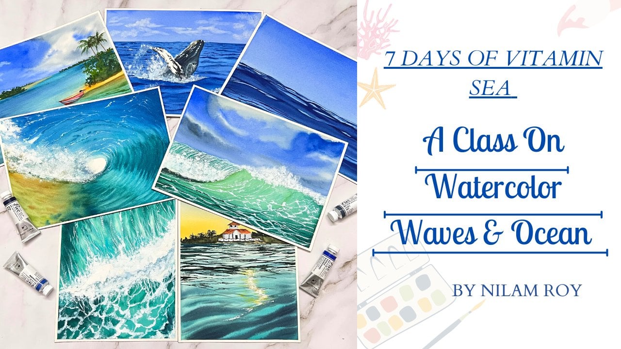
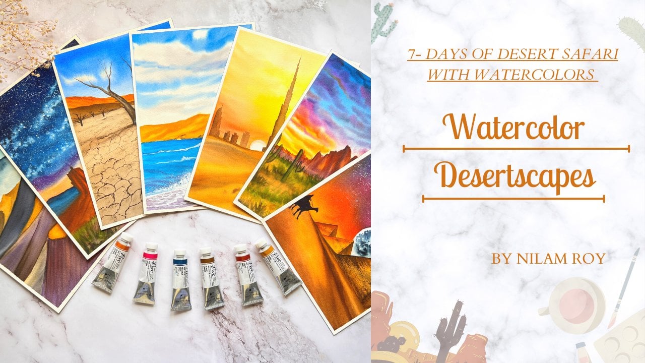
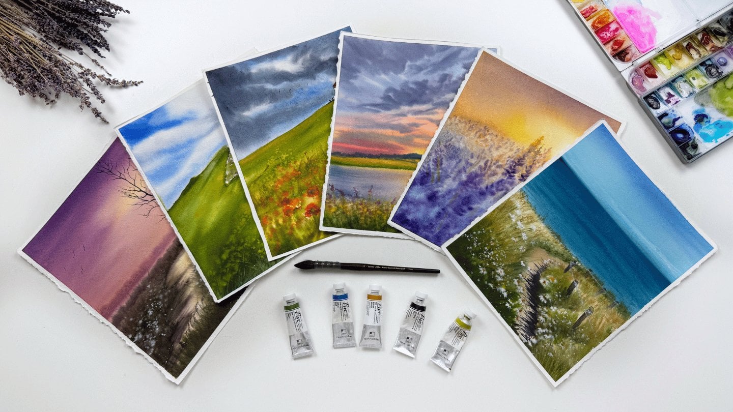
1. About The Class: It's that time of the year? Again? Yes. It's beginning to
look a lot like Christmas. Christmas is the season
of spreading love, kindness, and joy all around us. Christmas is just around the corner and the
preparations have begun. It is that time of the
year where we big, buys our cookies back, give attach que tan may norms for our loved ones to make
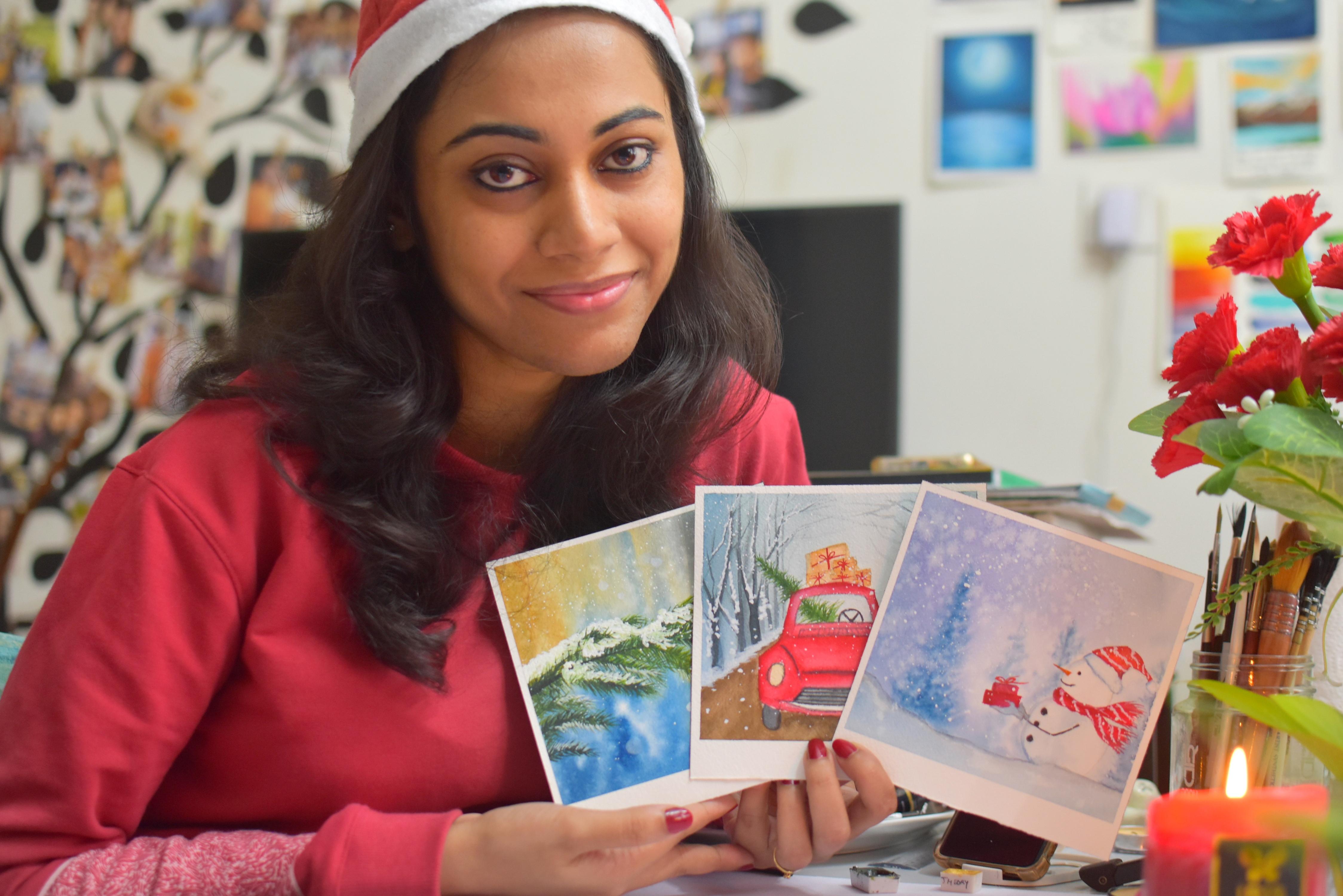
them fill extra special. Hello friends. I'm a watercolor artist based
out of Bangalore, India. You could find me
on Instagram under the handle name at the Niels
artsy underscore cove, where all my artworks displayed. You could also find me
on YouTube, Pinterest, and Facebook, the link to which is given on my
Skillshare profile. Welcome back to my
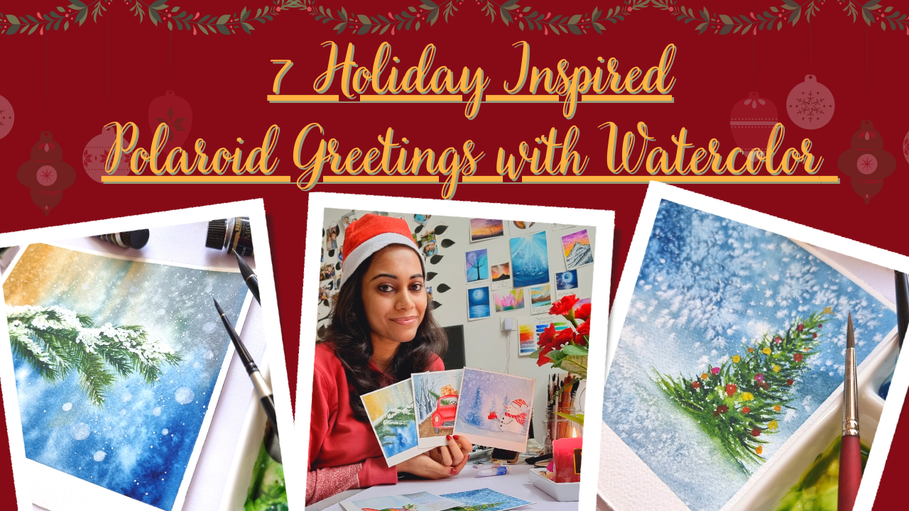
Skillshare class on seven holiday inspired
polarized greetings. I guess by now, you would have guessed what
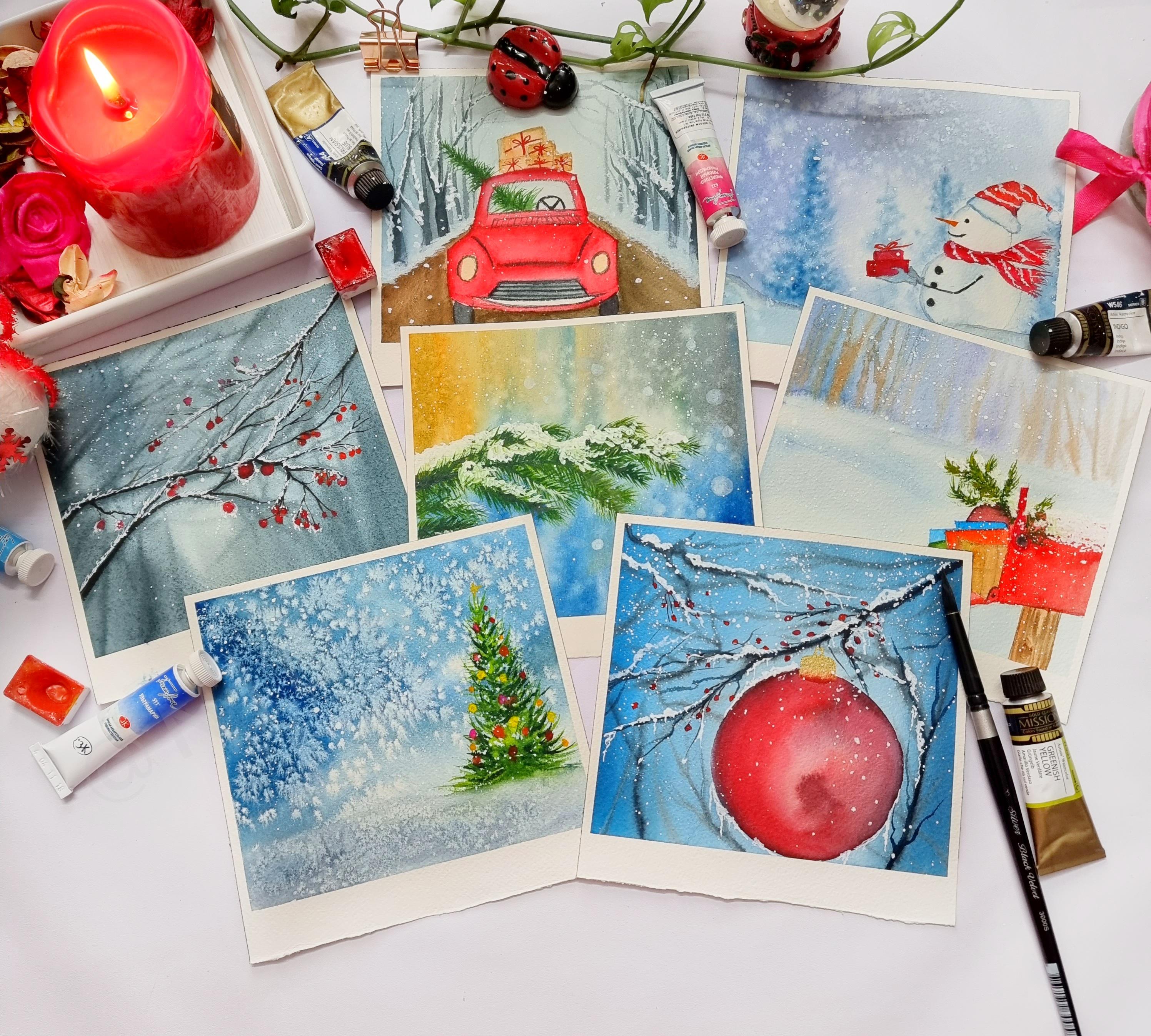
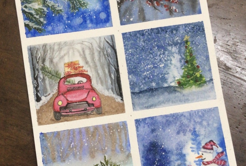
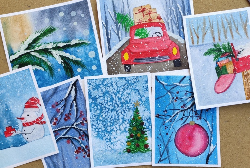
the glasses all about. Yes, we are going to create this seven full holiday inspired season
Polaroid paintings, which could be just the
perfect handmade gift for your loved ones. So this class will
go on about for seven days and seven days, we are going to learn and explore seven different subjects and techniques that we will be using to create this beautiful, cute illustrations which are perfect fall season greetings. Watercolor is said to have God, a mind of its own,
because of the v, it behaves when you use them on a red background and when you
use them on a dry surface. So because of this unpredictable
behavior of watercolors, sometimes you get such beautiful and
stunning results with just little tips and
tricks when you start getting to know this medium
or understanding this medium. In this class, we will be exploring this little
tips and tricks, such as flattering water
on your wet surface. How you can create this
beautiful bloom effect, which will represent
the snowy kind of soft snowy field that you
can have forests new ED. And just using the salt, you can create beautiful, stunning textures
on your people. So come join me in this
journey and let Spain together the seven beautiful holiday
inspired Polaroid paintings, which will totally blow your
mind and you will be just in time for Christmas to send this as greetings
to your loved ones.
2. Materials Required : Before we begin
with our greetings, let's quickly take a look
at all the materials that we are going to need before
we Kickstarter projects. First coming to our people. So this is watercolor
people from R2, which is a 100 percent
garden and decides to 15 into 15 centimeter reduce off. R-squared says,
like you could see. So this is 100
percent cotton paper and has a thickness of 300 GSM. And this is one of
the best, whatever. We're now moving to colors. Your eye. Just to include the color
swatches because I use colors from both the brands of Magellan mission as
well as white names. So your are all the color sheets we will be using for
our class project. Do not ready. I will be listing down
all the color swatches before we begin with each
of our class projects. Next item that we are going
to talk about is our brushes. So here are the
brushes that we are going to use for our projects. Mainly this flat brush
which I'll be using to lay flat or even coat of water
on people for wet-on-wet. And these are the round brushes
from silver black velvet, CVs, Three, 3000 as Cs. And these are one of the best watercolor brushes
I have used so far. And I absolutely love it. And this is the Princeton
had indeed CVs liner brush. This is a synthetic brush. This is another synthetic brush, size number 4 from Velveeta CDs. And here is the Princeton
Neptune villages. And we'll imitation brush. What two colors to all over
the world prefer, you know, silver black velvet
series because it's a blend of both natural and
synthetic hair brushes. I like this Princeton
Neptune series, which is made up
of squid and hair. And these are PR
listened to dig brushes, which is the heritage
and the velvet does CDs from Princeton and
Neptune see reasons also, you know, squirrel hair brushes. So that was all about the brushes now moving
on to our pallets. So your Alvin using
a ceramic palette. Next would be some tissue
damage, our napkin. So keep them handy whenever you are dealing
with watercolors, they are your best friends. Now we would again need
two jars of clean water. This is mandatory to have at least one clean jar
of freshwater Neo4j. And next would be
our masking tape. Your m using Wash U
DIV to tape down, maybe a burn all four sides and a board to fix the people. That's it. So grab your supplies for
diverse of liberal redu, and let's get started
with our project. See you in the next lesson.
3. Color Palette: Day 1: Hello guys. Let's quickly take a look at the color
palette that we are going to be using for
our D1 class project. I am now going to
quickly swatch out all the colors that we are going to need for our
class project one. The first color
that I'm going to swatch is my Prussian blue. Now this is from Magellan
Mission Gold Class watercolors, but feel free to use any
brand of watercolors that you have guard if you are not having this Prussian blue shade, you can also go ahead and use some of your ultramarine
blue and mix little bit of maybe red or a little
bit of Payne's gray or black to create much
more darker looking shade. If you want to have a darker
shade or a darker blue. Now the next color
is raw sienna. Now if you do not have
raw sienna, do not worry. You can always go ahead and
use your yellow ocher color, which is a very basic color, which will be available in all the basic
watercolor palette. Now the next is the sap green. Now sap green is
also prepared by mixing your green shade
with that of lemon yellow. So you could always prevail
sap green in that way. And the next color, that is what shout is the
greenish yellow color. Now this color, when
you use more or fewer, golden yellow or mustard
yellow with dark green, you get this shader
greenish-yellow. Even if you use your
lemon yellow and little bit of your golden yellow deep, which should be like
two is to one ratio, yellow should be
more than the green. You would be getting this
yellowish green color. The next deck in green color, when you mix little
bit darker shades of blues into your green, you would automatically be
getting this Van Dyke green. And now next color is
the beans gray, okay. Now instead of Payne's gray, you can easily go ahead
and use your black. Now when you use
three primary colors, red, yellow, and blue, mix them in equal proportions. You can also create
your own black, okay? And last but not least, we will be using some
whitewash. So that's it. Let's jump set our project one.
4. Day 1: First Snow: Hey, guys, welcome. And let's get started with
our very first greeting. So for that, I'm
dipping down my people, which is of a square size
of 15 centimeters into 15, sending me dough and I'm
fixing the beeper on all four sides with the help of my masking tape on this board. Since we will be creating
a Polaroid greeting, so just at the bottom
of the people, I have left around one
centimeter of the space and leave the masking tape
accordingly on that area. So far, this greeting, we will be starting
with the convert, and I'm just loading the
colors on my mixing salad. I have squeezed out some of that Prussian blue raw
sienna and we will be using our SAP green for
creating the tree foliage. Now, starting on that on
red now if you are new, are an absolute beginner. I would recommend you to
go back and check out my other water colored
glasses, your Skillshare. I have to worn glasses
like Water Galore, Sunset Beach Caves
and underwater CDs, and recently I had done
15 days of water skis. So there I have explained
all the techniques and great details about the
watercolor technique so you can go and check
it out out there. Now we're done red
means when you leave your wet paint on a wet surface. So that is the
reason I have laid our laid flat wash of water before starting with
our layering of colors. Now you're on this wet sofas. When I'm layering the colors, you can see right how
smoothly the color is. You're not blending in. The people are into
the background, right? So we're done. Red method always gives you
that soft and clean finish, which looks very
soothing to your eyes. If you so have observed, I'm just loosely or
very gently layering the colors and using some
darker tones at the corner. Most sides of my people and towards the center and retaining some
of the light sheets. Now I'll be going ahead and filling the same
kind of layering, but the top portion I am gently dragging the colors down
here at the corner. I have used my concentrated
raw sienna and as I'm, you know, progressing
towards the center, I'm using lighter
tones and then when I'm going towards the
rightmost corner, I am again feeding it out. And again at the right from
the right most corner. I'm starting with
Baynes Gray and as we approach towards the
center and fading it out. So this is how we are going to create this softer
looking background. A background is still red, so I can still, you know, drag or move around the
colors on the paper, as you can see him gently
lifting the colors up. And this is why your
paper should be red. Now here I'm going ahead and
doing the lifting technique. Now what is lifting technique
using a damp brush? When your paper is still wet, you can retain
your people white. So that is what is known
as lifting technique. Now you're the most
important technique is this bloom effect, which we will get by splattering this water on our wet surface
or on the wet background. So this gives us a very,
very beautiful look. And now, once your paper
has completely dried out, now we will be going
ahead and creating this branch and
creating the foliage. So here we are going to create a buying three or
four pine tree where, you know, we discovered the foliage is half
covered with snow. I'm just using my silver
black velvet size number to brush and creating this very soft and gentle strokes in strokes to create this
foliage like structure. So keep observing and
noticing my brush movements. You're I'm using two
different color tones of greens to indicate the
depth in the foliage. First, I would be going
with the lighter shade and then I'll be going
with the darker shade, which is my Van Dyke green
for the lighter shade. You could also make a lemon
yellow and you're green, so any green that you have? Mix it with your lemon
yellow and you would get some green color the more yellow that you
mix in your green. It will tend to sway towards more of the
yellowish green side, so it's up to you. So the first layer
is always lighter. We are going with the
light to dark approach. So layering first with light, and then we will be layering
over this lighter tones with the darker tone in order to
get the darker, greenish mix. Once you're done, you know, layering your lighter ones, you could always mix a little bit of your
Prussian blue into your lighter green
mix and you would be obtaining the
darker green mix. So it is always not
necessary to own all the colors that
you see me using here. If you're forming
your own color, I would always advise
or recommend you do that before you start
on with your painting, always mixing colors beforehand and keep it ready
before you jump. Start your painting
because, you know, mixing the color and
getting the same kind of shade shade that
you have mentally prepared may not be
possible when you are just in between the painting and
you run out of that color. So this is the
reason why most of us prefer to have water
watercolor tubes in hand ready. But it is always
great, you know, to begin out when you are just beginning out your
journey with water colors to always try and learn to paint with the very
limited color palette because you will have a vast knowledge about
color mixing and water, and you should be avoiding which complement colors you
should be avoiding too, so that you do not have any mawkish or greenish
kind of mixture. The main focus of our this
painting is the background, the soft looking background and the fine foliage that
we are going to create, which will be snowcapped. So this is what our
overall painting is. The beauty of the
painting lies in that soft transition of light to the darkest
colors and the snowy kind of background that
we have rendered toward using the technique of water splattering and creating this beautiful blooms
into our red background. Alpine foliage is already
taking its shape, and it is looking
so very pretty, and realistically
creating this foliage is indeed going to
take some time, but I would suggest you not
to lose out on your patience because the end result will really leave you feeling
very satisfied about it. Keep on creating
this short strokes. Using your liner brush all year round brush off site is
no to your I'm using, though the round brush
from Silver Black Velvet, which is of science number two. It has a very fine
pointy tip and is just eye for making this
kind of fine line detailing. But if you are more
comfortable with using of fine detailing brush, you can always go
ahead and switch to your liner detailing brushes. I will go on creating this foliage until I
am satisfied and until the tree looks kind of covered with the pine stems
protruding out. OK, so in the meantime, you keep creating this foliage
or grab a cup of coffee, feel relaxed and keep
on doing this step. First, snowfall always
seems very magical, so have I heard from
many of my friends who have been into the snowy places or who have witnessed snow fall? I in that matter have not experienced this
magical feeling, but I hope that someday
I will also get a chance of witnessing or experiencing this
magical feeling. So keeping that thought in mind, I have created this
season greetings where we are painting some beautiful and
magical snowing landscape with that of the pine, which is a symbolic
representation that, yes, Christmas is approaching. So it will be a very special feeling
for your loved ones to receive handmade
greetings from your side. If you are a person who
is a little impatient, then I would suggest that
instead of going ahead and creating such a detailed
kind of pine tree, what you could do is, you know, when the background
is still wet enough, you could let your greens using your liner brush all year
round rush of sites. No two are for anything which you are
comfortable and create this sort of blurry
background of a pine tree. And then on top of that. Go ahead with the darker tones of green and read
this outlining fog. So that is one more method
where you can easily create your own that kind of
appearance of a pine tree, but it will not be as detailed as this one is
looking right here. It will be more of
a very loose style. So if you are a person who likes to go for such kind of loose, you know, landscaping things, then maybe you
could try that out. Here you can see I'm going ahead and using some of
my darker tones and darkening out the main
stock or the main STEM Ridge. OK, so that it looks more
of that realistic side. Now it's time to paint snow. For that, I'll be
using my white. I'll be mixing this white glass shall make the game
a little take. It's not too runny or watery so that the effect is
much more pronounced. The snowy effect if you
used to water requires, you might have to add on a second layer in order
to make this nor pop out, you know, because generally, whether it's gua sha colors when you're used to water paint, it will fade out eventually when the paper is dried
out completely. So that is the reason
you need to use this gua sha not to
take one consistency. If you do not have white
wash available with you, do not worry you could
go ahead and and use your white galloping or even
acrylic paint would also do. But you need to be a little mindful when you are going with acrylic because once you
layer your acrylic on it, there will be no going back. You will not be able to
rectify your mistake, so be a little mindful of that. Now you're this no pattern
that I'm doing here is just on the upper layers or the upper surface
of the leaves, because that is how this law is deposited on these leaves. Are the trees, right? So just on that leaving some of the greens exposed because
if you cover it entirely, it will not give
that realistic feel. Once you are satisfied, creating the snowy deposits on the upper surface of
the leaves and you start with the lower twigs or the lower shrubs of the pine, so you're one thing
just go ahead with the wide gorge and
create the shard looking like shapes of the
ice deposits that will be formed on the tips of the pines. OK, the leaf foliage there, though you're not due
to lower temperatures, the leaves tend to freeze out, so that effect you
can create only by, you know, using the
shape of your brush. Just go along the direction
of those pine foliage. Keep creating those structures. Now, to give it a much
more realistic look, I'll go grab some of that Van Dyke green and I will create this spiky foliage like
pattern in between the snowy areas so that the
colors will not go dark, but it will just look
like some of the leaves are standing out from
those snowy deposit. OK, so that would give a more realistic touch
to your painting. To make this painting a
little more realistic, what you can do is do not make this snowy deposit formations, missions slide and in one
stroke use some, you know, coves and breaks in between
make it uneven because the snowy deposit is on the settled on the
foliage of the tree, which is not in a cemetery
or in perfect shape. OK, so do in order
to redeem that. Just go with, you know, coves and breaks in between the snow to give it a
more realistic feel. And now I'm splattering your white wash to represent
more of that snowy field. The snowy effect and in between
with diluted right water, I'll go and try to create this little bouquet
kind of effect, which will look like that. You know, it is the snow
which has got soft focused. So that is that they
use in photography. When they create or
capture such moments, they blur the background, go do it in soft focus. And the mean element is into
the focus where the rest of the other subjects in the picture is in
do the background, which is almost blurred. While creating this
annoying book. Always remember that you need
to have this little watery, not exactly too watery
mix that I have got, it's neither to take
not to do watery is just apt because once the people and the
layer dries off, it will look very
soft and blended, almost blended in to
the background blooms that we have got using the
splattering effect, right? Create this snowy
boogie effect using various shapes like not shapes, I would say sizes some
smaller, some bigger, some medium sized and we're
just the tip of your brush. You need not, you know, switch your brushes
with the tip. If your brush has
a point to dip, you are good to go with
that brush for doing this. I have not changed my brush. I'm using the same
long brown brush from piston velvet does
crease like you see. I think I am satisfied with how this
is looking right now, and I'll create one or two more, and then I think I'll stop
creating this annoying book. I have let my people
dry completely. Now it's time to remove Artie
from all the four sides. If you are somebody who
has calligraphy skills or you want to inscribe some
message on this greeting, you could, you know, write that short phrases or short words and
to this section, the white section
that we had left. And yes, you are done. I hope you have enjoyed creating this glass
project with me. I can't wait to see or
see you again tomorrow.
5. Color Palette : Day 2: Guys, welcome back
to day 2 project. And before I kick-start
our D2 project, I want to brief you
about the colors. So I'm using my
lunar blue color, which is granulating color from Daniel Smith I have
described in this project, warped is granulating color
and how beautiful is it to create textures and all about it in the
main class project. So please do give a watch your, I'll be giving you some
other alternatives to this granulating lunar blue. So instead of this
granulating Lunar New, you could also go ahead and
use some of your other shapes like French ultramarine
blue or Prussian blue, Arduino cobalt blue. So any of these blue shades will have some amount
of granulation. But, you know, the mostly used
granulating color is French Ultramarine Blue. Ocean Blue also has some
granulating effect, but it is not that much. It always differs
from brand to brand. And also if you are using a student grade watercolor paint or artist grade
watercolor painting. Okay, so that was all about those granulating blues
that we would be using. The other colors that
we are swatching out here is the
Payne's gray and CPR. Now you already know how
you can prepare CPR. I have already describe
the way that you can meet CPR in my previous
watercolor classes. When you mix the burnt
sienna with little bit of Payne's gray or a little
bit of Indie goal, so you get this muted or
darkest tone of brown. The other column
would be the reds. I'll be here going ahead
with red light and carmine, both of these colors, one unlike orangeish red and the other a
little darker shade. So when you mix both
of this red with little touch of blue
or Payne's gray, you get darker mix. Last but not the least, to create this new effect, we will be using white quash. So Elvis watching
the white worse. So these are the
colors that we are going to require for
our class project. It is more working towards
and limited color palette. I guess you all would
be having these colors. I have given some
alternative colors also. So get your colors ready. And let's take stat
class project.
7. Color Palatte Day 3: Hey guys, welcome to day 3, and we are going to be in this beautiful, little
cute illustration. So I'll walk you through with
all the colors that we are going to be using for
creating our class project. The first and the foremost
color will be a lunar blue. Now, do not worry if you do not have this lunar blue color, you can always substitute this color with indigo
or brushing blue. So basically any
granulating color or any darker shade
of blue would do. So I am yours
watching or the other alternative shades
of blue as well. So you're as watchdog,
Prussian blue. So next, Elvis
watching out my beans, Greek alert instance,
Europeans, gray color. You can go ahead and
use your black as well. Now the next color
that I'll be swatching out will be my red. So the first color
is the crimson. So instead of crimson, you can also go ahead
and use carmine. Are Alizarin crimson
if you have, that's well and good are Berlin maroon or
for Lynn read so any darker shades Read that you have guard
would do for it. And also I'll be using some
of that orangeish red. So I've got my red light color. So now next will be my
sap green for painting that Christmas tree
loaded in the car. And now the other darker shade of green will be
my Van Dyke green. Do not worry if you do not have this darker shade of green, you can always mix yard green with blue and
get this darker mix. And last but not the
least, is the whitewash. So get your colors
ready and let's kickstart our project three.
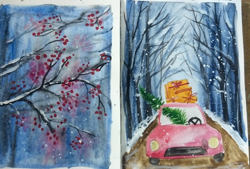
8. Day 3: Christmas Gifts Coming Home Part 1: Hello. Hello, welcome
to day three, and today we are going to paint a very cute and super
fun illustration, so as usual, I have deep down my beeper on all four sites
will be taping it out. And let's quickly get started
with the pencil sketch. So today our composition
will be a background road. And on that, we
will have our car. So I'm going freehand for
this car illustration. Now, if you are a beginner
and you have difficulty, what you can do is you cannot refer to this
final painting picture. I'll be uploading this
final painted picture in the projects and
the resources section, so you could use that as your reference and start
painting your car. And I will also
try to provide you a greater the way where
you can design your car. It is not a very detailed car that we are going
to do over here. Just a basic outline of the car. You need not to be worrying too much or
bothering too much about making this car
look very realistic. It's a very cute illustration, so I thought to include it. I'm now outlining the B section of the car and have
outlined the tires as well. So and now I'll be
going ahead and doing the background elements that is our one point prospective road on which this car is heading. So that's how we
are going to do it. And background to that road
will be some of those trees. So yeah, that I'm not
painting that up, Ansel, but you can directly been to those trees if you're confident enough or if you are
not that confident, you can always get used
lightly with your pencil. Just the basic outline
of the trees would do. Now that we are done
with the sketch, let's get started, so for
the background, I'll go, but I don't read
because here I'll be creating that point
of prospective where the trees are far
behind the car would be a little blurred and
faded out at a distance. So for that reason, I'm going with red on red. And that is how we are going to first be in the
background with my, you know, blue card. You could use your
darkest mix of indigo. Use different tonal
values of indigo. The ones which are towards the sides of the cars
will be a little darker. And as you go to the center of the people that will go lighter, so use the lighter values
or what you can do is once you load the pigments
onto your damn brush, go with the darker shade along the side corners and RNZI of Russian water
and come back and, you know, drag the
colors to the center. So in that way, you will be getting that lighter
shade like this. Try using a granulated
shade of blue for this, because it will
give that musty or the foggy effect so beautifully that you will be
really happy with that the overall effect when
the painting is completed, you know, so that's why I have chosen this
lunar blue color. Now, if you do not have blue, it's not necessary that you need to get this color
for this project. No, it's absolutely not. You can always use the
other blues like Indigo or, you know, your
Prussian blue as well, or your cobalt blue. So when you mix a
little bit of beans grain to your
ultramarine blue, also, you would get a
darker shade of blue, which will be granule
leading as well. Now I'll be painting
some tree outlines here. I'm using my indigo with
a little bit of beans. Grey makes your bear in mind. You should be doing this trees when the background
is still wet. So I want the initial layer
of this trees to become, you know, faded to once
the paper dries out. That's why we are going
with wet red now. Just like how we
created that soft for blurry background
in our project to remember so that we
painted some branches. Here we are painting
the tree outlines. Now for outlining this trees, your I'm using my
long run process, no fall from Princeton
Velvet does series. Now this is a synthetic
brush because I want to have better water control when it comes to painting wet on wet. Because if this being to
make sure it's too watery, the beans gray and
indigo paint makes. Then what will happen? The colors will start uncontrollably spreading
on the red surface, which I do not want. That's why you need to have very minimum water just
with the damp brush and use a little bit pigmented color
or the medium toned value of the color of indigo
or beans green. And you can create
this background. The trees now use the tip
of your brush and create this toner outlining
branches for this trees. OK, so use just a tip. So for this, you will have to use a brush which has
a sharp, pointed tip. So grab your may need to tailor liner brush
or in Iran brush, which has a fine,
pointy, sharp dip. So that will do the job. I'm just trying to retouch up some of
the areas and trying to clean out some of the
outlining that I have done. OK, so that's pretty much it. And uh, yeah, that's
pretty much it. But the brunching and
everything that we do and just rested out your. Now we will start
on with the road, so in the meantime, our background will
drive for the road. I'm going here with CPR. Now if you do not have CPR, you can go ahead and
use your bone tumble, mix a little bit of
beans and you would get your color similar
to that of CPR. Now for the road, I'm going your red white on dry technique. So what is on road technique? When you apply your wet paint
on a dry surface like this? Such cured the
surfaces of people and the one where we are
painting is this road. So yeah, though well
done right technique. We are following for the road because I do not
want some colors to go and bleed into the car outlining because then we
will be painted with red. So that is why I'm going with Burton Andre since I'll
have a better control of water when I go and been
distraught and also because the road area is quite, you know, smaller as
compared to the other area. So your red on red
technique might be a little problematic since we do not have much negative
spaces around. That way, it's safer to go red, but on red, red, on dry techniques, sorry. Now I'm being a
little careful with the brushstrokes
that I'm going and applying here because
I do not want to ruin my background since a
background has already dried, so you need to be really having some control
when doing this. Brush strokes so that
your colors do not go and bleed into the background or you stay in your
background somehow. OK, so when you are doing this corner edges of the
road go a little slow. Be patient. I'm not really happy with how the background has dragged
out and is looking so, so very light, dawn. So for this reason, I'm going with the medium, don't the value of
my Prussian blue and starting along the corner edges, I'll be just dragging
the colors to the center using the
vertical motion of my brush. But make sure that
you do not reload the colors when you are
painting going with the center. Just drag the colors and
create it out to the center so that the center area is still the lightest area
of the painting. Using similar method. I'll be going ahead with my
right hand side as well, so using the same vertical
strokes of the brush. I'll be feeding out
the colors now. The corners will
be darker and you will just be dragging
the colors to the center and making them look or appear as if they are fading
out into the distance. OK, so that's the mean
composition of this painting. I am happy with how this
is looking right now, so I'll stop with
the background. It's time to get started
painting our car, so let's grab our red and
I'll first outline the areas, mark out the boundary
or the outlines, and then we will be starting
to fill out the car. We are not going to
being told me this look very realistic because that's
not our main intention. It's more like a very cute
kind of illustration, which is very bright. So basically, it's the
car that is carrying your Christmas tree and
Doug Gimps to haul. So that's the overall fun and cheerful vibes that
we want to create. So it need not be
realistic to not bother about the car
being very realistic. Even the basic outlining
was not too realistic. We have just outlined
the car with this basic model or shapes the, you know, so that's it. So start filling out the areas. We will be going with
some lighter values, as well as applying
some darker values to indicate the shadow of the, you know, light and shadow. We will be playing around
with this to color the car. So right now I'm
outlining the cars and this one will be
a little darker now. Lightening it out
near to the base. But right now I'm using
going and coloring the top part where the
windshield is that I have, you know, started out with
the darker shade of red. OK, so that is how
I'm going to fill out the rest of
the car painting. So keep observing my
brush movements and the shades that I'm choosing
to create this darker value. So for the darker
red value you're, I'll be using my
Grimsson Carmine mixed with a little
bit of beans. So I'll be getting a
darker shade of gray red, which will be
closer to the heart of Berlin maroon apelin red. So feel free to use any darker shade of
red that you have got. And if you have just
got the basic red, what you can do is you can add a little bit of
beans green to it and create your own
make darker mix of red. Now I'm going ahead and filling out the bumper areas of the car, so I'll be filling it out here. You can redeem the
negative spaces around in order to
create, you know, no board for the car, but I'm not really
inclined of going with the no board right in
this painting of the car. I'll just create
the grills, maybe. And that decorative
direct city? That's it. Now you're in order to
make the white look more appealing because we are
painting with the darker shades. Here, I'm using the
lightest to tonal value of Prussian blue and
just around the corner. So I have just dragged
the entire, you know, wind cover of the car with
that color. And that's it. Now I'm painting the
grills for that grills. I'm using my beans gray. If you do not have beans gray, you can use your black as well. So go with the
medium. Don't value. And now I'm outlining the
ridges of these areas, the hoods basically so that, you know there is that play of light and shadow over your. And also, it looks a bit little
towards realistic touch. Not exactly too much, but yeah, kind of. And I'm outlining the other
lines for the greens. Now, at some places, I'm trying to redeem the negative space that is the white spaces of the people, and I'm just outlining the places with my
brain's gray color, your I'm using this long
run brush size done before. If you do not have this
brush, do not worry. Use any brush which has
a fine pointed tip or any brush that you are
comfortable doing this step. Now I'll be painting
the steering wheel, so just it's just a half. So it's a semi-circle
and then you paint the structures.
That's all. And then I'm now creating
the wheels for the car. So you're I'm using my
beans gray for the same. Now, it's time to
bring this gift, since my background that we had created has
already dried. I'm going with my, you know, like this donor
medium value dawn of my burned sienna
or burnt umber color. If you do not have these colors, you can also substitute
it with yellow A. makes a little bit
of your red in it, and you would get this kind of little dirty looking
mud kind of color. So this is what we are going to create as a base
color for our gifts. And once this Laird dries off, we will be painting
some ribbons, red ribbons on top of it. Now we will be painting our Christmas tree that
is being carried home. So, yeah, that's the half
portion will be inside the car and the other half will
be through the window. So first I'm doing
light handedly free and handedly the
outline of the tree. Do not worry, if you are
going over this red area, we will come back and fix this area once we are
painted the tree. So the Christmas tree
will be a pine tree, which is often a triangle shape, so it will be broader
at the base and tapering towards the top head. So similar way, I'm
creating this tree. Make sure that when you
are painting the best, you should not, you know, use drugs which are too
long and you are, you know, going out of the white
portion of the wind cover. OK, so the windshield cover, so you should retain the
stroke so little that area and use a lighter and a
darker mix of green. So you're the first
layer that I'm going ahead is
with my sap green. I use the medium tonal
value of SAP Green and then over this
stone in some areas, I'll be going ahead with
the darker mix of green, which is my Van Dyke green. Now I'm fixing the area where
we had painted the tree. I just went with the red
and then laid the red. Gosh, I'm blending into
a new family so that the green stalk portion is not visible anymore.
And that's it.
9. Day 3: Christmas Gifts Coming Home Part 2: Okay, so now we
have let our people dry out and this EDI
has dried out tens. I'm going there and you're outlining the red ribbons which
wrapped around our gifts. So this is the dealing that we would be
doing for this gift boxes, which are just loaded
overheard the car. And that's pretty much it. So I'm just being very careful when you're
painting this Rubens, it should not goal, you know, and spread
into the background, hence, your people or that particular area
should dry out completely. Since the color has faded
out a little bit new, this Hood section of the car. I'm going ahead with a little bit more pigment and dread and I'm just
filling it out, spreading it out evenly. Your m going on wet on dry, but my paint is watery
so that it easily spreads around the
paper and I'm evil to completely fill
these areas now, it should not be too runny, watery or else you
might, you know, ruin the painting because the paint will start spreading
into the other areas. And now it's time to darken
our background trees. So the ones which are
closer to the car, I'm darkening the color. Now as I move farther
from the car, the trees will be painted with one-to-one lighter value
than what we have initially being did because that
is what will give us the depth and distance
that the car has covered. So the gardens moving ahead, leaving behind this
other trees behind. So those trees which
are at a distance will be little blurred and
also it will be faded out. So this is that
perspective point that we are talking about. And here we are talking
about one-point perspective. And our perspective is right
at the center of the people. And that's how we have
been did the road rate. So yes, that's how
we're going to do now I'm filling
out the head length. Oops, looking too bright. So I have here used yellow deep, but you could feel free and
use cadmium yellow for it. Now, I'm lifting
out that color and painting this lightest
yellow shade for the same. So now it's looking better. So, yeah, you could
directly go ahead and use your cadmium
yellow for this. Now go with the lightest value. Now it's time to paint our snow. So your, I'm using my
white quash and now first I'll be doing those
law for the sidewalks, so the pavements of the road. Now here also my
brush movements, I'm just creating heaps of snow. And similarly I
will go and create the similar heaps of snow
around this right-hand corner. So this is basically, you know, the snow which was
deposited on the roles they have been put
back on the site, pavements where the streets. And it adds different BUT also
right to do Scandal rules. I love, I wish I could visit
some places like this, but I think this kind
of weather is just not suitable for me because I do not like dark and
gloomy weathers, but the places where there
is such heavy snowfall, it is always dark and
gloomy, isn't it? Anyhow. So now I'm going and layering my branches of the
trees with this node, just like how we have done
it in our second project. So for doing this step, always go ahead and use a brush which has a
fine pointed tip. Your, as you can see, I'm working with my Princeton
velvet long round brush, which has a pointed tip. So I would advise you to go for any round brushes of
size number two or four. Are you can also switch to your mini detailing brushes
or your liner brushes, anything which you
are comfortable with. I'm going to repeat
the same kind of steps like how we
have been entered the snow on the left-hand
side of the tree branches. Similar way I'm doing it. You're on the right-hand
side as well. So that's pretty
much it after us are dissuade filling in
the snow over your, it's time to splatter some snow. So use a little watery white
quash, not too watery. It should be medium consistency. And you will get this
small splatters. And if you want
bigger splatters, you can go ahead
and do like this, like how I'm doing, just using the tip of my brush. Just lay some dots in areas that you want
the bigger snowfall. So I'll be adding
some most known. So keep adding the snow
until you are satisfied. And that's it. We'll stop here maybe. And then let the paper dry. Now it's time to remove our apes from all the
four sides to make sure that you're painting has
dried out thoroughly before you peel out
your masking tapes? Yes. And here it is. Our painting is almost done
and ready and I'm quite loving it with how the entire painting has
come to be, isn't it? See you tomorrow again with
another beautiful painting.
10. Color Palate of Day 4: Hello guys, welcome to the fore. And today we are going to create this simple and very subtle
and beautiful painting with the Christmas tree. So let's quickly take
a look at the colors. So I'm basically just watching
the color for the sky, which is my Prussian blue color. And the next album swatching out my colors for
the Christmas tree, which is your greenish yellow now instead of greenish yellow, you can always go ahead
and use a sap green mix, little bit of lemon yellow, like in the ratio
of two is 212 parts of lemon yellow and
one part of green. And you would be getting a color similar to that of this
greenish yellow color. Now the next will be our
darker shade of green Your am using when Jackie
Greene from Magellan mission. But if you have a darker shade of any other greens are just
hookers, green are viridian. You can go ahead with
dark cheeks as well. Artists just make it a little
bit of Prussian blue into your greenish yellow
that you have prepared and you would be getting
dirt darker green, the more of the darker blue
shade you wouldn't add, the more a Docker, though green would be. The next colors would
be my red light and then followed by yellow
deep and cadmium yellow. So these are the colors
that we will be using for creating the Christmas tree
bubbles that will be hanging. And next we will be adding
little bit of carmine. So this would also be
for them bubble color. And next would be
a little bit of white quash, but
that's optional. So these are our colors
for this project. So grab your colors
and little bit of salt from your kitchen and we will be starting out
with that project.
11. Day 4: Christmass Tree Home: Welcome back. So
let's kick start the D4 project with a
very simple but yet really very beautiful
because we will be using the sol technique and we will create some beautiful snow
like textures on a people. So like always, I have to done maybe on all fours right now. I will go right on red, as I have already told
all your classes, as well as on the
previous lessons. Still wet on red means applying red paint on your wet
surface. That is your people. So this is what
red on red means, and red dawn red
will always give you a soft looking background, and it's the preferred
techniques for painting larger surfaces as well that especially when you are
painting, lose landscapes. So I have generously applied water all over the
people and ensure that there are no lumps of water
or bottles of water standing. OK, so now let's start
with dark color. So I'm going with from corner of the left hand
side and at an angle, I'm dropping the colors
in the slanted motion. So you're I'm using brushes. No. Now, if you do not
have pollution, no, you could use any other
darker shades of blue bead, cobalt blue or your
ultramarine blue. Or you can use even your indigo, so it's up to you. You feel free to use
any darker shade of blue because we will
be using the salt and this dextrose
will really look good on this darker
background sky. Now you're a little bit off my burnt umber with that
of my blue and created a darker shade of
blue just around the right hand side
where I led the colors. And now, with the help
of just my down brush, which is loaded with
little bit of water, I'm just trying to lighten out the shades out here as
you can see your arm trying to create my foreground the ground where the
Christmas tree will stand. OK, and I'm slowly fading out the colors while retaining the darker shades and
towards the right. I'm creating the light sheets. OK, now with dust, with the damp brush, I'll try to soften
out the hard edges that I feel have developed
near the ground, so I've just lifted it off. Now I'll be splattering
some of that water with the help of my brush to create this beautiful
soft blooms. And on top of this, now I'll be going ahead
and layering it with salt. Your the texture of the
paper will really come out beautifully because I have used table salt on my wet people. Now there are some
factors on which this soil texture effect depends on like what type of
people have you use, whether it's hard pressed
paper or cold pressed paper, the grain, the type of solid
grain that you've used, the larger are the
smaller one and also the pigment that is used when you are creating
this solid texture. Like here I have
used brush in blue, which is almost
semi opaque paint. Now, because it's a
darker background, it will be easier for the
soil to disperse the color out and bring out the underneath
texture of the people. OK, so this is how it will look once the soil has
completely dried out. So wait for the soil to completely dry out the
paper to completely dry out and then remove
it with the help of your brush
gently brushing it. Now we will be adding
the Christmas tree. So let's go and add with
some of that greens. For adding the Christmas tree, we will be going with
wet Andre technique, and for that I have
chosen my silver. Well, you know, Princeton
Velvet does say no fool brush. You can also use us
and the big brush, which has a long pointed tip like this kind of brush
or any ground brush, which has a sharp pointed tip, would also do so. You're the Christmas tree. I'll be just going very loose. The entire Christmas tree will come to life only with
just the play of colors. The base of the Christmas
tree will always be broader, and as you can see, I am going ahead with the
lightest shade first. So this is the greenish
yellow shade that I'm using. But you can also
go ahead and use a medium dawn the value of your sap green and
create this shape. You know, just add the edges, create those sharp
strokes of leaves, and that is how you can create the Christmas tree later on. In between those little areas, we will be going ahead and
adding our darker shades of green while you
are doing this step. Make sure that you
leave out some of the wide gaps that we have
got using our soil texture. So in there we can go ahead
and paint our baubles. You know, art is what
you can do is you can cover them before painting. Starting out to paint, you can cover them out with
the help of a little wax from the candles
or something and then order masking fluid. If you have a masking fluid, then go ahead and use that, or you may use wax and
cover those areas. So in that way, you
will be able to create that masking fluid lake effect. But on wax, you will not be. Once you rub the
facts on the paper, you will not be able to paint over those wax or fill it out, because if you try to
scrape out the wax, you will be ruining
the people's surface. OK, so bear that in mind. So it is a safer
option to go and leave those negative
spaces that you have got with the help of
the soil texture. OK, so now once you
add the darker tones leaving some of those gaps in
between and on those gaps, go ahead and fill out those baubles and circular
shapes with different colors. Here I'll be using the
colors like we have watched earlier the reds
and the greens, yellows, sorry yellows and reds that are a darker shade of
red because that will pop out against
this green color. Go in with your babus
only when you feel that you're layering of
green has dried out. So make sure that
when you are going with the tree with wet
and dry technique, your paint, the green beams
should not be too watery. It should just be the
right consistency like medium consistency so that
you can work smoothly. So I am going ahead and
dropping in some of the local polls in between where I have some of
that white spaces. And that is how I'm going
to create some more bubbles right at the sides of
the tree leaves also. So it is already
looking so beautiful. And once we are done
with the bubbles, we will fix a little bit of that foreground that we have where the tree
has been standing. Keep adding those bubbles
until you're satisfied, and now if you feel
that that's it, I'm not going to add any
more bubbles for you. Feel free to literally
stop right there. And yeah, that's it. You will be done
adding the bubbles, but I'm going to
add a little bit more of varying sizes
of these bubbles. And also, if you want to created a bit of
more decorative way, you can go around the tree like in the spiral way following
the shape of the tree. And you can create
the, you know, string of fairy lights
using your golden shimmer. If you have orders, you can just skip
that part as well. Now, I added, I'll start
using my car indigo beam. So if you do not
have that, not very. You can just use your
yellow to do that. Now I'm doing the grant
part and you can see I'm going with the light on red. So you're it's looking too dark, but I spread out the colors
and then maybe I'll come and lift out the colors and make sure that it doesn't
form that hard edge. I want to give this
painting a smooth look. So I'm just, you know, gently lifting of this color because this is
still bright red. So I'll be able to do that with the help
of my down brush. So you're I created this heap or a mount like structure
of snow, as you can see. So this will this is looking
almost better, right? Soft and subtle with that of the sky and the
background, right? So now I will be creating a little bit
more of textures in here. So this will be very
light to your eyes. If you're happy and
you do not want to add this salt
on the foreground, you can skip that part. I am now adding splatters
of white glass, but if you feel you are
satisfied with how does knowing effect that you have got with
the salt is fine by you, then totally skip this part. You need not splatter
the whitewash. I just felt like flattering. OK, now my paper has dried. It's time to dissolve the masking tapes from
all the four sides. Okay. Always wait out for your paper to dry completely
and then do this step. So we are done with
the Defour project, I hope you have loved it because it was very simple and easy, and yet it is looking
so very beautiful right after the the
trees overwhelming task, this is easier one.
12. Color Palette of Day 5: Hey guys, Welcome to Day 5 and we are going to
create letters to Santa. So yes, in this composition
we are going to paint a letterbox and a
background of blurry, forest background and Ohh, middle ground which
is no covered. Okay, So for that, the colors that I'm
going to use is violet, little bit of violet,
blue bone tambor, followed by raw sienna, red light, Carmine,
beans, green, and so on for creating
the letterbox as well as the snowy of middle
ground and background. So if you do not have
any sludge colors, you can go ahead and
substitute this colors with any of closer or
similar looking shames. It's not hard and
fast to go by with these colors now instead
of this red light, which is known by the name
Red Light in White Nights, it mean it may be known as
Princeton or Scarlett in, in any other brand. So, you know, do not go
by the means always. Luke by the color shapes
that I'm swatching out your and you will be able
to get hold of fjord. Similar colors, shapes. For adding some more
highlights and details, we will be using
some darker shapes, like Payne's gray
and burnt sienna. And for creating
that fine branch, we are going to use our
yellowish green now you can substitute it for a
sap green color that you have or make your own
sap green by mixing your lemon yellow and any of
your greens that you have. And further darker
shade of green. I'm using the oven
directly green, but you can always make your own negotiate by mixing
black or darker blue. So your colors are ready. Now grab your colors. Get it set in a palette, and let's jump start a project.
14. Color Palette of Day 6: Welcome to D6 and let's
quickly walk you through about the colors that we are going to use
for this project. So your first swatching out
my Prussian blue color. Now, if you do not
have Prussian blue, you can substitute it
with any other blue, such as ultramarine blue, like I have been telling in
the earlier lessons also. Now, you can also use violet or any other
darker shade of blue. Here I have sought start
indigo over there now. Again, the another
color is red light. Now if you do not
have red light, go ahead with scarlet or any
other similar looking shade, and next will be carmine. Now what I will do is
I'll show you when a mix my red light
and my carmine red, I will get medium to
one bright red color. Okay, So if you do not have
the shade of bright red, you can easily go ahead and
mix two of your lens and to create this brighter and
little darker looking red. Last but not the list, I would also be needing
some of that Payne's gray. Now instead of Payne's gray, you can always go ahead
and use your black T2. So that's it and little bit of whitewash to
do that snowing effect. Okay, So that's all with
the color palette for this project that we
will be painting. So let's get started
with the final painting.
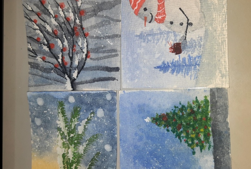
15. Day 6: Gift from Snowman: Hey, guys. Hi, welcome
back to day six, and today we are going to
paint a very good snowman. So let's get started
with our pencil sketch, so we will be going ahead and doing a very
basic pencil skirt. First, I'll be painting
the snowy highland. OK, so which is
in the foreground and we will be painting
those norman out here. So first snowman, I need
any circular object. So your I'm using my
tea light candles, bees, and I'm just outlining
the shape over your. Now you could use your
compass, your masking tapes. You know, the washi DBS circular dials anything which is
in round circular shape. Now, for the upper portion, the upper head of the
Snowman, I'm going freehand. But if you wish, you can go ahead with any smaller size
circular objects or you may even use a compass. Now I have painted a
Santa hat or Santa cap. Do now does snowman shape will not be exactly
very circular. We will be changing a
little bit of a shape. You can see the head
and the body portion. I erase some of it and
there at the intersection, I am going ahead and
creating a muffler, you know, outlining a muffler. So it's very simple. Basically, I'm not doing any
knotted structured muffler. I just kept a very loose muffler wrapped around the
neck of the snowman. Few buttons, and
there I'm creating now the hand of the
snowman bearing the gift. So this is a very, very simple pencil sketch. Nothing more details is here. So what you could do is you can use this
as your reference. You could pass the
screen over here and you can then sketch
out the outline. OK, so now we are done
with the outlining. It's time to do the background, so for the background, we will be going but onward, like we have done
since the background. I want to create a blurred out
background and snowmen and the snowy hillock are
the snowy highland while we are full ground and the main focus element
of this painting. That's the reason
I am going with the blurry background now there
in the blurry background, we will be creating a
very luminous effect. You know, the light, the the at the center portion, it will be kind of the people white that I will
try to retain and a very light tone of dark coloured that we
are going to create with the background oak so that the entire painting looks
really very nice. It will balance out our lighter elements and
our darker elements, OK? So for that reason, I am ensuring that I
lay the flat was very nicely and evenly so that
there is no chance of, you know, uneven, watery
content on the people. OK, so it is very, very necessary that
you do this properly. And since you have to go a little cautiously
around the snowman, do. Now we will be starting
with the background, so for the background, I'll be going from the corner of my left hand side and using a very slanted
strokes of the brush. I will be going from dark
to light transition. OK, so you're I am
using the bushy blue, and as I'm coming down, you can see my colors are offloading from the brush and it is becoming
a tone lighter. OK, so around the
corner edge it will be darker and as you come
towards the center area, it will come to the
light to shade. So here we are, going ahead with two
different tonal values. One is from the darker then mid value and then two the
lightest tonal value. Now around the center
area that you can see, I have lifted, right? I'll be now dragging
those like the value of the lighter tonal values
into the center area, so when it dries out, it will still look like
it is still having that. People write color
because we are painting this in
that perspective. And this Norman will also
have a little color in it so that overall area will be the lightest
part of a painting. OK. So I am going and. Doing the background around
this, Norman as well, so be a little careful
in here because you do not want any
colors to go and do the body of the snowman because we are going to
create a negative painting of the snowman only the
edges of this Norman we will be outlining with
the darker colors so that its shape or the body's distinct and
sharp and clear. OK, so now in the background, we are going to create
some blurry bindings. So for that, I'm using my medium toned pigmented value
of pushing glue. Now, if you wish to create with any other colors of this
fine, you can go ahead. But since I have used your combination of
violet and pushing blue, I am going ahead with the blue. But if you me, you may also use your
violet to do this. Background things so use
your makes both of this Prussian blue and violet because you want
them to look blurry. We are not giving
them a crest defined, you know, edge, so it will be in the background and
this is going to get blurry. So we are doing this step right when my baby
dressed in red. OK, so once the paper dries, this colors will automatically, you know, get the stone lighter. And since it does not having
any defined shape right now, this will automatically
look blurred out. Now here, the next brain, I'm going with a
little shorter brain than the one we had
created earlier. So you're I have used a very light tonal value
of my same brush and Lumix so use different
or varying tonal values of the color when
creating this pain. So that would give you a kind
of depth in the painting. So, you know, that's the trick over your when you are creating such kind of blurry backgrounds and you still want
to show depth, then do the painting so use different tonal values
to create that illusion. So I have been reading
this almost day one since the day
one of the projects that whenever you try to create
this blurry backgrounds, make sure that you do
not use too much of water in your paint
while activating them. OK, you need to use them in a pigmented value because
you are going on red. On red, you need them to
have less of water so that it does not go uncontrollably
beyond your control. Right? So first of all, when you activate
the paint with water and use them on that on red, it is beyond your control. The paint, you know, behaves as for their own well, you have no control over them. You are very less
control on them. So that is the reason you
need to use them with little, you know, pigmented
values or that you do not have to runny and it does
not all look very messy. OK. So we are done
with the pines now. It's time to create a
snowman for snowman. We will be creating, though, outlines the outer fringes and blending them
in do the body. So that reason I am
going ahead and, you know, rereading, you know, wetting the surface of
the body of the snowman. Now, before we do that, I'm creating this soft, snowy field in the background. So for that, I have added
the water splatters. Now I'll be creating the shadows for the
Snowman, so for that, I will be using my indigo
now, my indigo shade, your astronomy mission and closely resembles to that
of the bean's great. It almost is leg beans green. You can see your right. So what you can do is
you can use your indigo, which will be a little darker, like the darkest of the
blue that you have. So it will have a little
bit of bluish undertones. So you will see I added a bunch of that Prussian
blue into my indigo mix, and I got some close
value of that. Now with my damp, wet brush, I'll be evenly spreading the colors around the body
of the snowman, right? So in that way, it will be evenly
coated and the areas where I need the shadows
to be prominent, that is along the sides there. I have a little darker value than the rest of
the other places. Now, using the lifting
technique with my damp, wet brush, I just
lifted out those areas. Now we will let the body
of the snowman get dried out and we are going to
find those Santa hat. So for that, I'm
using my carmine red. Now go ahead and use any darker shade of red that you have got and
you can be in the hat. So the body of the hat
will be with the red. And now I'll be filling
out the red accordingly and along the sides of the hat, I'll be adding
some darker tones, so I'll be just dropping
in some over there. The pigmented value
of blue just along the lines of that hat and
I will create some greens like structures so you
can see that it will be more or less the creases
which will come to effect. Now you can see for
doing the same, creating those little
shadows and creases, I'm using my same
Princeton velvet, does it say no full
brush because it has a very good and pointed tip? And I like using
this brushes for any detailing that I need
to do in a painting. So, you know, just
using one brush, it becomes so much
easier to create, you know, certain elements of
this object where you need to do detailing as well as you need to fill
out the colors. Now I'm creating the muffler or the scarf around the
neck of the snowman. So you're do using the
same shade of red. Now some areas are outlining the areas that
I'm outlining there. I will be adding some
darker value of red, and as I'm pulling
out the scarf, I'll be lightening
down the color a bit. Not too much, but a bit. And to clear the
hangings of the muffler, I'll just create with my
brush this long strokes, long vertical strokes,
so that wouldn't do so. Similarly, I'd be creating for the other end
of the muffler. So now we will let this area get dried and then we will
be creating some, you know, some stripes
in that muffler. So for that, we need those
areas to dry out a bit. So in the meantime, I'm going ahead and
filling out the color on the gift boxes that are
there on Snowman's and OK. So we will lead this
area in the meantime, get covered and then
we will go back to painting some woolen, you know, detailing to the muffler and just normal white
stripes with the Doug Wash. Or you can use your booster beans or
your watercolor prints. OK, so now here you can
see for the gift boxes. I went with wet on dry
technique and now I'll be trying to create tiny ribbon there on top of the gift box. Now I used red out here. But if you have a golden
shimmer available with you, you can also very well use that golden shimmer on
top of your red box. It gives a very nice
contrast to it. OK, so now I'll be painting
the hand of the Snowman, as well as creating the filling out the gloves
of the Snowman as well. OK, so for that, I'm using the same old
Princeton velvet to see these days and before brush and I created that
hand over there. So you need a brush, which has a sharp, pointed tip. So switch to your detailing
brush or a line brush or even a round brush of
size number one or two, anything that you feel
comfortable with. Now for the gloves, I'm just filling out with my lighters total value of
Russian blue, and that's all. We are not going to create any more details over
yours or that's it. And we will let this air
get dried completely. Now we are going to clear those buttons on her
body of the snowman, just around the belly
of the Snowman. So I'm using Bean's
Gray or my indigo here. But you can very well
go ahead and use any lap or your brain's gray, whatever is available with
you using the same mix. I'll be going ahead with the
facial features also such as the eyes and the
smile of the snowman. OK, now for the nose part, you can the hugs go and switch to your
yellow lip color or, you know, because we have
already used your red, so I'm not painting our
red nose for the snowman. But if you use any other contrasting colors with the muffler and the scarf, you can very well go and being the nose of the
snowman with the red. So that's all. And now I'm starting with the little details
on the muffler, so I'm adding those slanted
stripes to the muffler. So all woolen patterns have
these cute patterns, right? So in order to give that little textural details
on the muffler, I'm going ahead and creating
this drapes with white. So, yeah, I think
I'll be going ahead and creating the same stripes
on those Santas gap to. To outline the circular, the end of the gap, the fluffy woollen
part of the cab, which is generally right, so I'm going and mixing it with some of that
Prussian blue color, and I'll be just outlining
it now for the head part. Also, I did the same
just around the edge of the starting point of that gap I filled
with, you know, landed with a little bit of
darker mix of my blue and then just outlining the
areas creating that shadow, the illusion of that white part. And now I'll be mixing it with my white guys so that it
looks smooth and event. And also it looks white. OK, so if you're one, you can add some
more woolen details. You know, just with
their jelly roll band are adding those details. But since I already added the textures on the cap
also like the stripes, so I'm not going
ahead with that. Now on the face to
am just, you know, blending the bluish tone there. And once it dries, it will all be
looking very white, so you will have your
snowy white snowman. Now we will be starting with that snowy foreground,
so for that, I'll be going where don red and I'm layering and even cold of water on that idea with
the help of my flood brush. Now on top of this, I'll be layering the medium
dawn values of my brush. You know, you can see how watery the mixes looking
because I want to create that glowing or the
light coming out from that snowy land or the sky getting
reflected in that snow. OK, so create to create
that reflection. We are going ahead with
this little bit corners, but the darker tones of the
mid value tones of my blue and I'm retaining the vibes by using the lifting
technique as well. I'll create some
more depth into it. And I'm adding, though
some more blues over your do not worry
might be is still wet. So till the time
your paper is where you can really play around
with colors, you know, like you can always
go ahead and lift out the color once you feel
that you are not happy. So see, I'm lifting
out the colors from the center area of that snowy ground and
towards the corners. I'm retaining those
darker areas. Now is the time for the
last finishing touch that is snowing splatters, so I'm mixing my white
squash and you're creating a medium consistency and creating this
noise splatters. So use some, you know, bigger splatters as well as some smaller splatters when you
go for smaller splatters, have less amount of
water in your brush and you would be creating
this small splatters. When you want bigger
splatters, create, you know, a little bit more of watery texture and you
will be able to get it. So, yeah, that's all
for the painting, and I really like the
look of this painting. It is looking very
soft and subtle, so I usually like this kind of soft and subtle
paintings. We are done. DA, my beeper has dried, and now it's time to peel off our masking tapes from
all the food sites. OK, so do this, Deb, when your paper has dried out thoroughly and it
is very important because your paper will otherwise have you not allowed from our
marble from the site. So let it dry evenly
with the tips on so you will get the proper
painting. So we are done.
16. Color Palette of Day 7: Hello guys, welcome to the
last and the final day of our seven holiday
inspired Polaroid greedy. And let's quickly take a look at the colors that we
are going to require for this last one
cure in this project, we are going to be using a
very limited color palette. Now these are the colors
that will be available. All of you because
you will be using red and you're using a comma and dread, and Prussian blue. Now to denote a blue, you can go ahead and use
any darker shade of blue. You can also use the
RTA look blue or your ultramarine
blue or your indigo. Now, the next color
will be the Payne's gray for creating
those branches. And this red light is an optional color when you are going ahead with
creating that bubbles, you can mix in your Carmen
and you're ready to create a medium
tone, crimson, red. Now, the next will
be our white quash. And if you have golden
shimmer with you, you can go ahead and use the golden shimmer on top of
that bubble. Golden Shovel. You can also opt for darker
yellows, yellow deep. Now, these are the colors, so get your colors
ready and let's quickly jump start a project.
17. Day 7: Christmass Bauble: Hey, guys, welcome to day seven, and today is the last day of our seven holiday inspired
Polaroid readings. So let's quickly begin by going ahead with the basic
pencil outline. So I'll be creating a bubble
which is circular in shape, and I have grabbed hub cap off my bottle a jar so you
could grab a compass or any round circular
object that you can find near you and you can
create this circular shape. The composition of
this painting is very, very basic and simple. I have decided to go with a
very simple one at the last because I think the few of the projects in the 70s
were quite overwhelming. So the last one, I wanted you to relax and enjoy, as well as implement all
the techniques that we have learned so far in the
previous six lessons. OK, so you're the bubble
is a main focus element, and in the background, we are going to draw some
branches of the trees. Now this is some word we have
done in our second project. Also, if you remember. So initially, we will go with the flat wash of water
for the background. We are going to
go red on red and that is why we are leaving and even go off
water beforehand. We apply upping. OK. So I want the
background to be blurry as well as
smooth and soft. That is why we
will be going with that on red and also because, like we have seen in
a second project, we will be creating a
faded out branches, which will be like out of focus. Or you can create a
foggier mystical effect. Also, so your interpretation, anything that you
would like to go. So I'm layering it
with the very bright, beautiful tone of my blues. So I have you're used
to my bright blue and you can also use
your Prussian blue in your darkest hour
pigmented values to its medium dawned or
lightest tonal values. OK. So when you come
towards the center, like we have seen in
all the other projects, you go lighter and
towards the corner edges you retain with
the darker sheaths. No, it is very essential that whenever you are going ahead with the subject or a painting, you understand the composition
really well and know what exactly that
you are going for. For example, in this painting, you must be knowing that, you know, water my
lighter values and water, my darker values
are accordingly. You can prepare
your paint ahead. So it is very, very important that
if you are painting it through a rough
picture or if you have captured the image by yourself and you are trying
to paint it later. So what you must do is
you must always study your friend's picture and you not take out inference
from that picture. Water the lighting values
water the darker values, which is in the foreground, which is in the middle
ground and which is in the background
and what techniques you must be going with so that you can achieve
a similar effect. You're in this composition of our main bubble is
the main focus element, and all the other elements in the background is
kind of out of focus. It is not the main
subject element, but it is kind of
supporting element and also our bloody background. So in order to get a blurry
background in watercolors, we must always go with
white on red technique. Now, when you go with
Don Red technique, it is imperative that you
must be knowing about what is your correct strength of
color that you are using. Like how much of water should
be added for you to get your perfect tonal value of the color and also to achieve the realistic
background tone like, for example, you're
at the corners. I'm using the
pigmented values and as I am approaching
towards the center, I am going with the
light, the values. And now I'm creating
this branches, so I'm using your means great. Now if you can observe the
way I have held my brush, so I am applying different
pressure points at the tip of my brush to create
some thicker branches. And when I'm applying it gently, I'm creating it some softer
and thinner branches. So based on your pressure
points of the brush, also, you would be getting, you know, a lighter and deeper strokes. So you must be well aware, and it requires some
of that practice also to play around with
the strokes of your brush. So if you are not
confident painting this branches freehand with your just the tip of your brush, you can also go ahead and practice this in
a piece of paper. And then maybe you then
started out in your painting. So make sure that you do disturb when your
background is still red, because once your
background dries out, all these lines will
appear very much sharp and very outlined and detail. Okay, so you you do not
want that to happen. You want this branches
to be low down in the background and later on the mean particular
focus elements. We will be coming back
and adding a layer over it again once the background
is completely dried up. No, I'm going with the
layering technique that is my background has
kind of dried out, but it's not completely
dry as well, so I will go ahead with one more code of that
beans grill on top of these branches because I need some of these branches
to be in focus. But as well as little lord, so I will go ahead and go with that another layer so
that it appears to be the main subject
element and also a beard is very defined in
our main subject frame. If you want your background
to be, read more textures, you can always go it and use
little cards or, you know, something sharp of which
has a sharp edge to it, and you could find
those branches as well. So that would become a
little different effect. And also, when you
feel the colors, sound them out in them, it will be giving a
different look altogether. I wanted to try that out, but I actually thought so. Let's not complicated, and
let's just go simply with this kind of thing and also of fact that I'm
not keeping well. So for now, this is the thing, but I promise you, it does show that the thing that I just
talked about about creating the texture with the
are sharp edges of your paintbrush or any sharp
cards or anything like that, and you can create a
beautiful background texture. So maybe in the next glass, I'll be showing you
how you can do that, and maybe it will be a glass
completely with texture. So wouldn't you love that? I think I might be planning
that for the next. So anyhow, concentrating on and coming
back to our painting, so I have added this
little red dots, which are resembling
that of berries. It's time to go ahead
with the bubble, so for the bubble to have the
smooth and luminous effect, we will be going with wet on, wet now along the
sides of the bubble, we will be using some
darker values or darker tones of our color. Okay. And well, at the center, we will be feeding the darker tones into
the lighter tones. So that is where the humanness or the glowing effect of
this bubble will come. Or do you know the shiny, lustrous surface of the
bubble would be defined? Now I'm going with
smoothly with my brush. Now, whenever you are
going red on red, be careful when you are painting this bubble because
you do not want your red to spread into the background because the background
has already dried out and it will be very
difficult to cover up the, you know, or rectify
the mistake once your red dove comes out
into the blue background. So it'll be a little careful
and gentle with this step. No need to rush and
no need to hurry. So around the corner, go with your tip of your brush very smoothly and get around. Keep out lane. Now, when you are
going with red on red, it will be easier
for you to draw. Keep dropping in darker and the lighter values and make this bubble
come to life because the colors will start
automatically spreading onto the red background and blend
the colors into each other. OK, so as you can see, I just landed on top of that
carmine my red light color, and I'm mixing it thoroughly, and you can see kind of
that blustery effect that have already got around the corner center center
portion of the bubble, right? So I have left it a
little lighter now. I'm darkening the edges. I'm using a little bit mix of blue just along the round edges. OK, now you can
also go ahead and use a little bit of
your black when you are going with the corners. I'm still fixing
the center part, lifting out some of
the colors as well. Now creating those shadows, I'm using my silver
blue velvet to say to brush because
I need a very sharp and pointed to
do this step and with little precision
because I do not want the ideas to bleed out. OK, so go a little carefully. And with the when you use a detailed brush like this or a brush with the
small pointed tip, you are more control. So when you have more control, your hands will be
steady and you'll be able to achieve that
perfect circular shape, OK? So just around the edges, you'll have to create
drop in the shadows. So I'm using my brain's gray. Or you could use even your black go with a
medium toned beans gray. Do not use too watery paint. Use a little pigmented value
and go ahead with it and try to blend out the other
areas with that darker tone. Now, do this, Deb, only when, though, of your
background is still red, because once the background
starts drying out, it will be very difficult to, you know, blender
discolor smoothly. So be a little quick and
drop in the shadows. Since I was continuously lowering the bubble
with my red paint, so my background is still there and this is allowing me
to move around the colors. Now, as you can see, I'm using just the DAMROSCH to lift around some
of the colors from the center and spread it across around the
other areas as well. Now the center portion, I want that shiny effect of
the bubble to come true. So for that, I'll be using some darker shades
around the sides, my right and sides and
around the center. I'll be going ahead
and lifting out some of the colors and
spreading it around. So that would give that
shiny, lustrous look. So now going about the ornamental crown
part of the bubble, I'm going with my
golden shimmer, but do not worry if you do
not have golden shimmer, you can always go ahead and use any of your darker yellows, such as Yellow DB or even your Indian yellow or mustard yellow in
that case would do. Now, with the help of my size, number to run Russia, I'm just going and adding in some more high loads to that branch from which
the bubble is hanging. OK, so I'm just defining
or outlining it once more. Now I'm going ahead with my snow deposits that
are there on the branch. OK, so just with the
doubling motion, with the tip of my garage lowering the snow on the branch. So I'll be doing this for
the rest of the branches, which are a little
defined and not blurry. OK, so based on these structures that we
have in the background, we will be going ahead
and clearing those snow. Now, for those who are watching
this for the first time, so this notion that I am
doing is but right now, if you do not have whitewash, you can always go ahead and
use your post clippings. The already vinyl white
watercolor of beams or try to use a thicker consistency of
your white watercolor been even when you are
going ahead with gloves. Do not make it too watery. Use a little thick
consistency so that your guage opacity
is retained and you can get this opaque white colour at the very first instance. Now adding in some of that snowy effect on around
the bubbles as well. So, you know, when the
temperature drops below and when an object is subjected
to subzero temperatures, you would have seen this
frosty kind of omissions that happen on the body of
those things, right? So this is almost
like those pointy, sharp edges that you get to see. And so I'm just going
and doing that, and I have added some of the splatters to denote
that it is snowing. So yeah, and after this, we will be done
with the painting. So adding in the last
finishing touches, adding in those of that snowy
deposits once again with the help of my size and before brush and I'm just using
the tip of my brush. Just little touches
here and there. And once I'm satisfied or
once you are satisfied, adding in those details, you may stop your painting. You're if you're satisfied with the overall look
of the painting, you may just stop it here
and let your people dry. And then we will be removing our masking this from
all the four sides. My beeper is right completely
now it's time to take off our masking tapes
from all the four sides, and I have those same
beautiful borders, all the. Now you're going to add in
a courtyard and that's it. We're done with the painting. So I hope you have
enjoyed the glass.
18. Wrapping up: Seven days and we have created
seven beautiful projects. And I hope you have already selected which ones to
send to your loved ones. Thank you for joining
in the class. And if you have loved a glass, I would love to hear from you. In that case, please think of dropping a review
for my class. It would help my class
reach better students. And I can't wait to see
you upload your projects, wishing you a very
happy Christmas, Bye.
 Nilam Roy, Art Instructor