Transcripts
1. Welcome to class!: Hi everyone. Thank you so much for joining me for this
class that is going to be all about how to paint some common fruits and
vegetables using watercolor. I'll take you
step-by-step through the process of painting
10 different fruits and veggies but the techniques
you'll learn inside this class can be applied to any other foods
you want to paint. If your favorite snack
isn't on today's list. there's no need to worry. We'll start by going over all
the supplies you'll need, and we'll talk about
how to make each of the fruits and vegetables
look realistic and pop off the page
using the wet on wet watercolor technique and utilizing shadows
and highlights. For your class project, you can choose to create an original piece of
artwork to hang on your kitchen walls using the skills you'll learn
inside this class. Keep it simple with a
single painting or jazz it up a bit with some text
and digital design upgrades. The final piece is up to
you and your creativity. Finally, if you haven't taken one of my classes before yet, my name is Priya, from Petals by Priya
Watercolor Designs, and I'm a watercolor artist, surface pattern designer, paper goods shop owner, and online art teacher
based in Honolulu, Hawaii. But most importantly,
I'm just so thrilled and grateful to be painting
alongside you today. If you'd like to learn more, you can find my work on
Instagram at petals_by_priya, or online at my website,
petalsbypriya.com. Now that we've covered all
the basics of the class, let's grab our supplies
and jump right in.
2. Supplies: Let's start by going over the supplies you'll
need for this class. Starting with watercolor paper, I will be using
Legion Stonehenge, 100 percent cotton paper. Moving onto watercolor brushes, you can really use any type of brush you're
comfortable with, but I will primarily be using round brushes ranging
from size 2-10. Most importantly, let's get
to the watercolor paints. Since we're going to be painting a wide variety of
fruits and vegetables, we'll need quite a
few different colors. I'll go more in depth in
each video as we go along, but overall I'll be using these two colors sheets
from the viva colors, and I'll leave a link to them
in the class description. Finally, some of the other
supplies we'll need for this class include a pencil and eraser for light sketching, a jar of clean water,
a mixing palette, paper towel, and a black
felt-tip pen or Sharpie. Once you're ready to
go, I'll see you in the next video to start
painting some lemons.
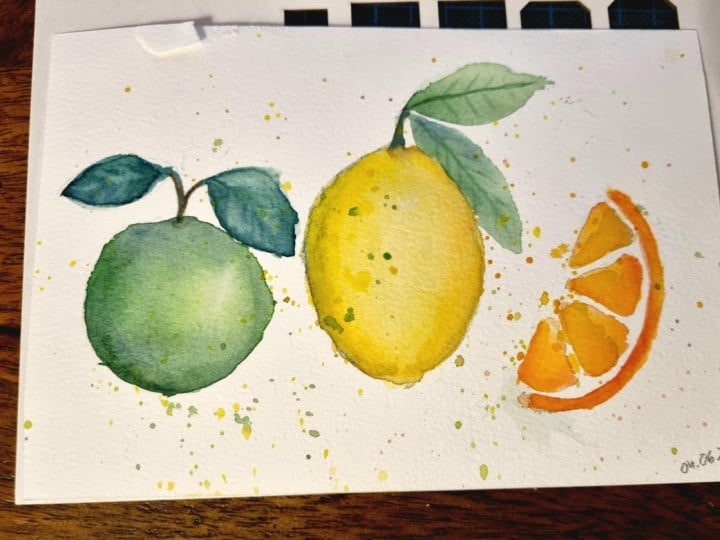
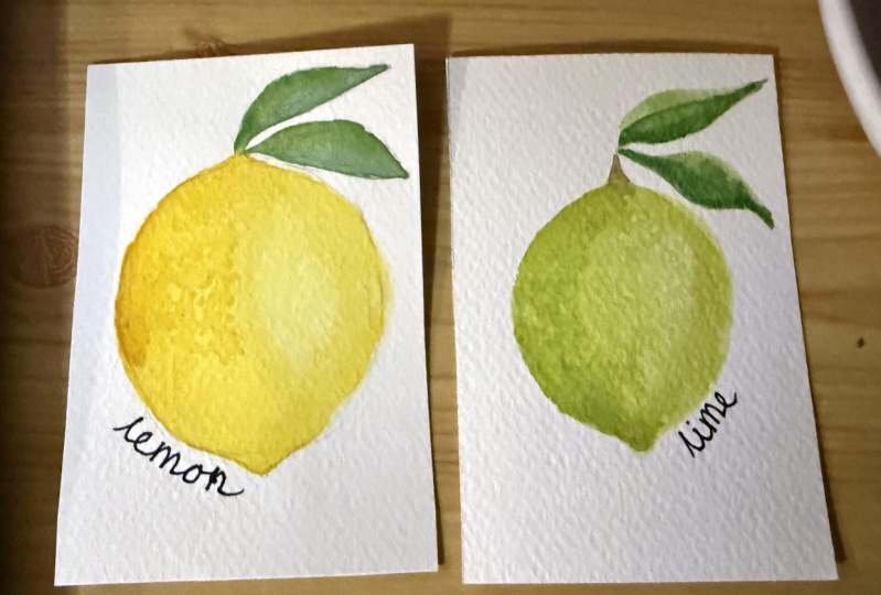
3. Lemons: We're going to start by
painting a loose style lemon. You can see here I have a reference sheet
that I created as I was practicing the fruits and veggies we'll be painting today. You'll probably notice me
referencing this sheet and other examples
throughout the class. Let's start by talking about which colors we'll need
to paint this lemon. First, of course, we
will need a shade of yellow for the base
layer of the lemon. Then either a darker
yellow or light orange to add the shadows
here around the edges. Finally, we'll need
some shades of green for the leaves
up here at the top. Now, you can choose
to paint with bright vibrant colors or tone it down with a more
muted color palette. Before we start painting, I'm going to start
with a light sketch to get a feel for the
shape of the lemon. I'm going to start with
an oval sketch that has small curved tips at
the top and bottom, like you can see here in
the reference painting. Then I'll add a small stem on top with a couple of
leaves coming down. Go ahead and sketch
out your lemon. Don't worry if it
takes you a few tries. Also, if you have any trouble sketching out any of the foods
during this class, you can check out the free
downloadable PDF I provided in the resources section that has reference sketches
for each of them. That will help you
out if you need it while you're
preparing your drawings. Once you're happy with your
sketch, we'll start painting. Now keep in mind, we
will be using the wet on wet watercolor technique
throughout the class. We'll need to work
fast and add layers while the previous
layers are still wet. Let's grab our lightest yellow
and we're just going to fill in the entire lemon with a light wash of that yellow. Make sure you have enough
water on your brush so that you don't run out
while you're filling it in. As I said, we will
be using wet on wet. We want to make sure that
this first layer stays nice and wet before we
start adding more to it. Now while that first
layer is still wet, we're going to add
some depth and dimension to the lemon
by adding some shadows. Go ahead and grab either your darker yellow or
even a light orange, and just tap in some
of that color around the edge of the lemon. If your first layer has dried, you can just go over it with a clean damp brush because we want to
make sure we can get these nice bleeds. I'm just tapping it in here. If you need to smooth out any harsh edges like these here, just rinse off your brush, gently tap it on
your paper towel to remove excess water, and softly feather out the paint along the
edges like this. It may take a few rounds of smoothing to get a
nice even blend. I'm going to add even more of the dark orange here and just make it a little more dramatic. What I also like to do after adding some of the
shadows is lifting away some color on
the opposite side to give it a nice highlight. All you have to do to lift
is rinse off your brush, dab it on your paper towel, and then gently lift
some of that color up. I'm going to do that
process one more time and this is just to add
that highlight there. Rinsing off my brush, dabbing it and
lifting some color. Once you're happy with how all the shadows and the
highlight look with your lemon, let's go ahead and
add the leaves. I'm using a slightly
smaller round brush. I'll be using size 4 and I'm gently filling up my
paintbrush with the color. I'm going to do a
small stem here off the top and then I
have two leaves, one that's coming more
sideways like this, it's going to fill that in, and then one coming down. One thing you'll want to keep
in mind is that if you have a leaf like this that's
touching with the lemon, if you don't want to have
crazy bleeds between the two, just make sure your
lemon layer has dried before adding the leaf. Now before this first
layer of the leaf dries, I also want to tap in some
darker green around the edges, like what we did with the lemon, just to give it a little
more drama and contrast. I also want to mention, if you want to learn more
about painting watercolor leaves in the loose style like I did here with the lemon, I have another comprehensive
class all about the ins and outs of painting
leaves in the loose style. Definitely check that one
out if that interests you. That's about it for the lemon. I hope you enjoyed that. Feel free to keep
practicing some more lemons or meet me in the next
video to paint some lines.
4. Limes: Moving on to limes, this process is very similar to the lemons we just
learned how to paint. If you're comfortable
with those you'll fly through this one in no time. For the color, as
you can assume, we'll need some shades of
green for the lime and the leaves and a bit of brown to add the small stem on top. Go ahead and figure out
which shades of green you'd like to use then we'll
start sketching. The sketch is going
to be pretty similar to the lemon but limes
are a bit more round. Make sure to keep that in mind as you sketch out your lime. When your sketch is
done let's follow the same process as we did for the lemons starting
with a light wash of green let's fill
in the outline. Again, you want to
make sure you have enough moisture in your brush so that this first layer
stays nice and wet and then while the first
layer is still wet we'll do the same thing
where we just tap in some darker green around
the edges for the shadows. Just gently tap
it in here around the edges and the
top and bottom. You can see I have a bit of pooling going on here
which just means there's a little too much water
on my paper and that makes it harder to blend
the colors nicely. This is one thing you
want to keep in mind when you work with wet
on wet watercolors, is to keep that fine
balance between having just enough but
not too much water as you start your second layer. Once you've gone through and
blended the colors a bit, I'm just going to add another
highlight like we did with the lemon by lifting
some color off the page. Again, to do that, I just rinse off my brush, dab it on the paper
towel and then just lift that color where I want there to be a little
bit of the highlight. Now I'm going to add a little brown stem here up at the top. Again, if you don't
want there to be big bleeds between
the colors just make sure your lime is dry before you add the stem and the leaves. I'm just using a
little bit of brown and then you can either
leave it like that or you can add a leaf
like we did here with the lemon so I'm just
going to go in and do one last wave with a really
dark shade of green. There you have it.
I told you that one would be a pretty easy, very similar to the lemon
that we just did previously. Next up, we'll continue the suggest theme to
paint some oranges but we're going to take
a little bit of a different approach for
this one. See you there.
5. Orange Slices: For the oranges, I'm actually
going to show you how to paint a slice or
a wedge of orange. However, if you want to paint the full outside of
the orange instead, it's going to be basically
the same process as we did for the
previous two lessons, but again, you want to make sure that the shape is more rounded. That's for the colors will
need for this lesson, we will need orange
and yellow so that we can get this nice
blend of color here. To get started with
the orange slice, let's look at my
reference paintings here. You can see we have a C
curve here on the left, and then four rounded
triangles that meet up towards the middle that makes
up the inside of the slice. Let's start sketching
those pieces and then we'll fill them
in with the color. Once your sketch is done, we'll start by
painting the C curve. I'm loading up my brush with quite a bit of the
lighter orange. It's almost more yellowy orange. I'm just going to
fill in the C curve. While that's still wet, I'm
going to grab a little bit of the darker orange and
just tap in some shadows. It doesn't have to be
anything too dramatic. Just tapping it in. Now, each of the
wedges is going to do the exact same
thing so we'll have the same process for
all four wedges. I'm going to start with a light base layer of
the lighter orange, almost yellowy orange and
then I'll tap in some darker orange down at the
bottom and around the sides to give
it some more drama. Again, starting with
the lighter orange, almost yellowy orange, I'm
just going to fill this in. Then while it's still wet, I'll just tap in the
darker orange down here at the bottom and up the sides. Using that same technique we did for the lemons and limes, I'll just feather it out to make the blend a
little more even. Now, I'm going to
repeat this process through the next three wedges. All four have this nice at blended ombre effect
and then we'll go back in and add
some seeds and some darker marks
once those are dry. One more reminder
when using the wet on wet technique like we've
been practicing all along, you want to keep a good
balance of moisture on your page between the
first and second layers. If your first layer has dried, simply take a clean damp brush
and reactivate that layer. On the other hand, if there's too much water and you
experienced pooling, just soak up some of
that excess water with a clean dry brush, then proceed with
the next layer. It takes a bit of practice, but the more you experiment
with this technique, the more naturally
it will come to you. Once you're done with all
four wedges so you can leave it as is if you're
happy with how that looks, or you can go back in and add a couple of last minute touches. I'm taking a very small brush, this is size 1, and I'm taking a dark orange
and I'm just going to add in some marks along
each of the wedges. Just some skinny little marks to give it some more interest. Make sure you're not doing
it in a perfect line. You don't want it to
look symmetrical, just want it to look natural. I'm just going to go
through and do that to each of the four wedges. There you have it for
the orange slice. I'll see you in
the next video to start painting some watermelon.
6. Watermelons: Now onto watermelons.
In this lesson, we'll be painting a
nice thick slice of watermelon with
some seeds in it. That's what we'll need
the black felt-tip pen or Sharpie for at the end is
to add in those seeds. In terms of color, we'll
need some shades of red or dark pink for the main
section of the watermelon, the black pen for the seeds, and then a light vibrant green
for the watermelon rind. Looking at my example
painting here, you will notice that our
painting is going to be a 3D view or a cross-section
of a watermelon slice. The important part
you'll want to keep in mind while you're
painting is to leave this nice thin whitespace between these two parts to show the change in perspective from the top of the watermelon
here to the side. Just another reminder
to be sure to download the sketching reference
sheet I provided if you need any help at all with
the drawing portion of it. We are all set to go. One thing I want to mention
before we start painting is that we're going to
be painting this in three different sections. Now we have the
top triangle here, the top part of the watermelon. We have the side and
then we have the rind. You want to make
sure you have all three of those parts defined in your sketch that way we
can work in sections. If we did it all at once, it would all bleed
into each other and just create a blob of color, which we definitely don't
want that to happen. I'm going to start with
this main section here, do a light wash just like we
have in the other lessons, light wash of dark pink. Then for the shadows, I'm going to tap in some
darker pink along the edge here and then I'm also going to create just a few
organic blooms. Just dropping in
color wherever to just make it look
fun and expressive. Let's get started with that. A few other tips for
this watermelon. Number 1, make sure the edge of your slice has a
slight curve to it. You don't want to
have your sketch be a complete triangle
with sharp edges, because in reality, when you cut up a slice of watermelon, it will have a rounded
edge where the rind is. Also, I would just want
to remind you that while working with the
wet on wet technique, time is definitely of the
essence so that you can have those nice bleeds of color
as you add the second layer. But as I've mentioned before, you can always go back over the first layer with a small
amount of clean water to reactivate it if yours has dried out before you've started
with that second layer. Now the base layer is done. Like I mentioned, I'm
going to be tapping in some shadows along the edge and around the top
near the rind and then also just drop in some
organic blooms throughout. You'll notice a consistent
theme here throughout the class where we start
with the base layer, then tap in the darker shadows around the edges like we're doing now and what we've done
with all the prior lessons. This is a great
technique to practice because you can apply
it to any other food or other subjects you
paint when you want to add more depth and give your
painting a 3D effect. While I might sound
like a broken record in each of these lessons, the skill itself is a really useful technique to have in your painting tool belt. Now you want to make sure that that first section is completely dry before
we move on to the next. The next is going to be
this side piece right here. If this was still wet and any part of it touched
the side piece, they would just blob into one. Let's look at our
reference again. We have this top section
that we just finished painting and now we're
going to work on the side. As I mentioned
before we started, this whitespace here
in between it's going to be really critical in order to show the change in reference from the top to
the side of the watermelon. If we didn't have
this whitespace here, it would just be
one flat triangle, one flat watermelon,
and you wouldn't get this depth and
dimension here. Keep that in mind as we
start the next section here is to leave a little bit
of whitespace in between. We're going to do the same
process as we did for this. Top section, start
with a light wash of the pink and then drop in some shadows here at the bottom. You can choose how thick or thin you want this
section to be. If you're more into
the thin slices, you can certainly keep the
side piece nice and dainty, maybe just one brush/wide. Or if you want a
thick juicy piece, you can make it a bit wider
like I'm doing with mine. I really want you to have creative freedom in
each of these projects. Add your own personal touches
and just have fun painting. Now, once you're done with
these first two sections and both have dried, we'll get started with
the third portion, which is the watermelon rind. I'm going to use a
very vibrant green here and I'm going to start
with a very light wash. It's almost yellowy green. Fill in that base layer and
then while it's still wet, drop in some of
the dark value of green along the edge and right alongside
this edge to show the change in perspective
from the top to the side. Let's get started
dropping in that color. When you're working on the rind, make sure your first
layer is very light. To achieve a more
translucent green, just rinse some of
the pigment off your brush before putting
it down on the paper. True watermelon slices have a very slight gradient from the pink fruit,
the green rind. You want to avoid making
too harsh of a transition. This also helps the dark
blooms look more dramatic and provides more contrast when
you drop those in next. Once you're done with the rind, we can start adding
in the seeds. As I mentioned before, we'll want to make sure
that this is completely dry before we start
adding the seeds. I will be using this
fine tip Sharpie. You can use either a Sharpie or a felt tip pen to add
in the seeds here. If any of this was still wet, it could damage your pen. That's why I just
want to reiterate. You want to make
sure this is dry before you start
adding any seeds. Now, looking at the
reference here, here's what some of the
seeds can look like. They're just teardrop shape and they're facing all
different ways. You can see you just
half of the seed here. One is facing
completely sideways, so feel free to just place
them where you want. Don't make them too
symmetrical or in a line, because that's not how it
looks in a real watermelon. Let's go ahead and add some in, and then we'll finish
up this lesson. I'm going to start by
just outlining each of the seeds with the
fine tip Sharpie. Then once I'm done outlining, I will go back through
and fill them all in. Just a reminder,
it's totally up to you where you want to
place each of the seeds. Just have fun with it. Place them wherever
you think they would be in a real slice
of watermelon. I think I'm all
done with my seeds. I hope you are too. If you want to go
the extra step, you can see here on my reference
that I have some of them with some white accents there to show a little bit
of highlight or light reflecting
off of the seeds and I just used a tiny bit of
white paint to create that. You can do that if you'd like, or if you're happy
with how it is, just with the black seeds, then we're good to go
to the next video.
7. Bananas: Bananas might not be the
prettiest fruit to paint, but they're actually
really fun to do. You can get really loose
and expressive by adding in some bruises to the banana using the wet on wet technique. In this lesson we'll be painting both bruised loosed style banana and also the more
traditional style like this. Let's start by sketching
out to different bananas. First step is going to
be the bruised banana. Once I'm done with the sketches, I'm going to take a
light wash of yellow. I'm actually using the
same yellow that I used for the lemon
in the first video. I'll just put down
my base layer. Now keep in mind this first
bruised banana is going to be a super loose,
more whimsical style. Don't overthink it. Just have fun filling in the color and dropping
in those bruises. The second banana will be more traditional and will require
more blending technique, but we'll get to that after. While that base
layer is still wet, I'm just going to grab a light brown and just tap
in some bruises so you get those nice
organic blooms when you use the wet
on wet technique. Just feel free to drop
it in wherever you like. You can have a super bruised
banana or you can have a pretty fresh one,
it's up to you. That's about it
for this version, it's very fun and simple. Next we'll do the more
traditional looking banana. For the second method of banana, I'm going to start with
another very light wash of the yellow and fill
in the whole banana. While this first
layer is still wet. I'm going to grab a darker value of that same yellow and just add in a little bit of
shadows around the edges. Just like we've done with
all the lessons so far, I'm just going to
feather this out to make the blends
a little softer. Now I'm going to add just a very light touch
of green up at the top. This banana is going to be a little bit less ripe
than the other one. If your green is a
little too intense, just rinse off some
of that pigment so it's almost like
a translucent green. Once you're done adding
a little bit of green, I'm going to finish off
with a little bit of brown for the top on the bottom. The green and yellow is
still a little bit wet, so it's going to bleed into
each other a little bit, which I actually like for this. I'm just gently adding
in some light brown. Then I'll go back in with a
little bit of darker brown. I'm going to do a little
here at the bottom too. Now I'm going in with
just a little bit darker of a brown to
add some shadows. I think that's about good. Up next we're going
to be painting a bright, beautiful beat. This is my favorite
one of the class, so I'll see you there.
8. Beets: In this next section, we'll be painting a
big beautiful beat. This is one of my
all-time favorites to paint mainly because this color is just so
vibrant and eye-catching. The specific color I'll be using for this is called Burgundy from the spring set of
the viviva color sheets. Now starting out
with the sketch, I'm going to draw first this round part of the beat
and then I'm going to add a wiggly little root towards the bottom and then I'll lightly sketch out where I
want the leaves and the veins to go up at the top. Once I have my sketch down, I'm going to do what we've
done in the other lessons and start with a base layer
of that burgundy color. Well, this first
layer is still wet, I'll be adding in some
shadows here on one side. I'm just getting a darker
value of that burgundy color. I'm also going to lift some color here so you
get a nice highlight. You can see by lifting color, adding highlights and shadows, it really just makes
all of these items look more 3D, more realistic. Because if I didn't
add these things, it would just look
a little bit flat. I'm just going to continue adding in some
shadows and lifting color and then we'll move
on to the next part. Well, this first layer
is still drying, I'm going to go in and
add the little root. I'm just using a darker
value of that Burgundy, making a little tail
off the bottom. Now we're going to start working on the leaves of the beat. As you can see in my reference
painting on the screen, the Burgundy color extends up through the beat and
into the leaves, which are more wavy
than the other leaves we've painted in
the class so far. And they have lots of veins
running through them as well. I'm going to start with
that Burgundy part. I included this
reference photo on the top left of some beet leaves so you can see how
those veins are really integrated
into the leaves. Okay, and once you're
done with that part, we can start adding in the
green part of the leaves. You can check out my outline
reference if you'd like, but these leaves just have a wavy edge and then
come to a pointy tip. I'm going to do a light
wash of green and just work my way around those red lines because I don't want to cover
them up completely. Well, this first
layer is still wet, I'm going to go back in and just drop in some darker green. Feel free to add the
shadows wherever you like. I usually tend to go
for the outside edge of each of the leaves and then some on the inside as well. I'm going to do the
same process with the second little leaf up here. I'll add in some
shadows just like we did with the first one, and then we'll be very
close to finishing. But the last step
will just be adding in some veins to these leaves. The last step is adding in a few more veins to
both of the leaves. I'm going to add those,
then we'll be all done.
9. Blueberries: Moving on to another
favorite of mine and also one of the easiest ones in
this class, the blueberries. There are a ton of
different ways to paint berries, but
for this lesson, we'll stick to the wet-on-wet, loose style theme
that we've been practicing throughout the class. Here you can see what
the berries will look like from my reference painting. We're going to be painting
quite a few of them here today so you can
get a good feel for adding shadows and painting them from slightly different
perspectives. In terms of color, you will just need
one blue color that you really
like, and that's it. The rest will all be done using different values of
that same color. No need for a sketch here,
you can if you'd like, but since these are basically
just imperfect circles, it's not totally necessary. This process will
be very similar to the ones we've done
for the other fruit. I'm going to start
off by just outlining an imperfect circle with a very light wash of that
blue that I've chosen, which is called midnight blue. Go ahead and fill that in. One other tip is if
your first layer is ever too wet or there's
pedaling or pooling going on, you can soak up some of that excess water by just
cleaning off your brush, dabbing it on the paper
towel and then just letting the brush soak
up some of that excess. Now I've grabbed a
darker value of that same blue and I'll
start tapping in the shadows around the edges so that base layer is still wet. Then you're just tapping in where the shadows
would be on the berry. Those edges are a little harsh, so I'm just [NOISE]
rinsing off my brush, dabbing it on the paper towel, and then just blending out
those lines a little bit. Once you've added
the shadows and you're happy with
how the blends look, I'm also going to
lift some color just to make this highlight
pop a little more. The same process I've used for lifting color on
the previous ones. Just rinsing off my brush, dabbing it on the towel and lifting some of that
color off the page. Now the next part is adding the petals or the calyx
of the blueberry, which we can't do until
this complete layer is dry. I'm going to paint
a few more berries, change up where the shadows
and the highlights are. Then we'll meet back up
to add those petals. You can really paint as
many as you'd like here the goal is just to
practice your perspectives, blending techniques, and just start to build in
that muscle memory. That's a huge part of improving
your watercolor skills is just muscle memory and letting those brushstrokes
come naturally to you. Now once you've practiced a few of these and added in all of your shading and highlights we'll do the finishing touches, which is just adding the calyx or the little petals
up at the top. They almost just kind of
look like a little asterix. To do that, I'm
just going to use a very small brush, round brush. Again, that's the size 1. Then I'm going to get
my darkest value of blue and go ahead and add
those onto the berry. [NOISE] There you have
it. The main thing here with the blueberries
is just to work on your shading and highlights
and really make it look like it's around berry
that's sitting on the page. Definitely keep practicing. Try painting different
perspectives. A good way to do that is just by looking at reference photos online and then
trying to mimic where the light hits the
berries in your painting. That's it for the blue berries, next step we're going to paint some red and green
Jalapeno peppers.
10. Jalapenos: Time to get a little spicy. We're going to start painting
some jalapeno peppers. I'm going to paint two different
examples in this lesson, one red pepper and one green. When I was first
practicing these, I don't know why but I had a hard time getting
the sketches right. If you have the same
troubles as I did, make sure to review that
sketching reference PDF. Now let's get started
with our two sketches. One's going to be a little
more curved here at the bottom and also
have a curved stem. The other will just be more
straight and basic looking. I'm going to start
with the red pepper. I've gotten a bright red color onto my brush and I diluted it, so it's just a very light wash, and I'm going to start filling in the outline
of the pepper. I'm just going back over it with a slightly more pigmented color just because it was a little
more pink that I wanted. Now before I add the shadows, I'm actually going to do
the highlights first. I'm just going to lift some
of that color off the page. Since I went over it twice, it might take a
couple of times of lifting the color to get
that nice highlight. I'm going to do one
there and then also a little bit further
down the pepper. Another thing to keep
in mind when you're doing lifting technique is to make sure that your
water is nice and clean. If it starts getting
a little too muddy, it can be hard to lift the color properly because there will still be a little bit of
color residue on your brush. Those highlights are looking
good and then I'm going to go ahead and add
some darker shadows. Before we add the shadows, if any of your base
layer dried up while you were doing the lifting technique for the highlights, just go over it gently
with a damp brush so that we can still
get that nice bleed from the wet on wet technique. I'm just re-wetting some of this before I go in
and add the shadows. Now I'm grabbing darker
value of the vivid red. I'm just going to add in the shadows around where
we did the highlights. Again, just tapping
those in and then I'll go back in
and smooth it out. Another thing I want to
mention about the wet on wet watercolor technique
is that the quality of your paper makes a
huge difference in the way it absorbs water and allows you to blend or lift several layers of paint
without getting damaged. Student grade or beginner paper tends to leave harsh
lines when you try to blend multiple
layers and can lead to frustration and
slower progress. On the other hand,
while 100% cotton paper is much more expensive, it absorbs water beautifully
and allows you to blend and lift color nicely
without getting damaged. All that being said, if
you can invest in it, I highly recommend switching to 100% cotton paper if you can. It will truly take
your watercolor painting to the next level. Once that layer is dry, I'm going to go ahead and add the stem which is
going to be in green. Again, to avoid any bleeding, then just make sure
this layer is dry. If you do want it
to be more loose style, more expressive, then you can definitely
leave this wet and then the stem will just
bleed into the pepper a bit. I'm just going to fill this in with
a lighter value of green and then I'll go back
and add some final shadows, and then we'll move on to
the green pepper next. I'm having a little bit of the bleeding of colors
because I was a little impatient waiting for
that first layer to dry, which is fine. But if you don't want
to have that happen, just make sure it's
completely dry before you start
painting the green. I've gotten a darker green. I'm just again, tapping that in. The first layer was a little
darker than I hoped for. It's not a huge contrast, but it does give it
a little more depth. I'm actually going
to lift some color off the top of the stem too. There we go. Next I'm going to work on the green
pepper right next to it. Now I'm done with the red one. Moving on to the green pepper, and for this one I'm going
to try something different. Instead of lifting
the color to get these highlights for where the light is hitting the pepper, I'm actually going
to just pencil in where I'm going to
leave it white and then I'll see how
that looks and see if that helps the highlights
pop off a bit more. I'm going to start
my first layer with a really light
wash of green, just like I did with the others, but I'm not going to
fill in the whole layer. I'm going to do
everything except those two little spots that
I marked for the highlights. Now you can see I've
done my base layer and I've left these spaces
white for the highlight. Now I'm going to
go back in and add my shadows just like I
did for the red one. I'll do some up top, some around the highlights, and then on the edges and
bottom of the pepper. One piece of advice that can really help you out
when you're painting subjects with highlights and shadows is to look
at a reference photo online to see where
the shadows are and where the light
hits off the subject, which is where you'll want
to add the highlight. I don't always paint based
on reference photos, but it does help when you aren't sure where to place
those shadows. Now I've added all the shadows
and like I said before, I left these spots white
to be the highlights. Just like in this red pepper, we have the lighter spots here and I just wanted these
ones on the green one to be a little more noticeable and provide a little
more contrast. But one thing I
never like to do in my paintings is leave it completely white to where it's just the watercolor
paper background. I'm going to take an extremely
light wash of the green. My brush is pretty much clean, but it has a little
tinted green and I'm just going to go over
those white spots. Just be very careful. That took a little
bit of blending to make the lines not
look so harsh, but it definitely gives a lighter highlight
than this one did. This one's a little
more blended evenly, but this one pops a little more. It's up to you which method
you like, you can do both. Then once this layer is dry, we'll go ahead and add the stem just like we did for the red. This first layer is dry, so now I'll go ahead
and add the stem. We'll do a light
wash of this green and then add the darker shadows. That's it for the
jalapeno peppers. You can keep experimenting with different shapes
and perspectives, play around with
different ways of adding in the
highlights and shadows, or go ahead and meet me in the next lesson and we'll
be painting some carrots.
11. Carrots: Carrots are very simple
and easy to paint. One of the things
I love most about them is the uniqueness
in their shapes. You can really play
around with giving each one some character, adding some curves at
the bottom for the root, changing up the
leaf style on top, and playing around
with the width and length of the
carrot as well. Let's start with a quick sketch. This is the style we'll
be painting today. You can see it has a bit
of a curved root here at the bottom and then very thin, wispy leaves on top, but feel free to change up the leaf style and make
it however you'd like. Now at this point in class, I'm sure you're familiar with the process that's
coming up next, I'm going to start by
filling in the base layer of the carrot with a really
light wash of orange. I'm going to be
using this vermilion also from Viviva color sheets. I'll do a light wash there, and then just like we did
with the other one's, we're going to start tapping
in some darker value of that orange along the carrot
to give it some shadow. Now while this base layer
is still nice and wet, I'm going to start adding in some shadows around the edges. Now that's a little darker than I want so I'm just
going to lighten it up here by adding some water, diluting the pigment a bit, and then I'll start
tapping them in. Just work your way around the carrot adding
in those shadows. It's always easier to start with lighter shadows and then add
in more color as you go. If you start too dark like
I did here at the top, it's a lot harder to go back
in and try to lighten it up, but you can always add darker
colors on top of lighter. I'm just loading up
some more color here in my brush then I'll
start tapping in again. Now that I have most of
the color tapped in, I'm just going to go
back through with a clean damp brush
and just smooth out these edges so that the lines aren't as
harsh when they dry. This blending technique is another essential skill for layering watercolors
on top of each other, so it's a very important
one to practice. If you notice this is the
area that you struggle with, I recommend solely practicing blending on a full
sheet of paper. It doesn't have to
be on a specific object like this carrot, you can even just paint a basic shape like
a circle or square, add a second layer of shadows on top and blend away
until you feel like you have more control
over it and you can create soft blended gradients. Now once you're happy
with the shadows and the blending for the main
portion of the carrot, we can go ahead and
add the leaves. Like I said before,
you can really do any style of leaf
you would like, I'm going to be doing
these thin, wispy ones. I'm going to take a really
dark shade of green, it's almost more black looking, and a very small round brush, probably size one or two, and just start adding in these
leaves up here at the top. Remember, this is the part
where you can really express your creative freedom
and play around with different styles of leaves. You can paint big fluffy leaves, tall skinny ones, leaves that are drooping down
the side of the carrot. Just be creative and have fun. All right, and there you
have it for the carrot. It's pretty simple and easy. The fun part like I said before, is adding in some character, you can switch up the shape. You can make it wonky. You can change up the
leaf style on top. It's really up to you
and your creativity. I hope you enjoyed painting that and I'll meet you
in the next video.
12. Eggplant: For our very last one, we'll be painting
an eggplant using a deep purple mixture of color. The colors that I mixed up for this painting include violet, purple, and a bit of deep
black for the shadows. It definitely took me some time to find a mixture that I liked so feel free to play around with different shades of purple, blue, or other dark
colors that you have to find a balance
that you like. We'll also be using some green for the top
of the eggplant. Now, there's always a
bit of shape variation with eggplants when you see
them at the grocery store, but for the most part
you'll notice that they're slightly thinner
here at the top, near the stem, and then they get a bit fatter towards the bottom. Make sure you take
that into account as you work on your sketch. Once you have your eggplant
sketch ready to go, then we can start
filling in the color. Again, looking at the
reference sheet here, I'm going to actually start with the green top of the
eggplant here first, just because it's easier to fix any mistakes
if I have to with a darker color on top of light than it is to go
lighter on top of dark. I'm going to start just with
a nice deep green here for this top part and
then we'll start filling in the main
body of the eggplant. I've loaded up my
brush with a nice deep green and I'm just going to start filling in
this top section. Now you don't need to
worry too much about having perfectly
smooth lines here. As I said before, we
can always go back over it with the dark
purple if we have to, to clean up any mistakes and just smooth out by going
over it with that purple. Now that the top part is done, we will start working
on the main body, which is going to be
that deep purple color. Again, looking at
this reference here, I'm going to have a light
wash to just fill in the whole base layer
and then go in and add these dark shadows to
give it that 3D effect. I'm giving shadows
all the way around the edges a little bit
on the bottom here, and then up the side. Start with a nice light layer and just fill in
the entire thing. I've mentioned this before, but make sure you
never go too dark on your first layer if
you plan to add more because that can make it
hard for those darker layers to contrast enough
against the base layer. Always lean more towards
a light wash to begin, that way your shadows
can be bold and provide a lot of
dramatic contrast. While this layer is still wet, go ahead and grab some
really dark values of that purpley black
mixture that you made, and just start dropping in the shadows around the edges
and at the bottom to give it that nice 3D effect and don't be scared to
really go dark with this. That's what I love about
painting eggplants. I don't normally paint
with colors this dark, but it's fun to just
play around with it. Give it lots of shadows. Just start dropping it in. I'm going to have the
highlight here on this side, so I'm going to make sure to
leave it fairly light and then like we've
done with some of the other ones in this class, like the lemon, I'm going
to go back in at the end and lift some of that color
to create a nice highlight. I'm going to do a
few rounds of this actually where I just drop in this dark, violet black mixture. Now before I lift some
color for that highlight, I noticed that some
of these shadows are just a little bit
rougher than I like, so I don't want those lines
to dry as rough as that. I'm just taking a clean, damp brush and just
blending that out. If you ever run into
that problem when you're doing wet on wet
technique like this, sometimes those edges
dry really harshly. You can always just blend
it while it's still wet. It's ready. Then for the
final portion of this video, I'll just rinsed off my brush, dab it on the paper towel and
I'm going to lift some of this color to make the highlight a little more dramatic here, where the light is
hitting the eggplant. Just lifting some of that
color right off the page. Now that looks pretty good. I'm just going to
add some little finishing touches
here on the top, to smooth out some of these lines and then we'll be
all done with the eggplant. We're all done
with the eggplant. I hope you had fun
painting that one. It's always one of my favorites. Like I said, I don't normally work with colors
that are this dark, so it's fun to just play around and get
expressive with it. That wraps up all of
the fruits and veggies, so next I will meet you in the next video to start
our class project.
13. Class Project: Now that you know how to paint all 10 fruits and vegetables, it's time to create a piece
of art work to brighten up your kitchen walls using what you
learned in the class. Now, it's totally up to you to decide what you'd
like to create, but I'll give you a few ideas
to help get you started. Number one, you can keep
it simple and choose one or multiple other foods from today's class to paint and
hang up on your walls. Super simple and easy. Number two, you could create a set or series
highlighting a few of your favorites from the class or maybe choose a theme like citrus fruits and paint three different
pieces to hang next to each other
featuring the lemons, limes, and orange slices. I'll show you what I
created for my project which is this market
fresh fruit sign, which is actually now available as a print in my online shop. I digitize my paintings
and created this sign using text and other design
elements in Photoshop. You have total
creative freedom here, just have fun with
it and use it as another opportunity to practice all the skills you
learned in the class. On a similar note,
if you'd like to eventually start
selling your artwork, the first step will be to
learn how to digitize it so you can easily place it
onto products like prints, greeting cards, calendars,
stickers, and more. If this is something you're
interested in learning, make sure to check
out my other class called Digitizing your Artwork. In that class, you'll learn
my step-by-step process for turning art into prints
in less than an hour. I really hope you
enjoy this project. Don't forget to share your work. Tag me on Instagram
@petals.by.priya so I can see what you create and share
it on my stories as well. Once you're done
with the project, I'll see you in the
next and final video to wrap up the class.
14. Final Thoughts: You made it to the
end of the class. Thank you so much for joining
me as we learned how to paint these ten different
fruits and vegetables. I hope you had fun getting loose and expressive with
your colors and shapes and creating
your very own piece of artwork to hang
on your walls. Please don't forget
to upload your work, share it on Instagram. Tag me at petals
by Priya and I'll share it on my stories as well. If you have any
additional questions, please don't hesitate
to reach out. I'm always reachable on
Instagram DMs or you can send me an email as well and I'll leave a
link to that below. If you enjoyed this class, please take a moment to leave a quick review or feel free to check out some
of my other classes. I would absolutely
love to see you there. Thank you again and happy
painting from me to you.
 Petals by Priya Watercolor, Watercolor Artist & Teacher