Transcripts
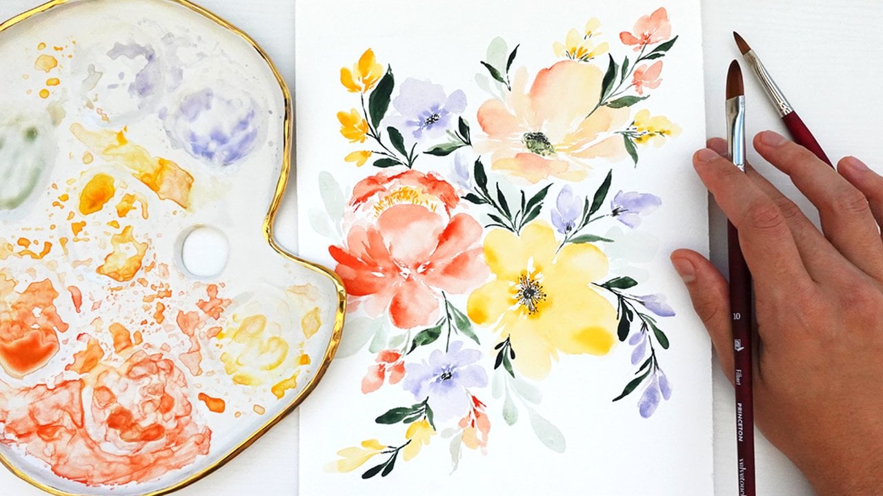
1. Welcome to Class!: Welcome watercolor artists as we dive into the
vibrant world of tropical plants
and flowers using beautiful, expressive
watercolor techniques. Today I'll be your guide on this journey where we'll explore the lush beauty of Hawaii right from the comfort
of your own home. My name is Pria, from petals
by Pria Watercolor designs. And I'm a professional artist specializing in floral and
botanical watercolor artwork. I'm based in beautiful
Honolulu, Hawaii. And I have always been
inspired and amazed by the true beauty of
all the plants and flowers I'm surrounded
by here on the island. The deep rich greens, the vibrant shades of pink, oranges and yellows and
the sheer size of some of these plants provide endless inspiration
for my artwork. In fact, I recently
released a collection of tropical watercolor pieces that brought me so much joy to paint. And I wanted to create this class to share
that joy with you. Inside this class,
we'll learn how to paint an array of
tropical botanicals, including the Hibiscus
flower, banana leaves, Bird of Paradise, Plumeria, and the Hawaiian ginger flower. And as we paint them, I'll share my step
by step process and techniques for bringing reference photos
to life on paper. We'll utilize blending to create those soft gradients on
the plumeria petals. Practice our layering skills for adding texture on the hybiscus. We'll master the wet on
wet technique to capture the natural glossy sheen
of the banana leaves. And we'll fine tune our water and brush control along the way. Now these techniques
will, of course, be valuable to each of the projects we complete
inside this class. But more importantly,
the experience and confidence that you'll gain throughout the process will be invaluable to your
watercolor journey. Outside the class,
you'll leave with a new set of skills, techniques, and experiences to utilize in all of your future
creations as an artist, so you can move forward
with creative confidence. While some of the techniques
I'll be showing throughout class are more geared toward
intermediate artists, the class overall
is suitable for watercolor enthusiasts
of any level. I've broken down each
of the projects into bite sized lessons with
real time instruction, so you can follow along at your own pace before
we get started. If you'd like to learn more or connect with me on social media, you can find me on Instagram
at Petals by Pria, on my website, petals by Pria.com or on Youtube at
Petals by Pria Watercolor. When you're ready, grab
your brightest paint colors and let's get started.
2. Class Projects: As mentioned in the
introductory video, this class will include
five projects in total. These will include
the Hibiscus flower, banana leaf, Bird of Paradise, plumeria, and the red
Hawaiian ginger flower. You can choose to
learn them all or pick a couple of your
favorites to focus on. First, each of the projects
will be painted with a mix of loose style with some more realistic details
added to each of them. I included a PDF that
you can download below with sketches of
each of the projects, so you can follow along easier. But if you prefer to paint
without sketching first, you can also totally do that and just paint in more
of a loose style. I want you to be able to express your creative freedom and make your own artistic
choices in this class. But that PDF also includes a few stunning
reference photos of each of the plants and
flowers we'll be painting, so you can get a better
idea of their shapes, their colors, and their
overall general look. And in the next
video, we'll cover all the supplies you'll
need for this class.
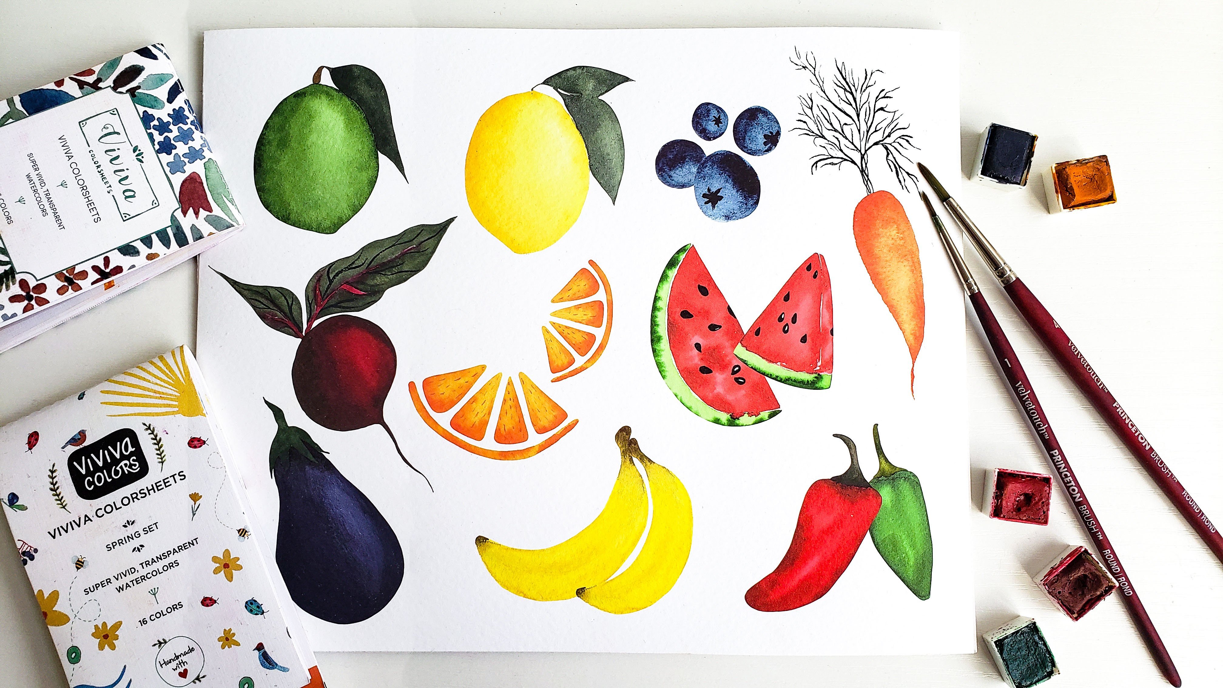
3. Supplies: Let's review the supplies
we'll be using in this class. For your convenience,
I also included a downloadable PDF with links to everything
that I'll be using. First up is watercolor paper. I'll be using arches, 100%
cotton cold press paper. But no matter what
brand you like to use, I do recommend using 100% cotton professional
grade paper. Because for these
projects we'll be using some lifting and blending
techniques that will perform a lot better
on high quality paper. Next up is the brushes. I'll be using a variety of round brushes from the
Princeton velvet touch series. I like to use these
brushes because they have the perfect amount of
stiffness versus flexibility. And they have a fine
tip point at the end. That is exactly what we need for the style of painting
will do in this class. But of course, any round
brushes you like to work with, it should be perfectly
fine for watercolor paint. I'll be using a variety
of colors that I'll share at the start of
each individual project. But as I always say, you're
more than welcome to use whatever colors you
have available to you and that you
like to work with. I want you to focus more so on the processes and
techniques of this class. And not so much on finding
the perfect, exact color. Especially because a lot of these flowers that
will be painting come in a variety of colors
and color combinations. In real life, I'll also be using a pencil for
some light sketching, a bowl or jar of clean water, paper towel, and
a mixing palette. Don't forget to download
the supply list down below if you need help finding
any of these supplies. And once you're ready, we'll get started with the
hi viscus flour. Up next.
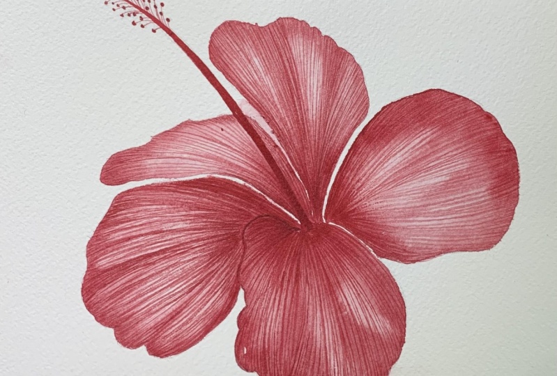
4. Hibiscus Basics: Start out with the
beautiful Hibiscus flower. If you've been to Hawaii
or other tropical places, you have probably
seen these before. They are simply beautiful. They come in so many
different colors and color combinations and they are just one of the quintessential
tropical flowers. Let's take a look at these
reference images again. These are all included
in the downloadable PDF. You can see that all
four reference photos are very different. This is just a small sample of the varieties that
Hibiscus come in. You have the bright
yellow, soft pinks, bold reds, but they all still have the same
core characteristics. The ruffled edges of
the overlapping petals, the delicate ripples in
the center of the petals, the deep dark value of
color in the very center, and the long stamen
coming out of the middle. Those are the first
things that I notice. But feel free to write
down or just take a mental note of
any other details that you find in the
Hibiscus flower. I said this before, but
I'm not planning to paint hyper realistic
versions of any of these. But I do like to take a
moment to just notice some of those elements that
I want to include in my paintings using my own style. Now, the light pink flower
on the very right is one that I took on a
neighborhood walk a while back. And those are the
colors that I'll be painting in my upcoming lesson. For the base layer
of the petals, I'll use a light value of this pink for my
pastel dreams palette. And I'll use that same color in a darker value for the ripples
and shadows in the petal. For the stamen, I'm using an even darker pinkish red
that I absolutely love. But as I mentioned,
the Hibiscus flowers come in all different colors
and color combinations. You're more than welcome to choose a different
reference image, or choose different colors, because the overall
process will be the same no matter which
colors you use.
5. Hibiscus Petals Demo: All right, so let's
go ahead and get started with the beautiful
Hibiscus flower. This is just a sample
painting that I did. Of course, yours doesn't have to turn out exactly like this. As I mentioned, there are so many different colors
that Hibiscus comes in. If you want to go
the pink route, you can follow along with
the colors that I'm using. Or if you want to
do yellow or red, there are just
endless combinations. Feel free to make it your own. For this one specifically, we're going to have a very
playful, loose style. I want to be able to
capture those ripples in the petals like we saw
in the reference photos, I'm going to be
using some wet on wet technique and
blending and layering. But overall, it'll be
a pretty loose style. Now I have my sketch
already down on my paper. As a reminder, all the sketches are available for
download if you'd like. I'm going to start with
this petal right here, just because it's
pretty straightforward and it'll be a good one
to show you our process. I'm going to start
with just a super, super light first layer. You can see there's
a little hint of pink just from excess
paint on my brush, But for the most part, it is just a very light value,
almost clear layer. You really want this
first layer to be nice, and even you don't want to have too much water to where
you see petals forming. But you want enough, you'll start to see
blooming happening. Once you add the
additional layers, now I'll go in with a slightly
darker value of pink. I'm going to start here just
by adding in some layers. I want the outer
edges of the petals, and I want this center to be darker where it meets
the rest of the petals. I have my darker value of pink, and I'm just starting
to tap it in down at the bottom again. Because it's wet,
you'll see that paint start to bleed out into
the rest of the petal. So I'm going to add it there. I'm also going to add
some of this darker paint around the edges again, just take your time. Have fun. Don't be afraid of what
you can't control too. Because loose style, especially when you're
using wet on wet, there's a lot you can't control. But that's the look
we're going for. Just have fun and let
it do its own thing. Now, after adding that
darker value up top, I've rinsed off the additional
pigment from my brush, and I'm using clean
bristles to soften out those lines a little bit and just make it a
little more smooth. Now later on I'm going
to be using a very dark, reddish pink for the
stamen of the flower, but I'm also going to use
that color here to add one final deep dark layer
at the very center, because that's where we want
the darkest value to be, where it meets up with
the rest of the petals. And I'll just add a
little bit more here. Make sure you use the tip
of your brush to capture those rough edges of the petal. Now I'm going to start using
a light hand and the tip of my brush to create some
lines just like this. That's what's going to give that ripple textured
effect to the petal. Using a fairly light value, using the tip of my brush, and just adding in a little bit of texture just like that. Even that line is a
little bit harsh for me. When that happens, I
just rinse off my brush and use the clean bristles to smooth it out a
little bit more. That's the process we'll be doing throughout
the entire flower. I'll remind you,
I don't want you to do the exact same
strokes that I'm doing. If you want to add
more ruffles, you can. If you want to
have fewer ruffles and just have clean petals, you can do that as well. Feel free to express your
creative freedom now. I'll just continue that until I'm happy with how
the petal looks, Adding some more
texture and ripples, adding darker value on the
edges, smoothing things out. And really just taking
advantage of the petal while it's still wet
so that I can get those really beautiful bleeds. Another thing you can do if
you want your petals to stay nice and light like you can
see in my example here, I have a lot of light areas, which I think is
really beautiful. And add some really
nice contrast. What you can do is take a clean, damp brush and lift up
some of that color. This technique is
called lifting. It's a really great way to add a little bit of
contrast to the petal, add some highlights, just really make those
lighter areas pop. All right, I'm happy with
how this first one turned out and now we can move
on to our second petal.
6. Hibiscus Petals Practice: For this one, I'm
going to move on down to the petal at
the bottom again, I'll start with a
very light value, it's almost clear, but it
has a little tint of pink. I'll apply a very
thin even base layer, making sure I don't
have any puddles or pools of water forming. It's just nice and even this is a great project to
start with because it's a good blend of
loose and playful, using expressive
strokes, wet on wet, but also adding a
little bit of detail. It is a great one to ease
into our tropical flowers. I have my base layer down and now I'll take a medium value of that same pink and start to tap in where I want those
darker values to be. Of course, down at the center where it meets the other petals. All of them, no matter
which one will have that really deep dark
value in the center. That is one of the
key characteristics of the Hibiscus flower
is the dark center. Then you can choose
where else you want those darker values to
be around the petal. I'll tap them in
around the edge. This is also a great time to
practice your water control. You can see a gentle
bleed happening, but if I have too much
water on my brush, it's going to flood the
petal and just explode out. But if you don't
have enough, you'll not get any bleeding at all. Just make sure you have a
decent amount on here so you get gentle bleeds and just try
to find that happy medium. Then as you go, you can
rinse off your brush and smooth out any lines with
a clean, damp brush. There's a lot of back
and forth between adding in more color and
then blending it out. Just finding what
style you'd like. I use a lot of bleeds and
blending in my paintings. Every time I add in more color, I always rinse off my brush
and then smooth it out a bit. But I'll say it one more time. You are more than
welcome to make your own creative
decisions here. Figure out what your
own petals need. If you want to do more
blending or less blending, you're more than
welcome to do that. Now I'll go in again with a dark value of that
reddish pink color. This will be the same color as the stamen here in the
center of the flower. That's the last
step that I'll do, but for now I'm using
that same color, very center of each petal. Again, just taking advantage of the petal while
it's still wet, making sure I get all
the bleeds that I'd like adding some of
those Ripley edges. Now I'll use my
medium value again to start adding in some
of the texture lines, using the tip of my brush
and pulling it outwards. Again, this is a harsh line compared to the
softer ones here. I'll go in and smooth that out. But first I'll just add a
couple more of these ripples. I'll also do one coming in
towards the center as well. Now I can rinse off
pigment again and just start to soften out
those lines again. I'm going for the loose style. I don't want to spend
too much time blending, but I do like the look of
having those softer ripples. Then the final step will
be rinsing off my brush, dabbing it on the paper towel, and using the lifting technique to make those highlights
even lighter. Because I really like having a nice sharp contrast between the darker pink and
the lighter areas. I think I actually want one
more little ripple here. I'll just use the very tip of my brush and add in a
small little one here. All right, that is
looking pretty good. I'm actually just going to
go in one more time with that dark red and just
tap in a little bit more. You don't have to do this part, but I just like that
very stark contrast, just making that a little
bit more bold and dramatic. Now, these other two
surrounding petals, it'll be the same
process as we just did. I'll speed that part up. But before we do that, let's go ahead and paint
this one together. Now, this petal, if you're following along with my sketch, is the one that has the
stamen on top of it. But I'm not going to
worry about using masking fluid or
working around it. Because as you can see
in the example painting, the stamen is a lot darker
than the rest of the petal. We can paint the
petal completely. Wait until it dries,
and then just go ahead and paint that stamen
directly on top. Let's start out with our
very light value and start to fill in our very first
layer of this petal, just giving it a little
bit of a wiggly edge. Now again, I'll start by
tapping in the darker value. Base. Now you can
really start to see where all these
inner petals connect. That's where the
darkest value will be. That's what creates a
little bit of depth here, because it looks like it's going deep down into the center of the flower and then getting lighter as the petals
extend outward, adding in the center, and then tapping in some
of the darker areas around the top to create those
very soft ripples. That's what I really love about these flowers is they are so expressive and beautiful and
they fold in their own way. Truly, every petal
looks so different. Just using a clean, damp brush here to soften some
of those edges. Now I'll use that dark red pink to darken the center even more. This is the same
color that we'll be painting the stamen
in at the very end, You want to make sure
this petal is completely dry before you add that in, Otherwise it will just bleed
out and look a little fuzzy. But we want the
stamen to look nice, and crisp, and sharp. I'm just randomly
picking places to add darker values around the
petal other than the center. The center will always
be the darkest, but for the rest of the petal, I'm just placing it
in wherever I want. Again, this is loose style. I'm not trying to make
it hyper realistic. Now, I'll just add a couple
of those fold lines. This is a very small petal, so I don't need to worry about
adding too many of these, but just going to use
the tip of my brush to add a little bit of texture. As the final step, I will just lift some of that
lighter color up. We're looking pretty good. The rest, as I mentioned, will be the same exact process. I'm going to just
speed up this part, but again, it will be the same exact thing
that we've been doing. Starting with the light layer, tapping in the darker
values in the center. To create that we tap in some darker
values along the side. We add our texture line starting thin and then getting
a bit thicker as they reach the outer
edge of the petal, just like you can see here. Then you can lift some
of that color out. Same exact process and go ahead and fill in
your last two petals. And then we will meet back up at the end to paint the
stamen together. All right, so I have
finished all of the petals using the same
technique for all of them. And now I want to let them dry completely before we
do the last step, which is adding in the. So just give yourself a
couple minutes to dry.
7. Hibiscus Stamen: All right, our petals
are nice and dry, so we can go ahead and
add the final step, which is the stamen. As you can see in
the example flower, it starts a little
whiter at the base, at the center of the flower. And then it gets
thinner and thinner, and then it has
these little dots on either side that will connect
with very fine lines. Now I'm switching over
to a size five brush. I used a size eight
for the petals, but I want a little more
control for this one. I'll be using that
same dark red color that I used for the center here. I'm going to start by
painting the very base, which is the whitest part. This is called wet
on dry painting because the layers
underneath are already dry. There's no bleeding happening. If you do see bleeding, stop and let your
petals dry completely. And then you can go back
in and add the stamen. But for now, I'm just
using the tip of my brush and blocking
in that color. It's getting thinner and
thinner as I move to the top. And using the very tip
of my brush at the end, it's nice and sharp. Now I'm going to darken it
just a little bit more, going over it with
more of that pigment. And that's because water
color always dries a little bit lighter than
when you apply the paint. So I just want to
make sure I have enough pigment on
there so it maintains that nice deep color
at the very base. I'm adding even just a
little bit of black to my mixture to deepen
it even more, just adding a touch
of that color at the very bottom and
then blending it out. Now we can start to add the
little dots at the end, which is called the stigmas. And I'm just going
to add a variety of sizes of these dots. Some of them will be small just using the tip of my brush. Then I'll apply more
pressure to get some of the bigger dots down
towards the bottom. Don't overthink it
here, we're just adding wherever you'd like. Try not to overlap
too many of them, but just add a fair amount
at the tip of the stamen. Now I'll go ahead and let
these dry and then we'll do the final step of adding
all the connecting lines. Now that all of the stigmas are moving down to a size one brush
that has a very fine tip. If you don't have a size one
brush, that's totally fine. You can just use the tip
of another round brush. I'll just start connecting that stamen to all of the dots. I'm just using a very
light hand painting in these little dainty lines. All right, there we have it. The beautiful hibiscus flower. I hope you enjoyed
painting this one. As I mentioned earlier, it's a great one to
just experiment, use playful wet on wet technique every time I paint one of these. Even if I'm using the
exact same sketch, it looks different
because you never know how the different bleeds and
blooms are going to work. That's honestly the best part of watercolor,
unexpected nature. That's why I always say the
best thing you can do is just let it do its thing and try not
to control it too much. I hope you enjoyed this and we'll move on to the next one.
8. Banana Leaf Basics: Now let's move on
to the banana leaf. Banana leaves, in my opinion, are one of the most beautiful and unique tropical
plants out there. They might seem simple, but there's just so
much to them that makes them fun and interesting
to look at and paint. Let's look at a couple of
these reference photos. The things that jump out to
me the most are the texture, those lines going across
each side of the leaf, the little torn edges that you can see on the
leaf to the right, and the shadows and highlights that enhance the overall
look of the leaves. And if you search for other reference photos
of banana leaves, you'll quickly find that they
all look very different. Some have tons of little
tears on the sides. Some have more of a flat top, while others are rounded. They're just all so unique. The colors I'll be using in my painting demonstration
include sap green, deep sap, green, and indigo. So go ahead and sketch
out your banana leaf, whether you use
the sketch that I provided or you
make up your own, and then we'll start painting
the stem in the next video.
9. Banana Leaf Stem: We can get started
painting our banana leaf. This is another
really fun project. We're going to start
by painting the stem, and then we'll get started on the leaves and we'll
go section by section. This is just the
sample I painted. As you can see,
we'll be utilizing shadows and
highlights to capture the gloss on each of the leaves to capture that
dimension and texture. Let's get started by
painting the stem. Now I'm going to be using
a size two brush for this project because we're working with pretty
small sections. If you don't have a brush
that small, that's fine. You can just use the tip
of another round brush. Or you can also do a larger sketch minus on
a five by seven sheet, but you can really blow it up to whatever
size you'd like. As I mentioned, we're going
to be starting with the stem. I'd like to start with
the stem first because it's a little bit lighter than
the rest of the sections. We'll be adding darker shadows on either side of
the petal sections. But I'd like to
start with the stem, because then as we
add the leaves, we can paint over it and just
clean up any of the edges. The stem is like the base underneath layer and then the leaves are at the top layer. I'm starting with a
fairly light value of my green blue mixture. I'll just start by placing
down this base layer, all the way down the stem. Starting from the top,
which is thinner, and then going all the
way down to the bottom. I'm starting really
light because we'll be building darker and darker
layers on top of it. As I said, it doesn't have to be perfectly clean because
we'll likely be painting on top of it once we start adding the individual
sections of the leaf. Don't worry too much about
having perfectly clean edges. Now, I'll start by tapping in some color at the base
while it's still wet. You can see in the example here, we have some shadows and depth by adding in these layers. I'm
going to start there. While it's still nice and wet, I am grabbing a darker
value of my green mixture. I'm going to start
placing this along the edge and along the bottom, starting pretty thin
and dainty at the top and then getting thicker
at the bottom of the stem. And as I go, I'm
going to be using a clean brush to soften it out and just blend
out that color a little bit, because I want that gradient
to be nice and smooth. In most of these projects, you'll see it's a lot of
back and forth between blending things out,
adding more color. Blending it out, again, it's just a nice back and forth. That also really
helps you to get a feel for your own
painting style as well. You can take a look at your
painting every now and then, determine what it needs,
what it doesn't need. See if you want to make it more detailed and do more
blending and layering, or if you want to keep
things a little more loose. Every time I add more color, I go back in with
my clean bristles To smooth it out a bit, you get a nice soft gradient
from dark to light. I'm going to now continue
working my way up the stem using a
medium value of green. I want to outline
either side of it, see how you can see that the lightest part is where the stem is coming
out towards you, and then the darker parts are
where it rounds downward. We want to create that effect by tapping in darker
shadows on either side. I'm just going to work
section by section, adding a little bit of
that darker color on either side of the stem,
sing off my brush. And then smoothing it out again. Darker colors on either side and then the lightest
value in the middle. I also said this earlier, but just don't worry too much about this
part because likely you'll be painting on top of it once you start
adding the leaves. Anyways, I just like to block in this color and add
a little bit of dimension. Establish that on
the base layer. But majority is going to
come from the leaf sections. Anyways, don't spend too
much time on this part, but I'll just continue
working all the way up, working in little sections at a time so that those
lines can remain wet. If I were to paint in the lines all the way up and
then start blending, by the time I got to the top, it would probably
be dry already. And it's harder to blend
paint that's already dried. I'm just working section by section all the way up the stem. You can already
start to see some of that dimension forming here. And it looks a little more realistic because you
have the highlights. And then you have the shadows as the curve of the stem
starts going downward. Just go ahead and keep doing this process all the
way up the stem. Now the majority
of this is done, but I'm just going in to add a slightly darker value
on the very edge, just in the areas where it
got a little too washed out. I just want to bring a little bit more of that color back in. I'm happy with how
this looks so far. I know it looks a little funky without the leaf
sections filled in yet, but I don't want you to worry
too much about this step. I just like getting
it done first so that we can then paint in the
leaves over the top of it. But you can always
go back in and make slight changes to
the stem as well. Just go ahead and let this dry completely and then we'll
get started with the leaf.
10. Banana Leaf Practice: Now we can move
on to the leaves. This is the best part
of this project. As I mentioned in the
beginning of this video, we'll be using a
lot of blending. We'll also be doing wet
on wet for blending. We'll be adding the
darkest parts of each section on the
inner and outer edges. And then we'll be blending into the lightest
value in the middle. We'll need to rinse
our brush a lot. We're going to need to just work with our water control and our brush control to create
these nice gentle bleeds. That's what's going to
give this banana leaf a lot of great texture. Another thing to note here
is that I'm using a variety of colors to help keep the
painting more interesting. Some parts I'm using sap green
for the warm yellow green. Other parts, I'm adding some indigo to have
a cooler green. And I'm just making sure to vary it because it
helps to create a more interesting look rather than just having
one solid color. I'm going to start with
my deep sap green. I just have a good amount
of color on my brush. I'll show you the process that we'll be doing on
every leaf section. I'm starting by just gently lining the outer edge
of this one section, then I'm going to rinse
off my brush completely so that I have clean water
and clean bristles. And that'll help me to start
gently softening that out a bit and blending it towards the lighter value in the
middle of the section, just using my clean brush, I'm rinsing it off
every few strokes so that I have clean
bristles to work with. Then I'm just gradually
bringing it to a lighter and lighter value towards the center of the leaf. You could also use two brushes If you want to have one that's mostly clean for blending and the other is
full of pigment, it's usually a more
efficient way to do it, but I usually like to
just use one brush, but it's up to you as we
practice in the last lesson. You can also practice your lifting technique like
we did on the Hibiscus. If you want to
lighten some areas to create stronger highlights, you can just use
your clean bristles to lift some of that
pigment right off the page like I just showed
in all of these projects. You'll get to practice a
good variety of techniques, not only for these projects, but also that you can take
with you in future projects. But now I'm going to do the same thing to this inner edge. I'm adding my darker
green along the edge, blocking in some of that
color, not too much. Then immediately
rinsing all that off of my brush and starting to feather that out and
meeting the other edge, you're bringing each
side of the leaf towards a lighter value
to meet in the center, that will be the
highlight of the leaf. You can see I'm starting to
bring these two together. Here you can see this section of the leaf really start to form beautifully. I'm just using my brush in between to soften
some of those areas. Now you can decide where you want to tap in
some more colors. I want this line to
be a little cleaner. I'm just going to
line that a bit more. This is what I
meant with painting over the top of the
center stem as well. You can see I've already added that darkest part,
right over the top. That's why I didn't want you to worry too much about making the perfect inner stem because most likely
it'll be covered. Anyways, that is going to be the main process
for every single section. I'm just adding a
couple more strokes here to really fill it out, but that is the overall
technique we'll be using. On all these little sections, you can see it's created a
really nice highlight here, which is the part of the leaf that's folding
outwards towards you. And then the inner shadows. And the outer shadows
are the darker parts of the leaf where it's hanging down or folding
in towards the middle. You get that really
nice effect that they're almost
floating in the wind. Let's go ahead and try the
same thing on another section. And you'll see that I'm jumping around sections
because I want to make sure that I'm not bleeding
any sections into each other. I want that top
one to dry before I start working on the
one right next to it. Now for this one, I'll be using my sap green, which
is a lot lighter. Like I said, I like to vary the shade of green
that I'm using. Just to keep it interesting, I'm going to start
with this top section here and I'll do
the same process. I like to start with
the outer edge first. You can start with the
inner edge if you'd like, but I just drop in
a little bit of color on the very edge. Like I said, some
parts are thicker, some parts are thinner. But before I give
that any time to dry, I'm rinsing off my brush. Or like I said, you
could also just use a different clean brush
and I'll start to work this color inwards
towards a lighter value. You ultimately want a very
soft and smooth gradient from dark to light. I'm rinsing off my
brush every o stroke so that I make sure I have
clean bristles to work with. If your bristles aren't clean, then it's easy to
just get muddied up. And then you can't really
create a very strong highlight because it's just going to
be too saturated with color. Don't be afraid of rinsing
off your brush quite often and then
continuing to blend. Now I'll do that same exact
thing on the inner edge. Once again, I'm lining it up, starting with the darkest color, rinsing off my brush, and using those clean
bristles to smooth it out and pull some of that
color out into the middle. Again, you want the middle of each section to be the
very lightest area, but you want smooth
transitions from either end. After I do that,
that's when I go back in and just make any
finishing touches here. If you want to add
any more color or smooth out any lines, you can go ahead and do that. Every section is
going to be the same, starting with the outer edge, or you can start with the
inner edge if you'd like, rinsing all of that pigment
off and blending it out. You'll really get
comfortable with this technique by the end
of the project because it's a lot of repetition
and we'll be doing these same exact steps all the way across
the entire leaf. Just have fun with
it. Take your time. Give yourself grace and patience and just get
lost in the process. Again, adding the darkest color. And then just blend,
blend, blending. Go ahead and keep
working on this, and I'll show you
some troubleshooting tips in the next lesson.
11. Texture & Troubleshooting: Sometimes what I
like to do to add a little bit of texture
to the leaves as well is create some of
these very faint lines. You can do that either after, when it's dried or
while it's still wet. One way that I like to do it, this leaf is still wet. I'm just going to add a little
bit more pigment there. Then using the tip of my brush, I just pull some of
that color right out and follow the
curve of the leaf. You can see it's a very
subtle little addition, but it does add some
of that texture that you see on real
life banana leaves. You can do it that way where it's still wet and
you're pulling that color out to create
a very subtle line. Or you can do it on leaf sections that
have already dried. Like this one, it's
dry and I'm just using the very tip of my brush to create these little fine lines. That one obviously is not
as subtle as this one. It depends on which
route you want to go. I personally like the
subtle ones a little more, you can see on my
example painting here. But if you want more distinct
texture lines as well, then you can do it in this
method where it's already dry and then you're just applying those
lines right on top. This is the wet on dry technique
because that first layer is completely dry before you
start adding on those lines. You can really go either way, just depending on
your preference. Now as you work on this, there are a couple of blending issues that you
might run into as well that I wanted to review some of the steps that you can take to make it a little bit easier. First things first, we talked a little bit about this
in the last one, but water control
will be extremely important as you work your
way through this banana leaf. Let me show you what it
would look like first if you didn't use enough water
and you tried to blend. Let's say I'm adding
my outer edge shadows. I try to blend it out, but I don't have enough
water on my brush. This is what you end up with. It's looking streaky,
and I'm not able to pull out any of that
color like you can. When you have the
correct amount of water, then it's going to dry
with a very harsh line. It's just going to be very
hard to make it look smooth. Even if you go back in
with more water later, you can see it's hard edges and streaky and it just
doesn't look very good. Now in that case, if it has
already happened to you, you can always go
back in and just add a little bit more
paint on top of it and then start to
re, blend it out. I'll show you that
here. Just adding in a little bit more color
while it's still wet, Then making sure I have the appropriate amount of water on my brush to start blending
that out towards the center. That's one way you can
troubleshoot that. Now, on the other hand, if
you're trying to do this, but you're using way too
much water and paint, you'll get the opposite effect. Let's say I go in and I'm adding on a big blotch of color. You can already see it
start to puddle up there. Then I try to blend it out with a lot of water on my brush, you'll start to see it's
just a big pool of pigment. It's going to get really messy. It's going to have very
harsh lines once it dries. What I'm doing here to solve that is just rinsing
off my brush, drying it off on my paper towel, and letting it soak up all of that excess
water and pigment. Those are just two of the
common problems that you might run into as you
work on this project. It's another great
opportunity to practice your water control
and your brush control. It's going to be
really important in all of the projects
in this class, not just the banana leaf. You really want to
get comfortable working with your brush, with your water, and
all of your supplies. So with all that in mind, you can continue working
on your banana leaf, filling it in
section by section, working on your layering, your blending, your
water control. And just keep working until
it's at a point that you're happy with and then we can
move on to the next project.
12. Bird of Paradise Basics: Talk about the Oso, beautiful
Bird of Paradise plant. There are tons of Bird of Paradise right around the
corner from where I live. And they're always
a joy to paint. Here are a couple of
reference photos. The one on the right is
from my own camera roll. And I have probably
about 100 more stored in my phone to
reference when I paint. The main elements that really stand out to me with the Bird of Paradise flowers
are the fiery orange petals sticking
out of the top and the vibrant blue ones that almost look like little daggers. Those provide just
beautiful pops of color. They add a lot of interest
to the flower as a whole. There are also some really
gorgeous gradients of color on the main base of
the flower as well that we can have some
fun with as we paint. The colors I'll use in my
painting include sap green, deep sap green, and
indigo for the stem. A mixture of values
of yellow orange, and a deep orange red for
the fiery orange petals. Finally, a really beautiful, vibrant blue for those blue
daggers I like to call them, but feel free to use any
shade of blue that you have.
13. Bird of Paradise Stem: All right, the first step of the Bird of Paradise
is the stem. I'm going to be using a
mixture of sap green, deep sap green, and add a little bit of indigo
for this darker section. I'll start with my
size five brush here, it's a round brush. I'm going to start with
the light green section. You can see on our
sample painting here, the section is light green with a little bit
of a darker shadow. And then we'll go on top with the darkest section that
has a little bit of indigo. But I always like to
work from light to dark. I'll start with the
sap green section. I'll start by just gently lining this very bottom area with a little bit of that
darker value of sap green, which has a nice,
yellowy, warm undertone. Just using the tip of my
brush dropping in some color. Then like we've done in a
lot of the other sections, I'm using clean
water to smooth out that edge and blend
it out a little bit. I want that top section
to be the lightest value. That's where it's going to
connect with the orange. I want it to be
very light value. I want to just create a
nice smooth gradient here, making sure to rinse off
my brush every few strokes so that I have clean
bristles to blend with. Now I'm going to drop
in a little bit of a darker value of green
here at the very bottom. Just so I can make that contrast
a little more dramatic. Again, just using the
very tip of my brush, I don't flood the surface. This is another
great opportunity to master your water control. As you work with the
wet on wet technique. Again, you want
just enough water to get a nice gentle bleed, but not too much to where it explodes over the
entire section. I want to maintain that
nice light area at the top. I'll just go back and
forth a little bit here, darkening some spots and
then making sure I have a seamless gradient from the
very bottom up to the top. Now I'm going to give it
a little bit of time to dry before I add in this
darker section here, just because I want
to have a nice crisp line between these two. At this point,
it's nice and dry. I'm going to go in with
my deep sap green with a touch of indigo,
so it's very dark. I want this section to be
a little bit more bold, that's why I'm going in
with this dark color. Using the very tip of my brush, I'm just going to drop in
this really dark color here. I'm lining the left edge. And then I'll rinse
off that pigment and smooth it out a little bit. I had a little too much
water on my brush there. Just drying it off and soaking
up some of that excess. Continuing to blend it out and
cover this entire surface. I have said this in some
of the other lessons, but when I do things like this, when I blend out colors
and create gradients, that's just because I
think it helps to add a little bit of dynamic
interest to the painting. I'm not looking at my
reference image and finding the exact spots that there's
highlights or shadows, or trying to make it
look hyper realistic. I just like having smooth gradients and a
little bit of contrast. I just think it gives your eyes a little bit more
to look at rather than just having one flat
color with no dimension. Again, not trying to make
this look hyper realistic. I'm just adding a little
bit of interest by creating these soft gradients and utilizing different
color values. This is another
great opportunity to infuse your own style
into this painting. If you do want it to be
more hyperrealistic, you can really look
at those shadows and highlights and place them
in the exact correct spots. Or if you want to be
more on the loose style, you don't have to blend at all. You can just use the wet on
wet technique and drop in color and let that paint
just bleed and bloom. You're always welcome to express your creative freedom
in these projects. But anyways, the next step
will be adding the orange, yellow petals.
We'll do that next.
14. Bird of Paradise Orange Petals: Okay, so now we can get started on our yellowy
orange petals. And this will be like how we
did for this first section. We'll have a blend from light
yellow to a dark orange. But I'm actually
going to start by just adding the base
layer of yellow. It's a warm yellow
and it's going to transition from
light to dark. And then we'll go in
a little bit later to add those really
dark orange shadows. And then we'll just gently
blend it out a little bit, but we'll start with this
base layer for all of them. I'll start by just adding
in these base layers. I have a nice warm orange, yellow on my brush, and I'm just going to lay
down some color here. I'll still blend it just a
little bit from dark to light, but I'm not going to
worry too much about creating perfect blends or
having strong contrast, because I'll go back in with my darker orange at
the end of this. For now, I am just
blocking in this color. Just adding in a little bit of a contrast here with some darker yellow and smoothing it out. I'm just lifting some of that pigment up here because I had a little too much color. Again, you can work on
that by just rinsing off your brush and letting
those bristles soak that up. This is what we want
our base layers to look like for every single one
of these orange petals. I'll skip a petal here because
I want to make sure that one dries before I work on
the one right next to it. I'll do the same thing, just having a nice soft
yellow background layer. This is another one where you can have fun with the wet on wet technique, Use
expressive strokes, let that paint bleed, then we'll do the fine tuning finishing touches once we go back in with that
dark orange layer. But for now, again, just laying down that color and having just a
very subtle gradient, just work your way across the orange parts of this flower. Make sure you're happy
with that base layer. Don't make it too
dark because we do want to have our second
layer be the darkest. It's always better to start
lighter than you think. Then we'll get darker and darker as we add the additional layers. We're also going to have
this little orange section down here just starting
with the tip of my brush. Also, make sure that all of your green is completely
dry before you add this section because
you don't want any of your green and orange
bleeding together. All right, now I'll
go in with my orange. For that bold, dark layer, you want to make sure all of your yellow sections are dry. First, we'll just be adding some of these
bold contrast lines. I have my deep orange
loaded up onto my brush. I'll use the very tip. Carefully add some of that
color down on the bottom. Now, I am going to blend
it out a little bit. Not too much, but I want
to soften that edge a bit. I rinsed off my brush. It's nice and damp, and I'll just line the very edge of that to soften it out. I'll do the same process to
the other petals as well. Taking my dark orange, you can also add a
little bit of red if you'd like to
make it extra bold. I usually end up doing that
after adding this step, but just lining the edge here, making it a bit more bold. Rinsing off all of that pigment so I have
clean water to work with. Then just barely
softening that out. You don't need to
worry about making the perfect blends
across the entire petal. I'm just barely
softening that out. It's not so harsh. You can already start to see from just the base
layer to adding a little touch of orange
already looks way more bold, way more interesting,
and it adds a lot of depth to our
bird of Paradise. I'm going to continue working my way across these
orange petals, just gently adding in this
bold orange, softening it out. Just like I've said
in the other ones. I'm renting off my brush every few strokes so that I have clean water to work with. This is also another tip that I've shared in some
of my other classes, but that is to not give up on your painting when it's in
the ugly or awkward stages. I consider right now or
a few minutes ago to be the ugly stage where everything looks a
little bit washed out, the lines aren't very clean. Sometimes I look at
my artwork and I just want to toss it
in the recycling bin. But when you just stick with it, you work on your blending, you add some more layers, add some wet on wet technique. It really starts to
come to life like this. When it's in its early
stages like this, it can sometimes feel
easy to give up on it, but I just encourage
you to stick with it. Worst case, if you stick with it and it still doesn't
turn out great, the whole process is still great experience
and great practice. Be patient with yourself
and stick with it. I'll come back to this one, but this petal is
still a little wet. I'll skip to this one for now. Just continuing to work my
way across this painting. Adding in my orange, rinsing off my brush, and gently smoothing that out. You get a lot of good
repetition and practice. This one is pretty little, you don't have a ton of
room to work with here, but you can still just
use the very tip of your brush to deepen that top
section just a little bit. The final one here,
adding in that orange. Now, as I mentioned,
sometimes I like to add just a little
touch of red to the orange sections
to make it even more bold and make that
contrast more dramatic. I'm just taking a
tiny bit of red added to my orange mixture using the very tip of my
brush and just barely adding a little line on
the very, very edge. It's not even very noticeable, but it does just help to
deepen it a bit more. Once you're done with
these final touches, we'll move on to
the next lesson, where we'll add the
little blue petals, and that'll be the final step
to the spirit of Paradise.
15. Bird of Paradise Blue Petals: We are almost there. But the final step for this gorgeous bird of paradise is adding in
these little blue petals. They really add a
great pop of color. And we'll just be utilizing different values. These
are pretty small. You'll either want to use a very small brush or just
a tip of your round brush. I like to make the edges
a little bit darker, deeper value, and then
lighter in the middle. That's what we'll be doing next. I'm using a very vibrant
mixture of blue. Feel free to use any blue that
you have available to you. And I'm going to
start with the edges and apply a very deep
value of this blue. Just block in some
of that color. You guessed it. While
it's still wet, I'm rinsing off that brush and using clean water to pull
some of that color out. I'm working my way
to a lighter value in the center of
this little petal. Then I'm also going to make these little notches
on either side. The darker value, just adding
a little bit of that up at the top and then pulling it down to meet with that
lighter value of blue. Then I'll do the same exact
thing for the other side, starting with that very
deep, vibrant blue. Using the tip of my brush to carefully add that on
the very outer edge. I'll also add that dark color onto the little
notches up at the top. I hardly ever paint with blue. This is a really fun pop
of color for this project. Then of course, rinsing off that pigment and
blending it out. Be sure to take your time, you can add as much or as
little detail as you'd like. Just make sure you at least have a little bit of variation in value so it's not just
one solid blue color. I personally like
it to be darker on the outer edges and those
little notches on top. And then I blend lighter
towards the center. Every time you see my
brush go out of the frame, that's just when I am
rinsing off the blue. Because especially for
bold colors like this, it's really easy for
your brush to get muddied up with such
a vibrant color. But then it's really
hard to blend, especially here in the middle. I want to have nice
clean water to work with so I can maintain
that light, bright value. It's looking pretty good. Now, I'll finish it out
with this one right here. It'll be the same
exact technique. So I'll just speed this part up, but making sure to be mindful of color values having some
dark and some light. All right, and there we have it, our beautiful bird of Paradise. I just love that
blue pop of color. It is just the perfect, final touch to this painting.
16. Plumeria Basics: We'll move on to plumerias. I wish you could smell these
flowers through the screen, because plumerias just have such a beautiful
peach floral scent that I just can't get enough of. Here are a few gorgeous
reference photos. The one on the very right
is from a botanical garden near me that has tons and
tons of plumeria trees. As you can see, there are a lot of variations of plumeria. Some are yellow and white, others are a bold, vibrant pink. Some have a more
delicate shade of pink. But they all have those gradual
gradients on the petals. And I'll show you
an easy technique to achieve that once
we start painting. I also notice the curves or the folded edges of the petals, and also these little pink
buds that will paint together. In my demonstration,
I'll be painting the G, pink and yellow variation, but you are always welcome to choose any colors you'd like. The colors I'll be using
in my painting include a medium pink from my
pastoral dreams palette, the same dark pink red that I used in the
Hibiscus painting. And then I'll also be
using this nice warm, yellowy orange tone for the tops of the plume area that I'll be blending
into the pink.
17. Plumeria Petals Demo: All right, Now we'll get started with the pretty plumeria flower. This is one of my all time
favorite ones to paint, because we'll be blending
this pink into the yellow. These are just the colors
that I've selected. But as we saw in the
reference photos, they come in a lot of
different color variations. I'm going to start by showing
you on this large petal, just so you can see it
a little bit better. I'll start by grabbing a
pretty dark value of my pink. I'm just going to
add a little bit here. Right at the center. And then a little
bit up the edge. Then I'll rinse off
all that pigment. My brush is nice and clean. I'll start blending this up and pulling that color
towards the center. Every few strokes, I'm
rinsing off my brush. As you know, if you've
done the other lessons, we are doing a lot of blending. And when you're blending,
it's crucial that you have a clean brush so that it
doesn't get too muddied up. Especially when
you're working with lighter colors like
pink and yellow. Now, while this is still wet, I'm going to grab
my warm yellow. It's almost like
an orange, yellow. I'm going to get plenty
of that on my brush and start to add it to the
very top of this petal. We'll be blending it out, just like we did for the pink. I'm not too worried about
where exactly I'm placing it, but I'm going to
rinse off my pigment again and do the same thing, softening some of
those edges and gradually blending it
down into the pink. The key when you're blending two colors together like this, is to make sure that the
point that they meet, they both are very light
values of either color. I don't want to blend this
rich yellow into a dark pink. I'm gradually
lightening the pink. And gradually lighting
the yellow so that they meet at the
very lightest value. And that makes a
really beautiful, almost like a cotton
candy type of gradient. Just deepening the
pink a little bit here and blending it out. It's nice and smooth. I want to avoid any
harsh edges like this, if I ever see those,
I just use the tip of my brush with clean
water to soften it out. All right, our first petal
is looking pretty good. I'm just going to add a little bit more of that
dark yellow here. Make that contrast
a little darker. I'll do the same down
on the pink as well, then we'll get started practicing on the
rest of the petals.
18. Plumeria Petals Practice: Let's do this process again. I'm going to skip one petal
for now and work on this one. The reason for that is
I don't want to work on two consecutive petals just because I want each of the
edges to be nice and crisp. If I started on
this one right now, this petal is not dry yet, so you'd have a little bit
of bleeding between the two. I'll come back to
that, but for now I'm working on the bottom petal. I will do the same
exact process, starting with my dark pink, adding that color down
at the very bottom. Again, we'll be blending it out. These initial strokes really
don't matter too much, but it just needs to be in the general
area that you'd like. I'll rinse off the pigment and start to pull that color up. I want to have a
gradual gradient. I'm rinsing off my
brush every few stroke, it remains nice and clean. I'm just going to
bring that color into a very light value of pink. That's where I want it
to meet up with a very, very light value of yellow. This exercise is great
for water control too, because if you have too
much water on your brush, it'll be pooling up. And the two colors just
really won't blend well. But if you don't
have enough water, again, you'll have
streakiness happening. This is another great project to work on your water
control and just finding that happy
medium between having too much water and
not having enough water. Now I'm grabbing my yellow
and doing the same thing, blocking in that color
at the very top, rinsing all of that off. And then blending it down. Just softening those edges out. Rinsing off my brush again and pulling that color
towards the pink. You'll also notice
that I'm skipping over these little folded
sections of the petals. You can see in the
example painting, each of these petals has this little curled section as just a little bit of light
pink to show that curve. But I'm going to go and
add those at the very end. For now, I'm just painting the main sections and then we'll go back to
that towards the end. But let's go ahead and do
one more in real time. I'm going to do this one since there's plenty of
separation between the two. Again, you want to
make sure you're not directly painting another
petal right next to it, just so you can keep all of
the edges nice and clean. The shape of this one is
a little bit thinner. I'm just starting by
lining the outer edge. Just being a little more mindful of the line here and
using more control, rinsing off the brush and pulling that color
towards the center, gently getting lighter
and lighter as I do so. Then once again, grabbing that warm yellow and adding a little bit of that
color towards the top. This is a smaller petal, so I don't want to add too much. But then I'll rinse
off that color and start pulling it
down towards the pink. Gradually becoming a
lighter and lighter value until it meets with
that light pink. Really focusing on my
water control here, that is the basic technique
that we'll be doing. Now that these petals are dry, I can go ahead and
finish the last two. It's the same exact process. I'll go ahead and speed
up this part, but again, you'll start with
your inner color, which in my case I'm
using that dark pink. Add your second color on the other side and
gradually work them together so they blend with a nice light value
in the center. Then we'll meet back up to do the folded parts and
add in the little buds. All right, so the main parts
of all the petals are done. So I'll give it a minute to dry and then we'll
go ahead and paint the little folded curled
edges and the buds.
19. Plumeria Buds: All right. All the main
sections of the petals are dry, So now we can work on the curled edges and
the little buds. I'll show you the
sample ones here. You can see on the curled
edges for each of these. They're pretty much the
same technique of starting a little darker and then easing your way into a lighter value. But overall, it's much
lighter because it's just that underside edge
that's curling over. You want to show the
shadow here at the bottom, and then the lighter edge is
basically clear at the top. We'll start with that and then
we'll move on to the buds. I'll start with this section here because it's the biggest, it'll be the easiest
to show you. I'll load up my brush with a
fairly dark value of pink. It's not as dark as
the main section, but it will be the darkest
pink of this little section, just lining the edge here,
rinsing off the pigment. And then starting to
smooth it out a bit and bring it up to
the very top again. You want this left edge to be the darkest value because that's where it's
curling underneath, that's where the
shadow would be. Then this section up at the top where it almost
connects with the main petal, is going to be a lot lighter. You really don't need
to overwork this. You can already tell that this part is just
curling over there. Don't worry about putting
in too much detail, but just make sure
it's darkest on the bottom edge and then
gradually getting lighter. That's all I'm going
to do. Let's do that one on the
next one as well. Starting with a
darker value here, bringing it up along the edge, rinsing off all that pigment,
and smoothing it out. It's a very simple process and I'll continue doing the same one all the way across the petals. This is a pretty thin section, I'm just barely adding
a touch of color. Softening that edge a bit and then doing the same thing
on the other edge as well. Starting darker with a
medium value of pink, leaving the darker value
on the part that would have the shadow that's
curling underneath. And then using clean
water to blend it out. There we go. Now we'll move
on to the little flower beds. I'm going to do the
dark pink that I used for the center and we'll do
a lot of the same technique, starting dark and
blending it out. I'm going to start with
the very dark value here at the very
base of the bud. Bring it a little
bit up the edge, rinse off that brush, and start to pull up that
color to a much lighter value. You can have a lot of fun making these little beds
however you'd like. If you want them to be
yellow, they can be yellow. If you want them to
be a lighter pink, they can be a lighter pink. It is totally up to you here, but I just like to
have that gradient in a lot of my paintings, even if it doesn't
look hyper realistic, it just gives a nice elegant, loose effect to the
painting because you have some contrast in the
value from light to dark, as opposed to if you
had all one solid shade or one value of pink, it would look pretty
flat and dull. But even just having the
slight gradient makes it more intriguing
and interesting. Now I'll do the same
thing on the other one, just starting by
outlining the outer edge, rinsing off all that pigment so I have clean
bristles to work with. Then gently blending it out and creating that soft transition
from dark to light. So feel free to continue
doing this across all of the little beds and you can make as many or as few as you'd like. All right. Our plumeria is
looking very beautiful. And now the last step is to
use the tip of your brush. I'm using a size one, grabbing a medium
shade of brown. I'm going to lightly
connect these buds to the main flower using a
very light hand here, barely applying any pressure, and just connecting those buds directly to the main flower. Feel free to use whatever
shade of brown you'd like. I'm just using a
medium worn brown and continue connecting
there we have it, our beautiful plumeria flower. I hope you enjoyed
painting this one. It's always one of my favorites. I just love the process of blending these two
colors together. I think it's so fun. Again, there are
so many variations of plumeria that you can do. I recommend checking out some different reference
images of Plumeria and yeah. Feel free to try out another
combination if you'd like.
20. Ginger Basics: We'll move on to the
Hawaiian ginger flower. I wasn't actually personally too familiar with these
until I moved to Hawaii, but once I saw them, it was love at first sight. Here are a couple of reference
images as you can see. Some of them have that
beautiful soft pink color, while others are a
bold, vibrant red, which is the one that I'll be painting in the upcoming lesson. The main element
that I noticed right off the bat is the
transition from lighter red or lighter pink
petals at the top that gradually darken into a dark
pink or red at the bottom. That's something I'll definitely want to capture in the painting. There's also a gradient
within the petals, as you can see
those lighter areas easing into the darker ones. For my painting, I'll be using a variety of values of
this one red color. And then for the stem, I'll be using sap green, deep sap green, and a
touch of indigo as well. But if you'd rather
paint a pink one, that is totally fine too. This technique will be
the same either way. I also actually painted a
pink version as part of my tropical collection that I mentioned in the first video. That's why I wanted
to try it out with the red color this time instead. Once you choose your colors, we'll start painting
in the next section.
21. Ginger Petals Demo: Now we can get started on this beautiful red
Hawaiian ginger flower. Now this is one
of those projects that will start to feel
a little bit repetitive, just because we're going to
be using the same technique on all of these little
individual petals. Now of course, as we mentioned
earlier, the difference, we'll be using lighter
values towards the top and then use more saturated
darker values at the bottom. But in general, it'll be the same process
all the way down. I really want you to be able to follow along with this technique easily because these little
petals are so small. I'm going to show you
up close example first. Here's a sample of what
the petals will look like, but I'm doing a
blown up version, so it's a little
easier for you to see, but I'll be using a size five
round brush for this demo. I'll be loading up my red color. Of course, like I said, you can also do
pink if you'd like. But I'm just going to start
by applying a good amount of really dark saturated value down at the bottom of
this little petal. Right now it's a creamy
saturated texture. I'm just placing that down on the bottom and up to
sides a little bit. I'll rinse off my
brush completely, just like we've done
on the other projects. I'll start slowly blending up this pigment into a
lighter value at the top. We are starting with that deep dark red at the very bottom, then just using
our clean water to slowly start to
bring up that color, that we end with a
very light value at the top of this petal. Again, this is just
a blown up version. We'll be actually working
with much smaller petals if you decide to do the
sketch that I provided. But I just wanted to be able to show you what
this looks like up close again at the top
section is very light value, pretty much just clear water. But I want to have a
very gradual change from that light
value to the deep, dark red at the bottom. Again, you can blend for as long as you want or as
little as you want. This is generally
how I like to do it. You can see on my
sample painting here that I start
dark at the bottom, gradually get
lighter at the top. Since we're not doing
hyper realistic style, you could just drop
in some color and do a couple of swipes
to blend it up. I'm somewhere in the middle. It's not super detailed,
super blended. But it's also not to
loose or abstract, and I don't have any blooms
or splotches going on. I'm somewhere in the middle. But it is up to you and
your stylistic preferences.
22. Ginger Petals Practice: I'm going to start with
my very top petals, and I have my size five brush. I have a medium
value of the red. Remember on every petal you
want to go dark to light, but also on the overall flower, we're going dark to light. Just keep that in mind. I'm going to start by adding some of that at the
base of this petal. Rinsing off my brush completely
so it's clean water. Then pulling some of
that color upward, it's a nice gentle
gradient there. If you'd like, you
can go back in and tap in a little bit
of a darker value, just at the very
bottom of this petal, just to get a little
more contrast. Now let's work on the next one. Generally, I like to skip
around just a little bit because I want to keep
my lines nice and crisp. You can see each individual
petal here, Whereas, if I start immediately working on the one
right next to it, while it's still
wet, it's going to bleed and become
just really messy. Skip around, but stay in
the same general area. That way you can give your
petals plenty of time to dry. In between, I'm moving
down here to this petal and making it
slightly darker. Then I'll start
pulling that color up, just like we did
on the last one. By now, you can really
start to tell that my individual style has
a lot of blending and contrast and really just accentuating those
soft gradients. That's just what I enjoy that's reflected in almost
all of my artwork, no matter what I'm painting. But in this course, I
really want you to apply your own unique style and your own techniques and preferences to the projects
that we're painting. If you want to do your
paintings a little more realistic or you want them
to be more expressive, or maybe you don't
want to sketch at all and you just want to make a more loose
expressionistic version. That is totally fine too. I'm going to move up to this petal now that that
top one is dry. Again, for these top sections, you really want to start light. Even my darkest color in these upper petals
are pretty darn light because I want to have room to get darker and darker
as I work my way down. If I start out too
dark at the very top, I'm not going to
have enough room to go darker as I
work my way down. As I mentioned, you will
get a lot of practice with this technique because
we'll be doing the same technique
all the way down. But just for the
sake of learning, I'm going to do a couple of the petals down here at the bottom, just so you can see
the difference between the light value ones and
the dark value ones. The darker value ones, I'm
going to use a lot more of this heavily pigmented mixture
directly from my palette. I'm going to plop some
of that pigment down. You can see it's very
heavy, very creamy texture. I still want to achieve
a nice gradient here, but it's going to be less of a contrast between the dark
values and the light values. Even the lightest value of these bottom petals
will be pretty dark compared to the
ones at the top. But I'm just carefully using
the tip of my brush here, and that gives me plenty of control, create that gradient. If I use too big of a brush, it's going to be
really hard to capture that smooth gradient
because I'll just have too much
water, too much paint. I like to work with
small brushes. Here you can see I have
a nice gradient still, but overall, the
petal as a whole is a lot darker than those
ones up at the top. Let's do one more like that, starting very heavily pigmented. And let's do one of
these side petals. I'm placing some
of that dark red starting up very
heavily pigmented, Just using the tip of my brush, rinsing it off, then
gradually pulling it up and blending up to a lighter value. I actually want this
one to be even darker, so I'm going to go in again. Since it's still wet, it's very easy to just apply a
little bit more color. It just blends itself. All right, there we have some good practice with the
light ones and the dark ones. Now I'm going to speed
up the rest of this, but you're going to be doing the same technique all
the way down the petal, starting light, getting dark, all right? So as I finish up
these last couple of petals, feel free to continue
working at your own pace. And then we'll give
it some time to dry and work on the stem.
23. Ginger Stem: Now all of our petals are done. It's looking great. We have a gradient, and
now we can get started on the stem for the ginger.
You can see on mine. Of course, as I always say, you are free to express
your creative freedom here. But if you want to follow
along with what I did, I started with sap green, which is a very yellowy green. And then it blends into a more cool green with some
indigo and deep sap green. That's just the look
that I like going into the darker where it meets the petals and lighter at
the bottom of the stem. Again, starting with sap green, which is a more
warm, yellowy green. I'm just going to line the very outer left side of the stem. I'll rinse off all that pigment and smooth it out a little bit. Even if you prefer to just keep the whole stem
one single color, I do recommend still having a little bit
of contrast between light and dark values
on it that will just help to make the stem
look a little more realistic. I'm just softening
everything out here, just like we did in
the other lessons. If you find that it's becoming
a little too saturated, you can always rinse off
your brush and just soak up a little bit of that
excess color again. That's called the
lifting technique. I'll just add back in
a little bit more of that sap green until I get it to a point
that I'm happy with. Now I'm going to move more
into my deep sap green, which is a darker, cooler
color. I'll do the same thing. I want to have a gradual blend from the light green
to the dark green. I'll start by just placing a
little of that color down, rinsing off my brush, and softening out those edges. You do have to work
fairly quickly here so that you don't
get any harsh edges. If the paint dries, I don't want to harsh line between the light
green and the dark green. I just want to work
while it's still wet so I can create
that nice blend. At the very top, I like
to go pretty dark. I'm adding quite a bit
of my deep sap green up there and blending it out. I'm going to leave this
little petal here blank for now because I want to go in with a really
deep dark indigo. That's just the look that I prefer for now.
I'll just leave it. I'm adding a little bit of the deep sap green on the right side as
well for the shadow. Rinse off that brush
and soften it out. I'm just utilizing the wet
on wet technique here. I'm not trying to
control it too much. I do want to have
a smooth blend, but I'm really just
going back and forth between dropping in
some darker color, blending it out, just creating
a nice little texture. Every now and then, I'm
taking a step back, looking at the painting
with fresh eyes, seeing where I want
a little more color, the shadows are looking. Just be sure to
do that with your painting every now and then too. It helps to just look
at it from afar, especially when you get a little too zoomed into your painting. I like to just take a step back and just view it
with fresh eyes. There we go, I'm going
to let this dry and then I'll add that
final dark chunk. I'm going to go really dark. Here I have indigo that I added to my deep
sap green mixture. I'll do the same thing, starting by blocking in some
of that color, making it nice and
bold, just like this. And then rinsing off my brush. I have clean water to work with. And starting to
gently blend that out using my size
one brush here. It's very hard to keep a clean brush when
you're working with indigo because it is so dark and just
saturated and bold. I'm really just having to rinse
off my brush almost after every single stroke because I don't just want to have a
solid dark indigo chunk. That's our final project. The red Hawaiian ginger.
24. Final Thoughts & Resources: We come to the end
of this class, I truly hope you've found joy and inspiration in
exploring the botanicals of Hawaii with me and
capturing the beauty of these tropical plants and
flowers with watercolor. Well, we painted five
beautiful projects. Today, there are so many more tropical plants
and flowers that you can bring to life as you continue on in your
painting journey. Now that you've
mastered new techniques like lifting, blending, layering, and taking advantage of the wet on wet techniques, Your possibilities are endless. You can now confidently paint tropical flora for
sketchbook spreads, digitize them for
surface pattern designs, turn them into trendy
stickers, and so much more. If you'd like to
learn how to turn your unique designs
into greeting cards, I recommend checking out my greeting card
class that walks you through my step by step process
for designing, printing, and selling highly profitable greeting cards all
from the comfort of your own home so you can see your artwork come to life
on a tangible product. One final thing before
we close out this class. I've said it in
my other classes, and I will continue
to say it again. The number one
thing you can do to improve your watercolor
skills is practice. Practice, and then
practice some more. Muscle memory is an
incredible tool. Each time you sit down to paint, whether it's for 5
minutes or 5 hours, whether it's a masterpiece or something that ends up
in your recycling bin, you're still building
up that memory, honing your skills and developing
your own unique style. But don't forget to have fun and enjoy the process along the way. I want to thank you
again for joining me in this tropical watercolor
class and as always, happy painting for me to you.
 Petals by Priya Watercolor, Watercolor Artist & Teacher