Transcripts
1. Welcome!: Hello, friends.
Welcome to my studio. Many of us, me included, love making our own greeting
cards for the holidays. I just believe it's such a nice thing to create
something by myself, to write a wish using
my own words and engaging my own imagination
in the overall design. It may seem complicated, but I promise you it's not. Today, you can
create these three beautiful watercolor
Christmas cards with me. We are going to work on our cards using various
color palettes, playing with metallic paints
as well, which is optional. And explore different ways
to create some lovely, playful and original cards
for your loved ones. I will guide you through
the process step by step. And this class is
suitable for beginners, but also for those of you who already have
some experience. I can't wait to start. But first, let's
see what materials and art supplies we need today.
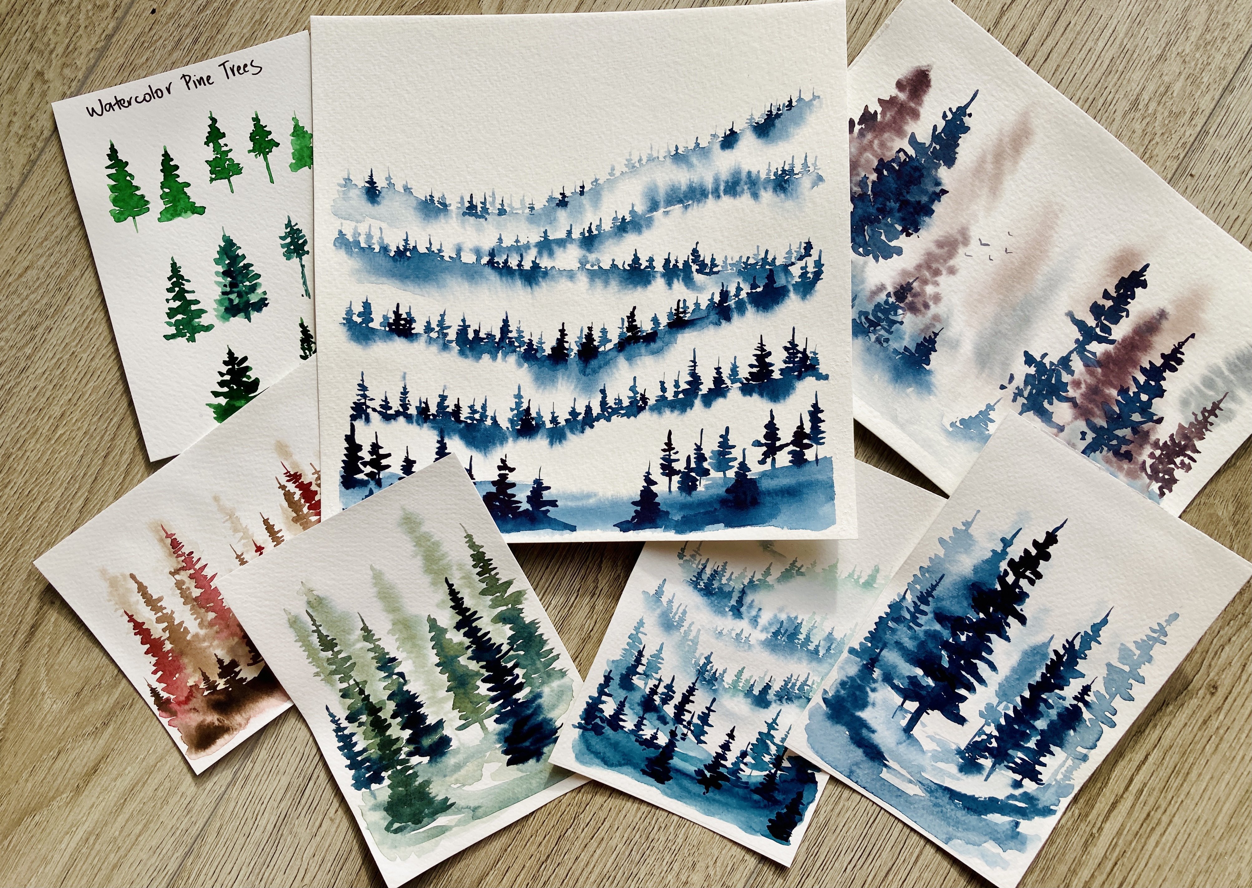
2. Materials: For our watercolor
Christmas cards, we need, of course,
some watercolor paints. This is my watercolor
set called White Nights. I bought the palette
of 24 colors and then added some more based on
what colors I use the most. For today's class, you can
decide what colors to use, but if you follow my choice, it will be mostly tones of blue, some dark green and red color. This lovely thing
here is a set of metallic watercolors called Star Colors
by Gans, Tab Brand. I absolutely love these. I don't use them too often, but they are perfect for
little projects like this one. We will use them to add some shiny details
like stars and such. But if you do or don't
have metallic watercolors, you can use metallic gel pens
or even classic gel pens, maybe yellow or white. Next up, my watercolor paper, this particular one is a Daly
rowni pop watercolor paper. It is quite affordable. It is nice and thick and of a decent quality for
a project like this. This is a huge
block I have here. I cut the paper into quarters, which is perfect size for
a simple folded card. I like buying big blocks
of paper because then I can always cut out any
size of paper I need. Now, my paint brushes, first one is my favorite, it is a mop brush size zero. I have some smaller
brushes here as well, and a liner brush
for tiny details. Sometimes I don't even use them, but it's good to have
them at hand just in case for the sketching part. I have just a regular pencil and a rubber for some more
details and highlights. I will be using a
white opaque medium. I have here white ink by Windsor Newton,
highly recommended. It can be used with a deep
pen or a liner brush, but white gel pen or even white quash is absolutely
sufficient as well. Let's not forget
the paper towel To clean our brushes and a jar of water to hold my cards in place, I will use this paper tape. It can be regular masking tape. I will tape my paper down
to a piece of hardboard, but you can tape it down
to the desk if needed.
3. Color Palette: When thinking about Christmas or Winter holidays and
the decorations, most of us picture a
green tree full of shimmering ornaments in
red and gold colors. At least for me, this is the most typical color palette I can imagine for Christmas. If we are looking for something less typical, don't worry, I have one more
color combination in mind that might interest you. But I'd like to try
something also using the good old trio of green, red, and gold, accompanied
by a lovely, deep indigo. This color is dark
enough to create an atmosphere of dark,
cold winter night. What I have here is a
mix of two red colors. This is cadmium red light and
the medal lake red light. You don't need to mix colors
if you don't want to. Maybe you have a red color that is just perfect
right in your set. But I had to create this
perfect red color by myself. It's not going to be so
difficult with the green color. It is a basic dark green
right out of the pen. It is nice and deep and goes lovely with the
red color I mixed. And the third one is the
already mentioned in the Go one of my
all time favorites, lovely, deep blue color. Now if you want to try something else than the classic
combination of red and green, you can get inspired by my second color palette
for today's class. The idea is to introduce the cold and frosty
feeling of a winter day. The first one in my
color chart will be the slight blue
color called mint. In this set, this color is special because it's
not only very nice. But for watercolor, it's also quite opaque and a bit chalky. If you want to imitate
this watercolor, you can try to mix a
regular watercolor with either white watercolor or a bit of water down white guash. Number two in my list is another favorite of
mine, Ultramarine blue. This one is translucent and cool and a bit
granulating paint. It can provide us with a
bit of interesting texture. Maybe the last one is
another kind of blue. This time I chose blue that is darker and a little bit
warmer than the previous two. Not that deep and almost
black like indigo. This one is called indent
in blue or I don't know. I'm never sure how
to pronounce it. Okay. But one thing is still missing and that
is the gold that we will be using for the embellishment and
nice festive accent. I have this nice set of cold water colors
I can choose from. If you don't have
something like this, just grab a metallic gel pen or even white or yellow gel pen. But I want to match
the shade of gold to the overall feeling
of the color palette. For the traditional one
I picked the red gold. You can see it really looks
a little bit reddish. It is the darkest
one in the set, and it will go nicely with the green and red I
chose for my card. It looks very nice
on the white paper, but it is also quite opaque. So it stands out also on
top of the darker washes. To complement the
blue color palette, I want another kind of gold, something that is
cooler and lighter. My choice is the champagne gold. I have to wake up the
paint with enough water, and let's see how it
looks on the paper. It really is lighter
than the red gold, but it emphasizes the
cold and frosty feeling I want to create
for my blue card. For additional details, I want
to use opaque white color. I have here my white gel
pen and my white ink. So let's see how they
work with the colors. You can see that the gel pen is not that bold, the line is thin. And sometimes you need to go over the line twice
to make it really. The ink on the other
hand is quite nice, but you have better
control using the pen. And then the liner
brush and ink. This ink also
appears quite thick, I'd probably have to put
a bit of water in it. Okay, let's paint the
cards and then we can decide what tool we'll use
for the white details.
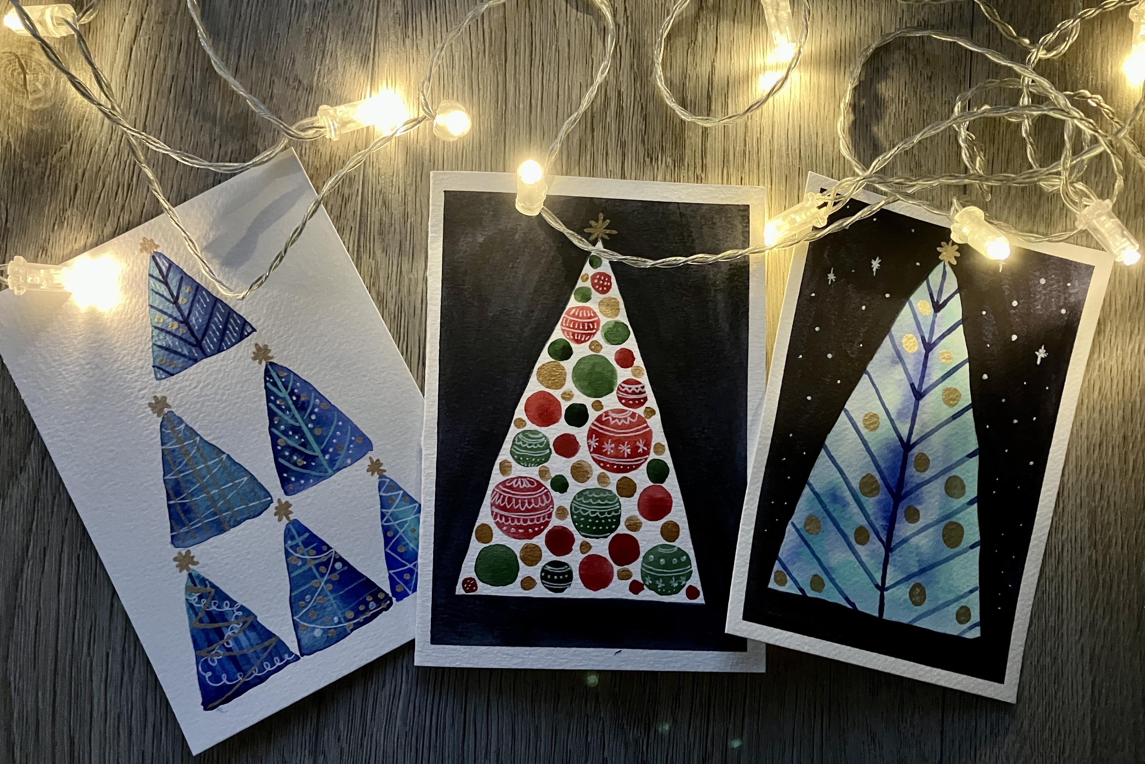
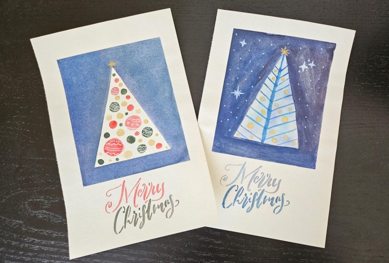
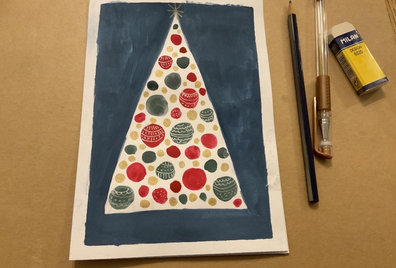
4. Class Project: Greeting Card #1: Let's make a folding
greeting card first. I have here a piece
of watercolor paper. It is approximately
15 by 21 centimeters, which translates to
5.9 by 8.3 inch. This is quite big
for a greeting card. I want to fold it in half, that way I'll get a card with a watercolor design at the top. And inside I can write a
wish or hide a small gift, like a gift voucher, or a ticket to a
concert, and so on. First, I make sure I fold
the paper precisely. You can use a ruler
to find the center of the longer side of the paper
and then just fold it over. I am using the ruler
again to help me. Now, I just want to paint some nice Winter or Christmas
design On the top of the card here I have my
hardboard and a paper tape. I'm going to tape
the paper down to the board so that
it stays in place. And as a result, there will be a nice elegant white frame. Now using my pencil, I sketch a big triangle, that will be the Christmas tree. If you are not happy
with it, just try again. It doesn't have to be precise. It can be loose and
bumpy if you'd like. Once you are satisfied with
the shape of the tree, you can add some color. This is called negative painting technique
because we are using the negative space to bring
out the shape of our tree. I have my mop brush and indigo color and I paint the
surrounding of the tree, leaving the area of the tree blank. It's really easy. You can flip the paper with the board if it's more
convenient to you. Now you can see that the
indigo wash is not that smooth and it will also get
a lot lighter as it dries. So I leave it for some
time, and when it's dry, I will put another layer
on top of this one. If you want to speed up
the process of drying, use your hair dryer and you'll be ready to paint
again in no time. My paper is dry already. So I can add one more layer of this nice velvet
indigo color. I fell the same line of
the tree I created before. We have a tree everyone, but we need to decorate it right when the
indigo dries again, because I don't want
any accidental smudges. We will continue to use the rest of our
chosen color palette to decorate the tree with
colorful balls or bubbles. As some say, just some
nice round ornaments. Pay attention to the
water in your jar. It's too dirty from the indigo. Change it so that it doesn't pollute your green
and red color. Now I switch to
my smaller brush. I want to have better
control when painting the ornaments and using
the colors I chose before I start to fill
the triangle shaped area with rod blobs round
Christmas ornaments. The color palette
is quite limited, but the size of the
ornaments does not have to be paint bubbles of different sizes randomly
placed all over the tree. You can also use the colors
in different concentrations. Some of them can be darker, some of them a bit lighter, and one by one slowly fill the tree with nice red
and green ornaments. At see, usually the green in traditional winter holiday color palette would be the tree itself. Here you can see that you can be creative even while
appreciating the classics. Now let's add some shine. I have my red gold
watercolor and the last three spaces of the tree will be filled
with golden ornaments, and of course, the golden
star for the top of the tree. It looks quite good already, but I want to add some more
details using my white pen. I choose some of the
balls, the darker ones, so that the white
is visible enough, and I draw random
lines and dots. You don't have to repeat
100% what I'm doing. Maybe you have also other ideas, better ideas how to decorate
your Christmas ornaments. If you do, please take
a photo after the class and upload for us to
see and get inspired. And when you decide it's
enough, your card is ready. Remove the tape and see how
nicely the card turned out.
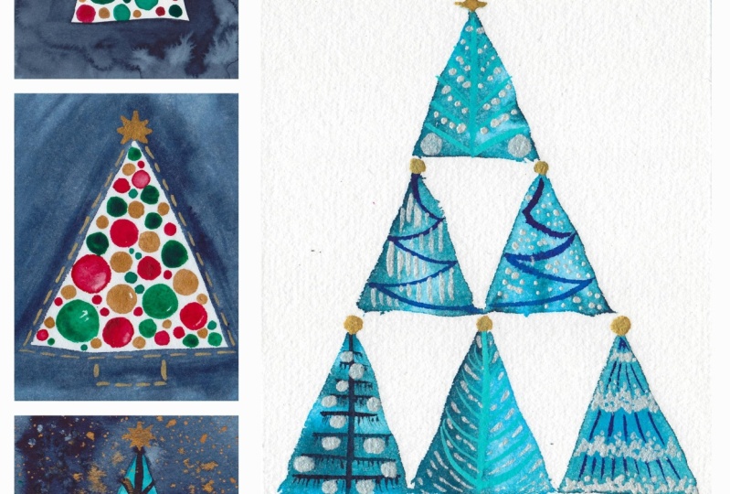
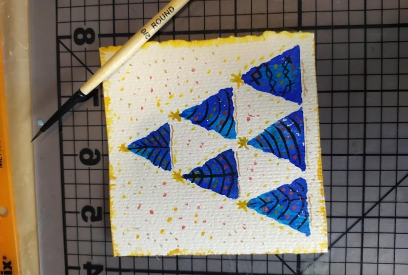
5. Class Project: Greeting Card #2: For the second card, we are
going to abandon the folding. I have a piece of paper that is 10.5 centimeters
by 15 centimetres, half of the previous one. Now, I don't have
to use the tape because I'm not going to
paint the background. Instead I'm going to paint
inside the trees This time. Yes, there will be
more than just 13, actually six of them. All of them are going to create
a shape of one big tree. Take as much time
as you need to make the sizes and position
of your trees, right? Basically, you can
start by sketching the one big triangle and then fit all those
small ones inside. They can be all the same or you can allow them to
be a bit loose. The lines do not have
to be 100% straight. Just have fun with it. And once you are ready, you can start coloring them with these nice shades of
blue we chose before. See, I'm working wet on wet. I tried to use at least
two different colors, one tree, and I want
the colors to blend with the tip of my brush. I add few drops of
color in the wet wash, let the colors bleed
into one another. This is a very nice watercolor
texture we have here. Before we continue
adding more details, the blue trees need to dry. Either use your head dryer
again to spit it up, or just wait for it to dry
naturally and maybe have a cup of coffee or stretch
a little bit while waiting. I can now continue, but before I start
painting again, I want to erase
these pencil lines. Good. Now I have my tiny, the one that allows me
to draw thin lines. And I'm going to
decorate my trees with some simple lines
using the water colors. You can use a very dark mix of your blue color and draw a line representing
the trunk of the tree. And then more shorter lines
on angle for the branches. There are really no rules.
You can be creative. This is not supposed to be a realistic depiction of a tree, so your imagination can go wild. This mint watercolor I have here is unique because
of its opacity. It is not common for a
watercolor to be this opaque. So if your light blue is not this visible on
the darker tree, don't worry and use
dark color again, or you can switch to your
white opaque medium. In my case, it is. Again
the white gel pen. I'm drawing just random
lines all across the three. This might be some tangled
Christmas decorations or string of lights. I am going back to the
first three, the top one, and I'm drawing whatever
comes to my mind, in this case some
tiny vertical lines. Those are maybe some icicles
hanging from the branches. You can see that. I really
let my imagination break free and I basically
doodle on my trees. Guys, I hope you'll share your results with
me because I'm sure you come up with so
many wonderful ideas how to decorate your trees. Last but not least,
some shiny details. I will use my champagne
gold and a small brush. I want the paint to be
quite thick and creamy, so that is opaque
enough to pop up. Again, I just have fun drawing several decorative dots
or lines here and there it is up to you to decide when you want to stop
adding more details. Okay, let's see how nicely the light gold looks on
the blue background. And I want to do one more thing. If you don't want to,
you can skip this step. But I'd like to have some
stars at the tops of my trees. Very well. I'm so
satisfied with this card. It feels modern,
festive, and playful.
6. Class Project: Greeting Card #3: As the third project, today
we are again going to work with the idea of simple triangle shape for
a Christmas tree. I have a single folded
piece of watercolor paper, again, 10.5 by 15 centimeters. And I'm going to paint the background and also
the inside of the tree. I like to have the frame of
my design nicely defined. Therefore, I'll use the
masking tape again. It will also prevent the
paper from curling when wet. This time, I'm going to combine my two color
palettes a little bit. I want to use the nice velvet indigo color from the classic
palette for the background. The tree will then be
painted in my blue shades. I grab my pencil and
sketch a big triangle, just like in the first project. I don't obsess over
straight lines or anything. It's just a suggestion of a
triangle shape for our tree. Now I take my mop
brush and I'm just applying clean water
inside the triangle. I want to achieve
a very nice wet on wet effect for my tree. Similar to what we previously
did with the small trees, I work with watery paints. I let the paints run
into one another. I'm using light
blue shades because when I apply the dark
indigo for the background, I want my tree to
pop up properly very well. Now, we
want to let this layer dry before we apply the
color for the background. My tree is already dry, so I can bring some more
color to the piece. I am again going to apply two layers of indigo
for the background. Using my mop brush, you can see that this is
actually the point where you can refine the
shape of your tree. Because the indigo is a way darker than the light
blue of the tree. So you can paint
over it slightly, adjust the shape as you like. Okay, now let me just flip
my board upside down so that I don't create any unfortunate
smudges with my palm. The indigo is not very smooth
right now as you can see. But the second layer will help improve the
overall look of it. I again, help the drying
process with my hair dryer. So I can now continue and go
over the indigo part again. Actually, the tree
now reminds me of an iceberg with the light blue, frosty tones and the pointy
shape, it is lovely. Try to paint the second layer the way that you don't repeat the same brush strokes in the same era, if
you know what I mean. Because some papers
that are not of the best quality cannot hold the paint underneath
properly and the new wet layer can
dissolve the layer below. Try not to overdo
the second layer. It should not happen if you
have a quality cotton paper, but it is common for less
expensive palth paper. Very good. I think it
already looks fabulous, but I want to play again with some details
inside the tree. I'll let the background dry. Before I start decorating here, I'd like to encourage
you, again, to use your imagination
and your own preferences. Maybe you have completely
different idea how to decorate the tree. Maybe you like it the way it is now minimalistic.
It's all up to you. I will revisit one
of the designs from the previous card using my small brush and
dark indigo paint. I suggest very simplistically
the trunk and the branches, and to add some more
nice shiny details, I take my stary colors, again, the champagne gold, and I draw several random dots or
decorations for my tree. I'd like to keep
this one simple. I like the design already. I'll just add the star again, to make it a little
bit more magical. I'll draw several random
dots on the background. These are the stars shining
in the cold winter night. Again, if you think the
stars are probably too much, just skip this step and that's it. Now
my favorite part, which is removing the
tape and revealing the nice wide frame
supporting the artwork.
7. Thanks for Joining!: Friends. Thank you for
attending this class. I hope you had fun creating these simple Winter
holiday greeting cards. I know I just gave you three examples and very
limited color palette, but I'm sure you can come up
with many different designs and ideas to create some lovely cards for
your friends and family. My intention was to
show you how you can work with really simple
shape and few colors, and basically without any
previous experience with watercolor and still create something that will definitely
warm someone's heart. I wish you all happy
creating and happy days and I'd love to
see some of your cards. So please don't be shy to share. See you soon. Take care. Bye.
 Jana Raninis, watercolorist