Transcripts
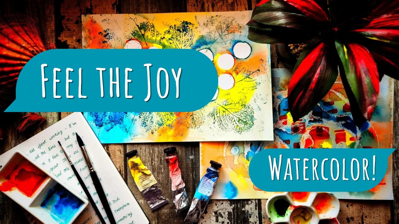
1. Introduction: Hello, everyone, and welcome to the class Watercolor
Florals for the soul. Here, we take a fun, loose and intuitive approach
to painting florals. Watercolors can be a medium that is calm and
meditative to play with once the stress of mastering techniques and learning
skills is put to the side. That is what I to help you with in the
lessons that follow. First, we decode
the principles of painting that help create
stunning artworks and I present these to you in
a way that is sun and digestible so that anyone
can easily follow along. Only very basic
watercolor supplies, such as a few paint brushes and a beginner set of paints is
necessary for this class. After learning the concepts
of floral artworks, I will walk you through
three demonstrations. By the end of this class, you will be able to come up with your very own watercolor
compositions and styles. I hope you'll join
me in this class, and I can't wait to see
what you'll create.
2. Materials: Let's talk about
the materials that we need for our artworks today. The first one is
watercolor paint. So paints come primarily in
two formats for watercolors. The first is pan
set like this one, and the second is tube format. So if you have watercolor tubes instead of pants,
that's fine, as well. You just need to
squeeze out a bit of paints onto your
color palette. And use those paints with a
bit of water on the brush. If you have pants with
dried colors like here, you can activate the color with a bit of water on a paintbrush. The second thing we need
is mixing palettes. So these tiny wells
on this side, as well as the
bigger wells here, help me mix colors. You could also use a ceramic
palette if you don't have an in built palette
or watercolor paint set, or you could even use a dining plate as a substitute
for mixing palettes. The next supply we need
it is a clot towel, and you can substitute
this with paper towel. This helps to absorb excess
water off the paintbrush when you just dab the paintbrush lightly onto the
cloth like this. The third supply we need are watercolor paint brushes
like these ones, and a jar of clear water. And of course, we need paper, and the paper should
ideally be 300 GSM. That's the weight of the
paper that I will use, or anything above that is fine. The reason we need a
heavyweight paper is so that it doesn't buckle when
we put too much water. Usually, the watercolor
papers we prefer are 100% cotton, but
that's not necessary. These paintings, we don't
do too many layers, so it's fine if you
have a cellulose paper. When you CM walk you
through the demonstrations, you will notice that
I sometimes use these marker pens for
my demonstrations. But these are an optional supply that you do
not need to have. I also use a water brush just for ease and
recording my process, but you could also just use a traditional set
of paintbrushes. It's not necessary to
have a water brush. Those are all the materials and I will see you
in the lessons.
3. Concept: Loose Flowers: Hi, everyone. In this lesson, we are going to see how we can create shapes for the flowers. I will be using a single pigment as well as my water brush. So first, I mix some color, and I get started by blocking in the center of
my flower shape. There are a few things that we can vary when making a flower, and this will give
us a wide variety of flowers to choose from. For now, I just make a circle. This is going to be the
center of my flower. Next, I draw out some
petals from the center. So this is my first petal, and I have given
it a rounded edge. A second petal And
before I continue, I would like to block in the opposite petals to this
one because this gives me an idea for where and how much spacing there
should be between the petals. So these two are opposite to
the first two that I made. And let me make one more here. So this is going to be
an eight petal flower. The number of petals is
something that you can vary. What you practice when
you follow along with this demonstration
can be different. You do not need to do things the exact way that I'm doing it. So for this first flower, I'm going to color
the inner parts of this flood with just
a solid gray color. You could choose to keep
it empty like it was before or you can fill it in
with color like I just did. It's up to you. Now, one of the things
that you can vary, which I will vary now is
the size of the center. So I make a very small
center right now for the next flower
that I'm going to draw. And the other thing you can vary is whether the edge is
pointed or circular. So for the first flower, I had rounded edges,
but as you can see, this one is going to have thin elongated petals
with pointed edges. I use the edge of my brush
to get this pointy shape. And that's quite a
handy way to make this. So once again, just blocking
in the opposite petals and adding more and more petals so that the spacing looks good. There goes another petal
with a pointed edge. And as you can see, just because these petals
are quite thin and long, I have a lot of them. This is probably more
than ten petals. So that's it for the
second flower shape. So I'll just show you
in the third shape, how you can vary the size of the center as well
as the thickness of the petal to get a different flower with
different number of petals. So this is a variation
of the previous two. Now, this is a bigger
center than the last one. And I'll make the petals just slightly thicker so that I'll have fewer
petals on this one, and I won't make them as
elongated as the last one. So these are shorter
and thicker petals. The last one on this side goes here and perhaps two more
petals on the opposite side. And there we go, just like that. For the next flower, let me once again make
a very big center. And this is going to be much
bigger than the first two. So a very big circle. And these dots in the center give the impression of polens at the center of the flower. Let's just enlarge the shape a bit more before
we add our petals. Next for the petals, we'll make them very
small this time, so you can see how
small they are. So this will be a flower
with a very big center and very small petals with a relatively thick base
and a small rounded edge. To make the edges either pointed or round or however
you prefer it, you can always take advantage
of the shape of your brush. So if you use the belly to press down near the
edge of the flower, you'll get a more rounded shape, whereas if you have a pointed
brush and you lift it up, as you go towards the edge, you'll have a more pointy shape. There goes two more petals, and we'll just finish this off. Perfecting the shapes a bit
and adding this last petal. For the next flower, I'm going to imitate our
second flower kind of so that I can show a
variation once again. And this variation has to do
with layering the petals. So this is exactly
like the second floor. Adding more and more petals. And really, this
is an exercise you should try to not just watch but do by yourself because it'll give you a lot of practice
and that can't hurt. So these two flowers
are quite similar. And the first one is dry. So I'm going to pick up some pigment and add a second layer of petals
on this first one, just to show you the variety in flowers that you
can come up with. So these are shorter
and thinner petals and they are darker
just so that they stand out from the outer petals. So this second layer of inner petals is the variation
that I'm showing you here. And really, you can
have many layers, but the upper layers need to be darker than the lower layers so
that they are visible. It's also important
to bear in mind that when you're adding
the upper layer of petals, the lower layer should
already be dry, and it should be bone dry
just to prevent any mixing of colors or blending
of colors with the lower layer because you want these edges to really stand out. You can opt to darken the colors where you
want to give it a shade. This always helps to add
interest in the painting. Another petal, yeah. So that's the fifth variety
of flower that we have got. And really, you can come up with a lot
of different things. It's all down to what
you can imagine. So let's make a rose, and this process is going to be slightly different than what
I have demonstrated earlier. So I start by deciding where
I want the center to be, and I make these tiny C
shapes around that center. So it should look like a C, and there should be gaps between the subsequent Cs that sit
outside the inner petals. So this is one petal, and you can see that white
gap that is important. This is the second petal, and you just built on
top just like this. There's another petal, one more. And it's important to
keep these white gaps, and it's always better to
leave a larger gap than necessary than to not
have sufficient gaps between the petals because
if they all blend together, you won't be able to see
the shape of the flour. I'm also giving a kind
of squiggly pattern here so that it looks
more natural and organic. Just like that. And you can make this flower as small or as big as you like. I think this rose looks
quite good at this point, as it is, so I'm going
to leave it be for now. And let's move on
to the next flower. And this one will
really just have petals without a very
distinct center. So I'll just make a
five petal flower. So the center is really
just one small point. It's not a big circle. And I've pulled out five
lines just to give you a rough idea of where I would
like to place the petals, and I draw the petals
around it, just like so. And you can vary the
number of petals. So this one will
have eight petals, but make sure that
the petals are sufficiently small
to accommodate a lot of them if you're
going to go for that. So you can see how
I do it to you. And that's the last petal. So just by working around
this one principle that we need to have a large circle
and few petals around it, we can see how many
different petals and flower designs we
have come up with. And you can have a
few different ones like this rose here was
different than the rest of them. And also, I'm going to try now to make a dandelion
just for fun. So it needs to
have a lot of dots or spots just like the
center of any other flower. So you'll make this
similar to the center. But rather than drawing out petals after you've
drawn the center, we just want to draw a few streaks pointing
towards the center, so they are representative
of the stem of the polen of this
dandelion flower. So these are the Okay. Sort of dandelion polens if
those are what it's called. But yeah. That's my dandelion and
just a few lines drawn out from the center to give the impression that
these polens have stems from which they emerge. Yeah, I'm not sure if I have got all the
terminology correct when it comes to flowers,
but that's okay. We are doing art. It's
kind of just this. Okay. Pattern of lines
that points towards the center that makes it looks
like one core and flower. So that's it for all
the flower shapes. And what I would like
to do next is to just demonstrate how you
can add some contrast. So the idea of contrast
is that you make certain parts darker and
the other parts lighter. So the parts that are in shadow should have more dark pigments to indicate that
they are in shadow. And I'll try to block in
some of these shades here. So near the center, I'm making one part of
the center prominent and darker than the other part. Maybe add a little bit of
pigment to this one here near the center to our
interest and make the petals pop by just
giving it that contrast. So I also fill up the centers that I had
left empty earlier. We can also add a few lines on the
petals to add interest, and these should be very subtle. We don't need something to overpower the look of the
petals we already have, but just something that
adds a little bit more. Just like that. Just adding some of those lines here. And so there are a
lot of things you can really do to make the
painting more interesting. A details and such. And there's this one
last flower shape that I just decided to
add to this list. And it kind of looks
like a lot of petals coming out from
one stem, like so. This could also be leaves, but if you give them the color of flowers
like red or orange, they would look
more like a flower. But if you give
them a green color, that would be leaf with
just the same pattern. So that's it for
the flower shapes. And I will see you
in the next lesson where we will explore
shapes for our leaves.
4. Concept: Leaves: Welcome back. In this lesson, we will look at
how we can create leaf shapes using watercolors. Just like the lesson on flowers, I will use a single pigment here to draw many
leaf shapes to give an idea of the different options we have for our composition. So the first leaf shape here
is just the curve line, and near the center of the line, I have pressed down
my brush to give it a fatter belly and
pointed edges. And here goes the
second leaf shape. So this is wider at the bottom
and pointed at the top. Just starting some more color to make sure that
the leaf is visible. And there we are. The third shape will be wider at the top and pointed at the
bottom, just like this. And I will now fill in the shape that I've
made with watercolor. So that's our third leaf. And really, you can come up with many variants this zigzag leaf
that I just came up with. Your imagination is the limit
for paintings of this kind because there's no set rule for what you're
allowed to do or not. And you can come up with
your own innovative shapes or leaves or take
inspiration from nature. Let's move on to
practicing some branches. So for this first branch, I draw a curve line
and I add the leaf of first kind to it,
just like that. I encourage you to practice
along with me as you watch these lessons to make
sure that you have warmed up for the compositions when
you come to the project. So this is the first branch with several leaves
coming out of it. Just intensifying the colors
a bit. And there we are. For the next branch, I'll make a more zig zagi pattern rather
than just a curve line. I think this makes it look
more natural and more organic. So I like to use these kinds
of shapes in my composition. Those are several branches
coming out of it. And let's add some leaves to it. Maybe I'll keep these
leaves tiny just because of how the
branch is structured, I don't have much space to accommodate too
many large leaves. So I'll just keep
them small, like so. Can see the motion of my wrist and my hand as I
make these leaves. So I press down near the
start to give it a wide tip. The leaf has a
white tip because I press down the brush
at the starting, and I gradually
lift off the brush as I near the edge of the leaf. To give it a pointed end. So that is my branch. And maybe what I can do
here is add some berries. Those are always an interesting
element that you can add. And you can give these berries a very sharp
contrast compared to the whites and the
light greens around. So you could strategically place these berries
at certain places where you want to
draw attention or where you want the
contrast to be high. It's important to be not
too uniform with this. You want to vary the size
and shape of the berries so that it looks natural
and organic and not too controlled, you know. And you can see how
these berries pop from the page and really draw the attention of the viewer. So let me add some more. A small one there. And I'll keep
adding more berries until I'm satisfied
with this branch. Just making this a bit fast because I'm sure you get the
idea of what I'm doing here. Now, moving back to the leaves that I've
dried from earlier, I add these veins to the center and I keep it
subtle at certain places. So adding the mid vein to all of these leaves and some
secondary veins as well. Just like that. So let's make a branch that has the fourth
kind of leaf on it. This is just very
experimental and I'm trying to see what I
can get from here. You don't have to do
exactly what I'm doing. You could vary the
shape of the leaves, you know, depending on
what you can come up with. And really, you
should experiment and play around in this part. This part is all about practice. This is not our
actual composition. So we don't have to worry about ruining our painting or anything of
that sort, really. Also experiment
with tonal values. So make the leaves lighter at some places and
darker at other. This will help add contrast and make the painting
interesting. I always like to make my
branches a bit darker than my leaves just so that my leaves look like they
melt into the background, whereas the branches really stand out in contrast
to the leaves. So just like that, I
have another branch. Maybe experimenting with a
few more leaves on this one. Yep, and that's it. So next, I would like to make these kind of
circular leaves, I guess. So many of these tiny
leaves on one branch. That's another option for what I could include in my composition. This is similar to the first branch that we drew except that our leaves
are circular now as opposed to the elongated
leaves that we earlier drew. Okay, so I think that's pretty much it for
the leaf shapes. I hope you enjoyed this
lesson and learned the various options you have when you make your own
flower compositions. I also hope you were
able to come up with some original leaf shapes or take inspiration from nature. And I will see you in the next lesson where we
will discuss color palettes.
5. Concept: Color Palettes: Welcome. In this lesson, we will come up with various
combinations of colors that we can use for flowers and
the rest of our composition. We are not going to go into a very detailed understanding
of color theory, which can be useful for
certain situations. But for these projects
that we are going to do, it suffices to just place any three colors
next to each other that are either inspired by nature and flowers that
we see in real life, or even come up with something
that's totally imaginary. You don't have to place the same three colors as
I am placing on my sheet. Really, you should play around and experiment with
your own colors and see what looks good when placed in combination
with other colors. So what I have on my chart
is a series of circles, and each of these
circles will be filled with three
different colors. This gives me an idea of
what these three colors, if I were to use them in my
composition would look like. Where two colors
meet each other, I let them blend and mix, so I can see what other colors I can get from the combination
of the two that I have. So my goal here is just to
fill every circle with colors. So this one I'm filling
with yellow ochre, peacock blue and red brown. And I quite like
this color palette, so maybe I'll use it
in one of my projects. So for this third circle, let me try some pink and some darker color,
maybe this purple. So I'm only putting two
colors perhaps in the circle. And I'm letting it blend and mix near the edges to see what other colors
I get out of this. Just cleaning up
the edges a bit, and maybe I'll lift off some
color and transfer it to the next circle where also I
will use this purple color. And maybe I can
combine it with some yellow more of a gamboge yellow. In fact, I think intaRd
might look good in there, but I'll leave it for now. Next, let's try green. And this orange yellow and
what could be a third color? Green could be my leaf, orange, yellow could be my flower and maybe this brown for
where I need shadow. So as a general rule, what I like to do is pick up one color that can be very dark, and that is the brown here. This I can use for the shadows. One color that would be
very light for the flowers, and that was the yellow in the previous one in
the previous circle. And one for the leaf like green. I got a bit bold on
this next circle and I think I'm using
this viridian color, seeing how it mixes
with yellow ochre. Okay, this became very identical to the last one
when I the brown, except that the green is a varidiant hue rather
than a sap green. For the next one, let's go with this bright pink that I
can use for the flowers. Place it next to
this yellow orange, and I have such a
beautiful and vibrant mix. And just for some deeper colours where I would like
the shadows to be, I include this brown color. The paper I'm working with right now is not watercolor paper. Instead, it's ivory paper, and that is okay because
I'm just trying to see how these colors
look next to each other. It's also not necessary for you to use watercolor paper
for this exercise. You could also use
any scrap piece of paper just to see
how the colors look. And given that watercolor
papers can be quite pricey, maybe this is a better option anyway to practice
on scraped pieces of paper and only do your actual painting on
the watercolor sheet. I like this pink color so much. I think I'll use a lot
of it in these circles. And I just like this
pink color so much. I think I'll use it in
the circle as well. And when it mixs
us with this blue, which is a totally
imagery colour on a flower composition, it gives a beautiful purple. When you go through
those exercise, I do suggest that
you draw a series of circles like I have, or you could even print out
the circles that I have provided in the class resources
under color palettes. And and really, you can come up with endless
combinations of colors, see how they mix and blend, and come up with your own
signature palettes this way. See, we are not trying to limit ourselves to
rules of color theory. We are really moving beyond
that and trying to see what colors best suit our taste by just placing them
next to each other. So this is very experimental, as opposed to learning
the theory of colors and then approaching this project from
that perspective. We are being very
experimental here. For this next one,
I once again use that beautiful pink
color and the yellow. And the third color,
how about this brown? Okay, this ended up looking very similar to another
circle right above it. But that's okay. Sometimes there will be repetitions
of this kind. So once I have completed
this last circle, I will have a lot of
different options to select from for the
color of my composition. And I'll choose just three out of these for three
different projects. But really, I could
save this sheet for later and just reuse it for any other
color combinations that I might like to do. So that is pretty much
it for color palettes, and I will see you in the next lesson where
we will discuss how to come up with compositions
for our floral arrangements. See you in the next lesson.
6. Concept: Composition: So now it's time to
talk about composition, which is one of the most
important things to keep in mind while
creating our artwork. We can construct a good
composition in four steps. The first is adding a
center of interest. The second is repetition
and variation. The third step is
adding contrast, and the fourth is
adding details. Let's go over each
of them one by one. First, let's talk about
the center of interest. So the idea is that you want to leave unequal spacing from each of the edges of the paper and place your
main element there. The main element is going to
be your center of interest. And in my case, this
large circle that I'm placing at the intersection of these lines is the
center of interest. The center of interest
is kind of like the protagonist of your story if you liken your
artwork to a story. It is the main character, and everything around the main
character is the cast that supports the main character without drawing attention
away from them. So what is a good place to
place the main character? Turns out there's something
called the rule of thirds by which if you place your main
character on the top or bottom one third or
on the left or right, one thirds, those are good positions to
place your painting. If your painting is placing the main character at the center of the
paper, right here, where I'm marking
it with orange, that turns out not to be a good place to place
the main character. Also don't want to place the main character equidistant
from both the sides, such as the top edge here
at the middle of it, or the bottom edge,
the middle of it, the left and the right sides and the middle of those
sites are not places where you want to place
your main character. And once we have added
the center of interest, which is the main character, We want to add
supporting elements, and these supporting
elements have to follow the principle of
repetition and variation. So the idea is that
the main character is surrounded by
supporting characters. So the protagonist, which is the biggest flower
in your composition, is going to be surrounded by supporting flowers
which are smaller. And most of them have more
or less the same shape, but you can vary the sizes. You can also slightly
vary the shapes. This adds variety. Repetition just
means that we have one specific shape that
we repeat many times. This makes it look good. Composition is finally what
looks good to the eye. So I add a lot of circles here. So this is the idea of
repetition and variation. You don't have to
repeat the same shape. You can vary based
on different shapes. So for instance, I can add leaves that are kind of pointed, so it offers a variety that is different from what the
protagonist has to offer. You can also add leaves and supporting elements that
are kind of curved. So that they are interest
to the painting. The third element is contrast. The idea of contrast is that there are two ways
you can create contrast. One is through color, and the other is through tonal value. So what is the idea behind
color and tonal value? So I draw the main character and place the
supporting elements. When I repeat my elements, to give a sense of depth, the elements that
are farther away, I keep them lighter compared
to the protagonist. The protagonist is what
I make the darkest, so this draws attention to the center of interest
of the story. The idea of contrast and you want maximum contrast where your main character is located? And the idea is that we want to place the darkest
color differences. So, for instance, this is the
darkest color, the green, and right next to it, the white and the orange
are the lightest color. Those are the kind
of differences that make the painting pop, and this is what
we call contrast. We want to place the darkest and lightest elements beside each other because it draws the attention of the
viewer to that center. And we do not want to draw
attention through contrast to supporting elements because that will lead the
viewer's eye astray, and they will be confused as to where to look
at the painting. We as artists, always need to be in charge of where we
lead the viewer's vision, as opposed to the viewer being distracted by elements that
did not go according to plan. I place some more leaves
at some other places. These are smaller
and lighter leaves. The final part of composition
is to add details. And the idea of details
is that our main element, which is a flower like this orange one here
that we have drawn, which is also surrounded by leaves that contrast the color and the tonal value
of the flower. So some more leaves and
stems is what I add here. Just making another
composition like we did using the
previous three rules. And once I have
this rough draft, what I want to do is
see where I should add details to draw the attention of the
viewer over there. Also, following the
principle of repetition, adding some circles and adding the same shape of leaves
over and over again. Using the color. So this is color repetition. I'm using the same color that
I used first once again. So this keeps the
painting harmonious. Right now, it's not
really a painting. I'm just demonstrating
this with my marker pens. So once we come to the point where we have to add details, which is the very final
stage of any painting, we want to add the most details where our protagonist
is located. So for instance, in the
case of this flower, I add a lot of pollens
to the center of the flower because
these constitute the finer details
that once we have attracted the eye of the viewer to the
center of interest, we want to keep their
attention there and really, you know, cherish the details. And that's what we
are aiming at with these details that are
concentrated near the protagonist. You could add more details too, such as the shadows that
I've added on the petals, as well as these fine lines on the petal that
indicate folds, and all the details
add interest to the painting and help
our composition. Notice that the lines
that I'm adding on the flower point towards
the center of the flower, and this helps draw attention
even further towards the center. Which
is good for us. This is exactly what
we want in a painting. So let's cover up any
obvious white spaces using more flowers and leaves. Once again, going back to
the principle of repetition, I add more color and
more weight to some of these lines to make it pop. That's another fine detail
that you could make certain small dark areas or small bright areas to lead the attention
of the viewer there. And we can add a little
bit of detail while being careful not to overdo it to some of the
surrounding elements too. And we keep the
surrounding emblements subtle compared to the
protagonist in any case. That's it for composition, and I will see you
in the project. We have learned everything we need the center of interest, repetition and variation,
contrast and details. These are all the elements
of composition we need to be mindful of when
creating these paintings. I will see you in the
project where we'll get started using some paints
and our watercolor paper.
7. Roses Demo (Part 1): So for my very first demo of how we can apply the principle
discussed so far, I will use a water brush, as well as the color palette I would like to
choose is the green, yellow, and pink that we
came up with earlier. The flower shape that I would
like to use is the rose, and that's approximately where I'll have the
center of interest. I start with a deep pink color for the center of the rose. I mark out that center with a small C shape, just like that. And then I take a dilute mix of this pink and expand the flour around this
center that I just marked. So I have these petals that
I'm marking down right now, and each subsequent petal is going to be lighter
than the one inside. In fact, let's just introduce some yellow to give
it a good contrast. So I'll mark out these
yellow petals at the outside and maybe add a
little bit of pink later on. I like to see how they mix
on the watercolor sheet. I already have an idea of
how it would look from my exercise on the other sheet where I explode color palettes, and it gives a
nice orange color, which is something I
would like in my rose. So that's a very
dilute yellow petal, and there is another one. It's a very repetitive process. And once I have a sufficient
number of these petals down, I would like to go
in with some pink. To just give a little more
color to these flowers. Remember that if this rose
shape is too difficult for you to form directly on
your watercolor sheet, it's a good idea to practice
on a spare sheet of paper, the shape so that you're more confident
when you're making it on your watercolor sheet. But the ultimate goal is to get that confidence
that you can directly go into your
watercolor sheet and mark these shapes. Specifically, in the
case of this row shape, remember that my
tip to you was that the white spaces between the petals should be
very distinct and clear. In fact, it's always good to have more white space than
necessary than to have less. If you have lesser than necessary white space
between these petals, then they would just
merge into each other and they would not give the shape
that we are looking for. So now I have two of
these roses down. When we create
these compositions, there is something in art
called the rule of odds. The idea of the rule of odds
is that it looks pleasant to our eyes when we have an odd number of repeated
elements on our paper. So for instance, the
repeated element here is the rose shape. So I don't want to have four
or six roses on my sheet. Rather five roses or maybe three roses are a
good number to stick. I know this can seem
like a very odd rule. However, you could
experiment to see how a four rows composition looks as opposed to a
five rows composition. And almost certainly you'll like the five rows
composition better. So for my specific
composition here, I'm going to go with
five of these shapes. I have the fourth rows down, and here's the final one, marking out at center. Then with a dilute pink colour, marking out the petals and
pulling these petals out, expanding them
around the center, adding more color where I
would like to have contrast. And just like that, I
have five roses here. I'm going to intensify the
colors at certain places selectively and to decide where exactly I need
more of these colors. I will just eyeball my painting. I'm adding these small buds
here and there that give the impression of tiny roses
that haven't bloomed yet. Or another interpretation for these small round
shapes could be that they are berries that are decoration to my
floral composition. I will have a few clusters
of these berries on my page, and they will vary in size, as well as I will vary the
intensity of the colors. So some of the berries will be lighter than
the other berries. For these clusters
of berries, too, it is a good idea to
follow the rule of odds. So I'll have an odd
number of cluster. The first cluster, which
is at the bottom of my main element or my
center of interest. And by the way, notice that my center of interest is the
largest rose on the page. The other roses
that add support to the central element are all
smaller than the biggest one, which is itself obeying the rule of thirds and is located at the bottom
one third of the page. So that's the fourth
cluster at the top, and this is the fifth cluster. Once I'm done with the berries, I'll mix some green to add
leaves to my composition. See you in the next part.
8. Roses Demo (Part 2): So welcome back to the rose composition and let
us add some leaves here. I always like to start with the area that surrounds
my main character. And I work from there to
the other characters. I have tried to mimic this
shape of rose leaves, but it's not necessary
to be too precise. After all, we are not using a pencil sketch
or anything here, rather we are just working
very instinctively to plan our painting Aslas to
get this composition down. What is a good
number of leaves to place is entirely up to you. You could follow
the rule of hoards. You could introduce leaves
that are darker near your center of interest
so that you have more contrast there and you
draw attention over there. You can also add branches. It's all up to you. There's a lot of freedom
in this kind of painting, and it's also quite repetitive, which is why I find it a
good kind of meditation. I'm using a water brush
for this just because it is convenient to use while
recording these videos, but it's not necessary
to use a water brush. Even a regular brush would
give you very good results. I continue to add these leaves. In fact, I would like to
have few of these leaves far away from my main
composition over there, just so that my page feels more full and my
composition complete. Notice once again that I'm
varying the shapes, sizes, as well as the intensity
of colors on these leaves. This helps add interest
to the painting. So I decided that let's innovate and just add a third
kind of leaf over there. And these are just
straight leaves that you can see me draw here. Once you have achieved
reputation in your painting, it's time to vary and
add something new. Not too much of it, but
just a little bit and just enough to make your
composition look nice. There's no specific rule on
how to decide where you place these repetitive
elements or where you place the variations. It's all up to the artist. There are few rules
that are general in nature and give you good
results most of the time, but of course, you
don't have to follow everything down to
how it's stated. You can always experiment and see how things look if
you do them differently. Like I said, there's a lot of
freedom with this painting. Once your leaves are a bit dry, you can also go in
with a second layer. In fact, you can do this for both the flowers as
well as the leaves. Right now, I'm pixing
a bit more pink to make the centers more
intense and more dramatic. Just like that. Yes. You can see that it became
a bit like a brown color, and that's because
my brush had a bit of green in it and I picked up the red and red
and green give brown. But I don't worry
too much about this because it's a good
variation to have. It's always good
to have a bit of colors mix on your paper. Intensifying some of those
greens now, like I mentioned. Not all of them, not everywhere, but just selectively at
certain places strategically. And with that, this painting
is nearly complete. It's important
also not to overdo it and step back every now and then to try and decide
if your painting looks finished and if you'd
like to stop at that point. So I'll see you in the
next project where we'll choose a different
color palette, as well as a different
flower shape. To conclude this
rose composition, I'm just fluttering
a bit of green, which is entirely optional. You could see if this is
something that you're interested in and
decide for yourself. And I will see you
for the next part.
9. Sunflowers Demo (Part 1): Welcome to the second
demo of this class, and for this one, I will choose the yellow green
and brown palette. So I have only replaced the pink from earlier
with a brown color. I begin by mixing
some yellow color, and I think for this part
for this specific demo, I would like to go
with the sunflower. The palette that I've chosen is well suited for sunflowers. I think that's where I'll
place my center of interest. And once again, I begin by
blocking in the center. As for a sunflower, I've made the center quite
big, like you can see. And I intensify the colors and fill it in all the
way to the center. Now it's time to add the petals. So I pull out the first petal. Notice that these petals are thin and they are
pointed at the tip. I make many of these petals. Once again, marking the
diametrically opposite petals gives me a good idea
for their placement. I take advantage of the shape of my brush
to get these thin, long and pointed petals. What I do is that as I'm
nearing the end of the petal, I slightly reduce the
pressure on my brush so that I lift it up and it leaves
it with a pointed tip. So let's block in the
second sunflower now, and this will be smaller than my center of
interest because it's the center of interest
that has to capture the most attention and
therefore, is the biggest. It's a good idea to practice with your
brush how to create these thin and long
petals with pointed tips. If you find this
challenging or if it's the first time you're
working with watercolors, that practice can
always help you. So after roughly blocking
in my second sunflower, I go back to the first
one and I pull out some more petals that will be longer than my first
set of petals. Like you can see here. Most of these decisions
that I make during the painting process
are impromptu. And that is kind
of the goal here. We are trying to be spontaneous. So I think I'll have a total
of three sunflowers in this composition
because these flowers are relatively big compared to the roses I had in
the previous demo. And finally, moving to the
third and last sunflower. And you can notice
how the center of these flowers kind of do
not align into a line, but rather they have a
curve that they fit into. And that just starts
interest to the composition. My shapes are not perfect, and this is not something
that bothers me too much because really, like I like to say, with
this kind of painting, there is a lot of freedom, and that's the best part of it. We are not trying
to be too precise. I block in shadows once again at one side of the
sunflower center, and I do it for each of them. I'm also selectively pulling out petals where I see the need for it or alternatively darkening some of the petals that I
already have on my page. After I have three of these
sunflowers on my page, and because there
are three of these, they obey the rule of thirds. Sorry, the rule of odds. Thing I like to do is add a bit of these tiny flowers
which are just small dots. These clusters of
dots would also adhere to the rule of
odds in this case. I'm going to make it that way. I'll have five of these
clusters, I think. Remember that the rule
of odds applies to the larger cluster and not to each of the tiny
points within it. You don't want to be counting
each of those tiny dots. That's not possible
for any of us. I have three of
these clusters now, and this is the
fourth one You really want to step back
from your painting every now and then to see where the composition
could use a bit of weight and add your
cluster over there. And once I have the fifth
cluster of dots down, I will see you on the next part where we'll begin adding leaves.
10. Sunflowers Demo (Part 2): Welcome to the second
part where we will start adding a few leaves
to our composition. Since I already had these pointed tips for the
petals of my sunflowers, I decided to go with a
round shape for the leaves. I scattered them once
again in clusters all around my composition wherever I feel like it could
use some weight. This is not probably
how sunflower leaves look in real life,
but that's okay. I mix a dark green for my
initial set of leaves. And it's important to be
careful here not to overdo it and keep it to just the
minimum amount necessary. I will add a few
lighter leaves as well. So I dilute my green, and once again, I start
blocking in a few leaves. And these lighter leaves, I make them bigger because they don't easily overwhelm
the composition. The darker your colors are, the more overwhelmed
your composition will look if you
use too much of it. And when they are lighter,
I can go with bigger sizes. So just adding these leaves wherever I feel like
the white space could be covered and become
a part of the composition. It helps to step back
every now and then to make a judgment call on whether you have enough in
your composition, and if you don't could add more. But if you do it doesn't help
to overdo the composition. At this time, I
would like to darken the centers because
I would like them to capture most of the
attention of the viewer. So that's what I'm doing
with my brown here. I'm adding these brown dots to the center of my sunflowers. I decided that some of my petals could use
a bit more weight, and I decided to make them
darker as a consequence. But I later on felt like
this was probably too dark. And if I could go back, I would probably
make them lighter. But I only dark on one side of the sunflower because I
would like to imagine the other side being in
light and the shadows being cast on the side
where I'm making it darker. Now I'm just going back and
forth between the petals, the center of the flower, as well as the
leaves to see where my composition could use
a bit more interest. I add these stems
that seem to connect the leaves I think my composition is
almost complete now. I too much more would
really overdo this one. But maybe it could
still use a bit of those dark leaves at some of the gaps between the
sunflower petals. I think this just helps
them to stand out more as individual units as opposed to three flowers that are just clubbed together by the paint. Adding darks to the white spaces between your composition
is a good way to fill them up and make the
composition look fuller. And with that, this flower composition is
ready now, I think. So I'll stop working on it now, and this is the final
look of the piece. I hope you enjoyed this demo, and do join me for the next one where we will paint
fantasy flowers.
11. Fantasy Flower (Part 1): So welcome to the third demo. And in this part, I will use the yellow ochre blue
and brown color palette from our earlier color
palettes discussion. So with my water brush, I mix some of that blue pigment. I believe this is
a cerulean blue or peacock blue or
some such color. And as you might have noticed, this specific palette is not a very realistic palette
in the sense that you don't see many flowers that
are blue in color, I guess. This is just a playful approach
that we are using now, not to be very accurate, but just to have fun and sort of explore what we can create with these kinds of techniques. And really, the
sky is the limit. There is just so
much you can do. Your leaves do not have
to be real colors, your flowers do not
have to be real colors. As long as there's
some semblance to the shape or something
that stays preserved and conveys the idea that what we are painting
is a flower or a leaf. It's a very repetitive
process this time too, just like we had earlier. So I add one petal at a time, and I use this sort of approach
where I first blogged in two petals and they are kind
of elliptical in shape, like you can see, and then I just build the
petals around them. I use a darker color
for the center of these petals as I move out, I vary the shape and
size of the petals, but I'll also vary
the intensity. Some of these petals are going to be lighter
and some darker, so these are the darkest ones. And now I'm going to try
and dilute my pigment. And use this diluted
color for more petals. Just like that. It's up to you how big you
want to make the flower, but this is going to be a center of interest for this painting, this first flower
that I'm painting. I chose the top right
corner this time. But really, you can decide how you would like your
own composition to look. And I think when I paint
the leaves for this one, the yellow occur when it contrasts with the blue
will look like a golden. And so this should look
quite exotic, I believe. But we'll see how it turns out. So making it more
concentrated at the center, the pigment is darker now. And this adds to the contrast. And blending that edge of the outer petal and adding more colors even to the
outer petal to give them a more stark
color just like that. A When you create your own projects, it's definitely not necessary to do exactly what I
did in my demos, which is you don't need
to paint a rose or sunflowers or this
specific fantasy flower. Really, you can take inspiration from all the
flower shapes that we came up with and the color
palettes and all of those good things and come up
with something of your own. I really encourage you to do
this because there's nothing as wonderful and as satisfying as making an artwork that
is just truly your own. And I hope that
this class really teaches you to do
that because it introduces the concepts that one needs to know in order to
be able to paint these, and then it's really up to your imagination where you
want to go from there. So I've moved on to
my second flower now, and this is going to be
smaller than my first flower, just because my first flower
is the center of interest. And now to the third flower, So let's add some
more dilute petals and more I move out
from the center, the more dilute I make it. Just like that. A there are, I think, two ways that you
can go about this. Either you can be
very experimental and just go ahead with your colors and see what you can add or take away from the composition as you go along. But there's also a second
approach which is more planned. It's really up to you what
brings more joy to you. But when I painted these, I wasn't very planned initially. But for this specific
fantasy flower, I did need to plan a little. It wasn't at the
first attempt that I managed to successfully
get this recorded. This is because my
first few attempts quite frankly did not
look all that good. But you get there with time and really all of us make mistakes, all of us make progress, we all learn, and
that's all good, which is why you should
always feel free to post in the discussions
below if there's anything that is challenging to you or anything that you
feel I can help you with. I'm always there to
provide that support and you should definitely
also post your projects. So we can all take
inspiration from each other. I think this is about how
many flowers I would have on this composition and now I have started to
add some berries. I'll meet you in the next
part where I will add more berries to
this composition as well as blocking the
leaves. See you there.
12. Fantasy Flower (Part 2): Welcome to the second part of our fantasy
flowers composition. So I just continue after adding the flowers with adding
these small berries. So I make these small circles. Sometimes I leave a
little bit of white in the center to give
the idea of a shine, and I make them different sizes, shapes, and I vary the
color intensity as well. This gives it a
more natural look. Just to obey the rule of odds, maybe I'll add a third
cluster of these berries. I think the third flower would do a good
place to add this because the other
two flowers already have some of these
berries close to them. So that's also how you
vary your composition. Now, let's move on
to our next color, which is the yellow ochre and create leaves
with this color. So I'll be very varied in the kind of leaves
I have over here. I would like to add a lot of variations just so that this one has a lot
of drama to it. To start, let's just have
some long pointy leaves. Then some of these
broader leaves. And once again, you
can make them more intense near the center
of the composition. But as you move
out, it generally helps to reduce the strength of the color just so that
your center of interest does not lose the attention. So I really like
how this first set of leaves turned
out to the right. And now I move onto this one and try to do the
exact same thing. Now let's add some broader leaves more circular
like this one here. So they look like a repetition of the shape of the flowers and are harmonious in that sense with the rest
of the composition. Adding a bit of
burnt sienna now. So that is the brown color. A few broader leaves that
are very, very dilute. A bit more repetition
to the side. So it's a very intuitive
process, I believe. Adding some brown,
and you really just eyeball the painting
at this stage to see what more addition it could use or if your
painting is complete, it's a good idea to stop
if you feel it's complete. But to me, it seems
like I can do more. I I see a bit of gap over here, so decide to add some
branches and to this one too. A few abstract branches there just to make it
look more full over there because I noticed that there was a bit of white
space after the berries. Adding the mid veins
using burnt Siena. Also adding a few berries
with the yellow ochre. So this is a very concentrated
mix of the yellow ochre. And I try to give more weight to the composition where I feel like it's taking
too much attention to one direction or one
part of the painting. So I would also like to pull the viewer to the
other side a bit, so I added a little bit of
berries and yellow ochre. So more leaves. And with that, my
painting is nearly ready, but how about let's
give it some shadows. So those are the shadows, and this is how the painting looks once it's completely dry. I hope you enjoyed
this, and I'll see you in the next spot. Take care.
13. Conclusion: Thank you, everyone
for sticking with me until the end of this
class and I hope you really enjoyed the
concepts that I got the opportunity to teach
you in the lessons. I also hope that
the demonstrations that followed the
lessons helped you understand how to
arrange your flowers in a way that is stunning
and eye catching. If you have created
something through these lessons that
you're really proud of, or even if that's not the case, maybe you have created something
that you feel could use improvement or you know, whatever the case might be, just feel free to share it in the project gallery below
because we are all here to learn and enjoy the process and support each
other as we go along. So feel free to comment and like on other people's
projects as well. And if you enjoyed this class, or even if you didn't, please leave an honest review because really this
helps me improve my content and put more things out there that might be
beneficial to all of you. Thank you very much and
see you in the next one.
 Sheryl Mathew, A Physicist with a Watercolor Streak