Transcripts
1. Intro: This is not a class
where we learn more tips and techniques for creating
realistic artwork, but rather we delve into the beautiful world
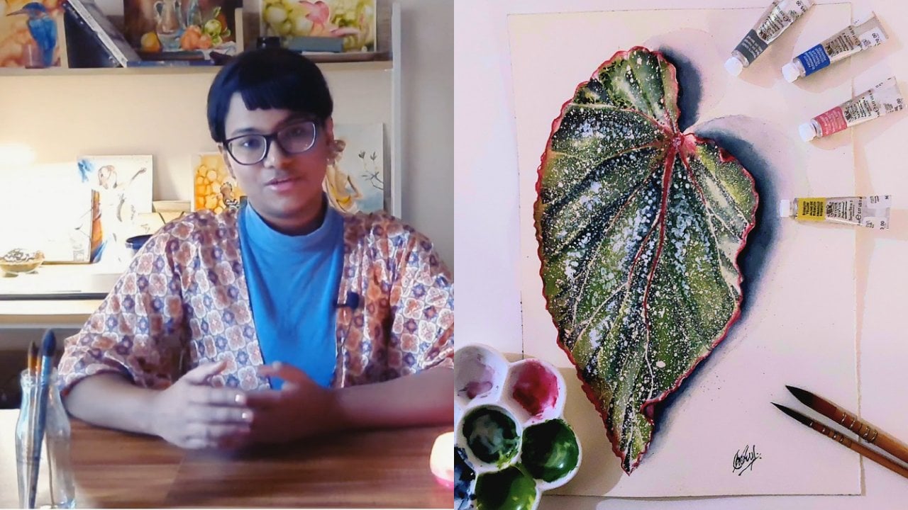
of abstract emotions. Hi, everyone. My name is Sheryl, and I'm your Skillshare teacher for the lessons to follow. I'm a self taught artist and a student of physics
based in India. In my opinion, if art
were to stay completely objective and reflect what we see in the real world right
in front of our eyes, then it would have nothing to offer beyond what
science already does. But there is more value to art, and that is what
abstraction teaches us. The world of the
abstract is subjective, based on interpretation
and perspective. With that in mind, this class takes us into a world where we ground ourselves into a
specific emotion such as joy, excitement, or
energy, and we use that to lead us to scenes, compositions and shapes that
we will use in our artwork. The abstracts that are created through this procedure
and method that I teach you in the lessons to
follow can be used and translated for any
emotions such as calm, nostalgia, melancholy,
or whichever emotion you would like to base
your abstract artworks on. So do stick around for
the lessons to follow. I promise that you'll enjoy
them and take home something of value to you.
Let's dive right in.
2. Class Overview: Before we proceed
to the lessons, let me give you an overview of this class and your
class project. Here, we generate
an abstract artwork that is based on an emotion, and the specific emotion
for this class is joy, the kind of joy that gives
you energy and excitement, and we'll use that emotion to create a couple of beautiful
abstract artworks. I will guide you in
the procedure and method that lets you
generate these artworks, and this involves
the following steps. The first step for us is
to take a few minutes to just calm ourselves and
meditate on that emotion. Feel the joy in your body. What does that mean to you? What pictures, scenes, events, does joy and energy
bring in your mind? Then we'll journal about those
emotions and those events, what those mean to
us specifically. And from our journaling
or meditation exercise that we will spend 5 minutes on, we will extract shapes,
compositions and colors. We will use these shapes and compositions into
creating artworks. But before we go there, we will also take a pause to do some warm up
exercises with watercolors. I will teach you how to control your water
in watercolors, how that impacts the painting, whether you have more water
on the brush or the paper, and what kind of
results you can expect based on your amount
of water versus amount of paint and
different techniques such as mixing on palette versus mixing on
paper and so on. Once we have done these
warm up exercises, we will move on
to our paintings, our actual paintings, which will be a couple of
abstract artworks, and you can generate your own depending on the
colors of your choice, the compositions and shapes
that you have come up with to drive a result
that is uniquely yours. It is not something
that has to look the same as mine.
It may or may not. It's up to you,
but the method is general and you can apply it to different emotions as well. Your class project is to create these two paintings
based on the emotion of your choice and post them in the
project gallery below. This helps me and
your fellow students view your diful works and provide feedback that help support you
in your journey. So see you in the lessons
where we'll first look at the materials that
are needed for this class.
3. Materials: The first item that we need for class today is a
notebook and some pens. This is for our
journaling exercise that we will do at the
beginning of the class. We also need some
watercolor sheets of paper. This paper is specifically
meant for watercolor painting. I'm using 300 GSM and
100% cotton paper today. But if you have cellulose
paper available, that is fine and
any brand works. We also need watercolor paints. They come in two
formats primarily, pan sets and tubes. I will use tube paints
for painting today, but if you have pan sets
available, that is also fine. We also need watercolor
painting palettes, but you can easily substitute
this with ceramic plates, which can work just as well. Paint brushes, I have one
flat and three round brushes. But even if you have
just one or two brushes, one flat and one
round, that is fine. A jar of clear water and a piece of cloth to dab off excess
water from our paintbrushes. So these are all the painting
supplies that we need. And let's also talk about some additional items which
help us create patterns. The first item is a leaf, which I picked from my garden, you can get any leaf that has a good venation
pattern at the back. We will use this to press
patterns onto our paper. We also need the circular cap of old bottle that we'll use
to press circular patterns, and a wax crayon or oil pastel or even a
piece of wax is fine. This helps us create water
resistance patterns. Those are all the materials, and I'll see you in
the next lesson.
4. Journaling Exercise: Before we start painting, we are going to pause for a
moment because in this class, we are not just
learning techniques. We are learning how to translate emotions into something visual. And for that, we need to find out what this emotion
feels like for you. Today's emotion is joy, excitement and energy, not
the kind that is quiet, but the kind that moves. The kind that feels
like a burst, a rush or something that is
expanding inside of you. I'd like you to think of a time when you felt
this kind of joy. It could be something big
or something very small. Maybe you were with a group
of friends laughing or celebrating something or just feeling completely
present and alive. Take your journal and write a few lines about that moment. Now let's move to
something more universal. Think of a moment
that almost everyone equates with joy and excitement. It could be a festival, celebration, dancing,
music, colors moment. Write down a few words or short sentences describing that. Now let's move away from
the specific event. If joy and excitement had no story and were just an emotion, what
would it feel like? Ask yourself, is
it light or heavy? Is it fast or slow? Does it feel like
something that's expanding and getting
bigger inside of you? Does it bounce, spread and rise? Write down whatever
comes to you, even just a few words. Now, from everything
you have written, I would like you to pick out three emotions and
three moments. So the emotions or the feelings
could be something like bursting, playful,
vibrant, light. And underneath it, we
want three moments which could be something
like swirling, bouncing, expanding,
radiating outwards. In the next step, we'll
bridge this to the art. Step is very important
because what you have just written is going
to guide your painting. Instead of copying
something you see, you're creating from
something you feel. Before we move on, we'll
take one more moment. Close your eyes if
you're comfortable. And just notice, where do you feel this emotion
in your body? Is it in your
shoulders, your chest? Does it feel warm,
light, energetic? Take one deep breath in and out. When you're ready,
open your eyes. In the next lesson, we'll
take everything you've written and translate it into shapes, compositions,
and colors.
5. Colors and Compositions: Now that we have
explored what joy and excitement
feels like for us, we are going to
translate that into colors because in watercolor, color is not just
visual, it's emotional. From the colors that
are available to me, I'm going to pick just three. Yellow brings light,
warmth, and joy. Scarlet adds vibrancy,
excitement, and intensity. And blue gives contrast. It keeps everything from
becoming too overwhelming. You may select any three
colors of your choice. They can be different
from my colors. It's completely okay. Use what is available to you and what represents joy
for you personally. Now that we have explored our emotions and built a color
palette that reflects it, we are going to
take the next step and start shaping
our composition. This is where your painting
begins to take form. Instead of sketching objects, we are going to build
our compositions using simple visual elements. These are like the
building blocks of emotion in abstract art. Circles are soft,
continuous, and repeating. They work beautifully for joy
because they create rhythm, playfulness, and a
sense of moment. I'm just going to draw
a few loose circles. They don't need to be perfect. In fact, it's better
if they are not. Rectangles and straight
edges introduce contrast. They feel more structured
and little unexpected, which works well for excitement. Try placing a few rectangles
between your circles. Notice how they
immediately add variation. Next, let us have some flowing organic shapes
that represent energy. They move freely, they
merge, they expand. I'll draw one continuous
shape that loops into itself. This is less about control
and more about movement. This is the neuromorphic
style of drawing, and we will soften the
edges just to make it look smoother where the
lines meet, just like that. It's almost like a meditation to smoothen out these edges. So I hope you take your
time and really get your composition to match whatever energy and excitement
meets to you personally. We can add some
weight to some lines just to make it more
interesting, just like that. This creates variation in
our neuromorphic drawing. And then we have
textures like leaves. These bring a sense of life, nature, and
unpredictability. Now, instead of using
everything at once, we are going to create
two compositions. Your first composition will focus on circles and repetition. This creates a sense of
rhythm like joyful movement, and your second composition will focus on organic flowing shapes. This is more intuitive. Think of energy spreading. In both compositions, try to think about where
your eye goes first, where there is space, and
where things feel dense. Not everything
needs to be filled, leaving space is just as
important as adding elements. As you drawing keep asking, does it feel like
my version of joy? In the next lesson,
we will warm up.
6. Warm Up: Part 1: Before we start our
final painting, we are going to take a
few minutes to warm up. This is my favorite part because there's no pressure
to be perfect. We are just exploring to
see how watercolor behaves. Before we begin,
you can download the worksheet for this exercise from the class resources below. I highly recommend
drawing it out so you can follow along and
paint directly on it. Let us start by
preparing our colors. Take your palette,
and we are going to squeeze out our three colors, a primary blue, a
primary yellow, and a scarlet red. Give each color a little
space on the palette. You don't need a
lot of paint here. Just enough so your
brush can move freely. Now, take a moment to just
look at these colors. These are all we are going
to use for this exercise, and you will be surprised how many variations we can create from just
these three colors. Now, let us begin with our
first warm up exercise. This is what I call a
watery brush blend. Pick up your brush
and load it with a generous amount of water.
Really, let it soak. This is important and create a very thin layer of water
onto the first shape. The shape itself is
not very important, but we need a very thin
coat of water on this. It should feel like a
slight glaze and not like a pool of water or a puddle
of water on your page. Like you can see
from this angle, it's just a slight
glaze on the paper. Next, we dip our paintbrush
into our first color. And we paint the top
section of our shape. Keep your strokes
light and fluid. Don't overthink the shape, fill it in gently. Now, without cleaning
your brush completely, pick up your second color and place it right
next to the first. Notice how the colors immediately begin to
move into each other. They don't stay separate. They start blending
on their own. That is water doing the work. You'll see soft edges, gradual transitions, and sometimes even
unexpected textures form. Try not to control
this too much. Let the paint spread. Let your brush be very
watery relative to the page. So my brush is
loaded with water, whereas my page only had a slight amount of
water to begin with. If needed, you can
tilt your paper slightly and watch
the colors flow. This stage is all
about letting go. You're not forcing a result, you're observing what happens. Take a moment here. Look at
what your colors are doing. Are they merging smoothly? Are their blooms forming? Do you see areas where one
color dominates the other? Every paper behaves
a little differently and every amount of water creates a slightly
different effect. That's exactly what
we are exploring. Now let's move to the
second variation. This time we are going to work with a watery
paper surface. Start by cleaning your brush. Now instead of going
straight in with color, we are going to apply a layer of clean water onto
the paper first. Gently paint water
into your neck shape, and I'm going to have a thick
puddle of water this time, and the surface is
really wet and glossy. You should be able
to see the sheen. Now, pick your first
and second color and just touch it to
the fifth surface. Notice how differently it
behaves compared to before. It spreads much faster, much softer, almost like
it's blooming outward. Drop your colors in and watch. The colors don't just met, they diffuse into one another. The edges become
even more blurred. There's less structure
and more flow. This method gives a very
dreamy atmospheric effect, but it also means you
have less control. If you add too much water, the colors become very diluted. If you add too many layers, they might start
to lose clarity. So again, this is
about observing. What happens when you add more pregnant and what happens
when you add less? Try it lightly tapping your
brush instead of dragging it. See how that changes the moment. Now let's move to
the third variant. This is what I call
a balance blend. This is somewhere
between the first two, not too watery, not too dry. Start again with your
brush clean and slightly damp and wet your
surface of the paper. Pick your first color
and make sure the amount of water on your paintbrush
and on your paper match. So there should not be more
water on any one of them. This time, notice that your
brush is not dripping with water and the colors are
controlled but still fluid. Paint your first section. Now, pick up your second
color and bring it in gently. You'll notice something
different here. The colors still blend, but they don't completely take
over each other. There's a bit more structure,
a bit more intention. If needed, you can
lightly guide the colors. Use the tip of your brush
to nudge the edges. Not too much, just enough. This is where you
begin to develop control over your watercolors, understanding when
to let the water do the work and when to step in. You can try adjusting
the water slightly. If it feels too dry,
add a touch more water, if it feels to lose, reduce it. You'll start to feel
the difference. In the next part, we'll explore how colors behave
when we mix them on the palette and
what leads to those muddy or results and
how to avoid them.
7. Warm Up: Part 2: In this part, we
are going to go a little deeper into
how colors interact. Not just how they blend, but what they become
when they met. We will explore this in
a few different ways. Let's begin by
wetting the paper. Take your brush with
clean water and gently apply an even
layer inside your shade. Make sure the surface
is nicely wet. You should see a soft she
but no large puddles. It helps to take your time to make sure the paper
is evenly wet. Use back and forth moment of your paintbrush to
give it an even coat. And if you have excess
water anywhere, you can get it on your paintbrush and dap
it off on the towel. Now, pick up your first color and lightly place it
onto the wet surface. Let it spread on its own. I cover about one third of this bigger rectangle
with my yellow color. Next, I clean off my paintbrush, and I pick my second color. I place it nearby, and I let it mix where
both of them meet. I make sure I have
enough pigment of this second color on my paper. And I pause to just watch. I lightly encourage it
with my brush where they meet to see what
intermediate colors I get when they blend
into each other. Then I introduce my third
color, which is the blue. I place it at both the edges, so at one edge it
mixes with the yellow, and at the other it
mixes with the scarlet. So I can see the range of colors easily that
I get from this. Your choice of colors might have been
different from mine, which is completely okay. But it's important
to do this exercise to understand what colors you get from three
colors that you have chosen based on your
expression of joy. Mixing blue and yellow
here gives me green, whereas mixing blue
with reddish orange on the other end gives me a slight purple and
while this dries, I'll move on to the next shape. We'll try a different
approach now. This time we are going to
mix colors on the palette first and then apply
them onto dry paper. Make sure your neck shape
is completely dry when you apply the color and now picking two of your
colors from the palette, let's say red and
yellow and mixing them together intentionally gives
us an orange on the palette. Take your time here
to adjust the ratio, add a bit more yellow or red until you get
a color you like. Applying this mixture on the paper gives me a
very vibrant orange. The color is more uniform,
more predictable. There are fewer surprises. You can repeat this with
other combinations. Blue and yellow gives a green and orange mixes with green because they are complimentares,
they give a brown. Next, let me mix some blue
and red or blue and orange, however you see this color. That gives a blackish purple. I will place that so that it can mix with
the other two colors. Once again, this is very
predictable the way it mixes because my paper
was tried to begin with. It has a hint more red in it, which is why it looks warmer, like a warmer purple
rather than more bluish. Now pause and observe and compare this with
your previous shape. When we mix on paper, we get variation,
softness and movement. When we mix on palette, we get control,
consistency, and intention. Neither is better. They just create different
kinds of results. Now let's explore something
a little more interesting. Take your next shape, and this time, we
are going to place a scarlet red and blue
next to each other. You can work either slightly
wet or slightly damp here. Place your red first. And I think I dropped a bit of water on the side of my page. I'm just clearing that
off with my brush right now because I like my
workspace to be clean. Anyway, moving on,
bring your blue beside it and watch what happens where the reddish orange
and the blue meet. These are near
complimentary colors. They don't blend as
cleanly as others. Instead, they start to
neutralize each other. You might see deeper purples, muted tones, or even
slightly dull areas forming. This is where
things can start to go muddy, but not necessarily. The key here is restraint. Now in the next shape, let's try blue and yellow. So I make this shape damp
first with clear water. And next, let me adjust a bit of water on this other side
because I don't want it becoming too muddy on this side and perfecting
a shape a bit too. Back to the shape
we are working on and we place a yellow first, then we introduce our blue. Watch how differently these behave compared to
the previous pair. Instead of dulling each other, they create greens, bright, fresh and vibrant greens. You may see multiple
variations of green forming, some leaning more towards blue, some more towards yellow. Again, try not to overwork this. Let the colors meet
and do their thing. This exercise helps
you understand which combinations stay vibrant and which ones start to neutralize. I like to perfect my shapes, but of course, you
don't need to. That's just a kind of
tendency that I have got. Let's move on to
the final exercise, and this one is very important. We are going to deliberately
make a mistake. In your last shape after
you have added water and my water has a bit of
muddis to it already. But I create just a thin coat of this and I start
adding my colors. I use all three of them. First the yellow, then I
move on to the orange. And finally, I add
more and more strokes, move the paint around, go back into areas that are already wet. I blend again, put colors, and then I blend again. I keep blending them
with each other. I basically just overwork
the square with my brush. With a dam brush, I just
overwork the square. I blend over and over and over again and you
can see how this creates a muddy texture and a dull, brownish
grayish tone. Almost every beginner struggles with keeping their
colors vibrant, not because they choose
the wrong colors, but because they don't
know when to stop. Watercolor rewards restraint. The more you go back into it, the more you disturb
the pigments, the more they mix into
each other completely.
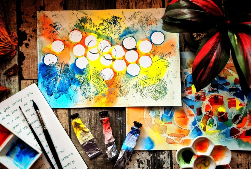
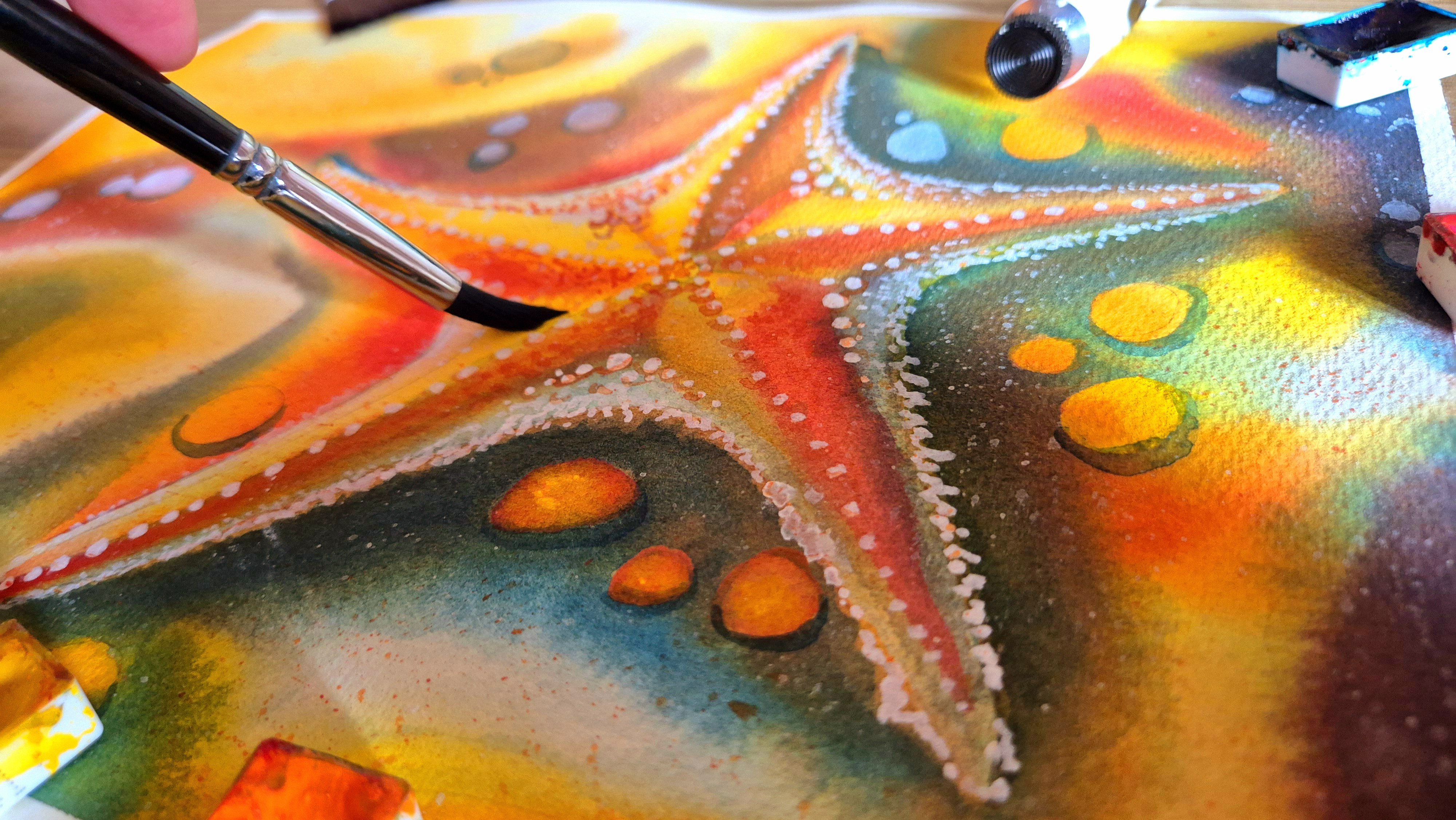
8. Painting: Circles: Now we are ready to begin
our first painting. This one is all about joy
through rhythm and repetition. We will be using circles
as our main element and combining them with
color, flow, and texture. We are starting with a completely blank sheet
of watercolor paper. Keep your paints, palette, brushes and a piece
of cloth nearby. This will help you control
excess water as we go. Dipping my cap into paint first, and I'm pressing
it onto my paper. I have used yellow this
time and I will use the lighter color first as I
build more and more circles. The circle that I place next
touches the first circle. And the one after that has
both yellow and orange, a bit of orange to it, and it touches both of
the first two circles. So this I find to be a pleasing overlay for how
I want to place my circles. But if you prefer to have more overlap, that is also okay. But this looks more symmetric if you let all the circles
touch each other, like so. Before picking up pigment, always take a moment
to understand how much water
your cap can hold. If your cap does not have
much paint sticking to it, you won't be able to
create these patterns. So you want a thick consistency of paint that you have
prepared on your palette. You also want a palette large enough that your cap can
dip inside it, like so. We are not aiming
for perfection here. These circles are just a base for our colors to flow within. Notice how I gently place the color onto the paper
instead of scrubbing it in. I let the shape of
the cab do the job. Try to observe how the colors
interact with each other. I place some blue circles now and it's advisable that you clean your cap
before every turn. I did not clean it last time, so I got a bit of a yellow
color on my paper this time. I'm sorry, a bit of green color. I keep repeating this process of pressing more
and more circles on my paper until I have a sufficient number of those
that I'm satisfied with. Composition finally is what
is pleasing to the eyes. So because you have
the same shade that is being repeated many times, this will look pleasant. But you want to be sparse in how you crowd your
circles on the paper. They should be more crowded at some places and more sparse
at the other places. And that gives it
a beautiful look. Now the next part
for us is to grab our paintbrush now that we
have laid our circles down. And we dip our paintbrush in water and then bring
it to our page. We want to paint the areas
outside all of the circles. We will stay outside each of the circle and the places
where the circle overlaps, and we'll just paint clean
water outside the circles. You'll note some bleeding of colors like you can see here, the blue is bleeding
out into the water, and that is perfectly fine. In fact, that is good if
it bleeds out a little bit because that gives
an interesting effect. I'm very careful to
maintain the shapes of these circles and
not distort them too much as I work with
my brush around them. And the amount of water I'm placing on the paper is
actually quite a lot. It's like a puddle of water, like you can see
from this ankle. It's not a little
conservative amount of water. It's quite a lot. And that is helpful
because in this part, we would want to allow our
paper to take its time to dry. We do not want it drying too fast because if it dries fast, we won't be able to
put colors later on, which we are going to
do in the next step. Wetting all around
these circles. I have wet the bottom part now and time to move on
to the top part. You can already see how
pleasant the colors that are flowing into the water look at the bottom part
of this painting. They give a rainbow feel. And they look fresh because the colors are very
few right now, and each circle is
one specific color, so it gives you one specific
shade a next to it. I do recommend that before
you start painting, you watch the entire video
because this way you will have no surprises and you will
know what to do at each step. But if you have already started and you're painting along
with me, that's also fine. P a bit of blue
in my paintbrush. I clean my paintbrush
frequently enough that I don't muddy all the colors
and mix all the colors. And if the gaps
between the circles are difficult to close
with larger size brushes, use your smaller size brushes. It might be the case that in your first attempt of trying to paint this that you messed up and your composition did not look as good or your
colors got muddy. That is not surprising if you're painting this kind of composition for
the first time. In fact, it took me two or three tries to get this
painting right. But the happiness
you get from seeing this painting work
is really worth it. It's worth the time you take to make mistakes and
learn from them, and it helps you grow
as an artist too. So when my colors
bled out earlier, I noticed some yellows at some places and some
oranges at other places, blues at the other
places and so on. Right now, I'm just placing more intense colors
right off my palette, where I observed the
yellows oranges and blues. I'm not mixing them
with my brush. I'm not overworking the paper. In fact, I'm letting
it naturally mix with each other
where they meet. The water does the job for me. I do not need to move
the colors around. If I see white space somewhere, I might encourage
the colors a bit, so the painting does
not look empty at certain places and so that the composition
stays interesting. But beyond that, I really just
let the paper do its job. Our painting is nearly complete. We just want to keep
intensifying and building colors to
the extent possible, while our paper is still wet, if you notice the
paper starts to dry, you would want to stop working. Also, you could fill out
all these small gaps with paint directly if you did not have
water there earlier. You can use a small
brush for this because this makes
it easier to get in the smaller spaces rather than a big flood brush or
a big round brush. Before we proceed
to the next part, we will let this first
layer dry completely. And once our paper is bone dry, we will press leaf
patterns onto it. So you would want to wait for
about 20 minutes or more, depending on how hot it
is where you're located. And once it's dry, I'll see you in the next part. To finish off our
first painting, we will print some leaf textures onto our dried circular
watercolor vase. So I have my leaf here and you can see the texture at its back. And to begin with, we want to cover that
texture in colour. I will take my blue, and I'm using blue here because I want a very sharp contrast. I suggest that you also choose the color that is darkest
on your palette for this part because that will make the textures most
visible on your paper. I use a very thick consistency
of this blue and I use my flat brush to paint over the veination patterns
at the back of the leaf. Then with this leaf in my hand, I press it down on the paper. Let's start from this end. Let's say we rotate
the leaf a bit, our leaf is pointing
outwards from the pattern. I will keep the orientation that way all along that the leaf is pointing outwards from
our circular pattern at the center of the page. And you just lightly press
it down and lift it off. It's not too visible on this side because it
was already blue, but when I put it over yellow, it will be more
visible, like so. Now, time to go again
with more paint because the back of my leaf is almost out
of color right now, and I just use enough color
to leave a light pattern. If you're not very
confident with this part, you could try making
leaf prints on a separate piece of paper before you print it on your
actual artwork. This is a really fun and
relaxing part of the painting, and there's no hurry anymore because our paper
is completely dry, unlike when it was
wet and we needed to work before the
paper starts to dry, we can take our time
with this part. It's also important
to know when to stop. Depending on the size of your paper and the
size of your leaf, you don't want too much
pattern because that will be distracting from
the central circles. I only just place enough that the texture is visible
but not overwhelming. I also start to go in
with my other colors, a mixture of orange and blue
and this gives a brown. I start to print that in
as well. Very lightly. I really love the look of this organic texture
on my painting, but if you prefer to
leave it at the circles and not print these organic
textures, it's fine. You can skip the part
where we use the leaf. But now our painting
is completely ready, and I will see you in the next part where we'll move
on to our second painting.
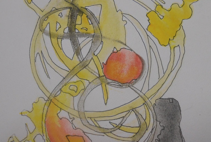
9. Painting: Neuromorphic Flow (Part 1): In our previous painting, we used reputation and
structure to express joy. In this painting, we
are going to let go of that structure and explore
energy in its most fluid form. This is about movement, intuition, and allowing
the paints to guide you. Once again, we start with
a blank sheet of paper, and this time we
need our wax crayon, or you can use an oil
pastel or a piece of wax in its place to create
the neuromorphic form. So this is similar to
the pattern that we drew in our journaling
exercise earlier. I just draw these doodly lines that are really flowy
and then optionally, you can smoothen the edges. This part is optional,
but I prefer to do it. The white of this crayon
is only visible from the side angle because
really it's a white crayon, so you won't expect to see it unless light reflects
differently from the side. In fact, from the top view
that I'll next show you, you won't be able to
see this much at all. But take your time to
smooth all the edges and add weight to some
of the lines optionally. You should be able
to see your design as well if you view it from the side in a way that light reflects off
the paper onto you. Then you would be able
to see the wax because wax is more velvety and you'll see that
texture from the side. So take your time
to do this with all the hard edges
smoothen them. We're using the wax here
because it repels water. So when we paint over this, wet on wet or even wet on dry, the white space where the
wax is there stays intact, whereas the paint stains
the rest of the paper. And that the water
that's rippleed off of this white space leaves an interesting pattern
where the wax is applied, exactly the same as what you
had put down on the paper. So this really acts
like a negative space. It's almost a substitute
for masking fluid. In fact, the first time that
I was preparing this class, I tried the same method, but with masking fluid instead, that I found to be harder
than using just a crayon. And so for the sake
of my students here, I have used this crayon. But you could try if you're interested in experimenting by substituting the oil crayon or the the piece of wax
that you're using, you can try substituting
it with masking fluid and create the same pattern
with masking fluid instead. If you have success
through that method, I would love to see it as well. Now, nearly all of
my edges have been smoothened and I take care to add weights
at certain places, as well as to press down on my crayon or wax
really hard because I want to leave enough on the paper that it will
repel water very well. The harder you press the wax
down, the better it will be, especially with cold press paper because it needs to
get into the teeth of the paper for the water to stay repelled from the texture
that's on top of the paper. Hot Press would be ideal
for this part, actually, but cold press is fine, and I do not think it would
work for rough grade, but if you have success
doing this with rough grade, if that's the paper
available to you, I would love to see the
result in that case as well. Let's keep doing this.
Just pressing down hard, going a second time over the
lines to make sure I have enough of the crayon
on white paper. I also add some circles
here just to fill up space because I did not like
how it was empty over there. And I add weights to one
side of the circle as well, maybe a circle there too. That's it for our
neuromorphic form. Now we'll start to paint on top with the same
colors that we used when we did the circles
using the cap of the bottle. So I have the same colour
palette this one, too. First, I'm going to wet
the entire sheet of paper, and this time, I don't
need to be careful. I can go over all the lines. In fact, that's why we
drew the lines there, so the wax repels the water and the paint
doesn't settle on top of it. So I'm very carefree in the
way I apply water right now. I just thoroughly soak the
entire paper with water. I try not to have puddles, but rather an even
pool of water. Because I would not
want my colours to flow too freely just enough that it looks appealing. So all those same colors
like I mentioned, the yellow, the
red and the blue. And once again, I go in
with my lightest color, and usually in watercolors, it's a good idea to start
with the light color because the darker colors can overwhelm
the painting too early, and you really cannot go from dark to light
in watercolors. You can only go
from light to dark. You cannot remove
paint in watercolors. You can only lay
them on the sheet, which is why it helps to choose the lightest color
to go in with first, and then progressively
darker hues go in next. So now I mix in some
of that red or orange, and I start to place that
where my yellow is not there, so I'm placing it at different places than
where I put my yellow, and this will prevent
the colors from becoming muddy and let them interact
naturally where they meet. As you can see, very
clearly now that the wax is repelling the colors because it repels the water in
which the colors mix. The orange here is a
very strong color. It draws attention, and blue
helps us balance it out. So I go in with my blue now. And I place it on
my sheet where both the yellow and the
orange are absent. So I have left space
for all three colors. I haven't necessarily planned
it out in the beginning. In fact, I'm very spontaneous
with how I do this. I place the colors wherever it looks appealing to the
eye and every now and then I take a step back from the painting to see
how the colors look and whether one side of
the painting looks too heavy and the other too light and to balance the
painting accordingly. Which place could
use most colors, which place could use
more white space. Those are questions
I constantly ask in my mind as I create
these artworks. Now, after I've laid
this color down, I use a watery brush. Remember the watery brush from our warm up exercises where we had a lot of water in the brush and relatively
less water on the paper. I use that to make
the colors flow because right now the colors
are not flowing that much. You can expect to see blooms. Blooms are cauliflower like patterns that appear
on paper when you have more water on the brush for this style of painting,
cauliflowers are fine. There's nothing wrong with having cauliflowers
for this one. They might be
really unwelcome in realistic styles of painting
depending on your subject. But here, all textures are
welcome and everything is beautiful because it conveys what you feel at
the end of the day. This composition, remember,
is built on how we feel our expression of joy. To B. This neuromorphic form
was one way to express it and the other way was the
circles that we did earlier, which we came up with in
the journaling exercise. We'll add some squares
to this one next, some rectangular
patterns, which also was one pattern that we
had made in our journal. Earlier during our exercises before this painting session. I will show you how
to do that once this paper is completely dry. Once you have laid
your colors down, the art that is flowing and dreamy and blending into
each other is done, and now you want to wait for
the page to dry completely. You want it to be brown
dry before proceeding to the next section where we will paint some rectangles on
top of this composition. See you there once your page
is completely dry. Okay
10. Painting: Neuromorphic Flow (Part 2): So now that my paper
is completely dry, I will demonstrate to
you the next part. I choose a color for this one that is very strong
so that I can clearly see it on
top of my painting, the base that I have
already painted. I use my flat brush
for this part, and this is a large flat brush. If you do not have a
flat brush with you, you can use a round brush
to create round patterns. But the idea basically is
that you use the shape of the flat brush to pull out
these rectangles like so, and you want to vary
their length so that there is interest
in the painting. Just like that.
I've been holding my brush pointing sideways, and you could also hold
it pointing downwards, and this will give
you different heights of the rectangles as well. I now do exactly that. So now I have some shorter rectangles and some longer ones. And I paint these rectangles in a diagonal pattern
along the paper, because this indicates
what direction the eyes are led along when a
viewer looks at it, because this is the area that has most detail
in this painting, the diagonal, going from the top left to
the bottom right. You can also vary
the colors slightly. For instance, I'm going
to make my orange more intense at some places and even blend it with a bit of
blue at some places. Just like that. So where I had already laid my
orange and it's still wet, it's okay if it's not
still wet for you, but you can just add a bit
of dough right on top of it. Just like that. This gives it a feeling of shadow as well. And that again, adds
variety to this painting. You can also vary the
intensity of colors. For instance, you
can dilute it with more water to have
less intense color, but I like mine this way. But I'll demonstrate it for you, so you know what I mean by that. This is a very dilute mix now, not as strong as
the earlier one, and it gives you some
lighter rectangles. This again helps add
variety to the painting. I don't want to
overwhelm my sheet, so it's important to
know when to stop, and it's tempting to go on, but this is all
for this painting. See you in the next lesson.
11. Reflection: Now that you have completed
both your paintings, let us take a moment
to pause and reflect. This is an important part
of the process because it lets you understand not
just what you have created, but how you have created it. I'd like you to place both your paintings
in front of you. Try not to judge
them as good or bad, but rather just observe them. Let's start with
your first painting. The circles with structure. Ask yourself, does it
feel calm or energetic? Does the repetition feel
playful or structured? Where does your eye go
first in the painting? This painting
reflects how we often experience joy with structure, rhythm, familiarity,
and balance. Now look at your second
painting, the flowing one. Ask yourself, does
it feel more free, more expressive,
more unpredictable. This painting reflects how we experience excitement
and energy, movement, change,
and spontaneity. Now look at both your paintings together and ask yourself, which one feels
more like your joy? Which one did you
enjoy painting more, and which one was more natural versus which
was harder to paint? Sometimes we are
drawn to structure. At other times we are drawn
to flow. Neither is better. They are both just
different ways of experiencing
the same emotion. If you'd like, take
a moment to write one or two line about what you feel your joy is really like. I also want to take a
moment to encourage you that it can happen when
painting with watercolors, that things did
not go as planned, that colors behave
unexpectedly and the shapes turn out different
from what you had foreseen. And that is completely okay. That is part of working
with watercolors and a part of working
with emotions. What matters is
that you showed up, explored, and created
something that came from you. There is no single
way to feel joy and neither is there a
single way to paint it.
12. Final Note: Congratulations. You have
reached the end of this class. I hope you enjoyed creating your abstract artworks as much as I enjoyed
teaching this class. The next step for
you would be to submit your projects to
the project gallery below, where I and your fellow
students in this class can view your project and provide constructive feedback
and support. As always, if you
have questions, feel free to reach out in
the discussions below. If you enjoy this class and feel that it
impacted you positively, do feel free to leave a
feedback and review this class. This helps my class reach more people who might
benefit from it. It was my privilege to be
a teacher in this class, and I hope you'll
stick around for more classes along
similar themes. More than anything,
my hope for you is that you continue
painting and creating and exploring in your
wonderful creative journey that you have embarked on. And I wish you the best for
all your future paintings.
 Sheryl Mathew, A Physicist with a Watercolor Streak