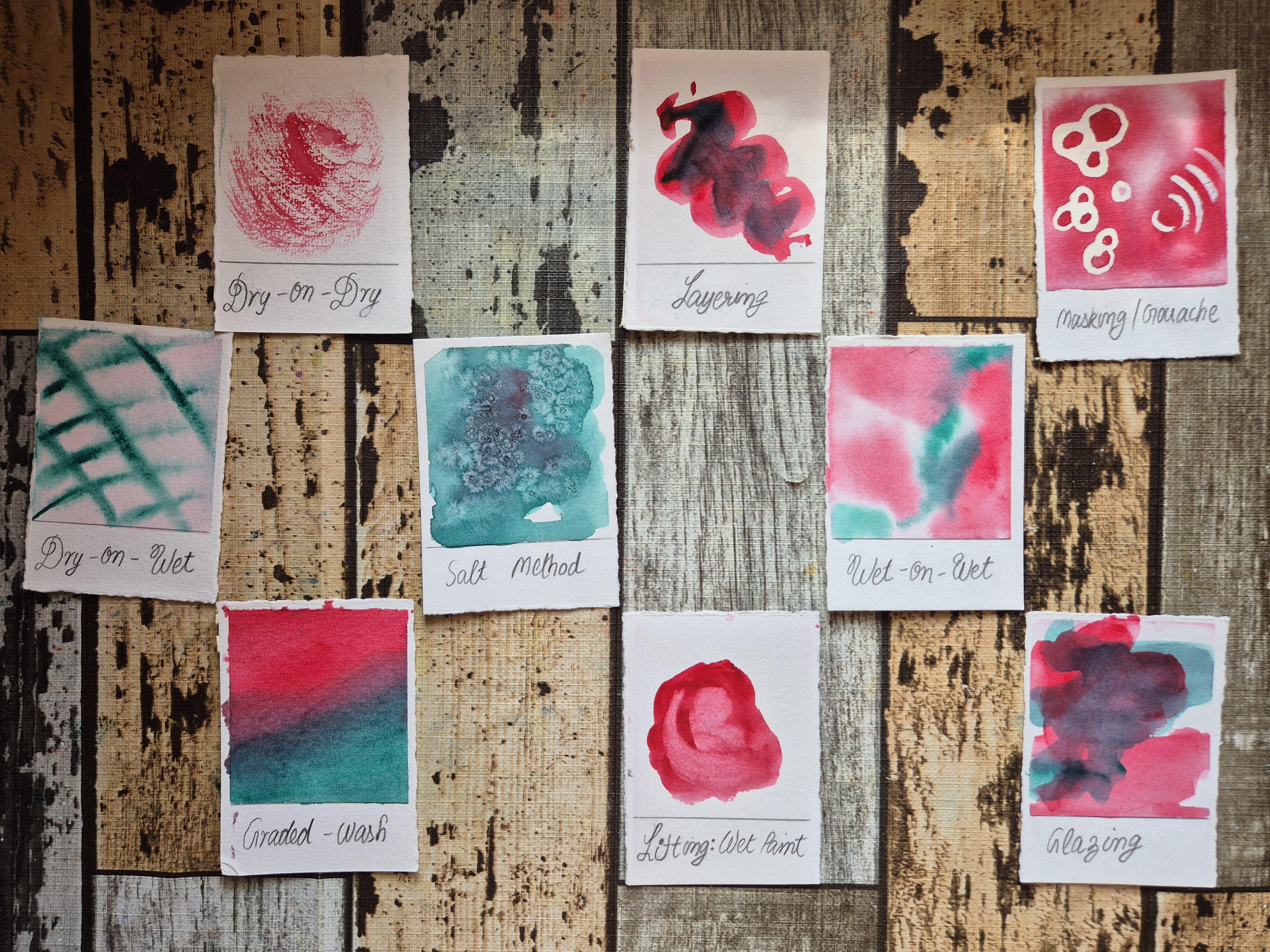
Transcripts
1. Introduction: Watercolor painting has
a breathtaking ability to create contrast
in artistic works. The interplay of light and shadow is captured
by watercolors with a subtlety that is unique to
this medium. Hi, everyone. I'm Cheryl, a self taught
watercolor artist from India. Before I discovered a crucial
ingredient in painting, my watercolor artworks often
appeared flat and dull. In this class, I will share everything I
have learned over the years about capturing light to create vibrant
watercolor artwork. We will use this knowledge
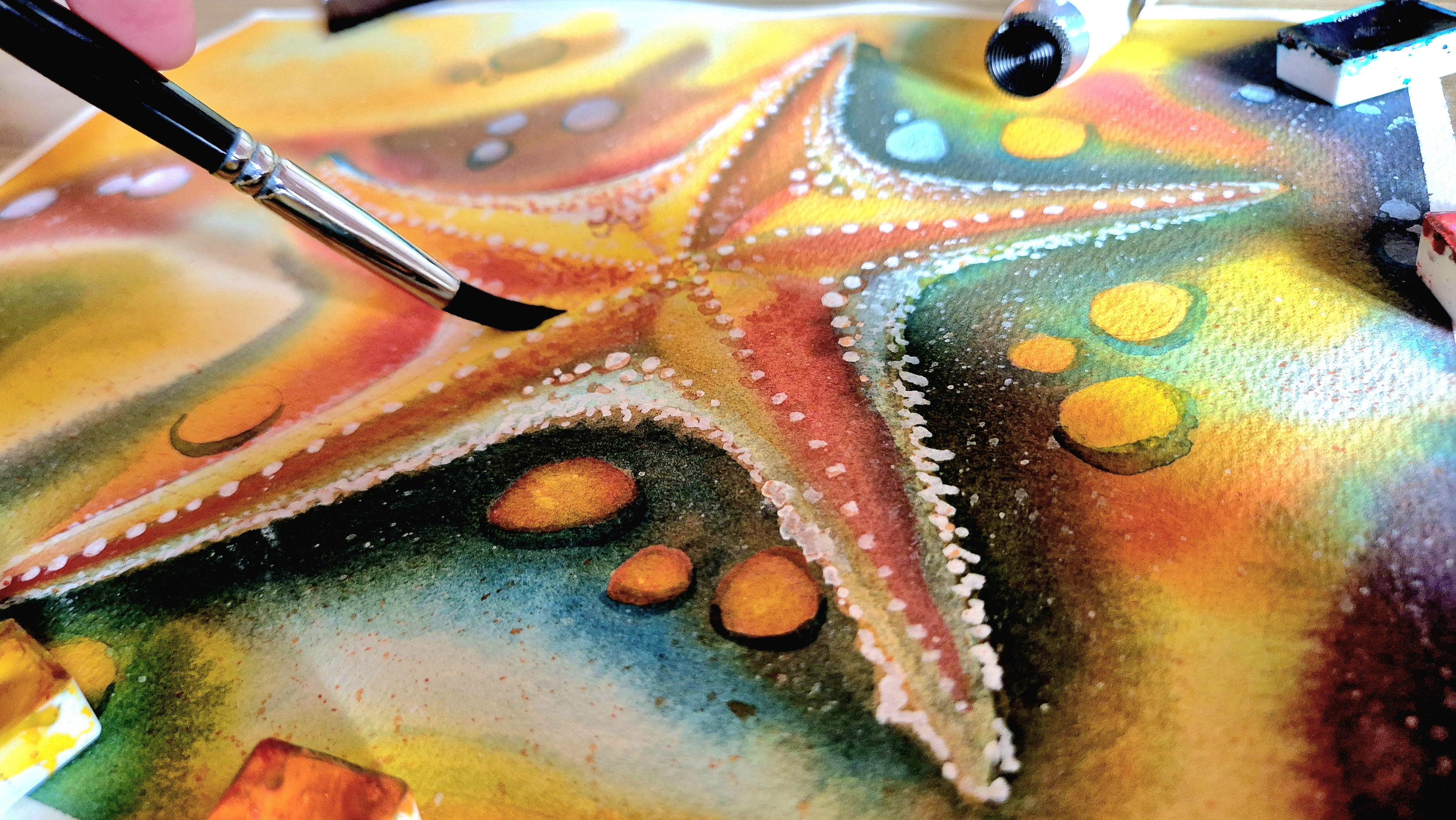
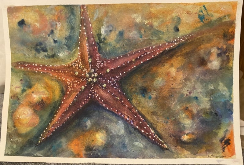
to paint a starfish using a limited watercolor palette of four colors and white guash. I will guide you through
all the materials needed for this project, as well as discuss
principles, techniques, and tips that will help you generate excitement and
interest in your painting. We will paint the starfish
together step by step, but remember that
these methods are general and can be applied
to any painting you create. This class is perfect for late beginners and intermediate
watercolor learners. If you are ready to elevate your watercolor skills,
let's dive right in.
2. Class Project: In the lessons that follow, the goal is to master
a wide range of watercolor techniques by
working on a specific project. For your class project, use the methods discussed
in the lessons to create your vibrant
starfish painting. The goal is to use
a wide range of tonal values to capture the lights and shadows
in your artwork. Do take snapshots of
your work in progress and your final painting to upload to the project's gallery. I'm always happy to
provide feedback. Please don't hesitate to ask in the class
discussions below. Remember that all the
methods discussed herein are general and will find application in other
watercolor projects as well. If any technique is new
or difficult for you, I invite you to practice
it repeatedly on a scrap piece of paper until
you have perfected it, and you will leave this class with many new skills
under your belt. I put forth the
following challenge to you as you work
through the painting. Create an inventory of all the different techniques
used in this class. Label each method with its name. This will help a lot as you progress through your
watercolor journey. Feel free to include your techniques inventory
to your project submission, along with the
starfish painting. Now, without further
delay, let's get started.
3. Materials: So these are all the supplies that we need for our artwork. We need a mixing palette. The one that I'm using is
a white ceramic palette, but you could replace
it with a plastic one, or instead of a palette, you could use a white
ceramic dinner plate or any other utensil that you
have available with you onto which you can squeeze out
some paint and mix colors. The specific shades of
watercolors that I'll be using today are
cadmium yellow medium, golden, ruby, and turquoise. You do not need to have
the same watercolors, but it's preferable if you have something that's
similar looking. So a shade of yellow,
a shade of orange, a red and a blue will
suffice for our purposes. The ones that I'm specifically
using and the names of these pigments are
also available in the resources tab down below, and I'm using watercolor pans, but if you have tubes, you could use those for
this artwork, too, squeeze out some paints onto your palette and then mix
the colors from there. I also have white gauche, and we need white
gauche so we can add some highlights towards
the end of the painting. This helps with the details that really stand out and
make the painting pop. I have three paint
brushes with me, a large flat brush and
two round brushes. So the large flat brush helps
you cover large areas and paint big washes quickly
and efficiently, whereas the smallest one is
preferable for doing details. The one which is intermediate
between these two, this is a size A round
brush with a pointed tip, holstering paint
intermediate areas. This is not important for you to have three paint brushes. I have chosen three just for convenience. It is sufficient. You have just one brush
with a good pointed tip, which you can use
for details and a large belly which you
can use for larger areas. So having three brushes is
convenient, but it's optional. Next, I have my
drawing supplies, which I'll require
before I start painting. I have an eraser,
and it's better to use an erb eraser if
you have one available because this helps pick the graphite marks gently from the paper if you want
to make any corrections, as opposed to scrubbing the paper too hard
with a regular eraser, which may ruin the
watercolor sheet. I also have a pencil
with me for drawing. Next, there is paper that
we need to talk about. The watercolor paper
on which I'll be painting is 100% cotton, cold pressed paper by Saunders. You don't need to
have the same brand, but it is very important to have 100% cotton paper without
which the artwork won't be able to hold
as many layers or absorb the layers well that
we will be laying down. Most of the
techniques that we do today require 100% cotton paper. The size I'm using
is 12 " by 9 ", but you don't need to
have the same size. If you prefer to create a
smaller or larger artwork, you could adjust the
size accordingly. Watercolor papers
come in two formats, either in blocks like this one, which is glued at the borders. So this prevents the paper from buckling when you apply water. But you could also use
loose sheets which are not glued like the one here. And what you need to do in this case is that you need to secure the edges
with a masking tape. I will discuss later
in my lessons how to secure the paper if you're
using loose sheets. If you're using a block, you do not need to
worry about this. Next, I have a jar
of clear water, and this is useful for rinsing of my paint brushes as I work. I also have a rag
piece of cloth. You could replace it
with tissue papers, but this is useful to tap
off excess water from the paintbrush or absorb excess water off
the paper directly. So these are all the supplies, and a complete list is also available in the
resources tab down below, which you may download
for your convenience. That's it for the supplies, and I will see you
in the lessons.
4. Preparation for Painting: Now that we have our
supplies with us, we are ready to start painting. To start, if you are using
loose sheets of paper like me, we need to secure
all the borders of the paper to a hard surface. For this, we use
the masking tape. We would like to leave an equal
margin on all four edges. And for this, I use
a rough estimate. But if you prefer to be
precise, you could use a ruler. To hold the paper to a solid
surface like the table here, oh I put my masking tape such that a part of it is on the paper and the rest of
it sticks to the table. This prevents the paper from buckling when we apply water. Once we have secured our
paper, let's start drawing. Where I want the center
of my starfish to be, I draw a small circle. And from that, I pull out
five lines at equal spacing, like you can see me do here. I use my pencil to measure equal lengths on each
arm of the starfish. So these five lines
that I pulled out from the center are going to become
the arms of the starfish. We will have five
of those. And you can see how I'm using my
pencil here for measurement. I wanted to one
side of the paper. But at the same time, I don't want it to be
protruding out of the paper. The arms of the starfish need to be contained within my space, and for this, I use the
measurement using my pencil. I measure one of the arms and
make sure that all of them, all the four arms
are the same length. I then join my markings
on the central line to the edges in marking to draw a star shape like
you can see me do here. My first sketch is
just a rough outline, which I clean up with my eraser. At this stage, my drawing
is nearly complete. All that's left is for
me to refine my sketch. So to recap, the process of
drawing is the following. First, we draw the
central circle, then we pull out five
lines because this gives us an idea of
where to draw the arms. And once we have
these central lines that run along the arms, we draw the arms around them. Drawing in this
particular sequence makes it easy to get the
shape correct. My drawing once it's complete, I create some broad
areas near the body of the starfish where I would like the area to be illuminated
by my painting. And next, I place some rocks on the sand on which
the starfish is laying. I vary the sizes of the rocks and also their
placement on paper. So they are not uniformly laid at equal spacing and equal
size throughout my chart, but rather things are non uniform because this helps
with the composition. I also draw some natural
looking organic curves where I would like the
highlights on the sand to be. With this, our
drawing is complete. And as a final step, I darken my drawing of
the starfish because I would like to be able to see it clearly over my
layers of painting, and it's fine to do this to have dark pencil lines
on the starfish because we'll have a lot
of contrast in this area, which will hide
the pencil lines. So there's no concern of pencil lines showing
over the artwork. And with this, we
are ready to move to the next stage where we paint our starfish,
see you there.
5. Sandy Background (First Layer): In this lesson, we
are going to paint the region around the
starfish using wet on wet. Before you start working
on your starfish painting, I suggest that you watch the entire lesson so that
you know what to expect. I begin by coating the area around the
starfish with clear water. I dip my largest paintbrush into my water container and transfer a generous amount
of water onto my sheet. I'm careful to go around
the starfish like so, because I would like to keep the region of the starfish dry. It is okay to use a lot of
water at this stage because the excess water would just seep into the fibers of
the cotton paper. This allows us a lot of working time on our
wet on wet layer. Using my largest paintbrush allows me to wet
the paper quickly. But if you only have a
smaller brush available, you may use it for this, though it will take more time. I'm most careful to keep the region around the
boundary of the starfish, as well as the border
of the paper wet. And the reason is that these are the regions that dry first. So it's important to put a generous amount of
water and uniformly apply it so that the borders stay
wet for a long time as well. To ensure that you have
laid down a uniform coat, you could view your paper
against a source of light, and you should see a soft sheen. And what we do not want to
see is a puddle of water. Allow your paper time to absorb all the excess
water or any puddles. However, if even later you observe that any region of
the paper has too much water, then spread it out
using your paintbrush. Or you could dab the
excess water off onto your cloth via your
paintbrush, like so. Take your time to wet the paper. And once the paper is ready, we can start to apply
our lightest shades. In watercolors, we work from the lightest to
the darkest color. So I mix some of my
lightest yellow color, and I began to lay
down where I want the shadows to be
on my background. The areas where I need
the highlights to be are where I have drawn my
organic curves using pencil, and I keep these regions white. Remember that in watercolors, the only white that we have
is the white of the paper. So it's important to leave certain areas white where we
want our highlights to be. And only apply paints where we want our
shadows to reside. In this painting, I envision my starfish to be illuminated
from the top left corner. So I have the largest amount of shadows at the bottom right. The areas that I have left white form these wavy
patterns on my paper, and this gives the
impression of crests and troughs on my
sandy background. Once we have laid down our
initial light coat of color, it's time to
intensify the shades. For this, we began to mix
a little bit of orange. This color, though it's called
golden by white knights, is not really a
metallic watercolor. It's just a shade of orange. So I begin with a
very light coat of orange in the areas where I've already
laid down my colors. I do not want to go over my
highlights with this color, where I've already laid down
the yellows is where I now lay down a little bit of
orange in a graded fashion. So I don't cover all of my
yellow with the orange, but rather I allow
the colors to mix on paper and create some areas which are darker and
others which are lighter. This kind of graded
wash technique is very important for creating
contrast in the painting. We watch our colors go from the lighter shade of yellow
to a darker shade of orange from where it will progress to a shade of red
and to blue ultimately, which is the darkest
tone that we have. It is important to pre plan
the areas where you'll have the lightest versus
the darkest shades in a painting with contrast. This is the reason that
we blocked out the curved lines on our sand when we were drawing because these
actors guide lines at this point and tell
me where to lay down the darker versus
the lighter shades. The highlights in my painting still have a curvy structure, so they retain the
impression of sand. We deepen the contrast
now by going in with red. Red is a color that
has the ability to overpower the
painting very quickly, so I apply only a
little bit of it at certain places and where
I have a darker coat of red, I keep those areas small. At this stage, we
essentially just repeat the exercise that we already did with orange
on top of yellow. Now we lay down red
on top of the orange at certain places and
in a graded fashion. To figure out where
you need to lay down the lightest versus
the darkest color, it's important to keep looking
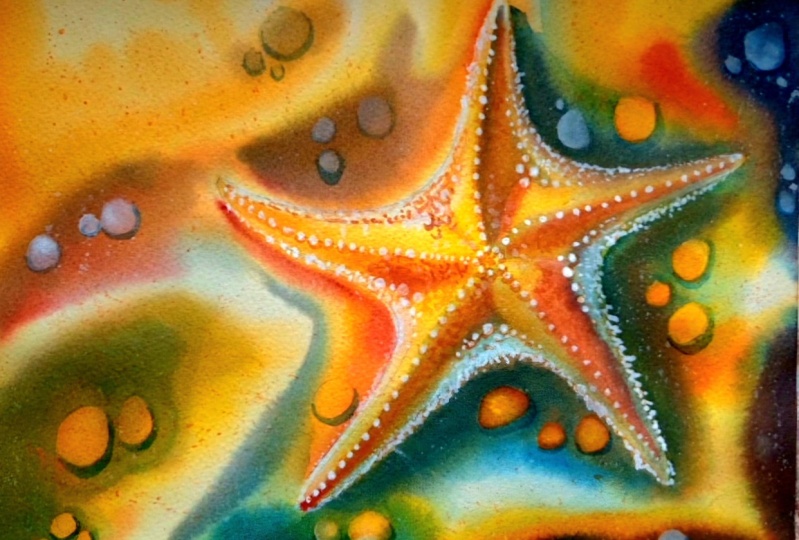
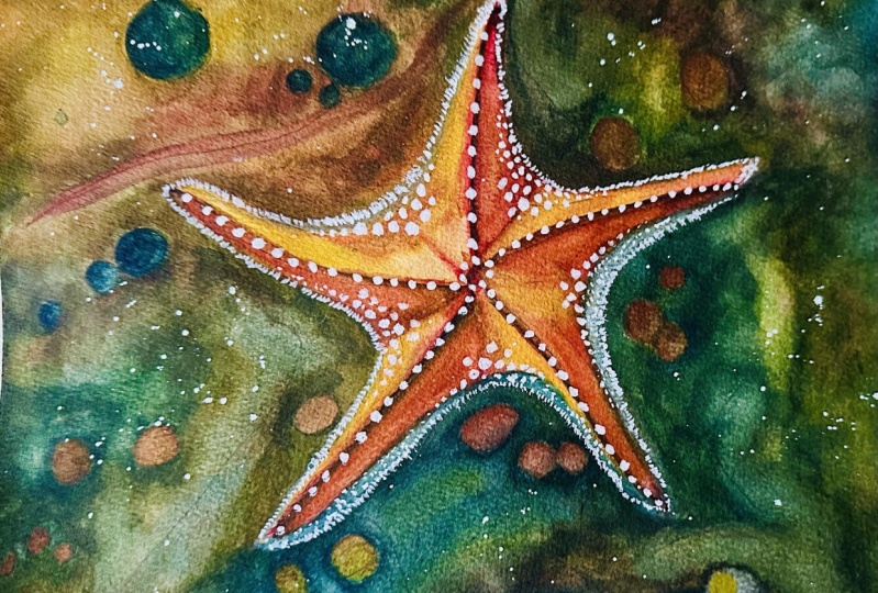
at the reference image. In the resources tab down below, I have provided
the final artwork and you may use this as your reference as
you paint along. It's going to be very helpful in figuring out where to
lay down the colors. Once I have
satisfactorily laid down the reds on the sand
around my starfish, we have finished painting
the first layer of sand. In the next lesson, we'll
paint the second layer, but before you
proceed to that part, it's important to let your
paper dry completely. You could use a hair dryer
to blow dryer your painting, and I will see you
in the next lesson.
6. Sandy Background (Second Layer): So now that we have laid down our very first
layer of paint, we are ready to proceed to the next part where
we'll build depth. We do this by layering
with a second layer. This layer is also
going to be wet on wet. I coat my background with clear water once again
after it has dried. And while I apply this
clear water on my paper, I can be confident
that it won't lift off the previous layer of paint since my paper is 100% cotton. This is the primary advantage of this kind of
paper that you can lay down many layers without the fear of muddying
up your painting. And watercolors
really need a lot of layers in order to
build a sense of depth. With just one layer, you have a pretty faded look. Since my entire background
has already been wet once, the paper is no longer
raw and it absorbs the water more quickly
on the second layer. I don't have to put in as
much effort or wait as long when I brush my water onto the
paper the second time. This part is just a
repetition of what you have already done because
without the layers, you really can't build contrast or vibrancy
into your painting. Make sure that the layer
is uniform this time too. Once I've done that, I
began once again with my lighter shade of
yellow and I laid down right where I had laid down
yellow the first time around. But this time, I just intensify the colors at each
of these places. I'm careful to leave
the highlights white because we want
to keep that contrast. Mixing a little bit more yellow and placing it
at certain places. You might have noticed
that once my paper dried, my paints looked far less vibrant and this is
a characteristic of watercolors that
you'll experience every time you paint
using wet on wet. This is because the paints
soak into the paper and the cotton fibers of the paper just really
absorb that color into it. And we have that beautiful
watercolor transparency when we lay down
the second layers. Watercolors have
very fine pigments, especially the
professial brands. The proficial gray
pigments are much smaller, and this helps with preserving the vibrancy of
the painting over the years when the
watercolor pigments are very fine and they
really soak into the page. Furthermore, having these fine pigments
help with transparency. You can see the previous
layer of orange even over the intense yellow that I laid
down on the second layer. Now to intensify the orange, I'm laying down more orange at those places where it
already was there. Now I have proceeded to the red. It's easier for me
to work this time around because I know where
each of my colors go. So I'm much more
confident and bold with the decisions that I make about the intensity
of the color. I just have to lay
down the reds and oranges and the yellows
where they already were, and I have to preserve
the highlights. So the regions that are white
stay white this time too. I built some contrast
around the starfish because this helps the starfish stand
out and pop from the page. More dilute red. And now at the bottom, I'm actually trying to go around the region where I
place the rocks. This is because I would like the rocks to look illuminated. And now I'm going
in with the blue. I mix some of the
turquoise that I have and began to lay down where I have
the deepest shadows. Usually, these are
places where I had intense red early on that
I place these blues. I'm also placing them
around the starfish once again to make the starfish
pop from the page. We haven't started to
paint the starfish yet, this looks very
strong as of now, but once the starfish
has its colors, it would all look united. Layering with some red over the blue to give
the look of purple. And right where I had the
reds to the left of my page, I laid down some more color, and you can see those
small segments that I've left without
any blue on them. Those are the segments where
I want my rocks to be. I'm almost working dry and wet at this stage
by which I mean that my pigments that I have on my brush have
very little water now, so they don't spread
as much on the paper. My paper is still wet. The way to create a dry brush
with a very dilute mix of the pigment is that you first dip your
paintbrush into the pigment, then dab off the excess
water onto your cloth. This way, you have a dilute
mix on your paintbrush, but you also do not
have excess water. This is it for the shadows. You could selectively
lay down some more blues and reds where you would like
to intensify the colors, but we are nearly done
with our second layer. In the next part, we will
start to paint the starfish, where we will use the layering
technique once again. I'm still trying to capture some more highlights on the sand by using my darkest
shade of blue around it. Be careful not to overdo
your painting at this stage. But when I feel like
it's just right, the amount of colours that
I've got down, I stop working. I also stop working if
my paper starts to dry. Then I let it dry completely. I wet it again and work. Now that we are done, I
will see you in the next.
7. Starfish (First Layer): So now we are ready to start
painting the starfish. My background layer is
completely dry now, and I use the same brush now to coat the starfish
with clear water. I rinse my paintbrush
off thoroughly because it seems like a bit of blue was still
there on my brush. I clean it thoroughly
in my water container. I began to lay down
a clear coat of water while making sure that I do not go past the
boundaries of the starfish. I use a lot of water
initially because the excess will just seep
into the cotton paper. And I don't worry
about any puddles and I'm initially
laying down the water. I can lift off any excess
water later on using my cloth. So careful to stay
within the lines, and I coat it with clear water, making sure that it's
thoroughly sowed. And all five arms, especially the borders
of the arms stay wet because those are the
areas that will dry up first. We might have lines that are not very clean at this stage. It's okay because we will clean up the lines when we are
laying down our final details. Right now, the first
layer that we paint on the starfish is
going to be wet on wet. And we'll also use the dry on wet technique where the water in our brush is very
little compared to the water on the paper. I use my smallest brush to
lay down some initial colors. Since I envision the light to be coming from the top left, I keep that area lightest
with white highlights. That just means that I'm
not laying any color on certain areas on the starfish where I want it to stay white, and the white of the paper is
what helps me achieve this. The places that will be in shadow are blocked in
using orange at this time. So I lay that orange towards
the bottom right like so. You can see how little the
paint moves as of now, and this is because
the amount of paint or rather the amount of water on my brush is very less compared to the amount
of water on the paper. So my pigment is very highly concentrated and this
helps the paint stay where it is while not creating harsh edges that you'll have
if you work dry on dry. Next, I began to lay down some reds near the
bottom right once again. Also somewhere near the top the paths that
will be in shadow, I would like to block
them in with a red color. Whenever painting on
a wet sheet of paper, it's important to ensure that the amount of water
on your brush is either equal to or less than the amount of water
on the paper. Because if you have more water on the brush than on paper, it will create undesirable
blooms or cauliflowers. So what I'm doing right
now is that I'm coating one part of each arm
with a darker shade. And the other part stays light with either
white or yellow. And this creates
the impression of lights and shadows
on the starfish. Intensifying the reds more to the bottom right once again. And I'm placing
these lines right now that help me distinguish the shape of the
starfish on my painting. Lifting off some color where
I want my highlight to be by dabbing a clear
brush on my cloth, I remove the excess water, and then I use this dam
brush to lift off the color. Once you have done this part, you need to wait for the
starfish to dry completely, after which we'll proceed
to the next lesson.
8. Starfish (Second Layer): The first layer on my
starfish has dried and we are ready to lay down
some shadows in this lesson. We'll do this using the
wet on dry technique. As well as we'll blend
the edges later on. To start, the regions
that are away from light like this right
side of the top arm is where I place
my dilute mix of blue to block in the
shadows at that part. Let's make that darker
and move to the next arm. On the bottom left arm, I again lay down some
dilute blue and you can see on white
how light it looks. That's how you know how much to dilute your pigment on
your mixing palette. Just a little bit of
color here and there, and it brings the
Safish to life. And we are painting
wet on dry right now. I place some shadow there. This is a dilute
orange at this place, not the dilute blue
because this area is in the light or
closer to the light, so it will look illuminated. Whereas the region
farther away from light will appear darker. To blend the edges
at certain places, you certainly do not want
to blend all the edges, but where you want to do it, what I do is I
create a dam brush, and the way to do that
is that you rinse off your brush thoroughly in clear water and you dab the
excess water onto your cloth. You have a dam brush
with which you can blend the edges
just like that. Et's put some blue near the
bottom of the starfish. And create some darker regions. You could look to your
reference photo to find out where the
darker regions have to be making it an
intense blue now. Just like that. And blending
the edges using a dam brush. Again, blending those edges. The blended edges look more like a smooth transition
that you would have on wet on wet as opposed to
hard lines on wet on dry. So once again, blending the
edges with a dam brush, which I create by cleaning off my brush and dabbing the
excess water on the cloth. Then I have the dam brush
with which I blend the edges. Let this dry completely, and I'll meet you
in the next lesson.
9. Rocks (Negative Painting): The shadow layer on my starfish
is now completely dry. And in this class, you'll paint around the rocks and
the main subject, which is my starfish
using negative painting. So the idea is
that you go around the regions that you want to leave lighter
with a darker color. So I just lay down my blue
and I go around the rocks. I'll make each of my rocks
trn out using this method. I also blend the edges, and we have to be a bit
quick with blending the edges to make sure we
don't leave any hard lines. Once again, to blend the edges, you need a dam brush. So I dip my brush in clear water and dab off the
excess water on my cloth. By doing so, I have a
dam brush and I use it to blend the hard edges
where I want it blended. So let's see what we
are going to do here. I'm going to go around
the rocks like so. And these are rocks which I had made with my
pencil marks earlier. They are almost
invisible now because my pencil marks were very
light for the rocks. But I know approximately where they are supposed
to be situated. So I go around the rocks with a blue color
to make the rocks stand out, and I blend the edges. So this is the blending part. I have clear water on
my brush with which I first run across the
boundaries of my region, and then I create a dam brush which I run over the
boundaries once again. And this is called negative painting, like
I mentioned earlier, this process of
negative painting using wet on dry as well as blending the edges is something we'll repeat throughout our painting. You have to be a bit
fast when you blend the edges because otherwise
it would leave a hard line. But even if you are left
with a few hard lines, there's nothing to worry about because I'll show a trick in the next class that
fixes any such mistake. Uh huh. I've noticed that the darker you
go with your colors, the more difficult it
becomes to blend the edges. But if you have a
hard line somewhere, just try to blend it and
use a bit of pigment. So I use a bit of blue in my blending to
remove the hardline, and this seems to lift
the hardline off. For somebody who's blending
edges for the first time, this might be a difficult
step, but it's okay. You'll get there at practice. Don't hesitate to share your project in the
project gallery below. Once you're done
with this course, even if you don't
personally think that your artwork is very good. The reason I say that is
that we all start somewhere. I was a beginner once too, and I can understand that
negative painting and blending, these are techniques
that are a bit advanced. Take a bit of practice
to get used to it. But we were all there sometime. So please don't hesitate or feel demotivated if you find
this part very hard. Once again, leaned on blue right where the shadow
from the starfish would be. This creates the impression
of shadow already and we can see the
painting come alive, blending the edges around the rocks that are
adjacent to the starfish, just continuing the process until I have enough
variety in my painting. It helps every now and then. Once we start getting into
the details like we are now, we are focused on the
details on the rocks, and it helps in this stage of painting to take a step back and look at your
painting as a whole. This way, you'll find out
when the details are getting too much or whether they are too little and you
need to add more. It always helps to
take a step back. Adding some shadows where
I already had blue, which I laid down wet on wet. Now I'm laying it down wet on dry and blending
the edges like so. If you notice carefully, you'll find that
even my painting has hard lines at
certain places. So even I'm not perfect, I make mistakes
too, and it's okay. It's about enjoying the
process first and second. We'll learn how to correct
those mistakes anyway. So nothing to worry about here. Even though I have
some hard lines. Once again repeating
the process where I'm going around the starfish and
around the rocks as well. So I had some rock to the top right here where
I'm painting right now, and I've made it sand out
with negative painting. A little bit more pigment where I want to
increase the contrast. Here I am layering negatively painted layers one
over the other. Making the rock up
there stand out more and blending the
edges just like that. As a final step, now that
my subjects are blogged in, I decide to go in with my kneadable eraser and remove some of the pencil lines
that are still visible. This helps me clean
up my sketch. So now I can't see any
pencil lines on here. Okay, well, I can see a few, but I can take care of those
later with white gouah. When we are done for this part, I'll see you in the next lesson.
10. Glazing: So now the negatively painted
layer is completely dry, and I proceed to the final layer of painting
that we lay on our starfish, as well as our sand. This is also going
to be wet on wet. And this is the layer
where we will lay down the most colors to build
contrast in our painting. This is also a very bold step in our painting because
as you can see here, I'm quoting both the starfish as well as my entire
background in clear water. And none of the color lifts
off my starfish when I do this because my paper once
again was 100% cotton. Once my paper is
soaked with water, I build up the
colours step by step, first on the background
like you can see here. At the end of this stage, you'll see that the painting
looks very, very vibrant, but as it will dry out, it'll become less intense, just like our previous
wet on wet layers. So to start, I'm
laying down the yellow next I'm going to
proceed with orange. Once again, laying
down the colors at the same place where they were laid down in the previous layer. The transparency of the watercolors let
us look through it. You can see the first
and second layers even now over our painting. I especially write
down shades of orange and red where
I have my rocks. Just like that. Since my paper and
starfish are both wet, some color will flow from
the sand onto the starfish. But this is okay. It's
nothing to worry about. And if you notice too
much color going in, you could always lift it off
with a dam brush like so. Once again, laying down the colors where I
already had them. And finally, intensifying
with the blue. Now, with the blue, when I
lay the paint near the rocks, I am careful not to
go over the rocks. So how's the soft edges near
the rocks in this layer? Locking in some shadows around the starfish,
just like that. We are being pretty bold with
our colors at this stage. But careful not to
overdo it nevertheless. Once again repeating
with the reds. Lifting off some colors. And I also intensify the
shadows inside the starfish, for which I'm
working dry on wet. So the pigment on
my brush is very, very dry, but the paper is wet. I'm also lifting off the
colors that flow into my rocks so that my rocks
continue to stand out. So lifting that blue off of
my rocks with a damp brush. I'm doing this for
each of the rocks. I'll creating a dam brush first, then lifting off any excess
colors off of these rocks. And it is this layer
where we get to hide any hard lines
that we might have left behind in the
negatively painted layer. So like you can see
in my painting, I had some hard lines earlier, but now everything
looks smooth now that I have laid down
an intense color. So we have corrected
those mistakes now. You should also lift off
any paint that flows into the starfish from the borders if it's flowing too
much especially. Here I don't want to lose my
impression of the starfish, so I'm lifting off
some of those colors. The process demonstrated here is also sometimes referred
to as glazing, where we coat the entire
surface with clear water. In the lessons to follow, we will add details that will
make the painting pop. See
11. Details on Starfish: So once my glaze
is completely dry, I proceed to adding
details to my starfish. In the first step,
when adding details, we will use white wash. I squeezed out a little bit of white wash from my tube onto my pallet and I've dipped my paintbrush into it
with a little bit of water. After that, I use my smallest
paintbrush to lay down these spots along
all the fire arms of the starfish, like
you can see here. There's no hurry anymore. You can take your time
to lay all of this down because our paper
is no longer wet. We are not working
with wet techniques. Everything is dry and everything
is already in its place. So we can do this really
slow and enjoy the process. We do not need to
worry about the paint drying or the paper drying
or anything of that sort. I'll also add some spots near the place where the arm
connects to the body, so you can see me
do this right now. I do this on all sides. Do look at your reference
photo to make sure that you're laying down the
details at the right place. These white dots that we are
adding are supposed to be small protrusions from the
surface of the starfish, and we'll give it a
three d appearance later on by adding a bit of shadow
beneath these small circles. We don't have to add the
shadow to each circle, but we can add them to a few to give a
feeling of realism. Where the arms of
the starfish end, I try to give it
a corrugated end because this I feel
helps with realism. So I have these spots very
close to where the arms of the starfish and
notice how bright these white dots are and how much they stand out
against the blue. This helps with the contrast, but something to be mindful
of is that when guash dries, it dries darker than it is. And that's true for all
light colored guash that light colors dry darker than
they look when they are wet. So when we are mixing guh, we want very little water if the white has
to be very strong. But if we want a more
transparent white, which is not so intense, then we should use
lots of water. Just like for watercolors, except that wash is opaque
and watercolor is not. That's actually one of the
reasons why we use wash for these kinds of details because the white
watercolor is useless. It doesn't give us
the opacity that is necessary to make
the white stand out. I already love how this
painting looks now, and I mix some orange to give variety on the
starfish surface. Adding orange dots where
the shadows are supposed to be and slowly
diluting the orange with water to give a lighter and lighter
color at certain places. Once again, very intense
orange dots on this arm, dilute it with water
and add a few more. You just have to
continue this process for as long as it feels right. And the way to know that
you have enough details is to take a step back and look
at the painting as a whole. This gives you a
bird's eye view, which tells you whether you
have put down enough details. Next, I'm laying down the shadows that I
spoke about earlier. This little semicircle that go around the white
spots just like that. Once the details are
down on the starfish, we can proceed to
the next lesson. There we will see how to paint the rocks so
that they stand out even more and how to
add more details to the sand to give
it a grainy look. See you in the next lesson.
12. Finishing Touches: So to add details
to my sand now, I splatter some white wash
onto my paper like so. So I just load my brush
with a bit of white wash, and I tap the paintbrush
against my finger. So some of that paint
gets off the brush and creates a granulated
texture on the sand. Next, I intensify the
colors of some of my rocks. I do this, especially using red and orange because these are colors that
really stand out. So doing that for
each of the rocks, not completely coating them with a specific color but laying a few colors that are bright
towards the center of the rock and darker
colors towards the edges. So once that's done, I also lay down some
more rocks with migh. I dilute my mix of white and use them to draw some circles
where there are shadows. I also play some of
these white highlights on the rocks that
I already have, and this makes it look like the rock is glowing,
which I really like. So many of these
details are optional, and if you feel like your
painting is complete, you could stop working anytime. It's not necessary
to add all of them. It depends on your taste. I also add some very dark rocks, not very dark, but
these are blue in color towards the top. And as a final step, I add shadows beneath the rocks. So I take some of my blue mix, and I make these semicircles
underneath the rocks. So they look three
dimensional and pop from the page, like
you can see here. This detail is a
really nice one, I feel because it helps so much in adding realism
to this painting. Once you've done this
for all the rocks, the final step is to peel off the masking tape once
your paper is dry. So wait for your
details to dry and for your entire paper to be bone dry before you
take the tape off. This way, you can ensure
that your paper stays flat after all the layers
have been laid down. Now to remove the masking tape, you can see how I'm pulling
it off off the table. I am removing it along an
oblique direction like so. It's a good idea to
remove it this way because it prevents the
paper from tearing. Now we are done with
our final step, and I'll see you
in the conclusion.
13. Outro: Congratulations on completing
the starfish painting. By exploring the power of contrast and mastering key
watercolor techniques, you have taken a
significant step in elevating your
artistic skills. Whether it was experimenting
with tonal values, practicing brush control or
balancing light and shadow, you have gained tools that can transform not only
this painting, but all your future
watercolor works. Remember, every stroke you make is part of your
creative journey. Don't hesitate to
revisit the lessons, refine your techniques, and
apply them to new projects. Practice is the bridge
between learning and mastery. I'd love to see how you
apply what you have learned, whether it's through
starfish paintings or your own unique creations. Be sure to submit your
projects to the gallery below. I can't wait to
celebrate your work and provide feedback to
support your growth. Thank you for trusting me to guide you through
this lesson. Your creativity and
dedication inspire me. Until next time, keep painting and letting
your artwork shine. Happy watercoloring.
 Sheryl Mathew, A Physicist with a Watercolor Streak