Transcripts
1. Introduction : The world around us is full of wild
and wonderful things. However, there's
nothing as wild or as wonderful as watercolors
themselves. Hello everyone. My name is Sheryl and I am a self-taught watercolor
artist based in India. My aim in this class is to equip
you with skills that you can apply to any
watercolor artwork that you choose to create. However, for this class, we will capture wildlife
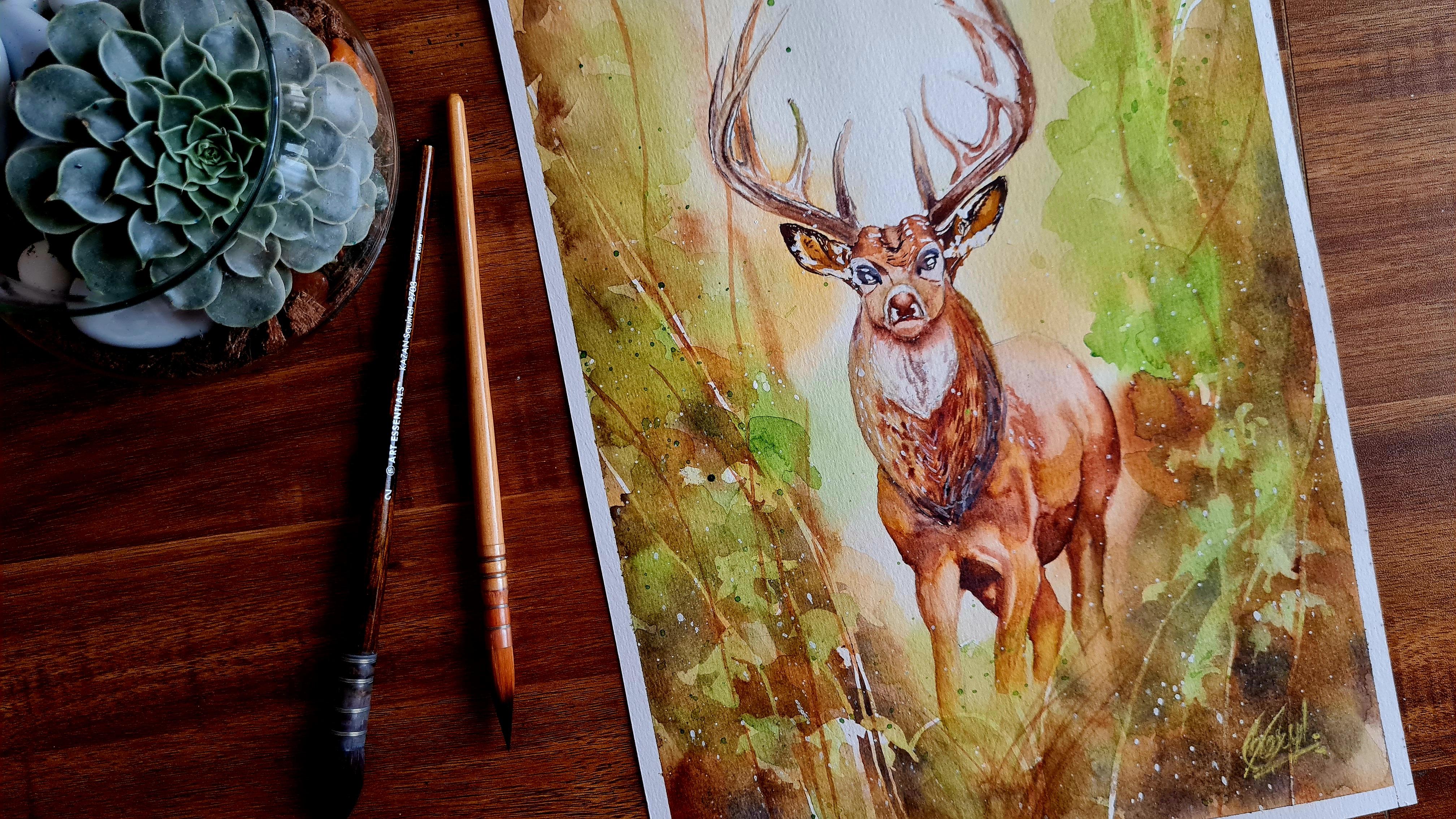
using watercolors. To this end, we'll create a majestic painting of a
beautiful stag in a forest. I will walk you through the
supplies that you'll require. We'll paint the soft
background wash first, add details to the foliate and then paint the main details in
the stag itself. You will practice various
watercolor techniques like wet on wet, wet on dry and dry on wet. By the end of this class, you will have created your very own watercolor
wildlife painting. I believe that
regardless of whether you are a seasoned
artist or a beginner, this class has something
to offer to you. So if you're ready,
let's get started.
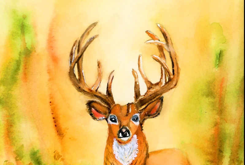
2. Class Project : For your class project. You will create your
own watercolor painting of a stag in a forest. A painting like this might seem intimidating, but do not worry. I will guide you lesson by lesson in how to
complete your project. First, we will paint
the background foliage and then paint the main subject. I will demonstrate
this for the stag. However, bear in mind
that you can apply this to any animal or bird
that you choose to paint. If you prefer to paint a
different animal or bird, do not hesitate to use
another reference picture. Some alternative references are available under
the resources tab. The reference picture that I'll be using for this class has been AI generated and I've
used Mid Journey for this. As you progress
through your painting, I encourage you to upload
your progress shots. And once you're done
with your work, please upload a
photo or a scan to the section below
titled, My Projects. This will help me as well
as your fellow students. Take a look at your work and provide feedback
if you ask for it. Now let us proceed
to the lesson. And I can't wait to
see what you create.
3. Supplies: These are the
supplies that we'll require for class today. First of all, we require
watercolor paper, which is a paper that is dedicated for making
watercolor paintings. The regular paper we have buckles a lot, we
do not use that. The size of the paper
that I'm using is 24 centimeters times
32 centimeters. My paper also has the
following properties. First of all, it
is cold pressed, which means that it has
a bit of a texture on the surface that is good for watercolor papers because you'd like to create texture. It's also recommended that
the paper should be at least 300 grams/meter square. Mine is 320
grams/meter square is the equivalent of, 300 GSM is the equivalent of 140 pounds. It's strongly
recommended that you use 100% cotton paper and
not cellulose paper. Next we'll need
some tracing paper and a print out of
our reference image. This is printed in gray
scale because first of all, it just helps me
preserve some ink. Second, all we need is a value study in order
to create our painting. This is a good enough
reference for us. We also use this
print out to trace onto our watercolor paper
using the tracing paper, the drawing of the stag. Next, I have with me
a kneadable eraser, or artist eraser, and
a mechanical pencil. A kneadable eraser
helps you to lift off graphite marks from
watercolor paper without having to
rub the surface. And this prevents the fibers of the paper from getting
damaged by the eraser. Next, we have masking
tape to prevent the paper from buckling
when we apply water. Next we have masking
fluid and a bit of soap, which we'll need when
applying it to the paper. I also have a paint
brush with me, and this is not a
very important one. The reason this
matters is because the bristles of the
paint brush could get ruined while applying
the masking fluid. However, the soap solution should prevent this
to a good extent. I have a cement pickup
which I use for removing my masking
fluid. Once it's dry. I have a set of brushes with me, and you certainly don't
need all these many brushes, but I've used all of
them in my painting, so I'm going to
mention them here. For your purposes, it
will suffice if you have just one good brush
with a pointed tip. In my case, I have two
synthetic brushes. One size 6 and size two, both with good tips. I have a natural hair brush for doing the soft
background washes. These two are
completely optional. But I have a large flat
brush which helps me quickly with the entire page
the background washes. I also have a large
circular brush that I use brush-off masking
fluid that I erase. I also have paper towels
which is useful for removing excess water off the paper or off my paint brush
by dabbing onto it. Next, I have two containers
of clean water with me. The first is for brushing clean water onto the
paper whenever I need to. And the second is to wash
brush between colors. Now most importantly, I have
watercolor paints with me. And these are Mijello
Mission Gold paints, which I have squeezed into pans. The palette here has built
wells that I'll be using. But if you don't have these, you can use a separate palette. You can also use paints
directly out of the tube. And there's no compulsion to use the same brand as long as you have something
that's good quality. The paints we'll be
using are red brown, burnt umber, burnt sienna,
raw sienna, yellow ochre Hookers' green, sap green,
and ultramarine blue. We'll also use yellow
orange every now and then. I've provided a full list of colors in the description below. You don't have to worry about
remembering all of this. You don't need the
exact same shades. It's fine as long as you have something that looks
similar to you. Once again, I
reiterate you don't need the same brand of
watercolors as I have, it's fine to have any
decent quality brand. Lastly, I have a tube of
white gouache by M Graham. You can use any white gouache
of any brand, it's fine. This, by the way, is
completely optional. It's not necessary to have gouache. The full list of supplies is also available
in the description. I'll see you with your
supplies in the next lesson.
4. Tracing Your Drawing: Let us get started
with the drawing of our stag onto our
watercolor paper. For this, you need
the printout of your reference image as
well as your tracing paper. I start by placing my
tracing paper on top of the printout and draw the outline of the
onto my tracing paper. I do this with my
mechanical pencil. The procedure is quite obvious. So, I sped the video up quite a bit. Now that I'm done
tracing the outline of my staging onto
the tracing paper. I flip the paper over
to the backside like so. I can see the outline of the stag on the back side of
the tracing paper. And now I'm going to, using
my mechanical pencil over this outline so that I have graphite deposited on both
sides of the tracing paper. Now I have it on both sides. And I once again I go
to the front side of the tracing paper and I placed this on my
watercolor sheet. Again, you have to
trace this out. And what this does
is that it deposits the graphite from the backside
onto the watercolor paper. So we'd have transferred
our drawing. I lift the tracing paper every now and then to
check which parts of the drawing still need to be deposited on the
watercolor paper. And I go over those parts, now I'm done, and
as you can see, the outline of the
stag that I got on my watercolor sheet is
actually quite light. I don't know if it's
visible through the camera, but it's visible
to my naked eyes. I go over the outlines with my mechanical pencil
to darken them a bit. I draw the impression of the foliage around the
stag with curved lines, like you can see these
represent trees. And I also make some
random shapes to represent the leaves
around the stag. In the next part,
we'll mask these areas of specifically the
foliage and the leaves, as well as we'll mask of
the antlers of the stag. See you in the next
part. Bye bye.
5. Masking: I start by securing the paper to the table
with masking tape. This prevents the paper
from buckling with water and leaves a clean
outline on all sides. I leave a six millimeter margin. Next, I use my masking fluid to cover the areas of the painting that I would
like to leave white. When I do the background wash, I have the following
supplies with me. First, I have a paint
brush with a pointed tip. I also have some water. In this palette, I have soap, and in the other well, I have masking fluid. To get started with masking, I dip my brush in water, then thoroughly coat the
bristles of the brush with soap. This prevents the
brush from getting ruined when I dip it
in the masking fluid. Because otherwise the masking
fluid dries very fast, It's very difficult to remove it from the bristles
of the brush, but dipping it in soap prevents it from sticking
to the bristles. What I'm doing now is that
I'm drawing the foliage, and this is just an impression
of the foliage, right? I'm drawing curved lines and this works interest
to the painting. I continue to do this for all the lines that I
had drawn on my paper. Next, I proceed to the
impression of the leaves. The shape of the brush is quite advantageous
when doing this because it right away gives me a pointed shape, like a leaf. When I press it
against the paper, I also make some
spontaneous parts and spontaneous
impressions of the leaves. Next, I mask of the antlers of the stark
with masking fluid. I would also like to
keep this area light because in the reference picture I can see that it's quite light. Finally, I take
some masking fluid and splatter it on the page. These give some nice
and white spots when I remove them after finishing
the background wash. Finally, we are done with
placing the masking fluid. I clean my brush thoroughly and we will continue once the masking fluid
is completely dry. This will take at
least half an hour. See you in the next lesson, bye.
6. First Background Layer: Welcome back. We will now do the first background
wash I have with me. These three paint brushes. A large flat brush for
wetting the entire page, a natural hair brush, as well as a synthetic hair
brush with a pointed tip. I also have some
tissue paper with me, and this is useful if I want to dab off excess
water from my bush. While doing the wet washes, I have two clean
containers of water. I have my mission
Gold colors with me. To get started, I take my large flat brush
and I'm going to wet the entire page
thoroughly in water. I dip it in clean water and coat the entire page with the clean water that
is there on my brush. I take some time to do
this, sped up the video, but this is a process in which you should
spend some time to make sure that the fibers of the paper have thoroughly absorbed all the water that you use. But make sure that you have
no puddles of water on your paper because this
could ruin your painting. All you need to have is a uniform glaze of
water on the paper. I prepare a very dilute mix of raw sienna and yellow ochre. I go in with my
painting with this, you can see instantly
that the paint spreads and gives a soft effect
as opposed to hard lines. And this happens because our background is
completely wet. I continue to place the raw sienna in a way that is random and adds
interest to the painting, but mostly towards
the top side because the bottom side has
a much larger value, if you look at the
reference image. Next, I start to prepare a very
dilute mix of Hookers' green. I go into my painting with this. When you do this, important
to ensure that the amount of water in your brush is less than the amount of water
on your paper. Having too much water on your brush could produce
blooms on your page. Blooms can sometimes be used to your advantage if you're trying to create
certain effects, but they are almost always
unwanted and accidental. You want to avoid this. If you have excess water on
your paint brush, then be sure to dab it in the tissue papers
that you've got with you. Next, I go in with
the stronger shade. This is burnt Sienna. I make random spots with it more towards the bottom
of the painting, but I also have some
towards the top. To add interest, I mix some more burn
sienna as I go along. I make sure to add burnt
sienna at places where I originally had white so that I don't have too much
mixing with the greens. If my paint is not
moving sufficiently, I just encourage it a bit with my brush while constantly making sure that I don't have more water on the brush
than on the paper. If at any stage you notice that your paper has
started to dry, then do not continue to work. You should stop,
allow the paper to dry completely and
start painting again. once the paper is
completely dry. my paper is still wet, so I add some red brown to
have variety in the painting. We have mostly selected earth
tones for this painting. As you would have noticed, that's because that's how
we see the reference image. And we would like to reproduce
that in our artwork. I continue to build
layers as long as my paper stays
wet with red-brown, burnt sienna, raw sienna, and yellow ochre to produce
a very dark effect. at certain places. I create a mixture of ultramarine
and red brown. The mixture of blue and brown of this kind gives a
blackish or grayish color. This is what we'd like in
the foreground because the values are quite
dark in the foreground. The techniques we are currently employing are called wet on wet and dry wet depending on the relative concentration
of paints in the brush. If the paint on the brush is
very dilute and very watery, that's wet on wet, it's called so because both the paper as
well as the brush are wet. It's a very concentrated pigment on the tip of your brush. Then that's called dry wet because the paint brush
is relatively dry, whereas the paper is wet. Next, I start to go in
with my synthetic brush. I remove any excess water. I prepare some red brown on
the tip of the paint brush. I start to create these
lines that look like trees. I create as many of them as correct to maintain balance and harmony
in the painting. I do not want too few of
them or too many of them, but just enough for the
painting to look complete. I occasionally add some
ultramarine to my red brown or to my burnt sienna to give a
darker and a blackish shade. It's important not to use the black that comes with
the paint set directly, because this can make
the painting look flat. The black that comes with the set usually does
not have any hue to it. Whereas when we
prepare our own black with a mixture of
brown and blue, that usually either has a reddish or brownish hue
or else a bluish hue. And this looks better. I add some grass to the
foreground with Hookers Green and Sark Green also continue to draw some trees in this green color. Finally, I splatter
some clean water onto the wet paper because this produces the effect of
a mossy background, which would look good in
our forest themed painting. Now we'll allow for this to dry completely before we return to create a second layer of background wash. See
you in the next lesson.
7. Second Background Layer: Now our painting
is completely dry, and as you can see, it's much lighter than
when we had made it. This is because when we
allow the paper to dry, the paints get absorbed into
the fibers of the paper as well as settle into the
crevices on the paper surface. This leaves a much lighter
color when it's dry. For the second background wash, I thoroughly wet the
background fully, once again with my
large flat brush. Since it was already
wetted earlier once it's now much
easier to wet it again. I don't have to spend nearly as much time this process
as the first time round. Now I go on to build the
colors that I laid down. In my first layer of
the background wash, I take some green and I lay right where I had
laid green in the last wash. It's important to
overlay it right on top of where there was
green the last time. Because if you lay it
on top of the browns, then it will have a muddy texture and a muddy
loaf, which wouldn't be nice. I build the colors and I use sap green this time as
opposed to Hooker's green. because I realized
that I did not want my green to be nearly as cool. I wanted more of a warmer
and brighter green. I use sap green,
and this is fine. Next I make a mixture of
red brown and sap green, and I lay it at my spots. Do this spontaneously
and randomly, but while taking care that I laid at the same place
where I laid it last time, but it's still a
bit spontaneous. It's time to, it's important once again to
make sure that you have no puddles on the page
because if you do, then that will produce
blooms once the paper dries. The best way to get
rid of any puddles is to have a damp brush lift
off the excess water. The way you have a
damp brush is by dabbing a wet brush onto
the tissue paper. Most of the water is
out of the brush. Then you take this
brush and you lift off the water like it's
a sponge from the paper. I mix of ultramarine and brown, and I lay it at certain places in a way that adds interest
to the painting, but mostly towards the bottom
half because that's where the values are the
strongest and the darkest. In our reference picture, I feel that I don't
have enough raw sienna and lighter shades
on my painting. Now I mix those. I sometimes also mix a
bit of yellow orange with the raw sienna to give
it a brighter look. Here I have some yellow
orange on my pain brush and I'm laying it onto the paper. I'm dubbing off the excess water from my paintbrush
onto the tissue. Here we are continue to build layers for as long
as my paper stays wet. Once my paper begins to dry, I will stop working on this now. I'll allow for this to dry completely before we
proceed to the next class.
8. Adding Details to Forest: So in this lesson, we
are now going to remove the masking fluid that
we applied to our paper. Before you do this, you need to ensure that your background wash from the last lesson
is indeed completely dry. And only then do this part, I use a cement pickup to
remove my masking fluid. You can also just use
the tip of your finger, but I prefer not to do that. And it's easier for me to
use the cement pickup. I do not remove the masking
fluid from the antlers, but I remove it from
everywhere else. on the background. Dust off any residual masking
fluid that might be on the paper with a bone-dry brush, and now it's completely off. If you can feel it somewhere
still on your paper, then go in again with
your cement pickup and be sure to remove every
bit of masking fluid. It's important to
feel your paper to know whether all of it is gone. Now, I'm going to start
with the wet-on-dry wash. I will wet my brush. I'll mix some sap green, a very dilute mix, and I'll just begin to tap on
my paper with it, you can see the
leaves shapes with hard edges and this is
the effect that I'm going for. For the
background, I change the hues as well as the values of the color that I use to give interest
to the painting. Once again, I lay the yellow
ochre and raw sienna mix right where I had
it earlier and I'll add browns also where
I had them earlier. I add water to change the
intensity of the green shade. This variation makes the
painting look better. As you do this for
your own painting, I would recommend that
you first observe how I'm doing it before
you start with yours. I covered some of the whites
of the leaves with the color because we don't
want white leaves glaring at us from the paper. This wouldn't look good. In fact, we just want
areas of different colors, which is why we masked
off the leaves earlier. They'll be lighter but
not completely white. I start to make the black brown mix with
ultramarine blue and red-brown and some burnt Sienna as well. I lay this at the foreground since as we observed earlier, this is where most of
the darkest hues are. The foreground is the darkest. As we proceed to the
back of the painting, we see lighter and
lighter shades. And when I say back, I mean more towards the
top of the painting. I take some time to create variation with
diluting the paint with a clean, damp brush. Then once again, I built
it layer by layer, the wet-on-dry part
of the painting. near the foot of the stag, I laid down some darker shades, but I'd also like
some greens in there. So I prepare a green mix and place it near the
foot of the deer, and wherever else I would
like to have more greens. I add some water with a
very dilute green color. I make some splatters on
the wet parts of the paper. This is to give
the mossy texture. Now, we'll wait for
the paper to dry completely before adding some final details
to the background. See you in the next
lesson. Bye bye.
9. More Details: Now that my last layer
is completely dry, I'm going to take
some sap green. I will splatter it on my background to give
the impression of foliage. It's important to make sure that the stag is not covered
in green spots. I put my palm over to make sure that nothing
falls on the stag. Alternatively, you can
place a tissue paper on the stag and then splatter
on the background. Next, I take some sap green and mix it with the brown that
I have on my palette. I create some more impressions
of leaves and grass. I mix some red-brown with
the brown on my palette, and load my synthetic brush with its pointed tip with the color, and paint more lines
in the forest. These lines, which are
representative of trees, are easy to create with the
sharp point of my brush. Once again, I try to include
enough branches that there is harmony in the painting and that I have balance in
the entire composition. We do not take all of them
all the way to the top. It's important to eyeball your
painting to see if you have sufficient details and sufficient variations
in the value, but do not overdo it. You can always soften the
edges with a clean damp brush like I'm doing with this, I feel that I'm done
with the background. The last thing we'll
do, we'll remove the masking fluid of the
antlers of the stag. Because we'd like to ready our paper for the next part
where we'll paint the stag. So painting is ready for the next lesson. I'll see
you there. Bye bye.
10. Stag Antlers: Now that the background
is completely dry, I will go on to
painting the stag. And we'll start
with the antlers. I have my round
brush, number two. This is a smaller
brush than I had for the background wash. My brush loaded with paint is almost
the same as a colored pencil, and that's pretty much
how I'll use it here, almost like a pencil. I draw straight lines along the length of the
branches of the antler. Captures the shape of
the antlers' contours. I go in with a lighter
shade initially, but I vary the
shades every now and then because this variation
adds beauty to the painting. Otherwise, the
antlers would look rather flat if you painted the
entire thing in one color. That's not something we want
specially for the antlers, because it's almost like
the best part of the stag. Here I've loaded a
different color with a darker value to paint over the first
layer that I created. To get the values correct while placing your paints, make sure that you
keep referencing the image provided in
the resources tag, which is our reference image. I continue to create
these straight lines for all the branches
of the antler. These crisp lines are produced when I paint wet
on dry or dry on dry, which is what we are doing now. Our paper is bone
dry at this step, and our watercolor
brush is either loaded with very little
water and a lot of pigment, in which case we're
doing dry on dry. Alternatively, like here, it is loaded with a
dilute mix of a paint, in which case it is wet-on-dry. Right now I'm painting
a very dilute mix of brown onto certain parts
of the stag's antler. Once again, keeping the
reference image in mind, that's how I know which
values to lay where. While the antler is still wet, I go on to drop some burnt sienna into it to add some soft lines. If I do not want soft lines, then I allow for the
underlying watery layer to dry completely before
I add the hard lines. wet-on-dry or dry-on-dry, like
here, that's what I'm doing. I add the shadow
underneath each of the branches so that it
looks more dimensional. I keep varying my colors
throughout the process. I even introduce some
green into one of the branches to have it unite
with the background wash. This is just a reflection
of green that is coming off the background and not the green of the
stags antler itself. Because of course,
that won't have any green of its own except
for the reflected colors. At this stage, I'm more or less satisfied with the
painting of the antlers, except for any finishing touches, which I observe the painting for a while to see where to add. Once I'm done with this process, I allow for these antlers
to dry completely. And I'll see you in
the next lesson, where we'll begin painting
the face of the stag.
11. Stag's Head and Neck : To get started, I'm going to
paint the ears of the stag. I have a very thick, concentrated red-brown color
on the tip of my brush. And I'm making these
quick and small hair like strokes on the ears to
give the impression of fur. I do this on both the ears. I'm constantly referring to my reference image to make sure that I've got the darks
where they should be and to get the value
placements correct. My approach here is contrary
to what most artists do, which is to paint the
lightest shade first. I'm painting the darkest first. The way that I'm using my paint brush is quite similar
to a colored pencil here. Next I go in with
some raw sienna and yellow ochre to paint the
parts of the ear that are comparatively lighter
than the last layer of hair. Paint the inside of
the ears with the, make sure, all the while
creating this hair-like texture, before I proceed with burnt sienna to the
face of the stag, I try to accurately capture the contours
with these lines that I draw here with burnt sienna. I go in with some water to soften some of the hard
lines that I've drawn, at some places, but
not everywhere. I add the darker shade
to a paint side of the head and try to reproduce the patterns that I can see on the face of the stag. I vary the colors that I use. Sometimes I go for burnt sienna, sometimes for red brown, and at other times for Umber or for raw sienna
and yellow ochre. I paint the patterns that I see around the eyes of the stag, darkening them at
certain places, blurring them out at others to create variation and
interest in the painting, they go in with a
different color, which is now the yellow ochre. We start painting the nose
and the mouth of the stag. I observe the patterns in the reference image
and try to reproduce them while also getting
the values correct. I make the part of
the nose at the top lighter and the part
at the bottom darker. I start to paint these
hair like strokes to show the fur beneath
the mouth of the stag. I don't know if they are
called a beard of the stag, but that's what it looks like. There's a part of the fur
that is white and beneath it, on the neck, there's a
part which is brown. I paint the white part for now. I also add a light shading
to the nose of the stag. Next, I start painting
the eyes of the stag. I realized somewhere
along the painting that my depiction of the eyes
were not accurate enough. Even though I had praised the
drawing for this painting, you can observe me
fiddling quite a lot with the eyes in the final
stage of the painting, where I add finishing touches to make them look more natural. Now I start to paint
more of the fur that is beneath the
mouth of the stag. This part of the fur is white. I wet the entire area first
with clean dump brush, then I load the brush with a little bit of pigment
and very little water. And I make these strokes to
give the appearance of fur. Even though this is white, we never leave any white
objects completely white. And the reason for that is that's not how we
see them in nature. We always see various
shades reflecting off. Next, we will paint the body
and the neck of the stag.
12. Stag's Torso and Legs : I've already drawn some of
the markings on the neck of the stag and I'm going to lay
yellow ochre on top of it. The markings beneath this layer are easy enough to create if you paint wet-on-dry and just make
straightforward strokes as if you're using
a colored pencil. I've added some shading to
the right hand side because I'm imagining light source
on the left hand top corner. I'm shading accordingly. Yellow ochre is a
light-valued color whereas the burn sienna and the red-brown mixture
that I'm laying now is a darker value. I laid down too much
red brown here. I'm lifting some paint off my brush before continuing
with the red brown. To build darker values, I'm building values on top
of the underlying wet layer of yellow ochre to give soft transitions as
opposed to hard lines. And this gives the
impression of fur. Before you do this part
of the painting where I'm painting the neck and
the body of the stag, I would recommend that you watch the entire video first before
starting your own work. That is because this involves
a lot of steps and it's good to have an overview of the entire process
before you start. I'm going into the body now because I'm
done with the neck. I lay down the
darker shades first, like I did even earlier block in the darkest parts
of the body of the stag. I do this with a mixture of
red brown and burn sienna. I begin to soften some of the lines wherever I would like a smooth transition as I see
in the reference picture. I start to fill the lighter
layers using yellow ochre and raw sienna. I overlay it on top of my red-brown to give
an appearance of unity. I go in with a mix of ultramarine blue and red brown underneath the body of the stag. And I continue to lay shadows and highlights
as I see them. While painting the
legs of the stag, I make sure that the rest of the body is dry
because otherwise the paint underneath the body will bleed into the
legs of the stag. And this is not something that I want happening. Now, I paint the top of the
back leg and I make sure that the underneath of the body is dry,
like I mentioned. Also, make sure that the
front leg that overlaps with the drawing of the back leg is completely dry so that colors don't bleed from
one place to another. Once again, to know where to lay the shadows versus
the lighter colors, it's important to closely
observe your reference picture. And that is what I do every
now and then while I paint. I'm nearly done with the body and the legs
of the star now. And I'll meet you in
the next part where we'll add the final
touches to the painting.
13. Finishing Touches : Alright. Now, we are nearly
done with this painting. In this lesson, I'll be adding the finishing touches
to this painting. First of all, I'm fixing any value transitions
that do not look correct. By which I mean that any
areas that should be darker, I'm just making them darker. Any areas that
should be lighter, I'm accentuating the dark areas around it to make it pop. You need to be careful at this stage not to
overwork your painting, because that is really
easy to do at this point. Take a break from your painting, look at it as a whole
every now and then to see if it might be complete. Because it's really easy
to go on forever with this last lesson and this
last stage of the painting. I add some more grass to the area near the
feet of the stag, and some parts of the foliage
seemed to light to me. So I just go and
darken them with some sap green and
Hookers green. The right side of the beard wasn't sufficiently
visible and detailed I felt, so I added some more
detail to that area. Finally, I feel like I'm done with adding the details
to my painting, and my page is completely dry. I start to peel off
the masking tape. Now it helps to peel it diagonally to make sure that it
doesn't rip the paper. Finally, I splatter
some white gouache to add interest to the painting. And, here we are done with our work.
14. Congratulations!: Thank you for sticking
till the end of this class and congratulations on
reaching the finish line. As a final step,
do not forget to upload your work to the
project gallery below. If you struggle with any part of the course or have questions, feel free to start a
discussion below or to ask my help by mentioning it
within your project upload. I will look at every project uploaded and provide feedback. Also, don't forget to follow me here on skill share and also on my Instagram and
Youtube pages to keep up with all the water color ideas that I come up with. I hope you enjoyed yourself in my class and see you
next time. Take care.
 Sheryl Mathew, A Physicist with a Watercolor Streak