Transcripts
1. Class Trailer: The holiday season
is the perfect time to slow down and enjoy
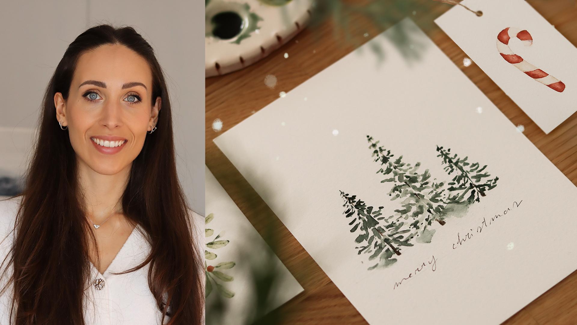
small creative moments. Hi, my name is Altea. I'm an artist, graphic designer, and online educator from Italy. In this class, we'll
paint a series of easy Christmas
cards and gift tags, designed to help you slow down, enjoy your watercolors and
get into a cozy festive mood, even if you only have a
few minutes to spare. We'll start slowly by
mixing our color palette. Then I'll guide you through
a few easy brushstrokes with a round brush just to ease into the painting before we
begin the illustrations. These projects are intentionally small and beginner friendly, and we'll build them with
simple watercolor steps. Each project takes
only about 5 minutes, which keeps the class
light and approachable. Perfect if you're looking
for a creative break. And once we finish painting, I will show you how to style your illustrations
with craft paper, twine, greenery, and other small decorations
that are easy to gather. So whether you are
completely new to watercolor or you've been
painting for a while, you'll find these
projects easy to follow and really
satisfying to create. I can't wait to paint with you, seeing in class. Oh
2. Welcome: Into class every one.
Before we start painting, I just want to share a few notes to help you get the most
out of this course. This is a simple, relaxing
and creative project, so feel free to approach it in a way that
feels best for you. You don't have to paint every
illustration I demonstrate. You can pick just one
gift tag or one card or even mix elements together to create something
completely your own. I also prepared a
printable sheet with the outlines of all the
illustrations that we'll paint. You can use it as a
reference while we work. Or trace it onto your watercolor paper if
you prefer having a guide. There is no pressure to
draw everything freehand. Do what helps you
enjoy the process. We'll begin with
the short warmup, choosing our colors and making a few simple brushstrokes
just to get comfortable. Then we'll move through
the projects one by one. First the gift tags, then the Christmas cards, keeping everything easy,
quick, and relaxing. Toward the end of the class, I will also show you a few
ideas for gift wrapping. So you can pair your
illustrations with craft paper, twine, a few decorative
elements, and green branches. And before we begin,
I would love to encourage you to share
your class project. You can upload your tags, cards, or even wrapped gifts. I always enjoy so much
seeing what you create. Alright. Now let's move on to the materials that
we'll be using.
3. Materials: I'm going to walk you through the materials that
I'll be using, but just know that
any paint brushes and watercolor paper will
work for this class. But if you're
curious to know what my favorite materials
are, just keep watching. Okay, let's start
with the brushes. If you have joined one
of my previous classes, you know that I like working
with round brushes because they are extremely versatile. With just one brush, you can make thin
lines, brother strokes, tiny details, and
even create leaf shaves by just pressing down
the belly of the brush. So for the small
Christmas illustrations, I'll be using three sizes. Size two for the
tiniest details, size four for most of
the leaves and berries. Size eight for slightly
larger strokes. Next, let's talk about tints. I'm using my Winsor
and knule watercolors. I have the panset and I'm also using some
colors from the tubes. All we really need
is a small pallet, a couple of greens,
a warm brown, and one festive red. For water, I like to keep
two jars on my desk. This is a small habit, but keeps the colors fresh and prevents everything
from turning muddy. So I will be using one jar
of water for the greens and the browns and the
other one when I have to rinse the brush
from the red color. Or paper, any watercolor
paper will work. So feel free to use whatever
you already have at home. In this class, I'll be using a hot press watercolor paper. And this is because it has a very smooth surface that I really like for
this type of project. The one I'm using
is from Canson, and it's 100% cotton. This is a good moment to cut the paper into the
sizes that we need. The gift tags, I
cut the paper into small pieces that measure
ten by 5 centimeters, which is about four by 2 ". For the Christmas cards, I prepared slightly
larger pieces, measuring 15 by 11 centimeters
or roughly six by 4.3 ". And for the gift wrapping
part of this class, here is what I will
be using craft paper, which is one of my favorite
options for Christmas gifts. It's minimal, recyclable and works beautifully with
handmade elements. Twine or any type of cord that you have at
home works well here. I love the twine because it adds a rustic touch and gives
everything very natural. A few small green branches
that I picked outside. If you have a chance, grab
any evergreen branch. It adds such a fresh
and seasonal feel to the gift wrapping. And then I have tiny decorative
elements like pinces or small wooden decorations
and the tiny golden bells. These are optional, but they add a really nice
decorative touch. And of course, our hand
painted cards and gift tags. Now, prepare your
brushes and colors, and I will see you
in the next lesson.
4. Color Palette: Alright, before we jump into the gift tags and
Christmas cards, I love starting with a very
simple color palette warm up. It's a little moment to get
comfortable with a brush, an opt the hand and see how the colors look on
paper before we begin. It's also a nice ice breaker. No pressure, just swatching. First color I'm using
is pearling green. This is one of my favorites, especially for
winter botanicals. It's a deep, elegant
green that works beautifully for pine twigs
and little branches. Next, I'm using the
exact same color. But this time with more water, I really like showing both values because even
with just one color, we can already create
variations and softer details. For the third swatch, I mix olive green with a
bit of pearling green. This creates a warmer green, perfect when you want something a little softur
but still natural. And here is the same
mix, but diluted. Whenever I paint botanicals, I always enjoy having both intense and lighter
versions of the same hue. This next one is terre verte. I hope I pronounce it correctly. It's a professional color
straight from the tube, but as you can see, looks very similar to
the previous mix. So you don't have to
own this ext shade. You can easily recreate it. For this swatch, I mix sepia with just the tiniest
touch of pearling green. It gives a lovely earthy brown that works really
well for stems. Here I'm adding burnt umber. This is also great
for branches or any small brown details
that we add later. Then I mix that
brown with a lot of white to create this
beautiful beige. It's perfect for soft
botanical touches, but also great for
any light objects like candles or little
decorative elements. And finally, a Christmas
essential, this warm red. For this one, I mixed Indian
bread with light red. And together, they create
such a cozy festive tone. Here, I'm watching just
the latter version. Right now I'm watching
the deeper version, so I diluted it with just
a few a tiny bit of water. I think this color is lovely for berries and tiny accents. These are all the colors that
we'll use in this class, a very simple and
earthy palette. Now, just to continue
this warm up, and to show you how I like
to use round brushes, I'm going to make a few
simple brushstrokes here on the same page. These are the ones
that I use the most. So I like to start from the top with the very
tip of the brush, then press down and
release the pressure. I will do a couple of
brushstrokes like this. You can also start from
the bottom up where press the belly of the brush
and release the pressure. It's a really simple motion, and it gives us such a natural
look to our botanicals. Then using only the
tip of the brush, we can create very thin lines. Theise will be perfect
for the pine twigs. Here, try to keep
your hand light and gentle so the strokes
stay thin and delicate. I also like creating a simple leaf shape by starting with the
tip of the brush. Pressing down the belly of the brush and releasing
the pressure. Then I repeat the same
motion for the other side. So with just two brushstrokes, we created a very
simple leaf shape. And lastly, we can paint a few berries just by using
the very tip of the brush. A round brush is
extremely versatile. The belly of the brush allows you to create larger strokes, and the tip helps you add
tiny details and thin lines. We're all set. In
the next lesson, we're going to create some elegant and minimalist
Christmas stacks.
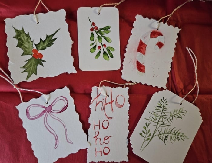
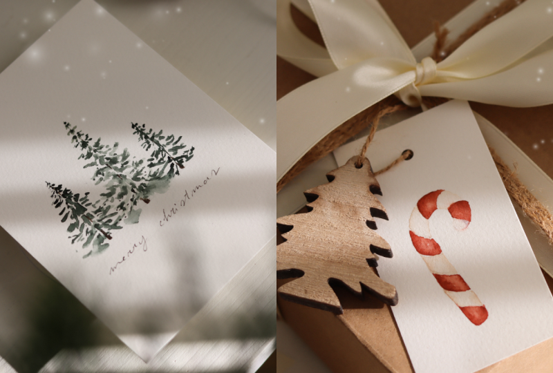
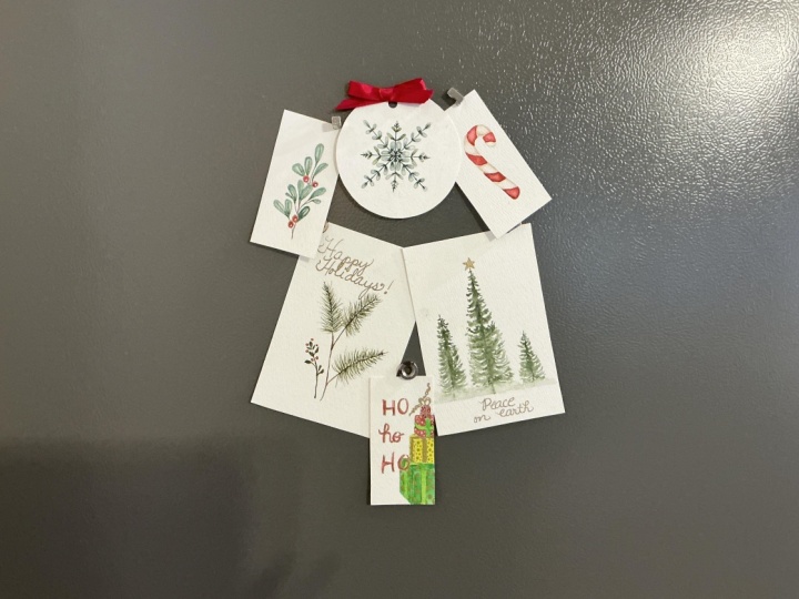
5. Gift Tags: I'm starting this first gift tag with a simple candy
cane illustration. So for some of these
tiny illustrations, I like having a
light pencil sketch underneath just to keep the
shape clean and precise. I actually tried
filming the sketch, but the lines were so light that the camera didn't
really pick them up. So instead, I prepared a printable sheet with all the illustrations that
will paint in this class. The lines on that sheet
are a little bolder, so you can trace
them onto your paper or simply use them as
a clear reference. So take your time to
sketch this illustration, pause the video, and when
you're ready, I'll be here. So once the candy cane
shape is sketched, I am going in with a red mix. The one that we created using
Indian red and light red. Since the illustration
is very small, I'm using a size two run brush to stay as precise as possible. I begin by painting
the bottom section. I drop in the red color, but I don't cover
the entire shape. I make sure to leave a
small untouched area. After placing the color, I rinse the brush lightly, dab it on the paper towel, and come back with clean
water to soften the edges. This creates a soft gradient and helps the candy
cane look rounded. Then I add a second touch of red on the opposite
side of the section. Now, moving section by section, dropping in the dark red, keeping that central part light, and smoothing the edges
before the paint dries. So let's say that you
have accidentally covered the entire shape and lost
that lighter middle section. Don't worry at all because
there is a solution. You can simply clean your brush, remove the excess water, and gently lift the color from the center while the
paint is still wet. Do it a couple of times, and you will see the color that will be lifted up
from the brush. This will bring back
the highlight and help the candy cane
keep its roundness. Just make sure to do this while
the paint is still fresh. Lifting doesn't work once
the section has dried. Once I'm done with the first
layer for the red sections, I can move on to the later
parts of the candy cane. For these areas, I'm
using the beige mix we prepared earlier in the
color palette section. It's mostly white with
just a tiny touch of brown to create a beige color. With this color, I fill
in the remaining stripes. Keeping the brushstrokes light so these sections stay delicate. And just like before,
I tried to drop in the color mostly on the edges, and I try to keep the
central part very light. All right, our first
layer is complete, but if you want to deepen
the contrast a little bit, you can add an optional second
layer of the red section. I'm going back in with
the same red mix, and I'm placing the color
just along the edges, always keeping the central area untouched so we don't
lose the highlight. Then with a clean brush, I gently smooth the edges of the strokes so everything
blends nicely and stays soft. That's it. Just a light touch. After this, I will
let the pin dry. A for the next tag, we're going to paint
a simple mistletoe. This time, I'm keeping
everything very intuitive. I don't have a
sketch underneath. So I just start with the tip of the brush and paint a soft
little branch at the top. If you feel the need
of having, like, a map underneath, just go ahead and take your
time to do the sketch. Okay, then I imagine
where the leaves will go. I press down the belly
of the brush and release the pressure to create
these rounded leaf shades. For the color, I'm using
a very light green. Either terre verte or olive green mixed with a
touch of purlin green. Any of these combinations
will work really well. While the leaves are still wet, I drop in a darker value or even a slightly
different green. I love when the colors
blend together on paper. It adds movement and
a lot of variety. All right, as they can notice, now we have all the
leaves on the right side. Now we're going to
add the leaves on the left side to balance
the composition. I'm working on cold
press paper here, and this paper dries a little faster than
what I usually use. So I need to work quickly when dropping in
those darker values. I like placing the
darker color right where each leaf touches the stem and then letting it
spread naturally. Once all the leaves are done, I add a few berries
using our red mix. I place them randomly, but I still make sure that the whole branch feels
balanced and light. I From here, I start adding small detas. I'm just dropping darker
grains into a few areas of the leaves and then smoothing the edges
before the paint dries. I go back and forth
between adding darker value and then softening
with a clean de brush. Tse subtle variations
really give the mistleto that
natural watercolor look that I really love. Of course, this
part is optional. You can keep your branch
very loose or you can add just a simple middle
vein on each leaf. Even that tiny detail
works beautifully. Personally, I really enjoy
adding small details and contrast in some part of
the botanical illustration. And since this part is
a little repetitive, I always like using it as
a moment to slow down. Painting small Christmas
tags like this is something I often do
during the holiday season. It feels cozy and relaxing, and I really love the idea of creating something
handmade for my gifts. I think it adds personal
touch to the wrapping gifts, and the process itself
is just very calming. These tiny illustrations don't
require a huge commitment, so I think they're perfect for a little weekend afternoon or whenever you want a
simple creative break. I will keep adding
these little touches until I'm happy with the result. Always smoothing the edges and keeping
everything very soft. For this tag, we are going to do something a
little different. Instead of an illustration, we are painting a simple
calligraphy style text. I think it looks really
cute on a gift tag, and it's such a quick
little project. To keep everything centered, I lightly sketch the
text in pencil first. And now I'm simply going over those letters with
the red color. Following the sketch underneath. To keep the lettering
from looking too flat, I like working with a watery
brushstrokes at first. That way, when I go back in
with a slightly darker value, I can drop it in and
let it blend naturally. So some parts of
the letters will stay lighter and
others will deepen. And that variation gives a really beautiful
watercolor look. This tag comes
together very quickly, and it's honestly so
relaxing to paint. I hope you're enjoying
the process, too. For the next tug, we're going to paint a
little holly branch, and I think that's
the right name. Those pointy leaves with the red berries that you see
everywhere at Christmas. I'm starting this one
without a sketch, as well. The only thing that I
keep in mind is trying to place everything toward
the center of the tug. So I begin by painting three small berries
using our red mix. I cluster them together
in the middle. Then I brings my
brush and I pick up a darker green to
outline the first leaf. At this stage, it almost
feels like drawing. I'm just using the very tip of the brush to mark
the outer shape. I also drop more paint in some areas and soften
these brushstrokes. Now, the paint is more
diluted, as you can see, and I complete the
outline of the leaf, so we can have a little
bit of variation. I While the leaf is still wet, I like dropping in a bit of a darker pigment
on the left side. I repeat the same process
for the other two leaves, and they're very
loose and intuitive, so don't worry too much
about making them perfectly. Once all the leaves are painted, I let them dry completely
before adding the second layer. This is the part where we add a few details to bring
the holly to life. I'm starting with
the bottom leaf, laying down a darker value
of pearling green on one side and gently
painting a central line. It's a simple detail, but I think that it keeps
a leaf from looking flat. I repeat this on
all three leaves. Lastly, I deepen the berries slightly so they
feel round and rich. This is the last tag
for this lesson. And now let's create
some Christmas cards.
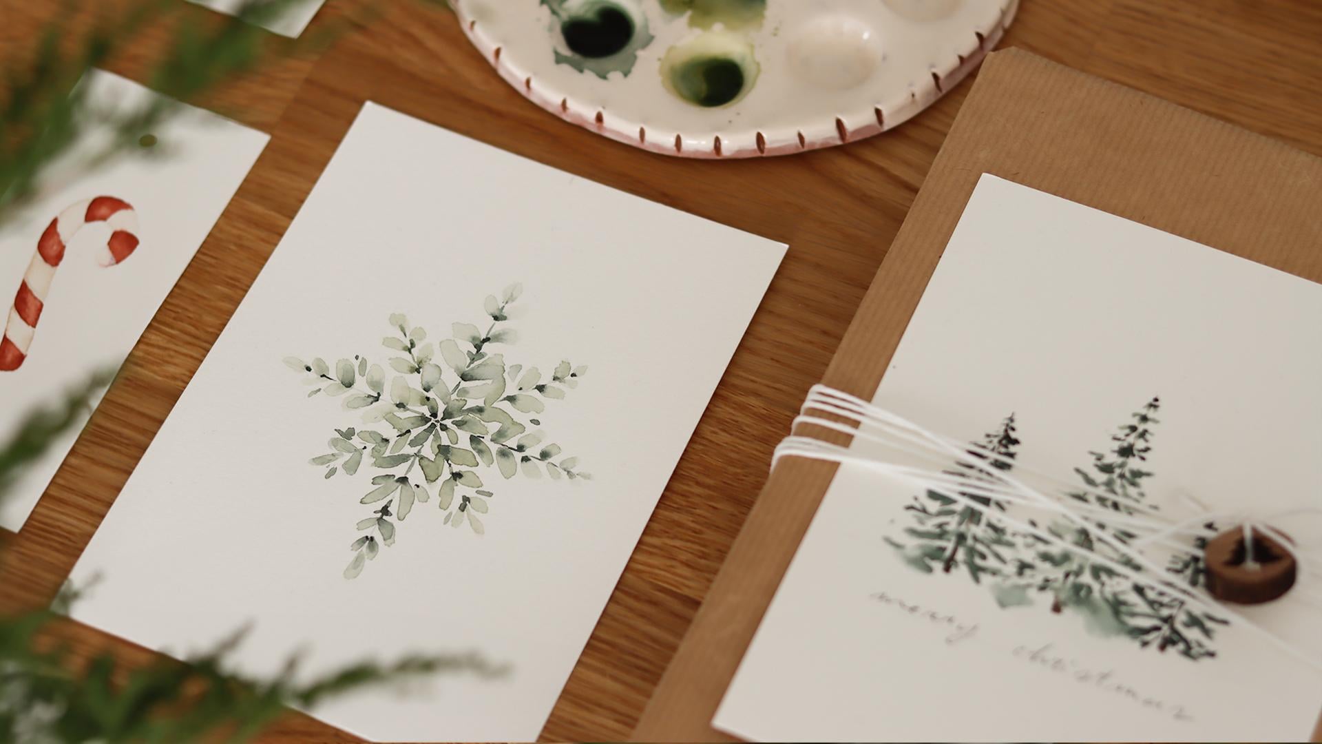
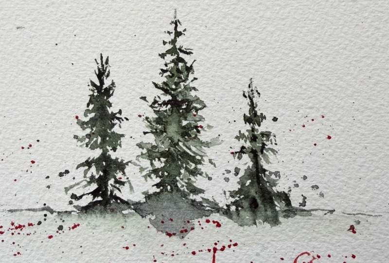
6. Christmas Cards: For this Christmas card, we are going to paint
three simple pine trees. I'm keeping them in the
center of the card. I'm also leaving some space underneath so I
can add some text. To make the painting
process easier, I trace three vertical lines in pencil just to mark where the trees are going
to be placed. I like to start with
a tree in the middle, since it will be
the tallest one. I begin by lightly marking the stem with a tip of my brush. Just a very simple
vertical line. Don't worry if it
appears interrupted because we're going to fill
the gaps with the branches. Then starting from the top, I use the tip of
the brush and begin dabbing gently to create
the smallest branches. These tiny irregular strokes will give the tree
its natural look. As I work my way down, I let the branches become a little whiter and
more irregular. Pine trees naturally spread
out as they grow downward, so I gradually make each level of branches
slightly longer. Whenever I feel the brush
is getting too dry, I just dip it into clean water and dab it on the
paper towel if needed. Or I just pick up more paint. The first tree is looking good, so I'm moving on
to the second one. For this second tree, I'm just repeating the
exact same steps as before. I start from the very top using the tip of the brush to create these tiny
little branches, and then I slowly
work my way down. The branches become larger and a bit more open
toward the bottom. There is nothing perfect
or symmetrical here. These shapes are very regular, and that is what makes
them look natural. And now I'll move on to the
third one, the tiniest one. I follow the same process
beginning at the top, dabbing the brush, and letting the branches widen as I go down. Trees are looking good, so now I'm rinsing my brush and loading it with just a
tiny bit of clean water. I'm going to soften
the very bottom of the trees to give them a
natural watercolor effect. You see the color that will spread smoothly across
our brushstrokes. I gently place a little
water at the base of the branches and let
the color blend into it. It creates a soft watercolor
bleed that feels very light, and I think it's looking
very nice on paper. Once I'm happy with that effect, I let this card dry completely. A Now we can move on to the second
Christmas card. And for this one, we're going to paint a simple pine twig. Before starting, I created a very minimal
pencil sketch here, the outline of the stem
and small branches. The sketch is very light, but it helps me stay centered on the card and gives me a
guide for the overall shape. Alright, once the
sketch is ready, I pick up some brown
color and trace the stem. I start from the very bottom
and I work my way up. The line breaks in a few places, but that's completely fine. We'll add the green
on top later, and it will look very natural. Then I rinse my brush and
pick up a medium light green. This is the mix of pearling
green and olive green, slightly diluted to stay soft. Starting from the stem, I make very thin lines
that point outward. This will be the needles
of the pine twig. At the bottom, the needles are a little larger,
as you can see, and as I move toward the top, I make them shorter
and more delicate. I continue this process
for all the branches, always following the
direction of the stem. And whenever I need, I simply
load more paint and add a few extra needles to make everything feel
full and balanced. Now, the first
layer is completely dry and we can add a
second layer of needles. I'm taking a deeper green. Pearling green works
really well here. And before adding the needles, I am going to refine the stem, especially where the
line was broken. This way it looks
more continuous and it gives it a
bit more depth. Then I start adding
the second layer of needles right on top
of the lighter ones. Again, I begin from the stem. The lines at the
bottom are longer, and as I move upward, I make them shorter
and more delicate. I'm placing the needles very randomly so the
brand looks natural. Pine takes are full of tiny, regular details, and that's
what makes them so beautiful. I personally find this a
very simple winter element, but it always looks
so refined and minimalist on cards
and gift tags. Once I'm done, I take a final
look at the composition. I noticed that most
of the weight is on the center right area and it feels like something is
missing on the left side. So instead of adding
another pine branch, I decided to introduce a different element for
a bit of variation. For this branch, I'm picking pearling green straight
from the tube. I'm not diluting it
with a lot of water because I wanted
to stay very deep. And then I trace a small
thin branch on the left. And add a few rounded leaves. It's just a simple
decorative detail, but I love the contrast that it creates next
to the pine needles. I'm really happy with this card. Now let's move on
to the next one, and we're going to create a
sort of botanical snowflake. So I didn't want to create the traditional snowflake
with a blue color. Instead, I wanted something very botanical that matched
the previous cards that we have created. Here, I started with a
very simple pencil sketch that was really essential here. Just six guiding lines that
meet all in the center. I first drew a vertical line, then a horizontal line. And after that, I added two diagonal lines crossing
through the middle. As I always, take your time, pause the video, and when you're done with
sketching, I'll be here. So I'm using my size four brush, and I've mixed a very
light value of green. Along the main
vertical guideline, I start placing the first
leaves on one side. I begin at the base and
work my way upward. Each leaf is created with
a very simple motion. I touch the tip of the
brush on the paper, I press down slightly
to use the belly of the brush and then lift up again to form this
soft ovo shape. As I move toward the
top of the line, I make the leaves
gradually smaller, so the whole branch
tapers nicely. While the paint is
still wet on the paper, I drop in a darker
value of green. This helps leaves blend softly and gives each one
a bit more depth. You can also try adding a totally different
green and see how the color will blend on
paper with the other one. The goal here is to create a variation and avoid this
snowflake to look flat. Um, so use the colors that really inspire you and
that you really love. Okay, then I move on to the other side of
the vertical line, and I repeat the same steps, keeping the leaves
small at the top and slightly larger
toward the center. So we're going to repeat this process for
all the guidelines. Every time I paint a new leaf, I make sure the base layer is still wet so I can drop
in a darker green. I'm also using pearling
green for the deeper tones. It creates a beautiful
dark accents. And when it's diluted, it becomes a very soft light
green that I really love. And for a variation, I sometimes drop in a
touch of olive green. It's a warmer shade, and I think it adds a
really nice contrast to this botanical snowflake. Now, I'm going to
continue by filling in each of the pencil
lines with leaves. Just take your time
during this step. It's a bit repetitive
but very relaxing. To Once the leafy snowflake
is completed, I take a final look at
the whole composition. Some leaves are missing a
little bit of variation. So I go back in and add
a touch of darker color. Wherever I feel the
illustration needs more depth. I drop in the pigment gently and I just let it
blend on the paper. And lastly, I'm just adding
in a few extra leaves, tiny adjustments until the
snowflake feels balanced. Overall, I really love
how it turned out. The mix of worm and cool
greens adds so much variety, and the whole piece has a soft, elegant look that works
beautifully for a Christmas card. For our last Christmas card, I wanted to paint a bow. I've been seeing bows absolutely
everywhere this year. They're definitely on trend, and I love this quirky
hand drawn style. So I thought it would be a really sweet and simple subject to include in this class. So here I slightly traced the outline in pencil
just to guide myself. But if you feel confident, you can definitely
paint freehand. Using a deep red made from
Indian red and light red. I start by dropping some of that color right in the
center where the knot is, and from there, I just
follow the pencil sketch. With my size eight brush, I outline the first
loop of the bow. I keep going around the sketch, just letting the
paint or water create those natural lighter
and darker spots. I actually really like
when some areas look deeper and others are a
bit more translucent. It gives the bow a very
organic and watercolor feel. Once everything is in place, I take a final look and make
a few small refinements. The right side of the
loop looked a little bit smaller than the
one on the left. So I just adjusted
the shape slightly. Then I dropped in a
bit more color onto the left ribbon and softened a couple of edges
that felt too sharp. And that's it. A very
simple illustration that looks so lovely on card. So now comes the fun part. Let's see how we can pair these illustrations with some cozy, festive gift wrapping.
7. Gift Wrapping Ideas: In this lesson, I want to share a couple of
ideas for wrapping your gifts and pairing them with the tags and cards
that we have created. I actually have a bit of love hate relationship
with gift wrapping. I adore choosing the
twine, the greenery, the little decorations
and seeing everything come together in the end. That is the best part. But I'm definitely not the best at wrapping the actual gift. I always end up fighting
with the paper and folding it neatly is definitely
not my strongest skill. So if you feel the
same, you're not alone. That's why I also kept these ideas really
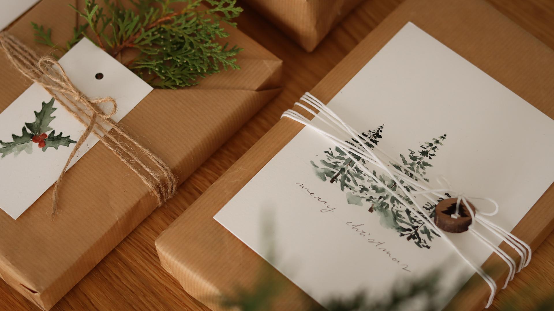
simple and approachable. I'm using craft paper and
a very easy folding method that creates this beautiful v shaped overlap in the front. First, I place the gift
box slightly off center on the sheet of kraft paper instead of keeping it
perfectly in the middle. This is important because it gives you more
paper on one side. And we will utilize it later
for the layered folds. I start by folding the paper on the top and pressing it
firmly against the box. Then I take the right
side and fold it inward. I smooth everything down with my hands so the folds
look crisp and clean. Next, I bring the flap down, and I repeat these steps
for the left side as well. Okay, now you can use a piece of tape to
secure everything. Don't worry if it
doesn't look perfect because we'll insert our
card into the pocket, and this will cover
most of the folds. It's honestly a
simple technique, but it gives the
gifts a hand crafted elegant look without needing
any complicated steps. Now that our gift is wrapped, you will notice that
this folding method actually creates a little
pocket on the front. I love using it to tuck in
one of our watercolor cards. Once the card is in place, I'm taking some twine and wrapping it horizontally
around the gift. I like to go around a few times, so the string looks
a little further. When I'm happy
with how it looks, I tie everything with a simple
bow right in the center. You can keep it
exactly like this, very minimal, very natural. Or you can add a tiny pine cone, a little branch of
greenery, some berries, or any other small
decoration you have at home. Everything works beautifully and really brings the whole
package together. I cut a very small piece of this gold cord just enough
to wrap one around the nut. Then I picked a tiny bell
and slide it onto it. It's such a simple addition, but honestly, makes the whole
package look so charming. Almost like a little
piece of jewelry. And once the bell is on, I gently tie the gold cord
around the twin bow and take a moment to adjust so the bell
sits right in the center. Now, I'm moving on to
another wrapping idea, and this one is even simpler. I still use craft paper
and a white cord, which I wrapped around the
package horizontally as well. I let the cords overlap a bit, and I inserted a small
wooden decoration before tiding the bow. You can see, I kept the bow off center to add
some visual interest. And to finish everything off, I placed the pine tree Christmas card that
we painted earlier, tucking it gently
around the string, so it stays in place. I really love how
the illustration becomes part of the gift. Simple, minimal,
and very aesthetic. Next, I wrapped a tiny
box with kraft paper. And instead of
placing the cord in the center like a
traditional cross, I shifted it slightly
to the right. It's something that you
do often, as you can see, and I think it feels more
visually interesting, and it gives the package a more modern and
minimalist look. I tied a simple bow
using the white cord. Before filming, I had painted
an extra leafy snowflake, but it turned out a bit
too small for a full cart. And instead of letting
it go to waste, I turned it into a
little decortiptg. I just cut around the outline, leaving a thin white
border all around. Alright, next, I use a
small white paper bag. I grabbed some twine, tied a small bow
around the handles, and attached one of the tags. And for decoration,
I added a pumpkin, and I just slipped
around the bow a little green branch for
a final festive touch. This was another
quick and easy way to personalize a plain bag, and you really don't
need anything fancy, as you could see a
little watercolor tag, some twine, something
from nature. Makes the whole package look really charming and beautiful. Lastly, I wrapped
another book using the same technique I showed you at the beginning
of this lesson. I used one of the pockets
to place a green branch, then wrap twine around it, and lastly, I added a gift tag. This is just another
alternative, and I really hope that these ideas sparked
some inspiration. I honestly can't wait
to see how you decorate your own gifts and how you
use your illustrations.
8. Thank You: Thank you so much for
joining me in this class. I really hope that
you enjoyed painting these Christmas
projects, but mostly, I really hope it gave
you some time to slow down and do something creative
for this holiday season. If you painted any
of the tags or cards or if you created
your own variations, I would truly love to see them. Can apply your work in the
project and resources section. It's always so inspiring
to see what you create, and it also helps other students feel encouraged to try
their own projects. If you enjoy this class, leaving a short review would
be incredibly helpful. It supports my work and helps other students
discover this class. So I thank you in advance if you take a moment to do that. And if you want
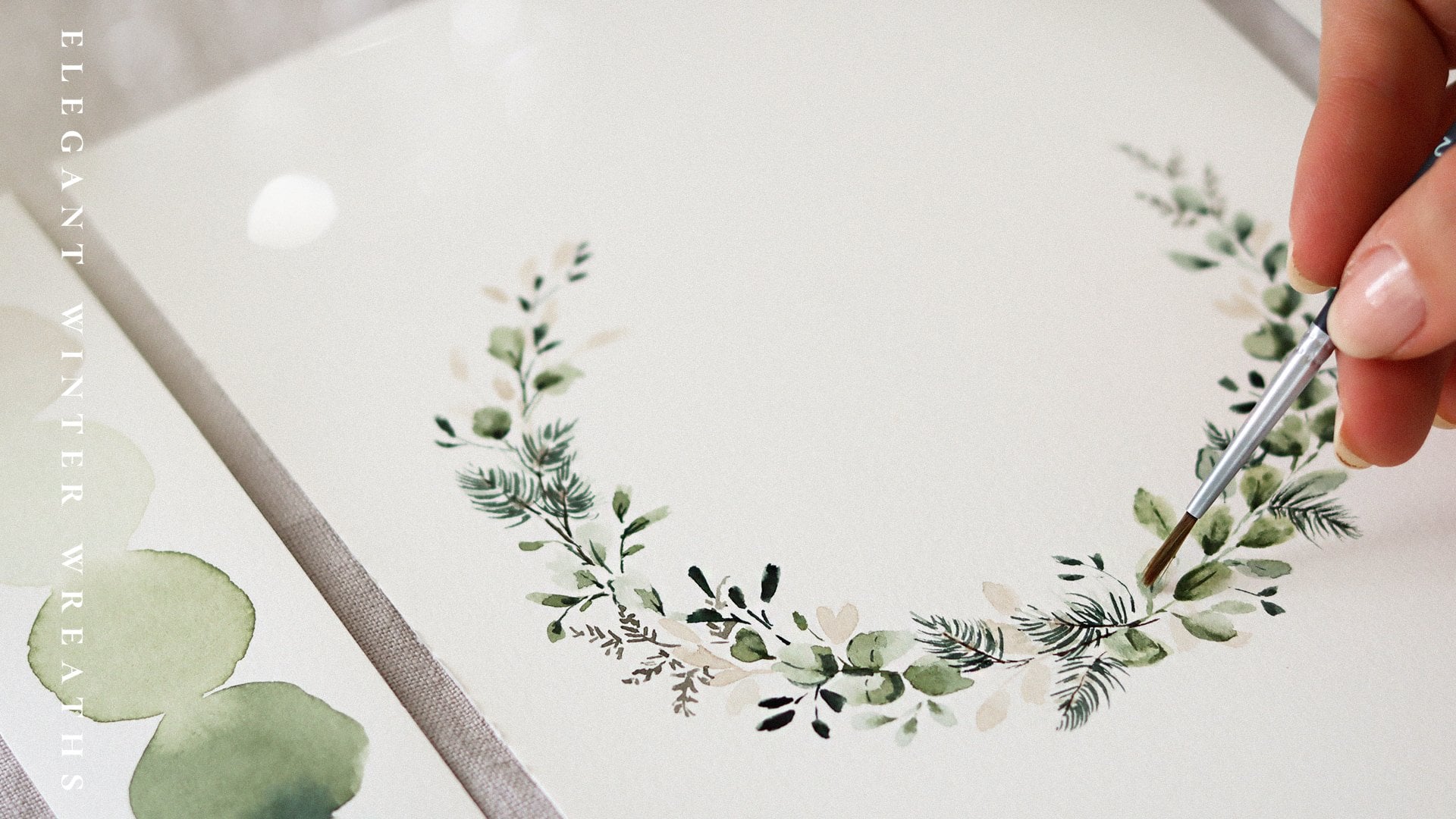
to keep painting, I have another class
that you might enjoy. It's all about creating a
watercolor winter wreath. It's a beautiful
seasonal project, and the wreath you paint
there can also be used as a Christmas card
or printed artwork. So if you are in the mood to continue exploring
winter botanicals, it might be a lovely next step. Lastly, if you would
like to stay connected, feel free to follow me here
on Skillshare for updates on new classes and on
Instagram at Altea do Design, where I share behind
the scenes projects that I'm working on and a
little bit about my life. Thank you again for
spending this time with me, and I really hope you have a wonderful Christmas
season. Bye.
 Altea Alessandroni, Artist and Designer