Transcripts
1. Class Trailer: Whenever Autumn arrives, I
feel most inspired to paint. The air feels crisp, the colors turn warm. And there is so much beauty in the simple details
all around us. Hi, my name is Altea, and welcome to my
watercolor class. I'm an artist, a
graphic designer, and online educator from Italy. In this class, we paint a small series of Autumn
illustrations together. Think of pumpkins, acorns,
leaves, and mushrooms. All those details that remind us of this beautiful season. This class is beginner friendly, and I will guide you step by
step showing you the colors, the materials, and the
techniques that I'll be using. You will also get a printable sketch sheeet so you can simply trace the outlines and focus
on the fun part painting. We'll start by looking
at the materials. I will walk you through
my Autumn palette so you can adapt it with
whatever paints you already have at home. Then I will dive into
each subject one by one, layering color and adding details to bring our
illustrations to life. By the end of this class, you have your own
little collection of Autumn watercolor paintings. You can use them
for handmade cards, journaling or simply as a relaxing creative
practice for yourself. My goal is to keep things
simple and enjoyable, so you can really
focus on the joy of painting without
worrying about perfection. So rub your brushes. Make yourself a cup of
your favorite drink, if you would like, and
let's start painting.
2. Class Outline: Welcome to class. I'm
so happy you're here. I live in Italy, and autumn here started just a
couple of weeks ago. It is one of my favorite
seasons along with spring because nature
changes so dramatically. Seeing the leaves turn
golden and red and noticing the soffur light
in the afternoons always inspires me to paint. I hope wherever you
are in the world, this class will give you
not only the skills, but also some cozy
seasonal feeling. This class, we're going to paint a series of autumn
subjects together, a pumpkin, some leaves, an acorn and mushrooms. Each one has its own
dedicated lesson, so you can follow
them in order or jump to the subject that
inspires you the most. For each lesson, I will
guide you step by step. You'll see how I mix colors, how I layer the paint, and where I add details. Don't worry if you're painting, don't look exactly like
mine. That's not the goal. The beauty of watercolor is that every piece comes out
a little different, and that's what makes it unique. Also prepared a
printable sketch sheet with all the outlines. You can download it in
the resources section and either trace it onto your paper or just
use it as a guide. This way, you don't
have to worry about the drawing part and focus
only on the painting. My advice for this course
is to quickly go over each lesson and then replay
it while you paint along. And I want to remind you to take your time
when you need to, and most importantly,
enjoy the process. Alright, now that you
know what to expect, let's move on and see the
materials that we'll be using.
3. Materials: Before we dive into painting, let's talk a little bit about the materials
that we'll be using. Don't worry. You really don't need a huge collection
of supplies. Just a few basics are
enough to follow along. First, let's talk about paper. I'll be using 100%
cotton watercolor paper. Mine is cold press, which means it has a little bit of texture that I really like. Cotton paper absorbs water beautifully and gives you more time to play
with your colors. But if you only
have saludos paper, that's completely fine, too. So as soon as you can, I really recommend upgrading
to 100% cotton paper. You don't need it
for this class, but keep in mind that the
techniques may look and feel a little bit different depending on the paper
that you're using. Cotton paper reacts
better through water, gives you smoother blends, and really helps you
see improvements in both your process and
your final results. That said, you'll still
be able to follow along perfectly with
whatever paper you have. For brushes, I'll be switching
between a couple of sizes. I like to have a small
round brush for details, something like a
size two or four. Then a medium brush like a
size six for broader areas. Do something small for details and something a little
bigger for larger shapes. Now, onto the paints, I'll be using
watercolors from my pen set and some colors
from the tubes. In the next lesson,
I will show you the exact colors that I'm using, but always feel free to adapt with whatever
shades you already own. Watercolor is so versatile, and the important part is just to play with
the colors you love. You will also need
two jars of water, one for rinsing your brush, and one for clean water. It really makes a difference in keeping your colors fresh. And, of course, some
paper towel or a cloth to dab your brush and
control the amount of water. Lastly, I recommend having a pencil and a needed
eraser on hand. Now that we have our
materials ready, let's move on to creating
our Autumn color palette.
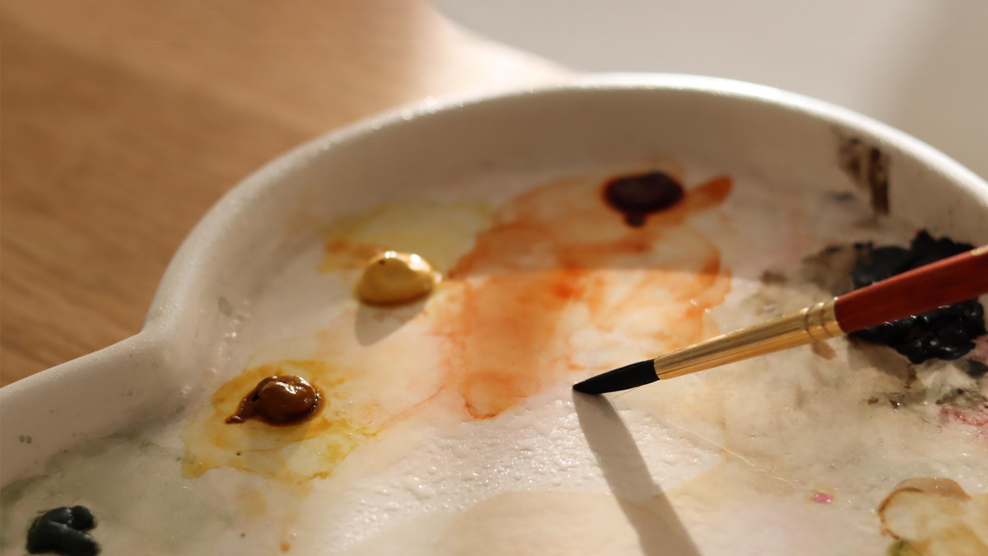
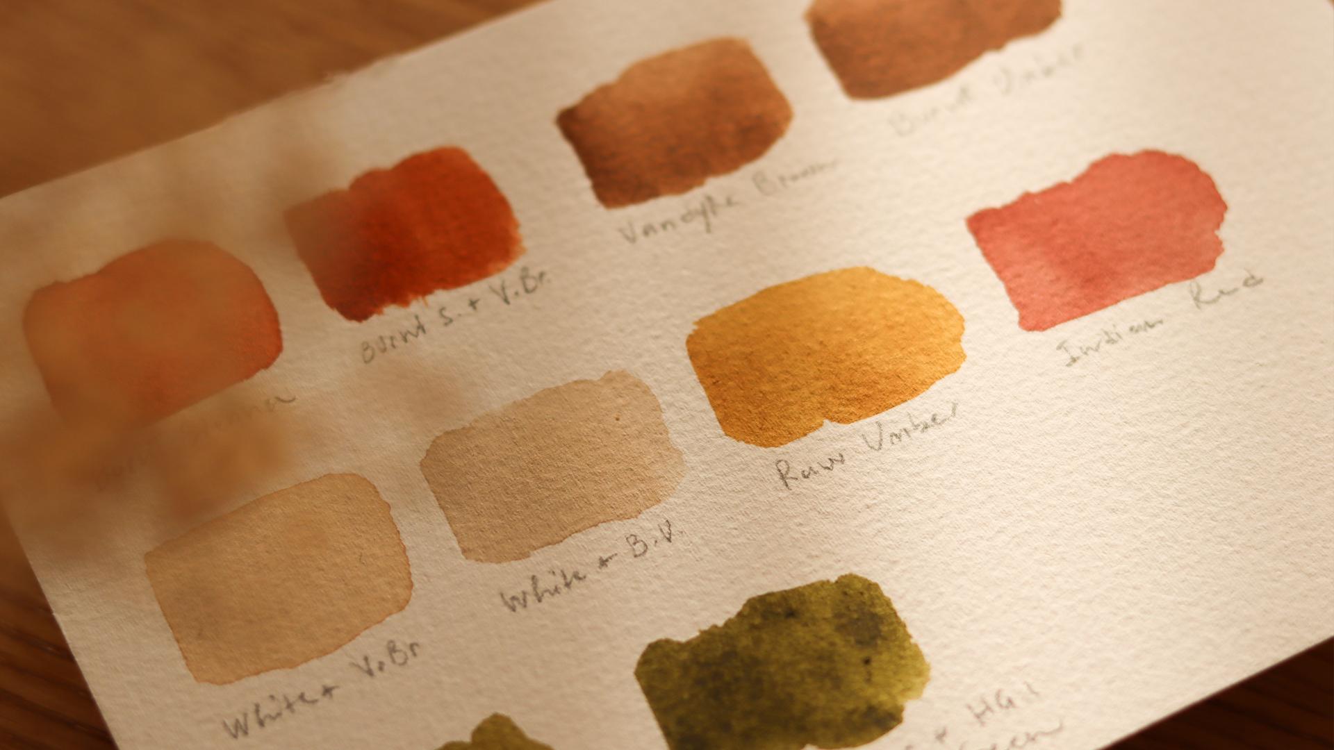
4. Autumn Colors: Before we dive into painting, let's talk about
the color palette that we'll be using today. I've chosen a mix of
warm earthy tones and mutagreens the kind of shades that really capture
the feeling of autumn. Just don't worry if you don't
have these exact colors. You can always adapt with
what you already own. Alright, so first up, I'm picking up a little bit of burnt sienna for my palette. This comes from a tube, and I just mix it with a tiny
bit of water on my palate. What I love about burnt sienna is the it has got this warm, earthy orange tone that
it is not too bright. I think it's just perfect for that autumn fill without
being too vibrant. Then I add a touch of Vandyk
brown to that burnt sienna. This makes the color a little
bit smokier and darker. It is great for
sheating the edges of pumpkins or adding a
little bit of depth. Feel free to play around
with these mixes. There is no right formula here. So after mixing burn
sienna with Vandyk brown, I will also show you the pure
van **** brown on its own. It's a lovely rich
brown that I like to use for adding depth
or for the mushrooms. As you can see, I'm laying down each color in a little swat, so you can see how they look. We've got burnt amber next, which I often use for mushrooms and those deeper foliage tones. The latter areas
of the mushrooms, I will use a mix of white with just a tiny
bit of van **** brown. And similarly, I do
another mix with white and burnt amber for creating just
a different shade. After that, I lay down a pure raw amber swatch so you can see how
it looks on its own. For the berries, I love using Indian red because it has that muted cozy autumn vibe that I think it's just perfect
for little details. Finally, for the greens, I'm mixing raw amber with a little bit of
hooker's green light, and this gives us a nice warm green that's not too bright and
feels very natural. If you want it a little darker, you can add a hint
of Verlin green, and of course, less water. Alright, these are the colors that I will use in
the next lessons, and you don't need to
match my palette exactly. What I want to tell you is that the most important
thing is to choose colors that remind you of Autumn and that make
you feel inspired.
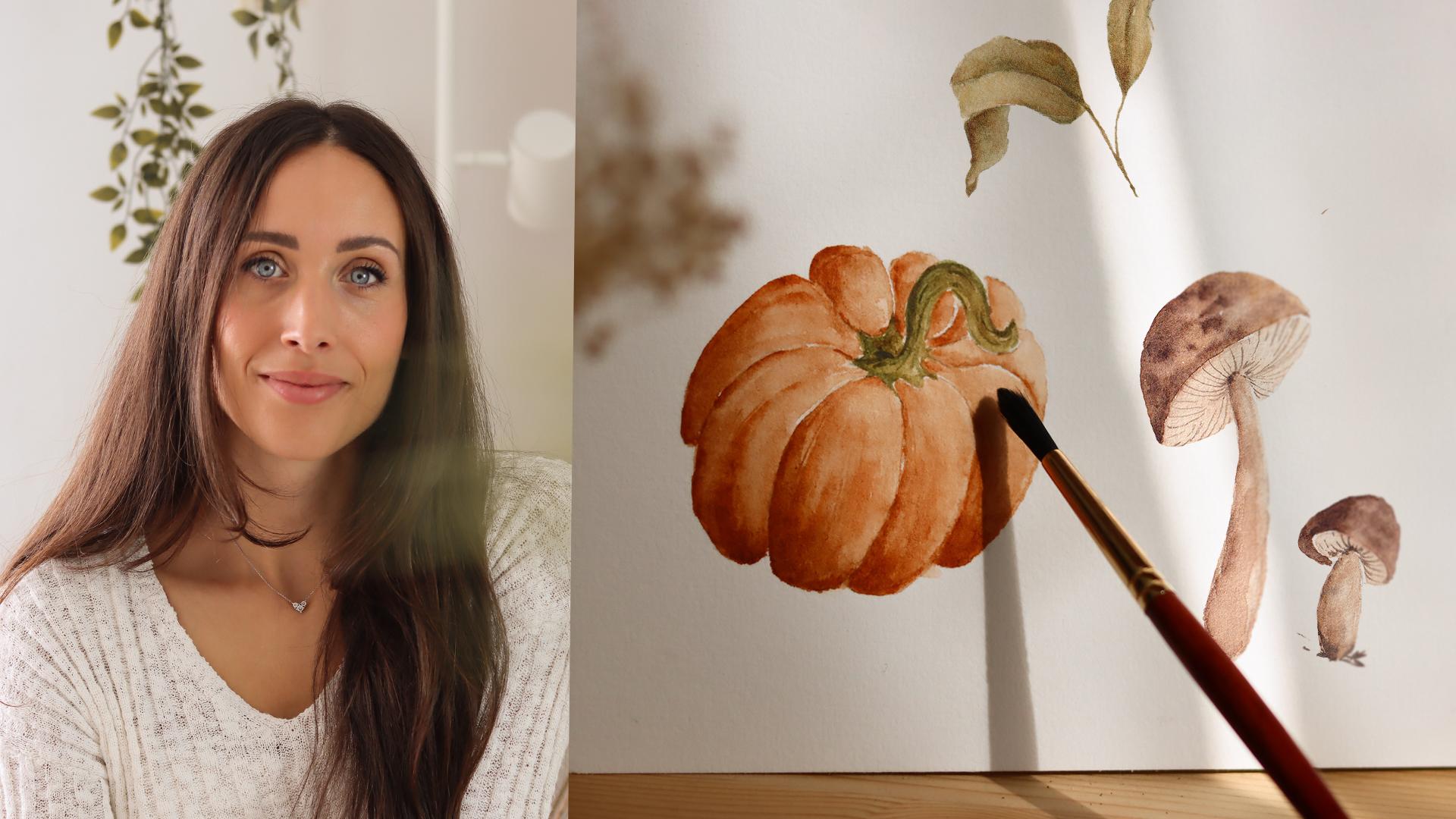
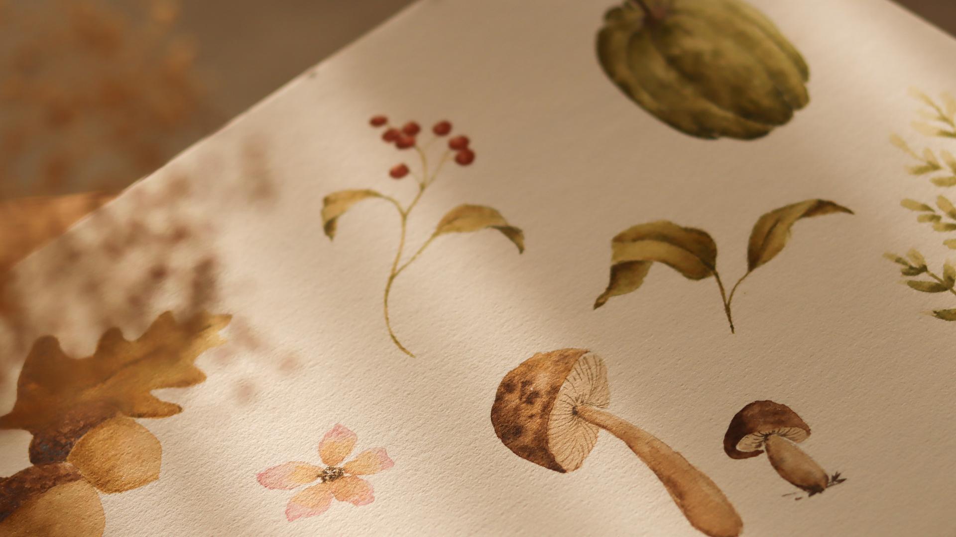
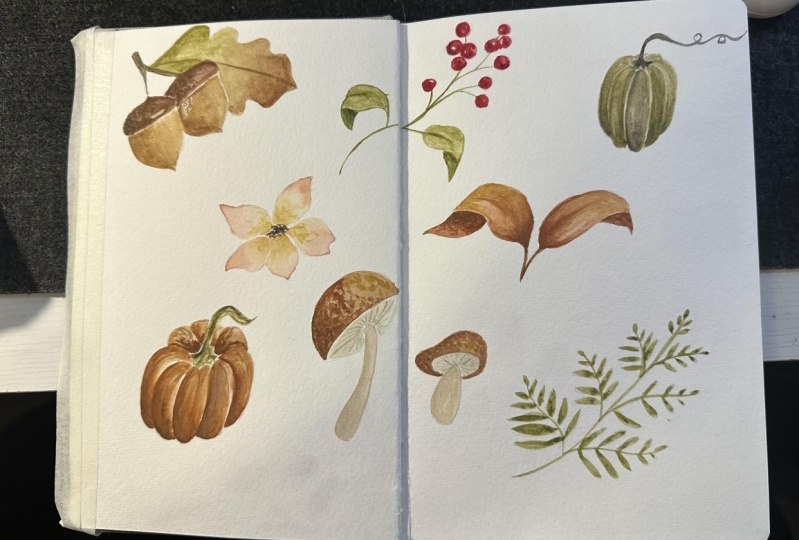
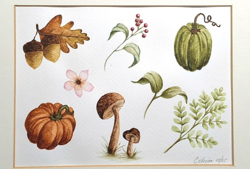
5. Pumpkin Illustrations: Of Alright, so the
first thing that I'm showing you here is our watercolor paper with
a very light sketch on it. It's really important to keep those pencil lines really
as faint as possible, a whisper so that when
the painting is finished, you can erase them gently
without scratching the surface. So after you sketched out
all the illustrations, if you notice that your
pencil lines are too dark, lightly roll a
kneaded eraser over them to left the excess
before you start. Okay, so for the sketching part, if you want to make
the setup even easier, you can print template
that I have prepared. Um, the lines on the
template are very dark, so you can tap it to a window, place your watercolor
paper on top and trace. That's exactly what I did here. It's simple, quick, and you get a clean outline without
overworking the paper, which is super important. Now, pause the lesson and take your time to outline
each subject. And whenever you're ready,
let's start painting. Let's start with a pumpkin
in the bottom left corner. For the first step, I'm going in with a
slightly deeper tone. I've mixed burnt sienna with just a touch of van ****
brown to met it a little. I'm placing that darker
value at the bottom of each section because I'm imagining the light coming
from the upper right, so the lower part will
naturally fall into shadow. Once the color is down, I rinse my brush lightly, dab it on a paper towel, so it's damp, not dripping, and I pull the pigment upward. I'm moving the brush softly to let the color
fade as it travels, creating a smooth gradient
with a lighter center. Keep your hand relaxed. The suffer the pressure, the suffer the transition. Before I move on,
I want to drop in a slightly darker mix right at the base and near the crease just to reinforce the shadow. Remember that watercolor
dries lighter, so don't be afraid of a
little bit of contrast here. Okay, now I'm ready
for the next section. I simply repeat the same steps, darker value at the bottom, than rings, dab
and blend upward. If you see a harsh line forming
where you don't want it, you can just touch it with a clean brush and
soften it right away. I will continue like
this for each section, always keeping the
light source in mind, so the lower areas stay deeper and the upper
parts remain lighter. If a section turns out too dark, lift a little bit of color
with a damp brush or attach a corner of a paper towel to the area to pick up the aces. And please feel free to experiment and see what
feels natural to you. For example, on
this upper section, I start with a
lighter wash toward the top and then drop the
darker mix at the bottom. This gives a very
soft transition, and we reach the same result. Go ahead and keep filling in each section at your own pace. During this course, I'm
going to spit up parts of the video to keep the class
concise and easy to follow. But I want to let you know that you don't need to
paint fast at all. Pause whenever you like. Rewatch a moment or even
practice a single section on a scrap piece of paper before committing to the
full illustration. When you're ready, press play again and we'll
continue together. Alright, once the first
layer is completely dry, I begin the second step. I'm starting again from
the middle section, just like we did
at the beginning. When painting on
top of a dry color, we are slowly building depth. I load my brush
with the same mix, burn sienna with a
touch of vandyke brown. And I gently lay down the color. My strokes go from
the bottom upwards. As you can notice, I'm keeping my strokes a little
bit scratchy, but if you like better
or smoother look, you can keep your
brush a bit more damp and lay down
the paint evenly. I continue section by section. And again, if you
notice a harsh edge or a brush stroke
that you don't love, just rinse the brush, wipe off the axis, and come back with a clean
brush to soften just the edge. As I work my way
around the pumpkin, I continue reinforcing the
creases between each rib. This is where the pumpkin
gets its definition, so don't be afraid to build up a little extra contrast
in those areas. Remember, watercolor
is all about layering, and this step can actually be repeated as many
times as you like. If you finish two
passes and fill a few areas still look
a little bit flat, you can absolutely
add a third layer. Just make sure the
previous layer is fully dry before
you go back in. Otherwise, it will
disturb the paint and risk lifting color
instead of adding depth. So once you're happy with
the overlook of the pumpkin, we can move on to the stem. For the stem, I like to use
a very deep earthy green. As we saw together in
the pallet lesson, I've mixed raw amber with hooker's green light and just
a touch of per line green. I keep the consistency on
the thicker side using very little water so that the color is very
thick and dark. I begin by dropping a
few brush strokes at the base of the stem where
it meets the pumpkin. Then with the tip of the brush, I outline the upper left edge of the stem to give
it definition. After that, I switch to a lighter hue and I
feel the whole shape. This will give the stem some roundness instead
of looking flat. Lastly, I'm adding
some burnt amber for more contrast and variation. So while this pumpkin
is going to dry, I will start working on the
second pumpkin on the sheet, and I would love for
you to do the same. So I challenge you to choose
any color that inspires you and simply apply the exact steps that we practice together. Build your first layer
section by section, leave the highlights at the top, and then come back with more layers once
everything is dry. This way, you will
get more practice repeating the same technique, but also freedom to
experiment with colors. And, of course, I'm
very curious to see how your pumpkin
will come out. All right, so by the time
my first pumpkin dried, the color had lightened
up quite a bit, as watercolors always do. So I decided to go
back one more time and add the final layer
in some of the sections, especially along the left side, where I wanted stronger shadows. This last step helps me
balance everything out and gives the pumpkin
its final polished look. And that's it. Our
pumpkin is complete. Take a moment to look at the shape as a whole
and notice how those layers of colors and the little touches of
contras bring it to life. When you're ready, let's move on to the next Autumn
subject together.
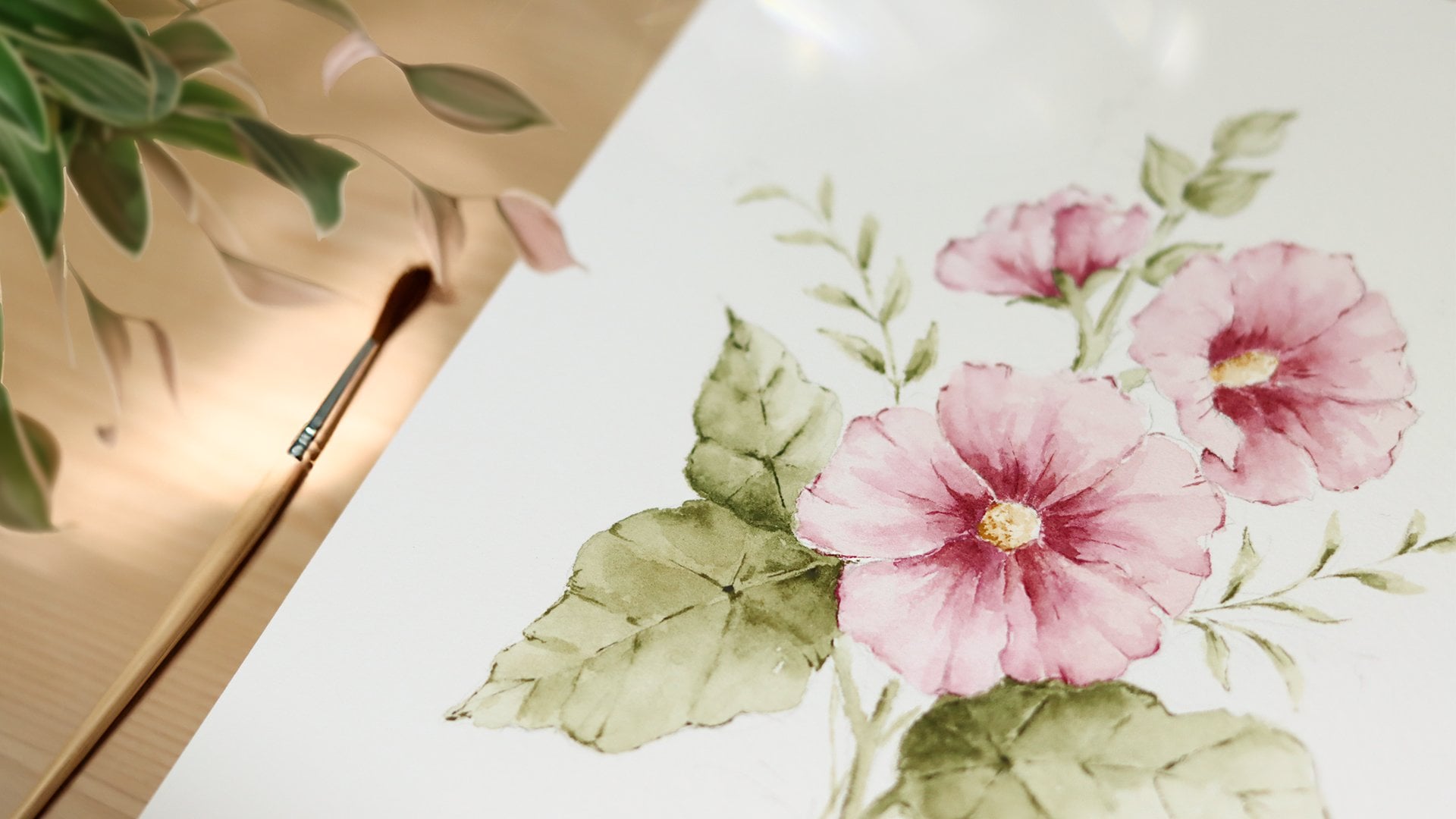
6. Leaves and Branches: I always watched colors before, but because I'm planning
to use new shades, I'm just testing them out
on a scrap piece of paper. This is a very helpful practice, and sometimes I do it before
starting a new painting. This helps me check if I've
got the right shape and the right value before putting paint dartly onto the sketch. For this flower, in particular, I wanted the petals
to transition from a soft pastel
pink to warm beige. Mix the pink, I combined rose mother with just
a touch of white, which gives me a
delicate pastel tone instead of a bright pink. For the beg, I diluted
raw amber with a good amount of water to
get a very light value. Once I was happy
with the colors, I started directly
on the petals. At the top of each petal, I placed the pink shade first. And then I immediately bring the Big tone on the
lower part of the pedal. With a clean done brush, I blend the two so they can meet softly in the middle and
create a gentle gradient. If the colors seem too strong
to you, if that happens, just lift some paint with a clean brush or dab it
lightly with a tissue. Whatercloor is
forgiving in that way. So I continue by adding the
bash to the remaining petals. Again, rinsing and
softening with my brush. So everything looks
smooth and delicate. Alright. Once that first
wash has settled, Okay. I go back with a pink again, this I'm focusing on the tip of the petals just to outline
and bring the phonician. For the center of the flower, I pick up a medium value of brown and dab the brush gently, creating a cluster
of small dots. These don't need to
be perfect circles. In fact, irregular marks
look more natural. With the same brush still
holding a little pigment, I pull some of that brown into the very base
of each petal. To finish, I switch to a
slightly darker brown. You can use burnt
umber or sepia and add a few more dots
right in the center to give it more contrast
and add texture. And if any of your brush
strokes looks too harsh, just soften them again
with a damp brush. Okay, I'm pretty happy
with this flower. Now we're moving
on to the berries. I'm beginning with the berries, and for this, I'm
using Indian red. Okay, I'm keeping
the color very rich, so I've only diluted it with
a small amount of water. I start on the left
side of each berry laying down the pigment where
I want the shadow to fall. While the paint is still wet, I rinse my brush
and use clean water to pull that color across
the rest of the berry. So this leaves us with a darker side and a
softer lighter side. Try to add variation, so make some of them a bit darker and others just
a little bit lighter. Before they dry, I
drop in a touch of more concentrated pigment
on the shaded side. The color will spread
in gently on its own, creating a soft transition without me having
to overwork it. Once the berries are complete, I move on to the stem. For the first wash, I pick up a very light green, something subtle and delicate, so it doesn't compete
with the berries. Then with a slightly darker mix, I reinforce just
a few key spots, the base of the stem where
it meets the branches, and the lower part of
the stem as it curves. This contrast helps the
branch feel more dimensional. For the leaves, I take
a similar approach, but I actually start with a darker value
first with a mix of raw amber and
hooker's green light deepen with the tiniest
touch of purlin green. I map the areas that
will be in shadow right along the fold of the leaf at the base where
it meets the stem, and anywhere the leaf
tucks under or curls. I'm using the tip of the brush
and very light pressure, almost drawing the path of the shadow rather than
painting the whole shape. Before the color dries, I rinse, dab and switch to a
very light green wash. I lay this lighter wash over
the top part of the leaf. Alright, I repeat
this on each leaf. For the finishing detail, I pick up a medium green and
suggest the central vein. Following the curve of the leaf, a couple of tiny side veins
or a hint of texture near the base is just enough to bring the leaf to life
without overworking it. So while the surface is
still just a bit damp, I drop a small accent of a darker mix right along the
fold to reinforce death. Alright, now, let's move on to the two curd leaves
here at the bottom. For this, I'm using the
same green mixes that I've been working with
throughout this course. But while I paint, I
want to share a thought. Since this is an
autumn themed page, warmer colors can really
elevate the overall mood. Shades like golden
yellow, earthy browns, or even hints of red would feel very seasonal and tie everything
together beautifully. Unfortunately, I
realized that after I had already started
laying down these greens, and that sometimes
in watercolor, you only see what would look better once the paint is
already on the paper. So I will definitely
try to lay down like a warmer layer of color once all the illustrations
are finished, but for now, I will keep
going with these greens. While these leaves are drying, I like to multitask and return to the other
parts of the page. Here, I went back
to the berry branch using a fine tip brush and
a darker value of green, I redefined some of the
areas like the central vein or the leaves and a
few edges of the stem. These small touches make
the shaves sharper and add a nice contrast against the lighter washes
we put down earlier. Coming back to our list, I want to share one of
my favorite habits. I always step back
from my painting. Looking at your work from
a little distance can help you see the bigger picture where it needs more contrast, where things might
feel unbalanced or where a simple extra detail
could make a big difference. Once these curd
leaves feel finished, we can move on to the last
subject on this page. With my pencil, I already sketch out the direction
of the main step and the smaller
branches just to give a guide for where everything
will go. All right. With my brush and a
medium value of green, I start tracing the main branch
and then work my way up, adding each smaller
branch along the sides. For the leaves, the brush
stroke is very simple. I just let the bristles touch
the paper and left them up. It's almost like stamping
the shape of the brush. This creates a natural
organic leaf shape without needing to outline
or overworking it. As I move upward, I make the branches and
the leaves smaller. With a darker value of green, I go back in and touch
just the base of some of the leaves or the
underside of a few branches. This creates the illusion of shadows and gives the
branch more dimension. I don't add dark
accents everywhere, only in selected areas. So there is still a nice bonce
between light and shadow. What I love about
this type of branch is how meditative
it feels to paint. The repeated brush strokes to create leaves
are very simple, but I think they create
such a delicate effect. If you're following along,
don't brush this part. Just enjoy the
rhythma of the brush, moving up the stem leaf by leaf. And remember, not every
leaf has to be identical. The little variations
in size and spacing actually make
it look more natural. You might also experiment
with color here. If you would like,
try adding a touch of yellow to some
of the leaves or even a hint of brown to capture the autumn feeling of a
fern just beginning to dry. The subtle shapes in
color can really add richness and keep the painting
from filling to uniform. This was a very simple element, but I think it was
really fun to paint. And as I said, I always find it super meditative painting the
leaves in this way. Alright, so now that
we have finished painting all the
leaves and branches, we can move on to the next
subject, the mushrooms.
7. Mushrooms: For the mushrooms, I've prepared two main mixes a soft
beige tone that I will use for the body and some deeper browns for the cups. For the cups, I'll be
using Van **** brown, burnt umber, and sepia. These are the same shades we saw together in the color
palette lesson, so they should look familiar. Let's start with the
larger mushroom. I'm beginning with a cup, and I'm laying down Vandyk
brown on the left side. I keep my brush
fairly damp here, not too dry so that the paint flows smoothly across the page. Then before the paint dries, I rinse my brush. Rub it on the paper
towel and use just a little bit of clean water to smooth out the
edge of the color. This helps me create
a soft gradient from darker on the left
to lighter on the right, giving the cap that
rounded appearance. Well, it's still wet. I drop in a few touches
of burnt amber, so I switch to a darker hue. This creates those
natural variations and textures that you often
see on mushroom caps. So don't worry about
making it perfectly even. In fact, I think it looks
more realistic if there are some irregular spots
and darker patches. So you can think of it as little freckles or markings that give the
mushroom character. I repeat the same steps on the smaller mushroom
right beside it. First, the van ****
brown on the left side. Blending it toward the right, and then dropping
in a few touches of burnt amber while the
paint is still damp. The process is exactly the same, just on a smaller scale. So you might want to switch to a slightly smoother
brush for more control. All right now that
the caps are done, let's move on to the latter
part of the mushroom, the stem and the
underside of the cap. For this, I've already
prepared on my palette, the beige color that
I'm about to use. So I start by laying down a smooth even wash
to cover the area, keeping the brushing
nice and damp so that the paint can flow
smoothly across the page. Once that's in place, I prepare a more diluted
van **** brown, not too strong because
I want to build the shadows and the
texture gradually. With this, I just lay down a few brush strokes on the
left side of the stem. Notice that I don't fill it in with a solid block of color. Instead, I place the pigment
in irregular patches, leaving some areas lighter. Then I grab the beige color and I lay down some
brushes as well. I do this step for
the tiny mushrooms, and once I have the
paint in place, I soften those brush strokes and spread the color to
fill in those areas. Right now, I switch
to burnt amber, and with the tip of my brush, I add a few darker strokes
right at the base of the stem. These marks are irregular, almost like little
grasses or soil textures, just to suggest
that the mushroom is growing out of the ground. Here I'm adding a
little bit more depth to the stem of the
bigger mushroom. And as we did before, I lay down the
paint in splotches. Then I make sure to blind
them with a clean them brush. Or right now that our caps
and stems are in place, we can add one of the
most distinctive feature of the mushrooms, the gills. This step requires patience
and a steady hand, but don't worry too much about
making every line perfect. What matters is
creating the suggestion of that delicate texture
underneath the cap. So I switch to a
fine brush here, something with a sharp point. I've picked up a very
diluted version of sepia. You can also use burnt amber
or whatever brown you have. The important thing is to
keep the color soft and not too dark so that the lines don't overpower the
rest of the painting. The lines begin
right at the center where the stem meets
the cap and from there, I gently pull them outward toward the
edge of the mushroom. I'm using very light pressure on the brush so that the strokes
can stay thin and fine. So you will notice
that I don't try to cover every single
millimeter here, but this is just
my own preference. I wanted to be I wanted these
lines to be very delicate, and I was afraid
that if I would use a darker color or if I would
fill in the area with lines, many, many lines and leave too little
spacing between them, the painting would
look very heavy. So this is why the
lines sometimes are interrupted and are very
light and delicate. Okay, once the
gills are finished, I take a look at the
larger stem again. It felt a little bit flat to me, so I decided to go back with a very diluted
van **** brown. So I'm adding one more layer to the left side of the stem, just to deepen the
shadow and add more texture and more volume. Even a subtle adjustment
like this can make the whole mushroom look
more three dimensional. And with that, our
mushrooms are complete. Then I have rich
cups, rounded stems, and those delicate gills details
that bring them to life. When you're ready,
we'll continue to the next subject in
our autumn collection.
8. Acorn: Alright, we are almost at
the end of this class, so congratulations for being
here and making it this far. Let's start painting this acorn, starting from the
top part, the cup. With my medium brush, I load a dark value of andyke brown and
place brush strokes mainly on the left side. Then I rinse the brush lightly. It's okay if there is still
a little pigment left, and I gently dab
along those marks so I can soften and blend them. This way, the color fades naturally and creates
a lighter transition. Next, I take burnt
umber in a deeper value and begin to add small dots across the surface of the cap. This part of the
acorn isn't smooth. It's covered with
tiny and even shapes. So these dots really help
create that texture. I don't try to make
them all uniform. Some are blended, some
seem more defined. Which adds realism. For the body of the acorn, I use raw amber. It got a little bit mixed with the green that was
already on the palette. So this is why you will
see it slightly different. The color is diluted
and very light. This way, I can create
a light soft base. I cover the entire shape
with this light layer. While the surface is still wet, I drop in a little bit more
pigment on the left side. This will begin to shape
the roundness with a shadow on one side
and light on the other. Now, let's paint the stem. I suggest to use a fine brush
here to be more precise. Starting from the top
of the acorn cap, I carefully trace thin lines
upward to connect the stems. These strokes are delicate, so try to keep your
hand very light. From here, I begin the leaf. I start with a golden
brown wash of raw amber, laying it across
the whole shape. I'm imagining the colors of this leaf turning to autumn tons, and I'm leaving some
areas untouched, so I can add some
green color later. Here I'm laying
down a soft wash of green by tapping the
brush onto paper. Along the outline
and near the veins, I drop in a darker brown, tuberfine edges
and add contrast. Y At this point, I return to the acorn body. With another glaze of green
mixed with raw umber, I layer more color onto the left side to
deepen the shadow. This second layer
makes the acorn feel rounder and more solid. And of course, don't forget to soften the edges of
your brush strokes. I also go back to the cap, adding another round of dots. Some of them I blur slightly, others I keep crisp
because the variety of edges makes the texture
look more natural. Then once again, I
return to the leaf, adding one more layer
of brown to intensify its autumn feeling and refining the details
along the veins. As you can see, I
keep moving back and forth between the
different parts of the acorn and the leaf. This back and forth process not only helps everything
staying balanced, but also gives time for
the different sections to dry before laying paint again. I add last set of
dots to the cap, as well, adjusting the
texture until I'm happy. For the final touches, I'm adding one last layer
on the acorn's body, curving my brush struck along its shape to suggest roundness. Now a step back to check
the overall balance. Sometimes adding just
a hint of shadow or a bit more contrast makes the
illustration feel complete. Alright. And when
everything is dry, you can gently erase your pencil lines
with a needed eraser. This will make your painting
look clean and finished. I'm so, so happy that we made it to the
end of this class, and let's wrap things
up in the next lesson.
9. Thank you: Thank you so much for
joining me for this class. I really hope that
you enjoyed painting these Autumn illustrations
with me. Now it's your turn. I would love to see
what you have created. So please show your project
in the project gallery. You don't have to
share the whole set. Just one illustration like a pumpkin or even a little
mushroom is more than enough. It's always inspiring to see how each one of you as their
own personal touch. If you have enjoyed this class, it would mean a lot to me if
you could leave a review. Helps me stay motivated and
keep creating more classes, but also it will help other
students discover my courses. Also, if you want to
get updates about future classes or, you know, about the projects
that I'm working on, don't forget to follow
me here on Skillshare and on Instagram at
Altea dot design. Thanks again for
painting with me today. I really hope that you
will keep practicing, experimenting with colors, but most importantly,
enjoy the process. I will see you very soon in one of my future classes. Bye.