Transcripts
1. Class Trailer: There is something magical about painting with watercolors. The way the pigment blend, flow, and create
something uniquely yours. When we capture the
beauty of flowers, watercolor becomes the perfect
medium to bring a piece of nature into our lives and connect deeply with
the world around us. Welcome to a new
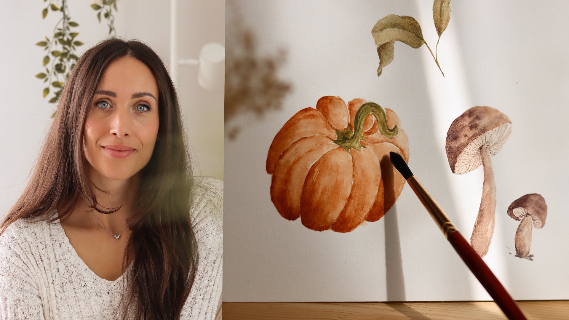
watercolor class. My name is Alta, I'm an artist, graphic designer, and
online educator from Italy. This course, we're going to explore the captivating
world of floras. Nature has always been a great source of
inspiration for me. The intricate details,
the vibrant colors, and the delicate forms
of funding flowers offer endless possibilities
for artistic expression. This journey into
watercolor floras will be the perfect guide for you to learn how to sketch
and paint a hollok flower. Will prepare all the materials and tools we need for the class, and we'll then dive
into botanical study, ensuring that we capture
the essence of the flower, while setting a strong base
for our watercolor work. After that, we'll dive
into color mixing. You will learn how to create
a harmonious color palette, blending just the
right shades to bring your hollocks to life with a
limited selection of colors. We then begin painting the
first layer of the flowers, focusing on light
washes that establish the base colors and soft
transitions between petals. As we build up layers, you will discover how to add depth and detail to the flowers. Ing dimension, and a
sense of realism while still keeping the
unpredictable watercolor look. Next, we'll move on
to painting leaves, giving them the same
attention to detail, starting with light washes
and gradually adding depth to create a cohesive
and balanced composition. Finally, we'll
refine our painting with the final touches. The delicate details
that bring everything together and give your painting that polished and
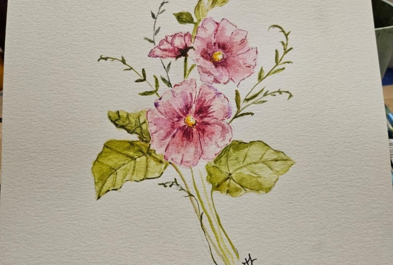
unfinished look. By the end of course, you will have created a
beautiful watercolor holyok, but most importantly, you will have gained
the confidence and skills to keep exploring the
world of botanical painting. So grab your brushes, and let's get started on this
creative journey together.
2. Class Project: Welcome to class. Before
we dive into the lessons, I'd like to give
you a quick outline of how the course is structured, and share some tips to help
you get the most out of it. This class is divided
into two main parts. In the first part, we'll
be focusing on sketching. You'll learn how to break
down floral shapes, into simpler forms, and create sketches of hollock
flowers, pods, and leaves. Even if you're new
to drawing or feel a bit unsure about your
sketching skills, don't worry. These lessons are designed to be approachable and easy to follow. The goal here is
to help you build confidence in your sketching before we move on to painting. Second part of this course is all about
watercolor painting. Once we have completed
our sketches, we'll move on into adding color, learning how to
layer watercolors, and how to create depth in
your floral illustrations. I'll guide you through
painting the flowers, leaves, stems, bad step by step. You can follow the entire
course from start to finish or depending on
your needs and interests, you can decide to focus more
on one part over the other. For example, if you're mainly interested in improving
your sketching skills, you might want to spend more
time on the first part. If watercolor painting is
what excites you the most, then feel free to spend more time on the second
part of the course. I recommend
dedicating one day to the sketching lessons and another day to the
painting lessons. This way, you can give yourself
enough time to absorb and practice all the new skills that you will acquire
without feeling rushed. I've edited some of the lessons to keep
the class engaging, certain parts of the
painting process may be sped up to avoid
it feeling too long. However, because this
is a recorded class, you can always post the video. Rewind or rewatch any part
that you need more time with. Lastly, I'd love
to see your work. If you feel inspired, please share your work in the project section
of the class. It's always exciting to see
how each of you interprets the lessons and your progress can motivate and
inspire others as well. Okay. Now that we are all set, let's get started, and I will
see you in the next lesson. M.
3. Materials: Before we dive into painting, let's talk about the materials we'll be using in this class. Having the right
tools can really make a big difference in your
watercolor journey. I want to ensure you
are set up for success. For our final painting, I'll be using 100% cold
press watercolor paper. This paper is ideal
because it has just the right texture to
hold the paint beautifully, allowing us to achieve both smooth washes
and detailed work. Cotton paper is considered to be among the best
quality paper available. Is durable and the
cotton fibers can retain water and pigments
exceptionally well. This ensures that
the paint spreads smoothly and evenly
across the paper. I can't stress this enough, but using paper made from 100% cotton will help you achieve the desired look
for your final painting. On the other hand,
when we are creating our color palette and
doing some initial tests, any student grade watercolor
paper will do the job. It doesn't matter if harsh lines form or colors don't
dry a smoothly. Using a more affordable paper, we can experiment
freely without worrying too much about waste
or cost. All right. For brushes, I'll be using a set of round brushes
from Princeton, specifically sizes
eight, four, and two. These brushes are versatile
and will allow us to paint everything from broad
strokes to fine details. The size eight is great
for laying down washes. The size four is perfect for adding more controlled layers, and the size two will
just help us with the finer details
in our painting. You will also need
two jars of water, napkins or paper towels, and a mixing palette. Regarding colors, I'll be using some hues from the paint set
and some from the tubes. The brand I'm using is
Windsor and Newton, and of course, don't forget your pencil and eraser
for the sketching part. These are the essentials
we'll need to get started. If you don't own
a specific brand and need to make
substitutions, no worries. I encourage you to use the
materials you have access to. What's most important
is that you feel comfortable and
ready to create. Now that we have our
materials ready, let's move on to sketching
the hollop flower.
4. Sketching Florals: In this class,
we're going to dive into some practical tips and techniques that will
help you approach floral sketching with
confidence and ease. Let's start by talking
about the reference images. When you are preparing
to sketch a new flower, the first step I recommend is finding a good
reference image. In the projects and
resources stop, I have provided a selection of images that you can
download and use. These references are really important because
they allow us to closely observe the plants
structure, shape and details. Take your time to
look through them and choose the one that
resonates with you. You will see I'll be working on the iPad as I explained
my thought process. For now, feel free to simply listen and
observe what I'm doing. Don't worry. We're
going to repeat the same steps on
paper together. You'll get hands on practice. One of the techniques
that I find most helpful is breaking down the
flower into simpler shapes. This method
simplifies what might initially feel like
a complex structure. Making it more approachable
and less intimidating. For example, let's take a look at our main reference
image here. The flower that's facing us darkly can be simplified
into a circle, which represents the
main part of bloom. Other elements like
side flowers can be broken down into a
triangle or a con shape. The basic shapes act as a
foundation of your sketch, guiding you as you
refine the details. These shapes not only help us establish the
flowers proportions, but also provide a sense of
its orientation and depth. Once you have your
basic shapes in place, you can start to refine them. The circle as a guide to draw the individual petals
of the holyoch. See how the petals
radiate from the center. The circle helps to maintain the correct proportions
and symmetry. Similarly, the triangle and the con shapes will guide the drawing of the side flowers, ensuring the look natural
and correctly positioned. When I need to draw a
flower that's new to me, I like to use a digital
tool that allows me to study and draw directly on
top of the reference image. This approach lets me
easily go back and forth, tracing the plant shapes and helping to make these
initial step easier. It also bots my confidence as I become more familiar with
the flower structure. So after this step, I usually transition to paper, repeating the process
by drawing free hand. This practice not only
reinforces what I've learned, but also helps in developing muscle memory for
sketching. Okay. Now we'll start sketching. Feel free to take your time
with this initial exercise. If you don't have a tablet
or an iPad, no worries. You can print out
the reference image place a sheet of
paper over it and tape everything to a window or any light source to
trace the subject. This technique is simple, but very effective, especially if you're
just starting out. For this part of the class, I'm using a sheet of paper, a pencil, and an eraser. I also have a charcoal
pencil handy, but this is not essential. It will just help the
sketch stand out. A quick suggestion
before we dive in since the sketch can very
light on video. If you have a chance, I recommend following
the course on a larger screen like
a laptop or desktop, and be sure to use
a full screen mode for a better view
of the details. All right. Let's begin by
sketching our Holock flower, focusing on the one that's
facing us directly. First, we want to establish the overall shape of the flower by sketching
a large circle. Circle represents the outer
boundary of the petals and will help us keep the flower symmetrical
as we work on it. In the center of the
circle, draw a smaller one. This will serve as a guide for the flower center where
all the petals converge. Oly hawks typically have
five distinct petals. For the first petal, I'm tracing two benchmarks from the
center of the flower, then I trace the lines toward the edge of the larger circle, and lastly, I shave the petal. Each petal is slightly rounded
with gently wavy edges, giving the flower its
soft delicate appearance. Once I have the first
petal in place, I draw the remaining by starting from the
edge of the outline. As you can see, I
draw very slowly, taking the necessary
time and I try to maintain equal spacing
between the petals. If the petals aren't
perfectly symmetrical, don't worry, nature is full
of little imperfections. Once you have the basic
petal shapes in place, it's time to add some detos. Look closely at your
reference image. You will notice that the
petals have subtle lines and textures that from the
center of the flower. These lines give the petals their characteristic
veined appearance and a depth to your drawing. Use a light touch with your
pencil to draw these lines, starting from the center and moving toward the
edges of each petal. You can also begin to define
the edges of the petals, adding small notches or light curves to make
them look more natural. The other edges of
the hock petals often have a slightly
ruffled look, so don't be afraid to let
your lines waver a bit. This will give your flower
more natural and organic feel. To give your sketch
more deaf and contrast, you can go over certain areas
with a charcoal pencil, or you can simply
go over again with a pencil to refrain some areas. Start by darkening the of
the flower where the petals. Next, use the trac pencil to add more emphasis to the
edges of the petals. Now that we've got our
main flowers kept out, let's move on to
drawing the buds. Buds are a lovely addition
to our sketch because they add a touch of natural
progression and growth, showing different stages
of the flowers life. To start, we're going to sketch the basic shape of the buds. Buds often have a
tear drop shape, which is perfect for capturing
their soft rounded form. Begin by sketching a
tear drop shape with a white rounded
bottom. Pointed tip. Imagine the tip pointing upwards as the bad reaches
towards the sky. I'm just adding a few more bats. You can place them very
close to each other, close to the stem also. There are no rules here. Once the bats are in place, we can add the lines, you can observe in
the reference photos. To show this, draw
a few gentle lines, curving from the pointed tip down toward the
bale of the body. Okay, now that we have explored sketching a flower from
the front facing view. Let's try drawing one
that's to the right. This is a bit different because the perspective changes
how the flower looks. To begin, lightly sketch
a triangle on your paper, and this triangle will
help us establish the direction in which
the flower is facing. Next close to the bottom, we can add some leaves that will just hold and
embrace the flower. A Now let's add the petals. I'm starting by tracing the first petal here
on the left side. I'm adding one more in the
back and I continue until the triangle shape is completely filled in since the flower
has not fully opened yet. Most of the petals will
overlap each other. Even though you can see
the reference images, I always keep them close to me, and I'm taking a look at them to help myself guide my hands, but without trying to copy it. I just like to take a
look at these images, but use it just
as a little help. Okay. Let's row one last flower. I'm taking this one
as a reference, but again, this is just to
give us a general idea. Feel free to reinterpret and adjust the shapes to fit
your own style and vision. I started by tracing
an val shape. Within the val, I traced a delicate C curve
close to the left side. From the bottom part
of the C curve, start drawing the frist petal. You can help yourself by
following the edge of the val, allowing the petal
to curve around. Okay. Now let's place
the second petal. With the first two
petals in place, the hardest part is behind us. Now, continue to draw
the remaining petals by following the outline
of the over shape. Remember to keep
the petals lightly irregular and allow
them to overlap. I. Lastly, at the center of the flower. Since the flower
is facing right, the center will be slightly
off center within the oval, leaning more towards
the left. All right. The last botanical element
we're going to draw is a leaf. Hock leaves are broad
and hard shaped. Often with a slightly
jagged edge. Also, they have a
textured surface with visible veins that
spread out from the mile. Okay. Just like we did with
the other botanical elements. Let's start by tracing
the general out line. First, draw a line, which will represent the
mean stem of the leaf. Next, sketch the overall shape of the leaf around this line. My shape is a bit like a pair, but if you want to make it more realistic and real
to the Holyock leaf, draw the shape a bit wider and less elongated
as I After that, we'll define the leaf by tracing over the
shape we just drew. Since the edges are
a little uneven, I like to wiggle my hand slightly as a draw to
give it a natural look. Lastly, let's add the veins. Place a small dot slightly
below the middle of the leaf, and from this spot, draw four veins spreading
out where the edges. Then add some smaller veins coming off the main
line in the center. And once you have finished, you can go over the leaf
with a charcoal pencil to add some details and make
send out a bit more. And that's it. We
have now sketched all the important parts
of the Hock plant, and in the next lesson, we'll put everything
together to create a beautiful composition for
our watercolor painting. I really hope that you
are excited to see how all these elements
will come together.
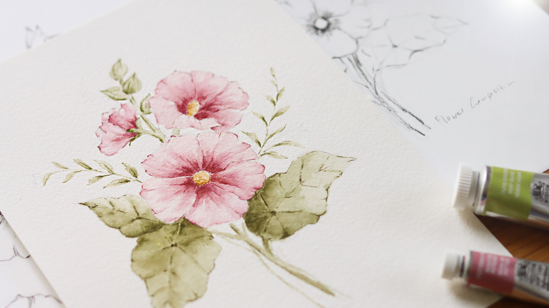
5. Creating the Base Sketch: In this lesson, we're going
to prepare the sketch that we will use for our
watercolor painting. You can find the ready made sketch in the resources section. If you want, you can skip to the painting part or get
some extra drawing practice. I would love to have you sketch along with
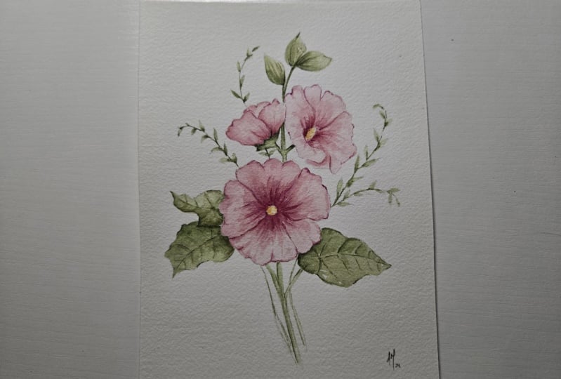
me in this lesson. For the composition of
choosing a triangular layout, and so I will place the largest flower at the bottom with two
smaller flowers above it. I've added the buds at the top
and to balance things out, I place some leaves at the
base. Just a quick note. I won't be focusing on
composition rules in this lesson. But if you would like to
explore the topic further, there's a dedicated lesson in my expressive watercolor
flowers course. It includes a
practical exercise, and I highly recommend
checking it out if you feel like you need extra
help with the composition. Right Let's get started. First, we need to think
about where the flowers will be since they will be the
focus of our composition. This will help us place the
visic shapes on the paper, which will serve as a guide
for drawing the flowers. I started by tracing
some curved lines to represent the stems and
the branches of the leaves. Then I drew the fires circle, which is the largest
and will represent the flower facing
darkly towards us. To right, I'm placing another flower that's
facing to the right. I'm using a novel
shape for that. On the left, I'm using
a triangle shape because we'll be drawing a flower that isn't
fully opened yet. We'll simply use
the same elements that we practiced in
a previous lesson. Next, I will find the flower stems and begin
placing the leaves. You will notice my
pencil strokes are light and a bit rough,
but that's okay. We'll clean up the lines later. I will add another leaf
here on the right side. To fill out the composition, I'm adding some
decorative branches. These aren't part of
the holy up plant, but I just thought they
looked really nice and helped balance
the composition and also they make it more rich. I'll also sketching the bots, placing them naturally
and randomly. Now let's start feeling in the dramatic shape by
drawing the flowers. I'll begin with the one in the
center which is facing us. I define the center
of the flower and then draw the five petals
around the circle. Okay, I will split up parts of the video to keep
this lesson short. But remember to take your time, feel free to pause the lesson and continue whenever
you're ready. Once we have drawn the flowers, I'll go back to the leaves and add the veins to give
them more detail. Now, our sketch is done, and we can transfer onto our watercolor paper and get
ready to start painting. I decided to go over
some of the areas of the drawing with
a charcoal pencil to add a bit more definition, but you don't have to do this
step if you don't want to. The next step will be to copy this sketch
onto another sheet, leaving out the finer details. Only need the basic lines to guide us when we
start applying color. Before we dive into painting this beautiful
hollock plant, in the next lesson,
we will create the color palette for
the final illustration. You will see the exact
colors I'll be using, and you can also experiment with different color combinations
if you would like.
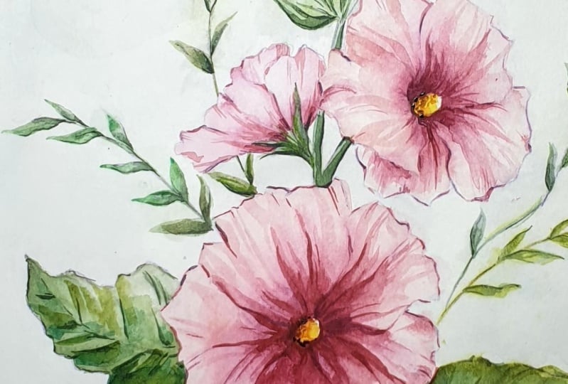
6. Color Palette: Holocks are pretty
common where I live. I've seen them in so
many different colors, from pink to white, purple, and even yellow. If you do a quick search on
Pinterest or the Internet, you'll just see how many
color variations there are. Creating a color palette before
diving into painting will get us familiar with the
hues and how they blend, giving us more confidence as
we start applying the color. In this lesson, I will show you the colors I picked for
the final painting, but feel free to create a color palette based
on what speaks to you. And take your time
to explore and enjoy the process
of mixing colors. Okay, let's get started. Since I'm really drawn to this particular hollyhock with its pink petals and the
darker intersection, these are the colors that we will utilize for the flowers, Mth and bird Ciena. I'm just a quick tip. If you don't have these
exact colors, no worries. Feel free to use similar hues. You have an end or pick
any colors that reflect the mood and style you want to create in your
painting. All right. So by mixing move
and burn Ciena, we can create some
really interesting hues. Let's start by mixing 50%
moth and 50% bar cena. I'm starting with a
thick rich pigment, and then I gradually rinse
my brush to add more water. This creates a
beautiful grading with the color fading as more
water dilutes the pigment. Just another quick tip here. If your brush picks
up too much water, just dub it lightly on a paper
towel to control the flow. Okay, so the first color
we got here looks like a soft coral or I would also say something
like a light Indian red. Now let's try the same mix. But this time we'll
use more move. You'll notice how
the color shifts towards a cooler, pinker tone. Okay. Finally, let's
try the reverse. So mixing more branciana, and just a little ma. As you can see, this creates
a warmer, earthier hue. By mixing these two colors, we have created
three unique hues that we can use for our flowers. Now let's move on to the leaves. For the leaves, I'll
be using raw amber, olive green, and Perlin green. Again, if you don't have these specific shades, don't worry. I will also offer
some alternatives at the end of the lesson. To mix the leaf color, I'm using 50% olive green, 50% raw umber, and just a touch of Perlin
green to deepen the color. The result is a worm, dark olive green that will contrast beautifully with
the pinks in our flowers. For the center of the flower, I'm using a mix of raw
Ciena and raw amber, and this creates a
soft yellow shade that works nicely with the other
colors in our palette. All right. Before we move
on to the painting lessons, here are two other
color options for the leaves if you want to
try something different. You can mix hookers green
light with van **** brown. This creates a
deeper cooler green. H The second alternative, which I think it's more similar to the one
that I created. Try mixing Hooker's green
light and Burnt Ciena. This plan will give you a
warmer earthy green tone. As mentioned, feel free
to experiment with color combinations and see what works best for
your illustration. All right. We're ready
for the final painting. I'll see you in the next lesson.
7. Painting Flowers: First Layer: The final project, I'm using
this watercolor paper, it's called pressed 100% gun. For brushes, amusing
Princeton ram brushes, I've chosen sizes,
two, four, and eight. The larger brush will be great for filling
in larger areas. While the smaller ones will
help with more detailed work, like refining the edges or adding subtle
color variations. As you can see, I've already prepared the sketch
of our hollok. It's a very light sketch just enough to guide us as we paint, but not too dark, so it won't interfere with
the water colors. Going to start by painting the first layer on the flowers. On my mixing palette, I've combined Mauve
and board Ciena, and I've kept the
mixture very watery, so it will appear
light on paper. Keeping the first layer light is important because
it is just a base. We'll be layering on top of it and we want to build up
the colors gradually. With your brush, lightly apply
the color to each petal. Notice how I'm letting the
brush across the paper. Don't worry about being perfect. The goal here is to simply cover each petal with
a wash of color. So keep your strokes
loose and reed. M Before the color dries, let's add a darker hue. I'm going to drop this
slightly richer shade closer to the center of the
flower where the petals meet. This will add depth and create a nice gradient effect.
Just a quick tip. If your paper dries
too quickly or if the color doesn't blend as
smoothly as you would like, just deeper brush
into clean water, dub it lightly on a paper
towel to remove excess water, and then gently blend the
edges of the darker hue. This helps soften the transition between the light
and dark colors. Just like before,
I'm starting with the light pink wash. And then adding a darker color near the base of each petal. Landing the two shades while
the paint is still wet. As you work, make sure to move to one petal to the
next without rushing. If you notice one petal
is drying too fast, go back and gently blend
the color as needed. You can always add
a bit more water to help smooth any harsh lines. Now that we have finished the first layer on
the main flower, we will repeat the same process for the other two flowers. Be sure to mix two
variations of pink. One that's light and watery, and another that's darker
for the darker areas. This will help you
easily switch between the bah and the deeper tones to create contrast and interest. To make your flowers
even more dynamic, try adding some subtle
variations in color. Maybe one pero has a slightly warmer tone while another has more
of the cool mob. These mob differences will make the painting feel more
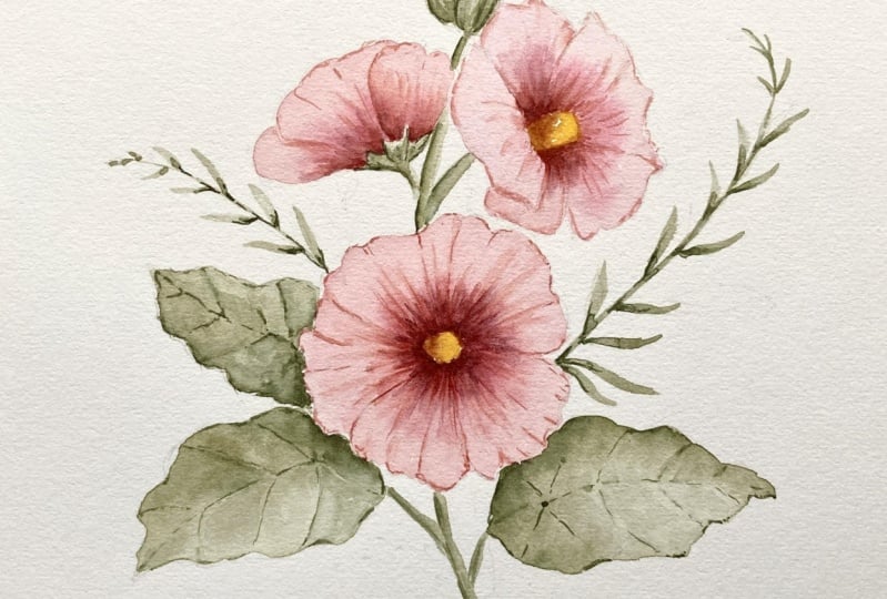
natural and vibrant. All right. The first
layer is complete, but I'm just going to intensify the pink area
around the main flower. I'm adding a few brush
starting from the center. Right now, I'm going to
wait for it to be dry. The first layer for our
lyock flowers is complete. This soft light wash will act as a foundation for
the richer colors that we will add later. Take your time with this step as building up color gradually, gives your painting a more
layer dimensional feel. In the next lesson, we'll start adding depth
and details to bring the flowers to life with
shadows and highlights. Make sure to let
your first layer of color dry completely
before moving on, just to avoid any unwanted
blending in the next stage.
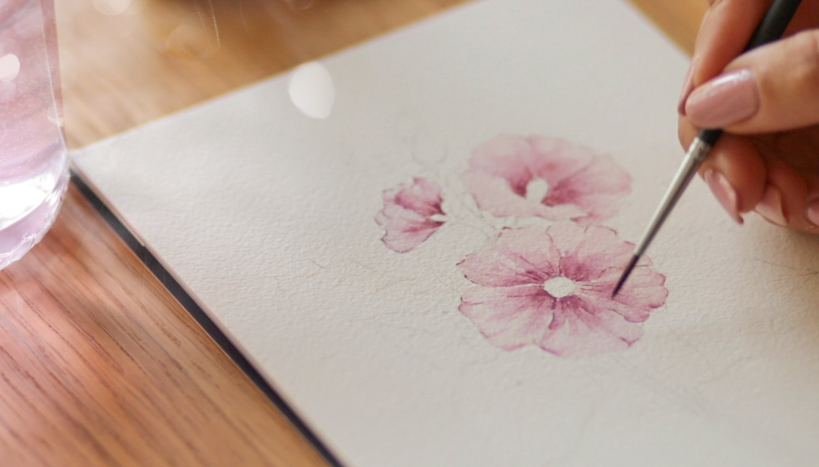
8. Painting Flowers: Second Layer: The second layer of paint, we're going to use
a darker shade to build up depth and contrast. I'll be using the same colors that are already on the palette, move and burn Ciena. The beauty of layering water
colors is that you can create subtle changes in tone just by adding
more pigment. Feel free to mix and adjust the color until you're
happy with the result. You want a slightly warmer tone, add more burnt senna. If you want a cooler
and pink ton, you can add a little bit of b. Just don't worry about getting the exact shade right away. You can always test the color on a scrap piece of
paper to make sure it looks the way you want before applying
it onto your painting. Once you're happy
with the color, start by adding
some brush strokes close to the center
of the flower. You don't need to paint
large areas at once. Just a few tiny
brush strugs near the center will create
the effect of death. Then take a clean damp brush and gently soften the
edges of the paint, blending it, so the color fades smoothly into
the lighter areas. If you find the color drying
too fast, don't panic. You can always rewet the areas lightly with clean water
and blend it again. Just remember to keep
your brush slightly damp, not soaking wet, to avoid any
harsh lines on the paper. While we wait for
this area to dry, let's move on to
the second flower and repeat the same process. For now, we'll focus on the
lower part of the flower, near where the leaves are
attached and gradually spread the color toward the
upper edges of the peal. As you paint, remember that watercolor has a mind
of its own sometimes. Let the paint flow
naturally and embrace any unexpected blending
and texture that occurs. It can add a lot of
character to your painting. I. All right let's return to the first flower
now that the color has dried. The goal here is to
darken the center even more and add shadows
where the petals overlap. This is how we create
that extension, making the flower more
lifelike and dimensional. Take your time with this
part of the process. Instead of covering
larger areas, ding small amounts of color
and build it up slowly. This way, you will
have more control over the blending and can gradually adjust how dark you want
certain areas to be. Oh. I'm adding a few
dedicate strokes of colors to enhance
the petal contours. Don't outline the entire petal. Just touch the higher points, the tips of the petals, and then soften the edges with your second brush to keep
the look natural and soft. Less with the petal edges. You want to suggest the
form without defining it. Leaving some areas
without dark outlines, Hs maintain that soft a fiel that the water
color does so well. A These two flowers are looking good so far. But I'll come back to them again later for
the final touches. For now, let's focus
on the main flower, which is the focal point
of our composition. Just like we did
with the others, we'll drop in a darker hue where the petals overlap a bit along
the edges of the petals, and of co, in the center
where the petals meet. You can work one petal at a
time or do several at once. Whatever feels
comfortable to you. Mmm. H h When you're happy with
how a petal looks, you can add a few fine delicate brush drugs
for extra detail. Sometimes, you don't even need to blend these final touches. Leaving them as they are can add more texture and depth
to your painting. These final brushes don't need
to be softened every time. Leaving them as crisp
lines can really bring out the details and give your flower
a more refined look. Now, the flowers have some
lovely contrasts in depth, but I've noticed
that the flower at the top right is
missing a few details. So I'm just going
to add a couple of fine brush strokes to make
sure it doesn't look flat. Adding these small toes can really help make the flower and. For the center of the flower, am a mix of ciena and raw amber. Start with a light
wash and then drop in a thicker darker color to
create that rich deep center. When you apply the darker shade, focus on just one
side of the center. This creates a natural gradient that looks more interesting than if you filled in the whole
area with one flat color. When creating gradients,
it's helpful to apply the darker color on one side first and let the pain
naturally spread. You can always
adjust the intensity by adding more water or color, depending on the fact
that you're going for. For the final touches on the center and
mixing a dark brown. With some of the yellows that
was left on the palette. With this darker shade, I'm gently tapping
the brush along one side of the center to
add shadow and dimension. Don't feel like you
need to overdo it. Sometimes just to feel like tops are enough to create
the fact that we want. I've also noticed a
few small white areas around the flower centers
that I've left painted. Now I'm going to fill those in. This will help give the flowers a more polished
and complete look. I think the flowers are
looking great and I'm really happy with the contrast
and depth we have created. Now we can move on to painting the leaves
in the next lesson.
9. Painting Leaves: First Layer: Preparing the colors
on my palette, making sure to
have a light water green and a darker
green ready to use. The colors of mix are raw amber, olive green, and a
touch of purlin green. You can play around
with these mixes to get the right shade you like. As always, feel
free to test it on a scrap piece of paper before
applying it to the leaves. When mixing greens, try experimenting with adding
a little more raw amber for a more earthy tone or more olive green for a
brighter and fresher hue. The color is all about personal preference
and experimentation, so don't be afraid
to tweak the colors. With my size a brush, I'm starting by laying
down the light green wash, cooling in almost the
entire area of the leaf. I'm intentionally
leaving the paper untouched near the edge of the leaf where it
meets the petals. As we go back in
with a darker green. Remember to keep your brush
strokes light and fluid. The first layer is meant to
be soft and transparent. It's okay if your brush strokes are a little loose
at this stage. With a darker green, I'll
go back and add this shade, close to where I left
the paper white. The light and dark washes will blend naturally
on the paper, creating a beautiful, soft
gradient between the two. Muscle spreading the darker
color along the central vein of the leaf and concentrating it mostly on the upper
part of the leaf. Don't worry if it looks
too dark at first. Water color always dries lighter than it
appears when it's wet. If the color is too dark, you can always grab a clean brush and lift
off some of that paint. All right. Let's continue
by painting the stems. For this, I'm switching to a thinner brush to create
smoother, more delicate lines. When painting, be mindful of the pressure you are
applying to the brush. A light touch will
give you those thin, elegant lines we
want for the stems. Now, moving to the leaf
on the upper left side, I'm starting with a
light green wash, just like we did with
a previous live. Where this leaf
meets the one below, I'm using a darker
green to create some separation between the
two and add more dimension. You will notice that
as the colors blend, the begins to have a n that gives it a more
realistic appearance. So I will darken
certain areas now, particularly around the bottom of the leaf and along the veins. Once again, I'm going to
use a dam brush to smooth out the edges where
the darker color meets the lighter wash. Mm. Mm. For the last leaf, the
one on the right side, I'm starting with a
view that it's slightly darker than what we use
for the previous leaves. This will give us
some nice variation in tone across the leaves, making the illustration
more visually interesting. So I apply the color
in a small area first. Then I dip my brush in water, dub it on a paper towel, and spread the color
gently across the leaf. Oh o. Once the leaf is
fully filled in, I will drop in a
darker green close to the stem and along
the upper part of the leaf to create death. While this area, let's move on to paint the stems and the bts. I'm keeping the first
layer of paint light and airy by using the same light
green we mixed earlier, along with a slightly
darker shade to add some subtle variation. Adding subtle sats in
color here and there can really help avoid
a flat and uniform. Play around with
different sheats of green to create and interest. Mm. Now, let's move on to
the decorative branches. These aren't part
of the Hock plant, but they help balance the composition and add
a little extra flare. I start by roughly tracing the central
stem of the branch, keeping my strokes
light and relaxed. Then I go back and
paint the leaves, making sure to some areas
lighter and others. This variation in turn
will give the branches a n. Helping them blend seamlessly with the rest
of the illustration. Don't be afraid to let the light and dark areas
blend on their own. What color often works best when we let the
colors flow naturally, rather than trying to
control every detail. All right. The first layer
of paint is now complete. At this stage, it's
all about building up those subtle gradients
and allowing the colors to interact
naturally on the paper. It might not look finished yet, but this layer sets
the foundation for the depth and texture
that we will add later. Before moving on, take a moment to look at your
leaves and stems. Are there areas where the
color looks too flat? If so, feel free to drop in a little bit more pigment
while the paint is still wet. All right, I'm really
excited to see how this illustration will turn
out. I hope you are too. I will see you in
the next lesson where we will start building up more depth and finishing touches to really bring
this piece to life.
10. Painting Leaves: Second Layer: Now, just like we did
with the flowers, it's time to add
the darker tones to bring our leaves to life. This step will help create depth texture and a
more realistic look. On my palette, I've prepared the darker green
I'll need for this. The mix is a bit
thicker because we want a stronger contrast with a lighter base we've
over it laid down. When you mix this color, make sure it's steep and rich but still fluid enough
to blend the smoothly. If you're not sure about
the color consistency, just test it out on
a scrap piece of paper before applying
it to the leaves. After you have adjusted the
ratio of pigment and water, let's start by outlining the central vein
of the first leaf. Using a thin brush
for precision and I'm making sure to keep the
line clean and defined. After outlining the vein, I'm also going over the
edges of the leaf and adding a few broader strokes where the leaf meets
the flower petals. These darker areas help
define the leaf structure. Give it more volume. Now, with a clean damp brush, I'm softening the edges
of this dark green. Gently drag the paint
outward so that it blends smoothly into the
lighter areas of the leaf. But remember, don't
cover the entire leaf. I'm being mindful of
the veins and leaving some lighter areas to maintain
that soft grading effect. If you notice the darker
color drying too quickly, you can re wet it slightly with a clean brush to keep
the blending smooth. Just make sure your
brush isn't too wet. Dubbing it on a paper towel first will help you control
the amount of water. Now I'm grabbing a
darker green and I'm using my thin brush to paint
the veins of the leave. This part requires a
little bit of patience. I'm applying the paint
carefully and then softening the edges of the veins while
the paint is still wet. When painting the veins, try to keep your brush steady, and if the paint
goes on too thick, gently blot it with a
damp rush to soften it. What a color is
very forgiving when it comes to making
small adjustments. I'm now moving on to the
other side of the leaf, aiming for a similar effect. Just take your time here. There's no need to rush. We want the veins
to look natural, flowing with the
shape of the leaf. If you find yourself
making a mistake like painting a vein that
looks a little bit off. Don't worry. I'll show
you how to fix that. Take a clean brush,
dip it in water, and dub it onto the mistake. This will lift the paint off and help smooth
out the area. It's a simple trick, but it's great for
minor adjustments. All right, I'm going to
split up the video for the next two leaves because the steps are
essentially the same. Please feel free to
pause the lesson and take your time to
work at your own pace. Mm. Mm. Mm. O. Oh Now that the leaves are looking more defined, let's move on to the stems. I will use a darker
green here as well, but I'm switching to
a thinner brush to maintain control over
these small areas. O. Next, I'm moving on to the buds, which are currently
looking a little bit flat. For this step, I'm
using a mid tone green, just a bit darker than
what's already there, but not as dark as the leaves. This will give us a
solid base to work on before adding the
final darker details. Use a thin brush to carefully
draw the lines on the buds. If you notice any harsh lines or areas where the
hue is too dark, don't hesitate to soften
them out with a d brush. This keeps everything smooth and prevents any area from
standing out too. With the smaller
areas like bats, be extra careful with the
amount of paint on your brush. To paint can quickly overwhelm
these delicate features, so a light touch works best. Now that we've added
the mid tones, it's time to make the bots pop by adding a few darker strokes. I'm concentrating this
darker hue near the base of the bots and along the tips
to create shadow and death. And Lastly, we can't forget
about these tiny branches. I think they could use
one final touch of green. With my size two brush, I'm going into the tiny areas where the leaves are
at touched the stems. I'm also adding a thin vein in the center of most
of the leaves. For a few, I'm outlining
parts of the leaf. This final touch give a more finished look
to the branches. All right with that,
we have completed the second layer of
our leaves and stems. You should be starting to see the whole painting
come together nicely. Contrast between the
lighter base layers and the darker tones that we've added now gives the illustration much
more depth and realism. A next lesson we'll
move on to adding the final touches and taking
an overlook at the painting. We'll announce a few areas, make any last minute
adjustments and bring out the small details
that make a big difference. This is where the paint really
starts to come to life. I can wait to see how
it turns all out. Make sure everything
is completely dry before move on
to the next step.
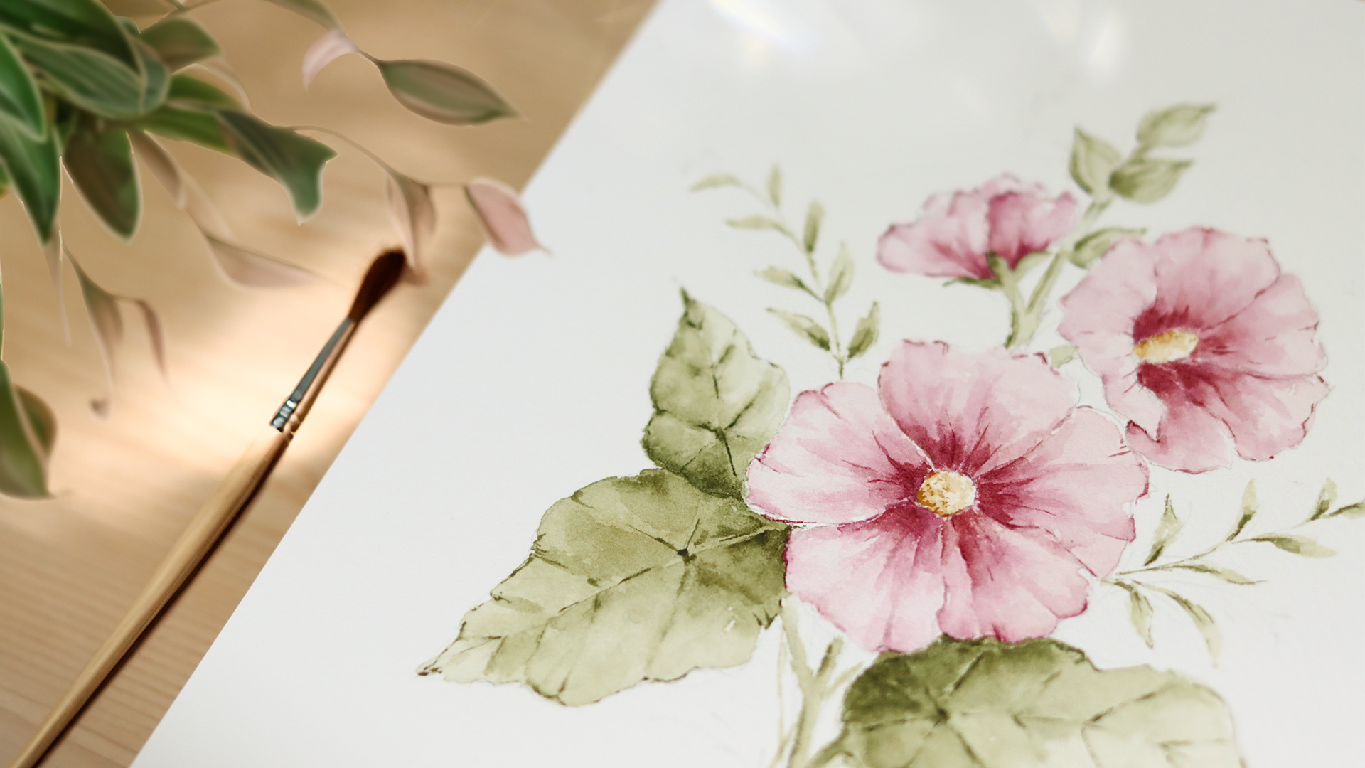
11. Final Touches: Observing my painting,
and overall, I'm feeling quite
happy with the result. But I did notice that the flowers could use a
little bit more contrast, especially around the center. Adding a little bit more
contrast will help flowers stand out and make the overall composition feel more balanced. As for the branches and leaves, I think they look good and
don't need any further tweaks. I'll leave them as they are. To I contrast to the
inner part of the petals, I'll be mixing are
two main colors. Mauve and board sana. I'm aiming for a darker value, so I will mix them until
I get a reach deep tone. Once the color is ready, I will start laying down some small bars
strokes on each petal. When applying the bars strokes, use a combination of
pressure techniques. Start with a heavier pressure at the beginning of the stroke. Then gradually lighten your
touch as you move outward. This will give you that soft
tapered effect that creates a nice transition between the darker center and
the lighter outer edges. After applying the brush ks, I am taking a clean dam brush and gently smooth out
the edges of the color, blending it into the
existing layers. The goal here is to
avoid any harsh lines while maintaining that nice
contrast we're building. Here, I like to work
one petal at the time. This gives you more
control and allows you to assess how each petal looks
before moving on to the next. It also helps to step
back occasionally to see how the overall
flower is coming together. As I'm working on each petal, I'm also keeping an eye on
the edges of the petals. Sometimes they can look a
little bit soft or defined, so I will occasionally add a few fine brush struks
along the edges. This can help
refine the shape of the petals and add
more definition, especially in areas
where the paint may have lightened too much
during the drying process. O Now, I'm taking a look at
the upper right flower, and I can see that it could use one last layer
of paint as well. It's looking a bit flatter
compared to the main flower. I will go over the inner part of those petals in the same way, mixing the move
and burn Siana to get a darker hue and
I'm flying the bruh. If you're ever unsure whether an area needs more paint or not, It's really helpful to step back and take a look at your
painting from a distance. Sometimes when we are too close, it's hard to see
the full picture. At this point, your painting should be looking
much more balanced, but the flowers having that extra contrast and definition to really
bring them to life. Take a moment to appreciate
how the layers of color have built up to
create depth and texture. Giving your hooks a
vibrant realistic feel. As we finish up this lesson, remember that these
final touches are often what take a painting
from good to great. It's not always
about big changes. Sometimes it's those small
thoughtful adjustments that make all the difference. Once you've made
your final tweaks and you're happy
with your painting, I encourage you to step
back one last time and take a look at the
entire piece. Does it feel? Are the colors and composition coming together the
way you envisioned? If there's something still calling for a little
extra attention, now is the perfect time to go back and refine
those details. But remember, there's also beauty in knowing when to stop. Sometimes letting
the painting breathe and leaving certain areas soft or unfinished can
add charm and uniqueness. Now that the flowers, leaves
and stems are complete, we have reached the
end of the scores. In the next lesson, I'll
wrap things up by sharing a few final thoughts
and thanking you for following along on
this journey with me.
12. Thank You: Have reached the end of
our watercolor journey, and I want to take
a moment to say, thank you for joining
me in this class. I truly hope you have enjoyed the process of sketching
and painting hollocks, and that you have discovered some new techniques to
carry forward in your art. Watercolor is such a
wonderful, expressive medium, and I'm so happy we could
explore it together, bringing these beautiful
flowers to life. You have finished your project, I would love to see
what you have created. Please feel free to share your class project in
the project gallery. Seeing your artwork and
how you have interpreted this lesson is one of my
favorite parts of teaching. It really brings me so
much joy. So don't be shy. Whether you follow along closely or you made the project
entirely your own, I would be thrilled to see it. If you enjoy this class, I would be very grateful if
you could leave a review. Your feedback is a huge
motivation for me, and also it helps
me improve my work and helps other student
di school my classes. Thank you again for
joining me today. I hope this class has
left you feel creative, inspired, and confident to keep exploring and
painting new subjects.
 Altea Alessandroni, Artist and Designer