Transcripts
1. Class Trailer: Hi, everyone. My name is Altea. I'm an artist, graphic designer, and online educator from Italy. I've always been
inspired by nature, and painting
botanical elements is one of my favorite ways
to feel connected to it. Whether it's through my graphic design work or
watercolor illustrations, I find so much joy and peace in capturing the beauty
of natural elements. This class, we're
going to create a winter wreath
using watercolor. This is a perfect
project for beginners, as we'll start with
simple botanical elements and gradually build them into
a beautiful composition. I'll guide you step by
step on how to mix colors, practice essential
techniques and layer your paint to a
depth and contrast. Plan your design and
create a delicate breath. This class is designed
to be a cozy, creative escape for
the winter season. You can use a wreath for
holiday cards, DIY projects, or even just as a comming exercise to bring
a little joy to your day. My goal is to make this process as relaxing and enjoyable as possible while also helping you feel confident with
your watercolor skills. So grab your paints
and let's dive into this peaceful
winter project together.
2. Class Overview: Welcome to class. I'm
so happy you're here. In this class, we'll be painting a delicate winter breath
using watercolor. This is a beginner
friendly project, but if you have some experience, I'm sure you will
still enjoy exploring techniques to add depth
and detail to your work. Here is how the
class is structured. We'll start by going over the materials and
supplies you'll need. Then we'll move on to
creating our color palette. I'll show you how to
mix the colors we'll use and how you can follow
along to create your own. After that, we'll
warm up by practicing some botanical elements
like leaves and branches, which will help you
get comfortable with the painting process. I've chosen a mix of leaves, branches, and a few small
details like berries. These elements are
easy to paint, even if you are a beginner. Once we've got
those basic sound, we'll dive into
the main project. I'll guide you step by step from planning your design
to painting the roof. Along the way, I'll share
some tips for creating contrast and dimension to really make your
painting stand out. This class is so special
to me because it's the very last class that I'll be filming in my current studio. This place has been
so important to me. It is where my creative
journey began, where I filmed my very
first ski shirt class and where I've grown as
an artist and educator. As I prepared to move
on to a new home, I wanted to share this
cozy winter project as a way to celebrate and
reflect on this new chapter. So before we begin, here are a couple of quick tips that I want
you to keep in mind. Take your time,
enjoy the process, and don't worry
about perfection. Every wreath will look
a little different, and that's what
makes it special. Remember, this is
your creative space, so have fun with it. Now, let's gather our supplies,
and let's get started.
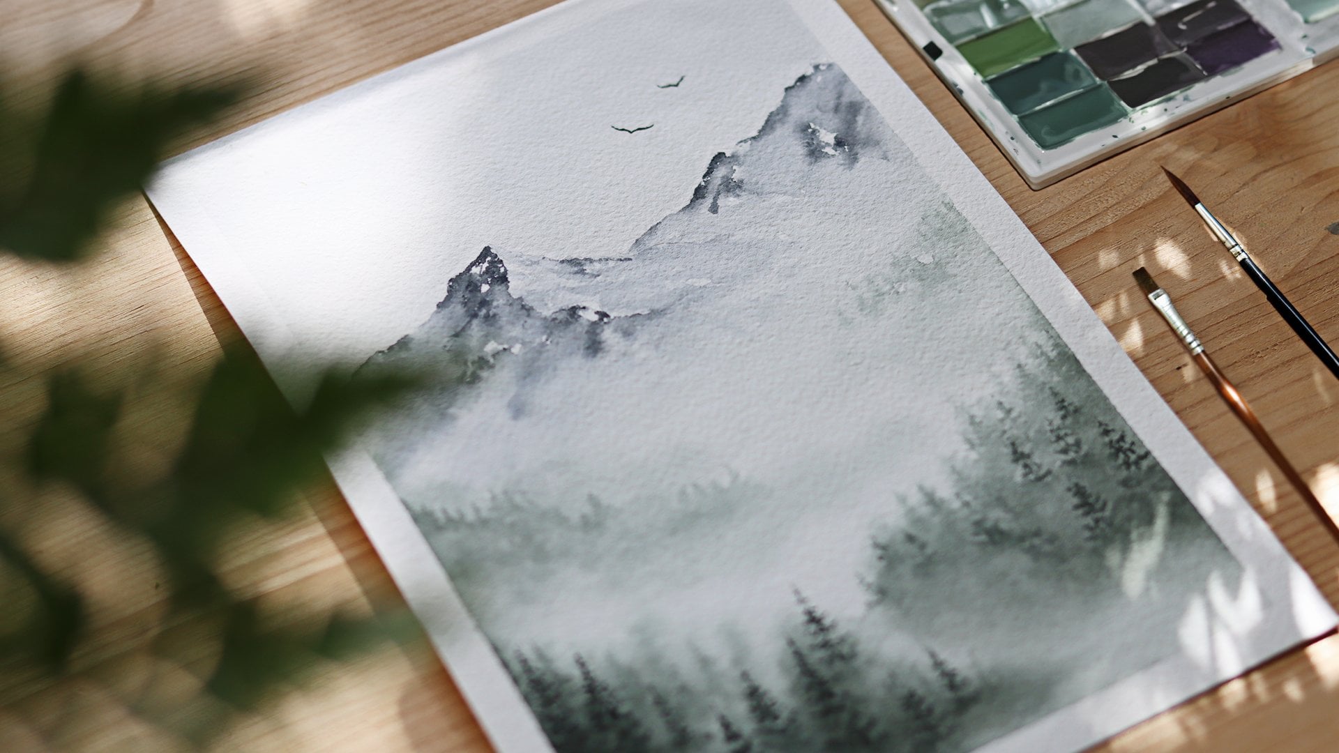
3. Materials: Before we begin, let's go over the materials you will
need for this class. For the paper, I'm using
Gamson watercolor paper. It's 100% cotton, 300
grams and hot pressed. Typically, I use
cold press paper, but I had this hot
press block on hand and I decided to
use it for this project. It has a smoother texture which gives a slightly different
look to the final painting. Paints, I'll be using
Windsor and Newton. I have a combination of
their common series pan set, which is a student grade option and offers a great
variety of colors, and their professional
grade tubes. I like using both because I have some colors only in the pants
and some only in the tubes. And for this class, I have some new green colors that I wanted to
try in the tubes. You also need two jars of water, one for cleaning your brushes, and one for fresh water, and some paper towels to absorb excess water
from your brushes. Brushes, I'll be using the
Princeton Aquilte series. I have three round brushes, sizes two, four, and eight. The smaller brushes,
sizes two and four are perfect for
details and thin lines. While the size
eight will be used when we mix the colors
on the palette. Alright, that's
everything you'll need, and feel free to use
what you already have. And don't worry
if your materials aren't exactly the same. The technique and
topic that we will cover today will work
with a variety of tools.
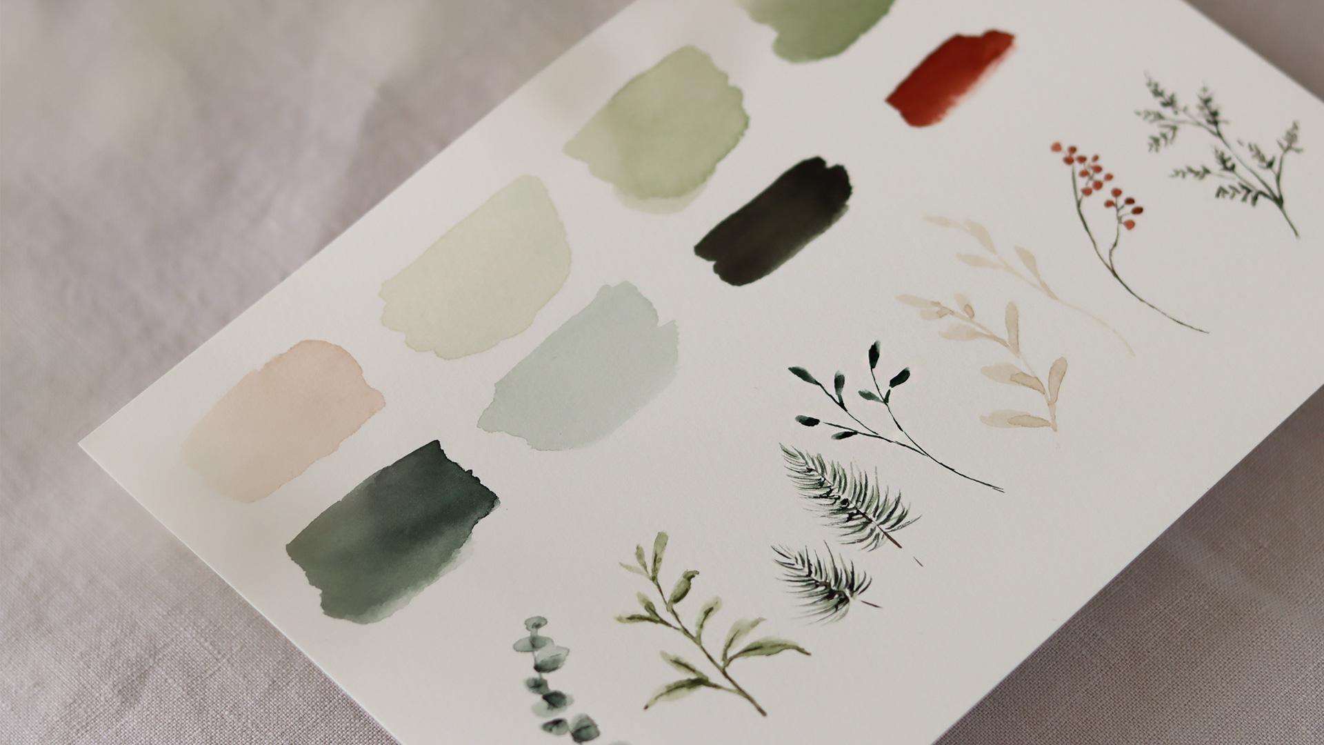
4. Color Palette: Now that we have our
materials ready, let's move on to creating the color palette
for this three. I've chosen a combination
of soft greens, warm neutrals, and
a puff of red. These are the colors
that I'll be using. But remember, you don't need to have the exact same shades. Feel free to substitute
with what you have or explore your
own preferences. The key is to have fun and
make the palette your own. Alright, let's start
with the first color Apache or creamy tone. To mix this, I use white, yellow ochre, a touch of blue, and a tiny bit of agenta. It might take some trial and
error to find the balance, but it's part of the process. I really like this color
because it's warm and neutral, and I think it adds a delicate
softness to the wreath. Okay, I'll lay down here on paper so you can
see how it looks. Next is a light green. The name is Tera Verte, and this one is from the tube. This green is so calming and it has a slightly muted tone, and it feels very natural. I think it's super delicate. For the third color, I mixed olive green
with pearling green, and I added quite a bit of
water to keep it light. Okay, let's watch it here. You can already see how it works beautifully alongside
the thera verte color. Now, the first color is the same mix of olive
green and pearling green. But this time, I kept it darker. So just use less water. It's a simple adjustment
just using less water, but it makes a big difference
in the final look. Love having a darker green like this for adding
depth and contrast. It really helps to make the lighter colors
pop. All right. Next is pearling green, which is one of my
favorite greens. It's so rich and deep, almost like a forest green. I think it adds a sense of
grounding to the palate. I will lay down here,
and as you can see, it looks very bold compared
to the other greens. Next, I diluted pearling
green with plenty of water to create a
much lighter version. Is a great technique to
use when you want to add variation without introducing
a completely new shade. It's such a soft
transparent green, perfect for adding subtle layers or delicate details. All right. Then we have **** brown
and pearling green. I like this combination for
the stems or darker details. Finally, we have a mix of
Indian red and lack red. This is the perfect
shade for berries or small accents in the wreath. It's vibrant without
being too overpowering, and it has a little pop of color that really
catches the eye. I will watch it here,
and you can see how it complements the
greens beautifully. If you want to keep your wreath
more neutral, of course, you could skip this color, but I think it adds a
lovely festive touch. All right now that we
have our colors laid out, take a moment to look at
your color palette and see how the shades
interact with one another. Feel like tweaking anything, maybe making a green lighter or adjusting the tone of
a red, just go ahead. This is your creative space, so don't be afraid
to experiment. Once you're happy
with your palette, we'll move on to the next step.
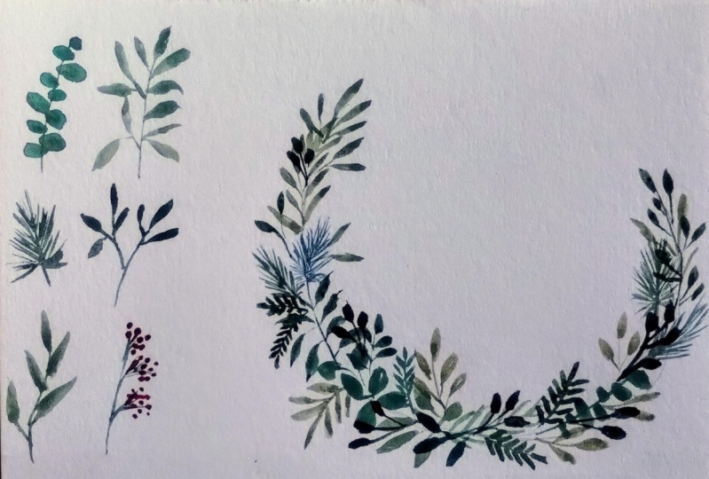
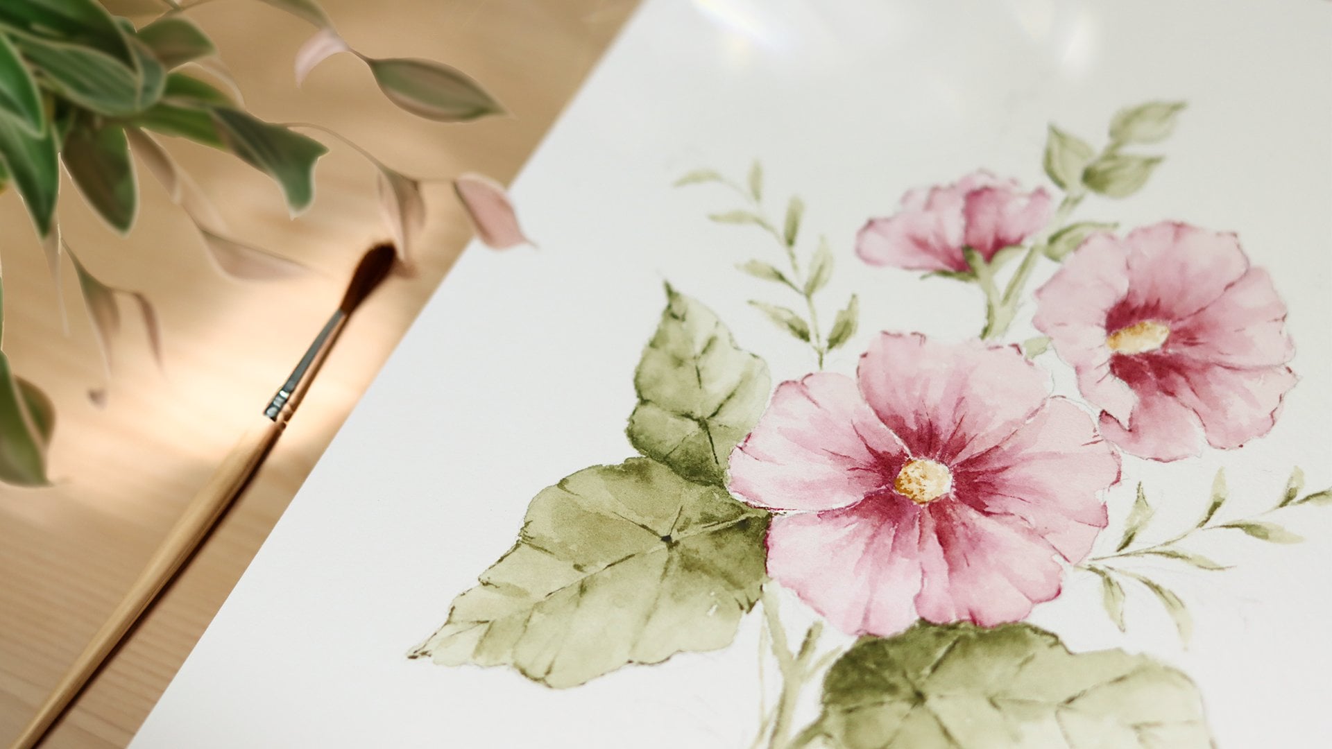
5. Botanical Elements: Before we start
painting the wreath, let's take some time to practice
the botanical elements. These simple shapes will make up the structure
of our wreath. So this is great
opportunity to warm up and get comfortable with the brush strokes
that we'll be using. If you ever feel stuck or
unsure about what to paint, I recommend looking for
inspiration on painters. This is something
that I often do when I need ideas or references. Sometimes just scrolling
through images can spark ideas for unique elements to include in your design. In the class resources section, you will find a photo
collage I created with some botanical elements that
you might want to reference. These can help you come up with new ideas or inspire
variations for your wreath. Now, let's start painting. At times, I will reference
this photo collage, and other times I will
paint intuitively, letting my imagination guide me. This will be a relaxed, intuitive lesson and
we'll paint as we go. Let's start with the
eucalyptus leaves. For this, I'm using
pearling green, which is perfect for
painting this subject. For the first layer, I keep the color light by
adding plenty of water. I begin by painting
the stem first, and then starting from the
bottom, I add the leaves. As I paint, I'm
focusing on creating small rounded and oval leaf
shapes along the stem. They don't need to be perfect. Eucalyptus has a
natural organic feel, so slightly irregular shapes will actually make it
look more realistic. Alright, now with
a darker value, I go back in to where the leaves are
attached to the stem. This will add depth and
dimension to our branch. For the next botanical element, I'm using the color a verte. Here I'm going to paint a simple branch for
my imagination. You can start by
painting the stem with a very light pressure and then press a bit heavier on the
branch to create the leaves. I like to paint more leaves
at the bottom of the branch. And as I work my way upward, the leaves become
smaller and fewer. Just like we did earlier
with the eucalyptus, I'm adding a darker value to some parts of the
branch to create depth. Once I've dropped the
color onto the paper, I rinse my brush, dab it on the paper towel
to remove any excess water, and then go back to smooth
out the brush strokes. This helps blend the colors, and if you're working
on cold press paper, this will create a
smooth gradient. For the next element, I'm painting some pine ties. To start, I trace
the stem by using a mix of pearling green
and van **** brown. The tip of the brush,
I paint a thin line. Then I rinse my
brush and pick up a light green colour
for the pine needles. Using the same
seize stick brush, I begin creating fine lines that extend outward from the stem. I make sure the brush is
only lightly loaded with paint and use a gentle
hand as I work. After laying down the base
layer of the needles, I switch to a darker
value of green. Following the same technique, I repeat the process adding fine lines over
the lighter ones. This layering creates
depth and dimension, making the fine twigs
feel more realistic. I next, I'm painting a darker
botanical element. I start by tracing the stem to define the structure
of the branch. This helps set the
foundation and gives me a guide for where
the leaves will go. Okay, to add leaves, I use quick strokes
and apply a bit of pressure with the brush
to create each shape. I really love including
this type of branch into my wreath because
the darker tones add depth and contrast, making the overall
composition stand out. It's a simple element, but it has a strong
visual impact especially when paired
with the lighter tones. Alright, I'm going to add a
couple more botanical lemons, a few wrenches in the Big tone, and some berries to
bring a pop of color. I'm just using the color
palette that we established before and put some ideas
on paper for the breath. The goal here is to play
around with these elements and start visualizing
how they might come together in the wreath
wood paint later. Don't worry too much
about perfection. This is your time
to experiment and get comfortable with the
brush strokes and techniques. Take your time as you work and feel free to pause a lesson if you need a moment to catch up or just try something new. Alright, let's paint one
more botanical element. For this, I'm using a mix of andike brown and
pearling green. I start by roughly painting the stem with loose
and quick strokes. Nothing too precise. This branch is meant to feel
a little wild and organic, so don't overthink the shapes. Next, I begin adding leaves, and instead of following
a structured pattern, I let the leaves branch out
in different directions. Some are small and clustered while others are
more spaced out. These variations give
the branch a natural, unrefined look which
works beautifully in contrast with the more
structured elements that we've painted earlier. Alright, so these
are the types of botanical elements that I'll
be using in the wreath, and I love how they turned out. But I've decided
to go back and add more depth to the
first two elements. They look a little flat, and a touch of extra paint
will just make it and pop. I really hope this
lesson was a nice way to get started and help you
warm up for the wreath. If you would like, you can show your progress so far in
the project gallery. Just snap a photo of
your work and upload it. I would love to see
what you have created.
6. Planning the Wreath: In this lesson, we're going to take a moment to
plan our wreath. This step is all about
sparking ideas and visualizing how you want
your final wreath to look. Planning doesn't have
to be complicated. It's just a way to give yourself a clear direction before
you start painting. To make this process easier, upgrading a sheet
with a circle and other shapes which you will find in the class or
resources section. The idea is to use these light
gray outlines as a guide. Can sketch dartly over them to brainstorm
different designs. Maybe you'd like to create a classic full circle
wreath, a half moon style, or an elegant oval
shape designed for something different,
something unique. This is another
chance to experiment and explore what resonates
with your vision. So while I'm filling
in these outlines and brainstorming ideas
for the wreath that we'll paint together, here are a few tips to help
you guide as you plan. Right now, I'm
focusing mostly on the different shapes you
can use for your wreath. But feel free to expand
on this exercise. For example, you can also
test out placement for different botanical elements or experiment with layering ideas. So think about balance. A wreath doesn't have to
be perfectly symmetrical, but it's good to
consider balance. This could be achieved
through color distribution. Size and type of
botanical elements or even the amount of
empty space in the design. A sense of balance can make your breath feel
harmonious and complete. Play with variations. Try sketching a few
different syles. Fill one wreath completely
with botanical elements for a lush abundant look
and keep another more minimal with just a
few leaves and berries. Exploring these variations
can help you decide how detailed or simple you would like your
final wreath to be. Consider focal points. Think about whether you want one section of the wreath
to stand out more. This could be a
cluster of Berries, darker branch, or a unique
element like a ribbon. Planning your focal point
in advance can give your composition more impact and help draw the viewer's eye. Remember, this planning step
is completely optional, but it can help you
feel more confident and prepared before
you start painting. Are someone who prefers to dive right into the
creative process, that's totally fine, too. Use this step, however it suits your style once you're
happy with your ideas, or even if you have
just one design you are excited to try, you'll be ready to move
on to the next step.
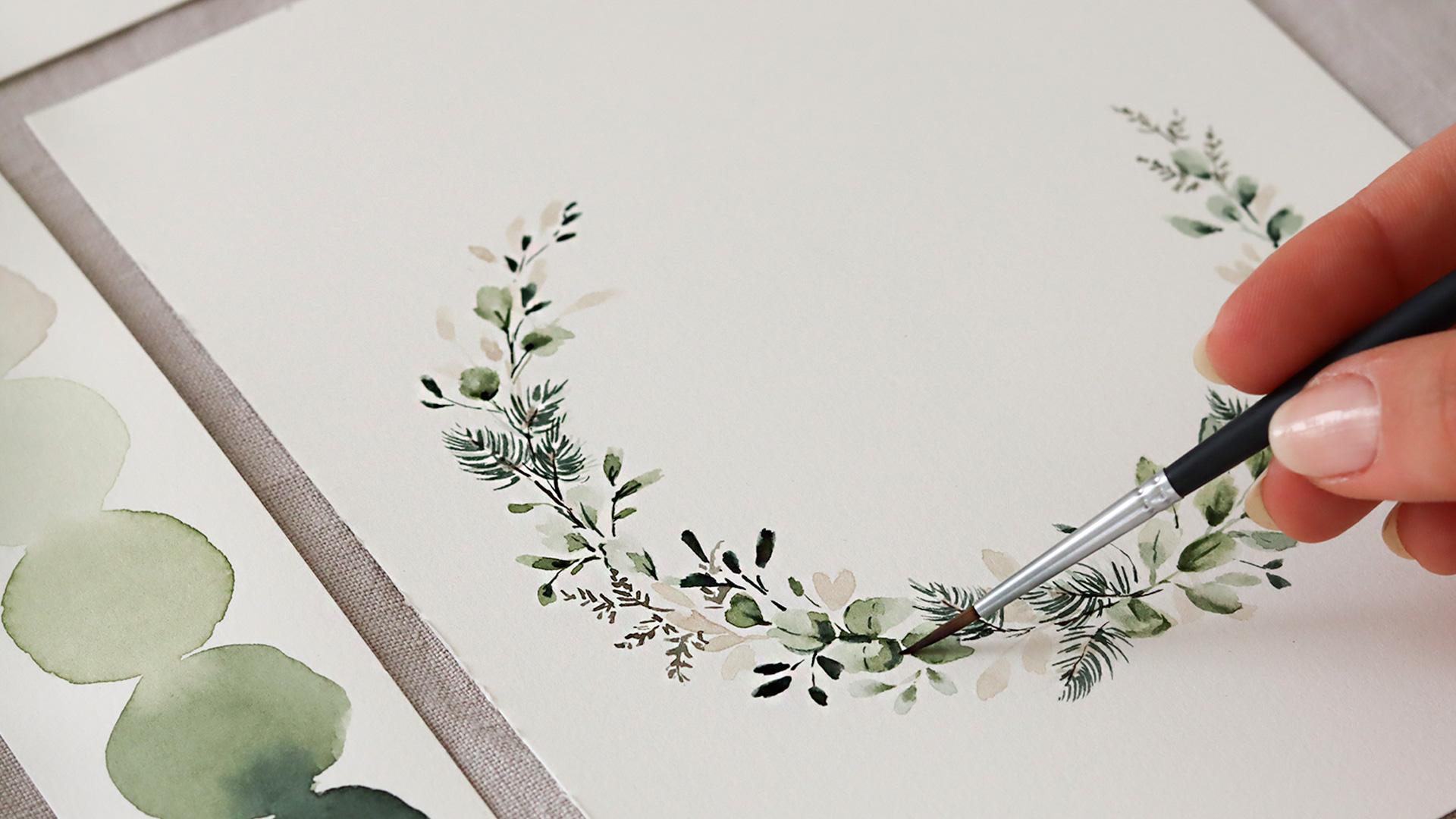
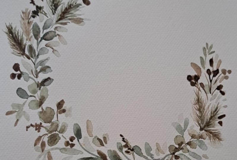
7. Painting the Wreath: Now that we have practice our botanical elements
and plan our design, it's time to bring everything together and paint
a full wreath. This is the style of wreath
that I selected from the planning exercise in the previous lesson.
A half moon wreath. To get started,
mark the center of your paper to help you guide the placement
of your wreath. Then using a compass
lightly trace a circle. This will act as the
structure for your design. If you don't have a
compass, no worries. You can use any
round object like a cup lead or even a small
bow to trace the shape. Because I'm creating
a half moon wreath. I'm making two benchmarks on the circle to indicate where the wreath
will start and end. These points will
help me stay within the shape as I paint and
keep the design balanced. For painting, I'm using
my size do brush. It's fine tip
allows me to create delicate and detailed
elements which are ideal for the size
of the illustration. Starting with a
eucalyptus branch. On my palette, I've mixed a soft green tone using a combination of olive
green and purlin green. As I paint, I begin with
a light wash of color, making sure I've mixed the
color with plenty of water. When creating the wreath, I like to work in layers. I always start with a lighter
value of color to map out the shape and add more
depth as I build the layers. I drop in a slightly
darker value of the same color at the base of the leaves where they
connect to the stem. This creates a
natural gradient and gives the branch a
soft dimensional look. To blend the two values, I clean my brush, gently dab it on a
paper towel to remove excess water and softly
blend the edges. Now I'm adding another
eucalyptus branch, and I'm repeating
the same steps. And Okay, next, I'm adding a leafy branch between the two
eucalyptus branches. For this botanical element, I'm using a light value
of pearling green, and with the tip of the brush, I start painting a few leaves, and I follow the outline of the wreath for painting
the main stem. Notice how I'm not following
a rigid pattern here. Instead, I'm working
intuitively, placing each branch where it feels right within the
shape of the breath. I like to spend more
time adding layers and find details rather than
sticking to a strict plan. It makes the process more
enjoyable and creative for me. So one tip that I feel
sharing with you is, don't worry too much about the ex placement of your
botanical elements. Focus instead on creating a sense of flow and
balance as it works. Your time, and don't
be afraid to pause and step back to look
at the overall shape. This helps ensure the branches align naturally with the
curve of the circle. As you can see, I'm
painting slowly. For me, this process feel
like a form of meditation. I take the time to
care of each leaf, adding depth and subtle
details one by one. There's no rush. This
is our opportunity to relax and let our creativity
unfold at its own pace. Alright, now I'm
adding the pine twigs, which we practice in the
botanical elements lesson. Even though I've already
explained the technique, I will quickly go over
it again as I paint. I'm starting with the stem
using a mix of pearling green and van **** brown to
create a rich, earthy tone. With a tip of the brush, I trace a fine line for the stem to keep it
delicate and light. Next, I add the pine needles
using a lighter green. I keep my brush strokes fine and quick following the
direction of the stem. As I lay down the first layer, I'm focusing on building the
shape and flow of the twigs, keeping them aire
and not too dense. At this stage, I'm not worried about adding
too much detail. I will come back later to announce them with darker tones. After adding a couple of pine twigs and moving on
to the beige branches. This help break up
the green tones and add some warmth
to the conversation. Using the beige color
that we mixed earlier, I paint delicate branches following the curve
of the wreath. I love how these
lighter tones contrast with the darker pine and
eucalyptus elements, creating a nice balance. As I work, I step back often to check the
flow of the wreath. Want to make sure each element feels connected to the next, creating a sense of harmony. If I notice any areas that
look too empty or dense, I adjust by adding or
spacing out the branches. Throughout this
process, I'm working intuitively making
decisions as I go. That's one of my favorite
parts of painting wreaths. It's a blend of structure
and creativity. Remember, your wreath doesn't need to look exactly like mine. Feel free to experiment
with placement, spacing, and the combination of new elements to make it
your own if you wish. Once I've added
the birch branches and a few more green ones, I will go back to
the pine twigs. At this point, I layer in the darker tones over the base layer to
adapt and dimension. Okay, now that the foundation of the wreath is coming together, I'm adding another layer of paint to the
eucalyptus branches. This second layer is
all about enhancing the depth and making the
leaves look more dimensional. Using the same pearling
green and olive green mix, I add a darker value at the base of each leaf
where it meets the stem. As I paint, I use
gentle strokes and keep a clean brush nearby to blend the darker tones
into the later ones. This step might seem subtle, but it makes a big difference in the final look of the wreath. Next, I'm introducing
a darker branches, and these branches add contrast and help
anchor the composition. Starting with the stems, I trace thin lines, and then I add small leaves, making sure to leave
enough space between the elements so it
doesn't feel overcrowded. Don't be afraid of letting these branches overlap with
other botanical elements. This creates a sense
of depth and helps the darker branches blend
naturally into the design. At this point, the wreath is starting to take on more
character and dimension. As you work, remember
to take a step back occasionally to look at
the overall composition. This will help you
decide where to place the darker elements and ensure
the wreath feels bounced. Okay, the wreath is
nearly complete, but at this stage, I like to go back and
refine some details. I'm starting with
the base branches, adding a touch more
definition to make them stand out against
the other elements. Using the same base tone, I apply a slightly darker value, and I create a thin line in
the middle of each leaf. Okay, next, I move on
to the green branches, focusing on leaves that
appear a little bit flat. To bring them to life, I use the tip of
the brush again, and I carefully add a darker value to the
center of each leaf. A single delicate line
down the middle mimics the look of a vein and
adds subtle texture. This step is small but really helps the leaves
feel more realistic. I work, I try to
move intuitively. I let my eyes guide me to areas where it feels that they couldn't use a
little extra detail. There's no rush here. This part of the process
is about slowing down and adding those
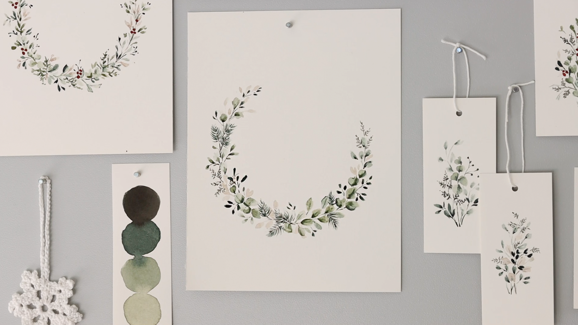
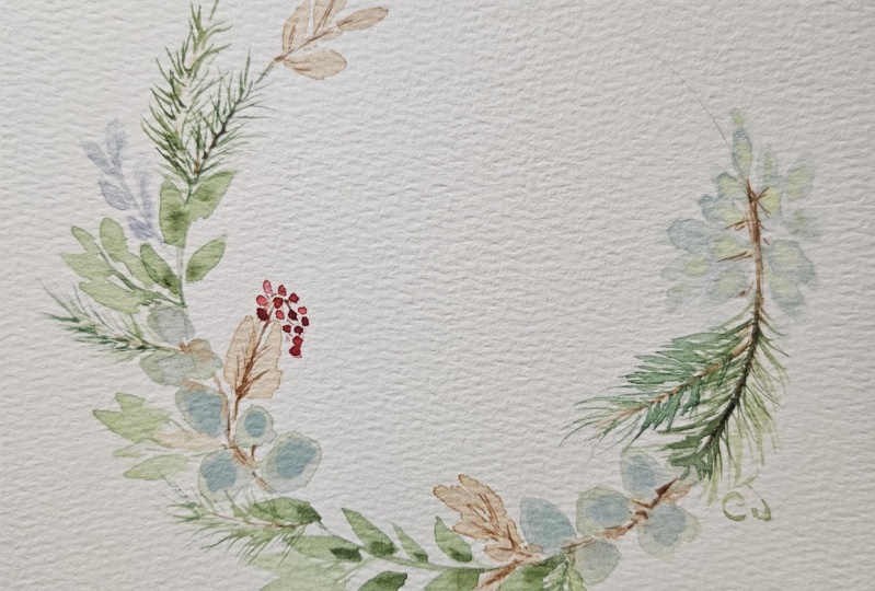
finishing touches that tie everything together. And here it is the
finish wreath. I love how all the
elements have come together to create
something delicate. And at this point, I'm using an eraser to gently remove the pencil marks
from the compass. Make sure your
paint is completely dry before doing this
step to avoid smudging. For my wreath, I chose to keep it simple with
just greenery. I love how the
different shades of green give it a soft
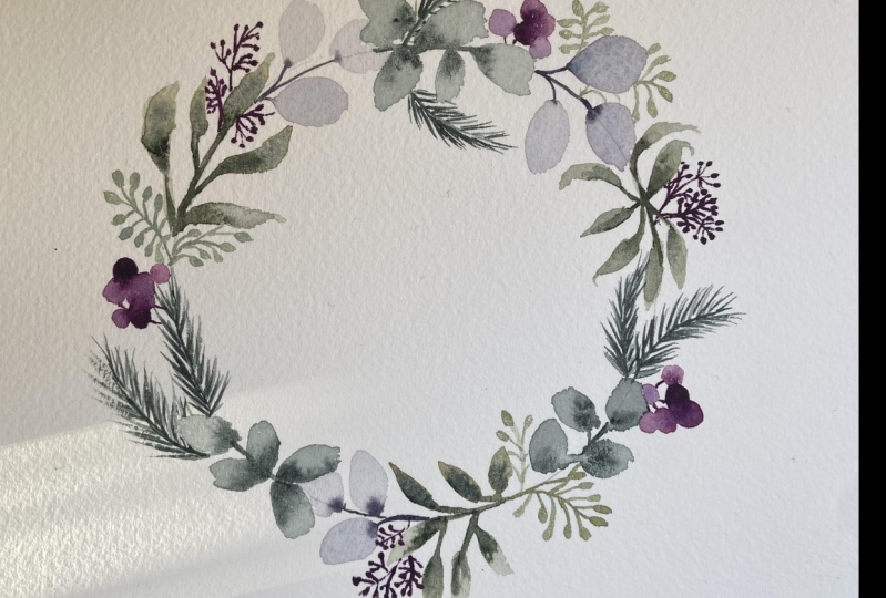
and timeless feel. However, if you would like to make your wreath
more festive, this is the perfect
time to add some, like, red accents or berries or even a ribbon to create a
Christmas inspire design. So feel free to customize
it to match your vision.
8. Thank You: Thank you so much for
joining me today. I really hope you
enjoyed painting the winter breathe as much as I did sharing
the process with you. It's always such a joy
to see how each of you brings your personality and
creativity into your work. I would love to see
what you have created, so don't forget to float your work into the
project gallery, whether it's the color palette, the food project, or really
any part of the course. I'm really excited to see
what you have created. If you're sharing your work on social media, feel
free to tag me. You can find me on
Instagram at ta dot design. And if you want to get updates on future
classes and giveaways, just be sure to follow
me here on Skillshare. Also, if you have any questions
or need further guidance, just feel free to use
the Discussion tab, and I'll do my best to help you. If you could leave a review, this would be an
immense help for me to let more people
know about my class. And keep me motivated
to create more. Thank you again so much
for joining me today, and I really hope to
see you work soon, and I hope to see
you soon in one of my feature classes as well. Bye.
 Altea Alessandroni, Artist and Designer