Transcripts
1. Welcome!: Hi friends. I am a big else and welcome back to my studio. For today's class, I've
prepared very specific idea. Very specific topic is
painting watercolor textures. Textures, nothing more. But once you practice painting
textures in wet and wet, in wet on dry with dry brushes
with many different media. When you get hang of it, you will see an amazing
variety of applications. Because whenever we paint landscapes lowers
even portraits. Their ability to mix
different media, mix different techniques and textures really could boost
your watercolor skills. And vertical textures have very, very high commercial
demand right now. So that will be very
interesting class, I hope. And let's just started.
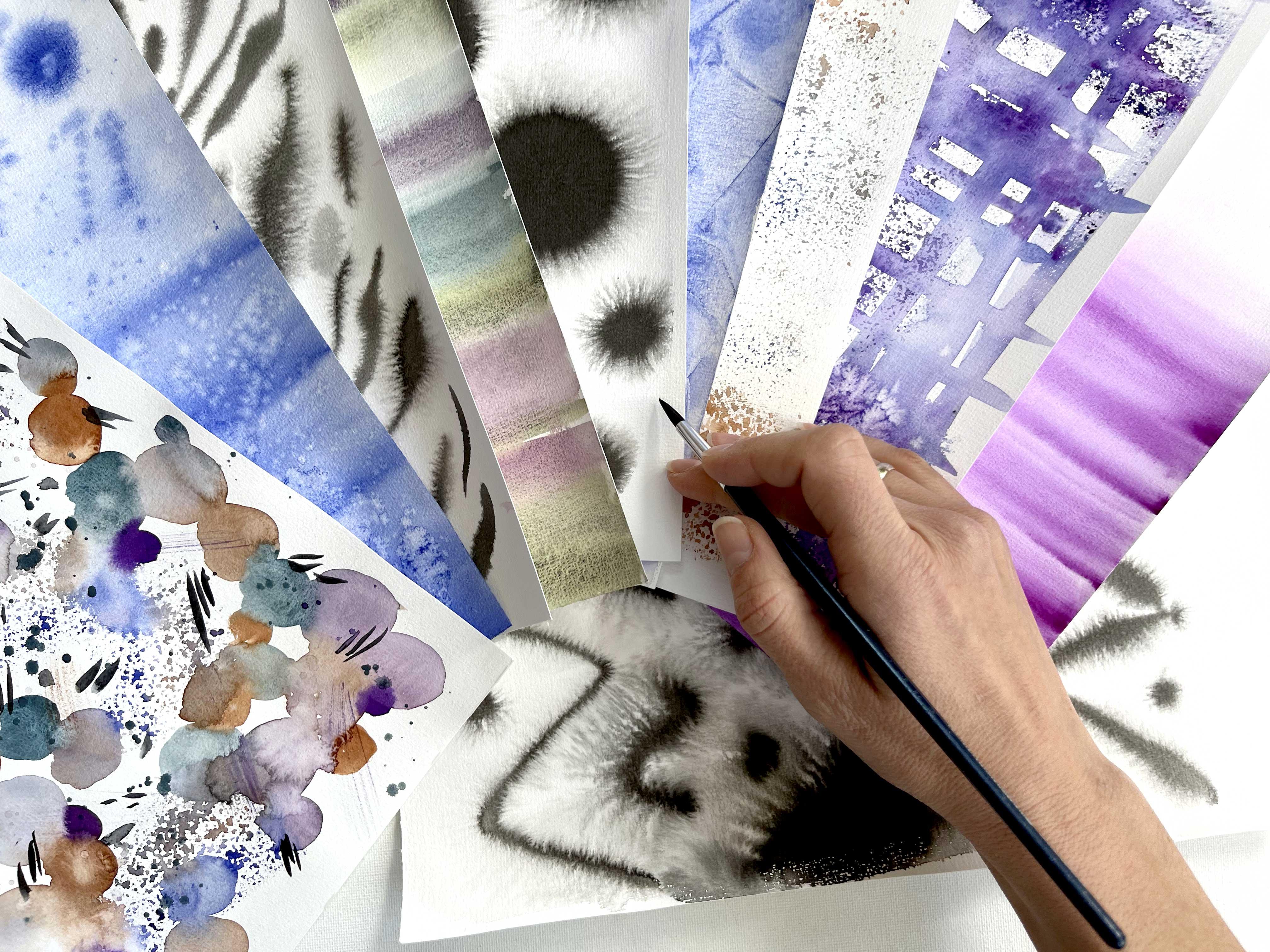
2. Textures Applications: I will show you a few
examples of how to apply watercolor textures
to enrich your paintings. Of course, first of all, it's for painting landscapes. You see the sky was
painted wet in wet on wet technique with mixing different shades of
blue and purple. Same here. Wet on wet technique
with some blooms. War when we added water
into half dry paper and some extra water diagonals
to create all these clouds. But in principle,
that's just a texture. If we are not talking about landscapes and go into
botanical illustration. It's same wet on
wet technique or wet on dry technique
of making gradients. Gradients Walsh's just on
a smaller areas naught when we glaze the
whole piece of paper, when we glaze just
one battle, e.g. but principles stay the same. One of my favorite things
is granulated colors. Sometimes you could
just use them as a watch for the
whole background. And if you mix
granulated colors, you could add, you could
get very beautiful shades. And these kind of
things are great for wall art for
full stores. If e.g. again, you do not want to
glaze the whole paper. If you are more into
botanical illustration. Here, I used painting
with granulated colors. You see how it enriches your. Next thing I want to show you is how to use dry brush strokes. When we add with
dry brush strokes some details like texture on these petals, these mountains, this malty texture
was painted with dry brush strokes and a little
bit with plastic folio, which I will share with you. Right here. It's a mix of wet
on wet technique. First layer was wet
on wet technique. And when it was dry, I went with my dry brush, same for botanical
illustrations. First layers,
glazing and gradient and toward really texture
of pear and apple. I used dry brush strokes. And probably the best
viewports see here. It's a mix of gradients
and dry brush strokes. And using brush
strokes like these, that creates very modern feeling for botanical illustration. Again, if we're back
to fall out and some abstract paintings
add in some textures, some gradients, some washes, and playing around
with sports and drops that could create really, really beautiful Reach
ideas for painting. Sometimes we could
just play around and find small areas and let colors to mix with
each other and enrich it with dry
brush strokes. Always nice to add some
watercolor splashes. They make your
painting very wide, very impress any stake. Very vivid, very popular thing, very important thing to know
how to paint wooden texture. Because wooden
texture we could use either for painting e.g. ports, or it's not
wooden texture, but the principles are the same. Or some urban areas.
3. Materials: For practice and textures, I would recommend you to have some board which could be lifted up and to which you could apply some type or painting
wet on wet techniques. You will see it later. So some paper type which before you apply
for the first-time, test it out on a piece of
your watercolor paper, how easy it removes. I would recommend you to buy back some affordable
watercolor paper. It's nice if it has
some texture on it, it really adds to the
watercolor feeling. And it should not be less than 200 g because we
will work a lot of water. That's the minimum amount. If you have some
watercolor paper with free calorie grams,
That's great. Different papers have different ways of
creating textures. So it's nice to have a bunch
of everything and try out. Applying the same technique in different papers will
make a huge difference. Another nice thing to have is just a sponge
from your kitchen. And another thing
from the kitchen. This one, you will need it for
creating amazing textures. I promised you will love it. Once you are in the kitchen, grab a little bit of salt. Again, different salts could
create different textures. Try everything
from your kitchen. For painting itself, you could either use your
basic watercolor, watercolors or try out
some granulated colors. I will give you a
list of my favorites. But for the beginning, you could just
take something one and just get the feeling bored. It is all about another thing. Ink. Ink is amazing. Media for making nice,
beautiful textures. And of course, brushes. For brushes. Checkout your kids stuff
because usually they're super fluffy and that's
what we need for creating. I would recommend you to have a big flat brush because we will be
applying a lot of water. It's just makes all
the process quicker.
4. Basic Wet on Wet Technique: Firstly, I will show
you the basics of making even and
gradient texture. It's nice if you put
something like a tape underneath your piece
of paper to make angle, It's not necessarily bad. Sometimes it helps
you out a bit. Then you glaze your paper
with some big flat brush. Doesn't matter which one. It's chance to be more
efficient, It's easier. If you have a bigger
brush for this. Distribute water very
formally without puddles. You could feed on glaze
the paper from the bottom, from the other side. That will give you
a little bit more of time before waveform. Paper dries. But of course for
this procedure you have to have very clean, clean background,
which I'm doing. I probably have some
surprises on this. Distribute this. We have very nicely fully
glazed piece of paper. Now firstly, let's try
to create an even nice, even a nice texture, just painting wet on wet. And our aim is to get
as more even texture. And it's possible
to achieve that. I go with my brush in
different directions, in different I mean,
from left to right, from right to left. Baton to Caltech moves the one line, right. In doing this, you will get
very nice, very even texture. And it's important
in a few seconds, you already can't go back. So right now, I
will not go back. I could do it only while
my paper is wet enough. And you could feel it. You're already could
have a look from the low angle and say
that paper gets dry. I could add a little bit more
water to the bottom part. It will give me a little
bit more time for painting. Another important moment. You shouldn't bring
too much water on your brush because it
will create spider reps. Right now, I would like to
start painting gradient, which moves I will go from
blue to almost nothing. I pushed a little bit my brush. I, I grew up a little bit
of my previous texture, my previous colored paper. I might even add a little bit of product to get more softer, softer goal, but not that much. Again, if you look at
that paper starts to dry. Lighter note to go up anymore. I wash my brush again. I go, it's about height
of your soft brush. And so in that height, you could go back into
the painting about. And we second stroke could
cause a little bit your brush. And brush, a little
bit more your brush. And that's how you come very softly from the bold blue
color to almost white.
5. Textures on Wet: There are many ways to add even more interesting texture
to everything we created. One is to take salt and drop it. No, to every salt
works very well. Or the bigger salt
particles you have, the more evident
will be the result. Let's see. I think it will work best
on their boldest alias. And of course, it
needs to dry first. Second part, which everybody, everybody lives,
especially kids. There would be
happy to help you. You need to clean
and wet brush and you need to make
something like this. Now, we have night sky. Almost picture is almost ready. If you want to be a
little bit more precise. You could just use
your wet brush and paint and bring
water into your paper. E.g. TO with tipping moves. We just keep adding water
into wine, same spot. And that's how you get a bigger and bigger white
areas become nodes. Biggest stores. And I don't know What about you? I already have known many ideas what I could
do out of this picture. And it could be not
only the night sky, it could be some
snow, snowy day. It could be done daily. Ions painting like this. It could be other flowers. Let's see. First of all, we need to paint a wall
paper or result to it. Because otherwise all
the water goes down. And our aim is to have nice
white areas. Are areas. You could even remove some
of the excess water with a paper towel or just
with paper towel. I like to work at
round two finger. And then you quote some texture. Now you could see in the
areas where we applied sold, the texture is very Chantal. It looks more like a crystal. When we applied for
brush splashes. It does not have these
outline around at all. So nice. And of course, when
we kept adding water, it's it gets very bright
because water pushes the paint away and the
different size and that grade, these looms.
6. Textures on Half Dry: You could keep experimenting
and you see that this part, the light blue part, is dry. Now you could do the same
thing what we did here, but with a wet brush with blue color on it
or any color on it. Just form. I would like to
keep it monochrome. Not to make it too complicated. So now we have the
opposite effect. We have blue dark
splashes on light color, which could be an
imitation of snowy day, or some tie dye technique. Even endless, endless
possibilities. For sure if you keep, add blue collar, same what
we did here with water. But right now, I keep to
do exactly the same thing. But with color. It will work only if
your paper is still wet, but it's at the moment when
it gets a little bit dry. So you could create
these nice, loose, nice, very crafty little cane. Watercolors, brush strokes. And now we could try
to level it off. Wash your car, wash.
And guess what? Let's add some water in
the middle of these. In the middle of this. I think now it looks
more like a doughnut. Isn't that beautiful? It's a painting, textures. It's very relaxing
way of painting. If you do not feel like
you want to see it and paint something big. Could just sit down. Paint textures make a
lot of brush strokes, add or remove water. And that feels really quite. I showed you quite
a lot of things. What we could do just with one color and one
piece of paper.
7. Multi Gradient - 2 ways: Now let me show you how to create beautiful gradient blues. First of all, I set my paintings
desk with a small angle. I prepare a mix of
ultramarine blue, just to ultramarine blue
without anything extra. Relatively, relatively
diluted, relatively wet. First, I will show
you how to create gradient with wet
color on dry paper. So I go from top to bottom. I make Few brush strokes. Then I would like
switch to Tokyo. So I start to mix a little
bit trickier right here. And I overlap a little bit
with my previous layer. Do fuel, brushstrokes, add more Tokyo's keys,
Tokyo's go again. Had more. Now e.g. I. Would like to make it more bold. I never go back. I never go up. But e.g. right now, I would like to switch back
to pro, to ultramarine blue. So I grab a little bit of ultramarine blue
from my palette. I overlap few strokes
with the top cholera. Then I grow up more and
more ultramarine blue. And you will see that your water starts to
get into the bottom. And once it dry, it will leave very
pleasant stains. So before it happens, you could go very carefully
along the edge with your paper towel and soak
all their water leftovers. Very carefully. Ride around these watery,
watery, watery edges. It will help you to
keep your texture really smooth and soft
without surprises. On the right half. My paper, I will
show you how to do these gradient with
wet on wet texture, wet on wet technique. Firstly, we need to
glaze the faithful, which is placing the paper. And we are very careful. We try not to have
any water puddles. So-called few more times with your brush district entitled start with burnt sienna and bring it to quinacridone rose. So I prepare a mix of burnt
sienna and the paper is wet, so it will go slightly quicker. Quinacridone rose. For gradient, It's
very important that you overlap the colors. So slim. Then. Do few more strokes. And now let's go back to
them to burnt sienna. And for doing that, I do not wash my brush. I just go to the bottle
with burnt sienna, which already has
some mics on it. Now, to get more clear. Cholera, I could wash my brush. B2, after I mix two colors. Always overlap a little bit
with the previous layer. So the more cleaner color I
would like to get at the end, the more often I have
to clean my brush. But when we make these
overlapping areas, e.g. this area, it's half Brown, has been this area. How Brown has been
for this area. We are not washing. We're not washing the brush. So let's let it dry. So let's check it out. Go to after all, rise. When you remove your paper tape. Careful sometimes too
much to the faithful. And if it's the first
time you use paper, tape, test it out on a piece
off on a piece of paper, or you could use a hairdryer or help remove it very carefully. What we get here, we get
very nice background. This one we could really
use for cityscapes. And this one could be also
a nice background for some poster or some sunset, e.g. some sunset one landscape and many other beautiful things.
8. Ink Textures: For the next texture, I will use ink, I glaze the paper. For painting. Prepare a special brush
which shouldn't be super good because usually brushes
are very quickly destroyed. By, with painting inks, I usually use something old. And now let's have a
look what's happening. You see how beautiful in
distributes its just one drop, shouldn't do anything else. In principle, that's
already a nice texture. The more water in the paper, the more it spreads. And I think on this edge it's, it's getting dry already. Here. Raise enormous amount of variations of
all these textures. And it's kind of
meditative process. Now you see this, this part of paper
getting dry and does not distribute that in that
foreign way as it was before. And of course, you could
really play around with these and see
what you will get. Next. Approach will be again with bar to a little
bit more geometrical. In case you would like
to create some bowl. Or turret program will introduce
some patterns anywhere. It could be a lot
of applications. I'm glazing the paper, I distribute the water
to avoid puddles. It's very, very important. Then I go to my inks. I start to paint. That's my favorite moment with painting ink when it
starts to distribute, it's such a big and, and it's, it's really, it's just very pleasant. Even if you're not. You do not need
patterns like these. Just tried a whole,
it's super relaxing. And it's, it's just very, very pleasant feeling
with watercolor. You can't get that
feeling, unfortunately. But inks are really
great for this occasion. Look, it's a big field
for experiments. Try it out and enjoy.
9. Animal Skin: Next approach we'll be painting
animals, skin imitation. I'm glazing the people who
distribute everything. You could pay in
either watercolors or would I start to paint zebra? Zebra stripes? I sometimes imply a
little bit more pressure, a little bit less pressure. I create the floor. Try to avoid painting vertical lines or
being too symmetrical. In real nature. It's rarely happens. You have to walk relatively
quick because once the paper is getting dry, then texture really change its. So you have to think
it through and then bring your idea
into the paper. You could vary the amount of pressure on your
brush and that's how you get different weakness. It's also nice to add
some contrast, e.g. in this area for strokes,
for really fluffy. Now I'm go back. I could add more
details, strokes. And all in all together. It will work very nice
with the contrast. Fluffy strokes, more
exact, bold strokes. What's important that
it's all it all has a full and if later on you would like to
bring it all into, it will be very relatively easy because you
already have a nice, nice if I do not lie, heading to dry brush strokes, it looks naught
consistent in this. Sometimes soft and
I just let it dry.
10. Wooden Texture: For painted wooden texture, I'm happily to have a reference my table right in front of me. We will paint wooden
texture into layers. First layer, we paint the
background, the basic basics. And I would recommend you to use some light browns, colors, e.g. sienna or burnt sienna,
relatively diluted. Try to apply color in horizontal line so it
should be relatively light. While the paper is still wet. You could add random shades. Just be random. Know, don't overdo it, don't overthink it,
and let it dry. Once the paper is dry, we have to switch
to a dry brush. And it should be
some fluffy brush. Sometimes I like to borrow brushes from my kids
for this purpose. I get a lot of
color on my brush. I remove the excess water
with the help of paper towel. I could flatten my brush a
little bit like this and I start to apply
dry brush strokes. You could apply a little
bit more pressure, a little bit less pressure. Maybe make some wiggling moves to imitate these wooden spots. Again, don't overdo it. For some contrast. You could go to the
darker brown color, e.g. burnt sienna or CPM, and add a little
bit of contrast. Always try to remove
the excess water. It will really make your wooden texture
authentic and realistic. So you just practice a
little bit different shades. We have a nice
wooden texture here. Another way to do it is to
start to paint with dry brush. So first you apply
brush strokes. My brush is dry and I really, I have to press quite a lot on the brush to get the result. It's already nice. And then I wash my brush, I use another brush. And in some places I
softer and a little bit. The texture that we will give you a little
bit more crispiness, crispy feeling, more
bright feeling. Sometimes you need that. Sometimes you need more natural, more realistic idea. Tribal ways. It's painting modern
texture is really, really pleasant and easy.
11. Textures with Sponge: Now, let's paint on dry paper. You'll see I like, I really
like to visit my kitchen. I get some nice stuff from there which I could
use for painting. Take e.g. burnt sienna. Careful when
you'll call this orange, it turns very important that
your brush is not very well. Otherwise you would not
see really the texture. It should be almost, almost try. And let's have fun or
always invite kids. They will appreciate that a lot. Of course, you could use different sponges for
different colors. And if you use one, go from light to dark. Nice texture. You could use it e.g. when you need to paint something neat it
like a pullover, e.g. if you do fashion, fashion
illustration, e.g. or if you want to add
some texture to snow. If you would like to
paint some landscape. Use your sponge. Then wash your brush, and then paint the seeds.
12. Abstract Plaid: So it's an endless
optional application of different techniques, e.g. you could randomly
apply water dispenser and then use your sponge. And you could mix calls
right on the sporangia. Just think for a
little bit more to everything makes us nice. I want to create some
slightly geometric texture. So I, every time I
apply my sponge, I use something different. I apply a little bit more
pressure on the sponge. I could add one drop of two
drops of water dispenser. And this is nice. This is very bright. Now let's do something
less bright. So if you do not
press on your sponge, it will be very soft and loose. If you try hard, it will be much more bold. C, also, you could
leave it like this. You could try to make all
of their area sponges, or you could combine these textured areas. Chest. It will be very, very tasty. Now, they created a
nice played. Missing. This just to assemble into nice. Good, can apply a little
bit more texture. In some areas. It's better not to
mix too many colors. Right now on the stage. You get a lot. And of course the thing that
in each and every stage could just go and add some
extra details. Like salt. Isn't it? Isn't it fun?
13. Textures with Plastic Folio: For the other technique, you will need plastic polio. You buy the food stores, fled brush with each. I'm glazing the paper. I would like to do
monochrome painting. So I just use ultramarine blue. In principle, right now, I cover all the paper
with relatively bold mix. It's very important that you have enough of product
on your brush. It should be bold and you
have to work very quickly. You could leave here in there, you put leaves some,
some white spaces. That's fine. What would be
very interesting to add? Some really, really,
really bold drops. Quran them. Just like this. And now you will need relatively big folio to
be bigger than paper. I usually try to fix the
bottom, the bottom edge. Then I go to the top edge. And then I try to create
nice, nice lines. It's not possible to repeat. It's not possible to
recreate the same, the same elements, so
the same textures. But this is really, this is really fun. You have about one to
one-and-a-half minutes to set up your folio. And then it's very important. You have to let it
thoroughly dry. And it usually takes. Now, after half an hour, I think we're ready to
remove the paper, plastic. Try to do it in one goal
without too much of wiggling. And in short, what we bought, it could be some
imitation of stones or form ice, mountains. So many, so many ideas. That's, I think this
is my favorite, my favorite texture
painting idea.
14. Granulated Stripes: Another beautiful way to, to get beautiful textures is to paint with
granulated colors. I glaze the people
that Michelle, what I mean with
granulated colors. So let's start this one. And just a stripe. With granulating colors. You have to have enough product on your brush because then you
will see the effect. Granulation more,
little bit better. That's something for. Another stripe will be purple. I think it's dusk violet. But anyway, there will be a
list of my favorite course. Could mount stripes. Right now, nothing is happening right now. Alright, it looks
like I'm painting just wet on wet,
usual watercolors. But give it a small moment. At this time, I'm keep painting. Just use all my favorite
granulated colors. They will be just
calculated area. And probably you
already could see that particles then started to dissolve and create these
very, very unique texture. So I hope you'll really like it. The color-code, dusk yellow. It has, it's maybe not
very evident for now, but it has beautiful
yellow particles in it that we will form, which will pop up soon. Once it gets dry, try not to go back. As usual. Check the paper. I think paper is getting
a little bit dry, so I add a little bit
of intro to the bottom. As I said. But not very close
to the last stripe. Something something nice. You could ensure ready the
view of granulated colors, distributing, mixing
with each other. If you like. You could just glaze
on the piece of paper with one
watercolor and get, and then paint with
white gouache, e.g. on the top. Because this, this granulated
colors, they are great for creating
background textures. You probably already,
you could see now, now the yellow part of the
yellow part starting pops up. Because i those for you again, when we just apply this color and we just
apply this color, it looks gray, isn't it? And then it dissolves
and magic happens. Now, the only thing I do
not like this brush stroke, this line in the middle. I dry my brush. Go on the top and soft
on the edges carefully. Likely where I've
painted stripes. So if I add some extra stripe, that will be completely fine. Now, you could
enjoy the view how all these particles mixing with each other and how
beautiful our texture.
15. Final Project - Abstract Pattern: So now let's paint
something very abstract. No need to follow
me step-by-step. It's nice if you
get an idea and get few different brushes that
will help you to work weekly. One branch for one color and other brush
for another color. First thing I'm doing, I start to create just random spots and I allow all my watercolor
mixes with each other. I could do things like this. Some colors, they have granulated texture and you
will see it in a moment. How, how it beautifully works. Something. Some, some colors are just usual
watercolor color of watercolor color paints
without any granulated ideas. Sometimes I use more
diluted texture, sometimes I use much less
diluted, more, more bold. So right now I have just
three colors in Baroque, but you see how
different it all yields. Once I'm mixing this. But now let's add
some, some variety. I would like to add to our mix. Some small sponge texture. One area here and one area here. And I even overlap a little bit. I use my dispenser so often. And then I start to
paint my bubbles. It's just bubbles. It's just baked in bubbles. Everybody could paint
bubbles, right? So if you just started
your watercolor way, watercolor adventure, really, that's really a
nice thing to do. And I would say that
painted nice textures has a very high commercial
demand as well. Isn't that? That a great bonus? Let's have some run the
latest sports here. When you paint something
complex like I do now, try to limit your color palette. Otherwise it wouldn't be too too different,
too overwhelming. And I usually try to
add some contrast. E.g. here it's very light sport. I want to add something dark. So we have contrasts with
lives and door width, beak blop, big bubble areas, and some spacey areas
which we got with our Sometimes I could create bubble right in this top, all these small little dots. Sometimes I'm like cool. Create something special. Little bit to, to
propose. To solve. The more brighter, the more
outstanding color you have, the small it should be. Otherwise, it will
be to popping up. For this blue, purple. I paid much smaller,
much smaller dots. Here. We'll get that feeling. Even if you paint all these dots in one way, it's all right. Then you will get
nice polka dot. Hi turn. It's nice to add some
bulbs when you add water in half dried areas, like I'm doing right now. And if you paint just with water next to one of
the bright spots, it will take out some color. Let's let's talk
off a warm spot. I like to have an
element of surprise. So I just randomly
apply colors, ups. My sponge also likes and
mental surprise. Currently. You just have to keep
checking the tomb. Somehow balanced, amount
of different colors. I see that. Slightly forgot about these. I'm back to my green card. I just enjoy how it all makes. Just a t. Once you see a big auto around, could draw another color here. And it will all be for good. It will create nice mix. Something like something known. Brown, burnt sienna and
slightly diluted burnt sienna. So same color just with different
variety of water in it. Now, what's missing? Some diluted. Some diluted for different different
amount of everything. Sometimes it overlaps. The more it overlaps, the more nice fades it creates. And it all looks
like some treasures. Stole. I've got the bird.
Like some Trevor's. Mom, lost. Drop here. What do we think? Maybe small, small one here. Nice white light areas about about everything. Try to reward. 14 your bubbles. So to straight. It should have a floor. It should go in
different directions. Now let's add some blooms. Usually when we painting, when I'm painting flowers, when the thing
botanical illustration, we really try to avoid
these loops at what you want to bring
something for fun. Paint some abstract texture. That's really, that's
the way to go. That's the way to play along. It's nice like internet, but let's take some
dry brush stroke. It's almost dry. I flatten it a little bit. What do you sit down? And I go around. It works better on the
areas which are still wet. I could take just a
bit from my palette. Dry brush, dry brush strokes. So right now I really
want to show you how to combine everything. You need to switch
to another color, wash your brush and dry it, grab another color, and proceed. Next thing, of course, we're going to do is splashes. First, I will do it with
clean water, just water. One, paper is almost dry, so it would not bring really big difference
just occasionally. I think I would
really like to add the green, this green tone. And that's granulated color. I ended on the top. And of course you could add
something else, like purple. That is like this. And as we are cooking now, let's add some salt. It will work only on the
very, very wet areas. To dry. It would be also nice, e.g. to experiment with
plastic follow. But right now I think the
painting is rather dry, so, but feel free to try
it for the next time. And as a final touch, I will take something dark. I will just take
like neutral tint. And I will add some
brush strokes, random in different directions. That could be dots, that could be some lines. Some small, some small shapes. Try to make them Random, have a nice flow. So I hope I've inspired you to play around with
different textures. And that's also a great way to warm up before big painting. Or I know that some people, they have fear of blank paper. What I would recommend
to take Chester slightly cheaper paper and go nuts and try everything I shared with you
in this tutorial. And you will, you will
overcome that fear, that fear of blank paper. Human love, blank papers because they have such a big
opportunity in them. So now our abstract painting
seems very finished. Very even I like to stand up and have a look from the
top of the camera. You could go and go and go and add splashes, blooms, textures. But sometimes it's
important to start, to stop, to stop at
the right moment.
16. Final Thoughts: Thank you so much for being
with me during this class. I hope you enjoy the process. I hope I showed you few really new and
nice techniques and I encouraged you to just
grab all your materials, mix everything, try everything. Just get this feeling
of freedom with your watercolor and create beautiful textures
for your wall art, for some commercial purposes, just for greeting cards. And it will be really,
really nice adventure. I'm looking forward to see your textures and your feedback
and see you next time. Bye bye.
17. Join my Membership!: Hi friends, I'm
going to be killed. And I welcome you to
joy, to my membership. I know that we all somehow
at different stages of our painting skills
and that's fine because I split my
membership classes, my membership offers
into sudden bundles. And you could start
either from the very, very basic steps and then short-time get to another step
and then to another step. And as my favorite thing, we could paint together complex botanical illustrations or loose floral compositions. It, somehow, it takes time to realize what you're more into, either into loose painting or
some more precise painting, it's okay to give
yourself a try. And another thing I
would like to stress out that most of my classes, you could stop at
any moment, e.g. when a baby cries or
dog needs to go out. So really at any
moment and heavy, just 15 min daily practice. Good. Bring you into really nice progress with
watercolor painting, withdrawal away,
anything basically. So I invite you to
try out free classes, to try out churn
membership, e.g. for a month and feel how
how does it feel here. So I hope you will like
it and we could make, we could create a
really nice together. I hope I see you there. Bye bye.
 Olga Koelsch, Watercolor artist and Pattern Designer