Transcripts
1. Introduction: Hello and welcome to my tutorial on painting the
enchanting water lily. In this guide, we will explore the serene beauty of
this captivating flower. We will pay close attention to its delicate pink petals as
they open in the sunlight, revealing a beautiful dense of light across their surfaces. As our water lily rests gracefully on a
tranquil water surface, we will explore how to
capture its reflection, surrounded by lily
pads that provide a natural and
harmonious backdrop. Using the wet on wet technique, we'll create a soft, blurry background that evokes a sense of calmness
and tranquility, allowing the viewer to feel as if they are peering
into a peaceful pond. This technique will not only set the mood for our painting, but it will also serve as a foundational element
for the rest of our work. Throughout the tutorial,
you will learn a variety of
essential techniques designed to capture
the intricate details of the water lily and
its surroundings. We'll focus on layering colors to achieve depth and realism, exploring how to
build shadows and highlights that breathe
life into our petals. Additionally, we will delve into the beautiful light effects that give the petals their
luminous quality, helping you understand
how to create that ethereal glow that makes water lilies
so captivating. While painting a water lily
may seem daunting at first, I assure you it's a rewarding process filled
with joy and creativity. Together, we will break it
down into manageable steps, making it easy to follow as we build your artwork
layer by layer. With patience and practice, you will discover that
you possess the skills needed to bring this
beautiful flower to life on your paper. So gather your art supplies, take a deep breath,
and prepare to embark on this peaceful
artistic journey. Let the beauty of nature
inspire your work as we dive into the art of
painting the water lily.
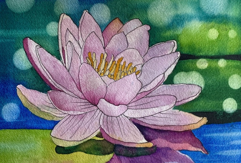
2. Project and Resources: I've prepared a selection
of helpful resources for your project available in the projects and
resources section. You will find a PDF file with the supply list I used
for this painting, along with the
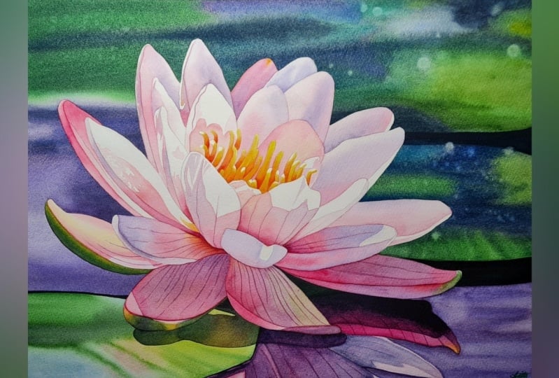
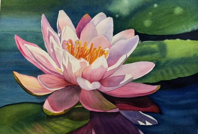
reference photo and an image of my finished
artwork for guidance. Line drawings in various
sizes are also provided, so you can print and
transfer them onto your watercolor paper in the size that you
prefer the most. My painting is in a 12
by nine inch format. Additionally, there are
working progress photos to help you follow the process
and focus on specific areas. Feel free to explore
these materials and use them to create your own unique,
beautiful painting. Please share your final painting in the projects and
resources section. I also encourage you to
take the time to view each other's work in the
students Project Gallery. It's always inspiring to
see what others create and the support of our fellow students can
be incredibly comforting. Don't forget to like and
comment on each other's work. Lastly, I highly recommend watching each lesson
before you begin painting. This will give you a
clear understanding of what to expect at each
stage of the tutorial. If you find this class helpful, I would greatly appreciate it if you could leave
an honest review. Your feedback will help me
improve my content and assist other students in
deciding whether to join this class.
Thank you in advance.
3. Mindset and Painting Plan: If you are drawn to
this water li's beauty but feel it might be
beyond your skill level, I would like to help
you shift your mindset, not just for this painting, but for any artwork you
approach in the future. I'm not a fan of assigning difficulty levels to
paintings in the usual sense. My view on levels
is a bit different. I believe that beginner, intermediate and advanced
levels are more about the time and patience a painting requires than the
techniques involved. Let me explain. If you know basic techniques like wet
on dry and wet on wet, the difficulty of
painting often comes down to how much time
you're willing to dedicate. We use the same techniques
across all paintings, so there is nothing inherently
difficult about them. The real challenge
lies in patients. Think of it this way. If you
can paint a single tulip, you can paint a whole bouquet. While a bouquet may seem like
a more advanced project. It's simply made up
of multiple tulips. The difference is only
in the time needed, not in the complexity
of techniques. While we're dealing here with a more complex
subject because we have many tulips to paint, it all boils down just to the time you have to
invest in this painting. You can paint one tulip, you can also paint ten
tulips in a bouquet. I encourage you to
adapt this mindset. For instance, with
this water lily, though it has many petals, each one is painted using just wet on wet and
wet on dry techniques. There is nothing unusual here. You simply repeat the same
process for each petal, focusing on color
and tonal values. This and other tutorials, I aim to break each painting into smaller
manageable sections, showing you the order
of layers step by step. If you follow along patiently, I'm confident that
even as a beginner, you'll be able to complete it. The background in this
painting might feel a bit challenging due
to its large area, but large backgrounds can
be tricky for everyone, not just for beginners. So if you're a beginner, then don't worry about it. So if you're worried, it might be beyond your level. Let me reassure you, it's absolutely suitable for beginners as long as you
have enough patients. This won't be a
painting you complete in one sitting, and
you don't have to. I want you to enjoy
the process, relax, take a moment for yourself, and immerse in the
joy of painting. In the end, whenever
that may be, you will have a beautiful water lily painting you
can feel proud of. If you tend to be impatient, take breaks along the way. In between, you can paint
something quick and fun, anything that brings you joy. Return to this painting
when you're ready. Remember, there is
no need to hurry. There are no deadlines,
nobody's chasing you, and there is no need to finish this or any other
painting in one day. To make things easier, we will break down this
painting into smaller sections, focusing on one part at a time. This tutorial is divided
into short segments, some a bit longer due to
the time we will spend repeating the same process
on multiple petals. Here is how we will
divide this painting. Background, including the water, the blurry background, and the soft lily pads
on the right side, lily pad in the
bottom left corner, reflection of the
lily in the water, petals divided into
stages, first, the main body of each petal, followed by the curled edges. And the center, the beautiful
glowing yellow center with its delicate
yellow stamens. This is a truly
enjoyable project, featuring lovely warm colors
and a serene composition. I hope you will enjoy
every moment of it. Now, let's begin
with the first step, masking the main subject.
4. Masking the Petals: I already have my
pencil sketch ready. I printed out my line
drawing in 12 by nine size and used a light pad to trace the image
onto my watercolor paper. I usually use arches,
cold press paper, but I recently ran out and decided to try
a different brand. And this is my second
painting on Bao hung paper. And to be honest, its
quality is excellent. I can't see any difference
between this paper and arches, and Bahung is a bit cheaper. So if you're looking
for an alternative, this could be a great choice. I stapled the paper to my
Gator board and taped it on all four sides to create a nice clean border around the painting
when it's finished. I didn't wet the paper. It's dry straight
from the block, and after making the drawing, I also used a needed eraser to lighten the sketch and
remove any excess graphite. Before starting a painting, I always consider whether to mask the main subject or not. In this case, the petals
have fairly simple shapes, so we could paint
around them easily. However, because we want to use horizontal brush strokes to convey the
impression of water, I thought it would be
easier to mask the petals. Don't know how about
you, but I always feel less stressed if I
mask the main subject, so I can focus only on
painting the background without worrying about painting around the main
subject carefully. For masking, I will be using Windsor Newton masking
fluid with a yellow tint. I will also need an old cap, a piece of soap, a brush dedicated to applying
masking fluid and water. Pour some masking fluid
into an old cup or any small container and
close the battle right away to prevent oxygen from creating clumps
in the bottle. Dip your brush in
water and rub it on the soap until you get a nice protective
coat on the bristles. The soap will protect the
bristles from sticking together after contact
with the masking fluid. Now we can dip the brush in the masking fluid and start
applying it to our subject. In the class resources, you will find an illustration showing exactly where
to apply masking fluid. As you can see, the
masking is applied along the edges of the flour
and on the statements. You can apply masking to
both areas at this stage, or you can split the process by masking the statements later. Personally, I will apply
masking only to the edges at this stage in the
areas marked with pink. Later, when we start
painting the flower, I will mask the statements, but feel free to mask both
areas now if you prefer. If you decide to mask
everything at this stage, here are two tips. First, make sure the two
masked areas do not touch. Later we will need to
remove the masking from the petal edges while keeping
the masking on the stamens. If the masking fluid
connects the two areas, you won't be able
to remove it from the petals only without also
pulling it from the stamens. Leave a small gap between them. Secondly, I highly recommend masking the stamens first
and then the petals. Masking the center first
allows you to apply masking to the petals more easily without
worrying about the center. If you mask the petals first, you would need to
wait for it to dry completely before masking the
stamens to avoid smudging, which makes it harder to
mask the stamens accurately. This may seem like a small tip, but it's quite
helpful in practice, especially if you're
a bit impatient. All right, let's get
back to masking. I may have rumbled a bit, but I know that sometimes these simple tips can
be really helpful, especially if you've never
used masking fluid before. Now, when working on a
shape like this petal, where the edge is very smooth, it's best to keep your
bash at around 40, 45 degree angle and
run it along the edge, holding the bristles
parallel to it, not perpendicular, but parallel. This is crucial for achieving
smooth, long edges. Make sure you're generous
with the masking fluid. Don't be too frugal here, as the layer of
masking should be thick enough to protect
those areas well. A thicker layer will also make
it easier to remove later. Continue applying the masking fluid and from time to time, rinse your brush
and reapply soap. I didn't record every
petals masking process. I simply applied it
around the flour. Here's how it looks
when I'm finished. The masking fluid is
still wet in some areas, so I won't start painting
until it's completely dry. Let it dry thoroughly, and once it's dry, we can start painting
the background.
5. Background - First Layer: Once the masking fluid
is completely dry, we can start painting
the background. I'll be using a size 12 brush. Let's prepare some colors. I'll start with ultramarine
blue mixed with Windsor blue. Ultramarine blue is a warm blue, while Windsor blue
is a cool blue. When we mix them, we
get a neutral blue, which I think will be
great for the water. I'll also be using
ultramarine blue to create a light
purple on the petals, which will help keep a harmonious color palette between the flower
and the background. Both Windsor blue and
ultramarine blue will also serve to create turquoise shades in the background when
mixed with greens. For green, I'll be using
my two favourite greens, green gold and Windsor green. When mixed, they
create a vibrant green similar to sub green. In the upper part, I will mix Windsor green with
ultramarine blue to achieve a deep turquoise. We'll also need a
deep dark green, which we can create by mixing green gold with Windsor
green and pains gray. These are the colors we'll
be using for the background. I prefer to paint from left
to right, if possible. So my plan is to start with
the blue water on the left, then move clockwise
around the water lily, finishing on the right
side with the lily pad. I'll take a break
after the dark shadow and complete the water
on the right side. I'm going to paint using
the wet on dry technique. Load your brush with
a watery mixture of our blue and start applying
it on the left side. Since we'll be
painting wet and dry, we need to use a
very watery paint. This will allow the
colors to blend on the paper and create
smooth transitions. Most importantly, watery paint will prevent us from
getting hard edges. If the paint is too dry, it will dry quickly
on the paper, and hard edges will
show up immediately. Diluted paint ensures that
the edges remain wet longer, giving us time to reel
out the brush with more paint and continue painting without
creating hard edges. You may be wondering
why we are painting wet on dry and not wet on
wet at this stage. You can paint wet on
wet if you prefer. That's not a problem.
I chose wet on dry because I plan
to apply two layers, and wet on dry typically dries
quicker than wet on wet. The second reason is that
when painting wet and dry, the colors will
remain more saturated once dry compared to the
wet on wet technique. When using wet on wet, the paint tends
to dilute more on the paper and dries paler. This time, I want to start with stronger colors right away. The third reason is
based on my experience, I know that I can
manage this area using the wet on dry technique without getting hard edges. If this area was larger and I intended to paint
it in just one layer, I would likely
choose wet on wet. But in this case, I know I can handle it with
a large brush. Besides if I make any mistakes, I will cover them with
the second layer. I'm using horizontal
brush strokes to mimic the horizontal
surface of the water. The masking is very helpful here because I don't have to worry
about the petal shapes. With a clean de brush, I'm lifting a
little bit of paint to create a lighter blue tone. As I move upward, I'm shifting the
color to turquoise. Now using a wet brush, I'm smoothing out this color. I'm leaving more water at
the edge to keep it wet. This gives me some time to
come back to the area I've just painted and add
any necessary details. For example, I want to drop in a darker blue tone with
additional paints gray. The edge of the paint
above will remain wet. So when I return to it, I can continue painting
without forming hard edges. When you're painting,
try to keep the paint consistency
the same throughout. If you want to add more paint to some areas that are
already painted, the new paint should have
the same consistency as the one on the paper
or be slightly thicker, but never more diluted. You apply more diluted
paint by adding more water, a bloom will occur
unless, of course, you want to create a bloom, then it's perfectly fine. But if you want to maintain
smooth colored transitions, you need to use the same paint consistency throughout
this process. I would describe my
consistency as milky, runny, and very easy to move on the palette with no
resistance under the brush. And In the upper right corner, I'm applying tinged water first. The water isn't clean
anymore, but that's fine. I want to create a lighter area that shouldn't be
perfectly white. The only white areas
will be on the petals, which will create the
illusion of strong light. I'm starting with the
brightest and cleanest color, which is my green on the
lily pad in the back. Then I'm adding more greens
and blues around it. I'm not trying to
perfectly recreate the reference photo
because that's impossible and even unnecessary. The reference photo
just provides information on where to place
each color more or less. I can follow it, but I can
also change it as I like. We have the freedom to play around with the
shapes and colors. Don't feel that if you don't recreate the reference
photo exactly, your painting will look bad. It will look good
and viewers will not compare your painting
with the reference. They will only see
your finished work. Notice that I'm focusing mainly on the
distribution of colors. I know there are
separate lily pads, but we will create that
separation in the second layer. At this stage, we
just want to create a roadmap of colors placing
them where they should be. We can finish on the lily pad on the right and then skip
to the water below. I'm again mixing
ultramarine blue with Windsor blue in a clean
area of my palette. I want to keep this color clean without the
addition of any greens, so I had to clean that part of the palette
to prepare the blue. Paint this blue corner carefully around the
reflection in the water. We can go over the
dark shadow above because we will later cover that overlap with a dark paint. After applying the blue, we can rinse and blot the brush and with
a clean de brush, try to lift off a
few lighter spots. We can also drop in
some darker blue close to the reflection
and add a few stripes. M After finishing this blue corner, we can leave everything to dry. So this is our first layer. It will dry paler,
but that's fine. We will deepen the colors
in the second layer. Now, leave this to
dry completely. After about five to 10 minutes, you may try to dry it
with a hair dryer. But if you do, please
don't paint right away. Give it even more time
to dry naturally. We apply the second layer, the first one and the paper underneath must be
completely dry. When you're ready, we will
move on to the next part.
6. Background - Second Layer: The first layer is
now completely dry. The colors are quite
fine in some places, but the second layer will make them deeper
and more vibrant. On the right hand side, I'm drawing the
shape of the li pads to ensure I know where to
apply the dark shadow. I think we can actually
start with the dark shadow. It's a good idea to establish the darkest tones as soon as possible as they provide a reference point for
other tunnel values. Those shadows are darkest
elements in the background. And if we paint them, it will quickly become apparent that other parts of the
background are too pale. So using a dark bluish color, paint those shadows wet on dry. The specific color
doesn't really matter. It's mainly paints gray with some ultramarine blue and certainly some green
from the palette. As long as we are working with the same colors
consistently, it's all good. What matters more is how
light or dark the color is. Now, let's dry those dark areas with a hair dryer and allow a few minutes for
the paper to cool down and return to
room temperature. If we start painting too quickly while the
paper is still heated, the paint will dry too
quickly on the paper, making it difficult to paint. In the meantime, we can prepare more colors for
the second layer. We will not be
using anything new. I just want to make sure that I have enough paint
on the palette. We will have a mix of ultramarine
blue and paints gray, green gold on the bottom left. And a turquoise mix of Windsor green and
ultramarine blue. You might ask why
my turquoise is not a mix of Windsor
green and windsor blue. And that's a good
question. That mix creates a very
powerful turquoise. In this case, it's
just a matter of taste and what I think
will look better. The turquoise in the photo
is slightly muted down. Using ultramarine blue, which
is a warm shade of blue, the turquoise is
automatically muted. Think of it as mixing
green with blue, but with a little
bit of red added. Of course, there is
no red in the mix, but ultramarine blue leans towards red more
than Windsor blue. Now, because this is
the second layer, we don't want to disturb
the previous one too much. When we apply water, we have to do this quickly without rubbing the
brush for too long. That's why a big brush
is best for this. Here I have an old
flat brush that I got as a gift a long time ago. And I also have a
big squirrel brush. You may know this type of brush. It's very soft and popular
among watercolists. Will use this big flat brush just to cover the background
quickly with water. Of course, you can use
your regular brush too. I just happened to have
this one, so I will use it. Another option would be to spray the background
with clean water, and this would be
even better because we wouldn't touch the paper
with the brush at all. But let's do it the
traditional way. So dip your brush in
water and try to cover the background with as few
brush strokes as possible. I won't cover the
blue area on the left because I'm not going to
apply more blue to that area. My water layer on the
left is applied up to that blue area and on the right up to the
upper dark shadow. I tried to show you
how much water I have. The surface is covered evenly with a high
shen on the paper, but there are no pales of
water or excess water. Now that the surface is wet, we have some time to
apply more colors. If you find that the paint
is spreading too much, you can either wait a little bit or use slightly more
concentrated paint. Apply the same colors as in the previous layer in places where you think
you want to darken. I'm trying to paint around that light area in
the upper right. If the paint spreads too much, we can always lift it out
with a clean damp brush. On the left side
of the lily pad, I'm adding darker color. We can also gently lift out paint to create
lighter spots. However, we will work
on those spots in the next part when everything
is completely dry. For now, I just want to lift off some paint here and there
to suggest lighter tones. I'm applying a dark blue on
the left side of the shadow and partially on the lily pad to create a connection
between them. Now with the same flat brush, we can apply water to the second li pad and
add more colors to it. I'm preparing a mix of ultramarine blue
and Windsor green. As you can see on the palette, we have an analogous
color scheme, ranging from green to blue. As long as we stay
within that range, it doesn't really matter
which colors we use because they all create a
harmonious composition. We should be more
concerned about how light or dark
those colors are. The second layer of
paint doesn't have to be darker in tone
than the first one. We're using the same
paint consistency and similar tunnel values, but it appears darker on the paper because of
the buildup of layers. Notice how nicely all those
colors interact with each other and blend together thanks to the wet
on wet technique. Tricky part is to maintain the same paint
consistency while finding that sweet spot between the paint consistency and
the wetness of your paper. After examining the background, I noticed that the blue in the bottom right corner is a bit pale in comparison
to the left side, so I decided to apply
another layer of blue. I cleaned a small space
to prepare fresh colors, and with a mix of ultramarine
blue and Windsor blue, I'm applying a blue layer using
the wet on dry technique. Now again with a
clean damp brush, I'm trying to lift off some paint to create
lighter passages. I switched to a smaller brush. It's a size six to have more control and create
smaller stripes. And with that, we can
finish this part. Now leave everything
to dry completely, and in the next part, we will finish the background.
7. Lifting Out: Now that everything
is completely dry, I can see that the dark
shadows are not dark enough. Before I start lifting
out the paint, let me apply another
dark layer here. If you find your
shadows too pale, feel free to add one more
layer of greenish blue. Once that's done, let's quickly
dry it with a hair dryer. What I'm planning
to do now is create those lighter spots you can
see in the finished painting. The reference photo has
lighter areas where the shapes are very blurry
and light bounces of them, which we can replicate easily. We don't even need a
scrubber brush for this. Instead, use a
regular round brush, and I'm using a size six. Dip your brush in water,
remove the excess, and wet a small area from where you want to
lift out the paint. Using a circular
motion with the brush, create those circles
and then lift out the paint by dabbing it
with a clean paper towel. This method should
work effectively. Green is a color
that lifts easily, so we don't need a
stiffer scrubber brush. A soft brush will also yield a softer look for those spots. I'm doing this on the edge
of the lily pad and in a few places above to replicate what I see in
the reference photo. Remember, nobody will
see your reference, so it doesn't have
to be exact match. Your painting should
stand on its own without direct comparison
to the reference. I believe this is
enough to create a convincing background for
this beautiful water lily. Keep in mind that the main subject of this
painting is the lily, so we don't need to add too much detail to
the background. By keeping it simple, we will draw attention
to the main subject, which is the lily that will
require more detailed work. Now let's move on to painting the lily pad
in the bottom left. Oh I
8. Lily Pad: In this section,
we will focus on the lily pad in the
bottom left corner. Painting this area
is straightforward, but notice the variety
of colors involved. We'll be using the wet
on dry technique so ensure your paints are
well diluted and runny. Let's start with a light
version of turquoise. It can be challenging
to pinpoint the exact color and the proportions of
green and blue I mixed. I'm simply picking
up what I have on my palette that I believe
will work well here, something light green
with a hint of blue. For this, I'm using
a size 12 brush. Next time adding a bit more ultramarine
blue near the petal. As I've noticed a hint
of blue in that area. I'll continue working
with various greens. Mute the color a bit and achieve more of an olive or moss green, I'm adding a touch of
burnt sierra into my mix. I also see some pink tones, so I'm adding a little bit
of permanent rose as well. This reflects the petals color. It's perfectly fine if the
pink mixes with the green. It will just create
a more subtle look, subtle pink, or
even a brown hue. To achieve a stronger
yellowish green, I will add Windsor
yellow to my green mix. As you can see, I'm
using many colors, reacting to what I
observe in the reference. Since my paint consistency
is quite watery, I can easily change colors, allowing them to blend
seamlessly on the paper. If my paint was drier, I might encounter hard edges while mixing different colors. Now I've switched to
a smaller brush size six to introduce a
darker green tone. I'll paint some
stripes that mimic the irregular surface
of the li pad, imagining that they
radiate from its center. I've noticed that the very
corner has too much green, so I will use a large
clean damp brush to lift out some paint and
create a lighter tone. After each sweep, I
will rinse and blot my brush to ensure it's
clean for the next pass. This way, I won't just be
dragging paint around. I can also remove paint from other areas to create
additional lighter highlights. Now, let's dry everything. Once dry, we can prepare a darker blue by mixing
ultramarine blue with paints gray to paint tiny shadows on the water
above the lily pad. Next, we will need to
paint cast shadow. To create an olive green tone, I will mix burnt sienna
with green gold and windsor green and then
darken it with paints gray. Using this dark green, I will paint the shadow shape underneath the
petal of the lily. On the right side of the shadow, I will drop in some permanent
rows for added depth. After applying the base shadow, I will pick up a
darker green tone and drop it in just
beneath the petals. Notice how I've
simplified this area. While there are tiny
details in the corner, they are not crucial to
the overall painting. I've just intentionally
left a lighter spot to suggest sunlight filtering
through the petals. Using a smaller brush, I can lift out a bit of paint in lighter areas to introduce variety in tonal values
within the shadow. This technique creates
a nice effect and suggests the reflective quality
of the lily pad surface. Now, let's dry everything. At this point, the
background is complete. If you feel your lily
pad is too pale, feel free to apply
another layer. I contemplated adding
one more layer, but ultimately I
decided against it. In the next part, we'll begin painting the reflection
of the lily in the water.
9. Reflection - First Layer: In the next four parts
of this tutorial, we will paint the reflection
of the lily in the water. I've divided this process into four manageable
sections for clarity. Let's start by cleaning
the palette as we'll be using a completely
different set of colors. This is also a good time
to change the water. We'll begin by preparing
permanent rose, which will be our main pink for the lily and its reflection. Next, let's mix
permanent rose with ultramarine blue using more ultramarine than permanent rose. This will create a purple
that we will need to mute down further by
adding burnt sienna, resulting in a nice, less saturated
purple that we can shift more towards pink
or blue as needed. Now, take a milky consistency
of permanent rose and begin applying it from the left side where there is a
light pink spot. On the right, we have
a strong pink petal, so let's apply pink
there as well. Here I think we
need to introduce a touch of quinacrodon magenta, which is a cooler shade of pink. At the tip of that petal, there is a hint of yellow. So let's add a
little bit of Indian yellow or any other warm
yellow in that area. Fill in the rest of the
petal with our muted purple. Use this purple on the
other petals as well, applying more blue
where the color shifts toward the blue shades. Okay. Dropping stronger colors under the petals
for added depth. Finally, on the smaller petal, use a light tone of bluish purple and try to
recreate the shadow shape. It afterward, rinse and blot your brush
and with a clean damp brush, gently fade that shadow. That's all for this
part. We've applied the basic colors in this area shifting from blue to pink and leaving the
lightest areas untouched. Now let everything
dry completely, and once it dry, we will apply a second layer.
10. Reflection - Second Layer: The first layer
is now completely dry and when we compare
it to the reference, we can see it still too light. In this part, we will
apply the second layer, carefully painting around those
highlights at the bottom, and we will also create a distinction between
the two petals. Notice how we are intentionally
applying each layer, considering how they interact. Each addition brings us
closer to the final result. We'll be using the
same colors as before. On the left, I have
permanent rose mixed with a little bit
of quinacrodon magenta. On the right, my darkest
mix consists of pains gray, ultramarine blue, permanent
rose, and burnt sienna. I will also add
more permanent rose to the right side to achieve
that rich deep purple. Additionally at the bottom, I'm mixing a muted blue using ultramarine blue and a
touch of burnt sienna. Generally, the colors in the water reflection
need to be a bit muted since the image of the lily is
distorted by the water, preventing the colors from
being too bright or vibrant. Let's start with the dark purple and darken the entire
petal on the right. I will apply dark purple under the lily petals gradually shifting down to permanent rows. At the tip of the petal, I'm dropping in
some Indian yellow. At this stage, we're darkening
the petal while creating a clear edge between this petal and the other petal below. In the next part, we will
paint the shadow here. Now, leave this side to dry
and move on to the left. Here we need to darken
those petals significantly, so be cautious not to touch
the petal we've just painted. Apply purples, blues and pinks while carefully painting around the highlights in
the lower part. Dropping a darker purple under the lily pad using a dabbing
motion with the brush, which allows you to release more paint than a regular
standard brush stroke. For the latest petals, apply a very pale version
of blue, but again, leave a small gap between
this petal and the first one we painted to avoid any unwanted bloom
from the wet paint. With a clean de brush, you can lift out some paint
to create lighter tones, and with that, we can
finish the sport. Now, let everything
dry completely. In the next part, we will paint the shadows and darken
some areas even more.
11. Reflection - Third Layer: Even after applying
two layers of paint, the reflection still appears too pale compared
to the reference. In this part, we will darken certain areas and
paint the shadows. On my palette, I'm
mixing the same colors, ultramarine blue,
permanent rose, paints gray, and burnt sienna. This time, however, I'm
using more permanent rose, resulting in a very
deep burgundy color. Let's start by picking up permanent rose
mixed with a touch of the deep purple and paint
the shadow on the petal. If you would like,
you can lightly draw a pencil line to guide you. Pull that deep dark color
toward the tip of the petal. Then use a dabbing motion with your brush to add more
paint just under the petal. Initially, I left the corner
between the petals painted, but since it's a dark area, we can paint it as well. Next, apply the shadow
under the second petal. Again, feel free to draw
a pencil line first if it helps you to know
where to apply the paint. But these shapes are
simple enough that you can likely to do this
without guidelines. Lastly, applied the dark
color under the lily pad, then softened the paint
with a clean de brush. Now, let's dry everything
with a hair dryer. After drying, wait for the paper to cool down and return
to room temperature. Next, pick up a more diluted, lighter version of the purple, ensuring you also have
that muted blue ready. All we want to do now
is darken the petal. I'm starting with the purple
and then shifting to blue. Notice that I'm also applying the paint onto the dark shadow. This will not only
deepen the shadow, but also create a nice
overlapping effect with this transparent layer. Be I will also use
this dark color to run under the lily pad again just to darken
that shadow even more. For the final detail, mix permanent rose with
quinacrodon magenta and apply this color to the pink petal if it needs a deeper hue. In my case, it definitely
needs a bit more mph, so I'm adding another layer. The slightest petal now
looks slightly too bright. It's too light, but
we can't address that now since both sides
have wet areas. So let's dry everything
now and in the next part, we will add veins and
darken the slight petal.
13. Masking the Stamens: At this stage, if you didn't mask out the statements
at the beginning, it's time to do it now. While it's not
strictly necessary, I believe it's worth
spending some time carefully masking them to give you a peace of mind while
painting the petals. However, if you prefer, you can skip this step and
carefully paint around them. I masking the stamens, I will use a small brush, dipping it in water, and then rubbing it on a piece of soap to create
a protective coat. Since the stamens
are quite small, I'm using a very tiny brush. It takes a bit of time. It took me about 15 minutes to mask everything
out carefully, but this precision
is essential here. Once you've finished
masking the stamens, let them dry completely. When they are dry, we can move
on to painting the petals.
14. Petals - Part 1: This part of the tutorial, along with the next one,
may feel a bit repetitive. We'll be applying the
first layer on the petals, and while it might seem tedious to repeat the same
process for each one, I will highlight a few
key points along the way. Let's begin by
preparing our colors. We'll definitely need pink, and my main pink will
be permanent rose. In addition, we will create
a muted purple by mixing permanent rows with
ultramarine blue and adding a touch
of burnt sienno. This mix will allow us to shift between blue and pink
tones as needed. At the bottom of the palette, I will mix permanent rose
with a little Indian yellow. The warm yellow will
add warmth to the pink, resulting in a lovely
baby pink shade. These are the colors
we'll be using. For this task, I'll be
using a Size six brush, which I believe will work well. We'll be painting each petal mainly using the wet
on wet technique, though there will be some areas where wet and dry
will be necessary. I will demonstrate
various types of petals that we will be repeating
throughout this process. We can start with any petal
as we will need to paint. All of them eventually, I've chosen one of the upper petals as
our starting point. This petal is completely
covered with color, so we won't leave
any white spots. Begin by applying an even
layer of water over the petal. Using the wet on wet
technique will allow us to blend colors
smoothly within this area. Notice that I will be
simplifying the surface details. While we can see
the bumpy surface, bumpy texture of the petal, I'm focusing on creating smooth color
transitions instead. My attention is primarily on
the main body of the petal, not on the curled edges. After applying a layer of water, pick up the first color, in this case, the warm pink and apply it to one
side of the petal. On the opposite side where
I see the muted purple, I will apply that color. Notice that I'm using
very light tones. I aim to maintain the luminous
quality of the petals. So it's important not to
go too dark at this stage. Starting light allows us to add more layers later if needed
and darken that area, whereas lightening an area, once it's painted, can be quite challenging
in watercolors. Once we finish one petal, we can move on to another one. Best to avoid painting
petals that are directly adjacent to the one
you've just completed, as we don't want the paint
to flow between them. So skip some petals
and focus on another. This next petal follows
the same process after applying the water layer at
the pink and purple colors. If the colors spread too much, use a clean de brush to
lift out some paint. Now let's tackle a
more complex petal. This petal has at the bottom where we
want to blend colors, but in the upper section, we need a hard edge
to create a shadow. For this, I will apply
water only partially in the area where I want to blend colors using wet on
wet technique there. The illustration shows
where I'm applying water. It's below the edge
I'm going to define. In other areas, I
will paint wet and dry to achieve those
necessary hard edges. Will begin with a
light purple tone, focusing on the shadows
in the upper parts. I haven't drawn these
shadows with a pencil, but if you prefer, you can
lightly sketch them in first. I like to minimize pencil lines. The shadows don't
need to be exact. We're simply trying to convey the impression we get
from the reference. As I move downward, the paint meets the wet area where I can add more colors
and blend them together. On the right hand side, I even incorporate a
touch of Indian yellow. Again, note how light
my tunnel values are. This strategy allows
for adjustments in tunnel values by layering
more paint later if needed, which will be particularly important for the
petals at the bottom. This petal is very
similar to the first two, so there is nothing
particularly unusual about it. At this stage, our
goal is to apply the basic colors
observed on the petals. While we can suggest some
darker tones in certain areas, the main purpose
here is simply to cover all the petals with
foundational colors. We want to work calmly and
deliberately on each petal, taking care to manage
any hard edges as they will help us create
a strong illusion of light. As I paint, I notice
variations in color. Some petals have more pink, others have more yellow, and some show more blue. This presents a
great opportunity not only to practice the
wet on wet technique, but also to train our eyes to recognize different
shades and hues. Remember the
techniques we have at our disposal and make
good use of them. Use the wet on wet technique for larger areas where
blending is needed. Use the wet on dry technique to establish hard edges
on the petals, and don't forget you can use a clean de brush
to lift out paint, creating highlights
or preventing the paint from
spreading too far. Mm. At this point, I need to pause and allow everything
to dry as there are no adjusted petals left to paint that don't touch those
already completed. Once everything is dry, I will return to apply colors to the remaining petals
in the next part.
15. Petals - Part 2: The first layer on half
of the petals has dried, so we can continue
with the rest. I noticed I missed one
petal in my pencil drawing, so I will quickly add that now before moving
forward with painting. There is nothing extraordinary
in this process. What we need here is patience as we repeat the same
technique on each petal. I highly encourage you not
to rush through this part. Take your time and paint each petal carefully
and thoughtfully. Remember, this is a
relaxing activity and there are no deadlines. Just enjoy the process
one petal at a time. For smaller areas, you might not need to use the wet
on wet technique, especially if a hard
edge is present, as we can cover those
areas very quickly. However, for larger areas, I recommend the wet on wet
technique because it creates a different field that works beautifully for delicate petals. Focus on applying the correct
colors in the right areas, suggesting darker regions
with slightly deeper tones. There is no need to achieve the darkest values right away. We will refine those
tonal values later to ensure the darkest places
are adequately dark. This particular petal is
darker than the others. I will use a deeper tone of permanent rose mixed with
quinacrodon magenta. The magenta adds a cooler
shade to the pink, which will work nicely here. After applying the paint, I will use a clean de brush to lift some color from the tip of the petal and I will drop in a touch of
Indian yellow odor. Next, I will mix permanent
rose with ultramarine blue, using a more
concentrated consistency to add slightly darker shades. On this petal, I'm
applying pink, and in the upper part, I'm using short brush strokes
to create a subtle texture. This effect is delicate
and barely noticeable, but it adds to the
overall realism. Now continue applying paint
to the rest of the petals. I will stop talking here as there is really
nothing more to say. We're just repeating the
same process on each petal. I will cut out the
sections where I'm applying the water glaze and only keep the parts
where I apply the paint just in case
you want to see those. Once you finish this part, leave everything
to dry completely, and in the next section, we will paint the curled
edges of the petals.
16. Petals - Curled Edges: We've applied the main
colors to the entire flower, and it looks lovely. Now we have a few more steps to take on our path
to completion. In this part, we will focus on painting the curled
edges of the petals. Let's begin with the pink
petal on the left hand side. Mix quinacrodon magenta with permanent rose to
create a deep pink. Using this color, carefully
paint the edge of the petal ensuring to
leave the tip unpainted. Soften the upper part of the painted area with
a clean damp brush. Repeat the same technique on
the lower part of the petal, adding more color to mimic
the reference photo. Our goal is to paint these edges in one
layer if possible. Next switch to a purple color to paint the edge of
the adjacent petal. Near the center of the petal, you will notice a
deeper pink tone, but we will darken
that in the next part. Continue painting the
edges one by one. I know there are many
petals in this lily, but if we methodically tackle
them section by section, we will create a beautiful
flower in the end. There's no need to rush. These are small areas that
require your patience. If there are strong
highlights in any sections, be sure to leave them unpainted. Notice that my brush
has a sharp point, which allows me to
navigate carefully into the tiniest corners
between the petals. No Now for the bottom left petal, we will use a green colour. Let's mix green gold, Windsor green, and burnt sienna
to create an olive green. To darken this color, we can add a touch
of Pain's gray. Start with just
green gold and apply this color to the curled edge
of the petal as our base. For the edge, add a bit of pink to tie the colors
together beautifully. Now, let's pick up the
darker green and start building up the dark
green value in this area. Carefully apply the
green along the edge, then drop in more of the deep color to ensure
it's dark enough. Oh. I'm adding even more paints gray right at the very
edge to deepen the tone. Next, mix green gold and winds are green to
refine this green layer, making sure it's
evenly covered with both green and pink
along the edge. Moving on to the next petal, start with a mix of burnt
sienna and Indian yellow. This area is small but
features a variety of colors. The key here is to
paint the center of the petal or the
tip of the petal, I should say, with dark green, leaving lighter
areas on both sides. Then at the darker green
and pink on the right side. This interplay of
light and dark tones will create a nice
three D effect, giving the petal a rounded form. Don't forget to add
highlight on the edge and be sure to incorporate
pink there as well. While this is a small area, it does require
careful attention. You find it overwhelming, consider breaking the
process into smaller steps. Apply yellow, let it
dry, then apply green, let it dry, and finally, focus on the pink before
allowing that to dry. Alternatively, you can paint everything at once as
I've chosen to do. Continue painting each
section with care. The bottom right
petal might be a bit trickier due to
its mix of colors. There's a lovely green at the tip alongside
pinks and purples. However, the technique
remains the same. Just distribute the colors similarly to your
reference photo. And with that, we can wrap up
this part of the tutorial. You can see how my lily
looks at this stage. It's almost finished. However, comparing it
to the reference photo reveals that it lacks depth
and the darkest tones. In the next part, we will add those crucial details
and darken all the areas that needed to bring
the painting to life. H
17. Petals - Details: In this part, we will enhance the petals by adding details. I'll begin with a
smaller brush size four. Let's start by preparing a dark, warm pink color, mix permanent
rose with Indian yellow. This will give us a
warm pink or even red, depending on the proportions. Then add paints gray
to darken this mix. Try to mix a color that is similar to what I
have on my palette. Use this dark color to paint the darkest areas
underneath the petals. Add more permanent
rose to your palette. Rinse and blot your brush and use it to smooth
out the paint. At this stage, we're
looking for areas where a touch of dark paint can
add depth to the lily. You'll notice that
just a small amount of the dark tone can significantly enhance the
dimension of the flower. Now, let's mix
permanent rose with ultramarine blue to
create a muted purple. To tone it down further, you can add a touch of
green from your palette, or if you don't have green
anymore on your palette, you can add paints
gray and burnt sienna. Start by applying just the
permanent rose to the petal, making sure to leave the
highlighted area unpainted. This will define the edge of
the shadow on this petal. After applying the
permanent rose, switch to your purple mix and apply it to the
rest of the petal. Continue to focus
on the areas where you want to add
depth and richness. And remember to take your time. This is where the details truly bring this
painting to life. In the area close to the center, drop in a darker tone. The green color can be
particularly useful here as the petals reflect the green from
the surroundings. Adding green also helps to
neutralize the purple tones. At this stage, we want to apply one more layer to the three
larger petals at the bottom. Since they are in shadow, it's essential to ensure
that they are dark enough. However, avoid going
too dark right away. It's better to apply a few thin, transparent layers to gradually
build up the colors and tones rather than applying one thick dark
layer all at once. Now, let's move on to other
sections of the flour, using the same dark
pink mix from earlier, perhaps adding a bit
more permanent rose. Apply this mixture
between the two petals. This time I'm using a
concentrated dark pink color. It has a thicker consistency
instead of a milky one. I want to make sure that
the color is dark enough before I start to fading away this color
with a clean de brush. Focus on those
small darker areas between the petals that
require more depth. This will help
create dimension and enhance the contrast
between each petal, ensuring they are clearly
distinguished from one another. At this stage, take
a dual approach. First, step back and
view your flower as a whole from a distance to assess the overall composition, overall distribution
of tunnel values. Look for areas that may
need more darkening, particularly in the crevices between petals near the center. Additionally, identify
if any petals overall appear too light
and need to be darkened. In my case, I believe
some petals on the right side could
benefit from a deeper tone. On the other side,
zoom in and take your time when you spot a
section that needs attention. It's essential to
work patiently, focusing on one small
area at a time. Often the challenge isn't
the technique itself, as I mentioned in the
beginning of this tutorial, but the lack of patience. It's tempting to rush to
finish your painting, but you must pay enough
attention to each petal. Once you've finished
darkening the petals, dry everything completely
with a hair dryer. The final touch will be adding those beautiful
stripes on the petals. While these lines are
green in the reference, I've decided to paint
them dark pink. You can certainly use
green here if you prefer, but I just thought that
pink would be better. Using permanent rose and
the tip of my brush, I will carefully paint these delicate lines paying close attention to their shape. Shapes of these
lines are crucial as they inform us how
the petal is bent. I want to create very thin lines thinner than those
in the reference, so they don't draw
too much attention. These fine veins add
character to the flower. Sometimes even if the petals don't naturally
have those lines, those veins, I like to include them to enhance
visual interest. For the bottom petals, remember to use a
slightly darker tone so the stripes are
visible when they dry. If you're uncertain about
the shapes of the lines, feel free to use a pencil
to help guide you. Although I included those
lines in the line art for you, I personally never draw them out because they can
appear too prominent. I prefer to paint these lines freehand loosely following
the reference photo. After painting the lines, dry everything again
with the hair dryer, and now we can remove the
masking fluid from the stamens. In the next part, we will paint the stamens and complete our
beautiful flower painting.
18. Stamens: To start, I will
clean the left side of my palette to create
a fresh mixing area. If your water is very dirty, this is also a good
time to change it, as we will need
clean yellow colors. Let's prepare our colors first. We will need three shades. The brightest shade
will be Windsor yellow. Then the middle shade, Indian yellow or any other
warm yellow you have on hand. And the darkest shade, a mix of your warm yellow, in my case, it's Indian
yellow with permanent rose. This should create a
vibrant orange or even red. Now the fun part begins. In the first stage, we will use the
brightest yellow, Windsor yellow to
cover all the stamens, leaving just the tips of
some of them unpainted. This stage is quite
straightforward. Our goal is to cover
everything with winds are yellow while
preserving some highlights. I know this area can be small, especially if you're painting
on a 12 by nine size, but I encourage you
to stay focused and take your time while
painting these statements. After applying Windsor
yellow to all stamens, dry everything with
a hair dryer and wait a few minutes for
the paper to cool down. Next, we'll pick up the Indian yellow to
apply our second layer. In this stage, we will add a bit of shadow to each stamen. Apply a touch of Indian yellow to the bottom
part of a stamen, then use a clean de brush
to fade it upwards. Focus on applying
this color mainly to the lower part of the stamen and gently
blend it towards the top. This technique will create
the illusion of depth, suggesting that the upper part is more illuminated by sunlight. Yes, I know this stage is even more tedious than
the previous one, but it's worth persevering. Notice that I'm painting with just the very tip of my brush. It's almost like drawing
with colored pencils. If you use a brush
that is too large, you might miss out on
the finer details. That's perfectly fine,
depending on your style, but I personally enjoy
being precise sometimes, so I don't mind dedicating a few extra
minutes to the statements. Besides, this is the focal
point of our painting. W Here's how the stamens look after the second layer. I'll pause for a few seconds
so you can take a good look. Feel free to pause
the video to keep it on the screen a bit
longer if you would like. After applying the second layer, make sure to dry everything
again with a hair dryer. Now for the third stage, pick up the darkest mix and apply it to the darkest
areas of the stamens. After applying the
darkest orange color, we can also pick up
some Indian yellow again and apply it right
next to the dark color. This helps to smooth
everything out, creating a softer transition between the dark
and middle values. Additionally, layering
Indian yellow makes the color appear
deeper and more vibrant. Again, the darkest orange is typically found at the
bottom of each stamen, which helps convey the depth
of the flowers center. And after applying the
darkest tunnel values with this dark orange, we can almost call this
painting finished. The very last step
I want to discuss, which is totally optional is softening the
edges of the shadows. I enjoy doing this
in my paintings when there are shadows on the
petals that met white paper. For this, I use a
scrubber brush, specifically a Windsor and
Newton galeria brush size. Four, I dip it in water. I blot it on a paper towel, and then gently rub the edge of the shadow back and forth
with the damp brush. Afterward, I dab the area with a paper towel to
lift some paint. This technique softens
those hard edges, creating a stronger sense
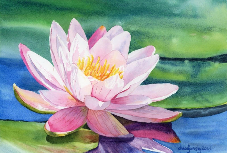
of warm glowing light. Now we can sign our painting. I always place my signature in the bottom right corner using colors that
match that area. In this case, I'm using a
slightly darker shade of blue, and I prefer my signature to be subtle rather
than prominent. And now the painting
is finished. We can carefully remove the masking tape to reveal
a nice clean border. Later, I will remove the
painting from the gator board, and I will trim off the
edges with those staples, leaving just a white border. This border is always helpful when I decide to
matin frame the painting. The painting looks beautiful. It's colm with
lovely colors that evoke a sense of
tranquility and relaxation. In the final part,
we will reflect on what we've learned
throughout this project.
19. Summary: Thank you so much
for joining me in this watercolor
painting tutorial. I hope you found it
enjoyable and that you are inspired to give this
painting a try yourself. Let's take a moment to recap what we've covered
throughout the project. We learned how to use the wet and wet technique
to achieve a soft, dreamy background that
beautifully complements our lily. This method allows
us to blend colors, seamlessly creating a
tranquil atmosphere. We explored how to break down the shapes into simpler forms, making it easier to
paint with confidence. This simplification helps create a harmonious composition
that draws the viewer's eye. We discovered the
importance of layering to create realistic
reflections in the water. By gradually building
up colors and tones, we were able to convey the depth of the lies
reflection in the water. We recognized that
patience is crucial when working on detailed subjects like flowers with
multiple petals. Taking our time allowed us to focus on each petal
individually, enhancing the overall
quality of our painting. Practiced using both wet on wet and wet on
dry techniques, understanding when to apply each method to achieve
different effects. This versatility
is key to creating dynamic and visually
interesting artwork. We emphasized the importance of tunnel values by
carefully preserving the lightest areas on the petals and darkening any
areas that needed it. This attention to
tunnel values helped create a strong sense
of light and dimension, making our lily appear
more vibrant and lifelike. I hope you enjoyed this
process as much as I did. Remember, painting is about
exploring and having fun. So don't be afraid to experiment with your own
colors and techniques. I hope you'll give this painting a try if you haven't yet. So thank you very much for
watching and happy painting.
 Krzysztof Kowalski, Watercolor artist