Transcripts
1. Introduction: Hello and welcome to the
watercolor painting Tutorial. Today we'll be painting a beautiful, moody,
waterfall landscape. This piece is more expressive than many of my other paintings. You'll notice that
it isn't meant to be a super realistic copy
of the reference photo, but rather an attempt to capture the mood of the
scene and highlight its essential elements in a way that creates a
convincing landscape. We won't focus too
much on details, and we won't worry about staying strictly within
the pencil lines. That makes this a
perfect project for those of you
who enjoy a bit of creative freedom
and don't like to feel restricted by
precise execution. It combines a balanced mix of loose painting with
just a touch of detail. We'll explore different
techniques to create textures and the beautiful light that makes this landscape so unique. Together, we will try to capture its dreamy atmosphere and bring the scene to life using
just a few colors. I'll guide you step
by step through the entire process in a
calm and relaxed way. I've divided the painting
into manageable parts. Although with a piece like this, it can be a bit challenging
since many areas are painted intuitively without
strict rules or order. Still, I hope you will pick up some helpful tips and tricks along the way that will inspire you in your
own painting practice. My wish is that you
approach this project with patience and
a relaxed mindset. Take this time for yourself. Don't rush and try to
let go of any pressure. Enjoy the process and let it become a quiet, creative moment. If you ever feel overwhelmed, simply take a break and return to it when
you feel refreshed. By the end of this tutorial, you will have a beautiful
atmospheric landscape painting, and I hope you'll feel proud
of what you've created. So gather your supplies,
take a deep breath, and let's begin this
joyful painting journey together. Happy painting.
2. Project and Resources: I've prepared a selection
of helpful resources for your project available in the projects and
resources section. You'll find a PDF with the supply list I used
for this painting, along with the
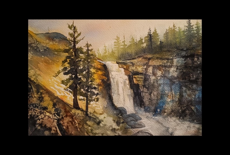
reference photo and an image of my finished
artwork for guidance. Line drawings in various sizes are also provided so
you can print and transfer them onto
your watercolor paper in the size that best
fits your needs. My painting is in a
15 by 11 inch format. Additionally, there are working
progress photos to help you follow the process and
focus on specific areas. Feel free to explore
these materials and use them to create your own unique
and beautiful painting. Please share your
final painting in the projects and
resources section. I also encourage you to
take the time to view each other's work in the
student project gallery. It's always inspiring to
see what others create, and the support of
your fellow students can be incredibly comforting. Don't forget to like and
comment on each other's work. Lastly, I highly recommend watching each lesson
before you begin painting. This will give you a
clear understanding of what to expect at each
stage of the tutorial. If you find this class helpful, I would also greatly appreciate it if you could leave
an honest review. Your feedback will help me
improve my content and assist other students in
deciding whether to join this class.
Thank you in advance.
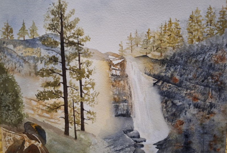
3. Painting Plan: Before we begin painting, let me share a few words about the reference image in our plan. Interestingly, the
reference image we'll be using isn't
actually a photograph. It's an AI generated image. Artificial intelligence is a complex and sometimes
controversial subject, and this isn't the place
to dive deeply into it, but I do want to make
one important point. You may have seen some groups
on Facebook with names like watercolor painting
or watercolor tutorials. Many of them regularly
post images created by AI, presenting them as real
watercolor paintings. People comment, share, and often believe these are
genuine artworks. Personally, I find this
highly inappropriate, misleading, and ultimately
harmful to the art community. I'm strongly against
this kind of use of AI because it feels like a
scam and misleads people. That set, AI is here to stay, and I believe there are
constructive ways we can use it, especially as a tool for
inspiration and idea generation. One positive application is
creating reference images. AI can help us design images
that match our vision, and sometimes it even adds unexpected but
beautiful elements we might not have
thought of ourselves. I created this reference
using mid journey, experimenting with many
variations until I arrived at something I felt would work well as a
painting reference. I see this type of use as
acceptable and even inspiring. Now, let me outline
the stages of our painting process so
you know what to expect. But before that, I want to emphasize one very,
very important thing, as with tutorials, but
especially with this one, I highly recommend watching each section first before
you start painting. This is crucial because
some areas will be painting fairly quickly due to the techniques
we'll be using, and it won't be possible to follow every brush
stroke in real time. What matters most in
this tutorial is not replicating each brush stroke but understanding
the bigger picture. What we are creating, why we are doing it, and how each stage builds
the atmosphere. So I suggest watching a section first to
get the overview, see how I approach it, and the result it creates. Then if you'd like, you can watch it again while
painting alone. Type of painting can't be reproduced exactly
because it involves many unpredictable effects
and each of you will end up with slightly
different result and that's absolutely fine. In fact, that's
the beauty of it. Don't feel pressured
to copy my painting. Instead, make it your own. Use different techniques
if you prefer, add more detail or
keep it looser. It's your painting and it should reflect your creative
and artistic expression. What I'm showing you
here is just one of many possible ways to
approach the subject. I'd like to walk you
through the stages of the painting and briefly
describe each one. We'll begin with masking. Before starting any painting, I always consider whether there are any areas that
need to be masked, since masking usually has to be done at the
very beginning. In this case, I decided to
mask the brightest highlights, which I identified in three
main areas at the top of the waterfall and on two spots along the
rocks on the left side. These are pure white areas that would be difficult
to paint around, so we will mask them out
to preserve that crisp, bright light in the landscape. Next, we'll apply a
basic wash across the entire painting and immediately start working
on the right side. This will probably be the longest and trickiest
part of the painting, but it also allows
for a lot of freedom. If you enjoy working loosely, you'll probably find it fun. But if you're like me and
prefer order and detail, it might feel a bit stressful. The good news is that
once you get through it, you will feel a big
sense of relief. My tip is to watch this part a couple of times before
painting along. That way you will feel calmer
and more confident because you will know exactly what the goal is and
how to achieve it. Stage three will
be much simpler. We will paint the trees
at the top of the rocks. Then we will add more color to the rocks and trees
on the left side, creating the base for the
next more detailed stage. Then in the next stage, we will focus on adding detail
to the rocks and trees. We'll also remove
the masking fluid at this point to reveal the nice highlights
we saved earlier. Finally, we will complete the painting by adding
the main trees. This sequence felt like the most logical order
of steps for me. But since you will have the reference photo,
my finished painting, and also some progress shots, feel free to approach it
differently if you prefer. Can paint in a different order or even use your own techniques, do whatever feels most
comfortable for you. Before we begin, I want to mention one more important idea. At some point, you may feel like the painting isn't going
in the right direction. You might experience the
so called ugly stage. Honestly, I felt that way after almost every
stage of this painting. So I know what that means. I kept thinking of 1,000 different ways I could
have painted it. At times I even felt
like giving up. Some of you already
know that I nearly decided not to record
this tutorial at all. I'm not a psychologist or
a motivational speaker, but I do want to encourage you push through no matter what. Every painting has
its ups and downs. Embrace both the parts you
enjoy and the parts you don't because it's all part
of the learning process. Try not to put too much
pressure on yourself. In the end, it's
just a painting. Approach it with
patience and calm, and I'm confident you will
create something beautiful. For me, even though I struggled, I ended up liking this painting, and it became a great
learning experience. I hope you'll enjoy it, too. If you're ready, let's begin.
4. Masking: The very first thing I
always consider before starting a painting is whether
or not to use masking. In this case, I
decided to mask out the brightest whites visible
in the reference image, the highlights on the
rocks on the left side, and the brightest spots at
the top of the waterfall. These areas are small, but they are very
important because they give the painting a
strong sense of light. Since we'll be working in a fairly loose style with
spontaneous brush strokes, it would be difficult to carefully paint around
these tiny areas. Masking them is the best way to preserve those highlights. For this, I'll be using Windsor Newton masking
fluid with a yellow tint. It may look green, but this is just the
color of the bottle. We'll also need an
old bottle cap or a small dish for puring
some of the masking fluid. A small piece of soap, I keep mine in a
little container, a brush used only for masking fluid and a container of water. Before using the fluid, gently roll the barrele to
mix the pigment evenly. Pour a small amount into a separate container and
close the barrele right away. We don't want the
masking fluid to be exposed to air for too long, as it can start to dry out and form clumps
inside the bottle. Always pour just what you need at the moment and
keep the rest sealed. To prepare your brush, dip it in water, and then
gently rub it on a bar of soap. This creates a protective
layer on the bristles, which helps prevent them
from sticking together. Don't worry, the
soap won't affect how the masking fluid
works on the paper. Now, dip your brush into
the masking fluid and apply it to the white areas at
the top of the waterfall. You don't need to be
extremely precise. We're mainly
creating light spots that will suggest
sparkling highlights. Follow the general flow
of the water as a guide, but don't worry
about exact details. Next, add masking to the
bright dots on the left rocks. When you're done,
clean your brush thoroughly and let
everything dry. Since these are small areas, the fluid should dry quickly. In the class materials, you will find an illustration showing exactly where
I applied the masking. I've also marked it on
my finished painting. In the next part, we'll apply the first and very
important layer.
5. First Layer: Now, we'll begin the
actual painting process. At this stage, we'll apply
the first initial layer, which is very
important because it sets the mood for
the entire painting. How we distribute the
colors and which colors we choose will have a big
impact on the final result. The goal here is to create
a moody column painting. It's not meant to be
vibrant or bright. We want to convey a sense of afternoon light, warmth,
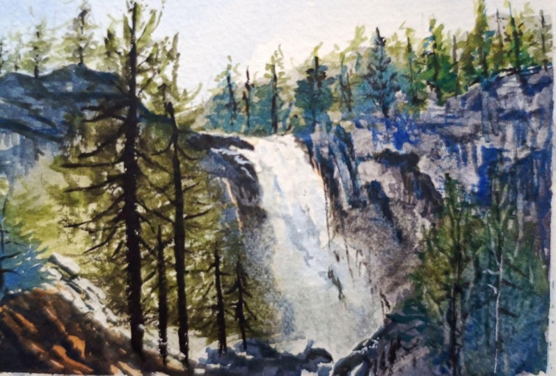
and tranquility. In this work in progress photo, you can see the result
after this first stage. As you can see, we'll cover
the entire painting with color and immediately start
working on the right side. You could divide this step
even further, if you like, apply the basic colors
across the entire painting, let it dry and then start the right side
with a second layer. However, I don't think
that's necessary here. The waterfall in the center naturally divides the painting. So while the left side dries, we can work on the right side without
interrupting the process. I know I've mentioned
this before, but I want to
encourage you again, watch this part first
without painting. This stage is quite
quick and spontaneous, and seeing it once
or twice will help you feel confident when you repeat the process on
your own painting. We'll be using only four
colors for this stage. Windsor yellow deep, a warm yellow that helps
create soft warm light. It will also be used to mix
muted greens with blues. Other yellows like transparent yellow or Windsor
yellow are too cool, and the greens would
end up too vibrant. This yellow leans toward red, which helps tone down the greens and contributes to
the overall mood. Then burnt sienna. This is ideal for sunlight
areas on the rocks. When mixed with blues, it produces a range of
neutral browns and grays. Ultramarine blue,
mainly for the sky, but also to create
different shades of green and paints gray, a very dark blue that
helps darken areas, create muted greens and
produce soft grays. It will play a key role
in unifying the painting. To start, I will mix a touch of burnt sienna with ultramarine
blue to prepare a gray and mix paints gray with Windsor yellow deep to
create a deep muted green. We'll be painting wet on wet, so choose your largest brush. Here are my three
biggest brushes, and I'll be using
my 1 " flat brush. First, we need to wet the
entire paper surface. You can do this with a brush, but I prefer using a spray bottle because
it's much quicker. I will just spray the
entire paper and keep the battle handy in case
some areas dry too fast. Using my flat brush, I will start with
Altramrine blue mixed with just a little
bit of burnt sienna, and I begin painting the sky. I start with the
sky because it's a large clean area and also the furthest
plane in the painting. On the left, the sky
is more blue gradually transitioning to
almost the white of the paper on the right. To create this gradient, I will use more water and less pigment as I
move to the right. Remember that the color
will dry lighter, make sure that the
blue is slightly darker than you want
the final result to be. I can already see that the paper on the left
isn't wet enough, so I'm giving it another
quick spray with clean water. Next, we move on
to the mountains. I'll switch to a mix of
burnt sienna and paints gray and make quick broad brush
strokes to cover this area. I'm not worried
about imperfections. Landscapes have lots of texture, and a few hard edges or darker streaks are
perfectly fine. While painting the mountains, I'm keeping in mind the light
area behind the main trees. This area should stay
light as it will create a nice background for
the trees in the foreground. I'm using a bit more Windsor
yellow deep and burnt sienna here to maintain warm tones
where the light hits. I'm also adding burnt sienna to the bottom left corner
where the large rocks are, mixing in just a touch of ultramarine blue to
slightly mute the brown. This will serve as the
base for those rocks. I'm now thinking about
the lightest parts that I can see in those rocks. At the bottom, I apply
some pains gray, then switch the mix
of pains gray and Windsor yellow deep to
create a muted green, suggesting trees at the base. You'll notice in
the final painting, many areas are
simplified or stylized. At one point, I even
decided to paint a green slope here rather than painting each
tree individually. I'm also adding a suggestion
of a tree on the left side. Notice that I'm avoiding
the waterfall for now. Eventually, it will
have a light blue tone. But now, if any paint
lands there accidentally, I use a clean brush to lift it. It's okay if a little
color remains there. It won't be pure white, but try to keep it light. Next with a very light mix of paints gray and
ultramarine blue, I suggest distant trees at
the top of the mountain. The paper is still
slightly damp here, so the edges of the
paint blur softly, creating a delicate
soft tree line. On the left side, I drop
in more green, yellow, and brown to suggest warmer colors and areas
bathed in sunlight. Now, we'll work on the mountains and trees on the right side. I'm using Pains gray as a base color alternating
with burnt sienna. The burnt sienna
near the waterfall will suggest worm light
falling on the rocks. I'm spraying this area again to help the paint flow
and to ensure I can create a soft edge on the left side where the
rock meets the waterfall. This is the area that
requires extra attention. I'm not afraid to use
bolder colours and darker tones of paints gray because I know it will
all dry much later. On the left side where the
paint meets the waterfall, I'm using a clean de
brush to soften the edge. This helps shape the waterfall
and create a smooth, blurry transition between
the rock and the water. Next with a green mix of winds are yellow deep
and paints gray, I'm suggesting the trees
in the foreground. I'll also use a deeper paints gray to darken some
areas of the rocks. The I'm gradually
adding more paint, yellow to mix with
blue and create greens and more blue and brown to
deepen the overall colors. It may look very dark now,
but that's intentional. We need a rich wet base
because we'll lift some paint, spatter, and sprinkle salt later to create
interesting effects. Focus on darkening the
area while letting some yellow and green
peek through and maintaining the warm brown on the rocks to
suggest sunlight. Make sure paint hasn't flowed too much
into the waterfall. If it has used a clean damp
brush to lift the axis. I'm also lifting
paint at the bottom to suggest the mist
of the waterfall, moving my brush upward to
create a soft lighter shape. Now we can create some
texture on the rocks. Ideally, you would use an old credit card to
scrape the wet paint, which creates a lighter
area with a darker edge. If you don't have one,
you can fold a piece of watercolor paper to
make it sturdy enough. Other options include something like the bottom of a paint tube, for example, or a ruler. The goal is to
lift the paint and creating lines and shapes that will help define the rocks. The effect will be subtle
because the paint is very wet. It will become more
visible as it dries. You may want to
wait a few minutes until the paint dries a little bit more and then start scrapping the
surface of the paper. The effect will be
much more visible. Where you lift paint, it should appear
lighter and the edges created by scraping will
form small indentations, creating darker lines that shape the shelves and contours
of the mountain. Oh Hi, it's future me popping
in for a moment. While recording the tutorial, I wasn't able to show you
this technique properly, but I found an old plastic card, and now I can demonstrate it. So here's that extra
step I mentioned. This is a quick technique
I wanted to show you. On watercolor is still
damp but not too wet, you can take the edge
of an old credit card, for example, and gently
scrape into the paint. This lift some of the pigment and creates lighter
textured shapes. Well, actually, it's not
lifting the paint technically, but it just pushes it away. It works especially well
for suggesting rugs, maybe bark or other
rough surfaces. The key is timing. If the paper is too wet, the paint will
just flow back in. And if it's too dry,
nothing will lift. So experiment a little bit, and you will see how
the simple trick adds a lot of natural
texture to your painting. I still feel the
area is too pale, so I'm adding more paints gray to define the
mountain shelves. While the paint is still damp, though not soaking wet, I sprinkle a little table salt to create additional texture. I'm not painting the
trees in detail. Instead, this will suggest organic shapes and
add visual interest. Now, using a smaller
brush size six, I will pick up some green and splatter it over
the three areas. I know it may look
chaotic at this stage, but it's important to
trust the process. Because this painting is very spontaneous
and unpredictable, it's impossible to recreate
every brush stroke exactly. The goal is to understand
the reasoning behind each step and the overall effect rather than copying
it perfectly. The salt is already working, creating lighter spots, and
the paint is starting to dry. As it becomes less wet, I continue to lift
paint with a piece of folded paper to enhance the
lighter areas on the rocks. I'm also adding more paints
gray and burnt sienna to the bottom right
corner to deepen this area and create
more contrast. Now I will add some green
between the lighter spots created by the salt hinting
at the foliage of the trees. As the paint dries and the
surface is no longer wet, we can switch to
Size six brush and use the dry brushing technique
to add the darkest parts. I'm picking up paints gray, and I'm holding the brush
almost parallel to the paper. Using the belly of the brush, I'm adding texture to the rocks. Because the paint on the
brush isn't very wet, it leaves a natural organic
texture on the surface. This step not only
enhances texture, but also makes the
rocks look more convincing by emphasizing
the shadow areas. I'm also adding some brown and yellow to highlight the
sunlight portions of the rocks. At this point, because
the paint is almost dry, we can hold the brush
in a usual way to add small details like
cracks in the rocks. I know it may still
look chaotic, but trust the process. Once all elements of the
painting are in place, everything will come together. Adding these details, particularly the darkest lines and shadows really
improves the rocks. You can now clearly see
the shelves that catch the worm light and the
larger rock formations. For this type of
landscape painting, it already looks
quite convincing. Now, take a deep
breath and relax. The most challenging
part is over. From here, the painting
will be much easier. Leave everything
to dry completely, and in the next
part, we'll focus on painting the trees at the
top of the right side.
6. Trees on the Right: In this part, we will add the trees at the top
of the right side. As you can see in the
working progress shot, the result isn't very detailed. Up close, the trees look like random textured
brush strokes. But when we step
back, our brains will read these shapes and
textures as trees. Could we paint the trees
more realistically? Absolutely. But do we
have to? Not at all. You can choose
whichever approach you like more realistic, more stylized, or a completely
different technique. Remember, I'm showing you only
one way to approach this. There are hundreds of ways to paint every element
in a landscape. Before we start the trees, I would like to darken the area just above the top
of the waterfall, especially on the left side. Using a size ten brush and
a mix of brown and blue, I will apply a light
diluted layer. This wet and dry
layer gently darkens the area while also preparing it to
receive a darker tone. Then I will drop in a deeper
blue above the waterfall. This helps create
contrast between the white of the waterfall
and the background, making the waterfall
stand out more. Once I'm happy with that, I switch to a smaller size
six brush and pickup green. Using the dry brush technique, I will suggest the branches
of the pine trees. I hold the brush almost
parallel to the paper and use the side of the bristles to create textured
organic branches. You could also paint them more precisely with regular
brush strokes, but using the dry brush
technique adds texture quickly. Just make sure that the
brush isn't too wet. Otherwise, you won't
get the desired effect. For the tree trunks
between the branches, I paint vertical lines
in a regular way. Avoid painting them as one continuous line because some branches overlap and
partially hide the trunk. The trunks should appear naturally integrated
with the branches. You can also vary
the green tones, use lighter and darker shades
to create more variety. I'm not too concerned
about perfect color. I'm using the same
palette as before, and it works well with
the rest of the painting. On the left side, feel free
to add warmer colors like yellow or brown since that
area receives more warm light. Once you've added the
trees and trunks, use the tip of your brush
or a smaller brush to add some random dry branches
extending from the main trunks. This will add extra
visual texture and a touch of realism. So When you finish, you can take a
break if you like, or we can move straight onto the next part where we will deepen the colors
on the left side.
7. Second Layer on the Left: Now we will move on to the
left side of the painting, starting with the rocks. At this stage, we want to define the colors of the
rocks a bit more. We will add more
browns and grays, refine the top of the mountain, deepen the colors
near the waterfall, and drop in some greens
to suggest trees. While working on this part, remember to keep the
middle area lighter. That's the space
behind the main trees. I'll begin by quickly wetting this area with a size ten brush. At this stage, we don't need to define edges except the
top of the mountain. Wetting the rest of the paper helps the colors blend smoothly, creating soft transitions
rather than harsh lines. We could call this a
second preparation layer. The first light
layer is already on the paper and now we
are building depth. Later we will focus on
details and defining shapes. I'm starting with a mix of Windsor yellow deep
and burnt sienna, dropping it into
the lightest areas to suggest warm sunlight. Next, I use natural
mixes of burnt sienna, ultramarine blue, and paints gray to add more color to the
rocks near the waterfall. Initially, I defined
the edges here, but I will smooth them
slightly to maintain a soft misty effect
around the water. I add warmer brown tones at the top to keep the area sunlit using more horizontal
brush strokes to suggest the different rock levels
or shelves, if you like. Now, with a mix of burnt
sienna and paints gray, I define the top of the mountain and bring more dark
tones to the left side. I'm still using my
large size ten brush, focusing on broad areas
rather than details. I vary the colors switching
between warmer browns and cooler blues and leave some lighter gaps where
sunlight hits the rocks. I drop in Windsor yellow
Deep again to enhance the worm light in
this area and use a stronger mix of Windsor yellow deep and burnt sienna for the brown slope
of the mountain. The masking fluid
here remains visible, which will create the effect of strong light bouncing
of smooth rocks. I fill the corner with
a light brown wash, then mix a muted green
from Windsor yellow deep, pains gray, and
ultramarine blue. The ultramarine adds
subtle vibrancy, but the green remains
soft and muted, keeping the overall mood calm. I apply the greens in
the shapes of the trees and darken the bottom
with more pains gray. Finally, I sprinkle just
a few table salt crystals over the trees and rocks, not too much adding texture and visually connecting this
site to the right side. You can see in the
working progress that the salt creates
a small subtle spots. Now leave everything to
dry and in the next part, we'll add more details
to these rocks.
8. Details on the Left: Now that the left side has enough color and we have a
solid base for the details, we can start defining
the rocks a bit more and also add the dark green
tree on the left side. I'll begin by spraying
my paints because it's the next day for me
and everything is dry. I want to reactivate the
paints before continuing. I will start with a
muted green color and paint small trees at
the top of the mountain. I'm using the dry
brush technique just like we used for the
trees on the right side. After painting the branches, I'll switch to a darker tone
to paint the tree trunks. Next, I'll move on to the rocks. I'll start with a darker mix of paints gray and burnt sienna. I'm paying closer attention to the areas that are
lighter in tone, the rocks that catch more light. I will leave those lighter areas untouched and focus on
adding the darkest shadows. I'm also using the
dry brush technique here to add texture. With the tip of my brush, I'm defining distinct
shapes and lines, and then I fill
in the rest using the side of the bristles
to create texture. Combination of
intentional lines and organic textures should create a nice balance between loose
and detailed painting. Oh Now I will work on the rocks
near the waterfall. I'll start at the upper part using warmer brownish colors, and as I move downward, I'll transition to more
grayish blue tones with additional paints gray. Since this area is close to the main element
of the painting, I want to paint
more intentionally, but I'm not trying to replicate
the reference exactly. My goal is to create a more
defined look for the rocks. Using the wet on dry technique, I define shadows and cracks
to build the main structure. I begin by dividing the
rocks into several levels or floors and mark them
with horizontal lines. Then very randomly, I paint vertical lines
to suggest cracks. I refer to my reference
for general guidance, but I use artistic license to paint in a way that
looks pleasing. I also leave some areas lighter to suggest sunlight
hitting the rocks. Next, I move to the bottom part, starting by defining
the general silhouettes of the rocks with paints gray. I'm painting wet and dry and focusing on basic
shapes for now. Once the base color is applied, I can define the rocks further by adding darker
shadows at the bottom. Ideally, wait until
the first layer dries so you have more control over the paint and how it spreads. The. With a stronger brown tone, I will add darker lines
on the brown slope. Don't overthink it. Just paint random lines to create shadows and
variety in browns. Finally, we will work on the rocks in the
bottom left corner. Here I alternate between
burnt sienna and Pains gray, focusing mainly on the shadows. I concentrate on
the darkest areas and fill them with dark tones. At first, these may look
like random shapes, but in the context of
the full painting, they will form the
image of the rocks. The rocks are particularly striking because of
the strong contrast between sunlit areas and
shadows. Take your time here. You should still be able to see some pencil
lines, but if not, pause and make a
more visible sketch, it will make painting
the shapes much easier. When the rocks dry, you may notice they look
paler than expected. Remember, you can always add another layer to deepen
the darkest areas. You can also use the side of
your brush to add texture to the sunlit areas with
the dry brush technique. This is a technique I
use a lot because it's controllable yet produces
organic random effects, perfect for natural elements. The last thing to do is paint the big green
tree on the left. I will mix Windsor yellow deep with ultra in blue
and paints gray, and then use a size tend brush
to paint the main shape. I focus on making
the tips of the tree point upward using
upward brush strokes. I leave some texture
at the bottom and add tiny tips along the
edge to suggest needles. While the paint is
still slightly wet, though it's fairly dry because the paint is concentrated
for a deep green, I sprinkle a little salt. This helps create
additional texture in what would otherwise
be a flat shape. And that's all for this part. As I mentioned earlier, the rocks seemed a bit pale, so I added some more dark paint to ensure they will
dry dark enough. Now we can leave it to
dry and in the next part, just before painting
the main trees, we'll make some
final adjustments.
9. Adjustments: But in this short section, I want to show you a
few small adjustments we can make before
painting the main trees. The main trees will be the
last element in the painting, and before we add them, we want to make sure
everything else looks good. This is also the right time
to remove the masking fluid. Here you can see that
the small addition of salt created some texture
on the tree on the left. This texture is different from, for example, the
trees at the bottom, because the paint
was drier here, so the spots created by
the salt are smaller, and the texture looks different. The first thing we want
to do before removing the masking fluid is make
the highlights glow. For this, we use
a scrubber brush. I'm using my tried and tested Windsor Newton galeria
brush size four. I wet the brush, remove
the excess water, and then gently wrap the paint
around the masking fluid. After that, I dab it with a paper towel to lift
the activated paint. This creates a lighter halo
around the masked areas, producing a soft glowing
effect for the highlights. We do this before removing masking fluid because the
masked areas are very small. If we removed the masking
first and then rubbed, there is a high chance
of paint accidentally getting into those white
areas which we don't want. Alternatively, if you have a magic sponge, you
can use that too. Just wet the tip of the sponge and rub
the surface gently. This will create a
lighter glowing area. Now we can remove the
masking fluid and reveal the truly white highlights
with a nice glow around them. This is also the time to add
any shadows that may have been lightened when using the
scrubber brush or sponge. We want to repeat
the process around the masking tape applied
to the waterfall as well. The lighter halo around
the masked areas will not only create a nice
glow around the highlights, but also suggest a
subtle waterfall mist. Here I'm also softening
the edges of the rugs. I gently rub the edges with a damp scrubber brush and left the paint
with a paper towel. This softens the edges and contributes to the illusion
of waterfall mist. Before removing the masking, we can also add some
subtle shadows. I use more brown at the
top and more blue in the central part following the direction of
the flowing water. Two now we can remove the masking fluid. I also want to show you
one very small detail. There is a very bright highlight on the left side that I missed. This is a tiny area, so we could use white
guash to paint it, but there is another
method we can use. We can cut small pieces
of masking tape and place them on the painting to
create the shape we want. Then using a magic sponge, we can lift the paint
from that area. This method works well for very, very small areas and allows for precise shapes such as
long straight white lines. As a final touch, I will use a dark mix
of paints gray and burnt sienna to add more shadows to the
rocks at the bottom. They look a bit too light compared to the rest
of the paintings, so I want to darken them slightly and define the
shadows more clearly. With that, this
part is finished. Of course, you can
refine details further. If you like, there are many
areas you could adjust, but try not to overwork it. You don't need to tell
the story of every rock. Leaving some areas loose gives the viewer room
for interpretation. In the next part, we will paint the main trees and
finish the painting.
10. Main Trees: Here we are in the final part. Now it's time to add
the last element, the trees on the left side. I'll be using a size ten brush. First, we want to stay within the same color palette
we've been using so far. I will start by mixing burnt
sienna with paints gray, and with this dark color, I will paint the
main tree trunks. The taller tree will have
a single long trunk. But for the tree on the right, we need to leave a few gaps. In these gaps, we'll later add branches that appear in
the front of the trunk, so they obscure it slightly. That's why we make the gaps. Next, we'll add thin branches using any brush suitable
for fine lines. I'm using a scepter
gold line brush, but a rigger brush
works perfectly fine. A liner brush is essentially a rigger brush with
slightly shorter bristles. You can also use a
regular round brush. Just make sure not to paint
lines that are too white. Use the tip of a brush
or a smaller brush. We'll add these branches on
both sides of the trees. Some will be dry branches, while others will
carry green elements. Right now, we will just building the main
structure of the trees. The foliage comes next. Try to avoid painting the branches too
mechanically because that can create a com effect where each branch
looks identical. Aim for an organic random look. H At this point, I noticed that my left
tree wasn't tall enough, so I extended the
trunk at the bottom. Now that we have
the main structure, it's time to fill the
branches with leaves, or in this case, needles. I will use a regular
round brush sizetn and paint using the side of the bristles and the
dry brush technique. This is the same technique we used for the trees at the
top of the mountains. Dry brushing gives texture, creates random unpainted
spots between the branches and produces irregular jagged
shapes that look natural. I'm also varying the greens with more yellow or more
paints gray to add depth. In the reference, there are
smaller trees near the rocks, but I decided not to paint them. I like the idea of
keeping the slope clear. Instead, I added a
shadow at the base of the tree to suggest
a little pocket where the tree
sits while leaving the slope green to preserve the effect created by the salt. Again, we don't need to tell
the story of every element. Leaving some areas unfinished
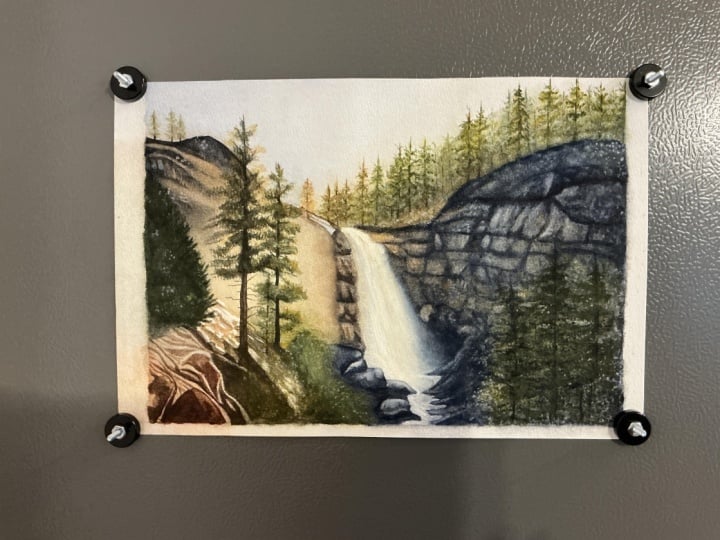
allows for interpretation. And that completes the painting. Now we can sign it,
remove the masking tape, and trim off the edges
with the staples. I think it looks really nice. It has a dreamy atmosphere with many areas left open and
slightly mysterious, not overly defined, giving our imagination room
to tell its own story. I hope you can see
that in your painting. In the last video, we
will take a moment to reflect on what we've
learned from this tutorial.
11. Summary: Thank you so much
for joining me in this waterfall
painting tutorial. I hope this project brought you as much joy
as it brought me, not to mention a
little bit of stress, and that you feel proud
of your progress and inspired to explore
further with watercolor. Before we wrap up, let's take a moment to reflect on what we've learned together. We begin by planning
the composition and masking the brightest highlights on the waterfall and rocks. We applied the first
wet and wet layers establishing the sky, mountains, rocks, and
base tree colors. This stage set the
mood of the painting, creating a soft
atmospheric backdrop for all the details to come. We practiced adding
additional washes to the rocks, trees, and mountains, deepening tones, and gradually shaping forms. We learned how each
layer builds depth and structure while keeping the overall feel loose and natural. This tutorial gave you space to experiment with
texture techniques, lifting paint, sprinkling salt, dry brushing, and
using brush edges. These methods suggested rocks, foliage and water effects
without overworking, helping you create a
convincing organic landscape. When painting the trees, rocks near the waterfall and the large green
tree on the left, you refine shapes and shadows while
maintaining spontaneity. You practiced balancing
precision and freedom, making the details feel
intentional yet natural. We emphasized light by protecting highlights
with masking fluid and then adding settled halos using scrubber brush
or magic sponge. Shadows were deepened gradually,
giving contrast, depth, and structure to the rocks and foliage while keeping
the painting harmonious. In the final steps, we added the main
trees on the left, filled in foliage and made last adjustments to
shadows and textures. We learned how to step back, evaluate, and refine the
painting as a whole, leaving some areas
loose to maintain mystery and allow
for interpretation. This was a detailed
and at the same time, pretty expressive project, and I'm truly proud of how
much you accomplished. Thank you for trusting
me to guide you through it and for taking
the time to observe, experiment, and enjoy
each step of the process. I hope this painting gave
you a sense of calm, focus, and creative joy and
that it inspires you to continue exploring
the world of watercolor. Take care in happy painting.
 Krzysztof Kowalski, Watercolor artist