Transcripts
1. Introduction: Hello and welcome to the quick and easy watercolor
painting tutorial. Today we'll be painting a beautiful single rose softly illuminated by
sunlight from behind. This project isn't
very difficult, but I hope it gives
you a sense of accomplishment and
quick gratification. It should take no more
than 2 hours to complete. Even though it's a
simple painting, we will still have plenty
of opportunities to practice techniques and
learn a few useful skills. You'll discover some
important factors to consider when painting a
smooth, one color background. We'll also explore how to
balance soft and hard edges, how to capture the glow
of light on the petals. And how to combine
wet and wet with wet and dry techniques to
create a realistic rose. I will simplify the process
as much as possible. Even if you're a beginner, you will be able to follow along and paint your own
beautiful rose, maybe even your very first one. Gather your supplies and let's start painting.
Happy painting.
2. Project and Resources: I've prepared a selection
of helpful resources for your project available in the projects and
resources section. You'll find a PDF file with
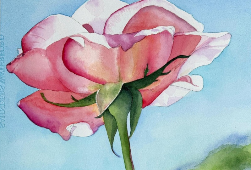
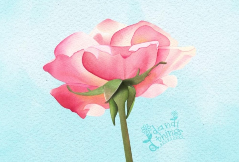
the supply list I used for this painting along with a reference photo and an image of my finished
artwork for guidance. Line drawings in various sizes are also provided so
you can paint and transfer them onto
your watercolor paper in the size that best
fits your needs. My painting is in an
eight by six inch format. Additionally, there are
working progress photos to help you follow the process and focus on specific areas. Feel free to explore
these materials and use them to create your own unique and beautiful painting. Please share your final painting in the projects and
resources section. I also encourage you to
take the time to view each other's work in the
student project gallery. It's always inspiring to
see what others create and the support of your
fellow students can be incredibly comforting. Don't forget to like and
comment on each other's work. Lastly, I highly recommend watching each lesson
before you begin painting. This will give you a
clear understanding of what to expect at each
stage of the tutorial. If you find this class helpful, I would greatly appreciate it if you could leave
an honest review. Your feedback will help me
improve my content and assist other students in
deciding whether to join this class.
Thank you in advance.
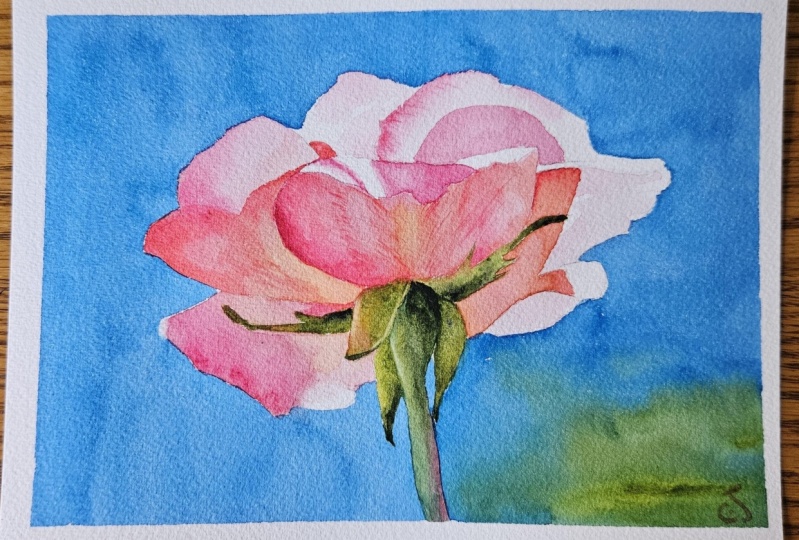
3. Painting Plan: Before we begin, let
me share a few words about the reference photo
and our painting plan. The photo is wonderful
because it includes one of the elements I always
look for in a subject, a strong sense of light. Here, the petals are
beautifully back lit with bright highlights that make some areas appear
almost pure white. Is ideal for
watercolor painting, a strong light often creates the most striking and
engaging results. Of course, unless we
specifically want to create a more moody painting with softer muted colors
and dimmer light, which can also be
beautiful and atmospheric. Keep this tutorial
beginner friendly, I decided not to use masking fluid which can
add extra complexity. You're welcome to use it if
you prefer, for example, to mask the flowers edges
before painting the background. But I think in this case,
it's not necessary. The outline of the
rose is fairly simple and the background
is a uniform color. So we will approach it in a
single wet and dry layer. Here is the plan of painting. We'll begin with the background. And while the cool tones
are still on the palette, we will move on to painting
the green elements, the sepals and the stem. Then we will switch
to fresh water, clean the palette, and shift
into pinks and yellows. The petals will be
painted in two layers, and finally, we will add
the finishing touches. Now let's move on to
painting the background.
4. Background: I already have my pencil
sketch prepared on the paper. I used an HB pencil and traced the outline
with a light pad. Then I attached the paper to
a gator board with staples, which hold it firmly in
place and prevent buckling. I also added masking tape
around all four edges, which will leave a
clean white border on the finished painting. Since the pencil lines looked a bit strong,
I lighten them. Whenever the subject
is light in tone, I prefer my pencil lines
to be barely visible. To soften them, I
use a needed eraser. You can shape it into a roll and gently roll it
over the drawing. This lifts excess graphite and leaves lighter
subtler lines. For the background, I'll
be using a size ten brush. We will need a lot of blue. A very light tone of Windsor blue green
shade works well here. Prepare a generous puddle
of this color with plenty of water so you have
a light watery consistency. I'll also add just a tiny
touch of permanent rose. It's hardly noticeable, but it helps reduce the greenish
cast of the blue, warms it slightly, and connects the background
to the flower, since we'll also be using
the pink on the petals. That way, we create
nice color harmony. There's also a green spot in the background
on the right side. You don't have to add it. It's optional, but I
will include it since it ties the background to the
green elements of the rose. For this green, I will mix
green gold, windsor green, yellow shade, and a little bit of Windsor yellow
deep to warm it up. Since my water turned
green after mixing, I will change it before working
with the blue background. Clean water ensures a
pure blue wash. Now, before painting, let me share four important points
to keep in mind. Our goal is to create a smooth, even layer of color. We'll be using the wet
on dry technique here, which is often simpler
for beginners. To get an even wash, remember these four key ideas. Prepare plenty of
paint in advance. You always need more
than you think, and mixing extra midway often results in a slightly
different consistency, which can make the
background patchy. Dip your brush only
into the paint, not into water, which is
actually quite difficult to do. The prepared paint is
already watery enough, so using it consistently
keeps the wash even. If we dip the brush into water, it may thin the mix too much
and cause uneven drying. Keep your painting tilted. Holding your board at an angle helps gravity pull
the pigment downward, which distributes color more
evenly and reduces streaks. Keep your edge wet. Always maintain a bit of paint at the edge
as you move along. You may know this from the classic rectangle
wash exercise. I never really liked
that exercise and painting rectangles myself
because in real paintings, we usually deal with
more organic shapes. This background is actually a perfect real life
version of that exercise. Now, let's apply the background. The stem will be our
starting and ending point. We will move clockwise
filling in the blue areas first and finish in the bottom right corner
where we will add the green. I start with my watery
blue near the stem. I rotate the painting so
it's easier to handle. Notice I'm not keeping
the board flat. I hold it tilted
with my left hand. This way, gravity helps
create a smoother wash, since the paint keeps flowing downward instead of
drying in place. I also try to keep
extra paint along the edge so it doesn't dry too quickly and
leave hard lines. Ideally, when you
reload your brush, dip only into the
paddle you prepared, not the water jar. I sometimes do this
instinctively, but extra water can change the consistency and
cause uneven drying. But still, tilting the
board reduces that risk. Brush size also matters. On this eight by six inch paper, I'm using a size ten brush, which works fine, though
bigger would also be good. If you use a brush
that is too small, you run the risk of
getting some streaks, various marks, and even
drawing in patchy background. If your large brush doesn't
have a fine tip for edges, you can use a smaller brush
just around the flour and then switch the bigger one
for filling larger areas. You'll see me rotating
the painting as I work. This flexibility is
very important for me. I couldn't paint with my paper
taped flat to the table. It would feel like
being trapped. I need to have this ability
to rotate my painting. That's why I like to use
a Gator board because it's very lightweight and I can move it around
however I like. As you can see, the surface
looks fairly smooth because I'm following the four key rules I
mentioned earlier. Of course, it's never perfect. Many factors affect the outcome. For example, on the
day I painted this, it was very hot, so the wash dried quickly. That made it even more important to keep a wet edge at all times. Now on the right side, I reached the area where I
want to shift into green, and there is nothing special
here, no special trick. I simply switch from blue to my green mix
and keep painting. I use the green as if I was just picking
up my blue paint. You can also drop in some darker green maybe with a bit of paints gray if you would like to match the photo more closely. Personally, I don't worry
about matching every detail. No one will compare my
painting to the photo. What matters is creating
harmony by introducing green that connects the
flowers sepals and stem. When you finish,
check the tape edges, clean up any wet spots and let
everything dry completely. I let it dry naturally
for about 5 minutes, and then I used a hair dryer. And that's our first step. The background is finished. Now we can move on to
painting the stem and sepals.
5. Stem and Sepals: The background is finished, and since we still have green on the palette and the
water is tinted green, let's move on to painting
the stem and sepals. First, I will mix Windsor
green yellow shade with Windsor yellow deep to
make a slightly warmer green. This will be our main color. Next, I will prepare
a darker green, the same mix of Windsor green
and Windsor yellow deep, but with paints gray added. You don't need to use the
exact same paints I'm using. Sub green or hookers green
will work just fine. You could even mix Windsor blue, the same one we used
for the background. With a yellow such
as Windsor yellow deep or transparent yellow. The hue will be a bit different, but that's perfectly okay. Art is not math. We don't have to
match colors exactly. What's much more important
are tonal values, how light or dark
your colors are. Values are what really create
form, depth, and realism. I'll also keep permanent rows on the palette since we'll
need it here too. For this step, I'm switching to a smaller brush size eight. Before picking up paint, I always dip my
brush in water and then dab it on a towel
to remove the excess. The brush should be damp but not dripping wet before you
load it with color. I'll begin with our green mix, adding just a touch
of permanent rose. Since pink is complimentary
color to green, it neutralizes the
green slightly, making it less vibrant
and more natural. If I need a stronger, more vivid green, I will use
the pure mix without pink. Placing muted colors next to pure colors makes the pure
ones look even more vibrant. Using the wet on dry technique, paint each sepal
and then the stem. Because these are
small elements, wet and dry works very well. Even if we want some
soft transitions, we can easily create them in such small areas
using this technique. At the tip of the stem, I will drop in a little
bit of permanent rose. Pink and green together create a neutral brown,
which blends nicely. It also helps connect the green
parts to the pink petals, since we'll be using
the same pink clatter. Using the same colours in different areas creates
harmony across the painting. For darker accents, use the
green mix with pains gray. Now, let's keep one petal and paint the next one
with a pure green mix. I usually avoid painting neighboring shapes
at the same time. This prevents the wet paint from bleeding into the adjacent area. At this stage, we're just
laying down the base colors. Adjustments can
always be made later. In the final stage, we will add details. For now, focus on getting
your greens in place, paying attention to color
shifts and tonal values. One useful trick is a technique
that is called charging, painting wet and dry
and then dropping in a second color or darker tone while the
first layer is still wet. This also creates smooth
transitions between colors. Sepals are very small and
their tips are even smaller. Later, when painting the petals, we'll need to carefully
paint around them, which can be a
little challenging. But don't worry if a
little green smudges. That's part of the
beauty of watercolor. If this were a larger painting, I might have masked out the sepals and painted
the petals first. Then once the masking
fluid was removed, I would paint the sepals. But at this small scale, masking isn't really necessary. We will manage just fine
painting around them. There's also another
advantage to starting with the sepals in
this particular painting. They are the darkest
part of the painting. By locking in the
darkest values early, we will have a reference point for how dark the petals
should go later. On one of the sepals, I'm also introducing a mix of permanent rows with
Windsor yellow deep, which creates an orangy tone. This ties the sepals more
closely to the petals. In the reference photo, that sepal looks a
little different, so I will reflect that. Once the sepals are painted, I recommend drying
them quickly with a hair dryer before
moving to the stem. Since some sepals
touch the stem, we don't want the colours
bleeding together. After using a hair dryer, wait a couple of minutes
before painting again. If the paper is still warm, paint will dry too fast
and won't blend smoothly. The stem, I will
use Windsor green mixed with Windsor
yellow deep as the base. If it's too bright for
you or you feel that this green looks a
bit too artificial, you can always add
something red, orange or brown to the green to make it
look more natural. For example, you can add more permanent rose
or quinacrodon red, which we'll also use later. I'm leaving the right
edge of the stem unpainted for now because
I want to add pink there. While the paint is still wet, dropping darker green near the sepals and in
shadowed areas. Now I'll add permanent rose along the right
edge of the stem. Where the pink meets the green, a dark neutral color forms. Since my paper is
drying quickly, probably still a bit warm
from the hair dryer, I notice a hard edge forming. To soften this, I go back over the left side with the base green to blend
everything smoothly. Once it's dry at darker
tones in key areas, the tips of the sepals and
any other parts in shadow. On that one different seple, I will add a second layer
with the same colors yellow, pink and green to slightly darken it so it doesn't
stand out too much. When everything is
completely dry, we can also try lifting. With a damp brush, paint a thin line of water
along the edge of the sepal. Use just water, no paint. Then gently blot it
with a paper towel. This reactivates the paint
that is already on the paper, so you can lift it out, creating a lighter edge. Lifting is often easier than trying to reserve highlights
from the beginning, especially in small
areas like this one. If you lift too much, which can happen easily with green since it lifts very well, just glaze over that area with another thin layer to add
a little bit more color. Speaking of glazing,
at the very end, you can apply a glaze to
adjust or intensify the color. A glaze is simply a thin, transparent layer of paint. For example, Windsor
yellow deep with permanent rose will brighten
and warm the sepals, while a thin layer of just yellow can make
greens look sunnier. And with that, we finished
the green elements. Now is a good time to
clean your palette and change your water
because next we'll be painting the petals and
we want our colours to be fresh and clean. No.
6. Petals - Initial Layer: Now we'll start
painting the petals. Finally, we're shifting from the cool color palette
to warm tones, bringing more life
into the painting. But before we begin,
let me first explain why we are going to paint
the petals in two layers. The first reason is always the same whenever I apply
two layers anywhere. It's simply because one layer often looks too
pale once it dries. The second layer always makes the colors more
vibrant and intense. In the background, we
applied just one layer, and that was enough
because we don't need the colors there to be
too vibrant or too dark. But on the petals, we do
want strong vibrant colors, and that's easier to
achieve with two layers. The second reason in this
case is that on some petals, we can see specific areas that can only be created
using two layers. This is part of the planning process analysing
the photo before painting. I sometimes spend a
few days studying a reference photo and planning how to
approach certain areas. On the petals here, we can see some areas where soft gradients met hard edges. It would be difficult
to paint it with just one layer apart from
the lack of intensity. That's because there is
a gradient from pink to white that touches directly against the hard
edge of the shadow. The most efficient
way to paint this is to first create
the light gradient, and then once it dries, paint the shadow over it. This way, we get both a clean, soft wet on wet gradient and
a sharp wet on dry edge. On top of that, the second layer makes the colors more vibrant. So always think about layers and their order before
you start painting. A little planning beforehand
is always worth it. Alright, let's prepare
plenty of paint. One petal of a
Windsor yellow deep, we'll use it to warm
up the center of the flower and make
the pinks warmer. And another petal
of permanent rose. Permanent rose is slightly
too cool for the petals, but we will still need
it in some areas. To make it warmer, just mix
it with Windsor Yellow deep. You will get a color very
close to quinacrodon red, which we'll also use later. If you prefer, you can use
quinacrodon red at this stage. It works beautifully here. On the other side of my palette, I will keep permanent rose, and I will also mix yellow and red together
to get a nice orange. I'll now switch back
to a size ten brush. Pick any petal to begin with. I like to paint from left
to right when possible, so I will start with the
first petal on the left. This one has both wet on wet gradients and
wet on dry edges. First, apply a layer of
clean water over the petal. We'll create a soft
pink gradient, darker on the edge and fading gradually
toward the center. Pick up a light
tone of permanent rose and apply it
along the edge, allowing the paint to
spread into the water. Also drop in the red mix in the darkest area near the fold. Let the paint spread naturally
to form a smooth gradient. If it doesn't means you don't have enough
water on the paper. Use the red color for the
lower part of the petal. This first layer
will dry lighter, but it will give us a
good base for the red. Near the center of the flower, drop in winds are yellow deep to warm the area and make
it more yellowish. And that's it. The first layer on the first petal is finished. Now, remember to always skip the petals right next to
the one you just painted. We don't want the paint
to bleed across petals. I will tilt the painting here so you can see how much
water I'm applying. If you see a nice even
shen on the surface, that's the perfect amount. If a little petal
gathers on the edge, just use your brush
to redistribute it. Make sure the water is even
and there are no dry gaps. Now pick up some red and pink and apply them
along the edge. Let the color spread
into the water, creating a nice gradient. If the paint spreads too far, use a clean de brush
to gently lift the s. Let's move to the
petal just below. This one is curled at the edge, which creates a natural
separation so it's safe to paint. Be careful not to let the
water touch the green areas. I want to minimize the risk
of the green bleeding. I try to paint around
those green elements. Once the water is applied, use permanent rows to
create a soft gradient. Keep the tone very light
because we want to leave some white highlights
in the lightest areas. Now we can dry the
petals we've painted, and once they are dry, we'll continue with the rest. On the top petal, we only need a very light pink gradient. Apply a water layer, and remember you
can always rotate your painting to make it
easier to reach tricky spots. Drop in some permanent rows
and let it spread smoothly. If it doesn't, add more water or guide it
gently with your brush. On the bottom petal, we will add an
initial base layer to prepare for
deeper colors later. I'm using the same colors, permanent rose mixed with
Windsor yellow deep. This time, I will add
more permanent rose to the left and more
yellow near the center. I'm also leaving the
bright highlight unpainted for now with hard
edges at this stage. Later, I will soften that
with a scrubber brush. Finally, let's apply
color to the main flower. Be careful here. Leave the
strong white highlights in the corners on both sides. In the middle of the petal, I'm using more
Windsor yellow deep. Once you've applied this initial
layer on all the petals, let everything dry completely
or use a hair dryer. Make sure the surface is bone dry before moving on
to the next step.
7. Petals - Second Layer: But the first layer is
now completely dry. As you can see, it
looks really pale. The colors aren't very vibrant
and the petals lack depth, but this is the stage
where everything changes. Now we will use bolder colors to bring much more life
into the painting. In addition to the colors
from the first layer, I will also be using
quinacrodon red. This is one of my
favorite colors for glazing and making
reds more vibrant. It's clean,
transparent and works beautifully when applied
over other colors. It makes reds really vibrant. Let's start by using it on the tiny cast shadow
on the top petal. Now, load your brush with a
generous amount of watery quinacridone red and apply it to the large petal
on the left side. Begin by defining the
edge of the shadow. I didn't mark this with pencil. I prefer to avoid pencil lines on petals
whenever possible. In this case, the
shape is simple, so there is no need
to outline it. It also doesn't
have to be perfect. Once you've created
the shadow shape, filling the rest of the
petal with quinacrodon red, and as you approach
the center of the flower shift into
Windsor yellow deep, While the paint is still wet, use a clean damp brush to
lift out a little pigment. This creates lighter spots that help build the
form of the petal. Next, I will move on
to the petal below. Honestly, I should have waited
for the first one to dry, but I decided to take the risk and paint
it straight away. Here I'm applying the same
colours as in the first layer. But now with the added
depth of a second wash, the tones appear
much more vibrant. On the left side, I'm adding more permanent
rows for richness. From here, I continue
working one petal at a time, asking myself, what
does this petal need? Does it need a shadow? If so, I will use quinacrodon red and
drop in Windsor yellow deep near the center or does
it just need stronger color? Then I will deepen it
with an extra wash, especially using quinacredon
red or permanent rose. Here, for example,
we have a petal with a slightly more
complex shadow shape. Follow the reference
photo carefully. If it helps lightly sketch the shape with
pencil beforehand. Remember to create a
subtle gradient from red to yellow by shifting
into Windsor Yellow Deep. Once all the surrounding
petals are done, dry them thoroughly and
let the paper cool. Finally, let's
apply another layer to the main central petal. I begin with quinacrdon
red and then shift toward a yellowish tone in the middle by adding
Windsor yellow deep. Along the left edge
and on the right side, as well as parts of the middle, I'm applying permanent rows
to darken the value slightly. Oh. Okay. And that's it. The second layer is finished. Dry everything thoroughly,
and in the last part, we will add just a
few small details to complete the painting.
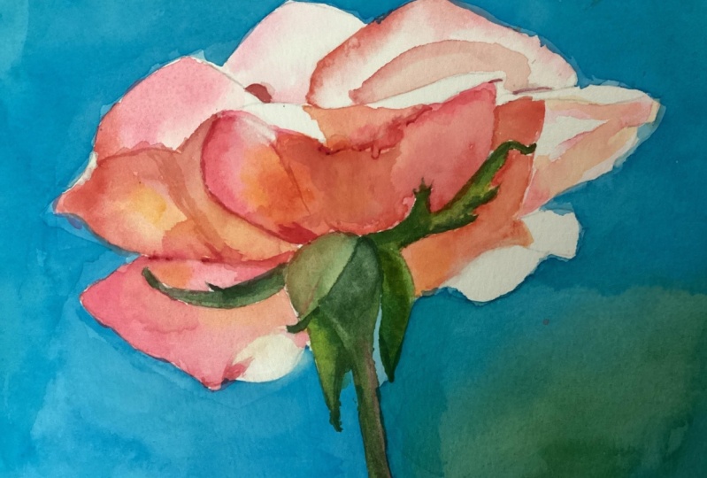
8. Finishing Touches: Our painting already looks good, but it still lacks
some small details and enhancements that
will make it even better. In this part, I will
show you what we can do. First, there is still one
important shadow to add, the one on the curled petal. It's the coolest shadow
in the entire flower. So for this, I'm
using permanent rose. On the left side of
the curled petal, there is also a tiny
detail worth adding. It's subtle, but it
really defines the curl. Apply permanent rose
along the edge, then soften it toward the lit area with a
clean dump brush. This gentle gradient makes
the edge more defined, and that shift from dark to light tells the viewer
that the petal is curled. It's a small detail, but it changes the form
of the petal entirely. Next, I will mix permanent
lysarine crimson with quinacridone red to
create a darker tone. I will use this for the deepest shadows like the small shadow at the
bottom of the main petal. I'll also strengthen
some corners making a clearer distinction
between overlapping petals. Okay On the curled edge, I will use this mix again
for an even darker accent. I also want to define
the right edge of the flower and paint a cast
shadow on the petal here. These are just
small adjustments, but they help tie the
whole painting together. With just the tip of the
brush and quinacredon red, I will also add a little bit of texture to the petals
by making many, many short brush strokes,
one next to another. This not only darkens
those areas slightly, suggesting
indentations, but also shows the direction in which
the petals bend and fold. Don't want to overdo this, but I also don't want the petals to look
unnaturally smooth. I will not add
texture everywhere, just in a few places
where it feels natural. Honestly, looking at
the painting now, I feel I could have
applied more color overall because some petals look a bit pale compared to the reference. But when I finish a painting, I never go back and fix things. Its own in person, the
painting looks good. It's only when
compared side by side with the reference photo
that it seems later. And I can live with that. Finally, let's do
my favorite step, what I like to call
turning on the lights. This is where we soften some edges to make
the highlights glow. For this, I use a
scrubber brush here a Windsor Newton galeria
brush size four. I dip it in water, dab off
the excess on a paper towel, and then gently rub the painted edge to
reactivate the pigment. After that, I blot it
with a paper towel and I repeat the process until
I'm happy with the result. I use this technique
especially where a strong highlight, white paper, meets a strong cast shadow, softening that hard edge of the shadow makes the highlight
look as if it's glowing. In my eyes, the small trick greatly enhances the illusion
of light in the painting. As a bonus, it also makes the
edges beautifully smooth, improving the overall finish. In this rows, we also have some white petal edges that met directly with
the blue background. I will soften those as well. Sometimes along those edges, you'll notice a thin dark line, either leftover pencil or an
overlap of blue and pink. If the petal edge is very light, you can gently scrub and
left those lines too. And with that, we can call
the painting finished. Now remove the masking tape
to reveal the clean border. Once everything is
completely dry, remove the paper
from the gator board and trim off the staples. Finally, sign your painting and share it either
online or in person. Congratulations on completing your
beautiful rose painting.
9. Summary: Thank you so much for joining me in this rose painting tutorial. I hope this project
brought you joy and gave you a sense
of accomplishment. Roses can seem intimidating, but by breaking the
process into simple steps, you've created something
beautiful while also learning techniques you can
use in many other paintings. Before we finish,
let's take a moment to reflect on what we've
practiced together. Began by analyzing
the reference photo and planning our approach. You learned how to simplify
a subject by focusing on strong light and how to
decide the order of steps, starting with the background, then the greens, and finally, the petals in layers. Using the wet on dry technique, we practiced building
an even luminous wash. You learned the importance of preparing enough
paint in advance, keeping your paper tilted, and maintaining a wet edge to achieve a smooth,
streak free background. In the stem and sepals, you saw how mixing
complementary colors like pink with green creates
natural muted tones. You also practiced charging
color into wet areas for smooth transitions and
learning how placing the darkest values early helps guide the rest
of the painting. Painted the petals
in two stages. The first wash established soft gradients and light tones, while the second layer
brought depth and vibrancy with bold quinacrodon
red and permanent rows. You discovered how
layering creates both color intensity and the balance of soft
blends with crisp edges. In the finishing touches, you learned how small
accents, a darker corner, a softened edge, or a few short brush strokes can completely transform the
realism of a painting. You also practiced using
a scrubber brush to lift pigment and create
glowing highlights, what I like to call
turning on the lights. Finally, we cleaned the edges, removed the masking tape,
and signed the painting. Always a satisfying step. Along the way you saw how even small imperfections
can become part of watercolor's unique
charm and that sometimes good enough is more
beautiful than overworking. This was a quick
and easy project, but one filled with valuable
lessons, planning ahead, creating smooth washes,
balancing soft and hard edges, layering with intention, and enhancing light
through small details. I'm proud of you for
completing this rose, and I hope it
inspires you to keep experimenting with
watercolor and enjoying the process
of painting. Happy painting and see
you in the next tutorial.
 Krzysztof Kowalski, Watercolor artist