Transcripts
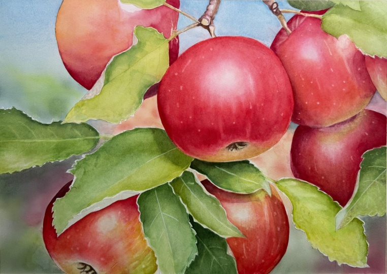
1. Introduction: Hello, and welcome to my
watercolor painting Tutorial. In this lesson,
I'm going to show you how to paint
juicy red apples, surrounded by beautiful
apple leaves. This piece is a great example of a complimentary
color scheme where red and green play
off each other to create a vibrant eye
catching composition. I'll guide you through the
entire process step by step. We'll start by taking
a closer look at the reference photos and
planning the composition, thinking about the main shapes, what we want to include, and what isn't really necessary. I'll walk you through how
we'll approach the painting, beginning with the background. From there, we'll
gradually build up those lovely vivid layers
of greens and reds, adding simple textures to bring more realism
into the piece. Explain what to focus on, what to pay attention to, and how to bring everything
together with confidence, understanding why we make
each decision along the way. Even though the final
painting may look detailed, it's not as difficult
as it seems. If you feel that painting
leaves is challenging, which I hear a lot, don't worry. I'll show you an easy and approachable
way to tackle them. This project is
wonderful because it offers many chances to
practice different techniques, but it also encourages
you to loosen up and paint more freely without
stressing about perfection. You'll see exactly what I
mean once we start painting. I hope this tutorial
brings you joy and a sense of pride when
you finish your piece. The final result looks
delicious and vibrant, and I hope you enjoy every
part of the process. I truly hope you feel inspired to give it a try.
Happy painting.
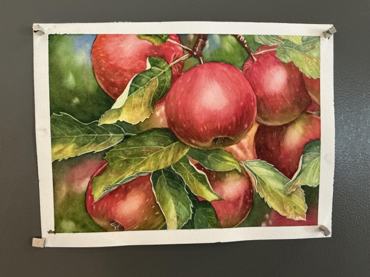
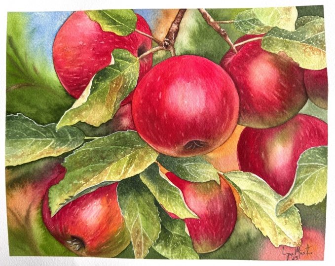
2. Project and Resources: I've prepared a selection
of helpful resources for your project available in the projects and
resources section. You'll find a PDF file with the supply list I used
for this painting, along with the reference
photo and an image of my finished
artwork for guidance. Line drawings in various sizes are also provided so
you can print and transfer them onto your
watercolor paper in the size that best
fits your needs. I painted it on a 12
by nine inch size. Additionally, there are working
progress photos to help you follow the process and
focus on specific areas. Feel free to explore
these materials and use them to create your own unique
and beautiful painting. Please share your final painting in the projects and
resources section. I also encourage you to
take the time to view each other's work in the
Student Project Gallery. It's always inspiring to
see what others create, and the support of
your fellow students can be incredibly comforting. Don't forget to like and
comment on each other's work. Lastly, I highly recommend watching each lesson
before you begin painting. This will give you a
clear understanding of what to expect at each
stage of the tutorial. If you find this class helpful, I would also greatly appreciate it if you could leave
an honest review. Your feedback will help me
improve my content and assist other students in
deciding whether to join this class.
Thank you in advance.
3. Inspiration and Painting Plan: The inspiration
for this painting comes from my hometown,
where I grew up. In the backyard, we have a small orchard with different
fruit trees and bushes. Among them are some
apple trees that I've always loved photographing
throughout the seasons. Of course, I especially
enjoy the time when the blossoms appear and the
bees are buzzing around. But when the apples arrive, especially in years
when there are many, I love that beautiful contrast
between red and green. First decision I had to make was whether to
paint it vertical, portrait orientation or a
horizontal landscape one. When I look at vertical
photos like this, I often think it could be
nice to paint them that way. But I rarely choose a portrait format simply because
it's difficult for me to work that way on my tiny table with a wall
right in front of me. I started looking for a good horizontal
composition instead. Besides, it's easier for me to record everything in
this orientation. When I take photos, I usually try to capture a
wider frame so that later I can crop the image into a more specific composition
for the painting. That's exactly what I did here. I photographed entire branches, then noticed an area
I really liked, took a closer photo, and later cropped it even
further on my computer. This final cropped version
felt perfect for a painting. I didn't crop it randomly. I followed two simple rules I always use when thinking
about composition. The first one is
the rule of thirds. It's a very simple yet
powerful guideline. When we divide an image into three parts horizontally
and vertically, we get four intersection
points and four main lines. According to this rule, those points are ideal
places for a focal area. So when I cropped
that original photo, I made sure the main apples sit near the upper
right focal point. Second rule is something I
came up with for myself. If possible, I like
the main subject to extend slightly beyond
the edges of the painting. In other words, I let parts of the apples or leaves
go off the page. There are two reasons
I love doing this. First, it creates a much more interesting
composition than placing everything neatly within the frame with a big
background around it. That would feel a bit
too static and boring. For me, of course. And when elements extend
beyond the edges, the composition
looks more natural, and it gives the feeling that we're viewing the
subject up close, almost like a subtle zoom in. And the second reason
is purely practical. Those overlapping elements
break the background into smaller shapes which makes the background much
easier to paint. Now that I had decided
how to crop the photo, I sent it to my
iPad and opened it in Adobe Fresco to create
a line drawing for us. At this stage, I took a closer
look at all the elements and asked myself whether everything needed to be
included in the painting. Original photo was quite busy, so I thought it would be good to simplify
things a little. I decided we didn't
need all of the leaves, so I removed the twig in the upper left corner and a
few leaves in the upper area. I also removed
this leaf here and cleaned up the ones that
were partially torn. To better understand
what would remain in the painting and
what I had removed, I filled the negative
spaces with gray. This helped me to see only the main subject without being distracted by
the background colors. Once I was happy with
this composition, I moved on to adding the
main colors to the apples, the leaves, and especially
the background. I wanted to find a good
color solution for the background because I knew I would need to
simplify it a bit. I started by applying the
base colors to the apples and leaves then experimented with
different background tones. First I considered
adding more blue, but it didn't feel right for the mood I
wanted to capture. It looked a bit too cold. A touch of blue as a hint
of the sky was fine, but the atmosphere overall I
had in mind was much warmer, so I didn't want to
use too much blue. So I eventually choose a
mix of yellowish, browns, greens and reds to
complement the main subject, along with some
soft light effects to add a little magical touch. Once this was done and the
line drawing was ready, I printed it out and
transferred it onto my watercolor paper
using a light pad. Then I attached the paper to my Gator board with
staples and masked the edges with masking
tape to create a clean white border around
the finished painting. Next, it was time to think about the painting
process itself. The first question was whether I needed to
mask anything out. In this case, I decided it wasn't necessary because
the background is divided into small
manageable sections that we can paint one by one. I planned out the layers and the techniques
I wanted to use, I didn't find any part that
truly needed to be masked. It's also worth mentioning that during this entire
preparation stage, I was constantly thinking about how to paint
this painting. What should come first,
which layers go on top, and how everything
would build up. So by the time I actually
sit down to paint, I already have a
fairly clear idea of how to approach
the whole process. This step is very
important for me, and sometimes it takes a
few days before everything falls into place and the painting sequence
feels just right. So here is our plan. First, we'll apply color to all the sections
of the background. Next, we'll lay down an
initial wash for the leaves. Then we will add texture to the leaves and finish
them with some details. After that, we'll change the color palette and start
working on the apples, beginning with the first layer. Then we'll deepen the apple
colors with the second layer. Next, we'll add the
indentations to the apples. And finally, we will paint the seples and a few
magical light spots in the background and
place small highlights and spots on the apples skin
to complete the painting. With any painting, there
will be ups and downs. You may feel overwhelmed
or tired at times, but I encourage you
not to give up. It's perfectly fine to take
long breaks if you need to. What matters is finishing the painting and feeling proud
of what you've achieved. In this piece, we
won't stress about perfect smooth washes or flawless execution
of every layer. Many of the beautiful textures here come from happy
imperfect marks. You will see what I mean
in the later stages. So don't worry, approach this
calmly and take your time. I will guide you through the
whole process step by step. Now, let's begin with the first step painting
the background.
4. Background: In this first part,
we're beginning the actual painting process by adding color to
the background. Please feel free to adjust the background to
your own taste. If you want more sky color,
that's absolutely fine. You can follow my approach or adapt it to your own vision. Let's start by preparing
the colors we'll be using. Mixing, I usually use an
inexpensive flat brush, probably meant for acrylics, because it's a bit larger, has slightly stiffer
bristles and makes it easier to pull paint from the
wells into the mixing area. With this brush, I can prepare
my colors very quickly. I always begin by
spraying my paints with clean water to soften them
and make them easier to use. We'll begin with the greens. I'm mixing Windsor
green yellow shade with Windsor yellow deep. Windsor yellow deep is a warm yellow that leans
slightly toward red. When we mix it with
that strong green, it warms the green up and makes it look a
bit more natural. I will also use green gold, which adds a lovely
warm green tone. We also need a dark
green, and for that, I will use the same
mix Windsor green, yellow shade, and
Windsor yellow deep. But this time, I will add
paints gray to darken it. I'm also keeping
burnt sienna and permanent zarine crimson on my palette to suggest hints
of apples in the background. And finally, I will
also use a bit of cobbled blue for
the small sky area. For painting the background, I'll be using a size ten brush, and we will work wet on dry. If you're not comfortable
with wet on dry because you worry that
paint may dry too quickly, you can absolutely
dampen each section with clean water first
and paint wet on wet. Water layer will give
you more time to work. However, these background
sections are quite small, so I think we can
manage them wet on dry. Another reason I prefer
this approach in this particular painting is that wet and dry colors
stay more intense. When painting wet on wet, the colors disperse in the water layer and
often dry lighter. When we paint wet and dry, the paint also dries lighter, but not so much as
painting wet on wet. So let's pick up
some cobald blue, and without overthinking it, make the first brush strokes. We'll begin with the blue and soon transition into greens. One important thing I want to mention now is
paint consistency. Your paint should be fairly wet. The water to paint ratio is
tricky to describe because it constantly changes depending on what's happening
on your paper. As a general guideline, keep your mixes watery but still intense around a mid tone. The paint should move
freely when you mix it, and if you tilt the palette, it should flow easily
almost like colored water. It's always better to have too much water than not enough. If the mixture is wet enough, we can always add more
pigment on top to darken it. But if you apply
paint that's too dry, you won't be able to layer
more without creating blooms. So when in doubt,
add more water and fill this first section
with simple basic colors. I moved from cobbled
blue through a mid green down into the
dark green near the leaf. The leaf below
will also be dark. So normally the
background here could be lighter in tone
to create contrast. But this leaf has a beautiful light edge that separates it
from the background, and placing dark
tones behind it works nicely because that light
edge will stand out clearly. After applying the
blues and greens, I picked up a little
burnt sienna and quickly dropped in some loose
lines to suggest branches. This step isn't very important, so feel free to skip it, especially if your paint is
already starting to dry. Remember, we can only add more paint while the surface
is still shiny and wet. With that, the first
small section is done. Now let's continue.
The next area is right beside the first one. Because we ended
with dark green, I will start the next section
with that same color. When two areas touch or are
very close to each other, it's often a good
idea to continue with similar colors for
smoother transitions. This helps create color continuity throughout
the background. Here I'm beginning
with dark green, then adding burnt sienna
and Windsor yellow deep. Notice how deep and
rich these colors are. They are not pale or pastel. This is something many
people find confusing because the paint is very
watery yet still quite dark. That's a misconception that watery paint must always be
pale, but that's not true. Watery paint can still contain a lot of pigment and
be very intense. It's thin but not weak. I also added some
permanent Azaren crimson to connect this background
area with the apples. It's always a good idea to add some colors from the main
subject in the background. Next, we continue into
the bottom left section. As you can see, I'm not really following the reference
photo for the background. Instead, I look at my
rough color sketch and place colors where I
think they will look good. I know I need greens, but I also want to
introduce touches of red, brown and yellow as subtle
suggestions of distant apples. Maintaining a watery consistency is also very important
for blending. If the mixture is too dry,
blending becomes difficult. Wet paint allows
you to easily pick up another color and blend
it right on the paper. You will notice soft light spots appearing in the background. Don't worry about them now. We'll create those at the
very end of the tutorial once everything is completely dry and we can see the
full composition. Up in the top area, I want to start with
cobbled blue to connect this space with a bright blue
area we painted earlier. But here I don't want the
blue to be as vibrant. That's why I'm also
adding burnt sienna. Brown neutralizes blue and
creates a lovely muted tone. You'll also notice that most of my background colors are
not extremely saturated. Keeping the background less
saturated is intentional. It allows the apples
and leaves to appear even more
vivid by contrast. In this painting, we have two kinds of contrast
working together, subdued background colors versus vibrant main subject
and green versus red. This contrast, along with the light spots and the
texture on the apples, create an energetic,
lively final painting. Now I want to show
you something in case you are afraid
of making mistakes. I want to prove that we can fix most mistakes in watercolor. For example, I'm picking up strong permanent
lazarin crimson and applying it to the small part
of an apple on the right, even though that apple
is mostly green. Even painting right over my pencil lines and onto
the apple next to it. Later, you will see that I
can completely fix this. In fact, the red
underlayer will help because this apple will be in shadow and needs to be dark. A hint of red underneath
will only deepen the shadow. The apple will be red anyway,
so it's not a problem. I'm adding even
more zarin crimson and leaving this flat
red layer to dry. In this background area, I'm going back to Windsor
yellow deep and burnt sienna to keep the tones lighter. I think this warm
yellowish brown adds a lovely glow and creates nice contrast with
the darker apples. Again, I'm not worried about painting a bit over the apples. This won't harm anything. The apple will become
much darker in tone, and the red applied later will look even richer
over the warm base. I'm always thinking about
how layers interact. If yellowish brown goes down first and the
red sits on top, the red will appear
deeper and more intense. So going slightly outside
the lines is not a big deal. It would be more
problematic to paint over areas that must stay
white or very light, like certain leaves,
for example, but even that can be corrected later with
a scrubber brush. In the bottom right, I'm
beginning again with yellowish brown to
connect this section with the previous one and
then transitioning into greens and reds to suggest another apple
in the background. Finally, I fill in the three small background
shapes between the leaves, and that completes the
background for now. Now we let everything dry. You can leave it to dry
overnight or use a hair dryer. In the next part, we'll apply the first layer to the leaves. I
5. Leaves - First Layer: Now we are going to start
painting the leaves. In this first step, we'll lay down an initial
layer across all the leaves. At this stage, we won't
focus on details. We only want to block in the main colors to create a
roadmap for later layers. This base will give us something solid to build texture
and details on, and it will also help keep
the final colors vibrant. First, I'll spray my
paints to reactivate them. They are dry because it's
the next day for me. So a quick mist with clean
water softens them up. To make sure we are on the
same page with the palette, I will clean the right
side of the palette, and I'll mix three
fresh paddles of color. Paddle one is green gold, our warm glowing green. The second one is
green gold with Windsor green yellow shade and a touch of ultramarine blue. This is our main middle green. And the third petal
is Windsor green with burnt sienna and
ultramarine blue. This is a more natural, more neutral, slightly
darker green. Burnt sienna warms
and neutralizes the green and ultramarine
blue helps deepen it. If we want it even darker, we could add Pains gray later. I will use asi ten
brush for this stage. If you're painting
in the same scale, avoid a smaller brush. A smaller brush tempts you into details and we want to keep
this layer loose and simple. I will pick up the
green gold first and start at the top with
the first small leaf, applying the paint wet and dry and then transitioning
to our middle green. Wet and dry is fine
here because the areas aren't large and if we
keep the paint wet enough, we can get smooth transitions, although they are
really not necessary. Don't worry about the light
undersides of the leaves yet. Those will come later. Right now, we're concentrating
on the green areas. Some leaves have
noticeable brown spots. You can add more brown
now if you like, but I will add those
brown areas later. Although we are applying
mostly middle values, we must think about the light
areas. That's important. With later layers,
we'll deepen shadows, but now we should leave
the lighter areas later. In practice, that means using slightly more water in places
that need to stay light. For example, the leaf in the bottom right needs
a much lighter value. So I will be using a much more
watery paint consistency. Conversely, if I know a leaf
will sit in deep shadow, for instance, under an apple, I will start directly with
the darker green mix, knowing it will dry a bit paler and likely
require another layer. If I accidentally put
down too much paint, I gently lift it up with clean damp brush to
bring the value back up. That's exactly what I do when a section looks heavier
than it should. Remove some paint
while it's still wet. I try to avoid painting
neighboring elements one after another while they are wet because paint can flow
from one into the other. Instead, I skip
around, paint a leaf, move to another area a
little further away, and then come back when
the first one is dry. If you must paint
adjacent shapes, wait for the first
to dry a bit or spit it up carefully
with a hair dryer. After using a hair dryer, always wait a few minutes for the paper to cool to
room temperature. Otherwise, the
next wash will dry too fast and be hard to control. Once the earlier leaf is dry and the paper has returned
to room temperature, I apply paint to the final leaf, making sure to leave the
most prominent edges white and avoiding
curled edges for now. So here's the result
of the first stage, a clean even base of the main leaf colors with
lighter areas preserved. Leave this layer
to dry thoroughly, and then we'll start building texture and details
in the next stage.
6. Leaves - Adding Texture: Now that the first layer
on the leaves is dry, we can start building
the texture. At this stage, we already
have a general idea of the light and dark
areas and we can see the pencil lines indicating
where the veins are. We'll use all of this information
to develop the texture. If you look closely
at the example leaf, you'll notice that all I did was apply almost the same
colors in the same areas, but with different brushwork. Difference in brush work
is what creates texture. I also paid attention to
the veins painting around them so that their shapes
would naturally appear. Let me show you how to do that. I'm switching now to a
smaller brush size four. If you have spotter brushes, they work beautifully
for this technique. I will stick with a
regular round brush so that everyone can follow along and achieve
the same result. For colors, we will continue
using the same three petals. Green gold, green gold mixed with Windsor
green, yellow shade, and ultramarine blue and green gold mixed
with Windsor green, burnt sienna, and
ultramarine blue. I'll start by picking
up the middle green, and now the fun part begins. Our goal here is to create
a textured mottled effect. To do that, we'll apply many small random brush strokes
right next to each other. This first leaf is quite small, so the effect isn't
as visible here, but you'll see it much more
clearly on the next one. I'm paying attention to the dark areas and the
placement of the veins. Since the veins are
lighter in value, I'm painting around them with slightly darker tones
so they stand out. And don't worry if you
accidentally paint over a vein. Later, I will show you two different ways to
bring the veins back. As you can see, I'm
not trying to create a smooth wash. Actually, the opposite is true. I'm using the wet
on dry technique and allowing my brush
strokes to overlap, leaving gaps, hard edges,
and irregular transitions. That's exactly what we want. This is how the texture
begins to appear, and we will refine
it even more later. The second leaf is a much better example of
what we are aiming for. I'm starting in a
completely random spot. It doesn't matter
where you begin. Here I picked up
the dark green and I'm placing it in the
shadowed areas first. It's always a good idea to establish the dark values early. I'm making small short
brush strokes and trying to stay between the veins branching
from the main vein. When I move to another
section of the leaf, I leave a narrow gap between the two areas and that
gap becomes the vein. Please don't worry
about perfection here. In fact, I would like you to put perfectionism away for a moment. We're not aiming for a
smooth, flawless layer. The more overlaps, tiny gaps and irregularities
you create, the more interesting the
final texture will be. That's why painting
these leaves allows for much more freedom
and much less stress. We're not trying to create
a perfectly even wash. The only thing we
must keep in mind are the values and the
placement of the veins. In the lighter areas, I switch to our middle
green or green gold, and in the darker areas, I drop in more of
the dark green. We can also come
back to the sections we've just painted
and add more paint, even if we think it
might create blooms. It really doesn't
matter at this stage. By adding more brush strokes to areas we already worked on, we're simply building
more texture. Here I'm also introducing
some burnt sienna. It's time to start adding those beautiful brown
spots to the leaves. This part of the leaf is
slightly bent and in shadow, so I'm using darker tones
to suggest that shape. There's no need to rush. We can slowly build the texture, and if the paint dries quickly, that actually works
to our advantage. It allows us to add
more spots on top, creating an even
nicer mottled effect. You can already
see the benefit of that initial layer
we applied earlier. It shows through in the little gaps we're
intentionally leaving, and all these layers together contribute to a
rich final texture. Of course, we could paint every tiny detail precisely like botanical illustrators or
hyperrealistic painters do, but that's not our goal here. We're aiming for a
convincing texture achieved in a
simple, relaxed way. Up close this stage may
look a bit strange, but trust the process and everything will come together
beautifully in the end. When you reach the
end of a leaf, consider whether you want to go back and add
even more texture. By the time we get there, the earlier sections
have usually dried, so now we can add
more brush strokes. Some areas might still be wet, so new paint will
create soft edges. Other areas may be drier, so the same paint will
create harder edges. This combination of
soft and hard edges is exactly what we want. For example, when I add
green and brown here, the area is already dry, so the marks have crisp edges. Over here, the surface
is still damp, so the brown spreads softly. Make sure your dark
areas are dark enough. If you're unsure, leave
the leaf for now. You can always come
back later and deepen the shadows with
more dark pigment. Darkening is easy. We can always add more
paint in another layer. Lightening to dark
areas is much harder. So this is how we want to treat
the leaves at this stage. On the lighter sides, use lighter green tones just
enough to create texture, but not enough to
lose the light value. Don't worry about perfectionism. Let your brush dense
freely across the paper. Allow randomness. Just keep an eye on
tunnel values and remember to leave those
narrow gaps for the veins. On this particular leaf, I'm leaving the little
vein gaps unpainted, and I'm also trying to keep
the upper edge lighter. In the final painting, that edge is much lighter
than what I have here. This is one of those
tiny tricky areas we can easily enhance later with
a touch of white guash. I always keep a small
tube of white guash nearby for situations
exactly like this. We'll come back to
this leaf later. This leaf doesn't differ
much from the others. You can see how the
texture emerges simply by placing many small random brush strokes next
to each other. This is a very easy way to
create convincing texture, and when we look at the entire
painting, it really works. The great thing
about this technique is that once the layer dries, we can go back and add
more brush strokes, deepen the colors, and
build even more texture. Interestingly, the
more layers we add, the smoother the texture
can eventually look. That might sound
counterintuitive, but as the brushes overlap and the tonel
values become closer, the surface can appear
smoother in some areas. This is also a nice
effect and we can use it wherever it fits our
vision for the leaf. Watercolor is perfect
for this kind of gradual adjustment because
the strokes dry quickly, letting us refine
and layer easily. I'm not following the
reference photo exactly. I'm focusing mainly on tunnel values and the overall impression
I want to achieve. The dark shadows on the leaves are
particularly important. They create a three
dimensional effect and show which leaves are
tucked behind others. This leaf catches
a lot of light, so it's the lightest in tone. Here use lighter greens
to build the texture and gradually deepen the
colors once your layer is dry. Don't go too dark too quickly. It's much easier to
build depth gradually. Work on each section
individually, but also step back and compare the leaf to the
rest of the painting, making sure it harmonizes
with surrounding colors. Once the light
tones are in place, I pick up some burnt
sienna to add brown spots. These are a simple but
very effective way to give character to the leaves. They make the leaves look
more interesting and natural. Next, I notice the left side of the leaf needs to be darker, so I add deeper green tones. I leave this leaf for
now and compare it with others later to see if it
needs further adjustments. Continue working on the other
leaves in the same way. Build the texture slowly paying careful attention to tunnel
values and the veins. If you're unsure whether
the tones are dark enough, stop and move to another leaf. Once all the leaves
have their textures, you'll be able to spot areas that need more depth
and dark tones. So leaves overlap others
like this one here. Notice the shadow
around the tip. Even though it's a small detail, painting it adds
dimensionality and clearly shows that one leaf
is in front of another. These three leaves in
the upper right corner may look like a bit of a mess
right now, but don't worry. Once the painting is complete, it will be obvious that
they are individual leaves. When you finish the texture, we can prepare a
separate mixture for the undersides of
the curled leaves. Mix burnt CNA, ultramarine blue, and a touch of green
with plenty of water. The consistency should be
very thin, almost like tea. This will give a very light tone for those small curled areas. Apply this first layer lightly, and then once it dries, go over it again with a slightly darker tone to add subtle texture
and tonel variation. The underside of the
leaf is actually green. So I will also use the same greens we applied
for the main leaf texture. Here I pick up a darker tone and carefully paint
the tips of the edge. Again, a small detail, but it adds visual interest. With that, we can
finish the stage. I know it may have
been challenging, maybe even a bit tedious, but I promise you
the effort will pay off when you see
the final painting. In the next part, we will focus on the finer details
of the leaves.
7. Leaves - Adding Details: At this point, we've applied two layers of paint
to the leaves. First, we blocked
in the main colors, and then we added texture. Now it's time for the
final adjustments, the details that help calm any perfectionist tendencies and really bring the leaves to life. There are still small
things we must do and other enhancement we can make to improve
the overall look. Let's start with the veins. When we added the texture, we left thin gaps
to suggest veins. We can refine those
veins, smooth them out, or even create new ones.
It's quite simple. I'll take a small sized
fur brush, wet it. And blood it lightly on my
towel to remove excess water. Then using just the
tip of the damp brush, I touch the area
where I want a vein. This lightly reactivates
the green paint, which I can then lift
with a paper towel. The result is a thin
lighter line, a new vein. This lifting technique works
beautifully with green, which is very easy to lift. It's perfect for fixing lost veins or adding extra
ones wherever needed. While creating this vein, I noticed that this
leaf could use a bit more dark green in
the shadowed areas, so I quickly applied it
to balance the tones. We can also enhance
the existing veins. Because we applied texture with so many overlapping
brush strokes, some veins aren't as
smooth as we would like. To fix this, lightly run the tip of a clean de
brush along the vein. Lift the activated paint with a paper towel and
repeat if necessary. Sometimes you may need
to add a touch of more water to reactivate
the paint. Just be careful. Too much water on your brush
can form a big droplet, which we want to avoid. The brush should
be damp, not wet. We're only using
the tip to create those thin, delicate lines. After finishing the veins, take another careful
look at the leaf. Check the tunnel values
and see if any areas need to be darker or
need a bit more texture. For example, here I
added more brown and green to darken and texture
a bend section of the leaf. I also noticed the lower part of the sleeve should be
lighter. That's an easy fix. I wet the area slightly, gently rub with the brush, and then dab with a paper
towel to lift some paint, creating a lighter tone. Once that's done, I can add a few more brown spots
to enhance the texture. As you can see, the lifting
technique is incredibly helpful for adjusting both
tunnel values and details. Now let's move on
to the next leaf. Again, I start by lifting out
the paint along the veins. I begin with the central vein, then work along the
smaller branching veins. I can also add tiny veins in between wherever they help
create a more natural look. There's also that beautiful
lighter edge on the leaf, which I think is so striking that it could be a
shame to omit it. We could lift out
the paint carefully, just like we did with the veins. But in this case, I find it more effective to
use white guash. I'm using Windsor Newton
white guash for this. I squeeze a small amount onto a colored index card
rather than my palette. This way, the guash won't
mix with the watercolors, and the colored surface makes it easier to see
the white clearly. I happen to have plenty
of these index cards, and their slightly
thicker texture works perfectly
for this purpose. Also keep water in a separate container
just for the guash. I like to keep it separate
to avoid contaminating my watercolor paints
unless I'm using the guash at the very end
of the painting process, and I know that I won't need
my watercolors anymore. Next I mix some green paint
with the white guash. Pure white is usually
too cool and harsh, so blending it with watercolor creates a softer, warmer tone. Now I can carefully paint
the edge of the leaf. I will also mix in a warmer
green for the other edge. Guash can even be used to add veins, if you want. Why not? If the first layer of guash
dries too transparent, simply go over it again. It can be tricky to get
the perfect consistency, but it's easy to build
opacity with layers. I continue to use this guash
mixture to refine edges, add veins, and enhance
details wherever needed. This is also a good time to add more details to the leaves. For example, on this leaf, I want to add a few
more brown spots and darken the underside
of the curled edge. I'm just paying attention
to the areas that catch my eye and adjusting them to
enhance the overall look. I'm also using wash to paint the edges of the leaves
and highlight some veins. I've decided to add even
more brown spots here, and I'll continue moving
from one leaf to the next, identifying areas
that can be improved, whether that's
darkening shadows, adding texture or using gouache to refine
edges and veins. H. Painting the edges really completes a leaf and
makes it look more finished. Sometimes it's best to leave
certain edges for later. For example, behind this edge, there will eventually
be a dark red apple. We could add guash now, but it won't be very visible. It's better to wait until
the apple is painted, and then we can create a crisp, clean edge that will contrast
beautifully with the apple. Even at this stage, we can still add some
small enhancements, darkening shadows,
adding subtle spots, or refining textures. Of course, you don't have to
add as many details as I do, or you can go
further if you like. Remember, I'm showing you only my approach,
aiming for a balance, enough detail to make the
leaves look realistic, but not so much that it
becomes overwhelming. I will add a few
more final details to the leaves in the
upper right corner, and at this stage, we can consider the leaves
mostly finished. In the last part
of this tutorial, we will add the final
touches to the painting, and at that time, we can revisit the leaves to
paint any remaining edges, textures, or dark
tones if needed. For now, we can move on. Next, we will focus on painting
the twigs of the apples.
8. Twigs: After finishing the leaves, I was eager to start
painting the apples, but I remember that
there are still the small twigs to which
the apples are attached. Painting these only took
me about 10 minutes, and then I moved
straight to the apples. For this tutorial, I've divided this process
into two steps. In this part, we'll
focus on the twigs, and in the next part, we'll begin the first
layer on the apples. I'll start by preparing
three shades of brown. My base is burnt sienna, and I will make three paddles. To the petal on the left, I add Windsor yellow deep to create a warm
yellowish brown. To the pedal on the right, I add ultramarine blue, giving me a deep dark brown
similar to burnt amber. The middle pedal will remain mostly burnt sienna for a
natural mid tone brown. We'll start with a light
tone of the middle brown. I'm painting wet and dry
because the twigs are very small and I want to preserve some white
areas for highlights. The approach is the same as for other elements
in this painting. First, apply a base color, paying attention to
the lightest areas. Then in the next layer, we build depth and
refine tonal values. On the stems, we can also
add a touch of green to connect the color of
the leaf to the twig. Once the basic
layer is in place, I will pick up the dark brown to paint the shadowed areas. Establishing the
darkest tones early makes it easy to judge
the middle values later. I'm still keeping some
highlights white, but don't worry if
you paint over them. In fact, I will paint
over some of them. We can retrieve them
later with white guash. I'll also introduce a little quinacrodon
red to the twigs. This creates a subtle
color connection to the apples and
adds a warm touch. The paint dries quickly because I'm using only a small
amount of water. This allows me to return to areas and deepen the
shadows as needed. I'm not trying to create a
perfectly smooth texture. My main focus is
on tunnel values. The white of the paper provides natural highlights
and where necessary, we can always reinforce
them with guash. Sometimes it's the tiny details that bring a painting to life. For example, this small
stem looks simple, but by layering a basic
color with a little shadow, it suddenly feels
alive and dimensional. Once all the twigs are painted, we're ready to move
on to the apples.
9. Apples - First Layer: This part took me
about 20 minutes. Now we're going to apply the very first layer
to the apples. This layer is exciting
because it will completely change the overall
look of the painting. We'll finally see
the vibrant contrast between the greens and reds. The whole color composition will instantly feel warmer
and more lively. First, let's prepare the
main colors we'll be using. I start with burnt sienna
and Windsor yellow Deep. These two will introduce subtle
variations in the apples, shifting some areas
toward yellowish brown. Next, we'll prepare plenty
of quinacrodon red. This is our main red and
it's truly a magical color. A single layer looks
almost coral or pinkish, but when layered, it
becomes incredibly vibrant. Its transparency is perfect for building depth and richness. We'll also mix quinacredon red with permanent lysarin
crimson, a dark red. There may be a tiny bit
of brown in the mix, but it won't affect the red. The green side of the palate, I prepare a mix of green gold and Windsor
green yellow shade. These apples aren't purely red. Some areas are still green, so we will need
this mix as well. With all the colors
ready, we can begin. I'll be using a brush
stand for this layer. I'll start with the apple in the upper part
behind the leaves. I pick up a very watery
mixture of burnt CNA, Windsor yellow deep,
and a touch of quinacrodon red and apply
it to the first apple. I'm working wet on dry and I
keep the paint very watery. If the paint is too dry, the colors won't blend
smoothly on the paper. I'm applying the basic colors
over the entire apple, allowing the natural variations of brown and red to emerge. Because the paint is watery, I can always return to the same area and
drop in more color, for example, adding red into brown to create
smooth transitions. Here I also added a touch of
permanent rose. It's pink. It's a cooler red
than quinacrodon red, and it isn't strictly necessary, but I noticed that shade
on the apple and I just wanted to include it
for a bit more variety. I'm using much more water on the upper side of
the apple just below the small leaf
because this area has a highlight and I want to
keep it lighter in tone. On the right side of the apple, the colors are darker
and more intense. Here I'm using quinacridone
red, permanentzarin crimson, and a touch of
brown to make sure that this area is
rich and saturated. Even though the colors
look vibrant now, they will dry paler. So don't worry we
will layer more to achieve that beautiful
glowing red later. The colors blend
smoothly on the paper, even though I'm painting wet and dry because my paint
is very watery. I can't stress enough how important this watery
consistency is. Let's move on to the next apple, the one at the bottom. I start with permanent Alizarin
crimson on the left side. You'll notice that
quinacredon red and Alizarin crimson work
beautifully together, creating a very vibrant mix. I'm painting carefully
around the leaf. We could have masked
out the leaves, painted the apples first, and then finished the
leaves afterward. But in this painting, I found it easier to paint around
the leaf shapes directly. I continue applying the
basic colors I see reds, browns, yellows,
and some greens. The goal at this stage is
simply to cover the apples with a base color while keeping
the highlight areas later. For example, on this apple, I leave a white area in the
middle of the highlight. Then with a Clinton brush, I soften it gently to blend it into the
surrounding colors. At this stage, it's more
important to suggest the placement of colors than
to worry about perfection. The interplay between reds, greens and browns is what
really defines the apples. Also, don't worry about creating a perfectly smooth layer. Any small imperfections
now blooms, hard edges, even patches, will actually enhance the final
texture of the apples. We'll be adding at
least two more layers just like we did
with the leaves. So this first layer is simply the foundation for
depth and vibrancy. This main apple turned out bigger than I expected
for this painting size. If you like, you can
switch to a larger brush, maybe size 12 or even bigger, which makes covering
these areas easier. I start with quinacredon red around the central
part of the apple, and then I add more water in the center to
create the highlight. Blending some yellowish brown below. Deepen the shadows with permanent Alizarin crimson
and add green at the bottom. Next, I dry this apple
with a hair dryer because the final apple on the
right touches it directly. I want the first apple completely
dry before continuing. After a few minutes once the paper cools to
room temperature, I can paint the last apple. At this stage, I'm not worrying at all about indentations, sepals, or other small details. Those come later. Now, the first layer is applied to all the apples. At this point, the
round shapes may not look much like
apples, but don't worry. We'll gradually build color, texture, and form to
bring them to life. Take a break, let the
painting dry completely, and in the next part, we will deepen the colours and continue developing
these apples.
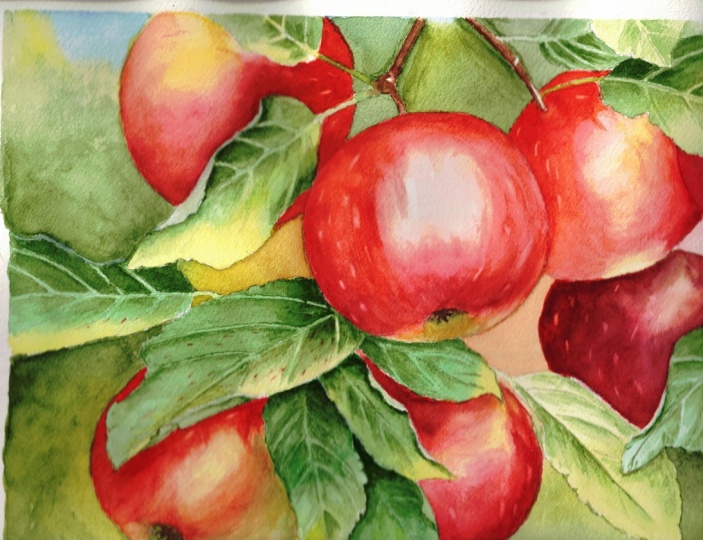
10. Apples - Deepening the Colors: In the previous layer, we established the basic
colors for our apples. Even though they look strong
and vibrant when wet, now when dry, they
look noticeably paler. To achieve truly rich
and saturated colors, we will now apply
a second layer. At this stage, a
subtle texture will also begin to emerge
on the apples skin, adding life and depth. Before we begin, it's
important to remember one key principle from now until we finish the
apples, the form. Here is a simple three D
drawing of an apple I made. Notice how the thicker lines indicate the curves
of the surface. This is our guide.
Every brush stroke we apply should follow the
natural form of the apple. Aligning our strokes with
the curvature will make the apple look believable
and three dimensional. I'll use the same
colors as before. Since my paints are dry, I first spray them with
clean water to reactivate them and prepare fresh
petals. Here's what I mix. Burnt sienna, quinacredon red as the main red permanentsan
crimson for darker reds. Windsor yellow deep, which is not so clean,
but that's fine. For the green areas, I mix green gold with
windsor green yellow shade. I'm also introducing
a darkening mixture, burnt sienna with
ultramarine blue, and a touch of green. This will be our
darkening agent for deepening shadows in
both reds and greens. I'll continue using
a brush size ten. Starting with the first apple, I see that the bottom
needs a darker tone. I mix burnt sienna
with the dark brown, adding a touch of
lizarin crimson and quinacrodon red
to retain warmth. Applying this, we immediately
notice a strong contrast between the dark apple and
the lighter leaf in front. We can also see how much darker this layer is in comparison
with the previous one. I'm painting wet and dry
using short brush strokes. Always keeping in mind
the apple's form. The strokes follow the
natural curve of the surface. At this stage, we're not aiming for perfectly smooth layers. In fact, it's beneficial
to be a little loose. Hard edges, gaps, and even blooms contribute
to the texture we want. The lighter area at the top remains untouched to
preserve the highlight. I can also revisit areas I just painted and drop in
more color if needed. Right away, the
second layer makes the apple's colors appear
much richer and more intense. Near the indentation
on this apple, I want to suggest
the curvature by leaving subtle
lighter curved caps. For the darkest shadows, I'm using lazarin
crimson mixed with my dark blend of burnt
sienna and ultramarine blue. I'll also drop in some dark red behind the leaf to
indicate a shadowed area. That completes the
first apple for now. It already looks juicy, but it's far from finished. There is still more texture and depth to add in later layers. Let's move on to the next apple. Here I start with a
mix of alzarine and dark brown in the deepest
shadow on the left. Then I switch to
reenacredon red, mixed with alzarine crimson, carefully layering colors under the leaf to create
a soft deep shadow. I'll also add a touch
of burnt sienna, Windsor yellow deep, and some green for subtle
shifts in color. Even though the first layer
looked vibrant when wet, it dried quite light. This is why at least
two layers are necessary to achieve a
rich, saturated look. I'm painting around the
highlight in the middle, always following
the Apple's form. The layer isn't
perfectly smooth, but the distribution of color and tonal values
is what matters most. The little gaps, variations, and even small blooms will help build the texture of the skin. And On the next apple, I repeat the process using darker versions of
the same colors. Painting this way
is very intuitive. It would be difficult to follow every single
brushstroke exactly. But the key idea is to layer
gradually respecting form, tonal values, and highlights. Work from shadow to light
and build depth slowly. Working progress photos can
help guide you along the way. This apple has very dark areas, so I use a lot of Alizarin
crimson mixed with dark brown. There are still subtle
areas of green, which I carefully layer in. You can always return to deepen the shadows
later if necessary. For the highlight, I lift paint gently using a clean de brush
to reveal a lighter area. I like to approach
painting organically, allowing everything to emerge
gradually layer by layer. The perfect imperfections
of watercolors like unexpected blooms or hard edges actually enhance the overall
look of this painting. Now, focusing on the main apple, I start with quinaqudon red and add some Windsor yellow
deep on the sides. I notice a touch of permanent
rose around the highlight, so I carefully blended in. Using a cleaned and brush, I soften any hard edges around the highlight to maintain a
smooth, natural transition. Moving downward on the apple, I add more quin acrodon red and permanent Alyzarin crimson
to build richness. For the darkest shadows, I mix burnt sienna with my
dark brown and touch of green. I start with this mix and then layer in permanent
Alizarin crimson. At the bottom of the apple, I introduce the green mix of green gold and Windsor green, blending it slightly with the reds and create a
natural transition. Finally, I drop in a dark red mix of
sarine and dark brown. Using multiple brush
strokes loaded with reds, I both blend the
colors gently and create subtle lines that suggest the apple's
natural texture. Throughout I follow
the form of the apple, curving my brush strokes
along its surface, imagining how my brush would bend and move
on a real apple. Next, I dry the right
side of this apple slightly so I can move on to the adjacent one without
colors bleeding. On this apple, just
like the first, I suggest the indentation and form by leaving gently
curved areas unpainted. I use a very saturated mix of quinacrodon red and
Alizarin crimson. On the right side,
next to the leaf, I add more of the green mix, and at the bottom, I emphasize
the green tone as well. For the darkest shadows, I use mixes containing
dark brown. Even though the colors are
quite dark at this stage, the bottom of the apple will appear later in the
final painting. This will be achieved later by lifting out paint to
create highlights. With that, this
layer is complete. You can already see a
major transformation compared with the
previous stage. The reds now create strong
contrast with the greens, and the dark tones combined with the first hints of texture, bring the apples closer to a realistic three
dimensional look. Leave everything
to dry completely. Once dry, we will move on to
painting the indentations and other details that will
finalize the apples forms. So
11. Apples - Indentations: In this short part,
I will show you how easily we can create the
indentations in the apples, those small pockets where
the stems and seples sit. This is very simple
and effective. I'll be using a brush size ten. First, I'll spray my paints to reactivate them
since they are dry. Will pick up a dark mix. It's hard to say exactly
what it contains, but burnt sienna for sure, lazarin crimson, and a
touch of ultramarine blue. Essentially, it can be any
color that is darker than the surrounding apple and
leans slightly red or green. The exact hue isn't critical. What matters most is
that it's darker. Start by applying this dark tone at the center of
the indentation. Then paint outwards following the natural curvature
of the apple, blending the color gently to
create a soft transition. On this apple, it's
easier to see. I will first pick up the
dark brown and paint a line suggesting where
the indentation will be. Then I will add a
bit of green to the mix and use a clean de
brush to blend it outward. One side of the dark spot has a hard edge while the
other blends softly, creating a convincing three
dimensional indentation. Next, I drop in small amounts of green and even
a touch of red, followed by reinforcing
the darkest spot with more dark tone. That's all we need for now. We're not worrying
about the sepals yet. They will be added later. The dark tone will dry later, giving us the flexibility to add even deeper
shadows afterward. I repeat the process
on the next apple, mark the indentation line, drop in dark tones, blend gently, and add touches
of green or red as needed. Again, sepals are
skipped at this stage. On the final apple, we don't need much work, but I slightly
darken this area to ensure that the indentation
is clearly visible. With that, this short
step is complete. In the next part,
we'll focus on adding much more texture to the apples to bring
them fully to life.
12. Apples - Adding Texture: This part took me around
20 minutes to finish, but it was actually very
relaxing and fun to paint. Comparing the working
progress photos, you can already see a difference in the texture
of the apples skin, especially on the apple
in the bottom left, which happens to be my favorite. After adding the indentations, we are now going to enhance the visual texture
of the apples. There's nothing particularly
difficult at this stage. I'm using the same
brush size ten. Will begin with a light
tone of quinacredon red, adding more water to
create a lighter mix. With this red, I start
applying many short, deliberate brush strokes
on the first apple, intentionally leaving
small gaps between them. Always follow the
form of the apple. The curvature of the surface guides the direction
of your brush strokes. These brush strokes
serve two purposes. First, they add visual interest and texture to the apple's skin. And second, they sadly adjust tonal values and strengthen
the colors in specific areas. At this stage, I view
the apple as a whole. This is the last
layer I will apply, an adjustment and
texturing layer. I especially enjoy
working on this apple because it clearly shows
the effect of the stage. Notice how the
short brush strokes create the characteristic
look of apples skin. It's particularly effective when red strokes overlap green areas. Using slightly darker tones than the previous layer ensures the
brush strokes are visible. Have fun with it. Red green or green over red will only
enhance the texture. This dark red apple
shouldn't be completely red. To fix this, I will use
slightly wet brush to reactivate the paint in areas
that should appear greener. Then I will dab this area with a paper towel to
lift some pigment, creating a lighter spot that
can be covered with green. This final layer is also the
moment to adjust shadows. If any areas lack depth, now is the time to
apply darker tones. For example, if a shadow
isn't dark enough, mix a deeper reddish tone
and gently apply it, keeping in mind the
goal at this stage. Many short brush strokes for texture while maintaining
correct tunnel values. On the last main apple, I continue with quinacredon
red brush strokes, while deepening
the shadows using a dark mix of Alyzarin crimson, burnt sienna, and
ultramarine blue. And that completes the
last layer on the apples. The skin now looks convincing. The colors are vivid and
the texture is appealing. The painting is almost finished, only two final steps remain. Patients will pay off a promise
13. Apples - Sepals: This part will be very short. I will show you how easily
we can create the seples. Although tiny, they add an important touch of
realism to the painting. For this step, I'm using
a small brush size four. First, dip the brush
in water and remove the excess by dapping it
on a towel or paper towel. Using only clean water, carefully run the tip of the brush along the
light edge of a seple. Lift out the
activated paint with a paper towel to
reveal the highlight. Repeat the same process
for the second sepal. Essentially, we are
lifting out paint in the same way we did for
the veins on the leaves, creating subtle light edges. Once the highlights
are in place, mix ultramarine blue with
burnt CNM and a touch of permanent lysarin crimson
to create a very dark tone. Use this mixture to paint
the sepals themselves. I'm avoiding white
guash here because lifting out produces a
more natural effect. Since these sepals are
small and mostly in shadow, a subtle approach is sufficient. On the second apple, the sepals are much more
prominent and slightly whitish. For this, instead
of lifting out, I use white guash mixed
with a touch of green. After applying the light color, I add a darker tone
for the shadows. The main body of the
sepals is already established by the
previous green layers. Finally, I slightly blend the
white to unify the effect. With the sepals in place, the apples look nearly finished. At this stage, we could
consider the painting complete, but there are a few
final finishing touches that will elevate it even more.
14. Finishing Touches: In this final part, we
will focus on adding small details that will make
our painting look polished. There are four main
areas we want to focus on reflected light highlights, light spots in the background, and spots on the apple's skin. Let's go over them one by one. Use a clean de brush size ten for creating reflected
light on the apples. Reflected light
is the light that appears on the dark
side of a round object. It always adds interest and enhances the natural
look of a round form. It's also very easy to create. All we need to do is lift
out the paint from the edge. We don't want to
exaggerate, though. Don't create a halo around the apple or a lighter contour. Just gently left out a bit of paint to create a subtle
light spot on the edge. Apart from that, use a
wet brush to lift out the paint from the main
highlights on the apples. Wrap the bristles in
small circles and then dab that area with a paper
towel to remove the paint. Repeat as necessary until you achieve a satisfying
light effect. I'm not using a scrabber brush because it would be
too strong for this. These colors lift out easily, so regular damp brush is enough. It is also much softer, and we want to create a very
soft natural light spot. I will also lift
out the paint from the edge here to create
the reflected light. This light is also present
just above the indentation. So let's create lighter
areas there as well. This surely adds more
realism to our apples. I'll now move on to the
next apples and create reflected light on the edges and highlights in the middle. At this stage, since we will not be applying more
layers to the apples, we can also finish the
edges of the leaves. Some leaves need a lighter edge painted with white guash
mixed with a bit of green. We can paint those edges now, and they will be clearly visible against the
dark red of the apples. He We can also use quash to create
highlights on the twigs. Oh The next visual element that we can add in the
background are light spots. Of course, the background
in my painting is more abstract than in the
reference photo. But that's the
beauty of painting. We can create whatever we like. I will now use a
clean damp brush and using circular motions, dampen the dried paint
in the background, and then lift it out
with a paper towel. This creates a lighter spot. I will create several of
these spots to add a magical, interesting touch
to the background. Of course, this is optional. You don't have to do this if
you don't like the effect. Finally, the last details we can create are small spots
on the apple's skin. This is also optional, but I decided to
add them because they are very easy to create, and I think they look
really beautiful. I'm using the tip of a clean damp brush size four
gently rubbing in one spot. If nothing happens, I add
a little bit more water, then lift the activated
paint with a paper towel. I place these lighter spots
randomly on each apple. It's certainly not required, but I think it looks really nice and adds a magical
touch to the painting. I'm not using white guash for this because lifting
out looks more natural. And with these little details, our painting is complete. Wow. That was a long
journey, wasn't it? But I think the final
result looks fantastic. The colours are vibrant, the composition is strong, and the textures are
rich and convincing. I hope you enjoyed
painting this with me. Now let's move on to
the last part and summarize what we've
learned from this tutorial.
15. Summary: Thank you very much
for following along as we brought these apples
to life in watercolor. I hope you've enjoyed
this process, learned some new approaches, and feel motivated to keep experimenting with color,
texture, and form. Before we wrap up,
let's take a moment to reflect on what
we've learned together. We started by carefully planning the painting, creating a sketch, and ensuring correct
placement and proportions of our main
elements in the painting. Pencil lines indicated
the veins of the leaves and the general
shapes of the apples, providing a strong foundation while leaving room for
expressive brush work. The leaves were
painted in stages. In the first stage, we
established base colors. Then we added texture, and we ended with
adding details. We practiced
balancing freedom in brush stroke with attention
to tunnel accuracy, creating leaves that
feel vibrant and natural without
overworking them. Small twigs were painted
quickly but effectively. Highlights were preserved
by leaving white areas. But we also created highlights by adding white wash in the end. Apples were developed
in multiple layers. In the first layer, we laid down base colors with watery washes, establishing
highlights, mid tones, and general color placement without worrying about
perfect smoothness. Then we deepened the colors. After that, we
painted indentations. We also added texture applied
with short brush strokes. We also painted seples with
a combination of lifting out technique and also
gouache for subtle realism. This process emphasized building color depth, understanding form, and creating natural texture
while leaving room for organic happy accidents like
blooms and uneven edges. Final details brought
the painting to life. We lifted paint to
suggest reflected light and strengthen the
three D form of the apples. We added subtle light
edges to leaves and twigs with gouache for
clarity against the apples. We created gentle lighter areas to add visual magic
and interest. We also lifted some small areas on the apple surface
to enhance realism. This stage reinforced the
importance of observation, patience and subtle
adjustments to polish a painting
without overworking it. This tutorial combined layering, tunnel planning, texture, and fine detail to create a cohesive composition of
apples with depth and realism. You practiced balancing controlled techniques
with expressive freedom, building form and
color step by step, adding finishing touches that elevate the overall painting. I hope this project gave
you a sense of focus, joy, and creative satisfaction
and that it inspires you to continue exploring the beautiful possibilities
of watercolor. Take care, thank you
and happy painting.
 Krzysztof Kowalski, Watercolor artist