Transcripts
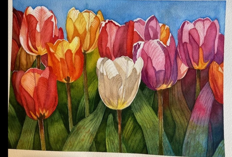
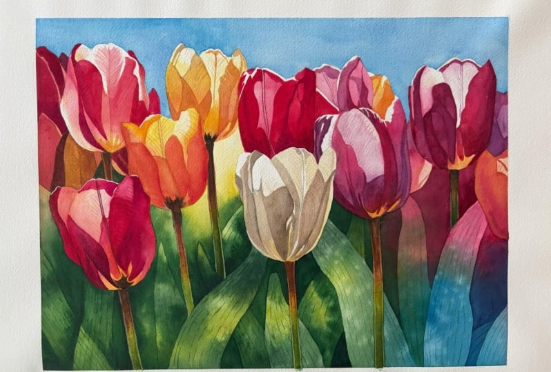
1. Introduction: Hello and welcome to this colorful watercolor
painting Tutorial. Today we'll be working on a bright and cheerful project featuring luminous tulips
in a variety of colors. This vibrant painting
full of wonderful hues, is sure to brighten your day and could become a stunning
decoration for your wall. It radiates joy and happiness, and I believe you will truly
enjoy bringing it to life. This tutorial, we'll primarily use the wet on dry technique, but we will also explore a bit of negative painting
for the leaves. While we could approach the leaves in a more
traditional way, I saw this as a
great opportunity to practice negative painting. Not only is this technique fun, but it also allows us to
paint the leaves more efficiently than working
on each one individually. Will learn how to simplify
the reference photo and its vibrant colors into more manageable
sections and shapes. By using layering techniques
with transparent paints, we'll achieve a luminous
quality that makes the tulips look like colorful gems shimmering
in warm light. As always, I will guide you step by step through the
entire process, breaking the painting
into manageable sections to ensure it's both
enjoyable and achievable. At first glance, this project might seem a bit overwhelming, especially if you're
new to watercolors. But don't worry.
If you're willing to take your time and
approach it with patience, you will find it much
easier than it looks. And remember, you can always simplify this painting
further if you like, or you can paint just
a section of it. With my guidance and a
step by step approach, I'm confident you will create a piece you
will be proud of. Whether you follow
my instructions closely or at your
personal flare, this painting is an opportunity to make something
uniquely yours. This is your creative journey, and I'm here just to inspire you and encourage you
every step of the way. By the end of this tutorial, you will have a vibrant
painting that will bring smile to your face
every time you see it. Gather your supplies, find a
quiet moment for yourself, and let's start creating this joyful painting.
Happy painting.
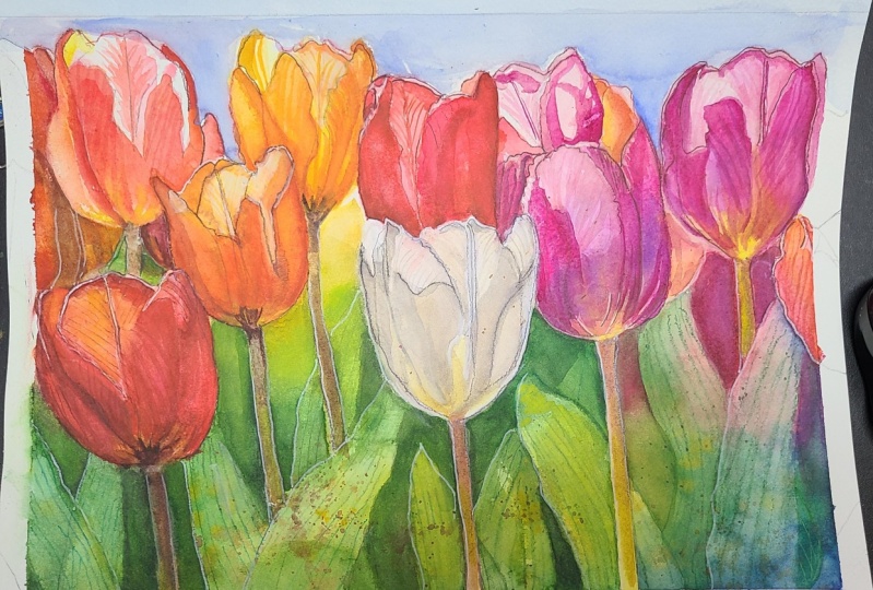
2. Project and Resources: I've prepared a selection
of helpful resources for your project available in the projects and
resources section. You will find various
PDF files, for example, a PDF with the supply list I
used for this painting along with a reference photo and an image of my finished
artwork for guidance. Line drawings in various sizes are also provided so
you can print and transfer them onto
your watercolor paper in the size that best
fits your needs. My painting is in a
16 by 12 inch format. Additionally, there are working
progress photos to help you follow the process and
focus on specific areas. Feel free to explore
these materials and use them to create your own unique
and beautiful painting. Please share your final painting in the projects and
resources section. I also encourage you
to take a moment to view each other's work in
the student project gallery. It's always inspiring to
see what others create and the support of your
fellow students can be incredibly comforting. Don't forget to like and
comment on each other's work. Lastly, I highly recommend watching each lesson
before you begin painting. This will give you a
clear understanding of what to expect at each
stage of the tutorial. If you find this class helpful, I would greatly appreciate it if you could leave
an honest review. Your feedback will help me
improve my content and assist other students in
deciding whether to join this class.
Thank you in advance.
3. Inspiration, Painting Plan: The idea for this painting
came to me as a way to escape my recent gloomy
mood to put it delicately. I felt the need for something bright and colorful
to lift my spirits, and flowers with their vast
array of vibrant hues, seemed like the perfect subject. I don't think I've ever painted so many colorful flowers
in a single piece before, and it turned out to be an incredibly enjoyable
and uplifting experience. Ever I feel uninspired
or creatively drained, I like to browse through
my collection of watercolor art books and
study other artists works. One of my favorite artists
and someone who inspired me at the very beginning of my watercolor journey
is Janet Whittle. I greatly admire her work, and she remains an
incredible source of inspiration for me. Own two of her books, one in Polish and
one in English, and every time I look
at her paintings, I'm captivated by the
way she portrays flower. To me, her artist's perfection. What I love most about Janet
Whittle's paintings is the balance she strikes
between realism and looseness, something I strive to
achieve in my own work. When I analyze her art, I notice how she uses simple washes of color and
simplifies her subjects, yet her paintings
still feel detailed. At the same time, they exude a playful quality
through the use of bold, vibrant colors and
dynamic shapes. Her work is never overworked. The layers are light, fluid, and distinctly
watercolor like. Yet they maintain a
strong visual impact. I think that unconsciously, I've always aspired
to paint like Janet. However, I still feel far from achieving her relaxed
and spontaneous style, which is also so well composed
and thoughtfully executed. Her work continues to
inspire me and reminds me of the beauty and joy that can be found in the simplicity
of watercolor. I like to draw inspiration
from Janet Whittle works, which is why I decided to use the negative painting
technique for the tulip leaves
as she often does. I knew I wanted to paint
the leaves first because if I made a mistake with the
negative painting at the start, it wouldn't be as frustrating. It would be far more
disappointing to mess up after completing
all the flowers. That's why the leaves will be the first stage in
our painting process. We'll break the process
into manageable stages, beginning with the green parts. Next, we will move on
to painting the sky, which will be a quick and
straightforward task. Before focusing on
the main tulips, we'll first paint the red tulips in the background on
the left hand side. Then we will paint the stems of the tulips followed by
the flowers themselves. We'll start with an
initial base layer for all the flowers and then work on the tulips in groups
organized by color. First, we'll paint the
tulip on the left, which will be pink or salmon. Next, we will move
to the red tulips. Then we'll tackle
the yellow tulips, including the orange
one on the right, as the colors are similar. After that, we'll
paint the white tulip, and finally, we'll finish with the purple
tulips on the right. I know it's a lot of flowers, and this painting requires
a bit of patience. But remember, you can simplify the painting as
much as you like. You don't have to paint
the entire piece. Feel free to focus
on just one section, a single tulip, or a
small group of flowers. If the whole painting
feels overwhelming, it's perfectly okay
to scale it down. So keep in mind that
there is no need to rush. You can break the
painting process into multiple days as I did. Enjoy the process and take your time to bring
this painting to life. Nobody is chasing you, and there is no deadline. This is not a race. We are here to paint in a relaxed and enjoyable
way, free from pressure. Now that you know our plan for
approaching this painting, let's move on to the first step, masking of the main flowers.
4. Masking: I've already
transferred my sketch onto the paper and secured it by stapling it to a gator
board on all four sides. I've also taped the
edges to create a clean white border for
the finished painting. The paper is dry and
straight from the block, but since it's firmly
attached with staples, there won't be any
issues with buckling. The sketch looks too dark, I like to use a kneaded eraser
to gently roll over it, especially in areas where the
painting will be lighter. This ensures that the
pencil lines won't show through too prominently
in the final piece. Initially, I drew all the
leaves as part of the sketch, but then I decided to paint them using the negative
painting technique, so I erase those pencil lines. In the class materials, I've included outlines for both the original leaf version and the negative
painting version. This way, you can choose the approach that
works best for you. Now for the masking,
I'll be using Windsor and Newton masking
fluid with a yellow tinge. I'll also need an old cap. This one is from an old battle of masking fluid I've
had for a while. We'll also need a piece of soap, which I keep in a small
container for easy access. And lastly, we will need a brush dedicated only to
applying masking fluid. Never use your good brushes for this as masking fluid
can damage them. And of course, we'll need water. A begin, gently roll the masking fluid
bottle to mix the contents. Then pour a small
amount into the cup. The reason for pouring
the fluid into a smaller container is that masking fluid dries quickly
when exposed to oxygen. If you leave the battle open during the entire
masking process, the fluid inside will be exposed to air for at least
several minutes. Over time, this can lead to
clamps forming in the battle, making the masking
fluid unusable. To avoid this, I pour out only the amount I need and
close the battle right away. Next, wet the brush and rub it gently on the soap to
create a protective layer. This will help prevent the
masking fluid from sticking to the bristles and make
cleaning the brush much easier. Once your brush is ready, dip it into the
masking fluid and carefully apply it to the
areas we want to protect. Here, of course, at
the very beginning, I made a small mistake. I didn't think this
through properly. I shouldn't have applied masking fluid to the red
tulip in the background, that small part
on the left side. In the class materials, you will find an illustration showing exactly where
to apply the masking. You can see, there is no
masking on that small area. Later in this tutorial, I will show you how to remove the masking fluid from that spot before
we start painting. The reason I shouldn't
have applied masking there is that the red tulip
belongs to the background, which we paint along
with the leaves. If I left the masking in place, I wouldn't be able to paint
the red tulip properly. It would leave a
white unpainted area that doesn't fit the background. Now, let's proceed with
applying masking fluid to the edges of the main
tulips and their stems. This will allow us
to freely paint the green areas without worrying about accidentally
painting over the flowers. It will also make painting
the sky much easier. Take your time with
the masking process. Aim to create smooth and
precise edges as these will form the final outline
of your petals and stems. Avoid rushing. Jagged edges in the masking will result in
uneven lines on your painting. Once you've applied the masking, let it dry completely
before moving on. Now that the masking
has fully dried, I will remove the
unnecessary section I mentioned earlier. To do this, I will use
an exacto knife and carefully cut away the
unwanted part of the masking. This allows me to correct the mistake without disturbing
the rest of the masking. There's only a tiny spot on the tulip where the
masking pulled away. Ideally, I would correct this by reapplying a small
amount of masking here, but it's such a minor area that I'm comfortable
leaving it as it is. In the next part, we'll begin by applying the first
layer to the leaves.
5. Leaves - First Layer: No. With the masking fluid in place to protect
the main flowers, we don't need to worry about accidentally painting over them. Before we prepare the colors, let me briefly explain
what we are going to do. We'll be painting the leaves using the negative
painting technique. To help visualize our goal, I use the procrete
app on my iPad to create a rough idea of
what we are aiming for. This process will
involve three layers. The first layer will be a general base layer applied
across the entire area. In the second layer, we will draw and define
the first set of leaves, bringing them out using the
negative painting technique. The third layer will add more leaf shapes for
depth and dimension. You're welcome to add more layers and details
if you would like, but I decided to
keep it concise. I think these three layers
will be enough to achieve a beautiful result without making the process too lengthy. To finish the leaves, we'll also add some simple
veins for extra detail. Let's begin by preparing the colors we'll
need for the leaves. I'm spraying my paints
with clean water, something I always do when
the paint have dried. This activates them, making
it much easier to pick up and transfer the pigment
to the mixing area. For the background, we'll
use permanent rows to reflect some of the tulip
colors in the background. This painting is
exceptionally colorful, so I'll be using almost
the entire palette. It's a great opportunity to explore all the colors
you have on hand. We'll also prepare
Windsor blue green shade, which I will use in the
bottom right corner. The green, feel free to
use your favorite shade. There is no strict rule here. I decided to mix my green using transparent yellow
and Windsor blue. This combination
creates a green that closely resembles Windsor green, hookers green, or
even sap green, depending on the ratio
of yellow to blue. Love mixing greens because it gives me a range of
shades to work with, which is always
visually interesting. This mix is so versatile
that I could easily remove Windsor green and green gold from my
palette altogether. However, I still keep them around simply because
I like green so much. It's my favorite color. Of course, you could also
use here Windsor green, yellow shade and
green gold and add Pains gray to create a
darker shade of green. In fact, to add depth
and to darken the color, I will also include
paints gray at the bottom of the mix to
create a darker shade. We'll apply the first layer using the wet on wet technique. Though you can also opt for wet on dry technique
if you prefer. Just remember to use
well diluted paint to ensure your colors blend smoothly creating
soft transitions. I'm using the wet
on wet approach because the area we're
covering is quite large, and this method makes it easier to achieve seamless
color transitions. Begin, I'm using a large flat, 1 " brush to apply a clean, even layer of water. Make sure that there
are no dry spots, puddles, or uneven areas. If you notice pools of water
gathering at the edges, use your brush to distribute the water evenly
across the surface. Next, I will switch
to a size 12 brush to start applying paint. I'm beginning with
the lightest color, a light green mix with a higher proportion of
transparent yellow than blue. If you prefer, you can also use green gold here as it's
a very similar shape. At this stage, we're laying the foundation for
the upcoming layers. The placement of colors in this base layer will influence the look and feel of
the final painting. You have the freedom to arrange the colors in a way that
feels right for you. For my painting, I've chosen to place the lighter
areas diagonally. My idea is to create a streak of sunlight falling across
the surface of the leaves, which you'll see reflected
in the final piece. Near the yellow orange tulips, I'm incorporating a warm yellow. Windsor yellow deep to reflect the color of the tulips
in the background. In the corner, I want to
keep the area lighter. So I'm applying only a
subtle yellowish tone, keeping it soft and delicate. I'm repeating the same idea
on the right hand side, but this time I'm using
permanent rows because I'll be incorporating this color
into the tulips on that side. So we will have a connection between the background
and the tulips. At the bottom, I'm adding Windsor blue to create
a soft turquoise stone. This is entirely a matter
of personal preference. Feel free to use any color combination
that suits your vision. Next time mixing
transparent yellow with permanent rose
to create a warm red. I'm using this mixture to paint the tulip silhouettes on the left hand side
in the background. Now you can see why
it was necessary to remove that section
of masking fluid. Without doing so, I wouldn't be able to paint this
background tulip. This warm red mix
is quite versatile. By adjusting the ratio, you can shift it toward a cooler red with
more permanent rose or toward an orange or yellow by adding more
transparent yellow. As I work downward, I transition to using
more yellow and blending to green to seamlessly connect this area with
the rest of the leaves. Once all the colors
are in place and the entire area is
covered with paint, it's time to tilt the painting. Tilting encourages the paint to move and blend
naturally on the paper, creating smooth transitions
between colors. As long as the
paint is still wet, you can also drop
in more colors. For instance, you might
want to add darker greens, as I've done, to deepen
the area near the tulips. Keep in mind that
we are working in three layers and with
each subsequent layer, we'll be building
up darker colors. In this initial layer, we are using the full
strength of the colors, but remember that they will
dry significantly lighter. When you're satisfied with how your colors
look on the paper, it's time to tilt the painting. The purpose of tilting is
to get the paint moving naturally and encourage the
colors to blend seamlessly. When colors mix
directly on the paper, the transitions look
soft and organic. If you try blending
too much with a brush, it can leave visible
brush strokes and risk an overworked
appearance. Is why it's important to use well diluted watery paint and to tilt the paper once you've
finished applying the colors. Keep tilting until you notice the paint stops gathering along the edges or near the masking fluid and
isn't moving anymore. For reference, since I
recorded this process, I can tell you that I tilted the paper for about 8 minutes. When the paint
begins to settle and the surface is still shiny
but no longer dripping wet, you can add an optional
touch, spatter effect. Using a smaller brush, I use a size six. You can spatter clean water to create soft diffused effect. While a lot of this area will eventually be covered
by other layers, this is a great way to add subtle interest to
the background. Instead of clean water, you can also spatter paint
for a more colorful effect. For example, in a blue area, try spattering yellow to create
an interesting color mix. You could also use
contrasting colors for a bit of drama
like burnt sienna in blue sections or green areas as green and brown naturally
complement each other. The result will vary
depending on how wet the paper is and how much
water or paint you spatter. Softer shapes form
on wetter surface while drier areas will create
more defined spatters. If you use a lot of water, you may even create blooms, those unpredictable bursts
of lighter patterns. Blooms are often considered
a mistake in watercolor, but I think they
can look stunning, adding character and
charm to your painting, especially when
done intentionally. With the first layer complete, we will let it dry completely. Once dry, we will move on to the next part and start
creating the first leaves.
6. Leaves - Second Layer: Now that the first layer
is completely dry, you can see how
beautiful it looks. It could easily stand alone
as a simple background. However, we're aiming for more depth and complexity
by creating leaves. In this part, we'll apply the first negative
painting layer to start defining the
main leaf shapes. To guide us, let's
refer to my sketch, which represents the look we're
aiming for in this stage. The idea is to bring out the leaf shapes by
painting around them. Take a moment to visualize how the negative painting
technique works. It's all about building
layers by outlining and shading the spaces around the subject to
make it stand out. Now, take a look how to do this. Begin by lightly sketching the main leaf shapes onto
your dry background. There is no need to follow a reference photo strictly,
but if you would like, feel free to search for tulip leaves online
for inspiration. Tulip leaves are naturally
simple in shape, and for this painting, we are simplifying
them even more. Start with a very basic outline. Beginning with a leaf on the left hand side
to demonstrate. If you prefer, you can simplify the process by using
transparent paper, such as tracing paper
or parchment paper. By placing this paper
over your painting, you can easily see the
background through it and sketch potential leaf shapes directly onto the transparent surface. This approach allows
you to experiment freely with the size, shape, and placement of
the leaves without committing to any specific
design right away. Once you've finalized a
shape you're happy with, you can cut it out
to create a stencil. This technique ensures
your leaf shapes align perfectly
with your vision, complement the composition of your painting and are
positioned just right. You can even reuse
the stencil to replicate the shape in other
places in your painting. Alternatively, you can
draw directly onto your painting if you feel confident in your
design choices. This transparent paper
technique is simply a helpful tool that you can use not only
for this project, but also for other paintings where you might feel uncertain
about the composition. Now that we've outlined
these simple leaf shapes, it's time to bring them to life using the negative
painting technique. We'll start by
mixing more green. For this, I'm combining
transparent yellow, windsor blue, and paints gray with a touch of burnt sienna to slightly
mute the vibrant green. This blend creates a rich
and versatile green perfect for adding depth to our leaves. Let's begin with the
first leaf on the left. To define its shape, we will wet the background
area to the left of the leaf and then drop in
the darker green mixture. Notice that I wet a much larger area
than I plan to paint. This technique allows
the paint to spread naturally, creating
smooth transitions. Even though we wet a large area, the paint should be applied primarily near the leaf
to define its shape. However, try to avoid creating
a contour around the leaf, as this can appear unnatural. Now I will move on
to the next section. This time, I'm wetting the background on
the right side of the first leaf and at the same time on the left
side of the next leaf. I'm working on the area
between these two leaves. At this stage,
we're setting aside the tulips and focusing
solely on the background. Notice that I'm not applying paint across the
entire wet area. Instead, I'm concentrating on the sections close
to the leaves. We want the first
layer to be visible, so I don't want to
cover it entirely. As you can see the colors from
the first layer applied in the previous step now serve as the color of the leaves that we are creating at this stage. The colors we are
applying now will define the leaves we will
create in the next part. The first layer
served as a roadmap, a foundation for us. In this layer and the next, we aim to apply
the same colors in the same places unless we want
to make some adjustments. For example, if there is
green in the first layer, I will also use green
at this stage as well. If there is pink, I
will apply pink now. If there is blue,
I will use blue. However, we may also choose
to make some changes. For instance, I'm
layering green over pink to create a more
muted version of pink. Since pink and green are
complimentary colors, mixing them results in a
neutral brownish tone. I'm also applying
green over blue to achieve a bit
more turquoise hue. Once you've finished painting the areas between
these first leaves, allow everything
to dry completely. This is my result after
completing this step. In the next part, we will repeat the process to create
another layer of leaves.
7. Leaves - Third Layer: This part follows almost the same process as
the previous one. The goal is to add
more leaves building on the depth we've
already started. I'm using the same technique as before to create leaf shapes, employing tracing paper to position the leaves accurately. Additionally, I'm re
using the stencils from the previous step to
arrange the leaves in a way that complements
decomposition. At this stage, we're
painting the leaves that are tucked behind the ones
we've already created. By adding a second
negative layer, we will create an
additional layer of depth. Each successive negative layer establishes shapes that appear
further in the background, adding more dimension
to the painting. That's why I like to say
that with each layer, we're creating another layer of depth or another level of depth. Let's start again with a
leaf on the left side. I want to demonstrate two different approaches
to painting these leaves. These methods apply whenever you use the negative
painting technique, not just in this
specific instance. I think it will be easier to explain this with an example. So let's take a
short break here. So in the first step, we painted the entire area, creating a foundation
and a roadmap of colors. The second layer, we
formed a leaf shape by painting around it using the negative
painting technique. At this stage, we already have a shape defined
by this approach, and now we want to
add another leaf. So let's imagine that we want to create a new leaf
shape like this one. There are two ways of
how we can do this, two ways to proceed. Method one is
maintaining separation. In this approach, we completely disregard the leaf
that is already there. Imagine the existing leaf
as if it's masked out. Applying water around
the new leaf shape extended to cover the area surrounding the
existing leaf as well. Once the paint is
added to the wet area, it will create the
background behind both the new leaf and
the existing leaf. This method results in a new leaf shape that appears behind the
previously created one, keeping the old one
in the foreground. The second method is
creating transparency. This method is
slightly different. Here you apply water
around the new leaf shape, but also over the existing leaf. When paint is added
to this wet area, it covers the background
of the new leaf while also partially overlapping
the old one, the old leaf. This creates the effect
of transparency, where the old leaf appears partially visible
through the new one. It gives a more abstract and also a bit more
interesting appearance. In this case, the old leaf visually recedes slightly
into the background, while the new leaf
appears in front, but with a transparent effect, since the new leaf itself
is not painted directly. The result depends on where you apply the water and paint. If you want to create a layering effect where one leaf is clearly in
front of the other, go with method one. If you prefer a more abstract, transparent look for the leaves, opt for method two. Let me demonstrate both methods so you can see the difference. On the left side, I want to use the second method to
create transparent leaves. After drawing the shape, I applied a dark green to the corner on the
left side of the leaf. Next, I applied water to
the right side of the leaf, extending it over the leaf I created in the previous layer. By doing this, I intentionally overlapped the old leaf
with the water layer. Now when I drop in my
darker green color, it partially covers
the old leaf. You can already see the effect even while the
paint is still wet. Once this layer dries, it becomes even more apparent. The newly created
leaf looks like it's positioned more in front
while the old leaf recedes into the background
because it's slightly covered with a darker green that we have just applied
in the second layer. Next, I will continue painting the remaining leaves
using the first method. I apply water between the leaves carefully avoiding the
previously created shapes. I'm not applying water over those leaves that we've
created in the previous part. When I drop in my colors, I ensure not to overlap the leaves that
I've created earlier. This way, all the new
leaves I'm painting now appear tucked behind those
from the previous layer. For smaller areas, I may skip
the wet on wet technique and instead apply
a dark green paint directly using wet on dry. This is quicker and works
well for tiny spaces. You can see now how the negative painting
technique creates a sense of depth with multiple
layers of leaves emerging. I've decided to
stop at this layer, but you're very welcome to
add more layers if you like, once this layer dries. There's definitely
potential for more leaves, but I didn't want
to overdo it or make this tutorial
unnecessarily long. Feel free to add your
own creative touch. This is how the painting
looks at this stage. After adding the second negative
layer, in the next part, we'll finish the
leaves by adding simple veins to enhance
their details. O.
8. Leaves - Veins: Now that everything
is completely dry, we can add another
layer of detail. This step is optional, but I think it adds a bit
more character to the leaves. For this stage, I'll
use a size four brush. I will stick with the same green I've been using
throughout the painting, adjusting the tunnel
value to ensure it harmonizes with
the rest of the work. At this stage, I will add simple lines to the leaves
to represent veins. This process is straightforward, not difficult at
all, as you can see. Adding these small details makes the leaves more
visually interesting. While it's not a realistic
style of painting, it leans more toward
illustration. I quite like the effect. You can leave some
gaps in the lines to avoid making them
look too mechanical, follow the shape of
the leaf and bend the lines slightly
to reflect its form. By doing this, you will better define the natural
curvatures of the leaves. And that's it for this part. A quick and simple stage. Now let's move on
to the next one, equally quick stage,
painting the sky. C
9. Sky: In this quick and easy part,
we will paint the sky. I decided to do this now before completely changing
the color palette. Let's make some room on the mixing space for
clean blue colors. For painting the sky, I'll be using a size ten brush. When I think of the sky, cobalt blue always
comes to mind. It's such a beautiful
color, perfect for sky. Unfortunately, it's
granulating color, but sometimes there
is no other option. Another option that I know artists like to
use is cerulean blue, which is even more granulating. I'm not a fan of using granulating colors
to paint the sky. However, in this case, I will use cobalt
blue for the sky. To connect the sky with
the rest of the painting, I will mix that cobbled
blue with Windsor blue, which I used at the
bottom of the painting. The combination of
these two blues creates a perfect sky color while maintaining harmony with
the overall palette. Adding Windsor blue will also reduce slightly the
granulation effect. Create a generous puddle of a watered down mixture
of these two blues. Using the wet on dry technique, start applying the paint from the left side and work
your way to the right. Unless you're left handed
and from the right, it would be probably
easier for you. Since we're using the
wet on dry technique, it's important to keep
the paint very watery. This helps avoid leaving dry
brush strokes on the paper, which can give the sky an
overworked appearance. Painting the sky, try to keep the consistency of your
paint at the same level. Notice that I slightly raised the left side
of the painting. This allows the paint
to flow naturally across the paper in the
direction I'm painting. You might be familiar with those simple watercolor
exercises where you create a smooth wash
from top to bottom, maintaining a wet edge of paint that you
keep pulling down. Painting the sky is a practical application
of that concept. The goal here is to achieve
a smooth, even blue layer. I dried the sky
with a hair dryer, and now we are
ready to move on to the next step finishing
the background. In the next part, we will paint simple abstract shapes of
tulips on the left hand side.
10. Background Tulips: Before we move on to
painting the main tulips, we need to finish
the background. There is one section that
still requires our attention, the left side, where we
can see some red tulips. Let's first prepare the
colors we will need. As you can see, my palette
is now nice and clean, and I've also changed the water so I can
use clean colors. We will need red, and for that, I'll be using quinacrodon red with a touch of permanent
rose added to it. We also need a
slightly darker red, so I will mix
quinacridone red with permanent sarin crimson to create a slightly
darker cooler tone. On the other side of my palette, I will prepare burnt sienna and we'll add transparent
yellow in a moment. Use the basic red to paint
a simple shape like this. Here I'm using
transparent yellow with some burnt sienna to
paint the brown shapes. The paint consistency is quite watery and I'm
working wet on dry. Now with permanent rose, I will start building the
red shapes on the left. I'm using rose because there
is yellow on the paper, and when I apply the rose, it will turn into red. Once these shapes are in
place, we can dry them. As you can see, I'm painting very simple shapes and simplifying the whole
area as much as possible. I'm focusing on basic shapes using a simple wet
on dry technique. Now let the paper
cool down a bit. In the meantime, let's prepare
an even darker red tone. Mix quinacrodon red with permanent Azaren crimson and then add pains gray
and burnt sienna. The pains gray and burnt
sienna mixture creates a neutral dark tone that
works as a darkening agent. Sarine crimson itself is
darker than quinacredon red, but it wasn't dark enough
to darken it further, we can add pains gray, which deepens the mix, but also shifts the
color to a bluish hue. To neutralize that bluish tint, we add burnt sienna, which is complimentary
to pains gray. I've created a short guide
on darkening colors, which you can find in
the class resources. I'm also darkening burnt sienna by adding a touch of Pains gray. Now, use the various shades of brown to paint the brown areas. This process might
feel a bit chaotic since we're applying different
colors to various areas, but that's how this
section looks. It's difficult to
break the steps down into a more
organized process. The key here is to simplify
this area as much as possible because it's just the background while trying to recreate
its overall look. Use various shades of red to paint the flowers
on the left, leaving gaps between
the red sections to suggest the edges
of the petals. This is a beautifully
abstract area and not very difficult. As you can see, I'm using a basic wet on dry technique
and painting simple shapes. After applying the red, I'm dropping in a darker tone
in some areas to add depth. That's all I'm doing here. We will use this very simple
approach for all the tulips. You will see that it's
not difficult at all. We will simplify the
tulips quite a bit, but I think the end result is
really pleasing to the eye. B. I'm adding a bit of green
in that area as well, along with a darker red layer in the corner. And that's all. Now, let's dry this
section completely, and the whole background
will be finished. Once the area is dry, we can remove the masking fluid. I will use a rubber
masking pickup tool, but of course, you
can use your fingers. Removing the masking fluid
reveals that I wasn't careful enough and I dropped some paint on
the tulip flowers. The yellow spatters
aren't really a problem because those tulips
will be yellow and red, so these marks will disappear
under the layer of paint. However, the green,
the dark green is not a welcome visitor. So to fix these spots, I will use a scrubber brush, which is stiffer than a
regular watercolor brush. I'm using a Windsor and
Newton galeria brush. It's a size four. But any stiffer brush will work. I will dip the brush in
water, remove the excess, and gently wrap the spots of
paint with the damp brush. This will activate the pigment, and I can then dab it with
a paper towel to remove it. These spots may not come off
entirely, but that's fine. They won't be visible later. I just want to lighten
them as much as possible. Now we are ready to
paint the flowers, starting with the stems.
11. Stems: In this section, we're going to paint the stems of the tulips. Let's start by
preparing the colors. We'll use burned CNA
as the main brown. For the lower part,
we will transition from burnt sienna to a bit of transparent yellow and add Windsor blue at the
bottom to create green. This will be the general color
composition for the stems. Additionally, I will mix paints gray with burnt sienna to
create a darker brown. Start by picking up the brown color and using
the wet on dry technique, apply to the first stem
beginning at the upper part. As you work your way downward, transition to more yellow. Finally drop in some green
near the upper part. Repeat the process
for each stem, start with brown at the top, and as you move downward, create a smooth transition to other colors such
as yellow or green. You can either follow
a reference or use your intuition to choose
colors that appeal to you. The goal at this stage is
to apply the base colors, creating smooth
transitions between them. The upper parts of the stems closer to the flowers are
usually darker in tone, but we will address that
in the second layer. We'll be applying two
layers to the stems. The first layer serves
as a base and a roadmap. Even though I'm using
fairly saturated colors, the single layer won't be enough to achieve
the desired depth. Once it dries, the colors
will appear too pale. That's why we will need to apply another layer
to deepen the tones. After finishing
this first layer, dry it with a hair
dryer and wait a few minutes until the paper
cools to room temperature. Painting on hot paper can be tricky as the paint
would dry too quickly. Notice that the green areas on the stems resemble sunlight
dancing across them, adding a natural
and dynamic effect. Once the first layer
is completely dry, we can apply the second layer. We will use the same
colors as before. But with the buildup of layers, the tonal values will become darker and the colors
will appear richer. At this stage, you
can try to avoid painting over the
edges of the stems. Leaving the edges lighter creates the effect
of reflected light, which adds a sense of dimension and light
to the painting. However, this step isn't
strictly necessary as we will be using white guache later to
paint those edges anyway. You can paint over
the edges now as the guash will allow you to
recreate the lighter edges. Alternatively, you can
use a scrubber brush later to leave the
lighter edges if needed. I'm also adding much
darker paint near the flowers to suggest
shadows and a depth. So Once you finish painting the stems, leave them to dry naturally
or use a hair dryer. In the next step, we'll begin painting
the flowers. H
12. Tulips - Initial Layer - Part 1: I hope you're excited
because we are finally starting to paint
these colorful flowers. I truly enjoyed working on them. They look like shimmering
gems in the garden, creating a stunning effect. Before we begin painting, let me show you the result we are aiming for at this stage. By the end of this step, we want to have applied the
base colors to each tulip. Doing this will completely
transform the painting's mood. The cool green and
blue color composition will shift into a vibrant, colorful palette that instantly
brightens the artwork. Notice that we will be applying base colors
to each tulip, but we will leave some
areas unpainted where light falls on the petals
creating strong highlights. Preserving these white areas is essential to capturing
the effect of bright, natural light on the petals. Let's begin by preparing
the necessary colors. I've cleaned my
palette to create a fresh mixing space and
changed the water as well. Now, let's mix all
the main colors we will need for the tulips. First, let's prepare
all the yellows, Windsor yellow mixed with transparent yellow and Windsor
yellow deep set aside. Tse will primarily be used for the yellow orange tulips and to add yellow accents
to other tulips. Next, let's prepare quinacridone
red for the red tulips. Now for the pinkish tulip or
the salmon colored tulip, let's mix queen acredon red
with Windsor yellow deep. This will create that lovely
pinkish salmon color. For the purple tulip, we will use a mix of permanent
rose and ultramarine blue. This will give us a beautiful
purple shade that we can adjust toward pink or blue
depending on the area. Finally, we need to prepare a color for the white
tulip in the foreground. When I encounter a
color like this, neutral, beige and
hard to define. I like to mix the
three primary colors. I prefer using the primary
colors already present in the painting or ones I plan to use to maintain
color harmony. Here I'm mixing
transparent yellow with quinacridon red and
ultramarine blue. By combining these
three primary colors, we create a neutral tone
that can be adjusted by adding more of one
of its components. Once I have this base mix, I compare it to the reference. If I notice, for example, that the mix is too yellow, I will add more blue and
red to shift the tone. After adding the blue,
I compare it again, and I might find that it
needs a bit more yellow. It's all about fine
tuning the proportions of the three primary colors until
I achieve a similar tone. Remember, it doesn't need to
be an exact match because nobody will be comparing or painting directly
to the reference. The goal is simply to
create something close. Now that we have the
basic colors prepared, let's start applying them. We'll begin with the
pink tulip on the left. I'll start by adding a
light touch of yellow, which I can see on the upper left side and at
the bottom of the tulip. After applying the
slight yellow, I will move on to the tulips,
main color or warm pink. At this stage, we want to
apply a light version of the tulips main color while leaving the white
highlights unpainted. In some areas that will
eventually be much darker, we can already use a stronger, deeper tone of the warm pink. However, it's crucial not to go too dark in the lighter areas, as we want to preserve a
sense of light on the petals. If there are distinctive
shadow edges, we can define them now, but we should avoid getting too much into
details at this stage. To help establish the
general colors to apply, I've included a blurred version of the reference photo
in the class resources. This can guide you in identifying the overall
color composition. You can also look at the
reference photo with squinted eyes to focus on the
main colors of each flower. Oh For the red tulip, I'm starting with
quinacridon red, but I will mix it with yellows because there is quite a bit of orange in the petals as well. My goal here is to
establish the placement of the main colors
red and orange. In the orange areas, I'm using a lighter tone
while in the red areas, I'm applying a strong red mix, as the final result
will be a vibrant red. Near the stem, I'm
adding more yellow primarily the worm winds are yellow deep and filling the rest with a strong
quinacridone red. While the paint is
still wet on the paper, I will go over some areas
again with quinacredon red. This red is incredibly vibrant and with a
touch of yellow, it creates a fantastic effect. Next, let's move on
to the yellow tulip. We'll skip the orange
yellow flower below for now as it's directly touching the two flowers
we've just painted, and we don't want the colors
to blend between flowers. For the yellow tulip, I'm starting with a light
tone of Windsor yellow. In the upper part, I'm
using only a hint of yellow to maintain the luminous
quality of the petals. A light tone is
just enough here. Moving downward, I'm shifting to a warmer shade of
yellow by adding more Windsor yellow deep with even a tiny touch of
quinacrodon red for warmth. No. Now, we'll skip
the tulip touching the yellow one and focus on
the white tulip instead. Use a very watery mix of our light beige color and
apply it to the shaded areas. Be sure to leave the
white unpainted paper for the brightest highlights. At the bottom of the
flower, near the stem, add a bit more yellow
to warm up the color. We're applying a simple,
smooth wash here. But the key is to preserve those white areas
for the highlights. Now let's move on to
the next flower that isn't touching the ones
we've already painted. Take a watery consistency of permanent rose and start applying it to the
middle of the flower, leaving the edges unpainted. The edges of the petals
catch more sunlight, and we want to capture that
effect in our painting. These small details,
the tiny areas of light will beautifully enhance the overall perception
of the painting. On the left corner
of the flower, shift the color to
quinacroton red. This variation in color adds depth and interest
to the flower. For the next tulip, we also want to be mindful
of the light areas. Use mainly permanent
rows to cover the two petals on
the left and right. The These petals create a hard edge with the
petal in the middle. Let's define those
hard edges now and we will add color to
the middle petal later. At the bottom of the flower, once again, use yellow. At this stage, we need
to take a short break since there are no other
tulips we can paint right now. We need to let the ones
we've already painted dry. Once they are dry,
we can proceed with applying the initial layer to the rest of the flowers. A
13. Tulips - Initial Layer - Part 2: Okay, now the flowers are dry, we can continue applying
the initial layer. Start by using a mix of
transparent yellow and Windsor yellow to work on
the yellow orange tulip. We always begin with
the lightest tones and colors and then gradually
layer in darker shades. Next, add a touch of quinacredon red to
the yellow mix and use this vibrant orange to
work on the darker areas. Quinacredon red
creates a beautiful, lively orange with yellow. This mix is very
similar to the orange that I already have on my
palette, plus it's transparent. So I feel that I no longer need orange paint on my palette. Generally prefer mixing
colors because it allows you to shift the hue toward
one of the components, and this creates layers of color that look more
interesting on the paper. The task for this tulip
is fairly simple as well. Start by covering
with yellow and adding more orange on the
sides and at the bottom. On the left and right sides, you can even mix in more quinacrodon red to make
the orange more vibrant. Now, let's move on to
the next red tulip, begin with quinacridon red, but be a little more cautious in the upper
part of the flower, as there are more
highlights there. It's important to preserve
those white areas, so try to apply the red while leaving those
highlights untouched. On the right side, mix quinacridon red with
a touch of yellow to intensify the red and shift it toward a warmer
poppy red colour. At the bottom, you
can also add a bit of permanent rose for an
interesting color change. Now, let's tackle
a small section of the yellow tulip in the back. Quickly apply yellow here. Again, being mindful to leave the white
highlights unpainted. At the bottom at a touch of quinacredon red to shift the
color toward an orange hue. Next, we can paint a small part of another
tulip in the back, start with a very diluted
mix of quinacridone red, and add a touch of warm yellow. Then shift the color
to a purple mix of permanent rose and
ultramarine blue. At the bottom, incorporate a touch of yellow to
balance the color. Finally, for the
flower on the right, use an orange mix of quinacridon red and
transparent yellow. At this stage, we
just want to cover the entire flour with
this orange mix. Once that's done, pick up permanent rose and apply it
in the middle of the flower. Now we need to dry the
flowers with a hair dryer. Give it a few minutes for
the paper to cool down, and then we will
finish this stage by painting the last two tulips. Prepare a purple mix
using permanent rose and ultramarine blue with more
permanent rose in the mix. Start on the left side and carefully paint
that small section, leaving the white
highlights unpainted. Use a fairly dark mixture here as it will naturally
be a darker area. Then using the same color, but in a much lighter tone, begin painting the main petals. Try not to paint all the way
to the edge of this petal. Leave that edge unpainted or apply just a small
amount of paint there because we'll be using a darker tone
on the right petal, and we don't want the dark tone to bleed into this light petal. At the bottom, use more
of that violet mix, adding a little more
ultramarine blue. On the right side, again, leave the edges white to
create strong highlights. For the main portion
of the petals, use permanent rows and shift
the hue slightly more toward violet by adding more ultramarine blue as you
work down the petal. H, At the bottom of the petal, leave a small white section and fill that space with
transparent yellow. Next, add a light pink to the middle petal of the
flower we painted earlier. Leave the edge of the
petal white and create a smooth transition to a very
light tone at the bottom. Finally finish this stage
by painting the tulip on the right with the
same purple mix of permanent rose and
ultramarine blue. Notice that because we've been using a watery consistency, the colors blended nicely on the paper, creating
smooth transitions. This is the effect
we were aiming for. At this stage, our
painting has gained more character becoming
bright and colorful. We now have a solid base
for all the flowers, and from here, we just need to add more
details to each one. Now proceed with painting
the flowers in color groups, starting with the warm
pink tulip on the left.
14. Pink Tulip: Let's start painting the flowers with the warm pink
tulip on the left, which has a pink salmon tone. For this step, I will
use a size ten brush. The approach is simple. In the previous layer, we established the
lightest tones. Now we will focus on
adding middle tones, and in the third
and final layer, we will apply the darkest
tones and finer details. By building the tulip
in three layers, we will achieve rich,
vibrant colors, create depth, and
maintain the delicate, transparent quality
of the petals. Let's begin. First, prepare three petals of paint,
quinacredon red. This will be the
main base color, quinacredon red and transparent yellow for a warm orange hue, quinacredon red, and a touch of ultramarine blue to create
a darker cooler red. Start with a light tone
of quinacredon red. Apply to the left side of
the tulip using wet on dry technique to keep things
simple and controlled. As you move downward, incorporate the orange mix, quinacrodon red and transparent yellow to reflect the
warmth in that area. Because we are
working wet and dry, maintain a fairly watery
consistency for your paint. If the paint is too dry, it can leave unwanted
dry brush strokes that give an
overworked appearance. To avoid this, ensure
your mixture is fluid and flows
easily on the paper. Continue building the base, focusing on smooth transitions and keeping the
highlights unpainted. We'll be using simple and
basic techniques here, primarily the wet
and dry method. Technically, there
is nothing too challenging since we are simply applying
colors to the paper. However, the more difficult
aspect may be translating the reference image into a painting and deciding
exactly what to paint. I hope that by closely observing the reference and
following what I'm doing, you will gain insight
into why I make certain choices and approach
the painting in this way. Process involves
building shapes, colors, and tones
layer by layer. I simplify each layer
focusing on creating clear shapes and using the colors I can see
in the reference. With each new layer, I adjust the shapes
and colors which become more intense due
to the gradual buildup. As you can see, the
second layer is very simple in
terms of technique. Just a basic wet on dry application regarding
the shapes we've painted. Well, it's not a simple circle, but rather an organic shape which isn't overly
complicated either. I've transitioned the color
from red to orange and adjusted the tone by varying the amount of water
in the paint. B once you've applied the
simple middle value layer, dry it completely
with a hair dryer. Be sure to let the
paper cool down before we move on to
applying the next layer, which will include
the darkest tones. There are darker streaks
of color on the left side, so begin by applying quinacredon red as the base to
deepen the red. Then pick up the darker
mix of quinacredon red and ultramarine blue and
drop it into the steel, wet quinacredon red to
add that darker tone. B. To create a
smooth transition, load your brush with
quinacridon red and blend the colors gently. That's all for this streak. Next, I noticed we can darken a small area
on the right side, use the darker mix
in the upper part, and then transition to orange and soften the
edge at the bottom. Once you've finished, try what we've just
painted with a hair dryer. Pick up queen Accredon red again and let's paint
another dark spot. Shape it into a half
heart like form and then drop in the darker mix on the left side to add
the darker shadow. Using a lighter tone of quinacridon red paint a line running through the
middle of the petal. At bent lines branching out from that central line
to create texture. Next paint a simple red
shape at the bottom right, and don't forget to include a small part of the
red tulip behind it. Finally, use transparent yellow to add color at the
bottom of the flower. There is also a very
subtle yellow tone in the upper left side that you
can include to added detail. To finish, apply one more layer of quin acrodon red
to the left side. If you need to, maybe
your flour looks good, and you don't have to do this. Gradually transitioning
the tone from darker to lighter by
using more water. That's it for this tulip. We've built up a few
layers which beautifully interplay to create a striking
light and shadow effect. We'll paint all the other
tulips in a similar manner, and at the very end, we will add tiny veins to
the petals for extra detail. Now let's move on to the next part and paint
all the red tulips.
15. Red Tulips: Let's begin with the
red tulip on the left. For this flower, we will
need quinacredon red, as well as a mix
of quinacredon red and transparent yellow to
create the orange tones. Start by applying the orange mix to the left side of the tulip. Next switch to
quinacrodon red to paint the darker shadow
along the left side. Three. At the base of the tulip, there is a hint of yellow, so leave some space for that, which will add shortly. For now, continue applying
the red to all the red areas, carefully creating a hard edge to define the petals outline. I also noticed a
hint of purple in this flower to
incorporate that use the mix of permanent
rose and ultramarine blue we used earlier
for the purple tulips. Now that we've covered the
large reddish orange area, we need to leave it to dry. I will speed up the process with a hair dryer so we can move on to another red tulip and
repeat a similar technique. Using Quinacridon red, start painting from the left
side of the tulip. There is a distinctive
shadow here, so focus on
recreating its shape. For now, I'm concentrating on the large main shapes and the
most prominent dark areas. My paint consistency
is still quite watery, which helps me achieve a smooth, even layer of color. And that's it for
now. Nothing too complicated. Wouldn't you agree? It's just a simple red layer. If you follow along
with me step by step, I'm confident you will
create a beautiful result. After drying both tulips, we can return to
the first one and focus on adding
the darker tones. To achieve this, we will
need a darker shade of red. Earlier, we created a darker red by adding a touch
of ultramarine blue. While ultramarine blue
can darken red slightly. Adding too much risks
turning it purple. To avoid this, we
will neutralize the blue by incorporating
burnt sienna, which is a complimentary
color to blue. For an even darker tone, we can use Panes gray
instead of ultramarine blue. Pains gray has a
broader tonal range and helps create a
richer dark shade. Since Pains gray also
has a bluish undertone, we'll still need burnt sienna to balance out that blue tint. With this combination, we've created a beautiful
darker shade of quinacrodon red perfect for deepening the tones
in our tulip. Let's start with
just quinacridon red and apply it to the
left side of the tulip. This layer will bring
out a vibrant red tone. While the paint is still wet, pick up the dark red and drop
it into the darker areas, working to create
smooth transitions between the main red
and the deeper tones. Now repeat a similar
process on the right side. Apply the red to
the large red area, but leave a small
triangular shape on the edge of the petal
where the light falls. Try to distribute the red
tones in a similar manner. The darker red should flow from the yellow base to the upper
right side of the petal. Once you've finished,
leave the flour to dry. In the meantime, let's add darker tones to the
other red tulip. Start by applying
quinacridone red. This layer will make
the red appear vibrant and provide a wet surface
for adding darker tones. While the red is still wet, pick up the darker mix with
your brush and apply it to the red areas especially at
the bottom to create shading. Next, use the darker red to paint the shadow
on the right side. Start with quinacridone red, adding a small amount of
darker red to deepen the tone. Paint the shape of the shadow, and while the paint
is still wet, drop in darker color at
the bottom to blend. Now, let both flowers dry and give the paper a few
minutes to cool down. Once the flowers are dry, we can add the darkest details. But before doing that,
I want to apply a layer to this petal because
it dried too pale, and I think it
needs more orange. I'm using a mix of
quinacridon red and transparent yellow to apply
a quick orange layer. Afterward, I'll dry it with a hair dryer and we'll be
ready to add the details. Now, let's begin by mixing
burnt sienna with pains gray. This will give us a black color that we can use for the
bottom of the flour. Start by applying an
even darker red mix to the darkest areas. I'm mainly using
permanent Azaren crimson. But if you feel like
it's not dark enough, you can add a touch of that
black mix to deepen the tone. Next paint two long lines running through the
middle of the petal. Then pick up the black color and paint the dark shape at
the bottom of the petal. Finally, add more yellow
around the black shape. In the second flower, just paint the two long lines, and then we are finished
with the red tulips. At this stage, we've already
painted three tulips. In the next part, we will paint two yellow tulips and the orange one on
the right hand side.
16. Yellow Tulips: To paint the yellow tulips, we will need bright,
transparent yellow. I'm preparing a petal of this yellow next to the
quinacridone red, so there is also a touch
of that red mixed in. If we add just a tiny amount of the black mix we
created earlier, we can achieve the
muted yellow shade that's perfect for
the shadow areas. I can see this color in the
shadow of the first petal. As we paint, we
want to establish the shadow on the left petal, creating a hard shadow
edge while leaving the lighter yellow portion that suggests sunlight
falling on that area. As you work your way downward, transition to a
more orange tone by adding a bit of quinacridone
red to your mix. Now repeat the same process
on the right petal. Use more yellow on the upper part and more
orange toward the bottom. Leave a lighter gap near the edge to create
a highlighted area. For the second flower, I'm also using an orange mix, but this time, I
will mix Windsor yellow deep with
quinacredon red. The reason for this variation is simply to adjust
the hue slightly. Windsor Yellow Deep creates a cleaner orange when mixed
with quinacrodon red, and I want to use this
combination for this flower. Using just these two colors, Windsor Yellow deep and quinacrodon red paint
the entire area, focusing on the shape
of the shadows. Use more quinacrodon red
in the areas that are more reddish and leave a small gap at the bottom for the yellow. Once you've applied this
yellow orange layer, we can move on to the
other yellow tulip. For the small yellow
section here, we don't need to do much. Just a simple orange
shadow will be sufficient. Now for the orange
tulip on the right, start by preparing
a strong orange mix with Windsor yellow deep
and quinacrodon red. Use this vibrant color
to paint the petal. At the bottom, use a mix of permanent rose with
ultramarine blue. The purple hint of color
will work well here. Now we can dry these flowers, and once they are dry, we'll finish them by adding
darker tones and details. Let's begin with an
orange yellow mix of transparent yellow, quinacridon red, and just
a tiny amount of black. Use this muted orange yellow to paint a few shadows
on the petals. As you can see, I'm greatly
simplifying the shapes. I'm even leaving some hard edges where I should have
softened them. I think these sharp
edges look really nice. For some reason,
this effect reminds me of stained glass windows. Deepen the colors
on the right side and notice that I'm
leaving some gaps, so the lighter color from the previous layer
remains visible. Add a darker yellow
at the tip of the middle petal
and at the bottom. Just like with the
other flowers, paint a line running
through the middle of the petal and drop in some
black at the bottom. For the second flower, we'll use a strong orange mix again and create distinctions
between the petals. In the darker areas, we can also drop in
a touch of black. Finally, paint the lines in the middle and drop in
black at the bottom. As you can see, it's the same process we're
repeating for each tulip. What changes are the colors and the shapes we're painting? Finish the flower
on the right by adding another layer
of the orange mix, Windsor yellow deep, quinacredon red, and
a touch of black. When the paint is still wet, drop in some permanent
rows at the bottom. This will create a
vibrant combination. We're very to finishing
this painting. I know you're probably
feeling tired, but remember that
you can take breaks. You can always come
back to the painting tomorrow or even
a week from now. Don't rush and don't try to
paint everything in one go. There is no need to hurry
through this process. When you're tired or
overwhelmed, mistakes happen. This painting requires
some time to finish, so don't give up, but also don't force yourself
to finish it quickly. In the next part, we will
paint the white tulip.
17. White Tulip: To paint the white tulip, we need our neutral beige color. I'm going to prepare
more of it because I'm sure the leftovers
won't be enough. So again, I'm mixing
transparent yellow, quinacridone red, and
ultramarine blue. I'll keep a warmer, more yellowish shade of this mix on the left side
and on the right side, I will add more ultramarine
blue to cool it down a bit. This will give us a range
of neutral hues to use for painting the shadows
on the white tulip. Let's begin with the
cooler shade and start applying it to the left
side of the flour. For the middle section of the left petal and at the bottom, use a warmer shade
with more yellow. We're partially repeating the
shape we painted earlier, but this time, we want to create a sharp edge on the petal to distinguish it
from the middle one. While the paint is still wet, I'm dropping in more
of that warmer shade at the bottom and more of
the cooler shade at the top. Now, let's paint the
shadow on the right petal. This shadow is warmer with more yellow and has a simpler shape. Once you've finished, use a hair dryer to dry
everything quickly, then wait a few
minutes for the paper to return to room temperature. Next, let's apply another
transparent layer, this time focusing on
the darkest areas. Use the cooler shade on
the upper left part, and as you move down, use a warmer shade. You can try to recreate what you see in the reference or simplify it as I do using simple
shapes and wet on dry washes. With a lighter version
of our neutral worm mix, paint a worm shadow
on the middle petal. Also paint the line running
through the middle of the petal and add small shadows
at the tip of that petal. Add more shadows to the right petal and drop in some yellow at the
bottom of the flower. If you drop in too much yellow, as I did, just rinse your brush, blood it on a paper towel, and try to remove some of that yellow with
a clean de brush. When you finish,
congratulations. You're one step closer to
completing this painting. Dry the white flour, and when you're ready, let's move on to painting
the purple tulips.
18. Purple Tulips: For our purple tulips, we will need a generous
amount of purple mixture. Start by preparing a mix of permanent rose and
ultramarine blue. On the left side of the
palette I'm cleaning a small space to prepare
pure quinacredon red. Begin with that
quinacredon red and apply it to the corner
of the flower first. This flower reflects the
color of the red tulip, so we want to capture
that in our painting. After applying the red, switch to permanent rose
mixed with a touch of ultramarine blue and continue
painting with this mix. We'll use this color to paint the purple shadow
on the right petal. Now, let's move on
to the next flower. Start by deepening the
purple shadow color in that small area, then pick up permanent rose and begin painting the large
shadow on the petal. As you go downward, transition to more purple. Avoid painting the yellow
area at the bottom of the flower and continue
working on the right side. Notice that I'm painting the entire shadow
area in one go. Use more purple at the
bottom part and on the sides and more
permanent rows at the top. Again, leave the tips of the
petals white for highlights. Continue working
on the next flower using the same colors. We'll be painting those
large shadows on the petals, creating sharp
edges, and varying the colors within the shadows
using pink and purple. Be sure to avoid painting
the yellow areas at the bottom and leave any white highlights where
they naturally appear. I think you will agree
that this method of painting is not
overly complicated. It's quick and effective. For the last purple
to leap on the right, apply a darker purple color at the bottom with permanent
rose higher up. Once you finish this stage, use a hair dryer and dry
everything completely. At this point, here's
how our tulips look. Now, we'll finish
the purple tulips by adding the darkest shadows, creating clear
distinctions between the petals and adding
some finer details. I don't have much
new advice to offer, as we are repeating
the same process with the same colors. The shapes I'm creating
are pretty simple, so there is not
much else to add. I think it's best to
observe the shapes I'm creating to
finish these flowers, or you can refer more closely
to the reference photo. Besides the main
tulips in the front, I will also apply a slightly darker tone to the
tulips in the background, which will help push them a bit further
into the background. This will wrap up this part, and technically we
could finish here. But in the next and final part, I'll show you what
else we can do. M.
19. Final Touches: Congratulations on
your patience and perseverance in making
it to this final part. It's been a long journey, but I hope you'll agree
that the result is well worth the effort and
time spent on this painting. The flowers look really good
at this stage as they are, and you could stop
here if you'd like. However, one additional detail I enjoy adding is very thin
veins on the petals. For this, I'll be using
a size four brush. There are two main reasons for adding veins at this stage. First, veins add character to the petals just as
they do to the leaves, since we've already added
veins to the leaves, including them on the petals creates a harmonious
balance between the two. This repetition of detail ties the composition
together beautifully. Second, veins help to emphasize
the form of the petals. The curves of the lines show how the petals bend and curl. For example, on this red petal, you can paint the veins
in an arched shape, which will immediately enhance the impression of the
petals curvature. These lines act as
visual guides directing the viewer's eye and showing the movement
of the petals shape. When it comes to colors, I stick to the same ones as
I used to paint the flowers. These veins are subtle additions not meant to be
overly prominent. I also avoid painting veins
on every single petal as covering all of them might make the flowers
look artificial. For the final touches, we can add tiny details using white guash mixed with
watercolor paints. For example, mix
red and yellow with white gouache to create highlights along the
sides of the stems. Similarly, mix green with white to add highlights
with a more greenish hue. Okay If you've lost some white highlights
on the petals, you can bring them
back using white guas or a tint of white mixed
with another color. For instance, on the red tulip, I lost the white highlight
at the tip of the petal. I can now restore it
using opaque guash. While I don't use much
guash in my painting, it's perfect for adding
small necessary details. These final touches
complete the painting. Now it's time to
sign your work and remove the masking tape to
reveal the clean border. I usually sign my paintings
in the bottom right corner. If the area is light, I use a darker watercolor
paint for the signature. If it's dark, I mix the background colour with white guash for
better visibility. I prefer my signature to be subtle and harmonious
with the overall piece. Now let's move on to
the final part and summarize what we've
learned in this project.
20. Summary: Thank you so much
for joining me in this watercolor
painting tutorial. I hope you found it
enjoyable and that it has inspired you to try
this painting yourself. Let's take a moment to recap what we've covered
throughout this project. We learned how to divide the painting into smaller
manageable sections, making it easier to approach a complex piece step by step
without feeling overwhelmed. This method helps
build confidence and ensures a smoother
creative journey. We explored the possibilities of the negative painting technique which we applied to
create the leaves. This technique added depth
and definition to the leaves, making them stand
out beautifully. These colorful tulips allowed
us to experiment with a wide range of colors
and their subtle shades. From bold reds and purples
to muted neutrals. This project gave us
the chance to utilize nearly the entire palette and understand how colors
interact on paper. We tackled the
intricate structure of tulips by simplifying their
form into basic shapes. By layering just a
few simple washes using the wet on dry technique, we achieved elegant yet
detailed floral composition. We paid careful attention to light and dark elements
within the flowers, ensuring that the
petals conveyed a sense of lightness
and transparency. This mindful approach helped create a realistic
and luminous effect. Hope you enjoyed the
process and feel inspired to paint this
vibrant floral composition. Thank you again for
spending this time with me. I really appreciate that. Happy painting, and I can't wait to see your
beautiful creations. Goodbye and take care. Bye.
 Krzysztof Kowalski, Watercolor artist