Transcripts
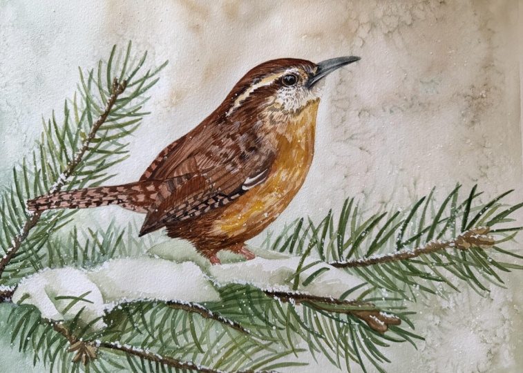
1. Introduction: Hello and welcome to the cozy
winter watercolor tutorial. Today we'll be painting a
charming Carolina wren perched delicately on a pine twig surrounded by a peaceful
blanket of snow. I love the contrast between
the little birds warm brown tones and the cool muted
colors of the background. I think it creates a very
comforting heartwarming scene. Painting captures the quiet
beauty of winter mornings, the soft light, the
hush of falling snow, and that gentle
stillness in the air. Even though the scene is frosty, there is a wonderful sense of warmth coming from
the wren itself. We'll use a soft
harmonious color palette to bring out that
cozy atmosphere. In this tutorial, I'll guide you step by step through
the entire process. We'll start by creating a delicate wintry background using the wet on wet technique, perfect for achieving
that hazy snowy effect. Then we'll paint the pine twig and add snow resting on them. Finally, we'll bring our
little Carolina wren to life, layering warm earthy tones, and adding those
fine details and patterns that make this
bird so expressive. We'll finish the painting with falling snowflakes to
complete the scene, adding that final touch of magic that makes winter
painting so special. Tutorial is suitable
for all skill levels. So whether you're just beginning your watercolor journey or looking to refine
your technique, you'll be able to
follow along easily. Feel free to make it your
own perhaps by changing the background
tones or adjusting the composition to
suit your style. This piece could even make a lovely Christmas card if you decide to
paint it that way. There are so many ways you can adapt it to your own vision. My hope is that this
painting brings you a sense of peace and warmth
as you paint along. So gather your
supplies, get cozy, and let's create this
charming winter moment together. Happy painting.
2. Project and Resources: I've prepared a selection
of helpful resources for your project available in the projects and
resources section. You'll find a PDF file with the supply list I used
for this painting, along with the reference
photo and an image of my finished
artwork for guidance. Line drawings in various sizes are also provided so
you can print and transfer them onto your
watercolor paper in the size that best
fits your needs. I painted it on a 12
by nine inch size. Additionally, there are working
progress photos to help you follow the process and
focus on specific areas. Feel free to explore
these materials and use them to create your own unique
and beautiful painting. Please share your final painting in the projects and
resources section. I also encourage you to
take the time to view each other's work in the
student project gallery. It's always inspiring to
see what others create, and the support of
your fellow students can be incredibly comforting. Don't forget to like and
comment on each other's work. Lastly, I highly recommend watching each lesson
before you begin painting. This will give you a
clear understanding of what to expect at each
stage of the tutorial. If you find this class helpful, I would also greatly appreciate it if you could leave
an honest review. Your feedback will help me
improve my content and assist other students in
deciding whether to join this class.
Thank you in advance.
3. Painting Plan and Sketch Preparation: Before we jump into painting, let me tell you a few words
about the reference photos, how I prepared the sketch, and how we're going to approach the painting
step by step. First, I knew I wanted to paint a Carolina wren
with a wintry feel. I've already painted a few
birds in winter settings, and I really enjoyed
those projects, partly because I
love winter myself. So I already had some ideas for creating a nice composition. My latest winter bird painting
was the winter chickadee, and I thought that composition
worked quite well. This time, my idea
was quite similar, but instead of using
reds and warmer tones, I wanted to go for a
slightly cooler look and include pine branches
like in my cardinal painting. I started by making a few
thumbnail sketches to explore composition options
and to make sure that the idea I had in
mind would work well. I used the Procreate app
on my iPad for this. These were very simple, quick sketches and studies. Eventually, I came up
with something I liked, so I enlarged it and started building a
more detailed sketch. This stage, I needed
some reference photos. I gathered several
images of Carolina ns and a few of pine
twigs covered with snow. Then using Photoshop, I
removed the background from the bird photo and placed
the bird on the twig, which I flipped horizontally to test how it looked visually. Also considered adding
a pine cone like in my cardinal painting or even a red bow to give it
more of a Christmas vibe. But in the end, I decided the pine needles
would already add enough visual complexity and the simple composition would
work beautifully on its own. Of course, if you would like
to add your own touches, such as a red bow berries, a pine cone, or anything else
you think would look nice, feel free to do that and
make the painting your own. Once I was happy with
the composition, I used the bird photo to
trace the pose precisely in appropriate to make sure all the details and
proportions were correct. For the pine branches, I didn't trace anything exactly. I took inspiration from the photos but drew
the needles by hand, so the twigs set exactly
the way I imagined. I had traced the twigs, they might not have looked
natural in my composition, so I patiently drew
each needle and added snow until
the whole drawing felt balanced and pleasing. At first, I made the
left twig a bit shorter. Then I decided to
extend it slightly. I drew all the needles
for those of you who like precision and enjoy following
pencil lines exactly. That said, drawing every single needle
perfectly isn't necessary. Needles are simple shapes and you don't have to paint
them exactly as drawn. You can keep just
the brown parts of the twigs and when the time comes paint loose random needles to give a more relaxed look. I like precision, and I
know many of you do, too. So I left those pencil
lines as a helpful guide. The sketch was ready, I printed it across two sheets. The finished painting
will measure 12 by 9 ", and I'm using an arches
cold press block. I have a block that measures ten by 14 ", which is perfect. It comfortably fits 12
by nine inch composition and leaves some room around the edges for staples and tape. To transfer the drawing, I taped the printed
image to the back of my watercolor paper and
turned on my small light pad. After switching of
the room lights and placing the paper
on the light pad, the lines show through clearly and I can
trace the whole image. One important thing I do
at the very beginning is mark the four corners
of the composition. This makes it much easier later when I place masking
tape around the edges. And now the fun part begins. I trace the entire image
slowly and carefully. It always takes time, especially with all
those middles here, but it's worth it to have
a strong, accurate sketch. I use a three edge pencil, which may sound hard, but it's my favorite, even then the drawing can be a bit dark for my taste sometimes. Make sure to get
all the details, especially the placement
and size of the eye. That's the most important part. And when you finish tracing, check that you can see
all the lines before you remove the printed reference from the back of your paper. If the pencil lines
are too dark, I like to use a kneaded eraser. It's a soft eraser. You can shape and roll
over the drawing to lift excess graphite and lighten
the lines without smudging. When the sketch is ready, I mount the paper on a Gator board and
attach it with staples. I place the staples around the borders outside the
actual painting area, spacing them about 1 " apart so the paper stays
taut and secure. And finally, I attach masking
tape to all four sides. The purpose of the masking tape isn't really to hold
the paper in place. The staples already do that, but rather to create a clean border around
the painting and ensure that the final size
is exactly 12 pin 9 ". This is where those four corners I marked earlier come in handy. They show me precisely
where to place the tape. Now I'm ready to paint. As you can see, I don't
wet my paper beforehand. When I use staples, stretching isn't necessary
because they hold the paper firmly in place
preventing any buckling. We're going to break down the painting process
into a few clear steps. We'll start by painting
the background, and I'm not using masking
fluid for thetorial, so we'll carefully paint
around the bird and the snow. It's quite manageable.
But if you prefer, feel free to mask out
those white areas first. I found the shapes simple enough that masking
wasn't needed. Next, we'll apply the first
wash to the pine needles. After that, we'll
take a little break because after painting
hundreds of needles, we'll definitely deserve it, and then we'll come back and add more details and
even more needles. At that point, we might
feel like giving up, but we won't because
we'll be too far along. Then we'll paint the brown parts of the twigs and add
shadows to the snow. This is the moment
when we'll feel proud. We didn't give up
because the painting will really start
coming together. Next, we'll give
our full attention to the Carolina n. We'll paint it in several stages to make it easier and
not too tiring. Finally, we will complete
the painting with a magical touch of falling
snow and at this point, we'll be very proud of
what we've created. I think the final result
looks really lovely, especially with the
falling snow which always adds that bit
of winter magic. I hope you are feeling inspired and ready
to start painting. Have a wonderful time
creating this piece, and now let's move on to
painting the background. No.
4. Background: Our first step will be
painting the background. It's the furthest
plane in the painting, so it's usually best to start
with what's furthest back. Besides, it would be quite
difficult to paint around the pine needles if we
begin with that element. The background will be
a light internal value, so we don't need to paint
around every single needle. We'll apply color across the entire background and
over the twigs as well. The only areas we will avoid are the bird and the
snow on the twigs. The needles themselves
are dark in tone. So when we paint the background, we can easily paint the needles over the
background color. Later, when we add the
darker green of the needles, it will easily cover the
light background beneath. My plan for the background
colors is to use muted versions of the tones we will use for
the main subject. Muted colors in the
background will help make the main subject
appear more vibrant. Since the ren will be
painted in warm browns, we'll use a muted brown
in the background. The twigs will be green, so we will also include
a touch of green here. In addition, we will
also introduce a bit of blue to make the color
composition more interesting. I think the combination of
soft bluish greens and browns works beautifully together and creates a calm
harmonious palette. For the background, I'll be
using a round brush size 12. You could also use a larger
flat brush if you prefer. Just make sure it's
not too small. You should be able to cover large areas quickly without
overworking the paper. When mixing colors, I always use a separate flat
brush because it's quicker and easier
to transfer paint from the wells to
the mixing area. The stiffer bristles also help pick up more
pigment efficiently. Let's prepare our colors
for the background. Burnt Sienna will be our
main color for the wren. So using it here
for the background helps connect the background
with the subject. The ultramarine blue mutes
the brown, creating a soft, neutral beige brown that will make the wrens worm
tones stand out later. The second mix will be
ultramarine blue and a small amount of warm yellow and I'm using
Windsor Yellow deep. Keep this mix slightly
on the blue side. The goal is a muted, natural green that will connect with the color
of the pine needles. The third mix is
ultramarine blue and Windsor yellow deep plus
a touch of Windsor blue. This one should be more
bluish but still subdued. If it looks too similar
to the previous mix, add a bit more Windsor
yellow deep to the green mix to make a clear distinction
between the two shades. These three mixes will
be our base colors, and we can adjust them as
needed while painting. But we'll paint the background using the wet on wet technique, start by applying a
layer of clean water. You don't need to wet the
entire background at once. I'm beginning with
the upper section on both sides of the bird. This is the area I want
to focus on first. Once that's finished,
I'll continue wetting the next
section as I go. Apply the water carefully
around the bird, but don't worry if you go
a little over the lines. This wash will be very light and the bird will be
much darker later. We will easily cover
any small overlaps. Apply water over the
twigs and needles, but avoid the snow. We want to keep that
pure white for now. When the paper has a nice shen, it's ready for color. I'll start by applying the brown mix on
the right side and then move on to the left side with the
green and blue tones. The goal is to create a soft, dreamy background with gentle
transitions between colors. Wet and wet is perfect for this. I'll also try to keep the area directly behind
the bird slightly lighter so that once we add
the darker tones of the bird, it stands out beautifully against that soft
glowing background. As you apply paint, gently tilt your board to help the pigment flow and
blend naturally. This step is very
important in my process and one of the reasons why
I love using a Gator board. It allows me to move
the painting freely, tilting it in any direction
to control the flow of paint. If your paper were
fixed to a tabletop, for example, this would
be much harder to do. Tilting helps create those
beautifully soft transitions without visible brush strokes. When I paint the background, I like to think of
the brush simply as a tool for delivering
paint to the paper. The blending is done by water, gravity, and the paper itself. On the left side, I will add more bluish tones in the upper
part and the right side, more browns, and in the
lower right, more greens. When I move on to
the lower section, I will wet the next area slightly into the one
I've just painted, so the two blend seamlessly. Down here, I'm using more
of the greenish tones, but I'm still careful not
to paint over the snow. Remember that watercolors dry lighter than they
appear when wet. Right now, the paint
may look just right, but it will lighten as it dries. To get the right final value, I usually paint slightly darker than I want the
end result to be. It might look a bit
strong while wet, but once it dries, it
will be just right. As you can see, the
colors are quite muted, not as vibrant as in many
of my other paintings. This is, of course, intentional. It helps set the mood and makes the main subject
stand out even more. When you place
vibrant colors next to softer neutral ones, the contrast increases
their vibrancy. Add some of the greenish tones
around the snow to create clear contrast between the
white snow and the background. We need to visually
separate these areas, so the background
shouldn't be too light, but also not too dark, especially above the snow. We can also add darker tones under the twigs where there is more shadow and keep the upper area lighter
where more light falls. At the bottom, I
wet the area again, avoiding the snow and drop
in some greens and blues. I'm adding a bit more windsor
blue green shade here. I think it works beautifully. Just make sure to use a very diluted mix as this pigment is very,
very, very strong. There's also a small
area above the snow. I will wet it first and then add soft blues and greens to
complete the background. Again, keep the tonal value
dark enough to distinguish it from the snow but not too
dark that it feels heavy. Once the entire
background is covered, I zoom out to check
the overall look. While the paper is still wet, I may add a touch more
brown or green in a few places to keep those
areas from drying too pale. Then I'll wait a moment until the paper loses its high sheen. It should still be
damp but not wet. And at that stage, I take
a smaller brush size six, dip it in clean water, and lightly spatter a few
drops across the background. The droplets push
the paint aside, creating soft lighter
spots that add texture and interest preventing the background
from looking flat. Now the background is finished. Let it dry completely
before moving on to the next step,
painting the needles.
5. Needles - First Layer: In this part, we'll add the
first layer to the needles. There is nothing
particularly difficult here, but make sure you have enough
time and feel calm and patient because this step
involves lots of repetition. We'll be painting the
same shape many times. As you can see in this
work in progress photo, we'll apply a base layer of
green to all the needles. My background is
now completely dry. I left it overnight. The paper is perfectly
flat. Let me show you this. There are no buckles
or warping at all thanks to the staples holding
the paper firmly in place. When we paint with watercolor, the paper naturally expands
and then shrinks as it dries and this movement
can be quite strong. And when I used to rely
only on masking tape, it often wasn't enough
to keep the paper flat. Since I started using
staples and a Gator board, painting has become so
much more comfortable and the paper always stays beautifully flat after
each layer dries. First, I'll spray a
little water over my paint since they
have dried overnight. A quick misting softens them and makes them
easier to work with. For the needles, our main green will be a mix of
Windsor yellow deep, ultramarine blue,
and windsor blue. This combination gives a
nice balanced green that you can easily adjust by adding
more yellow or more blue. Remember, painting isn't math. You don't have to
match colors exactly. At this stage, I'm not even looking at the reference
photos because my twigs aren't exact copies
of anything specific. I only use the photos for general guidance to get a sense of how the
needles look overall. Let's also mix a darker, slightly cooler shade by adding a bit more windsor blue
and a touch of pains gray. On the other side
of the palette, I will keep some
burnt sienna and a mix of burnt sienna
with ultramarine blue. That gives us a more
muted brown tone. For painting the needles, I will start with a
size six round brush, but I will soon switch to a smaller size four.
Now let's begin. Pick up some of that main green and using the wet
on dry technique, start painting each
needle one by one. If like me, you have a detailed drawing
and enjoy precision. This part can actually
be quite relaxing. If you didn't draw
every single needle and prefer to improvise,
that's absolutely fine. You can even skip this
step or the next one and simply follow the reference
photo or imagination. Don't feel restricted. Paint in the way that feels
most comfortable for you. It's your painting, and you get to make all the
creative decisions. I'm just showing you one of
many possible approaches. While you're painting the
greens from time to time, use a slightly more yellowish or more bluish tone
here and there. This will add depth
and visual interest. Later, we will add touches of warmth by dropping in
small hints of yellow, but even now it's a good idea to introduce subtle
shifts in color. You'll also notice
that some needles are positioned in front
while others sit behind. You might feel tempted to
show that depth right away by painting the needles in the back with a
darker green tone, thinking they should
appear in the shadow. Let me show you an example. Here, the front
needle is lighter in tone and the one
behind it is darker. You might also be tempted
to add extra details, additional layers or even
fine shadows at this stage. I'll demonstrate them here. But in truth, none of that
is necessary right now. In fact, the needles in the back should actually be
slightly lighter in tone, which might sound
counterintuitive at first. But if you look at my
finished painting, you'll see that most of the background needles are lighter than the ones in front. Create that effect later. This approach helps us achieve a more three
dimensional look. Since the needles in the
back are farther away, we can apply the principle
of aerial perspective, though it's slightly exaggerated here as the distance
isn't very large. The idea is that
objects further away appear lighter and often
have a slightly bluish tone. Because they are
further from us, we don't see them as clearly
as the ones in front. And that's why the front
needles can be darker and more detailed while those in the
back stay softer and lighter. At this stage, our
only goal is to apply the base color
to all the needles. My size six brush is
already a bit worn out and the tip has
started to curve, which makes it harder
to paint precisely. I will switch the
smaller size four brush, which actually feels much
better for this task. Again, don't worry about
details or shadows right now. Simply apply the green evenly
across all the needles. Use the wet on dry technique and lay down a flat wash of color, gently shifting it
here and there by introducing some warmer
or cooler tones. When the needles cross, just paint them as you see them. No need to overthink it. This process isn't
difficult or complicated. It just takes a bit of patience. So don't rush, don't stress, and don't put any
pressure on yourself. You don't have to finish
this in one setting. Paint for 10 minutes, 5 minutes, take a break, and come back later. The worst thing you
can do is hurry because as the saying
goes, haste makes waste. Just slow down, relax, and paint each needle calmly. There's no need to rush. Also notice that
the tunnel value of the needles at this
point isn't very dark. It's somewhere in
the middle range, darker than the background, but not at full strength yet. In the next part, we will
add details and deeper tones and this middle layer will
serve as a grade base, leaving lighter areas where the darker shades won't
completely cover the paint. When you finish this
part, take a break, relax, and let everything
dry completely. Once you're ready, come back, and we will start adding depth and dimension
to the twigs.
6. Needles - Details: The first layer on
the needles has dried and now we are ready to add
more details and shadows. After this stage,
the needles will already start to look
more three dimensional, but the real magic
happens in the next part. We'll get there
slowly step by step. My process is usually the
same for everything I paint. First, we add the basic colors. Second, we add darker
tones and shadows. And third, we make adjustments at details and bring
everything together. Let's move on to the next step. I'll be using the same
small brush size four because I feel comfortable with it and it works well for this. I'll also start with the
same color we used before. As I build up the layers, I'll see if the tone is
dark enough or if I need to adjust it with a slightly
darker mixture. We'll see. Begin with the green mix
and start adding shadows. At this stage, we have
two main objectives. The first one is what
I'm doing right now, adding darker tones to the needles to make them
look more realistic. I'm focusing on
two areas mainly. The first is near the
brown stem of the twig, which should be a bit darker, and the second is along
the edge of the needle. By painting a darker
line along one or both edges while leaving the
middle with the base color, we create that
characteristic needle form. Don't overthink it. The idea is simply to add darker
tones here and there, which will enhance realism. I'm using a darker mix
of Windsor yellow deep, ultramarine blue,
and Windsor blue to add shadows to the
needles in the back. This creates the illusion of needles tucked behind others. However, as I mentioned earlier, you'll also notice that
needles in the back will also have lighter tones to create a soft misty dimensional effect. You can see how the first layer we applied earlier
is helping now. That initial layer forms the lighter areas
of the needles, allowing us to focus
on the darker shadows. The slow process of layering transparent washes is exactly why watercolor
looks so beautiful. The interplay between layers
and the gradual buildup of colors and tones creates
a unique luminous effect. Next, pick up a light, bluish green tone
and use it to paint simple silhouettes of
the needles in the back. This is our second
objective for this part. First, add the darker
tones and details, and then second, paint the lighter needles
in the background. We don't need pencil
lines for this. The shapes are very simple
and the goal is to fill in the spaces between
the darker needles to create a sense of density. Because this is a
very light tone, we don't need to be precise. We can paint over
the needles we've already painted as
long as they are dry. If overlaps occur, that's fine. It can create a nice
effect or we can go over the darker needles
again to refine it. Continue adding darker tones to the foreground needles and lighter shapes to the
background needles. That's all we need
to do at this stage. It's not difficult,
but it does require patience since there are
quite a few needles. One additional thing
to keep in mind is the darker area below the snow. If you look at the work in progress photo or
the final painting, you'll see that I darkened
these areas significantly. This helps because the
twig casts a shadow, and darkening these areas makes the painting more realistic.
It has more depth. It also creates a nice contrast with the light
snow on the twigs. So while painting the needles, make sure to darken the
areas beneath the snow. Don't forget the needle poking
through the snow as well. I don't think it's necessary
to show every single needle, so I will shorten this part. You can always
refer to my work in progress photo or the finished
painting for reference. Once the needles are painted, there is one more thing that we can do to make them
look more interesting. Pick up some Windsor
yellow deep and apply it to a few random needles to
warm up their color slightly. This adds a touch of warmth and makes the needles more colorful. You can also mix the yellow with green to get a
warmer green tone. This also helps
connect the color of the needles with
the bird itself, which will have warmer tones. Creating these color
connections is important for a cohesive painting and
harmonious color scheme. While applying the yellow, take a moment to look
at the painting and decide if you want to make
any other adjustments. For example, I wanted more blue, so I added a light tone of Windsor blue to the left corner. Now, I think it looks a bit
more interesting and fresh. The needles look nice, especially with the lighter
shapes in the back. The twigs will become
even more beautiful after the next part where we will add the stems and
paint the snow. Let's move on to the next step.
7. Stems: The needles are finished. Now, we can always make some
adjustments later if we need to darken some areas
or add more needles. But for now, let's
consider them done. Next, we'll add the brown
parts of the tweaks. I'm not sure what
the correct term is, so let's call them stems. Adding them will make the
twigs look much more complete. We'll use the brown
we prepared earlier, burnt sienna and the mix of burnt sienna with
ultramarine blue. Since the paint has dried, I will add a little water and more paint to reactivate it. I've also decided
to add a touch of Windsor yellow deep to warm
up the brown slightly. I'm still using brush size four. Start by applying
various shades of brown to the first
stem on the left. Begin with a yellowish brown, an ochre tone, and then add
other browns in random spots. The goal is to create color variety so it
doesn't look flat. This is just the base layer, so don't worry about details, lay down the basic colors. Let's continue painting
below the tail and at the bottom at a
slightly darker tone. I recommend drying
this first layer quickly with a hair dryer. Once it's dry, we can
add details immediately. When dry, take the darker brown, burnt sienna with
more ultramarine blue and use it to paint the shadows. Focus on darkening the
right side of the stem, keeping in mind that the
stem has a brown form. In random spots, paint
short arc shaped lines to the opposite side to suggest roundness
and create texture. This is quite an
intuitive process. Simply add darker tones loosely. The goal is to give
the stem depth, make it look a bit
more realistic, and make the needles
appear attached to it. Adding the darker
tones to the stem may reveal that some needles
are still not dark enough. This is a great moment
to adjust them. Use a darker green to deepen
parts of the needles, so the whole twig reads
as one cohesive piece. We'll repeat this process
for all the other stems. First, apply the base layer, a warmer, more yellowish
brown, and once dry, add shadows and texture with the darker brown and make any necessary adjustments
to the needles. At the tips of the stems, there are small shapes
that look like petals. We don't need to spend too much time or add a
lot of details here, but we can add some shadows
to suggest the center. There's no need to
focus heavily on these. They are not critical. The main goal at
this stage is to darken the stems
and add texture. To do this, place many
short brush strokes close together using just the tip of the brush with a
dark brown tone. Also make sure the tone of the
needles matches the stems. If the contrast between the brown stem and the
needles is too high, darken the needles near the stem to unify
the tonal value. This is done intuitively adjusting everything
until it looks right. If you're unsure, you
can always reference my finished painting for guidance and try to
recreate what you see. Now the twigs are finished
and in the next part, we will paint the snow.
8. Snow: You may be wondering, how can we paint snow if it's just white? Actually, white subjects
have a lot of colors, and snow is no exception. I love painting white
flowers or snow because the key is
focusing on the shadows, which are always colorful. White snow reflects colors
from its surroundings. So to paint the snow, we focus on painting
the shadows, using the colors
from the background, the twigs, and the bird. Before we begin, I'd like to soften the edges
of the snow folds. This, I will use
my scrubber brush, a Windsor Newton galeria
brush size four. I dip the brush in water, remove the s on a paper towel, and gently rub the edges
to reactivate the paint. Then I dab the area with
a paper towel to lift the paint and create
a soft smooth edge. This step isn't
strictly necessary, but I think it adds a nice softness and makes
the snow look more delicate. Now, I'll switch to
a brush size eight. I'll pick up a very light
turquoise from my palette, the same color I used for the needles and start
adding shadows. I'm imagining a shadow on the left side of the first fold. We can also add a touch of
brown since we used it for the twigs and it will also
appear later on the bird. I want to create a shadow that separates one snow
fault from the next. I always start with
a very light tone, and once I'm happy with it, I look at the overall painting and decide if the shadow
needs to be darkened. If so, I drop in a
slightly darker tone. Since the paper is already slightly wet from
the first layer, the darker color
will gently spread. If any hard edges
form, I soften them. I try to keep the upper
part of the snow white, focusing mainly on the shadows. An The third fold also has more shadow
on the left to create a clear distinction
from the middle fold. There is a bit more shadow here because there is a
beard just above it. I will also add more
brown to this fold as well to harmonize with the
bird and the brown stem below. We also have needles
poking through the snow, which we can't forget. I think of these spots
as little pockets. The birds legs are hiding
in some of these pockets. To add dimension and create the illusion of folds
and indentations, we also paint shadows here. This suggests the subtle dips in the snow where
the needles emerge. With that, we can
finish the sport. Everything looks
really nice now. It might not have looked
good in the beginning, but I've learned not to charge any painting
before it's finished. Usually, by the end, everything comes together often even better than expected. Next, we'll apply the first
layer to the bird. Oh
9. Bird - First Layer: Finally, we can begin
painting the bird. As you can see in the
working progress photo, we'll start by applying an initial layer to
the entire bird, leaving only the white areas, the eye, and the beak untouched. We'll do this in two steps. First, we'll apply
brown to the wings, tail, back, and head, and then after
drying that layer, we'll apply a more yellowish brown to
the chest and belly. Let's begin. I'll be using a brush size eight
for this part. First, let's prepare our colors. The base brown is, of course, burned sienna, but it's not enough to
cover the whole bird as it's a very warm
reddish brown. We also need
something more muted. To do this, we'll mix burned sienna with ultramarine blue, keeping it on the brown side. Be careful not to
add too much blue or this mix will
neutralize and turn gray. Next, I'll prepare
a yellowish brown by mixing Windsor yellow deep with burnt sienna and then muting it slightly
with ultramarine blue. Since there is
yellow in this mix, we have to be careful
not to create green, adjust with Mlburn sienna, yellow or blue until you get a tone similar to yellow ochre. I actually have this color
premixed on my palette, but I rarely use it anymore
since I can mix it easily. Finally, we'll prepare
a very dark mix by mixing burnt sienna, ultramarine blue,
and pains gray. This will act as our black
for feather patterns, the eye, and the beak. Now let's pick up
the second mixture, the muted brown, which I
think will be a great base. We'll use it to paint the
upper part of the bird. Using a simple wet
on dry technique, start from the top
of the head and cover the head back,
wings, and tail. Where the brown meets, the white areas create irregular uneven edge to
suggest feathery texture. Don't worry about details yet. This is just a foundation layer. While applying this brown, don't hesitate to introduce other brown shades
for more variety. I'm dropping in a darker brown on the areas I've
already painted. This technique
called charging adds natural variation while staying
within the brown family, so everything will harmonise. I'll continue applying
the second brown mix. On the wing, I will add
a bit more burnt sienna. After painting the
brown up to the tail, I will pick up the dark brown and drop it onto the
tip of the wing, letting it blend naturally. I'll also drop it in
a few random spots. This works only while
the paint is still wet. If the surface starts to dry
and the sheen disappears, stop adding paint
to avoid blooms. Finally, with a clean de brush, gently smooth the
edges of the brown. Next, dry this layer with a hair dryer or let it dry
naturally if you like. We want the brown
to be dry before applying the yellowish brown
to the chest and belly. For the chest and belly, use the yellowish brown mix. You can incorporate other
brown shades for variation, but the main color should
be this yellowish brown. Start at the upper part
with a very light tone, and then fill in the rest. Leave the cheeks white
areas untouched. We'll add patterns there later. I'll also pick up just a touch of quinacrodon red for the legs. If it blends slightly with
the brown, that's fine. We just want to suggest that the legs are a
bit more reddish. And that's it for this part. Let everything dry and
when you're ready, we can move on to
adding the details. I'll dry this first
layer with a hair dryer and let the paper cool for a few minutes
before continuing.
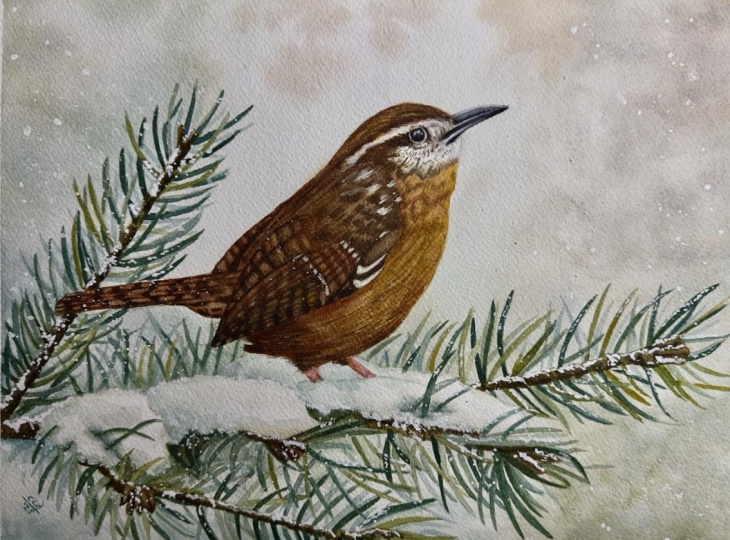
10. Bird - Wing: Here you can see the bird
after I added all the details. This part took me around an hour and I painted
everything in one go. However, I don't want to overwhelm you with
such a long video, so I decided to divide this
section into several parts. That way, after each part, you can take a break and continue painting
whenever you're ready. Most importantly, don't rush. Nobody's chasing you. There is no competition
and no deadline. Highly encourage you
to take your time, relax, and enjoy creating
these beautiful patterns. You will thank yourself
later for not hurrying. I'll be using a brush
size four for this part, and we'll focus on
painting the wing. I don't think we
need any new colors. The four paddles already on
my palette will be enough. I will go over each one to
remind you of the mixes. Upper left, burn Siena, upper right, burn sienna
with ultramarine blue. Bottom left, winds
are yellow deep with burnt sienna and a touch
of ultramarine blue, and bottom right, burned sienna with ultramarine
blue and paints gray. Now pick up the dark brown and let's start
painting the wing. First, let's create
long dark lines to separate each feather. These lines naturally indicate the length and direction
of the feathers. I'm using the tip of my brush
to get thin, precise lines. I also want to
mention that I don't follow the reference photo 100%. Of course, I look at it, but if I paint something slightly differently or
in a different place, I don't stress about it. Nobody will be comparing your painting to the
reference photo, so there is no need
to worry about getting every detail
perfectly right. Once I have the basic
structure of the feathers, I use the same dark brown color to paint the dark spots on them. I take a quick look at the reference photo to get a
general idea of the pattern, but I don't try to recreate
every single spot perfectly. I'm just randomly painting these dark shapes
on each feather, leaving a small
gap between them. Above this pattern, there is another area with a
slightly different texture. What stands out there are long lines that create
visual texture. So I start by painting many of those lines in the
correct direction. I also add some darker spots and gently blend
everything together. A little higher up, there
is yet another pattern. I start with the darkest color painting slightly
curved shapes. Then add lighter brown along
the right side of each spot. Finally, I rinse and
blot my brush and then use the tip of a clean de brush to
smooth everything out. This is another way to create soft blended patterns
on the feathers. If possible, I like
to first paint or draw the contours
of the feathers. These contours often
also act as shadows, giving us clear distinct
shapes to work with. You might notice in the
reference photo that there are some white spots on the
feathers and white feathers. I don't worry about them yet, and they are tiny details that I will add later
with white quash. This is much easier than carefully painting
around them now. The dark lines dry
quickly because we are working in small areas with
the wet on dry technique. Once they are partially dry, we can go back and
add more color. Here I'm adding Mlburn sienna
to warm up the feathers and a touch of quinacredon red to introduce an even warmer hue. While the paint is still wet, I pick up some dark
brown and drop it in to create soft
spots on the feathers. The wet surface allows these
spots to blur slightly, which is exactly what we need. I also return to the area with long lines to add more of
them and enhance the texture. As you can see, even on
the small wing area, there are many
different patterns and textures and various
ways to approach them. It's important to
capture at least some of these details here and
later around the eye because these elements
are characteristic of the bird and focal
points in the painting. Paying careful attention will make the bird look
realistic and lively. I think now we can take
a break and after that, we will move on to
painting the tale, which will be much simpler.
11. Bird - Tail: Okay, let's continue painting
and move on to the tail. Start with the dark
brown and draw long lines first to create a
structure you can build on. We want to separate each
long feather to have clear shapes that we can
later fill with patterns. I will really simplify
the pattern here. In the reference photo, the transitions between
colors are very smooth with soft gradients from
dark brown to lighter brown. Technically, we
could achieve this by applying a lighter brown first and then dropping in the darker brown while
the paint is still wet, allowing it to blur naturally. However, I've chosen
to simplify and use just wet on dry
technique for this pattern. I didn't try to soften the edges to match the
reference exactly. I left the hard edges because
I think they look nice. This pattern reminds me a bit of the pattern I painted
on the Blue Jays wings. But here, the edges of the
dark markings are more jagged, which I think looks more
natural for this bird. Right side, I switch to burnt sienna to shift
the hue slightly. I'll also simplify this area. Although I can see a slightly different type
of feathers there, I'll continue the pattern from the tail to keep it cohesive. And that's it for this
part, short and easy. Now let's move on to something
slightly more challenging.
12. Bird - Back and Head: In this part, we're going to paint the back and head area. So we'll also partially
go over the wing again. I always start with the shape that stands out the most to me. In this case, it's
the dark shadow. Once I have that, I will paint the pattern on
the back feathers, which is the same pattern
we painted on the tail. Now, let's pick up
the main brown mix, burn sienna with
ultramarine blue and start building a
different texture here. Begin by painting many long
lines one next to another. It's okay if they
blend together. Don't worry about
that. The small gaps between the lines will
naturally suggest texture. You can also vary the
colors as you go, bringing in more burnt
sienna to warm up the brown. When we move onto the wing area, pick up a darker
brown and create feathery textures by placing many short brush
strokes close together. As I paint, I imagine
fish scales with their arched shapes or shell
shapes placed side by side. Each line creates a
little fan shape. Each of these shapes
represent a small feather. Normally, a feather
would have a line in the center with brush
strokes radiating from it. But here we only see the tips, so the lines are
almost parallel. By placing many short
lines along with slightly longer lines near the white areas on the back
and on the top of the head, we create a nice variety
of visual textures. Each one suggests a
different type of feather. Is this anatomically correct? Not really, but we're not scientists, we're just painters. Our goal is to convey the
impression of feathers and simple lines are enough to capture the
essence of the bird. It's very important to follow the correct direction
of these lines. Imagine painting
over a real bird. Horizontal brush strokes
wouldn't make sense. Feathers grow from
top to bottom, and they bend and curve, so I follow the natural
form of the bird. Oh. I'm also picking up
a tiny amount of yellowish brown to add a few random brush strokes
in the white areas. Since we're near the eye, I think we can apply the
first layer straightaway. We need two layers for the eye. So let's start with
this initial layer. There's a dark ring
around the eye, so suggest that shape first. Then apply dark brown
to the iris and pupil, leaving the white area in the upper part for
the highlight. This highlight is
very important. Later, we will
darken the pupil and add some blue reflections
in the highlight, which will bring
the eye to life. Even now, it already looks nice, but the details will
enhance it further. Finally, let's add tiny dots or very short brush strokes around
the eye and on the cheek. This adds another
interesting visual texture that makes the bird so engaging. And with that, we can
finish this part. We'll continue in
the next section.
13. Bird - Chest: Let's continue moving
downward to the chest. At the top, we want to create
a smooth transition from the tiny brush stroke pattern to the scale like
shapes on the chest. Nothing too complicated, just a few simple
lines to prevent the transition from
being too abrupt. Now we can pick up
our yellowish brown and start painting
the chest and belly. Here we also want to create texture but slightly
different from the back. I'm using short
brush strokes again, but these brush marks are a bit larger and
overlap each other. If we place many of these strokes in the
correct direction, they will create the impression
of feathery texture. The small gaps and
the transparency of the brush strokes build up
a delicate layered look. As we paint, we also need to vary colors and tonal values. Keep in mind that the area under the wing and at the
bottom is in shadow, so we will use
darker tones there. Once we cover the whole area, the upper part will
likely be drier, and this is perfect
because we can go back and add another
layer of markings, enhancing the texture even more. We don't need to paint each individual
feather meticulously. That would be hyperrealistic. We're painting realistically, but leaving some room
for interpretation. Combining looser areas with more detailed parts creates a nice balance between
precision and freedom. Now you can take a
break if you like, or if you're eager
to finish the bird, we can move on to the
next part straightaway and start adding details.
14. Bird - Beak and Eye Details: Now, we can begin with the eye. First, pick up a small amount
of ultramarine blue on the tip of your brush and carefully apply it to
the highlight area. If the blue is too strong, you can lift some paint
with a clean de brush. This blue adds a clean, fresh touch and suggests a reflection of the sky
which we can see directly. Allow the blue to
dry completely. While we're waiting, we can also add some blue to the beak. I'm using the same
ultramarine blue but muted slightly with
a tiny touch of brown. Apply this blue to the
upper part of the beak, starting along the lower edge
and smoothing it upward. This creates a subtle
tonal transition from darker blue at the bottom
to lighter blue at the top. Use the same blue on the
lower part of the beak, but apply it only in
the middle section, leaving narrow white
areas for highlights. I will also add a little bit of quinacridon red mixed with brown near the tip of the beak. By now, the eye should be dry. Pick up a very dark tone, more ultramarine
and paints gray and carefully paint the pupil
working around the highlight. You might have thought the
eye was already dark enough, but adding this layer
brings it to life. Next, pick up a bit of brown and add it to the
ring around the eye. Finally, using your very
dark brown or black, add a few finishing touches. Define some areas
around the eye, a tiny short brush strokes in the eye reflection to suggest three reflections and add a few dark marks on
the feathers nearby. These small details increase contrast and give
the bird character. Now, let's finish the beak. First, draw a line separating
the upper and lower parts. Then use a darker
blue ultramarine blue mixed with some brown to darken the upper
part of the beak, especially in the corner. Smooth it upward to create a transition to the
lighter blue at the top, making sure to leave the narrow white edge at
the bottom as a highlight. If you lose it, you can restore it later
with white guash. Apply black to the lower part of the beak and blend slightly. I also added a few dark spots
I noticed in the reference, and that completes the Bk. Next, let's move to the legs
and add some details there. Use brown to add some feathers above the legs with simple
short brush strokes. Then mix a pinkish tone
with quin acrodon red, a bit of blue and brown. Apply this color to suggest
shadows on the legs. You don't need to match
the color exactly. Pick something that
looks natural. Finally, zoom out and
assess the whole painting. At any finishing touches
you feel are needed. For example, I decided to add a few more
dark brush strokes to suggest additional texture and dark feathers
below the wing. And with that, we can
call the bird finished. I think it looks
great in the scene. At this point, the painting
could be complete, but if you want to add
a magical wintry touch, we can move on to the final
part and add more snow.
15. Falling Snow: Here we are in the final
very rewarding part. We're going to finish
our painting by adding falling snow and a few
highlights with white guash. I'm using Windsor
Newton white guash. I'll squeeze a little
bit onto a piece of colored paper so I
can see it better. First, I mix a bit of
our yellowish brown with the white guash to
create a creamy opaque color. Using a size four brush, I can add lighter whitish
spots on the wings. We can use this color to suggest lighter feathers
here and there, or to fix highlights
if, for example, you accidentally covered part of the eye with too
much dark paint. You can now paint the
highlight in the eye. You can also use it to add
subtle highlights on the beak. We can also use white
guash to create snow on the stems and needles. I place many small spots
in random areas which instantly adds interest and enhances the wintry
mood of the scene. Using white gouache
can be tricky because the consistency
is important. If it's too watery, it
becomes transparent. If it's too thick, it's
difficult to paint with. When gouache dries and
appears less visible, don't worry, that's normal. I usually means that there was a little bit too
much water in the mix. Can simply go over
those spots again. Ideally, the gouache should
be thick but still workable. I lightly dampen my brush just enough to make
the paint manageable. After adding guash intentionally
in specific areas, I like to randomly
spatter it across the painting to create the
impression of falling snow. First, I cover the
bird's head and parts of the body with small pieces of paper to protect those areas. This prevents accidental
large blobs of gouache on important
details like the eye. If we want, we can
always later add some white spots intentionally
in those protected areas. Next, I will use a
large brush size ten with a slightly more
watery consistency of guash. Holding another brush
in my left hand, I tap the brush with
guash on its handle. This creates many small drops on the paper simulating
falling snow. The height, you hold the brush and the consistency of paint
will change the effect. Experiment to see
what works best. If no dots appear when tapping, your guash is likely too thick. Dip the tip of your
brush in a little water. And try again. Continue until tiny white dots start to fall. Add as much snow as you like. You might wonder
if you could just paint each dot individually. Of course, you could,
but it would take ages and look less natural. We can actually add a
few larger spots in random places to introduce
variety in snowflake sizes. A Once you're happy with the snow, remove the protective paper, sign your painting,
and admire your work. Congratulations. I hope
you enjoyed this process, and you're happy
with your result. In the final part, we will do a quick recap of everything we've learned
in this tutorial.
16. Summary: Thank you so much
for joining me in the Carolina Rn winter
watercolor tutorial. I hope this project brought you as much joy as it brought
me and that you feel proud of your
progress and inspired to continue exploring
watercolor techniques. Before we wrap up,
let's take a moment to reflect on what
we've learned together. We started with thumbnail
sketches, tested compositions, digitally and
carefully transferred the final sketch onto
watercolor paper. The bird was traced
accurately while pine needles were left
looser for a natural look. We painted a soft muted
winter background using wet on wet technique, blending browns,
blues and greens. Light behind the bird was
preserved to make it stand out, establishing depth
and atmosphere. Layered green tones and varied brush strokes
created realistic needles. You practiced building
texture, depth, and natural looking clusters without overworking the paper. Brown stems and shadows
enhanced realism. Snow was painted with
subtle colored shadows and folds to suggest volume and
reflect surrounding colors. We painted the bird in stages. First layer warm browns and
yellowish tones for the base. Then we painted wing and tail, simplified feather patterns
with realistic texture, then back, head, and chest, varied brush strokes and tonal values for layered feathers. We added reflection in
the eye, details shadow, subtle color transition to
bring the bird to life. White gouache was
used for highlights, whiter feathers and
spattered snow. You practiced
controlling consistency of white gouache and creating a natural random effect for
a magical winter finish. This tutorial combined
planning, layering, texture, and fine detail to create a harmonious
winter scene. You practiced balancing
precision with freedom, building depth and
bringing a small, lively subject to life
within a snowy landscape. I hope this painting gave
you a sense of calm, focus, and creative joy, and that it inspires
you to continue exploring the beautiful
possibilities of watercolor. Take care and happy
painting. Bye
 Krzysztof Kowalski, Watercolor artist