Transcripts
1. Introduction: In this painting class, we will explore seeing the world in blight, vivid tones and creating artwork. My step by step method
ensure no confusion. By the end, each
person's artwork emerges as a distinct
and unique creation. The beauty of this style lies in its ability to
produce diverse results. Even when everyone starts
with the same image and colors, by the time you finish, you have a colorful piece of art that truly reflects
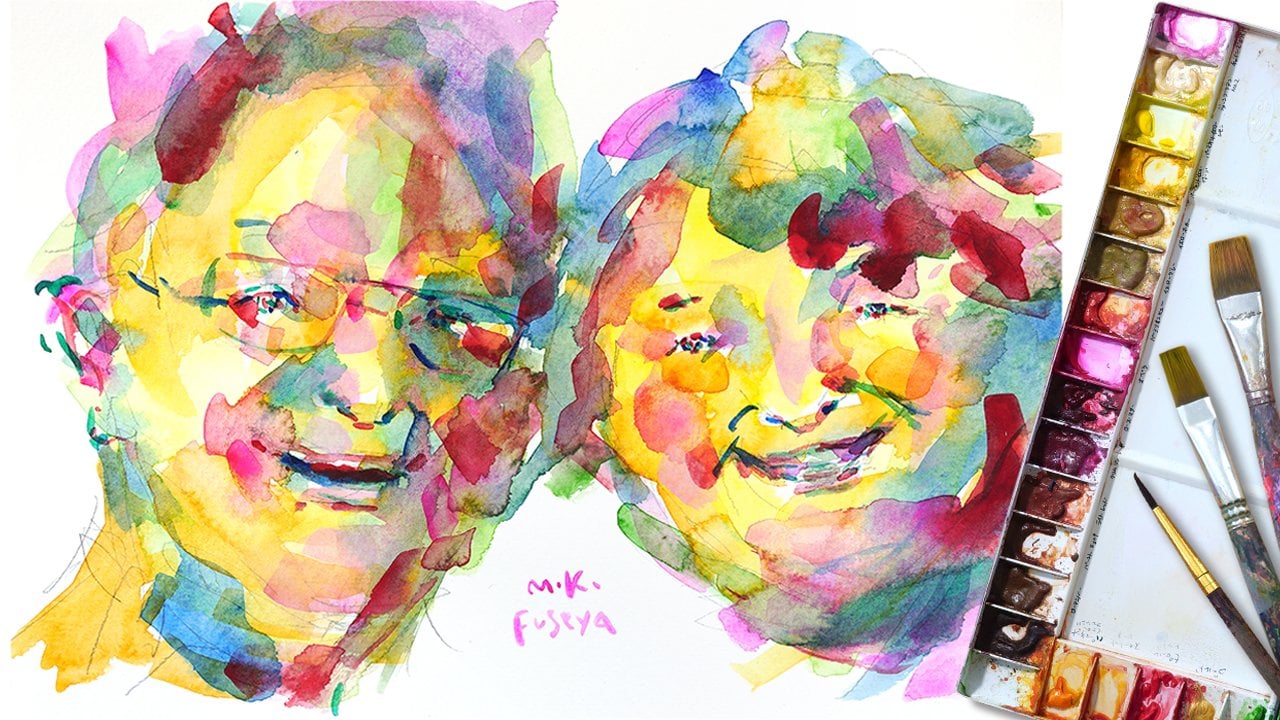
your personality. Hello. My name is Miki. For over 20 years, I've been painting in
this colorful style, which is characterized by
dynamic brushstrokes in vibrant, abstract colors,
and has a special way of brightening people’s spirits
and energizing spaces. I manage a rental art service that exhibit my
paintings in office, hair salons, homes, and clinic. And change every three months. Each time we rotate the artwork, the environment is
revitalized and the vivid, dynamic art has a powerful
impact on viewers. I hold exhibition
annually in Japan, my home country, and in Germany, where I currently reside. And my landlord ordered me
a painting to put their door, and it fits perfectly with their terrace, adding a splash of
color to their life. I also hold painting lessons
and participant in market, where I paint portraits and sell my art. My work is appreciated by
many people regardless of nationality and continues to inspire and uplift
those who encounter it. Whether you are beginner
or experienced, you'll find that handling the vibrant palette in this class is mood
lifting experience, allowing you to try a new style of art in a fun and
accessible way. In this class, I will guide
you through the process of understanding and
distinguishing between light and dark colors, transforming them into
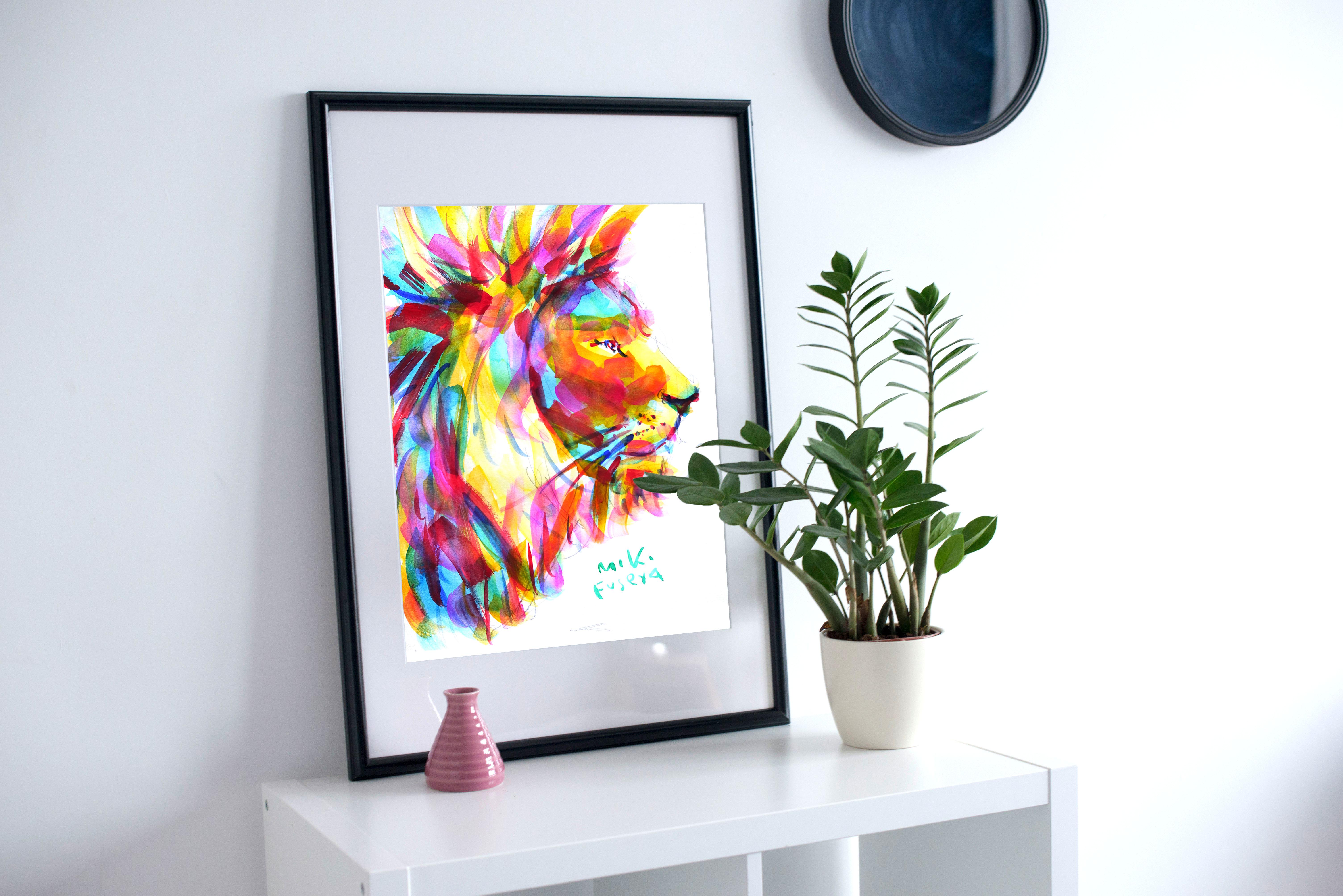
vibrant and lively artworks. By the end of the class, you can create a beautiful, colourful artwork of your own. Your artwork can brighten
your daily life, be printed as a postcard
to send to your friend and family or even be used
as a social media icon. Please share your finished
artwork in the class project. Viewing your artwork
objectively will help you discover a
new side of yourself. Embrace the difference
among the works of other participants and enjoy the creative journey together.
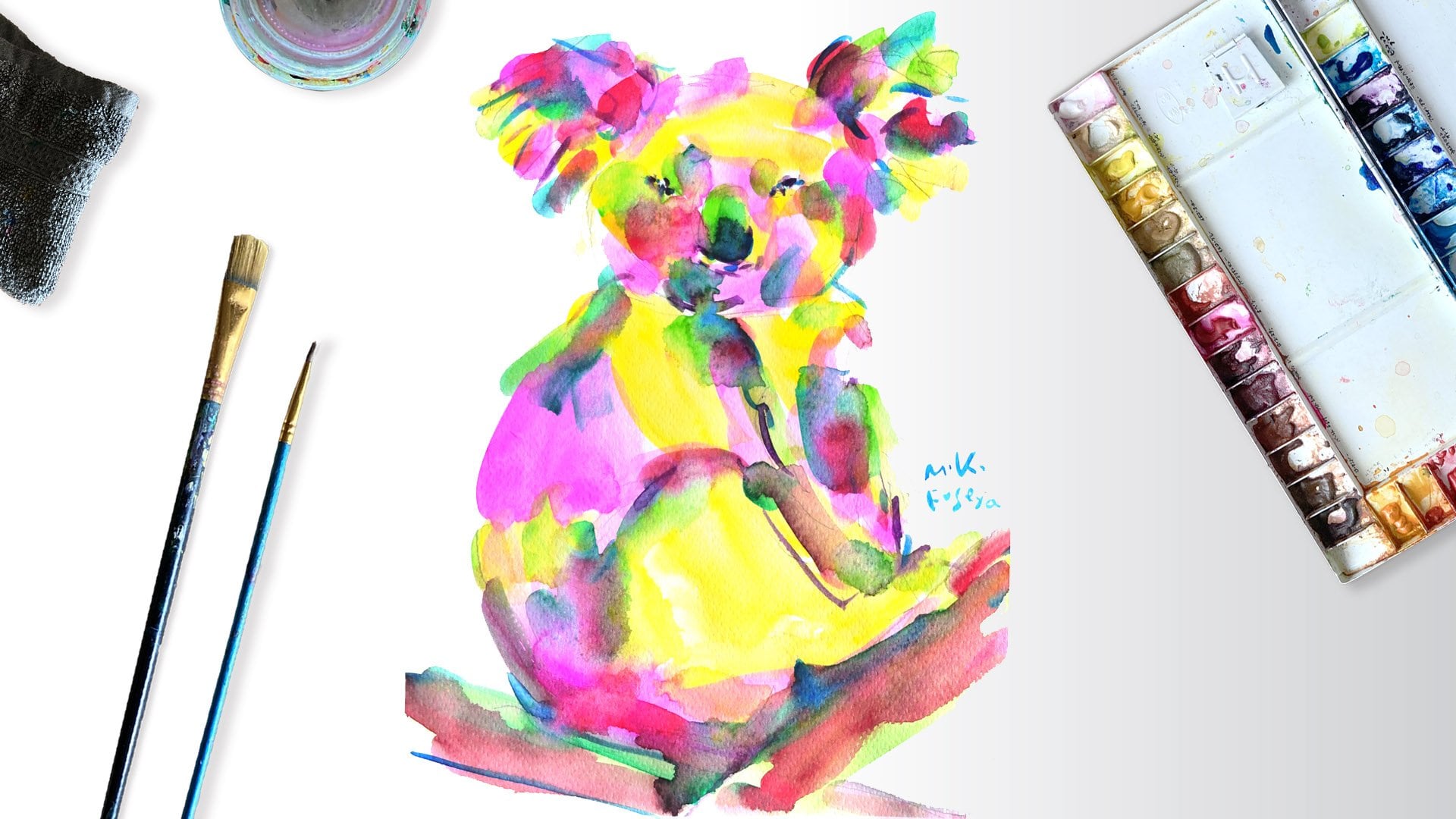
2. Project: Welcome to the class. I'm
so happy you are here. My style is all about using vibrant colors and not worrying too much
about the details. So you can relax and
enjoy the process. By following along with the
colors I use one at a time, you're finished with
a stylish painting. Of course, you're free to experiment and add
your own flare. Use your imagination to
create something unique. You can download the
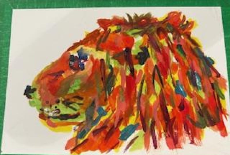
reference photo of the lion. You can find it Project & Resource tab. Don't worry about replicating
the photo exactly. Feel free to adapt
it as you see fit. If you find it challenging, you're welcome to use
my sketch as a guide. My sketch is also available
in the same section. In this class, we are
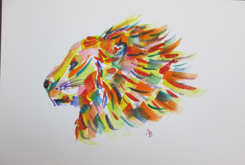
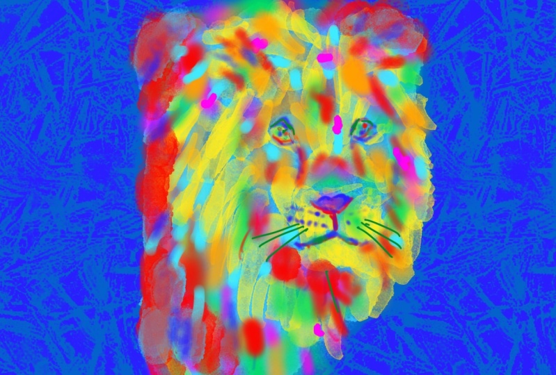
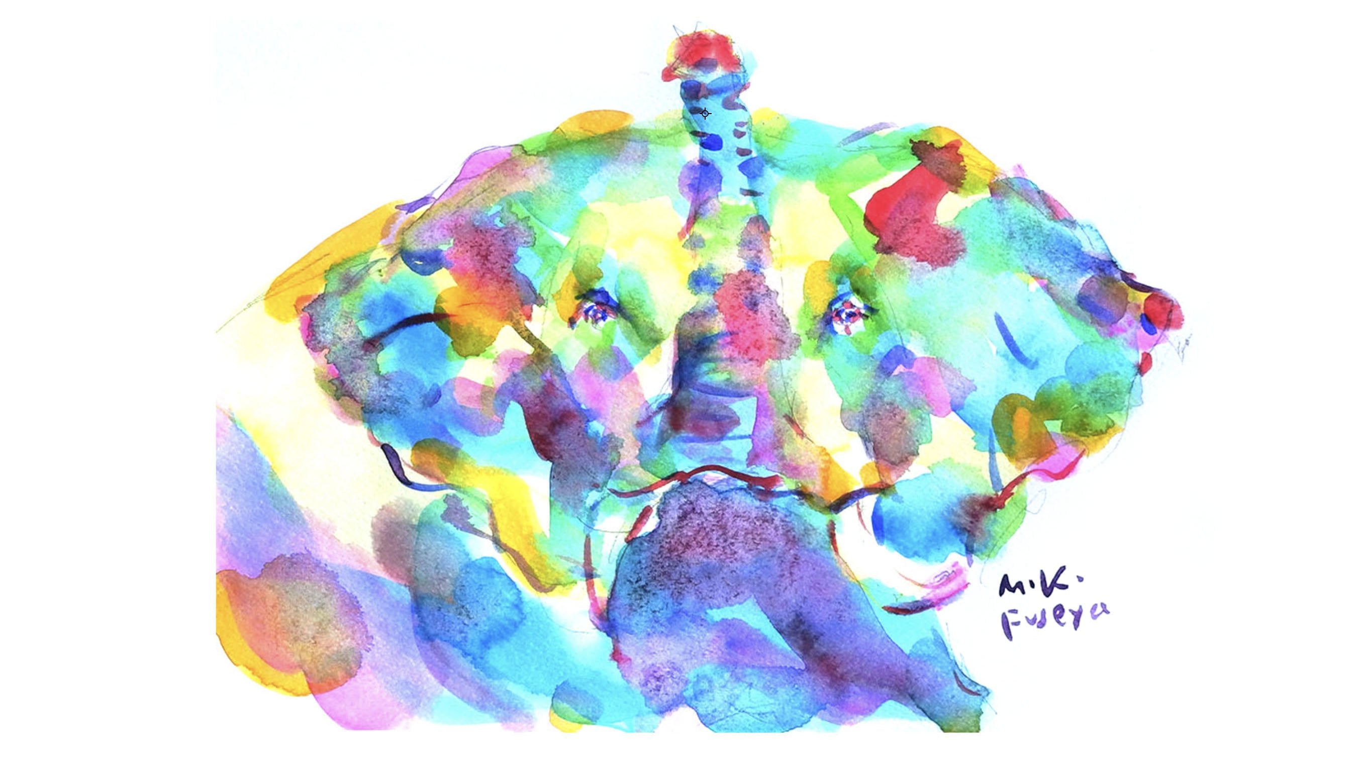
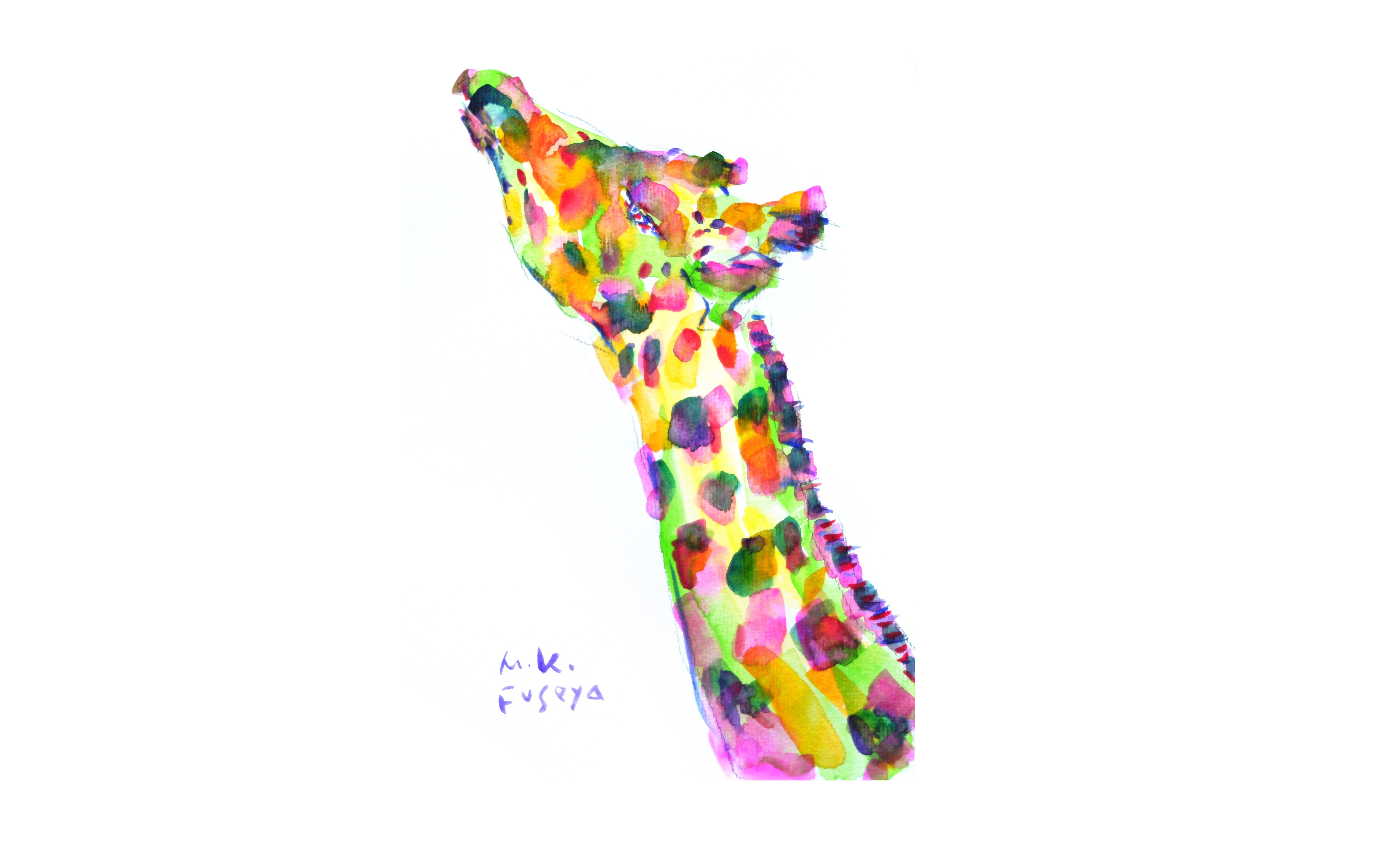
focusing on lion, but in my other classes, we explore various
subjects like animals, flowers, and even couple who are my landlord here in Germany. I encourage you to
experiment with different subjects in this
car colorful, vibrant style. No matter which
project you choose, I'm eager to see your results. If you have any feedback, don't hesitate to
share it with me. Once you finish your artwork, scan it to a take a photo, and upload it to the
Student Project Gallery. To do this, click the Create Project bottom located on the Project & Resource tab. You'll be taken a page where you can upload
your artwork. Don't forget the title
and description. I'd love to hear about
experience during this class. After uploading your project, take a moment to explore the
works of other participants. Enjoy seeing how
each person's art is different from yours. I encourage you to like and comment on their
works as well. It's a great to enjoy together. Your artwork has the power to inspire and bring joy to others. In the next lesson, I will
explain how to recognize light and dark contrast
and convert it colorful way. which is a key feature
of this class.
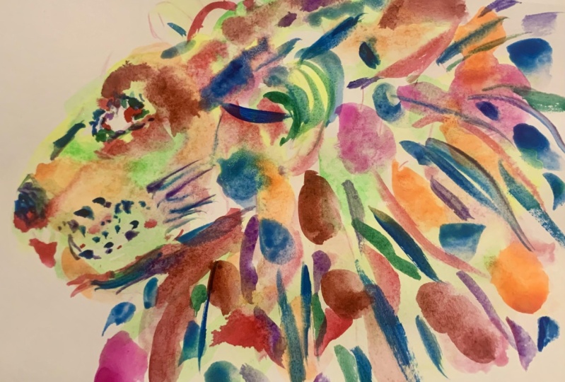
3. Light and Dark contrast: This lion is painted in my colorful style. This is the image
photo of the painting. The colors might seem to be applied randomly. However, if you convert this into a monochrome, you'll notice that the balance of light and dark area
is quite similar. The areas where the light
hits such as a bridge of the nose and the front of the
cheek bones were blight. While the side of the
face and the mane and around the eyes,
where shadow area, were dark. In this class, we will use yellow, light blue, orange, yellow-green, pink, red, dark-green, purple, and dark-blue. When I convert them to monochrome, you will see that each color has its own brightness level. Even if you use
different colors from what you see and paint
them in a colorful way. by roughly matching the brightness of the original photo with the brightness of the colors, you can create a three
dimensional appearance. Another key point of
my style is the eyes. Instead of using just one color, use multiple colors while
leaving some white pots. This gives the effect
that looks sparkling. These are the key points of my style. In next lesson, I will explain what we need
for this class.
4. What We Need: I guide you through
the materials. you'll need to create a colorful lion. Watercolor Paints. I use this Holbein watercolor
paint, a Japanese bland. I like this vibrant colors
and smooth blending. However, feel free to use any watercolor paint you have at home, even children's paints. Palette, this is my palette, filled with a variety of colors. For this class, we'll focus
on using just nine colors. Any palate you have will work
or you can use pan paint. If you are missing some
colors, don't worry. You can mix your own or
use different shades. Brushes, in this class, we will be using
just two brushes, a large flat brush
and small round brush. I use A4 sized paper, which a large flat blush being the size number 16 and a
small round blush size 0. Choose the brushes that suit the size of the paper
you'll be using. If you have already have brushes at home,
start with those. Paper, I use paper that is 300 g/m². The artwork you produce will
reflect your subconscious, offering insight into your
inner self. Pencil & Eraser, Those are likely item you
already have at home. Water dish. This is for
cleaning your brushes. You don't need anything special. An empty bottle from jam, chocolate, or honey
will work perfectly. Close, Use this to dry your
brushes after washing them. An old cloth or kitchen paper you have at home
will do just fine. Reference Photo, I use
reference photos. when I paint inspiration for shapes, shades, and overall atmosphere, I usually keep the reference on my iPad, but you can print it out
or save it on your mobile. While my painting style
isn't photorealistic, having a reference can help bring
your imagination to life. Now, we are all set
with our materials. We are ready to start. In the next lesson, we'll begin by sketching.
5. Sketch: Let's start with the sketching. First, we determine
the position of the nose on the far left and mark it. Then we mark the top
point for the mane. Keeping in mind
the diagonal line connecting the mane to the nose. We decide on the position
of the jaw below. Gradually, the size of the profile is starting
to take shape. This will naturally the size of the ear being
determined as well. Let's draw the line from
the forehead to the nose. Next, we mark the mane
on the far right side, which is the back of the head. We establish the boundary
between the face and mane. Then sketch the
shape of the nose. After that, we define the
width of the lower mane and add a bit more detail
to the shape of the ear. With the overall size established, we determine the
position of the eye. Finally, we decide on the
position of the mouse. The lion sketch is complete. In this class, the main
focus is on painting, so there is no need to create
an overly detailed sketch. If you find sketching
challenging, feel free to download
my sketch from the Project & Resource
tab and trace it. In the next lesson, we
will start painting.
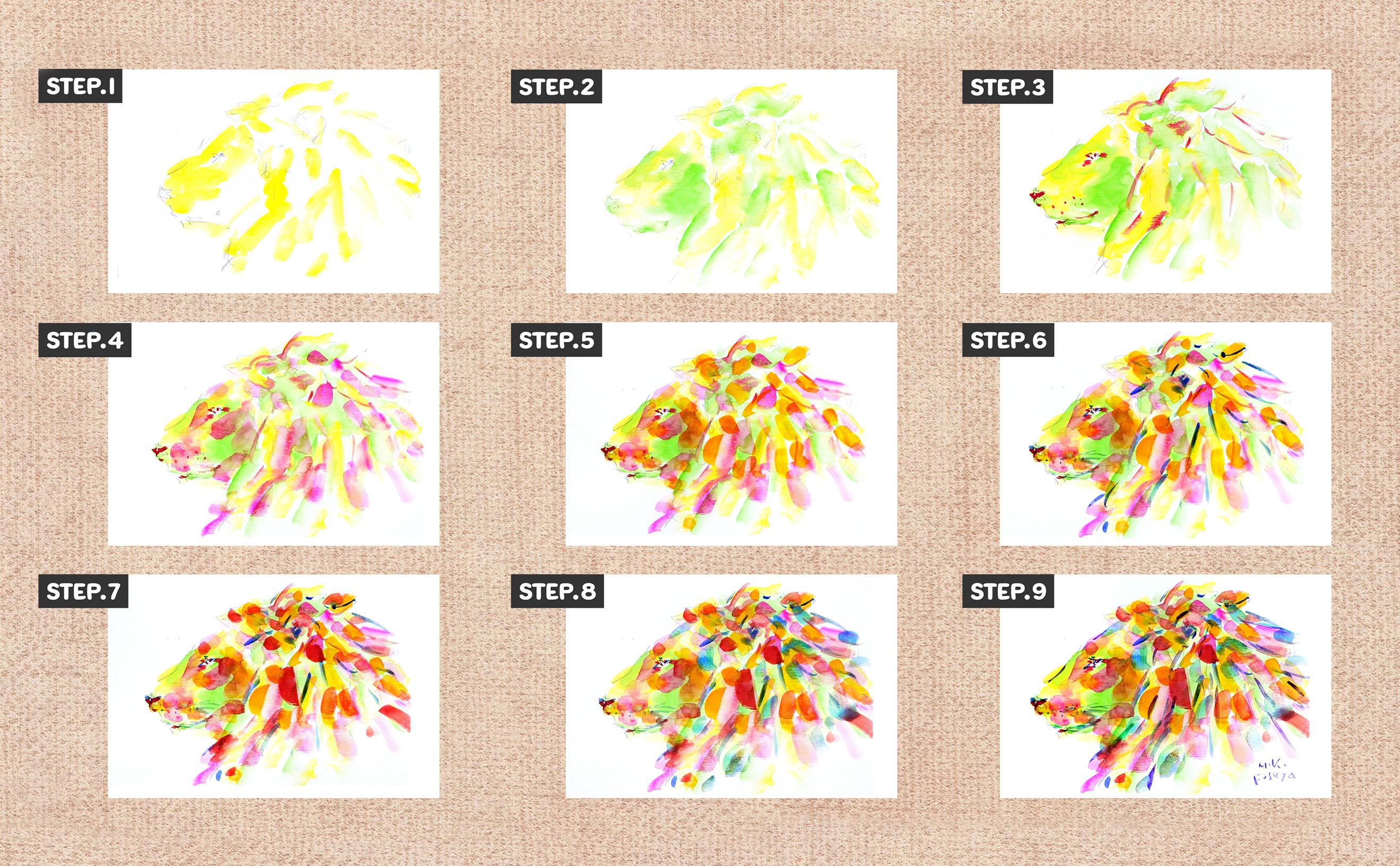
6. Base Yellow: Brush No.16 Yellow. Since yellow is light color, we use it to paint the bright areas where
light is heating. Apply to the blech of the
nose where the light hits. For the mane, we follow the flow of the hair and paint
the lighter areas. Continue to paint along the
direction of the hair growth. The top part of the
ear is also bright, so we paint that too. The front and top of
the face are bright. We add yellow there.
When the paint on the brush runs
low, let's add more. And if the color looks dry, add some water to the brush. We paint wild mane all over and finish by adding
yellow to the jaw. We've roughly paint
bright area with yellow. While I mentioned
painting lighter area, there is no need
to overthink it. Just relax and follow
along with me. In the next lesson, paint
yellow-green to the shadow.
7. Base Yellow-Green: Brush No.16 Yellow-green Since yellow green has a slightly lower value than yellow, we apply it to some of
the shadowed areas. The shadow under
the cheek bones, The area around the eye is slightly recessed
because there's no bone. The nose bridge is bright, but since yellow-green isn't too dark, we use it to emphasize
the nose bridge. We apply it around the mouth
as well where it's darker. We also add yellow-green to the mane, following the direction
of the hair growth. As the paint and water on
the brush get thinner, let's add more as needed. Moving the brush with quick
strokes create lines full of motion. The area around the mouth
was still a bit light, so I add more.
Under the eye and finish up. Even though we
only use two colors, yellow and yellow-green, it's starting to develop
a bit more depth. Now that the overall color
has been applied. In the next lesson, we'll use a fine brush to paint the details.
8. Detail Red: Brush No.0 red.
We paint the eye using dots, leaving some space
instead of filling them completely. By coloring
the nose and mouth, the face will become
more defined. Next, we paint
whisker follicles. We dip the brush
and paint again to paint the ear canals and
the texture of the mane. If you move the blush
quickly without stopping, you can create line
with movement. The mane glows wildly
in various direction. So we paint the texture
of the hair all over. The lion's expression
has come to life. If too much water is used, the colors may bleed, but I want to embrace this
uncontrollable aspect of watercolor and enjoy it
as a part of its charm. In the next lesson, we use
pink to make it gorgeous.
9. Gorgeous Pink: Brush number 16, pink. Pink is a bright color, but its value darker
than yellow-green, so we'll apply it to
the shadowed areas. Let's follow the
flow of the mane. The lower part of the mane
beneath the ears is darker, so we add pink there as well. We apply pink to the cheek, almost like makeup and extend it toward the shadow side
of the face and jaw. We apply it to the small hollow
between the eye and nose, around the whisker area
in front of the eye, and along the nose bridge's
side and forehead line. We scatter some pink on the lower part of
the mane as well. There is no need to
be overly cautious. Just paint where you feel like adding color and
fill in the gaps. Scattering it
throughout the piece. With the pink, the
piece has become more vibrant, while also gaining
more condors and depths. In the next lesson, we'll add orange to make it
even more lively.
10. Lively Orange: Lash number 16, orange. Let's make the painting even more vibraant by adding orange. We scatter the color throughout the mane, following the direction in which the wild strands grow. We add orange to
the shadow areas, as well as the nose, whiskers, jaw, and around the eye. As the brush starts to fade, let's add more paint and water, applying it to the shadow at the base of the ear. We finish by touching up any areas that need
a bit more color. With the addition of orange, the painting has
gained more depth. In the next lesson,
we'll use dark blue to add more detail to the finer parts.
11. Detail Dark-Blue: Brush No.0 darkblue, We add dots to the eye to
give them a sense of light. We also apply dark blue to the hollows under the
eye and on the nose. We add dark blue to the mouth, which was previously painted in red. Then, we paint the hair follicles and whiskers. Oops. I used too much
water on my brush, and the color dripped. But I'll make use of that and paint the ear canal. We continue to paint the mane in a wild style with dark blue, scattering it throughout the piece. You don't have to follow
my exact approach. Just enjoy the process and
follow your own passion. By adding dark blue, the outlines have become more defined. In the next lesson, we’ll scatter red throughout the painting to give it a more dramatic feel.
12. Dramatic Red: Brush No.16 red, Since red has a darker value compared to orange and pink, we'll use it to depict the darker shadow areas. Let's paint shadows behind the ears and the lower parts and the darker areas at the front of the mane, following the flow of the hair with lines. We scatter red throughout the piece. under the jaw and
lower parts of the mane, as well as those above the eye. With red scattered throughout, the painting now has more depth and a sense of luxury. Since we've increased the amount of warm colors, we'll use light blue in the next lesson.
13. Cool Color Light-Blue: Brush No.16 light blue, Now add light blue to the mane. When warm and cool colors are placed next to each other, they complement and enhance each other. Since there is currently more volume of warm colors, let's scatter light blue in the gaps throughout. There's no need to overthink it. Let's paint with a rhythm and enjoy the process. While I don't mix colors on the palette, directly layering colors on the paper can mix them and create deeper shades. By scattering light blue throughout, the painting feels more tightened and balanced. In the next lesson, we will use dark green to add more detailed touches.
14. Detail Dark-Green: Brush No.0 dark green, Let's paint the ear canals and the shape of the ear in detail. We add models to the eye and
also add color to the nose, making it darker. Paint the mane following the flow of the hair, and we add a bit of color to the mouth before finishing. By adding a dark shade of dark green, the details became clearer. This could be the final, but in the next lesson, we'll use purple to add finer details.
15. Final Detail Purple: Brush No.0 purple, Let's add some purple to the texture of the mane. It doesn't have to be exactly like mine; just scatter it throughout, keeping balance in mind. We paint the bridge of the nose and the outline of the forehead. We add some purpple to the
dots in the eye as well. Let's add follicles and the whiskers too. Once you feel complete,
let's sign it. The colorful lion is complete.
The colors are scattered throughout, yet the lion's posture and dignified expression leave a strong impression. In the final lesson, we will reflect on the class as a whole and discuss our
concluding thoughts.
16. Concluding Thoughts: I’m excited to see how your vibrant lion painting has turned out! How do you feel about it so far? Even if it didn't turn out
exactly how you imagined. Sometimes taking a
step back or revisiting it after a while gives
you a fresh perspective. You may notice that the impression of your painting shifts over time. Bright, bold colors have a way of lifting the spirit. Try letting go and painting more intuitively, without overthinking. You may be surprised at
how your inner world expresses itself through the colors you painted! Please capture your artwork
by taking a photo or scanning it and share it in
student project gallery. I'm really looking forward
to seeing your creation. Once you've photographed
or scanned your painting, why not use it in the
other creative ways? Set it as your phone wallpaper, Print it for unique message card or even turn it into
personalized product. If you post your artwork on Instagram, be sure to tag me and Skillshare so we can interact with your post. If you share it on stories, remember to tag me, so I can re-share it! If you'd like to continue creating more stunning
pieces with me, clicking my name up top, and you can explore
other my classes. And don't forget to follow me. Thank you so much for
joining me today. I can't wait to see
what you've created. Let’s keep making art that helps shape a brighter future.
Until next time!
 Miki Fuseya