Transcripts
1. introduction: Hi, I’m Miki. I’ve been painting in this lively and colorful style for over 20 years. My work is defined by bold, energetic strokes and vibrant abstract palettes that light up any space and uplift the spirits of those who see them. In this painting class, we will explore how to
see the world through vivid, vibrant colors and translate those impressions into expressive artworks. With my simple, step-by-step guidance, you’ll feel confident from start to finish, making each creation uniquely your own. This approach celebrates individuality while we’ll begin with the same reference and colors, The result will be as diverse as the creators themselves. By the end, you'll have a colorful artwork that reflects your personal style and adds a splash of joy to your surroundings. I run an art rental service, providing my paintings to offices, salons, clinics, and homes, refreshing the atmosphere every three months. Each rotation transforms these spaces, uplifting everyone who encounters the dynamic creations. I also hold annual exhibitions in Japan, my home country, and in Germany where I’m currently based. Beyond that, I teach painting, sell my work at markets, and even create custom pieces one of my favorites was a commission for my landlord that brought their outdoor terrace to life. Through all of these experiences, I’ve seen how the universal language of art connects and inspires people from all backgrounds. In this class, I’ll introduce you to an approachable and fun way of painting with vivid colors. No special materials are needed. You can get started with just paper and pencil, an eraser, watercolor paints
and two brushes, one thick and one thin. Whether you’re an experienced artist or just starting out, this is a chance to try something fresh and energizing. You’ll learn how to unleash a dynamic style that transforms contrasts of light and dark into vibrant colors, creating bold, joyful, and lively works. When you’re done, your artwork could brighten your home, become a thoughtful postcard, or even feature on your online profile! I encourage you to share your final piece in the Class Projects section. By comparing and celebrating each other’s work, you’ll gain new perspectives and uncover hidden aspects of your creative self. Let’s embark on this journey of vibrant discovery together!
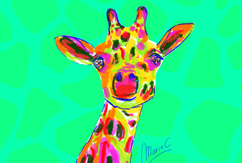
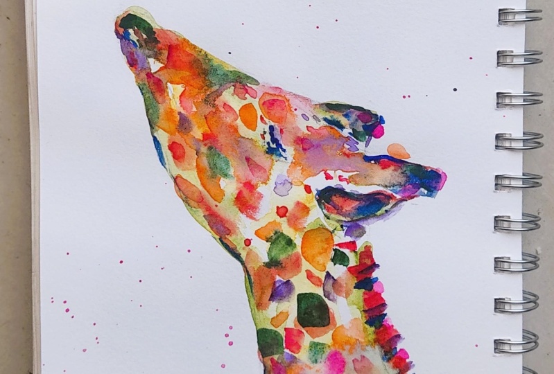
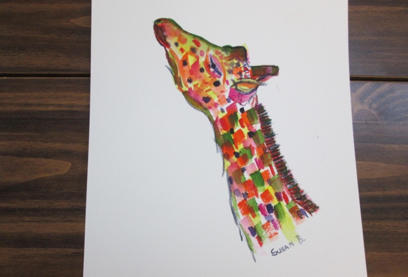
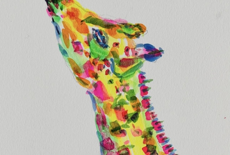
2. project: Welcome to the class. I'm truly glad to have you here! My painting style embraces bold, expressive strokes and vibrant colors, without focusing too much on the finer details. This means you can relax, enjoy the process, and let your creativity flow. Step by step, I’ll guide you through the process of painting a stunning giraffe. If you’re new to painting, don’t worry this style allows you to relax and have fun while letting your imagination shine. You can download the reference photo of the giraffe in the Project & Resources tab to get started. Feel free to interpret it in your own way you’re not limited to replicating it exactly. For added guidance,
I’ve provided my own sketch, which you’re welcome to use as a base. This is also available for download in the same section. While this class focuses on the giraffe, I have other lessons where we explore a wide range of subjects—from flowers to animals to people who’ve inspired me. I hope this inspires you to explore more creative possibilities after the class. Once your painting is complete, I’d love for you to share it! Take a photo or scan your artwork and upload it to the Student Project Gallery by clicking the Create Project button in the Project & Resources tab. Be sure to include a title and a brief description I’d love to hear about your journey through this process. After sharing your project, take some time to explore the works of other students. Notice how unique and expressive each piece is, even when using the same subject! Support your fellow artists with a like or a kind comment. This community is about sharing and uplifting each other. Your artwork has the potential to brighten someone’s day, spark new ideas, and spread joy. In the next lesson, I’ll show you how to master light and dark contrasts and turn them into vibrant color palettes a technique that’s central to this style.
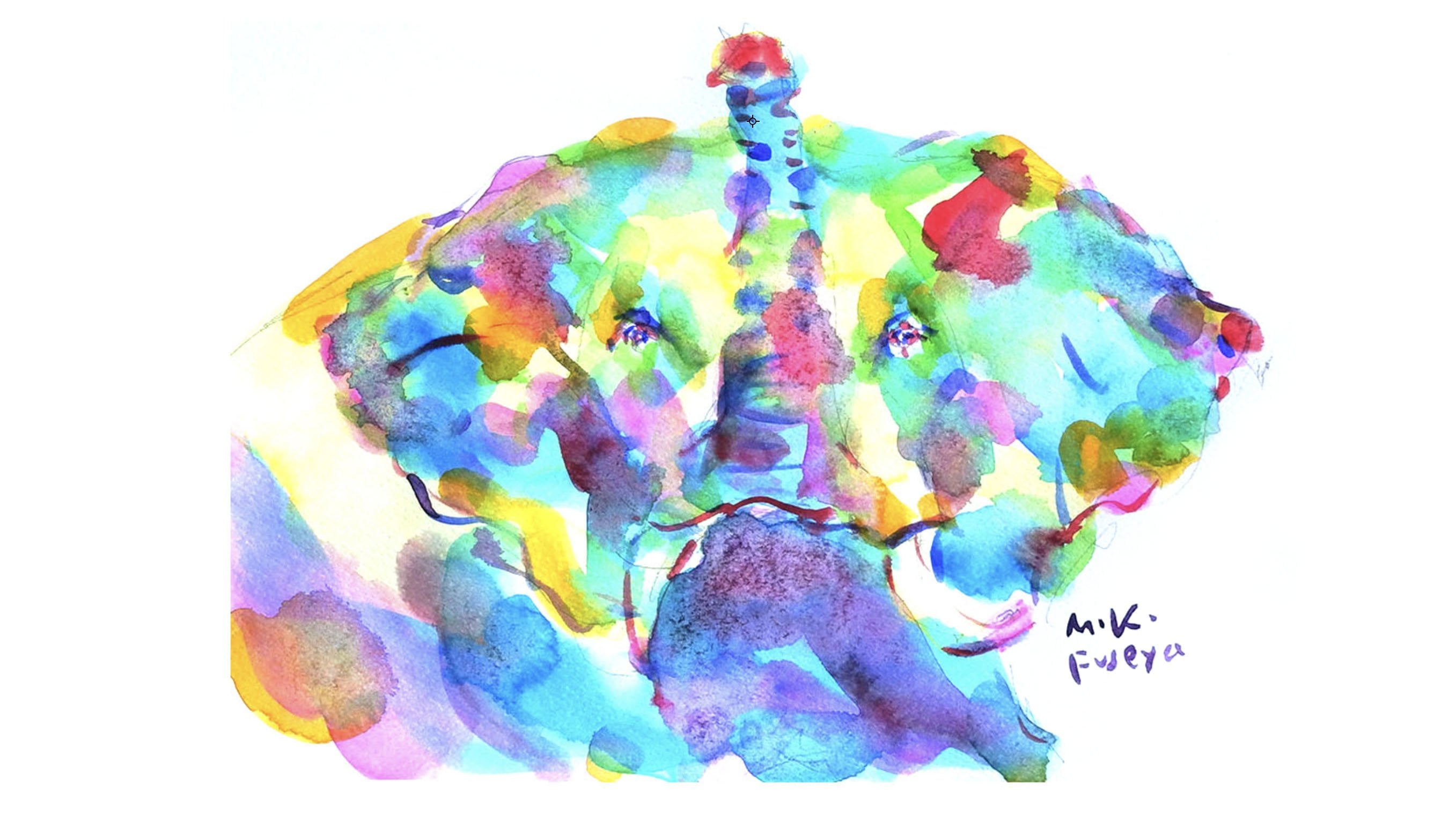
3. light and dark contrast: You might think that I'm placing colors randomly. Using primary colors to create colorful artwork is my style, but there is a rule behind it. Let’s compare a colorfully painted giraffe with the original photograph it was based on. Clearly, they are depicted in different colors. Now, let’s convert them to monochrome. Then, you'll notice that they appear to have similar tones. Even if the colors are not the same as the photo, I paint using colors that match the light and dark values. In this class, we use yellow, yellow-green, dark green, dark blue, purple, pink, red, and orange. Complementary colors such as red and green, blue and orange, yellow and purple are used. This enhances the visual and psychological impact through color contrast, making the overall impression more vivid and striking. Let’s also convert this color wheel to monochrome. You'll see the light and dark values of each color appear. Now let’s return to the photo of the giraffe. First, convert the photo to monochrome to understand the values of light and dark. Then, choose colorful hues that match those values. By doing so, you can create a vibrant, joyful piece that captures both the giraffe’s sense of dimension and a sense of fun that lifts the spirit. I’ve explained my style a bit more logically here, but you don’t have to understand it all. In the next lesson, I will explain the materials you need for this class.
4. material: Materials you will need. Let’s prepare the materials for painting a colorful giraffe. You don’t need fancy supplies just simple tools to bring your creativity to life. Watercolor Paints I love using Holbein watercolor paints, a Japanese brand known for its bright and vivid hues. However, any watercolors you have will work perfectly, whether it’s a professional set or even kids' paints. The goal is to have fun with colors! Palette
This is my trusty palette, packed with a variety of colors. For this class, we’ll use just nine essential colors. If you don’t have a palette, don’t worry you can use paint pans or even a simple plastic dish. Missing a color? Feel free to mix your own or experiment with similar shades. Brushes
We’ll keep it simple: you only need two brushes for this project a large flat brush and a small round brush. I typically useI typically use a flat plus size 16 and
round brush size zero. If you’re working on a smaller or larger sheet of paper, adjust the brush sizes accordingly. If you already have brushes at home, feel free to start with those. Paper
For the best results, I recommend watercolor paper that’s at least 300 g/m². This ensures the paper can handle layers of vibrant paint without so much warping. Pencil & Eraser These are for your sketch. Any pencil and eraser you have on hand will do just fine. Water Dish
You’ll need this to rinse your brushes. A simple jar or cup, like an empty jam or yogurt container, works perfectly.
Cloth or Paper Towel Use this to dry your brushes after washing them. An old towel, cloth, or even kitchen paper will work great. Reference Photo
We’ll use a giraffe as our subject. A reference photo helps with shapes, light, and overall inspiration. You can display it on a tablet, mobile, or print it out whatever works best for you. Remember, our focus is not photo realism, but capturing the essence of the subject. With these materials ready, you’re all set to start your creative journey! In the next lesson, we’ll begin with sketching. Let’s get started!
5. sketch: Let's start sketching. First, place a dot at the top of the mouth. Next, place a dot at the position of the right ossicone. Then, decide the position of the left side of the jaw. Determine the position of the neck at the far right edge of the paper, and start sketching the giraffe’s long neck. The initial position of the ossicone was a bit too low, so raise it up and sketch the ears as well. Adjust the position of the mouth too. If the first dot you placed is correct, that's great—but if not, don’t hesitate to make corrections right away. Using the dots you’ve placed so far as reference points, let’s begin forming the shape of the giraffe. Start by defining the shape around the mouth, and clarify the shapes of the ossicones. Sketch the ossicone at the back. Make the ear shape more clearer. Sketch the neck line. Decide the length of the mane, and shape the area from the jaw down to the neck. Once you’ve captured the outer shape of the giraffe, decide the position of the eye. Make the nose and mouth shape clear and the jaw is also sketched out clearly. and refine the shapes of the ears and ossicones a bit more. I felt the ear was high, so let's fix them. The giraffe sketch is now complete. In the next lesson, we’ll begin adding color.
6. yellow: Brush No.16
Yellow We start by painting the center of the face and neck. Follow the shape of the long neck. Add a bit of yellow to the jaw as well, and paint the ossicones. Add a bit more yellow to the neck, and that’s it for the yellow. First, we roughly applied yellow to the brightly lit areas. In the next lesson, let's start layering various colors one after another.
7. yellow-green: Brush No.16
Yellow Green Apply Yellow green around the eye and along the bridge of the nose. Then, add color from around the mouth down to the jaw, focusing on slightly darker areas and shadows. Also color the ossicones and ear. In this style, we build up layers of color on the paper. So even if the ossicones are meant to be black and the ears are slightly darker, we start by applying yellow green. We’ll add deeper tones later to create contrast. Paint the lower and side areas of the neck where shadows fall. Add Yellow green to the mane as well and that completes this lesson. We’ve only used two colors so far, but thanks to the variation in tone, the painting already has a hint of depth. In the next lesson, we’ll use pink to bring more brightness and liveliness to the whole piece.
8. pink: Brush No.16
Pink Add more color to the ossicones to deepen their tone. Then, paint the giraffe's pattern with pink. Add pink around the mouth as well, and scatter it throughout the piece. You don't need to paint every single spot. Just follow your feelings and enjoy moving your brush. Add pink to the shadows of the ear. For the mane, brush in the direction of the hair growth as you add pink. With pink applied throughout, the overall impression has become more vibrant and elegant. In the next lesson, we’ll use dark blue to work on the eye and other details.
9. dark-blue: Brush No.0
Dark blue First, let’s define the shape of the mouth and add some dark blue dots around the eyes. Oops, don’t worry if the colors bleed a little. Let’s enjoy these unexpected effects. Add dots inside the eyes as well, and apply dark blue to the ossicones. Now, let’s paint the shape of the ear. Paint the mane as well. We’ll also clarify the line from the jaw down to the neck, and that completes this lesson. By using a fine brush for the details, the giraffe has become much clearer. In the next lesson, we’ll add orange to bring out more richness and vibrancy.
10. orange: Brush No.16
Orange We add orange to the shadow areas. Apply orange around the mouth, eye, and ossicones to deepen the colors. We also add orange to the spots around the jaw, and begin coloring the spots on the neck as well. With the addition of orange, the giraffe looks even more vibrant and lively. Next, we’ll use red. Using a fine brush, we’ll add more detailed touches, such as around the eye.
11. red: Brush No.0, Red.
First, we paint the mouth in red. Then, we add small dots to the eye. Once we add color to the eye, the expression starts to come to life. Next, we paint the small spots around the head, and add red to the ossicones as well. We’ll continue by painting the spots on the face and neck, Paint the spots and shadows around the mouth. For the spots on the neck, let's apply red to the darker areas. Scatter red throughout. and add red to the mane. Finally, we paint the spots around the nose to complete this lesson. With the addition of red, the eye now show more expression, and the spots have become more defined. In the next lesson, we’ll add a darker color dark green—to give the giraffe more contrast and depth.
12. dark-green: Brush No.16
DarkGreen Add dark green around the mouth and nose area. Also apply dark green to the ossicones to deepen the color even more. Paint shadows from the nose up to the forehead, and add dark green to the spots as well. Layer colors over the spots not by applying the color precisely on top, but by slightly shifting the colors to enjoy the subtle differences in each spot. Also add dark green to the spots around the jaw and to the mane to create a stronger contrast between light and dark. With the addition of dark green, the contrasts become clearer, giving the giraffe more definition and depth. In the next lesson, we will use a fine brush to add more details with purple.
13. purple: Brush No.0
Purple Now, let’s add some purple around the eye. We also paint the mouth to define its shape more clearly. Add purple to the ossicones and spots too, making their shapes more distinct. We deepen the colors by adding purple to the spots on the face and body as well. You don't have to paint it the same way I did, just arrange the purple according to your passion. We also layer Purple on the mane to create deeper colors. Add a little bit more purple to the spots. By adding purple, the giraffe gains more contrast and character. In the next lesson, we’ll add pink one last time to give the giraffe a final touch of vibrance.
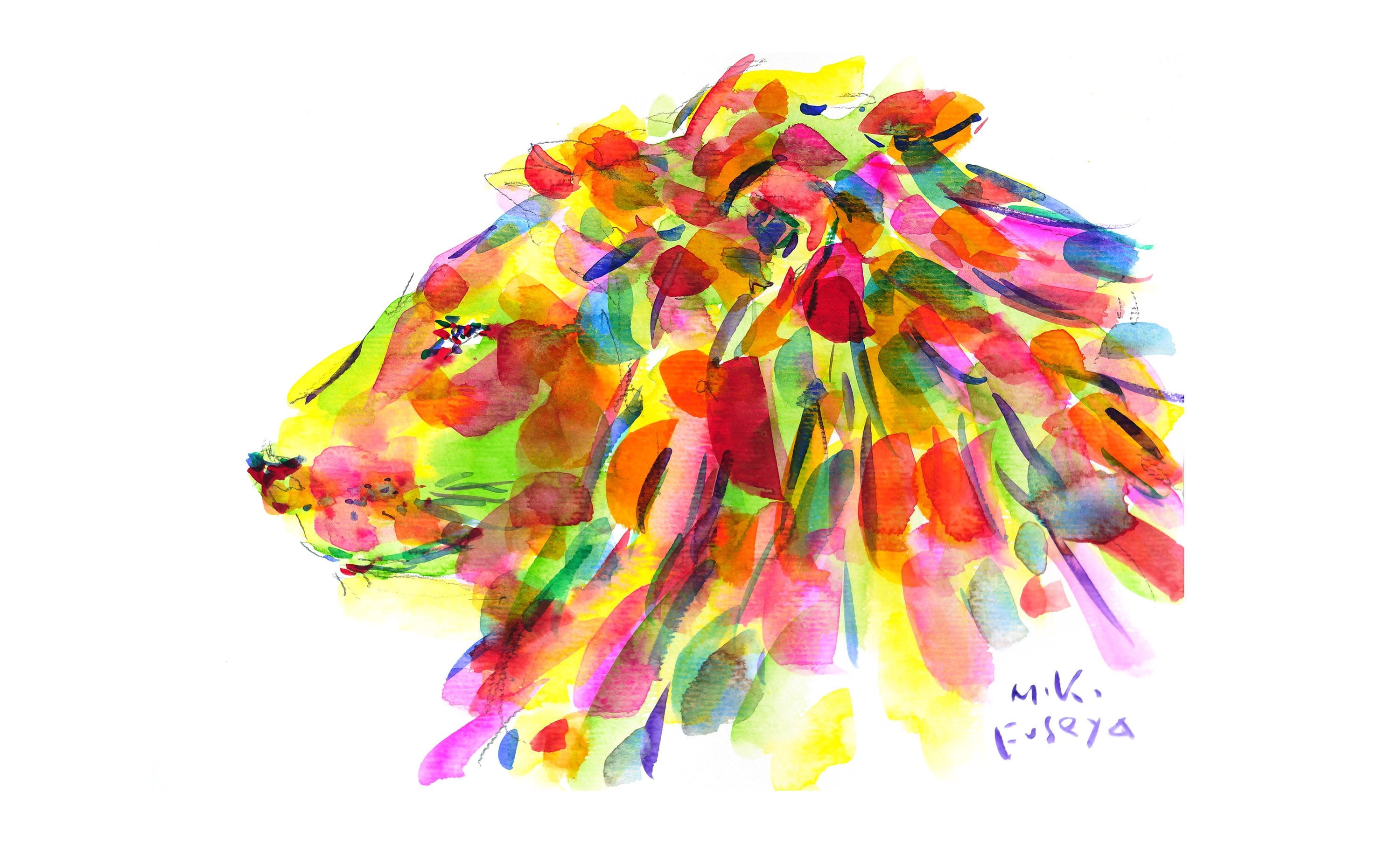
14. gorgeous pink: Brush No.16
Pink We add a touch of pink around the eyes. Just like makeup, it brightens up the face. Next, let’s add some pink to the ossicones and spots, Let's add pink to the spots on the neck as well. Paint pink to the shadowed area on the lower part of the neck. and now the giraffe is complete. Finally, please sign your signature in your favorite color to finish it off. Our colorful giraffe is done! In the next lesson, we’ll review everything we’ve learned in this class.
15. final thoughts: I’m so excited to see your graceful giraffe come to life on the paper! How did you feel to create something so gentle, tall, and full of character? Sometimes our artwork surprises us even if it looks different from what we imagined, that uniqueness is what makes it yours. Step back, take a deep breath, and see it with fresh eyes. You might find beauty in the unexpected lines or the bold choices you made. Let your creativity flow freely giraffes teach us to stand tall and stay curious. Each brushstroke reflects a part of your imagination and inner world. When you're ready, capture your giraffe masterpiece with a photo or scan and share it in the student project gallery. I’d love to see it! Try using it as your phone background, print it as a card, or print it on some products. The possibilities are endless. If you share your giraffe on Instagram, please don't forget
tag me and Skillshare, so we can see it and cheer you on! And if you post it to your stories, tag me so I can re-share and celebrate your creativity. If you enjoyed this class, you can find more by clicking on my name at the top Let’s keep painting together! Be sure to follow me to stay updated on future classes and creative inspiration. Thank you so much for joining me today. Let’s keep making joyful, meaningful art that adds color to the world. Until next time—keep reaching high, like the giraffe you just painted.
 Miki Fuseya